Shared posts

23 Feb 09:45
Connaissance du 22/02/2015
Par définition, un fruit est l'organe comestible des plantes qui succède à la fleur et protège les graines (ou noyaux et pépins). Ainsi, l'avocat, l'aubergine, les piments, le concombre, et le haricot vert sont des fruits.


17 Feb 13:39

sohaliah:bastardkeaton: Dancing at a London jazz club,...
Dancing at a London jazz club, 1950s.
These young jazz fans/”beatniks” in Britain became the precursor to Mods.
amazing
17 Feb 10:41

Surreal Photoshop and selfie skills from Izumi Miyazaki
by Liv Siddall

Life can be pretty boring when you’re a teenager. Rather than turning to the gory allure of video games and SnapChat, 18-year-old Izumi Miyazaki decided to take matters into her own hands and make a series of selfies that make yours look absolutely rubbish. By utilising household items and foodstuffs as props, and sometimes going as far as building her own sets (see head in the clouds photos below) Izumi transports herself into far off lands, so far off that they’re on a different world entirely. Her fixed, deadpan stare throughout makes the project not just endearing but also worth much more than if she was just larking about. It’s art, man. FYI she also sells badges and other small merch items – get ’em while you can.
17 Feb 09:53
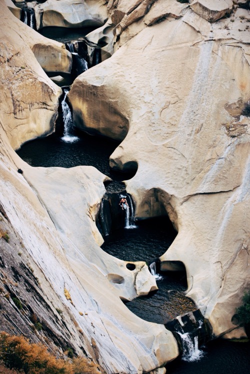
patagonia:Floating the Sierra’s infamous 7 Tea Cups on an...
Floating the Sierra’s infamous 7 Tea Cups on an inflatable dolphin.
Submitted by Devlin Gandy
Instagram @devlin_gandy
17 Feb 03:00

Artist Jeremy Miranda Examines Memory with Oil Landscapes that Bleed into Interiors
by Christopher Jobson


Artist Jeremy Miranda is fascinated with how the mind creates memories and the juxtaposition of experiences both real and perceived. His oil paintings overlap interior and exterior environments to create unexpected relationships between disparate subjects, usually natural versus man-made. The interior of an artist’s studio dissolves into a bucolic river landscape, a bookshelf leads into the ocean, or a glowing furnace is concealed below quiet pond. Miranda most recently had an exhibit at Nahcotta Gallery in New Hampshire where several of his original works are currently available. Some of his most popular images are also available as prints. (via My Darkened Eyes)

16 Feb 10:04
Connaissance du 14/02/2015
Dans le film "la Cité de la peur" sorti en 1994, la scène bruitée à la bouche commence exactement à 1h 00 minutes et 00 seconde du film.
16 Feb 09:03
Ghostbusters and the 'no ghost' logo
by Mark Sinclair

With Ghostbusters set for a 2016 reboot, the original film's 'no ghost' symbol has been all over social media recently – but will it return for another outing, such is its standing as one of the most recognisable logos in the movies? No need to call anyone ... here's all you need to know about it....
When it was released in 1984, Ghostbusters was a remarkable film for several reasons. It was one of the first comedies to employ a significant amount of special effects and, as Lesley Blume points out in a Vanity Fair article on how the film was made, it brought several actors largely known for their TV work into the cinema, heralding a crossover between the two that would become an established norm today.
The film also celebrated New York City at a time when its image had been severely damaged by years of financial problems and high crime rates. Even the film's last line projects this positive sentiment – "shouted by Winston Zeddmore," Blume writes, "as he surveys the smoking, molten-marshmallow-drenched disaster zone around him: 'I love this town'."

Ecto-1, sporting the 'no ghost' symbol, from fatmovieguy.com
Amid these observations, the fact that a logo was to become so firmly embedded in the fabric of a comedy about a team of parapsychologists might sound insignificant, yet, in film terms, the 'no ghost' symbol went way beyond the contraints of the storyline. Before Ghostbusters had even opened in cinemas, the 'no ghost' had been established as the logo of the film itself.
Prior to filming, the design of a symbol for the Ghostbusters fell to executive producer Michael C Gross. In an interview from the bonus disk of the DVD collection, The Real Ghostbusters (Time Life), Gross says that in talks with director Ivan Reitman, he offered to art direct the film and look after the animation side, as it was clear that it was going to warrant a wide range of special effects and creature designs.
"It was in the script," Gross recalls in the interview. "Danny Aykroyd had it written on the page, that the boys came in with this logo on their shirt, or on the side of the Ectomobile, of a ghost trapped in the 'no' symbol. That was it."

The symbol would be required for sets, props and costumes, Gross explains, so needed pinning down right away. With the newly-formed special effects house Boss Film Studios on board, Gross approached one of its artists, Brent Boates, who was working as a creature design consultant on the film, for some variations "of a ghost coming through the 'no' symbol'.
"He drew it up and there we were.... We didn't think twice about it," says Gross. "No-one really thought it was going to go past that. Of course, as everything grew and the advertising campaign came, it became the logo for the film."
The 'no ghost' was used extensively across the film's promotional material and appeared in its opening title sequence (by R/Greenberg Associates) where an animated cartoon ghost is 'caught' in the sign, which then forms the 'O' of 'Ghostbusters'.


Interestingly, as the film's end credits roll, members of the huge cheering crowd assembled outside the building where the final scenes take place can be seen holding up T-shirts sporting the logo. As some film commenters have suggested, the Ghostbusters logo is 'diagetic' ie of the fictional world of the film. This in itself is not unusual (there's a logo for Omni Consumer Products in RoboCop, for example), though the extent to which the Ghostbusters' logo is used and referred to – in and outside of the film – has only since been bettered by Jurassic Park.


And there are, in fact, two versions of the Ghostbusters logo, Gross reveals. "The interesting thing is – and it's hard for people to figure this out – but one of the versions I did had 'Ghostbusters' written in the diagonal sign," he explains. "And it doesn't read well the way the actual symbol is: so I flipped it so it reads the other way."
Gross explains that this 'correct' version of the symbol (ISO 3864-1, signage buffs), with the crossbar running top left to bottom right, was then only used in Europe where the 'no' sign was more familiar than in the US.
"We took the word 'Ghostbusters' off it – and it's still backwards – so if you ever see it the 'correct' way, that's for European release," says Gross. "They said, 'look we can't run it backwards over here, we've been using it for fifty years'. So it's two ways; if you see it 'backwards', it's US; if you see it the 'correct' way it's European.”
Here's a British poster for the film, with the crossbar top-left to bottom-right:

Via fanpop.com/clubs/ghostbusters
And here's a Spanish version:

Spanish poster with same logo, via imgkid.com
Even as it flipped back and forth across the Atlantic, on its home turf the Ghostbusters logo became so recognisable that versions of it even became a feature of the 1984 US election, with both 'Reagan busters' and 'Fritz busters' badges appearing in support of Mark 'Fritz' Mondale and Ronald Reagan alike:


From Anderson Americana auction site, here and here
As for what happens to the Ghostbusters logo in 2016, when the film returns with an all-female ghostbusting team, a recent graphic from Sony Pictures' Twitter showed little sign of a new version as yet.
Which is probably just as well, as no-one wants a repeat of what emerged when the Ghostbusters came back for a second time in 1989. Now that really was scary.


A tweet from Sony Pictures announced the July 2016 release date for the next Ghostbusters instalment
13 Feb 10:33

Horizontal Press' erotic works for you to lay back with, and think of England
by Billie Muraben

Established by illustrator Kaye Blegvad, Horizontal Press is a small pornographic press specialising in “small batch jazz mags and seminal works.” Based in Brooklyn, Horizontal Press keeps its tongue firmly in cheek, “[taking pleasure] in publishing erotic works for the discerning horndog.” If that wasn’t news enough, it’s launching this Valentine’s Day – just in time for you to send your loved one, or yourself, a Tijuana Bible by some of illustration’s most glittering stars. There’s Rose Blake, Clay Hickson and Lizzy Stewart to name but a few.
13 Feb 09:32
Facebook Now Lets You Choose Who Controls Your Account When You Die
by Staff

Social network Facebook has introduced a rather morbid new feature which allows you to decide who will have control of your account when you die. The feature, called "legacy contact", rolled out today and lets users designate a specific friend or family member who will be able to access certain areas of their profile when they pass away.
13 Feb 09:14
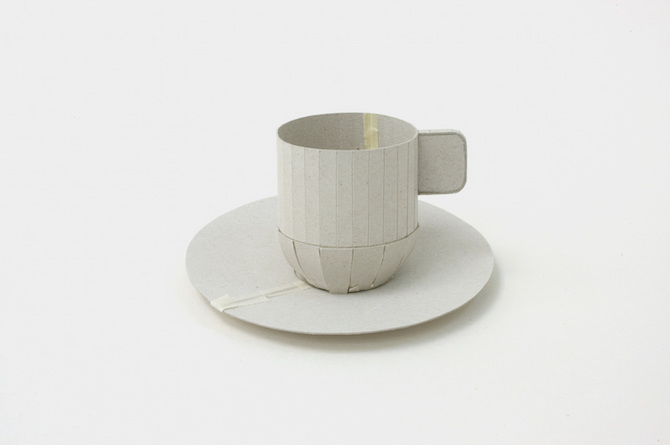
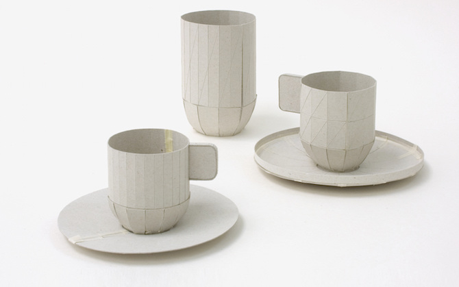
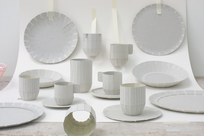
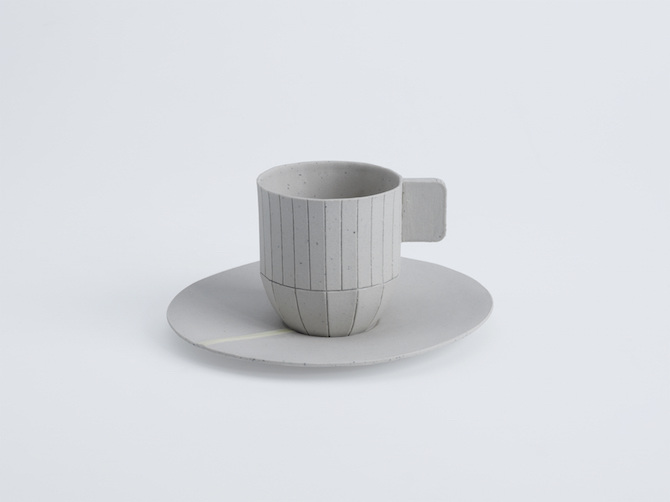
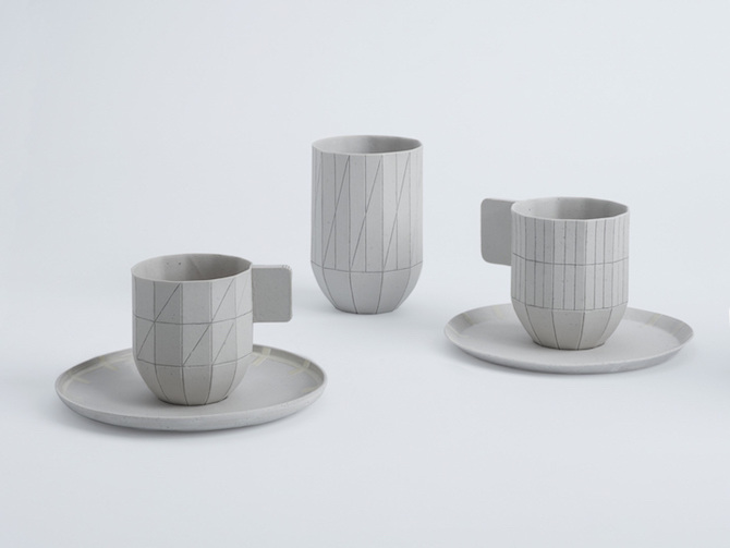
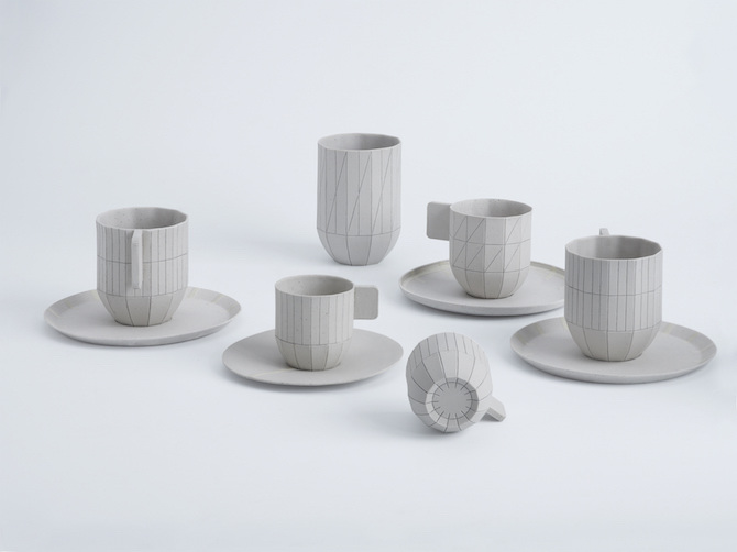
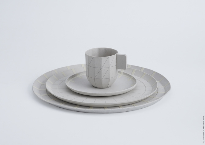
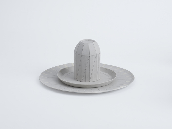
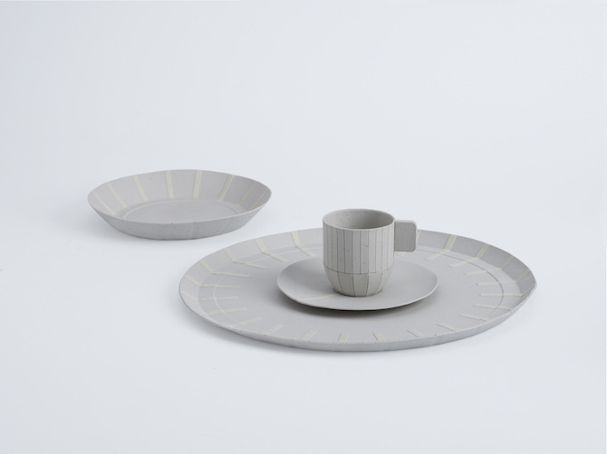
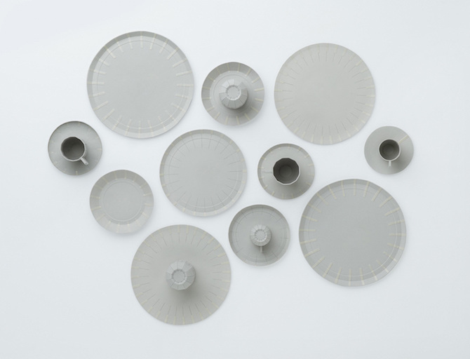
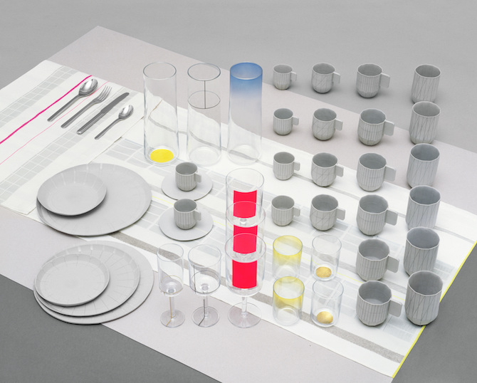 Paper Table by Scholten & Baijings
Stefan Scholten and Carole Baijings established their Amsterdam-based studio Scholten & Baijings in 2000, and are now widely regarded as one of the most exciting, innovative and dynamic design duos in Europe. Renowned for their sensitive and subtle yet functional products, their striking and often unexpected use of colour and their exquisitely crafted objects, they have applied their distinctive style to everything they create.
With their work Scholten & Baijings build a bridge between designer, artisan and manufacturer. Their close involvement in the production process results in design with both a perfect finish and a personal signature. They treat their work as an artists, starting with materials and colors and then try to create a shape or a design. That is exactly the story of Paper Table concept. During making paper prototypes designers came up with idea to translate carton to porcelain saving the same shape.
Paper Table In contemporary dining culture one encounters worlds of difference. In the Total Table Design project Dutch designers Scholten & Baijings present their vision for the art of dining. Royal Leerdam Crystal (glassware), Koninklijke Van Kempen & Begeer (cutlery) and the Audax Textile Museum Tilburg (table linen) joined forces to produce prototypes of their designs. All three partners can boast of a long tradition of artisan production and they regularly work in conjunction with a select group of designers from the Netherlands and beyond. The folded cardboard models for the crockery are translated into light grey, unglazed porcelain cups and plates, playing with the suggestion of cardboard delicately.
Words: Thisispaper, Scholten & Baijings
Images: Courtesy of Scholten & Baijings
Paper Table by Scholten & Baijings
Stefan Scholten and Carole Baijings established their Amsterdam-based studio Scholten & Baijings in 2000, and are now widely regarded as one of the most exciting, innovative and dynamic design duos in Europe. Renowned for their sensitive and subtle yet functional products, their striking and often unexpected use of colour and their exquisitely crafted objects, they have applied their distinctive style to everything they create.
With their work Scholten & Baijings build a bridge between designer, artisan and manufacturer. Their close involvement in the production process results in design with both a perfect finish and a personal signature. They treat their work as an artists, starting with materials and colors and then try to create a shape or a design. That is exactly the story of Paper Table concept. During making paper prototypes designers came up with idea to translate carton to porcelain saving the same shape.
Paper Table In contemporary dining culture one encounters worlds of difference. In the Total Table Design project Dutch designers Scholten & Baijings present their vision for the art of dining. Royal Leerdam Crystal (glassware), Koninklijke Van Kempen & Begeer (cutlery) and the Audax Textile Museum Tilburg (table linen) joined forces to produce prototypes of their designs. All three partners can boast of a long tradition of artisan production and they regularly work in conjunction with a select group of designers from the Netherlands and beyond. The folded cardboard models for the crockery are translated into light grey, unglazed porcelain cups and plates, playing with the suggestion of cardboard delicately.
Words: Thisispaper, Scholten & Baijings
Images: Courtesy of Scholten & Baijings


Scholten & Baijings: Paper Table
by Thisispaper Magazine
Paper Table by Scholten & Baijings
Stefan Scholten and Carole Baijings established their Amsterdam-based studio Scholten & Baijings in 2000, and are now widely regarded as one of the most exciting, innovative and dynamic design duos in Europe. Renowned for their sensitive and subtle yet functional products, their striking and often unexpected use of colour and their exquisitely crafted objects, they have applied their distinctive style to everything they create.
With their work Scholten & Baijings build a bridge between designer, artisan and manufacturer. Their close involvement in the production process results in design with both a perfect finish and a personal signature. They treat their work as an artists, starting with materials and colors and then try to create a shape or a design. That is exactly the story of Paper Table concept. During making paper prototypes designers came up with idea to translate carton to porcelain saving the same shape.
Paper Table In contemporary dining culture one encounters worlds of difference. In the Total Table Design project Dutch designers Scholten & Baijings present their vision for the art of dining. Royal Leerdam Crystal (glassware), Koninklijke Van Kempen & Begeer (cutlery) and the Audax Textile Museum Tilburg (table linen) joined forces to produce prototypes of their designs. All three partners can boast of a long tradition of artisan production and they regularly work in conjunction with a select group of designers from the Netherlands and beyond. The folded cardboard models for the crockery are translated into light grey, unglazed porcelain cups and plates, playing with the suggestion of cardboard delicately.
Words: Thisispaper, Scholten & Baijings
Images: Courtesy of Scholten & Baijings

11 Feb 09:37
Restaurant Business
by Coverjunkie
Cover Restaurant Business magazine.
Artwork: Adam Simpson
Art Director: Sara Stewart
Creative director: Bruce Ramsay


11 Feb 09:29
A Restaurant In Singapore Has Started Using Drones as Waiters
by Staff

A restaurant in Singapore called Timbre @ Substation has started introducing drones to its waitering staff, using them to transport both drinks and dishes from the kitchen to a specially designed drop-off area. Developed by Singapore-based Infinium Robotics, the robots actually help out the human staff rather than entirely replacing them, handling the brunt of the work so that the other staff can focus on hospitality.
10 Feb 16:14
Paper (US)
by Coverjunkie
Photographer Terry Richardson
Cool new cover Paper magazine.
"PAPER Magazine, founded in 1984, is an indispensible pop culture bible for tastemakers and tastemakers-in-training. PAPER Magazine's mission is to explore pop culture just beyond the scope of the mainstream, thereby illustrating for our readers the groundbreaking ideas that will influence the trends of tomorrow."


09 Feb 09:19
Connaissance du 09/02/2015
La version arabe du dessin animé les Simpsons s'appelle les Al-Shamshoon. Leurs prénoms sont Omar, Mona, Badr et Beesa.


05 Feb 09:38

Tom Wesselmann in front of ‘Nude, One Arm Down,’...
Tom Wesselmann in front of ‘Nude, One Arm Down,’ 1994.
05 Feb 09:30
Connaissance du 05/02/2015
Le scanner fut inventé grâce au Beatles. Dans les années 60, la société EMI (maison de disque des Beatles) finançait la recherche. Les bénéfices des ventes de disques du groupe permettent de travailler sur plusieurs projets dont le scanner.
03 Feb 13:37

Good vibrations from our fave painter Brecht Vandenbroucke
by Liv Siddall

Brecht, after five years of admiring your work I can happily say that I can spell your name without looking. And I can tell you that even though I’ve spent years admiring the skill of your painting, I can finally say that I think I actually get it. Over time, Brecht’s erratic artworks have become increasingly crowded with characters, pop culture references, logos, and his trademark long-limbed creatures.


03 Feb 10:28
Ex Libris érotiques
by noreply@blogger.com (julien josset)
Une collection très olé olé et très marrante à contempler sur le musée danois en ligne de l'Ex Libris :-)


