Shared posts

26 Jun 07:26

How (not) to miss a deadline

by Seth Godin

Deadlines are valuable, and deadlines are expensive.

Organized systems and societies need deadlines. It would be impossible to efficiently build a house if the subcontractors could deliver their goods or services whenever it were convenient for them. Movie studios and book publishers schedule their releases months in advance to allow distribution teams to plan their work. Software is dependent on subsystems that have to be in place before the entire program can work.

Along with the value that synchronized deliverables create, there are also real costs. Not simply the organizational cost of a missed deadline, but the significant damage to a reputation or brand that happens when a promise isn’t kept. And there’s a human cost–the stress and strain that comes from working to keep a promise that we might not have personally made, or that might be more difficult because someone else didn’t perform their part of the dance.

In the wide-open race for attention and commitments, the standards of deadlines have been wavering. For forty years, Saturday Night Live has gone on at 11:30. Not, as its creator says, because it’s ready, but because it’s 11:30. That’s the deal.

On Kickstarter, this sort of sacrosanct deadline is rare indeed. “This charger will ship in six weeks!” they say, when actually, it’s been more than a year with no shipment date in sight. Or with venture capitalists and other backers. “We’re going to beat the competition to market by three months.” Sometimes it feels like if the company doesn’t bring wishful thinking to the table, they won’t get funded. Given that choice, it’s no wonder that people get desperate. Wishful thinking might not be called lying, but it is. We should know better.

Earning the reputation as someone (a freelancer, a marketer, a company, a leader) who doesn’t miss a deadline is valuable. And it doesn’t happen simply because you avoid sleeping and work like a dog. That’s the last resort of someone who isn’t good at planning.

Here are some basic principles that might help with the planning part:

  1. If you’re competing in an industry where the only way to ‘win’ is to lie about deadlines, realize that competing in that industry is a choice, and accept that you’re going to miss deadlines and have to deal with the emotional overhead that comes with that.
  2. Knowing that it’s a choice, consider picking a different industry, one where keeping deadlines is expected and where you can gain satisfaction in creating value for others by keeping your promises.
  3. Don’t rely on false deadlines as a form of incentive. It won’t work the same on everyone, which means that some people will take you at your word and actually deliver on time, while others will assume that it was simply a guideline. It’s more efficient to be clear and to help people understand from the outset what you mean by a deadline. The boy cried wolf but the villagers didn’t come.
  4. At the same time, don’t use internal deadlines as a guaranteed component of your external promises. A project with no buffers is certain to be late. Not just likely to be late, but certain. Better buffers make better deadlines.
  5. Embrace the fact that delivering something on a certain date costs more than delivering it whenever it’s ready. As a result, you should charge more, perhaps a great deal more, for the value that your promise of a deadline creates. And then spend that money to make sure the deadline isn’t missed.
  6. Deadlines aren’t kept by people ‘doing their best.’ Keeping a deadline requires a systemic approach to dependencies and buffers and scenario planning. If you’re regularly cutting corners or burning out to meet deadlines, you have a systems problem.
  7. The antidote to feature creep isn’t occasional pruning. That’s emotionally draining and a losing battle. The answer is to actively restructure the spec, removing or adding entire blocks of work. “That will be in the next version,” is a totally acceptable answer, particularly when people are depending on this version to ship on time.
  8. A single deadline is a deadline that will certainly not be met. But if you can break down your big deadline into ten or fifteen intermediate milestones, you will know about your progress long before it’s too late to do something about it.
  9. The Mythical Person-Month is a serious trap. Nine people, working together in perfect harmony, cannot figure out how to have a baby in one month. Throwing more people at a project often does not speed it up. By the time you start to solve a deadline problem this way, it might be too late. The alternative is to staff each component of your project with the right number of people, and to have as many components running in parallel as possible.
  10. Bottlenecks are useful, until they aren’t. If you need just one person to approve every element of your project, it’s unlikely you can run as many things in parallel as you could. The alternative is to have a rigorous spec created in advance, in which many standards are approved before you even begin the work.
  11. Discussions about timing often devolve into issues of trust, shame and effort. That’s not nearly as helpful as separating conversations about system structure and data from the ones about commitment and oomph.
  12. Hidden problems don’t get better. In a hyper-connected world, there’s no technical reason why the project manager can’t know what the team in the field knows about the state of the project.

Like most things that matter, keeping deadlines is a skill, and since it’s a skill, we can learn it.

[More on this in my next post on what to do if you can’t avoid breaking your promise.]

18 May 13:21

Code-First Data Science for the Enterprise

by Lou Bajuk and Nick Rohrbaugh

[This article was first published on RStudio Blog, and kindly contributed to R-bloggers]. (You can report issue about the content on this page here)
Want to share your content on R-bloggers? click here if you have a blog, or here if you don't.

I Heart Code

As a data scientist, or as a leader of a data science team, you know the power and flexibility that open source data science delivers. However, if your team works within a typical enterprise, you compete for budget and executive mindshare with a wide variety of other analytic tools, including self-service BI and point-and-click data science tools. Navigating this landscape, and convincing others in your organization of the value of open source data science, can be difficult. In this blog post, we draw on our recent webinar on this topic to give you some talking points to use with your colleagues when tackling this challenge.

However, it is important to keep in mind that “code-first” does not mean “code only.” While code is often the right choice, most organizations need multiple tools, to ensure you have the right tool for the task at hand.

The Pitfalls of BI Tools and Codeless Data Science

There are multiple ways to approach any given analytic problem. At their core, various data science and BI tools share many aspects. They all provide a way of drawing on data from multiple data sources, and to explore, visualize and understand that data in open-ended ways. Many tools support some way of creating applications and dashboards that can be shared with others to improve their decision-making.

Since these very different approaches can end up delivering applications and dashboards that may (at first glance) appear very similar, the strengths and nuances of the different approaches can be obscured to decision makers, especially to executive budget holders—which leads to the potential competition between the groups.

However, when taking a codeless approach, it can be difficult to achieve some critical analytic best practices, and to answer some very common and important questions:

  • Difficulty tracking changes and auditing work: When modifications and additions are obscured in a series of point-and-click steps, it can be very challenging to answer questions like:
    • Why did we make this decision in our analysis?
    • How long has this error gone unnoticed?
    • Who made this change?
  • No single source of truth: Without a centralized way of sharing and storing analyses and reports, different versions and spreadsheets can proliferate, leading to questions like:
    • Is this the most recent [data, report, dashboard]?
    • Is the file labeled sales-data 2020-12 final FINAL Apr 21 NR (4).xlsx really the most recent version of the analysis?
    • Where do I find the [data, report, dashboard] I am looking for? And who do I have to email to get the right link?
  • Difficult to extend and reproduce your work: When you are depending on a proprietary platform for your analysis, with the details hidden behind the point-and-click interface, you might face questions like:
    • What did our model say 6 months ago?
    • Can I apply this analysis to this new (slightly different) data/problem?
    • Are we actually meeting the relevant regulatory requirements?
    • Is our work truly portable? Will others be able to reproduce and confirm our results?

At best, wrestling with questions like these will distract an analytics team, burning precious time that could be spent on new, valuable analyses. At worst, stakeholders end up with inconsistent or even incorrect answers because the analysis is wrong, not the correct version, or not reproducible. This can fundamentally undermine the credibility of the analytics team. Either way, the potential impact of the team for supporting decision makers is greatly reduced.

The benefits of code-first data science

RStudio’s mission is to create free and open-source software for data science, because we fundamentally believe that this enhances the production and consumption of knowledge, and facilitates collaboration and reproducible research.

At the core of this mission is a focus on a code-first approach. Data scientists grapple every day with novel, complex, often vaguely-defined problems with potential value to their organization. Before the solution can be automated, someone needs to figure out how to solve it. These sorts of problems are most easily approached with code.

With Code, the answer is always yes!

Code is:

  • Flexible: With code, there are no black box constraints. You can access and combine all your data, and analyze and present it exactly as you need to.
  • Iterative: With code, you can quickly make changes and updates in response to feedback, and then share those updates with your stakeholders.
  • Reusable and extensible: With a code-first approach, you can tackle similar problems in the future by applying your existing code, and extend that to novel problems as circumstances change. This makes code a fundamental source of Intellectual Property in your organization.
  • Inspectable: With code, coupled with version control systems like git, you can track what has changed, when, by whom, and why. This helps you discover when errors might have been introduced, and audit the analytic approach.
  • Reproducible: When combined with environment and package management (such as the capabilities provided by RStudio Team), you can ensure that you will be able to rerun and verify your analyses. And since your data science is open source at its core, you can be confident that others will be able to rerun and reproduce your analysis, without being reliant on expensive proprietary tools.
Codeless Problem Code-First Solution

Difficulty tracking changes and auditing work

Code, coupled with version control systems like git, to track what changed, when, by whom, and why.

Code can be logged when run for auditing and monitoring.

No single source of truth

Centralized tools to create a single source of truth for data, dashboards, and models.

Version control to track multiple versions of code separately without creating conflicts.

Difficult to extend and reproduce work

Code enables reproducibility by explicitly recording every step taken.

Open-source code can be deployed on many platforms, and is not dependent on proprietary tools.

Code can be copied, pasted, and modified to address novel problems as circumstances change.

Black box constraints on how you analyze your data and present your insights

Access and combine all your data, and analyze and present it exactly as you need to, in the form of tailored dashboards and reports.

Pull in new methods and build on other open source work without waiting for proprietary features to be added by vendors.

A summary of how a code-first approach helps tackle codeless challenges

Objections to Code-First Data Science

When discussing the benefits of a code-first approach within your organization, you may hear some common objections:

  • “Coding is too hard!”: In truth, it’s never been easier to learn data science with R. RStudio is dedicated to the proposition that code-first data science is uniquely powerful, and that everyone can learn to code. We support this through our education efforts, our Community site, and making R easier to learn and use through our open source projects such as the tidyverse.
  • “Does code-first mean only code?”: Absolutely not. It’s about choosing the right tool for the job, which is why RStudio focuses on the idea of Interoperability with the other analytic frameworks in your organization, supporting Python alongside R, and working closely with BI tools to reach the widest possible range of users.
  • “But R doesn’t provide the enterprise features and infrastructure we need!”: Not true. RStudio’s professional product suite, RStudio Team, provides security, scalability, package management and centralized administration of development and deployment environments, delivering the enterprise features many organizations require. Our hosted offerings, RStudio Cloud and Shinyapps.io, enable data scientists to develop and deploy data products on the cloud, without managing their own infrastructure.

To Learn More

If you’d like to learn more about the advantages of code-first data science, and see some real examples in action, watch the free, on-demand webinar Why Your Enterprise Needs Code-First Data Science. Or, you can set up a meeting directly with our Customer Success team, to get your questions answered and learn how RStudio can help you get the most out of your data science.

Webinar - Why Your Enterprise Needs Code-First Data Science

To leave a comment for the author, please follow the link and comment on their blog: RStudio Blog.

R-bloggers.com offers daily e-mail updates about R news and tutorials about learning R and many other topics. Click here if you're looking to post or find an R/data-science job.
Want to share your content on R-bloggers? click here if you have a blog, or here if you don't.
The post Code-First Data Science for the Enterprise first appeared on R-bloggers.
18 May 13:17

Dockerized Shiny Apps with Dependencies

by Peter Solymos

[This article was first published on R - Hosting Data Apps, and kindly contributed to R-bloggers]. (You can report issue about the content on this page here)
Want to share your content on R-bloggers? click here if you have a blog, or here if you don't.
Dockerized Shiny Apps with Dependencies

What makes programming languages like R and Python great for making data applications is the wealth of contributed extension packages that supercharge app development. You can turn your code into an interactive web app with not much extra code once you have a workflow and an interesting question.

We have reviewed Docker basics and how to dockerize a very simple Shiny app. For anything that is a little bit more complex, you will have to manage dependencies. Dependency management is one of the most important aspects of app development with Docker. In this post you will learn about different options.

Workflow

In our world today, COVID-19 data needs no introduction. There are countless dashboards out there showing case counts in space and time. This app is no different. You can find all the R code associated with this post in this GitHub repository:

analythium/covidapp-shiny
A simple Shiny app to display and forecast COVID-19 daily cases – analythium/covidapp-shiny
Dockerized Shiny Apps with DependenciesGitHubanalythium
Dockerized Shiny Apps with Dependencies

Download or clone the repository and open the 01-workflow directory. Now install/load some packages (forecast, jsonlite, ggplot2, and plotly), source the functions.R file. The workflow looks like this:

pred %
    get_data() %>%
    process_data(
    	cases = "confirmed", 
        last = "2021-05-01") %>%
    fit_model() %>%
    predict_model(
    	window = 30, 
        level = 95)
  1. pick a country (the available slugified country codes are explained in the source file),
  2. get the data from a daily updated web interface (JSON API),
  3. process the raw data: what kinds of cases (confirmed/deaths) to consider and what should be the last day of the time series,
  4. fit time series model to the data,
  5. forecast x days following the last day of the time series and show prediction intervals.

The data source is the Center for Systems Science and Engineering (CSSE) at Johns Hopkins University. The flat files provided by the CSSE are further processed to provide a JSON API (read more about the API and its endpoints, or explore the data interactively here).

We use exponential smoothing (ETS) as a time series forecasting method from the forecast package. There are many other time series forecasting methods (like ARIMA etc.). We picked ETS because of its ease of use for our demonstration purposes.

We can visualize the pred object as plot_all(pred) which returns a ggplot2 object like this one:

Dockerized Shiny Apps with Dependencies
Daily new confirmed COVID-19 cases for Canada / © Analythium

Turn the ggplot2 object into an interactive plotly graph as ggplotly(plot_all(pred)).

Shiny app

Change to the 02-shiny-app folder which has the following files:

.
├── README.md
├── app
│   ├── functions.R
│   ├── global.R
│   ├── server.R
│   └── ui.R
└── covidapp.Rproj

Run the app locally as shiny::runApp("app"). It will look like this with controls for country, case type, time window, prediction interval, and a checkbox to switch between the ggplot2 or plotly output types:

Dockerized Shiny Apps with Dependencies
COVID-19 Shiny app / © Analythium

Play around with the app then let's move on to putting it in a container.

Explicit dependencies in Dockerfile

The first approach is to use RUN statements in the Dockerfile to install the required packages. Check the Dockerfile in the 03-docker-basic folder. The structure of the Dockerfile follows the general pattern outlined in this post. We use the rocker/r-ubuntu:20.04 base image and specify the RStudio Package Manager (RSPM) CRAN repository in Rprofile.site so that we can install binary packages for speedy Docker builds. Here are the relevant lines:

FROM rocker/r-ubuntu:20.04
...
COPY Rprofile.site /etc/R
...
RUN install.r shiny forecast jsonlite ggplot2 htmltools
RUN Rscript -e "install.packages('plotly')"
...

Required packages are installed with the littler utility install.r (littler is installed on all Rocker base images). You can also use Rscript to call install.packages(). There are other options too, like install2.r from littler, or using R -q -e install.packages()-q suppresses the startup message, -e executes an expression then quits.

Build and test the image locally, use any image name you like (in export IMAGE=""), then visit http://localhost:8080 to see the app:

# name of the image
export IMAGE="analythium/covidapp-shiny:basic"

# build image
docker build -t $IMAGE .

# run and test locally
docker run -p 8080:3838 $IMAGE

Use DESCRIPTION file

The second approach is to record the dependencies in the DESCRIPTION file. You can find the example in the 04-docker-deps folder. The DESCRIPTION file contains basic information about an R package. The file states package dependencies and is used when installing the packages and its dependencies. The install_deps() function from the remotes package can install dependencies stated in a DESCRIPTION file. The DESCRIPTION file used here is quite rudimentary but it states the dependencies to be installed nonetheless:

Imports:
  shiny,
  forecast,
  jsonlite,
  ggplot2,
  htmltools,
  plotly

Use the same Ubuntu based R base image and the RSPM CRAN repository. Install the remotes package, copy the DESCRIPTION file into the image. Call remotes::install_deps() which will find the DESCRIPTION file in the current directory. Here are the relevant lines from the Dockerfile:

FROM rocker/r-ubuntu:20.04
...
COPY Rprofile.site /etc/R
...
RUN install.r remotes
COPY DESCRIPTION .
RUN Rscript -e "remotes::install_deps()"
...

Build and test the image as before, but use a different tag:

# name of the image
export IMAGE="analythium/covidapp-shiny:deps"

# build image
docker build -t $IMAGE .

# run and test locally
docker run -p 8080:3838 $IMAGE

Use the renv R package

The renv package is a versatile dependency management toolkit for R. You can discover dependencies with renv::init() and occasionally save the state of these libraries to a lockfile with renv::snapshot(). The nice thing about this approach is that the exact version of each package is recorded that makes Docker builds reproducible.

Switch to the 05-docker-renv directory and inspect the Dockerfile. Here are the most important lines (Focal Fossa is the code name for Ubuntu Linux version 20.04 LTS that matches our base image):

FROM rocker/r-ubuntu:20.04
...
RUN install.r remotes renv
...
COPY ./renv.lock .
RUN Rscript -e "options(renv.consent = TRUE); \
	renv::restore(lockfile = '/home/app/renv.lock', repos = \
    c(CRAN='https://packagemanager.rstudio.com/all/__linux__/focal/latest'))"
...

We need the remotes and renv packages. Then copy the renv.lock file, call renv::restore() by specifying the lockfile and the RSPM CRAN repository. The renv.consent = TRUE option is needed because this is a fresh setup (i.e. not copying the whole renv project).

Tag the Docker image with :renv and build:

# name of the image
export IMAGE="analythium/covidapp-shiny:renv"

# build image
docker build -t $IMAGE .

# run and test locally
docker run -p 8080:3838 $IMAGE

Comparison

We built the same Shiny app in three different ways. The sizes of the three images differ quite a bit, with the :renv image being 40% bigger that the other two images:

$ docker images --format 'table {{.Repository}}\t{{.Tag}}\t{{.Size}}'

REPOSITORY                  TAG                 SIZE
analythium/covidapp-shiny   renv                1.7GB
analythium/covidapp-shiny   deps                1.18GB
analythium/covidapp-shiny   basic               1.24GB

The :basic image has 105 packages installed (try docker run analythium/covidapp-shiny:basic R -q -e 'nrow(installed.packages())'). The  :deps image has remotes added on top of these, the :renv image has remotes, renv and BH as extras. BH seems to be responsible for the size difference, this package provides Boost C++ header files. The COVID-19 app works perfectly fine without BH. In this particular case, this is a price to pay for the convenience of automatic dependency discovery provided by renv.

The renv package has a few different snapshot modes. The default is called “implicit”. This mode adds the intersection of all your installed packages and those used in your project as inferred by renv::dependencies() to the lockfile. Another mode, called “explicit”, which only capture packages which are listed in the project DESCRIPTION file. For the COVID-19 app, both these resulted in identical lockfiles. You can use renv::remove("BH") to remove BH from the project or use the “custom” model and list all the packages to be added to the lockfile.

If you go with the other two approaches, explicitly stating dependencies in the Dockerfile or in the DESCRIPTION file, you might end up missing some packages at first. These approaches might needs a few iterations before getting the package list just right.

Another important difference between these approaches is that renv pins the exact package versions in the lockfile. If you want to install versioned packages, use the remotes::install_version() function in the Dockerfile. The version-tagged Rocker images will by default use the MRAN snapshot mirror associated with the most recent date for which that image was current.

Summary

You learnt the basics of dependency management for Shiny apps with Docker. Now you can pick and refine an approach that you like most (there is no need to build the same app multiple ways).

Of course there is a lot more to talk about from different base images to managing system dependencies for the R packages. We'll cover that in an upcoming post.

Further reading

To leave a comment for the author, please follow the link and comment on their blog: R - Hosting Data Apps.

R-bloggers.com offers daily e-mail updates about R news and tutorials about learning R and many other topics. Click here if you're looking to post or find an R/data-science job.
Want to share your content on R-bloggers? click here if you have a blog, or here if you don't.
The post Dockerized Shiny Apps with Dependencies first appeared on R-bloggers.
11 Apr 09:10

SharePoint R integration and analysis

by finnstats

[This article was first published on Methods – finnstats, and kindly contributed to R-bloggers]. (You can report issue about the content on this page here)
Want to share your content on R-bloggers? click here if you have a blog, or here if you don't.

SharePoint R integration and analysis, this tutorial is a continuation of the previous post Data analysis in R pdftools & pdftk. In the last post, we discussed one of the common data storages is pdf. Today we are going to discuss SharePoint R integration and analysis.

Nowadays most companies are depending on a common centralized database, such kind of situation SharePoint is one of the important tools for storing information.

Why Microsoft SharePoint?

It’s very handy and easy to use, can handle a huge amount of data, easy retrieval, and fast processing. One centralized database will remove all kinds of personal dependencies and no need to worry about data security.

Imagine if the employee resigned from the company all the data saved in one centralized platform and the newcomer can easily pick it up and contribute to it immediately.

Looking for Data Science jobs?

SharePoint R integration and analysis

In this tutorial, we are going to discuss following important steps.

Step 1: How login into the SharePoint database in r?

Step 2:- How to extract the data from SharePoint?

Step 3:- How to clean the data in r?

Step 4:- Analyze the data in r

Step 5:- Make a report and mail it to the respective person

We are not going to concentrate much on Step 4 and Step 5 because it’s subjective and varies based on the requirements.

How to login into the SharePoint database in r?

First, we need to save the user id and password in the mentioned format.

Usepassword


Once you store the user id and password, the next step is to set up the URL.

First go to the list you want to extract the information and take the URL from the browser, for example, if you want to extract the information from the “HR” list, the URL should be something like this.

http://your.sharepoint.websitename//HR//_vti_bin//owssvr.dll?XMLDATA=1&

The next step is to extract the list code, view code, and row limit from the share point database and join to the above URL.

The URL finally looks like mentioned format.

url

List code, View code and Row Limit looks something like this

LIST={alphanumericcodes}&VIEW={%alphanumericcodes}&RowLimit=something”

Let see how to find the list code? first, you need to click on the list setting and select “audience target setting“, from the browser URL now you can extract the list codes.

Differences between Association & Correlation

In the same way, you can extract view codes also from the list setting. Go to list settings and under view click “all items”, now from the URL you can extract view codes.

Finally, the row limit format looks something like this

RowLimit=&RootFolder=%2fmodulename%2fLists%2flistname

For extracting module name and list name, you can just click on the list link (the information you want to extract from) and from the browser, can extract the details.

Your URL ready now.

url


Getting Data

library(xml)
library(xlsx)
data


Now entire columns information’s saved in mydata

The column names should look like ows$Title or ows$category etc… now you can do the proper column renaming according to you and select relevant columns.

The cleaned data is ready now and according to your requirements can execute the analysis and make a report.

Conclusion:

Based on the SharePoint centralized database anyone can automate the complete process flow based on R. Really, this will save huge manpower and money.

If you have an automation edge kind of set up, can execute 100% automation. Yes, the bot will take care of everything, just sit and relax.

What is NULL hypothesis?

The post SharePoint R integration and analysis appeared first on finnstats.

To leave a comment for the author, please follow the link and comment on their blog: Methods – finnstats.

R-bloggers.com offers daily e-mail updates about R news and tutorials about learning R and many other topics. Click here if you're looking to post or find an R/data-science job.
Want to share your content on R-bloggers? click here if you have a blog, or here if you don't.
The post SharePoint R integration and analysis first appeared on R-bloggers.
23 Oct 07:53

Super Solutions for Shiny Architecture #5 of 5: Automated Tests

by Marcin Dubel

[This article was first published on r – Appsilon Data Science | End­ to­ End Data Science Solutions, and kindly contributed to R-bloggers]. (You can report issue about the content on this page here)
Want to share your content on R-bloggers? click here if you have a blog, or here if you don't.
Automated Tests. Super Solutions for Shiny Architecture

TL;DR

Describes the best practices for setting automated test architecture for Shiny apps. Automate and test early and often with unit tests, user interface tests, and performance tests.

Best Practices for Testing Your Shiny App

Even your best apps will break down at some point during development or during User Acceptance Tests. I can bet on this. It’s especially true when developing big, productionalized applications with the support of various team members and under a client’s deadlines pressure. It’s best to find those bugs on the early side. Automated testing can assure your product quality. Investing time and effort in automated tests brings a huge return. It may seem like a burden at the beginning, but imagine an alternative: fixing the same misbehaviour of the app for the third time e.g. when a certain button is clicked. What is worse, bugs are sometimes spotted after changes are merged to the master branch. And you have no idea which code change let the door open for the bugs, as no one checked particular functionality for a month or so. Manual testing is a solution to some extent, but I can confidently assume that that you would rather spend testing time on improving user experience rather than looking for a missing comma in the code.

How do we approach testing in Appsilon? We aim to organize our test structure according to the “pyramide” best practice:

testing pyramide

FYI there is also an anti-pattern called the “test-cone”. Even such tests architecture in the app I would consider as good sign, after all the app is (automatically) tested – which is unfortunately often not even the case. Nevertheless switching to the “pyramid” makes your tests more reliable and effective plus less time-consuming.

anti pattern test coneNo matter how extensively you are testing or planning to test your app, take this piece of advice: start your working environment with automated tests triggered before merging any pull request (check tools like CircleCI for this). Otherwise you would soon hate finding bugs caused by developers: “Aaaa, yeaaa, it’s on me, haven’t run the tests, but I thought that the change is so small and not related to anything crucial!” (I assume it goes without saying that no changes goes into ‘master’ or ‘development’ branches without proper Pull Request procedure and review).

Let’s now describe in details different types of tests:

Unit Tests

… are the simplest to implement and most low-level kind of tests. The term refers to testing the behaviour of functions based on the expected output comparison. It’s a case by case approach – hence the name. Implementing them will allow you to recognize all edge cases and understand the logic of your function better. Believe me – you will be surprised what your function can return when starting with unexpected input. This idea is pushed to the boundaries with so called Test Driven Development (TDD) approach. No matter if you’re a fan or rather skeptic at the end of the day you should have implemented the good unit tests for your functions.

How to achieve it in practice? The popular and well-known package testthat should be your weapon of choice. Add the tests folder in your source code. Inside it, add another folder testthat and a script testthat.R. The script’s only job will be to trigger all of your tests stored in testthat folder, in which you should define scripts for your tests (one script per functionality or single function – names should start with “test_” + some name that reflects the functionality or even just the name of the function). Start such a test script with context() – write inside some text that will help you understand what the test included is about. Now you can start writing down your tests, one by one. Every test is wrapped with test_that() function, with the text info what is exactly tested followed by test itself – commonly just calling the function with set of parameters and comparing the result with the expected output, e.g.

 result 

Continue adding tests for single function and scripts for all functions. Once it is ready, we can set the main testthat.R script. You can use there code: test_check(“yourPackageName”) for apps as packages or general test_results .

User Interface (UI) Tests

The core of those tests is to compare the actual app behaviour with what is expected to be displayed after various user actions. Usually it is done by comparing screen snapshots with the reference images. The crucial part though is to set up the architecture to automatically perform human-user like actions and taking snapshots. 

Why are User Interface (UI) tests needed? It is common that in an app development project, all of the functions are work fine, yet the app still crashes. It might be for example due to the JS code that used to do the job but suddenly stopped working as the object that it is looking for appears with a slight delay on the screen in comparison to what was there before. Or the modal ID has been changed and clicking the button does not trigger anything now. The point is this: Shiny apps are much more than R code with all of the JS, CSS, browser dependencies, and at the end of the day what is truly important is whether the users get the expected, bug-free experience.

The great folks from RStudio figured out a way to aid developers in taking snapshots. Check this article to get more information on the shinytest package. It basically allows you to record the actions in the app and select when the snapshots should be created to be checked during tests. What is important shinytest saves the snapshots as the json files describe the content. It fixes the usual problem with comparing images of recognizing small differences in colors or fonts on various browsers as an error. The image is also generated to make it easy for the human eye to check if everything is OK.

There is also an RSelenium package worth mentioning. It connects R with Selenium Webdriver API for automated web browsers. It is harder to configure than shinytest, but it does the job.

As shinytest is quite a new solution, in Appsilon we had already developed our internal architecture for tests. The solution is based on puppeteer and BackstopJS. The test scenarios are written in javascript, so it is quite easy to produce them. Plus BackstopJS has very nice looking reports. 

I guess the best strategy would be to start with shinytest and if there are some problems with using it, switch to some other more general solution for web applications.

Performance Tests

Yes, Shiny applications can scale. They just need the appropriate architecture. Check our case study and architecture description blog posts to learn how we are building large scale apps. As a general rule, you should always check how your app is performing in extreme usage conditions. The source code should be profiled and optimised. The application’s heavy usage can be tested with RStudio’s recent package shinyloadtest. It will help you estimate how many users your application can support and where the bottlenecks are located. It is achieved by recording the “typical” user session and then replaying it in parallel on the huge scale.

So, please test. Test automatically, early and often.

giant alien bugs from the Starship Troopers film

Smash down all the bugs before they become big, strong and dangerous insects!

Follow Appsilon Data Science on Social Media

Follow @Appsilon on Twitter!
Follow us on LinkedIn!
Don’t forget to sign up for our newsletter.
And try out our R Shiny open source packages!

Article Super Solutions for Shiny Architecture #5 of 5: Automated Tests comes from Appsilon Data Science | End­ to­ End Data Science Solutions.

To leave a comment for the author, please follow the link and comment on their blog: r – Appsilon Data Science | End­ to­ End Data Science Solutions.

R-bloggers.com offers daily e-mail updates about R news and tutorials about learning R and many other topics. Click here if you're looking to post or find an R/data-science job.
Want to share your content on R-bloggers? click here if you have a blog, or here if you don't.
06 Aug 07:08

The Shiny Developer Series

by Curtis Kephart

[This article was first published on RStudio Blog, and kindly contributed to R-bloggers]. (You can report issue about the content on this page here)
Want to share your content on R-bloggers? click here if you have a blog, or here if you don't.

The Shiny Developer Series

Shiny is one of the best ways to build interactive documents, dashboards, and data science applications. But advancing your skills with Shiny does not come without challenges.

Shiny developers often have a stronger background in applied statistics than in areas useful for optimizing an application, like programming, web development, and user-interface design. Though there are many packages and tools that make developing advanced Shiny apps easier, new developers may not know these tools exist or how to find them. And Shiny developers are also often siloed. Though the Shiny developer community is huge, there is rarely someone sitting next to you to sound out ideas about your app.

With these challenges in mind, the RStudio Community has partnered with Eric Nantz of the R-Podcast to create the Shiny Developer Series.

What is the Shiny Developer Series?

Our goal is to:

  • Review great tools that serve Shiny developers
  • Meet the people behind these tools and learn from their experiences
  • Foster the Shiny community.

Each episode of the series includes:

  • A webinar, where Eric hosts a live interview with the author of a tool or package that helps make Shiny developers’ lives a bit easier.
  • An open Q&A and follow-up discussion on community.rstudio.com/c/shiny
  • Recorded Live Demos – when it makes sense, Eric and/or his guest will record a demo of the tools they talked about.

Register now for Shiny Developer Series updates and scheduling reminders

Past episodes

We have already had three great episodes!

Winston Chang on Shiny’s Development History and Future

In Episode 1, Winston Chang talked about the key events that triggered RStudio’s efforts to make Shiny a production-ready framework, how principles of software design are invaluable for creating complex applications, and exciting plans for revamping the user interface and new integrations.
Watch the episodeShow notesFollow-up community discussion

Colin Fay on golem and Effective Shiny Development Methods.

In Episode 2, Colin Fay from ThinkR shared insights and practical advice for building production grade Shiny applications. He talked about the new golem package as the usethis for Shiny app development, why keeping the perspective of your app customers can keep you on the right development path, and much more.
Watch the episodeShow notesFollow-up community discussion

Video demo of the golem shiny app development workflow

Mark Edmondson on googleAnalyticsR and building an R-Package Optimized for Shiny

In Episode 3 – Mark Edmondson from IIH Nordic talked about how he incorporates Shiny components such as modules with googleAnalyticsR and his other excellent packages. He dived into some of the technical challenges he had to overcome to provide a clean interface to many Google APIs, the value of open-source contributions to both his work and personal projects, and much more.
Watch the episodeShow notesFollow-up community discussion

Upcoming Episodes

We have episodes scheduled for the rest of the year.

David Granjon on the RinteRface Collection of Production-Ready Shiny UI Packages

Episode 4 – Friday, August 9, Noon-1PM Eastern

If you’ve ever wanted to build an elegant and powerful Shiny UI that takes advantage of modern web frameworks, this episode is for you! David Granjon of the RinteRface project joins us to highlight the ways you can quickly create eye-catching dashboards, mobile-friendly views, and much more with the RinteRface suite of Shiny packages.

Nick Strayer on Novel Uses of JavaScript in Shiny Applications

Episode 5 – Friday, September 13, 11am-Noon Eastern

Shiny has paved the way for R users to build interactive applications based in javascript, all through R code. But the world of javascript can bring new possibilities for visualizations and interactivity. Nick Strayer joins us in episode 5 of the Shiny Developer Series to discuss the ways he’s been able to harness the power of javascript in his projects, such as his shinysense package.

Yang Tang on Advanced UI, the Motivation and Use Cases of shinyjqui

Episode 6 – Friday, October 25, 11am-Noon Eastern

Sometimes your Shiny app’s UI needs a little extra interactivity to give users more flexibility and highlight key interactions. For example, one user might not like the initial placement of a plot or data table and would like to move it around themselves. In episode 6 of the Shiny Developer Series, we will be joined by Yang Tang to discuss the development and capabilities of the powerful shinyjqui package that provides Shiny developers clean and intuitive wrappers to the immensely popular JQuery javascript library.

Victor Perrier & Fanny Meyer on dreamRs, and Tools to Customize the Look & Feel of Your App

Episode 7 – Friday November 8, 11-Noon Eastern time.

Have you ever wanted to ease the effort in customizing the look and feel of your Shiny app? Victor and Fanny are behind dreamRs, a large collection of R packages dedicated to Shiny developers, many of which are designed to help you make your Shiny app as professional looking as possible. They will talk about how moving beyond Shiny’s default options can improve your users’ experience.

Nathan Teetor on the approach and philosophy of yonder

Episode 8 – Friday December 6, 1-2pm Eastern

We have seen the Shiny community grow immensely with excellent packages built to extend the existing functionality provided by Shiny itself. But what would a re-imagination of Shiny’s user interface and server-side components entail? Nathan’s yonder package is built on Shiny, but gives developers an alternative framework for building applications with R. Eric will talk with Nathan about what shiny developers can learn from this approach and how he’s approached such an ambitious undertaking!


If you would benefit by being kept up to date about this material and developments in the community, please register now for Shiny Developer Series. You will receive updates and scheduling reminders, and check out the Shiny Developer Series website.

To leave a comment for the author, please follow the link and comment on their blog: RStudio Blog.

R-bloggers.com offers daily e-mail updates about R news and tutorials about learning R and many other topics. Click here if you're looking to post or find an R/data-science job.
Want to share your content on R-bloggers? click here if you have a blog, or here if you don't.
20 Mar 13:50

“I Thought I Was Going Mad:” Pensioner Catches A Mouse That Kept Cleaning His Shed On A Trail Cam

by Mindaugas

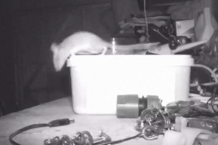
72-year-old British man Stephen Mckears began to question his sanity when he started noticing objects had been moved around in his shed overnight. And they weren’t just being randomly placed, things like clips and screws were somehow finding themselves neatly packed back into a tub as if to chastise Mr. Mckears for his untidiness. Just who was this fastidious phantom, this organized apparition?

Image credits: SWNS

Baffled but determined to solve the mystery, Mr. Mckears decided to empty out the tub and scatter its contents around. He was astonished to find that sure enough, everything was back in its place the next morning. Something was definitely afoot.

Image credits: SWNS

Enlisting the help of friend and neighbor Rodney Holbrook, they decided to set up a trail camera to catch the helpful ghost once and for all. Mr. Holbrook is a keen wildlife photographer, so he has experience in tracking down mystery visitors. What they found was adorably unexpected – a cute and determined mouse lifting objects twice its size in an effort to keep its ‘home’ clean.

Image credits: SWNS TV

“I’ve been calling him Brexit Mouse because he’s been stockpiling for Brexit,” Mr. Mckears said.

“The heaviest thing was the plastic attachment at the end of a hosepipe – and the chain of an electric drill. I didn’t know what it was at first. The kids were saying it was a ghost.”

Image credits: SWNS TV

“One day I emptied the tub out and spread the contents on the side – and the next day they were all back in again. I thought I was going mad.”

Image credits: SWNS TV

Mr. Holbrook was astonished at the mouse’s diligent behavior. “I’ve been calling him Metal Mickey but some people have been saying he’s just mouse proud,” he joked.

“I was quite amazed to see it – it is an amazing mouse.”

Image credits: SWNS TV

“Steve asked if he could use my trail camera to film whatever it was that was moving the objects in his shed.”

“The mouse was chucking things into the box – we thought it was a ghost or something at first. I thought I have to see this for myself.”

Image credits: SWNS TV

Image credits: SWNS TV

It seems that the mouse goes on-shift from around midnight to 2.30am – and has been doing its cleaning duties every night for about a month now.

Image credits: SWNS TV

Image credits: SWNS TV

Image credits: SWNS

“It was doing it for about two hours that night – he must have had to go for a sleep after it,” Mr. Mckears said.

Image credits: SWNS

“I’ve seen a mouse moving objects to make a nest but never metal objects. It’s quite amazing.”

“It’s still busy doing it now.”

Image credits: SWNS

People were amused by the cute and funny story

02 Mar 21:27

Creating blazing fast pivot tables from R with data.table – now with subtotals using grouping sets

by Jozef's Rblog

(This article was first published on Jozef's Rblog, and kindly contributed to R-bloggers)

Introduction

Data manipulation and aggregation is one of the classic tasks anyone working with data will come across. We of course can perform data transformation and aggregation with base R, but when speed and memory efficiency come into play, data.table is my package of choice.

In this post we will look at of the fresh and very useful functionality that came to data.table only last year – grouping sets, enabling us, for example, to create pivot table-like reports with sub-totals and grand total quickly and easily.

Basic by-group summaries with data.table

To showcase the functionality, we will use a very slightly modified dataset provided by Hadley Wickham’s nycflights13 package, mainly the flights data frame. Lets prepare a small dataset suitable for the showcase:

library(data.table)
dataurl 

Now, for those unfamiliar with data table, to create a summary of distances flown per month and originating airport with data.table, we could simply use:

flights[, sum(distance), by = c("month", "origin")]
##    month origin       V1
## 1:     1    EWR  9524521
## 2:     1    LGA  6359510
## 3:     1    JFK 11304774
## 4:     2    EWR  8725657
## 5:     2    LGA  5917983
## 6:     2    JFK 10331869

To also name the new column nicely, say distance instead of the default V1:

flights[, .(distance = sum(distance)), by = c("month", "origin")]
##    month origin distance
## 1:     1    EWR  9524521
## 2:     1    LGA  6359510
## 3:     1    JFK 11304774
## 4:     2    EWR  8725657
## 5:     2    LGA  5917983
## 6:     2    JFK 10331869

For more on basic data.table operations, look at the Introduction to data.table vignette.

As you have probably noticed, the above gave us the sums of distances by months and origins. When creating reports, especially readers coming from Excel may expect 2 extra perks

  • Looking at sub-totals and grand total
  • Seeing the data in wide format

Since the wide format is just a reshape and data table has the dcast() function for that for quite a while now, we will only briefly show it in practice. The focus of this post will be on the new functionality that was only released in data.table v1.11 in May last year – creating the grand- and sub-totals.

Quick pivot tables with subtotals and a grand total

To create a “classic” pivot table as known from Excel, we need to aggregate the data and also compute the subtotals for all combinations of the selected dimensions and a grand total. In comes cube(), the function that will do just that:

# Get subtotals for origin, month and month&origin with `cube()`:
cubed 
##     month origin distance
##  1:     1    EWR  9524521
##  2:     1    LGA  6359510
##  3:     1    JFK 11304774
##  4:     2    EWR  8725657
##  5:     2    LGA  5917983
##  6:     2    JFK 10331869
##  7:     1    27188805
##  8:     2    24975509
##  9:    NA    EWR 18250178
## 10:    NA    LGA 12277493
## 11:    NA    JFK 21636643
## 12:    NA    52164314

As we can see, compared to the simple group by summary we did earlier, we have extra rows in the output

  1. Rows 7,8 with months 1,2 and origin , – these are the subtotals per month across all origins
  2. Rows 9,10,11 with months NA, NA, NA and origins EWR, LGA, JFK – these are the subtotals per origin across all months
  3. Row 12 with NA month and origin – this is the Grand total across all origins and months

All that is left to get a familiar pivot table shape is to reshape the data to wide format with the aforementioned dcast() function:

# - Origins in columns, months in rows
data.table::dcast(cubed, month ~ origin,  value.var = "distance")
##    month      EWR      JFK      LGA       NA
## 1:     1  9524521 11304774  6359510 27188805
## 2:     2  8725657 10331869  5917983 24975509
## 3:    NA 18250178 21636643 12277493 52164314
# - Origins in rows, months in columns
data.table::dcast(cubed, origin ~ month,  value.var = "distance")
##    origin        1        2       NA
## 1:    EWR  9524521  8725657 18250178
## 2:    JFK 11304774 10331869 21636643
## 3:    LGA  6359510  5917983 12277493
## 4:    27188805 24975509 52164314
Pivot table with data.table

Pivot table with data.table

Using more dimensions

We can use the same approach to create summaries with more than two dimensions, for example, apart from months and origins, we can also look at carriers, simply by adding "carrier" into the by argument:

# With 3 dimensions:
cubed2 
##      month origin carrier distance
##   1:     1    EWR      UA  5084378
##   2:     1    LGA      UA   729667
##   3:     1    JFK      AA  2013434
##   4:     1    JFK      B6  3672655
##   5:     1    LGA      DL  1678965
##  ---                              
## 153:    NA         F9   174960
## 154:    NA         HA   293997
## 155:    NA         YV    21526
## 156:    NA         OO      733
## 157:    NA        52164314

And dcast() to wide format which suits our needs best:

# For example, with month and carrier in rows, origins in columns:
dcast(cubed2, month + carrier ~ origin,  value.var = "distance")
##     month carrier      EWR      JFK      LGA       NA
##  1:     1      9E    46125   666109    37071   749305
##  2:     1      AA   415707  2013434  1344045  3773186
##  3:     1      AS   148924       NA       NA   148924
##  4:     1      B6   484431  3672655   542748  4699834
##  5:     1      DL   245277  2578999  1678965  4503241
##  6:     1      EV  2067900    24624    86309  2178833
##  7:     1      F9       NA       NA    95580    95580
##  8:     1      FL       NA       NA   226658   226658
##  9:     1      HA       NA   154473       NA   154473
## 10:     1      MQ   152428   223510   908715  1284653
## 11:     1      OO       NA       NA      733      733
## 12:     1      UA  5084378   963144   729667  6777189
## 13:     1      US   339595   219387   299838   858820
## 14:     1      VX       NA   788439       NA   788439
## 15:     1      WN   539756       NA   398647   938403
## 16:     1      YV       NA       NA    10534    10534
## 17:     1      9524521 11304774  6359510 27188805
## 18:     2      9E    42581   605085    34990   682656
## 19:     2      AA   373884  1817048  1207701  3398633
## 20:     2      AS   134512       NA       NA   134512
## 21:     2      B6   456151  3390047   490224  4336422
## 22:     2      DL   219998  2384048  1621728  4225774
## 23:     2      EV  1872395    24168   112863  2009426
## 24:     2      F9       NA       NA    79380    79380
## 25:     2      FL       NA       NA   204536   204536
## 26:     2      HA       NA   139524       NA   139524
## 27:     2      MQ   140924   201880   812152  1154956
## 28:     2      UA  4686122   871824   681737  6239683
## 29:     2      US   301832   222720   293736   818288
## 30:     2      VX       NA   675525       NA   675525
## 31:     2      WN   497258       NA   367944   865202
## 32:     2      YV       NA       NA    10992    10992
## 33:     2      8725657 10331869  5917983 24975509
## 34:    NA      9E    88706  1271194    72061  1431961
## 35:    NA      AA   789591  3830482  2551746  7171819
## 36:    NA      AS   283436       NA       NA   283436
## 37:    NA      B6   940582  7062702  1032972  9036256
## 38:    NA      DL   465275  4963047  3300693  8729015
## 39:    NA      EV  3940295    48792   199172  4188259
## 40:    NA      F9       NA       NA   174960   174960
## 41:    NA      FL       NA       NA   431194   431194
## 42:    NA      HA       NA   293997       NA   293997
## 43:    NA      MQ   293352   425390  1720867  2439609
## 44:    NA      OO       NA       NA      733      733
## 45:    NA      UA  9770500  1834968  1411404 13016872
## 46:    NA      US   641427   442107   593574  1677108
## 47:    NA      VX       NA  1463964       NA  1463964
## 48:    NA      WN  1037014       NA   766591  1803605
## 49:    NA      YV       NA       NA    21526    21526
## 50:    NA     18250178 21636643 12277493 52164314
##     month carrier      EWR      JFK      LGA       NA

Custom grouping sets

So far we have focused on the “default” pivot table shapes with all sub-totals and a grand total, however the cube() function could be considered just a useful special case shortcut for a more generic concept – grouping sets. You can read more on grouping sets with MS SQL Server or with PostgreSQL.

The groupingsets() function allows us to create sub-totals on arbitrary groups of dimensions. Custom subtotals are defined by the sets argument, a list of character vectors, each of them defining one subtotal. Now let us have a look at a few practical examples:

Replicate a simple group by, without any subtotals or grand total

For reference, to replicate a simple group by with grouping sets, we could use:

groupingsets(
  flights,
  j = .(distance = sum(distance)),
  by = c("month", "origin", "carrier"),
  sets = list(c("month", "origin", "carrier")),
)

Which would give the same results as

flights[, .(distance = sum(distance)), by = c("month", "origin", "carrier")]

Custom subtotals

To give only the subtotals for each of the dimensions:

groupingsets(
  flights,
  j = .(distance = sum(distance)),
  by = c("month", "origin", "carrier"),
  sets = list(
    c("month"),
    c("origin"),
    c("carrier")
  )
)
##     month origin carrier distance
##  1:     1        27188805
##  2:     2        24975509
##  3:    NA    EWR     18250178
##  4:    NA    LGA     12277493
##  5:    NA    JFK     21636643
##  6:    NA         UA 13016872
##  7:    NA         AA  7171819
##  8:    NA         B6  9036256
##  9:    NA         DL  8729015
## 10:    NA         EV  4188259
## 11:    NA         MQ  2439609
## 12:    NA         US  1677108
## 13:    NA         WN  1803605
## 14:    NA         VX  1463964
## 15:    NA         FL   431194
## 16:    NA         AS   283436
## 17:    NA         9E  1431961
## 18:    NA         F9   174960
## 19:    NA         HA   293997
## 20:    NA         YV    21526
## 21:    NA         OO      733
##     month origin carrier distance

To give only the subtotals per combinations of 2 dimensions:

groupingsets(
  flights,
  j = .(distance = sum(distance)),
  by = c("month", "origin", "carrier"),
  sets = list(
    c("month", "origin"),
    c("month", "carrier"),
    c("origin", "carrier")
  )
)
##     month origin carrier distance
##  1:     1    EWR      9524521
##  2:     1    LGA      6359510
##  3:     1    JFK     11304774
##  4:     2    EWR      8725657
##  5:     2    LGA      5917983
##  6:     2    JFK     10331869
##  7:     1         UA  6777189
##  8:     1         AA  3773186
##  9:     1         B6  4699834
## 10:     1         DL  4503241
## 11:     1         EV  2178833
## 12:     1         MQ  1284653
## 13:     1         US   858820
## 14:     1         WN   938403
## 15:     1         VX   788439
## 16:     1         FL   226658
## 17:     1         AS   148924
## 18:     1         9E   749305
## 19:     1         F9    95580
## 20:     1         HA   154473
## 21:     1         YV    10534
## 22:     1         OO      733
## 23:     2         US   818288
## 24:     2         UA  6239683
## 25:     2         B6  4336422
## 26:     2         AA  3398633
## 27:     2         EV  2009426
## 28:     2         FL   204536
## 29:     2         MQ  1154956
## 30:     2         DL  4225774
## 31:     2         WN   865202
## 32:     2         9E   682656
## 33:     2         VX   675525
## 34:     2         AS   134512
## 35:     2         F9    79380
## 36:     2         HA   139524
## 37:     2         YV    10992
## 38:    NA    EWR      UA  9770500
## 39:    NA    LGA      UA  1411404
## 40:    NA    JFK      AA  3830482
## 41:    NA    JFK      B6  7062702
## 42:    NA    LGA      DL  3300693
## 43:    NA    EWR      B6   940582
## 44:    NA    LGA      EV   199172
## 45:    NA    LGA      AA  2551746
## 46:    NA    JFK      UA  1834968
## 47:    NA    LGA      B6  1032972
## 48:    NA    LGA      MQ  1720867
## 49:    NA    EWR      AA   789591
## 50:    NA    JFK      DL  4963047
## 51:    NA    EWR      MQ   293352
## 52:    NA    EWR      DL   465275
## 53:    NA    EWR      US   641427
## 54:    NA    EWR      EV  3940295
## 55:    NA    JFK      US   442107
## 56:    NA    LGA      WN   766591
## 57:    NA    JFK      VX  1463964
## 58:    NA    LGA      FL   431194
## 59:    NA    EWR      AS   283436
## 60:    NA    LGA      US   593574
## 61:    NA    JFK      MQ   425390
## 62:    NA    JFK      9E  1271194
## 63:    NA    LGA      F9   174960
## 64:    NA    EWR      WN  1037014
## 65:    NA    JFK      HA   293997
## 66:    NA    JFK      EV    48792
## 67:    NA    EWR      9E    88706
## 68:    NA    LGA      9E    72061
## 69:    NA    LGA      YV    21526
## 70:    NA    LGA      OO      733
##     month origin carrier distance

Grand total

To give only the grand total:

groupingsets(
  flights,
  j = .(distance = sum(distance)),
  by = c("month", "origin", "carrier"),
  sets = list(
    character(0)
  )
)
##    month origin carrier distance
## 1:    NA        52164314

Cube and rollup as special cases of grouping sets

Implementation of cube

We mentioned above that cube() can be considered just a shortcut to a useful special case of groupingsets(). And indeed, looking at the implementation of the data.table method data.table:::cube.data.table, most of what it does is to define the sets to represent the given vector and all of its possible subsets, and passes that to groupingsets():

function (x, j, by, .SDcols, id = FALSE, ...) {
  if (!is.data.table(x)) 
    stop("Argument 'x' must be a data.table object")
  if (!is.character(by)) 
    stop("Argument 'by' must be a character vector of column names used in grouping.")
  if (!is.logical(id)) 
    stop("Argument 'id' must be a logical scalar.")
  n = length(by)
  keepBool = sapply(2L^(seq_len(n) - 1L), function(k) rep(c(FALSE, 
    TRUE), times = k, each = ((2L^n)/(2L * k))))
  sets = lapply((2L^n):1L, function(j) by[keepBool[j, ]])
  jj = substitute(j)
  groupingsets.data.table(x, by = by, sets = sets, .SDcols = .SDcols, 
    id = id, jj = jj)
}

This means for example that

cube(flights, sum(distance),  by = c("month", "origin", "carrier"))
##      month origin carrier       V1
##   1:     1    EWR      UA  5084378
##   2:     1    LGA      UA   729667
##   3:     1    JFK      AA  2013434
##   4:     1    JFK      B6  3672655
##   5:     1    LGA      DL  1678965
##  ---                              
## 153:    NA         F9   174960
## 154:    NA         HA   293997
## 155:    NA         YV    21526
## 156:    NA         OO      733
## 157:    NA        52164314

Is equivalent to

groupingsets(
  flights,
  j = .(distance = sum(distance)),
  by = c("month", "origin", "carrier"),
  sets = list(
    c("month", "origin", "carrier"),
    c("month", "origin"),
    c("month", "carrier"),
    c("month"),
    c("origin", "carrier"),
    c("origin"),
    c("carrier"),
    character(0)
  )
)
##      month origin carrier distance
##   1:     1    EWR      UA  5084378
##   2:     1    LGA      UA   729667
##   3:     1    JFK      AA  2013434
##   4:     1    JFK      B6  3672655
##   5:     1    LGA      DL  1678965
##  ---                              
## 153:    NA         F9   174960
## 154:    NA         HA   293997
## 155:    NA         YV    21526
## 156:    NA         OO      733
## 157:    NA        52164314

Implementation of rollup

The same can be said about rollup(), another shortcut than can be useful. Instead of all possible subsets, it will create a list representing the vector passed to by and its subsets “from right to left”, including the empty vector to get a grand total. Looking at the implementation of the data.table method data.table::rollup.data.table:

function (x, j, by, .SDcols, id = FALSE, ...) {
  if (!is.data.table(x)) 
    stop("Argument 'x' must be a data.table object")
  if (!is.character(by)) 
    stop("Argument 'by' must be a character vector of column names used in grouping.")
  if (!is.logical(id)) 
    stop("Argument 'id' must be a logical scalar.")
  sets = lapply(length(by):0L, function(i) by[0L:i])
  jj = substitute(j)
  groupingsets.data.table(x, by = by, sets = sets, .SDcols = .SDcols, 
    id = id, jj = jj)
}

For example, the following:

rollup(flights, sum(distance),  by = c("month", "origin", "carrier"))

Is equivalent to

groupingsets(
  flights,
  j = .(distance = sum(distance)),
  by = c("month", "origin", "carrier"),
  sets = list(
    c("month", "origin", "carrier"),
    c("month", "origin"),
    c("month"),
    character(0)
  )
)

To leave a comment for the author, please follow the link and comment on their blog: Jozef's Rblog.

R-bloggers.com offers daily e-mail updates about R news and tutorials on topics such as: Data science, Big Data, R jobs, visualization (ggplot2, Boxplots, maps, animation), programming (RStudio, Sweave, LaTeX, SQL, Eclipse, git, hadoop, Web Scraping) statistics (regression, PCA, time series, trading) and more...
04 Jun 12:33

Hello, Dorling! (Creating Dorling Cartograms from R Spatial Objects + Introducing Prism Skeleton)

by hrbrmstr

(This article was first published on R – rud.is, and kindly contributed to R-bloggers)

NOTE: There is some iframed content in this post and you can bust out of it if you want to see the document in a full browser window.

Also, apologies for some lingering GitHub links. I’m waiting for all the repos to import into to other services and haven’t had time to setup my own self-hosted public instance of any community-usable git-ish environment yet.


And So It Begins

After seeing Fira Sans in action in presentations at eRum 2018 I felt compelled to add support hrbrthemes support for it so I made a firasans🔗 extension to it that uses Fira Sans Condensed and Fira Code fonts for ggplot2 graphics.

But I rly wanted to go the extra mile and make an R Markdown theme for it, but I’m weary of both jQuery & Bootstrap, plus prefer Prism over HighlightJS. So I started work on “Prism Skeleton”, which is an R Markdown template that has most of the features you would expect and some new ones, plus used Prism and Fira Sans/Code. You can try it out on your own if you use markdowntemplates🔗 but the “production” version is likely going to eventually go into the firasans package. I uses markdowntemplates as a playground for R Markdown experiments.

The source for the iframe at the end of this document is here: https://rud.is/dl/hello-dorling.Rmd. There are some notable features (I’ll repeat a few from above):

  • Fira Sans for headers and text
  • Fira Code for all monospaced content (including source code)
  • No jQuery
  • No Bootstrap (it uses the ‘Skeleton’ CSS framework)
  • No HighightJS (it uses the ‘Prism” highlighter)
  • Extended YAML parameters (more on that in a bit)
  • Defaults to fig.retina=2 and the use of optipng or pngquant for PNG compression (so it expects them to be installed — ref this post by Zev Ross for more info and additional image use tips)

“What’s this about ‘Dorling’?”

Oh, yes. You can read the iframe or busted out document for that bit. It’s a small package to make it easier to create Dorling cartograms based on previous work by @datagistips.

“You said something about ‘extended YAML’?”

Aye. Here’s the YAML excerpt from the Dorling Rmd:

---
title: "Hello, Dorling! (Creating Dorling Cartograms from R Spatial Objects)"
author: "boB Rudis"
navlink: "[rud.is](https://rud.is/b/)"
og:
  type: "article"
  title: "Hello, Dorling! (Creating Dorling Cartograms from R Spatial Objects)"
  url: "https://github.com/hrbrmstr/spdorling"
footer:
  - content: '[GitLab](https://gitlab.com/hrbrmstr)
' - content: 'This work is licensed under a Creative Commons Attribution-NonCommercial 4.0 International License.' date: "`r Sys.Date()`" output: markdowntemplates::prismskel ---

The title, author & date should be familiar fields but the author and date get some different placement since the goal is more of a flowing document than academic report.

If navlink is present (it’s not required) there will be a static bar at the top of the HTML document with a link on the right (any content, really, but a link is what’s in the example). Remove navlink and no bar will be there.

The og section is for open graph tags and you customize them how you like. Open graph tags make it easier to share posts on social media or even Slack since they’ll auto-expand various content bits.

There’s also a custom footer (exclude it if you don’t want one) that can take multiple content sub-elements.

The goal isn’t so much to give you a 100% usable R Markdown template but something you can clone and customize for your own use. Since this example shows how to use custom fonts and a different code highlighter (which meant using some custom knitr hooks), it should be easier to customize than some of the other ones in the template playground package. FWIW I plan on adapting this for a work template this week.

The other big customization is the use of Prism with a dark theme. Again, you can clone + customize this at-will but I may add config options for all Prism themes at some point (mostly if there is interest).

FIN

(Well, almost fin)

Kick the tyres on both the new template and the new package and drop suggestions here for the time being (until I get fully transitioned to a new git-hosting platform). One TODO for spdorling is to increase the point count for the circle polygons but I’m sure folks can come up with enhancement requests to the API after y’all have played with it for a while.

As noted a few times, the Rmd example with the Dorling cartograms is below.

To leave a comment for the author, please follow the link and comment on their blog: R – rud.is.

R-bloggers.com offers daily e-mail updates about R news and tutorials on topics such as: Data science, Big Data, R jobs, visualization (ggplot2, Boxplots, maps, animation), programming (RStudio, Sweave, LaTeX, SQL, Eclipse, git, hadoop, Web Scraping) statistics (regression, PCA, time series, trading) and more...
24 Oct 21:46

9th MilanoR meeting on November 20th: call for presentations!

by MilanoR

(This article was first published on MilanoR, and kindly contributed to R-bloggers)

MilanoR Staff is happy to announce the 9th MilanoR Meeting!

The meeting will take place on November 20th, from 7pm to about 9:30 pm, in Mikamai (close to the Pasteur metro station) [save the date, more info soon]

This time we want to focus on a specific topic: data visualization with R. 

download

We are curious to see if there are interesting contributions about this topic within the community. Then: have you build a gorgeous and smart visualization with R, or developed a package that handle some data viz stuff in a new way? Have you created a Shiny HTML widget or a dashboard that has something new to say? Do you feel you have something to input, o you can recommend someone? 

Send your contribution at admin[at]milanor[dot]net: you may present it at the 9th MilanoR meeting! 

If you want to contribute but you cannot attend the meeting, you can send your contribution as a short video (3/4 minutes long) atadmin[at]milanor[dot]net. Videos may be published in the blog and played at the meeting before or after presentations.

MilanoR community grows with every R user contribution!

(If you want to get inspired, here you can find all the presentations from our past meetings)


What is a MilanoR Meeting?

A MilanoR meeting is an occasion to bring together the R users in the Milano area to share knowledge and experiences. The meeting is open to beginners as well as expert R users. Usually we run two MilanoR meetings each year, one in Autumn and one in Spring. We are now running the 9th MilanoR meeting edition.

A MilanoR meeting consists of 2-3 R talks and a free buffet offered by our sponsors, to give plenty of room for discussions and exchange of ideas: the event is free for everyone, but a seat reservation is needed. Registration will open soon, stay tuned!

The post 9th MilanoR meeting on November 20th: call for presentations! appeared first on MilanoR.

To leave a comment for the author, please follow the link and comment on their blog: MilanoR.

R-bloggers.com offers daily e-mail updates about R news and tutorials on topics such as: Data science, Big Data, R jobs, visualization (ggplot2, Boxplots, maps, animation), programming (RStudio, Sweave, LaTeX, SQL, Eclipse, git, hadoop, Web Scraping) statistics (regression, PCA, time series, trading) and more...
01 Oct 08:40

Data.Table by Example – Part 3

by atmathew

(This article was first published on R – Mathew Analytics, and kindly contributed to R-bloggers)

For this final post, I will cover some advanced topics and discuss how to use data tables within user generated functions. Once again, let’s use the Chicago crime data.

dat = fread("rows.csv")
names(dat) 

Let’s start by subseting the data. The following code takes the first 50000 rows within the dat dataset, selects four columns, creates three new columns pertaining to the data, and then removes the original date column. The output was saved as to new variable and the user can see the first few columns of the new data table using brackets or head function.

ddat = dat[1:50000, .(Date, value1, value2, value3)][, 
               c("year", "month", "day") := 
                        .(year(mdy_hms(Date)), 
                          month(mdy_hms(Date)),
                          day(mdy_hms(Date)))][,-c("Date")]

ddat[1:3]  # same as head(ddat, 3)

We can now do some intermediate calculations and suppress their output by using braces.

unique(ddat$month)
ddat[, { avg_val1 = mean(value1)
         new_val1 = mean(abs(value2-avg_val1))
         new_val2 = new_val1^2 }, by=month][order(month)]

In this simple sample case, we have taken the mean value1 for each month, subtracted it from value2, and then squared that result. The output show the final calculation in the brackets, which is the result from squaring. Note that I also ordered the results by month with the chaining process.

That’s all very nice and convenient, but what if we want to create user defined functions that essentially automate these tasks for future work. Let us start with a function for extracting each component from the date column.

ddat = dat[1:50000, .(Date, value1, value2, value3)]

add_engineered_dates 

We’ve created a new functions that takes two arguments, the data table variable name and the name of the column containing the date values. The first step is to copy the data table so that we are not directly making changes to the original data. Because the goal is to add three new columns that extract the year, month, and day, from the date column, we’ve used the lubridate package to define the date column and then extract the desired values. Furthermore, each new column has been labeled so that it distinctly represents the original date column name and the component that it contains. The final step was to remove the original date column, so we’ve set the date column to NULL. The final line prints the results back to the screen. You can recognize from the code above that the get function is used to take a variable name that represents column names and extract those columns within the function.

result = add_engineered_dates(ddat)
result

Let’s now apply the previous code with braces to find the squared difference between value2 and the mean value1 metric.

result[, { avg_val1 = mean(value1)
           new_val1 = mean(abs(value2-avg_val1))
           new_val2 = new_val1^2 }, by=.(Date_year,Date_month)][
                  order(Date_year,Date_month)][1:12]

Perfect!

I’m hoping that these three posts on the data.table package have convinced beginners to R of its beauty. The syntax may be scary at first, but this is in my opinion one of the most important packages in R that everyone should become familiar with. So pull your sleeves up and have fun.

If you have any comments or would like to cover other specific topics, feel free to comment below. You can also contact me at mathewanalytics@gmail.com or reach me through LinkedIn

To leave a comment for the author, please follow the link and comment on their blog: R – Mathew Analytics.

R-bloggers.com offers daily e-mail updates about R news and tutorials on topics such as: Data science, Big Data, R jobs, visualization (ggplot2, Boxplots, maps, animation), programming (RStudio, Sweave, LaTeX, SQL, Eclipse, git, hadoop, Web Scraping) statistics (regression, PCA, time series, trading) and more...
25 Nov 12:22

Best practices while writing R code Exercises

by Paritosh Gupta

(This article was first published on R-exercises, and kindly contributed to R-bloggers)

How can I write R codes that other people can understand and use?

Hand pressing Best Practice button on interface with blue background.

In the exercises below we cover some of the best practices while writing a small piece of R code or a full automated script. These are some of the practices which should be kept in mind while coding, trust me it will make your life a lot easier.

Answers to the exercises are available here.

If you obtained a different (correct) answer than those listed on the solutions page, please feel free to post your answer as a comment on that page.

Exercise 1
We want to create a numeric vector. The values of this vector should be between 1 and 10, starting from 1 with a difference of 2. Below is the code to generate a numeric vector.Make the suitable changes so that it follows standard practice for assignments.

NumVector = seq(1,10,by=2)

Exercise 2
The command below installs “car” package. Make changes in the command below so that all the packages get installed on which “car” is dependent.

install.packages("car")

Exercise 3
Make the changes in the below code so that it is easy for other users to read and it follows the standard practice while writing an if/else statement in R.

y <- 0
x <- 0

if (y == 0)
{
log(x)
} else {
y ^ x
}

Exercise 4
Update the below code so that it is easy for other users to read it.

NumVector <- seq(1,10,by=2)

if(length(NumVector) > 10 && debug)
message(“Length of the numeric vector is greater than 10”)

Exercise 5
Correct the indentation in the below function so that it is easy for you and other users to read and understand.

test<-1

if (test==1) {
print(“Hello World!”)
print(“The value of test is 1 here”)
} else{
print(“The value of test is not 1 here”);
}
print(test*test+1);

Exercise 6
Update the below code such that it first checks if the “dplyr” package is present. if it is already present, don’t install it just load the package.If the package is not present, install it and then load it.

install.packages("dplyr",dependencies = T)

Exercise 7
Change the below code so that the it doesn’t print package related information while loading the plyr package.

library(plyr)

Exercise 8
Make the changes in the below code so that it doesn’t print warnings while calculating the correlation value between two vectors.

a <- c(1,1)
b <- c(2,3)
cor(a,b)

Exercise 9
Update the below command so that it calls the ‘rename’ function from ‘plyr’ package. The same function is present in both the packages- ‘plyr’ and ‘rename’.

rename(head(mtcars), c(mpg = "NewName"))

Exercise 10
Create a scalar vector ‘a’ with a value of 10e-02 (1/100). Below code prints the same vector in scientific format. Make changes to print in a numeric format.

a <- 1e-02
print(a)

To leave a comment for the author, please follow the link and comment on their blog: R-exercises.

R-bloggers.com offers daily e-mail updates about R news and tutorials on topics such as: Data science, Big Data, R jobs, visualization (ggplot2, Boxplots, maps, animation), programming (RStudio, Sweave, LaTeX, SQL, Eclipse, git, hadoop, Web Scraping) statistics (regression, PCA, time series, trading) and more...
14 Jul 08:25

Bayesian Wizardry for Muggles

by arthur charpentier

(This article was first published on Freakonometrics » R-english, and kindly contributed to R-bloggers)

Monday, I will be giving the closing talk of the R in Insurance Conference, in London, on Bayesian Computations for Actuaries, as to be more specific, Getting into Bayesian Wizardry… (with the eyes of a muggle actuary). The animated version of the slides (since we will spend some time on MCMC algorithm, I thought that animated graphs could be more informative) can be downloaded from here.

Those slides are based on the chapter writen with Ben Escoto for the Computational Actuarial Science with R book, and some previous work.

To leave a comment for the author, please follow the link and comment on his blog: Freakonometrics » R-english.

R-bloggers.com offers daily e-mail updates about R news and tutorials on topics such as: visualization (ggplot2, Boxplots, maps, animation), programming (RStudio, Sweave, LaTeX, SQL, Eclipse, git, hadoop, Web Scraping) statistics (regression, PCA, time series, trading) and more...
22 Jun 14:30

LOL: Star Wars Musical Parody Gives ‘A New Hope’ the Disney Treatment

by Angie Han

Star Wars musical parody

J.J. Abrams is being careful not to give too much away about the upcoming Star Wars Episode VII, but there are a few things we can assume just by virtue of the fact that it’s a Star Wars movie. For example, it’s safe to say it won’t look anything like this delightful Star Wars musical parody.

Which is a real shame, because Star Wars: The Musical demonstrates that Disney tunes and lightsaber battles actually go together like peanut butter and bananas: They may not be the most intuitive combination, but they’re a damn good one. After the jump, watch Luke, Han, Leia, Darth Vader, Obi-Wan Kenobi, and more sing their way through the plot of Star Wars Episode IV: A New Hope.

Jeffrey Gee Chin directed the fan video, and George Shaw wrote the music and lyrics.

Of course Darth Vader gets to sing “When You Wish Upon a Star” about his beloved Death Star.

Obviously, there’s no way in hell Abrams will make a Disney-style Star Wars musical, even if the studio does have all the appropriate rights. But there’s a weird part of me that kinda-sorta wishes they would. If nothing else, a Star Wars musical would be a daring change of pace from all the self-serious, CG-heavy action blockbusters clogging the box office these days. 

On the bright side, there’s actually a chance that Episode VII will feature some musical performances. Musicians The Healer Twins and Safe Smokingroove have confirmed that they’ll be in the film, which makes us wonder if we’re headed back to the Mos Eisley cantina or a similar watering hole.

For more Star Wars: The Musical, visit the official website, which has tons of making-of videos and behind-the-scenes snaps. The team behind this video also promises to give the Disney treatment to Empire Strikes Back and Return of the Jedi in the future.

The post LOL: Star Wars Musical Parody Gives ‘A New Hope’ the Disney Treatment appeared first on /Film.

25 Sep 11:49

A speed test comparison of plyr, data.table, and dplyr

by Tal Galili

(This article was first published on R-statistics blog » RR-statistics blog, and kindly contributed to R-bloggers)

ssssssspeed_521872450_d085d1e928

Guest post by Jake Russ

For a recent project I needed to make a simple sum calculation on a rather large data frame (0.8 GB, 4+ million rows, and ~80,000 groups). As an avid user of Hadley Wickham’s packages, my first thought was to use plyr. However, the job took plyr roughly 13 hours to complete.

plyr is extremely efficient and user friendly for most problems, so it was clear to me that I was using it for something it wasn’t meant to do, but I didn’t know of any alternative screwdrivers to use.

I asked for some help on the manipulator Google group , and their feedback led me to data.table and dplyr, a new, and still in progress, package project by Hadley.

What follows is a speed comparison of these three packages incorporating all the feedback from the manipulator folks. They found it informative, so Tal asked me to write it up as a reproducible example.


Let’s start by making a data frame which fits my description above, but make it reproducible:

set.seed(42)
 
types <- c("A", "B", "C", "D", "E", "F")
 
obs <- 4e+07
 
one <- data.frame(id = as.factor(seq(from = 1, to = 80000, by = 1)), percent = round(runif(obs, 
    min = 0, max = 1), digits = 2), type = as.factor(sample(types, obs, replace = TRUE)))
 
print(object.size(one), units = "GB")
## 0.6 Gb
summary(one)
##        id              percent     type       
##  1      :     500   Min.   :0.00   A:6672132  
##  2      :     500   1st Qu.:0.25   B:6663570  
##  3      :     500   Median :0.50   C:6668009  
##  4      :     500   Mean   :0.50   D:6668684  
##  5      :     500   3rd Qu.:0.75   E:6660437  
##  6      :     500   Max.   :1.00   F:6667168  
##  (Other):39997000

I’ll start the testing with plyr, using ddply, but I’ll also show the difference between subsetting a data frame from within a ddply call and doing the subset first from outside the call. Then I offer a third way to use plyr‘s count function to achieve the same result.

library(plyr)
 
## Test 1 (plyr): Use ddply and subset one with [ ] style indexing from
## within the ddply call.
 
typeSubset <- c("A", "C", "E")
 
system.time(test1 <- ddply(one[one$type %in% typeSubset, ], .(id), summarise, 
    percent_total = sum(percent)))
##    user  system elapsed 
##  104.51   21.23  125.81
## Test 2 (plyr):, Use ddply but subset one outside of the ddply call
 
two <- subset(one, type %in% typeSubset)
 
system.time(test2 <- ddply(two, .(id), summarise, percent_total = sum(percent)))
##    user  system elapsed 
##  101.20   46.14  147.64
## Test 3 (plyr): For a simple sum, an alternative is to use plyr's count
## function
 
system.time(test3 <- count(two, "id", "percent"))
##    user  system elapsed 
##    5.90    0.22    6.12

Doing the subset outside of the ddply call did speed things up, but not as much I as orinially thought it would. For my particular project, doing the subset outside of the ddply call reduced the run time to 12 hours. So largely this is still a “wrong tool” problem, rather than a “when to subset” problem.

Next, I’ll try data.table and for this test and the dplyr one below I’ll operate on the data frame which has been pre-subset:

library(data.table)
 
## Test 4 (data.table): Speed test for package data.table
 
## Define the data table
three <- data.table(two, key = c("id"))
 
tables()  # check that the key columns are correct
##      NAME        NROW  MB COLS            KEY
## [1,] three 20,000,578 310 id,percent,type id 
## Total: 310MB
## Operate on it
system.time(test4 <- three[, list(percent_total = sum(percent)), by = key(three)])
##    user  system elapsed 
##    0.17    0.01    0.19

dplyr is not currently available on CRAN but you can install it from github with:

devtools::install_github("assertthat")
devtools::install_github("dplyr")
library(dplyr)
 
## Test 5 (dplyr): Speed test for package dplyr
 
fourDf <- group_by(two, id)
 
system.time(test5 <- summarise(fourDf, percent_total = sum(percent)))
##    user  system elapsed 
##    1.49    0.03    1.52
 
sessionInfo()
## R version 3.0.1 (2013-05-16)
## Platform: x86_64-w64-mingw32/x64 (64-bit)
## 
## locale:
## [1] LC_COLLATE=English_United States.1252 
## [2] LC_CTYPE=English_United States.1252   
## [3] LC_MONETARY=English_United States.1252
## [4] LC_NUMERIC=C                          
## [5] LC_TIME=English_United States.1252    
## 
## attached base packages:
## [1] stats     graphics  grDevices utils     datasets  methods   base     
## 
## other attached packages:
## [1] dplyr_0.01       Rcpp_0.10.4      data.table_1.8.8 plyr_1.8        
## [5] knitr_1.4.1     
## 
## loaded via a namespace (and not attached):
## [1] assertthat_0.1 digest_0.6.3   evaluate_0.4.7 formatR_0.9   
## [5] stringr_0.6.2  tools_3.0.1

Both data.table and dplyr were able to reduce the problem to less than a few seconds. If you’re looking for pure speed data.table is the clear winner. However, it is my understanding that data.table‘s syntax can be frustrating, so if you’re already used to the ‘Hadley ecosystem’ of packages, dplyr is a formitable alternative, even if it is still in the early stages.

Have a nice day!

(Editor’s edition: image credit link)

To leave a comment for the author, please follow the link and comment on his blog: R-statistics blog » RR-statistics blog.

R-bloggers.com offers daily e-mail updates about R news and tutorials on topics such as: visualization (ggplot2, Boxplots, maps, animation), programming (RStudio, Sweave, LaTeX, SQL, Eclipse, git, hadoop, Web Scraping) statistics (regression, PCA, time series, trading) and more...
09 Aug 21:06

Data Scientists and Statisticians: Can’t We All Just Get Along

by Wesley

(This article was first published on Statistical Research » R, and kindly contributed to R-bloggers)

It seems that the title “data science” has taken the world by storm.  It’s a title that conjures up almost mystical abilities of a person garnering information from oceans of data with ease.  It’s where a data scientist can wave his or her hand like a Jedi Knight and simply tell the data what it should be.

What is interesting about the field of data science is it’s perceived (possibly real) threat to other fields, namely statistics.  It seems to me that the two fields are distinct areas.  Though the two fields can exist separately on their own each is weak without the other.  Hilary Mason (of Bitly) shares her definition of a data scientist.  I suppose my definition differs from Hilary Mason’s data science definition.  Statisticians need to understand the science and structure of data, and data scientists need to understand statistics.  Larry Wasserman over at the Normal Deviate blog shares his thoughts on statistics and data science.  There are others blogs but these two are probably sufficient.

Data science is emerging as a field of absolutes and that is something that the general public can wrap their heads around.  It’s no wonder that statistician are feeling threatened by data scientists.  Here are two (albeit extreme) examples:

If  a statistician presents an estimate to a journalist and says “here is the point estimate of the number of people listening to a given radio station and states that the margin of error is +/- 3% with a 90% confidence interval” there is almost always a follow-up discussion about the margin of error and how the standard error was calculated (simple random, stratified, cluster) why is it a 90% confidence interval rather than a 95% confidence interval.  And then someone is bound to ask what a confidence interval is anyway?  Then extend this even further and the statistician gives the journalist a p-value?  Now there is an argument between statisticians about hypothesis testing and the terms “frequentist” and “Bayesian” start getting thrown around.

It’s no wonder that people don’t want to work with statisticians.  Not only are they confusing to the general public but the statisticians can’t even agree (even if it’s a friendly disagreement) on what is correct.  Now if we take the following data scientist example:

A data scientist looks through a small file of 50 billion records where people have listened to songs through a registration-based online radio station (e.g. Spotify, Pandora, TuneIn, etc.).  This data scientist then merges and matches the records to a handful of public data sources to give the dataset a dimensionality of 10000.  The data scientist then simply reports that there are X number of listeners in a given metro area listening for Y amount of time and produces a a great SVG graph that can be dynamically updated each week with the click of a button on a website. It is a fairly simple task and just about everyone can understand what is means.

I feel that there will always be a need for a solid foundation in statistics.  There will always exists natural variation that must be measures and accounted.  There will always be data that is so expensive that only a limited number of observations can feasibility be collected.  Or suppose that a certain set of data is so difficult to actually obtain that only a handful of observations can even be collected.  I would conjecture that a data scientist would not have a clue what to do what that data without help from someone with a background in statistics.  At the same time if a statistician was told that there is a 50 billion by 10000 dimension dataset sitting on a Hadoop cluster then I would also guess that many statisticians would be hard pressed to set the data up to analyze without consulting a data scientist.  But at the same time a data scientist would probably struggle if they were asked to take those 10000 dimensions and reduce that down to a digestible and understandable set.


DNATake another example of genetic sequencing.  A data scientist could work the data and discover that in one sequence there is something different.  Then a domain expert can come in and find that the mutation is in the BRCA1 gene and that the BRCA1 gene relates to breast cancer.  A statistician can then be consulted and find the risk and probability that the particular mutation will result in an increased mortality and what the probability will be that the patient will ultimately get breast cancer.

Ultimately, the way I see it the two disciplines need to come together and become one.  I see no reason why is can’t be part of the curriculum in statistics department to teach students how to work with real world data.  Those working in the data science and statistics fields need to have the statistical training while having the ability to work with data regardless of the location, format, or size.

To leave a comment for the author, please follow the link and comment on his blog: Statistical Research » R.

R-bloggers.com offers daily e-mail updates about R news and tutorials on topics such as: visualization (ggplot2, Boxplots, maps, animation), programming (RStudio, Sweave, LaTeX, SQL, Eclipse, git, hadoop, Web Scraping) statistics (regression, PCA, time series, trading) and more...
30 Jul 18:15

Easier Database Querying with R

by RGuy

(This article was first published on anrprogrammer » R, and kindly contributed to R-bloggers)

I have a strong distaste for database connection management.  All I want to do when I want to query one of our many databases at work is to simply supply the query, and package the result into an R data.frame or data.table.

R has many great database connection tools, including but not limited to RPostgreSQL, RMySQL, RDJBC, ROracle, and RODCBC.  I set out to consolidate all of my database querying into a simple function, and I have succeeded for my purposes.  I can connect to my company’s MySQL, Postgres, and Oracle databases with ease with my fetchQuery function, defined (in conjunction with it’s dependencies) as follows.


#' Make a connection to a database
#' 
#' This function abstracts the idea of a database connection, allowing variable parameters 
#' depending on the type of database you're connecting to
#'@param config a named list of the configuration options for the database connection
#'@return a connection to the database defined in the config
#'@author Erik Gregory
makeCxn <- function(config) {
  if (class(config[['drv']]) == "character") {
    config[['drv']] <- dbDriver(config[['drv']])
  }
  do.call(dbConnect, config)
}

#' This function runs a query on a database, fetching the result if desired
#' 
#' The purpose of this function is to remove connection management from the querying process
#' @param query the query you want to make to the SQL connection you've specified
#' @param config a named list of the configuration options for the connection
#' @param n the number of rows to return, or -1 for all rows
#' @param verbose Should the queries be printed as they're made?
#' @param split Should the queries be split on semicolons, or run as a block?
#' @return A list of results if multiple queries, or a single result if one query.
#' @author Erik Gregory
fetchQuery <- function(query, config = config.gp, split = FALSE, verbose = TRUE, n = -1) {
  res <- list()
  cxn <- makeCxn(config)
  t1 <- Sys.time()
  queries <- query
  if (split == TRUE) {
    queries <- strsplit(query, ";", fixed = TRUE)[[1]] # Split the query into components
  }
  for (item in queries) {
    if(verbose) {
      cat(paste(item, '\n'))
    }
    tmp <- try(dbSendQuery(cxn, item)) # send the query
    if ('try-error' %in% class(tmp)) {
      res[[item]] <- dbGetException(cxn)
      next
    }
    type <- tolower(substring(gsub(" ", "", item), 0, 6)) # identify if select, insert, delete
    if (type == "select" | grepl("with..", type) | grepl('EXPLAI|explai', type) | !split) {
      res[[item]] <- try(fetch(tmp, n))
    }
    else {
      res[[item]] <- dbGetRowsAffected(tmp)
      cat(res[[item]])
    }
    if (verbose) {
      print(Sys.time() - t1)
      if (!is.null(dim(res))) {
        print(dim(res))
      }
    }
    dbClearResult(tmp)
  }
  dbDisconnect(cxn)
  if (length(res) == 1) {
    res <- res[[1]]
  }
  res
}


I set my default config parameter to fetchQuery to be my most commonly used connection. I define my connections in my file at ~/.Rprofile file. The effect of this is that I always have the configuration information in memory whenever I need them. An example is as follows:

config.gp <- list(
    user = "username",
    password = "password",
    dbname = "MY_DBNAME",
    host = "url_of_host",
    port = port_of_host,
    drv = "PostgreSQL"
)

config.gp.admin <- list(
    user = "username_of_admin",
    password = "password_of_admin",
    dbname = "MY_DBNAME",
    host = "url_of_host",
    port = port_of_host,
    drv = "PostgreSQL"
)
config.mysql <- list(
    user = "username",
    password = "password",
    dbname = "MY_DBNAME",
    host = "MY_HOST_IP_ADDRESS",
    drv = "MySQL"
)
config.whse <- list(
  drv = JDBC("oracle.jdbc.OracleDriver", "/usr/lib/oracle/instantclient_11_2/ojdbc5.jar"),
  user = "username",
  password = "password",
  url =  "url"
)

Notice that the drv (driver) argument can be either an actual driver, or a character string of the driver type. My reason for this is that some driver initializations require multiple parameters, while some only require a single one. This could be made elegant by using a do.call argument, as defined in makeCxn above.

It is important that the connection lists defined in the ~/.Rprofile file

  1. Have the arguments you want to pass to dbConnect, named according to the value they correspond to in dbConnect
  2. Have no extra arguments that you don’t want to pass to dbConnect


Some explanations behind the reasoning of the arguments and methods of fetchQuery:

  • Sometimes I want to run a bunch of queries all contained in one character string to my databases. This function will either split those queries by semicolons, or run them all in one batch depending on what you ask it to do. The advantage of the former is you will have diagnostics for each of the intermediary queries (temporary table creations, table deletions or inserts, …).
  • I usually want to see how my query is doing as it’s running, so I provide a verbosity option.
  • fetchQuery attempts to auto-detect whether you’re doing an insert or deletion or selection, and returns a result appropriate to the operation. This algorithm is simple, crude string-matching at this point, and i’d be happy to see an improvement. It hasn’t been a problem for me yet since I am very consistent in my sql syntax.

So, whenever I want to run an oracle query i’ll run something like:

res <- fetchQuery("SELECT * FROM table_name", config.whse)

or if I want to run a query as an admin against our Postgres database

res <- fetchQuery("SELECT * FROM table_name limit 10", config.gp.admin)

The connection fortunately gets closed no matter if the query is in error or not, which is really nice for me and my company’s DBAs (R will limit the number of active database connections you can have open, so it is important to close them).


To leave a comment for the author, please follow the link and comment on his blog: anrprogrammer » R.

R-bloggers.com offers daily e-mail updates about R news and tutorials on topics such as: visualization (ggplot2, Boxplots, maps, animation), programming (RStudio, Sweave, LaTeX, SQL, Eclipse, git, hadoop, Web Scraping) statistics (regression, PCA, time series, trading) and more...
22 Apr 22:01

How to Really Understand Someone Else's Point of View

by Mark Goulston and John Ullmen

The most influential people strive for genuine buy in and commitment — they don't rely on compliance techniques that only secure short-term persuasion. That was our conclusion after interviewing over 100 highly respected influences across many different industries and organizations for our recent book.

These high-impact influencers follow a pattern of four steps that all of us can put into action. In earlier pieces we covered Step 1: Go for great outcomes and Step 2: Listen past your blind spots. Later we'll cover Step 4: When you've done enough... do more. Here we cover Step 3: Engage others in "their there."

To understand why this step is so important, imagine that you're at one end of a shopping mall — say, the northeast corner, by a cafe. Next, imagine that a friend of yours is at the opposite end of the mall, next to a toy store. And imagine that you're telling that person how to get to where you are.

Now, picture yourself saying, "To get to where I am, start in the northeast corner by a cafe." That doesn't make sense, does it? Because that's where you are, not where the other person is.

Yet that's how we often try to convince others — on our terms, from our assumptions, and based on our experiences. We present our case from our point of view. There's a communication chasm between us and them, but we're acting as if they're already on our side of the gap.

Like in the shopping mall example, we make a mistake by starting with how we see things ("our here"). To help the other person move, we need to start with how they see things ("their there").

For real influence we need to go from our here to their there to engage others in three specific ways:

  1. Situational Awareness: Show that You Get "It." Show that you understand the opportunities and challenges your conversational counterpart is facing. Offer ideas that work in the person's there. When you've grasped their reality in a way that rings true, you'll hear comments like "You really get it!" or "You actually understand what I'm dealing with here."
  2. Personal Awareness: You Get "Them." Show that you understand his or her strengths, weaknesses, goals, hopes, priorities, needs, limitations, fears, and concerns. In addition, you demonstrate that you're willing to connect with them on a personal level. When you do this right, you'll hear people say things like "You really get me!" or "You actually understand where I'm coming from on this."
  3. Solution Awareness: You Get Their Path to Progress. Show people a positive path that enables them to make progress on their own terms. Give them options and alternatives that empower them. Based on your understanding of their situation and what's at stake for them personally, offer possibilities for making things better — and help them think more clearly, feel better, and act smarter. When you succeed, you'll hear comments like, "That could really work!" or "I see how that would help me."

One of our favorite examples involves Mike Critelli, former CEO of the extraordinarily successful company, Pitney Bowes. Mike was one of the highly prestigious Good to Great CEOs featured in the seminal book by Jim Collins on how the most successful businesses achieve their results.

One of Mike's many strengths is the ability to engage his team on their terms to achieve high levels of performance and motivation. When we asked him about this, he said, "Very often what motivates people are the little gestures, and a leader needs to listen for those. It's about picking up on other things that are most meaningful to people."

For example, one employee had a passing conversation with Mike about the challenges of adopting a child, pointing out that Pitney Bowes had an inadequate adoption benefit. A few weeks after that, he and his wife received a letter from Mike congratulating them on their new child — along with a check for the amount of the new adoption benefit the company had just started offering.

When he retired, the Pitney Bowes employees put together a video in which they expressed their appreciation for his positive influence over the years. They all talk about ways that Mike "got" them — personal connections and actions that have accumulated over time into a reputation that attracted great people to the organization and motivated them to stay.

It's a moving set of testimonials, and it's telling about Critelli's ability to "get" people on their own terms — to go to their there — that they openly express their appreciation permanently captured on video for open public viewing.

Remember, they did this after he was no longer in power.

Like Mike Critelli does, when you practice all three of these ways of "getting" others — situational, personal, and solution-oriented — you understand who people are, what they're facing, and what they need in order to move forward. This is a powerful way to achieve great results while strengthening your relationships.

When you're trying to influence, don't start by trying to pull others into your here. Instead, go to their there by to asking yourself:

  • Am I getting who this person is?
  • Am I getting this person's situation?
  • Am I offering options and alternatives that will help this person move forward?
  • Does this person get that I get it?