Жанр игр Tower Defense (Защита Башни) впервые появился ещё лет 10 назад на ПК, но настоящую популярность получил именно на iPhone и iPad. Все дело в простой игровой механике, да и управление отлично подходит для сенсорных дисплеев. Правило в таких играх только одно — всеми доступными способами не дать противнику подойти к защищаемому объекту.
Из-за такой простоты App Store наполнен сотнями однотипных Tower Defense, но лишь единицы заслуживают внимания. Мы собрали 12 лучших игр в жанре «защита башни», среди которых вы точно найдёте для себя что-то подходящее.Читать далее...
Пожизненная подписка на сервис VPN Unlimited — 130 $ 39 $. Куча серверов. Поддержка OS X, iOS, Windows и Android.
I've always been fascinated by the wonderful animated gifimages created by the talented folks of RADIO. So I thought to myself I have to try this too, and since it's about Christmas time I had the idea to draw Santa. Giving this some further thought, I decided Santa had to go on a diet, and do a bit of exercising instead of leaving all the heavy lifting up to Rudolf and his friends. So I swapped the reindeers for this beautiful vintage bicycle named Omer by Achielle, this way Santa is riding in absolute style! Let's have a closer look on how I created this animated gif…
Creating the illustration in Illustrator
This article will give you some insight on how you can create an animated gif starting from a static illustration created in Illustrator, and composing the animation using Photoshop's Timeline feature. So first I started drawing a static version of Santa riding a bike which would serve as the first frame of my animation. I started with the bike, and then I drew Santa.
Stay organised
During the process I made sure that my layers stayed as organised as possible. So I divided things up in layers, starting with a layer for the bike and one for Santa. While drawing I made sure to group the objects that belong together, and also give these groups a proper name so that I would never loose oversight. Naming everything might seem a bit overkill, but believe me if I say it's essential if you're going to create an animation with 30 different poses of Santa's legs, the crank, the pedals…
Limit colors to save on file size
One of the challenges when creating an animated gif, is to keep the file size as low as possible. Cutting the amount of frames can help, but of course you want to end up with a smooth animation. Besides the amount of frames, the pixel dimensions also play a big role of course, but the best thing you can do is to try to use as less colors as possible. During the creation I saved each color I used as a global swatch color. Global colors are pretty handy because if you change this color later on in your process, then this change will automatically be applied to your illustration. You only need to check the 'Global' checkbox when double clicking the swatch in the Swatches panel.
Calculate the frames
While you organise your drawing into layers and grouped objects, keep in mind which parts of the drawing will stay static and which will be animated. Make sure that those elements that need to be animated are a separate group or layer. In the image below you can already see that I used number 1 at the end of the name of certain grouped objects. Since the screenshot is still taken in the middle of my process, those numbered grouped objects are only some of the moving objects of my illustration. The chain and the wheels will of course also rotate.
Creating the animation states
Once you have finished your illustration, you have only created 1 frame of the animation. The next step is creating the other frames representing the different states of the animation. This is the hardest part of the process. You have to analyse and figure out what will be animated, and in how many steps. I started with the most obvious objects, which are the rotating parts: the wheels, the crank and the pedals. So I kept in mind that the amount of frames I needed to create should be a divisor of 360 (for a complete rotation).
I decided to go for 30 frames in total. This meant I had to create 30 different states of the wheels, the crank, the pedals and of course Santa's legs. I copy rotated each grouped object at 12°, and then repeated this action for another 28 times using the Transform Again function (Cmd/Ctrl + D). Since the object is grouped, Illustrator creates a separate group layer for each, also using the same name. All I needed to do is change the number at the end. Again, I don't think this is overkill, because the numbers are important for when I'll compose each frame. This way I know the e.g. 'crank 12' goes together with 'front wheel 12', 'back wheel 12' and 'right leg 12' and 'left leg 12' etc.
So what about the other elements in the drawing that also needed to be animated but in a different way? Well here I also used the same technique of numbering every state of a grouped object, and I kept in mind that in case I needed to repeat the animation of the element more than once that the number of states is either a divisor of 30, or the way I would apply the states would create a fluent loop animation. For the beard I used 4 states, but I went from state 1, 2, 3, 4, back to state 3, 2, 1 and again to 2, 3, 4 and so on. A little bit of math and experimentation was needed to make this work, because there is also the factor of speed (frame duration) that you need to keep in mind. Using 1 single frame for each state appeared to be way too fast. It was like the beard and hat were vibrating.
The image above shows the crankset in all its states (viewed in Outline Mode). I used Transform Again to create the different states and rotated each part at 12°, but I did correct each pedal to keep them all horizontal. However in the end, while drawing all the states of the legs of Santa, I tweaked the angle of the pedal a little bit here and there to match the pose of the foot.
While drawing each state of the leg, I turned off the layers that show the other states of the crankset and made sure only the corresponding state was visible. Then I went into Isolation Mode (by double clicking the object) to draw. Going into Isolation Mode is very helpful, especially in this situation where things are getting a bit complex with all the different states of other elements etc. It helps you in focussing on what you're drawing. One way of working is switching to Outline Mode before going into Isolation Mode, and then hit Cmd/Ctrl + Y again to see only the object you're working in Preview Mode. To check the smoothness of each state of the leg, I often turned on the layers of some of the previous poses of the legs so I could check where I was I going. Still… this was the hardest part of all. Making sure the legs are well animated. I had to do some tweaking again, while composing the frames in Photoshop. You can only guess what the outcome will be, which in a way makes it exciting to create these kind of things.
Composing the animation in Photoshop
Once I created all the different states. I made sure all my layers and objects were visible in my document, and I exported my file to Photoshop by going to File > Export. I used 72 dpi and made sure Write Layers was selected, together with Maximum Editability. Then I opened the file in Photoshop and started composing the different frames via the Timeline (Window > Timeline).
Compose frame by frame
Once you click the Create Frame Animation button in the Timeline panel at the bottom of your document, you create your first frame. From there on it's a matter of selecting a frame and playing with the eye icons of the layers in the Layers panel. At this point, you'll be happy you named your layers and used numbers. This way you know exactly which layer belongs to which state and frame. The beard, ribbon, and hat were the only objects that needed a bit of estimation and experimentation to make things work. Also the chain has 2 states, but you can hardly see the movement since things go fast. I switch between state 1 and 2 for each frame.
Little details count
At the end I added the tiny bump by putting a stone on the road. I moved the stone in different (estimated) positions through the different frames. Same for the lines in the background. Although, I have to admit that they gave me a headache at first to get them right. First of all I had trouble making sure they loop fluently, and also to achieve a sense of movement. After the first try I ended up with a lot of flickering lines instead, but after doing a bit of math, and by spreading the different states of the lines better over the different frames, I was able to fix it.
Frame duration
While composing your animation, you need to do a lot of testing and tweaking. One of the things you need to experiment with is the duration of each frame. You need to find the proper speed. Even a millisecond can make a difference. Luckily this is the easy part, as you can set this for all frames in one action, by selecting all frames and clicking the dropdown arrow at the bottom of a frame.
Conclusion
While working on this creation, I underestimated the amount of work needed. It made me also think if this is the best and most efficient way to create this. Especially when I was struggling with the lines. I know I could do this in no time in Adobe Flash. In Flash you can use tweening. Just like Flash, Photoshop also has a tween function. Though, I wasn't able to use this function and I don't know how exactly this tweening works. I tried a couple of things, but probably because I added those lines at the very end of my process it messed up things so I decided to add the lines in positioning them frame by frame also using different layers of each position. So I guess certain animations might be way more efficient using Flash, but since it's been a whole while since I worked in Flash and I had to draw all these different states of Santa's legs, I decided Illustrator would be the best option, in combination with Photoshop. It's up to you of course to choose what's best. After all it's the result that counts. So there you have it! I hope you enjoyed the read, and it has sparked some ideas.
From time to time we get to find a fine example of fantastic art. Brian Edward Miller is a super talented American artist that comes up with some simply mesmerizing artworks, like the one you'll see in this post. His style is super amazing, from pencils to coloring, he really is at the top of his game!
Here you can see a fine selection of Brian's work. Breathtaking, right? For more of it, please don't forget to visit his portfolio at DeviantART. He'll definitely enjoy your attention! I hope you enjoy these as much as I did! Cheers. ;)
В японской письменности используются как элементы слоговой азбуки (хирагана и катакана), так и иероглифы (кандзи). Самым долгим для написания кандзи является «тайто», что приблизительно переводится как «дракон в полёте». Чтобы изобразить этот иероглиф, нужно сделать 84 черты. Хотя запомнить его не так сложно, как кажется на первый взгляд, поскольку «тайто» состоит из шести более мелких иероглифов: трёх «драконов» и трёх «облаков».
Whether you like the horror genre or not, you can be assured that it will always make people react in contrasting ways. Some will simply laugh it off as mere fantasy, yet others will scream in terror and not be able to sleep soundly for days. It’s that paradox that has always stoked my interest and has led me to the this genre of photography. Also being a life long movie buff with a passion for horror has contributed as well.
Horror sessions are actually one of the most enjoyable photo sessions a photographer could ever undertake. You get to work with super-talented make-up artists and models, and contrary to what people may think, these sessions tend to be relaxed and fun, we always do have a good laugh while we are shooting.
My definition of a good horror shot is that it should be serious and raw, with no fancy retouching or soft light, and I especially like them when the contrast is high and there is harsh shadows. I do hope you enjoy or are terrified of my work.
Are you scared yet?
Photographer Andreas Gradin shares with us some of his favorite shots from his horror collection.
Andreas Gradin is a photographer based in the north of Sweden. His main business is fashion portrait photography, and he has been involved in stock photography for eight years.
Music video by Pharrell Williams performing Gust of Wind P.s. The whole video reminds me the movie “Hero” by Zhang Yimou (and for sure the amazing battle scene). That is not the first... Keep on reading
Link
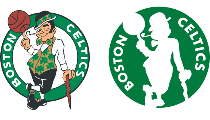
The NBA's Boston Celtics have introduced a secondary logo for the 2014 – 15 season based on their primary logo. Looks like we've found a suitor for the Starbucks mermaid. (Some clarification provided by the Celtics: alternate logo officially launches July 22; primary logo will remain unchanged).
В 2004 году в Париже открылся ресторан Dans le Noir, весь персонал которого — слепые люди. Посетители ужинают здесь в полной темноте и зачастую не зная заранее точного меню, что даёт шанс в отсутствии зрения больше прочувствовать пищу через вкус и запах. С течением времени рестораны как под этим брендом, так и под другими названиями, но со схожей концепцией, открылись во многих столицах и крупных городах мира.
StPete based tattoo artist and talented illustrator Ilya Brezinski shows off his best in dot-work technique. Whatever the material – skin or paper Ilya handles each work with a lot of care and... Keep on reading
All of you must have heard by now about the new OS X called Yosemite. It’s coming this fall along with other incredible things Apple announced during the keynote. We are absolutely thrilled to see new features as Apple fans, but we’re even more excited as developers.
That’s right, we are going to work on a new Pixelmator version for OS X Yosemite right away. So I suspect that you’re going to see some user interface changes. And, of course, we’re absolutely itching to dig in and have a look at what we can do with the new Swift language and Xcode 6. Boy, this is going
to be sooo exciting!
La Grande Illusion, c.1946
artist: Bernard Lancy
These reproductions are from expired auction listings at ha.com. The dates range from 1927 to 1981 with many posters from the 1940s.
Fantômas, 1932
artist unknown
Fantômas, 1947
artist: Jacques Fourastie
The Lodger, 1944
artist: Roger Jacquier Rojac
The Killers, 1964
artist: Guy Gérard Noël
Beauty and the Beast, 1946
artist: Jean-Denis Malclès
Eyes Without a Face, 1960
artist: Jean Mascii
Eyes Without a Face, 1960
artist: Jean Mascii
Earth Versus the Flying Saucers, 1956
artist: Georges Kerfyser
Godzilla, 1956
artist: A. Poucel
Wages of Fear, 1953
artist: Rene Ferracci
The Maltese Falcon, 1941
artist unknown
The Big Sleep, 1946
artist: Vincent Cristellys
Casablanca, 1940s
artist: Pierre Pigeot
Notorious, 1946
artist: Pierre Segogne
Scarlett Empress, 1934
artist: Roger Vacher
The Birds, 1963
artist: Boris Grinsson
The Stranger, 1945
artist: Clement Hurel
The Mysterious Rider, 1927
The Mysterious Island, 1929
Bird of Paradise, 1932
artist: Bernard Lancy
The Big Clock, 1948
artist: Boris Grisson
Miracle in Milan, 1951
artist: Boris Grinsson
Six in Paris, 1965
artist: Folon
More Folon on 50 Watts
Stalker, 1981
artist: Folon
The Holy Mountain, 1973
Previously: The Holy Mountain of Contemporary Polish Posters
This post first appeared on April 24, 2014 on 50 Watts
Mid-Century modern is an architectural, interior, product and graphic design that generally describes mid-20th century developments in modern design, architecture and urban development from roughly 1933 to 1965. The term, employed as a style descriptor as early as the mid-1950s, was reaffirmed in 1983 by Cara Greenberg in the title of her book, Mid-Century Modern: Furniture of the 1950s (Random House), celebrating the style that is now recognized by scholars and museums worldwide as a significant design movement. - Wikipedia
I am a huge fan of this period/style and it always inspiring to see works from that period or that borrow the aesthetics. This illustrations I found on Flickr are a great example of the form and style that characterize Mid-Century modern.
I really enjoy those big pixel art prints featuring huge cities with all sort of things happening all around... but sometimes less is more, and these pixel art gifs are just terrific!
These were done by Slovakian designer Dusan Cezek and they show what a big geek he is. From classic comics to beloved sci-fi flicks, these are just amazing! For more of his Gifs, please visit his portfolio at Behance! Cheers. ;)
Today we will show you the beautiful Peter’s House in San Francisco, California, a project by Craig Steely Architecture. This place is amazing. The house is modern, elegant, clean and really cozy. A house with an open floor and tons of glass, witch is perfect to take advantage of the city views. Definitely a great place to live.
Description from the architects: Located on a steep site above Dolores Park in San Francisco, Peter’s house uses a system of moveable louvers, (built from reclaimed lumber sourced from the San Francisco Presidio) to regulate openness and privacy.
Make sure to check out Craig Steely Architecture website for further inspiring projects. See you next week :)
Download Flat Pink Web UI Elements Kit PSD file. menus, profile, icons, social, switches, icons, news blog, tabbed box, star rating, steps and more. Enjoy!
Видеоматериалы серии «КИЕВ СПОРТ КЛУБ / ХАТХА ЙОГА / АНДРЕЙ СИДЕРСКИЙ / занятия» — выполненные по инициативе администрации Киев Спорт Клуба репортажные видеозаписи занятий, проводимых Андреем Сидерским в зале Киев Спорт Клуба. Асана, пранаяма, основы медитативных практик — изо дня в день, с полным сохранением оригинального текста. Тщательный показ и подробные объяснения. «Информационные экскурсы в […]
“Дизайн состоит не только в том, как он выглядит,” - сказал однажды Стив Джобс, - “но и в том, как он работает.” Нравится вам новое эстетическое направление, или нет, но не только в этом состоит iOS 7, изменения операционной системы намного глубже. В iOS 7, в первую очередь, была проведена работа по реорганизации каждой функции, каждая из которых была пересмотрена с целью создания более целостной структуры.
Система кардинальным образом изменилась благодаря сотрудничеству сэра Джонатана Айва и Крейга Федериги. Иконки кажутся невероятно тонкими, при этом очень яркими и насыщенными в плане цветов. Вообще, сетка приложений теперь является чем-то вроде одного из уровней, который находится над фоном экрана iPhone. Заблокированный экран теперь тоже выглядит иначе, он стал подвижным. Внизу появилась мигающая стрелочка и надпись “Разблокируйте”, для этого нужно сделать лишь простое смахивающее движение слева направо в любой части экрана. Siri и Центр уведомлений, который теперь доступен и на заблокированном экране, стали прозрачными, а сетка приложений и фон с эффектом 3D реагируют на ваши движения.
Apple сделала Control Center, который можно открыть, просто смахнув вверх. Он не занимает весь экран и позволяет получить доступ к некоторым, часто используемым, функциям. Есть возможность быстро перейти в режим “Самолета”, зажечь фонарик, выключить Bluetooth. В общем, Apple, в этом плане, удовлетворила все просьбы пользователей.
iOS 7 теперь предлагает новый режим многозадачности. Папки теперь могут содержать множество страниц приложений, чтобы перейти от одного к другому, нужно сделать двойной клик. Далее вам остается лишь выбрать нужное приложение.
Прекрасным примером нового интерфейса стало приложение “Погода”, в котором мы теперь можем увидеть полную анимацию экрана.
Приложение “Фото” отныне предлагает множество фильтров, на манер Instagram, для обработки сделанных вами снимков. Фотографии можно очень легко сортировать по дате, месту и времени. Плюс ко всему, если вы заядлый iфотограф, и у вас на устройстве хранится множество снимков, они все могут быть представлены в виде интерактивной мозайки.
У App Store теперь новый интерфейс. Теперь вы можете осуществлять поиск приложений исходя из возрастных ограничений или вашего местоположения. И самое главное, отыне все обновления приложений происходят автоматически.
Улучшился и голосовой помощник Siri. У него новый, более человечный, мужской или женский голос, планируется и расширение списка поддерживаемых языков. Голосовой помощник стал умнее и теперь позволяет зачитывать последнюю электронные сообщения, включать Bluetooth, изменять яркость экрана и тд. Плюс, у него появилась прекрасная интеграция с автомобилем.
Мобильный браузер Safari также получил обновление, и теперь у него есть полноэкранный режим, единое поле для поиска и ввода адресной строки, возможность открывать бесконечное количество вкладок и совместимость с iCloud keychains для того, чтобы не запоминать огромное количество паролей.
Apple также добавила функцию Air Drop, которая позволяет перекидывать файлы на другие iOS-устройства. Но, к сожалению, она будет доступна только для последних поколений устройств: iPhone 5, iPad 4, iPad mini и iPod touch 5G.
У приложения “Музыка” также новый интерфейс. Теперь купленные вами фильмы и сериалы будут отображаться в библиотеке. Появился и долгожданный сервис - iTunes Radio. Он предлагает 200 различных каналов, а также предоставляет возможность создать свое собственное радио. Новый сервис будет бесплатен и финансироваться за счет рекламы. iTunes Radio появится сначала в США, а затем и по всему миру.
Бета-версия iOS 7.0 доступна уже сейчас, правда, пока только для iPhone. Версия для iPad появится через несколько недель, а полная версия - этой осенью. Новая система подходит для устройств, начиная с iPhone 4, iPad 2, iPad mini и iPod 4G.
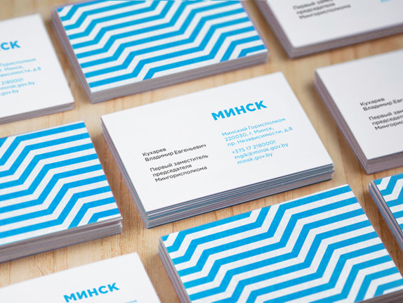
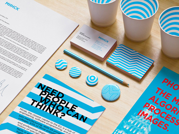
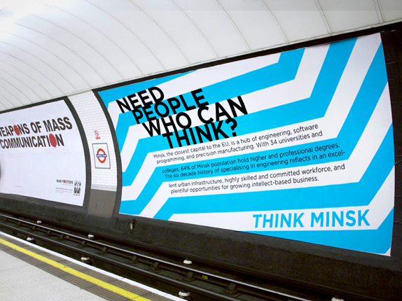
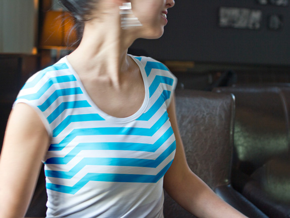
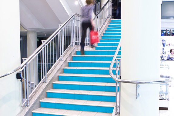
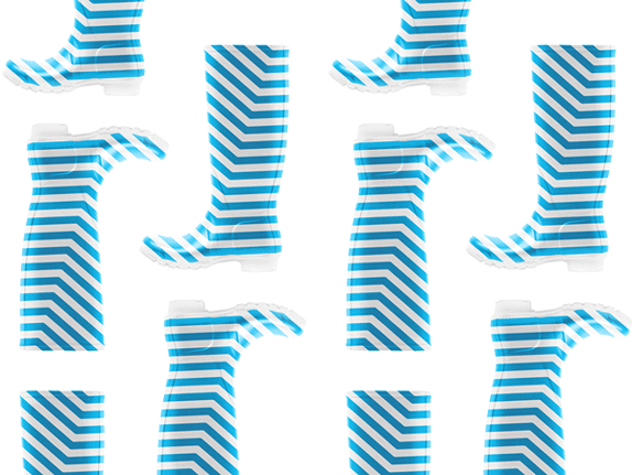
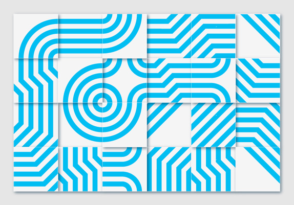
Established in 1067, Minsk is the capital and largest city of the Republic of Belarus with nearly 2 million people — about 20 percent of the population of the country. Today, as described by the Minsk City Executive Committee, Minsk is "a modern, dynamic city, the largest transport and logistics center, a cultural and scientific center of the country" with high education standards, positive diversity, clean and green (as in parks and stuff), and mostly as a city on the rise. "Minsk," however, share London- and Moscow-based agency INSTID, who have been working with the city on its new identity since August 2012, "lacks a clear identity. Its residents define themselves mostly by nationality, and admit that Minsk does not have a particular culture or tradition of its own." Commissioned by the city's tourist information agency, INSTID's task was to "help improve international recognition of Minsk to help it attract foreign investment, visitors, and talent" and "help residents feel proud of Minsk and develop a unique city culture based on their distinct character, and create a powerful platform for city's future development." The new identity will begin to be implemented this summer.
Instead of reflecting on multitude dimensions of the city's life, the brand strategy captured Minsk's essential quality, the ability to rationalise, engineer, and create effective practical solutions to complex technological and scientific problems. This quality is deeply ingrained in Minsk residents, many of whom are third generations engineers. It manifests itself in the user-friendly layout of the city and the rhythmical and reliable work of its services. It also propels a burgeoning industry of software programming, engineering, and high precision manufacturing that has emerged in Minsk over the last two decades. The core idea of Minsk as a city of intellect is expressed in the slogan Think Minsk. It sends a clear message to foreign investors, tourists and talent that Minsk welcomes and fosters knowledge-based production and exchange of ideas. It gives a direction for the city development and propels Minsk towards becoming a new growth place in the world economy. — Provided text
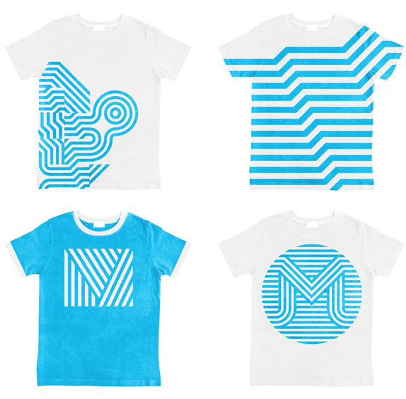
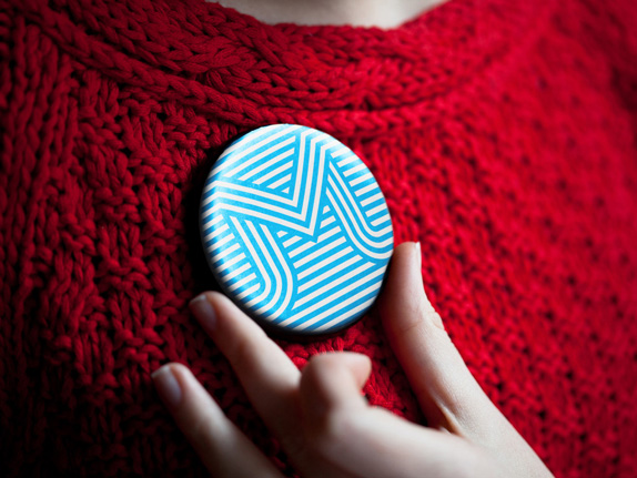
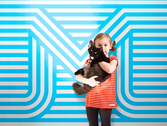
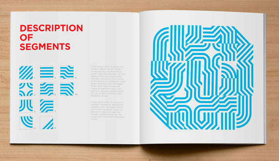
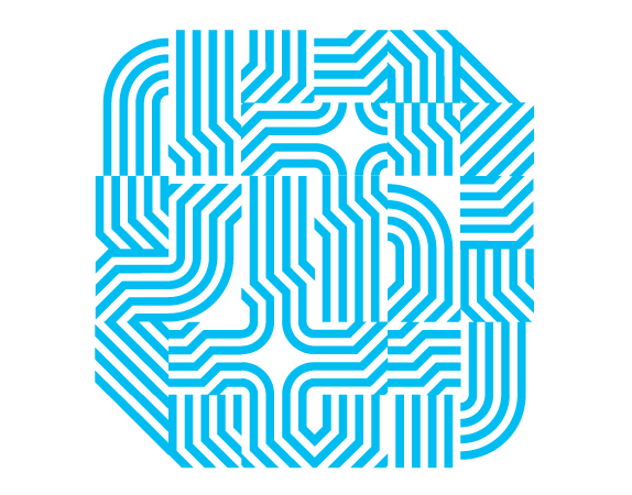
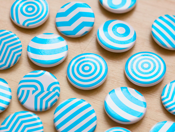
A graphic expression of this archetypal quality of Minsk is delivered by the combination of the light blue colour (the colour of communication, abstract thinking, and intellect), and the line (as a most flexible and effective shape). Given the lack of any common symbols for the city at present, we decided against creating a defined decorative graphic symbol. Rather, we created a platform for fostering and channeling the creative energy of Minsk residents by defining very clear, laconic, and abstract tenets of the Minsk visual style. In other words, we designated alternating blue and white stripes of equal width as the key and only imperative for the city visuals and opened them to the Minsk residents, businesses and public bodies to interpret and use. Below are some illustrations how the city visual style can be effectively and powerfully implemented in a variety of contexts and applications. — Provided text
Clearly, a lot of this project so far is pie-in-the-sky thinking: whether it's the boots above or the colored steps photograph, most of the images shown here are simply to paint a picture of what could be achieved if everything goes right, from concept approval to vendor alignment to citizens embracing the city as much as that cute little girl is embracing her cat. The identity, built around blue-and-white, thick lines and not a more distinct set of icons or visuals seems like an interesting way of building a destination brand. The main problem is that this could apply to any number of metropolitan destinations around the world. There doesn't seem to be any real specificity to Minsk — the strongest message I get, and I guess it's a good one, is that Minsk is a contemporary, young, edgy city but that's about it. On the identity itself, there are good moments and bad. The weaved "M" monograms are quite fetching (and at least carry an "M" for Minsk) and the patterns certainly have potential, but no more than any other set of decent patterns we've seen before. Where it fails, badly, is in the typography, briefly seen in a couple of the images towards the top where there is red on blue making it nearly impossible to read, or there is also the zero-leading treatment on the diagonal lines followed by awkwardly line-spaced text. It's almost as if two different firms did each part. I'm willing to Think Minsk, but not with that type.
A few more images of the identity can be found here.
Jaw braking body calligraphy performed live in Moscow by Russian artist nicknamed Pokras Lampas, see more actions on his Facebook page (take a NSFW advise for viewing photos below) Keep on reading
Как ты думаешь, мне купить себе плащ? Хотя... за последние пятьдесят лет мне ни разу не понадобился плащ. И это, наверно, печально... Но у меня никогда не было времени подумать о плаще. А теперь есть. Вот, что печально.
В телесериале «Звёздный путь» характерным приветствием Мистера Спока в исполнении Леонарда Нимоя был жест жителей планеты Вулкан — сведённые указательный и средний пальцы, а также безымянный и мизинец с разрывом между средним и безымянным. Это приветствие — не что иное, как древнее еврейское благословение, которым священнослужители коэны благословляют народ Израиля в синагогах. Нимой посетил такую службу в детстве и был настолько впечатлён этим жестом, что решил его использовать спустя много лет в сериале.
Although I absolutely love 3d artworks with millions, if not BILLIONS of polygons, I came to figure that low polygon artworks are indeed charming if well done, like these by American artist Timothy Reynolds.
These are pretty impressive. He not only comes up with awesome low poly sceneries, but he also makes them look amazing with such great lightning. Such a talent! For more of his works, you may visit his portfolio at Behance. He'll sure enjoy it! Cheers. ;)
This morning I have mixed feelings: I am happy that we have the possibility to bring our beloved The Old Reader to a new level, and I am sad that Google Reader soon will be completely over. It was a large part of my daily internet life. We even started making The Old Reader because no one could stand my whining anymore.
News came unexpected (mind you, we are living in GMT, so it was literally the middle of the night), but we are doing out best. We tripled our user base (and still counting), and our servers are not amused so far. We will be deploying more capacity shortly, so things should get better by the end of the day. Please, be patient with us.
This is overwhelming. When we started this as something for us and our friends to use, we never expected so many of you to join us in our journey. Thank you very much for your kind words and support, we appreciate this.
Seeing Google Reader go, many of you are asking whether The Old Reader is going to stick around. Also, quite a lot of people would like to donate to keep our project running. We have been discussing this quite a lot recently, and we decided that paid accounts (the freemium model) are the way to go. We want to keep making a great product for our users, not cater it for advertisers’ needs.
We are going to be honest, we have not even started coding this yet. However, we would like to get this news out as soon as possible for everyone to know the way we will be going. Paid accounts will have some additional features, but the basic free accounts will still be 100% usable. We are not in this game to make money, but we want to give something special back to the people who are going to be supporting us.
We have our daily jobs, so we can’t promise that new features will be ready tomorrow or next week. We have no investors or fancy business plans, but we are open about everything we do, and we want to do it the right way.
We reworked the plans according to the news today. Creating an API for mobile clients is the number one priority in our roadmap. We would love to collaborate with any developers who were making Google Reader clients. Please, spread the word about this if you can.
For those of you who are posting feedback and creating new feature requests - please, double-check for existing items in Uservoice. We hate answering the same questions multiple times and removing duplicate requests.
Most asked questions are: - “When will OPML import be working again?” As soon as we launch more capacity to handle this. Hopefully, later today. - “Why are you asking for access to my Google contacts when I log in via Google account?” We don’t anymore. - “When will you make an iOS app? How about Android?” We will start with API as soon as we can and see how it goes. - “Why is there no way to login without Google or Facebook accounts?” We cover that one in our knowledge base, but we plan to implement own login code. The demand is high. - “How do I rename a feed?”. Just browse the Tour page, please? - “Shut up and take my money!”. Will work on that, stay tuned.
We have lots of things to do, and it will probably take us several days to reply to all emails and tickets. Also, Twitter keeps reminding us about daily tweet limits, so there might be delays as well.
Some other news: last week our developer (on the left) turned 21, and we have implemented PubSubHubbub support. Many of you asked us to make feed updates faster, and PubSubHubbub makes compatible feeds refresh almost instantly. Yay!
Thank you very much for your support. We will do our best during next three months to prepare for the day Google Reader will no longer be around.


 La Grande Illusion, c.1946
artist: Bernard Lancy
These reproductions are from expired auction listings at ha.com. The dates range from 1927 to 1981 with many posters from the 1940s.
La Grande Illusion, c.1946
artist: Bernard Lancy
These reproductions are from expired auction listings at ha.com. The dates range from 1927 to 1981 with many posters from the 1940s.
 Fantômas, 1932
artist unknown
Fantômas, 1932
artist unknown
 Fantômas, 1947
artist: Jacques Fourastie
Fantômas, 1947
artist: Jacques Fourastie
 The Lodger, 1944
artist: Roger Jacquier Rojac
The Lodger, 1944
artist: Roger Jacquier Rojac
 The Killers, 1964
artist: Guy Gérard Noël
The Killers, 1964
artist: Guy Gérard Noël
 Beauty and the Beast, 1946
artist: Jean-Denis Malclès
Beauty and the Beast, 1946
artist: Jean-Denis Malclès
 Eyes Without a Face, 1960
artist: Jean Mascii
Eyes Without a Face, 1960
artist: Jean Mascii
 Eyes Without a Face, 1960
artist: Jean Mascii
Eyes Without a Face, 1960
artist: Jean Mascii
 Earth Versus the Flying Saucers, 1956
artist: Georges Kerfyser
Earth Versus the Flying Saucers, 1956
artist: Georges Kerfyser
 Godzilla, 1956
artist: A. Poucel
Godzilla, 1956
artist: A. Poucel
 Wages of Fear, 1953
artist: Rene Ferracci
Wages of Fear, 1953
artist: Rene Ferracci
 The Maltese Falcon, 1941
artist unknown
The Maltese Falcon, 1941
artist unknown
 The Big Sleep, 1946
artist: Vincent Cristellys
The Big Sleep, 1946
artist: Vincent Cristellys
 Casablanca, 1940s
artist: Pierre Pigeot
Casablanca, 1940s
artist: Pierre Pigeot
 Notorious, 1946
artist: Pierre Segogne
Notorious, 1946
artist: Pierre Segogne
 Scarlett Empress, 1934
artist: Roger Vacher
Scarlett Empress, 1934
artist: Roger Vacher
 The Birds, 1963
artist: Boris Grinsson
The Birds, 1963
artist: Boris Grinsson
 The Stranger, 1945
artist: Clement Hurel
The Stranger, 1945
artist: Clement Hurel
 The Mysterious Rider, 1927
 The Mysterious Island, 1929
 Bird of Paradise, 1932
artist: Bernard Lancy
Bird of Paradise, 1932
artist: Bernard Lancy
 The Big Clock, 1948
artist: Boris Grisson
The Big Clock, 1948
artist: Boris Grisson
 Miracle in Milan, 1951
artist: Boris Grinsson
Miracle in Milan, 1951
artist: Boris Grinsson
 Six in Paris, 1965
artist: Folon
More Folon on 50 Watts
Six in Paris, 1965
artist: Folon
More Folon on 50 Watts
 Stalker, 1981
artist: Folon
Stalker, 1981
artist: Folon
 The Holy Mountain, 1973
Previously: The Holy Mountain of Contemporary Polish Posters
The Holy Mountain, 1973
Previously: The Holy Mountain of Contemporary Polish Posters
 This post first appeared on April 24, 2014 on 50 Watts


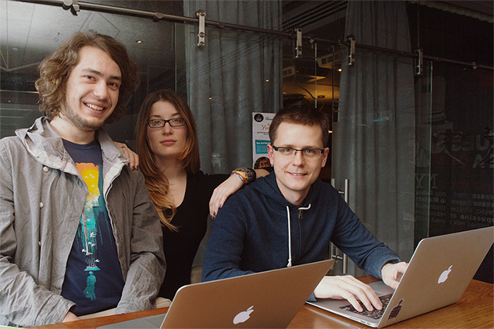 (The Old Reader’s team before March 13, photo by repor.to/shuvayev)