Tifmurray
Shared posts
Someone To Blame
Liter House

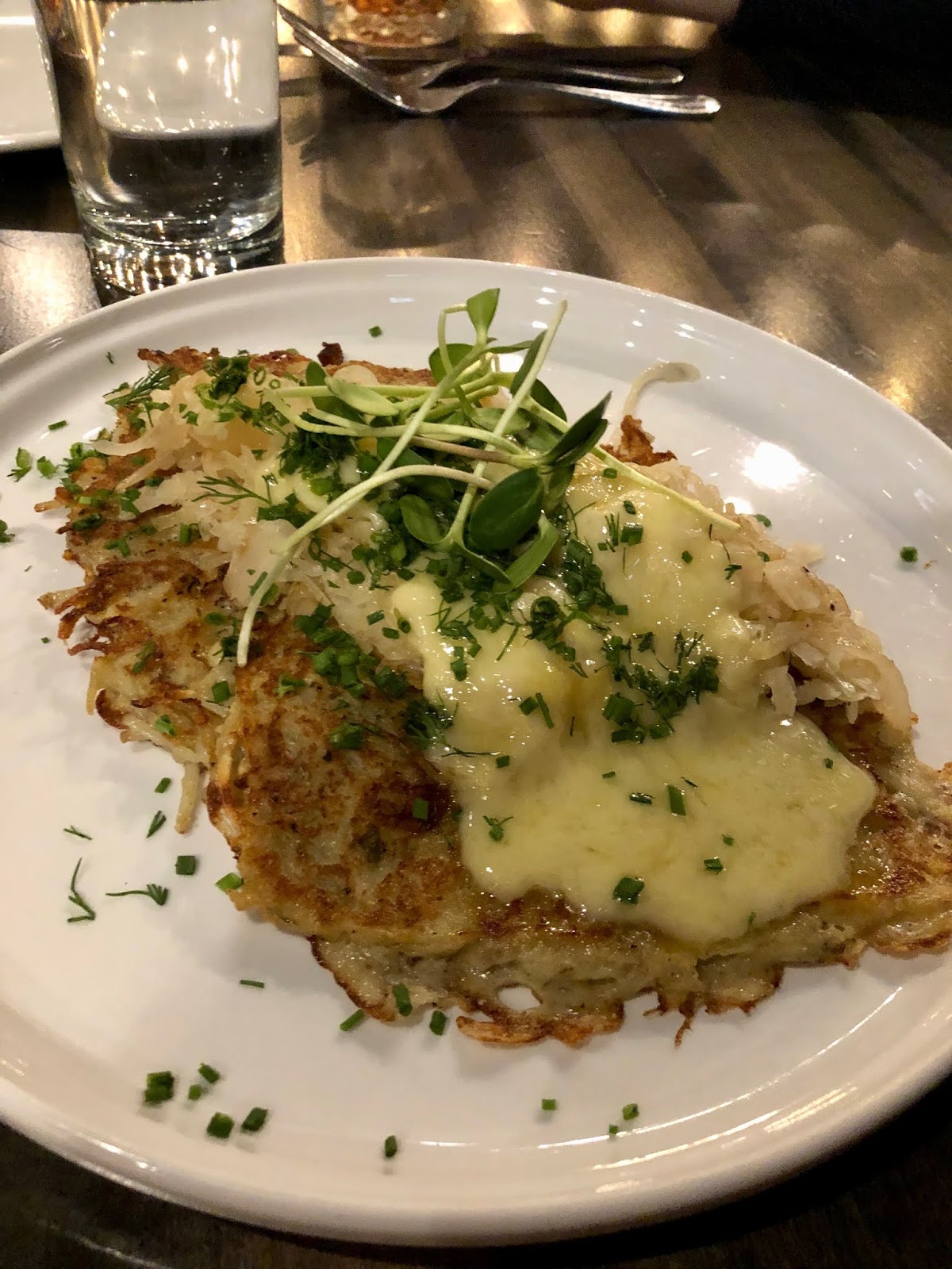 We started with the potato latkes topped with raclette cheese and sauerkraut ($10). This was a generous serving and so, so good. There were a couple of large crispy potato pancakes topped with the melted creamy cheese and then some caramelized sauerkraut and onions. This was such a good combo with the crispy edges of the potatoes, the creamy richness of the cheese and the acid from the sauerkraut. I would totally get this again. They also do a version with mortadella instead of the cheese, but I don’t know how you would pass up the cheese.
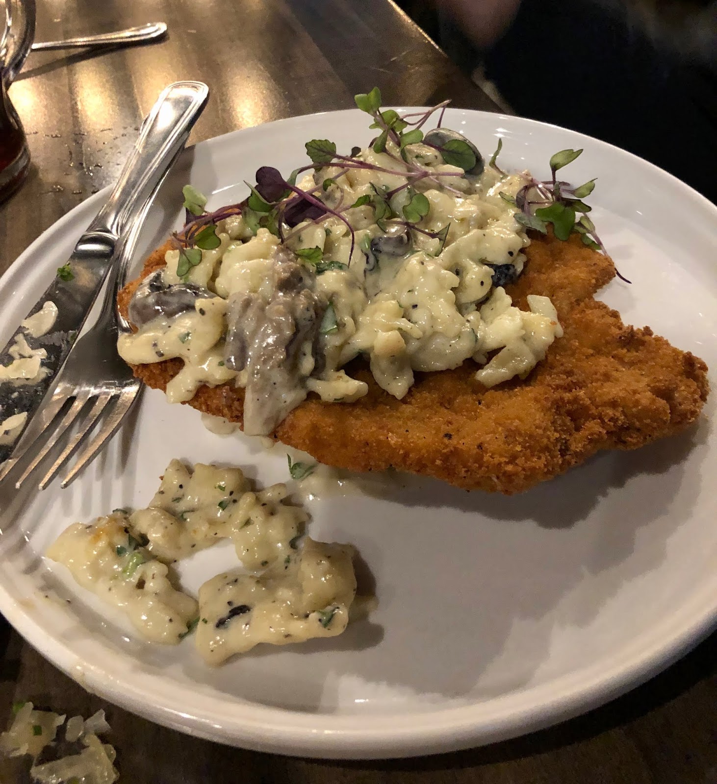 Hubby ordered the pork schnitzel ($18). This was an intensely tender piece of fried pork tenderloin topped with a creamy mushroom sauce and homemade spaetzle. Wow, this was such a great dish. The spaetzle was tender and held up really well to that mushroom sauce. It was a great combo. Everything was cooked just right, and I was impressed. Luckily hubby was up for sharing, because I ate a fair amount of his.
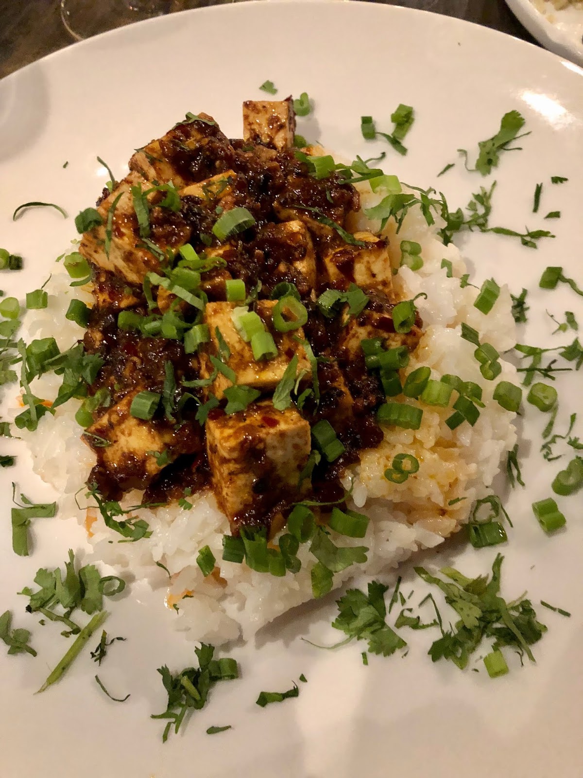 I ordered one of the specials of the night, which was the mapo tofu ($14) Let’s face it. I will order mapo tofu just about any time I see it on a menu. German restaurant? No exception. So it’s hunks of tofu on rice with a sauce that had black beans, garlic and a hot Chinese sauce that was so hot, it was almost too much for me. I have had the chef’s version of this dish at his other restaurants, but I feel like this was the hottest one yet! Definitely a lasting residue of spiciness with this one. I love this dish and general, and this one was well done, but it was to the point heat-wise that I would likely not order it again here because it detracted from the taste of everything else (luckily that creamy sauce on the schnitzel helped). If you really like super spicy though, I would go for it. Also, they might want to warn people about the heat level.
Ukiyo -- revisit

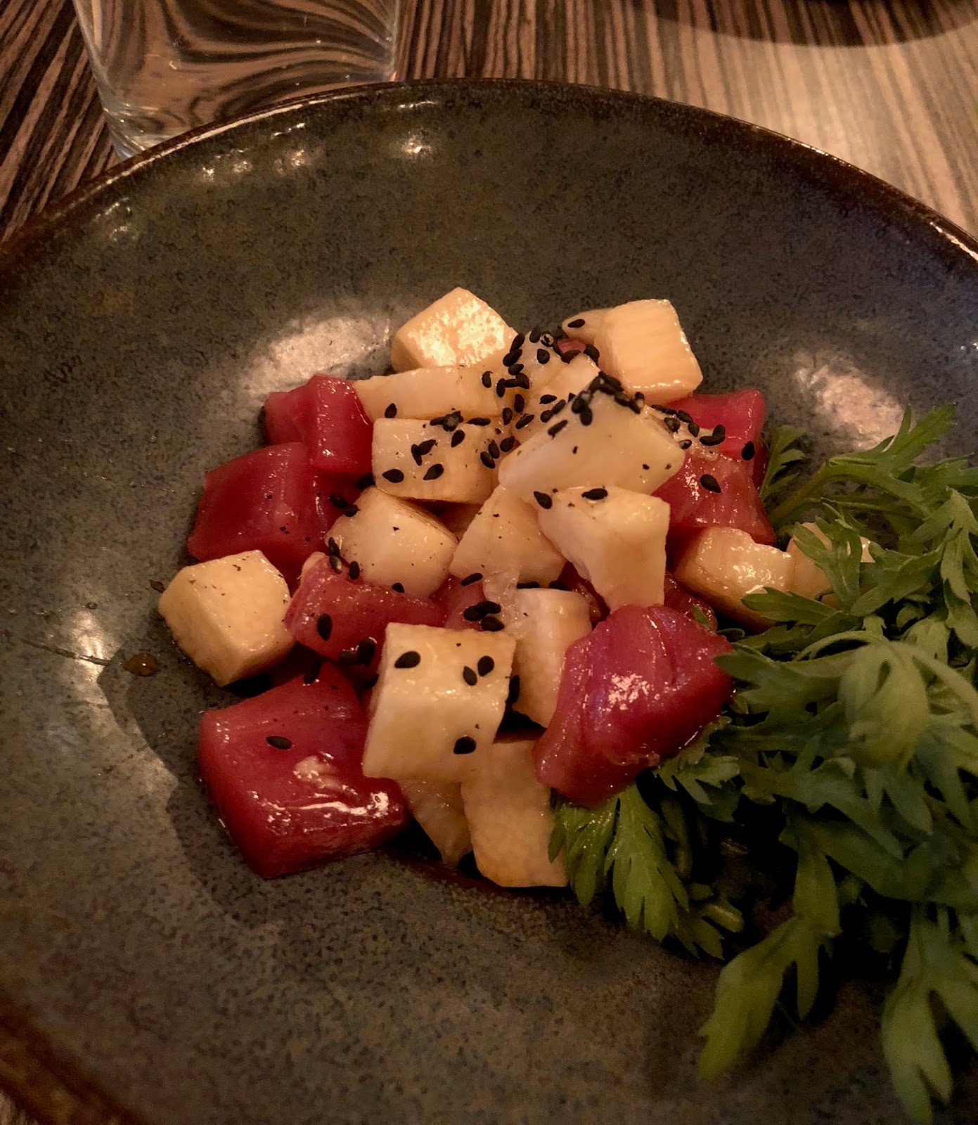
 We also had the bacon and cheese okonomiyaki ($10), which was the standout. So glad I ordered this, and the feeling was held by my friend as well. So okonomiyaki are Japanese pancakes made with shredded scallions and cabbage, and I believe some mountain yam was in there. Plus, of course, the bacon and cheese. There was a sauce drizzled on top and bonito flakes. This was the reason that I went back less than a week later with my daughter. That pancake was so tasty. Lots of flavors in there, lots of umami as they say. Seriously, next time you go, give it a try. It is rich though, so you will want to share it.
 We also had a hot chicken bun to share ($3), which was also quite delicious. I love a good Japanese bun, and this was a good one. The bun itself was really tender and I appreciated that it wasn’t as fat as some I have had, so it had a good ratio of bun to fried chicken. The crispy coating on the fried chicken was so crisp it just shattered when you bit into it. It was coated in a kind of hot honey sauce that didn’t feel ridiculously hot at first but built up in your mouth. Add some pickles, and you have a great little bite.
The Office Gift Guide
 Sources: 1 / 2 / 3 / 4 / 5 / 6 / 7 / 8 / 9 / 10 / 11
Hi friends! I have always wanted to do this gift guide … haha! It’s a gift guide for The Office fans!
I’m sure you have a friend or two who, like me, watches The Office on rotation at LEAST one time every year. It’s a cult!
Which gift is your favorite? I definitely appreciate the passion behind number two and the one I would be the most excited to receive is probably number three or five or 10.
Oh! And comment your favorite The Office quote!! It’s hard to choose, but I’m going to go with “You never had pad thai.” Always makes me die laughing. xx – Elsie
Nesso

 First of all, I was impressed by the effort put into remodeling the interior. I always thought the old Cerulean interior was interesting and modern, but they have certainly improved it in my mind. There’s darker wood, and a much warmer feeling. It still feels very modern though. Our server was attentive, and it was one of the circumstances where it felt like the company had put some effort into staff training. Our server was also knowledgeable about the menu and offered suggestions.
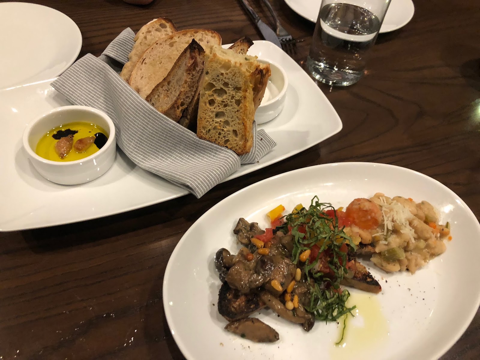
 We started with the bread plate ($5) and the bruschetta ($10) for appetizers. They have a nice bread plate with several fresh bread options, including focaccia and sliced Italian bread. They serve the bread with roasted garlic olive oil with a touch of balsamic, as well as butter. The bread plate was well done. We all really liked the bruschetta as well, which included several toppings such as white beans with cheese, wild mushrooms, mustard greens and tomato. It was all on the same plate, but sort of separated by flavors, and every one was good. I enjoyed mixing some of the richer flavors with some of the more acidic flavors from the tomatoes. It was a crowd favorite at the table. We also ordered the grilled artichokes, because they are also a family favorite. They are very good as well and have nice crispy grilled edges. They were heavily seasoned with garlic and herbs and were served alongside a salad of citrus, fennel and red onions with hazelnuts. I enjoyed the freshness of the salad, but I am not sure I loved it with the artichokes. The artichokes were nicely cooked though so that they were tender inside with the charred exterior.
 I love love that they have true first course sized pastas. So you can truly make it a first course, or you can have a very light dinner. I love pasta that is interesting, but so often Indy restaurants give you so much of it that it looks unappealing the minute it is set down in front of me because it is just way, way too huge. Our server warned us that they were two-ounce portions, and they are also priced appropriately in my opinion for the quality you get. Hubby and my son had the bigoli ($12), which was outstanding. It is a large spaghetti-like pasta, but thicker and was in a black pepper, egg, parmesan and guanciale sauce. A small amount went a long way, but it was rich and delicious. And a small amount was all you needed. My daughter had the gnocchi ($16) which was also very good. She questioned it a bit because it included pears in the toppings but ended up really liking the combo that also included fried sage, hazelnuts, grana Padano cheese, goat cheese fondue and chicken-focaccia meatballs. The gnocchi were small and somewhat dense but had a nice crisp exterior from being pan-fried. An interesting combos of flavors for sure. For my main dish, I ordered the risotto with a rich broth, lots of parmesan, butter and some foie gras, which was all topped with sliced truffles ($15). Again, I loved the fact that I could order something this rich and decadent, and not regret it because of a massive portion. It was small and just the right amount. Ok, I might have seared the foie a bit and maybe put in a little more, but it was a really tasty combination.

Fixated on Light Fixtures from Perigold

When we bought our LA home, all the rooms were installed with the cheapest, flimsiest light fixtures you can find so I knew those had to go, like asap! I always get asked what are some things to splurge on when decorating. Without hesitation, I always say lights. They can really transform a cookie cutter room into a space that looks chic and unique. I’m thrilled to be partnering with Perigold to share my favorite lights from their shop and how they make a big impact in our spaces. They have a huge selection of high-end pieces, from furniture to decor and will definitely add some major wow factor to your home.


Let’s start with our living room. It used to have a ceiling fan and stood out like a sore thumb. We never used it so bye fan and hello Caracas chandelier! Does this look familiar?

We had the 16 light Caracas in our New Orleans dining room. As much as I wanted to bring that here, it’s ginormous. Our ceiling is only 8 feet so the 6 light one fits perfectly in our living room. It’s such a sexy thang!


Next, is our guest bedroom. I call this the sunny room and what better way to complete the look than a modern, shiny gold light that looks like a sun! This is the Klismos flush mount. We’re picking lots of flush mounts because of our low ceilings. I wanted something a little playful in here. It goes so well with our bold yellow geometric wallpaper.


Our hallway also good hooked up with the Harper semi-flush mount.

Meet Roxanne! She gets LIT in our bedroom. We had a sun in our guest bedroom, so I figured we should do stars in here. You can pretty much tell that I have a thing for brass finishes. I think they just add a nice warmth to a space. I can always count on Perigold for a large selection of beautiful sculptural pieces. There are pieces I’ve never seen before and it’s so inspiring. Mosey on over to get inspired for your home!


Mass Ave Pub


On the Street…Viale Piave, Milan

This is another very elegant Milanese lady you won’t typically find at a fashion show or an influencer lunch but you will find her curating the goods at her chic boutique in Milan @imarika_milano !
On the Street…Color Play, London

I thought the color play (two shades of orange, burgundy and khaki) made this the most chic look I’ve seen so far this fashion season!
Thanks for the color inspiration @lisa.aiken
Festiva -- New Ownership
 In case you haven’t heard, there are new owners at Festiva—it is the previous owner of La Chinita Poblano in Broad Ripple. We were excited to give the new place a try and see how and what had been changed. The first thing I appreciated is that you can now eat there even if you are under 21, so on one of the visits discussed here, we took the kids. The other visit was with friends.
 There are certainly some highs and lows at Festiva food-wise. On one visit we had the guacamole ($9) and on one visit the queso ($7). The guacamole is described as the best in town, and it is definitely up there. Seasoned well—lots of salt and lots of acid. Extremely good. The queso on the other hand, which is described on the menu as tres chiles queso is not very good. Not a lot of flavor and very thin in consistency. I feel like queso is something that shouldn’t be too hard to get it tasty and I think this recipe needs to be shaken up. The chips are solid. Other really good things—the margaritas. Both times we had a pitcher of the house margaritas ($30 for 4-5 margaritas). I like that you don’t have to go fancy here to get a quality margarita. Also, I like the little crunchy spicy bits you get when you sit down as well. I don’t love the hot sauce drizzled on them, as it quickly makes them go soggy, but the ones without or the ones eaten quickly are very tasty.

 A big winner on both visits was the carne asada ($20). This is a good size piece of marinated skirt steak—it’s marinated in a cilantro-based sauce. It comes with sautéed onions and peppers and choice of sides. We’ve tried several, but the most commonly ordered seem to be the potatoes (rajas con papas) and the beans (frijoles charres). This steak has so much flavor from the marinade as well as the salsa-type sauce that comes with it. This was a table favorite on both visits with both groups. On one visit we also had the costillas ($18 for half rack), which are honey/guajilli braised pork ribs. The menu says it comes with a crema, but I didn’t see any. The ribs were quite good though—extremely tender and with a nice smoky flavor.
 On one visit we ordered the pollo in achiote ($16) as well. This is a half-roasted chicken in an achiote rub (it has a red color and an earthy flavor). You know, I think our chicken was a bit burnt, although it had a decent flavor. Part of the color is certainly from the spice rub, but we saw several others come out that were not so dark. The chicken was a bit dry once you got into the white meat as well. I think if this was executed just right, it would be very tasty. The least successful dish for me on one of the visits was the shrimp tacos ($16). They are described as salt and pepper crispy shrimp (I love a good salt and pepper preparation), with caramelized onion, chipotle salsa, cilantro and onion. For whatever reason, these came across as really flat to me. The shrimp were good quality, but the flavors just didn’t have the acidic balance I crave with this kind of food.
 Overall, I think Festiva is a fun place to go, and I like the setting, the service, and the drinks for sure. I have found several really good food items as well, even if I hope they keep tweaking some of the menu items as they grow. It’s certainly a place we will return (my kids are already asking), and since we can bring them now, this makes it more of a doable option. Those of you who have been since the ownership change, what do you think?
Workingman's Friend -- Revisit

 This place has the charming atmosphere of a very old, slightly divey bar in an older Indy neighborhood—the near west side. I do wonder when this part of town will be targeted for redevelopment like the near east side has been. Anyhow, there were people there, but it wasn’t super busy. We quickly ordered our cheeseburgers (me a single ($5), hubby a double ($6.50)) and our onion rings ($3.50). I foolishly noticed fried zucchini ($4.50) advertised on a sign and ordered it as well. That was my only mistake. These are clearly coming out of a foodservice bag and are not tasty—they are breaded and then fried. We each tried one and that was it.
 Our burgers on the other hand, they were delicious. I got the perfect accompaniments on mine—cheese, lettuce, mayo, onions and pickles (they put the pickles on the side). Then I added some ketchup and mustard. So the burgers here are super thin. They have lacy edges but are still somewhat tender in the middle. They shred their lettuce (the only way it should be on a burger) and they put it on the bottom bun with the mayo. Exactly where it should be. Hubby enjoyed his double as well—he liked that there is a thin piece of bread in between the patties because it keeps the sandwich together, so it doesn’t just fall apart. These burgers really fill a void in Indy. (Please tell me where else to get good thin burgers in town if you know of any).
 The onion rings are also solid. They are battered and are so much better than the zucchini. A burger and onion rings are the perfect combo. Oh and an ice-cold schooner of beer (literally, their glasses are coated in ice). It may become more frequent in our rotation. And we saw one of our U.S. Senators there, Joe Donnelly, which was pretty cool. He came and said hello and took a picture with hubby. (He had a single if you’re curious).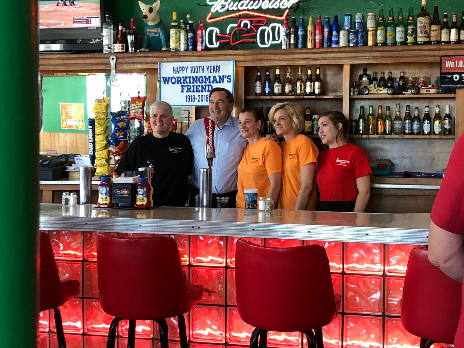
wear this there: mosquito supper club.

the mosquito supper club may not sound like someplace you might like to dine, but never fear, you should be free of those pesky little varmints in this charming Cajun restaurant located in a repurposed old home in New Orleans. instead, imagine yourself sitting down to a cozy, communal-style spicy Cajun seafood dinner including gumbo, oysters, shrimp and fried soft shell crabs! heck, yes, please bring on the bib and don’t forget my slice of pie! we’re thinking we give a fresh spin to the southern belle with a feminine and billowy bow blouse but pair it with a fun suede jumper and some kickin’ boots. bring out that girly charm with a vintage-inspired Floral Embroidered Clutch and you are good to go. need a little reading material should be rolling solo? we suggest rosie walsh’s ghosted — a love story with an intimate secret at its heart.


wear this there: free people Blissful Beginnings Blouse in ivory; free people Canyonlands Suede Jumper; Reike Nen Ring Slim Boots in Beige; Pixi Shea Butter Lip Balm; butter london ‘Patent Shine 10X®’ Nail Lacquer; ESYM Rose Roll-On Aromatherapy Oil; read this there ghosted by rosie walsh; NEED Jane Doe Sunglasses in Warm Sand; j.crew Crystal cluster earrings; anthropologie Floral Embroidered Circle Clutch.


• photography by jillian greenberg for remodelista and jacqueline marque photography
The post wear this there: mosquito supper club. appeared first on sfgirlbybay.
Ali'i Poke

 At Ali’I, you get a small or large bowl ($9.50 or $12.50). In a small bowl, you get two scoops of protein and in a large, you get four. I was really torn because I like to get a scoop of tofu in my bowl, but only one scoop of fish seemed inadequate. And in the interest of blogging, I also wanted to try the salmon. So, in order to write the most thorough post possible (it’s your fault I got such a huge portion), I got the large. However, for future reference, you really don’t need the large unless you’re really hungry—the portion they give is quite generous. I had two scoops of the marinated tuna, one of the marinated salmon, and one tofu. The kids both got the small and both got all tuna. First of all, I think the fish quality is slightly better than the other poke place I have tried in town. The pieces are cut a bit bigger, and they give you more in a scoop. I think the bigger pieces make it harder to hide fatty bits. Both the tuna and the salmon were very good, and I only came across one piece that was a touch fatty. The tofu was nice big chunks too, and because they don’t mix the proteins up in the sauce (which has its good and bad points), it stays that way. As for the base of my bowl, I got half sushi rice and half greens, and I think at this place, I would just stick with the rice in the future. I really like greens in poke, but these were bigger, harder pieces of lettuce (mainly romaine), and weren’t as good as softer mixed baby greens. Just harder to eat I guess.
 As far as toppings, I went with edamame, sesame seeds, crispy onions, avocado, and scallions. I also like that they don’t charge you extra for anything (even the avocado), so you know just what you are paying from the start. There are a ton of sauces and I had a hard time choosing. I ended up getting some of the creamy miso and some of the spicy mayo, and both were good (they will let you taste any that you want as well). My daughter did the creamy miso and the sesame shoyu and I think it might have been a little better. I would also like to try the sesame vinaigrette. There is also classic unagi sauce and honey wasabi. (I told you there are a lot of choices!).
Coffee Cups Made from Old Recyclable Coffee Grounds

Having just opened our very own snack bar, inapinch, we’ve spent lots of time researching and sourcing cups, bags, and boxes for our to-go offerings. And now with New York potentially banning plastic straws, finding viable eco options for businesses that also highlight aesthetic and branding needs seems more relevant than ever.
So when we stumbled upon Berlin backyard start-up Kaffeeform, our faces lit up with delight! Product designer Julian Lechner became obsessed with trying to find a way to reuse coffee grounds to create a new material. After 3 years of experimentation, Kaffeeform was born by creating a new formula that creates new products out of old coffee. Lechner takes recycled coffee grounds and natural glues to create a sustainable and eco-friendly alternative to products based on mineral oils. All Kaffeeform cups have the appearance of dark marblewood, smell of coffee, are very light, and finally, are dishwasher-friendly and long-lasting, so they can be used over and over again.
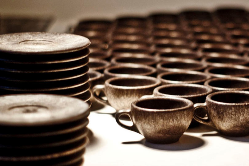


PRODUCT FEATURES:
– Dishwasher friendly
– Lightweight
– Durable
– High isolation qualities
– Slight coffee scent
– Food safe
– Free of BPA
– Eco-friendly material composite
– Made for unlimited consumption
– Each cup looks unique
– Carbon neutral disposal / Biodegradable
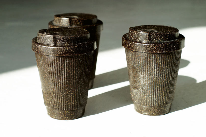
In 2018, Kaffeeform won the Red Dot product design award for it’s innovative material and process. The coffee grounds are collected in local coffee shops in Berlin and then dried, packed and shipped in through a sheltering workshop – a collaboration that is constantly growing over time.
We cannot wait to see more innovation like this, as more product designers turn to renewable sources as their inspiration for creating new products.
All images courtesy of kaffeeform.
30 Modern Stained Glass Artists To Follow on Instagram

Yesterday on Instagram I mentioned how much I’m living for the renaissance that’s happening in the world of stained glass. In addition to the existing community of talented stained glass artists, a new generation is learning this incredible tradition and finding ways to make it their own. Artists are trying more minimal styles and embracing the graphic nature of stained glass to create contemporary patterns and designs. Whether they hang on the wall, against a window, in the corner of a doorway or get installed in a window frame, these new designs are continuing the tradition of stained glass in a whole new way.
I was blown away by the number of amazing recommendations left under my Instagram post about stained glass, so today I’m sharing 30 of my favorite stained glass artists and designers to follow online. But be sure to visit the post to check out the recommendations in the comment section as they continue to grow and evolve! xo, Grace


The Cube, an Art Moderne Era Home Built Entirely out of Concrete


Brandon and Ashley Whiteside are a dreamer and doer duo that doesn’t get bored easily — especially with a most unique renovation project right under their belt. They recently finished a complete remodel on “the Cube,” a three-story house built in 1937 that they bought from its original owners. Brandon and Ashley named their home quite literally after what it is — a true cube, with three 750-square-foot floors stacked on top of each other. What makes their Art Deco and Streamline Moderne style house so exceptional is that it is built entirely out of concrete (excepting four vertical steel supports, one in each corner). Rumor has it that the engineer who built it had lost two homes prior, one to a fire and the other to a tornado. In economic and utilitarian spirit, he built his third home to last — the house, located close to downtown Oklahoma City, has stood solidly for over 80 years. It has seen its surrounding neighborhood fall apart and begin to rise again, all under one family’s ownership. Today, the house serves as the neighborhood’s storm shelter and offers Brandon, Ashley and their six-year-old daughter Nora a truly one-of-a-kind family home.
The Cube never ended up on the market, as Brandon and Ashley heard about the original owners’ intention to sell early on, and stayed in contact until the timing worked for everyone. Since changing ownership 18 months ago, the house has undergone a lovingly executed restorative facelift. “My goals when updating were to honor the style that the Cube always could have been,” Ashley says. “In essence, I wanted to avoid a possible theme, instead letting the fun and style look like it had evolved and developed organically over the years.” Ashley, an interior stylist and abstract artist, spent a good while designing the renovation as much as possible in advance, scheduling timelines and lining up the funds. As few updates had occurred in the home’s eight decades, Brandon and Ashley went for the whole kit and caboodle — new roof, windows, flooring, electrical, landscaping, exterior and interior paint along with full kitchen and bath remodels were all included in the project. Although Ashley always urges her clients to complete one room before moving onto the next, she learned the importance of her own advice the hard way. “We were extremely cavalier in the dreaming phase, electing to do it all at once,” she shares. “Following [my own] advice could have saved my routine-loving husband some real heartache!” she laughs.
The concrete structure that makes the Cube so unique also provided some challenges during the renovation. Working with concrete walls, floors, ceilings, beams, stairs and porches meant that significant changes to the existing layout were out of the question. Hanging anything, especially heavy or load-bearing contraptions, turned out to be rather challenging as well. What you lose in flexibility, you gain in sturdiness and lack of squeaky floors.
Ashley’s desire to create beautiful spaces is rooted in the feeling of being energized by her surroundings. “These desires are amplified by feeling like my home is a showroom for my work, and in many regrettable ways, an extension of my personality. I can get so engulfed in my projects that I feel like inviting someone to view it is actually letting them get to know me.” With the remodel complete, Ashley has filled the house with her signature mix of old and new, rearranged, styled and rearranged again to find the best and most inspiring solutions for each space. “I want stories and charm, a little something weird and maybe a few things to laugh at when you come over!” she says. When asked about her takeaways from the renovation, Ashley shares, “the process is, well, very humanizing. You’ve got to humble yourself a little to get through it. Being a fixer and a dreamer by nature, I’m most thankful for and most bewildered by the fact that I look around and there’s not anything needing me.” She jokingly adds, “also, I might lose my mind soon because what am I supposed to do now?!” —Sofia
Photography by Emily Hart / Nina & B Photography
Image above: The first impression when entering the Cube is the view of the living room. For Ashley, this space was an opportunity to find the perfect balance between energetic colors and white. This is the sweet spot!
 This post is brought to you by Juniper & Scout, an online shop offering the best in modern, handcrafted design so you can always find the perfect gift (or well-deserved treat for yourself). Visit the shop here! Thank you for supporting our small business sponsors who help us bring you free, original content every weekday!
In Pasadena, an Art Deco Dream with a Vibrant Checkered Ceiling


Oftentimes the most magical, electric spaces are born of an unlimited dream bank and an abandonment of rules — combined with a heavy dose of unbridled creativity. Such is the case for the gloriously revamped studio space of Margaret and Corey Bienert, a husband and wife filmmaking duo who moved to the Los Angeles area from Chicago, IL two years ago.
To craft the perfect space for Margaret and Corey to work, collaborate and recharge, the couple entrusted the design to Margaret’s sister, producer/photographer/podcaster Caroline Lee, and author/stylist/blogger Anne Sage. Caroline and Anne’s task was to completely transform the lackluster Pasadena, CA studio Margaret and Corey rented — the supreme hurdle of which involved working with some less-than-lovely, water-stained ceiling tiles. “I was literally lying awake one night worrying about how ugly that ceiling was when the idea came to me to paint them in a standout pattern,” Anne recalls. “This way, we’re not just hiding an eyesore, but we’re using every square inch of the space as an integral part of the design!” To pull off this vision, Anne created a paint-by-numbers map of the ceiling using 13 different shades of Portola Paints. But when it came to executing the paint job (each tile was covered in three coats!), Margaret trusted only herself, Caroline shares: “That glorious checkered ceiling took 60 HOURS to paint … and Margaret did it alone! She’s incredibly attentive to detail and didn’t trust anyone else to ‘help’ up to her standards,” she teases.
Conventional design “rules” might suggest the rest of the space be more neutral with such a punchy ceiling, but Caroline and Anne had other plans. Instead the two expertly infused peach, deep green, dusky blue and mauve tones throughout the space, using the ceiling as a beacon of palette inspiration. Various textures, like sumptuous pink velvets, both enliven and deepen the studio; quirky and eclectic accessories carry the eye around the space in visual harmony. This ethos means every corner, nook and cranny is a pop of excitement, and this more-is-more layering of art deco vibes works to a tee.
“We could easily have elected to wallpaper all four walls,” Anne begins, “but Caroline and I are really into creative uses of fabric lately and we couldn’t resist installing a dramatic floor-to-ceiling curtain along the back wall. We wanted a really dynamic yet subtle effect, so we chose a Crypton fabric in the same peach color as the wallpaper to create a streamlined sense of movement.”
With the project all said and done, Margaret says the studio — called A Pretty Cool Space — is beyond her wildest dreams. “It’s the perfect place to create, to brainstorm, to recharge,” she shares. “It’s inspiring and bright and complex in all the best ways!” —Kelli
Photography by Echo and Earl / @echoandearl
Image above: Anne and Caroline are a force to be reckoned with — their own studio space, Light Lab, is a testament to their combined skills. To translate their effervescent vibe onto Margaret and Corey’s rental, they used similar design tactics, like creating a chic area that encourages gathering. “We went with low, broad seating to foster a lounge-y vibe,” Anne says. “The studio is a workspace, sure, but who says it can’t feel relaxed and inviting, too?”
 This post is brought to you in collaboration with Weebly. If you’re thinking about taking your side gig to the next level, be sure to check out our 4-part series Launching your Online Business. Created in partnership with Weebly, this series shares inspiration, tools and support to build + grow your website or online store. Use our series and the Weebly platform as resources along the way to build your brand and business and get 15% off your first Weebly purchase right here!
On the Street…Howard St., New York

Yesterday was so cloudy but right at the end of the day the sun broke out and I found this incredibly chic woman chatting on Howard Street! That’s a great way to end a grey day, New York

A2Z Cafe - Revist
 It has been awhile since we went to A2Z and my daughter always nags me about going because she really likes it. Also, hubby had never been, and it is very convenient to my parent’s house, where we were dropping off my dog for some dog sitting, so it worked perfectly.
  We started with an order of the fried biscuits ($7 for 10 or $4 for 5). These are good little morsels—they are sugared on the outside, so they really come across more like doughnuts. They do serve them with apple butter for sweetening them up even more. They are tasty little nuggets for sure if you like to start your breakfast off with a little sweet appetizer.
 Hubby loved his dish. He went with the tater tot scramble ($8.50). So they take tater tots, scrambled eggs, bacon, ham, and shredded cheese and they scramble it all together and top the whole thing with sausage gravy. Seriously, this dish made him so happy. And even though sometimes I worry that mixing so many things up in a dish can just taste like a mess, this didn’t. The bites I had were quite tasty. And he cleaned his plate. It also comes with a side of toast, again, very tasty toast.


The Best LED Light Bulbs We’ve Found For The Entire House
At least five times a day Sherry gets asked: “What are those LED bulbs that John loves?” Sometimes it seems even more popular than the ever-present “where you’d get that thing in your house?” question (all answers are here, btw) or “what are those short girl jeans Sherry wears constantly?” (they’re these). Because as anyone who has listened to our podcast knows, I am, shall we say, particular about my light bulbs. And as we switched over our entire house to LED bulbs over the last few years, it has sent me down the wormhole of finding my favorite bulbs (and avoiding the ones that make my eyes extremely angry). Since one big pro of LEDs is that you won’t have to replace them for years – maybe even decades (many of them say 30+ years on the packaging) – I wanted to make sure I got it right.
And although we’ve spoken about them SEVERAL times on the podcast (did I mention I’m obsessive?) it’s not much help to all the people who regularly inquire about not being able to find “that blog post with our favorite light bulbs” (I even got a text like this from my own mom) because, well, that blog post doesn’t exist. Until now!

“Buying Bulbs Used To Be So Easy“
That’s a direct quote from my mom when she texted me about what LEDs to buy. While I’m not 100% certain what “heyday” of light bulb shopping she’s referring to, I can completely relate to the sentiment. The classic-but-energy-hungry incandescent bulbs are being phased out and the once-newfangled, higher efficiency CFL bulbs are looking downright oldfangled these days compared to LEDs. LEDs used to be crazy pricey, but have come down in cost considerably, meaning it’s finally practical for everyone to make the switch. Our favorites still aren’t as cheap as CFLs (they’re about $5/bulb) but they say the average person recoups that cost within a year or so by lowering their electric bill with their use. So off we set to upgrade our house to LEDs.

A Simple Way To Read A Light Bulb’s Label
Before I get into our favorites, let’s talk about two intimidating terms on LED packaging: Kelvins and Lumens. They’re not nearly as complicated as they sound and (spoiler alert) you can mostly get away with ignoring them. Here are a couple of stupid word tricks I use to remember what those two mean (warning: cheesy mnemonics coming up):
- Lumens is a measurement of brightness, or how much light a bulb gives off (both L words!). Alternately, you can think of it as how much it will illuminate a space. More lumens = more light.
- Kelvins is a measurement of color temperature, or how warm (yellow) or cool (blue) the light is. The more Ks a bulb has, the kolder the temperature will be (both K words…sorta). So a 4000K bulb is cooler (bluer) looking than a 3000K bulb.
But the good news is that most light bulb packaging still includes familiar shorthand. “Lumens” often correlates to a “wattage equivalent,” so if you’re currently using a 60 watt bulb in a fixture, you should be fine putting a 60-watt-equivalent LED in its place (typically around 800 Lumens). There are exceptions (like specialty Edison-style LEDs that have much lower light output) so it’s helpful to double-check the lumens on a label, but if that’s too much for your noggin to process – like it is for me sometimes – don’t fret.

Kelvins also has a plain English correlation, and that’s to terms like “warm white,” “soft white,” or “daylight.” Although these descriptors seem to be applied somewhat standardly, I’m a true maniac about color temperature so I always verify the Kelvin rating. Our go-to throughout our whole house (and the beach house) is a 2700K bulb, which is usually called a “soft white” bulb. I hate lights that are too cool or blue looking because I feel they make a home look cold or sterile – like a hospital or a Walmart. I know those “daylight” bulbs promise more accurate colors in your home, but they just don’t look right to me.

Picture an evening when you’re sitting down to a cozy fire and turning on some lights, maybe for reading or chatting with friends. You don’t want the room to feel too yellow, and you definitely don’t want it to feel blue and stark and cold, and that’s what daylight bulbs feel like to me after finding the right bulbs (say it with me: soft white 2700 Kelvins).
Our Favorite General Use LED Light Bulbs
So let’s get down to business. Here are the 5 types of bulbs you’ll find in our house, starting with the heavy hitter and then moving to more special-use bulbs:

You’ll find this Cree 60W Equivalent Soft White LED light bulb in most of the fixtures in our house – lamps, overhead lights, sconces, etc. The price is one of the most affordable we’ve found, they sell them in bulk, and there’s not any sort of delay or humming that we’ve had with other brands. We stick to 2700K bulbs throughout our home and our beach house for the sake of consistency and simplicity, and only in some cases use corresponding 40W equivalents for a slightly dimmer light (like in the beach house’s bedside sconces). There’s also a candelabra version if you need that. And if you have recessed lights, here’s a soft white dimmable version of those that we love.

This Philips 60W Equivalent Clear Glass bulb offers the same light as our go-to Cree bulb, but the clear glass cover and Edison-esque filaments made it a better choice for exposed fixtures where the bulb is visible. They are a smidge more expensive but they’re far less visually intrusive than the Cree bulb’s frosted cover and chunky white base. So if you’ve got any bulbs that aren’t hidden behind a shade or a diffuser, these are a great option. There’s also a candelabra version of this bulb for chandeliers and such.
Our Favorite Speciality LED Light Bulbs

This specialty Philips Dusk To Dawn LED bulb incorporates a light sensor (that red dot) which allows the bulb to automatically turn itself on as the sun sets and then off when the sun rises. We put these in our front porch lights, meaning we no longer need to flip them on and off each day. It’s an extra little convenience that we’ve really appreciated and I’m only bummed I haven’t found a candelabra-equivalent yet for some other outdoor fixtures.

This is one area where I make an exception to my soft white rule. In work spaces or storage spaces like closets, garages, attics, or sheds, we’re not after that cozy “warm glow” of a soft white bulb – we need a bright, crisp light to find what we’re looking for! Our garage used to have two bare, incandescent bulbs struggling to illuminate the space. We swapped in two of these LED Flushmount Replacement fixtures that screw into a plain ol’ light bulb socket, making it look a bit more finished AND giving off a brighter cast. Suddenly things that were barely seen before are a lot easier to clearly find/see/use (which is a good thing when it comes to saws). They also sell a version with a pull-chain, in case you need that option too.

Lastly, for anyone else who’s incorporating smart home technology into our house, I’ve found these Philips Hue White bulbs to be an affordable way to go. They offer the same basic benefit of other smart bulbs: you can control them with your phone or your smart home speaker like an Amazon Echo or a Google Home. We even set up special routines so when we say “Alexa, Goodnight” downstairs as we walk out of the living room, our living room lights turn off and our bedside table lamps turn on upstairs to light the way as we walk in. I know, I’ve gone full nerd (and I couldn’t be happier). But unlike the pricier Hue Color Ambiance ($50), which can change to any color in the color spectrum, or the Hue White Ambiance ($29), which can change to any color temperature, these basic Hue White bulbs only produce my favorite 2700K, soft white light… and are downright cheap by comparison ($15).
I got a starter kit for Christmas that included two bulbs along with the required hub, so Sherry and I put them in our bedside lamps. Our favorite gimmick is to say things like “Alexa, turn John’s bedroom light to 22%” and it dims to exactly 22% of its total brightness. You can see the dimming in action in the Instagram below. They’re certainly more fun than they are necessary, but I thought I’d include them in this list just in case anyone else wants to get in on that smart light life.
So those are all of my time-tested, bought-them-with-my-own-money, favorite LEDs. And while they’re perfect for our house and our eyes (or at least my “special” eyes as Sherry likes to call them when I’m being particularly neurotic), I would recommend testing out a bulb or two in your home before committing to a houseload of new light bulbs. You may find that you have a different preference than us, and that’s fine… just as long as it’s not Daylight bulbs.
Just kidding.
Sorta. Maybe not. ;)
P.S. For another post all about lights (and how to make certain fixtures look good together if multiple rooms open to one another) here’s a post all about that.
*This post contains affiliate links*
The post The Best LED Light Bulbs We’ve Found For The Entire House appeared first on Young House Love.
BMW Concept M8 Gran Coupe Is Designed to Polarize

Most cars are designed to embody well established shapes, proportions and colors already associated with beauty. Beyond purely conceptual exercises or exceptional new models, automotive manufacturers rarely set out to tip the scales toward risk, especially rare in regards to cars adorned with an established lineage. Yet, the German giant BMW is setting out to shake things up with their newly unveiled Concept M8 Gran Coupe – a design expressing aspirations to redefine what a flagship means sitting at the vertex of their line-up.

Domagoj Dukec, Vice President Design BMW M and BMW i, says:
The BMW Concept M8 Gran Coupe is designed to stir things up, to polarise – it should move you emotionally. With this car we want to reach people who are looking for something special and who want to stand out from the crowd. Here, BMW M is unmistakably taking luxury out of its comfort zone.

Let’s begin with the Concept M8’s undeniably polarizing paint choice: Salève Vert, as it’s called, appears an electric green in most light or a greyish-blue in others, all depending upon surrounding lighting. The iridescence is achieved across the form with embedded micrometer-sized synthetic flakes, manipulating the reflection and refraction of light to the eyes.

But BMW implores to look beyond the eye-catching color and to take notice of the face of the Concept M8 Gran Coupe’s face-forward impression, one widening the contours of the car’s body through the execution of its emblematic radiator grille kidneys. Here, embellished in gold, and designed to accentuate the car’s low center of gravity, BMW’s signature front face is bookended with four-eyed headlamps, lighting technology originating from the seriously fast and quickly serious M8 GTE endurance racer. The hexagonal cat eye glare points inward toward the significant grill, floating above an assemblage of carbon-fibre-reinforced plastic air intakes underneath engineered to deliver the performance associated with the M-Series.

In comparison to its immediate and direct predecessor the BMW Concept 8 Series, the Concept M8 Gran Coupe cues strikingly similar proportions. Accommodating the addition of two extra doors, a gentler downward taper from the roofline and softened creases adorn the sheetmetal. If the Concept 8 Series presented the pronounced musculature of metal tensed in preparation to go, the Concept M8 Gran Coupe relaxes this impression only slightly from the side, while doubling down on the angular and sculptural aggression from the rear.


Accessorized in gold-colored gills, brakes, wheel rim, twin exhaust tailpipes, and window graphic, the bold BMW Concept M8 Gran Coupe will be easy to identify from previous generation M-Series models.Both the BMW 8 Series Gran Coupe and and its M-Series iteration will sit atop of BMW’s stable for 2019 and beyond, with more details about its interior and performance yet to come.
Vanguard -- Revisit
 For whatever reason, it has taken us awhile to get back into Vanguard—not sure why. I have always enjoyed it and they have a new(ish) chef (Adam Ditter) who came from the now-shuttered Longbranch (hard to believe that already two restaurants have closed in that same space). Anyway, hubby and I stopped in recently without a reservation and scored one of the last tables.
 We started with the salmon pastrami dip with house kraut and house made pretzel bites ($7). This was a really tasty share plate. You have to really enjoy the seasonings in pastrami, as they are strong here, but a bite with the acidic kraut and the absolutely wonderful, soft pretzel bites was great. It is a unique dish and quite tasty…Perhaps just a couple more of the pretzels would be great though, as the dip is quite plentiful.
 We also shared the carnitas, which was presented very attractively. There were two crusts that were described as cheddar piecrust, which was filled with the carnitas. There was also apple sauce and crème fraiche served with it—the apple sauce was on the dish, the crème fraiche on the side. I sort of wished it had been reversed. I didn’t care for the sweetness that the apple sauce gave the dish, but I liked the slight sour flavor of the crème friache. The meat was very tasty. It was hard to really get a full feel of the taste of the crust because of the apple sauce, which was a little bit of a bummer, because I was very intrigued by the idea of the cheddar crust.
Bernie Sanders' son running for Congress in New Hampshire
Levi Sanders is joining seven other Democrats and three Republicans in the race for the 1st congressional district
Bernie Sanders’ son says he is running for Congress in New Hampshire.
Levi Sanders is joining seven other Democrats and three Republicans in the race for the 1st congressional district. Democratic representative Carol Shea-Porter is stepping down after her term ends.
Continue reading...
Study: Legal marijuana could generate more than $132 billion in federal tax revenue, 1 million jobs

NEKO: A See-Through Modern Cat Tree by RINN

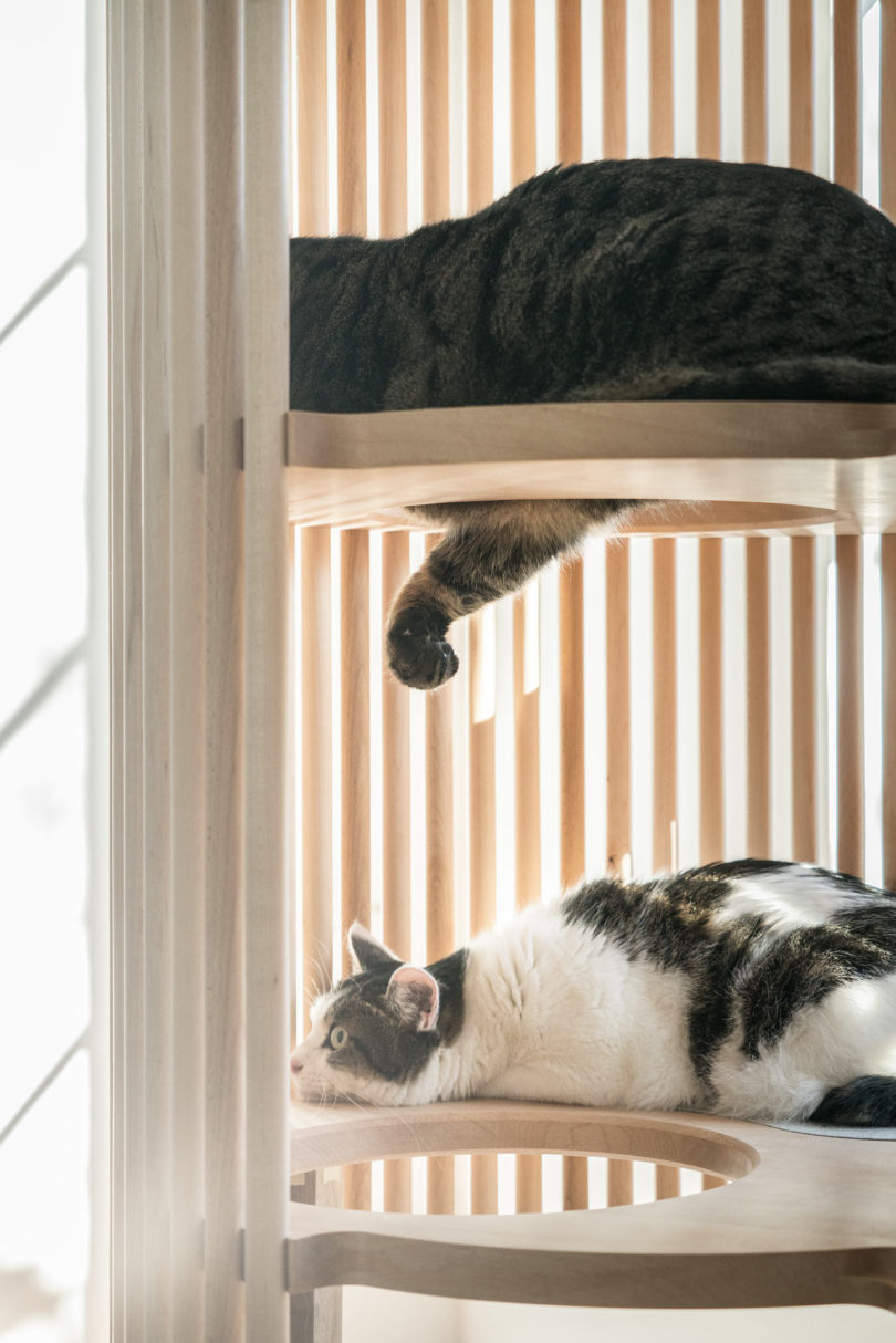
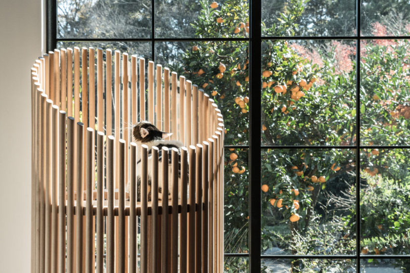
Let’s face it, pets aren’t just pets. They’re a part of the family and because of that, they deserve all the comforts we do. You may have noticed that more and more designers are cleverly finding ways to incorporate furniture for our furry friends – the kind we’re not embarrassed to live with as soon as guests enter the front door. Cat furniture especially has been on the rise and the latest comes from RINN, the same Japanese brand that brought us their minimalist, automatic cat feeder, Petly. This time, they’re launching NEKO, a modern cat tree that gives your feline several spots to nap and a pillar to scratch.
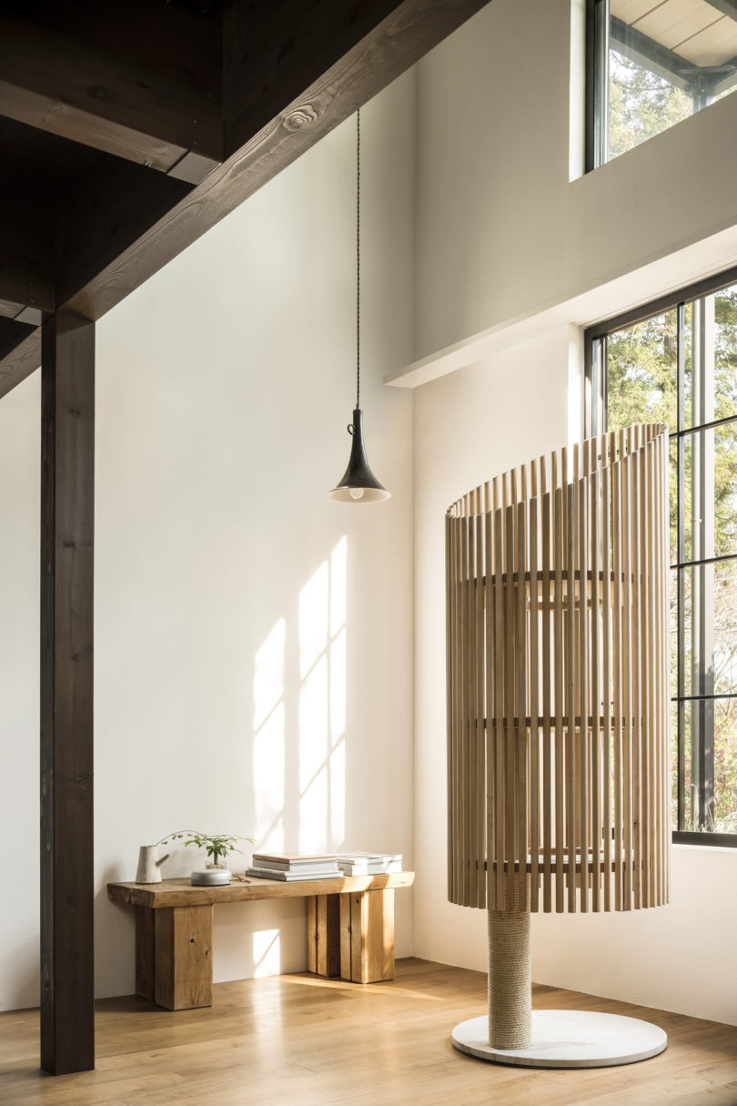
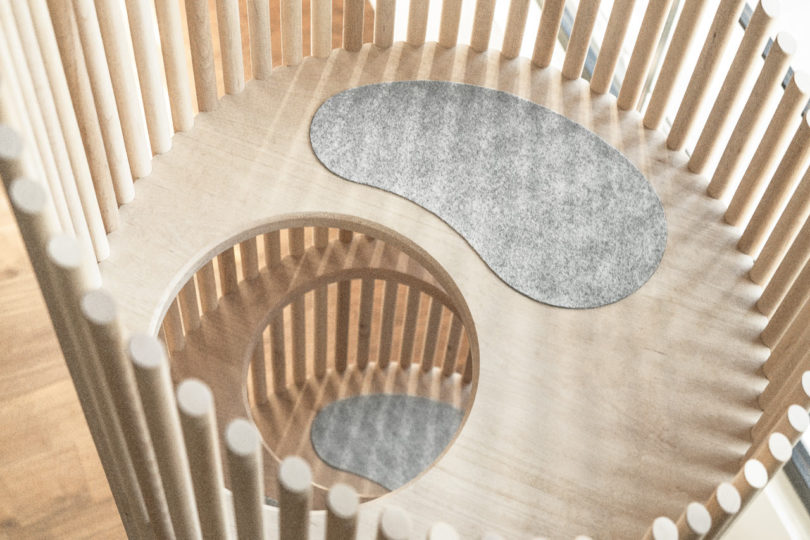
The mostly wooden (from forests in the Hida region of Japan) cat tree features a marble base that holds a hemp cord covered pillar with three elevated levels for rest and relaxation. Each level is partially covered in Kvadrat fabric for additional kitty coziness.


Who would have thought that something so elegant would be designed for a cat? Gone are the days of those carpet-covered monstrosities, which can now be replaced with the wood and marble NEKO that will have your guests inquiring immediately.





accidentally wes anderson.

if you’ve been reading here for a while, you know of my fondness for all things wes anderson (and more specifically, the charming mister anderson himself). so it would come as no surprise that this is my absolute new favorite instagram account: @accidentallywesanderson. it’s pure perfection with so many cinematic gems reminiscent of classic ‘wes-ness’ i had a hard time choosing just a few images to share with you. i’m obsessed with the color palette and symmetry of wes anderson’s eye so this account just brings me endless pleasure. should you also be a fan of the man, you might also enjoy this video which i found fascinating.


• all photographs courtesy of @accidentallywesanderson.
The post accidentally wes anderson. appeared first on sfgirlbybay.
peace for all.

honestly, i don’t know quite what to say to you all, but yet again i find myself wanting to say something because ignoring this latest tragedy seems naive. we can’t just go on looking at pretty pictures, can we? i mean we have to but i’m sure you’re feeling much like me and thinking it feels a little bit shallow at a time like this when our country (our world) is grieving so much. and then i think, well that’s giving in to this terrorism, isn’t it? and i want to try not to do that. yesterday i was a ball of mess. i couldn’t focus, i cried most of the day and felt pretty well broken. and i wasn’t even directly affected like the poor families that were torn apart, forever shattered in one way or another. senseless sorrow that doesn’t have to keep happening. i am tired of hearing from our government that nothing can be done. Tragedies like this one don’t happen in other countries with stricter gun laws. it’s proven. and you can’t tell me that anybody in this country needs an semiautomatic weapon to protect themselves or their families. it’s utterly senseless to say that, so you can have your 2nd amendment but we have to have stricter laws to keep our world safe. jkrowling had this to wisely point out, and jimmy kimmel was so logical to me the other night when he tearfully spoke. he called out the senators who are in the pocket of the NRA, and asked for common sense and action from our elected officials to ensure that something like this doesn’t happen again. there are some things you do if you feel the same — you can join everytown against gun violence or americans for responsible solutions. i’m not here to lecture, and if you disagree, i’m sorry, but i cannot keep hearing that there’s nothing we can do to stop this and i refuse to believe we simply have to accept this is our new normal. we can also be kinder to each other, we can love our families harder. we really just to do better as a country and as human beings. stay safe my friends. perhaps listen to this beautiful song, grieve and do what you need to do to get through this, but then i hope you’ll help fight to stop the cause of all this unnecessary sorrow.
xo, victoria
• iconic poster by artist jean carlu.
The post peace for all. appeared first on sfgirlbybay.
The ToDD Residence by SkB Architects

Designed by SkB Architects for a growing Seattle family, The ToDD Residence was built on a corner lot with limited space available and a tight budget. The design references an urban farmhouse with a two-story, pitched roof structure attached to a single-story volume with a flat roof. The exterior is fairly scaled back with a contrasting color palette of gray and white, simple forms, and no extraneous details.
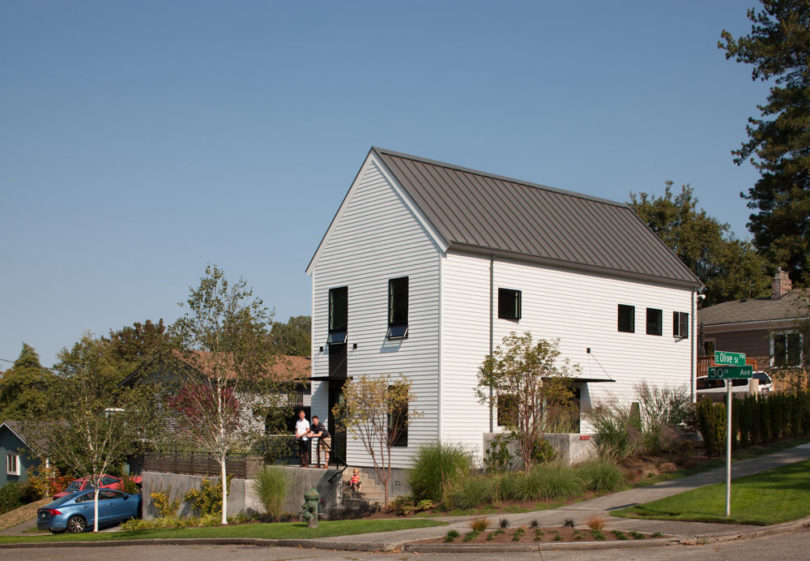


What would typically go in a backyard has been moved up to a side terrace that’s raised above the street for added privacy.


The home’s 1,970 square feet was thoughtfully designed to make the most of every square inch. The ground floor maintains an open floor plan, except for a guest bedroom, that comprises a living room, dining room, kitchen, and home office.


The living area benefits from two fairly private terraces, which expand the feel of the space.


Upstairs marks the private areas with bedrooms that are no larger than they need to be since most of the time is spent downstairs.


Photos by Lara Swimmer and Tim Bies.