Tifmurray
Shared posts
31 Mar 21:27
The Atheists' Case for Fighting Poverty
by Jerry A. Coyne
A new study by Pew Research analyzes data from more than 40,000 people in 40 countries who were asked this provocative question: “Do you need God to be moral?” It is of course a staple of
27 Mar 18:08
studio spaces: jenny sharaf.
by victoria

i was instantly smitten with the bold, colorful work of artist jenny sharaf at tappan collective. but then, it was the portraits of jenny herself, taken by Hans Kwiotek that made me want to learn more about her. she just looks so cool and confident, right? his captures of jenny in her studio space are rad! tappan has a wonderful interview and studio visit with the artist, you should check out — her current medium? “Housepaint and cheap craft paint from Michaels!” Jenny is a an artist born and raised in Los Angeles, currently living in San Francisco, and is also the founder of Gallery Daily, which bridges the gap between art and technology in the Bay Area. Through painting, video, works on paper, and installations, Jenny Sharaf explores “the mythology of the California girl, the role of the female artist, and the image of the role of the female artist, and the image of the 21st century woman in order to illuminate the evolving generational shifts of feminism and contemporary notions of the gaze”. you can see all of her work at tappan collective, as well as her own website. oh, and she has an excellent instagram photostream and tumblr, as well.


• Photos are taken by Hans Kwiotek, Photos via tappan collective.
24 Mar 00:44


Sustainable Mid-Century Modern Dollhouse and Matching Furniture
by Jaime Derringer

The ARC Dollhouse is a brand new design and venture for artist/designer Krista Peel under the name 3 Star Studio. Working alongside her husband, they designed and created a mid-century 3/4 scale dollhouse designed for kids, families, teens, decorators, model-makers and collectors. Inspired by their young daughter, they wanted to create a dollhouse that is recommended for ages 2 and up.
The design of the house, which is made of laser-cut 1/4″ sustainable Baltic birch plywood, grown in WI, was inspired by Oscar Niemeyer, Brasilia and the Palácio do Planalto. It is affordable and comes flatpacked. Easily assembled with some wood glue, the entire thing notches together.
You can buy the house here.


In addition, they also designed a set of furniture specifically for the house that is available in either birch plywood or solid walnut with clear acrylic details.


Buy the Birch Plywood Furniture Set here and the Walnut + Clear Acrylic Details Furniture Set here.
23 Mar 19:03


Redesigned Consumer Packaging Disappears To Eliminate Waste
by Nanette Wong

For his masters thesis, recent Pratt Institute graduate Aaron Mickelson redesigned mainstream consumer packaging to eliminate waste. How? By creating a package that completely disappears by the time the product is finished. The Disappearing Project presents 5 different solutions in a hope to spark conversation and change.

Glad Bags: The package is made up of the last bag in the package itself, leaving no extra trash when it gets used. All the product information and logo are printed using traditional oil-based inks on the package in case you need a reminder of what you purchased.


Tide Pods: Instead of its traditional plastic bag packaging, a sheet of laundry pods will be stitched together, printed using soap-soluble ink. The individual pod packing for each pod is also water-soluble and dissolves in the wash.


OXO Pop Containers: OXO containers have a shiny, logo-ed paper inside the container. Instead of the normal printing methods, the instructions are printed directly onto the container using soap-soluble ink. Then, the label breaks down easily once the consumer washes it for the first time.


Nivea Bar Soap: A simple but effective solution—use a septic-safe, water-soluble paper to wrap the soap. The user will take the whole package into the shower with them, leaving the wrapper to dissolve.


Twining Tea Bags: As of now, tea packaging is lined with wax, preventing it from being composted. Mickelson’s solution is to glue together the sachets into a folded up, self-standing brick. While there still results in some packaging waste (as will likely always be the case with food packaging) but it has been diminished. However, when the product is gone, so is the packaging—which is the running theme for all of these new solutions.

sitdownsun likes this
23 Mar 13:06


In The Kitchen With: Our Favorite Breakfast Recipes
by Kristina Gill

Breakfast is my favorite meal of the day, and among breakfast offerings, I love savory breakfast foods. Since December, I have spent a small fortune on breakfast in the West Village, taking a long time to consume cappuccinos and wonderfully, artery-clogging buttered toast and eggs. When I am back in Rome, savory breakfast is one of the things I miss most. I’ve been traveling quite a bit since late November and haven’t gotten back into a week-morning routine that will allow me to enjoy a slow breakfast, but on the weekends – especially Sunday – I try to allow myself the time to enjoy a nice hot breakfast with a good cup of tea. This week, I have gone through our archives to find our best savory breakfast posts. I’ve put a few sweet ones in for the sweet teeth out there. -Kristina
Above and below, photographer Stacy Newgent shared her secret for the best french toast and crispy bacon. This is my ideal breakfast! Coffee and freshly squeezed orange juice included! See more great breakfast ideas after the jump!

Click through for all of our favorite breakfast recipes after the jump!
    
|
Tifmurray likes this
22 Mar 14:56
Court OKs Duke Rate Hike
A ruling by the Court of Appeals of Indiana paves the way for a rate increase by Duke Energy Indiana Inc. The utility wants to use proceeds from the hike to help pay for a $3.5 billion coal gasification plant in Edwardsport.
21 Mar 14:24

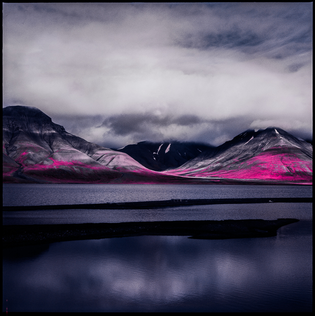
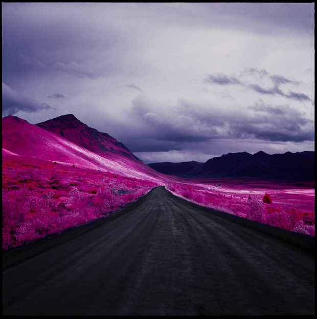
Infrared Film Transforms the Arctic
by Alyssa Coppelman
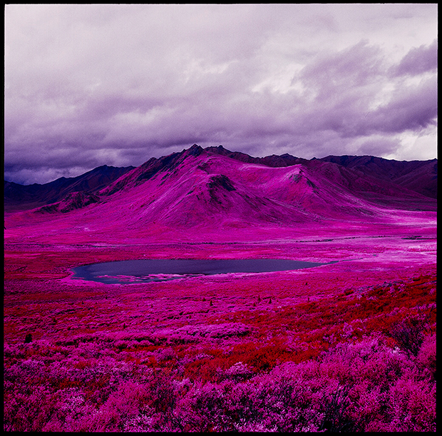

Inspired by Richard Mosse’s infrared work, NYC-based photographer Daniel Zvereff made sure to get his hands on some of the last remaining stock of expired Kodak Aerochrome film in 120 format. The dazzling fuchsia, crimson, and lavender tones are produced when the film reacts to the chlorophyll in plants. Because of this, Zvereff was only able to shoot during the short Arctic summer, and will have to wait until next summer to continue the project. It will be his last chance to use the film, which degrades more quickly than most film, before it goes completely bad.
Zvereff plans on taking these last 15 rolls back to the Arctic and, hopefully, into Russia. Of the parallels of place and process, Zvereff says: “The Arctic will essentially be the next frontier for mining natural resources, and with a warming climate it’s safe to say it will soon be transformed as we know it, forever. It only seemed appropriate to photograph its incredible natural beauty using a film that is no longer in existence.”
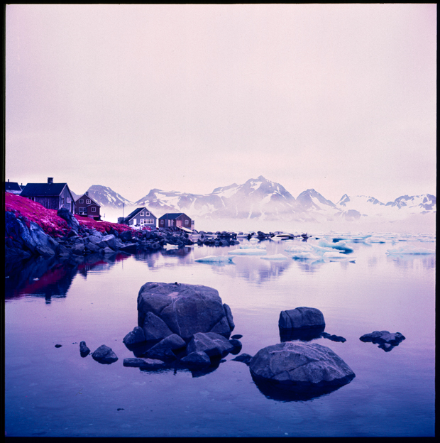
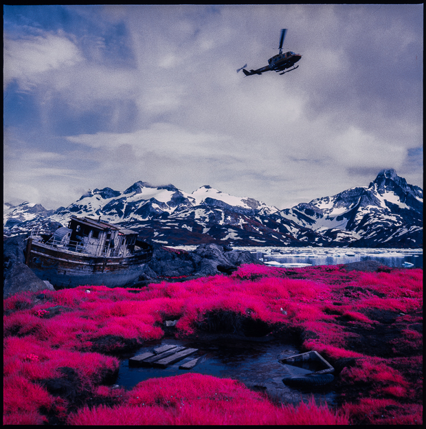
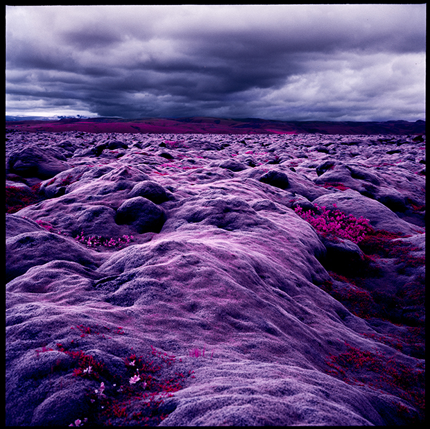

The post Infrared Film Transforms the Arctic appeared first on Feature Shoot.
20 Mar 18:36


 I had the rare beef pho ($8), and while it was good, I still think there are better around town. The broth just didn’t have the richest flavor of all the ones I have tried, although it was still very good. I do like that it looks like they literally put the beef in raw and let the broth alone cook it (the top parts of the meat poking out of the broth were still very pink). I was a little disappointed with the amount of fresh herbs you get here—and all of it is Thai basil and none of it was cilantro (the picture you see in the background is the plate for two bowls of pho). I like a bit of both. They give you plenty of bean sprouts though and nice juicy wedges of lemon which I love to add for the extra bit of brightness. I also throw in some jalapenos for touch of spiciness, although I do not eat them. I just let them flavor the broth a bit.


Saigon - Revisit
by Erin in Indy
Back on the Vietnamese trail, we wanted to give Saigon another try. We hadn’t been for years and I had never had their pho. I have been having fun comparing different versions at different places and was anxious to try it.
Hubby and I met up with @zigged and her husband for dinner. I loved having the opportunity to have more people to get to try more things! We started off with the Vietnamese pancake (of course, it’s one of my favorites) ($8.95) and the crispy rice pudding ($8.50). The pancake was good—the crepe aspect of it nice and crispy and thin. They all generally come filled with sliced pork and shrimp (not a lot of shrimp here) and bean sprouts. I enjoyed it but for some reason, not as much as some of the others I have had. I don’t think it had as much of the green onion flavor as some I have had and the pork wasn’t as seasoned. I like the seasoned fish sauce for dipping—giving it a bit of salt and a bit of tanginess.
The rice pudding was very interesting. It was cubes of the soft rice cakes that were stir fried with egg and scallions and served with a thicker, soy based sauce. The cakes were soft yet firm, and slightly crisp on the outside. The eggy mix added a bit of substance to them, making them definitely savory. A bit of the lightly pickled radish and carrots on the side was a nice addition to the bites. A dip in the sauce added the salty flavor and a touch of sweetness. The longer we continued eating these, the more we couldn’t stop.
I had the rare beef pho ($8), and while it was good, I still think there are better around town. The broth just didn’t have the richest flavor of all the ones I have tried, although it was still very good. I do like that it looks like they literally put the beef in raw and let the broth alone cook it (the top parts of the meat poking out of the broth were still very pink). I was a little disappointed with the amount of fresh herbs you get here—and all of it is Thai basil and none of it was cilantro (the picture you see in the background is the plate for two bowls of pho). I like a bit of both. They give you plenty of bean sprouts though and nice juicy wedges of lemon which I love to add for the extra bit of brightness. I also throw in some jalapenos for touch of spiciness, although I do not eat them. I just let them flavor the broth a bit.Hubby ordered the clay pot pork ($9.95), which was probably the best dish on the table. The pork had a spicy, peppery seasoning that was great. Not so much a sauce, as a spice rub almost. The pork was tender. The only thing I thought was a little weird is that they served the rice on the side. The rice was good-just the right amount of sticky factor, but usually when I have had a clay pot, the rice is on the bottom of the pot and cooked that way so that it is a bit caramelized and crispy on the bottom and has absorbed a bit of the flavor of whatever is cooked on top. I would have loved to see this in this dish.
Sacha’s hubby had the mixed grill ($14.95), which also had a wonderful rich flavor—you could taste the smoky grilled taste on all the meat—which included chicken, pork and shrimp. It was served with a side of rice noodles that were cold, and thus not my favorite thing (I am not a huge fan of cold noodles). I am not sure if they were warm to start or not. The meat on the dish was very good. I might be tempted to order it with rice though, just because rice tends to stick together better and stay warmer.
You have to love the fact that the place used to be a Bob Evans. You can tell they have tried to change it up a bit, but it still has the distinctive Bob Evans bones. But I am always happy to see a former chain turn into an independent restaurant.
Saigon has a huge menu though—162 items to be precise. I would love to know what your favorite items are.
Saigon Restaurant
4760 W. 38th Street
Indy 46254
317/927-7270
20 Mar 18:36


Szechwan Garden - Revisit
by Erin in Indy
I have a lot to talk about! This post combines a couple of meals—lunch with my friends Sacha and Scott and a business dinner. (Most prices listed here are dinner prices, lunch is always cheaper.) So I got to try a lot of things.
I am just going to sort of jump around with some of the stuff. Combined, I tried several appetizers/dim sum items (dim sum is only available at lunch). I really enjoyed the shrimp and chive dumplings—very chive-filled for sure (I am thinking maybe some scallions too). Nicely pan-seared giving a little crispy edge. Not a ton of shrimp, but just enough to give it a fuller consistency. At dinner we tried the scallion pancake ($3.50), crab Rangoon ($5.95), pot stickers ($5.95), and the just straight up dumplings ($4.50). Of these, I probably liked the dumplings and pot stickers the best. The pot stickers were nicely pan-fried as well, giving just a touch of crunch on the outside and the dumplings were softer, and sitting in a spicy chili/soy broth. But it was nice to have some of the fried items to go along with the dumplings—the crab Rangoon were more cream-cheesy than crabby, but were fried just right and were super hot and crunchy. The scallion pancakes is crispy, but with a softness as well. Lots of fresh green scallion flavor.
 |
| chive dumplings |
 |
| potstickers and dumplings |
 |
| crab rangoon and scallion pancake |
Of the various entrées I had over the course of both meals, some of the highlights were the pan fried green beans with little crispy bits of pork belly ($8.95 for dinner portion, lunch is cheaper)—the beans still had a snap, but had a slightly blistered skin from the heat. I also really enjoyed the Chengdu braised fish in hot chili oil. This one probably had the most kick of all the dishes. The fish was tender and was lovely over the rice served alongside. A table favorite was the shredded pork with garlic sauce ($9.95). This dish was a bit spicy as well, and had a rich garlic sauce. There were lots of sliced onions and red and green peppers as well. I liked the way that the meat and the veggies were all sliced similarly to each other, giving just the right proportion of all the flavors in each bite.
 |
| Green beans |
 |
| Chengdu Fish |
 |
| Shredded pork |
We also had the fried squid with salt and pepper ($14.95). I generally love salt and pepper items, and the crust on this had a good crunch and flavor, but the pieces of squid suffered the chewy fate that it so often does. Based on the flavor of it though, the fried fish fillet with salt and pepper is on my list for my next visit. I think with more tender fish, this dish will be super tasty. Salty and a fair dose of pepper as well. I can’t wait. We also had the shrimp and garlic sauce ($13.95). This one was good as well—tender plump shrimp plus more fresh veggies—bigger ones here if you’re looking for a more balanced meal between protein and veg. There was broccoli, red pepper chunks and peapods. I enjoyed it, although it was a bit blander than the other dishes. The beef chow fun was an interesting one as well, and also not spicy. The homemade thick noodles were sautéed with scallions, bean sprouts, and large pieces of sliced beef. This is more of a soy-based sauce, with maybe just a touch of sweetness. I liked the fresh noodles. That’s pretty much my story in any type of cuisine though.
 |
| squid |
 |
| garlic shrimp |
 |
| beef chow fun |
For me, the biggest miss was my lunch order of sautéed eggplant with basil sauce (and I asked them to add some chicken). In the past when I have dined at Szechwan Garden, I have seen people eating big plates of eggplant and I always wanted to get it, even though I wasn’t exactly sure which dish it was (there are several eggplant dishes on the menu). This dish was really overly oily and had little flavor at all. I actually tried to order the garlic-based eggplant dish at dinner to see if it was better (and to see if my lunch may have just been a fluke), but somehow it got forgotten and by the time we realized it, we had all had WAY too much to eat to order more. So, someday maybe I will figure out the mysterious eggplant dish.
 |
| eggplant |
Which brings me to my final thought, how can you ever really get a handle on this place? How do you even know what to begin to order when there are 374 menu items (plus the dim sum)? So do you order something new every time or stick with old favorites? I know I am trying the salt and pepper fish next time, but that’s about as far as I can get. How do you guys handle it and what are your favorite items?
Szechwan Garden
3649 Lafayette Road
Indy 46222
317/328-2888
20 Mar 16:04
Hearing Set on Proposed Water Rate Hike
Indiana American Water Co.'s proposed rate hike will be the topic of two public meetings next month in Gary and Franklin. The Indiana Office of Utility Consumer Counselor field hearings will discuss the utility's plan to raise nearly $20 million for infrastructure modernization projects.
20 Mar 16:04
ProLiance to be Acquired by Chicago Utility
An Illinois company has announced an agreement to acquire Indianapolis-based ETC ProLiance Energy. The deal with Exelon Corp. (NYSE: EXC) is expected to close in the second quarter of this year. ProLiance is expected to become part of Exelon's Constellation subsidiary.
20 Mar 16:03
IURC Reduces Rate Increase From Citizens
The Indiana Utility Regulatory Commission has approved a smaller rate hike than requested by an Indianapolis-based utility. Citizens Water was seeking a nearly 15 percent increase. The IURC says 9 percent is sufficient, arguing the requested "level of executive compensation" was too high.
18 Mar 17:51
Indiana American Water seeks to raise rates
For most of the utility's residential customers using 5,000 gallons per month, the monthly water bill would rise from $37.35 to $39.75.
18 Mar 17:34
Group to Seek Feedback on Massive Upgrades
The Indiana Office of Utility Consumer Counselor is slated to hold a public meeting next month in Evansville to detail a proposed statewide infrastructure project. It involves a nearly $1 billion investment by Vectren Corp. (NYSE: VVC).
18 Mar 13:52

Beautiful Yet Horrifying Aerial Photos of the BP Oil Spill
by Alyssa Coppelman

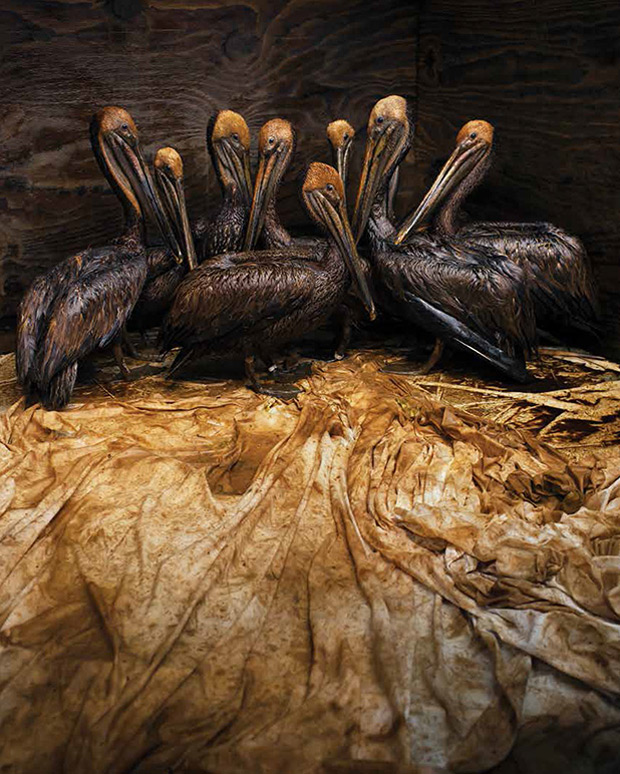
One of the best ways to draw attention to the ugly side of humanity of is to beautify it, to make people want to look instead of look away. Seattle-based photographer Daniel Beltrá has achieved this with his photographs of the 2010 BP Deepwater Horizon oil spill in the Gulf of Mexico, which he documented for Greenpeace. Spill, published by Gost Books, collects these striking images, all reminiscent of abstract paintings, into a compelling volume of evidence of environmental devastation.
If the expanse of the ocean were an unknown visual trope, it would be possible to get lost in the sheer beauty of these photographs. Knowing how the ocean normally looks, the horror of this massive environmental catastrophe that killed 11 people, countless animals, and polluted oceans and coastlines and interfered with fisheries is readily apparent and impossible to escape.
Arriving in the Gulf one week after the spill, Beltrá spent 40 hours over the course of two months photographing the spill and cleanup efforts, flying 3,000 feet above the Louisiana coastline in a small, rented Cessna aircraft. Some of the 411 controlled burns used to clean up the spill are visible in Beltrá’s photos, as well as the effects of the oil and Corexit, the controversial toxic chemical poured in vast quantities (1.8 million gallons) over the spill, evidenced by the red striations seen through the surface of the oil and water. Although the Deepwater Horizon oil disaster happened almost four years ago, images of it remain consistently relevant out of the sheer probability that this very same sort of disaster could happen again.
Beltrá’s work is currently on view in the exhibition Prix Pictet: Power at the Museum of Photographic Arts in San Diego through May 18, 2014.


The post Beautiful Yet Horrifying Aerial Photos of the BP Oil Spill appeared first on Feature Shoot.
Constantincerdan likes this
16 Mar 17:12
MISO Breaks Ground on South Region Center
A Carmel-based energy market manager has started work on a regional operations center in Arkansas. The Midcontinent Independent System Operator Inc. says it will be a command center for its new south region. MISO plans to hire 50 workers in Little Rock with average salary of $85,000.
12 Mar 15:46
Indiana American Water Adds Utility Company
Greenwood-based Indiana American Water has acquired a Sullivan County utility. The deal for Merom Water is valued at nearly $400,000.
12 Mar 15:25
How a Court Secretly Evolved, Extending U.S. Spies’ Reach
by By CHARLIE SAVAGE and LAURA POITRAS
Leaked documents add new details to a secret body of law that the Foreign Intelligence Surveillance Court has developed since it began to broaden its role in 2001.
|
|
11 Mar 17:58

‘Humanae’ Portraits Match People of Different Ethnicities With Their Pantone Color
by Laura Barisonzi


Brazilian fine art photographer Angelica Dass‘ series Humanae identifies portrait subjects from around the world using the Pantone color system. Using an 11×11 pixel swatch from her subjects’ faces, Dass matches them to corresponding Pantone colors, creating an abundant and unique catalog of skin tones that reflects the world’s diversity beyond the categorizations we have long been confined to. We recently asked her more about the ongoing project.


What was your inspiration for using Pantone colors to represent humans?
“If what I wanted was to destroy the concepts of colors associated with race, such as red, yellow, white and black, it would not be logical to use a color scale that works with percentages of these colors. That’s why I chose not to use CMYK or RGB. Pantone works on a neutral scale, where a color has no more importance than another. It’s a very identifiable scale for those in the world of design, but also easily understood by anyone. It provides a way to look objectively at the ‘human object.’”


How do you go about finding subjects for your work and what are the criteria you are looking for?
“There is no selection criteria. I make public announcements through social networks. To ensure diversity in the project, I work at spaces that are not only in the art world, too. The 2000 images in the project have been made in galleries and art fairs, but also in urban favelas, in NGOs, at the headquarters of UNESCO, and in cooperatives that work with the homeless.
“Not only are there a mix of faces and colors, but a mix of social classes, religions, sexual orientations, political elections, economic status—together in Humanae we cannot be confined to these codes. So far I have taken portraits in seven cities: Madrid, Barcelona, Winterthur, Rio de Janeiro, São Paulo, Paris, and Chicago. My minimum goal is to make portraits on all the five continents.”


By identifying your subjects by Pantone color rather than ethnicity/color of origin/name/occupation, etc., what commentary do you hope to make about their identities and the relationship between them?
“It is a kind of game for subverting our codes. The ultimate goal is to provoke discussion about ethnic identity, creating images that lead us to identify each other independent from factors such as nationality, origin, economic status, age, or aesthetic standards. The most important thing for me is the dialogue Humanae has generated outside of the existing conversation. For example, Humanae has been used in educational textbooks by teachers who use it as a tool to talk about equality, appropriation for new artists who are interested in the physiognomic variety in the project, or scientists who use it to illustrate their research.”
Since the Pantone system is a highly structured and ordered system, how does your display of the work relate to this system?
“The project is exhibited in different ways, but always messy numerically. The aim isn’t to make a color scale from light to dark. The intention is to make it like real life—all together, and mixed. Each time I exhibit, I always try to make new portraits, to continue adding images to a work in progress.”


The post ‘Humanae’ Portraits Match People of Different Ethnicities With Their Pantone Color appeared first on Feature Shoot.
11 Mar 17:58

Amusing Photos Highlight the Bizarre World of Trade Shows
by Alyssa Coppelman


In his ongoing series, Convention, NYC-based photographer Harry Griffin calls attention to the rather quirky aspects of conventions and trade shows, in particular those related to health, beauty, “glaring instances of commodity fetishism,” or “anything uniquely esoteric, like gardening or hot tubs…”
Griffin’s destiny was tied early on to trade shows—his father invented the All Wall System and attended trade shows to market his invention, bringing Griffin along with him when he was a child. About Convention, Griffin says, “After the first show, it was thrilling but I couldn’t place why. The second, The Greater NY Dental Meeting, was when it started to come together.”
About one of his more bizarre experiences, Griffin says, “On the first day of the International Association of Amusement Parks and Attractions (IAAPA) expo there was an awards ceremony. They honored various CEOs and Presidents for their part in globalizing their respective countries. Towards the end, Mickey Mouse and his gang of breakdancers took the stage and did headspins. All of this for an audience of middle-aged, primarily white, men in suits. To say it was excessive would be an understatement.”


The post Amusing Photos Highlight the Bizarre World of Trade Shows appeared first on Feature Shoot.
11 Mar 17:56
Major Library Conference Hits Indy
Thousands of library professionals from throughout the world are in Indianapolis for the Public Library Association 2014 Conference. The five-day event will feature professional development sessions, technology demonstrations and a keynote speech by humorist and author David Sedaris. Visit Indy expects the conference to draw 9,000 attendees.
11 Mar 17:55
 “Why would you get the guy who created the Zune to make your website?”
Watch Barack Obama Chat with Zach Galifianakis on Between Two Ferns
“Why would you get the guy who created the Zune to make your website?”
11 Mar 17:43
separated at birth.
by victoria

don draper + sam mcadam-cooper photography.
it’s been a long while since i’ve shared a separated at birth. but it’s a special occasion. cuz, guess what? mad men is on its way back. and it’s the final season. such bittersweet news. what will become of our beloved don draper? and what of betty — will she ever find contentment? will roger keep dropping acid? will peggy go on to find true love? so many questions to be answered, so little time left. stay tuned — the final season begins sunday, april 13.


Marika Jarv Creative + roger sterling.


10 Mar 12:48

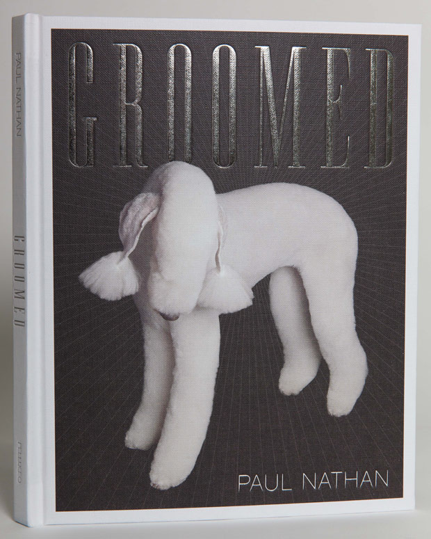
Dogs Gone Wild: Photos of ‘Creative’ Fur Styles at A New Jersey Dog Grooming Competition
by Amanda Gorence


New Zealand-born, NYC-based photographer Paul Nathan shines the light on some perfectly primped canines in his new book Groomed, released this Spring by Pelluceo Publishing. Shooting at multiple high-profile grooming competitions, Nathan explores the world—and art—of dog grooming, capturing the creations of some of the world’s top dog groomers. The selection here are from what’s known as the ‘creative’ category. Humorous and delightful, Nathan’s pre-show portraits reveal character in both the artist and the canvas. He recently told us more about the world of dog grooming.
Where did you find these colorful pups?
“The images in the Creative Grooming section of Groomed were taken last April at Intergroom in New Jersey. Intergroom is one of the largest international conferences of its kind in the world with more than 2000 dog and cat groomers attending each year. This year’s Intergroom is coming up on April 5-7th, 2014.”


Do you know how long this sort of grooming takes and how the dogs react to it? Any tricks to making them stand still while getting so decked-out?
“According to groomers I have spoken to, not every dog can be part of a creative grooming competition or have these extreme color creations done to them. As with child stars, some are just born with patience and the will to please that help them deal with the long process involved in creating a creative grooming piece. In most cases the colors are done in stages on different days, usually in sessions of no more than three hours with plenty of breaks for the animal. Every dog is different and only the groomer knows how long to work with a dog. Keeping the dog happy and comfortable is key.”
Do you know what type of dye is used, or how long it lasts?
“There is a vast variety of hair coloring products for dogs. They are all non-toxic and semi-permanent. Depending on the kind of coat the dog has it can last from a few washes to a few months.”
Who are the enthusiasts/pet owners behind this?
“The enthusiasts are master dog groomers competing at grooming competitions like Intergroom. They are wholly responsible for the designs. In fact, when the dogs are presented, the groomer is often dressed to match the animal and there is a set or backdrop where the animal is presented. I simply chose my favorites to photograph.”


The post Dogs Gone Wild: Photos of ‘Creative’ Fur Styles at A New Jersey Dog Grooming Competition appeared first on Feature Shoot.
07 Mar 19:54


A Chopped-Up 1960s Home Gets Modernized
by Caroline Williamson

Located in Palo Alto, California, this 1960s home, designed by Brown and Kaufman, was in need of a major renovation. The house was dark and chopped-up with too many internal walls preventing light from filling the space. Klopf Architecture came up with a plan to brighten the home by creating space and flow by removing walls and adding new windows.

The size of the living room was reduced so that they could add a master walk-in closet and laundry room/desk area, but the space still feels roomy.

The kitchen’s windows were redesigned to let more light in. I love how instead of a boring backsplash, they used windows which really lightens the darker cabinets up. I also love the bright yellow behind the stove.

There was also a partition wall in the kitchen that was removed to open it up.


Photos by Mariko Reed.
07 Mar 15:05
Modern Wood Kitchens
by Naomi
Maybe it’s in reaction to the world being so saturated with all WHITE KITCHENS, but I find myself attracted to EARTHY STAINED CABINETS recently. When doing stained wood in a kitchen I love it rich: not too dark (espresso) not too light ( bleached) Those looks, while lovely, seemed more trendy to me, and thus prone to lookin dated down the road. I’d rather have a natural stained walnut or weathered reclaimed wood. Something organic and natural. The stained wood cabinet looks best on a modern door- slab or something with minimal embellishment. Pair it with a light counter, modern fixutres, perhaps an unexpected pattern and you have yourself one chic kitchen.
 via Design Files


That island! I love a mix of wood and metal.
06 Mar 21:00

Paneer Bhurji, or Indian-Spiced Scrambled Paneer with Peas
by Cara

We fell in love with Indian food when I was in seventh grade. By we, I somehow mean my entire world at once. Friends and family converged at this one Upper West Side restaurant, all of us craving potato samosas, saag paneer, and chicken tikka masala at the same time, and often. It was 1997, and I guess we’d been busy eating the cuisine of the 90s, whatever that was, and when it came to light that there were delicious and deeply flavorful stews and rice pilafs, not to mention naan and poori, that we’d been missing all this time, we decided to eat our fill. We also all loved vegetarian main dishes, and Indian cuisine has got those aplenty.
Ever since those dinners, starting in middle school, I’ve loved Indian food–I’ve taken cooking classes, explored neighborhood restaurants, and tried my hand at curry pastes at home. Despite this, I haven’t branched out that much, menu-wise, in what I order at restaurants.

Then one cold night in January, I met my friend Anika for Indian food at a local place she’d found, and she–daughter of an excellent Indian home cook–told me that there was a new dish she’d never had til recently. She introduced me to paneer bhurji that night, and in a way it made me fall in love with Indian food all over again, the vast array of sub-cuisines and whole undiscovered dishes (which makes sense, since India is enormous and diverse!). Thanks to this paneer preparation, I jumped back into my at-home Indian cooking journey and decided I’d figure out how to make paneer bhurji at home. Like vegetable korma, paneer bhurji is a meatless dish that pairs beautifully with warm naan.


Paneer bhurji uses paneer, the blank slate that many Indian vegetarian meals center around. I’m sure you’ve eaten your fill of saag paneer, but maybe not tried paneer in other ways. I hadn’t either. But here, instead of being fried in whole cubes, the paneer gets crumbled and scrambled, and the result is totally different. The flavor given to the blank slate derives from cumin, toasted in oil at the beginning, pinches of a couple other spices in the vein of garam masala, then lemon to balance the flavors. Essentially, this is a simple dish, something you might eat for weekend lunch instead of scrambled eggs. In the summer, you could throw in seasonal vegetables and nix the peas.

Unlike paneer dishes, naan is hard to make at home, and that’s where Stonefire comes in. The company makes traditional naan in its high-tech ovens, which mimic the intense heat of an actual ancient tandoor oven, a heat that can’t be replicated in a home kitchen. I like to keep the naan in the freezer (it comes in four flavors), then warm in my oven and brush butter before serving. Stonefire’s recipe uses both buttermilk and ghee and gets its teardrop shape from being hand stretched. Also, naan can be a great last-minute crust for pizza!
This post was sponsored by Stonefire. Figure out where to get your own naan on Stonefire’s store finder. Thanks for supporting the sponsors that keep Big Girls, Small Kitchen delicious!
**Recipe**
Paneer Bhurji
Serves 4
For those of you in the NYC area, I found Gopi brand paneer at Union Market. I don’t keep garam masala spice blend on hand, but if you do, sub in about 1/4 teaspoon for the coriander, cinnamon, cloves, and cardamom. Still use the whole cumin seeds, though–they’re central to the flavor.
Ingredients
8 ounces paneer
2 tablespoons neutral oil, like safflower
1 teaspoon whole cumin seeds
about 1 inch piece ginger, minced (1 tablespoon)
1 onion, minced
2 serrano chilis, seeds removed, minced
1/4 teaspoon ground coriander
Pinch cinnamon
Pinch cloves
Pinch cardamom
Freshly ground black pepper
Salt
3 whole tomatoes from a 14-ounce, chopped, plus 2 tablespoons juice from the can
1/2 teaspoon sugar
1 teaspoon freshly squeezed lemon juice
1/2 cup frozen peas, defrosted
2 tablespoons half and half
1 scallion green chopped, for serving (optional)
Naan for serving
Crumble the paneer, by hand or in the mini food processor, until it resembles medium-fine curds, like scrambled eggs. In a large skillet, heat oil over high heat and add the cumin seeds. Fry, shaking the pan, for 1 minute, until very fragrant. Lower the heat to medium, and add the ginger, onion, and serranos, and cook til soft, stirring often, about 8 minutes. Add the spices and 1/2 teaspoon salt. Now throw in the paneer and cook for 3 minutes to let the flavors meld. Add the tomatoes, sugar, and lemon juice, and let the paneer bhurji simmer and become a bit saucy. Stir in the peas, then finish with the half and half. Taste for salt, adding more if needed. Sprinkle with the scallion green if using, then serve with naan.
Paneer bhurji reheats well in the microwave and is also great cold or room temp, as leftovers.
06 Mar 20:46
Duke Energy Names Indiana VP
A 25-year Duke Energy employee has been named vice president of community relations and economic development for Indiana. Marvin Blade most recently served as a government and community relations manager for Duke's Ohio/Kentucky business unit.
06 Mar 17:15

Hilarious Portraits Use Scotch Tape to Distort Faces
by Jenna Garrett


Albuquerque-based commercial photographer Wes Naman has discovered how to draw out the best of the worst in his contortionist portrait series Scotch Tape. Inspired by a silly moment while wrapping presents, Naman recruited family and friends to be transformed by his mutant use of office supplies. Simultaneously horrifying and hilarious, each smashed nose and stretched lip provides zombie-esque plastic surgery that one cannot look away from. Never taking more than 10 minutes to apply his effect, Naman uses photography to stretch and squeeze everyday people into fantastically freaky creatures.


The post Hilarious Portraits Use Scotch Tape to Distort Faces appeared first on Feature Shoot.
05 Mar 20:37


At the moment, I am sitting in my temporary work spot which faces a sparkling pool basked in the California sunshine- quite a big change from the pouring Portland rain. This view puts bright, sunshine-y colors on my brain: palm tree greens, pool blues, bikini pinks, and of course, warm yellows.
Sources (from top to bottom): SF Girl By Bay, Lonny, decor8, unknown, Trisha Brink Design, The New Tenant, Love Made Me Do It, The Design Files, MIMI + MEG, homestyle magazine, and Designspiration.
INTERIOR INSPIRATION : POOLSIDE COLORS.
by Summer Allen
At the moment, I am sitting in my temporary work spot which faces a sparkling pool basked in the California sunshine- quite a big change from the pouring Portland rain. This view puts bright, sunshine-y colors on my brain: palm tree greens, pool blues, bikini pinks, and of course, warm yellows.
Sources (from top to bottom): SF Girl By Bay, Lonny, decor8, unknown, Trisha Brink Design, The New Tenant, Love Made Me Do It, The Design Files, MIMI + MEG, homestyle magazine, and Designspiration.