Shared posts

02 Apr 18:55

A Modern Interpretation of Traditional Stone Inlay

by Caroline Williamson

A Modern Interpretation of Traditional Stone Inlay

Lithos Design aims to change the way you think of stone inlay designs by removing the traditional patterns and transforming them into modern interpretations. The Opus collection, designed by Raffaello Galiotto, explores the classical idea of marble inlay work with a whole new approach to it where they incorporate 25 different types of marble, five patterns, and 12 color ranges for a series of new looks.

Lithos-Design-OPUS-2-MIKADO-pepe

Designed for the floor and walls, the patterns come ready-to-install as 60cm x 60cm modules, with patterns that can be extended depending on its intended usage. Full of geometric shapes and bold graphic patterns, the Opus collection offers a beautiful, modern look with a bit of a traditional feel.

Lithos-Design-OPUS-3-MIKADO-zucchero

Lithos-Design-OPUS-4-MIKADO-zucchero

Lithos-Design-OPUS-5-MIKADO-cacao

Lithos-Design-OPUS-6-MIKADO-cacao

Lithos-Design-OPUS-7-BAMBU-foresta

Lithos-Design-OPUS-8-BAMBU-foresta

Lithos-Design-OPUS-9-BAMBU-deserto

Lithos-Design-OPUS-10-BAMBU-deserto

Lithos-Design-OPUS-11-TANGRAM-ginger

Lithos-Design-OPUS-12-TANGRAM-ginger

Lithos-Design-OPUS-13-TANGRAM-aloe

Lithos-Design-OPUS-14-TANGRAM-caffa

Lithos-Design-OPUS-15-ALLEGRO

Lithos-Design-OPUS-16-ALLEGRO

Lithos-Design-OPUS-17-ANEMONE-perla

Lithos-Design-OPUS-18-ANEMONE-perla

Lithos-Design-OPUS-19-Anemone-muschio


02 Apr 17:41

A Look at Creative Food Packaging

by Pinch Food Design

At Pinch, Bob notoriously teases me for having a “PP problem.” No, it’s not what you’re thinking…. It’s a packaging problem. I am obsessed with packaging. So this month we want to highlight Tomorrow Machine, a Swedish design studio based in Stockholm & Paris that specializes in package product and food concepts.

The two projects “This too shall pass” and the “Sustainable expanding bowl” are both examples of how the creative designers behind Tomorrow Machine, Hanna Billqvist and Anna Glansén, focus on building a better world through research, new technologies, and intelligent material.

A Look at Creative Food Packaging

This too shall pass asks whether it is reasonable that it takes several years for a milk carton to decompose naturally, when the milk goes sour after a week? “This too shall pass” is a series of food packages where the packaging has the same short life span as the foods they contain. The package and its contents are working in symbiosis.

Tomorrow-Machine-1a

Oil package
A package made of caramelized sugar, coated with wax. To open it you crack it like an egg. When the material is cracked the wax no longer protects the sugar and the package melts when it comes in contact with water. This package is made for oil-based products.

Tomorrow-Machine-2

Tomorrow-Machine-3

Tomorrow-Machine-3a

Smoothie package
Gel of the agar-agar seaweed and water are the only components used to make this package. To open it you pick the top. The package will wither at the same rate as its content. It is made for drinks that have a short life span and need to be refrigerated – fresh juice, smoothies, and cream, for example.

Tomorrow-Machine-4

Tomorrow-Machine-5

Tomorrow-Machine-6-rice

Rice Package
Package made of biodegradable beeswax. To open it, you peel it like a fruit. The package is designed to contain dry goods, like grains and rice.

Tomorrow-Machine-7

Tomorrow-Machine-9

Tomorrow-Machine-10-expanding-bowl

The Sustainable expanding bowl created for Innventia is a self-expanding instant food package combining different aspects of sustainability. It saves space in transportation by being compressed – at the same time, it is made out of a 100% bio-based and biodegradable material, invented by Innventia.

Tomorrow-Machine-11

The project combines the knowledge of scientists and the creativity of designers. When pouring hot water into the package the mechano-active material will react to the heat and transform from a compressed package to a serving bowl. This is the new generation of sustainable package design, using materials that are both smart and environmentally friendly.

Tomorrow-Machine-12


02 Apr 17:14

A Light That Could Ease Seasonal Affective Disorder

by Nanette Wong

A Light That Could Ease Seasonal Affective Disorder

The Day and Night Light by Éléonore Delisse is not only a beautiful, richly hued lamp, it also has a psychological benefit. The way the colors oscillate within the lamp is coordinated with the body’s circadian rhythm, and can help rebalance our internal cycles.

Day & Night Lights_7

Set to cycle every 24 hours, the light changes due to a slowly rotating dichroic glass. In the morning, it casts a cool blue light to stimulate wakefulness. In the evening, it shines a warm amber, resulting in increased melatonin production to aid with sleep.

Day & Night Lights_8

By mimicking natural daylight, it helps stop the negative affects of winter. For those who may suffer from seasonal affective disorder, the Day and Night Light might be the perfect alternative remedy.

Day & Night Lights_3

Day & Night Lights_5

Day & Night Lights_2

Day & Night Lights_1


01 Apr 19:59

The Garden Table

by Erin in Indy
I am always looking for new lunch places in my neck of the woods. I have a decent smattering of friends who meet me on various sides of town for lunch, and the BFF and I tend to stay in the Broad Ripple/Fashion Mall area. To be totally honest, we also tend to repeat a lot of the same places, so I was excited to see a new Broad Ripple possibility for us.

The Garden Table is a super cute place—you order at the counter and they bring your food to your table. There’s a giant menu over the bar as well as printed menus you can peruse at your leisure as well. They mainly focus on breakfast (“morning plates”) and lunch (“afternoon plates”)—and tend toward a sort of earthier crunchy vibe—lots of healthy options, and lots of vegetarian options. Of course, you probably could have guessed that from the name.

I was happy to see just enough meat on the menu—what they do have is generally local—like the Smoking Goose bacon on my BLT Smash ($10). It was a sandwich served on grainy bread (I’m thinking it’s Amelia’s). There was a layer of smashed avocado on the bottom layer of bread, topped with romaine lettuce, tomato, Sriracha aioli and lots of the aforementioned bacon. There was another piece of bread to put on top if you wanted, but I just went with the open face. It was a good sandwich. The proportions were a bit off for me—the bread was thick and fairly dense (it actually would have not been overly feasible to eat this sandwich as a sandwich for me—with both pieces of bred). The flavor of the bacon and the aioli were great together. I wished for a tad more avocado, but I usually do. The biggest letdown was the tomato—not so much because it wasn’t super ripe and tasty (it is February after all), but more because both halves of my sandwich were topped with a really thick end of the tomato—not a slice. A couple of very thin slices would have made the proportions just right as well as the acidic balance. As it was, I pulled most of it off. But even so, I liked the sandwich. The greens on the side were clearly dressed, but with what, I am not sure. There was no acid in it to me, and I just passed on them after my first bite.

I also had a cup of the chicken avocado soup, not really knowing what to expect. Would it be a creamy soup? A tortilla type soup? As it turned out, it was a broth-based soup and I enjoyed it. There were big chunks of fairly tender chicken as well as a lot of sliced avocado. It was unique and (after a little salt and pepper) a really tasty soup.


My BFF had the B. Ripp Breakfast Burrito ($10) which I had a bite of, and it was tasty too. It was filled with chorizo, queso fresco, scrambled egg, red onion and bell pepper. She chose the side of sweet potato Brussels sprouts hash (it comes with a side). The burrito is slightly smaller than many, and I appreciate this. So often, I either don’t finish these kinds of dishes or just feel so bloated after eating it. This one had a nice mix of spicy flavors inside. I would say there was slightly less egg than many have, and I liked that it was all mixed together so you got a bite of pretty much all of the ingredients each time. She raved about the hash. I didn’t get a chance to get a bite, but I can tell you she really liked it!

I think this is a nice addition to Broad Ripple for breakfast or lunch—a healthier option that isn’t just burgers and fried food. I’m intrigued to try some of the other items on the menu.

The Garden Table
908 East Westfield Blvd.
Indy  46220
317/737-2531


01 Apr 19:59

Tinker Street

by Erin in Indy
I think everyone has been very excited about Tinker Street opening, including me. I broke my own rule and went like 6 days after they opened the first time and thought it was probably best to wait a bit to write about it, especially since it’s my own rule. I will say though I was really impressed with how professional the service was right from the start. It makes sense though, knowing that Peter George and Tom Main run the place --they are experienced restaurateurs in Indy.


Food-wise, I think it’s a good solid place. I love the energy—it’s small and a little noisy when it’s full (I’m pretty sure it’s always full) but has a very well-trained and friendly staff. The whole place is focused around a bar area, so just be warned, it’s 21 and up (much to my kids’ chagrin, but probably not to most people).


On our most recent visit, hubby and I ordered the hummus plate ($7) based on some recommendations. We both enjoyed it—I liked the line of salty dried olive along the edge of the plate to dredge your hummus through to give it that little pop of flavor. I love to eat olives with my hummus, and appreciated it. The triangles of pita were fresh and soft (and slightly warm) and the hummus was thick with a nice garlic edge. The lemon oil in the bowl also gave it a little acidic flavor, which you know I liked as well. I mean, ultimately, it’s hummus, and there’s only so far you can go with it, but it was well done. On our first visit, we enjoyed the cheese plate ($13), which seemed to be a favorite in the dining room. We all really enjoyed the honey butter particularly. Again, it’s a cheese plate. It’s straightforward simple flavors, but you can’t really go wrong.


Hubby and I had enjoyed the housemade papardelle with tomato ragu and house made ricotta ($14) on our first visit, so we were interested in trying the housemade pea ravioli with peas and Parmesan and brown butter that had replaced it on the current menu. I really, really appreciate restaurants that make their own pasta, especially since so few do around town, although to be honest, I wasn’t totally blown away by the flavors of either. The papardelle was a little brighter with the tomato and ricotta—the ravioli just seemed dense and could have used a squeeze of lemon or something to freshen it up. But I  will certainly always be willing to try any new concoctions.


Unusually, I found the stars on both visits to be the entrées. I say unusually because I tend to think appetizers are often more interesting and more seasoned. To me, they just tend to stand out more. Not at Tinker Street. The one item hubby insisted on getting on both visits was the pork belly ($14) and I will agree it was delicious. I loved the meatier slab of the pork, with not as much of the gelatinous fat. The flavors of the kimchi, sorghum seed and the seasoned sunny side up egg on top were unusual, and really delicious. There was distinct spiciness and Asian flavor to the sauce that was on the bottom of the plate. There was nice acid from the kimchi and sorghum seed was new to me, but gave a nice texture and almost pasta-like accompaniment. It tasted like you took all the good stuff out of a bowl of really good ramen or something.


We also had the tuna entrée ($15) on this second visit, and it was also very good. I appreciated that they asked how I wanted it cooked and cooked it to my specification. It was served on top of a kale and celeriac salad. The salad was a very good accompaniment because it had some heartiness from the kale, but not too much and some almost fruity feel from the celeriac. I really, really liked the molasses pomegranate vinaigrette. I am always happiest with something with some acid in it, and this was a good one—and unique in its combination of sweet and tart. My only complaint was that I would have liked a little more on the plate between the fish and the salad. I was trying to soak up every little drop, and there just wasn’t quite enough. It was fairly delicate (especially in contrast to the sauce on the pork belly), and really delicious. I just needed more.


This tendency to be a little light handed with some of the seasonings was something I noticed more on my first visit with dishes like the ruby grapefruit and avocado salad with feta and black rice. All the ingredients were great, but it needed something more to tie it together. Same was true of the rice noodles in the red curry broth. The broth just seemed a little under-seasoned.


After several recommendations, we went with the s’more pot de crème ($6) and were very happy. It was a nice rich chocolate pot de crème topped with roasted marshmallow fluff and a little line of ash on the plate that we just dabbed each bite in. The combination of everything really gave you the sense of eating something cooked in a campfire. We also enjoyed the housemade “twinkie” from our last visit ($7) with coffee cream, pecan and toffee, although I only had a little bite. For a fruity, lighter dessert, I enjoyed the poached Asian pear  ($6) with hibiscus granita (I love granita) and a kind of granola around it. Less successful was the “Mere’s crepes” ($8), which was actually a cake made of stacked up crepes and topped with dark chocolate. Not at all what I was expecting, and it was just okay.


Like I said, I am really impressed with the professionalism of this place, particularly right after opening. This is something a lot of restaurants around town could learn from. They have clearly trained their staff well. I love the little welcome glass of sparkling wine they bring you upon being seated, and the decently priced, interesting wine list. Speaking of prices, I think this place does a good job of not breaking the bank, even with a lot of local ingredients on the menu. The portions are moderately sized—I think perfect, but some might say they’re small.


This is a great addition to Indy—it has a great vibe—and feels so friendly. The downside is no reservations (sigh) so go prepared to wait unless you show up at 5:00. The menu is very approachable but still has enough creativity to make it interesting. And I tell you what, I can’t wait to try the burger and shoestring fries. We eyed the one the table next to us had and it looked really good. And I enjoy the interesting wine list as well (yay! Not another list where they’ve only paid attention to the beer). Anyway, please share your thoughts and favorite dishes.


Tinker Street

402 East 16th Street

Indy  46202

317/925-5000

Tinker Street on Urbanspoon

01 Apr 19:59

End of the Line Public House

by Erin in Indy
I met up with my book club the other morning at the End of the Line in Fountain Square. They said they had a good weekend breakfast/brunch menu and naturally, I was intrigued. I was going to try and be on the healthy side, but really wanted to try the breakfast burrito ($5.95 for just the burrito, no potatoes), so that’s what I had instead.

The burrito was straightforward—nothing fancy going on here, but it was really good. It was a large flour tortilla wrapped around 2 scrambled eggs, my choice of meat (I went with sausage on the server’s recommendation), cheddar cheese and pico de gallo. On the side they gave you sour cream and guacamole. It hit the spot though—there was enough eggs and cheese with just the right amount of flavor from the sausage and seasoning from the pico. I really liked the way the entire burrito was grilled so the tortilla was hot and crisp. I am not a fan of a tortilla that just comes straight out of a bag and remains room temp.

I liked having the guac and the sour cream on the side to dip into although the guac was a bit bland. I’m guessing they’re not making it there. 

One person at our table had a burger that looked pretty darn delicious (you don’t have to order breakfast, which I appreciate) and a side of homemade white cheddar mac and cheese that looked decadent. I’m going to have to go back to try that.

All in all, it was a good, solid breakfast—it was a great place for our group of 6-7 because we could get right in without a crazy wait (weekend breakfast in this town can be ridiculous). The service was a bit on the slow side—I am going to venture to guess because we had a larger group. We didn’t mind because we were talking about our book (duh) but keep it in mind if you’re in a hurry.

It’s been a long time since I have been here—and I think it had a different name the last time I was there. What about you guys? Have you been?

The End of the Line Public House
1105 Shelby Street
Indy 46203
317/687-4857
www.fountainsquareindy.com

  End of the Line Public House on Urbanspoon
01 Apr 19:58

La Mulita

by Erin in Indy
Hubby and I had not been to La Mulita together—and I had only tried it only one other time when I was in the depth of my broken wrist and just didn’t have the energy (or ability) to write about it. So we headed over there again to try it out.

La Mulita is Delicia’s more casual little sister—and they are open for lunch. There is a bar though, so you can still enjoy a cocktail or beer if you want. The menu isn’t huge, but it was still hard to choose what to get. I got excited when I saw the “Pick 2” option because it meant we could get four different items and try even more. 

We started with some guacamole and chips ($5). We both enjoyed it—it was mainly avocado with a fair lime kick, but it was tasty. There were nice big chunks of avocado in there, and even though I would have added salt if it had been on the table, we still liked it. Not a lot of heat to it, but when you added their house hot sauce (you should really add it to pretty much everything), it was super delicious. I really enjoyed the chips—they seemed to be housemade fried tortillas—there were both corn and flour tortilla versions. I really liked the way the flour ones kind of puffed up and became really light. The corn ones were your basic corn tortilla chips, and I picked through the basket for the flour ones (sadly there were fewer of them). I think we would order this again because we also liked doctoring up other stuff with the guac.

We got two “pick 2s” ($7.50 each) and got to try the shrimp taco, the carne asada taco, the pork Milanesa cemita, and the Conchinita Pibil cemita. (You’ll notice an extra cemita in the pics because they accidentally brought us one wrong thing.) Hubby and I were split on our favorites—he tended to like both of the tacos best and I sort of liked the pork Milanesa cemita and the carne asada taco best.  The taco was filled with nicely tender marinated skirt steak, onions, radish and cilantro in a corn tortilla. There was also a lime on the side, which I promptly squeezed on. It was in a soft corn tortilla. There was enough meat to it to keep the taco tasting meaty and moist. A little guac and hot sauce just made it even better.

Cemitas are little sandwiches—at La Mulita, sort of the size of sliders—that come on these wonderful eggy buns sprinkled with sesame seeds. They have just a touch of sweetness and are really soft. The pork Milanesa version had fried pork cutlet, chorizo, egg, oaxaca cheese, chipotles and cilantro mayo. I liked all the varying textures and flavors. My only complaint is that there wasn’t enough (any?) of the cilantro mayo to keep it from seeming dry. Once I ordered some on the side, it was delicious. That sauce is delicious period. I would just get a side of it to put on everything.

The Conchinita Pibil cemita was more of a pulled pork-type of feel but with a smoky flavor (and red color) from achiote. There were pickled red onions, avocado and a black bean paste as well. I liked this one too, but just wasn’t getting enough flavor variation (more pickled onions please) to make me love it.

Hubby really liked the grilled shrimp taco, but a couple of the pieces of shrimp had a texture problem for me that made me feel like they were almost undercooked (that is so unusual too). Maybe because they made it really fast because that was the part of our order that was forgotten. It was served with lightly pickled cabbage, cilantro and honey chipotle sauce. I liked the addition of the sauce here. I would try them again though.

All in all, we really enjoyed the experience. I love the opportunity to get to try lots of different things. I feel like I would happily try just about anything on the menu. So tell me, what have you had there that you really liked?

La Mulita
5215 North College Ave
Indy  46220
317/925-0677
www.lamulitaindy.com 


La Mulita on Urbanspoon
01 Apr 19:53

On the Scene…At Chloe, Paris

by The Sartorialist

3815chloeB0066web

3815chloeB0005

3815chloeB9813

3815chloeB9784

3815chloeB9820


31 Mar 16:04

SEE: TYLER SPANGLER.

by Summer Allen


Artist: Tyler Spangler, southern California. (See also: shop & instagram)
31 Mar 15:57

Ind. Law - What is needed to fix SEA 101, the Indiana's new RFRA, other than repealing it?

by Marcia Oddi
What is needed to fix SEA 101, other than repealing it? Two things: First, to the new RFRA itself, add...
31 Mar 15:57

Ind. Law - RFRA: An analysis, and a comparison with its federal counterpart

by Marcia Oddi
Matt Anderson, a civil trial lawyer with Wruble & Associates in South Bend, has written a post for his blog,...
31 Mar 14:31

BAKED DOUGHNUTS / ALMOND BREEZE

by bri emery
Tifmurray

Baked doughnuts!

DSC_1400

have you ever had baked doughnuts? they are surprisingly so delicious and a healthier option to satisfy your doughnut cravings! ivan is sharing this beautiful recipe with us today in partnership with our awesome long-time sponsor, almond breeze. we will be coming up with more fun brunch recipes in the coming months, so keep an eye out!

DSC_1403
DSC_1274

and how cute is this illustration that redcruiser made for us? i love her style…

BAKED DOUGHNUT BRUNCH
Makes 6-8 servings

doughnuts

Ingredients:

• 1 cup all-purpose flour
• 1/2 cup sugar
• 1 1/2 teaspoons baking powder
• 1/4 teaspoon cinnamon
• 1/2 cup almond breeze
• 1/2 teaspoon white vinegar
• 1/2 teaspoon pure vanilla extract
• 1 egg
• 4 tablespoons butter, softened
• 1/4 teaspoon salt
• coconut flakes

DSC_1281
DSC_1305
DSC_1321
DSC_1324

MAKING THE DOUGHNUTS: Preheat oven to 350 degrees. In a large bowl whisk together 1 cup all-purpose flour, 1/2 cup sugar, 1 1/2 teaspoons baking powder, 1/4 teaspoon salt, and 1/4 teaspoon cinnamon and set aside. In a small saucepan on medium heat, stir in the 1/2 cup almond breeze, 1/2 teaspoon white vinegar, 1/2 teaspoon pure vanilla extract, 1 egg and 4 tablespoons softened butter. Stirring constantly with a whisk until butter melts. Combine the wet mixture to the dry flour mix until smooth. With a large spoon, pour the doughnut batter into an ungreased doughnut pan. Bake for 12 minutes or until a toothpick inserted comes out clean. Remove baked doughnuts immediately from pan and place onto a cooling rack.

DSC_1357
DSC_1364

PINK GLAZE
• 2 tablespoons almond breeze
• 1/2 teaspoon pure vanilla extract
• 2 cups powdered sugar
• food coloring (red, blue)

how to make: In a medium size bowl scoop in 2 cups powdered sugar. Add in 2 tablespoons almond breeze and 1/2 teaspoon pure vanilla extract. Mix well until smooth consistency (Add in additional powdered sugar for a thicker consistency). Separate the glaze into two even batches on an additional bowl. For the first pink glaze; one drop of red will do, mix well. In the second bowl use 5 drops red and 2 blue to achieve a darker hue of pink. Dunk in each doughnut and set back onto cooling rack (keeping a towel underneath the rack will ensure less cleaning time as the glaze drips until hardens) Garnish doughnuts with coconut flakes.

DSC_1396
DSC_1372

photos and styling by: ivan solis
illustration by: redcruiser
want more food posts? click here!
this post is in partnership with almond breeze. all opinions are my own.

27 Mar 15:18

DIY Bent Arm Chandelier

by Mandi
DIYBrassBentArmChandelierTutorial.jpg

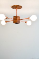
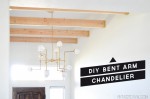
Building lights is sort of my thing.  It is honestly my DIY spirit animal.  That being said this light pushed me to the brink.  Not because it is hard, but because I was trying to figure out the best way to do it in the most uncomplicated way possible (which complicates things).  So after trying out 3 different types of wires and few hardware swaps I am SO excited to share with you the most simplified version of this brass bent arm chandelier! 

 DIY Brass Bent Arm Chandelier Tutorial

A few weeks ago I was thumbing through a magazine and came across this gorgeous light from Circa lighting.  I loved all of the different angles and the whole feel of it.  I also love Lindsay Adelman and her branch lights so hard. I knew that I could use both of them as a jumping off point for an amazing light in the entryway.

After spending a few hours on Grand Brass looking at all of the parts that they had, and a lot of sketching I came up with a plan (and ended up with a lot of parts.)  All of the serial numbers for the parts are listed after their description.

DIY Brass Bent Arm Chandelier Parts

a. (12) 8in. X 1/8 IPS HOLLOW BRASS PIPE STEM (PIBR08-0X8)
b. (12) 6in. X 1/8 IPS HOLLOW BRASS PIPE STEM (PIBR06-0X8)
c. (6) 1/8F sides X 1/8F bottom X 1/8F top SMALL CLUSTER BODY (BOS2X8)
d.(12) 3-1/4in. SPOKED HOLDER CAST BRASS with 1/8F TAPPED HOLE (HO3-1/4S)
e.(12) PORCELAIN SOCKET (SO10045C)
f. (1)1/8F sides X 1/4F bottom X 1/8F top JUMBO CLUSTER BODY (BOJ6)
g. (3)* 12in. X 1/8 IPS HOLLOW BRASS PIPE STEM (PIBR12-0X8)
h. (1) 1/4IPS PIPE PENDANT HANGING CROSS BAR SET (CB208)
i. (6) 1/8F X 1/8F ips. ADJUSTABLE FRICTION SWIVEL (SV140)
j. (2)* 1/8F THRU 5/8H X 5/8W STRAIGHT COUPLING (NE438) 
k. (1) 1/4 PLUG WITH SCREW DRIVER SLOT (FI1/4PLUG) 
l. (6) 1/8 PLUG WITH SCREW DRIVER SLOT (FI1/8PLUG) 
m. (1) 8in. BRASS FLAT BASE W/RETURN (BAFL08NW) (We had to drill our hole larger, so if you dont have a                 tool to do this they have some that are smaller in diameter with a bigger hole.)
n. (12) OPAL 3-3/4" DIAMETER X 4-1/8" HEIGHT WITH 3" FITTER ROUND BOTTOM CYLINDER TUBE (GLC304)
o. (12) 22-10 Crimp Sleeve
p. (2) large wire nuts
q. (2) Medium wire nuts
r. (1) Wire stripper/cutter
s. Lamp wire

*dependant on the height of your ceiling

While this project isn’t horribly hard (now that we know the right way to do it) it’s definitely not on a beginner DIY level.

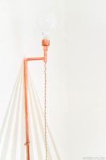
You are going to start by assembling your short arms (these are the arms without the bend) using the 8” brass pipe (a.), the spoked holder (d.), and the metal base for the socket. (Make sure that once everything is assembled you tighten the small screw on the socket base.)  This will keep your entire socket from unscrewing when you are changing the light bulb.

DIY Brass Bent Arm Chandelier-9

DIY Brass Bent Arm Chandelier-29

Next you are going to assemble the longer arms using 2 of the 6” pipe (b.),  the spoked holder (d.), the metal base for the socket (e.) and the friction swivel (i.)

DIY Brass Bent Arm Chandelier-10


Take apart the friction swivel (dont lose the little bits!) and attach each side to the brass pipe.

DIY Brass Bent Arm Chandelier-13

DIY Brass Bent Arm Chandelier-15


Wire your socket by checking for the textured edge on your lamp wire.  The smooth one is hot and will be connected to the gold screw inside your socket.  The textured edge is going to be connected to the silver screw. 

DIY Brass Bent Arm Chandelier-19

DIY Brass Bent Arm Chandelier-20


Then feed the other end of the wire through your socket base and brass tube.

DIY Brass Bent Arm Chandelier-21


Attach the socket to the base.

DIY Brass Bent Arm Chandelier-16


When you get to the friction swivel you will have to split your wire to go around the post in the middle (I just split mine from the bottom, up to this point).

DIY Brass Bent Arm Chandelier-22


Reassemble the swivel using all the little parts that you didn’t lose (because you are AWESOME!!)

DIY Brass Bent Arm Chandelier-23


I didn’t tighten the screw down all the way until I was completely done with the light (it made things a little floppy) but it gave me a little more play with the wire.

DIY Brass Bent Arm Chandelier-24

The next step is connecting your short arm and long arm to the hub and adding a 3rd wire that will connect everything to the main body of the chandelier.  This was hands down the most complicated part of the entire light.

So here is what I learned.

Starting with the fact that the wires in this picture are WAY too long.  But it is all I had to show you so sorry about that ;).

DIY Brass Bent Arm Chandelier-26

Make sure that the wires that are coming into the hub are on the same sides (hot, hot, and hot, neutral, neutral, and neutral)  this will give you a little more room because they aren’t crossing over each other and adding more bulk to the situation.

Cut and strip the wires as short as you can while still being able to mange them (I think ours ended up about 1/2”-3/4” long)  Twist the wire together and clamp it with a wire clamp (we had to trim a small amount of the plastic off of the edge of the wire clamp)

Lay it in as flat as possible.  Once you have both of your wires clamped and sort of inside, gently pull on the 3rd wire (it is still exposed at this point, it hasn’t been covered up by the brass tube) and suck everything inside the little chamber.

DIY Brass Bent Arm Chandelier-27


Then add the cap and the screw plug.

DIY Brass Bent Arm Chandelier-33


Thread your 3rd wire through an 8” piece of pipe (a.) and connect it to the main body of the chandelier (f.) The body of the chandelier is an egg shaped brass piece that screws apart.  When it unscrews, the piece with all of the holes is the bottom section.  (This is a mini version)

DIY Brass Bent Arm Chandelier-32


Repeat for all 6 arms.  When you are attaching them make sure that they alternate which arm (long or short) is on the top.

Once you have all of your wires in the main center hub take all of the hot and twist them together,  adding one more long length of wire.  This will be the main wire that runs up the stem to the ceiling.  We found that it worked best to twist one group and then after the wire nut was on to tuck it down inside so that it was out of the way before twisting the second group.

To assemble the stem that comes out of the ceiling you are going to use the 12” pieces of pipe with the straight couplings.  The amount that you need is based entirely on how high your ceilings are and how low you want your light to hang.  This will attach to the hole in the top of the upper body section.  The bottom section has a larger (1/4”) hole that you will cover up with the screw plug.

DIY Brass Bent Arm Chandelier-35


Add the large screw ring for the canopy (it comes attached to the hang straight coupling), the canopy, then the hang straight coupling and the cross piece in that order. Tighten everything up.   I mentioned above that the canopy that we ordered had a hole that was too small.  We used a hole saw that we had left over from this project to make it bigger.

DIY Brass Bent Arm Chandelier-17


Now comes the fun part. MAKE SURE THAT YOU TURN YOUR BREAKER OFF BEFORE YOU WIRE YOUR LIGHT!  (yes that was me yelling, it is critical.)  Attach it to the ceiling with the cross bar, wire it to the house wires and bring the canopy to the ceiling and tighten the screw ring.  Dont attach the cross bar first, and then try to screw the light into that, it will just twist your wire up.  Get the hang straight attached to the cross bar first.

Apparently the ceiling beams are good for more than just looking awesome.  How’s that for MacGyver?

DIY Brass Bent Arm Chandelier-31


When everything is wired, tightened and light bulbs are in, flip your breaker back on and cross your fingers that everything went smoothly!

DIY Brass Bent Arm Chandelier-39


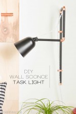
The last thing is to tighten the screws on your swivel elbows, and finish it off with the glass shades.

DIY Brass Bent Arm Chandelier-37

If you make it through this entire tutorial, you are a rockstar!

So what did I learn rewiring the same light 15 times?

The first thing that I did was try a different type of wire because lamp wire was super thick.  Even though it had a good amount of insulation on it, it was no match for the sharp edges of the pipe.  Lamp wire was the only kind (I tried 3 different varieties) that didn’t have the coating stripped off of it.  Go with lamp wire.

When something seems too small, that is because it is.  The original main body of the chandelier was teeny.  Too teeny to fit 6 wires into.  Trust me I tried.

DIY Brass Bent Arm Chandelier-40


The bigger one that the final light ended up with was SO MUCH BETTER. 

DIY Brass Bent Arm Chandelier-34


The last thing that I learned?  The projects that push you to your breaking point and you hang in there and dont give up, usually end up being your favorite.

DIY Wooden Beams-14


We’re thinking of adding them to the shop, so stay tuned!

Dont miss the Shop My House sale that is happening over at Joss and Main!!

17694__SITE_large

LoveYourGuts14

27 Mar 15:18

DIY Shadow Art + Video

by Mandi
VR_IntroPost_ForTwitter.jpg

Happy #100reveal Thursday!!

VR_Intro Post_For Twitter

You guys. I have got the COOLEST project for you today. As I was brainstorming ideas for these fun GE reveal® light bulb projects my natural train of thought was obviously to do something cool with light.  But we’ve already rewired a light, and made an amazing chandelier for the entryway

Something different was just what the Dr. ordered.

Something new.


Shadow Art DIY vintagerevivals

So armed with $100 to The Home Depot, and a GE reveal® light bulb I set out on my quest.

You know when you get an idea that just seems so crazy, and when you tell everyone in your life about it they genuinely don’t understand what you are explaining?  No? Just me? 

This project describes that perfectly. I have been super obsessed with shadow art lately, but it is always done on such a grand art installation scale.

I wanted a way to be able to simplify it enough to use it in my house.  And probably not use it to make human shapes because that would be terrifying to stumble across in the middle of the night.

So after thinking long and hard about it for a minute or 2 I set out to see if it would work.  If I could actually do something using light and shadow.


I conducted a little experiment and here is what I learned:

Screen Shot 2015-03-12 at 1.17.40 AM


It is entirely possible…IF you have the right kind of light bulb, and the right angle.

The light bulb is critical, it needs to give off enough light to cast a strong shadow and it also needs to be focused.  A regular style light bulb disperses the light too much, but a reveal® indoor flood light worked perfectly.

The angle of the light, will lengthen + shorten your shadow, and the distance from the pegs will straighten out the letters (the further away the less skewed they are.)

So with this in mind we started with a little trip to my version of Disneyland…The Home Depot.

I bought a GE reveal® indoor flood light (and a regular one for the before and after) (4) 8’x1”x6”, a 3’x1”x1” wooden dowel and a 2×4’ sheet of underlayment. 

After you’ve measured the exact size of the underlayment (this will serve as the backboard for everything) you are going to cut 2 pieces that measure the width of the underlayment horizontally (2’) and 2 pieces that measure the vertical distance between the 2 horizontal boards.  This is a backer frame and will give you something to attach the face frame and the underlayment to.

Next you are going to cut 2 boards with 45 degree angles that have an inner measurement that match your underlayment.

PSA:  For the LOVE cut these angles so that they look like this:

DIY Shadow Art Frame vintagerevivals.com-2


Not like this:

DIY Shadow Art Frame

Court, I’m talking to you.

If you did not heed the above advice, head back to The Home Depot and buy yourself another couple of boards…#fun.

Once you have your boards cut the right way, use a nail gun to attach them to the back frame.

Shadow Art Project


Then put your underlayment on top and secure it with a few nails.

DIY Brass Bent Arm Chandelier


To make the light I took apart this cute desk lamp that I’ve had laying around and a few spare parts from the Bent Arm chandelier build.

All I did was deconstruct this light that I bought a while ago:

Screen Shot 2015-03-12 at 9.44.20 AM


And put it back together with the long arm in between the base and the socket (I wanted to be able to adjust the light angle as much as I need to.)  I also swapped in a cord that looked better and had a higher wattage rating.

DIY Shadow Art vintagerevivals.com-6

Then I drilled a small hole in the center of the frame and fed the cute new wire through.   The last bit of light construction was wiring a plug on the end.  Its time for a common sense disclaimer, these bulbs can get warm, this isn’t a light that you will want to leave on for hours and hours. Yes? Yes.

Once the light was hung inside the frame (with a small screw) it was time to place the dowels.

I did this part last so that I had complete control over the way that the shadow cast.

Shadow Art Project-2


Once I measured and marked where my short dowels (they measure 3.5”) were going to live, I used a small amount of Titebond III wood glue to adhere them to the board.

Shadow Art Project-6


A roll of painters tape works wonders to hold them in place while the glue dries.

Shadow Art Project-4

DIY Shadow Art vintagerevivals.com-8


Want to see what it turned into?

When the house lights are on and the spotlight is off you have this curious and delightfully inoffensive bit of wooden art on the wall.

DIY Shadow Art Light Off vintagerevivals.com


When you shut off the house lights, and turn on the spotlight you get a friendly little message:

DIY Shadow Art vintagerevivals.com  


Amazing right?!  I mean, who doesn’t want your decor to actually greet you!!? And for a grand total of less than $50 no less!

DIY-Shadow-Art-vintagerevivals.com


Because of the closeness of the light onto the board I was a little curious if you would even be able to tell a difference with the reveal® light bulb.  Oh ye of little faith Mandi.  Of course you can.  Directly on the light it’s a little hard to tell a difference, but look at how much cleaner white the reveal® side is, and how much sharper the shadow.  (Bulbs used were 40 W Soft White Spotlight vs 45 W reveal® Halogen Indoor Flood bulb.)

DIY Shadow Art GE Reveal Before and After vintagerevivals


Shadow Art DIY vintagerevivals

What do you think?  Do you love it?!

Its time for another giveaway!!  You know the drill, (10) winners will win a $100 Home Depot gift card, and a GE reveal® lighting package, all you have to do to enter is leave a comment and let me know what level of DIYer do you consider yourself to be and/or tell me about your favorite DIY project that you have completed!

ge_reveal_giveaway copy

LoveYourGuts14

25 Mar 13:51

Planning Lucy’s Big Girl Room

by Mandi
Tifmurray

I like the paint treatment in the "after" at the bottom. Been thinking about switching our bedroom with the guest room, and I'd love to paint the guest room like this.

Vintage-Inspired Toddler Bedroom Ideasvintage toddler room inspiration

What’s the first thing I thought of when I found out I’m pregnant? I’m going to be totally vulnerable and tell you that among my first thoughts were possible color schemes for the new kiddo’s room. You know, the important stuff. The interior designer side of me stayed up late dreaming of cute color combinations and mentally space planning our spare room for a crib and baby furniture. But one morning I had a redeeming thought pop into my head: Why redecorate a room for a baby who could care less, when I have a toddler who would find the whole process as exciting as I do?

I scratched my plans to makeover our spare room for the new babe and decided to ask Lucy about what she would want for the room instead. And what did my little firecracker tell me? “BOOOOO!” What color do you want the walls to be? “Boooo!” What color do you want your bed to be? “Boooo!” What color does mommy like least out of all the other colors? Bluuuuuue! But I set out to find a fun and fresh color scheme that was Lucy approved and wouldn’t require too many new purchases. I prefer shopping for home furnishings and accessories in our storage shed in the backyard.

Well, as our little girl ran around yelling “Booo woom! Boo wooom!” this week, we got to work at clearing out the spare bedroom and painting it a beautiful shade of light blue. Now we’re just wrapping up the painting, and I’m getting excited to paint and instal moulding this week. But first I thought I’d stop and take inventory of the things I’ve collected to far for Miss Lucy’s new room.

blue pom pom trim 5 yards for $5.50 from Etsy
inexpensive white curtain pair $41.07 for a pair from Amazon
eyeball sconce white $29.00 from Urban Outfitters
valspar la fonda mirage blue Valspar’s La Fonda Mirage #5003-5B
rabbit bunny nightlight $14.99 from Target
puppy sheets $69.00 from Land of Nod
ball finial white curtain rod $14.99 from Amazon
8 $354.76 for 8×10 from Amazon

off white diamond grid shag rug

Lucy’s furniture was either found or given to us, but we’re still looking for a dresser. Her headboard is a beautiful royal blue ironwork piece that will add a nice feminine touch to her room, though I would’ve never chosen that color had it been up to me. Lucky for Lucy, we found it that way and I didn’t feel like undertaking a big stripping and refinishing job, so it sort of forced me to bring royal blue into the mix. Now I’m kind of loving it!

Lucy's Room Before

Lucy's Room Before

I’m planning on adding a picture rail moulding strip to the spot where the color changes on the wall. I’m hoping it will add a nice classic touch to the room, while helping a fickle girl like me keep from making nail holes in the walls as I change out the artwork from time to time. So far we’re loving the changes, but Lucy’s actually been the most excited. I’m just so glad we decided to give her the new room instead of the baby, because that gal sure is enjoying watching the transformation!

This week we’re heading out to my favorite inexpensive antique shops to look for an old dresser with lots of character. If all else fails, we’ll go for Ikea (cheap!), but I’m keeping my fingers crossed that I can find something used. Wish me luck!

continue reading

The post Planning Lucy’s Big Girl Room appeared first on Making Nice in the Midwest.

23 Mar 16:11

Invisible Bookends

by A Beautiful Mess
Tifmurray

I love this idea. Chris is doing a book purge right now and it's making me rethink about how our "library" is organized.

Turn discarded books into invisible bookends for a streamlined bookshelf display.Bookends are a great way to add a bit of style to your bookshelf, but what about when you don't really have room for a big ol' bookend? Or maybe you just want to keep things simple on your bookshelf. I had that problem recently. I needed a way to keep my books standing up at the end of the shelf, but didn't want to clutter things up with bookends, or ugly them up with thin metal bookends like the ones you see at the library. I just wanted my pretty books to shine in all their glory.

Then the thought occurred to me— Why not turn a pretty, forgotten book from the thrift store into a bookend, solving all my bookshelf problems? It's the perfect thin shape, looks great, and is a nice way to give new life to a damaged or discarded book.

Turn discarded books into invisible bookends for a streamlined bookshelf display.See? No, you don't see, do you? That's because my bookends are practically invisible! They blend right into their environment while adding a bit of classic style to the ends of my bookshelf. A wonderful solution. Check out how easy they are to make!

Turn discarded books into invisible bookends for a streamlined bookshelf display.Supplies (for two bookends):
-2 books with 1" spines
-2 thin metal bookends (I used these)
-1x6 board or a board of another dimension to fit your book (see notes below)
-super glue (I used gorilla glue)
-clamps
-craft blade

Selecting Your Book and Lumber Size: My books measured about 5.75" deep, 8.25" high, and 1" thick. It's important to find a book depth that will correspond with lumber standard widths, so you don't have to do any unnecessary cutting of the lumber later. This is why I used a book with a 1" spine. I used a 1x6 board to fill the inside of my book, which really measures .75" x 5.75". This board fit my book dimensions perfectly! How did I know that would happen? Well, I brought my book spine to the lumber yard with me! There's a first time for everything.

If you can't find 1" thick books and need to fill out the inside of your book more, you can also find thinner sheets of lumber below the standard lumber sizes at places like Lowe's. Just stack and glue the boards to your desired thickness.

Turn discarded books into invisible bookends for a streamlined bookshelf display.Step One: Use a sharp craft blade or razor to cut away the contents of the book from its spine.

Feel free to read the contents later! Or discard the pages as I did. I was able to do this guilt-free, because I found my book at the thrift store and figured it was unloved and needed a new life.

Turn discarded books into invisible bookends for a streamlined bookshelf display.Step Two: Wrap the book spine around your lumber to mark where to cut the lumber. I left about a 1/8" gap at the top to achieve a more realistic book effect.

Step Three: Cut the board to the length you marked. If you don't have a saw at home, you can do this at the lumber yard. They will make cuts for you for free.

Turn discarded books into invisible bookends for a streamlined bookshelf display.Step Four: Cover the wooden blocks and metal bookends with moderate amounts of Gorilla Glue, as shown above. Don't get too close to the edges or it will seep out. Gorilla Glue foams and expands as it's clamped, which makes for a strong hold, but a messy final product if you're not careful when applying the glue.

Step Five: Once everything is all glued into place, use clamps to press it all together as the glue sets up. You should use scrap lumber as a buffer between the book and the clamps or the clamps will leave indents in your book. I made the mistake of not doing this, and got some pretty visible denting, especially on my orange book. Thankfully the dents aren't noticeable on my shelves. Whew!

Turn discarded books into invisible bookends for a streamlined bookshelf display.Here are my invisible bookends in action. It's as if my books are saying, "Look, Ma! No hands!" -Mandi

Credits // Author and Photography: Mandi Johnson. Photos edited with Stella from the Signature Collection.

16 Mar 16:11

Suede Colorblocked Catchall DIY

by A Beautiful Mess
Tifmurray

For Crafternoon?

  Seude Colorblocked Catchall DIY (click through for tutorial)        Being a DIY-minded girl, I often see pretty items being sold in stores and instead of thinking, "I want that!" it's usually "Can I make that?" I saw this cute little suede catchall dish online and my brain went straight to how I could recreate the idea at home. In case you aren't sure what a "catchall dish" is, it's a little dish or container that people keep on their entryway table or counter where they can throw their keys, loose change, or other items that are floating around in the vicinity. They're great! It's like a junk drawer for your keys! If you don't want to use suede, you could also make this with a thick wool felt—that would be pretty as well.

Seude Colorblocked Catchall DIY (click through for tutorial)
Supplies:
- suede (real or faux) in two colors
- scissors or rotary cutter and metal ruler
- leather punch (anything that will punch a hole through leather as big as your screw posts will work)
- leather glue
- 1/4" screw posts (4 sets)
- hammer
- small square object as a corner guide

Seude Colorblocked Catchall DIY (click through for tutorial) First you'll want to cut a square of leather that is 7" x 7" and another smaller square of your second color that is 4.5" x 4.5". Use the leather glue to glue the smaller square exactly in the middle of your larger square. Well, as close to exact as you can anyway...

Seude Colorblocked Catchall DIY (click through for tutorial)        Align a square object (like a small box or a square vase) with the corner of your inside color square and pinch the larger square sides up with your fingers at the corner. Use a marker to make a small mark on the outside of the leather where the corner is made.

Seude Colorblocked Catchall DIY (click through for tutorial)        Use your leather punch to punch a hole in that marked spot, pinch the corner in half again, and trace the hole you just punched onto the other side of the suede fold. Punch that hole as well so you end up with two mirror image holes. Repeat this process with each corner.

Seude Colorblocked Catchall DIY (click through for tutorial)        Screw your posts through the holes to connect the sides.

Seude Colorblocked Catchall DIY (click through for tutorial)     You can leave the corners pointed if you want, but I took fabric scissors and chopped them off a bit for a cleaner look. To get the sides to stand up straight at more of a right angle, you can fold each side in towards the middle, take a hammer, and hammer across the folded seams where the bottom meets each side. This will create a crease in the leather so it will be more willing to bend at that spot. That's it, you're done!

Seude Colorblocked Catchall DIY (click through for tutorial)     Seude Colorblocked Catchall DIY (click through for tutorial)     Seude Colorblocked Catchall DIY (click through for tutorial)     Seude Colorblocked Catchall DIY (click through for tutorial)         I love that this was such a simple project to make and it turned out so cute too! You could make a couple of theses at once to give out as gifts or be a little selfish and just keep them in different spots around your place. You can do all one color if you like (still cut out the two sizes of squares though so it gives the dish more shape), but I think the color blocked bottom is fun. Time to show my keys their new home! xo. Laura

Credits // Author and Photography: Laura Gummerman. Photos edited with A Beautiful Mess actions.

12 Mar 21:13

kitchen reno: choosing quartz countertops

by gemma
Tifmurray

My dream kitchen has white/grey, marble-like countertops like these.

Let’s chat kitchen countertops today. Specifically, quartz countertops that look like carrara marble. Warning: this is a seriously long post and if you have no interest in countertops and kitchen reno’s, I suggest you just close’r down now. Or take a shot for every time you read the word “quartz”. That’ll make things a whole lot more exciting for sure. Just don’t  play a blog post drinking game and drive.

Some of the decisions with our house reno have been made quickly, and others have been laboured over for a long while. This was the latter.

Here we are, countertop-less…

DSC_1300

First step in any kitchen counter decision is material choice. There are so many options these days when it comes to counters – laminate, granite, quartz, quartzite, corian, marble, butcher block, concrete, soapstone, etc – and each have their advantages and disadvantages. We were constantly weighing looks vs price vs longevity and maintenance. Depending on your budget, needs of your household, and your style preference, your choice here is going to vary. I don’t think there are any “bad” choices – just different options to suit different needs. Our criteria came down to the following:

Looks: I wanted something that was light – largely white with a bit of grey – to tie the two colours in the cabinetry together. I like the veining that you find in stone, but didn’t want it to be overly busy.

Longevity & Maintenance: We are a young family and only just in the beginning of likely several decades of fairly major wear and tear on our house. We wanted something that would stand up to kids in the kitchen and would be as maintenance free as possible. I didn’t want to be having to wipe down a spill a split second after it happened because I was worried about staining, or have to seal the counters every year. I’m a low maintenance kind of gal.

Price: To get what we wanted in a) and b) above, we knew we would have to shell out some serious coin. In our overall kitchen scheme, we decided to save on cabinetry (IKEA) and backsplash (more on that in another post) in order to spend more of our budget on countertops.

carrara marble countertop alternatives


After considering all of that, the choice to go with a quartz was pretty clear. It is an engineered stone, so you can get that look of veining as you would in a natural stone, but it is super durable and maintenance free. No having to seal it annually like granite, or worry about spills and staining like a marble. There is absolutely nothing wrong with any of those choices – we were just trying to choose what would work best FOR US. Here is an article on Remodelista more about the pros and cons of engineered quartz.

Once you get into the world of quartz manufacturers, there are tons of choices. Maybe too many, as it makes the decision process hard! I knew I wanted something that had white and grey in it like a marble, so I went out and started collecting samples and looking at slabs in person where possible.

If I even moderately liked what I saw, I brought samples home with me so that I could hold them up to my cabinetry in the light of my kitchen. There is nothing better than seeing something in your own space – way different than in a showroom under fluorescent lighting. FYI that sometimes it wasn’t super easy to get the sample pieces – it took some persuading and promises of bringing them back to the show room, so be firm if you go out looking. If possible have some sample pieces of your cabinetry and other finishes with you, so that you can see everything together in one place, if you aren’t able to bring home a sample.

If you are looking for a quartz that has grey and white in it and looks similar to carrara marble, these are the ones you might want to check out (this list is current as of March 2015 – manufacturers are always adding new colours). Please also know that these were just the ones I came across, I’m sure there are others out there!

quartz countertop options that look like marble - via the sweetest digs

Here are bigger screenshots of each countertop option, with links to the manufacturer.

Caesarstone – Calcatta Nuvo:

calcatta nuvo

Caesarstone – Frosty Carrina:

caesarstone - frosty carrina
Caesarstone – Misty Carrera:

caesarstone - misty carraraSilestone – Lyra:

silestone - lyra
Silestone – Lagoon:

silestone - lagoonSanta margherita – victoria:

santa margherita - victoria
Santa margherita – lyskamm:

Santa margherita - lyskamm
Cambria – Torquay:

cambria - torquay

Belenco – Fairy White:

belenco - fairy white
Hanstone – Tranquility:

Style: "BEAU_swatches"

Zodiaq – Coarse Carrara:

zodiac - course carraraZodiaq – Snow Drift:

zodiaq - snow drift

After checking each one of those out in person, I narrowed it down to 6 for our kitchen. They all had a fair bit of white in them, and didn’t have the flecks or speckled look that you often find in quartz. It’s totally a personal preference thing – I just don’t like the little flecks and prefer a smooth look with grey veining.

marble lookalike quartz countertop options via the sweetest digs

At this point, I got detailed quotes for each one of these materials. All of these manufacturers are reputable, so price would definitely help us narrow it down. To be honest, I could have been persuaded to go for any of these.

Definitely the front runner for me initially was the Calcatta Nuvo as I thought the veining was just so striking and the grey and white were perfect in our kitchen. And of course, it was the one that was by far the most expensive. Isn’t that always how it is? Cut.

The Frosty Carrina was second most expensive and I wasn’t thrilled by how little veining there was in it, and it was predominantly grey rather than white, so it was nixed.

The last four came in at very comparable prices, so it was just a matter of looks: Tranquility was very white with quite dark, dramatic veining and lots of white space (I thought this one was going to be my favourite, but it just didn’t feel right in our kitchen); Coarse Carrara had some ever so slight flecks/speckles that I didn’t love; and Snow Drift ended up feeling just too busy. So left standing? Santa Margherita Victoria. Winner winner chicken dinner. I should also mention that I went out and saw a big slab of it in person before putting in my order. It’s such a major decision that seeing it on a small scale and on the computer wasn’t enough. I often found that I saw an option on the computer that looked ahhh-mazing, and then in person it looked so different from what I had imagined. So word of warning — always go in person!

Basically as soon as the installers were bringing the slab through the door, I knew it was exactly the right decision. The counters are bright and read like a nice white from a distance.

santa margherita victoria quartz countertops - via the sweetest digsBut when you get close up, the veining detail adds so much interest, without overtaking the whole counter.

santa margherita victoria quartz countertops - via the sweetest digs

I went with a squared edge profile. Simple and clean.santa margherita victoria quartz countertops - via the sweetest digs

They feel solid, smooth, and seriously lovely. Oh, and the seams (we have 3 in our corners) are barely noticeable. I’m totally in love. Bigtime. santa margherita victoria quartz countertops - via the sweetest digs santa margherita victoria quartz countertops - via the sweetest digs

You got some sneak peaks at other elements in the kitchen there… it’s coming together, hey? Things sort of happened quickly all of a sudden. Probably because I was feeling the pressure of getting it close to completion for my last Globe & Mail article (coming out in tomorrow’s paper – my last in the 5 article series I have written). Anyway, more details on those finishing details soon!

For local folks who might be interested, we purchased our countertops through Kemptville Interiors, supplied by Hiltz Marble & Granite. They were all an absolute pleasure to work with!

Find more posts on the kitchen reno here: designing the kitchen + installing IKEA kitchen cabinetry.

What sort of countertops do you guys have in your kitchen? Do you love ‘em? We did butcher block in the basement kitchen, and I loved the look of those. So warm. Oh and I know some folks who poured their own concrete counter – and it looks amaaaazing. My parents have quite a stunning granite in their kitchen too, which has tons of veining and interest. It’s fun to have so many options, hey?

The post kitchen reno: choosing quartz countertops appeared first on the sweetest digs.

06 Mar 14:09

Old City Hall Transformation Unveiled

The city of Indianapolis and a Louisville-based luxury hotel developer have unveiled a $55 million plan to breathe new life into a historic building. 21c Hotels is looking to turn the Old City Hall property into a free contemporary art museum and 150-room hotel with restaurant and event space. Indianapolis Mayor Greg Ballard says the announcement shows the city is ready to compete globally for talent.
03 Mar 20:32

Ind. Gov't. - What is the state policy re email retention?

by Marcia Oddi
In 2012 the ILB had a number of posts on the Indiana Commission on Public Records project to create a...
26 Feb 19:12

Design Mistake #2: The ‘Too Small Rug’

by Emily

Biggest Design Mistakes_buying rugs that are too small_roundup_emily henderson_expert advice

America has been suffering for too long from ‘too small rug’ syndrome. I see it virtually every day and it pains me, especially when it’s so easily avoided. I’ve been trying to figure out how this plague came to be I think I’ve finally nailed it:

1. Huge rugs can be expensive and can feel like such a scary commitment. 2. A 5×8 or 6×9 rug sound big even though they often aren’t. 3. Catalogs and magazines are misleading. I’ve styled a lot of catalogs where we have to use the sample size (months before the actual rug is available) and its only 5×7 so we ‘make it work’ and in the shot it’s okay, but in actuality that rug is way too small for the room. I also think that retailers know that 5x7s sell so much more because they are cheaper so they don’t stock 8×10’s in the store, so when people go to purchase they think, ‘Well, this must be big enough because its the biggest one’.  Also ordering and waiting is less fun, so people just snag up the 5×7. Lastly nothing is more annoying than getting a rug home and deciding it isn’t quite right, then having to return it – so I think people just don’t.

Click through to see 25 8×10 rugs under $500  …

A rug in a living room should really ground the whole seating around – it tells everyone that THIS is where the conversation is, this is the focal point of the room, and a too small rug makes it feel disjointed and really just cheapens everything.

Here are a bunch of pretty rooms that they’ve tried to convince us have big enough rugs. They don’t:

Rugs_too small_examples_1_with copy

Don’t listen to these rooms. They look fine in a photo because everything else is beautiful, but they are actually super awkward. If you have a beautiful rug like the one on the right (above) layer it over a huge sisal or another solid flat weave. I did that here and it totally worked.

These below are particularly funny to me because we are supposed to think that the people who own that art collection and that amazing loft space are fine with those teeny tiny awkward rugs:

Rugs_too small_examples_2_with copy

I think that the first rug might be a bathmat. It must have been some sort of product roundup shot because otherwise I have no idea why there is a task lamp on the coffee table or a collection of vessels on the bath mat.

Living rooms almost ALWAYS need at least an 8×10 if not a 9×12. You heard it. Unless you have a TINY living room, stay away from anything under 6×9. Considering a 4×6? Don’t. That’s fine for next to a bed, in a kitchen, entrance, etc, but a 4×6 will assuredly not work in your living room.

Here are the two exceptions – 1. If your living room is smallish and your sofa is up against a wall, then you can float a 6×9 rug in front of it. For some reason this doesn’t look awkward or too small, probably because the seating area already feels grounded and intimate because the room is smallish and the wall is helping ground everything. And 2. If you use a cowhide. For some reason because of the sculptural shape of the hide, it can be smaller and its still pretty.

rug-exceptions

But otherwise, your rug should be big enough for at least two legs of all your furniture to be on it, and ideally all four (but I know that is asking a lot).

My rule has always been to keep it consistent – don’t have your sofa completely on it if your lounge chairs are totally off of it. Its better for them all to be distributed equally, visually.

Rugs_right size_4

Often 8×10’s aren’t even big enough to get all furniture on it, so before you purchase make sure that your room can’t handle a 9×12 rug and if so, please get that. I’ve never walked into a huge living room with a big rug grounding a seating area and thought, ‘Woah, these idiots have such a big pretty rug!!’

Rugs_right size_2

You need to make sure that your rug is first and foremost proportioned to your sofa – if your sofa is 7′ long (standard is 7′ or 8′) then your rug better at least be 9′ wide so you have a foot on either side. AT LEAST!! But don’t think ‘Oh great, I can just get a 6×9′ because if your living room is pretty big then your rug also needs to be proportioned to your room. A too small rug can and will make your beautiful living room feel smaller, choppy and generally cheap.

Tough love, today, I know. I’ve just seen it so often and it saddens me. If you love your too small rug, please just layer it on an inexpensive LARGE sisal (Ikea and Target both have affordable ones).

Meanwhile to combat this syndrome, nay PLAGUE, we have done a roundup of 8×10 (OR LARGER) rugs under $500. Brady searched for days because well, 8×10’s for $249 aren’t exactly everywhere, but we feel confidant and happy to recommend these bad boys to you. We chose $500 because there are a lot of 8×10’s under $1000 that are easy to find but the $500 or under price point felt like a good challenge and within most people’s budgets.

Best Rugs under $500_budget rug_modern_midcentury_affordable_roundup_emily henderson

1. Criss Cross Rug | 2. Dot Tile Rug | 3. Wool Sweater Rug | 4. Yellow Striped Rug | 5. Grey Stripe Rug | 6. Mystic Blue Wool Rug |  7. Chunky Woven Jute Rug | 8. Elizabeth Blue Rug | 9. Gaser Shag Rug | 10. Fresno Shag Rug | 11. Royal Area Rug | 12. Mirage Diamond Rug | 13. Pattern Hemp Rug | 14. Grey Moroccan Rug | 15. Purple Wool Kilim | 16. Braided Wool Rug | 17. Navy Moroccan Rug | 18. Grey Striped Rug | 19. Neutral Morocco Rug | 20. South Padre Rug | 21. Overdyed Red Rug | 22. Blue Leather Rug | 23. Alvine Yellow Cross Rug  | 24. Montauk Blue Rug | 25. Panja Rug | 26. Black Diamond Rug

For additional tips and rug size info check out this video I made years ago.

May your living room feel more pulled together, grounded and proportioned. Good luck, friends.

For Design Mistake #1 (the generic sofa) please go here and check our favorite stylish sofas for under $1000.

This public service announcement was brought to you by every designer ever in the world and probably your mom, too. 

23 Feb 21:18

DIY Faux Stained Glass

by A Beautiful Mess

How to make a faux stained glass panel.Stained glass isn't just for cathedral windows or Irish pub windows. It's also for plain ol' windows in normal folks' homes, like mine! I've discovered that lots of cities have places where you can actually learn how to make authentic stained glass, but I wanted to see if I could get a similar look using glass paint and metal strips.

I love the way my faux stained glass panel turned out, but I did learn a few techniques for achieving the best results. Check out my process below and learn how to make your own faux stained glass look even prettier than mine!

How to make a faux stained glass panel.Supplies:
-glass panel (You can have a glass shop make one to fit your window or else remove glass from an unused picture frame if you don't need it to be a specific size.)
-lead adhesive strips (I used the entire package for this window.)
-glass paint (I preferred the consistency of the Gallery Glass brand to Martha Stewart.)
-backdrop paper
-marker
-sharp blade or scissors (I ended up preferring scissors)
-t-square or ruler

How to make a faux stained glass panel.Step One: Lay out your backdrop paper and trace the outline of your glass panel. If you are using a t-square, make sure the glass panel is square with your table before tracing. Then design your stained glass pattern with marker lines.

How to make a faux stained glass panel.Step Two: Lay the glass panel over the lines you made with the marker. Cover the lines with the lead strips that you cut to size with sharp scissors. I cut my pieces a bit longer than what I needed and then cut away tiny bits of the end until it fit perfectly. Use a stylus to press the metal strips into place. (The lead strips I used came with a stylus.)

Step Three: Outline the inside of each section of the design with glass paint. Be very careful to keep the line straight and go all the way up to the edge of the lead strips.

How to make a faux stained glass panel.Step Four: Fill in the outlined area with a thick layer of paint, and use the tip of your bottle to spread the paint around. To prevent bubbles and to smooth out the texture, use glass brushes instead of the tip of your bottle. I didn't use glass brushes and had trouble with the texture of my paint showing in the final product. If you get bubbles, use a tooth pick or needle to pop them.

Step Five: Fill in all of the sections of your design with paint, working so that your arm will not accidentally get into freshly painted sections. You may wish to take your time and do random sections across the glass and wait for the paint to dry before doing another round of random sections. That's what I did, and it saved my sanity from having to paint so many sections in one sitting!

How to make a faux stained glass panel.Advice for the best outcome:

Use the best glass paint. I liked the runnier consistency of the Gallery Glass paint to the thicker Martha Stewart paint, but if you do decide on Martha Stewart glass paint for the color selection, be sure to select the liquid fill paint, not the gloss or frost paint. It smooths out better.

Apply thick coats of paint. Don't try to skimp on your paint, as I did in a few of my sections. I was running out of paint and didn't want to take another trip to the store to buy another bottle. Thicker paint will settle nicely and give less of a textural design in the finish as the light shines through and highlights your brush strokes.

Finish off the joints of your metal strips. Something I didn't do with my panel is to dab pewter glass outliner onto the joints to give a more realistic finish to the leaded strips. This will also fill in any gaps where your lead strips may have been ever so slightly too short. This is an added expense, but will give an added air of authenticity to your faux glass panel.

How to make a faux stained glass panel.I bought mirror hanging hardware to mount this panel in my kitchen window, but I didn't end up having a wide enough mounting surface in my window trim to use the hardware, but the window trim along my window sill did provide a nice ledge to lean the panel against my existing window. I'm still on the hunt for the perfect hardware to secure the panel in place, but for now it's sitting pretty right here behind my kitchen sink giving me some much needed privacy next to the front door of our house. -Mandi

Credits // Author and Photography: Mandi Johnson. Photos edited with Stella and Valentine from the Signature Collection.

23 Feb 21:14

Colorblocked Scratching Post DIY

by A Beautiful Mess

So cute! Color Blocked Scratching Post DIY (click through for tutorial)           If you have a cat (or two!) and have ever roamed the pet store aisles looking for a good scratching post, then you probably already know about my personal anguish. Our cat Mac has taken to occasionally scratching on a few rugs and chairs that I would rather keep "unshredded", so I thought we should get him a post so he can direct his scratching instinct in a more positive direction. The problem with cat scratching posts is that most of them are pretty, well, boringly hideous. I mean, if I want a piece of furniture that's going to stand out in my house, I want it to be a cool vintage chair or plant stand, not a dull-looking scratching post. Thankfully, what's a girl to do when she can't find what she wants already made? You guessed it, DIY to the rescue!

So cute! Color Blocked Scratching Post DIY (click through for tutorial)              We’re happy to be working with Fancy Feast, who just launched their Broths with Chicken (you can see Mac is loving it!). It's part of their #WaysToWow campaign, sharing tips to wow our furry little buddies. As part of our partnership, Fancy Feast is making an additional donation to Humane America Animal Foundation (behind Adopt-a-pet.com), who helps homeless pets get out of shelters and into loving homes. It's in conjunction with the brand's history of raising awareness about shelter animals.

You may already know, but I have a pretty big heart for the humane society and pet adoption. I adopted our first kitty Charlie over three years ago, and we loved her so much that we adopted a little brother named Mac for her a year ago. Since I have a husband that is on the road touring a lot for his musician job, it can be really lonely when he's out of town, and I have to say that the loneliness was really getting me down. As soon as I got sweet Charlie though, it was a million times more fun to be home alone and so comforting just to have another heartbeat around the house. Mac's playful spirit (and constant willingness to cuddle) has brought even more joy, and I always tell people that I feel like they rescued me instead of the other way around. I love those furry babies so much. 

Supplies:
-18" round wood circle
-4x4 wooden fence post (about 20" tall)
-drill and long wood screws
-white 4x4" post cap
-white paint
-150 ft of 1/4" nylon rope*
-pink and yellow dye
-bucket and salt (to dye the rope)
-staple gun (or hammer and small nails)
-white and pink (or white and yellow) electrical tape

*It seems like sisal rope is actually the rope of choice for scratching posts (I think it holds up to long-term scratching better), but it looked like I could get a brighter dye color and a whiter white with the nylon rope instead. Either rope works though and the sisal can be dyed as well.

So cute! Color Blocked Scratching Post DIY (click through for tutorial)           So cute! Color Blocked Scratching Post DIY (click through for tutorial)           So, the first thing you'll want to do is attach your post to your round platform. Find the middle of your platform, place the post in the middle, and use a pencil to trace around the edges of the post so you can see where to put the screws. Use a drill bit that's slightly smaller than your wood screws and drill four holes within your marked square that go all the way through to the other side of the platform. Flip the platform over and line up your traced square to be on top of your post (so basically your whole scratching post should be sitting upside down). Since you pre-drilled your holes all the way through the wood, you should be able to see where to screw in your four wood screws from the underside to secure the platform to the pole. (Get someone to help hold it in place if you need to while you drill. It's a bit awkward to hold yourself) Flip the scratching post right side up when you're done and paint the bottom platform with a few coats of white paint.


So cute! Color Blocked Scratching Post DIY (click through for tutorial)           To dye your rope, you'll want to get a bottle of dye for each of your colors (I chose pink and yellow). Since I wanted three colors of rope to color block with, I dyed 50 ft pink, 50 ft yellow, and left 50 ft white. Fill a large bucket halfway with hot water and add 1/3 cup of salt to the water (the salt helps to set the dye). Mix in your first dye color and stir. You can control the color you want by adding more dye, more water, or simply leaving the rope in for longer or shorter amounts of time (I did one full bottle of color and left the rope in for 30 minutes). Just keep checking the rope to see how it's progressing and leave it in longer or add more dye if you want a darker color. When you are happy with the color, pour out the dye and rinse the rope in cool water until the color runs clear. You'll really want to rinse the rope until all excess dye is removed so you don't end up with dye on your kitties' paws. If you would rather not use a manufactured dye, you can also look into some natural dye options as well, but if you rinse the rope really well, the dye shouldn't transfer from the rope.

So cute! Color Blocked Scratching Post DIY (click through for tutorial)   Once your rope is rinsed, hang it up or place it on a cookie sheet in a big pan to air dry.

So cute! Color Blocked Scratching Post DIY (click through for tutorial)   After the rope has dried, take your white rope and staple gun the end to the bottom of the post. (You could also use small nails instead of a staple gun.) Wrap the rope around the post as tightly as you can, pushing down on the rows every so often to make sure they are packed tightly together. 

So cute! Color Blocked Scratching Post DIY (click through for tutorial)   When it comes time to change colors, cut your white rope, take your white electrical tape and connect the end of the white rope to the beginning of your pink rope. The trick with electrical tape is that you want to pull on it and stretch it while you wrap it—that's what makes it really secure. Continue to wrap your pink rope around the pole and repeat the process of joining ropes again with the pink or yellow electrical tape when you switch to yellow rope, and again with the white tape when you switch back to the white rope to finish the pole. Remember to wrap tightly and push down on the rows every so often. 

So cute! Color Blocked Scratching Post DIY (click through for tutorial)   To finish your rope wrapping, cut your rope and secure the end with electrical tape. Use your staple gun to secure the rope end onto the pole. Glue your post cap onto the top of your post (I just used a simple epoxy glue to secure mine), and you're ready to show kitty the new scratching post!

So cute! Color Blocked Scratching Post DIY (click through for tutorial)             So cute! Color Blocked Scratching Post DIY (click through for tutorial)          So cute! Color Blocked Scratching Post DIY (click through for tutorial)            I rubbed some catnip onto the sides of the post and brought Mac in to check it out. I did a few scratching motions myself on the post and it didn't take him very long to give it a try himself! If your cats aren't already using a scratching post, you may need a few tips to get them used to using the new scratching routine (check out this post for ideas). And man, I still really love those junk food cat toys I made recently and they still play with them everyday...

I have to say, I was a little worried that a cute scratching post might not be possible, but I'm so pleased with how this came out! Since the colors and feel of the post match the rest of our home aesthetic, it really blends in with the rest of the room and doesn't awkwardly stand out (and of course you can change the dye colors to match whatever your home colors are). It's cute, functional, and the kitties love it. So I would say it's a win for everyone! xo. Laura

 Credits // Author and Photography: Laura Gummerman. Photos edited with A Beautiful Mess actions.

track
16 Feb 20:34

Pizzology - Mass Ave

by Erin in Indy

I hit up Pizzology on Mass Ave with a friend for lunch the other day. It was actually my first time going to the new location. Well, I guess it’s no longer the newest location, now that the one in West Clay has opened. It’s been awhile since I’d been to Pizzology and I was looking forward to seeing what was new on the menu.

The first thing we shared were the artichoke fritters ($8). I hadn’t seen them before and they were really, really good. Of course, I am a total sucker for artichokes. They were gooey and cheesy with nice bits of artichoke rolled into a ball and deep-fried. The cheese they use is goat cheese and there was also lemon in there, so they were nice and tangy, which you know is totally my thing. They were super crisp and hot and dusted with salt. They serve them with a roasted Fresno aioli—it was really nice with them too. Not heat spicy, but a nice deep chili pepper flavor combined with the creamy rich mayo.

We also shared a pizza that I had never had before—and one that was new on the menu since I had last been to Pizzology (like I said, it’s been awhile). The pizza was the rosmario ($13.50). It’s a white pizza (no red sauce). It’s topped with mild, earthy fontina cheese, wood-roasted mushrooms, rosemary and caramelized onions. It sounded like a unique and really tasty combo to me. It was good, but it didn’t have as much flavor as I expected with rosemary as one of the ingredients—the use of rosemary was fairly light. I liked the flavor of the mushrooms. You can tell they’ve been roasted in the wood-burning oven.  I think a little sprinkle of sea salt on top might complement the rosemary flavor. I do like the crust here—and we got a little taste of the red sauce too by asking for a side of the marinara to dip our crusts in—a nice way to get a little bit of both worlds. Honestly though between the two, the fritters are what stood out for me.

I like the spacious interior of the Mass Ave location—and the big open kitchen is a cool thing to watch. I wasn’t a fan of sitting on one of the bar stool tables along the window—if you sit on the window side (it’s a banquette type of bench), I was too far from the table. No problem for me, we just switched because it wasn’t that busy yet. Our server was very friendly and let us know when there was a mistake in our order and corrected it quickly. A nice addition to Mass Ave.


Pizzology
608 Massachusetts Ave
Indy 46204
317/685-2550

Pizzology Mass Ave on Urbanspoon
16 Feb 17:55

Why are we so Afraid of Color? {In Kitchens and Bathrooms}

by Naomi

As much as I love decorating (textiles, chairs, lamps, mirrors oh my!) kitchens and bathrooms continue to be my favorite spaces to design.  Perhaps it’s the blending of architectural elements with more decorative softer touches.  I love specifying millwork with special details, laying out tile patterns, accentuating lighting with the perfect pendant or sconce.  Compared to a living room with lots of textiles and furnishings, these spaces usually have less materials, making each selection more profound and important.

Kitchens and bathrooms tend to be more “permanent” renovations.  Remodels are lengthy, messy and expensive.  I find that people tend to be much more risk adverse when remodeling these rooms.  There is a much greater concern over creating a timeless look vs a trendy design.  After all, changing out a pillow in a living room is no big deal, but swapping out a tile backsplash in a kitchen is not so cheap or easy.  I totally GET wanting a kitchen that will look classic in 10 years, I wouldn’t want to spend a lot of money to then have it look dated within a decade.  Buttttt does classic have to mean a white kitchen?  I often wish I got more calls to do more colorful kitchens.  People are open to color in other areas, so why not in the heart of the home?

pink and orange bathroom

As much as I love a bold statement of color and pattern,  you can add a special punch to your kitchen or bathroom without going 110%.  I adore the bathroom above…. but not for my home.

So how do you add more color into these functional rooms in a smart and dare I say “safe” way?  Here are tips to be classic yet colorful in your kitchen and bathroom.


#1 A colorful base cabinet paired with classic white backsplash tile (or light wall.)

I think of this as updated classic.  Keep the architectural lines clean and let the color on the cabinets do the talking. The light walls keep the room from feeling overly saturated.

blue base cabinets

I love this kitchen so much!  The choice of a navy blue base cabinet is so rich and warm.  White counters, subway tile, a traditional beaded inset cabinet all give this kitchen a classic look.

green base cabinets

orange vanity

Hallie Henley Design

#2 Mix white perimeter cabinets with a bold colorful island

When the majority of the kitchen is clean and crisp, you can go a little bolder on the island!  You can even pair the white perimeter with a special tile or wallcovering that ties into the island.  The white cabinet will help balance the space and keep it from feeling too busy.

white cabinets with blue siland

Sarah Richardson

orange island

green island blue wallpaper

wallpaper in a kitchen?  be still my heart.

#3 Barely there color feels soft, clean, yet interesting.

Not feeling a bold hue?  A soft pastel can be absolutely gorgeous and equally compelling against a white backdrop.  Especially fitting in a bathroom.


violet cabinets 2

lilac cabinets

Wow, this bathroom is amazing!!  The soft color is just the perfect accent and looks great against brass fixtures.

mint cabientry bathroom

Colorful cabinets too much for you?  Here are a few ways to incorporate colors on a smaller scale.

#4 Leave the cabinets neutral but add a colorful pantry or door.

yellow pantry

green door pantry

#5 Subtle Saturation at its best.  Skip color on the walls, but add it to the ceiling!

white bathroom blue ceiling

Beth Webb

blue ceiling in kitchen


In reviewing these rooms, I see a few general takeaways.

– Color is a great way to add interest in rooms that do not big architectural details.  Low ceilings or no major mouldings?  Color may be that necessary addition in your space.

– White is a great counter-balance to color.  It quiets and brightens the space and keeps the attention on where you want it.

– Speaking of white- if you go for colorful cabinets, white or gray counters tend to work best.  Marble, quartzite, or quartz look great paired with a little color.

– If your cabinets are colorful, you don’t need to splurge on a fancy door style.  Keep it simple!

– A little color goes a long way.  (I prefer color on a few cabinets than splashing it all over the bare walls)

– Kitchen specific- the less wall cabinets you have, the more colorful the base cabinets.  Keeping the color below eye level makes a colorful space feel brighter and more open.

2183202_Befor024

lots of windows, limited upper cabinets, lots of lovely!

***

If you would like help creating the kitchen of your dreams, please reach out to us- {naomi at designmanifest.com}

We’d love to design kitchens, colorful or not.

16 Feb 17:38

Ind. Gov't. - More on: Pence rationale for abolishing State Library Genealogy Department

by Marcia Oddi
In an updated post this afternoon the ILB quoted the recommendation of the Office of Management and Budget re the...
11 Feb 13:39

Public Finance Director Moves on to Private Firm

An Indianapolis-based engineering firm has added the state's former public finance director to its executive team. Kendra York is now director of planning services and economic development at American Structurepoint.
06 Feb 19:07

Ind. Gov't. - "When You Die, Who Can Read Your Email?" Indiana among those considering new law [Update]

by Marcia Oddi
That is the headline to this Feb. 1 WSJ report by Rachel Emma Silverman. A few quotes:A controversial new state...
06 Feb 19:04

Ind. Gov't. - Pence budget would eliminate the state genealogy department

by Marcia Oddi
What is the Genealogy department? Here is the state government website, that explains:The Genealogy Collection has developed over time to...
04 Feb 18:59

Affordable Upholstered Headboards

by Heather

Tufted Upholstered Headboard | Decor FixHello, friends! Today we are talking headboards. I’m sharing my thoughts on and have scouted several affordable upholstered headboards from around the web for under $400. I priced them all for queen sized beds. One is even less than $140. Can’t beat that. If you’re contemplating a purchase, here are some things to consider…

UPHOLSTERED HEADBOARDS

PROS:
1. Comfort: Very comfy if you like to sit up in bed to read, watch TV, or use electronics. An upholstered headboard makes your bed moonlight as sofa, while solid framed headboards aren’t as conducive to sitting up right.
2. Looks: Upholstered headboards are gorgeous, and a fabric covered piece softens the look of heavier wood or metal furniture used in the rest of a bedroom.

CONS: 
1. Bad for Allergies: They get dusty. Fast. Cleaning is a must, especially if you have allergies. I typically try to vacuum my headboard every now and then (or once a year). #keepingitreal
2. Show Stains: They can be difficult to clean. As opposed to a wood or metal headboard, upholstery tells all your late-night-snacking-in-bed secrets.

Affordable Upholstered HeadboardsSOURCES
Roma Tufted Wingback // Safavieh Halmar Arched // Skyline Nailhead 
Dane Nail Trim // Skyline Arched Nailhead Insert // Loft Concept Tannyson
Berkshire Stripe // Gerber Elsie // Canopy Stripe Loran
Nailhead Linen in Laguna // Hedron Velvet in Teal // Skyline Nailhead in Sage

Ok, so technically the Gerber Elsie red and white floral pattern headboard is $404, but it HAD to be included. It reminds me so much of Grace Bonny’s famous Otomi headboard DIY. I would love to go bold and do something like this one day. It will probably take finding a fabric that I know I’d want to stare at every day for years. Grace Bonny's red and white headboard

If you’re a DIY type, Sarah M. Dorsey has a fabulous and simple tutorial for making your own upholstered headboard, which could open up a world of possibilities with fabric options.

We’ve had this one from Target for 4 years now, and it’s served us well. Honestly, I was over it for a while and wanted something fresh. A new bed wasn’t in the budget, so I draped one of my favorite textured throws over it. This is how it looks most days…Upholstered Headboard | Decor Fix

Yes, the iPhone wielding toddler is a regular too.

The post Affordable Upholstered Headboards appeared first on Decor Fix.