
Found by Rickard Arvius
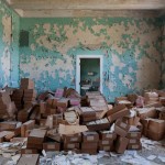
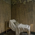
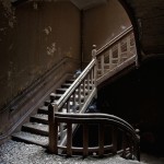
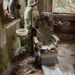
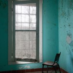
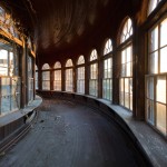
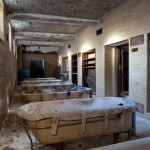
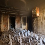
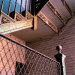
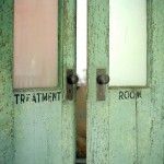
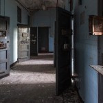
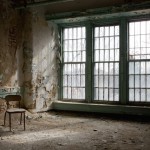
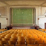
Le photographe Jeremy Harris nous fait découvrir l’architecture du 19ème siècle d’hôpitaux psychiatriques aujourd’hui à l’abandon. Les images mettent en évidence les structures étranges de ces lieux de morale, chacune des pièces a gardé la plupart de ces meubles et permet de nous plonger dans une autre époque.





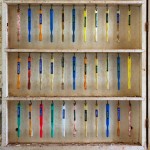


Came across the work of Canadian photographer Andrew B. Meyers again and had to repost. His photos don’t look real in any way. The way he lights them and the layout of the objects bring this ordered surreality that’s wonderful to take in. I also have no idea how these are made, but if I had to guess I’d say a mix of photography and Photoshop wizardry.


We here at YTD love typography as much as we enjoy looking at projects showcasing lettering and calligraphy. And for our latest featured artist, we will be showcasing the work of another graphic designer who is mainly focused in typography.
Meet Jackson Alves, the one man creative force behind Custom Types from Brazil which has been doing typographic work for various agencies and magazines and has been wowing the creative industry with his decorative lettering and sophisticated calligraphy styles.

YTD got the chance to talk to Jackson sharing his creative process, tools and inspirations. Check out the short interview below.
Follow what you love, work for pleasure and seek perfection on what you choose.

YTD: Hi Jackson, welcome to You The Designer! How’s your day so far?
JACKSON: Nice as usual. Thanks for asking me.
YTD: Tell us something about you and your creative work.
JACKSON: So, my name is Jackson, I’m a letterer, calligrapher and teacher, based in Curitiba, south of Brazil.

YTD: Give us a short background how did you discover your love for typography.
JACKSON: I always loved typographic compositions, but when I started reading books about typography then I fall in love with it, mainly when I read “Elements of Typographic Style” by Robert Bringhurst.
YTD: What pushed you to finally pursue a career in graphic design?
JACKSON: What a lot of people does, I love illustration and because of this I thought that graphic design would be the best choice.

YTD: How do you usually start your day?
JACKSON: Practicing calligraphy.
YTD: What are your creative inspirations? What do you usually do to stay inspired?
JACKSON: Follow creative persons and artists that I admire.

YTD: Share us your creative process. From where do you start?
JACKSON: Always researching about styles, and sketching a lot on paper, just rough. When I reach some pieces I like, I try more elaborate sketches on that way and go on.

YTD: What are your tools? Describe to us your workplace.
JACKSON: I have my computer on the left side of my table and a great space to draw/calligraphy on paper on the right side, along with my pens, brushes and inks. Beside my desk I have a blackboard when I practice lettering and at back of my chair is a large roll of paper to practice calligraphy on the wall.


YTD: So aside from being a designer, you also teach calligraphy and lettering in some workshops. How was it going so far?
JACKSON: I love teaching. I teach on a university and my workshops are a way to teach a specific activity on several cities of my country (I hope on other countries soon) and know nice people. On my workshop I’m teaching my way of being create with custom lettering.

YTD: Who is your creative hero?
JACKSON: I have some people I admire such as Luca Barcellona, Claudio Gil, John Stevens, Erik Marinovich and other (most of then calligraphy masters).

YTD: Many are confused about this. For you what is the difference between FONT and TYPEFACE?
JACKSON: Font is the final product, the software, a file you use. If you talk about font you’re talking about a TTF, OTF file. Typeface is about the design of the letter, about the style.

YTD: Traditional or digital?
JACKSON: Both. One needs the other.
YTD: Share to us some of your random favorites:
TV SHOW: I don’t like TV so much, I prefer watch a movie.
BOOK: The Elements of Typographic Style, Robert Bringhurst
FOOD: Barbecue, for sure.
BAND/SINGER: 2 Pac, The Notorious B.I.G. and all of the old school hip-hop.
FITIONAL CHARACTER: Wall-E
FONT: TheSis, by Lucas de Groot
VACATION SPOT: My parents’ house and beach.

YTD: How do you usually spend your free time?
JACKSON: Playing with my daughters and practicing calligraphy and lettering.
YTD: If you are not a type designer today, what would have been your work and why?
JACKSON: Maybe a cartoonist, because I already was and I like doing it.

YTD: A piece of advice to aspiring designers out there.
JACKSON: Follow what you love, work for pleasure and seek perfection on what you choose.
YTD: Thanks Jackson for spending some time with us! Anything you’d like to promote? Or places where we can check out more of your work?
JACKSON: You can check these channels that I always update: Behance, Facebook and Instagram.

SEE ALSO: Typography and Lettering by Martina Flor
Got inspired? Share us your thoughts through the comments below and might as well suggest some artist(s) you want us to feature next!
Read more posts by Kerby Rosanes


Most of the big events such as music concerts, film festivals, exhibitions, and other use ticket as a way to enter the event. An event requires a great promotion, one of which is by using the attractive event tickets
A well-designed ticket can make your next business event stand out and get people talking about it long before the day of the event. For many sentimental customers, tickets with creative designs also make great mementos of special events or movies.
This book and it’s full length, not-so-brief title “Hidden Warbirds: The Epic Stories of Finding, Recovering, and Rebuilding WWII’s Lost Aircraft” is a fantastic look into the modern world of finding, researching and rebuilding some of the most famous aircraft of the 20th century.
Written by aviation historian Nicholas A. Veronico, the book is a captivating page turner that covers multiple World War II Warbirds including the famous planes “Swamp Ghost” and “Glacier Girl” – both of which could have entire books written about them on their own.
The post Hidden Warbirds: The Epic Stories of Finding, Recovering, and Rebuilding WWII’s Lost Aircraft appeared first on Silodrome.
Six hundred miles north of Stockholm, on a remote hunting estate near Jarpen, Magnus Nilsson mans the kitchens at a restaurant straight out of ancient agrarian times.
"We do things as they have always been done at Jämtland mountain farms," he says. "We follow seasonal variations and our existing traditions." Everything on the 12-course tasting menu at Faviken is made with just-foraged ingredients: local garden produce, locally raised meat, wild game, herbs, and mushrooms from the estate, cheese and other dairy from the surrounding region of Jämtland, and seafood from the neighboring region of Trøndelag, Norway. During the summer, the chefs build up their stores for the dark winter months: "We dry, salt, jelly, pickle, and bottle."
N.B. If you're not planning a trip to the northern edges of Sweden anytime soon, Phaidon has just published Faviken, a cookbook by Nilsson. All photos via Faviken unless otherwise noted.

Above: Swedish chef Magnus Nilsson in his trademark furs. Photo by Howard Sooley via Nowness.

Above: The dining room accommodates just 12 diners.

Above: Local scallops.

Above: Dried bundled and jarred herbs function as decor.

Above: A single log serves as a side table. . Photo by Howard Sooley via Nowness.

Above: Scenes from the dining room; hanging cured meats add a medieval touch.

Above: Illumination by fire: candles and a wood-burning stove.

Above: Nilsson's furs, at the ready. Photo by Howard Sooley via Nowness.

Above: Diners can opt to spend the night; snowy landscape and sauna included.
Above: Fäviken, by Magnus Nilsson, is $36.03 from Amazon. Photograph via Eater National.
Taking a trip? Have a look at our City Guides to see all of the Remodelista recommended hotels, restaurants, and shops. A restaurant not to miss in Stockholm: Museet, A Modern Bistro that Doubles as a Museum.
N.B.: This post is an update; the original story ran on December 19, 2012 as part of our Winter Cabins issue.
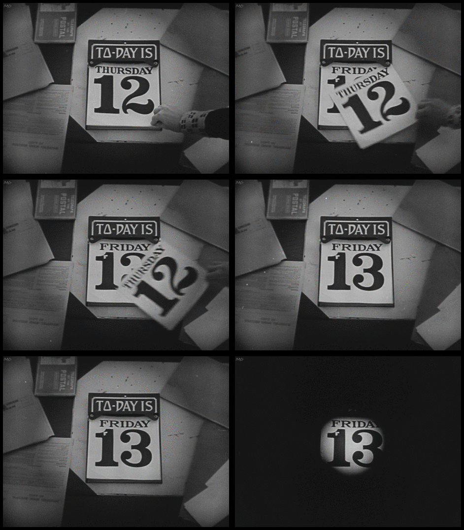
To-Day is Friday the 13th
Buster Keaton’s “One Week” (1920)

When it comes to modern animal illustration it’s hard not to riff off the work of Charlie Harper. His stylizing of flora and fauna defined a style that few have been able to best. But then I saw the work of Melbourne based Marc Martin and thought to myself, “Well, that’s certainly a unique take on wild animals.” — unique meaning awesome.
Mr. Martin recently released an alphabet book called The Curious Explorer’s Guide to Exotic Animal Which features a menagerie of animals done in his unique style. Sure, you can find similarities between the work of Harper and these, but Marc’s work is unique. His animals feel like they’re created by a true right brain creative, whereas Harper’s work is very designed and logical.

These animals are made up of dazzling brush strokes and inky splatters that give each beast a personality of it’s own. My personal favorites are the hippo, with it’s unique perspective and layering of color, and the chameleon, which reminds me of a Fear and Loathing in Las Vegas drawing. Not exactly the kind if connotations a kids book might have.
You can see more work from the book by clicking here, and you can grab a copy for yourself by clicking here.


Latvia-based graphic artist and illustrator Alex Konahin (previously) recently completed work on a new series of ornate insect drawings titled Little Wings. The illustrations were made using pens and india ink in his distinctive style that makes used of ornate scrolls and intricate floral designs. If this is the first time you’ve seen Konahin’s work, be sure to check out his amazing Anatomy drawings, and you can also see lots more on Facebook and Tumblr. (via Faith is Torment)
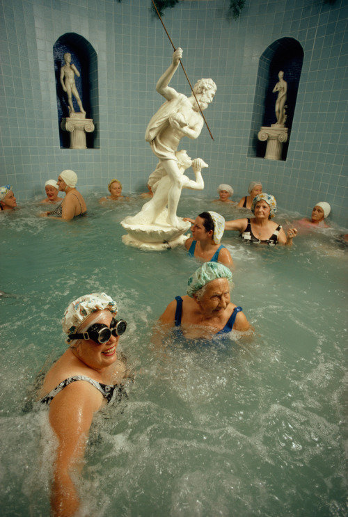
Women enjoy the benefits of a heated whirlpool in Saint Petersburg, Florida, 1973.Photograph by Jonathan Blair, National Geographic
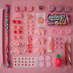
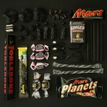
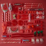
Focus sur cette excellente série et collection par la photographe Emily Blincoe basée au Texas. L’ensemble des bonbons et sucreries a été rangés et disposés par couleurs et thèmes. Le tout est à découvrir à travers son projet « Sugar Series ». Plus d’images dans la suite de l’article.
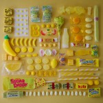
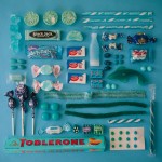
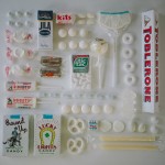

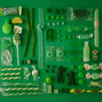



 Made in Mimbre
"Made in Mimbre is a brand created in 2007 for the development of design objects utilizing unique technique and fashioned from wicker. The designs consist of lines of lighting characterized as emotionally vibrant.It is a brand that is characterized by the sustainability in its production process which is notable for bringing local artisans and designers together to work hand in hand. The Andes House, through Made in Mimbre has teamed up with the artisans of the Chimbarango region, in order to rescue and revive the artisanal weaving techniques and create new objects, improve design, quality, and production. The objective is to professionalize the artisan’s work, creating greater value through higher quality production, while providing greater job stability in the life of artisans.The works seek to strongly reclaim both the origin and local culture of the region."
Words and images: Courtesy of Made in Mimbre


Åh vad jag älskar studentarbeten! De är ofta så mycket mer fantasifulla och vågade än “the real deal”. Här finns ingen budget eller andra tråkigheter som begränsar utan studentera skapar förpackningar där endast fantasin får sätta gränserna. Älskar det!
De här soporna från Alexander Stoeckel är härligt lekfulla och färgranna men känns ändå inte helt orealistiska. Jag skulle absolut kunna se dessa säljas på till exempel Whole Foods. Den klassiskt formade burken låter den vackra soppan synas och ta plats och de små sked- och skålformade etiketterna i kontrastfärger blir ett perfekt kompliment. Sen tycker jag också väldigt mycket om idéen med att varje burk har en liten påse med frön som man kan plantera i den fina burken när soppan är uppdrucken. Etiketten på baksidan går att ta av och därunder finns en ny etikett där man kan skriva själv. Underbart! Helt klart nåt av det finaste jag sett på länge.

Photo by Julie Schneider
From attending sewing camp at the age of 7 to studying fiber art at art school, I have a life-long love of textiles. So, I recently jumped at the chance to get a behind-the-scenes glimpse into one of my favorite businesses: Spoonflower, an innovative print-on-design company started in 2008 that centers around community design and printing fabric, wallpaper, and decals.
While the traditional textile industry is largely angled towards large-scale operations, Spoonflower offers short runs with a low set-up cost, less waste, and no need for an industry “in” to print designs, fostering an approach to production with an eye to local sourcing and a growing online community of designers. There is something really satisfying about seeing your own pen and ink image transformed into a fabric ready for sewing.
Etsy and Spoonflower share kindred values of creativity and community, and through the years I’ve had the chance to work with the Spoonflower team on partnership projects (like Craft Party). Stepping through the pattern-filled threshold at their headquarters in Durham, North Carolina, was an exciting moment. Long-time employee Darci Moyers was my guide.


The reception area is decorated with upholstered furniture, wallpaper, gift wrap, quilts, and other finished projects bearing the prints of Spoonflower designers from around the world.

Walking down the hallway, you catch the a glimpse of where the magic happens…

…right here! When Spoonflower launched, they had just two fabric printers. These days, the print room contains 27 large format fabric printers and 6 paper printers. It takes an average of 7 minutes to print a yard of fabric, while in the early days it took about 15 minutes.

A fabric printer in action.
At this part of the tour, Darci really got me. As we approached this fabric printer, I was surprised to see swatches of my green envelope pattern printing out of the machine – they had seeded this tour with my own design as a sweet surprise! You can see it coming out of the far left side of the printer in the photo above. This fabric was the first fabric I designed and printed on Spoonflower a few years ago. This unexpected moment of seeing my design come to life fresh out of the printer really completed the circle for me. I had experienced the design process and that surge of joy opening a package from Spoonflower containing my designs on the various weaves and fibers of fabric, but I had not seen that magic middle step of ink hitting the fabric. A full fabric circle!
Spoonflower has pioneered a means to convert large format inkjet printers to print on untreated natural fabrics using water-based pigment-based inks. They offer ten natural fabrics, including various cotton wovens, silk, and an organic cotton knit fabric produced in their home state, North Carolina. Effectively, Spoonflower is bringing textile production and jobs back to an area that was once a booming center of the textile industry.

Paper printer in action
Along the far wall of the print room, reside the paper printers. Above you can see colorful swatches of wallpaper printing. In addition to their fabric line, Spoonflower also offers print-on-demand decals, wallpaper (in matte and satin), and gift wrap.

Rolls of gift wrap.
Each printer has it’s own name, like this flamboyant solo artist:

Once the fabrics are finished printing, it’s time to head to the fixation room.


In the fixation room, the fabrics get run through machines that heat-set and permanently bond the pigment inks to the fabrics. On a hot North Carolina day, it can get rather sweaty in here!

Merit badge cut-and-sew fabric for Etsy Craft Party 2013
Once the fabrics have been printed and set, they are ready to get cut to size and shipped out to customers across the globe.
When I give tours of the Etsy office I am often asked what the strangest thing I have found for sale on Etsy is. (Brief jerky remains a top contender in my pun-lovin’ book.) So, I posed the same question for Darci and Stephen Fraser, the co-founder of Spoonflower, with regards to their website. Stephen informed me that Spoonflower is home to an impressive array of corgi prints and is also “definitely the biggest marketplace in the world for zombie fabrics.” Now, I would just like to see that pairing come together. Who is going to design some undead corgie fabric?

Spoonflower also has a community space called the Greenhouse, where they host regular sewing and design workshops and events to plant the seeds of creativity.

Inside the Greenhouse
Thanks for the tour, Spoonflower friends!

Left to right: Darci Moyers (long-time Spoonflower staff), me, and Stephen Fraser (Spoonflower’s co-founder).
Check out the Related Items below featuring work from Etsy sellers made with Spoonflower fabrics.
Julie Schneider is a Brooklyn-based artist, teacher, and punster. When she's not working on Etsy's community team, she's writing, drawing, and making cards and papercuts. Keep up with her latest creations on Instagram, Twitter and Pinterest.
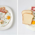
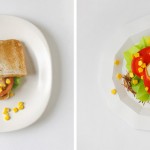
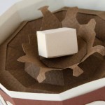
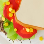
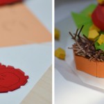
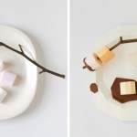
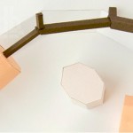
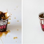
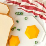
À l’occasion de l’édition 2013 du festival de design de Vilnius, le studio lituanien Primprim a réalisé une série de plats populaires fait de papier. Associant à chaque plat une typographie différente, comme times pour les oeufs au plat, ils développent une relation entre les sens, le goût et la vue. À découvrir en images.
When LA-based Garrett Colton—whom we featured earlier today—was headed to Uruguay, he asked us for recommendations on where to stay. Casa Zinc was the first place that came to mind. It turned out Garrett already had reservations, it's that sort of place.
Owned by Arron Hojman, the hotel is located in the quiet enclave of La Barra away from the fray of nearby Punta del Este. Hojman used a mixture of industrial design with salvaged finds to design the hotel managing to make it look as if it has been a local fixture forever. His love of all things vintage is evident in the hotel's decor as well as in his nearby shop, the Trading Post, where he sells an eclectic selection of antiques and found objects. For more, go to Casa Zinc.
Photography via Uniq Hotels.

Above: Industrial lighting hangs from the wood clad ceiling.

Above: Reclaimed doors lead to the kitchen.

Above: Vintage light shades in the white tiled kitchen with checkerboard floor.

Above: Hojman used a collection of salvaged doors and windows for the hotel.

Above: The dining room with shelves housing Hojman's collection of vintage globes and books.

Above: One of the six rooms available at Casa Zinc.

Above: A repurposed wood headboard.

Above: Vintage chalkboards, rulers and school chairs as decor in a guest bedroom.

Above: A utility sink in the bathroom with marble back splash.

Above: Arched windows salvaged from a Uruguay train station.

Above: Reclaimed industrial furniture in a bedroom.

Above: Outdoor dining in the garden.

Above: The entry to Casa Zinc's brick building with corrugated fencing and two industrial lights on either side of the door.
Looking for other places in South America? Check out our hotel posts in Argentina.
N.B.: This post is an update; the original story ran on March 19, 2010.
Considered Design Awards: Vote for Your Favorites in Each Category Once a Day
| Remodelista Reader Finalists | Remodelista Professional Finalists | Gardenista Finalists |
| Best Dining Space | Best Dining Space | Best Architectural Feature |
| Best Office Space | Best Office Space | Best Indoor Garden |
| Best Kitchen Space | Best Kitchen Space | Best Urban Garden |
| Best Bath Space | Best Bath Space | Best Edible Garden |
| Best Bedroom Space | Best Bedroom Space | Best Outdoor Room |
| Best Children’s Space |
It’s easy to forget that the moon is a real place. We look up at the familiar orb in our sky and see it as a flat, lighted disk with dark grey patches (and a face if we use our imagination). Perhaps it’s the fact that the moon is so small in our sky that we have to wait for a “super moon” to even get excited about it orbiting our planet. Now let’s use our imagination a little: what if the planets of our solar system were in place of the moon? It would be hard to forget Jupiter floating that close – it’s around 11 times the size of Earth!
See Also Arkyd: The First Publicly Accessible Space Telescope
Ron Miller, a former art director for NASA, has been imagining the planets superimposed in place of the moon and creating images which show their true size if placed that near to Earth. While the moon may seem astonishingly far away at 233,812 miles, when you place large gas giants like Jupiter or Saturn in its position, they would be so behemoth they would fill an entire direction of the sky (and likely make life on Earth impossible). Miller’s images give us a good idea of just how fantastically big, and small, the planets really are (Mercury, for example, isn’t that impressive size wise and would only look slightly bigger than the moon). They also give us a good impression of what a differently colored object orbiting above would look like.
Above: Neptune
Miller used this view of the moon over Death Valley, California, as the basis for his images.
The gigantic planet Jupiter, with a diameter 40 times that of the moon, in the same position.
Mars
Uranus
Mercury
Saturn
Venus
Via The Atlantic
A l’occasion de la sortie du dernier numéro de The Gourmand, les designers Jamie Julien-Brown et Jess Bonham ont imaginé « The Gourmand Measures of Quality », illustrant le talent nécessaire pour bien doser les cocktails. Des créations rappelant l’univers scientifique et illustrant une Margarita ou encore un Martini.


These custom pillows are unique in that you can submit a photograph of your pet to create the..(Read...)
Once skateboarder Jonanthan Mehring was bit by the travel bug, he challenged himself to find “the gnarliest, most culturally different places” to skate. His passion for skateboarding and travel combined with his amazing camera skills have allowed him to make a career out of his talents. He has been to over 30 countries with his friends, scouting the most unique locations to skate, often garnering quite an audience. Mehring’s photos have been published in Rolling Stone, Spin, Skateboarder, Thrasher, Monster Children, Slap and Kingpin and shown in galleries all over the world. Below is his fascinating interview with Andrew Norton for The Photographer Series, which “tells the stories behind some of skateboardings most epic images and the dudes who made them.”
See Also NEVER BEFORE SEEN DOGBOWL FOOTAGE
Read more of Mehring’s story on Petapixel and see more captivating images on his website. To learn more about the guys who make the most magical skateboarding photos, check out more videos from The Photographer Series.