Because of the high cost of mounting a proxy fight, the average hedge fund makes less money on its activist investments than on its nonactivist portfolio, Nickolay Gantchev of the University of North Carolina discovered in a study of 1,164 campaigns by 171 hedge funds. A few do score big: A small minority of firms earns twice as much through activism as from nonactivist investments. But on average, the mean $10.71 million cost of a campaign ending in a proxy fight (think of all that printing and mailing) wipes out abnormal gains.
Asdavison
Shared posts
17 Jun 11:48


A New Framework for Customer Segmentation
by Judy Bayer and Marie Taillard
Asdavison@Lindsay ...
Her confession was blurted out in the midst of our first conversation about the new digital marketing strategy which we would eventually advise them on: "You know, I don't think I believe in segmentation anymore." She said it fast and softly, almost in hope that the sounds around us would make it inaudible. But we did hear it, and responded, "Well, we don't either."
For us, this exchange was the culmination of a reflection that had started in the classroom and in client engagements, where we were finding an increasing disconnect between telling people about segmentation, targeting and positioning on the one hand, and about the increasing shift of control from brands to consumers, on the other. Clients and students questioned it increasingly: here we were, advocating a rigid methodology that carves out the market because "we can't be all things to all people," while preaching the gospel of co-creation at firms, such as Lego and Starbucks, that enter into a dialogue with their customers, giving them more access, sharing risk, and advocating transparency (see Prahalad & Ramaswamy's book The Future of Competition).
In one presentation, we were exuberant about Big Data and Little Data, and in the next, speaking what seemed to be 1960's voodoo psychographic language. To resolve these contradictions, we had begun pleading with students and clients to look for "jobs to be done." The approach echoes Ted Levitt's famous comment about selling ¼ inch holes rather than ¼ inch electric drills, and advocates a mindset shift away from selling products to "doing jobs" that solve customers' problems. In Clay Christensen's words, customers "hire" products or other solutions because they have a specific job to fulfil, not because they belong to a certain segment.
Once the taboo was lifted in our minds and in our conversation, our client, a senior marketing executive in the telco sector, with decades of operational experience, explained that in some of the countries she managed, her marketing teams were simply shelving the results of the segmentations they felt obligated to perform out of routine, or because they felt it was expected of them as serious marketers. They just ignored them. In others, marketers were still adamant that segmentation was the only way to go, but couldn't explain its benefits. Voodoo indeed.
We agreed to work on a new kind of segmentation based the combinations of jobs that customers need to get done. Here's how the "jobs done" segmentation works:
Step #1: Identify the contexts in which customers are using the company's products. Examples of such jobs in the mobile telco realm might include: "being in touch with family and friends while roaming,""choosing the best entertainment and dining opportunities on the go over the weekend" and "becoming more confident and secure in the use of a smartphone." A mobile service provider using multiple research techniques might find that there are fifty or more jobs to be done across their customer base. One person might typically get several jobs done by a given provider or brand.
Step #2: Combine information about transactions and customer behaviour in the contexts to describe each of the jobs to be done. For our weekend entertainment example, we would look for a combination of weekend searches for entertainment information, searches for local restaurants, movie reviews and social behaviour such as tweets about movies, concerts or restaurants. The "becoming confident and secure" job might use data from call centre interactions and detect unused features on a new smartphone. The actual relevant data for each of the "jobs to be done" is selected during the initial research as a function of the different contexts to be explored and the data available. This is very different from traditional behavioral segmentation which focuses on a wide set of individual variables such as the percentage of voice calls. Here we need a holistic view of the data required to characterize a context.
Step #3: Map individual customers to jobs, using the data. Each customer would be scored according to the relevance for him or herself of each of the jobs done. A specific customer may need 20% of the entertainment job, 2% of the confidence job and 40% of the being-in-touch job. The customer profiles would be spread across all jobs. From there it's a simple step to cluster customers on their mix of jobs to be done rather than on their "raw" behaviour, demographics or attitudes. For each segment, there may be only three or four jobs to be done that are crucial. This then allows the development of specific solutions for each segment.
Setting the job done framework as a basis for customer segmentation allows us to use all the relevant data for customers in a meaningful and structured fashion. Firms can see how customers are hiring solutions for the jobs important to their lives and observe customers in the action of getting the job done (or in some cases, not getting it done). As brands access unprecedented amounts of data about consumers' activities and are able to use them more efficiently and productively, they find broad patterns and trends and can indeed get better at detecting "the person behind the data" and the jobs that person needs done. Another element of relevance for customers is that they now expect that the data which they are implicitly sharing with brands will result in a positive impact on their own personal experience rather than in lumping them into new, irrelevant buckets.
Peter Drucker once said, "The customer rarely buys what the business thinks it sells him." The problem is we don't know what kinds of jobs customers are going to need done unless we follow each customer's journey. Big Data now lets us observe that journey. This type of of segmentation is more important than ever as technologically empowered customers have more choice and the ability to craft their own solutions. It represents the new job to be done for us all of us in marketing.
13 Jun 23:23


Weird Tube of the Day: The Best-Worst Phone Conversation in History of Cinema
Check out this awkwardly scripted dialogue scene from an unidentified 1980s South Indian film. It is one of the most dramatic phone conversations in film history.
Submitted by: Unknown (via Reddit)
08 Jun 15:00
200 Channels, Nothin' But Cats
AsdavisonGod I love the simpsons ...
07 Jun 13:15

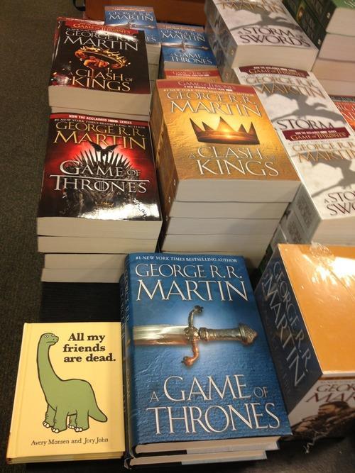
Full Circle of the Day: George RR Martin Reacts to Red Wedding Reactions
On last night's Conan, A Song of Ice and Fire author George R. R. Martin sat down to watch a compilation video of people's reactions to last weekend's infamous "Red Wedding" scene from HBO's grisly drama series Game of Thrones. Apparently, Martin was familiar with the backstory of the video and explained that they were recorded by readers who had been aware of the pivotal event and wanted to film their unknowing friend's reactions. Martin also gave a nod to the running joke on the Internet about his "no characters left behind" policy by warning Conan that if he were a writer for the show, he would have him killed by his live band in a conspiracy hatched by co-host Andy Richter.
Submitted by: Unknown (via Team Coco)
Andrew Baisley and -1 others like this
03 Jun 16:03
A Sunken Trampoline is Cooler Than a Sunken Pool
AsdavisonWANT 1!!!!!
Kevin White likes this

29 May 17:20
The Best Question to Ask Bill Gates Ever?
AsdavisonLove it ...
Kevin White, Andrew Baisley and -1 others like this
27 May 12:52

How to Assess an Ad's Creativity
by Werner Reinartz and Peter Saffert
Asdavison@Lindsay ... they have a Danone add ...
Most measures of creativity are based on the work of psychologist Joy Paul Guilford (1897-1987), who defined creativity as the ability to think differently along a number of clearly defined dimensions. Building on Guilford's work, psychologist Ellis Paul Torrance (1915-2003), probably the international leader in creativity research, developed the Torrance Tests of Creative Thinking (TTCT), which are used in the business world and in education to assess individuals' capacities for creativity.
In the early 2000s, Torrance's metrics were adapted to an advertising context by a group around communications researcher Robert Smith from Indiana University. Focusing only on the components that are directly related to how consumers consume and process advertisements, Smith's group defined advertising creativity as the degree of divergence from a norm along five dimensions: originality, flexibility, elaboration, synthesis, and artistic value.
As we describe in our HBR article, we used Smith's scale to assess the creativity of 437 TV advertising campaigns in Germany. We recruited a panel of representative consumers and asked them to give a response on a scale of one to seven to a series of questions. From these responses we were able to assess the various ads and we found that there was significant divergence across ads in terms of the type of creativity that were most salient. Here's how we defined and assessed the five dimensions:
Originality
An original ad comprises elements that are rare, surprising, or move away from the obvious and commonplace. The focal element here is uniqueness of the ideas or features contained in the ad. To assess originality we asked three questions:
1) Is the ad "out of the ordinary"?
2) Does it depart from stereotypical thinking?
3) Is it unique?
The highest originality score was given to Coca Cola's "Happiness Factory." The panelists unanimously gave it the maximum score of 7.0. This ad also scored 6.3 for artistic value.
Flexibility
Flexibility is seen in an ad's ability to link a product to a range of different uses or ideas. We asked panelists the following questions to assess it:
• Does the ad contain ideas that move from one subject to another?
• Does it contain different ideas?
• Does it shift from one idea to another?
The highest creativity score was given to Jacob Krönung's "Time for Chatting" ad that respondents rated at 5.0. This was by some margin the ad's highest-scoring creativity dimension.
English translation: We think its great that you men are practical in nature. That you are ready to tackle any challenge and never give up. Because Jacobs Krönung has given us time: time to talk, time to enjoy the new coffee specialties from Jacobs Krönung for Tassimo.
Elaboration
Many ads are creative because they contain unexpected details or extend basic ideas so they become more intricate and complicated. We again asked respondents three questions:
• Does the ad contain numerous details?
• Does it extend basic ideas and make them more intricate?
• Does it contain more details than expected?
The highest score in this dimension (4.0) was given to the Ehrmann Yogurt "Strawberry Tongue" ad, although this was not the ad's highest creativity factor (it scored 5.0 for artistic value).
Synthesis
An ad that is creative along this dimension blends normally unrelated objects or ideas. To assess it we asked the following:
• Does the ad connect objects that are usually unrelated?
• Does it contain unusual connections?
• Does it bring unusual items together?
The highest synthesis score (6.3) was awarded to Wrigley's Juice Fruit Squish "Juicy Fruit Ranch" ad. But this was not the ad's highest score (like the Coke ad, it took 7.0 for originality).
English translation: Background voice: "These are Martin and Schnuffler (male character pointing towards two rabbits). These are their friends (pointing towards more rabbits). This is the production. This is Betsy." Betsy: "Hello, I am Betsy." Voiceover: "Crispy on the outside. Fruity on the inside. Juicy Fruit Squish."
Artistic Value
Ads with a high level of artistic creativity contain aesthetically appealing verbal, visual or sound elements. Their production quality is high, their dialog is clever, their color palettes is original, or their choice of music is somehow memorable. To assess artistic value we ask again three questions:
• Is the ad visually or verbally distinctive?
• Does it make ideas come to life graphically or verbally?
• Is it artistic in its production?
The Danone Fantasia Flavor Trip ad gave us the highest score for artistic value (6.67). This ad also scored highly for originality (6.67 as well) and elaboration (6.33).
English translation: New from Danone: Fantasia. Wonderful creamy yogurt. Go on a taste voyage. Let yourself be seduced by Fantasia. For a fantastic €0,29.
As we explain more fully in our article, these was considerable variation in overall creativity across the 437 campaigns we assessed. On the 1-7 scale the average overall creativity score was 2.98, the lowest 1.00, and the highest 6.20. We also found the biggest sales impact from creativity came when two dimensions were emphasized in an ad and there was clear pecking order in terms of which combinations were best.
Combining elaboration with originality had almost double the average impact of a creative pairing on sales, closely followed by the combination of Artistic Value and Originality (1.89, accounting for 11% of all combos). The weakest combination was flexibility and elaboration, which had less than half the average pairing's impact on sales. Yet we found that in terms of usage there was little difference between them: advertisers did not seem to favor any one combination over the other.
Perhaps the most valuable contribution of our study is that it shows how ad professionals and their clients might better channel the energies of their creative people. By applying research methodologies like ours they can have a better sense of what kind of creativity matters the most for their products and place their creativity investments accordingly.
24 May 21:36
Those Pitches Weren't Even Strikes
gary.mcmullen and -1 others like this
24 May 16:45
The Sound is So Sad
16 May 21:32

A New Perspective of the Day: View of Manhattan From Its New Tallest Building
Workers at the construction site of the World Trade Center complex used a GoPro camera to film the historic placement of One World Trade Center's spire last Friday, resulting in a beautiful bird's eye-view of the Manhattan skyline from the new tallest building in the Western Hemisphere (1,776 ft).
Submitted by: Unknown (via YouTube)
Daniellepretto and -1 others like this
14 May 19:46
Dead Giveaway - Charles Ramsey Songified
14 May 13:42

The Three Elements of Successful Data Visualizations
by Jim Stikeleather
AsdavisonIn all the time I have been trying to figue out what makes big data tick ... visualization is probably the most important part. Trying to tell a story with numbers is very difficult, so if you can make a compelling visual way to tell the story it's much easier to get across. Good visualization companies are going to be worth their weight in gold soon ...

Now that we've discussed when data visualization works — and when it doesn't, let's delve into what makes a successful data visualization. Although there are a number of criteria, including ease of comprehension and aesthetics, I'd like to explore the three that designers most often overlook.
1. It understands the audience.
Before you throw up (pun intended) data in your visualization, start with the goal, which is to convey great quantities of information in a format that is easily assimilated by the consumers of this information — decision-makers. A successful visualization is based upon the designer understanding whom the visualization is targeting, and executing on three key points:
- Who is the audience, and how will it read and interpret the information? Can you assume it has knowledge of the terminology and concepts you'll use, or do you need to guide it with clues in the visualization (e.g., indicated good is up with a green arrow)? An audience of experts will have different expectations than a general audience.
- What are viewers' expectations, and what type of information is most useful to them?
- What is the visualization's functional role, and how can viewers take action from it? An exploratory visualization should leave viewers with questions to pursue; educational or confirmational visualizations should not.
2. It sets up a clear framework.
The designer needs to ensure that everyone viewing the visualization is on common ground about what it is representing. In order to do so, the designer needs to set up a clear framework, which involves the semantics and syntax under which the data information is designed to be interpreted. The semantics involve the meaning of the words and graphics used, and the syntax involves the structure of the communication. For example, when using an icon, the element should bear resemblance to the thing it represents, with size, color and position all communicating meaning to the viewer.
Lines and bars are simple, schematic geometric figures that are an integral component of many kinds of visualizations: lines connect, suggesting a relationship. Bars, on the other hand, contain and separate. In studies, when people have been asked to interpret an unlabeled line or bar graph, people overwhelmingly interpreted lines as trends and bars as discrete relations — even when conflicting with the nature of the underlying data.
There is one other element to the framework: Before everything else, make sure your data is clean and you understand its nuances. Does your data set have outliers? How is it distributed? Where does your data have holes? Are you making pre-judgments about the data? Real-world data is often complex, of diverse types from diverse sources, and not always reliable. Getting to know your data will help you select and appropriately use a framework.
3. It tells a story.
Visualization in its educational or confirmational role is really a dynamic form of persuasion. Few forms of communication are as persuasive as a compelling narrative. To this end, the visualization needs to tell a story to the audience. Stories package information into a structure that is easily remembered which is important in many collaborative scenarios when an analyst is not the same person as the one who makes decisions, or simply needs to share information with peers. Data visualization lends itself well to being a communication medium for storytelling, in particular when the story also contains a lot of data. Minard's graphic of Napoleon's march on Moscow in 1812 is an exemplar. With newer technology freeing designers from the paper-based paradigm of images, even more compelling narratives can be constructed.
Storytelling helps the viewer gain insight from the data. Information visualization is a process that transforms data and knowledge into a form that relies on the human visual system to perceive its embedded information. The goal is to enable the viewer to observe, understand and make sense of the information. The difference between information visualization and traditional storytelling in film, theater or television is that the information and story conveyed in information visualization environments are much more complicated. Design techniques that prioritize particular interpretations in visualizations that "tell a story" can significantly affect end-user interpretation.
Visualization designers need to dig into the data in order to gain an understanding of it, and also to connect with the visualization's audience. Good designers know not just how to pick the right graph and data range, but how to be a compelling storyteller through the visualization.
14 May 09:44

Entertainment Gossip of the Day: The Jay Leno Pumpcast Karaoke Segment was Likely Staged
Say it ain't so! The uplifting Californian couple that performed what was thought to be a spontaneous karaoke duet as part of Jay Leno's Tonight Show "Pumpcast News" segment may have actually been hired actors, according to The Smoking Gun. According to the hoax killers, Will Sims and his wife Monifa have been pursuing careers in show business for sometime with Mrs. Sims having appeared on the same "Pumpcast News" segment before more than two years ago. Monifa has since responded to the allegations, claiming it was just a coincidence that she ended up on the show for a second time. What do you think?
Submitted by: Unknown (via The Smoking Gun)
13 May 16:07
A Baby Covered In French Bulldogs
by noreply@blogger.com (Joanne Casey)
AsdavisonThis is just too much !


13 May 15:58


Well, That's an Interesting Fact
AsdavisonHehehehhe
Quantifying Everything For Great Justice
Graph by: Unknown (via Reddit)
Tagged: murder , internet explorer Share on Facebook
Andrew Baisley and -1 others like this
13 May 15:57
Big wildcats playing in boxes. HELLO, NEW FAVORITE THING!
Asdavison@finkowitz
Big wildcats playing in boxes. HELLO, NEW FAVORITE THING!
Daniellepretto likes this
13 May 11:49


Meanwhile in London of the Day: Bluth's Banana Stand is Going On Tour
To promote the upcoming season premiere of Arrested Development on May 26th, Netflix has launched a pop-up shop tour of Bluth's Original Frozen Banana Stand, which will serve up real frozen bananas and photo ops with cast members in various locations across Great Britain and the United States, starting with London (as seen in the picture) this week and a few more pit stops in New York and Los Angeles in the following week. Is there any money in it? Perhaps you should find out!
Submitted by: Unknown (via Huffington Post)
09 May 10:04


Stats Pr0n of the Day: Money Really Can Buy Happiness
Since the publication of the "Easterlin paradox" in 1974, researchers from around the globe have been trying to prove whether or not a person's net worth correlates with how happy they are. In 2008, Betsey Stevenson and Justin Wolfers found a logarithmic correlation between one's income and life satisfaction. The research duo published a new paper last month to reveal that this correlation has held up through recessions, with people in 25 countries reporting higher life satisfaction with higher pay.
Submitted by: Unknown (via Washington Post)
Kevin White likes this
08 May 07:57


YouTube Launches U.S. Trends Map
This morning, YouTube unveiled a Trends Map breaking down the site's top videos in the United States by regions, age and gender demographics. According to the YouTube official blog, the top videos are selected based on their YouTube views as well as the frequency of shares within a 12 to 24 hour time span.
Submitted by: Unknown (via YouTube)
07 May 17:05

A pug dressed as a hot dog, eating a hot dog at an event called...
A pug dressed as a hot dog, eating a hot dog at an event called “Bark in the Park.” Monday, you’re alright.
(via)
07 May 08:07


A New Perspective of the Day: Historical Figures Dressed in Contemporary Fashion
AsdavisonHa
Ever imagined what Shakespeare would look like if he were alive today? The British television channel Yesterday commissioned several illustrations of historical figures re-imagined as if they were still around for the biographical series Secret Life Of. Among those who were drawn include Queen Marie Antoinette as a high-class socialite (above, top), King Henry VIII as a suave suit-wearing gentleman (above, middle) and Shakespeare as a vest-wearing hipster (above, bottom).
Submitted by: Unknown (via laughingsquid.com)