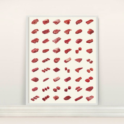
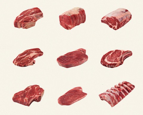
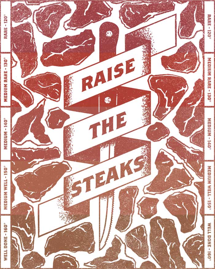
A poster celebrating Beef. My apologies to you vegetarians out there. But, this made me chuckle.
A poster celebrating Beef. My apologies to you vegetarians out there. But, this made me chuckle.
Tickle is an app (concept?) to help you escape awkward situations. Using your phone’s accelerometer, Tickle can sense awkward gestures, and in turn, generate a phantom phone call to allow you to gracefully excuse yourself from whatever awkward situation you’re in. This made me laugh and double check if it’s not April 1st.
UPDATE: It’s a joke. Bummer.
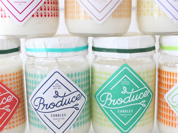
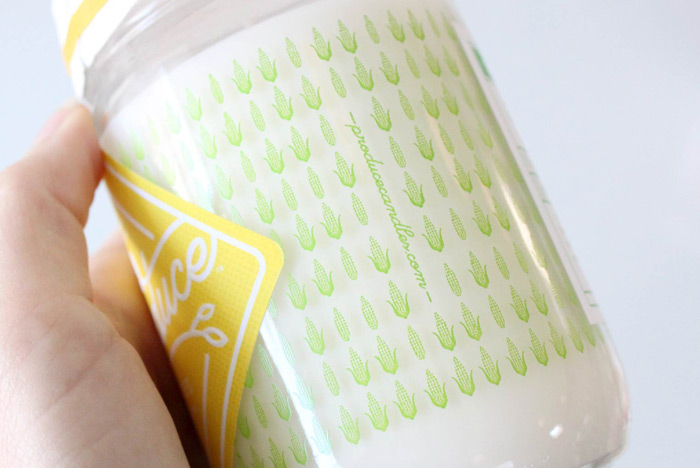
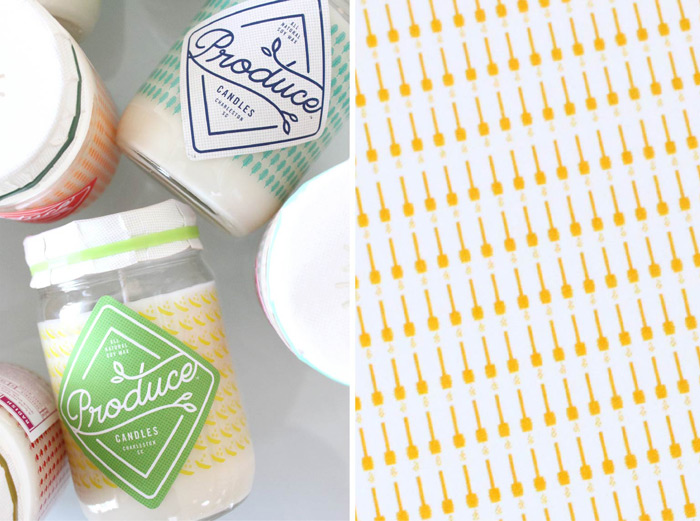
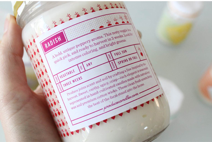
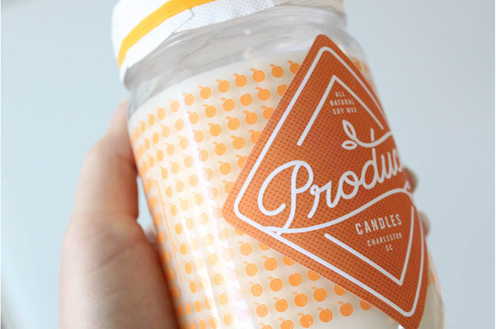
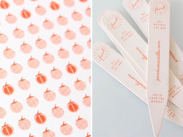
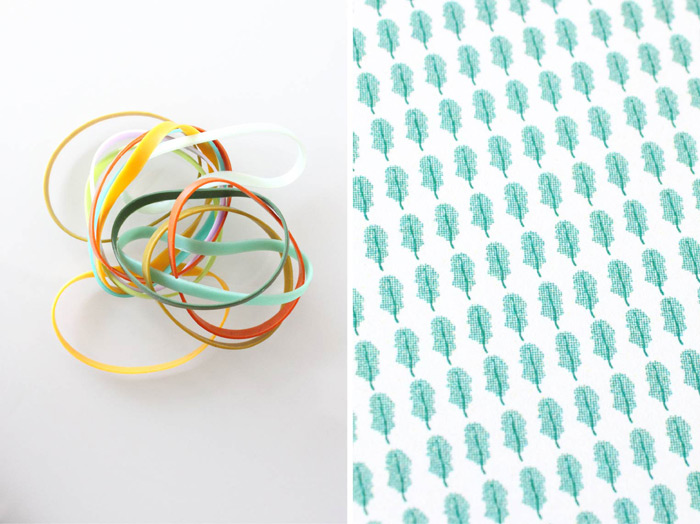
It’s been far too long since I’ve posted a project from the ladies at Stitch Design Co., so this morning I’m excited to share their latest packaging project for Produce Candles.
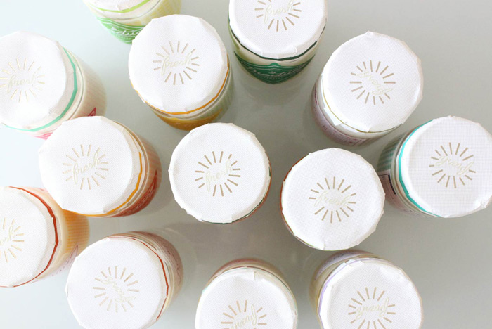
The fresh, vibrant packaging designs reflect each hand-cultivated candle’s produce-inspired scent, which include unique varieties like snap pea, kale and carrot, to name a few. The containers feature silkscreened patterns inspired by each scent, embossed labels and laser die cut and embossed toppers.
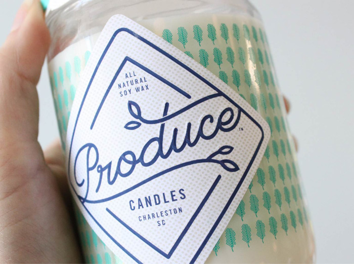
I’m especially loving the toppers, which are also secured with a custom colored rubber band.
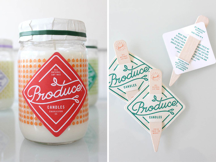
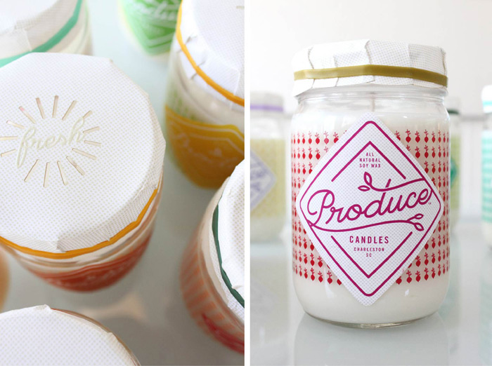
If you’re interested in purchasing a candle or two, all of their current scents are available on the Produce Candles website.
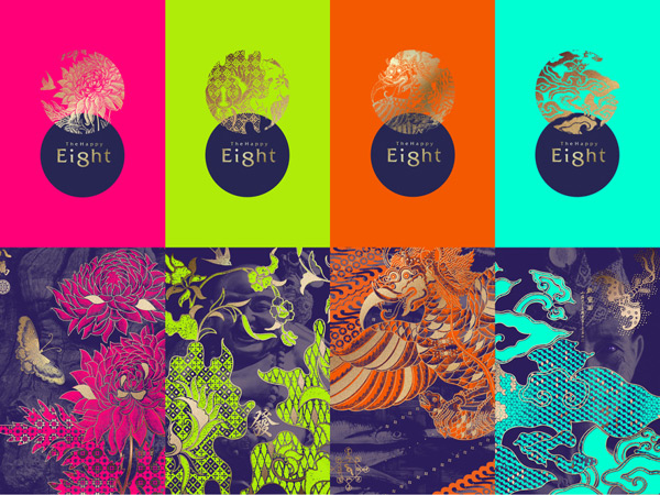
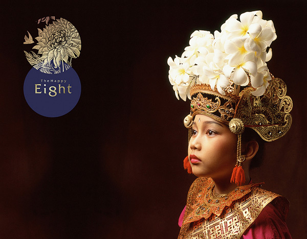
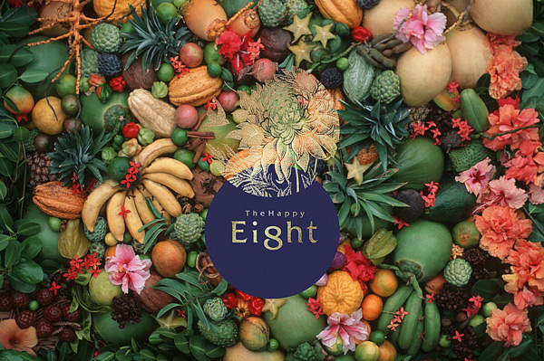
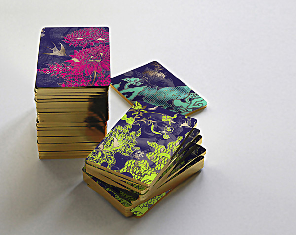
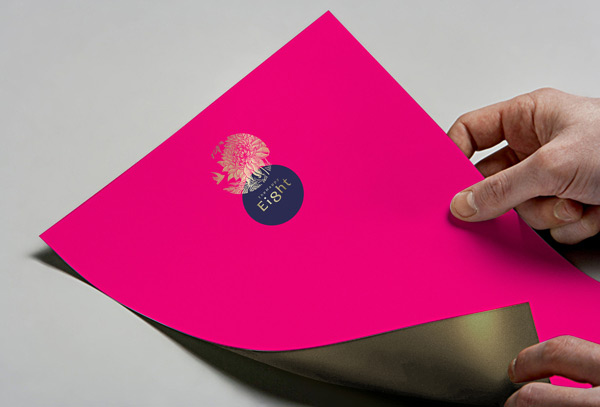
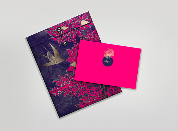
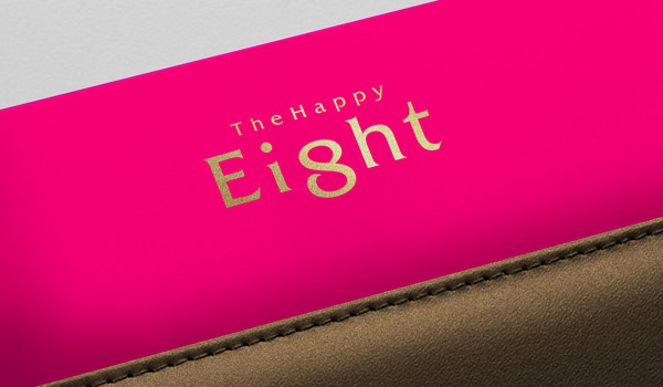
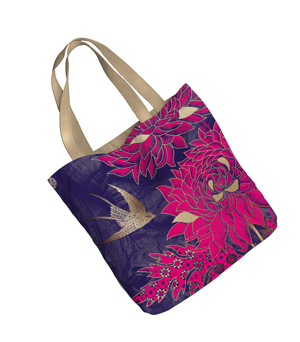
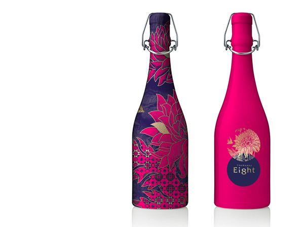
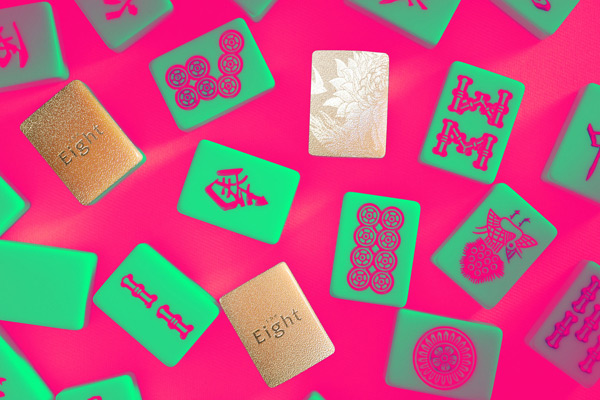
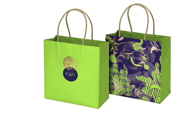
I’m loving this vibrant work by 1983 Present for The Happy 8, a chain of hotels in Malaysia.
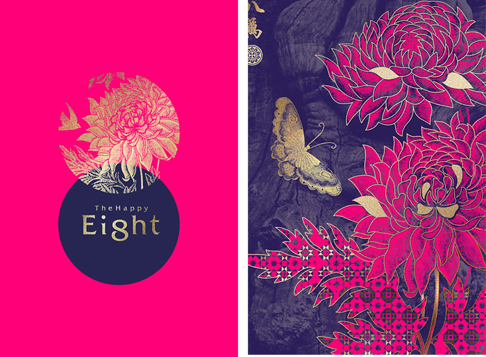
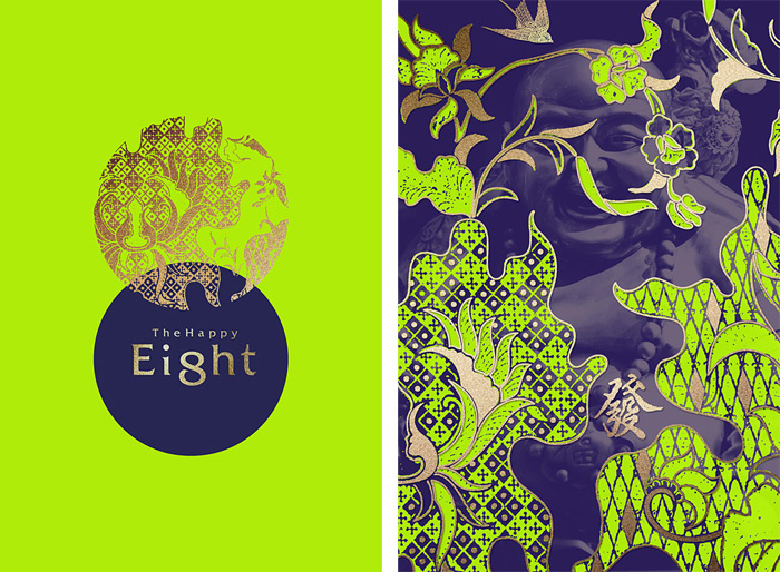
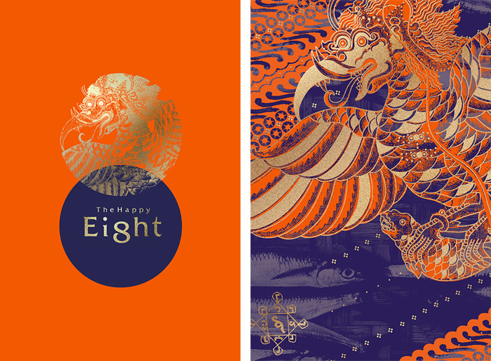
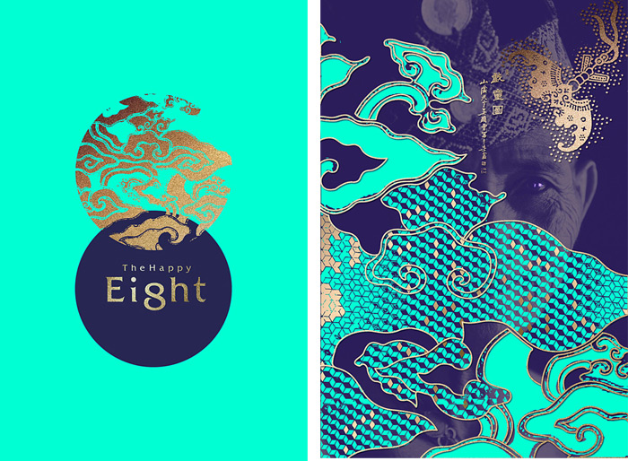
The Happy 8 is a high-quality chain hotels brand of Malaysia. The brand is enlightened from the combination of Nanyang culture and art. Design inspired by vibrant colours in the local system, mysterious national symbols as well as inclusive multicultural. It re-interpreted national culture in an unique way,combined with the advantage of the other local hotels. The brand identity system has achieved a very strong coherent brand experience while giving uniqueness to every touch-points. Customers can experience a fabulous Nanyang culture and art. The hearts filled with joy mutual respect and culture mixture. Let’s leave the inhospitality and loneliness of urban, to enjoy a cultural and artistic journey with passion.

via Brand New


Created by artist Alyson Shotz, this reflective picket fence is made entirely of mirrors and has been installed in several locations since 2003. The iteration shown here was on view through 2012 at the Storm King Art Center in New York. The fence has the uncanny ability to reflect its surroundings resulting in a barrier that is at times almost completely camouflaged, or, depending on your perspective, in stark contrast to the nearby landscape. (via Designboom)
To wrap up the year 2013, digital agency inTacto created an interactive infographic highlighting the rise of the “flat design” trend. The website “Flat Design vs. Realism” features an interactive HTML5 game in which the users are given the chance to pick their side and battle with the enemy “Street Fighter” style. The infographic is a narration of how realism (or skeuomorphism) once ruled the digital world until designers started using the emergent flat design. According to inTacto, the idea to create the project came about after Apple also changed the look of iOS7 into flat design, which Windows 8 had already used earlier. [“Flat design vs realism: which side are you on?”. Creative Bloq.]
Defining the two design styles, realism (or skeuomorphism from the Greek words skeuos “tool or container” and morphe “shape”) refers to a concept in design where the items or objects seem to resemble their real-life counterparts. It is used in several design fields such as user interface (UI) design and Web design. There are visual and non-visual skeuomorphs. Visual skeuomorphs refer to how Web and UI icons seem in 3-D even though they are in a flat surface (e.g. buttons are designed to look as real as possible by the effects of shadowing, highlights and details). On the other hand, non-visual skeuomorphs refer to: sound of a vinyl record ending placed at the end of digital records; and shutter sounds used in digital cameras. [Rouse, Margaret. “What is skeuomorphism?”. WhatIs.]
Flat design is defined as a type of minimalist design. Using this style will much emphasize the usability of an application. When people were asked ideas about how they think flat design look, words like simple, clean, modern, trendy, and colorful were some of the answers. Positive arguments for flat design are: illustrations are minimized; if an application uses this kind style, it loads faster; and the content is represented in such a way that it is simpler and easier to understand. [“Infographic: Flat design vs. skeuomorphism”. Webdesigner Depot.]
Which design style would you prefer? Flat design or skeuomorphism? Remember, when we say that something uses flat design, words like minimalist, bold colors, sharp edges and lines, simple typography, and very little shadowing will come up. In skeuomorphism, the presence of embossed and bevel effects, 3-D artificial textures, and drop shadows and reflective shimmers can be seen.
In conclusion, inTacto stated that “It doesn’t matter what design wins, because we both like flat and realistic design.” Both design styles were featured on various websites in 2013 and this year, is another opportunity for us to explore, innovate and develop new design styles for the digital world. [Hagle, Will. “Flat Vs. Realism: The Digital Design Battle”. All My Faves.]
You can check out the interactive infographic “Flat Design vs. Realism” to try the game and hear the story yourself.
Read more posts by Gian Bautista
To find out the best new bands in Austin for our Sense of Place visit, we went to the source at KUTX Radio.
Suzymarie.johnsonok,kretz
For more of Natalie’s work, be sure to check out her portfolio, which is filled with lots of fun, colorful and interesting illustration work, and follow along with new work on Tumblr.
Suzymarie.johnsonThese are great!
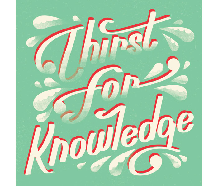
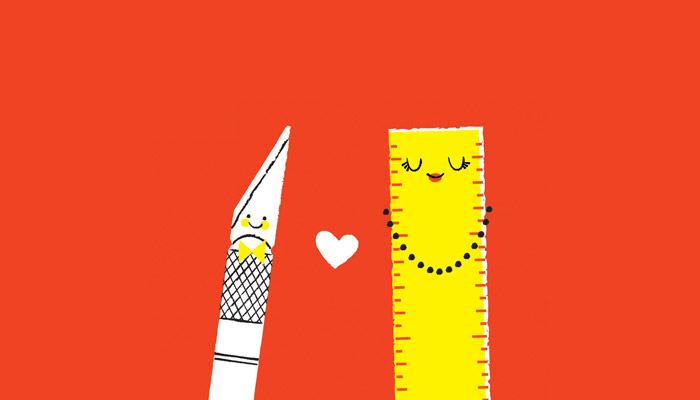
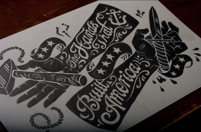
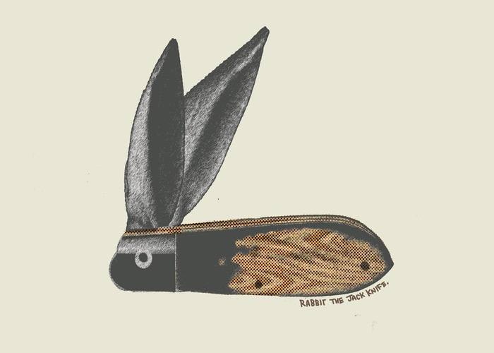
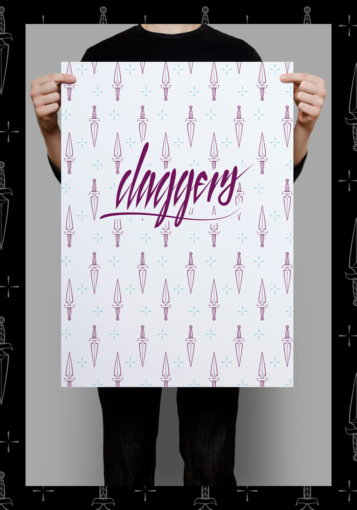
Alliteration Inspiration is a weekly column featuring the top twenty pieces of visual inspiration based on two random alliterative themes. This week’s thematic combo: knowledge & knives.
An urban legend states that we only use about 10% of our brain, and one could argue we operate on only 5% until we’ve had our morning coffee. Well, it’s about time to wake up the other 90-95% with a ten pack of knowledge-based designs certain to light up your lobes.

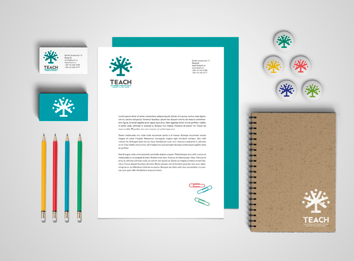 dework / Brand identity & collateral – Project TEACH
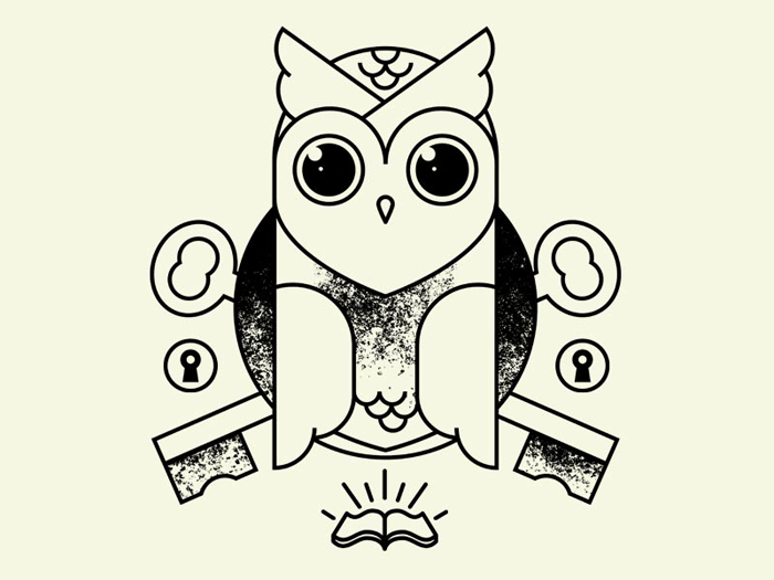
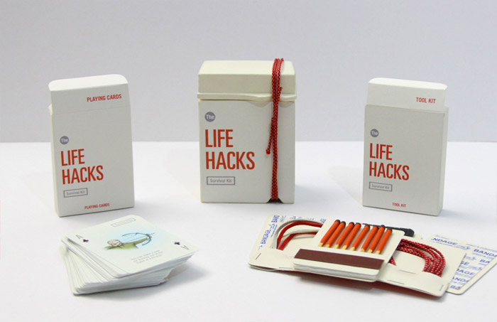
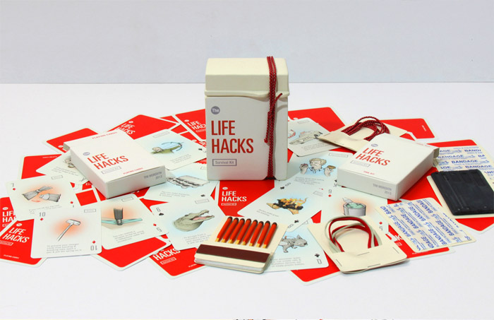
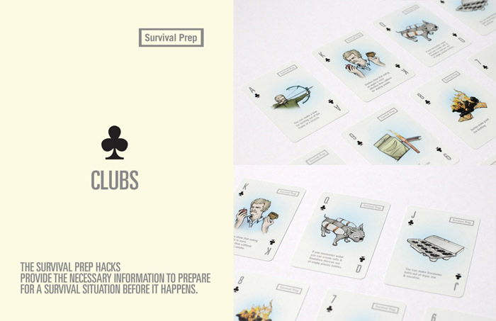
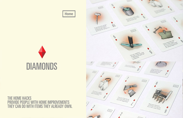
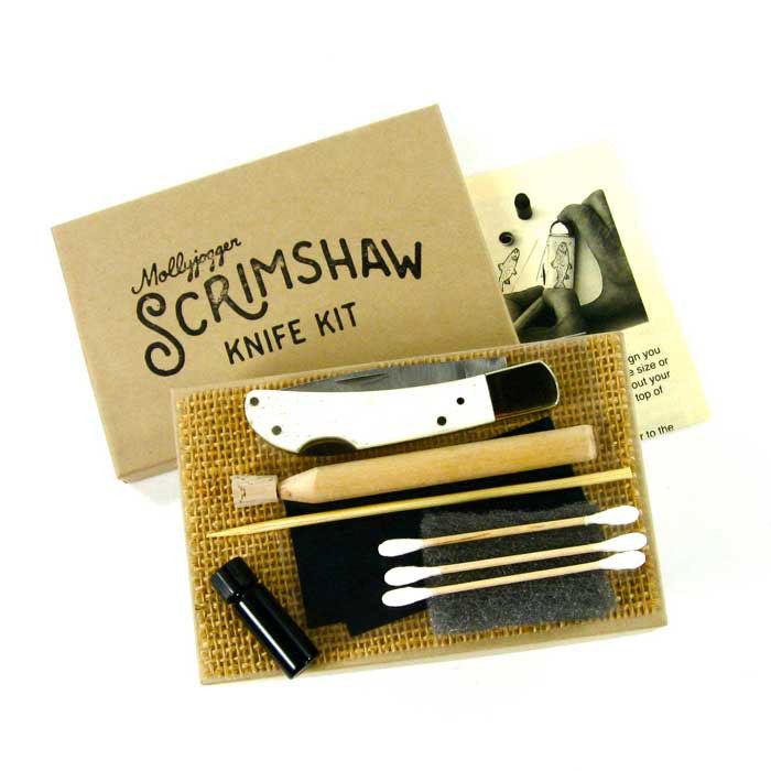
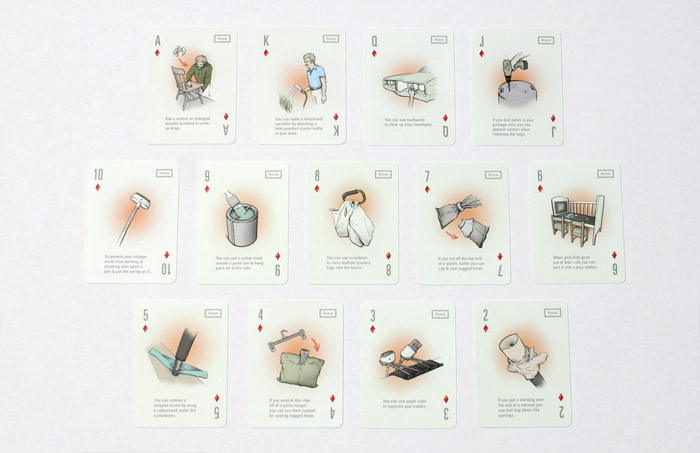 Tim Meredith / Playing cards & tool kit
If you’re looking to sharpen your design eye, these ten fine examples of bladed beauty will surely do the trick. Simply scroll and let your eye slice through them like a hot knife through butter. Chop chop!
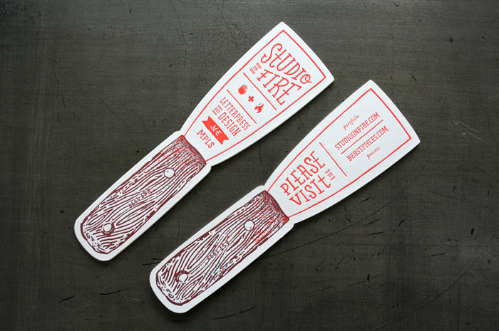
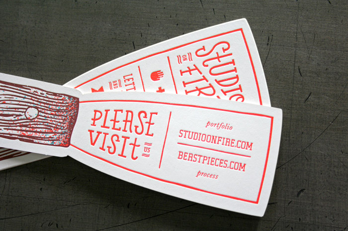
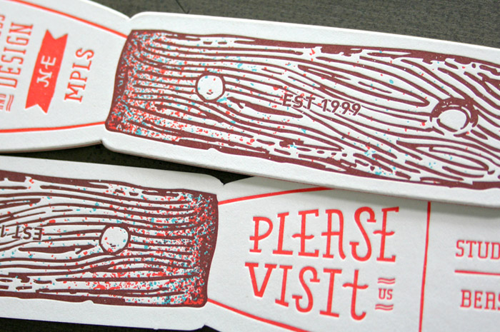 Studio on Fire / Self promotion letterpress
Suzymarie.johnsonOrlando native! :)
InVaso is a unique planter concept straight from the mind of designer Stefano Claudio Bison. The idea is an interesting one – in theory, making the vessel from sponge, a porous material that is excellent at holding water, you create a pot that might store water and nutrients and release them to the plant over time. In essence, a true “self watering” planter.

However, there are a few flaws that might call the functionality of InVaso into question. First, if the sponge is more absorbent than the soil inside, it would actually suck water away from the plant. I imagine drainage would be awful. And, no doubt, it would become pretty gross and saturated with salt build up over time. The upside to that being that it would be very easy to clean!

Also, what is with cacti and succulents being the poster child of plant models? A cacti is a plant that definitely does not need to be in a vessel that remains moist most of the time, not to mention hates poor drainage. Instead, it seems InVaso is something that might actually provide a good environment to a plant that likes to be very wet and even appreciates high humidity. In any case, I commend Bison’s creativity, and recognize that experiments like this are what lead to breakthroughs in the world of caring for our plant friends more effectively.


Photos © Stefano Claudio Bison
 Christoffer Relander’s "We Are Nature" Series
 Nao Tamura’s Seasons Leaf Plates
 Masha Reva x SNDCT ‘Botanical Layers’
The post InVaso Planter by Stefano Claudio Bison appeared first on Plant Propaganda.
Suzymarie.johnsoncan i borrow one to fall asleep?

Zimoun : 138 prepared dc-motors, cotton balls, cardboard boxes 40x40x40cm, 2011 from STUDIO ZIMOUN on Vimeo.
Suzymarie.johnsonBahahahahaha!
As part of SVA’s Masters of Branding program, the students are each currently participating in a self-initiated project that spans the course of 100 days. One current student, Tyler Adam Smith, chose to work with the theme of “100 Books that SHOULD be written,” where each day he conceptualizes a book that he wishes to be written and designs the cover. I know I definitely second most of these titles. Follow along to see what comes next right here.
Graphic design is not just only about making beautiful layouts and fantastic designs but it is also about connecting to the people who we are targeting at. In fact, one can consider it as a part of psychology because designers are tasked to understand and connect with people through designs.
One tool that we designers use to connect with people is color. Color gives an array of emotional and visual cues. Apart from that it sets the tone and attracts people’s attention towards the design. While learning color theory is important for us graphic designers, it is also a great measure to understand what the meaning of different colors. One good insight about color is from American stage director, Vincent Minnelli and he said: “I use colors to bring fine points of story and character.”
Today we are going to feature this awesome infographic about the Psychology of Color.
What do you guys think about the infographic? Share your thoughts below! Don’t forget to visit Visual.ly for more awesome infographics to add in your inspiration bank!Follow us out in Facebook,Twitter,Pinterest and Google+ also do subscribeto get your latest dose of design news, tutorials and creative advertising ideas for inspiration.
Looking for a library of high-quality print templates? The search is over! Hit the link and get high-quality print templates here for free!
Read more posts by Patrick Jude Ilagan
Apple just recently unveiled their latest operating system for mobile devices, iOS 7. It features a more minimalistic and flat look, throwing away the skeuomorphic design of the previous versions with new color palette, typography and new features. It is the “most significant iOS update since the original iPhone” said Craig Federighi, Apple’s Senior Vice President of Software Engineering.

While most are excited and thrilled about the new OS which will be available this fall, the design especially the look and feel of the new set of icons received mixed reviews mostly from designers. The use of gradients combined with minimalist style on the icons making it brighter, flatter and pastel-like is the most notable change that the design world has been conflicting about. A tumblr blog was even made for fun, showcasing this aesthetic of Jony Ive, Apple’s Senior Vice President of Industrial Design and what it would look like when applied to various things.
With the conflicting thoughts about the iOS 7 design, some designers have done some experiments and created their own take on what the iOS 7 design should look like. One designer who took the challenge is Dmitry Kovalenko. The Ukraine-based designer redesigned the home screen with more emphasis on changing the icons’ graphics and colors. One notable addition is the use of shadows on each graphic for the icons that create depth and unique look. Check out his redesigned iOS 7 GUI below:


Designer student from Paris, Leo Drapeau also took the challenge of redesigning the new iOS. His goal was to make the design more detailed, cleaner and more coordinated using the same design direction and the overall look of the new iOS. The result, a better home screen UI design well applauded by fellow designers.


Which of the two redesigns you think would look better for the new iOS?
Share us your thoughts by leaving a message in the comment box below. Find You The Designer on Facebook, Twitter, Pinterest and Google Plus for more updates. Also, don’t forget to subscribe to our blog for the latest design inspirations, stories and freebies. Speaking of freebies, check out our free print templates page for your print design needs. Stay awesome everyone!
Read more posts by Kerby Rosanes
Suzymarie.johnsonFor you Carson.


A year ago I wrote about this amazing geometric paper torso designed by artist Horst Kiechle. At the time the piece wasn’t actually complete as he was still perfecting how all the organs fit together thanks to feedback he received online. At long last the model is done and Kiechle launched an extensive website with free downloadable templates you can print and assemble along with photographed step-by-step instructions for every single piece. So now there’s no excuse to not spend the next three months of your life on this. Good luck!

Artist and creative director Brock Davis has a charming sense of humor when it comes to his personal work. Though we’re already fans of his affinity for food—like the “Emo Pineapple” wallpaper art he shared earlier this year—as well as his editorial and advertising work, which includes everyone from the New York Times and Wired to Harley-Davidson and Jack Links beef jerky, he also makes time for work that captivates his imagination. And, often, his subjects are food items taken to a whole new level.

Instead of cutting up a cucumber for a salad, for instance, he turned it into a killer whale. Most of his projects seem to be born from wanting to perform an every day life task then having it go somewhere completely different. His son wanted a treehouse, so he built him one—though Davis’s version was a mini treehouse that fit on a stalk of broccoli. He paid homage to Peter Saville’s seminal design for Joy Division’s Unknown Pleasures by recreating the album cover on a black dinner plate using spaghetti noodles.
And then there’s his banana peel trucker cap which went viral practically overnight both for its inventiveness and whimsical wink to the hipster. Whether he’s smashing gummy bears to create mini bearskin rugs or recreating Stonehenge with a bunch of broken Rice Krispies, the work of Brock Davis is always engaging and prone to multiple smiles. It’s in keeping with his mantra too: “Make work that people want to talk about and have fun doing it.”


Appree is a company founded in Seoul, Korea in 2008 that produces a range of whimsical, nature-themed office supplies. Founder Sangwoo Nam was inspired to start creating these products when reflecting on his childhood; a time when he was constantly at play outside, experiencing and feeling one with the natural world around him. Nam feels that, as people, we grow out of this childhood one-ness with nature and become robotic automatons toiling away in windowless concrete cubes. Fun!
Through design, he aims to get us back in touch with the outdoors we once knew, using products like these Leaf-It sticky notes. Leaf-Its come in a variety of realistic leaves and flowers to choose from, bringing that bit of green back into our daily lives. Even better, the more you use them, the more lush your office becomes (assuming, like me, you don’t throw out your sticky notes and instead stick them endlessly on top of one another).


Photos © Appree.
To purchase, visit Mochi Leaf.
The post Appree’s Leaf-It Sticky Notes appeared first on Plant Propaganda.
Suzymarie.johnsonCarson, you nerd... I am sure you already knew about this.


Feit footwear—and that’s pronounced “fight” rather than “feet”—is a handmade shoe line made from natural materials. Launched in 2005 by former Royal Elastics founder Tull Price, the company was created to act as a direct response to the saturated synthetic market. Aside from offering a wide range of beautifully designed men’s shoes and boots, Feit abides by its ethos to make products without the use of a single machine.
By adhering to the Goodyear construction method, which is traditionally used in classic men’s dress shoes, Feit shoes are stretched and stitched into the sole rather than glued. All of the leather is sourced from Italian tanneries and treated with vegetable dye. No harmful chemicals are used, and the leather is kept as close to its natural state as possible, which lets the leather breathe and age well over time. While there is a rather robust handmade shoe market to be found online, it’s rare to find a line that is truly well-designed with attention to quality, fit, and aesthetics. It’s a direct reflection of Price’s history and ethics and also, perhaps, a nod to his ongoing partnership with Rag & Bone. Take a look at the full range of shoes as well as wallets and belts here.

Suzymarie.johnsonwell, there you go.
This is one of Open University’s six Design in a Nutshell videos.
I also recommend Gothic Revival, Arts and Crafts, Modernism, American Industrial Design and Postmodernism.
(via the always amazing Open Culture blog)
Suzymarie.johnsonyikes
 1925-1926, illus. Willem Papenhuyzen via Memory of the Netherlands
 1925-1949, poster by Evert Möllenkamp via Memory of the Netherlands
 1925-1949, poster by W. J. v.d. Werf via Memory of the Netherlands
 1926-1927, poster by Albert Hahn via Memory of the Netherlands
 1927-1928, poster by Albert Hahn via Memory of the Netherlands
 1939, poster by E. Lukàcs via Memory of the Netherlands
 1939, poster by Gé Hurkmans via Memory of the Netherlands
 1940, poster by Drik de Leeuw via Memory of the Netherlands
 1942, poster by Hans Bolleman via Memory of the Netherlands
 1942, poster by Hans Bolleman via Memory of the Netherlands
 c. 1950–1959, designer unknown, via Memory of the Netherlands
 1950-1970, poster by V. Riel via Memory of the Netherlands
 1950, poster by N. Olthuis via Memory of the Netherlands
 1952-1953, poster by Dick Harders via Memory of the Netherlands
 1959-1964, designer unknown, via Memory of the Netherlands
 1959-1964, designer unknown, via Memory of the Netherlands
 1959-1964, designer unknown, via Memory of the Netherlands
 1959, poster by T.T. Kwee via Memory of the Netherlands
 1960-1970, poster by Frits Frietman via Memory of the Netherlands
 1960, designer unknown, via Memory of the Netherlands
 1967, designer unknown, via Memory of the Netherlands
 1968, designer unknown, via Memory of the Netherlands
 1972, designer unknown, via Memory of the Netherlands
 1972, designer unknown, via Memory of the Netherlands
 1973, poster by Frans Mettes via Memory of the Netherlands
 1973, poster by Frans Mettes via Memory of the Netherlands
 1975, poster by Frans Mettes via Memory of the Netherlands
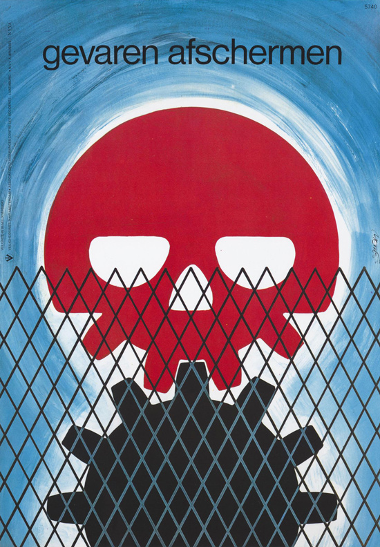
 1977, poster by Ron van Weerdt via Memory of the Netherlands
This one would look good in a CRM textbook
Previously: Don't fall off the building and Danger Is Everywhere
1977, poster by Ron van Weerdt via Memory of the Netherlands
This one would look good in a CRM textbook
Previously: Don't fall off the building and Danger Is Everywhere
Suzymarie.johnsono really?
Suzymarie.johnsonCONES IN YOUR EYES?!?!?!

So you know how a rainbow is supposed to have every color in it? It doesn’t. And this video from The Royal Institution, in part, addresses why you won’t find purple in rainbows. But what the video is actually about, and what’s awesome, is how we perceive color.
Inside our eyeballs, along the back surface, we have rod and cone-shaped cells that form the retina. When the cone cells of the retina are excited by light pouring in through the pupil, they send electrical signals to the brain. And we perceive specific colors based on what mix of signals are sent to the brain. The cones in humans are normally only sensitive to three colors: red, blue and green because the three types of cones we have are sensitive to red, blue and green wavelengths of light. Some females can have additional cones that are sensitive to another wavelength of light thanks to a genetic anomaly. There is an excellent Radiolab episode about color which features a woman with tetrachromacy. She’s able to see colors that you and I just can’t. The episode also mentions that butterflies have five kinds of cones and that there are animals with as many as 16 different kinds of cones. They can see so many colors that we’ll never see. When you think about it, it seems unfair.
Still, color is amazing, and this short video is a great introduction to how we perceive it. It was produced by the Royal Institution of Great Britain, which has a bevy of fascinating science videos (like any of the Modern Alchemist series, although I particularly like the one about Iodine). This video is hosted by Steve Mould, and it asks a very basic question “How do our brains see the colour magenta which doesn’t have a wavelength?”

You want the best for your money, whether you're buying a kitchen gadget or personal care item. The Sweethome, a spinoff from the folks at Wirecutter, will guide you to the best version of every home product.
    
|
Suzymarie.johnsonfor you carson
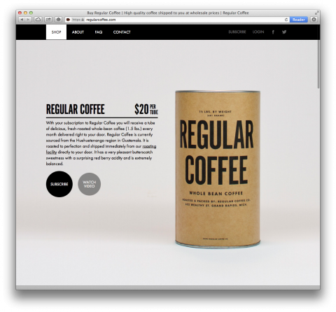
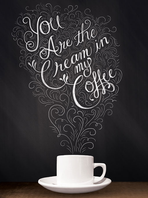
Regular Coffee is a very designy subscription coffee service. The folks behind Regular Coffee aim to deliver intentionally sourced, artisan roasted coffee directly to your door. Their beans are currently sourced from the Huehuetenango region in Guatemala.
Looking at their branding and packaging, one could say, Regular Coffee is the Field Notes of coffee.
Let it be known that I am almost as much of a crazy cat lady as I am a card-carrying plant nerd (which isn’t always the easiest combination, given that cats are notorious for their destruction of houseplants). That said, I love these collages by Chicago artist Stephen Eichhorn. He has been making these hand-cut collages as part of his ongoing “Plants and Animals” series since 2009. Eichhorn uses vintage books about cats and plants to create images that are hilarious and puzzling. I could look at these for hours.


Art © Stephen Eichhorn.
For more Plants and Animals, visit the Tumblr.
 Friday Foliage: Bract to Basics
Christoffer Relander’s "We Are Nature" Series
Friday Foliage: Bract to Basics
Christoffer Relander’s "We Are Nature" Series
 Botanical Paper Products from Rifle Paper Co.
The post Stephen Eichhorn’s Plants and Animals appeared first on Plant Propaganda.


Portland-based photographer Sarah K. Byrne recently wrote and filmed a detailed tutorial on how to make multiple exposure photographs using a Cannon 5D Mark III camera and accompanied the article with some great examples of her own work. You can see more of her photography over on Tumblr, and if you liked this you can see many more examples of multiple exposure photography right here. (via fstoppers)