Shared posts

07 May 14:56

Infographics: Data meets Design

by Gian Bautista

They say knowledge is power, but how do we make knowledge powerful?

Infographics, a technique we use to communicate information more quickly and clearly. It is where “data meets design” and both cooperates to convey a message through good visualization.

In this motion graphic by  Column Five, they showed some of the visual techniques a designer could use to communicate ideas and information effectively to a specific audience.

How many sevens are there in this number set?

infogra_banner1

This example shows how a simple change in color, size, orientation and flicker can make it easier for us to count the sevens.

Color

infogra_banner2

The simple color change made it easier for us to see the sevens almost instantly. You could also tweak the size, orientation, and even make the element flicker to direct your audience’s eyes into it.

Size

infogra_banner3

Orientation

infogra_banner4

These changes we do are “visual clues” that an average human brain processes within two-hundred and fifty-two (250) milliseconds.

infogra_banner5

In infographics, we use these elements to communicate messages such as: color for correlation; size for quantity; and orientation to show trends. The power of design in communicating information doesn’t stop there. It can also be used to visualize processes, hierarchy, anatomy, and chronology.

ALSO READ: Environmental Graphic Design: Architecture meets Graphics

Check out more Graphic Design tips from our articles section. Share your thoughts about this feature through the comments box below and don’t forget to follow us on TwitterFacebookGoogle+Tumblr, and Pinterest.

Read more posts by Gian Bautista

07 May 14:54

You! Be Informed! #0061 – Paypal’s New Brand and Identity

by Julya Buhain
Suzymarie.johnson

this is the best thing i have seen all year! can't explain why though...

Paypal is sporting a make-over. After 7 years of carrying the same logo, Paypal has unveiled a new logo and with it a new branding strategy. Paypal, the e-Commerce and online banking giant, has changed tactics and is endeavoring to create ‘a people powered economy’.

1398872186772

1398880374287


The rebranding was done by FuseProject, a design and marketing strategy powerhouse based in both California and New York. The rebranding was headed by Yves Behar – founder and CEO of FuseProject.

For the logo they decided to go with a bolder wordmark, a stronger monogram and more vibrant colors to emphasize both trust and innovation. They kept the italicized text to symbolize how dynamic their brand is. They wanted to go with a new logo that better represented perceptions of youthfulness, trust, energy and innovation. The logo itself is crafted with a modified version of the Futura typeface with softer edges.

Here are some of there redesign progress snippets:


1398870058280

1398870085653

1398870107127

1398870615826

1398871795040

1398880879949

David Marcus, the President of Paypal has a few words about this transition:

“Our new brand identity goes far beyond an updated logo, we have aligned this with our first global brand campaign. We’re setting a new expectation with our global consumers, developers and merchants: PayPal is redefining the future of money by putting people first. After all, money doesn’t make the world go round, people do.”


Here’s the full video of him discussing the marketing strategy:


Being the Go-To for digital payments, Paypal in it’s branding has to establish a level of friendliness with it’s consumers. Conversions matter, which is why its website has also been revamped. Sprouting a mobile first approach with easier forms and a gorgeous user experience.


screen02


screen01

1398884061393


Here are some shots of the rebranding in actions:

139887939848013988752411411398875103929


So, Creatives – what are your thoughts? Did paypal make or break it with this new resign? Could you have done something better? You can check out some of the other rebrandings we’ve covered like, Reebok and Visa. Let us know what you think in the comments below. You can also hit us up on our FacebookTwitter and Google+ profiles. Lastly, our RSS Feeds is open for subscription, so that you can be informed!

Sources:


Read more posts by Julya Buhain

07 May 14:53

Infographic: The Working Dead

by Kerby Rosanes

Workplace zombies? Yes they exist and each of them are well covered in this awesome infographic by AtTask called “The Working Dead” that enumerates the eight types of workplace zombies devouring your productivity.

Inspired by the popular show “The Walking Dead“, the infographic categorizes the people that slows down the pace of your team as workplace zombies. Example’s include the “Crawler” who doesn’t keep up with the established process, the “Howler” who always complains and draws other people’s attention to their tasks, and the “Shifty” who switches tasks and priorities on a daily basis.

Check out the infographic below or head over to AtTask to view a bigger version. You might just identify someone you know under one of the following zombie classifications.


The Working Dead

Read more posts by Kerby Rosanes

07 May 14:53

Macaw: A Frontend Web Developers Dream

by Julya Buhain

Macaw is a new application that’s perfect for front end web developers. It churns out semantic, valid HTML with very easy customisable CSS. The designs are responsive and easy to work out when the code is exported. Easily, one of the best new additions to any designers tool kit. With the influx of design tools this day and age, the modern web designer has more options than the combination of Photoshop and Dreamweaver to get their code out there.


Whether you work with mock up first and then go straight to code, or if you start your work in Photoshop and code last. Macaw is interesting because you skip that step between the draft code and the final output. You visually lay out what you want to happen, and then just polish it further. It’s sort of where Sketch and Dreamweaver meet in between.


select-options


transfering-presentation-attributes


The idea for Macaw sparked when Adam Christ and Tom Giannattasio noticed the bridge between designers and developers. They started a kickstarter, with a targeted goal of $75,000 to fund the software. On the first day, they had already surpassed the amount – showing the design community’s clear cut need for this tool. Initially launched for early backers in mid January, and with a stable release just coming out earlier this April. Macaw has been making waves all month as designers are enjoying the program.


FEATURES

Here are some of the features, I’ve been loving:

  • Responsive Code - Macaw is mobile first! It does everything from 100% width sections to fluid code.
  • Global Styles – You can apply designs/settings to more than one element, and it carries to everything with that style.
  • Typography - has excellent support for web fonts!
  • Interactive – You can also add scripts.


Not convinced? Check out this work flow.


Having had the weekend to play around with the trial itself, I’m really quite pleased with the potential of the program. I’ve recently made the shift from Mac to Windows, so I’ve been looking for an alternative to Coda. Most of what I’ve been hearing about Macaw has been really good so far, and I whole-heartedly agree.

If you want more of the latest Web Design tools, you can check out our list of 15 Web Apps for Web Designers.  Have you used it yet? Or do you have any thoughts? Suggestions for alternatives? Let us know your thoughts by leaving a comment below. You can also hit us up on our FacebookTwitter and Google+ profiles. Lastly, our RSS Feeds is open for subscription, so that you can stay creative.

Read more posts by Julya Buhain

07 May 14:50

In-Depth and Up Close Process Video of a Watch Being Made

by Bobby Solomon

NOMOS Glashütte

German based watchmakers NOMOS Glashütte are known for their high caliber of watchmaking and this video proves it. Aptly titled Look over the watchmakers’ shoulder we get an intimate look at the intricate process that goes into the making of a watch. It’s honestly mind-boggling to think of how confident these makers are at creating something with such small scale. I think it also clearly shows why these watches are so expensive: it takes a lot of work to make something so perfect.

07 May 14:28

Grey, Singapore: Multinational Typeface

by Garth

The team at Grey Advertising‘s Singapore office designed a fascinating modular Multinational Typeface, using colors and composition representative of the flags of all 106 countries in which the company does business.

I love the duality of feelings that this series evokes — while the diversity of color and variation in form celebrate each country’s individuality, the modular structure joins the letters together in one global, united system. Each character/country is unique, yet everything fits in place together.

Grey Singapore: Multinational Typeface / on Design Work Life

Much has been written and said about the needs of our global economy. In fact: heated debates have and are still taking place about the dichotomy of global vs. local.


Here’s our take on it all: when you set up a new hub to work with the rest of the world, it kind of makes sense to install a multinational team to do so. Not just a local setup running a global account, but a team that has got a clue about the world out there. We did just that. And we invented a design tool to brand this team, and to communicate our mindset and vision – the world’s first multinational typeface.

Grey Singapore: Multinational Typeface / on Design Work Life

Grey Singapore: Multinational Typeface

Grey Singapore: Multinational Typeface

Grey Singapore: Multinational Typeface

Grey Singapore: Multinational Typeface / on Design Work Life

Grey Singapore: Multinational Typeface / on Design Work Life

Grey Singapore: Multinational Typeface / on Design Work Life

Grey Singapore: Multinational Typeface / on Design Work Life

Grey Singapore: Multinational Typeface / on Design Work Life

Grey Singapore: Multinational Typeface / on Design Work Life

Grey Singapore: Multinational Typeface / on Design Work Life

Grey Singapore: Multinational Typeface / on Design Work Life

Grey Singapore: Multinational Typeface / on Design Work Life

Grey Singapore: Multinational Typeface / on Design Work Life

Grey Singapore: Multinational Typeface / on Design Work Life

Grey Singapore: Multinational Typeface / on Design Work Life

Grey Singapore: Multinational Typeface / on Design Work Life

Creative Credits
Designer/Typographer: Luis Fabra
Photography: Theia pixelworx

07 May 14:25

Children's Library Visual Identity: Hvass and Hannibal

by Marta Cerdà Alimbau
Visual identity for Københavns Kommunes Biblioteker / Hovedbiblioteket

The modular system created in this visual identity for children is bright and playful.

The children can play and create their own characters and patterns, which allows the identity to grow on its own in a very natural and dynamic way. 

Visual identity for Københavns Kommunes Biblioteker / Hovedbiblioteket

Visual identity for Københavns Kommunes Biblioteker / Hovedbiblioteket

Visual identity for Københavns Kommunes Biblioteker / Hovedbiblioteket

Visual identity for Københavns Kommunes Biblioteker / Hovedbiblioteket

Visual identity for Københavns Kommunes Biblioteker / Hovedbiblioteket

07 May 14:13

From The Collection: 002

by Tobias Frere-Jones

I took the city bus to get to school. The high point of the trip was getting a transfer, a rough slip of paper rattling and clanging with type.

I would ask the driver for one, and then take it home rather than use it. I just liked the way they looked, and didn’t really notice the hodgepodge of typefaces. But my fondness for “blue collar” typography surely started here.

Click for the big image and enjoy the traffic jam of sans serifs.

New York City bus transfers

07 May 14:13

Letters From Abroad

by Tobias Frere-Jones

Image from “Brighton Typewalking” courtesy of Ben Mitchell

Every city finds expression and identity in its lettering. On grand monuments and humble shopfronts, letterforms convey the personality of their home as well their immediate content. With help from many hands, I’ve assembled a list of photostreams and blogs documenting public lettering around the world.

I’m not the first person to assemble such a list, and I sincerely hope I’m not the last. Please send any corrections (and especially additions!) to info@frerejones.com. Thanks to all the contributors, with special gratitude to Florian Hardwig and Pascal Duez, Indra Kupferschmid, Jean François Porchez, Gaelle Jolly, Pooja Saxena and all of the photographers. Happy traveling!


EUROPE

 
Flickr photostream by Florian Hardwig
    Lettering in many styles and materials, covered in thousands of photos

Painted Signs and Mosaics by Sebastien Ardouin
    Fading advertisements from Britain, France, Germany and many other locations

Flickr photostream by Fritz Grögel
    Public lettering from across Europe (Don’t miss 11 Didots are better than 1)

À Bonnes Enseignes by Pascal Duez
    Painted, tiled, carved and neon lettering throughout Europe

Flickr photostream by St. Rainer
    Lettering from Kassel and elsewhere in Germany

Urbane Reklame by Isabella Lacourtiade & Florian Hauser
    Postwar shopfronts from Germany, Spain and elsewhere (with map)
    via Pascal Duez and Florian Hardwig

On Aime se Promener
    Commercial signage from France, Spain, Portugal and Poland
    via Pascal Duez and Florian Hardwig

Flickr photostream by cpbischof
    Lettering from Germany, Scandinavia and elsewhere, including many carved and cast examples
    via Pascal Duez and Florian Hardwig

A Pile of Type
    Signboards, awnings, shopfronts and more from Spain and The Netherlands
    via Anton Koovit and Yassin Baggar

Caroline’s Miscellany by Caroline LD
    Fading advertisments in UK and France, sorted by location and subject

Numbers and Type by birx
    Hundreds of examples from Germany, France, Italy
    via Pascal Duez and Florian Hardwig

Typography Collection Part 1 / Part 2 / Part 3 by Justyna Frąckiewicz
    Shopfronts and neon lettering from Poland, Germany, Austria, Czech Republic & Hungary
    via Jean François Porchez

Outletters
    Latin and Cyrillic lettering from Germany, Bulgaria and Serbia
    via Alexander Nedelev

UNITED KINGDOM

 
Ghostsigns by Sam Roberts
    A extensive resource on “the fading remains of hand-painted wall advertising”, primarily from the UK but many examples from around the world, and links to several books on ghostsigns.

Anomalies of Lost Street Furniture Compliation organized by Susie Clapham
    Milestones, postboxes, and other pieces of overlooked lettering

London Typographica
    Geotagged submissions with interactive map, organized by OPX
    via Indra Kupferschmid, Gaelle Jolly

Faded London by Yelfy
    Ghost signs, mosaics, milestones, coal holes and more

Public Lettering: A Walk in Central London by Phil Baines
    Annotated walking tour from The British Library to Trafalgar Sqaure

Jane’s London
    Over 100 albums of London photos, many on lettering

Urban Typography in Oxford by Gaelle Jolly
    Lettering of shops, signposts, monuments and more

Brighton Typewalking by Ben Mitchell
    Commercial and residential lettering from the nineteenth century to the present

TypeCity UK
    Wide-ranging compilation, including derelict and contemporary advertising, wayfinding, shopfronts and monuments

IRELAND

 
Our Type by Trevor Finnegan
    Shopfronts in the towns and villages of Ireland
    via Michael Duggan

A Gentleman of Letters
    Signpainter Kevin Freeney’s work, shared by his son Paul

Gentlemen of Letters
    Documentary film on Dublin signpainters

FRANCE

 
Instagram feed by Jean François Porchez
    France and many other locations

Gardons le Mural Compilation organized by Christian Berjon
    Fading advertisements from France and elsewhere, sorted by subject

Les Publicités Murales Peintes by Dominique Harster
    Fading advertisements in small towns across France

Les Murs Peints S’Affichent by Philippe Célérier
    Shopfronts and fading advertisements

Jules Vernacular by Jack Usine
    Lettering across France, tagged by material and style
    via Indra Kupferschmid, J. B. Morizot

L’Abri Côtier by canecrabe
    Painted, enameled and carved house names
    via Pascal Duez and Florian Hardwig

Flickr photostream by akalollip
    Antique lettering (mostly painted), in large cities and small towns
    via Pascal Duez and Florian Hardwig

SPAIN

 
TypoBarcelona by Laura Meseguer
    Instagram feed of the city’s endangered public lettering

Stadtalphabet Barcelona
    Previews of the book by Martin Ulrich Kehrer
    via Johannes Lang

PORTUGAL

 
TypoLisbon by Cristiana Couceiro
    Instagram feed showcasing Lisbon’s signage, with several examples of neon     via Sam Potts

SWEDEN

 
Signs of Stockholm by Gustav Mårtensson
    All styles, materials and uses, from the nineteenth century to the present, with commentary (text in English)
    via Pascal Duez and Florian Hardwig

DENMARK

 
Copenhagen Type by Rasmus Lund Mathisen (Instagram feed here)
    Extensive survey of the city’s commercial lettering, with many archival photos
    via Jean François Porchez, Gaelle Jolly

Ghostsigns Denmark by Hanne Andersen
   Inscriptions and mosaics as well as ghostsigns

GERMANY

 
Kolonialwaren by Barbara Bechter
    Over five thousand photos of ghostsigns across Germany, sorted by city (text in German)

Buchstaben Museum
    A museum of original dimensional lettering from around Berlin: cast metal, backlit plastic, neon.
    via Indra Kupferschmid

Alte Aufschriften und Werbung by rauter25
    Derelict and contemporary signage in Hamburg

Hannover Type and Lettering and Signs: not DIN by birx
    Many examples of street signs and other notices, prewar to present
    via Pascal Duez and Florian Hardwig

Hamburg Alphabet by Chris Campe
    Shop Sign Lettering in Hamburg, with accompanying book

AUSTRIA

 
Unter Fenstern Zeichen by Herbe Marker
    Over two thousand photos of shopfronts (text in German)
    via Andrei Robu

Stadtalphabet Wien
    Previews of the book by Martin Ulrich Kehrer
    via Johannes Lang

Type Museum by Jürgen Bauer
    via Pascal Duez and Florian Hardwig

Wiener Schilder by phospho
    via Pascal Duez and Florian Hardwig

Vienna City Typeface by Achim Gauger     Instagram feed     via Johannes Ecker

ITALY

 
Italian Typography 2013 by Doug Bartow

Vernacolo Tipografico Sassolese / Modenese / Fiorentino / Misto
    by Antonio Cavedoni

Lettering from Turin by Silvia Virgillo
    Shopfronts in Torino
    via Catherine Dixon

SLOVAKIA

 
Old-Fashioned Font Hunters
    Forum for lettering photography (in Slovak)

Brusel Expo 58

MALTA

 
MaltaType
    via Benna Cohen

POLAND

 
KRK_TYPE compilation organized by Marcin Bartoszek and Magdalena Kania
    Lettering around Krakow
    via Mariusz Ciesla

ROMANIA

 
Type, Street Art, Signs in Bucharest Romania by Jerry Cotter

CROATIA

 
(dija)kritika by Marko Hrastovec
    The rendition of diacritics (successful and otherwise) in Croatian signage

ARMENIA

 
Flickr set by Armina Ghazaryan
    Inscriptions and signage in Yerevan
    via Hrant Papazian

INDIA

 
Bombay Type by Gopal MS
    via Pooja Saxena

Hand Painted Type compilation organized by Hanif Kureshi
    via Kalapi Gajjar

You Should Like Type Too by Rob Keller
    Several galleries of hand-painted lettering in India
    via Pooja Saxena

Lettering from the Archive and Streets of Delhi by Aakanksha Gaur
    via Pooja Saxena

Lettering from the Streets of Bangalore by Pooja Saxena

Street Signs of Chennai by Nia Murphy and Selvan Thandipani
    via Pooja Saxena

Inscrutable Generalities / The Memories of Shapes / The Minstrels of Letters / by Rarh Design Magazine
    Lettering in Bengali
    via Pooja Saxena

Malayalam Type
    via Pooja Saxena

BANGLADESH

 
Letters from Bangladesh by Rarh Design Magazine
    via Pooja Saxena

An Ahmedabadi Morning by Akash Raj Halankar
    via Pooja Saxena

SRI LANKA

 
Found Type Lanka Compilation organized by La-ulu Collective
    via Pooja Saxena

BURMA

 
Burmese Signage by Ben Mitchell

THAILAND

 
Thai Signage by Ben Mitchell
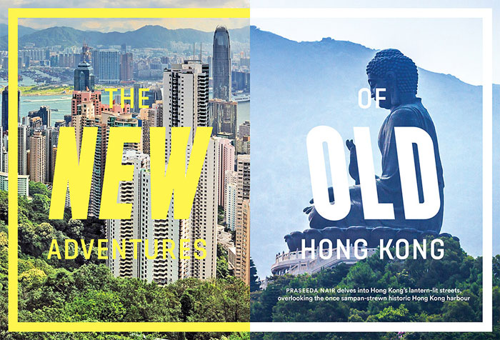
HONG KONG

 
NeonSigns.hk by M+, Hong Kong’s museum for visual culture
    Catalog of neon signs past and present, with map and documentary video and tips for shooting neon signs
    via Michèle Champagne

PHILIPPINES

 
Urban Type Manila by Carl Graham
    via Arvin Quilao

AUSTRALIA

 
Ghost Signs Melbourne

Box Hill Cemetery / City of Kew WWI Memorial / Carved Letters by Simon Robertson
    Cornerstones, gravestones and monuments in and around Melbourne

NEW ZEALAND

 
Preserve and Hand Painted Signage by Mark Spurgeon
    via Kris Sowersby

CANADA

 
The Montréal Signs Project by Matt Soar and Nancy Marrelli
    via Pascal Duez and Florian Hardwig

UNITED STATES

 
Recapturist
    Roadside signage across the US, with map and (very precise) locations

Signage found across America by Nate Burgos

Motels in Texas, Las Vegas, Colorado, New Mexico, Kansas and elsewhere. Drive-In Eats, Movie Houses, Cleaners as well as Signs and Facades generally, by “SKY✡VU”

Instagram feed by colorbyspiegel
    Roadside signage across the US
    via Jean François Porchez

Marc Shur Photography by Marc Shur
    Several galleries of roadside signage, primarily from the West Coast

Instagram feed by ekovax
    Signage across the US
    via Jean François Porchez

Instagram feed by alphabetarm
    via Jean François Porchez

Neon by Thomas Hawk
    Thousands of photos of neon signage, from the West Coast and across the US

Storefront Tile
    Flickr group of shop floor mosaics in the US, and some in the UK

Instagram feed by sunsetmeridian
    via Jean François Porchez

NYC Type by Luke Connolly
    via Gaelle Jolly

Street_Type by Joe Geis
    via Gaelle Jolly

New York City Signs, 14th to 42nd Street by Walter Grutchfield
    Exhaustive survey of ghostsigns in one section of Manhattan, with detailed histories

Dedicated NYC by Jack Curry
    An ongoing record of dedication plaques in New York City

John’s Signs and Pictures by John Greathead

Ampersand Seven by Therese Cox
    One number for each day of the year, from New York and other locations

New York Numbers by Nick DiLallo
    via Gaelle Jolly

Chicago Type by Shawn Hazen
    via Pascal Duez and Florian Hardwig

NYC Type
    Instagram feed with many contributors and sites

New York Storefronts by James and Karla Murray
    Previews of their book of vanishing storefronts
    via Indra Kupferschmid

New York Neon by T.E. Rinaldi
    Neon signage throughout New York City, with accompanying book
    via Indra Kupferschmid

Project Neon by Kirsten Hively
    Over a thousand photos of neon sings in New York
    via Indra Kupferschmid

Neon Boneyard by Josh Smith and Skylar Challand
    Outdoor museum of mid-century casino and hotel singage

MEXICO

 
Palabras Lugar
    via Maira Frappé

BRAZIL

 
Tipos Paulistanos by J. R. D’Elboux
    Architectural lettering in São Paulo
    via Jean-François Porchez

SOUTH AFRICA

 
CT Type organized by Rowan Eva
    Instagram feed of lettering from Cape Town
    via Gaelle Jolly

MADAGASCAR

 
Typography in Tana
    via Sam Potts

RWANDA

 
Langustefonts by Johannes Lang

WORLDWIDE

 
Type Collect Compilation organized by Luke Connolly

Fleurs Coiffeur Liqueur Compilation organized by Stephen Coles
    Signage for florists, hairdressers and liquor stores

Found Typography Flickr group
    via Pascal Duez and Florian Hardwig

Fontspotting Flickr group
    Wide range of styles, materials and periods

TypArchive
    via Pascal Duez and Florian Hardwig

Vernacular Typography by Molly Woodward
    Years-long project to document endangered vernacular lettering around the world, with photos tagged by material, content and location
    via Indra Kupferschmid

House Names Flickr group
    via Pascal Duez and Florian Hardwig

Typeverything

Types of Tings

07 May 14:12

Type Love: Modum

by Courtney

Modum is a new contemporary serif typeface from The Northern Block. Featuring eight weights with matching italics, over 800 characters, seven variations of numerals, true small caps with accents, ligatures, manually edited kerning and Opentype features, Modum is incredibly versatile. Pick up a copy for yourself at MyFonts.

Type Love: Modum / on Design Work Life

Type Love: Modum / on Design Work Life

Type Love: Modum / on Design Work Life

Type Love: Modum / on Design Work Life

Type Love: Modum / on Design Work Life

Type Love: Modum / on Design Work Life

Type Love: Modum / on Design Work Life

28 Apr 20:18

The Adobe Challenge: Sagmeister X Walsh

by KYLE FITZPATRICK
Suzymarie.johnson

BAHAHAHAHAHAHAHA!

Stefan Sagmeister Jessica Walsh Adobe 1

Stefan Sagmeister Jessica Walsh Adobe 2

Stefan Sagmeister Jessica Walsh Adobe 3

Sagmeister & Walsh is undoubtedly one of the best design firms working right now. They’re a powerful little team who have done everything from branding Jay-Z’s Barneys collaboration with jagged gold to providing an Art Deco trophy for the New York Festival. You can see very clearly that they love what they do and that they are very, very talented at it too.

As a means to create some friendly competition and put their work hard, play hard vibe to the test, Adobe invited Stefan Sagmeister and Jessica Walsh to participate in a series of creative tasks that involved their making the Adobe logo out of random objects. Produced by the always lovely Art Directors Club’s Young Guns division, the resulting project is an online game show called Sagmeister X Walsh. It’s a bright, fun, design based series that shows how creatives have to stay on their toes.

The show/”Adobe Challenge” has the two designers competing for the title of Creative Master by making and remaking a logo. They’re given two materials (i.e., parts of a piñata, cake, thread, baby dolls, etc.) and have to use them to create an attractive—Yet on brand.—depictions of the Adobe A despite many curveballs (Like blindfolds.) being tossed their way. The two then go head-to-head in making and are judged by a powerhouse team consisting of graphic designer Stefan Bucher, letterer and illustrator Jessica Hische, designer and artist Joshua Davis, and designer and critic Noreen Morioka. The show is brightly colored and features off-the-cuff interviews with Stefan and Jessica as they are tossed crazy challenges. It’s totally fun and silly and truly shows how talented everyone is involved.

There are five episodes total that all last about five minutes long and they truly are a hoot and a holler. They kind of make you wish that a design show like this existed on television—or that you could participate in a challenge like this. Catch the first two videos below (and the rest here) and some more details on all involved here.

28 Apr 20:08

Badass Lady Creatives: Illustration by Miss Lotion

by Melanie
Illustration by Miss Lotion / on Design Work Life
For Journalisten Magazine

Something about Miss Lotion’s illustration style feels nostalgic. To this child of the ’90s, her work conjures mental images of Nickelodeon and Highlights magazines, of character tees and public murals. All personal responses aside, Miss Lotion builds worlds with an widely-appealing charm.

Miss Lotion is a moniker for Louise Rosenkrands, an illustrator based in Copenhagen, Denmark. This badass lady creative has worked with a variety of clients, from Norweigan Magazine to Urban Outfitters to Converse. Here’s just a few favorites:

Illustration by Miss Lotion / on Design Work Life
Cover art for BUPL
Illustration by Miss Lotion / on Design Work Life
The redhead’s hair being in the way throughout this entire series is a nice touch.
Illustration by Miss Lotion / on Design Work Life
For Ud&Se magazine
Illustration by Miss Lotion / on Design Work Life
For Euroman magazine
Illustration by Miss Lotion / on Design Work Life
For Smag & Behag Food magazine
Illustration by Miss Lotion / on Design Work Life
Cover illustration for GOOD magazine
Illustration by Miss Lotion / on Design Work Life
For Smag & Behag Food magazine
Illustration by Miss Lotion / on Design Work Life
For N Magazine
Illustration by Miss Lotion / on Design Work Life
Magazine illustration
Illustration by Miss Lotion / on Design Work Life
Miss Lotion’s style is a bit different in graphite, but those inky dark shades are perfect.

View more of Miss Lotion’s illustrations on her portfolio. And speaking of murals, Miss Lotion has some great mural work of her own.

28 Apr 19:45

Playful Type Experiment Featuring the Importance of Play at Work

by Kerby Rosanes
Suzymarie.johnson

For the found type project guys!

Work hard. Play harder. We all know the importance of “play” on our working environment. Aside from being a great way to get away with stress, it is also an effective technique in beating creating block. To emphasize the importance of play at work, Germany-based designers Max Kuwertz and Yanik Balzer created an amazing series of playful typography work which feature the line:We Don’t Work – We Play.

The set was a self-initiated project for a personal exhibition with the same line as the title. Each type experiment was created using natural elements and everyday objects such as match sticks, cigarettes, toys, etc. See some of our favorites from the collection below.

We Don't Work – We Play


We Don't Work – We Play


We Don't Work - We Play


We Don't Work - We Play


We Don't Work - We Play


We Don't Work - We Play


We Don't Work - We Play


We Don't Work - We Play

See more about the type experiment on Behance. Which are your favorites?

Tell us your thoughts in the comments below!

Read more posts by Kerby Rosanes

28 Apr 19:36

Ratio Eight Coffee Maker: Bringing Refined Design To your Morning Routine

by Bobby Solomon
Suzymarie.johnson

Carson.... ?

Ratio Eight Coffee Maker

Coffee making instruments have a long history of being “sexy”. You’ve got the Chemex, the French press, and for the professional, the La Marzocco espresso machine. Added to the list is the brand new Ratio Eight coffee maker which, to use a totally clichéd descriptor, looks as if Apple designed a Mr. Coffee.

We designed the Eight with the ideal balance of form to function. The clear blown-glass and warm black walnut flush-up against machine-sculpted aluminum for a staunch juxtaposition. Every angle and alignment is measured down to the tenth of a millimeter, all for a singular, refined efficiency.

Ratio Eight Coffee Maker

I have no idea if this actually makes decent coffee or not but you’ve got to give it to them for styling along. The combination of aluminum, glass, wood, and cork is a designers wet dream. This is coffee porn taken to the extreme. You can take a look at the video below to get a sense of what the machine is capable of, but be warned, it comes with a hefty $480 price tag.

15 Apr 16:52

Defending Comic Sans

by Gian Bautista

Last week, we wrote an article about the common graphic design sins that some designers commit. One point we stated is the use of horrible fonts such as: Papyrus, Curlz MT, and Comic Sans. Today, we’re going to talk about more of probably the most hated font in the world that is Comic Sans. Why is the so-called font bashed very much by typographers and graphic designers alike? There’s even a website dedicated to ban it.

defensebanner3

Just a brief idea of what we’re talking about, Comic Sans is a font designed by the typographic engineer Vincent Connare for Microsoft and was first released on Windows 95. It was created as part of a Microsoft program for a dog’s speech bubbles.

Many people hate Comic Sans mostly because of how unprofessional and childish it looks. According to David Kadavy, the “mismanagement of visual weight” is what caused the font to be visually unappealing. Stroke weight determines the legibility of a font. Even stroke weight equals more legible font.

helvetica-vs-comic-n

Despite of the hatred, some people argue in defense of the font.

We came across a video by Vsauce called “A Defense of Comic Sans“. The video is made by blogger Michael Stevens and it basically gave the history of the font and several nerdy typographic trivia. He argued that the invention of Comic Sans is a major turning point in the history of typeface. He stated that Comic Sans is an evident reason for typography, that was once a very specialized art form, to be accessed by most of us.

Here are some arguments in defense of Comic Sans:

It was designed for on-screen use. 

garmond-vs-comicsans

When used correctly on a screen, Comic Sans actually has better readability than Garamond.

defensebanner1

The British Dyslexia Association recommends using Comic Sans for text as it is “dyslexia friendly”.

It is Child friendly. 

defensebanner2

With its rounded edges and its handwritten aesthetic, Comic Sans seems friendly and accessible to children because it’s one of the fonts that looks like how we write.

Were those enough points for you? Here’s a very funny and sarcastic monologue written by Mike Lacher in the point-of-view of the font. If there is a “ban Comic Sans” internet movement, there’s also the Comic Sans Project (a Tumblr blog for Comic Sans defenders) by French designers Thomas Blanc and Florian Amoneau. The blog features various logos re-imagined using the much-hated font.

tumblr_lwfbqtm0kj1r7viaco1_500

In conclusion, Comic sans is not the problem, it’s the people who were using it inappropriately. It is not the font’s fault if we have decided to use it on documents, awnings, websites, or even gravestones.

Never miss the hottest in the world of design from our articles section. Share your thoughts through the comments box below and don’t forget to follow us on TwitterFacebookGoogle+Tumblr, and Pinterest.

Read more posts by Gian Bautista

15 Apr 16:51

Here I Am

by Tobias Frere-Jones

It seems there are twenty or thirty songs with that title, so pick one that you like and hum along: here I am. This is my new home, welcome.

15 Apr 16:31

3D Newspaper Ad

by swissmiss

3d Newspaper Ad

This 3D typographic newspaper ad by Felipe Salazar made me look.

(via Hirnverbrandt)

14 Apr 23:53

Exquisite Corpse

by Dave

Exquisite Corpse via grainedit.com

Remember playing the game Telephone as a child? The game that consisted of people passing around a phrase and then laughing at how the phrase gets distorted from one person to the other? Illustration project Exquisite Corpse is like the visual version of Telephone. The collaborative project invites illustrators to participate in a “never-ending” abstract illustration.  Each illustrator adds to the piece in sequence while only being allowed to see a small part of what the previous illustrator contributed.  The effect is a single, unifying illustration that seamlessly morphs into different ideas and interpretations.


Exquisite Corpse via grainedit.com


Artists featured above: Hedof, Ilse Weisfelt and Aron Vellekoop Leon.

——————–

Also worth viewing…
Rick Berkelmans AKA Hedof
Andy J Miller
Mike Perry

Not signed up for the Grain Edit RSS Feed yet? Give it a try. Its free and yummy.


Share on FacebookShare on Facebook

Sponsor // Webydo: The leading online design studio that enables designers to create, manage and publish their client’s websites completely code-free.


14 Apr 23:47

Social Good Guides: Social Innovators Collective

by David Sherwin
The Social Good Guides website, where you can download 20+ small business guides

I’ve been working in the social impact space for the past few years, and I’m often contacted by designers that want to understand what it takes to get into the space. There’s been a serious lack of resources to point them toward—until now. The Social Good Guides are a series of 20+ small-business guides created to support early stage social entrepreneurs, nonprofit founders and individuals working on social impact projects. The goal of the guides is to centralize general knowledge and equip change-makers with the essential skills a founder needs to be familiar with in order to achieve success during their startup year.

To quote the creators of the guides: “Each guide has been authored by a distinguished professional with sector expertise in the social impact space, designed by a seasoned graphic designer and brought to life by a dedicated team of volunteers. The content for the guides ranges from How to Choose a Legal Structure to The Importance of Great Design, How To Build Your First Website to Why Strategy Matters… The guides were created in response to the high failure rate that New York–based social entrepreneurs were experiencing two years after launching their social ventures. This was partly due to the fact that startup founders were missing the essential small-business skills needed to stay in business and that few educational resources are available.”

The project was spearheaded by Shana Dressler, founder of the Social Innovators Collective and director of the Makers Institute, and Marc O’Brien, founder of Confidence. One of the guides is available now, and the full set will be available in the fall as free downloads here

I appreciate the attention to design and making the series approachable just as much as the investment by the authors themselves in writing and sharing the content pro bono.

Cover of the Branding + Identity guide, written by Deroy Peraza, co-founder of Hyperakt, and cover designed by James Amoros from Anti/Anti

Cover of the Idea to Launch guide, written by Andrew Greenblatt, founder of Ventureboon and professor at NYU, and cover designed by Liz Cook

Cover of the What You Don't Know About Social Media guide, written by Andy Smith, co-author of Dragonfly Effect, and cover designed by Katie Ingersoll

These projects looks to have been a massive effort for both guide authors and designers, and it looks like they still have a few covers left to get done. If you’re interested in participating in this project, feel free to write to shana [at] socialinnovatorscollective dot org.
14 Apr 23:39

Conceptual Hilarity: Clever Bits of Instagram Nonsense from Brock Davis

by Christopher Jobson

Conceptual Hilarity: Clever Bits of Instagram Nonsense from Brock Davis humor
Ninja Knee

Conceptual Hilarity: Clever Bits of Instagram Nonsense from Brock Davis humor
Crayon Tree

Conceptual Hilarity: Clever Bits of Instagram Nonsense from Brock Davis humor
Snowman on his smartphone

Conceptual Hilarity: Clever Bits of Instagram Nonsense from Brock Davis humor
Beard bear

Conceptual Hilarity: Clever Bits of Instagram Nonsense from Brock Davis humor
Cereal TIE Fighter

Conceptual Hilarity: Clever Bits of Instagram Nonsense from Brock Davis humor
Chip in a bottle

Conceptual Hilarity: Clever Bits of Instagram Nonsense from Brock Davis humor
Squorange

Conceptual Hilarity: Clever Bits of Instagram Nonsense from Brock Davis humor
Good morning

It’s been a long while since we last checked in with Brock Davis (previously) who seemingly dabbles in every creative field there is from illustration and photography to advertising and apparel. But it’s his Instagram account where his brilliance seems to be most highly concetrated, where every image has a mix of laugh-out-loud whimsy and a good dose of why didn’t I think of that. You can see more if his work right here.

14 Apr 23:39

Reflected Landscapes by Victoria Siemer

by Christopher Jobson

Reflected Landscapes by Victoria Siemer mirrors landscapes conceptual

Reflected Landscapes by Victoria Siemer mirrors landscapes conceptual

Reflected Landscapes by Victoria Siemer mirrors landscapes conceptual

Reflected Landscapes by Victoria Siemer mirrors landscapes conceptual

Reflected Landscapes by Victoria Siemer mirrors landscapes conceptual

Reflected Landscapes by Victoria Siemer mirrors landscapes conceptual

Reflected Landscapes by Victoria Siemer mirrors landscapes conceptual

In this recent series of digital artworks, Brooklyn-based graphic designer Victoria Siemer begins with dreamy landscapes of mountainous forests shrouded in fog and clouds and then inserts giant reflective fragments that rise from the ground. The inversed image creates the uncanny effect of a monolithic mirror that towers over the photograph like a kind of portal. Siemer says via email that the images are open for interpretation, but her work often deals with the idea of visual or emotional fragmentation which originated from her college thesis. Another example is her recent series of humanized computer error messages recently making the rounds. You can see more over on her blog (occasionally nsfw). (via My Modern Met)

07 Apr 23:16

Zack Dougherty’s Tech Art Reflexive GIFs

by KYLE FITZPATRICK

Zack Dougherty GIF Art Portland 7

Zack Dougherty GIF Art Portland 9

Of course the best way to comment on the current state of art and technology has to be through a GIF. What other form could it take? A website? A painting? No: a GIF. (Or perhaps a single channel video on a flat television, a la Brian Bress?) Portland artist Zack Dougherty is colliding classical art with very forward focused technologies that come together in retro future GIFs. They’re mesmerizing and dark, perhaps admonishing the dwindling talents of contemporary artists.

Zack Dougherty GIF Art Portland 10

Dougherty’s GIFs are all about the contrast between classic sculpture and polygonal tech items. David’s bust is entrapped by a glowing teal cube while Neptune vacillates between smooth and angled forms. Neon lights accent forms created by Michelangelo. Hands waver out of a pile of CPU components. A bust of a Greek god wears an Oculus Rift. These scenes are all depicted by small, sometimes impossible to notice movements.

As a whole, Dougherty is crafting a somewhat fatalistic view of how we treat and look and explore classical art today (specifically sculpture). While trying to keep them safe and preserve them in his work, they also feel like warnings to remember that the human hand can accomplish such feats. “Let’s not let our iPhones get in the way of what we can experience and do ourselves,” he seems to warn. He executes them perfectly too and many can be mistaken for small scenes from films. I suggest you spend a while digging through his archives: Dougherty is one talented dude.

Zack Dougherty GIF Art Portland 3

07 Apr 23:13

Font Men

by Dave


Font Men is a short film about the work of Jonathan Hoefler and Tobias Frere-Jones, who collectively ran the most successful and well respected type design studio in the world. Produced before their recent and very public split, the film provides a rare glimpse into the forces that brought them together and the successful empire they built together.

——————–
Also worth viewing:
Marigny Typeface
Gist Font
Props Radio – Designer Music

Not signed up for the Grain Edit RSS Feed yet? Give it a try. Its free and yummy.
——————–

Share on FacebookShare on Facebook

Sponsor // Wallpapered Maps


07 Apr 23:04

Matt Chase: Escapades Magazine

by Garth

Matt Chase just blew my mind with his challenging, beautiful design work for “The Takeoff Issue” of new travel magazine Escapades. After you ogle the gorgeous end results below, read Matt’s in-depth process recap to learn about the design decisions, type exploration and overall challenges that went into creating this wonderful work.

From Matt’s website:

In the Fall of 2013, I was commissioned to commandeer the creative vision for—and design the launch issue of—Escapades, a new Middle Eastern travel publication circulating throughout the Persian Gulf. Skewing toward the comfortably affluent and well-heeled reader, the magazine embodies a spirit rooted in the uncharted adventures that lie ambitiously in wait.


Matt Chase: Escapades Magazine / on Design Work Life

In addition to establishing the overall, comprehensive design of the magazine and laying out each page, I advised on content organization, contributed several illustrations, commissioned photography, art directed additional illustrations, authored several headlines and oversaw production efforts. The first issue was completed over the course of roughly four months.

Matt Chase: Escapades Magazine / on Design Work Life

Matt Chase: Escapades Magazine / on Design Work Life

Matt Chase: Escapades Magazine / on Design Work Life

Matt Chase: Escapades Magazine / on Design Work Life

Matt Chase: Escapades Magazine / on Design Work Life

Matt Chase: Escapades Magazine / on Design Work Life

Matt Chase: Escapades Magazine / on Design Work Life

Matt Chase: Escapades Magazine / on Design Work Life

Matt Chase: Escapades Magazine / on Design Work Life

Matt Chase: Escapades Magazine / on Design Work Life

Matt Chase: Escapades Magazine / on Design Work Life

Matt Chase: Escapades Magazine / on Design Work Life

Matt Chase: Escapades Magazine / on Design Work Life

Matt Chase: Escapades Magazine / on Design Work Life

Matt Chase: Escapades Magazine / on Design Work Life

Matt Chase: Escapades Magazine / on Design Work Life

Matt Chase: Escapades Magazine / on Design Work Life

Matt Chase: Escapades Magazine / on Design Work Life

Matt Chase: Escapades Magazine / on Design Work Life

Matt Chase: Escapades Magazine / on Design Work Life

Matt Chase: Escapades Magazine / on Design Work Life

Creative Credits
Portrait: Lindsay Gilmore

07 Apr 23:03

Little: Ephemera

by Garth

We recently featured Little‘s lovely identity and collateral work for Fair State Brewing Cooperative, and now I’m quite taken by Ephemera, where Little has found a beautiful way to unleash their stash of one-off projects or fun internal pieces that would otherwise have no home on the site.

Ephemera is a refreshing view on how to put a firm’s weirdness and character on display since the client work that pays the bills unfortunately doesn’t often warrant the “weird” solution. Check out Little’s eclectic mix of work below, though I think it’s best experienced directly on Little website.

Little: Ephemera / on Design Work Life

Little: Ephemera / on Design Work Life

Little: Ephemera / on Design Work Life

Little: Ephemera / on Design Work Life

Little: Ephemera / on Design Work Life

Little: Ephemera / on Design Work Life

Little: Ephemera / on Design Work Life

Little: Ephemera / on Design Work Life

Little: Ephemera / on Design Work Life

Little: Ephemera / on Design Work Life

Little: Ephemera / on Design Work Life

Little: Ephemera / on Design Work Life

Little: Ephemera / on Design Work Life

07 Apr 22:53

Beautiful Stippled Hand Lettering and Illustrations by Xavier Casalta

by Christopher Jobson

Beautiful Stippled Hand Lettering and Illustrations by Xavier Casalta typography stippling illustration

Beautiful Stippled Hand Lettering and Illustrations by Xavier Casalta typography stippling illustration

Beautiful Stippled Hand Lettering and Illustrations by Xavier Casalta typography stippling illustration

Beautiful Stippled Hand Lettering and Illustrations by Xavier Casalta typography stippling illustration

Beautiful Stippled Hand Lettering and Illustrations by Xavier Casalta typography stippling illustration

Beautiful Stippled Hand Lettering and Illustrations by Xavier Casalta typography stippling illustration

Beautiful Stippled Hand Lettering and Illustrations by Xavier Casalta typography stippling illustration

Beautiful Stippled Hand Lettering and Illustrations by Xavier Casalta typography stippling illustration

Beautiful Stippled Hand Lettering and Illustrations by Xavier Casalta typography stippling illustration

Beautiful Stippled Hand Lettering and Illustrations by Xavier Casalta typography stippling illustration

Using a black Isograph 0.10mm pen, French illustrator Xavier Casalta draws a cluster of dots the size of a speck of dust and follows with a few hundred thousand more to create swooping letterforms, shadows, and gradients. Only 21 years of age the artist already possesses a commendable sense of typography and composition as is exemplified in his ‘The quick brown fox jumps over the lazy dog’ project that involves a visual interpretation of the phrase in 10 different designs. You can see more of Casalta’s work on his website and pickup limited edition prints in his shop. (via Fubiz)

07 Apr 22:41

Photographer Klaus Leidorf’s Aerial Archaeology

by Christopher Jobson

Photographer Klaus Leidorfs Aerial Archaeology Germany aerial
Remember Summertime

Photographer Klaus Leidorfs Aerial Archaeology Germany aerial
Scrap Tires

Photographer Klaus Leidorfs Aerial Archaeology Germany aerial
Sailing Hay Bales

Photographer Klaus Leidorfs Aerial Archaeology Germany aerial
Summer Toboggan Run

Photographer Klaus Leidorfs Aerial Archaeology Germany aerial
Isar Nuclear Power Plant

Photographer Klaus Leidorfs Aerial Archaeology Germany aerial
Stock of Wood

Photographer Klaus Leidorfs Aerial Archaeology Germany aerial
River Vils At Schalkham, Bavaria

Photographer Klaus Leidorfs Aerial Archaeology Germany aerial
Autumn In The Vineyard

Photographer Klaus Leidorfs Aerial Archaeology Germany aerial
Under Snow

Photographer Klaus Leidorfs Aerial Archaeology Germany aerial
Poplar Avenue

Photographer Klaus Leidorfs Aerial Archaeology Germany aerial
Wave Pattern

Photographer Klaus Leidorfs Aerial Archaeology Germany aerial
Surrounded

Photographer Klaus Leidorfs Aerial Archaeology Germany aerial
Clones

Photographer Klaus Leidorfs Aerial Archaeology Germany aerial
Technical Break

Perched at the window of his Cessna 172, photographer Klaus Leidorf crisscrosses the skies above Germany while capturing images of farms, cities, industrial sites, and whatever else he discovers along his flight path, a process he refers to as “aerial archaeology.” Collectively the photos present a fascinating study of landscapes transformed by the hands of people—sometimes beautiful, sometimes frightening. Since the late 1980s Leidorf has shot thousands upon thousands of aerial photographs and currently relies on the image-stabilization technology in his Canon EOS 5D Mark III which is able to capture the detail of single tennis ball as it flies across a court. You can explore over a decade of Leidorf’s photography at much greater reslution over on Flickr. All images courtesy the artist.

19 Mar 17:46

Ballad of a WiFi Hero

by swissmiss

An animated adaptation of the famed McSweeney’s Internet Tendency piece, “In Which I Fix My Girlfriend’s Grandparents’ WiFi and Am Hailed as a Conquering Hero,” by Mike Lacher.

(via)

19 Mar 17:38

Kickstarter Spotlight: SlatePro by Nathan Mummert

by Courtney

Regular readers may remember the introduction of the Slate Mobile Air Desk seen here a few months ago. At that time my enthusiasm for this new product was barely contained, and I am now a loyal daily user. So with that in mind, I am incredibly excited to tell you about the new product in this series, SlatePro, the Personal TechDesk.

A larger, desktop version of the original product, SlatePro is every organized designer’s dream. It features multiple display docks for all your mobile devices, air vents to provide constant cooling for your laptop and other tech products, a heavy duty mousepad that sits flush against the surface, a filing rack, pen dock, and a recessed cup holder.

Kickstarter Spotlight: SlatePro / on Design Work Life

Kickstarter Spotlight: SlatePro / on Design Work Life

Kickstarter Spotlight:  SlatePro / on Design Work Life

Kickstarter Spotlight: SlatePro / on Design Work Life

Kickstarter Spotlight: SlatePro / on Design Work Life

Kickstarter Spotlight: SlatePro / on Design Work Life

Kickstarter Spotlight: SlatePro / on Design Work Life

Kickstarter Spotlight: SlatePro / on Design Work Life

Kickstarter Spotlight: SlatePro / on Design Work Life

Kickstarter Spotlight: SlatePro / on Design Work Life

The SlatePro is currently being offered to the public as part of a Kickstarter campaign that, with about two weeks remaining, has already surpassed its goal almost five times, which is no surprise to me. If you’re interested in getting your hands on one for yourself, simply head over to their project page to send some support their way.

13 Mar 14:57

Theo Jansen’s Walking ‘Strandbeest’ Sculptures Available as 3D Printed Toys

by Christopher Jobson

Theo Jansens Walking Strandbeest Sculptures Available as 3D Printed Toys kinetic sculpture 3d printing

Theo Jansens Walking Strandbeest Sculptures Available as 3D Printed Toys kinetic sculpture 3d printing

Theo Jansens Walking Strandbeest Sculptures Available as 3D Printed Toys kinetic sculpture 3d printing

Theo Jansens Walking Strandbeest Sculptures Available as 3D Printed Toys kinetic sculpture 3d printing

Artist Theo Jansen has created several 3D printed models of his famous walking sculptures called Strandbeests. There are currently four different models and two alternate propeller attachments for added Strandbeest goodness. Available over at Shapeways.