Shared posts

16 Aug 15:36

The Art of the Nonconforming Stair

by Build LLC

BUILD-LLC-CSH-Int-Stair-03#
[All images by BUILD LLC]

When it comes to stair design, it’s not always practical or cost-effective to design and build a fully code-compliant stairway. We’re not advocating breaking code for the main stairs throughout the house, but rather those to access smaller spaces like roof terraces, storage lofts, reading nooks, or other areas that aren’t considered primary living or working areas. Code-compliant stairways take up quite a bit of area, they can be expensive, and their dimensional requirements can be excessive for the infrequent traffic of nonessential spaces within residences and commercial uses. Today’s post takes a deep dive into nonconforming stairs and identifies important building code exceptions pertaining to stair design. We’ll also cover some useful drawings and photos of built examples of nonconforming stairs from the BUILD portfolio.

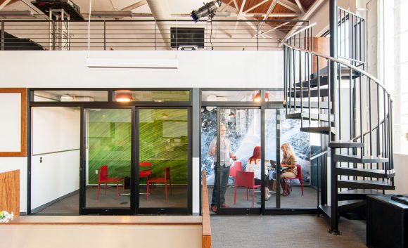
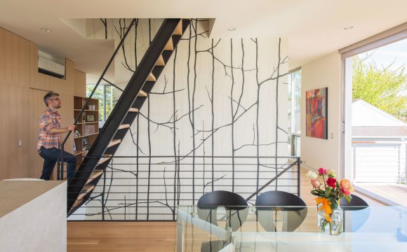
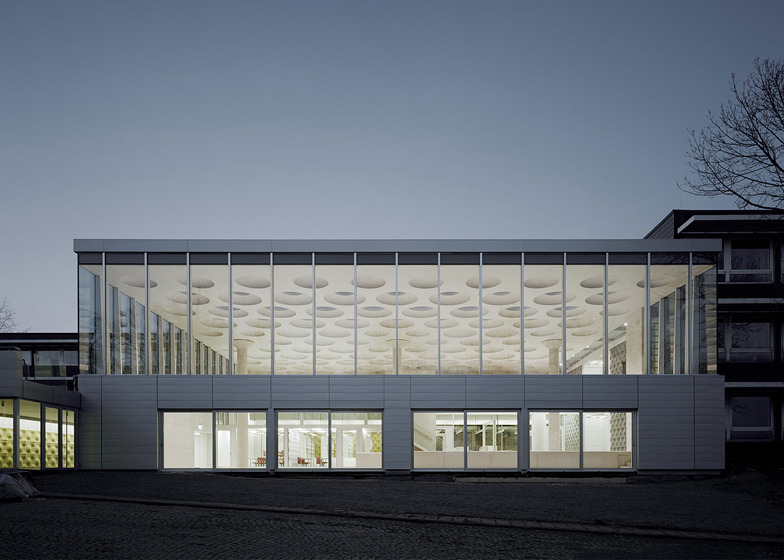
To start, we’ll need to eat our spinach by reviewing a couple of key provisions from the relevant building codes. While the 2012 International Residential Code (IRC) is the most rational place to start for a single-family residence, the internationally adopted version doesn’t actually offer any useful exceptions to stair design. Section R311.4 on Vertical Circulation and section R311.7 on Stairways prescribe code-compliant stairs and ramps regardless of the application. While there is an exception for circular stairs, we find that these types of stairs rarely provide the solutions offered by nonconforming stairs. We do occasionally use circular stairs where the area consumed by the stair isn’t critical (circular stairs take up more space than you might expect) and the look of the circular stair geometry is more desired, like in the Creative Live San Francisco Headquarters below.

BUILD-LLC-CLSF-Break-out-1&4-01#

Moving onto more localized codes, many jurisdictions have adopted amendments to the IRC and The Seattle Residential Code amends section R311.4 on Vertical Egress as such:

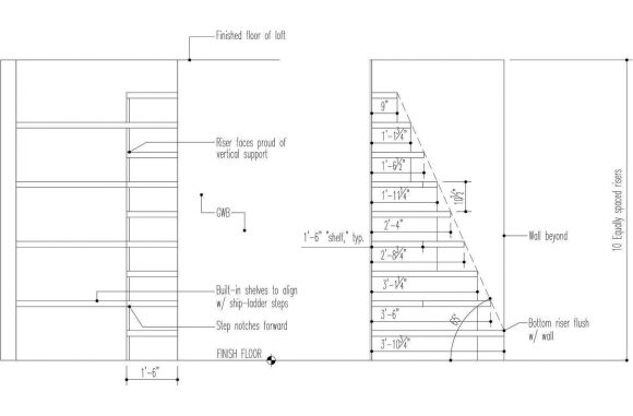
Exception: Stairs or ladders within an individual dwelling unit used for access to an area of 200 square feet or less, and not containing the primary bathroom or kitchen.

This is a game-changer of an exception, and if you’re using the Seattle Building Code (SBC), you can find a similar exception under 1009.18. Whether you’re referencing the Seattle Building Code or the International Building Code (IBC), you’ll also find exceptions for Winder Treads (IBC 1009.7.3), Curved Stairways (IBC 1009.11), Spiral Stairways (IBC 1009.12), Alternating Tread Devices (IBC 1009.13), and Ship Ladders (IBC 1009.14). The common denominator here is that when the space being made accessible by the vertical egress is under 200 square feet (along with the specific requirements of each code provision), a code-conforming stair is no longer required. This is an incredibly useful exception that makes vertical circulation much more sensible, typically more cost-effective, and affords architects and designers a greater amount of flexibility with the design of the vertical circulation. Now, let’s get into some examples.

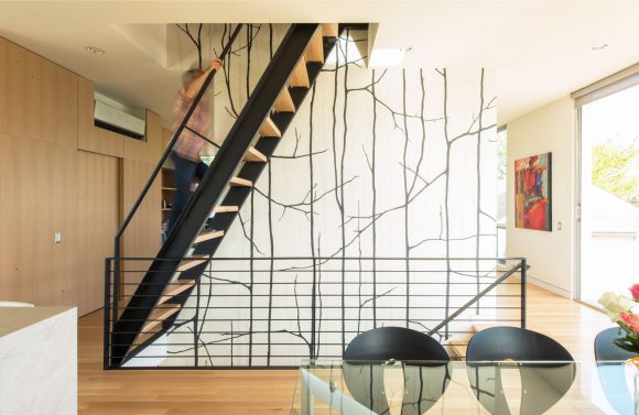
CASE STUDY HOUSE 2014
Our Case Study House series aims to experiment with and optimize different systems for building modern residences prior to designing them into our client-based projects. The nonconforming stair is the perfect example of one of these systems, and the CSH2014 uses one to access a rooftop deck. This application tested out the ergonomics of the rise, run, and head-clearance of a nonconforming stair, as well as the overall feel of ascending and descending. You can draw and measure all you want in the office, but some elements of design simply need to be field tested at the 1:1 scale. Building this into one of our own projects proved a successful test and we’ve used similar designs several times since.

BUILD-LLC-CSH-Int-Kitchen-01#

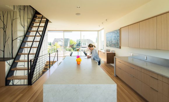
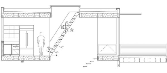
The primary design driver of this nonconforming stair is the length of the roof-hatch door above, it sets the dimensions of the nonconforming stair below. This application is noticeably steeper than a code-conforming stair and requires a bit of care to navigate, but it works quite well given the less frequent use of the roof deck and the geometrical limitations of the space. This particular stair, in true Case Study House fashion, set the precedent for future nonconforming roof access stairs.

BUILD-LLC-CSH-2014

The nonconforming stair of the CSH2014 was constructed with blackened steel channels, solid oak treads stained light gray to match the floors, and a blackened steel handrail.

BUILD-LLC-CSH-Int-Dining-05

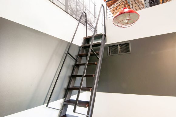
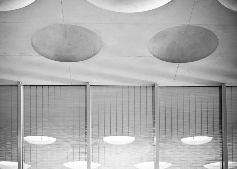
CREATIVE LIVE SAN FRANCISCO
Due to the extremely high ceilings, there are several storage lofts located throughout the Creative Live San Francisco Headquarters and the nonconforming stairs offer practical access without using up valuable floor area. The nonconforming stairs are also used as a bit of visual pop in some areas of this commercial space.

BUILD-LLC-CLSF-Mezz-Ladder-06#

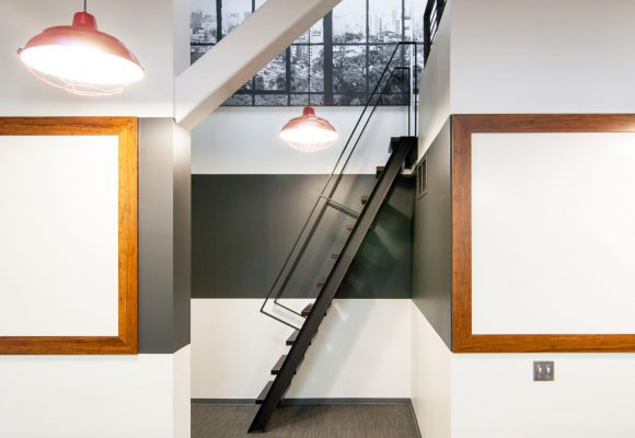
Once again, blackened steel channels offer a structurally sound and aesthetically clean profile, while dark walnut treads keep a consistently dark composition. Minimal blackened steel handrails help with the climb.

BUILD-LLC-CLSF-Mezz-Ladder-02#

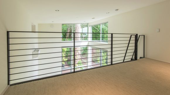
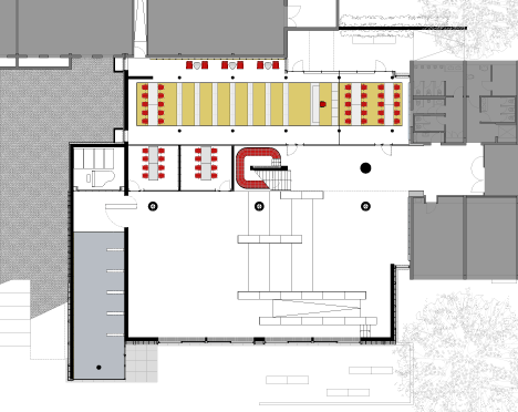
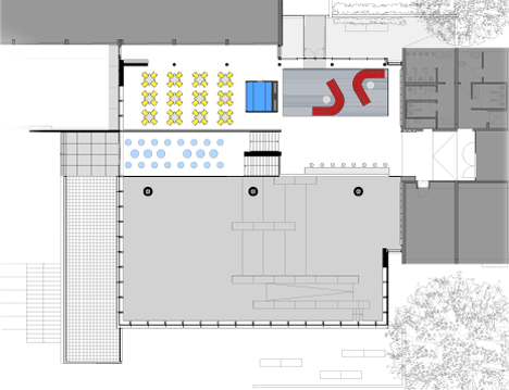
MERCER ISLAND PROJECT
In order to maximize the usable area of the Mercer Island Project, a series of loft spaces were designed into and above the bedrooms. These allow for storage, reading nooks, or simply cozy spaces to retreat. Because the tall shed roofs were already part of the design, the additional space is very cost-effective.

BUILD-LLC-Merrimount-Int-Bedroom-Loft-01#

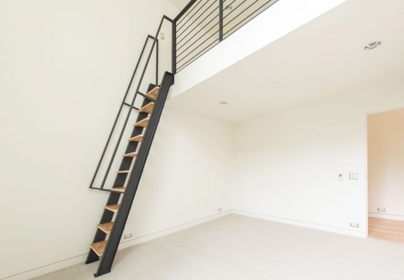
Maximizing the usable floor area at bedrooms is crucial and the nonconforming stairs in this residence were the only solution. Code-conforming stairs would have taken over valuable floor area to be feasible, thereby eliminating the possibility of loft spaces.

BUILD-LLC-Mercer-Island

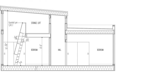
In this instance, the blackened steel of the nonconforming stair structure attaches to a 36” tall blackened steel guardrail which spans the length of the loft (minus the access opening). The arrangement of bedroom lofts in this design offers generous amounts of daylight and a treehouse effect within the lofts themselves.

BUILD-LLC-Mercer-Island-Loft-04

BUILD WORLD HQ
We took some liberties with the nonconforming stair at the new BUILD World Headquarters and tested out an experimental staircase. Because this nonconforming stair is the first view upon entering the office, we wanted it to appear less like vertical circulation and more like an intentional, beautiful display. It does so while also providing access to loft storage and an informal lounge area, neither of which are used by anyone outside of Team BUILD.

BUILD-LLC-Office-Int-08

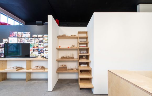
Every other tread of the nonconforming stair aligns with a shelf of the adjacent display space. The millwork is constructed of double layers of apple-ply and carries through to the shelving at the adjacent conference room. This composition creates nicely proportioned cubbies for physical models and books, as well as offering a staircase to the loft space above hidden in plain sight.

BUILD-LLC-office

Each of these examples is an evolution of the strategies we’ve implemented for using the nonconforming stairs. As our portfolio grows and project programs present a need for this type of access, you’ll continue to see this building code exception explored in our current and future designs.

Cheers from Team BUILD

20 Feb 20:00

Sebastian Weiss

by acarusone

Sebastian Weiss

Sebastian Weiss

Sebastian Weiss

Sebastian Weiss

Sebastian Weiss

Sebastian Weiss is a photographer, and a photo columnist at Architectural Digest Germany, based in Hamburg, Germany. His architectural photos are stunning, and I love how he really captures the essence of a building, and does it in a very minimal way.

Wonder which camera he’s using. My guess is he’s using an iPhone, but can’t confirm.

For his most update-to-date photos, follow him on Instagram.

21 Aug 18:10

Unreal Engine 4 + ArchVIZ by Koola

by Ronen Bekerman
 Unreal Engine 4 + ArchVIZ by Koola

Today I stumbled upon these Drop Dead Gorgeous Unreal Engine 4 Architectural Visualization tests by koola which immediately reminds one of Alex Roman’s “The Third & The Seventh” project but this time in REALTIME. Most of the content on Koola’s thread on the Unreal Engine Forums is like Chinese to me but he sure did captured my attention with this! Take a look too.

Done on an i7-3770 with GTX670 running at 50-60FPS

Checkout the original Unreal Engine forum thread – ArchViz / Lighting by Koola

Some stills too…

f9d0b610e15fd83f609ea5cb71b4191f0010 728x902 Unreal Engine 4 + ArchVIZ by Koola

293a7a0f045ab681bb06f178141771c60013 728x886 Unreal Engine 4 + ArchVIZ by Koola

4a10ef9cd4dee5ddbfbd6c0e99162c3e009s 728x874 Unreal Engine 4 + ArchVIZ by Koola

This work went into my Architectural Visualization board on Pinterest. I invite you to follow me and see what other great things I’ve curated there for some time now.

follow me on pinterest button Unreal Engine 4 + ArchVIZ by Koola

Unreal Engine 4 + ArchVIZ by Koola is a post from Ronen Bekerman's 3D Architectural Visualization Blog

24 Jan 19:20

ECM-Capable tech bomber by Alexey Pyatov

by Igor Tkac
Our friend KARANAK sent us these renders as high quality .png files with transparent backgrounds. Thanks!


Keywords: high definition .png file format spaceship art by alexey karanak pyatov ecm-capable bomber schematic illustration design
07 Jan 19:00

Center for Interpretation of Jewish Culture Isaac Cardoso

by ashleynelson001

January 6th, 2014 – The mountains of the Centro de Portugal are rich in Jewish heritage and the walled town of Trancoso is no exception. Trancoso is a city in northeastern Portugal that was home to a flourishing Jewish community in the 14th and 15th centuries, prior to the expulsion and forced conversion of Portugal’s Jews. The Center for Interpretation of Jewish Culture Isaac Cardoso – the first of its kind in Portugal in more than 500 years – is the completed vision of Portuguese architects Gonçalo Byrne and José Laranjeira.

Center for Interpretation of Jewish Culture Isaac Cardoso Goncalo Byrne Arquitectos

Isaac Cardoso, after whom the center is named, was a Jewish physician and philosopher, who was born in Trancoso in 1603 to a family of Bnei Anousim. He later moved to Spain with his family and then fled to Venice to escape the Inquisition, where he and his brother Miguel publicly embraced Judaism. He went on to publish a number of important works on philosophy, medicine and theology, including an important treatise defending Judaism and the Jewish people from various medieval stereotypes.

Center for Interpretation of Jewish Culture Isaac Cardoso Goncalo Byrne Arquitectos

The establishment is located in the dense urban fabric of a medieval fortified village, in an area once referred as the Jewishquarter of Trancoso. Starting from a ruined allotment, the aim was to re-erect a building that reinforces the corner geometry, still displaying an acute angle on the intersection of two narrow streets, and establishing a symbolic gesture in the context of Jewish urban culture. The center will also contain a new synagogue called Beit Mayim Hayim – “the House of Living Waters.”

Center for Interpretation of Jewish Culture Isaac Cardoso Goncalo Byrne Arquitectos

Included in the center is a small garden called Mayim Hayim (living waters); two rooms for temporary exhibitions; the synagogue Beit Mayim Hayim; a main room with a view over the well “Poço do Mestre” and the small garden in the ruins of the former building with sculpted cruciform marks and other signs. The building rises towards the light as a metaphor of the strong religious faith of the Jewish community.

Center for Interpretation of Jewish Culture Isaac Cardoso Goncalo Byrne Arquitectos

Altogether, the irregular granite slab stereotomy and tiny fenestrations define the elevation towards the two confining streets. The massive character of the building is also reflected on the interior design and “excavated” spaces, like a sequence of voids sculpted from within a large stone monolith For the exception on this sense of mass, the building is provided with the existence of a large glazing which allows visibility over the Master Pit, a core that enhances all the Jewish culture symbolism with the presence of water. The excavated granite mass, where the openings are also crafted with a special plastic approach, prevents overall perception of interior space from the outside, also controlling lighting, recreating and reinterpreting some of the most expressive features of Jewish Architecture in Beira Interior region.

Center for Interpretation of Jewish Culture Isaac Cardoso Goncalo Byrne Arquitectos

Given the small size of the building, unique geometry and privileged location within the urban medieval tissue of Trancoso, the option pointed towards one outer shell is insulated and coated with granite slabs providing a ventilated façade solution. The structure of reinforced concrete column / slab, with walls filled with brick masonry is fully lined, on the inside, with walls and ceilings of acoustic control plasterboard. Outside paving and coatings have the same nature, made with regional granite slabs, keeping the colors and textures of the urban environment inside the fortified village and castle guard. The ultimate hope is that the center will serve to commemorate the countless Portuguese Jews who were persecuted, displaced or forcibly converted more than five centuries ago.

Photography: FG+SG fotografia de arquitectura

18 Oct 05:31

BIG Completes The Danish National Maritime Museum

by admin

BIG with Kossmann.dejong+Rambøll+Freddy Madsen+KiBiSi have completed the Danish National Maritime Museum in Helsingør. By marrying the crucial historic elements with an innovative concept of galleries and way-finding, BIG’s renovation scheme reflects Denmark’s historical and contemporary role as one of the world’s leading maritime nations.

The new Danish National Maritime Museum is located in Helsingør, just 50 km (30 mi.) north of Copenhagen and 10 km (6.5 mi.) from the world famous Louisiana Museum for Modern Art. The new 6,000 m² (65,000 ft²) museum finds itself in a unique historical context adjacent to one of Denmark’s most important buildings, Kronborg Castle, a UNESCO World Heritage site – known from Shakespeare’s Hamlet. It is the last addition to Kulturhavn Kronborg, a joint effort involving the renovation of the Castle and two new buildings – offering a variety of culture experiences to residents and visitors to Helsingør.

Leaving the 60 year old dock walls untouched, the galleries are placed below ground and arranged in a continuous loop around the dry dock walls – making the dock the centerpiece of the exhibition – an open, outdoor area where visitors experience the scale of ship building.

A series of three double-level bridges span the dry dock, serving both as an urban connection, as well as providing visitors with short-cuts to different sections of the museum. The harbor bridge closes off the dock while serving as harbor promenade; the museum’s auditorium serves as a bridge connecting the adjacent Culture Yard with the Kronborg Castle; and the sloping zig-zag bridge navigates visitors to the main entrance. This bridge unites the old and new as the visitors descend into the museum space overlooking the majestic surroundings above and below ground. The long and noble history of the Danish Maritime unfolds in a continuous motion within and around the dock, 7 meters (23 ft.) below the ground. All floors – connecting exhibition spaces with the auditorium, classroom, offices, café and the dock floor within the museum – slope gently creating exciting and sculptural spaces.

Bjarke Ingels: “By wrapping the old dock with the museum program we simultaneously preserve the heritage structure while transforming it to a courtyard bringing daylight and air in to the heart of the submerged museum. Turning the dock inside out resolved a big dilemma: Out of respect for Hamlet’s Castle we needed to remain completely invisible and underground – but to be able to attract visitors we needed a strong public presence. Leaving the dock as an urban abyss provides the museum with an interior façade facing the void and at the same time offers the citizens of Helsingør a new public space sunken 8 m (16 ft.) below the level of the sea.”

KiBiSi has designed the above ground bench system. The granite elements are inspired by ship bollards and designed as a constructive barrier that prevents cars from driving over the edge. The system is a soft shaped bench for social hangout and based on Morse code – dots and dashes writing a hidden message for visitors to crack.

The exhibition was designed by the Dutch exhibition design office Kossmann.dejong. The metaphor that underpins the multimedia exhibition is that of a journey, which starts with an imagining of the universal yearning to discover far away shores and experience adventures at sea. Denmark’s maritime history, up to the current role of the shipping industry globally, is told via a topical approach, including notions such as harbor, navigation, war and trade. The exhibition has been made accessible for a broad audience through the intertwining of many different perspectives on the shipping industry.

David Zahle, Partner-in-Charge: ”For 5 years we have been working on transforming the old concrete dock into a modern museum, which required an archaeologist care and spacecraft designer’s technical skills. The old lady is both fragile and tough; the new bridges are light and elegant. Building a museum below sea level has taken construction techniques never used in Denmark before. The old concrete dock with its 1.5 m thick walls and 2.5 m thick floor has been cut open and reassembled as a modern and precise museum facility. The steel bridges were produced in giant sections on a Chinese steel wharf and transported to Denmark on the biggest ship that has ever docked in Helsingør. The steel sections weigh up to 100 tons a piece and are lifted on site by the two largest mobile cranes in northern Europe. I am truly proud of the work our team has carried out on this project and of the final result.”

photographs by: Rasmus Hjortsh

16 Jul 17:54

*포럼 앳 에켄버그 짐나지움, 중공슬래브 그 구조적 아름다움 [ Ecker Architekten ] The Forum at Eckenberg Gymnasium

by 5osA


광활한 대지위에 60~70년, 지어진 11개동 Eckenberg 아카데미 캠퍼스의 중앙에

새로운 허브가 생성된다.-Adelsheim 지역에 위치한 아카데미는 1960~70년 사이에 걸쳐

완공된 11개의 동으로 구성된다.-

기존 6층 건축물 두개동 사이에 위치한 포럼 짐나지움은 다음과 같은

프로그램으로 구성된다.

오디토리움, 도서관, 다목적실, 학생휴게실, 카페로 구성되며 기존 건축물과의 관계속에서

다양한 레벨 공간 속에 배치된다.

-메인 오픈스페이스는 거리에 위치한 테라스와 기존 건축물의 저층부에

위치한 교실과 램프 및 계단으로 연결. 도서관과 스터디룸은

기존 교실에 인접하며 외부 리딩 정원과 연결.

오디토리움과 그 하부에 위치한 카페, 라운지, 인터넷 스테이션은

서측 출입구와 집적 연결.-

여기 포럼 엣 짐나지움의 건축공간을 두드러지게 하는 오픈플랜은 3개의 원형기둥으로

지지되는 3차원 라쿤나(lacunar) 콘크리트 슬래브로-roof concrete slab-

연속된 무주공간을 확보하며 연속된 동심원 패턴이 특징인

디자인으로 구현된다.

그리고 무주공간 연출을 위한 중공슬래브는 구조를 위한 기능적 확보는 물론

공간의 고유한 캐릭터를 구체화하는 중요한 요소로 작용한다.

-콘크리트 슬래브의 연속적인 언듈레이션을 통해 전체 슬래브의 강성을 확보하며

슬래브 자체를 경량화 시킨다.-

이러한 특징을 갖는 포럼 앳 짐나지움은 캠퍼스 내에 발생하는 다양한 커뮤니티를 통합, 소통시키는

허브로 제안되며 캠퍼스를 대표하는 구심점이 된다.


reviewed by SJ


The Forum at Eckenberg Gymnasium, Adelsheim

Ecker Architekten are pleased to announce the completion of the Forum at the Eckenberg Gymnasium in Adelsheim, a project of the Baden-Württemberg Department of Property and Construction - Heilbronn Office. Construction began in late 2011.


Architect and project leader: Ecker Architekten
Structural engineering: Rehle Engineers
Structural analysis and inspection: Kist Engineering
Mechanical and electrical engineering: CARPUS+Partner
Light design engineering: Belzner Holmes
Acoustic engineering and building physics: Krämer-Evers


Integration into the spatial and educational environment

The extensive campus of the Eckenberg Academy is located on a scenic hillside overlooking the town of Adelsheim. The entire campus consists of 11 individual buildings from the 1960s and 70s. The solitary two and three-story buildings line the slope in a regular fashion; but this regularity lacks a visible hierarchy, and no perceivable campus centre is evident. A deficiency of flexible, unallocated indoor space meant that the student body had insufficient opportunities for social gathering, and extra-curricular activities offered by the academy were extremely limited.

The new Forum addressed these concerns through the establishment of a central campus hub. The new building joins two existing structures on six different levels. It contains an auditorium, a library, various multi-function rooms, a student lounge, and a café. The building stands as a single volume, articulated through the integration of various points of entry at multiple levels; with spaces at the ground level defined by transparent partitions.

The 1,000-square-metre facility consists of three superimposed levels that extend differently into the auditorium. The ground floor is in direct relationship to the street and the public realm. A generous, albeit dark and compressed foyer leads to the surprisingly light-filled auditorium.

The main space opens directly to a terrace at the street level and connects the existing classroom building to the lower level with a ramp and a broad staircase. The library and study rooms abut the existing classroom building, the mechanical room below the Mensa, and an outdoor reading garden. The west entrance provides a split-level connection to the auditorium below; and to the café, lounge, and internet stations above.


Design idea and formal qualities

The framing structure of the building is a three-axis lacunar concrete slab supported by three rotationally-cast concrete columns. The slab is articulated through a variety of cycloidal coffers, some of which accommodate transparent skylights. The coffering reduces the actual weight of the supporting structure while demonstrating the physical depth of the construction. The skylights ventilate the space, provide acoustic absorption, and contain integrated lighting to illuminate the space by day and night.

A battery of slender, tapered steel columns integral to the curtain wall facade transfer the remainder of the roof loads. A metre-wide glazed roof along the perimeter between the new and existing buildings lends a lightness to the room that contrasts the massive character of the materials used in construction. The resulting play of light and shadow – of the monolithic and the immaterial, strikes a balance between the construction of a modern solitaire and the formation of a distinctive local building ensemble.


Socio-cultural qualities

The Forum is a flexible building that permits a variety of uses. The main space is designed to accommodate occasional formal gatherings. For the opening ceremonies, the "Catwalk"- a wide bridge with illuminated glass flooring that is normally used as the main entrance to the building, became an impromptu stage for the school's 'Big Band'. A terrazzo ramp running along the edge of the auditorium ensures accessibility for the disabled, and is large enough to facilitate the transport of a piano to the upper level of the main space.

The Forum provides places to see and to be seen. The reading tables in the library overlook the multi-function rooms, and permit an unobstructed view of the space above and beyond. The corridor in the library provides a visual connection to the study room, the conference rooms, and to the catwalk above.

The ceiling below the so-called "Autobahn Bridge" connecting the Forum with the existing classroom building echoes the character of an American movie marquis. This element marks the entrance to the library. The cylindrical column adjacent to the library entrance is deliberately over-dimensioned, creating a conspicuous information column where advertisements and notices may be posted.

Material transformation, sustainability and technical accommodation

The entire enclosure is rendered in CEM-III concrete. The fly-ash content of this material presents a lighter appearance than that of standard concrete mixtures. To exhibit the beauty, economy, and character of this raw material, a large portion of the building remains as an exposed concrete construction.

The exterior cladding at ground level is a mill-finished aluminium rain-screen facade. The horizontal cassette establishes a plinth that contrasts markedly with the transparency and verticality of the upper-storey fixed glazing. Standard aluminium curtain wall profiles were polished to lend the entire building an elegant character. Exterior sun screening is hidden behind spandrel glass panels, which are articulated in order to correspond with the depth of the roof slab beyond.

White terrazzo flooring is used throughout the building. The three rotationally-cast columns support the roof and enclose the rainwater drainage of the building are bush-hammered to expose the various textures of the aggregate and matrix of the concrete. Standard walk-off mats are used at the main entrances, laid to give the impression of generous carpets. Modular acoustic panels absorb sound, add colour, and bring a subtle material contrast to the spaces.

The entire ground floor slab is insulated from below. In-floor heating pipes are installed between the layers of reinforcing bars, allowing the mass of the concrete to be used for thermal mass activation. The building takes advantage of natural cross-ventilation, enabled through large fields of operable glass louvres. Additional ventilation is provided by operable skylights in the main roof slab. Stainless steel micro-louvres integrated into the curtain wall are used for exterior sun-control.

Twenty double-focus Metal-Halide lamps illuminate the entire floor area of the auditorium. Task-specific lighting is provided by a combination high-output fluorescent and LED sources.


from  dezeen


저작자 표시비영리변경 금지
09 Jul 20:30

CLOG Exhibition “New Views: The Rendered Image in Architecture” at the Art Institute of Chicago

by Alexander Walter

If you find yourself in Chicago over the next few months, don't miss to check out New Views: The Rendered Image in Architecture, an exciting exhibition that CLOG just opened at the Art Institute of Chicago. CLOG was asked by the museum to curate an exhibition about the publication's fourth issue, CLOG : Rendering, which was published last August.


03 Jul 17:43

The $2 million bargain: Restored Wrigley Building Plaza, just re-opened, a Major Civic Contribution

by Lynn Becker
click images for larger view
This is where it old began, not that many years ago, at the plaza separating the Graham Anderson Probst and White's 1922 Wrigley Building, with its clock towers modeled after the 12th century Giralda tower in Seville,  and the 1924 annex just to the north.  It was a tired sight, filled with crumbling concrete planters and an anemic fountain.  A section of the elegant cream-colored terra cotta had been removed years ago to create a blocky ‘modernist‘ entrance for what was then the Wrigley Building Restaurant.
Then in August of 2010, Mars candy, which two years before had bought  Wrigley, the company and the building, removed the fountain, planters and benches, leaving the the shadow of where they stood on the unaltered pavement.   Replacing the modernist entrance was an incredibly cheap-looking sequence of metal and glass storefronts, installed to monetize the plaza with retail that never game.
The following year, Mars announced that it would be moving out the last of the Wrigley employees from the building - jumping up the vacancy rate from 40 to 65% -and sold the 460,000-square-foot structure for somewhere around $30 million to a local investment group, BDT Capital Partners, LLC..

The new owners accepted the largely empty status of their investment to launch a “comprehensive renovation . . . transforming The Wrigley Building into a model business environment for the modern age.”  According to a report in Crain's Chicago Business, the $70 million project, aided by tax breaks coming with the building's new status as an official Chicago Landmark.

With Goettsch Partners as the architects, the project has included restoring original 1920's bronze chandeliers, found in a storeroom of discarded fragments, to the building's south lobby.  Other original design elements have been uncovered or restored as the infrastructure has been updated to contemporary standards.
In July of last year, the plaza was sealed off for its own rehab.   It's actually a viaduct, owned by the City of Chicago and built over what was once North Water Street.  The metal storefront from Mars were ripped out, as was a wooden window wall, built long after the building opened,  in the terra-cotta faced screen that marks the entrance to the plaza and supports an above-grade bridge linking the two buildings.
Nearly a year to the day after the plaza closed, the $2 million rehab is complete, and it's been done right.  There's new granite paving, and new terra cotta where the 7-11-style metal storefronts and wood screen used to be.
The green-painted upper-level window frames are now a darker color, and the new doorways are trimmed in the same handsome metal as the plaza-level window frames.
The screen along Michigan once again has its original, Chicago-School-style openness, with spectacular views to the Trump Riverwalk, its glowing spiral garage and 353 North Clark to the west, and Pioneer Plaza and the Equitable Building to the east.
rendering courtesy Goettsch Partners
Right now it's also a little empty.  Goettch's renderings show the plaza alive with people at tables lining the plaza's north and south facades (the designated dining perimeters are actually demarcated by a change in paving stone), with the intention of the space becoming an “open-air shopping arcade” with up to eight shops or restaurants.
At the moment, however, all those spacious retail areas are empty, and the only announced tenant so far is Walgreen's, which is taking pretty much the entire north tower retail component, with a 30,000 square-feet flagship spread out over two levels.  Although the drug chain now sells sushi at its similarly massive store across from Macy's, it's hard to see how it will support the kind of white-tablecloth dining seen in Goettsch's rendering.
It doesn't help that none of the 90,000 square-feet of retail at the Riverwalk, just west of the Wrigley Plaza, of the Trump International Hotel and Tower, has never been occupied since it opened almost four years ago.  Donald Trump, after ripping out Hoerr Schaudt's spectacular native landscaping, for a generic, cheaper to maintain replacement,  announced in 2012 he was essentially holding his breath against renting out the retail space until he gets high-end retailers that are unlikely ever to be in the market for below-grade space at a location with no other retail anywhere near it.

Maybe the added traffic from the new, nearby Langham Hotel at Mie's IBM Building, opening in about a week, will help in generating the kind of traffic that will give the Wrigley and Trump plaza the restaurants and retail that will raise them up to being true piazza-quality civic spaces.  For now, even in its initial state as empty as the Trump, the rehabbed Wrigley Building plaza is a major achievement.


Read More (photographs, in abundance):


06 Jun 05:28

Silk Pavilion: Creating ’3D Printed’ Structures From Silkworms?

by Simon Martin
Joone45

impressive!

feature

Neri Oxman just can’t help being Neri Oxman. Always on the forefront of the next big thing, she famously revealed a line of runway-ready 3D printed apparel before 3D printing was even a buzzword. Revealed this week, the latest project to come out of Neri’s innovative Mediated Matter program at MIT centers around the intersection of digital and biological fabrication……it doesn’t get any more MIT than that.

Silk Pavilion

“It explores a novel approach to the design and fabrication of silk-based building skins by controlling the mechanical and physical properties of spatial structures inherent in their microstructures using multi-axes fabrication. The method offers construction without assembly such that material properties vary locally to accommodate for structural and environmental requirements. This approach stands in contrast to functional assemblies and kinetically actuated facades which require a great deal of energy to operate, and are typically maintained by global control. Such material architectures could simultaneously bear structural load, change their transparency so as to control light levels within a spatial compartment (building or vehicle), and open and close embedded pores so as to ventilate a space.”

-Neri Oxman

Constructed with 26 polygonal patterns that feature a silk ‘template’ for the worms laid down by a CNC machine, the structure “explores the relationship between digital and biological fabrication on product and architectural scales.” The silkworm’s ability to generate a 3D cocoon was the underlying inspiration for the group, who wanted to explore what could happen if that ability is project to a human (or multi-human for that matter) shelter. To put things into perspective here, a single silkworm is capable of creating it’s own cocoon out of a single silk thread that oftentimes measures over 1KM in length. To find the sweet spot for maximizing their use of silkworms to complete their giant ‘cocoon’, the group of MIT students created an algorithm that assigned a single continuous thread across their initial polygonal structure—which essentially laid the foundation for the silkworms to build upon.

SNAG-0001

SNAG-0002

SNAG-0003

SNAG-0004

The density variation in the structure came from the silkworms themselves…all 6,500 of them. Placed at the bottom rim of the initial structure, the silkworms made their way up the structure reinforcing the polygonal sections with varying degrees of silk density. The time-lapse sections towards the end of the video are incredible to watch as the somewhat-transparent polygonal sections become more and more dense.

SNAG-0006

SNAG-0007

SNAG-0008

SNAG-0005

Once the 6,500 silk-laying workers reached their pupation stage, they were removed from the structure. The resulting moths are capable of producing 1.5 million eggs…which if returned to a build environment like the Silk Pavilion would be capable of producing 250 additional structures. Perhaps most impressive however, is that the silk worms are sensitive to sunlight, which results in particular structure pattern:

“Affected by spatial and environmental conditions including geometrical density as well as variation in natural light and heat, the silkworms were found to migrate to darker and denser areas. Desired light effects informed variations in material organization across the surface area of the structure. A season-specific sun path diagram mapping solar trajectories in space dictated the location, size and density of apertures within the structure in order to lock-in rays of natural light entering the pavilion from South and East elevations. The central oculus is located against the East elevation and may be used as a sun-clock.”

-Mediated Matter, MIT

SNAG-0009

SNAG-0010

SNAG-0011

SNAG-0012

SNAG-0013

SNAG-0014

SNAG-0015

SNAG-0016

SNAG-0017

06 Jun 05:13

Guerrilla Crosswalk Painter Arrested by Vallejo Police, Cheered By Neighbors

by Tanya Snyder

This story falls into the unusual but persistent overlap between pedestrian advocacy and vandalism. In Vallejo, California, last week, one man saw the need for a crosswalk at a dangerous intersection, and decided it was his job to make it happen.

Antonio Cardenas got arrested for trying to keep his community safe. Photo: NewsTimes

Anthony Cardenas, 52, grabbed some white paint and got to work at dawn to create his own makeshift crosswalk at the intersection of Sonoma Boulevard and Illinois Street. And he did a pretty decent job, according to the news photos. Maybe the geometry wasn’t perfect, but Cardenas definitely got his point across. And then he got cuffed.

Acting on a tip from a witness, police found Cardenas in his home last Thursday, where the retired U.S. Marine freely admitted to his paint job and explained that his goal was public safety. The cops placed him in the Solano County Jail with a $15,000 bail. As one officer told KTVU, the rogue crosswalk qualifies as vandalism.

Cardenas still faces felony charges. A Streetsblog reader forwarded a statement from the Solano County district attorney, who said the case is under review and Cardenas will be arraigned later.

But it hasn’t turned out all bad for him. An anonymous donor bailed him out of jail and he got a hero’s welcome once he got home, with neighbors hooting in support and TV news crews heaping attention on his cause.

A bandana-masked Cardenas told reporters he was simply trying to make the intersection safer after witnessing several crashes and almost getting hit a couple of times himself. “I got tired of seeing people get run over here all the time,” Cardenas told CBS Sacramento. He said he’d tried to voice his concerns before to public officials, to no avail.

Many neighbors who spoke to the press supported Cardenas and agreed that the intersection – four lanes and “easy for drivers to barrel through” according to the KTVU video – is a real hazard for pedestrians. “All you see is accidents, all day long,” one woman said. Neighbors also say the DIY crosswalk was getting a lot of use before authorities caught wind of it. Vallejo police dispute that collisions are common there, saying none have been reported.

According to KVTU, Caltrans will “grind and repave [the] intersection to erase any remnants” of Cardenas’ paint job, and has no plans to put in a permanent crosswalk.

This isn’t the first time Cardenas has painted a guerrilla crosswalk. He told reporters that after his first attempt painting markings at the same spot about a year ago, he hid out in LA for a while to evade arrest. But he doesn’t plan to try again. “This is not worth it,” Cardenas told the Times-Herald. “Even though I hate for people to be hit … I am not going to pursue this.”

06 Jun 04:44

Back to the Future: A Documentary Short on Irina Werning’s Viral Photography Project

by Christopher Jobson

Back to the Future: A Documentary Short on Irina Wernings Viral Photography Project portraits documentary

Back to the Future: A Documentary Short on Irina Wernings Viral Photography Project portraits documentary

Back to the Future: A Documentary Short on Irina Wernings Viral Photography Project portraits documentary

Back to the Future is a documentary short about Argentinean photographer Irina Werning’s incredible photography project where she recreates cherished old photographs of people. I always assumed that Werning must be obsessed with details to take photos that so closely resembled images made decades earlier, but I didn’t expect the amount of labor that goes into making a single shot. From arranging the right wardrobe, to creating backdrops and perfectly mimicked bad lighting, let alone traveling to meet each of her subjects, each photograph is really a significant undertaking. Filmed by Jamie Jassett.

29 Apr 04:42

Miniature Melbourne: A Tilt-Shift Video of Melbourne Having Too Much Fun

by Christopher Jobson

Miniature Melbourne: A Tilt Shift Video of Melbourne Having Too Much Fun tilt shift Melbourne Australia

Miniature Melbourne: A Tilt Shift Video of Melbourne Having Too Much Fun tilt shift Melbourne Australia

Miniature Melbourne: A Tilt Shift Video of Melbourne Having Too Much Fun tilt shift Melbourne Australia

Photographer Nathan Kaso spent almost 10 months making this fun tilt-shift video of Melbourne with a special focus on the city’s annual festivals and other outdoor events. This is where I always make some snarky comment about how I’ve seen enough tilt-shift work, but this video proves that when it’s good, it’s good and the manner of shooting or production just doesn’t matter. Music by Tom Day.