Shared posts

12 Nov 21:55

Data Package v1 Specifications. What has Changed and how to Upgrade

by Meiran Zhiyenbayev

This post walks you through the major changes in the Data Package v1 specs compared to pre-v1. It covers changes in the full suite of Data Package specifications including Data Resources and Table Schema. It is particularly valuable if:

  • you were using Data Packages pre v1 and want to know how to upgrade your datasets
  • if you are implementing Data Package related tooling and want to know how to upgrade your tools or want to support or auto-upgrade pre-v1 Data Packages for backwards compatibility

It also includes a script we have created (in JavaScript) that we’ve been using ourselves to automate upgrades of the Core Data.

The Changes

Two major changes in v1 were presentational:

  • Creating Data Resource as a separate spec from Data Package. This did not change anything substantive in terms of how data packages worked but is important presentationally. In parallel, we also split out a Tabular Data Resource from the Tabular Data Package.
  • Renaming JSON Table Schema to just Table Schema

In addition, there were a fair number of substantive changes. We summarize these in the sections below. For more detailed info see the current specifications and the old site containing the pre spec v1 specifications.

Table Schema

Link to spec: https://specs.frictionlessdata.io/table-schema/

Property Pre v1 v1 Spec Notes Issue
id/name id name Renamed id to name to be consistent across specs  
type/number format: currency format: currency - removed format: bareNumber format: decimalChar and groupChar   #509
#246
type/integer No additional properties Additional properties: bareNumber   #509
type/boolean true: [yes, y, true, t, 1],false: [no, n, false, f, 0] true: [ true, True, TRUE, 1],false: [false, False, FALSE, 0]   #415
type/year + yearmonth   year and yearmonth NB: these were temporarily gyear and gyearmonth   #346
type/duration   duration   #210
type/rdfType   rdfType Support rich “semantic web” types for fields #217
type/null   removed (see missingValue)   #262
missingValues   missingValues Missing values support did not exist pre v1. #97

Data Resource

Link to spec: https://specs.frictionlessdata.io/data-resource/

Note: Data Resource did not exist as a separate spec pre-v1 so strictly we are comparing the Data Resource section of the old Data Package spec with the new Data Resource spec.

Property Pre v1 v1 Spec Notes Issue
path path and url path only url merged into path and path can now be a url or local path #250
path string string or array path can be an array to support a single resource split across multiple files #228
name recommended required Made name required to enable access to resources by name consistently across tools  
profile   recommended See profiles discussion  
sources, licenses …     Inherited metadata from Data Package like sources or licenses upgraded inline with changes in Data Package  

Tabular Data Resource

Link to spec: https://specs.frictionlessdata.io/data-resource/

Just as Data Resource split out from Data Package so Tabular Data Resource split out from the old Tabular Data Package spec.

There were no significant changes here beyond those in Data Resource.

Data Package

Link to spec: https://specs.frictionlessdata.io/data-package/

Property Pre v1 v1 Spec Notes Issue
name required recommended Unique names are not essential to any part of the present tooling so we have have moved to recommended.  
id   id property-globally unique Globally unique id property #228
licenses license - object or string. The object structure must contain a type property and a url property linking to the actual text licenses - is an array. Each item in the array is a License. Each must be an object. The object must contain a name property and/or a path property. It may contain a title property.    
author author author is removed in favour of contributors    
contributor name, email, web properties with name required title property required with roles, role property values must be one of - author, publisher, maintainer, wrangler, and contributor. Defaults to contributor.    
sources name, web and email and none required title, path and email and title is required    
resources   resources array is required   #434
dataDependencies dataDependencies   Moved to a pattern until we have greater clarity on need. #341

Tabular Data Package

Link to spec: https://specs.frictionlessdata.io/tabular-data-package/

Tabular Data Package is unchanged.

Profiles

Profiles arrived in v1:

http://specs.frictionlessdata.io/profiles/

Profiles are the first step on supporting a rich ecosystem of “micro-schemas” for data. They provide a very simple way to quickly state that your data follows a specific structure and/or schema. From the docs:

Different kinds of data need different formats for their data and metadata. To support these different data and metadata formats we need to extend and specialise the generic Data Package. These specialized types of Data Package (or Data Resource) are termed profiles.

For example, there is a Tabular Data Package profile that specializes Data Packages specifically for tabular data. And there is a “Fiscal” Data Package profile designed for government financial data that includes requirements that certain columns are present in the data e.g. Amount or Date and that they contain data of certain types.

We think profiles are an easy, lightweight way to starting adding more structure to your data.

Profiles can be specified on both resources and packages.

Automate upgrading your descriptor according to the spec v1

We have created a data package normalization script that you can use to automate the process of upgrading a datapackage.json or Table Schema from pre-v1 to v1.

The script enables you to automate updating your datapackage.json for the following properties: path, contributors, resources, sources and licenses.

This is a simple script that you can download directly from here:

https://raw.githubusercontent.com/datahq/datapackage-normalize-js/master/normalize.js

e.g. using wget:

wget https://raw.githubusercontent.com/datahq/datapackage-normalize-js/master/normalize.js
# path (optional) is the path to datapackage.json
# if not provided looks in current directory
normalize.js [path]

# prints out updated datapackage.json

You can also use as a library:

# install it from npm
npm install datapackage-normalize

so you can use it in your javascript:

const normalize = require('datapackage-normalize')

const path = 'path/to/datapackage.json'
normalize(path)

Conclusion

The above summarizes the main changes for v1 of Data Package suite of specs and instructions on how to upgrade.

If you want to see specification for more details, please visit Data Package specifications. You can also visit the Frictionless Data initiative for more information about Data Packages.


This blog post was originally published on datahub.io by Meiran Zhiyenbayev. Meiran works for Datopian who have been developing datahub.io as part of the Frictionless Data initative.

06 Oct 18:44

The Ultimate Guide to Java 9

by Nicolai Parlog

Java 9 is coming! Just six more months until the scheduled release, so let's have a look at all the shiny new things we get to play with.

But before we do, I have to make a public service announcement: This is the first post since SitePoint's brand new Java channel went public - yeah! (Ok, maybe I'm a little overexcited but as its editor that's kind of my job.) If you like it, you should stick around because there will be more like this.

We'll cover everything related to Java and its ecosystem:

So if there's any Java in your blood (coffee counts), subscribe to our feed, TODO (what else)

Now, on to Java 9! Because there is so much going on, I created a table of contents:

TODO

(Btw, you can find some of the snippets in this article on GitHub.)

Java Platform Module System

First, let's kick the biggest elephant out of the room: The Java Platform Module System (JPMS) is undoubtedly Java 9's flagship feature and much has been written about it: the grandiose State of the Module System, on this site when I summarized the JVMLS,
on my blog, on other blogs, heck, even Wikipedia has a (useless) article.

With all of these sources we don't have to repeat anything here - so we won't. Instead, let's move on to less known features. And there are so many of them!

Language Changes

When Sun was low on cash, Java 7 only brought some small changes to the language. In an act of sarcastic humor, the project that contained them was dubbed Project Coin. For Java 9 JEP 213: Milling Project Coin refines these and other details.

Private Interface (Default) Methods

Java 8 brought default methods to the table, so that interfaces could be evolved. This went pretty well but there was one unfortunate detail: Reusing code between default methods was unpleasant.

Extracted methods either had to be default methods, which had to be public, or go into some helper class to keep them private:

public interface InJava8 {

    default boolean evenSum(int... numbers) {
        return sum(numbers) % 2 == 0;
    }

    default boolean oddSum(int... numbers) {
        return sum(numbers) % 2 == 0;
    }

    // we don't want this to be public;
    // but how else do we resuse?
    default int sum(int[] numbers) {
        return IntStream.of(numbers).sum();
    }

}

In Java 9 we can simply have a private interface method:

public interface InJava9 {

    // as above

    private int sum(int[] numbers) {
        return IntStream.of(numbers).sum();
    }

}

Neat, hm?

Try-With-Resources on Effectively Final Variables

Have you ever done something like this?

void doSomethingWith(Connection connection) throws Exception {
    try(Connection c = connection) {
        c.doSomething();
    }
}

The variable c is just there because the try-with-resources statement's syntax required it - the managed resources had to be declared in the statement's head. Java 9 relaxes this. It is now possible to have any resource managed as long as it is effectively final .

So in Java 9 we can use connection directly:

void doSomethingWith(Connection connection) throws Exception {
    try(connection) {
        connection.doSomething();
    }
}

Diamond Operator for Anonymous Classes

Say we have a simple class Box<T> and at one point we want to make an anonymous subclass of it. In Java 8 we had to do it like this:

<T> Box<T> createBox(T content) {
    // we have to put the `T` here :(
    return new Box<T>(content) { };
}

Isn't it obvious that it should be a box of T? I mean, the compiler can infer the type if we were not creating an anonymous subclass, so why can't it do the same here?

The reason are non-denotable types - types that the compiler understands but the JVM doesn't. In cases like this the compiler might infer a non-denotable type but wouldn't know how to express it for the JVM. So the diamond operator was roundly rejected for anonymous classes.

Java 9 relaxes this and allows the diamond if a denotable type is inferred:

class inJava {

    <T> Box<T> createBox(T content) {
        // Java 9 can infer `T` because it is a denotable type
        return new Box<>(content) { };
    }

    Box<?> createCrazyBox(Object content) {
        List<?> innerList = Arrays.asList(content);
        // we can't do the following because the inferred type is non-denotable:
        // return new Box<>(innerList) { };
        // instead we have to denote the type we want:
        return new Box<List<?>>(innerList) { };
    }

}

SafeVarargs on Private Methods

Do you know about @SafeVarargs? You can use it to tell the compiler that your special mixture of varargs and generics is safe. (If you're asking yourself, why it wouldn't be safe, check out this great Q&A on StackOverflow.) A typical use looks like this:

@SafeVarargs
public static <T> Optional<T> first(T... args) {
    if (args.length == 0)
        return Optional.empty();
    else
        return Optional.of(args[0]);
}

@SafeVarargs can only be applied to methods which cannot be overridden (
reason). This obviously includes static, final, and private methods as well as constructors. Or does it? For no apparent reason private, non-final methods could not be annotated before and Java 9 fixes that. One annoyance less.

No More Deprecation Warnings for Imports

If you maintain an old project but are keen on having a warning-free build, you might have come up against the vexing fact that imports of deprecated types cause warnings.

The following class does everything correctly: While it uses a deprecated type, it is deprecated itself so it looks like there is no reason to get a warning.

import java.io.LineNumberInputStream;

@Deprecated
public class DeprecatedImports {

    LineNumberInputStream stream;

}

But in Java 8 we do! WTF?! Ok, @SuppressWarnings("deprecation") to the rescue! Alas, imports can not be annotated and annotating the stream declaration does not help either. Sad panda.

Again, a little thoughtful tweak is all it takes for Java 9 to shine: Importing a deprecated type no longer causes warnings, so the class above is warning-free.

Now let's move to APIs - new ones and existing ones, high-level and low-level...

Continue reading %The Ultimate Guide to Java 9%

25 Apr 12:58

Q&A: Bill Gates

Microsoft’s cofounder vows to change the “supply side” for breakthrough energy technologies by investing billions of his and his friends’ dollars.
03 Nov 22:02

Higher Engineering Mathematics, 7th Edition

by foxebook

Editorial Reviews

A practical introduction to the core mathematics principles required at higher engineering level

John Bird’s approach to mathematics, based on numerous worked examples and interactive problems, is ideal for vocational students that require an advanced textbook.

Theory is kept to a minimum, with the emphasis firmly placed on problem-solving skills, making this a thoroughly practical introduction to the advanced mathematics engineering that students need to master. The extensive and thorough topic coverage makes this an ideal text for upper level vocational courses.

Now in its seventh edition, Engineering Mathematics has helped thousands of students to succeed in their exams. The new edition includes a section at the start of each chapter to explain why the content is important and how it relates to real life. It is also supported by a fully updated companion website with resources for both students and lecturers. It has full solutions to all 1900 further questions contained in the 269 practice exercises.

Table of Contents

Section A: Number and algebra
Chapter 1. Algebra
Chapter 2. Partial fractions
Chapter 3. Logarithms
Chapter 4. Exponential functions
Chapter 5. Inequalities
Chapter 6. Arithmetic and geometric progressions
Chapter 7. The binomial series
Chapter 8. Maclaurin’s series
Chapter 9. Solving equations by iterative methods
Chapter 10. Binary, octal and hexadecimal numbers
Chapter 11. Boolean algebra and logic circuits

Section B: Geometry and trigonometry
Chapter 12. Introduction to trigonometry
Chapter 13. Cartesian and polar co-ordinates
Chapter 14. The circle and its properties
Chapter 15. Trigonometric waveforms
Chapter 16. Hyperbolic functions
Chapter 17. Trigonometric identities and equations
Chapter 18. The relationship between trigonometric and hyperbolic functions
Chapter 19. Compound angles

Section C: Graphs
Chapter 20. Functions and their curves
Chapter 21. Irregular areas, volumes and mean values of waveforms

Section D: Complex numbers
Chapter 22. Complex numbers
Chapter 23. De Moivre’s theorem

Section E: Matrices and determinants
Chapter 24. The theory of matrices and determinants
Chapter 25. Applications of matrices and determinants

Section F: Vector geometry
Chapter 26. Vectors
Chapter 27. Methods of adding alternating waveforms
Chapter 28. Scalar and vector products

Section G: Differential calculus
Chapter 29. Methods of differentiation
Chapter 30. Some applications of differentiation
Chapter 31. Differentiation of parametric equations
Chapter 32. Differentiation of implicit functions
Chapter 33. Logarithmic differentiation
Chapter 34. Differentiation of hyperbolic functions
Chapter 35. Differentiation of inverse trigonometric and hyperbolic functions
Chapter 36. Partial differentiation
Chapter 37. Total differential, rates of change and small changes
Chapter 38. Maxima, minima and saddle points for functions of two variables

Section H: Integral calculus
Chapter 39. Standard integration
Chapter 40. Some applications of integration
Chapter 41. Integration using algebraic substitutions
Chapter 42. Integration using trigonometric and hyperbolic substitutions
Chapter 43. Integration using partial fractions
Chapter 44. The t=tan θ/2 substitution
Chapter 45. Integration by parts
Chapter 46. Reduction formulae
Chapter 47. Double and triple integrals
Chapter 48. Numerical integration

Section I: Differential equations
Chapter 49. Solution of first-order differential equations by separation of variables
Chapter 50. Homogeneous first-order differential equations
Chapter 51. Linear first-order differential equations
Chapter 52. Numerical methods for first-order differential equations
Chapter 53. Second-order differential equations of the form a d2y/dx2 +b dy/dx + cy=0
Chapter 54. Second-order differential equations of the form a d2y/dx2 + b dy/dx + cy= f(x)
Chapter 55. Power series methods of solving ordinary differential equations
Chapter 56. An introduction to partial differential equations

Section J: Statistics and probability
Chapter 57. Presentation of statistical data
Chapter 58. Mean, median, mode and standard deviation
Chapter 59. Probability
Chapter 60. The binomial and Poisson distributions
Chapter 61. The normal distribution
Chapter 62. Linear correlation
Chapter 63. Linear regression
Chapter 64. Sampling and estimation theories
Chapter 65. Significance testing
Chapter 66. Chi-square and distribution-free tests

Section K: Laplace transforms
Chapter 67. Introduction to Laplace transforms
Chapter 68. Properties of Laplace transforms
Chapter 69. Inverse Laplace transforms
Chapter 70. The Laplace transform of the Heaviside function
Chapter 71. The solution of differential equations using Laplace transforms
Chapter 72. The solution of simultaneous differential equations using Laplace transforms

Section L: Fourier series
Chapter 73. Fourier series for periodic functions of period 2π
Chapter 74. Fourier series for a non-periodic function over range 2π
Chapter 75. Even and odd functions and half-range Fourier series
Chapter 76. Fourier series over any range
Chapter 77. A numerical method of harmonic analysis
Chapter 78. The complex or exponential form of a Fourier series

Book Details

  • Author: John Bird
  • Pages: 896 pages
  • Edition: 7
  • Publication Date: 2014-04-30
  • Publisher: Routledge
  • Language: English
  • ISBN-10: 0415662826
  • ISBN-13: 9780415662826

Book Preview

Click to Look Inside This eBook: Browse Sample Pages

PDF eBook Free Download

Note: There is a file embedded within this post, please visit this post to download the file.

The post Higher Engineering Mathematics, 7th Edition appeared first on Fox eBook.

31 Aug 20:04

You Can’t Tell This is 3D Rendered

by Matt Mullenweg
06 Jun 22:25

Food photography – Behind the Scenes

by Allison Jacobs - Contributor

Food photography - Behind the Scenes via Click it Up a Notch
*Post contains affiliate links. Thanks in advance for supporting Click it Up a Notch.

I have always loved to see how people set up their shots for all areas of photography.  I like to see the food photography behind the scenes and often it is a nice reminder that not everyone has a beautiful natural light studio.  I think it helps show that you don’t need a large space or a studio to start with food photography.  You just need a little space & some good light.  So I have been trying to remember to take a pullback image of how I have set up the food for the image to show the variety of locations you may have never considered before that are right there at your house.

I am going to show one pullback & one final image from a variety of places all around my house.  As you will see, I like to experiment with different places and different backgrounds for food photography.  I rarely shoot in my actual kitchen and I often set up things on the floor to help get a variety of angles when I shooting.

Food photography – Behind the scenes

As you can see, for these images, I was set up on my dining room buffet for my “table” with an aluminum baking sheet for the background.  I chose the baking sheet behind to give the image a darker more moody look overall.

Food photography - Behind the Scenes via Click it Up a Notch
This is one I shot outside in the late afternoon on my patio outside.  It was late enough that I wasn’t get a lot of direct sun on the food but I could still use the light to enhance the image.  I wanted the light to add to the feeling of it being like the end of a summer day with the ice cream starting to melt.  I had a 36″x36″ board that I painted with a stain & some white paint.  I added a torn paper bag to add to the story of the image under the ice cream.

Food photography - Behind the Scenes via Click it Up a Notch

Here is another one that I shot in my backyard.  In this image, you can see that I was photographing our actual dinner.  Sometimes I will set up a food shot just to shoot it, but more often I am planning ahead & I know I want to shoot something before we eat it.  In the evening when the sun gets right behind the trees in our yard it leaves a nice soft light which is what I wanted to capture here for this pizza.  So I took the photo of it on the table right before we sat down to eat.  I knew I wanted a close up shot that showed the detail of the pizza and had the cutting board so I wasn’t too concerned about having already set the table.

Food photography - Behind the Scenes via Click it Up a Notch

The fun part about this lemonade set up is that I was on the floor in my son’s room because it has really great light {you have to find the good light, right?}.  In this image, the window was along the wall to the right of the set up.  As you can see from the pull back, I was using a set of skinny wood planks as a “table”.   The space between the boards was a little more than I liked but I am always up for experimenting to see how things will work as a background for food photography.  You just never know unless you try!

Food photography - Behind the Scenes via Click it Up a Notch

This was set up in my garage and as you can see, I got creative with my “tabletop” by using a white headboard we were storing in there.  I set up the white foam board to the side & back of the actual food to reflect the light back towards the subject.  My light was coming from the garage door which was open behind me.

Food photography - Behind the Scenes via Click it Up a Notch

Food photography - Behind the Scenes via Click it Up a Notch

When I wanted to set up this hummus and chips shot, I headed back out to the patio. The light was nice and even with some clouds on this late afternoon which acted as sort of a softbox for the images. I had everything styled on the baking sheet how I wanted and knew ahead of time that I planned to shoot close in without including the background if possible.

Food photography - Behind the Scenes via Click it Up a Notch

Food photography - Behind the Scenes via Click it Up a Notch

In this shot of raspberry lemonade, I set it up on tiles by a wall of windows.  I wanted the images to be backlit to show off the lemonade and create a light and airy image.  I had the white foam board to the left to fill in some shadows.

Food photography - Behind the Scenes via Click it Up a Notch

allisonjacobs_raspberrylemonade_650px

I shot this image on a whim after peeling an orange for snack.  I just put the black chalkboard piece down on the ground in front of the sliding glass doors in our kitchen, added the orange slices & a kitchen towel then took the shot.  As you can see it wasn’t direct light coming through the window because the sun was already high enough in the sky but it did give a really nice bright even look to the final image.

Food photography - Behind the Scenes via Click it Up a Notch

Author information

avatar
I am a natural light photographer dedicated to shooting my everyday, ordinary life as it unfolds here in Southern California. I love seeing my life through the lens of my camera while photographing the people and moments that I don’t want to forget in my life. I am excited to share what I have learned along the way here at Click It Up a Notch!
19 May 21:44

Вибери мене: мінімалістичні постери українських кандидатів в Президенти

by Сергій Пішковцій

11941_558786947573392_5293707044093879356_n

Президентська гонка в Україні набирає обертів і з кожним днем стає все феєричнішою: кандидати все частіше вдаються до чорних методів боротьби, а виборців ще більше дратує політична реклама, яка увірвалась у нашу буденність. Дизайнер з Вінниці, Ігор Чепугов, вирішив підійти до цього питання з іншої сторони, і створив серію мінімалістичних постерів для кожного з кандидатів. 

Кожен постер з неприхованим сарказмом ілюструє кандидата в Президенти України, і водночас залишається вірним традиціям мінімалізму. Ігор розповів Inspired, що працює в дизайні та рекламі уже досить давно, але і в передвиборчих кампаніях також брав участь, тому волею-неволею, але стежить за політикою постійно.

“Ідея дуже проста: обєднати стереотипи і меми, і подати їх максимально компактно – як в дизайні, так і в меседжі”, – розповідає він, і додає, що гасла, використані в роботах – досить опозиційні, але зроблені максимально по-доброму, без бажання когось образити. Не зважаючи на шалену популярність постерів в мережі – запис Ігора у Facebook перепостило понад 1800 людей, політики з ним поки не зв’язувались.

10313987_558786927573394_4915394535409223058_n

10313186_558786934240060_4830221936970805589_n

11941_558786947573392_5293707044093879356_n

1610027_558786940906726_3884958607079814474_n

10329074_558786977573389_3709009327270723079_n

10173605_558786920906728_3234870644641565773_n

10313376_558786917573395_5212386530471746891_n

10313460_558804557571631_6519505549376629934_n

14 Apr 15:29

Huginn: Like Yahoo Pipes plus IFTTT on your server

12 Apr 12:09

CloudFlare's Heartbleed challenge cracked

15 Feb 16:59

Как написать статью в LaTeX

by virens
Результатом любого приличного исследования являются публикации. Вы делаете что-то новое, и это по идее должно немного (или значительно) двинуть научное знание вперёд. А так как научные тексты удобнее писать в LaTeX, специально для этого созданным не абы кем, а Дональдом Кнутом, то возникает непраздный вопрос: как же написать статью в LaTeX?!

Вернее, вопросов два: как написать научную статью и как это сделать в ЛаТеХе?


Как написать научную статью
В Сети есть много хороших и правильных постов о том, как следовало бы писать статьи. Там вам скажут, что сначала придумывается заглавие, потом аннотация (abstract), потом красивое введение, потом, собственно, результаты исследований и, как апофеоз экзистенциального катарсиса, заключение.

В жизни всё несколько иначе. Обычно стоит большая задача, которую нужно решить. Мы сидим, чещем затылок и листаем журналы в поисках намёков на решение. Пробуем то и это, и чаще всего либо оно не работает вообще, либо работает, но не так, как надо. Потом иногда приходит какая-нибудь хорошая и свежая мысль, и внутренний голос говорит "О! Это интересно", а внешний - "Ахххаааа!".

После прихода этого самого "Аха!" вместе с хорошей идеей автор начинает что-то быстро писать на бумаге, прикидывать, покрякивать и энергично потирать ручонки. Далее, в состоянии полного угара творчества что-то ваяется, вычисляется, математически выводится, разливается по колбам, экспериментируется, программируется и численно симулируется. Это самое счастливое время, когда забываешь обо всём на свете и делаешь что-то занятное - за это, собственно, научным сотрудникам и платят деньги.

Через некоторое время угар творчества проходит и автор видит наброски, куски кода, булькающие колбы, вереницы данных, таблицы и графики. Работа принимает более организованный характер: нужно сравнить с имеющимися методами, провести дополнительные эксперименты или расчёты. Если это что-то, чего ещё никто не делал - самое время приступать к написанию статьи.

Основная часть таким образом у автора в том или ином виде уже есть, так что статья начинается с середины, а именно - с полученных данных. Всё, что написано про оформление диплома или курсового проекта в LaTeX, полностью справедливо и здесь.

В основной части считается хорошим тоном привести математическую формулировку или модель, которая соответствует процессам. Сравнение численной модели с реальным экспериментом тоже добавляет веса и доверию статье. Также стоит упомянуть, на каком компьютере проводились симуляции (особенно если вы предлагаете новый алгоритм и сравниваете с предыдущими), какое оборудование использовали и что булькало в пробирках.


Заглавие обычно выбирается из пары десятков нагенерированных коллегами и автором вариантов. Как правило, заглавие статьи должно содержать некие ключевые слова, которые описывают содержимое статьи. Это важно, так как позволяет быстрее и проще вашу статью потом найти другим людям в поисковых системах.


После этого пишется обычно одна из самых занудных частей статьи - Заключение. Дело это непростое и обычно приходит с опытом и набитием шишек. Так как люди обычно читают аннотацию (abstract), введение и заключение к статье, то они должны быть отполированы до зеркального блеска.

Обычно заключение отвечает на три вопроса:
  1. Что за проблема решалась в статье?
  2. Какие результаты были получены в статье?
  3. Ну и что!?
Для ответа на эти вопросы, в особенности на последний, хорошо поиграть в игру "Ну и что?!". То есть представьте, что вы беседуете с редактором журнала, и он вас спрашивает: "ну и что в статье интересного-то?" или "почему я должен обратить на это внимание?".


Введение это вторая по трудности часть после заключения. Введение обычно даёт формулировку целей исследования и достаточный обзор существующей литературы. Но это легко сказать, а что писать-то? Ну, например, автор этих строк пользуется следующей болванкой:
  1. Почему это исследование вообще проводилось?
  2. Какая литература уже существует по этому вопросу? Здесь можно провести обзор и показать ту брешь, которую вы хотите заткнуть своей статьёй.
  3. Какова конкретная цель исследований? Это теоретическое обоснование чего-то, или экспериментальная работа, или численные симуляции.
  4. В чём новизна работы?
После написания введения и заключения можно писать аннотацию (abstract).


Аннотация (abstract) это короткое описание цели работы, результатов и что в работе сообщается. В целом, аннотация пишется обычно из надёрганных предложений из Введения и Заключения. Обычно аннотации короткие и должны быть не длиннее, скажем, 250 слов (у журналов и конференций по этому поводу свои правила).


Как написать научную статью в LaTeX
Эпиграф:
LaTeX is capable of most things 
but not always in the most obvious manner.

Собственно, как уже говорилось выше, почти всё, что нужно для этого, есть в постах о написании диплома в LaTeX:
Есть одно НО: у каждого журнала или конференции есть свой собственный, не имеющий аналогов в мире, стилевой файл  LaTeX разной степени корявости и тухлости. Как правило, там содержится рабочий пример статьи, так что лучше попробовать сначала собрать пример.

Но если вы думаете, что отправленную вами в журнал статью примут "с колёс" и без редакции, то вы либо крутой нобелевский лауреат, либо большой оптимист. И поэтому скорее всего вам предстоит общение с рецензентами и редактором журнала. Вот тут-то LaTeX нам и сослужит добрую службу....


Рецензии и правки научных статей в LaTeX
Ещё до того, как вы отправите статью, лучше всего использовать одноколоночный набор и включить нумерацию строк, чтобы рецензенты ссылались не просто на страницу, а сразу на конкретную строку.


Нумерация строк в LaTeX
Нумерация строк включается пакетом lineno, который можно скачать здесь. В преамбуле документа добавляем
\usepackage[mathlines]{lineno}% Enable numbering 
Отлично, теперь вставляем команду:
\linenumbers\par %%% <---- turn on the numeration of lines
там, где мы хотим начать нумерацию линий. Если нужно оборвать нумерацию в конце статьи перед, скажем, списком литературы, команда выглядит так:
\nolinenumbers %%% do not use line numbers any more.
Важно то, что пакет lineno позволяет не только автоматически проставлять номера строк, но ещё и ссылаться на них. Автор настоятельно рекомендует использовать эту возможность, чтобы не сойти с ума самому при правках и не злить рецензентов.

Для этого в том месте, которое вы обещаете рецензенту поправить (и делаете это), ставим ссылку:
\linelabel{review:1R1}
Как и везде в ЛаТеХе, ссылки стоит ставить разумные: например, здесь написано, что это ответ на замечание 1 от рецензента 1 (они обычно анонимные).

Далее в тексте ответа на замечания рецензентов пишем что-то типа:
We clarified this on page~\pageref{review:1R1} line~\ref{review:1R1}.

Наступает счастье: здесь мы приводим не только ссылку на строку (\ref{review:1R1}) но и сразу на страницу (\pageref{review:1R1}).

Вместо конструкции $$ ..... $$  следует использовать \[ ... \] или \begin{displaymath} ....\end{displaymath}, тогда пакет lineno правильно проставит номера строк в тексте с математическими формулами.

Больше о нумерации строк вам расскажет весьма толковая документация к пакету lineno.


Ссылка на сноски в LaTeX
Допустим, вы сказали, что угоняете часть тектса в сноску. Об этом лучше написать рецензенту прямо, чтобы он не искал кусок пропавшего текста по всему документу.

Для этого пишем в преамбуле документа:
\newcommand{\footnoteremember}[2]{\footnote{#2} \newcounter{#1} \setcounter{#1}{\value{footnote}}} \newcommand{\footnoterecall}[1]{\footnotemark[\value{#1}]}
Теперь в тексте можно написать:

The Finite Element Analysis was perfomed on a crappy computer\footnoteremember{footnotelatitude}{Simulations were run on the Dell Latitude E5400 notebook with Intel Celeron 2.2 GHz processor, 2GB DDR2 SDRAM, 120 GB SATA HDD 5400 rpm under Debian GNU/Linux v 5.0 with MATLAB v2007b for UNIX.}.

Так что у нас есть ссылка footnotelatitude которая ведёт на сноску. Теперь сослаться на неё можно так:
(see footnote\footnoterecall{footnotelatitude})
И вы теперь сможете видеть номер сноски, на которую вы ссылаетесь. Трюк позаимствован отсюда.


Перевод PDF в простой текст
Сгенерированные ЛаТеХом документы часто переводятся в PDF, но иногда требуется перевести всё в простой текст. Часто это следует делать с сохранением структуры, и тут нам поможет pdftotext:
pdftotext -layout  -nopgbrk   reviewnotes_12-0238_MS.pdf
где ключи означают:
 -layout           : maintain original physical layout
 -nopgbrk          : don't insert page breaks between pages
Если нужно перевести в текст только со страницы 5 по страницу 10, даём команду:
pdftotext  -f 5 -l 10 reviewnotes_12-0238_MS.pdf
После этого текст можно вставлять в веб-форму для ответа рецензентам.


Ссылка название раздела или главы в LaTeX
Тоже часто используется, особенно если вы при правках радикально меняете структуру статьи (скажем, рецензенты вам это настоятельно советуют). Делается ссылка на название раздела с помощью пакета nameref и который входит в пакет hyperref - он входит в стандартный набор TexLive и потому уже должен быть установлен.

Включаем пакет в преамбуле:
\usepackage{nameref}

Ставим метку для раздела (section):

\section{Introduction}\label{intro}
И ссылемся в тексте:
See more details in the \nameref{intro} section that has number \ref{intro}.
Вместо этого мы при компиляции увидим:
See more details in the Introduction section that has number 1.
Этот удобный и простой трюк подсмотрен тут.


Вместо заключения
Собственно, этот пост - небольшая зарубка на память и собрание нескольких рецептов из моего уже порядком разросшегося черновика. Полностью приведённый пример можно посмотреть на моей странице в Google Code.

15 Feb 15:11

A Good Free Tool for Identifying Fonts

by David Walsh

Great designers understand that, while images may speak a thousand words and the first bridge towards the audience is that of a visually engaging design, content is essential and must therefore make a great impression, too. Hence, most professionals have a keen eye for beautifully written text, and are constantly on the lookout for what gorgeous fonts to use next.

Indeed, this must have happened to you many times by now: first, you’re mesmerized by a cool word that you ran into God knows where, and then you try to find a way to use it in your work – which could take forever. Allow me to tell you about a handy tool that helped me put the days of exhausting web font scouting behind me for good, in three simple steps.

What Font Is

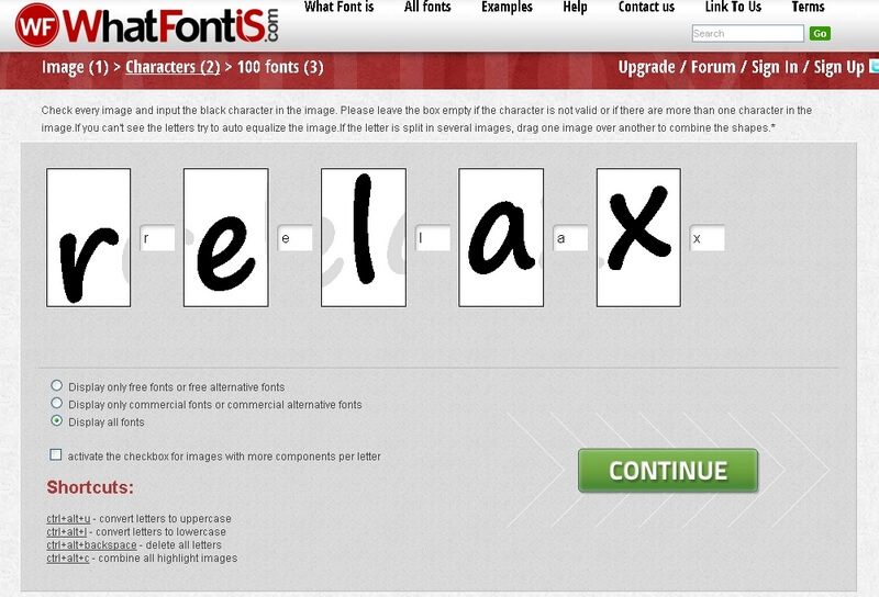
The first thing you want to do is navigate to WhatFontIs.com and launch a search. There are several ways to start. Option #1 is to type in keywords and see matching results summoned from the 285K-strong database, option #2 is to insert the URL of where you saw that word, and option #3 – my favorite – is to upload a screenshot of it directly onto this platform.

What Font Is

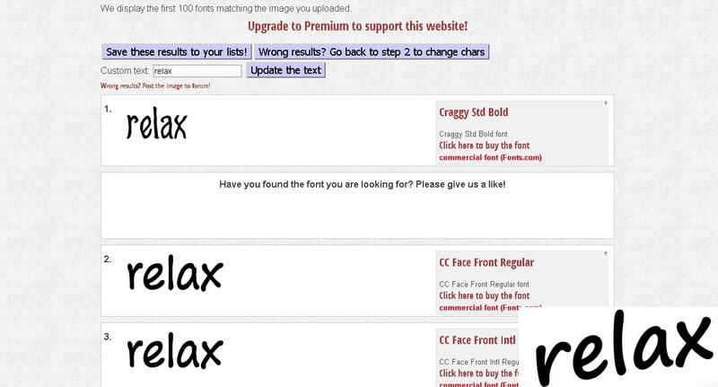
Once you’ve uploaded the screenshot, check the box that tells WhatFontIs whether the background is lighter than the characters or not, and ‘Continue’. Now, confirm each character and pay attention to the filters that enable you to decide what kind of fonts you will be presented with: free, commercial, or both. Then, move forward to the results page, and take you pick out of all the existing close matches and 100 alternatives – who knows, you might settle on something that’s just a tad different.

What Font Is

What Font Is

These steps will get you the font that you’re craving, each and every time. But you should know that there are two sides to WhatFontIs: the one that regular members see, and the shiny Premium one. A Premium Account charges only $9.99 for a whole year, and is definitely worthwhile. It breaks the standard limit of 10 identifications per day, and instead allows for as many as you may need. Besides, it takes all the annoying ads out of the picture and allows you to select source for commercial fonts.

Finally, Premium users are at liberty to input 1 to 15 characters when they’re launching a screenshot search (as opposed to the regular account that requires 2 to 10), so you could track anything down – regardless of whether you start from a single letter, or if the written word that haunts you is rather lengthy. Overall, WhatFontIs.com is your ticket to finding any font ever made.

What Font Is

Read the full article at: A Good Free Tool for Identifying Fonts

Treehouse

Sencha Touch Mobile Framework

15 Feb 10:43

Infinite scroll search-friendly recommendations

by Maile Ohye
Webmaster Level: Advanced

Your site’s news feed or pinboard might use infinite scroll—much to your users’ delight! When it comes to delighting Googlebot, however, that can be another story. With infinite scroll, crawlers cannot always emulate manual user behavior--like scrolling or clicking a button to load more items--so they don't always access all individual items in the feed or gallery. If crawlers can’t access your content, it’s unlikely to surface in search results.

To make sure that search engines can crawl individual items linked from an infinite scroll page, make sure that you or your content management system produces a paginated series (component pages) to go along with your infinite scroll.


Infinite scroll page is made “search-friendly” when converted to a paginated series -- each component page has a similar <title> with rel=next/prev values declared in the <head>.

You can see this type of behavior in action in the infinite scroll with pagination demo created by Webmaster Trends Analyst, John Mueller. The demo illustrates some key search-engine friendly points:
  • Coverage: All individual items are accessible. With traditional infinite scroll, individual items displayed after the initial page load aren’t discoverable to crawlers.
  • No overlap: Each item is listed only once in the paginated series (i.e., no duplication of items).
Search-friendly recommendations for infinite scroll
  1. Before you start:
    • Chunk your infinite-scroll page content into component pages that can be accessed when JavaScript is disabled.
    • Determine how much content to include on each page.
      • Be sure that if a searcher came directly to this page, they could easily find the exact item they wanted (e.g., without lots of scrolling before locating the desired content).
      • Maintain reasonable page load time.
    • Divide content so that there’s no overlap between component pages in the series (with the exception of buffering).


  2. The example on the left is search-friendly, the right example isn’t -- the right example would cause crawling and indexing of duplicative content.

  3. Structure URLs for infinite scroll search engine processing.
    • Each component page contains a full URL. We recommend full URLs in this situation to minimize potential for configuration error.
      • Good: example.com/category?name=fun-items&page=1
      • Good: example.com/fun-items?lastid=567
      • Less optimal: example.com/fun-items#1
      • Test that each component page (the URL) works to take anyone directly to the content and is accessible/referenceable in a browser without the same cookie or user history.
    • Any key/value URL parameters should follow these recommendations:
      • Be sure the URL shows conceptually the same content two weeks from now.
        • Avoid relative-time based URL parameters:
          example.com/category/page.php?name=fun-items&days-ago=3
      • Create parameters that can surface valuable content to searchers.
        • Avoid non-searcher valuable parameters as the primary method to access content:
          example.com/fun-places?radius=5&lat=40.71&long=-73.40

  4. Configure pagination with each component page containing rel=next and rel=prev values in the <head>. Pagination values in the <body> will be ignored for Google indexing purposes because they could be created with user-generated content (not intended by the webmaster).

  5. Implement replaceState/pushState on the infinite scroll page. (The decision to use one or both is up to you and your site’s user behavior). That said, we recommend including pushState (by itself, or in conjunction with replaceState) for the following:
    • Any user action that resembles a click or actively turning a page.
    • To provide users with the ability to serially backup through the most recently paginated content.

  6. Test!
Written, reviewed, or coded by John Mueller, Maile Ohye, and Joachim Kupke
11 Jan 18:32

Top Windows Phone app certification failures and how to avoid them

by Bernardo Zamora

Thanks to Mike Francis of the Windows Phone Store certification and policy team, who provided much of the content for this blog. -- Bernardo


I work very hard to develop, test, and market my Windows Phone apps. Failing certification testing requires me to correct and resubmit my app, which can delay the app release and require additional time to fix the problems.

In this post, the Windows Phone Store certification and policy teams share the most common certification failures we see as apps go through the certification process. This post also covers steps you can take to avoid these failures. Armed with this knowledge, you can increase your chances of passing certification the first time and publishing your app to the Store on schedule.

These are the top Windows Phone App Submission requirements failures, from most common to least common.

Incorrect app screenshots

Requirement 4.6 - App screenshots. Your app screenshots should not include any emulator chrome, frame rate counters, or debug information. They should not be altered or be transparent. Also, photos of your app running on a device or the emulator are not substitutes for a screenshot taken with the emulator.

  • Tip: Use the built-in emulator screenshot tool to take the screenshots. The Windows Phone 8 SDK ships with emulators for WVGA, XVGA, and 720p resolutions.
  • Tip: Don’t take WVGA (480 x 800) screenshots for Windows Phone 8 XAPs. Instead, use the Dev Center feature that automatically scales the XVGA screenshots down to the WVGA resolution.
  • Tip: Screenshots are not required to be localized, however, you do need to provide at least one screenshot for each language supported.

Here are a couple of examples of bad screenshots:

Bad screenshot 1 – Note emulator chrome

Bad screenshot 2 - Note frame rate counter in upper right

clip_image001

clip_image002

And here are the correct screenshots:

Good screenshot 1 - No emulator chrome

Good screenshot 2 - No debug information

clip_image003

clip_image004

Missing information to test the app

Requirement 5.1.4 - App Testability. Many apps require login credentials to run. If your app requires an existing account, make sure you create a test account that can be used by the certification team during testing. Don’t forget to include the account credentials in the Certification notes in your Dev Center submission. Click More XAP Options on the Upload and describe your XAP page.

clip_image005

Include test account credentials in Certification notes field.

App crashes

Requirement 5.1.2 - App closure. This requirement is simply to verify that your app doesn’t crash during certification testing. As you know, if your app crashes in release mode, it just goes away without any user prompt. Certification will reject your app if it “unexpectedly terminates” during testing.

BugSense and Little Watson can help you collect unhandled exception telemetry data. See this KB article for more info on how to avoid crashes: Troubleshooting Windows Phone App Problems that occur after Submitting.

Incorrect icons and tile images

Requirement 4.7 – Required app images. Developers sometimes forget to replace default icons and tile images in an app created from a Visual Studio template. Other tools such as App Studio and Apache Cordova provide default images that are to be replaced with unique icons and tiles that reflect your app. The default images are useful in letting you know the required size for these assets.

clip_image006

Default tile provided by App Studio - replace before submitting

clip_image007

Default tile provided by Visual Studio – replace before submitting

  • Tip: Visual Studio creates a default large tile when using the Project New template -FlipCycleTileLarge.png. This tile (691 x 336) is required only if your app supports large tiles. By default, this option is disabled in the WMAppManifest.xml settings. If your app doesn’t support large tiles, you can delete the tile from the project. This will save space and installation time for this unused asset.

Incorrect use of the Back button

Requirement 5.2.4 - Use of Back button. The Back button behavior is narrowly defined. The Back button should:

  • Close the app only if the app is on the main page
  • Go to the previous page only if not on the main page
  • Close an open dialog
  • Close the soft keyboard

There are two exceptions to this:

1) If the app is a game, and if during game play the Back button is pressed, game play can be paused and present a pause prompt. Pressing the Back button again should dismiss the pause prompt and restart game play.

2) If you need to confirm with the user that they really intend to close the app when the Back button is pressed, you can display a confirmation prompt (for example, “Are you sure you want to quit?”). This should only be done when the Back button is pressed and the user is on the main page. An affirmative response should exit the app. A negative response should return the user to the main page. You can do this by overriding OnBackKeyPressed.

  • Tip: If you are writing a C++ app or game, see the Marble Maze sample for sample code on implementing the Back button behavior in a native app or game.

Insufficient localization information

Requirement 5.5.1 – Language validation. For each of the languages your app supports, you must provide a localized app description. This is the description entered as part of your Dev Center submission. Certification testing also verifies that your app displays properly for each of the languages your app supports.

  • Tip: Use the emulator to quickly switch between phone languages. To do this, press Settings, and then press language + regions. Then change the language setting to one that your app supports. Don’t forget to tap restart phone – otherwise the language change will not persist. When the emulator reboots, deploy, start your app and verify the correct language is displayed. Note that the emulator supports all of the display languages supported by Windows Phone, whereas your development phone likely doesn’t.

Lack of support for both light and dark phone themes

Requirement 5.5.2 – Content and themes. This requirement ensures your app displays properly in both light and dark themes. You can switch between themes on your phone. To do this, press Settings, and then press theme.

clip_image008

  • Tip: Use Blend and Visual Studio during layout to easily switch between themes.

clip_image009

In Visual Studio the Device Window (Design | Device Window) allows you to toggle between the dark and light themes giving you feedback on the visibility of your UI items during layout.

  • Tip: To determine the current theme your app is running in, use the following code:

var v = (Visibility)Resources["PhoneLightThemeVisibility"]==Visibility.Visible; // true==light theme, false== dark theme

  • Tip: There are some app scenarios where you want to force the app to display the same regardless of the theme. A library that helps you do this is Jeff Wilcox’s PhoneThemeManager. With one line of code in your app’s constructor, you can force your app to display in the Dark or Light theme, regardless of the current phone theme setting.

These are the most common certification failures, though not a comprehensive list of all types of errors. You can review the entire list of requirements in the Windows Phone Dev Center.

I hope this helps you build apps that pass certification faster and with fewer rejections. Let us know what other issues you are encountering, so we can help you get your apps into the Store as quickly as possible.

11 Jan 18:29

Замерзла Америка

by Сергій Пішковцій

US-3

Поки Україна сумує з приводу відсутності снігу на новорічно-різдвяні свята та мокру і вогку погоду, Північна Америка потерпала від давно небачених холодів. Впливу аномального похолодання зазнали понад 240 млн жителів півночі США та Канади, а знаменитий Нігарський водопад майже повністю замерз. 

Востаннє таке траплялось в 1934 році, а повна зупинка водопаду відбулася лише в 1848 році – коли льодові затори на кілька годин заблокували рух води.

article-0-1A81C46F00000578-247_964x615

article-0-1A811A4400000578-197_964x640


Чикаго та замерзлий берег озера:

s_s02_61021087


Райони, уражені низькими температурами на знімку з космосу:

s_s11_43170092

s_s16_63321620


Times Square, Нью Йорк:

s_s19_RTX170K9


Люди вийшли на розваги на замерзлу поверхню річки:

s_s22_RTX171IR

Вид на Чикаго з борту літака:

US-3

Фото: The Atlantic, Independent, Daily Mail

Спонсор запису: Інтернет-магазин туристистичного спорядження Перекотиполе

15 Dec 12:36

Регистратор домено R01 допустил утечку паспортных данных и не только

by bg.marketer@gmail.com (Bogdan Glushak)

Логотип R01Сегодня узнал о неприятной новости. Хакеры взломали одного из российских регистраторов доменов R01. Вчера был доступен сайт, на который они (злоумышленники) выложили паспортные данные клиентов, их физические адреса и номера телефонов.

Этот сайт уже заблокировали и он почти выпал с кэша гугла.

Но страшно представить, как теперь эти данные будут использовать. Остерегайтесь фишинга.

P.S. Самое интересное, что регистратор пока не спешит предупреждать своих клиентов о возможной угрозе.

06 Dec 16:36

Люди, які заважали Йолці

by Сергій Пішковцій

1461502_218126378368366_696330744_n

В ніч на 30-те листопада мирний протест на київському Майдані Незалежності перетворився на криваве побоїще: Беркут брутально розігнав євромайдан, на якому залишались переважно молоді студенти. Під приводом “розчищення території для встановлення новорічної ялинки” спецназ бив кожного, хто там стояв: дівчат, хлопців, кийками та ногами. Наступного ранку вся країна побачить кадри жорстокого свавілля силовиків та з ще більшою активністю вийде на протестні акції у своїх містах.

Київський фотограф Олександр Пілюгін зафіксував останні 30 хвилин цього майдану, учасники якого згодом будуть побиті та покалічені.

486656_218126591701678_717688261_n

1002025_218126508368353_1632802948_n

1012786_218126291701708_1094415285_n

1379706_218126608368343_2102603639_n

1441406_218126375035033_2010065934_n

1457698_218126851701652_1302952834_n

1450318_218126581701679_1224661367_n

1456752_218126845034986_1660162509_n

1452320_218126381701699_1270276183_n

1451392_218126755034995_2111371564_n

1459944_218127041701633_1802916887_n

1461502_218126378368366_696330744_n

1463687_218126511701686_343132253_n

1471773_218126951701642_1842685966_n

1476446_218126718368332_517892072_n

1452442_218126925034978_850964378_n

1454707_218126668368337_1834397256_n

1488222_218127035034967_1627998828_n

1478985_218126298368374_2116652949_n

1477604_218126671701670_560262560_n

03 Dec 13:14

#Євромайдан: список закладів, де можна зігрітись протестувальникам у Києві

by Редакція Inspired

6255416561_7583c0f469_b

Не зважаючи на те, що наша країна нібито в затяжній економічній кризі, а далі, за запевненнями чиновників – буде ще гірше, одразу декілька закладів у центрі Києва відкрили свої двері для учасників Євромайдану. Уже більше тижня масові акції охопили не лише центр Києва, а й інші міста по всій території України. Як вже жартують, революції в Україні чомусь трапляються саме тоді, коли приходить найбільш холодна та неприємна погода.

Один з наших читачів склав список закладів у центрі Києва, які зголосилися безкоштовно допомагати учасникам протестів: тут можна не лише перечекати негоду, зігрітися, а й випити гарячого чаю чи бульйону.

1386037498_monotone_fork_spoon_dinner_eat_restaurant

1) Два Гуся, вул. Хрещатик 7/11

2) Здоровенькі були, вул. Лютеранська 3

3) Foodtourist, вул. Басейна 2а

4) Барабан, вул. Прорізна 4а

5) PIVBAR Beer&Beef, ТЦ Глобус, друга лінія

6) Канапа, Андріївський узвіз, 19а

7) McDonald’s, вул. Софіївська 1/2

8) McDonald’s, ТЦ Глобус, фудкорт

9) McDonald’s, вул. Хрещатик 19а

10) Сушия, ТЦ Арена-сіті

11) Сушия, ТЦ Глобус

12) Сушия, вул. Грушевського, 4

13) Сушия, вул. Грінченка, 2/1

Список на Foursquare: http://4sq.com/1ch77KJ

Список склав Богдан Каркачов

29 Nov 09:48

Як не замерзнути на Євромайдані: інфографіка

by Сергій Пішковцій

Погода з кожним днем стає все більш суворішою, а політична ситуація – все більш напруженішою. Зважаючи на те, що на центральні площі українських міст в рамках протестів #євромайдан може вийти ще більше людей, ми вирішили викласти пам’ятку для тих, хто не хоче замерзнути під час тривалого перебування на мітингу.

maidan

28 Nov 22:22

9 Lessons from an $11m Marketing Campaign

by jamesporter

Posted by jamesporter

The John Lewis Christmas 2013 campaign has smashed it virally. Since it launched two weeks ago it's had:

  • 8 million views on YouTube
  • 150k Twitter mentions
  • 70k Facebook interactions

As content marketers, those kind of engagement statistics seem incredible. Admittedly, brand marketers have much bigger budgets, but as content marketers, what can we learn from brand marketers about creating, launching and promoting content?

If you're in the UK, then you will undoubtedly have seen it, but for everyone else, here's the video:

If you're a bit skeptical and think that content marketing and big brand marketing are totally different, then read this quote from industry marketing bible The Drum:

"Shares are the currency of social success and for leading brand marketers discovering how to create and distribute highly shareable content repeatedly and at scale is now at the top of their wish list."

Sounds familiar, right? Basically big brand marketing and content marketing are converging.

Hopefully you've bought into the idea that we're becoming the same industry…so what can we learn?


Lesson 1: Don't launch on your own site (launch where your target market is)

John Lewis is a big brand, but they didn't launch their campaign on their site. They launched their campaign via Twitter and YouTube.

Why? Because that's where their target market is, that is where they are going to get traction with their audience, and that is where they have the highest chance of virality.

Lesson: Could you launch your content where your target market is? A great example of this happening in the SEO community is Stephen Pavlovich's Definitive Guide To Conversion Rate Optimisation. It's a fantastic piece of content that was launched on Moz and helped to build Stephen's name in the industry.

Pro Tip 1: If you're worried about losing link equity, use the cross domain rel=canonical tag to transfer value back to your site.

Pro Tip 2: If you can't get your content onto a platform where your target audience is, can you use paid promotion to get your content on there?


Lesson 2: Don't make links your main objective

We all want more links. But at Distilled we're now optimising campaigns for other metrics as well.

Question: Would you rather build your brand with new audiences or would you prefer a link from a DA30 site on a page that nobody ever visits and that provides zero referral traffic?

Lesson: Set your content objectives not purely on links or views, but on other levels of engagement. Still factor in links but consider other metrics like sharing, data capture, brand uplift, or online purchases/enquiries.


Lesson 3: Target your content broadly

When you're creating content at the level of John Lewis, then arguably your audience is the entire population.

As content marketers, we've got narrower audiences, but there's a fine line between targeting your content too broadly:

and targeting your content too narrowly:

Lesson: Make sure that the audience that you are targeting for your content piece is large enough to achieve your objectives. Otherwise you have failed from the start.

Pro Tip 1: If you're worried about the reach of your target audience, try and combine several audiences into one content piece. Wiep Knol in his Searchlove 2010 presentation (no longer available, unfortunately) gave a great example of combining several target audiences with his piece the "70 Most Beautiful Churches In Europe," which brought the travel blogging and religious communities together.

Pro Tip 2: Another way you can target content more broadly is geographically. Bingo site TwoLittleFleas has used a US/UK switch on their quiz to broaden their potential audience from 63m (UK population) to 377m (US and UK population).

Pro Tip 3: Another way of targeting your content is including many niche audience groups within a piece of content. This works as the piece of content speaks to pre-existing communities, and their automatic thought when seeing the piece is "that's for me!."

The "From Gospel to Grunge: 100 Years of Rock" piece is not just for people interested in music, it also references various music communities and that will encourage people to engage with the piece.

100 Years Of Rock


Lesson 4: Build influencers into your content

John Lewis has embedded an influencer with a massive online community directly into their content. Lily Allen is singing on the ad, which is a pretty clever play from John Lewis considering that she's got 4.3m followers on Twitter.

Lesson: Build influencers into your content launch plan. Ask them to contribute or comment, give them a free trial, or offer them beta access.

Pro Tip: When doing outreach, find people who you can help out. This changes the mindset from "what can this person do for me" to "how can I help this person" (great tip from Marco Montemagno at SearchLove 2013).


Lesson 5: Focus your marketing on innovators/opinion leaders

Hat tip to Seth Godin (and his Purple Cow) for this one. Why did John Lewis launch their campaign online, even though TV is the primary channel? Because online is where innovators and opinion leaders hang out. These are the people that are on the lookout for something new or different. Innovators and opinion leaders have the ability to change the behaviour of the early and late majority.

Lessons: Opinion leaders matter. Use this process from Richard Baxter to find the influencer intersect for your market, and then build relationships with these people as a long term strategy for success in your space.


Lesson 6: Get your creative right (people need to love your marketing)

Didn't you know? Google and other social networks (particularly Facebook), are filtering content through to you based on what they think you'll like. Just because you're publishing content doesn't mean your audience is getting it. (not convinced, read this book).

If other people are reading and sharing though, then your content is likely to get through the filters. So people really do need to love your marketing for it to work.

So, how can you get your creative up to scratch?

If you're just starting out with content marketing, then there are a few things you need to do first:

  • Manage expectations and educate internally that content marketing plays like this can fail.
  • Do something small first that requires limited budget. Build confidence. Get buy in from the C-suite. THEN go big!

Pro Tip 1: Mitigate risk. Offset some of the risks of content marketing by emulating the fundamentals of a piece that has ALREADY been successful in a different geographical location or industry.

Pro Tip 2: Need creative inspiration? Check out this great post from Kelsey Libert on creative ideation, or this classic from Larry Kim "How I got a link from the Wall Street Journal".


Lesson 7: Spend more on outreach than you are spending on content creation

The John Lewis campaign cost £7m. £6m is going to promotion (advertising). £1m went to creative.

What ratios are you working on in terms of spend on content creation to outreach? The loud and clear message here is that in brand marketing outreach isn't an afterthought. It's fundamental to the campaign.

Lesson: Double your outreach budget. Do outreach yourself? Spend twice the amount of time on it for your next project.


Lesson 8: Keep your content non-promotional (but plan for sales post-launch)

If people feel that they are being sold to, they are less likely to share. So keep your content as non-promotional as possible.

Lesson: For your next piece of content, strip out your sales focused header and footer, and remove the sales spiel and the 'buy' call to action. This is an example piece of content marketing for Simply Business. As you can see, the content, sharing and utility of the piece is the main focus, not any specific marketing or commercial messages.

Pro Tip: Add remarketing tags to your content so you can promote to your audience at a later date (even if it's just to promote your next content piece).


Lesson 9: Are you creating a reaction with your audience?

What reaction are you stirring up in your audience? Is it curiosity, surprise, sorrow or pride?

Interestingly, John Lewis adverts are deliberately sad and they evoke an emotional reaction with their choice of music and the story.

Lesson: At the concept stage, if your concept doesn't evoke a visible reaction with a small group of users, consider it a no-go. No reaction = No social shares.


Conclusion

As content marketers, we know a lot of the strategies and tactics that brand marketers are using. But there's a big difference between knowing what to do, and actually doing it.

In my opinion, there's still a lot we can learn from brand marketers, specifically in terms of strategy, scale, reporting and measurement, and ultimately in the results they get. I'm excited about the way that our two industries are converging.

If you need more inspiration here are a list of resources that I follow to keep up to date with the creative digital sector, and of how I keep up to date with what people love online:

Ads/PR/content making waves:

Hope you enjoyed the piece, if you've got any examples of great content marketing or brand marketing that have blown you away, drop them in the comments. Would love to see them.


Sign up for The Moz Top 10, a semimonthly mailer updating you on the top ten hottest pieces of SEO news, tips, and rad links uncovered by the Moz team. Think of it as your exclusive digest of stuff you don't have time to hunt down but want to read!

14 Nov 09:50

Відео дня: Стрибок на Землю з висоти 40 кілометрів

by Сергій Пішковцій

Red Bull Stratos

14 жовтня виповнився рівно рік, як австрійський скайдайвер Фелікс Баумгартнер стрибнув зі стратосфери на Землю в одному лише скафандрі. Зараз ми вже знаємо, що все завершилось успішно: весь світ обійшли кадри приземлення Фелікса та його радісного жеста з піднятими руками догори. Проте ніхто не знає, що ж насправді відбувалось ці пекельні 9 хвилин, поки він летів з космоса на поверхню планети.

Red Bull Stratos сьогодні оприлюднив повний відеозапис стрибка Фелікса, який включає записи з кількох камер та показники швидкості, висоти та біометричні дані. За перші 20 секунд Баумгартнер набрав шалену швидкість – 700 км/год, через 30 секунд – ще більшу, 1350 км/год, а перевантаження від його обертання сягали майже 2G. Це треба побачити на власні очі. Тримайтесь за крісло:

30 Oct 13:13

New Virgin America Safety Video

by Matt Mullenweg

Virgin America is giving Delta a run for their money with this amazing safety video — who has ever said that before? — directed by Jon Chu, who also did two of the Step Up movies. (Which sound cheesy but are actually awesome.)

20 Oct 21:31

Реклама, на яку хочеться дивитись

by Сергій Пішковцій

Реклама, на яку хочеться дивитись

Всі ми звикли до широкоформатної реклами на білл-бордах, яка заполонила наші міста і іноді не зовсім доречно вписується в міський ландшафт. А от у 20-40х роках минулого століття в Нью-Йорку – тогочасному рушію світу – вся реклама була винятково мальованою.

“Як це так?” – спитаєте ви, і все дуже просто: перед стіною хмарочосу або будинку висіла люлька з працівниками, які методично та впевнено наносили рекламне зображення кольоровими фарбами. Сьогодні ж на вулицях Нью-Йорка можна все ще зустріти таку рекламу – і вигляд у неї значно привабливіший, і увагу на неї звертають більше.

Реклама, на яку хочеться дивитись

Реклама, на яку хочеться дивитись

Одним з найбільших підприємств, яке виконує такі замовлення, є компанія Collossal Media, в штаті якої 30 професійних художників. Вартість кожного проекту коливається від 5000 до 100 000 доларів, і залежить від строків, майданчика та креативу.

Процедура малювання досить непроста: спочатку стіну розкреслюють і виміряють. Потім на неї вішають велетенські рулони паперу, на яких в масштабі 1:1 малюють ескіз реклами. Вже на основі цього і буде малюватися основна картинка.

Реклама, на яку хочеться дивитись

9781211244_8eb785b3bc_c

Реклама, на яку хочеться дивитись

Така реклама не псує місто, а навпаки, органічно вливається в міське середовище.

Реклама, на яку хочеться дивитись 8450801699_f7886fd4a9_c 9781279653_b077a9a1af_c 9781031201_3b1e6da1c4_c 9622394609_6f3c683414_c Реклама, на яку хочеться дивитись 8619273357_75fd9cc935_c 9141669459_030601ac0d_c 9360312066_b87845951e_c 9603929728_27aca63035_c 7943988336_5a4d6ff8e2_c Реклама, на яку хочеться дивитись 9781211244_8eb785b3bc_c Реклама, на яку хочеться дивитись Реклама, на яку хочеться дивитись

via samsebeskazal

13 Oct 09:27

Don't Despair Over The Ugly iPhone 5c Case Any Longer

by Jordan Crook
Screen Shot 2013-10-11 at 11.09.31 AM

The color enticed you. The playful plastic called out to you. And that cover, with silly little circular cutouts had your name all over it.

Thirty dollars later, you’re feeling a little silly after realizing that this case is Apple’s first big design flaw since the Apple TV remote. But don’t be embarrassed, we all make mistakes.

Luckily, a new app called CaseCollage is here to save the day for those of us who thoughtlessly purchased Apple’s case alongside a new iPhone 5c.

The app, launched out of a company called LunarLincoln, lets you pull in images from your social feeds like Facebook, Instagram, Flickr and Picasa to fill in the holes with something a bit less ugly and a bit more personal.

You can arrange the photos however you’d like, or add in preset images or text from a collection provided within the app. Hell, if you love the color scheme but hate that pesky text peeking out of the holes, you can simply choose to get color(s) to fill in your Crocs case holes.

After arranging the icons to your pleasing, you can print out the personalized design, trim it down, and lay it between your new iPhone 5c and what you swear is the last bad decision you’ll make (about a phone case, at least).

Pretty sweet deal, no?

Interested parties can check out the app right here.


13 Oct 09:17

Разгон батареи отопления

by DI HALT

Межсезонье. На улице холодно. Коммунальщики, пидорасы, жмотят отопление. Батареи греют в пол силы. Дома дубак. Лысый котик мерзнет и страдает. Доколе?! Думаете я побежал за электрическим обогревателем? Да хрен-с-два! Наш метод — разгон батареи отопления.

Итак, согласно нормативам на каждую комнату должно быть определенное количество секций батареи отопления. Количество зависит от метража. Средняя мощность одной секции чугунного или алюминиевого радиатора около 200Вт. Но это пассивная теплоотдача, а ведь тепло можно принудительно отобрать! Этим и займемся

Грабь награбленное!
Если на выходе батарея теплая, то значит есть где урвать еще энергии. Есть потенциал для разгона! А хороший разгон немыслим без хорошего охлаждения! Посему двигаем за кулерами.

Я решил не париться и купил самых дешманских кулеров. По 40р штука. Обычныйх 80х80х25. Они в аккурат по ширине секции радиатора. Сразу десяток взял:

Дальше соединил их стяжками в могучую батарею:

Для соединения использовал пластиковые стяжки:

Это быстро, просто и надежно. Если хорошо затянуть, то будет как литая.

Затем все пропеллеры соединяем параллельно. Желтый провод, если есть, откусываем и выбрасываем. Это датчик скорости, он нам не нужен. А все красные соединяем вместе с красными. Черные с черными.

Осталось подцепить коннектор:

Если коннектора нет, то не беда. Можно тупо скрутить провода с блоком питания.

И взять блок питания от роутера. Блок можно брать совершенно любой. Лишь бы он давал ток от 1А и напряжение на выходе было постоянным, т.е. DC. Сама величина напряжения может быть от 5 до 15 вольт. Чем выше вольтаж тем эффективней, но тем и шумней. На 15 вольтах батарея превращается в могучий тепловентилятор, прокачивающий комнату за считанные минуты.

Я взял на 5 вольт. Он был под рукой просто. С ним кулеры вращаются еле еле, их практически не слышно, а батарее этого хватает.

Пластиковыми же стяжками посадил все на батарею

Подключил питание… Поехали!

Да, вешать их надо так, чтобы максимально эффективно продувать радиатор. У моего радиатора есть внутри параллельные ребра. По ним воздух движется снизу вверх конвекцией. Потому я вентиляторы поставил так, чтобы они эту конвекцию ускоряли, дули снизу вверх.

На чугунной батарее может быть другое оптимальное расположение. Например, продувать сбоку или спереди. В общем, смотрите и решайте сами. Идеальным вариантом должно стать полное охлаждение батареи до комнатной температуры.

И, конечно же, можно не городить батарею из кулеров, а взять обычный бытовой вентилятор и направить его на радиатор. Эффект будет не хуже.

А еще у этой батареи есть приятный бонус. Если вы не последний участник тепловой цепи, то ваши мерзкие соседи, что громко слушают музыку или топают у вас над головой, вымерзнут нахер вместе с тараканами!

Тем же методом можно повысить мощность и электрических радиаторов. Меньше жрать электроэнергии они конечно не будут — закон сохранения энергии незыблем. С принудительной прокачкой они просто перестанут выключаться. Но плюс в этом тоже есть, во-первых, радиатор будет не таким горячим, сложней обжечься. А во-вторых, нагрузка на электросеть будет много ниже, автоматы не будет вышибать почем зря. Ведь постоянно работающий 800Вт радиатор куда менее хардкорен для проводки чем щелкающий туда-сюда, как утюг, 3КВт монстр. А по выдаваемой мощи они будут примерно равны.

З.Ы.
Сей креатиф был рожден когда ЦС, пожаловался мне в аське, шо у него дескать жопка мерзнет. На что был послан за кулерами и спустя небольшого апгрейда радиатора у него в квартире таки наступила африка. Вот его фоточки.

Вот такая херня, малята. Холодной вам батареи и теплой квартиры :)

16 Sep 12:01

Delta equips more than 19,000 flight attendants with Windows Phones

by Michael Stroh

Windows Phone is about to rack up some serious frequent flier miles. Delta Air Lines today said that it’s equipped 19,000 flight attendants with Windows Phone 8-powered Nokia Lumia 820 smartphones.

The airline will use them to run credit cards for flyers who want to buy food, upgrade their seat, rent headsets, and make other in-flight purchases. The flying checkout system, which leverages additional technology from Microsoft Dynamics and Avanade, makes it possible for Delta to offer electronic receipts and coupons—plus significantly slash checkout times, the airline said. The phones will also handle passenger manifests, frequent flyer info, connecting gate updates, and flight attendant scheduling updates.

Head over to the Official Microsoft Blog for more on this exciting deal between Delta, Microsoft, Nokia, AT&T, and Avanade.

Starting today, you'll see a familiar phone arriving with the Delta Air Lines beverage cart.

04 Aug 11:43

Гугл как таймер

by dimok

Как увеличить конверсию Вашего сайта (бесплатная книга)

На днях один из сотрудников Гугл поделился интересной фичей поисковика - там можно задать таймер. вот как это работает:

Делается собственно это запрос типа https://www.google.ru/search?q=set+timer+for+10+minutes

Стоит отметить, что для того, чтобы это увидеть, язык в поисковике должен быть установлен английский.

(с) Блог Димка (@dimokru): seo/smo, бизнес, блогосфера.

Похожие посты блога:

03 Aug 20:39

8 мифов о данных, за веру в которые вас скоро уволят

Когда дело доходит до использования данных, маркетологи очень часто допускают много глупых ошибок.

Авинаш Кошик (Avinash Kaushik), ведущий мировой эксперт в области веб-аналитики, в своей статье собрал восемь ложных мифов, в которые свято верят многие специалисты отрасли. Основываясь на своем опыте общения с маркетологами из разных стран, он выделил два типа «неудачников»:

- первые абсолютно не используют данные в своей работе. Их можно сразу увольнять, не задумываясь;

(на заметку: если 30% своего времени в 2013 году вы не уделили работе с данными, то вам далеко до профессионального успеха)

- вторые используют данные неправильно, выбирают неподходящие стратегии и метрики.

В своей статье Авинаш Кошик разрушает мифы и дает читателям полезные советы, как и что нужно делать, чтобы добиться успеха и повышения.

1. «Данные в реальном времени играют решающую роль»

Многие, кто придерживался такого мнения, уже уволены.

К сожалению, не сразу, потому что для того, чтобы понять, какая впечатляющая сумма денег была потеряна из-за этой концепции, нужно время.


Нельзя отказываться от использования данных в реальном времени совсем, ход мыслей должен быть примерно следующий: «Нам нужны данные в реальном времени или нам не нужны данные в реальном времени. Давайте-ка оценим скорость, с которой наша компания обычно принимает решения. Если мы в состоянии принимать решения в реальном времени, то мы получим данные в реальном времени. Если это занимает два дня, то давайте учитывать этот временной цикл. Если нам требуется 10 дней, чтобы, например, поменять ставки в кампаниях PPC, то мы выбираем этот цикл данных».

Если у вас на руках определенный объем данных в реальном времени, вы должны убедиться, что умеете правильно им распоряжаться. Обычно, спустя несколько дней, специалист бывает просто потрясен наличием «живых» данных, что понятия не имеет с какой стороны подойти к их использованию. А время идет.

Необходимо синхронизировать предоставленные данные с той скоростью, с которой компания на самом деле принимает решения:

данные> аналитик> менеджер> руководитель проекта> VP> возникли вопросы к менеджеру> кричит на аналитика> обратно к руководителю> VP = 6 дней.

Далее следует результат и ваше повышение.

PS: Есть исключения. Обработка данных в реальном времени бесценна в том случае, если отсутствует человеческий фактор. Например, платформы с искусственным разумом, которые автоматизируют торговые процессы на Wall Street.

2. «Главное - оптимизировать показатель отказов»

Нет. Вас уволят. Через 3 месяца.

Показатель отказов – это действительно нужная метрика. Но это не KPI. Разница между ними в том, что второй отражает итоговый результат, а первый полезен для диагностики тактических задач.

Показатель отказов необходим для того, чтобы увидеть свои промахи: слабая навигация по сайту, ужасная посадочная страница, плохо установленный таргетинг, отсутствие CTA. Измерив показатель отказов, легче разобраться, в чем именно заключается проблема: в источнике (объявления) или в назначении (сайт).  

Для того чтобы снизить показатель отказов с 70% до 30% необходимо 3 месяца. И что теперь?

Нельзя постоянно думать о показателе отказов. Для того чтобы понизить его, необходимо исправить дизайн и таргетинг объявлений и оптимизировать посадочную страницу. Теперь стоит сосредоточиться на остальном.

Время от времени пользователи посещают ваш сайт, но для того, чтобы совершить покупку, им необходимо просмотреть еще 12-25 страниц. Сконцентрируйтесь на этом, хоть это и сложно. Зато прибыльно.

Стабилизация показателя отказов обязательна, но она не обеспечит вам полную победу. Сконцентрируйтесь на игре. Обратите все внимание на метрику Число страниц за посещение, сфокусируйтесь на Отчете потока посетителей (графическая репрезентация переходов пользователя по сайту), отслеживайте Показатель отказа для корзины (обозначает в процентном выражении количество посетителей сайта, поместивших товар в корзину, но так и не совершивших покупку), высчитывайте Средний размер заказа.

Это очень кропотливая работа, но именно она приведет вас к желаемому результату. Концентрируйте внимание не на метриках, а на ключевых показателях эффективности, которые напрямую связаны с прибылью.

3. «Количество лайков обеспечивает позитивную репутацию в Сети»

Из-за лайков вас могут уволить гораздо быстрее, чем вы думаете. Вашему начальству не составит особого труда понять, что лайки не имеют никакой ценности на Facebook, а тем более для развития бизнеса.

Существует несколько причин, почему Лайки (а также и фолловеры) – неэффективные метрики. Например, рассмотрим два бренда: Innocent Drinks и Tide Detergent.

Innocent набрал 0.3 миллиона лайков на Facebook, Tide в свою очередь 3.7 миллиона. Разница небольшая.

Но если посмотреть на число справа от количества лайков, то все наоборот. Для бренда Tide – 15 000, для Innocent – 58 000!

Даже обладая количеством лайков в 10 раз больше, чем у Innocent, Tide не может сравняться с ним по количеству упоминаний в Сети.

На самом деле, ошибка Tide в том, что они неправильно подошли к организации Диалогового маркетинга. Изо дня в день бренд публикует «вот фотографии нашего продукта, организации, которые мы спонсируем и их объявления». Но этого недостаточно для вовлечения пользователей.

А вот компания Innocent очень хорошо понимает, что это значит: они стараются получить сотни комментариев и лайков к комментариям. И в данном случае сотни и тысячи – это не метафоры.

Поэтому не стоит постоянно думать о лайках (и фолловерах). Думайте о стратегии диалога в социальных сетях.

4. «#1 в списке выдачи результатов = SEO успех»

Чтобы занять первую позицию в выдаче, компании тратят огромные суммы денег, что, по словам Авинаша Кошика, результатов почти не приносит.

Проблема в том, считает Авинаш, что результаты поиска не являются стандартизированными. Скорее они являются персонифицированными, даже гипер-персонализированными. Независимо от того, залогинились вы или нет.

Когда автор ищет в Google свое имя «avinash», то первым номером видит свой сайт потому, что он автоматически вошел на свой профиль Google+, поисковик отслеживает историю поиска, IP адрес, а также многое другое.

Но не путайте это с KPI.

Если серьезно, в качестве отправных точек следует использовать Глубину индексирования, Внешние ссылки (только качественные), и Рост (или его отсутствие) по ключевым фразам. Анализ показателей Посещений и Конверсии в совокупности, а затем по отдельным ключевым словам или фразам принесет кратковременные результаты. Для того, чтобы показатели качества были долгосрочными, необходимо заняться метрикой под названием Совокупная Ценность Клиента или CLV.

Не стоит начинать с CLV, это сложно. Придерживайтесь вышеупомянутой экскурсии, и это приведет вас к успеху.

5. «Главное – снизить показатель CPC»

«Меня больше всего расстраивает, когда компания строит маркетинговую стратегию на одной метрике. И выбирает CPC. Я постоянно слышу, что целью той или иной кампании в первом квартале является снизить стоимость за клик с 2,25$ до 2$. На ум сразу приходит следующее:

Вы не должны заботиться о стоимости за клик. Вы покупаете платные функционалы, нанимаете грамотных специалистов, вы должны рассчитывать на увеличение прибыли. Надо обязательно посчитать в состоянии ли ваша компания за долгосрочный период увеличить CLV клиента, приобретенного в ходе кампании PPC.

CPC – очень неэффективный индикатор успеха стратегии. Из-за того, что компании полагаются на этот показатель, они начинают принимать бесполезные решения, что приводит к нулевым результатам, как в продвижении бренда, так и в вашей карьере.

6. «Больше переходов на страницу!»

Использование такой метрики, как «Потребление контента» может вызвать у сотрудников несоответствующее поведение.

В случае с новостным сайтом, можно набрать миллионы просмотров страницы, опубликовав истории с названиями «Apple покидает рынок» или «Кардашьяны отдыхают в Греции». Но траффик быстро уходит, а вам придется придумать очередной шокирующий заголовок.

Как такие статьи-однодневки влияют на развитие бизнеса? Если только дисплейные объявления на сайте не приносят $14,000 CPM, то компания не станет платить вам зарплату.

Если речь идет о сайте, целью которого является предоставить пользователям только контент (например, New York Times), то внимание стоит обратить на такую метрику, как Лояльность пользователей. Вместо того, чтобы тратить время на мимолетные тактики, не приносящие развития, вы можете сделать сайт таким, что люди сами захотят вернуться еще.

Если вас волнует лидогенерация, то вы скорее всего уже делали подобное «OMG, давайте опубликуем инфографику о мартышках, показывающих фокусы, мы получим миллиард просмотров, хотя на самом деле никаких макак, а тем более фокусов не существует». Успех в таком случае стоит оценивать не вирусным эффектом и не количеством расшариваний в соцсетях, а количеством приобретенных лидов.

Если рассматривать ecommerce, то единственной причиной беспокоиться о количестве просмотров в таком случае может стать улучшение покупательского опыта пользователей.

Не зацикливайтесь на количестве просмотров. Задумайтесь, что именно приносит вам деньги, выберите ближайшую к этому метрику и работайте над ней.

7. «Чем больше количество показов, тем лучше»

Дисплейная реклама – это неотъемлемая часть digital-маркетинга. Но нельзя строить бизнес-стратегию на показах.

Если не выбирать, что смотреть, скажем, по ТВ или в интернете, очень трудно сделать вывод из того, что вы только что увидели. Представьте, насколько слабая связь между воздействием на пользователя и показами баннеров (любых размеров, форм и т.д.). Вы уверены, что видели эту рекламу?

Автор выдвинул гипотезу, что эта проблема навязана нам уже ушедшими в прошлое ТВ, журналами и радио.

Не покупайте показы. Платите за вовлечение.

Наиболее приемлемым вариантом в данной ситуации является плата за клик.

Если вы готовы на это пойти, то смотрите дальше и используйте метрику Просмотры. Если вы – новичок, попробуйте измерить показатель отказов. Если у вас уже есть опыт за плечами, высчитывайте время пребывания на странице. Если вы профессионал, считайте доход. Ну а если вы гуру аналитики, ваша задача – прибыль.

Показы - ничто, прибыль - все.

Возможно, вы не согласитесь, и это нормально. Если А/В тестирование показало, что показы баннерных объявлений приносят прибыль, то покупайте, не задумываясь. Но не более одного раза за квартал. Но если вы забудете про тестирование, то можете попрощаться с креслом – результатов не будет.

8. «Демографические характеристики и психографика – все, что мне нужно»

В данном случае мы говорим не о метрике, а о факторах, которые определяют какие именно данные надо использовать для таргетинга.

Это еще одно наследство, доставшееся нашему поколению от телевидения, радио и газет, где основным критерием является «я хочу охватить аудиторию 90-летних бабушек, которые любят вязать, на каком канале размещать рекламу?» или «нужно охватить аудиторию студентов, голосующих за Барака Обаму». Вот примеры демографических и психографических критериев.

На самом деле, никто не знает, заинтересованы ли студенты, голосующие за Барака Обаму в покупке вашего товара или нет.

(Знали ли вы, что 50% ТВ просмотров происходит через интернет, и каждый из них имеет коэффициент расшариваний менее 1%. Вот как сложно определить, кто эти люди, и тем более полагаться на них в продвижении бренда).

Мы делаем то же самое в Интернете. Мы выбираем соцсеть и говорим: «У вас есть миллиард человек, поделитесь данными об их возрасте и образовании, и я обрушу на них поток объявлений!»

Показатель CTR доказывает не совершенность этой стратегии. Намерение (Intent) важнее демографических характеристик и психографики. Всегда.

Если вы располагаете денежными средствами, то потратьте их на ту рекламу, которая обеспечит вас данными о намерении.

Два примера.

В поисковых системах намерение повсеместно, независимо от того, 90 вам лет или 18. Если вы зашли, скажем, на Baidu и ищете HTC, то, во-первых, у вас сильное намерение. А во-вторых, существуют встроенное намерение. Например, если мужчина читает статьи о том, как забеременеть, то если ему показать связанное с этим объявление (даже несмотря на то, что он мужчина), он захочет кликнуть на него.

Первоначальное намерение сильное, вторичное слабее (но если использовать ремаркетинг, то можно усилить и второе намерение). Но в обоих случаях, главным критерием показа является никак не пол, возраст или образование.

Современный digital-маркетинг предоставляет безграничные возможности для развития, но и ошибок не избежать. Главное – видеть суть проблемы и не позволять себе заблуждаться, тогда подходящее решение быстро найдется. Ах да, и вас не уволят.  


31 Jul 14:49

Дропнулся домен LiveJournal.com.ua

by Zezya

Вчера вечером дропнулся домен LiveJournal.com.ua. Изначально он был зарегистрирован в 2005 году, не принадлежал компании LiveJournal, его владельцем было физическое лицо, какой-либо рабочий сайт в последнее время на нем не размещался. На момент освобождения у домена был тИЦ 10. Ручная регистрация. Текущий whois.

livejournal.com.ua до перехвата

livejournal.com.ua до перехвата

Самый смак использовать такой домен для ведения своего блога, подключенного к платформе ЖЖ.

29 Jun 20:49

Экспорт кодов аэропортов IATA

by info.nospam@nospam.inln.ru (DenizK)

Экспорт кодов аэропортов (в форматах XML, CSV, XLS) можно осуществить с сайта http://www.apinfo.ru/airports/export.html Доступны следующие поля: 

  •  Код IATA (ИАТА)
    •  Код ICAO (ИКАО)
    •  Название аэропорта на русском языке
    •  Название аэропорта на английском языке
    •  Название города на русском языке
    •  Название города на английском языке
    •  Часовой пояс города
    •  Название страны на русском языке
    •  Название страны на английском языке
    •  Двухбуквенный ISO-код страны
    •  Географические координаты аэропорта
    •  Длина взлетно-посадочной полосы
    •  Высота над уровнем моря
    •  Телефон
    •  Факс
    •  Контактный email
    •  Адрес сайта
    26 Jun 22:24

    Почему мертвецы ставят «лайки» в Facebook?

    by shamanix

    Или почему вегетарианец рекомендует McDonald’s? А почему парень, у которого никогда не было машины, подписался на Subaru? Представляю вашему вниманию частичный перевод статьи про темную сторону «лайков».

    Просматривая ленту в Facebook, некто Brendan O’Malley заметил, что его старый друг Alex Gomez «лайкнул» банк Discover. Это его удивило не только потому, что Алекс ненавидел корпорации, но потому что Алекс погиб полгода назад. Фейсбуковский «лайк» датирован 1-м ноябрем, что странно, ведь Алекс умер в марте. Учитывая личные взгляды Алекса, этот «лайк» вполне можно считать оскорбительным.

    А вот и скриншот:

    Похоже, Facebook попросту не отслеживает это — если никто не поменял статус страницы покойного, для социальной он сети все еще жив. Чтобы проанализировать последние посты на стене давно неактивных страниц, нужно потратить достаточно много времени. И вряд ли с этим справится какой-то алгоритм — должно быть, нужен специальный отдел по поиску мертвецов в Facebook.

    Аккаунты умерших людей переходят в специальный статус — на английском это называется ‘memorialized’, т.е. памятные. Если аккаунт в этом статусе, никто не может залогиниться и добавлять/удалять друзей. В зависимости от настроек приватности, друзья могут писать на стене сообщения покойному, также можно отправить личное сообщение. Весь контент остается, включая «лайки» и «шейры», но человек больше не появляется в блоках «Вы можете их знать» и других предложениях. Чтобы сообщить о погибшем и перевести его аккаунт в новый статус, нужно отправить заявку в Facebook при помощи этой формы.

    В марте 2012-го проскакивала информация о том, что в Facebook уже более 30 миллионов профилей мертвых людей.

    Однако это не первый случай, когда автор статьи замечал странные «лайки»: некоторые друзья будто «лайкали» безрассудно и наугад. Так, либерал мог внезапно поддерживать в социалочке Митта Ромни и т.д.

    Впрочем, про парня без Subaru, но подписавшегося на их страницу — ничего удивительного. Это как удивиться мальчишке, заглянувшему в салон Porsche: если его выгонят с фразой «тебе здесь нечего делать!», когда он вырастет, никогда не купит Porsche. Также и с «лайками» — лучше относиться к этому проще: «мне нравится, что вам нравится». Но хорошо, если бы Like — был просто Like’ом. Когда автор статьи спросил друзей про те «лайки», оказалось, что они их не ставили. Так как это получается?

    Тайна непреднамеренных лайков или вся правда о продвижении постов

    Те, кто ведут свои страницы давно, помнят о времени, когда все только и гнались за фанами: проводили всякие акции, разыгрывали ценные призы и призывали подписываться на страницу. В общем, большинство  крупных компаний с легкостью собрали многотысячную аудиторию, но вскоре заметили, что под каждым постом показано количество пользователей, которые реально имели возможность его прочитать (о метрике «talking about this» читайте в этом посте). И количество это в лучшем случае равнялось 10% аудитории. Что с одной стороны логично — количество постов и страниц, на которые мы подписаны, растет экспоненциально. Не все пользователи просматривают ленту каждый день, а те, кто просматривают, не всегда делают это больше одного раза в день. Чтобы угодить рекламодателям, появилась опция продвижения постов.

    Вкратце: чем больше фанов, тем дороже обойдется продвижение постов. Используя эту опцию, вы получаете внимание аудитории, которое выражается в отметках «мне нравится», переходах по ссылке в посте и новоиспеченных фанах страницы. Последнее — только в случае, если вы выбрали продвижение поста не только среди подписчиков, но и среди их друзей. Т.е. ваш пост показывается у «чужих» людей в ленте под соусом «Марии К. нравится бренд Х и вот что они, значит, пишут сегодня». С покойным Алексом как раз такая ситуация и вышла, но странно в этом то, что Алекс мог подписаться на страницу ненавистной корпорации.

    Когда мы заказывали продвижение постов, примерно 20% отметок «мне нравится» были от людей, которые не знают русского языка (особенно интересовались нашими постами почему-то венгры). Сомневаюсь, что кто-то из них пользовался встроенной опцией перевода «See Translation».

    Автор статьи тоже решил поэкспериментировать и заказал продвижение постов для своего проекта. Количество просмотров теперь радовало глаз, но эти просмотры и лайки совсем не казались качественными. Симптомы те же: совершенно нерелевантные люди из Южной Америки, Азии и восточной Европы. Были даже комментарии арабской вязью, что уж говорить.

    Впрочем, совсем плохо было раньше, сейчас алгоритмы Facebook чуть лучше фильтруют явных ботов и отметки «мне нравится» появляются от более-менее релевантной аудитории. Хотя переходов по ссылке в посте — как и раньше, кот наплакал. Сомнение в том, насколько эти «лайки» осмысленные.

    И еще пара примеров:

    А был ли лайк?

    И про Subaru:


    И вот что ответил E.V. на вопрос про этот лайк:

    Можно было бы не придать этому значение — может, «лайкнул» и забыл уже давно, но он пишет, что он «последний человек, кто когда-либо лайкнул бы автомобильный бренд». И таких примеров очень много.

    Недавно у нас был пост про отдел Data Science Team в Facebook, где подробно шла речь о том, какая информация о пользователях оседает в дата-центрах социальной сети. Ценность этих данных была бы выше, если бы было меньше таких ошибок. Если уж показывать рекламу с упоминанием кого-то из друзей, то показывать того, кто действительно является подписчиком того или иного бренда.Ну, а теперь еще одна история: в начале апреля мы обнаружили, что на страницу Netpeak внезапно подписались несколько тысяч фанов. Конечно, это были ребята с иностранными именами, иногда без фотографий, с подписками на 5-10 разных страниц. На тот момент их было свыше 8 тысяч. Происки конкурентов, уж было подумали мы, но каково же было удивление, когда никаких «разоблачительных» постов не последовало, а процент вовлеченной аудитории значительно вырос. Свыше 5 тысяч вовлеченных фанов без всяких признаков активности — шутка ли?  С каждым днем их количество шло на убыль — видимо, алгоритмы их «просеивали». Сейчас наконец не наблюдаем их совсем.

    И в качестве десерта — скриншот из свежего исследования Emarketer об эффективности рекламных инструментов Facebook: