Shared posts

31 Jan 19:06

Houses

by Stephen Rees


The illustration below was drawn by Raymond Briggs. It shows a typical British terraced house, of the type built between 1880 and 1914. The reason I have that on my hard drive is that it was used in a discussion on twitter about the way to increase density in  Vancouver.
Raymond Briggs Terrace house

Originally I wanted to point to Briggs illustration of the home where Father Christmas lives but this was the nearest I could get to it. Note that very little has changed about the houses – the most obvious one being the car that is parked outside each one.

R Briggs FC houses

I was born in a house like this in East Ham. So I know exactly what happened as these houses aged. They were steadily modernised. When my parents bought their house in 1948 it was pretty much in the same state as when it was constructed fifty years earlier. There was an outside toilet, water was heated in a geyser over the sink for daily use, and in a gas “copper” for bath nights and laundry. In the 1950s they got a local authority grant to put in a bathroom (they halved the back bedroom to get the necessary space) and installed a solid fuel boiler in the kitchen to heat the water.

There was some discussion in later years of getting gas fired central heating, but the death of my grandmother meant that the family could sell two houses in East Ham and buy a larger, newer one in Loughton. We joined the exodus from East Ham while I was at university. The local population there now is largely from the Indian subcontinent.

Screen Shot 2018-01-29 at 4.20.21 PM

The houses continued to be modernised. Compare this current Google streetview to the one below. The original double hung sash windows in wooden frames were replaced by double glazing in modern plastic frames before 2008. No doubt the loft was insulated at that time too. It is also notable that the next door neighbours did the same things to their houses. More recently, the windows have again been replaced, this time with glazing bars closer to the original design but an enclosed porch has now been added, and the decorative masonry mullions have vanished. The house number is once again etched into the window over the front door – just as Briggs illustrates.  The grey French slates on the roof have been replaced by concrete tiles.

But don’t forget I have done this before but amazingly WordPress doesn’t provide me access to images before 2017. This dates from 2008

“Actually the vast majority of London terraces are two storeys. Most were built between 1880 and 1914 and have two distinctive features: the narrow frontage to reduce liability to property tax (then determined by length of street frontage) and designed to meet the specifications of the 1880 Public Health Act. ”

What prompts me to write this is that the building we live is now being studied for potential replacement. It is 44 years old. The windows need replacement as the heavy wind driven rain now gets inside – and some of the sliding doors to the (now enclosed) balconies no longer close properly. The roof needs replacing again and the drains are giving rise for concern. Our flower beds look more like ponds right now.

In this neighbourhood it is not unusual for houses much newer than that to be demolished and replaced by larger, lot filling houses. Unless there is a laneway house, or legal secondary suite, the population density does not change. In fact this census tract lost population in the last ten years.

We do not seem to value buildings here. They are regarded as disposable. Even the ones we declare as “heritage” are not guaranteed a longer life, nor are they preserved but will continue to be “brought up to code” with each generation. And we will certainly not consider how existing buildings could be maintained and repurposed – even though there are plenty of good examples of how that can be done. But we might well convert a few surplus shipping containers into living space for the marginalised.

POSTSCRIPT  This is not to suggest that Britain does not pull down fairly recently built  multifamily buildings

Bacton Low Rise Estate`Demolished

Bacton Low Rise Estate Demolished picture by Roll The Dice on flickr

“With Camden council as client and developer, they retain any value generated from the sale of the units which is then reinvested back into social capital, with no developer cut.” A model which ought to be adopted here, I think.

Story here


31 Jan 19:06

Jobs Jar – and long-distance thanks

by pricetags

This comes by way of Linda Ginenthal in Portland. Linda is (soon to be was) Programs Manager in the Active Transportation & Safety Division of Portland’s Bureau of Transportation.

It is with great excitement that I let you know that I am retiring after 23+ years working with PBOT. My planned retirement date is in April/May. The job announcement is now posted as Program Manager for the Active Transportation and Safety Division.

I worked with Linda when, a long time ago, I started giving a yearly lecture on transportation and land-use for Portland’s much-praised PSU Traffic and Transportation class.  How long ago was that?  I remember Linda telling me about this nifty new program called PowerPoint, and how I should digitize my slides and scrap the Kodak carousels.

But she’s done so much more:

Linda

A model of the public servant who works to make a city better – and who in helping shape Portland has helped shape Vancouver.  (And, I would like to think, vice-versa.)

Our thanks to you, Linda, for an outstanding career.

31 Jan 19:06

What did NASA know? and when did they know it?

by gavin
mkalus shared this story from RealClimate.

If you think you know why NASA did not report the discovery of the Antarctic polar ozone hole in 1984 before the publication of Farman et al in May 1985, you might well be wrong.

One of the most fun things in research is what happens when you try and find a reference to a commonly-known fact and slowly discover that your “fact” is not actually that factual, and that the real story is more interesting than you imagined…

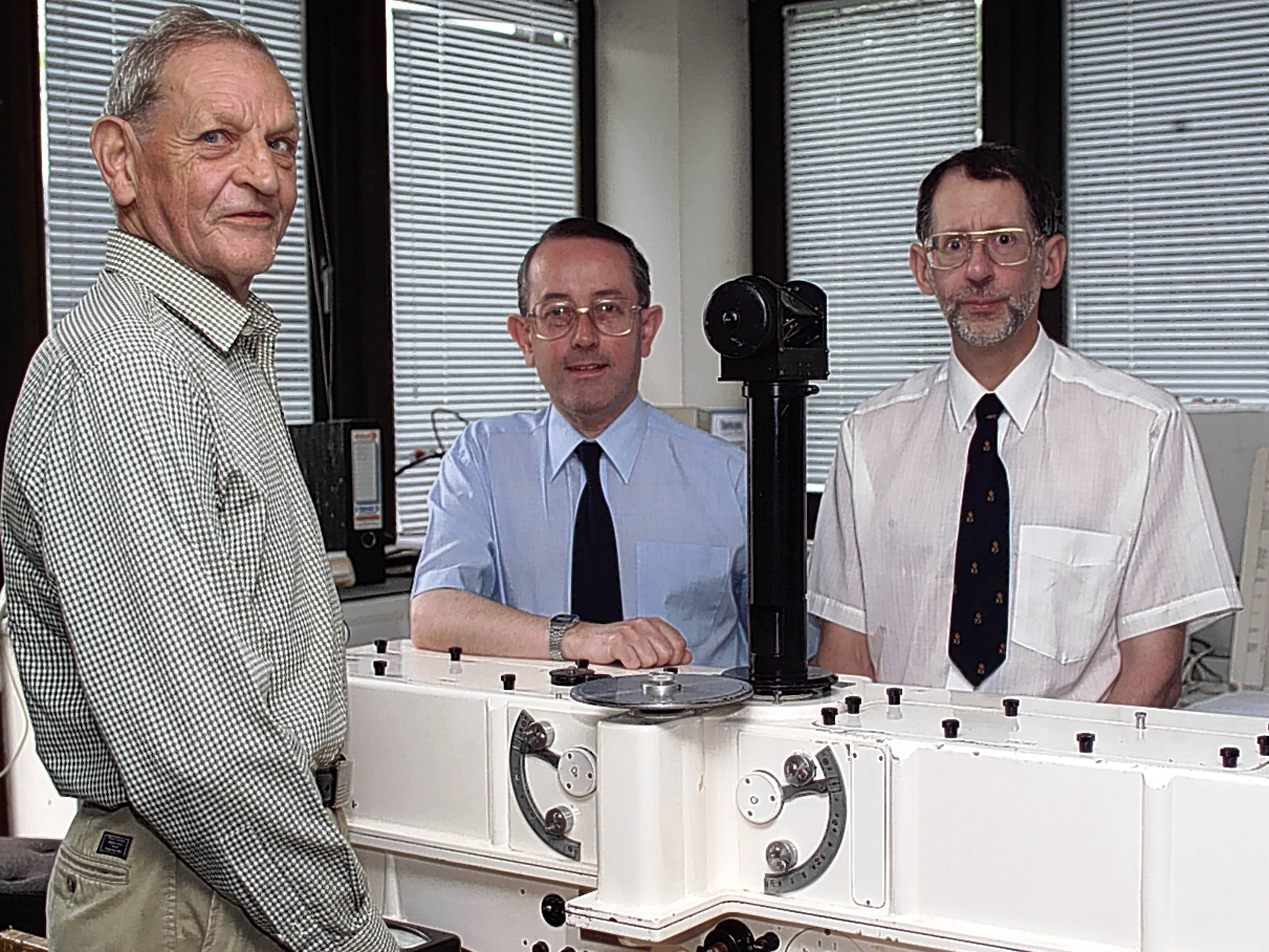
Joe Farman and colleagues (BAS)Here is the standard story (one I’ve told repeatedly myself): The publication in 1985 by scientists from the British Antarctic Survey working at Halley Station (right) of observations of extremely low ozone values in Oct 1983 (SH springtime) came as a huge shock to the scientific community. Given that NASA had been monitoring ozone by satellite using the NIMBUS instruments since the late 1970s, people were surprised that this had not been reported already. NASA scientists went back to the satellite data and found that anomalously low values had been rejected as bad data and were not included in the analyses. After reprocessing the data with this flag removed, the trends became clear and the confirmation of ground-based data was reported in the NY Times in Nov 1985 and published formally the next year (Stolarski et al., 1986).
This is mostly true, but not quite…

It is true that the Quality Control (QC) flag on the retrieval was set whenever the inferred ozone level dropped below 180 Dobson Units [1 DU is equivalent to a 0.01mm thick pure ozone layer at standard temperature and pressure]. Prior to 1983, there had never been an observation below 200 DU and so values lower than 180 DU were out of calibration range for the sensor. These calibrations rely on the actual atmospheric profiles being relatively close to pre-defined standards so that deviations in the observed radiances are small, and you can assume quasi-linearity. Deviations that are too large can come from multiple causes and thus are more uncertain to interpret. The absence of a very low ozone profile in the calibration was thus inherently limiting.

However, it wasn’t true that no-one at NASA had noticed.

Satellite anomalies

The processing of the Oct 1983 data was started in August 1984 by the Ozone Processing Team at Goddard Space Flight Center led by A. Fleig and including Donald Heath and P.K. Bhartia. In statements from Bhartia and Richard McPeters, it seems clear that the large increase in flagged data (points that were nominally below the QC level) in October 1983 was noticed and investigated. The first explanation for a large increase in anomalous data is almost always that there is something wrong with the sensor, and the first check on that is comparing the retrievals with whatever ground truth is available. The only publically available real-time Antarctic ozone data at the time was from South Pole (the BAS data was not publically accessible), and that showed polar ozone values of ~300 DU in Oct 1983, casting doubt on the anomalously low satellite retrievals. Nonetheless, retrieved values from the rest of the world outside of the polar vortex were normal so the puzzle remained. Additional data had been available from the Japanese Syowa station for 1982 which would have been helpful, but its publication (in December 1984) was not widely appreciated at the time.

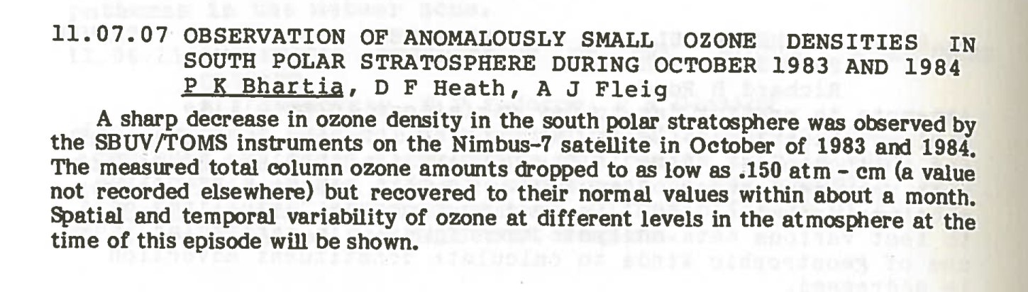
By December 1984, the OPT team was confident enough that the data was real that they submitted an abstract for a conference to be held in Prague in August 1985. [Update: the submitted abstract]

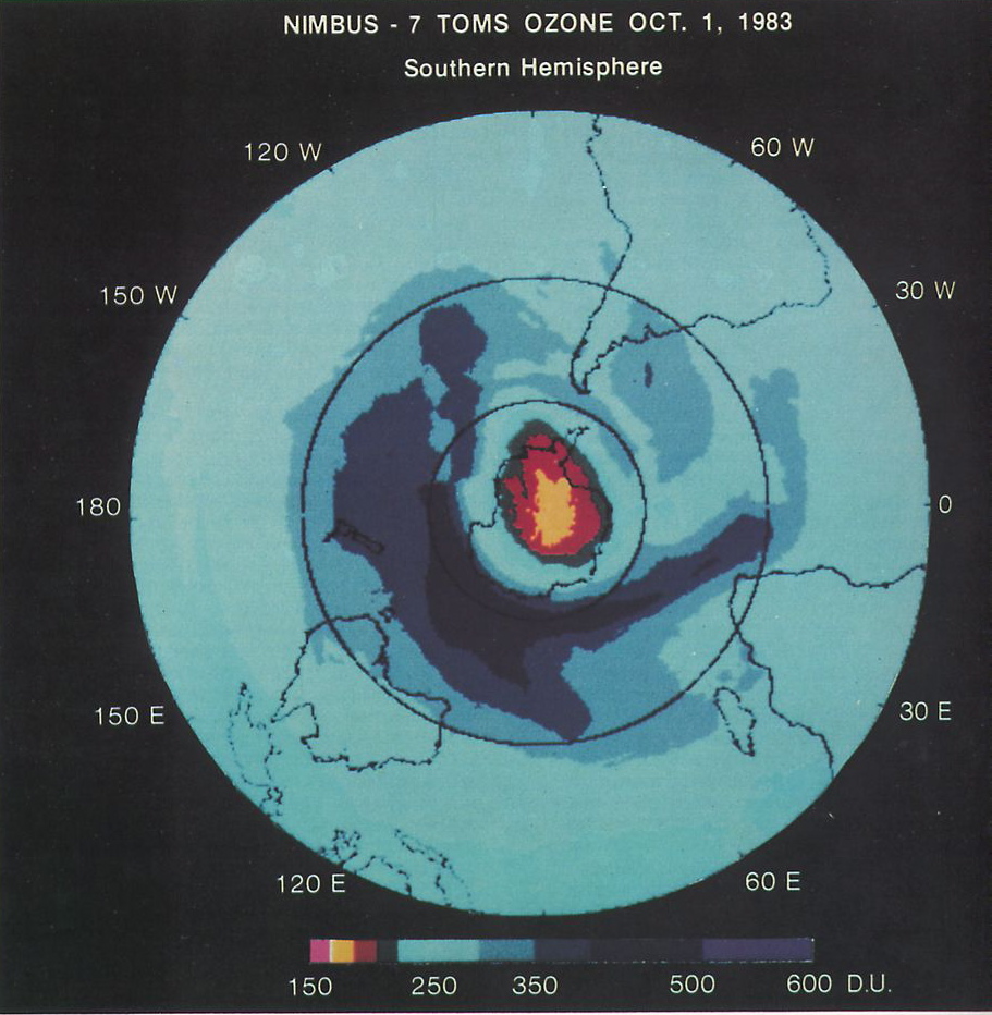
The data that they’d generated (in 1984) included the following map:

The Oct 1st 1983 ozone hole

However, before this had been publically presented, the Farman et al paper was published in Nature in May 1985.

Halley Station reports


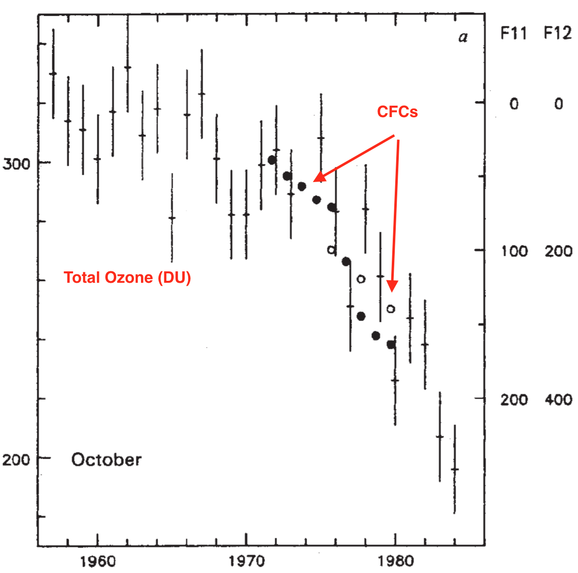
Farman et al 1985 figure showing decreases in ozone to Oct 1983

The clear decrease in October ozone values seen at Halley Station (in 1983, falling below 200 DU for the first time), and the correlation to the increasing CFC concentrations (plotted inversely in the figure above), was undoubtedly dramatic.

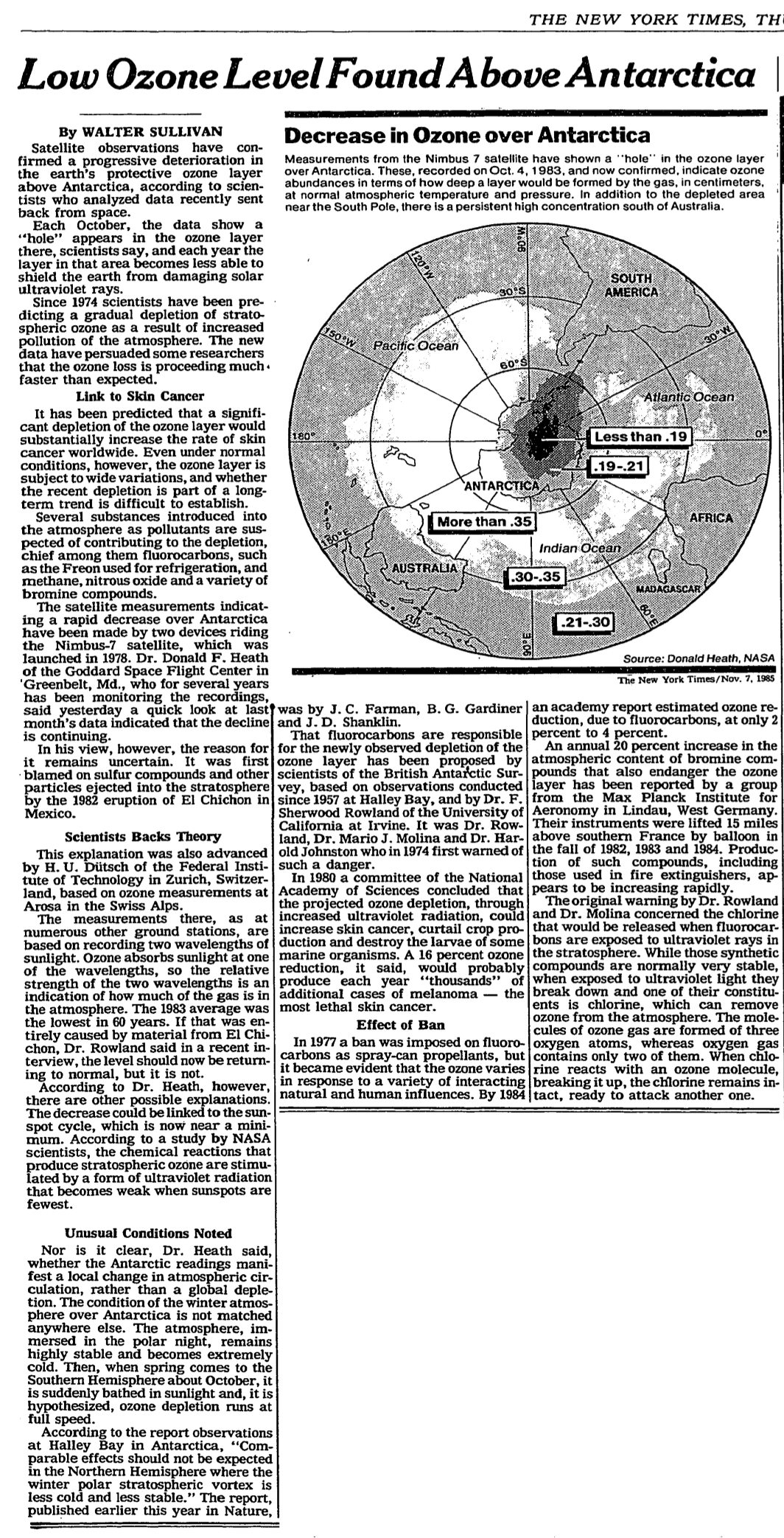
It wasn’t however until Nov 1985 after a workshop that the first media report (in the NY Times) showed the NASA results (publishing another Oct 1983 map for a slightly different day). That article was notably the first public use the term “hole” to describe the feature (though this term had been coined by Sherwood Rowland some months earlier).

The Nov 1985 NYT story

The article is also notable for reflecting the uncertainty that existed at the time about the cause of the anomaly. Farman et al had suggested strongly that increased chlorine loads in the stratosphere were causing the depletion, but two alternate theories were still credible – a dynamical theory based on anomalous upwelling of (relatively depleted) tropospheric air and a solar-cycle related cause.

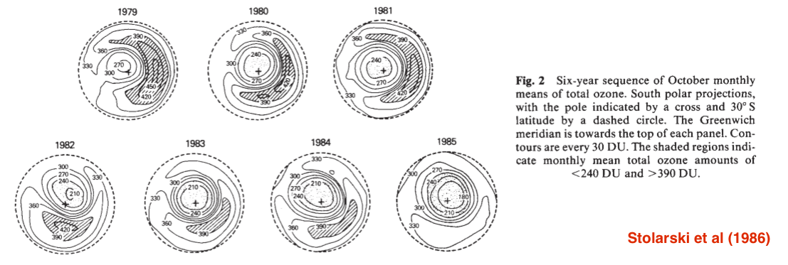
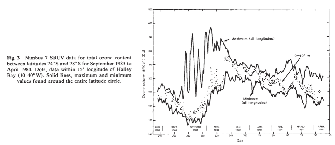
It wasn’t until August 1986 that the first ‘proper’ NASA publication on the NIMBUS trends was published (Stolarski et al., 1986). This data had been processed with additional low DU profiles as part of the calibration and showed clearly the long term trend down across the polar vortex:

Stolarski et al figure 2

and specifically collaborated the low (sub 200 DU) Oct 1983 values seen at Halley Station (dots):

Stolarski et al figure 3

Also in 1986, the South Pole group reported that the preliminary observations from Oct-Dec 1983 had been invalid – the wrong channels had been read on the instrument – a problem that certainly slowed the NASA reporting.

Further field work by NASA during the 1987 Airborne Antarctic Ozone Experiment (AAOE) ended up providing definitive evidence in favor of the chlorine hypothesis, with details of the heterogeneous chemistry on polar stratospheric clouds as hypothesized by Susan Solomon and colleagues in 1986.

Summary

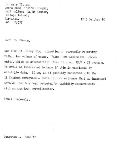
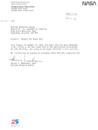
It seems to me that the extra details provided by McPeters and Bhartia (which have been available for many years, though perhaps have not been widely read), and the figure from 1984, change the nature of this story. It isn’t a simple tale of over-confidence in algorithms in the face of black swan events, but rather a tale of poor communications and siloed researchers that slowed down the ability of the wider community to see and interpret what was going on. In some sense this doesn’t matter – enough people were looking at ozone in the polar vortex that if Farman hadn’t reported this, NASA, the South Pole group or the Japanese would have seen it soon enough with similar impacts on the Montreal Protocol negotiations. But the barriers to rapid communication certainly slowed down the community response. For instance, it has been reported that the Farman group had attempted to contact people at NASA prior to publication, but their letters were not sent to the right folk and were never received. [Update: A copy of the letter sent in Oct 1983(!) and the response are attached below (via Susan Solomon)].

What if this were to happen today?

Today, satellite-retrieved ozone data (like much NASA remote sensing) is available in real time. Dramatic increases in ‘bad’ data would be obvious to many right away. With email and (perhaps) a more open scientific culture, people looking at instruments on the ground would have been able to telegraph concerns to the right people working on satellites and other ground stations to confirm their observations much earlier. It seems likely that the initial publications would have been joint efforts (or at least coordinated), even if attribution of the change would still have been contentious.

None of the above should be taken as trying to diminish the work of Farman and colleagues whose ‘old school’ brand of observational science certainly paid off, but a result is far more powerful when seen in multiple independent records.

Further reading/viewing

First-hand descriptions of the NASA effort are available as “MANIAC” (auto-biographical) talks from Paul Newman, P.K. Bhartia and Richard Stolarski at GSFC:

And some further reading here on the role of imagery and metaphor in the ozone “hole” discussion.

Update: letters from BAS to NASA and the response:

References

  1. J.C. Farman, B.G. Gardiner, and J.D. Shanklin, "Large losses of total ozone in Antarctica reveal seasonal ClO x /NO x interaction", Nature, vol. 315, pp. 207-210, 1985. http://dx.doi.org/10.1038/315207a0
  2. R.S. Stolarski, A.J. Krueger, M.R. Schoeberl, R.D. McPeters, P.A. Newman, and J.C. Alpert, "Nimbus 7 satellite measurements of the springtime Antarctic ozone  decrease", Nature, vol. 322, pp. 808-811, 1986. http://dx.doi.org/10.1038/322808a0
  3. P.K. Bhartia, "Role of Satellite Measurements in the Discovery of Stratospheric Ozone Depletion", Twenty Years of Ozone Decline, pp. 183-189, 2009. http://dx.doi.org/10.1007/978-90-481-2469-5_13
  4. W.D. Komhyr, R.D. Grass, and R.K. Leonard, "Total ozone decrease at South Pole, Antarctica, 1964-1985", Geophysical Research Letters, vol. 13, pp. 1248-1251, 1986. http://dx.doi.org/10.1029/GL013i012p01248
  5. S. Solomon, R.R. Garcia, F.S. Rowland, and D.J. Wuebbles, "On the depletion of Antarctic ozone", Nature, vol. 321, pp. 755-758, 1986. http://dx.doi.org/10.1038/321755a0
31 Jan 19:05

Minimalism, at best, is just an efficient path towards a patiently deferred Maximalism. pic.twitter.com/VFaH1wdNFi

by primalpoly
mkalus shared this story from primalpoly on Twitter.

Minimalism, at best, is just an efficient path towards a patiently deferred Maximalism. pic.twitter.com/VFaH1wdNFi


Posted by primalpoly on Tuesday, January 30th, 2018 5:16am


73 likes, 15 retweets
31 Jan 19:05

How to Blog More?

by Ton Zijlstra

I backed away from Facebook (not entirely though) a few months ago, and as a result my volume of new blog postings increased. I want to take it a step further. A step to revisit and tackle the question how to blog more. The main bottleneck is that I usually end up creating long posts, providing context which sometimes evolve into essay like things. That is not a bad thing, my blog is a space to think aloud, but it means long gaps between those type of postings. There are many smaller things I could blog about just, but I usually don’t, as I am worried it will end up as a long time-intensive posting. Setting targets of x blogpostings per week never worked in the past of course. The material then stays in my Evernote (yeah, still found no alternative).

So I am strivng for a more light-weight and unhurried way of creating blogposts of the non-essay variety. Short references with just a short observation, and/or a minimum of context. Over time it could be a more established routine, but for now I’m just looking at possible ingredients of such a light routine.

Ingredients that are involved I think:

  • Don’t write postings in WordPress, but as notes in Evernote. This keeps the ‘publish’ button out of view, which to me seems to signal I can only log out of WordPress if I finish the posting.
  • Write more about what I do, re-use material I use for my work
  • Allow multiple notes in different stages of construction to exist simultaneously. What gets finished gets posted.
  • Listen to feedback, use it.
  • Look through the stuff I bookmarked a few times a week, to either blog a few links on a topic, or jot down a few thoughts.
  • Use small chunks of time to write a few lines, 10 minutes on the train will do and will add up.
  • Link back to more of my existing postings if I want to add context and let the reader decide to go down the rabbithole of my musings.
  • Delete sidepaths, associations, contextual stuff while writing something (I deleted at least half a page of additional stuff while writing this posting)
  • Create and use ‘templates’ or repeating styles for certain types of postings, so as not to start from scratch. E.g. I’ve been posting some week notes recently and I use an empty template for it, which speeds up the writing, as it provides a clear path, where a blank screen allows me to go down all kinds of other paths.
  • Stop trying to be complete or exhaustive with linking to other sources, a few links suffice to weave the web as it is meant to be after all.
  • No need for pictures in every post, let alone the ‘perfect’ image to illustrate something.
  • Allow imperfection and unfinishedness. It doesn’t matter, if the purpose is to keep a log, or trigger interaction.
  • Writing is its own purpose. Produce first, improve later.
  • Stop.
31 Jan 18:58

Anagram Transit Map

by Stephen Rees

I have not written very much about our transit system recently. This map appeared on Reddit and may already be viral, for all I know

Anagram transit map

31 Jan 18:57

SotD: If I Had a Rocket Launcher

Bruce Cockburn is sufficiently Canadian that his name may ring no bells. But I think If I Had a Rocket Launcher made a few waves back in the day and may jog a memory. He’s an interesting guy, and this is a nice, lilting melodic song about wanting to kill people.

Bruce Cockburn

Cockburn (rhymes with “flow-burn”) is Christian, political, a dazzling (mostly acoustic) guitarist, and a decent singer and songwriter, with a pleasing throaty baritone. He’s been doing it for a long time; when I was the part-time University stage manager forty years ago, I put him on several times, and every show was a highlight.

When you’re listening to a Cockburn tune or watching a video, zone in for a moment and focus on the guitar playing; there is a lot happening, all the time, fast and graceful and with odd harmonies shooting off in all directions. One of the shows I managed Bruce was hurting pretty bad with the flu, but The Show Must Go On, and during the encore, he kind of lost it, got down on his knees at the front of the stage with an electric guitar and ripped out this howling electric firestorm; not exactly what the audience was expecting but I bet they all remember that evening; I sure do. While we’re on the subject, here’s Cockburn playing some acoustic blues on a National Steel guitar, oh my those chords.

Now, as for If I Had a Rocket Launcher, what can I say? There are a lot of places right now in the world where if I were one of the poor brown people getting killed, if I had one I would too. Except for I can’t sing or play guitar nearly as well.

This is part of the Song of the Day series (background).

Links

Amazon, Spotify, iTunes, live video: acoustic, electric.

31 Jan 18:57

we’re hiring – learning technologies specialist

by D'Arcy Norman

I’m looking to add another member to the Learning Technologies Group in the Taylor Institute for Teaching and learning. It’s part of a really amazing team, and will involve consulting with instructors, providing advanced technical and pedagogical support for the integration of learning technologies, and the development of resources and programs to support the work of the team.

It’s a limited-term position, and we’re looking to hire quickly. If you know someone who would be awesome for this, please share the posting with them. If you are someone who would be awesome for this, please apply!

31 Jan 18:56

Government changes to tackle deficit not enough: ICBC chair - The Globe and Mail

mkalus shared this story .

Significant changes the government announced this week to tackle a growing deficit of more than $1-billion at British Columbia's public auto-insurance provider will not be enough to stanch the bleeding, says Joy MacPhail, the chair of the Insurance Corporation of B.C.

In nine months, the anticipated deficit increased by a factor of 10, thanks to spiralling claims costs that show no signs of slowing. Ms. MacPhail's comments, in an interview with The Globe and Mail, suggest more reforms are coming, possibly including caps on injury payouts and higher premiums.

Ms. MacPhail said the rising costs of settling claims have been emerging since 2014. However, she said the deficit forecast in last year's budget has veered so dramatically off course because of trends related to the slow pace of settling litigation in B.C.'s unique-in-Canada, full-tort system, in which those who are injured can sue for all damages in court without a legislated cap on payments.

Story continues below advertisement

Attorney-General David Eby on Monday announced changes he expects to introduce in the spring, including a cap on minor injury claims and higher premiums for bad drivers. He said without these measures, the average B.C. driver would face a $400 rate hike next year to restore ICBC to balance.

The NDP promised in last year's election campaign to freeze ICBC rates, but they were increased by 6.4 per cent on basic insurance in November. This week, Mr. Eby refused to rule out additional rate hikes.

Ms. MacPhail said in the interview Mr. Eby's proposals will reduce the need for additional rate hikes, but she also did not rule them out.

"The proposed changes the government is talking about will go a long way to solving the problem, that's why it is so perplexing to me that these changes were not brought in earlier," she said on Tuesday. "However, it's not the resolution to all the problems."

Mr. Eby has slammed the Liberal government for not taking measures to curb ICBC's costs.

British Columbia drivers, who pay some of the highest auto-insurance premiums in the country, are not paying nearly enough to cover the cost of claims today. As a result, ICBC's deficit this year is projected to hit $1.3-billion, up from the $115-million that was forecast at the start of the fiscal year.

The shift is almost entirely due to higher claims costs – ICBC paid $3-billion to settle claims last year and, in the first nine months of this fiscal year, has paid $4.25-billion.

Story continues below advertisement

Story continues below advertisement

In 2013, the BC Liberal government introduced a "rate smoothing" policy that capped ICBC's annual increases. Since then, rates have climbed by about 5.5 per cent each year, but ICBC's costs have climbed faster. In 2017, ICBC would have needed an increase of 20 per cent to keep up with costs and the insurer is projected to require a 30-per-cent increase next year to balance its books.

Ms. MacPhail, who was appointed chair by the NDP government last July, said auto insurance claims have been rising across North America for at least three years and changes to rein in costs are overdue here.

"The insurance product has been changed virtually everywhere in North America because of these trends everyone is facing," she said.

When the NDP formed government last summer, Mr. Eby received in his transition package a detailed study from Ernst & Young warning of "significant structural problems" at ICBC. The consultants' report provided four options to reduce costs. The most dramatic would be moving to a comprehensive-care model – the so-called "no fault" option the NDP and the Liberals rejected.

But the Ernst & Young report also suggested that imposing a cap on minor injury claims – similar to the systems in Alberta and New Brunswick – could dramatically reduce costs. A cap of $7,000 to $9,000 on pain-and-suffering settlements for minor injuries, even after doubling the accident-benefits allowance and medical-payments limit – would save ICBC about $770-million.

The report noted that claims costs for minor injuries have been climbing since 2000 and in 2016 accounted for 60 per cent of total bodily injury claims paid by ICBC.

Story continues below advertisement

But Ms. MacPhail said two new trends emerged this year that contributed to the ballooning deficit. Many older claims that were initially assessed as minor are now heading to court as large-loss claims of more than $200,000. Over the past year, the cost of settling large-loss claims has increased by 80 per cent. As well, she said, the cases in which claimants are represented by lawyers are taking longer to settle.

The BC Liberals began 2016-2017 projecting an $11-million loss at ICBC, but the Crown corporation finished the fiscal year with a loss of more than $900-million, budget documents say.

Surpluses and deficits at ICBC
In millions of dollars; 2016-17 covers a 15-month period from Jan. 1, 2016, to March 31, 2017, as ICBC switched its fiscal year; 2017-18 is projected
Budgeted
Actual
THE GLOBE AND MAIL, SOURCE: b.C. finance ministry
31 Jan 18:56

Google Removed 700K Malicious Apps From the Play Store in 2017

by Rajesh Pandey
Let’s be honest: the Google Play Store is filled with sub-par apps. These apps pop up on the Play Store almost every other day masquerading as a popular app and end up being installed by hundreds of unsuspecting users and steal their data. If you thought Google does not care about this, then you are wrong.  Continue reading →
31 Jan 18:56

Twitter Favorites: [adamrg] @JoyAnnReid Kennedy has a heck of a speechwriter and I love his rejection of zero-sum politics. (OTOH, he needs a n… https://t.co/WBwKhCKbjZ

Adam Gessaman @adamrg
@JoyAnnReid Kennedy has a heck of a speechwriter and I love his rejection of zero-sum politics. (OTOH, he needs a n… twitter.com/i/web/status/9…
31 Jan 18:56

Fragile Tests (ultra-wonkish)

Fragile Tests (ultra-wonkish)

An importance part of Tinderbox development is a fairly big suite of tests that run all the time. Right now, there are 1,297 tests, and they’re run many times a day. Tests can’t check everything, but they do check lots of things, and let me know when something comes unstuck. I seldom let a test fail for more than a few minutes.

A fragile test is a test that sometimes passes but occasionally fails. That’s a very bad thing. Most of the fragile tests are fragile for well-understood reasons; for example, there are a couple of tests for time intervals that fail just before or just after we switch to daylight savings time. Those could be fixed, of course, but it’s just simpler to leave myself a note.

Tests that involve multiple cores at the same time can be fragile because you never know exactly how many cores will be available, or when one of them might be interrupted. Any sign of fragility is an asynchronous test is almost surely a serious failure.

Sometimes, though, a test is fragile without rhyme or reason. Here’s one saga.

Tinderbox’s has a bunch of kibitzers that help keep the map view neat. For example, the Top Alignment Kibbitzer keep an eye out for notes whose tops are nearly aligned; if you move a note so its top is almost but not quite aligned with its neighbor, the Top Alignment Kibbitzer will align it. There are a whole bunch of kibbitzers, and they're not hard to test: you put down a note, you move a second notes so the kibbitzer in question should wake up, and you see if the kibbitzer does in fact wake up and check that it does the right thing. You also test that other kibbitzers don't wake up at inappropriate moments and start shoving things around for no good reason.

We’ve got about 40 of these tests, and one of those tests has been fragile for months. It tests the Top Adornment Spacing Kibbitzer, an advisor that tries to move notes that are near the top of an adornment a consistent distance from the top edge. This would fail about once a week, without rhyme or reason. Only the top adornment spacing test failed; the test for the Left Adornment Spacing Kibbitzer never gave any trouble. What was wrong?

The problem, it turns out, was a bad C++ copy constructor for LayoutInfo objects — the objects that keep track of layout details in the map view. LayoutInfo has a ton of instance variables — it’s really just a bundle of data and nothing else. One of those details is the size of the text for drawing the title.

Now, the title of an adornment is drawn at the top of the adornment, and it's handy to have the Top Adornment Spacing Kibbitzer try to reserve the top area of the adornment for the title. That’s reasonable! But, somehow or other, the text size got dropped from the copy constructor, and the Kibbitzer happens to use the copy constructor when it’s trying to decide whether to wake the kibbitzer. The test expects the text size to be zero, and usually it actually was zero, but once in a while you'd get a garbage value and the kibbitzer would fail to fire because the adornment was drawing the title in billion point Helvetica. The baseline is somewhere beneath the basement, and the kibbitzer goes back to sleep because there's no way this can be anything it can fix.

Lessons:

  • Fragile tests are fragile for a reason.
  • C++ copy constructors are tricky critters.
31 Jan 18:56

The Curious Case of the Canadian Psychologist

mkalus shared this story from Burkean Journal.

One day I requested Jordan B. Peterson’s first book, Maps of Meaning, from the university library stacks. I already had an electronic copy and watched the whole lecture course, so the hassle was probably a waste of time, but I still had this strange impulse to encounter a real copy (in the cellulose, so to speak). I wanted to hold it in my hands and contemplate its significance for a few minutes, as if it was one of Shakespeare’s pens or a Gutenberg Bible.

It isn’t always easy to tell what exactly an object is, not least because what something is depends on what you want to do with it and what it becomes over time. Peterson likes to point out how the Ford Model T was a mode of transport but it was also a societal transformation, a powerful anti-authoritarian statement, and the biggest change in human-horse relations since some Indo-European steppe-dwellers looked at the horse’s ancient ancestors and went “hmm…”.

In this sense, it’s not obvious what Maps of Meaning actually is. It is a book, as is a tray, a table support, a paperweight, etc., but it is something else as well. The heavy paperback in my hands felt like a minor relic, with a deeper significance beyond the familiar passages and diagrams I recognised from before. I suspect it struck me like that because it had come to represent what happens when someone decides to do something properly.

About 30 years ago, the not-yet-Professor Peterson decided he’d do his best to work out where belief systems and cultures come from, what their biological and psychological significance might be, and why people would fight over them. The explanations on offer for inter-group conflict were deeply unsatisfying, especially given that there were, and still are, thousands of ICBMs just waiting for a signal to deliver the hydrogen bombs which could effectively reset civilisation to 400 AD.

After years of intense effort the full work was published in 1999. It begins:

“Something we cannot see protects us from something we do not understand. The thing we cannot see is culture, in its intrapsychic or internal manifestation. The thing we do not understand is the chaos that gave rise to culture.”

In PDF form it amounts to nearly 400 A4 pages in small print. It’s a work of stunning depth, weaving comparative mythology, neuropsychology, psychoanalysis, history, literary analysis and philosophy into an argument that the patterns that come up in mythology from different places and times are dramatic, imagistic representations of what it is like to be human, regardless of where or when.

The oldest stories of our species are not a simply incompetent science, rather they deal with the question of how to approach the tragic realities of the human experience without making everything a trillion times worse. The most successful societies are built upon these stories, whether we realise it or not.

Maps of Meaning was a book by an anonymous Harvard lecturer, which impressed those who read it but made no great impact. The book remained relatively unknown for 17 years, the kind of book university libraries keep in an off-campus warehouse, to be retrieved in the unlikely event that someone asks for it.

Peterson went on and worked as a clinical psychologist and conducted research into the psychology of personality, becoming a tenured professor at the University of Toronto. There he taught two undergraduate courses, one about personality and one based on Maps of Meaning. Then, on the twenty-seventh day of September 2016, almost by accident, a sleeping giant woke up.

Peterson must often wonder what his life would be like had he just gone back to sleep that night. He was concerned about the policies surrounding a new hate-speech law in Canada, ostensibly brought in to protect trans people from harassment. He didn’t think it would do anything of the sort. He argued that the law was the work of people who either didn’t understand or actually hated the society in which they lived, and the Ontario Human Rights Commission was an institution fundamentally opposed to the maintenance of a free state.

He started talking at his computer. He put his thoughts on his YouTube channel, where he had already been uploading his university lectures for quite some time.

The response was overwhelming, largely because he was addressing questions that went much deeper than the proposed law. After his thoughts on Bill C-16 had made their way around the planet several times, people got curious about his lectures. His University of Toronto course Maps of Meaning: The Architecture of Belief gained something of an international cult following. His appearances on the Joe Rogan podcast quickly attained legendary status.

Later on, he publicly wondered why so many people care what some random psychology professor thinks about anything. More than likely it’s his ability to articulate things that people half-know, things they’ve picked up bit by bit from books, teachers, TV, parents, friends, but never explicitly grasped.

Peterson became even more famous after his Channel 4 interview with Cathy Newman went viral online a couple of days ago. If you have not seen it, I would advise you to do so as soon as you can. It is nothing short of spectacular.

Thirty years ago, Jordan Peterson decided to take on the problem of how humans work with single-minded determination. He has done so ever since. Cathy Newman charged headlong into the person sitting opposite her and, apparently for the first time in her professional life, met solid steel.

Peterson, backed by decades’ worth of research and experience, and now with dozens of hostile interviews under his belt, is hard to faze. Where the average guest is routinely bowled over, flattened or burnt to a crisp, Peterson stood fast, stated facts with precision and patience, and let Newman’s credibility shatter against him. You have to wonder if she’ll ever utter the phrase “so you’re saying” again without blushing.

The interview showed in painful detail the vast chasm between the competent and the incompetent, the genuine and the fake. For instance, Peterson had to state repeatedly that there are many reasons for any average difference you observe between men and women. Newman did not want to know.

This whole episode could turn out to be a watershed moment in the history of Britain’s relationship with the news. Why watch Cathy Newman act the clown in an expensive studio when you can get Sam Harris vs Jordan Peterson on your phone? If you have something to say to the public, why let journalists filter it when you can talk to a camera and put it on YouTube?

The most remarkable thing about all this, however, is not the interview fallout but the fact that this was just something Jordan Peterson did one day between promoting his new book (12 Rules for Life: An Antidote to Chaos), giving lectures on identity, culture, the modern university, and drowning in fan mail. He has received tens of thousands of messages of thanks, from people he has helped to understand themselves and the world more fully and, from there, approach life with greater confidence and strength.

There are thousands of people giving him a few dollars a month on Patreon, as if to say “whatever you’re up to, I want to help”. Around early 2017, hyperbolic comments started appearing on Peterson’s YouTube videos along the lines of “this man is single-handedly going to save civilisation”. A bit over enthusiastic perhaps, but it’s no accident that Peterson has suddenly become one of the world’s most popular public thinkers.

Nobody will agree with him on absolutely everything. This is no great surprise. Be that as it may, over the last thirty years he has reached a point where just about everything he says is at least worth considering. As Douglas Murray of The Spectator so brilliantly put it:

“Whatever else anybody might think of him, Professor Peterson is a man of remarkable learning and experience, and does not appear to have arrived at any of his views by the now common means of ‘I reckon’.”

There’s no particular magic going on, no arcane, esoteric secrets of the Universe.

This is someone who left his ego at the door and put in the effort.

31 Jan 18:56

Using Art to Resist

by Leanne

“A reminder that all acts of making are by their very definition acts of resistance, and they are political. Even if you don’t think so.” — Karie Westerman

Creative Resistance Resources

The post Using Art to Resist appeared first on Leanne Prain.

31 Jan 18:56

Letterboxd 2.0 Brings iPad Version, Support for iOS Automation Apps

by Federico Viticci

I've always been fascinated by Letterboxd, the popular service to catalog and rate movies you've watched, as well as share your appreciation for the art of film with other users in a social network-type environment. My problem, however, is that dedicating serious time to watching quality movies (instead of whatever is on TV) has mostly been an aspirational effort; I never truly attempted to make a list of films I want to watch and set aside a good chunk of time every week to enjoy them.

Among various "quality of life" improvements (which I briefly mentioned in this episode of Analog(ue) with Myke Hurley), earlier this year I decided to create an Airtable database with a list of movies I want to see, trying to tick one off at least every week. Since I started testing a beta of Letterboxd 2.0 for iOS last week though, I'm wondering if maybe now is the time for me to consider using a dedicated service to collect, rate, and discover movies.

Launching today on the App Store, the most notable change in Letterboxd 2.0 is the addition of a native iPad app. Based on the same principles and structure of the iPhone version, navigation in Letterboxd for iPad happens primarily via five tabs at the bottom of the screen; unlike the iPhone app, these tabs are labeled and easier to identify at a glance. Thanks to the larger canvas, every UI element in the app is bigger and more comfortable to interact with – which is unsurprising – but the Letterboxd iOS team also took the time to rethink how other controls should be laid out on the iPad's screen.

In the Profile page, for instance, links to open sections for films you've rated, your likes, and watchlist have been relocated to a sidebar; when you open a movie's individual listing, the iPad app shows larger cover art at the top, followed by a bigger movie poster than the iPhone version, with ratings and other actions grouped together on the left, leaving room for reviews and other useful information in the main view on the right.

One day, I'll be like Matthew. One day.

One day, I'll be like Matthew. One day.

As Letterboxd founder Matthew Buchanan wrote in a blog post:

In the 22 months since the launch of our iPhone app, we’ve consistently received the same feedback: please make this work on my iPad! We’re pleased to announce that today we’ve shipped Letterboxd 2.0 for iOS, a universal app with native iPad support that brings the richness of our community to the larger form factor.

This was no small task. Some screens from the phone app just made sense larger (browsing grids of popular films) or presented in a popover (sorting and filtering options), while others (like member profiles) required more of a rethink. The results are glorious—our Patron profile pages have never looked so good! With three iPad resolutions and two orientations to consider, we’ve concentrated our efforts on the most commonly used views in the app, and we’ll continue to refine ancillary screens in future releases.

While browsing the Letterboxd iPad app in full-screen feels good, I'm particularly happy to see the company has embraced modern iPad multitasking too. Letterboxd fully supports Slide Over, Split View, and basic drag and drop for text fields (such as the search one); I'm going to be using Letterboxd next to apps like Safari or iTunes when I'm browsing around looking for movies to add to my watchlist, and I'm glad I won't have to switch between multiple spaces to do so.

In addition to making the iOS app Universal, version 2.0 of Letterboxd has also adopted the x-callback-url protocol to support inter-app automation through URL schemes.

As detailed in the documentation available here, Letterboxd 2.0 supports three different actions: search (to perform a search on the service and filter by results by film, member, list, and other parameters), addToWatchlist (fairly self-explanatory), and log. With the latter, you can add a new entry to the app (either a review or a personal diary entry), pre-filling key details such as a movie's title, date, and review from other apps, sending a request directly to Letterboxd's compose window, which will populate each field based on what has been passed by the URL scheme.

A search for a movie that started in Drafts. After confirming a result, it will be added to your watchlist in Letterboxd.

A search for a movie that started in Drafts. After confirming a result, it will be added to your watchlist in Letterboxd.

For years, I've seen iOS users create workflows to log watched movies or archive reviews in note-taking apps that supported a rich URL scheme or web APIs, such as Day One (a popular choice for this task given its diary nature) or the aforementioned Airtable. With a URL scheme, Letterboxd can now be integrated with Drafts and Workflow on iOS, which opens up interesting possibilities as the log action supports HTML content in the review field. This means you could write a review in a Markdown environment like Bear and Ulysses, then use a workflow to convert it to HTML and send everything to Letterboxd, retaining formatting and content for other fields as well. The Letterboxd team has created some sample actions and workflows you can find here.

As I said above, I'm not a movie expert, but I want to discover and watch more movies in 2018. Letterboxd – which also offers two types of premium subscription on its website – is a thriving community with hundreds of thematic collections and excellent recommendations by movie aficionados who are passionate about this industry and art form. With an iPad version, Letterboxd now provides a rich and modern iOS experience that, hopefully, will help me grow my movie knowledge over the next few months.

Letterboxd 2.0 is available on the App Store.


Support MacStories Directly

Club MacStories offers exclusive access to extra MacStories content, delivered every week; it's also a way to support us directly.

Club MacStories will help you discover the best apps for your devices and get the most out of your iPhone, iPad, and Mac. Plus, it's made in Italy.

Join Now
31 Jan 18:55

The Daily Edit – Golfer’s Journal: Tom Shaw

by Heidi Volpe


The Golfer’s Journal

Art Director: Jim Newitt
Photo Editor: Grant Ellis
Photographer: Tom Shaw

Heidi: What was different about this course that was a challenge for you to photograph?
Tom: The biggest challenge with this course was the Wind and the light. The course, and this particular hole, is quite exposed so you get your share of wind and rain. I love this kind of wild weather though – it feels good to spend a day walking in it.

Did you purposely choose to shoot more end of day?
Yes I did. I tend to plan these shoot around and evening and a morning – this gives me two chances at getting the best light. I was lucky as an old school friend lived within yards of the course so I stayed with him and had a very short walk to the course.

What type of direction did you get from the magazine?
They explained about the detail of the course and pretty much gave me free reign to shoot it in all its elements – from wide DPS views to the fine detail such as the cut grass. Because Summer in Scotland the late evening light lasts so long (almost until 10pm), I had plenty of time to really walk the hole and see all the details.

When you are approaching such a legendary course which is heavily photographed, is your process any different?
I don’t really do much research – I’m not the biggest golf fan, but I am a fan of the landscape in which it sits, so I won’t look at other pictures, as I need to see how and where the light is, and I want to see it with fresh eyes.

I enjoyed your sporting landscape gallery, would you say these image fall into that category or does there need to be some type of architectural element to anchor the image.
These Images do fall into the sporting landscape category, but I feel that they do need people in the image to give it scale and context. Some of the images do have that and I think that it is important. But this image is shot with a specific brief to be about the hole, not the people. In some of my other work with surfing and cycling – the people play a very small but important part in the image as it is all about scale and context.

This kind of work – the sporting landscapes – is pretty new to me as I have spent a lot of my career shooting athletes and sporting events, but this is going back to shooting what I love, landscapes. I grew up in Scotland and my love of photography started by being out in the hills and mountains, and seeing the light dance across the hills. I’m looking to combine these two passions of sport and landscape so it seemed a natural progression to shoot this way.

------------------------

Visit our sponsor Photo Folio, providing websites to professional photographers for over 9 years. Featuring the only customizable template in the world.

------------------------

31 Jan 18:55

Soviet iPod :: Sonos CR100 ab April ohne Funktion

by Volker Weber

SonosCR100eol

Sonos schreibt:

Heute verabschieden wir uns von unserem ersten Controller, dem CR100. Wegen seiner veralteten Technologie wird sich der CR100 ab April 2018 nicht mehr mit deinem Sonos System verbinden.

Es folgt eine längere Litanei, warum man diese Geräte nicht mehr betreiben soll und Sonos sie nicht mehr unterstützen will. Dabei lässt sich Sonos nicht lumpen: Jeder Kunde kann für einen CR100 einen Gutschein über 125 € abrufen, der beim nächsten Kauf (bis 1. Juli 2018) eingelöst werden kann. Da kostet ein Play:1 dann nur noch rund 50 Euro. Ein Gutschein pro Haushalt.

Der CR100 hat schon seit vielen Jahren kein Software-Update mehr erhalten. Ich musste vor zwei Jahren einen ziemlichen Aufstand machen, um meine Controller noch einmal mit der aktuellen Installation zu verbinden. Ich hoffe, es gibt noch einen technischen Grund, den Sonos nicht erklärt. Spanning Tree müsste dringend aktualisiert werden und das UPnP wird auch bald überfällig.

31 Jan 18:55

Alexa, sleep well

by Volker Weber

0b428241e14530091dceb4fb39bd6586

After exactly one year I have now retired my Echo Dot. Too many false positives, not useful enough. I am still talking to Siri on my Apple Watch and iPhone, but Alexa moved out.

31 Jan 18:55

Higher Education's Top 10 Strategic Technologies and Trends for 2018

files/images/Gartner-2018.PNG

EDUCAUSE, Feb 03, 2018


Icon

Educause has a bunch of 'top 10 lists for 2018' and it's a bit hard to keep track. But I think this is the over-arching one. In any event, it's the most recent. The top 'strategic technology' for 2018 is "Uses of APIs," which would accord with my own thinking. The remainder of the list is taken up with old standards like active learning, mobile devices, and learning analytics. The 2018 'most influential trend' is "complexity of security threats." There's a separate list of Top IT trends for 2018 (which is actually three separate lists). One of these is the ELI key issues for 2018 which is headed by 'academic transformation'. Image: Gartner Top 10 Strategic Technologies for 2018.

Web: [Direct Link] [This Post]
31 Jan 18:55

EdX Quietly Developing ‘MicroBachelors’ Program

files/images/Anant_Agarwal_of_edX-1516943876.png

Jeffrey R. Young, EdSurge, Feb 03, 2018


Icon

According to this article, EdX "is quietly developing a 'MicroBachelors' degree that is designed to break the undergraduate credential into Lego-like components." The work is funded by a $700,000 Lumina Foundation grant. “Education in five to ten years will become modular, will become omnichannel, and will become lifelong,” said EdX CEO Anant Agarwal. This targets higher education institutions at their weakest point: certification. The article also notes in passing Arizon State University's 'open-scale courseware,' "the university’s attempt to rebrand a concept that was once known as MOOCs, or massive open online courses."

Web: [Direct Link] [This Post]
31 Jan 18:55

Gutes Werkzeug :: Wera Kraftform

by Volker Weber

IMG 20180131 143553

Ursprünglich mal als Werbegeschenk bekommen, habe ich mittlerweile eine große Sammlung von Wera Schraubendrehern. Mit diesem Wera Kraftform Kompakt 60 etwa kann ich eigentlich alle Schrauben drehen. Abgebildet ist das viel kleinere Wera Kraftform Kompakt 10, bei dem die Bits kürzer sind und der Griff kompakter. Die Verbindung zwischen beiden ist formschlüssig. Man zieht an dem grünen Ring, um sie wieder zu lösen. Für sehr kleine Schrauben, tief im inneren von Gehäusen nutze ich den Wera Kraftform Micro Elektroniker Schraubendrehersatz.

Ich mag diese Sets, weil dann immer alle Größen zusammenbleiben. Wenn man sehr viel schraubt, dann nimmt man keine Bits sondern einzelne Schraubendreher, bei denen man den Griff nicht wechseln muss.

31 Jan 18:55

Regional Funding for Transit: Where’s the Enthusiasm?

by pricetags

Gord Price:

Peter Ladner, on behalf of the Better Transit and Transportation Coalition, makes a plea for a a regional agreement on transportation funding – now! – in a Sun and Province op-ed.

 Time to make a decision on transit plan

For decades we’ve negotiated and pleaded for federal and provincial money. Now it’s there, waiting for us to make a simple decision on how to close a very small funding gap for the next phase — about $80 million a year.

Even with our limited capacity, the number of workers taking transit to work in Metro Vancouver jumped by 43 per cent over the last decade — the biggest increase in Canada. And our per capita annual transit trips are the fourth highest of any city on the continent, behind only New York, Montreal and Toronto.

But if government gridlock doesn’t end very soon — within weeks — our opportunity to reduce congestion by 20 per cent while improving air quality could pass us by.

Momentum matters. We’ve still got agreement on the 10-year plan. Amazingly, this plan has been approved by the federal government, the provincial government, an overwhelming majority of the local mayors, the TransLink board and staff, tens of thousands of stakeholders, and the biggest non-partisan coalition in B.C.’s history.

Ironically, failing to come to a regional agreement on funding because of angst about the Broadway subway line could melt down the 10-year plan, opening the door for the federal government to pick the Broadway line as their favourite — and endangering indefinitely all the other vitally needed improvements in the region.

We need leadership here — at all levels:

  • from the region’s mayors — in danger of coming unglued by calls to go slow, rethink priorities and double-guess the city of Vancouver’s contribution to a regional subway;
  • from the Premier, who ultimately has control …

The time is now.


I’d note that the regional mayors have already come to an agreement on priorities – as they have repeatedly in the past.  (It’s a myth that the regional mayors continually squabble, unable to come to a consensus.)  Even the presence of Derek Corrigan as chair of the Mayor’s Council has not changed that.

For the record, it’s what I predicted:

… former Vancouver councillor Gordon Price believes it’s unlikely that the Burnaby mayor taking over as council chair will seriously jeopardize the Broadway subway or Surrey light-rail.

“That would really surprise me,” said Price, who believes both projects as well as the Pattullo Bridge replacement are critical priorities for the sake of the region. “That would just raise a lot of antagonism, needlessly. … I don’t think Corrigan is going to go there, I just can’t see that kind of fight.”

“Here is Corrigan’s chance to establish his big-picture legacy, beyond Burnaby,” Price said. “And I think he will go with it, I think he’ll take it.”


Greater concern are the cautionary messages coming from the Premier, like these quotes from a Vaughan Palmer column.  Other than the reference to mobility pricing, see if you can distinguish his comments from any previous Premier:

“The mayors’ council has undertaken a review of mobility pricing as their attempt to meet their costs of increasing transit and transportation infrastructure in the Lower Mainland,” he continued. “I know that they want to aggressively (meet) their needs outside of property taxation.”

Horgan said he had not yet had time to digest the findings in the interim report, never mind guess at what the final might say. “It’s a mayor council initiative so I’ll leave it up to them to defend what the outcomes are ultimately.”

At the same time he warned local government leaders not to assume the provincial government would rubberstamp just any recommendations on mobility pricing.

“No,” he emphasized when pressed about supporting levies that would amount to tolls in all but name. “I want to see what they come back with and how it fits into our affordability plan for British Columbians … I don’t want to see inconsistent policies come forward from other jurisdictions.”


Something happens when politicians, even with municipal background, cross the water and occupy the wood-paneled offices of the provincial Legislature.  They position themselves to avoid taking direct responsibility for Metro Vancouver transit issues, even as they make it clear they will have the last word.

In particular, when it comes to approval of a regional funding mechanism, a breakdown typically occurs if it looks like the provincial government will have to spend any of their political capital for an unpopular choice (which they all ultimately are).

Listen to Horgan’s phrases: It’s the mayors who will have to defend their position, nothing will be rubber-stamped, recommendations will be rejected if they’re not consistent with the provincial government’s agenda.  And as always, an oblique reference to property taxes – something requiring no provincial approval but poison for local politicians.

It’s all so negative.  No vision, no enthusiasm for the development of rapid-transit in the Metro by the NDP.  Nothing like, for instance, Horgan’s enthusiasm (and quick announcement) on a widened highway that will serve his constituency.


It’s unthinkable that the Province would delay a decision on Metro transit that would mean the loss of federal dollars, nor proceed with the priorities that the BC Liberals failed to address.  But gee, it would be nice to see that big smile when the Premier is talking about transit in Metro Vancouver.

31 Jan 18:54

Big Detail

by russell davies

This is a fascinating conversation about public transport design. This bit stuck out because I suspect there's an interesting parallel here with marketing/audience data. The extra detail just doesn't add that much value:

"This has interesting connections to another marketing craze, which is the notion of big data, the notion that we now have so much more data about individual people’s transport needs that this ought to completely transform how we plan public transport. And the message is always fundamentally, Grandpa, what did you do before we came along? How did you manage in the Dark Ages before we came along and showed you this? And the answer is, we did fine because most big data is big detail and the Tube isn’t going to change anything it does; the New York City Subway is not going to change anything it does, just because we now have data, knowing that at 07:34 p.m., six people from over here go over there to that park when the weather’s nice. That’s the sort of data we’re getting and it’s not relevant to the design of high-capacity transit systems. It is in the nature of highly efficient public transport that you do not vary your routing according to that sort of detail. And I want to say, a lot of fantastic things have come out of big data but it’s also been, kind of, comically oversold as information at a level of detail that isn’t actually relevant to how plan high-efficiency, high-[unclear] public transport."

31 Jan 18:54

Twitter Favorites: [Lesley_NOPE] Compassion fatigue. Post concussion. Intermittent anxiety and depression. There’s no one look. Sometimes only masks… https://t.co/jZzCZ3JEhl

Sleeve Fierce @Lesley_NOPE
Compassion fatigue. Post concussion. Intermittent anxiety and depression. There’s no one look. Sometimes only masks… twitter.com/i/web/status/9…
31 Jan 18:54

Classes taught online on snow days

files/images/Bulluck_School.jpg

Amelia Harper, Rocky Mount Telegram, Feb 03, 2018


Icon

This could be any newspaper anywhere really. It could be snow, heat, torrential rain, whatever. "While most students in Edgecombe County were missing school during the recent January snow days, students at G.W. Bulluck Elementary School had the option to continue." You've seen the headline before, and eventually, you'll stop seeing the headline as it becomes common practice. Then, as it becomes common practice, administrators will be much less hesitant to declare snow days. At a certain point, shorter work weeks (made possible due to automation and a long-overdue sharing of productivity gains with workers) will converge with e-learning days. The future takes time to arrive, but one day, we'll wake up and discover that, like camera-phones, suddently it's here. Image: GW Bulluck Elementary

Web: [Direct Link] [This Post]
31 Jan 18:53

Northeast False Creek and the Viaducts: Send an email

by pricetags

A request from Michael Alexander:

If you support removal of the viaducts and approval of the North East False Creek plan, send emails today. Council is holding public hearings today, with many delegations opposed.  We need to sway votes to yes.

Send a comment:

  1. Go to vancouver.ca
  2. Click “Tell the Mayor”
  3. Follow the link to the web form.
  4. Please support the NEFC plan.

A plan summary is here. The full report is here.

Of course, people can comment about any aspect, but the key is support for removal of the viaducts and approval of the plan.

Even if this passes, there is still much to do. This starts the viaduct’s removal process, and is the framework for future work to come on detailed design of the park and other elements of the plan.


31 Jan 18:53

"Science fiction isn’t just thinking about the world out there. It’s also thinking about how that..."

“Science fiction isn’t just thinking about the world out there. It’s also thinking about how...
31 Jan 18:51

I’m a BlackBerry apologist and I like the BlackBerry Motion

by Sameer Chhabra

In the age of the iPhone X and the thoroughly modern premium-tier Android flagship smartphone, I still really like BlackBerry devices.

Although, simply due to the fact that the Waterloo, Ontario-based BlackBerry doesn’t actually manufacture smartphone hardware anymore — that’s handled by the Chinese TCL, which has a long-term licensing partnership in place with BlackBerry — it’s not entirely fair to say that phones like DTEK50, DTEK60, or the KEYone are formal BlackBerry devices.

Still, I liked those devices and I really like the TCL-made Motion.

In fact, I like the Motion so much that when I finally got my hands on one, I felt a sensation akin to what one would describe as bliss.

“Finally,” I said out loud. “A full touchscreen BlackBerry device that was more than just useable — it was actually a joy to use.”

BB Motion Convenience Key

I couldn’t resist its serviceable 5.5-inch IPS display. I was drawn to its machined, metal and glass industrial design. I couldn’t help but thumb its truly conveniently placed convenience key. That gorgeous rubber back meant that the phone never felt slippery in my hands — unlike many, many Android smartphones made of metal and glass that always felt like they were mere moments away from flying out of reach of my fingers. That it was waterproof and dustproof were welcome additions that made me gush with joy.

Granted, the phone isn’t without its faults. Again, its 1080 x 1920 pixel IPS LCD screen is only serviceable and is certainly nothing revolutionary. Much like the screen, the device’s single-lens camera is subpar in comparison to the phone’s peers. The smartphone’s volume rocker and power button are firm, yet undeniably shallow. Its Snapdragon 625 is a mid-tier processor that isn’t capable of truly constant high-performance output. Of course, the bezels are also gigantic and difficult to forgive.

“Finally…a full touchscreen BlackBerry device that was more than just useable — it was actually a joy to use.”

And that’s all to say nothing of the fact that the BlackBerry Motion’s mushy, poorly built home button — that also serves as the device’s fingerprint sensor — is inexplicably built on a hinge. This means that every click of the home button results in the bottom part of the button dipping lower than the top part, which is not only uncomfortable, it’s just plain unnatural.

“Home buttons are supposed to go straight down — not down on an angle,” I cried, also out loud.

BB Motion keyboard

I was disappointed, but for a company that at one point had been unable to build a meaningful competitor to the iPhone or to premium-tier flagship Android devices, a device like the decidedly mid-range Motion in its roster was impressive.

Granted, it once again must be mentioned that the organization responsible for designing and developing the Motion isn’t the same Waterloo company that released devices like the Bold and the Curve.

Costly sins that are tough to forgive

In spite of its virtues, even I find it difficult to forgive the BlackBerry Motion for the sin of its exorbitant $605 CAD price. The issue isn’t that there are better phones that are priced within a competitive range to the Motion. Phones like the $659 CAD OnePlus 5T and the now $460 CAD Essential Phone really should be disqualified from most price-for-quality conversations because they serve as examples of exceptions to a rule.

Instead, the problem is that when compared to other, similar mid-range phones — devices like the LG Q6 and the HTC U11 Life which both cost $449 CAD — the BlackBerry Motion’s price tag is undeniably steep.

BB Motion camera

The decision to price BlackBerry devices at often prohibitively expensive costs in order to bolster the company’s reputation among corporate and enterprise users was often colloquially referred to as the ‘BlackBerry tax.’ BlackBerry’s hubris was easier to excuse back when it wasn’t licensing its brand name to other hardware manufacturers.

“Home buttons are supposed to go straight down — not down on an angle.”

Admittedly, the BlackBerry tax is also easier to ignore when it applies to flagship devices, and not mid-range products.

The Motion is proof of that fact. The phone’s metal, glass and rubber aesthetic allows the Motion to compete favourably with other mid-range devices from Asus, Huawei, Alcatel or Motorola, but there’s no way that the device can compete in the same space as phones like the Samsung Galaxy S7 or the iPhone 6S or the iPhone 7 — devices that are admittedly costlier than the Motion and older than the current generation of flagships, but that are nonetheless the devices that most people will settle on for brand reasons, performance reasons or both.

BB Motion fingerprint sensor

The truth is, I’m not really sure if the BlackBerry brand will be able to weather a new smartphone storm. For BlackBerry apologists like me, though, there’s no small amount of joy to be garnered from knowing that someone — RIM, BlackBerry, TCL or otherwise — is still trying to pump out worthwhile BlackBerry smartphones.

Today marks the five-year anniversary of BlackBerry 10 — the touchscreen operating system that was supposed to allow the struggling Waterloo tech giant to compete in a space dominated by iOS and Android.

BlackBerry 10 never truly panned out, but it’s nice knowing that BlackBerry — in some form or iteration — has finally succeeded at putting out a meaningful smartphone.

The post I’m a BlackBerry apologist and I like the BlackBerry Motion appeared first on MobileSyrup.

31 Jan 18:50

Nintendo has sold more than 14 million Switch consoles since launch

by Dean Daley
Nintendo Switch

Nintendo has released its earnings report for the company’s third financial quarter, which spans from the months of October to December.

During this particular quarter, the company sold 7.23 million Switch consoles, which nearly doubles the total number sold to date. In total, Nintendo sold 14.86 million units by the end of December — this is noteworthy, given that the portable system hasn’t even been out for a year yet.

The Switch has already outsold Nintendo’s previous console, the Wii U, which originally launched in November 2012.

The earnings report also reveals that the company’s software is selling well. Super Mario Odyssey, Nintendo’s latest Mario game, is the top-selling game on the console. Super Mario Odyssey sold nine million copies, Mario Kart 8 Deluxe sold 7.33 million, The Legend of Zelda: Breath of the Wild sold 6.70 million and Splatoon 2 selling a total of 4.91 million copies sold.

In terms of earnings, Nintendo hit a revenue of 482.97 billion yen ($5,43 billion CAD), which is a 177 percent year-over-year increase. Further, this is also the highest quarterly revenue figure since the quarter ending in December 2009. Additionally the company’s attained an operating profit of 116.5 billion yen (1,31 billion CAD), which is an increase of 261 percent and the highest since the quarter ending in December 2009 as well.

Nintendo now expects to sell 15 million units of the Switch before the end of its fiscal year in March, 2018. The company also plans on selling 20 million consoles over the next financial year. 

The Switch has already surpassed the Wii U in terms of numbers and if the numbers stay on track, the console is well on its way of catching up to Microsoft’s Xbox One. While Microsoft hasn’t released official Xbox One sales numbers in months, speculation indicates that its sales fall somewhere in the 34 million range.

Dragon Quest Builders, Bayonetta 2, Fe, Kirby Star Allies, Dead Cells, Dark Souls Remastered and many other games are coming to the Switch in 2018.

Source: Nintendo, Via: CNBC 

The post Nintendo has sold more than 14 million Switch consoles since launch appeared first on MobileSyrup.

31 Jan 18:50

These Earbuds Are Made with the Stuff of Stars

by MobileSyrup

What do Treblab’s X2 Headphones and the Sun have in common? They both contain beryllium, which, as it turns out, makes for really stellar audio equipment. In layman’s terms, beryllium possesses a high stiffness-to-weight ratio, and—when used to create components in speakers—produces a uniquely high responsiveness and sound clarity. So, if you’re looking to upgrade your listening setup, these headphones offer an experience that’s out of this world, and they’re on sale for $82 CAD [$67 USD].

In addition to delivering crisp sound, these earbuds help block out distractions with CVC 6.0 noise cancellation, allowing you to truly enjoy the music you’re listening to. What’s more, they can connect to multiple devices, so you don’t have to constantly unpair and repair when you switch around. Plus, they even boast a built-in mic for taking calls while you’re on the move.

The Treblab X2 Completely Wireless In-Ear Headphones normally retail for $98 CAD, but you can get them on sale today for $82 CAD [$67 USD].

The post These Earbuds Are Made with the Stuff of Stars appeared first on MobileSyrup.