At Dropbox, we’re committed to creating an environment where everyone feels inspired to create their best work and achieve what they previously could only imagine. To do this, we need a diverse team of people who represent different backgrounds, experiences, and perspectives. Diversity, Equity, and Inclusion (DEI) isn’t just the right thing, it’s mission critical. That’s why we’re working every day to build a diverse and inclusive culture at Dropbox, a place where all employees feel a sense of pride and belonging.
In the past year, our team has invested in designing the right approach and identifying the proper resources and measurement tools needed to make progress. Here’s a snapshot of what’s been happening:
Hired a Head of Diversity, Equity, and Inclusion: Angela Roseboro joined Dropbox in December and she will be responsible for leading our diversity, equity, and inclusion efforts. She has more than twenty years of HR experience, and has held positions leading diversity and inclusion, talent management, and leadership development teams.
Amped up recruitment: We deployed a dedicated diversity recruiting and sourcing team to attract great talent at all levels and expand our reach to diverse communities.
Conducted focus groups to assess our diversity efforts: We completed more than 60 global focus groups to help us identify how Dropboxers perceive diversity and inclusion within the company. As a result, we’ve created a number of working groups to develop and execute action plans.
Implemented diversity workshops: We designed and implemented a two-hour interactive workshop using actors to demonstrate the impact of unconscious bias in the workplace. Built on previous workshops focused on awareness, this workshop concentrates on building inclusive behaviors, providing Dropboxers with real-life tools to navigate sensitive situations and have valuable conversations.
Created Launch internship program: We kicked off the Dropbox Launch internship for Dropbox engineering in 2017. Launch is a program that provides a first internship experience to technical students from diverse backgrounds.
Launched Veterans Employee Resource Group: Our Employee Resource Groups (ERGs) continue to be an asset in providing us with insights and perspective on our diversity, equity and inclusion efforts. In 2017, we were excited to launch our Vets@ ERG, giving us further opportunities to build awareness and an inclusive culture for all Dropboxers.
This year we made progress in gender representation:
Company-wide female representation increased by 3 percentage points to 36%
Women in leadership roles increased by 4 percentage points to 31%. Additionally, we filled key leadership positions with women, including our VP of Sales, Americas, VP of FP&A, VP of Corporate Legal, and CIO.
Women in manager roles increased by 5 percentage points to 39%
Female hires increased by 6 percentage points to 40%
The percentage of women in technical roles increased 2 percentage points to 23%
US ethnic diversity
Our minority representation (including Asians, Hispanics, Blacks, American Indian/Pacific Islander, and people of two or more races) rose one percentage point to 45% of the employee population. However, we remained flat in our representation of Blacks and Hispanics at Dropbox. Although we’ve seen progress in some areas, we know that to make sustainable progress we have to be more purposeful and deliberate in how we recruit, retain and advance diverse talent.
With each year our goal is to have our Dropbox community grow stronger, broader, and better reflect the world we live in. For us, diversity, equity, and inclusion is not about creating advantages for some, but removing barriers for all to fully leverage the talents of each of our Dropboxers. There is still work to do, but we are committed to this journey and will continue to not only share our progress, but our challenges as well.
Data as of 12/31/2017; race stats are US only and include employees who self-identify; percentages rounded to the nearest whole number
Well this is awesome. The Winter Olympics start this Friday, and The New York Times published this piece using augmented reality. Point your phone’s camera somewhere flat in your room, and you see four olympians in a still action shot. Walk around them, walk up to them, and see the details.
My four-year-old got a kick out of it.
For the last Winter Olympics, The Times aimed to make the extreme scales that athletes compete on more relatable. So it’s interesting to see them go the other direction, zooming in close to individuals.
I’m looking forward to the 2022 Winter Olympics when I get to experience the events through the athletes themselves and then pick the tricks that they do Choose-Your-Own-Adventure style.
Another one of those distracting and deceptive reports on congestion – this time from INRIX. Here are my comments in an interview on News1130.
VANCOUVER (NEWS 1130) – Call it the “Full Vancouver” — when you complain about real estate, the weather and traffic all in one conversation.
But it turns out our gridlock is nowhere near the worst in a new global ranking measuring traffic congestion and its impact on urban areas around the world. In fact we’re not even the worst in Canada.
The INRIX Global Traffic Scorecard places Vancouver 77th globally, with drivers spending an average 29 hours in congestion in 2017. …
Even within Canada, Vancouver is fifth in the gridlock ranking behind Montreal (50 hours), Toronto (47 hours), St John’s, Newfoundland (34 hours) and Ottawa (31 hours).
During peak traffic hours, the study finds drivers in Vancouver spend 15 per cent of their time bogged down in traffic but one transportation expert is taking issue with how the report defines congestion.
“There’s an assumption behind it that automobile drivers should always be able to go at the posted speed limit — as fast as possible — without having to slow down. If you’re going 10 km/h below the limit, then that’s congestion,” says Gordon Price, a fellow with Simon Fraser University’s Centre for Dialogue.
“And behind that there is a further assumption that cities should be built so that traffic never has to slow down. To achieve that you pretty much have to destroy the idea of a city, which is people coming together to do exchange — whether it’s money or goods or ideas or even just going on a date. No city could possibly eliminate congestion, nor would it want to. That would not be a successful city.”
So how would Price characterize Vancouver traffic?
“This is so personal. If I’m the one caught in traffic at a bridge or tunnel, I’m not going to feel good about it. I do want to get there as fast as possible and I’ve kind of been raised with the expectation that I should be able to,” he says.
“But really, as the report itself says, congestion just keeps getting worse, no matter how much we spend on new roads. That’s called ‘induced traffic’ and you’re not going to solve it that way,” Price adds.
“They do suggest better use of data and things like road pricing and demand management, you can put whatever words you want on it, but it really comes down to this — you have to build roads, they are vital to the health of a city, but if you just keep funnelling more cars trucks and buses on them, that’s not going to be a solution.”
Of the the 38 countries covered by the INRIX Global Traffic Scorecard, Thailand leads with the highest average hours spent in peak congestion (56 hours), outranking Indonesia (51 hours) and Columbia (49 hours), followed by Venezuela (42), and the U.S. and Russia both with 41 hours.
Among developed nations, U.S. and Russia shared top of the most congested countries in the world.
“Congestion costs hundreds of billions of dollars, and threatens future economic growth and lowers our quality of life,” says Dr. Graham Cookson, Chief Economist at INRIX.
“If we’re to avoid traffic congestion becoming a further drain on our economy, we must invest in intelligent transportation systems to tackle our mobility challenges.”
Price believes, ultimately, that comes down to giving people better choices.
“Better transit and that kind of thing, but it really has to be part of the design assumptions behind how we build our cities. If the object of it is always to fight congestion, I guarantee you’re going to lose.”
I’m delighted to announce the winners of Mozilla’s Reality Redrawn Challenge after my fellow judges and I received entries from around the globe. Since we issued the challenge just two months ago we have been astonished by the quality and imagination behind proposals that use mixed reality and other media to make the power of misinformation and its potential impacts visible and visceral.
If you have tried to imagine the impact of fake news – even what it smells like – when it touches your world, I hope you will come to experience the Reality Redrawn exhibit at the Tech Museum of Innovation in San Jose. Our opening night runs from 5-9pm on May 17th and free tickets are available here. Keep an eye on Twitter @mozilla with the hashtag #RealityRedrawn for more details in the coming weeks. After opening night you can experience the exhibit in normal daily museum hours for a limited engagement of two weeks, 10am-5pm. We will be looking to bring the winning entries to life also for those who are not in the Bay Area.
The winner of our grand prize of $15,000 is Yosun Chang from San Francisco with Bubble Chaos. Yosun has won many competitions including the Salesforce Dreamforce 2011 Hackathon, Microsoft Build 2016 Hackathon and TechCrunch Disrupt 2016 Hackathon. She will use augmented reality and virtual reality to create an experience that allows the user to interact with misinformation in a creative new way.
Yosun says of her entry: “We iPhoneX face track a user’s face to puppeteer their avatar, then bot and VR crowdsource lipreading that avatar to form political sides. This powers the visuals of a global macroscopic view showing thousands of nodes transmitting to create misinformation. We present also the visceral version where the user can try to “echo” their scented-colored bubble in a “bubble chamber” to make the room smell like their scent with multiple pivoting SensaBubble machines.”
Our second prize joint semi-finalist is Stu Campbell (aka Sutu) from Roeburne in Western Australia. Sutu will receive $7,500 to complete the creation of his entry FAKING NEWS. He is known for ‘Nawlz’, a 24 episode interactive cyberpunk comic book series created for web and iPad. In 2016 he was commissioned by Marvel and Google to create Tilt Brush Virtual Reality paintings. He was also the feature subject of the 2014 documentary, ‘Cyber Dreaming’.
As Sutu explains: “The front page of a newspaper will be reprinted in a large format and mounted to the museum wall. Visitors will also find physical copies of the paper in the museum space. Visitors will be encouraged to download our EyeJack Augmented Reality app and then hold their devices over the paper to see the story augment in real time. Small fake news bots will animate across the page, rearranging and deleting words and inserting news words and images. The audience then has the option to share the new augmented news to their own social media channels, thus perpetuating its reach.”
Mario Ezekiel Hernandez from Austin also receives $7,500 to complete his entry: Where You Stand. Mario graduated from Texas State University in 2017 with a degree in Applied Mathematics. He currently works as a data analyst and is a member of the interactive media arts collective, vûrv.
Mario’s entry uses TouchDesigner, Python, R, OpenCV, web cameras, projectors, and a mac mini. Mario says of his entry: “Our solution seeks to shine a light on the voices of policymakers and allow participants to freely explore the content that is being promoted by their legislative representatives. The piece dynamically reacts to actor locations. As they move along the length of the piece tweets from each legislator are revealed and hidden. To highlight the polarization we group the legislators by party alignment so that the most partisan legislators are located at the far ends of the piece. As participants move away from the middle in either direction, they will see more tweets from increasingly partisan legislators.”
Emily Saltz is a UX Designer from Bloomberg LP and will be traveling from New York with her entry Filter Bubble Roulette, after receiving prize money of $5,000. Previously she was UX and Content Strategist at Pop Up Archive, an automatic speech recognition service and API acquired by Apple.
Emily says of her entry: “This social webVR platform plays into each user’s curiosity to peek into other social media filter bubbles, using content pulled from social media as conversational probes. It will enable immersive connection people across diverse social and political networks. The project is based on the hypotheses that 1) users are curious to peek into the social media universes of others, 2) it’s harder to be a troll when you’re immersed in someone else’s 3D space, and 3) viewing another person’s filter bubble in context of their other interests will enable more reflection and empathy between groups.”
Rahul Bhargava is a researcher and technologist specializing in civic technology and data literacy at the MIT Center for Civic Media. There he leads technical development on projects ranging from interfaces for quantitative news analysis, to platforms for crowd-sourced sensing. Based in Boston, he also won $5,000 to create his entry Gobo: understanding social media algorithms.
Rahul says of his entry: “The public lacks a basic understanding of the algorithm-driven nature of most online platforms. In parallel, technology companies generally place blind trust in algorithms as “neutral” actors in content promotion. Our idea tackles this perfect storm with a card-driven interactive piece, where social media content is scored with a variety of algorithms and prompts to discuss how those can drive content filtering and promotion. Visitors are engaged to use these scores as inputs to construct their own meta-algorithm, deciding whether things like “gender” detection, “rudeness” ranking, or “sentiment” analysis would drive which content they want to see.”
The Reality Redrawn Challenge is part of the Mozilla Information Trust Initiative announced last year to build a movement to fight misinformation online. The initiative aims to stimulate work towards this goal on products, research, literacy and creative interventions.
I’ve had these a day so far, and I love them. But not just because they sound good. Lots of earphones do that. I love them because the mic in the thing is good. This is surprisingly rare.
Let’s start with the humble Apple EarPods that are overpriced at $29 but come free with every new Apple i-thing and for that reason are probably the most widely used earphones on Earth:
No, their sound isn’t great. But get this: in conversation they sound good to ears at the other end. Better, in my judgement than the fancy new AirPods. (Though according to Phil Windley in the comments below, they are good at suppressing ambient noise.) The AirPods are also better than lots of other earphones I’ve used: ones from Beats, SkullCandy, Sennheiser and plenty of other brands. (I lose and destroy earphones and headphones constantly.) In all my experience, I have have not heard any earphones or headphones that sound better than plain old EarPods. In fact I sometimes ask, when somebody sounds especially good over a voice connection, if they’re using EarPods. Very often the answer is yes. “How’d you guess?” they ask. “Because you sound unusually good.”
So, when a refurbished iPhone 7 Plus arrived to replace my failing iPhone 5s two days ago, and it came with no headphone hole (bad, but I can live), I finally decided to get some wireless earphones. So I went to Consumer Reports on the Web, printed out their ratings for Wireless Portable Stereo Headphones (alas, behind a subscription wall), went to the local Staples, and picked up a JBL E25BT for $49 against a $60 list price. I chose that one because Consumer Reports gives it a rating of 71 out of 100 (which isn’t bad, considering that 76 is the top rating for any of the 50 models on the list)—and they called it a “best buy” as well.
I was satisfied until I talked to my wife over the JBL on my new phone. “You’re muffled,” she said. Then I called somebody else. “What?” they said. “I can’t hear you.” I adjusted the mic so it was closer to my mouth. “What?” they said again. I switched to the phone itself. “That’s better.” I then plugged the old EarPods into Apple’s Lightning dongle, which I also bought at Staples for $9. “Much better.”
So the next day I decided to visit an Apple Store to see what they had, and recommended. I mean, I figured they’d have a fair chance of knowing.
“I want a good mic more than I want good sound,” I said to the guy. “Oh,” he replied. “I shouldn’t say this because we don’t sell them; but you need a Bose. They care about mics and theirs are the best. Go to the Best Buy down the street and see what they’ve got.” So I went.
At Best Buy the guy said, “The best mic is in the Bose Soundsport Wireless.” I pulled my six-page Consumer Reports list of rated earphones out of my back pocket. There at the top of the ratings was the Soundsport. So I bought a blue one. Today I was on two long calls and both parties at the other ends said “You sound great.” One added, “Yeah, really good.” So there ya go.
I’m sure there are other models with good mics; but I’m done looking, and I just want to share what I’ve found so far—and to implore all the outfits that rate earphones and headphones with mics to rate the mics too. It’s a kindness to the people at the other end of every call.
Remember: conversations are two-way, and the person speaking has almost no idea how good they’re sounding to the other person over a mobile phone. So give the mics some weight.
Canadian folk music is my favorite genre. The songs are basically about one of three things: 1. Shipwrecks. 2. Growing old with your wife. 3. When the lake ice was thinner than you thought and your horse fell through.
Posted by
existentialcoms
on Wednesday, February 7th, 2018 8:18pm
Yesterday, we learned about two promotional stunts, one executed and one planned. Elon Musk launched a Tesla Roadster into solar orbit and word leaked that Donald Trump and the U.S. military were planning a massive military parade. These are both branding exercises. What do they say about the brands they reflect? Sports cars in space … Continued
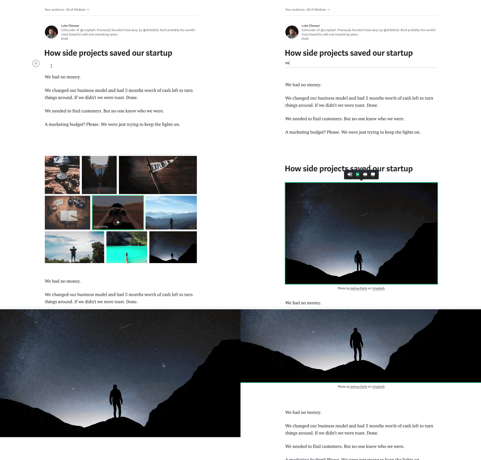
We’re excited to announce the 400,000+ high-resolution photos on Unsplash are now available in Medium.
If you’re writing a story on Medium and you want to add a photo, simply click the search icon and select the photo you want.
After you pick a photo, the photo credit links to the photographer will appear automatically. Also, the team at Medium has taken the extra care to re-size photos so they fit perfectly in the layout of your story.
This partnership with Medium holds special meaning for me and the Unsplash team.
Six years ago, I heard about a new website called Medium from former Twitter Founder/CEO Ev Williams.
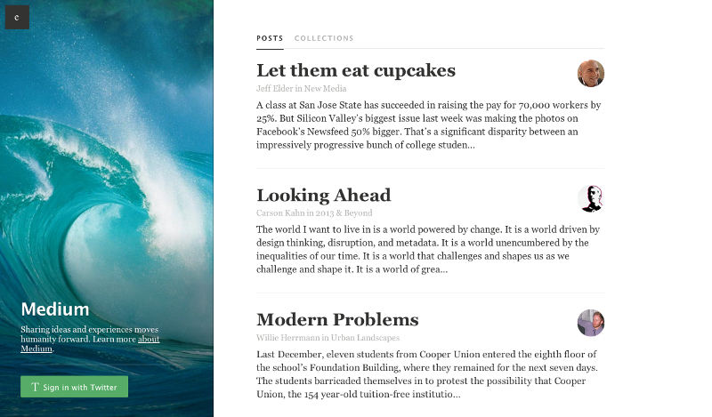
Medium.com homepage (2012)
Back then, Medium.com was just this one webpage. I had no idea what it was going to be but, I knew it was run by Ev, and he had a history of making world-changing products. I signed up.
A few months later, an early version of Medium was shown to the world: A place to share ideas and experiences to move humanity forward.
Medium.com homepage (March 2013)
Then, Medium opened up access for members to write and I got my invite.
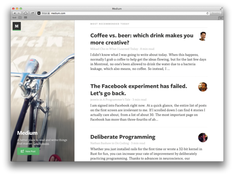
I felt intimidated. The writing on Medium was so good, I wasn’t sure I could write something worthy of the platform. Under self-imposed pressure, I thought about having a coffee or a beer to spark some inspiration. After a while, I realized I couldn’t think about anything better to write about than this coffee or beer drink decision so I said screw it, and wrote about that.
A few hours later, I published Coffee vs. beer: which drink makes you more creative? Coincidently, two days before I wrote this story , we created Unsplash, a photography website where we shared 10 high-resolution photos that you could use for anything. I used one the first 10 Unsplash photos as the top image for the story:
I didn’t have much of an audience and I didn’t know how many people would be interested in my story. So I didn’t expect much.
But then, my story became the most recommended story on Medium.
“Coffee vs beer…” #1 on Medium homepage (May 29, 2013)
I was freaking out. Building an audience is supposed to take months or years yet, Medium brought an audience for my writing in an instant.
Knowing people cared about what I had to say gave me the motivation to focus on writing for the first time in my life. That year, I wrote a story every week on Medium. Today, I’ve published 63 stories that have been read 475,000 times.
Apart from Medium bringing an audience to my stories and photos on Unsplash, it seemed like Unsplash became useful for writers on Medium. I began to see Unsplash photos accompany many Medium stories. Even to this day, many of the recommended stories on Medium have Unsplash photos in them. Unsplash was recommended by the Medium design team and even provided the photography for the homepage of Medium at one point.
As a frequent writer and reader of the Medium community, I always felt there was a the potential for a relationship between Medium and Unsplash someday. The two just fit too well together.
This is why I am so excited for today’s Medium + Unsplash partnership. Medium is the most inspiring writing and reading platform I’ve ever been part of. It plays a meaningful role in moving many ideas forward no matter where those ideas come from. My hope is we can help play a role in moving these ideas forward by adding an impactful visual component to them.
Medium is a megaphone for ideas. And my hope is Unsplash can help turn up the volume even more.
I’m honored to have the opportunity to partner with a community, product, and team as wonderful as Medium’s. Here’s to moving ideas and photography forward.
Medium + Unsplash was originally published in Unsplash Blog on Medium, where people are continuing the conversation by highlighting and responding to this story.
I have been using TiddyWiki for a long time now. It’s a simple HTML application that you can open in a browser and start adding your notes. Once you save, the HTML will contain both code and data. You can send that HTML page to your friends by email to share the notes or put it on Dropbox/Drive/web for sharing. It’s as simple as that.
TiddlyWiki, a unique non-linear notebook for capturing, organising and sharing complex information. I have used it to make class/workshop notes. So I can send it to all participants just by attaching it to an email. Best part is participants can download the attached TiddyWiki from email or web with all the content and code. They can add their own notes to it if they like all completely off-line. They can also save and share it further if they like.
I use Zim wiki on my desktop. Even though I sync it using GIT across my machines. It’s not convenient to use or edit on the go or on phones. I wanted to have notes on the go. Something like Evernote but FOSS. Over the years TiddlyWiki has been rearchitected and now it’s more useful than before. With some plug-ins1 I can edit the content in Markdown. I can manage tasks etc. So it’s become much faster, cleaner and very hackable. So naturally I took a look at it again, specially looking for features for this use-case, but without using Dropbox or Drive for syncing. That’s when I found NoteSelf.
NoteSelf is built on top of TiddlyWiki, a powerful, free, highly customizable and open-source personal wiki. We took the best of it, it’s powerful customization system, and mixed it with one of the best embedded databases available, PouchDb, to bring in the synchronization capabilities you need.
CouchDB settings in NoteSelf.
Since I have been using CouchDB as my personal back-end for many applications. NoteSelf fit all my requirements. Now I have notes on the go accessible anywhere via browser. Works off-line, syncs when it gets internet connection. Since CouchDB stores everything as simple JSON, hacking or re-purposing this the system is very easy too. A single piece of information in TiddyWiki is called Tiddler. In CouchDB this Tiddler is just an independent JSON document with well defined structure. So now I have batch applications that adds Tiddlers to my Wiki from the back-end. So when I open my NoteSelf I see new notes created by a batch application based on some events. For example when I star a podcast episode, it gets added to my NoteSelf as a note with some details so when I open the Notes, I have a Tiddler waiting for me, so I will never forget to make notes.
Here is an example Tiddler JSON stored in the CouchDB. Attributes like period, podcast, link and time are additional user defined attributes added by my batch application. Rest of them are standard Tiddler fields. As of now there is only one limitation. _id and title should be same. Though this limitation has not hurt me yet, but it makes it difficult to have two Tiddlers with the same title.
{
  "_id": "Episode 149: Here’s how the GDPR will change IoT – IoT Podcast – Internet of Things",
  "_rev": "5-2f1e8b8ccc8814bc2b8f79e4c9b690fd",
  "fields": {
    "created": "20180206004520152",
    "creator": "admin",
    "title": "Episode 149: Here’s how the GDPR will change IoT – IoT Podcast – Internet of Things",
    "tags": [
      "iotpodcast",
      "listeningnow"
    ],
    "modified": "20180206011620388",
    "modifier": "admin",
    "type": "text/x-markdown",
    "period": "50",
    "podcast": "iotpodcast",
    "link": "https://iotpodcast.com/2018/02/episode-149-heres-how-the-gdpr-will-change-iot/",
    "text": "- My notes about this podcast\n- can add [links](https://thejeshgn.com) too",
    "time": "2018-02-05T10:14:05Z"
  }
}
CouchDB databases are cheap and are easy to backup. Hence now I have multiple notes with different databases as back-end. They are backed-up as simple JSON documents, easy to retrieve and fix if the situation demands. Now all I need is an Android application with a native UI, though I must say NoteSelf runs really well on a mobile browser.
Pavan Rajam shares a broad look at Apple's video-related efforts, evaluating the company's current position and its potential for greater impact in the fast-shifting market.
Today, there is no meaningful exclusive video content on Apple platforms. Apple, thus far, has relied on its design and engineering prowess to differentiate its video offerings.
It’s clear this strategy isn’t working.
The iTunes Store is arguably the best transactional video storefront, but that alone is not enough to stop consumers from adopting subscription services. The TV app has a great UI and cross app integration, but that does not justify the $150 price to get it on your TV. Apple TV is the best designed, most capable streaming video box on the market, but that isn’t enough to justify its premium pricing when the same streaming services are available on every other platform with a significantly lower cost of entry.
Rajam's overview makes clear the significant challenges Apple faces in this market. Though the company is making heavy investment in developing original content, it's unknown what the plan for distributing that content will be: will it be widely available across all platforms, or exclusive to Apple hardware? Both approaches have clear benefits and drawbacks, so the question goes back to what the bigger goal is.
Apple ultimately has to decide what is more important: Apple TV as a premium hardware product line or a streaming video service that runs across all of its platforms.
I expect that by the end of this year, whether Apple's video content is released by then or not, we will at least have the answer to that question.
Currently, a big reason video services like Netflix thrive is that they're available to a huge number of customers – regardless of what TV, phone, or computer you own, you can get Netflix. It would be against industry practice for Apple to create a video streaming service that's exclusive to its hardware. Hollywood likely wouldn't appreciate that either, as creators want their work shared as widely as possible. For those reasons, I have a hard time seeing Apple launch a service that isn't, at the very least, available to users on some other platforms.
If Apple did make its service available on select other platforms, such as Android and the web, it could still position Apple TV as the only way to watch its shows on the big screen. Non-Apple users would still have access to the service, but if Apple does its job and creates truly compelling new shows that people love, many of those users may then be willing to splurge for a premium set-top box. Asking anyone to pay $150 for access to a streaming service is a hard sell, but if you can first hook people on shows they love, they'll eventually want to watch those shows in a way that's most comfortable: on their TV.
Last week, The New York Times announced that it had added an augmented reality feature to its iOS app. The first article with embedded AR content was a preview of the feature published last week that explained to readers how it worked. At the bottom of the article was a newspaper box that could be dropped into your surroundings. I showed it off to some friends over the weekend, and everyone was impressed by how realistic it looked as they walked around the box in a neighbor’s kitchen.
The New York Times debuted its new ARKit features with a newspaper box demo.
This week, the Times rolled the feature out as part of its Winter Olympics coverage. In Four of the World’s Best Olympians, as You’ve Never Seen Them Before, the publication spotlights figure skater Nathan Chen, speed skater J.R. Celski, hockey player Alex Rigsby, and snowboarder Anna Gasser. The results are impressive. I placed each athlete in my living room, then walked around them. From each angle, snippets of text about what I was seeing were overlaid on the image providing additional details and context. The app also makes use of haptic feedback on the iPhone to alert users to new information as they examine a scene.
The feature currently works only on compatible iOS devices running iOS 11, though an Android version is in the works. A rough approximation of the AR experience is available on the web too, though I found that the scrolling stuttered too much, making it hard to navigate the article. Although the first implementations of ARKit in the Times’ iOS app feel more like proofs of concept than journalism, it’s an interesting start that has the potential to offer a new perspective on events.
[Graham] Roberts[, the Times’ head of immersive platform storytelling,] is excited about the advertising possibilities of AR. “You can see what the car is like in your driveway. You can see what the coffee machine is like on your counter before you bought it. Walk around it,” he said. “But I think the foundation there is the fact that it can come within the article experience. So it’s frictionless, really effectual and it gives you a thing that you can do that was not possible before. And I think that that will put the New York Times in a really unique position for advertising.”
The Rosetta Stone, the Berlin Wall, and the Falcon Heavy rocket with scale information in Quartz.
The New York Times isn’t alone. In fact, Quartz added ARKit to its iOS app back in September 2017 as soon as iOS 11 became available. Among the objects available for viewing in Quartz’s app are SpaceX’s Falcon Heavy rocket, the Rosetta Stone, and the Berlin Wall. Each item can be resized and rotated with your fingers on the screen of an iOS device, something The New York Times’ app cannot do. Quartz also provides scale information so you can get a sense of how big each object is.
It will be interesting to see to what degree AR takes off with news outlets. It can’t be cheap to produce AR experiences – the Times’ Winter Olympics piece lists 17 people who were involved in its production in one capacity or other. Still, AR has the potential to bring a new perspective on the news that wasn’t possible before and offer new ways for advertisers to reach consumers. For now, however, ARKit features are primarily a novelty that will draw attention to stories but need to be integrated into publications’ reporting better before they are likely to become commonplace.
Support MacStories Directly
Club MacStories offers exclusive access to extra MacStories content, delivered every week; it's also a way to support us directly.
Club MacStories will help you discover the best apps for your devices and get the most out of your iPhone, iPad, and Mac. Plus, it's made in Italy.
It’s been mostly gentle and sophisticated around here recently. Let’s turn to Texas and fix that; Pride and Joy, by
Stevie Ray Vaughan, is about the simplest blues holler you can
imagine, with a happy message and some smokin’ hot guitar.
Wow, Stevie Ray has been dead for 28 years. The last time I saw him feels like yesterday; it was just weeks
before his death. Stevie Ray had managed to achieve sobriety after a lot of years of hard partying; like many sober addicts, he’d
gotten to the point where the alternative was a coffin. Anyhow, that night when I saw him, he made a touching little speech about
being sober, and how you had to take of yourself to be there for the people you love. A pity he got on that helicopter.
I loved almost every moment of every one of his recordings, because of the lovely guitar sound, the rockin’ blues stripped of
everything but the bare essentials, and then the essentials turned up to eleven.
Also, he was just a cool guy, with a cool accent and a cool image; and great fun on stage, never holding anything back.
Pride and Joy is on
Texas Flood, maybe my fave SRV album. The title track and Tin Pan Alley are my
personal highlights, but I felt like something uptempo and a little rude today. Old-fashioned sentiments to be sure, but perhaps
not entirely out of place: “You mess with her, you’ll see a man get mean.”
Improving the accessibility of the video experience on our web properties was one of our main goals for 2017. In this post, we will talk about how we built closed captions support into our video delivery platform and how we made the control set on our video player more accessible.
Why Closed Captions?
The goal for adding closed captions was to make our videos accessible to more viewers in more scenarios. Some viewers are deaf or hard of hearing and need closed captions to be able to fully understand the content of our videos. Some are used to watching muted, autoplaying videos on social media feeds and want the same experience when browsing nytimes.com or our mobile apps. Some might use closed captions to help improve their language skills. Not providing closed captions to videos essentially locked these and other viewers out of experiencing the rich quality of videos produced by video journalists at the New York Times.
Implementing closed captions also creates some new possibilities for our video experience. Closed captions and subtitles use the same underlying technical implementation for videos on the web — in our case, Web Video Text Tracks (WebVTT) with cross-browser support aided by hls.js — which means we’ve opened the door to adding subtitles in languages other than English in the future. Creating video transcripts based on closed captions also now becomes an easier task, which would improve the searchability of our video library.
Designing an Intuitive Caption-Publishing UI
We had several considerations to keep in mind:
As with our encoding integration, we wanted the process to be as straightforward as possible. We wanted to require the fewest number of mouse-clicks to generate captions, accommodate varying caption-generation speeds, have the ability to copy edit the captions, and control when the captions are visible to the viewer (the ability to “publish” and “unpublish” captions).
The journalists should have the option to generate captions without depending on the encoding process. Though the captions could be generated when encoding the video, they could also be generated at any time following the initial encode without having to re-encode the asset.
In the service we designed, the journalists can generate captions in various parts of the publishing process. They can opt to create captions as they upload and encode a video, or they can generate them independent of any other action if a given video asset already contains previously encoded renditions.
The video team can also choose to generate captions in any one of three ways:
Machine-Generated Captions: As the title suggests, these captions are generated by a computer, which makes them less than accurate (usually at about 70% accuracy) and might require extensive editing. This option is used almost exclusively for breaking news content that needs to appear on the site as soon as possible.
2-Hour Captions: This option involves a human transcriber and guarantees a 2-hour turnaround during normal business hours. The journalists are only required to do minimal editing changes with those.
Same-Day Captions: This is the slower human-generated option which is mainly used for non-urgent content.
If the journalists already have a captions file for the video on their computer, they can upload it and forego the above caption-creation step.
Once the captions are generated or uploaded, the CMS UI reveals a ‘Review’ button that allows the journalist to review the captions with our external provider. They can change the timing, copy edit the text, and once satisfied, finalize their edits and return to the main UI.
After copyediting, the captions are ready to be published. The journalist simply presses on the button to make the captions live, and they become available to the video player within seconds. If, for some reason, they are unsatisfied with the captions, they can always press another button to unstage the captions and remove them from the player.
Illustration by Jason Fujikuni
Generating and Serving Closed Captions
To add closed captions support into our video publishing workflow, we created a microservice called video-captions-api. Behind the scenes, we use third-party vendors like 3Play Media to generate captions from videos and Amara for editing captions.
We had two major goals in mind when creating and integrating video-captions-api into our existing video publishing pipeline. First, we wanted to make this microservice agnostic to the newsroom workflow, which is always subject to change, to make it more stable and easier to open source. Second, as speech-to-text mechanisms and technologies evolve at a fast pace, we wanted the system to provide us flexibility in the vendors we use to generate captions, so we reduce the possibility of vendor lock-in, and have the potential to extend.
In the implementation of video-captions-api, we created an abstraction called provider, which can be either a wrapper of a vendor API client or a module that provides some basic functionality. Each provider performs exactly one operation on captions. For example, the 3Play provider wraps a client for the 3PlayAPI and is responsible for generating captions from a video file. To generate captions from a video file, we create a job with the provider set to 3Play, and when this job is finished, we fetch the generated captions file from 3Play API and upload it to our GCS bucket.
Similarly, to review and edit an existing captions file, we simply create a job with the provider set to Amara, and when the editing is submitted, we mark this job done. The lifecycle of a captions job for the CMS then consists of several jobs on video-captions-api. From the CMS’s perspective, the status of a captions job can be “generating,” “generated,” “being reviewed,” “reviewed” and potentially more, but from video-captions-api’s perspective, there are only two statuses for a job: “in progress” and “done.”
To serve a captions file with a video, we just need to include captions metadata in the M3U8 manifest of that video. On the player side, hls.js parses the manifest and retrieves the captions file. Since we need the ability to publish videos and captions separately, we need to be able to update the M3U8s after videos are already published.
Thanks to our service that generates adaptive bitrate streaming formats on the fly, this becomes simple and natural. Once a captions file is published, that file is uploaded to a GCS bucket. Simultaneously, the cached M3U8 manifest of this video is purged. When the next user makes a request for this video, we generate a new M3U8 manifest — with all of the video renditions previously defined as well as the captions content — on the fly. That manifest then gets cached until the next time we update a video rendition or the closed captions.
Video Controls A11y
After landing the closed captions project in production, we decided to do an accessibility audit of our video player’s UI using a keyboard and screen reader for navigation. Our goal was for this mode of interaction with our video player to be as smooth as it is using a mouse. We quickly realized that this interaction model was broken. Fortunately, we were able to take a few simple steps towards fixing the player’s keyboard and screen reader UX.
In order to make the controls accessible, we needed to update the video player’s markup with semantic HTML. We replaced <div>s and <span>s that had masqueraded as buttons with actual <button> elements. For slider controls (e.g. the volume slider), <input type="range"> was a perfect fit. We also added ARIA attributes and the HTML title attribute to the markup of our controls to provide more context for screen reader users.
The big win here was being able to take advantage of the accessibility features that browsers bake into <button>, <input>, and friends, such as focus handling.
<span class=”volume-slider”></span>
was updated to:
<input
class=”volume-slider”
type=”range”
title=”Adjust Volume”
aria-label=”Adjust Volume”
min=”0”
max=”100”
step=”10”
value=”100”
aria-valuemin=”0”
aria-valuemax=”100”
aria-valuenow=”100”
/>
For cases where using semantic elements wasn’t possible, we continued using <div>s but added ARIA attributes and tabindexes to make these elements behave as the semantic versions would.
With semantic elements in place, we added keydown event listeners to the control elements to allow them to support keyboard interactions. These event listeners closely mirrored the existing click handlers we already had in place.
After some discussion with our designers, we also decided to implement a custom focus ring styling on our control set that would be consistent across all browsers. The CSS to implement this was straightforward:
/* disable the browser default styling */
button, input, textarea, a {
outline: none;
}
/* apply our custom focus styling on :focus only */
But we had one remaining problem: Mouse clicks also focus these elements, and we only wanted to apply focus styles on keyboard navigation. Our solution was to keep track of the currently focused control element (if any) that had been focused by the keyboard and to prevent focus events from firing on mouse events:
// stops the `focus` event from being fired on mouse down events
// so that the focus ring does not appear on mouse interactions
event.preventDefault();
});
});
With these improvements in place, the control set on our video player has taken a big step forward for accessibility.
You can check out an example of our improved video experience with closed captions and accessible controls here.
Next Steps
Looking ahead, we are keeping accessibility in mind while planning future improvements for our video player. Some of the features we’d like to implement going forward include multiple language subtitle support, video transcripts, and improved keyboard and screen reader experience on our audio player and the remaining parts of our video player.
Samsung has started rolling out the Android 8.0 Oreo update for the Galaxy S8 and Galaxy S8+. For now, the update is only live in Germany and only for those S8 owners who were a part of the beta program. S8 owners who did not take part in the beta program will start receiving the OTA update after 24 hours.
Continue reading →
Anil Dash asked people what their favorite file format was. David Robinson replied:
CSV is similar to Markdown. No one global standard (though there are attempts) but a damn good attempt at "Whatever humans think it is at a glance, they're probably right"
There is a spectrum for tools from the theortically optimal to the most human usable. It is almost always a tradeoff between purity/completeness and ease of human use.
For data science tools/statistical methods development there is a ton of work that needs to be done to govern edge cases. That work can either be done by the human users of the software/tool/data or it can be done on the back end by the developers of tools. Once you start looking for this tradeoff you see it everywhere - one of my favorite recent examples is flexdashboard versus Shiny. Shiny is llows for a lot of flexibility, deals directly with edge cases, and asks the user to pay attention to those cases. Flexdashboard “just works” in the sense that for most of the stuff I’m doing it seems to almost intuit what a person with minimal training would do.
I think both kinds of approaches have their place. Most of the time I just want to use the thing that reads my mind and takes minimal intellectual overhead. Same thing for when training people new to data science (or anything else). But eventually I start running into too many edge cases and want to move to something more sophisticated.
One thing I have a really hard time with is the transition from the “just works for humans” to the “theoretically optimal”. Almost always that transition is hard/rough. I wish there was a way (both selfishly and as an instructor) to smooth the transition from the intuitive, easy tool to the more flexible but necessarily more complicated tool. That always feels like a cliff to me.
Apple’s iTunes chief Eddy Cue attended Variety‘s 2018 Pollstar Live event in Los Angeles, California, but he reportedly wanted to focus on Apple Music while present.
According to Bloomberg reporter Lucas Shaw, Eddy Cue largely avoided talking about Apple’s upcoming original programming plans. Instead, Cue simply said Apple may reveal “a lot more” about its plans in “a little bit of time.”
While Apple has reportedly invested $1 billion into a ‘war chest’ to create original TV programming, it’s still unclear what the company’s broader plans are in this area, outside of scripted series from the likes of Steven Spielberg, La La Land writer-director Damien Chazelle and Reese Witherspoon, among other talent.
In the discussion, Cue went over Apple’s commitment to reducing the amount of items consumers have to carry with them, such as Apple Pay removing the need for a physical wallet. He also discussed his time in the music industry and how that experience translated to Apple.
Cue also spoke about the HomePod, Apple’s smart speaker which will release in the U.S. on February 9th. According to Cue, the HomePod won’t allow users to manually adjust sound because the speaker can instead use its built-in A8 chip and AI algorithms to automatically adjust the bass, treble and other settings depending on the song.
In honour of the Lunar New Year, which falls on February 16th this year, toy manufacturer Dead Zebra is releasing a new Year of the Dog vinyl Android figure.
Priced at $12 USD, the festive figure trades in its antennae for a pair of red dog ears. It also comes with a commemorative gold-painted medallion and a special box with reflective gold foil.
The figure is available to order today, with the company promising it will ship out to customers on February 9th.
Most Android fans know all about Dead Zebra. The company has an official partnership with Google to make Android figurines. Over the years, Dead Zebra has put out some particularly charming renditions of Android’s loveable mascot. Last year, the company did a Year of the Rooster figure.
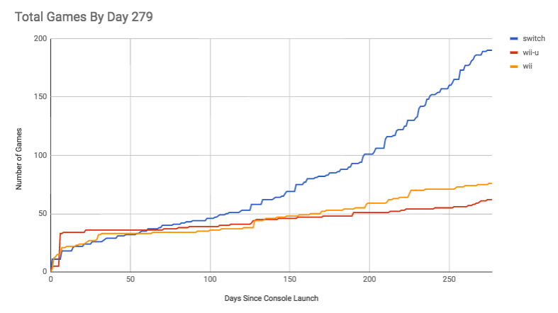
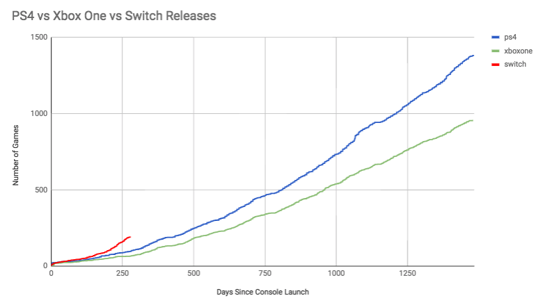
A new report has revealed that the Nintendo Switch already has three times as many games available than its predecessor, the Wii U, did at this point in its lifespan.
At the end of December, Kotaku UK downloaded data from more than 18,000 games and 250,000 reviews from review aggregate site Metacritic. Analysis of this data showed that on its 279th day on the market in December of 2017, the Switch had 191 games available.
For comparison, the Wii U had 60 games at that same milestone, and even the mega-popular Wii only had 65 games available on its 279th day.
Surprisingly, the Switch even has more games available than the PlayStation 4 and Xbox One did this point in both console’s lifecycles. The PS4 appears to have had just over 100 games, while the Xbox lagged slightly behind it.
Even more impressively, there are already 45 Switch games available with an average Metacritic score of 80 or higher (the site labels any title with such a score has having ‘favourable reviews’) and were reviewed by more than 40 different outlets, whereas it took the Wii and Wii U nearly their entire lifespans just to crack 50 games which fit that criteria.
The Switch has sold more than 14 million units since its launch in March 2017, so this report marks another notch in its belt as it continues its wild growth.
What do you think about the Switch’s explosive success? Do you miss the Wii U? Let us know in the comments below.
CIBC’s famous ‘ski-thru’ ATM has returned to Whistler Blackcomb Resort, but with a social media twist.
While skiers are free to simply make transactions through the ATM as usual, the structure now features a three-foot tall animatronic penguin perched on top. Whenever someone tweets @CIBC with the hashtag #SkiThruATM, the penguin will spin on his snowboard, adding a level of fun interactivity to the novelty setup.
Additionally, for every tweet that makes the penguin spin, CIBC will donate $1 to Alpine Canada in support of the three national ski teams (Canadian Alpine, Para Alpine and Ski Cross), up to a maximum of $10,000.
The ATM, which also includes heat lamps and ski pole and glove holders, first appeared atop Whistler Mountain in January of 2017. If it continues to attract attention and support, perhaps it will even become an annual tradition for the resort.
Montreal-based Element AI has compiled a report and analysis on the global supply of AI researchers in an effort to get a better understanding of an industry in high demand.
Overall, the report found that there are 22,064 PhD-educated researchers globally that are capable of working in AI research and applications, with only 3,074 candidates currently looking for work. The US had the highest concentration of researchers with 9,010 researchers, followed by the UK with 1,861 researchers.
Canada fell in third place with 1,154 researchers.
To conduct the broader survey, Element AI used results from LinkedIn searches that showed the total number of profiles according to specialized parameters. The search included candidates who were awarded a PhD no later than 2015 to account for years of work experience, and candidates must include ‘AI’ as well as specific concepts such as deep learning. To ensure they had technical expertise, they included candidates with experience in Python, Tensorflow, or Theano.
“Canada came in third place for the number of researchers in our LinkedIn and conference presenter searches, making it a viable competitor to the US, with 1,154 high-level profiles, which is high given Canada’s small population and GDP,” the report reads.
Canada has received a lot of attention for its AI ecosystem – Element AI itself raised a historic $137.5 million Series A last year. Last year also saw a lot of attention for Canadian AI talent as several tech companies — such as Facebook, Google, Uber, Samsung, and DeepMind — set up AI labs in the country.
To address a talent gap, the Canadian government pledged $125 million in a national AI strategy. Part of that went to Toronto’s Vector Institute, meant to be a hub between industry and academia in AI research. The Ontario government went on to invest $30 million to create more AI grads.
Element AI also ran a more advanced subset to capture candidates who listed very specific frameworks such as torch, caffe, and nltk, and avoid candidates using AI as a buzzword. The report captured the names of leading AI conference presenters considered influential experts in their respective fields of AI. It found 6,138 experts using this search, with 1,735 indicating that they are available for work. Of this group, 5,400 AI experts are publishing studies and presenting at AI conferences.
After analyzing conference data, the report also gleaned some interesting insights: “[Candidates] — despite being educated in Canada, the UK, Germany, France, or China — were more likely to move to the USA for professional work,” the report reads. “These arcs suggest that the US acts as the ‘hub’ for AI research and education, serving as the link for both the academic and business worlds where AI intersects.”
Some database biases to consider are the fact that LinkedIn is a predominantly Western platform, as the report showed that European and Asian countries have significantly fewer researchers than the US, the UK, or Canada. Conferences were almost limited to several English-speaking conferences in the Western world.
Access more context on the full report here. An interactive map is available here.
I occasionally field questions about computing and the industry from
people starting out, whether it be friends switching jobs or just internet denizens.
My answers are opinions, but I wish I had formed some of these opinions earlier.
For someone’s benefit, here they are.
Elegant, readable, and a lot of other words don’t mean anything
You’ll be asked to produce readable, elegant code. You won’t know what
they mean by that. Neither does anyone.
We all sort of know what bad code is - we know it when we see it.
But readable or elegant is, more than anything else, in the eye of the beholder. And generally,
it’s meaningless. I’ve worked with people who insist that 4 space indentation is readable
but 2 space indentation is completely unreadable. Or that there must be spaces between
the () in a function declaration and its parameters. Is it more elegant to use currying and
other functional-programming flavor, or just use traditional for loops? Nobody knows.
This is all nonsense. I once wrote an internal blog post for Mapbox, declaring
our code style: it was to follow the existing conventions of the project, and that’s it.
Don’t reformat your functions to K&R style, don’t add or remove semicolons.
Just be consistent. It doesn’t matter.
If you want evidence that style doesn’t matter, look at the code style of three.js,
the enormously popular WebGL library. It has over 900 contributors, and an unusual style that I haven’t
seen anywhere else. The style hasn’t alienated or puzzled contributors, or caused regressions
or bugs. It doesn’t matter: the style works for the author.
Which is the cruel thing about “readability” edicts: they’re a disguised way of saying
“code like me.” Some senior engineer wants to see code that agrees with them.
Nobody knows all the levels of the stack
The web is a deep stack of things to learn: browser quirks, networking,
CSS, HTML. Below that, JavaScript interpreters, browser rendering engines. Below
that, process isolation and the OS. And then the hardware abstraction, the hardware,
the power supply, the transistors. The electrons that flow, and the paths etched
in the microprocessor. Then sub-atomic particles and quantum dynamics, so you
can understand random number generation.
The truth is, I and 99% of people working with computers just have to trust that
everything inside of the metal box is doing what it’s supposed to do.
Long ago, the magic of industrialization made computers so powerful and complex
that nobody would be able to build one from scratch. We can - and should -
dive deeper, understanding each layer as we become able to. But
almost all of us start from the top down, understanding heavily abstracted
technology like JavaScript before we understand fundamental mechanisms
like microprocessors.
Don’t worry if you understand computers as enchanted aluminum boxes: everyone does.
It’s not really a problem for your programming career.
You’ll need to work without documentation
Everyone should write better documentation, but nobody does. You will constantly
find incomplete or incorrect docs. Raging into the void does no good.
The dirty truth is that everyone who wants to work quickly is reading the source code.
Again, this isn’t ideal, but it is reality. Learning to explore and read
unfamiliar codebases saves you from the slowest
and most unreliable thing in the world: other people. And it helps you be a better
open source citizen: instead of opening a ticket saying that the documentation doesn’t work,
you can figure out why and propose a fix, upfront.
There’s a broader point here. Debugging strategies are generally worth more
than the ability to write code quickly. Debugging is the thing that people
spend mythical amounts of time on - “I spent 12 hours debugging this!” - often
because (and not to blame the victim here) their debugging strategies consist
of re-reading the documentation and guessing code. Guessing is bad: read the code,
look at the code that’s actually running, whether it’s in your local copy of a library,
or Node.js’s source, or on GitHub. It’s worth it.
Expect chaos always
Programming is a partially-professionalized craft that’s built on compromise and
elbow grease. As a result, usually nothing works.
Which means that, even the most elite programmers are constantly dealing with
mistakes, whether their own or mistakes that they’ve inherited from programmers
before them. Even if you’re batting 1000, your perfect
application might be vulnerable to a bug at a way lower level, like the
Meltdown vulnerability.
Which isn’t to discourage you, but to reframe the craft: what we’re building
are solutions to problems. Things that reflect the environment, history, and limitations
of their form.
It’s good for you, emotionally and practically, to expect this going in: that computing
is long divorced from mathematical purity or conceptual elegance. The two may reunite,
but in this era we’re mostly solving problems as best we can with the means provided.
Anticipate the chaos and the catastrophes, just aim to end up with less chaos
than you started with.
Besides the media flurry on the new Liberal leader of the Ten Lane Massey Bridge party, there has been discouraging information coming out about ICBC, the Insurance Corporation of British Columbia. This is a provincial Crown corporation established in 1973 to provide universal auto insurance to motorists in this province. It was cutting edge at the time, and responsible for driver and vehicle licensing and registration.
Unfortunately it also appears that some of its profits did not stay with the Corporation, and you can find out more about its governance here. There’s been some finger-pointing on how these losses happened, and a suggestion of limiting the awards of some injuries to mitigate these losses. But a retired Police Chief for the City of Delta Jim Cessford has come up with a proposal to save lives and to save money for the Crown Corporation~bring back photo radar. Why? Because when people know they are being watched, they drive more carefully. “We had it in Edmonton when I was with Edmonton Police. And we found that there was a dramatic decrease in the number of collisions, as a result of photo radar. I know that there’s this whole notion that ‘It’s cash grab.’ Well, that’s true. Obviously, there are funds that are realized as a result of photo radar. That’s a side issue. The real issue is saving lives and we believe that photo radar did save lives.”
British Columbia did have photo radar which was implemented by the provincial NDP government in 1996. It generated 2.3 million dollars in the year 2000. In 2001 the incoming provincial Liberal government did away with photo radar, instead saying they would rely on traditional policing methods. At the time it was estimated to cost the government 6 million dollars to phase out the program.
Attorney General David Eby has also suggested that red light cameras be set up across the province. But if lowering speeds means that lives are saved, shouldn’t photo radar be considered too? A study on the Economic Impacts of Photo Radar in British Columbia undertaken in 2006 revealed “an annual net benefit of approximately 114 million in year 2001 Canadian dollars to British Columbians. The study also finds a net annual saving of over 38 million Canadian dollars for the Insurance Corporation of British Columbia (ICBC) that funded the program..Automated photo radar traffic safety enforcement can be an effective and efficient means to manage traffic speed, reduce collisions and injuries, and combat the huge resulting economic burden to society… Every effort should be made to focus on and to promote the program on safety improvement grounds. The program can be easily terminated because of political considerations, if the public perceives it as a cash cow to enhance government revenue.”
The 2018 PyeongChang Winter Olympics officially start on February 9th and continues until February 25th.
The games are comprised of 102 medal events spanning 15 sports. While we Canadians are bred for the Winter Olympics, many of us no longer have cable in our homes. For those without cable, there are still plenty of ways of watching this year’s games.
CBC
Because the CBC owns the official Canadian broadcasting and streaming rights for the Winter Olympics, anyone with cable can easily tune into their local CBC station to catch the action. While those without a traditional cable connection can turn to the CBC Sports Olympic app, which includes live videos.
Note, however, that there’s a 12-plus hour time difference between South Korea and Canada, which means this year’s Olympics may conflict with your sleep schedule. Thankfully, the app will also include highlights and other coverage from the games. Chromecast and Air Play are also supported by the app.
There’s also the CBC TV app users can download to watch the games as well. For those who would like to use this app, they’ll have to create a free account which gives access to 14 regional CBC TV live streams. The live coverage will also include the opening and closing ceremonies. CBC TV is available on both Android and iOS.
Both of the CBC’s apps feature ads. CBC TV, however, allows iOS users to purchase a subscription to remove in-app advertisements for $4.99. This subscription is not yet available on Android.
Twitter and CBC
Due to a partnership with CBC Radio-Canada and Twitter Canada, there will be first-ever live stream of select Olympic events on Twitter in Canada. On Twitter there will be live coverage of the opening and closing ceremonies as well as five additional events. The additional events will be announced at a later date. There will also be near-live video clips of the certain events. Follow @CBCOlympics for English content and @RC_Sports for French content.
Digital Antenna
Another option is to buy an indoor digital antenna. Any digital antenna should be able to pull in the local CBC feed, especially if you live in an urban area. You can check which channels are available for free here.
A good antenna to check out is the Mohu ReLeaf. It features a 45 mile range with a ten foot cable included in the box. The best place for the antenna is near a window. The Mohu ReLeaf costs $46.28 CAD and users can purchase it from Amazon.ca. Another option is the Clearstream Eclipse, which costs $119.99. It also makes sense to make sure you purchase an amplified digital antenna because it provides a more consistent and stronger signal.
The Olympic Channel app will also live stream individual games, as well as other Olympic-related coverage. Users can register to stay up to date with favourite athletes, sports and events.
Additionally the app has a complete schedule of the games and news about specific games. The app is available on both Android and iOS and both platforms can cast to a larger screen.
Youtube
It’s also possible to watch the Games via YouTube. YouTube will stream competitions through the official Olympic channel. The app is also set to feature upload highlights, as well as general coverage of the games. That said, the Olympic channel will not focus solely on Canadian content.
Team Canada also has a channel on YouTube. As of right now it’s unclear if Team Canada will be flooding the channel with every event, simple highlights, or just Canada’s gold medal wins.
PyeongChang app
The PyeongChang 2018 app doesn’t include live streams of the games. Nevertheless it provides highlights, some video content, plenty of photos, news posts and a complete schedule of events.
The PyeongChang 2018 app is available on iOS and Android.
If we’ve miss any other legitimate places to watch the Winter Olympics, let us know in the comment section below.
Now who’s ready to watch our country win all of the golds?
Another one of those distracting and deceptive reports on congestion – this time from INRIX. Here are my comments in an interview on News1130.
VANCOUVER (NEWS 1130) – Call it the “Full Vancouver” — when you complain about real estate, the weather and traffic all in one conversation.
But it turns out our gridlock is nowhere near the worst in a new global ranking measuring traffic congestion and its impact on urban areas around the world. In fact we’re not even the worst in Canada.
The INRIX Global Traffic Scorecard places Vancouver 77th globally, with drivers spending an average 29 hours in congestion in 2017. …
Even within Canada, Vancouver is fifth in the gridlock ranking behind Montreal (50 hours), Toronto (47 hours), St John’s, Newfoundland (34 hours) and Ottawa (31 hours).
During peak traffic hours, the study finds drivers in Vancouver spend 15 per cent of their time bogged down in traffic but one transportation expert is taking issue with how the report defines congestion.
“There’s an assumption behind it that automobile drivers should always be able to go at the posted speed limit — as fast as possible — without having to slow down. If you’re going 10 km/h below the limit, then that’s congestion,” says Gordon Price, a fellow with Simon Fraser University’s Centre for Dialogue.
“And behind that there is a further assumption that cities should be built so that traffic never has to slow down. To achieve that you pretty much have to destroy the idea of a city, which is people coming together to do exchange — whether it’s money or goods or ideas or even just going on a date. No city could possibly eliminate congestion, nor would it want to. That would not be a successful city.”
So how would Price characterize Vancouver traffic?
“This is so personal. If I’m the one caught in traffic at a bridge or tunnel, I’m not going to feel good about it. I do want to get there as fast as possible and I’ve kind of been raised with the expectation that I should be able to,” he says.
“But really, as the report itself says, congestion just keeps getting worse, no matter how much we spend on new roads. That’s called ‘induced traffic’ and you’re not going to solve it that way,” Price adds.
“They do suggest better use of data and things like road pricing and demand management, you can put whatever words you want on it, but it really comes down to this — you have to build roads, they are vital to the health of a city, but if you just keep funnelling more cars trucks and buses on them, that’s not going to be a solution.”
Of the the 38 countries covered by the INRIX Global Traffic Scorecard, Thailand leads with the highest average hours spent in peak congestion (56 hours), outranking Indonesia (51 hours) and Columbia (49 hours), followed by Venezuela (42), and the U.S. and Russia both with 41 hours.
Among developed nations, U.S. and Russia shared top of the most congested countries in the world.
“Congestion costs hundreds of billions of dollars, and threatens future economic growth and lowers our quality of life,” says Dr. Graham Cookson, Chief Economist at INRIX.
“If we’re to avoid traffic congestion becoming a further drain on our economy, we must invest in intelligent transportation systems to tackle our mobility challenges.”
Price believes, ultimately, that comes down to giving people better choices.
“Better transit and that kind of thing, but it really has to be part of the design assumptions behind how we build our cities. If the object of it is always to fight congestion, I guarantee you’re going to lose.”


 Price Tags.


 primalpoly on Twitter.


 uberfeminist on Twitter.


 existentialcoms on Twitter.

 Fefes Blog.
 Vintage Ads.










 Samsung has started rolling out the Android 8.0 Oreo update for the Galaxy S8 and Galaxy S8+. For now, the update is only live in Germany and only for those S8 owners who were a part of the beta program. S8 owners who did not take part in the beta program will start receiving the OTA update after 24 hours.