Do you think of yourself as a Python programmer, or a Ruby programmer?
Are you a front-end programmer, a back-end programmer?
Emacs, vim, Sublime, or Visual Studio?
Linux or macOS?
If you think of yourself as a Python programmer, if you identify yourself as an Emacs user, if you know you’re better than those vim-loving Ruby programmers: you’re doing yourself a disservice.
You’re a worse programmer for it, and you’re harming your career.
Why?
Because you are not your tools, and your tools shouldn’t define your skillset.
Your tools are not your skills
Ask a programmer to list their skills and more often than not you’ll get a list of technologies.
But technologies are just a small set of the skills you need as a programmer.
You need to gather requirements.
You need to debug code.
You need to design user experiences.
You need to build abstractions.
You need to avoid security problems.
And so on and so forth.
None of these skills are technologies.
And if you think your only skills are technologies you won’t notice the skills you don’t have.
And if you don’t know what you’re missing, you won’t take the time to learn the skills that can make you truly productive and valuable.
Your tools are not your job
If you define yourself by your tools, you are limiting yourself to what jobs you can get.
First, because you won’t apply to those jobs.
Second, because you will market yourself based on tools, instead of all the other skills that might get you that job anyway.
If your identity is tied up with your tools, you won’t listen to people who use different technologies.
Some tools are better than others at certain tasks.
Some tools are interchangeable.
But an expert using a bad tool can often do more than a novice with a bad tool.
Spending your time fighting over which tool is better is a waste of your time.
Instead, spend your time listening and learning from everyone, whatever tools they use: most skills will transfer just fine.
The technologies you use, the tools you build with, are just that: tools.
Learn to use them, and learn to use them well.
But always remember that those tools are there to serve you, you are not there to serve your tools.
The next SEO experiment I’d like to discuss results for is the MDN “Competitive Content Analysis” experiment. In this experiment, performed through December into early January, involved selecting two of the top search terms that resulted in MDN being included in search results—one of them where MDN is highly-placed but not at #1, and one where MDN is listed far down in the search results despite having good content available.
The result is a comparison of the quality of our content and our SEO against other sites that document these technology areas. With that information in hand, we can look at the competition’s content and make decisions as to what changes to make to MDN to help bring us up in the search rankings.
The two keywords we selected:
“tr”: For this term, we were the #2 result on Google, behind w3schools.
“html colors”: For this keyword, we were in 27th place. That’s terrible!
These are terms we should be highly placed for. We have a number of pages that should serve as good destinations for these keywords. The job of this experiment: to try to make that be the case.
The content updates
For each of the two keywords, the goal of the experiment was to improve our page rank for the keywords in question; at least one MDN page should be near or at the top of the results list. This means that for each keyword, we need to choose a preferred “optimum” destination as well as any other pages that might make sense for that keyword (especially if it’s combined with other keywords).
To accomplish that involves updating the content of each of those pages to make sure they’re as good as possible, but also to improve the content of pages that link to the pages that should show up on search results. The goal is to improve the relevant pages’ visibility to search as well as their content quality, in order to improve page position in the search results.
Things to look for
So, for each page that should be linked to the target pages, as well as the target pages themselves, these things need to be evaluated and improved as needed:
Add appropriate links back and forth between each page and the target pages.
This one is interesting in that “html colors” doesn’t directly correlate to a specific page as easily. However, we selected the following pages to update and test:
The problem with this keyword, “html colors”, is that generally what people really want is CSS colors, so you have to try to encourage Google to route people to stuff in the CSS documentation instead of elsewhere. This involves ensuring that you refer to HTML specifically in each page in appropriate ways.
I’ve opted in general to consider the CSS <color> value page to be the destination for this, for reference purposes, with the article “Applying color” being a new one I created to use as a landing page for all things color related to route people to useful guide pages.
The results
As was the case with previous experiments, we only allowed about 60 days for the Google to pick up and fully internalize the changes as well as for user reactions to affect the outcome, despite the fact that 90 days is usually the minimum time you run these tests for, with six months being preferred. However, we have had to compress our schedule for the experiments. We will, as before, continue to watch the results over time.
Results for the “tr” keyword
The pages updated to improve their placement when the “tr” keyword is used in Google search, as well as the amount of change over time seen for each, is shown in the table below. These were the pages which were updated and which appeared in search results analysis for the selected period of time.
Change (%)
Address
Impressions
Clicks
Position
CTR
HTML/Element/tr
-43.22%
124.57%
2.58%
285.71%
HTML/Element/table
26.68%
27.02%
-2.90%
0.00%
HTML/Element/template
27.02%
9.21%
-15.45%
-14.05%
API/HTMLTableRowElement
—
—
—
—
API/HTMLTableRowElement/insertCell
-2.78%
-23.91%
-2.16%
-21.77%
API/HTMLTableRowElement/rowIndex
—
—
—
—
HTML/Element/thead
38.82%
19.70%
0.00%
-13.67%
HTML/Element/tbody
42.72%
100.52%
14.19%
40.68%
HTML/Element/tfoot
8.90%
11.29%
2.64%
2.18%
HTML/Element/th
-50.32%
3.43%
0.39%
106.25%
HTML/Element/td
20.05%
40.27%
-8.04%
17.01%
API/HTMLTableElement/rows
—
—
—
—
The data is interesting. Impression counts are generally up, as are clicks and search engine results page (SERP) position. Interestingly, the main <tr> page, the primary page for this keyword, has lost impressions yet gained clicks, with the CTR skyrocketing by a sizeable 285%. This means that people are seeing better search results when searching just for “tr”, and getting right to that page more often than before we began.
Results for the “html colors” keyword
The table below shows the pages updated for the “html colors” keyword and the amount of change seen in the Google activity for each page.
These results are also quite promising, especially since time did not permit me to make as many changes to this content as I’d have liked. The changes for the color value type page are good; nearly 15% increase in impressions and a very good 34% rise in clicks means a health boost to CTR. Ironically, though, our position in search results dropped by nearly 1.25 points., or 10%.
The approximate 23% increase in both impressions and clicks on the CSS color attribute is quite good, and I’m pleased by the 10% gain in CTR for the learning area article on styling box backgrounds.
Almost every page sees significant gains in both impressions and clicks (take a look at text-decoration-color, in particular, with over 3000% growth!).
The sea of red is worrisome at first glance, but I think what’s happening here is that because of the improvements in impression counts (that is, how often users see these pages on Google), they are prone to reaching the page they really want more quickly. Note which pages are the ones with the positive click-through rate (CTR), which is the ratio of clicks divided by impressions. This is in order of highest change in CTR to lowest:
What I believe we’re seeing is this: due to the improvements to SEO (and potentially other factors), all of the color-related pages are getting more traffic. However, the ones in the list above are the ones seeing the most benefit; they’re less prone to showing up at inappropriate times and more likely to be clicked when they are presented to the user. This is a good sign.
Over time, I would hope to improve the SEO further to help bring the search results positions up for these pages, but that takes a lot more time than we’ve given these pages so far.
Uncertainties
For this experiment, the known uncertainties (an oxymoron, but we’ll go with that term anyway) include:
As before, the elapsed time was far too share to get viable data for this experiment. We will examine the data again in a few months to see how things are progressing.
This project had additional time constraints that led me not to make as many changes as I might have preferred, especially for the “html colors” keyword. The results may have been significantly different had more time been available, but that’s going to be common in real-world work anyway.
Overall site growth during the time we ran this experiment also likely inflated the results somewhat.
Decisions
After sharing these results with Kadir and Chris, we came to the following initial conclusions:
This is promising, and should be pursued for pages which already have low-to-moderate traffic.
Regardless of when we begin general work to perform and make changes as a result of competitive content analysis, we should immediately update MDN’s contributor guides to incorporate recommended changes.
The results suggest that content analysis should be a high-priority part of our SEO toolbox. Increasing our internal link coverage and making documents relate to each other creates a better environment for search engine crawlers to accumulate good data.
We’ll re-evaluate the results in a few months after more data has accumulated.
If you have questions or comments about this experiment or its results, please feel free to post to this topic on Mozilla’s Discourse forum.
"Wooooaaah, ist der schöööööön". So eine Reaktion auf technische Geräte erlebe ich selten. Die Scheffin hat das Gerät sofort adoptiert und liebt es. Dazu muss man wissen, dass die Scheffin eine absolute Leseratte ist. Es gibt nichts anderes, womit sie so sehr ihren Stress abbauen kann und runterkommt. Deshalb lohnt sich bei ihr ein gutes Lesegerät. Sie hat auch ein iPad, aber das ist zum Lesen anstrengender.
Und bei diesem Sonnenlicht geht jedem Farbdisplay die Puste aus. Wie das iPad ist der Kindle Oasis ein absolutes Premium-Produkt. Meines Wissens gibt es nichts besseres.
Wir sind damit bei fünf technischen Geräten, die sie exklusiv benutzt:
iPhone
iPad für Mediatheken der Öffis und Magazine*
Misfit Ray als Fitness & Sleep Tracker, mit Knopfzellen für vier Monate
Plantronics Backbeat Sense, lieber als Apple AirPods (!)
Kindle Oasis
*) Ich freue mich, wenn ich Eure Lufthansa-Magazine runterladen kann. Einfach den Buchungscode schicken.
Companies do a lot "to get their products embedded in our brains and part of our thinking." They want us to think of them as people, so we'll care for them, and so we'll think that they care for us. But they don't. Nowhere is this clearer than in the case of Facebook, which knew about data mining and election tampering activities as far back as 2015, but is only now doing the apology tour. This article is a lavishly-linked and lucid denunciation of the idea that Facebook cared - or cares - one whit. Its responsibility and sensitivity (if it has only) is only to itself and its owners and shareholders. See also Audrey Watter's summary of (non-)coverage of the story in educational media.
Slowly but surely I’ve been amassing a small library of academic writing books. Not because I love dispensing advice, but because a lot of people ask me to recommend books, and others suggest the ones that have worked for them. But first, a disclosure statement: I buy absolutely each and every single one of my books (except for the ones, of course, authors gift me or academic publishing houses send me in lieu of payment or as a token of appreciation).
Public service announcement: I buy my own books with my own money and I get absolutely zero royalties or kickback from recommending them.
That out of the way, this is the sentence that got me hooked on Joli Jensen’s “Write No Matter What: Advice for Academics” (published by University of Chicago Press) is the following one (p. xi)
Writing productivity research and advice can be summarized in a single sentence: In order to be productive we need frequent, low stress contact with a writing project we enjoy.
Joli Jensen summarises what at the core, I believe is what helps ME move forward with my writing: I write every day, and I try to make it low stress by writing memorandums, analysing data and synthesising my thoughts in a conceptual map. I also write by hand in my Everything Notebook section for a specific project I am undertaking. These handwritten notes, these processes really help me think and develop my thoughts.
However, Jensen also zeroes in on a big problem in academia (p. xi)
Our problem is that academic life offers us the exact opposite: infrequent, high-stress contact with projects that come to feel like albatrosses
That’s why I don’t like to sit down and crank out a paper. I need to slowly and steadily think and process what I’m learning. And this is the reason why I write and read every day and I try to be in contact with my data regularly.
.@jolijensen zeroes in on a key element of academic writing: we need a low-stakes routine that can move us forward. Three taming techniques. pic.twitter.com/fHIjqSxmiW
Jensen’s advice on writing at least 15 minutes a day resonates with what Jo Van Every suggests in her 15 Minutes Challenge. I know for a fact that if I sit down and scribble notes on a book, book chapter or journal article, I can write at least a few words. And a few words is better than NO WORDS. I really enjoyed Jensen’s honesty in attributing ideas to who originated them. She credits the idea of the 3 taming techniques to David Steinberg’s “How to Survive and Complete a Doctoral Dissertation“. I have to confess that I have not read Steinberg’s book, but I really enjoyed reading Joli Jensen’s account of what she learned from him and how those teachings became her three taming techniques. There’s also something extraordinarily refreshing about an author of an academic writing book who confesses to facing the same insecurities and anxieties that we all face.
As I said on Twitter, I write every day and I find myself stuck for MONTHS in a particular idea or without solving a specific set of analyses. Then BOOM, it all comes together.
This statement along w/ other similar truths about honesty in academic writing sold me – we ALL struggle with academic writing @jolijensenpic.twitter.com/iSQwDsl2Bc
This morning (Saturday 24 March) there was a short item on the BBC Today Programme where Paddy Ashdown was arguing the case that we should treat personal data like property and that individuals should have the right to sell their data and get their fair share of the profits.
Cambridge Analytica & data harvesting: the only protection is to set in law that personal data is part of individual property to which they have full property rights and that this cannot be used without their formal agreement, including the right to share in the profits created.
“Oh my”, thought my sleepy brain. I don’t think that will work without a lot of regulation which undoubtedly will lead to more exploitation through data estate agents. Jenni Tennison from the Open Data Institute did her best to state an alternative case, the need for greater transparency, for open-ness but it a really short radio slot, it unfortunately didn’t really hit the spot.
I know I make data and therefore privacy trade-offs almost everyday. I’ve probably been somewhat blasé, perhaps too naive with the little knowledge that I have, with the certainty that my own self censorship will ensure that an algorithm can’t “know” me. But they can (and do) sell parts of me . . .
Thanks to mainly to Channel 4 and The Guardian the past week has been full of extend of data manipulation, unethical practices employed in particular by Cambridge Analytica and Facebook.
Over the past decade I’ve been fortunate to have been involved in discourse around the potential uses of network data and the ethical implications of being able to mine personal information. Tony Hirst has always been my “go to guy” around this. Thanks to Tony, and others including Martin Hawksey and his Tags Explorer, I’ve been able to see and explore for myself the potential and the pitfalls of using data. This week Tony reminded us of a post he wrote back in 2010 about Facebook privacy settings. “We” all knew this was coming, but what do “we” – academics, ed tech writers know . . . experts get it wrong all the time and we don’t have the big bucks that get us a seat on the data sharing explotation table.
Thankfully there is now a spotlight on data control, privacy and ethics. There’s lots of talk about allowing users to get back their data. But how do you reclaim your Facebook data for example? Autumn Caines has written a fantastic post around her experiences on doing just that. Please take 10 minutes to read it.
I particularly like how Autumn relates this to gaslighting and the issues we in education face, particularly around personalisation of learning. I like Autumns notion of platform literacy. We need to know what platforms, do, can do, don’t do with data. Education has a vital role to play here. I fear that what most platforms call personalisation is actually increasing homogenisation of content and “the student journey”.
I am struggling just now with my trade offs in terms of social media use, which have been so useful for me in terms of extending my personal learning network, in terms of extending the conversations I can participate in, the terms of allowing me easy access to the thoughts and research of so many peers, in terms of having data informed discussions around learning and teaching, I don’t want to lose that but I feel myself stepping back more and more.
NB
I’ve just spotted this post from David Hopkins about his Facebook data – worth a read too.
I’m talking two tracks today, named Acknowledgment and
Resolution, but there are millions of people who love
them but don’t know their names. They are the “A Side” of
A Love Supreme by
John Coltrane, recorded in 1964 and one of the best-selling jazz records of
all time. Thing is, most people just start at the beginning of the album and stick with it till the end. Or if you’re a
traditionalist like me, the LP. Either way everyone just thinks of it as A Love
Supreme.
It’s a hell of a piece of music. Since this is “modern” jazz, the harmonies aren’t classical, but you stop noticing after a few
seconds, because John is taking you on a trip and he knows where he’s going and it’s hard to resist his pull. And then there’s
McCoy Tyner on piano and Elvin Jones on drums; there are a lot of people who’d say it’s the best work any of them ever recorded.
Acknowledgment is the one that most people will remember because it’s where the band chants “a love supreme” against
cosmic chording from Tyner. But I
actually like Resolution a little better, finding
Coltrane’s lazy descending line completely enchanting.
Earlier I mentioned that Coltrane knew where he was going and on this record he really Knows Where He’s Going because he’d just
got religion, there’s a silly poem about God in the liner notes. Dunno, doesn’t make me feel religious when I hear it, just proud to
be a member of the same species as those guys in the studio in 1964.
This was a really interesting article to read. At certain points you might have to just skip over some of the tech details (unless you really want to dig deep, which I applaud). The idea here was to offer a machine learning application as a service. The application takes regular photos and renders them in the style of some artwork (hence: 'style transfer'). But the real fun is in the set-up of different services to allow this to be run mostly in the cloud using other services, things like Stripe (for payment), AWS for hosting, ReCaptcha on form uploads, Apex for deployment.
As the busy season ramps up, Mobi is looking for people to staff up their Balancing Crew. Details HERE.
The Balancing Crew is responsible for checking bikes in the field, carrying out field repairs, and re-balancing bikes between the stations. Support Crew carry out a variety of tasks, some of which include station and helmet cleaning, station removals and installations, and station troubleshooting and repair.
I was asked to give a short talk in my Departmental Proseminar yesterday on the topic of giving presentations, and specifically about making slides effective.
There is more than one way to give a good talk, and there is more than one way to make “good slides” or—better—make good use of slides and other material you might want to show people. So the things I’ll talk about and especially the specific techniques I’ll discuss are selected from many good ways to present yourself and your work. Presenting is a two-sided process, where you should be comfortable with what you are saying (and how you’re saying it), on one side, and where your audience should be able to follow along and understand your message, on the other.
Presenting is a kind of performance. It is one of several ways we
communicate the content of our ideas or research. The
impression-management involved in any talk is often annoying. At times
it can even be inimical to the intellectual activity you’re trying to
get across. But it’s also unavoidable, and it is not entirely bad. Try
to see it as continuous with all of the other forms of communication
you engage in all the time—from informal conversation and written
messages to formal papers and books. They all have their distinctive
rituals and conventions, too.
You need to know who your audience is. My audience is a group of
graduate students in the social sciences. These are people just
starting out, usually speaking in front of people who will have few if
any strong preconceptions about them or their work. At times, such as
a job talk, a lot might be at stake.
I’ll say three things. First, I want you to think about what a talk
is, as opposed to (for example) a paper, or a set of slides. Second,
how can you use slides to show and tell your audience what you have to
say? I’ll talk about how I find it useful to layer, highlight, and
repeat design elements in a way that helps the audience follow
along. And third, a little more specifically, I’ll talk about how to
make things clear on your slides when it comes to presenting
results or details.
First, what do I mean, “give a talk”? There are many ways to
effectively run an argument or convey research results or bring your
audience into the topic you want to develop. I’m not going to try to
survey them. Instead, I just want to emphasize two things.
First, and to repeat, a talk is a performance and inevitably involves
a lot of impression-management, especially when something important is
at stake. In a context like a job talk, what people generally want to
come away with is the feeling that the presenter is in control of
their material, that they know what they are doing, and that what
they are doing is, ideally, interesting and important.
What that means concretely will vary depending on who you are, what
your research looks like, and who your audience is. People are often
not assessed fairly, or according to a single standard. But it’s also
true that, whether as a matter of the investment that people have made
in making the talk happen, or just in the pure desire to have a
successful interaction, audiences really want talks to go well.
Outside of adversarial settings, no one wants to watch someone
bomb. This means that presenters start out with the audience on their
side to a much greater degree than people often realize.
Second, there’s the content of the talk. Behind every good talk is the
actual content of what you have to say. This is always far more
detailed than can be conveyed in the time you have. That content is a
paper, or a chapter of your dissertation, or at least a specific
finding or argument that you have spend a lot of time working out.
For convenience, let’s just call it “the paper”.
To put it bluntly, if the paper is bad, then it doesn’t really matter how
polished the talk is, or how good the slides look. By the same token,
if the talk is bad, then people won’t learn how good the paper is. And
if your slides are bad, it’s going to be harder to give a good talk.
The actual slides are the most immediately visible but also the least
substantively important part of your material. While I’m going to
highlight a few rules and techniques about making decent slides, do
not lose sight of the fact that if your paper is bad, your talk is
going to be bad too.
The paper is not the talk. The paper is what the talk is about. In
some fields, the talk can be very closely related to the paper, and
there are still people trained to “read the paper” in the
old-fashioned sense. But this is increasingly rare. In most fields,
especially when presenting the results of a data analysis, the
presenter must condense, summarize, and highlight the important parts
of their own work. The paper is the most important thing; the talk is
about the paper; and you use your slides to help you give a better
talk.
What are slides good for? I think they are best thought of as
signposts or billboards or advertisements for the talk you are giving.
They’re meant to help the audience follow along and occasionally to
show them important things. They support the content of the talk and
keep people on the road you want them to be on.
Now, think about what good road signs or effective billboards look
like. They have strong imagery, they are clearly interpretable, and
they contain few if any words.
A corollary of this way of thinking about your visual
material is this: don’t write your talk on the slides. The most
common way a talk fails is that the presenter uses their Keynote or
PowerPoint slide deck as an outliner for themselves. They use it as
something to help themselves, rather as something to help the
audience. They start making notes for what they want to say and put
those notes on the slides. All of that text (bullet-point after
bullet-point) ends up on the screen, where they then read it to
the audience. Don’t do this.
This kind of bad talk is why many people profess to hate slides as
such. Occasionally they are annoyed enough to generalize expansively
about how PowerPoint-itis is a feature of the End of Thinking or the
Decline of the West. Personally, I think those people have not been
unlucky enough to sit through talks where the presenter has not even
bothered to prepare slides.
A related point is that using the slides as an outliner tends to make
talks too long. In talks, as in life, you have less time than you
think. Half the battle of conveying competence and presenting
effectively is being aware of what you can say in the time you have
available. It is far less than you think, even after trying to take
that fact into account. Even worse, the phenomenology of giving a
talk is very different from that of listening to one. When you give
a talk, time will seem to pass much faster for you than it will for
your audience. If you run out of time and you have a very large number
of slides with a lot of text on them, you will risk developing a kind
of tunnel vision. The goal of “getting through your slides” will
become a kind of death wish, a goal to be accomplished at the cost of
your audience’s time and patience.
What should your slides do instead? And how should you do it? The
slides can help the audience follow along as you tell them what you
are going to do, and then as do it. One straightforward but effective
technique is to build up your argument, your data, or
your findings, by layering, content, highlighting new elements,
and repeating methods of presentation or design elements so that
your audience can follow the logic of what you’re saying.
Here are some examples.
Here’s a slide from a talk where I’m trying to tell people about the
corner of a specific field that I am going to be discussing. So
beginning from the most expansive definition of the field (“A mode of
inquiry”), we gradually narrow the focus to the actual content of the
dataset by the time we get to “At Universities in Five Countries”. I
repeatedly overlay the elements to narrow them down one piece at a
time, talking about each step as I go.
The repetition of design elements can also be used to connect your theory or ideas to the data you are presenting. For example, here I know I am going to end up showing a scatterplot of the relationship between two variables, “Status Distance” and “Deviation from Consensus”. So I introduce the two ideas with that in mind.
Then I talk about three possibly interesting ways that status distance and deviation from consensus might related, showing the audience what an idealized relationship might look like on the scatterplot in each case.
By the time we get to the graph, the audience has the basic
relationship in their minds, has a sense the shape of the association
they might be looking for in the data, and can take the time to
understand the details of the scatterplot without being overwhelmed by
it, or by having to take in from scratch a whole lot of information
about what’s on the graph. By anticipating the end point, we’ve
(hopefully) brought them along with us as we’ve moved from the general
ideas to our expectations for the data to the actual results.
Again, your data will be different. Your goals will be different. The general point is to think about how best to convey that data and those goals using the design elements in your slides.
What else can we say about using design elements to make the details of your talk clearer and easier to follow?
When presenting data or results on slides, try to use figures rather than tables as much as you can. If nothing else, tables are hard to even see properly on a big screen, let alone quickly interpret. Large screens have lower resolutions than you think. Things that appear quite legible on your beautiful, high-resolution laptop screen will be much harder to see on a six-foot wide projected image from twenty feet away. (That applies to figures, too by the way.)
Learn how to make figures and graphs properly. That’s a skill that goes far beyond giving talks. I have written a book on data visualization that teaches you how to do it. Just notice here, though, that the figure here has many deliberate design elements meant to help the audience. The estimates are ordered by magnitude. The gridlines are visible but subtle. The zero line is slightly emphasized, and so on.
Layering, highlighting, and repeating elements can also be used with graphics and figures. Here we start with a dendrogram of subject areas. It has quite a lot of small text.
As I talk around the figure, giving an interpretation of it, I use some semi-transparent overlays to pick out some of the structure in the figure and make an argument about it.
This can be done over several steps, focusing further on some particular areas of interest and building up the details of the interpretation.
We can repeat these techniques both within and across slides, too. For example, here I have three figures with the same basic structure on the slide, showing gaps in the use of three kinds of alternative financial services. We pick out the labels as we go, and the audience can see how the gaps are consistent across the different items.
This gets continued on the next slide, talking about a different but
related category, so-called “Adverse Credit Events”. The visual
language, structure, and design elements are carried over in a way
that lets the audience more easily understand what they are looking
at, and lets the presenter continue to build their argument. In this
slide the graph panels are also laid out in an ordered way, left to
right from highest to lowest average incidence. Small details like
this will make it easier for the audience to follow along.
Sometimes tables are necessary. If you do use them, do it properly. Good tables are carefully laid out. Look at the tables of results or summary data in journals like the AJS. They very rarely use vertical lines to separate columns. The white space in the columnar layout does that job instead. They minimize the use of horizontal lines, too, instead using spacing to separate parts of the table.
When showing tables on a large screen, it can be useful to subtly differentiate the rows with an alternating background shade, as here, but it’s not always necessary. Judicious use of color can highlight elements of interest when needed.
The paper is the most important thing. The paper is not the talk. The talk is about the paper. The slides help you give the talk. A few small techniques can go a long way to helping your audience out.
Talks are a performance. That makes them annoying, but it also means that like most interactions, both sides want it to go well. Try to use that Goffmanian fact to your advantage when you can.
That last point extends to the Q&A part of the talk. Do not try to stuff everything you have into your main presentation. (As I’ve said, this is an impossible task if you have actually done any work.) Instead, keep all that additional stuff in reserve. Anticipate where you will get questions. Leave openings for those questions and be ready with a response, including a slide if necessary. That way, you are more likely to have the ideal sort of performance, where the speaker and the audience can both come away feeling good about themselves: the audience because they asked smart questions, and the speaker because they were ready with an answer. This extends to the meta-level of feeling good, where the audience can feel good about the speaker’s competence, and thus feel good about their own good taste for choosing to invite the speaker out, or attend the conference session. Everyone ends up happy. This is far more preferable than the second-best outcome, where the audience (still determined to make themselves feel good) will fall back on wanting to feel more clever than the speaker, and pat themselves on the back for asking questions the speaker could not answer.
All of this is a little absurd, I agree. But that’s just how it goes. You are sociologists. Remember your Goffman and do what you can to manage the interaction to get the outcome everyone wants.
So I’ve been collecting some more tiles with Veloviewer and it is definitely addictive. For example, this morning, my rides looked like this:
and you can see the annoying little gap in South Etobicoke. Thus, with a little more time on hand this afternoon, I took a somewhat circuitous route home.
(normal route purple, this afternoon, blue).
Now my tiles look like this:
and to add to the fun, I got to discover some new territory like this bridge.
I’ve added a few rides from the last couple of years to my Strava account, and now if I zoom out on my personal heat map, the tiles look like this.
Most of my riding is downtown, and some of the rides further afield are with TBN. You can clearly see one or two rides starting from Finch station going north that are not connected to downtown. Sadly, the longer rides that come from downtown are all ghost bike rides from the past year or two.
One more note: I’ve given up on the Strava phone app. Many people were reporting problems with iPhones not recording properly from about the middle of February. I’ve switched back to tracking rides with the Cyclemeter App, and then uploading to my free Strava account, which seems to work out fine. I’ll be tracking rides with my Garmin as well when I get back to doing those longer rides.
This week marks the 10th anniversary of the launch of Bluffton Today, a hyperlocal newspaper whose evolution reflects many of the major forces operating on journalism in this country.
Everybody's dumping on Facebook this week, with good reason, but I thought I'd take a moment to look at why Facebook succeeded and so many others (Friendster, Myspace, even the mighty Google) failed. Here are eight things they got right, in no particular order.
Let’s start with Facebook’s Surveillance Machine, by Zeynep Tufekci in last Monday’s New York Times. Among other things (all correct), Zeynep explains that “Facebook makes money, in other words, by profiling us and then selling our attention to advertisers, political actors and others. These are Facebook’s true customers, whom it works hard to please.”
Irony Alert: the same is true for the Times, along with every other publication that lives off adtech: tracking-based advertising. These pubs don’t just open the kimonos of their readers. They bring readers’ bare digital necks to vampires ravenous for the blood of personal data, all for the purpose of aiming “interest-based” advertising at those same readers, wherever those readers’ eyeballs may appear—or reappear in the case of “retargeted” advertising.
With no control by readers (beyond tracking protection which relatively few know how to use, and for which there is no one approach, standard or experience), and no blood valving by the publishers who bare those readers’ necks, who knows what the hell actually happens to the data?
For one among many views of what’s going on, here’s a compressed screen shot of what Privacy Badger showed going on in my browser behind Zeynep’s op-ed in the Times:
Note that I have the data leak toward Facebook.net blocked by default.
Here’s a view through RedMorph’s controller pop-down:
And here’s what happens when I turn off “Block Trackers and Content”:
By the way, I want to make clear that Zeynep, Brian, Natasha and Sue are all innocents here, thanks both to the “Chinese wall” between the editorial and publishing functions of the Times, and the simple fact that the route any ad takes between advertiser and reader through any number of adtech intermediaries is akin to a ball falling through a pinball machine. Refresh your page while reading any of those pieces and you’ll see a different set of ads, no doubt aimed by automata guessing that you, personally, should be “impressed” by those ads. (They’ll count as “impressions” whether you are or not.)
Now…
What will happen when the Times, the New Yorker and other pubs own up to the simple fact that they are just as guilty as Facebook of leaking their readers’ data to other parties, for—in many if not most cases—God knows what purposes besides “interest-based” advertising? And what happens when the EU comes down on them too? It’s game-on after 25 May, when the EU can start fining violators of the General Data Protection Regulation (GDPR). Key fact: the GDPR protects the data blood of what they call “EU data subjects” wherever those subjects’ necks are exposed in borderless digital world.
To explain more about how this works, here is the (lightly edited) text of a tweet thread posted this morning by @JohnnyRyan of PageFair:
Facebook left its API wide open, and had no control over personal data once those data left Facebook.
But there is a wider story coming: (thread…)
Every single big website in the world is leaking data in a similar way, through “RTB bid requests” for online behavioural advertising #adtech.
Every time an ad loads on a website, the site sends the visitor’s IP address (indicating physical location), the URL they are looking at, and details about their device, to hundreds -often thousands- of companies. Here is a graphic that shows the process.
The website does this to let these companies “bid” to show their ad to this visitor. Here is a video of how the system works. In Europe this accounts for about a quarter of publishers’ gross revenue.
Once these personal data leave the publisher, via “bid request”, the publisher has no control over what happens next. I repeat that: personal data are routinely sent, every time a page loads, to hundreds/thousands of companies, with no control over what happens to them.
This means that every person, and what they look at online, is routinely profiled by companies that receive these data from the websites they visit. Where possible, these data and combined with offline data. These profiles are built up in “DMPs”.
None of this will be legal under the #GDPR. (See one reason why at https://t.co/HXOQ5gb4dL). Publishers and brands need to take care to stop using personal data in the RTB system. Data connections to sites (and apps) have to be carefully controlled by publishers.
So far, #adtech’s trade body has been content to cover over this wholesale personal data leakage with meaningless gestures that purport to address the #GDPR (see my note on @IABEurope current actions here: https://t.co/FDKBjVxqBs). It is time for a more practical position.
And advertisers, who pay for all of this, must start to demand that safe, non-personal data take over in online RTB targeting. RTB works without personal data. Brands need to demand this to protect themselves – and all Internet users too. @dwheld @stephan_lo @BobLiodice
Websites need to control
1. which data they release in to the RTB system
2. whether ads render directly in visitors’ browsers (where DSPs JavaScript can drop trackers)
3. what 3rd parties get to be on their page
@jason_kint @epc_angela @vincentpeyregne @earljwilkinson 11/12
Lets work together to fix this. 12/12
Those last three recommendations are all good, but they also assume that websites, advertisers and their third party agents are the ones with the power to do something. Not readers.
But there’s lots readers will be able to do. More about that shortly. Meanwhile, publishers can get right with readers by dropping #adtech and go back to publishing the kind of high-value brand advertising they’ve run since forever in the physical world.
That advertising, as Bob Hoffman (@adcontrarian) and Don Marti (@dmarti) have been making clear for years, is actually worth a helluva lot more than adtech, because it delivers clear creative and economic signals and comes with no cognitive overhead (for example, wondering where the hell an ad comes from and what it’s doing right now).
Going back to real advertising is the easiest fix in the world, but so far it’s nearly unthinkable because we’ve been defaulted for more than twenty years to an asymmetric power relationship between readers and publishers called client-server. I’ve been told that client-server was chosen as the name for this relationship because “slave-master” didn’t sound so good; but I think the best way to visualize it is calf-cow:
As I put it at that link (way back in 2012), Client-server, by design, subordinates visitors to websites. It does this by putting nearly all responsibility on the server side, so visitors are just users or consumers, rather than participants with equal power and shared responsibility in a truly two-way relationship between equals.
It doesn’t have to be that way. Beneath the Web, the Net’s TCP/IP protocol—the gravity that holds us all together in cyberspace—remains no less peer-to-peer and end-to-end than it was in the first place. Meaning there is nothing to the Net that prevents each of us from having plenty of power on our own.
Customer Commons is working on exactly those terms. The first publication to agree to readers terms is Linux Journal, where I am now the editor-in-chief. The first of those terms will say “just show me ads not based on tracking me,” and is hashtagged #DoNotByte.
Obeying readers’ terms also carries no risk of violating privacy laws, because every pub will have contracts with its readers to do the right thing. This is totally do-able. Read that last link to see how.
As I say there, we need help. Linux Journal still has a small staff, and Customer Commons (a California-based 501(c)(3) nonprofit) so far consists of five board members. What it aims to be is a worldwide organization of customers, as well as the place where terms we proffer can live, much as Creative Commons is where personal copyright licenses live. (Customer Commons is modeled on Creative Commons. Hats off to the Berkman Klein Center for helping bring both into the world.)
I’m also hoping other publishers, once they realize that they are no less a part of the surveillance economy than Facebook and Cambridge Analytica, will help out too.
I think the best push-back I got there came from Esteban Kolsky, (@ekolsky) who (as I recall anyway) saw less than full moral equivalence between what Facebook and Cambridge Analytica did to screw with democracy and what the New York Times and other ad-supported pubs do by baring the necks of their readers to dozens of data vampires.
He’s right that they’re not equivalent, any more than apples and oranges are equivalent. The sins are different; but they are still sins, just as apples and oranges are still both fruit. Exposing readers to data vampires is simply wrong on its face, and we need to fix it. That it’s normative in the extreme is no excuse. Nor is the fact that it makes money. There are morally uncompromised ways to make money with advertising, and those are still available.
Another push-back is the claim by many adtech third parties that the personal data blood they suck is anonymized. While that may be so, correlation is still possible. See Study: Your anonymous web browsing isn’t as anonymous as you think, by Barry Levine (@xBarryLevine) in Martech Today, which cites De-anonymizing Web Browsing Data with Social Networks, a study by Jessica Su (@jessicatsu), Ansh Shukla (@__anshukla__) and Sharad Goel (@5harad)
of Stanford and Arvind Narayanan (@random_walker) of Princeton.
(Note: Facebook and Google follow logged-in users by name. They also account for most of the adtech business.)
One commenter below noted that this blog as well carries six trackers (most of which I block).. Here is how those look on Ghostery:
[Later again (8 April 2018)…] About the comments below (60+ so far): the version of commenting used by this blog doesn’t support threading. If it did, my responses to comments would appear below each one. Alas, some not only appear out of sequence, but others don’t appear at all. I don’t know why, but I’m trying to find out. Meanwhile, apologies.
Formally, Piano Sonata No. 23 in F Minor, Op. 57, by
Ludwig van Beethoven. The name “Appassionata” was attached not by
Ludwig but by a music publisher ten years after his death. But it’s stuck because well, the music is really passionate; soft and
intimate then loud and fast. It’s usually the highlight of any concert where it’s performed. I heard someone say on the radio
once, about Beethoven: “Maybe not the best melodist or orchestrator to have ever composed, but unique in creating the feeling that
each successive note is absolutely the only one that could possibly have been chosen.” This is like that.
It’s also famous for, perhaps apocryphally, having been
loved by Lenin.
Regular readers will know that I’m a deranged audiophile with lots of expensive boxes down at one end of the
living room. This kind of solo piano music is one of the ultimate tests of high-end audio, and it’s a test the equipment reliably
fails. A lot of people, at this point in history, have never been in a room with a full-size concert grand being played hard by
someone who’s good at it. You can’t imagine what it sounds like, the piano can roar and growl and soar, you can feel the sound
flowing around you. I’ve listened to some of the world’s best audio systems, in aggregate priced in the hundreds of thousands, and
they don’t come close to the real thing. Having said that, a good recording of a good Beethoven sonata by a good performer on a
good stereo setup can be terrifying. In a good way, I mean.
Every famous pianist you never heard of has recorded the Appassionata, and the one I’ve listened to most is an
ancient vinyl LP by
Lazar Berman; wow, you can actually buy it on Amazon. If you’re the kind of
person who would do such a thing we should sit down together some evening with adult beverages and vintage vinyl.
I also have digital versions by
Ashkenazy,
Brendel, and
Robert Silverman, all great, maybe Brendel a little less so, and I’m completely at a
loss as to what to recommend. I foolishly typed ”best Appassionata recording” into Google and stumbled into a maze of twisty little
piano-fanatic passages, and now I think
I’m going to have to buy a recording of one of Sviatoslav Richter’s 1960 live performances, either Moscow or Carnegie hall.
But for
now I’m going to stick with
Claudio Arrau, because I’ve never heard a recording by him of anything
that I didn’t think was great.
This album includes the Moonlight and the Pathétique along with
Appassionata, which is really a lot of excellent music.
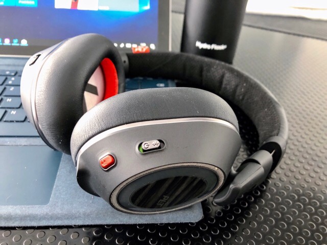
Als das Plantronics Voyager 8200 UC letzte Woche kam, versprach ich, dass ich mir dieses Mal ausreichend Zeit nehme, es zu testen. Sehr schnell stellte sich heraus, dass es funktioniert. Und dann hat mich der Mikrofontest endgültig überzeugt. Blieb nur noch eine Frage: Wie trägt sich das auf Dauer?
Die Antwort auf die Frage ist sehr subjektiv. Mir sind sie sehr bequem, nach einem Tag Eingewöhnung. Zuerst dachte ich, dass ich Platzangst bekomme, weil sie sehr voluminös sind und deutlich mehr Druck ausüben als etwa die Voyager Focus. Aber dann habe ich mich schnell daran gewöhnt. Ich habe mehrfach damit ein kleines Mittagsschläfchen gemacht. Das simuliert für mich eine Flugreise, weil ich dort auch immer nur stundenweise schlafe. Ich habe sie den ganzen Tag getragen, um damit zu arbeiten und sämtliche Telefonate zu führen.
Die orange Taste hat mir auf verschiedene Weise gute Dienste geleistet. Während man Musik hört, hält sie die Wiedergabe an und schaltet die Außenmikrofone durch. Man hört damit mindestens so gut wie ohne Kopfhörer. Und während eines Telefonats schaltet sie stumm, so dass man in einer Konferenz nicht reinplappert. Die aktive Geräuschunterdrückung habe ich meistens nicht gebraucht. Sie erzeugt ein leichtes Rauschen, das man nur hört, wenn keine Musik läuft.
Das Headset hat ein paar selbstverständliche Qualitäten, die jeder Plantronics-Anwender kennt. Wenn man es abnimmt, hört die Musik oder das Video auf zu spielen, ein Telefongespräch wird stummgeschaltet. Setzt man es wieder auf, dann geht das Programm weiter, das Mikrofon wird wieder entsperrt. Das geeschieht so automatisch, und automatisch richtig, dass man es bei jedem anderen Headset vermisst, wenn man sich daran gehöhnt hat.
Was ich verbesserungsfähig finde, sind Design und Haptik der flachen Seite der Ohrmuscheln. In der Mitte gibt es einen Furnier-Look -- ja, so wie in Autos -- und auf der linken Seite braucht man eine Zeit lang, bis man sicher die Bedienungselemente für <<, >ll und >> trifft. Auch die Lautstärkeregelung ist nicht so gut gelöst, wie das bei dem ersten BackBeat Pro war. Aber das sind Nickeligkeiten. Nach einer Woche habe ich mich daran völlig gewöhnt.
However, there’s a forest getting lost for the trees in all the talk about new hardware and apps. Sure, those will be part of the reveal, but Apple has already signaled that this event is different by telling the world it’s about education and holding it in Chicago. It’s part of a broader narrative that’s seen a shift in Apple’s education strategy that can be traced back to WWDC 2016. Consequently, to understand where Apple may be headed in the education market, it’s necessary to look to the past.
Apple’s Early iPad in Education Efforts Falter
Apple’s history of supporting education goes back to the company’s origins, but we don’t have to go back that far to understand where it stands now. The best place to start is at the Guggenheim Museum in New York City. The museum was the backdrop for Apple’s last event held outside the environs of its Cupertino headquarters, which just so happened to also be about education. The event, which was held in 2012, unveiled iBooks 2.0 featuring interactive textbooks, the iBooks Author tool for creating them, and iTunes U for iOS.
In 2012, iPad sales were still rising, and hopes seemed high that the iPad was the perfect device to support education. At first, that seemed to be the case. Apple was awarded a $30 million contract, which was the first part of a bigger deal to supply iPads to every student in Los Angeles’ school district in 2013. Later during Apple’s Q4 2013 earnings call Tim Cook said that the company had grabbed 94% of the tablet market in schools, which was followed by record-breaking iPad unit sales in Q1 2014.
It wasn’t long after that Q1 2014 earnings call, however, that several factors converged to undermine iPad adoption in schools as well as challenge the Mac’s position in the classroom. In fact, the very same earnings call foreshadowed trouble ahead. In the Q&A section of the call, Tim Cook cited the iPad’s market share in education, dismissing an analyst’s question about the threat posed by low-priced Chromebooks. However, by Q2 2014, global iPad sales began to drop and as the year progressed, Apple’s iPad deal with Los Angeles and other school systems began to unravel.
Today, more than half the nation’s primary - and secondary-school students — more than 30 million children — use Google education apps like Gmail and Docs, the company said. And Chromebooks, Google-powered laptops that initially struggled to find a purpose, are now a powerhouse in America’s schools. Today they account for more than half the mobile devices shipped to schools.
Faced with a broad-based decline in iPad sales and blindsided by a serious challenger, Apple needed a new approach.
The seeds of a new strategy were planted at WWDC in 2016 with the announcement of Swift Playgrounds and later that year with the introduction of Apple’s Everyone Can Code initiative.
Swift was still a young language at the time. Swift Playgrounds got a lot of attention, but at Apple’s fall event in 2016, the company revealed a broader, more ambitious plan that included an interactive textbook that was available in iBooks and additional resources for teachers and students that supported a complete Learn to Code curriculum. Unveiled with the public release of Swift Playgrounds in the fall, Everyone Can Code was interpreted by many as a sign of commitment to Swift and attempt to accelerate its adoption. Those were certainly aspects of the program, but Everyone Can Code was the first piece of a larger puzzle that has begun to reveal itself over the last 18 months.
iPads – equipped with Apple Pencil and Smart Keyboard apps – delivered to all incoming students free of charge during summer orientation starting next year.
An iOS Design Lab, set to open in a temporary space in 2018 and in its permanent home at Ohio State’s Columbus main campus in 2019. The lab will offer opportunities for direct engagement with technology among students and faculty members.
Coding courses, set to launch in spring 2018, featuring Apple’s Swift programming language. The courses are an extension of Apple’s similar arrangement with more than 30 community colleges nationwide.
The lab will also be available to the larger community surrounding the university.
Aside from the increasing frequency of the announcements in 2017 and 2018, there are a couple of additional notable aspects of Apple’s new approach to education.
First, Everyone Can Code is about more than hardware and the Swift Playgrounds app. Both are important, but they are tied together by a curriculum that creates a roadmap for schools and teachers to follow and, in the case of the Digital Flagship University program, a lab that encourages broader community involvement too.
Second, as Apple rolled out Everyone Can Code to high schools and colleges, its messaging gained a new dimension. The press releases not only extolled the virtues of learning, but they began tying it with local economic benefits too. An example is this statement from the announcement of the high school and college-level curriculum:
Earlier this month, Apple announced the creation of the Advanced Manufacturing Fund focused on creating jobs in the US throughout our supply chain, with an initial investment of $1 billion. The new Swift coding curriculum is another example of Apple’s commitment to economic development and will help create even more career opportunities for students across the country. Apple now supports 2 million jobs across all 50 states, including more than 1.5 million jobs attributable to Apple’s app economy.
Similar statements about Apple’s economic impact are found in its announcements of programs in Europe and other parts of the world.
What’s changed about Apple’s approach to the education sector is that it’s no longer simply selling schools on hardware and apps and leaving them to figure out how to incorporate them into the classroom. Hardware and software are critical aspects of the strategy, but were not enough to defend the company’s early lead in tablets against Chromebooks. What Apple is doing with Everyone Can Code, which I think is best demonstrated by the deal with Ohio State, is offering value beyond the hardware and software. The strategy is to provide a focused, turn-key solution to education that alters the calculus when schools evaluate their options. Apple is also reaching out more broadly into schools’ communities, forming a public/private partnership to support education at all levels, which is something I think we’ll hear more about in Chicago next week.
Let’s Take a Field Trip
Two other events occurred as 2017 came to a close that have a bearing on next week’s education event.
In isolation, the opening of the new Chicago Apple Store seems unrelated to next week’s event, and maybe it is. However, Tim Cook visited Chicago for the grand opening of the store and took the opportunity to meet with Chicago Mayor Rahm Emanuel and be interviewed on the Mayor’s podcast, Chicago Stories.1 When Emanuel asked what Apple could do to help kids learn to code who don’t have access to Apple products, he pointed to Apple’s in-store programs and its partnership with local organizations like Chicago’s tech incubator, 1871.
Just two months later, Apple announced an expansion of its Everyone Can Code program to all of Chicago’s nearly 500,000 students. The program includes K-12 public school students and City Colleges of Chicago and involves local businesses and non-profits. That’s an education deal of extraordinary size not seen since Apple was chosen to supply iPads to Los Angeles schools. In fact, according to a 2017 story in The New York Times, Chicago is the third biggest public school district in the continental US behind New York and Los Angeles.
Lane Tech College Prep High School. Photo courtesy of LonelyBeacon.
It’s against that backdrop that Apple will take the stage at Lane Tech next Tuesday. It’s an opportunity to hit the reset button, proving that Apple can implement Everyone Can Code on a scale comparable to the failed deal with Los Angeles five years ago. It’s also a chance for Apple to celebrate its partnership with other schools big and small that it’s already working with successfully and use them and Chicago as a roadmap for what it has in mind next for education.
Noticeably absent from the December press release about bringing Everyone Can Code to Chicago students is any mention of hardware. The Chicago Public Schools district already uses Macs and iPads, but it's heavily invested in Chromebooks too; so much so that it has held a teacher conference called Googlepalooza, which leads me to doubt whether the school system has enough iPads to administer the Everyone Can Code program to all its students. Given the scale of the program, it’s too much to expect that every student would be provided an iPad like incoming freshmen are at Ohio State, but I won’t be surprised if a hardware component of the program is announced Tuesday.
Although Everyone Can Code appears designed to shift the dialogue with schools away from price, where Chromebooks have an advantage, it can’t be avoided entirely when so many school systems are under tight budgetary constraints. Consequently, I expect Apple will drop the price of the base model 9.7” iPad another $30-50.
However, a price drop also introduces constraints. As a result, I don’t expect hardware changes like Apple Pencil support in the base model iPad. Instead, a rugged Apple-manufactured keyboard case that connects via Bluetooth seems more likely for the low end of the iPad line. Last year, Apple teamed up with Logitech to offer the Logitech Rugged Combo case. Like the LG 5K display that replaced Apple’s Cinema Displays, that feels like a placeholder deal meant to satisfy schools until Apple comes up with its own solution.
If we see a new iPad, it’s more likely to be at a higher price point than the base model, but close enough to the existing base model’s price that it could legitimately be considered by some schools. That would give the device a reason to share the stage with a lower-cost iPad and an opportunity for Apple to introduce new features like adding the Smart Connector and Apple Pencil support to more models of the iPad. With a Smart Connector, Apple could add a keyboard case that wouldn’t need to be separately charged, a feature that should tempt school IT administrators.
Macs will likely play a secondary role at next week’s event. A price drop and a spec bump for the low-end Mac make sense, but a Retina display as some rumors suggest doesn’t. Apple may also announce a 13” Retina MacBook, but I doubt that will occur at the low end of the line where the Air competes directly with the Chromebook.
Apps should be a major focus of the event too. It’s an opportunity to cover the highlights of iOS 11.3, but I expect the most time will be paid to apps that support Apple’s education strategy. In an early beta of 11.3, there were signs of a new framework called ClassKit. Although I don’t expect Apple to turn next Tuesday into a mini-WWDC session by explaining the ins and outs of the new framework, the company is likely to introduce new features to its Classroom app that take advantage of the framework and perhaps demonstrate features that third-party developers can use to enhance their own apps.
iBooks also feels like a natural candidate for a refresh next week. The app, which was featured prominently in Apple’s last education event outside California, has not seen a major update in some time. During part of the iOS 11.3 beta, the app was renamed ‘Books,’ which suggests that at a minimum, a rebranding of the app is in the works. I’m with Ryan who recently wrote about his expectations for a revamped iBooks in MacStories Weekly though. As Mark Gurman’s report in January for Bloomberg suggests, the time feels right for more than a simple rebranding, though what exactly will change is unclear.
The 2012 education event in New York City also introduced iTunes U for iOS. Last year, Apple pulled iTunes U content from iTunes and added it to Podcasts leaving the app with no real connection to its namesake. Also, the content available through the app extends beyond the university level suggested by the name. As a result, I expect a rebranding and redesign of the app as well as a re-imagination of how it and iBooks/Books fit together to provide a cohesive learning experience for students.
As soon as any Apple event is announced, people pin all of their hopes and dreams for new products to it. Suddenly, it becomes the event where every crazy rumor from the past six months becomes a ‘sure thing.’
Apple has a brand-new venue for major events right in the backyard of its new Apple Park campus, which has only been used once for a major event. The fact that next week’s event is being held outside of Cupertino signals that this is not an event of the scale of a September iPhone introduction. It also signals that it’s not an event that’s just about Apple and its products.
Apple has a long history of supporting education. It’s struggled over the past five years in the face of competition and missteps, but it hasn’t abandoned teachers and students. Next week’s event is as much about renewing the company’s commitment to them as it is about the products that will be discussed.
The event is also about making a connection with communities. At a time when Silicon Valley is looking more isolated and out of touch with the lives of people outside the Valley, Apple is reaching out, looking for a home for a new campus, and finding ways to bring public/private partnerships to education. In his interview with Rahm Emanuel, Tim Cook said:
You need the … political leadership, … you need great universities, schools that get people excited about entrepreneurship, you need some venture capital to give these guys some money so that they can go off and create things. You need a number of things. Chicago has all of it.
That’s a message I expect we’ll hear again on Tuesday, and it explains why Apple has chosen Lane Tech as the venue for next week’s presentation.
Change in education moves slowly. Next week when Apple takes the stage at Lane Tech, we will get updates to apps and some hardware announcements, but more importantly, the event will serve as a milestone in Apple’s education strategy that’s been evolving over the past five years. It’s not an endpoint any more than it’s the first step, and whether it’s successful or not remains to be seen. However, even if next Tuesday doesn’t create the same product splash as an iPhone event, I expect what we will see is an Apple with renewed confidence in its role in education and a roadmap for where it expects to take its education initiatives in the future.
The Mayor getsit when it comes to naming things. ↩︎
Support MacStories Directly
Club MacStories offers exclusive access to extra MacStories content, delivered every week; it's also a way to support us directly.
Club MacStories will help you discover the best apps for your devices and get the most out of your iPhone, iPad, and Mac. Plus, it's made in Italy.
A quick Friday post to let folks know about three in-development R packages that you’re encouraged to poke the tyres o[fn] and also jump in and file issues or PRs for.
Alleviating aversion to versions
I introduced a “version chart” in a recent post and one key element of tagging years (which are really helpful to get a feel for scope of exposure + technical/cyber-debt) is knowing the dates of product version releases. You can pay for such a database but it’s also possible to cobble one together, and that activity will be much easier as time goes on with the vershist package.
Not all vendored-software uses semantic versioning and many have terrible schemes that make it really hard to create an ordered factor, but when that is possible, you get a nice data frame with an ordered factor you can use for all sorts of fun and useful things.
It has current support for:
Apache httpd
Apple iOS
Google Chrome
lighttpd
memcached
MongoDB
MySQL
nginx
openresty
openssh
sendmail
SQLite
and I’ll add more over time.
Thanks to @bikesRdata there will be a …_latest() function for each vendor and I’ll likely add some helper functions so you only need to call one function with a parameter vs individual ones for each version and will also likely add a caching layer so you don’t have to scrape/clone/munge every time you need versions (seriously: look at the code to see what you have to do to collect some of this data).
And, they all it a MIME…a MIME!
I’ve had the wand package out for a while but have never been truly happy with it. It uses libmagic on unix-ish systems but requires Rtools on Windows and relies on a system call to file.exe on that platform. Plus the “magic” database is too big to embed in the package and due to the (very, very, very good and necessary) privacy/safety practices of CRAN, writing the boilerplate code to deal with compilation or downloading of the magic database is not something I have time for (and it really needs regular updates for consistent output on all platforms).
A very helpful chap, @VincentGuyader, was lamenting some of the Windows issues which spawned a quick release of simplemagic. The goal of this package is to be a zero-dependency install with no reliance on external databases. It has built-in support for basing MIME-type “guesses” off of a handful of the more common types folks might want to use this package for and a built-in “database” of over 1,500 file type-to-MIME mappings for guessing based solely on extension.
File issues or PRs if you need more header-magic introspected guesses.
NOTE: The rtika package could theoretically do a more comprehensive job since Apache Tika has an amazing assortment of file-type introspect-ors. Also, an interesting academic exercise might be to collect a sufficient corpus of varying files, pull the first 512-4096 bytes of each, do some feature generation and write an ML-based classifier for files with a confidence level + MIME-type output.
Site promiscuity detection
urlscan is a fun site since it frees you from the tedium (and expense/privacy-concerns) of using a javascript-enabled scraping setup to pry into the makeup of a target URL and find out all sorts of details about it, including how many sites it lets track you. You can do the same with my splashr package, but you have the benefit of a third-party making the connection with urlscan.io vs requests coming from your IP space.
I’m waiting on an API key so I can write the “submit a scan request programmatically” function, but—until then—you can retrieve existing sites in their database or manually enter one for later retrieval.
The package is a WIP but has enough bits to be useful now to, say, see just how promiscuous cnn.com makes you:
In a surprise move, Apple announced an education-focused event late last week. This marks the tech giant’s first education event since 2012, leading to expectations that the company will have a few product announcements to share.
In traditional Apple fashion, it’s unclear exactly what the event’s keynote and subsequent demos will focus on, or even what products will be revealed. As always though, it’s possible to read between the lines and speculate what Apple has planned for Tuesday.
That said, we know that the March 27th 10am ET/1pm PT event will have some sort of education spin to it, and that the bulk of the event will take place at a high school in Chicago. Given that the education market is still dominated by Google’s Chrome OS platform and Windows 10 desktops and laptops, it makes sense for Apple to launch another comprehensive push at the lucrative education market.
I’ll be on the ground this Tuesday at Apple’s education event bringing all the new directly from the show floor.
Cheaper iPad
Apple has been pushing the pricey iPad as an education tool for a few years now, but it looks like the company has plans to kick this strategy up a notch.
A new, cheaper iPad that removes some of the devices more premium features in order to hit a lower price point, could be on the way.
It’s likely that the new budget iPad won’t fall into the company’s ‘Pro’ line, which means it likely won’t feature standard Apple Pencil compatibility (more on this later). Still, there are rumours circulating that this new, more affordable iPad could feature a Smart Connector of some sort, allowing it to be compatible with Apple’s keyboard case. Apple’s Smart Connector is typically reserved for the iPad Pro.
Other speculation points to Apple finally releasing another iPad Mini, which hasn’t been updated since 2015 (the 4th-generation Mini remains my favourite iPad). Given that the iPad Mini features a smaller display, it’s likely that the company could sell the tablet at lower price point than the current $449 standard 9.7-inch 2017 iPad.
Revamped MacBook Air
The MacBook Air was an undeniably influential laptop that’s still used and loved by many. When the device was first released, Apple’s thin, versatile laptop was so far ahead of other manufacturers that it took years for the competition to respond from a design perspective.
Fast forward to 2018, and the Air is starting to show its age in both the design and hardware departments, especially in the face of the more recently released MacBook Pro.
Rumours stemming from KGI Securities often reliable analyst Ming-Chi Kuo indicate that Apple plans to release a new 13.3-inch MacBook Air that features a retina 1920 x 1200 display, an upgraded processor, and possibly even a slightly revamped body. The current version of the MacBook Air only includes a 1440 x 900 resolution display — a lacklustre resolution by today’s standards.
Given the backlash Apple experienced for going all in with USB-C with the release of the new MacBook Pro line, it’s also possible the company will opt for a mix of USB-C and USB-A with the new air.
Cheaper Apple Pencil
This one is a bit of a long shot, but it’s Apple could reveal a cheaper, education-focused Apple Pencil.
The current version of the Apple Pencil is only compatible with the iPad Pro, but given the Chicago event’s invitation features what looks like an Apple Pencil drawing in its media invite, it’s possible a new stylus of some sort could be revealed.
ClassKit
On the software side of things, Apple is apparently working on new classroom-focused software suite called ‘ClassKit.’
ClassKit was first uncovered by 9to5Mac, which first code related to the suite in the framework of one of iOS 11.3’s recent betas. According to 9to5Mac, ClassKit gives developers the ability to create educational apps, along with the ability to distribute quizzes and tests through iPads that can then be sent directly back to a teacher.
Since Apple’s Chicago event is set to be education focus, it’s almost certain that ClassKit will an appearance.
Everything else
At Apple’s last education event back in 2012, the company showed off iBooks 2 and a new iBooks Author app focused on textbook creation.
This time around, it’s possible Apple could have an overhauled iBooks app in the works once again, according to reporting from Bloomberg.
Multi-user functionality was added to iPads back with iOS 9.3 and Apple might have plans to further expand this feature in some way with an education focus.
It’s also important to keep in mind that just because Apple says its Chicago event is focused on education, it doesn’t mean we won’t see other products as well.
The company’s AirPower wireless charging mat that was announced back in September could finally get a release date (Apple previously said that it would release in 2018). iOS 11.3 could also get a full release now that it’s been in beta for a few weeks.
We could also get a glimpse at new, upgraded AirPods that feature better improved life, an iPhone SE 2 with increased screen resolution and a new processor, and as always, maybe even a “one more thing” moment of some sort.
Google is not updating the Nexus Player to Android P and will stop pushing out security updates for the Android TV set-top box.
To anyone following Nexus Player news for the last few months, this shouldn’t really be much of a surprise.
Google had already confirmed that the Nexus 5X, Nexus 6P and the Pixel C are not getting updated to Android P. That said, it’s odd it took the search company an extra two weeks to make the announcement about the Nexus Player.
The Nexus Player originally launched in November 2014 with Android 5.0 Lollipop. Back in 2016, Asus stopped producing the Nexus Player, though the device still received updates. Last year Google added Android 8.0 Oreo as well as Google Assistant to the set-top box.
Developers who utilize the Nexus Player for developing Android TV apps can still use the Android TV emulator in the Android P Developer Preview.
Chinese smartphone manufacturer Huawei is looking into building a smartphone that has the ability to run blockchain-type apps, according to a report fromBloomberg.
The company is planning on licensing an operating system from Sirin Labs that could help integrate a blockchain network into future Huawei smartphones.
This system is called ‘SIRIN OS’ and it’s capable of running blockchain applications alongside regular Android OS.
Sirin Labs has made a habit of developing quirky phones with its last offering being a $17,400 USD device, called the Solarin, that focuses on security.
The company’s current phone is called FINNEY and it’s up for pre-order now. The device promises to have the ability to use blockchain technology and also features an embedded cryptocurrency wallet. Which could be why Huawei is looking into partnering with them.
“Amazing meeting just concluded between Sirin Labs and Huawei. Among other things discussed was the possibility of cooperating together to bring blockchain technology to the masses in a secure way,” said Sirin Labs in a statement to Bloomberg.
The companies have confirmed to Bloomberg that there’s been some discussion, but no deal has been made yet.
While many are still holding onto the hope that Apple will soon reveal a new MacBook Air, Bloomberg’s almost always reliable Mark Gurman is reporting that only a “low-cost iPad,” alongside new education software, will be shown off at the tech giant’s upcoming March 27th, 2018 education event.
In the lucrative and hyper-competitive education market, Apple has continuously been losing ground to both Google and Microsoft. A cheaper iPad makes sense given Apple’s ambition to become the go-to classroom device manufacturer, especially when it comes to price.
The company’s cheapest tablet right now is the $449 CAD 9.7-inch 2017 iPad.
Bloomberg is also reporting that a new, cheaper MacBook designed to replace the MacBook Air is still in the works, but that it won’t make an appearance at Apple’s Tuesday event. Gurman reports that Apple’s cheaper MacBook will likely be priced in the under $1,000 range.
It’s unclear if Apple’s new, more affordable iPad will feature Apple Pencil functionality, though some rumours point to Apple also releasing a cheaper stylus designed specifically for this new iPad. It’s possible that the new iPad will include a magnetic accessory connector, just like the iPad Pro.
I’ll be on the ground at Apple’s education event in Chicago bringing all the news directly from the event’s keynote.
In-display fingerprint sensors have been the talk of the town, especially since the reveal of the Vivo X20 Plus UD — the first phone ever released with a fingerprint scanner under the display. However, it looks like Samsung’s Galaxy Note 9 may be an upcoming smartphone with this new feature.
According to the Korea Herald, who attributes its information to unnamed sources, “Samsung Display has prepared three or four solutions for Samsung Electronics to embed the fingerprint sensor inside of the main display, and both are seriously considering one of the solutions… A final decision on adoption of the technology will be made by this month.”
According to another source, “there is enough time for the display company to improve the technology to meet the handset maker’s expectations before the launch of the Note 9 in late August.” The source went on to say that moving the fingerprint sensor to the front of the phone would allow for Samsung to put a larger battery into the device.
Recent rumours point to Samsung foregoing the use of the in-display fingerprint scanner for the Note 9. The leak mentioned that Samsung had looked into all sorts of technologies that it could implement into the in-display fingerprint scanner. The company also enlisted the help of Synaptics, the manufacturer of the in-display fingerprint scanner for Vivo’s line of smartphones.
The industry source for that rumour claimed that an in-display fingerprint scanner would only be possible next year, but this report casts doubt on that claim.
Samsung will likely unveil the Galaxy Note 9 in late August, similar to last year’s Note 8.
I've heard it called "the internet of broken things" in the past, though the new name is probably more appropriate because the things aren't broken, they were just badly designed to begin with. This article is a good compendoium of some recent breakdowns, referencing such threats as Mirai and Stuxnet and Heartbleed. This cannot be solved in a day. "Long term, we need to make a better investment in the overall health of the internet," Jim Zemlin, executive director of the Linux Foundation, said. "There's no quick fix, but if you have bug bounty programs, do threat modeling, and train developers to write secure code, you're going to have a healthier internet."
Best Buy Canada is following suit with its U.S. counterpart and will no longer sell Huawei products, according to information obtained by MobileSyrup.
U.S. Best Buy locations will stop selling Huawei devices over the course of the next few weeks, according to reports from Reutersand CNET.
Presumably, Best Buy Canada will adhere to a similar timeline.
Reuters and CNET both cited tensions between the Chinese tech giant and the U.S. government over security and trade concerns as the reason for Best Buy choosing to stop stocking Huawei products.
Those concerns have so far resulted in major U.S. carriers like AT&T cutting ties with Huawei, which not only sells devices but is also one of the largest telecom infrastructure companies in the world.
The Canadian government and carriers have raised no such flags, however, so Best Buy Canada ceasing to carry Huawei devices will mark the first time the U.S. scandal has affected a tangible change in markets north of the border.
Recently, Huawei came under fire in a Globe and Mail report that featured interviews with several former Canadian security officials who expressed concerns with the company’s role in the development of Canada’s 5G networks.
In a formal statement, Best Buy Canada did not deny plans to stop the sale of Huawei products, but told MobileSyrup: “We don’t comment on specific contracts with vendors, and we make decisions to change what we sell for a variety of reasons.”
Meanwhile, Huawei asserted that its prospects in Canada wouldn’t be strongly diminished.
“Canada is a very different market than the United States,” said a company spokesperson in a statement to MobileSyrup. “We sell our devices to Canadian operators, not directly to independent retailers.”
Still, Best Buy refusing to stock Huawei products will shut down a retail path for Canadian carrier partners when the Huawei P20 eventually hits the market.
The new Instant Pot Max has some new features that could be genuinely useful when it arrives in June: Faster cooking due to its higher maximum pressure and a more accurate temperature sensor for sous vide cooking are a few highlights. But this doesn’t make your current pressure cooker passé. The Max is a high-end addition the Instant Pot lineup that won’t replace any existing models. We spoke with Instant Pot’s CEO, Robert Wang, and vice president of product, Yi Qin, about the Max’s new features and plan to test one as soon as they’re available. In the meantime, here’s what you can look forward to.
Use stovetop pressure cooker recipes without modifications
The Instant Pot Max will be the fastest multicooker once it arrives because it will be the first that can cook at 15 psi, a level that was previously achievable only with stovetop pressure cookers. This also means the Max can handle stovetop pressure cooker recipes without any adjustments (previously, you had to modify the cooking time based on timetables from the manual) and can be used for pressure canning. But it will launch in only a 6-quart size, which holds just four pint jars at a time.
Easier controls
In an attempt to alleviate the confusion some folks might experience with previous Instant Pots’ control panels (there are a lot of buttons!), the Max includes a touchscreen. It also has fewer preset cooking functions, which is good, because for most recipes, you’re just manually setting pressure level and cook time. You can quickly control time, pressure level, elevation, steam venting, temperature, and keep-warm functions by touching the screen and adjusting the dial. But the higher-pressure capabilities of the Max might create more worry for pressure-cooker-anxious folks than the touchscreen can mitigate.
True sous vide capabilities (supposedly)
With an added temperature sensor in the lid, Instant Pot claims the Max is the most precise cooker it makes. The Instant Pot Ultra also has a temperature sensor, but only in the base, whereas the Max has both. When the Ultra launched, the company claimed it could sous vide foods, but dialed back those claims and rewrote the manual when it realized the Ultra didn’t hold as accurate a temperature as the company would like. We sous vide salmon filets in the Ultra and the results were more akin to slow poaching than anything you’d get from an immersion circulator. Yi Qin told us the Max’s sous vide and keep-warm functions can hold temperature with one to two degrees variance compared with the Ultra’s five-degree margin. You can guarantee we’ll test that out!
Safer pressure-release button
On the Max, Instant Pot moved the pressure-release button from the lid to a safer home on the control panel. In comparison, the Ultra’s release button is right next to the pressure valve. The Duo, meanwhile, requires you to manually twist the valve from “sealing” to “release.” Either way, you have to put your hand right next to the spot where steam comes shooting out, which can make some folks uneasy. So the Max’s relocated release button is a big improvement if you’re nervous about steam burns (although I’ve never burned myself on any Instant Pot).
“Stirring,” but not really
We’ve seen other publications report that the Instant Pot Max can stir food as it cooks. This isn’t entirely accurate. It doesn’t have a physical stirring mechanism like you’d find in an air fryer or Thermomix—so don’t expect it to do a hands-off stir-fry. Instead, the Max has a “pulse release” function that agitates food by letting off measured bursts of pressure throughout the cooking process. Here’s how it works: Pressure raises the boiling point of water, so even though liquids under pressure can get up to 250 degrees Fahrenheit, they’re not rapidly bubbling inside the pot. As soon as some of the pressure is released, the liquid bubbles up and takes whatever you’re cooking for the ride. According to Robert Wang, this agitation makes a cloudier and more collagen-rich bone broth that’s prized by paleo-diet enthusiasts—a claim we look forward to testing.
Easier cleanup
The Instant Pot Max is easier to clean than previous models. We’re glad to see that Instant Pot widened and angled out the crevice between the cooking pot and housing. This is a welcomed improvement because the narrow gap on the IP-DUO60 was a pain to clean. And the lid is dishwasher-safe despite the added wireless temperature sensor and electronics.
No, you don’t need to replace your Instant Pot
If everything goes according to plan, the $200 Instant Pot Max should be the most versatile and user-friendly multicooker ever, once it comes out in June. But this doesn’t make your Instant Pot obsolete! At best, the Max is in the running to be our new upgrade pick, and Instant Pot assures us it isn’t discontinuing any models—just adding to the line. Although the new features on the Max are nice to have, the existing line—from the Duos to the Ultra—don’t feel lacking in functionality. If you’re currently thinking about buying an Instant Pot, and you find these new features are appealing, you might want to wait until June for the Max.






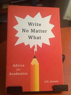



 As the busy season ramps up, Mobi is looking for people to staff up their Balancing Crew. Details


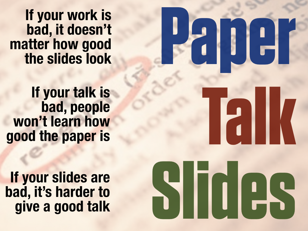


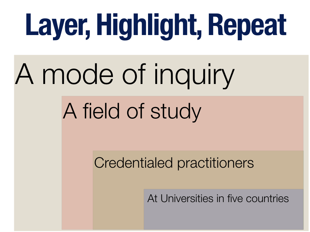
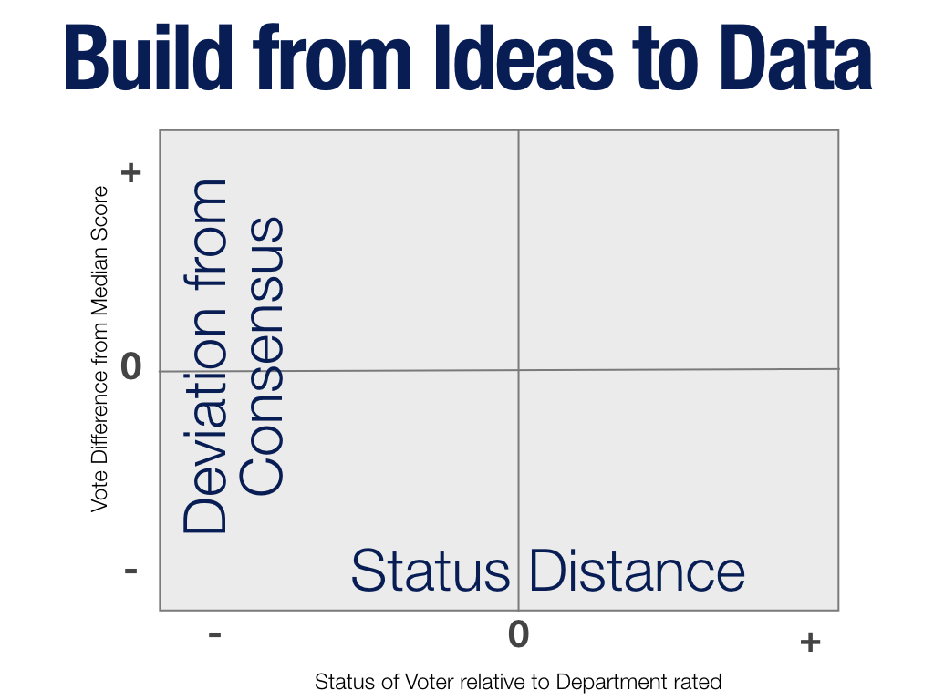
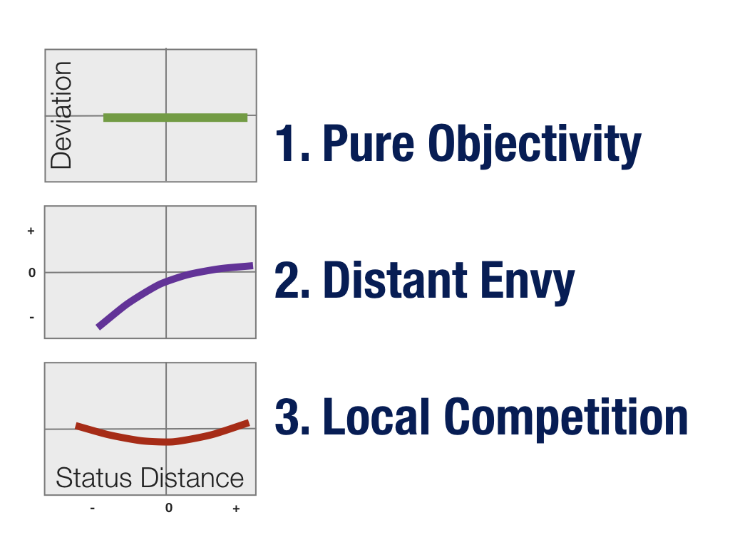



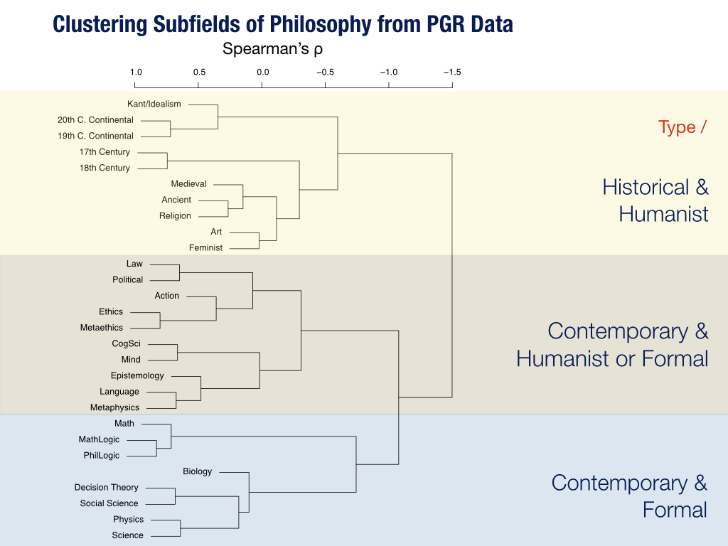


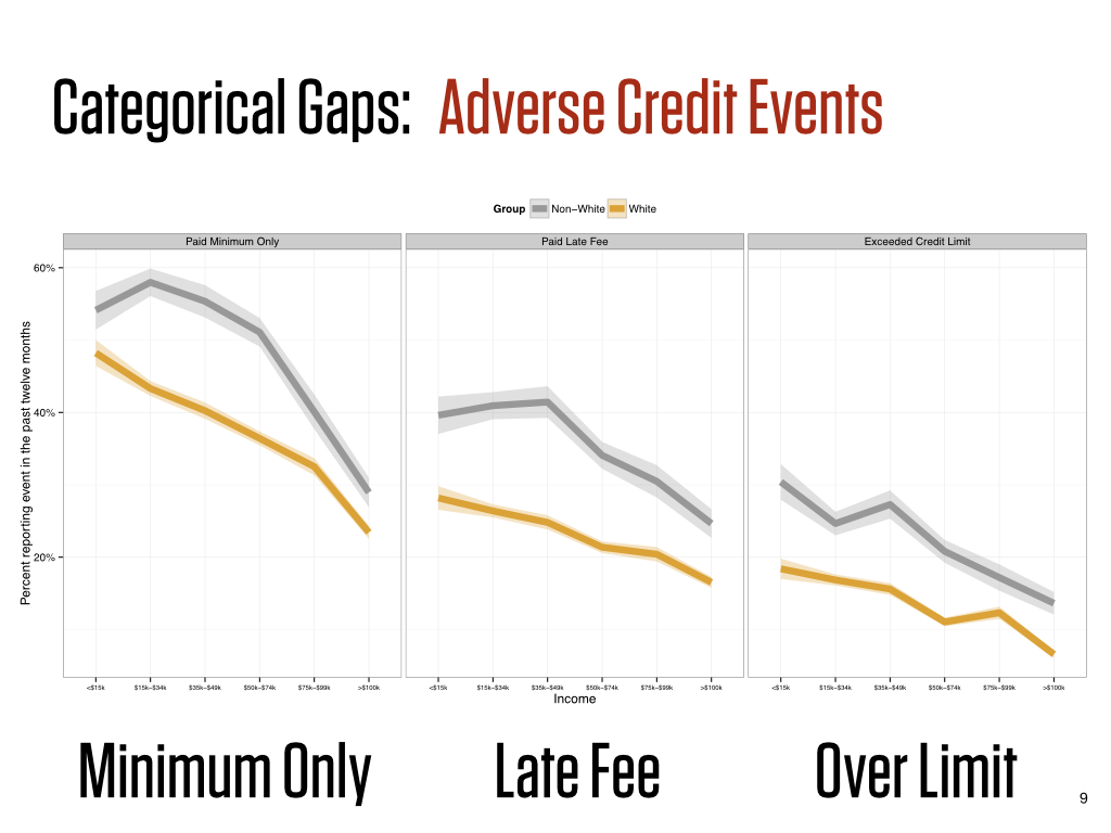





 a hyperlocal newspaper whose evolution reflects many of the major forces operating on journalism in this country.