Shared posts

11 May 05:16

Four Fruits of Philosophy

files/images/fake_news.jpeg

Rachel Anne Williams, Medium, May 12, 2018


Icon

OLDaily isn't simply about educational technology. It takes a philosophical perspective, which means that readers benefit (I hope!) from some deeper analysis that "Look what's cool!" This post identifies four major benefits of philosophy: critical thinking, scientific criticism, ethical reasoning, and wisdom (here defined as "knowing how to live a good life. Knowing what’s valuable in life and what’s not," which speaks to the outcomes and benefits of education). Though each post stands on its own, and refers to a specific resource or point of view, the posts (more than 30,000 of them) are also intended to be taken together as a unified whole, an extended philosophical discussion of learning, technology, and wisdom. P.S. I love the thermometer example. 

Web: [Direct Link] [This Post]
09 May 14:25

Pity the two-vehicle family with a mortgage up for renewal this spring - The Globe and Mail

mkalus shared this story .

Rob Carrick Personal Finance Columnist

We are starting to accumulate all the irritations you normally see when the economy’s going great.

Rising gasoline prices? Check.

Rising borrowing costs? Yup.

Story continues below advertisement

Rising inflation? You bet.

Costs are rising on a wide front this spring, but they’ll hit one demographic hardest. That’s the family with two vehicles and a mortgage that must be renewed this spring. Between higher borrowing costs and surging gasoline prices, a typical family could easily expect to pay an extra $165 or more per month.

It’s a sign that your finances are in hand if you can absorb an increase such as this without too much trouble. But households seem so stressed out financially these days. The Financial Planning Standards Council just published a survey indicating that 41 per cent of Canadians rank money as their greatest stress – over health, work and relationships – and that 51 per cent feel embarrassed about the lack of control they have over their finances.

There’s some good news for all working people in the latest data on incomes. The Bank of Canada estimates year-over-year recent average wage growth of 2.7 per cent, up from 2.3 per cent in the final three months of 2017 and just 1.1 per cent in mid-2016. The two-vehicle family renewing a mortgage will need this extra money.

Rising gas prices crept up on us while we were keying in on interest rates as the big threat to household financial stability. <a href="http://Gasbuddy.com" rel="nofollow">Gasbuddy.com</a> reported a Canadian national average gas price of $1.33 cents a litre earlier this week, up 24 per cent from $1.07 one year earlier. There’s some momentum to gas prices – within the first seven days of May, they were up 7.4 cents over the April average. Gasbuddy shows that British Columbia and Newfoundland residents would pay more than this.


Regular unleaded gasoline prices
In cents a litre, including taxes
Canadian average
Toronto
Vancouver
THE GLOBE AND MAIL, SOURCE: the kent group
data
share
×
Date Canadian average Toronto Vancouver
2016-01-05 101.3 101.6 121.9
2016-01-12 96.8 95.2 109.8
2016-01-19 93.7 92.2 106.6
2016-01-26 91.3 94.1 106.7
2016-02-02 93.8 94.2 107.6
2016-02-09 88.6 89.5 102.8
2016-02-16 88.1 91.7 108.9
2016-02-23 90.1 87.7 106.5
2016-03-01 89.3 89.6 110.7
2016-03-08 91.5 90.5 112.6
2016-03-15 98.6 95.6 115.6
2016-03-22 96.9 95.7 112.7
2016-03-29 99.3 99.6 115.6
2016-04-05 98.7 98.6 113.7
2016-04-12 101.9 102.5 114.8
2016-04-19 102.8 102.6 113.6
2016-04-26 103.3 104.6 117.8
2016-05-03 106.5 105.6 120.8
2016-05-10 104.6 104.6 119.8
2016-05-17 107.8 107.6 121.5
2016-05-24 109.1 110.6 120.6
2016-05-31 108.9 109.6 121.8
2016-06-07 111.4 108.6 124.8
2016-06-14 109.7 105.5 120.8
2016-06-21 108.3 104.7 122.3
2016-06-28 107.5 106.5 123.4
2016-07-05 108.1 106.5 126.6
2016-07-12 104.8 103.4 123.6
2016-07-19 104.2 102.4 123.6
2016-07-26 103.0 101.3 122.1
2016-08-02 101.7 100.5 116.9
2016-08-09 103.1 101.0 117.2
2016-08-16 103.4 99.8 117.5
2016-08-23 105.0 101.8 122.7
2016-08-30 107.0 103.0 125.9
2016-09-06 105.6 100.6 123.7
2016-09-13 103.5 99.3 124.6
2016-09-20 105.5 102.2 127.5
2016-09-27 105.5 101.1 124.0
2016-10-04 106.6 103.5 123.8
2016-10-11 109.4 104.9 127.0
2016-10-18 108.7 104.2 127.8
2016-10-25 109.2 105.7 130.2
2016-11-01 107.9 105.2 128.5
2016-11-08 106.6 105.1 120.6
2016-11-15 101.4 100.4 111.8
2016-11-22 99.9 98.7 112.4
2016-11-29 103.5 101.3 117.0
2016-12-06 105.6 104.2 118.4
2016-12-13 106.4 104.9 120.1
2016-12-20 108.4 105.3 123.1
2016-12-27 112.0 108.4 128.1
2017-01-03 115.6 111.9 131.3
2017-01-10 116.8 113.5 134.6
2017-01-17 113.7 111.8 126.8
2017-01-24 111.5 111.3 124.3
2017-01-31 110.1 109.3 121.7
2017-02-07 108.7 107.4 125.2
2017-02-14 108.6 108.2 126.9
2017-02-21 108.9 108.1 127.9
2017-02-28 109.8 107.4 130.5
2017-03-07 110.7 107.2 134.6
2017-03-14 110.6 108.3 137.1
2017-03-21 109.6 107.6 133.9
2017-03-28 108.9 108.5 132.7
2017-04-04 114.9 111.9 139.5
2017-04-11 116.3 114.1 140.4
2017-04-18 121.3 120.2 138.8
2017-04-25 119.1 117.0 138.1
2017-05-02 114.8 113.7 133.7
2017-05-09 111.4 110.4 130.4
2017-05-16 112.8 111.5 133.4
2017-05-23 114.8 113.5 137.4
2017-05-30 117.1 114.9 135.6
2017-06-06 114.7 113.2 133.4
2017-06-13 111.5 109.3 132.0
2017-06-20 108.0 106.5 129.8
2017-06-27 106.5 105.0 128.7
2017-07-04 108.7 106.6 131.4
2017-07-11 110.6 109.2 134.0
2017-07-18 110.0 109.7 132.5
2017-07-25 109.8 110.6 131.6
2017-08-01 110.1 111.4 132.5
2017-08-08 114.1 113.5 135.0
2017-08-15 113.6 112.2 136.3
2017-08-22 112.7 111.2 138.9
2017-08-29 112.6 111.8 140.4
2017-09-05 121.6 121.8 140.2
2017-09-12 123.9 124.0 140.3
2017-09-19 115.6 114.2 137.1
2017-09-26 114.1 114.2 135.3
2017-10-03 115.0 114.1 133.4
2017-10-10 112.9 111.6 133.9
2017-10-17 113.7 113.2 135.8
2017-10-24 115.8 115.4 137.6
2017-10-31 119.5 119.4 141.6
2017-11-07 124.9 122.3 144.6
2017-11-14 125.5 123.7 145.0
2017-11-21 122.4 120.3 139.9
2017-11-28 121.3 122.0 137.2
2017-12-05 120.6 122.0 138.9
2017-12-12 119.3 120.8 135.8
2017-12-19 118.4 120.0 136.6
2017-12-26 120.3 121.4 136.7
2018-01-02 122.1 123.1 139.7
2018-01-09 121.5 121.5 138.7
2018-01-16 123 123.8 141.4
2018-01-23 123.9 125.7 140.7
2018-01-30 126.4 126.8 145.3
2018-02-06 126.2 126.3 147.1
2018-02-13 122.8 123.3 143.2
2018-02-20 121.2 120.8 141.3
2018-02-27 123.2 123.6 145.3
2018-03-06 124.7 123.6 148.5
2018-03-13 124.2 124.1 149.5
2018-03-20 126.5 125.5 151.8
2018-03-27 129.9 129.4 154.6
2018-04-03 131.6 131.3 154
2018-04-10 131.7 130.8 153.2
2018-04-17 134.4 134.7 153.5
2018-04-24 136 135.3 155.5
2018-05-01 138.6 137.3 159.6

Regular unleaded gasoline prices

×

Share this chart:

<a href="https://s3.amazonaws.com/chartprod/KD396fz26syv6eDZa/thumbnail.png" rel="nofollow">https://s3.amazonaws.com/chartprod/KD396fz26syv6eDZa/thumbnail.png</a>

It’s estimated that people in Canada drive an average 20,000 kilometres a year – let’s conservatively say 30,000 km for a household with two vehicles, or 2,500 a month. This works out to about $300 in gasoline costs per month assuming two reasonably fuel-efficient vehicles, up about $60 from a year ago.

Interest rates are a much bigger deal than gas prices, unless you drive a thirsty truck or SUV. About 47 per cent of outstanding mortgages come up for renewal this year, many of them during the busy spring season for buying and selling homes. If you’re renewing a five-year fixed rate mortgage set up five years ago, a widely available discounted rate would be 3.49 per cent. A comparable rate from back in 2013 would have been 2.79 per cent, which means you’re looking at paying 0.7 of a percentage point more.

Story continues below advertisement

Story continues below advertisement

The national average resale house cost in 2013 was $382,196, which meant a monthly payment of $1,640 if you assume a 2.79-per-cent five-year fixed-rate mortgage amortized over 25 years. On renewal at 3.49 per cent, the payment would rise to by $105 a month to $1,745. Add the higher cost of gas to increased mortgage payments and you get extra monthly costs of $165 a month, or $1,980 a year.

Two spouses earning a combined total $125,000 would have a good chance of making that back based on current trends for pay increases. Problem is, overall inflation seems to be picking up. According to Statistics Canada, the year-over-year cost of living increase in March was 2.3 per cent, which compares with 2.2 per cent and 1.7 per cent in February and January, respectively. Energy prices have driven inflation higher, but many families have found food inflation to be an issue as well.

Spring is an inconvenient time for these expenses to start piling up. Families are planning their summer vacations and working parents with younger kids are lining up summer camps that can cost as much as $500 to $1,000 per week per child. Spring is also a time when people spend big on fixing up their homes and yards – just take a look at the crowded parking lots at home-improvement stores these days.

Pro-active families will start budgeting now to adjust to higher living costs. Estimate how much extra you’ll have to spend and accommodate it either through pay increases or cutting other expenses.

Reactive families will let it all play out and see what happens. They’ll have a starring role in the next poll asking people how stressed they are about their financial situation.

09 May 14:11

Software as an academic publication

Software has for while now played a weird an uncomfortable role in the academic statistics world. When I first started out (circa 2000), I think developing software was considered “nice”, but for the most part, was not considered valuable as an academic contribution in the statistical universe. People were generally happy to use the software and extol its virtues, but when it came to evaluating a person’s scholarship, software usually ranked somewhere near the bottom of the list, after papers, grants, and maybe even JSM contributed talks.

Journals like the Journal of Statistical Software tried to remedy the situation by translating the contribution of software into a commodity that people already understood: papers. (Okay, thinking of papers as “commodities” is probaby worth another blog post.) The idea with JSS, as I understood, was that you could publish a paper about your software, or maybe even a manual, and then that would be peer-reviewed in the usual way. If it passed peer-review, it would be published (electronically) and then you could list that paper on your CV. Magic! The approach was inefficient from the start, because it placed an additional burden on software developers. Not only did they have to write (and support) the software, but they had to write a separate paper to go along with it. Writers of theorems were not saddled with such requirements. But at the time of its founding around 2004, the JSS approach was perhaps a reasonable compromise.

These days, I think many people would be comfortable seeing a piece of software as a per se academic contribution. A software package can, for the most part, stand alone and people will recognize it. I personally do not think authors should be forced to write a separate paper, essentially translating the software from code into English or whatever natural language. The Journal of Open Source Software is a move in this “opposite” direction, where no paper is required, beyond the software itself and a brief summary of the software’s purpose and how to use it. This process is similar to ideas that people have had regarding the publishing of data: why not just let people who collect data publish the dataset alone and get credit for doing so? I think the JOSS approach is basically the way to go for academic software contributions, with one small caveat.

Evaluation of most software places a heavy emphasis on usefulness. The instructions for authors on the JSS web site indicate how each paper and software would be evaluated for publication:

The review has two parts: both the software and the manuscript are reviewed. The software should work as indicated, be clearly documented, and serve a useful purpose. Reviewers are instructed to evaluate both correctness and usefulness. Special emphasis is given on the reproducibility of the results presented in the submission.

JOSS takes a slightly different approach but ultimately has a similar standard. The software

Should be a significant contribution to the available open source software that either enables some new research challenges to be addressed or makes addressing research challenges significantly better (e.g., faster, easier, simpler)

In both cases, there is an emphasis on usefulness which, as a goal, is difficult to argue against. However, if you look at the goals of most academic journals, usefulness is not amongst the criteria for evaluating contributions. If it were, you’d have to delete most of the journals in existence today. This is a frequent argument that basic scientists and theorists have with policymakers—whether their work is “useful” is not the point. Advancing the state of knowledge about the world is important in and of itself and the usefulness of that knowledge may be difficult to ascertain in the short run. Journals typically strive to publish papers that represent an advance in knowledge in a particular field. Often there is a vague mention of “impact” of the work, but how wide that impact is likely to be will depend on the nature of the field.

What exactly is the advance in knowledge that is obtained when software is developed and distributed? I don’t ask this question because I don’t think there is an advance. I ask it because I think there is definitely knowledge that is gained in the process of developing software, but it’s usually not communicated to anyone. This knowledge is typically not obtained via the scientific process. Rather it is often gained through personal experience. We have well-established methods for distributing software once it is developed, but we do not have well-established venues of distributing any knowledge that is obtained, particularly any informal knowledge or personal stories.

If you’ve ever seen someone give a presentation or talk about some software they’ve written, you know it’s not the same as reading the manual for the software. One reason why is that the presenter will describe the process through which they went about writing the software and, usually as asides, mention some lessons learned along the way. I think these “lessons learned” are critically important, and make up a relevant contribution to the scientific community. If I mention that I started out writing this software using R’s S4 class/method system but realized it was too complicated and annoying and so went back to S3, that’s a useful lesson learned. As a fellow developer, I might reconsider starting my next project with S4. However, unless we take a critical eye to the git logs for a given software package, we would never know this by simply using the software. It would seem as if the developer went with S3 from the get go for unknown reasons.

I think it would be nice if software publications included a brief summary of any lessons learned in the process of developing the software. Many developers already do this via blog posts or similar media. But many do not and we are left to wonder. Maybe they did some informal user testing and found that people preferred one interface over another interface. Anything that other people (and developers) might find useful, beyond the software itself. It might be a paragraph or even just a set of bullet points. It might be more but I’m not inclined to require any specific length or format. To be clear, this is not equivalent to a scientific study, but it’s potentially useful information nonetheless.

One good example of something like this is the original 1996 R publication in the Journal of Computational and Graphical Statistics by Robert Gentleman and Ross Ihaka. In fact, the abstract for the article says it all:

In this article we discuss our experience designing and implementing a statistical computing language. In developing this new language, we sought to combine what we felt were useful features from two existing computer languages. We feel that the new language provides advantages in the areas of portability, computational efficiency, memory management, and scoping.

With many popular software packages there are often blog posts that people write to describe how they use the software for their particular purpose. These posts will sometimes praise or criticize the software and in aggregate provide a good sense of the user experience. The kind of information I’m talking about gives us insight into the developer experience. For any reasonably well-developed piece of software, there are always some lessons learned that the author ultimately keeps to themselves. I think that’s a shame and it would be nice if we could all learn something from their experience.

09 May 14:11

Google's Show of Force

by Volker Weber

Capture

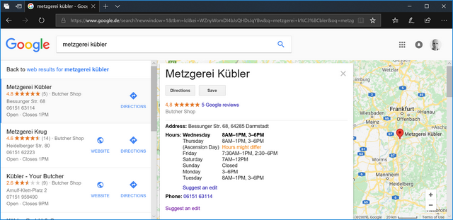
The Google I/O Keynote was quite impressive. Machine learning, artificial intelligence, Google Assistant, Google Lens and so forth. I think Google Assistant passed the Turing Test already. This is of course all driven by your data. I never bother to look up a business website if I want to find out how I can call them or whether they are open. And if a business listing is missing opening hours, I find out and then add them myself, if only for future reference.

AI and ML depends on large volumes of data. That is why Google is so hungry for it. Without this data, you simply cannot compete with them, no matter how much money you pour into research.

09 May 14:10

Luckin Coffee exits soft launch, trying to poach top Starbucks staff

by Eva Yoo
Luckin Coffee (瑞幸咖啡), a new coffee brand the “new retail professional coffeeshop operator”, has announced that it now opened in 13 cities, 400 stores, served 1.3 million customers with 5 million cups of coffee after 4 months of soft launch, TMT Post is reporting. The CEO of Luckin Coffee, Qian Zhiya (钱治亚), is the former COO […]
09 May 14:10

Debco Bag Distributors has recalled Iris Wireless Charger

by Bradly Shankar
Iris Wireless Charger

E-commerce site Debco Bag Distributors has recalled its Iris Wireless Charger product for wireless devices.

In an alert on Health Canada, the charger is described as being “clear/white in colour and circular in shape with model number CU9419 and date code S/N 201712 DP1986 or S/N 201803 DP2035 printed on the back of the charger.”

Health Canada notes that the product may melt and/or smoke, which can pose a burn hazard to consumers.

As of May 4th, 2018, Debco says it has received one report of smoking and one report of melting in Canada, although there have been no reports of burn injuries.

Overall, Debco says approximately 1,312 units of the charger were sold in Canada between February and April 2018.

Health Canada says customers with the product should stop using it immediately and contact Debco Bag Distributors toll-free at 1 (844) 730-5005 from 9am to 5pm EST from Monday through Friday. Debco can also be reached online or by email.

Source: Health Canada

The post Debco Bag Distributors has recalled Iris Wireless Charger appeared first on MobileSyrup.

09 May 14:10

From my inbox

by Volker Weber

5f2adb4261627d59c2fbf8899d828e48

Manfred kennt mein Kryptonite. Ich werde mir das gut einteilen. MAMPF! Danke, Manfred!

4960845b63973360d9ed7a44525c7817

Wenn man so ein Paket bekommt, dann ist da oft Werbung drin im Sinne von "Kauf noch mehr". Vielleicht ist der Gutschein ja einem von Euch nützlich!

fe0766d4609d168a3513a627997a7463

Und Eric weiß auch, was gut ist. Heute kamen gerade vier M16 Minen, die ich für meine anderen Lamy bestellt habe. Ja, die trocknen irgendwann aus. ;-) Danke, Eric.

Solche Pakete aus heiterem Himmel machen immer einen Heidenspaß. Jetzt warte ich nur noch auf das Paket mit den fünf Rollen für meinen Aeron. Die alten haben nach zehn Jahren den Geist aufgegeben.

09 May 14:10

Breaking down the B.C. economy's risky reliance on real estate

mkalus shared this story .

After a decade of soaring real estate prices that have turned ordinary homeowners into paper millionaires and added billions to the provincial GDP, the B.C. economy finds itself in a dangerous position, says an SFU professor.

On its own, real estate accounted for 18 per cent of B.C.'s GDP last year, according to Statistics Canada. Add in building construction, and it's something like a quarter of the GDP — more significant than the oil and gas industry in Alberta.

"We have an economy that's been made dependent on this through a faulty policy framework and this is a bad long-term model," said Josh Gordon, an assistant professor in the school of public policy at Simon Fraser University, 

The province relies so heavily on the real estate industry that a crash would have major impacts on both the economy and the everyday British Columbian, according to academics and former finance ministers who spoke with CBC News.

Jobs on the line

Thousands of construction jobs and an important source of tax revenue hang in the balance, as do the life savings of new homebuyers and the retirement plans of long-time homeowners. The experts say something needs to change.

"This is why you shouldn't design your economy around real estate and real estate price appreciation," Gordon said.

Many construction jobs could be lost if B.C.'s real estate market crashes. (CHEK News)

It's not just the fact that real estate is king. Gordon also worries it's become increasingly difficult for other industries to get a foothold in B.C.

When housing becomes as unaffordable as it is in many parts of the province, attracting skilled and talented workers becomes a major challenge, Gordon said.

If a true crash were to happen, he believes it would offer opportunities in the long term for other businesses to move in.

But in the short term, there would be pain.

"There's a range of dynamics that happen in housing bubbles and booms, which is that people take on a lot of debt. So when that process stops or reverses, there's a lot less discretionary spending that happens, so you would see an impact in the retail sector and so on," he said.

Real estate is 'not real life'

For Vladimir Dvoracek, real estate's supremacy isn't just an economic problem. It's also sociological.

"What does life consist of? The important things are … having kids, playing with them in the park, holding hands with your spouse and going for dinner," said Dvoracek, an associate vice president of institutional research at the University of the Fraser Valley.

"Speculation in real estate, sure it happens, but it's almost become a mania in Vancouver. It's almost all people think about, and that's not real life."

He believes that despite a raft of new taxes from provincial and municipal governments, the system remains fundamentally unfair. The average worker gives up a large chunk of each paycheque to income taxes, while taxes on real estate assets remain comparatively low.

"Transfer the incentive so that there's more incentive to work and live and less incentive to speculate and hold," Dvoracek said.

Finance ministers weigh in

Former B.C. Liberal finance minister Kevin Falcon acknowledges there were signs of an imbalance while he was in office in 2011 and 2012.

He remembers visiting Asia to promote the province's credit rating to the world, and hearing stories about how huge sums of money were flowing out of China and into the housing markets of major cities.

"I remember saying to staff, we need to take a harder look at this," Falcon told CBC News.

"I wish in some ways I'd hung around, because I think there were some policy things that maybe we could have considered earlier."

Kevin Falcon was B.C. finance minister from 2011 to 2012.

He's doubtful that British Columbia will ever experience a major crash in the housing market, citing conservative lending policies and the province's attractive climate and scenery.

But he said the provincial and federal governments both need to work on supporting other industries like tech and natural resources.

"It would be a mistake if we relied on the fact that we're a beautiful place and lots of people want to live here and turn it into a bedroom community for people from abroad," Falcon said.

Fellow-Liberal Colin Hansen, who preceded Falcon in the finance ministry, is similarly dismissive of the theory that B.C. is in a real estate bubble.

And he argued that housing-related industries — particularly construction — have helped B.C.'s GDP grow at "very healthy rates." He said that if a crash happened, it would be devastating for the province's construction workers.

Hansen said he supports gentle moderation of the market that would cause prices to plateau, rather than drop. That includes construction of even more housing, and redirecting foreign investment away from luxury homes and condos and toward things like purpose-built rentals.

"If we are simply going to discourage foreign investment from coming into the British Columbia economy, that would not be a good thing," Hansen said.

If you are interested in housing affordability, check out CBC's new podcast, SOLD! Host Stephen Quinn explores how foreign investment in real estate divides community, class and culture. Find it at CBC Podcasts or Apple Podcasts.

09 May 03:09

Why not to use two axes, and what to use instead

Tl;dr: We believe that charts with two different y-axes make it hard for most people to intuitively make right statements about two data series. We recommend two alternatives strongly: using two charts instead of one and using indexed charts.

From time to time we get an email asking if it’s possible in Datawrapper to create charts with two different y-axes (also called double Y charts, dual axis charts, dual-scale data charts or superimposed charts). It is not – and we won’t add it any time soon. We’re sorry if that makes our user’s life harder, but we agree with the many chart experts[1] who make cases against dual axis charts. We hope you’ll hear us out.

We will first look at situations when people want to use dual axis charts, then we explain their problems, and afterward we’ll look at four alternatives:

Why people use dual axis charts

Why do people use dual axis charts? We looked around and found that most people used them to show…

1 …two data series with the same measure, but different magnitudes, e.g. the global GDP on one axis and the GDP of Germany on the other one:
2 …two data series that show the relative and the absolute values of something, e.g. the GDP per capita on one axis and the absolute GDP on the other one:
3 …two data series for totally different values, e.g. the GDP of a country on one axis and the life expectancy of that country on the other one:
4 …one data series, but the y-axis shows different scales, e.g. the values in Fahrenheit on one axis and in Celsius on the other one:

As you can see, dual axis charts are often used to show two different data series with a different magnitude (=number range) and/or measure (GDP, life expectancy, etc). Often, their goal is to compare two trends with each other. Giving readers the possibility to do so makes a lot of sense – but there are some reasons why a dual axis chart is not the way to go. In fact, of these four use cases, we think that only the last dual axis chart can be used without any doubt, since it only uses the second Y-axis to show an alternative scale and not a second data series.

Let’s have a look at the problems with dual axis charts before thinking about alternatives:

The problems with dual axis charts

Here’s the problem in a nutshell: The scales of dual axis charts are arbitrary and can therefore (deliberately) mislead readers about the relationship between the two data series.

Let’s use some real Worldbank data for the German GDP and the global GDP between 2004 and 2016 to explain that:

This chart has two different y-axes: The left axis shows the global GDP with a range from 40 to 80 trillion US-Dollar. The right axis shows the German GDP with a range between 2.5 and 4 trillion US-Dollar. The measure (US-Dollar) is the same, but we have a wildly different magnitude. A second axis sounds like a good solution – but there are three problems we have with them:

Zero baselines at different heights can mislead

The proportions of the two scales are often different from each other in dual axis charts. If the left axis would go down to zero, the chart would be twice as long. If the right axis would go down to zero, the chart would be almost three times as long. This is how both axes look like when we extend them to zero:

So while the chart looks like the German GDP and the global GDP go up at roughly the same rate (at least until 2014), they don’t. The global GDP increased by 80% until 2014; the GDP of Germany by 40%.

Most readers are used to line charts with just one scale. So when they see a line chart with two scales, their intuition goes into the normal “that’s how I read a line chart”-mode: “Oh, two lines, cool, same rate, interesting”. Readers actively need to remind themselves that these two lines have less of a relationship than they’re used to seeing in a line chart.

So how small is the relationship between these two lines? Let’s go crazy. Nothing really matters, right? We can make all kinds of statements with our two data sets if we just tweak the scales a little bit:

But that’s a problem we can solve, isn’t it? We can just set the zero baseline to the same height. Except:

Even zero baselines at the same height can mislead

This is how the chart looks like with the same baseline. (Meaning, if we extended both y-axes to zero, they would have the same height.) In the best case, our readers will now think: “Seems like the global GDP increased more than the German GDP”. Yes! Success! Except, in the worst case, our readers will think: “In the first years, the German GDP was higher than the global GDP. And then in 2011, the two GDP’s were the same:”

Why would anyone think that? Because humans have a tendency to set things in relation if they’re close-by, and this relationship becomes a huge part of the meaning they see in things. Data points and data series are not an exception to this rule. We automatically compare lines and points with each other; and it’s hard to remember that different scales are involved. If things look close-by on a chart, it’s hard to constantly remember that actually, they are miles apart.

They’re just hard to read

“Ha,” you might say, “readers just need to look closer. I stared at this chart for a minute and I figured everything out.” Well, good for you. But most of our readers don’t like to do math in their heads. (Which is ok: Our job is to do the math for them.)

A study from 2011 backs up that claim. Petra Isenberg, Anastasia Bezerianos, Pierre Dragicevic and Jean-Daniel Fekete showed 15 people four different charts that all showed values in different magnitudes, and observed how well these people could read the charts. One of them was a chart with a dual axis, which the researchers call “superimposed chart”. That’s what they found out:

We found across the board that the superimposed chart performed poorly both in terms of accuracy and time. Participants’ feedback from the questionnaire was also clearly against the superimposed chart and it was ranked lowest by all but one participant. Participants called it very confusing and demanding too much concentration or reflection to decipher the non-monotonic and discontinuous nature of the two scales. – A Study on Dual-Scale Data Charts

The researchers go on and recommend to avoid dual axis charts altogether. We agree. We tried to show here that the danger of dual axis charts is that they’re not intuitive. Chart designers have the freedom to manipulate axes as they wish, which can lead to first visual impressions which are way off what the data actually says.

Alternatives

However, there’s hope! There are alternatives. Here we will present four of them: Creating two charts, indexed charts, labeling and connected scatterplots.

Solution 1: Side-by-side charts

If the problem is that the two lines create meaning because they’re so close together, let’s separate them! The first solution is to create two different charts with our two data series, also called side-by-side-charts. The advantage is that – like with a dual axis chart – side-by-side charts don’t care how much the numbers differ: We can create two different axes for two different charts. The disadvantage is that two charts might need more space than one chart.

Solution 2: Indexed charts

If we want to keep both data series in one chart, we can create an indexed chart. That’s a chart that doesn’t tell us anything about absolute numbers, but shows the relative change of our data series over time: By what percentage a variable increased or decreased over time. Labeling or tooltips can bring back information about the absolute numbers. And one can even show more than two data series in the same chart, as happened in this chart by my co-worker Gregor, who compares the growth and decline of several cryptocurrencies with each other.This approach works only for data series with a similar rate of change, though. Cole Nussbaumer Knaflic makes that point really well in one of her articles: If one of data series changes by +10000% and the other one by just +5%, the latter line will almost be invisible.

Solution 3: Prioritizing & labeling

The third idea to prevent a dual axis is to just show one line: the more important data series of the two. We can then use chart annotations to add information about the data we leave out (the other data series). That’s also a recommendation by Cole Nussbaumer Knaflic, although she called it “not exactly the eloquent solution I was imagining”. Indeed, this solution won’t work well for most data (including ours), but can be a great alternative for dual axis charts that present absolute and relative numbers of the same measure. For example, the following chart shows the unemployment rate in the US, but gives information about the absolute numbers in form of annotations:

Solution 4: Connected Scatterplot

Here it gets fancy: A connected scatterplot keeps one variable on the y-axis – but instead of time, it places the second variable on the x-axis. Suddenly, time doesn’t move from left to right, but wiggles through space. It’s really unintuitive[2], but also lots of fun. Stephanie Evergreen recommends it as an alternative to a dual axis chart in one of her articles. In our case, a connected scatterplot might be overkill; but we’ve seen cases in which they are the best chart type for showing an insight.


Of the four alternatives we show here, the first two will be useful in most cases. Let us know if we missed anything! We hope we could make our concerns understandable and show some ways how you can visualise your data even without a dual axis chart.


  1. Here are articles by smart people who have opinions about using dual axis charts:
    Dual-Scaled Axes in Graphs Are They Ever the Best Solution? by Stephen Few. Looks first at column charts, then at line charts with dual axes and concludes that he "cannot think of a situation that warrants them in light of other, better solutions."
    Two Alternatives to Using a Second Y-Axis by Stephanie Evergreen. Explains two alternatives to a second Y-axis, two side-by-side graphs and a connected scatterplot.
    Be gone, dual y-axis! by Cole Nussbaumer Knaflic. Shows a case when indexed charts as an alternative for dual axis charts fail, and suggests a labeled chart instead.
    Hadley Wickham’s arguments against dual axis charts on StackOverflow. Gives four arguments why it’s not possible to create dual axis charts with his charting library ggplot2.
    Dual axes time series plots may be ok sometimes after all byPeter Ellis. Makes arguments against side-by-side charts, indexed charts, and connected scatterplots, and explains Do’s and Don’ts of creating dual axis charts.

  2. Note that both the dual axis chart and the connected scatterplots are not intuitive, but differently so: The dual axis chart promises the reader to be easily decipherable, since it looks like the common line-chart that readers have seen so often and learned how to read. Quickly glancing at a dual axis chart for a second can plant misleading statements in a reader’s mind. Glancing at a connected scatterplot, on the other side, just ends in a confused face and the realisation “I need to take my time to understand this chart”. It’s not intuitive, but it also doesn’t lead to intuitive (and wrong) insights.

09 May 03:09

High Park Sakura 2018

by jnyyz

Over the past week, the local media has started to stir up anticipation for the bloom of sakura in High Park. The blooms are much later than usual. Those that braved traffic over the weekend were probably underwhelmed as the trees were perhaps between 10-25% in bloom. However, a few days of warm weather can do wonders. This morning, I did a little scouting on the way into work and I say that the blooms still looked to be only about 50%.

IMG_8527

Today was the day that we decided to try to get our annual family photo with the sakura. This evening, we biked into the park as per usual. It was very crowded for a weekday.

DSC02348

Traffic jam. Also loads of pedestrians which I guess is progress of a sort.

DSC02349

The nominal family picture.

DSC05860

Turning the camera 180°, this is what the scene looked like. Crazy for a Tuesday.

DSC05863

Lucy says “Can we go home now, Dad?”

IMG_8536

Leaving the park. In and out in about 15 minutes. Biking is best as usual.

DSC02354

I’ll have to go back when it’s a bit more peaceful. Tomorrow should be good, but there is rain in the forecast for Thursday and Saturday.

If you want to see a fuller, less crowded display, check out the south west side of Robarts Library.

IMG_8530


09 May 03:09

New Pocket Casts CEO promises to ‘always’ respect user privacy following buyout

by Bradly Shankar
Crossplatform podcast app Pocket Casts

Newly appointed Pocket Casts CEO Owen Grover has published a blog post addressing concerns regarding concerns surrounding the podcast company’s takeover last week by NPR and a public radio group.

Firstly, Grover shut down suggestions that the app would become a platform to harvest user data, pledging that the company would only collect the minimum required to provide Pocket Casts services.

Specifically, Grover said the company isn’t looking to collect user’s location data. “We don’t need your location data. We don’t want your location data,” he wrote. “We won’t be collecting or storing your location data. Where you go day to day is none of our business…I have no idea why people even think we’d do that.”

As well, he stressed that the company “is not in the ad sales business,” it is “in the building great products that people love business” and there is “no intention of changing that.”

Finally, he stated that Pocket Cast content will not be skewed in favour of the company’s new owners, promising to “continue to accept podcasts on every topic under the sun.”

Source: Shifty Jelly Via: Android Authority

The post New Pocket Casts CEO promises to ‘always’ respect user privacy following buyout appeared first on MobileSyrup.

09 May 03:08

Re-Reading “Alone Together” – The 2017 Update

by PJ Patella-Rey

It’s been 7 years since Alone Together (2011) was published. And, here at Cyborgology (which we launched only a few months before the book came out), probably no other publication has received so much of our attention (with the possible exception of Haraway’s “Cyborg Manifesto.”

While Turkle’s earlier writings were hopeful, forward-looking provocations about the growing intimacy between humans and machines, Alone Together (as well as Turkle’s more recent Reclaiming Conversation [2015]) struck a completely different tone: a present-focused techno-pessimism. Turkle’s insistence on the intrinsic inferiority of digitally mediated interaction—that it is less real, less human—became a foil for ambivalent, nuanced analysis of technology and society that we sought to provide on this blog. In part, Turkle has become an antagonistic figure because she cherry-picks anecdotes while ignoring more systematic research on the way digital technologies facilitate social support. In part, because she epitomizes a sort of rhetoric about the ontological inferiority of the Web—its lack of realness—that has distracted from important social justice questions about how such technologies reinforce/reproduce existing inequalities and the concrete measure that can be taken to changes this.

In the recent 2017 update of the book. Turkle doubles down, referencing Darwin and embracing evolutionary biology style grand narratives in her new preface. She says, “as we evolved, people were the only other creatures who responded with us with suggestions of empathy.” (I can hear Haraway off in the distance, shouting, “what about dogs?!”) Turkle continues:

Now robots showed us “as-if” empathy, and we were, you might say, cheap dates. We proved willing to talk to robots about personal matters.

She explains that machines gain control over us because they know how to “push people’s Darwinian buttons.”

This new analysis is also more polemical than the original book, which she now describes as “a call to arms.” For example, one passage reads:

What is democracy without privacy? What is intimacy without privacy? If your answer is, Let’s wait and see; technology always brings change, and people always adjust, then my note to you is this: you are playing with fire.

I suppose it should be said that this is a false dichotomy. There is a lot daylight between fearful techno-determinism and the wait-and-see approach. We could, for example, talk about (re-)constructing social media platforms so that they are not incentivized to collect and sell our data.

In her new take on Alone Together, Turkle’s most grave concern now appears to be that technology is undermining our capacity for empathy altogether, particularly for children as their toys become smarter. Furby and Tamagatchi were central to the original book, but their capacities pale in comparison to the high tech toys of today—at least, for those who can afford smart toy.

new questions feel… pressing: How will intimacy and empathy change in a world where we give toddlers baby bouncers and potty trainers with a slot for a tablet or smart phone?

I’m no technophile. It’s never even occurred to me to setup a television for my toddler let alone a tablet. But, I can say categorically that biggest threat to intimacy my son and I share isn’t the distraction of technology but the distraction of economic precarity, the endless hustle of the gig economy—something that Turkle, who begins the preface by informing readers that she is writing “at the cottage,” likely has little experience with.

Despite the fact that I think almost everything Turkle says is reductionist and oozes with privilege, I like her new style. She’s more upfront with her ideological agenda and the writing is far clearer as a result.

Authenticity and Intimacy in Alone Together

Turning now to the original text of Alone Together, I’ve sought to examine Turkle’s core arguments about intimacy and authenticity as carefully and generously as I could construct them. These terms come up a lot throughout the book and often in relation to one another. Being interested in digitally-mediated intimacy, I wanted to parse what she meant by both.

What’s most clear is her concern that technology is replacing “real” intimacy with simulation. She explains that the purpose of her book, Alone Together (2011, p.12), is to explore

a nagging question: Does virtual intimacy degrade our experience of the other kind and, indeed, of all encounters, of any kind?

Turkle’s nagging question itself raises a couple questions: What does she understand intimacy to be and what distinguishes “real” intimacy from its virtual or simulated forms—in other words, what conditions are necessary for intimate relationships to be authentic? But, while she emphasizes the centrality of these concepts to her work theorizing technology—saying, for example (p. 6), “both by temperament and profession, I place high value on relationships of intimacy and authenticity”—she never systematically defines these terms, so we are left to piece together how she interprets them.

For Turkle, authenticity is the opposite of simulation—in particular, she contrasts authentic interactions with “robotic sociality” (i.e., humans interacting with robot or interacting with each other as though they were robots). From children’s toys to sex dolls, Turkle contends that there is a growing propensity in our culture to replace people with interactive machines in important social interactions. She (2011, p. 7) explains why she believes such interaction is inauthentic:

Authenticity, for me, follows from the ability to put oneself in the place of another, to relate to the other because of a shared store of human experiences: we are born, have families, and know loss and the reality of death. A robot, however sophisticated, is patently out of this loop.

The way Turkle defines it, authenticity involves a certain imaginative capacity to assume the role of the other. In other words, authentically human interactions are defined by empathy. She justifies this claim in the 2017 preface mentioned above, leaning on speculative evolutionary biology: “as we evolved, people were the only other creatures who responded with us with suggestions of empathy.”

Robots (or AI, more broadly) can only mimic empathy (what she calls “as-if empathy” [2017]), they cannot actually feel it. And, though they can perform I ways that seem to invite empathy from us, that empathy is misplaced since we are projecting feeling on to robots that they can actually have. In her (2011, p. 287) words:

That the robotic performance of emotion might exist in its own category implies nothing about the authenticity of the emotions being performed. And robots do not “have” emotions that we must respect. We build robots to do things that make us feel as though they have emotions.

The consequence, Turkle fears, is that robots actually condition us away from empathy, because they can simply be turned off when inconvenient. In fact, the thrust of her book is, ultimately, to argue that the kinds of simulated sociality we have with robots extends beyond those interactions to interactions between people. She explains (2011, pp. 12-13):

Sociable robots and online life both suggest the possibility of relationships the way we want them. […] From the perspective of our robotic dreams, networked life takes on a new cast. We imagine it as expansive. But we are just as fond of its constraints. […] Technology makes it easy to communicate when we wish and to disengage at will.

We are encouraged to see each other like robots—something there when we need it but that we can ignore or turn off when we do not—that digital communications technology

puts people not too close, not too far, but at just the right distance. The world is now full of modern Goldilockses, people who take comfort in being in touch with a lot of people whom they also keep at bay (2011, p. 15).

She suggests that this willingness to distance others is dehumanizing, contrasting the easily avoidable/escapable interactions we have with intelligent machines to the “messy, often frustrating, and always complex world of people” (2011, p. 6). Turkle fears the outcome of these interactions with interactive technologies will be “an emotional dumbing down, a willful turning away from the complexities of human partnerships—the inauthentic as a new aesthetic.”

In other words, interactions with robots teach us to treat others as objects that can be disregarded or ignored. Authentic sociality, on the other hand, requires us to acknowledge the personhood of others and to confront them in a way that we cannot easily escape. In phenomenological language, other people are not merely an “object for-us” but a “subject in-itself.”

Ironically, however, Turkle seems to play down precisely the complexities of being human that she purports to champion. Her valorization of evolutionarily-driven, pre-social, “authentic” humanity seems to leave little room for the multifaceted, contradictory, and performative self that social theorists from Goffman to Gergan to Butler have observed. On the other hand, she often acknowledges that identity is malleable, and its development requires play and experimentation. Technology’s capacity to facilitate identity play was, in fact, a focal point of her earlier books, and it is something she continues to champion, even as she grows more pessimistic that technology affords such play. “The Internet can play a part in constructive identity play, although, as we have seen, it is not so easy to experiment when all rehearsals are archived” (2011, p. 273).

How do we make sense of Turkle describing authenticity as an essential aspect of our evolved human nature and at the same time describing identity as a fluid process? The simple answer seems to be that—in contrast to the way we commonly use the term—“authenticity,” for Turkle, is not about identity; instead, it is largely synonymous with empathy. Robots are not authentic because they are not empathetic. Humans are authentic to the degree they exercise empathy. But, none of this is meant to be a statement about identity in the way that we usually talk about authenticity.

But, wait… Just when we thought we understood where Turkle was coming from, she throws us a curveball. She cites this conversation with a teenager as emblematic of the way in which digital communications threaten to authenticity (2011, p. 271)

Brad says that digital life cheats people out of learning how to read a person’s face and “their nuances of feeling.” And it cheats people out of what he calls “passively being yourself.” It is a curious locution. I come to understand that he means it as shorthand for authenticity. It refers to who you are when you are not “trying,” not performing. It refers to who you are when you are in a simple conversation, unplanned.

Here, Turkle seems to be offering a second and third definition for authenticity: the unperformed self and the unmediated self. Moreover, she reinforces this second definition of authenticity as the unperformed self in her (2016, p. 109) book, Reclaiming Conversation, saying that: “Instead of promoting the value of authenticity, [social media] encourages performance.” This is the only mention of authenticity in her newest book.

Clearly these are distinct definitions of authenticity. Are we meant to assume that some underlying conceptual thread links them all together? Or, are these different definitions the product of conceptual slippage?

One possible way we might reconcile her statements regarding the inauthenticity of the performed self with her celebration of identity exploration is to infer that she believes that identity play is good when it is self-focused and problematic when it is other-focused; however, I am dubious as to whether such a distinction can hold up in practice. Phenomenology dating back to Hegel, existentialism, and social psychological theories such as “the looking glass self” all point to the significance of others in coming to know the ourselves. In other words, we often perform identities for others because we want to know ourselves.

I think the most generous interpretation is that Turkle intended for the first definition of authenticity—“the ability to put oneself in the place of another, to relate to the other because of a shared store of human experiences”— to be the meaning of the concept throughout Alone Together; however, because this is such an unusual way to use the term, she occasional slips into the more common usage.

More cynically, I would suggest that her choice to use this term was a rhetorical move that allowed her to condemn digitally-mediated interaction by association (with inauthenticity) rather through argumentation. In other words, you do not have to do the work of explaining why digitally-mediated interaction is bad if you define it as inauthentic, because the inauthentic is already assumed to be bad. Slippages in how the term “authenticity” is used then serve to reinforce this negative association.

Nonetheless, if we bracket these other meanings for authenticity and focus on her unique definition, then we can uncover how it is connected to another key concept in the book: intimacy. If authentic interactions are defined by empathy, then intimacy is the product such interactions. While she sometimes describes “intimacy with machines” (2011, p. xxiii), she clearly signals that such intimacy is inferior, lacking reciprocity. In other words, authenticity is a precondition for “real” intimacy and simulation anathema to it.

This brings us to what I believe is the underlying thesis of the book—that technology threatens intimacy by undermining authenticity—which is alluded to in the opening sentences (2011, p. 1):

Technology proposes itself as the architect of our intimacies. These days, it suggests substitutions that put the real on the run.

These substitutions may be robots, computer programs, or smart toys like Tamagotchi and Furby. But the substitutions that concern Turkle are those that occur between humans. As I have already decribed, her central fear is that simulated interactions with smart machines condition our expectations for interactions with other humans, especially as technological mediation constructs interactions between humans in ways that look more like interactions with machines. Specifically, with regard to intimacy, she (2011, p. 16) explains that:

when technology engineers intimacy, relationships can be reduced to mere connections. And then, easy connection becomes redefined as intimacy.

In other words, for Turkle, real intimacy requires both availability and commitment. Digital technologies are problematic insofar as, even though they may bridge distance, they also make it just as easy to disconnect. We are not required to confront the consequences of interactions, to literally see the impact of our words on the face of another. For Turkle (p. 288), real intimacy requires “about being with people in person, hearing their voices and seeing their faces, trying to know their hearts.”

In contrast, she (2011, p. 169) believes that, with “online intimacies, we hope for compassion but often get the cruelty of strangers.” In fact, she suggests the Web encourages and normalizes cruelty—that rage and abuse “is endemic on the Internet” (2011, p. 237). While it would be difficult to argue that cruelty among strangers is not common within digitally-mediated interactions, but the question this invites is whether this is the only thing going on.

Two years of participant observation in the sex camming and DIY porn communities suggest to me that it isn’t. I’ll share more of those findings in future posts.

PJ Patella-Rey (@pjrey) is an XBIZ nominated clip producer and a PhD candidate in sociology.

[updated 5/9/18. substantially revised based on further reading and reflection.]

09 May 03:08

How to be a free thinker 101: 1. Stare of into space a lot. 2. Buy a bunch of books you don't read. 3. Complain that you can't make friends because you are too smart. 4. Have the same totally original thoughts as everyone else. 5. Talk over women.

by existentialcoms
mkalus shared this story from existentialcoms on Twitter.

How to be a free thinker 101:
1. Stare of into space a lot.
2. Buy a bunch of books you don't read.
3. Complain that you can't make friends because you are too smart.
4. Have the same totally original thoughts as everyone else.
5. Talk over women.


Posted by existentialcoms on Monday, May 7th, 2018 6:55pm


3394 likes, 833 retweets
09 May 03:08

I hope millennials ruin social media next because I'm getting pretty sick of it.

by existentialcoms
mkalus shared this story from existentialcoms on Twitter.

I hope millennials ruin social media next because I'm getting pretty sick of it.


Posted by existentialcoms on Tuesday, May 8th, 2018 7:27pm


936 likes, 176 retweets
09 May 03:08

Dirty deals and speculation: 3 major turning points in the history of Vancouver real estate

mkalus shared this story .

Vancouver's housing affordability crisis is an ongoing saga but has roots going all the way back to the arrival of the first colonizers.

To this day, the land is the unceded territory of the Musqueam, Squamish and Tsleil-Waututh people.

"There was no treaty and there was no war, it was just expropriated," said Leah George Wilson, a lawyer and former chief of the Tsleil-Waututh nation.

"Access to the water and marine resources was a part of the setting aside of land and resources for First Nations."

In the first and biggest of the many dirty deals for land in Vancouver, the territory the First Nations were allowed to keep was gradually rendered unfit for resource gathering.

Rail lines and speculation scandals

Next came Canadian Pacific Railway, the most powerful company in the early history of Vancouver, which owned a huge chunk of the city's land.

CPR had announced the end of the railway would be in Port Moody, driving up prices there because speculators knew it would be valuable once the trains started running.

But then CPR pulled an audacious bait-and-switch.

Waterfront Station, pictured around 1915, was built after CPR switched its Pacific terminus from Port Moody to Vancouver. (Major Matthews/Vancouver Archives)

"Ultimately, the CPR had no intention of stopping there — what they said and what they did were two different things," said Donald Luxton, a Vancouver heritage advocate.

They quietly negotiated for land in Vancouver, Luxton explained, and then made a killing off the profits.

CPR sold the land for Vancouver General Hospital to be built on, for example, as well as many churches and other landmarks in the area. In many ways, they led the development of downtown. 

Vancouver was born in a climate of land speculation — and from one angle, that's why there's a city here at all.

Expo 86 ran from May 2, 1986 to Oct. 13, 1986 and attracted more than 22 million visitors. (City of Vancouver)

After Expo 86

Speculation has ramped up in more recent times, though, and if one event could be pinpointed as the start it would be Expo 86.

The World's Fair was designed to show off Vancouver with the idea of attracting foreign investment into B.C.

It marks the point when the flood of global capital into the Vancouver real estate market begins.

Hong Kong tycoon Li Ka-shing bought the Expo lands in 1988 for $320 million. (Kin Cheung/Associated Press)

Two years after the fair, the Expo grounds were sold to Hong Kong tycoon Li Ka-shing, one of the richest men in Asia.

The message from Vancouver was clear: we're open for business. And money began flooding in from around the Pacific Rim, setting up one of the factors in today's housing crisis.

The Early Edition

Dirty deals and speculation: 3 turning points in the history of Vancouver real estate

Share Audio

Playback Status: ready
Assigned test group: None
Identifier: mediaId 1228319811925
Asset: Undetermined
Bitrate: Undetermined
Streaming URL:
Events Log:

Vancouver’s housing affordability crisis is an ongoing saga but it’s rooted in historical events. 6:55

With files from Matthew Parsons, The Early Edition and SOLD!, a CBC Vancouver original podcast that digs into Metro Vancouver's real estate scene.

09 May 01:02

The Best Places to Buy Glasses Online

by Leigh Krietsch Boerner
The Best Places to Buy Glasses Online

After putting in more than 50 hours of research, talking to eight optometrists, ophthalmologists, and opticians, and having six people test a total of 28 pairs of frames and prescription lenses, we think that Warby Parker is the best place for most people to buy glasses online. It’s one of the few retailers that let you try on frames at home before buying. Add on a better frame selection and solid customer service, and you can clearly see why Warby Parker is our top pick. If you’re looking for less trendy or less expensive styles, we have picks covering those, too.

09 May 01:02

Burrard Bridge: The Last Piece (with pigeons)

by pricetags

This looks to be the final piece of the Burrard Bridge upgrade — a masterpiece of engineering design: Complete separation of multiple modes while simultaneously addressing issues of infrastructure, heritage, safety, means prevention and traffic flow.

A few blocks on the south side of Pacific from Burrard to Howe remained unfinished until recently.  Now, as the pigeons quickly discovered, even the grass is planted.

Bridge drivers are still figuring out the new lane flows.  Here, for instance, north-bound at Pacific, there are two right-hand-turn lanes.  But (very Canadian-like), drivers tend to queue in the longer line-up at the curb, not realizing they have a choice.

Which means there is underutilized capacity for even smoother traffic flows once drivers figure out their options.

We haven’t seen any data yet to compare the pre- and post-upgrade traffic flows — but anecdotally, bridge traffic seems to be flowing better. Certainly more safely, and presumably happier.

So where oh where are the ‘mageddon predictors, who maintained that taking away two lanes from the bridge deck for bike and ped crossings could only lead to (all together now) Carmegeddon!

09 May 00:43

Guest Post: Networking for programmers with very little free time

The following guest post is by Moshe Zadka, explaining the importance of networking and how you can do it with minimal time outside work.

A good professional network is a long-term asset. When you’re looking for a new job you can talk to people you know, ask them if their company is hiring, and then have them submit your resume directly to the hiring manager. This will allow you to skip the “resume filter”, and often get you past the phone screen as well.

But even if a professional network is useful, how do you find the time to build it? You probably don’t want to have to get out every evening to a social gathering, and spend hours talking, just to plan for a hypothetical future job.

One way to start building your professional network with little time spent is by focusing on your current job. Over time your colleagues will leave for other jobs, and every former colleague is a potential referral to another company. So you should always make sure you have non-work contact details for your colleagues.

Unfortunately, you can only expand your network so much from attrition at work: if you want a larger network, you will have to do some work. But by making judicious use of your time, and going to the right venues, you can grow and maintain a good professional network while still only spending one or two evenings a month at events.

How networking helped me

In one of the San Francisco Python meetups, I met someone working at PayPal– a company I had no interest working for. However, we kept in touch. At some point, he moved to a start-up. At another point, I found myself looking for a job, after a company shutdown. Because I had kept in touch with him, it was easy to reach out.

Even though I was on a tight timeline for getting another job, he made sure I was fast-tracked through the process – a pro-forma resume review, and skipping the phone screen. I still had to go through a half-day’s worth of interview panel, but removing the simple filters from my path probably saved a week or more worth of being unemployed, and also let me put pressure on other prospective employers to fast-track me.

Business cards

Business cards sound like an antiquated thing, something you might see on “Mad Men”. However, even with modern smartphones, there is no faster way to share your contact details with someone you’ve just met. For that, a business card’s most important part is your e-mail address.

In all of the opportunities below, give people a business card when the conversation is done. Making your own cards is free to cheap nowadays, no need to wait for your job to print you one. In any case, you want to make sure you have your personal e-mail on the card, not your work e-mail.

Conferences

If you are already employed, ask your job to send you to relevant conferences. Some places have a budget for “professional development”, others have funds specifically marked “conferences” – or maybe it’s under the recruiting budget. Choose a relevant conference, and remind your manager that sending you to the conference is a form of training: a great investment in employees.

Some companies will only fund your trip if you speak at a conference. Most conferences understand that some people will only come if they speak, and structure their timeline accordingly: you’ll know whether your talk is accepted far enough in advance to get your manager to sign off on sending you. An efficient way to send talk proposals is to recycle – if a talk is declined from one conference, it is fine to send it to another closely related one, although sometimes it will have to be tweaked slightly. If the audiences are sufficiently distinct you can even reuse a talk you’ve already given.

Once you are at a conference, attend birds of feather sessions, and try to sit with new people for conference meals, if those are served. This is a great way to meet more people at the conference. Giving a talk is also a great way to meet more people: you can often meet other speakers, and many people in the audience will want to talk to you afterwards.

Meetups

Many places have tech meetups in the evening. You can probably find time to go to a meetup once a month. If you do go, make sure to make the most of your time – mingle, talk and hand out your business card.

Avoid going to the same meetup month after month – while it is comfortable, it tends to be the same people: your goal should be to expand your network. So once you stop meeting new people, switch to a new meetup.

As with conferences, giving a talk at a meetup is great way to meet new people. You might even be able to work on your talk at work, if you can pitch it as a recruiting event to your manager.

Engineering blog

If your company has an engineering blog, participate. Find something you have done recently which was interesting or surprising, and write about that experience.

If your company does not have an engineering blog, see if you can make one happen. It helps with recruiting, and helps people develop in their career.

Keeping in touch

Keep in touch with your network. If you come across an article relevant to someone, send it to them with a note “thought it might be interesting”. Often they will already have read it, but will be interested in sharing their thoughts.

Summary

Developing and maintaining a professional network does not need a huge time investment – a little bit goes a long way, if properly allocated. And when the day comes that you need a new job, that small investment will pay off. While you usually can’t just get a job just by knowing someone, a network will help skip past companies “resume filters”, and you can have a more streamlined interview process if you have a friend on the inside.


Moshe is a core developer on the Twisted project, and has been using Python for 20 years. He’s just published a book, “from python import better”.


It's Friday afternoon. You just can't write another line of code—but you're still stuck at the office...

What if every weekend could be a 3-day weekend?

09 May 00:41

Sundar Pichai kicks off I/O 2018 by acknowledging the burger emoji incident

by Dean Daley

Today at Google I/O 2018 in Mountain View, California, Sundar Pichai, the CEO of Google, officially made an announcement regarding something that has impacted a large number of Android users.

He has finally made an official announcement about the ‘where the cheese belongs in the cheeseburger emoji.’ While it’s not clear if Pichai is apologizing for the cheese placement, he is at the least acknowledging it.

Pichai also made an announcement that Google is changing the beer emoji and joked about why the foam is so high up, while the volume of beer is so low.

Google fixed the burger emoji last year with the Android 8.1 update. While Pichai tweeted about the concern last year, it’s good that he took to the stage today to poke fun at the situation.

The post Sundar Pichai kicks off I/O 2018 by acknowledging the burger emoji incident appeared first on MobileSyrup.

09 May 00:41

Google announces new AI and camera features for Photos

by Bradly Shankar
Google I/O Photos

Google has announced a suite of new features for its Photos Android app at its annual I/O conference in Mountain View, Califonia.

Firstly, a new feature will allow for photos to be instantly shared with contacts after they are taken.

Additionally, artificial intelligence will be used to suggest automatic brightness and colour improvements should a photo be underexposed in any way.

Finally, users will be able to scan a document and convert it to PDF for later use in Photos.

Google CEO Sundar Pichai said all of these features will be rolling out to all Google Photo users “over the next couple of months.”

Overall, Pichai says there are 5 billion images viewed in Photos around the world every day.

More to come… 

The post Google announces new AI and camera features for Photos appeared first on MobileSyrup.

09 May 00:41

Google smart displays coming in July with YouTube TV

by Bradly Shankar
Lenovo Smart Display

Google has confirmed that its Assistant-powered smart displays will be launching in July, the company announced at its I/O developer conference.

The displays, which are from Lenovo, JBL, LG and Sony, were announced at CES in January, but this marks first confirmation of when they’re set to release.

Alongside the date announcement, Google revealed new features for the displays. To start, each display will come pre-loaded with YouTube TV to watch shows like Jimmy Kimmel Live! and local news.

As well, the smart displays will be able to help out when in the kitchen. In an on-stage demo, Google showed off the display being told to load up recipes through Assistant, with assistive images, videos and steps displayed on-screen to aid users in their cooking.

This article will be updated once Google has confirmed Canadian pricing and availability.

More to come…. 

The post Google smart displays coming in July with YouTube TV appeared first on MobileSyrup.

09 May 00:41

Google reveals Black Mirror-like Assistant features that replicate a living personal assistant

by Sameer Chhabra

Google is currently working on a new Assistant feature called ‘Duplex,‘ that effectively turns the company’s digital assistant into a quasi-human personal assistant.

Google CEO Sundar Pichai showed off Duplex through two different phone calls.

In the first call, Google Assistant successfully navigated a simple exchange to arrange an appointment for a woman’s haircut.

Assistant was able to deliver the relevant information, while simultaneously responding to the hair salon’s follow up questions.

In the second phone call, Assistant navigated through a restaurant booking that required more nuance to complete.

Still, Assistant was able to successfully book a reservation for a number of people.

Duplex isn’t a feature that is currently available, nor does it seem like it will be ready within the immediate future.

“We’re still developing this technology,” said Pichai.

More to come… 

Source: Google

The post Google reveals Black Mirror-like Assistant features that replicate a living personal assistant appeared first on MobileSyrup.

09 May 00:41

Google Maps will soon offer personalized recommendations

by Brad Bennett

Google is working on making Maps not just a GPS tool, but also a personal recommendation tool.

At the company’s the company’s I/O 2018 developer conference, Google announced two new features for Google Maps called ‘For You’ and ‘Your Match.’

The For You feature suggests improved local recommendations. Users can find ideas for places to eat with custom recommendations, popular places and more. This is set to work similarly to apps like Trip Advisor and Yelp, except it’s built inside of Maps.

The Your Match feature will take content that you have entered into maps before, and use it to give your search results a score based on how much Google thinks you’ll like a specific location.

The match score uses machine learning to combine what Google knows about hundreds of millions of places based on what humans have put into maps, like reviews.

You can also long press on a location to add it to a list of places that are easily shareable, making it possible to make a list of your favourite restaurants and share it with friends when they visit.

These features will start arriving on iOS and Android later this summer.

The post Google Maps will soon offer personalized recommendations appeared first on MobileSyrup.

09 May 00:41

Google reveals new visual positioning system for Maps

by Bradly Shankar
Google Maps update

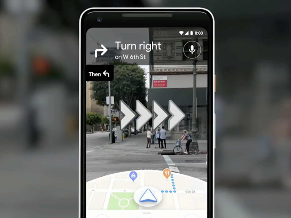
Google has announced a revamped version of Maps that utilizes a complex visual positioning system to offer improved navigation.

At the ongoing Google I/O conference, senior director of product Aparna Chennapragada showed how Google is “combining the power of the camera and computer vision with Streetview and Maps to reimagine walking navigation.”

In her presentation, Chennapragada noted how users would often have to move around in the real world to line themselves up with the blue dot marking their location in Maps. To avoid any such confusion, Google Maps will instead display blown-up 3D directions such as lit-up arrows and precise steps like “6th street is 100 feet away.”

Meanwhile, a smaller version of the traditional Maps experience will be displayed on the lower half of the screen, should it be needed.

Additionally, the demo showed that panning the camera around the streets would automatically highlight points of interest nearby, such as cafés or retail stores.

Finally, Chennapragada said that “just for fun,” the Maps team has also been experimenting with a digital avatar that can help further guide users, with a cartoon fox shown off as an example.

The post Google reveals new visual positioning system for Maps appeared first on MobileSyrup.

09 May 00:41

Google says that Waymo self-driving cars are ready for snowy weather

by Sameer Chhabra

Executives from Google’s Waymo autonomous vehicle division have announced that the company’s self-driving cars can now navigate through snowy weather.

During a presentation at Google’s I/O 2018 developers’ conference, Waymo CTO Dmitri Dolgov showed off how Google’s self-driving cars function while driving in the snow.

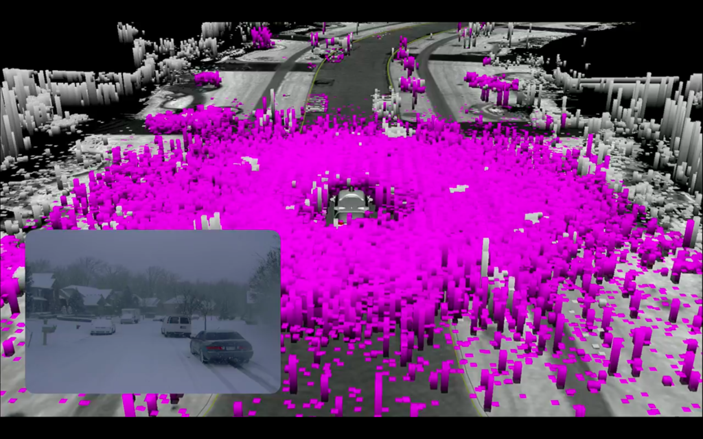
The first image below shows what self-driving vehicles typically perceive when they’re operating in snowy weather.

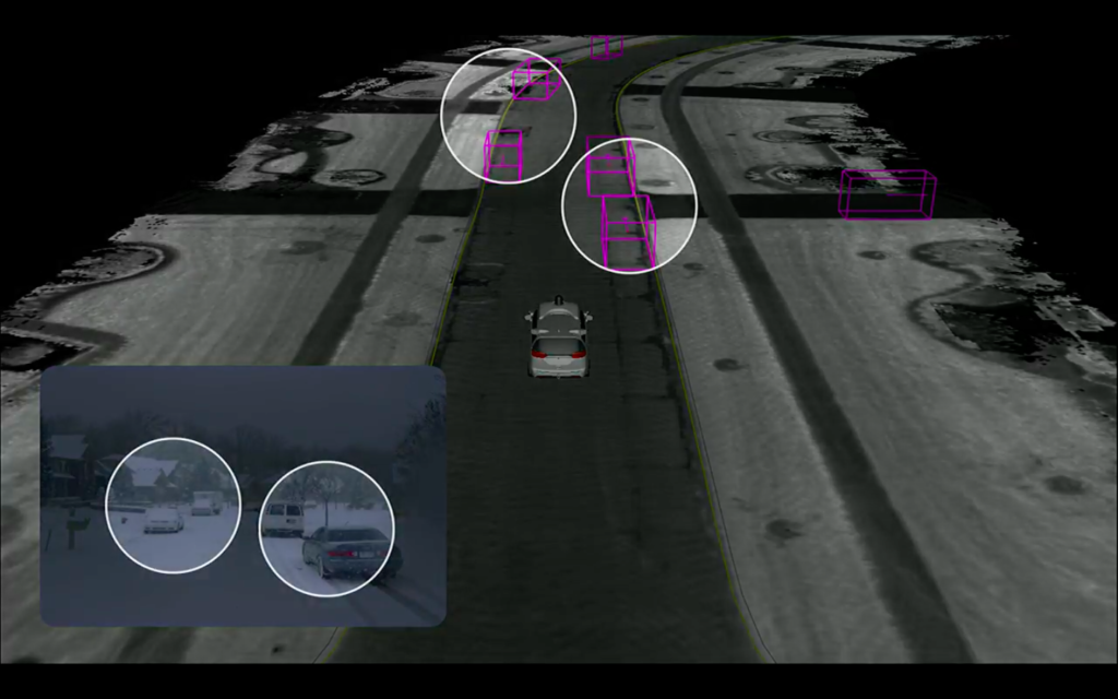
However, using Google’s TensorFlow machine learning software, engineers can train Waymo vehicles to navigate through snowy weather.

The image below shows what Waymo vehicle perceive during especially snowy weather.

While Google didn’t make any announcements regarding an eventual Canadian launch, today’s announcement is a sign that autonomous vehicle research and development is progressing at a substantial pace.

The post Google says that Waymo self-driving cars are ready for snowy weather appeared first on MobileSyrup.

09 May 00:41

You will soon be able to cut and paste text using Google Lens

by Jonathan Lamont
Google Lens capturing text from document

Google Lens is getting the ability to copy and paste real-world text, the Mountain View-based tech giant revealed today at Google I/O 2018.

Additionally, it was announced that the Lens feature will be moving into the camera app on select Android phones.


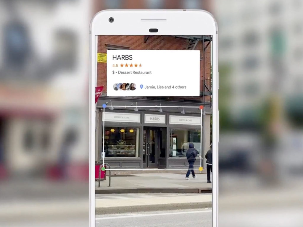
To use the copy-and-paste feature, you can simply select text in the camera like you normally would on your phone. You can also use Lens to search text, such as menu items in a restaurant, to see photos and answers about them.

Style Match allows Lens to detect certain styles in objects. Google demoed this on a lamp at the conference.


Finally, Google says in the future, it hopes to provide real-time results that work by proactively surfacing results and anchoring them to real world objects.


Apart from real-time results, the above features will be rolling out in the next few weeks and will be available in the camera app on phones from the following brands: LG, Motorola, Xiaomi, Sony Mobile, HMD/Nokia, Transsion, TCL, OnePlus, BQ, Asus and the Google Pixel.

The post You will soon be able to cut and paste text using Google Lens appeared first on MobileSyrup.

09 May 00:41

Here are all the Android P features announced at Google I/O 2018

by Dean Daley

At today’s I/O 2018 conference, Google announced several new features, functionalities and even new gestures for Android P.

First and foremost, for those who want to try out any of the below features, download the public beta here.

If you’re interested in learning how to download it, check our little guide.


Android Dashboard

One of the most interesting features coming to Android P is the Dashboard. The Android Dashboard lets you closely monitor their smartphone usage. The feature gives you an overall view of how you use your device. With the Dashboard, you can even put a limit on how long you use apps and the app will become greyed out once you reach that limit.

To learn more on Android Dashboard, click here.


Do Not Disturb

Another feature is the new ‘Shush’ gesture that launches the ‘Do Not Disturb’ functionality. Google wants to help combat smartphone addiction with this new feature. This functionality allows users to flip it so that it’s facing down to turn off notifications.

To learn more on this Do Not Disturb functionalities, click here.


iPhone X-like gestures

Android P also adds a bunch of new iPhone X gestures for the user. Users can swipe up to access multi-tasking, replacing the ‘Overview’ button. You can also scroll through the list with a new pill-shaped home button. The gestures, however, are completely optional. To set it up, navigate to the settings area, go into the ‘System’ menu, then go into ‘Gestures’ and tap the ‘Swipe up on Home button’ option.

To learn more about all of the other gestures available, click here.


Adaptive settings

Android P also adds new ‘Adaptive Battery’ and ‘Adaptive Brightness’ to Android P. These features use machine learning to remember how bright you like the display in different levels of light as well as learning how to maximize battery efficiency based on app usage.

To learn more about ‘Adaptive Brightness and Adaptive Battery, click here.


Slices & Actions

Google is also adding Actions and Slices to Android P. The functionalities will make your smartphone more predictive. For instance, after plugging in your headphones your device will suggest that you start playing your next song or call a friend.

For more on Slices and Actions, click here.

Android P is expected to be officially available in late August.

The post Here are all the Android P features announced at Google I/O 2018 appeared first on MobileSyrup.

09 May 00:41

Here are the 6 biggest announcements from Google I/O 2018

by Patrick O'Rourke

With computer scientists, developers, engineers, device manufacturers and an army of journalists descending upon Google’s Mountain View headquarters for an opportunity to take part in this year’s I/O festivities, MobileSyrup has put together a list of this year’s most interesting announcements.

Read on to learn more about Android P, Google Assistant developments, updates to popular Google apps, as well as cool new Google Lens integrations.

Android P’s Public Beta is now available

At I/O 2018, Google revealed that Android P’s public beta is now available. The latest version of Google’s mobile operating system adds a number of new features to Android. For example, ‘Shush’ allows users to flip their Android device display facedown in order to turn on ‘Do Not Disturb’ Mode. iPhone X-like multi-tasking gestures are also coming to Android P, too.

Among the most interesting announcements to come out of I/O 2018 in terms of Android P, is the fact that the operating system’s public beta can now be downloaded and installed on Sony, Essential, OnePlus, Oppo, Nokia, Xiaomi and Vivo devices.

An Android beta being available on more than just Pixel and Nexus devices is a first for Google’s mobile operating system and a significant step in the right direction.

To download the Android P public beta, follow this link.

iPhone X-like gestures come to Android P

Android P

In a move that was expected by most, Google announced that iPhone X-like gestures are set to make their way to the latest version of the company’s mobile operating system.

This shift marks a significant design change for Android. The three icons typically located at the bottom of the display have been replaced with a single line users are able to move around. Replacing the ‘Overview’ button, users now need to perform a short swipe up in order to enable multitasking, similar to Apple’s iPhone X.

The multi-tasking system has also shared a number of similarities with iOS 11 and the iPhone X. With Android P, multitasking now consists of a horizontally scrolling list of open applications, along with access to a search bar and suggested apps.

Before you scroll down to the comments section to let us know that Palm/webOS and later BlackBerry/BB10 in fact featured similar navigation features long before the iPhone X, we’re well aware — Apple’s 10th-anniversary device is just the most modern comparison.

Google’s Duplex is a Black Mirror-like nightmare

If Duplex is truly as capable as Google’s demo made it seem, then it has the potential to be a game changer. Google’s Duplex effectively turns the company’s digital assistant into an eerily human personal assistant, at least in terms of voice and interaction.

In the first demo, Google Assistant navigated a simple exchange that involved arranging an appointment for a haircut. With the power of Duplex, the Assistant was able to navigate the conversion in a way that made sense, while still responding to the hair salon’s various questions.

The second equally impressive call shown off at I/O 2018 involved Assistant navigating through a nuance-filled restaurant booking.

Duplex is incredibly impressive, but it’s likely that the feature won’t be available to the public at any point in the immediate feature.

Visual navigation and personal recommendations in Google Maps

Say what you will about Google Maps, but it’s difficult to imagine how one would go about revising the app’s navigation experience. However, this year’s I/O shows that Google still has some tricks rolled up its mapping sleeve.

Not only is Google Maps set to receive updates aimed at introducing personalized recommendations, the app will soon support a new visual positioning system that aims to reduce the awkward circling you inevitably do when attempting to line up with the directions in Maps.

Google Maps will soon provide users with a blown-up 3D navigation system that will instruct users when and where to turn by capturing images fed to the app through the device camera.

A brand new Android dashboard to manage your time better

With more people owning smartphones than at any other point in history, it seems Google is interested in supporting the overall well-being of its users.

As part of the company’s upcoming Android 9.0 P version update, Google is introducing a new dashboard that provides users with a snapshot of their device usage.

The Android Dashboard tells users how long and how often they’ve used apps and provides users with the option to set time limits to control how often they can use specific apps.

Users can even set up reminders and notifications to instruct them to take a break from using certain apps. The Android Dashboard is part of Google’s new commitment to what the company calls ‘Digital Wellbeing.’

Google Lens is finally moving to the camera app

While Lens, Google’s object-recognition platform, is still very much in its early stages, the company used its I/O 2018 developers’ conference to announce new updates to the platform. 

First, Google Lens on certain devices will soon be found within the camera application. Additionally, Google Lens users will soon be able to use the platform to cut-and-paste real-world text into on-device clipboards.

Finally, Google said it hopes to allow users to browse the real world simply by pointing their cameras at real-life objects.

The post Here are the 6 biggest announcements from Google I/O 2018 appeared first on MobileSyrup.

09 May 00:40

Qualcomm and Google partner to help deliver faster Android updates

by Jonathan Lamont

Qualcomm has announced that it has partnered with Google to implement Android P on devices powered by Snapdragon chips.

The U.S.-based chipset giant has optimized software on some mobile platforms to help manufacturers when upgrading to Android P. The goal is to allow Google to improve the speed of its OS upgrades. Qualcomm says it’s bringing the feature to its 845, 660 and 636 Snapdragon processors.

The fruits of this Qualcomm-Google partnership can be seen by the increased number of OEMs making the Android P developer preview available on their devices.

This all works thanks to Project Treble, the hardware interface architecture that was part of the Android Oreo release in 2017. Project Treble makes it easier for device manufacturers to update their phones.

Hopefully this new initiative helps make updates faster and more consistent for Android users, since Android has suffered from fragmentation for a long time.

Only time will tell if manufacturers get on board, but seven have already added devices to the beta program.

Essential, Nokia, OnePlus, Sony, OPPO, Xiaomi and Vivo have all announced availability.

Find a full list of the devices here.

Source: Qualcomm

The post Qualcomm and Google partner to help deliver faster Android updates appeared first on MobileSyrup.

09 May 00:40

Android P Developer Preview 2 system images are now available

by Dean Daley

While Google announced the Android P public beta at I/O 2018, factory images for the Android P Developer Preview 2 are also now available to download for select Google hardware.

With it come many of the new features announced today at Google I/O 2018. This includes new iPhone X-like gestures and adaptive brightness and battery functionalities.

Also available with the Android Developer Preview 2 — and the Android P beta program — is the available to add a top and bottom notch.

So there’s that.

To flash the Android Developer Preview 2 you can check out this guide here. Note: you’ll have to flash the new build if you previously flashed another developer build, there are no automatic over-the-air updates.

However, the developer’s preview is quite unstable so you might want to download the public beta instead. Find our guide to download the public beta here.

Source: Android Developer Blog Via: 9to5Google

The post Android P Developer Preview 2 system images are now available appeared first on MobileSyrup.