Shared posts

22 May 19:17

What will increase your programming productivity the most?

by Eric Normand

Lisps have traditionally been highly interactive. This allowed AI researchers and language developers to iterate quickly and learn about what works and what doesn’t. How can you tap into this in your workflow?

Transcript

Eric Normand: What is the single most important thing you can do to both increase your productivity and programming and also to learn faster?

My name is Eric Normand and these are my thoughts on functional programming. This is not actually directly related to functional programming; it’s orthogonal to the paradigm. It’s kind of related because the answer that I want to give is that you want fast feedback.

The language that started the whole live coding thing, as far as I know, is Lisp. It’s a functional language. It’s kind of tangentially related. In Lisp, you have a REPL and you’re coding to a live environment. The compiler is always available to you. You’re in an environment, you’re adding code, you’re compiling it and you’re adding values to the global namespace.

That lets you do so much in terms of learning. You’re going to very quickly test something out, change one little thing, see what it does, change another little thing, see what it does. For learning, you’re actually always learning two things. You’re learning the domain, like what are you programming about. Is it an accounting system? Is it a database? Is it an e-commerce system?

You’re learning about the domain and how best to represent it. You’re also learning the language, and the system and the environment it’s in. You’re learning, “What does this function do if I can put in a nil for the second argument? Can I access this database in constant time so I can do it in a loop?” You’re constantly asking these kinds of questions.

The REPL has the answers. The REPL has all the answers because it’s just like the live system. It’s just like running in production. The learning and the programming are actually just the same things. You’re always learning about how best to program the system and how best to represent your domain. That’s what programming is.

I actually was talking to someone yesterday who, totally new to Clojure, got [inaudible 3:19] up and running with a framework that was totally unfamiliar to him. Because it had such fast feedback, he could change one little value in the program. He had a simple program that came with the [inaudible 3:39] tutorial. He could change one thing and see what happen, change another thing and see what happen.

Because he could make such small changes, he was never that far away from the working program. He could really understand every little bit that he needed to, to get what he needed done, done. Now imagine if you had a slower feedback loop, he could do this within a second. Make a change, save the file and within a second you see the difference in the GUI and on the web browser.

Not exactly a REPL, but for something that’s very GUI and intensive, that’s what you want. You want to see the change right away. He was able to learn this thing. Imagine if he did have a slower feedback loop, he would start to feel the pain of, “God I want to try one more thing. Why don’t I think about it a little more? Why don’t I try to guess what it’s going to do?”

It’s faster to guess. Sometimes you guess right and you save that time of having to test it, whereas if you had a fast feedback loop you wouldn’t have to guess. You could get it right or you could get it wrong ten times and finally find the right answer. This is the thing that I probably think Clojure does the best. Clojure is pretty good at functional programming. It’s pretty good with concurrency.

Those things are important and it’s pretty good. It’s good. It’s good enough. It’s better than good enough for those things. There’s a lot of competition for functional programming. There’s a lot of competition for concurrency. That fast feedback, I don’t know if anyone can keep up. I mean, maybe other Lisps. Common Lisp makes it really easy. Racket makes it easy. Skin makes it easy.

Clojure also makes it easy on both GVM and ClojureScript and the browser or on node. It’s one of the things that I set up. I spent a lot of time setting up so that I can move quickly. I don’t want to have to guess so much and make assumptions. I just want to be able to try it out, ask questions.

If there’s one thing that marks an expert Lisp programmer over a beginner Lisp programmer, it’s reliance on the REPL. A master will do the REPL more. One thing I encourage my students to do as much as possible is, don’t ask me questions like, “What does map do again?” It’s like don’t ask me, ask the REPL.

What if I don’t know? What if I’m wrong? The REPL is never wrong. I’m wrong all the time and sometimes I don’t know and I’m going to ask the REPL. That’s going to be my way to figure out the answer to your question. Figure out a way to do a tiny little experiment that you can do right in the REPL that will have a hypothesis. The hypothesis is that nils are going to crash this function.

Then run it on NIL and see. If you are trying to get better at Clojure or any other Lisp for that matter, I would say that a huge thing is asking the REPL more questions. If you’re confused about how does this thing work, get into a REPL, set up a little experiment and try to figure out yourself using the REPL the answer to your question.

Besides that, the other technique that is very common for working in the REPL is to work inside out. In small pieces, evaluate the forms that you would put in the function. Write the function and if there’s four steps that you want to complete, make it output the first step and see if that’s right. Then, do the second step with the output of the first step and see if that one is right.

Then, add the third step and add the fourth step. Eventually, you’ve got a debug. If debug did one step at a time instead of writing out all four steps down, then seeing if the answer is wrong, you don’t know what happened. If you did do that and you’re like, “I don’t know what happened”, break it down. Comment out the three steps and just start with one. “Did I get that first thing right?”

It might seem slower because sometimes you would get it right the first time in those four steps. In general, you’re not going to get it right. Doing smaller steps is easier to stay within a working program. This is my thoughts on fast feedback.

Not exactly functional programming related but tangential, and still something I’m super interested in. Those are my thoughts. Do it. Fast feedback. As fast as possible. See you all later. Bye.

The post What will increase your programming productivity the most? appeared first on LispCast.

22 May 19:16

We cycled to the local zoo yesterday with the l...

by Ton Zijlstra

We cycled to the local zoo yesterday with the little one. Returning home we noticed that the nesting coots in the garden are just as fascinating.

P1040497 P1040505

22 May 19:16

The Phony Value Exchange

by noreply@blogger.com (BOB HOFFMAN)

This week, as the GDPR gets closer to implementation, we can expect to hear a lot of noise from digi-weasels here in the US explaining to us why we need to allow wide data collection as a fair "value exchange" for the free access we get to online services.

This argument is total bullshit.

Let's start at the beginning. First, the true part. The web provides us with amazing services and they are essentially all free of cost. I don't think there is any doubt that most of us don't really appreciate the benefits we get from free web services. The duopoly of Google and Facebook provide us with a whole lot of valuable stuff that we pay nothing for. Especially Google. They are entitled to recompense for the amazing services they provide.

And they are well compensated for their efforts. They are two of the most profitable companies on the planet. And essentially all of their profit comes from advertising.

This is no different from how other media, like TV, radio, and magazines, make their money. They provide us with entertainment and information, and in return they are able to reach us by selling advertising space and time to their clients. This is a legitimate value exchange.

Here's where the bullshit comes in. The online ad industry claims that they are entitled to some extra value - the value of knowing every little thing about us. This goes by the benign name of data collection, but what it really is is intrusive surveillance into personal aspects of our lives to which they have no legitimate claim.

Advertising is essential to the economic structure of the web as it is now configured. But tracking and surveillance are not.

We can have online advertising that does not rely on tracking, just as we've had TV, radio, and magazine advertising that did not rely on tracking. But the online ad industry is trying to confuse things.

They are saying the value exchange is this: we'll give you free services, you give us your data. The true value exchange is: they give us free services, we give them the opportunity to reach us with advertising.

The collection, sharing, and sale of personal, private data has no place in the value exchange.


22 May 19:16

OmniGraffle 3.6 for iOS Available for Testing

by Brent Simmons
mkalus shared this story from The Omni Group.

You can sign up for a TestFlight invitation and help us make sure OmniGraffle 3.6 for iOS is in ship-shape.

It includes a new Auto Layout Connected Graphics feature which will also be in OmniGraffle 7.8 for Mac — which is also available for testing.

We’d love to have your help!

22 May 19:15

Honor 10 Review: Much More Than ‘The Poor Man’s iPhone X’

by Steve Litchfield
The months and years roll by and Huawei and Honor smartphones evolve… slowly. Each is – genuinely – better than the last, but the glossy mass of glass, the avalanche of Emotion UI and bundled software, the dual camera ideas, much also stays the same. Is there enough new for the Honor 10? Actually yes, mainly through the AI in the camera, though there are quirks, plus a surprisingly low price point. Continue reading →
22 May 19:14

Castro 3 Review: The Castro You’ve Always Wanted

by Ryan Christoffel

Castro has long been one of the premier podcast clients on iOS, and its excellent version 2 – with an innovative triage system and delight-inducing design touches – helped solidify it as such. Those strengths in 2.0, however, were mitigated in part by the absence of a few key features that competing podcast apps tout. That changes with Castro 3.

If you're unfamiliar with the app, Castro's centerpiece feature is a triage system involving an inbox and queue. The premise is that, with the rising popularity of podcasting, there are more great podcasts available than ever before. If you subscribe to lots of shows, the standard episode management tools found in competing apps likely aren't sufficient. With Castro, by default new episodes of shows land in your inbox, and can then be sorted to the top or bottom of your queue and downloaded, or archived if they're not of interest to you. It's an elegant solution to the problem of podcast overload, and, thanks to customization options that allow you to make certain shows populate the top or bottom of the queue automatically, it's a system that works for you, tailored to your listening preferences.

Castro's triage system clicked with me the first time I tried it, and I used the app daily for nearly a year. Eventually though, I became more selective about the portions of podcasts I listened to, and Castro's lack of chapter support sent me elsewhere. I've seen comments from other prospective Castro users who were similarly turned off from the app due to one missing feature – and often, this feature was different for different people.

If an absent feature ever kept you from sticking with Castro 2, that almost certainly won't be a problem anymore. Castro 3 addresses nearly all of those "one missing feature" requests in a single release. Trim Silence is Castro's take on Overcast's Smart Speed; full chapter support is now present, as is a new Apple Watch app; the player screen has been fully redesigned; Mix to Mono improves stereo mixes that are hard to hear; and finally, there are excellent new per-podcast controls in a variety of areas. Perhaps the only thing still missing is an iPad app.

Castro 3 is everything Castro already was, but better. It's the app that Castro fans have always wanted.

Trim Silence

That's right, Castro now has an equivalent feature to Overcast's Smart Speed, dubbed Trim Silence. Doing exactly what it sounds like, this feature intelligently removes unnecessary silences from whatever you're listening to – saving you time, while still providing all the spoken content you came for. After testing it over the last few weeks, it works just as I'd expect. Voices still sound natural, they just never really slow down. If you want to save even more time, you can also combine Trim Silence with an adjusted playback speed of your choice.

Trim Silence can either be activated for all shows at once, or you can use it on a per-show basis. Unlike in Overcast, there's no single place you can visit to see how much time Trim Silence has saved you in total, but the savings for each single playback session is visible on the player screen.

Chapter Support

For many users, Trim Silence is the one new feature they needed to give Castro a shot; it's tough to feel like you're losing time because of an absent feature. For me though, that same angst is also present when using an app with no chapter support. Besides the simple fact that I prefer skipping over topical conversations that aren't of interest to me, I also get great joy out of having a reference guide for exactly how my listening time will be spent. Give me the agenda, give me the plan, and I'll be good. And now, Castro does that.

Chapters are accessed from the new player screen by tapping the title ticker underneath a podcast's artwork. Here you'll see a chronological listing of all chapters, complemented by an info tidbit I never knew I needed: running lengths for each individual chapter, so you'll know up front exactly how long each chapter is. Another nice touch: the chapter you're currently listening to displays a time remaining estimate. Tap on a chapter to immediately jump to that spot. And yes, chapter-specific artwork is now supported too.

Apple Watch App

Castro now includes an Apple Watch app, the greatest benefit of which is selecting a new episode to start phone-free. The app is so simple and streamlined, it's extremely easy to use. If a podcast is playing you'll see play/pause and skip controls, while Force Touch uncovers additional options to Archive or Star the current episode. Tapping the 'Up Next' button at the bottom of the player screen will open your full queue, where another tap will initiate playback of the selected show. And that's all there is to it. What it does, it does well, and without unnecessary complexity.

Due to limitations in WatchKit there's no offline playback available here, nor volume control through the Digital Crown, but if Apple announces new APIs at WWDC to make those features feasible, I'm sure we'll see them in a future update. Until then, Castro's Watch app is nothing remarkable, but it offers a nice way to quickly choose what you'll listen to.

Redesigned Player Screen

Castro's player screen is entirely new, holding a lot of information without ever feeling over-crowded. This is largely because the top half of the screen can be changed into one of two modes with a horizontal swipe. The default state simply holds a show's artwork, but swipe over and you get a variety of control options: sleep timer, playback speed, and toggles for Enhance Voices, Trim Silence, and Continuous Play. Objects that remain on-screen at all times in the player are AirPlay controls, a share button, an episode's title and current chapter, play/pause and skip controls, and a playback scrubber. The latter few elements are all nice and big, reminding me a bit of Jared Sinclair's 'sodes app. There are also a couple of somewhat hidden elements to the player screen: though the top part of the screen is primarily dedicated to the two modes I mentioned, if you swipe and hold to the left or right of those two views, you'll open an episode's show notes or that show's per-podcast settings screen, respectively. While these options are more hidden than I'd like, they're not the only ways to access those two screens, so they serve as helpful optional shortcuts here. Speaking of hidden features, you can also star an episode by double-tapping the show's artwork, similar to liking photos on Instagram.

Left and Center: Castro 3's player screen; Right: Castro 2's player screen.

Left and Center: Castro 3's player screen; Right: Castro 2's player screen.

Castro 2's player screen was all about being functional, heavy on playback controls but light on anything visually appealing. Castro 3 strikes a better balance between form and function by adding show artwork and removing unsightly controls from view when they're not needed. Because of its former blandness, I used to approach Castro's player screen as a place to get out of as soon as I possibly could; now, I don't mind leaving it up while listening. That is, if I'm not addictively opening and closing it to get another fix of the haptic feedback and animations built into that action.

Mix to Mono

If you've ever listened to a podcast that pans different speakers to different channels in a way that makes your brain hurt, Castro has you covered. Activating Mix to Mono from the app's settings screen will automatically convert stereo mixes to mono for a more pleasant listening experience. You can turn the feature on by default for all shows, or only select offenders.

Per-Podcast Controls

Per-podcast settings are a strength of Castro 3 that podcast savants are bound to love. As I've already hinted, there are a lot of control settings in the app for tweaking playback to your preferences, and every single one can be adjusted just for certain podcasts. In the management category, you can simplify triage by sorting a show's episodes automatically – to the inbox, beginning or end of the queue, or archives – and there are also five adjustable playback settings: Playback Speed, Trim Silence, Enhance Voices, Mix to Mono, and Skip Intros. The latter lets you start podcasts a certain number of seconds or minutes after their proper beginning, which can be helpful for shows with long-winded intros.

The last available per-podcast setting is one I've found particularly useful: Episode Limits. Perfect for the age of flash briefing shows, this feature lets you keep your total episode count under control by setting a max number of episodes to keep for a show. For example, if you subscribe to the New York Times' The Daily, or Subnet by Relay FM, but have trouble keeping up with every episode and don't want older shows clogging your queue, you can have Castro only keep from 1 to 5 episodes at a time. Whatever number you choose, Castro will automatically save that many of the show's newest episodes, while archiving the episodes you don't get to that fall outside that range. I tend not to subscribe to short, daily shows because I don't want the burden of constantly cleaning out any episodes I never get to; Episode Limits removes that pressure and frees me up to just enjoy the latest news when I'm ready for it.

Castro Plus

Castro is undergoing a business model transition with version 3. Castro 2 was a paid up front app, while Castro 3 is a free download from the App Store. This should introduce the app and its unique triage system to a much wider base of users at no cost. For those who truly enjoy the app and want to take advantage of its full feature-set, there's a new Castro Plus subscription available.

For $2.99 per quarter or $8.99 per year, a Castro Plus subscription unlocks Trim Silence, chapter support, Mix to Mono, per-podcast controls, Enhance Voices, and the app's dark mode. Whichever subscription length you choose, there's a 7-day free trial to take the new features for a test drive. If you're an existing Castro 2 user, Enhance Voices and dark mode remain unlocked for you even without a subscription, since they were available previously.

Miscellaneous

Besides all the new features outlined above, Castro 3 also includes some under-the-hood revisions to make for a better, more reliable daily driver. The player engine has been rewritten from the ground up, leading to an improved Enhance Voices feature, faster streaming, and more responsive controls: core functions like play, pause, skip, and scrubbing now work faster than before.


Castro's development history bears many parallels to that of an Apple product. I didn't use 1.0 much, so I can't comment on it, but 2.0 was a bold, beautifully made app that centered on a great core idea; however, compared to many competitors, it lacked several features people value. Over time, though, the app was continually iterated upon, adding thoughtful improvements like rich notifications and the first great drag and drop implementation on iPhone. Now, with 3.0, all of those quality improvements to a solid foundation are complemented by a suite of features that bring the app as close as ever to feature parity with its competitors.

Early adopters of Apple products value the care and attention to detail the company usually employs. A few key features may be missing from a 1.0, but they're made up for over time thanks to constant iteration and improvement. Sometimes a device or app takes a few revisions before being fit for the mass market, but once it gets there, it's something truly special. I believe that's what we have with Castro 3.

Castro has always had its core attractions, and those remain what they were; Castro is still Castro, but better. Its main appeal was once to a select group of users with specific design preferences, but now Castro has truly come into its own: it's become an app that serves nearly any podcast fan's needs.

Castro is available as a free download on the App Store.


Support MacStories Directly

Club MacStories offers exclusive access to extra MacStories content, delivered every week; it's also a way to support us directly.

Club MacStories will help you discover the best apps for your devices and get the most out of your iPhone, iPad, and Mac. Plus, it's made in Italy.

Join Now
22 May 19:14

The Power Mac G4 Line

by Stephen Hackett

The tower form factor may be a thing of the past, at least until the new Mac Pro shows up next year, but for years, if you needed the most powerful and flexible machine money could buy, the Power Mac was the only way to go.

For almost five years, the heart of the Power Mac was the PowerPC G4 chip. Starting in 1999 it clocked at just 350 MHz, but by the time the Power Mac G4 line was retired, a tower with dual 1.42 GHz CPUs could be ordered. In that time frame, things like Gigabit Ethernet, SuperDrives, and Wi-Fi became mainstream.

The Power Mac G4 came in three distinct cases over the years it was available. Each style of machine saw several revisions while in service, bringing the total number of models to 10. That's a lot of computers to cover, so let's get started.

Graphite

The original Power Mac G4 borrowed a lot from the "Blue and White" Power Mac G3 that preceded it. The G4's case was dubbed "graphite," but the basic design was the same, complete with its plastic handles and side door that opened to grant easy access to all of the internal components of the machine.

The similarities run deeper, however. The 1999 models were in two families.

At the low end, the "Power Mac G4 (PCI Graphics)" 400 MHz model actually shared the logic board from the G3. It ran for just $1,599 and came with a 10 GB hard drive, 64 MB of RAM, and a CD-ROM drive.

The high-end 500 MHz "Power Mac G4 (AGP Graphics)" came with an all-new logic board design and included AGP-based graphics, AirPort compatibility, a faster memory bus, DVD-ROM or RAM standard, an internal FireWire port, two separate USB buses and support for up to 1.5 GB of RAM. It sold for $3,499.

If that wasn't confusing enough, Motorola struggled to meet demand and Apple had to give up on the 500 MHz model it had promised customers. Apple had to shift its speeds down, and ended up selling 350 MHz and 400 MHz "PCI" models and a 450 MHz "AGP" model. It was a rough start to Apple's new flagship line.

In July 2000, Apple was quick to move on from the awkward first models of the Power Mac G4. It revised the machines, now all using the AGP-based architecture. This model is named the "Power Mac G4 (Gigabit Ethernet)," a nod to the new connectivity built into the machine.

The headline here was the CPU, however. The 2000 G4 was available with a single 400 MHz G4, dual 450 MHz G4s, or dual 500 MHz G4s. Apple boasted that Mac OS X was built for multi-processor systems, and that the G4 was actually faster than the Pentium III CPU from Intel, despite running at half the clock speed.

Prices ranged from $1,599 to $3,499, and all three models came with the then-new Apple Display Connector which passed video, power, and USB to the company's new displays, as shown off in the PR images:

The Graphite Power Mac G4 saw one last revision in January 2001, with machines now running at 466, 533, 667, and 733 MHz. Only the 533 MHz model could be custom-ordered with dual processors, thanks to supply constraints out of Motorola.

This final Graphite G4 came with faster expansion slots, Nvidia GPUs on most models, and a new built-in amplifier designed to drive USB speakers.

The base model's RAM and storage had increased since the first model, now coming with 128 MB of RAM and a 30 GB hard drive for $1,699. The high-end $3,499 model came with Apple's then-new SuperDrive, which could read and write both CDs and DVDs, a first in the Mac line.

QuickSilver

Just a few months later, in July 2001, Apple took the wraps off the Power Mac G4 (QuickSilver), a whole new case design that is my personal favorite of the three. This second-generation case was cleaner and more professional looking. It traded in its pinstripes for smooth gray plastic. The drive doors and handles were more refined, and the front panel's main feature was a large speaker.

Compared to its siblings, the QuickSilver looks downright plain, but I think it is my favorite of the three designs.

On the inside, the QuickSilver started at 733 MHz for $1,699. That meant that the cheapest QuickSilver was the same speed as the most expensive Graphite. An 867 MHz model (with a SuperDrive!) sat in the middle,1 below a dual 800 MHz system at $3,499. The dual CPU model could run dual displays and supported up to 256 MB RAM.

Unlike the Graphite before it, the QuickSilver saw only one revision.

In July 2002, it was the first Macintosh to ever break the gigahertz barrier, with a $2,999 model with dual 1.0 GHz CPUs and 512 MB RAM at the high end. It came with a new L3 cache, as did the mid-range 933 MHz model.

Mirror Drive Doors

August of 2002 brought with it the final form of the Power Mac G4. Named "Mirror Drive Doors," this case was much closer to the QuickSilver than the QuickSilver had been to the Graphite, but the front panel was radically different, with its four new air intakes and media drive doors gaining a mirror-like finish:

These machines quickly became known as the "Windtunnel G4" for the amount of fan noise. Apple eventually offered a replacement program for the power supply and fans, but the name stuck.

With much faster components than previous G4s, the Mirror Drive Doors came with variable speed fans. This was an attempt on Apple's part to keep the noise down, but the machine still gained a reputation for being too loud for some customers. A quick look at the back of the three case styles shows how much more air Apple was trying to move through the Mirror Drive Doors case:

The August 2002 G4s were the first to offer dual processors at all price points, including the entry-level dual 867 MHz machine at $1,699. Above it were dual 1.0 GHz and dual 1.25 GHz models that both came with 166 MHz system buses, SuperDrives, and an ATI Radeon 9000 Pro video card.

These machines all required Mac OS X, and were unable to boot into Mac OS 9.

January 2003's "Power Mac G4 (FW 800)" wore its new feature right on its sleeve: this G4 was the first to ship with FireWire 800. The new connector came with much faster data rates than FireWire 400. This was a big deal for video and graphics professionals working with large files.

Beyond FireWire 800, this machine was the first Power Mac to support Bluetooth and AirPort Extreme, Apple's flavor of 802.11g.

While offering so many new features, Apple was able to drop the price this time around. The entry-level, dual 1.0 GHz machine ran just $1,499. The high-end dual 1.42 GHz machine sold for $2,699, the cheapest high-end Power Mac of all time.

The FW 800 was meant to be the latest and greatest, and it delivered on that promise, but it wasn't the final Power Mac G4. That goes to a machine that, as Thomas Brand wrote on 512 Pixels, was somewhat unusual:

The Power Macintosh G4 (Mirrored Drive Doors 2003) was released on June 23, 2003, alongside the new Power Macintosh G5. It replaced the six month old Power Mac G4 (FireWire 800) that came before it.

Unlike its successor, the Power Macintosh G4 (MDD 2003) lacked a G5 processor, aluminum enclosure and USB 2.0. Unlike its predecessor, the Power Macintosh G4 (MDD 2003) lacked FireWire 800, AirPort Extreme and built-in Bluetooth.

It came in two CPU configurations, single or dual 1.25 GHz; with 256 MB of DDR RAM and a 12X Combo Drive. Hard disk capacity started at 80 GBs; with Mac OS X 10.2 Jaguar preinstalled.

But what made the Power Macintosh G4 (MDD 2003) special wasn’t its specs, rather the fact it could boot into Mac OS 9.

This last G4 tower was the final life raft for those clinging to Mac OS 9. The dual 1.25 GHz model was the fastest ever to run the OS, and many of them served publishers and educators well into the G5 and early Intel years.

The G4's Legacy

The PowerMac G4 oversaw an amazing amount of change. The impressive increase in power Apple packed into the machines over their five years on the market is breath-taking in our time of most modest CPU gains. It's hard to believe that the first Graphite machines and the last Mirror Drive Doors models are even related, if you're just looking at the raw specs.

More importantly, however, is the fact that the G4 towers ushered in the Mac OS X era for many professionals. Many Graphite and QuickSilver owners transitioned from booting into Mac OS 9 to running OS X on these towers. The Mirror Drive Doors machines offered a tempting upgrade to early G4 or G3 owners, but they were quickly overshadowed by the mighty Power Mac G5.

But that's a story for another day.


  1. This is the oldest Power Mac G4 that can run Mac OS X Leopard. ↩︎

Support MacStories Directly

Club MacStories offers exclusive access to extra MacStories content, delivered every week; it's also a way to support us directly.

Club MacStories will help you discover the best apps for your devices and get the most out of your iPhone, iPad, and Mac. Plus, it's made in Italy.

Join Now
22 May 19:13

WeWork and Regus Both Need An Affiliate Model

by Andy Abramson

When it comes to co-working spaces WeWork is the elephant in the room. They are the giant. The monster. The leader far and away. About the only organization that can compare, albeit with a different goal and model, is Regus, perhaps the first mover in the world of co-working. But both have gaps in their location maps, which in turn presents opportunity for others to fill the gaps.

Over the past few weeks as I've been leading a nomadic life of sorts, I've realized that both co-working companies lack any type of affiliate model, so while I have memberships with both, it's often been my discovery that their isn't a location for miles and miles, sometimes even no location at all in some states in the case of WeWork.

Unlike the gym and workout world that developed an affiliate membership model early on, in the case of the two giants, its all or nothing. But the digital nomad isn't going to always end up where WeWork or Regus are located, which is why models like those from Croissant , the League of Extraordinary Co-working Spaces (Lexco) and CoPass all are ahead of the game. They function much like traveler lounge leader Priority Pass does, where you join the "club" and get access to all the rest, sometimes free and sometimes for a daily rate.

Now here's a thought. If I was running the Centurion Lounge Program for AMEX, I'd quickly work out deals with Regus, WeWork and CoPass, and extend mutually beneficial access rights (as long as the member has an AMEX card) and immediately expand the footprint of the Centurion Lounges.

Co-working facilities need an affiliate model...no one company can be everywhere, and given how the concept is past taking off, it's time to go beyond land and expand, and simply give members one more reason to stay members.

22 May 19:12

Temporary “People Protected Bikeway” Makes Seattle Bike Lane Safer

by Sandy James Planner

a-cyclist-greeted-by-a-bike-lane-protected-by-humans-on-golden-gate-all-photos-streetsblog-rudick

You have to admire the good folks in Seattle for their approach to making the argument for safe, separated, protected bike lanes.

Last week, in order to encourage the development of a continuous separated bikeway, volunteers came out to create a “people protected bikeway”. And they did a very good job, as documented on Twitter.

This kind of urban ingenuity typically attracts a lot of attention and comment. Price Tags previously reported on the rogue bike lane that appeared on Saskatchewan Drive in Edmonton, as well as the human traffic cones stopping traffic in London.

And what, exactly, did that look like? The police report documents the fact that there were, “males dressed as traffic cones, blocking the road like traffic cones”. Well okay then.

coness-6ed9e

Simply put, when all else fails, enlist your own ingenuity to get your point across. Safer separated bike lanes make cycling easier and more comfortable, and as always, a novel approach to illustrating this simple fact is sure to generate a response.

22 May 19:12

Blockchain for Peer Review

files/images/Untitled-design3546546-796x417.jpg

David Rosenthal, DSHR's Blog, May 24, 2018


Icon

This article describes an initiative in the UK called Blockchain for Peer Review, " a protocol where information about peer review activities (submitted by publishers) are stored on a blockchain." Although this may appear to make sense, argues  David Rosenthal, "implementing it with a blockchain is effectively impossible" because of GDPR. The reason is that the proposal would store personal information about reviewers in a permanent fashion, and GDPR requires that "people must be able to demand that their personal data is rectified or deleted under many circumstances." More. But you can't unspend money after having spent it, you can't unvote after having voted in an election, and you can undo your ownership of a car after it caused an accident. And, I suspect, you can't unreview an article after it has been reviewed.

Web: [Direct Link] [This Post]
22 May 19:12

Enough already

by Paul Jarvis
Exterior mindfulness (some call it minimalism) only works when we solve for enough.
22 May 19:12

Google Photos is Finally Adding a Favorites Feature

by Evan Selleck
One of the features that Google Photos has been missing is the ability to quickly add a photo or video as a favorite. Continue reading →
22 May 19:11

The Fritzbox and Devices With Multiple IP Addresses

by Martin

For years I have wondered why accessing my Fritzbox DSL router at home via my LTE backup connectivity doesn’t work reliably. While web pages load at first, things quickly get stuck. After 4 years I finally found the answer and a fix for it.

As I run a number of services at home I need reliable Internet connectivity and thus have an LTE backup in place via a separate router in case the DSL line fails. Over the years it has helped me out on quite a number of occasions.

When my DSL line fails I can reconfigure my cloud at home to use the LTE router as gateway for all services. To access the Fritzbox GUI via the backup link I have to use SSH port forwarding on another device in the local network because the Fritzbox, by design, doesn’t use the LTE router as default gateway and thus all TCP connections coming from there can’t be answered. And this is what I had trouble with over the years. In most cases I could see the first few pages of the Fritzbox GUI in my browser but then the connection got stuck. I tried putting switches in between, I tried different physical setups but nothing helped.

And then one day I noticed that the Raspberry Pi I used as an SSH port forwarding gateway with a fixed IP address didn’t have DHCP deactivated for the interface so it had 2 IP addresses on the same network interface with a single MAC address. And it is this combination of single MAC address and multiple IP addresses that the Fritzbox can’t handle. While binding several IP addresses to a single interface and single MAC seems to be a totally valid configuration, I’d still classify it as an unintended misconfiguration with effects that really mystified me.

Note that the Fritzbox has no problem to handle Ethernet interfaces with several MAC addresses each bound to a separate IP address which is the configuration of my cloud setup at home, i.e. a dozen virtual machines in Ethernet bridged mode, each with its own MAC and IP addresses mapped to the single physical Ethernet interface of the host!

Glad I figured that one out!

22 May 19:11

Data scientists as the new Mad Men

by Nathan Yau

Ken Auletta for The New Yorker looks at “math men” replacing the Mad Men:

Engineers and data scientists vacuum data. They see data as virtuous, yielding clues to the mysteries of human behavior, suggesting efficiencies (including eliminating costly middlemen, like agency Mad Men), offering answers that they believe will better serve consumers, because the marketing message is individualized. The more cool things offered, the more clicks, the more page views, the more user engagement. Data yield facts and advance a quest to be more scientific—free of guesses. As Eric Schmidt, then the executive chairman of Google’s parent company, Alphabet, said at the company’s 2017 shareholder meeting, “We start from the principles of science at Google and Alphabet.”

I know the big tech companies is where the money is at, but I hope you young statisticians out there consider the other possibilities. Your skills are valued in many places.

22 May 19:11

Blockchain applications

files/images/network-3139214_1920_crop-a2d8dd0addcca3408f3a15698b6494a6.jpg

Mike Loukides, O'Reilly, May 25, 2018


Icon

This is a survey article describing how blockchain is being used for various applications. "The killer application for blockchains is probably something we haven't thought of yet: something new and different that will surprise and astonish us when we invent it." See also: What is a blockchain? Related:Why blockchain isn’t magic and it won’t fix every problem you have.

Web: [Direct Link] [This Post]
22 May 19:10

Your Professional Growth Questionnaire

by Rui Carmo

Michael Lopp, in his usual concise and unassuming fashion, knocks it out of the park, at least where I’m concerned.

(This is serendipitous for a number of reasons I can’t get into right now, but, as usual, terrific reading if you’re seriously into any sort of career, your own or other people’s)

22 May 19:10

Gemini Photos Declutters Your Photo Library

by John Voorhees

MacPaw has released a brand new iPhone app that takes the ideas from Gemini 2, the company’s duplicate file finder on the Mac, and applies them to your iOS photo library. Gemini Photos uses an algorithm to analyze your photos that suggests the ones you should consider deleting. With photo files getting bigger with each improvement of the iPhone’s camera and features like Live Photos and burst mode, a utility like Gemini Photos can save significant amounts of space on your iPhone.

Gemini Photos is a subscription-based app. Before you can start using it, Gemini asks you to pick a monthly ($1.99/month) or annual ($11.99/year) plan, both of which come with a three-day free trial. After you sign up for a plan, Gemini Photos automatically scans your photo library. Alternatively, you can purchase Gemini Photos for a one-time payment of $14.99.

Depending on the size of your library, the initial scan can take a while. I have over 38,000 photos, which took about 17 minutes to scan, made my iPhone X get warm, and noticeably drained its battery. I uninstalled the app, restarted my iPhone, re-installed, and went through the initial scan process again, which took 12 minutes the second time, so your experience could vary. After that initial scan though, subsequent rescans of my library were measured in seconds rather than minutes.

Gemini Photos suggests two categories of photos you might want to delete: Similar and Clutter. I like the design of the app’s main ‘Your Library’ screen a lot. It’s simple and clear with a card-like UI for each of the two categories that includes a grid of thumbnails of some of the photos the app has identified. At the bottom of screen is the total number of ‘Unneeded Photos’ and a button that reveals a breakdown of the total by category.

Browsing similar photos (left and center) and screenshot clutter (right).

Browsing similar photos (left and center) and screenshot clutter (right).

Tapping either card takes you to a detail view where you can browse the photos and decide whether to go with Gemini’s suggested deletions or make adjustments. Tapping a set of similar photos lets you swipe between each to decide which to discard, and long-pressing a photo reveals the share sheet that you can use to send the image to another app.

It will come as no shock to people who know me that I don’t do much to manage my photo library. As a result, Gemini identified over 11,000 ‘unneeded’ photos between the two categories.

By far the biggest category, at over 10,000 photos, was the images the app flagged as similar. Overall, I was happy with the results, though it’s important to keep in mind that similar images are not duplicate images. As a result, I wouldn’t suggest deleting all similar photos without looking at them first. When I reviewed the similar section of Gemini, I found photos that I didn’t want to delete. For example, a photo of a building and a selfie from the same angle with the same building in the background. Also, for some special events, I’d rather keep all the photos I took for sentimental reasons, even if they are similar.

The Clutter section of Gemini is divided into three subcategories: Blurred, Notes, and Screenshots. Of the 900 photos in my library that Gemini detected as clutter, 234 were blurry, 116 were notes, and 550 were screenshots. With a few exceptions, I mass-deleted the screenshots and blurry photos. One false-positive I noticed in the blurry category were photos that were predominantly of the sky with clouds. Notes tended to be images of business cards, grocery lists, and other text, though Gemini did inexplicably identify a few photos of columns and statues from a trip to Rome as Notes. Although I found some images in the Clutter section that shouldn’t have been included, the rate of false-positives was low enough that the utility of the app was not meaningfully affected.

For now, Gemini Photos is iPhone-only. I’d like to see it come to the iPad, which would make visually scanning through a large library faster. I’d also like Gemini Photos to add video support to cull those inevitable short, blurry videos that I take by accident from time to time.

Despite some false-positives, I’ve found Gemini Photos to be a great way to quickly eliminate junk from my large, poorly-managed photo library. It’s one of those single-purpose iOS utility apps that makes an otherwise tedious task much more palatable.

I'm not sure about Gemini's subscription business model though. Gemini Photos strikes me as the sort of app that most people will use only occasionally and won't want to pay for every month. Of course users can always subscribe for a month and then cancel the subscription, resubscribing the next time they need to use the app, but that's not ideal because it requires users to remember to unsubscribe to avoid auto-renewal. A one-time payment of $14.99 is also a steep price compared to other photo utilities. However, if you weed out your photo library regularly or only occasionally, but are willing to do the subscribe/unsubscribe dance, Gemini Photos is worth a look.

Gemini Photos is available on the App Store.


Support MacStories Directly

Club MacStories offers exclusive access to extra MacStories content, delivered every week; it's also a way to support us directly.

Club MacStories will help you discover the best apps for your devices and get the most out of your iPhone, iPad, and Mac. Plus, it's made in Italy.

Join Now
22 May 19:09

@stoweboyd

@stoweboyd: If the facts are against you, argue the law. If the law is against you, argue the...
22 May 19:09

SotD: Willow Indigo

Yesterday I took you back to 1958 and that worked out pretty well, so let’s stay there. The title above is a little confusing; it refers to Duke Ellington’s awesome album Ellington Indigos, and its titanic take on Willow Weep For Me; but picking just one song is especially tough in this case.

Duke Ellington

We have to be a little careful here, because Ellington Indigos has gone through a bewildering series of releases, with significant variation in the song selection, running order, and arrangements: There’s a good write-up at Jazz History Online. I have the CD, but the link above is to (I think) the original LP release, because you can stream it.

The album title seems kind of obvious in its intent: Other people on the scene played Blues, but Duke played Indigos, because that was classier and more downtown. I probably disagree, but hey, the music is great.

As with the Kingstons yesterday, the music is distinctly of another time; the string sections are a little too lush for modern tastes and Duke’s piano-playing a little over-ornamented. None of which should bother anyone, because holy crap these guys can play, and Ellington’s arrangements are one layer of genius on top of another on top of another.

The opening number Solitude probably has the flashiest arrangement, with different instrumental-voice combos sliding in and out to point out that this note is important and that chord change is worth noticing. Mood Indigo has a purity of line that makes me think of Bach. It opens with a long, contemplative blues conversation between Shorty Baker on trumpet and Jimmy Woode on bass; then gets richer and richer. My second choice for today’s song would be Prelude to a Kiss because it’s just so insanely dramatic; for a party trick, play it as loud as you dare on the biggest speakers you can find. Tenderly is the only piece that’s even remotely up-tempo, the orchestra sections joking with each other; then they fall silent and the outro is played, you know, tenderly. Dancing in the Dark has these weird uncharacteristic fast chromatic runs by Ellington against the string section that aren’t like anything I’ve ever heard before. And then Autumn Leaves, which is a sentimental song, is played for maximum sentiment, with (on the CD at least) an opening verse in (well sort of, anyhow) French.

But Willow Weep For Me has to win; the arrangement is fabulous and that melody’s descending line would draw tears from stone. In the course of writing this I learned that it was written by Ann Ronell in 1932; who seems to have been an interesting person. More or less every jazz musician you ever heard of has recorded it, probably because that descending line is gonna make anyone sound good.

This is part of the Song of the Day series (background).

Links

Spotify playlist. Willow on Amazon, iTunes, Spotify. Live video wouldn’t help.

22 May 19:09

More Thoughts On Jupyter Notebook Search

by Tony Hirst

Following on from initial sketch of Searching Jupyter Notebooks Using lunr, here’s a quick first pass [gist] at pouring Jupyter notebook cell contents (code and markdown) into a SQLite database, running a query over it and then inspecting the results using a modified NLTK text concordancer to show the search phrase in the context of where it’s located in a document.

The concordancer means we can offer a results listing more in accordance with a traditional search engine, showing just the text in the immediate vicinity of a search term. (Hmm, I’d need to check what happens if the search term appears multiple times in the search result text.) This means we can offer a tidier display the dumping the contents of a complete cell into the results listing.

The table the notebook data is added to is created so that it supports full text search. However, I imagine that any stemming that we could apply is not best suited to indexing code.

Similarly, the NLTK tokeniser doesn’t handle code very well. For example, splits occur around # and % symbols, which means things like magics, such as %load_ext, aren’t recognised; instead, they’re split into separate tokens: % and load_ext.

A bigger issue for the db approach is that I need to find a way to update / clean the database as and when notebooks are saved, updated, deleted etc.

22 May 19:07

OnePlus 6 Review: It’s all about the camera

by Igor Bonifacic
The new OnePlus 6 smartphone

Ever since it released the OnePlus 3 almost two years ago, OnePlus has settled into a comfortable rhythm. Every six months, the company releases a new smartphone that is more technically capable (and expensive) than its last one.

Each new phone has not dramatically changed OnePlus’ value proposition. To date, they’ve all offered impressive internals and a lightweight Android experience at the cost of more premium features like waterproofing and top-notch camera capabilities.

The OnePlus 6 changes that equation: not completely, but enough to make it a completely different beast compared to past OnePlus smartphones.

Notch what you were expecting?

OnePlus 6 notch

The OnePlus 6 features a 6.28-inch screen with an iPhone X-style display notch. By adding a notch, OnePlus was able to achieve an 84 percent screen-to-body ratio. Unlike some other Android devices, the OnePlus 6 includes a relatively small chin bezel. Moreover, compared to the iPhone X, the notch on the OnePlus 6 is relatively small. I’ve never had a strong opinion on display notches, but for those who can’t stand them, I’ll say that the notch on the OnePlus 6 is less intrusive than others I’ve encountered.

What’s more important is that software support for the notch is well-implemented. By default, when the phone is oriented vertically, OxygenOS will adjust the colour of the status bar to match whatever app is currently on-screen. So in the instance of Facebook, for example, the status bar takes on a complementary shade of blue.

Meanwhile, when the phone is oriented horizontally, the screen around the notch is blacked out; there’s no instance in which you’re forced to navigate around the notch to see text or media.

Users also have the option to hide the notch, and OnePlus has included the option to adjust how the notch behaves on a per-app basis, as well.

For those who want to get as much screen real-estate as possible, the OnePlus 6, like the OnePlus 5/5T, includes support for navigation gestures.

OnePlus 6 full phone

Quickly swiping up from the bottom of the display takes the user back to the homescreen, while holding that same gesture halfway up the screen leads to Android’s Overview menu. Swiping up on the display from either the left or right side of the screen leads back one screen.

If there’s an issue with how OnePlus has implemented gestures in Oxygen OS, it’s that in my experience you have to be overly deliberate when using them. Moreover, by enabling gestures, you pass on some of Android’s Oreo more useful button shortcuts. For example, with gestures enabled, there’s no Overview button to double tap to quickly switch between your two most recently used apps.

Once you get past the notch and how it works, the OnePlus 6 features more or less the same display OnePlus has shipped with every new device since the OnePlus 3. It’s not a QHD panel, nor does it support HDR — HDR 10 or Dolby Vision — or a faster refresh rate.

Moreover, when it comes to things like colour accuracy and legibility in direct sunlight, the OnePlus 6’s OLED display is still a step behind displays on competing devices like the Galaxy S9 and iPhone X. All of that’s not to say the screen on the OnePlus 6 is bad (in fact, I think most people will fall in love with just how much screen real-estate the OP6 offers), merely that there are better displays out there at higher price points.

The other major difference between the OnePlus 6 and OnePlus’ past smartphones is a new all-glass design.

According to OnePlus, it went to a glass back for a variety of practical reasons, one of which is that the material is better at allowing radio waves to pass though.

OnePlus provided MobileSyrup with the OnePlus 6 in ‘Mirror Black.’ The phone is also available in ‘Midnight Black’ and ‘Silk White,’ a colour that will be available later in the year. Between its glossy finish and pre-applied screen protector, the Mirror Black OP6 is hard to keep clean.

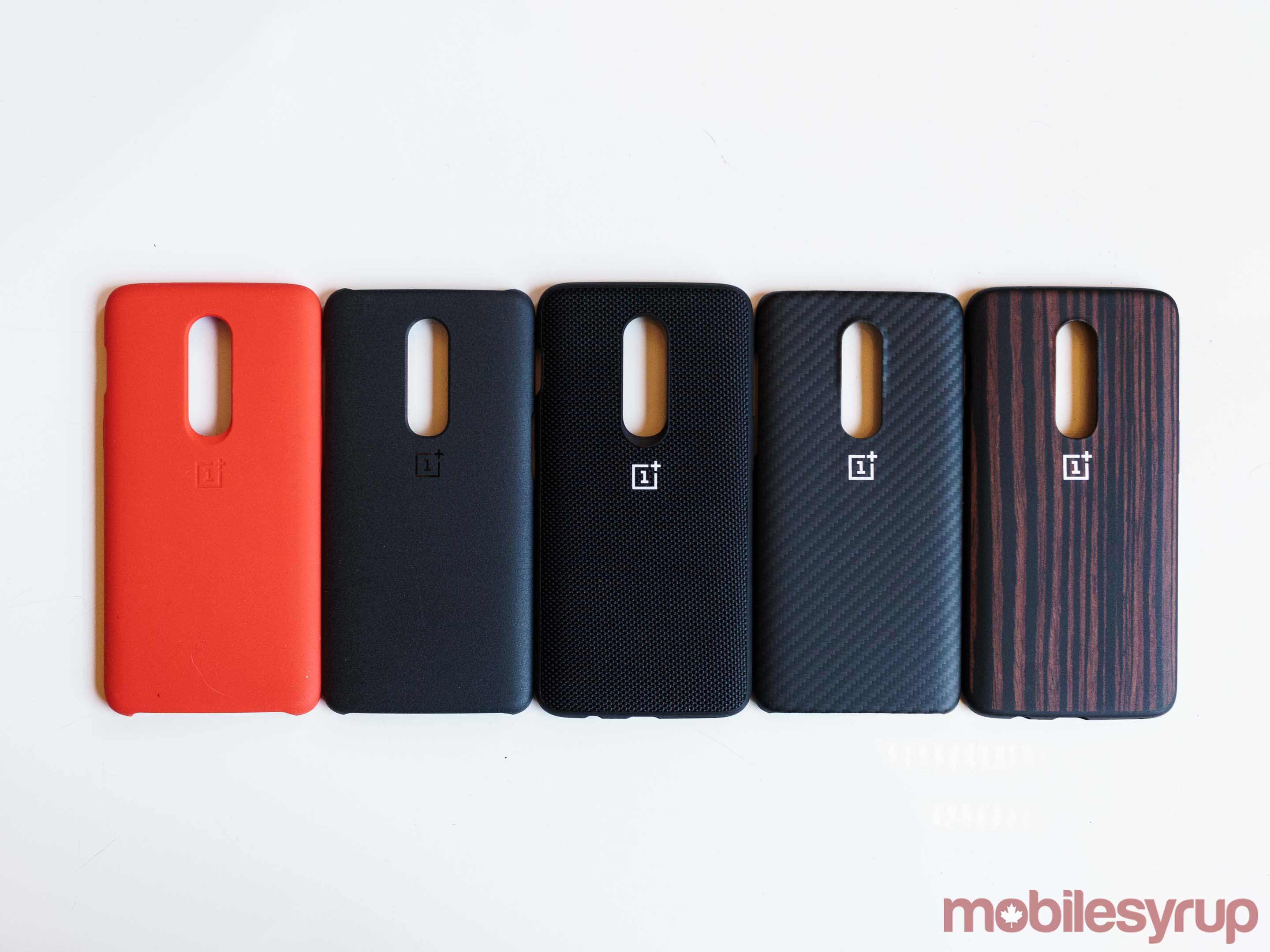
From what I’ve seen of the Midnight Black and Silk White models, they appear to be less prone to attracting smudges and fingerprints — to my eye, they’re also more handsome. If you plan to buy one of OnePlus’ excellent first-party cases alongside your new OP6, the glass back is a non-issue.

One major disappointment with the OnePlus 6 is that OnePlus didn’t add inductive charging to the phone. If there was ever a time to add wireless charging, this was it; glass backs make integrating the tech easier.

The OnePlus 6 also doesn’t include an official IP water and dust resistance rating. However, according to a OnePlus spokesperson, the phone will survive the occasional splash, including an accidental trip to the toilet bowl. I didn’t test the OP6’s waterproof capabilities, so take the company’s claim as you will.

I’ll also mention here that OnePlus has not added support for microSD expansion. To make up for the fact, OnePlus is, for the first time, offering a 256GB storage option. Also, for what it’s worth, the OP6’s dual SIM tray supports LTE connectivity via both SIM slots — on past OnePlus phones, only the primary SIM slot supported 4G speeds.

There are several other more minor design tweaks. The OP6’s two rear-facing cameras are stacked vertically, instead of horizontally, towards the centre of the device. Additionally, the rear-facing fingerprint sensor has a rectangular, instead of circular shape.

OnePlus 6 edge

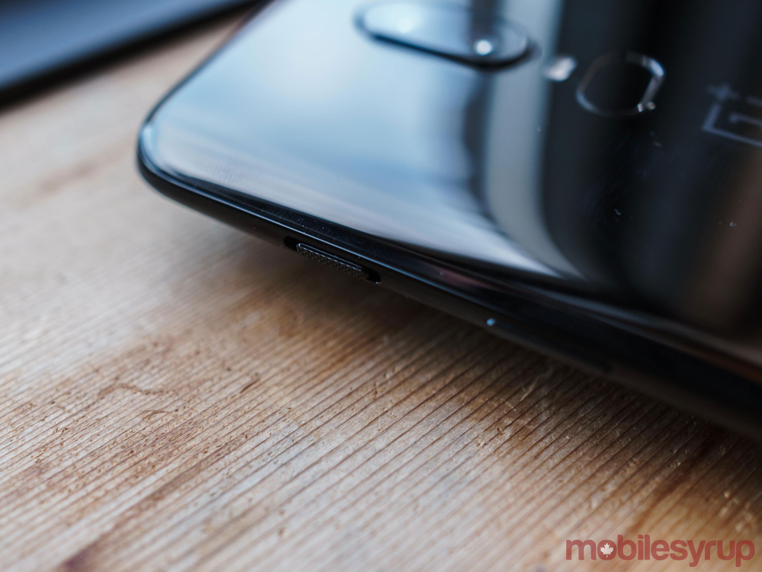
Lastly, OnePlus has moved the Alert Slider to the left side of the device. OnePlus is also reverting the Alert Slider’s function back to the way it was in the OnePlus 2. Instead of adjusting Android’s Do Not Disturb settings, it’s now a simple ring, vibrate and silent switch.

In all, I like the design of OnePlus 6 a lot. It’s not the most handsome Android device on the market, but where the OnePlus 5/5T looked too much like the iPhone 7, the OnePlus 6, even borrowing design cues from the iPhone X, feels like it has a design that can stand on its own.

Project Treble to the rescue

Compared to past new OnePlus smartphones, OxygenOS, OnePlus’ Android fork, comes with relatively few new features. The one notable exception is a new Gaming Mode that improves on the Gaming Do Not Disturb mode that OnePlus shipped last year. With OxygenOS 5.1.3, Gaming Mode reduces latency, in addition to preventing notifications from interrupting the experience.

In terms of software, the more important consideration is that the OnePlus 6 is the first OnePlus smartphone to ship with Android Oreo out-of-the-box.

As such, it’s the first OnePlus smartphone required to support Project Treble. In theory, this means the OP6 should get major Android updates faster than past OnePlus devices. In fact, it already looks like the OP6 is on track to get Android P soon after the Pixel 2 and Pixel 2 XL — the OnePlus 6 is one of the third-party devices included in the Android P open beta. We’ll have to see how OnePlus handles Project Treble, but so far things are promising.

Classic OnePlus performance

OnePlus 6 cases

With up to 8GB of RAM, Qualcomm’s flagship Snapdragon 845 processor and fast UFS 2.1 flash storage, the OnePlus 6 is an absolute pleasure to use. Everything, from launching new apps to switching between existing ones, is fast. I didn’t experience any slowdowns during my time with the device.

With Qualcomm’s new X20 LTE modem, I was able to consistently get about 50Mbps download speeds on Fido.

Authentication, via both the rear-facing fingerprint sensor and Face Unlock, was also fast and accurate.

Like the OnePlus 5 and 5T, the OnePlus 6 features a 3,300mAh battery. With moderate use involving, I found the battery able to last a full day. Once it needed a top up, OnePlus’ excellent Dash Charge fast charging solution was able to charge the battery to full in about 45 minutes.

If you’ve used a OnePlus smartphone anytime in the last two years, all of the above will be familiar territory.

A camera that’s finally worth talking about

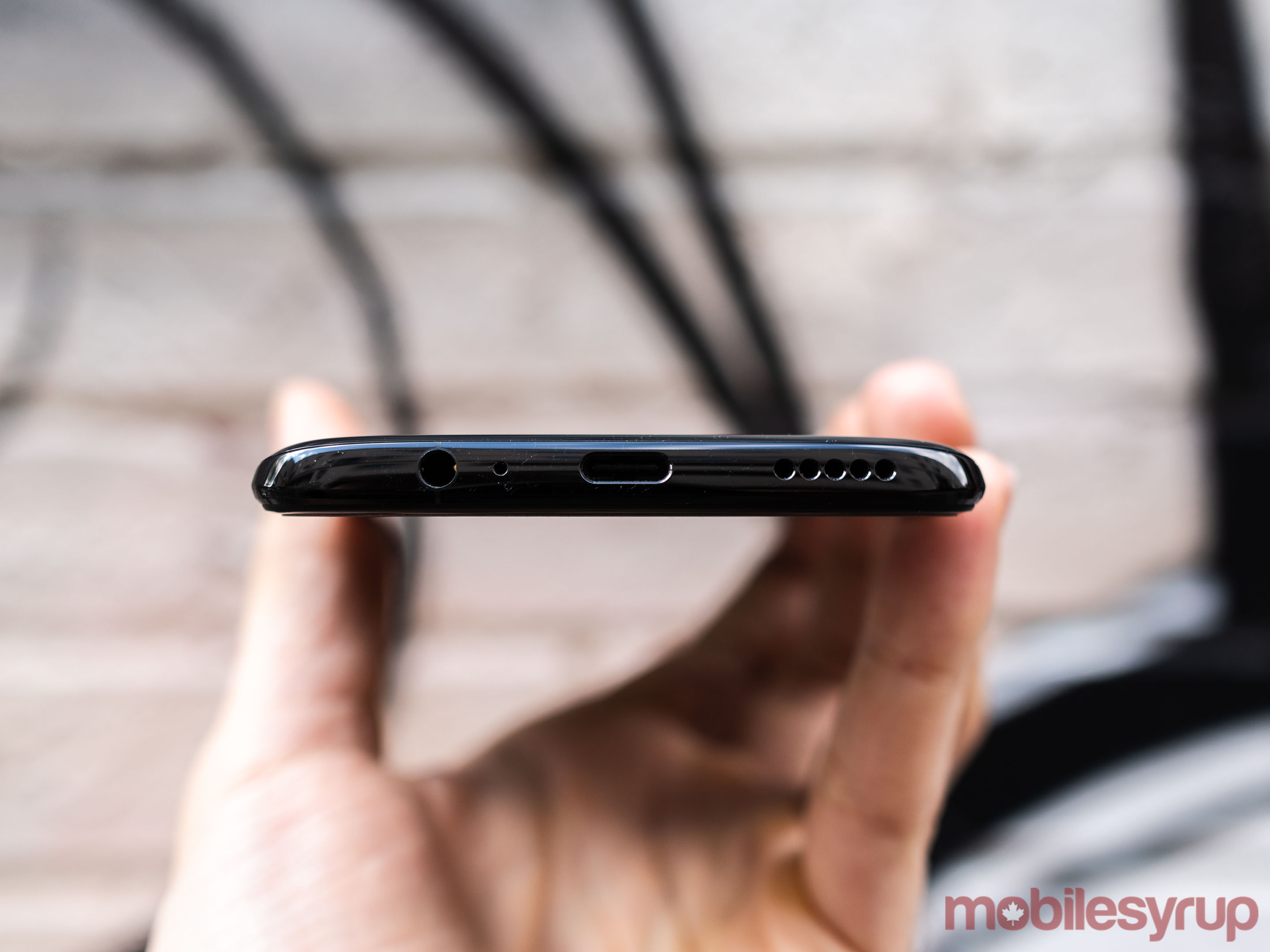
OnePlus 6 top-down

If the OnePlus 6 sounds a lot like OnePlus’ past phones, with all the same strengths and weaknesses, it is. That is until you get to its camera.

With the OP6, OnePlus has adopted a back-to-basics approach, prioritizing solid components instead of gimmicky tricks to improve camera performance.

To start, the OnePlus 6 includes optical image stabilization (OIS). OIS results in the camera’s shutter to stay open longer, allowing more light to hit its sensor. Only the main sensor is stabilized, but the inclusion of OIS helps improve image quality across the board, especially in low-light situations.

Second, the OnePlus 6’s new 16-megapixel Sony IMX 519 measures in at 1/2.6-inches, making it the same size as the Pixel 2’s main sensor and 19 percent larger than the sensor found on the OnePlus 5 — camera sensors that are physically larger allow for larger individual pixels, and larger pixels collect more light.

Together, the result of all these improvements is not only the best camera system OnePlus has shipped to date, but a camera system that’s actually competitive with Android’s top-tier shooters. In my time with it, the OnePlus 6’s main camera produced incredibly detailed shots, even in less than ideal lighting conditions.

Video performance is similarly improved, largely thanks to the addition of OIS, which helps smooth out footage. The OnePlus can capture 4K video at both 30 frames per second (FPS) and 60FPS, as well as slow-motion video at 240FPS and 480FPS.

Unlike the Galaxy S9, Xperia XZ2 and P20 Pro, the OP6 isn’t capable of capturing slow-motion video at 960FPS. However, the trade-off is that slow-motion capture is a lot more usable on the OP6 than those devices. The OP6’s Sony IMX519 sensor features built-in memory and due to the lower bitrate it’s capturing slow-motion video at, it’s capable of shooting one minute of 480FPS slo-mo video in one go. As a result, you have a lot more leeway when shooting slow-motion video since you can start the camera earlier, stop it later and then trim the footage afterward.

Software-wise, the OP6 includes a couple of new features, including a built-in video editor and new bokeh effects when using the included portrait mode. Later in the year, the company plans to add portrait mode to the front-facing camera. The more substantial improvement is the phone’s light metering software. In my time with the OP6, the phone has almost consistently nailed the exposure of shots.

Of course, the camera is not without its issues: its HDR functionality is not as robust the Pixel 2’s, with particularly challenging scenes causing it to blow out highlights, and it doesn’t include all the nifty features that come included with the P20 Pro. However, for the first time, it doesn’t feel like less than stellar camera quality is the trade-off you have to make when buying a new OnePlus smartphone.

The post OnePlus 6 Review: It’s all about the camera appeared first on MobileSyrup.

22 May 19:05

Do you use wireless charging?

by Dean Daley
OnePlus 6 devices in a row

This past week OnePlus revealed the OnePlus 6 and while it grabbed the attention of many, it was surprising to see that the phone doesn’t feature wireless charging — especially given its glass back.

The company made a big deal about its glass back and how it managed to create a device that felt and look like it had a matte metal finish but is actually made of glass.

But one of the main advantages of a glass back is wireless charging, so it’s weird that OnePlus didn’t include the function.

Just to clarify, wireless charging is the ability to charge a device by leaving it flat on a charging pad. While you cannot walk around with the product, you no longer have to fiddle with any wires.

The Samsung Galaxy S8 series, Galaxy S9 series, LG G7 ThinQ, Sony Xperia XZ2, iPhone 8 and iPhone X all have the functionality.

OnePlus is not alone, though. Huawei also didn’t include wireless charging in its P20 series even though its device includes a glass back.

So why don’t companies include wireless charging?

OnePlus made the argument last year with the OnePlus 5T that its Dash wired charging exceeds the speeds of wireless charging methods.

This is possibly the reason again.

What’s more interesting, however, is whether people really want wireless charging. I personally use the Huawei P20 Pro and the Pixel 2 XL as my main drivers so I never use wireless chargers.

However, Patrick O’Rourke, MobileSyrup’s managing editor, has three wireless charging pads on his desk.

So while I personally don’t use wireless charging, we’re curious, do you use wireless charging? Also what do you think about the OnePlus 6 leaving out the feature?

Let us know in the comments below.

Take Our Poll

The post Do you use wireless charging? appeared first on MobileSyrup.

22 May 19:05

Here are the changes to Canadian carrier rate plans this week [May 22 – May 27]

by Ian Hardy

There are over 30 million wireless subscribers in Canada and if you’re in the market to switch carriers, then you’ll want to know about the latest promotions and cell phone rate plan changes. You can find all those changes and additions below in a simple, easy to read chart.

Every week MobileSyrup will post the latest weekly rate plan deals. You can also check out our MobileSyrup’s rate plan calculator for details on plans, as well as to find the right plan for you.

Keep in mind that rate plans are always subject to change and that we’ll do our best to keep this list updated as accurately as possible.

Canadian carrier rate plan changes this week

7-Eleven Speakout

Ongoing

  • $20 off any phone with $50+ voucher purchase

Bell

New

  • Quebec:
    • 2GB data option with BYO for $5
    • 3GB data option as now 3GB bonus with BYO (Instead of 2GB)
    • 3 new 8GB promo plans in QC
    • Remove 6GB data option
    • Remove all Bring Your Own Device

Ongoing

  • Main Regions: 2GB bonus with all data options (Except 15GB)
  • 2GB Bonus on 10GB data option in Saskatchewan
  • 2GB Bonus on 6GB data options in Manitoba
  • Up to 4GB on data option in Quebec
  • $100 Trade-in Credit with selected phone
  • Save $10/month with every additional line on a Share plan (all regions)

Chatr

Ongoing

  • 1GB on selected plans
  • Double your Minutes, Texts and Data
  • 10% off with BYO phone

Cityfone

Ongoing

  • 1GB on selected plans
  • Double your minutes, texts and data
  • 10% off with BYO phone

Eastlink

Ongoing

  • 1 GB of bonus data for every family member you add to your plan
  • 3GB data for $60/month

Fido

New

  • New Fido XTRA reward postpaid customers with deals and giveaways on the app
  • 1GB and 2GB Data plans in Quebec now are Pulse plans
  • Double data on 1GB and 2GB Pulse plans, 2GB bonus data on 6GB and 8GB Pulse plans (QC)

Ongoing

  • 3GB Bonus on all Pulse plans
  • 2GB Bonus on 5GB Pulse plans (MB/SK)
  • $230 trade-in Credit with the Apple iPhone 8 o 8 Plus with 2-year contract in-store

Freedom Mobile

Ongoing

  • 3GB Bonus data with the Home 40 plan & all everywhere Canada & Big Gig plans
  • $5/month off in credits on the $25 and $30 Home basic plans
  • $10/month off for 12 months on Big Gig or Big Gig + Everywhere Canada plans for customers who BYO phone (in-store only)
  • $10/month off for 6 months on Home 40 plan for customers who BYO phone (in-store only)

Koodo Mobile

Ongoing

  • Up to 2GB in bonus data on selected plans (Quebec)
  • 2GB Bonus add-on with the $48 plan (Manitoba & Saskatchewan)
  • Up to 3GB bonus add-on for 24 months (Main Regions)
  • $5 off $40 prepaid plan
  • 1GB Bonus data with the $55 & $65 prepaid plan
  • Prepaid Offers: $20 Activation Bonus with Prepaid phones + Free 100 Minutes Talk booster add-on + 10% off with automatic top-ups

Bell MTS

Ongoing

  • 2GB bonus on 6GB data options
  • $30 Airtime credit on Prepaid phones

PC Mobile

Ongoing

  • Bonus points with smartphone purchase on a 2-year contract

Petro-Canada

Ongoing

  • Promotional plan: Spring Forward Plan with 300 mins for $25

Public Mobile

Ongoing

  • Bonus data on select plans
  • Save $2 with AutoPay Rewards

Rogers

Ongoing

  • 2GB Bonus Data on all Share Everything plans up to 10GB (main regions)
  • 2GB Bonus Data offer on 6GB Share Everything plans (MB)
  • 1GB Bonus Data offer on 7GB Share Everything plans (QC)
  • 2GB Bonus Data on 10GB and 14GB Share Everything plans (QC)
  • $15/mo. discount for additional lines (all regions) + 1GB bonus data for one additional line (main regions)
  • $230 trade-in Credit with the Apple iPhone 8 with 2-year contract in-store
  • $250 trade-in Credit with the Samsung Galaxy S9 or S9+ with 2-year contract in-store
  • $200 off for customers switching from SaskTel
  • $100 off for customers switching from another carrier (MB only)

SaskTel

Ongoing

  • $20 Prepaid bonus

Telus

Ongoing

  • 2GB Bonus data with 1 / 2 / 5 / 8GB data options
  • 2GB Bonus data with 6GB data options (Manitoba)
  • 1GB Bonus with the 15GB plan (MB)
  • 2GB bonus with the 10GB plan (SK)
  • 4GB Bonus Data on $4 plan (QC)
  • 2GB Bonus Data on $10 & $14 plan (QC)
  • Save $10/month (QC and SK) or $5/month (other regions) when adding a family member to a Shareable plan

Videotron

Ongoing

  • 2GB Bonus with 7 & 8 GB Premium Plus plans & 4GB / 5GB / 6GB Premium plans
  • Up to $26 off plans with BYO phone

Virgin Mobile

Ongoing

  • Main Regions: 3GB bonus with most plans
  • 2GB Bonus on selected plans in Manitoba & Saskatchewan
  • Up to 2GB bonus on selected plans in Quebec

The post Here are the changes to Canadian carrier rate plans this week [May 22 – May 27] appeared first on MobileSyrup.

22 May 19:05

Samsung opens artificial intelligence research centre in Toronto

by Brad Bennett
Samsung logo on wall

Samsung’s advanced research and development arm, Samsung Research, is opening three new AI research centres worldwide. One of them is based in Toronto.

Samsung Research is looking to strengthen the company’s AI capabilities by expanding its global AI research.

The Toronto location will be led by Dr. Larry Heck, who is the senior vice president of Samsung Research America (SRA). He was previously the head of the SRA’s AI centre and will work with Canadian universities to research core AI technologies.

The lab in Toronto is part of a new wave of centres spread across the globe. Samsung is also opening locations in Moscow, Russia and Cambridge, U.K.

These three new labs will join the already existing AI research locations in Seoul, South Korea and in the San Fransisco Bay Area the U.S, giving Samsung a total of five AI centres worldwide.

Across all of these centres, Samsung hopes to employ around a 1,000 AI researchers within the next two years.

Source: Samsung

The post Samsung opens artificial intelligence research centre in Toronto appeared first on MobileSyrup.

21 May 04:05

Pi-hole on Raspberry Pi

by Volker Weber

ZZ0C2D6B5A

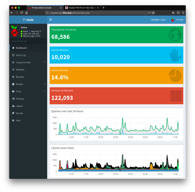
Yesterday I finally got around to install Pi-hole. Jens asked me how Homebridge was doing and I remembered that yes, I have a Raspberry Pi chugging along without giving me any headaches. Time to SSH into the little machine and upgrade all the software as well as installing Pi-hole. Which in itself is pretty painless. If you use IPv6, I suggest you first set your Fritzbox to always assign ULAs, because FD00:: is the prefix you want for the local address of your Pi-hole. I told Pi-hole to resolv addresses via my Fritzbox, so that DNS in my local network continues to work.

After you installed it you instruct your router/Fritzbox to announce your new DNS forwarder to all clients via DHCP. Each connected device will resolv via Pi-hole, which resolves via Fritzbox, which in turn resolves via whatever you set as your DNS server on the Internet.

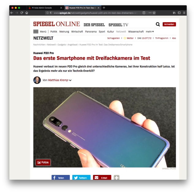
Why did I do this? Pi-hole filters out all requests for ad servers and tracking services. Which means that I finally can read Spiegel Online in Firefox without the site telling me I need to remove my ad blocker which I did not even have in Firefox. But since the site discovered that it could not track me, it denied access. All is good now since the code that checks for ad blocking cannot even load.

This is filtering at the net level and can break things. This is not a beginner's practice.

Anyway, brilliant. We just got ahead in the rat race. For now ...

ZZ789BB31B

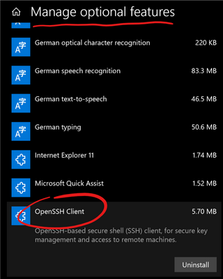
If you want to run your Raspberry Pi headless, that is without screen, keyboard and mouse, you need commandline access via SSH. A SSH client is pre-installed on a Mac. On Windows, make sure you have the optional OpenSSH client installed.

WindowsOpenSSH

More >

21 May 04:04

Fix that brand

by Volker Weber

1 5cQWDsAA2hjmO08AEfDBng
Photo Sugru

Sugru’s failure to reach the mainstream –and its subsequent sale to Tesa this week– shows how crucial the investment in branding and marketing is in order for impact driven companies reach scale.

More >

21 May 04:00

Staying focused, the productive way

Your manager keeps telling you that you’re not getting enough done. So you decide to become more focused, since as everyone knows, to be a productive programmer you need to stay focused. Deep-diving into TV Tropes, chatting with your friends, or reading up on that fancy new web framework might be fun, often even educational, but they won’t get that feature you’re working on out the door.

So you get noise canceling headphones, and only read your email once a day, and use the Pomodoro technique, and became laser-focused on your code—but still, you’re not productive enough. Your colleague across the hall doesn’t write code faster than you, and yet somehow they make more of an impact, they get things more done. You know it, and your manager knows it.

Why?

Because staying focused is not enough to make you productive. In fact, it’s often the other way around: staying focused is a side-effect of what truly makes you productive.

  • To understand why staying focused isn’t enough, we’ll take a detour from programming and go visit my past self: a young soldier being escorted into a military jail.
  • Then, we’ll apply the lesson we learned and see how understanding your goals is key to becoming more productive, and how your goals can help you stay focused.

A short visit to a military jail

Imagine a yard full of dirty gravel, and mixed in with the gravel are tiny twigs, trash, and the like. How long could you spend crawling around looking for this debris before you’d get bored? How long could you stay focused?

Long ago I lived in Israel, and as a Jewish citizen I was required to serve three years in the military. For a variety of reasons, personal and political, I had no interest in becoming a soldier, and so I attempted to avoid conscription by getting a medical discharge for mental health reasons. While on the base I was part of a transients’ unit on the military base: we would clean bathrooms and the like while awaiting processing.

As our story unfolds, I was having a very bad day. My attempt to get a discharge was failing, as the military psychiatrist had decided there was nothing wrong me. And to make things worse, the sergeant who ran the unit wanted me to go off and do some work on the base, and I couldn’t deal with it.

So I said “no"—which to say, I refused orders, serious business in the military. The sergeant organized a quick trial, and the officer in charge sentenced me to a day in the on-base jail. Perhaps for entertainment, perhaps to enforce the importance of obeying orders, while I was in the jail my guards ordered me to search for little bits of tiny debris that were mixed in the jailyard’s gravel.

And so I spent quite a while, crawling around on my knees in the rain, working hard at a pointless task. The guards were impressed, and eventually they felt bad enough to give me an umbrella to keep the rain off.

The moral of the story

I started this episode by refusing to work, and refusing work that had some purpose (washing dishes, or cleaning a bathroom). I ended by working hard doing something that was a complete waste of time.

Both choices were good ones, because in both cases I was working towards my goals:

  1. My broadest goal was getting kicked out of the military. Cooperating was doing me no favors: spending some time in jail for refusing orders demonstrated I was not going to be a good soldier.
  2. My secondary goal was minimizing the amount of time I spent in jail. I had met a soldier on base who had spent his time in jail getting in trouble with his guards, so he’d been sentenced to even more time. He ended up spending months on a military prison base. I wanted to be a model prisoner, so I could get out of jail as quickly as possible.

Staying focused and avoiding distractions is all fine and good, so long as the work you’re doing actually helps you achieve your goals. If it’s not, you’re staying focused on the wrong thing. I could have stayed focused by following orders—and that would have been the wrong way to achieve my goal of getting kicked out of the military.

Plus, knowing your goals can help you stay focused. If you don’t care about your task, then you’ll have a hard time focusing. But once you do understand why you’re doing what you do, you’ll have an easier time staying on task, and you’ll have an easier time distinguishing between necessary subtasks and distracting digressions. And that’s why I was able to enthusiastically clean debris from gravel.

This then is the key to achieving your goals, to productivity, and to staying focused: understanding your goals, and then working towards them as best you can.

Applying your goals to staying focused

So how do you use goals to stayed focused?

  1. Figure out the goals for your task.
  2. Strengthen your motivation.
  3. Judge each part of your work based on your goals.

1. Discovering your goals

Start with the big picture: why are you working this job? Your goals might include:

  • Money: Getting paid so you can buy food and shelter.
  • Social pressure: You want your coworkers and boss to think well of you.
  • Organizational goals: You believe in what the company is doing.
  • A sense of obligation: You want to help your customers or users.
  • Building and playing: Solving a hard problem is fun.
  • Curiosity: Learning is fun too.

Then focus down on your particular task: why is this task necessary? It may be that to answer this question you’ll need do more research, talking to the product owner who requested a feature, or the user who reported a bug. This research will, as an added bonus, also help you solve the problem more effectively.

Combine all of these and you will get a list of goals that applies to your particular task. For example, let’s say you’re working on a bug in a flight search engine. Your goals might be:

  1. Money: I work to make money.
  2. Organizational goal: I work here because I think helping people find cheap, convenient flights is worth doing.
  3. Task goal: This bug should be fixed because it prevents users from finding the most convenient flight on certain popular routes.
  4. Fun: This bug involves a challenging C++ problem I enjoy debugging.

2. Strengthening your motivation

Keeping your goals in mind will help you avoid distractions, and the more goals you’re meeting, and the more your various goals point in the same direction, the better you’ll do. If you have weak or contradictory goals then you can try different solutions:

  • If you work for a company whose goals don’t mean much to you, then you’ll have a harder time focusing: consider finding a new job where you’re doing something you care more about.
  • If after enough research you’ve decided your task is pointless, you can either try to push back (mark the bug as WONTFIX, go talk to the product manager), try to add an additional motivation (is this a good opportunity to learn something new?), or just live with the fact that it’ll take you longer to implement.

3. Judging your work

Understanding your goals will not only help you avoid small distractions (noise, TV Tropes), but bigger distractions as well: digressions, seemingly useful tasks that shouldn’t actually be worked on. Specifically, as you go about solving your task you can use your goals to judge whether a new potential subtask is worth doing.

Going back to the example above, imagine you encounter some interesting C++ language feature while working on it can be tempting to dive in. But judged by the four goals it will only serve the fourth goals, having fun, and likely won’t further your other goals. So if the bug is urgent then you should probably wait until it’s fixed to play around.

On the other hand, if you’re working on a pointless feature, your sole goals might be "keep my manager happy so I can keep getting paid.” If you have two days to do the task, and it’ll only take two hours to implement it, spending some time getting “distracted” learning a technical skill might help with a different goal: switching to a more interesting position or job.

Start with your goals

Once you know goals, you can actually know what it takes to be productive, because you’ll know what you’re working towards. Once you know your goals, you can start thinking about how to avoid distractions because you’ll know you’re doing work that’s worth doing.

Before you start a task, ask yourself: what are my goals? And don’t start coding until you have an answer.


It’s Friday afternoon. You just can’t write another line of code—but you’re still stuck at the office...

What if every weekend could be a 3-day weekend?

21 May 03:56

"I did not mean that Conservatives are generally stupid; I meant that stupid persons are generally..."

“I did not mean that Conservatives are generally stupid; I meant that stupid persons are...
19 May 23:22

The Implosion Chronicles

by Ken Ohrn
mkalus shared this story from Price Tags.

The NPA, a Vancouver civic party, is not doing well early in the run towards the region’s October 2018 election.  What with public reviews of mayoral candidate Glen Chernen, botched meeting notices and really bad campaign messaging.

BTW, he likes some bike lanes, so maybe there’s a glimmer of hope. But I guess this could change.

Let’s start with Mike Klassen, former NPA council candidate, reacting to Chernen’s ascendancy with decidedly unflattering terms:

Catch up on experience and qualifications with this Chernen bio, compiled from public sources, with thanks to 2018CivicElxnWatcher:

Jen St. Denis in StarMetro Vancouver looks for a platform or ideology in mayoral hopeful Glen (Muscle Cars) Chernen. “Something is rotten” will have to do for now, I suppose, along with:

Glen Chernen is convinced something is rotten at city hall and believes the only way to fix it is to become mayor.

The Dunbar resident, who says he hasn’t held a conventional job in 20 years but makes a living managing his own investments, has become increasingly absorbed with examining city land deals and what he believes are conflicts of interest. He now spends nearly all his time doing this, he told StarMetro in an interview on Wednesday.

“Somebody needs to go in there and start operating the city to the benefit of the public,” Chernen said.

From our Flimsy Organization department, the reasoning behind the NPA having postponed their mayoral candidate nomination meeting:

And finally, campaign messaging:   good old MVGA — yes, a Trump / Ford message, devoid of any content other than boosterism. Perfect for a mayoral hopeful who is, so far, devoid of ideology.


19 May 23:21

Create Code Metrics with cloc

by hrbrmstr

The cloc Perl script (yes, Perl!) by Al Danial (https://github.com/AlDanial/cloc) has been one of the go-to tools for generating code metrics. Given a single file, directory tree, archive, or git repo, cloc can speedily give you metrics on the count of blank lines, comment lines, and physical lines of source code in a vast array of programming languages.

I don’t remember the full context but someone in the R community asked about about this type of functionality and I had tossed together a small script-turned-package to thinly wrap the Perl cloc utility. Said package was and is unimaginatively named cloc🔗. Thanks to some collaborative input from @ma_salmon, the package gained more features. Recently I added the ability to process R markdown (Rmd) files (i.e. only count lines in code chunks) to the main cloc Perl script and was performing some general cleanup when the idea to create some RStudio addins hit me.

cloc Basics

As noted, you can cloc just about anything. Here’s some metrics for dplyr::group_by:


cloc("https://raw.githubusercontent.com/tidyverse/dplyr/master/R/group-by.r")
## # A tibble: 1 x 10
##   source language file_count file_count_pct   loc loc_pct blank_lines blank_line_pct comment_lines comment_line_pct
## 1 group… R                 1             1.    44      1.          13             1.           110               1.

and, here’s a similar set of metrics for the whole dplyr package:


cloc_cran("dplyr")
## # A tibble: 7 x 11
##   source language file_count file_count_pct   loc loc_pct blank_lines blank_line_pct comment_lines comment_line_pct
## 1 dplyr… R               148        0.454   13216 0.442          2671       0.380             3876          0.673  
## 2 dplyr… C/C++ H…        125        0.383    6687 0.223          1836       0.261              267          0.0464 
## 3 dplyr… C++              33        0.101    4724 0.158           915       0.130              336          0.0583 
## 4 dplyr… HTML             11        0.0337   3602 0.120           367       0.0522              11          0.00191
## 5 dplyr… Markdown          2        0.00613  1251 0.0418          619       0.0880               0          0.     
## 6 dplyr… Rmd               6        0.0184    421 0.0141          622       0.0884            1270          0.220  
## 7 dplyr… C                 1        0.00307    30 0.00100           7       0.000995             0          0.     
## # ... with 1 more variable: pkg 

We can also measure (in bulk) from afar, such as the measuring the dplyr git repo:


cloc_git("git://github.com/tidyverse/dplyr.git")
## # A tibble: 12 x 10
##    source    language     file_count file_count_pct   loc  loc_pct blank_lines blank_line_pct comment_lines
##  1 dplyr.git HTML                108        0.236   21467 0.335           3829       0.270             1114
##  2 dplyr.git R                   156        0.341   13648 0.213           2682       0.189             3736
##  3 dplyr.git Markdown             12        0.0263  10100 0.158           3012       0.212                0
##  4 dplyr.git C/C++ Header        126        0.276    6891 0.107           1883       0.133              271
##  5 dplyr.git CSS                   2        0.00438  5684 0.0887          1009       0.0711              39
##  6 dplyr.git C++                  33        0.0722   5267 0.0821          1056       0.0744             393
##  7 dplyr.git Rmd                   7        0.0153    447 0.00697          647       0.0456            1309
##  8 dplyr.git XML                   1        0.00219   291 0.00454            0       0.                   0
##  9 dplyr.git YAML                  6        0.0131    212 0.00331           35       0.00247             12
## 10 dplyr.git JavaScript            2        0.00438    44 0.000686          10       0.000705             4
## 11 dplyr.git Bourne Shell          3        0.00656    34 0.000530          15       0.00106             10
## 12 dplyr.git C                     1        0.00219    30 0.000468           7       0.000493             0
## # ... with 1 more variable: comment_line_pct

All in on Addins

The Rmd functionality made me realize that some interactive capabilities might be handy, so I threw together three of them.

Two of them extraction of code chunks from Rmd documents. One uses cloc other uses knitr::purl() (h/t @yoniceedee). The knitr one adds in some very nice functionality if you want to preserve chunk options and have “eval=FALSE” chunks commented out.

The final one will gather up code metrics for all the sources in an active project.

FIN

If you’d like additional features or want to contribute, give (https://github.com/hrbrmstr/cloc) a visit and drop an issue or PR.