Shared posts

30 May 20:15

Igor's New Go-Fast Bike

by noreply@blogger.com (VeloOrange)
by Igor


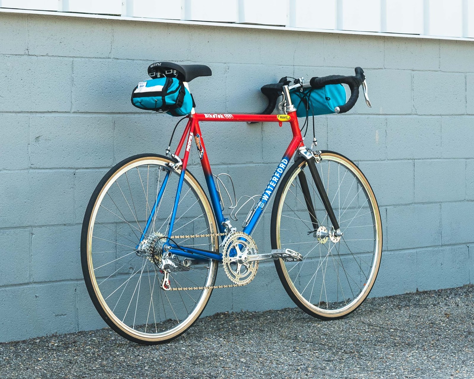
"Restomod" is a term that is thrown around among vintage internal combustion enthusiasts quite a bit. It involves the blending of old-world design with modern-day features to create a vehicle that is more reliable, safe, and comfortable. This mid-90s retired racer is just on the cusp of vintage, so I decided it was ready for a proper spruce up with a bunch of modern and a few not-so-modern components for a speedy restomod interpretation.


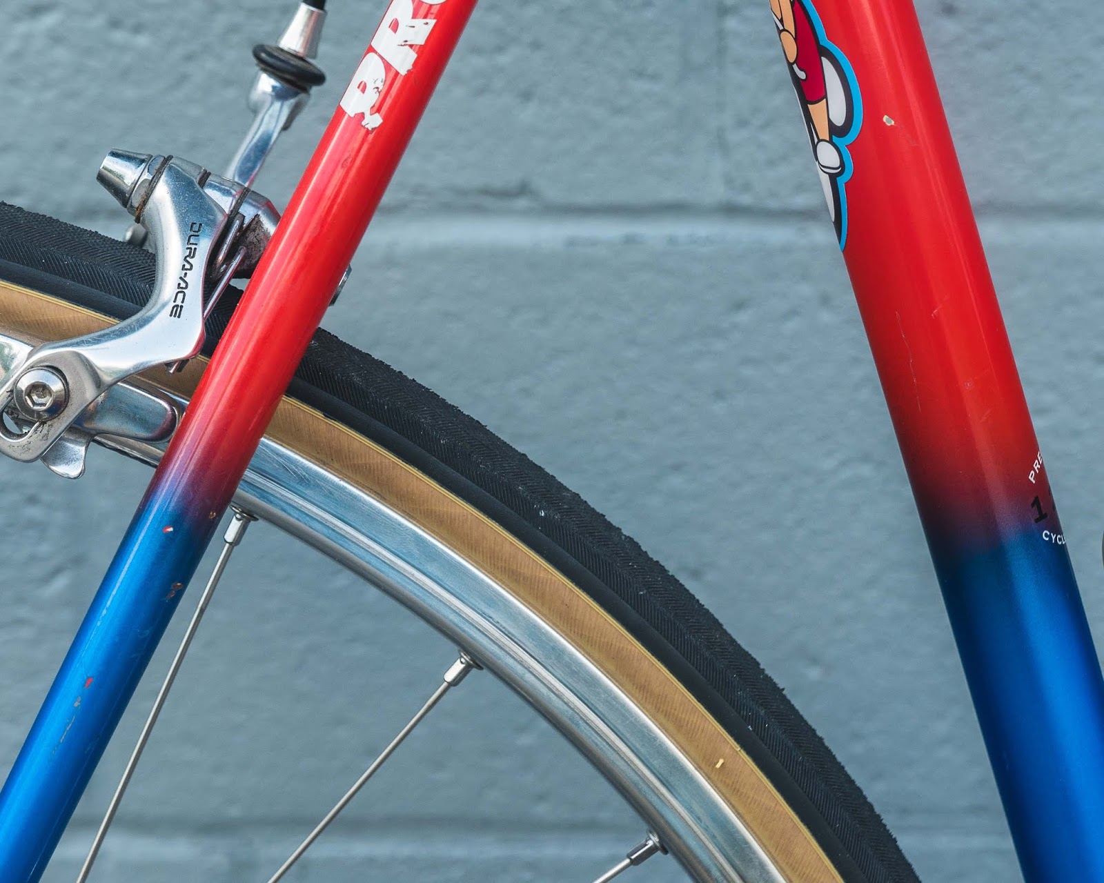
This is a mid-90s Team Mack issue Waterford 1200 road bike. It's built from Reynolds 753 tubing and Henry James lugs. In order to be able to employ this tubeset, builders had to go through a certification process to prove they know how to handle and fabricate using this super-thin, heat-treated tubing. You can't use use long-pointed, ornate lugs as the tube could crack over time, so the lugwork is short and simple.


This is where I'd put my race number - if I raced!
The Ventana fork uses carbon legs, alloy dropouts, 1" steel threaded steerer, and a very neat-looking CNC'd fork crown. It seems fine according to my eyeballs and the coin test, but I might replace it with a steel fork down the road.


Three-cross wheels lacing is tried-and-true, but I wanted to do something special for this build, so I employed the master wheelbuilding knowledge of Baltimore's own Tommy Barse of Cutlass Wheels to build up a set of 32 hole PBP Rims to a Grand Cru 11speed Touring Hub and a High-Flange Front Hub. Here's Tommy's take on the wheels and the nitty-gritty of the build:


"There was no hesitation when Igor approached me about building a set of wheels for his Waterford. Igor mentioned that he wanted a sporty, responsive design for more spirited riding. My choice of spokes was easy - Sapim D-Lights in the front wheel with their 2.0/1.65/2.0mm butting; Sapim D-Lights in the rear wheel on the non-drive side and Sapim Race (2.0/1.8/2.0) spokes on the drive side. The nipples selected are Wheelsmith silver brass - their finish is unparalleled in quality and longevity. I have not seen their Duristan finish fade, corrode or mar unlike other manufacturers’ nipples. I stock bulk 310mm uncut spokes from Sapim to cut to the proper length for each build. My Morizumi spoke cutter has been an extremely valuable tool to build quality wheels with just the right thread purchase between spoke and nipple.


The Velo Orange PBP rims measured very round in the four sections that I measure ERD for spoke calculation. The 2-cross spoke pattern for the front was selected for the wider bracing angle to provide better cornering and climbing stiffness for the shallow box section rim. The radial non-drive side and 2-cross drive side were selected for a little less weight and increased lateral stiffness. Being in the mid-Atlantic, especially Annapolis, I incorporated high quality DumondeTech MR grease on the nipple shoulders and Loctite copper anti-seize on spoke threads for ease of maintenance. Wheels turned out wonderful in terms of lateral and radial trueness. Several rounds of stress relieving proved the wheels are stable, allowing for confident riding in all conditions.


The neo-classic aesthetic is eye-catching and a nice balance of classic silver components with a less classically styled approach to semi-tangential spoking. These will serve Igor well for years to come!"

The wheels are all wrapped up in Fairweather Traveler Tires in the 700x28c sizeway. While the Rust color would have been cool, I think the black and tan combo looks superb.

Onto the drivetrain! The shifters are Campagnolo's 11speed Athena. They're all metal, silver, and have a very light actuation. They also fit exceptionally well on our upcoming Nouveau Randonneur Handlebars. The cockpit is held in place by our Removable Faceplate Quill in a classic Chrome finish. Once the fit is dialed in, I'll cut the excess quill to save dozens of grams.


The dangler is also Athena and is quite handsome. I swapped the unit's stock plastic pulleys with our 10T Alloy Jockey Wheels for two reasons: 1) since these replacement wheels don't float, shifting is super crisp and 2) they're red. Very red. 


The crankset is our 110bcd Drillium paired with an Athena pusher. While our rings aren't technically rated for 11speed drivetrains, I haven't experienced any issues with this group or Shimano's previous generation 105. Needless to say, if you want to run 11 speed on our cranksets, I'm very confident you'll be fine. All that said, Shimano and Campagnolo recently released their 12 speed drivetrains. So there's that...


The perch is our Smooth Touring Saddle. It's my go-to nowadays for all new builds. The seatpost is an interesting one. The seatlug requires a 27.4mm size and a 27.2mm would commonly crack the binder's ear over time. Luckily, this one is in good shape minus a bit of paint flaking.


All that speed needs to come to a stop at some point, and it is handled by a pair of single-pivot Dura-Ace caliper brakes. They're exquisite.


While clipless pedals would look great, I have found Sabots to be my pedal of choice.

To accentuate the gorgeous fade paintjob, I wrapped Grand Cru Leather Bar Tape over Red Tressostar Cotton Tape. When you're riding, you can see the red tape through the perforations. Details matter!

Finally, a bit of storage handled by a Day Tripper Saddle Bag and Road Runner's Burrito Supreme Handlebar Bag. It's a great combo for a camera, rain shell, tools, cell/wallet/keys, and a rolled up slice of pizza.

30 May 20:15

Drupal.org gets videos that make Drupal easier to learn

by Dries

In the beginning of the year I started doing some iOS development for my POSSE plan. As I was new to iOS development, I decided to teach myself by watching short, instructional videos. Different people learn in different ways, but for me, videos tutorials were the most effective way to learn.

Given that recent experience, I'm very excited to share that all of the task tutorials in the Drupal 8 User Guide are now accompanied by video tutorials. These videos are embedded directly into every user guide page on Drupal.org. You can see an example on the "Editing with the in-place editor" page.

These videos provide a great introduction to installing, administering, site building and maintaining the content of a Drupal-based website — all important skills for a new Drupalist to learn. Supplementing user guides with video tutorials is an important step towards improving our evaluator experience, as video can often convey a lot more than text.

Creating high-quality videos is hard and time-consuming work. Over the course of six months, the team at Drupalize.Me has generously contributed a total of 52 videos! I want to give a special shout-out to Joe Shindelar and the Drupalize.Me team for creating these videos and to Jennifer Hodgdon and Neil Drumm (Drupal Association) for helping to get each video posted on Drupal.org.

What a fantastic gift to the community!

30 May 20:15

“[I]t is not even clear that the president himself knows what that strategy is.”

by Andrea

The Washington Post Opinions: Trump’s actions on North Korea have consequences. Here’s a list of them. By Anne Applebaum, columnist. Published May 25, 2018.

“Remember, Trump’s withdrawal from the Iran nuclear deal didn’t automatically return the Middle East to where it was before the pact was signed in 2015: It returned us to a worse place. We’re now unable to reimpose sanctions on Iran because the coalition that enforced them is broken. Trump’s withdrawal from the Kim summit doesn’t return the Korean Peninsula to status quo ante either. Even if he returns to the negotiating table next month, we do not live in the same world that we lived in on March 7, the day before a plan for the now-canceled summit was announced. Actions have consequences. Here’s a list of them.

We don’t have the credibility that we had before. This is the most important consequence of Trump’s impulsive decisions, first to agree to a summit with no warning, and then to cancel the summit with no warning. The one “card” the United States has always held on the Korean Peninsula was its military presence, coupled with the presumption that, if provoked or attacked, U.S. forces would respond. Now that it’s clear how eager Trump was for a summit, how much he wanted the Nobel Peace Prize that Fox News promised him, and how rapidly he pivoted from calling Kim “Rocket Man” and “maniac” to “very open” and “very honorable,” any further bluster from the president will just sound ludicrous.

A U.S. president’s ignorance has been on naked display. I was with apolitical Polish friends in Warsaw just after the summit cancellation was announced. Normally they don’t pay much attention to North Korea, but this time they were filled with questions: Doesn’t Trump have any advisers?”

30 May 20:15

Twitter Favorites: [JaysGirlEmily] I have a rebuttal to this: many of us who are nice, fun, delightful people don't use the sponsored hashtags, becaus… https://t.co/1VHR2e2S85

Emilir Marrero Jr. @JaysGirlEmily
I have a rebuttal to this: many of us who are nice, fun, delightful people don't use the sponsored hashtags, becaus… twitter.com/i/web/status/1…
30 May 20:15

Twitter Favorites: [ReneeStephen] @spaikin @fordnation @OntarioPCParty Friends, unless he promises that if anybody is laid off that he will support t… https://t.co/kbdKM8FjBg

Renée Stephen @ReneeStephen
@spaikin @fordnation @OntarioPCParty Friends, unless he promises that if anybody is laid off that he will support t… twitter.com/i/web/status/1…
30 May 20:15

Twitter Favorites: [tinysubversions] I sometimes wonder how people have time to listen to new music when there is about 100 years of recorded music to c… https://t.co/qOADow6Yh3

Darius Kazemi in London @tinysubversions
I sometimes wonder how people have time to listen to new music when there is about 100 years of recorded music to c… twitter.com/i/web/status/1…
30 May 20:15

Recommended on Medium: Podcast Radio Station

One of my favourite CBC shows is Podcast Playlist, which is a weekly, curated show where Matt Galloway & Lindsay Michael sample a set of podcasts, around a particular theme. They play excerpts, or whole episodes depending on length, and talk about why they have included it.

Related, much to my surprise, one of my favourite [ed: counterpoint] developments in media are these post-show discussion shows (Talking Dead, Talks Machina, After the Thrones). I should note that some of these shows are terrible, some are good. The better ones tend to be web, rather than network, and more free-flowing. They’re also all universally too long.

Whether web-based/digital or, my ideal, an honest-to-goodness terrestrial radio station, would combine these into a thrilling, diverse and interesting talk-format discovery station. With programming divided up throughout the day/week, with curated hosts, and re-broadcasting entire podcast episodes, it re-invents the incredibly tired call-in-and-rant structure of current talk radio. It also offers a chance for different new revenue streams for podcast creators (who, in my idea, are of course compensated for all re-broadcasts & take some share of advertising revenue).

Let’s say you divide each day into 4-hr segments, where hour 3 (or maybe just the last 0.5 hr) is the “discussion of what you just heard” segment, ideally including one or more of the podcast creators you were just listening to, and allowing inbound contribution via phone/text/whatever (like any call-in show).

If there were regular, recurring scheduled themes, I’d tune in for topics that interest me. For serial podcasts, like Serial, this offers an opportunity to have a scheduled broadcast over several weeks. Some would be one-offs, and some regulars for weeks or months at a time.

Last-minute thought: In many ways, this is the model CBC Radio 1 already has. Most of the shows are essentially podcasts (Q, Under the Influence, Ideas, Quirks & Quarks, Spark — the lines between regular radio-show and podcast are very blurry) already, intermixed with news/current event shows. The key difference, I think, is an expectation that the station is curating other people’s content, as well as probably producing their own. For a broadcaster like CBC, with a mandate to support Canadian culture, this could be a really interesting new station, pushing out Canadian podcasts to the world.

Originally published at Tannock.net.

30 May 20:15

Twitter Favorites: [Sean_YYZ] The Tunnels of Moose Jaw is fun. Their two tours cover the early Chinese-Canadian history (and the struggles they f… https://t.co/nhjH6NpcNh

Sean Marshall @Sean_YYZ
The Tunnels of Moose Jaw is fun. Their two tours cover the early Chinese-Canadian history (and the struggles they f… twitter.com/i/web/status/1…
30 May 20:15

Twitter Favorites: [bmann] Our summer in Berlin starts now. A short delay at the airport means Japadog for dinner. https://t.co/wwVuguEAlN

Boris Mann @bmann
Our summer in Berlin starts now. A short delay at the airport means Japadog for dinner. pic.twitter.com/wwVuguEAlN
30 May 20:15

HomePod Receiving AirPlay 2 and Calendar Support Today, Launching in More Countries Soon

by Ryan Christoffel

Apple is releasing iOS 11.4 today, alongside a companion 11.4 update for the HomePod. Ahead of that release, Apple Newsroom shared details on exactly what we can expect.

Today's update will at last bring AirPlay 2 to iOS and, by extension, the HomePod. This will enable the multi-room audio and stereo pairing features that Apple first demonstrated on-stage at last year's WWDC. More in-depth coverage of AirPlay 2 features will be available in our iOS 11.4 overview, publishing when that update launches. And look out for a hands-on story covering the HomePod's new stereo pairing feature after it becomes available.

One other noteworthy feature coming to HomePod today is the addition of Calendar support. This works similarly to the other Personal Requests features of HomePod, which include Notes, Messages, and Reminders: only the Apple ID used to set up your HomePod will be able to share its Calendar information, and that data can only be accessed when you're at home on the same Wi-Fi network as HomePod.

Finally, Apple has announced three countries where HomePod will be launching soon: Canada, France, and Germany. The smart speaker will be available beginning Monday, June 18th.

→ Source: apple.com

30 May 20:15

Moodlenet user testing

by Bryan Mathers
Moodlenet testing - Miles

I’ve been participating in a Moodlenet design sprint (based on this process) all week facilitated by the wonderful people at Outlandish. It was lovely to be on the facilitated side for once, allowing me to focus on the visualisation of concepts. By day 3 we had collaboratively turned our words into wireframes and hacked together a proof of concept. For day 4, Doug Belshaw had invited individuals to conduct a user test. Here’s a visualisation of the test journey by his Hello-World-ness, Miles Berry.

The post Moodlenet user testing appeared first on Visual Thinkery.

30 May 20:14

Out of Network

by Alex Beattie 

Recently, the discussion of technology usage has taken what might be called a “health turn”: Articles diagnose our “infobesity,” for instance, or claim phones are the real e-cigarettes. Self-help books with the titles How to Break Up With Your Phone or The Distraction Addiction urge tech moderation, or “digital Sabbaths.” These warnings are part of what anthropologist Adam Fish calls “digital healthism,” an emerging discourse that promotes the abstinence of tech use to enhance personal health and well-being.

On the surface, digital healthism appears to resemble the anti-TV discourse in the 1980s, when the calls to curb tech use tended to come from tech outsiders: psychologists, politicians, and teachers alike. But this time the concerns are emerging from an unlikely source: Silicon Valley itself. In late 2017, former Facebook executive Chamath Palihapitiya expressed “tremendous guilt” about the harms of social media in “ripping society apart.” Other Silicon Valley executives reportedly keep their children and themselves from their own “addictive” products, identifying with the iconic proverb from Scarface: “never get high on your own supply.” And Justin Rosenstein, the programmer behind the Facebook “like,” is one of several Silicon Valley engineers who feels guilty for having accelerated an “attention economy” in which platforms compete to colonize users’ time. Describing his regret to the Guardian that his invention was being used as a dopamine hit to placate users, Rosenstein has responded by launching Asana, a data-analytics company aimed at improving workers’ productivity.

The concern with “addictive” technology appears to be mainly about what the epidemic of distraction does to productivity, a tale that’s been spun to workers for over a hundred years

This new venture is indicative of the health turn in whole. Cries of “technology addiction” may seem to stem from a moral concern with users’ quality of life, but much as sociologist Jock Young found in his 1970s research into attitudes toward recreational drug users, the problem people have is less with the behavior itself than with its interference with work. When technology is deemed “addictive,” it is not phone use itself or its effects on individual well-being that mainly bothers commentators. The concern appears more to be what the epidemic of distraction does to productivity, a tale that’s been spun to workers for over a hundred years: What is “healthy” is simply what improves their job performance.

In the early 20th century, this was how Taylorism was sold to factory workers. By fragmenting procedures on assembly lines, work would become less demanding and infringe less on their leisure. For so-called knowledge workers today, the ruse has been reversed: Leisure has been blended into work to supposedly make workplaces more informal and fulfilling. This emphasis has no more to do with employee well-being than time-motion studies did in the era of scientific management. Because fewer efficiency gains can now be made through deskilling and streamlining jobs, the key has become to capture more of the cognitive output and life experiences of “flexible” workers for value production, whether through open-plan offices, corporate breakout spaces, or shared intranets like Slack. These collaborative working spaces afford camaraderie and, critically, capture asynchronous labor in networks that depend on phones to sustain continual connectivity.

Moreover, political theorist Jodi Dean has argued that the use of Facebook and other social platforms that extend beyond formal work relations are part of what she terms “communicative capitalism” — where human interaction is appropriated and turned toward profit. From this perspective, the increasing number of hours spent with online platforms measures their increasing exploitation. Until recently, these platforms assumed there was no limit to how much users could be made to want to connect. But if the emergence of digital detoxes and similar “mindful” approaches to phone use are any indication, we may be reaching peak connectedness. Digital healthism could be taken as a sign that a sizable number of people have decided that they do not use social media but rather social media uses them, rendering them unwell in the process. In The Pathology of Communicative Capitalism, David W. Hill labels the modern malaises of anxiety, stress, and depression as “communicative diseases,” by-products of an economy that, in valuing efficient exchange over meaningful bonds, fragments social communication.

While platforms like Facebook benefit from an excess of communicative labor, the wage-paying employer is left with a hyperconnected worker that struggles to focus on job-related tasks or risks burnout. As a result, contemporary managerial discourse increasingly lauds the benefits of unplugging. Even before social media, nearly 15 years ago, the Boston Consulting Group developed an internal unplugging program to address its high employee turnover. The program required employees to disconnect during one working day of the week: no emails, no BlackBerrys (this was 2004), and no work. Participating employees, the company found returned to the job with more vigor and a renewed sense of work-life balance. The group recommended that its consultants also take regular breaks and moderate their digital connections to avoid burnout. Further well-being research suggests stressed workers make more mistakes, have higher health insurance rates, and take more sick days.

Today’s workplace is littered with more digital distractions than in 2004. Notifications flash on screens like blips on a radar, bottomless newsfeeds afford endless scrolling, and Fortnite, Two Dots and other “sticky” mobile games linger at workers’ fingertips. These interruptions are deadly for tasks that require sustained concentration: reading, notetaking, report writing. With devices being blamed for workers’ loss of concentration, Google has recently announced a suite of “Digital Wellbeing” functionalities for Android phones, including daily feedback on time spent on device, options to bundle third-party notifications into single alerts, and nudges to resist “distracting” services like YouTube. With the alleged architects of tech addiction co-opting the tenets of unplugging, digital healthism goes full circle.

The idea of the always-connected knowledge worker who checks email constantly is supplemented with the digitally mindful employee, who strives for and attains deep and uninterrupted periods of work

Making the workplace more distraction-free may seem to make it “healthier,” but it merely re-Taylorizes it, decluttering the networked assembly line: laptops are banned from meetings; workers are told check emails less frequently, and so on. Tech use is deemed “unhealthy” only when connectivity is deemed “mindless”—  that is, compromising the knowledge worker’s capacity to pay attention and turn it into work product for the salary-paying employer.

The idea of the always-connected knowledge worker who blends work and nonwork time with digital technology — checking email constantly and responding as speedily as possible — is thus supplemented with the digitally mindful employee, who strives for and attains deep and uninterrupted periods of work. This is the much-vaunted state of “flow,” which according to psychologist Mihály Csíkszentmihályi is a pleasurable state of being lost in one’s work. It echoes what author Carl Newport calls “deep work,” where intensely focused workers perform at their highest cognitive capabilities.

These blissful periods of labor seem like a win-win for both worker and employer. Yet it is the employer who chiefly benefits. Disconnectionism recodes self-care as the maintenance of a normative level of productivity, with social media diets serving as ascetic rituals of discipline and focus. Workers discipline themselves from the urge to check out social media feeds or news websites, to develop resiliency to the fluff that distracts them from the task at hand. But star employees are only as free as the Stakhanovites subjected to Taylorism before them. Escaping from distractions is more for bosses than workers, just as “mindfulness” is code to eliminate mindless scrolling — that is, cognitive effort not captured by one’s direct employer.

Employers desire both well-connected and focused workers; the emergence of digital healthism means they can have their cake and eat it too. Organizations used to have to block employees’ access to social networks on the suspicion they compromise deep work, but with internet jamming programs like Self Control or Cold Turkey, workers will restrict their access themselves. Then there’s the “Do Not Disturb” chat status, the productivity equivalent of the “No Smoking” sign and a projection of focus and productive fitness. The semiotics of Do Not Disturb is a signal to the wider network that this worker is not to be interrupted. Similarly, switching on Out of Office serves not only to create a “healthy” distance between the worker and their networks of colleagues and clients but also transform a period of absence into a productive one. The benefit of automatic reply is to allow for email triage, ensuring only the most considered material gets through.

Disconnection as a form of self-care could be a means to address the ailments that communicative capitalism produces. Yet individual acts of disconnection do nothing to change the living conditions we’re stuck with. Jamming your access to the internet to perform deep work is the equivalent of recycling your plastics and glassware to address pollution. Both feel good and project virtue but fall short of addressing the endemic structures that are the root of environmental degradation. Similarly, such practices as digital detoxing or unplugging individualize systemic issues of mass corporate surveillance or privacy exploitation that require collective action and structural reform. These self-regulatory modes of disconnecting have ideological knock-on effects, blurring the relationship between the responsibility of the self and society and diverting attention from new possibilities of how social media services might be better supplied.

Another consequence of disconnection as care is that it trickles its underlying ethos of productivity into all facets of existence. Michel Foucault argued that the emergence of self-monitoring practices in the West fused subjectivity to a hyper-instrumentalized life of constant goal-setting as a process of normalization. This was my experience when using Mute and Moment, phone-monitoring apps that provide regular feedback on the time spent on your device. These apps do not distinguish between work and leisure, and instead interpret all time on devices as time-wasting; on Mute every update is accompanied with a glaring emoticon and moralizing message. This leaves little room for idle phone play or digital wayfaring, requiring you to instead ring-fence every moment of digital leisure to avoid the app misinterpreting what you’re doing. If the goal is to “nudge” you off your device, the actual effect is to nudge you toward endless micro-project-management, transforming downtime into something structured, obedient, and explicitly purposeful.

A friend once told me he saw no pleasure in eating, seeing food purely as fuel. This is what the ethos of productivity risks reducing play into: a “recharging the batteries” process subservient to work. If disconnection as care is subsumed under an ethos of productivity, it risks reinforcing the idea that any nonproductive or nonintentional modes of disconnection — such as daydreaming or reverie — are eccentric or abnormal. Such pursuits risk being sidelined if the construction of “health” or normality continues to be ruled by the value of efficiency. If the game is self-improvement, perhaps we must disconnect from how we value work itself rather than the technologies upon which it increasingly depends.

30 May 20:14

SELF-OPTIMIZATION

by Real Life

An energy drink ad currently airing asks, “What if people had a battery-level icon, like on your phone?” as we see an assortment of people dressed for the office, navigating a city sidewalk, each with their own percentage level, most green, some red and running out. “You’d see a lot of us walking around,” the voice-over continues, “in need of a recharge.” The beverage is then presented as a kind of lightning-fast charging cable for the body.

The ad’s gimmick plays not only to the fantasy that our life force can be captured in some simple unidimensional measure and actively managed but also to the broader, more insidious notion that people should function like phones. The expectations we have for our devices saturate our expectations of others (whether they are friends, family, service workers, or robots) and ultimately ourselves. We should be capable of handling any task we’re hired for, moving seamlessly from one interface to the next, from one application to another, for as long as required. If we can’t, we need to “recharge” ourselves: to find the right drug combination or exercise regimen, or else to sit ourselves out for precisely as long as we need to get back to 100 percent. The idea that we are anything other than self-sufficient and energy independent is suspended for a fantasy of instrumental control.

Digital networks and resources can give the illusion of accessibility — if anyone can access nutritional guidelines, for instance, anyone should be able to follow them. This incorrect notion produces a moral residue: If anyone can “do it” — be healthy and attractive and alert and prepared to capitalize on any opportunity — than to not do it is a moral failing. We might recognize illness as no-fault but also censure any “failure” to treat it according to social protocols.

Self-optimization becomes a form of piety: privatized labor of personal responsibility as public good. This plays out as a commitment to efficiency, as in “if you’re not optimizing your life for the benefit of your work (whether or not that work helps anyone other than your employer) you are dead weight” — a drain on other people’s material and emotional resources. If work is life, then professional imperatives are moral imperatives too. This portends a condition in which health is indistinguishable from productivity.

This week, Rebecca O’Dwyer writes about the proliferation of sobriety apps and how these work to redefine the concept. Removed from the context of addiction, sobriety is recast as a wellness practice, like fad dieting, and brought in line under the discourse of self-betterment. By this thinking, one can be “sober” even while taking drugs like ayahuasca or LSD to increase creative potential, as “sobriety” is recast as a state of readiness for work.

What’s at stake isn’t personal health and happiness, let alone collective well-being, but rather employer demands for output. As Alex Beattie writes, “disconnectionism recodes self-care as the maintenance of a normative level of productivity, with social media diets and the like serving as ascetic rituals of discipline and focus.” The “digital detox” isn’t recommended so much as a means of fulfillment or engagement with life but as a management strategy for maintaining productive focus. The demonization of distraction functions as an alibi for the employer cooptation of attention.

As social supports are being dismantled and jobs are scarce and often poorly paid, seeming anything less than 100 percent committed to working whenever begins to seem risky. To let oneself go is to lose crucial competitive advantage, which is increasingly conflated with a kind moral and physical unfitness. As O’Dwyer points out, the preoccupation some have with the minutiae of their consumption has a superstitious cast. Obsessive self-care is the flipside of self-destruction: Both can provide the illusion of control over life’s injustices and unpredictable pains, a sense of agency — as if we always get what we choose and what we deserve.

Featuring:

“Straight Edge,” by Rebecca O’Dwyer

“Out of Network,” by Alex Beattie


Thank you for your consideration. Visit us next week for Real Life’s upcoming installment, CURSES AND HAUNTS.

30 May 20:14

What to consider when choosing colors for data visualization

Data Visualisation can be defined as representing numbers with shapes – and no matter what these shapes look like (areas, lines, dots), they need to have a color. Sometimes colors just make the shapes visible, sometimes they encode data or categories themselves. We’ll focus mostly on the latter in this article. But we’ll also take a general look at colors and what to consider when choosing them:

When to use colors in data visualization

Consider if there is a better alternative to gradient colors when encoding your most important values. Gradient colors can be great to show a pattern, e.g. on a choropleth map, but it’s hard to decipher the actual values from them and to see differences between the values. Consider showing your most important values with bars, position (like in a dot plot) or even areas, and to use colors to only show categories. Readers will be able to decipher your values faster:

color in data vis advice

If you need more than seven colors in a chart, consider using another chart type or to group categories together. Colors make it easy to let readers distinguish between categories in your data, but try to avoid using more than seven of them. The more colors in a chart represent your data, the harder it becomes to read it quickly. Your readers will need to often consult the color key to understand what is shown in your chart. Consider using another chart type:

color in data vis advice

How to make better color choices

Consider using the same color for the same variables. If you just use one color for all your charts, using the same color is the best option to make your article not overly colorful. For example, it’s ok to show the unemployment rate in blue in the first chart and a few paragraphs later a GDP chart with the same color. However, if you use more than one color for your first chart, the colors in this chart will be “taken”. To not confuse readers and increase comparability, consider only using these colors again if you’re showing data about the same category/country/etc.:

color in data vis advice

Make sure to explain to readers what your colors encode. Every visual mark that represents a value or variable should be explained: What does the height of your bar mean? What does the size of your circles on a symbol map represent? The same is true for colors. There are many ways to create a color key. Here are three of them:

color in data vis advice

Consider the color grey as the most important color in Data Vis. Using grey for less important elements in your chart makes your highlight colors (which should be reserved for your most important data points) stick out even more. Grey is also helpful for general context data, less important annotations, to show what’s unselected by the user, or to calm down the overall visual impression of your charts. Since grey can seem a bit cold, consider using it with a hint of color: Try a warm grey (grey+yellow/orange/red), or use another very light color as an alternative (e.g. super light yellow):

color in data vis advice

Make sure your contrasts are high enough. Caring about contrast means caring if your readers will be able to read your chart on their screen, even in low light and even if you use light colors like grey. This is especially important for text: The smaller the text, the higher its contrast to the background needs to be for it to be readable. The contrast ratio between background and foreground should be at least 2.5 for big text and at least 4 for small text. In addition to having a high contrast ratio, avoid complementary hues (e.g. red and green, orange and blue) and bright colors for backgrounds. Use this tool to test your color contrast, the brightness difference and if colors are “compliant”.

color in data vis advice

Consider where your colors appear in relation to each other. The smaller the areas on your chart and the bigger the distance between them, the harder it is to compare them. Consider giving small points or lines a high contrast in their hue or brightness, to make them easily distinguishable. However, big areas can handle toned-down colors with little contrast; especially if there is no other (background)color between these areas:

color in data vis advice

Use intuitive colors. When choosing a color palette, consider their meaning in the culture of your target audience. If possible, use colors that readers will associate with your data anyway, e.g. party colors: Republican = red, Democrats = blue; natural colors: forest = green, lake = blue; or learned colors: red = attention/stop/bad, green = good (to go). When it comes to color-encoding gender data, consider avoiding the stereotypical pink-blue combination. To not confuse your readers entirely, try a cold color for men (e.g. blue or purple) and a warmer color for women (e.g. yellow, orange or a warm green):

color in data vis advice

Use light colors for low values and dark colors for high values. When using color gradients, make sure that the bright colors represent low values, while the dark colors represent high values. This will be most intuitive for most readers:

color in data vis advice

Don’t use a gradient color palette for categories and the other way round. It might be tempting to use shades of one hue (e.g. blue) even for categories, to make your chart look less colorful. However, since many readers will associate dark colors with “more/high” and bright colors with “less/low”, such a color palette will imply a ranking of your categories. Use different hues (green, yellow, pink, etc.) for your categories to avoid that, and to be able to talk about these colors. Readers might be quicker at finding specific categories if you make their colors stand out with a different lightness or saturation, but note that your chart should explain why these colors stand out. If you find your chart too colorful, consider another chart type for your data.

color in data vis advice

Use lightness to build gradients, not just hue. When designing color gradients, lots of consideration is needed. If you’re unsure, use the Datawrapper defaults, the ColorBrewer palettes or these Carto gradients. If you do want to try your hand at it: Don’t place more than two hues with the same lightness in your gradient, but design it from a bright color (e.g. white) to a dark color (e.g. dark blue) in a consistent way. Your gradient should work in black and white, too. Gradients with much variation in lightness (like rainbow scales) can confuse readers:

color in data vis advice

Consider using two hues for a gradient, not just one. This is the next step to make your map or chart even more decipherable. Readers will be able to distinguish the colors on the gradient better if they are encoded through lightness and (two or three carefully selected) hue:

color in data vis advice

Consider using diverging color gradients. If you want to emphasize how a variable diverts from a baseline (say the national average), you may want to consider using a diverging palette. It’s important to use clearly distinguishable hues for both sides of the gradient. The center color should ideally be a light grey, not white:

color in data vis advice

Consider color-blind people. Using different lightnesses in your gradients and color palettes has the big advantage that readers with a color vision deficiency will still be able to distinguish your colors. There are many different types of color blindness: Use an online tool or Datawrapper’s automatic colorblind-check to make sure that color-blind users can distinguish the colors on your chart:

color in data vis advice

Want to know more?

30 May 20:14

A guide for applying to data science jobs

by Nathan Yau

Emily Robinson gives advice on applying for a data science job (that you can likely generalize for most tech jobs). For example:

If you have a GitHub, pin the repos you want people to see and add READMEs that explain what the project is. I also strongly recommend creating a blog to write about data science, whether it’s projects you’ve worked on, an explanation of a machine learning method, or a summary of a conference you attended.

This is especially true for visualization-heavy jobs. It doesn’t have to be GitHub. You just need a place where others can see your collection of work, so that they can see if it aligns with what they’re looking for. Plus it lets you show off your best stuff.

And this:

Rather than applying to every type of data science job you find, think about where you want to specialize. A distinction I’ve found helpful when thinking of my own career and looking at jobs is the Type A vs. Type B data scientist. “A” stands for analysis: type A data scientists have strong statistics skill and the ability to work with messy data and communicate results. “B” stands for build: type B data scientists have very strong coding skills, maybe have a background in software engineering, and focus on putting machine learning models, such as recommendation systems, into production.

I’ve never formally interviewed for a data science job, and the last job I interviewed for was back in college I think. So I’m one of the worst people to ask about this stuff, but this seems like good advice.

Tags: data science, job

30 May 20:14

Downtown Vancouver Viaducts Teardown — Explainer

by Ken Ohrn

From About Here founder Uytae Lee — part of the team at Halifax-based PLANifax — comes the following video, entitled “Why are we getting rid of a highway in Vancouver?”.

It’s a cogent and thorough backgrounder on Vancouver’s viaduct teardown project.

It runs 5:28. It’s light, heavy, serious and fun at the same time. And it’s worth every second.

The video starts with a project overview, including some penetrating context on the viaducts, and the viaduct-spawning master plans for all-freeways all-the-time everywhere.

It then drops into urban renewal (the sad and crude excuse for neighbourhood destruction-by-viaduct), the effects that such highways have on cities, and finishes with a look at other cities and why they too are getting rid of freeways.

All in 5 minutes.

Stay tuned for the next edition, which promises to cover those opposed to tearing down the viaducts.

30 May 20:14

Spot Prawn Market

by Ken Ohrn

When Safeway just won’t do, Vancouver foodies find a way to get the delicacies they want.

People wait at the docks for the arrival of a spot prawn boat. They’re buying at $20 per lb.

Pix below, plus a primer on spot prawns courtesy of the Chefs’ Table Society of BC, hosts of the just-wrapped Spot Prawn Festival. (Don’t miss it next year.)

Wild BC spot prawns are a delicacy known around the world for their sweet, delicate flavour and firm texture. They are most recognizable for their reddish brown colour, which turns bright pink when cooked, defining white spots on their tail and white horizontal bars on the carapace.

BC spot prawns are the largest of the seven commercial species of shrimp found on the west coast of Canada. They vary greatly in size, with some larger females exceeding 23 cm in total length. Prawns are hermaphrodites: for the first two years of their lives they are males, and then they change to females. Typically, spot prawns live a total of four years.

In BC, approximately 2,450 metric tonnes are harvested annually, with about 65% of the harvest coming from the waters between Vancouver Island and the mainland.

BC spot prawns are available live during the harvest season, which usually starts in May and lasts anywhere from six to eight weeks. Prawn fishermen spread baited traps along the rocky ocean floor at depths ranging from 40 to 100 metres. This method has minimal impact on ocean habitat and very low levels of bycatch of other species.

It’s just another part of urban life, by the ocean.

30 May 20:14

Farm Vehicles in Richmond~The T-Shirt

by Sandy James Planner

IMG_5267

In response to council’s decision to approve the planting of 10,700 square foot mansions (plus bonus housing of 3,200 square feet) on the supposedly protected Agricultural Land Reserve in the City of Richmond, a local designer has created the perfect ‘troll apparel’.

And apparently, it’s doing a fair job of reflecting public opinion.

As reported in Richmond News, it’s a humble t-shirt, “lampooning the controversy over house size limits on the city’s farmland. In a take on the universal sign that warns drivers to beware of slow-moving farm traffic, Dan MacClure, of Creative Apparatus, has switched the traditional tractor for a luxury sports car.”

The $20 shirts are a limited edition and have proved to be quite popular. If you must have one — and they’re perfect for wearing at Richmond council meetings — they can be purchased by following this link.

IMG_5266

30 May 20:13

The Best Photo Printer

by Amadou Diallo
The Best Photo Printer

If you’re a photo enthusiast ready to make the leap to creating your own gallery-quality prints at home, the most flexible option is an inkjet printer. After spending a total of 76 hours of research and side-by-side testing during various iterations of this guide, the best inkjet printer for making long-lasting, high-quality photographic prints up to 13 inches wide is the $800 Epson SureColor P600. It delivers professional-quality color prints, black-and-white photographs that are as close to traditional darkroom prints as any comparable digital method you’ll find, and uses pigment inks that produce photographs more fade resistant than anything you’d typically get from an online print service. The P600 lets you print on a wider variety of media than rival models from Canon and its touchscreen control panel makes changing settings and performing maintenance faster and easier than with previous Epson printers.

30 May 20:13

What’s the Best Vacuum for Hardwood Floors?

by Michelle Ma
What’s the Best Vacuum for Hardwood Floors?

Any vacuum can clean hardwood floors—this is the simplest possible task for a vacuum cleaner. You don’t need anything special to get dust, hair, crumbs, or anything else off your wood, tile, or laminate floors. Just look for a model that lets you switch off the spinning brush roll, to avoid scattering debris or possibly damaging sensitive flooring. Our favorite vacuum—for any purpose—is the Shark Navigator Lift-Away NV352, a reasonably priced, durable vacuum that works great on any surface.

29 May 14:18

Impromptu standing desk yesterday at track 11 a...

by Ton Zijlstra

Impromptu standing desk yesterday at track 11 at Utrecht Central Station.
utrechtstabureau

29 May 14:17

SotD: Ball and Chain

Having introduced Cheap Thrills to this series, I can’t possibly leave it behind without featuring Ball and Chain. Is it just Janis Joplin’s greatest vocal performance, or maybe the finest live capture of a blueswoman ever, or maybe (not stretching very far) the hottest vocal performance ever recorded by anyone? Probably not, but it’s totally not an insane line of inquiry. In the very unlikely event you don’t know Ball and Chain, turn this up loud. But get a grip on something firm first.

Janis Joplin

It was written sometime in the Sixties by Big Mama Thornton but it’s not clear whether she ever got much in the way of royalties; some record-company sleazebag got a new Porsche instead, probably.

The Cheap Thrills version is live and features crazed guitar breaks by Big Brother’s Sam Gurley; but this is a Joplin showpiece, end to end. She takes it from a murmur up to a full-blown maniacal howl and then further still, losing control of her voice a few times along the way and that’s an essential part of the performance; she’s a maenad, ecstatically lost in her art, dangerous to be around.

There really is nothing more to say.

This is part of the Song of the Day series (background).

Links

Spotify playlist. This tune on Amazon, iTunes, Spotify. The performance at the Monterey Pop festival was a key moment in Joplin’s career, and that video captures an electric arrangement very much like that on Cheap Thrills, but not as good. Janis is though. Having said that, I really like this 1969 performance from Germany because it’s got a horn section and better camerawork; I feel closer to the ecstacy.

29 May 14:17

Moving from Amazon to Hetzner

by Martin

If it is not the first time you come across this blog you are probably aware that I host most of the cloud services I use on (now virtual) servers at home. To make sure my Nextcloud and other services are always available when my main connectivity over DSL fails, I have backup LTE connectivity that can take over automatically. There is one major issue with that however: I can’t access my servers from the mobile network.

So What’s The Problem?

This is because despite getting a public IPv4 address that is reachable from the Internet, it is not reachable from the same mobile network for a number of reasons I don’t want to dwell on here. Anyway, so this is only half a solution for me as my smartphone and other mobile devices need to be able to connect to my services at home even over the LTE fallback connectivity to sync the calendar and address book and to keep me connected to my XMPP chat server.

And the Solution Is: Let’s Have A Redirection

The way to get around this problem is to have a server on the Internet with a public IP address that acts as an intermediary between me and my servers at home when the fallback is active. Over the past few years I’ve been using a virtual Ubuntu server at Amazon AWS in Ireland for the purpose. As a few years ago, even small VMs cost around 10 euros a month, I only booted the VM when fallback connectivity was required. The main hassle of this approach was that the VM got a new public IP address every time I booted the system. This meant that I had to change the IP address in the fallback scripts on my servers at home every time this happened. Especially at a time when my DSL line failed, this significantly added to the overall stress level.

Moving On To Hetzner

Over the past few years, VMs in the public cloud have become a lot cheaper. Despite the Amazon, Google and Microsoft ‘almost’ oligopoly,  there are (still) national players in the cloud market such as Hetzner in Germany. I guess that despite having two massive data centers, I imagine they are just a little dwarf compared to A, G and M. But hey, I really like diversity! This coupled with a monthly price of €3 for a small VM to run 24/7, I decided to switch and have the VM running continuously. The virtual machine can be decommissioned at any time and there is no minimum contract length. Also, there is a fixed public IPv4 address connected to the machine so there is no need anymore to change my scripts when main connectivity fails.

IPv6 – Go!

As an additional bonus, the machine is also assigned an IPv6 prefix so even when I have to fall-back to LTE connectivity and the redirect via the VM at Hetzner, I can still connect to my cloud over IPv6. Even up to today, Amazon did not offer this to me. One more reason to switch

And yet another reason to migrate is that this gives me the opportunity to move this blog from a hosted web server to my own VM. The hosted web server currently costs me 5 Euros a month so the VM will actually save me 2 euros a month once I’ve made the switch.

And finally, while it wasn’t a reason to switch, I was very positively surprised on how easy it was to sign up and configure the VM for my purposes. I didn’t time it but it was no more than 5 minutes before the VM with a pre-configured Ubuntu 18.04 was up and running. Amazon’s AWS interface is an order of magnitude more complicated.

Together with virtualizing my servers at home I’ve now completely revamped my hardware setup. But I’m not quite done yet, my Dynamic DNS setup also needs a bit of a shakeup. More about that in one of the next posts.

29 May 14:16

Suggested Reading: AI, SDG’s, Data Protection and more

by Ton Zijlstra

Some links I thought worth reading the past few days

29 May 14:16

Kobo announces $140 Clara HD e-reader with 6-inch display

by Igor Bonifacic

Toronto’s Kobo is adding a new low-cost device to its lineup of e-readers.

Announced today, the Kobo Clara HD features a 6-inch eInk Carta screen with 300 pixel per inch (PPI) screen density; 8GB of internal storage — that’s enough space to store approximately 6,000 e-books at one time, according to Kobo; and a 1,500mAh battery that the company says can power the Clara HD for several weeks on a single charge. On the connectivity front, the Clara HD ships with a 2.4GHz 802.11 b/g/n Wi-Fi chip and microUSB port for charging.

Like the company’s other recent e-readers, the Clara HD features Kobo’s ComfortLight Pro tech, which reduces the amount of blue light the display emits at nighttime. Kobo also added an anti-glare coating to the screen to improve screen legibility in direct sunlight.

To top it all off, at 166g, the Clara HD is Kobo’s lightest 6-inch e-reader to date.

One feature that’s missing from the Clara HD is waterproofing. It’s not IP8X water and dust like the some of the recent Aura e-readers.

In Canada, Clara HD will retail for $139.99, making it $10 more than the company’s current lowest priced e-reader, the $129.99 Aura. Compared to the Aura, however, the Clara HD features a denser screen and twice as much internal storage. It’s also lighter.

Pre-orders for the Clara HD open today, with in-store availability starting on June 5th at Indigo and other select retailers. To incentivize Canadians to give the Clara HD a chance, Kobo is bringing back its 7-Day Challenge. Until July 6th, Kobo will cover the cost of express shipping and returns in cases where customers aren’t happy with their purchase.

The post Kobo announces $140 Clara HD e-reader with 6-inch display appeared first on MobileSyrup.

29 May 14:16

Recording lost seconds with the Augenblick blink camera

by Alex Bate

Warning: GIFs used in today’s blog contain flashing images.

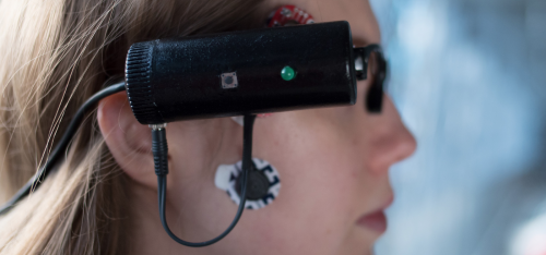
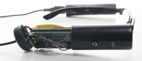
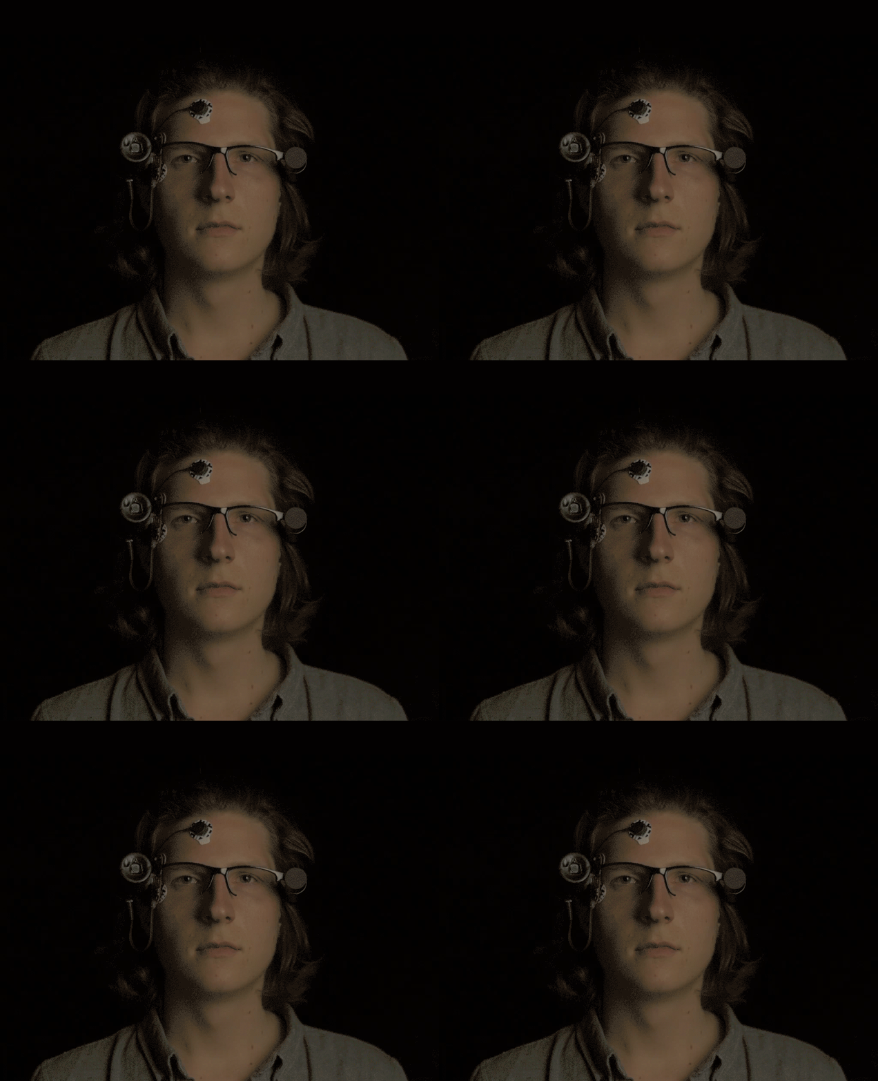
Students at the University of Bremen, Germany, have built a wearable camera that records the seconds of vision lost when you blink. Augenblick uses a Raspberry Pi Zero and Camera Module alongside muscle sensors to record footage whenever you close your eyes, producing a rather disjointed film of the sights you miss out on.

Augenblick blink camera recording using a Raspberry Pi Zero

Blink and you’ll miss it

The average person blinks up to five times a minute, with each blink lasting 0.5 to 0.8 seconds. These half-seconds add up to about 30 minutes a day. What sights are we losing during these minutes? That is the question asked by students Manasse Pinsuwan and René Henrich when they set out to design Augenblick.

Blinking is a highly invasive mechanism for our eyesight. Every day we close our eyes thousands of times without noticing it. Our mind manages to never let us wonder what exactly happens in the moments that we miss.

Capturing lost moments

For Augenblick, the wearer sticks MyoWare Muscle Sensor pads to their face, and these detect the electrical impulses that trigger blinking.

Augenblick blink camera recording using a Raspberry Pi Zero

Two pads are applied over the orbicularis oculi muscle that forms a ring around the eye socket, while the third pad is attached to the cheek as a neutral point.

Biology fact: there are two muscles responsible for blinking. The orbicularis oculi muscle closes the eye, while the levator palpebrae superioris muscle opens it — and yes, they both sound like the names of Harry Potter spells.

The sensor is read 25 times a second. Whenever it detects that the orbicularis oculi is active, the Camera Module records video footage.

Augenblick blink recording using a Raspberry Pi Zero

Pressing a button on the side of the Augenblick glasses set the code running. An LED lights up whenever the camera is recording and also serves to confirm the correct placement of the sensor pads.

Augenblick blink camera recording using a Raspberry Pi Zero

The Pi Zero saves the footage so that it can be stitched together later to form a continuous, if disjointed, film.

Learn more about the Augenblick blink camera

You can find more information on the conception, design, and build process of Augenblick here in German, with a shorter explanation including lots of photos here in English.

And if you’re keen to recreate this project, our free project resource for a wearable Pi Zero time-lapse camera will come in handy as a starting point.

Edit: an apology from the author

It has come to my attention that I missed an obvious pop culture reference when writing today’s blog post and for that, I’d like to apologise. Long-time readers of my blog posts will be aware of my continued efforts to include Doctor Who images and quotes whenever possible, even when they only have a tenuous connection to the subject matter. And today, when it made perfect sense to mention the Weeping Angels, I completely missed a trick. I’m sorry. I’m so sorry. And so, better late than never, here is a GIF of what you’d hope not to discover when playing back your footage from Augenblick.

The post Recording lost seconds with the Augenblick blink camera appeared first on Raspberry Pi.

29 May 14:15

Philips Hue App Update Enhances Light Management and Adds 30 New Designer Scenes

by John Voorhees

Philips has released an update to Hue, the companion app for its line of smart lightbulbs. The user interface will be familiar to existing users, but the update introduces a refreshed design that looks better than the prior version and surfaces features that used to be harder to find. Philips has added a bunch of new built-in lighting scenes too.

Hue is divided into four tabs. The first, Home, lists each of the rooms you’ve set up with Hue lights. Each room is a separate button that opens a detail view when tapped and includes an on-button brightness slider and on/off toggle, just like the prior version of the app, though the design has been updated with rounded corners and more depth that makes the slider and toggle stand out better. There’s also a satisfying little haptic bump when you move the slider to full brightness.

The redesigned Home tab (left) and quick-adjust interface (right).

The redesigned Home tab (left) and quick-adjust interface (right).

Brand new to the Home tab is a quick-adjust gesture. Tapping and holding any of the room buttons opens a view with a color picker, your four most recently used scenes, and an area where you can switch between the color wheel and different shades of white. Hue ambient white bulbs only display the shades-of-white picker.

The quick-adjust gesture took a little getting used to at first. While tapping and holding, you adjust the colors by dragging your finger around the color picker. The color transmitted by the bulbs does not, however, change as you drag your finger. It changes on release, which makes it harder to dial in a color with the precision that I’d like.1

Tapping a room’s button opens a detail view that’s divided into three parts. The top section replicates the controls found on the button you tapped. The middle part includes a button to create a new lighting scene as well as buttons that switch between a list of the lights in that room, a list of your saved scenes, and the color pickers.2

Adjusting individual lights, picking scenes, and using the color-picker.

Adjusting individual lights, picking scenes, and using the color-picker.

Each Hue light in the lights list can be separately controlled with an on/off toggle, brightness slider, and quick-adjust gesture, just like a room’s lighting is controlled. Tapping the scenes button opens a list of previously-saved scenes, which can be reordered via drag and drop.

Like the quick-adjust gesture, the color picker allows you to drag your finger around to dial in the light color you want, but it has added functionality in rooms with multiple lights. Sitting above the puck that you slide around to pick a color for your lights is a number in a circle. Tap it, and it spreads into a bigger circle ringed by each of the lights in that room. Each can be dragged away from the circle with a haptic bump on supported iPhones to ungroup that bulb from the rest, at which point it’s color can be set separately from the rest of the lights. Regrouping bulbs is as simple as dragging them back onto the number indicator.

New scenes can be set up with the ‘New scene’ button.3 With the update, Philips has introduced 30 new pre-built scenes, which it says are hand-picked by lighting designers. I’ve played with several of the new scenes and like them. I expect most people will find at least a few they enjoy, though if you don’t, you can also create your own, combining the color picker and brightness levels or create scenes from a favorite photo.

Both the main Home tab view and detail view also have a new three-dot button that opens a menu of setup options that are available elsewhere in the app too, but are much easier to find thanks to the new menu. From the main Home tab, you can access room, light, and accessory, while the detail view’s three-dot button takes you to ‘Edit rooms or move lights’ or ‘Add lights or edit names.’

The remaining three tabs of Hue – Routines, Explore, and Settings – have received some cosmetic updates, but no substantive changes.

The design changes to Hue make it much easier to use. Although it took some getting used to, the new quick-adjust gesture makes changing my lights much easier than in the past. I also appreciate that common setup actions are easy to access from the Home tab behind the three-dot button. Hue’s Settings tab remains a little dense, but that’s less of a problem now that commonly used actions are available elsewhere.

I generally control HomeKit devices using the Home app because despite its design flaws, Home is usually better than most manufacturer’s apps. However, one of Home’s greatest flaws is how difficult it can be to make fine-grained adjustments lights. With Hue, Philips has built an app that is better than the vast majority of other manufacturer’s apps, making it worth another look for Hue owners.

Hue 3 is available on the App Store as a free download.


  1. I suspect this part of the Hue app may work this way due to the perceptible lag that occurs as Hue lights communicate with their hub, which might result in a worse user experience. ↩︎
  2. Previously, the color picker could only be accessed by tapping the icon of the light associated with a room, which was not easily discovered. ↩︎
  3. For the record, the lack of title casing on Hue’s buttons drives me a little nuts. ↩︎

Support MacStories Directly

Club MacStories offers exclusive access to extra MacStories content, delivered every week; it's also a way to support us directly.

Club MacStories will help you discover the best apps for your devices and get the most out of your iPhone, iPad, and Mac. Plus, it's made in Italy.

Join Now
29 May 14:15

"The promise of a computerized society, we were told, was that it would relegate to machines all of..."

“The promise of a computerized society, we were told, was that it would relegate to machines...
29 May 06:01

Vancouver House — Keeps On Rising

by Ken Ohrn

From Vancouver’s Seaside Greenway, near Granville Island. The starchitect twisty building that just won’t stop growing.

Plus a look at one of Vancouver’s unique marine environments. Plus a great big bridge that never quite became the freeway it was built to be.

Vancouver.House.Rising

Click to enlarge

29 May 06:01

Desktop-Class Productivity for iPad

by Werner

We’ve just released an amazing update for iPad. With full support for external keyboards, powerful shortcuts, Type Travel navigation, and much more – Things 3.6 takes our iPad app to the next level. Try it today!

Play

The screen wasn’t touched once
in the recording of this video.

For this update we had one goal: make our iPad app truly desktop-class. To achieve this, we had to substantially improve support for external keyboards – and by that we don’t just mean adding a few more shortcuts. In fact, adding more shortcuts was only possible because of one of the key features in this release: the ability to select items from the keyboard.

Keyboard Selection

The lists you make in Things are constantly changing, so editing them has to be easy. Over the years, we’ve worked hard to make this feel as frictionless as possible on touch devices: insert items anywhere with the Magic Plus button, select items quickly with a left swipe, multi-select items by swiping down the circles on the right, and reorder items (even a multi-selection) via drag and drop.

The easy-ness of these list editing controls on iOS is something we’re proud of. But as soon as you attach a keyboard to your iPad, all that magic goes away. Almost every list editing action requires you to lift your hand off the keyboard and touch the screen, which gets exhausting.

This problem can’t be fixed by “just adding keyboard shortcuts”, because shortcuts require context: Where do you want to insert a new to-do? Which items do you want to move? And so on. Before you can use a shortcut, you need a persistent selection in the list that you can target. So that’s exactly what we’ve built for Things 3.6.

To see what we mean, just open the app and tap the down arrow; you’ll see the first to-do selected. Now you can move the selection around with the arrow keys, or hold down shift and use the arrows to select more to-dos. Yes, it works just like the Mac!

One of the beautiful things about the way it works on iPad is how keyboard and touch controls work together seamlessly. You can start selecting to-dos with your keyboard, then tap a few with your finger to add some more, and so on – it just feels natural.

Powerful Commands

Now that you have a selection in the list, there are all sorts of things you can do. Even with a small handful of shortcuts, you already have a lot of power:

  • Insert a to-do below your selection: ⌘ Cmd N
  • Open a to-do with Return and Tab around inside of it.
  • Close the to-do again: ⌘ Cmd Return
  • Move items up or down the list: ⌘ Cmd /
  • Duplicate, copy, or paste items: ⌘ Cmd D/C/V
  • Set a date: ⌘ Cmd S
  • Mark it complete: ⌘ Cmd K
  • And so on…

These shortcuts are all very straightforward – chances are you already know most of them. And if you’re a shortcut-enthusiast we have good news! We’ve added over 70 shortcuts across the app. Press and hold the ⌘ Cmd key in any view to see what’s possible, or check out the full list on our website.

Quick Popovers

You’ll notice that popovers in Things are also fully accessible from the keyboard (When, Deadline, Tags, etc.). Open a popover, such as ⌘ Cmd S, then use the arrow keys to move your selection around. Better yet, just start typing in any of them to filter down the results!

Quick side note: Apple’s Smart Keyboard for iPad doesn’t have an Esc key 😱 So how do you get out of popovers? Well there’s a system-wide shortcut for this: ⌘ Cmd . – and it also works in Things.

Type Travel

There’s a really cool feature we built for the Mac, called Type Travel. It allows you to navigate Things with your keyboard. You don’t need a shortcut to use it – just start typing where in the app you want to go, and instantly you’re transported there. It’s magic. We’ve now brought this feature to iPad, and it really shines here. It’s amazing how quickly you can get around without even lifting a hand.

Plus!

To polish it all off, we’ve built three long-standing feature requests into this release:

  • You can now drag & drop to-dos into Things’ sidebar to move them to other lists.
  • Tags and deadlines can now be applied to multiple to-dos at once: just select a group and tap •••. Works on iPhone, too!
  • Things now supports app-wide undo and redo on iOS.

After taking this update for a spin, we think you’ll agree: using Things on iPad feels completely different now. That “I’ll just wait till I get back to my Mac to do serious work” feeling is replaced with a feeling of empowerment: almost anything you could do in Things on your Mac, you can now do on your iPad.

So grab your keyboard, head on down to the coffee shop, and see what you can do with Things 3.6 – we hope you’ll like it!