Shared posts

18 Jun 22:07

Shortcuts: A New Vision for Siri and iOS Automation

by Federico Viticci

In my Future of Workflow article from last year (published soon after the news of Apple's acquisition), I outlined some of the probable outcomes for the app. The more optimistic one – the "best timeline", so to speak – envisioned an updated Workflow app as a native iOS automation layer, deeply integrated with the system and its built-in frameworks. After studying Apple's announcements at WWDC and talking to developers at the conference, and based on other details I've been personally hearing about Shortcuts while at WWDC, it appears that the brightest scenario is indeed coming true in a matter of months.

On the surface, Shortcuts the app looks like the full-blown Workflow replacement heavy users of the app have been wishfully imagining for the past year. But there is more going on with Shortcuts than the app alone. Shortcuts the feature, in fact, reveals a fascinating twofold strategy: on one hand, Apple hopes to accelerate third-party Siri integrations by leveraging existing APIs as well as enabling the creation of custom SiriKit Intents; on the other, the company is advancing a new vision of automation through the lens of Siri and proactive assistance from which everyone – not just power users – can reap the benefits.

While it's still too early to comment on the long-term impact of Shortcuts, I can at least attempt to understand the potential of this new technology. In this article, I'll try to explain the differences between Siri shortcuts and the Shortcuts app, as well as answering some common questions about how much Shortcuts borrows from the original Workflow app. Let's dig in.

App Shortcuts and Suggestions

There's an important difference between shortcuts and the Shortcuts app. As a system functionality, a shortcut is a convenient way to reopen or interact with a key feature of an app that the user has previously seen or completed. For instance, in iOS 12 you may see shortcuts for ordering a coffee on your way to work or playing a podcast playlist in a third-party app as you're driving back home. App shortcuts are not workflows; they are the equivalent of a "point of interest" in an app that you can easily find again.

In Apple's parlance, shortcuts are "donated" by apps to the system after a user performs an action in an app. Then, iOS 12 suggests shortcuts in Spotlight search results (where they appear as tappable items featuring the app's icon and labeled action) and on the Lock screen as notification-like bubbles. In watchOS 5, you'll see suggested shortcuts on the Siri watch face.

Shortcut suggestions are generated on-device by taking into account contextual triggers such as the time of day and day of week, the user's location, and detected motion (such as walking or driving). Apple has been developing and refining their so-called Proactive technologies for years now1, but the Shortcuts project marks the company's first foray into deep-linked app actions that react to user patterns and environmental triggers.
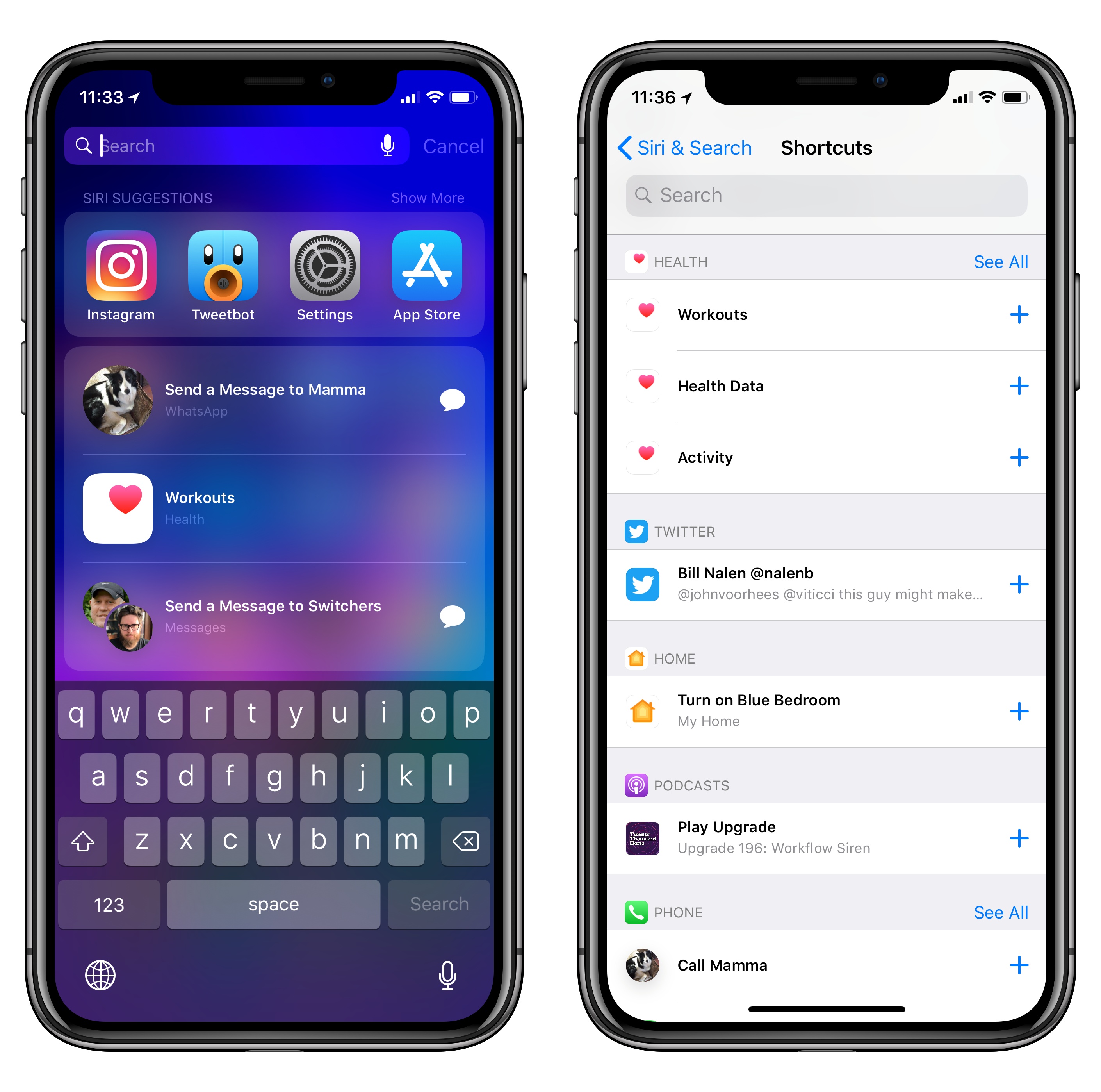
Shortcut suggestions in iOS 12's Spotlight screen.

Shortcut suggestions in iOS 12's Spotlight screen.

There are two types of app shortcuts. The first kind is a basic shortcut that opens a specific piece of content or section in an app. These simpler shortcuts are based on NSUserActivity, an API that Apple first introduced in iOS 8 to enable third-party apps to hand off activity to other devices and later expanded in iOS 9 to offer search results in Spotlight. The same API, with minimal tweaks on the developers' side, is used in iOS 12 to provide users with shortcuts that launch apps into specific screens or activities. I expect developer adoption of shortcuts based on NSUserActivity to be massive when iOS 12 launches later this year; especially for apps that do not require execution of tasks inline within Siri/Spotlight/Lock screen, NSUserActivity should be enough.

According to Apple, while NSUserActivity enables basic integrations with apps, SiriKit Intents provide the best experience for users who want to accomplish more with shortcuts. This is not a new API either, but the way it's surfaced throughout the system is.

SiriKit Intents have been around since iOS 10 as a way for developers to integrate their apps natively with the Siri voice experience and perform actions inline within the assistant. Apple launched SiriKit as a domain-based API designed for specific kinds of apps, and slightly improved it last year with the addition of visual code, list, and note-taking apps. Just as it was becoming clear that Apple's narrow domain-specific approach couldn't scale to thousands of apps that can't be easily categorized, the company is turning SiriKit on its head.

In iOS 12, developers can now create their own custom intents based on built-in semantic templates; furthermore, existing SiriKit Intents can break out of the Siri UI and also work as shortcuts in other places such as Spotlight, the Lock screen, and even the Siri watch face. Apple's approach isn't surprising: if iOS apps can have the ability to perform tasks with custom interfaces and responses outside of the main app environment (as is currently possible with SiriKit Intents), why not expand the same functionality to other types of proactive assistance? With shortcuts, any essential, repeatable feature of an app can become an action that can be executed from anywhere on the system without launching the full app.

The idea of frequent usage and user routine is what separates intent-based shortcuts from traditional SiriKit voice interactions. For example, iOS 12 may learn that, on the way back home from work on Thursdays, you like to order pizza and have it delivered at 8 PM. Or that on an average workday around 1 PM, you open Things into your 'Office' project. These are repeatable actions that developers can turn into shortcuts with custom interfaces2 using the same underlying Intents technology first launched in iOS 10.

Developers who are planning to integrate with SiriKit in iOS 12 will have to consider whether users may want to execute actions from their apps elsewhere on the system; those who have shied away from integrating with SiriKit so far should probably look into custom intents now.

This new feature allows any app to offer a custom interface and custom responses that are used when the intent is invoked via Siri or shortcuts. To create a custom intent, developers can choose from building blocks that include verbs such as "do" or "order" and other templates; these actions essentially define how Siri talks about the task it's executing. I'm excited about the prospect of any app becoming eligible for Siri integration; going forward, I expect Apple to continue expanding its custom intent technology as it may open up Siri to hundreds of thousands of new app integrations.

Even though the opposite may seem true, the shortcut features I've described so far do constitute a form of automation. Arguably, suggested shortcuts are system automations – actions to trigger a specific function that are conveniently presented at the best available time or location to anticipate users' needs. Some old-school power users may disagree with me on this, but, more broadly, I consider Apple's Proactive technologies – whether in surfacing a calendar event in an email message or ordering coffee while driving to work – a new kind of automation. Only time and developer adoption will tell if Apple's bet is successful; conceptually speaking, I see suggested shortcuts as an effortless, almost invisible way to get users accustomed with the idea of actions that are automatically surfaced by the OS.

The line between system and user automation gets blurry once we start considering the second layer of Apple's Shortcuts initiative: the ability for users to create custom phrases to launch shortcuts.

Add to Siri

Available in Settings ⇾ Siri & Search, iOS 12 features an option for users to define their own phrases for launching specific shortcuts via voice. This is done by speaking a custom phrase into a Siri recording UI that transcribes the command and creates a shortcut that can be invoked at any time. The Settings app automatically suggests recently used app shortcuts as well as other shortcuts that were previously "donated" by apps. Both recording a custom shortcut phrase and launching the phrase via Siri require an active Internet connection. Once given a custom phrase, user-configured shortcuts appear under the My Shortcuts section in Settings.

Adding shortcut phrases in iOS 12.

Adding shortcut phrases in iOS 12.

There are a few details worth noting about adding custom shortcut phrases to Siri. In their apps, third-party developers can embed messages and buttons (which they can design) to bring up the Siri UI to record a shortcut phrase. This means we'll start seeing apps populate important screens or actions with suggestions and buttons to record a shortcut phrase. Moreover, in the Siri recording UI, developers can include a phrase suggestion, but it's up to the user to decide what they want to record.

More importantly, users always have to create personalized shortcut phrases through direct interaction: apps cannot automatically fill the 'My Shortcuts' page in Settings with shortcuts and custom phrases. The user has to associate a custom phrase to a shortcut first.

The more I think about it, the more I see custom shortcut phrases as the next big step in making Siri a more personal assistant that is unique to each user. As would happen with an actual assistant, shortcut phrases allow users to form their own language over time, creating a personalized set of instructions that only their assistant can interpret and act upon. It's the equivalent of jargon in a group of friends, but applied to Siri and app actions. The potential accessibility perks are tremendous too: Apple now enables everyone to create custom Siri phrases that can be however long or short they want; this removes the need to find actions nested in apps, multiple levels deep into their navigation stack.

An example of a Siri shortcut button in a third-party app.

An example of a Siri shortcut button in a third-party app.

Here's why I believe Apple and the Workflow (now Shortcuts) team have been incredibly smart in reframing the concept of user automation around Siri and voice: when you think about it, custom phrases aren't too dissimilar from keyboard shortcuts. However, spoken phrases are easier to remember – they don't feel like dark magic to regular users who have never bothered with "automation" before, and, most of all, they are natively supported across the entire spectrum of Apple products, from iPhones and AirPods to HomePods and Watches.3

I strongly believe that personalized phrases are the first step towards changing the fundamental Siri experience, which is going to evolve into a personal command log – from one Siri to a million Siris, each uniquely tailored to the user who customized it. Furthermore, custom phrases reveal the third (and, for now, final) layer of Apple's automation and Siri personalization strategy: the brand new Shortcuts app.

Custom Shortcuts and the Shortcuts App

The Shortcuts app, announced at WWDC last week, is the new version of Workflow. The app will not be part of iOS 12 itself; instead, it'll be available on the App Store. In conversations I had last week, it appears that Apple's goal is to offer full compatibility with existing workflows previously created in the Workflow app. My understanding is that Apple is very much aware of the fact that a sizable portion of the pro/prosumer community relies on Workflow to enhance their iOS experience in key ways; they don't want to change that relationship for the worse. Very little if nothing should break in the transition to the Shortcuts app; in fact, I'm optimistic about the prospect of retaining all the actions from the original Workflow plus new ones created specifically for Shortcuts.

At first glance, Shortcuts looks like a cleaner, more intuitive version of Workflow designed for the modern iOS 12 design language. The app lets you create workflows – now referred to as "custom shortcuts" – with an editor that, just like the Workflow app, supports drag and drop to move actions from a library (organized in content types) into the shortcut editor. In the Shortcuts app, Apple removed the swipe gesture to navigate between the action library and editor in favor of a bottom panel that is reminiscent of Apple Maps and Stocks in iOS 12. A search field is always available at the bottom of the editor; tap on it, and you'll be able to view all the actions Shortcuts offers. Abundant design refinements and new action panel aside, the editor's core structure looks just like Workflow's.

Despite the close resemblance, Shortcuts isn't just a redesigned version of Workflow. And it's also more than a glorified utility for people who want to geek out on an iOS device. As the "third layer" after suggested shortcuts and custom phrases, custom shortcuts are the most versatile tool for every iOS user who wants to deeply personalize Siri, automate sequences of actions, and, yes, even augment their productivity. The Shortcuts app aims to be a powerful blend of Workflow, app shortcuts, and Siri all rolled into one as a new take on personal assistants and iOS automation. It's a bold idea that keeps what made Workflow unique while also opening it up to a broader user base and deeper system integrations.

There are a few key elements to consider. First, app shortcuts – the aforementioned actions donated by developers with NSUserActivity or SiriKit Intents – can be part of a custom shortcut created in the Shortcuts app. These shortcuts4 should either appear under Siri Suggestions or Apps in the action library. The inclusion of these actions in the Shortcuts app is a big deal: for the first time, users can create chains of actions that execute native third-party app commands without launching apps through URL schemes. Whether you want to launch an activity in an app or perform an action, these native actions won't require you to write any code or talk to any web API – and in the case of intent-based actions, they will run inline within the Shortcuts app itself.

In a way, this is the first step toward the WorkflowKit framework I imagined last year – a solution for apps to be supported in an automation environment without the limitations and security concerns of URL schemes. What I couldn't foresee was that Apple would reuse SiriKit for this. I don't think these new integrations will obviate the need for more customizable URL scheme actions just yet (more on this below), but it's a move in the right direction.

Perhaps more impressively, it seems that, upon assembling a custom shortcut, users will be able to choose to display native third-party app actions or not with a new 'Show When Run' toggle. If I were to guess, I'd say that this setting applies both to shortcuts being run in the Shortcuts app as well as the execution of multiple steps in Siri.

The 'Show When Run' toggle in a native app action in Shortcuts.

The 'Show When Run' toggle in a native app action in Shortcuts.

Which brings me to the second notable trait of the Shortcuts app: custom phrases. Just like shortcuts provided by apps to the system can be assigned a custom Siri invocation phrase, custom shortcuts from the Shortcuts app can be assigned a phrase to quickly trigger them from Siri.5 This ties into another key functionality of custom shortcuts: whenever possible, Siri on iOS 12 will try to run the multiple steps that comprise a custom shortcut inline, without launching the Shortcuts app; it'll do so simply by moving down the sequence of actions and confirming results to the user.

An intent-based extension summoned via a custom shortcut in Siri.

An intent-based extension summoned via a custom shortcut in Siri.

This was demonstrated by Apple's Kimberly Beverett at last week's keynote: with a custom shortcut, Siri was able to send an iMessage to a contact, set a HomeKit scene, play audio in a third-party radio app, and open directions in Maps – all in a single request that ran contextually inside Siri. The demo showcased two powerful aspects of Shortcuts' integration with Siri: background execution and the ability to skip confirmation steps in a series of automated actions. Just like in a traditional "workflow", Siri completed multiple actions in a row, displayed a summary message, and only launched an app at the very end. I cannot even imagine all the advanced custom shortcuts I could build by mixing background execution with web APIs6, native app shortcuts, and Siri in the same sequence of actions.

Execution of multiple background tasks inside Siri feels to me like the final piece of the Workflow acquisition puzzle. If you consider all the layers I covered above – app shortcuts, custom phrases, and custom shortcuts – it's clear that Apple wants to transform Siri into an assistant capable of not only handling a variety of app-related requests but, more importantly, bundles of sequential requests that are routinely requested by users. Of all the Shortcuts features I've seen so far, running whole sequences of steps in Siri is the one I'm most curious about.

More Shortcuts Details

Below, I've assembled a collection of details about shortcuts and the Shortcuts app that I was able to put together by rewatching the WWDC videos, as well as having lots of interesting conversations last week.

Magic Variables and Scripting actions are in. Two of Workflow's most advanced functionalities will continue to be supported in Shortcuts and will likely play an essential role in the creation of complex chains of actions.

Magic Variables, introduced in Workflow 1.7, enable actions to continuously create variables behind the scenes, letting users dynamically convert them between types using the Content Graph engine. Magic Variables are unique to Workflow and they have dramatically changed how advanced users can chain actions together. Judging from Apple's screenshots of the Shortcuts app, Magic Variables will be supported in custom shortcuts and users will also be able to include them as part of a response read aloud by Siri.

I'm also glad to see the inclusion of the Scripting category of actions in Shortcuts. Currently, the Scripting section of Workflow features options such as conditional blocks, repeat loops, getting data types and setting file names, and even fetching device details like battery and network information. All signs are pointing to Shortcuts retaining the same functionalities.

Shortcuts has an action extension for the share sheet. One of Workflow's most powerful (and flexible) system integrations is the action extension that lets users run a workflow contextual to the app they're in and the item they're sharing. From what I hear, Apple plans to keep the same action extension for the Shortcuts app. As someone who regularly uses dozens of workflows activated from the extension in apps like Safari, Ulysses, and Photos, I look forward to adapting them to the Shortcuts extension.

The Gallery stays, but questions remain about public sharing. As confirmed by Apple, the Shortcuts app will have a built-in Gallery for users to browse and download hundreds of pre-made custom shortcuts for different tasks. Shortcuts will be organized in categories and curated by Apple on a regular basis. The Gallery isn't new to the Workflow app, and it's unclear if public sharing of user-created custom shortcuts will be part of it. Shortly after Apple acquired Workflow, the company removed the ability for users to share workflows directly to the gallery with public user profiles; it seems like Shortcuts will follow in the same footsteps with a Gallery limited to custom shortcuts created and promoted by Apple.

I am confident that the Shortcuts app will continue to offer ways for users to share custom shortcuts with each other, but I believe sharing won't be tied to the Gallery, at least initially. That said, I would love to see user sharing return to the Gallery in a future update as a curated marketplace of custom shortcuts created by the community and vetted by Apple. I see tremendous potential in letting the iOS community natively extend Siri and iOS apps.

HomeKit integration. The Shortcuts app will support HomeKit; during the keynote, Apple demonstrated how a custom shortcut could set a thermostat to a specific temperature and toggle a fan on and off. We haven't actually seen how HomeKit actions can be set up in Shortcuts yet though, so it's not clear if HomeKit actions will let you configure individual characteristics of accessories with granular options. I wouldn't be surprised if, for simplicity's sake, the first version of Shortcuts only supports triggering existing HomeKit scenes.

There is a new Show Result action for Siri output. Judging from the slides shown at WWDC, this is the action that will let users craft custom Siri responses in the Shortcuts app. The Show Result action can be filled with Magic Variables and arbitrary plain text; when a custom shortcut is run via Siri, the assistant will speak the text contents of the action.

The new 'Show Result' action in Shortcuts.

The new 'Show Result' action in Shortcuts.

I can already imagine the possibilities this action opens up – such as the ability to end up with different Siri responses depending on the result of a conditional block in Shortcuts. I'm curious to know what happens to Show Result when a custom shortcut is run outside of the Siri UI though.

No support for passing input to a custom shortcut from Siri. My understanding is that triggering a custom shortcut from Siri won't allow you to pass along a message as input text. For instance, if you have a custom shortcut that sends the input text to Ulysses and have associated the "Ulysses append" phrase to it, you won't be able to say "Ulysses append Buy Nintendo Switch" to Siri and expect the "Buy Nintendo Switch" part to be sent to the Ulysses app.

From what I've been able to gather so far, Siri in iOS 12 doesn't currently support the ability to pass an input message to a custom shortcut activated with a user phrase, and it's unlikely to gain such functionality in the first version of iOS 12. This means that Siri will only be a launcher for custom shortcuts, not an actual interface that can pass user commands for specific parameters at runtime. There's a lot of complexity involved in this, and I assume it is one of the next big features in the pipeline for Shortcuts.

Native app shortcuts don't support custom input, output, and customizable fields. On a similar note, native app shortcuts based on SiriKit Intents that execute within the Shortcuts app can't receive a custom input from previous actions. They also can't set Magic Variables as custom output and don't have customizable parameters. As shown in Apple's screenshots of the Shortcuts app, native app actions are disconnected from every other step in a custom shortcut, which is likely going to limit their flexibility for advanced users.

URL scheme actions for third-party apps should remain available. In addition to manually launching URL schemes with the 'Open URLs' and 'Open x-callback-url' actions, Workflow has long offered a selection of built-in third-party app actions that are based on URL schemes but abstract that complexity with a visual module. For example, Bear, Things, and Ulysses come with native Workflow actions that can pass along custom parameters when launching the respective apps.

Examples of visual app actions based on URL schemes in Workflow.

Examples of visual app actions based on URL schemes in Workflow.

After talking to several developers at WWDC, it sounds like there's a good chance third-party app actions powered by URL schemes should remain in the Shortcuts app as well. Personally, I think these will continue to be solid workarounds until SiriKit Intents are powerful and customizable enough to offer the same functionality of URL scheme actions. Ideally, in a future version of Shortcuts, these actions should be replaced by visual SiriKit Intents that can be customized with multiple variables and parameters by users. For now, it seems like traditional URL scheme actions will still allow for deeper customization and control than native app shortcuts.

Shortcuts has a widget with limited user interaction. As shown on Apple's website, the Shortcuts app will keep the same widget that lets Workflow users run workflows from outside the app.

The widget is one of Workflow's most peculiar features: it supports remote execution of workflows with basic interactivity, but it kicks you back to the main app if it comes across an action that can't be completed from the widget, such as entering text with the keyboard or editing an image. The idea of running the same sequence of actions in different, more constrained environments brings me to...

Running custom shortcuts in Siri and audio-only contexts. Because Shortcuts has a widget, and because Apple said custom shortcuts will be offered on iOS, watchOS, HomePod7, and even CarPlay, I can then infer that the ability for the same shortcut to run in different contexts is expanding to audio and the watch face's limited UI. Just like the widget, I assume this means a custom shortcut will completely execute within Siri (whether on HomePod or the Watch) unless an action requires manual user input. In that case, Siri would probably ask you to continue running the shortcut on your iPhone.

If this is the case (and I think my explanation is mostly accurate), I can imagine that custom shortcuts that embed actions such as 'Choose from List' or 'Ask for Input' will require jumping from Siri to the Shortcuts app. I would be completely okay with this as a first version. Generally speaking though, I'd love for Siri to give me multiple options to choose from a list, allow me to enter input via voice, and interact with a shortcut while it is executing in an audio-only context.

The new Play Media intent. Finally, speaking of audio: SiriKit in iOS 12 supports a new INPlayMedia intent which, as the name suggests, allows the assistant to play audio and video content from third-party apps. The intent can launch apps in the background (such as the radio station demo from the keynote) and supports playing audio on HomePod as well as suggestions on the Lock screen.8

In terms of app adoption and shortcut integrations, this intent should make it possible for the likes of Spotify and Overcast to offer users a way to play their favorite content via Siri just like they can with Apple Music and Podcasts. Overcast and other third-party podcast apps could, for instance, offer Siri shortcut buttons in various places of their UIs to let users record phrases such as "Play my Overcast queue" or "Let's listen to Connected"; playback would then kick off immediately in the background and play through the device's speakers, HomePod, or other devices. If my interpretation of this is correct, the combination of shortcuts and the new Media intent may alleviate a lot of the annoyances typically involved with using Siri and third-party media services.

The Future of Workflow and Siri

In iOS 12, Apple is providing users with a path from simple shortcuts to custom automation; both revolve around the guiding principle of letting users choose how they want Siri to get things done on their behalf. There is a progressive disclosure of automation happening from system shortcuts to the Shortcuts app: whether you've never dabbled with app shortcuts before or are a Workflow expert, iOS 12 wants to help you spend less time using your phone – a recurring theme this year – and let shortcuts do the work for you.

Shortcuts are going to be the feature for developers to adopt this summer. It was the talk of WWDC 2018 and, based on my conversations, developers are excited and optimistic about embedding SiriKit and shortcuts within their apps. In particular, custom phrases and custom SiriKit intents seem to be the most attractive proposition for developers who want to let users conveniently open and interact with their apps.

Shortcuts and custom phrases feel like the future of Siri and apps: they're supported in every permutation of Siri and, most importantly, they let users develop their own language to access commonly used actions instead of forcing them to remember a syntax made of app names and verbs. Shortcuts, phrases, and custom intents feel like an app- and user-centric response to Alexa skills that Apple is uniquely positioned to build.

While shortcuts are a way to "sell" the idea of lightweight automation to regular users, the Shortcuts app is shaping up to be the automation powerhouse we were hoping to see following the Workflow acquisition. From what I've seen so far, the Shortcuts team has been able to build a cohesive narrative around basic shortcuts and custom ones, going far beyond what Workflow could have achieved as an independent app. I'm optimistic that heavy Workflow users won't be disappointed by Shortcuts.

Even more than feature parity with Workflow though, I see integration of custom shortcuts with Siri as the next frontier for making automation accessible to more people. I believe this is what's going to push automation forward as something more than "scripting" and other old preconceptions. Giving users the tools to create automations with drag and drop and easily trigger them with their voice is a remarkably powerful idea; it can turn Siri into a truly personal, programmable assistant capable of performing entire series of actions with just one request. I don't think I've ever seen anything even remotely similar to Apple's demo of the Shortcuts app and Siri integration on other platforms.

Some people, however, may argue that this isn't real support for multiple commands in Siri; after all, you still have to create a custom shortcut with your favorite actions and manually set it up for Siri. And maybe the Shortcuts app is a way for Apple to circumvent the fact that Siri, unlike Google Assistant, isn't capable of handling multiple questions in the same sentence yet. Ultimately however, it all goes back to whether you see the beauty and potential of user automation or not. With custom shortcuts, you won't even have to speak entire sentences containing multiple requests every time you want to execute them; you can just tell Siri a short custom phrase and it'll fire off multiple steps on its own.

From my perspective, this is exactly what automation is about: making a computer more useful, accessible, and faster so that we can save time to focus on something else. Custom shortcuts and the Shortcuts app show that not only is this vision still very much alive inside Apple, but it's evolving with the times too.


  1. For example, the iPhone has long offered the ability to monitor significant location changes and Siri already supported proactive app recommendations. ↩︎
  2. As was previously the case, snippets of custom UIs built with SiriKit aren't interactive: an app can bring up a restaurant menu as an animated or static image, but users can't tap inside the Siri snippet to interact with it. ↩︎
  3. Unsurprisingly absent so far: macOS. ↩︎
  4. Yes, we are literally talking about shortcuts within custom shortcuts in the Shortcuts app, but bear with me here. ↩︎
  5. I believe this will be managed from the settings icon currently located in the top right of the shortcut editor. ↩︎
  6. If the Shortcuts app keeps all the features from Workflow, its existing support for web APIs means Siri in iOS 12 could be extended with basic integrations for any web service with an API. That would be pretty wild. ↩︎
  7. On HomePod, shortcuts will be available via Personal Requests. ↩︎
  8. There is even a new API for developers of media apps to recommend new episodes of periodic content (like TV shows and podcasts) to users alongside suggested shortcuts. ↩︎

Support MacStories Directly

Club MacStories offers exclusive access to extra MacStories content, delivered every week; it's also a way to support us directly.

Club MacStories will help you discover the best apps for your devices and get the most out of your iPhone, iPad, and Mac. Plus, it's made in Italy.

Join Now
18 Jun 22:07

Progress on the 10th Avenue Bikeway

by Sandy James Planner


Think of the “Sidewalk Closed” signs as “Bikeway being Born” signs.

From the 800 block of West 10th Avenue, opposite the Blusson Spinal Cord Centre yesterday in Vancouver.

18 Jun 22:06

WITHIN creates distribution platform using WebVR

by Judy DeMocker

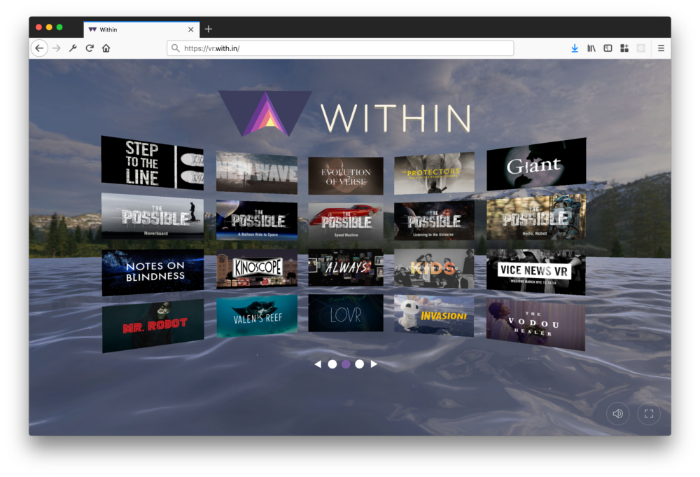
Virtual Reality (VR) content has arrived on the web, with help from the WebVR API. It’s a huge inflection point for a medium that has struggled for decades to reach a wide audience. Now, anyone with access to an internet-enabled computer or smartphone can enjoy VR experiences, no headset required. A good place to start? WITHIN’s freshly launched VR website.

From gamers to filmmakers, VR is the bleeding edge of self-expression for the next generation. It gives content creators the opportunity to tell stories in new ways, using audience participation, parallel narratives, and social interaction in ever-changing virtual spaces. With its immersive, 360-degree audio and visuals, VR has outsized power to activate our emotions and to put us in the center of the action.

WITHIN is at the forefront of this shift toward interactive filmmaking and storytelling. The company was one of the first to launch a VR distribution platform that showcases best-in-class VR content with high production values.

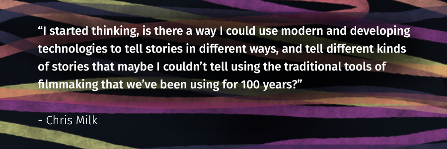
“Film is this incredible medium. It allows us to feel empathy for people that are very different from us, in worlds completely foreign to our own,” said Chris Milk, co-founder of WITHIN, in a Ted Talk. “I started thinking, is there a way I could use modern and developing technologies to tell stories in different ways, and tell different kinds of stories that maybe I couldn’t tell using the traditional tools of filmmaking that we’ve been using for 100 years?”

Simple to use

WITHIN’s approach is to bring curated and original VR experiences directly to viewers for free, rather than trying to gain visibility for their content through existing channels. Until now, VR content was mostly presented to headset users via the manufacturer’s store websites. So if you shelled out hundreds of dollars for an Oculus Rift or HTC Vive, you would see a library of content when you fired up your rig.

With its new site, WITHIN is making VR content accessible to everyone, whether they’re watching on a laptop, mobile phone, or headset. The company produces immersive VR experiences with high-profile partners like the band OK Go and Tyler Hurd. It also distributes top-tier VR experiences, like family-friendly animation and nature shows, with 360-degree visuals and stereoscopic sound.

“We aim to make it as easy as possible for fans to discover and share truly great VR experiences,” said Jon Rittenberg, Content Launch Manager at WITHIN.

WebVR JavaScript API

The key to reaching a vast potential audience of newcomers is to make a platform that is simple to use and easy to explore. Most importantly, it should work without exposing visitors to technical hurdles. That’s a challenge for two reasons.

First, the web is famously democratic. Companies like WITHIN have no control over who comes to their site, what device they’re on, what operating system that device runs, or how much bandwidth they have. Second, the web is still immature as a VR platform, with a growing but limited number of tools.

To build a platform that ‘just works’, the engineers at WITHIN turned to the WebVR API. Mozilla engineers built the foundation for the WebVR API with a goal to give companies like WITHIN a simpler way to support a range of viewing options without having to rewrite their code for each platform. WebVR provides support for exposing VR devices and headsets to web apps, enabling developers to translate position and movement information from the display into movement around a 3D scene.

Adapting content to devices

Using the WebVR specification, the company built its WITHIN WebVR site so it could adapt to dozens of factors and give new viewers a consistently great experience. In an amazing proof-of-concept for VR on the web, the company was able to optimize each streaming experience to a wide range of platforms and displays, like Vive, Rift, PSVR, iOS, Android, GearVR, and Oculus Go.

“The API really helped us out. It gave us all the pieces we needed,” said Jono Brandel, Lead Designer at WITHIN. “Without the WebVR API, we could not have done any of this stuff in the browser. We wouldn’t have access to VR headsets.”

Gorgeous content

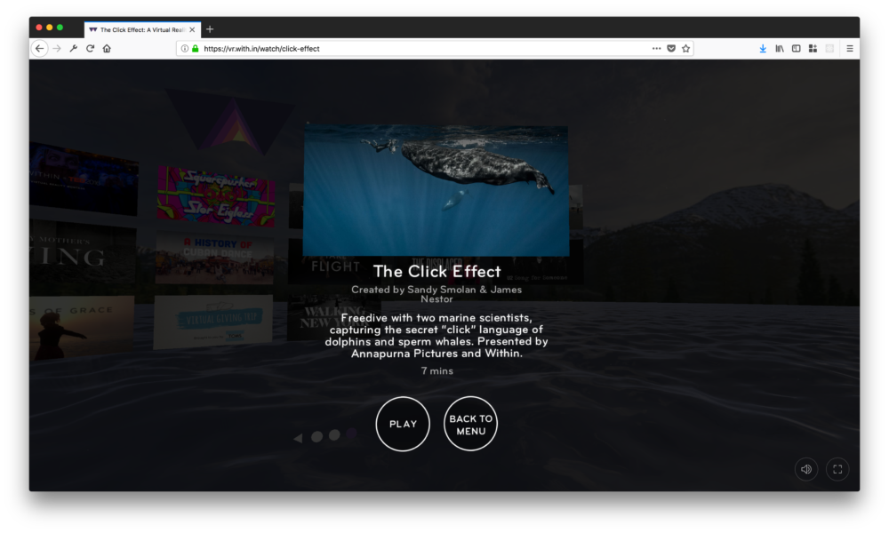
The WITHIN WebVR site does a fantastic job of adapting its VR content to a range of devices. The site can identify a visitor’s device and push content suited for that device, making it easy on the end user. The majority of visitors to WITHIN’s VR site arrive on a Cardboard device that works with their smartphone. That delivers a basic experience: 3D stereoscopic visuals with some gyroscopic controls.

WITHIN uses WebVR to connect to any viewer or device

Headset users get the same content with higher resolution visuals and binaural audio, which brings life-like sound effects to VR experiences. The VR content can also adapt to different head and hand tracking inputs, and supports common navigational tools in popular headsets. Folks visiting via a browser can view VR content just as they would play a 3D, interactive game or watch a 360-degree video online.

To get this level of adaptive support took quite a bit of work behind the scenes. “We have a room filled with a ton of devices: smartphones, computers, and operating systems. We’ve got everything,” Brandel said. “It’s really cool that one code base supports all of these platforms.”

A more capable web platform

The web is a great platform for creating and experiencing VR. It’s easy to share content broadly, across continents and cultures. And it’s simple to get started building 3D experiences using free tools like A-Frame, invented by Mozilla engineers with help from a talented and dedicated open source community.

“We’re excited to see such big platforms making a bet on WebVR,” said Lars Bergstrom, Director of Mixed Reality at Mozilla. “As new devices reach more people, we expect the WebVR specification will continue to grow and evolve.”

Mozilla and WITHIN are also collaborating to make the open web platform even better for VR distribution. The two companies are working together on a series of experiments to make WebVR versions of popular players as capable as native applications, using tech standards WebGL and WebAssembly.

The goal is to make it simpler for content creators to push their stories and games to the web, without having to do a lot of coding work. The two companies are exploring how to use Unity’s popular gaming platform to streamline the publication to the web, while still delivering performance, stability, and scale for immersive experiences.

“The Unity ecosystem is already mature – and it’s where the designers and developers are focused,” said Christopher Van Wiemeersch, Senior UX Web Engineer at Mozilla. “We’re hoping that WebAssembly and the Unity-WebVR Exporter can help us use the web as a distribution platform and not only as a content-creation platform. You’re using JavaScript under the hood, but you don’t have to learn it yourself.”

Earlier this year, Mozilla released Unity WebVR Assets, a tool that aims to reduce complexity for content authors by letting them export content from the Unity platform and have the experiences work on the web. You can check it out in the Unity Asset Store.

If you’re a filmmaker interested in getting your VR experience on the WITHIN platform, you can submit your project here for consideration.


The post WITHIN creates distribution platform using WebVR appeared first on The Mozilla Blog.

18 Jun 22:06

Librem 5 general development report — June 11, 2018

by Heather Ellsworth

There has been some exciting work done on the Librem 5 project and while there is still plenty of work left, we would like to highlight the accomplishments the team has achieved over the last couple of weeks. So here please enjoy a brief update on our recent efforts and victories.

Software Work

There is so much that goes into the software stack of the Librem 5. There’s the underlying infrastructure like the UI shell and newly developed libraries and protocols. But then there’s the familiar apps that are necessary.

On the nuts and bolts level, our phone shell (phosh) has seen several usability improvements mostly around the lockscreen. One important change is that the lockscreen unlocking has been switched to PAM to better handle the PIN to lock the device. There have also been some additions to the code to better handle multiple outputs (screens). Also, Libhandy is our “handy” UI library for developing GTK+ apps. There has been a recent addition of an arrows widget (HdyArrows) to indicate swiping direction which will be very useful to many applications, especially the lockscreen. Additionally, libhandy has seen some bug fixes and a slight rework of the keyboard handling support. Since graphics are important, we have added Etnaviv support to weston-simple-dmabuf (a Wayland client to test Linux DMA-BUF protocol implementations). We also extended it’s NV12 format support. It’s being used over here to test wlroot’s linux-dmabuf implementation which we wrote a couple of weeks ago. We’d like to especially thank the wlroots and Weston projects for their code reviews, recommendations, and support.

Since you can’t have a phone that doesn’t make phone calls, there have been great strides made on the Calls app and the Calls app can successfully place phone calls now! (And if you missed it, we encourage you to go read the exciting blog post about it.) Along with all of the great work it took to get to this point, the interfaces have been documented in the code. Debian packaging is being put together and we’ve been working to include Flatpak packaging contributed by a member of the community.

Every smart phone needs an On-Screen Keyboard (OSK), so there has been significant development on writing some necessary protocols and getting them upstream. So far the virtual-keyboard protocol has been accepted for inclusion in upstream wlroots. The text-input protocol has also been submitted upstream. To test virtual-keyboard protocol, we created a prototype client based on weston-keyboard. You can read more about the OSK developments in Dorota’s initial blog post on the matter.

Hardware Work

Identifying and testing the individual hardware components that will be present on the dev kit and eventual phone is a non-trivial task. After identifying a component as a potential fit for our needs and receiving a couple of them to test, often kernel modules need to be modified or written before the testing can begin. This was the case when evaluating and testing a low power WiFi card/module, which is still underway. Vibration motors are also being gathered for evaluation and battery chargers are being tested. We are also looking into various camera options.

Community Outreach

The community continues to be at the front of our thoughts. So we have created a general PureOS wiki at wiki.wp.puri.sm that still doesn’t have much details yet but will eventually be a place to look for both general and technical information on PureOS and Purism products. We’ve also fixed an issue with the community email lists so that they are functional now and opened up our Matrix rooms so that you can join our discussions with your already existing Matrix ID. For more information on both the email lists and Matrix rooms, have a look at our volunteer page.

We have been so happy to receive some initial volunteers that are doing fantastic work to help the Librem 5 become awesome. If you’ve been following and contributing to our code repositories, please note that we just moved the hosting from Gogs to GitLab – the new location can be found at source.wp.puri.sm.

That’s all for now folks. Stay tuned for more exciting updates to come!

The post Librem 5 general development report — June 11, 2018 appeared first on Purism.

18 Jun 22:06

“Look what you made me do.”

by Andrea

The New Yorker: The Language of the Trump Administration Is the Language of Domestic Violence. By Jessica Winter, June 11, 2018.

Look what you made me do has emerged as the dominant ethos of the current White House. During the 2016 Presidential race, many observers drew parallels between the language of abusers and that of Trump on the campaign trail. Since his election, members of the Trump Administration have learned that language, too, and nowhere is this more vivid than in the rhetoric they use to discuss the Administration’s policies toward the Central American immigrants crossing the U.S. border. Informally since last summer, and officially since April 6th, the Department of Homeland Security has been separating parents from their children at the border, taking the parents into criminal custody and handing the children over to the Department of Health and Human Services to be placed in shelters and foster families, sometimes thousands of miles away from their parents. The process is compounded in its brutality by its perhaps intentional disorder, as a Boston Globe piece detailed on Sunday: parents in custody often have no idea where their children are, how to get them back, or if or when they will see them again.

[…]

There has always been a sickening intimacy to Trump’s insults and cruelties, whether he was sexualizing his daughter or sexually humiliating and physically dominating Hillary Clinton during the second Presidential debate. For many observers, especially women, that debate—coming days after the release of the “Access Hollywood” tape—triggered a fight-or-flight response, unleashing their own memories of harassment and abuse. And, for many observers, especially parents, the news coverage of the atrocities being committed at the border in the name of American prosperity and security triggers a similar physiological response—except that this time the trigger is instantiated by sadistic, totalitarian force. (I cannot be the only mother of small children who slept on the floor of her kids’ room the night that “All In with Chris Hayes” reported on a baby seized from his parents, one week past his first birthday.) A slow, quiet terror continues to spread through the American populace. We are all being made into complicit bystanders in Trump’s violence. We are all members of Trump’s toxic, traumatizing family now.”

Link via MetaFilter.

18 Jun 22:06

Underscores, Optimization & Arms Races

by Anil Dash
Underscores, Optimization & Arms Races

A dozen years ago, the web started to reshape itself around major companies like Google. We can understand the genesis of today’s algorithmic arms race against the tech titans just by looking at a single character.

Underscores, Optimization & Arms Races

This is all ancient tech history now, but content management systems used to be one of those competitive markets that tech people watched avidly. (CMSes are the tools people use to publish stuff on the Internet — Medium, where you’re reading right now, is one, and some of the big ones people use today are WordPress or Drupal.)

Back in the early 2000s, I helped create two then-popular CMS tools, Movable Type and TypePad; pretty soon, WordPress and Drupal and other tools came onto the scene solving a similar set of problems. All of these apps basically did the same thing they do today: You type in a box, and hit publish, and it makes a nice-looking web page with whatever you wrote. At first they were used by individual bloggers to keep personal sites, but they quickly took over publishing for almost every media outlet on the web. It was a booming market, and the people working on these tools were some of the first wave of high-profile social media startup founders.

Friendster was around then, and MySpace was growing in prominence. (Facebook didn’t come around until a little later, and was still just for Ivy League kids for a long time.) But the biggest player on the rise in that era was Google. They’d bought Blogger, one of the earliest popular social media tools, in early 2003 and then launched their AdSense advertising platform a few months later. All of a sudden, Google was massively influencing content and monetization in the new world of social media.


Underscores, Optimization & Arms Races

Drawing a line

Just as we see Instagram and Snapchat going back and forth today one-upping each other’s features, in the early 2000s, people were constantly making new features for publishing in the then-new format of blogging. Todays social apps might distinguish themselves based on who has the best photo filters, but the technological distinctions between content management systems were a lot nerdier, like really esoteric and detailed technical controls over the design of your website.

The early era of the social web was a time of incredible advancement in web design. There was a revolution in aesthetics, focused around simplicity and white space and advances in typography and styling, and this was matched by huge leaps in accessibility and conformance with the open technical standards that defined the web itself. Basically, the web got a lot more pleasant really quickly, driven in large part by the influence of the people who were creating the early social media platforms. Things got good enough that it was worth the time to sweat little things like the formatting of web addresses.

Yep—we got so picky about design that one of the elements of a website that people wanted to control was the web address (URL) of the webpages themselves. At first, each of the posts on your blog would live at an address that was something like example.com/00000002.html, with the number going up each time you wrote a new post. But that long, nerdy-looking number offended a lot of people’s aesthetic sensibilities, so pretty soon addresses started to look like example.com/2004/04/story.html and that was a little better.

Eventually, people wanted to have the whole title of their article show up in the web address. Part of this was just because it looked cool, but some folks had started to suspect that having those words in the address might help a blog post rank higher on Google. (Google was still a smaller player in the overall web search market at the time, but it was already by far the most popular search engine amongst internet geeks.)

But here’s the thing: web addresses can’t have spaces in them. To include a full title with spaces in a web address for a blog, the spaces would either have to be removed (ugly!) or converted into something equivalent. Since we were one of the first to encounter this issue, our team designed to have our content management system use underscores, based on the rationale that underscores were the character that most closely resembled a blank space.

The end result? Anybody who used our tools could write a a blog post entitled “My Great Cookie Recipe” and it would live at an address that looked like example.com/2005/04/my_great_cookie_recipe.html. By contrast, the WordPress team thought that hyphens looked better, so blog posts published on their tool would look more like example.com/2005/04/my-great-cookie-recipe. Sure, these different tools made slightly different choices about which character to use, but such a subtle distinction couldn’t be meaningful, right?

As it would turn out, we’d stumbled across a harbinger of how the entire web was about to change.

Underscores, Optimization & Arms Races

The rise of SEO

Just as the social media era of the web was taking off, Google’s rapidly-growing platform radically changed the nature of content and sharing on the web. Anybody with a website was starting to understand that ranking highly on Google was immensely valuable, and as Google’s ad platform boomed, seeing those paid results alongside “organic” search results made it even clearer that a high ranking had monetary value.

Initially, information of how to rank better on Google was exchanged almost as folk knowledge—half urban legends or myth, half insights that were gleaned through painful experience but not documented anywhere. Soon, the dark arts of earning Google’s favor came to be known as “search engine optimization”, and what began as informal sharing of guesses about Google’s function started to grow into what became a multi-billion-dollar industry.

Everybody Loves Dashes

Even as SEO matured and formalized, Google had very little documentation and no designated ombudsman to handle questions about how to be in their search engine’s good graces. Eventually, early Googler Matt Cutts took up the mantle of representing the company to the community as advocate for best practices in search optimization, using his personal blog to explain company policies that had heretofore been opaque or inscrutable. There was a feel of Kremlinology to the way his minor public utterances would be parsed for any hints that outsiders could glean about Google’s inner workings. But just as often, Cutts would make clear pronouncements of What To Do, and these were received by the SEO community almost as religious edicts.

One such declaration in the summer of 2005 came like a lightning bolt, a proclamation on Dashes vs. underscores:

I often get asked whether I’d recommend dashes or underscores for words in urls. For urls in Google, I would recommend using dashes.

There was a lot of nuance in Matt’s post, but pretty soon the perception for a lot of SEO people became “dashes good, underscores bad”. (The punctuation in URLs are hyphens, technically known as Hyphen-minus, but sure, let’s call them dashes.) To most people in the industry, this settled things. Google had told us all what they preferred, and everybody wanted to rank highly in Google, so SEO experts fell in line. Everything was to be dashes, forevermore.

But once you’ve trained a community that they constantly need to guess at the secret machinations of your algorithm, they’re not going to stop doing so just because you’ve made a public pronouncement.

For years, despite Cutts’ clear statement, the choice of punctuation remained such a point of contention and debate that countless stories were written about how best to appease the fickle Googlebot. Eventually, discussion around hyphens and underscores in web addresses became so fraught and so persistent that six years after that initial blog post, Cutts made an entire YouTube video just about punctuation in web addresses on one of Google’s official channels. About 125,000 people have watched the whole video.

Underscores, Optimization & Arms Races

Indexing the web, as it is

While the burgeoning SEO community was debating how best to please Google, amongst our team of people building a content management system, we were having a completely different philosophical debate: should we be trying to appease Google?

You see, the theory of how we felt Google should work, and what the company had often claimed, was that it looked at the web and used signals like the links or the formatting of webpages to indicate the quality and relevance of content. Put simply, your search ranking with Google was supposed to be based on Google indexing the web as it is.

But what if, due to the market pressure of the increasing value of ranking in Google’s search results, websites were incentivized to change their content to appeal to Google’s algorithm? Or, more accurately, to appeal to the values of the people who coded Google’s algorithm?

We found ourselves resistant to what felt like a coercive effect of Google’s rising domination, especially since Google’s own Blogger platform was a competitor of ours. Our expression of that frustration was expressed by a debate over a single character: We were using _ because we thought it looked nicer, so why should we change to - just because Google liked it better? Weren’t they supposed to adapt to what we published on the web?

Holding the line

For a while, the team I was working on resisted changing our software to use dashes instead of underscores. My rationale was simple — Google has tons of money, why should we change the design of our tools for free, just to make things easier for a big company like Google? The WordPress community made a more pragmatic call, figuring (quite reasonably!) that users wanted to rank well in Google, they made sure their tool’s default was to use the punctuation that the search engine preferred.

At a literal level, the technical differences here were trivial. But the different choices of punctuation reflected very different philosophies about how the web should work. Dashes vs underscores represented a profound question: Would we change our apps and our content to suit big companies like Google, or should those big companies accommodate us?

Underscores, Optimization & Arms Races

Caving In

Eventually, most people who were publishing on the web said they didn’t want to do anything to risk diminishing their Google ranking, and our team had pretty much no choice but to switch to letting people publish web addresses using dashes. I genuinely felt like we had caved in. Caring so much about a single punctuation mark was, of course, an absurd hill to die on, but having Google coerce us into changing our software, and our aesthetics, felt like the first step toward a slippery slope of further concessions.

But the truth was even worse. Despite my misgivings about Google, I didn’t notice a more nefarious pattern that was established at the same time. A whole community had formed around trying to guess how Google’s algorithm worked, and that community very quickly built an entire infrastructure around reverse-engineering the algorithms that drive attention and popularity on the web.

Google was teaching us that the way to win on the web is to game the algorithms of big companies.

A few years later, Google changed their mind and said we could use either dashes or underscores, and people should use whatever they want. But by then it was too late, we’d all already fallen in line.


Finally, the algorithmic arms race

In that old era of the social web, the community’s shared knowledge of how to game algorithms was mostly used for harmless things. People would try to get more readers for their personal blogs, or pull off silly stunts like “Google bombing”, which was essentially just playing with getting a certain site to rank high in Google’s results for a particular term. It’s no wonder we thought it was no big deal if we changed our apps to make content that suited Google’s arbitrary rules. None of this stuff mattered that much, right?

But by attaching monetary value to search ranking, what Google ended up catalyzing was a never-ending arms race, where they constantly updated their algorithm and each community on the web constantly tried to learn how to exploit the new mechanics. The stakes of the algorithmic arms race kept going up; instead of being about pulling off silly pranks, understanding how to appease Google became the cornerstone of multi-million-dollar marketing campaigns. Instead of being about one character in a web address, it became about publishing content that suited the algorithm, whether it was true or not. At first, the only people paying attention were nerds making content management systems, then a broader audience of people trying to optimize their search engine positioning.

Eventually, though, movements across the political spectrum came to understand that knowledge of how to appease the algorithms that govern social media had profound social and cultural power. It wasn’t just marketers who figured out the best way to promote their ideas, it was trolls and activists and harassers and people on the fringes who wouldn’t have had any way to get the word out before—both for better and for worse. At that point, the rise of fake media markets was inevitable.


By the time we realized that we’d gotten suckered into a neverending two-front battle against both the algorithms of the major tech companies and the destructive movements that wanted to exploit them, it was too late. We’d already set the precedent that independent publishers and tech creators would just keep chasing whatever algorithm Google (and later Facebook and Twitter) fed to us.

Now, the challenge is to reform these systems so that we can hold the big platforms accountable for the impacts of their algorithms. We’ve got to encourage today’s newer creative communities in media and tech and culture to not constrain what they’re doing to conform to the dictates of an opaque, unknowable algorithm. We have to talk about the choices we made in those early days, even at risk of embarrassing ourselves by showing how naive we were about the influence these algorithms would have over culture.

And ultimately, we have to use the chance we’ve got now to underscore the lessons that we learned from the earliest days of the social web, that still resonate on billions of screens today. So much can come from a decision about just one character on the screen.

Underscores, Optimization & Arms Races

18 Jun 22:04

Open source community calls in the wake of GDPR

by Doug Belshaw

I am a supporter of the intentions and sentiment behind the General Data Protection Regulation (GDPR) that came into force last month. However, it comes with some side effects.

Take community calls for the open source community, for example. Here’s how they often work:

  • Agenda — someone with a level of responsibility within the project creates an agenda using a service you don’t have to login to access and to which everyone can contribute (e.g. Etherpad)
  • Synchronous call — at the appointed time, those wishing to participate connect to some kind of audio and/or video conferencing services (e.g. Zoom)
  • Recordings — those who are interested in the project but couldn’t participate at the time catch up via the agenda and recording.

I’ve been running community calls using this kind of approach for the last five years or so. It’s an effective method and a process I do so automatically, I didn’t even think about the GDPR implications.

Yesterday, however, I was informed (very nicely!) by Carlo Polizzi, Moodle’s DPO and Legal Counsel, that I needed to delete the data I’d collected in this way and find a new way to do this.

GDPR requires that (unless community members contribute anonymously) we must, at the very least:

  1. Gain consent from each individual that we can store their personal data and that they agree to our privacy policy.
  2. Inform individuals what that data will be used for and how long we will be storing it.
  3. Give them the option of withdrawing that consent at any time and having their data deleted.

This means, of course, that community members are going to have to register and then log in to a system that tracks them over time. I’ve written before about creating an architecture of participation for episodic volunteering. This certainly prevents more of a challenge for the ‘easy onboarding’ part of that.


So, not sure what to do, put up the Bat-Signal and asked my network. Out of that came suggestions to use:

  • An encrypted etherpad solution that auto-deletes after a specified amount of time (e.g. CryptPad)
  • Forum software that feels quite ‘realtime’ (e.g. Discourse)
  • A Moodle course with guest access open (e.g. MoodleCloud)

On a more meta level, I also had some feedback that synchronous communication discriminates users for whom English isn’t their first language and/or who are disabled.


For now, given the above feedback, we’re going to end community calls in their current guise. I’ve met with Mary Cooch, Moodle’s community educator to discuss a few options for how we could do things differently, and we’re going to explore using the existing MoodleNet discussion forum at moodle.org along with BigBlueButton.

If you’ve got any questions, comments, or suggestions, I’d love to hear them, as this is something that many other open source projects are going to have to grapple with, as well!


Image CC BY-SA opensource.com

18 Jun 22:04

Making Exceptions

by Eugene Wallingford

When I became head of my department, one of the things that became a near-daily part of my life was enforcing administrative rules and fielding requests for exceptions to those rules. I like writing code a lot more, but these decisions involve a surprising amount of judgment, which can make them occasionally interesting.

A couple of weeks ago, Matt Reed wrote about the challenge of making exceptions to administrative rules. He opens by pointing to someone else's tweet asserting that exceptions to rules will largely flow to a certain group of students: those who grow up believing they have a right to question the rules. Reed acknowledges that this is true but goes on to argue that, even so, exceptions are an essential part of a fair system. I agree with him that there is a lot going here.

One of the few administrative tasks about which I had well-formed ideas before I started as head was applying rules. I'm in the group of students that many people would think of as privileged enough to be comfortable asking for exceptions. But I was also raised as a rule follower and, as a result, almost never asked for exceptions. I went through school following the rules as they were given to me and finding ways to move forward when the rules slowed me down. Occasionally I would learn that a friend had asked for an exception on a lark and ended up with an easier path. At first, I usually felt foolish for not asking myself; later, I would feel bad about myself for being a patsy, or cynical toward the system.

So, when I became an administrator, I wanted to be careful to apply the rules fairly, as they were intended, and not make exceptions just because someone asked for an out. It's tempting to help out a student when he or she asks for a break, but what about those students who didn't ask -- because they didn't know they could, or because they were afraid, or because they assumed the request would be denied? Things get hard sometimes when a faculty member presses for an exception to help a student they like or want to help. The faculty member will often say, "Well, the student wouldn't ask for this, so let's help them out anyway." But my thoughts stay with the students who won't ask and don't have an advocate. What about them?

If we start getting a lot of requests from faculty and students for an exception to a specific rule, I figure it's time for us to consider changing the rule.

However, as Reed argues, with any non-trivial rule, there really are exceptions to the spirit of the rule that we need to take into account. In his words, we need to exercise a little "epistemological humility". Even wise and experienced faculty members can't envision all possible circumstances that may arise when they write a rule. It's even harder to anticipate how a policy will interact with the myriad other policies enacted in the department or by other departments on campus. When those unexpected circumstances or interactions arise, we have to make exceptions if we really want to be fair. This means exercising judgment.

In my time as head, I have worked hard to walk the fine line between enforcing the rule as intended and making exceptions when exceptional circumstances arise. The challenge comes in dealing with groups of people at either end of a spectrum:

  • Some faculty want to make exceptions all the time. "It's just a rule," they say. "Why make someone suffer?"
  • Some faculty never want to make exceptions. They fear that our (or their) judgment will be called into question, and it's simpler -- and safer -- to never go out on a limb.

I learned early on that I was not omniscient and that the only way to be fair to students and faculty is to make exceptions. But I prefer to exercise judgment carefully. In order to do that, I ask for well-considered justifications.

To be honest, the justifications on most of the student requests I receive boil down to "because I want you to" or "because it would help me". If we enforce a prerequisite, it will push back a student's graduation date. (Sadly, failing a course has consequences...) If we enforce a distribution requirement, the student will have to take a course they don't like, or take a course from a professor they don't like.

In most of these cases, I sympathize with the student's plight, but that doesn't mean I can grant an exception. I try to probe for more details to see if there are grounds for further consideration, but most often I simply have to be the bearer of bad news.

(I've been talking about student requests a lot here, but my years as department head have taught me that faculty are not all that different. Some never ask for exceptions to rules that apply to them, while others ask freely. A surprising number of the requests also boil down to "because I want you to".)

With some effort, it is possible to walk the fine line. As Reed says:

The folks of whom exceptions are being asked need to be able to explain why they said "yes" to student A and "no" to student B. Ideally, they should know not only the rules, but the reasons behind the rules. That's a tall order, but in many cases, it can be done.

My general practice works something like this: Require that each request for an exception come with an actual justification that explains the exceptional circumstance. If the given justification is weak but I think there may be something worth considering, I work with the student (or faculty member) to elicit the deeper rationale behind the request. If the ultimate justification is solid, then I consider making an exception, sometimes in consultation with the faculty. Absent a solid justification, I enforce the rule. In those cases, I try to help the requestors understand why and, if possible, try to help them find other ways to handle the challenge facing them.

In my dozen or so years as head, I've surely made a few mis-steps, granting a request or two that should have been denied and denying a request or two that probably should have been approved. But I've worked hard to make good decisions, to recognize those cases in which I needed to update my thinking, and to recommend that we change rules when they no longer serve the purpose we intended. As with so many other tasks that we teachers and department heads perform, a little epistemological humility comes in awfully handy. Mistakes and struggles remind us to stay humble.

18 Jun 22:02

City of Vancouver Announces New Housing Plan, Duplexing of Single Family Zones

by Sandy James Planner

0428 cmhc

You can tell it’s an election year by the flurry of reports on the City of Vancouver council agenda next week, as the civic leadership tries to tuck in their New Housing Plan, and also plans to refer the first two potential rezonings of the North East False Creek work to public hearing.

Globe and Mail writer and seasoned civic watcher Frances Bula quickly hits the main highlights of the proposed housing plan, which will “allow duplexes automatically as a choice in most of the city’s single-family neighbourhoods, as well as aiming to ensure that two-thirds of a hoped-for 72,000 homes built in the next 10 years are rentals.” 

Of course, immediately allowing duplex zoning in single family neighbourhoods will require staff to explain why this change is being prescribed without citizen input, and will require staff resources to explain, process and implement.

The city will allocate approximately $2.5 billion of city land to affordable housing, with a goal that 50 per cent of the 72,000 homes built in the next ten years will be geared to households with incomes below $80,000. Monies collected from developer-provided community amenity contributions (CACs) and the Empty Homes Tax will also be directed towards affordable housing.

The City estimates it will take “about $5-billion in land and cash to create 12,000 social and supportive housing units as part of the 10-year program.”

And here’s a sobering thought~even though the city approved 7,131 new homes last year, as Bula notes, only 800 of them were designated as rental apartments.

As the city’s report states, “The share of renter households earning below $30,000/year fell from 34% in 2005 to 28% in 2015, while the share of renter households earning over $80,000/year increased from 13% to 28% in the same period. While rising median incomes may account for some of this change, these trends indicate a risk to the long-term diversity and resilience of our City – reinforcing the need to meet the Housing Vancouver objective to ensure the “right supply” of housing that meets the needs of all incomes.”

The City of Vancouver has set up some measurement objectives for the success of their program, hoping that in ten years rental vacancy rates will rise to 3 per cent, the home ownership and rental market will have stabilized, and that 33 per cent of all households have children.

You can read the full housing report here.

housingbc

18 Jun 22:02

Lifestyle Choices vs Cancer Risk

by David McCandless

Diet, exercise and other choices play a huge role in cancer risk. We worked with The World Cancer Research Fund to chart the latest science.

» explore the interactive data-visualization

18 Jun 22:02

How Doug Ford won and how to challenge him

by Michal Rozworski

Last Thursday was a dark day in Ontario as the Conservative Party led by businessman-bully-bullshitter Doug Ford won a majority in the provincial election. Two guests assess the factors behind the Ford’s win and the chances for building an effective opposition to the coming right-wing agenda for Canada’s most populous province.

First up, Doug Nesbitt, PhD student in history at Queen’s presently competing his dissertation on the Days of Action during the last Conservative government in Ontario under Mike Harris. He is also an editor at rankandfile.ca as well as an organizer with the Fight for 15 and Fairness in Kingston, where he lives. He analyzes this 2018 election drawing on links with the Harris years in the 90s, the opposition then and its lessons.

He leaves off exactly where my conversation my second guest, Deena Ladd, begins. Deena is the director of the Worker’s Action Centre in Toronto and one of the main organizers behind Ontario’s wildly successful Fight for $15 and Fairness. She discusses how Doug Ford’s win came about and what this tells us about the strategies that can challenge his government from below.

As always, remember to subscribe above to get new episodes as they appear, rate the show on iTunes and donate to help keep this good thing going. Thanks!

18 Jun 22:02

iWork 4.1 Adds Audio Recording Capabilities, Various Minor Improvements

by Ryan Christoffel

Apple updated its iWork suite for iOS today to version 4.1, bringing a variety of small improvements along with one centerpiece feature: support for audio recordings.

Pages, Keynote, and Numbers have all added the ability to record audio in-app that is saved inside your document. The process for this is simple: hit the plus icon to open the content menu, then select the tab that looks like a photograph, after which you'll see a new 'Record Audio' option. There's a special UI that pops up from the bottom of the screen whenever you're recording an audio snippet, which at first only includes a record button. After you've stopped recording, you'll have the ability to preview your recording, add more audio to what you've already recorded, and edit clips by trimming, deleting, or recording over portions of them. Once you're done with a recording, hit the 'Insert' button in the top-right corner and you'll see your audio presented as a small, round icon matching iOS' system volume icon. This icon can be picked up and moved anywhere inside your document, working especially well as an elegant partial overlay on top of existing content. Tapping the icon will engage audio playback.

While the in-app recording system is fine, I'm thankful that iWork also supports importing existing audio files using either drag and drop or the Files UI picker. You can also export audio recorded in an iWork app using drag and drop, or by selecting the file and hitting the Share button in the contextual menu.

Outside of the new audio-focused features, today's update brings only a handful of smaller improvements. Keynote users will be glad to hear that you can finally edit or create new master slides on iOS, something the Mac version has long been able to do; the app also lets you export presentations as a movie or images. Pages' Smart Annotation feature has been upgraded with the ability to stretch and wrap as you make edits, and the app now enables adding colored backgrounds to documents. Following the introduction of support for LaTeX and MathML notation in Pages 3.1, now Keynote and Numbers gain that support too. If you prefer using the Apple Pencil as a navigation tool for scrolling, all iWork apps now have an option in Settings you can toggle for that behavior. There are also new shapes available in all three apps, new chart design options, and more.

iWork for Mac has been updated as well with most of the minor improvements of the iOS version, but the audio recording capabilities are not included.

iWork 4.1 isn't a major update, but it's a welcome one. Apple continues iterating on Pages, Keynote, and Numbers regularly, with a special emphasis on iOS improvements, and I've definitely seen my iWork use increase as a result.


Support MacStories Directly

Club MacStories offers exclusive access to extra MacStories content, delivered every week; it's also a way to support us directly.

Club MacStories will help you discover the best apps for your devices and get the most out of your iPhone, iPad, and Mac. Plus, it's made in Italy.

Join Now
18 Jun 22:02

Direct Programming

by Jonathan Edwards

Here is a brief description of my latest work in progress, which I am submitting to PPIG.

Direct Programming

To make programming more accessible to regular people it may help to make it less abstract and more concrete. Towards that end I am taking another run at the old ideas of macro recording and Programming by Example. Many such efforts abstracted user actions into conventional code. Instead I co-design the PL and UI to be analogous, so that programs and users have much the same capabilities, and programs look much like recorded transcripts of user actions. Conscientiously following this design principle leads in the opposite direction of current PL trends, towards a deeply imperative semantics and a de-emphasis of functional abstraction.

Any attempt to make programming more concrete faces two challenges: loops and conditionals, for they necessarily deal with hypothetical situations. My approach is to extend the direct manipulation metaphor onto template states that prototype iteration, and example states that witness alternative cases.

This submission is a demo of early-stage work lacking evaluation, and indeed it is submitted in the hope of receiving guidance on an appropriate evaluation methodology.

[Video]

As always, comments and criticisms welcome.

18 Jun 22:02

On The Sad State of Macintosh Hardware

by Quentin Carnicelli

With Apple recently releasing their first developer beta of MacOS 10.14 (Mojave), we’ve been installing it on various test machines to test our apps. The inevitable march of technology means Mojave won’t install on all of our older hardware. There’s no shock there, but the situation is rather distressing when it comes to spending money to purchase new equipment. Here is the situation, as reported by the wonderful MacRumor’s Buyers Guide:

Buyer's Guide showing 'Don't Buy' on nearly all Macs

At the time of the writing, with the exception of the $5,000 iMac Pro, no Macintosh has been updated at all in the past year. Here are the last updates to the entire line of Macs:

  • iMac Pro: 182 days ago

  • iMac: 374 days ago

  • MacBook: 374 days ago

  • MacBook Air: 374 days ago

  • MacBook Pro: 374 days ago

  • Mac Pro: 436 days ago

  • Mac Mini: 1337 days ago

Worse, most of these counts are misleading, with many machines not seeing a true update in quite a bit longer. While the Mac Mini hasn’t seen an update of any kind in almost 4 years (nor, for that matter, a price drop), even that 2014 update was lackluster. The once-solid Mac Pro was replaced by the dead-end cylindrical version all the way back in 2013, which was then left to stagnate. I don’t even want to get started on the MacBook Pro’s questionable keyboard, or the MacBook’s sole port (USB-C, which must also be used to provide power).

It’s very difficult to recommend much from the current crop of Macs to customers, and that’s deeply worrisome to us, as a Mac-based software company. For our own internal needs, we’ve wound up purchasing used hardware for testing, rather than opting to compromise heavily on a new machine. That isn’t good for Apple, nor is it what we want.

Rather than attempting to wow the world with “innovative” new designs like the failed Mac Pro, Apple could and should simply provide updates and speed bumps to the entire lineup on a much more frequent basis. The much smaller Apple of the mid-2000s managed this with ease. Their current failure to keep the Mac lineup fresh, even as they approach a trillion dollar market cap, is both baffling and frightening to anyone who depends on the platform for their livelihood.

Given the incredibly sad state of the Mac lineup, it’s difficult to understand how WWDC could have come and gone with no hardware releases. Apple’s transparency in 2017 regarding their miscalculation with the Mac Pro seemed encouraging, but over a year later, the company has utterly failed to produce anything tangible. Instead, customers are still forced to choose between purchasing new computers that are actually years old or holding out in the faint hope that hardware updates are still to come. Every day, the situation becomes more dire.

Apple needs to publicly show their commitment to the full Macintosh hardware line, and they need to do it now. As a long (long) time Mac OS developer, one hesitates to bite the hand that feeds. At a certain point, however, it seems there won’t even be anything left worth biting.

18 Jun 22:02

More Mobi; More Affordable Mobi

by Ken Ohrn

Making Mobi, Vancouver’s bike share provider, bigger and more affordable to more people is a great idea.

Many thanks to Vancity, City of Vancouver and Mobi by Shaw Go for the Vancity Community Pass, announced June 14 as a pilot project.

You can get a Community Pass membership HERE, and other locations too (shown on the web site).

For only $20, you can purchase a 365 Day Pass Plus membership with unlimited 60 minute rides. Each additional 30 mins +$3.

You may qualify for this pass if you have a
* Leisure Access Pass
* Red Compass Card
* Third party referral from a Community Partner

Now that the eastward expansion is well underway, Mobi members have more destinations they can reach with a ride. A big win for everyone.

And just for more Mobi fun, here’s @VanBikeShareBot, bringing you the latest Mobi stats every day, courtesy of @MikeJarrett_, who notes the numbers are approximate and very unofficial. Still a hoot, though.

With any luck, the Mobi you choose might be one of the Art Bikes, like this one from Priscilla Yu, whose Granville Island mural was featured on Price Tags a little while ago.

18 Jun 22:01

How to read a log scale: What Mike Bostock means

A few weeks back, I read a tweet by Mike Bostock, a very influential voice in the data vis scene. “Don’t compare percentage change on a linear scale,” he said, “Use a log scale instead. -50% (0.5×) is as big a change as +100% (2×).” He attached two maps with the same data, but one of them was on a linear scale (left) while the other one was on a log scale (right):

I scratched my head. Why is -50% as much as +100%? I’m not a math genius, so it took me some time to understand what that was all about. In this Weekly Chart, we’ll explore what Mike means – and when not to follow his advice.

Edit: After I published this article, Mike dug up the absolute values of this data and published this excellent explanation of different ways to compare two values with each other on a map. You can basically stop reading this blog post and head over to his one.

Let’s imagine a county with four people with Alcohol Use Disorder in 1980. By 2014, that number sunk to two people. One can say that the 1980 number halved, or that it decreased by 50%, or one can say that the number is 0.5 times as big (since 4 × 0.5 = 2; it’s the same as 4 ÷ 2).

Let’s imagine a second county in which the 1980 number of four cases doubled to eight cases by 2014. It increased by 100%. The number is now two times as big (4 × 2 = 8).

So why does Mike Bostock declare that 50% and 100% is the same change? Because with change, he doesn’t mean the percentage change, but the rate change. The percentage change for our counties is -50% and +100%. But their rate change is ×2 and ÷2. The difference between 2 and 4, and the difference between 4 and 8 is the same growth rate (as you might remember from the Weekly Chart two weeks ago).

And that’s why Mike wants to show these numbers on a log scale. Only on a log scale, the same rate changes are shown with the same distances:

We can calculate that. Do you remember the log10x formula from school? We can plug our “0.5 times” and “2 times” in there. If we do that, the percentage change of -50% (= 0.5 times) in our first county will be shown on the chart with a distance of -0.301 (= log100.5). The 100% increase in our second county will be shown with a distance of 0.301 (= log102). Boom! -0.301 and 0.301 is the same distance away from zero.

Here are all the percentage changes that we can see in the map, but shown in a scatter plot that compares the linear percentage values with the log values:

So is Mike Bostock right? We shouldn’t show percentage changes on linear scales anymore?

Well, that depends on what we want to show. (Yes, I know that this is the answer to 90% of chart-related questions, but it’s simply true 90% of the time.)

If we want to show how many people are affected, we should consider showing these percentage changes on a linear scale. If we show the changes of people with Alcohol Use Disorder between 1980 and 2014 in our first and second county with a log scale, they will be shown with the same 0.301–distance. But the number of people affected is different: In the first county, 2 fewer people are affected. In the second county, 4 more people are effected. On a linear scale, the distance between 2 and 4 will be twice as big. The same distance/unit represents the same number of people (if our base number is the same). So on e.g. an unemployment chart, showing percentage changes on a linear scale makes sense.

But there are charts where the growth rate is more important than the percentage change. Stock prices are a good example, since the change in price is more important than the absolute increase in US-Dollars.

So what should we do differently the next time we’re building maps?

Not so much, really. Maps are a special case: Darker means “more” and brighter means “less”; but it’s impossible for a normal human being to read the underlying numbers on a map solely based on the colors.

In addition, our number of stops, the kind of stops and the specific colors we use all play into how the data will be perceived. It’s very easy to create the two maps that Mike showed in his tweet (and that I showed at the beginning of this article) even if we keep the numbers on a linear scale. We can just tweak the number of stops. You can try that out for yourself if you hover over the interactive map up there and click on “Edit this chart” in the upper-right corner.


Like so often in chart design, it comes down to common sense, thinking about what we want to show and a general attitude to show the data truthfully. Knowing the difference between log scales and linear scales can help us to make better choices when it comes to designing charts. But as a general rule, the linear scale will work best most of the time, especially when we present data about people. See you next week!

18 Jun 22:00

Let’s Try A Bit Of That Mastodon

by Martin

I do have a Twitter account but rarely use it. Like pretty much all ‘social’ networking sites my main issues with them are that they are run by for-profit companies, they are centralized, push their own agenda and values of what they think is appropriate or not and that I’m not the customer there but the good they sell to advertisers. Over the past 2 years an alternative has been growing that promises to fix most of these issues: Mastodon.

So What’s This All About?

I’ve heard about Mastodon before but never found the time or heightened interest level to actually try it. But something must have clicked last week when Microsoft announced it would take over Github as it showed how quickly the direction of a popular centralized service can change without notice. So what exactly is Mastodon?

From a user point of view, Mastodon seems to work pretty much like Twitter. Instead of ‘tweets’ one writes ‘toots’, re-tweeting is called ‘boosting’, one can ‘star’ toots, direct messaging is possible as well and the default Mastodon GUI in the browser with its three column layout also looks familiar. But this is where the similarities end.

And this is because Mastodon is not a centralized service run by a profit oriented company. Instead, the system is open source and federated, which means anyone can run a Mastodon instance for himself, for his friends, or for the general public. When joining Mastodon one selects one of the public servers and creates an account there. If you don’t have friends on Mastodon yet, a good place to start looking for people that have things to say that are of interest to you is the public activity stream of the server. As the service is a federated system, one can also connect with people on other Mastodon servers. Think of it like email which is also a federated system and allows exchange of messages over different servers.

While this allows great freedom it also has its disadvantages like, for example, identical account names on different servers. This can obviously lead to some confusion over authenticity. But we eventually figured out how to deal with this in the email system, too, so I’m confident people can handle it in Mastodon as well.

Critical Mass?

The main question is whether Mastodon will gain critical mass to keep people interested in the long run. According to Wikipedia and a number of network statistics pages (see here and here), the project is around 20 months old now and has already attracted some 1.5 million users. The server of Eugen Rochko, the initiator of the project has some 160.000 users at the time I’m writing this and the public activity stream shows buzzing activity day and night. Around 3000 Mastodon instances can be found around the world today which makes it a truly distributed system without central control.

So where does this all lead? I’m not sure but so far I’ve found quite an interesting discussion stream. If you want to have a look, I’m @heurekus@mastadon.social.

18 Jun 21:53

Canada’s The Logic is a new subscription news outlet focused on the innovation economy, à la The Information

files/images/historyOfTech_v2-jpeg.jpg

Shan Wang, Nieman Lab, Jun 16, 2018


Icon

The difference between me an the people launching The Logic is that they think quality news and education should be sold to rich people while I think quality news and education should be distributed for free to poor people. It seems to me that the events of recent years should have taught us the wisdom of the second path, but the push (through such things as the previously mentioned Shattered Mirror report) is that we should be charging more subscription fees. I would love to do the same thing the people at The Logic are doing but I'm not willing to charge subscribers $300 per year for it, because I think it's wrong for the people, and wrong for democracy.

Web: [Direct Link] [This Post]
18 Jun 21:53

It’s easier than you think to craft AI tools without typing a line of code

files/images/maxresdefault.0.jpg

James Vincent, The Verge, Jun 16, 2018


Icon

OK, this isn't quite as easy as depicted in the article, and to actually use it to do anything you will have to type some lines of code, but the gist of the article points to an important new trend in software, specifically, the ability to use services to build features that are then accessible through other applications that you build. Scenario: suppose I'm building an elearning application to teach people how to use a drill, and I want them to learn how to hold it properly. I train the AI model using pictures of correctly and incorrectly held drills, then I connect my e-learning application to the AI model, and the application looks at people holding drills and tells them whether they're holding them correctly or not. Lobe is a service that creates the AI model; you still have to write your own e-learning application, though.

Web: [Direct Link] [This Post]
18 Jun 15:44

Twitter Favorites: [termie] @waxpancake https://t.co/A1ZPzzCWCe

18 Jun 15:43

Twitter Favorites: [Pez5683] My hottest hockey take? I think the importance of fighting in hockey is drastically overblown and the sport would b… https://t.co/1zgQN7LY2j

Greg @Pez5683
My hottest hockey take? I think the importance of fighting in hockey is drastically overblown and the sport would b… twitter.com/i/web/status/1…
18 Jun 15:43

Twitter Favorites: [CTVNewsGord] Crews from 442 Squadron in Comox performed another safe medevac of a cruise ship passenger near Port Hardy yesterda… https://t.co/gimegCgHIS

Gord Kurbis @CTVNewsGord
Crews from 442 Squadron in Comox performed another safe medevac of a cruise ship passenger near Port Hardy yesterda… twitter.com/i/web/status/1…
18 Jun 15:43

Twitter Favorites: [RG_Reporter] newly elected #SpaFY MPP @ChrisGloverON promises NDP will act as 'conscience' for province: https://t.co/kClE6AY1ii https://t.co/YgQYzDXP9L

Rahul Gupta @RG_Reporter
newly elected #SpaFY MPP @ChrisGloverON promises NDP will act as 'conscience' for province: toronto.com/news-story/866… pic.twitter.com/YgQYzDXP9L
18 Jun 15:37

WeChat announces improvements to mini program UX and developer support

by Runhua Zhao
WeChat announced last night that it has upgraded its mini programs’ user experience and developers’ tools. Here are some of the changes: The programs now allow users to read articles published by subscription accounts linked to the programs. The new update will allow a user to read an article published by the account when shopping […]
18 Jun 15:36

Let's talk about USB-C and Apple

by Volker Weber

MD818

This is the cable you get, when you buy an iPhone. It has a USB Type A plug on one end and a Lightning plug on the other end. You also get a charger with a USB Type A port. If you use a MacBook or a 2016 MacBook Pro, you cannot use this cable to connect the phone to your computer.

This week somebody started a rumor that iPhone was going to go to USB-C for the iPhone. Then everybody started to jump on the bandwagon and twisted this into "Apple is finally dropping Lightning". As if Lightning was a bad thing. Here is what I think will happen instead, if that original rumor is true:

MQGJ2

Apple is going to keep Lightning but they might ship a cable (and a charger) with USB-C on the other end. When they do that you can plug the cable right into your MacBook and still connect it to any iPhone you might still have (iPhone 5 and later). There goes the need for a dongle and all your other accessories still work.

USB-C is this great promise that you just need one cable and one charger that will charge all your accessories. And it remains a promise. I have a couple of smartphones with USB-C ports but you cannot mix and match chargers, cables and phones. QC3 is not compatible with FCP. So your Huawei phone cannot quick charge with a Samsung, BlackBerry oder Nokia charger and cable. Everything appears to be right, but it just won't do it. Is it the charger or the cable? Very difficult to find out. Let's face it: USB-C currently is a bag of hurt.

138132

This is the cable that is shipping with most Android smartphones today. USB Type A to USB-C. It's very similar to what Apple has been shipping with iPhone, it only has a USB-C instead of Lightning plug. That is precisely what Apple is not going to switch to. And USB-C on both ends? Why in the world would they drop Lightning and break compatibility with all their MFI accessories? If Apple ever drops Lightning from iPhones, then it will be replaced with nothing.

If Apple ships a USB-C to Lighning cable with futures iPhones, they are not going to support any of these QC3 or FCP hacks. It will be proper USB PD (power delivery).

18 Jun 15:34

datarep:Endianess of date and address formats in Europe and the...


datarep:

Endianess of date and address formats in Europe and the US


I am for Big Endian in both address and dates. It’s the only approach that sorts appropriately.

18 Jun 15:34

"I myself am made entirely of flaws, stitched together with good intentions."

“I myself am made entirely of flaws, stitched together with good intentions.” - |...
18 Jun 15:30

Samsung Galaxy Note 9 Might Come with 4,000mAh Battery, Faster Wireless Charging

by Rajesh Pandey
Post the Galaxy Note 7 incident, Samsung played safe in terms of battery capacity with the Galaxy Note 8 and equipped it with a modest 3300mAh battery. This year though, it looks like the company is once again going to push barriers in terms of battery capacity with the Note 9. Continue reading →
18 Jun 15:30

Burrard Motor Hotel

by ChangingCity

The city has seen the loss in recent years of many older and less expensive hotels. Some have been redeveloped, and some have become used as non-market housing. The Burrard is an exception; a few years ago it was renovated, rebranded, and became a stylish boutique hotel retaining it’s mid-century modern style. It’s no longer inexpensive – you can stay in the Hotel Vancouver for less. It was built in 1956, and designed by Asbjorn Gathe, the recently added partner in Gardiner, Thornton, Gathe and Associates.

One prominent feature of the design is the way the flank wall was designed to incorporate a neon identification sign. That was true in this 1958 postcard when it was the Burrard Motel and in our before shot from 2007, when it was called the Burrard Inn (although the star element of the design was lost at that time), as well as today as the Burrard Hotel. (Note that Burrard Street still had houses along it, even in the late 1950s).

In the decade since the ‘before’ shot was taken a new neighbor has appeared; a 16 storey non-market housing building designed by DYS, copmpleted in 2014 and run by the Kettle Friendship Society with over 140 units targeted at youth who are homeless or at risk of homelessness. The goal is to provide tenants with a stable and safe home environment in which they can thrive.

18 Jun 15:29

Apple’s iWork suite on Mac and iOS updates Pages, Keynote and Numbers apps

by Dean Daley
iWork on phone

Apple’s iWork suite on Mac and iOS has received updates for its Pages, Keynote and Numbers apps.

Pages 4.1 for iOS

  • Easily record, edit and play audio directly on a page
  • Smart annotation marks now stretch and wrap to follow your text as you edit
  • Quickly switch between drawing and smart annotation modes on iPad
  • A new option in Settings > Pages lets you use Apple Pencil to select and scroll
  • Track text changes in shapes and text boxes
  • Add color and images to backgrounds in page layout documents
  • Give charts a new look with rounded corners on columns and bars
  • Add mathematical equations to page layout documents using LaTeX or MathML notation
  • Enhance your documents with a variety of new editable shapes
  • Add gradient and image fills to shapes and text boxes
  • Easily browse templates by category
  • Save a different auto scroll speed per document when using presenter mode
  • Improve support for Arabic and Hebrew

Keynote 4.1 for iOS

  • Edit existing or create new master slides
  • Easily record, edit, and play audio
  • Export a presentation as a movie or images
  • A new option in Settings > Keynote lets you use Apple Pencil to select and scroll
  • Give charts a new look with rounded corners on columns and bars
  • Add mathematical equations using LaTex or MathML notation
  • Enhance your documents with a variety of new editable shapes
  • Add gradient and image fills to shapes and text boxes
  • Improved support for Arabic Hebrew

Number 4.1 for iOS

  • Easily record, edit, and play audio directly in a spreadsheet.
  • A new option in Settings > Numbers lets you use Apple Pencil to select and scroll
  • Give charts a new look with rounded corners on columns and bars.
  • Add mathematical equations using LaTeX or MathML notation
  • Enhance your documents with a variety of new editable shapes
  • Add gradient and image fills to shapes and text boxes
  • Easily browse templates by category

Pages 7.1 for Mac

  • Track text changes in shapes and text boxes.
  • Add colors and images to backgrounds in page layout documents.
  • Give charts a new look with rounded corners on columns and bars.
  • Add mathematical equations to page layout documents using LaTeX or MathML notation
  • Enhance your documents with a variety of new editable shapes
  • Improved support for Arabic and Hebrew

Keynote 8.1 for Mac

  • Add mathematical equations using LaTeX or MathML notation
  • Give charts a new look with rounded corners on columns and bars
  • Enhance your documents with a variety of new editable shapes
  • Improved compatibility with Microsoft PowerPoint
  • Improved support for Arabic and Hebrew

Numbers 5.1 for Mac

  • Give charts a new look with rounded corners on columns and bars
  • Add mathematical equations using LaTeX or MathML notation
  • Enhance your documents with a variety of new editable shapes
  • Improved compatibility with Microsoft Excel
  • Improved CSV and text import

All of these updates are available via the App Store and the Mac App Store.

Source: MacRumors

The post Apple’s iWork suite on Mac and iOS updates Pages, Keynote and Numbers apps appeared first on MobileSyrup.