Shared posts

26 Jun 18:25

EdTech is Driving Me Crazy, Too

files/images/surveillance.png

Will Richardson, Modern Learners, Jun 22, 2018


Icon

The actual tl;dr for this post is probably something like: "Purveyors of ed tech are jumping whole hog on the socio-emotional learning bandwagon, but what if we attacked the mental health issues our kids are experiencing through a different lens, one that starts with the premise that we’re the ones that are broken, not the kids?" It's a good point. And Will Richardson suggests some ways of measuring socio-emotional feedback from a student's perspective, where they track us, "every time our 'narrow path' narrative makes them anxious or stressed, or every time we deny them the agency to pursue learning that matters to them, or hint at their value as humans by the test scores or GPAs they get, or whenever we deny them fundamental democratic rights, or refuse to act in ways that suggest that we are the problem and not them?"

Web: [Direct Link] [This Post]
26 Jun 18:25

Written by Amy Lee & Eric Pang

by Amy Lee

Written by Amy Lee & Eric Pang

Firefox has a motion team?! Yes we do!

Motion may sometimes feel like an afterthought or worse yet “polish”. For the release of Firefox Quantum (one of our most significant releases to date), we wanted to ensure that motion was not a second class citizen and that it would play an important role in how users perceived performance in the browser.

We (Amy & Eric) make up the UX side of the “motion team” for Firefox. We say this in air quotes because the motion team was essentially formed based on our shared belief that motion design is important in Firefox. With a major release planned, we thought this would be the perfect opportunity to have a team working on motion.

Step 1: Make a Sticker

We made a sticker and started calling ourselves the motion team.

We created a sticker to formalize the “motion team”.

Step 2: Audit Existing Motions

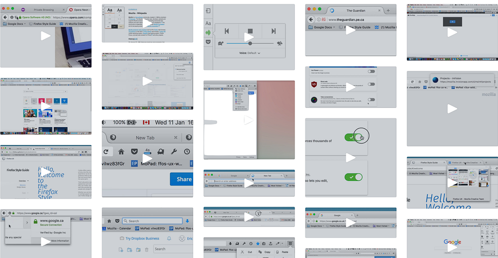
The next plan of action was to audit the existing motions in Firefox across mobile and desktop. We documented them by taking screen recordings and highlighted the areas that needed the most attention.

An audit of current animations was performed and documented for Firefox on Android, iOS, and desktop to explore areas of opportunity for motion.

From this exercise it was clear that consistency and perceived performance were high on our list of improvements.

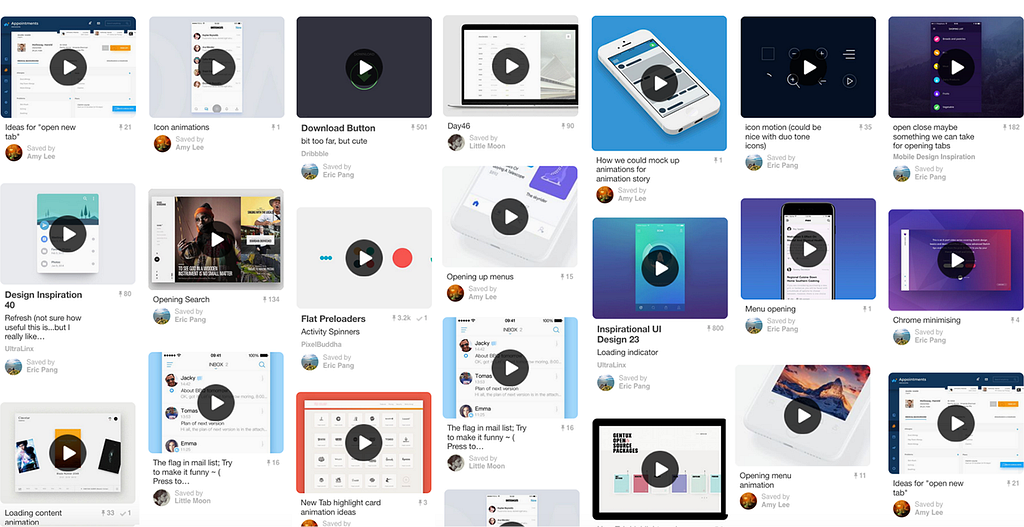
The next step was to gather inspiration for a mood board. From there, we formed a story that would become the foundation of our motion design language.

During this process, we asked ourselves:

How can we make the browser feel smoother, faster and more responsive?.

Inspiration was collected and documented in a mood board to help guide the motion story.

Step 3: Defining a Motion Story

With Photon (Firefox’s new design language) stemming from Quantum we knew there was going to be an emphasis on speed in our story. Before starting work on any new motions, we created a motion curve to reflect this. The aim was to have a curve that would be perceived as fast yet still felt smooth and natural when applied to tabs and menu items. Motion should also be informative (i.e showing where your bookmarked item is saved, when your tab is done loading) and lastly, have personality. We defined our story based on these considerations.

Motion curve that was applied to menu and tab animations.

The motion story was presented to the rest of the UX team during a work week held in Toronto (the UX team is distributed across several countries so work weeks are planned for in-person collaboration).

This was our mission statement:

The motion design language in Firefox Quantum is defined by three principles: Quick, Informative and Whimsical. Following these guiding principles, we aim to achieve a cohesive, consistent, and enjoyable experience within the family of Firefox browsers.

Next we presented some preliminary concepts to support these principles:

Quick

Animations should be fast and nimble and never keep the user waiting longer than they need to. The aim is to prioritize user perceived performance over technical benchmarks.

Panel and new tab animation.

Informative

Motion should help ease the user through the experience. It should aid the flow of actions, giving clear guidance for user orientation: spatial or temporal.

Left: Download icon animation indicates download progress. Right: Star icon animation shows the action of saving a bookmark and the location of the bookmark after it’s saved (the library).

Whimsical

Even though most people would not associate whimsy with a browser, we wanted to incorporate some playful elements as part of Firefox’s personality (and maybe ourselves).

Icon animations with some whimsy.

After getting feedback and buy-in from the rest of the UX team on the motion story, we were able to start working with them in applying motion to their designs.

Step 4: Design Motions

The Photon project was divided across various functional teams all focusing on different design aspects of Firefox. With motion overlapping many of these teams we started opening communication channels with each that would directly impact our work. We worked especially close with the visual/interaction team since it didn’t make sense to start motion design on components that were not yet close to complete. We had regular check-ins to set a rough ordering/priority of when we would schedule motion work of specific components.

Once we had near final visuals/interactions, it was time to get into After Effects and start animating!

https://medium.com/media/f099215e9a6dea67eec0d1a6e4ee729b/href

Step 5: Implementation

Implementing animations, especially detailed ones such as bookmarking and downloading, was an interesting challenge for the development team (Jared Wein, Sam Foster, and Jim Porter).

Rather than have a developer try to reproduce our motion designs through code, which can become tedious, we wanted to be able to export the motion directly. This ensured that the nuances of the motion was not lost during implementation.

To have the animations performant in the browser, the file sizes also needed to be small. This was done by using SVG assets and CSS animations.

We explored existing tools but did not find anything suitable that would be compatible with the browser. We created our own process and designed the animations in After Effects and used the Bodymovin extension to export them as JSON files.

One developer in particular, Markus Stange made this method possible by writing a tool, to convert JSON files into SVG sprite sheets. Sam further refined the tool and it became an essential asset in translating timeline animations from After Effects into CSS animations.

Page reload icon animation using a SVG sprite sheet.

After rounds of asset production, refinements, reviews, and testing, the big day came with the launch of Firefox Quantum!

A large part of the Firefox Quantum team was located in Toronto, Ontario.

We were a bit anxious awaiting feedback since this was the most significant update since Firefox 1.0 first launched in 2004.

Thankfully the release was met with positive reviews. We were happy that even some of our motions got a kudos.

So that wraps up the story of how the “motion team” for Firefox came to be. But that’s not all we do here at Mozilla. These days you’ll also find Eric busy working away at UX for Web Payments, Privacy and Search, while Amy casts her Dark theme magic and spins out the next UX iteration of Activity Stream and Onboarding.

If you haven’t given Firefox Quantum a try, take it for a spin and let us know what you think.


Written by Amy Lee & Eric Pang was originally published in Firefox User Experience on Medium, where people are continuing the conversation by highlighting and responding to this story.

26 Jun 18:22

I want to automate counting the number of blogp...

by Ton Zijlstra
I want to automate counting the number of blogposts I post in a week. Am assuming that the likeliest way of doing that is parsing the RSS feed for timestamps, and count them that way. Do you have any pointers to where such a RSS parser script (for Mac or MAMP) might be found?
26 Jun 18:20

At Apple, the customer comes third.

by Josh Bernoff

The most important thing to Apple is the product. After that comes employee efficiency. Customers? They’re in third place. Here’s how I learned that: Yesterday I finally brought my iPhone with its failing battery into the Apple Store in Burlington, Massachusetts. When I showed up, the bright and happy Apple guy in the front of … Continued

The post At Apple, the customer comes third. appeared first on without bullshit.

26 Jun 18:20

blood donation: no good deed goes unpunished

I have been infected with the Ebola virus.

I have had sex with another man in the past year.

I am taking Coumadin®.

Actually, none of those three statements is true. And Facebook knows it.

The American Red Cross has given Facebook this highly personal information about me, by adding my contact info to an "American Red Cross Blood Donors" Facebook Custom Audience. If any of that stuff were true, I wouldn't have been allowed to give blood.

When I heard back from the American Red Cross about this personal data problem, they told me that they don't share my health information with Facebook.

That's not how it works. I'm listed in the Custom Audience as a blood donor. Anyway, too late. Facebook has the info now.

So, which of its promises about how it uses people's personal information is Facebook going to break next?

And is some creepy tech bro right now making a killer pitch to Paul Graham about a business plan to "disrupt" the health insurance market using blood donor information?

I should not have to care about this, and I don't have time to. I don't even have time to attempt a funny remark about the whole Facebook board member Peter Thiel craving blood thing.

26 Jun 18:20

My Senate Testimony

by John Battelle

(image) Today I had a chance to testify to the US Senate on the subject of Facebook, Cambridge Analytica, and data privacy. It was an honor, and a bit scary, but overall an experience I’ll never forget. Below is the written testimony I delivered to the Commerce committee on Sunday, released on its site today. If you’d like to watch, head right here, I think it’ll be up soon.  Forgive the way the links work, I had to consider that this would be printed and bound in the Congressional Record. I might post a shorter version that I read in as my verbal remarks next…we’ll see.


Honorable Committee Members –


My name is John Battelle, for more than thirty years, I’ve made my career reporting, writing, and starting companies at the intersection of technology, society, and business. I appreciate the opportunity to submit this written and verbal testimony to your committee.

Over the years I’ve written extensively about the business models, strategies, and societal impact of technology companies, with a particular emphasis on the role of data, and the role of large, well-known firms. In the 1980s and 90s I focused on Apple and Microsoft, among others. In the late 90s I focused on the nascent Internet industry, the early 2000s brought my attention to Google, Amazon, and later, Twitter and Facebook. My writings tend to be observational, predictive, analytical, and opinionated.

Concurrently I’ve been an entrepreneur, founding or co-founding and leading half a dozen companies in the media and technology industries. All of these companies, which span magazines, digital publishing tools, events, and advertising technology platforms, have been active participants in what is broadly understood to be the “technology industry” in the United States and, on several occasions, abroad as well. Over the years these companies have employed thousands of staff members, including hundreds of journalists, and helped to support tens of thousands of independent creators across the Internet. I also serve on the boards of several companies, all of which are deeply involved in the technology and data industries.

In the past few years my work has focused on the role of the corporation in society, with a particular emphasis on the role technology plays in transforming that role. Given this focus, a natural subject of my work has been on companies that are the most visible exemplars of technology’s impact on business and society. Of these, Facebook has been perhaps my most frequent subject in the past year or two.

Given the focus of this hearing, the remainder of my written testimony will focus on a number of observations related generally to Facebook, and specifically to the impact of the Cambridge Analytica story. For purposes of brevity, I will summarize many of my points here, and provide links to longer form writings that can be found on the open Internet.

Facebook broke through the traditional Valley startup company noise in the mid 2000s, a typical founder-driven success story backed by all the right venture capital, replete with a narrative of early intrigue between partners, an ambitious mission (“to make the world more open and connected”), a sky-high private valuation, and any number of controversial decisions around its relationship to its initial customers, the users of its service (later in its life, Facebook’s core customers bifurcated to include advertisers). I was initially skeptical about the service, but when Sheryl Sandberg, a respected Google executive, moved to Facebook to run its advertising business, I became certain it would grow to be one of the most important companies in technology. I was convinced Facebook would challenge Google for supremacy in the hyper-growth world of personalized advertising. In those early days, I often made the point that while Google’s early corporate culture sprang from the open, interconnected world wide web, Facebook was built on the precept of an insular walled garden, where a user’s experience was entirely controlled by the Facebook service itself. This approach to creating a digital service not only threatened the core business model of Google (which was based on indexing and creating value from open web pages), it also raised a significant question of what kind of public commons we wanted to inhabit as we migrated our attention and our social relationships to the web. (Examples: https://battellemedia.com/archives/2012/02/its-not-whether-googles-threatened-its-asking-ourselves-what-commons-do-we-wish-for ; https://battellemedia.com/archives/2012/03/why-hath-google-forsaken-us-a-meditation)

In the past five or so years, of course, Facebook has come to dominate what is colloquially known as the public square – the metaphorical space where our society comes together to communicate with itself, to debate matters of public interest, and to privately and publicly converse on any number of topics. Since the dawn of the American republic, independent publishers (often referred to as the Fourth Estate – from pamphleteers to journalists to bloggers) have always been important actors in the center of this space. As a publisher myself, I became increasingly concerned that Facebook’s appropriation of public discourse would imperil the viability of independent publishers. This of course has come to pass.

As is well understood by members of this committee, Facebook employed two crucial strategies to grow its service in its early days. The first was what is universally known as the News Feed, which mixed personal news from “friends” with public stories from independent publishers. The second strategy was the Facebook “Platform,” which encouraged developers to create useful (and sometimes not so useful) products and services inside Facebook’s walled garden service. During the rise of both News Feed and Platform, I repeatedly warned independent publishers to avoid committing themselves and their future viability to either News Feed or the Platform, as Facebook would likely change its policies in the future, leaving publishers without recourse. (Examples: https://battellemedia.com/archives/2012/01/put-your-taproot-into-the-independent-web ; https://battellemedia.com/archives/2012/11/facebook-is-now-making-its-own-weather ; https://shift.newco.co/we-can-fix-this-f-cking-mess-bf6595ac6ccd ; https://shift.newco.co/ads-blocking-and-tackling-18129db3c352)

Of course, the potent mix of News Feed and a subset of independent publishers combined to deliver us the Cambridge Analytica scandal, and we are still grappling with the implications of this incident on our democracy. But it is important to remember that while the Cambridge Analytica breach seems unusual, it is in fact not – it represents business as usual for Facebook. Facebook’s business model is driven by its role as a data broker. Early in its history, Facebook realized it could grow faster if it allowed third parties, often referred to as developers, to access its burgeoning trove of user data, then manipulate that data to create services on Facebook’s platform that increased a Facebook user’s engagement on the platform. Indeed, in his early years as CEO of Facebook, Mark Zuckerberg was enamored with the “platform business model,” and hoped to emulate such icons as Bill Gates (who built the Windows platform) or Steve Jobs (who later built the iOS/app store platform).

However, Facebook’s core business model of advertising, driven as it is by the brokerage of its users’ personal information, stood in conflict with Zuckerberg’s stated goal of creating a world-beating platform. By their nature, platforms are places where third parties can create value. They do so by leveraging the structure, assets, and distribution inherent to the platform. In the case of Windows, for example, developers capitalized on Microsoft’s well-understood user interface, its core code base, and its massive adoption by hundreds of millions of computer users. Bill Gates famously defined a successful platform as one that creates more value for the ecosystem that gathers around it than for the platform itself. By this test – known as the Gates Line – Facebook’s early platform fell far short. Developers who leveraged access to Facebook’s core asset – its user data – failed to make enough advertising revenue to be viable, because Facebook (and its advertisers) would always preference Facebook’s own advertising inventory over that of its developer partners. In retrospect, it’s now commonly understood in the Valley that Facebook’s platform efforts were a failure in terms of creating a true ecosystem of value, but a success in terms of driving ever more engagement through Facebook’s service.

For an advertising-based business model, engagement trumps all other possible metrics. As it grew into one of the most successful public companies in the history of business, Facebook nimbly identified the most engaging portions of its developer ecosystem, incorporated those ideas into its core services, and became a ruthlessly efficient acquirer and manipulator of its users’ engagement. It then processed that engagement into advertising opportunities, leveraging its extraordinary data assets in the process. Those advertising opportunities drew millions of advertisers large and small, and built the business whose impact we now struggle to understand.

To truly understand the impact of Facebook on our culture, we must first understand the business model it employs. Interested observers of Facebook will draw ill-informed conclusions about the company absent a deep comprehension of its core driver – the business of personalized advertising. I have written extensively on this subject, but a core takeaway is this: The technology infrastructure that allows companies like Facebook to identify exactly the right message to put in front of exactly the right person at exactly the right time are, in all aspects of the word, marvelous. But the externalities of manufacturing attention and selling it to the highest bidder have not been fully examined by our society. (Examples: https://shift.newco.co/its-the-advertising-model-stupid-b843cd7edbe9 ; https://shift.newco.co/its-the-advertising-model-stupid-b843cd7edbe9 ; https://shift.newco.co/lost-context-how-did-we-end-up-here-fd680c0cb6da ; https://battellemedia.com/archives/2013/11/why-the-banner-ad-is-heroic-and-adtech-is-our-greatest-technology-artifact ; https://shift.newco.co/do-big-advertisers-even-matter-to-the-platforms-9c8ccfe6d3dc )

The Cambridge Analytica scandal has finally focused our attention on these externalities, and we should use this opportunity to go beyond the specifics of that incident, and consider the broader implications. The “failure” of Facebook’s Platform initiative is not a failure of the concept of an open platform. It is instead a failure by an immature, blinkered company (Facebook) to properly govern its own platform, as well as a failure of our own regulatory oversight to govern the environment in which Facebook operates. Truly open platforms are regulated by the platform creator in a way that allows for explosive innovation (see the Gates Line) and shared value creation. (Examples: https://shift.newco.co/its-not-the-platforms-that-need-regulation-2f55177a2297 ; https://shift.newco.co/memo-to-techs-titans-please-remember-what-it-was-like-to-be-small-d6668a8fa630)

The absolutely wrong conclusion to draw from the Cambridge Analytica scandal is that entities like Facebook must build ever-higher walls around their services and their data. In fact, the conclusion should be the opposite. A truly open society should allow individuals and properly governed third parties to share their data so as to create a society of what Nobel laureate Edmond Phelps calls “mass flourishing.” My own work now centers on how our society might shift what I call the “social architecture of data” from one where the control, processing and value exchange around data is managed entirely by massive, closed entities like Facebook, to one where individuals and their contracted agents manage that process themselves. (Examples: https://shift.newco.co/are-we-dumb-terminals-86f1e1315a63 ; https://shift.newco.co/facebook-tear-down-this-wall-400385b7475d ; https://shift.newco.co/how-facebook-google-amazon-and-their-peers-could-change-techs-awful-narrative-9a758516210a ; https://shift.newco.co/on-facebook-a156710f2679 ; https://battellemedia.com/archives/2014/03/branded-data-preferences )

Another mistaken belief to emerge from the Cambridge Analytica scandal is that any company, no matter how powerful, well intentioned, or intelligent, can by itself “fix” the problems the scandal has revealed. Facebook has grown to a size, scope, and impact on our society that outstrips its ability to manage the externalities it has created. To presume otherwise is to succumb to arrogance, ignorance, or worse. The bald truth is this: Not even Mark Zuckerberg understands how Facebook works, nor does he comprehend its impact on our society. (Examples: https://shift.newco.co/we-allowed-this-to-happen-were-sorry-we-need-your-help-e26ed0bc87ac ; https://shift.newco.co/i-apologize-d5c831ce0690 ; https://shift.newco.co/facebooks-data-trove-may-well-determine-trump-s-fate-71047fd86921 ; https://shift.newco.co/its-time-to-ask-ourselves-how-tech-is-changing-our-kids-and-our-future-2ce1d0e59c3c )

Another misconception: Facebook does not “sell” its data to any third parties. While Facebook may not sell copies of its data to these third parties, it certainly sells leases to that data, and this distinction bears significant scrutiny. The company may not wish to be understood as such, but it is most certainly the largest data broker in the history of the data industry.

Lastly, the Cambridge Analytica scandal may seem to be entirely about a violation of privacy, but to truly understand its impact, we must consider the implications relating to future economic innovation. Facebook has used the scandal as an excuse to limit third party data sharing across and outside its platform. While this seems logical on first glance, it is in fact destructive to long term economic value creation.

So what might be done about all of this? While I understand the lure of sweeping legislation that attempts to “cure” the ills of technological progress, such approaches often have their own unexpected consequences. For example, the EU’s adoption of GDPR, drafted to limit the power of companies like Facebook, may in fact only strengthen that company’s grip on its market, while severely limiting entrepreneurial innovation in the process (Example: https://shift.newco.co/how-gdpr-kills-the-innovation-economy-844570b70a7a )

As policy makers and informed citizens, we should strive to create a flexible, secure, and innovation friendly approach to data governance that allows for maximum innovation while also insuring maximum control over the data by all effected parties, including individuals, and importantly, the beneficiaries of future innovation yet conceived and created. To play forward the current architecture of data in our society – where most of the valuable information is controlled by an increasingly small oligarchy of massive corporations – is to imagine a sterile landscape hostile to new ideas and mass flourishing.

Instead, we must explore a world governed by an enlightened regulatory framework that encourages data sharing, high standards of governance, and maximum value creation, with the individual at the center of that value exchange. As I recently wrote: “Imagine … you can download your own Facebook or Amazon “token,” a magic data coin containing not only all the useful data and insights about you, but a control panel that allows you to set and revoke permissions around that data for any context. You might pass your Amazon token to Walmart, set its permissions to “view purchase history” and ask Walmart to determine how much money it might have saved you had you purchased those items on Walmart’s service instead of Amazon. You might pass your Facebook token to Google, set the permissions to compare your social graph with others across Google’s network, and then ask Google to show you search results based on your social relationships. You might pass your Google token to a startup that already has your genome and your health history, and ask it to munge the two in case your 20-year history of searching might infer some insights into your health outcomes. This might seem like a parlor game, but this is the kind of parlor game that could unleash an explosion of new use cases for data, new startups, new jobs, and new economic value.”

It is our responsibility to examine our current body of legislation as it relates to how corporations such as Facebook impact the lives of consumers and the norms of our society overall. Much of the argument around this issue turns on the definition of “consumer harm” under current policy. Given that data is non-rivalrous and services such as Facebook are free of charge, it is often presumed there is no harm to consumers (or by extension, to society) in its use. This also applies to arguments about antitrust enforcement. I think our society will look back on this line of reasoning as deeply flawed once we evolve to an understanding of data as equal to – or possibly even more valuable than – monetary currency.

Most observers of technology agree that data is a new class of currency in society, yet we continue to struggle to understand its impact, and how best to govern it. The manufacturing of data into currency is the main business of Facebook and countless other information age businesses. Currently the only participatory right in this value creation for a user of these services is to A/engage with the services offered and B/purchase the stock of the company offering the services. Neither of these options affords the user – or society – compensation commensurate with the value created for the firm. We can and must do better as a society, and we can and must expect more of our business leaders.

(More: https://shift.newco.co/its-time-for-platforms-to-come-clean-on-political-advertising-69311f582955 ; https://shift.newco.co/come-on-what-did-you-think-they-do-with-your-data-396fd855e7e1 ; https://shift.newco.co/tech-is-public-enemy-1-so-now-what-dee0c0cc40fe ; https://shift.newco.co/why-is-amazons-go-not-bodega-2-0-6f148075afd5 ; https://shift.newco.co/predictions-2017-cfe0806bed84 ; https://shift.newco.co/the-automatic-weapons-of-social-media-3ccce92553ad )

Respectfully submitted,

John Battelle

Ross, California

June 17, 2018

24 Jun 18:25

NewsBlur Blurblog: On Airline Mapping | somethingaboutmaps

sillygwailo shared this story from somethingaboutmaps.

A couple of months ago, I had the opportunity to redesign the route map for a major airline, to be printed in their in-flight magazine.

RevisedCartogram

Click for a larger version.

This is not the final product that I ended up creating for the client, but it’s my favorite iteration, and the one that I want to talk about today. I just want to break down a few elements of how and why this came together the way it did: a little behind-the-scenes of my work and thought processes.

Cartogram

As I began exploring layout options for the project, I started with a simple Gall Stereographic projection.

Gall.jpg

Antarctica has been removed in order to leave space for some logos and other information that the client wanted on the page.

But I quickly ran into a couple of challenges, due to the demands of the two-page print spread that I needed to fit this map into.

  1. Gutter: There’s a fairly wide gutter in the middle of the spread, where the pages are bound together. No cities or labels or other important stuff can fall within that zone. That leaves me with very few ways to non-awkwardly divide the map into two pages. The above image is one of the only options. In fact, I had to widen the Atlantic Ocean a little bit just to make it work — Iceland and Greenland are much closer together in reality. The end result is that the whole thing is kind of unbalanced. The vast majority of the routes are on the right side.
  2. Scale: The whole map has to fit within 398 × 270mm (15.7 × 10.6in). That seems like a fair amount of space, but, because of the distribution of the airline’s flights, some areas, such as Europe, are very densely packed. Far too crowded to label.

So, I decided to take a different approach. Instead of being beholden to reality, and the true size and shape of the Earth’s landmasses, I made a cartogram. By resizing and reshaping different areas, I could both alleviate overcrowding and better distribute the world on either side of the gutter.

Cartogram.jpg

I widened a portion of Asia, just west of India, in order to make space for the gutter. I shrank areas where there were fewer destination cities, and expanded those that had more. But despite all the distortions, it looks (to me) still reasonably familiar. Cartograms tread a fine line between reshaping the world and keeping it recognizable, and I think that I did OK here. The extent of the distortions becomes much more apparent when you run it through Bernie Jenny’s MapAnalyst.


Undistortion Grid.jpg

DistortionGrid.jpg

The white grid in the top map corresponds to the white grid on the bottom, showing how warped the original Gall Stereographic has become. As the land is distorted, so is the grid. You can see, for example, how all the grid squares in the Pacific have been compressed as the Americas have been moved closer to Asia. Click the bottom image to enlarge it.

To make the cartogram, I started with the Gall Stereographic map in Illustrator. Then I simply selected chunks of land and resized/moved them until I was happy. I made heavy use of the Lasso tool.

MoveSA.gif

Let’s just put that right over there.

I would shrink an area here, expand or shift one there. It was an iterative process over the course of an hour or two, changing a piece at a time and seeing the effect it had on the other pieces. The end result looked terrible and jagged, due to the way it was constructed, but it had everything in approximately the location that I wanted it.

PreTrace.jpg

To clean up all that roughness, I then redrew a new, tidier set of linework on top of the distorted map. I built mine out of straight lines and circular arcs, much like the Geo-Metro set I did for Project Linework. It gives things a modern, urban feel. I think it keeps enough detail to make places seem familiar, while smoothing over a lot of details that had to be distorted.

Traced.jpg

Finally, I nudged around some of the city dots. Since the linework I drew didn’t exactly match the (now-distorted) coastline, some coastal cities had moved a bit far from the sea. In other cases, I shifted them a little bit just to make more room for labels.

Root and Branch Lines

I began the project determined to avoid the clutter that characterizes so many flight maps. Major airlines have a lot of connections, and drawing each possible route can lead to a tangled mass of impossible-to-follow lines.

UnitedMap.jpg

I expect that designing the flight map for United Airlines is a pretty tough job.

That’s an extreme example, but you get the idea. These things can get out of control quickly, and the map ends up not really being useful as an informational tool.

My client had far fewer flights than United, and fortunately almost all of them originated in Dubai. But, even then, showing every line could lead to chaos (if a lesser degree of it). So, instead, I created a root-and-branch structure. Lines to each city were bundled together (as though with cable ties) and routed through empty spaces. I also gave everything an elegant, flowing curvature. It’s sort of plant-like.

RootDetails.jpg

This was another iterative process. I’d draw a root, then start to add branches to it, then figure out a better routing and start that section over, or I’d decide another root was needed to keep things tidy, etc. It took quite some time. As a starting point, I mostly just looked for open spaces that had a good balance of cities on each side.

AllBranches.jpg

Smooth Line Joins

Getting the lines to join smoothly also took a some work. I couldn’t just quickly connect the city lines to the bundled lines — I wanted them to flow into each other. This meant adjusting the curvature on each line carefully until things looked right. Basically, I had to set the bezier handle of the thinner line to be tangent to the curvature of the thicker line at the point where it joins. To explain this, I’ve put together some diagrams that approximate (a nicer version of) Outline Mode in Illustrator, which shows you just the bare vector paths, with no styling.

BezierAdjust.jpg

Left: one line carelessly jammed into the other. Right: the branch line has been curved to flow into the root line more smoothly.

That looks much better. But, there’s still one issue. These paths are styled with strokes, and those strokes have widths to them. So, in reality, it’s more like this:

Corner.jpg

Now things don’t look quite so smooth. There’s a little bit of a non-organic-seeming corner on one side where the lines come together. When I did my manual smooth join, I didn’t really account for the fact that the edges of the stroke are a short distance away from the center of the stroke.

So, instead of connecting the branch straight to the root, I need to connect the branch a short distance away from the root, so that the right edge of each of those two strokes will be in alignment with each other. The roots have a stroke width of 3pt, and the branches are 1pt, so if I do a little math, it turns out that I want to connect the branch to something that’s 1 pt away from the center of the root, and it’ll all work out.

Gap.jpg

By shifting the branch up a little bit, now its right edge is in alignment with the right edge of the root, and they flow together well. How did I place it exactly? I used the Offset Path tool to make a new version of the root line, 1 point away from the old line. This is a little different than just shifting the line left or right by 1 points. It’s more like creating a buffer around the line, 1 point wide. Offset Path is great, and I use it a lot (often to make waterlines).
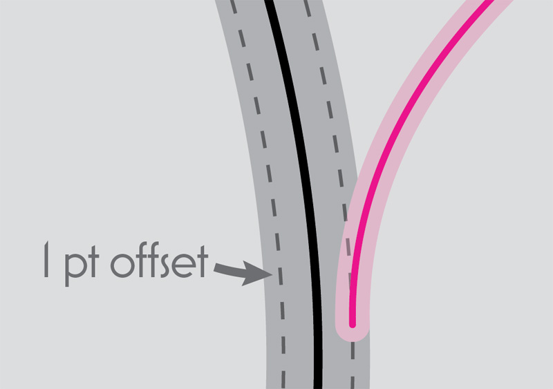
Offset.jpg

The end result is a nice smooth set of flowing lines. It’s a really little touch. But, so much of good mapmaking inheres in the small details, doesn’t it?

Gradients on Strokes

You may have noticed that some cities are red and some blue — the former are the client’s flight destinations, and the latter are those of one of their major codeshare partners. I wanted to show the flights to the codeshare cities in a matching blue, but it would have looked awkward to just join a blue line straight into a red trunk.

UnadjustedBlue.jpg

So, instead, I applied a gradient stroke to each of the codeshare lines, so that they were blue near the dot, and red near the root. I had to adjust each gradient manually; since each line was a different length, I couldn’t simply say, “make it red for the first 10% of the line.”

Gradients.jpg

Make sure to choose the second Stoke option: apply the gradient along the stroke.

The end result gives us a fairly-smooth transition between roots and branches when we need to use blue.

Fun fact: one alternate version of the map that we looked at also used gradients, but this time for opacity. Each city had a separate arc line running toward Dubai, but the lines became invisible shortly after leaving the city, to hint at their destination while avoiding a lot of overlap and clutter. I used the same gradient panel in Illustrator to do this, keeping the color constant but changing the opacity for the middle portion of the line. It was a fun idea, though ultimately we decided not to use it.

Faderoutes.jpg

I’m pretty pleased by the overall result of the root and branch style. It both shows the extensiveness of the network, and allows the reader to easily figure out which cities connect to which other cities. It’s relatively clutter-free. Again, I had a little bit of an easier job than the designer of that United Airlines map I showed above — I have fewer cities to deal with, and most of them connect to the same place. But I suspect that this style would still yield some benefits on a more crowded network; even if it might not make everything 100% clear, it would probably still help a lot.

Coloration

My initial draft of the map started out with a much brighter color scheme for the basemap, and bolder lines.

Bolder.jpg

Fortunately, I solicited the ever-valuable advice of my colleague Tanya Buckingham. She said it felt a little childlike to her, which I started to agree with as I looked at it. Over the course of about twenty minutes, we slowly adjusted the palette to look a little more mature and refined. Mostly this was driven by her; she had a particular shade in her mind and we kept trying to match it.

I also gave the route lines some transparency. This was actually done out of necessity on a later draft of the map, one that was much more crowded and which needed the lines to fit comfortably underneath the labels, rather than dodging around them. But I liked the look of it, and so I went back at the end and applied the change to the cartogram, long after we’d abandoned it, and I think it helps. It makes the route network seem much less vascular.

Odds and Ends

I tried to avoid crossing lines, but there were a couple of places where it was necessary. In those cases, I added little breaks to help make it clearer that these did not connect.

LineBreaks.png

Given the distortions in the cartogram, I threw in a couple of ocean labels to help remind people of the geography they were looking at. If I’d done another draft, I might have also included some continent labels, as well. Just little context clues.

Label.png

Finally, I wanted to show you a couple of the other maps in this project. Besides making a world map, I was also tasked with making a series of half-page regional maps, as well. Here, I took a page from the work of folks like Erwin Raisz and Richard Edes Harrison and did a series of perspective views.

Exemplars.jpg

I did not make these.

Mine.jpg

But I did make these.

I used both Orthographic and Vertical Perspective projections to create five regional maps. It’s an immersive viewpoint that I find very powerful. These kinds of projections always suggest the concept of distance and travel to me, by showing the far-ness of some place on the horizon. It also feels like flying, positioning the reader high above the Earth (though the eye is more at space travel height than airline height).

Concluding Thoughts

In the end, the client eventually preferred a more traditional representation, including a non-cartogram world map, and non-bundled flight lines, though we did keep the perspective views. That’s the nature of this business: there’s often a lot of stuff that gets discarded as drafts are done and different visions explored. Sometimes the artist’s favorite versions don’t make it to print; that’s something I find challenging about being a creative professional. But, this blog gives me a place to show off and talk about something that might not otherwise have had an outlet. I hope you found it interesting or useful!


This project walkthrough is, and will remain, free, but if you derive some value from it, you are welcome to make a donation to support my continued work.


Like this:

Like Loading...

24 Jun 18:25

Twitter Favorites: [ReneeStephen] @sillygwailo I thought you mean the musical and I was SUPER EXCITED and then realized you mean Ontario... Which is... *a* Hamilton...

Renée Stephen @ReneeStephen
@sillygwailo I thought you mean the musical and I was SUPER EXCITED and then realized you mean Ontario... Which is... *a* Hamilton...
19 Jun 18:19

Twitter Favorites: [ICCTtweets] Torontonians of Icelandic descent are mentioned in an article about Workd Cup fans in The Star today: https://t.co/ogc8SJ3VVc

Icelandic Canadian Club of Toronto @ICCTtweets
Torontonians of Icelandic descent are mentioned in an article about Workd Cup fans in The Star today: thestar.com/sports/worldcu…
19 Jun 18:19

Instapaper Liked: With residents from all 32 World Cup countries, Toronto cheers on the world

Torontonians of Icelandic descent are mentioned in an article about Workd Cup fans in The Star today: https://t.co/ogc8SJ3VVc — Icelandic Canadian Club of…
19 Jun 18:19

Twitter Favorites: [rtanglao] @IanKing @sillygwailo i know you can take great photos richard with or without a course! and i'm confident you can… https://t.co/5DyVX1Gsa0

Roland Tanglao 猪肉面 @rtanglao
@IanKing @sillygwailo i know you can take great photos richard with or without a course! and i'm confident you can… twitter.com/i/web/status/1…
19 Jun 18:19

Twitter Favorites: [SnarkySteff] Had “nothing to eat” and then realized I had all I needed for breakfast for dinner — milk about to sour, vinegar, o… https://t.co/yIQsY7rnrd

Steffani Cameron, the Full Nomad @SnarkySteff
Had “nothing to eat” and then realized I had all I needed for breakfast for dinner — milk about to sour, vinegar, o… twitter.com/i/web/status/1…
19 Jun 18:19

Twitter Favorites: [maxhawkins] 🚀 Launching now: Your Boss for iOS 🚀 Your Boss is a peer-to-peer accountability network; a boss for people who do… https://t.co/8oHimbjA8G

Max Hawkins @maxhawkins
🚀 Launching now: Your Boss for iOS 🚀 Your Boss is a peer-to-peer accountability network; a boss for people who do… twitter.com/i/web/status/1…
19 Jun 18:19

Twitter Favorites: [bmann] @Stv I have everything in gCal so Calendly gets it all from one account. Feels like a good SMB option for people who are iOS native.

Boris Mann @bmann
@Stv I have everything in gCal so Calendly gets it all from one account. Feels like a good SMB option for people who are iOS native.
19 Jun 18:19

Twitter Favorites: [bmann] @Stv yes! For another day. Architecture! Transit! Museums & galleries!

Boris Mann @bmann
@Stv yes! For another day. Architecture! Transit! Museums & galleries!
19 Jun 17:32

SotD: The Return

I introduced Ferron to the Song of the Day a couple weeks back with Bellybowl, and I’d like to use her beautiful The Return in this closing focused-on-the-divine sequence, to help talk about my own experience of worship.

But first, the song. The melody sways back and forth like the willow tree in the words, and the voice ambles through those words, pausing in unlikely places as the tree bends. And those lyrics: They mostly don’t parse into coherent sentences but Ferron knows what she’s doing and there’s no doubt where she’s aiming. Also, the harmonies are gorgeous and the arrangement is approximately perfect.

But that tree is what made me want to fit The Return into this series, because trees and worship go together in my mind. Worship inhabits the human emotional repertoire, along with anger, desire, joy, and the rest. People have fallen into religious faith because they visited a place, for example the exquisite cathedral at Chartres, that reliably provokes in humans that feeling, worship. There’s nothing wrong with the sensation: That you’re in the presence of something much, much greater than yourself, for which reverence is appropriate. I’ve been to Chartres twice and its beauty and grandeur so seized me that I had trouble breathing.

Trees

These trees are only about a hundred years old; they’ll get lots bigger.

But I think there’s a potential category error, because when you’re feeling that, it’s the church you’re reacting to. It’s common for people who are feeling worshipful to transfer that feeling to an object of faith, an unseen deity. Living as I do in the Pacific Northwest, it’s an easy and regular experience to be in the presence of entities worthy of worship; living entities. I’m talking of course, of our great upreaching rain-fed trees, which may weigh a million kilograms and exceed fifty meters in height. They are bigger, stronger, longer-lived, and less-worried than you are.

The Hidden Life of Trees

Feeling reverent around trees also has the advantage that they’re not metaphors for anything that is said to be twitchily concerned about how and with whom you deploy your genitals, or whose intercedents will require some of your cash to support their lifestyles. Ferron’s tree is a willow but I think she was deploying that name for its sound. Around me, it’s the Douglas Fir, Red Cedar, Hemlock, and (especially) Big-Leaf Maples that constitute the forest temples, and not to anything but themselves.

I’d like to take a little side-trip and mention The Hidden Life of Trees, by Peter Wohlleben, translated from the German. It’s a slim, highly readable volume that talks about what the title says. A lot of that hidden part of their lives happens underground, among the roots and soil microbiomes. If you are given to feeling worshipful in forests, you will gobble up this book and smile regularly, reading it.

I don’t think Ferron’s being metaphorical either; A walk in the woods leaves me feeling stronger and more balanced. There’s strength to be taken, you just have to look and listen.

This is part of the Song of the Day series (background).

Links

Spotify playlist. This tune on Amazon, iTunes, Spotify. No live video, sorry.

19 Jun 17:32

Most Modest pop-up at Mission Bicycle

by brandon

Pop-up alert:

While wrapping up Design Week here in San Francisco, we just didn't want things to come to an end. It was all too fun, and it all ended too fast.

So in the spirit of great design, we've enlisted the help of our good friends at Most Modest design studio to do a pop-up in our shop at 766 Valencia St. through the end of this month.

Their incorporation of poppy colors in simple, straightforward, and beautifully designed goods manages to draw parallels both visually and idealistically to what we do for bikes here at Mission Bicycle Company.

In short, we love what they do and think you will too.

About Most Modest:

Established in 2012, Most Modest is a San Francisco-based design studio, specializing in craft inspired technology goods. Founder and Principal Designer Justin Champaign, and his team pull from a deep interest in behavior, knowledge of new technology, and a passion for making things that reduce consumption and increase enjoyment of day-to-day objects.

Fundamental to the Most Modest process is the idea that the journey defines the destination. Through extensive research, sketching, 3-D modeling and rapid prototyping, the team tests and validates potential solutions to ensure an incredible result.

Come check it out:

The pop-up is officially up, running, and chock full of goods guaranteed to give your home or office the modern yet understated touch you've been missing.

Come take a peek and get inspired during our normal hours: 

11:00am-7:00pm Mon-Fri & 11:00am-6:00pm Sun

Can't make it to SF? Check out their website here.


19 Jun 17:32

New US Tariffs are Anti-Maker and Will Encourage Offshoring

by bunnie

The new 25% tariffs announced by the USTR, set to go into effect on July 6th, are decidedly anti-Maker and ironically pro-offshoring. I’ve examined the tariff lists (List 1 and List 2), and it taxes the import of basic components, tools and sub-assemblies, while giving fully assembled goods a free pass. The USTR’s press release is careful to mention that the tariffs “do not include goods commonly purchased by American consumers such as cellular telephones or televisions.”

Think about it – big companies with the resources to organize thousands of overseas workers making TVs and cell phones will have their outsourced supply chains protected, but small companies that still assemble valuable goods from basic parts inside the US are about to see significant cost increases. Worse yet educators, already forced to work with a shoe-string budget, are going to return from their summer recess to find that basic parts, tools and components for use in the classroom are now significantly more expensive.


Above: The Adafruit MetroX Classic Kit is representative of a typical electronics education kit. Items marked with an “X” in the above image are potentially impacted by the new USTR tariffs.

New Tariffs Reward Offshoring, Encourage IP Flight

Some of the most compelling jobs to bring back to the US are the so-called “last screw” system integration operations. These often involve the complex and precise process of integrating simple sub-assemblies into high-value goods such as 3D printers or cell phones. Quality control and IP protection are paramount. I often advise startups to consider putting their system integration operations in the US because difficult-to-protect intellectual property, such as firmware, never has to be exported if the firmware upload operation happens in the US. The ability to leverage China for low-value subassemblies opens more headroom to create high-value jobs in the US, improving the overall competitiveness of American companies.

Unfortunately, the structure of the new tariffs are exactly the opposite of what you would expect to bring those jobs back to the US. Stiff new taxes on simple components, sub-assemblies, and tools like soldering irons contrasted against a lack of taxation on finished goods pushes business owners to send these “last screw” operation overseas. Basically, with these new tariffs the more value-add sent outside the borders of the US, the more profitable a business will be. Not even concerns over IP security could overcome a 25% increase in base costs and keep operations in the US.

It seems the intention of the new tariff structure was to minimize the immediate pain that voters would feel in the upcoming mid-terms by waiving taxes on finished goods. Unfortunately, the reality is it gives small businesses that were once considering setting up shop in the US a solid reason to look off-shore, while rewarding large corporations for heavy investments in overseas operations.

New Tariffs Hurt Educators and Makers

Learning how to blink a light is the de-facto introduction to electronics. This project is often done with the help of a circuit board, such as a Microbit or Chibi Chip, and a type of light known as an LED. Unfortunately, both of those items – simple circuit boards and LEDs – are about to get 25% more expensive with the new tariffs, along with other Maker and educator staples such as capacitors, resistors, soldering irons, and oscilloscopes. The impact of this cost hike will be felt throughout the industry, but most sharply by educators, especially those serving under-funded school districts.


Above: Learning to blink a light is the de-facto introduction to electronics, and it typically involves a circuit board and an LED, like those pictured above.

Somewhere on the Pacific Ocean right now floats a container of goods for ed-tech startup Chibitronics. The goods are slated primarily for educators and Makers that are stocking up for the fall semester. It will arrive in the US the second week of July, and will likely be greeted by a heavy import tax. I know this because I’m directly involved in the startup’s operations. Chibitronics’ core mission is to serve the educator market, and as part of that we routinely offered deep discounts on bulk products for educators and school systems. Now, thanks to the new tariffs on the basic components that educators rely upon to teach electronics, we are less able to fulfill our mission.

A 25% jump in base costs forces us to choose between immediate price increases or cutting the salaries of our American employees who support the educators. These new tariffs are a tax on America’s future – it deprives some of the most vulnerable groups of access to technology education, making future American workers less competitive on the global stage.


Above: Educator-oriented learning kits like the Chibitronics “Love to Code” are slated for price increases this fall due to the new tariffs.

Protectionism is Bad for Technological Leadership

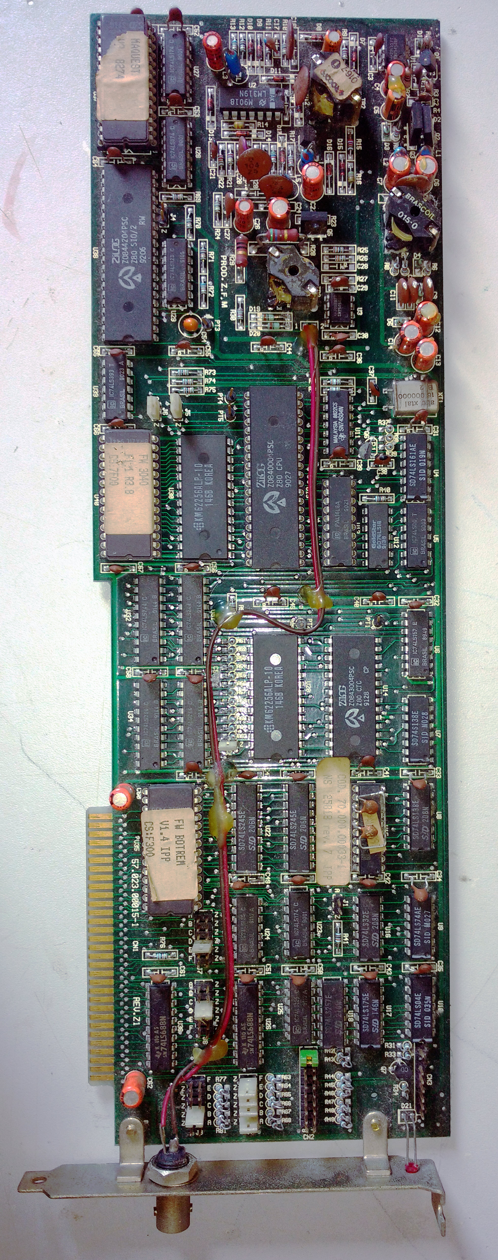
Recently, I was sent photos by Hernandi Krammes of a network card that was manufactured in Brazil around 1992. One of the most striking features of the card was how retro it looked – straight out of the 80’s, a full decade behind its time. This is a result of Brazil’s policy of protectionist tariffs on the import of high-tech components. While stiff tariffs on the import of microchips drove investment in local chip companies, trade barriers meant the local companies didn’t have to be as competitive. With less incentive to re-invest or upgrade, local technology fell behind the curve, leading ultimately to anachronisms like the Brazilian Ethernet card pictured below.


Above: this Brazilian network card from 1992 features design techniques from the early 80’s. It is large and clunky compared to contemporaneous cards.

Significantly, it’s not that the Brazilian engineers were any less clever than their Western counterparts: they displayed considerable ingenuity getting a network card to work at all using primarily domestically-produced components. The tragedy is instead of using their brainpower to create industry-leading technology, most of their effort went into playing catch-up with the rest of the world. By the time protectionist policies were repealed in Brazil, the local industry was too far behind to effectively compete on a global scale.

Should the US follow Brazil’s protectionist stance on trade, it’s conceivable that some day I might be remarking on the quaintness of American network cards compared to their more advanced Chinese or European counterparts. Trade barriers don’t make a country more competitive – in fact, quite the opposite. In a competition of ideas, you want to start with the best tech available anywhere; otherwise, you’re still jogging to the starting line while the competition has already finished their first lap.

Stand Up and Be Heard

There is a sliver of good news in all of this for American Makers. The list of commodities targeted in the trade war is not yet complete. The “List 2” items – which include all manner of microchips, motors, and plastics (such as 3D printer PLA filament and acrylic sheets for laser cutting) that are building blocks for small businesses and Makers – have yet to be ratified. The USTR website has indicated in the coming weeks they will disclose a process for public review and comment. Once this process is made transparent – whether you are a small business owner or the parent of a child with technical aspirations – I encourage you to please share your stories and concerns on how you will be negatively impacted by these additional tariffs.

Some of the List 2 items still under review include:

9030.31.00 Multimeters for measuring or checking electrical voltage, current, resistance or power, without a recording device
8541.10.00 Diodes, other than photosensitive or light-emitting diodes
8541.40.60 Diodes for semiconductor devices, other than light-emitting diodes, nesoi
8542.31.00 Electronic integrated circuits: processors and controllers
8542.32.00 Electronic integrated circuits: memories
8542.33.00 Electronic integrated circuits: amplifiers
8542.39.00 Electronic integrated circuits: other
8542.90.00 Parts of electronic integrated circuits and microassemblies
8501.10.20 Electric motors of an output of under 18.65 W, synchronous, valued not over $4 each
8501.10.60 Electric motors of an output of 18.65 W or more but not exceeding 37.5 W
8501.31.40 DC motors, nesoi, of an output exceeding 74.6 W but not exceeding 735 W
8544.49.10 Insulated electric conductors of a kind used for telecommunications, for a voltage not exceeding 80 V, not fitted with connectors
8544.49.20 Insulated electric conductors nesoi, for a voltage not exceeding 80 V, not fitted with connectors
3920.59.80 Plates, sheets, film, etc, noncellular, not reinforced, laminated, combined, of other acrylic polymers, nesoi
3916.90.30 Monafilament nesoi, of plastics, excluding ethylene, vinyl chloride and acrylic polymers

Here’s some of the “List 1” items that are set to become 25% more expensive to import from China, come July 6th:

Staples used by every Maker or electronics educator:

8515.11.00 Electric soldering irons and guns
8506.50.00 Lithium primary cells and primary batteries
8506.60.00 Air-zinc primary cells and primary batteries
9030.20.05 Oscilloscopes and oscillographs, specially designed for telecommunications
9030.33.34 Resistance measuring instruments
9030.33.38 Other instruments and apparatus, nesoi, for measuring or checking electrical voltage, current, resistance or power, without a recording device
9030.39.01 Instruments and apparatus, nesoi, for measuring or checking

Circuit assemblies (like Microbit, Chibi Chip, Arduino):

8543.90.68 Printed circuit assemblies of electrical machines and apparatus, having individual functions, nesoi
9030.90.68 Printed circuit assemblies, NESOI

Basic electronic components:

8532.21.00 Tantalum fixed capacitors
8532.22.00 Aluminum electrolytic fixed capacitors
8532.23.00 Ceramic dielectric fixed capacitors, single layer
8532.24.00 Ceramic dielectric fixed capacitors, multilayer
8532.25.00 Dielectric fixed capacitors of paper or plastics
8532.29.00 Fixed electrical capacitors, nesoi
8532.30.00 Variable or adjustable (pre-set) electrical capacitors
8532.90.00 Parts of electrical capacitors, fixed, variable or adjustable (pre-set)
8533.10.00 Electrical fixed carbon resistors, composition or film types
8533.21.00 Electrical fixed resistors, other than composition or film type carbon resistors, for a power handling capacity not exceeding 20 W
8533.29.00 Electrical fixed resistors, other than composition or film type carbon resistors, for a power handling capacity exceeding 20 W
8533.31.00 Electrical wirewound variable resistors, including rheostats and potentiometers, for a power handling capacity not exceeding 20 W
8533.40.40 Metal oxide resistors
8533.40.80 Electrical variable resistors, other than wirewound, including rheostats and potentiometers
8533.90.80 Other parts of electrical resistors, including rheostats and potentiometers, nesoi
8541.21.00 Transistors, other than photosensitive transistors, with a dissipation rating of less than 1 W
8541.29.00 Transistors, other than photosensitive transistors, with a dissipation rating of 1 W or more
8541.30.00 Thyristors, diacs and triacs, other than photosensitive devices
8541.40.20 Light-emitting diodes (LED’s)
8541.40.70 Photosensitive transistors
8541.40.80 Photosensitive semiconductor devices nesoi, optical coupled isolators
8541.40.95 Photosensitive semiconductor devices nesoi, other
8541.50.00 Semiconductor devices other than photosensitive semiconductor devices, nesoi
8541.60.00 Mounted piezoelectric crystals
8541.90.00 Parts of diodes, transistors, similar semiconductor devices, photosensitive semiconductor devices, LED’s and mounted piezoelectric crystals
8504.90.75 Printed circuit assemblies of electrical transformers, static converters and inductors, nesoi
8504.90.96 Parts (other than printed circuit assemblies) of electrical transformers, static converters and inductors
8536.50.90 Switches nesoi, for switching or making connections to or in electrical circuits, for a voltage not exceeding 1,000 V
8536.69.40 Connectors: coaxial, cylindrical multicontact, rack and panel, printed circuit, ribbon or flat cable, for a voltage not exceeding 1,000 V
8544.49.30 Insulated electric conductors nesoi, of copper, for a voltage not exceeding 1,000 V, not fitted with connectors
8544.49.90 Insulated electric conductors nesoi, not of copper, for a voltage not exceeding 1,000 V, not fitted with connectors
8544.60.20 Insulated electric conductors nesoi, for a voltage exceeding 1,000 V, fitted with connectors
8544.60.40 Insulated electric conductors nesoi, of copper, for a voltage exceeding 1,000 V, not fitted with connectors

Parts to fix your phone if it breaks:

8537.10.80 Touch screens without display capabilities for incorporation in apparatus having a display
9033.00.30 Touch screens without display capabilities for incorporation in apparatus having a display
9013.80.70 Liquid crystal and other optical flat panel displays other than for articles of heading 8528, nesoi
9033.00.20 LEDs for backlighting of LCDs
8504.90.65 Printed circuit assemblies of the goods of subheading 8504.40 or 8504.50 for telecommunication apparatus

Power supplies:

9032.89.60 Automatic regulating or controlling instruments and apparatus, nesoi
9032.90.21 Parts and accessories of automatic voltage and voltage-current regulators designed for use in a 6, 12, or 24 V system, nesoi
9032.90.41 Parts and accessories of automatic voltage and voltage-current regulators, not designed for use in a 6, 12, or 24 V system, nesoi
9032.90.61 Parts and accessories for automatic regulating or controlling instruments and apparatus, nesoi
8504.90.41 Parts of power supplies (other than printed circuit assemblies) for automatic data processing machines or units thereof of heading 8471
19 Jun 17:32

| Adam McCauley, from When Did Caging Kids Become the Art of the...

19 Jun 17:31

Google Pixel 3 XL to Come with Single Camera Setup at Rear

by Rajesh Pandey
Last year, Google managed to outdo every other smartphone OEM in the market in terms of camera performance with the Pixel 2 which featured a single camera setup at its rear. Google managed to deliver unprecedented camera performance which other OEMs failed to do with the dual-camera setup on the rear.  Continue reading →

19 Jun 17:31

Using E Ink displays with a Raspberry Pi

by Alex Bate

Are you interested in using an E Ink display in your next Raspberry Pi project? Let us help you get started!

Raspberry Pi E Ink Displays

Weather and new display using a Raspberry Pi Zero and Kindle e-reader by Luke Haas

E Ink displays

E Ink displays are accessible, they don’t need a lot of power, and they can display content without any power connection whatsoever — think Amazon Kindle if you’ve only a vague knowledge of the technology.

E Ink displays work using negative and positive charges. They contain tiny microcapsules suspended in a liquid within a film layer. The microcapsules consist of negatively charged black particles and positively charged white particles. By applying the correct charge, you control whether the black or white particles come to the surface.

</e_ink_101_with_alex>

E Ink displays for your Raspberry Pi projects

So how and why would you use an E Ink display in your project? Simple! Aside from their low power consumption and indefinite display time, E Ink displays are relatively cheap, light, and interesting to look at. Plus, they’re easy to read in sunny conditions, which isn’t always true of LCD screens. And with e-readers now in their teens, there are plenty of forgotten devices collecting dust in drawers, ready to be repurposed.

Repurposing old e-readers

If you’ve ever tried to use the ‘experimental browser’ on a Kindle device, you’ll have found yourself transported back to the glory days of dial-up refresh rates and half-downloaded images. The only thing missing is the screeching connection tone. However, by connecting your Kindle to the same network as your Raspberry Pi, you can create a web page accessible to the e-reader to display data to your E Ink screen.

This bike computer by David Schneider makes use of that trick:

DIY: Build A Better Bike Computer

A Raspberry Pi and Kindle make vital information about your bicycle journey readable. Read more: http://spectrum.ieee.org/video/geek-life/hands-on/video-build-a-better-bike-computer

Secondhand e-readers are fairly easy to pick up from websites such as eBay, from your local carboot/yard sale, or from book-loving friends or family members. If you have one to hand and want to get making, you’ll find an abundance of tutorials for notification displays and low-power minimalist computers using e-readers.

Brand-new E Ink displays

If you want to buy a smaller display, or don’t have access to an old e-reader, you’ll find many online hobby retailers selling E Ink screens in several sizes and colours. The Pi Supply PaPiRus comes in many shapes and sizes as an easy-to-use Raspberry Pi HAT (Hardware Attached on Top). Simply push it in place on the GPIO pins, download the library to your Pi, and you’re good to go.

Raspberry Pi E Ink Displays

In case you’re looking to add a little more colour to your display, the Pimoroni red, white, and black Inky pHAT is an add-on designed for the Raspberry Pi Zero.

Raspberry Pi E Ink Displays

A quick and effective project for a smaller display like this is a Raspberry Pi Zero name badge, and we’ve seen our share of them at tech events and Picademy training sessions.

Brian Corteil 🤖 on Twitter

@MKRaspberryJam Yes, just like this one, pHat badge is a case for showing of your pHats, look mum no power!

Once you’ve programmed your Pi and updated your E Ink screen, you can detach it from the Pi and wow those you meet with your magic power-free digital name badge!

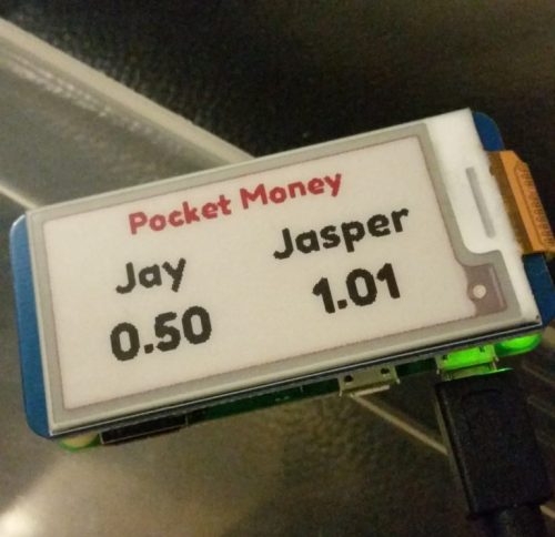
And if you buy yourself an E Ink HAT, you can even have a go at this Monzo-powered money tracker.

Raspberry Pi E Ink Monzo Display

Past predictions of Liz Upton

Back in 2013, our Director of Communication, Liz Upton, wrote a post about Max Ogden’s Kindleberry Pi build, commenting the following:

Here at the Foundation, we’re watching the development of e-ink products with great interest. At the moment it’s nigh-on impossible to buy an e-ink display as a consumer unless it comes bundled as part of an e-reader like a Kindle or a Nook; and that makes them very expensive. The technology has all kinds of potential for applications we want to see the Pi being used for: the low energy requirement makes an e-ink screen a perfect choice for places where you’re off the grid or reliant on solar power. We’re looking forward to seeing prices come down and displays becoming more easily available to consumers.

How lovely to be sat here in 2018, writing a post about the growing use of E Ink displays and the wide availability of the technology to hobbyists and digital makers! It shows how far the electronics industry for home builders has come, and we’re excited to see where it’s heading next.

The post Using E Ink displays with a Raspberry Pi appeared first on Raspberry Pi.

19 Jun 17:31

Road works vs the Dutch cyclist - a rural main route between village and city

by David Hembrow
Road works always risk placing cyclists at a dangerous disadvantage, which can result in people opting for another form of transport. To prevent this, cycle-routes must always be maintained, as can be seen in this video. There are many other examples of this principle being applied in many different situations.
19 Jun 17:31

Quick Notes – OpenRefine – Working With Databases

by Tony Hirst

It seems as if the latest version of OpenRefine – v. 3.0 – is out in beta ([repo]) and it looks at if some integration with databases is provided.

On the way in, you can connect to a database and import data from it into OpenRefine directly:

Looks interesting, though part of me wonders “why?”: if the data is in the database then presumably you’ve started to clean it anyway. One of the things I’ve realised working on some revisions for our TM351 data management and analysis course is that you can use table constraints as part of a data cleaning workflow to flag up errors in your data. It could be interesting to imagine how constraint violation errors might be used to support data cleaning activities in an application such as OpenRefine. (In a sense, you might think of applying facets to a column as the application of rules or constraints that can identify rows containing data that violates them.)

On the way out is the option to export a project as a SQL file. This includes defining column types:

and also configuring other aspects of the SQL export file, such as exporting table definitions, either with or without the data, and optionally including DROP and IF EXISTS statements:

Here’s an example of the sort of thing it can generate:

DROP TABLE IF EXISTS clipboard;
CREATE TABLE clipboard (
a INT NULL,
b VARCHAR(12) NULL,
c INT NULL
);
INSERT INTO clipboard (a,b,c) VALUES
( 1,'e',1 ),
( 2,'w',3 ),
( 2,'tg',56 )

Going back to the notion of constraints, if an exportable SQL table is defined with particular column types, it would be handy to be able to use the type definitions to check the data being exported. For example, having set the types, apply those types as exclusive facet rules on the relevant columns and then raise an alert and/or preview the violating rows if any rows are returned that break the type rules.

If such checking was possible, you could start to imagine round tripping on the data, loading in a table definition and using it to check some aspects of a dataset loaded alongside it (such as data types, uniqueness etc.) Which reminds me, the SQL exporter doesn’t allow seem to support UNIQUE or PRIMARY KEY definitions?

19 Jun 17:30

Anchor Brings User-Friendly Podcasting to the iPad, Complete with Editing Tools

by Ryan Christoffel

If you've ever used Anchor to make a podcast, you know just how easy it is. That ease of use, however, has historically meant sacrificing any access to editing tools that most podcasters need. Today that changes, however, as Anchor is introducing basic editing tools as part of the debut of its iPad app.

Anchor for iPad resembles its iPhone counterpart in most ways: the basic recording workflows and tools are all available here, so existing Anchor users won't have any trouble navigating the app. One major change is that the iPad version loses access to the full database of Anchor podcasts for listening. While I'd prefer the iPad app retain full functionality from the iPhone, the message behind this move is clear: the iPad app is all about content creation, not consumption.

This different focus between iPad and iPhone versions extends to the fact that the new editing tools are currently iPad-exclusive. Anchor says it may expand them in the future to its web and iPhone apps, but for now at least, if you want to edit your Anchor show without needing an external app, you'll need an iPad on hand.

Anchor's editing tools are extremely simple, which is fitting for an app that prides itself on simplicity. When assembling an episode, you can tap the '...' icon next to each clip to see two editing options: the first enables trimming the clip to the exact start and end time you prefer, while the second lets you split recordings at several points into multiple clips. The interface for these features is intuitive and user-friendly, with clearly labeled buttons and a nice pinch to zoom feature for making the most minute changes possible. There's not much more that needs saying about these tools, except that they should lead to higher quality podcasts, while drastically reducing the number of times Anchor users need to re-record something.

Anchor for iPad arrives with all the bells and whistles that iPad professionals expect from quality apps: support for Split View, drag and drop, and all sizes of iPad Pro, along with great UI layout in both landscape and portrait orientations.

Drag and drop can be used to easily drop in recordings stored in places like the Files app, making for convenient import of audio you recorded in another app. You can also use drag and drop as a quick way to add recordings from your Anchor library to just the right spot in an episode you're working on. Finally, it's put to use inside the episode builder for quick clip rearrangement. All of these touch-powered options make podcast creation feel more intuitive and accessible than ever for a novice like myself.

The iPad app does a great job adapting to your current screen setup, providing easy access to all necessary tools even in cramped conditions. Even in 50/50 Split View on the 12.9-inch iPad Pro, you're able to access all panels from the full screen app and work with no compromises. The only situation Anchor doesn't work well is as the smaller app in a 70/30 split – you can't access the episode builder or your profile unless Anchor's given more screen real estate.


Podcasting from the iPad has always been difficult due to various system limitations, and despite years of major new iOS updates, there haven't been any meaningful improvements on that front. What Anchor has built feels like the way iPad podcasting is meant to be done – no fuss, no frills, just an easy to use tool that gives you just enough power to make a great podcast. Anchor's iPhone app was already a solid way to record and publish shows, but the iPad feels like a much more fitting work environment for when you want to take the time to create something special.

Anchor is available as a free download on the App Store.


Support MacStories Directly

Club MacStories offers exclusive access to extra MacStories content, delivered every week; it's also a way to support us directly.

Club MacStories will help you discover the best apps for your devices and get the most out of your iPhone, iPad, and Mac. Plus, it's made in Italy.

Join Now
19 Jun 17:30

Media teams gain increased flexibility through Dropbox partnerships

by Victoria Yuan/George Baier IV
Illustration for post on Dropbox adoption by media teams
Illustration by Justin Tran

Media and entertainment companies have unique needs when it comes to collaboration. They work in teams that span the globe. They work with tools that span a spectrum of uses. And every day, those teams are under pressure to create more content in less time, across an array of consumer platforms. As a result, they’re producing an unprecedented volume of data, including high-res file types with larger and larger file sizes. The challenge becomes—where do you put all that data and how can teams access, review, revise, and share it quickly and securely?

Enter Dropbox. Over the past few years, we’ve evolved from a place to store your files to a place where collaboration gets easier. Now, we don’t just keep files in sync, we keep teams in sync, too. And we want to provide them with one unified home for content and the collaboration around it.

More than a billion files created and saved in 2017

Over the past year, we’ve made major strides toward that goal. In the media and entertainment industry, we’ve seen strong adoption of Dropbox tools. In fact, users created and saved more than a billion files in Dropbox last year. To build on that momentum, we’re excited to announce the launch of expanded partnerships with Canva, Final Draft, Frame.io, Getty Images, Shift.io, Marvel, and Widen. Today, we’re going to reveal some of the factors driving this growth in the media and entertainment industry.

Expanding partnerships for added flexibility

More than 75% of Dropbox Business teams already link to partner applications. We saw over 100% year-over-year increase in third-party, user-linked app adoption among teams within the media and entertainment vertical. Now, we’re expanding key partnerships to give those teams even more freedom to use the tools and platforms they prefer.

Canva’s upcoming integration with Dropbox will make it even more possible to design anything, bring ideas to life, and publish anywhere.

  • Add content and images to Canva directly from Dropbox
  • Distribute edited content cloud-to-cloud, from Canva to Dropbox

“Designers and creatives want to focus their efforts on pushing the limits of their imagination, not losing time looking for content and the tools to support it,” said Cameron Adams, cofounder and CPO at Canva. “Our integration with Dropbox, one of our most strategic partners, enables our joint customers to collaborate and bring ideas to life, so they can design anything and publish anywhere, wherever and whenever inspiration may strike.”

Final Draft is the industry-standard screenwriting tool used by 95% of entertainment professionals—and Dropbox enables teams and screenwriters to move content forward.

  • Save scripts directly to Dropbox from the Final Draft iOS app (iPhone and iPad)

“More and more teams, screenwriters, and content creators leverage Final Draft and Dropbox to help move projects forward with confidence and ease,” said Scott McMenamin, President of Final Draft. “Our companies are committed to connecting content with collaboration, throughout the production process as it goes from concept to screen.”

Frame.io and Dropbox allow video teams to maintain their rhythm and work seamlessly together.

  • With one click, publish content from Frame.io to Dropbox

“Video teams are more distributed than ever before. Tools like Frame.io and Dropbox allow these teams to maintain their rhythm and work seamlessly together, from anywhere. Dropbox has always been an essential part of any video creators toolkit which why we wanted to ensure our tools work seamlessly together.” – Emery Wells, Founder & CEO of Frame.io

Getty Images and iStock integrate with Dropbox to connect image workflows, letting teams spend less time managing content and more time creating outstanding work.

  • Seamlessly move images and videos purchased on Getty Images and iStock directly to Dropbox

“At Getty Images we are constantly striving to find ways to save our customers time and deliver a frictionless workflow experience when working with our premium content,” said Jason Fischel, Vice President of Products, Getty Images. “Our partnership with Dropbox allows our customers to seamlessly move images and videos purchased on Getty Images and iStock directly to their Dropbox, giving them the freedom to concentrate less on content management and more on creating amazing campaigns.”

SHIFT’s integration with Dropbox saves time by enabling seamless content transfer between platforms, enabling professionals to work with greater speed, security, and freedom.

  • Add content to SHIFT directly from Dropbox, and distribute approved files from SHIFT to Dropbox
  • Monitor updates on new content saved to Dropbox via SHIFT’s Feed, which enables teams to stay on top of workflows and content from a single interface

“Our integration with Dropbox is an important step in helping content creators everywhere work together more seamlessly. As Dropbox and SHIFT products are often used side-by-side, we are now removing time-consuming steps that are usually required when moving content between systems,” says Kai Pradel, CEO of SHIFT. “Users of our new SHIFT platform can easily import and export content, using our Feed to be notified when new files are available. It’s a win for us, a win for Dropbox, and most importantly—a win for our customers.”

Marvel’s integration with Dropbox and Dropbox Paper accelerates workflows for the design community.

  • Add design content to Marvel projects directly from Dropbox, with content syncing automatically between both platforms
  • Embed fully interactive Marvel prototypes into Dropbox Paper documents

“Marvel is focused on providing a flawless prototyping experience for the design community and our integration with Dropbox brings Marvel closer to one of the most widely-used collaboration surfaces, giving our joint customers even more expanded capabilities to move projects forward with less friction,” said Murat Mutlu, CEO Marvel.

Widen’s integration with Dropbox connects content with a trusted digital asset management (DAM) platform, better supporting creative collaboration, photoshoots, events, social curation, and more.

  • Add content to Widen directly from Dropbox, either manually or automatically
  • Distribute content from Widen to Dropbox, from any location or remote environment

“As teams continue to create more and more content, footage, and video assets, we’re focused on providing them with a secure digital asset management experience that works with tools they know and love,” said Jake Athey, VP Marketing at Widen. “Our integration with Dropbox brings our best-of-breed solution closer to one of the most ubiquitous collaboration platforms used by media and entertainment industry professionals, giving them greater flexibility to do more, in less time, and more securely.”

These new partners also complement our current integration portfolio:

Vimeo: Teams and users can upload any video stored in a Dropbox account on the Vimeo upload page. The integration enables automatic uploads, saving time by bringing multiple video files from Dropbox to Vimeo. Dropbox Paper can also automatically embed video content from Vimeo.

Tools that work together the way you do

As the industry continues to evolve, media and entertainment teams face new challenges, especially with the growing need to manage complex projects on a global scale. To solve these broad challenges, Dropbox has released several new products and features over the past year. Built on core product capabilities, such as best-in-class file sync/share, previews, and unlimited file size uploads, tools like Dropbox Paper, Dropbox Smart Sync, Dropbox Showcase, and Team Folders all contribute to our platform’s ease of use.

Dropbox Paper is a collaborative workspace that lets your team write, edit, brainstorm, review designs, manage tasks, or run meetings, in one shared doc. Paper makes it easier for staff, freelancers, and agencies to coordinate projects while seamlessly embedding shared documents and rich media.

Animated screenshot of Dropbox Paper

Dropbox Smart Sync lets you see and access every file in your account—and every folder that’s been shared with you—right from your desktop, without taking up all your hard drive space. Smart Sync streamlines the way you manage your Dropbox content by enabling you to sync only what you need, when you need it.


Animated screenshot of Dropbox Smart Sync


Dropbox Showcase lets you easily share your work with partners and clients, track progress, and keep tabs on who’s seen what—all in one place. Plus, recipients don’t need to download your content to view it. High-definition 1080p videos play beautifully right within the page.
Animated screenshot of Dropbox Showcase

Team Folders let you automatically assign access to the specific content your team needs to do their job. You’ll also have the flexibility of inviting team members—and non-members—to specific sub-folders with granular sharing controls.

Coordinating projects throughout the content lifecycle

Content typically goes through three stages: creation, feedback, and distribution. For teams and users in media and entertainment, this occurs at tremendous scale. Last year, teams in those industries collectively created and saved more than a billion files with Dropbox. Media and entertainment teams use Dropbox to collaborate on a wide range of file formats—including JPG, PSD, MP4, and MOV. At this scale, we have a tremendous opportunity to help the broader media and entertainment industry at large.

These customers tell us they use Dropbox Business as the foundation for their internal and external collaboration networks and the content around it. Every day, they rely on Dropbox as their unified home for content creation, feedback, and distribution.

These customers make up a composite population of publishing, production, and creative sub-industry teams. We’re constantly listening to customer feedback. In some cases, it directly inspires new Dropbox capabilities. When a global broadcasting company mentioned their need for MXF previews, for example, Dropbox was able to respond to the request by adding that file type to the Dropbox file system.

Bringing together your team’s favorite tools

For publishing, production, and creative teams, collaboration should be easier. There’s more data than ever, but too often, it’s trapped in silos, and spread across teams, tools, and devices. Photographers and videographers create such a massive amount of content on a single shoot, it can feel like a full-time job to find the footage you need, when you need it. That’s just one of the time-consuming tasks that make work feel like a grind. That’s what we call “work about work.”

We’re not just talking about the time it takes to search through emails and folders full of files. We’re talking about the time it takes to toggle between apps. People use a wide range of them because it’s too limiting to get locked into one ecosystem. We believe the best way to work together is by bridging those content silos. So we developed an open, connective platform that lets you keep using the tools you love without the hassle of logging in and out of every app.

Stay tuned. Next week in part two, we’ll look at specific use-cases from media and entertainment customers, including Dow Jones, Westchester Publishing Services, Lonely Planet, Sid Lee, and Superdigital. We’ll show how they’re using Dropbox tools to make creation, collaboration, and project coordination easier for their teams.

To learn tips on powering collaboration on your team, download our eBook, Flow Together.

Flow Together banner for Dropbox Business

19 Jun 17:29

SkyHive, a Canadian Technology Company Leads the Way on the Future of Work

files/images/coming-soon-old-wqhd.jpg

Cision, Jun 22, 2018


Icon

Here's the press release, with pointless adjectives and grandiose claimes edited out by me: "SkyHive appl(ies) a skills-based, as opposed to job-based, match of work opportunities.(It uses) machine learning to extrapolate the technical and soft skills possessed by job seekers, as well as the hiring needs of employers.” This is something I've been talking about for some time. If you're matched directly from competencies to jobs, why would you need badges or credentials? That said, a colleague reports that there's a lot of time-consuming profile-filling that leads only to bad results. So, maybe, not quite ready. Related: videos  SkyHive for Job Seekers and SkyHive for Employers; white paper SkyHive Overview.pdf (I keep wanting to call it SkyDive, as it reminds me of the What Color is your Parachute series).

Web: [Direct Link] [This Post]
19 Jun 17:29

Google Photos’ newest feature will automatically group together similar images

by Igor Bonifacic
Google Photos

Google is rolling out a new organization feature to its popular Photos app.

Google Photos will now recognize when users take multiple snapshots of the same subject within a short span of time. It will group those photos together, highlighting the best one in the process.

The feature was first spotted by an Android Police reader.

Similar to when users take portrait or burst mode photos, Photos will present a group of similar images as a single photo within its overview window.

Tapping the lead photo allows users to see all of the photos in the entire series. From here, the user can decide whether to save only the best photo from the series or to pick a new highlight photo.

While it seems Photos may not always pick the best photo from a series, the feature does help to declutter things.

Source: Android Police

The post Google Photos’ newest feature will automatically group together similar images appeared first on MobileSyrup.

19 Jun 17:29

Roku is reportedly building an app that combines all streaming services into one

by Brad Bennett

Streaming hardware manufacturer Roku is looking to launch a streaming service marketplace, according to a report.

Roku currently offers access to every popular streaming service in the form of apps, which the company calls channels.

According to the report from Variety, Roku is looking to group all of the streaming services together in something it calls ‘Marketplace.’

Marketplace seems to be a gathering point for all of the content from a user’s streaming services. There’s a lot of promise in this approach. Amazon has been offering something similar for years (Amazon Channels) and it’s estimated that it sells more than 50 percent of all online HBO subscriptions.

This could be a huge play for Roku, since this is something that a lot of other set-top boxes struggle with. Being able to offer all of Netflix’s and CraveTV’s content inside its own app, Roku would be able to advertise and make money on top of selling hardware.

Source: Variety

The post Roku is reportedly building an app that combines all streaming services into one appeared first on MobileSyrup.

19 Jun 17:29

It’s more expensive to subscribe to YouTube Music on iOS than Android

by Brad Bennett

Google recently launched its new music streaming service, YouTube Music in Canada. Unfortunately, for iPhone and iPad users, it costs more to subscribe on iOS to YouTube Music than it does on Android and other platforms.

A YouTube Music subscription costs $9.99 CAD per month everywhere except inside of the iOS app. Users that want to get YouTube Music on iOS, will either have to sign up online or pay $12.99 CAD instead.

The price difference is due to the fact that Apple takes a 30 percent cut on in-app subscriptions. This has been something that a lot of music streaming apps have had to deal with on iOS. Spotify, for instance, prompts its users to sign up online instead of paying the extra $3 when they hit the ‘Premium’ button on iOS.

The 30 percent fee has been critiqued in the past, especially since Apple offers its streaming service for $10 on iOS making it appear cheaper than the competition.

If you’re an iOS user and you want to get YouTube Music, sign up here instead.

Download YouTube Music on iOS and Android.

The post It’s more expensive to subscribe to YouTube Music on iOS than Android appeared first on MobileSyrup.

19 Jun 17:28

A dedicated Google Podcasts app is now available

by Dean Daley
Google Podcasts

Google has finally released a dedicated app for podcasts, simply dubbed “Google Podcasts.” It’s been possible to trace the development of Podcasts through the Google app. Google even gave the app a Material Design overhaul last week.

Now that it’s a standalone app, Podcasts leverages Google’s recommendation algorithm to suggest shows users may enjoy. The app syncs across multiple devices via Google Assistant, allowing users to start listening to an episode on their Android smartphone and continues listening with Google Home.

The Podcasts app is also integrated within Google Assistant, allowing users to search for podcasts simply by asking the digital assistant. This feature doesn’t seem to be working yet; Google Podcasts hasn’t officially launched yet.

Once the user starts listening to podcasts on the app — or if they’ve already used the podcast section within Google Podcasts — a “For you” section will appear, showing the user’s subscribed podcasts, incomplete episodes and a list of all of downloaded episodes.

Zach Renau-Wedeen, a Google product manager, says — via a Product Hunt post — that Google believes it can “double worldwide podcast listening over the next couple of years, primarily through seamless integration with the Google Assistant and AI-powered features starting with personalized recommendations.”

He continues to say that the app will be available globally, support 47 languages and include more than two million podcasts. There’s currently not an iOS version of the app yet.

Overall, the Google Podcasts app looks similar to the Google Podcast section within the Google app and anyone familiar with that should be at home with the Google Podcasts app.

To download Google Podcasts on Android, visit the Google Play Store.

Source: Product Hunt

The post A dedicated Google Podcasts app is now available appeared first on MobileSyrup.