Shared posts

29 Jun 15:02

What is the business value of Clojure?

by Eric Normand

Is there some reason a business would choose Clojure over other languages? Let’s find out!

Transcript

Eric Normand: What is the business value of Clojure? Hello, my name is Eric Normand. These are my thoughts on functional programming.

I was watching a talk by David Nolen the other day. David Nolen is the maintainer of ClojureScript. He’s done quite a lot in the Clojure community.

In the talk, it was to beginner programmers about starting their careers. At the end, he mentioned that he thinks that for a business, the choice of programming language is mostly a hiring decision. The programming language is not going to change the business’s success. It’s mostly about hiring.

I’ve been wrestling with that because I’ve been trying to figure out what the business value of Clojure is. I thought that maybe it has to do with the reduction of risk because Clojure lets you quickly experiment, quickly develop solutions so you can quickly evaluate whether a solution is going to work for you. You’re mitigating the risk that way because you have such a small investment.

I’ve been taking to his idea more and more because I want to explore that more deeply. When you choose a programming language unless it is something super specialized that gives you a huge advantage in the area you’re in. If you choose Ruby and Rails for your architecture because you’re doing quick one-off Web apps, that might give you enough advantage to warrant you choosing that just for the business value.

What he was saying was in the long term what matters is the processes, thinking, the architecture of your system, and how well you program it. I have to agree with that.

Does that leave any room for Clojure?

Language choice is a hiring decision

If language choice is a hiring decision, why wouldn’t you just go with Java, JavaScript, or Ruby? Some of the most popular languages out there. Then you’d have more hiring options.

Eric Normand profile image
Eric Normand
@ericnormand
twitter logo

If choice of programming language is a hiring decision, why wouldn't you just go with Java, JavaScript, or Ruby? Some of the most popular languages out there. Then you'd have more hiring options. Why choose Clojure?

ed.gr/vwq3

Mon Oct 29 19:02:20 +0000 2018
Twitter reply actionTwitter retweet action2Twitter like action1

When you choose a more obscure language like Clojure, you’re choosing who you can hire, or who you will be hiring. You’re choosing a hiring pool. The advantage of Clojure is that you will be hiring Clojurists and tapping into that community.

Eric Normand profile image
Eric Normand
@ericnormand
twitter logo

When you choose a more obscure language like Clojure, you're choosing your hiring pool. The advantage of Clojure is that you will be hiring Clojurists and tapping into that community. Clojurists are different from Javaists on average.

ed.gr/vwq4

Sun Jul 29 15:00:16 +0000 2018
Twitter reply actionTwitter retweet action6Twitter like action15

To me, it makes a lot of sense. Clojurists are different from Javaists on average. That’s all you can do when you’re looking at programmers as an aggregate. You have to average them out.

Here’s the thing about hiring and getting hired. That ultimately, it’s a numbers game, but you only need to hire one person for your position. You only need one job. Ultimately, at the end, it doesn’t matter how many candidates there are or how many jobs there are that you could get because you only need the one.

Eric Normand profile image
Eric Normand
@ericnormand
twitter logo

Here's the thing about hiring and getting hired. Ultimately, it's a numbers game, but you only need to hire one person for your position. You only need one job. In the end, it doesn't matter how many candidates or jobs there are. You only need one.

ed.gr/vwq7

Sat Sep 29 15:02:39 +0000 2018
Twitter reply actionTwitter retweet action1Twitter like action2

If you want to play it as a numbers game like, “I’m going to use Java in my company because I can always find Java programmers,” you’d have to imagine the programmer you’re going to get. There are a lot of Java programmers. Just by the fact that Java is taught at a lot of universities, it might be that programmer’s only real language, only language that they’ve worked in before.

You have to think that is going to affect the quality of the candidate. A candidate who knows several languages, has been part of different communities, and understands things from different angles is going to be a better programmer.

Typically, that’s what you get with a more obscure language like Clojure. This used to be the case for a language like Python. People used to talk about how Python was a good language to hire for.

Knowing Python meant that you were a little bit more curious. You were more willing to learn a new language because you probably didn’t have it at your job. You weren’t paid to do it. You were the programmer who would go out of their way, probably, in their spare time to learn a new language. Probably, that’s the case right now with Clojure.

The applicant should learn Clojure for developer happiness and the job pool

I do want to talk a little bit about what are the benefits of learning Clojure for the job applicant. David Nolen mentioned this, that on the programmer’s side, the real reason to choose one language over another is developer happiness. There’s also job pool. That’s an important consideration.

Eric Normand profile image
Eric Normand
@ericnormand
twitter logo

A final reason to choose one language over another is to buy into a community. You're choosing your peers. Companies should choose the language to pick who they hire, a programmer should pick a language based on who they want to work with.

ed.gr/vwsm

Tue Jul 10 15:01:11 +0000 2018
Twitter reply actionTwitter retweet action7Twitter like action19

Developer happiness is also a real factor. If you’re happy in one language and not another, you should take that into serious consideration when choosing a language. It could make a real difference.

Developer happiness, as far as Clojure is concerned, I think that there are two main reasons that Clojure can increase developer happiness. One is that Clojure has very fast feedback. The other is that Clojure doesn’t get in your way.

Eric Normand profile image
Eric Normand
@ericnormand
twitter logo

There are 2 main reasons that Clojure can increase developer happiness. One is that Clojure has very fast feedback. You can get into flow easily. Two is that Clojure has very little abstraction for abstraction's sake. There's very little ceremony.

ed.gr/vwrm

Fri Oct 05 19:03:42 +0000 2018
Twitter reply actionTwitter retweet action17Twitter like action31

Fast feedback

I believe that Clojure is the language that has the best support for REPL driven development, for interactive programming, for live programming.

These are all different ways of saying the same thing. In Clojure, you will write code and you can see whether it works immediately. This is something that you get in most fields of making, of invention.

You are doing some woodworking, you pick up a tool, and you start carving your block of wood. You can see is this tool going to get me where I want to go. You can tell pretty quickly that you’re on the right path.

You can then get into a nice flow because you are confident that you’re moving in the right direction. You can get into a rhythm of working.

One thing that happens a lot in programming is we have to write a lot of code before we see anything work, before we see anything happen. Then we have to go back and figure out why it didn’t work. If that cycle is too long, there’s a lot of stress involved. It’s distressing to work and not see the results of your actions.

Eric Normand profile image
Eric Normand
@ericnormand
twitter logo

One thing that happens a lot in programming is we have to write a lot of code before we see anything happen. Then we have to go back and figure out why it didn't work. If that cycle is too long, it's stressful.

ed.gr/vwr6

Sat Oct 27 15:02:53 +0000 2018
Twitter reply actionTwitter retweet action1Twitter like action9

That’s fast feedback. I think that can help developer happiness.

Out of your way

The other thing is the amount of BS work that you have to do. What I mean by that is a lot of languages have you create abstractions just for abstractions sake.

The abstractions don’t help you with what you’re trying to achieve. I’m going to call out some languages like Java — where it might not be the language itself — but the community, certainly, is very much into abstractions that don’t help so-called design patterns and things like that. It’s not that the design patterns themselves are wrong. They’re overused and over-valued for what they give you.

By going with Clojure, you’re choosing a language that makes lean abstractions, just the right kinds of abstractions, and amount of abstractions easy. That’s what you’re buying into for developer happiness. Just getting rid of all the boilerplate and bureaucracy of the language.

That’s the developer happiness side.

Community

Then there’s also this other side of buying into a community. You’re choosing your peers. Because companies should choose the language to pick who they hire, a programmer should pick a language based on who they want to work with, who they want to communicate with, what conferences they want to attend. That’s the community aspect.

If you want to learn what Clojure people talk about, if you want to be involved in that community, and be around people who are thinking about the things that Clojure programmers think about — you can tell what that is by the conference talks, the blog posts, the podcast, what people are working on, what they’re talking about. That’s another reason to choose the language.

There you have it. You’ve got both sides. You’ve got the hiring side and you’ve got the being hired side. Why choose any particular language? I just happened to use Clojure as the example there.

All right. My name is Eric Normand. Please subscribe if you enjoyed this. Please tell your friends. Share it, like it. I appreciate you being here. Thank you so much.

The post What is the business value of Clojure? appeared first on LispCast.

29 Jun 15:02

Five-word movie review: “Incredibles 2”

by sheppy

Awesome! Totally worth the wait.

29 Jun 15:02

George Oates: Making and Remaking Collections Online

by George Oates

Excited to let you know that the work I’ve done at G,F&S has made its way into academia.

Abstract

George Oates is a web designer, producer and developer who has been working with digital collections since 2003. She was one the founding team of Flickr, and the originator of Flickr Commons. She currently heads heritage design studio Good, Form & Spectacle, working with institutions including the British Museum, the Wellcome Library and the V&A. In this interview with Mitchell Whitelaw, Oates discusses her developing practice in making and remaking digital collections, spanning web-scale services, unsolicited interfaces, messy metadata and gentle interventions in institutional practice.

Oates, G. & Whitelaw, M., (2018). George Oates: Making and Remaking Collections Online. Open Library of Humanities. 4(1), p.32. DOI: http://doi.org/10.16995/olh.325

29 Jun 15:02

YouTube for Android Offers Picture-in-Picture For Free in The US

by Rajesh Pandey
YouTube subscribers in the United States can now enjoy Picture-in-Picture mode in the YouTube app for Android on their Android device running Oreo or higher. Continue reading →
29 Jun 15:02

So, this is Gutenberg

by Tris Hussey
I used to be right there testing beta versions of WordPress. Even on this, my live, production site. I’ve been out of that habit for a while, but I keep hearing about Gutenberg and how it’s going to be the next editor. And it’s really different. Thanks to Morten I’m trying it out. His video […]
29 Jun 15:02

Why People Make Bad Charts (and What to Do When it Happens)

by Nathan Yau

It's important to consider the reasons so that we don't overreact. Otherwise, we're just berating, pointing, and laughing all of the time, and that's not good for anyone. Read More

28 Jun 05:19

Twitter Favorites: [shawnmicallef] Toronto is such a hodgepodge of different kinds of bike stuff, nobody knows@l what to do. A product of ignoring a u… https://t.co/kGcCPjpryJ

Shawn Micallef @shawnmicallef
Toronto is such a hodgepodge of different kinds of bike stuff, nobody knows@l what to do. A product of ignoring a u… twitter.com/i/web/status/1…
28 Jun 05:18

Protecting Your Privacy in Firefox Pre-Release

by Dave Camp

As a matter of principle, we’ve built Firefox to work without collecting information about the people who use it and their browsing habits. Operating in this way is the right thing to do, but it makes it hard to infer what Firefox users do and want so that we can make improvements to the browser and its features. We need this information to compete effectively, but we have to do it in a way that respects our users’ privacy. That is why experimentation in our pre-release channels like Nightly, Beta and Developer Edition is so critical.

Release only gives us partial insight; pre-release helps with the bigger picture.

One outcome of the unified telemetry project that we finished last September was to streamline data collection as it takes place in the different channels of Firefox. As part of that project, we created four categories of data: Category 1 “technical data”, Category 2 “interaction data”, Category 3 “web activity data”, and Category 4 “highly sensitive data” which includes information that can identify a person. These categories apply to all Firefox data collection including telemetry (data that Firefox sends Mozilla by default) and Shield Studies (a Mozilla program to test rough features and ideas on small numbers of Firefox users).

The release channel of Firefox that hundreds of millions of people use sends us Category 1 and 2 technical and interaction data by default. The latter is especially useful so that we can understand how people interact with menus, prompts, features, and core browser functions. Because this telemetry data is limited, it is not enough to make fully informed decisions about product changes.

This is why we rely on our pre-release channels to collect, when necessary, additional Category 3 web activity data or run studies on particular features with unique privacy properties.  Gathering this information is critical so that we can understand the real-world impact of new ideas and technologies on a limited audience before deploying to all Firefox users.

Even when we collect or share data in pre-release, privacy comes first.

Any new Firefox data collection must go through a rigorous process. The lean data practices that we follow mean that we minimize collection, secure data, limit data sharing, clearly explain what we’re doing, and provide user controls. For example, Shield Studies are controlled weekly Firefox studies that answer specific questions using the minimum amount of data needed on the smallest relevant sample size. Every study is reviewed and signed off by a data scientist, a QA engineer, and a Firefox Peer. The majority of studies stay within Category 1 and Category 2 data; for anything sensitive, even in pre-release, additional sign-off by our Legal and Trust teams are required.

We don’t compromise our principles when we work with partners. Privacy and security threats on the web are evolving and so are we to protect our users. This includes partnering with others to provide expertise that we don’t have. We require partners who works with us to uphold the same privacy and accountability standards we’ve set for ourselves.

What’s next?

The Firefox Privacy Notice has always said that pre-release has different privacy characteristics, but we are going to update this to clarify what that means. We’ll do the same on the landing pages for pre-release, because anyone who is uncomfortable with additional data collection or sharing should instead download the release version of Firefox.

We are deeply grateful to our community of pre-release users who put up with unstable builds, report issues, and contribute much needed data. Ultimately, it is the insights from our most passionate users and advocates in pre-release that allow us to offer a better product to all users, with less data collection in the long run.

28 Jun 05:18

Canadian-built electric bus first to pass new model test in the U.S.

by Brad Bennett
Nova bus

Quebec-based bus manufacturer Nova Bus has built an all-electric bus that’s passed the U.S. Federal Transit Administration’s (FTA) new model bus test.

Busses in the U.S. are required to pass the FTA’s test to be able to legally operate on the country’s streets. The bus is an LFSe model, which means that it’s all electric, making it the first electric bus to pass this test. The vehicle scored an 80 percent in its  run through the test.

Over the course of the test the bus drove 24,000 kilometres in a record time of 195 days. The bus also broke another record by driving 1,800 kilometres in a single week.

Both of these records have shattered people’s expectations of what an electric vehicle is capable of doing.

The bus charges using OppCharge technology, which is a standard form of charging for large electric vehicles like busses.

Nova Bus has been using the LFSe model of busses in Montreal and now that it passed the FTA test its can start selling its electric busses in the American market.

Source: Nova Bus

The post Canadian-built electric bus first to pass new model test in the U.S. appeared first on MobileSyrup.

28 Jun 05:17

Samsung’s new camera tech may improve low-light performance on phones

by Jonathan Lamont
samsung

Samsung’s new camera technology enables better low-light performance and higher resolution cameras. Called ISOCELL Plus, the technology improves on Samsung’s 2013 ISOCELL technology.

ISOCELL solved a problem with cellphone camera sensors. ISOCELL uses a metal grid to form barriers between individual pixels. This stops colour crosstalk —  a phenomenon where light entering pixels caused an undesired effect in another pixel.

The issue started to appear as manufacturers squeezed cellphone cameras into smaller and smaller spaces. Because pixels were so close together, light photons would cross over into adjacent pixels. Samsung’s ISOCELL places a metal barrier between pixels, preventing crosstalk.

However, ISOCELL has its own drawbacks. Metal can absorb and reflect light in different ways. This reflection and absorption results in optical degradation.

Optimized pixel isolation

Samsung’s new ISOCELL Plus technology utilizes a new material developed by Fujifilm to separate the pixels. The material helped optimize the isolation between individual pixels.

Thanks to the new material, Samsung was able to achieve 15 percent more light sensitivity and richer colours.

Additionally, the technology enables Samsung to make smaller pixels than the previous metal grid. According to Samsung, the technology allows for sensors wit 0.8 micrometre pixels without any performance loss. Furthermore, this will enable cameras with more than 20 megapixels.

This new technology could offer improvements over current cameras when it comes to lowlight. Right now, cellphone cameras struggle in lowlight because the sensors can’t absorb enough light. Until now, most solutions to get around this meant increasing the phones thickness by incorporating a larger sensor. Alternatively manufacturers could use a technique called pixel-binning to produce brighter images. However those images are low-resolution.

ISOCELL Plus could enable manufacturers to achieve better performance without sacrificing resolution or phone size.

Samsung is currently showing off the tech at Mobile World Congress Shanghai, which runs until June 29th.

The Korean technology giant hasn’t announced any phones with ISOCELL Plus sensors.

Source: Samsung Via: Android Police

The post Samsung’s new camera tech may improve low-light performance on phones appeared first on MobileSyrup.

28 Jun 05:17

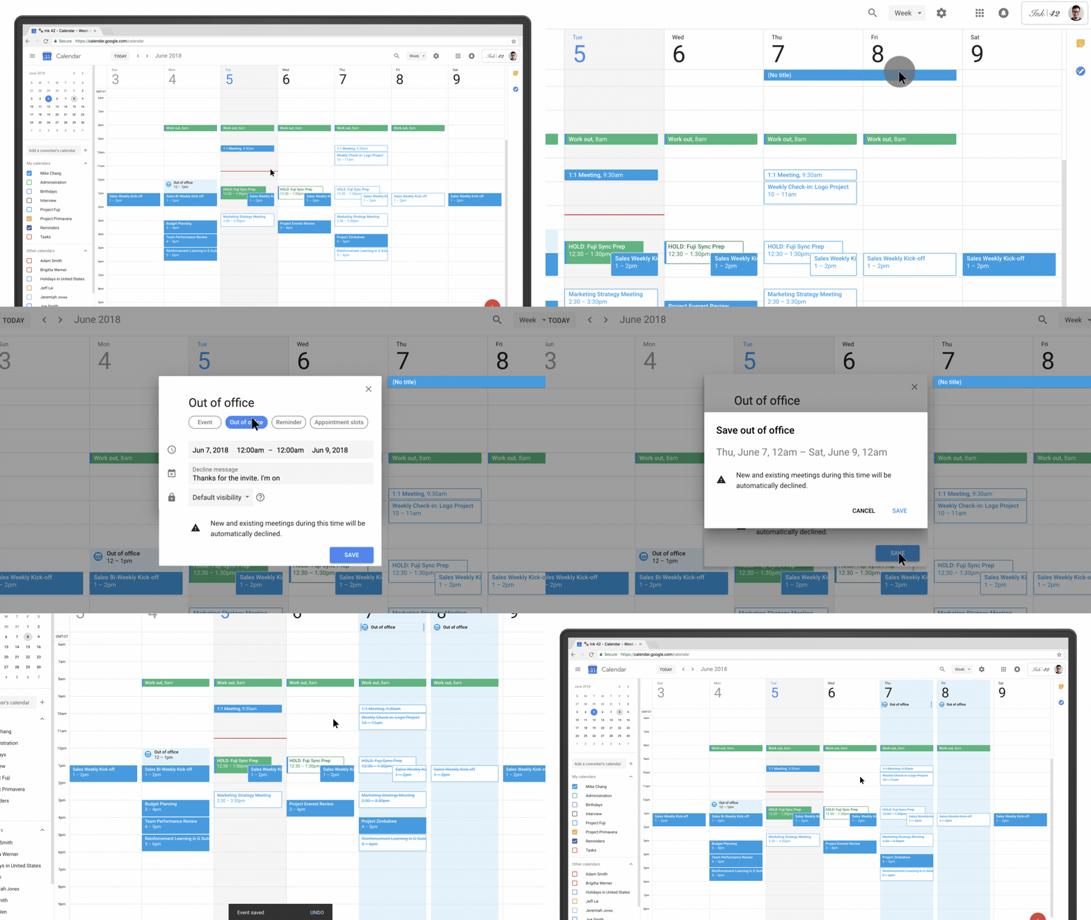
Google Calendar now has an ‘Out of Office’ feature

by Bradly Shankar
Google Calendar app on Android

Google has announced a new “Out of Office” feature for its Calendar service, allowing users to set customizable work hours which will let others know when they’re available.

Google Calendar is also able to automatically decline meetings on behalf of the user based on this availability. A specific decline message can be set.

Additionally, Google says Calendar will “try to intelligently detect” when an out of office object is created and change the type automatically, depending on the title entered. Users can opt out of this feature if they so choose.

Google Calendar GIF

Google is also looking to make it easier to customize work hours in Calendar. Previously, users could only set working hours to one interval for all days of the week, but now, they’ll be able to customize hours for individual days.

Further, Calendar will infer the user’s working hours based on past scheduling patterns.

The feature has begun rolling out and will be available to all users within the next few days.

Source: Google

The post Google Calendar now has an ‘Out of Office’ feature appeared first on MobileSyrup.

28 Jun 05:17

Williams Lake Indian Band looks to rebuild bike trails lost in last summer's wildfires

mkalus shared this story .

The devastation of last summer's wildfires still lingers in many areas of British Columbia, including the badly damaged bike trails left behind in Williams Lake. 

The Williams Lake Indian Band, which originally built many of the trails, is hoping to restore the bike paths because of the health and business benefits they bring to the area.

"[The fires] wiped out every single trail that we had built," said band councillor Willie Sellars.

"We take great pride in building those trails."

About 15 kilometres of biking trails were lost, including a cross-country mountain biking trail and a network of trails leading down into the Williams Lake Indian Band community and to main campsites in the area.

"We're talking about healthy living, protecting our heritage," Sellars told Shelley Joyce, the host of CBC's Daybreak Kamloops.

Last summer's wildfires spread aggressively in the province and, a year later, the effects continue to linger in many areas. (B.C. Wildfire Service)

But it's also a matter of business, Sellars said, as Williams Lake increasingly promotes itself as a mountain biking tourism destination.

"Trails are becoming pretty important and pretty big business within the city of Williams Lake," said Sellars. "It's what we are known for."

The band is working with the cycling club in Williams Lake and waiting for the area to be logged and the dead trees to be removed, which is expected to start July 1, before beginning to rebuild.

"We have to look at not only rebuilding but maybe making [the trails] better and just looking at how it's going to roll out with all that burnt land," Sellars said.

Daybreak Kamloops

Williams Lake Indian Band looks to rebuild bike trails lost in last summer's wildfires

Share Audio

Playback Status: ready
Assigned test group: None
Identifier: mediaId 1265579075555
Asset: Undetermined
Bitrate: Undetermined
Streaming URL:
Events Log:

The devastation of last summer's wildfires still lingers in many areas of British Columbia, including the badly damaged bike trails left behind in the Williams Lake. 6:03

With files from Daybreak Kamloops.

Read more from CBC British Columbia

28 Jun 05:16

Why recent updates to WeChat’s Subscription Account change everything

by WalktheChat
WeChat just modified the format of the “subscription folder”. Why is it game changing? What is the change? This change of the display of the subscription account messages transforms what used to be a list of accounts into a more “Facebook style” newsfeed. This is the biggest change made to WeChat Official Accounts since their launch in 2013. Let’s categorize ... Read More The post WeChat changed the Subscription Account folder: why does it change everything? appeared first on WalktheChat .
27 Jun 21:25

BlackBerry KEY2 Review: An upper mid-range smartphone with a flagship price

by Sameer Chhabra

It’s very easy for smartphone aficionados to turn up their noses at the mere thought of a BlackBerry-branded handset, but it’s hard not to be impressed by the sheer audacity associated with releasing a device with BlackBerry’s iconic logo in 2018.

Still, Chinese device manufacturer TCL has followed up its two BlackBerry-branded phones from 2017 with a device that feels like an amalgamation of all of the lessons learned from the BlackBerry KEYone and the BlackBerry Motion.

The KEY2 is sleek, minimalistic in its design, and features an improved keyboard over its predecessor. However, at a price of $829.99 outright — and about $100 on a two-year contract — the KEY2 faces stiff competition from devices that are better in almost every conceivable way.

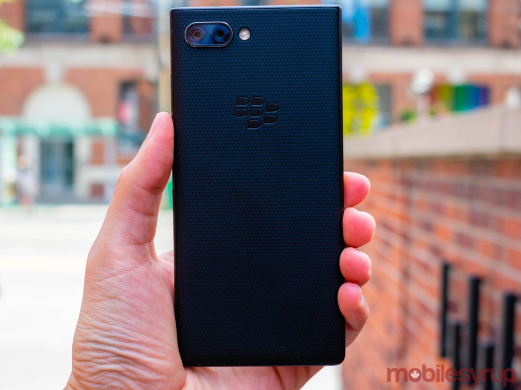
A design that screams BlackBerry, yet manages to be unique all over again

Far be it from me to criticize modern smartphones for their dull, often similar designs, but apart from the prospect of handsets with absolutely no bezels whatsoever — like the Vivo Nex — it’s safe to say that we’ve hit a standstill in terms of smartphone ingenuity.

Additionally, in spite of the millions of dollars that smartphone manufacturers have spent to try to convince the world’s population otherwise, screen cutouts and screen notches are very much a passing fad. Otherwise, there isn’t very much else being done to push the envelope in terms of actual physical smartphone design.

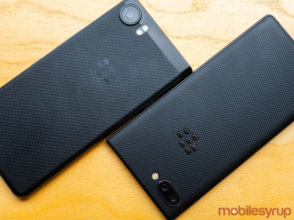
As a result, in an age of disappearing bezels and increasing device sizes, the fact that the BlackBerry KEY2 has a physical keyboard as well as a 4.5 multi-touch screen, is something of a design revelation. Of course there have been other smartphones that combined a touchscreen and a physical keyboard, and yes the Priv and the KEYone already did this in 2015 and 2017 respectively, but that still doesn’t take away from the fact that TCL’s decision to yet again release a BlackBerry-branded handset with a physical keyboard is a risky design move.

Thankfully, TCL’s improved its physical keyboard, with keys that are 20 percent larger than last year’s model that are also more responsive than those featured in the KEYone. Those larger keys translate into a taller device, but the KEY2 is still comfortable to use in one hand. Also improved on the KEY2 are the universal key shortcuts. Whereas the KEYone’s programmable keys were only accessible from the home screen, the KEY2 lets users hold the the new ‘Speed Key’ that replaces the right shift key and access the universal shortcuts from any application. The Speed Key is incredibly easy to set up and use, and serves as an interesting implementation of the KEY2’s physical keyboard.

On the subject of useability, TCL chose to move the KEY2’s power button to the right-hand side of the device, eliminating the KEYone’s most egregious design flaw. The KEY2’s power button now sits comfortably within thumb’s reach — for right-handed users — and is flanked by the volume rocker on top and the BlackBerry convenience key on the bottom. The KEY2’s power button placement is yet another welcome improvement on the KEYone’s design.

Additionally, as I mentioned in my hands-on, it’s a joy to type on the KEY2. While software keyboards have their benefits, very little compares to clicking actual physical keys.

Once you look past the hardware keyboard, the KEY2 begins to more closely resemble its predecessor, as well as other black rectangles available on the market today.

Returning to the KEY2 is the KEYone’s 4.5-inch IPS LCD 1080 x 1620 pixel display, with its 3:2 aspect ratio. The screen is bright and significantly vibrant, and is easily viewable under most lighting conditions. It should be mentioned that due to the screen’s aspect ratio, the KEY2 isn’t really designed for widescreen content viewing. Instead, the phone works best for web browsing, social media consumption in portrait and, of course, productivity tasks.

The issue of screen quality is the first mark against BlackBerry’s latest flagship smartphone and its flagship price. The KEY2 has a perfectly serviceable display for an upper mid-range smartphone, but the panel simply doesn’t compare to the IPS LCD screens on other flagship devices like the Essential Phone, the Huawei P20 or P20 Pro or the iPhone 8.

Also returning to the KEY2 is the standard 3.5mm headphone jack.

The same size battery as the KEYone with reduced life expectancy

While the KEYone wasn’t a perfect phone by any stretch of the imagination, it was defined by its astonishing battery life. The KEYone’s 3,500mAh battery could easily last for two days of usage, and while the rest of the phone may have had flaws, the battery certainly one of them.

Sadly, the same can’t be said for the KEY2’s 3,500mAh, which is able to provide a full day of extensive usage, but very little more than that.

What makes the KEY2’s battery consumption conundrum so confounding is that the upper mid-range Qualcomm Snapdragon 660 powering the 2018 flagship is a significant step up from the Snapdragon 625 in the KEYone, and is supposed to improve overall battery performance.

The KEY2’s battery life is only underwhelming when compared to the KEYone. As a standalone device compared to other smartphones on the market, however, the KEY2’s battery life is impressive.

Equally impressive is the KEY2’s overall performance. Thanks to that Snapdragon 660 processor and 6GB of RAM, the KEY2 is able to handle most tasks with ease. Even games like Oddworld: Stranger’s Wrath run smoothly at medium to medium-high settings, with minimal difficulty.

In spite of the KEY2’s speedy performance, this is the second mark against the latest BlackBerry-branded flagship. The Snapdragon 660 is a fine processor, but in terms of sheer processing prowess and feel, it lags behind the Snapdragon 835, the Snapdragon 845, the Kiri 970 in the Huawei P20 and P20 Pro and the Apple A11 Bionic found in the iPhone 8 and iPhone X.

The fact is that most users won’t notice a major difference, but the KEY2 is an undeniably slower smartphone compared to other flagship devices.

That being said, the KEY2’s physical keyboard and uncommon aspect ratio makes it difficult to truly enjoy playing games

A happy, secure marriage between BlackBerry and Android

Ever since BlackBerry-branded handsets began running Android with the Priv in 2015, the device have adhered to a strict marriage between near-stock Android filled with a number of BlackBerry security and productivity apps.

The KEY2 continues this tradition, running a variant of Android 8.1 Oreo that features some Google app duplicates, as well as a number of first-party BlackBerry apps.

Among those BlackBerry apps are BBM, the BlackBerry Hub, as well as the Productivity Tab. While I can’t think of anyone who still uses BBM as their primary messaging application, services like the Hub and Productivity Tab add a welcome layer of organization not seen outside of notification drawers.

The Productivity Tab is an optional feature that organizes a user’s calendar, messages, tasks and contacts into a single pane (accessible through a swipe from any app), while the BlackBerry Hub brings a user’s complete messaging and social media portfolio — including call logs — into a single, comprehensive space.

It’s worth noting that most BlackBerry apps are available for all Android users. The Hub, for example, is available on any compatible Android smartphone. However, KEY2 who don’t want to access BlackBerry’s suite of first-party apps won’t be able to delete them permanently — only disable them.

The KEY2 also comes with the Amazon Shopping app pre-installed, and this app can’t be permanently deleted either. While the Amazon Shopping app isn’t as egregious as some of the other pre-installed apps on certain other devices — the Xperia XZ2 and Facebook immediately come to mind — it’s disappointing to see that TCL has chosen to prevent users from deleting pre-installed apps.

Ironically enough, this refusal to provide users with power over certain pre-installed apps is at odds with the manner in which TCL has touted its latest BlackBerry-branded smartphone as a boon for privacy advocates.

Not only does the KEY2 come with an updated BlackBerry DTEK app, the phone also ships with the ‘Locker’ app that prevents access to files, photos and even other apps without additional authentication.

Also included with the KEY2 is Mozilla’s Firefox Focus browser. Focus is a browser built for users looking for an extra layer of privacy. The browser automatically blocks ads and tracking, while exclusively offering an Incognito Mode-like browsing experience for users. Just like Incognito Mode, Firefox Focus doesn’t stop internet service providers from getting a log of visited websites, but it’s an additional layer of general security regardless.

The truth is that my personal smartphone usage habits don’t require a layer of security beyond two-factor authentication, but the inclusion of the Locker app means that users who do care about hiding certain files or photos don’t need to download an untrustworthy third-party app. Instead, the Locker app on the KEY2 means that secret agents, political leaders and journalists have an encrypted storage locker pre-built on their devices.

Two cameras are better than one, but not by much

While the KEY2 resembles its 2017 predecessor in a number of ways, the device’s newest and most notable features are its two rear-facing cameras. Both cameras are 12-megapixel shooters, though one features an f/1.8 aperture while the other features an f/2.6 aperture.

Sadly, the KEY2’s dual rear-facing cameras don’t offer very much in the way of amazing photography. Yet again, the KEY2 offers a camera experience that improves on the KEYone’s lacklustre performance, but that is incomparable to other flagship smartphones on the market.

As such, camera quality is the third mark against the BlackBerry KEY2. Whereas flagships like the Galaxy S9/S9+, the iPhone 8 and iPhone X, the Huawei P20 Pro and the Google Pixel 2 are able to shoot truly stunning photographs, the KEY2’s own camera is worse than that of something like the Essential Phone — a flagship device with a camera that’s good, but certainly not great.

The KEY2 is also capable of 1080p video recording at 30 and 60 frames-per-second, 4K video recording at 24 and 30 frames-per-second and slow-motion video, though the device’s average camera performance means that users won’t really get the most out of each recording.

Canadian carrier pricing and availability

The TCL-manufactured BlackBerry KEY2 costs $829.99 outright and will be available on July 6th, 2018.

The device will cost $100 on a two-year Telus plan, $99 on a two-year Bell and SaskTel plan and $95 on a two-year Rogers plan.

The device will also be sold online at Amazon, Best Buy, Walmart, Staples, Blueshop and Visions.

The post BlackBerry KEY2 Review: An upper mid-range smartphone with a flagship price appeared first on MobileSyrup.

27 Jun 21:25

Why your document is a terrible mess

by Josh Bernoff

Here’s what went wrong. You started with a good idea. Then you showed it to someone. She told you it needed something more. So you added it. You sent it out for review. Your reviewers all suggested adding and changing things. They’re important and powerful people, so you did. The technical people insisted you include … Continued

The post Why your document is a terrible mess appeared first on without bullshit.

27 Jun 21:25

Warum?

by Volker Weber

Ich kratze mir so ein bisschen am Kopf.

  1. Google Pay geht mit Boon-Mastercard (Prepaid, virtuelle Karte), Comdirect-Visa, Commerzbank-Mastercard, Commerzbank-Visa und N26-Mastercard. Warum nicht mit denen von Sparkassen und Volksbanken ausgegebenen Kreditkarten? Oder denen der Deutschen Bank. Wollen die wirklich abwarten, ob Heerscharen von Kunden woanders ein Konto aufmachen?
  2. N26 kann in vielen Ländern Apple Pay. Sie könnten auch hier. Was verpennt Apple da?
27 Jun 21:25

Lessons Learned From a Consortium That Fizzled

files/images/chains.1.jpg

Mark Lieberman, Inside Higher Ed, Jul 16, 2018


This article describes what happened when four liberal arts colleges decided to form a consortium to offer EdX MOOCs together. Don't worry, it's nothing bad. But it's interesting to see how each institution found its own path forward. Davidson focused on "free, short courses driven by timely topics in the news, such as voter fraud and "engaging in a time of polarization." Colgate developed two MOOCs and "now sees them as one element in the institution's landscape of course modes." Wellesley secured Mellon Foundation grant for blended learning and developed an on-campus initiative. And Hamilton developed four MOOCs "but eventually opted not to pursue the medium further."

Web: [Direct Link] [This Post]
27 Jun 21:25

What Became of the Blogosphere?

by Ton Zijlstra
Dave Winer, one of, if not the, earliest bloggers asks what became of the blogosphere? It was a topic of the conversations in Trieste 2 weeks ago at State of the Net, where we both were on the program.

I get what he says about losing the center, and seeing that center as a corporation back then. This much in the way Tantek Celik talked about the silos first being friendly and made by the people we knew, but then got sold, which I wrote about yesterday. Creating a new center, or centers, is worthwile I concur with Dave, and if it can’t be a company at the center, then maybe it should be a network or an organisational manifestation thereof, such as a cooperative. An expression of networked agency.

Because of that I wonder about Dave’s last point “There used to be a communication network among bloggers, but that’s gone now.”

I asked (on Facebook), “What to you was that previous communications network, and what was it built on? What type of communications would you like to see re-emerge?” The answer is about being able to discover other bloggers, like Dave’s Weblogs.com platform used to do (and still does, but most updates are spam).

Blogs to me are distributed conversations. Look at the unbridled enthusiasm I expressed 11 years ago when I wrote about 5 years of blogging in this space, and the list of people I then regarded as my regular group of people I had blogged conversations with. It is currently harder to create those, and it has become harder for me to notice when something I write is reacted to as well. Much of the IndieWeb discussion is about at least being able to discover all online facets of someone from their own domain, and pulling responses to it back there too. Something I need to explore more how to do in a way that fits me.

In terms of communication and connecting, it would be great if I could explore the blogosphere much as in the picture below. Created by Anjo Anjewierden and presented at the AOIR conference in Chicago in 2005 by Lilia Efimova, it shows a representation of my blog network based on text analysis of my and other people’s blogs. It’s a pretty good picture of what my blog ‘neighbourhood’ looked like then.

Or this one also by Anjo Anjewierden from 2008, titled “the big one”. It shows conversations between my and other’s blogs. Grey boxes are conversations across blogs (the bigger the box, the more blogpostings), the other dots are postings that refer to such a conversation but aren’t part of it. Top-left a box is ‘opened up’ to show there are different postings (colored dots) inside it.

Makes me want to have a personal crawler that maps out connections between blogs! Are there any ‘personalised’ crawlers out there?

27 Jun 21:24

Apple Is Building a Media Platform Like Never Before

by Ryan Christoffel

Have you ever watched the construction of a new building while knowing nothing about what the finished product would be? You track its progress a piece at a time, clueless about the end goal until finally there comes a point when, in a single moment, suddenly it all makes sense.

Apple's media ambitions have been like that for me.

In recent years, Apple has taken a variety of actions in the media space that seemed mostly disconnected, but over time they've added up to something that can't be ignored.

  • 2015: Apple Music and Apple News launched.
  • 2016: Apple Music redesigned; TV app debuted.
  • 2017: App Store revamped with dedicated games section; Apple Podcasts redesigned; TV app adds sports and news.
  • 2018: Apple acquires Texture; iBooks redesigned and rebranded Apple Books.
  • 2019: Apple's video streaming service launches?

Apple already has control of the hardware that media is consumed on, with its ever-expanding iPhone business and suite of complementary products. It has invested significant effort into building the apps media is consumed in, as evidenced above. And finally, it's also building the paid services media is consumed through.

And the company is doing these things at a scale that is unprecedented. Once not long ago, Apple's primary media platform was iTunes. Now, hundreds of millions of users consume media every day through Apple's suite of spiritual successors to iTunes:

  • Apple Music
  • Apple TV (the app)
  • Apple Podcasts
  • Apple Books
  • Apple News
  • And the App Store

Apple has one unified goal, I believe, driving all its media efforts: it aspires to utilize hardware, software, and services to provide the entirety of a user's media experience. If you consume media, Apple wants to provide the full stack of that consumption, from media delivery to media discovery. My aim in this story is to share an overview of how that goal is being fulfilled today.

Media Delivery

With the lone exception of Apple Music,1 you need Apple's hardware before you can use its software and services. But it's a sure bet that if you own and love an iPhone, iPad, or Mac, you're going to use that Apple device to consume media.

If you're using Apple hardware to consume media, it makes sense to do so through a built-in app. The appeal of this may not be as strong if you have just one Apple device, but once you have several, it becomes so much simpler to stick with the apps that are already there. Both because it prevents needing to install third-party apps on multiple devices, and also because of the unified in-app experience Apple offers.

By sticking with Apple's media apps, you get a look and feel that's essentially uniform; no matter which app you're using at any given moment, you'll feel at home. Every Apple media app follows the latest stock iOS design trends and they all carry similar navigation options: TV's Watch Now is akin to Podcasts' Listen Now and Books' Reading Now; News and the App Store's Today tabs provide editorially-curated stories; also, Library and Search screens are ubiquitous across nearly all media apps.

These common ties aren't iOS-only, either. The more you buy in to the Apple ecosystem, the more you benefit.

  • The Music, Podcasts, and News apps on watchOS are more capable than anything the Watch's App Store offers, because Apple's teams have access to APIs that don't exist for third-party developers.
  • The one way to enjoy Apple's TV app on the big screen is with an Apple TV device.
  • Only Apple's own audio products – Music and Podcasts – are natively built in to the HomePod; those two apps were also, unsurprisingly, AirPlay 2-ready when iOS 11.4 launched earlier this year.

If you use Apple apps, you can rest assured they'll get priority integration with the rest of the Apple ecosystem, enabling watch, phone, tablet, and TV to all offer a unified experience.

Once a user relies on Apple's hardware and software, paid services are the natural third step. Not only are the services baked right in to existing apps, but they also receive – to no one's surprise – special ecosystem privileges.

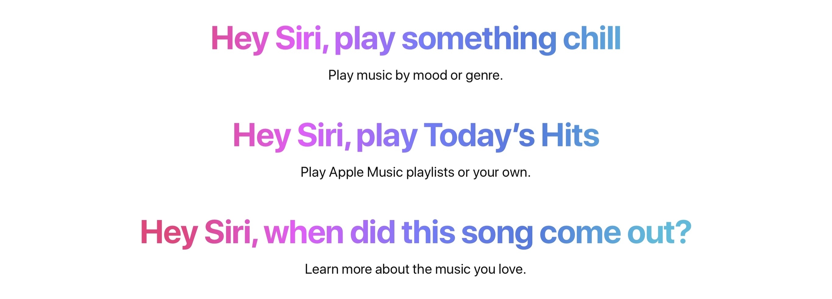
Only Apple Music gets to natively integrate with Siri for hands-free control, and that's a big advantage – even when it's limited to a single context, such as the iPhone; throw in the HomePod, music control while driving, and AirPods integrations and Siri becomes even more important to the Apple Music experience.

We all know Apple has a video subscription service on its way, and there's no doubt its home on iOS and tvOS will be the TV app. Eddy Cue recently hinted that Apple's service would include "a technology angle that will be a 'surprise'". There's a good chance that surprise will rely on the foundation of Apple's existing hardware and software. If Apple makes its TV service available on third-party platforms, so as to reach the broadest possible user base, then perhaps this secret "technology angle" could be exclusive to Apple's hardware and serve as a differentiator. The company could then score a win on two major fronts: it would be able to gain a large subscriber base, while simultaneously offering incentives that attract existing subscribers to Apple's hardware products.

Apple recently acquired Texture, a service with specialties that appear a perfect fit for Apple News. Subscriptions already exist in Apple News for certain publications, but you have to pay a separate subscription for each news source, which isn't the most appealing model to prospective buyers. What if Apple offered a bundled option supplemented by Texture's partnerships – bringing quality stories to your iPhone, iPad, Mac, Apple Watch, and perhaps one day your Apple TV (video) and HomePod (audio) too? That might bring news subscriptions back in style.

Media Discovery

The Internet is increasingly filled with new content just waiting to be consumed, but sometimes finding that content isn't the easiest thing. Apple has aimed to solve that problem by focusing its content discovery efforts on three areas: human curation, personalized picks, and social sharing.

Human Curation

The App Store's Today tab is the most prominent example of strong human curation at Apple. Apple's editorial team has done a fantastic job putting out interesting stories and app features on a daily basis. The App Store is chock full of wonderful creations, and even working for a site like MacStories, it's hard to keep up with them all. Checking the Today tab every day has become one of my favorite ways to discover new apps and games.

For me there's no topping what Apple has done with the Today tab, but their team has also put a ton of effort into discovery-related projects for Apple Music. The Browse tab has become one of my most dependable sources for finding new music: the featured section up top regularly introduces me to artists and albums I would have never otherwise found; curated playlists spanning different moods and genres are always top quality, and between A-List, Best, Essentials, and other playlist types, I rarely have to do work building my own playlists. Apple Music's discovery experience is also boosted by a host of productions I don't often take advantage of, but which make the service better as a whole – video interviews between artists and Zane Lowe, exclusive documentaries, and special Beats 1 shows and segments all fall into this category.

Though not as comprehensive outside the App Store and Apple Music, Apple's human curation nevertheless extends across all its media apps to varying degrees. The Browse tab inside Podcasts has been a great way for me to discover new shows outside my normal tech sphere, and I rely on the Book Store listings in Books as a means of neglecting, or at times simply adding to, my existing reading backlog. TV's Watch Now tab has introduced my wife and I to a ton of new shows through its curated sections, and every day the News editors' selection of Top Stories keeps me informed about the biggest U.S. headlines. In all these cases, my main use of the apps is consuming content I already know about – the podcasts, books, movies, shows, and news I prefer – but the discovery features are a valuable supplement to my content diet.

Personalized Picks

Human editors can and should only do so much, which is why discovery through Apple's media apps is also dependent on personalized picks: systems that learn what you like and dislike.

As its name implies, the For You section in Music is focused on serving content based on your tastes. There are still elements of human curation in For You, but its primary purpose is to make something useful out of the input you provide. When you love or dislike a song, the For You engine gets a better sense of your preferences and begins offering more fitting recommendations. In iOS 12, Apple added similar love and dislike options to the new Books app as a way of shaping its reading suggestions.

Discovery isn't always about finding something new, often it's simply about finding what's next. When you're wondering what to listen to, Music's For You provides a healthy mix of new and old options selected for you, and to some extent by you. The New Music Mix, Favorites Mix, and Chill Mix playlists are strong examples of this; pair them with standby sections like Recently Played and Heavy Rotation, and recommended playlists and artists, and you have a host of tailor-fit options informed by your past activity and input.

The TV app's Up Next queue has become my wife and I's go-to for choosing what to watch next. Outside of the occasional Netflix show2, all scripted content (i.e. non-YouTube) for us lives in Up Next. When a new episode of one of our shows is available, it goes to the front of the queue; the same is true of iTunes movies we've pre-ordered upon their release dates. If there's a show or movie one of us wants to save to watch later, we add it to Up Next for future viewing. And if it's a slow season for new content, the neglected shows at the end of Up Next remain nearby as solid fallback options.

Social Sharing

Social is the final avenue of media discovery for Apple. In most of the company's media apps, this is limited to a simple top charts list, which shows what's popular among other users at a macro scale. I use top charts in the App Store more than any other app, but occasionally it's been of benefit in Books, Music, and Podcasts too, particularly thanks to genre-specific charts.

More exciting to me than top charts is the assortment of social features added to Apple Music in iOS 11. Where top charts provide a broad view of social interest, Music's social features focus on individuals: what are your friends listening to? What playlists have they created?

Unlike Apple's past efforts at adding social components to its music products, iOS 11's take actually works. It's non-intrusive, requires no work on your part beyond setting up a profile, and it really does help with discovery. For You's 'Friends Are Listening To' section, with friends' photos accompanying the music they've recently played, does exactly what it needs to do. As I wrote earlier this year for Club MacStories3, I think features like this could extend perfectly to Apple's other media apps. And since the whole system is run by Apple, users could activate social sharing for apps like Podcasts or Books without needing to set up another profile: just create a profile once, and friends can choose which media apps to follow you in.


It's abundantly clear that Apple is becoming not just a hardware company, or a software and services company, but also a media company.

The amount of investment made so far into Apple media is significant, especially when considering the company's history of priding itself on roads not traveled. Undoubtedly, Apple believes it needs to be deeply invested in the media market.

And frankly, I'm glad that's true. The deeper I go into the Apple ecosystem, the more I find myself wanting to leave as little as possible. Third-party alternatives are fine, but they all come with drawbacks I have trouble getting over. Whenever I read inside Kindle, the in-app notification ads are grating; when I try a competing music streaming service, I miss Siri; apps like Google News are solid, but I find Apple News just a bit nicer; third-party video apps on tvOS are a nightmare compared to the TV app; and on the list goes.

While Apple certainly doesn't get things perfect by any means, its team of designers and engineers seem to care about the same kinds of details I care about. As such, they do a better job building products that fit my own tastes.

I suspect this is true for a lot of Apple users. If you enjoy the comfort of Apple's ecosystem, seeing that ecosystem extend into quality media experiences can only be good news.

Good news as a user, and most certainly good news for Apple, who stands to benefit more and more from an ever-growing place in its customers' lives. Recently I wrote:

As Apple moves deeper into focusing not just on tech, but on media as well, it will have an increasing number of opportunities to use its apps and services to supplement a user's experience of big events, such as other major sporting events, election seasons, and more. Applying the Apple ecosystem's unified media and editorial services to the area of pop culture may seem like a small move, but it could become a product differentiator that users grow to love.

No other company has the necessary base of both users and products – spanning hardware, software, and services – to build a media platform like Apple's. And with future improvements that are surely in the works now – new paid services, better integrations of existing products, and the weight of the Apple media platform brought to bear on the big events people care about – it will be hard for any prospective media contenders to catch up.


  1. It's available on both Android and Windows. ↩︎
  2. Netflix is the biggest remaining holdout that doesn't put content in Up Next. Fortunately, most of what we watch is found elsewhere, so our Netflix subscription gets cancelled and restarted at different times of the year. ↩︎
  3. In the Monthly Log issue for March 2018. ↩︎

Support MacStories Directly

Club MacStories offers exclusive access to extra MacStories content, delivered every week; it's also a way to support us directly.

Club MacStories will help you discover the best apps for your devices and get the most out of your iPhone, iPad, and Mac. Plus, it's made in Italy.

Join Now
27 Jun 21:24

When, Exactly, does a Firefox User Update, Anyway?

by chuttenc

There’s a brand new Firefox version coming. There always is, since we adopted the Rapid Release scheme way back in 2011 for Firefox 5. Every 6-8 weeks we instantly update every Firefox user in the wild with the latest security and performance…

Well, no. Not every Firefox user. We have a dashboard telling us only about 90% of Firefox users are presently up-to-date. And “up-to-date” here means any user within two versions of the latest:

Pie chart of "Up to date and out of date client distribution" showing 83.9% up to date, 8% out of date and potentially of concern, and 2.1% out of date and of concern.

Why two versions? Shouldn’t “Up to date” mean up-to-date?

Say it’s June 26, 2018, and Firefox 61 is ready to go. The first code new to this version landed March 13, and it has spent the past three months under intense development and scrutiny. During its time as Firefox Nightly 61.0a1 it had features added, performance and security improvements layered in, and some rearranging of home page settings. While it was known as Firefox Beta 61.0b{1-14} it has stabilized, with progressively fewer code changes accepted as we prepare it for our broadest population.

So we put Firefox 61.0 up on the server, ring the bell and yell “Come and get it~!”?

No.

Despite our best efforts, our Firefox Beta-running population is not as diverse as our release population. The release population has thousands of gpu+driver combinations 61 has never run on before. Some users will use it for kiosks and internet cafes in areas of the world we have no beta users. Other users will have combinations of addons and settings that are unique to them alone… and we’ll be shipping a fresh browsing experience to each and every one of them.

So maybe we shouldn’t send it to everyone at once in case it breaks something for those users whose configurations we haven’t had an opportunity to test.

As a result, our update servers will, upon being asked by your Firefox instance if there is an update available, determine whether or not to lie. Our release managers will chose to turn the release dial to, say, 10% to begin. So when your Firefox asks if there is an update, nine out of ten times we will lie and say “No, try again later.” And that random response is cached so that everyone else trying for the next one or two minutes will get the same response you did.

At 10% roughly one out of every ten 1-2min periods will tell the truth: “Yes, there is an update and you can find it here: <url>”. This adds a bit of a time-delay between “releasing” a new version and users having it.

Eventually, after a couple of days or maybe up to a week, we will turn the dial up to 100% and everyone will be able to receive the update and in a matter of hours the entire population will be up-to-date and…

No.

When does a Firefox instance ask for an update? We “only” release a new update every six-to-eight weeks, it would be wasteful to be asking all the time. When -should- we ask?

If you’ve ever listened to a programmer complain about time, you might have an inkling of the complexity involved in simply trying to figure out when to ask if there’s an update available.

The simplest two cases of Firefox instances asking for updates are: “When the user tells it to”, and “If the Firefox instance was released more than 63 days ago.”

For the first of these two cases, you can at any time open Help > About Firefox and it will check to see if your Firefox is up-to-date. There is also a button labeled “Check for Updates” in Preferences/Options.

For the second, we have a check during application startup that compares the date we built your Firefox to the date your computer thinks it is. If they differ by more than 63 days, we will ask for an update.

We can’t rely on users to know how to check for updates, and we don’t want our users to wait over two -more- months to benefit from all of our hard work.

Maybe we should check twice a day or so. That seems like a decent compromise. So that’s what we do for Firefox release users: we check every 12 hours or so. If the user isn’t running Firefox for more than 12 hours, then when they start it up again we check against the client’s clock to see if it’s been 12 hours since our last check.

Putting this all together:

Firefox must be running. It must have been at least 12 hours since the last time we checked for updates. If we are still throttling updates to, say, 10% we (or the client who asked previously within the past 1-2min) must be lucky to be told the truth that there is an update available. Firefox must be able to download the entire update (which can be interrupted if the user closes Firefox before the download is complete). Firefox must be able to apply the update. The user must restart Firefox to start running the new version.

And then, and only then, is that one Firefox user running the updated Firefox.

How does this look like for an entire population of Firefox users whose configurations and usage behaviours I already mentioned are the most diverse of all of our user populations?

That’ll have to wait for another time, as it sure isn’t a simpler story than this one. For now, you can enjoy looking at some graphs I used to explore a similar topic, earlier.

:chutten

27 Jun 21:23

Nest Hello Doorbell $40 off, includes free Google Home Mini

by Bradly Shankar
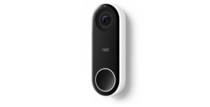
Nest Hello Doorbell

Nest is currently offering its Hello Doorbell at a reduced price, in addition to throwing in a free smart speaker.

Until July 8th, Canadians can order the video doorbell for $259 CAD (regular $299.99). Nest is also including a Google Home Mini ($79 on its own) at no additional cost.

Nest’s Hello smart doorbell features an HD camera that records 4:3 HDR video and two-way audio. The doorbell can also see in the dark using infrared illumination.

Note that Hello requires a wired doorbell, chime and a 16-24VAC, 10VA transformer. Nest has a tool that helps customers figure out if Hello will work with their home setup.

Nest also recommends getting a professional to install Hello.

The Nest Hello Doorbell can be ordered here (shipping is free).

The post Nest Hello Doorbell $40 off, includes free Google Home Mini appeared first on MobileSyrup.

27 Jun 21:23

Going Places with HTML and CSS

by Shilpa Kumar
Illustrations by Jason Fujikuni

HTML and CSS were probably the first two languages you learned when you first started coding. The two languages are the backbone of web page structure and while they are straightforward to grasp, they can be difficult to master. HTML offers many advanced tools that help to better define the objects on a page and optimize search results; CSS has recently released a new feature called Grid that provides a framework for layouts that adapt to multiple screen sizes.

Navigating the advanced features of HTML and CSS can be daunting, but this tutorial is intended to help demystify some of them.

HyperText Markup Language, or HTML, is the most popular way of communicating with the web because it tells the browser how elements, such as images or text, should be displayed on a page. Because this is a language that controls how content is shown, it’s important to utilize HTML tags to explicitly describe the types of content on a page. Leveraging the verbose tags available, or writing semantic HTML, can help boost pages in search results, and make pages more accessible for readers with disabilities.

Writing semantic HTML means writing meaningful HTML, where the markup tags convey the meaning of the content they contain. Semantic HTML acts as a layer of communication between developers working on the code, and it tells browsers, search engines and screen readers how to work with the page’s content. Essentially, semantic HTML is <div>s with definition.

How to Use Semantic HTML

Semantic HTML helps create a well-defined web page structure that minimizes ambiguity. It also enhances the accessibility of a page by allowing screen readers — software that traverses the content of a page and reads it out loud to the user — to navigate pages and relay more information to the user.

Here are some common Semantic HTML tags and how they are used:

<header>
This tag is helpful in defining any introductory content, like page navigation or logos. This tag can exist anywhere on a page except within a <footer> tag. There can also be multiple headers that exist on one page. For example, use this tag to wrap a main headline with some introductory text, as shown below:

<header>
<h1>The Ultimate Chocolate Site</h1>
<p>Your Source for All Things Chocolate</p>
</header>

<nav>
The main navigation of a page can be wrapped with the <nav> tag. This is useful for search engines, and it identifies the primary navigation more clearly in case there are other methods of navigation on the web page.

<section>
Use the <section> tag instead of a <div> tag to explicitly define the areas in a document that contain a group of related content. Wrap a set of paragraphs, images or a mix of content in section tags to indicate that they are related content.

<h1>All About Chocolate</h1>
<section>
<h2> Chocolate Types</h2>
<h3>Dark Chocolate</h3>
<p>…</p>
  <h3>Milk Chocolate</h3>
<p>…</p>
</section>
<section>
<h2>Origins of Chocolate</h2>
<h3>Where does Chocolate Come From</h3>
<p>…</p>
  <h3>Who Invented Chocolate</h3>
<p>…</p>
 </section>

<article>
The <article> tag is for content on a page that is self-contained, meaning it should make sense outside of the context of the page, like in an RSS feed or on another platform. Use this tag to wrap content like a news story or a blog post (shown below), for example.

<article>
<h1>Today in the World of Chocolate</h1>
<p>Date: June 18, 2018</p>
</article>

<footer>
Just like the <header> tag, any markup for footer content, including navigation, author bios or copyright notices should be defined in the <footer> tag. There can also be more than one footer on a page. Like the <header> tag, footers can be placed anywhere on the page, but usually is placed right before the end of a </section> or a </body> tag, as shown below.

<body>
<p> Chocolate Content </p>
<footer>Copyright, 2018</footer>
</body>

The Semantic HTML Heading Tag
It is important to note that each <h1> element creates a new section as well! Any subheading tags ( <h2>, <h3>, etc) are considered sub-headings under the top level heading and don’t create new sections.

What about <divs>?
This does not mean the <div> tag has no meaning, but should only be used when appropriate.

The example markup below shows how to use some of these tags effectively.

<body>
<header>
<h1>All About Chocolate</h1>
<nav>
<ul>
<li><a href=’#’>Home</a></li>
<li><a href=’#’>About Us</a></li>
<li><a href=’#’>Read More On Chocolate</a></li>
</ul>
</nav>
</header>
<section>
<article>
<h2>Today in the World of Chocolate</h2>
<p>A new kind of chocolate has been discovered in the Amazon forests. This day will go down in history for the chocolate books.</p>
</article>
</section>
<footer>
<h3>Footer</h3>
<p>&copy; 2018 ChocolateMadness.com</p>
</footer>
</body>

Search Optimized HTML

Writing search engine optimized HTML, or SEO HTML, can make it easier for search engines to find your web page and can help you reach a larger audience. How the page appears in search engine results can be controlled with SEO markup.

These are some SEO tags and how to use them:

<head>
Most of the important SEO tags go inside the <head> tag. This section will not affect the look or feel of your web page, but most of this content will be important in the search engine results page.

<title>
This is what shows up as the headline on search engine result pages. What is written in the <title> tag should contain your web page’s name, and can include some of the content of your web pages.

<meta name=”[your description goes here]”>
This is your web page’s description in the search engine results. Make sure it is detailed and honest.

For example:

<head>
<meta name=”description” content=”Chocolate News and Information”>
</head>

Here is an example of these SEO tags in practice:

<head>
<meta charset=’UTF-8' />
<meta name=”description” content=”Chocolate Information”>
<meta name=”keywords” content=”chocolate, sweets, history>
<meta name=”author” content=”Shilpa Kumar”>
</head>

Open Graph Tags

Another useful HTML tool is open graph tags, which provide control over how content shows up on social media when a link is shared. For example, the content that appears on Facebook when a link is shared, such as article title, author and description, is controlled by open graph tags.

There are four required properties when using open graph tags: title, type, image and URL. Additional optional metadata tags can include audio, description, default language, and more. For a detailed look at open graph tags and to read documentation, check out http://ogp.me

In order to make your web page into a graph object, simply add additional metadata tags to the <head> section of your HTML markup with a property attribute set to a content property like below:

<meta property=”og:title” content=”All About Chocolate” />
<meta property=”og:type” content=”website” />
<meta property=”og:url” content=”http://www.chocolatemadness.com/home" />
<meta property=”og:image” content=”img.chocolatemadness.com/news/chocolate-flavors.jpg” />
Illustration by Jason Fujikuni

CSS Grid

While the semantic HTML tags mentioned above let us write structured and readable markup, they don’t affect how our content will look in the browser. Cascading Style Sheets, or CSS, is where we define color, position, font and any other styles. CSS can also be used to control page layout and how elements change based on screen size.

There are numerous ways to control page layout with CSS — tables, setting widths, floats, flexbox — and all of them come with their own unique issues. A recently released CSS feature called CSS Grid, or Grid, can break any given page layout into a two-dimensional series of columns and rows that can be controlled by CSS rules. It’s implemented by applying CSS rules to both the parent element (the grid’s container) and the child elements (the grid items nested within the container). No floats or margins are required to style the content to be responsive.

It’s important to ensure your audience can access your content no matter what device they use, and CSS Grid can be is useful for creating clean layouts that are responsive across multiple screen sizes.

The cells of the grid are not fixed. If a design requires a grid cell to be positioned in a specific location, you can apply the `grid-column` and `grid-row` CSS properties on the cell to control where a cell should be positioned on the page. These shorthand properties specify a “from” and “to” position on the grid. This is useful if a design requires a specific placement of grid items in the mobile layout that is different from the tablet or desktop layout.

You can change the position of any cell in the grid to any location on the same grid and not stress about breaking the layout. Check out this CodePen example that illustrates these properties and placement of grid cells.

There are many layout options with CSS and it can be hard to know which ones to use. A good rule of thumb is if you can draw a grid over your layout, you should use CSS Grid. If a grid doesn’t quite work, use flexbox.

For more information about CSS Grid, read this extensive piece on the framework by my colleague Natalya Shelburne.

When building your web page, it’s important to keep your audience in mind and think about how they’ll access your content. The powerful tools outlined here will help to streamline your layouts, make your web pages more accessible and enhance how your pages appear in search results.


Going Places with HTML and CSS was originally published in Times Open on Medium, where people are continuing the conversation by highlighting and responding to this story.

27 Jun 21:22

Samsung Set to Unveil the Galaxy Note 9 on August 9

by Evan Selleck
Rumors pointed to Samsung hosting an event earlier than normal before the end of 2018, and, sure enough, the company has just confirmed as much. Continue reading →
27 Jun 21:22

In UK haben sie ein riesiges, fliegendes Trump-Baby gecrowdfundet, um das bei Trumps Besuch über London fliegen zu lassen

by Ronny
mkalus shared this story from Das Kraftfuttermischwerk.

Am 13. Juli wird Donald Trump Großbritannien besuchen. Irgendwelche Britten wollen ihm dann einen etwas anderes Willkommen bereiten und haben eine sechs Meter hohes, fliegendes Trump-Baby gecrowdfundet, welches bei seinem Besuch über der Themse schweben soll. Die Aktion war mir nichts, dir nichts durchfinanziert, läuft aber weiter, um noch mehr Überraschungen umsetzen zu können.

Donald Trump is a big, angry baby with a fragile ego and tiny hands.

He’s also racist demagogue who is a danger to women, immigrants and minorities and a mortal threat to world peace and the very future of life on earth. Moral outrage is water off a duck’s back to Trump. But he really seems to hate it when people make fun of him.

So when Trump visits the UK on Friday the 13th of July this year, we want to make sure he knows that all of Britain is looking down on him and laughing at him. That’s why a group of us have chipped in and raised enough money to have a 6 meter high blimp made by a professional inflatables company, to be flown in the skies over Parliament Square during Trump’s visit.

27 Jun 21:22

Sonos Beam Review: Beaming sound for everyone

by Ted Kritsonis
Sonos Beam

Sonos’ efforts to claim supremacy over the living room’s audio space got another entrant when the company unveiled the Beam, a speaker that should fit better into smaller spaces.

I noted this in the hands-on time I had with the speaker in San Francisco, but now, after about two weeks with it in my own home, its strengths and weaknesses became more obvious.

The Beam makes Sonos’ living room options a trio to choose from. Do you go for the Playbar, the oldest (and least attractive) of the three? The Playbase, which features a flattened form factor, allowing it to slide easily under a monstrous TV? The Beam is a compromise between them, neither intrinsically better, nor undoubtedly inferior to the others.

Fitting in

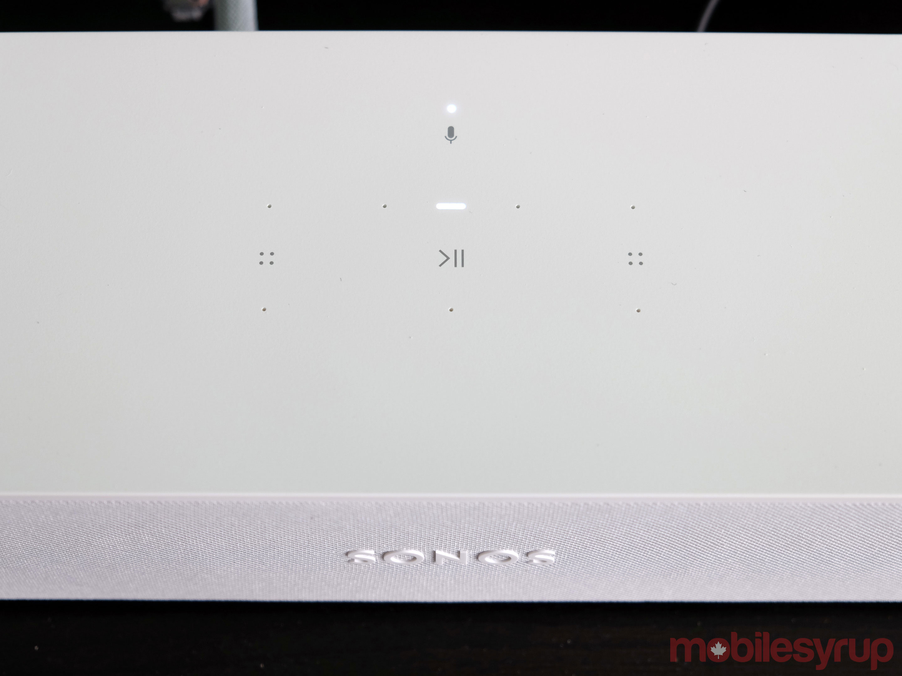
Sonos Beam angle

Having gone over the specs in the hands-on, I won’t delve too much into them here. Suffice it to say, the Beam has some impressive power under the hood. The four drivers and three passive radiators aren’t hindered too much by the form factor either.

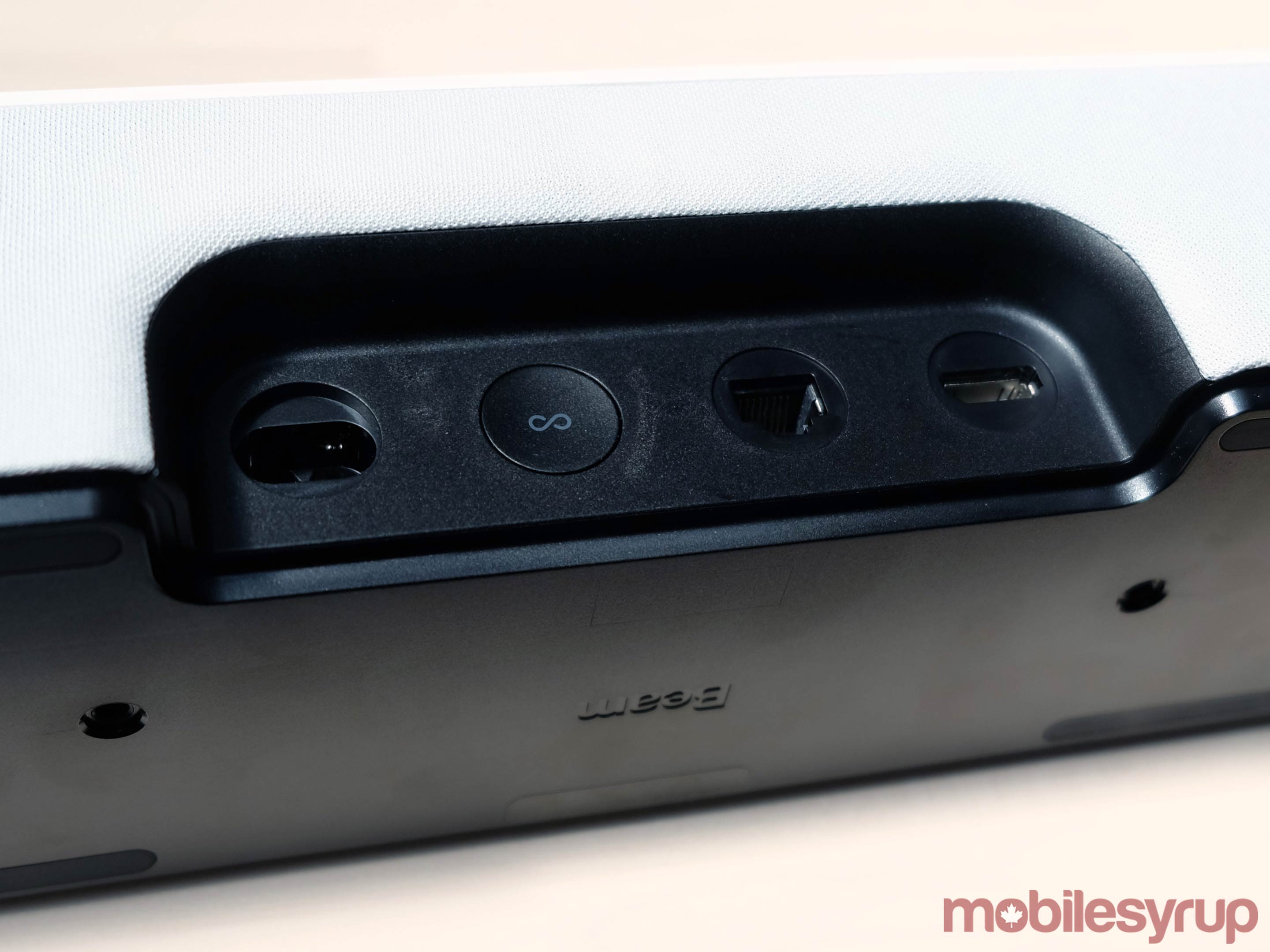
So as not to keep anyone from wall-mounting it, the screw mounts underneath do offer that option. I laid it down on my small entertainment unit closer to the edge. Setting it up was easy and painless, as Sonos speakers tend to be.

The only catch was that I had a Sharp TV from 2010, which didn’t have an HDMI ARC (Audio Return Channel) input. TVs generally have the port going back years now, so it’s not an unusual thing to have. Look at your HDMI inputs, and you will likely have one that says ‘ARC’ on it. That’s the port the Beam is supposed to plug into, with the other side going into the speaker’s own HDMI port.

ARC is important in that it allows a port to work as both an input and output. In this case, the TV would automatically route all audio through that to the Beam. When setting up through the app, the final configuration would allow the TV’s remote to control the Beam’s volume.

For non-ARC TVs, Sonos wisely included an adapter that would work with a toslink optical digital audio cable, thereby offering an alternative. It even includes the toslink cable in the box, ensuring you’re not scrambling to get one should you be in my situation.

Though I do use powerline adapters for some devices under my TV, I opted to test the Beam exclusively over Wi-Fi. It reduced wire clutter, but the Wi-Fi chips in Sonos’ speakers are usually very reliable. I never really encountered any connectivity issues with this speaker, as a result.

Sounding off

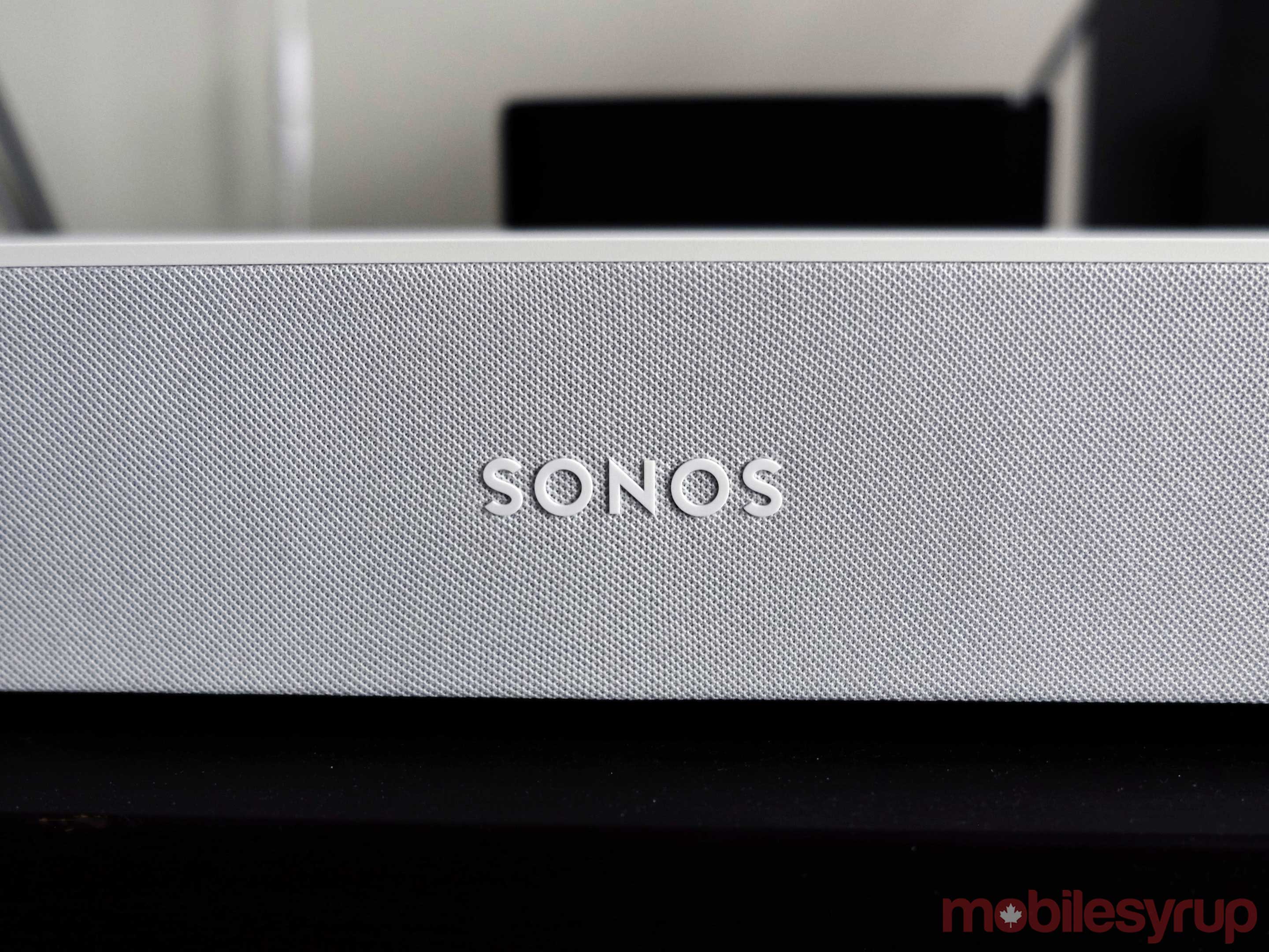
Sonos Beam close up

I made sure to tune my living room with Trueplay, so the Beam could calibrate and play any audio with the dimensions of the place set in. Having tested so many Sonos speakers in the past, I’m convinced the software does make a difference for the sake of consistency.

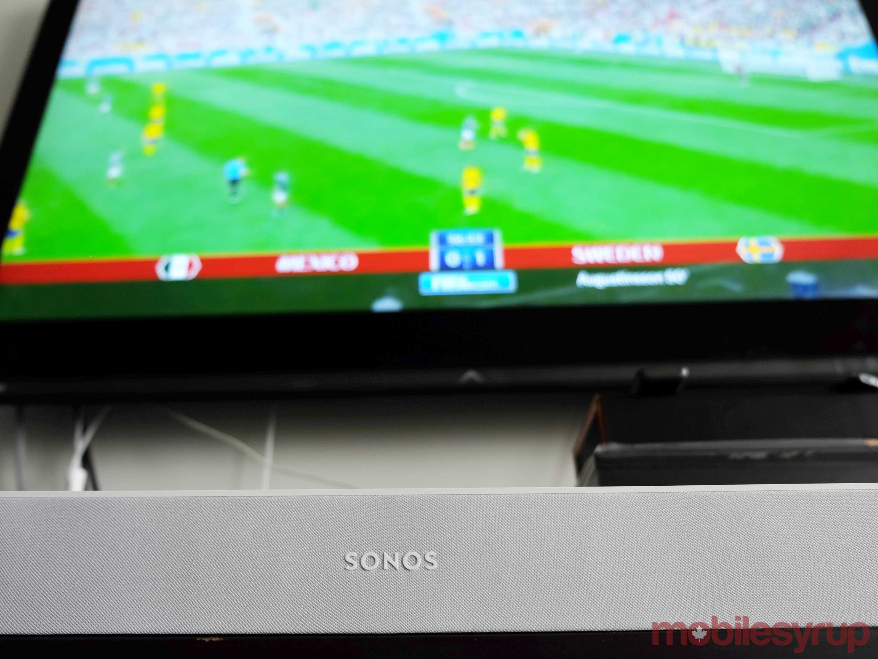
The Beam can get very loud, with impressive clarity to boot. You probably don’t have to blast it too much if you’re in a condo or apartment, where space may be more limited. At 60 percent volume watching FIFA World Cup matches, I felt it resonated really well.

I played a lot of music, watched sports, movies and TV shows, along with some gaming to gauge the true extent of the Beam’s ability. The Playbase produced better and stronger bass. That much was obvious early on. To me, it sounded closer to what the Playbar delivers. The mids and highs were crisp and warm, with some good stereo separation.

These were already takeaways from the hands-on launch event, only now, I could see they applied a little more broadly than I thought. For example, the Playbar is noticeably longer, and thus, spreads out the sound a little more because of it. The Beam’s advantage, though, is its ability to emulate a similar soundstage within a smaller footprint. The Playbase still comes off as the most powerful of the trio.

Music vs. everything else

Sonos Beam

Sonos is pushing the Beam as a living room speaker, but isn’t excluding or relegating music to do so. I get why, but if I wanted a speaker primarily for music, I would consider a Play:5 over this. With the Beam, music must still be a consideration, since it makes little sense to pay similar money for a speaker that you would only otherwise use when the TV’s on.

Naturally, the company would love to see the Beam as part of an expanded setup. Add two Sonos Ones (or Play:1s) and even a Sonos Sub, and you have a pretty powerful surround setup that adds true stereo and thumping bass. But then you’re looking at a price tag of $2,000.

Without question, the Beam would be an audio upgrade over tinny TV speakers and aging sound bars, but a good sound bar with a sub? It does depend on the brand, but it’s a tighter fight at that point.

What sets it apart from the others like it is the smart features that allow for tighter integration with smart home devices and compatible services. Neither the Playbar or Playbase will be able to work with Amazon Alexa or Google Assistant. That gives the Beam a significant edge above all else.

Talking out loud

Sonos Beam back ports

There are no real surprises with Sonos’ adoption of Alexa, since the Sonos One has already shown the way. Google Assistant isn’t ready yet, but is coming later this year.

The key to having a voice assistant tied into a speaker tethered to a TV is how it changes viewing habits. I rarely had to adjust the volume through a remote. I just told Alexa to adjust the level between zero to 10, or simply say, “Alexa, lower the volume (or raise the volume instead).”

If a call came in, I could quickly mute it by voice, too. It’s still just as fast to press a button on the remote, but I was stuck. In cases where the Beam is connected with the optical cable and there’s no way to switch the TV’s audio over manually to the speaker, the TV’s remote will still only control the TV speakers.

That was the predicament I was in, and so, I resorted to using Alexa instead. But even then, because of the optical cable, I couldn’t turn the TV on or off, either. This is why the HDMI ARC input offers a more convenient scenario.

Still, like the Sonos One before it, the Beam’s Alexa integration worked perfectly fine. I could control my Philips Hue lights and even my iRobot Roomba, among other compatible devices. The only TV streamer I could use with the speaker’s voice activation was the Amazon Fire TV Stick. Through that, I could at least tell the Beam what I wanted to watch. It’s not perfect execution, but it’s a good start.

What about AirPlay 2?

Sonos Beam top

The Beam’s launch more or less coincides with the official launch of AirPlay 2. Sonos confirmed it would go live in July, so it is in the same month at least.

What is known so far is that Apple’s wireless protocol will also work with the Playbase, Play:5 and Sonos One. The integration will enable some compatibility with Siri, meaning you would be able to ask it to play music from Apple Music and send it to the Beam. It’s pretty limited beyond that — it can’t control playback or move music to another Sonos speaker on your network.

I’ll be updating this review once I get the opportunity to test it.

The post Sonos Beam Review: Beaming sound for everyone appeared first on MobileSyrup.

27 Jun 21:22

Developing research questions

by Raul Pacheco-Vega

As I mentioned in one of my recent blog posts, I have PhD students at all stages (about to defend their PhD proposal, about to go on to the field, about to finish) and therefore I have been reading a lot of books on the PhD journey. I’ve also been participating in several events associated with PhD students’ performance: dissertation proposal defense, comprehensive exams, etc., both my own students and those on whose doctoral committees I sit on.

Rafa Hime Carlos me

Rafa, one of my former PhD students, and Hime and Carlos, two of my current PhD students

What I have been finding is that there’s a lot of variation in how doctoral students are mentored and what they learn and how they approach their research. So I tweeted about this, and complained that we do a poor job of training students at all three levels (undergraduate, masters and doctoral) on how to craft and develop good research questions.

Regardless of whether you’re writing a book-length, cohesive manuscript or 3 papers, you should have a driving/leading research question. I also think we do a poor job of reminding students and even early career scholars: our job is to EXPLAIN phenomena. We are looking for answers to puzzles. And to explain phenomena and look for answers we need to ask good questions: WHAT matters is different to WHETHER it matters to HOW it does.

One of the main problems we face is teaching our students how to find puzzles. What drives your work, what motivates your research, what makes what you’re studying important? What’s the puzzle you are seeking to solve? This is a big problem – a lot of students and researchers don’t seem to know strategies to find a puzzle worth examining.

The truth is that we need to help our students follow a systematic process for undertaking research. This is my own strategy:

To me, finding a puzzle to solve is about pondering. Why, instead of getting X response to Y variable, we are getting Z?. It’s about finding something head scratching. It’s about going “huh?”. I have been using the framework I posit below to help my students frame their own research based on a puzzle that drives the research, and also based on positing specific research questions for each paper.

A FEW RESOURCES TO HELP STUDENTS AND RESEARCHERS DEVELOP RESEARCH QUESTIONS:

27 Jun 21:22

Samsung Galaxy S10+ to reportedly have larger screen than Note 9

by Bradly Shankar
Samsung Galaxy S9 Plus

Samsung’s upcoming Galaxy S10+ smartphone will feature a 6.44-inch display, according to a report from South Korean publication The Bell. 

This would make the S10+ the largest Samsung phone to come to North America, as the Samsung Galaxy Mega and the Note 8 featured a 6.3-inch display. Reports also state that the Galaxy Note 9, which will likely be unveiled on August 9th, is set to feature a 6.4-inch display, suggesting that it too will be smaller than the S10+.

With the S9+, the increased screen size enabled the phone to carry a larger battery, as well as an additional rear camera. It remains to be seen if the Galaxy S10+ — should it indeed carry a larger display — will use the extra space to feature an even bigger battery or a third rear camera.

Recently, The Bell also reported that the Galaxy S10 will do away with its current iris scanner technology in favour of an in-display fingerprint sensor and 3D face scanning technology.

Source: The Bell Via: 9t05Google

The post Samsung Galaxy S10+ to reportedly have larger screen than Note 9 appeared first on MobileSyrup.

27 Jun 21:22

5 Critical Gaps in STEM Skills

files/images/stemgap.PNG

Dian Schaffhauser, Jul 16, 2018


This is a different way of looking at the gap in science, technology, engineering and math (STEM) skills. Sure, there's the knowledge component - or, at least, "basic mathematics, critical thinking, complex and creative problem-solving and the ability to adapt." But the gap manifests in some unexpected ways as well. Consider, for example, the "belief gap", that is, "the impression students have about which industries offer STEM jobs and whether or not they believe they belong in STEM." Or the "geography gap," "exposing the connections between 'poverty and place' and the 'lack of opportunity in certain neighborhoods and communities.'" This account is based on the State of STEM report (warning: they will require the information they need to spam you before they send you a copy, but this direct link to the 44 page PDF might work).

Web: [Direct Link] [This Post]
27 Jun 21:22

Rogers’ Wall-to-Wall Wi-Fi mesh network now available

by Jonathan Lamont
Rogers head office logo

Rogers has announced Wall-to-Wall Wi-FI, the company’s first foray into mesh WiFi networks.

Customers can add the product to any Ignite Internet package for $9.99 per month. The rental fee includes one hub, which plugs into any Rogers modem, and one beacon which plugs into an electrical outlet.

Rogers says this set up is enough for the typical household, but additional beacons are available for an extra $4 per month. Currently Rogers doesn’t offer an outright purchase option for the hardware.

There’s also a $49.99 installation fee. A technician will perform the installation and setup Wall-to-Wall WiFi and your modem for optimal performance.

The hardware behind Rogers’ mesh WiFi system is powered by Eero. Eero is a San Francisco-based company that released its second-generation mesh WiFi product in Canada last year. Purchasing an Eero hub and beacon costs $399 CAD.

Customers also get access to an app that allows them to control their WiFi easily. It provides information on connected devices, the status of the different hubs and beacons and current network speeds. It also makes it easy to share network access with friends and family.

Like any mesh network, Wall-to-Wall WiFi is customizable. Rogers says it will learn and optimize to your home, providing the best coverage. Additionally, the mesh network will stay up-to-date automatically so users don’t have to worry about security issues.

Bell and Telus have also launched mesh network options this year.

Bell’s mesh offering utilizes hardware from U.S. manufacturer Plume. It costs $5 per month and come with four hexagonal access points that plug into the wall. Additional pods are available for $2 per month. Bell customers also need the Home Hub 3000 modem — which carries a $7 monthly rental fee. Bell’s offering isn’t available for outright purchase.

Telus’ mesh offering is only available in British Columbia and Alberta for now. The starter pack has two booster packs and costs $120.

If you’re looking to add Roger’s Wall-to-Wall Wi-Fi, you can sign up for it here.

The post Rogers’ Wall-to-Wall Wi-Fi mesh network now available appeared first on MobileSyrup.

27 Jun 21:21

Twitter is tightening its grip on fake accounts and spam

by Brad Bennett

Twitter is looking to renew its fight with fake accounts and malicious behaviour.

This is a goal that the social network claims it has had for a long time and in May it was able to identify and challenge 9.9 million potential spam accounts per week. This number is up from 6.4 million in December 2017 and 3.2 million in September 2017.

The company has been able to improve these numbers by developing its machine learning algorithms to be better at finding these accounts before real users report them.

There has also been a drop in reported spam accounts since this new technology has been implemented. In March of this year, Twitter was receiving 25,000 spam reports a day and now it’s only getting around 17,000 a day.

The company has also found a way to find spam accounts and test them. The social network can now detect how a spam account acts compared to a real account. If Twitter suspects an account of being spam it can freeze it into a read-only state. The account can only view things, but not post until a user verifies it by confirming their phone number or by using another verification method.

Twitter is also making new users verify their accounts when they sign up for the service. Whenever a new user joins the social network they now need to use two-step verification with an extra email address or phone number. This change should start rolling out later this year, according to a Twitter blog post.

The company claims that with these new signup rules they can block more than 50,000 spam-based signups a day.

Source: Twitter

The post Twitter is tightening its grip on fake accounts and spam appeared first on MobileSyrup.