Shared posts

15 Aug 01:54

Why Serverless?

We were arguing at work about different modes of computing, and it dawned on me that the big arguments for going serverless are business arguments, not really technology-centric at all. Maybe everyone else already noticed.

[Disclosure: Not only do I work at AWS, but as of earlier this year I’m actually part of the Serverless group. I still spend most of my time working on messaging and eventing and workflows, but that’s serverless too.]

Now, here are a few compelling (to me, anyhow) arguments for serverless computing:

  1. Capacity Planning. It’s hard. It’s easy to get wrong. The penalties for being wrong on the high side are wasted investment, and on the low side abused customers. Serverless says: “Don’t do that.”

  2. Exploit Avoidance. There are no sure bets in this world, but one very decent weapon against next week’s Spectre or Heartbleeed or whatever is: Keep your hosts up to date on their patch levels. Serverless says: “Run functions on hosts that get recycled all the time and don’t linger unpatched.”

  3. Elastic Billing. There are a few servers out there, not that many, running apps that keep their hardware busy doing useful work all the time. But whether it’s on-prem or in the cloud, you’re normally paying even when the app’s not working. Serverless says “Bill by the tenth of a second.”

Technology still matters

Now, when we get into an argument about whether some app or service should be built serverlessly or using traditional hosts, the trade-offs get very technical very fast. How much caching do you need to do? How do you manage your database connections? Do you need shard affinity? What’s the idempotency story?

But some of the big reasons why you want to go serverless, whenever you can, aren’t subtle and at the end of the day they’re not really technical.

This is a new thing

I’m a greybeard and have seen a lot of technology waves roll through. By and large, what’s driven the big changes are technical advantages: PCs let you recompute huge spreadsheets at a keystroke, in seconds. Java came with a pretty big, pretty good library, so your code crashed less. The Web let you deliver a rich GUI without having to write client-side software.

But Serverless isn’t entirely alone. The other big IT wave I’ve seen that was in large part economics driven was the public cloud. You could, given sufficient time and resources, build whatever you needed to on-prem; but on the Cloud you could do it without making big capital bets or fighting legacy IT administrators.

Serverless, cloud, it all goes together.

15 Aug 01:54

Thoughts On Vancouver Rapid Transit – Broadway to UBC

by Ken Ohrn
UBC Millennium Line Extension (TransLink)

TransLink, UBC and City of Vancouver engineers and planners have told us what they think about the technology for the Broadway to UBC rapid transit line.  There’s no room for more busses on this monster corridor, and LRT has too-low capacity.

This information came out at the July 28 Town Hall meeting mentioned recently in Price Tags along with significant background.

When you dive into the numbers, the answer looks obvious.  Thanks to Kenneth Chan at the Hive.

The obvious choice for the remaining future rail rapid transit span between Arbutus Street and UBC is a continuous underground extension of SkyTrain’s Millennium Line, according to the region’s top planners.

A public town hall event held over the weekend to discuss the future extension west of Arbutus Street consisted of presentations by panellists, including TransLink Vice-President of Infrastructure Management and Engineering Sany Zein, City of Vancouver Chief Engineer and General Manager of Engineering Services Jerry Dobrovolny, and UBC Associate Vice-President of Campus Planning Michael White. . . .

Furthermore, a fully tunnelled SkyTrain extension to UBC is expected to see an opening day ridership of at least 250,000 people – about two-and-a-half times the opening ridership of the Canada Line about a decade ago . . .

“There is no urban LRT system in the world carrying the volume of people we need to carry on this corridor. There are systems in the world that carry many more than 5,000 pphpd. But that’s a train that is essentially a city block, we don’t want to go longer than that,” added Dobrovolny.

A poll on Mr. Chan’s article in the Hive is running 94.6% in favour of “Tunneled Skytrain from Arbutus to UBC” with vote count at 2,800 and rising at time of writing.

15 Aug 01:53

Community is Plural

by Stowe Boyd

I wrote this piece in 2013, inspired by Robert Safian, the then-editor of Fast Company.

Robert Safian is the editor of Fast Company, and when he wrote ‘community is plural’ in a 2012 editorial he was trying to get at the notion that his community of readers is actually a multiplicity of communities:

Our audience is really a bunch of vibrant communities that don’t hew to the terms of traditional market segmentation. What matters is that they share something more sophisticated: a psychographic.

This is a concept I am developing as well, in the business context. As companies transition away from slow-and-tight organizations, based on collective long-term strategy and identity, the unitary community within a business shakes out into a multiplicity of overlapping communities. Some will still feel and act like the older, slow-and-tight organization, but many will become fast-and-loose, adopting the cooperative logic of ‘connectives’, shaped by the self-organizing dynamics of social networks rather than the imposed order of business process and ordained strategy.

These various communities within a single business pose a new challenge for leadership. In the past, creating a corporate culture meant indoctrinating people into a single collective, with explicit shared goals: especially a long-term and exclusive commitment to the company’s vision of the future and the company’s place in it. Today, in a time of radical change and ‘innovation vertigo’, wise leaders do not promulgate a single, official future, and in fact will encourage a variety of diverse ideas of what the future may bring. If only for that reason, we are confronted with the need to reject a single monolithic culture in any reasonably large business, and even in small ones that want to grow to become large.

The emergent properties of social networks — like knowledge creation, innovation, and sense making — may be the greatest leverage a company has, so allowing more communities within a single company will lead to higher levels of innovation and adaptation. Rather than a monolithic organization trained to operate as a single unit based on a single fixed set of rules, we are now confronted with an economic context where it’s more rational to have a spectrum of communities operating independently, inventing and rewriting their own rulebooks along the way.

And the self-awareness that this is going on in the business is the psychographic that these communities will share, so that this apparent disorder is understood as a source of strength, resiliency, and competitive advantage.

Originally published at stoweboyd.com in 2013.


Community is Plural was originally published in Work Futures Institute on Medium, where people are continuing the conversation by highlighting and responding to this story.

15 Aug 01:53

Is Anyone Doing [x]?

by Richard Millington

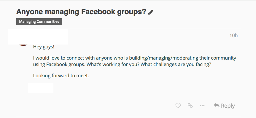
I sometimes dread posts like these:

It’s posted with good intentions and doesn’t break the rules.

But it’s clearly not a good post. If you’re not managing a Facebook group it’s irrelevant and if you are managing a Facebook group there is nothing in the post compelling you to answer. What does he want? Is he trying to sell you something? You would need to post at least twice to be able to help.

These kinds of posts aren’t quite spam, but they’re not useful neither. And every post which isn’t useful makes the community less relevant. Once your community has too many of these posts, the overall quality of the people participating and their contributions declines.

This is where it’s better to maximize for quality rather than engagement. Set standards for new posts. Ensure members provide more context (who are they, what are their goals, what drives them to post this question now) and are more specific (they ask exactly what information they need and provide as much detail as possible).

Just because an item isn’t posted with bad intent doesn’t mean it’s not harmful to the community. You can safely ask these to be removed or updated.

15 Aug 01:53

It’d Be a Shame if You Didn’t Receive the Full Benefits of this Website…

by Tony Hirst

…as in: “nice place you have here, it’d be a shame if anything happened to it”, or just “Sorry, you’re not welcome here, unless you give me a …”.

How many times have you seen such a notice, or been asked when buying a big ticket item in a shop for your: name, postcode, address, date of birth, …?

As James Bridle observes in New Dark Age : Technology and the End of the Future, p247:

[I]n most of our interactions with power, data is not something that is freely given but forcibly extracted — or impelled in moments of panic, like a stressed cuttlefish attempting to cloak itself from a predator.

15 Aug 01:52

A Much Faster Way to Charge your iPhone

by Anil Dash
A Much Faster Way to Charge your iPhone

Forgive me, for I am about to commit gadget blogging. I've been using an iPhone X since they came out, and almost from the start my battery has charged between two and three time the default speed of most people's phones. All you need is one new cable to do it.

The short version: The iPhone X (and iPhone 8) supports a fast-charging mode. If you spend a little bit of money on a higher-wattage charger, you can fill up your battery much faster, especially when it's really low.

Here's what the results look like with the fast-charging setup that I've got now, starting from a phone that was down to only 2% battery charge:

Time (minutes) 0 4 20 75 90 120
Charge 2% 10% 37% 83% 91% 97%

Underpowered

It's a strange way of pinching pennies on a phone that costs a thousand dollars, but Apple still includes their chintzy little square phone charger with every iPhone sold. It's barely changed over the last decade, and puts out a paltry 5 watts. On the plus side, it is small and doesn't block adjacent outlets, which I suppose is nice for people who are short on space.

But here's the terrible part: If the regular 5W charger is the only charger you use with an iPhone X, and your battery is running really low, plugging in for half an hour will only add about 20% to your battery. You'll still be in Low Power Mode after half an hour! That is no good.

As always with Apple, the solution is to spend money. It's more money than you want to spend, but enough that we'll all just suck it up and pay. Yay, Apple!


Overkill

I've ended up with a solution that is, admittedly, overkill. Through an absurd series of events, I ended up with an extra of Apple's most expensive charger: The 87 Watt USB-C Power Adapter. This is the most powerful laptop charger Apple sells, using its latest USB-C connector. Only the top-of-the-line 15" MacBook Pro even comes with this kind of power supply; the rest of the MacBooks make do with 61 Watts or less — the regular MacBook only comes with a 29 Watt charger! But each of these chargers uses USB-C, the new universal cable that's both enticingly simple and infuriatingly prone to unpredictable incompatibilties around power and data capabilities. The bottom line is, you don't need the ridiculously high-powered Macbook charger because any of the Apple USB-C chargers can do the job. If you don't have any of these USB-C chargers, I've heard good things about Anker's 30W power plug.

Once you've got one of these power bricks, or an extra USB-C port on your MacBook or iMac, it's time for the key step: grab Apple's USB-C to Lightning cable, which is frustratingly overpriced at twenty bucks, but worth it. (Amazingly, this represents a 25% price drop for this particular cable over last year's prices.)


That's it. Plug in your pricey new USB-C to Lightning cable, and you'll be topping up your iPhone battery much faster. Of course, it matters most if your charge level gets really low — if you're already at 95%, none of these products will make much of a difference for getting to 100%.

I've also used a number of the popular wireless charging (Qi) devices that the iPhone X and iPhone 8 support, and while they certainly work, they're really slow. I much prefer the speed of having my battery fill faster to the convenience of not having to plug in a cable, unless I'm at a public/shared charge point like at a coffee shop or airport.

The rumors are that Apple is going to include the USB-C to Lightning cable along with the next generation of iPhones, and they certainly should. The default experience for people buying a top-of-the-line phone ought to be the fastest charging experience possible.

A Much Faster Way to Charge your iPhone

15 Aug 01:52

Announcing a New York Times iOS Feature that Helps Readers Find Stories Relevant to Them

by Norel Hassan
Illustration by Agnes Lee/The New York Times

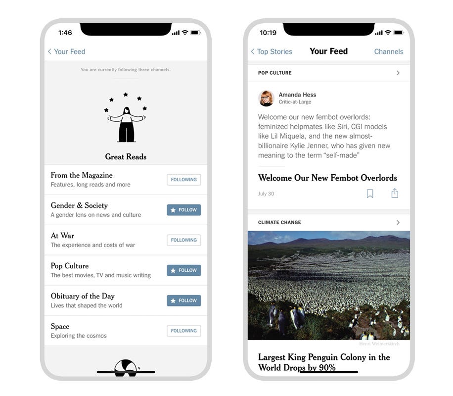
The New York Times publishes around 160 articles per day, with only a fraction of those articles making it to the digital home page. We wanted to find a way for our loyal readers to easily keep up with the stories that are most relevant to them. We’ve created a new space within our iOS app called Your Feed where readers can choose from 24 channels to follow, giving them more control over their experience with The Times. Some channels pull stories from existing New York Times sections and columns, such as Modern Love, while other channels, such as Gender & Society, pull content from a variety of sections. These curated channels highlight the breadth of journalism we publish and surfaces relevant content readers may have missed.

Some channels include commentary from our reporters and editors, and feature worthwhile reads from outside of The Times. This added context is only available on Your Feed, and we’re experimenting with this extra layer to bring deeper insights and context to stories.

Reading a printed paper is a customizable experience. When you hand someone a paper, they have access to all the stories; they pick out the sections they want and read stories of interest. Maybe while they’re thumbing through, they find a story or section that they didn’t realize they wanted to read! Chances are, different readers will select different sections and stories.

It’s been my job as a product designer at The New York Times to take this idea and translate it to your phone.

How We Designed Your Feed

1. Readers told us follow is the thing to do
Following is not a new concept. It’s a common feature in apps and on websites: we follow on Twitter, Instagram and on other platforms to get the content we want to see. The New York Times is not new to the following space, either; we’ve experimented with different ways of surfacing customized content over the years. While some of our experiments have been more successful than others, they all have informed the latest iteration of Your Feed.

The biggest ‘ah-ha!’ moment came from in-person research we did to explore what a customized space within our digital experience could look like. Our initial hypothesis was that readers wanted a better way to save content, but in the end, we discovered that the ability to follow different types of content was the greater user need.

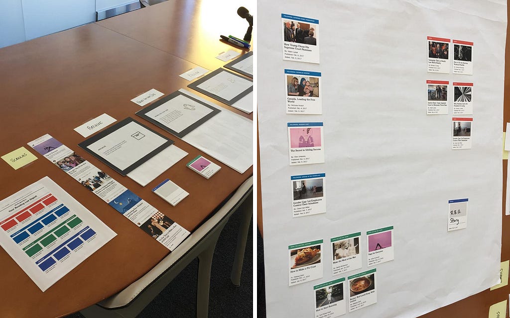
In the research we conducted, we presented research participants with four hypothetical customized features: “Archive,” “Follow,” “News you can use” and a “Queue.”

Along with each of the four hypothetical features, we also showed participants a deck of cards, with each card representing a piece of New York Times content, and asked them to select all of the cards they were interested in for that hypothetical content space.

We then asked participants to take the physical cards they had in hand and group them on on a blank canvas, or “screen,” based on how they would find the different content types the most useful. We then discussed the reasoning behind how participants organized their cards, and their expectations around different messaging channels, such as notifications, and the relationship to both the idea of a new space and the home page.

After talking with participants about their decisions over several rounds, and thinking about the different use cases that arose, it became clear that the ability to follow New York Times content was a promising opportunity to serve unmet user needs. Of all the hypothetical features we tested, Follow proved to have the fewest number of workarounds, while also solving for several different user needs at once. It was the biggest hole our team could fill in our product.

Through our research, we also learned that users were interested in having a space separate from the home page that delivered a customized feed of content.

To validate our research, we created a very hacky prototype of Follow for desktop web. This prototype featured a matrix of channels based on page views and engagement, and it allowed readers to follow channels from article pages. Although the test was held together with Scotch tape, readers were following channels and coming back more often to see what was published. It quickly proved the research right: our readers wanted a way to follow our journalism and have a customizable space.

2. Showcasing a writer’s voice and tone is really important
When I first started at The Times, I joined a team that was working on a mobile prototype that delivered stories and photos in a more conversational way. Through that prototype, we learned that readers were interested in interacting with our content in a more casual way.

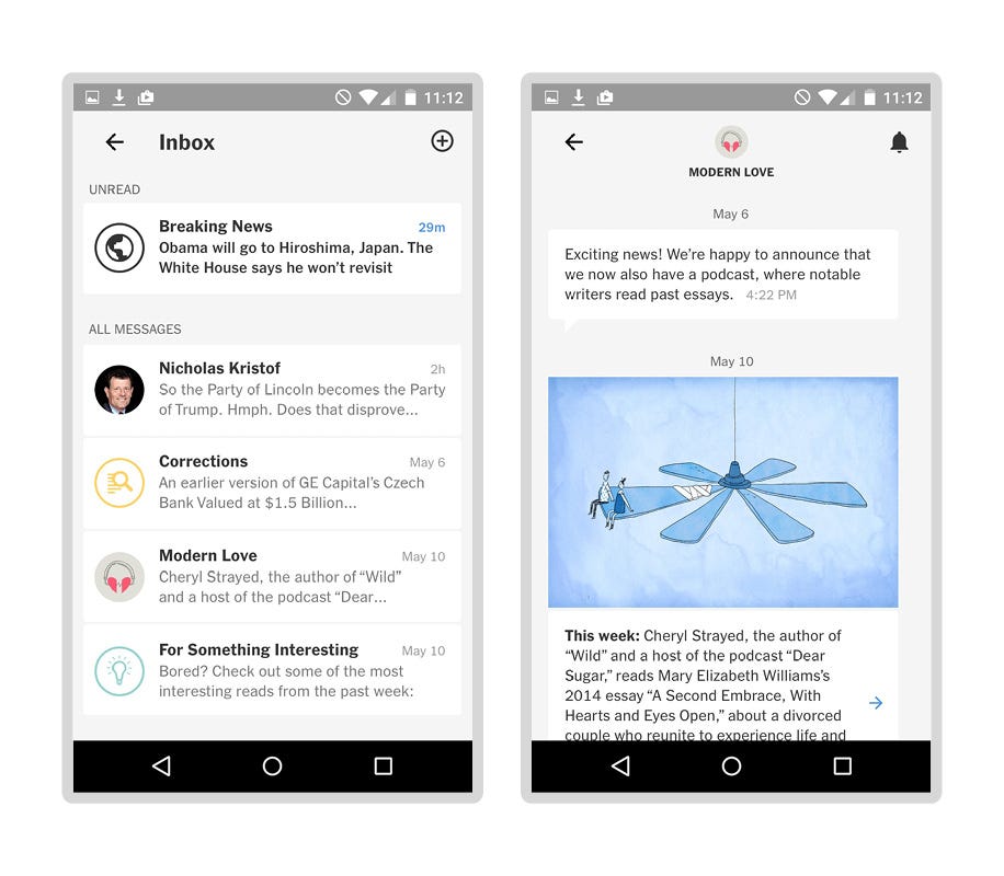
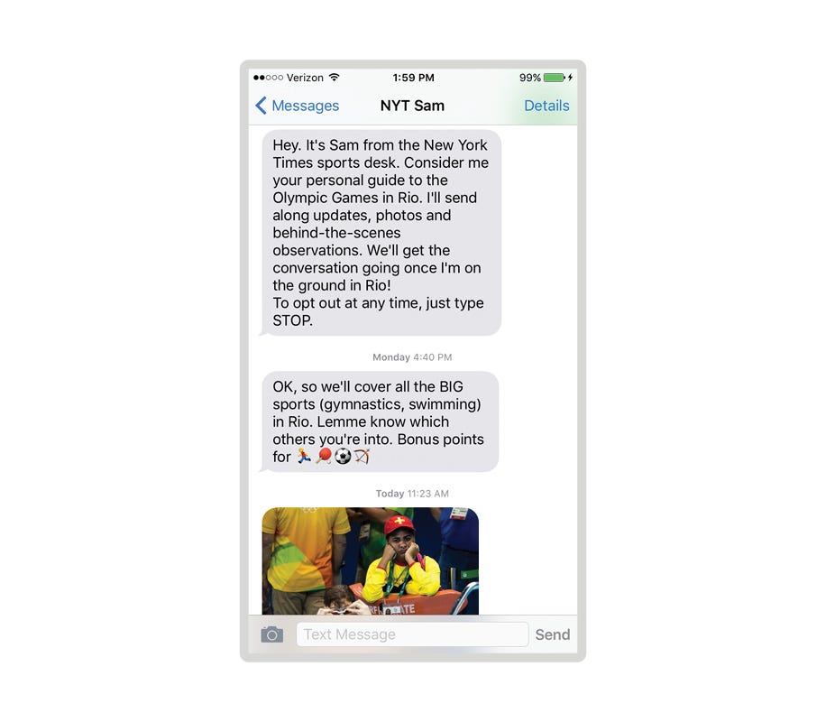
With this in mind, we simultaneously did a text message experiment throughout the summer 2016 Rio Olympics. Readers could sign up to get text messages from our Deputy Sports Editor, Sam Manchester, as he covered the Games. The texts were funny and offered behind-the-scenes insights that readers couldn’t get anywhere else. People really engaged in this two-way communication; They texted Sam back and asked specific questions at a volume and rate that was, frankly, difficult for one person to keep up with. We’ve since improved.

Both of these projects highlighted how our design-led team needed a more streamlined workflow with the newsroom. Part of the challenge was figuring out how two departments with different disciplines — Product & Design and the newsroom — could create a workflow that served each other’s needs. This didn’t happen with our previous projects and we planned accordingly for Your Feed. We learned that we needed to create a new workflow for editors and reporters that fit seamlessly with their already hectic days.

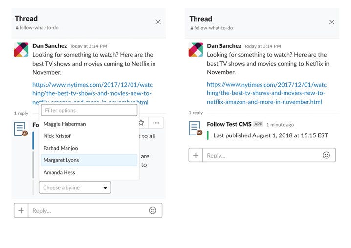
To achieve this, we leveraged The Times’s wide use of Slack to act as the CMS for Your Feed, to prototype quickly. Our back-end engineer, Brandon Hopkins, built a bot that interacts with editors, producers and reporters to guide them through the process of sharing links and publishing commentary.

3. We need to help our readers, not overwhelm them
With previous messaging experiments, we learned to limit the number of stories we delivered to readers. Too many new stories resulted in users ignoring the feature. Readers said it was too close to their real email inboxes and it made them feel like they were working through a to-do list, instead of catching up on their interests in an enjoyable way.

This sentiment came up during our in-person research as well. Interview after interview, users discussed how they feel overwhelmed and want solutions for navigating a nonstop news cycle.

When we were determining what channels would be offered in Your Feed, we knew we had to strike the right balance with channel topics. There had to be enough channels to satisfy a range of interests, but not so many options that we would overwhelm our users.

We took the same considerations for the publication cadence within channels. We couldn’t make topic-based channels draw content algorithmically because it could inundate users’ feeds — we may publish dozens of stories on a particular topic in a given week, for example. So our topic-based channels (Climate Change, Health & Fitness, Space) are curated by New York Times editors who ensure we deliver a diverse selection of stories.

What’s Next

Over the next several months we will be adjusting the channels we offer, expanding how readers can follow channels and adding new features to Your Feed. We’ll be watching and listening closely to how readers are engaging with the channels.

We’ll also continue to explore what a customized space within The New York Times means by testing new features that will help us determine the future of Your Feed. We’re excited to iterate on different versions of incorporating save, notifications and managing your interests.

Take a look and let us know what you think.

Shannon Smith contributed writing.


Announcing a New York Times iOS Feature that Helps Readers Find Stories Relevant to Them was originally published in Times Open on Medium, where people are continuing the conversation by highlighting and responding to this story.

15 Aug 01:51

I predicted Apple would die: “Wake up and smell the toast”

by Josh Bernoff

It was 1996. Gil Amelio had just taken over Apple Computer. My job at Forrester was to predict the future. I was certain that Apple would crater and I said so in print. Steve Jobs had introduced the Lisa and then, the insanely great Macintosh, in 1984. It made a hell of an impact, and … Continued

The post I predicted Apple would die: “Wake up and smell the toast” appeared first on without bullshit.

14 Aug 20:36

We may not be married...

by peter@rukavina.net (Peter Rukavina)

… but our names are forever joined in our new concrete driveway.

14 Aug 18:22

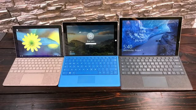
Surface GO is tiny

by Volker Weber

Surface-Size-Hero-1024x576

Brad Sams has taken some great photos comparing Go, 3 and Pro. I have two of them but not Go. David Lee likes it:

14 Aug 18:22

Purified Radio

by Volker Weber

IMG 20180803 120255

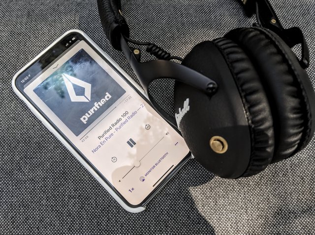
This is Purified Radio, a radio show produced by Daniela Niederer, stage name Nora En Pure, a swiss producer and DJ. It's the perfect show for me, as she is playing exactly what I would play, if I were still spinning records: Indie Dance and Deep House. Started a few years ago, it is now a weekly show playing on more than 70 stations worldwide. You can listen to it as a podcast or on Soundcloud.

And yes, this is still my trusted Marshall Monitor Bluetooth. I always come back to this headset, although I have far better ones. I just love the balance between size, volume, sound and simplicity. Everything is done with a single brass knob.

14 Aug 18:21

Lisa Brennan Jobs :: 'I have a secret. My father is Steve Jobs'

by Volker Weber

41siv2yclAL

Steve Jobs and Chrisann Brennan were 23 when their daughter was born. Lisa Brennan-Jobs remembers the pride and pain of a childhood spent navigating the vastness between her struggling single mom and Apple’s mercurial founder.

Vanity Fair has an excerpt of her book.

More >

02 Aug 21:48

Samsung might launch the Galaxy Note 9 on August 24th in Canada

by Dean Daley
Samsung Note 8

Samsung’s U.S. store is already taking reservations for the upcoming Galaxy Note 9.

While this doesn’t mean very much to Canadians, as our online store hasn’t opened its pre-order page yet, what is interesting is that making a reservation guarantees an August 24th arrival.

This means that Samsung will launch the Galaxy Note 9 on the 24th in the U.S. So while we cannot confirm that the Note 9 will launch in Canada on the 24th, it at the very least seems likely, especially considering that the Note 8 launched in Canada on the same day it did in the U.S.

With such a quick launch date it means that the Samsung will begin taking pre-orders in Canada sooner rather than later.

Previous reports from European leaker Roland Quandt also indicated that the Note 9 would launch on the 24th. Quandt says he received his information from a European operator.

That being the case, it seems like Samsung is planning to release the Galaxy Note 9 on August 24th, globally — well at least in North America and Europe.

The Galaxy Note 9 is rumoured to feature a 6.3-inch display, a 4,000mAh battery and a new Bluetooth-enabled S Pen. 

Samsung will officially unveil the phone on August 9th.

The post Samsung might launch the Galaxy Note 9 on August 24th in Canada appeared first on MobileSyrup.

02 Aug 21:47

Unintended Consequences to Google Context Cards on Conspiracy Videos?

by mikecaulfield

I was putting together materials for my online media literacy class and I was about to pull this video, which has half a million views and proposes that AIDS is the “greatest lie of the 21st century.” According to the video, HIV doesn’t cause AIDS, retrovirals do (I think that was the point, I honestly began to tune out).

But then I noticed one of the touches that Google has added recently: a link to a respectable article on the subject of AIDS. This is a technique that has some merit: don’t censor, but show clear links to more authoritative sources that provide better information.

At least that’s what I thought before I saw it in practice. Now I’m not sure. Take a look at what this looks like:

hiv

I’m trying to imagine my students parsing this page, and I can’t help but think without a flag to indicate this video is dangerously wrong that students will see the encyclopedic annotation and assume (without reading it of course) that it makes this video more trustworthy.  It’s clean looking, it’s got a link to Encyclopedia Britannica, and what my own work with students and what Sam Wineburg’s research has shown is that these features may contribute to a “page gestalt” that causes the students to read this as more authoritative, not less — even if the text at the link directly contradicts the video. It’s quite possible that the easiness on the eyes and the presence of an authoritative link calms the mind, and opens it to the stream of bullshit coming from this guy’s mouth.

Maybe I’m wrong. It seems a fairly easy thing to test, and I assume they tested it. But it’s also possible that when these things get automated the things you thought were edge conditions turn out to be much more the norm than anticipated. In this case, the text that forms that paragraph from Britannica is on “AIDS”, not “AIDS denialism”, and as such the text rebuttal probably has less impact than the page gestalt.

I get the same feeling from this one about the Holocaust:

holocaust2

What a person probably needs to know here is not this summary of what the Holocaust was. The context card here functions, on a brief scan, like a label, and the relevant context of this video is not really the Holocaust, but Holocaust denialism, who promotes it, and why.

Again, I hope I’m wrong. Subtle differences in implementation can matter, and maybe my gut on this is just off. It really could be — my job involves watching a lot of people struggle with parsing web pages, and that might warp my perspective.

But it should be easy enough for a researcher to take these examples and see how it works in practice, right? Does anyone know if someone has done that?


02 Aug 21:47

Android Auto could soon support Google Podcasts

by Igor Bonifacic
Google Podcasts

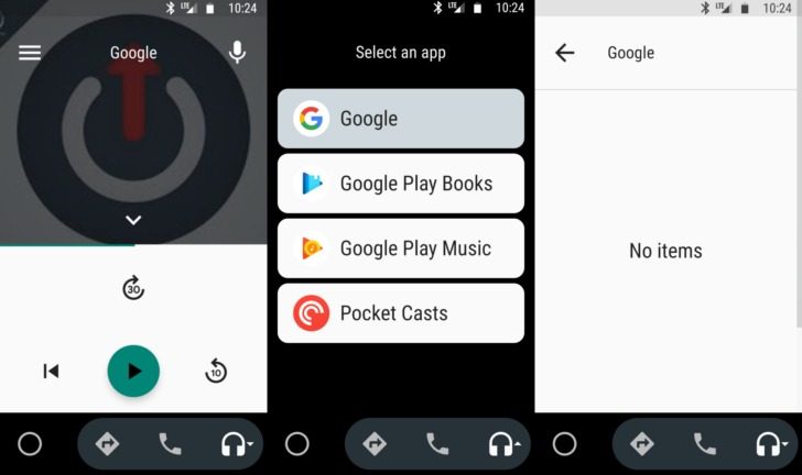
New evidence suggests Google is working towards adding support for its recently released podcasts app to Android Auto.

Over the past couple of weeks, some Android Auto users have been able to continue listening to podcasts inside their car when they’ve started Android Auto while streaming a podcast on their smartphone.

However, the functionality was obviously a work in progress, because at that moment there wasn’t an interface for controlling playback.

On Wednesday, however, one of Android Police‘s readers saw Google Podcasts appear on the media carousel of Android Auto. AP‘s Richard Gao, the author of the original story, wasn’t able to see this functionality in their car, which suggests Google is rolling out the feature to a limited number of users.

Moreover, Google still has work ahead of itself before the feature is consumer ready. For instance, in the screenshots above, the media screen doesn’t display all the relevant information related to the current podcast. It also lists the audio source as the Google app, instead of Google Podcasts.

Source: Android Police

The post Android Auto could soon support Google Podcasts appeared first on MobileSyrup.

02 Aug 21:47

Canadian company awarded $145.1 million USD in lawsuit against Apple

by Jonathan Lamont
Apple

A federal jury in California ruled in favour of Canadian company WiLan in a patent infringement case against Apple.

The court awarded WiLan $145.1 million USD in damages. According to a statement from WiLan, Apple’s iPhone infringed two WiLan patents related to wireless communications technology.

However, Apple plans to appeal the ruling. The company also rejected claims of infringement in pre-trial filings.

Ottawa-based WiLan is a subsidiary of Quarterhill, a Canadian technology holding company. WiLan began as a producer of broadband wireless technologies after its founding in 1992. However, the company shifted to licensing it’s extensive patent portfolio.

This wasn’t the first lawsuit between WiLan and Apple. A separate litigation in 2013 ruled in favour of Apple. WiLan had sought $248 million in damages.

WiLan isn’t the only Canadian coming after Apple. Earlier this month a Torontonian filed a small claims lawsuit against Apple after scratching his Apple Watch. Despite Apple’s offer to waive the out-of-warranty cost to replace the unit and a later offer to refund him, the man is continuing with the suit.

Source: Global

The post Canadian company awarded $145.1 million USD in lawsuit against Apple appeared first on MobileSyrup.

02 Aug 21:47

Logitech’s Rugged Combo 2 iPad student case is the perfect education market companion

by Patrick O'Rourke

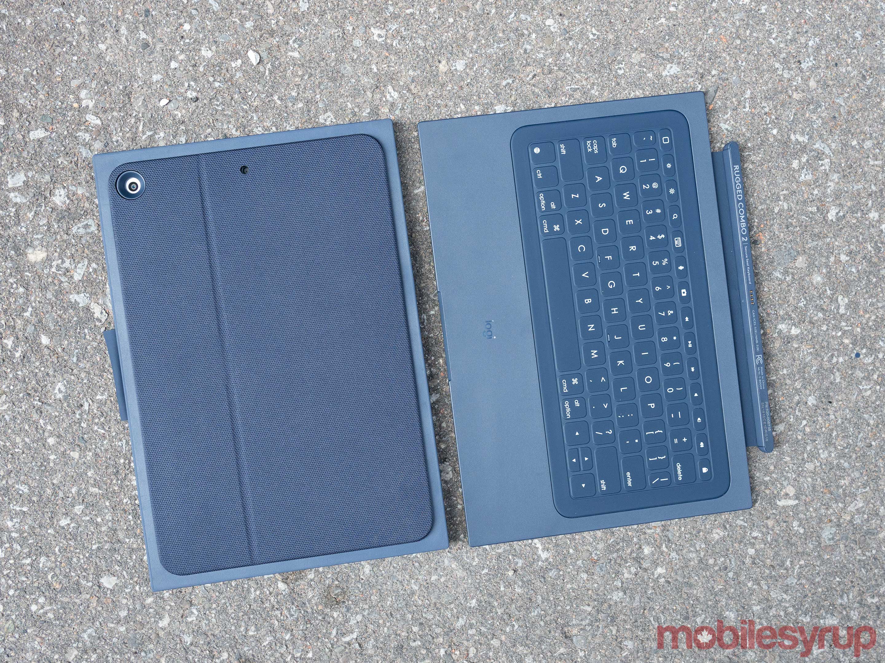
Logitech’s Rugged Combo 2 iPad case turns Apple’s 2018 9.7-inch iPad with Apple Pencil into an absolute monstrosity.

That’s okay though, because this case isn’t designed with every-day adult users in mind. Instead, Logitech created the Rugged Combo 2 specifically for the education market.

logitech rugged keyboard top-down

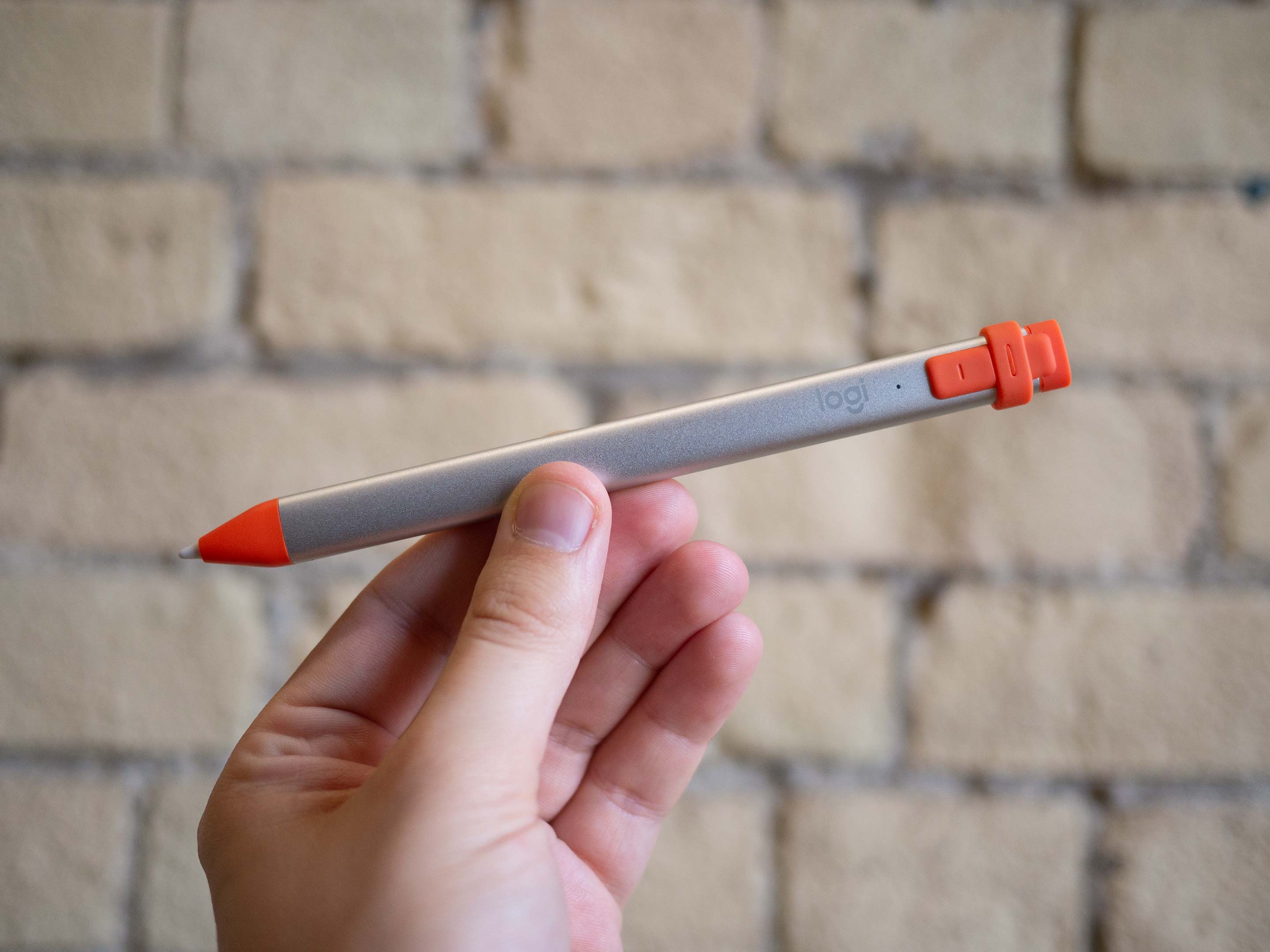
In fact, even if you wanted to buy the Rugged Combo 2 and Logitech’s companion ‘Crayon’ Apple Pen replacement, you wouldn’t be able to since Logitech is exclusively selling the accessories to educational institutions.

The Rugged Combo 2 surrounds the 9.7-inch iPad in a massive plastic box that to some extent almost feels like too much protection, as well as little like the first-generation Surface Pro.

While I still contend that the 9.7-inch (2018) iPad is a pricey proposition for any Canadian public educational institution — especially if the school aims to outfit every student with the $429 tablet — putting one in a case is definitely a necessity with just how rough children can be with fragile, expensive electronic devices.

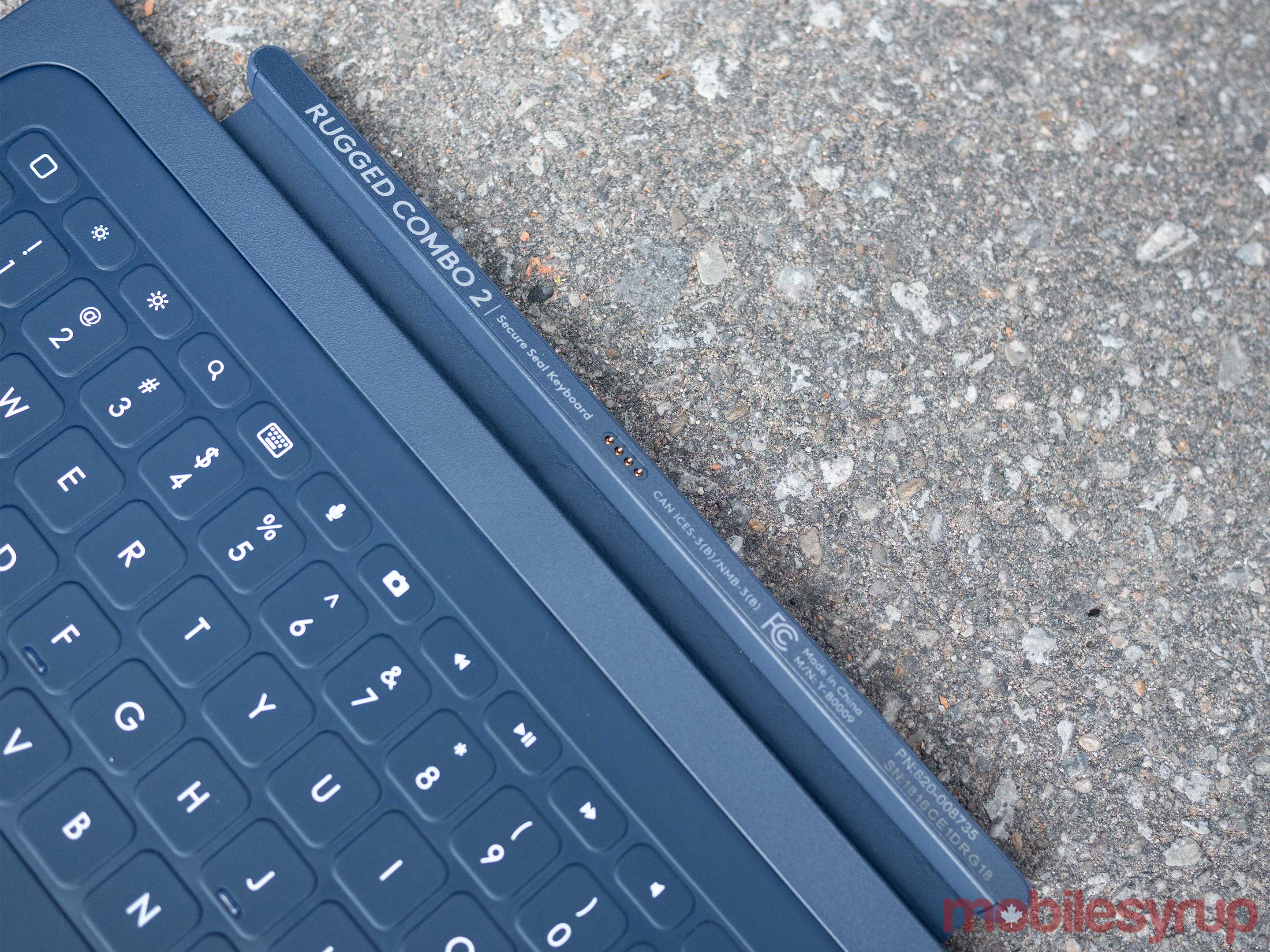
logitech rugged combo case magnetic connector

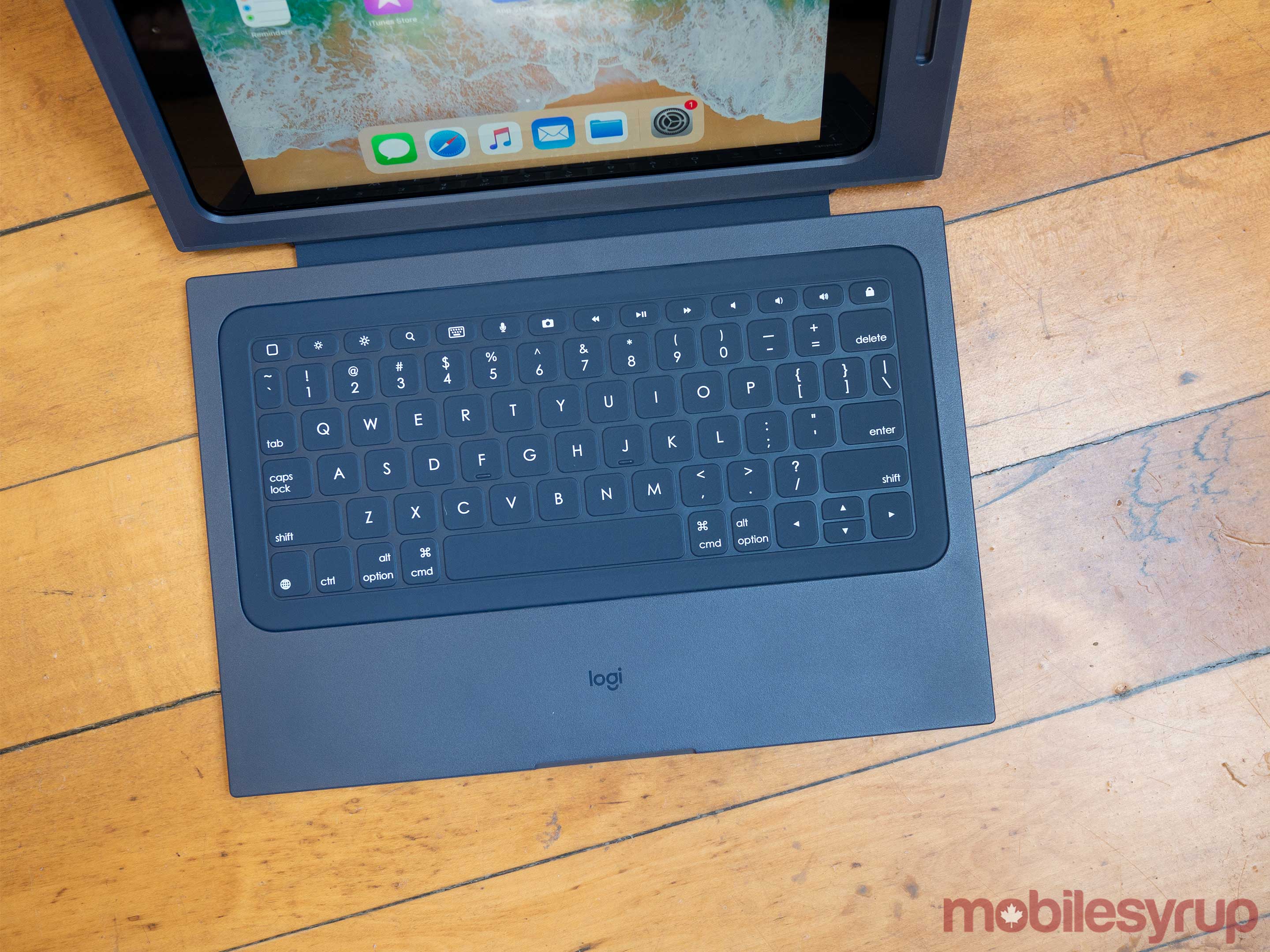
What makes the Rugged Combo 2 more interesting when compared to a standard iPad Bluetooth keyboard is that it’s connected to the iPad through the tablet’s Lightning port, along with the fact that it can be magnetically detached.

What Logitech has effectively done is create its own version of Apple’s iPad Pro Smart Connector, but rather than a permanent, built-in hardware aspect, the connection is facilitated through the case. Hopefully a regular consumer version of this case is released at some point.

While Bluetooth has come a long way over the years, you still need to manually connect most Bluetooth devices in some way — with Apple’s AirPods being the exception, when they work as advertised.

Logitech Rugged Combo 2- Pad-case keyboard

Apple says that this is something teachers asked for to make the process of distributing the tablet to students easier.

If you think about it, this strategy makes sense. A teacher spending a significant portion of a 90 minute class troubleshooting Bluetooth keyboard issues with even just a few students would quickly eat up time.

Shortcode:

The Rugged Combo 2 case is difficult to put on and take off, though this is a good thing given its education focus. The case also features a pass-through lightning connector, as well as a clear window under its surprisingly adjustable kickstand.

Logitech specifically says that the case protects the iPad from a four-foot drop, though given how heavy duty the plastic enclosure is, it’s likely that it could handle an even higher fall.

Logitech iPad Crayon

Logitech’s Rugged Combo 2 9.7-inch 2018 iPad case is priced at $129 CAD, while the accessory manufacturer’s Crayon comes in at $64.95 CAD.

The post Logitech’s Rugged Combo 2 iPad student case is the perfect education market companion appeared first on MobileSyrup.

02 Aug 21:47

Keep a short tail on social media

by Volker Weber
Since announcing her new job with The New York Times, a widespread campaign of harassment has targeted Verge reporter Sarah Jeong for a number of tweets she wrote years ago. Many of those now reacting to these tweets have intentionally taken them out of context, and she has since received an unrelenting stream of abuse from strangers on the internet.

More >
02 Aug 21:47

Applause hammer

by russell davies

Applause hammer

The stand-out moment, for me, in the History of Jazz podcast, was the little aside about the 'applause hammers' at The Ziegfeld Midnight Frolic. It just seemed so odd and inventive.

Without much hope or expectation I stuck some relevant search terms into an eBay watch and then after a year or so of waiting up popped a hammer.

Of which I am now the proud owner.

I'm not sure what to do with it, obvs. Maybe take it to Ronnie Scotts.

Applause hammer

Applause hammer

02 Aug 17:08

Does functional programming have an answer for everything?

by Eric Normand

Some might say that functional programming has the answers to solve the problems of concurrent, parallel, and distributed systems. But is that true? We explore what FP has to offer.

Transcript

Eric Normand: Does FP have the answer to everything? Hello, my name is Eric Normand. These are my thoughts on functional programming.

I’m writing this book and part of me wants to have the answer to everything. Part of me wants to say this is how a functional programmer would solve this problem and this is how a functional programmer solves this problem.

For a lot of problems, it’s true. We do have answers. We have a lot of tools that are disposed when they do solve problems, I think, definitively. The thing is, though, we don’t have all the answers and there are constantly new problems coming up. What I think FP has to offer, more than any particular answers to questions or answers to problems, is that we’re asking good questions.

These questions are becoming increasingly relevant in a world, in a multithreaded world, a distributed systems worlds where you got the shared resources that maybe they’re shared on a same machine or maybe they’re shared among multiple machines, and you need a way to deal with this added complexity.

Functional programming is actually asking the right questions. Functional programming asks what operations do we have that really depend on when they’re run or how many times they’re run. What can we represent as data because that’s the only thing we really know how to transfer from one machine to another?

Eric Normand profile image
Eric Normand
@ericnormand
twitter logo

Functional programming asks "what operations depend on when they're run or how many times they're run?" "What can we represent as data because that's the only thing we really know how to transfer from one machine to another?"

ed.gr/xx7v

Sun Sep 16 15:02:04 +0000 2018
Twitter reply actionTwitter retweet action2Twitter like action5

Transferring code is actually really hard. We can only do it in very limited ways. I can send you some JavaScript because I know you’re in a browser and it’s a known environment. In general, we’re sending data back and forth.

What can be represented as data and how do we interpret that the way we need to at the right time? What is a pure calculation that we could run on this and not worry about all those concerns about when it’s run or even what machine it’s run on?

Eric Normand profile image
Eric Normand
@ericnormand
twitter logo

FP asks "What can be represented as data and how do we interpret that the way we need to at the right time?" "What is a pure calculation that we could run on this and not worry about all those concerns about when it's run or even what machine it's run on?"
ed.gr/xx7x

Thu Dec 20 16:02:11 +0000 2018
Twitter reply actionTwitter retweet action0Twitter like action3

These are questions that functional programmers ask. It’s the analysis that we do that’s what provides value. There are definitely tools that once you’ve analyzed it, these tools could help. These are functional programming tools.

Also, most of the value comes from the questions, and the analysis itself, just figuring out how do these things fit together in terms of time.

Eric Normand profile image
Eric Normand
@ericnormand
twitter logo

Most of the value of functional programming comes from the questions, and the analysis itself. It's valuable just figuring out how do these things fit together in terms of time.

ed.gr/xx7y

Wed Jan 02 16:02:01 +0000 2019
Twitter reply actionTwitter retweet action0Twitter like action0

I love it when people comment on this podcast, when they ask me questions, when they disagree with me and we get into a great discussion. It’s one of the main reasons I’m doing this. If you want to get in touch with me, just find me on Twitter, @ericnormand. Also, you can email me, eric@lispcast.com. I am really looking forward to hearing from you. See you later. Bye.

The post Does functional programming have an answer for everything? appeared first on LispCast.

02 Aug 17:07

Mastodon A Few Weeks Later

by Martin

Back in mid-June I decided to have a look at Mastdon despite not being a social media type of person. But due to being federated and private, it was different so I went ahead and gave it a try. So how did it work out for me?

Overall, I would say that it has been a very positive experience for me as discussions I followed or participated in made me think and resulted in interesting activities. Here’s an overview of those I remember that go beyond the funny pictures and memes that are nice to loose a smile over every now and then.

As a network security minded person I am always interested to improve the security of my services. After all, security is not a state, its a process. One thing I improved that directly resulted from a discussion on Mastodon are the http security headers on the web sites I have on the Internet, including this blog.

One of my ‘other’ hobbies is computing history. To that end I learned a lot about the history of Silicon Graphics (SGI) who dominated the graphical workstation market in the 1990s. It’s of special interest to me because it was an SGI Indy on which I really used Unix for the first time (yes, well Irix, to be precise) and it is the machine on which I downloaded and watched a video from the Internet for the first time, a trailer for the then brand new Star Trek Voyager series. The ‘Unix Haters Handbook‘ was another interesting thing I rediscovered on Mastodon. I read this book in the 1990s and it is now available for free as PDF download. It was great fun to read it then and it’s still all true today!

Coming back to the present, I also found quite a number of interesting podcasts on Mastodon that I have since subscribed to. “Damals ™” is definitely one of them (in German) with very interesting topics about the evolution of different technologies.

On the people side I found a few people I met at conferences before and it’s good to extend the discussion with them into the virtual domain.

And to close, here’s a link to a video I found on Mastodon of an 18 year old who bought a mainframe and put it into the basement of his parent’s house.

02 Aug 17:06

Wunderschöne Demo eines iPhone-Mikros

by Volker Weber

Wenn man Videos mit dem eingebauten Mikro aufnimmt, hat man regelmäßig einen sehr schlechten Sound, egal ob iPhone oder Spiegelreflexkamera. Abhilfe verspricht ein externes Mikro. Die meisten Vlogger schwören auf den Hersteller Rode. Bei 'richtigen' Kameras montiert man das Mikro im Blitzschuh und führt ein 3.5mm Kabel zum hoffentlich vorhandenen Eingang der Kamera. Auch beim iPhone würde das gehen, mit einem Rigg, das iPhone und Mikro zusammenhält. Der mitgelieferte Lightning-Adapter vermittelt das Kabel zum iPhone.

Aber mit diesem Rode VideoMic Me-L geht es viel einfacher und ohne Klapperatismus. Mikro einstöpseln, Kamera-App aufmachen, loslegen. Jetzt vorbestellen. In zwei Wochen wird geliefert.

More >

02 Aug 17:04

Android P will reportedly launch on August 20

by Igor Bonifacic

Google will release the next major version of its mobile operating system, Android P, on August 20th, according to serial leaker Evan Blass. Blass shared the news in a tweet he sent out on Thursday morning.

Last year, Google launched Android Oreo on August 21st.

With Android P, Google is adding, among other features, system-wide support for display notches, gesture navigation and new digital wellness features.

There is still no indication as to its go-to-market name. What do you think it will be called?

The post Android P will reportedly launch on August 20 appeared first on MobileSyrup.

02 Aug 17:03

Surface Go Review: Don’t throw away the Chromebook

by Igor Bonifacic
Microsoft's diminutive new Surface Go 2-in-1

After the Surface RT and Surface 3, Microsoft is once again back with a new attempt to create a low-cost 2-in-1 with mass market appeal.

The company is positioning its newest laptop-tablet hybrid, the Surface Go, as the perfect device for children and teens, as well as those who want or need a smaller second computer to compliment their existing mobile and desktop devices.

In a lot of ways, Surface Go is an exceptional 2-in-1, representing an amazing feat in miniaturization, but as something that actually makes sense to buy as a second device, the value proposition it presents is less clear.

Specs

  • Display: 10-inch PixelSense Display, 1800 x 1200 (217 ppi), 3:2 aspect ratio
  • Processor: 7th generation Intel Pentium Gold Processor 4415Y
  • Graphics: Intel HD Graphics 615
  • Memory: 4GB/8GB 1866Mhz LPDDR3
  • Storage: 64GB eMMC/128GB SSD
  • Dimensions: 245mm x 175mm x 8.3mm
  • Weight: 521.63g
  • Camera: 5.0-megapixel front-facing camera with 1080p video capture Windows Hello sign-in; 8.0-megapixel rear-facing camera with 1080p video capture
  • OS: Windows 10 S (upgradeable to Windows 10 Home for free)
  • Battery: Up to 9 hours of local video playback
  • Connectivity: Wi-Fi 802.11 a/b/g/n/ac, Bluetooth 4.1, LTE with some future models
  • Ports: USB-C, 3.5mm headphone jack, Surface Connect, microSDXC card reader

A miniature Surface Pro, for better and worse
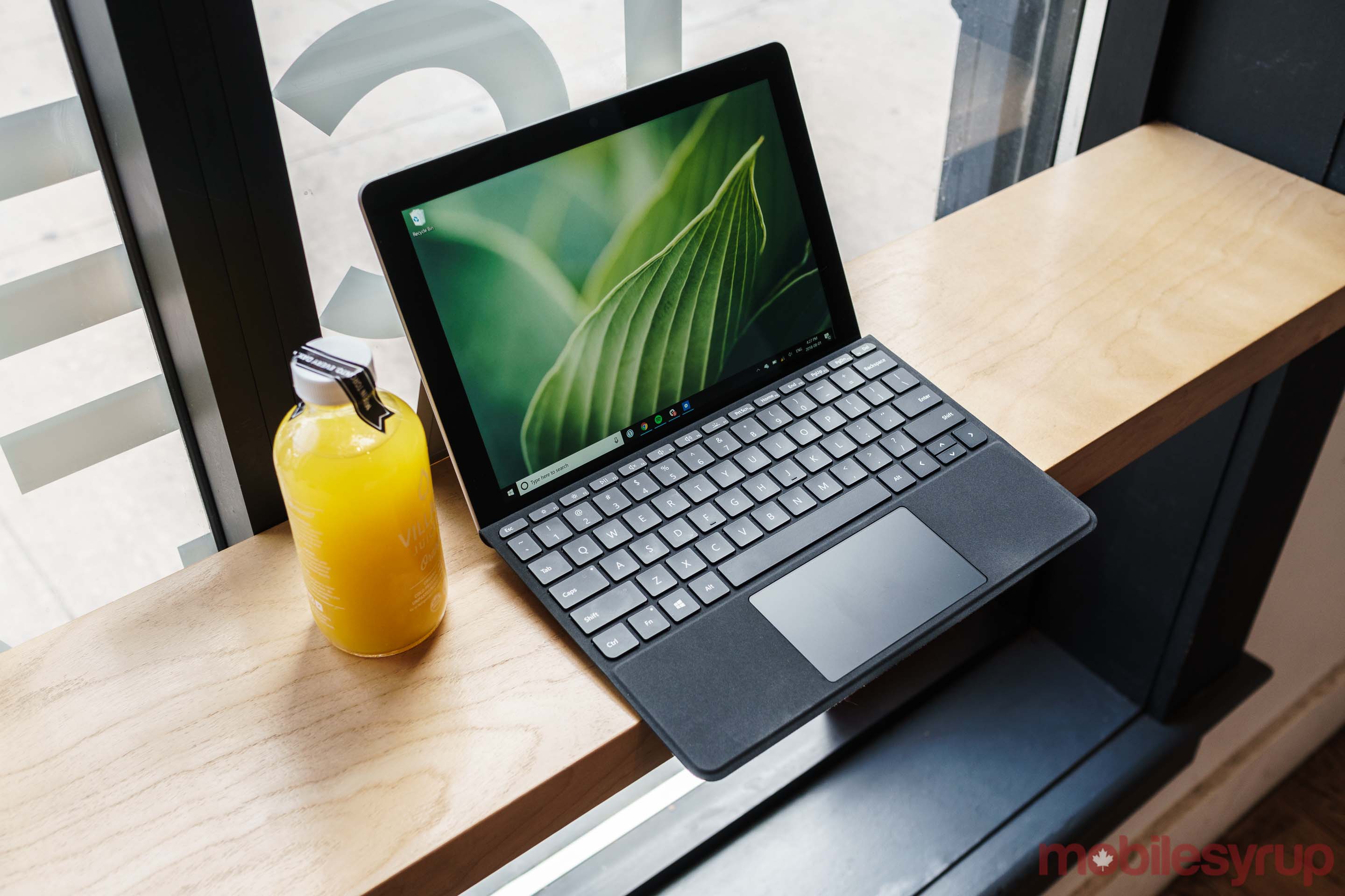
Surface Go is Microsoft's smallest and thinnest Surface to date

Measuring in at 8.3mm thick, the Surface Go is Microsoft’s thinnest 2-in-1 to date. In fact, as Paul Thurrott points out, unless the company were to redesign its current hinge mechanism and remove the headphone jack from future Surface devices, it’s unlikely Microsoft will be able to make a thinner 2-in-1.

Moreover, at only 521g, the Surface Go is light. During my time with it, I carried both the Surface Go and my 13-inch MacBook Pro, which weighs 1.37 kg, in my backpack to and from work every day, and I didn’t feel like my bag was any heavier as a result. Using Surface Go as a tablet, it feels substantial thanks to the same magnesium metal construction that’s a hallmark of Microsoft’s other Surface-branded devices.

Like Surface Pro, Surface Go feature a hinge with 165 degrees of movement

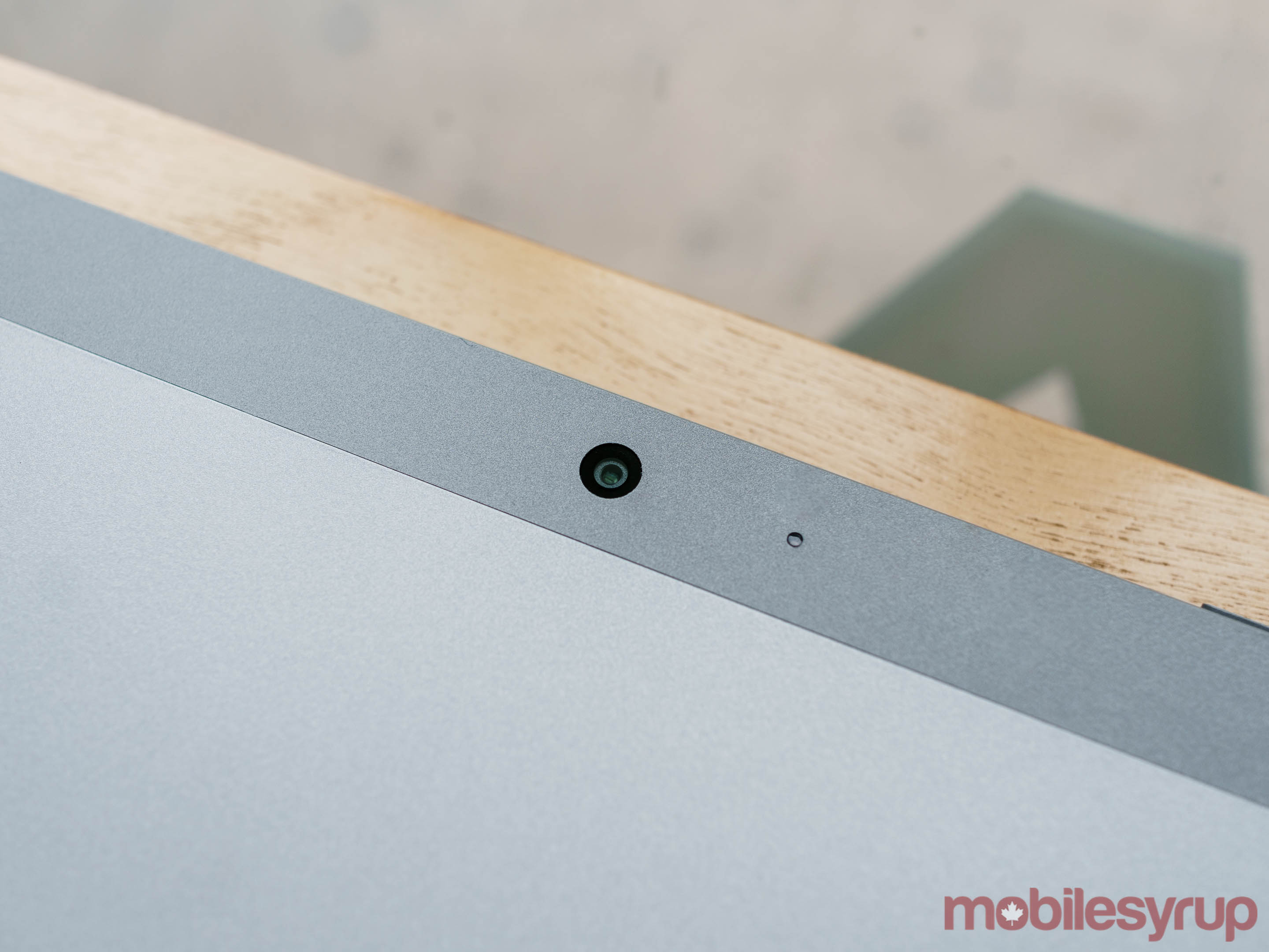
Indeed, with the exception of a missing PixelSense Accelerator, which in the case of the Surface Pro and Surface Book 2 help make the Surface Pen more responsive when used in conjunction with those devices, the Surface Go is, for all intents and purposes, a smaller Surface Pro. Small touches that Surface fans love, such as Windows Hello authentication and the Surface Pro’s 165-degree ‘Studio’ hinge, are all present here in miniature form.

Windows 10 wasn’t meant for a 10-inch screen

Sometimes, as is the case with the Surface Go’s display, that translation to a smaller Surface Pro doesn’t go off without a hitch, however.

The Surface Go features a 10-inch ‘PixelSense’ screen with 1800 x 1200 pixel resolution and 3:2 aspect ratio.

With a typical brightness of 350 nits, Surface Go’s display is plenty bright for indoor use. Moreover, it features 100 percent sRBG coverage and delivers crisp colours that are vibrant without looking too saturated. At first blush then, the Surface Go appears to feature a screen that’s much better than what other 2-in-1s, laptops and tablets in the $500 price range offer.

Unfortunately, there’s no getting around the fact that it’s a 10-inch screen, with all the limits to usability that entails.

While there are valid reasons for their large size, the Surface Go’s sizeable bezels make an already small screen feel even more cramped.

Screen scaling is another issue.

By default, Surface Go scales text and interface elements to 150 percent of their original size. This makes most text easy to read — though some smaller text and icons can look blurry. The trade-off, however, is that there’s just not enough screen space for Windows 10’s signature snap functionality to work as well as it does on larger screens.

For example, using Google services like Gmail and Drive, via both Microsoft Edge and Google Chrome, required either almost excessive amounts of scrolling to navigate or were completely unusable.

Meanwhile, apps that I downloaded from the Microsoft Store were hit and miss. Some, like Facebook Messenger and Instagram, were perfectly usable when snapped side-by-side, and yet others, like Spotify and Slack, needed their own dedicated virtual desktop to be useable.
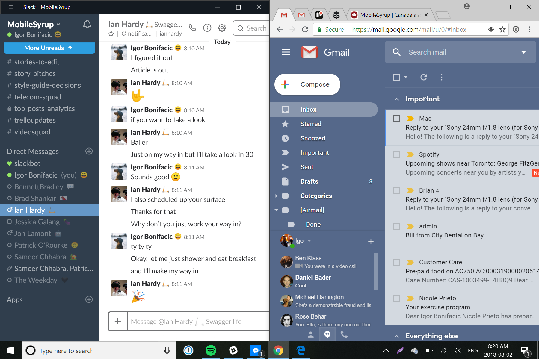
Snapping windows side-by-side could be better at Surface Go’s 150 percent scaling setting

Other interface scaling options, such as the 100 and 125 percent settings, make most text almost too small to read.
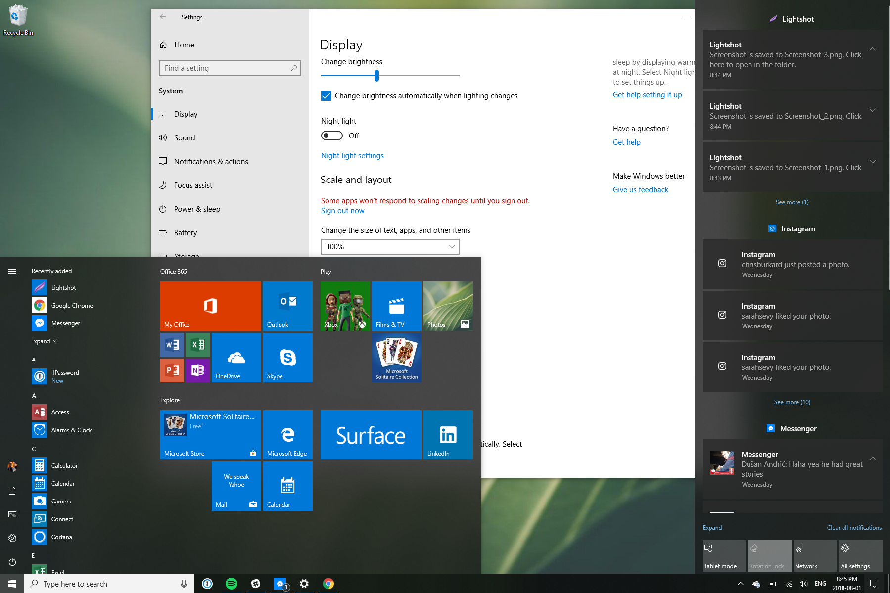
100 percent interface scaling

The result of all of this is that, more so than other Surface devices, making the most of Surface Go means switching between virtual desktops.

Ironically, most of Windows 10’s best desktop management tools, such as the ability to switch between apps even when they’re on different virtual desktops by using the Alt-Tab shortcut, aren’t enabled by default, nor does the operating system go out its way to surface these tools to the user.
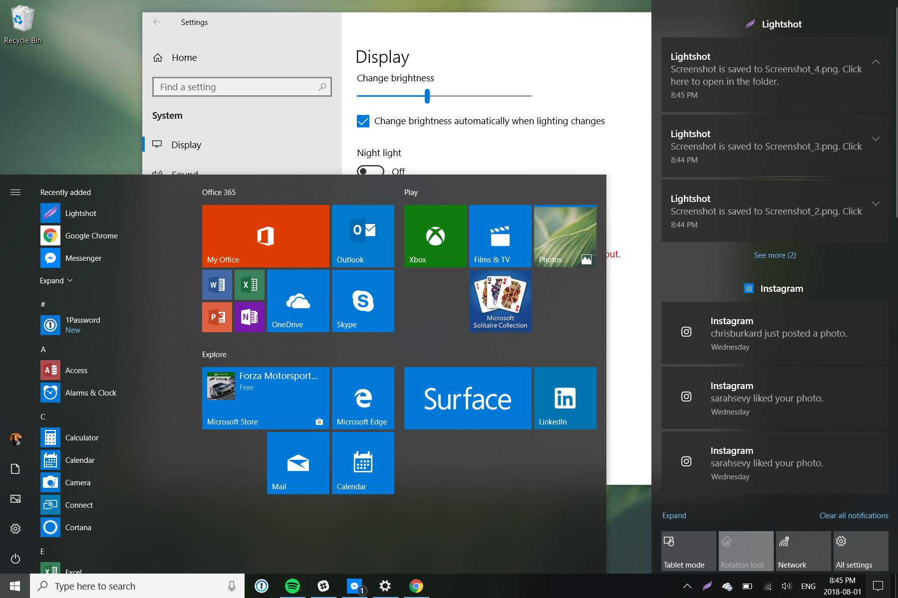
125 percent interface scaling

Moreover, even shrunk down, the display’s 3:2 aspect ratio makes the Surface Go somewhat awkward to use in a portrait orientation, limiting its appeal as a tablet.

Elsewhere, Microsoft’s attempt to make a small Surface Pro leads to stronger results.

A case study in how to design a small keyboard

Specifically, the biggest standout is the new, smaller Type Cover Microsoft created for the Surface Go.
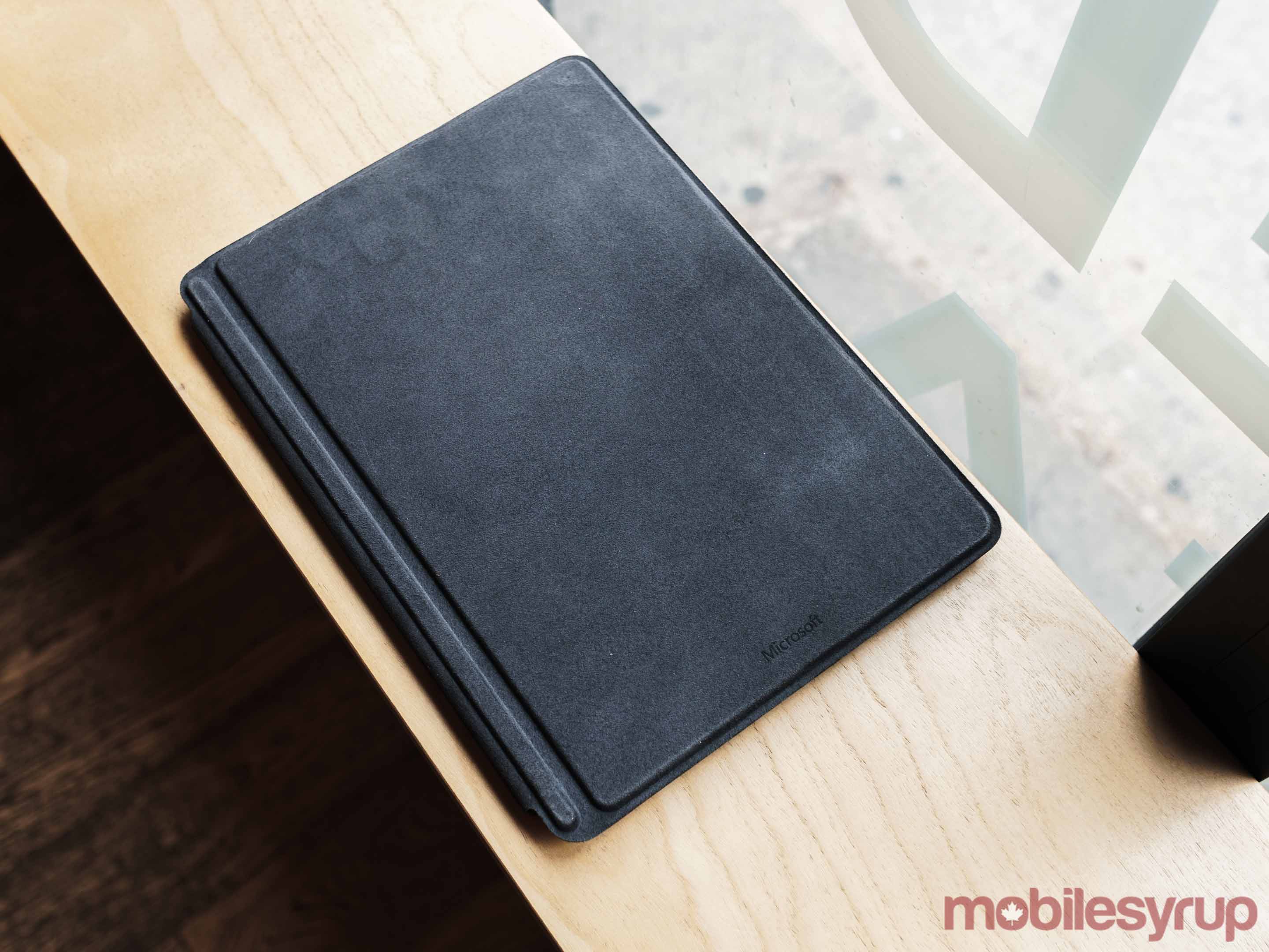
Microsoft did an amazing job with Surface Go's Type Cover

While my typing was less precise and slower with the Surface Go’s smaller Type Cover keyboard, which is 85 percent the size of a full-sized keyboard, I didn’t notice any comfortability issues, even during extended use. In fact, I wrote the majority of this with the Surface Go.

Moreover, in a pleasant surprise, the Surface Go’s keyboard features the largest trackpad Microsoft has ever shipped on one of its Type Covers. It’s now the full length of the space bar, which makes it more comfortable and easier to use.

To be clear, there’s still a notable difference between the Surface Go’s keyboard and any full-sized keyboard. Given my job, I don’t think I could use the Surface Go as my daily workhorse machine. Between the cramped screen and smaller keyboard, everything felt like it took longer than it does on my MacBook Pro or Windows 10 desktop at home.
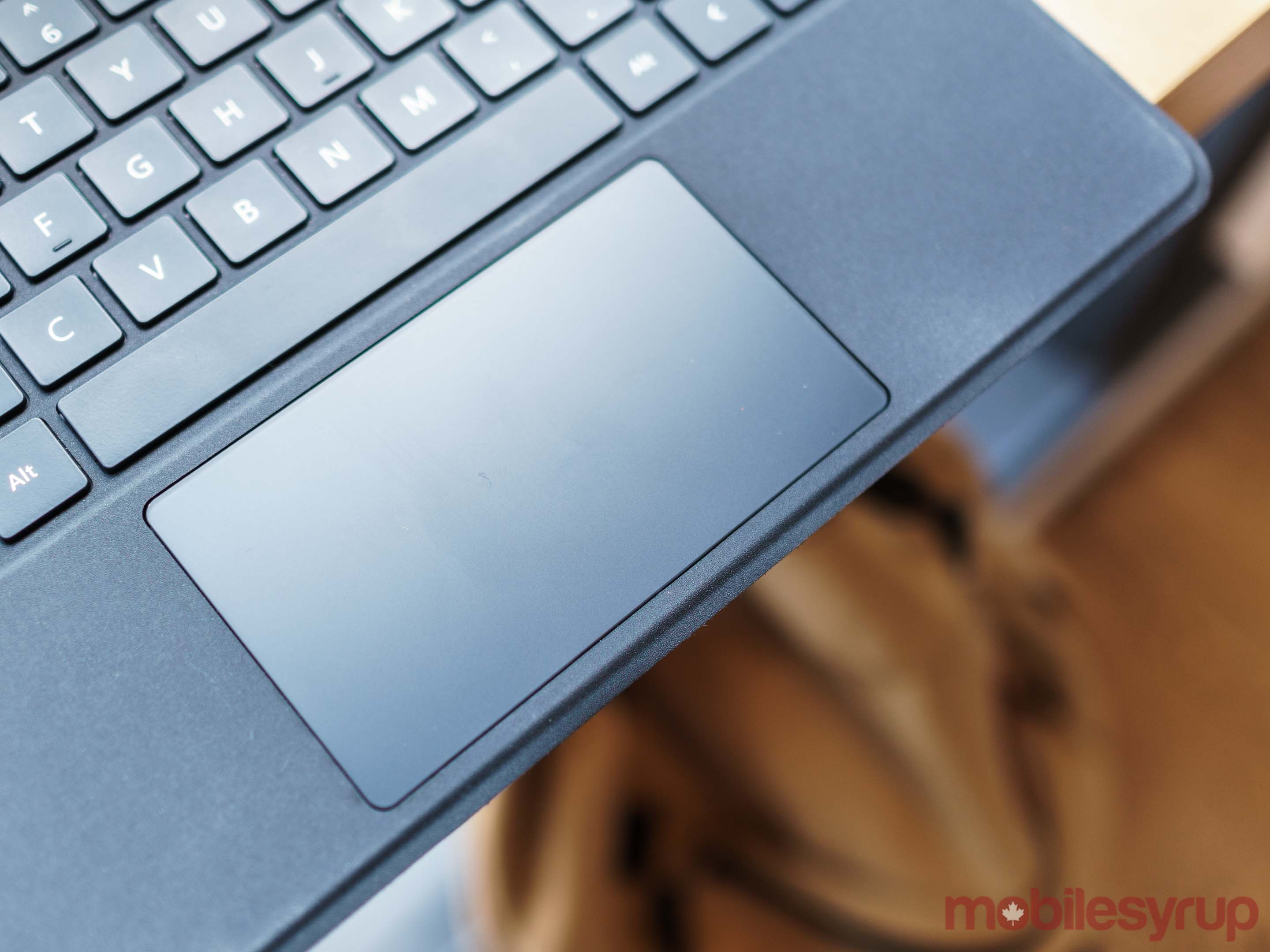
Despite its small size, it actually features the largest trackpad on a Surface to date

That said, Microsoft should be commended for creating an excellent keyboard within the constraints it set for itself. The Surface Go Type Cover stands as one of the best small-sized keyboards I’ve used, far surpassing peripherals like Apple’s Smart Keyboard.

Intel’s 4415Y chipset delivers
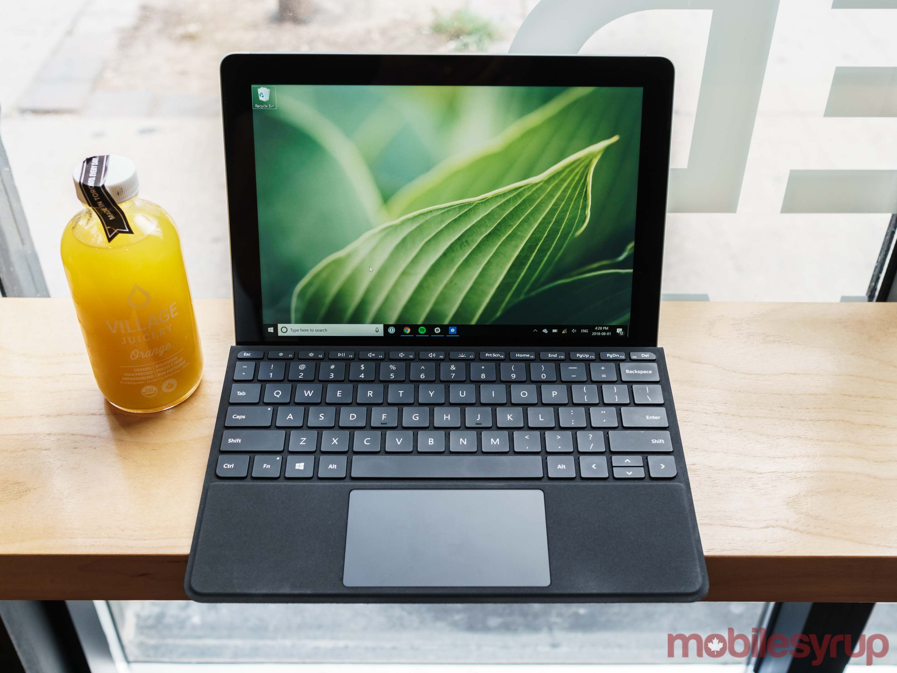
One concern I had going into this review was performance.

The 7th generation Intel 4415Y chipset that powers the Surface Go is a processor that is typically found in mid-range Chromebooks, not devices that come pre-installed with a full desktop operating systems like Windows 10.

My experiences using computers with Intel’s Core M series of processors, which the chipmaker markets as more technically capable than the 4415Y, left me frustrated. I always felt like I was fighting those devices to complete simple tasks.

To my surprise, however, the 4415Y was a capable performer. With the model Microsoft provided to MobileSyrup, which featured 8GB of RAM and a faster 128GB solid-state drive (SSD), I was able to use all my usual go-to apps — Spotify, Chrome and Slack — across multiple virtual desktops, without issue or slowdown.

Of course, performance wasn’t as smooth as what I’ve experienced on more powerful Windows 10 machines; it sometimes took several long seconds before apps and new browser tabs would load, and while I was able to complete more processor intensive tasks, such as editing a photo in Adobe Lightroom, those were best left to more capable machines. In short, as a light computing device, the Surface Go delivers exactly where it counts.

Don’t expect amazing battery life

Battery performance, on the other hand, is about what one can expect with a device of this size.

On its website, Microsoft claims it was able to eek out nine hours of battery uptime on the more power hungry 8GB model. Like most other industry battery tests, Microsoft’s Surface Go test involved a device that continuously played local video, with its Wi-Fi on, until it fully discharged its battery.

When I tested the device in mixed-use, using Microsoft Edge as my primary browser and listening to music on Spotify while writing this review with the computer’s brightness set to the ‘Suggested” setting, I drained the 27 watt-hours battery from 100 to 10 percent in approximately four hours and 10 minutes. In a second battery test I conducted using Google Chrome instead of Edge, the Surface Go’s battery performed slightly worse, draining to 10 percent in just under four hours.
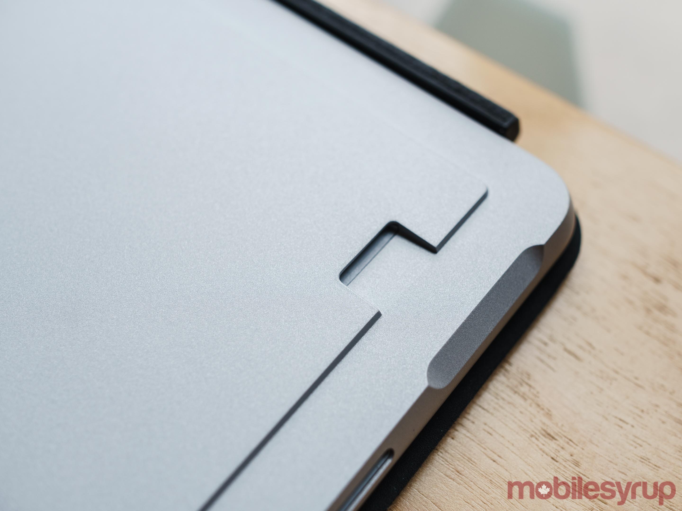
Like past Surface devices, Surface Go features a microSD card reader

If there’s a silver lining to the Surface Go’s average battery life, it’s that it is the second Surface device to ship with a USB-C port (it also includes Microsoft’s proprietary Surface Connect port, a 3.5mm headphone jack and microSD card reader). This means you can use an external battery to charge the 2-in-1 when it’s not near a wall outlet; as an added bonus, if you already own a USB-C charger, you don’t have to carry a Surface Connect charger, which is only designed to charge Surface devices.

Forget the iPad comparisons

Surface Go stacked on top of the 10.5-inch iPad Pro

For better and worse, Surface Go is going to get a lot of comparisons to Apple’s new $429 iPad.

While I think they’re fundamentally different devices, it’s worthwhile pointing out some of the differences between the pair.

To start, I can’t overstate how much better the typing experience is on Microsoft’s new Type Cover compared to the Bluetooth keyboards I’ve tried on the iPad. Not is there only more key travel, the fact that there’s a trackpad, with support for gestures, makes it a lot easier to use the Surface Go as a productivity-focused machine.

Physically, Surface Go features front-facing stereo speakers (which output loud and clear sound), as well as a sensor that enables support for Windows Hello facial authentication, both features that aren’t currently available on the entry-level iPad. It also includes a microSD card reader, USB-C port and built-in kickstand.

Then there are the differences between Windows 10 and iOS. While even on the iPad there are examples of apps that aren’t properly formatted for the device (see below), on the whole, Apple’s tablet better functions as a dedicated tablet than the Surface Go. The main issue with Windows 10 as a tablet operating system is that there are far too many apps on the Microsoft Store that aren’t properly optimized for tablet mode use.

Spotify, to pick one popular example, doesn’t feature a dedicated tablet interface on Windows 10 (despite the fact that it has one on iOS). Spotify is just one example of a popular Windows app that doesn’t have a touch-optimized interface. There are countless other examples.

Of course, for all its advantages as a tablet operating system, iOS isn’t a desktop operating system. Between side-loading apps and actual multi-tasking, there’s so much more you can do with a desktop operating system like Windows 10. However, that does mean there’s a lot more added complexity with Windows 10. Even with some of the features Apple has implemented to make the iPad more capable as a productivity machine, I’ve always felt more inspired to do work with Windows 10 devices like Surface Go.

Deceptively priced
At launch, the Surface Go is available to purchase in two different models. The base model, with 4GB of RAM and 64GB of internal storage, costs $529 CAD. The more expensive variant, which includes 8GB of RAM and 128GB of internal storage, is priced at $699 CAD. Later this year, Microsoft also plans to release a Surface Go model with LTE connectivity. The company hasn’t announced yet how much that variant will cost.

Besides the difference in storage capacities, the 128GB Surface Go features faster SSD storage than the 64GB model, which makes use of slower embedded MultiMediaCard (eMMC) storage.

Otherwise, both currently available models are identical, shipping with the same Intel 4415Y chipset.

If you’re considering the Surface Go, the base model is tough to recommend. I can’t speak to what performance is like on it — as I mentioned earlier, Microsoft provided MobileSyrup with the 8GB model for review. However, even without having used it, I hesitate to recommend it for two reasons.

First, for a device that ships with a full desktop operating system (out of the box, Surface Go comes with Windows 10 S. Users can upgrade to Windows 10 Home for free) 4GB of RAM is likely to lead to a sluggish experience, particularly as the Surface Go ages.

Second, even using cloud storage services, 64GB is likely far too little local storage for most people’s needs.

After installing only the bare minimum of apps I need to do my job, 30GB of my Surface Go’s SSD was already taken up. With the base model’s 64GB of internal storage, you’re looking at a situation in which more than half of your new computer’s storage will be taken up before you even launch it for the first time.

For the sake of owning a device that will have some longevity, and one that you’ll actually enjoy using, the more expensive model is the one to buy.

That raises a separate issue, however.

$700 is a lot of money to spend on a 2-in-1 that doesn’t come with a keyboard inside the box (Microsoft sells the Surface Go’s Type Cover separately). Once you start factoring in accessories like the Type Cover, Surface Go costs much more than its sticker price suggests.

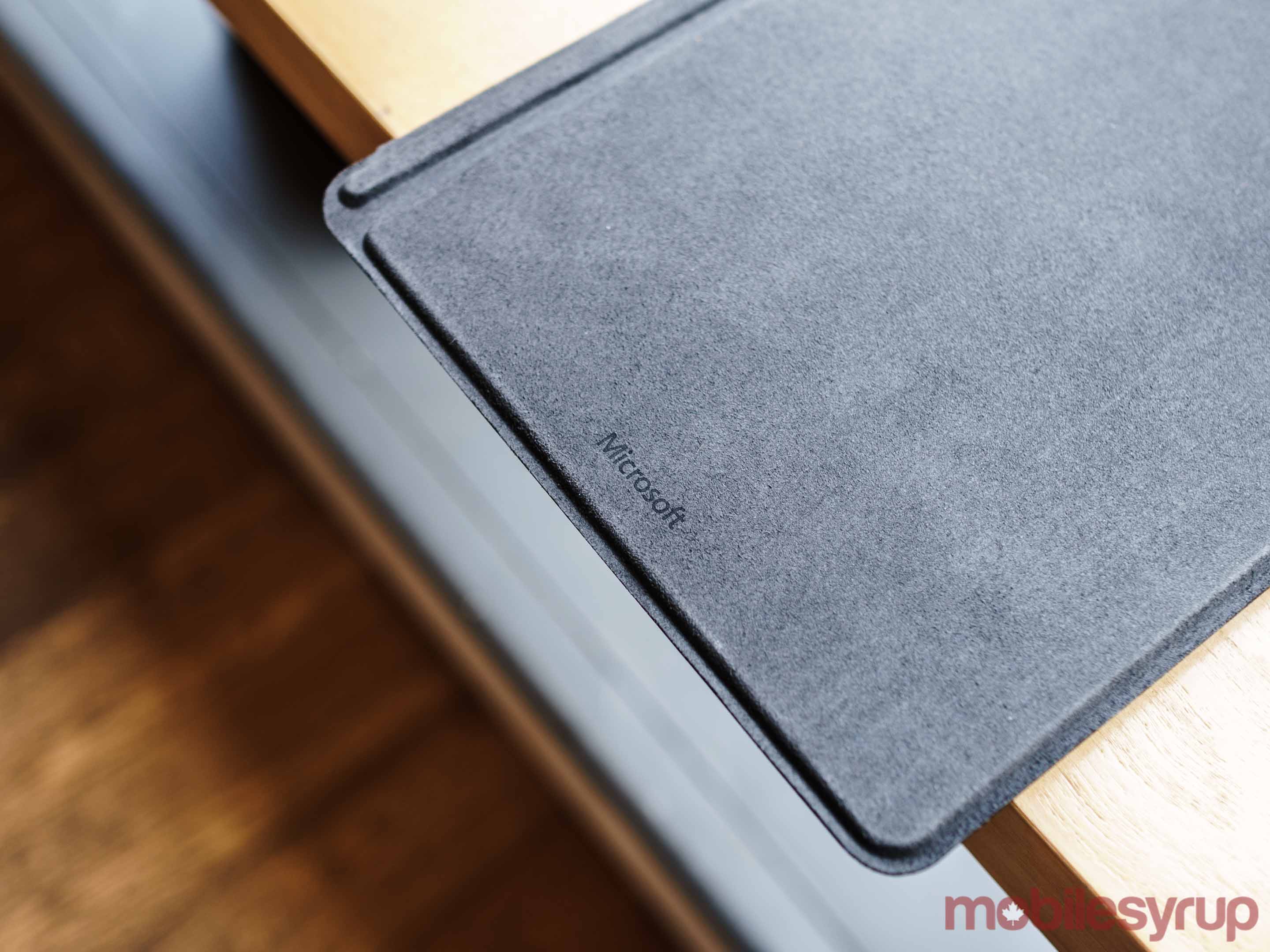
At the minimum, Canadian consumers can expect to spend $129.99 CAD to add the basic black Type Cover to go along with their new device. The more premium Alcantara Signature Type Cover, which comes in three different colours — ‘Burgundy’, ‘Cobalt Blue’ and ‘Platinum’ — is priced at $169.99 CAD. Adding a Surface Pen ($129.99 CAD) and Microsoft Complete warranty coverage ($129 CAD) to the mix, increases the cost of the Surface Go even further.

Depending on the model, using the Surface Go as its team intended, with Surface Pen and Alcantara Type Cover, costs between $829 and $999 before tax.

That’s a lot of money to spend on what’s ostensibly supposed to be a second computer or a device you give to a child.
The post Surface Go Review: Don’t throw away the Chromebook appeared first on MobileSyrup.

02 Aug 17:03

Make More Books

by peter@rukavina.net (Peter Rukavina)

An Artist Trading Cards spin-off project.

02 Aug 17:03

Large drone almost collided with airliner 1.2 kilometres above Edmonton

by Jonathan Lamont
DJi Phantom Drone

A WestJet airliner had a near miss with a large drone this week.

According to police, the plane was on approach to Edmonton International Airport. Flying at 4,000 feet — about 1.2 kilometres above the ground — the pilots spotted the drone. Described as “pallet-sized,” it was flying off their left wing.

Scott Pattison, a spokesperson for the Edmonton Police Service, told CBC News that someone wasn’t acting responsibly and could have caused “an extreme disaster.”

Furthermore, Pattison said that a drone could cause significant damage to the plane. A drone could collide with the cockpit, killing or injuring the pilots. Additionally, the drone could bring down the plane by getting caught in the turbine.

The main issue here is that the drone violated 90 metre maximum height imposed by Transport Canada — about 300 feet.

Along with that rule, Transport Canada has a number of guidelines around drones. Furthermore, these rules prevent incidents like this one and worse. Unfortunately, not everyone follows these guidelines.

Transport Canada Guidelines

The follow guidelines apply to unmanned aerial vehicles (UAVs), such as recreational drones. UAVs must, among other restrictions:

  • Fly no higher than 90 metres above the ground
  • Keep at least 30 metres away from vehicles, vessels or members of the public
  • Keep at least 5.6 kilometres from airports
  • Fly within 500 metres and remain within sight of the operator

For a complete list of rules and guidelines, visit Transport Canada’s website.

Additionally, UAV operators who put an aircraft at risk, fly drones where nor permitted, and/or endanger anyone’s safety could be fined as much as $25,000. UAV operators could see jail time as well.

Police are still investigating the incident and have asked anyone with information to call Edmonton police or Crime Stoppers.

Source: CBC

The post Large drone almost collided with airliner 1.2 kilometres above Edmonton appeared first on MobileSyrup.

02 Aug 17:00

Where Do Educators Turn for Research into the Effectiveness of Technology Tools?

files/images/jex.PNG

David Nagel, THE Journal, Aug 15, 2018


Icon

It's like our whole media world wrapped up in an educational technology article. "Educators are most likely to turn to media outlets and ed tech vendors for information about education technology. But they don't necessarily find the information from those sources reliable." I would ask, why don't they look elsewhere then? But where? The survey was conducted by the International Society for Technology in Education (ISTE) and the Jefferson Education Exchange (JEX). The article doesn't link to it (grrrr) and neither does the press release (grr). Indeed, the whole thing looks like an advertisement for ISTE's new EdTech Advisor service. So what we have here is what appears to be a fake news article describing a possibly fake survey all to advertise some product. Do you wonder why educators don't find these sources reliable? And ISTE - shame on you.

Web: [Direct Link] [This Post]
02 Aug 17:00

BlackBerry’s Evolve X is the company’s first phone with wireless charging

by Brad Bennett
blackberry logo

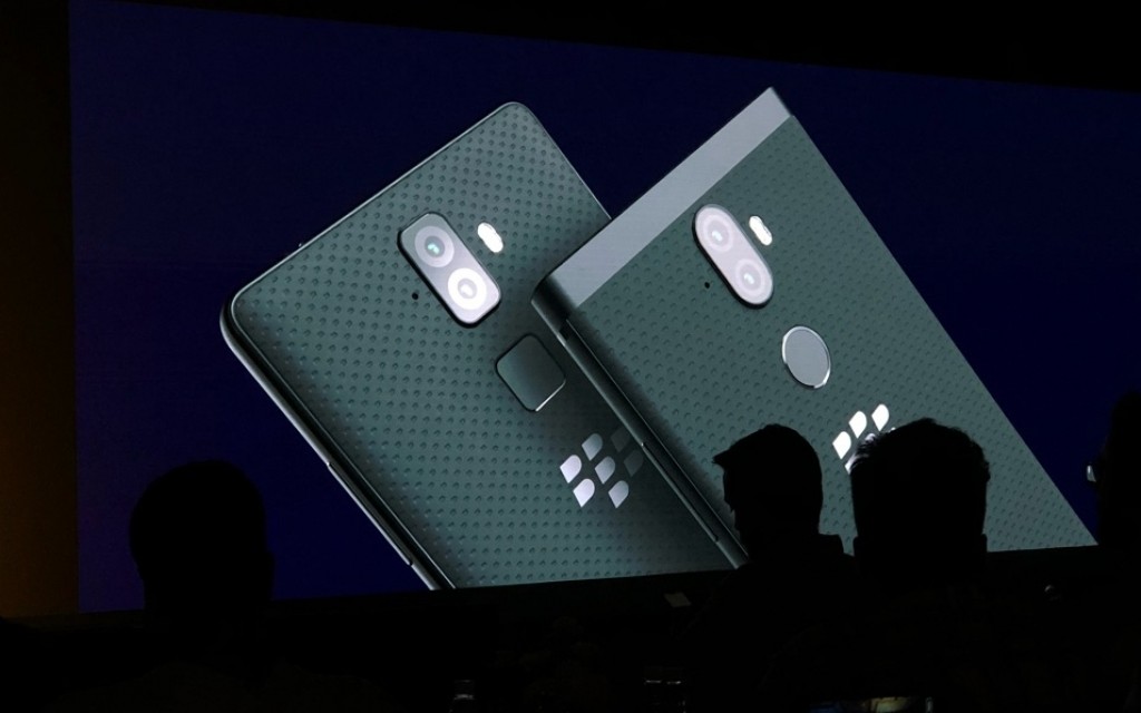
BlackBerry is launching two new Android phones in the Indian market that include flagship level features.

The pair of devices are going on sale in India and there’s a slim chance they might also make it to Canada, though nothing has been confirmed yet.

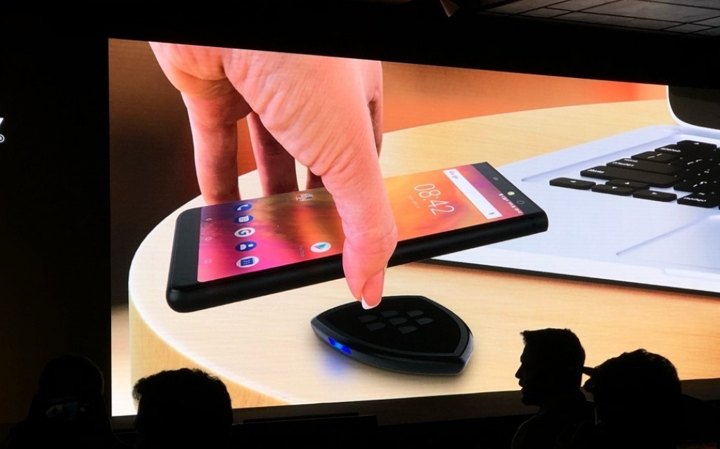
Of the pair of devices, the Evolve X is the more premium of the two, with wireless charging, a 6-inch screen, a Qualcomm Snapdragon 660 processor and two rear cameras.

The regular Evolve packs most of these features with the exception being that it runs a Snapdragon 450 chipset and doesn’t feature wireless charging.

One of the most exciting aspects of the new phones is the battery life. The Key2 only features a 3,500mAh battery, so both of these new handsets should last much longer than the older phone.

The Evolve X is priced at $510 USD and the regular Evolve costs $365.

According to GSMArena, the phones will go on sale in the middle of September, but they’re set to be Amazon exclusives in India.

Image Credit: GSMArena

Source: GSMArena

The post BlackBerry’s Evolve X is the company’s first phone with wireless charging appeared first on MobileSyrup.

02 Aug 17:00

Sonos redesigned the Nasdaq Bell sound to mark IPO filing

by Patrick O'Rourke
Sonos One smart speaker

In its 16th year existing as a company, smart speaker manufacturer Sonos has filed an IPO that’s set to value the company in the range of $1.5 billion USD.

While a huge deal for the company, Sonos also marked the occasion in an interesting and unique way: the smart speaker company has completely redesigned the sound of the Nasdaq’s opening Bell. While some might assume that this is little more than a limited-run publicity stunt, it seems that’s not the case, at least according to Sonos.

Sonos says that the new bell will continue to ring at the Nasdaq for the foreseeable future. At least for the time being, it seems the sound change doesn’t have a specific end date.

While the new Bell isn’t that different from its predecessor, it does sound slightly more aggressive and also ends with the noise of a spinning coin. To me, similar to the previous Bell, the new sound once again closely resembles the obnoxious slot machine noise that’s ever-present at casinos.

Sonos is set to be listed as SONO on the Nasdaq. The Sonos One, the company’s most recently released smart speaker, has been positively reviewed by most critics.

The speaker features Amazon Alexa voice-activated assistant integration, with Google Assistant supposedly launching at some point in the near future.

Source: Sonos

The post Sonos redesigned the Nasdaq Bell sound to mark IPO filing appeared first on MobileSyrup.

02 Aug 17:00

Amazon might have accidentally revealed Samsung’s Wireless Charger Duo

by Jonathan Lamont
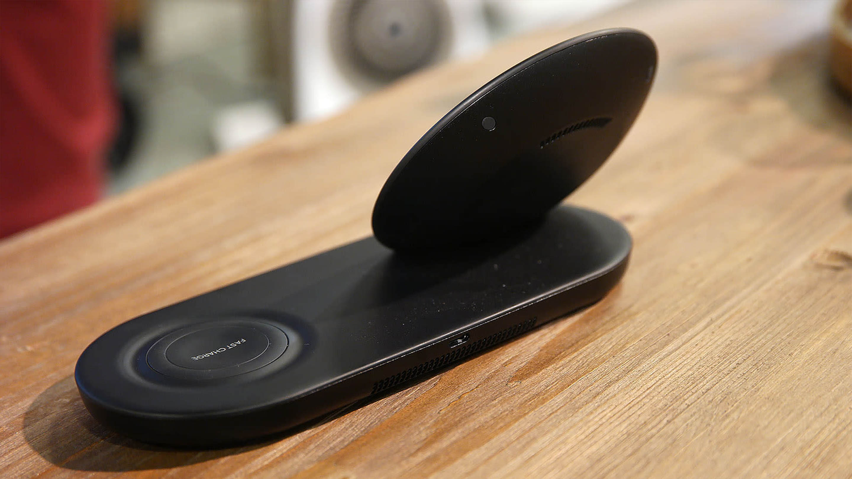
Samsung Wireless Charger Duo

Amazon may have outed Samsung’s upcoming Wireless Charger Duo at a holiday press preview event

The event showed off a number of products the company wants to push as we near peak gifting season. However, among the many products on display was one that isn’t available yet.

The product, which looks identical to the Wireless Charger Duo leak that came out of Russia earlier this week, was sitting out on a shelf for anyone to see.

Gizmodo seniour reporter Sam Rutherford was at the event and spotted the charging stand. According to Rutherford, Amazon employees at the event didn’t know much about the device. Furthermore, they didn’t know the price or release date.

Rutherford thought he caught a break when he spotted a product tag sitting nearby. However, the tag was labeled “Samsung Qi Pad (2018).”

Worse, the QR code on the tag linked to this Amazon store page for a different Samsung charging pad.

Samsung Wireless Charger Duo rear

Despite the lack of a tag, Rutherford was not deterred. He set to work investigating the charging pad with all the journalistic skill he could muster.

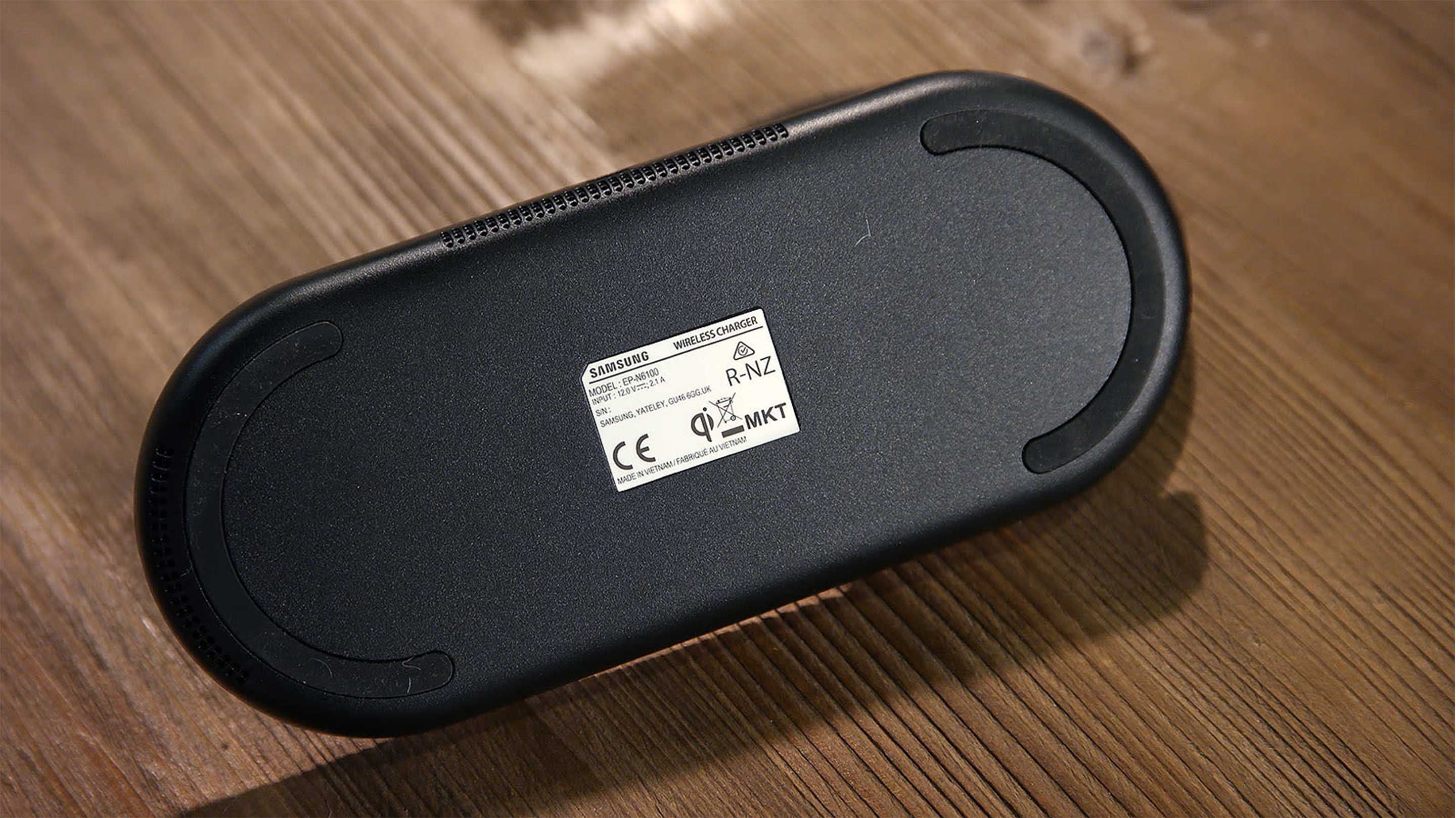
The Charger Duo appears to have two wireless charging pads powered by a single USB-C input. The device doesn’t have any official Samsung branding, but Rutherford tipped it over and discovered a Samsung sticker on the bottom. The label sticker also noted the model number and power specs, listing the input as 12 volts, 2.1 amps.

Samsung Wireless Charger Duo bottom

Additionally, the device features two indicator lights that tell you the charging status of either pad. Unfortunately Rutherford wasn’t able to charge his phone. The pad seemed as if it weren’t fully operational.

As for how the charging pad got to the display, Rutherford thinks someone at Amazon simply grabbed the wrong product. A different charging pad was clearly meant to be there.

Images: Sam Rutherford, Gizmodo

Source: Gizmodo

The post Amazon might have accidentally revealed Samsung’s Wireless Charger Duo appeared first on MobileSyrup.