Shared posts

04 Sep 03:52

How To Add Your Micro.blog Feed to NetNewsWire

In NetNewsWire 5, you can add your Micro.blog feed of people you follow, so you can read their posts in NetNewsWire.

Here’s how:

Figure out the URL. It’s something like this, where my username is replaced with your username: https://micro.blog/feeds/brentsimmons.json

In NetNewsWire, hit cmd-N. (Or click the + button in the toolbar.) Put that URL in the URL field in the sheet that appears. Give it a name if you want, and choose a folder if you want. Then click the Add button.

That’s it!

Posting to Micro.blog

If you have the Micro.blog app on your Mac, you can select an article in NetNewsWire, then pull down the share menu in the toolbar, and choose Micro.blog.

It will send that article to the Micro.blog app, where you can edit and comment before posting.

The same thing works for MarsEdit, so you can post to any blog.

04 Sep 03:52

NetNewsWire Diary #1: Automatic Hashing and Performance

I like Swift’s recent addition of automatic hashing support — in many cases you can declare conformance to Hashable and let the compiler do the rest.

This let me delete a bunch of code, and I love deleting code.

* * *

I noticed a regression the other day: for some reason, fetching articles from the database and populating the timeline view got noticeably slower when the results are fairly large.

I worried that this is because my articles database is over a year old, and as it grows the fetch times get longer.

So I used the Time Profiler instrument to see what was going on during a fetch — and I found that most of the time was being spent in hash(into:) in two of my structs: Article and DatabaseArticle.

And of course fetching articles means creating a whole bunch of these structs. Hundreds or thousands, even, depending.

Those were two cases where I had adopted automatic hashing. The hash(into:) method was generated by the compiler.

So I thought about what to do. I wanted a hash that’s unique, or close enough, and I want it to be fast.

The solution, in both of these cases, was obvious — each has an articleID property that is unique per database, which is close enough. That means just hashing one property rather than (presumably) all of them.

So I made hashValue a computed property in each of those structs, as in:

var hashValue: Int {
    return articleID.hashValue
}

I built and ran the app — and the performance issue was fixed.

I put some (temporary) timing code around the code that fetches all unread articles, and it went from 0.37 with automatic hashing to 0.07 with my computed hashValue.

That’s huge!

I realize I could have written a hash(into:) function instead. Maybe I should? I’m not sure that it matters one way or the other. Possibly by the time you read this I will have switched the implementation.

The point still stands, though, that automatic hashing in the case of objects with lots of properties might be a performance hit. As always — use the profiler.

PS Hashing is important in NetNewsWire because I use sets frequently. In general I make arrays at the UI level, when populating a timeline (for instance), and use sets when fetching from the database, etc.

04 Sep 00:36

Amsterdam Sample Platter

by peter@rukavina.net (Peter Rukavina)

If there was a travel planning bug when I put this trip together, it was only leaving 48 hours for Amsterdam. But we had a hard start for public school on Thursday on one end, and TonElmineCon on the other, so there was, alas, no way to squeeze in more time. So we got to sample a quick swath of Amsterdam today in hopes that we one day use what we learned as the basis for a return trip.

We started the day with the bountiful breakfast at ZOKU (therein following Pete’s Law, “always book a hotel with a good breakfast buffet”), and then lazed around on the roof, reading and sketching for another hour (therein following Pete’s Law, newly-learned, “travel is not a race”).

ZOKU breakfast

Oliver on the ZOKu roof

The Roof

With a spring in our step from the hearty, relaxing start, we headed out on the town just after 11:30 a.m.

Given the success of our Malmö cargo bicycle beta test, we decided that our first stop would be to try renting a Dutch take on the people-carrying bicycle, the Bakfiets bike.

We walked up the street to MacBike Rental at Waterlooplein and found a straight-talking, helpful clerk there who considered the possibility and advised that I should try riding the bike without Oliver first, lest I be unable to, and he fall out. I left Oliver as a deposit, and headed off for a loop around the block.

The bike was unusual to ride, not surprising given how long it is, and how the front wheel is steered indirectly. But I managed to get the hang of it, and returned unscathed (“most people, if they’re gonna fall off, do so in the first 20 seconds,” I was told). Next it was time for Oliver to join in: I held the bike steady while he climbed into the wooden box and sat down, and off I pedaled.

With 150 pounds of teenager in the box the bike was even more unusual to handle, and after half a block I realized that even if I could get a rhythm down, I wouldn’t feel comfortable merging into the chaotic flow of Amsterdam cycle traffic, so, with heartfelt hanks, we bid our host goodbye and continued on without cycle.

Oliver with a Bakfiets bike

We walked west, through Rembrandtplein, and when we passed a Maoz Vegan restaurant on a corner Oliver, mindful of our need to eat and hydrate, insisted we stop for lunch, ever-mindful of my vegetarian tendencies. We enjoyed a couple of falafel sandwiches sitting at a counter overlooking both a tattoo & piercing shop and a multi-floor live sex show complex; Oliver was unphased.

Our next step was, I think, my favourite shop of our entire trip: the Boekie Woekie bookshop on Berenstraat is in its 32nd year of selling exclusively books made by artists; packed into its tiny storefront were more interesting books than I’ve seen gathered in one place anywhere. I stretched Oliver’s patience and spent 30 minutes plumbing the stacks, whittling my selections down to three tiny books that I could fit into my satchel. Since I started experimenting with printing and binding books this year, I’ve wondered if there might be a way that I could sell them; Boekie Woekie suggests that there is. I could have spent the day there. (Thank you to Robin Sloan, whose own visit to the shop, mentioned in his newsletter, was my inspiration for the visit).

Although we’d only been out for a couple of hours at this point, a break was in order, so we rounded the corner and walked up the canal to Koffiehuis ‘De Hoek’ where Oliver devoured a piece of Dutch apple pie and I discovered “fresh ginger tea,” which, as near as I can tell, is made simply by pouring boiling water over slices of fresh ginger (it was great).

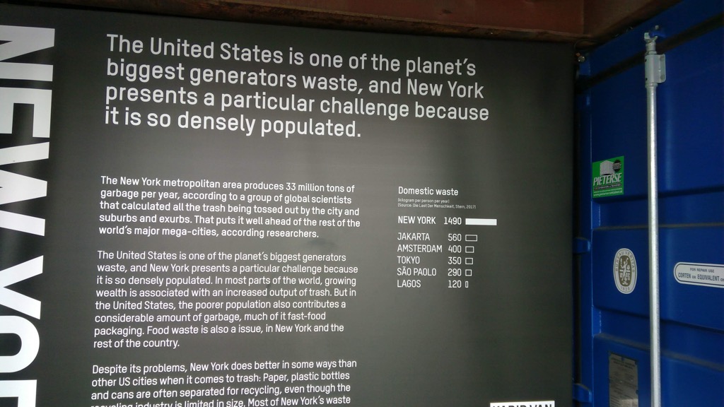
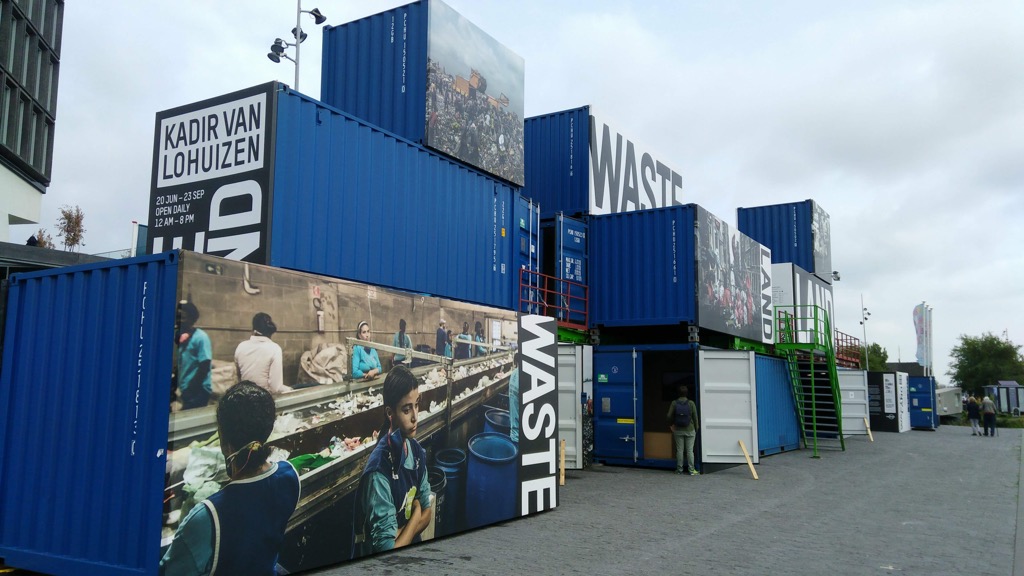
Eager to see something of the Amsterdam waterfront, and armed with a recommendation from Harold, we walked to the central train station, through a tunnel under the tracks, and directly onto the ferry that runs to the area around the A’DAM building across the water (the ferry carries bicycles, scooters, and pedestrians, and it’s free). The neighbourhood across proved to be an interesting one to wander around: we largely ignored A’DAM (the perilous-looking swing suspending from the penthouse was forbidding-looking), but we toured an interesting shipping-container-housed exhibit on waste management in New York, Jakarta, Lagos, São Paulo and Amsterdam, got a coffee at Coffee Virus, hidden inside the A LAB, and then wandered around the A LAB itself (which appears, from our brief tour, to be kind of like Betahaus on steroids).

Wasteland

Wasteland Containers

Inside the A LAB

Inside the A LAB

There was really only one place that I had to visit in Amsterdam, and that was Mediamatic.

I first learned of Mediamatic when the content management system cum wiki that powers its website was used to manage the website of one of the reboot conferences. I created a page for myself on the Mediamatic website back in 2007 and it’s been there ever since. Also since then I’ve been subscribing to the Mediamatic email newsletter and paying attention to its various projects. So I’ve developed an affinity for the place, even though I’ve never visited. Until today.

Mediamatic describes itself like this:

Mediamatic is a cultural institution dedicated to new developments in the arts since 1983. We organize lectures, workshops and art projects, focusing on nature, biotechnology and art+science in a strong international network.

As far as the general day-to-day public is concerned, the easiest way to experience Mediamatic is through Mediamatic ETEN, its restaurant, and that’s where we pointed ourselves for supper tonight.

That pointing turned out to be something of a vertical challenge, as dutifully following Google Maps’ directions put us in full view of Mediamatic, but on a bridge two stories above, initially unable to derive the geographical path between us and it. Fortunately an elevator manifested itself at the end of the tram platform, and soon we were walking onto the grounds and in the door of the restaurant.

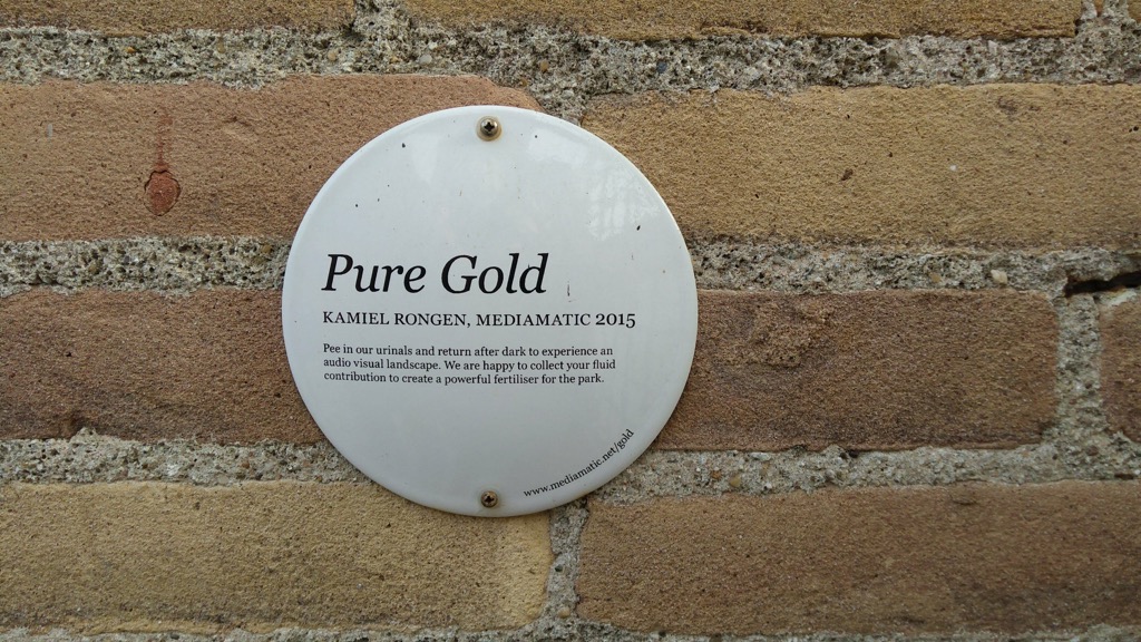
Mediamatic Clean Lab

Mediamatic from Afar

Pure Gold at Mediamatic

Mediamatic ETEN

Mediamatic ETEN is a vegan restaurant perched on the water, overlooking the Nemo science museum. They were serving pizza this evening, and we ordered up the Pizza Nero, an apple-pear juice, and a Swingers beer (“Reminiscent of sun, the beach and the fresh saltiness of the North Sea, Swingers is the perfect partner on the dance floor we call life.”)

Swingers Beer

Pizza Nero

The pizza, covered in mushrooms, onions, beans and greens, was delicious. And the beer was, indeed, reminiscent of the North Sea.

From Mediamatic, we took the hidden elevator back up to the tram platform, caught the № 26 to central station, and, from there, took the Metro № 53 back to ZOKU, stopping to take a photo of at least one of the city’s canals before leaving.

Amsterdam Canal

As I type we are in the sixth floor “living room” at ZOKU. I’ve just polished off another fresh ginger tea; Oliver a chai latte; and we shared a dish of mixed nuts (I could get used to having drinks and snacks easily-ordered 24/7).

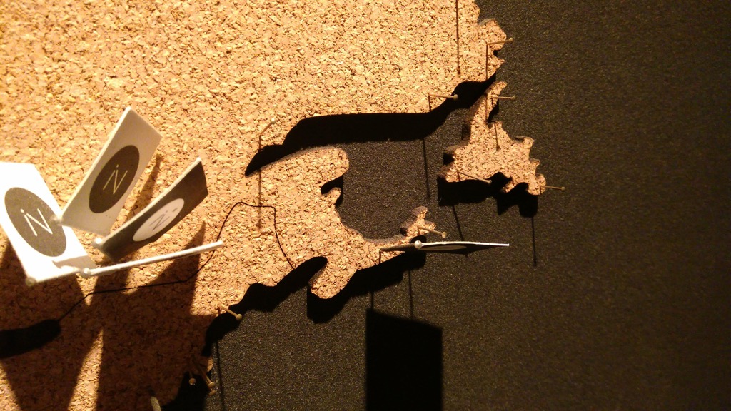
Sitting here typing away I’ve just noticed that the cork map of the world that’s mounted on the wall behind Oliver is missing Prince Edward Island; if we had more time, I’d use the 3D printer at the bar to rectify this. But we don’t. So we’ll have to come back another time.

No PEI on the ZOKU map!

We take the long Amsterdam-Frankfurt-Halifax journey tomorrow, arriving in the early evening; after an overnight, we’re back on the Island on Wednesday afternoon. And Oliver starts grade 12 on Thursday morning.

04 Sep 00:36

Samsung Galaxy Note 9 Camera Review: The pen sticks out

by Ted Kritsonis
Note 9 camera

The Galaxy Note 9 is Samsung’s largest phone by screen size, and continues a recent tradition of borrowing heavily to iterate forward.

The South Korean tech giant has now entered into a predictable pattern. The company may present the Galaxy S and Galaxy Note lines as distinct, but they are inexorably tied, with incremental improvements carry over from one to the other.

The camera is no different. An overwhelming majority of the features in the Galaxy S9+, in particular, are found intact on the Note 9. Some of the additions do have practical impact, though it’s the S Pen’s involvement that proves to be the most impactful.

Shooting with this phone didn’t offer too many surprises, except for the potential the new additions may have. For more on everything else the device has to offer, MobileSyrup’s Patrick O’Rourke has that covered.

More of the same

Line up the Galaxy S9+ camera specs with those of the Note 9, and they are almost carbon copies. The same lenses, image sensors and software features are available.

To recap, that’s the same 12-megapixel sensor and mechanical aperture that switches between f/1.5 and f/2.4, plus an additional 2x optical zoom lens. The telephoto lens maintains its static aperture.

This extends to the special modes as well. Live Focus, the mode that uses both lenses to capture images with adjustable depth of field, is back with little to no performance upgrade. Super Slo-Mo video is unfortunately still shot at 720p, rather than 1080p, where it would look better. AR Emoji return as well. That was the mode introduced in the Galaxy S9/S9+ where users could create avatars based on animated versions of their face.

Even compared to the Note 8, the Note 9 is not a leap forward from a technical perspective. The mechanical aperture certainly is different, and is even more useful in Pro mode. The additional software features could make a difference, particularly for novice shooters, whereas the S Pen’s integration could make a more functional difference.

Wielding the S Pen

Note 9 pen

I’ve always been lukewarm on the S Pen from the start. It is a neat accessory to have, though its functionality was that of a stylus. If it wasn’t pressed against the screen in some way, it served no other purpose. Equipping it with Bluetooth Low Energy (LE), it presents another way to utilize it without having to write anything.

The pen’s button can act as a shutter, capable of shooting photos with a simple click. By default, double-clicking the button switches between the rear and front-facing cameras, but you can also toggle that so it records video instead.

It’s one of those practical things that I’m surprised I never considered before. If there are apps acting as remote shutters for cameras, why not an accessory built into the phone? And the best part is that it works efficiently. I used it when setting the phone up on an angle where it was tougher to hit the onscreen shutter (or volume button), and in instances where I wanted to shoot in low-light and nighttime. Resting it on a flat surface or on a tripod, shooting in Pro mode at a very slow shutter speed — I only needed to focus on the display and just click the pen.

In another case, I wanted a majestic angle of a subject, so rested the phone against my shoe while I took each snap with the pen. Whether it was reaching overhead a crowd, an awkward angle or during movement, the pen made its mark.

I’m not a selfie person at all, but when I showed how the pen works for them, people were immediately drawn in. The most consistent feedback centred on the ability to better frame groups without anyone having to push the phone’s shutter. No more handing the phone to the tallest person for a wider angle.

Granted, wider-angle front-facing cameras have helped lessen that burden, but even so, there was no need to contort one’s thumb to snap the shot.

What made this even better was that it wasn’t an all-or-nothing commitment. The pen can go 200 clicks or 30 minutes — whichever comes first — before needing a recharge. Fully charging it only takes 40 seconds.

If Samsung can convince developers to take its open API and make use of the pen’s newfound integration in some way, then it may have a chance of being a game-changer. The good news is that it already works with third-party apps (not all, mind you), including photography ones. So, if you shoot with something like, say VSCO, then you are good to go.

AI recognition

Scene Optimizer is just another term to describe automatic scene recognition, where the camera’s AI identifies the subject and adjusts settings accordingly. Samsung is late to this game, as almost every other phone manufacturer has already done it. Nevertheless, it’s here, and it works decently.

I say decently because I discovered little that made it groundbreaking or innovative. It functions much like any other scene recognition does, though the Note 9 has a slight edge with the mechanical aperture playing a role.

There are 20 presets the camera can pick out, including sunsets, food, portraits, landscapes, mountains, birds, street scenes, backlit subjects and skies, among others. Do they work? Yes, for the most part, but as I discovered with the Huawei P20 Pro, two of the same qualifiers can confuse the AI. If you shoot a landscape with mountains and a sky in it, it’s a little hit or miss over how which one will take precedence.

Despite that, at least it’s a move in the right direction. And it’s entirely optional. Toggle it off and you basically have the same Auto mode from the Note 8 and Galaxy S9/S9+.

Then there are the flaw detection features, which highlight blurred and blinking subjects. This is one of those things that can be truly useful, if only the execution was broader. For example, blur detection only sets in when the level of blur is fairly significant. I would’ve preferred it tell me if there was any blur in the focal area to begin with.

The blink detection is more effective for selfies, but even then, it only seems to hone in on eyes that are fully closed. Anything less than that seems to slip through the cracks.

Image quality

Samsung deserves some criticism for putting out a $1,300 device that doesn’t at least raise the bar on camera prowess, but if it is any consolation, the Note 9 is one of the best shooters around.

The iPhone X is lauded for its camera, but I believe that praise is misplaced. True, it can take great photos — under the most optimal conditions. However, night shooting is mediocre at best, terrible at worst. In my testing, the Note 9 beat it handily in those scenarios.

What the Note 9 gets right is good contrast with less noise. For example, in one shot I took, the clock’s details are visibly clear, while the darkest portions aren’t rife with noisy pixels. It only got better when I shot in Pro mode, where I could dial back any excessive ISO and shutter speed adjustments in Auto mode.

I found little to differentiate from the Galaxy S9/S9+, in almost every respect. There were a few cases where the Scene Optimizer did its thing well enough. Other times, I felt like I was shooting with the S9+ all over again. That even goes for Live Focus, which is still pretty neat, though still needs work when dealing with strands of hair.

Super Slo-Mo mode really needs a resolution boost. It’s a cool thing to show off, but any drop in lighting becomes a snowfall of grain, rendering the mode moot in a variety of situations.

Bixby sticks around

I’m still not sold on Bixby, especially when it comes to the Vision component. That’s the part that is supposed to offer contextual information through the camera. Translating text is one thing, and it does okay on that, but anything related to product or food is shaky at best.

In fact, it feels unchanged since I reviewed the Galaxy S9/S9+ cameras. For a platform in desperate need of big leaps to respectability, the camera integration leaves plenty to be desired. That could change in 2019, but the mountain to climb only gets steeper with Google Assistant and Amazon Alexa going strong.

Familiar ground

The old adage is that ‘if it ain’t broke, don’t fix it.’ It’s an agreeable concept, yet it doesn’t always feel like it with an expensive handset like the Note 9. An excellent camera had the potential to be even better, putting more pressure on competitors to raise their games to meet the challenge.

If you have a Note 8 or Galaxy S9/S9+, there is not enough here to warrant an upgrade for the camera. Too many features in those devices are in this one with little to no innovative change. If you’re upgrading from something older, however, the Note 9 will feel like an improvement. A vast improvement if we’re talking something prior to 2016.

The post Samsung Galaxy Note 9 Camera Review: The pen sticks out appeared first on MobileSyrup.

04 Sep 00:35

La démission de Nicolas Hulot

by Tristan

paysage d'Auvergne

Paysage d’Auvergne

C’est arrivé par surprise à la radio, quand Nicolas Hulot a annoncé « Je prends la décision de quitter le gouvernement ».

Mais l’article qui m’a le plus intéressé, parce qu’il touche le fond du problème, c’est celui d’Usbek et Rica : Notre « lassitude de l’apocalypse » nous empêche-t-elle de sauver le climat ?. On y trouve une conférence TED dont la transcription est disponible en français.

J’ai (très maladroitement, je le concède) extrait quelques notes de ce TED talk, qui sont autant de source pour comprendre puis agir face à ce sujet.

5 raisons pour lesquelles on n’entend plus les infos concernant le climat

  1. Distance (le problème est lointain géographiquement ou dans le temps)
  2. Lassitude de trop de catastrophisme depuis des décennies
  3. Dissonance
  4. Déni : je refuse de voir le problème
  5. Identité : je suis attaché à des valeurs[1] qui vont contre le climat.

5 solutions pour rendre le message plus audible et les progrès en faveur du climat plus socialement acceptables :

  1. Social : rendre le progrès écologique plus proche des gens pour le rendre contagieux ;
  2. Supportive, avoir une approche positive des choses faites contre le changement climatique plutôt que de parler de catastrophes à venir ;
  3. Simple : simplifier l’action par exemple avec des techniques de Nudge ;
  4. Signal : disposer d’indicateurs qui montrent régulièrement les progrès réalisés au niveau individuel ;
  5. Story : imaginer un futur excitant compatible avec le respect de la planète.

Mise à jour du 4 septembre : Rugy au poste de Hulot, mais toujours la même politique de Macron . Extrait (l’emphase est de mon fait) :

au-delà de l’organisation de l’Etat, ce qui cloche, ce qui nous mène dans le mur et que les chefs d’État doivent corriger de toute urgence, c’est le modèle économique dominant. Pendant que «la planète est en train de devenir une étuve, que nos ressources naturelles s’épuisent, que la biodiversité fond comme la neige au soleil», Emmanuel Macron, Edouard Philippe comme tous les dirigeants de la planète, pensent croissance, PIB, relance de la consommation… Bref, dixit Hulot, « on s’évertue à entretenir voire à réanimer un modèle économique marchand qui est la cause de tous ces désordres ». Et alors que «l’enjeu écologique est un enjeu culturel, sociétal, civilisationnel, on ne s’est pas du tout mis en ordre de marche pour l’aborder comme cela». […]

Puisqu’il y a fort à parier que la nomination de François de Rugy ce mardi ne signe pas un sursaut écologique à la tête du gouvernement, c’est à la société civile de se réveiller massivement et de peser de tout son poids. Ces dernières années, c’est grâce à elle, à sa pression sur le politique, que les forages de gaz de schiste ne transforment pas l’Hexagone en fromage suisse. Ou que l’usage des insecticides néonicotinoïdes comme de l’herbicide glyphosate a été (certes encore trop peu) freiné. L’unique espoir est là.

Note

[1] Ces valeurs sont très différentes suivant les gens. Ça peut venir de plein de choses, du genre “il faut faire beaucoup d’enfant” à “le shopping me remonte le moral” ou “gagner beaucoup d’argent est signe de réussite sociale” ou “il me faut une voiture plus belle que celle du voisin”, ou “il faut manger de la viande à tous les repas” etc.

03 Sep 20:33

Screwing Your Vocal Minority

03 Sep 20:32

Long live my RSS reader!

by Andrea

Brent Simmons: Historical code: NetNewsWire Lite 4.0 and New World NetNewsWire. “I don’t know what to do about NetNewsWire 3.3.2, which was the last release of the non-Lite full version. That code is really, really old and I don’t even really want to publish it. But I might. Or I might get it building and release a 3.4 version of it.”

“My goal used to be to make NetNewsWire a great Mac app with lots of paying users. Secondary goals were to promote reading and writing on the web, the blogosphere, and RSS and open web standards.
My goal now is to make NetNewsWire a great Mac app with lots of users. Other, no-less-important, goals are to:

  • Promote healthier news-reading via the open web and RSS
  • Promote native Mac app development by providing a good example and by making the code open source

(Yes, I’m strongly considering an iOS version, but I’m concentrating on the Mac app first.)”

I’ve been a NetNewsWire user since way-back-when, and I’m still using it to this day – version 3.2.15, to be exact. I don’t use it to read news, but I subscribe to the feeds of 272 websites, weblogs etc., and I’m still a huge fan of NetNewsWire. Thanks, Brent, for putting in the effort to re-create NetNewsWire!

03 Sep 20:32

Building badge value with Endorsement

Don Presant, Open Badge Factory, Sept 17, 2018


Icon

This item introduces two major concepts to the badge ecosystem. The first is the idea of 'endorsement', which "promises to resolve recurring questions about the “credibility of badges” by providing third party validation that can be formal (like accreditation) or informal (“fits our purpose”). Endorsement can also strengthen collaboration, increase portability and encourage the development of meaningful badge ecosystems." The second is the idea of a 'recognition network' where issuers recognize each others' badges (and hence would allow each others' credentials to be stacked with their own).

Web: [Direct Link] [This Post]
03 Sep 17:41

NewsBlur Blurblog: Why Crazy Rich Asians is a watershed moment for representation in Hollywood

sillygwailo shared this story from Michelle da Silva.

From tiger moms to why there are no Asian men on The Bachelor, two (Asian) NOW editors discuss the importance of the first Hollywood studio film with Asian leads in 25 years.

03 Sep 17:41

NewsBlur Blurblog: Priority Highlight: Why Open Streets?

sillygwailo shared this story from Toronto Centre for Active Transportation.

By Yvonne Verlinden (TCAT) and David Simor (8 80 Cities) | Photo: 8 80 Cities

Only two out of every ten adults in Canada adults get enough exercise (Public Health Agency of Canada, 2016). The rest of us, seated at desks all day, behind the wheel of our cars every evening, and in front of Netflix at home, face serious health consequences because of our sedentary lives. Physical inactivity can shorten a life span by two and a half years – nearly as much as smoking.

At the same time, we are facing a crisis of community. More Canadians than ever are living alone and a quarter report being lonely. Social isolation is as bad for your health as smoking. To some degree, the problems of loneliness and low physical activity are related – the more time we spend shut indoors or shut in cars, the less opportunity we give ourselves to meet others and get to know our neighbourhood.

Open Streets is a simple, but profound initiative that addresses these issues. Very simply, we open the streets for a day to all of the fantastic public uses that it could be used for if it wasn’t dominated by cars. Dance lessons, demonstrations, yoga, and exercise classes are offered for free to anyone who wants to come out. The street becomes a temporary park, with space for people to bike or stroll and experience their city in a new way.

In June 2018, a coalition of Toronto community leaders released a set of 15 municipal actions for creating safe and active streets for all, called #BuildTheVisionTO. One of these actions is a for Toronto to host a weekly Open Streets event from May to September.  Over the next few months, the coalition will be asking city council and mayoral candidates in the municipal election on October 22nd, to commit to this call to action.

Where did Open Streets come from?

Open Streets started in Bogotá, Colombia, more than 40 years ago, as a city-wide intervention to increase physical activity. Called Ciclovia, the event continues today and is the largest in the world. Every Sunday, 120 km of streets are closed to create a walking and cycling network that connects low, middle and high income neighbourhoods.

Since then, Open Streets has spread across North America. Over 150 cities – small, large, urban, suburban – have hosted one or more events. Ottawa has been hosting car-free Sundays for close to 50 years!

In Toronto, Open Streets was first proposed back in 2012 by City Councillor Kristyn Wong-Tam.  The original proposal would have seen Open Streets taking place once a month from May to October with a 20 km route. It took two years of advocating by the Councillor and grassroots volunteers to get the program off the ground, though the number of dates was reduced to two and the route substantially shortened. Despite the lack of dedicated funding from City Hall, Open Streets in Toronto is entering its fifth year of operations, having provided free, fully accessible recreation and joy to over 300,000 participants. The next Open Streets in Toronto are happening on Sunday August 19 and Sunday September 16, 2018.

The results are in! Benefits of Open Streets

As the Open Streets phenomenon has grown, researchers have evaluated its impacts, and studies have been published about events in Los Angeles, New York City, San Diego, St. Louis, and of course, Bogotá. These studies have found that nearly half of participants would have been inactive that day if they had not come to Open Streets (Cohen et al., 2015; Hipp et al., 2012). The majority of participants are able to meet guidelines for physical activity while at the event (Engelberg et al., 2014; Hipp et al., 2012). Moreover, significant increases in daily activity can stick for those who attend multiple events (Hipp et al., 2014).

Participants also point to the positive social environment and friendliness as highlights of the event (Hipp et al., 2014; Zieff et al., 2018). Many report noticing something new, such as a new shop or restaurant, while traveling the route, and say that the event has changed their feelings about their city in a positive way (Hipp et al., 2012).

In Toronto, evaluation conducted by Ryerson University has found similar findings. Our Open Streets events have encouraged physical activity and alleviated stress. Forty-three per cent of participants wouldn’t have engaged in recreational activity were it not for Open Streets. The events have also encouraged people to think differently about active transportation, with 42% of participants reporting that they are now more aware of the benefits of walking and cycling. Open Streets also strengthens people’s connections to their city and to each other, with 85% of participants saying that Open Streets has strengthened their community and 75% agreeing that Open Streets has improved their perception of Toronto.

Closing the street might spark concerns about traffic congestion and local businesses but  studies in other cities have found no significant traffic delays (Wolf et al., 2015), as events usually take place on a Sunday. The majority of participants report spending money along the route (Hipp et al., 2012), and businesses in Los Angeles, San Diego and San Francisco have reported an overall neutral impact, with restaurants and pubs in particular seeing gains (Engelberg et al., 2014; Chaudhuri & Zieff, 2015; Bronzen et al., 2016).

Seeing the City Differently

Dr Aaron Hipp, a researcher from St. Louis, writes that, “Initiatives open not only the streets, but also the eyes of participants to see their community in a new way.” With full street re-construction happening only once every 50 to 75 years, streets can seem static and unchangeable. By temporarily instituting a dramatic change, Open Streets pose the question, what if our streets were different? What if it were always pleasant to stroll along here? What if I could always bike here safely? Where would I go and how would my life be different? While a complete and permanent closure to cars is unfeasible in most situations, it is often possible to expand sidewalks and bike lanes if we can let go of a bit of car space. Such a bold step takes courage and creativity, on the part of local residents and from their municipal representatives, but Open Streets help us imagine what it would be like.

Any day now council and mayoral candidates will be knocking on your door asking for your vote on October 22nd. Ask them if they support Open Streets and the #BuildTheVisionTO campaign. And check back to the TCAT website to see all the candidates’ completed survey responses.  

03 Sep 17:40

NewsBlur Blurblog: Automators 5: Project Templates

sillygwailo shared this story from Rosemary Orchard.

Automators Artwork Episode 5 of automators is all about project templates, and how they can help you to be more productive. David and I are both OmniFocus users, but project templates can be used with almost every task management system out there - even Reminders!

The simplest type of project template is a project you can copy - this is easily done in both OmniFocus and Things, the advantage is it's easy to set up, but it's also static - what you have is what you get.

You can also store project templates somewhere else, the places I have used are:

  • Editorial
  • iCloud Drive
  • Dropbox
  • Drafts
  • Workflow/Shortcuts

One thing I have done is to import all of the templates I'd previously saved into Dropbox and iCloud Drive into Drafts - this was easily done by pressing and holding the + icon which then lets you import a file.

Something I use a lot when making templates for OmniFocus is TaskPaper - and I even made a Drafts Action Group to help me do so easily. What you can do with OmniFocus and TaskPaper is create a template in OmniFocus, copy it and then paste it into a text editor (like Drafts) to edit it - this allows you to put "fuzzy dates" in, such as "Thursday" or "Monday -2d", the latter evaluating to two days before Monday. You can also include «variables» which the TaskPaper to OF action will then help you replace.

I demonstrated how to use this action group in a screencast for you:

And there's also a blog post all about it: Using Drafts 5 Taskpaper with OmniFocus

As I mentioned in the podcast, Todoist supports importing a CSV file - and if your task manager does too then you can use Numbers or Excel and date math to make relative dates.

So, what kind of project templates might you create?

  • Packing Lists
  • Publishing a podcast episode
  • Writing and submitting an essay/report
  • And much more!

While David and I are both primarily OmniFocus users, there are also lots of great resources for Things users:

And the Todoist blog also has a post called A whole new way to create and share Todoist Templates - Todoist Blog.

One of the workflows/Shortcuts I mentioned on the podcast was one to create an essay project, the options here are somewhat simplified, but demonstrate quite nicely how this works:

  • Essay to OmniFocus
  • Essay to OmniFocus As the URL Scheme in Things doesn't support adding headings I formatted the project in Things somewhat differently - however you can import a JSON which does support headings format so if you're willing to get stuck in I'm sure you can figure it out!

Another Workflow/Shortcut I mentioned is the iOS implementation of these scripts:

David also did a great screencast about how he uses Shortcuts to make project templates:

Make sure to check out the show notes for all of the links, and I look forward to discussing this episode and all of your examples for project templates in the forums!

03 Sep 17:38

NewsBlur Blurblog: Randomness Leads to Paradiso

sillygwailo shared this story from Peter Rukavina's Weblog.

I had a chat with Pedro yesterday about the utility of opening yourself up to “randomness” when traveling (or, for that matter, when moving through life). Randomness, put another way, is simply not having a plan, and allowing what might happen to happen. This does not mean that it doesn’t take effort: it’s often hard not to have a plan, not to fall into established patterns, to do what is expected of someone like you in such and such a situation.

Practicing this has resulted in some of the brilliant moments of travel in our family’s life. It’s how Oliver and I ended up by ourselves at the zoo in eastern Slovakia, how I found myself falling into a hole on a construction site in Munich, and how the path led us to be the only guests in a small hotel south of Barcelona. In each case we’d left the Lonely Planet at home, and headed off to see where the road might lead. It almost always leads somewhere interesting.

Today that interesting place was the storied Paradiso club here in Amsterdam. We hadn’t planned to go there; indeed we had no plans for this evening save perhaps to find a place for supper and to take a walk. But an accidental web search led me to learn that tonight at Paradiso was Sugar Mountain presents Tyler Childers, Parker Millsap, e.a. and that was interesting enough bill to catch my eyes; tickets were only €15 and that sealed the deal.

Paradiso

Paradiso is only a 20 minute walk, a straight shot parallel a series of canals, from our base here at ZOKU; between my noticing the show at 4:30 p.m. and heading out the door at 5:30 p.m. I managed to buy tickets, figure out how to use the printer in the lounge, print the tickets, and get ourselves packaged up for the evening.

As we walked into the main theatre and found a place to perch ourselves the lights came down and Parker Millsap and his band took the stage. From the first chord I realized that I was going to need ear protection to withstand the show with my 52 year old ears; fortunately the club helpfully has free foam ear plugs on offer at the door.

Millsap and his band were hard-driving country-influenced rock. They were a tight ensemble, and the played a solid set; it wasn’t particularly to my taste, but it was a good way to start the evening.

Parker Millsap and Band

Millsap’s set was only 40 minutes long; as soon as it was over we moved to the smaller second-floor hall for Ruby Boots (“e.a.” in Dutch means “and others,” and Ruby Boots, fronted by Australian Bex Chilcott, was one of the others). The band is usually a guitar-heavy Americana band; this evening it was just Chilcott on guitar and a single band mate accompanying. They did their best to approximate the volume of the full band, and, with by Chilcott’s powerful voice and skillful songwriting, it was a delightful hour-long session.

Ruby Boots

The main event was Tyler Childers, back in the main hall.

While the other acts were solid, Childers and his band were crackerjack, and transported the night from a novelty to a happening. Their Kentucky-fueled country rock was well-crafted and energetic; it’s almost impossible to believe that Childers is only 27 years old, as his songs seem written by someone with considerably more life under their belt. We stayed for the entire 75 minute set, and enjoyed every song (it’s not every Kentucky country band that inserts a cover of Kiss Me by Sixpence None The Richer into their act).

Tyler Childers and Band

Our lack of a plan served us well tonight; we’ve one more day to try the same approach again before we fly home to Canada on Tuesday.

(As should be obvious from the photos above, my aging phone’s camera is dreadful at low-light action shots; I wanted to include something to document the night, though, so I included the photos despite their fuzziness).

03 Sep 17:38

NewsBlur Blurblog: The joy of traveling alone: A New York Times travel writer describes why she loves exploring solo

sillygwailo shared this story from Solo-ish.

Can't afford to fly to Paris? There are plenty of ways to savor solitude closer to home.
03 Sep 17:38

Discovering and Cycling Japan’s Biggest Climb

by Jeffrey Friedl

Note: this article may not appear properly in news readers.

This article contains interactive aspects that are likely removed by most news readers. Please see this particular article directly on Jeffrey's blog for full functionality.

Starting in the Ocean rear wheel in the Sea of Japan city of Toyama, Toyama Prefecture, Japan -- Toyama, Japan -- Copyright 2018 Jeffrey Friedl, http://regex.info/blog/
iPhone 7 Plus — 1/40 sec, f/1.8, ISO 25 — map & image datanearby photos
Starting in the Ocean
rear wheel in the Sea of Japan
city of Toyama, Toyama Prefecture, Japan

I recently did a bicycle ride that I'd been planning for months: to do Japan's biggest road climb, a single climb going from sea level to Japan's highest paved road at Mt. Norikura, at an elevation of 2,717m (8,914'). As far as I know, it's the biggest possible elevation gain in a single paved-road climb in Japan, and as far as I know, it's never been done, or even known of, until now.

I've ridden that “highest paved road in Japan” road before, as blogged about here, but this time I would start 110km (68mi) away at the ocean (elevation: 0), in the city of Toyama.

I'd spent months researching the most direct route from the ocean, updating road data (as described in “Updating Maps for Cycling, Including Japan’s Pseudo One-Way Roads”), refining my elevation database, and scoping out places to get food and drink along the way.

Here's the route that I came up with:

... and here's the elevation profile:

It's almost completely flat at the start, rising ever-so-gently from the ocean towards the mountains. It's one solid climb all the way from pretty much anywhere you start in Toyama; I found a boat launch that's paved into the ocean, so that seems to be a great place to start.

5:30am Sea of Japan -- Toyama, Japan -- Copyright 2018 Jeffrey Friedl, http://regex.info/blog/
iPhone 7 Plus — 1/40 sec, f/1.8, ISO 25 — map & image datanearby photos
5:30am
Sea of Japan

I'd gotten a hotel in Toyama, and was out the door by 5am to make the 20-minute ride up to the climb's starting spot in the ocean. I'd come the previous afternoon, after checking into the hotel, to make sure that it still existed (I'd done all my research with Google Maps and Google Earth).

Ready To Roll selfie just before starting out, with the rear tire in the ocean -- Sea of Japan -- Toyama, Japan -- Copyright 2018 Jeffrey Friedl, http://regex.info/blog/
iPhone 7 Plus — 1/30 sec, f/2.2, ISO 64 — map & image datanearby photos
Ready To Roll
selfie just before starting out, with the rear tire in the ocean

I picked a simple path through the city, so as to make an easy-to-follow route in case others might want to do it.

I say it's “one unbroken climb”, but that's in the big-picture sense, and doesn't mean that every step forward actually goes up. (If that were the case, traversing a speed bump would break a climb into two.) There are times over the 110km that the roads dips down slightly, such as a short mild descent to meet a bridge that crosses a river, or to dip under train tracks:

Local Dip -- Toyama, Japan -- Copyright 2018 Jeffrey Friedl, http://regex.info/blog/
iPhone 7 Plus — 1/60 sec, f/2.8, ISO 40 — map & image datanearby photos
Local Dip

For all practical purposes, though, it's one single climb, and so I was looking forward to have it under my belt.

Sun Peeks Out 6am -- Toyama, Japan -- Copyright 2018 Jeffrey Friedl, http://regex.info/blog/
iPhone 7 Plus — 1/7400 sec, f/1.8, ISO 25 — map & image datanearby photos
Sun Peeks Out
6am

The sun rose at 5:35, but didn't make an appearance until 6am. I thought it was lovely at the time, but it heralded a strong wind that materialized out of nowhere. I'd been feeling good until then, but then became consumed with worry that I'd have to contend with the wind for the next five hours, until I got to the steep stuff (for which a wind doesn't matter as much).

First Sight of the Goal I think that's Mr. Norikura to the right of center, 65km (40 mi) away -- Toyama, Japan -- Copyright 2018 Jeffrey Friedl, http://regex.info/blog/
iPhone 7 Plus — 1/120 sec, f/2.8, ISO 25 — map & image datanearby photos
First Sight of the Goal
I think that's Mr. Norikura to the right of center, 65km (40 mi) away
“ Steep ” Section Early On -- Toyama, Japan -- Copyright 2018 Jeffrey Friedl, http://regex.info/blog/
iPhone 7 Plus — 1/125 sec, f/2.8, ISO 20 — map & image datanearby photos
“Steep” Section Early On

The first 80km has only 800m of climb, so it averages a very mild 1%, though there are a few short sections at 5%. There's even one very short bit that goes down at 5%, but it's so short that it has no material impact on the overall climb.

Lots of Avalanche-Protection Half Tunnels -- Hida, Gifu, Japan -- Copyright 2018 Jeffrey Friedl, http://regex.info/blog/
iPhone 7 Plus — 1/60 sec, f/2.8, ISO 1250 — map & image datanearby photos
Lots of Avalanche-Protection Half Tunnels

I felt good, other than the headwind and a slight bloating feeling. I was worried that I'd not have a lot of chances to refill on water during the ride into the mountains, so I was drinking a lot and refilling whenever I had the chance. I was also eating copious amounts, in addition to the big breakfast I'd had at the hotel, so as to avoid The Bonk (running out of energy) on the long ride. In this I was successful.

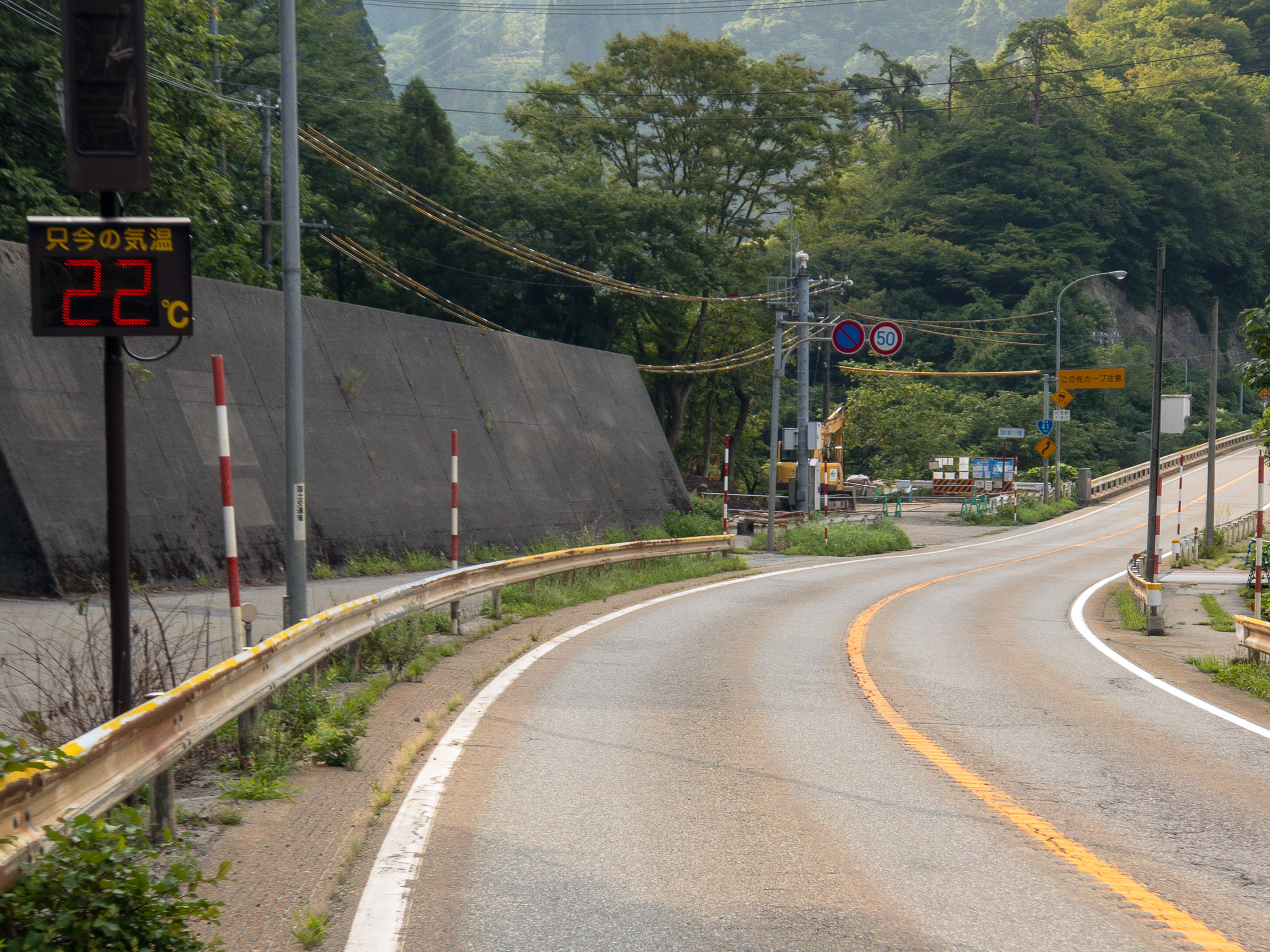
Much Cooler than I Expected 22°C (68°F) -- Hida, Gifu, Japan -- Copyright 2018 Jeffrey Friedl, http://regex.info/blog/
iPhone 7 Plus — 1/120 sec, f/2.8, ISO 20 — map & image datanearby photos
Much Cooler than I Expected
22°C (68°F)
Horrible Photo of a Gorgeous Scene I wish I had my real camera -- Hida, Gifu, Japan -- Copyright 2018 Jeffrey Friedl, http://regex.info/blog/
iPhone 7 Plus — 1/350 sec, f/2.8, ISO 20 — map & image datanearby photos
Horrible Photo of a Gorgeous Scene
I wish I had my real camera
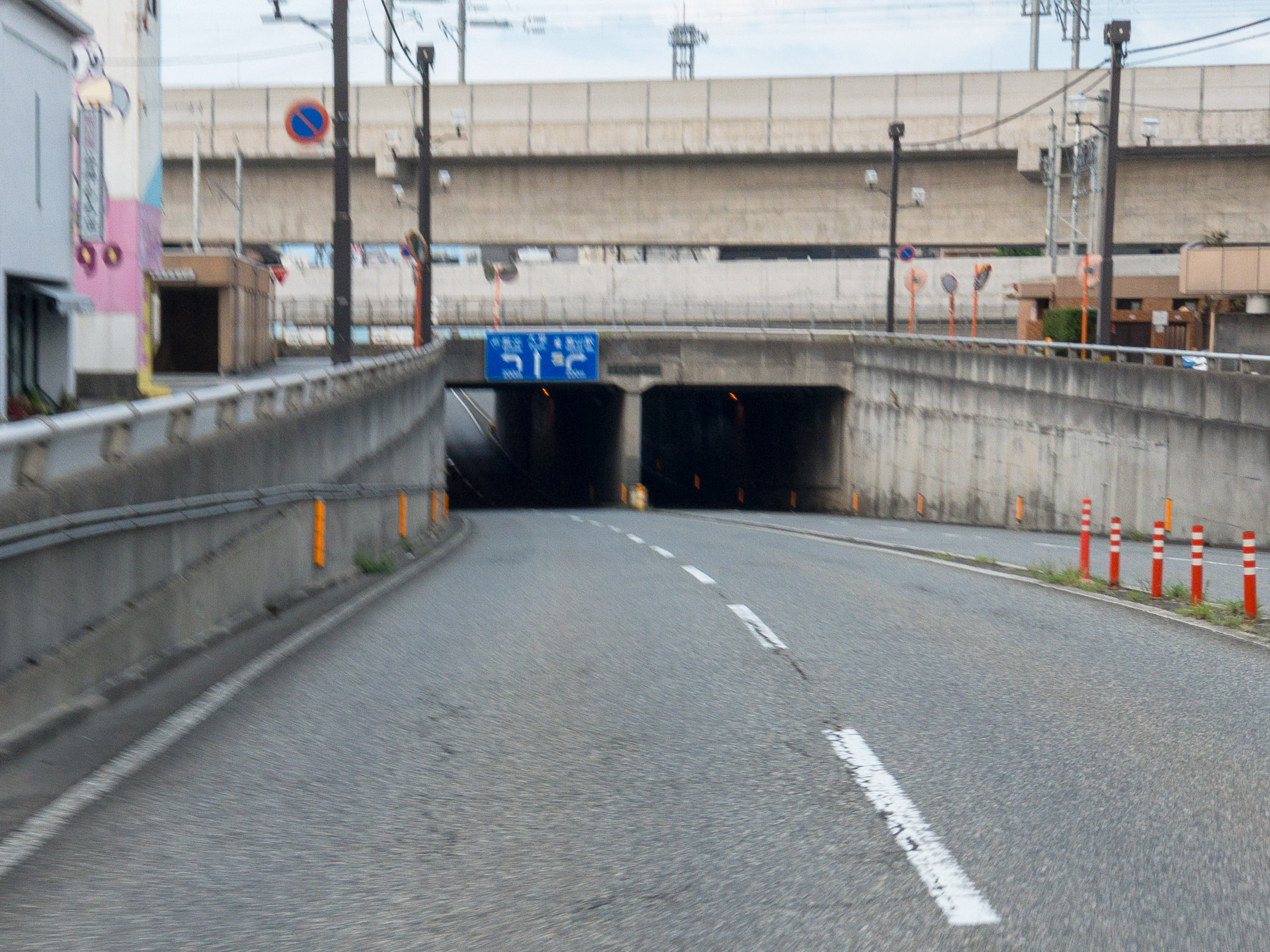
One of Several long tunnels -- Takayama, Gifu, Japan -- Copyright 2018 Jeffrey Friedl, http://regex.info/blog/
iPhone 7 Plus — 1/60 sec, f/2.8, ISO 1250 — map & image datanearby photos
One of Several
long tunnels
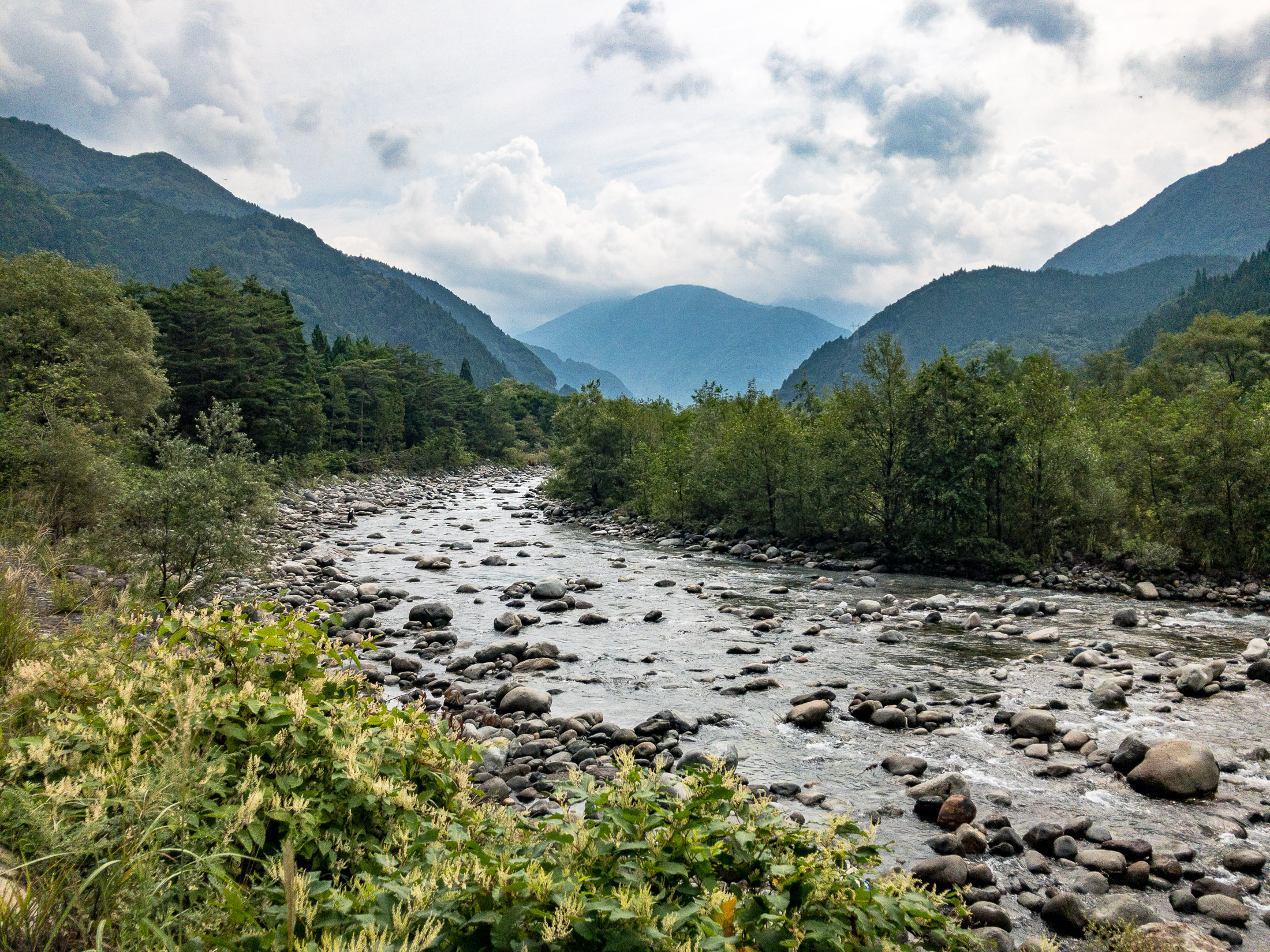
Beautiful Scenery -- Takayama, Gifu, Japan -- Copyright 2018 Jeffrey Friedl, http://regex.info/blog/
iPhone 7 Plus — 1/3400 sec, f/1.8, ISO 20 — map & image datanearby photos
Beautiful Scenery
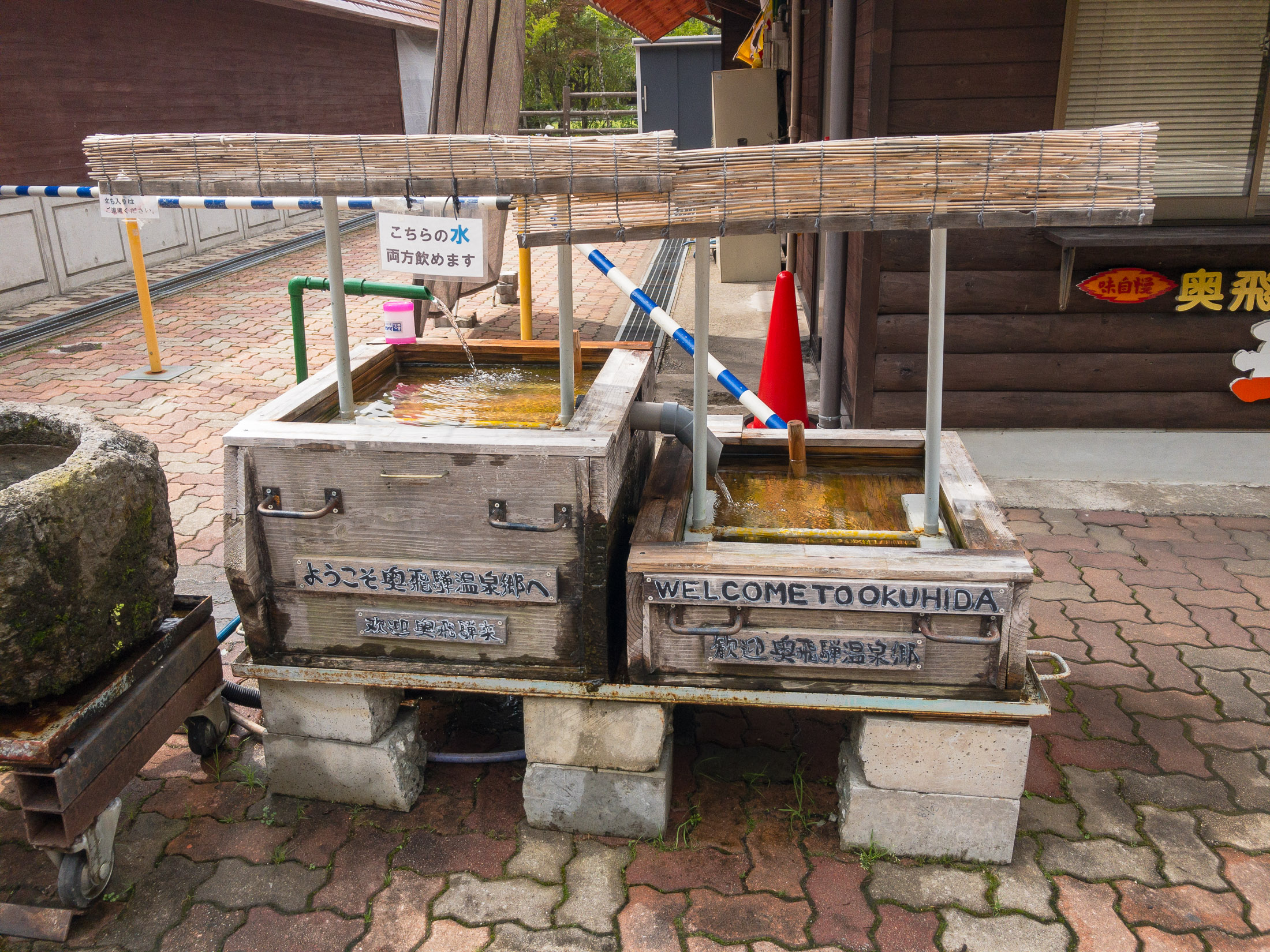
Free, Drinkable Water I'm not sure why it was presented this way, but I was thankful for the water -- Takayama, Gifu, Japan -- Copyright 2018 Jeffrey Friedl, http://regex.info/blog/
iPhone 7 Plus — 1/610 sec, f/1.8, ISO 20 — map & image datanearby photos
Free, Drinkable Water
I'm not sure why it was presented this way, but I was thankful for the water
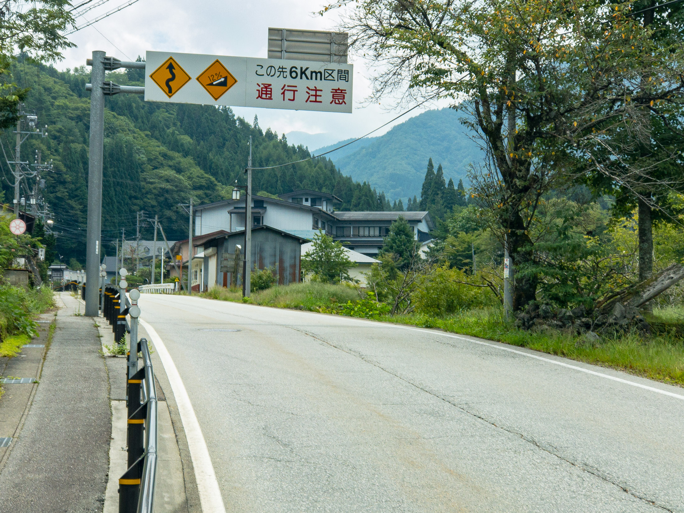
12% Grade next 6km -- Takayama, Gifu, Japan -- Copyright 2018 Jeffrey Friedl, http://regex.info/blog/
iPhone 7 Plus — 1/350 sec, f/2.8, ISO 20 — map & image datanearby photos
12% Grade next 6km

Despite what one might think at first, that sign doesn't mean “12% grade for the next 6km”, but instead it means that there are sections that are up to 12% steepness at points during the next 6km. The average for the 6km is actually just 5%, so it's not that bad.

Norikura Disappearing into the Mist I thought it was pretty at the time. Little did I know. .. -- Takayama, Gifu, Japan -- Copyright 2018 Jeffrey Friedl, http://regex.info/blog/
iPhone 7 Plus — 1/280 sec, f/2.8, ISO 20 — map & image datanearby photos
Norikura Disappearing into the Mist
I thought it was pretty at the time. Little did I know...
First Mention of “ Norikura ” 100km into my ride -- Takayama, Gifu, Japan -- Copyright 2018 Jeffrey Friedl, http://regex.info/blog/
iPhone 7 Plus — 1/240 sec, f/1.8, ISO 20 — map & image datanearby photos
First Mention of “Norikura”
100km into my ride
First Street Sign with “ Norikura ” -- Takayama, Gifu, Japan -- Copyright 2018 Jeffrey Friedl, http://regex.info/blog/
iPhone 7 Plus — 1/250 sec, f/2.8, ISO 20 — map & image datanearby photos
First Street Sign with “Norikura”
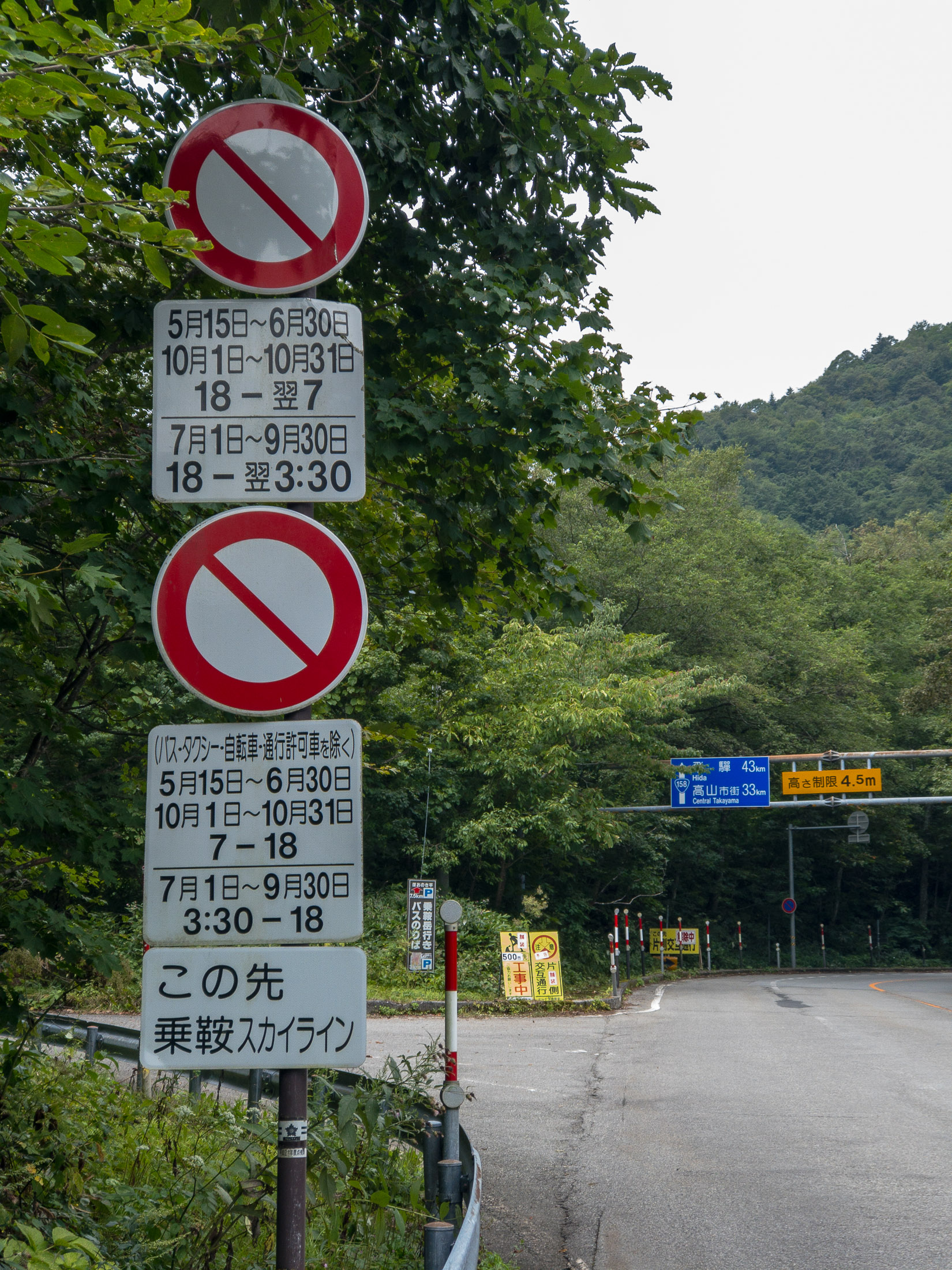
Absolutely-Ridiculous Signage -- Takayama, Gifu, Japan -- Copyright 2018 Jeffrey Friedl, http://regex.info/blog/
iPhone 7 Plus — 1/120 sec, f/2.8, ISO 20 — map & image datanearby photos
Absolutely-Ridiculous Signage

I've written about the ridiculous way some Japanese road-restriction signs present themselves, such as in “No Motorcycles Allowed….. Sometimes… Sort of”, but the one above takes the cake.

Here's a literal translation of the various parts:
(Note that in Japanese traffic law, a bicycle is a “vehicle” just like a car or truck or bus.)

NO VEHICULAR TRAFFIC
May 15 through June 30
October 1 through October 31
6pm through the next day's 7am
July 1 through September 30
6pm through the next day's 3:30am
NO VEHICULAR TRAFFIC
(busses, taxies, bicycles, special permission excepted)
May 15 through June 30
October 1 through October 31
7am through 6pm
July 1 through September 30
3:30am through 6pm
Ahead is
Norikura Skyline

What this is saying, in the most-convoluted way, is:

From July 1 through October 31, only buses, taxies, bicycles, and those with special permission are allowed, and only during the day (well, from 3:30 am in the middle of the summer).

The sign doesn't mention anything about other times of the year (fall, winter, and spring), but I know that the road is physically closed off with a gate, due to snow.

The takeaway from this is that normal passenger cars are completely prohibited at all times.

I don't understand why they need to present it in such a convoluted way. Everything is a restriction (including the “... excepted” part, which is a restriction on the restriction), which I suppose is fine, but why couldn't they say it simply?

I wonder how long it would take the average Japanese driver, when presented with these signs, to realize that they're telling him that he's not allowed to proceed?

Also odd is that the signs aren't about the road that they're on. For whatever reason, these signs were placed on the main road, but they talk about the road that turns off to the left. Very strange.

In any case, as a cyclist, I was allowed to take the road at that date and time, so I did. It was steep, but pretty.

Deep Nature very steep nature -- Takayama, Gifu, Japan -- Copyright 2018 Jeffrey Friedl, http://regex.info/blog/
iPhone 7 Plus — 1/120 sec, f/1.8, ISO 32 — map & image datanearby photos
Deep Nature
very steep nature
Takayama, Gifu, Japan -- Copyright 2018 Jeffrey Friedl, http://regex.info/blog/
iPhone 7 Plus — 1/380 sec, f/1.8, ISO 80 — map & image datanearby photos
Takayama, Gifu, Japan -- Copyright 2018 Jeffrey Friedl, http://regex.info/blog/
iPhone 7 Plus — 1/60 sec, f/2.8, ISO 64 — map & image datanearby photos

That section of road was about 4km, and averaged 9.3%.

It brought me, finally, to the Norikura Skyline, the last 14km (8.5 mi) stretch to the top. Despite being only 13% of the distance, its 1,020m (3,350') of climb comprised more than a third of the entire trip's. It averages a 7.3% grade overall, but that belies the fact that not all sections are the same: the 2nd and 8th kilometers average 10%, and the kilometer after each of those averages 9%. On the other end of the scale, the 13th kilometer averages only 3.6%, bless its heart.

This final push to the top would be the most physically-demanding section, but having completed the long, mentally-demanding runup to here, with the goal in sight, I was feeling good.

That didn't last long.

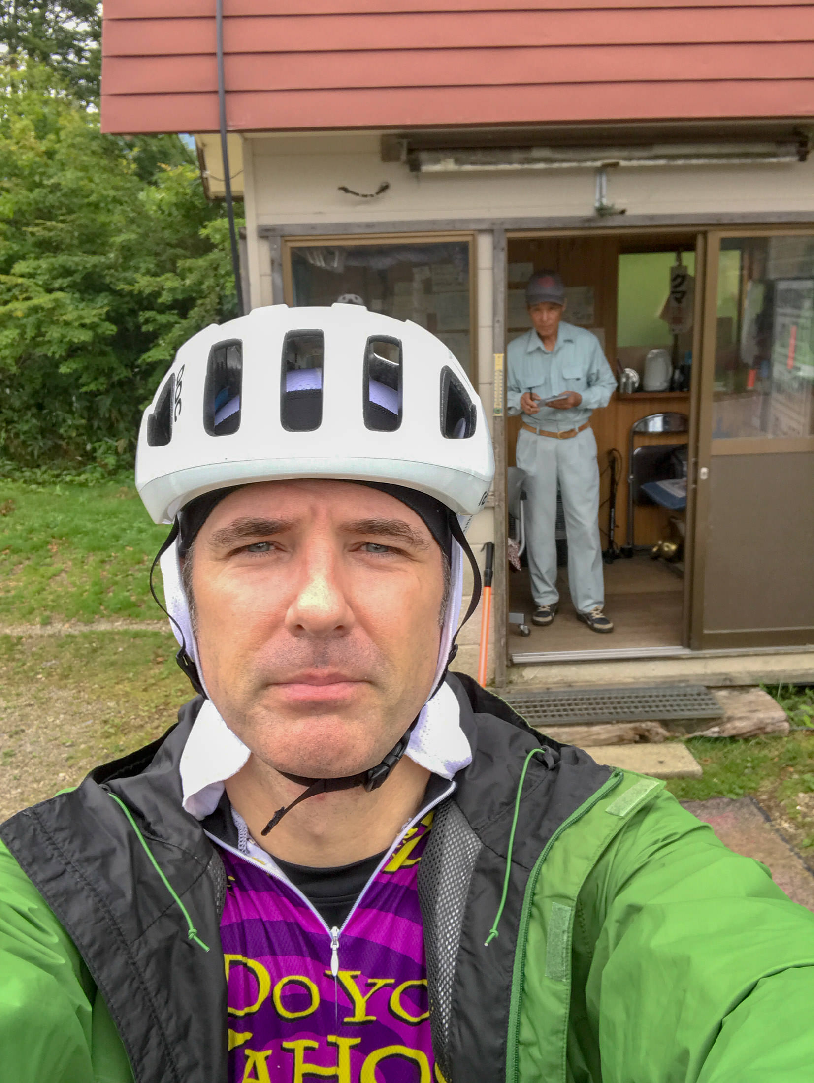
Denied turned away because of “ too much fog ” -- Takayama, Gifu, Japan -- Copyright 2018 Jeffrey Friedl, http://regex.info/blog/
iPhone 7 Plus — 1/160 sec, f/2.2, ISO 25 — map & image datanearby photos
Denied
turned away because of “too much fog”

As I approached the guard/toll gate, a worker had come out and stood waiting to meet me with wrists crossed in an “X” sign, the universal sign in Japan for “no/closed/bad”. I knew immediately that my attempt at Japan's Biggest Climb was over, because I knew that in Japan when these kinds of decisions were made, they were completely non-negotiable.

List of Road-Closure Conditions none of which were triggered, except for the vague “ snow/ice/fog ” at the bottom -- Takayama, Gifu, Japan -- Copyright 2018 Jeffrey Friedl, http://regex.info/blog/
iPhone 7 Plus — 1/1400 sec, f/1.8, ISO 20 — map & image datanearby photos
List of Road-Closure Conditions
none of which were triggered, except for the vague “snow/ice/fog” at the bottom

The “too much fog” reason is just so stupid. I can certainly take responsibility for myself, and as for others, the road is always closed to normal traffic, so the only vehicles allowed are the occasional taxi or bus driven by professionals. (As you can see in the photo above, the toll for a large bus is 10,200 yen, about US$100!) I had bright flashing lights both front and back, and the fog, however thick it was, would have been only at the very top anyway. It was just stupid.

It seems that I should have checked The Skyline's home page to see the current status, I learned from the guard. As of this writing, the road is open to cyclists, as evidenced by the marked circle:

When I was turned away, it was an “”, and had been so from the previous day.

Now I know.

Overall, I spent half an hour there, at first trying to talk my way in, and then in figuring out what I'd do going forward. The main guy I talked to (not the one in the photo above) was full of empathy and easy to talk to, so that made things better, but it was still so very disappointing. I turned around to return to the hotel.

I eventually headed down a different way than I'd come up, via a lovely descent. But after having ridden more than 100km up hill, any descent would have been lovely.

The road eventually flattened out, and in the flatter areas the headwind had returned. Since three hours had been cut from my trip by the Norikura Skyline guard, I had plenty of time and was in no rush, so I took it easy, as I had been all day.

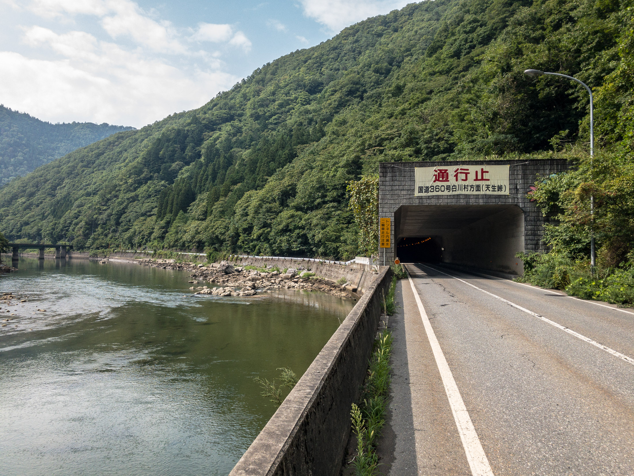
50km (32mi) into my return, I had a momentary worry about another road closure:

“ Road Closed ” “ Route 360 toward such-and-such a Pass ” -- Hida, Gifu, Japan -- Copyright 2018 Jeffrey Friedl, http://regex.info/blog/
iPhone 7 Plus — 1/1000 sec, f/1.8, ISO 20 — map & image datanearby photos
“Road Closed”
“Route 360 toward such-and-such a Pass”

I'd had two routes worked out for my return, one that was easy and one that looked to be very, very hard. On the return I'd been toying with the idea to try the hard one, but on paper it seemed almost as hard as the Mt. Fuji climb I'd done two months prior, which was both mentally and physically very difficult for me, so I'd decided that I just wasn't up to trying it. But now with this huge “Road Closed” sign, I worried that I'd have to do it.

I came across some road workers and asked whether the easy road to Toyama was closed. “No idea”. A bit farther on, I came across some surveyors and asked the same, and was cheerily told that it was open and without hills all the way. That sounded good.

Bypassed by a Tunnel -- Hida, Gifu, Japan -- Copyright 2018 Jeffrey Friedl, http://regex.info/blog/
iPhone 7 Plus — 1/270 sec, f/1.8, ISO 20 — map & image datanearby photos
Bypassed by a Tunnel

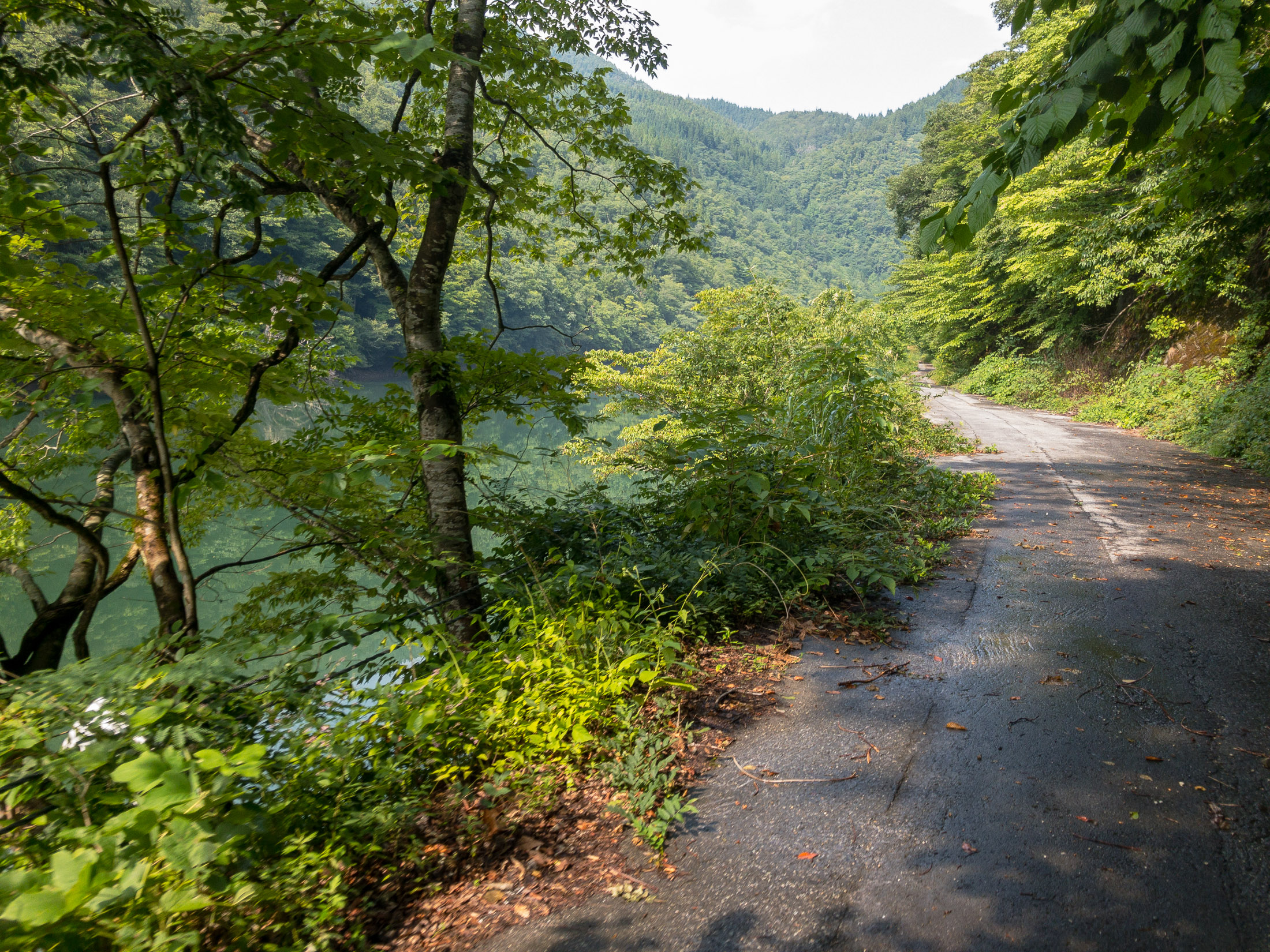
This road, which was bypassed by a modern tunnel, looked much more appealing in Google Street View photos from four years ago:

As it was, I had to pick my way between the overgrowth, and among many fallen rocks and branches, but it was still nice.

The next 25km (17mi) were mostly downhill, and I seemed to have a tailwind because at times my speed was more than I could otherwise explain. It was nice.

Pretty View but again, the iPhone photos just don't do it justice -- Toyama, Japan -- Copyright 2018 Jeffrey Friedl, http://regex.info/blog/
iPhone 7 Plus — 1/240 sec, f/2.8, ISO 20 — map & image datanearby photos
Pretty View
but again, the iPhone photos just don't do it justice
Rice Fields at the Edge of the City taken at 32 kph (20 mph) -- Toyama, Japan -- Copyright 2018 Jeffrey Friedl, http://regex.info/blog/
iPhone 7 Plus — 1/32000 sec, f/1.8, ISO 25 — map & image datanearby photos
Rice Fields at the Edge of the City
taken at 32 kph (20 mph)

I arrived back at the hotel 10 minutes shy of a 12-hour ride. I'd ridden 215km (134mi) and climbed only 2,177m (7,150'). If I'd had done the complete climb, and the harder return, the climb would have been about double, and my biggest ride in that respect. As it was, the amount of climb was nothing special (it's ranked #39 in my rides by climb). By distance, it's my #6-longest ride.

I brought my scale along to weigh myself before and after. During the ride I had 9,075ml of drink (2.4 gallons) which in itself weighs 9kg (20lb), and in addition ate in abundance, but I still lost 3.8kg (8.4lb) during the 12-hour ride. This did involve one bathroom break, but the bulk of the loss was 28 pounds worth of sweat. Wow.

Here's the ride at Strava:

And here's the Relive video of it:

Relive 'My Super Disappointing Ride of Crushing Disappointment / がっかりばかりのライド'

My hotel was a nice business-budget hotel near the train station, and as such the restaurant was more “cafeteria” than “restaurant”, but I was happy for real food.

Dinner APA Hotel (アパホテル) -- APA Hotel (アパホテル) -- Toyama, Japan -- Copyright 2018 Jeffrey Friedl, http://regex.info/blog/
iPhone 7 Plus — 1/30 sec, f/1.8, ISO 40 — map & image datanearby photos
Dinner
APA Hotel (アパホテル)

I had a couple of beers in my room fridge waiting for me, but I ended up just passing out, and sleeping well. I checked out early, and made the 4-hour drive home.

03 Sep 17:37

Subways don’t always last 100 years

by Sean Marshall
mkalus shared this story from Marshall's Musings.

IMG_7232-001
Former Toronto Mayor Rob Ford liked to claim that subways would last one hundred years, while other “inferior” forms of transit, like light rail systems, would last only thirty.

At the time, Ford was pushing for a subway extension to Scarborough Town Centre that would replace the Scarborough RT. The SRT opened in 1985 and nearly thirty years later, the line needed a major rebuild, including new equipment. The City of Toronto planned to replace the aging system with a modern LRT route, including a three kilometre extension with two new stations at Centennial College and at Sheppard and Progress Avenues in Malvern. The line would have been fully funded by the province, and the rebuild would have reduced the cumbersome transfer from the subway platforms.

Of course, Rob Ford was wrong about subways lasting 100 years. While Toronto’s subway system is over sixty years old — the original Yonge Subway opened in 1954 between Union and Eglinton Stations —  only the tunnels and station structures themselves remain from that era. The Yonge Subway is on its fourth generation of vehicles. Each of the stations have been renovated with new turnstiles, tiling, signage, and elevators. The TTC is also working on a new automated signalling system, and track replacement is an ongoing program.

Had the Scarborough RT been built as originally planned as an LRT route, there would only be the need for ongoing maintenance and new replacement vehicles. Extensions of the line would have been much easier and cheaper. The problem was that the planned route was converted — with pressure from the provincial government — to an Intermediate Capacity Transit System, a novel technology which was then being developed by the Province of Ontario. The rolling stock — nearing 30 years old — had to be replaced, and Bombardier, the successor to the provincial Urban Transportation Development Corporation, no longer built vehicles that could fit a tight turning radius between Ellesmere and Midland Stations. That’s why, after 30 years, the SRT needs a replacement.

But you don’t have to travel far to see proof that subways don’t last a hundred years. In Rochester’s case, that city’s subway lasted only twenty-nine years before abandonment.

IMG_7219-001High Falls, Rochester

Rochester, New York is an interesting city. It’s best known as the home of Kodak and Xerox, with a few attractions that make it a worthwhile place to visit, including the George Eastman Museum and estate, The Strong Museum, and the most easterly of Frank Lloyd Wright’s classic Prairie Style houses.

It also has America’s only fully-abandoned subway system.

The Rochester Subway was one of three subways planned and built in mid-sized American cities after the First World War. All three, coincidentally, were designed to permit streetcars to run under city streets using abandoned canal beds.

Cincinnati’s subway was the first to begin construction. Work began in 1919 on the path of the old Miami and Erie Canal, which once linked the Ohio River with Lake Erie at Toledo. But costs increased and construction was never completed. Today, the Cincinnati Streetcar runs on top of the abandoned subway route along Central Parkway.

IMG_5599-001Central Parkway in Cincinnati in January 2015, where new streetcar tracks run above the abandoned subway line

Rochester was the second city to build a subway line in a disused canal bed. The Erie Canal was rerouted around Downtown Rochester in 1919 and the new subway line — of which less than three kilometres was below grade — was built along the old waterway. A new downtown roadway, Broad Street. was built above the old canal. Service began in 1927 and was abandoned in 1956, as streetcar service in Rochester came to an end. Suburban growth along with population decline in old central city, and the prioritization of new interstate highways, put an end to rapid transit in that city.

Newark was the last city to build a new subway system in an old canal bed. Opened in 1935, the Newark City Subway was built between the Pennsylvania Railroad Station (which now serves Amtrak, NJ Transit commuter trains, and PATH subway trains to New York City) and northwestern suburbs. The City Subway, which operated PCC streetcars until 2001, later became the core of New Jersey Transit’s Newark Light Rail System.

IMG_7230-001

In Rochester, several sections of the abandoned subway remain visible to the public, including both tunnel portals. Stairs leading down from the Broad Street Bridge, which spans the Genesee River and once carried the Erie Canal, allow the general public to get a glimpse of the tunnel (it is also accessible from the Genesee Riverway Trail next to Blue Cross Arena without stairs), and all the graffiti lining the walls.

IMG_7238-001A public walkway from the Genesee Riverway at the Broad Street Bridge allows visitors to get a glimpse of the abandoned Rochester Subway


03 Sep 17:35

How can you work with a JSON value if you know nothing about it?

by Eric Normand

I have talked about the difficulty of typing certain JSON values coming from some APIs. The JSON is just very complicated. When I do that, I often get this question “how can you work with a JSON value if you know nothing about it?” The question is rhetorical. Of course you can’t do anything if you know nothing about it. But we do know a ton! We just can’t (or it’s very difficult to) encode what we know as a type.

Transcript

Eric Normand: How can you work with a JSON value if you know nothing about it?

Hi, my name is Eric Normand and these are my thoughts on functional programming. I wrote this article back in October of 2017 I think it was. Yep, end of October 2017. The article is called Clojure Vs. the Static Typing World. It was a response to one of Rich Hickey’s keynotes.

I talked about my experience with Haskell and working with JSON APIs and how difficult it was to do that from Haskell. You can read the article. I’m not going to go into that here. I got a lot of readers of this article. It went viral because it kind of had a trolly nature. I think people saw some trolling in it. I wasn’t trying to troll, I was just trying to share my experience.

JSON APIs are difficult to type

One thing I talked about was how difficult it was to type some JSON APIs because the people who are producing that JSON are not static typers. You could be doing a JSON API from a system written in Ruby, a system written in JavaScript, a system written in any number of dynamic languages that don’t follow the rules that Haskell wants you to follow.

You could be getting back a JSON that has this really complex structure to it. There’s rules you have to know that aren’t even written down anywhere, or they’re kind of implicit in the documentation but you have to read between the lines. Mostly you have to get a response, a piece of JSON, look at with your human eyes and see what you can do with it.

I’m talking about some values being optional, meaning they are either there or they’re not. Some values having different types, sometimes it will be a string or a list of strings. The string will represent the one case. The list of strings is multiple. Maybe even it’s missing because it had zero.

That’s three different types, really. Sometimes the value of one of the key values in there will determine what else will be in there.

Let’s say if we’re returning an add response then you’ll see a key for this. If you’re returning a subtract response, you’ll see a key called this other thing. Then that one might have a complex type too that has three possible cases in it, and it’s all based on the type.

When you look at the combination of all of these things with deeply nested JSON structures, the difficulty of typing that, especially since it’s not even well documented, it’s just an enormous task. The fact that it can change all the time and so you have to deal with the type changing over time. Your client has to change, but you also want to be able to deal with the old JSONs that you got.

It’s a big task

I’m not saying it’s not possible to type it, but the question is how much effort is it going to be and are you going to get it right? You’re just continuously complicating this type to make it match the actual JSON than you’re getting.

That is something, just from personal experience, that happens. I did not know how to type these things without spending all my time on them.

The type system is very good when you can apply a lot of rationality to the thing. You say, “Well, we’re not going to deal with this case because if we make this type so complex, it will be hard to type, so I’m going to keep it simple. Then look, my solution gets simple.”

What we’re talking about is stuff that might even start very simple and easy to type. Over time, the JSON API just gets added to and it changes. Then they go through a couple of rushed sprints and the thing gets messy. It’s like they have some library that makes it easy to deal with in their language, but then it doesn’t make it easy to type.

There’s just all these things going on on the other side of the API, on the server side. You’re writing this client that you’re not in control of that don’t help when you’re trying to type it. Just personal experience.

In JSON everything can be missing

I’ve found that I would rather just have the RawJSON and be able to write a bunch of if statements. Just ignore the parts that I don’t care about, dig into the parts that I do and do my best with them. Otherwise, I would just be typing all the time, writing types, modifying types.

I made this point. I don’t think I made it as clearly as this because I felt like it was kind of tangential. One of the responses to my post was…well, yes. Let me back up. One of the responses was, “Well, isn’t that what something like a maybe is for, where you can have a missing value?”

The thing is, in JSON everything can be missing. You don’t know what they consider something that is optional. Do you put a maybe everywhere? It’s not as easy a solution as saying, “That’s what maybe is for.”

The solution requires modeling this other API and its behavior, using the tools you have, and maybe might be one of them. You have to decide this is something that might be missing. This is something that is always going to be there, so I’m going to put a maybe here, and I’m going to leave this as an un-maybe type.

That is the hard part. It’s not how do I represent something that’s missing. That’s easy. Then I get this other thing. This is a really key point because I’m going to answer the question. I get this question all the time and it really speaks to the kind of thinking that I think is what I’m trying to point at as the problem.

Static typing is the future

Well, let me say this before I get into this. I think static typing is the future. I think it’s going to be very important in the future. We should use as much processing power as we can to guarantee our code is correct. I like static typing. I’m very happy that I learned Haskell because I learned static typing in a very good environment, supportive environment.

Eric Normand profile image
Eric Normand
@ericnormand
twitter logo

I think static typing is the future. I think it's going to be very important in the future. We should use as much processing power as we can to guarantee our code is correct.

ed.gr/z0lb

Fri Jan 04 20:03:03 +0000 2019
Twitter reply actionTwitter retweet action1Twitter like action3

I’m thankful all the time because it helps my Clojure programming. One day, I will use static typing more than I do now. I like static typing. I want to heal this divide so we can talk, right?

I feel like that we in the Clojure side have something to contribute and we need to work together. We need to learn more static types, and the static-type folks need to learn more of what we’re doing in the dynamic type and why we choose dynamic types for some things.

Eric Normand profile image
Eric Normand
@ericnormand
twitter logo

We need to learn more static types, and the static-type folks need to learn more of what we're doing in the dynamically typed world and why we choose dynamic types for some things. I want to heal this divide so we can talk.

ed.gr/z0lc

Tue Sep 25 15:01:41 +0000 2018
Twitter reply actionTwitter retweet action2Twitter like action5

I know a lot about JSON value

Here’s one of the questions that I get a lot that really shows the issue. I’m going to address it directly. How can you work with a JSON value if you know nothing about it? I was saying, “It’s hard to type these JSON values coming from random APIs.” They say, “Well, how do you even work with something if you don’t know anything about it?”

Eric Normand profile image
Eric Normand
@ericnormand
twitter logo

I said "It's hard to type JSON values coming from random APIs." Haskellers say, "Well, how do you work with something if you don't know anything about it?" But I do know a lot about it. It's just stuff that isn't easy to express as a type.

ed.gr/z0ld

Wed Dec 05 16:01:39 +0000 2018
Twitter reply actionTwitter retweet action1Twitter like action9

Here’s the answer. I know a lot about it. I just said I know that this thing might be missing. I know that when this value is this, when this key has this value, I have to look at this other key, but if it has this key, the problem is, that’s not easily typeable.

It’s simply not easily typeable. I know a lot about it. It’s just that the type system that I have in Haskell doesn’t let me express those things very well. That is the issue. This question of, “I know nothing about it,” this is the problem. You see types as all or nothing. “If I can’t type it, I know nothing about it.” That’s not true.

If you can’t type it, there might be a ton you know about it that’s just not easily encoded in your type system. This kind of rhetoric of, “If you can’t type it, then it’s not worth anything,” is not helping you as a static typer. I’m addressing the person who [laughs] asked this directly. This is not helping you.

Clojure actually provides a model

There are things that you know that cannot be expressed in the type system. There are things that are not easily expressible, or maybe they are expressible but the type would be 14 pages long. These are real concerns. We can’t just throw something out. We can’t just say, “I’m not going to use that API because I can’t figure out how to type it.” You have to work with it.

This is one of the things I was trying to get at in my article, that Clojure actually provides a model. That model is simply, “Just give me the JSON. I’ll deal with it. I just need to be able to parse it as JSON and I’ll do my best with it.” That’s really the model that Clojure gives you. It’s also pervasive in the community. When another Clojure programmer does something, that’s what they do.

Eric Normand profile image
Eric Normand
@ericnormand
twitter logo

Clojure provides a model. That model is simply, "Just give me the JSON. I'll deal with it. I just need to be able to parse it as JSON and I'll do my best with it." That's really the model that Clojure gives you. It's also pervasive in the community.

ed.gr/z0lf

Fri Sep 14 19:04:05 +0000 2018
Twitter reply actionTwitter retweet action3Twitter like action9

This could’ve changed since I’ve worked in Haskell, but when I was there, my experience was people spent a lot of time writing out these complex types. That was the answer. It’s great. It’s like they’re excited about having a type system now where they can actually express these things. That’s what it was. They saw the positive in it.

JSON is typeable

This is what I was trying to get at in my article. I think that it’s a little ambitious to use the type system to represent an important part of the JSON API ecosystem out there. Some of it is going to be easily typeable.

Then, I continued on, saying once you have it just in JSON, because JSON is typeable. It’s an ADT. It has all these cases of it’s a string, or a number, or a null, or a Boolean, etc. Once you have it like that, Haskell doesn’t make it easy to work with these things, like digging into it and pulling out a value at a certain keypath.

Now, of course, there’s lenses. I know. Those were very, very new when I was working in Haskell, and we did not adopt them in our code base. What I’ve seen is that they could work. I don’t know. I don’t have enough experience with them.

I don’t really like the error messages they give you when you’ve got something wrong, but it seems like, in all possibility, that they’ve really solved the problem. I need to look into them a lot more before I make a judgment on them.

A challenge that Haskell needs to deal with JSON APIs

At the time, it was very difficult working with this because each keypath returned a maybe. Each step on the path returned a maybe and then you had to deal with this, “Well, what was missing?” I’d just get a nothing back.

It just was not as easy as working with in Clojure, with this JSON that I know some stuff about, and I’m just going to try that stuff on it. I didn’t mean to make any kind of rifts between static and dynamic. It was simply a challenge. It was simply a challenge that Haskell needs to be able to deal with these JSON APIs from a language standpoint, and also from a community standpoint.

It’s even been almost a year since that article came out, and maybe Haskell has even changed since then. I don’t know. I should actually go and explore some more, I guess.

Please, if you know of Haskell is better than it was then for this kind of thing, let me know. I’m @ericnormand on Twitter. You can also email me, eric@lispcast.com. Thank you so much.

The post How can you work with a JSON value if you know nothing about it? appeared first on LispCast.

03 Sep 17:32

Cookies Disabled by Default…?

by Tony Hirst

I’ve started paying attention to the cookie policies I’m presented with when I visit a website for the first time. This one starts out looking like you’ve been opted out, but remember to check below the fold / scroll…

See also: Who Left Open the Cookie Jar? A Comprehensive Evaluation of Third-Party Cookie Policies, Franken et al..
 

03 Sep 17:31

Briefing: Huawei Launches new smartphone chip ahead of Apple and Samsung

by Jiefei Liu
China has been promoting self-developed chips and a domestic semiconductor supply chain.
03 Sep 17:17

OSCON: Building Composable Abstractions [Talk]

by Eric Normand

Do you want to create robust and composable abstractions? Here’s an iterative process to define the essence of a domain and build composability into the core and then demonstrates how to apply this process to the Processing graphics library to develop a composable vector graphics system.

Video

Slides

Building Composable Abstractions OSCON 2018 - download

Download slides

Transcript

I teach functional programming and a lot of people ask me this question. How do I structure a functional program, how do I structure software?

They read about functional programming, they learn the basics, they learn recursion, they learn immutable data structures that kind of thing, and they’re like, “I can program Fibonacci just fine, but how do I structure a whole program that has to get stuff done?”

Unfortunately, the functional programming literature is not as developed as say the object or any programming literature, so there’s not a lot of material out there to read. I’ve been thinking a lot about this and I came up with a process.

A beginner needs a process that steps them through each little bit. Even if it’s not the most efficient process or the way they would do it as an expert, it’s something to get them started. That’s what I’m going to present here today.

My name is Eric Normand. This talk is called “Building Composable Abstractions.”

Just a bit about myself, I’ve been programming in functional languages since 2001. I started with Common Lisp. Now I’m into Clojure and I write about that at lipcast.com. You can find more about me there.

Here’s a little plan of the talk. First, I have to motivate why we’re talking about abstractions. Then I’m going to describe the process. Then we’re going to go through the process with an example. We’re actually going to develop a vector graphics system in JavaScript. Finally, we’ll have some feel good conclusions.

Motivating abstractions. This is Aristotle. About 2,300 years ago, he developed a system of physics, Aristotelian physics. It was his attempt at explaining how things worked in the world. This is an excerpt of it. It had a lot of concept. It was a big, big tome of a work. I’ll just explain some of these concepts here.

Ideal speed, that’s the idea of that big things move slower than small things. Natural place. That is the idea that if you move a rock to the top of the hill, it’ll tend to roll down to its natural place which is at the bottom of the hill.

There’s natural motion, which is the motion, like when I’m walking, it’s smooth and graceful and not hurting myself, but imagine if I got hit by a car like my limbs will go flying and that’s unnatural motion. I might hurt myself the way I’m moving, it’s unnatural motion.

As you know modern people, we look at this and were like, “That doesn’t work too well. I can already see bugs in it. There’s corner cases, there’s big things to move fast, like what are you talking about?”

But this was the dominant form of physics in the western world for 2,000 years. What physicists would do was write more books trying to explain away the bugs. So they’re writing all these conditionals like, “Well some big things move fast but that’s it because of this.” They just spend a book explaining that.

So, basically it grew by getting worse [laughs] over time. It’s just like more and more you had to learn to be able to do physics, and it never solved the fundamental problems.

About 300 years ago, Isaac Newton came along and did a big re write. He threw out Aristotle and came up with a new system. This is what it looked like    three nice elegant laws. This is not an excerpt. This is it. These are Newton’s laws of motion. I’ll go over them quickly.

Inertia is the idea that without any forces acting on a thing, it’s not going to change like it’s not going to move in a different way. It’s just going to keep going in a straight line or not move at all.

Acceleration, this is the sum of the forces is equal to the mass times the acceleration. And then, action reaction says that if I do a push, that actually creates two forces in the model, one in the direction of the push and one in the opposite direction, and they’re the same strength of force.

You see, they’re very nice, concise laws that are written mathematically and there’s only four concepts here that you’ll see in those laws. He went from this mishmash of concepts with no coherence between them, to a very small, concise, elegant thing.

Of course, this does not explain everything. There’s nothing about liquids or there’s nothing about air resistance and stuff like that. It doesn’t explain everything but you can add it on top without invalidating this. You don’t have to say, “If it’s a liquid, it’s going to act this other way.”

It still acts in that same way, but there’s more stuff that you have to know about the liquid. Physicists nowadays, add on to this without breaking the core, without having to make exceptions in the core.

What do I want to say? There’s no way to translate between Aristotle and Newton. You had to do a big rewrite. You had to start over, throw it out.

A lot of times, we talk about I’m going to get it working, and then I’ll clean it up later. That’s what Aristotle did. He got the rock rolls to the bottom of the hill. He got that working. When you clean it up, it just turns into this one little concept that doesn’t cohere with the rest of the stuff. The process of solve a user story. Solve a user story. Solve a user story, then clean up. That does not lead to a nice, clean, coherent design in the end. You might have clean code but you don’t have a nice abstraction in there.

On to the process. These are the objectives I had when I was developing the process. The first one is I wanted to develop Newtonian style abstractions and not the Aristotelian mishmash abstractions.

I want anyone to be able to do it. Meaning, you don’t have to go learn something else to understand how it works. You should be able to start where you are. Just learn the process and start applying it. It needs to foster collaboration. User stories are there for a collaboration.

If I’m going to say, “The user story thing doesn’t work as well as we want it to,” I should at least give a way to have some collaboration back in.

This is Conal Elliott. This process was largely inspired by work he did called the Denotational Design. It’s a different process, mind diverged because we had different objectives, but it’s largely inspired by this and his is really good, so I want to give it credit.

We’re going to do the example. It’s a vector graphics system in JavaScript. If someone said vector graphics in JavaScript to me, I’d think, “We’ll Canvas.” I need to show why a Canvas is not what we want. Canvas is great. It’s just not what we want. Who’s familiar with Canvas? Raise your hand.

In Canvas, you put an HTML tag in your page. In JavaScript, you get that DOM element and you get a context from it. You call methods on the context and that draws into the page. That’s what the CTX is. That’s the context. All that has already been done. We have the CTX. Right here, I’m setting the color to black. I’m filling in a rectangle of the whole Canvas.

That’s what width and height. W and H is the width and height of the Canvas. This is just clearing. It’s actually being drawn down there, but it’s black so you can see it. If I want to draw a rectangle on top of it, I can set the color to red, that’s 25500. I set the X and Y, and the width and height.

I dip my paint brush in red and I draw the rectangle. Canvas lets you translate. I’m translating first. I take a step, I dip my paint brush, and then I draw. It lets you rotate. I’m going to rotate, and then step, and then dip, and then draw. If I rotate after I translate, that’s like I’m going to step, and then turn, and then draw.

You get a different answer if you rotate and translate. I’ve been able to turn this into physical steps that I take. That’s not how I think about art and painting and stuff. This is not the abstraction that I want. This is a fine abstraction, it’s very mathematical, but I want something else.

Here are the steps that we’re going to go through, four steps. First, we’re going to develop a physical metaphor just like I had a metaphor that I reverse engineered from Canvas. Then we’re going to explore this metaphor, refine it a little bit. Then we’re going to construct the model that will actually run. Then we’ll implement it.

You notice that the fourth step is the only one where we’re actually implementing it. That’s three steps of just thinking. I was always taught this that you should think about what you’re going to write before you write it. The problem with that advice is that like, “What do I suppose to think? At least when I write it, I’ve got something concrete?”

Also, thinking is indistinguishable from procrastination. I never liked this advice even though I knew it was true. It just wasn’t detailed enough to actually follow. This is something you can do. It’s like three steps of thinking that will fulfill this advice.

Step one, physical metaphor. Here’s the reason behind the physical metaphor. We have grown up in this world. From day one, we’ve been exploring, touching stuff and putting it in our mouths. Trying to walk, and throwing, and banging. We’re learning how the physical world works.

We have very rich, deep intuitions about how things work. We can ask our intuition, “How would this work in this physical scenario?” Then all we have to do is code that up. Too often, we start with the code and we don’t have anything to ground it with. Certainly, for beginners, this really helps get something solid. It also helps me to think of the metaphor first.

When you’re choosing a metaphor, there’s two things you’ve got to look at. One is that it has to answer questions. You have to be able to ask it, “How would it work in this situation?” You get an answer. If I say for vector graphics, we’re going to use a metaphor as a bag of marbles. That’s not going to help you. It’s a physical metaphor, but it’s not going to help you develop graphics.

The next thing is it needs to be a shared experience. Like I said, when doing collaboration, it has to be something that someone else can talk to you about. It’s actually quite magical. Often in my experience, what happens is, I’ll have this great idea. I want to go talk to someone about it. They’re like, “It sounds awesome, but I have no idea what you’re saying.” It’s too abstract.

Then I’ll go run, write down some code to try to explain it. Then I’ll show it to them and they’ll be like, “Why do you use tabs instead of spaces?” I’m like, “No, you’re missing the point.” This is something that we can actually talk about, that is shared, and is not focusing on the wrong thing.

Here are some examples of metaphors we could use for vector graphics. You can see that they’re all different. They all would give you different answers but they’re all good. Painting, you can imagine, if I paint blue over red, there’s going to be some color mixing. That would be part of our model.

Stencils would be like shapes that you can repeat. You spray paint, the stencils.

Anyway, I’m not going to go over all of them. I just want to make that point that you have choices here with what your metaphor is. They could all be good and you could just come up with different systems for it.

What we’re going to be doing is shapes and construction paper. Really quickly, you grab a piece of colored paper. You cut out a shape with scissors. Then you can move that shape around on your Canvas. That’s really easy. Already you can see with this physical metaphor, you already know how this is supposed to work because it’s a shared experience.

I’ve given this talk before. One of the first objections people have is, “Well, your abstraction might have a metaphor, but mine doesn’t.” The thing is you can tell they asked it so fast they didn’t even think about it. They didn’t even try to find a metaphor. My challenge to you is to dig deeper than that. I really think that maybe there might be something in there.

The worst case is you can ask yourself, “How would I do this with pen and paper if I didn’t have a computer and I had to do it physically?” If you’re doing a student registration system at a university, you’d say, “Well, we’ll have a desk with someone sitting at the desk and they have a book.” A student walks in and says, “I want to take this class.” Will you flip to this certain page in the book and you write your name down?

You can come up with the process that you can start discussing before you’ve even started to implement it. If you started to implement, it would be like, “Well, let’s put a database table in there.” It’s like, “Whoa, whoa, whoa, that’s too fast.” [laughs] Think about it a little bit first.

We’ve got our physical metaphor. It’s rich enough for what we want. This is just a summary of what I’ve said. We’ve got this rich physical intuition. We want to be able to mine it to get these answers. Something that we can share and it keeps us grounded. We’re not talking about cues and buffers and stuff yet. We’re still talking about something that we can all imagine.

In this step, where we’re exploring the metaphor, we’re starting to make it more precise. We’re starting to make it into something that we can move toward. A model like Newton had. The elegant, concise laws and stuff. What we’re doing is focusing on the interface first.

I was always given this advice too. When I was developing this, I was like, “Wow, this advice finally came up.” What I would do is go to the Whiteboard and I just start writing out some ideas. I have them in a certain order that and I start to look, “OK, cutouts have a color.” I take a piece of paper, it’s got to color and I start cutting out a shape. They’re going to have a shape.

Again, this is just freeform brainstorming. I don’t know where this is going yet. Overlay Order. I want to make sure that if I put a green square on top of a red circle that I’m going to see the green and not the red underneath. The order is going to matter because if I do it in the other order, the red would show up.

Rotation and translation are independent. I did this Canvas thing, I don’t want to have that property where if I rotate first and then translate, it gives you a different answer.

I put a paper here, and I move it. I rotate it, and then I move it again and then rotate. I don’t want to think about what order I’m doing stuff in. I just want to be able to move it and look at it and move it again and that kind of thing.

Same with rotation, I want to be able to say that if I rotate it a little bit and I look at it and then I rotate it again, it’s the same as doing it all at once. It’s like it adds. The same with translation, I move it here. No, no. I think, yeah, down there. That’s right. That’s how I want to play with the system.

Then I start to make it even more precise. I’m keeping a list up here of all the concepts that I’ve developed so far. I’m just saying, “OK, cutouts have a shape. Well, that means I’m going to be able to query that cutout for its shape.”

I’m thinking the name of the shape, something like a string with square or circle, right? That’s just my thought right now. Same with color, it’s going to have some kind of RBG representation, but I’m going to be able to ask a cutout for its color. Then I’m going to be able to construct different shapes of circle and rectangle.

Rectangle is going to take a color, and a width, and a height. This is kind of how you think about this. Now, then overlay. I’m going to have this operation called overlay. It’s going to take two cutouts. It’s going to put one on top of the other. I want to make sure that doing it this way is different so I’m going to use a not equals.

Then, I see a problem. Do you all see the problem? The problem is what does overlay return? Does it return another cutout? If it does, a cutout needs a shape and a color. I just said that two slides ago. What is the color of a green square on top of a red circle? Doesn’t make sense, right?

It could say, “Well, it returns a list of colors,” but then that doesn’t make sense either. Why would I care what the list of colors is? The same with the shape. What is the shape of a square on top of a circle arbitrarily overlapping? It doesn’t have a name. What we have here is called a corner case where if I return a cutout, I’ve got some cutouts don’t have a shape and color.

What happens when you have a corner case is…It’s a branch, basically. The minimum is two possible branches. I have the color or I don’t. Now, that means that somewhere else in my code where I need to use the color of a cutout, some cutout is going to arbitrarily be passed to my code. I don’t know where it came from. I don’t know if it’s an overlay or a rectangle that was directly constructed.

I’m going to have to ask it, “Do you have a color?” before I query the color and start doing something with it. Same with the shape. What you have is then four branches. You have, “If it has a shape and it has a color, then do this. If it has a shape, but it doesn’t have a color, do this.”

You’re just making more branches in the rest of your code, not even in the code to implement this thing but elsewhere. You’re increasing the complexity of the code that uses this abstraction. We just want to avoid them. If you imagine we had one more thing that was conditional, that would multiply again, so times two, 4*2=8. That’s eight branches that we have to deal with elsewhere in our code.

At this stage, we just want to avoid that, just pointing it out. Newton has no corner cases, which is why you can build on top of it for 300 years. I’m scrapping what I just did, that overlay thing. I’m making it again. This time, it’s going to have a thing called a collage.

It’s like a collection. I’m going to start with an empty collage, add a cutout to it, add another cutout to it, add another cutout to it. The collage does not have a shape or color, so that’s easy. I just need to make sure that if I put A on and then B, it’s different from putting B on and then A. That’s what I’ve got here. I can move forward now. Of course, I did mark collage up here just to be sure.

Translation and rotation independence, what does that mean? I’m trying to come up with a very concise and precise mathematical type notation for this. What I’m saying is if I rotate and then translate, it’s the same as translating and then rotating.

If I do this and then this, it’s the same as this and then this. I’ll get the same picture. Rotation is additive, same thing. I’m making a concise mathematical notation. If I rotate by R1 and then rotate by R2, it’s the same as rotating by R1+R2. Same thing. Then translation, it’s the same, just too long for one line.

Then I look at this, and look how many concepts we have. That’s seven. It just feels wrong. It feels like this is too much for this simple vector graphic system with two shapes, just color and shape. It doesn’t make sense. Too much, so I’m going to scrap it. The first thing I’m going to think about is that color and shape to get rid of because they’d given me a problem before.

When I think about it, I’m never going to query the color. I just want it to draw right. I just want it to give me the final picture that’s correct. Same with shape, why would I even expect to have a name for every shape I want to cut out? It doesn’t make sense. It’s got to draw or write. If I construct it, then I expect it to always draw it correctly.

Also, we didn’t come up with the problem until we got to a more complicated operation, the overlay operation. Once we started to compose two things, we realized, “This is actually not going to work.” What I suggest is to start with the composition, because it’s the hardest thing you’re going to do. It’s going to constrain the design the most.

By constraining the design, the rest of the stuff will be easy. It was easy to do the color and shape. When we got to overlay, boom, then we had problems. Let’s deal with the hard problems first. The rest will be smooth. Scrap everything. Start it again, but this time, start with overlay. I’m going back to just cut out but it doesn’t have a color and it doesn’t have a shape.

We just have this simple overlay of A. B is different from overlay of B and A. It returns a cut out.

This one is the same as before. If I rotate and then translate it, it’s the same as translating and rotating. This one is the same. Translation is the same. Just add the Xs and the Ys.

We need to construct the color. We didn’t even get this far before. It’s just the function and you give an RG and a B. It’s going to give you a representation of a color. The constructor will take that color and then some parameters for the shape. We also need an operation to draw it. It takes a cut out and it draws it. We’re done with Step 2.

The whole idea of Step 2 is just to get more precise. We’re mining our physical intuition about how this system works, this construction paper system. We’re mining it for these answers, for these operations and how they have to act to simulate this situation. We’re looking for those relationships and the concepts.

We want to start with composition. If we find corner cases, that’s a good reason to scrap it and start over.

Model construction. This is the fun one because we’re not on implementation yet, but we’ve also run out of precision that we can get out of this handwritten notation that we’ve got.

Something that has even more precision, but also has more expressive power is a programming language. I’m going to do JavaScript, because actually there’s a subset of JavaScript that is very functional, that is very mathematical. I’ll be able to use that. I’m going to use JavaScript and Canvas as mathematical notation. I’m not coding it.

I’m just expressing something more precisely. We need representations for these concepts and operations that we’ve got in our model. I usually just do this in my head but I’m showing my work. On the left, I’m just listing all the concepts we have. On the right, I’m listing all the stuff that JavaScript gives me to build these things out of.

Basically, I just say, “Cut out is going to be one of these and then overlay is going to be one of those.” There are probably wrong choices for this, but there’s going to be some easy ones. What you’re trying to do is find stuff that your language gives you, the constructs that your language gives you.

They have the same properties that we wrote down before. The properties being like, “This has to be equal to that or this can’t be equal to that.”

For instance, the rotation, I said it’s additive. That means plus, which means it’s got to be a number. It’s not more complex than that. You’re looking for stuff that has the properties you’re looking for.

Me being a functional programmer, I’d love to teach this technique of using functions to represent things. This might not be the way that you’re used to seeing functions, but we’re going to look at the structure of the function by itself and to see where we can apply it. This is your basic function. It’s got inputs. These are the things that change.

Every time you run this function, you have the ability to pass in different values for your arguments. It’s got an output. We’re actually not going to use the output, but we know it’s there. We need something to represent things that don’t change. We can do that by wrapping it in an outer function.

We’ll have these variables that are in the environment in the scope that that function is defined in. Nothing outside of the outer function can modify those variables after it’s been called because they’re in its scope. If the function, the internal function, never changes them, we can say that they never change. We’ve got a way to represent things that change.

We’ve got a way to represent things that don’t change. If we need it, we have an output. Let’s do an easy one. We’re going to represent a color as a function. What we’re doing now is we’re translating from our model concepts, our construction paper view of graphics into JavaScript with Canvas.

What does a color mean in Canvas? It means you set the fill style. Construct the function. Nothing that changes for a color. It’s going to be immutable. The things that don’t change are up here. That’s it. Why represent this as a function?

Why represent things as functions? Functions have this really cool property that their interface is so small, that they’re so clear how they work and how they compose. If you, for instance, did a class with 10 methods. You’re probably going to have getters and setters on it. You can so easily just cheat and skip over the clean interface, ask the color and do something.

Whereas, this way, you can even tell what the color is. Once you make one, all you can do with it is call it. You can’t make logic that knows like, “If the R is greater than 100, then do that.” But we can’t do that. You can’t cheat in any way. It’s just very clear.

Later, you can make your interface have that, but when we’re building this abstraction in this Newtonian clean room way, this is where you want to be.

A more complicated one. Rectangle. It’s only complicated because drawing a rectangle it takes more code than setting the color. The cut out is a function of TX, TY, and R.

That’s the translation and the rotation because those are the two things that change. Sorry, wrong order. The color and the shape don’t change. The translation and the rotation will change because once I cut it out of the paper, the color can’t change. I’m not going to change it after I cut it out, but I can move it around. That’s all I’m saying.

This is just the code in Canvas for drawing the rectangle. It’s going to save the state and restore it at the end so that this translate and rotate don’t affect anything else. It’s going to call the color function that will set it. We’ll just fill in the rectangle. Circles are very similar except instead. They have the same signature.

That’s important. They have the TX, TY, and R, but they have to use this arc and fill thing. It’s the same thing. It’s just different.

Here’s where it gets interesting. Notice we were able to do the easy stuff first, the color and the rectangle because we already figured out what properties they had. We can start with the easy stuff first and we move to the complicated stuff.

This is translate. Translate is going to take a cut out and an X and a Y. It’s going to return a new cut out. Notice the same signature. What it’s going to do is it’s going to call cut out but adding the new X from here to the TX from here, the Y to the TY and not changing R. Notice how nice and concise this is. That’s what I really like about. It’s nice and concise.

I didn’t need my pointer. [laughs] [inaudible 34:12] . Rotate is the same except we’re adding the rotation and R here and not changing TX and TY.

Overlay, all it does is it takes an A and a B and calls A with the TX and TY and R. It calls B with a TX, TY, and R. We have draw which has passed the zeros in and then those zeros will get added so whatever translation and rotation we have.

I said we’re not implementing it yet, but the nice thing about doing it in a programming language is that you can actually run it. You can test out in your model. I just want to be clear. At this point, we have more tools the Newton ever had. If he had a computer, he could have written a model in the computer and tested out how his physics would work.

He had to do it all in his head but we have this. We don’t even have to be as smart as Newton. We can do it on our screens. What am I doing? Setting it all the black, creating a rectangle, it’s red, 200 by 100, translate it, rotate it. The numbers don’t really matter. Sorry, it’s a white rectangle. I said red. A red circle, then I’m going to translate it.

I create an overlay where C is on top of R. That’s why you see that and then I draw it. That’s what I get. Right there. That looks right. I start exploring and I start trying different things. Let me rotate the thing. Let me translate it in another way. Let me add another thing in. I play with it for a while. I won’t show that, but I did find this situation that I didn’t like.

All of this is the same except then at the end. I’d take the R, the O and I rotated. I rotated over time so I can watch it animated. I’m going to play a movie and you see what it looks like when I rotated over time. That is not what I expected to happen. That does not sit well with my intuition about the model, about my construction paper set up.

What’s wrong? If I were Aristotle, I’m going to use him as a scapegoat. If I were Aristotle, what I would do is I would say, “There’s this problem so we’ll put an IF statement in there.” What would Newton do? He would go back to his model and he would say, “I must have missed something. Nothing wrong with the code. I forgot to bring something out of my model.”

Let’s take a look at the code. You see what’s happening is, I’m just passing R to each one. I’m rotating each one independently. I’m not rotating them together. That’s what I was expecting. I thought I’m taking my hand and I’m putting them on the two things. I’m rotating it, but notice when I do that, I can rotate.

I can grab it by the bottom right corner or I can grab it by the top left corner. I would get different results. It matters where I put my hand and that I didn’t capture it all. This is the value of being able to run it. You can see stuff that you’ve missed from your model. I need to add that place that I rotate.

That’s my advice is revisit your metaphor and go back up and before you go forward again. It gets more complicated now. This is how I decided to solve it. When I make an overlay, not only do I take the A and the B, but I give it a center point. I use that in here. It’s too much to explain but what you have to do is move it to the origin, rotate it, and then move it back.

That’s what’s happening here. You see, when I call overlay, I’m adding in the center point. When I rotate it, it looks like this. This is end of step three. We’ve got a running model. We needed to choose constructs that preserved the properties that we explored in the second step. If you have a problem, revisit your metaphor.

Don’t add more problems to it, trying to hack it to get it to work, which is what I do, too. I know the temptation. Implementation. Just use a class. Seriously, this is maybe the least important part, I want to say. You should do whatever is normal for your language. Use a class. That’s fine. That’s what I would do. Probably, I do Clojure a lot.

I’d probably just use a HashMap to represent all the data that I needed. I would just make a mental note. The color never changes but the rotation does. That’s what I would do. I’m not going to actually do the actual implementation. I feel like I showed where I want to show. I’m actually going to skip this slide or go on. There’s some corollaries to this process.

You have to know your domain. I personally feel like in my experience working as a programmer, we don’t learn our domain well enough. If we’re doing an accounting system, we should learn accounting. We should know accounting in some ways better than an accountant who does it themselves because we have to be able to model it and including all those weird cases that they might not remember.

We have to be able to put those into a mechanical system and you have to know your language. You notice we took the function and we broke it down, like what are the parts and what are they for? You need to be able to do that.

This is my newsletter. It’s about Functional Programming and Clojure. This is me on Twitter.

If you want to continue the conversation, any time, just let me know. I’m at listcast.com as well. If you want to find my email and stuff like that. Thank you very much.

The post OSCON: Building Composable Abstractions [Talk] appeared first on LispCast.

03 Sep 17:03

Gute Führung und deren Auswirkungen auf die persönlichen Finanzen

by Volker Weber

Sketch3

Nächste Woche gibt es wieder eine Apple Keynote und dazu dann wieder jede Menge Kommentare und Prophezeiungen. Als Apple Touch ID einführte, meinten die Experten, das sei total unsicher und so leicht zu überlisten. Danach hörte man nie wieder davon. Das gleiche Spiel bei Face ID. Funktioniert nicht, lässt sich überlisten, etc. pp. Noch mal davon gehört? Überhaupt hört man oft die Meinung, unter Steve Job wäre das alles nicht passiert. Als wäre Tim Cook zu doof, sich die Schuhe zuzubinden.

In dem Chart da oben habe ich eine schwarze Linie gesetzt, die den Zeitpunkt markiert, zu dem Tim Cook Interim CEO wurde, ein Titel, den auch Jobs mal hatte. Bei jedem Abschwung des Aktienkurses wurde das Ende von Apple beschworen. Peak Apple schwadronieren die Experten dann. Schlauer wäre es, einfach mal ein paar Aktien zu kaufen und Ruhe zu bewahren. Das finanziert locker alle Spielsachen, die man sich von Apple kauft.

Sketch

Dabei ist Apple nicht mal der größte Kracher. Hellblau = Amazon, grün = Microsoft, blau = Apple, rot = Tesla. Irgendwie kaufen alle bei Amazon, mit AWS hat das Unternehmen Cloud Computing erst so richtig aufgemischt. Microsoft ist irgendwie auch nicht mehr von gestern. Das sind die Zugewinne nur eines Jahres. Wer von einem Jahr für 1000 € Amazon gekauft hat, hat jetzt einen zweiten Tausender. Microsoft hat mehr zugelegt als Apple, nur der Tesla-Investor hat sich verrechnet.

Sketch1

Das funktioniert auch über fünf Jahre. Amazon plus 577 Prozent, Microsoft plus 259 Prozent, Apple plus 216 Prozent. Selbst die vergleichsweise lahme Ente Tesla hat noch 80 Prozent zugelegt. Gute Leadership wie von Jeff Bezos, Satya Nadella oder Tim Cook rechnet sich. Statt Zigaretten lieber Aktien kaufen!

Sketch2

Es ist immer etwas schwierig, in der flachen Kurve einzusteigen. Amazon kennt jeder, Wirecard vielleicht weniger. Und da ist gerade letztes Jahr die Post abgegangen. Und nein, ich fange jetzt nicht an, Anlagetipps zu geben. Ich will nur mal darauf hinweisen, dass "Influencer" weniger wissen als Investoren.

03 Sep 16:55

Labor Day for the self-employed

by Josh Bernoff

I’m working today. A lot of you have today off. But I’d never trade my independent life for a job again. Here’s what it means to be an independent freelancer. It means I get to savor the joy of concentrating on work for a whole day today while the rest of you are at the … Continued

The post Labor Day for the self-employed appeared first on without bullshit.

03 Sep 16:39

I second that emoji: The standards, structures, and social production of emoji

Bethany Berard, First Monday, Sept 17, 2018


Icon

First Monday has devoted this month's issue to the Emoji, from which I select two articles to highlight. This article describes how candidate emoji are propossed and approved by the Unicode Consortium. " Unicode’s codespace has 1,114,112 code points. While Unicode Standard 11 contains just over 137,300 characters, there are a finite number of code points." This has led over the years for the encoding not only of minority languages, but also for the inclusion of a wide set of cultural touchpoints in the unicode emoji specification itself. Additionally, there's a nice subtheme in this article where "political economy of communication focuses on how power manifests in these constitutive moments where specific arrangements of communication technologies are cemented."

Web: [Direct Link] [This Post]
03 Sep 16:36

Where’s Arjen Kamphuis? Missing in Norway.

by Ton Zijlstra

I am saddened and worried by the news that Arjen Kamphuis has been missing for 2 weeks. He was last seen checking out of a hotel in Bodø, Norway on August 20th. Arjen is a privacy and transparency advocate, and cyber security specialist. We move in similar circles and regularly bump into each other, sometimes on train stations across the country, resulting in long conversations en route. I hope Arjen is safe and will surface again soon, but in the mean time, should you be in northern Norway, do keep an eye out. Tips can be send to findarjen@gmail.com.

More information on Arjen:
In Norwegian,
In Dutch,
In English

[UPDATE Sept 12th] Norwegian police announced they have found some of Arjen’s belongings, including it seems his ID. They still keep all options open, deliberate disappearance, accident or crime.

03 Sep 16:34

Microcredentials - NZ perspective

Selena Chan, learning elearning, Sept 14, 2018


Icon

This short posts contains a number of links and references regarding microcredentials from a New Zealand perspective, including an Education Central NZ report on the rise of the micro-credential that "summarises the three pilots undertaken and some of the rationale in NZ adoption."

Web: [Direct Link] [This Post]
03 Sep 16:34

Learning’s first principle – the most important thing i learned this year

Aaron Davis, Sept 14, 2018


Icon

Aaron Davis pulls together three links with a common theme: the idea that learning depends first on the learner wanting to learn, on motivation. This is for me an important ground for endorsing learner-led learning. The posts collected include a Dave Cormier post from 2014 on whether students care, Simon Sinek's book Start With Why, and Brad Gustafson on starting with people.

Web: [Direct Link] [This Post]
03 Sep 16:34

The Importance of Simple Ideas

by David Banks

In the Summer of 2009 I had just graduated college and job prospects were slim in Recession-era Florida. My best lead for employment had been a Craigslist ad to sell vacuum cleaners door-to-door, and after having attended the orientation in a remote office park I was now mentally preparing myself for a new life as an Arthur Miller character. That was when a friend called with a lucrative offer. She worked at a law office and they were hiring a part-time secretary to process the new wave of cases they had just gotten. This tiny firm represented home owners’ associations in mortgage foreclosures and bankruptcies, and business was booming.

The job was simple because everything about suburban homes is standardized: from the floor plans to the foreclosure proceedings, everything is set up for mass production. It was also optimized for bullshit. Sometimes I would be instructed to print out emails from clients who’d attached PDFs of scans of printed, previously received emails. I would write a cover letter, print out their email and the attachments (which, remember were scans of printed out emails) and enclose the printed-out email with the printed-out PDFs of scans of emails, then scan and email what I had just printed and mailed so that the client would get an email and a paper letter of the same exact thing. Sometimes I would fax it too. Everyone knew this was ridiculous but the longer it took to do anything the more money the attorneys made.

My job reminded me of a scene in the 1997 movie The Fifth Element, wherein CEO Jean-Baptiste Emanuel Zorg (Gary Oldman) delivers a monologue to Father Cornelius (Ian Holm) that begins, “Life, which you so dutifully serve, comes from destruction, disorder, chaos!” He then pushes a glass off his desk and as little robots descend on the shards and clean it up he narrates the scene: “a lovely ballet ensues so full of form and color. Now think of all those people that created them. Technicians, engineers, hundreds of people who will be able to feed their children tonight.” Financiers and the burgeoning tech industry had destroyed countless things, and now I was an obedient Roomba cleaning up the shards— a beneficiary of others’ creative destruction.

This is not a particularly deep thought, but that’s never stopped an idea whose time has been forced by capital. Depth is not a precondition of power when it comes to ideology. In fact, it is teenage suburban weed revelations like Zorg’s that dominate the minds of capitalists who, at least since Andrew Carnegie’s Prosperity Gospel, have done a good job of making everyone else agree that their bad ideas are immutable truths. Observers and practitioners of state power —from Antonio Gramsci to Karl Rove— recognize that political common sense is not forged through debate, it is imposed through brute force and media saturation. Simple, easy to digest ideas spread fast, which is why it is important to engage with deeply uncritical ideas and, whenever possible, come up with compelling alternatives.

The trick is to package an idea in such a way that it can survive virality, where it will get further simplified, misunderstood, taken out of context, and interpreted by both good and bad-faith actors. The journey to popularity is made easier if an idea is robust, simple, and speaks to something that is already felt. Given that so much of media is used to “manufacture” the consenting opinions that legitimize the power of corporations and their client states, reactionary and conservative ideas have a much easier time gaining traction. Books, essays, and YouTube videos that tell their audiences that financial success is tied to individuals’ moral character, for example, confirm widely held beliefs and therefore get shared and thus find themselves at the top of search results. To introduce a new idea that challenges widely-held notions about work and morality, one has to go about it by foregrounding relatability and then letting the moral consequences naturally follow. If the story I just told you feels right, then it follows that you agree with my moral explanation for that feeling.

***

David Graeber has done just that in his new book Bullshit Jobs: A Theory, which is an expansion on his viral 2013 Strike! essay. Both make a fairly simple proposition: people are increasingly working at jobs that they know are meaningless (i.e. bullshit) but are often well-paid and easy to do. A bullshit job only requires a few hours of actual work a week, is not physically strenuous, and may even provide opportunities to pursue hobbies if done surreptitiously. Why then, Graeber asks, do people consistently feel psychically gutted by these jobs? Making lots of money to do very little sounds like the ideal job and yet, judging by the popularity of the essay alone, that is not the case for millions of people around the world.

What is the idea that Bullshit Jobs puts forward? Any book with political aspirations should be judged, at least in part, by a thorough investigation into who benefits from the widespread adoption of its ideas. To begin answering this question, we have to consider the definition of the titular term: “A bullshit job is a form of paid employment that is so completely pointless, or pernicious that even the employee cannot justify its existence even though, as part of the condition of employment, the employee feels obliged to pretend this is not the case.”

Graeber fleshes the definition out into a taxonomy of five different kinds of bullshit jobs. Flunkies are someone whose profession exists solely through a combination of other, more powerful people’s desire to have underlings serve them. Goons aggressively carry out anti-social rules and laws. Duct-tapers hold together intentionally broken systems. Box tickers are jobs “who exist only or primarily to allow an organization to be able to claim it is doing something that, in fact it is not doing.” And taskmasters “whose role consists entirely of assigning [bullshit] work to others.” These types often merge. For example, my job at the law office was a flunky-goon hybrid.

Far from being a detriment to economic activity, the proliferation of bullshit is arguably the major force of increased employment today. “At least half of all work being done in our society” Graeber speculates, “could be eliminated without making any real difference at all.” All the administrators your college hired as classroom sizes bloomed, the managers with sentence-long titles that write reports at each other all day, and the office drones who process paperwork to comply with laws that their company wrote and handed to Congress make up a good deal of the high-status jobs added to the economy in recent years.

“Even in relatively benign office environments” Greaber argues, “the lack of a sense of purpose eats away at people.” Increased status or compensation can compound shame, guilt, and anxiety as the worker becomes consumed by the idea that they are complicit in society’s ills. Who this book is for, then, appears to be middle class professionals who recognize the meaninglessness of their job.

When it comes to analyzing the race and gender dimensions, Bullshit Jobs is, by no means, directed solely at affluent white men. Not only is the bullshit economy simply too big to impact only one demographic, but the tactics of psychic violence it relies on —gas lighting and demanding unending emotional labor just to name two primary ones— are often directed squarely at women. The book also contains overlapping anecdotes from people of color who were hired to do nothing but work on company diversity issues, only to find that their job was designed to be an ineffectual box ticking or duct-taping role with no actual power to fix the problem they were hired to solve. These symphisian tasks not only frustrate the worker, they also make them the prime targets of white resentment.

What seems most important to Graeber though, is that we as readers bear witness to this particularly insidious form of psychic violence and recognize a fundamental truth that this suffering reveals: namely, that humans are not self-interested individualists. Rather we are compassionate creatures driven by the desire to help people and make a difference in the world.

There is something deeply disturbing and surprising palliative about reading the accounts of meaningless work that Graeber solicited through his Twitter account, anonymized, and republished throughout the book. There are stories of office managers, doormen, and even social workers whose daily responsibilities are no more meaningful than digging a hole in the morning and filling it in after lunch. I was lucky in 2009, in that I had an ideology that provided satisfying answers to explain why I hated my job.  I had friends that were politically engaged, and we could talk about how good money goes to bad people. For many though, they can’t find a critique that goes beyond Zorg or maybe Mike Judge’s 1999 movie Office Space. Griping with co-workers can be rewarding too, but people are hungry for bigger, but still straight-forward, answers.

***

Like most things, meaningful explanations to complex problems like, “why do I hate a job that by all accounts I should love?” are eminently Googleable. Jordan Peterson, whose YouTube success has been the basis for a best-selling self-help book masquerading as a work of philosophy, is increasingly found at the top of algorithmically sorted piles of data. Peterson, a University of Toronto psychology professor, has made a career out of lashing together several bunk theories about the relationships between IQ, gender, and race: ideas that are so predictably wrong and hateful that they don’t require much summary. It suffices to say that much of Peterson’s work is geared toward people who are drifting —YouTube video titles include “Jordan Peterson teaches you how to interact with anyone” and “Jordan Peterson: What Kind of Job Fits You?”— and in search of satisfying answers to big problems.

Peterson’s book 12 Rules for Life: An Antidote to Chaos is a fine distillate of the retrograde, reactive blather that made him internet famous; strapped together by moralizing truisms organized in 12 “rules” that make up chapter titles, the contents of the book sync up so well with white men’s contemporary alienation that it should be no surprise that it is a best-seller. Even seemingly reasonable rules like “Do not bother children when they are skateboarding” are really anti-social screeds about resenting women and fantasizing about physical violence. His treatment of theory is dead wrong and the anecdotes based off of his professional practice bely a deep suspicion of women’s basic ability to tell the truth. There’s also a chapter about being the best lobster so that women will be biologically attracted to you. This book has sold millions of copies.

Reactionaries like Jordan Peterson are enticing because they have no problem giving a single answer to deep questions of meaning and one’s place in the world. In addition to bunk evolutionary biology, Peterson also talks a lot about the Bible and what it says about living a good and just life. There are chaos dragons and spectral forces that the reader must slay in order to thrive. Similar to Alex Jones, Peterson invites his audiences to subscribe to a system of meaning similar to a religion that, from the outside, merely looks like a set of objectively wrong facts. What he is actually doing is much more profound: he is giving satisfying explanations for an unpredictable world.

Liberals, on the other hand, are happy to data posture; they avoid taking a political stance by reciting data, and seem astonished to find out that work for the sake of working does not breed happiness. They grab their chins and nod seriously at faux intellectual ideas by behavioral economists like Dan Ariely. One of Ariely’s most popular studies, presented at a TEDx event, offered subjects a few dollars to build a series of small Lego figurines. All were told that the sets would eventually be disassembled and re-used but some people had their sets torn down in front of them as they were building another one. Unsurprisingly, the people who saw their work instantly undone agreed to build far fewer Lego sets.

Seeking the stamp of approval of a behavioral economist before agreeing to the inherent value of meaningful work belies a deep distrust of other people and a willful ignorance of existing knowledge on the subject. For at least a century, researchers have known that humans derive a singular pleasure from what Graeber, citing early 20th century German psychologist Karl Groos, calls “the pleasure at being the cause.” To exist at all is to make change in the world, and “this realization is, from the very beginning, marked with a species of delight that remains the fundamental background of all subsequent human experience.” Demanding endless research on a topic that should be a moral supposition is a hallmark of liberal media. By replacing actual political work with calls for endless experimentation, powerful people can perpetually delay any meaningful political work.

Greaber, then, appears to be providing a new option that is more satisfying than liberal handwringing and far more humane than what the reactionaries are offering. The key to success is his method, which eschews data posturing in favor of a subjective analysis. Graeber is very upfront about the subjective nature of his work, arguing that his own motivations include trusting individual workers’ own assessments of their jobs’ effects on the world, instead of relying on some seemingly independent evaluation: “my primary aim is not so much to lay out a theory of social utility or social values as to understand the psychological, social, and political effects of the fact that so many of us labor under the secret belief that our jobs lack social utility or social value.” This leaves little room for quibbling over whether or not a Vice President for Strategic Visioning is really doing important work or not. The point is to understand how the role of Vice President for Strategic Visioning is experienced, why that experience can be negative, and to use that subjective experience as the basis for a normative argument about how work should be organized.

The book, which came out last May, has been derided on Twitter as an unnecessary expansion of Graeber’s five-year-old viral essay. This is an odd critique for political writing: that a popular essay should not be put into other forms unless you have something new to say. Such a reaction seems to ignore how attention intersects with politics. A popular idea, turned into a popular book, stakes a claim to news cycles, column inches, likes, plays, and followers. Bullshit Jobs is useful both for the ideas it contains but also as a subject of media coverage. Both characteristics, for better or worse, are important. Finding a happy balance —an idea that is both liberatory and capable of going viral without losing its moral clarity— is essential if the left wants their ideas to show up in the places where we look for truth: Google search results.

Much like the Trump presidency, Petersons’ work may have attracted a lot of attention for being singularly stomach-wrenching, but he is more of an avatar than a pariah; someone that has effectively consolidated hegemonic ideas into a digestible format. Peterson is an intellectual troll and, as Whitney Phillips’ definitive study of trolls concludes, that means he has a keen sense of how to inject ideas that “replicate behaviors and attitudes that in other contexts are actively celebrated.” By manipulating context and knowing when and where to break with decorum, he can create controversy by saying things that most powerful people already agree are true.It is this ability to rearticulate hegemony while appearing as though you are speaking truth to power that generates the attention that social media algorithms are keen to pick up on.

Someone seeking an explanation for why they hate their desk job will likely turn to algorithmically sorted media like Google search results and YouTube videos to find answers. The results, ranked and sorted by popularity, dutifully recite the dominant ideology: extroverted YouTube personalities talking directly into their cameras about the positive mentality that let them break the 100,000 views mark or a TED talk about how your brain chemistry changes when you do something that you love. What unites the motivational speaker and the neuroscientist is that your problems (and successes!) are your own. Society is a static obstacle course and you are racing against everyone else. Truly great people change the rules of the game, but they do it by being remarkable —winning so definitively that the game is changed forever, or cheating in a mischievous, enviable way— not by cooperating with others.

Bullshit Jobs can compete with the likes of Peterson precisely because Graeber built the theory on subjective experiences. It just feels true while simultaneously giving permission to feel that truth by introducing the reader to other people that have had the same experience. The book is not a barn burner, it asks very little of its reader, and these are its two most useful features as an entry point for better politics. If you already agree that your job is bullshit, then you are halfway towards agreeing that people, left to their own devices, will look to be helpful and cooperative. This basic belief, in turn, can go a long way towards making specific policy proposals like a universal basic income, unionization, and socializing essential services like medical care, easier to swallow.

We’re at the precipice of a grand re-arranging of political alliances in which neocons and neoliberals are banding together with an agenda of paltry centrist domestic policy and hawkish foreign intervention, while something dangerous but potentially liberatory is brewing everywhere else. The task now, which Bullshit Jobs is just the start of, is articulating a compelling narrative of peoples’ lives such that when they act politically they choose liberatory approaches —unionizing, socializing essential services, a universal basic income— instead of reactionary ones. What we need now are more, better works like Graeber’s. Ones that side-step the endless data posturing liberals engage in as they attempt to debunk the terrifying reality painted by reactionaries. Let us opt instead for compassionate understanding and inspiring calls to collective action.


David is on Twitter

03 Sep 16:05

Someone Left a Google Pixel 3 XL In a Lyft

by Rajesh Pandey
The Pixel 3 XL leaks just don’t stop. Pre-production units of the handset have already leaked in detailed high-resolution photos and even been unboxed on video. Now, adding salt to Google’s injuries, (presumably) a Google employee left a Pixel 3 XL in a Lyft. Continue reading →
03 Sep 16:05

The Best FM Radio Apps for Android

by AndroidBeat Contributor
If you were born in the 80s or 90s, I am sure you know how listening to the radio was an addictive experience. We all loved to hear the radio, especially with all the chatter of RJs. Continue reading →

03 Sep 16:03

Biaoqing: The circulation of emoticons, emoji, stickers, and custom images on Chinese digital media platforms

Gabriele de Seta, First Monday, Sept 14, 2018


Icon

First Monday has devoted this month's issue to the Emoji, from which I select two articles to highlight. This article looks at the blending of emoticons, emoji and stickers under the heading of 表情 - biaoqing - in Chinese culture. This is "an umbrella term that brings them together (along with other sort of images) in virtue of a popular understanding of their shared usage: ‘expressing emotion’, complementing and enriching the textual communications mediated by computing devices and digital media platforms." The article also describes the creation of unique or custom biaoqing, which suggests that this is an ongoing phenomenon.

Web: [Direct Link] [This Post]
03 Sep 15:50

An Emoji Language

by Stephen Downes
Reading this month's First Monday, which was a special issue on the emoji, inspired me to a creative thought, which I document here.

The thought has two parts:

- first, there's the (probably unoriginal) thought that the existing and future set of emoji (or, related, emoticons, or icons (including, say, font-awesome) in general) can or will constitute a language. Such a language would have the advantage of being international, easy to learn, and reasonably expressive.

- second, the possibly original thought that we can (and should) make the language of emoji that much more expressive with a simple set of diacritical marks.

Let me explain. Here's a typical emoji, which we might call a chef or a cook or a baker:

With the addition of just a few marks we can create what is sometimes called a 'word family' - a set of linguistic moves around a single concept.

Noun

Add a 'hat' or 'roof' to specify that our icon refers to a thing (specifically, a person), who is a cook:

Verb

Add a line or a swoosh under the icon to signify that it's a verb. In this case, our very would mean something like 'cooking' or 'baking'.
 
Being

The idea of something being something else is a core linguistic function. These expressions can be literal, as in 'Socrates is a man', or they can be metaphorical, as in 'Lena is a table'. The cook emoji can similarly express 'being a cook'. We'll use a single mark to indicate being, as follows:

If we wish to assert that some specific thing is something, this mark allows us to use whatever signifier we want for that thing. For example, "Stephen is a Cook".

Or even better...


If we want to be even more specific, we can insert a QR code in place of the image icon, and the reader can go directly to the page representing that person or object.
 

Adjective / Adverb

Adjectives modify nouns, and adverbs modify verbs, so we can handle both concepts with a single mark. Also, both adjectives and adverbs can be stacked, that is, multiple adjectives or adverbs can modify a single noun or verb. So we'll use the same arrow-like mark pointing to the thing being modified, like this:
This is a squid cook (or, possibly, in a different context, a cook that resembles a squid - we can allow for some double meanings an puns; no good language is complete without them).


This is squid cooking. (Note that in a lot of cases, the diacritical marks can be omitted, if the conext collapses or is in some way obvious - here, for example, pretty much any interpretation will reduce to 'squid cooking' or 'squid cook' (which are themselves closely related) so the marks would probably be optional in day-to-day usage.)

Conjunctions


Just a couple more and we're done: conjunctions (or, viewed from a different perspective, propositional operators): 'and', 'or', 'if-then', 'not'. The symbols are what you would expect:


These are placed in between emoji or groups of emoji and mean basically what we think they would mean. For example:


This means 'Cooking squid or sushi'. As an interesting sidenote, take the 'or' symbol away and replace it (optionally) with the modifier symbol and you have, and you have:


Cooking squid sushi.

These are the basics, and I'll end the post here (rather than build the entire language). I think that things like prepositions and modalities can be created from the emoji themselves. Things like universality and specificity are implicit (and more specifically, a universal is any conditional that does not specifically reference being.

Maybe the new language of emoji will evolve this way, and maybe it won't. But I would be very surprised is some means for expressing these concepts were not incorporated, as they enable emoji to evolve from a simple system of reference to a fully expressive international language.