Shared posts

15 Sep 08:16

Why are actions hard to test by definition?

by Eric Normand

Functional programming divides the world into actions, calculations, and data. Actions are hard to test by definition, and we explore why.

Transcript

Eric Normand: Why are actions hard to test by definition? Hi, my name is Eric Normand. These are my thoughts on functional programming.

I was thinking the other day that people often say that functional code is easier to test, especially when you’re talking about pure functions. I totally agree. Pure functions are way easier to test than side effecting code.

I thought, because of the new perspective I’m bringing to functional programming where I’ve got these three groups, these three domains of things…I thought it would be good to see what that new perspective brings to the discussion.

When I was thinking about it, lo and behold, the definition of actions is exactly what makes it hard to test. Let’s go over the definition.

Eric Normand profile image
Eric Normand
@ericnormand
twitter logo

How does the perspective of actions, calculations, and data shed light on why actions are hard to test? It turns out that the definition of actions leads directly to why they are hard to test.

ed.gr/12k2

Sun Nov 25 16:01:52 +0000 2018
Twitter reply actionTwitter retweet action0Twitter like action2

Actions are anything that are bound up in time. This is usually talked about in the functional world as effects or side effects. These are things that are not part of the input or the output of a function that return value. The way I like to think about it is things that depend on when they are run or how many times they’re run.

I have a little mnemonic. I say time or times. The time it is run or the number of times it is run. If it depends on when it is run, it’s hard to test because it’s not being run at the time that you want to test it.

When you want to test it is before it’s time to actually run the thing. You want to test it, even on a different machine. You are testing it on your continuous integration server or on your development machine.

It’s definitely not the time that you want to be running that. As an example, if you want to test that your thing is going to send the right email at the right time, that’s really hard to do. You have to fudge time. You don’t actually want to send the email to your actual users when you’re testing. You want to send it to a fake email address, which is hard to set up.

Even harder to set up is we want this thing to go out on the third of the month. It’s not the third of the month today. How do you test that on the third of the month it will go out without waiting for the third of the month? You want to test it now.

You have to set it up. You have to fake time. You have to pretend to your software like it’s a different day. That is one part of being an action. That’s what makes it hard to test is, it depends on when it’s run.

If you’re talking about something more subtle like doing global mutable state…Sending an email, that is obviously an effect but mutable state, let’s say, reading from a global mutable variable, that is also an action that depends on when it is run.

You’re going to have to set up that mutable state in whatever situation, whatever configurations, whatever state it needs to be in to simulate enough of the possible states that you feel like you have a good test. That’s hard, too. You have to look at all the code and say, “What states could this be in?”

If you’re not thinking about it that way, you’re probably going to miss states. You’re probably going to only test the easy cases and not consider that if other things are writing to this at different times then we’re going to have a problem.

You’re also probably not going to test…If you’re not doing this right, a thing that you could easily mess up on is the multithreaded case where the thing is being changed as you’re reading it. If you’re in a multithreaded world and you’re using global mutable state…

Let’s say you have two variables you’re reading from, two global variables. Those things are being written to by other threads while you’re running. That could be a problem.

In your test, you would have to test for that. You would have to run enough tests to be sure, meaning enough iterations of your test, to be sure that you’re sussing out all of the race conditions so that you can test it in your build server instead of in production.

Eric Normand profile image
Eric Normand
@ericnormand
twitter logo

If something depends on when it is run, it’s hard to test because the test is run at a different time from production. Since actions depend on when they are run, you have to work to set up the time to be similar.

ed.gr/12ky

Tue Oct 23 15:02:30 +0000 2018
Twitter reply actionTwitter retweet action1Twitter like action1

That’s time. From the definition, I’m literally trying to go for what the definition is telling us. The other thing is an action could depend on how many times it is run.

When I say that, you should be thinking, “Wait a second. I need to run my stuff a lot to be able to test it. I need to be able to run this for different test cases. I need to be able to run it on my development machine as many times as I want. Every time I make a change in the code, I want to rerun my tests. Every time I deploy something I need to rerun the tests.”

If it depends on how many times you run it, that’s a big conflict there. There are some functions that depend more on the number of times than others. That’s one of the things that we talk about when we’re talking about, “What does a functional programmer do with all these actions that depend on how many times?”

There’s an analysis you can do to figure out, “Hey, does this thing really depend on every single time is different, is a different effect? Is it maybe idempotent? The first time you call this has an effect but the second time doesn’t.”

There’s a bunch of stuff we can do, but still, that argument remains. One of the reasons why non-functional code is hard to test is because it’s full of actions, basically.

Those actions depend on when and how many times they’re run. How many times they’re run, if something depends on that it’s really hard to test. In your tests, you want to have multiple test cases. You want to have multiple…

…If you’re doing example based testing, you want at least a few for each thing, for each unit. If you’re doing property based testing, then of course you’re going to want to generate hundreds, if not thousands, of example cases.

You’re constrained here. It’s going to make it a lot harder to test. What a lot of people do is they’ll set up a little mock environment or something. All of that is a lot of work compared to if you had to test calculations, which, remember, don’t depend on when and they don’t depend on how many times they are run.

You can run them as many times as you want with different arguments. These are pure functions, basically. You run them as many times as you want with different arguments. No one’s going to care. You can test the return value. That’s all there is to test. That’s nice.

You don’t have to have it send an email and then check if you receive the email. How long do you wait because maybe email is slow? Sometimes it doesn’t get delivered right away.

Anyway, the other thing is when it is run. It doesn’t matter when they’re run. That means they could be run on a different machine. They can be run during development. They should always give the same answer.

All right, that was me riffing on this idea that by definition, actions are hard to test. Maybe later we’re going to talk about what we can do about that.

I’ve probably already talked about it in other episodes but not as explicitly in that context of testing. I’m @ericnormand on Twitter. You can also email me at eric@lispcast.com. Thanks so much for watching. I’ll see you later.

The post Why are actions hard to test by definition? appeared first on LispCast.

15 Sep 08:16

Should We Do This? A Decision Framework For Community Tactics

by Richard Millington

Clients often ask us questions about new tactics. For example:

“Let’s create a video channel in our community for members to record and share videos”

It makes sense. Videos are rising in popularity, more platforms are pushing it, and it sounds fun. If you pull it off, your community can become the YouTube for its topic.

If you don’t have a framework for making decisions on tactics like these, you can easily go off-strategy and exhaust yourself chasing new ideas. Many communities become a graveyard for forgotten ideas.

Here’s how we tend to think about any new tactic.

1) Does it directly link to a community goal? How would sharing videos help a community achieve its goal? Certain kinds of videos might help members overcome common problems in better detail or help customers get more from a product.

You can also see what the tactic might look like at this stage. If videos are about problems, we might create a channel to tackle specific problems no-one else can solve. If they’re about success, we might use them for beginner or advanced level tips etc…

2) Is it the best way to achieve the goal? Having customer sales reps write answers to previously unanswerable questions or share best tips might be easier and more effective. What makes videos unique? They make it simple to follow what’s happening as it’s happening. This probably suggests targeting newcomers.

3) Have members expressed an interest in recording/viewing videos from each other? Most of the time the answer is no. This doesn’t mean you shouldn’t do it (members often struggle to express an interest in something they haven’t seen). But it does mean you need to do a trial of the idea first to see if it’s popular before investing much time and resources in it.

4) How do we trial this idea? You might run a simple competition, have a video week (or month), allow just the very top members to create and share videos, pull in existing videos from other sources and see if they’re a hit etc…Most of the time, a tactic is a complete dud and needs to be refined or tossed out. Never do something big without a small trial first.

5) What will we stop doing to make time and energy to do this well? Running a successful video channel well takes a lot of time and resources. What tactics will we stop doing to make sure we can do this well? Who will be responsible for it?

What you might notice is now the idea of “Let’s launch a video channel for members to create and share videos” becomes “Let’s host a newcomer video week for top members to share how they tackled their earliest challenges. If it works out, we’ll stop our weekly MVP calls and focus on collecting best videos instead on a new channel of the community”

Don’t get sucked into investing huge amounts of time and resources into ideas which aren’t clearly powerful, proven to work, and you don’t have time to do them well. Go through the process and reject or adjust the idea until you know it’s worth doing.

15 Sep 08:16

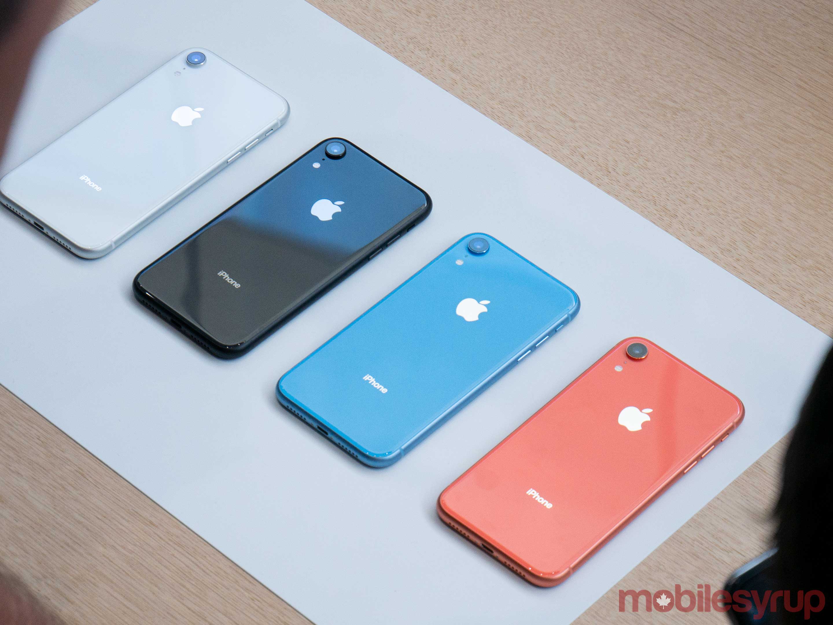
What is your favorite iPhone Xr color?

by Volker Weber

iphone-xr-red-select-201809 AV3

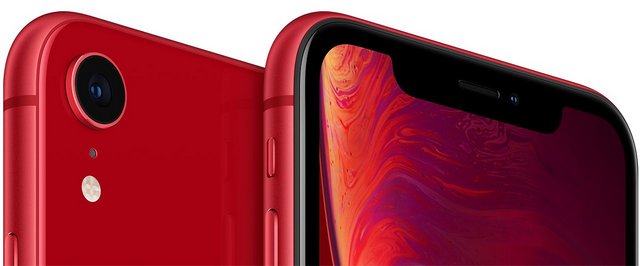
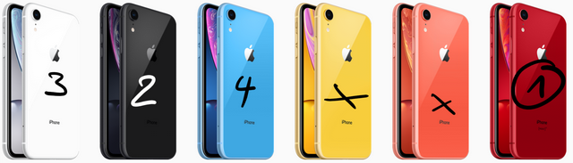
I think the Xr is actually the most interesting of the new phones. It's crazy powerful, the entry level 64 GB model is plenty enough, and I think it has the most beautiful design. And, easily overlooked, it has the longest lasting battery of the new phones. But what about the colors?

Sketch

Black and white are classic choices, and I find black more compelling since it's stealthy and the bezel is unnoticeable. But the red version is my far my favorite. Blue is OK, yellow and rocal are not. Xr will only become available next month.

Which color do you like best?

15 Sep 08:16

mapsontheweb:Flag map of the Principality of Ansbach, possibly...


mapsontheweb:

Flag map of the Principality of Ansbach, possibly the worst bordergore in history.

15 Sep 08:15

Time To Bury Electrical Lines

Maybe, just maybe, after the deluge coming from Hurrican Florence and the long wait to get...
15 Sep 08:15

You wouldn’t download a car…

by Alex Bate

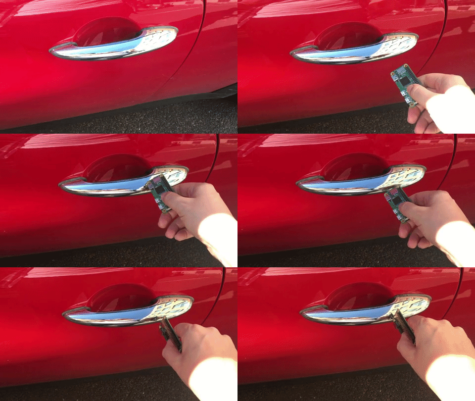
You wouldn’t download a car…but is that just because none of us know how to? And OF COURSE none of us know how to: it’s a really hard thing to do!

Raspberry Pi Tesla

Dramatic reenactment using a Mini because, c’mon, as if I can afford a Tesla!

Nikola Tesla was in love with a pigeon 😍🐦

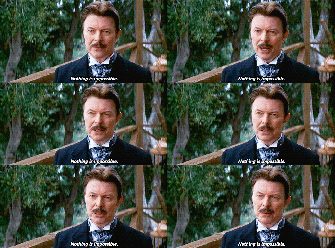
True story. He was also the true father of the electrical age (sorry, not sorry, Edison) and looked so much like David Bowie that here’s David Bowie playing Nikola Tesla:

David Bowie as Nicola Tesla — Raspberry Pi Tesla

Not even pigeon love

Which is the perfect segue, as here’s a Tesla playing David Bowie, and here’s also where our story truly begins…

Some people dislike Tesla (the car manufacturer, not the scientist) but we love them

But some people also dislike going to the dentist, so ¯\_(ツ)_/¯. (I also love going to the dentist.)

I’m pretty sure the reason some people have issues with Tesla is that electric cars still seem like a form of magic we’re not quite comfortable with.

Whatever people’s reason for holding a grudge against Tesla, recent findings at a university in Belgium this week have left the tech community aflutter: the academics announced that, with the aid of a “$35 computer”, they can clone your Tesla car key and steal. Your. Car.

If you haven’t guessed yet, we’re the ones behind the $35 computer. (Hi!)

Says WIRED: A team of researchers at the KU Leuven University in Belgium on Monday plan to present a paper at the Cryptographic Hardware and Embedded Systems conference in Amsterdam, revealing a technique for defeating the encryption used in the wireless key fobs of Tesla’s Model S luxury sedans. With about $600 in radio and computing equipment, they can wirelessly read signals from a nearby Tesla owner’s fob. Less than two seconds of computation yields the fob’s cryptographic key, allowing them to steal the associated car without a trace.

When I said that the tech community was all aflutter, what I meant was, on the whole, we find this hack somewhat entertaining but aren’t all that shocked by it. Not because we hate Tesla, but because these things happen. Technology is ever evolving, and that $600 worth of kit can do a thing to another thing isn’t all that unbelievable.

Sweet Cyber Jones on Twitter

The keys to my new Tesla https://t.co/jNViEZBxrB

The academics showed an example of the hack using “just” a couple of radios, a Raspberry Pi, some batteries, and your basic, off-the-shelf “pre-computed table of keys on a portable hard drive”. And through the magic of electric car IoT technology, Tesla instantly released a series of fixes to allow existing Tesla users to protect their cars against the attack, which is all kinds of cool.

Alex, why are you making such light of this?!

Because The Fast and the Furious isn’t real. And I highly doubt there’s a criminal enterprise out there that’s capable of building the same technology as well-funded university researchers.

Yes, this study from KU Leuven University is interesting. And yes, we all had a good laugh at the expense of Tesla and Elon Musk, but we don’t need academics to provide material for that. And I genuinely love Tesla and the work Elon is doing. True love.

Instead, we should be seeing this as a reminder that data encryption and online security are things we all need to take seriously in this digital world. So stop connecting your phone to whatever free WiFi network you can find, stop using PASSWORD123 for all your online accounts, and spend a little more time learning how you can better protect yourself and your family from nasty people on the internet.

And leave Britney Tesla alone!

The post You wouldn’t download a car… appeared first on Raspberry Pi.

15 Sep 08:15

"How is the war going along?"

by peter@rukavina.net (Peter Rukavina)

The Clyde River project posting letters home from World War I continues today:

Well, Jack, how is the war going along? We don’t know anything about it here. We might as well be in the woods a thousand miles for all that we don’t know that there is a war.

With all that we know about the war, and with our modern communications tools, it’s easy to forget that those in the middle of it didn’t know much about what was happening. And of course they didn’t know when, or if, the war would end.

15 Sep 08:15

Analog Status Updates

by peter@rukavina.net (Peter Rukavina)

In the window of Wright’s Shoes on Queen Street (which has uncommonly good window displays that have got me into the store more than once).

15 Sep 08:15

Apple Watch Series 4: The MacStories Overview

by Alex Guyot

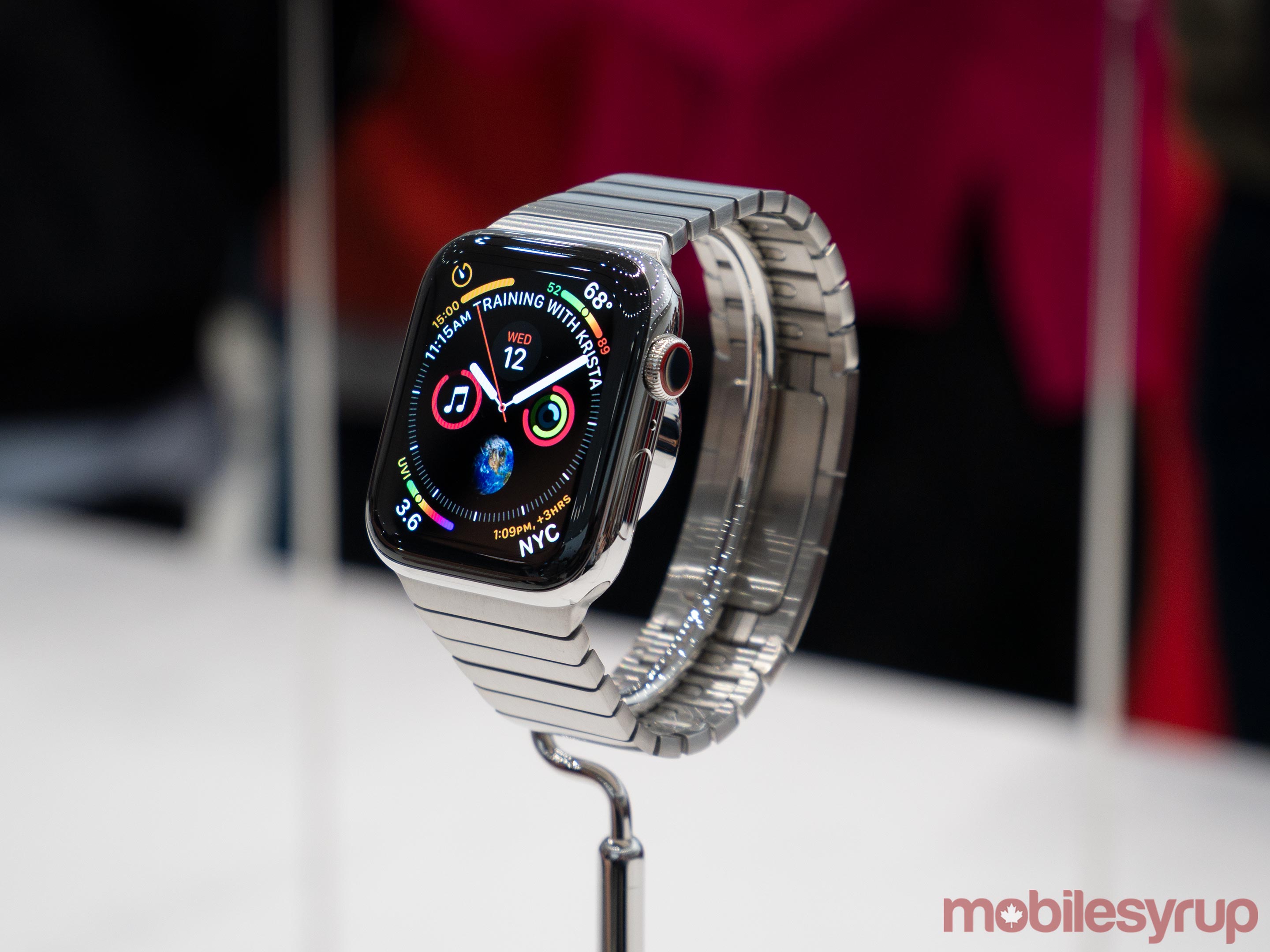
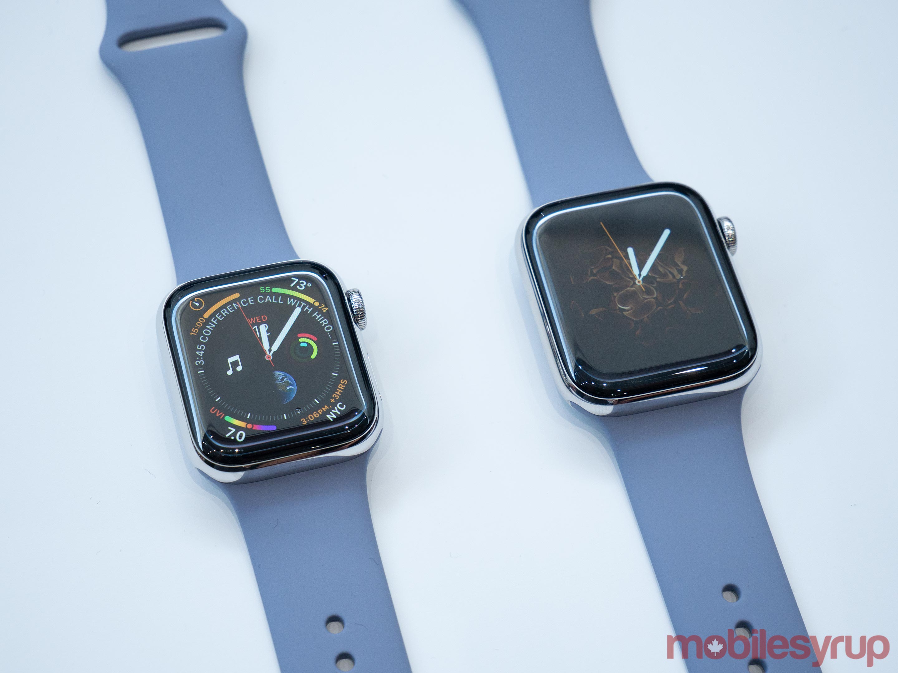
This morning at Apple's annual September event at the Steve Jobs Theater in Apple Park, Jeff Williams took the stage to announce the Apple Watch Series 4. The new Watch lineup boasts larger and thinner chassis, more than 30% larger displays with rounded corners, a breakthrough ECG sensor, and more.

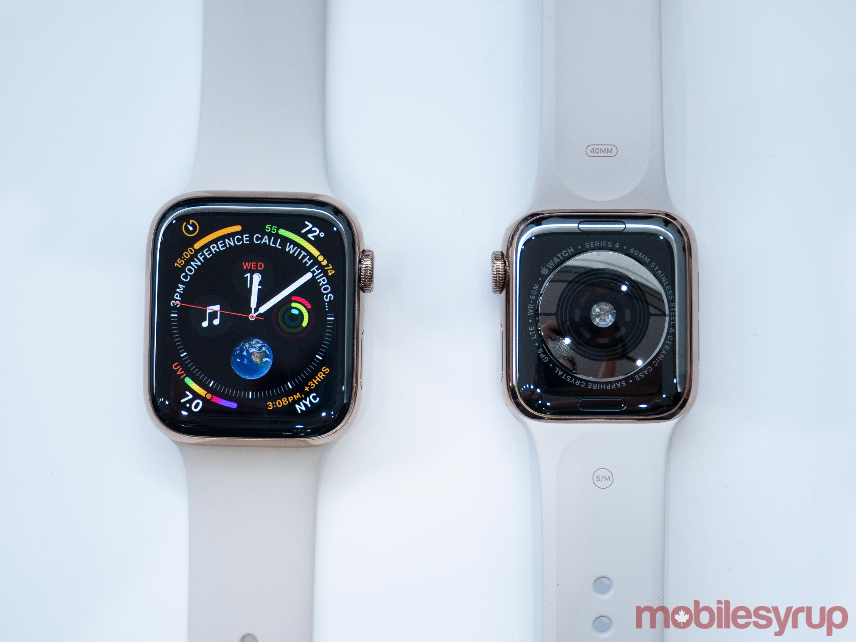
This is the first major change to the shape of the Watch's enclosure since the debut of the original Apple Watch, but thankfully Apple has maintained compatibility with existing watch bands. The new models will be sold in 40mm and 44mm varieties, each size 2mm larger than the 38mm and 42mm of previous generations. Stainless steel and aluminum varieties are offered as usual, but it looks like we've seen the end of the "Edition" Apple Watch line.

On the software side, the larger Apple Watch models are launching with a swath of new watch faces. Many of these faces take advantage of the new increased screen size by allowing a greater number of complications than we've seen on any face before. According to Apple the entire operating system has been revamped to take advantage of the new screen with its curved edges. These changes will ship in watchOS 5 on the new Series 4 Watch. There's no word yet on whether all or any of the new faces will make appearances on older models of Apple Watch – they have not been included in any watchOS 5 beta builds thus far.

New Design

As mentioned above, the Apple Watch Series 4's new enclosure comes in 40mm and 44mm sizes. The exact measurements for the 40mm Series 4 are 40mm height by 34mm width by 10.7mm depth. In comparison, the Series 3 38mm Apple Watch measured 38.6mm height by 33.3mm width by 11.4mm depth.

The 44mm Series 4 dials in at 44mm height by 38mm width by 10.7mm depth, contrasting with the 42mm Series 3 model's 42.5mm height by 36.4mm width by 11.4mm depth. That makes both new models around 6% thinner than their predecessors. Jeff Williams called out on stage that the new Apple Watches have less total volume than their corresponding Series 3 models, despite the increases in width and height of the chassis.

The screens on the Series 4 line have been pushed a little bit further toward the edges, although I still wouldn't quite call them "edge-to-edge" displays. Rather than rising to points, the corners of the displays are now rounded so that they can push against the physical corner boundaries of the new devices. Apple claims their goal was to make the new screens 30% larger without making the enclosures themselves noticeably bigger than previous models. We'll have to wait to get our hands on some actual Series 4 devices to determine the degree of success they had in this regard.

The Series 4 Apple Watch include a brand new Apple-designed S4 processor. The S4 is a dual-core, 64-bit System in Package (SiP) chip, and Apple claims that the Apple Watch is the only product in the world to run entirely on a SiP. Performance-wise, the S4 is up to two times faster than the Series 3's S3 chip.

The Series 4 models are also equipped with new speaker hardware which is up to 50% louder than before. The devices' microphones have been relocated to the right side (opposite the speaker) in order to reduce echo and make phone calls come through more clearly.

The back of the Apple Watch Series 4 is made from black ceramic and sapphire crystal. Both materials allow radio waves to pass through them, enabling improved cellular activity since signals can now freely penetrate both the back and front of the device.

ECG Sensor and Health

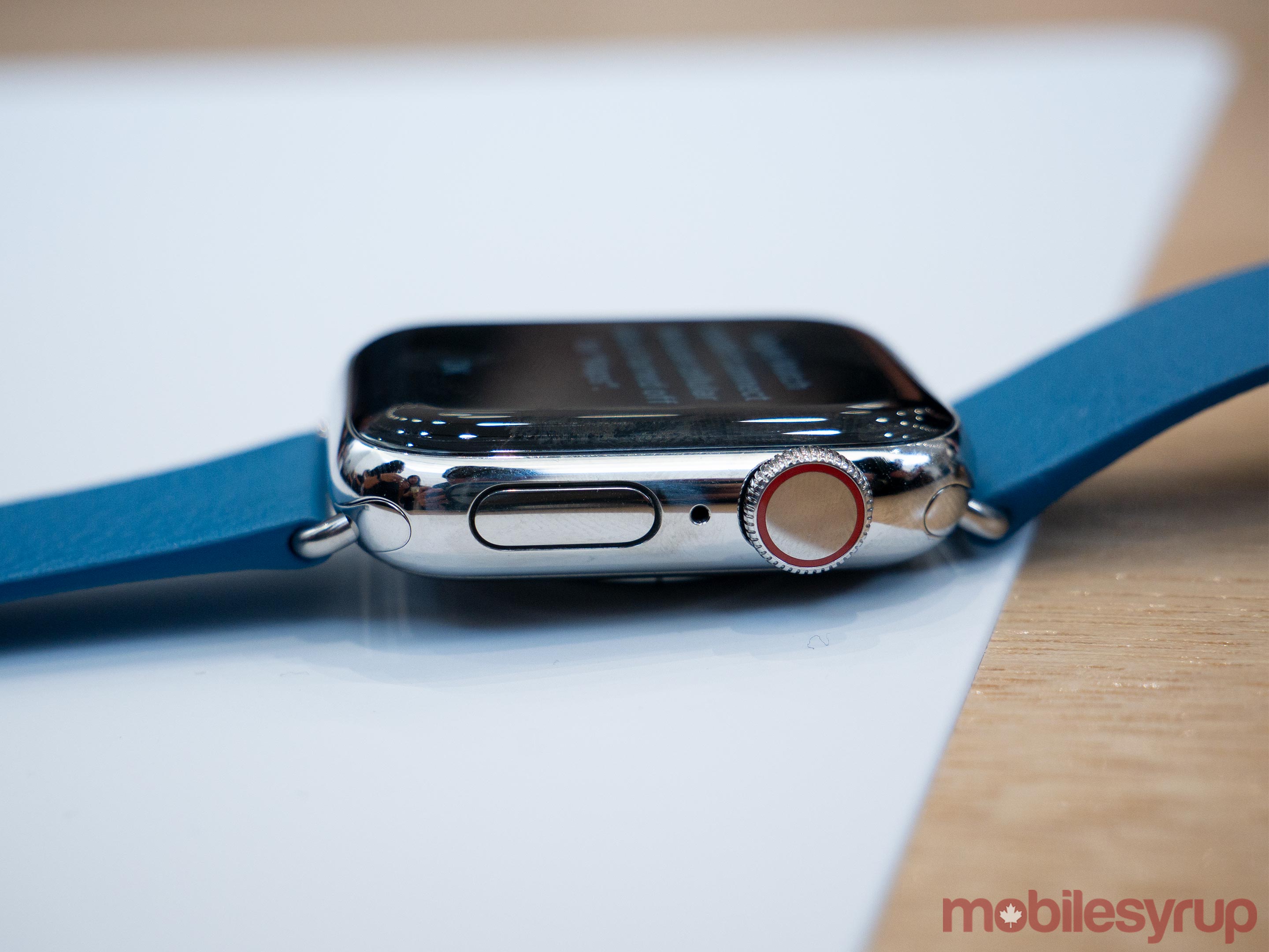
The most evident change to this year's Apple Watch may be the redesigned case, but the improvements go much deeper than that. The mechanism behind the Digital Crown has been completely re-engineered to provide haptic feedback and to enable the device's ECG sensor. As you scroll the new crown you'll feel haptic clicks which help you place your position in the interface more precisely. The Digital Crown is 30% smaller overall, but Apple says they've packed 21% more components into the smaller package.

While they don't go into detail on exactly what that component breakdown is, part of it is the new titanium electrode built into the crown's top. This electrode pairs with another electrode built into the bottom of the Series 4's new sapphire crystal back. When you place your finger over the top of the crown you form a closed circuit between your finger and the wrist of your other arm – where the back electrode is making contact. The new technology is then able to generate an ECG, or an electrocardiogram, within 30 seconds.

According to Apple's website the ECG app is coming later this year, so this functionality likely won't be enabled on launch day for the Series 4 Watch. Once that app becomes available it will store ECG results from all of the tests that you run, and at any point you can generate a printout of these results from the Health app to take to your doctor. The new Apple Watch will mark the first ECG sensor that has ever been made available over the counter to consumers.

Alongside the ECG sensor, the new Apple Watch also ushers in advancements to its heart rate rhythm monitoring. The Series 4 will periodically sample your heart rate and send you a notification if it detects either an unusually low or an unusually high rhythm as compared to your current rate of activity. This behavior is also noted to be coming to watchOS later this year, so it won't be available right at launch either.

The last new health-related feature of the Series 4 is fall detection. Apple has done significant research around the behavior of people as they fall in order to determine the difference between an unexpected fall and other forms of rapid activity. The new Apple Watch ships with a greatly improved accelerometer which is capable of sampling position eight times faster than the previous model. With this widened pool of data for each moment, Apple is able to track arm movements as you fall forward or slip backward in enough detail to determine a fall has occurred.

When your Apple Watch thinks you've fallen it will tap you on the wrist with a notification. From that prompt you have the option to trigger the Watch's SOS feature and call emergency services, or confirm that you're okay (there may be other options as well, such as only contacting your emergency contacts, but Apple's marketing materials don't show all of them and it wasn't called out specifically in the keynote). If you do not press any options and you also remain immobile for 60 seconds, your Watch will automatically place a call to emergency services and send messages to your emergency contacts.

The health improvements in Apple Watch Series 4 are by far its biggest features, and could have resounding impacts on the lives of many people. Apple has been working with the American Heart Association to verify the accuracy and functionality of their ECG monitor and heart rhythm alerts, and they have already received FDA approval on both of these features for public use. ECGs and rhythm monitors are some of the best ways to identify atrial fibrillation, or AFib, and it's a huge medical breakthrough to make such technologies so easily accessible to the public. If your Apple Watch does detect symptoms of AFib in your heart metrics, it will wait until it has detected six total occurrences before notifying you – which is a great decision to avoid panicking people with false positives.

New Watch Faces

The Series 4 ships with two brand new new watch faces dubbed "Infograph" and "Infograph Modular." Each of these accommodates more complications than any previous watch face, and the complications themselves are new and improved as well.

The image above shows some of the new designs for complications, which can be mixed and matched on the new Infograph faces. As far as I can tell, Apple is not planning on releasing these faces on older models of Apple Watch, but there were several other new faces announced today which will be backward compatible.

The Breathe face shows one of three relaxing patterns and allows direct access to the Breathe app by tapping on the center of the face. It also optionally allows three complications, one in each top corner and one along the bottom. The Fire & Water face transitions back and forth between fire and water effects flowing out from the center to consume the entire face. This face allows the same three complications as Breathe, and can optionally be set to only display either the fire or the water effect (by default it will randomly choose between them each time your display turns on, or each time you tap the center).

The new Liquid Metal face shows a full screen effect of liquid metal being swished around. It optionally includes the same three complication styles as the previous two, and it can be set to silver, gold, or black metallic colors. You can also set it to all colors, which will cycle between the three each time you raise your wrist or each time you tap the center.

Finally, the new Vapor watch face behaves in the exact same manner as Liquid Metal. The difference of course is that the effect shown is one of colored vapor floating around the display. The complication options are identical and you can pick between pink/orange, black/white, blue/green, or all colors.

Each of the new effect faces are contained into a circle within the overall rectangle of older Apple Watch model screens. On the new Series 4 screen though the effects will flow all the way out to the nicely rounded corners. Overall these effect faces feel a little gimmicky to me, but I'm at least happy to see Apple allowing complications on every new face it adds. In the past many faces were forcibly kept "pristine" by disallowing complications, which of course massively limited those faces' actual functionality.

From left: Infograph, Breathe, Fire, Vapor

From left: Infograph, Breathe, Fire, Vapor

The Infograph face is definitely the most interesting of the new bunch. It looks to be customizable to such a degree that it can look like an entirely different face based on what use cases you apply to it. One of Apple's examples on stage showed an Infograph variant which filled the center with shortcuts to contact friends. Another showed an Infograph Modular face entirely geared toward activity tracking, including a third-party complication running across the center with the day's carb, fat, and protein intake. I expect many people to find Infograph too busy to be useable at first, but since all complications are optional there may be some simpler configurations which display a decent amount of information without feeling excessive. We'll have to wait to get our hands on the Series 4 Watch before we find out for sure.

From left: Infograph with white face and friends complications, Infograph Modular with activity complications

From left: Infograph with white face and friends complications, Infograph Modular with activity complications

If you purchase a Series 4 model from the Hermès or Nike+ collections, you'll have the option of new watch faces in a variety of colors and designs. Since I don't own an Hermès or Nike+ Apple Watch, I'm not sure whether the new faces are also going to be made available on previous models.

Miscellany

The Apple Watch Series 4 is the first Watch to ship with Bluetooth 5, a protocol that iPhones began shipping with last year. In theory this should allow your Apple Watch to maintain its connection with your iPhone over a greater distance, and at greater data transfer speeds.

Apple claims that the new Apple Watch models will have the exact same 18-hour "all-day" battery life that the Series 3 boasted. While working out, the battery life has been extended to 6 hours for outdoor workouts with full GPS tracking – 1 hour longer than the Series 3. If you also have cellular enabled then that time drops to 5 hours; add streaming music on top and you're down to 4 hours. That said, both of those reductions remain an hour higher than the corresponding Series 3 metrics.

Conclusion

Apple has done some amazing work with the Apple Watch Series 4. The health tracking improvements alone mark an incredible upgrade over last year's models, and over the entire category of basic ECG monitoring devices (none of which are available over the counter). As this new technology spreads, hundreds of thousands of people will gain free, automatic access to advanced heart monitoring metrics. This is an amazing achievement and its potential impact cannot be overstated.

Beyond health, the Series 4 Apple Watch has a beautiful new display in a similarly sized body. It's thinner and larger while maintaining the same weight as previous models, it improves cellular connectivity, boosts speaker volume and reduces microphone interference, and it includes a couple great new watch faces (and a few somewhat underwhelming ones too).

There's no doubt that the Series 4 is the biggest Apple Watch upgrade to date. Unfortunately, it also comes with the first increase in base pricing for the device. The Apple Watch Series 3 is still being sold, and is holding down the bottom line at only $279 for the aluminum model with no cellular. That said, the Series 4 has a starting price of $399 for the 40mm aluminum model with no cellular – that's $50 higher than the $349 starting price of all previous 38mm flagship aluminum models. Upgrading to a 44mm model is only $30 higher now (starting price of $429), so at least that's slightly cheaper than the $50 increase similar size upgrades have cost in the past.

If you like stainless steel Apple Watch models, I'm sorry. The steel variants are only available with cellular capabilities, which is a $100 price increase from aluminum models. As such, stainless steel Series 4 models have a starting price of $699. Steel models also still cost the old $50 to upgrade size to 44mm, so the starting point for the larger steel Series 4 is $749. All of these baseline prices only get you a sport band, so you'll be shelling out even more if you want to pick up a nicer watch band as well. (At least your old bands still fit though!)

I don't love the price increases, and I'm disappointed that Apple won't offer the stainless steel models without cellular. That said, these are still incredible new devices. The Series 4 Apple Watch is more worth upgrading than any iteration before it. With its new design, impressive speed improvements, and amazing heart monitoring benefits, this is clearly the best Apple Watch ever made. If you're still pushing a Series 2 or earlier, it's a trivial recommendation to go for the Series 4. If you purchased the Series 3 last year, the price increases may push these models too far away from being worthwhile. The Series 3 is still a great Watch, and its speed improvements over the Series 2 and earlier were already drastic.

All things considered, Apple has given us an amazing upgrade this year. I'm excited to get my hands on a Series 4, and I'm happy to see the Apple Watch continuing to move forward at a rapid pace. There's still plenty more for this device to accomplish, but we're getting into the territory of it being a legitimate computer in its own right without relying quite so much on its iPhone companion.


You can also follow all of our Apple event coverage through our September 12, 2018 hub, or subscribe to the dedicated September 12, 2018 RSS feed.


Support MacStories Directly

Club MacStories offers exclusive access to extra MacStories content, delivered every week; it's also a way to support us directly.

Club MacStories will help you discover the best apps for your devices and get the most out of your iPhone, iPad, and Mac. Plus, it's made in Italy.

Join Now
15 Sep 08:14

Google Is Discontinuing Its Inbox Email App in March 2019

by John Voorhees

Google launched Inbox in 2014 as a place to experiment with new email features, some of which made their way into the company’s Gmail app eventually. Although it served as a sandbox for trying new features like email snoozing, Smart Replies, and Nudges, Inbox was not updated nearly as frequently as Gmail. So, it wasn’t surprising to hear from Google yesterday that it plans to end support for Inbox at the end of March 2019.

If you are an Inbox user and want to move your email accounts to Gmail, Google has created a transition guide.

→ Source: blog.google

15 Sep 08:14

How do you get people to notice your business?

by Paul Jarvis
Whether it’s getting interviewed on podcasts, getting articles published by industry publications or just increasing awareness about who you are and what you do—it’s a fairly common want for folks who run their own business.
15 Sep 08:14

On Being An American

by Anil Dash

I was born and raised outside of Harrisburg, Pennsylvania. A few weeks ago, an editor of The Patriot-News, the local paper, asked me for my thoughts regarding the anniversary of the attacks.

To put things in context, I was always very ambivalent about the culture of the area I grew up in. Though it’s very geographically beautiful, it is a much more conservative place that I didn’t really begin to appreciate until years after I had left. It is also a simpler place, in many ways, which is why the tone of my editorial is a little more straightforward and literal than my usual cynical and sarcastic self. Not, of course, that they wouldn’t understand my piece, but that the usual tone of my writing wouldn’t really do justice to the ideas I was trying to express.

Or, to put it a different way, I’m a lot more corny and maudlin in this essay, but it’s mostly because one of the things I’ve tried not to do since the attacks is mask actual emotion with the usual ironic distance that I tend to apply to such matters. I’m an idealist at heart, and I’d rather have that show.

Also, the Harrisburg Senators are the AA minor league baseball team, which after a rocky history had shut down in the 1950s, only to be revived in 1987 as part of a revitalization of Harrisburg. The city has flourished since, and I can’t help but think that part of the reason why is because it was so inspiring to watch that team achieve such a tremendous success their very first year out.

This essay appeared with slightly different edits in last Sunday’s Patriot-News.

We Have Our Differences

A month after last September’s attacks, I left Manhattan for the first time. I had holed up a bit, clinging to my adopted city as a bit of a sanctuary, wanting to hold on tightly to a New York that suddenly seemed vulnerable, even fragile. But it was time to venture out, so I found myself en route to Harrisburg, and to the town I was born and raised in.

The thing that struck me, other than the usual contrast of Harrisburg, with its quiet and its slower pace, was the distinction between New York City and Central Pennsylvania’s signs. The marquees in front of restaurants and car dealerships and churches had all sprouted similar reassurances of “United We Stand” or “God Bless America”, in a singularity of message that I hadn’t seen since my days as a teenager in the area, when the success of any local sports team would prompt all of the signs to show a similar unity.

That driving down the street would evoke memories of rooting for the home team when I was younger probably wasn’t coincidence. As a self-described member of the New York liberal media, and a man who is the son of first-generation immigrants, I was never unaware on my visits to my hometown that there were some who felt I was somehow less American than they were. Add in that I probably physically look a little more like the hijackers of last September than most people’s mental image of the boy next door, and suddenly what seemed uncomfortable or unusual might now be construed as downright Unamerican. But my identity as an American was forged by my experiences growing up in these small towns.

And in those first weeks, I thought a lot about what it is to be American. That a lot of people outside of New York City might not even recognize their own country if they came to visit. The America that was attacked a year ago was an America where people are as likely to have been born outside the borders of the U.S. as not. Where most of the residents speak another language in addition to English. Where the soundtrack is, yes, jazz and blues and rock and roll, but also hip hop and salsa and merengue. New York has always been where the first fine threads of new cultures work their way into the fabric of America, and the city the bore the brunt of those attacks last September reflected that ideal to its fullest.

It was no accident that the primary target, the location deemed most threatening and offensive to those who would resent American culture, is the place where we embrace the widest variety of people. Where what it is to be American is at its most inclusive, and it becomes clear that American is not something that one does, but rather something that one is. Among those lost in the collapse of the Twin Towers were citizens of at least 42 countries. To have lost people from so many countries around the world is part of what makes those events a particularly American tragedy.

I realized shortly after the attacks that, while flying, or when crossing one of the bridges or tunnels into Manhattan, or even just in going about the course of my daily life, I might have to show not just that I had no ill intent, but that I might need to prove my “American-ness”. A photo ID or a knowledge of American customs wouldn’t be enough, now that those murderers had tainted those formerly unblemished credentials.

![Harrisburg Senators Mascot](/magazine/images/hbgsenators.gif)harrisburg senators
What came to mind on the times when I wondered about proving myself as an American were the images of my youth spent in Central Pennsylvania. I started to carry around in my wallet some ticket stubs from one magical summer when I was in junior high school, when the then brand-new Harrisburg Senators went from being nonexistent to being Eastern League champs. The proof of my loyalty was my history in Harrisburg, not because I had gone to a few baseball games, but because being American is part of who I am. Anyone can come to our country and eat a hot dog and watch a ball game and stroll along the riverside, but that won’t make him an American. Being able to grow up amongst fellow fans, despite not knowing of the history of the Senators who played in the 50’s, being able to bridge small-town boy and big-city man, being able to live both as a personally conservative son of immigrants and a politically liberal citizen of the United States: these were the proud privileges and cherished rights that made me an American.

It’s a lesson not easily learned. I’ve seen the eye-rolling as politicians and opportunists on both sides of the political spectrum try to use the World Trade Center attacks as justification for whatever plans or programs they’ve always been convinced should be foisted upon the public. I’ve seen the grimaces and groans as challenges to the Pledge of Allegiance were mounted. I’ve seen good people with unpopular views labelled as disloyal, untrustworthy, even treasonous. So it bears repeating that being an American isn’t something that you do, it’s something that you are.

The lesson I’ve learned is to extend the embrace to all the members of our American family. Get annoyed, get angry, be incensed as you are with your sister who always votes the opposite of you, as annoyed as you get with your father who never quite got where you were coming from politically. And come back, shaking your head but still smiling, and enjoy the chance to appreciate those Americans that your reflexes tell you to resent. Be thankful for the chance to have neighbors or fellow citizens who raise your ire or offend your sensibilities. Be thankful that we can sit in a quiet small town and roll our eyes at the inanities of a visitor from a big city. I’ll be the first to admit that every time I return to New York City from a visit to Harrisburg, I look around at all my fellow New Yorkers and wonder for a moment if they’re all just a little bit crazy. And, of course, they are. Or at least they’re a little bit different.

It’s a difference we’re privileged to have.

15 Sep 08:13

Apple Keynote: Nix Neues aus Silicon Valley

by carsten
Das war sie also, die von Apfel-Jüngern zelebrierte Apple Keynote mit der Sehnsucht nach neuen technologischen Ufern. Was gab es? Drei iPhones, die schneller, höher und so weiter sind und eine Apple Watch S4, die [...]
15 Sep 08:13

“Was Maaßen getan hat, wird mit und ohne Maaßen weiterwirken. “

by Andrea

Die Zeit:

AfD erhielt vorab Informationen aus Verfassungsschutzbericht. “Hans-Georg Maaßen soll einem Abgeordneten Zahlen aus dem unveröffentlichten Report genannt haben. Unüblich ist das nicht. Die Grünen beklagen eine Ungleichbehandlung.”

“Maaßen wird seit Wochen kritisiert, er grenze sich nicht klar genug von Rechtspopulisten ab und agiere politisch. Jüngster Anlass waren seine Interviewäußerungen zu einem Video über einen Vorfall in Chemnitz, bei der Rechtsradikale nach einem Streit um eine Sachbeschädigung einen Afghanen angegriffen hatten. “

SPD fordert die Kanzlerin zur Entlassung Maaßens auf. “Für die SPD ist der Verbleib von Verfassungsschutzpräsident Hans-Georg Maaßen in seinem Amt untragbar. Die Parteispitze fordert: “Merkel muss jetzt handeln.””

“Die SPD-Spitze fordert von Kanzlerin Angela Merkel, dass sie für die Ablösung von Verfassungsschutzpräsident Hans-Georg Maaßen sorgt. “Für die SPD-Parteiführung ist völlig klar, dass Maaßen gehen muss. Merkel muss jetzt handeln”, sagte SPD-Generalsekretär Lars Klingbeil mit Blick auf dessen Äußerungen zu ausländerfeindlichen Vorfällen in Chemnitz. “

Angriff von oben. “Egal ob er geht oder bleibt: Hans-Georg Maaßen hat die Demokratie geschwächt. Auch er verstopft mit seinen Halbwahrheiten und Ablenkungen den öffentlichen Diskurs.” Ein Kommentar von Markus Horeld.

“Man kann jetzt den Rücktritt von Maaßen fordern. Der Schaden an der Demokratie aber ist längst angerichtet. Was Maaßen getan hat, wird mit und ohne Maaßen weiterwirken.”

15 Sep 08:13

Machine intelligence at Dropbox: An update from our DBXi team

by Timo Mertens and Vinod Valloppillil

Our workdays are getting noisier. Never-ending emails, text messages, constant notifications from more apps and more platforms—it’s disruptive and distracting. And then there’s content. All kinds of documents, spreadsheets, presentations, videos, and photos. Industry research shows that employees at larger organizations use an average of 36 cloud services at work, including tools for productivity, project management, communication, and storage. This information overload is a key source of pain for people at work—and a prime opportunity to leverage the help of machine intelligence.

How do we define machine intelligence?

When we talk about machine intelligence at Dropbox, we mean the whole range of applied machine learning, from simple linear classifiers to advanced deep learning networks. For many years we’ve been building a world-class machine learning team, improving our platform behind the scenes. We started with a lot of foundational work on image recognition to improve our users’ experience of organizing the massive amount of photos they keep on our platform. The fact that many of those photos have text in them led us to invest in our mobile document scanning capabilities and custom optical character recognition (OCR) pipeline to help our users quickly scan and find their content. We combined classical machine vision techniques with advanced deep learning methods to create a mobile scanner experience that was faster and more accurate than any off-the-shelf solutions we could find.

A lot of the content in Dropbox is already in text-based documents, so search is another area of significant investment for us in terms of machine learning. We’ve now completely rebuilt our search infrastructure to improve the quality and speed of results from the hundreds of billions of pieces of content our users entrust to our platform. Because of our granular sharing permissions, each user has a unique corpus of documents to search within. This creates whole dimensions of personalization that web search engines largely ignore. Add to that activity signals related to relevance—such as files with recent comments or those recently viewed by team members—and you have a really productive use case for machine learning.

Each product innovation makes our users’ lives a little better, but how can we make larger leaps toward freeing people’s attention so they can find focus and flow at work? Instead of people working harder to keep up, can we make their tools smarter? To achieve this, we’re weaving our unique approach to machine intelligence into all of our products and surfaces. We call this effort the Dropbox intelligence initiative (DBXi), and we’re excited to share some updates.

What’s the big problem we’re trying to solve?

We see tremendous potential to use machine intelligence to improve the work experience itself. Quieting the noise for individuals is the first step toward helping people in organizations work better together. There are lots of engineering challenges behind creating an intelligent workspace, but the motivation comes from design and product insights. Our researchers have invested years studying how the rise of SaaS applications and mobile have changed the way contemporary knowledge workers do their jobs and run their teams.

This research shows three kinds of activity that people spend way too much time on:

  • Organization: Work content is spread across files and cloud content in different silos. We spend a lot of time just finding what we need before we can start working on it.
  • Contextualization: It’s hard to put content together with the communication about it. Constantly shifting context requires mental overhead and cuts into our ability to think clearly, leading to stress and burnout.
  • Prioritization: With everything so scattered and fragmented, it’s hard to know what’s really important.

These activities are an increasing part of modern work, and they all get in the way of maintaining focus. And these problems are compounded for every team member as well, so there’s a lot to gain from taming this complexity. We think our intelligence solutions can help address these pain points at work.

What’s our next step?

One example of a user experience we’re exploring as part of the DBXi initiative is demonstrated in the animation above. In this prototype, we’ve evolved the existing desktop surface where our users check sync activity and see notifications into a more dynamic view that intelligently highlights their most important work connected to Dropbox.

We suggest the most relevant content by traversing a user-specific graph that connects people, content, and activity signals in privacy-preserving ways. This includes not only files but also content like Google Docs, as well as collaborative activity in emails, messaging apps, and calendars—whatever a user chooses to connect to Dropbox. And we make all this content searchable in this surface as well. To cut through the noise, we prioritize notifications and show content related to calendar events in personalized activity feeds. And to declutter these feeds, we cluster content and collaborative activity across silos so users can immediately see which projects need their attention and be only a click away from the content they need.

This prototype is only one of many surfaces we’re exploring for intelligence. The data graphs and models we build for products and search are generally reusable across surfaces and features. By scaling our internal machine intelligence platform, DBXi is multiplying the efforts of our dedicated intelligence product team so all our engineers can modify and validate models for intelligent features, improved search, and other business optimizations. These scalable methods and common infrastructure give our product managers and designers the flexibility they need to experiment and take chances on novel directions.

From a technical perspective, these are important problems to solve, and success means not only intuitive user interfaces, but also lightning-fast response times, industry-leading prediction, and the highest standards for maintaining data privacy. Want to help us build the next-generation intelligent workspace? We’re hiring!

15 Sep 08:13

Blogging by Email with Categories

by peter@rukavina.net (Peter Rukavina)

By far and away the greatest boon to my blogging practice over the past couple of years is giving myself the ability to post here by email, something I described the technical aspects of back in 2016 when I coded it up.

It’s proved a valuable new tool for posting when I’m out of the office or when I’m traveling, especially when I want to post a photo just after taking it. It’s also allowed me to use the speech-to-text feature of my phone to dictate posts, which requires a lot of proofing and editing, but is generally easier than trying to tap things out in full on the tiny phone keyboard.

I added a new feature to this setup today, giving myself the ability to add categories to blog posts by including lines that start with a hash (#) symbol.

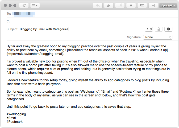
So, for example, I want to categorize this post as Weblogging, Email and Postmark, so I enter those three terms in the body of my email, as you can see in the screen shot below, and that’s how this post gets categorized.

Until this point I’d go back to posts later on and add categories; this saves that step.

15 Sep 08:13

The Late Bus

by peter@rukavina.net (Peter Rukavina)

Back in my early days on the executive of the PEI Home and School Federation I received a call from a parent concerned about the cancellation of the “late bus” in West Prince: they were concerned that this cancellation had made participating in after-school activities hard for many students, and they wanted something done about it.

A couple of days later I had occasion to be on the phone with Dale Sabean, then Superintendent of the Western School Board, and I brought the matter up: with some indignation in my voice, I’m sure, I raised the issue. “How could the board be so short-sighted to take this ham-handed move?”, I might have said (although I was likely more polite).

“You know there hasn’t been a late bus for more than 20 years, right?”, Dale replied.

To this point I’d been operating under the assumption that the cancellation of the late bus was a recent move, and one that needed to be nipped in the bud immediately; that was certainly the impression I got from the complaining parent.

Dale and I had a good laugh about this, I suggested that the board re-examine the notion of establishing a late bus, and I emerged chastened, wiser about the half-life of public school issues on Prince Edward Island, and happy that Dale Sabean was such a kind-hearted superintendent.

Today, the CBC reports, Public Schools Branch announced that there will be a one-year, two-days-a-week trial of a late bus in West Prince.

15 Sep 08:13

The Art of the Personal Project: Eric Espino

by Suzanne Sease

The Art of the Personal Project is a crucial element to let potential buyers see how you think creatively on your own.  I am drawn to personal projects that have an interesting vision or that show something I have never seen before.  In this thread, I’ll include a link to each personal project with the artist statement so you can see more of the project. Please note: This thread is not affiliated with any company; I’m just featuring projects that I find.  Please DO NOT send me your work.  I do not take submissions.

Today’s featured artist:  Eric Espino

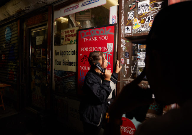
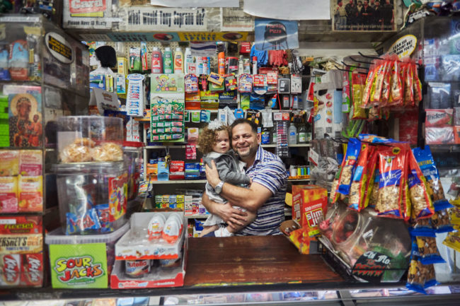
Artist Statement: “La Bodega” – The lost soul of a neighborhood

Around NYC we have noticed more and more Hispanic “bodega” markets disappearing, one of the major aspects making up the diversity within the 5 boroughs. Every bodega is a major key in Hispanic or urban area neighborhoods catering to the needs of the poor and working class. It is a major staple within the Hispanic culture that is, unfortunately, being driven out due to the “New” New York gentrification conditions and standards we have experienced over the last 10-15 years or so.

Our homes and neighborhoods are changing and are no longer affordable. Bodegas have always been the place to go to for the last minute ingredients to your home-cooked meal- to be the place where you always receive a warm welcome- to always having a place to be around the people you’re most connected to; no matter the color, race or religion, but most of all a place we all knew as “La Bodega”.

This was my home. We are the face of a born and raised NYC culture that will never be forgotten. – La Bodega


To see more of this project, click here.

APE contributor Suzanne Sease currently works as a consultant for photographers and illustrators around the world. She has been involved in the photography and illustration industry since the mid 80s.  After establishing the art buying department at The Martin Agency, then working for Kaplan-Thaler, Capital One, Best Buy and numerous smaller agencies and companies, she decided to be a consultant in 1999. She has a new Twitter feed with helpful marketing information because she believes that marketing should be driven by brand and not by specialty.  Follow her at @SuzanneSeaseInstagram


------------------------

Visit our sponsor Photo Folio, providing websites to professional photographers for over 10 years. Featuring the only customizable template in the world.

------------------------

15 Sep 08:13

Crystal Visions

by Apoorva Tadepalli

In 1914, Bruno Taut, one of the leading Expressionist architects during the Weimar period, took on the association of German glass industries as a client and designed for them a pineapple-shaped dome structure with 14 sides and a prismatic glass roof like a disco ball. It had floor-to-ceiling colored glass and an interior waterfall between the staircases. This Glass Pavilion, what Taut called his “little temple of beauty,” is widely known as the first significant building that used glass bricks.

Expressionist artists viewed glass as a symbol of purity and renewal after World War I — Taut described glass in the built form as having a kind of mysticism, a somewhat cosmic significance. “People of Europe!” he wrote in Alpine Architecture, a tome of utopian designs for a city in the Alps. “Create for yourself sacred possessions — build! Be a thought of your star, the Earth, that wants to adorn itself through you!” The modern city in this vision is an augmentation of the earth, building on top of the natural landscape, with and against it at the same time — a form of “augmented” reality that predates the way we understand the term “augmented reality” today.

Taut called on modern society to create a new physical reality, to “adorn” the earth, and enhance it. Ludwig Mies van der Rohe, who was heavily influenced by Taut and is often credited with designing the first glass and steel buildings, imbibed this vision when he stressed on the image of “cut crystal” that would create a kind of jewel-like brilliance on building facades. The glass skyscrapers that dominated the 20th-century city were inspired by expressionist architecture. In cities like New York, the skyscraper would form a large-scale augmentation, an omnipresence, a totalizing landscape — and a precursor to the relatively novel devices that we now use to understand and navigate the city.

The modern city in this vision is a form of “augmented” reality that predates the way we understand the term today

Kevin Lynch, whose 1960 book The Image of the City has influenced urban planning for decades, identified the importance of the city’s “legibility” — “If it is legible,” he wrote, “it can be visually grasped as a related pattern of recognizable symbols.” Lynch argued that an inability to create a familiar image of a city would produce a sense of lostness, and therefore of terror. The urban environment — from streets and buildings to public infrastructure like stations and parks — built amongst, with, and against nature, makes a city make sense the way a book makes sense; a city needs to be “read,” and used. The practice of “sense-making” creates a reality in itself, and therefore a worldview. In this way, legibility is the ultimate form of augmentation, imposed on a city for the sake of enabling, and naturalizing, a set of practices, routines, and values; a grand narrative by which to contain the countless customs and subcultures that make up a city’s life. Inherent to this legibility is curation, and exclusion. Skyscrapers look very different to those who see them largely from the inside, and those who see them entirely from the outside.


“We live for the most part in closed rooms,” Expressionist poet Paul Scheerbart wrote. “These form the environment from which our culture grows. If we want our culture to rise to a higher level, we are obliged to change our architecture.” Scheerbart believed that the imagery created by glass buildings, through their openness to natural light and the environment, would lift society into a higher state of sensory awareness. Ironically, though, now, these same structures typify a distinct closedness. Modern skyscrapers exist, in part, to shield us from the elements while simultaneously controlling them: Buildings made almost entirely of windows that cannot open, and glass that is manufactured for its “sun control” features, its ability to adjust the settings of the natural environment within the built one.

Central air conditioning, which coincided with skyscrapers in early 20th-century America, made it possible to exist primarily within a layer of manmade reality. It radically changed our relationship to the natural environment, which could now be controlled, or obscured, as required. Before central air conditioning was invented, houses were designed in concert with natural airflow: more windows, higher ceilings, porches or water bodies or similar sections of the house that could be spent in the shade during the hottest months. Central AC defined the kinds of structures that could now be built (shopping malls, museums, office blocks) and how people spent the summer (largely at the movies — Hollywood’s golden age began around the same time). Air conditioning, and the general guzzling of electricity, became a status symbol.

Now, buildings are not designed for ventilation — skyscrapers and most office buildings are airtight — but for central cooling. Windows that open ruin the lines of the building as it is meant to look from the outside; they also let in noise and dust, while a controlled environment is cleaner, more stable and predictable — more legible. Willis Carrier, inventor of the modern air-conditioner, marketed it as “manufactured weather.” Architect Rem Koolhaas wrote that “if architecture separates buildings, air conditioning unites them,” and this seems to get at the crux of how the urban environment augments reality: it makes a totalizing whole out of what never was before. The whole city becomes our indoor, customizable, augmented world.

The image reflected on the sides of modern skyscrapers creates a continuity with the sky: look up on a bright, sunny day in New York’s Financial District and you can see the Freedom Tower almost blending in, the blue and white sky running all the way down its side, only brighter. Reflective glass on skyscrapers is not so much mirroring the sky as it is creating a new one that is richer, fuller, responding in real time to the sun and the clouds around it, and which does not dim. This brilliance of light and color gives one the sense of perpetually being awake, or if not awake then on a kind of sleep mode — a state of rest that is only half-restful, ready to spring to a default state of productivity in an instant. It also allows its viewers to enjoy the natural elements — the sun, the clouds, the saturated blue sky — in a unified way, just as Snapchat filters can homogenize our faces. At the same time, the lawlessness, the expressionism, of modifying the given world is what makes these structures so captivating. Modern skyscrapers turn the idea of “natural” architecture on its head: nature is adapting to technology — the sky blends into the building — rather than the other way around.


Taut’s Alpine architecture was meant to challenge and incorporate nature all at once. Taut was not trying to reject nature outright, but his frenetic attempts to conquer it came from a sublime sense of awe. Elements of the modern urban form also inspire this awe: not just at the brilliance of glass, but also its height. Instagram’s #neckxercise hashtag, which has around 5,000 photos on it, is a collection of upward-facing photographs where the jagged edges of buildings jut into the frame like puzzle pieces, all designed to make “looking up” a legitimate aesthetic, lifestyle, and philosophical choice. It is worth remembering that this habit — in very subtle, unconscious ways — validates the many forms in which exclusion is practiced by these structures: reflective glass mystifies the grand activity happening inside the buildings.

Skyscrapers change our relationship to sunlight, to wind and shadow — light inside but no wind; excessive wind outside from all the wind tunnels created by Manhattan’s buildings, and shadows everywhere on the street. We look up and we see these buildings stand in for the stars, the moonlight, the clouds. They make up the urban dweller’s natural environment, their reality: larger and larger spaces whose insides are totally private. The more the urban environment develops and grows, the less our physical, textual, and emotional reality is shared. Hermetic interiors augment the elite experience of belonging inside, while sublime exteriors conduct an atmosphere of submission.

The sky is colonized in physical space by the reach of these buildings, which recognize the sky as real estate. In her book Form Follows Finance: Skyscrapers and Skylines in New York and Chicago, Carol Willis, director of the Skyscraper Museum in New York, talks about the “vernaculars of capitalism” that subtly define the language of the urban form. The location and image of a skyscraper’s presence in a particular place is a product in itself. The architect-designer who developed the reflective glass that came to dominate vernacular office culture in the second half of the century was inspired by a Life ad for mirrored aviator sunglasses.

We are the unconsenting audience of this art form that is our skyline, taking in these images regardless of whether we are looking up to see buildings or clouds

The sky, which one would think is a kind of commons, is also the screen onto which much of the advertising (or potential for advertising) that affect our lives is displayed. American Surety, Singer, the MetLife building, and Banker’s Trust are just some of the skyscrapers that were created solely for the purpose of branding large-scale enterprises. There is a connection between the glamor of corporate spaces and the value that our society places on work; the visual language of skyscrapers represents the dynamics and objectives of capitalism itself. As Marx described capital’s function as squeezing value out of labor until it can no longer produce, skyscrapers, towering into the sky, squeeze space literally out of thin air.

 The utopian ideals for Expressionist architecture involved a kind of classless harmony with nature, but in our contemporary society, the structure and placement of skyscrapers reinforces an economic order — these looming constructs impose on and remake the surrounding environment according to a certain logic, augmenting the life of the city. Whether in the form of homogenizing experience through weather control or shielding their occupants from the street and vice versa, or exercising “soft” power by building corporate branding into the physical landscape of a city, they enact and represent the forces of exclusion and economic segregation, literalizing modern capitalism.


In 1936, Harold Ross, while serving as editor of the New Yorker, received an angry letter from New York architect Aymar Embury II, reacting to Lewis Mumford’s curmudgeonly “Skyline” column of architecture criticism. “It does seem very highly desirable to say a kind word once in a while if only for the heightening effect of contrast,” Embury wrote bitterly. “Whenever I read Mumford’s criticisms, I just boil. They are very offensive.”

In defense of Mumford, Ross replied rather acridly the following week: “I sometimes realize that architecture is one of the few subjects I cannot detach myself from emotionally. I don’t have to go to a theatrical production if I don’t want to, or a moving picture, or look at a painting, or, at worst, I can walk away from these things. But a building is there, and I’ve got to look at it, and realization of this sad fact frequently makes me indignant and downright bitter.” Ross’s feelings seem entirely justified in the context of an urban visual landscape that is an open canvas for the increasingly few to express themselves to the increasingly many. We are the unconsenting audience of this art form that is our skyline; we are constantly gazing up at these dominating phallic marvels, taking in these images regardless of whether we are looking up to see buildings or clouds.

The image of the city has a deep, psychological impact on our sense of civic selfhood. In the 1970s, New York’s tourism bureau began to capitalize on the nickname “the Big Apple” and used a campaign to turn it into a brand; Milton Glaser’s “I Love NY” became a design icon. After September 11, one passenger on the Staten Island ferry looked at the skyline and commented that it was like the city had lost its two front teeth. There is an undeniable cultural capital associated with this stylized production of civic pride. TV has always been quick to exploit the image of the skyline for subliminal messaging: quick shots in between scenes establish setting, and some of these are shots so fast we don’t consciously register them. Media creates legibility and familiarity, too, through a kind of narrative augmentation that arguably renders, or attempts to render, physical familiarity almost irrelevant. This is how the city markets itself not just for its residents but for the world.

Today this civic self-branding is inextricably linked to the capitalistic impulses that drive the modern city. While the original Expressionists imagined the city as an “adornment” or augmentation that would manifest utopia, the city now reshapes itself in the image of its wealth. Advertising, especially in public places, appeals to a continuously created sense of civic identity: Casper, Fiverr, and StreetEasy are just some of the omnipresent brands on the subway that, subtly or not, call on the viewer to be a “New Yorker,” promoting the sensibilities that supposedly characterize residents of this city. A recent Seamless ad campaign, showing the “unusual” add-ons demanded of restaurant workers by customers (“Go to 2B. Tell them to stop stealing my wifi. Deliver to 2A for a well-earned high-five”), effectively paints New Yorkers as self-indulgent, unthinking consumers with no interest in treating workers of the service industry with humanity or respect. These ads can seem perversely accurate, mirroring the dynamics of class hierarchy and cruel hypercapitalism that in many ways define the city now.

It’s not just our physical reality that is augmented by the modern urban environment, then, but also our emotional reality, our sense of identity. And city branding translates directly to our own personalized branding. Just as the experiences of the characters in Friends seem that much richer and more vivid when preceded by shots of the New York skyline, so too do our own experiences in documentation. Cities enable aspiration, which in turn enables strong brands. Self-expression that supports the dominant city narrative, one augmenting the other, has massive power.

The signifiers that cities provide make our lives more legible for an audience. They also inspire and imply a cultivated attitude, a level of experience, and a vast and intimate, secret knowledge — a kind of exclusivity and secrecy that the buildings themselves exercise on us. What Adorno and Horkheimer called the “culture industry” is evident here in the way capitalism uses social media culture to redevelop cities into truly contemporary, post-industrial ones. From branded skyscrapers to portable Instagram moods, the city is being commodified in increasingly intangible ways. The images that this culture produces are an augmentation of an augmentation, which have very little to do with the way most people living in New York actually move through the world, but which make strong statements about how we should move through the world, or perform our movement through the world.


The “adornment” that Expressionist thinkers advocated for nature was a response to oppressive aesthetic norms, and it had a distinct artistic and progressive political purpose. These radical goals may be irrelevant in the contemporary urban project, but the importance of individual expression remains in this image-making culture — we, as the recipients of these various modes of expression within the built form, understand the social and cultural value of producing our own versions of these mass images. We, in our investment in not only living in a legible city but also becoming legible to the agenda of the city, are a necessary part of this totalizing vision.

Still, however, the city is the ideal place for creating movement through the world in a way that can defy or escape the contemporary world’s wealth-oriented agenda. The city is the manifestation of capitalism and at the same time, in many ways, the only place where capitalism, and the legibility of corporate functionality, can be escaped. Jane Jacobs’ famous “sidewalk ballet,” where people loiter on stoops for hours without producing anything of value, where they leave their mail and their keys with total strangers at the corner deli, where the exchange of meaningless conversation between a newspaperman and a deli owner and a commuter waiting at the bus stop and a local resident hanging around her window can determine the course of a day, is an omnipresent urban dynamic that is constantly escaping, actively, the project of capitalism. As critics of the Seamless ads have pointed out, we do not, in fact, live in a city where it is possible or even actually cool to totally avoid human contact — we live in a large, dense city that is full of unpredictability. Just as the city is prone to having legibility imposed on it, it is also the space where illegibility is most possible, and has the most potential.

15 Sep 08:13

Supporting AR Experiences in the New York Times Android App

by Ramona Harrison
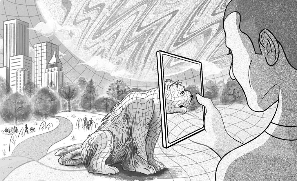
Illustration by Jeremy Leung

Earlier this year, The New York Times introduced augmented reality (AR) experiences within interactive articles. This new digital storytelling medium allows readers to bring three-dimensional objects captured by our newsroom into their own space. From catching Olympic athletes mid-jump, to closely examining the intricate textures of David Bowie’s costumes, to exploring NASA’s latest mission to Mars — augmented reality brings a new and interactive dimension to our stories.

These experiences have been enabled on the native app side by new technologies that were released in the past year: ARKit became available on iOS in late 2017 and ARCore became available on Android in February 2018. Fundamentally, these software development kits, or SDKs, allow an app to understand the environment around a user’s device and to place objects and information within it.

To parse the user’s environment, ARCore and ARKit use the device’s camera to identify distinct feature points in areas of high contrast, such as the corners of a table, and keep track of those points as the user moves their device.

As the device is moved, the feature points reposition within the camera frame and the change is used by the SDKs to infer how much the user has moved their device. This visual information is combined with motion data from the device’s sensors to estimate the position and orientation of the device camera over time — this is called pose.

Developers can use this information to align the pose of the real device camera with the pose of a virtual camera that renders 3D content. Because the rendered virtual content is aligned on top of the real camera image in each frame, it appears as if it is part of the real world around the user.

Three Goals that Guided Our AR Development

When we first started to explore how we wanted to support AR in our Android and iOS news apps, we identified three key goals:

  1. We wanted to support these experiences in our existing news application — we did not want to require our readers to install a companion app. This also meant that any dependencies we added would need to be minimal in order to keep the download size of our core app lightweight.
  2. We wanted to be able to publish new experiences separate from the app release cycle, which happens every two weeks. We also wanted to make the app as agnostic to the content and flow of these experiences as possible, so that our colleagues in the newsroom would be able to craft unique and varied interactions across stories.
  3. We wanted our colleagues in the newsroom to be able to author each story just once and have this same version run seamlessly on both Android and iOS platforms.

These goals really came to define our options and as a result, we built the framework that we’re using today.

Our first goal to support AR experiences in our existing news application meant that we could not rely on common cross-platform rendering solutions like Unity or Unreal Engine since these frameworks could not be integrated into our existing native apps. We also had to turn down any solution that involved a large dependency which would add excessive bloat to our app download size.

In order to satisfy all three of these goals, we considered a number of different approaches before settling on one that worked.

Native approach

The first approach we considered is what I’ll call “the native approach.” In this approach, the complete AR experience — including all rendering and user interactions — is controlled by the native application.

Because the rendering is handled on the native side and there is no back and forth communication with the web side, the experience is synchronous, performant and responsive. However, we very quickly ran into some serious limitations to this approach.

The main the AR experience had to be baked in at build time. This meant that it failed to meet our second goal: to be able to publish new experiences with the news cycle, and independently of our app release cycle. It also failed to meet our third goal — to produce once and have it work across Android and iOS — since interactions would need to be pre-scripted and implemented separately for both platforms.

Web rendering approach

The second approach we looked at is what I’ll call “the web rendering approach” — WebAROnARCore and WebAROnARKit. In this approach, which is built as an extension to the existing WebVR browser API, the device exposes AR data to the web page via a browser interface.

The native app is responsible for rendering the camera image, as well as sending important AR data to the web page, such as the current camera pose. The web page then uses WebGL to render all of the virtual content on top of the camera image, and it renders any of the virtual content that should be visible in the experience.

There are two advantages to this approach we really loved.

First, iOS and Android versions of the WebAROnARCore and WebAROnARKit projects adhere to the same interface. This means that our colleagues in the newsroom would be able to author each AR experience just once and it should behave the same on both platforms.

Second, since all of the virtual content rendering is handled by the web page, the newsroom can craft unique and varied AR experiences by simply creating a new web page rather than waiting on an app release. Each new experience does not need to adhere to a standard formula when it comes to how a scene will be rendered or how a user might interact with the virtual content.

However, we ultimately steered away from this approach for a couple of reasons.

Because the camera image is rendered by the native application on the GL rendering thread and the virtual content is rendered by the web page in its own thread, there is a mismatch in synchronicity between frames. This means that when the device moves around quickly it appears as if there is a slight drift between the real world camera image and the virtual content.

The Android implementation relies on an experimental Chromium fork that would need to be packaged with the APK in our app release. The dependency is quite large, meaning this would not meet our first goal to provide the AR experiences in our existing app without bloating the APK size.

Illustration by Jeremy Leung

Hybrid approach

The third, and final, approach we looked at is an approach I’ll call “the hybrid approach.”

In this approach, all of the rendering related to the AR experience — including rendering the camera image and the virtual 3D content — is handled by the native app while the content of the experience is delivered and controlled by a web page.

The visual experience is composed of two layers on the screen. The top layer is a web view that renders the web page that presents 2D content, such as text, and user controls. It has a transparent background, allowing the user to see through to a native layer below where the camera image and 3D virtual content are rendered.

The web page acts as a controller for the AR experience. It has a JavaScript interface that it uses to call through to the native layer, sending instructions about what virtual content to load, how to position it and how it should react to the user’s interactions. This means that the native app remains as agnostic as possible to the content and flow of each experience. It doesn’t care which or how many virtual models are being rendered, at what time they are placed or how they are positioned relative to the user.

Because the web page can be authored and delivered at any time, we can meet our goal of publishing new experiences along with the news cycle rather than the app release cycle. Since the JavaScript interface is implemented to control ARKit on iOS devices and ARCore on Android devices, the web page only needs to be authored once and will work similarly on both platforms.

Scene graph

Before I can talk about the hybrid interface between the web page and the native app, I need to do a quick detour to talk about scene graphs.

A scene graph is a common approach to managing data in a graphics engine. A scene graph is a tree made up of nodes that can each have as many children as they want — we call this an n-tree.

A scene graph made up of nodes attached to a scene anchor.

All of the nodes in our scene descend from a single root node, which itself is attached to a scene anchor. This anchor tracks a real-world position across time, meaning that the virtual content rendered by the scene will appear fixed to a real-world point in the user’s space.

Each node has some information associated with it. In our case, it has:

  • A unique identifier used to find or reference the node.
  • A position and rotation in three-dimensional space, i.e. a pose.
  • Information about what, if anything, to render.

The native app uses the scene graph to understand how the 3D virtual content should be rendered. In our hybrid approach, we enable the web page to control details of the scene graph in order to create unique AR experiences across stories. We also enable the web page to perform managerial tasks like starting and stopping an AR session or loading and unloading the file resources required to render an experience.

Commands and results

To enable the web page to control the AR experience, we’ve created a command and result loop. Commands are created and issued by the web page. They’re passed to the native app through a Javascript interface on the containing web view.

Command and result loop between the web page and native app.

Any action that the web page wants to perform on the AR session or the scene graph is encoded as a command. Each command has a unique identifier, a type indicating the action to be performed and an optional map of values to configure the action. Commands are serialized to a JSON string that looks something like this:

{
“id”: 1011,
“type”: “setNodeVisibility”,
“options”: {
“nodeId”: 25,
“visible”: true
}
}

When a command is issued by the web page, it is added to a queue on the native app side. The app then processes the command and sends an asynchronous result message with the same identifier back to the web page. The result indicates whether or not the command was executed successfully and delivers an optional map of return values.

{
“id”: 1011,
“success”: true,
“values”: {}
}

Event listeners

The command and result loop provides a mechanism for the web page to direct the flow of an AR experience, but how does the web page learn about events that happen spontaneously during the AR experience? This technology has to contend with constantly changing and potentially disruptive visual input. If a device’s camera is recording in a room with a table, the web page would want to know that the table is there so that virtual objects appear as if they were on top of it.

To notify the web page of events that occur during an AR experience, we added an event listener interface. Event listeners give the web page a way to listen for things that happen spontaneously within the experience. This saves the web page from constantly polling for certain events, such as when a table becomes visible and a new plane is detected on its surface where objects can be placed.

An event listener is added by the web page via a command and the app notifies the web page of subsequent relevant events.

Instead, it can set a planeDetected listener and be notified by the native app whenever a new plane is discovered.

Event listeners can be set by the web page on the native side with the addEventListener command. This command takes an option specifying the type of event it should listen for, and returns an ID as the result so that events from this listener can be identified in the future.

After the event listener has been added, it will notify the web page anytime the specified event has happened via the onEvent function on the web interface.

Event structure

Here’s an example of an event message. It indicates the type of event, the listener ID that it was sent from, and any additional data related to the event that the web page might care about.

{
“id”: 1,
“data”: {
“type”: “planeDetected”,
“center”: {“x”: 20.1, “y”: 3.0, “z”: 1.5},
“extent”: {“x”: 1.0, “y”: 0.0, “z”: 1.0}
}
}

In this case, the event lets the web page know that a new plane of the specified extent has been detected at that center position.

By putting these components together, we’ve been able to deliver immersive, unique stories with AR content outside of our app release cycle.

These stories enable readers to interact with the news in new ways, like stepping inside a Thai cave to experience the real-world scale of the obstacles that rescuers faced in retrieving a soccer team and their coach earlier this summer.


Supporting AR Experiences in the New York Times Android App was originally published in Times Open on Medium, where people are continuing the conversation by highlighting and responding to this story.

15 Sep 08:12

The iPhone Franchise

by Ben Thompson

Apple released a new flagship iPhone yesterday, the iPhone XS. This isn’t exactly ground-breaking news: it is exactly what the company has done for eleven years now (matching the 11-year run of non-iOS iPods, by the way1). To that end, what has always interested me more are new-to-the-world non-flagship models: the iPhone 5C in 2013, the iPhone 8 last year (or was it the iPhone X?), and the iPhone XR yesterday. Each, I think, highlights critical junctions not only in how Apple thinks about the iPhone strategically, but also about how Apple thinks about itself.

The iPhone 5C

It’s hard to remember now, but the dominant Apple narrative in 2013, after a five-year iPhone run that saw the company’s stock price increase around 700%, was that the company was at risk of low-end disruption from Android and high-end saturation now that smartphone technology was “good enough”.

Apple's stock price during the iPhone era

This was, for me, rather fortuitous: Stratechery launched in the middle of the Apple-needs-a-cheap-iPhone era, providing plenty of fodder not only for articles defending Apple’s competitive position,2 but also multiple articles speculating on what the iPhone 5C would cost and how it would be positioned.

For the record, I guessed wrong, and I knew I was wrong Two Minutes, Fifty-six Seconds into the keynote.

It was at two minutes, fifty-six seconds that Tim Cook said there would be a video – a video! – about the iTunes Festival.

And it was awesome.

In case you didn’t watch the whole video (and you really should – it’s only a couple of minutes; due to a copyright claim I had to embed Apple’s full-length keynote), this clip of the ending captures why it matters:

Message: Apple is cool.

This was Apple, standing up and saying to all the pundits, to all the analysts, to everyone demanding a low price iPhone:

NO!

No, we will NOT compete on price, we will offer something our competitors can’t match.

No, we are NOT selling a phone, we are selling an experience.

No, we will NOT be cheap, but we will be cool.

No, you in the tech press and on Wall Street do NOT understand Apple, but we believe that normal people love us, love our products, and will continue to buy, start to buy, or aspire to buy.

Oh, and Samsung? Damn straight people line up for us. 20 million for a concert. “It’s like a product launch.”

Apple's iTunes Festival video on the left, Samsung's Galaxy SIII commercial mocking those standing in line on the right
Apple’s iTunes Festival video on the left, Samsung’s Galaxy SIII commercial mocking those standing in line on the right

This attitude and emphasis on higher-order differentiation — the experience of using an iPhone — dominated the entire keynote and the presentation of features, with particularly emphasis throughout on the interplay between software and hardware.

In fact, that understated Apple’s position in the market: as I discussed last year the iPhone 5C — which in retrospect, was really just an iPhone 5 replacement in Apple’s trickle-down approach to serving more price-sensitive customers — was a bit of a failure: Apple customers only wanted the best iPhone, and those that couldn’t afford the current flagship preferred a former flagship, not one that was “unapologetically plastic”.

Thus the first lesson: Apple wouldn’t go down-market, nor did its customers want it to.

The iPhone X

Last year, meanwhile, was in many respects the opposite of the iPhone 5S and 5C launch, at least from a framing perspective. The iPhone 8 was the next in line after the iPhone 7 and all of the iPhones before it; it was the iPhone X that was presented as being out-of-band — “one more thing”, to use the company’s famous phrase. The iPhone X was the “future of the smartphone”, with a $999 price tag to match.

A year on, it is quite clear that the future is very much here. CEO Tim Cook bragged during yesterday’s keynote that the iPhone X was the best-selling phone in the world, something that was readily apparent in Apple’s financial results. iPhone revenue was again up-and-to-the-right, not because Apple was selling more iPhones — unit growth was flat — but because the iPhone X grew ASP so dramatically:

iPhone Revenue, Units, and ASP on a TTM basis

This was the second lesson: for Apple’s best customers, price was no object.

The iPhone XR

To be clear, the overall strategy and pricing of the iPhones XS and XR were planned out two to three years ago; that’s how long product cycles take when it comes to high-end smartphones. Perhaps that is why the lessons of the iPhone 5C seem so readily apparent in the iPhone XR in particular.

First off, while the XR does not have stainless steel edges like the iPhones X or XS, it is a far cry from plastic: the back is glass, like the high end phones, and the aluminum sides not only look premium but will be hidden when the phone is in a case, as most will be. What really matters is that the front looks the same, with that notch: this looks like a high-end iPhone, with all of the status that implies.

Second, the iPhone XR is big — bigger than the XS (and smaller than the XS Max, and yes, that is its real name). This matters less for 2018 and more for 2020 and beyond: presuming Apple follows its trickle-down strategy for serving more price-sensitive markets, that means in two years its lowest-end offering will not be a small phone that the vast majority of the market rejected years ago, particularly customers for whom their phone is their only computing device, but one that is far more attractive and useful for far more people.

Third, that 2020 iPhone XR is going to be remarkably well-specced. Indeed, probably the biggest surprise from these announcements (well, other than the name “XS Max”) is just how good of a smartphone the XR is.

  • The XR has Apple’s industry-leading A12 chip, which is so far ahead of the industry that it will still be competitive with the best Android smartphones in two years, and massively more powerful than lower-end phones.
  • The XR has the same wide-angle camera as the XS, and the same iteration of Face ID. Both, again, are industry-leading and will be more than competitive two years from now.
  • The biggest differences from the XS are the aforementioned case materials, an LCD screen, and the lack of 3D Touch. Again, though, aluminum is still a premium material, Apple’s LCD screens are — and yes there is a theme here — the best in the industry, and 3D Touch is a feature that is so fiddly and undiscoverable that one could make the case XR owners are actually better off.

There really is no other way to put it: the XR is a fantastic phone, one that would be more than sufficient to maintain Apple’s position atop the industry were it the flagship. And yet, in the context of Apple’s strategy, it is best thought of as being quite literally ahead of its time.

The iPhone XS

There is, of course, the question of cannibalism: if the XR is so great, why spend $250 more on an XS, or $350 more for the giant XS Max?

This is where the iPhone X lesson matters. Last year’s iPhone 8 was a great phone too, with the same A11 processor as the iPhone X, a high quality LCD screen like the iPhone XR, and a premium aluminum-and-glass case (and 3D Touch!). It also had Touch ID and a more familiar interface, both arguably advantages in their own right, and the Plus size that so many people preferred.

It didn’t matter: Apple’s best customers, not just those who buy an iPhone every year, but also those whose only two alternatives are “my current once-flagship iPhone” or “the new flagship iPhone” are motivated first-and-foremost by having the best; price is a secondary concern. That is why the iPhone X was the best-selling smartphone, and the iPhone 8 — which launched two months before the iPhone X — a footnote.

To be sure, the iPhone X had the advantage of being something truly new, not just the hardware but also the accompanying software. It was the sort of phone an Apple fan might buy a year sooner than they had planned, or that someone more price sensitive might choose over a cheaper option. The XS will face headwinds in both regards: it is faster than the iPhone X, has a better camera, comes in gold — it’s an S-model, in other words — but it’s hard to see it pulling forward upgrades; it’s more likely natural XS buyers were pulled forward by the X. And, as noted above, the XR is a much more attractive alternative to the X than the 8 was to the X; most Apple fans may want the best, but some just want a deal, and the XR is a great one.

Apple should be fine though: overall unit sales may fall slightly, but the $1,099 XS Max will push the average selling price even higher. Note, too, that the XR is only available starting at $749; the longstanding $650 iPhone price point was bumped up to $699 last year, and is now a distant memory.3

Apple's Fall 2018 iPhone Lineup

To put it another way, to the extent the XR cannibalizes the XS, it cannibalizes them with an average selling price equal to Apple’s top-of-the-line iPhone from two years ago; the iPhone 8 is $50 higher than the former $550 price point as well.

Mission Impossible iPhone

This is what I meant when I said Apple’s second iPhone models capture how the company has changed not only its strategy but how the company seems to view itself:

  • 2013 was a time of uncertainty, with a sliding stock price and a steadily building clamor heralding Apple doom via low-end disruption; the company, though, found its voice with the 5C and declared its intentions to be unapologetically high-end; the 5C’s failure, such that it was, only cemented the rightness of that decision.
  • In 2017 the company, for the first time in ten years, started to truly test the price elasticity of demand for the iPhone: given its commitment to being the best, just how much could Apple charge for an iPhone X?
  • This year, then, comes the fully-formed iPhone juggernaut: an even more expensive phone, with arguably one of the weaker feature-driven reasons-to-buy to date, but for the fact it is Apple’s newest, and best, iPhone. And below that, a cheaper iPhone XR that is nearly as good, but neatly segmented primarily by virtue of not being the best, yet close enough to be a force in the market for years to come.

The strategy is, dare I say, bordering on over-confidence. Apple is raising prices on its best product even as that product’s relative differentiation from the company’s next best model is the smallest it has ever been.

Here, though, I thought the keynote’s “Mission: Impossible”-themed opening really hit the mark: the reason why franchises rule Hollywood is their dependability. Sure, they cost a fortune to make and to market, but they are known quantities that sell all over the world — $735 million-to-date for the latest Tom Cruise thriller, to take a pertinent example.

That is the iPhone: it is a franchise, the closest thing to a hardware annuity stream tech has ever seen. Some people buy an iPhone every year; some are on a two-year cycle; others wait for screens to crack, batteries to die, or apps to slow. Nearly all, though, buy another iPhone, making the purpose of yesterday’s keynote less an exercise in selling a device and more a matter of informing self-selected segments which device they will ultimately buy, and for what price.

I wrote a follow-up to this article in this Daily Update.

  1. Specifically, the original iPod was released in October, 2001, and the 7th generation iPod Nano in September, 2012; the last iPod Touch was released in July, 2015
  2. I.e. Two Bears and What Clayton Christensen Got Wrong
  3. Hilariously, Senior Vice President of Worldwide Marketing Phil Schiller said in reference to the $749 price point, “That’s less than the iPhone 8 Plus. I’m really proud of the work the team has done on that”; Apple shareholders are surely proud that the price is $50 higher than the iPhone 8!
15 Sep 08:09

The price of relevance is fluency

by Anil Dash
The price of relevance is fluency

“You can’t say anything anymore! You can’t even make jokes!”

There’s a constant complaint from people in positions of power, mostly men, who keep making the ridiculous assertion that they’re not able to speak in public. What they actually mean is they no longer understand the basis of the criticisms they face. And it’s a phenomenon we see from so many people who have a public platform, whether they’re CEOs or comedians or other cultural figures.

Some of this is a familiar issue: the powerful think that ordinary people have no right to criticize them. There’s nothing new there, and certainly a lot of the dismissive reactions are simply these people thinking that they’re better than their critics, and so don’t have to listen to the pushback. But even those who think they should still be at least pretending to take feedback from the public are mystified by what they’re hearing.

But there is something new that's also helping cause all this fuss: the rate of change in culture is increasing.


For some kinds of people, we valorize the breaking of social conventions. In business, it’s called “disruption”, in arts or culture they’ll be called “bad boys” or other similarly ridiculous names for rewarding transgression. Eventually, these rule breakers (who, of course, seldom break the rules of systemic racism or sexism or other structural injustices) find themselves in a position where they have a public voice. They’re onstage, or quoted in the media, and they love the fact that they’re being heard. They bask in the unalloyed adulation of the masses.

Until recently. All of a sudden, the same things they’ve always said, or something said in private that suddenly becomes public, get a vociferous negative response unlike anything they've ever encountered. Usually, that blowback happens on social media, and these powerful legacy leaders tend to blame the issue on some ineffable negative essence of social networks. They rant about things like "the twitter mob". But that's not the issue at all.

There Is No "Twitter Mob"

You see, there is no "Twitter mob", there's only people. And people shape culture, and culture evolves. But in the past, the powerful could keep themselves isolated from the way culture evolves, if they wanted to. Janet Jackson didn't even know what Hot Cheetos are!

And so, these political leaders and CEOs and comedians and famous-for-being-famous people blather on like they always have, but only now they're faced with the criticisms they've inspired. The criticisms were always there, but the connection of social media to mass media has made them visible.

Worse, that visibility of critique means that powerful people now have to do work that they didn't want to do. They can't stand it.

Suddenly, even the most powerful people in society are forced to be fluent in the concerns of those with little power, if they want to hold on to the cultural relevance that thrust them into power in the first place. Being a comedian means having to say things that an audience finds funny; if an audience doesn't find old, hackneyed, abusive jokes funny anymore, then that comedian has to do more work. And what we find is, the comedians with the most privilege resent having to keep working for a living. Wasn't it good enough that they wrote that joke that some people found somewhat funny, some years ago? Why should they have to learn about current culture just to get paid to do comedy?

Similarly, CEOs keep fussing about how it's hard to not offend people these days. (Being a CEO myself, this one ends up on my radar a lot.) Now, every person in marketing knows they have to try to stay culturally relevant, and certainly every ordinary worker knows they constantly have to be learning new skills and developing professionally. But if a CEO has been in his seat long enough, he'll often get deeply resentful of being told that he has to learn new ways of being respectful to the people who were systematically obstructed from reaching his awareness in the past.

We can't even count all the stupid ways this plays out, but there are common tropes. The go-to examples of resistance to cultural evolution are always the legacy power-holders resisting the very identity of the communities they excluded. You'll hear awful shit like, "I don't know whether to call them Black or African American, or what?" or terrible "jokes" about the appropriate pronouns that people should be identified with. Now, these powerful folks don't want to be held accountable for disrespecting people with different identities, and the powerful certainly don't want to be mocked for their illiteracy in contemporary culture, but they damn sure want to make certain that you know they're not interested in indulging modern norms for showing respect to others.

It's not that hard

Here's the thing, though: It's not that hard. It's not difficult at all to ask people how they want to be identified. It's not tricky to listen to what people are saying about their concerns and their issues, and to try to understand what that means about how culture is evolving. It's not hard at all to be humble about unfamiliar aspects of society and ask for information in respectful ways, then take those responses into consideration going forward.

And in fact, that's the simple price of continued cultural relevance. If someone wants to maintain power in culture, all that's required is a sincere and honest engagement with those who are granting that power through their attention and support. All it takes is a little bit of curiousity and some basic human decency, and any of us who are blessed with the good fortune to have a platform will get to keep it, and hopefully to use it to make things a little better for others.

But those in power who have a loud public voice and refuse to adjust and evolve their messages for the modern world will only face increasing resistance, and even actual accountability sometimes — perhaps even in the form of losing their platforms. And good riddance.

14 Sep 22:22

Apple Watch Series 4 Hands-on: The biggest update yet

by Patrick O'Rourke
Apple Watch Series 4

As someone who uses an Apple Watch almost every day and is a big fan of the wearable, the Series 4 is the upgrade I’ve been waiting for.

The Series 4 sports a more substantial, edge-to-edge display, significantly reduced bezels and a slightly thinner design, amounting to the most significant aesthetic change to the Apple Watch since its launch. This means that unlike the Series 1, Series 2 and Series 3, Apple’s new Series 4 looks very different from its predecessors in some respects.

Apple Watch Series 4

All previously released Watch Bands are compatible with the Apple Watch Series 4, which might sound confusing given the wearable’s size change. While the Series 4 comes in at a slightly altered size, 40mm and 44mm, Watch Bands designed for the old 38mm and 40mm Apple Watch will still work with the new models, according to Apple. The 40mm Series 4’s display is 35 percent larger than its predecessor’s screen, while the 44mm iteration comes in a 32 percent bigger.

Apple has also added haptic feedback to the Series 4’s Digital Crown, which now features a subtle red ring running around its circumference instead of the Series 3’s easily identifiable red dot. While I only tested out this feature for a brief period, it adds a welcome tactile feel to the Digital Crown.Apple Watch Series 4

What’s set to be most interesting about the Series 4 is how app developers take advantage of the additional display real-estate. I rarely find myself using Apple Watch apps, and when I do, they often feel cramped and difficult to navigate because of the wearable’s small display.

With the Series 4, this could change if developers utilize the larger screen.

Apple Watch Series 4

As it stands right now, this, unfortunately, doesn’t seem to be the case. Only Apple’s new eight Complication Watch Face give users more at-a-glance information thanks to the Series 4’s bigger display.

In the Canadian market in particular, a few questions remain about the Series 4. For instance, while the watch’s new electrocardiograph heart monitoring feature, also known as EKG, has been approved by the FDA in the U.S., it’s unclear if it’s in the process of receiving Health Canada certification. It’s also worth noting that EKG won’t be available at launch, with Apple stating the feature is set to be added to the Series 4 at a still unrevealed date.

Apple Watch Series 4

Other health improvements include new low-heart-rate warning and fall detection, features that could be particularly useful for anyone with elderly parents or accessibility issues. The ability to receive a notification from the Apple Watch Series 4 that lets you know a loved one is in trouble could be a game changer for some.

Other Apple Watch Series 4 improvements include the smartwatch’s new 64-bit dual-core S4 processor, which coupled with watchOS 5, should result in a smoother navigation experience. Apple has also shifted the Series 4’s mic to sit beside the wearable’s Digital Crown, as well as increased the volume of the smartwatch’s speakers.

Apple Watch Series 4

Finally, Apple also claims the Series 4 features the same 18-hour battery life as the Series 3 despite its new features, though this is something I’ll definitely need to verify myself.

More extensive testing, particularly when it comes to performance, is still necessary with the Apple Watch Series 4. That said, from a purely aesthetic perspective, the improvements to the new smartwatch, especially its new, larger display, are a great move on Apple’s part.

Apple Watch Series 4

The new Apple Watch Series 4 will be available starting on September 21st, with preorders opening on the 14th. The GPS version of the watch is set to be priced at $519. The GPS and cellular variant costs $649. Additionally, the older Series 3 model is now priced at $369.

During the tech giant’s keynote presentation, Apple also revealed that Rogers will start offering Series 4 cellular plans. Apple plans to launch watchOS 5 on September 17th.

The post Apple Watch Series 4 Hands-on: The biggest update yet appeared first on MobileSyrup.

14 Sep 22:22

Uber announces $200 million investment to launch engineering hub in Toronto by 2019

by Sameer Chhabra

U.S.-based ride-sharing giant Uber used a September 13th, 2018 media event at Toronto’s MaRS Discovery District innovation hub to announce $200 million of additional investment in Canada over the next five years.

Uber CEO Dara Khosrowshahi made the announcement alongside University of Toronto computer science professor and head of Uber’s Advanced Technologies Group (ATG) Raquel Urtasun.

In addition to increasing its ATG research and development centre workforce to 500 employees, Uber plans on opening an engineering hub in Ontario’s capital in early 2019.

The new hub will be dedicated to “building, operating and continuously updating the vast infrastructure and backend systems that power Uber’s products,” according to a September 13th, 2018 media release.

Khosrowshahi told those attending the company’s announcement that Uber plans on inviting local Toronto talent — as well as global talent — to work in “Canada’s AI tech hub.”

The company will also offer current Uber engineers the opportunity to relocate to the company’s future Toronto engineering offices.

The Uber CEO added that the company plans on developing state of the art “non-Uber transportation hardware.”

The development taking place in Toronto will also “help drive product innovation for our core ride-sharing services,” explained Khosrowshahi.

Addressing safety concerns

During a short question-and-answer period that followed the event, Khosrowshahi took time to address the fatal crash caused by a self-driving Uber vehicle in Tempe, Arizona.

“This is the toughest time, when you’re developing technology that is not perfect, but even though it’s imperfect, we’re going to make damn sure that it’s safe,” said Khosrowshahi.

Urtasun also answered the question of self-driving car safety, explaining that there is currently a “big process in the company to make it safe.”

The post Uber announces $200 million investment to launch engineering hub in Toronto by 2019 appeared first on MobileSyrup.

14 Sep 22:20

Apple Watch Series 4 Canadian specs, pricing and availability

by Brad Bennett
Apple Watch Series 4

Apple unveiled its most significant update to the Apple Watch since its initial unveiling of the wearable in 2015. We have rounded up the most important details for you, including featured specs, pricing and Canadian availability.

Specs

The Apple Watch Series 4 launches with a roughly 30 percent larger display compared to the previous models. Inside is Apple’s 64-bit dual-core S4 processor, which is set to be twice as fast at the Series 3. The company has redesigned the heart rate monitor and back plate for improved health tracking and wireless signals. The watch can now detect falls, act as an electrocardiograph (which will not be available in Canada for a while), and has improved the digital crown.

In addition, Series 4 is also water resistant for up to 50 metres, a better accelerometer, gyroscope and Apple’s W3 chip for easy connection to some wireless Beats and AirPods.

Availability

The watch is set to launch on September 21st with pre-orders going live on the 14th. Rogers is beginning its pre-orders on the 17th, but the watch still ships on the 21st.

Pricing

Apple Watch Series 4 ranges from $519 CAD for the 40mm base model Series 4 with GPS and a Sport Band, to $1,119 CAD for the 44mm cellular stainless steel gold option with a Milanese Loop band. There are more expensive Hermès options, but at that point, the cost is for the strap.

Rogers sells the aluminium variant in all three colours but only with the white Sport Band. There’s no upfront cost for the Watch, but customers have the option to pay $28.29 per month ($679 outright) over two years for the 40mm option, and $30.37 per month ($729 outright) for the 44mm. It’s worth noting that purchasing a this Series 4 Watch from Rogers costs between $30-$40 more than buying it outright from Apple, depending on the size.

Plans

Customers can add their watch to Rogers’ network for $10 per month. That price adds an extra gigabyte of data to their existing plan to account for the watch’s data usage. As a bonus, the carrier is offering three months of data for free with the purchase of the Apple Watch Series 4, which has a value of $30 value.

So far, Rogers is the only carrier to release its Apple Watch plans and we will update this post as Bell and Telus reveal its offerings.

Source: Rogers

The post Apple Watch Series 4 Canadian specs, pricing and availability appeared first on MobileSyrup.

14 Sep 22:20

The difference between OLED and LCD in the iPhone XS and XR

by Jonathan Lamont
iPhone 7 Plus LCD vs iPhone X OLED

Of all the new phones announced at Apple’s September iPhone event, the iPhone XR is arguably the most interesting. Compared to the significantly more expensive iPhone XS and XS Max, the XR is eerily similar.

Sure, it doesn’t have a dual-lens camera. But Google has shown what single-lens cameras are capable of. If Apple’s software improvements are as good as what the company claims, the XR will be no slouch in photography.

Beyond that, there aren’t many significant differences. All three devices use the same A12 Bionic processor. They all have Face ID and support for wireless charging. The XR has IP67 water resistance compared to the IP68 in the XS and XS Max.

iPhone XR camera bump

Arguably, the most important difference is the display. Not the size–the XS comes in at 5.8-inches, the XS Max at 6.5 and the XR comfortably in the middle at 6.1.

It’s the type of display. The XS OLED panel against the XR’s LCD. With the base model of the XS and XS Max models starting at $350 and $490 more respectively, that’s a lot of money for an OLED panel.

Is it worth it? Let’s find out.

The physical difference

We’ll start with a quick look at the actual statistics. The XS models both have 458 pixel-per-inch (ppi) displays. The XR has a 326ppi display. In other words, the XS devices have higher resolution displays.

It’s worth noting that OLED or LCD doesn’t affect the resolution of the display. Regardless, higher resolution means higher image quality. However, more pixels means more power usage.

The XS models also have 3D Touch. Again, not related to the type of display — the 7 and 8 had the feature with LCD displays. However, the XR has Haptic Touch, a sort of ‘press-and-hold’ variation that borrows the haptic feedback of MacBook trackpads.

Finally, the XS models have significantly higher contrast ratios. Apple’s website lists both XS devices with 1,000,000:1 contrast, compared to the XR’s 1,400:1. This is where the OLED and LCD differences come in.

Why does OLED have higher contrast?

It all comes down to how the displays work. Liquid Crystal Display (LCD) has a constant backlight. A panel the same size as the display creates a steady white light that illuminates the display. Manufacturers layer polarizers and filters in front of the backlight control the amount of light that shines through. Additionally, they shape the images you see on the screen.

LCD isn’t bad by any stretch. It’s been the go-to flat-panel display technology for some time. But it has some drawbacks when it comes to mobile devices — most related to that backlight.

iPhone 7 Plus LCD vs iPhone X OLED

OLED, or Organic Light Emitting Diode, displays don’t use a backlight. Each individual pixel produces its own light. Brightness can also be controlled on a per-pixel basis.

This means that whites are brighter and the blacks are darker. Images have more contrast and are more vibrant.

That difference is visible in the image above. The iPhone 7 Plus with an LCD panel (left) next to the iPhone X with an OLED shows the contrast difference. There’s more detail in the Earth image, specifically on the dark side of the planet. Furthermore, the lights on the continent are sharper on the OLED. It’s hard to see in the photo, but the black is deeper as well.

In the header image, you can also see how much brighter the compass point are on the iPhone X compared to the 7 Plus.

Other advantages to OLED

Getting rid of the backlight has other advantages as well. It makes the display thinner overall, allowing for thinner phones or phones with more stuff inside — like a bigger battery.

Furthermore, OLED can save battery. With OLED screens, dim colours use less power. Black uses no power at all. This could counteract the extra battery drain from having a high-res display like the XS has.

Coupled with the improved contrast and picture quality, OLED makes a solid argument for being one of the best display technologies around.

Great, but not perfect

OLED has drawbacks as well, however.

Burn-in is one big issue for OLED. Companies have gotten really good at reducing burn-in through software, but it is inevitable.

Burn in is caused by uneven wearing of the pixels. Over time, OLED pixels dim. This is exacerbated by use, especially from bright and static images.

Pixel 2 XL home button

Generally, on OLED will wear evenly. The pixels will be used at roughly the same amount. However, phones have several static elements like home buttons and status bars. Typically, these display as white on dark backgrounds or black and light backgrounds.

Because they’re often static, those bright spots wear faster than other parts of the screen. When those elements go away, for example when watching a full-screen video, users often notice the burn-in.

Software has gotten pretty good at mitigating wear, however. My Pixel 2 XL, despite having an LG display prone to burn-in, exhibits almost no sign of burn-in. After almost a year of heavy use, my phone has less burn-in than my first-gen Pixel after the same period of use.

Is OLED worth the price?

This ultimately comes down to personal preference. I’d take an OLED over anything because I love the vivid colours and contrast. However, when it comes to the new iPhones, an extra $350 is a lot to ask for an OLED screen.

Considering that every iPhone except 2017’s iPhone X had an LCD display — and great looking LCDs at that — I think most people will be more than happy with the XR.

OLEDs are great, but I don’t think they’re $350 great. If you’re that interested in OLED, it’d be worth looking at Android options like the S9. For just a little more than the iPhone XR, you can get an S9+ with one of the best OLED displays in a phone right now.

However, if you’re set on Apple, the XS is a great option with a killer OLED panel.

The post The difference between OLED and LCD in the iPhone XS and XR appeared first on MobileSyrup.

13 Sep 06:53

Here's what Americans say it will take to rebuild their trust in the media

Christine Schmidt, NiemanLab, Sept 24, 2018


Icon

There's a lot going on in this article, but here's how I read it: for people who distrust the media, the most cited reason is bias, but for people who trust the media, the most cited reason is accuracy, and transparency can improve trust in the media generally. This matters to me because, as readers know, this newsletter definitely comes with a point of view. The same is true of most teachers and professors. That's why it's really important to get the facts right and to be transparent. If you can't do this, then having a point of view will sink you, and people won't trust you. Here's the full report (37 page PDF) from the Knight Foundation.

Web: [Direct Link] [This Post]
13 Sep 06:52

Apple products that are coming and some that disappeared

by Volker Weber

In no particular order:

  • Three new iPhone X: a refresh of the existing iPhone X with newer technology called Xs, a larger one the size of the old iPhone Plus now called Xs Max, because it has a larger display than any other iPhone before. And the all new Xr, which I would now view as the new standard option. Same newer technology like the A12 Bionic inside, but an LCD screen instead of AMOLED, no zoom lens, no 3D touch, but still capable of portrait shots with a single lens.
  • iPhone 6S and iPhone SE are gone. So are headphone jacks. As are headphone jack adapters. I never used mine.
  • iPhone 7 and iPhone 8 continue to be available as more affordable options. Both are great. iPhone 5S, iPhone 6 and iPhone 6S continue to get a software update to iOS 12. I am running it on an iPhone 6 and it is much better/faster than iOS 11.
  • Apple Watch Series 4 is huge. See next post. Apple Watch Series 1 is gone. The more affordable option is now Series 3. Apple Watch Edition is gone as well. No more ceramic version. Watch Hermès continues to be the variant for people who would like to spend more.
  • New gold color option for the iPhone X and Apple Watch Steel. It's not my cup of tea, but I can see a market.
  • No show: AirPower. I think it was too ambitious. Apple will have learned a lesson to only announce what they can build.

vowe's choice: iPhone XS Max and Watch Series 4. Both in stainless steel. 'Max or not' is difficult, but I can manage a Plus, so I can manage a Max, just for having that huge display.

Silly season is almost over. The experts did not get their iPad Pros and their Macbooks. They will come, only in a separate event. iPhone is Apple's most important product. They don't divert attention from it by announcing less important products alongside. And that should tell you something. Apple Watch is way more important than you think.

And yes, you can now buy an iPhone for 1649 €.

13 Sep 06:52

BEAT IT - Michael Jackson x Peter Bence (Piano Cover)

by BencePeterOfficial
mkalus shared this story from BencePeterOfficial's YouTube Videos.

From: BencePeterOfficial
Duration: 03:13

Michael Jackson x Peter Bence: Beat It Piano Symphony
PETER BENCE ON TOUR - GET TICKETS:
http://peterbence.com/#concerts
DOWNLOAD / STREAM this song: AVAILABLE SOON
Follow me:
http://www.facebook.com/BencePeterMusic
https://www.instagram.com/bencepetermusic
https://www.twitter.com/bencepeter

Arranged, mixed and produced by Peter Bence
Directed by Sebastian S. Zold
Camera: Zoltan Sarady
Special thanks to Audio-Technica for their continuous support!

Booking / Business:
info@peterbence.com

http://www.peterbence.com

13 Sep 06:47

Microsoft pop-up warns Windows 10 users not to use other browsers

by Jonathan Lamont

If you use Firefox or Chrome, Microsoft wants to win you back with another pop-up.

The new pop-up will come as part of the Windows 10 October 2018 update. However, testers running the new build have already spotted the pop-up.

When users try to install a rival web browser like Firefox or Chrome, the pop-up appears. “You already have Microsoft Edge — the safer, faster browser for Windows 10,” says the prompt.

Below that, it gives you the option to use Edge or install the browser of your choice anyway. Additionally, there’s an option to turn off the pop-up.

However, having users jump through these hoops in the first place is rather frustrating. Most people installing another browser have a fairly good reason for it.

Alternatively, maybe you should give Edge a chance. It’s quite fast. Additionally, some of the best Windows 10 features are front and center in it.

Timeline, for instance, is integrated into Edge fairly well — although you can get an extension to bring the feature to other browsers.

Ultimately, I think that putting up warnings and prompts like this won’t help anyone. The people that would be dissuaded by warnings likely wouldn’t be installing another browser in the first place.

The pop-up will just annoy users who would install another browser. To me, it seems like a lose-lose situation.

Granted, Google isn’t much better. If you don’t use Chrome, you’ve likely seen the pop-up on the Google search page recommending you switch to Chrome for the same reasons Edge wants you to stay with it.

Regardless of where you stand in the browser wars, these practices aren’t good. They’re frustrating for users everywhere.

Source: Techdows Via: The Verge

The post Microsoft pop-up warns Windows 10 users not to use other browsers appeared first on MobileSyrup.