Shared posts

23 Sep 19:28

Weeknote 37/2018

by Doug Belshaw

This week I’ve been:

Next week, I’m working from home all day Monday and Tuesday morning, then I’m off to London for a mini sprint on the front-end development of MoodleNet with Mayel de Borniol and Outlandish.


23 Sep 19:28

Microsoft acquires Lobe

by Rui Carmo

I was a bit taken aback by this. Even though it’s great to see that Lobe was viable, I would have liked to see them succeed on their own, since slotting them into the current Microsoft AI lineup will likely result into their UI becoming just a feature of a larger product and not a standalone, end-to-end experience.

23 Sep 19:28

PCalc 3.8 Adds Support for iOS 12’s Siri Shortcuts, Including Powerful Clipboard Commands

by Federico Viticci

PCalc, James Thomson's advanced calculator for iPhone and iPad, has been updated this week to version 3.8. I've been testing PCalc 3.8 for the past couple of months on my devices running iOS 12, and it features one of the best implementations of Siri shortcuts I've seen from a third-party developer yet. Even more than the app's excellent widget, shortcuts have enabled me to integrate PCalc features into different aspects of my daily workflow, including conversations with Siri via my HomePods.

As I will detail in my upcoming iOS 12 review (and as I explained in a story back in June), there are two types of system shortcuts apps can donate to iOS 12. Basic "activity" shortcuts (based on the existing user activity framework) can launch apps into specific screens or activate specific features; more advanced app shortcuts (based on custom SiriKit intents) can perform native actions in the background without launching the app at all. In iOS 12, both types of shortcuts are available from Search, the lock screen, and the Shortcuts app; they can also be assigned a custom voice phrase to be triggered from Siri.

PCalc 3.8 supports both styles of shortcuts in iOS 12, and the way Thomson implemented creation and assignment of shortcuts from within PCalc should be a template for other developers to follow.

As you start using PCalc 3.8, operations you recently performed in the app will be suggested in Settings ⇾ Siri & Search ⇾ All Shortcuts; you will also be able to search for PCalc-specific shortcuts by title in Search. But this isn't what I want to highlight for this update. Head over to PCalc's own preferences, open the 'Siri Shortcuts' section, and you'll be presented with a dashboard featuring activities you recently performed in the app (such as calculations or specific functions), shortcuts you've already assigned to Siri, and other custom shortcuts you can configure manually.

You can find PCalc's shortcuts in Settings, but the app gives you more powerful options.

You can find PCalc's shortcuts in Settings, but the app gives you more powerful options.

The real fun begins once you dig deeper into the 'Custom Shortcuts' section of PCalc. All of the app's features – from standard commands such as assigning a value to x to functions and conversions – can be turned into shortcuts that either run in the background or open PCalc to perform the selected action. Each shortcut can be given a custom Siri phrase (by tapping the '+' button next to its title), but you can also manually donate shortcuts to the system (i.e. they'll be instantly made available in Settings and other places) by tapping on them.

And that's not all: Thomson designed a shortcut creation UI that, through the use of segmented controls at the top, lets you set input and output values for each shortcut and choose whether the shortcut should execute in the background or launch PCalc.

Set up this way, PCalc shortcuts – whether in Siri or Search – can operate on the contents of the clipboard and return results without launching the app.

Set up this way, PCalc shortcuts – whether in Siri or Search – can operate on the contents of the clipboard and return results without launching the app.

This system, developed by Thomson for creating multiple variations of the same shortcut inside PCalc, is why I believe other developers should treat PCalc 3.8 as a model to follow in the future. By default, app shortcuts in iOS 12 cannot accept any input from the user or produce results that are saved elseswhere; shortcuts are "fixed" actions that are invoked, executed, and dismissed without any kind of data flow. This wouldn't have really worked for PCalc: as a calculator, the entire app is predicated upon the idea of letting users input data and expect results. So Thomson came up with a simple, ingenious idea: using the system clipboard as a global variable for input and output.

Spoilers: tax is always too much.

Spoilers: tax is always too much.

Upon creating a shortcut, PCalc 3.8 lets you choose whether it should perform an operation based on a number contained in the clipboard; you can also decide to save the result to the clipboard (overriding what you previously copied) or a variable. As in previous versions of the app, PCalc offers base x and y variables; in iOS 12, both variables can also become native shortcuts, which opens PCalc to some fascinating automation possibilities with the Shortcuts app.

Let me give you some examples of what you can do with shortcuts and PCalc 3.8. At a basic level, you can assign a custom Siri phrase to open a specific screen or feature of PCalc, such as the tape or registers. That's convenient, but it's not where the real power lies. Thanks to integration between the clipboard and shortcuts in PCalc, you can create shortcuts that, for instance, convert a number you previously copied from US Dollars to Euros. All you have to do is create a Currency shortcut that converts the clipboard from USD to EUR and give it a Siri activation phrase. Then, copy a number, invoke the shortcut by phrase, and Siri will provide you with a visual and spoken response provided by PCalc through the shortcut you just created.

Finally, an easy way to make me sound clever on podcasts with Americans.

Finally, an easy way to make me sound clever on podcasts with Americans.

These clipboard shortcuts work like magic, and they extend PCalc in a way that it almost becomes a native feature of Siri itself. I created a PCalc shortcut to calculate the Italian tax rate (22%) for a number I copied to the clipboard; I even have a whole set of shortcuts to convert from metric to imperial units (and vice versa). Thanks to iOS 12, these shortcuts are supported everywhere: I can ask Siri on my iPhone, iPad, Apple Watch, and HomePod to run a PCalc shortcut and the operation will be completed in less than two seconds, with the result saved to the clipboard on my iPhone. While the regular Siri experience supports some of these features (such as unit conversions) by default, Siri doesn't understand what "a number from the clipboard means". With PCalc 3.8, I can more easily integrate Siri conversions and operations into my routine because they can be triggered with a simple hotword without speaking a whole sentence (dictating long numbers is especially tricky for me because of my Italian accent).

Even better, PCalc's shortcuts can be implemented as individual steps in the Shortcuts app and used to perform multiple operations in the background in a longer and more complex custom shortcut. Consider, for instance, this simple idea: you have a number that represents a currency value, which you want to convert to multiple currencies at once. With the regular Siri, you can't ask the assistant to "convert 10 Euros to USD and GBP"; you have to ask your requests one after the other.

With PCalc 3.8 and the Shortcuts app, you can assemble a custom workflow that uses multiple app shortcuts and the clipboard to perform several calculations in a row, presenting a collection of results in a single response. Or perhaps you live in Europe and need to convert your reasonable metric units to "feet" and "inches" and "yards" for your American friends; with PCalc and Shortcuts, you can create a custom shortcut that presents you with a menu to choose the unit you want and runs the native shortcuts accordingly.

The custom PCalc shortcut runs entirely within Siri.

The custom PCalc shortcut runs entirely within Siri.

The idea of stacking multiple app shortcuts inside a single custom shortcut is one of the techniques I'm going to explore for this new generation of Siri apps and iOS automation. PCalc is a perfect example of how developers have worked around limitations of the current API using the clipboard as a way to exchange data across multiple steps; it's not an elegant solution (I'd very much prefer to have real variables instead of a clipboard hack) but for now, it gets the job done. With this system, I can now integrate PCalc with all of my accounting and financial workflows without using URL schemes at all; even better, I can ask Siri to perform a series of operations with a single phrase and get a rich, personalized response back by the assistant.

Even though I don't consider myself an advanced PCalc user (I mostly use the app for conversions and basic operations), I've grown to appreciate the convenience of running frequent calculations with Siri and I've started integrating PCalc with the Shortcuts app in some interesting ways. As a result of its adoption of Siri shortcuts in iOS 12, my overall usage of PCalc has increased: I don't necessarily open the app more often, but I access native PCalc features either via Siri or Shortcuts from all of my devices.

This is the core philosophy behind Siri shortcuts in iOS 12, which developer James Thomson was able to perfectly adapt to PCalc with the amount of power and flexibility users expect from his app. PCalc 3.8 is a shining example of shortcut integration in iOS 12, and I highly recommend checking out the update on the App Store today.

PCalc Currencies

Run multiple currency conversions in Siri using a number from the clipboard. This shortcut requires the PCalc app to be installed.

Get the shortcut here.


Support MacStories Directly

Club MacStories offers exclusive access to extra MacStories content, delivered every week; it's also a way to support us directly.

Club MacStories will help you discover the best apps for your devices and get the most out of your iPhone, iPad, and Mac. Plus, it's made in Italy.

Join Now
23 Sep 19:27

Reclaim Hosting: the VHS Days

by Reverend
Image of Reclaim Hosting's new homepage A Rotating Easter Egg is just one of the many features of Reclaim Hosting’s New VHS-Inspired Site Design

It’s official, Reclaim Hosting‘s website got an overhaul, and in addition to featuring Bryan Mather‘s updated VHS-inspired designs it also highlights several new services and products we are offering. Before I go into detail, I have to note that this re-design is entirely Lauren Brumfield‘s brainchild. She did the lion’s share of the site re-design as a professional development project that once we caught wind of it quickly became slated for a Fall launch. That speaks volumes to Lauren’s work ethic and impeccable sense of design, and I’m blown away by what she has accomplished. So, all hail Lauren!

Repo Man Migrations

The site does retain much of the art we used previously. For example, the Migrations page still features the glowing green car inspired by Repo Man (1984), and in many ways in the age of VHS at Reclaim Hosting the visual is more appropriate than ever 🙂

And the VHS Aesthetic is no where more apparent than in the new headers for many of the products. For example, we had soft released the new VHS icons for the Personal, Professional, and Org plans, but the labelled VHS tape in the header really ties the room together.

Managed Hosting at Reclaim

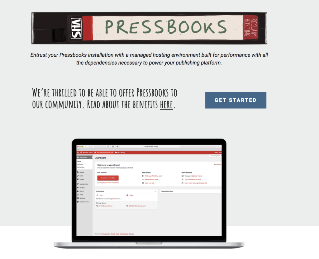
We’ve also added more managed services beyond WordPress MultiSite, including Virtual Private Servers and the soon to be released Commons in a Box offering. And as I mentioned yesterday, we are now offering shared and dedicated hosting for Pressbooks for all you waiting for the open textbook rapture. In fact, providing more managed shared hosting services like this is a direction we are hoping to explore in even more depth in the coming months.

Pressbooks screenshot

We are also now offering Professional Services, which folks can sign-up for if they need a hacked site(s) cleaned up, site monitoring, custom software installed/configured, and priority support and consultation. It is something folks have asked us about repeatedly, like Pressbooks, and for those running accounts that are mission critical, have a history of getting hacked, or just need to go above and beyond this may be a good option.

Reclaim getting all Professional

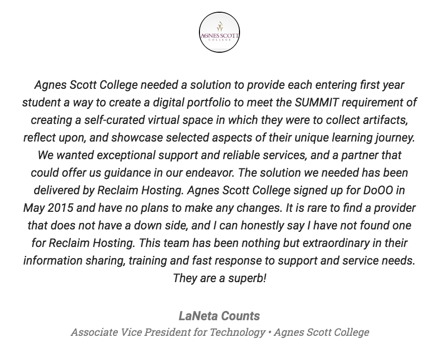
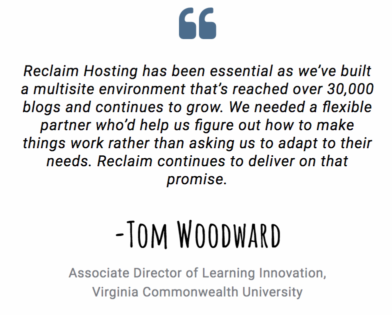
Finally, Lauren reach out to folks who we currently support, and you will see a number of pull quotes—like those below—punctuating various pages of the site.

Remain a big fan of of that human technology Lora Taub-Pervizpour!

No, YOU are superb, LaNeta! And your taste in academic hosting companies is flawless.

Did Tom Woodward say something positive about someone? A blog grows in Brooklyn!

It’s cool to read what the folks who work with us have to say, and when I look at the new site there is no small element of pride and excitement at how well-rounded and fully-featured our services have become, and I don’t think our personalized support and attention to detail have gotten lost in the mix. We continue to grow intentionally and scale for human growth and that, dear reader, has made all the difference!

23 Sep 19:27

GIFs as Disinformation Remedy (aka The GIF Curriculum)

by mikecaulfield

Earlier today Alexios Mantzarlis tweeted a GIF by @PicPedant that demonstrates a particular photo is fake in a precise way:

8hy8IaP

This is interesting because recently I’ve been moving to GIFs myself for explanations. Here’s some demonstrations of our techniques, for example:

Check for other coverage (in this case with a good result):

Manafort

Check what a person is verified as (in this case, a reporter):

Verified

Check what a site is about (in this case white supremacy):

webamren

And so on. Part of this is related to my and Scott Waterman’s Rita Allen proposal to generate short instructional sequences to post in comment threads of fake material (i.e., how to fact check) rather than just Snopes-ing people (i.e. “you’re wrong”). Part is based on my year and a half now of making short 10 second YouTube demonstrations of how to check various things.

But bringing it to GIFs is also based on some conversations I have had with Aviv Ovadya and others on what Web Literacy at Scale looks like. (“Web Literacy at Scale” is Aviv’s term for a project he is working on). I think one thing I’ve been thinking about (again, inspired by the insights of others at MisinfoCon) is that misinformation works on the user who doesn’t click through on links, which means media literacy efforts have to (at least in part) not require clicking through on links. If the disease thrives in a click-through free environment and learning about the cure requires click-through — well, you’ve maybe already lost there.

Media literacy GIFs, then, work on a few of levels. First, like disinformation, they operate just by being in the feed, requiring no user action, reducing the asymmetry of problem and remedy. Just as importantly, the shortness of the GIFs show that online media literacy need not (in many cases, at least) be complex. If you could have checked it in five seconds and you didn’t, it’s not that you’re just not smart enough — it’s that you just didn’t care enough. It’s a moral failing, not an intellectual one, and that framing allows us to more cleanly enforce reputational consequences one those who are reckless.

I don’t know how this affects my and Scott Waterman’s Rita Allen proposal, which involves a similar effort to show people how to fact-check rather than berate them for being wrong, but planned to use short sequences of screenshots. That framing paper is due Tuesday, so I guess I have to figure it out by then. But for the moment I’m contemplating the benefits of a media literacy campaign that thrives in the same link-averse passive consumption playgrounds as the problem it is trying to address.

23 Sep 17:13

Apples

by Ton Zijlstra

Today is national apple picking day. We had a tree full of apples this year. We ate a few apples during summer, but the drought, wasps and birds took most of them. So despite the many apples the tree carried early in the summer, the harvest in the end was smaller than last year.

The apples are very tasty though. Just the right mix of sweet and tangy. And Y was rather impressed one day sitting at the table in the garden, when she asked for an apple, and I simply reached above me and picked one.

I spent more time pruning the tree, then picking the few remaining unspoilt apples today.

20180915_152816
Pruning the tree

20180915_152947The very limited remaining harvest

23 Sep 17:07

Young Lovers

by peter@rukavina.net (Peter Rukavina)

While I was emptying the leak buckets in the attic this evening, I came across this photobooth picture of Catherine and me. It must have been taken in 1992 or 1993—25 years ago!—as neither of us is wearing eyeglasses.

How young we were; literally half a lifetime ago.

23 Sep 17:04

BM2018: Saturday AM

by jnyyz

We’ve been getting up a little earlier to make sure that we can catch sunrise while setting up timing.

DSC06998

The forecast for the morning was for generally low winds, and sure enough there were many wind legal runs.

We have had three different documentary film crews around this week. Today we had two of them at timing.

DSC07027

During the first heat it was pretty cold so all but one bike scratched, and true to form, it was Jennifer. Unfortunately, she had her usual bad luck with the wind.

Fabien kicked off the second heat with a run that was a little short of his best, and also not wind legal.

DSC07034

The rest of the heat had good wind, with Ellen and Larry running at about the same speeds they have been running all week.

DSC07011

Matthias started the third heat by laying down his fastest time of the week of 78.95 mph. The other three riders got in solid runs that were a little short of their best. Perhaps everyone is getting tired, in particular those who have been running twice a day.

Andrea followed in the fourth heat with his second run of the week above 80 mph, but just a bit short of what he did on Tuesday. Then Fabien ran again, going a bit slower, but having legal wind this time. He is just short of 80 mph.

Perhaps a little bird told Jennifer that her earlier run was not wind legal so she decided to run again. She hold me later that her attitude was “just f*ck it, I’m going to try again”, and it paid off with her first wind legal run of the week at 72.42, also her fastest of the week, and faster than what she had done earlier the same morning.

DSC07039

Velina came down the pike in Bluenose, and I saw that elves had been busy working on the shell overnight as it looked very different than yesterday. She earned a 55 mph for her trouble.

DSC07042

Finally in heat five, Calvin finally got a fast run at 80.83 mph, making him the 8th person in the 80 mph club, and maintaining his position as 7th fastest on the all time list. The motion blur must have been because he was going so fast. Special thanks to Marieke for noticing that the exit trap sensor was misaligned just at the point that his bike was in sight. That saved me from missing the time for a fast run by Calvin for the second time.

DSC07045

Guillaume ran Altair 6 in a coast down test and also earned a 55 mph hat, making him officially the worlds fastest HPV riding professor.

Finally Karen pushed up her world record for a second time this week to 46.54 mph.

All in all a very rewarding session of racing.

Here are the full results.

satAMresults

After the noon meeting, we had the traditional taking of group pictures.

DSC07048

Bas directing things as usual.

DSC07050

U of T.

DSC07053

The picture with all team members.

DSC07056

The “racers only” version.

DSC07060

All the people taking pictures of the racers.

DSC07062

This dynamic duo of Karen and Ken have four world records between them.

DSC07064

The Henry family.

DSC07067

U of T with their bikes and the van.

DSC07072

Ken and Karen getting cited for something.

DSC07075

and of course Andrea for being the fastest human this year.

DSC07079

One more evening of racing. Here is the start order.

satPMstart


17 Sep 14:46

Samsung Galaxy Note 9 :: Das fast perfekte Smartphone

by Volker Weber

IMG 4573

Seit einer Woche benutze ich das Samsung Galaxy Note 9 und ich bin schwer beeindruckt. Das Ding kann einfach alles. Fertigungsqualität, Bildschirm, Kamera, Akku, alles perfekt. Es verzichtet auf den modischen Notch, hat immer noch eine Kopfhörerbuchse, Dual SIM oder Speichererweiterung, und kann über USB-C zahlreiches Zubehör anschließen. Mangels Adapter habe ich noch gar nicht alles ausprobiert, etwa die Möglichkeit, einen kompletten Desktop per USB/HDMI auf einen großen Bildschirm zu zaubern. Das Note 9 unterscheidet sich nur marginal vom Vorgänger, so wanderte etwa der Fingerabdrucksensor an die richtige Stelle und der Stift lässt sich per Bluetooth pairen und damit als Fernbedienung nutzen.

Überhaupt der Stift: Wer den nicht benötigt, kann auch das Galaxy S9+ nehmen. Das kostet aktuell statt der 969 € für das Note 9 nur knapp über 700 €. Das nur unwesentlich kleinere S9 ist schon auf knapp 550 € gefallen. Mit der Preisstabilitiät ist das bei Samsung so eine Sache. Das S9 hat einen Listenpreis von 849 €, das S9+ sollte 950 € kosten. Das Note 9 ist noch so neu, dass es lediglich 30 € nachgegeben hat. Beim Note 8 sind es mittlerweile schon knapp 300 €. Für mich macht der Stift den großen Unterschied. Ich würde statt des S9+ zum gleichen Preis das Note 8 vorziehen.

Die Überschrift sagt "fast perfekt". Das "fast" kommt durch die Samsung-Software ins Spiel. Als AndroidOne, ohne die ganze doppelte Software und den peinlichen Bixby wäre es tatsächtlich perfekt. Ich musste mir eine zusaätzliche Software installieren, um den Bixby-Knopf abzuschalten. Wie schön wäre es, wenn man den als Kamerauslöser oder für den Google-Assistenten konfigurieren könnte. Und wie cool wäre es, wenn die Notizen, die der Stift so einfach macht, automatisch in OneNote landen würden. So wie es ist, kämpft das Note 9 täglich mit mir, damit ich die proprietären Samsung-Programme füttere.

IMG 4579

Das ist so schade. Selbst, wenn ich die Apple-Watch weiter nutzen könnte, würde mich die Software davon abhalten, alles mit dem Note 9 zu machen. Ich habe diese Woche abwechselnd das Note 9 und das viel billigere Nokia 7 Plus genutzt. Und das Nokia ist mir weitaus angenehmer, auch wenn es in der Hardware unterlegen ist. Es ist nur die Software, die das Note 9 so unmöglich macht.

Was mir (bei beiden) gefällt: Android Security Update ist aktuell bereits September 2018, also ganz fix. Das Note 9 ist noch auf Android 8.1, das 7 Plus offiziell auch. Beim Nokia steht Android 9 kurz bevor, und beim Note 9 wird Samsung auch nicht trödeln.

16 Sep 18:55

Are you ready for all of October’s mobile announcements?

by Dean Daley

While Apple announced its trio iPhones this month, the rest of the mobile world has saved their big smartphone launches for October.

Here’s a rundown of all of October’s announcements.

Microsoft is holding its Surface event on October 2nd in New York City. It will take place at 4pm ET/1pm PT.

The following day, LG will announce the V40 ThinQ at 5pm ET / 2pm PT in New York City. Rumours indicate that it will be the first handset to feature a triple rear-facing camera and a dual selfie shooter on the front.

Google will announce its Pixel 3 series on October 9th. This event will also take place in New York City, at 11am ET/8am PT. Alongside the Pixel 3, the company is expected to reveal two Pixelbooks, one that functions like the 2017 Pixelbook and another with a detachable display.

The following day, Samsung will host “A Galaxy Event,” where it will show off a device that will be “4x the fun.” It’s unclear what this means exactly. However, this can indicate the phone will feature 4x optical zoom, 4x hybrid zoom or four cameras.

Six days later, Huawei will announce the Mate 20 and Mate 20 Pro in London. It appears the Mate 20 will sport a waterdrop-style notch similar to the Essential Phone. Huawei hasn’t said when the event will start.

That’s it for all of the known events going on in October.

However, rumours indicate that Razer will launch a new handset on October 10th. Leaks indicate that the Razer Phone 2 will share the same design as the original Razer Phone.

Lastly, reports from CNET indicate that OnePlus will launch its upcoming smartphone in October, as well. The Chinese company confirmed it will get rid of the headphone jack in its upcoming phone and that it will sport in-display fingerprint sensor technology called ‘Screen Unlock.’ Additionally, the rumoured OnePlus 6T will reportedly feature a waterdrop notch and a Snapdragon 845 chipset.

So, October is looking quite busy, are you excited for any of the abovementioned phones? Or is Apple’s iPhone XS the handset you’ve been waiting for?

Let us know in the comments below.

Take Our Poll

The post Are you ready for all of October’s mobile announcements? appeared first on MobileSyrup.

15 Sep 08:04

How will Shareable Scooters work in Vancouver?

by Sandy James Planner

Sandy James Image

Price Tags Vancouver has been discussing how and when Vancouver will be addressing scooters. And we mean all things about scooters~where they are left, where they will be allowed to  operate, and what the restrictions will be on companies bringing them to Vancouver. .

In a city that does not have a surplus of taxis and with taxis unwilling to do short trips, and with no ride share options on the immediate horizon, other alternatives are needed. There is definitely a latent demand  for short trips, and scooters are one way to go. The Seattle Department of Transportation”s definition of “shareable mobility devices”  include “tricycles, handcycles, tandem cycles, electric scooters, and others” with a view to providing transportation options to disabled residents. Seattle is also looking at hefty licencing fees of  up to $250,000 if four vendors apply. The Reuters clip below shows that vendors make their money back in two to three weeks with scooter shares.

But where do scooters operate in cities  and where should they be left? Price Tags Vancouver documented what happened in San Francisco where shareable scooters could be left anywhere, and soon cluttered up sidewalks. Many cities want scooters to be in bike lanes and not competing with pedestrians on sidewalks. Seattle has placed some of the bicycle/scooter parking on public sidewalks, but officials are now looking at placing the scooter parking on the street in clearances or in parking spaces.

While the taxi industry has been vocal about the introduction of ride-sharing as cutting into their business, a scooter trip does not have similar competition. There will be a need for clear-cut regulations on where scooters are allowed to operate and where they are left on the street and public realm in Vancouver.

As Gordon Price asked last week ” So Vancouver, what’s your plan?


15 Sep 08:04

Ontario’s 42nd Parliament, 1st Session: Better Local Government Act, the Superior Court of Ontario, the Canadian Charter of Rights and Freedoms, the Notwithstanding Clause, and Bill 31, Efficient Local Government Act

by chuttenc
english-logo
Logo used for education and illustrative purposes. This is not an official publication and I am not an agent of the OLA.

Hoo, that’s a title. Let’s start with a timeline, shall we?

You’ll remember from my first post in this series a rather peculiar Bill that reached the floor of the Legislative Assembly on July 30: Bill 5, Better Local Government Act, 2018. It, amongst other things, cut the number of municipal wards in Toronto from 47 to 25 a little over two months before its municipal election.

It sustained heavy debate in August and, on the final day before recess, was carried through both its second and third readings (with division). There were immediate court challenges and Ontario Superior Court Justice Edward Belobaba was asked to examine the legality of the Bill.

In Ontario, as in the rest of Canada and in the United States, we have multiple branches of government designed to keep each other in check. The legislative branch is allowed to change the laws, yes, but only if the change is constitutional according to the judicial branch.

In this case Justice Belobaba ruled that it was not constitutional. By changing the terms of the election while it was ongoing, it interfered with the candidates’ Right to Free Expression. By increasing the number of residents per councillor it impinged on residents’ effective representation in municipal politics (which the Justice argued was a form of Expression so infringed).

The Government announced its intent to file an appeal, as is expected. If you don’t appeal, you’ve given up, and no politician I know of would dare give the impression of giving up. But as the Toronto election was a mere month and a half thence, it was unlikely that a legal argument would occur early enough to matter for the election currently under way.

What wasn’t expected (by me at least) was that the Premier announced his intention to reconvene the Legislative Assembly two weeks early from its recess and use the “Notwithstanding Clause” of the Charter to assert the Province’s right to govern itself despite the provision of the Charter.

If you’re familiar with the politics of the United States, think of it like this: If a State Government wanted to ignore certain provisions of the Bill of Rights all it had to do was vote for itself to be allowed to do so. Certain rights (term limits, voter eligibility) would be inalienable, but certain other ones (fundamental freedoms of religion, expression, press, peaceful assembly…) could be voted away five years at a time. One of its intended uses was to operate in case the judicial branch overstepped its bounds, but to my knowledge that has never actually happened. (Well, the Government party alleges it has now, of course, but only history will tell if this argument has merit.)

It’s been 18 years since the last time a Province attempted to vote on a Bill that invokes the Notwithstanding clause (Alberta tried and failed to use it to prevent the recognition of same-sex marriage. Wrong side of history, folks.). And now Ontario has one on the books:

Bill 31, Efficient Local Government Act, 2018

This is identical to Bill 5, Better Local Government Act, 2018 except for a few twiddles. There’s some adjustment of related acts because there were things that were supposed to happen in August that now need to be redone with the new ward territories… but the big one is the inclusion of lines like “The amendments to this Act made by Schedule 1 to the Efficient Local Government Act, 2018 apply despite the Human Rights Code.”

You know it’s a good bill when you have to specify that it needs to happen despite Human Rights.

Clarification:

This is not suspending the Charter, this is using the hard-negotiated rights of the Provinces to enact a segment of the Charter to suspend parts of itself in the course of provincial business. It is legal.

But as we have seen and continue to see with people arguing that “It’s a free country, so I’m allowed to say <terrible thing to say>”, if your only argument is that it’s legal, you already know it isn’t right.

Chaos in the House:

In Ontario we have an adversarial Legislative Assembly. The Opposition is there to debate motions on their merits (or lack thereof), and generally try and cajole the Government to explain itself and maybe change its approach.

When the Premier called the Assembly back in on September 12… well, things became a little bit more than adversarial. The Premier and several MPPs (notably in the Hansard the member for Essex) broke decorum, the gallery began demonstrating and had to be cleared… and all that within the first fifteen minutes of Question Period:

After lunch, the MPPs themselves interrupted parliamentary proceeding and some  “warning and naming” happened. If the Speaker determines that a member cannot maintain decorum, that member is named by their name (not by their riding, ministerial title, or title (like “Premier” or “Leader of the Opposition”)) by the Speaker and must leave. Or be escorted out.

The first to be escorted out was the MPP for my riding of Waterloo, Ms. Catherine Fife. The second was the Leader of the Opposition, Ms. Horwath. Over a dozen MPPs were escorted from the house, and then the first reading of Bill 31 carried (on division).

The next day, September 13, after a duration of further debate on Bill 4, Cap and Trade Cancellation Act, question period started back in with the NDP MPPs back in the house:

This is a level of acrimony I didn’t expect to see, and the Speaker seems pretty tired of it all. It’s getting so bad that even the MPPs aren’t willing to put up with talking past each other anymore, the member for Mushkegowuk-James Bay filed a notice of dissatisfaction under Standing Order 38(a) about the Government’s answer to their previous question about school infrastructure.

And this is all without even debating further Bill 31 and its Notwithstanding business. This is since the Leader of the Opposition and the Leader of the Green Party are working on a Reasoned Amendment to the Bill (sometimes used as a delaying tactic, mostly intended as a way for the non-Government members to suggest alternative Bill implementations), so debate on that to-be-written Amendment must happen first.

So what’s next? Well, the Legislative Assembly stands adjourned until next Wednesday the 19th. Why? Because of, and I kid you not, the International Plowing Match in Chatham-Kent.

So we won’t hear more about the Amendment until then, and we can’t hear more about Bill 31 and its use of the Notwithstanding clause until at least then…

…which means Toronto limps on in a quantum superposition. It had 45 wards, it was growing to 47, it was ordered to have 25, and the order was struck down.

I imagine voter turnout is going to be weak-to-middling when October 22 comes around, and there may even be grounds for a legal challenge of its validity given the confusion all this nonsense is causing…

But we’ll see.


15 Sep 08:03

The Rise of the TSP: Uber’s “real competitor”

by Gordon Price

Further evidence of the rise of the ‘Transportation Service Provider’ – a single entity that, Uber-like, tries to consolidate as many transportation choices as possible.  Especially, in particular, Uber.

From The Sun:

But what if Uber has larger ambitions for Express Pool and the rest of its suite of services, and it’s actually aiming to compete directly against public transit system? Andrew Macdonald, the company ’s Toronto-based vice-president for Uber’s Americas operations and global business development, was unfazed by the question. He said he sees Uber and transit as complementary services in taking on Uber’s real competitor: individual vehicle ownership.

15 Sep 08:03

Andrea Reimer’s Decision — 2018 Vancouver Civic Election

by Ken Ohrn
Mayoral candidate or not?

Vision Vancouver councilor Andrea Reimer has published her decision about running for mayor in the October 20 civic election.

This comes after Vision’s nominated candidate Ian Campbell withdrew for reasons that remain unknown.

In THIS Facebook post, Ms. Reimer says no.

After very carefully weighing this decision, there is no question that it weighs towards running if taken simply on the merits of what’s best for the progressive policies I’ve championed for the better part of two decades. At the same time there are two candidates running who echo substantial parts of some of the policies I’ve championed and while lacking a party backing makes it harder for them, another candidate won’t help.

So my decision remains the same one I came to in early 2017 . . . . after spending my entire adult life in service to the public, I need to take some time away from service and particularly public life. It feels terrible to say that as I’ve always put the community’s interest first but I know in my heart that I can’t keep doing the work I’ve been doing without some time to recharge, so I won’t be running in this election.

In many ways it’s a shame to lose an energetic and experienced prospect for mayor, as evidenced by her succinct and thoughtful post (well worth a read).

Maybe when you’re done at Harvard, Ms. Reimer.

15 Sep 08:02

On The iPhone Event

by Rui Carmo

I ended up not having the time or inclination to share my thoughts on Wednesday’s iPhone event due to a rather time-consuming (and somewhat depressing) engagement, but now that I’ve regained some zest and vim here is a quick summary.

First off, and just to get that out of the way quickly, the Series 4 watch turned out to be the most significant device for me. Even though I have a perfectly good Series 3, I will probably buy one as soon as I figure out whether the ECG functionality will be enabled outside the US (medical regulations being what they are, and conveniently glossed over until now–there are a lot of subtleties involved).

I still wish they’d made a round, more watch-like device, but Apple doesn’t seem to be going that path anyway soon, and there is a degree of continuity implied by having bands be compatible across generations (which may well be completely irrelevant in the long run, but still makes sense).

And form factors are as good a topic as any to begin addressing the new iPhones. The apparent death of the SE form factor is particularly annoying to me given that I prefer small devices with just enough screen real estate for messaging, but the overarching trend to do everything on a phone has clearly driven Apple towards bigger form factors, something that I’m not keen on at all.

I also deeply regret the death of Touch ID, which was in my opinion far more practical (and, from a perspective of intent, maybe even more secure) than Face ID. I don’t want to have to pick up my phone from a desk or charging cradle to unlock it or to authenticate in apps—that is highly inconvenient in many situations, and enough people have written at length about the differences (and frustrations) entailed in both approaches.

Having said that, I’m relatively satisfied that the new “low-end” model shares the same CPU and overall internals as the other ones—that alone is enough for me to discard the iPhone 8 as an option, even though, to be honest, it still is the device I like the most.

Still on the CPU topic, I can’t even begin to address the fact that Apple is shipping millions of extremely powerful A12 chips with a 7nm process right now. Even though they’re not fabbing them directly, they are effectively handling Intel their metaphorical posterior in many regards, and further cementing the notion that whenever Apple decides to ship a desktop CPU, it will outclass (and likely outperform) whatever Intel manages to squeeze out in the meantime.

I could not care less about OLED or case framing (although I still dislike the idea of a glass back), and with the XS camera being the only significant difference for me, I will have to figure out whether it’s worth the premium.

Horace Dediu has an absolutely spot on piece on another aspect of this, which is the “lasts longer” statement buried amidst the sustainability section of the keynote (he also took the opportunity to update his pricing chart, which I’m adding below). Hardware lifecycle and value are fundamentally different for Apple devices (witness my continued use of an iPhone 6 until today), and it is worth considering upgrades as continued investment spaced out over the years rather than yearly gadget binges.

My guess is that the XS won’t be worth the expense for me, and that a 64 or 128GB XR will be my next iPhone. I am going to dislike it being significantly larger than my iPhone 6, but happy to put the savings towards the Series 4 or a new iPad down the road.

Oh, and I find the naming to be less than inspiring, but at least we’re finally out of the numbers game.

15 Sep 08:02

Creating your knowledge workshop

by Jim


Electronics workshpoVendors and too many managers continue to promote and search for the One True Tool. This is a clear indicator that someone is trapped in an industrial mindset irrelevant to the actual world of knowledge work that we inhabit. If your work can be accomplished with one tool, then you are little different from or better off than the average wrench-turner on an assembly line. You are a replaceable component in a rigid system.

To build a body of work as a knowledge workers you need at least a well-equipped toolkit; ideally you will learn to operate within a proper knowledge workshop.

For simple projects, Swiss Army knives and Leatherman Tools are the answer. No one serious about their craft works with a single tool. Good craftspeople depend on a collection of tools that work together and co-exist in a workshop where they can be found and used as tasks require.

We are at a point in carrying out knowledge work where we would be well-advised to set aside the quest for the one true tool and turn toward the problem of creating and equipping a knowledge workshop suited to our needs.

What makes a workshop?

A workshop is

  • a collection of tools, each suited to particular tasks and projects. Some tools are old, some new; some are general purpose, some specialized; some are used every day, others less frequently
  • organized and arranged so the right tool is available whenever needed.
  • containing an inventory of common parts and useful raw materials already assembled just in case.
  • and a scrap bin full of fragments and discards sitting in the corner. These are handy to test new tools or to create quick jigs and fixtures that might be helpful in constructing a final product.

These typical features of physical workshops offer guidance about how to create a knowledge workshop suited to our needs.

For a few specialized forms of knowledge work, the nature of a knowledge workshop is already reasonably well understood. Software developers have rich choices for their development environments. Bond traders and other investment specialists can have very sophisticated custom work environments built and maintained in the quest for a few more basis points.

Those of us doing more general knowledge work need a strategy for getting from concept to the creation of our own knowledge workshop. That plan consists of three phases; setting the workshop up, learning to use it effectively, and dealing with the roadblocks that a craft-centered strategy will inevitably provoke in the typical organization.

Setting Up

The exact details of setting up a knowledge workshop will vary by the particular form of knowledge work you do. Are you extracting insight from numbers? Are you designing new organizations? Are you writing research reports? The specific form your knowledge work takes will guide you to the particular tools relevant to the deliverables you create.

There are some general guidelines that apply regardless of the specific area of knowledge work. First, you are building a workshop, not searching for the perfect tool. Pay attention to whether tools you are considering play nicely with one another. Second, be conscious of how the tool mix is developing. Is there a balance between big tools and little specialty tools? Do the specialty tools bridge the gaps between what the big tools handle? Do the specialty tools get used often enough to be worth keeping, or do they exact greater demands on your memory than they return in improved effectiveness?

While selecting, assembling, and (eventually) integrating a random collection of tools into something more useful, consider how you will assemble relevant supporting materials. If you are a wordsmith, do you want an online dictionary available? Do you want more than one? If you perform market analysis, are there general statistical tables or reports that you draw on repeatedly (e.g., the Statistical Abstract of the United States)? Are the tools and materials arranged and organized to make your work easier, or are they a long list of random entries or icons on your desktop?

Learning

Once your workshop is set up, you can begin what will become a never-ending task of learning to use it effectively. Set aside time to play with your tools and discover their limits and features. If you want to take advantage of pivot tables in Excel, waiting until they are essential to the product you must deliver by the end of the week is a mistake. Do you need to discover that pivot tables exist first?

This is all in the nature of “productive play,” of learning what is possible from the workshop you are designing.

Overcoming Resistance

“Productive play” may be essential to doing better knowledge work, but it is also a notion certain to trigger corporate antibodies in most organizations. You will encounter resistance, so you must have a plan for addressing it. Your most potent weapon: your ability to deliver better quality knowledge work.

Before you can do this, identify and enlist allies in your efforts and co-opt or counteract the most dangerous sources of resistance. The specifics will vary by organization, but expect to run afoul of your IT group and whoever ended up with oversight of Sarbanes-Oxley compliance for starters.

Step zero of any knowledge workshop strategy then becomes: “Take your CIO to lunch or befriend the folks staffing the help desk.” Their policy roles make them potential enemies, but their natural predispositions also make them potential allies.

Getting Started

The monoculture of office suites and corporate Web portals is rooted in outmoded assumptions about the nature of work as an industrial task.

Knowledge work is not factory work; factory strategies will not help knowledge workers. Tools are what you give to someone filling a well-defined role on the assembly line. A knowledge worker—you—needs to go further. Build your custom workshop now and see your work prosper.

The post Creating your knowledge workshop appeared first on McGee's Musings.

15 Sep 08:02

Divergent and Convergent Phases of Data Analysis

There are often discussions within the data science community about which tools are best for doing data science. The most recent iteration of this discussion is the so-called “First Notebook War”, which is well-summarized by Yihui Xie in his blog post (it is a great read).

One thing that I have found missing from many discussions about tooling in data analysis is an acknowledgment that data analysis tends to advance through different phases and that different tools can be more or less useful in each of those phases. In fact, a tool that is very useful in one phase can be less useful or even detrimental in other phases. Yihui touches on this in his blog post and my goal here is to expand on this idea here.

A Double Diamond for Data Analysis

One image that is commonly found in the literature on design thinking is the “double diamond”, which is a model for the design process. I think this model can be usefully adapted to help us think about data analysis and my best representation is here (apologies for the scribble).

Double Diamond for Data Analysis

In this figure I’ve identified four phases of data analysis that alternate between divergent and convergent forms of thinking. The x-axis is roughly “time” or the timeline of the analysis. The y-axis can be thought of as indicating the range of possibilities. Okay, it’s not exactly a numerical graph, but you get the idea. The wide parts of each diamond are meant to indicate that there are many possibilities under consideration while the narrow “choke points” indicate that there should be one or a few things under consideration.

How does all this relate to data analysis? Let’s first take a closer look at the four phases.

Phase 1: Exploration

The goal of Phase 1 is to explore the possibilities inherent in the data. This part is familiar to all data analysts.

The dataset lands in your lap and there are a lot of things to do and a lot of questions to answer. Did you get the right dataset? Are all the data there? Are they in the right format for analysis? This is often where a lot of data wrangling occurs. We must consider what question is being asked and whether the data are appropriate for that question (at least without making unreasonable assumptions). We might also consider what question motivated the creation of the data.

At this point we may think we have a question to ask, but usually that question is only vaguely formed or is in need of further information. Here is where we need the data to help us out. For example, an important general question is “Can the data even be used to answer my question?” We need to look at the data to figure that out. How we look at the data will vary across people, context, and many other factors. Regardless of the specific situation, we likely will need to make lots and lots of plots, summaries, and tables. We’ll need to look at the data, perhaps even in a program like Excel, and just get a sense of the data.

This phase of analysis is highly divergent, with many possibilities being considered for how to ask the question and what approach to take. In my experience, I’m making tons of plots and looking at various transformations of individual variables and bivariate relationships. I’ve never bothered to count, but it wouldn’t surprise me if there were thousands of plots made in this phase. This is the “sketching” phase of analysis, figuratively speaking, but sometimes literally speaking. Sketches of plots or tables are often a useful planning device.

This phase of analysis is almost always fun, because we are opening up the possibilities. But all good things must eventually come to an end.

Phase 2: Refining the Problem

Phase 2 is challenging because it involves making decisions and choices. Nobody likes to do that. Inevitably, most of the work you did in Phase 1 will be left on the cutting room floor. You might love all your children equally but you still need to pick a favorite. The reason is nobody has the resources to pursue every avenue of investigation. Furthermore, pursuing every avenue would likely not be that productive. You are better off sharpening and refining your question. This simplifies the analysis in the future and makes it much more likely that people (including you!) will be able to act on the results that you present.

This phase of analysis is convergent and requires synthesizing many different ideas into a coherent plan or strategy. Taking the thousands of plots, tables, and summaries that you’ve made and deciding on a problem specification is not easy, and to my surprise, I have not seen a lot of tools dedicated to assisting in this task. Nevertheless, the goal here is to end up with a reasonably detailed specification of what we are trying to achieve and how the data will be used to achieve it. It might be something like “We’re going to fit a linear model with this outcome and these predictors in order to answer this question” or “We’re building a prediction model using this collection of features to optimize this metric”.

In some settings (such as in consulting) you might need to formally write this specification down and present it to others. At any rate, you will need to justify it based on your exploration of the data in Phase 1 and whatever outside factors may be relevant. Having a keen understanding of your audience becomes relevant at the conclusion of this phase.

Phase 3: Model Development

This phase is the bread and butter of most statisticians and statistics education programs. Here, we have a reasonably well-specified problem, a clear question, an appropriate dataset, and we’re going to engineer the solution. But that doesn’t mean we just push a button and wait for the result to come out. For starters, what will the results look like? What summaries do we want to produce and how will they be presented? Having a detailed specification is good, but it’s not final. When I was a software engineer, we often got highly detailed specifications of the software we were supposed to build. But even then, there were many choices to make.

Thus begins another divergent phase of analysis, where we typically build models and gauge their performance and robustness. This is the data analyst’s version of prototyping. We may look at model fit and see how things work out relative to our expectations set out in the problem specification. We might consider sensitivity analyses or other checks on our assumptions about the world and the data. Again, there may be many tables and plots, but this time not of the data, but of the results. The important thing here is that we are dealing with concrete models, not the rough “sketches” done in Phase 1.

Because the work in this phase will likely end up in some form in the final product, we need to develop a more formal workflow and process to track what we are doing. Things like version control play a role, as well as scriptable data analysis packages that can describe our work in code. Even though many aspects of this phase still may not be used, it is important to have reproducibility in mind as work is developed so that it doesn’t have to be “tacked on” after the fact (an often painful process).

Phase 4: Narration

In the final convergent phase of data analysis, we must again make choices amongst the many pieces of work that we did in Phase 3. We must choose amongst the many models and results and decide what will make it into the final product, whether it is a paper, a report, a web site, or a slide deck.

In order to make these choices, it is useful to develop a narrative of the analysis. Building the narrative is dimension reduction for results and it allows you to choose from the various results the ones that follow your narrative. Simply “presenting the data” is first, not really possible, and second, not desirable. It’s information overload and rarely allows the audience to make an intelligent conclusion. Ultimately, the analyst must decide on a narrative and select the various results that tell that story.

Selecting a narrative doesn’t mean that everything else is thrown out. There are often many parts of an analysis that cannot make it into the main product but can be put in some form of “supplementary materials”. For example, FiveThirtyEight.com doesn’t put its election statistical model on its web site, it puts it in a PDF document that you can download separately. In many scientific papers, there can be dozens of tables in the supplementary materials that didn’t make it into the paper. Many presenters often have backup slides hidden at the end of the deck in case there are questions. Some people may disagree with the choice of narrative, but that doesn’t eliminate the need for choices to be made.

Implications

At this point it’s worth recalling that all models are wrong, but some are useful. So why is this model for data analysis useful? I think there are a few areas where the model is useful as an explanatory tool and for highlighting where there might be avenues for future work.

Decision Points

One thing I like about the visual shape of the model is that it highlights two key areas–the ends of both convergent phases–where critical decisions have to be made. At the end of Phase 2, we must decide on the problem specification, after sorting through all of the exploratory work that we’ve done. At the end of Phase 4, we must decide on the narrative that we will use to explain the results of an analysis.

At both decision points, we must balance a set of competing priorities and select from a large number of outputs to create a coherent product. When developing the problem specification, we must avoid the desire to say “We’re going to do all the things” and when producing the final product we must avoid the “data dump” where we shift the burden of interpretation and distillation on to the audience.

In my experience, data analysts really enjoy the divergent phases of analysis because no choices have to be made. In fact, in those phases we’re doing the opposite of making choices–we’re trying out everything. But the convergent phases cannot be avoided if we want to produce good data analysis.

Tooling

When it comes to discussions about tooling in data science it’s useful to preface such discussion with an indication of which phase of data analysis we are talking about. I cannot think of a single tool that is simultaneously optimal for every phase of analysis. Even R is sub-optimal for Phases 2 and 4 in my opinion. For example, when developing data visualizations for presentation, many people resort to tools like Adobe Illustrator.

I find most debates on tooling to be severely confounded by a lack of discussion about what phase of analysis we are focusing on. It can be difficult for people to accept that a given tool may be optimal for one phase but detrimental in another phase. I think the four-phase model for analysis can explain some of the recent “debates” (a.k.a flame wars) on tooling in the data science world.

Let’s start with notebooks. I think the issue here is essentially that notebooks can be useful for Phase 1 but potentially dangerous for Phase 3. Reproducibility is a critical consideration for developing the final results, but is less important when exploring the data in Phase 1. The need for consistent state and in-order execution of commands is more important in Phases 3 than in Phase 1 when lots of ideas are being tried and will likely be thrown out. There’s no either-or decision to be made here with regard to notebooks. It just depends on what phase of analysis you’re in. I generally prefer R Markdown but can see the attractiveness of notebooks too.

Consider the age-old base graphics vs. ggplot2 debate. This is another debate confounded by the phases of data analysis. In the divergent phases (like Phase 1), there is a need to do things very quickly so that good ideas can be discovered and bad ideas can be discarded. Having a system like ggplot2 that allows you to rapidly “sketch” out these ideas is important. While the base graphics system gives you fine control over every aspect of a plot, such a “feature” is really a detriment in Phase 1 when you’re exploring the data. Nathan Yau seems to edge towards base graphics but I think this is largely because he is considering developing “final” data presentations in Phase 4. If you look at the visualizations on his web page, they are akin to works of art. They are not sketches. When developing those kinds of visualizations, having fine control over every detail is exactly what you want.

Education

In my experience as both a student and a teacher, statistical education tends to focus on Phases 3 and 4 of the data analysis process. These phases are obviously important and can be technically demanding, making them good things to emphasize in a statistics program. In the classroom, we typically start with a reasonably well-specified problem and proceed with engineering the solution. We discuss the many options for developing the solution and the various strengths and weaknesses of those options. Because the work in Phase 3 ends up in the final results, it’s important to get this phase right.

When getting a graduate degree, Phases 1 and 2 are usually taught as part of developing the thesis using an apprenticeship model with an advisor (“just watch what I do for a few years”). Some good programs have courses in exploratory data analysis that fall squarely into Phase 1, but I don’t think I’ve ever seen a course that covers Phase 2. Phase 4 is sometimes covered in visualization courses which discuss the design process for good data presentation. There are also a number of good books that cover this phase. But we rarely discuss the role of developing a coherent narrative of an analysis in the classroom. Usually, that is covered using an apprenticeship approach.

Data Analytic Errors

One general problem that occurs when I see others do data analysis is confusing the different phases. It’s common for people to think that they are in one phase when they’re really in another. This can lead to data analytic problems and even mistakes.

Confusing Phase 3 for Phase 1 is arguably the most common and the most dangerous problem that one can encounter in science. In Phase 1 we are developing the specification of the problem, but in Phase 3 that specification should be more or less locked down. If we discover something else interesting in Phase 3, we cannot pretend like that’s what we meant to conclude in Phase 1. That’s a recipe for p-hacking. Phase 1 should be broad and exploratory with the data. But once you’ve decided on a problem in Phase 2, Phases 3 and 4 should be solely dedicated to solving that problem. Changing up the problem in mid-stream in Phases 3 and 4 is often tempting but almost always a mistake.

A related problem is confusing Phase 2 with Phase 4. I have observed people who explore the data extensively, making quick plots, sketches, and summaries, and then immediately draw a conclusion like “X causes Y” or “A is associated with B”. Essentially, they jump from Phase 1 straight to Phase 4. This is problematic because often in the exploratory process we only look at rough sketches, often just bivariate plots or 2x2 tables which reveal strong relationships. Making inferences from this kind of exploratory work can be misleading without carefully considering second order factors like confounding or the effects of missing data. Often, those issues are more easily dealt with when using formal models or more detailed visualization.

Thinking through and formally specifying a problem in Phase 2 can often help to solve problems without having to fit a single model. For example, if exploratory analysis suggests strongly that missing data is missing completely at random, then there may be no need to model the missing data process in Phase 3. In the extreme case, you may conclude that the question of interest cannot be answer with the data available, in which case other data needs to be obtained or the analysis is over.

I think awareness of the different phases of an analysis can help to address this problem because it provides the analyst with a way to ask the question of “Where am I?” When using a map, in order to figure out where you’re going, you first need to figure out where you are. The four-phase model serves as a roadmap to which analysts can point to identify their location.

Future Work

I will end this with some thoughts on what the four-phase model implies for potential future work in the field of data analysis. Seeing the model written down, some immediate gaps jump out at me that I think the data science community should consider addressing.

Tooling

Much of the software that I use for data analysis, when I reflect on it, is primarily designed for the divergent phases of analysis. Software is inherently designed to help you do things faster so that you can “analyze at the speed of thought”. Good plotting and data wrangling software lets you do those activities faster. Good modeling software lets you execute and fit models faster. In both situations, fast iteration is important so that many options can be created for consideration.

Software for convergent phases of analysis are lacking by comparison. While there are quite a few good tools for visualization and report writing in Phase 4, I can’t think of a single data analytic software tool designed for Phase 2 when specifying the problem. In particular, for both Phases 2 and 4, I don’t see many tools out there for helping you to choose between all the options that you create in the divergent phases. I think data scientists may need to look outside their regularly scheduled programming to find better tools for those phases. If no good tools exist, then that might make for a good candidate for development.

Education

Data analytic education tends to focus on the model development and presentation phases of data analysis. Exploratory data analysis is an exception that largely falls into Phase 1, but EDA is not the only element of Phase 1. We often do not teach aspects of challenging a question or expanding beyond what is given to us. Typical data analytic education takes the original problem as the final specification and goes from there. There is no re-litigating the problem itself. In other words, we start at the end of Phase 2.

I think more could be done to teach students aspects of both convergent phases of analysis (Phases 2 and 4). For Phase 2, teaching students to hone and refine a question is critical for doing research or working elsewhere in data science. I think providing them with greater exposure to this process and the chance to practice repeatedly would be a shift in the right direction. I also think we could do more to teach more narrative-development skills for Phase 4 of analysis, whereby results are synthesized into a coherent presentation.

Regardless of what we might do more or less of, I think the four phase model allows you to consider what aspect of data analysis you might want to teach at any given moment. It can be difficult to simulate a full-fledged data analysis from start to finish in a single classroom setting. However, splitting up the process and focusing on individual phases could be useful way to modularize the process into more manageable chunks. I am interested in exploring this approach myself in the future.

Summary

Stealing the “double diamond” model from design thinking and adapting it for describing data analysis has some important benefits as a mental model for the process of analyzing data. It lays out four phases of analysis that all of unique activities (and potentially a unique toolbox) associated with them. I find it a useful model for explaining the various debates going on in the data science community, for exposing gaps in the tooling and in data science education, and for describing certain classes of mistakes that can be made during data analysis.

15 Sep 08:01

The Future of Podcasting Is Educational

James McWilliams, Pacific Standard, Sept 27, 2018


Icon

Now we need to understand that the headline does not mean that 'the future of education is podcasts'. Though really valuable, podcasts play a niche role in the wider educational ecosystem. Having said that, education is definitely a primary application for podcasts. I use them pretty much every day to advance my own learning. And I provide them in the form of course and lecture recordings. This article plugs Zachary Davis's podcast Ministry of Ideas. I haven't listed to it (I will) but I like the idea that it is trying to empower "responsible citizens to develop skills we need to make wise judgments."

Web: [Direct Link] [This Post]
15 Sep 08:00

Sorry Apple, your “most advanced” features are already commonplace in China

by Gang Lu
I wanted to buy an Apple Watch 4, but suddenly I feel embarrassed. If I don’t use an iPhone, why would I buy an Apple Watch?
15 Sep 08:00

Why the Housing Crisis as We Knew it is Over

by Gordon Price

Photo by Michael Geller, Vancouver Courier

Truth or clickbait: Is the housing crisis in Vancouver really over? Nope, not for the many people it has negatively impacted, and will continue to do so.

It took some time to get to this crisis, but it may not take as long to get out. Maybe it already has. Demand-side parameters — taxes, interest rates, mortgage requirements, investment sources, prices,  expectations, attitudes, politics — are all shifting simultaneously. That means, on the supply side, the implications of this chart are profound:

Past 12-month Starts, Completion (CMHC), and Annual Household Formation – Metro Vancouver 1990-2018

Housing starts and completions have never been higher over the last 28 years. And household formations have dropped.

Combined with all those other changing parameters, I think it’s safe to say that the housing crisis as we knew it is already over.  Civic candidates are basing their platforms and arguments on the circumstances of the past, proposing changes to alter conditions that have already changed or are in the process of doing so, perhaps dramatically.

But I could be wrong.

15 Sep 08:00

Candidates Talk Bikes — 2018 Vancouver Civic Election

by Ken Ohrn
People riding bikes on bike lanes — an evil scourge to some (Ken Ohrn photo)

After a Vancouver civic election mayoral candidates meeting, we have a much clearer picture of where some candidates fall on the pro-bike spectrum.

The meeting was hosted by the Shaughnessy Heights Property Owners’ Association.

Good old bike lanes raised an emotionally-charged anti-bike audience response among the invitees from Shaughnessy Heights. As usual, this showed how the very concept of the bicycle as a legitimate mode of transportation is threatening to those with a deeply entrenched motordom-at-any-cost worldview.  And so provides now-rancid red meat for cynical politicians to throw to this shrinking base.

As to mayoral candidates’ views, we are once again grateful to Charlie Smith at the Georgia Straight.

Shauna Sylvester (Independent):

  • Cycling is Vancouver’s fastest-growing transportation mode; with 10% mode share for trips to work
  • More Vancouverites ride bikes than take the Expo line
  • Subsidization is largest for other modes, by far
  • She advocates reducing car dependency in favour of other modes
  • Bike lanes are necessary for life safety if you choose a bike for your trip
  • Ms. Sylvester wants to make sure the City has the resources and capacity for people to take the modes they want and need to use, including walking, cycling and transit
  • Ms. Sylvester is also on record as wanting to more than double Vancouver’s 2040 target for bike mode share to 25% from 12%.

Ken Sim (NPA):

  • No war on bikes due costs of bike lane removal
  • Not happy with 10th Ave hospital district lanes and Cambie Bridge west lane
  • Clear dog-whistling to cars-cars-cars as the NPA’s continuing transportation priority

David Chen (ProVancouver):

  • Remove bike lanes from arterials
  • Restrict bike lanes to “seasonal and hourly” use

Fred Harding (Vancouver First):

  • Restrict bike lanes to “seasonal and hourly” use

Wai Young (Coalition Vancouver):

  • She promises to take out Vancouver’s bike lanes.
  • Adopting an ancient tactic, Ms. Young repeated a ludicrous figure about Vancouver’s mode share for bikes (no facts please, whatever I say is always right)  #Waioff
15 Sep 07:59

Dana Blankenhorn, No More Mr. Nice Liberal: ...

Dana Blankenhorn, No More Mr. Nice Liberal:

It only ends when anyone associated with Trump or Trumpism, down to city councilmen, can be disqualified by the simple fact of having been Trumpists. Trumpism, and that brand of conservativism, must become as anathema as Nazism became for Germans after World War II.

15 Sep 07:59

3 Days and 275 Miles to End AIDS: This is Cycle for the Cause

by Guest Author

Cycle for the Cause. Photo credit: Inspired StorytellersRead this first-hand account by Marcus Woollen about his personal motivation and training to ride 275 miles in Cycle for the Cause, to raise crucial funds and awareness that support the New York City’s LGBT Community Center’s HIV prevention and support services. There's nothing quite like completing a challenging bike ride for a cause you truly care about, so read this post and be inspired!

The post 3 Days and 275 Miles to End AIDS: This is Cycle for the Cause appeared first on Average Joe Cyclist.

15 Sep 07:57

Twitter Favorites: [MetroManTO] The #KingStreetPilot has been such a success with transit riders that not only must it be made permanent, it should… https://t.co/HF6UCC6ARb

Pedro Marques @MetroManTO
The #KingStreetPilot has been such a success with transit riders that not only must it be made permanent, it should… twitter.com/i/web/status/1…
15 Sep 07:56

The garbled nonsense of Jacob Rees-Mogg's new press release

mkalus shared this story .


The Economists for Free Trade are a ragtag bunch of Brexit-supporting eccentrics whose primary function is to make all other economists feel better about their life choices. Their latest press release, which comes with a Jacob Rees-Mogg stamp of approval, is a masterclass in babbling nonsense. It is designed to promote their new report on why Britain would be fine if it fell off the cliff-edge in March next year, contrary to the findings of every credible independent body in economics or indeed any industry body.

It is hard to find a single accurate sentence in the entire thing. It is so full of legal, economic and logical misunderstanding that it is genuinely easier to highlight the sections of it which are true. However, that would also be less fun, so let's stick with the traditional methodology.

It starts with the first sentence of the second paragraph. "A world trade deal under WTO rules would boost the UK's trade with the rest of the world including Europe," it reads. It is a quite completely insane thing to suggest.

Firstly, there is no "world trade deal". There is a WTO safety net which, among other things, bans discrimination in trading arrangements between countries unless they have a trade deal. Calling this arrangement a 'world trade deal' is the worst kind of misleading and cynical advertising-speak.

Second, WTO terms are not going to boost the UK's trade with Europe. There is no scenario painted by anyone on any side of the debate which would suggest this and there is certainly no reason to believe it on the basis of what is written here. It's the kind of thing you say when you have soared off into your own special land where the rules of causation do not apply. This sentence suggests the Economists for Free Trade are no longer in a fight against the EU, but against the basic concepts of language and meaning.

"If the EU insisted on slapping WTO tariffs on British exports," the paper scowls, like a schoolboy pretending to be James Bond, "the overall effect would amount to a staggering £13 billion a year boost to UK revenues."

The EU is not "insisting" anything. It has no choice. The WTO non-discrimination provision means that you must apply your tariffs equally outside of a trade deal. The authors either know this and are liars, or they don't and are idiots.

At other points, the report appears to recognise the non-discrimination provision and then simultaneously misunderstand it so comprehensively that it turns the world on its head.

"Armageddon-style predictions that the EU would freeze out British goods by refusing to recognise them as complying with EU standards in breach of WTO rules and in a worse way than it treats any other non-EU country are simply not realistic," the report reads. You may have noticed that it is very hard to follow the writing. The sentence structure is an absolute mess and they appear to be unaware of the existence of commas. But put aside the grammar for a moment and focus on the argument.

They have everything back to front. The EU is not proposing to treat Britain differently to any other non-EU country. The entire problem is that it is treating Britain as any other non-EU country, and that entails a substantial downgrading of our relationship. In a way, this is the pinnacle of the report, because it is the point where its arguments become perfectly inverse to the reality of the thing it is discussing. It is a magic mirror world of 180-degree wrongness.

"Imposing non-tariff barriers to trade are illegal under WTO rules," it then adds - a point which is simply false. If it were true, there would be an awful lot of illegality going on in the WTO, given that there are non-tariff barriers to trade everywhere. Having a different language is a non-tariff barrier. Passing a law banning certain plastic packaging or chemicals in production are non-tariff barriers.

The single market aims to eradicate non-tariff barriers, for instance by melding together regulations. It is precisely this project which the Brexiters demanded to leave a couple years ago because it was apparently an intolerable infringement on our sovereignty. Now they claim that it is everywhere: all around us, all-good and never visible, like a deity.

"Switching to a World Trade Deal under WTO rules is no step in the dark because the UK already conducts about half of its trade under WTO rules and six out of ten of the EU’s main trading partners – including China, India, the USA and Japan – trade with it under a WTO regime," the press release says.

They are clearly oblivious to how free trade operates. There is almost no country on earth which operates only by WTO rules. States use a variety of trading structures to allow goods to flow more easily. Mutual recognition agreements, for instance, allow you to do anything from trusting another country's safety checks to providing a priority lane during import.

The EU has hundreds of these things, lots of them with prized trading partners like China and the US. It is simply wrong to say, as Economists for Free Trade do, that "over the past 25 years, the top four exporters to the EU, including the USA and China, have all conducted their trade under WTO rules". They don't.

There are countless other fallacies, logical malfunctions and howling errors in just the press release, let alone the full report, but life is too short to read it all. There comes a point where you have to spare yourself the intellectual damage, the sheer cost in brain cells, of sustained exposure to this stuff.

We are at the tail end of Brexit, with around six months until the end of Article 50, and this is what the hard Brexiters have to offer. This is the sum total of their proposition: a report which can barely complete a sentence without misleading people and which has no understanding of the most basic elements of the matters it purports to address.

Yesterday, Rees-Mogg confirmed that another report, a 140-page alternate plan for Brexit by the Tory MPs opposed to Theresa May's Chequers proposal, has been permanently spiked.

From what we know of it, the paper appears to be in the same genre as the Economists for Free Trade report: nationalist slashfic in which Britain plays the role of potent action hero while the world and objective reality meekly submit to its will. There would be tax cuts, huge tax cuts - tax cuts across the board - but also there would be massive spending, not least on a nuclear defence shield in space and an expeditionary force sent to the Falklands for no discernable reason. Ultimately it was so deranged and bizarre even Mogg thought it best to shelve it.

Boris Johnson keeps making general stabbing actions at the prime minister, but what is his plan? He wrote in the Mail yesterday that the Irish backstop had put Britain into a negotiating headlock. "It is a humiliation," he said.

But what proposal does he have to fix it? Nothing. There is only a vague assertion of "technical solutions". Around the world, people are "abolishing frontier checks", he says, and we can do so here, failing to mention that he just headed a campaign which made border control its core message.

Even the most advanced borders, like Canada-US, have checks, and so do the most regularly intimate ones, like Norway-Sweden. The "technical solutions" he alludes to do not exist. They've had months to try and show us how these technical solutions would work - not just in general but specifically for implementation in March next year. They have not, because they cannot. Just like all the other promises, they crumble to dust as soon as they are touched.

There is nothing. They have nothing. After all the swagger and the radio interviews and the parliamentary machinations and the think tank reports and the speeches, they've not a single viable proposal to offer. At some point, either months or years from now, there will be a stocktake of what was said during this period and how key people behaved. It will not be kind to them.

Ian Dunt is editor of Politics.co.uk and the author of Brexit: What The Hell Happens Now?

The opinions in politics.co.uk's Comment and Analysis section are those of the author and are no reflection of the views of the website or its owners.

15 Sep 07:56

A Short History of CRAAP

by mikecaulfield

I reference the history of the so-called “checklist approaches” to online information literacy from time to time, but haven’t put the history down in any one place that’s easily linkable. So if you were waiting for a linkable history of CRAAP and RADCAB, complete with supporting links, pop open the champagne (Portland people, feel free to pop open your $50 bottle of barrel-aged beer). Today’s your lucky day.

Background

In both undergraduate education and K-12 the most popular approach to online media literacy of the past 15 years has been the acronym-based “checklist”. Prominent examples include RADCAB and CRAAP, both in use since the mid-00s. The way that these approaches work is simple: students are asked to chose a text, and then reflect on it using the acronym/initialism as prompt.

As an example, a student may come across an interactive fact-check of the claim that reporters in Russia were fired over a story they did that was critical of the Russian government. It makes claims that a prominent critic of the Kremlin, Julia Ioffe, has made grave errors in her reporting of a particular story on Russian journalists, and goes further to detail what they claim is a pattern of controversy:

2016.PNG

We can use the following CRAAP prompts to analyze the story. CRAAP actually asks the students to ponder and answer 27 separate questions before they can label a piece of content “good”, but we’ll spare you the pain of that and abbreviate here:

  • Currency: Is the article current? Is it up-to-date? Yes, in this case it is! It came out a couple of days ago!
  • Relevance: Is the article relevant to my need for information? It’s very relevant. This subject is in the news, and the question of whether Russia is this authoritarian state that so many people claim it is vital to understanding what our policies should be toward Russia, and to what it might mean to want to emulate Russia in domestic policy toward journalists.
  • Accuracy: Is the article accurate? Are there spelling errors, basic mistakes? Nope, it’s well written, and very slickly presented, in a multimedia format.
  • Authority: Does it cite sources? Extensively. It quotes the reporters, it references the articles it is rebutting.
  • Purpose: What is the purpose? It’s a fact-check, so the purpose is to check facts, which is good.

Having read the whole thing once and read it again thinking about these questions, maybe we find something to get uneasy about, 20 minutes later. Maybe.

But none of these questions get to the real issue, which is that this fact check is written by FakeCheck, the fact-checking unit of RT (formerly Russia Today), a news outfit believed by experts to be a Kremlin-run “propaganda machine”. Once you know that, the rest of this is beside the point, a waste of student time. You are possibly reading a Kremlin written attack on a Kremlin critic. Time to find another source.

We brought a can opener to a gunfight

Having gone through this exercise, it probably won’t shock you that the checklist approach was not designed for the social web. In fact, it was not designed for the web at all. 

The checklist approach was designed – initially – for a single purpose: selecting library resources on a limited budget. That’s why you’ll see terms like “coverage” in early checklist approaches — what gets the biggest bang for the taxpayer buck? 

These criteria have a long history of slow evolution, but as an example of how they looked 40 years ago, here’s a bulletin from the Medical Library Association in 1981. First it states the goal:

In December 1978, CHIN held a series of meetings of health care professionals for the purpose of examining how these providers assess health information in print and other formats. We hoped to extract from these discussions some principles and techniques which could be applied by the librarians of the network to the selection of health materials.

And what criteria did they use?

selection

During these meetings eight major categories of selection criteria for printed materials were considered: accuracy, currency, point of view, audience level, scope of coverage, organization, style, and format.

If you read this article’s expansions on those categories, you’ll see the striking similarities to what we teach students today, as a technique not to decide on how best to build a library collection, but for sorting through social media and web results.

Again, I’ll repeat: the criteria here are from 1978, and other more limited versions pre-dated that conference significantly.

When the web came along, librarians were faced with another collections challenge: if they were going to curate “web collections” what criteria should they use?

The answer was to apply the old criteria. This 1995 announcement from information superhighway library CyberStacks was typical:

Although we recognize that the Net offers a variety of resources of potential value to many clientele and communities for a variety of uses, we do not believe that one should suspend critical judgment in evaluating quality or significance of sources available from this new medium. In considering the general principles which would guide the selection of world wide web (WWW) and other Internet resources for CyberStacks(sm), we decided to adopt the same philosophy and general criteria used by libraries in the selection of non-Internet Reference resources (American Library Association. Reference Collection Development and Evaluation Committee 1992). These principles, noted below, offered an operational framework in which resources would be considered as candidate titles for the collection

Among the criteria mentioned?

  • Authority
  • Accuracy
  • Recency
  • Community Needs (Relevance)
  • Uniqueness/Coverage

Look familiar?

It wasn’t just CyberStacks of course. To most librarians it was just obvious that whether it was on the web or in the stacks the same methods would apply.

So when the web came into being, library staff, tasked with teaching students web literacy, began to teach students how to use collection development criteria they had learned in library science programs. The first example of this I know of is Tate & Alexander’s 1996 paper which outlines a lesson plan using the “traditional evaluation criteria of accuracy, authority, objectivity, currency, and coverage.” 

trad.PNG

(an image from a circa 2000 slideshow from Marsha Tate and Jan Alexander on how to teach students to apply library collection development criteria to the web)

It’s worth noting that even in the mid 1990s, research showed the checklist approach did not work as a teaching tool. In her 1998 research on student evaluation of web resources, Ann Scholz‐Crane observed how students used the following criteria to evaluate two web sites (both with major flaws as sources):

criteria

She gave the students the two websites and asked them to evaluate them (one student group with the criteria and one without). She was clear to the students that they had the entire web at their disposal to answer the questions.

The results…were not so good. Students failed to gather even the most basic information about the larger organization producing one of the sites. In fact, only 7 of 25 students even noted a press release on an organization’s website was produced by the organization, which should be considered as an author. This oversight was all the more concerning as the press release outlined research the organization had done. The students? They saw the relevant author as the contact person listed at the bottom of the press release. That was what was on the page, after all.

(If this sounds similar to the FakeCheck problem above — oh heck, I don’t even have snark left in me anymore. Yeah. It’s the same issue, in 1998.)

What was going on? In noting a major difference in how the expert evaluators went about the site versus the way the students did, Scholz‐Crane notes:

No instances were found where it could be determined that the students went outside the original document to locate identifying information. For example, the information about the author of Site A that appeared on the document itself was short phrase listing the author as a regular contributor to the magazine… however a link from the document leads the reader to a fuller description of the author’s qualifications and a caution to remember that the author is not a professional and serves only as a friend/mentor. None of the students mentioned any of the information contained in the fuller description as part of the author’s qualifications. This is in stark contrast to the essay evaluations of the expert evaluators where all four librarians consulted sources within the document’s larger Web site and sources found elsewhere on the Web.

Worse, although the checklist was meant to provide a holistic view of the document, most students in practice focused their attention on a single criterion, although what that criterion was varied from student to student. The supposed holistic evaluation was not holistic at all. Finally, the use of the control group showed that the students without the criteria were already using the same criteria in their responses: far from being a new way of looking at documents it was in fact a set of questions students were already asking themselves about documents, to little effect.

You know how this ends. The fact that the checklist didn’t work didn’t slow its growth. In fact, adoption accelerated. In 2004, Sarah Blakeslee at California State University noted the approach was already pervasive, even if the five terms most had settled on were not memorable:

Last spring while developing a workshop to train first-year experience instructors in teaching information literacy, I tried to remember off the top of my head the criteria for evaluating information resources. We all know the criteria I’m referring to. We’ve taught them a hundred times and have stumbled across them a million more. Maybe we’ve read them in our own library’s carefully crafted evaluation handout or found one of the 58,300 web documents that appear in .23 seconds when we type “evaluating information” into the Google search box (search performed at 11:23 on 1/16/04).

Blakeslee saw the lack of memorability of the prompts as a stumbling block:

Did I trust them to hold up a piece of information, to ponder, to wonder, to question, and to remember or seek the criteria they had learned for evaluating their source that would instantly generate the twenty-seven questions they needed to ask before accepting the information in front of them as “good”? Honestly, no, I didn’t. So what could I do to make this information float to the tops of their heads when needed?

After trying some variations in order of Accuracy, Authority, Objectivity, Currency, and Coverage (“My first efforts were less than impressive. AAOCC? CCOAA? COACA?”), a little selective use of synonyms produced the final arrangement, in a handout that quickly made its way around the English-speaking world. But the criteria were essentially the same as they were in 1978, as was the process:

chart

And so we taught this and its variations for almost twenty years even though it did not work, and most librarians I’ve talked to realized it didn’t work many years back but didn’t know what else to do.

So let’s keep that in mind as we consider what to do in the future: contrary to public belief we did teach students online information literacy. It’s just that we taught them methodologies that were developed to decide whether to purchase reference sets for libraries

It did not work out well.


14 Sep 22:18

Supreme Court sides with Rogers in landmark copyright ruling

by Sameer Chhabra

Canada’s highest court has sided with Rogers in a landmark copyright case regarding an internet service provider’s obligations to identify individuals accused of copyright infringement.

The September 14th, 2018 Supreme Court of Canada ruling (SCC) is the latest development in the copyright case between national telecom service provider Rogers and U.S.-based film production company Voltage Pictures.

Voltage Pictures initially accused a Rogers subscriber, ‘John Doe,’ of infringing the production company’s copyrights through peer-to-peer file-sharing.

Voltage intended to use John Doe to establish a class action suit against others. The production company used Canada’s notice-and-notice system to request the personal information of John Doe.

The notice-and-notice system establishes that copyright holders can issue a notice to internet service providers when a subscriber is believed to have infringed a copyright. The ISP then must issue a notice to the subscriber, while also informing the copyright holder that a notice has been passed on.

While Rogers agreed to disclose the information, the telecom service provider said it would only do so at the cost of $100-per-hour, plus HST, and 20 to 30 minutes per individual. Ahead of the case, Voltage planned to sue 55,000 individuals in a reverse class action lawsuit. At $50 per hour, it would have cost the production company $2.75 million to obtain the personal information of all the individuals it planned to sue, a price it argued was prohibitive.

The Federal Court initially agreed that Rogers was allowed to charge the fee. The Federal Court of Appeal sided with Voltage Pictures, and the case ultimately made its way to the Supreme Court of Canada (SCC).

All nine (SCC) justices sided with Rogers, with justice Suzanne Côté providing a concurring opinion, rather than a dissenting one.

The SCC’s 56-page decision was written by justice Russell Brown, while additional reasoning was delivered by Côté.

According to Brown’s decision, Rogers is entitled to charge fees when identifying individuals accused of copyright infringement, but the telecom service provider’s fees must be reasonable.

Brown wrote that he believes “Rogers is entitled to recover” the costs associated with fulfilling the requirement of a Norwich order when it comes to identifying individuals accused of copyright infringement.

Simply put, a Norwich order is a pre-trial discovery method that allows rights holders to identify alleged wrongdoers.

“In response to a Norwich order requiring it to furnish such information (or other supporting information), an ISP is therefore entitled to the reasonable costs of steps that are necessary to discern a person’s identity from the accurate records retained under [the Copyright Act],” wrote Brown.

In spite of his decision, Brown added that “it is impossible to determine Rogers’ reasonable costs of compliance in this case.”

As a result, Brown said that the matter should be sent back to the Federal Court of Canada in order to “allow Rogers to prove its reasonable costs of compliance.”

“And, given those same circumstances, Rogers should be entitled to [cite] new evidence to prove its reasonable costs of compliance with the Norwich order,” wrote Brown.

Côté agreed with the Brown’s overall reasoning — and even agreed that Rogers should be entitled to charge fees under Canada’s existing copyright framework — but argued that the telecom service provider’s process for responding to court requests for subscriber information isn’t superseded by Canada’s notice-and-notice regime.

“Taken together, these provisions make clear that an ISP need not actually determine the identity of an alleged infringer,” wrote Côté.

Côté added that the notice-and-notice regime doesn’t explicitly allow ISPs to ask for compensation.

However, in the event that a copyright holder use a Norwich order to demand that ISPs turn over information related to individuals accused of infringing copyright, the notice-and-notice regime doesn’t provide any guidance.

As such, Côté argued that due to the requirements of fulfilling Voltage Pictures’ Norwich Order, Rogers should be allowed to levy fees of its own determination.

“The notice and notice regime was not, however, intended to embody a comprehensive framework by which instances of online copyright infringement could be eliminated altogether…This is why, as I have explained, a copyright owner who wishes to sue a person alleged to have infringed copyright online must obtain a Norwich order to compel the ISP to disclose that person’s identity. The statutory notice and notice regime has not displaced this requirement, but operates in tandem with it.”

In a statment issued to MobileSyrup, David Watt, senior vice president of regulatory at Rogers, said, “This is an important win for our customers and millions of Internet subscribers facing open season on their personal information.”

The post Supreme Court sides with Rogers in landmark copyright ruling appeared first on MobileSyrup.

14 Sep 22:17

The next Chrome will support fingerprint scanners, face recognition

by Jonathan Lamont
Chrome Beta app on Android

Chrome is sporting a fresh look after its tenth birthday, but the development team is still working on new features. These include new authentication methods, shape recognition and more.

A recent Chromium blog post lays out the new things developers are testing in the Chrome 70 beta.

One big security improvement in Chrome 70: the browser will be able to utilize the fingerprint scanner on MacBooks and Android phones.

That means users can scan their finger as a secondary form of authentication. This should go a long way to making the web more secure.

Furthermore, there are a number of new APIs for shape recognition. One is for face detection, which can scan for eyes, nose and mouth. This suggests facial recognition could become part of the Chrome browser.

Additionally, the browser will be able to recognize barcodes and Latin text using the other shape detection APIs.

Next steps of a secure web

Also on the security front, Chrome is pushing ahead with it’s ‘Secure by default’ initiative. The Chrome team wants the default status of the web to be secure. As such, the team has been slowly changing how Chrome displays ‘HTTPS’ and ‘HTTP’ tags in browsers.

With Chrome 70, the ‘Not secure’ tag that appears on HTTP websites when you begin entering a password or email will turn red.

The browser will also exit fullscreen mode when dialogue boxes appear. This should help make it clear where these pop-ups come from so that users aren’t fooled by scams.

Finally, the 70 beta has support for Web Bluetooth on Windows 10. This allows websites to securely communicate with nearby devices. This feature has been available since Chrome 56 for Android, ChromeOS and macOS.

You can read the full list of updates and changes here.

Source: Chromium Blog Via: Engadget

The post The next Chrome will support fingerprint scanners, face recognition appeared first on MobileSyrup.

14 Sep 22:16

Google is killing its Gmail Offline for Chrome app in December

by Jonathan Lamont
Gmail for Android

Google is shuttering its Gmail Offline Chrome app later this year as the company cleans up its email apps.

The old Chrome app was introduced as a way for Gmail users to access email offline. However, with the recent Gmail redesign, Google built that functionality directly into the web app.

According to Google, the native solution works better and is easier to use than the old Chrome app.

Google says it will remove the Gmail Offline Chrome app from the Chrome Web store after December 3rd, 2018.

That gives you about two and a half months to transfer over to the native offline functionality.

To access Gmail offline, make sure you enable the feature in settings. Then simply navigate to mail.google.com in a Chrome browser running version 61 or higher. Unfortunately, it doesn’t work on non-Chrome browsers.

Even if you’re not connected to the internet, you should be able to access the last 90 days of email.

Sad as it is to see a feature go, it makes sense this time around. Google is cleaning up its Chrome apps. Removing this app makes sense because its features are built in and work natively with Gmail now.

Source: Google Via: 9to5 Google

The post Google is killing its Gmail Offline for Chrome app in December appeared first on MobileSyrup.

14 Sep 22:16

Apple says dual SIM support is coming to the iPhone XS in upcoming iOS 12 update

by Patrick O'Rourke
eSIM

In a recently published support document, Apple has outlined precisely how dual SIM support is set to work with the iPhone XS and iPhone XS Max.

The page explained how to setup dual sims and indicates when the feature is set to be available. While dual SIM support won’t be available when the iPhone XS launches on September 21, it’s coming to iOS 12 later this year, says Apple. That said, a specific release date has not been revealed.

To use the dual sim feature, the iPhone XS or XS Max must be unlocked, which won’t be an issue in Canada for most users, or the same carrier as the first SIM. In the Canadian market both Rogers and Bell plan to support eSIM technology with the iPhone XS and XS Max.

Further, it looks like both SIM cards can be eSIMs, with the Chinese market being the exception to this rule.

While the feature hasn’t launched yet, in other to add an eSIM to the iPhone XS, you first need to navigate to ‘Settings’ and then ‘Cellular.’ Next, tap ‘Add Cellular Plan.’ You can then use your iPhone to scan a carrier-provided QR code.

Apple has also said that Group FaceTime is set to be added to iOS 12 at some point in the future.

You can find Apple’s full document on eSIM usage with the iPhone XS and XS at this link.

Via: 9to5Mac

The post Apple says dual SIM support is coming to the iPhone XS in upcoming iOS 12 update appeared first on MobileSyrup.