Shared posts

03 Oct 23:18

How to Choose the Best Host for your Website by Flywheel

by Guest Author

You finally got your website ready to launch! All the content is there, the design is stellar, and you’ve picked the best domain name. Now you’re ready to go live!

Launching your site is flooding your head with questions: What hosting solution is best for you? How do you know it’s reliable? What if your site goes down? Are you paying too much or too little?

With so many website hosting options, it can be rather overwhelming. But don’t worry, we’re going to take a deeper look into all these questions and set the record straight. So, make note of your site structure, get ready to do your research, and let’s get started! Here’s what we’re going to cover:

    • Understanding your site needs

    • Exploring your hosting options

    • What hosting features you should look for

    • How to determine the right host

    Key takeaways

Understanding your site needs

Before we dive into what you need from a hosting provider, it’s important to figure out what kind of features and support your site needs. Take note of these because, depending on your site setup and host, features and cost can vary quite a bit.

Reliable uptime

What kind of traffic are you expecting? If you’re just trying to maintain a personal portfolio site, you might not have heavy traffic. However, if you’re ready to launch a high-traffic or business website, you’ll likely need stronger, more reliable performance.

Traffic heavily impacts the speed and performance of your website. Whether your visitors come from desktop or mobile devices, optimizing your website will create a faster, better interactive visitor experience.

Many hosts have an average uptime you can compare. It’s important to do one (or both) of the following: First, choose the plan that best fits your needs and traffic expectations. Second, never settle for a host that charges you for traffic overages if this is a big concern!

Here’s an example: You’re running an e-commerce site, and Black Friday is around the corner. You might want to talk to your host or get a dedicated server in order to handle the traffic spikes coming your way. After all, if your site crashes or the load time is more than a couple seconds, you’re instantly losing sales.

Strong security measures

Obviously, no one wants to have their site hacked, suffer from malware, or deal with spam. There are many hosting options that come with some security measures already in place. Ask yourself if your site is at a greater security risk. Do you have important, confidential information that needs stronger protection?

Every website needs security, and if your site is handling sensitive information, you need extra solid security! If this isn’t your forte, find a host that can help you set up security measures or help handle a situation if anything were to happen to your site.

Check with your hosting provider to see what kind of security options are worked into their platform or plan. You might get things like free SSL or malware scanning. Some hosts charge for things like SSL installation or malware removal, while others come with it already included for free.

Easy-to-use dashboards

How hands-on do you want to be while managing your website? Do you need more or less control over your options? Are you looking for a team to help you manage the technical details?

If you like using the dashboard, you can get a sense of what the experience will be like working with your host. This can also be a good indicator of the level of support you can expect. Some hosts expect you to have a lot of technical knowledge, whereas some try to simplify the process.

Knowledgeable support

Support is also a big consideration – you want a team of experts to have your back! Having a positive support experience is what will likely make or break the simplicity of working with your website host. This also provides you with peace knowing someone has your back.

You want to get the most bang for your buck, so if you think you’re going to need great support, consider what’s included in your hosting plan and what level of support and simplicity you can expect.

Know your hosting options

Now that we’ve taken a look at some of the features and support to consider when looking for a host, let’s walk through the most common hosting options.

First and foremost, consider your site setup. Is your website completely custom? Are you using a content management system like WordPress or Drupal? Did you use a site creator like Wix or Squarespace? There are different hosting options depending on how your site was created.

Host your own website

Are you ready to handle hosting, server provisioning, security management, etc? Although it involves a bit more work, you can set up your own server with enough patience and technical knowledge. You’ll need to consider f if you have the time to manage this on top of maintaining your website.

So, even if you have the technical skills, consider a specialized or managed host if you’re balancing time and control. Your hosting provider might be able to help you better understand your options, work to customize your plan, and optimize the setup for your website! A hosting provider might be a great option to help you get back those billable hours of your time and support you along the way.

Traditional hosting

There are tons of website hosts out there that can handle almost any site setup, and the biggest things to compare are the features and guarantees that come with your plan. For example, if you’re paying five dollars a month for shared hosting and minimal support, that might work for a small personal blog but probably not for an ecommerce website. If you’re paying $200 a month for that same small, light-traffic blog, you might be paying much more than you ought to be.

Specialized and managed hosting

There are also hosts that specialize in certain types of websites. These types of hosts are great because everything they provide is built with that in mind. For example, if you’re running a WordPress website, there are tons of WordPress-specific hosting options. So, if you want the optimal setup for your site, a WordPress host is going to have features in place, servers setup, and support teams trained specifically for WordPress.

If you want someone else to handle all the technical, nitty-gritty details of hosting, consider managed hosting. Managed hosts typically have dedicated servers or cloud hosting to aid in your site speed and performance as well. This means you have a committed team that can help you solve problems and keep your site in tip-top shape, rather than having to make all the little changes yourself.

Are you just creating and handing off sites for clients? A managed host is also a great way to have someone else on your “team” to answer support questions and make sure everything’s running smoothly. This way you can get back to doing your best design and development work rather than spending billable hours setting up servers and answering emails (plus, with the right host, you might just get some referral kickbacks!).

What features you should look for

At this point, consider your workflow. Are you working with a team of people? Do you need add-ons like CDN to increase performance or free SSL certificates for every website? There are many features many hosts offer, and as you’re doing more research, it’s important to consider which ones are offered in your plan.

Some common features that come with hosting are:

    • Staging sites – A test environment that allows you to make and test changes without breaking your live site.

    • Security – The level of security varies for each host, so be sure to read up on what details are available for your setup.

    • Collaboration tools – Some hosts have features that make it easy to collaborate with partners and clients, such as providing shared access to sites with different levels of permissions.

    • Backups – You want to make sure you have a copy of your site saved at all times.

    • SFTP access – How easy is it to access your site files? Does your host use a traditional C-Panel or offer a streamlined solution?

    Billing options – Some hosts offer advanced billing features, such as the ability to transfer the bill to your clients.

This is just the start. When you consider how many options your host offers, it’s important to remember your workflow. This way you’re able to streamline your work and keep track of everything all from one place with the right setup.

How to determine the right host

With all the options laid out, how are you really supposed to pick from the countless hosts out there? Here are a few go-to tips:

Ask for a demo

    • – Most hosts offer a demo to show you around their platform and help answer questions. It’s a great way to see if it’s a good fit for your workflow.

Test out the platform

    • – Many hosts let you sign up for free. If you ask, they might let you migrate a site and

perform a speed test

    • , too! That’s a great way to check reliability and performance.

Read reviews

    • – There are a million hosting reviews on the internet, and if you’re curious, it’s a great place to start! Just be aware of bias or paid reviews.

Ask the community

    • – Sometimes the best people to ask are your friends or a trusted industry source.

    • Compare your options – If you’re stuck, put your options side by side and compare the features to prices.

Key takeaways

Now that you know what to look for when considering web hosts, are you ready to make a decision? There are so many options out there, but the good news is there are plenty of great hosts. If you want to try a few, there’s nothing wrong with that, but hopefully you now have the information to make the best choice for you and your website!

      • Look for the features you need from a hosting solution.

      • Don’t pick a hosting plan that’s too big or small for your site needs.

      • Make sure you get what you pay for in terms of features, performance, reliability, and security.

      • Your host should always make it easier to do your best work, so don’t settle for less!

      • Your host should always make it easier to do your best work, so don’t settle for less!

BRITT POLLOCK – CONTENT COORDINATOR, FLYWHEEL

Britt is the Content Coordinator at Flywheel, a delightful managed WordPress host. While she is also an active writer for Flywheel’s blog, Layout, she also helps manage it and create various types of content for the company. To connect and share ideas, shoot her an email at brittany@getflywheel.com.

03 Oct 23:17

Google Translate iOS app now recognizes French Canadian

by Bradly Shankar
Google Translate iOS app

Google has updated its Translate iOS app to include support for French Canadian.

French Canadian can be turned on by going to ‘Settings,’ then ‘Speech Region,’ select ‘French,’ and finally, ‘French (Canada).’

The Google Translate iOS app also now supports English (U.S., UK, Australia and India, Bengali (Bangladesh and India), French (France) and Spanish (Mexico and Spain).

Overall, the Google Translate app supports text translations of 103 languages and audio translations of 37 languages.

Via: iPhone in Canada

The post Google Translate iOS app now recognizes French Canadian appeared first on MobileSyrup.

03 Oct 23:17

The Best Home Bluetooth Speaker

by Brent Butterworth
The Best Home Bluetooth Speaker

After researching 27 Bluetooth speakers and testing 18 contenders, we think the Marshall Stanmore is the best home Bluetooth speaker for people who want a full-sounding compact audio system that’s intended to stay in one place rather than be carried around. The Stanmore’s ultrasimple operation and room-filling sound will appeal to lots of listeners.

03 Oct 23:17

How Etsy Handles Peeking in A/B Testing

by Callie McRee

Etsy relies heavily on experimentation to improve our decision-making process. We leverage our internal A/B testing tool when we launch new features, polish the look and feel of our site, or even make changes to our search and recommendation algorithms. For years, Etsy has prided ourselves on our culture of continuous experimentation. However, as our experimentation platform scales and the velocity of experimentation increases rapidly across the company, we also face a number of new challenges. In this post, we investigate one of these challenges: how to peek at experimental results early in order to increase the velocity of our decision-making without sacrificing the integrity of our results.

The Peeking Problem

In A/B testing, we’re looking to determine if a metric we care about (i.e. percentage of visitors who make a purchase) is different between the control and treatment groups. But when we detect a change in the metric, how do we know if it is real or due to random chance? We can look at the p-value of our statistical test, which indicates the probability we would see the detected difference between groups assuming there is no true difference. When the p-value falls below the significance level threshold we say that the result is statistically significant and we reject the hypothesis that the control and treatment are the same.

So we can just stop the experiment when the hypothesis test for the metric we care about has a p-value of less than 0.05, right? Wrong. In order to draw the strongest conclusions from the p-value in the context of an A/B test, we have to have fixed the sample size of an experiment in advance, and to only make a decision on the p-value once. Peeking at data regularly and stopping an experiment as soon as the p-value dips below 0.05 increases the rate of Type I errors, or false positives, because the false positive of each test compounds increasing the overall probability that you’ll see a false result.

Let’s look at an example to gain a more concrete view of the problem. Suppose we run an experiment where there is no true change between the control and experimental variant and both have a baseline target metric of 50%. If we are using a significance level of 0.1 and there is no peeking, in other words, the sample size needed before a decision is made is determined in advance, then the rate of false positives is 10%. However, if we do peek and we check the significance level at every observation, then after 500 observations, there is over a 50% chance of incorrectly stating that treatment is different than the control (Figure 1).

Figure 1: Chances for accepting that A and B are different, with A and B both converting at 50%.

At this point, you might already have figured that the simplest way to solve the problem would be to fix a sample size in advance and run an experiment until the end before checking the significance level. However, this requires strictly enforced separation between the design and analysis of experiments which can have large repercussions throughout the experimental process.  In early stages of an experiment, we may miss a bug in the set up or with the feature being tested that will invalidate our results later. If we don’t catch these early, it slows down our experimental process unnecessarily, leaving less time for iterations and real site changes. Another issue involved in set up is that it can be difficult to predict the effect size product teams would like to obtain prior to the experiment, which can make it hard to optimize the sample size in advance.  Even assuming we set up our experiment perfectly, there are down the line implications. If an experiment is impacting a metric in a negative way, we want to be aware as soon as possible so we don’t negatively affect our users’ experience. These considerations become even more pronounced when we’re running an experiment on a small population, or in a less trafficked part of the site and it can take months to reach the target sample size.  Across teams, we want to be able to iterate quickly without sacrificing the integrity of our results.

With this in mind, we need to come up with statistical methodology that will give reliable inference while still providing product teams the ability to continuously monitor experiments, especially for our long-running experiments. At Etsy, we tackle this challenge from two sides, user interface and statistical procedures. We made a few user interface changes to our A/B testing tool to prevent our stakeholders from drawing false conclusions, and we implemented a flexible p-value stopping-point in our platform, which takes inspiration from the sequential testing concept in statistics.

It is worth noting that the peeking problem has been studied by many, including industry veterans1, 2, developers of large-scale commercial A/B testing platforms3, 4 and academic researchers5. Moreover, it is hardly a challenge exclusive to A/B testing on the web. The peeking problem has troubled the medical field for a long time; for example, medical scientists could peek at the results and stop a clinical trial early because of initial positive results, leading to flawed interpretations of the data6, 7.

Our Approach

In this section, we dive into the approach that we have designed and adapted to address the peeking problem: transitioning from traditional, fixed-horizon testing to sequential testing, and preventing peeking behaviors through user interface changes.

Sequential Testing with Difference in Converting Visits

Sequential testing, which has been widely used in clinical trials8, 9 and gained recent popularity for web experimentation10 , guarantees that if we end the test when the p-value is below a predefined threshold α , the false positive rate will be no more than α. It does so by computing the probabilities of false-positives at each potential stopping point using dynamic programming, assuming that our test statistic is normally distributed. Since we can compute these probabilities, we can then adjust the test’s p-value threshold, which in turn changes the false-positive chance, at every step so that the total false positive rate is below the threshold that we desire. Therefore, sequential testing enables concluding experiments as soon as the data justifies it, while also keeping our false positive rate in check.

We investigated a few methods including O’Brien-Fleming, Pocock and sequential testing using difference in successful observations. We ultimately settled on the last approach. Using the difference in successful observations, we look at the raw difference in converting visits and stop an experiment when this difference becomes large enough.  The difference threshold is only valid until we reach a total number of converted visits. This method is good for detecting small changes and does so quickly, which makes it most suitable for our needs. Nevertheless, we did consider some cons this method presented as well. Traditional power and significance calculations use proportion of successes whereas looking at difference in converted visits does not take into account total population size.  Because of this, we are more likely to reach the total number of converted visits before we see a large enough difference in converted visits with high baselines target metrics. This means we are more likely to miss a true change in these cases. Furthermore, it requires extra set up when an experiment is not evenly split across variants. We chose to use this method with a few adjustments for these shortcomings so we could increase our speed of detecting real changes between experimental groups.

Our implementation of this method is influenced by the approach Evan Miller described here. This method sets a threshold for difference between the control and treatment converted visits based on minimal detected effect and target false positive and negative rates.  If the experiment reaches or passes the threshold, we allow the experiment to end early. If this difference is not reached, we assess our results using the standard approach of a power analysis.  The combination of these methods creates a continuous p-value threshold for which we can safely stop an experiment when the p-value is under the curve. This threshold is lower near the beginning of an experiment and converges to our significance level as the experiment reaches our targeted power. This allows us to detect changes quicker with low baselines while not missing smaller changes for experiments with high baseline target metrics.

Figure 2: Example of a p-value threshold curve.

To validate this approach, we tested it on results from experimental simulations with various baselines and effect sizes using mock experimental conditions. Before implementing, we wanted to understand:

  1. What effect will this have on false positive rates?
  2. What effect does early stopping have on reported effect size and confidence intervals?
  3. How much faster will we get a signal for experiments with true changes between groups?

We found that when using a p-value curve tuned for a 5% false positive rate, our early stopping threshold does not materially increase the false positive rate and we can be confident of a directional change.  

One of the downfalls with stopping experiments early, however, is that with an effect size under ~5%, we tend to overestimate the impact and widen the confidence interval.  To accurately attribute increases in metrics to experimental wins, we developed a haircut formula to apply to the effect size in metrics for experiments that we decide to end early.  Furthermore, we offset some of these by setting a standard of running experiments for at least 7 days to account for different weekend and weekday trends.

Figure 3: Reported Vs. True Effect Size

We tested this method with a series of simulations and saw that for experiments which would take 3 weeks to run assuming a standard power analysis, we could save at least a week in most cases where there was a real change between variants.  This helped us feel confident that even with a slight overestimation of effect size, it was worth the time savings for teams with low baselines target metrics who typically struggle with long experimental run times.

Figure 4: Day Savings From Sequential Testing

UI Improvements

In our experimental testing tool, we wanted stakeholders to have access to metrics and calculations we measure throughout the duration of the experiment. In additional to the p-value, we care about power and confidence interval.  First, power.  Teams at Etsy have to often coordinate experiments on the same page so it is important for teams to have an idea of how long an experiment will have to run assuming no early stopping. We do this by running an experiment until we reach a set power.

Second, Confidence interval (CI), is the range of values that are a good estimate of the true value in which we are confident a particular metric falls. In the context of A/B testing for example, if we ran the experiment millions of times, 90% of the time the true value of some effect size would fall within the 90% CI. There are three things that we care most about in relation to the confidence interval of an effect in an experiment:

  1. Whether the CI includes zero, because this maps exactly to the decision we would make with the p-value; if the 90% CI includes zero, then the p-value is greater than 0.1. Conversely, if it doesn’t include zero, then the p-value is less than 0.1;
  2. The smaller the CI, the better estimate of the parameter we have;
  3. The farther away from zero the CI is, the more confident we can be that there is a true difference.

Previously in our A/B testing tool UI, we displayed statistical data as shown in the table below on the left. The “observed” column indicates results for the control and there is a “% Change” column for each treatment variant. When hovering over a number in the “% Change” column, a popover table appears, showing the observed and actual effect size, confidence level, p-value, and number of days we could expect to have enough data to power the experiment based on our expected effect size. 

Figure 5: User interface before changes.

However, always displaying numerical results in the “% Change” column could lead to stakeholders peeking at data and making an incorrect inference about the success of the experiment. Therefore, we added a row in the hover table to show the power of the test (assuming some fixed effect size), and made the following changes to our user interface:

  1. Show a visualization of the C.I. and color the bar red when the C.I. is entirely negative to indicate a significant decrease, green when the C.I. is entirely positive to indicate a significant increase, and grey when the C.I. spans 0.
  2. Display different messages in the “% Change” column and hover table to indicate different stages the experiment metric is currently in, depending on its power, p-value and calculated flexible p-value threshold. In the “% Change” column, possible messages include “Waiting on data”, “Not enough data”, “No change” and “+/- X %” (to show significant increase/ decrease). In the hover table, possible headers include “metric is not powered”, “there is no detectable change”, “we’re confident we detected a change”, and “directional change is correct but magnitude might be inflated” when early stopping is reached but the metric is not powered yet.   

Figure 6: User interface after changes.

Even after making these UI changes, making a decision on when to stop an experiment and whether or not to launch it is not always simple. Generally some things we advise our stakeholders to consider are:

  1. Do we have statistically significant results that support our hypothesis?
  2. Do we have statistically significant results that are positive but aren’t what we anticipated?
  3. If we don’t have enough data yet, can we just keep it running or is it blocking other experiments?
  4. Is there anything broken in the product experience that we want to correct, even if the metrics don’t show anything negative?
  5. If we have enough information on the main metrics overall, do we have enough information to iterate? For example, if we want to look at impact on a particular segment, which could be 50% of the traffic, then we’ll need to run the experiment twice as long as we had to in order to look at the overall impact.

We hope that these UI changes will help our stakeholders make better informed decisions while still letting them uncover cases where they have changed something more dramatically than expected and thus can stop the experiment sooner.

Further Discussion

In this section, we discuss a few more issues we examined while designing Etsy’s solutions to peeking.

Trade-off Between Power and Significance

There is a trade-off between Type I (false positive) and Type II (false negative) errors – if we decrease the probability of one of the errors, the probability of the other will increase – for a more detailed explanation, please see this short post. This translates into a trade-off between p-value and power because if we require stronger evidence to reject the null hypothesis (i.e.  a smaller p-value threshold), then there is a smaller chance that we will be able to correctly reject a false null hypothesis a.k.a decreased power. The different messages we display on the user interface balance this issue to some degree. At the end, it is just a choice that we have to make based on our priorities and focus in experimentation.

Weekend vs. Weekday Data Sample Size

At Etsy, the volume of traffic and intent of visitors varies from weekdays to weekends. This is not a concern for the sequential testing approach that we ultimately chose. However, it would be an issue for some other methods that require equal daily data sample size. During our research, we looked into ways to handle the inconsistency in our daily data sample size. We found that the GroupSeq package in R, which enables the construction of group sequential designs and has various alpha spending functions available to choose among, is a good way to account for this.

Other Types of Designs

The sequential sampling method that we have designed is a straightforward form of a stopping rule modified to best suit our needs and circumstances. However, there are other types of sequential approaches that are more formally defined, such as the Sequential Probability Ratio Test (SPRT), which is utilized by Optimizely’s New Stats Engine4, and the Sequential Generalized Likelihood Ratio test, which has been used in clinical trials11. There has also been debate in both academic and industry about the effectiveness of Bayesian A/B testing in solving the peeking problem2, 5. It is indeed a very interesting problem!

Final Thoughts

Accurate interpretation of statistical data is crucial in making informed decisions about product development. When online experiments have to be run efficiently to save time and cost, we inevitably run into dilemmas unique to our context, and peeking is just one of them. In researching and designing solutions to this problem, we examined some more rigorous theoretical work. However, the characteristics and priorities in online experimentation makes the application of it difficult. Our approach outlined in this post, even though simple, addresses the root cause of the peeking problem effectively. Looking forward, we think the balance between statistical rigorousness and practical constraints is what makes online experimentation intriguing and fun to work on, and we at Etsy are very excited about tackling more interesting problems awaiting us.

This work is a collaboration between Callie McRee and Kelly Shen from the Analytics and Analytics Engineering teams. We would like to thank Gerald van den Berg, Emily Robinson, Evan D’Agostini, Anastasia Erbe, Mossab Alsadig, Lushi Li, Allison McKnight, Alexandra Pappas, David Schott and Robert Xu for helpful discussions and feedback.

References

  1. How Not to Run an A/B Test by Evan Miller
  2.  Is Bayesian A/B Testing Immune to Peeking? Not Exactly by David Robinson
  3.  Peeking at A/B tests: why it matters, and what to do about it by Johari et al., KDD’17
  4.  The New Stats Engine by Pekelis, et al., Optimizely
  5.  Continuous monitoring of A/B tests without pain: optional stopping in Bayesian testing by Deng, Lu, et al., CEUR’17
  6.  Trial sans Error: How Pharma-Funded Research Cherry-Picks Positive Results by Ben Goldacre of Scientific American, February 13, 2013
  7.  False-Positive Psychology: Undisclosed Flexibility in Data Collection and Analysis Allows Presenting Anything as Significant by Simmons, Simonsohn, et al. (2011), Psychological Science, 22
  8. Interim Analyses and Sequential Testing in Clinical Trials by Nicole Solomon, BIOS 790, Duke University
  9. A Pocock approach to sequential meta-analysis of clinical trials by Shuster, J. J., & Neu, J. (2013), Research Synthesis Methods, 4(3), 10.1002/jrsm.1088
  10.  Simple Sequential A/B Testing by Evan Miller
  11.  Sequential Generalized Likelihood Ratio Tests for Vaccine Safety Evaluation by Shih, M.-C., Lai, T. L., Heyse, J. F. and Chen, J. (2010), Statistics in Medicine, 29: 2698-2708
03 Oct 23:17

What was FairPlay Canada really trying to accomplish?

by Sameer Chhabra
fairplay canada

When a Bell Media-led coalition — dubbed ‘FairPlay Canada’ — formally submitted an application to the Canadian Radio-television and Telecommunications Commission (CRTC) to create an independent agency that would block access to websites found to infringe copyright, digital rights advocates across the country were equal parts concerned and perplexed.

Groups voiced concerns about net neutrality and censorship, but they also pointed out that the Commission had, and still has, very little jurisdiction over the Copyright Act — the primary piece of legislation responsible for governing the protection of copyright and intellectual property in Canada.

“…numerous legal provisions and tools to help copyright owners protect their intellectual property…” — CRTC statement to MobileSyrup

Before FairPlay Canada formally revealed its intentions to the public — when crowdfunded website Canadaland was one of the only publications with exclusive news about the coalition’s existence and its goals — the CRTC even told MobileSyrup that Canada’s copyright system already has “numerous legal provisions and tools to help copyright owners protect their intellectual property, both online and in the physical realm.”

So when the CRTC used jurisdictional grounds to deny FairPlay Canada’s website blocking application on October 2nd, 2018, consumer rights advocates weren’t entirely surprised by the Commission’s decision to defer ruling on copyright matters.

That being said, now that FairPlay Canada’s website-blocking application has been temporarily put to rest, it’s important to ask a deceptively simple question: What was FairPlay Canada really trying to accomplish?

Simple question, complicated answer

According to a January 29th, 2018 media release, FairPlay Canada — a coalition comprised of approximately 25 Canadian media organizations, including Bell Media, Rogers Media, Cogeco and the Canadian Broadcasting Corporation (CBC) — simply wanted the CRTC to establish a body called the ‘Internet Piracy Review Agency’ (IPRA).

IPRA would “assist [the CRTC] in identifying websites blatantly engaged in content theft,” while the CRTC would require Canadian internet service providers “to take measures to prevent such sites from reaching Canadians,” according to FairPlay Canada.

In short, FairPlay wanted to establish a mechanism that would allow media organizations to block access to websites that infringe copyright in Canada.

“…raising it in the public forum does raise it with government” — Monica Auer, FRPC

However, that question of purpose is complicated by the aforementioned fact that the CRTC isn’t responsible for governing the Copyright Act.

To Monica Auer — the Forum for Research and Policy in Communications’ executive director — FairPlay Canada’s ultimate goal may have been to simply raise the spectre of copyright infringement in a public forum.

“I think raising it in the public forum does raise it with government,” explained Auer, in a phone call with MobileSyrup.

“If you’re an advocate for one side of an issue or another side or another side after that and you walk into an MP’s office and you say we have this serious problem, presumably, some members may not view it as a serious problem until it receives a little more media attention.”

For John Lawford — the Public Interest Advocacy Centre’s executive director and general counsel — FairPlay’s decision to raise copyright issues with the CRTC may have something to do with conflict of interest concerns.

“…tempting to use their gatekeeper power to help out their business interest…” — John Lawford, PIAC

“It might have been that the leaders of this effort are otherwise in a conflict of interest position where they are controlling copyrights or making money off copyright and also controlling aspects of access to the network,” explained Lawford, in a phone call with MobileSyrup.

FairPlay Canada may have been comprised of media organizations, but companies like Bell Media and Rogers Media have direct ties to telecom service providers.

Rogers Media is owned by telecom giant Rogers Communications, while FairPlay Canada leader Bell Media is owned by BCE Inc., the parent company responsible for national telecom Bell Canada.

“[It might have been] tempting to use their gatekeeper power to help out their business interests on their broadcasting side with their telecom side,” speculated Lawford.

“It’s a risk of allowing vertical integration and telecom companies to also own and control content.”

Welcome (and temporary) reprieve

While the CRTC’s application denial may have stalled FairPlay Canada’s website-blocking plans, net neutrality advocates shouldn’t let out a sigh of relief just yet.

As Lawford told MobileSyrup, if FairPlay Canada wants to continue championing its website-blocking agenda, the federal government’s Copyright Act review is the perfect forum to voice those concerns.

The House of Commons Standing Committee on Industry, Science and Technology (INDU) began the first phase of the Copyright Act review in April 2018.

The goal is to meet with groups across Canada’s publishing, software, visual arts and telecommunications sectors to review Canada’s existing copyright framework.

“I don’t expect it to die” — John Lawford

In an email to MobileSyrup, the Asian Television Network’s (ATN) chairman and CEO Shan Chandrasekar directly acknowledged the Copyright Act review as another avenue to advocate FairPlay Canada’s goals.

“With the CRTC shifting the issue to Parliament, we look forward to working with the federal government to strengthen legal protections for content creators in its review of the Copyright Act,” wrote Chandrasekar, in his statement.

“Modernizing existing criminal provisions in the Act and significantly enhancing copyright enforcement are what’s needed to help protect artists, producers and other developers of Canadian content from piracy.”

INDU expects to complete all three phases of the Copyright Act review by early 2019.

“I don’t expect it to die,” said Lawford. “I expect to do it all over again with the Copyright Act review.”

The post What was FairPlay Canada really trying to accomplish? appeared first on MobileSyrup.

03 Oct 23:17

Everything Old is New Again

by Sandy James Planner

42663216_1867609043324416_948732304019161088_n.jpg

42663216_1867609043324416_948732304019161088_n.jpg
But this time and place is different~here is Lady Florence Norman going to work in London in 1916, 100 years ago.  Lady Norman was an active suffragette and also ran a hospital in France during the first  world war.
Her scooter called an “Autoped” was a birthday present and was one of the first examples of motorized”kick” scooters~you can see there is no seat.

Mashable notes that these were “manufactured in New York and Germany by Krupps, the U.S. postal service tested the Autoped as a means of fast transport for its special delivery service. The foldable scooter was also reportedly used as a quick getaway machine by New York gangs, racing down narrow alleys beyond the reach of police cars.”

And while scooters and e-bikes are seen as the sustainable way for travel, in the 1930’s these scooters were used on military bases, and increasingly as a response to fuel rationing. In one hundred years, scooters may have become faster and more efficient, but their basic purpose~transporting people without the size, bulk and fuel cost of a vehicle~remains the same.


Image: vintage.es

03 Oct 23:17

RT @JenniferMerode: Notable visit. In July Poland's EU affairs minister was the only one of 27 to question whether Ireland should stand in…

by JenniferMerode
mkalus shared this story from iandunt on Twitter.

Notable visit. In July Poland's EU affairs minister was the only one of 27 to question whether Ireland should stand in the way of a Brexit deal. He was shouted down by others and Poland "clarified" its position at a later expert meeting. twitter.com/simoncoveney/s…

Positive meeting with FM Jacek Czaputowicz in Warsaw. He was clear on continued solidarity on #Brexit. Both Poland+Ireland want closest possible relationship with UK post Brexit. Focus now needs to be on getting deal done on Irish Backstop and agreeing the Withdrawal Treaty Text. pic.twitter.com/n6aweoQfXO


Posted by simoncoveney on Wednesday, October 3rd, 2018 2:13pm


101 likes, 28 retweets

Posted by JenniferMerode on Wednesday, October 3rd, 2018 4:27pm
Retweeted by IanDunt on Wednesday, October 3rd, 2018 4:33pm


44 likes, 34 retweets
03 Oct 18:51

RT @news42: BREAKING: Theresa May announces solution to Irish border problem - Northern Ireland to spend two nights a week and alternate we…

by news42
mkalus shared this story from fuckingbrexit on Twitter.

BREAKING: Theresa May announces solution to Irish border problem - Northern Ireland to spend two nights a week and alternate weekends in the U.K. after Brexit
#Brexit #cpc18


Posted by news42 on Wednesday, October 3rd, 2018 7:24am
Retweeted by fuckingbrexit on Wednesday, October 3rd, 2018 7:30am


13 likes, 8 retweets
03 Oct 18:37

A Quick Note

by Richard Millington

Big hero images, large white spacing, plenty of empty areas are all signs of a community designed by someone who prioritized beauty over what members need.

This usually happens when the person designing a community doesn’t participate in it.

Given the choice between beautiful and ugly, everyone prefers beauty.

But that’s not the choice.

When you’re forcing members to waste time scrolling around the page to find what they want, you have a problem. The more time it takes, the worse the community experience becomes. If it becomes too bad they go somewhere else entirely.

It’s no surprise the best communities, StackOverflow, FitBit, Spotify, Alteryx, GiffGaff etc…have densely packed sites that are easy to scan.

More than one community revamp has been ruined by someone on a misguided quest to make something prettier instead of better.

If you find yourself pushing the content people want to see down the page, adding a lot of spacing between content, it’s time to speak up. Because if you don’t your members will.

03 Oct 18:37

Crosscall Trekker-X4 :: Nicht alle Smartphones sind gleich

by Volker Weber

crosscalltrekkerx4

Smartphone-Vorstellungen sind sowas von langweilig geworden. Snapdragon hassenichtgesehen, mindestens fünf Kameras, Dual-Simsalabim, ratter ratter ratter. Und am Ende machen sie doch alle das Gleiche. Aber es gibt noch Ausreißer. Geräte mit einem ganz scharfen Profil. Der Trekker-X4 ist so ein Smartphone.

Handy, Smartphone, Action-Kamera, stoßgesichert, wasserdicht, unkaputtbar. Dazu jede Menge schlaue Software. So kann die Kamera eine Zeitschleife aufnehmen, die man dann speichert, nachdem etwas passiert ist. Also erst der Stunt, dann die Aufnahme. Videos werden automatisch im Querformat aufgenommen, egal wie man das Handy hält. Spannend sind auch die Möglichkeiten, wie man das Gerät ohne externe Hülle montieren kann.

Crosscall ist eine französische Firma, die von Outdoor-Menschen gegründet wurde. Und sie haben schon einige Erfahrungen mit solchen Geräten gemacht. Es lohnt sich, das mal anzuschauen. Ich würde mal mit diesem Video anfangen.

More >

03 Oct 18:37

Welcoming you to another Art of Hosting

by Chris Corrigan

Its that time of year when we are getting ready to invite people back to Bowen Island for our annual Art of Hosting.  Since 2004, folks have travelled from all over the world to come to this gathering. Over four days and three nights, we will be diving in with each to explore powerful tools for participatory leadership, engagement and hosting conversations.

Our team this year consists of myself, Caitlin Frost, Amanda Fenton and Teresa Posakony, four long time Art of Hosting stewards who have extended their practice into other related fields. These are some of my closest colleagues in the work, and people with whom I have done some of most interesting, engaging and complex work in my career.  We each bring a deep set of practices and experiences to our work and we all love teaching.

Caitlin is one of the world’s foremost practitioners of The Work of Byron Katie, a practice of self-inquiry that has been used by leaders and participants in our program to develop a strong personal leadership practice for inquiring into limiting beliefs. Being able to show up resrouceful in challenging work is a crucial aspect to participatory leadership, whether you are leading an organization, a community or a single meeting. The Art of Hosting is predicated on the ability of hosts to hold space when we are uncertain of outcomes and dealing with emergence. Caitlin will be leading a half day of work during the workshop to introduce participants to the practice and demonstrate ways of using similar practices collectively, so that groups can increase their capacity for working in complexity.

Amanda is a steward of The Circle Way, which is the core practice behind the Art of Hosting.  Understanding how to lead and work in Circle gives hosts and leaders a powerful practice ground for participatory leadership. It is a place where hosts can learn how to practice standing in places of power and leadership and how to lend their attention to holding open the space that is needed for voices and leadership to emerge within a system . Circle practice is not simply about a dialogue method, but is instead a ground for developing the leadership skills needed for participatory work.

Over the past decade, Teresa’s work has combined skillful participatory practice with a curiosity about how to change systems, especially those systems that are responsible for health and education. Using a combination of learnings from research in neurology, epigenetics, adverse childhood experiences and resilience, Teresa has put together a body of work to bring trauma informed practice to leadership, participatory gatherings and systems change. 

This year we are also being joined by a colleague from Japan, Yurie Makihara who uses dialogue and participatory leadership in her work with businesses and municipalities in Japan on sustainability issues.

As for me, I get to bring my deep interest in designing process for complex challenges, using hosting for planning, action and evaluation to address tricky strategic work into this work. What I love about teaching is how much more I learn about my own work as I share it with my colleagues and with participants who are bring real life challenges to the program.

It’s not all about us though.  It’s also about you, the participants. each Art of Hosting is highly experiential and you are invited not only to bring your own work and curiosities to Bowen, but bring your courage to step up and host with us. We have participants coming from a variety of sectors including business, education, social services, churches, local and indigenous governments and philanthropy.  The conversations and connections that are formed on Bowen often last year, between diverse folks from a variety pf places.  We invite you to join us as well.

Find out more

03 Oct 18:37

John Urschel Goes Pro

Jordan Ellenberg, Hmm Daily, Oct 15, 2018


Icon

This article is the story of the development of a math PhD student - who had to decide between this and a career in football. "The world is on the lookout for football players. His coaches at Canisius, an all-boys Jesuit high school, continually encouraged him to think big, bigger, biggest. If he worked at it, he could play in college. He could play in the Big Ten. There was a chance he could play in the NFL. From his math teachers? Zero." Great article.

Web: [Direct Link] [This Post]
03 Oct 18:35

Wrapping up Haskell Book

by Chris Allen

I’d like to summarize some of the background to Haskell Programming from First Principles’ development and finalization.

A brief summary of events

Julie and I worked together on the book as equal partners until we started to disagree about its direction. Even though we had different ideas and work needs, I explicitly expressed my intention that we still finish the first edition of the Haskell Book together. The book was in limbo after that point. Work from both of us after that was sporadic and unfocused. There was disagreement on whether the book needed further editing to be finalized and printed. The emails we got about syntax errors, typos and other issues in the book seemed conclusive to me that it did need further editing. I suggested an editor for the book which Julie rejected. It became more and more difficult for Julie and I to communicate with each other about the book which created more tension.

In October 2017, Julie demanded that I enter into negotiations with her over the book’s completion and management. This is when the lawyers started talking. We tried working through different scenarios such as:

  • We would continue as equal partners, but there’s a structured agreement in place for the book’s completion and management.
  • I would sell Julie my rights in the book or vice versa.

There was a lot of back and forth and it took nearly a year of negotiations before we arrived at an agreement. Work on the book was halted because we could not agree and our working relationship had soured. The final agreement that we arrived at was based largely on the terms Julie demanded. It was supposed to be an amicable resolution to our problems. Julie got what she wanted and would benefit from the book’s final publication and the readers would finally get a finished product. The agreement included a confidentiality clause as well. To see Julie attack me online with spiteful insinuations and untruthful comments about me and what happened with the book after she voluntarily signed the agreement is upsetting.

What happens now

The book is going through its final edit. When that is done the final electronic version will be published and then the print version will be sorted out.

I know this site is a bit of a disaster zone, but if you like my writing or think you could learn something useful from me, please take a look at the Haskell book I've been writing. There's a free sample available too!

Posted on October 3, 2018

03 Oct 18:34

Examining Dark Mode Implementations of Mac Productivity Apps

by John Voorhees

As I noted in my review of macOS Mojave, there’s a lot more going on with Dark Mode than dark gray window chrome. There were two sessions at WWDC dedicated to Dark Mode. Some apps are easier to adapt to Dark Mode than others from a technical standpoint, but beyond the coding, developers have to grapple with many design issues that affect apps differently.

As with many new features Apple introduces, there’s the way the company would like to see Dark Mode implemented and then there’s the way third-party developers use it in practice. Part of the variety you find is driven by the particular needs of each app. Other differences reflect compromises that are necessary to adapt existing designs to Dark Mode. Sometimes, however, developers intentionally ignore Apple’s recommendations, choosing to take a different path.

In my Mojave review, I collected some representative examples of apps that were ready with Dark Mode implementations when the OS update shipped. Since then, many other apps have been updated. I’ve spent time with many of them and have begun to see some design and implementation patterns among the early adopters that are interesting to compare to similar system apps by Apple. It’s also useful to consider how these variations will impact the experiences users have with these apps.

In the sea of dark gray floating before my eyes, I’ve identified a handful of app categories that illustrate some of the subtle differences between the apps I’ve tried. There are many other good examples, but email clients, task managers, text editors, and note-taking apps are categories that best illustrate how Dark Mode is being used by the first wave of developers to put the feature into practice.

Email Clients

Email clients are a good place to start because Mail was one of the apps Apple called out at WWDC when explaining the complexities of designing for Dark Mode. As Apple explained, its apps generally take one of three approaches:

  • An all dark UI like the Finder, which shows off file icons against a dark backdrop
  • Darkened window chrome and other elements with unaffected content
  • Optional light or dark content areas

Mail is an excellent example of the third option. By default, the background of Mail’s compose window is dark gray, but it can be changed to white in Mail’s Preferences. Apple’s Notes app takes the same approach.

What’s interesting about Apple’s approach to the message compose window is that I’m unaware of any third-party developer that has followed suit. Both Airmail and Spark adopt a dark-only compose window, and I can’t say I blame them. If I’m in Dark Mode, I don’t want to write messages against a glaringly bright compose window.

Of the two email clients I’ve tried that have a Dark Mode, Airmail’s implementation is closer to what Apple described at WWDC. Like Mail, both apps take a three-pane approach with accounts and folders listed in the left pane, a list of messages in the middle pane, and a message pane on the right.

Airmail follows Apple’s lead by applying vibrancy to the left-hand pane, which lets the colors of windows and the Desktop behind Airmail shine through. I know many people who don’t like the effect, but it can be turned off in Display settings in the Accessibility section of System Preferences. Users that like vibrancy don’t have a choice with Spark, where it isn’t used in the app's far left pane at all. That makes Spark feel a little out of place on a Desktop with other multi-pane apps open. Airmail also shares a similar approach to Mail with its nearly black message list and message background, while Spark features softer gray tones with slightly less contrast.

Of the three, I like Apple’s implementation the best. Airmail comes close, but the subject lines of its messages are starkly white against an almost black backdrop. Apple softens the subject line contrast a little with off-white text, preserving readability better than Spark, which employs a similar text color set against a lighter background while achieving a more pleasant look than Airmail.

Task Managers

The Dark Mode landscape for task managers is as diverse as the apps that implement it. On the simple end of the spectrum are Apple’s Reminders app and TaskPaper, both of which feature a two-pane design that supports vibrancy for the left-hand pane. Of the two, I prefer the higher contrast between Reminders’ two panes, but both are solid implementations of Dark Mode.

My favorite and the most striking use of Dark Mode in a task manager though is Things. The app is probably the best example of what is possible with a thoughtful implementation of Dark Mode. Things has always made good but sparing use of color against a primarily white background. For Dark Mode, Things adopts a dark left-hand pane without vibrancy and a lighter content pane, which is the inverse of Reminders. The combination works, though the lack of vibrancy support makes the window feel a little out of place among apps that use it.

What makes Things’ Dark Mode work so well though is the adjustments that have been made to the colors of icons. Many of the Light Mode icons are dark colors that would have faded into the background of the app when Dark Mode is turned on. Cultured Code has done an excellent job of picking colors for Dark Mode that are different than in Light Mode but work just as well.

It’s also worth noting that unlike some of the other apps I’ve tried, Things’ Dark Mode is toggled from the View Menu instead of Preferences. The app includes an option for automatic switching between Light and Dark Modes based on system settings and always-on Dark Mode, which is handy for users who want to use it but haven’t switched to Mojave yet or who want to use Dark Mode in Things only. Curiously, there’s no option for an always-on Light Mode.

OmniFocus 3 shipped with a dark mode that is separate from the Mojave system feature. I’m glad that’s about to change with a version 3.1 update that’s currently in beta. Although I like having the option to turn on Dark Mode in apps separately from my Mac’s system setting, like Things, requiring users who have turned on Dark Mode in Mojave’s System Preferences to also turn it on in individual apps is not expected behavior and therefore not a good user experience.

Todoist is worth mentioning too, even though it recently released a dark theme instead of support for Dark Mode. I like the theme, but it’s not tied to Mojave’s Dark Mode feature. Turn on Todoist’s new theme, then switch to Light Mode in System Preferences and Todoist remains dark because the theme is an app-level skin, not a system level mode. Todoist is an excellent task manager that I’ve used in the past, but its lack of true Dark Mode support is one of several areas where the app diverges from macOS conventions and features, which detracts from the overall user experience.

Despite a couple of quirks, Things' attention to detail makes it my favorite Dark Mode app among not only task managers but all Mac apps. I’m glad to see OmniFocus is working on a similar implementation in its beta and wish Todoist would add system-level support for its dark theme, but Things’ thoughtful use of color makes it stand out from the crowd.

Text Editors and Notes Apps

Text editors and note-taking apps are a unique category because dark themes were common before Mojave’s Dark Mode came along. That left developers to figure out how to handle themes going forward.

Bear has had light and dark themes since its introduction. To address Mojave’s Dark Mode, Bear got a new theme called Dark Graphite. Whenever you switch to Dark Mode, Bear uses Dark Graphite. If you switch back to Light Mode, the theme returns to the last theme you were using regardless of whether it was a light or dark theme. You can also switch themes while in Dark Mode using Bear’s Preferences. With multiple light and dark themes available, Bear’s solution is a good integration of the expected system Dark Mode behavior and existing user customization options.

Ulysses takes an approach that is reminiscent of Things. The text editor already included the concept of light and dark themes. To support Dark Mode, Ulysses added an Appearance to the View menu that obeys the system setting, but you can also set the appearance to always be light or dark. iA Writer and Agenda take the same approach as Ulysses, except the System Match, Light, and Dark options are in the apps’ Preferences. Unlike the others, however, Agenda also dispenses with supporting vibrancy in its left-hand sidebar.


The three categories of apps I’ve highlighted demonstrate the variety of Dark Mode implementations by developers, but are just the tip of the iceberg. There are many more apps that have implemented Dark Mode, and new ones are being released every day.

It’s not surprising that Dark Mode has taken off quickly with third-party developers. There were few features released with Mojave that might appeal to a broad spectrum of developers like Dark Mode does, and no one wants to be left behind as the only bright app in a sea of dark gray.

Of the various implementations of Dark Mode, the text editors have done the best job as a group of supporting the feature and providing users with the flexibility to customize how apps behave and look. However aesthetically, Things is my favorite overall use of Dark Mode of any third-party app I’ve tried so far, despite not supporting always-on Light Mode or sidebar vibrancy.

Still, by and large, Apple’s Dark Mode apps strike a better balance than most third-party apps. That’s to be expected this early in the life of the feature. Apple has had far longer than third-party developers to work on each of its apps. Still, if you examine different apps closely, it’s clear that there’s more to creating a high-quality Dark Mode app than meets the eye, and I expect implementations to improve as more good examples emerge from among the early adopters.


Support MacStories Directly

Club MacStories offers exclusive access to extra MacStories content, delivered every week; it's also a way to support us directly.

Club MacStories will help you discover the best apps for your devices and get the most out of your iPhone, iPad, and Mac. Plus, it's made in Italy.

Join Now
03 Oct 18:34

Chrome OS feature hides UI when scrolling in tablet mode

by Jonathan Lamont

Chrome OS developers are testing a new feature that would hide the browser UI when scrolling.

This means that Chrome OS would work similar to the mobile version of Chrome. When users scroll down the page, UI elements like the search bar and tabs slide out of the way.

“Chromium Evangelist” Francois Beaufort posted about the change on Google+. It is live in Chrome OS Canary, an early developer channel for testing new features.

One important note, however, is the new behaviour only works on Chromebooks with a tablet mode. Furthermore, it appears those Chromebooks have to be in tablet mode to take advantage of it.

The behaviour makes Chromebooks in tablet mode a sort of middle-ground between mobile Chrome and desktop Chrome.

Chrome UI hides when scrolling

At the moment, it’s not clear whether the behaviour is optional. Based on early reception to the change, I would think Google will add an option to keep the UI in view if there isn’t one already.

Most users so far seem against the change, arguing that it doesn’t add much to the browsing experience. Having to scroll up every time you want to change a tab could be annoying, and hiding the UI doesn’t save much space on a Chromebook compared to a phone.

Regardless, the change so far only applies to Chromebooks in tablet mode and likely won’t affect many users anyway. It’s likely intended for use on the upcoming Pixel Slate.

Source: Francois Beaufort Via: 9to5 Google

The post Chrome OS feature hides UI when scrolling in tablet mode appeared first on MobileSyrup.

03 Oct 17:51

Twitter Favorites: [skeskali] View from ⁦@VPL⁩’s roof at sunset, facing east https://t.co/FBbmStUbC2

Cecily W. 🔥🏳️‍🌈 @skeskali
View from ⁦@VPL⁩’s roof at sunset, facing east pic.twitter.com/FBbmStUbC2
03 Oct 17:50

Announcements from the Microsoft Surface event

by Rui Carmo

I’m not excited by the new look (the Surface Pro 4 I have has a dark grey/black keyboard, and that is much more relevant than case color for me), but I am interested in the upgrades.

Bit sad that USB-C didn’t make it, and that the Studio is still essentially made of unobtainium, since I would very much like to try one out for a few months alongside my iMac.

03 Oct 17:50

Distributed Teams: Regional Holidays

by chuttenc

Today is German Unity Day, Germany’s National Day. Half of my team live in Berlin, so I vaguely knew they wouldn’t be around… but I’d likely have forgotten if not for a lovely tradition of “Holiday Inbound” emails at Mozilla.

Mozilla is a broadly-distributed organization with employees in dozens of countries worldwide. Each of these countries have multiple days off to rest or celebrate. It’s tough to know across so many nations and religions and cultures exactly who will be unable to respond to emails on exactly which days.

So on the cusp of a holiday it is tradition in Mozilla to send a Holiday Inbound email to all Mozilla employees noting that the country you’re trying to reach can’t come to the phone right now, so please leave a message at the tone.

More than just being a bland notification some Mozillians take the opportunity to explain the history and current significance of the event being celebrated. I’ve taken a crack at explaining the peculiarly-Canadian holiday of Christmas (pronounced [kris-muhs]) in the past.

Sometimes you even get some wonderful piece of alternate history like :mhoye’s delightful, 50% factual exploration of the origins of Canadian Labour Day 2016.

I delight in getting these notifications from our remotees and offices worldwide. It really brings us closer together through understanding, while simultaneously highlighting just how different we all are.

Maybe I should pen a Holiday Inbound email about Holiday Inbound emails. It would detail the long and fraught history of the tradition in a narrative full of villains and heroes and misspellings and misunderstandings…

Or maybe I should just try to get some work done while my German colleagues are out.

:chutten

03 Oct 17:50

Another Year as Director at Large for the Icelandic Canadian Club of Toronto

by Richard

At an event last year put on by the Icelandic Canadian Club of Toronto, the president approached me to ask if I’d join the board of directors. It didn't take long for me to decide, though I did take a few days to mull it over. I had attended all the events (the travel show, where a traveler to Iceland presents about their trip; Thorablott, the yearly "winter" feast; and the Christmas brunch and farm visit where Santa made an appearance and told us about the Yule Lads), and I had taken the Icelandic lessons that the club offers.

In the first year as a director at large, I have been responsible mainly for my perspective and have volunteered to help out in material ways more so than I would if I weren't. I also maintain the Icelandic Canadian Club of Toronto Twitter account and do some of the communication through their Facebook page and try to keep the events page up to date. At today's annual general meeting, I have happily agreed to serve another year on the board, and hope to ameliorate the technology we use for internal communications (especially during board meetings). I have been the sole maintainer of the Instagram account, something I hope to broaden in the next year. I have some other ideas about where my responsibilities might broaden as well, and I'm excited about what might be possible in the coming months.

A colleague of mine at my day job is on the board of her local rowing club, and she and I were talking about a mutual colleague who had wondered if he should put his board membership on his resume. The answer from both of us was an emphatic yes. (I wish I had said he should target his experience towards whatever job he might want, but the situation didn't call for nuance.) Being a board member of a small club, with decisions that need making and events that need planning and communication that has to happen, has been a small thrill, and has made me feel part of something more so than just a regular membership would have. If you can stand a little conflict (present in all human relations) and like the idea of really being part of something, I would definitely recommend finding a role on a decision-making body. My role on the ICCT board has been something I've definitely been proud of the last year or so.

03 Oct 17:49

Autofahrerin fährt beim Abbiegen Radler an

by noreply@blogger.com (Christine Lehmann)
mkalus shared this story from Radfahren in Stuttgart.

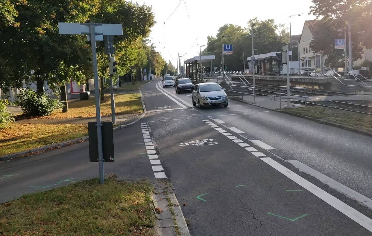
Mitte September ist hier eine 22-jährige Autofahrerin mit einem Radfahrer zusammengestoßen, als sie aus der Nürnberger Straße in die Obere Waiblinger Straße abbiegen wollte. Der 53-jährige Radler erlitt schwere Verletzungen. 

Mal sehen, wann die Polizei aufhört, verniedlichend von "offensichtlich übersah* sie beim Abbiegen ... den Radfahrer" zu sprechen und statt dessen eine Formulierung verwendet, die in etwa bedeutet, dass die Autofahrerin nicht auf den Radfahrer achtete oder dem geradeaus fahrenden Radler die Vorfahrt nahm. Denn so wars.


Blogleser 'Tadek hat mir von der Unfallstelle ein Foto geschickt. Die Markierungen auf dem Radweg sind immer noch zu sehen. Radfahrende müssen sich auf solchen Radstreifen darauf verlassen können, dass Autofahrende die Spur halten und sich umschauen, bevor sie abbiegen. Sie haben kaum eine Chance vorherzusehen, dass der eine Autofahrer neben ihnen just der ist, der es nicht tut. Bei LkW testet man jetzt Abbiegeassistenten. Bei PkW wird man das auch noch einführen müssen, wenn sich Autofahrende nicht auf ihre Sorgfaltspflicht besinnen und bremsen und gucken, bevor sie an solchen Stellen abbiegen. Um so eine Stelle sicherer für Radler zu machen, kann man die Kurve für Autofahrer rechtwinklig gestalten, sodass sie nicht in Versuchung kommen, mit nahezu unverminderter Geschwindigkeit aus der Fahrbahn heraus in die Nebenstraße reinzuschießen.


*Stuttgart-Bad Cannstatt (ots) - Eine 22-jährige Honda-Fahrerin ist am Montagmorgen (17.09.2018) in der Nürnberger Straße mit einem 53 Jahre alten Fahrradfahrer kollidiert. Der Radler erlitt bei dem Zusammenstoß trotz eines Fahrradhelms schwere Verletzungen. Rettungskräfte kümmerten sich um ihn und brachten ihn in ein Krankenhaus. Die 22-jährige Pkw-Lenkerin befuhr gegen 07.20 Uhr die Nürnberger Straße in Richtung Augsburger Platz. Offensichtlich übersah sie beim Abbiegen in die Obere Waiblinger Straße den Radfahrer, der auf dem Radweg in gleicher Richtung fuhr. Hierbei kollidierte sie mit dem Radler. Zeugen des Unfalls werden gebeten, sich bei den Beamtinnen und Beamten der Verkehrspolizei unter der Rufnummer +4971189904100 zu melden.
03 Oct 17:49

10 key facts about SAFE Network

SAFE, Oct 16, 2018


Icon

As I've been suggesting in recent months, the structure of the web is changing at the lowest levels. It's not clear how this will ll shake out yet. On the one hand we have HTTP/2 (criticized by some as "a protocol by Google for Google" - see this interview). On the other hand we have SAFE - "Secure Access For Everyone" - which is "a network like the Internet but created by connecting users’ devices together rather than relying on centralised servers." See also the SAFENetwork Primer.

Web: [Direct Link] [This Post]
03 Oct 17:49

Beautiful Bikes from Boston's Builders' Ball - Royal H Disc Randonneur

by noreply@blogger.com (VeloOrange)
by Igor

To conclude our three-part series of Beautiful Bikes from Boston's Builders' Ball, here is this drop-dead gorgeous, modern Randonneur built by Bryan Hollingsworth of Royal H Cycles. It has a ton of really neat features that incorporate new tech into a fairly traditional machine including disc brakes, thru-axles, threadless headset, and straight bladed fork with tapered legs. Here is a description of the bike from Bryan. Enjoy!


Beautiful, royal blue paint with 50mm Snakeskin Fenders

"The blue rando bike was built for a customer in New Jersey. I met up with them at my parents house in a freak early-Spring ice storm and had to do the complete fitting and bike discussion in the dark, as a tree took out the electricity to the house. It originally was supposed to have satin finished stainless lugs, but i got caught up in the polishing and took them to mirror finish. They match the luster of the White Industries headset, crank, and hubs, as well as the polished Velo Orange fenders and rack.

Randonneur Rack with Integrated Decaleur


The lugs are hand cut - the pattern is simple, but I removed a lot of unnecessary material from the originals. The bike is also built for disc brakes, which i think is a fun take on the traditional rando design. I suppose it's not a true rando, since it doesn't have an integrated lighting system, but the customer wanted to run a battery powered front light. I fabricated a stainless steel body for a handlebar plug battery light that mounts on a special braze on behind the seat tube for the rear.


The silca frame pump also mounts behind the seat tube for a slightly different look. Aside from that, the bike was made to fit the customer, and be a comfortable distance machine. It's exactly my size, so i got to take it for a test ride, and it can move as well! I forgot to bring the Roadrunner X Velo Orange front bag to the show, but that's what is going to go on that rack. I love the integrated decaleur system!"


03 Oct 17:49

Visualizing Photos Taken ‘On This Day’ in Previous Years with Shortcuts

by Federico Viticci

I'm in the process of creating a complete archive of every workflow I ever created for the Workflow app and updating each one for Shortcuts. As I was browsing through my old Workflow articles, I came across an interesting workflow I created in early 2015 called Photo Flashbacks. The main idea was simple enough: given Workflow's ability to read the contents of the photo library, the workflow would filter a photo taken on the same day in previous years and preview it with Quick Look. That seemed like a fun project that I could pick up again and improve for the Shortcuts app.

On This Day

My new custom shortcut is called 'On This Day', and it can be used to find any number of photos for any number of years in the past. Want the shortcut to only show you a single photo taken on this day last year? Just add your preference at the beginning, and you'll have a functional replica of dedicated "on this day" utilities from the App Store. Feeling a bit more nostalgic and looking to assemble a collage of 5 photos for each "same day" from the past 10 years? This is also possible by tweaking two numbers. The shortcut was designed to scale from individual shots to entire collections of photos; the final result will always be previewed in full-screen, and you can decide to save it to the Photos app or anywhere else with the share sheet. You can even activate the shortcut from Siri if you want (though due to memory consumption, it'll always have to execute in the Shortcuts app).

As usual, let's take a look at how this works in practice:

As I mentioned above, the shortcut also supports collections of photos from several years in the past:

Of all the custom shortcuts I've shared on MacStories since the release of iOS 12, this is possibly the most advanced and complex one. However, as was the case with my iPhone XS Frames shortcut, I tried to abstract complexity from the user experience as much as possible. You shouldn't notice any of the image scripting happening behind the scenes, and the shortcut won't ask you to manually pick images or modify them in any way.

After installing the shortcut, all you need to do is answer two import questions. These configure two 'Number' actions that tell the shortcut how many photos per day it needs to find and for how many years in the past. If you're looking to have the classic "A photo from this day last year" experience, my recommendation is to enter "1" for both questions; doing this tells Shortcuts to search for photos from one year in the past and to only load one photo for that day.

One the import questions for this shortcut.

One the import questions for this shortcut.

The two Number actions that control years and photos filtered by the Shortcuts app.

The two Number actions that control years and photos filtered by the Shortcuts app.

However, you're also free to enter whatever you want, bearing in mind that the more years and photos per day you'll ask Shortcuts to search and combine, the longer it's going to take for the shortcut to complete. You can enter values such as "15 years, 5 photos per day" or "3 years, 10 photos per day", and the shortcut will continue to work. Or you can ignore both import questions and manually modify the Number actions to contain ‘Ask When Run’, which will prompt you to manually enter values every time you run the shortcut. The choice is yours.

I don't want to get into a technical explanation of every single action of this shortcut, but there are a few high-level themes and key ideas I'd like to highlight. First of all, this shortcut can only work if your photos have correct metadata for the 'Date Taken' parameter; Shortcuts is trying to find photos that match a specific date, so if they lack a date altogether, or if the date is incorrect, the shortcut won't work. Furthermore, while location metadata is optional, the shortcut is best experienced with photos that have embedded data for the original location where they were taken – most pictures taken on an iPhone do. At the end of the shortcut, you'll be presented with a nice message that sums up how many photos were found along with the names of all the cities where the pictures were taken.

The message displayed at the beginning of the shortcut (left) and the final results.

The message displayed at the beginning of the shortcut (left) and the final results.

Perhaps more importantly, you can see that the shortcut applies a date overlay to each photo to communicate visually when it was taken. I'm both proud of how I was able to implement the date overlay and embarrassed by the fact that it's a hack that gets the job done. Shortcuts cannot generate images that contain styled text and a custom shape like, say, Pixelmator or Affinity Photo. So to generate the date overlay, my shortcut uses some custom HTML that is converted to rich text, converted to PDF, and finally converted to an image. The shortcut then performs cropping on the image and applies a mask to make the date overlay look like a native "badge" that gets added on top of photos.

Creating the date overlay with HTML and custom styles.

Creating the date overlay with HTML and custom styles.

Even better though, you'll notice that the font used in the date overlay is a bold version of San Francisco. By default, Shortcuts doesn't use this typeface when converting HTML to rich text. However, by using inline styles and the -apple-system property supported by WebKit, I was able to use the San Francisco typeface like a modern web browser would. Ideally, Shortcuts should offer a visual editor for creating images based on styled text, but until that happens I'm going to use this workaround.

Lastly, a note on filtering photos and combining multiple results in the same image. If you want to exclude certain albums from your search query, I suggest adding a filter for 'Album is not...' to the initial 'Find Photos Where' action.

You can remove results from specific albums.

You can remove results from specific albums.

This can be useful if you want to remove photos from shared photo streams or albums created by apps such as Instagram and WhatsApp.

You'll also notice that, when dealing with multiple images that have to be combined in a grid, the shortcut will resize each photo to 800 pixels and crop it to a square format.1 The choice to make photos square was just a personal preference so I would end up with a grid where each image has the same size. If you'd rather keep the same format but still combine images, you can remove the 'Crop Image' action (shown above) and switch the final 'Combine Images' action to use the side-by-side setting.


Putting together this shortcut turned out to be more challenging than I initially expected. Besides old problems of Workflow that still haven't been addressed in Shortcuts (e.g. lack of native text-to-image actions or folding for long blocks of actions), I also ran across new ones such as limited execution time for memory-intensive shortcuts when summoned in Siri.

Despite all of this however, 'On This Day' has become one of the shortcuts I run every morning soon after waking up. It's nice to look back on pictures of my dogs when they were cute little puppies2; I hope that others will be able to rediscover photographic memories and forgotten moments with this shortcut as well. You can download it below.

On This Day

Search your photo library for old photos taken on this day in previous years. The shortcut can look for photos from multiple years, with multiple photos per day. If more than one photo is found, photos are resized to square and combined in a grid.

Get the shortcut here.


  1. I'm not sure why cropping images to a square (800x800) appears to be slightly squishing them too. I'm guessing this a bug – the 'Crop Image' action should only crop a portion of a photo, not force it to be resized to a square. ↩︎
  2. To be fair, they're still cute. ↩︎

Support MacStories Directly

Club MacStories offers exclusive access to extra MacStories content, delivered every week; it's also a way to support us directly.

Club MacStories will help you discover the best apps for your devices and get the most out of your iPhone, iPad, and Mac. Plus, it's made in Italy.

Join Now
03 Oct 17:48

Managerial alternatives to leaving smart people alone

by Jim

I’ve often quoted Tom Davenport’s observation that the default HR strategy for knowledge-intensive organizations is to “hire smart people and leave them alone.” While there’s wisdom in that perspective, I fear it is no longer a desirable strategy.

I once had the office next door to Tom’s when we both worked at the Center for Information Technology and Strategy in Boston. The Center was an experiment by Ernst & Young to build better connections between academic research and business practice. It was an embodiment of Tom’s observation, grounded in our experiences in organizations that had pursued other approaches.

What does it mean to “leave them alone?” People don’t become managers to leave things alone. Managers set direction, they marshall resources, they evaluate and interpret results. Why should smart people be exempt from these eminently sensible actions?

They’re not.

But managers of smart people often aren’t qualified to do these essential management tasks. Setting direction, marshaling resources, and evaluating results depend on understanding practice. This is where managers struggle. In a world of manual tasks and procedural paperwork, managers could be expected to have a good grasp of how the work was and should be done. Managers understood practice. Thus, they were qualified to manage it.

We no longer live in that world.

In a world of knowledge work, it is knowledge workers—the smart people—who best understand practice. In this world, Tom’s strategy is a safe and responsible one; if you don’t know how to do what you manage, you’re well advised to resist the urge to meddle.

“First, do no harm” is commendable but not the same advice as “do nothing.” Setting direction, marshaling resources, and evaluating results depend on understanding practice. But understanding practice tells us nothing about whether that practice is advancing the goals of the organization. Practice is anchored in where we are; we also need to know where we would like to go.

Blending these perspectives implies that managing smart people requires a collaborative effort. Smart people provide sense-making of where we have been. Managers provide insights on desirable places to go. Smart people and managers jointly develop the maps and plans that connect the two.

It is not yet clear to me how this collaboration should play out in practice.

Smart people must be able to articulate what they do for those who can’t be expected to know as much as the smart people do about their domains. This places a responsibility on smart people to be able to educate others—particularly managers—about the point and promise of their expertise. Smart people who can’t, or won’t, explain how their expertise matters do a disservice to their organizations.

When smart people were a rare phenomenon in organizations, smart people and pretenders could both get away with jargon and faux-complexity. The numbers were small enough that a few wise gatekeepers could contain the downside risk and the upside of actual smart ideas was worth the trouble.

There’s an old, likely apocryphal, story told of Tom Watson in the early days of IBM. Seems an engineer had made a 10 million dollar design mistake. When asked why the engineer hadn’t been fired, Watson’s response was “I spent too much money learning from that mistake to get rid of the one person who won’t make it again.”

The calculus changes when smart people represent a significant proportion of your work force. For one, tolerating a single 10 million dollar mistake is reasonable; managing a hundred simultaneous potential mistakes—and upsides—becomes an existential problem. There is too much chance to leave the process to chance.

The organization needs a view into the mix of potential smart ideas. Further, the organization needs to actively shape the mix to align with the goals of the organization. This becomes a conversation about “command intent” and how that interacts with “ground truth.”

Leaving smart people alone makes sense when the alternative is to give orders that are ignorant of context and possibility. Far better to combine the perspectives of smart people and forward-looking managers and increase the smarts applied.

The post Managerial alternatives to leaving smart people alone appeared first on McGee's Musings.

03 Oct 17:46

How Russia will disrupt the midterm elections

by Josh Bernoff

The objective of Russia’s meddling in the 2016 election was never to elect Donald Trump — it was to create chaos. So let’s game it out. You are the head of Russian intelligence. You’re out to build on your success in 2016 and make America as impotent and divided as possible. What would you do? … Continued

The post How Russia will disrupt the midterm elections appeared first on without bullshit.

03 Oct 17:46

True Story

by Dave Pollard


Cartoon from poorlydrawnlines.

Tell me the true story, about the time when that man
Took you in to lend a hand, and how you took him for a spin
And that money you saved you stole from him…
Tell me the true story, of how you yelled at your Mom and Dad
Left home with all you had
And now you’re running scared, and you’re mad.
     — True Story, by the Small Glories

Two years ago I wrote (for the nth time) about stories. That time it was trying to deconstruct my own story — the old Story of Me I had built up over a lifetime that was designed to give meaning and coherence to my life and to provide a hint of how I might be of use to others. That’s what we do when we tell our stories. With friends we tell stories about what apparently happened, what we thought, how we felt, to use them as a sounding board for making sense of what happened, to fit it into our Story of Me. With casual acquaintances we tell stories about what we do or did “for a living”, usually in the hope that may lead to a connection, professional or personal.

Often good stories are prompted by good questions. But what exactly is a good story? And what is a “true” story? To me a good story, like any piece of good art, has seven essential qualities: (1) it gives pleasure, (2) it provides some fresh understanding, (3) every sentence in it counts (no padding), (4) it takes a camera or “theatre” view (says what was said and what objectively happened without any interpretation or judgement), (5) it respects the audience’s intelligence (no manipulation or deliberate obscurity), (6) it leaves space for the audience (to fill in their own details), and (7) it must be in some way really imaginative, clever, or novel.

I think what makes for a “true” story is element (4) — just describing what happened factually and letting the listener decide how to interpret it. Great songs (like the one excerpted above), or like this one, and great poetry, tend to be “true” stories, not cluttered with the writer’s self-absorbed reflections on what they thought or felt.

Why is this? Perhaps because it’s hard to relate to another person’s thoughts and feelings, but easy to follow and visualize and emotionally react to the events of a story. The facts are necessarily “authentic” in a way that the processed thoughts and feelings of a narrator can never be. So great songs convey the feeling in their tone, their melodies and harmonies, and great creative writing does so through its tone, the images it invokes and the perceptive adjectives it uses.

And then, the icing on the cake that rescues the song or writing from being just an observant tone poem or banal self-indulgence, is this: Some understanding can be conveyed by what the “camera view” of the teller focuses on, and by the clever juxtaposition or turn of phrase that helps you see something you couldn’t see before. In the song True Story it’s the realization that most of our stories aren’t really true, and hence are shallow, and that self-honesty and authenticity can create powerful (and necessary, if the relationship is to last) connection. In the song True North it’s the juxtaposition of constant change with the unchanging, and the realization that life consists of a balance of both. Of course, if the songwriters had written the two sentences I just wrote, their songs would have been terrible. The songwriters conveyed these important understandings through telling the stories, with a just a hint (in the song titles, in the harmonic resolution of the final notes of the choruses) that gently steers you to the understanding. (A lot of stories also contain three verses that lead you in a particular direction.) Great stories mustn’t hit you over the head (à la Aesop’s Fables “morals”) or manipulate you (eg a certain Supreme Court nominee’s fake tears and righteous privileged white male indignation).

In short, if you want to be a great story-teller, don’t tell me what you think (or thought), or feel (or felt), or believe (or learned), or what you think I should think, or feel, or believe. Tell me what happened, full of facts about what was said and done, and imagery and sensory information so that I can imagine myself there, and let me decide how that feels and what I would think. That’s a good story.

There is a great tendency (especially, it seems, in males) to try to ‘helpfully’ convey one’s own synthesis of understanding, rather than telling a story that leads to the same understanding. A synthesis is of necessity a sense-making, a judgement, and something of an oversimplification. As a result, it’s suspect. That’s why great presentations use stories (sometimes a single anecdote is enough), and why the most brilliant syntheses, no matter how often restated and no matter how cleverly articulated, are not memorable. They can be really interesting (many of my most-read articles, and some of the most popular works of non-fiction, consist of lists, often of the “how to” variety; these are all of necessity writers’ syntheses). But we intuitively don’t tend to trust them, and without a story they are almost invariably not specific or rich enough to be truly actionable.

Sadly, few stories meet the seven criteria above. It takes a mix of talents (imaginative, creative, compositional, perceptual and synthetic) to write a great story. I was amazed at how different (and more difficult) it was writing a play compared to writing a short story with a narrator, even though I always try to avoid “thought balloons” and “he felt…” passages in my fiction).

What happens if we strip away our thoughts (including syntheses) and feelings (including judgements and suppositions) from our stories? Two years ago, I deconstructed my self-aggrandizing Story of Me (everything I had supposedly accomplished, which was a self-assessment) and replaced it with a “humbler” supposedly less-dualistic Story of Me. But I now realize the replacement was just as judgemental as (just more self-deprecating than) the original. And just as dualistic.

Here’s something perhaps closer to a “true” story of me:

There is no ‘me’. The illusion of a ‘me’ within this character emerged at about age 6 and has been around ever since. It has never been comfortable in the seemingly-fraudulent, inauthentic role of Dave the Person, but as the chemistry of this body has changed and the stresses to ‘perform’ have eased, the illusory ‘me’ has been less depressed, though it is still almost as anxious and fearful and prone to escapism. Falling in love has provided powerful but only temporary respite.

That’s it. It meets almost none of the criteria of a good story. It’s neither interesting nor useful. By itself it is not a “true” story either, though I think I could construct (a much longer) one that would say essentially the same thing without the judgements and self-perceptions. But there would be no purpose in doing so. It would be a bad, true story.

Recently I attended a meeting of young entrepreneurs, faithfully telling the old “untrue” Story of Me and earnestly offering advice and reassurance. What compelled me to attend this meeting? The answer, of course, is that ‘I’ had and have no choice. Forty years of conditioning is well-nigh impossible to break. It shows that ‘I’ am holding on for dear life. Tomorrow, ‘I’ will go to several volunteer meetings and be deeply, momentarily engaged, even though there is no ‘me’ and even though nothing really matters.

And then ‘I’ will come home and start on another blog post, as ‘I’ can’t not write. It’s how ‘I’ have been conditioned to make sense of (and remember) things, and to express what ‘I’ have no other avenue to express.

Hopefully my conditioning, which seems to be gradually shifting, will increasingly see me writing stories that are (by the above criteria) both good and true. But I wouldn’t bank on it. Hopefully, over time, my conditioning will lead me to let go of the old Story of Me and to stop telling stories — both to myself and to others — that are neither good nor true.

But in the meantime — sorry, I’m doing my best and it’s all I can do. Lost and scared, ‘I’ am.

True story.

03 Oct 17:42

GM and Honda team up for autonomous vehicle project

by Brad Bennett

Automotive powerhouses General Motors and Honda are working together following the Japanese automotive manufacturer purchasing a 5.7 percent stake in GM’s self-driving car subsidiary Cruise Automation.

Honda’s investing $2.75 billion USD over the next 12 years to become part of Cruise’s operations. This cost includes $750 million USD that Honda paid GM for the 5.7 percent of Cruise, according to CNBC.

GM has also announced that Honda’s investment has raised the self-driving company’s valuation to $14.6 billion USD.

The two legacy automakers plan on working together to build a space-efficient self-driving vehicle that’s intended for the global market. There’s no release date set for the car, but GM will reportedly manufacture the autonomous vehicle.

We’re proud to announce that @Honda is investing $2.75 billion dollars in Cruise and has chosen to partner with us and @GM. This partnership will help us to create a new purpose-built autonomous vehicle. https://t.co/4ffuLcvIOM

“Together, we can provide Cruise with the world’s best design, engineering and manufacturing expertise, and global reach to establish them as the leader in autonomous vehicle technology — while they move to deploy self-driving vehicles at scale,” said General Motors CEO Mary Barra, as reported by CNBC. 

Cruise Automation is a relatively new car company that launched in San Fransisco in 2013. In 2016 GM acquired the company.

The company’s headcount and fleet are growing at a rapid pace, rising from just 40 employees to over a thousand over a relatively short period. In terms of fleet size, the Cruise Automation is estimated to be testing around 180 driverless Chevy Volt electric cars.

Cruise was founded by Kyle Vogt and Dan Kan. Vogt was a founder of Justin.tv which later became the now Amazon-owned video game streaming platform Twitch.

Source: CNBC, Cruise, Kyle Vogt

The post GM and Honda team up for autonomous vehicle project appeared first on MobileSyrup.

03 Oct 17:42

CRTC says Canadians visiting U.S. today may get Trump’s mobile emergency alert

by Bradly Shankar
CRTC logo

The Canadian Radio-television and Telecommunications Commission (CRTC) has confirmed that Canadian customers in the United States may receive an emergency alert to their phones today as part of a “high-level” alert test from the Trump administration.

The alert may be sent out to Canadian mobile customers on any carrier who are within or near U.S. borders, according to the CRTC.

The ‘Presidential Alert’ is scheduled for 11:18am PT/2:18pm ET and will contain the following text:
“THIS IS A TEST of the National Wireless Emergency Alert System. No action is needed.”

This is the first test of a national wireless emergency system by the U.S.’ Federal Emergency Management Agency (FEMA) disaster response organizations. FEMA says it will share the test result data with mobile carriers to ensure the system works well during actual emergencies.

The presidential alert will be broadcast across U.S. cell towers for 30 minutes, so mobile owners may not get the message right away.

Based on rules outlined in 2006 U.S. law, the FEMA alert must relate to a true emergency and cannot contain a personal message from the president.

In May, the CRTC began testing its own mobile emergency alerts across Canada, although there were initial issues in Ontario and Quebec.

Via: 680 News

The post CRTC says Canadians visiting U.S. today may get Trump’s mobile emergency alert appeared first on MobileSyrup.

03 Oct 17:41

Facebook ‘View As’ hackers didn’t access third-party app data

by Sameer Chhabra

Menlo Park social networking giant Facebook said that its investigation into the ‘View As’ hack hasn’t revealed that hackers accessed third-party applications using Facebook Login.

An October 2nd, 2018 media release attributed to Facebook’s vice president of product management Guy Rosen explained that the social networking company’s investigation “has so far found no evidence that the attackers accessed any apps using Facebook Login.”

Rosen added that any developers using Facebook’s SDKs were “automatically protected” when the company reset user’s access tokens — the keys used to keep users logged in so they don’t need to re-enter their sign-in information each time they access a Facebook-linked application.

Facebook is also currently building a took that will allow developers to manually identify whether app users were affected, “out of an abundance of caution.”

According to Facebook, the ‘View As’ hack was the result of changes to Facebook’s video uploading feature.

Due to three specific bugs, hackers were able to use Facebook’s View As feature — which lets users see how others view their accounts — to generate access tokens that mimicked genuine accounts.

Facebook acted by resetting the access tokens of approximately 50 million users who were definitely affected by the hack, as well as an additional 40 million accounts that may have been affected.

Rosen told reporters during a September 28th, 2018 phone call that hackers had not accessed private messages or posts. No credit card information was accessed either.

A Toronto-based law firm has launched a class action suit against Facebook as a result of the hack.

Source: Facebook

The post Facebook ‘View As’ hackers didn’t access third-party app data appeared first on MobileSyrup.

03 Oct 17:40

Latest iOS 12.1 beta brings fix for iOS 12 charging issue

by Patrick O'Rourke
iPhone XS Lightning cable

iOS 12.1’s second beta, which just dropped this morning, includes a fix for the charging issue that’s affecting the recently released iPhone XS, iPhone XS Max, as well as any iOS device capable of running Apple’s new operating system.

The bug reportedly caused some users to experience an issue resulting in their device not to charge over a Lightning connection when the display isn’t activated.

iOS 12.1

In this case, tapping the device to wake it up resumed charging, but as soon as the display turns off again, charging halts.

With the release of iOS 12.1’s latest beta, it seems this issue has already been solved. While a frustrating issue, it’s good to see Apple moving swiftly to solve the problem.

It’s unclear when Apple plans to drop iOS 12.1 publically, but given the tech giant’s track record, a full release likely isn’t that far off.

Via: 9to5Mac

The post Latest iOS 12.1 beta brings fix for iOS 12 charging issue appeared first on MobileSyrup.