Shared posts

19 Oct 15:35

Exploring college major and income: a live data analysis in R

by David Robinson

I recently came up with the idea for a series of screencasts:

Hadley Wickham had the great suggestion of analyzing a Tidy Tuesday dataset. Tidy Tuesday is a fantastic project run by the R for Data Science online learning community (especially Thomas Mock) that releases an interesting dataset each week.

I’ve now released my first such screencast, exploring this week’s Tidy Tuesday dataset on (the data behind The Economic Guide to Picking a College Major). You can also find the R Markdown I produced here.


I produced a handful of figures that I found pretty interesting. I took a look at the distribution of income from graduates within each category of major.


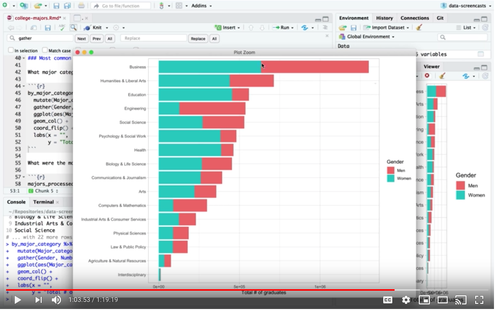
I spent some time on looking at the differences in gender distribution across majors, which was also included in the data.


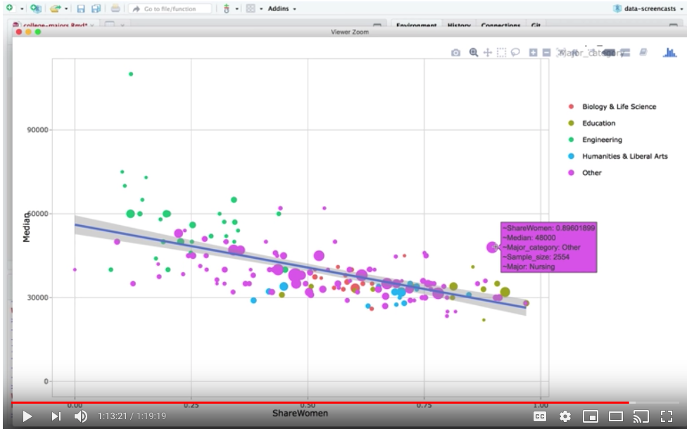
And I ended by setting up an interactive scatterplot with the plotly package that compared the share of women in a field to the median salary.


Some notes and observations:

  • This isn’t an R tutorial: If I were teaching R, I’d have prepared in advance and moved more slowly through the material. This is a case study in how I’d dive into a dataset and learn from it, including steps where I think aloud and decide what route to take. If anything, it’s closer to a “speedrun”.
  • I enjoyed showing the order I work in: I write blog posts somewhat “inside-out”: I start with a few figures, then figure out what preprocessing I should have started with, and I’m always moving uninteresting figures out of the post or to appendices. It was nice to show how an analysis took shape and ended up looking like a organized final product.
  • I ran into fewer bugs than I expected to Part of the excitement of a live screencast is that “anything can go wrong” (part of the reason I recorded this first one in advance rather than live is to practice with less pressure!) I was pretty well versed in the tools I used in this session (dplyr and ggplot2), so I got stuck on only a handful of bugs (though I did go down a few unproductive routes).

I had enough fun that I think I’ll do it again (though probably not every week). With that in mind, I’ve learned some lessons that might improve my future screencasts:

  • I speak too fast: this is a recurring issue for me. When I’m speaking in front of an audience I can watch people’s faces and pace myself a bit better, but when I’m “by myself” while recording it’s difficult. I’ve learned this is especially difficult for non-native listeners, and I’ll try to be more conscious and speak slower!
  • I need to keep a better eye on time: The screencast is about 80 minutes long (I’d originally planned on an hour, and I’ll probably aim for that in the future). I’d be interested in feedback about the length, and whether people find the whole session interesting.

I look forward to hearing your feedback, and to recording to the next one!

19 Oct 15:34

Microsoft Is Killing Skype Classic on November 1, and Here’s Why People Are Upset

Chris Hoffman, How-To Geek, Nov 01, 2018


Icon

Skype 8 (which is what Microsoft calls the 'Surface' version of Skype) never worked properly for me. So I always used (what they call) Skype classic, until the audio and video quality declined to the point where it too was unusable. So I had already moved on from Skype (using mostly Google Hangouts). It's not ideal but it's better than the remaining (ie., Facebook) alternatives (which I won't use, because Facebook). That said, the article suggests that Discord and Telegram are pretty popular, though they're both pretty new. There's lots of room for a new market leader here; it won't be Skype 8.

Web: [Direct Link] [This Post]
18 Oct 22:31

The Org Chart Test

by rands

If you’ve had a 1:1 with me in the last decade you know that once we’re done with our planned agenda that there is good chance that I’ll stand up, walk to the whiteboard, and start drawing some version of the organization chart (“org chart”).

I believe the org chart is one of the three critical artifacts that must be easily discovered and well-maintained. Why? First, let’s start with a definition. In my favorite part of Managing Humans, the glossary, I define an org chart as:

A visual representation of who reports to whom. Org charts are handy in large organizations for figuring out who you’re dealing with.

That’s one good use case, but one is missing. An org chart should also effectively describe, at a high level, how the product is organized and also who is responsible for what. An org chart should be legible.

The Legibility Test

Grab a co-worker (doesn’t matter who), head to your nearest empty conference room with a whiteboard, grab a colored pen and make sure it’s not a Sharpie™, and starting scribbling. We’re looking for an org chart.

Rands, how should I draw it? Boxes and arrows? Architecture? People structure? Technical structure? Which boxes go where? I need guidance.

For this exercise, the only guidance I’ll provide is no names of human beings.1 Please draw what you consider to be the most commonly understood version of the org chart.

Done? Ok.

Here are a series of increasingly complex questions your drawing should answer:

Did you draw something? Seems like a simple part of the task, right? I do candidate interviews all the time, so I’ve got this drawing down, but I wonder about you. How quickly can you step up, draw some boxes, and give them names? Are you happy with the result?

At any point during the drawing process, did you stop to explain yourself? Are there parts where you are making excuses for the way it’s being drawn? As you were drawing the boxes, did you need to stop and say “Yeah, this is weird, but…” or “You probably think this box means THIS, but it means THAT.” If you’re like me and you’ve drawn this picture a lot, you probably don’t even hear these excuses because that’s just the way we’ve always described it.

When you’re a small team, say less than 100, the org chart isn’t that important because the humans can keep the state of the team in their head. Nothing needs to be written down because communication is freely flowing. The communication tax of large organizations has not yet been applied. The humans know who is responsible for what. They know who owns different parts of the stack. They must. It’s a small company, and the ownership of things is changing all the time because… it’s a start-up. Chaos is the defining characteristic.

At some point, someone on the team is talking to an interview candidate, and they realize they need to draw a visual representation of the team. It’s crude. It’s fast. And it’s the very first org chart. More on this moment, but back the test.

Final question. If you left the org chart on the white board2 and a random tenured human on the team walked by the conference room and saw the org chart, would they nod and say, “Yup, that’s about right.”? The tax on communication increases as a function of the size of the team. The reason you need agreed upon and well-understood artifacts like an org chart is because critical aspects of the organisms are clear. Everyone understands critical truths.

This final question is impossible to answer effectively. You need to answer the question subjectively, “Is my org chart legible?” Is it clear enough to read? Could your average employee without any outside help read your org chart and answer the following questions:

  1. What are the constituent parts of the team?
  2. It is clear from the names of the different teams who are likely responsible for what within the team?
  3. Does how the org chart is drawn give the reader a high-level idea of how the product or business is architected?

Management types take this artifact for granted because we live it. Our day is full of travels across the org chart. It’s our mental map for the humans and technology within our teams which means we both understand it and take it for granted. The vast majority of the humans in the organization do not have a daily need for org chart understanding, but when they do, your goal is instant maximum legibility.

The Basics at Scale

How much time is your team thinking about obvious things? Tricky question for a manager to answer because the job gives you extraordinary access to information. There are daily reminders of the obvious.

The communication tax applied to large teams assures that the basic information doesn’t scale without structured assistance. The org chart, the company values, and the current business goals: this critical set of information must become a set of easily discoverable and well-maintained artifacts. When the humans have a question, your goal is they habitually return to these artifacts to answer their obvious questions because they are full of critical truth.


  1. When proper names show up on an org chart, it transforms into a different beast. It’s an equally important artifact, but when names land on the org chart, it becomes less organizational and more political.

    Back to our rapidly growing start-up. There’s a critical inflection point when someone somewhere in the building thinks, “We need managers” and twelve point three seconds later they draw a people-based org chart on the nearest piece of paper. Jules can work with this folks. Kate can manage these humans. Ok. Whew. Next crisis.

    This is backwards. Jules and Kate are lovely humans and perfectly capable of being managers, but an org chart built around the humans is backwards. What are you building? An e-commerce site? Rad. You likely have a front end team and a back-end team. Build your first org chart around your product or the technology; not the people.

    A people-based org chart describes power structures. Who is responsible for whom? What do they own? How big is their area of influence? Who do they report to? You can not avoid these questions being asked, but you can set the tone for how you view your organization structures. Product first? Technology first? Or people first?

    I share this advice with you because it’s a mistake I’ve made for years. Initial conditions set a tone that is nigh impossible to change. ↩

  2. Don’t do this. It freaks people out. See above. ↩
18 Oct 22:30

The Persistent Myth of Insurmountable Tribalism Will Kill Us All

by mikecaulfield

New Knight Foundation-supported study out about college students which very much confirms what we see in classrooms. Students:

  • feel overwhelmed by the “firehose of news”
  • feel unequipped to sort through that news
  • want to read and share truthful accounts
  • believe in journalistic principles of accuracy and verification
  • but fall back on cynicism as a strategy, believing far more news to be fake or spun than really is

All this is exactly what we see in classrooms. Every class might have one or two hardcore partisans, but the vast majority of students feel OVERWHELMED. They want to do the right thing, but it seems impossibly time-intensive and complex.

What we find in this environment is that some students initially talk like hardcore partisans when looking at prompts, before they have the skills to navigate the overload. But that’s because the alternative to reacting tribally is an investigation they imagine is going to take them an afternoon. Once they have the skills, that tendency slips away. Here’s the sort of answers we’re getting after one week of skills training when a student looks at a story of declining arctic ice from the National Snow & Ice Data Center (an excellent source, BTW):

“This site appears trustworthy. I searched Google news and found it is cited by multiple credible sources including bigger weather news sites. I also used the “Just add Wikipedia” trick as a way to investigate funding and found that it is partially funded by the US through NASA, which shows there are probably experts there.”

“It’s good, they’ve been around forever and are affiliated with other research facilities like University of Colorado.”

(amalgamation of several student responses to protect student privacy).

We do enough of these in class that we can see they get to this point in less than 60 seconds for many tasks. If the habits hold, when someone tries to pull them slowly into post-truth land, they’ll have a natural resistance. Maybe enough to avoid the first steps down that slippery slope.

You know what I don’t see in my classes — in a Republican district, where a nontrivial number of students don’t believe in climate change? Any reaction of the sort that you “can’t trust the site because declining sea ice and climate change is a myth.” Not one.

It’s not just a Republican thing. We find the same thing with prompts for liberal hot-button issues on GMOs. Students — many of whom are very committed to “natural” products and lifestyles — make accurate assessments of the lack of credibility of sites supporting their opinions. They believe this stuff, maybe, but admit the given site is not a good source.

Now you might think that all the students (all of them!) are somehow secretly hiding their tribalism and saying what they know they need to say to get approval — even though none of our assignments are graded on anything but participation. If you haven’t taught a class before, maybe that sounds plausible to you — that all the students have simultaneously decided to hide their secret opinions and somehow mimic expert competence instead while not believing in it.

If you have taught a class before I know you are doubled over laughing at that idea. Good teachers know when students are faking it, or going through motions with secret resentment. That’s not what we see in our classes. We see excitement with the new skills, and above all RELIEF. You can see the great weight being lifted as the students learn 60-second fact-checks. I came in once to one section I taught and forgot to go over the homework, and the students were crushed. When I realized I had skipped it and went back to it, they lit up. They wanted to show off their new skills.

Not just the Republicans. Not just the Democrats. The students, all of them.

And yet everywhere I present to ADULTS, there are people that tell me these methods won’t work, because tribalism-yadda-yadda-yadda. They’ve usually never taught this stuff, certainly not this way. But they are convinced of tribalism as a fundamental truth, an intractable problem. They’ve taken it on faith that — unlike almost anything else in human life — tribalism is not one of many factors governing human behavior, but a sort of absolute veto that obliterates anything you throw against it, a dispositional antimatter.

Yep. Academics and bureaucrats can be fiercely tribalistic about the insurmountably of tribalism.

To be honest, believing our students just don’t want to know the truth is the professional corollary to the cynicism we see students come in with about news media. Cynicism may not provide comfort, but it provides absolution. In this world, at this particular moment, that may feel like the best possible deal you’re going to be able to cut. I get it.

But it’s also a waste of the frustrated idealism of our students. I don’t know where our students will be in ten years or what they will believe. I know that views do harden, even over the course of college. But they come to us, right now, wanting to do better at this, feeling guilty that they’re not, overwhelmed by the effort to close that gap. The fact that we don’t take advantage of that desire, that class by class we are letting this urge of students to do better wither on the vine so that they can later be groomed and radicalized by God knows who — that is something we will all come to regret, no matter which tribe we belong to. A massive, massive waste of human desire and potential in the face of looming catastrophe.

The report tells us the students would like to do better. The students in our classes learn to do better, and enjoy doing better. I’m really not sure what we’re waiting for.

.


Added 10/17: Someone below asked whether I could link to these skills we teach. Sure. The two best starting points are this set of four three-minute videos from Civix, and the textbook. Teachers can find other teaching resources — including importable online activities — here.

18 Oct 22:30

I've Read From A Book for 6 Months Straight

by Richard

Apparently one way to form a habit is to do that thing once a day and make a streak. Apps like Snapchat encourage streaks of sending someone in particular a message or photo, and Timehop keeps track of how many days in a row you check in on your past social media activities. It had recently occurred to me that I had stopped doing something I used to love, which is to read books.

I have recently come to regret not so much the polarized nature of Twitter but rather its effect of fracturing my attention. A tweet about one topic is followed by another, with links out to articles that I would feel hurried to read because there was another tweet waiting for me to react to. To stretch out my attention span, I wanted to get back into reading books though it had felt like there wasn't a satisfying reward mechanism to get me hooked again. That was until the Bookly iPhone app crossed my radar. I had used a few apps in the past to track the amount of time spent reading, which would give me an idea of how long it took me to read an entire book, and at what pace I read. The Bookly app added to that the concept of a reading streak, and that was exactly what I needed.

A new job in a new city made it difficult to find time to read books in the last couple of years. Recently, I set out to read a book (dead trees editions) for about 15 minutes a day for 30 days straight. On May 19th of this year, I hit that goal. I have since read from a book, either dead trees or electronic edition (mostly the latter) for 180 days in a row. I still post my progress to Goodreads, and by the end of the year I hope to have read a modest 20 books. I'm in awe of those who read 100 or more books, which is doable with planning and persistence. Reading before work and not before bed is definitely a great tip, though for me, my commute is fairly short, and time seems to go by a lot faster in the morning than it does in the evening. I've so far been able to carve out time every day, and hope to be able to do it every day for the, weeks, months and years to come.

18 Oct 22:30

Less Content

by Richard Millington

It’s easy to create a content calendar, you can fill it with items like:

  • Member of the month
  • Member Interview Tuesday.
  • What Are You Working On?
  • Expert Advice About [x]
  • Throwback Thursday
  • Promotion Friday

It’s harder to make the content exciting enough to sustain interest.

The problem with anything regular is unless it’s regularly (and surprisingly) interesting members learn to ignore it.

Working out loud discussions typically begin strong but the popularity soon fades as members realize the number of useful connections from them doesn’t justify the effort.

Interviews with members typically falter because many members don’t have anything remarkable to say. Once you’re in week 20, you’ve been through most of your top members. Worse yet, the audience often has to wade through an hour-long interview, or a 2000+ word transcript to find a few interesting nuggets.

A few tips that might help here:

1) Tweak the format to make it scannable. Reduce an hour-long interview to a members’ top 5 tips, what I learned this month, top links, top resources, or an edited digest etc…

2) Only publish content that passes the interest test. It’s harsh, but if you interview a member for an hour, and they don’t say anything remarkable, respect your community and don’t publish it. Your duty is to the entire community, not one member. Better yet, wait for members to say something remarkable in the community and interview them. Have a few people you can run content past to see if they like it.

3) Drop the content calendar. If you’re just churning out content to fill an arbitrary slot in the calendar of your own making, it’s probably an idea to drop the calendar. There simply isn’t enough meaningful activity to fill out. Wait and help create the conditions for amazing things to happen and then write about it.

Publishing content “because it’s Thursday” is the worst reason to publish content.

18 Oct 14:10

Reverse engineering a Huawei phone

by Volker Weber

The US famously does not allow Huawei phones, without further explaining why. Here is a frenchman reverse engineering some of the apps on a "Huawei P20 from China". The question is if Huawei phones bought here exhibit the same behavior. Yesterday, Huawei gave away a few hundred of them to influencers at an event in London. Maybe some of them have enough technical clout to investigate this instead of clamoring about three cameras. And then, maybe, turn off their free phones forever.

This guy is on a roll, btw. The other day he found a very basic security flaw in a dating app, exposing all personal data of singles searching for love in support of Donald Trump.

17 Oct 20:57

Maybe phones have gone too far :: Genius review of the Google Pixel 3

by Volker Weber

Addict 3390231 640

We are captives to our phones, they are having a deleterious effect on society, and no one is coming to help us. On the upside, this is a great phone.

When I grow up I want to be able to write like Mat Honan.

More >

17 Oct 20:57

Twitter Favorites: [Planta] I think I'll be the only one in Canada not doing pot tomorrow.

Joseph Planta @Planta
I think I'll be the only one in Canada not doing pot tomorrow.
17 Oct 20:57

Wordpress Editor Generates Page Title Links From Pasted URLs

by Tony Hirst

Noting that if I paste a URL into my WordPress.com visual editor, behind the scenes it can look up the link, pull a page title back, and create a link using the title as link text and the link set to the URL I pasted in:

I’m not sure if this requires any particular metadata on the page referenced by the link? Certainly, it doesn’t seem to work for every URL? But then, Pete Warden’s blog – what do you expect?!;-)

Will Compression Be Machine Learning’s Killer App?

Here’s a closer look, watching the page traffic that’s returned using browser developer tools (View->Developer in Chrome):

This is what’s returned:

{"success":true,"data":{"body":"<a href="https:\/\/petewarden.com\/2018\/10\/16\/will-compression-be-machine-learnings-killer-app\/">Will Compression Be Machine Learning’s Killer App?","attr":{"width":676,"height":1000}}}


And this is what was sent:

I wonder if the same mechanic is used to embed Youtube videos when you paste in a Youtube URL? Although that may be done in the web page itself (you can generate the Youtube embed code simply by extracting the video ID from the pasted URL and constructing the embed code using a template.)

17 Oct 20:57

BestPhotos Offers Streamlined Photo Management

by John Voorhees

BestPhotos, a photo management app from Chicago-based Windy Software that we’ve covered on Club MacStories before, was updated today with new features for quickly and efficiently organizing your photos. I take thousands of pictures each year and sometimes it feels like I take even more screenshots. Sifting through to find the best shots and discard old screenshots, duplicates, and just plain bad photos takes a lot of tapping and time in Apple’s Photos app. BestPhotos is a better solution that streamlines the whole process.

From the Library view of BestPhotos, you can view your entire collection of photos or filter them by areas that may need attention like images that are missing location data, portrait mode photos that include a regular copy of the image that you may want to discard, HDR images and non-HDR copies of the same image, short videos that were probably taken by mistake, vertical videos, iOS screen recordings, duplicates, and similar photos. You can also filter by images taken today, this week, month, or year, album, and the smart albums created automatically by the Photos app. The filters, which are available as Siri shortcuts too, are a good way to tackle an entire category of common issues that might be cluttering up your library, which can be a much less daunting task than taking on your entire library at once.

There are buttons in the toolbar along the top of the library view that provides statistics about the photos you’ve taken over the past year. You can also access BestPhotos’ settings and select one or more photos for batch deleting or adding to an album. Images, other than Live Photos and videos, can also be rotated or shared via the share sheet from here.

Tinder-style photo deleting and favorite marking.

Tinder-style photo deleting and favorite marking.

Tapping on an image expands it from its thumbnail so you can take a closer look. Using the gesture popularized by Tinder, swiping left on a photo marks it for deletion, and swiping right marks it as a favorite, though the delete or favorite actions can be substituted with a hide photo action instead. The same actions can be accomplished by tapping corresponding buttons in the bottom toolbar too. The changes aren't saved until you tap done in the toolbar, so there are plenty of opportunities to change your mind. The Tinder-style swipe gesture is a quick way to mark photos but eliminates swiping on the photos to navigate between them. Instead, BestPhotos relies on a scrollable tape of thumbnails along the side of the image preview and forward and back arrows in the toolbar along the bottom of the screen.

I like the swiping gesture for marking photos for deletion or as favorites a lot, but initially, it was hard to restrain myself from reflexively swiping to navigate. I think it would help to make the thumbnail strip a little wider and the navigation buttons a little bigger. That would sacrifice some image viewing space, but they strike me as a little too small given the app’s unique navigation model.

One way to minimize navigating your library is by turning on the ‘Auto Advance Photos’ setting. When enabled, the feature advances from one image to the next when an image is marked for deletion, as a favorite, or for hiding by tapping the buttons in the bottom toolbar. There are also keyboard shortcuts for navigation as well as toggling particular modes and actions if you use the iPad version of the app with an external keyboard.

Location data.

Location data.

Along the bottom of the image preview screen, there are buttons to compare two images side-by-side, which is valuable when deciding which of two similar images to discard, a button for adding photos to an album, and a button for viewing metadata. Cropping, rotating, and sharing (including sharing a small, email-friendly version of an image or one without location data) are also available for any image except Live Photos and videos.

My photo library is a mess, and although I don’t plan to go through them all, BestPhotos has already been a painless way to begin the process of cleaning up my most recent pictures. The app’s navigation takes some time to get used to, but the ability to compare two similar photos side-by-side, the quick, broad swipe gestures for marking photos as favorites or for deletion or hiding them, and the smart filters for finding trouble areas in your photo library are all reasons to consider BestPhotos.

BestPhotos is available on the App Store as a free download. An In-App Purchase of $2.99 unlocks all of the app’s features.


Support MacStories Directly

Club MacStories offers exclusive access to extra MacStories content, delivered every week; it's also a way to support us directly.

Club MacStories will help you discover the best apps for your devices and get the most out of your iPhone, iPad, and Mac. Plus, it's made in Italy.

Join Now
17 Oct 20:57

Facebook Can’t Fix This.

by John Battelle

The last 24 hours have not been kind to Facebook’s already bruised image. Above are four headlines, all of which clogged my inbox as I cleared email after a day full of meetings.

Let’s review: Any number of Facebook’s core customers – advertisers – are feeling duped and cheated (and have felt this way for years). A respected reporter who was told by Facebook executives that the company would not use data collected by its new Portal product, is now accusing the company of misrepresenting the truth  (others would call that lying, but the word lost its meaning this year). The executive formerly in charge of Facebook’s security is…on an apology tour, convinced the place he worked for has damaged our society (and he’s got a lot ofcompany).

In other news, Facebook has now taken responsibility for protecting the sanctity of our elections, by, among other things, banning “false information about voting requirements and fact-check[ing] fake reports of violence or long lines at polling stations.”

Yep, a company that, in its core business, is currently charged with evasion, misstatements, and putting growth above civic duty is somehow still solely responsible for fixing the problems it’s created in our civil discourse and attendant democracy.

Does this feel off to anyone else?

We’ve had nearly two years of congressional hearings, nearly two years of testimony and apologies and “we must do better-isms.” While the company must be commended for actually making several things better (the ad transparency platform, for example), the fact that we continue to believe that the appropriate remedy for what ails us is to let the fox fix the holes in our chicken coop is downright….baffling.

I guess this is what you get when the folks in power are happy with the results of our elections.

But here’s my prediction, and it won’t take long for me to be proven right or wrong: Should the Democrats take control of the House, things are going to change. Quickly. Sure, with only the House, the Democrats can’t actually force any new regulation, nor can they command any cabinet level policy shifts.

But as Trump well knows (and fears), a subpoena is a powerful thing.

Now, if the Democrats don’t win the House, well, that’s another column.

(cross posted from NewCo Shift)

17 Oct 20:57

Wired Wednesday: BoxLock, Palm & Airwrap Styler

by John

This week on News 1130 radio in Vancouver, I spoke about these tech topics for Wired Wednesday with Ben Wilson:

  • BoxLock secures your booty against porch pirates (source)
  • Introducing the ‘Palm’, a Tiny New Android-Powered Smartphone (source)
  • The $500 Dyson Airwrap styler vacuums up wet hair to curl it (source)

Listen here

The post Wired Wednesday: BoxLock, Palm & Airwrap Styler appeared first on johnbiehler.com.

17 Oct 20:57

When Will It Just Be Machines Talking to Machines?

by Tony Hirst

Do you ever get the feeling that the machines are trying to influence the way you think, or take charge of your communicative acts?

One of the things I noticed for the first time today was that my WordPress editor seems to have started converting some pasted in URLs to actual links, using the pasted URL as the href attribute value and with the link text pulled from the referenced page (WordPress Editor Generates Page Title Links From Pasted URLs). Thinking about it, this is an example of an auto__completion__ behaviour in which the machine has detected some pattern and “completed” it based on the assumption that I intend to “complete” the pattern by turning it from a URL to a web hyperlink.

That is, I paste in X but actually want to represent it as [Y](X) (a link represented in markdown, where Y is the link text and X the target URL or <a href="X">Y</a> (an HTML link).

I imagine most people are familiar with the notion that Google offers a range of autocompletion and autosuggestion terms when you start to type in a Google web search (I don’t think the voice search (yet?) starts to interrupt as you when you ‘ok Google’ it (I don’t knowingly have any voice interfaces activated…))…

What I’ve also noticed over the last few days that a Gmail update seems to have come along with a new, positively set default that opts me in to an autocomplete service there when I’m replying to an email at least:

This service has been available since May, 2018, at least: SUBJECT: Write emails faster with Smart Compose in Gmail.

In look and feel, it’s very reminiscent of code autocompletion support in programming code editors. If you aren’t a programmer, know that computer programmes are essentially composed of fixed vocabulary terms (whether imposed by the language or defined within the programme itself), so code completion makes absolute sense to the people who built the Gmail software application and user interface. Why on earth wouldn’t you want it everywhere…

A couple of things concern me without even thinking about it:

  1. What could possibly go wrong…
  2. Does autocomplete change what people intend to write?

In the paper Responsible epistemic technologies: A social-epistemological analysis of autocompleted web search, Miller & Record write:

[U]sers’ exposure to autosuggestions is involuntary. Users cannot type a search without encountering autosuggestions. Once seen, they cannot “unsee” the results. …

Psychology suggests two likely consequences of involuntary exposure. First, initially disregarded associations sometimes transform into beliefs because humans are prone to source-monitoring errors: subjects mistake the original information source and may put more or less credence in the information than they would have given the correct source (e.g. Johnson et al., 1993). Someone might read [something] and initially disregard it, but later, having forgotten the source, recall having read it. This is supported by the sleeper effect, according to which when people receive a message with a discounting cue, they are less persuaded by it immediately than later in time (Kumkale and Albarracín, 2004). Second, involuntary exposure to certain autosuggestions may reinforce unwanted beliefs. Humans are bad at identifying and rooting out their implicit biases (Kenyon, 2014). Because exposure is involuntary, even subjects hygienic in their epistemic practices may be negatively affected.

[A]utosuggestions interactively affect a user’s inquiry, leading to paths she might not have pursued otherwise. Effectively, if a user looks at the screen, she can’t help but see the autosuggestions, and these impressions can affect her inquiry. Autosuggestions may seem to a user to delimit the possible options or represent what most people find relevant, either of which may change her search behavior. She may change her search terms for one of the suggestions, add or subtract additional terms to rule out or in suggested results. She may abandon her search altogether because the autosuggestions seem to provide the answer or indicate that there is no answer to be found that is she may assume that because nothing is being suggested, no results for the query exist. Furthermore, because the displayed information may be incomplete or out of context, she might reach a different conclusion on the basis of autosuggestions than if she actually visited the linked page.

Altering a user’s path of inquiry can have positive effects, as when he is exposed to relevant information he might not have encountered given his chosen search terms. But the effects may also be negative. … Such derails in inquiry may be deleterious… .

Finally, autosuggestions affect users’ belief formation process in a real-time interactive and responsive manner. “It helps to complete a thought,” as one user put this (Ward et al., 2012: 12). They may thus generate beliefs the user might not have had. Based on autosuggestions, I might erroneously believe [X]. Alternatively, I might come to believe that these things are possible, where before I held no beliefs about them, or I might give these propositions more credence than I would otherwise. Autocomplete is like talking with someone constantly cutting you off trying to finish your sentences. This can be annoying when the person is way off base or pleasant when he seems like your mind-reading soulmate. Either way, it has a distracting, attention-shifting effect that other interactive interface technologies lack.

As an aside, I also note that as well as offering autosuggestion possibilities that intrude on our personal communicative acts, it’s also acting as a proxy that can buffer us from having to engage in those actions. Spam filtering is one example (I tend not to review my spam filter folders, so I’m not sure how many legitimate emails get passed through to it. Hmm, thinks, does a contemporary version of the OSS Simple Sabotage Field Manual markdown include suggestions to train corporate spam filters on legitimate administrative internal emails?)

A good example of creeping intermediation comes in the form of Google Duplex, a voice agent / assistant demoed earlier this year that can engage in certain phone-based, voice interactions on your behalf. It’s about to start appearing in the wild on Pixel phones (Pixel 3 and on-device AI: Putting superpowers in your pocket).

One of the on-device features that will be supported is a new Call Screen service:

You can see who’s calling and why before you answer a call with the help of your Google Assistant. …

  1. When someone calls, tap Screen call.
  2. The Google Assistant will … ask who’s calling and why. Then you’ll see a real-time transcript of how the caller responds.
  3. Once the caller responds, choose a suggested response or an action. Here are some responses and what the caller will hear:
    • ​​Is it urgent? – “Do you need to get a hold of them urgently?”
    • Report as spam – “Please remove this number from your mailing and contact list. Thanks, and goodbye.”
    • I’ll call you back – “They can’t talk right now, but they’ll give you a call later. Thanks, and goodbye.”
    • I can’t understand – “It’s difficult to understand you at the moment. Could you repeat what you just said?”

But not actually “transfer” the call to the user so they can answer it?!

According to Buzzfeed (The Pixel 3: Everything You Need To Know About Google’s New Phone), the Call Screen bot will answer the phone for you and challenge the caller: “The person you’re calling is using a screening service and will get a copy of this conversation. Go ahead and say your name and why you’re calling.” This raises the interesting question of how another (Google) bot on the calling side might respond…

(By the by, thinks: phone receptionists – the automated voice assistants will be after your job…)

It’s probably also worth remembering that:

[s]ometimes Call Screen may not understand the caller. To ask the caller to repeat themselves, tap I can’t understand. The caller will hear, “It’s difficult to understand you at the moment. Could you repeat what you just said?”

So now rather than you spending a couple of seconds to answer the phone, realise it’s a spam caller, and hang up, you have to take even more time out waiting on Call Screen, reading the Call Screen messages and training it a bit further when it gets stuck? But I guess that’s how you pay for its freeness.

Anyway, as part of your #resistance defense toolkit, maybe add that phrase to your growing list of robot tells. (Is there a full list anywhere?)

As well as autocomplete and autosuggest, I note the ever engaging Pete Warden blogging recently on the question of Will Compression Be Machine Learning’s Killer App?:

One of the other reasons I think ML is such a good fit for compression is how many interesting results we’ve had recently with natural language. If you squint, you can see captioning as a way of radically compressing an image. One of the projects I’ve long wanted to create is a camera that runs captioning at one frame per second, and then writes each one out as a series of lines in a log file. That would create a very simplistic story of what the camera sees over time, I think of it as a narrative sensor.

The reason I think of this as compression is that you can then apply a generative neural network to each caption to recreate images. The images won’t be literal matches to the inputs, but they should carry the same meaning. If you want results that are closer to the originals, you can also look at stylization, for example to create a line drawing of each scene. What these techniques have in common is that they identify parts of the input that are most important to us as people, and ignore the rest.

Which is to say: compress the image by creating a description of it and then generating an image based on the description at the other end. A picture may save a thousand words, but if the thousand words compress smaller than the picture in terms of bits and bytes, that makes sense to the data storage and transmission folk, albeit at the trade off of increased compute requirements on either side.

Hmm, this reminds me of a thinkses from over a decade ago on The Future of Music:

My expectation over the last 5 years or so was that CD singles/albums would start to include remix applications/software studios on that medium – but I’ve been tracking it as a download reality on and off for the last 6 months or so (though it’s been happening for longer).

That said – my expectation of getting the ‘src’ on the CD was predicated on the supply of the remix application on the CD too, rather than it being pre-installed on the users’ computer.

The next thing I’m looking out for is a ‘live by machine’ gig, where a club franchise has real hardware/synths being played at a distance by the band, who are maybe in another venue owned by that club chain?

For this, you have to imagine banks of synths receiving (MIDI) control signals over the net from the real musicians playing live elsewhere.

This is not so much online jamming (or here: eJamming) – where you mix realtime audio feeds from other musicians on the web with your own efforts – as real time creation of the music from audio generators…

It’s also interesting to note that the “reproducibility” requirement associated with shipping the software tooling required to let you make use of the data (“predicated on the supply of the remix application on the CD too”), as well as the data, was in my thinking even then…

Pete Warden goes on:

It’s not just images

There’s a similar trend in the speech world. Voice recognition is improving rapidly, and so is the ability to synthesize speech. Recognition can be seen as the process of compressing audio into natural language text, and synthesis as the reverse. You could imagine being able to highly compress conversations down to transmitting written representations rather than audio. I can’t imagine a need to go that far, but it does seem likely that we’ll be able to achieve much better quality and lower bandwidth by exploiting our new understanding of the patterns in speech.

I even see interesting possibilities for applying ML compression to text itself. Andrej Karpathy’s char-rnn shows how well neural networks can mimic styles given some examples, and that prediction is a similar problem to compression. If you think about how much redundancy is in a typical HTML page, it seems likely that there would be some decent opportunities for ML to improve on gzip. This is getting into speculation though, since I don’t have any ML text compression papers handy.

Ah ha…

Tangentially related, ramblings on Google languaging: Translate to Google Statistical (“Google Standard”?!) English? and Google Translate Equilibrium Finder. FWIW, these aren’t machine generated “related” items: they’re old thoughts I remembered blogging about before…)

17 Oct 20:57

Marketing Tips: Breaking Into Commercial Assignments and Promo Leave-behinds

by A Photo Editor

Guest post by Kristina Feliciano

I’ve developed a large body of personal work but have never shot commercial assignments. How do I get started?

I suggest you do something that is truly unfashionable these days: Assist. Technology—digital photography, the Internet, social media—has been wonderfully democratizing, making it super easy for anyone to make and distribute work. But the low barrier to entry has also inspired people to skip steps that are essential to their education as a professional photographer. When you assist, you’re getting paid to learn while enjoying remarkable access. You’ll be watching how a pro runs their set, works with their team, collaborates with their clients, and solves problems. You can learn about lighting, directing talent, gear, logistics. You’ll also meet people, from crew members to clients. If I were you, I’d commit to assisting for at least a year. It’s a small investment of time, and you can still shoot your own work on the side. Yes, there are successful young photographers who never assisted. But behind the scenes, you sometimes hear that the producer or art director on these photographers’ shoots is actually running the show because the photographer doesn’t know how to light, what to do when the weather doesn’t cooperate, how to lead a crew. In those cases, it’s unlikely that the photographer will be hired again. To survive beyond a few lucky breaks, you need to prepare yourself, and spending a night or two asking Dr. Google for information does not count. Go the old-school route and find yourself someone to apprentice with.

I’m a portrait, entertainment, and advertising photographer planning to go on meetings with magazines, ad agencies, and movie & TV studios, and I want to print a two-sided promo card as a leave-behind. How do I choose which images to use?

The first step is acknowledging that one card for these three different audiences will not serve you well. To be effective, a promo should be relevant to the recipient. For the magazines, you want to show off your portrait capabilities but not ads or key art that you’ve shot—generally speaking, photo editors don’t want to see campaigns. So consider a card featuring two of your strongest celebrity portraits, ideally ones that either contrast each other in some notable way—serious/humorous, studio/location, natural light/stylized, a single/a group—or that work together to make a strong, consistent statement of your style. For the movie & TV studios, demonstrate your narrative and production skills. Consider showing key art on one side and a publicity image on the other. And for ad agencies, aim to inspire the art buyers and creatives to want to work with you: Show two of your strongest portraits that speak to your capabilities in terms of lighting, production, style, and uniqueness. They’re visual people and love photography as much as you do. Dazzle them; show them what makes you special. As an alternative to all of the above, if you’re presenting to a group, you could print four or five cards, each with an excellent image one one side and your branding on the other, set them out in stacks on the table, and let people choose which card/s they want as they leave. No matter which route you choose, though, make sure you’re making decisions with your audience’s needs in mind. Otherwise, all you’ll be leaving them with is the impression that you didn’t do your homework.

Kristina Feliciano is a marketing consultant based in Los Angeles and the former creative director of Stockland Martel. If you have questions about marketing send her an email and she can answer them here: kris@kristinafeliciano.com

------------------------

Visit our sponsor Photo Folio, providing websites to professional photographers for over 10 years. Featuring the only customizable template in the world.

------------------------

17 Oct 20:57

Taking an Election Break — 4

by Ken Ohrn

Found this while taking a break last Saturday from the never ending flow of news from the 2018 civic election.

Sylvia says this photo looks like it’s moving, all by itself.

Colours and designs of Autumn on the Arbutus Greenway
17 Oct 20:57

It turns out that Facebook could in fact use data collected from its Portal in-home video device to target you with ads

mkalus shared this story from Recode - All.

Facebook announced Portal last week, its take on the in-home, voice-activated speaker to rival competitors from Amazon, Google and Apple.

The biggest question surrounding the device: Why should anyone trust Facebook enough to put Facebook-powered microphones and video cameras in their living room or kitchen? Given Facebook’s year of privacy and security issues, privacy around the device — including what data Facebook collects and how it’s used — has been an important part of the story surrounding Portal.

That’s why we need to update our reporting.

Last Monday, we wrote: “No data collected through Portal — even call log data or app usage data, like the fact that you listened to Spotify — will be used to target users with ads on Facebook.”

We wrote that because that’s what we were told by Facebook executives.

But Facebook has since reached out to change its answer: Portal doesn’t have ads, but data about who you call and data about which apps you use on Portal can be used to target you with ads on other Facebook-owned properties.

“Portal voice calling is built on the Messenger infrastructure, so when you make a video call on Portal, we collect the same types of information (i.e. usage data such as length of calls, frequency of calls) that we collect on other Messenger-enabled devices. We may use this information to inform the ads we show you across our platforms. Other general usage data, such as aggregate usage of apps, etc., may also feed into the information that we use to serve ads,” a spokesperson said in an email to Recode.

That isn’t very surprising, considering Facebook’s business model. The biggest benefit of Facebook owning a device in your home is that it provides the company with another data stream for its ad-targeting business.

That isn’t what was conveyed when we spoke to Facebook executives at Portal’s launch. But in a follow-up call with Rafa Camargo, the product VP in charge of Portal, he apologized for sharing inaccurate info and said that while this data can technically be used for ad targeting, he doesn’t know if it will be.

He added that the Portal team doesn’t plan to use the data for ad targeting purposes because Portal doesn’t run ads, which was part of the confusion.

It could, however, be used to target ads to users on other Facebook apps.

“I think [my colleague] was intending to say that we don’t intend to use it,” Camargo told Recode. “Potentially, it could be used.”

This confusion, though, is exactly why people have concerns around Portal and any other Facebook-owned app or device right now. Explaining exactly what data Facebook collects — and how that data is used — has been a challenge for the company. Properly explaining that with a new in-home device equipped with microphones and a video camera is even more important.

17 Oct 20:57

'If we wanted beauty, we'd travel to Paris': how Calgary resisted its iconic pedestrian bridge | Cities

mkalus shared this story from The Guardian.

“The level of hatred directed towards that piece of infrastructure was out of proportion with the cost,” says Druh Farrell as she recalls the stormy process leading to the construction of Santiago Calatrava’s pedestrian and cycling Peace Bridge in Calgary. “It was an incredibly painful process. It became so intense.”

The celebrated Spanish architect was brought in to address a complicated brief. The crossing – connecting downtown to the northern river pathway and the community of Sunnyside – had to completely span the Bow River, while being flat enough to avoid obstructing a nearby helicopter-landing area.

Bringing in a big name didn’t change people’s opinions, however. For the opening of the bridge, councillor Farrell was escorted by four bodyguards. Even Farrell’s brother had to endure the ire directed at the Peace Bridge when a dinner guest discovered their relation and said to him: “You tell your sister that if we wanted beauty, we’d travel to Paris. In Calgary we just need it to work.”

“It was the first piece of significant infrastructure predominantly for active mobility,” Farrell explains. “If it had been for vehicles, we would not have had any debate, and it would not have been controversial.”

Since its ribbon-cutting in March 2012, though, the Peace Bridge has become one of the most-travelled walking and cycling routes in the city, with more than 5.5 million crossings, an average of 28,000 per week – not bad for a region that enjoys a meagre 1.75% modal share for cycling.

Most Canadians know Alberta as “Oil Country” due to its economic dependence on the Tar Sands. Calgary, Canada’s third-largest city, is home to a number of oil and gas headquarters. Covering a 848 sq kilometre area – eight times the size of San Francisco – and sprawling endlessly into the prairies, it’s easy to see why driving has become the default mode of transportation for the vast majority of Calgarians.

In recent years however, things have started to shift, and residents have begun demanding options. Farrell sits at the heart of that transition. In 2007 Calgary’s Centre City Plan was passed by a vote of the council under the then-manager of planning and design, Brent Toderian. The plan established that they would not consider any new river crossings for motor vehicles entering the downtown core. Situated where the Bow and Elbow rivers meet, Calgary’s downtown is only accessible from the north and east by means of a river crossing, resulting in several car-dedicated bridges that are largely unwelcoming to cyclists and pedestrians.

The Centre City Plan identified three locations where potential bridges could be built, dictating two simple criteria: they had to be dedicated pedestrian and bicycle crossings only, and they had to be beautiful. But as Farrell soon found out, building something of beauty in “Cowtown” would not be as easy as it seemed.

The total budget for the bridge was C$24.5m (£14.2m), half the cost of a planned highway interchange in nearby Cochrane, 11 miles west of Calgary, that would serve one-50th of the population of Calgary.

“Now I think most Calgarians would recognise it was worth it,” she asserts emphatically. “I certainly believe it was worth it because the bridge is so well used.”

In spite of the initial negativity, the bridge stands out for Farrell as a memorable pivot point for Calgary. “The Peace Bridge really was a first for a lot of reasons,” she says. “It got people talking about architecture, and it identified a bottled-up need and desire for more walking and cycling connections to our downtown core.”

In the years to follow, the city constructed the George C King and Elbow River Traverse bridges – a pair of pedestrian and cycling connections to the east of downtown, with a fourth crossing planned to the west when demand grows to sufficient levels.

The iconic structure has become more than just a gateway to the city. “What we ended up doing unintentionally with the Peace Bridge is building a public space over the river,” recalls Farrell. “It’s far more than a transportation hub or connection – it’s a meeting place, a sense of place, on top of our beautiful river.

“It’s the most photographed structure in the city. It’s used for the promotion of Calgary in everything from real estate to hotels, and included in international bridge-design showcase books. It reinforces that we did the right thing.”

The Peace Bridge also laid the groundwork for Calgary’s next big cycling infrastructure project: a downtown cycle-track network.

Within a year of the bridge opening, the latent demand for cycling infrastructure became clear. As more people were using the trails and bridges to enter the city, they needed a comfortable place to travel once they burst onto the downtown streets.

Farrell stood at the forefront again, providing the initial push for the 7th Street Cycle Track that would connect directly to the Peace Bridge. Perhaps unsurprisingly, talk of reallocating road space spurred anger.

After the construction in 2013, the 750m bidirectional, curb-protected lane quadrupled cycling numbers along that corridor overnight. Initially the project was to be completed in increments, but the discussion shifted to the idea of building the whole scheme at once as an 18-month pilot project. It seemed to be smooth sailing until a change of council later that year made the politics more challenging.

As with the Peace Bridge, Farrell says hostility towards the project from businesses and politicians was disproportionate to the cost of C$5.75m. But the temporary nature of the pilot cycle lanes allowed them to pass by an 8–7 vote in April 2014. A little over a year later, Calgary’s downtown cycle-track network was delivered two months early and $2m under budget – reallocating just 2% of downtown street space to induce 1.2 million bicycle trips over 18 months, with little to no driver disruption.

“Pilots are so important. For one thing, we were constantly adjusting,” explains Farrell, referring to the 100 tweaks that staff made in response to data collected at 80 different points. These changes were facilitated by the provisional nature of the scheme, including flexible delineators, planter boxes, temporary concrete curbs and floating traffic signals.

“The transportation department was extremely nimble in identifying problems and mitigating them. By the end of the pilot, the system worked. So they weren’t just waiting until the end of the project to make adjustments – they were doing it all along and measuring the data. We had such a compelling case. We had more people cycling: different people, young people, women, and families were all using the network. It was hard to say ‘no’.”

In December 2016, the council voted 10–4 in favour of making the network permanent, meaning that the pilot had accomplished exactly what was intended: demonstrating to a skeptical public that with safe separated space for cycling, even the sprawling, frigid cities of the Canadian Prairies will get on their bikes.

Councillor Diane Colley-Urquhart, who had initially voted against the pilot, changed her vote, telling reporters: “I was a person that didn’t support this in the beginning. I thought this was madness. But, to see how it’s evolved, and how it’s working and to see how people are starting to get the fact that this is shared public space …”

Now Calgary’s cycle network is cited as a reason companies and employees are relocating to the city. As Farrell said: “If we want to attract new industries to Calgary, we need to first build a city that’s worth moving to.”

Building the Cycling City, by Melissa Bruntlett and Chris Bruntlett, is published by Island Press

Follow Guardian Cities on Twitter, Facebook and Instagram to join the discussion, and explore our archive here

16 Oct 23:13

Netflix added 7 million subscribers in Q3 2018, beating expectations

by Bradly Shankar
Netflix app on phone

Netflix has released its financial earnings report for the third quarter of 2018, revealing a stronger subscriber growth than what Wall Street analysts expected.

The streaming service giant added 6.96 million subscribers worldwide during this quarter, surpassing estimates of roughly 5.1 million adds.

Specifically, 1.09 million subscribers came from the U.S., while the remaining 5.87 million were international subscribers. This pushes Netflix’s overall worldwide subscriber base past 137 million. The company is projecting it will add 9.4 million subscribers during the fourth quarter, compared to 8.33 million in the same period last year.

It’s important to note that Netflix counts both paid and free trial subscribers in its totals. In a letter to shareholders, Netflix says it will stop reporting on free trials in its total memberships figure by 2020. Netflix has 130.4 million paid memberships as of the end of the third quarter.

In terms of revenue, the company generated $4 billion USD in Q3, which was in line with Wall Street expectations and marks a 34 percent from the previous quarter. Streaming revenue grew 36 percent year-over-year during this quarter, although international revenue dropped $90 million as a result of year-over-year impact from currency.

Netflix projects it will post $4.2 billion in revenue in the fourth quarter, an increase from the $3.29 billion generated in Q4 2017.

Netflix is anticipating earnings to be lower in the fourth-quarter, noting that it will need to recognize on its income statement the billions it has invested in producing Original movies and TV shows, as well as licensing other content. Earlier this year, the company revealed that it was planning to spend at least $8 billion on original programming alone.

Some of the Netflix Originals that began streaming during the third quarter include To All the Boys I’ve Loved Before, which Netflix says its one of its most-viewed original films, Matt Groening’s Disenchantment animated comedy series and the second season of its Ozark drama series.

Outside of specific figures, Netflix pointed to its ability to increase the profile of its talent, which can, in turn, lead to strong promotion of its original content.

For example, Stranger Things’ Millie Bobby Brown (Eleven) has accumulated 17.6 million Instagram followers since the series launched in July 2016. 13 Reasons Why star Katherine Langford (Hannah Baker), meanwhile, has generated 12.4 million followers since the series premiered in March 2017.

The post Netflix added 7 million subscribers in Q3 2018, beating expectations appeared first on MobileSyrup.

16 Oct 23:12

Amazon’s 2018 Echo devices are mostly worthy upgrades: Echo Dot, Plus, Show and Sub

by Patrick O'Rourke
Amazon

While Amazon announced a flurry of new products a few weeks ago during a keynote at the company’s Seattle, Washington head office, in typical fashion, only select devices are making their way to the Canadian market.

First and most importantly, the e-commerce giant is finally bringing the Echo Show to Canada. The 2nd-generation Echo show is a significant step above its predecessor thanks to its sizeable 10-inch display and surprisingly impressive sound quality.

Amazon also launched the third-generation version of its tiny Echo Dot, along with a fabric-covered 2nd-generation iteration of the Echo Plus, the company’s highest-end smart speaker.

Finally, there’s Amazon’s Echo Sub, the company’s new connected subwoofer. The device is capable of adding significant bass to an Echo-powered speaker setup.

Below is a quick look at each of Amazon’s new Echo devices.

Echo Dot 3rd-generation

3rd Gen Echo Dot

The latest iteration of the Echo Dot is by far the best version of Amazon’s pint-sized smart speaker, though it still lacks 3.5mm audio input. However, Bluetooth connectivity with external devices is still possible.

The tiny smart speaker’s audio quality is substantially improved over the 2nd-generation version of the device, as well as a cut above the generally horrible sounding Google Home Mini. That said, the new Dot only features a single 1.6-inch 360-firing speaker. The improvement this year is the 360 sound, which results in fuller audio that’s surprisingly capable of filling a room despite the Dot’s small size.

Further, the new Dot responds to voice commands more consistently when compared to earlier versions of the smart speaker thanks to its more sensitive array of four far-field microphones. The Dot has also been revamped on the outside, thanks to a fabric cover that moves its design more in-line with Amazon’s 2nd Gen Echo.

Still, if you’re the type of person who cares about audio quality, the Echo Dot isn’t the smart speaker for you. The new Echo Dot is available in ‘Charcoal,’ ‘Heather Gray’ and ‘Sandstone’ for $69 CAD.

Echo Plus 2nd-generation

Echo Plus 2nd Generation

The new Echo Plus features a friendlier, fabric wrapped design when compared to its 1st-generation counterpart. The latest version of the speaker still features Zigbee home automation hub integration, though a new built-in temperature sensor has been added to the device that could be useful if you have a smart thermostat.

Concerning sound quality, the new Echo Plus still features omnidirectional Dolby Audio and a 0.8-inch tweeter, coupled with a slightly larger 3-inch subwoofer. The speaker features noticeably more bass when compared to its predecessor, but lacks the high-end fidelity of other smart speakers like Apple’s HomePod or the Sonos One. In general, there’s a rather substantial gap between the way the Echo Plus outputs high and low frequencies.

The Echo Plus once again features a 3.5mm headphone jack, allowing it to be connected to external speakers or a pair of headphones. The Plus is also now capable of being paired with an additional Plus speaker for stereo sound. This feature also works with the Echo Dot and 2nd-generation Echo.

The new Echo Plus is available in ‘Charcoal,’ ‘Heather Gray,’ and ‘Sandstone’ for $199 with a free Philips Hue light bulb.

Echo Sub

Echo Sub

Given Amazon’s habit of not bringing products to the United States at the same time as Canada, it’s interesting the company has opted to release the Echo Sub in the Canadian market.

The Sub’s bass is deep, powerful and, at times, overwhelming depending on the genre of music you’re listening to. Spec wise, the Sub is down-firing and features a 100-watt amplifier pushing a 6-inch woofer.

The Echo Sub can be connected to a pair of two Echo speakers that are the same, for example, the Echo Dot or the 2nd-generation Echo, or with a wide range of Echo devices following the initial pairing. For instance, I connected the Sub with the Echo Plus, then set up multi-room audio with the Sub and Plus couple, selected along with the Show, Dot and 2nd-gen Echo. This collection of speakers resulted in the most impressive room-filling sound I’ve ever encountered.

Unfortunately, there doesn’t seem to be a way to control the Sub’s volume or intensity, which is a strange design decision on Amazon’s part. The Echo Sub also lacks a standard 3.5mm input plug.

The Echo Sub is priced at $169 and is set to release on November 19th.

Echo Show 2nd Gen

Echo Show

I can’t help but feel that Amazon Echo devices that feature a display, particularly the Show, are not as useful in Canada as they are in the United States.

Similar to the alarm clock-like Echo Spot, there are very few Canadian video Skills worth checking out, with CBC News and CTV News being the only two standouts. Further, while it’s great to have relatively easy access to YouTube unlike previous versions of the Show, the device’s version of Firefox is limited, mainly when using it to watch content on Google’s video-sharing service.

The device also doesn’t officially support Netflix, though it is possible to access a web version of the platform through the Echo Show’s built-in web browser.

Even trying to watch Amazon Prime Video content on the Echo Show is a frustrating experience. For example, I couldn’t find a way to watch the 4th season of Man in the High Castle, with the device launching the last episode I watched of the TV show regardless of how specific my voice request was.

Echo Show rear

On the plus side, the ability to control connected lights via the Echo Show’s touchscreen is a welcome addition, as is the complete redesign of its aesthetic. The new Show looks less like an ageing device you’d find in a doctors office and now feels more in-line with other smart home devices thanks to its fabric covered rear and sizable display. Regarding specs, the Show features a 10-inch touchscreen that measures in at 1,280 x 800 pixels. The device also includes Zigbee smart home hub integration, just like the Echo Plus.

In general, the Echo Show outputs great sound that tends to be heavy on the bass, though this can be easily shifted through the device’s built-in equalizer. Finally, the Echo Show also features a 5-megapixel camera that supports HD video calling, though this isn’t a feature I have spent significant time testing.

Given that the Echo Show includes a display, it would, in theory, make sense for Amazon to allow the user to interact with the touchscreen more frequently, though that, unfortunately, isn’t the case. The Echo Show is controlled primarily through the same voice commands that work with other Echo devices.

With the Canadian release of Google’s likely more capable Home Hub still looming on the horizon, the Echo show remains a tough sell. The Echo Show with a free Philips Hue light bulb is priced at $299.99 in ‘Charcoal’ and ‘Standstone,’ and is set to ship on November 8th.

The post Amazon’s 2018 Echo devices are mostly worthy upgrades: Echo Dot, Plus, Show and Sub appeared first on MobileSyrup.

16 Oct 23:01

Going from New Laptop to Productive Mozillian

by chuttenc

laptopStickers

My old laptop had so many great stickers on it I didn’t want to say goodbye. So I put off my hardware refresh cycle from the recommended 2 years to almost 3.

To speak the truth it wasn’t only the stickers that made me wary of switching. I had a workflow that worked. The system wasn’t slow. It was only three years old.

But then Windows started crashing on me during video calls. And my Firefox build times became long enough that I ported changes to my Linux desktop before building them. It was time to move on.

Of course this opened up a can of worms. Questions, in order that they presented themselves, included:

Should I move to Mac, or stick with Windows? My lingering dislike for Apple products and complete unfamiliarity with OSX made that choice easy.

Of the Windows laptops, which should I go for? Microsoft’s Surface lineup keeps improving. I had no complaints from my previous Lenovo X1 Carbon. And the Dell XPS 15 and 13 were enjoyed by several of my coworkers.

The Dells I nixed because I didn’t want anything bigger than the X1 I was retiring, and because the webcam is positioned at knuckle-height. I felt wary of the Surfacebooks due to the number that mhoye had put in the ground due to manufacturing defects. Yes, I know he has an outsized effect on hardware and software. It really only served to highlight how much importance I put on familiarity and habit.

X1 Carbon 6th Generation it is, then.

So I initiated the purchase order. It would be sent to Mozilla Toronto, the location charged with providing my IT support, where it would be configured and given an asset number. Then it would be sent to me. And only then would the work begin in setting it up so that I could actually get work done on it.

First, not being a fan of sending keypresses over the network, I disabled Bing search from the Start Menu by setting the following registry keys:

HKEY_CURRENT_USER\Software\Microsoft\Windows\CurrentVersion\Search
BingSearchEnabled dword:00000000
AllowSearchToUseLocation dword:00000000
CortanaConsent dword:00000000

Then I fixed some odd defaults in Lenovo’s hardware. Middle-click should middle-click, not enter into a scroll. Fn should need to be pressed to perform special functions on the F keys (it’s like FnLock was default-enabled).

I installed all editions of Firefox. Firefox Beta installed over the release-channel that came pre-installed. Firefox Developer Edition and Nightly came next and added their own icons. I had to edit the shortcuts for each of these individually on the Desktop and in the Quick Launch bar to have -P --no-remote arguments so I wouldn’t accidentally start the wrong edition with the wrong profile and lose all of my data. (This should soon be addressed)

In Firefox Beta I logged in to sync to my work Firefox Account. This brought me 60% of the way to being useful right there. So much of my work is done in the browser, and so much of my browsing experience can be brought to life by logging in to Firefox Sync.

The other 40% took the most effort and the most time. This is because I want to be able to compile Firefox on Windows, for my sins, and this isn’t the most pleasant of experiences. Luckily we have “Building Firefox for Windows” instructions on MDN. Unluckily, I want to use git instead of mercurial for version control.

  1. Install mozilla-build
  2. Install Microsoft Visual Studio Community Edition (needed for Win10 SDKs)
  3. Copy over my .vimrc, .bashrc, .gitconfig, and my ssh keys into the mozilla-build shell environment
  4. Add exclusions to Windows Defender for my entire development directory in an effort to speed up Windows’ notoriously-slow filesystem speeds
  5. Install Git for Windows
  6. Clone and configure git-cinnabar for working with Mozilla’s mercurial repositories
  7. Clone mozilla-unified
    • This takes hours to complete. The download is pretty quick, but turning all of the mercurial changesets into git commits requires a lot of filesystem operations.
  8. Download git-prompt.sh so I can see the current branch in my mozilla-build prompt
  9.  ./mach bootstrap
    • This takes dozens of minutes and can’t be left alone as it has questions that need answers at various points in the process.
  10. ​./mach build
    • This originally failed because when I checked out mozilla-unified in Step 7 my git used the wrong line-endings. (core.eol should be set to lf and core.autocrlf to false)
    • Then it failed because ./mach bootstrap downloaded the wrong rust std library. I managed to find rustup in ~/.cargo/bin which allowed me to follow the build system’s error message and fix things
  11. Just under 50min later I have a Firefox build

And that’s not all. I haven’t installed the necessary tools for uploading patches to Mozilla’s Phabricator instance so they can undergo code review. I haven’t installed Chrome so I can check if things are broken for everyone or just for Firefox. I haven’t cloned and configured the frankly-daunting number of github repositories in use by my team and the wider org.

Only with all this done can I be a productive mozillian. It takes hours, and knowledge gained over my nearly-3 years of employment here.

Could it be automated? Technologically, almost certainly yes. The latest mozilla-build can be fetched from a central location. mozilla-unified can be cloned using the version control setup of choice. The correct version of Visual Studio Community can be installed (but maybe not usably given its reliance on Microsoft Accounts). We might be able to get all the way to a working Firefox build from a recent checkout of the source tree before the laptop leaves IT’s hands.

It might not be worth it. How many mozillians even need a working Firefox build, anyway? And how often are they requesting new hardware?

Ignoring the requirement to build Firefox, then, why was the laptop furnished with a release-channel version of Firefox? Shouldn’t it at least have been Beta?

And could this process of setup be better documented? The parts common to multiple teams appear well documented to begin with. The “Building Firefox on Windows” documentation on MDN is exceedingly clear to work with despite the frightening complexity of its underpinnings. And my team has onboarding docs focused on getting new employees connected and confident.

Ultimately I believe this is probably as simple and as efficient as this process will get. Maybe it’s a good thing that I only undertook this after three years. That seems like a nice length of time to amortize the hours of cost it took to get back to productive.

Oh, and as for the stickers… well, Mozilla has a program for buying your own old laptop. I splurged and am using it to replace my 2009 Aspire Revo to connect to my TV and provide living room computing. It is working out just swell.

:chutten

16 Oct 22:58

What we lose by reading 100,000 words every day

Jennifer Howard, Washington Post, Oct 31, 2018


Icon

The Mini-Heap entry asks, "what does it mean for the future of reading, learning, and teaching that the average person now reads 100,000 words a day on electronic devices?" But the article itself frames it as "what do we lose?" by reading these words. The article is a discussion of Maryanne Wolf's “Reader, Come Home.” Jennifer Howard summarizes, "Wolf offers a persuasive catalog of the cognitive and social good created by deep reading, but does not really acknowledge that the ability to read well has never been universal." I think that reading 100,000 words a day - one third of a novel - is actually pretty good, and the adjustments we make in order to read that much (especially to read in a linked and non-linear fashion) might actually be improvements.

Web: [Direct Link] [This Post]
16 Oct 22:58

How to Fix Fake News

Regina Rini, New York Times, Oct 31, 2018


Icon

I'm not really on board with the idea tat the New York Times has solved the problem of fake news, nor either that emulating the norms of the cocktail circuit is the way to do it - both are as capable of spreading rumours as well as fact, and neithr seems to be held accountable for it. But there is an element worth drawing out of this article, and it's this: the ability to spread fake news stems at least in part from our ability to remember who said what. "We need to establish stable testimonial norms, which allow us to hold each other accountable on social media." In other words, we "should track and display how often each user decides to share disputed information." Of course, thi presupposes a system where we already know which news is fake - and one of the challenges today lies in making that determination.

Web: [Direct Link] [This Post]
16 Oct 22:58

Public Impermanent Spaces: Concord Community Park

by Gordon Price

The Concord Community Park – something more than a pop-up intervention on the northeast corner of False Creek – is both community-minded and clever.


The 3.5-acre transformation of some decaying asphalt, opened at the end of September, serves as both a play space prior to development of the last piece of Concord Pacific Place, and as a way to placate the neighbouring critics, particularly in CityGate, who have persistently distorted the timing on the provision of a park (required, but not until adjacent development is specifically approved.)

Puting in an interim park before legally required is a strategy Concord used at the beginning of the megaproject when it grassed in David Lam Park in the late 1980s, before there was hardly a highrise, using it as much as an advertisement as an amenity.

Though this version is surrounded by blue fencing (ensuring, I presume, security at night), there’s now a seamless flow of green between Creekside Park and this play space – and play is the operative word. I lost count of the segments that offer different ways to engage with different kinds of balls, from ping pong to basketball.

Each play area has accompanying seating and grass spaces – fun for people to watch people playing for fun.  Not to mention the picnic tables for the way we all enjoy public space: eating and drinking.

It struck me that perhaps, when the permanent design is in place after years of consultation, this temporary version will be looked back upon fondly, something that, because of its impermanence, responded better to people’s needs and desires to actually use than to gaze upon.


16 Oct 22:57

Pixel 3 XL features Samsung display: iFixit

by Igor Bonifacic

Leading into the announcement of the Pixel 3 and Pixel 3 XL, one of the great mysteries involving Google’s latest pair of Android smartphones was from which supplier the search giant had sourced its OLED panels.

Thanks to iFixit, that mystery has been solved.

Well, at least partially.

According to the company, which recently published its teardown of the Pixel 3 XL, at least one-half of Google’s new smartphone lineup features a Samsung AMOLED panel. After taking apart its unit, iFixit discovered tell-tale serial markings that confirmed the origin of their Pixel 3 XL’s display panel. The company also found a host of other Samsung-influenced design elements, including plenty of adhesive around the battery.

At the moment, it’s unclear if the Pixel 3 features a Samsung display panel, as well; iFixit only took apart the Pixel 3 XL, not both devices. Moreover, since iFixit only took apart one unit, it’s unclear if Google is dual-sourcing OLED panels from both Samsung and LG.

Last year, Google single-sourced the Pixel 2 XL’s flexible plastic OLED panel from LG. The Pixel 2 XL’s OLED display became notorious for a variety of reasons, including poor colour management, premature OLED burn-in and a purple smear effect.

iPhone XR


In contrast, the screen on the Pixel 3 XL appears much improved. DisplayMate, one of the leading authorities on display panel technology, awarded the Pixel 3 XL’s screen its highest possible A+ rating, praising factors like colour accuracy and screen reflectance.

Turning to repairability, iFixit awarded the Pixel 3 and Pixel 3 XL a score of four out of 10. That’s a lower repairability score than last year’s Pixel 2 XL, which iFixit awarded a score of six out of 10.

One of the main issues with the new Pixel XL is that, thanks to the layout of the phone’s internals and ample use of adhesive inside, the majority of repairs are more complicated than they were with the Pixel 2 XL. Additionally, the new glass back, which is necessary for wireless charging, is easier to damage.

Visit iFixit to read its full Pixel 3 XL teardown.

Source: iFixit

The post Pixel 3 XL features Samsung display: iFixit appeared first on MobileSyrup.

16 Oct 22:57

Canada’s largest EV charging network FLO partners with ChargePoint

by Brad Bennett

Canadian electric vehicle charging station network Flo is partnering with the U.S.-based charging network ChargePoint.

Both companies are EV charging leaders in their respective countries, so it makes sense for both platforms to join forces. Now, users with either a ChargePoint or FLO membership can use their account across both systems.

“We appreciate the opportunity to partner with FLO and invite other networks to participate in similar initiatives that support our philosophy of helping to get every driver behind the wheel of an EV,” said Pasquale Romano, the CEO of ChargePoint in the company’s recent press release. 

“As electric mobility continues to gain traction, it is essential that industry leaders work together to optimize the charging experience for the benefit of all EV drivers and stakeholders, said FLO CEO Louis Trembly in FLO’s press release. 

Now that the two companies have joined forces, users have access to over 33,000 charging stations across the United States and Canada. All drivers need to do is either download the latest version of the FLO or ChargePoint app. Users should note that if they cross the border taxes and the exchange rate may alter the price of charging.

This announcement comes at the same time as Google shared that it’s adding EV charging locations to Google Maps.

Source: FLO

The post Canada’s largest EV charging network FLO partners with ChargePoint appeared first on MobileSyrup.

16 Oct 22:57

Jacobides et al, Toward a Theory of Ecosystems


Jacobides et al, Toward a Theory of Ecosystems

16 Oct 22:57

Facebook is reportedly working on a streaming device with a camera

by Bradly Shankar
Facebook app

Facebook is working on a camera-equipped streaming device codenamed ‘Ripley,’ according to a report from Cheddar.

Ripley will reportedly connect to a TV to offer video calling through Facebook Messenger, as well as streaming from entertainment services like Facebook’s Watch video platform.

Cheddar reports that Ripley uses the same core technology as the Portal, Facebook’s Amazon Echo Show-esque video chat device set to launch in the U.S. next month. There currently isn’t any word on a possible Canadian release.

Because Ripley is powered by the same technology as the Portal, the device is expected to also use artificial intelligence to automatically detect and follow users as they move throughout the frame during video calls. Like the Portal, Ripley will also presumably feature Amazon Alexa support to allow users to ask about news, weather, traffic and more.

According to Cheddar, Facebook aims to unveil Ripley in spring 2019, although the outlet notes that the device is still in development and this plan could change.

Facebook’s hardware plans haven’t gone very smoothly so far. The Portal was originally intended to be unveiled at Facebook’s F8 conference in May, although the company held off on an announcement in the wake of the Cambridge Analytica privacy scandal surrounding the data breach of millions of users.

Given that roughly 30 million people were affected in another data breach earlier this month, it makes even more sense for Facebook to wait until next year to reveal a new piece of camera-equipped hardware.

In response to ongoing privacy concerns, Facebook offers the ability to disable the Portal’s camera and microphone at any time. The video chat device also comes with a cover to block the camera lens.

Source: Cheddar

The post Facebook is reportedly working on a streaming device with a camera appeared first on MobileSyrup.

16 Oct 22:54

Designing for Cognitive Differences

Brandon Gregory, A List Apart, Oct 31, 2018


Icon

I was at the 25th anniversary celebration for the Inclusive Design Research Centre on Saturday, and it raised in my mind the question of how broadly we should think of inclusivity (because it was baically an open recenption, and I am just not comfortable at open receptions - I need structure). So the categories described by this article caught my eye. One was 'inattention', which cover people with things like ADHD or who are distracted by motion. Another was 'anxiety', which may stem from unclear form or vague instructions. And finally, to complete the set, 'depression'. All these are pretty significant diabilities if you have them (and lightly dismissed by those who don't) and when we think of inclusive design we shoul be thinking of these as well.

Web: [Direct Link] [This Post]
16 Oct 22:52

Google Pay kooperiert mit PayPal: Und was gibt es noch auf dem Markt?

by Carsten Thomas
Durch die Zusammenarbeit von Google Pay mit PayPal erschließt sich Google ein Millionen Publikum.Ein Mega-Deal für Google. 20,5 Millionen Kunden sackt Google Pay durch die Kooperation mit PayPal ein, welche dieses als Zahlungsmittel akzeptiert haben. Nach dem Start von Google Pay in Deutschland Ende Juni hielt sich die [...]