Shared posts

07 Nov 05:35

Evolution of International Roaming Prices

by Martin

10 years ago, most people would have deduced from the headline of this post that I would probably want to talk about prices for voice calls while roaming. Today in 2018, I’m pretty sure most people will think about Internet access first. And indeed, I am in the US at the moment and I have noticed that my German network operator of choice has a new data roaming offer for North America that goes beyond what was available so far. This inspired me to have a look at how things have evolved over the past decade.

Prices in the ‘Middle-Ages’

As I am writing about mobile since 2005, I have a good basis to look back how things were in the past, quickly forgotten as technology has advanced. Back in 2007 I was mostly using Vodafone Web Sessions while roaming in Europe and elsewhere. 15 Euros would buy one 50 MB of data for 24 hours. While it was certainly not cheap, it was o.k. for business travel and short private trips abroad.

Prices In the Recent Past

Over the past few years, data roaming prices have gradually come down. Since last year, data roaming in the EU is included in the monthly subscription of all EU customers which has obviously helped me tremendously. But the EU is only the EU and I travel elsewhere as well. Fortunately, since 2014, my home network operator of choice offers global data roaming for 12 euros for 150 MB for up to a week. I’ve been using this offer quite a lot, but as data demands were rising more quickly, the 150 MB usually didn’t last quite that long.

So while this offer is still in place, a new package can now be booked with my operator of choice (won’t say the name, no advertisement on this blog…) that grants one 500 MB of data while traveling in the US for up to a week for around 25 euros. With my smartphones and my Linux based PC that would usually be quite enough for a week.

Auto-Updates Are A Curse!

I specifically point out Linux here because I’ve customized the updater to only download fixes when I instruct it to do so. Unfortunately, the corporate IT department of my company is probably not the only one that has blocked their users from changing the update settings of their Windows PCs, so these notebooks attempt to download updates the minute they see Wifi popping up. This pretty much backfires when roaming, as that was exactly what my company notebook did the minute I activated the offer. So instead of a week, my company notebook ate through the 500 MB in a few minutes. Activating another 500 MB bundle for 25 euros was the obvious solution but another 300 MB were gone in a matter of minutes as well. Far from ideal but if this is what the company wants…

There Were Better Times Before…

Fortunately, my private phone contract lets me use my monthly data bucket while roaming in the US for a few extra Euros a month. Unfortunately, the option has been discontinued and can not be ordered anymore with new contracts. So I enjoy it while it lasts. But the 500 MB for 25 euros are a good option for me in the future.

What will the Future Bring?

So while the amount of data one can get for a certain price while roaming outside of the EU keeps rising, so does the data hunger of devices which currently easily offsets any gains if one is not careful. But looking back at how things were 10 years ago, I am optimistic that 10 years from now, international data roaming outside the EU will have improved again far beyond what is available today.

P.S.: And if you are interested in data roaming prices in the, what I would call ‘stone age’ of the mobile Internet, i.e. at the beginning of the new millennium, have a look at my recent presentation I gave at the VCFB 2018 in Berlin.

07 Nov 05:34

The fastest iPad is still an iPad

by Rui Carmo

Nilay is completely on point here. The lack of a filesystem is always going to be off-putting to Pro users, and having the Files app not do anything with external storage is completely ridiculous at this point.

It’s an easy fix, and yet such a hard mindset to change at Apple.


Support this site
07 Nov 05:34

xkcd and the needle of probability

by Nathan Yau

xkcd referenced the ever-so-loved forecasting needle. I’m so not gonna look at it this year. Maybe.

Tags: humor, needle, uncertainty, xkcd

07 Nov 05:33

One university to close, another lays off faculty, and two more will merge

Bryan Alexander, Nov 11, 2018


Icon

For a long time newspapers claimed they were holding out against the digital wave. Then the crisis hit and newsrooms began to close and jobs began to disappear. Colleges and universities, to this point, have been claiming they will hold out as well. But with the echo boom fading, the realities of digital competition are sinking in. As Bryan Alexander reports, "the forces of changing enrollment and declining state support continue to wreck havoc.  The American higher ed crisis rolls on."

Web: [Direct Link] [This Post]
07 Nov 05:32

Learning Together, Learning on Their Own

Allison Rodman, Educational Leadership, ASCD, Nov 11, 2018


Icon

This article presents personal professional development for teachers from the stance of "what if?" and seems to suggest that it's a radical new idea. "Teachers, rightfully, have begun to speak out against this one-size-fits-all system and form their own professional learning networks (PLNs), using tools like Twitter and Voxer, edcamps, massive open online courses, and blogs." From where I sit, this mode of personal learning is well-entrenched. But I can see there being a perspective where all of this is new to teachers, and that it has been the change in their students' education that has led the way. See also: Escape from the zero-learning zone.

Web: [Direct Link] [This Post]
07 Nov 05:32

For the Web

Tim Berners-Lee, World Wide Web Foundation, Nov 11, 2018


Icon

Tim Berners-Lee has launched a petition-pledge website calling on people to endorse a set of principles for the open web. I find that the principles he is asking people to sign fall far short of the web he is trying to support. The principles basically call for access, privacy and benefit to humanity. The main page calls for a web that's safe, diverse, open and accessible.

Web: [Direct Link] [This Post]
07 Nov 05:32

My Tiny Tiny RSS instance started throwing erro...

by Ton Zijlstra

My Tiny Tiny RSS instance started throwing errors, about mcrypt functionality missing. Turns out it’s resulting from having upgraded the PHP version I run my server on. Setting it back from php 7.2 to 7.1 solved the issue as per the FAQ. If you don’t have private feeds you can also set the FEED_CRYPT_KEY to an empty string in the config.

07 Nov 05:30

mapsontheweb:Brexit Islands. Clever


mapsontheweb:

Brexit Islands.


Clever

07 Nov 05:30

Oumuamua

Scientists say mysterious ‘Oumuamua’ object could be an alien spacecraft. Harvard...
07 Nov 05:30

Choosing Your Markdown Editor: A Comparison of Ulysses and Drafts

by Ryan Christoffel

One thing the MacStories team loves to do is constantly try new apps, compare the serious contenders in each app category, and settle on the app that suits us best. Most of the time this app evaluation process takes place on a merely private level, for personal purposes, but today I wanted to share in public an in-depth comparison and analysis of two excellent writing apps: Drafts and Ulysses.

These two apps have been on my mind a lot in recent months. To share some context, I have used Ulysses as my primary Markdown editor almost exclusively since early 2016. During that time I’ve been very happy with the app, even through its transition last year to a subscription model. I’ve continued trying out the latest updates from Ulysses’ competitors, of course, but nothing else has stuck for me. However, there's one app I’ve long wanted to give a serious look at, but hadn’t been able to until recently: Drafts 5.

Tim Nahumck’s review of Drafts was the first tug on my interest, causing me to follow updates to the app with a close eye. Then Federico had a successful experience writing his iOS 12 review in Drafts 5. Ultimately, I couldn’t resist giving the app a serious shot any longer.

Drafts and Ulysses are very different apps in many ways. However, they share in common being powerful Markdown editors. In this article I’ll walk through their similarities, divergences, and ultimately share which app I’ve decided to write in going forward. The goal is not to say which app is better, as the answer to that question is entirely subjective. Instead, I want to help you decide which app is likely best for you.

Table of Contents

Document Organization

Ulysses (left) and Drafts (right).

Ulysses (left) and Drafts (right).

Drafts and Ulysses each take very different approaches to organizing your documents, one of which may resonate more strongly with you.

Ulysses follows a fairly traditional file management approach, with your library of 'sheets' (Ulysses' diction for documents/notes) being organized inside groups and sub-groups (folders and sub-folders). You can also create filters, which are essentially smart folders. Filters contain all sheets that match the specific conditions you set up; a filter can contain multiple conditions spanning text, keyword, and date categories.

Creating a filter in Ulysses.

Creating a filter in Ulysses.

Drafts eschews a traditional file structure altogether, instead employing a system reminiscent of email. New drafts created in the app live in your inbox, where they stay until you either archive or trash them. You can also, optionally, flag a draft or assign tags to it. If you prefer a more traditional folder-type structure, tags can get you part of the way there: after setting tags you can create a Workspace that only displays certain tags, creating a folder of sorts. For most purposes though, search will be the best way to find your previous drafts.

Drafts' email-inspired approach makes sense for the type of app it wants to be: a "place where text starts." The point of a draft is that it enables jotting something down quickly, then sending that text elsewhere. Though Drafts can be used as a full-time Markdown editor for published works, that's not its primary purpose. However, it does seem that with Drafts 5 in particular, there are more concessions made in the app than ever before for users who want Drafts to be their primary writing tool. As I mentioned, Federico did write a 42,000 word review in the app.

Historically I've preferred a traditional file structure for my document-based apps; funnily enough, though, in the last year I started using Ulysses in a way that more closely reflects Drafts' file philosophy. I created an Inbox group where all my works-in-progress would live, and once something was published it got filed away in a folder. The folders ultimately didn't matter though, as I seldom revisited them – the main crux of the system was having that Inbox group where all active sheets resided.

I think the switch came for me because I didn't want to bother with visiting multiple places to see everything I needed to write. If I can get it all in one place, without that place being overly crowded, that's my preferred way to do it.

Writing Environment

Both Ulysses and Drafts offer clean, distraction-free writing environments. You can keep things minimalist, with nothing but your words and cursor on-screen, or in Drafts there's a special keyboard row that can remain visible at all times. On the iPad, both apps allow you to write while a sidebar of your other documents is on-screen, and with Drafts you can optionally keep your action list pinned in a sidebar instead.

If you do a lot of writing, the environment of your words can be particularly important. While I know many writers still use tools like Microsoft Word every day, I'm thankful to not be one of them. In the area of app design I have very specific preferences, and Ulysses and Drafts both cater to my pickiness to varying degrees.

Browsing the Ulysses Style Exchange.

Browsing the Ulysses Style Exchange.

One of the key points in favor of Drafts and Ulysses' writing environments is that each of them are customizable. With Drafts you can choose from color themes like light, dark, gray, and solarized; Ulysses offers attractive light and dark modes, but it also includes a selection of theme options that change the color and style of syntax highlights and the background. What's especially nice about Ulysses' themes is that you can download user-made themes from the Ulysses Style Exchange – once installed, these themes will sync seamlessly across your devices. Themes make it really easy to establish an ideal writing environment in Ulysses.

Both apps provide a wide array of font options and the ability to adjust things like line height and paragraph spacing to your liking. One area the apps diverge is that Ulysses allows you to choose which document statistic to view – word, character, or sentence count, reading time, etc. – while Drafts offers no alternatives to its pairing of character and word count.

Appearance settings in Drafts.

Appearance settings in Drafts.

One final, but very important customization area I'll mention regards each app's markup type. In Drafts you can choose to write in plain text, Markdown, a simplified version of Markdown, Taskpaper, or JavaScript. Ulysses likewise has a few options: Markdown, Markdown XL, Minimark, and Textile'd. In my use of each app, I've stuck with Markdown for Drafts and Markdown XL for Ulysses.

What's especially significant about these apps' markup is not so much the different supported types, but the way markup is displayed in each app. Unlike most Markdown editors (including Drafts), which show all syntax in-line, Ulysses always hides syntax for certain types of content. You'll still see syntax for bold and emphasis, but elements like links, images, and footnotes will have their Markdown abstracted out of view. With these types of content, syntax is replaced with text boxes that indicate the element type, while hiding information like a linked URL or image. You can tap a text box to view or edit its contents, otherwise those contents will remain hidden in your document's body.

Left to right: Image, link, footnote, and the way they appear in Ulysses.

Left to right: Image, link, footnote, and the way they appear in Ulysses.

Ulysses' text boxes have the potential to make or break the app for you. I know of some people who simply cannot use the app, no matter how much other parts of it appeal to them, because they hate having their writing abstracted behind text boxes. Personally, I fall near the opposite end of the spectrum and love what Ulysses does. I prefer to have the clutter of URLs removed from my sight, both for links and images. My reasoning is simple: I prefer focusing on my own written words, and URLs aren't my words. I chose them, yes, but I didn't "write" them, and I don't need to see them.

I wish Drafts supported a similar text box method of handling Markdown, just as I wish Ulysses included an option to disable text boxes – the more options the better. Unfortunately, if you have a strong preference in this area, that detail alone might decide which app you go with.

Actions in Drafts vs. Export in Ulysses

The true power of Drafts and Ulysses lies in what happens after you've finished writing. In Drafts, this is where actions come into play, while in Ulysses there's a share functionality with various export options.

Actions are the bread and butter of Drafts. They enable sending your written text anywhere else you can think of, in the form that's most fitting for its journey. With Drafts you have access to a variety of built-in actions to do things like send your text as an email or tweet, or export it to another third-party app, but what's really special about actions is that they can be user-built and shared in the public Drafts directory. Creation of actions can be a little intimidating, but if you know what you're doing it offers a virtually limitless amount of power and flexibility.

Each action you create will consist of at least one step. These steps include simpler options like creating a Reminder, loading the system share sheet, or uploading to a cloud storage service, but there are also advanced steps like running a bit of JavaScript, opening x-callback-url, or triggering a shortcut in the Shortcuts app. In addition to setting an action's steps, Drafts also lets you assign actions to custom keyboard shortcuts, choose icons and colors for them, and adjust various other settings.

From left to right: Drafts' action sidebar, keyboard row, and action editing interface.

From left to right: Drafts' action sidebar, keyboard row, and action editing interface.

Once you have some actions on hand, they can be sorted into different action groups that live in one of two places: the keyboard row or the action sidebar. Drafts' keyboard row lives above Apple's own QuickType bar, cutting into your writing canvas (especially on iPhones) but offering enormous utility for that trade-off. The keyboard row is best employed as a place for actions that manipulate your current text, whereas the action sidebar is perfect for exporting text after you're done with it. Depending on your needs though, you can put any type of action in either place, and navigate between different actions groups that best align with the type of writing you're currently doing.

I'm admittedly a novice at creating Drafts actions, but the time I have invested into actions has been very rewarding. Essentially what actions enable you to do is build your own features for the app. Need an app that can publish to WordPress? An action can be built for that. The same is true if you need to upload to multiple cloud storage locations at once, or convert your text into tasks in Things or OmniFocus, or whatever else you might think of. Drafts' built-in actions can help with the basics, but for everything else you can create a new action or find one in the public directory.

Because Drafts has the potential to be so powerful, it can also err toward being overly complex. The power is in your hands, provided you know how to use it. If you need to build a complicated action, it helps if you can find a similar action in the directory that can be tweaked to your needs. Otherwise, action creation is an investment: over time new actions will be easier to create, but when you're new to Drafts they can be a challenge.

Ulysses takes a much different route for getting text out of the app. Rather than offering user-created actions, it provides a share button that's the gateway to six different export formats: Text, HTML, ePub, PDF, DOCX, and Publishing. These six options may be fairly limited compared to the scope of Drafts' actions, but they're more powerful than you might expect thanks to the included configuration options.

Every export format in Ulysses and its configuration options.

Every export format in Ulysses and its configuration options.

The export formats I've used most frequently are Text, PDF, and Publishing. The former has been for Markdown exports, which I save to Working Copy using the share sheet. PDF export is especially impressive thanks to the different PDF themes Ulysses offers, and that you can find in its style exchange; if you use Ulysses on the Mac, you can even edit styles to tailor them to your exact preferences. When I need to make a note look great before sharing it as a PDF, Ulysses is my favorite way to do that.

Publishing with Ulysses1 is great because it allows you to minimize interactions with the WordPress editor, and generally speaking, the more you can avoid your CMS, the happier you'll be. With Ulysses you can choose a post category, select tags from your existing site's database, save URLs for linked posts, and more all inside the publishing interface. Another nice perk is Ulysses' publishing preview, which provides a helpful look at what your published content will look like – here again you can download custom themes to match the exact preview style you prefer.

At the end of the day, Ulysses and Drafts each have a lot to offer at the post-writing stage, but what they offer is drastically different. Drafts clearly has a big edge in terms of flexibility and potential, enabling you to find or build whatever action you need, the catch being that you do have to do the work of assembling those actions yourself. Ulysses has a more limited scope, but its export options require little to no configuration on your part, and they're easy to use and understand. In comparing Drafts' actions with Ulysses' export options, it's not really a matter of one being better than the other; instead, each has a lot to offer, but only one will ultimately be best for your specific needs.

Extensibility

Gone are the days when an iOS app was only what lay behind its icon on your home screen. Modern apps exist as part of a broad, interconnected system that spans all of iOS and even additional hardware platforms. Here is how Drafts and Ulysses stack up in the area of extensibility.

Widget

This category is completely owned by Drafts. To some degree it's a win by default, since Ulysses doesn't offer a widget at all, but even if that weren't the case I'm confident Drafts' approach would come out on top. Why? Because Drafts offers not one, not two, but three different widgets.

It may seem like overkill having three widgets, but Drafts makes great use of them. The standard widget does what I've seen lots of other note-taking apps do: provide buttons to quickly create a new note. With Drafts there's a button to start a blank draft, another for creating a draft containing the contents of your clipboard, a third button that launches a new draft in dictation mode, and finally, a button for searching your Drafts database.

The two additional widgets are called Recent and Workspaces. The former shows you a list of your recent drafts, which can be tapped on to open them directly. Each listing includes an excerpt of the draft in question, which is especially helpful in situations where a draft may not be titled. The Workspaces widget enables launching directly into one of your custom workspaces, a feature I'll touch on shortly.

Share Extension

Here too is an area where Drafts has the upper hand on Ulysses. The latter app does have a share extension, and it's truly a solid one, enabling you to add to or modify shared text right within Ulysses' extension, saving the final product as a new sheet to any group you choose. But where Ulysses' extension is great, Drafts' is just a bit better.

Drafts' extension can do everything Ulysses does, plus more. You can modify shared text, with Markdown syntax displaying correctly in the extension just like Ulysses, and ultimately save the shared text as a new draft. Similar to how Ulysses lets you choose a group to save the new sheet to, Drafts enables tagging and/or flagging the new draft.

The main feature Drafts offers that Ulysses doesn't is the ability to append or prepend to existing drafts in your database. This means that rather than creating a new draft, you can save shared text to the top or bottom of an existing draft. And for me, that feature is huge. Whether I'm working on a long-form article and need to save research material to it, or I have a note in drafts that I regularly modify, the share extension supporting append/prepend makes the process beautifully streamlined. I so hope Ulysses adds the same functionality to its extension one day.

Mac

Ulysses has a fantastic Mac app, offering a nearly identical experience to its iPad app and then some. In addition to practically everything it can do on iOS, Ulysses for Mac lets you open multiple sheets at once, it supports full version history, and enables editing styles.

Drafts does not yet exist on the Mac, though it will very soon. A Mac version is actively being developed, and is currently available in beta to all Drafts Pro subscribers. However, upon launch the Mac app won't offer support for actions, a feature that's core to the Drafts experience. The app's developer, Greg Pierce, has stated he plans to add full action support in the future, but it's unclear how far off that future may be. For now at least, the Mac version will simply serve as a place to access and edit your drafts.

I don't use a Mac very often, but if I did, Drafts' stripped down Mac app would likely be a problem for me. Whenever possible I try to use apps that offer the same features and design across multiple platforms, preventing any friction from occurring when I need to use a different device than usual. Potential Drafts users will need to weigh for themselves how important or not the Mac app's shortcomings may be.

Watch

When it comes to the Apple Watch, the app story is reversed: Drafts has a great Watch app, while Ulysses currently doesn't offer one at all.

With Drafts on the Watch you can use dictation to create new drafts, which is likely the most common use case for the app. An optional setting found in the iPhone app lets you select a default tag that will be appended to every draft created on the Watch.

Besides offering the ability to quickly get your thoughts down via dictation, Drafts' second main function on the Watch is that you can access all drafts saved to your Inbox. Believe it or not, reading through drafts on the Watch is actually a pretty nice experience. 2 What's even better though is that each draft can even be modified: you can flag, archive, or trash a draft, add or remove tags from it, and – my favorite part – append or prepend to the draft via dictation. All of this makes Drafts a very powerful tool on the Watch, and undeniable proof that a Watch holdout like Ulysses could offer meaningful value to its users by coming to watchOS.

Shortcuts Integration

Whether you choose Ulysses or Drafts as your primary Markdown editor, you're going to benefit from deep support for shortcuts, though in different ways. Ulysses' strength is found in built-in actions inside the Shortcuts app itself; its Siri shortcut options, on the other hand, are more limited. With Drafts the story is reversed, with the app containing fewer native actions inside Shortcuts, but an impressively rich adoption of Siri shortcuts.

Let's start with the Shortcuts app, where Ulysses benefits from seven built-in actions and Drafts has four. Drafts' actions, while more limited, still span a range of helpful uses, including the ability to add to a new or existing draft, get the contents of a draft, open a draft, or run a drafts action. In most cases these actions should be sufficient, but for those who want a bit more power in their hands, Ulysses provides one of the deepest sets of actions for any single app in Shortcuts.

Ulysses has Shortcuts actions equivalent to those of Drafts (save the ability to run actions, since that concept doesn't exist in Ulysses), and adds to those the ability to get a sheet or details of a sheet,3 create a new group, open the app straight to a particular sheet, group, or view you choose, and make an attachment to a sheet. The latter option is especially powerful, as you can use it to attach either text, keywords, or even an image to the chosen sheet.

If built-in Shortcuts actions was these apps' only method for automation, Ulysses would be the clear winner. However, that's not the case. The beauty of iOS 12's pairing of Siri shortcuts with the Shortcuts app is that it enables any Siri shortcut to serve as an action inside Shortcuts. As a result, all the areas Drafts lacks built-in actions can be made up for with Siri shortcuts.

Drafts has Siri shortcuts that replicate the Shortcuts app's built-in actions, but in addition to those it offers shortcuts to open workspaces, create new drafts with the contents of the clipboard or with dictation mode triggered, and the ability to preview a draft right in the Siri UI. I've found this latter option particularly helpful, as it enables me to quickly reference something in a draft without the need to leave my current app. Fully opening a draft via Siri is useful in its own right, but for a reference note you don't intend to make any changes to, the preview shortcut is a great option to have.

Ulysses' few Siri shortcuts don't offer anything new that isn't already offered in the Shortcuts app. You can open a sheet or group, or create a new sheet in a specific group. For anything else you want to do, you'll need to use Shortcuts.

Overall, when you combine built-in actions inside the Shortcuts app with the recently added Siri shortcuts options, both Drafts and Ulysses provide rich automation possibilities that should satisfy even the most demanding user's needs. The one detail that I think gives Drafts a slight edge is that, in addition to Siri shortcuts and actions in the Shortcuts app, Drafts has the benefit of a native 'Run Shortcut' action inside Drafts itself, which opens an entirely different way to tackle some of the same automation problems.

Nice-to-Have Miscellany

What I've shared so far covers many of the basic similarities and differences between Drafts and Ulyssses, but each app also includes a handful of noteworthy exclusive features not yet mentioned that don't fit neatly in another category.

Ulysses

Image support. One big difference between Ulysses and Drafts is that the former includes full support for images, while the latter does not. Images can be embedded directly into the body of your Ulysses sheets, and viewed either in full color or a black and white version that helps keep the focus on your words. The size of image previews in sheets can be adjusted to your preferred line height, and if you really don't want to see the images at all, but still want them in your sheets, you can turn off image previews altogether.

Writing goals. Ulysses' writing goals are a fantastic tool whether you have a project deadline or you simply want to maintain a habit of meeting a certain writing quota. Goals can be set on a per-sheet or per-group basis and used for hitting a metric like word, paragraph, or page count, or even a goal based on reading time. There are goals based on deadlines, which will automatically calculate how much you need to write each day (based on the days you select as "writing days"), and you can also set a daily goal for any given group.

Pasting to insert links. I absolutely love how Ulysses lets you add links to existing text simply by selecting the text then pasting. It's a tiny feature, but if you insert a lot of links in your writing, this behavior is a great friction reducer. No need to enter Markdown link syntax, just highlight and paste.

Typewriter mode. With typewriter mode you can hone in better on what you're currently writing. If you toggle the feature on, your current line of text will remain in the same part of the screen, and optionally it can even be highlighted. If you really want to block everything out, there's also a toggle that can cause all text except your current line, sentence, or paragraph to be faded so what's most important stands out.

Open external files in place. Ulysses places an 'External Files' option in your library for the purpose of pulling in existing documents from other sources. You can open documents via the Files app's document browser, and once you've made your selection, the file is accessed and can receive edits while remaining in its original location. This ability to open and edit an external file in place is great, as it eliminates the need to make copies of existing files. However, one drawback is that Ulysses' custom way of handling Markdown will often result in things like links getting messed up in the original document, an issue which substantially reduces the feature's usefulness.

Dropbox syncing. Both Ulysses and Drafts default to iCloud syncing for their file databases, but if you'd prefer an alternative, Ulysses lets you activate Dropbox storage and syncing instead. If you'd like, you can even keep some files in iCloud and others in Dropbox.

Drafts

Actions to manipulate text. In my discussion of actions earlier I focused on actions that get text out of Drafts, but you can also use actions to simply manipulate the text in your current work-in-progress. Some of these are fairly basic, like those that add the necessary syntax for Markdown bolding or emphasis, but you can also create more advanced actions, like this one from Tim Nahumck that will make selected text all upper case, title case, subscript, superscript, or one of several other options.

Workspaces. The Workspaces feature in Drafts is essentially like a saved search, letting you enter a view of the app that only contains drafts matching the tag and text filters you've specified. They're similar to Ulysses' filters, but with more power behind them. As Tim Nahumck remarked in his Drafts 5 review:

Think of workspaces as areas of your life: each one provides a focused view of your drafts without having the clutter of the other areas in your face to distract you.

Workspaces are especially valuable when paired with action groups. For example, you can have a workspace that only contains drafts related to a certain area of writing, like your blog, and create action groups that pertain especially to your blogging needs. With a little setup, a shortcut could launch you immediately into your specified workspace with the correct actions present. Combining workspaces and action groups, what you end up with is a modular writing app custom-tailored to your needs.

Rearrange mode. A nice alternative to copy/paste, Drafts includes a built-in rearrange mode that can be used to drag and drop paragraphs to different places in your drafts. Though plenty of users will find rearrange mode helpful when editing their long-form writing, I think it's especially handy when dealing with lists of items that can be easily moved up or down inside the list.

New draft creation. If you choose to employ Drafts not just for long-form writing, but short bits of text also, you'll appreciate how the app can open directly into a new draft so you can get writing with no delay. I turned this feature off myself since I prefer to launch into my existing works-in-progress, but it's a nice option to have.

Alternate app icons. It may not have anything to do with writing, but it's worth noting that Drafts offers a variety of alternate app icons for making the app fit in well on your home screen; Ulysses offers no such option.

The Ideal Users for Each App

Hopefully it's clear by now which app seems like a better fit for you, but if not, here's what I think.

In approaching this comparison from a personal standpoint, my main focus has been on using one of these apps as my primary Markdown editor – the app where I write long-form content that will be published in one way or another. Historically, however, Drafts has been used by many to write things like emails, calendar events, to-dos, messages, and other small bits of text that end up elsewhere; a big part of the app's identity is being "where text starts." If that concept appeals to you, Drafts is probably the app for you. Ulysses isn't designed to compete with Drafts for small bits of text.

Although I've tried using Drafts as the place I jot short bits of text, that concept has never quite gelled with the way I prefer to operate. I like going to my task manager to add to-dos, my calendar app for adding new events, and so on. If you can relate to that, Drafts may still be for you though. While past versions of the app have been geared more toward users who buy into the "where text starts" concept, Drafts 5 has brought a number of improvements that make the app a powerhouse for long-form content too.

I believe Drafts is best suited to users who are natural tinkerers: they like to learn how things work, not intimidated by the technical nature of that education, because ultimately their learning provides them the power to change how things work. Drafts has a bit of a learning curve – in order to get the most out of the app, you'll need to set up actions, action groups, and workspaces that best suit your needs, and the interface to do these things isn't the most accessible. Rather than abstracting away some overly technical settings and options, Drafts puts everything in front of its users, letting them run wild making the app what they want it to be. This is a blessing and a curse: experienced users, especially those comfortable with scripting, will thrive on all the flexibility Drafts offers; those simply looking for an app to get writing done may struggle with the level of investment Drafts requires to craft an ideal setup.

Ulysses is a natural fit for authors in the business of writing books or short stories, thanks to its excellent goal features and traditional file structure. If, like me, your writing is published online or you're a student perhaps, Ulysses' main appeal over Drafts is that the app gets out of the way and enables you to simply write. You don't have to "build" features like you might with Drafts actions, you simple get everything the app has to offer in an elegant, accessible package. The downside of this, of course, is that the app is limited to what's already there. If there's a feature missing that you need, there's no way to remedy that.

As I already mentioned, the different ways Drafts and Ulysses handle Markdown syntax may be a big factor for you too. If you absolutely must see the full Markdown for things like links, footnotes, and images, it may be difficult adjusting to Ulysses; on the other hand, if you prefer that syntax get out of the way so you can focus on your words, Drafts doesn't offer that ability.

Pricing

Drafts and Ulysses are both free downloads with subscription options, but each app ultimately has its own unique business model.

Ulysses offers a 14-day free trial period to new users, but after that trial period the app becomes read-only until you purchase a subscription. You can subscribe on a monthly plan for $4.99 or an annual plan for $39.99. Students can take advantage of a heavily discounted six-month plan for $10.99.

Drafts also has a free trial period and subscription options: $1.99/month or $19.99/year. Clearly Drafts has a huge price advantage over Ulysses. It goes even further though in that, unlike Ulysses, much of Drafts is useable even if you don't purchase a subscription. The free app allows you to create and edit drafts, use actions, and more. However, a Drafts Pro subscription unlocks the ability to create and edit actions, access alternate themes and icons, save workspaces, use append and prepend in Drafts' share extension, and benefit from URL schemes and the Recent and Workspaces widgets. If you want Drafts to be your full-time Markdown editor, you'll almost certainly want a Drafts Pro subscription.

Conclusion

Ulysses and Drafts are both extraordinary apps. They each sit at the top of the heap of iOS Markdown editors, offering unique strengths that may appeal more to one type of user or another.

When I began this comparison, I had no idea which app I would end up choosing. Ulysses has served me well for years already, but Drafts appears to have a more aggressive development schedule presently, which I find appealing, and it's hard to ignore the potential for custom-built actions to make my life easier.

In the end, I've decided to stick with Ulysses for two main reasons: ease of use and aesthetics.

While I'm now far more capable than before of navigating Drafts and setting up custom actions and workspaces to suit my needs, every time I open the interfaces for those things it's like I've entered foreign territory. Drafts feels like an app built for programmers, and the furthest my programming skill stretches is using Apple's Shortcuts. Ulysses, on the other hand, gives me the features I need in an accessible form. Actions in Drafts may unlock a world of new possibilities, but for now at least, I'd rather have Ulysses' existing toolset and avoid the need for tinkering.

Ease of use is important to me, but on its own, it probably wouldn't be enough reason to keep me in Ulysses. The power of Drafts would be too great a pull in that equation. However, another key factor in my considerations is aesthetic preferences, and Ulysses wins out here easily.

As I've already mentioned, I love the way Ulysses abstracts away Markdown syntax that I don't need to see, helping me avoid visual obstructions and focus on the words I'm writing. It would be hard to lose that benefit with a switch to Drafts. Also, despite the high level of customization offered by each app, I still have a few visual nitpicks regarding the way Drafts looks. And they truly are nitpicks: I don't like the font color used for headers, and it can't be changed; with my preferred line spacing and font size, the text cursor isn't centered between lines; and in general I prefer not to have additional keyboard rows in my text editors, and hiding Drafts' would reduce a lot of the app's value.

Ulysses is the app for me going into the future, but that could always change at a day's notice. You never know what new app or update is going to come along that makes a compelling contender for your go-to, and that's one of the things I find so exciting about covering apps for a living. We may settle in with our favorite apps for a time, but there's always the potential for a new favorite to lie in wait just around the corner.

Ulysses is available on iOS and the Mac, while Drafts is on iOS and coming soon to the Mac.


  1. Available for WordPress and Medium. ↩︎
  2. Though there is a character limit, so really lengthy drafts will only give you a long excerpt on the Watch. ↩︎
  3. Getting details of a sheet can be used like Drafts' action for getting the contents of a draft, but it's more powerful: you can use the action to get either the sheet's title, identifier, contents, keywords, notes, or name. ↩︎

Support MacStories Directly

Club MacStories offers exclusive access to extra MacStories content, delivered every week; it's also a way to support us directly.

Club MacStories will help you discover the best apps for your devices and get the most out of your iPhone, iPad, and Mac. Plus, it's made in Italy.

Join Now
07 Nov 05:29

Election Day predictions

by Josh Bernoff

Here’s what’s going to happen today, Election Day in America, and in the weeks and years that follow. (You will notice there are no percentages here. I predict, I don’t quote probabilities.) Young people will vote in record numbers. But less than half of the young people eligible will vote. Someone will win control of … Continued

The post Election Day predictions appeared first on without bullshit.

07 Nov 05:29

MacBook Air and Mac mini Review Roundup: Welcome Updates to Apple’s Mac Lineup

by John Voorhees

Tomorrow, Apple will begin delivering new MacBook Airs and Mac minis to customers around the world. It’s been a long time since either computer was updated; too long many would say. John Gruber of Daring Fireball asked around about the period between updates:

Behind the scenes last week in New York, I asked a few folks from Apple for any sort of hint why these two Macs — the MacBook Air and Mac Mini — went so long between updates. One thing I was told is that Apple wants to focus on “meaningful updates”. The days of “speed bump” updates are largely over. The value just isn’t there.

That may not be a message that long-time Mac users want to hear, but it’s consistent with recent history and seems to be supported by the reviews published today. Regardless of the backstory though, both new Macs are substantial updates that have received generally favorable reviews.

The MacBook Air

Dieter Bohn of The Verge addresses the ongoing debate about whether the new Air is more like an updated MacBook or MacBook Pro with no Touch Bar:

Is this new Air like a 12-inch MacBook, just blown up to a slightly bigger size? Is it more like a 13-inch MacBook Pro (sans Touch Bar), just with cheaper parts? After all, if you set the latter down next to this new Air, you can barely tell them apart.

My answer is that it’s both of those things. But the more truthful answer is that it doesn’t matter. People who have purchased one of those MacBooks already have a fairly modern, powerful computer that’s nice to use. The comparison that actually matters is to the old MacBook Air. There are a ton of people who have been hanging on to theirs because it was so good and so reliable.

The Air is unmistakably an entry-level notebook, but one that reviewers generally find rises to the occasion when more intensive tasks are thrown at it. Gruber, who reviewed an Air with 8GB of RAM, says:

I’ve been using this device heavily over the last few days — as heavily as I could while simultaneously testing the new iPad Pro, at least — and performance has been great. The system is swapping, but I honestly don’t notice. SSD performance is that good.

If you don’t know whether you need the upgrade to 16 GB of RAM, you don’t need it. I would recommend the base 8 GB configuration to just about any typical user.

Although capable for everyday tasks, it doesn’t excel at every task as Bohn highlights:

If you’re hoping you’ll be able to upgrade and get way faster video editing or process a ton of RAW photos at once, get a MacBook Pro. Those kinds of tasks will bring this Air to a chug and spin up those fans. I have found it to be more capable and powerful than the 12-inch MacBook, but, again, the difference is not as big as I’d hoped.

I don’t think of any of this as a problem, though — not really. The Air can do everything I want it to in my daily workflow. I just want to be clear that my daily workflow doesn’t push the limits of this processor. My guess is that if you’re still using a MacBook Air, neither does yours.

It’s clear that the MacBook Air is a better value than the 12-inch MacBook and the better choice for most users. Brian Heater of TechCrunch is convinced that the Air will replace the MacBook:

There’s no doubt the new Air marks a sizable update. It’s pricier, too, though Apple’s kept things more in check here than with the Mac Mini. With all of its upgrades and lower price point to boot, the Air is the clear pick over the 12-inch MacBook in practically every way.

As a matter of fact, barring some major future upgrade, the 12-inch likely isn’t long for this world. And that’s perfectly fine. The new Air is very clearly the better buy.

Regardless of what becomes of the 12-inch MacBook, Jason Snell sums the Air update up well on Six Colors:

Still, Apple has placed the MacBook Air back where it spent the first part of this decade: firmly at the center of the Apple laptop universe. It’s not the cheapest or fastest or lightest laptop, but it’s the lowest-priced Retina Mac and it’s powerful and flexible enough to serve the needs of the broad audience for consumer Macs. The new geographic center of the Mac is once again where it’s been for most of this decade: It’s the MacBook Air.

The Mac mini

On the outside, the new Mac mini is the exact same size as the existing model, but the new model is Space Gray and includes a larger vent and new ports on the rear. The most intriguing thing about the new mini, however, is the range of configurations available, which is best bracketed by reviews from Jason Snell on Six Colors and Marco Arment on Marco.org, who tested entry-level and top-of-the-line models respectively.

Snell, who uses his mini as a home server, says:

Apple provided me with a base-model Mac mini to test, and I transferred the contents of my home server and ran it all weekend. Even the base model was dramatically faster than my 2011 Mac mini, no surprise there. That’s the combination of the modern processor, 8GB of RAM, and the speed of the flash storage boot drive. I attached my Thunderbolt 2 RAID to one of the Thunderbolt 3 ports via an Apple adapter.

Whether you’ll want to upgrade from the $799 base model really depends on what you’re planning on doing with your Mac mini. The base model certainly seems capable of running as a home server without skipping a beat; if you’re planning on doing more intense work, you’ve got plenty of room to choose to upgrade. I admit to weighing the idea of ordering a model with the upgraded Ethernet port, just so I can max out the speed of the connection between my iMac Pro and my server. Everyone will have their own priorities.

Marco Arment tested a mini with a 6-core i7, 32 GB RAM, 1 TB SSD, which Apple sells for $2499. That’s a substantial step up from the model tested by Snell, but still not the highest end model available, which costs $4200. Arment's reaction:

The 2018 Mac Mini is real, and it’s spectacular.

It makes almost nothing worse and almost everything better, finally bringing the Mac Mini into the modern age.

Whether you go with an entry-level model or something beefier though, you’re going to get a much more capable mini than before. As TechCrunch points out:

The biggest turn on the I/O side of things, however, is the inclusion of an impressive four Thunderbolt 3 ports. That’s the same number found on the iMac Pro and twice as many as you get on the 2017 standard iMac. It opens things up to a lot more computing versatility. As far as my own desk is concerned, I welcome the ability to power the LG 4K monitor Apple sent along for testing purposes.


Both Mac updates are considerable improvements over past models covering a wide range of use cases that have felt neglected in recent years. Arment’s conclusion regarding the mini sums up Apple’s renewed emphasis on the Mac in general well:

Last year, with the introduction of the absolutely stellar iMac Pro, Apple showed us a glimpse of a potential new direction. It was downright perfect — a love letter to the Mac and its pro desktop users, and a clear turnaround in the way the company views the Mac for the better.

We didn’t know until now whether the iMac Pro’s greatness was a fluke. But now we have another data point: the last two desktops out of Apple have been incredible. After this, I have faith that they’re going to do the new Mac Pro justice when it finally ships next year.

The new Mac Mini is a great update, out of nowhere, to a product we thought would never be updated again.


Support MacStories Directly

Club MacStories offers exclusive access to extra MacStories content, delivered every week; it's also a way to support us directly.

Club MacStories will help you discover the best apps for your devices and get the most out of your iPhone, iPad, and Mac. Plus, it's made in Italy.

Join Now
07 Nov 05:28

Put the flow back in workflow with Dropbox Extensions
by Quentin Clark

Update (November 27, 2018): Our first batch of Extensions are available today for English language users, with support for more partner apps on the way soon. You can learn more—and get free exclusive offers from our partners—by visiting our Extensions page.


Graphic showing logos for File Actions Partnerships blog post

When I started my career at Microsoft, Office was in its heyday and would continue to dominate the productivity space for decades. But the world has changed—the cloud has ushered in a new generation of productivity tools, and employees have more and better applications to choose from than ever before. According to one survey, medium to large organizations now use an average of eight different cloud providers for various enterprise apps and services.

We know that our users love having the freedom to choose the tools best-suited for their work—but not the friction of having to toggle between them to get work done. Think of how many steps it takes just to get a contract signed: you have to send someone the contract, they download it, sign it virtually, probably save it somewhere, then send it back to you before you finally save the signed version back to Dropbox.

Increasingly, users are turning to Dropbox to pull together all their content and work tools into one seamless experience. That’s why today we’re introducing Dropbox Extensions, a series of new integrations that let users start workflows—from signing contracts to annotating videos from within our platform.

With Dropbox Extensions, you’ll be able to:

  • Take a contract from first draft to final PDF to signature with no uploading, downloading, or scanning
  • Digitally fax that signed contract to its final destination directly
    from the Dropbox file
  • Annotate videos or edit images in Dropbox for real-time feedback
    on the fly
  • Automatically save these updates back to your shared folders,
    so your whole team is in sync

These no-fuss workflows are only possible because we’ve built deep product partnerships with leading productivity companies that include Adobe, Autodesk, DocuSign, Vimeo, airSlate, HelloSign, Nitro, Smallpdf, and Pixlr. We want users to have the ability to move fluidly from one task to the next without breaking their flow. It should be just as easy to use a combination of tools and apps as it is to use the same suite of tools from a legacy provider.

Dropbox is home to hundreds of billions of PDF, DWG, and multimedia files, so we’re in a perfect position to connect partners to our users based on the content they’re engaging with. By making it easy for users to find the right tools for the task at hand, everyone wins.

These integrations are a major expansion of Dropbox capabilities, and we’re excited to make Dropbox Extensions generally available to users on November 27. Customers can now use Dropbox as a starting point for actions like PDF editing, eSignatures, video annotation, and more.

Dropbox Extensions is the latest example of how we’re partnering with other best-of-breed tools to make collaboration more seamless. Just last month we announced a partnership with Zoom that will make it easy for users to start a video conference call from within Dropbox or access Dropbox content during a Zoom meeting.

Over time, we’ll add more partners and deeper integrations to our ecosystem. A world with more freedom to choose the right tools and less friction between them is one where we can all do our best work.

07 Nov 05:28

The Best Bluetooth Tracker

by Nick Guy
The Best Bluetooth Tracker

After 30 hours of research and 40 hours testing the top contenders over the past four years, we’ve found the Tile Pro is the best Bluetooth tracker for keeping tabs on your stuff. It has longer range, a louder alarm, and a larger crowd-finding network than anything else we tested, and unlike previous Tile models, it even has a replaceable battery.

07 Nov 05:28

Data Feminism

by Nathan Yau

Data grows more intertwined with the everyday and more involved in important decisions. However, data is biased in many ways from collection, to analysis, and the conclusions, which is a problem when it is often intended to provide an objective point of view. In their recently released manuscript for Data Feminism, Catherine D’Ignazio and Lauren Klein discuss the importance of varied points of view:

The double-edged sword of data shows just how important it is to understand how structures of power and privilege operate in the world. The questions we might ask about these structures can relate to issues of gender in the workplace, as in the case of Christine Darden and her wrongly delayed promotion. Or they can relate to issues of broader social inequality, as in the case of predictive policing described just above. So one thing you will notice throughout this book is that not all of our examples are about women–and deliberately so. This is because data feminism is about more than women. It’s is about more than gender. Put simply: Data Feminism is a book about power in data science. Because feminism, ultimately, is about power too. It is about who has power and who doesn’t, about the consequences of those power differentials, and how those power differentials can be challenged and changed.

In the interest of making the published work as complete as possible, D’Ignazio and Klein made the manuscript public and are ready for feedback.

Tags: equality, feminism

07 Nov 05:28

Chinese selfie app Meitu faces up to ‘natural look’ beauty

by Runhua Zhao
Changing concepts of beauty in China keep photo editing apps on their toes.
07 Nov 05:10

Mit dem iPad Pro auf Reise

by Volker Weber

0090e9071828498568b2d38ced334c7d

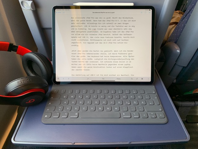
Das allererste iPad Pro war mir zu groß. Nicht der Bildschirm, aber das ganze Gerät. Dann kam das iPad Pro 9.7, in das ich mich sehr verliebte. Allerdings bin ich schnell an zwei Dingen gescheitert: iOS 10 konnte zu wenig und die Tastatur war zu eng und zu fummelig. Das Logi Create war zwar ebenfalls sehr eng aber wenigstens praktikabel. Im Ergebnis habe ich das iPad Pro vor allem wie ein normales iPad benutzt. Selbst das Software-Update auf iOS 11, das viele neue Features brachte, konnte mich nicht zurückholen. Mittlerweile hatte ich mich voll auf Surface umgestellt. Ein Upgrade auf das 10.5 iPad Pro schien mir unnötig.

Jetzt aber werden die Karten neu gemischt. Wenn ich die beiden neuen iPad Pro nebeneinander stelle, ist meine Präferenz ganz klar das große. Das Keyboard hat keine Kompromisse. Alle Tasten haben die volle Größe. Lediglich die Hintergrundbeleuchtung der Tasten könnte man vermissen. Ich schreibe diese Zeilen in iA Writer und ich fühle keine Nachteile gegenüber einem Laptop. Dabei passt die ganze Konstruktion locker auf einen Klapptisch der zweiten Klasse.

Die Umstellung auf USB-C ist für mich erstmal ein Nachteil. Für Lightning habe ich überall Kabel und Dongles, mit USB-C fange ich noch mal von vorne an. Vor allem aber habe ich erst mal zwei Kabel und Netzteile für iPhone und iPad dabei. Zu Hause stelle ich iPad Pro einfach auf mein udoq. Bin froh, dass ich so ein großes habe! Immerhin ist das Netzteil schön klein und leicht, besser als das alte iPad-Ladegeräte. Ich bin froh, dass sich Apple bei der Abwägung stark vs. schwer für die leichte Variante entschieden hat. Bei den iPhones ist das umstritten, bei den iPads sicher auch bald.

Aus dem Stand habe ich jedenfalls nun eine mobile Maschine, die unglaublich leicht und doch performant und ausdauernd ist. Texte zu schreiben dürfte dabei noch die einfachste Übung sein. Für mich allerdings eine ganz wichtige. Und ich bin froh, dass die Tastatur so gut ist.

Am Rande noch ein kleiner Schnack zum Beats Studio 3: Die Geräuschunterdrückung im ICE ist perfekt. Ich bin praktisch alleine.

07 Nov 05:10

Why I’m Writing These Particular Apps

On the Rainier Slack group, I was asked why I’m writing the app. What are my goals? What’s my exit strategy?

The below is how I replied. It’s unedited Slack-writing, so forgive me for (for one thing) suggesting that at age 65 I might not be writing code anymore. (I very much hope to be.)

Here’s the deal with Rainier (and NetNewsWire too). I’ve been obsessed with writing this app for many years. I’m 50 now, and have a good day job, and I don’t need to make any extra money. This means I can afford to make the apps I’m compelled to make. They will do good for the world, and I do have political and social goals for them.

But I don’t expect NetNewsWire to be popular like Twitter, and I don’t expect Rainier to be popular like Ruby or Python or Swift. Not even close.

I’ve worked all these decades to be able to be in the position where I have the ability and freedom to write the apps I want to write. Anyone could argue that I should be putting my skills and experience toward something more likely to be earth-shaking, and that’s fair — but I believe I can do the most good by making the apps I was born to make, rather than working at something that doesn’t excite me.

Large numbers of users doesn’t excite me. High-quality, open source Mac apps excite me. Bringing the power I enjoyed with Frontier to a new generation excites me. Bringing RSS reading back excites me.

My goal is just to be able to continue working on these apps, no matter how few or many users they have. My exit strategy… well, eventually cognitive decline will come, and I’ll write less code and do more writing about the apps. And eventually I’ll end up turning them over to someone else (or some group). But hopefully that’s 15 years from now, at least.

These are the apps I need to make. This is an emotional thing, for sure — but I’m rational enough to understand my heart and to follow it rather than to fight it.

Further reading: Love, from 2015, and Why I develop for Mac OS X from 2002.

07 Nov 05:10

On the design of the iPad Pro

by Volker Weber

5441485d55d9e5dbf1034945307ea0a8

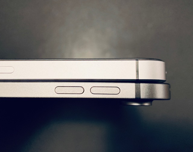
The most beautiful iPhone that Apple ever made was the iPhone 4/4S. And they refined it with a larger screen and a metal back for the 5/5S. That design lived on as the SE, but none of them had the same elegant backside.

When I saw the first pictures of the new iPad Pro I was immediately reminded of this design, and even more so when I held it in my hand. It has the same square edges and it feels very familiar.

However, this new iPad Pro is huge. And even thinner. It's thinner than any iPhone ever was. Or any iPad for that matter. Something so thin and large feels incredibly light, and after inspecting it from all sides it became apparent why it does not have a headphone jack. There simply is no space anywhere to put one. A headphone plug is way too long to push it into the enclosure without hitting either a speaker or the screen. And given that the whole device, safe for the camera is just 5.5 millimeters thin, it would only leave a single millimeter on both sides for the case and the jack itself. Yes, Apple could have made the iPad thicker, they could have made the bezels larger, but for a headphone jack? Puleeze.

Yes, the screen is brilliant, FaceID works in all directions, the keyboard folio is finally exactly like I want it, but there are two things that are not obvious: the screen is a terrible mirror since it reflects very little light and the four speakers sound amazing.

There is nothing, literally nothing, that I would change in its design. It's beautiful, it feels absolutely right, this is just amazing hardware. But I do miss the Lightning connector. I know why it's not there, but it's just physically way superior. I have a really hard time to set the iPad down on my udoq. Where a Lightning connector will center itself, you have to hit the USB-C connector exactly right, to a fraction of a millimeter.

07 Nov 05:03

The Rise of the TSP: Walled Gardens

by Gordon Price

This piece very much confirms my thesis: transportation choices will be consolidated (and restricted) by ‘Transportation Service Providers”, in the hope that one or a few will emerge dominant, following the precedent of Telecommunication Service Providers like Telus, AT&T and eventually something Amazon-like. 

From Fast Company:

By David Zipper, a fellow at the German Marshall Fund

If you’re not a techie, you may not have come across the term “walled garden” before. But it’s a critical concept these days in technology business strategy–and it has the potential to fundamentally change the ways we travel throughout cities.

In essence, a walled garden is a closed technology platform that limits the information and options available to a user.  … You can find walled gardens in products ranging from e-readers (Amazon Kindle) to social media (Facebook) to various video game consoles.
For the first time, the walled garden strategy is now being applied to urban transportation, with ride-hail giants Uber and Lyft racing to add new mobility modes to their apps.

In 2018, Uber has announced partnerships or acquisitions related to car sharing (Getaround), e-bike sharing (Jump), e-scooter share (Lime), and public transportation (Masabi). For its part, Lyft acquired public bike share operator Motivate, launched its own e-scooter share service, and has started building new integrations with public transportation into its app. The stakes are high; both companies–as well as China’s Didi Chuxing–want to evolve into walled gardens by providing trip planning and ticketing for any urban trip a commuter might desire. …
.

Many U.S. transit agencies offer apps with trip planning and ticketing functionality, but no transit app allows users to also book a trip on ride hail. It’s doubtful that Uber or Lyft would ever allow that, since they want to own the customer relationship. They would much prefer to incorporate transit ticketing within the walled gardens of an Uber or Lyft app—and they are rapidly moving in that direction (see the partnerships mentioned earlier).

If public transportation becomes one of many services available within the Uber or Lyft app, that raises a number of thorny questions. Will disintermediated public transportation agencies receive data about when and why riders purchased tickets, which can then allow them to plan better service? Will they have to pay a commission when a rider books a ticket through an Uber or Lyft app, which would reduce their already declining operating revenues?

And perhaps most importantly, will Uber or Lyft design their apps to nudge people away from public transportation and toward their ride-hail service? …

Taking a step back, do cities want mobility companies to compete on the basis of the exclusive services only available within their walled garden? What if instead all mobility options were available on trip planning and ticketing platforms, allowing a commuter to consider her options and book any service she likes? Companies like Uber or Lyft could still build services like bike share and e-scooters into their apps, but they would compete based on the user interface and core quality of their service—not the extent to which they lock particular brands or modes inside their walled garden. …

In contrast to the broad platforms envisioned by MaaS’s boosters, Uber and Lyft want to use walled gardens to become their own platforms. That may be great for them, but it could lead to a worse customer experience (i.e., more walled gardens, each with limited mobility options, rather than accessing all services at once).

Is there an alternative to the emergence of urban mobility walled gardens? Yes. Governments could require that all mobility providers make their trip planning and ticketing data available for public integration (this is a strategy that Finland is starting to test). Any company can then establish a platform that brings together multiple modes into an app or subscription service. …

Do we want urban mobility companies to compete on the basis of the quality of their service, or is it okay for them to strategically lock certain services inside (or outside) their mobility platforms?

07 Nov 05:03

The 2018 Mac Mini

by Rui Carmo

The benchmark results are interesting, and the mini would go well with an external GPU. I’m a bit curious as to the display situation, though, since dual 4K would work, but which 4K panels?


Support this site
07 Nov 05:03

The Guardian's Election Non-Coverage

by peter@rukavina.net (Peter Rukavina)

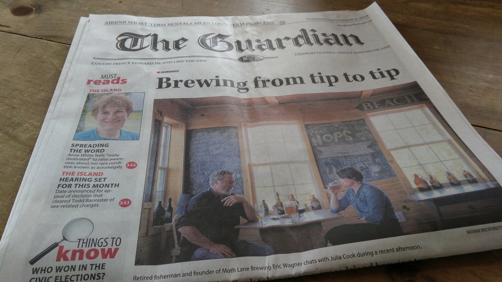
Citizens of Charlottetown woke up with a new mayor and city councillor following from yesterday’s municipal election in the city. Picking up our daily newspaper The Guardian, this morning, however, you’d never know it:

The Guardian, Page 1, November 6, 2018

Instead of election coverage, we see a delightful piece about the local brewing industry.

Why?

Because, starting this summer, The Guardian is no longer printed on Prince Edward Island.

As the CBC reported in May, the paper is printed in Halifax now, a move instituted by its new owners:

In an email statement to CBC News, SaltWire Network spokesperson Barbara Cameron said the Guardian and Journal Pioneer’s digital platforms will be the “primary venue for late-breaking news.”

“Printed newspapers are evolving and so is what we include in that medium. More and more we’ll be playing to the strength of print, which facilitates thoroughness, resonance and permanence,” she said.

That’s powerful PR, but little consolation for someone who wants to read about the election by opening a real newspaper.

Here’s how the non-news was explained on the front of the paper today:

There are new mayors in Charlottetown, Summerside and Stratford today, as well as a new council in the new municipality of Three Rivers. While print deadlines prevented results in today’s print edition of The Guardian, full coverage is online and will be in Wednesday’s paper.

By Wednesday, who will care?

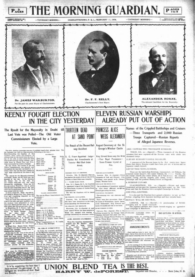
By comparison, here’s the front page of The Guardian from February 11, 1904, the morning after that year’s municipal election in the city:

The Guardian, Page 1, February 11, 1904

Those were the days.

07 Nov 04:59

Twitter Favorites: [alexlaughs] i made this bc i'm an asshole https://t.co/7YHMHeQN4Y

Alex Sujong Laughlin @alexlaughs
i made this bc i'm an asshole pic.twitter.com/7YHMHeQN4Y
07 Nov 04:50

A look at Apple’s new Mac mini: decent power in a tiny body

by Patrick O'Rourke
Mac Mini

I have admittedly never paid much attention to Apple’s Mac mini.

For starters, desktop devices don’t exactly fit into my workflow given that I’m often writing or editing photos on the go. More importantly, though, the previous version of the Mac mini was outdated when pitted against comparable, often far less expensive Windows computers.

Prior to this year, Apple hadn’t released a new version of the Mac mini since 2014. To put that in perspective, that’s the same year the company debuted the iPhone 6S/6S Plus and the first-generation Apple Watch.

That has changed now that the company has updated the Mac mini with more modern hardware, following an announcement at the company’s recent keynote. Although most likely wrote the Mac mini off as a product Apple planned to quietly discontinue, in an uncharacteristic move, the tech giant has actually listened to the dedicated and passionate user base that helped grow it into the industry influencing behemoth it is today.

Any way you look at the new Mac mini and regardless of configuration, the latest version of the tiny desktop computer is significantly more powerful than its predecessor. For instance, while the original Mac mini maxed out at 16GB of RAM, consumers can now configure the computer with up to 64GB of DDR4 RAM.

Mac Mini

Apple has also increased the speed and capacity of the diminutive desktop’s onboard storage with it switching to SSD only, and now offering storage ranging all the way up to 2TB. That said, as is typical with Apple’s products, storage comes at a premium, with the 2TB storage costing an additional $1,680 CAD on top of the cost of the Mini.

However, the most significant change with the new mini is the option to configure it with up to six cores with either an 8th-generation Intel Core i5 or i7 processor. The lower-end Intel i3 version of the Mac mini, which is the configuration I tested, is still available, as well. Graphics card wise, the Mac mini features an integrated Intel UHD Graphics 630 card.

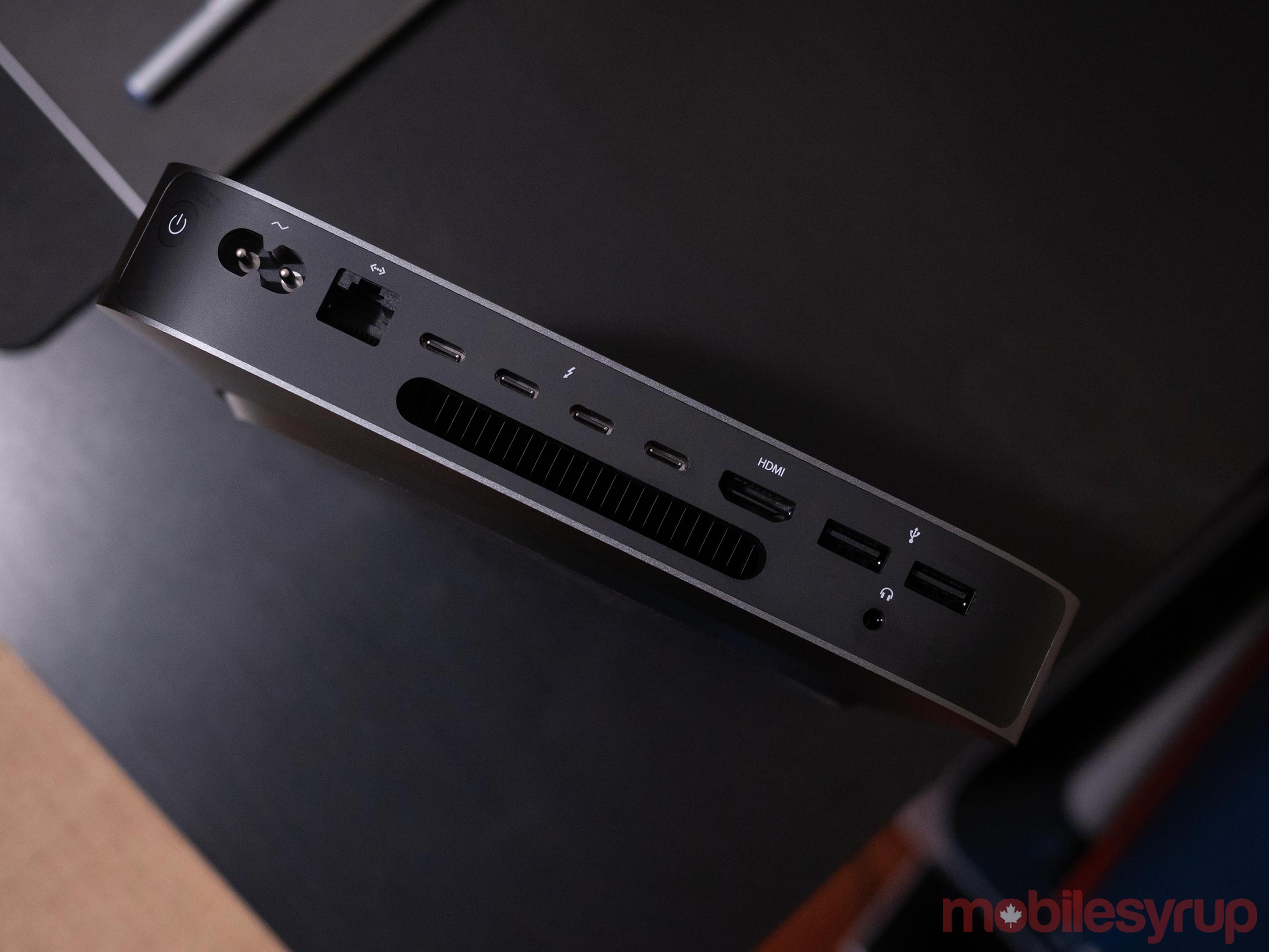
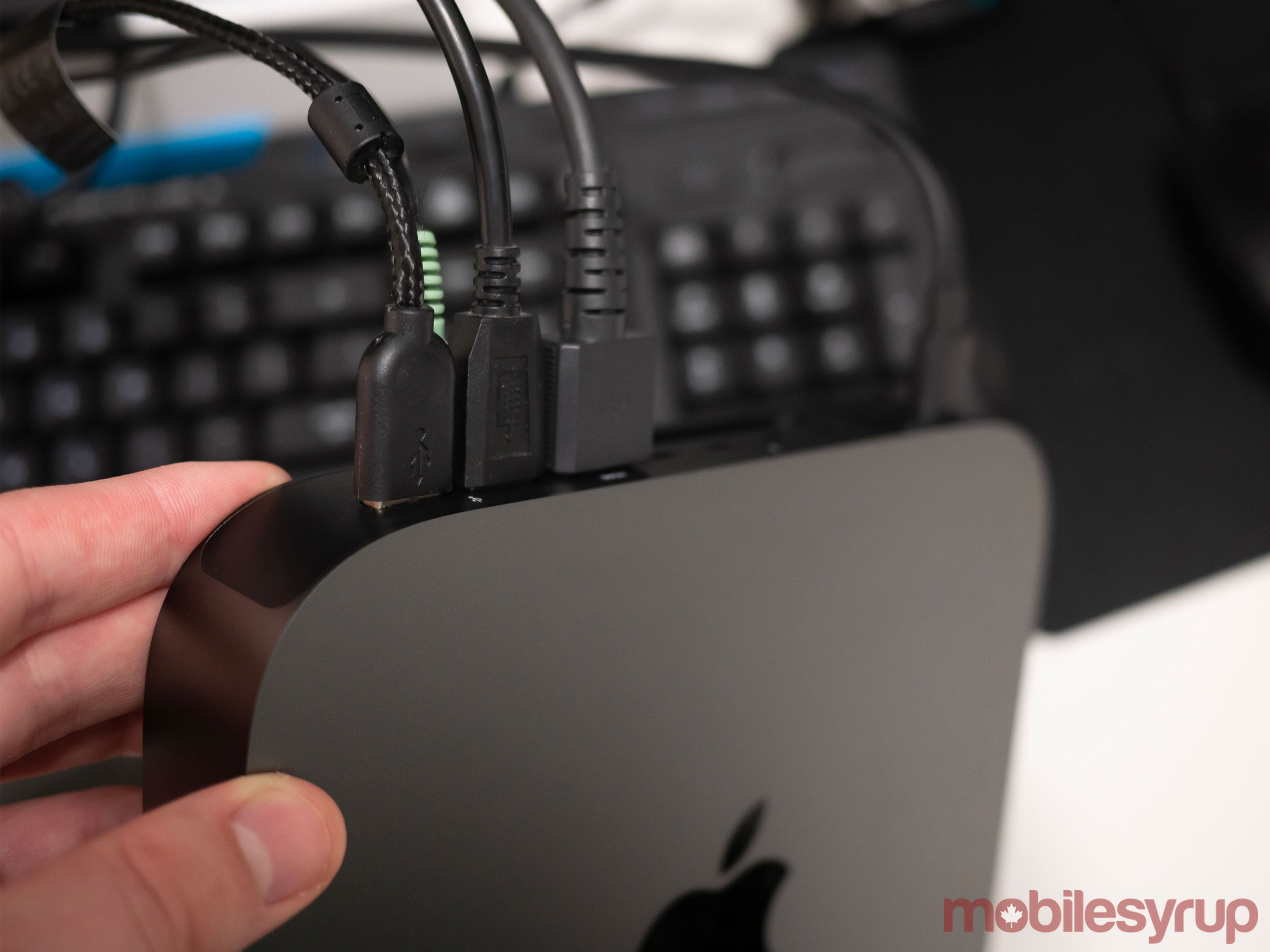
Other changes include four Thunderbolt 3 USB-C ports on the rear of the device, coupled with two USB-A plugs, making the Mac mini one of the few Apple products to feature both standard USB-A ports and USB-C — if only more Apple products adopted this strategy. The Mini also thankfully still includes a standard 3.5mm headphone jack, just like Apple’s other Mac devices, as well as an HDMI out port.

Apple says that thanks to the inclusion of Thunderbolt 3, the Mac mini is capable of powering two 4K displays simultaneously. It’s also worth noting that the Mac mini is compatible with Apple’s Blackmagic external graphics card.

Mac Mini ports

Further, the pint-sized device features a single 10 Gigabit Ethernet port and a standard power cable slot. The other notable update with the new Mac mini is Apple’s T2 security chip, which manages the device’s encrypted storage and secure boot, as well as a completely revamped cooling system.

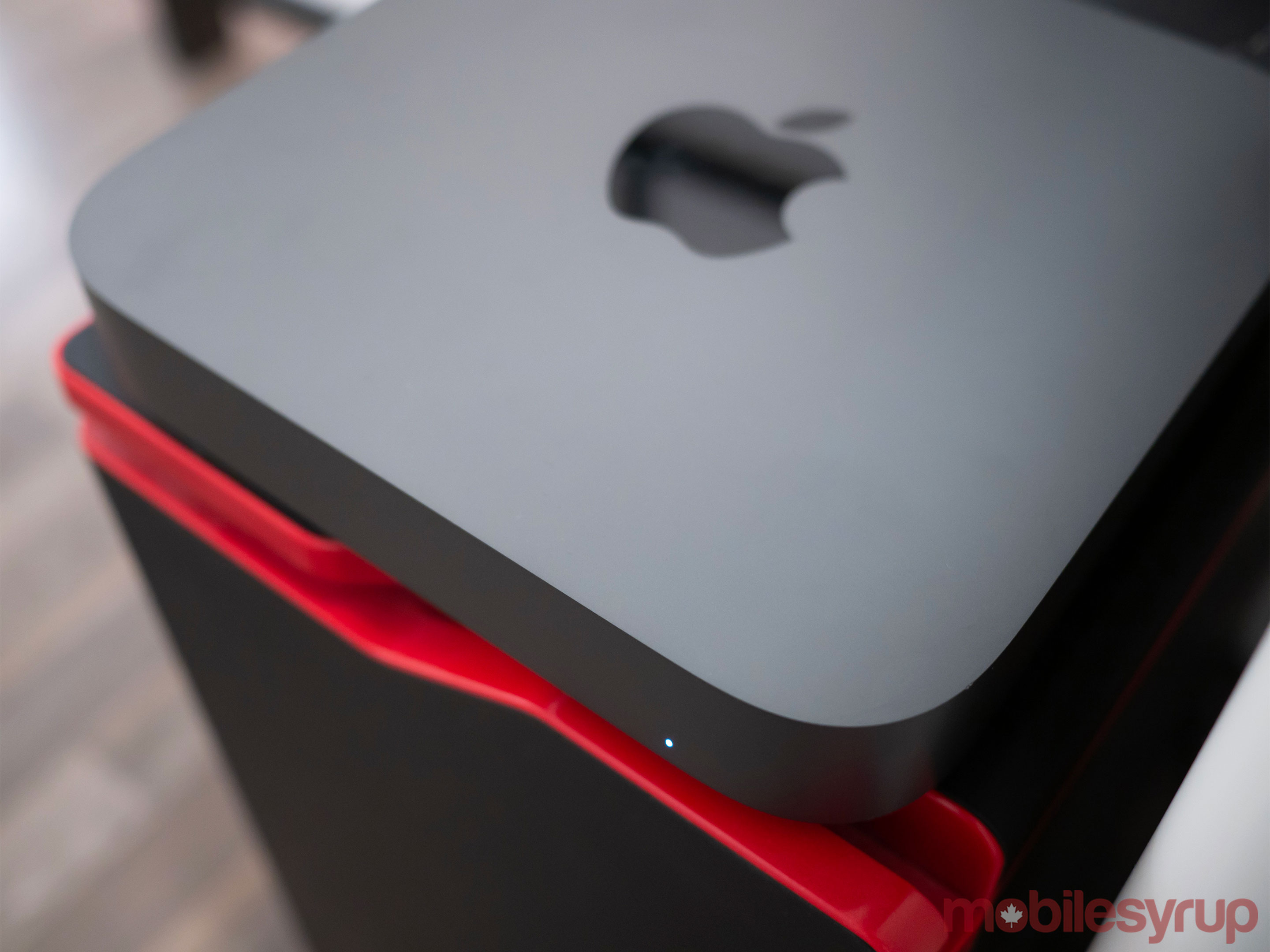
Apple has also updated the Mac mini’s colour options to include ‘Space Gray,’ moving the device’s available hues more in line with the rest of the Mac lineup. Similar to the new MacBook Air, Apple says that the new Mini is constructed of 100 percent recycled aluminum, though it still retains the sleek, compact look of its predecessor.

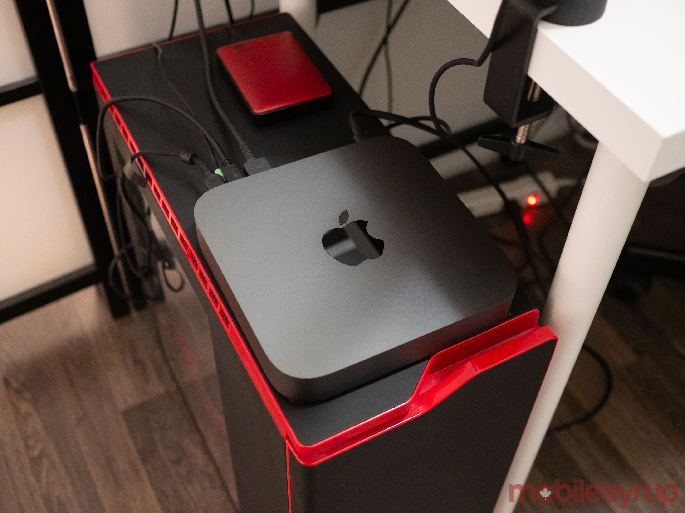
It’s also worth noting that the Mac mini doesn’t include a mouse and keyboard in the box, just like past iterations of the desktop. I placed the Mac mini review unit Apple provided MobileSyrup with on top of my rapidly aging gaming PC, then hooked up my flashy gamer with a capital ‘G,’ Razer keyboard and mouse via USB-A.

On a more serious note, the lack of an included keyboard and mouse is something to keep in mind though given that the Mac mini remains one of the few more affordable ways to enter into Apple’s Mac ecosystem.

Mac Mini side view

The Mac mini that Apple provided MobileSyrup features an Intel i3 quad-core processor with a base speed of 3.6GHz, 8GB of RAM and 128GB of PCI-E flash storage. This particular configuration comes with a price tag of $999. There are also i5 and i7 versions of the Mac mini available, with RAM options extending all the way to 64GB, coupled with 2TB of storage.

As a result, the price of the Mac mini ranges considerably, starting at $999 and going all the way up to an astounding $5,119.

Interestingly, unlike other Apple products, RAM remains slotted with the Mac mini and isn’t soldered directly to the device’s motherboard. This means that while Apple, as expected, doesn’t recommend doing so, it is possible to upgrade the Mac mini’s RAM on your own, just like with past versions of the device. Even more surprisingly, the tech giant says that doing so doesn’t void the mini’s warranty.

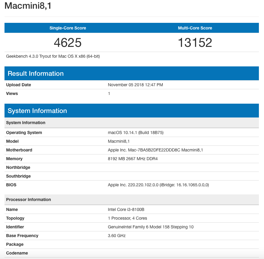
I ran a benchmark on the Mac mini with Geekbench 4, resulting in a single-core score of 4,625 and a multi-core score of 13152.

mac mini

This puts the lowest-end Mac mini configuration roughly in the same category as the 2017 13-inch MacBook Pro that features an Intel Core i7-7567U 3.5 GHz 2-core processor in terms of single-core performance, as well as in the range of the late 2013 Mac Pro that features an Intel Xeon E5-1620 V2 3.7Ghz 4-core processor and the 15-inch MacBook Pro Intel Core i7-6700HQ 2.6GHz 4-core processor when it comes to multi-core performance.

While far from benchmarks that blow the competition out of the water, given this is a roughly $1000 configuration of the mini, the results are decent.

The main question surrounding the device is how it fits into the tech giant’s lineup of devices. As Apple has done over the last few years with its various Mac computers, but perhaps even more so this time, the company is positioning the Mac mini as a tool for creators.

For instance, Apple has frequently boasted that the new Mac mini is capable of transcoding HEVC video 30 times faster than its predecessor, positioning the mini as a small but capable video editing tool.

This direction was emphasized by Apple showing off how musicians, video editors, photographers and other creatives use the Mac mini, both during the company’s recent fall hardware keynote, as well as in subsequent closed-doors briefing following the event.

Apple’s Mac mini is available for pre-order now and will go on sale on November 7th.

The post A look at Apple’s new Mac mini: decent power in a tiny body appeared first on MobileSyrup.

07 Nov 04:50

Yongnuo’s mirrorless camera runs Android and uses Canon lenses

by Bradly Shankar
Android Nougat

Camera maker Yongnuo has announced a new mirrorless camera that supports Canon’s line of lenses and, interestingly enough, Android Nougat.

In terms of actual shooting-related specs, the YN450 sports a 16-megapixel Four Thirds sensor that can shoot in RAW and in 4K video at 30 fps. An 8-megapixel selfie cam, meanwhile, is located by the display on the back.

But it’s the other specifications that make the camera decidedly more phone-like, starting with the Android OS. According to Yongnuo, the YN450 features Wi-Fi and “full Netcom 4G / 3G network data” thanks to an eight-core Qualcomm processor. Further, the camera sports 3GB RAM, 32GB of storage and a 4,000mAh battery, and an 8-megapixel selfie cam by the display on back.

It’s important to note that Yongnuo hasn’t yet revealed pricing, a release date or country availability, so it’s currently unclear if the camera is coming to Canada. The “YN450″ moniker is actually a placeholder, as Yongnuo is looking for customers to come up with a better name on Facebook.

Source: Yongnuo

The post Yongnuo’s mirrorless camera runs Android and uses Canon lenses appeared first on MobileSyrup.

07 Nov 04:50

Seven new app complications leak for Apple Watch Series 4

by Brad Bennett

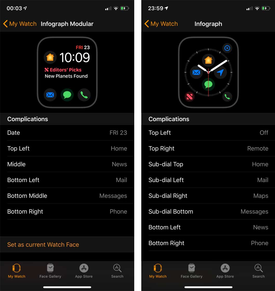
The Apple Watch was updated to watchOS 5.1.1 earlier this week, and some users who are also running the iOS 12.1.1 beta are seeing seven new app complications for the Apple Watch Series 4.

The Apple Watch Series 4 has two specific watch faces called ‘Infograph’ and ‘Infograph Modular’ that allows users to add a variety of quick-action buttons called complications.

According to 9to5Mac, the seven new complications are for ‘Home,’ ‘Mail,’ ‘Maps,’ ‘Messages,’ ‘News,’ ‘Phone’ and ‘Remote.’

All of these are first-party Apple apps that were missing complications in earlier versions of watchOS 5.

If your iPhone and Apple Watch are running Apple’s latest operating systems — iOS 12.1 and watchOS 5.1.1, respectively — then these app shortcuts will appear in the iPhone’s ‘Watch’ app and can be embedded into the Apple Watch’s Infograph faces.

While these new complications are exciting, they don’t currently work and simply appear as blank spaces on the Apple Watch.

9to5Mac’s theory is that the complications were part of the upcoming watchOS 5.1.2 beta, but somehow snuck into the fixed release of watchOS 5.1.1.

Since the complications can’t be used yet, 9to5Mac suggests that they’ll be shortcuts to open the corresponding apps on the Apple Watch.

Image source: 9to5Mac

Source: 9to5Mac

The post Seven new app complications leak for Apple Watch Series 4 appeared first on MobileSyrup.

07 Nov 04:49

Niantic’s Ingress relaunch reportedly causing crashes, broken features

by Bradly Shankar
Ingress Prime

San Francisco-based software developer Niantic has relaunched its Ingress augmented reality mobile game under the name of Ingress Prime. 

First announced in December 2017, the massive Ingress Prime overhaul adds a variety of quality-of-life upgrades, including a new UI, reworked menus and gameplay systems, one-finger map gestures and improved security and anti-cheat features.

Niantic said it developed the changes using experience gained from Pokémon Go, its second AR mobile game, as well as Apple’s ARKit and Google’s AR Core technology.

However, the relaunch hasn’t gone very smoothly, according to a variety of reports from the Ingress community.

One day after the Prime update, the Google Play Store’s Ingress page has been bombarded with negative one-star reviews, citing all kinds of issues with the new version of the game.

User Berrie bun said he was experiencing issues with the compass and navigate-by-sound features. Meanwhile, user Nathan Beasley reported compatibility errors with his Samsung Galaxy S9 and user Art Miramontes said he couldn’t log in or create a new account on his Galaxy S8+.

Several players are also noting that the new UI drains data and battery life more quickly while occasionally even leading to game crashes. “Shiny new graphics turned this into a data and battery hog,” wrote user David Collins. User Hassan Saam El-khatib, meanwhile, said the new UI is “so laggy” and “so messy,” leading his phone to crash several times while playing.

Other reports point to the landmark-based Portals disappearing and a focus on menus that are flashier to look at but harder to navigate, among other issues.

Given that these are a handful of accounts from random Android players, it’s currently unclear just how accurate or widespread these reports may be. It’s worth noting that there aren’t any similar reports about Ingress Prime issues on the App Store at the time of writing. Niantic also hasn’t yet officially commented on any potential Ingress Prime problems on its blog or social media channels.

In any case, are you playing Ingress Prime and have been experiencing any issues? Let us know in the comments.

Image credit: Niantic

Via: Android Police

The post Niantic’s Ingress relaunch reportedly causing crashes, broken features appeared first on MobileSyrup.

07 Nov 04:49

Nokia 9 render surfaces online with five rear-facing cameras

by Dean Daley

Renders of the penta-camera setup Nokia 9 have surfaced online. These factory CAD-based renders from @OnLeaks and 91mobiles reveal a new flagship from HMD Global, the owners of the Nokia brand.

The back of the phone features seven elements: five cameras, a dual LED flash and a proximity detection sensor.

According to the render, the phone sports a metal frame with a glass back panel, which means it may support wireless charging. The phone also has a USB Type-C port on the bottom with a speaker grille and microphone. There’s no headphone jack, however.

On the front, the phone sports a 5.9-inch display with QHD resolution and 18:9 aspect ratio. The phone measures in at 155 x 75 x 7.9mm.

In addition, there’s no fingerprint scanner on the front or rear, which indicates the likelihood of an in-display sensor.

Additionally, the device sports a Snapdragon 845 processor and not Qualcomm’s 2019 Snapdragon processor. According to 91mobiles, the phone will feature 8GB of RAM, 128GB of storage and a 4,150mAh battery with some sort of water and dust resistance.

With HMD Global recently acquiring the “PureView” branding from Microsoft, Nokia handsets will have both the PureView and Zeiss brands behind their camera.

Source: 91Mobiles & OnLeaks

Image Credit: 91Mobiles & OnLeaks

The post Nokia 9 render surfaces online with five rear-facing cameras appeared first on MobileSyrup.

07 Nov 04:49

Nexus 6P, 5X security updates no longer guaranteed following November 2018 OTA

by Sameer Chhabra
Nexus 6P

As of Google’s November 2018 Pixel and Nexus security updates, the Mountain View search giant is no longer guaranteeing that 2015’s Nexus 5X and 6P will continue to receive security updates.

According to Google’s Android update support page, Nexus devices were guaranteed updates for at least two years from the date they were first sold, while security updates were guaranteed for at least three years.

Google began selling the 5.7-inch Nexus 6P and the 5.2-inch Nexus 5X in September 2015, simultaneously establishing the company’s Android update policy.

True to its word, Google hasn’t issued Android 9 Pie updates to either the Nexus 6P or 5X. The latest version update for both phones was Android 8.1 Oreo.

It’s worth noting that Google hasn’t definitely said that it won’t issue any additional security updates for its 2015 flagship smartphones, simply that “we can’t guarantee support.”

Still, with Google having eliminated its Nexus program with the debut of the Google Pixel and Pixel XL phones in 2016, anyone with a 2015 Nexus device shouldn’t expect any additional updates.

Good night sweet Nexus, and flights of angels sing thee to thy rest.

Source: Android Police

The post Nexus 6P, 5X security updates no longer guaranteed following November 2018 OTA appeared first on MobileSyrup.

07 Nov 04:49

Google Canada manager hopes global walkouts will become ‘watermark’ for tech industry

by Bradly Shankar
Google

Google Canada country manager Sabrina Geremia says she shares the frustration of the thousands of workers who recently walked out of Google offices around the world to protest the company’s handling of sexual mistreatment.

In Canada, there were dozens of employees who walked out in protest at Google locations in Toronto, Montreal and Waterloo.

The walkout came in the wake of a New York Times story that detailed how Google quietly paid Android creator Andy Rubin $90 million to leave the company following sexual misconduct allegations. Google determined the claims were credible and paid Rubin off without making any of these dealings public.

As a result, Google employees began protesting sexual misconduct, lack of transparency and a non-inclusive workplace culture.

Now, at a lunch hosted by Toronto’s Canadian Club, Geremia said the walkout marks a “difficult episode” but hopes it will become a “watermark” for the tech industry. Specifically, Geremia says Google has cracked down harder on inappropriate behaviour over the past few years, adding that the issue is a major concern to CEO Sundar Pichai. Pichai recently said he was looking to collect feedback from workers on how to better handle sexual misconduct issues.

Via: BNN Bloomberg

The post Google Canada manager hopes global walkouts will become ‘watermark’ for tech industry appeared first on MobileSyrup.