The new iPad Pro has ignited conversations about the future of computing and new possibilities for creative work. Paired with a second-generation Apple Pencil, the hardware unlocks potential that has driven many professionals to re-evaluate how iPads best fit in their lives. My own experience with the new iPad Pro has been a journey of discovery. To expand my horizons and help others get more out of their devices, I asked the creative professional community to share their own iPad workflows.
From digital illustration to managing a business, the vast range of ways people are working on iPads proves there’s no one right way or wrong way to use them. Some have embraced iOS as their platform of choice for every task. Some use a Mac and an iPad in concert to create powerful workflows that highlight the capabilities of each device. Others are developing entirely new ways of working that simply couldn’t exist before.
Fantastic idea by Steeber, and a collection of great examples of all kinds of people using the iPad for all kinds of professional work. Another reminder that we – as tech press – can only cover a fraction of the tasks an iPad is able to accomplish.
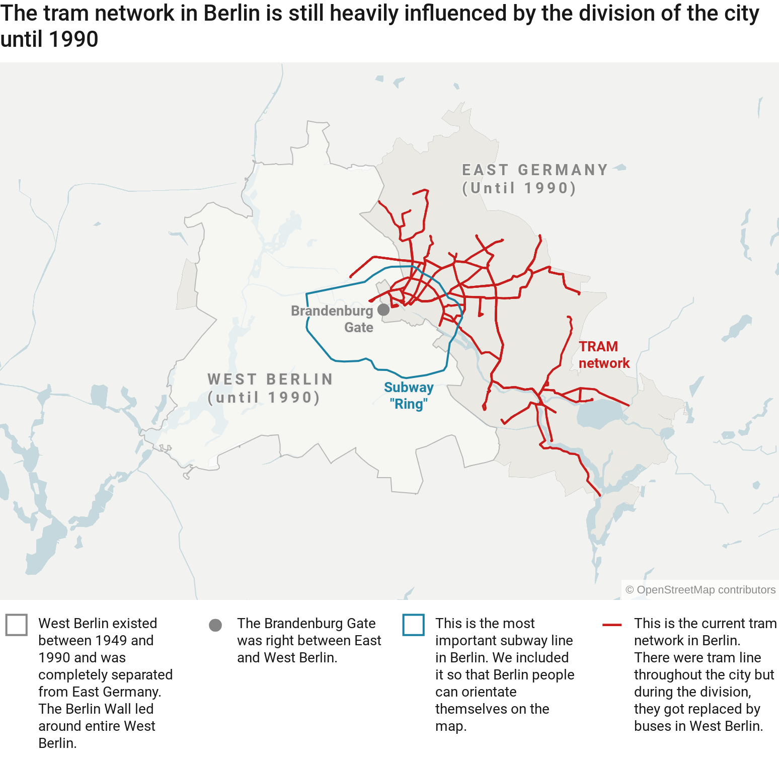
Today, we launched a few big features for our locator maps. The most important addition: You can now import areas & lines. Which basically means you can do everything. Everything! Like importing the historical Berlin wall from this Github Gist & the Tram lines from OpenStreetMap to show the following:
Berlin has a great subway & bus network – but at least in some parts of the city, it also has a tram network. As you can see on the map above, the 22 tram lines only exist in former East Berlin, with two small exceptions. One might think that these tram lines were all built during GDR times between 1949 and 1990. And that West Berlin just never bothered constructing a tram network. But the opposite is the case:
There were already 93 tram lines by 1929, in both East and West Berlin. After the Second World War, the West Berlin administration decided that trams are outdated and replaced them with subway lines and busses. East Berlin kept them, and they still exist to this date. (As someone who uses them multiple times a week, I’m really happy about that.)
To learn more how to import areas (like the Berlin wall) or lines (like the tram network) to Datawrapper locator maps, have a look at this Academy article: “How to import area & line markers”. Also, definitely check out that great fire camp map Gregor created for the announcement blog post. And here’s another announcement: Starting next week, we’ll look at some of the best charts that Datawrapper users have created during 2018. Very excited for that. See you then!
Many researchers who study human behavior on the
Internet will point out that calls to "just delete
Facebook" are unrealistic for many users. A lot of
people depend on the company for family connections,
health-related support groups, or even employment.
Which, of course, should make deleting Facebook an
easy win from an economic signaling point of view. If
you can credibly stay off Facebook, you're signaling
that you have the skills, wealth, health, and
social capital not to need it. What could be better?
Why aren't more people signaling their fitness through
conspicuous lack of Facebook dependence? Two reasons.
If you delete your account, it's too easy for others to make fake accounts imitating you, so it looks like you're on there anyway.
The decision to #deleteFacebook is easily reversible. You could easily come sneaking back.
So the thing to do if you want to get signaling power
out of quitting Facebook is to not just delete your
account, but do two things.
keep your account live so that it keeps your name "squatted on" in Facebook-space.
take a credible action to lock yourself out (that is in compliance with the Facebook ToS, of course).
How about this? Get a "burner" SIM, make that the
one phone number for your account, then let me hang
on to the SIM for you. I'll periodically post a list
of everyone whose Facebook account is associated
with a SIM I hold, but I won't be able to log in.
I'll charge a monthly storage fee to keep the SIM
for you, but it only comes due when you reclaim it.
I worry we’ve gone too far towards trying to build a sense of community instead of satisfying the practical need.
This was a big point from The Indispensable Community. A lot of organizations are trying to build a strong sense of community when they shouldn’t be.
Fostering a strong sense of community works when the topic is a strong part of your members’ identity.
You probably don’t feel a strong sense of community with people who use the same knife sharpener, paracetamol, or brand of notepad as you do.
But you might feel a sense of community with people who share the same occupations, circumstances or have the same passions.
If you’re struggling to get people to open up, share what they’re up to in their lives, and participate in off-topic discussions, it’s not because your tactics are wrong, it’s more likely the topic isn’t a major part of someone’s identity.
You can either refine the topic to ensure it personifies your target audience’s identity or, better, focus on a more personal (and more practical) need.
That is usually information (typically getting answers to questions), but it can also mean getting benefits from answering questions (feeling a sense of influence and access) or building a reputation that leads to other work opportunities.
If your sense of community tactics aren’t working, focus on more immediate, practical, benefits.
This article describes the failings of an autograding system in use in a computing science class in Berkeley. The use of autograders in computer sciences is a natural development, as programs can be tested by debuggers and efficiency algorithms to determine not only whether they run at all, but also how well they run. This article records what happens when they fail, but it's more useful reading when looked at from the context of what should happen when they run successfully (which is what they usually do).
Damon bought this demo Sportif-style Pass Hunter, but he wasn't too keen on the drop bars. He liked the SRAM groupset, Facetted Fenders, Constructeur Rack, and gear-range, but the current cockpit was a no-go. So we modified it a bit to create this comfortable, upright sport-oriented townie to explore DC and all the trails the greater area has to offer.
While the Tourist Bars are a bit narrow by today's fashion, they are supremely comfortable and make sneaking by traffic in town bearable and downright pleasant.
The range of gears on this build are quite generous. The crankset is our 50.4 with 46/30T rings and the cassette is a SRAM 11speed 11-32. The rear dangler is a SRAM Force 22 which has a surprisingly strong spring which does a good job keeping chain tension over bumps, and the front gorilla is a SRAM Rival. Shifting is accomplished courtesy of SRAM's S-700 11sp offering.
The Rear Constructeur Rack is neatly mounted to the Rear Facetted Fender and the front has an extra stay to keep it secure when he goes on the C&O Canal. You may ask yourself, "Self...why is the rack not mounted to the fender?" Well, when we originally offered the bike for sale, the extra stay was already mounted. I didn't want to remove the stay and leave an unsightly hole in the fender, so I mounted the Randonneur Front Rack to the fork so that it could be removed or utilized without the hassle of unbolting the fender stay. It's like a fresh Beaujolais Nouveau wine. Don't take it too seriously or think about it too hard, just enjoy it for what it is.
Full-coverage, 45mm Facetted Fenders paired with a set of Front and Rear Mudflaps keep him, his drivetrain, and his riding friends clean from road grime and dirt. And a classic Fender Reflector keeps him visible - though it isn't a replacement for a blinkie or even better, dynamo lightset. We may or may not be working on a fender mounted dynamo. Tires are Fairweather Traveler in 32mm. Very low rolling resistance, lightweight, and stylish.
Finally, the perch is our Smooth Touring Saddle and Dajia 1b Seatpost. This is my favorite saddle. It's immediately comfortable from the get-go, lightweight, durable, and has nearly the same dimensions are our Model 3 Leather offering. Oh and it has bag loops! If you have your heart set on a leather saddle, get one now. We aren't getting more after they are gone.
All together, this makes for one super cool ride. It's lightweight, comfortable, and a bit performance oriented, and that's why I'm dubbing this one a Sportie Townie. Can't wait to see it around town, Damon!
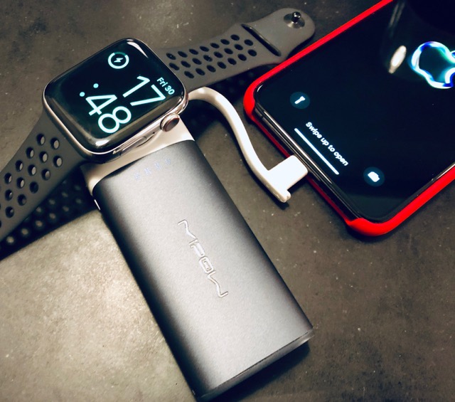
Oh, was für ein schönes und wertvolles Geschenk! Heute Abend kam ganz überraschend der Amazon-Lieferservice mit einer MiPow Apple Watch Power Bank. Das war eins der ganz wenigen technischen Geräte, die ich noch nicht habe. Sowas ist nur ganz schwierig zu finden. :-)
6000 mAh reichen aus, um selbst das iPhone XS Max einmal und die Apple Watch mehrfach zu laden. Dazu ist alles eingebaut, sowohl das Lightning-Kabel als auch der Induktivlader für die Apple Watch. Beide Geräte können gleichzeitig geladen werden und man braucht lediglich das mitgelieferte USB-Kabel, um den Akku über Nacht mit dem iPhone-Lader wieder aufzufüllen. Noch schöner wäre statt MicroUSB natürlich Lightning oder USB-C, aber dieses Kabel kann man zur Not auch problemlos ausleihen, wenn man es mal vergessen hat.
Let’s bring it forward, and begin again with the latest post from one of our great commenters, Ron van der Eerden. (For those who were part of the comments stream, feel free to repost, but try to add something more to the discussion.)
I doubt duplexes will be very attractive to developers, that being “big bad developers”. A few very small developers may take advantage. But for a small developer it’s a big risk and big money for what would still be an expensive product. I’m certain the outgoing council knew this would be a fairly inconsequential move with few repercussions and unworthy of the massive consultation some would have preferred. It’s more symbolic. A baby first step.
Basement suites in old houses were always an afterthought with abysmal floor plans and wasted space. Often with low ceilings, even lower under ducts and beams, freezing cold floor slabs, terrible leaky windows, drafty, dark and subject to the landlord needing entry for mechanical system maintenance and repair. In new duplexes they would be planned from the beginning and avoid all of those shortcomings. You’d fit more usable space in a smaller footprint. Where once you had two units you can have four. It wouldn’t go from three to two because you can’t have a laneway house if you want a duplex.
Yet.
I’m sure that’s coming. So ultimately you’ll be able to have five units where once there might have only been one. This strategy is all in service to those many people who just can’t let go of the idea of a neighbourhood of houses. The feel of the street would be largely unchanged. It’s not the answer. It’s an answer, one that might play out here and there across the city maybe gaining some momentum once laneways are allowed.
To get the density we should be aiming for around transit hubs and stations we need to call in the big bad developers.
Get excited, Loopback users! We’re now shipping Loopback 2.0, a major upgrade to our popular audio routing utility. The success of the first release of Loopback gave us the chance to go back to the drawing board for version two. We focused on making the app both more powerful and more accessible, with an intuitive wire-based interface that better illustrates how your audio will flow.
Loopback’s easy to understand wire-based routing
If you’re already familiar with Loopback, you can jump over to our “What’s New in Loopback 2” web page to read all about the new features. This upgrade is a fantastic leap forward.
New to Loopback?
Loopback gives you control over how audio flows between apps and devices on your Mac. Since it first shipped in early 2016, Loopback has gained a substantial audience of podcasters, screencasters, audio techs, and more. Loopback’s power is great for a wide variety of uses, including:
Playing Audio to All Podcast Guests
When a physical mic is coupled with a music player like iTunes or a soundboard app like Farrago, guests on Skype can hear your voice, as well sound effects and musical add-ons.
Creating Top-Notch Screencasts
Screen recording tools grab either microphone audio or all system audio, and neither option is ideal. With Loopback, get just the audio you need by recording only the mic and the application being filmed.
Pairing It With Audio Hijack
Audio Hijack is best known for letting you record any audio, but it can also apply effects to audio, without recording. When Audio Hijack and Loopback join forces, you can do things like putting a compressor on your microphone before you send it to Skype, and more.
Combining Multiple Hardware Devices
Audio apps including GarageBand, Logic, and Ableton Live only record from a single audio device at a time. Loopback can merge multiple physical input devices into a single virtual device for easy recording.
Using Pass-Thru Devices
Loopback’s virtual audio devices also make it easy to pass audio directly from one application to another. A zero-configuration “Pass-Thru device” can be used as both an audio input and an audio output throughout the system to pipe audio directly between applications.
And So Much More
Podcasters, live streamers, and audio techs swear by Loopback, and now it’s better than ever. Virtual audio devices give you control over how audio flows on your Mac, making it possible to do incredible things.
Try Loopback 2 Right Now
For the power of a high-end studio mixing board in a much simpler package, look no further than Loopback.
Loopback 2 works on MacOS 10.11 and higher, and the links below will get you started. Download our free, fully-functional trial to explore all that Loopback offers, then purchase through our online store for $99.
If you previously purchased Loopback 1, you’re eligible to upgrade to version 2 for just $49. Download the new version to try it out, then click to purchase your discounted upgrade to version 2.
Folks who purchased Loopback on or after September 1st, 2018 will receive a complimentary upgrade to Loopback 2. Full details have been sent via email, so please check your inbox.
I’ve discussed and linked to articles about the advantages of splitting patches into small pieces to the point that I don’t feel the need to reiterate it here. This is a common approach at Mozilla, especially (but not just) in Firefox engineering, something the Engineering Workflow group is always keeping in mind when planning changes and improvements to tools and processes.
Many Mozilla engineers have a particular approach to working with small diffs, something, I’ve realized over time, that seems to be pretty uncommon in the industry: the stacking of commits together in a logical series that solves a particular problem or implements a specific feature.
Six years after the adoption of Transportation 2040 by city council, work continues to expand and connect the downtown Vancouver cycling network.
Up next are upgrades to an extension of the Richards Street protected bike lane, from Cordova to Pacific, to provide better access to downtown, and of course the commensurate infrastructure for the safety and comfort for people of all ages and abilities. (Can you say triple-yay?)
An open house is happening next week where the public can ask questions and provide feedback on the proposed design:
Thursday, December 6 4pm to 8pm
Vancouver Public Library, Central Branch
Promenade Trade Fair (North End)
350 W Georgia Street
The stranger and more complex story of change in my computing life is the decision to move from an iPad Pro and a Macbook to a Chromebook. My computing is complicated and I wear too many hats but what I’m talking about here is my day-to-day main portable computing device.
In late 2015, I decided to go all-in on the iPad Pro. That actually worked pretty well for a while and, for all of 2016, I didn’t have a Mac at home and relied solely on my iPad Pro for daily work. I made a lot of progress with that setup and was even able to launch a successful podcast which has almost entirely been recorded, edited and published using iOS.
My work was evolving and so was iOS. In late 2017, I was appointed Head Teacher of the school where I work, taking up the post in August 2018. That was a more significant shift in my workloads than I had perhaps anticipated - not just in the volume of work but also the type of work that my computer was required to support.
At the same time, iOS 11 had shipped and it simply broke my relationship with iOS on the iPad. There was nothing about its new multitasking system that I liked and little that I could even tolerate. From its unhelpful app-pairing feature to its devaluation of the Home Screen and overloading of the Dock, I just could not get comfortable with it at all. Then iOS 12 came along and made it even worse in some ways with its aping of iPhone X gestures and ever-finer distinctions between a little swipe up to display the dock and an ever so slightly longer swipe up to show multitasking. Touch just isn’t built for such fine distinctions.
My school is known as an “iPad school” - we were the first whole-school 1:1 iPad deployment in the world - but we have been a “Google school” even longer. We have been on what is now GSuite since it was called “Google Apps for Your Domain”. The first thing I ever did when I started at the school was to sign up for GAFYD and we have been on it ever since.
When Google Drive launched in 2012, we started making more use of it and Google Docs. In the six years since, we have really gone all-in on these apps. I was never a huge fan of web-based software but we started with one particular project where we cut so much time and effort out of the process that I couldn’t help but get interested.
That project was the process of writing report cards. Previously, every teacher used to produce and print a Pages document for their pupils. That pile of documents would get delivered to the secretary who was then responsible for dividing them up and assembling report cards from them. This process was time-consuming and hugely error prone. We replaced that with a process where I create a template file in Google Drive for each pupil and then teachers write their reports in a single shared file per pupil and then we print them all at the end. That was when I got interested in Google Docs in a big way.
Fast forward to 2018 and virtually all of the work I do at school is now in Google Docs. I don’t think I’ve created anything new outside Google Docs for a couple of years now. As I was preparing to take over as Head Teacher, more and more of my work became about higher levels of complexity, involving more data sources and requiring larger work spaces than ever before. Big spreadsheets to build timetables, school budgets, pupil information and the like.
If I can refer back to an article I wrote in 2013 called “Beyond Consumption vs Creation”, which I still think is the most coherent thing I’ve written on the topic, I observe that mainly what happened my work took me outside that boundary of complexity and duration that the iPad can support.
At the same time, Chromebooks have been on the rise. They are killing Apple in US K-12 education but it’s still not clear exactly what impact they are having on the wider market if any. It does seem obvious to me, though, that Google knows exactly where their strength lies and it actually has very little to do with ChromeOS itself.
My school runs on GSuite but we usually access it through iPads. What I have found, though, is that the GSuite iOS apps are not very good. They lack important (and sometimes basic) functionality found in the web version of GSuite and they take a long time to adopt iOS platform features.
The point, though, is that GSuite is so powerful and so much at the heart of everything I do at school that if you asked me to decide between giving up GSuite and giving up iPad, I’m afraid iPad has to go. It is for this reason that I have been vocally advocating that Apple make iOS Safari as close to a “desktop class” browser as it can be. I don’t know the technical reasons why GSuite can’t be accessed in Safari on iOS. I don’t know if the browser has limitations that mean the apps genuinely can’t run in it, or whether they could but Google just chooses not to allow it.
I’m entirely willing to believe that this isn’t Apple’s fault. That doesn’t mean it’s not their problem. Lack of feature-complete access to GSuite is, I believe, as serious a risk to Apple in K-12 as the potential lack of Photoshop and Office on Mac OS X was to its role in business back in the early 2000s.
None of this is to say that iPad and iOS has suddenly become a bad platform. It has not - although I could make a strong case that every change made to multitasking in iOS 11 worsened the experience in every way. iPad is still a good platform for the things it was good at back in 2015/16 when I was using it full time. What has really changed more than anything are my own personal computing needs and the strength of the competition.
iOS has a particular software lack in a particular sector. It just so happens that I work in that sector and I work extensively with deep features of that suite of software that iOS lacks.
We might fairly ask why Apple has chosen not to compete with GSuite. It has, from time to time and piece by piece, but in no way is it a realistic proposition for a school heavily invested in GSuite to consider switching to iCloud. The concept simply doesn’t make sense. It’s not that Apple’s equivalent features are better or worse; it’s that in many cases they simply don’t exist. There are no shared folders in iCloud Drive, no organisational units, precious little control over iCloud feature availability, no auditing or security tools. Collaboration tools do exist in iWork apps but the workflow is ad-hoc and on a per-document basis. There’s nothing like Google Drive’s Team Drives feature. There are no fine-grained controls over spreadsheet editing. If we were to take the top 20 daily-actively-used features of GSuite, I don’t know if Apple’s cloud infrastructure has equivalents for almost any of them.
So, you see, my point is not that the iPad is a bad computer or that iOS is a bad operating system. Neither of these things are true. I do have a question, though, about what Apple thinks people should be buying from their product line.
Notice that the premise of this article is how I came to switch from a 12.9” iPad Pro and a 2015 MacBook to a Chromebook. It honestly seems to me that Apple might seriously expect people to own more than one £1000+ computing device just to get the benefits of both a laptop and a touch screen. Macs can do some things that an iPad can’t do - like access the full GSuite - and an iPad can do some things that a Mac can’t do. Should people really have to buy two computers from Apple to get the best of both worlds?
The Google Pixelbook I have been using seems to do a much more balanced job of providing laptop features and tablet features in one coherent device. It is virtually identical to the new 12.9” iPad Pro in terms of physical dimensions and weight. It opens like a traditional laptop with a very nice keyboard and trackpad but then folds back to become a tablet when required. It makes you wonder what might have been if Apple hadn’t been so determined to keep the Unibody MacBook Pro form factor essentially inviolate for a decade. The Google Pixelbook isn’t cheap in Chromebook terms but it’s significantly cheaper than the iPad Pro/MacBook dyad that Apple wants to sell you.
Is the Google Pixelbook a genuinely great tablet computer? No, certainly not. It’s a very good laptop that does a passable job of some kinds of tablet tasks. In tablet mode, it’s great for Netflix, YouTube, casual web browsing and that sort of thing. Would I put the Pixelbook into tablet mode to go deep on a Google Sheets document? Of course not. Having said that, I reflect on how often I used my iPad Pro in pure “tablet mode” too - it wasn’t all that often either. It seems that as laptops get more tablet-y, tablets are getting more like laptops. The Pixelbook isn’t a better laptop than a MacBook, and it isn’t a better tablet than an iPad, but this one device satisfies 98% of my computing needs in a single package. It also costs less than half of what I would need to buy from Apple to get the same set of capabilities.
As for doing “real work” on the Chromebook, I’ve been in that world for some time already. That part wasn’t even a concern for me. I had proven all that some time ago - my Macbook literally had no non-default software on it except Chrome. It effectively was a Chromebook in all but name. Sure, the Chromebook doesn’t run all the software in the world, but it runs the software that I actually need and use every day absolutely flawlessly.
One other thing that hurts to say but I believe is true is this: ChromeOS is getting better faster than iOS on iPad. Apple seems now to be on a two-year cadence for meaningful iPad-related software updates and, honestly, that’s just not fast enough. ChromeOS is moving very quickly. Probably, iOS is ahead for now but I hate waiting on an “iPad year” WWDC and then hoping that something will happen for the OS features I happen to care about. There are some parts of iOS that have lain fallow for years now - Mail, Calendar, Safari - that need some serious investment. Third party apps might fill some of the gaps but iOS doesn’t let them be full replacements for the system apps. Honestly, I'm bored waiting for progress on some of these platform basics that have been on iPad users' wish lists for literally half a decade or more now.
So where do we go next? On the one hand, we have Apple with a wildly successful phone product and a tablet product sharing the same basic OS. They also have a legacy desktop platform that's adopting mobile app APIs to fill functionality gaps. That said, after nearly a decade of iOS on iPad, we seem to still be staggering our way along the road to a full-power iOS. Every single year, we iPad users talk amongst ourselves about how “next WWDC” will fix everything - many people who have dropped laptop money on the 3rd generation iPad Pro are really buying it on more of a hope, even, than a promise that iOS 13 will make it sing.
Google, on the other hand, has a numerically successful phone platform that still has some quality challenges and an all-but-abandoned tablet strategy. They have a moderately up-and-coming hybrid laptop/tablet platform in ChromeOS that is seeing significant work and investment and is shipping significant feature updates on a regular basis. (Interestingly, said platform is also adopting mobile APIs/runtimes to fill functionality gaps.) Google also have a genuinely wonderful collaboration platform in GSuite that has become the most important software in my life bar none. Clearly, it’s become more important to me than any software that Apple makes.
Ironically, the web browser was what opened the door for the first Mac revival in the original iMac era. The lack of a fully-capable web browser is what’s closing the door on the iPad for me.
If you live in British Columbia, Canada, add your voice to ask the BC Government to STOP taxing ebikes. Ebikes make cycling possible for seniors and many other people, and the BC government is making it harder for people to buy these environmentally friendly transport vehicles. It needs to STOP.
Challenging those faux-profound bits of knowledge so often taken for granted I still remember the first debate I ever did. It was in a high school classroom…
If people (and, by some definitions, many or even most people) are chart illiterates, then we may feel tempted to write those groups off. We may prioritize the design of visualizations to help the creators of, say, machine learning models, from whom we can presume a sufficient level of visual and statistical literacy, rather than the populations who may be impacted by these models (sometimes unjustly). If what we mean by “visualization literacy” is narrow enough, or rare enough, then we’re already setting ourselves mental upper bounds for the number of people we’ll impact with our work.
This was an interesting perspective. I’m used to listening to or reading from people on the presentation side of visualization, in which case it’s your job to raise literacy. You should imagine what others are thinking and explain any points of possible confusion with annotation and intuitive visual encodings.
Don’t ever use “people won’t understand it” as a crutch.
An attempt at glass blowing left me thinking about how design properties can remain hidden during manufacture yet go on to define the experience of the finished product.
Encouraged by the visit of a cousin with an interest in craft, I found myself at Salt Glass Studios, located in a picturesque barn in the even more pictuersque village of Burnham Thorpe (birthplace of Admiral Horatio Nelson, where his father was the rector of the local church).
Founded by Fiona Wilkes and Max Lamb, Salt Glass Studios runs a variety of courses as well as taking private commissions. Max was our tutor for the day and he explained the process with the detail and humour necessary to illuminate it for our novice interests.
Glass leaves demonstrating various pigment colours
Our goal was to blow a glass bauble, the surface of which could be imbued with colour and opacity by rolling it in pigments at various stages of its creation.
He showed us samples of colour within finished glass, as well as the pigment in its raw form. The difference was noticeable, reminding me how important it is to build up the craftperson’s ‘sixth sense’ – that rare ability to project knowledge of a raw material – be it computer code or glass pigment – into a minds-eye vision of the polished output.
The colour actually disappears entirely during the fierce, 1000 degree firings which keep the glass workable during the blowing process. Its final shade remains a mystery, even after the bauble has cooled enough to show its finished form. Ultimately it will define the visual experience of the object, but it only becomes a known quantity at the very end.
Part of MEX Inspirations, an ongoing series exploring tangents and their relationship to better experience design.
Toronto-based YouTuber David Lee has shared a new video in which he takes a look at the upcoming Galaxy S10.
The video includes concept footage of the unreleased smartphone and its ‘Infinity-O’ display technology. Like the Galaxy A8s we’ve seen leak in recent weeks, the Galaxy S10 is rumoured to feature a circular punchout that’s designed to accommodate the phone’s front-facing camera. As Lee notes, the punchout — particularly when used in conjunction with YouTube’s zoom-to-fill functionality, which is designed to accommodate smartphones that feature displays with 18:9 and similar screen aspect ratios — looks cleaner than a traditional notch.
What do you think of Samsung’s new Infinity-O display technology? Is it an improvement over notched display cutouts? Let us know in the comment section.
According to Dave Limp, senior vice president of Amazon Devices, Echo users will be able to ask Alexa, the device’s built-in voice assistant, to play their favorite songs, artists, albums, playlists created by Apple’s curators, as well as radio stations available on the service. Beats 1, Apple Music’s own live radio station featuring artist interviews and daily programs, will also be accessible via the Amazon Echo, the company said. The integration will be enabled just like any other skill on the Amazon Echo by connecting your Apple Music account to Amazon’s device using the Alexa app.
“Music is one of the most popular features on Alexa—since we launched Alexa four years ago, customers are listening to more music in their homes than ever before,” said Dave Limp, senior vice president, Amazon Devices. “We are committed to offering great music providers to our customers and since launching the Music Skill API to developers just last month, we’ve expanded the music selection on Alexa to include even more top tier services. We’re thrilled to bring Apple Music – one of the most popular music services in the US – to Echo customers this holiday.”
While Apple Music has long been available on Android in addition to iOS and macOS (and on Sonos speakers in addition to HomePod), the upcoming Amazon Echo integration marks a major shift as Apple Music has never been able to integrate with competing smart speakers through third-party voice assistants. It’ll be interesting to see if the Amazon Echo integration will be more limited than the HomePod’s native Apple Music access, which we’ll make sure to test once Apple Music’s Alexa skill goes live next month.
Support MacStories Directly
Club MacStories offers exclusive access to extra MacStories content, delivered every week; it's also a way to support us directly.
Club MacStories will help you discover the best apps for your devices and get the most out of your iPhone, iPad, and Mac. Plus, it's made in Italy.
Music has always been one of Alexas most popular features and today were excited to announce that Apple Music will be available on Echo devices beginning the week of December 17.
Since it gets integrated into Alexa, that could mean Apple Music could be controllable through Alexa on Sonos. I just hope they make it available worldwide.
Starwood Hotels confirms it has been hit by another data breach affecting 500 million guests.
Marriott, the hotel’s parent company, says on November 20th, 2018 that guest information was stolen by an “unauthorized party” from Starwood’s guest reservation database on November 19th, 2018.
Engadget reports that about 327 million out of the 500 had a combination of name, mailing address, phone number, email address, passport number, Starwood Preferred Guest account information, date of birth, gender, arrival and departure information, reservation date, and communication preference accessed.
Marriott said that an unknown number included encrypted credit card data.
“We are working hard to ensure our guests have answers to questions about their personal information, with a dedicated website and call center,” the company said in a statement to Engadget on November 30, 2018. “We will also continue to support the efforts of law enforcement and to work with leading security experts to improve.” It added that it is “phasing out” Starwood systems as part of its ongoing security work.
This is Starwood’s third data breach incident since 2015.
Most people asked about their new puppy begin with a sweet story. Louis Seguin begins his differently:
"We were the unlucky ones," he said Thursday.
Seguin and his partner were out with their dogs — Shasta and Chinook — for an afternoon walk near their home in Winlaw, B.C., on Friday when Shasta ran off the forest service road.
Shasta, right, and Seguin's second family dog, Chinook, on the left. (Louis Seguin)
The couple heard a "scream" and thought the 10-month-old puppy had been attacked by a cougar. She'd actually been caught in a trap, lawfully set on Crown land about six metres from the trail.
Shasta died in her owners' arms.
"We tried to get her out, but we didn't know what we were doing," Seguin said. "It was too hard."
The couple is now lobbying the province to tighten rules around where traps can be set in B.C., but trappers say prevention is less about mandated rules and more about proper education.
Trap was legal: conservation service
Shasta, an Australian Shepherd, was killed by a Conibear trap — a steel, body-gripping trap designed to kill animals quickly.
Officers with the B.C. Conservation Service (BCOS) investigated Shasta's death and found the trap had been lawfully set.
The only mandated restriction on traps in B.C. is that they can't be within 200 metres of a residence. Conibears are only banned from municipal land.
Since Shasta died, Seguin and the FurBearers — a non-profit committed to preventing trapping cruelty — have launched a petition called for stricter rules for trappers.
'We tried to get her out, but we didn't know what we were doing,' Seguin said. 'It was too hard.' (Louis Seguin)
Seguin would like to see the 200-metre rule expanded, but they're mainly calling on the province to bring in a mandatory trap signage system. Under that, trappers would have to post "bright, visible signage" to alert people when there are traps within 20 metres of a place where people and pets could be walking.
"So, it's clear to the neighborhood that there's traps and then they know: don't walk your dogs — instead of the other way around where you find out because your dog's dead," Seguin said.
The dog owner, who still has Chinook, said he's also watched videos to learn how to free a dog from a Conibear since Shasta died.
"Just in case," he said.
Trappers' side of the debate
Pete Wise, who's been trapping for 60 years, said too much signage leads to lawful traps being interfered with or stolen — valuable furs and all.
"I've seen it happen," he said. "The guys that are out there trapping, [they're] trying to make a living."
Wise has also been teaching courses on proper, humane trapping practices in B.C. and the Yukon for nearly 25 years. He said, ideally, traps are set 100 metres back in the bush.
"There's a lot more to just putting the trap on the ground," Wise said. "You have to look at ... the consequences and the moral consequences of what we're doing."
He continued: "We do not want to catch people's pets."
We do not want to catch people's pets.- Pete Wise, long-time trapper
The debate between trappers and pet owners can be volatile, and conservation officers often run into the fray first-hand when they respond to calls like Seguin's.
Sgt. Ben Beetlestone said telling a dog owner their pet was killed by a legal trap is a tough conversation to have.
"You just try to be emotional with the dog owner, at the same time ensuring that they understand the activity that took place was was totally allowed," said the officer, who has 18 years' experience.
The BCOS receives around eight reports of pets being caught in traps every year. A statement from the B.C. Forests Ministry said it's currently working with the B.C. Trappers Association on a program to produce warning signs that could be used by trappers in active trapping areas, if they choose.
Congratulations to two of my best friends, Klaas and Joke, for selling their company, Inventive Designers. The sale is a great outcome for Inventive Designer's customers, partners and employees. This sale also means I will no longer serve on Inventive Designer's Board of Directors. I'll miss our board meetings, but I'm sure Klaas, Joke and I will replace them with nights in a local bar. Congratulations, Klaas and Joke!
A friend was asking me some questions today about intersections of disability, gender, and the internet. What happens when creators of the web, or of applications, bring their identities to bear? Are there interesting examples?
I get asked questions like this fairly often: Show me a disabled woman of color who is like, inventing some entirely alternate reality! Or, something along the lines of, give me the name of someone who is “just like so-and-so famous white guy, but a (disabled) woman of color”. No one I can think of ever quite fits the requirements, in part because the questions are framed from a point of view of what we have now and the point of diversity is looking for something different outside of that frame! The differences may not be what you expect or want them to be. It is hard to answer the questions but I always try to offer some thoughts – usually just a few names or pointers to interesting web sites.
One aspect I could point to as a general principle, though, would be to look for people who are consciously creating experiences or works that are multi-layered and can be experienced in different ways. For example looking at the Disability Visibility Project, you can say, well, what is this? It offers many different experiences: blog text or Facebook posts, with image and video descriptions; podcasts with transcripts; oral histories, interviews, and personal connections; Twitter chats that connect people over an hour on a very low barrier to entry public discussion using particular hashtags. Or, thinking of Kinetic Light’s Descent: it’s a dance performance where there’s meticulous attention to the performance venue accessibility, audio descriptions, music, poems, narration, and 3-D printed representation of the stage for tactile participation. Doing those things is quite radical and yet it doesn’t mean inventing a new kind of internet or a whole new technology. It is bringing the tools to bear that we can and bringing all of our awareness into the game.
In theory, those tools could be built into our expectations of what an app, a web site, a video, or an image, are and how they are experienceable (or consumable, if you want to think of it as consumption, which I’m not sure that I do). They may be there, but they are not integrated as they might be (for example, have a look at the WordPress Gutenberg debacle!) And, in fact I think Kinetic Light has an app in development that is intended for use by other performers or performances, that would allow for the different “channels” of experience to be presented more easily (such as translations, transcriptions, descriptions, music, or other dimensions of experience).
I want to say more about that but first a little digression as the thought I was leading to is more about geography and embodiment. I think of all the efforts people are making to improve maps. What is shown on maps, in what level of granularity, how do we represent it. This depends deeply on our physical embodiment and how we traverse the landscape. A map is not just a door or a path – it can show something of the ways we might want to be in it (or not). I care not just about stairs and ramps and elevators, but about texture, cobblestones, bricks, gravel, dirt, grass, marble — for navigability but also for enjoyment or to prepare myself for extra pain. The SoundPrint project maps for noisy or quiet environments. We care about hot and cold, sunlight exposure, whether there is a view, a feeling of claustrophobia or limitlessness, whether children can run free or can be easily entertained and accommodated, and certainly about how easy and fast it will be to go to the bathroom. I think of projects like wikimapia which were going to gather photos and impressions from many people for particular points in space, and of my dream project of creating beautiful and useful MUD-like text description overlays on precise points in every direction, which could deepen over time as places change, to retain the ghosts of the past.
Update: On December 6th we released WordPress 5.0. It was definitely the most controversial release in a while, but the usage and adoption metrics are looking similar to previous releases. I’m looking forward to continuing to iterate on the new block editor!
We are nearing the release date for WordPress 5.0 and Gutenberg, one of the most important and exciting projects I’ve worked on in my 15 years with this community.
I knew we would be taking a big leap. But it’s a leap we need to take, and I think the end result is going to open up many new opportunities for everyone in the ecosystem, and for those being introduced to WordPress for the first time. It brings us closer to our mission of democratizing publishing for everyone.
I recently visited WordCamp Portland to talk about Gutenberg and WordPress 5.0, which will also include the new default theme Twenty Nineteen, which you’re seeing me test out on this very site. There were some great questions and testimonials about Gutenberg, so I’d urge you to watch the full video and read the WP Tavern recap. I’ve also visited meetups, responded to review threads, kept an eye on support, and I’m in the middle of office hours with the core community.
As we head toward the release date and WordCamp US, I’ve put many questions and answers into a Gutenberg FAQ below. For those who have other questions, I will be checking the comments here.
It’s an exciting time, and I’m thrilled to be working with y’all on this project.
Not the ship of Theseus
What is Gutenberg?
Gutenberg, for those who aren’t actively following along, is a brand new Editor for WordPress — contributors have been working on it since January 2017 and it’s one of the most significant changes to WordPress in years. It’s built on the idea of using “blocks” to write and design posts and pages.
This will serve as the foundation for future improvements to WordPress, including blocks as a way not just to design posts and pages, but also entire sites.
The overall goal is to simplify the first-time user experience of WordPress — for those who are writing, editing, publishing, and designing web pages. The editing experience is intended to give users a better visual representation of what their post or page will look like when they hit publish. As I wrote in my post last year, “Users will finally be able to build the sites they see in their imaginations.”
Matías Ventura, team lead for Gutenberg, wrote an excellent post about the vision for Gutenberg, saying, “It’s an attempt to improve how users interact with their content in a fundamentally visual way, while at the same time giving developers the tools to create more fulfilling experiences for the people they are helping.”
Why do we need Gutenberg at all?
For many of us already in the WordPress community, it can be easy to forget the learning curve that exists for people being introduced to WordPress for the first time. Customizing themes, adding shortcodes, editing widgets and menus — there’s an entire language that one must learn behind the scenes in order to make a site or a post look like you want it to look.
Over the past several years, JavaScript-based applications have created opportunities to simplify the user experience in consumer apps and software. Users’ expectations have changed, and the bar has been raised for simplicity. It is my deep belief that WordPress must evolve to improve and simplify its own user experience for first-time users.
The idea with blocks was to create a new common language across WordPress, a new way to connect users to plugins, and replace a number of older content types — things like shortcodes and widgets — that one had to be well-versed in the idiosyncrasies of WordPress to understand.
The block paradigm is not a new one — in fact many great plugins have already shown the promise of blocks with page design in WordPress. Elementor, one of the pioneers in this space, has now introduced a new collection of Gutenberg blocks to showcase what’s possible:
Why change the Editor?
The Editor is where most of the action happens in WordPress’s daily use, and it was a place where we could polish and perfect the block experience in a contained environment.
Additionally, the classic Editor was built primarily for text — articles have become increasingly multimedia, with social media embeds, maps, contact forms, photo collages, videos, and GIFs. It was time for a design paradigm that allowed us to move past the messy patchwork of shortcodes and text.
The Editor is just the start. In upcoming phases blocks will become a fundamental part of entire site templates and designs. It’s currently a struggle to use the Customizer and figure out how to edit sections like menus, headers, and footers. With blocks, people will be able to edit and manipulate everything on their site without having to understand where WordPress hides everything behind the scenes.
What does Automattic get out of this?
There have been posts recently asking questions about Automattic’s involvement in Gutenberg compared to other contributors and companies. There is no secret conspiracy here — as project lead I was able to enlist the help of dozens of my colleagues to contribute to this project, and I knew that a project of this size would require it. Automattic aims to have 5% of its people dedicated to WordPress community projects, which at its current size would be about 42 people full-time. The company is a bit behind that now (~35 full-time), and the company is growing a lot next year, so look for 10-15 additional people working on core and community projects.
In the end, Gutenberg is similar to many other open source projects — Automattic will benefit from it, but so will everyone else in the WordPress community (and even the Drupal community). It’s available for everyone under the GPL. If the goal was purely to benefit Automattic it would have been faster, easier, and created an advantage for Automattic to have Gutenberg just on WP.com. That wasn’t, and isn’t, the point.
Is Gutenberg ready?
Absolutely. Our original goal with Gutenberg was to get it on 100,000 sites to begin testing — it’s now already on more than 1 million sites, and it’s the fastest-growing plugin in WordPress history. There is a lot of user demand.
The goal was to both test Gutenberg on as many sites as possible before the 5.0 release, and also to encourage plugin developers to make sure their plugins and services will be ready. With everyone pitching in, we can make this the most anti-climactic release in WordPress history.
In the recent debate over Gutenberg readiness, I think it’s important to understand the difference between Gutenberg being ready code-wise (it is now), and whether the entire community is ready for Gutenberg.
It will take some time — we’ve had 15 years to polish and perfect core, after all — but the global WordPress community has some of the world’s most talented contributors and we can make it as good as we want to make it.
There is also a new opportunity to dramatically expand the WordPress contributor community to include more designers and JavaScript engineers. With JavaScript apps there are also new opportunities for designing documentation and support right on the page, so that help arrives right where you need it.
Someone described Gutenberg to me as “WordPress in 3D.” I like the sound of that. Blocks are like layers you can zoom in and out of. The question now is: What are we going to build with this new dimension?
Do I have to switch to Gutenberg when WordPress 5.0 is released?
Not at all. When it’s released, you get to choose what happens. You can install the Classic Editor plugin today and when 5.0 is released, nothing will change. We’ve commited to supporting and updating Classic Editor until 2022. If you’d like to install Gutenberg early, you can do that now too. The Classic Editor plugin has been available for 13 months now, and Gutenberg has been available for 18 months. Both have been heavily promoted since August 2018, and more than 1.3 million .org sites have opted-in already to either experience, so nothing will change for them when they update to 5.0.
How can I make sure I’m ready?
Before updating to 5.0, try out the Gutenberg plugin with your site to ensure it works with your existing plugins, and also to get comfortable with the new experience. Developers across the entire ecosystem are working hard to update their plugins, but your mileage and plugins may vary. And you can always use the Classic Editor to address any gaps.
As with every new thing, things might feel strange and new for a bit, but I’m confident once you start using it you’ll get comfy quickly and you won’t want to go back.
The release candidate of 5.0 is stable and fine to develop against and test.
When will 5.0 be released?
We have had a stable RC1, which stands for first release candidate, and about to do our second one. There is only currently one known blocker and it’s cosmetic. The stability and open issues in the release candidates thus far makes me optimistic we can release soon, but as before the primary driver will be the stability and quality of the underlying software. We made the mistake prior of announcing dates when lots of code was still changing, and had to delay because of regressions and bugs. Now that things aren’t changing, we’re approaching a time we can commit to a date soon.
Is it terrible to do a release in December?
Some people think so, some don’t. There have been 9 major WordPress releases in previous Decembers. December releases actually comprise 34% of our major releases in the past decade.
Can I set it up so only certain users get to use Gutenberg?
Yes, and soon. We’re going to be doing another update to the Classic Editor before the 5.0 release to give it a bit more fine-grained user control — we’ve heard requests for options that allow certain users or certain roles and post types to have Gutenberg while others have Classic Editor.
What happens after 5.0?
We’ve been doing a release of Gutenberg every two weeks, and 5.0 isn’t going to stop that. We’ll do minor release to 5.0 (5.0.1, 5.0.2) fortnightly, with occasional breaks, so if there’s feedback that comes in, we can address it quickly. Many of the previous bugs in updates were from juggling between updates in the plugin and core, now that Gutenberg is in core it’s much easier and safer to incrementally update.
What about Gutenberg and accessibility?
We’ve had some important discussions about accessibility over the past few weeks and I am grateful for those who have helped raise these questions in the community.
Accessibility has been core to WordPress from the very beginning. It’s part of why we started – the adoption of web standards and accessibility.
But where I think we fell down was with project management — specifically, we had a team of volunteers that felt like they were disconnected from the rapid development that was happening with Gutenberg. We need to improve that. In the future I don’t know if it makes sense to have accessibility as a separate kind of process from the core development. It needs to be integrated at every single stage.
Still, we’ve accomplished a lot, as Matías has written about. There have been more than 200 closed issues related to accessibility since the very beginning.
We’re also taking the opportunity to fix some things that have had poor accessibility in WordPress from the beginning. CodeMirror, which is a code editor for templates, is not accessible, so we have some parts of WordPress that we really need to work on to make better.
Speaking of which, CodeMirror was seeking funding for their next version — Automattic has now sponsored that funding and in return it will be made available under the GPL, and that the next version of CodeMirror will be fully accessible.
Great news ? Due to a substantial donation from @automattic our crowdfunding goal has been reached, and CodeMirror 6 is definitely happening!
Finally, Automattic will be funding an accessibility study of WordPress, Gutenberg, and an evaluation of best practices across the web, to ensure WordPress is fully accessible and setting new standards for the web overall.
After WordPress 5.0, is the Gutenberg name going to stick around?
Sometimes code names can take on a life of their own. I think Gutenberg is still what we’ll call this project — it’s called that on GitHub, and you’re also seeing it adopted by other CMSes beyond WordPress — but for those outside the community I can see it simply being known as “the new WordPress editor.”
With the adoption of React for Gutenberg, what do you see as the future for React and WordPress?
In 2015 I said “Learn JavaScript deeply” — then in 2016 we brought the REST API into Core. Gutenberg is the first major feature built entirely on the REST API, so if you are learning things today, learn JavaScript, and I can imagine a future wp-admin that’s 100% JavaScript talking to APIs. I’m excited to see that happen.
Now, switching to a pure JavaScript interface could break some backward compatibility, but a nice thing about Gutenberg is that it provides an avenue for all plugins to work through — it gives them a way to plug in to that. It can eliminate the need for what’s currently done in custom admin screens.
The other beautiful thing is that because Gutenberg essentially allows for translation into many different formats — it can publish to your web page, it can publish your RSS feed, AMP, it can publish blocks that can be translated into email for newsletters — there’s so much in the structured nature of Gutenberg and the semantic HTML that it creates and the grammar that’s used to parse it, can enable for other applications.
It becomes a little bit like a lingua franca that even crosses CMSes. There’s now these new cross-CMS Gutenberg blocks that will be possible. It’s not just WordPress anymore — it might be a JavaScript block that was written for Drupal that you install on your WordPress site. How would that have ever happened before? That’s why we took two years off — it’s why we’ve had everyone in the world working on this thing. It’s because we want it to be #WorthIt.
And WordPress 5.0 is just the starting line. We want to get it to that place where it’s not just better than what we have today, but a world-class, web-defining experience. It’s what we want to create and what everyone deserves.
Was this post published with Gutenberg?
Of course. No bugs, but I do see lots of areas we can continue to improve and I’m excited to get to work on future iterations.
Updated 29th November 2018: added section on ‘Battery confidence’
Introduction
What does a year of living with a device reveal that initial reviews missed upon its release? This is partly a journal of my notes since adopting the KEYone in 2017 and partly a riff on transferable experience design nuances which might guide future smartphones.
BlackBerry’s KEY range is one of the only remaining mainstream phones with a physical keyboard. As such, it fills a small but significant niche as a tool for a particular type of creator. Furthermore, the unique tactile experience whereby the keyboard doubles as touchpad for scrolling and other gestures is an interaction method which may hold important clues for other types of digital products.
I’d love to hear your feedback as this post grows. Please add your thoughts as comments below.
Battery confidence
29th November 2018
Blackberry KEYone battery life: 5 hours 4 minutes screen on time, 35% charge remaining
In more than a year of using a Blackberry KEYone as my main device it has never run out of battery. I charge each night while I’m sleeping and, if I’m driving, I plug it in to the car charger – mainly because I’ve set Android Auto to keep the screen active while I’m behind the wheel. Every user will have a different set of real world conditions but for my circumstances the KEYone has all but eliminated battery anxiety.
I attribute this to three factors:
The efficient combination of the Qualcomm Snapdragon 625 processor and a comparatively small, 4.5 inch 1080p screen. This draws less power than most flagships with their faster 8xx series chips and larger, higher resolution displays.
The 3505 mAh battery is a relatively high capacity, particularly given the smaller screen size.
The inclusion of QuickCharge 3.0 means re-charging happens fast when you need it: BlackBerry estimates 50% in 36 minutes. I’ve found this varies depending on the particular charger and how much battery power was remaining when I plugged in, but in practice it does what it’s supposed to: top up enough to get you through.
As a result, I do more with my BlackBerry KEYone than with other devices. I don’t hesitate to play podcasts through the loudspeaker for extended periods of time during the day because I know I’ll still have enough charge left to make it through to bed time. If I’m out on an adventure over land or sea, I’m happy to let location apps run non-stop in the background, often recording a GPS track for most of the day. On holiday, when I’m trying to minimise my smartphone use, it means I often don’t need my charger at all because I know the phone will continue working for two or three days of occasional photos, checking messages in the morning and a few glances at Google Maps.
On days when I’m travelling for work, I might spend 4 hours using the KEYone as a hotspot for my laptop on the train. With most phones, I’d take the precaution of plugging in to an external power pack or looking for a seat with a plug socket. However, I know from repeated experience with the KEYone that I can still make it through a full day day of meetings and back home with room to spare.
BlackBerry Power Centre app-by-app customisation
As a result, I’ve spent relatively little time experimenting with BlackBerry’s Power Centre, which allows app-by-app customisation of screen brightness, resolution and frame rate. For instance, if you spend a lot of time browsing social media, you can set a particular app to a lower average brightness and to use 720p rather than the full 1080p, thereby saving battery power. It is a feature I’m sure a subset of advanced users will appreciate, but you’d have to be an especially heavy Tweeter or Instagramer to need it.
Battery life is notoriously difficult to evaluate. It can vary from person-to-person even with the same device. It also changes over time as the battery itself degrades and the phone becomes cluttered with apps that have a cumulative drain on power. However, after more than 12 months of real world usage and comparison with other devices, I would feel confident recommending the stamina of the BlackBerry KEYone as one of its standout features.
David Leonhardt points out in The Monopolization of America that we mistakenly think the Boston Tea Party was about taxes on tea:
The popular telling of the Boston Tea Party gets something wrong. The colonists were not responding to a tax increase. They were responding to the Tea Act of 1773, which granted a tea monopoly in the colonies to the well-connected East India Company. Merchants based in the Americas would be shut out of the market.
Many colonists, already upset about taxation without representation and other indignities, were enraged. In response, dozens of them stormed three ships in Boston Harbor on the night of Dec. 16, 1773, and tossed chests of East India tea — “that worst of plagues, the detested tea,” as one pamphlet put it — into the water.
A major spark for the American Revolution, then, was a protest against monopoly.
He goes on to mention Tim Wu’s new book, The Curse of Bigness, and to detail the degree to which we have come to accept market monopolies.
PS I confess that I shared the common misconception about the Boston Tea Party, too..









 If you live in British Columbia, Canada, add your voice to ask the BC Government to STOP taxing ebikes. Ebikes make cycling possible for seniors and many other people, and the BC government is making it harder for people to buy these environmentally friendly transport vehicles. It needs to STOP.



 No bugs, but I do see lots of areas we can continue to improve and I’m excited to get to work on future iterations.