Shared posts

13 May 23:01

Big love on a little Brompton

by Lady Vélo

“Go on”, Ian said to me, gesturing at the massive box next to the Christmas tree. “That one is yours”. We had a full house for the holidays with my sister and her two boys staying over, so I wasn’t sure if this present was something she’d shoved by the tree overnight while her little ones were sleeping.

I started to unwrap the mystery box. As soon as I tore the paper and saw the logo on the cardboard, I lost all power of speech – it was just a series of squeals coming out of my mouth in Ian’s direction! Ian had surprised me with a Brompton bicycle, and it got even better when I actually opened the box. It was in metallic purple – my favourite colour and the paint job I’d been drooling over when we visited Brompton Junction in Covent Garden to collect his brand new bike in September.

“I’m worried now”, Mamma V said to Ian. “That vein in the middle of her forehead is bulging!” She laughed. Mamma wasn’t being serious, although my frontal vein does pop-out like the Incredible Hulk when I’m super stressed or very excited. This was definitely a case of the latter.

Staring at this beauty which I still couldn’t believe was mine, my jaw locked into a gaping smile that wouldn’t shift off my face. All I wanted to do was get outside and ride it – allow the fact I was still in my Disney pyjamas and quite literally looked like I’d just rolled out of bed! I was finally that kid who got their dream toy on Christmas morning and had to take it out to play, immediately.

And so I did. I shoved my bare feet into a pair of trainers, carried my new bike out to the garden path, unfolded it and hurried Ian to do the same and come ride with me. It was absolutely freezing outside and we didn’t even stick coats on – we didn’t care.

ladyvelo_jools_walker_brompton_christmas_2018

Both in our PJs (although Ian wasn’t on a Beauty and The Beast fashion flex like me), we cycled around the housing estate. We were that  ‘his and hers Brompton couple’ in full, cheesy effect. We stopped and chatted with some of our neighbours who laughed at the spectacle of two grown-ass adults bezzing around the estate like two wild oversized children. It’d been so long since I’ve felt that kind of fun and excitement coursing through my veins, and that feeling on a bike – something that’s been missing for a long time –  is something I’m holding onto for dear life.

Things have been pretty tough of late, so anything that could possibly bring me joy had been well and truly pushed out of my mind by the misery that was consuming it – including being on a bike. I needed serious headspace out of everything. I’d cut down on how much time I spent on social media a few weeks before Christmas – a combination of final book deadlines and carer duties being ramped-up meant that I needed less ‘noise’ and no FOMO clogging up the scarce free brain space I had. Life has calmed down a little now, so I’ve had a bit more time to spend on the Brompton. And that’s exactly what I’ve been doing – just spending time on this little bike, getting to know it and embracing the big new lease of life it’s giving me.

ladyvelo_jools_walker_brompton_bicycle_commute

I’ve only had my Brompton for three weeks, but it’s been so bloody nice to hop on it whenever I want to and ride a bike on my own terms. Not because I have to, not because I’m contractually obliged to do an event, and not because I need to keep up with everyone. I’ve been enjoying serious amounts of JOMO – the Joy Of Missing Out – and following my own relaxed agenda.

My love for cycling is being rejuvenated. I had no idea he was secretly plotting to get me this Brompton, but I’m convinced Ian knew that he was buying me more than just a bike when he did this. I can’t wait to realise the ideas I have for rides and adventures I want to do this year that will be so much easier and accessible with this little purple powerhouse… and I can’t wait to share them on VCG at my own pace too.

The post Big love on a little Brompton appeared first on Velo City Girl.

17 Jan 04:28

Jag Diary 6: I-Pace Day Two

No highways were harmed in the preparing of this blog fragment; our new I-Pace is for the moment an urban runabout. In town, it doesn’t get you anywhere faster than a Honda Fit or 20-year old Ford Focus would. But those burn fossil fuels and we should all try to stop doing that.

[Yes, I said I was going to do live updates to Sunday’s Green Light piece, but that turns out to be annoying. Sorry.]

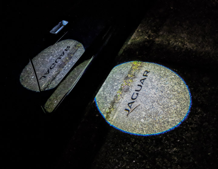
Jaguar projection

The door handles are flush when parked, but slide out when you unlock. When you unlock at night they glow and project, absurdly albeit with decent kerning, on the adjacent pavement.

  1. I originally wanted to get white paint because I unhealthily loved the red-leather-seats option and thought the white/red combo was cool. And I still think so, but I’m glad Lauren convinced me to go for Caesium Blue. It’s a lovely color, lighter than it seems in online pictures.

    I was afraid the blue/red would look kind of garish but now that I’ve seen it I don’t care. If I worried about that kind of thing I wouldn’t buy a Jaaag, right? I do wish they offered a nice forest green though.

  2. It’s dead cool to pull out your phone, pop open the car’s remote-control app, and set the internal climate to 20°C ten minutes before you go out to drive somewhere on a Canadian winter night.

  3. The headlights have autonomic voodoo; they click into high-beam mode when they think nobody’s in front of you (correctly, so far) and apparently try to point away from the eyes of drivers in oncoming lanes.

  4. Yeah, the infotainment screen navigation is kinda klunky and slow, and the menu tree isn’t the most intuitive thing. But it’s not that big.

    I found that within a day, I had perfected a leisurely wave gesture, somewhat in the style of a Tai Chi master or opium smoker, and achieved menu mastery.

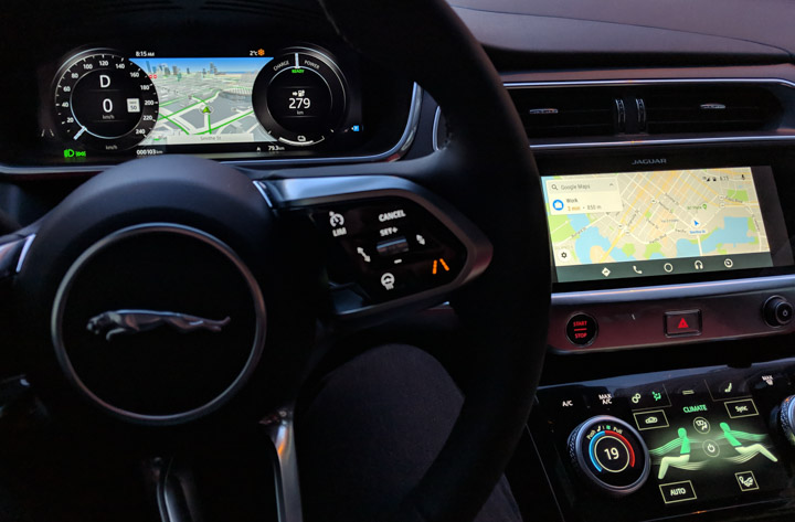
  5. When I plugged in my Pixel 2, Android Auto initially coughed and belched, but the kinks worked themselves out and it’s now a first-class citizen of the big middle screen. It’s kind of cool having Google maps on the big screen and Jag’s own maps, which are more eyecandyful, up on the “instrument panel” screen behind the steering wheel.

  6. Jaguar I-Pace screens including Google Play

    Aesthetics by Jaguar on the left, by Google on the right.

  7. Prior to buying the car, I’d blown off negative comments on its infotainment app by saying “who cares, I’m going to use software from a software company.” But I have to say that the general presentation of the Jag software on Jag’s screens is prettier than Android manages. There’s been attention to typography, there are tonal gradients in the background, and so on.

    Having said that, it doesn’t have my 13,096 songs in the cloud like Google does, and doesn’t know what “OK Google, text Lauren” means, nor “OK Google, Calgary weather.”

    I’m not actually sure what outcome I’d like to see on this one.

  8. The user manual is available as a mobile app; the Android version gets horrible reviews mostly because it only covers a couple of Jaguar models. It’s actually not bad, with a search function and visual guide and rich hyperlinking. There’s also a PDF version online at ownerinfo.jaguar.com, and then when you get the car there’s a hefty slab of dead trees in the glovebox.

    However, all of these are sadly incomplete in their coverage. For example: The car comes with a feature where you can have it play whooshy spaceship crescendos as you accelerate, to help petrol-heads who are missing that fossil-combustion roar. No form of the manual told me where in the menus it was hiding. OK, I was trying to impress a 12-year-old, but still.

    Also, I wanted to fool with the instrument panel display, which has many modes. The manual is full of English sentences that have subjects and verbs and objects but somehow failed to map, in my mind, to what I was seeing on the car’s screens. I appreciated the advice I’d picked up in the online Jaguar community, which is that this wisdom is best consumed with the help of a couple of glasses of the Famous Grouse. So I went and bought some, but there are lots better Scotches and it didn’t help that much.

  9. Oh right, online communities. The best for my money is at ipaceforums.co.uk although, as the name suggests, it’s Euro-heavy. There’s also i-paceforum.com (note the hyphen) but it’s not as good. On Reddit there’s r/jaguar and the still-embryonic r/ipace.

  10. I’ve signed the car into the home WiFi network and turned mobile data on. It came with an AT&T Canada SIM and despite several pleading emails from AT&T, I have no idea what that does. It was already network-connected somehow because the remote-control app tells me where it is and how charged it is and lets me do things like turn on the heating inside.

    I also turned network updates on, and noticed that the software is a couple releases behind the latest. More investigation is definitely required.

  11. Speaking of apps and suchlike, someone is building a Python library to talk to the I-Pace’s API, and making good progress. There are lots of interesting APIs, many of which Jaguar’s remote-control app doesn’t use. Hmmm…

[Life lesson: A really good time to write about something is while you’re learning about it. I learned this from Mark Pilgrim and if you’ve never heard of him that’s OK (if sad).]

17 Jan 04:28

Acorn 6.3 Postmortem

This is a long post, for developers and folks who are code curious.

Acorn 6.3 was a reasonably fun release to work on. There was nothing huge in it, but it did included some nice updates to existing capabilities along with a few new features. Here's what I think is worth writing about.

A New Brushing Engine

I had originally planned to release a new brush engine in 6.2, but writing it ended up being a bit trickier than I expected. I got something together for 6.3 though- and it's certainly faster than the previous engine.

Wait, what's a brush engine? Well in Acorn, it's the mechanics which take input from your mouse/trackpad/stylus and then converts that into scribbles for your image. There is a lot of code that exists to make this possible. The engine needs to think about the size of the brush and opacity (which can change depending on much pressure you're putting on a stylus), as well as "flow" of the ink/paint you're putting down. There's also little shortcuts such as holding the shift key between clicks to draw straight lines, and holding down the option+command key to turn your brush into an eraser. And let's not forget about rotation of the brush while following a path, blend modes, smoothing, scatter, and getting the spacing right between all the dabs in a brush stroke.

Then of course, you get to make sure that all happens without any slowdowns in the UI. Is the brushing keeping up with what you're attempting to draw? Acorn has a goal of 120 FPS for most brushes (when running on a Late 2015 iMac), so it needs to be speedy.

When starting out with this rewrite, I didn't want to just modify the existing engine. I've already been doing this for a number of years and I felt that it was time to mostly start over. So instead of adding new classes into Acorn I created a test app to develop in. And when the engine was pretty close to being feature complete, I could drop it into Acorn and continue working on it from there.

The first thing I wanted to do was have all the drawing happen in a background thread. From profiling I knew that Acorn spent a lot of time drawing pixels to the right locations and while that was happening, input about where to draw was frequently missed. So the new engine takes input at around 480hz on the main thread (also known as the UI thread), and a background thread will do the actual calculations and drawing to your layer. Then at a minimum of 1/90th of a second, the engine will grab the bitmap and throw it up to the screen (composited with any other layers and effects you might have). Depending on how much work is going on I've seen Quartz Debug reporting around 300fps on the previously mentioned iMac. Things were good, but YMMV depending on what the brush has things set to. Ironically, smaller brush sizes require a lot more work for Acorn and can tend to be slower.

The actual bitmap blitting is done with Core Image, and I had to invent a few tricks in order to make it keep up with the input. Acorn can't just tell Core Image to 'draw this dot', have it do that, and then say 'ok, now draw this dot'. Well, you can- and that's what Acorn used to do (in the Acorn 4.x timeframe (and it would previously perform reasonably well when everything's done on the CPU!)). But these days most everything is done on the GPU, so you need to batch your drawing together and send it all up the GPU in reasonably sized chunks. And the amount of drawing stacked up in those batches also depends on how fast and furious the input from the user is. Pressure can build up on the input side as well as the output side, and there's little mechanisms in Acorn to balance it all out. This was pretty fun to write, including dealing with the requisite threading issues.

The new brush engine also added a number of other little features which were present in the test app, but which I haven't exposed yet in Acorn. Doing some would require some UI changes that I wasn't ready to commit to for this update, and I wasn't 100% happy with them quite yet.

Oh, and then of course there was compatibility. Acorn 6.3 was developed on 10.14, but it supports MacOS back to 10.11. My tricks for batching things together in Core Image didn't work so well on 10.11 and 10.12, and actually exposed a number of bugs in Apple's framework. So for folks running on older MacOS releases, they would get the previous engine.

I also added some new widgets to the brush palette, but there's still more things that I want to change and add (which will happen eventually). But real artists ship, so out the door it went.

iOS 12 Portrait Matte Support and Layer Mask Features

Apple added a new feature to its latest iPhones in the iOS 12 update called "Portrait Matte". It's a special image embedded in HEIC images which is based off the depth data and some machine learning in your photo. You can then use this image as a mask to blur parts of your image (which is what the iOS "Portrait" camera setting does), or you can use this data to remove backgrounds.

But how should Acorn expose this matte? My first stab was to have Acorn add the matte as an additional layer. After playing with it a bit, it just felt off. So I ended up adding the matte as a mask to the main layer when opening the image. But folks are obviously going to want to do more than just mask out the background so I added new features to Acorn where you could easily drag and drop the layer mask into into its own layer. I also made it easy to move an existing layer to another layer's mask via drag and drop. I can't predict what people are going to want to do with the mask, but I might as well make it easy to move around.

It was also during this development that I found some bugs in Apple's My Photo Stream. The matte was showing up rotated incorrectly when opening images out of Photos. At first I figured I was just reading the data wrong, but nope- under certain conditions when images with the portrait mask were uploaded to MPS, the rotation data from the camera went missing. After some communication and a Radar filed at Apple, this bug was fixed in an OS update. Bug fixes like this don't happen very often, but when they do it makes filing all the other Radars worth it. Mostly.

Getting an image with the Portrait Mask onto your Mac is a bit tricky (iOS really wants to flatten effects before sending an image out). What's worked best for me is taking a selfie, and then using Image Capture to transfer over the HEIC. Why selfie? Well, the depth data for the back facing cameras is obviously there somewhere in the image (because Photos.app can modify it), but it's not showing up as a portrait mask for Acorn. Investigations are ongoing as to why this is.

8bit PNGs / Indexed PNGs

Recently I purchased a commercial license for PNGQuant for use in the next update to Retrobatch. It's a great utility which can take a PNG image, reduce the number of colors used, and add dithering to make it look pretty close to the original. The benefit of this is that you get much smaller file sizes. "8 bit PNGs" has been a feature request for Acorn for years, so I threw it in 6.3 as well.

Combine this with Acorn's (already built in) use of PNGCrush, and you get some pretty small PNG file sizes.

PNGQuant and PNGCrush are usually used as command line tools- but both come with source, which meant that I could compile the sources into Acorn's binary and not have to call out to a tool. This is what I was currently doing with PNGCrush. I compile the source into Acorn and call a pngmain() function with arguments to a temp file. It works, but it's kind of a hack, and I didn't have any way to cancel an in-progress action.

So for 6.3, I decided to pull the PNGCrush code out into a separate tool, and include PNGQuant as a tool as well. I could call them via NSTask, and since it was a separate process, I could terminate them if settings where changed in Acorn's web export.

This worked pretty well, until I tried to submit Acorn to the App Store. I had completely forgot about signing the binaries and giving it the right entitlements for acceptance to the MAS.

There were a bunch of things I had to do in order to get it all working, and some really dumb mistakes by me- but Timo Perfitt wrote a post just last week which almost mirrors exactly what I was going through. Go read his post if you're curious about mach-o headers and adding Info.plist files to executables.

Bugs

Acorn 6.3 introduced a new way of rendering PDFs, where vector data and bitmap data are layered together in a PDF. Previously when making a PDF, Acorn would flatten the image and insert the bitmap into a PDF (the one exception was if your image was 100% vector layers- the the resulting PDF would be all vector). Well of course I screwed this up a little bit, so that sometimes your bitmap layers would be drawn much larger than they appeared on screen. And this would happen for PDF export as well as when printing. Why when printing? Because printing on MacOS is pretty much "here's a PDF, send it off to the printer". Acorn of course uses the same PDF routines when exporting and printing.

But this bug was fixed for 6.3.1, along with some curves improvements I mentioned in a previous post on this site.

Pay via Stripe on the Flying Meat Store

This isn't really an Acorn thing, but I also reworked our online store so that it now accepts Apple Pay. I had moved to Stripe last year for collecting payments, but adding Apple Pay support required a little bit more work on my part. I put that off until this past week, and it's up and running now.

Previously I was using PayPal Web Payments Pro, which was pretty nice ten years ago- but compared to what Stripe offers these days, as well as the ease of development… well, it was really no contest. Stripe is awesome.

The End

Hey, that's a lot of writing. Now I know why I don't do postmortems more often.

17 Jan 04:28

More planning planned for 2019 in bike lanes

by dandy


2019 looks like another dismal year for bike lane installations in Toronto

More planning planned for 2019

Bloor-Danforth expansion not included in planned installs

By Tammy Thorne

Almost three years ago the City of Calgary decided to install a grid of cycle tracks and bike lanes in its downtown core. Since then the number of people cycling has increased by about 40% and more women and children are using bikes to get around. That inspired Edmonton to install its own minimum grid of bike lanes. Meanwhile, New York City last year recorded the fewest traffic deaths in more than a century. This was thanks in large part to implementing a Vision Zero plan, which included lowering speed limits on most streets to 25 mph (40 km/h).

TORONTO WHERE YOU AT?

Here in Toronto we had more cycling deaths last year than in any year since 1998. Speed kills. Bike lanes make streets safer. These things we know. Yet, in 2018 only (literally) a few new bike lanes around York University and some in the Thorncliffe and Flemingdon Park neighbourhoods were installed and in all cases, the lanes don’t have connections on arterial routes, or to other bike lanes, or, well, destinations. No new bike lanes were installed downtown last year except for a short, well-constructed two-way bike lane on Harbour and Lake Shore (pictured above).

And, it doesn’t look like we will fare much better in 2019.

The only new bike lane installs planned so far for 2019 are:

  • a bike lane on Bay from Front to Lakeshore;
  • a bike lane and cycle track on Christie from Bloor to Dupont;
  • a bike lane and sharrow combo on Peter / Blue Jays Way / Navy Wharf;
  • a cycle track on Scarlett Road from Bernice Crescent to Humber River;
  • and a bike lane on Willowdale Avenue from Empress to Finch Avenue.

That’s about 9 total kilometres for these new bike lanes projects. (Please note, we are not including the majority of contra-flow lane 'connectors' in our new bike lane counts.)

And, of course, we must discuss the elephant in the room.

BLOOR BIKE LANES

Bloor, Bloor wherefore art thou Bloor bike lanes?

We expected an extension to the east… and an extension to the west… after documented success with the bike lane on Bloor in what is arguably it’s busiest section downtown in the Annex and Korea Town. A transportation staff report on October 3, 2017, said the bike lanes should be considered for the full length of the corridor. “The pilot project has demonstrated that a cycling facility can be successfully implemented on one of busiest and most constrained sections of Bloor Street and should be considered for the full length of the Bloor/Danforth corridor. Further study, consultation, design and Council approval would be required for other sections of Bloor Street and Danforth Avenue.”

Now that 2018 has passed and no action seems to have been taken regarding extending the Bloor bike lanes we were curious about when the corridor studies or EAs would begin – and end.

Eric Holmes, a communications officer for the City could not say when studies for Bloor or Danforth would even begin, but only that staff will soon recommend the “appropriate timing” for planning studies. (Transportation staff confirmed a report would be presented to council in the second quarter of 2019.)

Meanwhile, councillors along Bloor and Danforth have publicly supported the bike lanes and would like to see them installed.

In terms of the gap in the bike lane on Bloor East, between Sherbourne and Church St., Mr. Holmes advises that this bike lane has been delayed, apparently “ because the Capital Works scheduled for that section of Bloor St. has been re-programmed to a future year as a result of capital coordination and the timing of the reconstruction of the Glen Road Bridge and Tunnel under Bloor Street East.” (No date is available as to the timing of the bridge reconstruction. (We think, due to the anticipated delay, bike lanes should be installed now - not after.)

Round ‘n’ round we go! Let’s spin to the top of the wheel and ask Mayor Tory’s office why so few bike lanes are being installed. (Noting: Toronto’s mayor recently admitted in a CBC interview that his administration’s Vision Zero plan isn’t working.)

Don Peat, the Mayor’s executive director of communications says: “Under the Mayor’s leadership, the City has invested in safe, separated bike lanes, connected the gaps in the on-street cycling network, and improved the City’s trail network. The City has invested millions of dollars in cycling infrastructure over the past four years and built on-street bike lanes, including separated bike lanes, and trails.”

Bloor, possibly the most studied bike lane project in the history of all bike lanes, according to the City’s own staff, was made permanent in 2017. It’s now 2019 and we’ve got not much to show 30 months into the bike plan. At the current rate we are installing bike lanes the 10-year plan would take at least 24 years. (Eds note: More like 37 years at the rate of 9 km/year)

Perhaps the City should hire the Urban Repair Squad that used to do guerrilla bike lanes in Toronto to install all the sharrows they call ‘connectors’ throughout the city so that official City transportation planning staff can be freed up to plan and install bike lanes -- at a much more rapid pace.

We deserve better Toronto. We have the cyclists, we just need the infrastructure -- the bike lanes. And, apparently, for that we need coordination and political will. Time to stop making bike lanes so damn political and instead seeing them as what they really are: critical.

Related on dandyhorsemagazine.com:

WTF is up with the Bike Plan: 2018 bike lane count is in and it's not pretty

Street Fighters: The Urban Repair Squad (from issue one)

17 Jan 04:27

Maybe The Community Just Isn’t For Them?

by Richard Millington

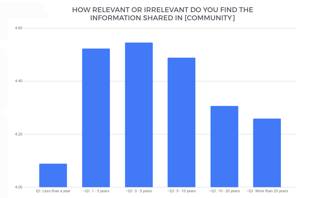
Here are responses to a client’s survey question distributed by length of time they’ve been working in the field (n=356).

Take a second and think how you would interpret this data.

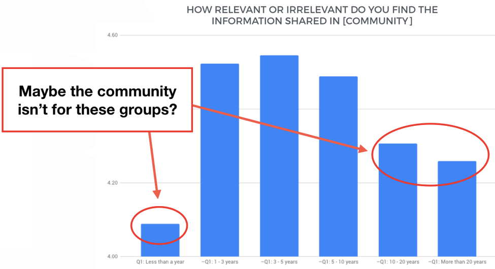
One interpretation is to look at the newcomer group (and possibly the veteran groups) and decide to have more relevant discussions, content, to cater to that audience.

For example, a beginner’s guide to the topic, introductory level discussions, topic overviews etc…

Perhaps a more exciting interpretation is to look at these same groups and conclude “hey, maybe my community isn’t for them”

The survey data could equally be telling you to focus on people with 1 to 10 years of experience in that field.

Instead of trying to balance out the mean, you increase the inequality to focus entirely on a small group of members.

Remember, the danger in trying to accommodate newcomers is the content might become less relevant to the people who find it most relevant today.

It’s often a lot easier to double-down on what is working than trying to fix what isn’t. You can design the entire community concept solely for those who find it most relevant today.

Sometimes, it’s just easier to focus on the good than the bad.

p.s. The price of our Strategic Community Management and Psychology of Community course rises again this Friday.

17 Jan 04:27

Amanda Cox promoted to New York Times data editor

by Nathan Yau

Amanda Cox is the new data editor for The New York Times:

As data editor, Amanda will continue to provide direction for The Upshot, and she’ll add the expertise from Computer-Assisted Reporting journalists in New York and software developers here and in the Washington bureau. She’ll serve as the top adviser to the executive editor and managing editor on statistical questions like polling methodologies and election forecasting, and she’ll participate in conversations with desks as they discuss data-oriented reporting that may aid our economics, technology and investigative coverage.

In her time here, Amanda has helped bring together some of our best explanatory and statistical reporting efforts with our smartest visualization experts, and now she’ll do that on a bigger stage.

Great news for both Amanda and NYT.

Tags: Amanda Cox, New York Times

17 Jan 04:27

Sony Introduces the A6400

After over a two-year break, Sony has finally got back to putting out a new APS-C sensor mirrorless camera, this time the A6400. More on it in a bit.

Previous to this, we had this progression in APS-C:

  • Feb 2014 — A6000
17 Jan 04:27

Apple HomePod :: And the beat goes on

by Volker Weber

f5ebf384b0d42506ad793ad9cd580246

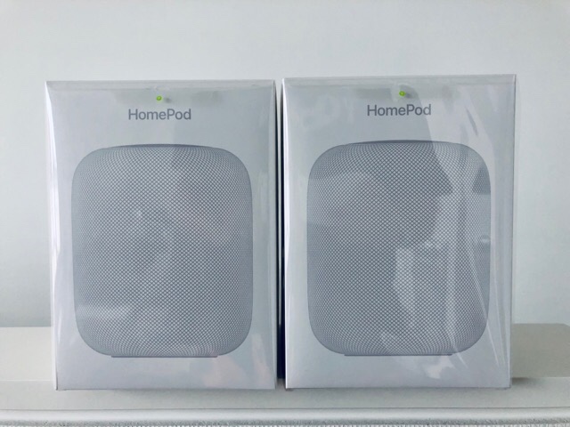
Zwei HomePods habe ich und am Anfang musste ich ziemlich rangieren, bis sie ihren Platz in einem Sonos-Haushalt gefunden hatten. Meine erste Reaktion war darum auch eher negativ. Ein HomePod is allein vom Klang her ein Witz verglichen mit einem Play:5-Paar oder einer PlayBase, erst recht, wenn die auch noch von SUB und weiteren Playern unterstützt ist. Ja, das ist ein extrem unfairer Vergleich (350 € vs. 2000 €), aber so war halt die Situation.

Nun ist etwas Zeit vergangen. Im normalen Leben macht man keine Klangvergleiche. Gut genug ist gut. Und HomePod ist definitiv gut genug. Ich sage gerne mal "Hey Siri, spiel meine Playlist House im Zufallsmodus" oder "Hey Siri, spiel den neuesten Podcast Purified Radio". Die Playlist ist mittlerweile länger als 15 Stunden und ich höre immer wieder andere Musik, die mir gefällt. Dazu hatte ich bereits letztens festgestellt, dass ich immer mehr mit Kopfhörern rumlaufe.

Ergebnis: Aus acht Sonos-Zonen sind mittlerweile fünf geworden. Und mindestens eine weitere steht vor dem Ausstöpseln. HomePod hat nicht total gewonnen; das wird auch nicht passieren, weil Apple keine Alternative zur Unterstützung eines Fernsehers hat. Aber mindestens ein weiterer Raum könnte gut einen HomePod gebrauchen, diesmal in schwarz. Und das ist keine gute Nachricht für Sonos.

17 Jan 04:27

Logi R500 :: Klicker für iPhone und iPad

by Volker Weber

43559fe569f3f7b59a2d41c1eb246531
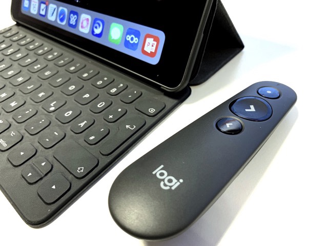
(Foto: Stefan Domanske 2019)

Ich kann mich noch gut erinnern, wie ich das erste Mal mit dem iPhone vorgesungen habe. Keynote, HDMI-Dongle, viel Gaffa-Tape, um das alles auf dem Tisch zu fixieren. Ich habe die Zuhörer gewarnt, es könne sein, dass während der Präsentation etwas schreckliches passiert. Und dann habe ich diese Ansage vergessen. Erste Frage am Ende: "Was hätte den schreckliches passieren können?" Dann habe ich das Gaffa-Tape abgezogen und meinen Aufbau präsentiert. Erstaunen und Gelächter. Aber das iPhone hatte sauber durchgehalten. Heute ist das Routine.

Was mir jedoch sofort fehlte, war ein Klicker. Die brauchen halt einen USB-A Port. Man kann seine Apple Watch als Klicker (nur für das iPhone) nehmen, aber das lenkt von der Präsentation ab. Stefan hat mir heute den Logi R500 gezeigt. Der kann das per Bluetooth und funktioniert mit iOS. Das ist die Lösung!

More >

17 Jan 04:27

New Year, Free GitHub

Because private GitHub repositories were not a freebie, I recently signed up to their $7 monthly plan. However, now that I've gone indie, reducing expenses has become a priority, and so I'm pleased that developers such as myself are now being given special treatment.

When it comes to design, I may have concerns with Microsoft as a user of its products and services, but I've nothing but continued good feelings towards them as a developer.

17 Jan 04:27

Replied to Noise cancelling for cars is a no-br...

by Ton Zijlstra
Replied to Noise cancelling for cars is a no-brainer
We’re all familiar with noise cancelling headphones. I’ve got some that I use for transatlantic trips, and they’re great for minimising any repeating background noise...It doesn’t surprise me, therefore, to find that BOSE, best known for its headphones, are offering car manufacturers something similar

Noise cancelling in cars isn’t a no brainer I think. When I first got my noise cancelling headphones and had put them to good use on trains and airplanes, I tried to use them while driving in my car as well. I took them off again rather quickly, once I noticed that I actually use the car’s noises as feedback, e.g. for shifting gears, to determine road conditions, and other things. So with noise cancelling active I felt that part of my sensorium was cut off. It will take replacing those observations by ear for ones by other senses, actively rewiring entrained behaviour. For passengers it’s likely a different thing.

17 Jan 04:26

Small Potatoes: Technology Use Explains Less than 1% of Variation in Teens’ Mental Health

by jennydavis

Yes, Please to this article by Amy Orben and Andrew K. Przybylski, which I plan to pass around like I’m Oprah with cars. Titled The Association Between Adolescent Well-Being and Digital Technology Use, the paper does two of my favorite things: demonstrates the importance of theoretical precision & conceptual clarity in research design, and undermines moral panics about digital technology and mental health.

The effects of digital technologies on the mental lives of young people has been a topic of interdisciplinary concern and general popular worry. Such conversations are kept afloat by contradictory research findings in which digital technologies are alternately shown to enhance mental well-being, damage mental well-being, or to have little effect at all. Much (though not all) of this work comes from secondary analyses of large datasets, building on a broader scientific trend of big data analytics as an ostensibly superlative research tool. Orben and Przybylski base their own study on analysis of three exemplary datasets including over 350,000 cases. However, rather than simply address digital technology and mental well-being, the authors rigorously interrogate how existing datasets define key variables of interest, operationalize those variables, and model them with controls (i.e., other relevant factors).

A key finding from their work is that existing datasets conceptualize, operationalize, and model digital technology and mental well-being in a lot of different ways. The variation is so great, the authors find, that researchers can construct trillions of different combinations, just to answer a single research question (i.e., is digital technology making teens sad?). Moreover, they find that analytic flexibility has a significant effect on research outcomes. Running over 20,000 analyses on their three datasets, Orben and Przybylski find that design and analysis can result in thousands of different outputs, some of which show negative effects of digital technology, some positive, and others, none at all.  Their findings drive home the point that big data is not intrinsically valuable as a data source but instead, must be treated with theoretical care. More data does not equal better science by the nature of its size. Better science is theoretically informed science, for which big data can act as a tool. While others have made similar arguments, Orben and Przybylski articulate the case in the home language of big data practitioners.

The second element of their study is that analyzing across the three datasets gives a result in which digital technology explains less than 1% of the variation in teens’ mental well-being (0.4%, to be exact). The findings do show that the relationship is negative, but only slightly. This means that 99% of teens’ mental well-being is correlated with things other than digital technology. Regularly eating potatoes showed a negative correlation similar to that of technology use in relation to teens’ mental health. The minuscule space of digital technology in the mental lives of young people sits in stark contrast to its bloated expanse within the public imagination and policy initiatives. For example, while  I was searching for popular press pieces about mental health among university students to use in a class for which I am preparing, it was a seeming requirement that authors agree on the trouble of technology, even when they disagreed on everything else.

The article’s unassuming title could easily have blended with the myriad existing studies about technology, youth, and mental health. Its titular simplicity belies the explosive dual contributions contained within. Luckily, Twitter


Jenny Davis is on Twitter @Jenny_L_Davis

17 Jan 04:26

GoodNotes 5: The MacStories Review

by John Voorhees

I spend a lot of time at a keyboard. The obvious advantage of a keyboard is speed. When I'm in a groove, nothing beats typing into a text editor at my Mac or iPad Pro for quickly recording thoughts and ideas, so they aren't forgotten.

Moving fast is not nearly as important when it comes time to refine those ideas into something coherent. Slowing down, switching tools and contexts, and working in different environments all help to bring order to disparate thoughts. The same holds for planning something new, whether it's the next big article or organizing my thoughts on some other project.

It's in situations like these when I grab my iPad Pro and open GoodNotes. The switch from the indirect process of typing into a text editor to working directly on the iPad's screen with the Apple Pencil enables a different perspective that helps me refine ideas in a way that typing doesn't.

With version 5, the GoodNotes team has taken my favorite iOS note-taking app and refined every aspect of the experience. The update retains the simplicity of the app's design but does a better job surfacing existing functionality and extending other features. The result is a more flexible, powerful app that plays to its existing strengths – which current users will appreciate – but should also appeal to a broader audience than ever.

Document Management and Search

The area that's seen the most improvement over past versions of GoodNotes is how notebooks are managed and organized. Like many note-taking apps, GoodNotes is organized around the concepts of notebooks that contain pages of notes. In earlier versions of the app, Notebooks could be classified into Categories, which acted as a single flat folder structure. Now, however, GoodNotes 5 supports infinite levels of nested folders, which should be a welcome addition for anyone with lots of notebooks or individual pages of notes.

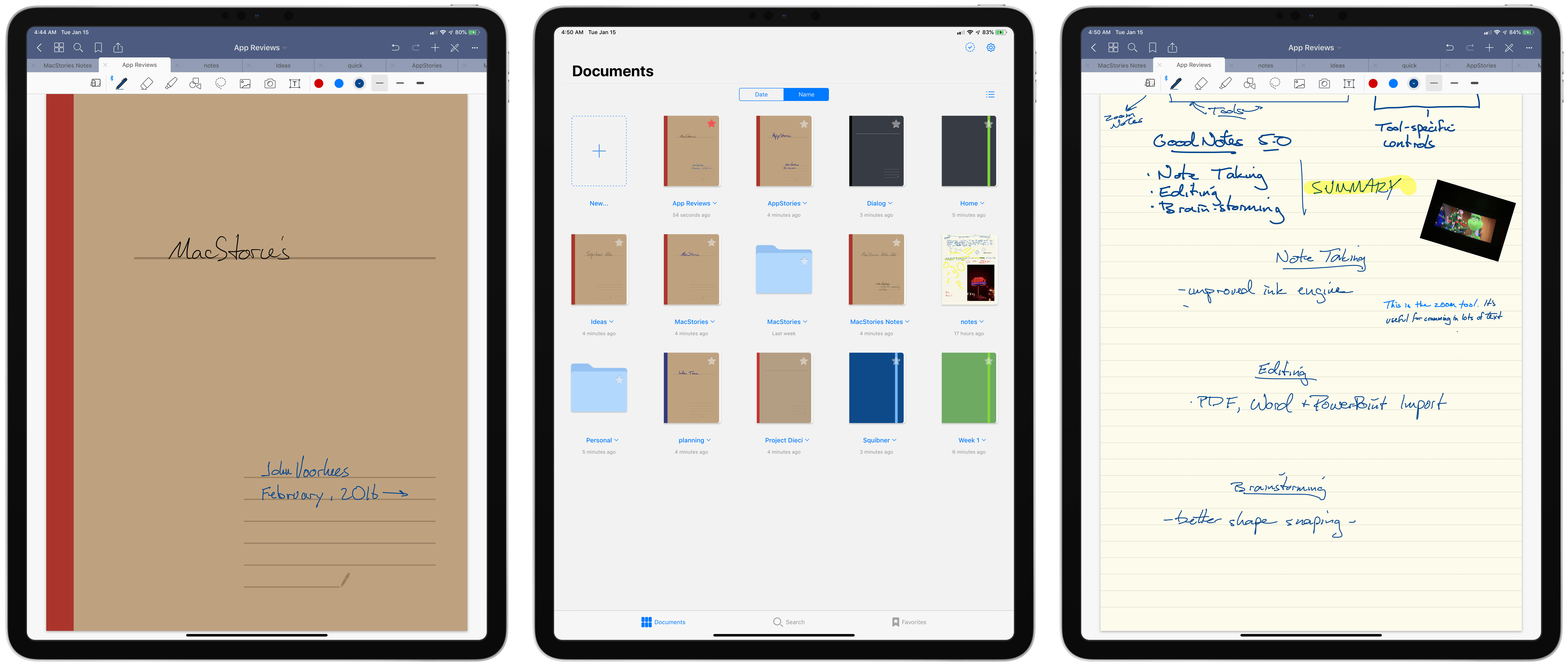
The Documents view includes notebooks, folders, and free-standing notes.

The Documents view includes notebooks, folders, and free-standing notes.

'Documents' is the root level view for all folders, notebooks, and notes. From here, you can tap the 'New' button to create a folder or notebook, open an image from your iCloud Photo Library, take a picture with your device's camera, import a file from the Files app, or take a Quick Note. Quick Notes, which are notes that live outside a notebook at whatever level of the folder hierarchy you are currently viewing, can also be created by double tapping the 'New' button.

The Quick Notes feature is new to GoodNotes 5 and an excellent example of the added flexibility the update offers. Instead of opening an existing notebook, which opens to the last page you were viewing and might not be the page you want to edit, Quick Note allows you to jot something down immediately and move it to a notebook or another folder later. The feature is a terrific shortcut that addresses the more complex folder structures users can now create.

Documents can be viewed as thumbnails or a list.

Documents can be viewed as thumbnails or a list.

Items in the Documents view can be viewed as thumbnails or a list and can be sorted alphabetically or by modification date. Everything in this view can also be marked as a favorite, which is a subset of items that appear when you open the Favorites tab at the bottom of the Documents view. Items can also be individually or batch-exported, duplicated, moved, or sent to the trash after tapping the checkmark icon in the top right-hand corner of the screen. Another way to move items is with drag and drop, which works with multiple items on the iPhone and iPad.

The more robust document management and organization tools in GoodNotes 5 are excellent additions. In particular, nested folders should make a big difference in the way people organize large numbers of notebooks.

My only quibble with GoodNotes' approach is that it's a custom implementation that bypasses the Files app. That means you can't drop a notebook into an arbitrary project folder in iCloud Drive, for instance. There is no GoodNotes folder in iCloud Drive. Instead, moving documents into and out of the app relies on importing and exporting.

Nonetheless, GoodNotes' custom document browser is excellent, and unlike text documents that I often want to open in multiple iOS apps, that's not possible with GoodNotes' file format. As a result, despite my preference for apps that integrate with Files, I don't think GoodNotes' custom note management solution is problematic.

Search shows recent search terms and organizes results by type.

Search shows recent search terms and organizes results by type.

Search is also far more robust than in previous versions of GoodNotes. In earlier versions, search from the document view just searched document names and search within a notebook only searched that document. Now though, opening the Search tab from the Documents view presents a search field, recently searched keywords, and recently opened documents. I particularly like the addition of recent search terms and documents, which make it easy to retrace my steps through the app with minimal effort.

GoodNotes searches more than ever before too. Typing a query into the search field searches handwritten notes, typed notes, and the names of folders, notebooks, and notes. Results are helpfully divided into sections like Titles, Typed Notes, and Written Notes to indicate their origin. Search is also available inside notebooks and Quick Notes where the results are limited to matches found in the document you are viewing.

Search is also available inside individual notebooks.

Search is also available inside individual notebooks.

My handwriting is atrocious, and more times than not GoodNotes can correctly decipher it, allowing me to search for past notes. Text recognition is also very fast, indexing new handwritten text in just a few seconds at most. I don't use search a lot because most of my notes are temporary, but the ability to sift through old notes for reference purposes regardless of where the matching term appears is incredibly powerful. It's the sort of feature that leverages the computational power of iOS devices to produce a note-taking experience that can't be matched in the analog world.

I should also mention GoodNotes' 'Copy to' share extension that copies PDFs to GoodNotes as standalone documents or as part of a notebook. When I want to edit an article by hand, I typically export a text file as a PDF to GoodNotes, where I mark it up. I could do the same thing in many iOS PDF apps, but I prefer GoodNotes' dedicated editing tools, which are superior to what's available in my favorite PDF apps.

Notebooks and Notes

Starting a new notebook from the Documents view presents several different customization options, including the notebook's cover design and size, the type and color of paper inside, its title, whether the orientation of the notebook will be portrait or landscape, and the language used for search purposes. With version 5 of GoodNotes, there are more notebook cover and paper options than ever before. In total, there are eight categories of portrait covers and four types of landscape covers, each containing several different designs. You can also choose to forego a cover altogether. There are additionally four categories of portrait and three categories of landscape papers that range from simple ruled, graph, and dot styles, to more complex papers for accounting, calendar planning, and musical notation. You can also import custom-designed papers using any PDF file.

GoodNotes 4 (left) and GoodNotes 5 (right).

GoodNotes 4 (left) and GoodNotes 5 (right).

Once you've got a notebook set up, the first thing you'll notice upon opening it is that the toolbars have changed. Where once there was a single toolbar, now there are two. Although the change takes up more vertical space than before, the results are worth that tradeoff because it allows more tools to be readily accessible and the visual difference is negligible. The icons have also been tweaked too; all are more legible and more uniformly proportioned than in prior versions.

On an iPad, buttons for navigating the app's UI, viewing thumbnails of all pages of a notebook at once, searching in a notebook, marking a page as a favorite, sharing, undoing and redoing changes, adding pages and other elements, turning on a read-only mode, and accessing additional features have all been moved to the title bar. Each of the tools in the title bar is mostly self-explanatory, but there are a few highlights worth noting.

Viewing a notebook's individual page thumbnails.

Viewing a notebook's individual page thumbnails.

The thumbnail button opens a view that on a 12.9-inch iPad Pro displays 25 pages of a notebook in portrait mode and 28 in landscape mode. For longer notebooks, GoodNotes' thumbnail view is a terrific way to jump to a specific page quickly. The thumbnail view includes a control for switching to two other views too: one that displays pages marked as favorites and the other which displays outlines for PDFs you've imported that incorporate an outline as part of the file.

When the read-only mode is engaged, you cannot edit your notes. Instead, the majority of the UI is hidden, including the note-specific toolbar, allowing your notes to occupy slightly more space. The effect is a streamlined reading mode that creates a perfect study environment for students or anyone else using their notes to learn something new.

Behind the 'More' button is where you'll find another new GoodNotes feature: scroll direction. In past versions, scrolling was horizontal only.

It should be noted that the title of your notebook is also interactive. Tapping it opens a popover with information about the document's location, the last time it was edited, which page you are viewing, and the total number of pages. There is also a button for moving the notebook, and you can tap the notebook's title to change it.

GoodNotes supports opening multiple notebooks in separate tabs, which appear just below the top toolbar. It's one of my favorite features because it reduces switching between multiple notebooks to a single tap. The feature is also a good one to play with when considering what a similar system-wide feature might be like if implemented by Apple as part of iOS.

Below GoodNotes' tabs is a notebook-specific toolbar that's divided into three regions. On the left is the zoom tool, which was previously hard to discover because it was only accessible from a contextual menu item. I don't use zoom much, but it's a great option if you want to cram a lot of notes onto a single page. When activated, you can write in a large area at the bottom of the screen. As you do so, what you write appears in a smaller box that can be positioned anywhere on the page. The feature also includes buttons for indenting and outdenting your written notes and buttons for moving the note-destination box around the screen.

From the top left: Switching pens, picking ink colors, adjusting the pen's stroke, adding a recent image.

From the top left: Switching pens, picking ink colors, adjusting the pen's stroke, adding a recent image.

Next to zoom are the primary tools used to create notes. There's a pen, eraser, highlighter, shape, lasso, image, camera, and text insertion tool. When each tool is selected, the far right region of the toolbar transforms to display settings specific to that tool. For example, if the pen tool is selected, the right side of the toolbar displays ink color and line thickness settings. Additional options and settings are available by tapping on any button that is selected. For the pen tool, that allows users to pick from a set of pre-defined editable ink colors or create custom colors from a color picker. It also allows users to adjust the three line width presets in 0.1mm increments from 0.1mm to 2.0mm.

In addition to the fountain pen and ball pen available in prior versions of the app, GoodNotes 5 adds a brush pen, which is much more pressure sensitive than the fountain or ball pen. None of the pens, however, seem to implement the tilt sensing made available by the Apple Pencil. The fountain pen remains my favorite choice for taking notes because it strikes a nice balance between pressure sensitivity and smooth curves that make it the most legible and attractive to my eye, though I use the ball pen a lot too. The developer says the ink engine used by GoodNotes 5 has been improved, and I noticed some subtle improvements, but the ink engine was already one of the best I've tried.

It's a small change, but the pen and eraser tools have been rearranged, so they are now side-by-side. Previously they were separated by the highlighter. The update makes it harder to accidentally pick the wrong pen tool when you are focusing on your notes instead of the buttons in the toolbar. Switching between the pen and eraser, which comes in three widths, can also be accomplished by double tapping on the barrel of the second-generation Apple Pencil.

With the shape tool, you can draw a shape and GoodNotes will snap to the closest shape it detects, straightening lines and smoothing curves. I don't use this tool often, but it can be a nice way to create quick diagrams, and in my testing, the app seems to detect shapes better than in the past.

The lasso tool in action (left) and resizing an image (right).

The lasso tool in action (left) and resizing an image (right).

The lasso tool is another aspect of GoodNotes that shows off the power of digital notes over analog. Circle anything on a page, and it can be moved around the page. GoodNotes is smart enough to grab an entire word or doodle even if you're a little sloppy with the way you circle something. Tap the lassoed item and options to take a screenshot of the selected item, resize and rotate it, change its color, and convert it to copyable text, along with cut, copy, and paste, are all available.

Another nice touch is that selecting the image or camera tools opens a tiny strip of recent photos along the right side of the toolbar, making it easy to pick a recent photo to add to your notes quickly.

When you compare GoodNotes 5 side-by-side with its predecessor, it's clear that virtually nothing was left untouched during the update process. The results are excellent overall, but I do have a few minor issues to raise. First, the app uses stars to mark items as favorites in the Document view, but bookmarks when you're inside a notebook. The status of the two is the same, and I like the feature a lot, but the use of different iconography left me wondering if they were two separate features at first, which could lead to confusion. Second, rotation of lassoed text and drawings is only accessible behind the 'Resize' contextual menu. I had to go hunting for it and was left wondering whether it should be elevated to the toolbar or at least renamed to make it easier to find. Finally, on my iPad Pro, some of the toolbar popups occasionally dropped down from the wrong spot on the toolbar, which is something I expect will be addressed in a future update.

GoodNotes 5 is a universal app, but I haven't covered what it's like to use on the iPhone because that's not how I use the app. To my mind, the Apple Pencil is indispensable to any note-taking app, including GoodNotes. I occasionally open GoodNotes on my iPhone to refer to a note, but I don't use my finger to take notes on its small screen. The toolbars that I like so much on the iPad version of GoodNotes suffer on the iPhone. Far too many reside behind the app's three-dot 'More' button, and notebook-specific settings for tools slide up from the bottom of the screen in a panel instead of being part of the toolbar. So while I'm glad the iPhone version exists for reference purposes, that's not why or how I – and I suspect most people – use GoodNotes.

One final caveat about GoodNotes 5 I should mention is that it's lost some features in the update process. None should be dealbreakers for most people, but I want to highlight them for any readers who may rely on the features. Auto-backups, Wi-Fi file transfers, Presentation mode, some of the zoom mode controls, support for styluses other than the Apple Pencil and Logitech Crayon, and compatibility with the GoodNotes Mac app have been removed from the app. According to the developers, a new compatible version of the Mac app is in the works, and other features will return in future updates. In the meantime, GoodNotes 5 users can still retain version 4 as a separate app on their devices.


GoodNotes 4 was already a feature-rich, successful app that has been featured in Apple promotional materials multiple times. One of the difficulties of a significant update to such an app is preserving what brought the app where it is without being so reluctant to change that the app stagnates. Having spent many weeks using GoodNotes 5 and comparing it head-to-head with its predecessor, I'm happy to report that the update strikes an excellent balance.

The redesign brings GoodNotes into line with current iOS design trends, which makes the app feel more at home and modern among its peers. Also, instead of resorting to feature creep, attention was wisely focused on building upon GoodNotes' existing successful formula. As a result, GoodNotes 5 elevates the task of taking notes and managing them by refining the user experience and leveraging the inherent advantages of digital note-taking. It's an approach that positions GoodNotes as a premier pro iPad app, which anyone who works on an iPad should consider adding to their must-have apps.

GoodNotes 5 is a separate app on the App Store, though existing users will be able to update for free as soon as Apple approves a bundle that includes GoodNotes 4 and 5. By using the 'Complete My Bundle' feature, users who paid full price for GoodNotes 4 will receive GoodNotes 5 at no additional cost. If you paid less than full price for GoodNotes 4, you'll need to pay the difference for version 5. However, as of publication, the GoodNotes bundle has not been approved. For new users, GoodNotes is available on the App Store for $7.99.

UPDATE: The GoodNotes 4/5 bundle, which allows existing GoodNotes 4 users to update to GoodNotes 5 for free (or the difference in price if GoodNotes 4 was purchased at a discount), is now available on the App Store.


Support MacStories Directly

Club MacStories offers exclusive access to extra MacStories content, delivered every week; it's also a way to support us directly.

Club MacStories will help you discover the best apps for your devices and get the most out of your iPhone, iPad, and Mac. Plus, it's made in Italy.

Join Now
17 Jan 04:26

Converting Pandas Generated HTML Data Tables to PNG Images

by Tony Hirst

Over the weekend, I noticed the Dakar 2019 rally was on, which resulted in my spending Sunday evening putting a scraper together to grab timing data down from the official website (notebook code here).

The data on its own is all a bit “so  what?”; it only comes alive when you start playing with it. One of the displays I was still tinkering with at the end of last year’s WRC season was a tabular stage report that tries to capture a chunk of information from stage timing, such as split times, so it made sense to start riffing on that.

The Rally Dakar timing screen presents split times like this:

You can get a view with either of the running time in stage at each split / waypoint, or the gap, which is to say, the time difference to the person who was fastest at each split. (I think sometimes Gap times may report the time difference to the person who ranked first on the stage overall, rather than the gap to the person ranked first at a particular split.)

One of the things that interests me (from a data storytelling point of view) is how much time a driver gains, or loses, within a split compared to other drivers. We can use this to spot parts of the stage where a driver has hit a problem, or pushed hard.

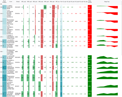
The sort of display I’ve been working up looks, at least with the Dakar data, like this so far (there are a few columns missing compared to my WRC tables, but there’s also an extra one: the in-line bimodal sparkline chart).

This particular view displays split times rebased relative to Peterhansel (it’s easy enough to generate views rebased relative to any other specified driver). That is, the table shows how much time Peterhansel gained/lost relative to each other driver at each waypoint. The table is ordered by stage rank. The columns on the left show how much time was gained/lost going from one waypoint to the next. The columns on the right show how the gap relative to each driver evolved over the stage. The inline chart tracks the gap evolution.

The table is a styled pandas table, rendered as HTML. After applying styling, you can get a preview in a notebook using something of the form:

from IPython.display import display, HTML
display( HTML( df.style.render() ) )

I’ve previously posted a recipe for Grabbing Screenshots of folium Produced Choropleth Leaflet Maps from Python Code Using Selenium so here’s the latest iteration of my code fragment (which built on the previous example) for taking a chunk of HTML and using selenium to open it in a browser and grab a screenshot of it.

The code is h/t to several Stack Overflow posts.

import os
import time
from selenium import webdriver

#Via https://stackoverflow.com/a/52572919/454773
def setup_screenshot(driver,path):
    ''' Grab screenshot of browser rendered HTML.
        Ensure the browser is sized to display all the HTML content. '''
    # Ref: https://stackoverflow.com/a/52572919/
    original_size = driver.get_window_size()
    required_width = driver.execute_script('return document.body.parentNode.scrollWidth')
    required_height = driver.execute_script('return document.body.parentNode.scrollHeight')
    driver.set_window_size(required_width, required_height)
    # driver.save_screenshot(path)  # has scrollbar
    driver.find_element_by_tag_name('body').screenshot(path)  # avoids scrollbar
    driver.set_window_size(original_size['width'], original_size['height'])

def getTableImage(url, fn='dummy_table', basepath='.', path='.', delay=5, height=420, width=800):
    ''' Render HTML file in browser and grab a screenshot. '''
    browser = webdriver.Chrome()

    browser.get(url)
    #Give the html some time to load
    time.sleep(delay)
    imgpath='{}/{}.png'.format(path,fn)
    imgfn = '{}/{}'.format(basepath, imgpath)
    imgfile = '{}/{}'.format(os.getcwd(),imgfn)

    setup_screenshot(browser,imgfile)
    browser.quit()
    os.remove(imgfile.replace('.png','.html'))
    #print(imgfn)
    return imgpath

def getTablePNG(tablehtml, basepath='.', path='testpng', fnstub='testhtml'):
    ''' Save HTML table as: {basepath}/{path}/{fnstub}.png '''
    if not os.path.exists(path):
        os.makedirs('{}/{}'.format(basepath, path))
    fn='{cwd}/{basepath}/{path}/{fn}.html'.format(cwd=os.getcwd(), basepath=basepath, path=path,fn=fnstub)
    tmpurl='file://{fn}'.format(fn=fn)
    with open(fn, 'w') as out:
        out.write(tablehtml)
    return getTableImage(tmpurl, fnstub, basepath, path)

#call as: getTablePNG(s)
#where s is a string containing html, eg s = df.style.render()

The png image is saved as an image file that can be embedded in other HTML pages, shared via soshul meeja, etc…

17 Jan 04:26

Build a parasite to block your digital assistant

by Nathan Yau

Digital assistants offer convenience, but they also offer continuous surveillance, and it’s not always clear when the tech is listening. Alias by Bjørn Karmann is a device you put on top of the assistant the block any unwanted listening:

Alias acts as a middle-man device that is designed to appropriate any voice activated device. Equipped with speakers and a microphone, Alias is able to communicate and manipulate the home assistant when placed on top of it. The speakers of Alias are used to interrupt the assistance with a constant low noise/sound that feeds directly into the microphone of the assistant. First when Alias recognises the user created wake-word, it stops the noise and quietly activates the assistant with a sound recording of the original wake-word. From here the assistant can be used as normally.

Armed with a Raspberry Pi and a 3-D printer, follow the build guide to make your own.

Tags: hardware, privacy, smart home

17 Jan 04:26

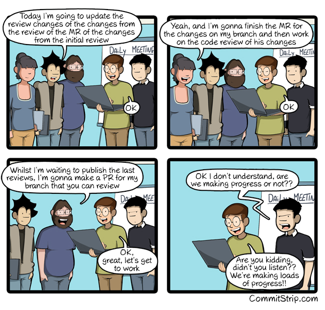
I review, you review, we all review

by CommitStrip
mkalus shared this story from CommitStrip.

17 Jan 04:23

South of Fraser Rail Proposal Includes Salvo Fired at Surrey’s McCallum

by Colin Stein


Former Township of Langley Mayor Rick Green is advocating for 99km of passenger rail to connect Surrey to Chilliwack.

In a letter posted on Medium yesterday, Green’s proposal includes a map depicting a starting point at the Pattullo Bridge, with stops throughout Surrey, the Langleys, Aldergrove, Abbotsford, and ultimately ending in Chilliwack.

The image is notable for harkening back to the days of paper creases and highlighters (the cocktail napkin did not make publication), and for showing the world the lengths we may go to service Sumas.

The proposed route is actually the former BC Hydro Freight Division rail corridor — sold off by the province in 1988 — with passenger rights apparently intact and in the public domain.

In addition to promising economic growth and quality of life gains of a ‘South Fraser Community Rail’, Green simultaneously rakes Mayor Doug McCallum over the coals for rushing forward with the Surrey Skytrain proposal:

This project does absolutely nothing for our region, or for the municipalities that fall beyond Surrey.

Read the full letter here. Thanks to Tom Durning for the tip.

17 Jan 04:22

A hard-working glossary can cure jargon overload

by Josh Bernoff

A great business book will be full of magic words that reflect new and crucial concepts. What’s the best way to explain those? Here’s how to make a glossary that works without drowning in jargon. If you’re writing a business book, you’ll inevitably face a difficult problem with language. Some of the unfamiliar words you’ll … Continued

The post A hard-working glossary can cure jargon overload appeared first on without bullshit.

17 Jan 04:22

Interlibrary Cooperation on Autism

by peter@rukavina.net (Peter Rukavina)

From today’s Autism Society of PEI newsletter:

The Autism Society of PEI and the PEI Public Library Service are happy to partner on a new collection sharing initiative. Islanders can now access the Autism Society’s in-house collection with their PEI Public Library card. Members of the public can search and request these materials through the library’s online catalogue and have them delivered directly to their local library. Thank you to the PEI Public Library for this great partnership opportunity!

This is tremendous news, and a fantastic move forward given the previously muddled situation with autism resources.

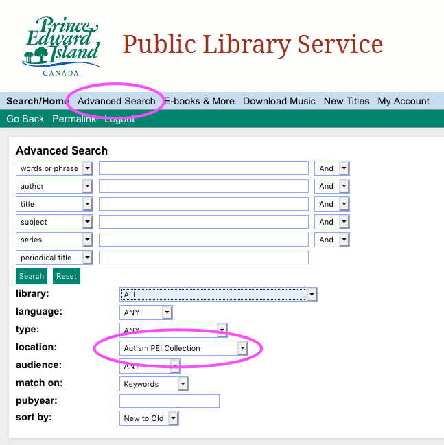
You can see all of the available resources like this:

  1. Go to the Public Library Service catalogue in your browser.
  2. Click Advanced Search.
  3. Select “Autism PEI” under Location.
  4. Click Search.

Screen shot of Public Library Service search for autism materials.

As of this writing there are about one hundred items in this collection, from 101 tips for the parents of boys with autism to Video modeling for young children with autism spectrum disorders. The ability to order these resources for delivery to one of the 26 library branches across the Island makes the collection so much more valuable than when items were only available from the Autism Society’s office in Charlottetown.

This is also a good example of interlibrary cooperation in general: there are myriad resource libraries held by non-profit organizations and institutions across the Island, with collections that could benefit greatly from exposure to a wider audience. Cooperative projects like this leverage the curatorial skills of subject-matter-expert organizations with the visibility, systems and logistics expertise of the Public Library Service.

Bravo!

17 Jan 04:21

Bad invention: Personalized kleenex!

by Liz

Lately I keep finding little torn up plastic pouches around the house with Danny’s name on them. They turned out to be some sort of personalized vitamins where each packet says DANNY on it and then a little inspirational saying. The vitamins also, I believe, have an app. I find my partner’s propensity to order weird shit off kickstarter endearing and now it’s like had this unforseen side effect that his domestic litter tattles on him!

Germphobic people! do not read any further! And definitely don’t read that post on my past Bad Invention: The Sockerchief!

.

.

.

.

This made me think. I have some lifelong terrible habits and one of them is (from equally terrible allergies) leaving a trail of used kleenexes behind me, like an unsavory rat’s nest, and even worse sometimes it’s because I used a kleenex absent mindedly and put it down on the couch next to me because it still had some life in it (WHAT!!!!?!) and then I use it again in a few minutes OR it gets squashed into the couch cushions or falls to the floor and gets a new life as a dust and lint magnet. Or perhaps worse – it goes into my pockets and then through the washer (I mostly use handkerchiefs nowadays to work around these problems.)

You reap what you sow, and the apple does not fall far from the tree, and karma, etc. so it turns out my son not only also has allergies but also scatters little wads of kleenex around as if it were snowing.

Now we come to our bad invention: Personalized Kleenex! The couch cushion cracks would now reveal LIZ or MILO. How handy for blame, but perhaps also for creative re-use. Inspirational messages (going with the trend on the …. i-vitamins? e-vitamins? could be things like:

Bless the hand that gave the blow.
– John Dryden, The Spanish Friar. Act ii. Sc. 1.

Liberty ’s in every blow!
Let us do or die.

– Robert Burns, Bannockburn.

Blow, bugle, blow! set the wild echoes flying!
And answer, echoes, answer! dying, dying, dying.

– Alfred Tennyson, The Princess.

Sonorous metal blowing martial sounds:
At which the universal host up sent
A shout that tore hell’s concave, and beyond
Frighted the reign of Chaos and old Night.

– Milton, Paradise Lost. Book i. Line 540.

Or better yet – my favorite!!!!

I must have liberty
Withal, as large a charter as the wind,
To blow on whom I please.

– William Shakespeare, As You Like It. ACT II Scene 7.

For use with an app, I think a printed QR code on each kleenex would suffice. Simply remember to photograph each kleenex before or after the blow, and a special uncrumpling algorithm will sort out the code. This could plot the location of your used kleenexes on a map, display them to your friends via a social network; opportunities for buying new boxes of this substance abound – the more you use the more kleen-coins you earn – Machine learning applied based on your past stored e-kleenexr patterns to predict future caches. Personalized, social, E-Kleenexr 2.0 AI as microcurrency – on the blockchain. How can I drive this into the ground any further? WHERE IS MY ONE MILLION DOLLARS?!

17 Jan 04:21

The Prosperity Paradox

by kblake


prosperity paradoxBut hope is not an effective strategy. 

Purchase the book on Amazon

Clayton M. Christensen and his co-authors reveal a paradox at the heart of our approach to solving poverty. While noble, our current solutions are not producing consistent results, and in some cases, have exacerbated the problem. At least twenty countries that have received billions of dollars’ worth of aid are poorer now.

Applying the rigorous and theory-driven analysis he is known for, Christensen suggests a better way. The right kind of innovation not only builds companies—but also builds countries. The Prosperity Paradox identifies the limits of common economic development models, which tend to be top-down efforts, and offers a new framework for economic growth based on entrepreneurship and market-creating innovation. Christensen, Ojomo, and Dillon use successful examples from America’s own economic development, including Ford, Eastman Kodak, and Singer Sewing Machines, and shows how similar models have worked in other regions such as Japan, South Korea, Nigeria, Rwanda, India, Argentina, and Mexico. 

Read the related HBR article “Cracking Frontier Markets”

The ideas in this book will help companies desperate for real, long-term growth see actual, sustainable progress where they’ve failed before. But The Prosperity Paradox is more than a business book; it is a call to action for anyone who wants a fresh take for making the world a better and more prosperous place.

The post The Prosperity Paradox appeared first on Innosight.

17 Jan 04:21

“This Is Not a Product”: The Apple Developer Transition Kit

by Stephen Hackett

In his keynote introducing the switch to Intel,1 Steve Jobs introduced the weirdest Mac of all time: the Apple Developer Transition Kit.

After announcing the change, Jobs revealed a secret. The Mac he had been using to demo software all morning actually had a 3.6 GHz Intel Pentium 4 processor inside.

Needless to say, the crowd went wild.

Transitions make or break when it comes to the details, and Apple had a lot of them at WWDC 2005. After admitting that every major version of Mac OS X has been compiled for both PowerPC and Intel chips, Jobs outlined Rosetta, which would allow PowerPC applications to run on Intel Macs without a hitch.

Xcode was updated to version 2.1 to allow developers to build "universal" apps that would run natively on old and new Macs alike.

To help with this work, Jobs then introduced a new computer. An Intel Mac inside a Power Mac G5 body, the Apple Developer Transition Kit (or DTK) was made as a way for developers to work on their x86 applications before the first Intel Mac shipped to customers.

The machine came with a 3.6 GHz Pentium 4, a CPU that would never end up in a shipping Mac, as Apple launched with the Core Duo line of processors.

It ran an Intel version of Mac OS X Tiger. 10.4.1 came on these machines; Apple was up to 10.4.4 by the time the first MacBook Pro and Intel iMac shipped in January 2006.

Jobs was quick to explain that the DTK was not a Mac made for customers:

This is a development platform only. This is not a product; this will never be shipped as a product. It's just for you guys to get started in development. You actually have to return them by the end of 2006. We don't want them floating around out there. These are not products.

To borrow one of these systems ran $999, and they shipped a few weeks after WWDC. Once they were in the world, things got interesting as people started poking around inside.

The Hardware

Adam Rosen at The Vintage Mac Museum writes:

A small logic board labeled Barracuda sits inside a ridiculously large tower (to fool the passers-by). The processor is a 3.6GHz Pentium 4 with Hyper-Threading.

Rosen's photo shows just how odd this machine looked inside:

Photo courtesy of Adam Rosen

It's a weird machine, but it was pretty much a complete system, as Katie Marsal wrote for AppleInsider:

These development-based Intel Macs appear to be shipping in a slightly modified aluminum Power Mac G5 enclosure that sports an altered cooling system consisting of a different fan configuration. Located at the rear of the unit are two USB 2.0 ports, a Gigabit Ethernet connector, and one FireWire 400 port. On the front of the unit, developers have access to a headphone jack, one USB 2.0 port, one FireWire 400 Port and a micro switch that comes mounted next to the power switch and can be activated by a paperclip. However, its function is unknown.

As this Daring Fireball post shows, even the noise wasn't as bad as some had feared.

Ryan Katz, Senior Editor at Think Secret reported on the machine as well:

Sources have indicated that Apple will employ an EDID chip on the motherboard of Intel-based Macs that Mac OS X will look for and must handshake with first in order to boot. Such an approach, similar to hardware dongles, could theoretically be defeated, although it's unknown what level of sophistication Apple will employ.

Also uncertain is whether the Intel-based development kits seeded to developers already feature the EDID chip or whether the installation disc contains a less sophisticated installation check that simply seeks out one particular hardware configuration — the one given to developers — and will not install on other configurations.

This was also known as the Trusted Platform Module. John Gruber wrote about this at the time:

The gist of the situation, reportedly, is that at least some portions of the Intel Developer Transition Kit version of Mac OS X are strung up in such a way that depends upon the TPM module on the Transition Kit motherboard. I say “reportedly” because I can’t say for certain there is in fact such a module on the motherboard, because I don’t have a Developer Transition Kit, and even if I did, I’d be under an NDA that would prevent me from discussing it. But I think it’s safe to assume these reports are true.

The effect of this, surprise surprise, is that the version of Mac OS X that ships with the Developer Kit hardware only runs on Apple’s Developer Kit Hardware. Which state of affairs is exactly what Apple stated, clearly and publicly, when they announced the transition at WWDC in June. What Apple hasn’t stated publicly is how, technically, they were going to keep Mac OS X compiled for x86 from running on non-Apple x86 computers. The TPM chip is, apparently, at least part of the answer.

This didn't pan out as expected; Intel Macs don't ship with a TPM chip, but Apple has worked over the years to make sure macOS just runs on Macs, even though a community of Hackintosh enthusiasts is still alive and well.2

While the vast majority of these machines ended up back at Apple, a few have stayed out in the world. On occasion, one will pop up on eBay, and one surfaced on the MacRumors forums about ten years ago. Rosen got his hands on one, too:

When you first start the machine a BIOS screen appears, allowing you to hit F4 and set the boot drive order, system date, etc.. No Open Firmware here. Unlike other Macs the hard drive needs to be partitioned using Master Boot Record (MBR), not GUID as used for all shipping Intel-based Macs. That’s unique. This thing is really a PC with proprietary software pasted on top.

Rosen was able to bring it back to life after finding the original version of Mac OS X it came with from Apple. Oddly, the machine required the Install DVD to be present at startup, something no other Mac has ever needed.

A Modern Version

With a switch to ARM all but certain, I've been thinking about the DTK in a modern context. Would Apple ship a weird half-baked ARM Mac ahead of its official rollout to give developers a head-start on rebuilding their applications?

Times are different now. In 2005, the DTK was Apple's first Intel machine, but Apple has shipped millions of ARM devices. In fact, Apple has sold more ARM-powered devices than the total number of Intel Macs.

While a "development only" ARM Mac would surely be beneficial to many, would Apple instead rewire the iOS Simulator in Xcode to accept modern Mac apps? Could it create some sort of sandbox to run these programs on an iPad Pro? The possibilities are numerous, but as a hardware guy, I hope 2019 or 2020 is a repeat of 2005, and we see another "this is not a product" moment from Apple.


  1. For more on this keynote and the Intel transition itself, check this article over on iMore. ↩︎
  2. Ironically, Apple's T2 chip may be the kiss of death to this sort of thing in the future. ↩︎

Support MacStories Directly

Club MacStories offers exclusive access to extra MacStories content, delivered every week; it's also a way to support us directly.

Club MacStories will help you discover the best apps for your devices and get the most out of your iPhone, iPad, and Mac. Plus, it's made in Italy.

Join Now
17 Jan 04:21

Celebrating 11 years of The Commons

by Leticia Roncero

Today marks the 11th anniversary of The Commons – a project that Flickr began to provide cultural institutions, such as libraries, museums, and historical societies, with a space to share their digital collections with people around the world.

The Commons was launched on January 16, 2008, when Flickr released its pilot project in partnership with The Library of Congress. The two main objectives of the program were to increase discovery and use of publicly-held photography collections and to provide a way for the general public to contribute knowledge through user-generated content (by adding tags, comments, and notes to these historical collections).

In honor of the tremendous growth of this now-11-year-old project, and the 115 participating institutions that have joined so far, we’ve created a gallery featuring the images from the Library of Congress (and other Commons member accounts) with the highest number of community-generated tags. Check out the full gallery here.

Here’s a sneak peek.

Soldier's goodbye & Bobbie the cat, Sydney, ca. 1939-ca. 1945 / by Sam Hood
Unidentified soldier of the First AIF
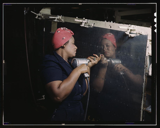
Operating a hand drill at Vultee-Nashville, woman is working on a "Vengeance" dive bomber, Tennessee  (LOC)
Women are trained to do precise and vital engine installation detail in Douglas Aircraft Company plants, Long Beach, Calif.  (LOC)

With 70,400 followers and 33,021 photos uploaded to Flickr, the Library of Congress continues to be one of the largest and most active accounts from The Commons catalog. To celebrate, they are sharing 11 photos related in some way to the number 11 to a new Flickr album focused on the 11th anniversary of The Commons. They’re posting on the ‘Picture this blog’ site as well!

Over the years, the Library of Congress has identified and deciphered the story behind many of the images from its catalog thanks to the expertise and research skills of hundreds of Flickr users. Therefore, we want to take this opportunity to give a special shout-out to users like Art Siegel, Kilted Cowboy, budderflyman, and many other frequent commenters in the community who have been active on the Library of Congress account for years, helping to flesh out names of subjects and providing historical context. Thank you all for your dedication!

If you’re interested in supporting The Commons, please be sure to join the Flickr Commons group, a place for The Commons community to share and discuss the truly awesome collections being made available in The Commons.

17 Jan 04:19

Back on the wagon/horse?

by Jeremy Toeman

Haven’t written a blog post since 2016, which is a near-eternity in the modern era. As much as there was no particular reason I stopped, man is it hard to restart. I’ve literally been wanting to write the entire time, but sitting here typing is a totally different thing. In fact I have no agenda to this post, and am treating it as a stream-of-consciousness.

That said, I have decided that I should feel comfortable putting anything I want on this blog, be it personal journey (hello!), product/technology commentary & opinions, thoughts on product management & strategy, etc. I think one central theme I’d like to write more about is innovation as a mindset. But I’ll also dabble on anything from family/living/social commentary (I pledge to keep as far away from politics as I can). Hope that works out. One of my goals is a high level of transparency, dabbling on over-sharing vs under.

I do realize how daunting it is to write. Even now I’m not 100% sure I’ll hit the Publish button. Here are some of the concerns I have:

  • Why bother? Seriously, there’s SO much content out there, does the world need one more thing to read? I can just keep these oh-so-witty moments to myself. But I’ll try not to!
  • I may fall off the horse/wagon (seriously, which is it?) again. Sometimes the hardest part of losing a good habit is the effort to just get back to where you started. And the idea of doing this haphazardly is tough for me – I prefer to get into a good routine and commit. The challenge with blogging is I either write a bunch of posts and don’t publish, or I run the risk of giving it up again. Going to have to go with the latter.
  • Is it worth the time? Beyond the why bother remark, if I spend, say, 15-30m per day writing, is that the “best” use of that time? Hard to say, and hard to even evaluate what that might mean. Writing along might contribute to happiness/etc, so even if nobody’s reading, the process might be worth the journey. I’ll take a shot.
  • Making it look good is much harder/time-consuming. Sometimes I just want to write, but “best practices” would say to edit, to find a good picture to go with the post, properly tagging the post, cross-posting to medium/linkedin/etc, etc. For now I’ll skip the “extra work” part until I am in a good rhythm with it, then re-evaluate.
  • Lack of interaction will be defeating. In a bit of a chicken-and-egg moment, since I haven’t been regular, I have, effectively, no readers to engage with. So I have to pre-commit to the deafening silence for now, and see what happens.
  • Avoiding judgment. I think the biggest concern overall is whatever personal brand-building this results in. Do I look better, or worse? Smarter, or dumber? I’ve certainly made some very wrong projections before, but a few right ones as well. And does it even really matter? Hard to tell, but I’m going to just have to jump off the diving board and see what happens.

So there we are. Welcome to 2019, and hopefully I’ll be back as soon as tomorrow, but realistically just before 2021 would be good enough for now.

17 Jan 04:16

Practical Deep Learning for Coders (Review)

Jason Brownlee, Machine Learning Mastery, Jan 16, 2019
Icon

I haven't taken this course, but this review is quite positive, and I want to keep the link around for future reference. Deep learning (a type of artificial intelligence) " is often taught in a bottom-up manner, requiring that you first get familiar with linear algebra, calculus, and mathematical optimization before eventually learning the neural network techniques," writes Jason Brownlee. "Instead, a top-down approach can be used where first you learn how to get results with deep learning models on real-world problems and later learn more about how the methods work." That's certainly my preferred style of learning, which is why I want to keep this link handy. Image: Fraser Mummery,

Web: [Direct Link] [This Post]
17 Jan 04:16

Stuck, (un)schooling and social, writing

by Lilia

I was trying to write some end-of-the-year posts, but everything that I’d like to summarise changes very fast. So instead something quick – a few things that make me busy thinking now.

There is a lot of discussions about schools in our house recently. We went to a democratic school last week and a friend from Russia is there with detailed reports about its inside working. Robert and Alexander are doing rounds of open days in secondary schools around us (yes, all options are open, as it was from the beginning :)) Our homeschooling group is meeting tomorrow to discuss new format of meetings after things went out of order last year. I was in email discussion today which touched the reasons behind my choices of now to start a school myself.

That stirs a lot of thinking and I probably should write more about all of it:

  • about democratic schools and unschooling from a social perspective (useful: Sudburry vs other educational models)
  • democratic structures in Sudbury schools and how far something similar can work in a family (here I’m particularly interested about cleaning routines :)) and in a network situation
  • differences between Russian and Dutch educational environments and their implications for homeschooling
  • personal-parenting-professional in respect of making educational choices when the existing system doesn’t offer what is needed

Those things are inspired a lot by the conversations in Russian and/or with Russians, which is heavily on FB. I’m a bit lost in which language and where to write about that thinking: I don’t like FB for it, have no idea where to put a text in Russian here and my Russian LJ blog is well, a journal where I enjoy a small secluded space. And in the middle of it comes Walking away from facebook post by Chris Corrigan, which makes me thinking once again (comment):

I am sitting on the fence with this one for a very long time – I hardly post anything meanigful on my own FB, but contribute to group discussions and those do matter for building connections and getting somewhere with conversations. Blogging – and knowing that it is not read or seen there – is difficult. Also because I do not know how to do so in all three languages that I use on FB and to all those communities that I can reach via FB. But may be it’s time to look at it again and try to get out a bit harder.

Anyway, may be I shoud just start from translating into English a piece that I wrote in Russian for collection of essays on parents’ perpectives of free education. And then figure out those cleaning routines at home creating a mental space for a spring cleaning of my reading-writing routines, languages and the tech behind, and getting back to blogging-as-communication.

The post Stuck, (un)schooling and social, writing appeared first on Mathemagenic.

17 Jan 04:16

Twitter Favorites: [CatherineOmega] I just had an elevator ride where groups of people got on at every single floor, like in the Winter Soldier, except… https://t.co/nG2cXTKJWR

Catherine Winters @CatherineOmega
I just had an elevator ride where groups of people got on at every single floor, like in the Winter Soldier, except… twitter.com/i/web/status/1…
17 Jan 04:15

Google Maps is rolling out speed trap icons and corresponding audio cues: report

by Dean Daley
Google Maps on Android

Google Maps is becoming a bit more like Waze.

Recently, one Android Police tipster spotted speed trap icons in Google’s main navigation app. When using the directions functionality, the tipster noticed visible orange and white speed camera icons on their route. And when driving they discovered that the app will make an audio cue whenever they approached a speed camera.

Currently, the feature is not available to everyone. The feature is likely a server-side switch, which signifies a slow rollout.

This isn’t the first we’ve seen of Google Maps adding a Waze-like feature. Since November, users have had the ability to report speed traps and incidents they encounter while driving.

Google bought Waze five years ago, so it makes sense that Google would slowly add some of Waze’s better features to Maps.

We’ve reached out to Google to see if this feature is also rolling out in Canada.

Source: Android Police

The post Google Maps is rolling out speed trap icons and corresponding audio cues: report appeared first on MobileSyrup.

17 Jan 04:15

Apple’s new iPhone XS Smart Battery Case works with the iPhone X

by Patrick O'Rourke
iPhone XS Smart Battery Case

Even though reports indicated the iPhone XS’ new Smart Battery Case doesn’t work with last year’s iPhone X, it seems that isn’t the case.

The fit isn’t exact given the smartphone’s camera bump, speakers and mic are located in slightly different positions, but the iPhone XS’ Smart Battery Case is compatible with the iPhone X, according to various reports.

Though MobileNation’s Rene Ritchie initially reported that the iPhone XS’ case doesn’t work with the iPhone X, he later followed up stating that it indeed is compatible with last year’s iPhone.

Ritchie has since deleted his original tweet stating that the iPhone XS’ Smart Battery Case doesn’t work with the iPhone X. He says that the case fits the smartphone and all that needs to be done to get it to work is to swipe away the “This accessory is not supported by this device” notification.

Interestingly, Apple told The Verge that the iPhone XS case doesn’t work with the iPhone X. Further, Apple says that the iPhone XS Smart Battery Case isn’t compatible with the iPhone X on its Support Page.

The iPhone XS Max and iPhone XS version of the Smart Battery Case is priced at $179 CAD and is available in White and Black.

It doesn’t look like Apple currently has any plans to release colourful versions of its Smart Battery Case that match the XR’s vibrant hues. The iPhone XR Smart Battery Case also costs $179 CAD and is available in White and Black.

The cases are currently available online through the Apple Store with delivery listed between January 25th and February 1st. In-store sale of the Smart Battery Case is set to launch on February 1st.

Source: The Verge, Twitter (@reneritchie)

The post Apple’s new iPhone XS Smart Battery Case works with the iPhone X appeared first on MobileSyrup.

17 Jan 04:15

Ford confirms it’s working on an electric pickup truck

by Brad Bennett

At the Deutsche Bank Global Auto Industry Conference in 2019, Ford finally revealed that it’s working on an F-Series pickup truck that will be all-electric.

The company was supposed to be making a hybrid-truck by 2020, but since the vehicle marketplace has changed so much, the company is pivoting to build a fully electric version to follow the hybrid.

The company hasn’t shared any specifics, other than the fact that some truck from the F-Series will be all-electric in the future.

Trucks are one of Ford’s best sellers in North America so it will be interesting to see what happens once they start producing electric versions.

Ford is going to have put out a really powerful truck since it’s going to compete with Tesla’s upcoming truck and the recently revealed Rivian R1T.

Source: Electrek

The post Ford confirms it’s working on an electric pickup truck appeared first on MobileSyrup.