Shared posts

10 Dec 04:00

AP CS Report for 2018

by barbarerumichedu

Every year I, Barb Ericson, gather and report on the data for AP CS from the College Board which is at http://research.collegeboard.org/programs/ap/data/ 

There was a huge increase in Advanced Placement (AP) Computer Science Principles (CSP) exam takers nationally (from 43,780 in 2017 to 70, 864 in 2018 – a 62% increase).  The Computer Science A (CSA) exam also grew (from 56,088 in 2017 to 60,040 in 2018 – a 7% increase).

The detailed data for AP CSP for 2017 and 2018 is at https://www.dropbox.com/s/5gv4pvd5jlt9wyo/AP-CSP-2017-2018-with-pop.xlsx?dl=0

The detailed data for AP CSA from 2006 to 2018 is at https://www.dropbox.com/s/6y2xsydha1851nv/DetailedStateInfoAP-CS-A-2006-2018.xlsx?dl=0

The number of exam takers for all states for AP CSA from 1998 to 2018 is at

  AP CSA is no longer the most male skewed of any of the AP exams as of 2018.  The most male skewed exam is now Physics C: Elec. & Magnet.  However, AP CSA is the 2nd most male skewed of the AP exams and AP CSP is the 5th most male skewed after Physics 2 and Physics C: Mechanics.  Thanks to Willa Hua from the University of Michigan for creating the following graph.

The percentage of female exam takers increased slightly for CSA from 23.5% in 2017 to 23.9% in 2018. However, the percentage of female exam takers varies from state to state. For AP CSA, the range was from 0% (no female exam takers) in Mississippi and South Dakota to 37% in Alaska (not pictured below). Five states had 27% female exam takers: West Virginia, California, Arkansas, New-York, and Washington. Thanks to Willa Hua from the University of Michigan for creating the following graph.

Percentage of female AP CSA exam takers by state

The percentage of female exam takers increased slightly for CSP from 30% in 2017 to 31% in 2018. However, the percentage of female exam takers varies from state to state. For AP CSP, the range was from 0% (no females took the exam in Montana) to 40% in New York and 47% in the District of Columbia. Thanks to Willa Hua from the University of Michigan for creating the following graph.

The percentage of students who pass the AP CSP exam nationally is higher than the percentage who pass AP CSA, Biology, Calculus AB, and US History.  As you can see from the table below Black students have the lowest pass rate on all of these exams and Hispanics have the second lowest pass rates.

Pass Rates for AP Exams in 2018 by Racial Groups

AP Exam All Asian White Hispanic Black
CSP 71% 82% 78% 54% 40%
CSA 67% 76% 69% 46% 37%
Biology 61% 74% 69% 38% 31%
Calculus AB 57% 68% 62% 39% 32%
US History 52% 66% 60% 33% 27%

The female pass rate for the CSA exam in 2018 was the highest ever at 65%, but this was still a bit lower than the pass rate for males, at 68.2%.  The female pass rate on the CSP exam fell slightly from 70.4% in 2017 to 68.5% in 2018.  The female pass rate at 68.5% in 2018 was slightly lower than the male pass rate, at 72.1%.  The female pass rate is lower than the male pass rate on many AP exams, including Biology, Calculus AB, and US History. The female pass rate is higher than the male pass rate for English Lit. & Comp. and Studio Art – Drawing. Black and Hispanic females had a lower pass rate in 2018 on the AP CSA and AP CSP exam than Black and Hispanic males.

Exam M F Hisp M Hisp F Black M Black F
CSA 68% 65% 48% 37% 39% 32%
CSP 72% 69% 57% 49% 42% 38%
Biology 67% 58% 46% 34% 34% 30%
Calc AB 60% 54% 43% 35% 34% 30%
Eng Lit 47% 48% 28% 28% 19% 21%
Art 82% 91% 75% 84% 71% 82%
US Hist 61% 52% 39% 29% 29% 26%

The Black female pass rate varies quite a bit.  Arkansas had 21 Black female students take the AP CSA exam and only one pass it, which is a pass rate of 4.76%. Connecticut had 4 of 6 Black female students pass the AP CSA exam, which is a pass rate of 66.67%. In 16 states, no Black female student took the AP CSA exam (Alaska, Hawaii, Idaho, Iowa, Kansas, Maine, Mississippi, Montana, Nebraska, New Mexico, North Dakota, Oregon, South Dakota, Utah, Vermont, and Wyoming).  Only 7 states had more than 10 Black female students pass the AP CSA exam (California 13/36, Maryland 15/59, Virginia 16/54, New Jersey 19/48, Georgia 22/56, New York 26/77, and Texas 28/64). 

Only 10 states had more than 10 Hispanic females pass the AP CSA exam (Ohio 12/13, Georgia 13/29, Washington 15/23, Virginia 31/55, Illinois 33/60, New Jersey 34/72, New York 45/153, Florida 71/152, Texas 107/355, and California 146/453). 

All states had students take the AP CSA exam, but the number of exams per 100,000 of population varied from 43 (New Jersey) to 0.2 (South Dakota).  All states had students take the AP CSP exam, but the number of exams per 100,000 of population varied quite a bit from 59 (Maryland) to 1 (Kansas and Montana).

The ten states with the highest number of exams per 100,000 of population:

AP CSA AP CSP
1 New Jersey 43 1 Maryland 59
2 Virginia 39 2 Florida 41
3 Maryland 36 3 Connecticut 36
4 Massachusetts 35 4 California 35
5 Wash D.C. 31 5 Rhode Island 34
6 California 30 6 Alabama 33
7 Connecticut 30 7 New Jersey 31
8 Washington 29 8 New York 30
9 Texas 25 9 Georgia 29
10 Illinois 25 10 Massachusetts 28

In four states, no Black students took the AP CSA exam: Kansas, Montana, North Dakota, and South Dakota.  In 12 states, in which at least one Black student took the exam, no Black student passed the exam: Hawaii (4) Utah (4), Iowa (3), Maine (2), Alaska (1), Nebraska (1), New Hampshire (1), New Mexico (1), Vermont (1), West Virginia (1), and Wyoming (1). 

The states with the highest number of Black students taking the AP CS exams. 

AP CSA AP CSP
1 Texas 228 1 Florida 866
2 Maryland 217 2 New York 758
3 New York 211 3 Maryland 478
4 Georgia 178 4 Georgia 325
5 Virginia 174 5 California 312
6 California 167 6 Texas 254
7 Florida 140 7 Alabama 216
8 New Jersey 133 8 Massachusetts 179
9 North Carolina 97 9 North Carolina 144
10 Massachusetts 84 10 Virginia 139

In three states, no Hispanic students took the AP CSA exam: Wyoming, Mississippi, and South Dakota.  In seven states, in which at least one Hispanic student took the exam, no Hispanic student passed the AP CSA exam: Kansas (4), West Virginia (3), Maine (3), Alaska (1), North Dakota (1), Vermont (1), and Montana (1). 

The states with the highest number of Hispanic students taking the AP CS exams.

AP CSA AP CSP
1 California 1740 1 California 4247
2 Texas 1487 2 Florida 2651
3 Florida 734 3 Texas 1526
4 New-York 481 4 New-York 1168
5 New-Jersey 354 5 Illinois 637
6 Illinois 277 6 New-Jersey 396
7 Virginia 240 7 Georgia 334
8 Georgia 165 8 Maryland 281
9 Maryland 150 9 Nevada 248
10 Massachusetts 144 10 Colorado 224
08 Mar 01:51

“Rainy Mystery Alley” (Thorvald and Thurston, spoken word space) – Postcard #90

by gravellybeach@gmail.com (Dave Thorvald Olson)

Analog loops, guitars, feedback and poetry about impossible alleys, 8 seat bars, villages with book shops, woolen scarves, Fado, Kathmandu mud, and umbrellas thwarting tactility.

Rainy Mystery Alley” – made by “Thorvald and Thurston” in a Provo basement, 2018

Read along: Rainy Mystery Alley poem

Subscribe

Auto-magically receive Postcard from Gravelly Beach podcast, via: 

Reviews rewarded with actual postal postcards #bribe

Follow along via Twitter @uncleweed @gravellybeachUncleWeed Storytime (FB)

08 Mar 01:51

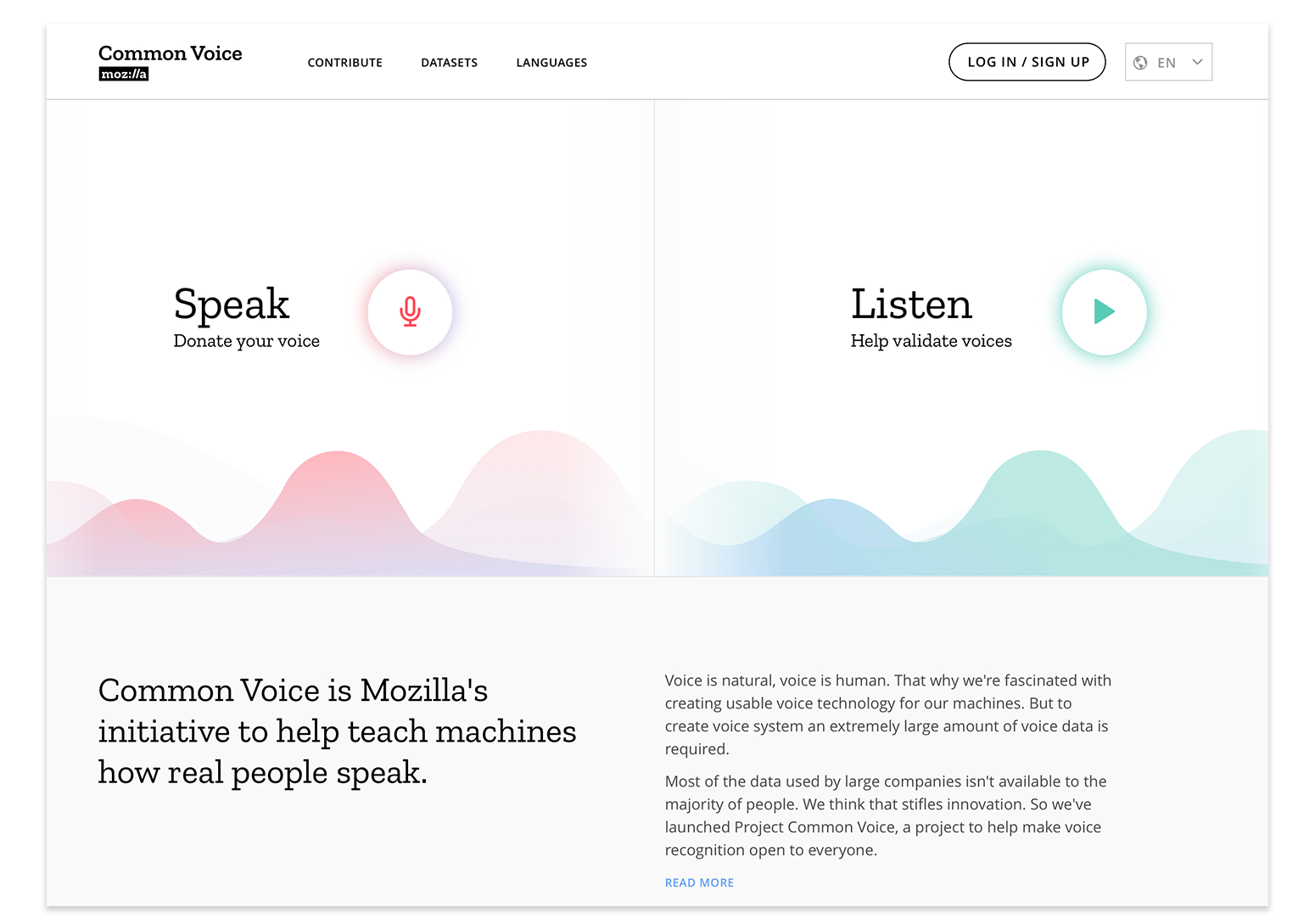
Sharing our Common Voices – Mozilla releases the largest to-date public domain transcribed voice dataset

by George Roter

Mozilla crowdsources the largest dataset of human voices available for use, including 18 different languages, adding up to almost 1,400 hours of recorded voice data from more than 42,000 contributors.

From the onset, our vision for Common Voice has been to build the world’s most diverse voice dataset, optimized for building voice technologies. We also made a promise of openness: we would make the high quality, transcribed voice data that was collected publicly available to startups, researchers, and anyone interested in voice-enabled technologies.

Today, we’re excited to share our first multi-language dataset with 18 languages represented, including English, French, German and Mandarin Chinese (Traditional), but also for example Welsh and Kabyle. Altogether, the new dataset includes approximately 1,400 hours of voice clips from more than 42,000 people.

With this release, the continuously growing Common Voice dataset is now the largest ever of its kind, with tens of thousands of people contributing their voices and original written sentences to the public domain (CC0). Moving forward, the full dataset will be available for download on the Common Voice site.


Data Qualities

The Common Voice dataset is unique not only in its size and licence model but also in its diversity, representing a global community of voice contributors. Contributors can opt-in to provide metadata like their age, sex, and accent so that their voice clips are tagged with information useful in training speech engines.

This is a different approach than for other publicly available datasets, which are either hand-crafted to be diverse (i.e. equal number of men and women) or the corpus is as diverse as the “found” data (e.g. the TEDLIUM corpus from TED talks is ~3x men to women).

More Common Voices: from 3 to 22 languages in 8 months

Since we enabled multi-language support in June 2018, Common Voice has grown to be more global and more inclusive. This has surpassed our expectations: Over the last eight months, communities have enthusiastically rallied around the project, launching data collection efforts in 22 languages with an incredible 70 more in progress on the Common Voice site.

As a community-driven project, people around the world who care about having a voice dataset in their language have been responsible for each new launch — some are passionate volunteers, some are doing this as part of their day jobs as linguists or technologists. Each of these efforts require translating the website to allow contributions and adding sentences to be read.

Our latest additions include Dutch, Hakha-Chin, Esperanto, Farsi, Basque, and Spanish. In some cases, a new language launch on Common Voice is the beginning of that language’s internet presence. These community efforts are proof that all languages—not just ones that can generate high revenue for technology companies—are worthy of representation.

We’ll continue working with these communities to ensure their voices are represented and even help make voice technology for themselves. In this spirit, we recently joined forces with the Deutsche Gesellschaft für Internationale Zusammenarbeit (GIZ) and co-hosted an ideation hackathon in Kigali to create a speech corpus for Kinyarwanda, laying the foundation for local technologists in Rwanda to develop open source voice technologies in their own language.

Improvements in the contribution experience, including optional profiles

The Common Voice Website is one of our main vehicles for building voice data sets that are useful for voice-interaction technology. The way it looks today is the result of an ongoing process of iteration. We listened to community feedback about the pain points of contributing while also conducting usability research to make contribution easier, more engaging, and fun.

People who contribute not only see progress per language in recording and validation, but also have improved prompts that vary from clip to clip; new functionality to review, re-record, and skip clips as an integrated part of the experience; the ability to move quickly between speak and listen; as well as a function to opt-out of speaking for a session.

We also added the option to create a saved profile, which allows contributors to keep track of their progress and metrics across multiple languages. Providing some optional demographic profile information also improves the audio data used in training speech recognition accuracy.


Common Voice started as a proof of concept prototype and has been collaboratively iterated over the past year

Empower decentralized product innovation: a marathon rather than a sprint

Mozilla aims to contribute to a more diverse and innovative voice technology ecosystem. Our goal is to both release voice-enabled products ourselves, while also supporting researchers and smaller players. Providing data through Common Voice is one part of this, as are the open source Speech-to-Text and Text-to-Speech engines and trained models through project DeepSpeech, driven by our Machine Learning Group.

We know this will take time, and we believe releasing early and working in the open can attract the involvement and feedback of technologists, organisations, and companies that will make these projects more relevant and robust. The current reality for both projects is that they are still in their research phase, with DeepSpeech making strong progress toward productization.

To date, with data from Common Voice and other sources, DeepSpeech is technically capable to convert speech to text with human accuracy and “live”, i.e. in realtime as the audio is being streamed. This allows transcription of lectures, phone conversations, television programs, radio shows, and and other live streams all as they are happening.

The DeepSpeech engine is already being used by a variety of non-Mozilla projects: For example in Mycroft, an open source voice based assistant; in Leon, an open-source personal assistant; in FusionPBX, a telephone switching system installed at and serving a private organization to transcribe phone messages. In the future Deep Speech will target smaller platform devices, such as smartphones and in-car systems, unlocking product innovation in and outside of Mozilla.

For Common Voice, our focus in 2018 was to build out the concept, make it a tool for any language community to use, optimise the website, and build a robust backend (for example, the accounts system). Over the coming months we will focus efforts on experimenting with different approaches to increase the quantity and quality of data we are able to collect, both through community efforts as well as new partnerships.

Our overall aim remains: Providing more and better data to everyone in the world who seeks to build and use voice technology. Because competition and openness are healthy for innovation. Because smaller languages are an issue of access and equity. Because privacy and control matters, especially over your voice.

The post Sharing our Common Voices – Mozilla releases the largest to-date public domain transcribed voice dataset appeared first on The Mozilla Blog.

08 Mar 01:48

✚ Visualization Tools, Datasets, and Resources – February 2019 Roundup

by Nathan Yau

Throughout the month I collect new tools for data and visualization and additional resources on designing data graphics. Here's the new stuff for February. Read More

08 Mar 01:48

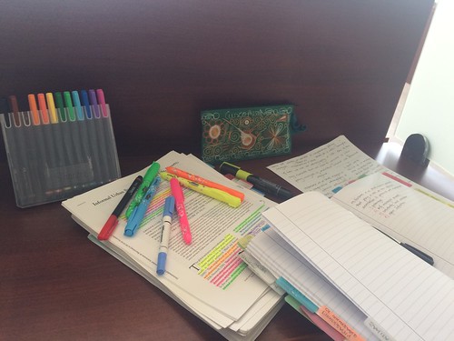
Reading, scribbling, highlighting, taking notes and organizing information from a journal article or book chapter – walking through my digital and analog processes

by Raul Pacheco-Vega

I have written several Twitter threads about how do what many people call “active reading“: I read, highlight, scribble on the margins, take notes and then store these in digital and analog media. I use highlighting and writing marginalia to engage more deeply with the reading materials I am working with. I’ve also posted here on my website the most recent iteration of my colour-coded highlighting and scribbling process. This note-taking process generates material that I then store either in analog form (Everything Notebook, index cards, Cornell Notes), or in digital form (memorandums, synthetic notes, rhetorical precis or Conceptual Synthesis Excel Dump rows)

My #AcWri process integrating reading CSED

A couple of days ago, I posted a Twitter thread showcasing my highlighting and scribbling and note-taking, as well as summarizing and organizing information digitally (and analogically). I decided to transfer my Twitter threads to a more permanent medium (my blog) so those who are interested in following similar approaches to active reading, literature reviewing and note-taking can do so. In this post I included several threads in order to make it easier for people to see different examples.

For literature reviews and reading and note-taking, I use both digital and analog methods, as shown here.

As I mentioned above, I’ve written SEVERAL Twitter threads showcasing my highlighting and scribbling. Here is another one, that also includes the process of filling out a Conceptual Synthesis Excel Dump (CSED) row.

I often use Twitter threads to showcase my highlighting and as pedagogical tools for my students, but at the same time live-tweet insights I gain from reading specific articles, books or book chapters. This is one of these examples.

And here is yet ANOTHER Twitter thread where I highlight, scribble and store my thoughts in memoranda or CSED rows. This particular thread focuses on argumentative writing, and explains each highlighter colour, which relatese to my colour-coded hierarchical organization of ideas. This is a nested approach.

08 Mar 01:48

Context.io IMAP Discovery Endpoint Now Available

by Context.IO
https://github.com/ReturnPath/imap-discovery

We’ve been receiving a lot of requests from developers using Context.io about making this endpoint public. We’ve got good news for all of you — it’s now public and live!

If you prefer to handle your own authentication and add users or email accounts manually, you may want to check for IMAP configuration settings to add users. The Discovery endpoint returns known IMAP configuration settings given an email address.

To learn more, read about the endpoint in our docs, and take a look at the discovery libary on GitHub.

Context.io will be shutting down service March 31, 2019 at 11:59pm CST.


Context.io IMAP Discovery Endpoint Now Available was originally published in Context.IO on Medium, where people are continuing the conversation by highlighting and responding to this story.

08 Mar 01:48

NetNewsWire Feedback Incoming

I’ve been getting more NetNewsWire feedback now that I’ve called it actually usable now.

Feedback is always an education. (See the most recent issues for some of it.)

There are things I expect to see, and then do see. Things I expect to see, and then don’t see. And things I didn’t expect at all.

It’s a great reminder that everybody’s different, and people want different things. They want to use the app the way they want to use it.

The tricky part is deciding what to do, of course. When I was younger, and selling NetNewsWire, I was reluctant to add features and preferences — but I did it anyway. A lot. I wanted people to buy the app!

But it did mean that NetNewsWire became, in at least one person‘s words, a kind of “Swiss Army knife” of RSS readers. This made it difficult to move forward with new features that I thought would be cool and useful.

Now that I’m older, and I’m not trying to please everybody and make money, I’m even more reluctant. I want to keep the app as simple as possible — because I like simple apps, and because it means I have time to add other features that I’ve never done before, but that I always thought would be cool.

But, at the same time, I really do want it to be used by as many people as possible. So there’s a tension there which I find interesting. My position on it is just to go slowly — which I can’t really help anyway — and think hard about each issue.

One That I Did Not See Coming

One of the unexpected things is Add way to see how many total unread items there are within the app.

There is a way, of course. There are two ways, even: the unread count appears in the Dock icon and beside the All Unread smart feed.

You’d think that would be enough — but it’s not. Consider that you might have the Dock hidden, and consider that you might have enough feeds and folders in the sidebar so that you can’t see the All Unread smart feed — it’s scrolled off.

Then what?

It could go in the toolbar — but some people run with the toolbar hidden. And, anyway, I never like status-y stuff in the toolbar. It could be a non-default toolbar thing — people could add it. But I’ve learned that lots of people don’t know you can customize toolbars.

How about a status bar at the bottom of the sidebar that can’t scroll off? Older versions of NetNewsWire had this.

Sure — but the trend these days, which I like very much, is to have a clean bottom edge to the window. No chrome. Look at Mail, Safari, Pages, and Numbers.

Well, okay — do that, but make it a View menu option, off by default, so we keep the clean edge.

Ugh. Now we’re going down the road of endless permutations of little things you can configure. That’s the road I want to avoid as much as possible. Do we really add that just because of the probably rare case where someone hides their Dock and the All Unread smart feed is scrolled off?

Another idea: that bottom-of-the-sidebar status view could appear only when the All Unread feed is scrolled off. But I really hate non-stable UI with weird little changes like that. It always seems too clever, and it makes me think the designer thinks they can paper over a design flaw by showing off.

Or there could be a non-scrolling indicator at the top of the sidebar. That ruins the nice line going along the top, though. But maybe the timeline needs a thing at the top for sorting, so maybe that line will go away anyway? And: wouldn’t this look weirdly redundant when the All Unread feed is not scrolled off?

So… what to do? I’m not actually asking for suggestions — though I’ll get some, because people tend to read things like this as problems-to-solve. (And I don’t mind suggestions. Not at all.) But what I actually intend here is just a look behind the development process at the point where people start giving feedback on an app.

Here’s what happens at this point: your design meets conditions you didn’t account for. They’re often rare cases, but they’re legitimate. And all the options seem pretty bad.

What will probably happen, in this case, is that I’ll punt on figuring it out till after 5.0 ships. I have no idea what I’ll end up doing. Which is part of the fun. :)

08 Mar 01:47

Photos

by Tom MacWright

Olympus XA-2

My photos are on macwright.org now: /photos.

I don’t like Instagram. I know that other people like it: they found a community there. They keep in touch with family. They share interests and life events. But I just don’t: I don’t like how browsing Instagram makes me feel. I don’t like how it shapes my photos, how it works as a product. I don’t like that it’s a Facebook company. How it doesn’t have critical APIs. You can’t cross-post to Instagram without using the app.

By creating my own place to post photography, I can start to like taking photos again. I can feel like my process of taking film photos, scanning them, and putting them on the web is worthwhile. That learning how to tweak camera raw in Capture One is fun. I can post just a photo or two a month. I don’t want to engage, I want to create.


So I wanted was /photos and that’s what I made. I use a script to resize and encode photos, then put those photos on Amazon S3. S3 is wired to CloudFront, which is then connected to photos.macwright.org. Using Amazon isn’t ideal, but because I control the domain, I can swap that later.

To post a photo to the site, I take it, process it in Capture One, create the thumbnails, upload them to S3 with Transmit, create a post that works with Jekyll, and hit publish.

Maybe the most interesting part of the tech is the way images are presented: I use the aspect-ratio CSS media feature to size each photo to a screenful on desktop, and use the picture element to serve one of 2 sizes and 2 formats - JPEG and WEBP.

It works the same way as the rest of the site. The only new thing is my usage of S3 and CloudFront in the place of Git LFS, which is where I keep my illustrations. I just knew that there’d be a lot of huge images, and didn’t want to commit to keeping them all on the disk of my laptop forever.

I’m happy to have built my own thing, where I can feel good about one of my passions again. I won’t be racking up likes. I don’t even collect analytics on this site, of any kind. I hope you like the photos.

08 Mar 01:47

Are women now better represented in films than ever before?

Here’s Ivan filling in for Lisa – she saw a chart that I created and asked me to turn it into a Weekly Chart.

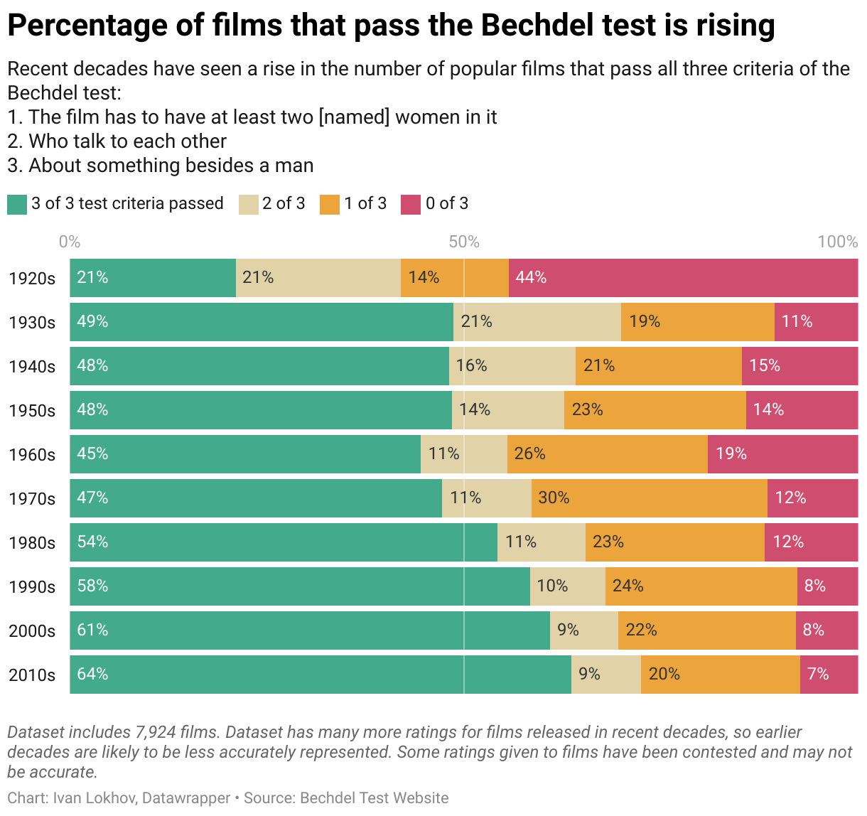
With the Oscars 2019 come and gone this past Sunday, it’s as good a time as ever to ask the question: how well are women represented in films? I used the Bechdel test to attempt to answer this question:

The test criteria seem basic, but it’s shocking to discover that a large proportion of films do not actually meet them. The Bechdel test website provides a large list of films and whether they pass the test. Among the “highlights”: not a single film from the Mission: Impossible series (there are 6 in total!) passes it.

Considering the progress that has been made over recent decades with regards to women’s rights[1], I thought it would be interesting to look at how representation of women in films has developed over time.

Getting the data

The aforementioned Bechdel test website provides a convenient API which I used to download data for all films in the database[2].

The downloaded data is in JSON format. I wrote a node.js script to group films into decades and calculate percentages of films that pass the different criteria. The script also converts data into CSV format which can be uploaded to Datawrapper. I excluded the earlier decades as they contained very little data.

With data now at my disposal, I went on to create the visualisation itself.

Chart Choices

I used the humble stacked bar chart to visualise the data. Each decade is represented by a single bar. Percentage proportions corresponding to the number of Bechdel test criteria passed are clearly visible through color-coding. The stacked bar chart also makes it quick and easy to make comparisons between the decades and see the overall trend emerging over time.


The Bechdel test is just one way of looking at representation of women in films. If you know of any further approaches or metrics dealing with this topic, or want to share your thoughts on the Bechdel test, let me know in the comments!


  1. It’s debatable how much real progress has been made - this big and important topic is outside the scope of this article. However to me the general trend seems to be positive, with an increasing amount of laws being adopted to support women’s rights and entitlements worldwide. In any case there is still a long way to go.

  2. Typing in curl http://bechdeltest.com/api/v1/getAllMovies > data.json in the terminal will download the data and save it as data.json.

08 Mar 01:47

The Full Versus Crop War Just Started

The introduction of the Canon RP introduces a new element into the full frame versus crop war that's been going on. 

I've noted before that with very capable 24mp full frame bodies on the market from Nikon and Sony at the US$2000 price point, Fujifilm was forced to push the pricing of their crop sensor X-T3 down a bit in order to provide marketing space. …

08 Mar 01:47

Postbox 6.1.11 is Now Available!

Postbox 6.1.11 is now available. Here's what's new in this release:
  • Several fixes to improve indexing performance
  • Added a "Theme" menu option to the View menu
  • Change to prevent the "Edit Message" command from activating when the Preview Pane is not open
  • The folder contextual menu command "Download This Folder" will now also index the folder
  • Added preference UI for "Show text attachments inline" in Preferences | Options > Display > General
  • Restored close window warning notifications on Windows
  • Removed message counts from the Windows Taskbar
  • Removed deprecated Default Send server option from Accounts > Outgoing Server settings
  • Fixed an issue that prevented filter action "Play Sound" filename from displaying
  • Fixed an issue with LDAP that prevented contacts from displaying
  • Fixed an issue with account reordering within an Account Group
08 Mar 01:47

X-Ray Microscopy of Symbolics “Ivory” CPUs.

by Stanislav

I currently have three Symbolics MacIvory CPUs. (Do you, reader, have one to sell? Please leave a comment!)

One is currently installed in a working machine and was not yet molested; the two remaining chips, I obtained in 2017 by bartering away a Symbolics 3620.

At some point I will cut one or more of the “Ivories” open, and perform die microscopy. But prior to this, why not a bit of non-destructive imaging?


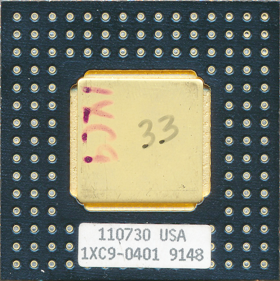
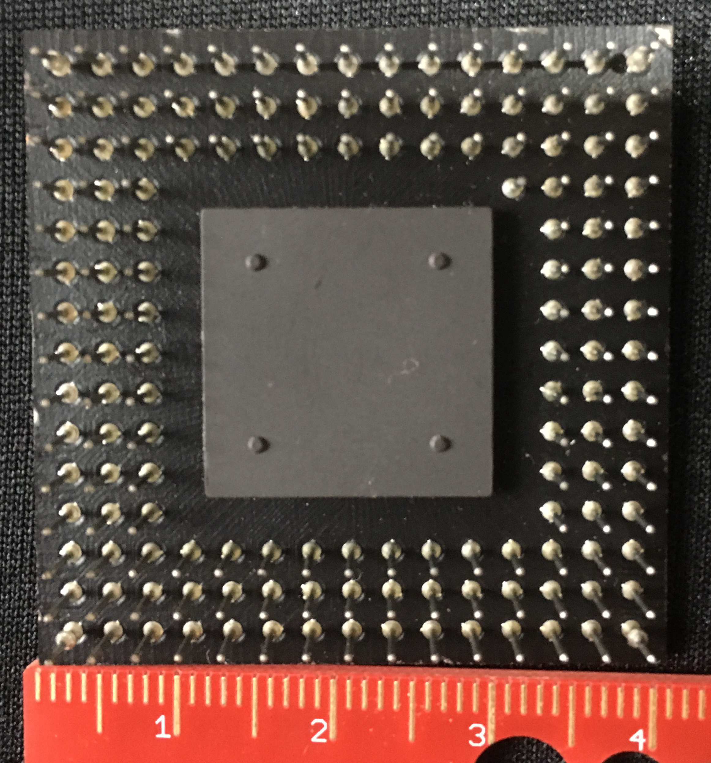
The first of the two samples is a “production” model, with a metallic cap:

Click for full resolution (1 MB):

Iron Ivory

Edit: the bottom side of this unit looks like this.

An attempted die shot at maximum voltage yielded:

Click for full resolution (Warning: 20 MB!):

Iron Ivory


It appears that 35kV (the maximum setting of the system) is unable to produce a usefully-contrasting image of the die and connections.


So we move on to the second sample, a “proto” model with a ceramic cap:


Click for full resolution (200 kB):

Ceramic Ivory

And with this one, we get:

Click for full resolution (Warning: 20 MB!):

Ceramic Ivory


Pretty interesting. What is the substance visible on the die? (glue holding the lid in place? or a “bird’s eye” view of the metallic layers of the die itself?)

Later, a magnified shot will be taken of this unit, with 35cm film and a scintillation cassette.

Exposure: 75 sec. @ 35kV, contact print, film: “Eco-30″.


08 Mar 01:47

Being Self Aware

by Richard Millington

We had trouble once with a client’s community manager who refused to accept her behavior was hurting the community (or members had an issue with her).

So we issued a survey to members gathering feedback. The results were illuminating (for us and her).

In your next community survey, ask members for feedback about yourself and your community team.

Make sure its anonymous (and members know it’s anonymous).

What do they like about how you engage with members?
What do they not like?
How do they perceive you?
Do they believe you care about them and put them first? Or are you just protecting the brand and trying to get them to go away?

If the answers cause you to reflect upon how you behave in your community, you’ve done the survey well.

08 Mar 01:47

Open Data Dashboards – A Partial Look Around to See What I’ve Been Missing

by Tony Hirst

Each new year, one of my half-made resolutions is to pull together an opendata hub for my local area. Being an island, the clear boundary also provides opportunities for monitoring inflows and outflows that may be harder to identify in other areas.

And each year, it never happens, although each year I do dabble a bit with local data gleaned from national datasets.

So this year, I’m gonna to try to start pulling recipes into one place, and try to get into the habit of adding new datasets as tables in the same database. The database model will probably be hit and miss, but I’ll try to work out sensible primary and secondary keys where I can. A Linked Data model would probably make most sense, but having to spend time getting the modelling right is too much of an overhead and a distraction.

A couple of things I want to try to achieve:

  • producing recipes that scale out; my interest is in grabbing and representing data from national datasets at a local level. The recipes should be easily keyed with identifiers that allow views to be rendered as easily for other areas as for the Isle of Wight;
  • producing some sort of consistent workflow and coherent architecture where I can easily add more data views whenever I get to grips with a new dataset.

A great example of this, and one I really should take a couple of days holiday off to work in, comes in the form of the Trafford Datalab Ward profiler.

This is just packed with goodness:

  • the ability to select different data topics and subtopics within those;
  • choropleth maps and associated, sorted lollipop charts (the only chart type that looks to be supported at the moment);
  • the ability to download the data;
  • the ability to see the R code used to grab the data.

The source for the site / app is available as traffordDataLab/ward_profiler and the data and data grabbers can be seen at traffordDataLab/ward_data/.

The ward_data repo is such a lovely, simple idea: topic areas with separate R code files to grab the data for a particular subtopic and dump it as a CSV.

Columns are normalised to:

area_code area_name indicator period measure unit value

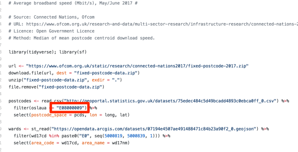
The R code often seems to pull local data from national datasets using literal, embedded codes, but it would be too much overhead to recast all these as arguments and pop them at the top of each file where they can be easily changed, or provide a means of passing them into the file from a parameter file.

The next step might them be to automate the production of the parameter file from a text look-up (eg “Isle of Wight”, “Trafford”) against various code lookup tables.

My first impression was that it could also make sense to extract mutables, such as URLs (data URLs often change with updated datasets) into a separate file too, or at least parameterise them and move them to the top of the R files. But new version datafiles relating to a particular dataset sometimes require tweaks to parsers, even if the datasets are nominally the same. This issue of consistency is one of the downsides of data released as files (CSV etc) rather than accessed via an API. (The advantage is that you can often get the bulk data more easily as a file…) But it would make more sense (using the file based data grab route) to version each data grabber file, creating an ongoing series of forks for each new release, rather than change the last most recent version directly. This would also ensure that history keeps working and would let you compare datasets over several releases. It would still make sense to pull  codes and URLs etc out into parameters at the top of the file. The codes at the top (a user area), to allow folk to easily grab data for another area; then the URLs in a maintenance area below, that could be readily changed when updating the file for a different release of the same data.

On the other hand, moving to API datagrabs may make more sense still. The R statxplorer from the House of Commons Library’s Oli Hawkins could help there, at least when pulling on data from the DWP Stat-Xplore API (Stat-Xplore website).

The way the Trafford Data Lab have arranged their spatial datasets is also interesting  — a repo containing shapefiles for different boundaries: traffordDataLab/spatial_data, which look like they might well have been pulled from the ONS geoportal boundaries collection and then converted to geojson. (One thing I think that could be useful would be a set of recipes for generating the different boundary sets identified by the Trafford data for arbitrary local authority areas. (i.e. allowing users to extract data for just their local area from a national dataset). related to this, I have a crude sketchbook here showing how to to grab some of the boundaries into a simple spatialite database.)

As well as the ward profiler, the Trafford Data Lab have also produced a range of other single web page apps that are generated from code that extracts local data from national datasets and constructs the a static index.html file that defines the app.

For example, this road traffic accident app:

is generated from a single Rmd file that can be found in this repo.

The Trafford Data Lab approach is elegant in so many ways: standardised data tables; scripts for pulling data into standardised data tables at a local level from national datasets; a ward data viewer that scales easily just by adding another item to a form in the single page web app that defines it; bespoke single web page app generators that build static single page web apps containing just the local data they need extracted from national datasets.

I’m not sure if a similar approach is being followed by folk over at the House of Commons Library, but they also seem to have got onto a roll lately with their Constituency Dashboards.

These dashboards scale views at a constituency level (with displays often rendered at ward level, or other smaller appropriate geographical area within the constituency:

The apps are built on top of Microsoft Power BI, and while code doesn’t appear to be available, you can grab the constituency level data from the app:

Some of the apps are also paged, though it seems that in some cases that’s not working so well… I don’t like the social media trackers much either…

PS To do: it’s been a long time since I had a look around the open data space. On the to do list: check out what ODI Leeds have been up to recently (repos). For example, West Yorkshire Mapping looks interesting… or at least, it would be if recipes for generating those different geodata slices were available too… Bath Hacked is another group who’s recent projects I need to catch up with (repos, though they looked to have stalled somewhat?). Data Plymouth / DataPlay is another, though I always used to find it hard to find any actual code outputs from their events…?

08 Mar 01:46

Update on Check, Please!

by mikecaulfield

Short update on the Check, Please project.

We’re about halfway into the coding hours on this which is a bit scary. We still have some expert hours from TS Waterman at the end to solve the hard problems but right now we’re solving the easy ones.

A couple weeks ago we put out a prototype. The prototype was for one of the three moves we wanted to showcase, and it was functional, and used the original concept of a headless Chrome instance in the background to make these things. The protoype did what good prototypes do and showed that project was possible, but there were three weak spots:

  • First, the Chrome screenshots could usually be manipulated to capture the right part of the screen (e.g. scroll down to a headline or get the correct Google result scrolled into view). But this was a bit more fragile than hoped as we tested it on a wide array of prompts.
  • Second, headless chrome was really slow on some sites. Even on speedy sites, like Google, the fire-up and retrieval would normally be a couple seconds but could stretch to much much more. We were headless chroming three sites and on the occasional call where all three went slow we’d sometimes get over 30 seconds. This didn’t happen a lot (timings were usually about 10 – 15 seconds for the entire process) but it happened enough.
  • Finally, because headless chrome is headless a lot of things needed to make the animation instructive (mouse pointers, cursors, omnibars) have to be added anyway via image manipulation.

I played with the settings, with asynchrony, with using a single persistent instance of Chrome Driver, and things got better, but it became clear that we should offload at least some problems to a caching mechanism, and where possible use PIL to draw mockups off of an HTML request rather than doing everything through screenshots. So I’m in the middle of that rebuild now, with caching and some imaging library rework. Hoping to get it reliably under 10 seconds max.

08 Mar 01:46

Bloggers’ Ink

by Bryan Mathers
Bloggers' Ink

Well now, it all started with this Twitter conversation.

There’s something about creating a sticker that forces you to boil down what it is you’re saying, as well as picturing it on someone else’s laptop hood.

But this sticker is REMIXABLE, courtesy of the fabulous Remixer Machine. So blogger, go make your monster…

The post Bloggers’ Ink appeared first on Visual Thinkery.

08 Mar 01:46

Exponent Podcast: Valuing Value Chains

by Ben Thompson

On Exponent, the weekly podcast I host with James Allworth, we discuss The Value Chain Constraint.

Listen to it here.

08 Mar 01:42

Wer will ein faltbares Handy und warum?

by Volker Weber

8b98d54b11a64106cdf8241a839097f5

Faltbare Smartphones — oder sollte man nicht besser sagen faltbare Tablets – sind auf den ersten Blick ziemlich sexy. Der Huawei-Prototyp wirkte dabei auf mich überzeugender als der von Samsung. Dennoch gibt es ein paar offensichtliche Nachteile:

  • Glas lässt sich nicht biegen. Das aktuelle Gorilla-Glas ist ziemlich hart und kratzfest. Biegbare Oberflächen müssen dagegen weich sein. Diese biegbaren Tablets werden superleicht verkratzen.
  • Man kann Material nicht beliebig oft biegen, ohne dass es steif wird und sich verändert. Wie bricht man ein Stück Metall? Man biegt es immer wieder vor und zurück.
  • Je mehr bewegliche Teile, desto mehr Fehler. Huawei und Samsung sind ganz stolz auf ihre aufwändigen Konstruktionen. Egal ob Slider oder klappbare Geräte, stets gilt: An den beweglichen Teilen gehen sie kaputt.

Und dann wäre da noch die Software. Android hat schon für Tablets kaum brauchbare Software. Von größeren Auflösungen profitieren vor allem Videos. Aber die werden auf den Biegetablets vor allem dicke schwarze Balken oben und unten haben.

Man schaue sich so ein Gerät immer unter dem Gesichtspunkt an, wie es sich zusammengeklappt nutzen lässt. Das wird die am meisten benutze Konfiguration sein.

08 Mar 01:30

WSL pro tip: Don’t mix the streams. For example...

WSL pro tip: Don’t mix the streams. For example, don’t try to work with an NPM-based project using the Windows version of NPM when you set up the project on the Linux side a while ago.

08 Mar 01:30

Yesterday, Katerina commented, “What happened t...

Yesterday, Katerina commented, “What happened to your keyboard? It sounds so much better than usual.” By better, she meant quieter. The answer is that I was using a Surface Laptop instead of my usual MacBook Pro. And, I have to agree. The keyboard is a nice change.and lovely to type on.

08 Mar 01:30

I just installed the latest Windows 10 Insiders...

I just installed the latest Windows 10 Insiders Fast Ring build (18346) with the new Windows Subsystem for Linux updates that allows you to access Linux files from Windows.

Before this, to use Visual Studio Code or other Windows apps on the same files you were using with Linux tools, you had to be careful and make sure that you were working in the Windows filesystem, exposed via the /mnt/c path. This worked pretty well, but it wasn’t quite ideal. I felt a performance hit when running Linux-based tools on a large number of files. And, it felt like the main user story it solved was to enable using Linux tools on Windows files. While that’s a good use case to solve, it wasn’t my use case.

Now, you can open up any Linux path through what looks like a network connection to Windows apps. This means that you can open up your Linux home directory in Explorer and work directly on files that are located there with Windows applications. The net result is a lot better for the way I work. And, any potential performance hit happens on one file at a time instead of when I run a compile on a whole bunch of source code.

Better yet, this is the developer experience I really want. It solves the use case where I want to use Windows apps in the GUI — primarily Visual Studio Code as a text editor — to work with files on the Linux side. It lets me treat the Linux command line as one layer, and Windows as another layer.

Not bad. Not bad at all.

08 Mar 01:23

Soor: A Third-Party Apple Music Client for iPhone

by Federico Viticci

Soor, a third-party client for Apple Music created by indie developer Tanmay Sonawane, is based upon a fascinating premise: unlike other standalone music players for iPhone, Soor works with Apple's native MusicKit API, enabling direct integration with Apple Music; unlike Apple's Music app though, Soor prioritizes one-handed gestures, user customization, and a single-page design that packs multiple sections into one view. In theory, Soor should be the optimal blend of two different worlds – a third-party music player with its own aesthetic and stylistic choices combined with Apple Music data and the service's vast streaming catalog. In practice, while Soor has some solid ideas I'd like to see in Apple Music too, and despite its intriguing visual design, the app doesn't qualify as a complete replacement for the Music app on iPhone.

Two years ago, Apple introduced MusicKit, a developer framework and set of APIs that allowed iOS developers to create apps compatible with Apple Music. From utilities such as Shazam and SongShift to standalone players and fully-featured clients, MusicKit aimed to provide the native alternative to Spotify's web API that had been missing from the iOS music app ecosystem. As I wrote in my review of iOS 11:

MusicKit enables apps to integrate with Apple Music and get access to artists, albums, songs, playlists, and even activities and curators. The MusicKit API returns JSON results and supports discovery operations such as search, charts, and personalized recommendations. To do this, iOS 11 has a new music permission dialog with a purpose string that explains why an app wants to access your Apple Music library and account.

I expect MusicKit to spark a creative, diverse ecosystem of music utilities – from alternative clients that stream songs saved in your library (if Apple allows them on the App Store) to fitness apps with deeper Apple Music integration. It’ll be interesting to see if MusicKit becomes as popular as the Spotify API – at least on the iOS App Store.

Two years later, it's fair to say music utilities have benefited from MusicKit's native integration with Apple Music and the user's local music library, but alternative clients have fared better on a platform where an Apple Music app is not available – the open web. In the past year alone, thanks to the introduction of MusicKit for the web, we've seen the release of several web apps that replicate the Apple Music experience in a browser – often with an attention to detail and polished design that might even pass for an official Apple product. I suppose this is a logical consequence: from a user's perspective, it makes more sense to gain access to Apple Music on a platform that doesn't have a dedicated, built-in Music app than to install an alternative Apple Music player on an iPhone, which already has a pre-installed, full-featured app from Apple. But if that's the case, where does Soor fit in?

A Customizable Home Screen

The main selling point of Soor is its single-page design with sections that can be customized and rearranged by the user. Soor doesn't have a tab bar, which means that from a single home screen you'll have access to:

  • Your playlists
  • Recently played
  • Recently added
  • Apple Music's hot tracks
  • Top playlists
  • New releases
  • Top songs
  • Apple Music's For You section

With the exception of For You (more on this below), all these sections can be turned off in the app's settings and rearranged so that, for instance, your playlists and recently played albums are at the top of the screen, with Apple Music sections following down in the middle. Soor's key proposition is this drastic departure from the organization of the Music app: rather than splitting the Library and For You into two separate tabs, Soor lets you mix and match both types of content in the same screen, enabling you to choose the order they're displayed for faster access.

In the several weeks I've spent testing Soor on my iPhone, this has turned out to be my favorite aspect of the app. In an old issue of our MacStories Weekly newsletter (#154), Ryan argued in favor of a customizable For You page in the Music app, noting how Apple should consider letting users personalize the order of blocks displayed in what is, for many, the default view of Apple Music. Soor delivers on that idea with the ability to decide which sections you want to see and where they should be placed. In everyday use, the end result is a music app that can be faster to operate than Apple Music because the playlists, albums, or songs you care about are just two taps away. Everyone's music preferences are different; the flexible, modular approach of Soor is exactly what I'd like to see in the future of Apple Music too.

I should also note how Soor's design fits the modern iOS ecosystem but does a better job at balancing information density than Apple's own app. Compare Music's presentation of the For You page and your playlists to the same screens as viewed in Soor:

Comparing the For You and Playlist pages between Music and Soor.

Comparing the For You and Playlist pages between Music and Soor.

Thanks to smaller thumbnails and (scrollable) grids, Soor is able to display more content on screen, thus increasing the speed and comfort of navigation between sections. By contrast, where Apple Music once felt bold and intuitive, it now appears overly sparse and limited. Again, I would love for a future version of Apple Music to let me select the density of content aggregated in the For You page, much like iOS allows me to choose its system-wide font size with a simple slider.

MusicKit and For You

In terms of actually playing music, even though Soor has its own Now Playing screen, under the hood it uses Apple Music's audio engine and player. This means that when a song is playing in Soor, it'll also appear as playing in the Music app because Soor is merely a different front-end interface for the same underlying service. Playing a song in Soor will be reflected in Control Center and the Apple Watch as if it were playing in Music; similarly, if you start playing something in Soor then force-quit the app, it'll continue to play because, behind the scenes, playback is managed by the Music app.

There's one notable omission (the first in a long list): unlike the Music app, Soor does not support AirPlay 2, so you won't be able to stream to multiple AirPlay 2 speakers at once or control what's playing on them on a separate channel from your iPhone's system audio. According to Sonawane, AirPlay 2 is one of the features he's planning for future updates to the app, but – considering the app's price tag – it would have been nice to have it available at launch.

The inclusion of the For You section is one of the perks of MusicKit, and it helps achieve a basic degree of feature parity with the Music app. In Soor, the For You section is comprised of a series of content blocks that are always displayed at the bottom of the home screen and cannot be rearranged or split into smaller, individual chunks. These blocks are:

  • Curated playlists (Favorites Mix, Chill Mix, New Music Mix)
  • The day's Playlists and Albums
  • Artist spotlight playlists
  • New For You
For You in Apple Music (left) and Soor.

For You in Apple Music (left) and Soor.

These are the same sections you'd see in the Music app, but they're available right inside Soor – much like For You content can also be accessed from the Sonos app after you connect an Apple Music account. Notably absent, however, are the Friends Mix and Heavy Rotation playlists, which are exclusive to the Music app. I'm aware of the fact that the Friends mix/feed is not available to the MusicKit API (so there's nothing Soor can do about it), but I have to wonder why For You can't be freely rearranged on screen or why it can't be narrowed down to a subset of playlists or sections.

Other Design Peculiarities

Soor has its fair share of problems, as I'll detail in the section below, but I ought to mention its several visual treats and other design touches that are worth discussing.

In addition to a standard light theme, Soor supports a true black theme (ideal for OLED displays) and a dark mode based on dark grays and oranges; I like the latter a lot, and I hope Apple has a similar palette in mind for Apple Music in iOS 13.

Themes in Soor.

Themes in Soor.

While Apple's Music app employs a mix of 3D Touch and buttons to reveal contextual menus for songs, playlists, and other items, Soor eschews 3D Touch altogether and uses a combination of popup menus and drag and drop to let users perform actions and manage their queue. Contextual menus are invoked by tapping an ellipsis button next to songs/albums or the artist name in the Now Playing screen. I like how these menus are not modal on iPhone – they don't take over the entire screen – but instead feel like contextual menus inspired by macOS. Despite their resemblance to desktop menus, they feel native to iOS: each item in the menu has its own icon, and you can "hover" with your finger over each option to feel a subtle haptic tap and see a highlight around the selected item. As others have shown lately, I'm starting to think that desktop-like contextual menus can indeed be adapted to iOS.

Contextual menus in Soor.

Contextual menus in Soor.

Soor differs from Apple Music in how it implements queue management. Soor's contextual menus don't contain any buttons to "play next" or "add to queue"; instead, this is entirely done by dragging songs and placing them in a "drop zone" that features buttons to queue, add songs to playlists, like them, and share them with extensions.1

Drag and drop in Soor is technically impressive.

Drag and drop in Soor is technically impressive.

This interaction is really well done, and it's now one of the best showcases of drag and drop for iPhone along with Castro.2 When you're dragging a song and hover over buttons in the drop area, each glyph gets highlighted, plays a haptic tap, and displays a tooltip to indicate it'll activate if you let go of the song. It's even more impressive for playlist management in that if you pause with a song over the playlist button, the drop area will expand and reveal an additional tray of playlists that you can scroll while dragging to select a destination playlist.

As I mentioned above, Soor's adoption of drag and drop is impressive, both visually and technically speaking. After a few weeks spent using the app, however, I'm not convinced it's necessarily faster than Music's more simplistic, but effective 3D Touch menu. I use 3D Touch a lot in Apple Music to like songs, jump to albums, or add songs to my queue. The gesture is "sloppy" in that it doesn't require hitting a tiny button with too much precision, and I've grown accustomed to pressing with my thumb, selecting a menu option without lifting my finger, then letting go. In using Soor, I found myself missing Music's 3D Touch interaction, and I felt like the app's menus and drag and drop system were slower than Music's press-to-open system in the end.

I'd also like to highlight Soor's "pull to reach" functionality, a setting designed to aid one-handed operations by letting you pull down on the screen to select toolbar buttons at the top. Think of it like pull to refresh, only it has to be more "intentional" and you have to wait for a toolbar icon to be selected (it'll be highlighted and you'll feel a tap) before you can let go and trigger the button. In Soor, this is presented as an easier way to open settings, activate the search feature, or tweak sorting in playlists because all three of those buttons are placed toward the top of the screen and may therefore be difficult to reach.

Pull to reach to open search.

Pull to reach to open search.

I like the sentiment behind pull to reach, which is presented as one of the marquee features of Soor, but in my experience accidental triggers of the pull-down gesture were too frequent to justify leaving the setting enabled. Even with an option to mitigate pull to reach with a 0.5 second delay turned on, I found that I could often trigger search when I was just scrolling in the app without meaning to open search and engage pull to reach. There's definitely something to the idea behind pull to reach, but the current implementation was too unreliable for me to leave it enabled.

Soor's Problems and Limitations

I'm going to cut to the chase here: whether by MusicKit limitations or personal decisions of its developer, Soor is affected by a variety of other issues that prevent it from being a full Apple Music client capable of replacing the Music app.

Soor lacks key features that are part of the modern Apple Music experience. Aside from For You and top songs, most of the other views from Apple Music are missing: artist pages lack profile pictures, they don't separate different types of music releases, nor do they show you artist bios and related artists; there are no music videos either. It's effectively impossible to browse for new music in Soor: Apple Music has a front page that highlights interviews, new releases, and videos; you can browse by genres, check out radio stations, and see a list of noteworthy 'coming soon' releases on the main Browse page; all of this is absent from Soor.

It gets worse though. Soor does not support Beats 1 at all, has no built-in lyrics, does not work with AirPlay 2, and it's hamstrung by API limitations that, for instance, prevent it from sharing playlist links, seeing what your friends have been listening to, or understanding which tracks in an unreleased album are actually available for streaming or not (if you try to play them, they won't do anything because they're not available yet). The developer is upfront about some of these technical limitations in a built-in FAQ section of the app, but it's hard to tell whether all the other missing features were also due to API restrictions of if they were decisions made during development.

What's for certain is that Soor is a $10 iPhone app (it doesn't support the iPad in this first version) that is advertised as having "full Apple Music support" while in reality it's a music player that integrates with Apple Music but lacks dozens of features that make up the modern Apple Music experience. It's a subtle difference, but it's where I draw the line in the comparison between Apple's Music app and Soor.

Wrap-Up

All of this begs the question: why should you buy Soor?

It's undeniable that the app has an attractive UI and is perhaps the best example of MusicKit support in a third-party Apple Music client for iOS. But I don't think pretty design and solid API adoption are good enough reasons to recommend a $10 app to people nowadays. Instead, I think you should consider Soor if you're the kind of Apple Music subscriber who doesn't care for all the other features absent from the app (videos, Beats 1, browsing for new music, artist pages, etc.) and wants to get fast access to playlists in a single-page design. The ability to customize the order of sections and put playlists at the top is the feature that sets Soor apart from the Music app. If you're the type of person who pays for Apple Music to stream songs but doesn't care about any of the other modern Apple Music features and just wants to quickly listen to playlists on an iPhone, then I would say Soor is probably for you. Sadly, I have a feeling this is not a huge market, but I could be wrong.

In many ways, Soor reminds me of Ecoute, the music player for iOS that launched well before the days of Apple Music and streaming services. Like Ecoute, Soor brings a different design sensibility to the music player, but it can't be considered a full replacement for the main service it integrates with due to a host of technical restrictions and opinionated choices. For this reason, Soor is ultimately stuck between its vision and the realities of Apple Music: the app lures you with the promise of a beautiful, comprehensive Apple Music listening experience, but it can't fulfill that vision just yet. I hope that its developer will be able to iterate on this first version of the app by shipping an iPad version and supporting all the Apple Music features that can be added to the app. But if you're a heavy Apple Music user, Soor's approach, despite its beauty and cleverness, is too limited to replace Apple's Music app today.

Soor is available on the App Store at $9.99.


  1. If you share an Apple Music song with the share sheet, you'll share both the song's name and iTunes link; if you share a track you manually uploaded to iCloud Music Library (which can be played in Soor), you'll only have the song's title. ↩︎
  2. I continue to believe Apple should enable drag and drop system-wide on iPhone. ↩︎

Support MacStories Directly

Club MacStories offers exclusive access to extra MacStories content, delivered every week; it's also a way to support us directly.

Club MacStories will help you discover the best apps for your devices and get the most out of your iPhone, iPad, and Mac. Plus, it's made in Italy.

Join Now
08 Mar 01:23

Apple’s Month-Long Celebration of International Women’s Day

by John Voorhees

A week from tomorrow is International Women’s Day. To mark the day, Apple has announced a series of events throughout the month of March.

In the US, Apple is partnering with Girls Can Code to bring programming to more girls and young women. The program includes Swift training for club leaders and will use the company’s Everyone Can Code Curriculum to make the programming language available nationwide to 90,000 girls. Apple’s Lisa Jackson:

“Women have earned the opportunity to have our ideas shape the future,” said Lisa Jackson, Apple’s vice president of Environment, Policy and Social Initiatives. “We’re excited to support Girls Who Code as they empower girls to be the developers and tech innovators of tomorrow.”

Emily Grasile of the Chicago Field Museum will be featured at Chicago's Michigan Avenue store.

Emily Grasile of the Chicago Field Museum will be featured at Chicago's Michigan Avenue store.

In addition, Apple retail stores in Singapore, Kyoto, Hong Kong, London, Milan, Paris, Dubai, San Francisco, Chicago, New York, and Los Angeles will host a special ‘Made by Women’ series featuring artists, scientists, entrepreneurs, musicians, developers, photographers, and others.

On the App Store, Apple will run special features all month long. Every March App of the Day will feature apps by women, and on Fridays the App Store will go behind the scenes with stories of the women behind apps and efforts being made to bring women into the tech industry. On March 8th, there will also be a special collection of games featuring Captain Marvel that coincides with the release of the film.

Apple Music will include special editorial and playlist content featuring women and Beats 1 will have a 24-hour takeover highlighting the work of women musicians. Apple’s movie, TV, books, and podcast storefronts will include content made by and featuring women too. Finally, on March 8th, Apple Watch users who complete a 1.6 kilometer walk, run, or wheelchair workout will receive a special Activity award and stickers for Messages.


Support MacStories Directly

Club MacStories offers exclusive access to extra MacStories content, delivered every week; it's also a way to support us directly.

Club MacStories will help you discover the best apps for your devices and get the most out of your iPhone, iPad, and Mac. Plus, it's made in Italy.

Join Now
08 Mar 01:22

Spectre: A Computational Approach to Long-Exposure iPhone Photography

by John Voorhees

Spectre is a new specialized camera app from the team that created Halide, one of our favorite camera apps on iOS. The Halide team describes Spectre as a computational shutter for the iPhone, which allows the app to do things like remove people from a crowded scene, create artistic images of rushing water, and produce light trails at night. The same sort of images can be created using traditional cameras, but getting the exposure right, holding the camera absolutely still, and accounting for other factors make them difficult to get right. With Spectre, artificial intelligence is used to simplify the process and make long-exposure photography accessible to anyone with an iPhone.

If you’ve used Halide, you’ll be at home in Spectre, which shares a similar interface. Overall though, Spectre is simpler than Halide if for no other reason than that it’s tailored for a very specific type of photography.

The main Halide interface (left) and Spectre (right).

The main Halide interface (left) and Spectre (right).

Below the viewfinder is a row of buttons to flip the camera around for a selfie, stabilize the camera, and access settings. When stabilization is turned on, the button becomes an indicator that helps you steady your shot. Spectre can take 3, 5, and 9-second images. That’s a long time to have the shutter of the camera open, so the steadier you can hold your iPhone, the better your final results will be. The stabilization button helps by showing an iPhone icon centered inside a bracketed square. As you move your hand the icon moves, giving you a sense of how much camera shake you’re introducing to the image. When the app decides you’re holding your iPhone still enough to take a picture, the word ‘STABLE’ appears below the button and you can begin shooting.

You can watch people disappear from a shot with hardly a trace as you take a picture.

You can watch people disappear from a shot with hardly a trace as you take a picture.

Instead of keeping the shutter open the whole time during an exposure, what Spectre does is take hundreds of individual images and then compare them to do things like remove objects that move through the frame. The same AI also helps reduce the effect of camera shake, making long exposures possible without a tripod.

The length of exposure is controlled by a dial in the lower right corner of the screen. Just above that is the settings button where you can choose to save your resulting photos as Live Photos and implement a Siri shortcut to trigger the shutter button. The Settings screen includes a handy guide too with suggestions on settings to get the best shot under different conditions, which I found helpful when starting out.

Rushing water takes on an artistic quality in a long-exposure shot. iPhone Camera app version (left) vs. Spectre version taken using a tripod (right).

Rushing water takes on an artistic quality in a long-exposure shot. iPhone Camera app version (left) vs. Spectre version taken using a tripod (right).

There’s also a button in the top left corner of the screen to turn light trails on, off, or to auto-mode. In my testing, the automatic light trails setting worked well in most shots but seemed to have been set to off a few times when shooting into the bright headlights passing beneath a highway overpass at night.

Spectre has an exposure compensation button in the top right-hand corner too, which you can adjust with a slider that appears when you drag your finger vertically on the screen or tap the grayed-out exposure button. You can also tap onscreen to set the focus point for a shot and preview the pictures you’ve taken using the button in the lower left corner of the screen. In preview mode, you can mark photos as favorites, share images or movie versions of them, or delete them.

The light trails of headlights and taillights shot handheld from an overpass over I-294.

The light trails of headlights and taillights shot handheld from an overpass over I-294.

Spectre’s AI is impressive, but it’s best to keep in mind that it’s not magic either. Holding your iPhone as still as possible results in better images than relying on stabilization.

The images in this review are straight from my iPhone XS Max with no editing. I tried Spectre in a variety of settings: sitting in a chair at a coffee shop with my arm resting on a table for stability, standing with no place to brace myself in freezing cold, and using a mini tripod. The tripod won hands-down, but sitting still in a chair at a coffee shop wasn’t far behind. My handheld shots of the creek weren’t keepers, but they were taken on a cold day after I’d been out a while and my hands were becoming numb and probably a little shakier than normal. In contrast, all of the night time shots I took on a highway overpass were shot handheld and many turned out well.


The bottom line is that it takes some practice to get good shots from Spectre: both practice holding your iPhone steady and knowing what kind of conditions are best for taking long exposures. There aren’t a lot of settings in the app, but tweaking them helps yield better results too.

After only a week of using the app, I don’t feel like I’ve completely mastered Spectre. For example, of the 10 night time shots I took on a highway overpass, six were good and four were awful messes. There weren’t any images that fell inbetween. I had the same experience with the other shots I took. All were at one end of the spectrum or the other.

That is sure to frustrate some people when they first try Spectre, which is why I highly recommend reading the excellent tips in Settings. Still, when things fall into place, the results can be fantastic and I’ve had great fun experimenting with the app. I feel as though with a little more practice, I’ll be able to improve my hit rate and create many more interesting shots.

Spectre is available on the App Store for $1.99 for a limited time after which the price will be increased.


Support MacStories Directly

Club MacStories offers exclusive access to extra MacStories content, delivered every week; it's also a way to support us directly.

Club MacStories will help you discover the best apps for your devices and get the most out of your iPhone, iPad, and Mac. Plus, it's made in Italy.

Join Now
08 Mar 01:22

Friday File Feline: Japan’s Traffic Safety Video Catapulting in Popularity

by Sandy James Planner

tumblr_nk4erfFw7z1s2wio8o1_500

tumblr_nk4erfFw7z1s2wio8o1_500

In the “you just can’t make this stuff up” department an auto parts service company in Japan has created a traffic safety video for cats. They actually used animal psychologists’ advice to create a video with “plenty of moving pieces to keep the kitties’ attention on the important message, adding in the sounds of chirping birds, and a narrator who meows.”

Fast Company  also reports that the video was “focus-group tested by cats for cats at a one of Japan’s many cat cafés and were chosen as most likely to ensure a rapt feline audience.”

Using a sound track that has a similar sound wave pattern comparable to small rodents and mice, the video is designed for cat owning drivers to watch too, with driving tips to observe where cats could be found on the road, and how to ensure that drivers do not crash into them. Of course the whole point is for cat owners to check out the video with their pet cat to see if the cat will watch it, and hopefully pick up some human driver trips too. The video is below if you want to check it out on your own cat. Of course the international attention to the fact that the Yellow Hat auto parts company created such a video is enhancing the company’s brand~in three days the video has already garnered almost 90,000 views.


08 Mar 01:22

SUVs & Trucks Exponentially Killing, Maiming Pedestrians

by Sandy James Planner

suvstroller

suvstroller

While many cities have undertaken initiatives to make it safer and more convenient for walking and biking, the motor industry has been selling bigger and larger vehicles, with over 1.4 million Sport Utility Vehicles (SUVs) and crossovers being sold in the United States in the first quarter of 2018. What is the difference between these two categories? A SUV is a vehicle built on a truck platform, while a crossover is a unibody construction on a car platform, and is supposed to  be more maneuverable and parkable. Both of these are large vehicles and are outselling sedans.

Indeed trucks and SUVs comprise 60 percent of the new vehicle purchases in the United States, and have been contributing to an increasing proportion of pedestrian deaths. From 2009 to 2016  pedestrian deaths have risen 46 percent and are directly linked to the increase of these large vehicles on the road.

Statistics show that SUVs with the high front end grille is twice as likely to kill pedestrians because of the high engine profile, but this information has not been well publicized. In the United States a federal initiative to include pedestrian crash survival into the vehicle ranking system was halted by opposing automakers.

So why are people buying these large vehicles?

As this report suggests  the larger size “is ideal for families, who appreciate the space to carry more passengers as well as haul modern-day cargo from groceries to IKEA furniture. Their larger size also provides a higher level of safety. Drivers also appreciate sitting higher in the vehicle, which can give a better vantage point for maneuvering the vehicle. And for drivers who live in harsh climates, SUVs and Crossovers offer a rugged build and all-wheel drive that handles better in the snow than smaller cars do.”

It is all about the driver experience and nothing about the pedestrian or cyclist survival  after being hit by these vehicles. As the NPR reports in 2018 pedestrian deaths in the United States reached a 28 year high with 6,227 pedestrians killed in crashes. That is 4 percent more than 2017, and  is roughly equivalent to the population of Yarmouth Nova Scotia.

The Governors Highway Safety Association (GHSA) directly links pedestrian deaths to the SUVs noting that their involvement in fatal crashes has increased by 50 percent since 2013.  These SUVs “cause more severe pedestrian injuries and make up an increasingly large percentage of registered vehicles”. The GHSA also clearly identify the popularity of SUVs and trucks as more likely to kill a pedestrian due to the size and weight differential.

But automobile companies are selling a product, and the current promotions for large trucks and SUVS  are selling an “experience”. Trucks are being sold as the perfect city/country vehicle for a whole range of hardy people. Take a look at the YouTube video below which usurps an old Donny and Marie Osmond song to peddle trucks to cowboys, soldiers, construction workers, musicians and horse fanciers. It’s not about sustainability and doing right by the environment, it is about power, speed, the outdoors  and being rugged.

And you will notice there is not one pedestrian in sight.


Image Fox5SanDiego.com

08 Mar 01:22

Jericho: The Planning Begins

by Gordon Price

Don’t want to misquote Mike Harcourt, but he observed not long ago that a lot of the residential growth in the City of Vancouver for some considerable time in the future could be West of Alma.  And primarily on First Nations lands.  Sites like the UEL, the University Golf Course, Jericho.  And then further east, there are the Heather lands, sites along the Fraser, around Burrard Bridge, perhaps much more.

Jericho is the first large-scale site to be considered west of Alma for many decades.  So the planning begins – and not just for the urban design of the site.  Also for the waves of wealth generated.  For the kind of partnerships that evolve.  And how reconciliation is interpreted.


Saturday, March 2

12 pm – 4 pm

Jericho Hill Pool & Gymnasium | 4180 W 4th Avenue, Vancouver

Ceremonial Welcome (12 pm – 1 pm) – formal welcome by representatives from MST Nations and City of Vancouver.


Following the ceremonial welcome, stick around to learn about the process, project background, City policies, proponent aspirations, talk to City staff, and meet the proponent team.

Open House (1 pm – 4 pm)


07 Mar 21:30

Horizon Report Preview 2019

EDUCAUSE, Feb 28, 2019
Icon

This report (11 page PDF) carries on Horizon's long-standing tradition of predicting things that have already happened. Need proof? For the short term, Horizon is predicting mobile learning and analytics. Medium term sees mixed reality and artificial intelligence. And get ready, because in 4-5 years we'll see blockchain and virtual assistants (that will be a surprise to anyone who bought a Google Home with Bitcoin). It's not that these predictions are unhelpful, they're also too vague to be useful. Consider 'blockchain'. They write "the  legacy of blockchain might be what the technology inspired rather than the broad adoption of blockchain technology itself." Well - yeah. But what will be the technology inspired by blockchain? I've taken my own stab at that question - but it's hard to see Horizon getting beyond a one-word answer. Via Campus Technology.

Web: [Direct Link] [This Post]
01 Mar 15:08

Fender Hardware Hacks

by noreply@blogger.com (VeloOrange)
By Scott

Loyal readers will recall a post I wrote last June about multiple uses of fender stays. We thought with spring rapidly approaching, that perhaps it was time to share some more little "hacks" and ideas of how to use fender hardware to spruce up your bike/clean up the overall look of your bike.

Matt, from our local Bike Doctor, recently came by on his new custom, all-road bike made by local builder, Brackish Cycles. His ride is pretty darn modern with thru-axles, hydraulic disc brakes, dropper post, dropped seatstays, and carbon fork. He cleverly decided on using several fender eyelet bolts as cable/hose guides for various external routing. I think it's a pretty slick alternative to clamps.


Igor helped him out with mounting a front fender on his carbon fork to keep the spray off him and his drivetrain. Why only a front? Because Matt is a self-proclaimed (and I quote) "selfish cyclist". This bike is specifically designed for speed; and since there isn't much room in the back, Matt opted to use one of those plastic ass-savers as a way to keep the grit and grime off his backside. When working on the fender, Matt noticed our long leather mud flaps. It was a bit longer than the ass saver he was using, so he used one of those and a long rack strut underneath to support it and voila: a more stylish and hearty ass saver, that blends in well with the finish of his new bike.


When running dynamo lighting, the routing of the wires is something that can look, well, ungainly. With a custom fork, you can always have a hole drilled at the top and bottom to run the cable through, but for those of us running stock forks, how does one keep the cables nice and neat, without having to use zip ties? R-clips of course! Screw these into the fork eyelets and run the cables through them to keep everything nice and neat. Here is Igor's setup on his Polyvalent.


Finally, we have P-clamps. Such a simple and versatile item. We used them a few years back as a way to attach a wine crate to a Porteur rack.


Does anyone have any non fender uses for fender hardware that they'd like to share? Drop us a line in the comments and we'll share your knowledge with the world.

01 Mar 15:07

@stoweboyd

@stoweboyd: Indoor cannabis cultivation accounts for 1% of all electricity use across the US |...