Rolandt
Shared posts
Aquaminds Notetaker - Jeffery Smith
NewsBlur Blurblog: Toronto’s “Fully Stacked” Shipping Container Market is Now Open
 |
sillygwailo
shared this story
from  Designlines Magazine. Designlines Magazine.
|
Well-built, muscular, and loaded with top tier players – “fully stacked” is a term you might use to describe a winning sports team. It’s a term we’d use for a project, too, particularly one originated by a big thinker, built by leading architects, and populated by a stable of premium, mostly-local brands. Yes, Stackt is fully stacked and, now that this mixed-use, all-season public market at Bathurst and Front streets is open to the public, you too can go see what makes this project a winner.

Designed by LGA Architectural Partners’ Janna Levitt and Danny Bartman with Stackt founder Matt Rubinoff, the soon-to-be-bustling community hub – Canada’s largest shipping container marketplace – temporarily inhabits the site of a former smelting plant. The 2.4-acre-lot, roughly the size of two city blocks, is built up using 120 reclaimed shipping containers. These, as you’ve gathered, are stacked, with those on the bottom being retrofitted and occupied by pop-ups, creative incubators, and 30+ retailers and food and beverage vendors. The 40-foot-long containers are often combined to meet specific occupant’s needs: for instance, Belgian Moon uses three conjoined crates to house its brewing equipment. Other inhabitants, like COFO, Dresden Vision, Reunion Island Coffee and Donut Monster, more than make do with one or two.

Wall painting by Alfalfa.
The shipping containers up top will act as large canvasses for local and international artists, drawing attention to the site from the many surrounding condo developments and office towers, and pulling visitors from the nearby Fort York and the Bentway with stunning murals. In fact, much is being done to further beautify the site which already boasts a 25-car parking lot and massive bike rack. Later this spring interior courtyards and pedestrian pathways will be planted, a canopy of greenery will be strung from the upper containers, a public greenhouse will open, and a large shading-device will be installed by Stacklab. All of which encourage visitors to partake in the many events and other cultural programming that is scheduled to take place outdoors and all year long.

After a two-year lease runs its course, the city-owned property is slated to be converted into a public park with Stackt’s physical structure picked up and moved elsewhere. Until then, this fully stacked project is setting a precedent for future temporary developments in the city, and even nation-wide.
Stackt Market is located at 28 Bathurst, at the corner of Bathurst and Front streets. It is open Monday to Saturday 10-7 and Sunday 11-6. Stacktmarket.com
The post Toronto’s “Fully Stacked” Shipping Container Market is Now Open appeared first on Designlines Magazine.
Twitter Favorites: [bmann] This is the successor to my current Chromebook. This model supports Linux apps so I will upgrade at some point. O… https://t.co/kpbdkFQCRU

This is the successor to my current Chromebook. This model supports Linux apps so I will upgrade at some point. O… twitter.com/i/web/status/1…
Dear map people
Dear map people,
Routing is the most powerful tool we have to reduce the environmental impact of driving, make cities quieter, safer, and more livable, and fight congestion. And you are blowing it.

This might be because HERE, the number two provider of map technologies, was bought by a bunch of car companies. Or because Google is headquartered in the suburbs. Or that the financial world is fixated on opening the pandora’s box of self-driving cars.
But the end result is the same: bicycle and multimodal routing continues to be a toy, and driving directions keep getting better. We have nearly real-time reports of car crashes so that drivers can shave a few minutes off their commute. Blocked bike lanes are invisible to the system. Even lanes that are redirected into street traffic because of construction that lasts for months – they’re all the same. Google Maps lets you avoid tolls and highways in your car. It sees no difference between a sharrow, a protected bicycle lane, or a so-called bicycle-friendly road.
We have the technology. 311 systems are flooded with cyclists reporting lane blockages. Historical data can be analyzed to identify which lanes are real and which are unenforced paint on the ground. Cross-referenced with traffic fatalities, cyclist safety can be accurately estimated. The same LIDAR/imagery synthesis being used for hyper-accurate self-driving maps could be used to measure the size of the shoulder, the presence of obstructing cars, and the use of horrible mixing zones.
What happened to multimodal routing – directions that include multiple types of transit, like biking or driving to train stations? Why does OpenTripPlanner have great support for multimodal routing in Portland, and the small startup Transit app does too, but every major player barely supports mixed modes? What does it mean that cities like San Francisco and Washington, DC are installing bike lockers and most cities have Park n’ Ride stations for reducing in-city traffic by encouraging people to take the subway into town – but Google Maps, Apple, and most of the apps on your phone will just recommend driving the whole way?
Is there any bigger wasted opportunity to positively influence people’s mobility choices than routing? Can companies continue to wax poetic about reinventing mobility and simultaneously encourage people to drive more? It’s time to reroute.
Breakdown of Spotify’s Thriving Online Community
For a few weeks we’re going to be taking a deeper dive into some of the more advanced aspects of running an online community.
If you’re looking to up your game, move up to a strategist level, or get an insight into what top community pros work on; this should help.
Last year, we analyzed a few of the top communities around (Apple, Autodesk, StackOverflow, and Airbnb). We’re going to add to this collection today by taking you on a deep dive of the Spotify Online Community.
Note: If you’re reading this by email either click here to see the full post, get the slides here, or enable images).
Overview
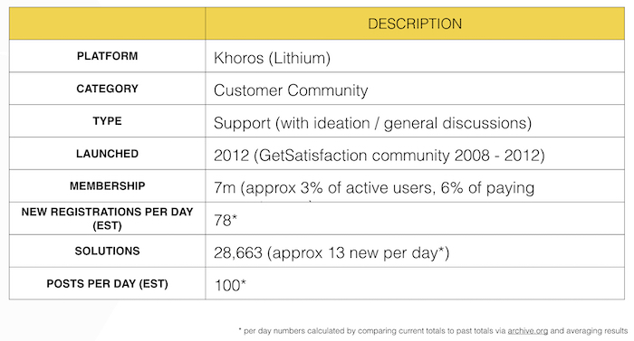
Let’s begin by looking at the basics from available information (note this data is accurate up to May 2019).
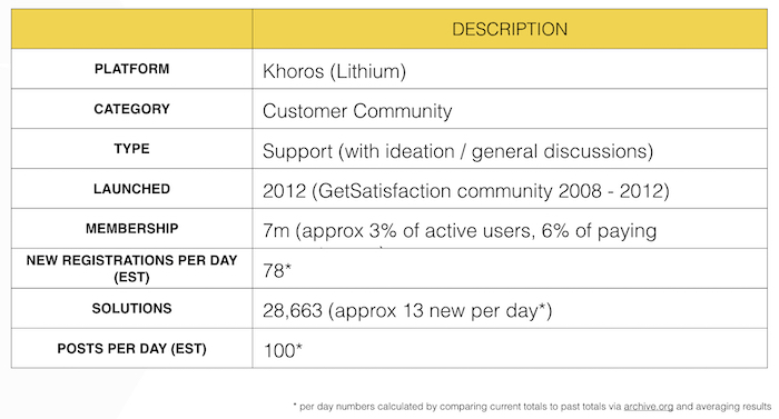
(If image doesn’t display, please click here)
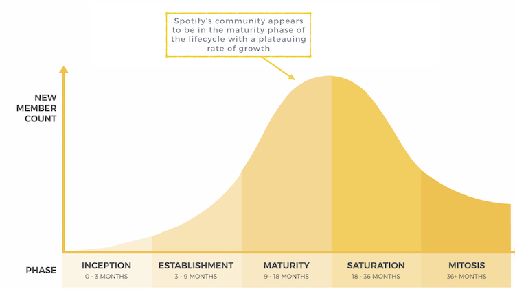
However, it’s worth noting community growth (0.4% per year) lags far behind customer growth (2% to 4% per year). Most members join and don’t ask a question.
This is clearly a mature community (based upon the community lifecycle).

* Note: per day numbers are collected by comparing figures listed on the website today vs. several months ago (via Archive.org) and averaging the results. This will not account for any posts which have been removed.
(If image doesn’t display, please click here)
Community Structure
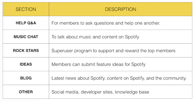
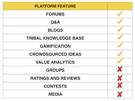
The Spotify community has a relatively simple structure with five key elements. These are:

(If image doesn’t display, please click here)
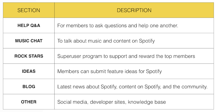
Although slightly hidden, the community also has a knowledge base and promotes some additional communities for developers off-site (StackOverflow, GitHub, and Twitter).
To support this, the community is using the following features provided by Lithium:
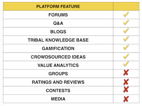
(If image doesn’t display, please click here)
The lack of groups is interesting. This could be because either groups is a relatively new feature from Lithium or because it’s outside of the community strategy.
Either way, it’s likely the addition of groups would support the ‘Music Chat’ where members could form groups and exchange playlists around topics of interest.
Community Design
(If image doesn’t display, please click here)
Layout and Navigation
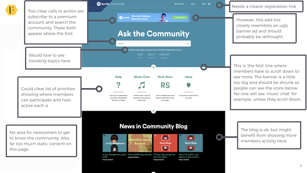
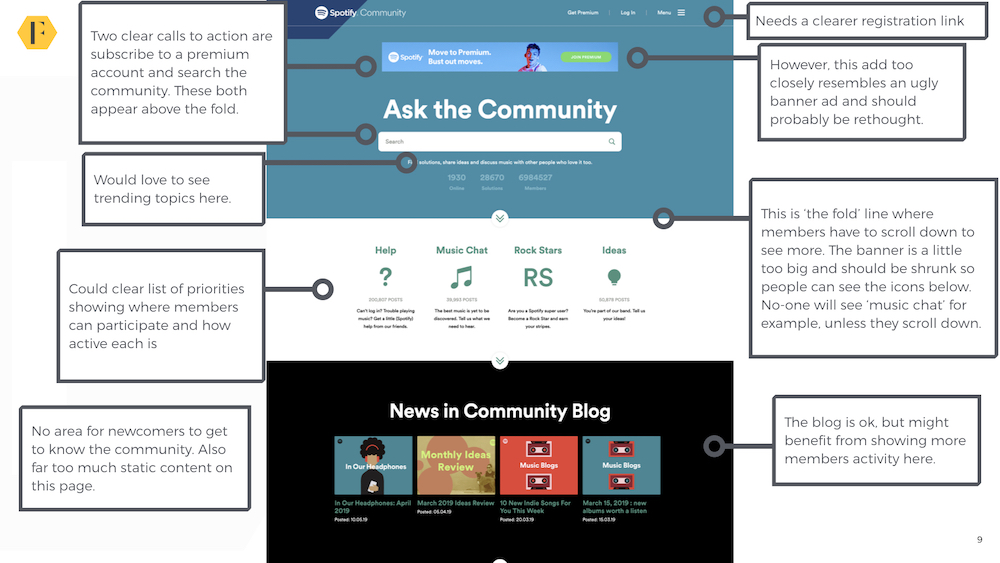
The community design has two clear calls to action for visitors. These are to sign up for a premium account, and search for an answer to a question. Both drive an immediate return on investment (new accounts/call deflection). However, the size of this banner means it’s likely most members won’t see the four key areas of the community below.
We would recommend reducing the size and ensuring people can get an immediate insight into what the community is about.
Navigation
Navigation is hidden in a hamburger menu at the side of the page. This probably works great for mobile, but it might be easier if they used a standard tabbed navigation bar. Especially given how difficult it is to find the knowledge base.
We would also recommend renaming ‘Spotify Answers’ as it’s not clear that this refers to the knowledge base compared with ‘Help’.
Overall, the navigation is relatively simple and uncluttered with a few areas of improvement.
Aesthetics
The community design gets almost everything right. It matches Spotify’s brand well, there is a clear contrast between different areas of the site. The site avoids stock images and is generally uncluttered. However, two downsides stand out. The first is the call to action asking people to sign up for premium at the top of the page. This looks too much like a cheap banner advert. The second is the level of static content.
Newcomers
In most support communities, the majority of questions come from relatively new customers. It usually makes sense to provide an obvious place for newcomers to get started. Spotify hasn’t yet done this on the homepage. Given the community uses single-sign-on, it might be useful to provide an obvious place for newcomers to get answers to their questions.
Activity
(If image doesn’t display, please click here)
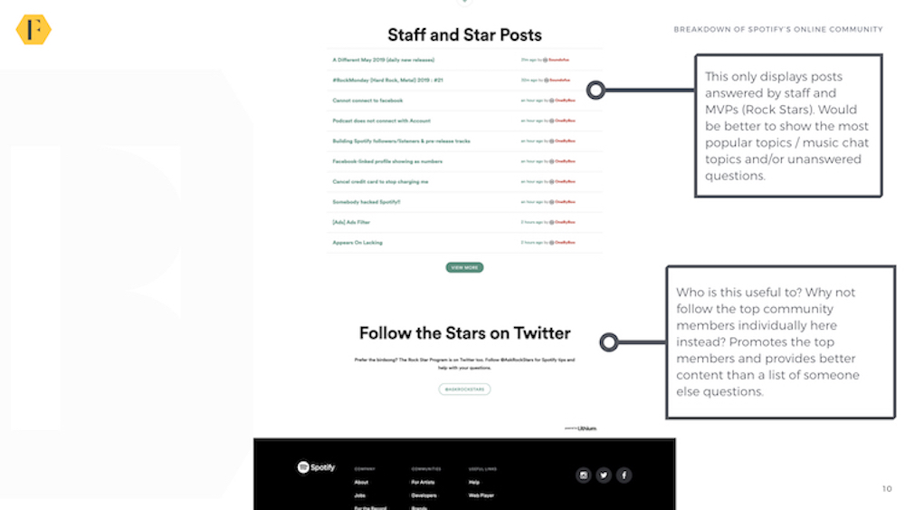
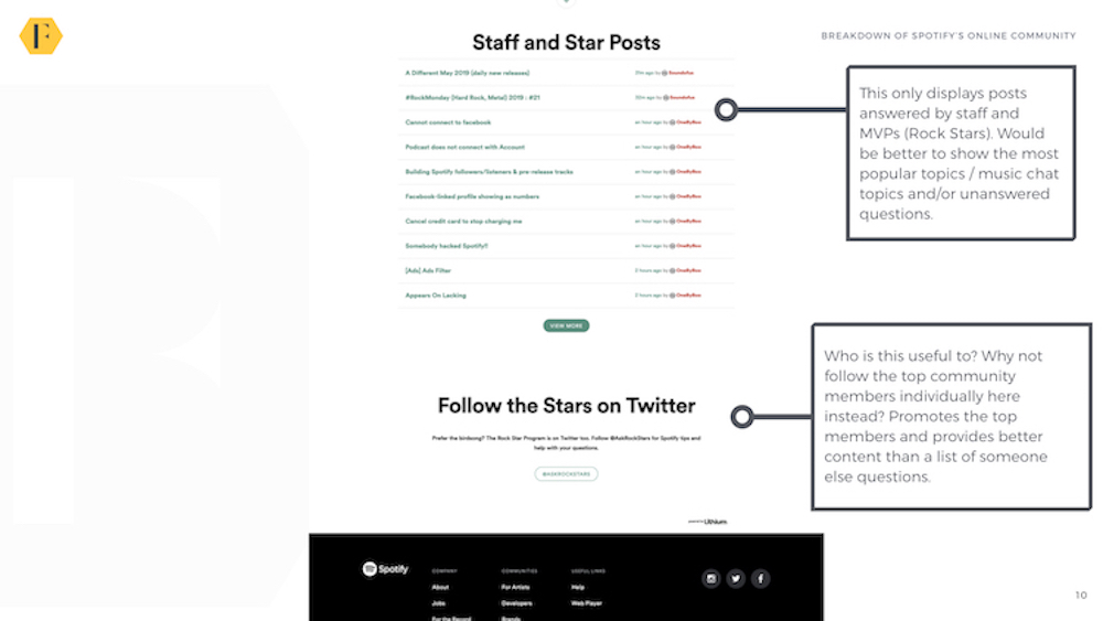
Spotify has taken a unique design decision to only show contributions from staff members and top members (Rock Stars) on the homepage. This means the community only shows posts which have been answered.
Given how unlikely it is an average newcomer is searching for that solution, it might be better to show either the latest unanswered posts (which regulars/top members can then answer) or trending/top posts (which helps most users get the answer to their questions).
Another downside is staff/Rock Stars are likely to respond to multiple posts at once. This means almost all the posts shown on the community homepage could come from the same person.
We would also like to see trending topics/discussions shown beneath the search bar at the top of the page to drive more traffic to those areas.
Mobile

(If image doesn’t display, please click here)
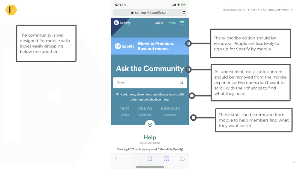
The community seems designed primarily for mobile and functions well with boxes dropping down to a single column. However, it would be wise to remove some of the static text to make it easier for members to find what they’re looking for.
CTAs
The two major calls to action (create a premium account and search) are clear. Perhaps the only downside is the ability to ask questions directly from the homepage – which is what most members are likely to want to do. The community also lacks any dynamic CTAs which vary by a member’s stage in the community. Newcomers are shown the same CTAs as veterans.
Final Rating
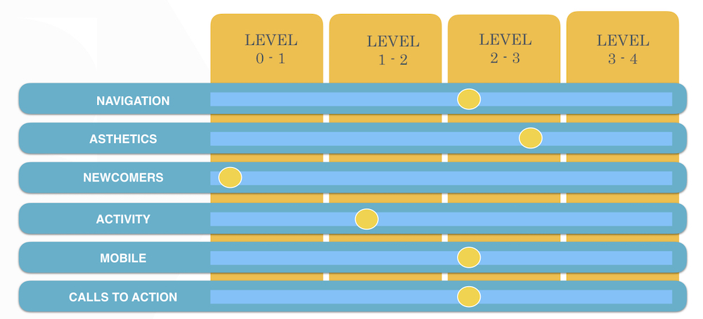
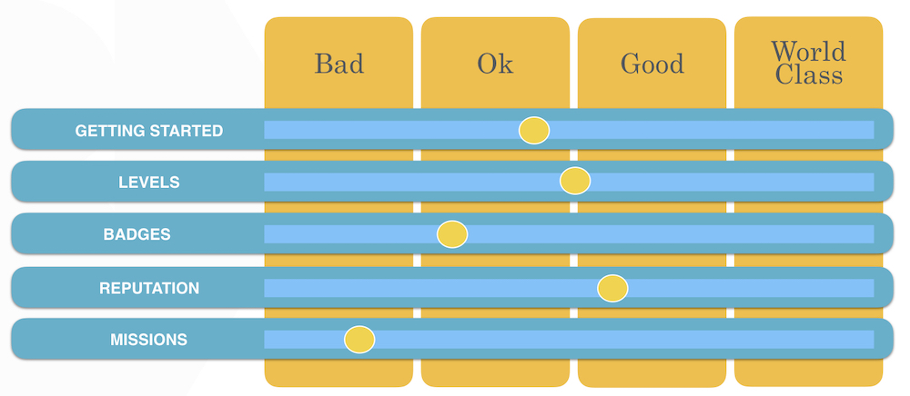
Using our benchmarks, the community design hovers somewhere between ok to good overall.

(If image doesn’t display, please click here)
Onboarding
We can break onboarding down into three areas; pre-registration, registration, and post-registration.
Pre-Registration
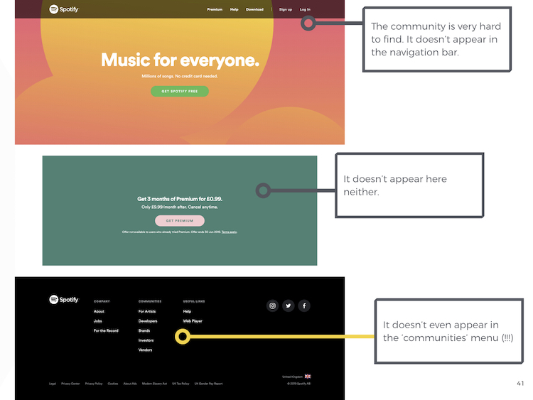
Despite the community’s size, it’s curiously absent from the Spotify homepage.

(If image doesn’t display, please click here)
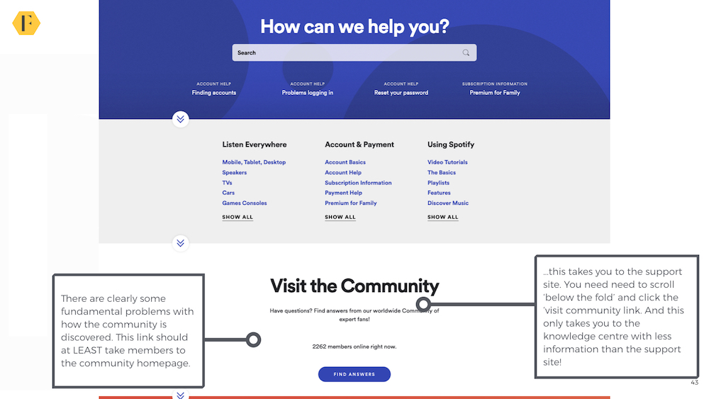
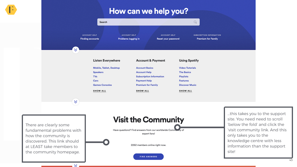
It doesn’t even appear under the ‘Communities’ option at the bottom of the page(!). Both the ‘help’ tabs direct members to the support center. To find the community members have to click on ‘help’ and then scroll down below the fold to find the community. Even after they click on this, they’re not taken to the main community homepage but to the lesser-used knowledge base (which is unlikely to provide better answers than those available in the support center).
(If image doesn’t display, please click here)
What this implies is the community isn’t used as the primary customer support channel, but as the ‘catch-all’ for when members couldn’t get the answer from anywhere else. It also means that while the community has general music chat, it’s not utilized anywhere near as much as it could be.
This feels like a major missed opportunity. It also suggests almost all traffic comes via search.
Here the Spotify community competes with its own support center (more on that later) to display results. However, when results do appear, they are often displayed as featured snippets (see below). This is a major benefit of using Lithium as the community platform.

(If image doesn’t display, please click here)
When members do visit, it’s difficult to see where to register. Members have to click on the ‘log in’ section instead of a registration link. It might be better to show a registration call to action for visitors who haven’t logged in.
Registration
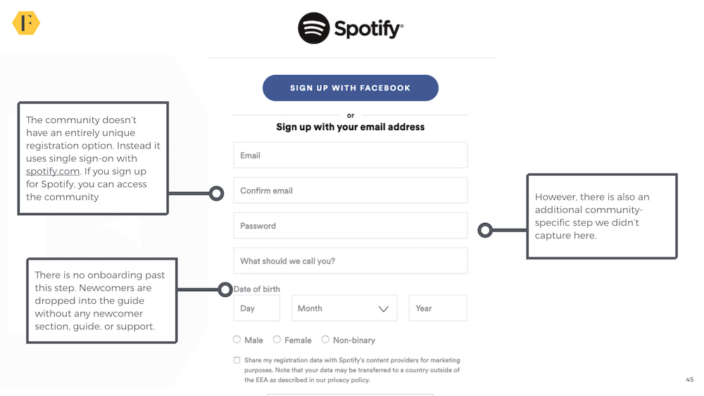
The Spotify community uses SSO (single sign-on). To join the Spotify community you need to have a Spotify account. You can sign-up via a Facebook account. The upside is this makes the registration process simple, the downside is it becomes far more difficult to create a unique user journey for newcomers (i.e. members who sign up via the community aren’t usually distinguished from those who sign up via any other method).

(If image doesn’t display, please click here)
However, once someone does sign-up for an account, they are taken back to the community homepage. The process is relatively simple and the community can track when a member first visits the community.
Post-Registration
Outside of badges shown here, there is no further communication or support for community members. There are no on-site tips or emailed information to guide members towards different aspects of the community. The music section of the community could be thriving, but it won’t be anywhere near as active as it could be if the only people who can find it are those who have problems with their Spotify account first. The poor navigation is significantly hampering the community’s success.
It’s hard to feel a sense of community with other members when you don’t know who the community team is, who other members are, and what the community is about.
Final Rating
Spotify’s community onboarding is ‘ok’, largely thanks to a simple registration experience. It should do a lot better at attracting new members and keeping them in the community after they register.

(If image doesn’t display, please click here)
Search
We’ve recently broken search into its own category.
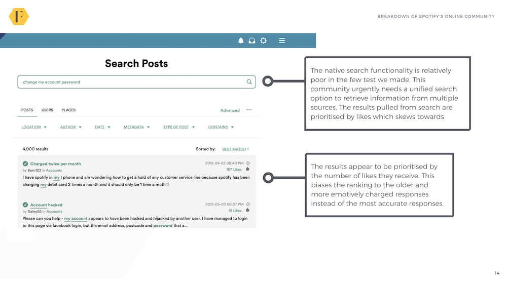
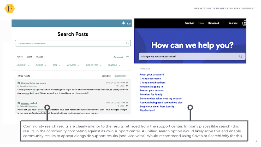
Spotify’s community shows the problems with using the native search function of a community platform. Native search only pulls content from the community. The Spotify community search bar can pull content from Lithium’s forum and tribal knowledge base, but not from the support center.
This means the same search for an answer on the community and the support centre leads to two completely different results – typically with Lithium’s user-generated content given the poorer answers. In fact, Lithium’s default search results are worryingly bad in the few examples we tested.

(If image doesn’t display, please click here)
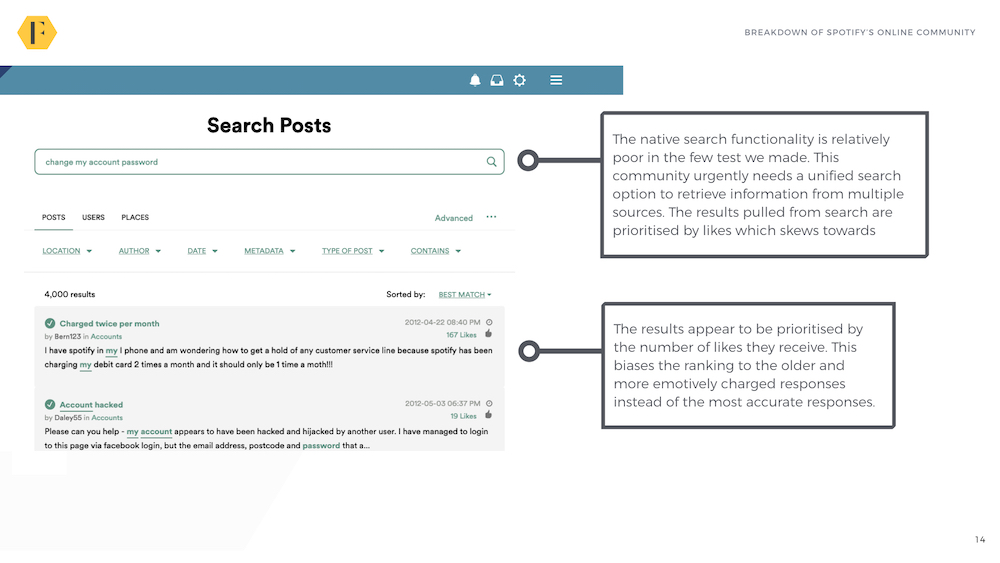
I suspect this is because the search has less content to retrieve information from and has been customized to prioritize the results with the most ‘likes’ instead of the best relevancy.
This means emotionally charged topics which encourage a lot of people to like (as shown above) appear above what might be the best answer. This happened across multiple search requests we tested. It’s a major problem which needs to be solved (also note: showing topics which are 7 years old is not normally ideal).
(If image doesn’t display, please click here)
The other downside of using a native search feature is you end up duplicating what’s in the knowledge base and help center which hurts your search results. The solution is to use Coveo, SearchUnify or another option which retrieves content from multiple databases and shows the best result. This means the support center could show results from the community and vice-versa. This would immediately improve the support experience for all customers (the Zuora community is a good example)
The Engagement Experience
The Spotify engagement experience is spread across three areas;
- Help/Support (Q&A).
- Music Chat (Forums).
- Ideas (Crowdsource Ideas).
Help/Support: 201k posts (approx 40 posts per day – 2019)
The support community is where Spotify’s community really thrives.
The Help Q&A has generally good taxonomy with limited overlap between categories. However, the categories are listed in an odd mixture of alphabetical and by popularity. We would recommend sticking with either (ideally with the most popular categories at the top).

(If image doesn’t display, please click here)
A few things we can pick up instantly here:
- Most question titles are reasonably clear (although with a few which need improvement).
- The community has a near 100% response rate to questions from top members. Around 80% of responses seem to be from community Rock Stars with the remainder coming from rising stars, moderators, and a handful of other members.
- The accepted solution rate which seems to hover around 15% to 25%. This isn’t necessarily bad (most members who ask a question don’t take the time to mark an accepted solution).
- It’s clear which questions have an accepted solution and which have been answered by a moderator.
The average time to respond seems hard to determine, but a random sample of questions and responses suggests around 15 to 30 hours. This is too long for a community of Spotify’s size and a reasonable target for improvement should be to bring this down to a handful of hours. In a community with 40 new posts per day, it should be possible to reduce this to 3 to 5 hours.
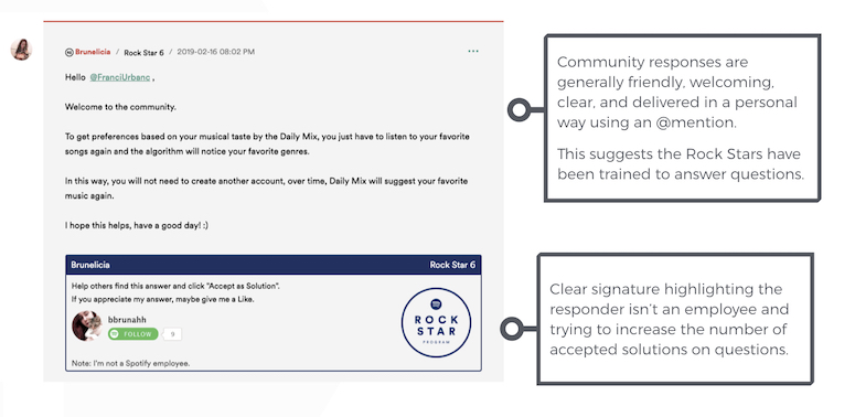
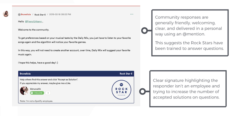
If we dive deeper, the quality of responses is generally extremely good. Community Rock Stars (who provide the bulk of the answers) respond with friendliness, empathy, clarity, and often ask clarifying questions to get to the crux of the issue.
(If image doesn’t display, please click here)
It’s also clear who is an employee and who isn’t by the signature within the posts. This is an excellent and clear way of helping members understand who a response is from (and potentially avoid any legal liability for the responses).
The only downside (and this is minor) is after viewing a dozen or so they all start to sound the same – often using the same words and mannerisms. This suggests they’re trained to use a template and this might feel impersonal over time. However, given how unlikely it is anyone is going to browse through many answers, it’s a minor issue. The tone of responses is generally at a world-class standard.
Music Chat: 40k posts (approx 42 posts per day – 2019)
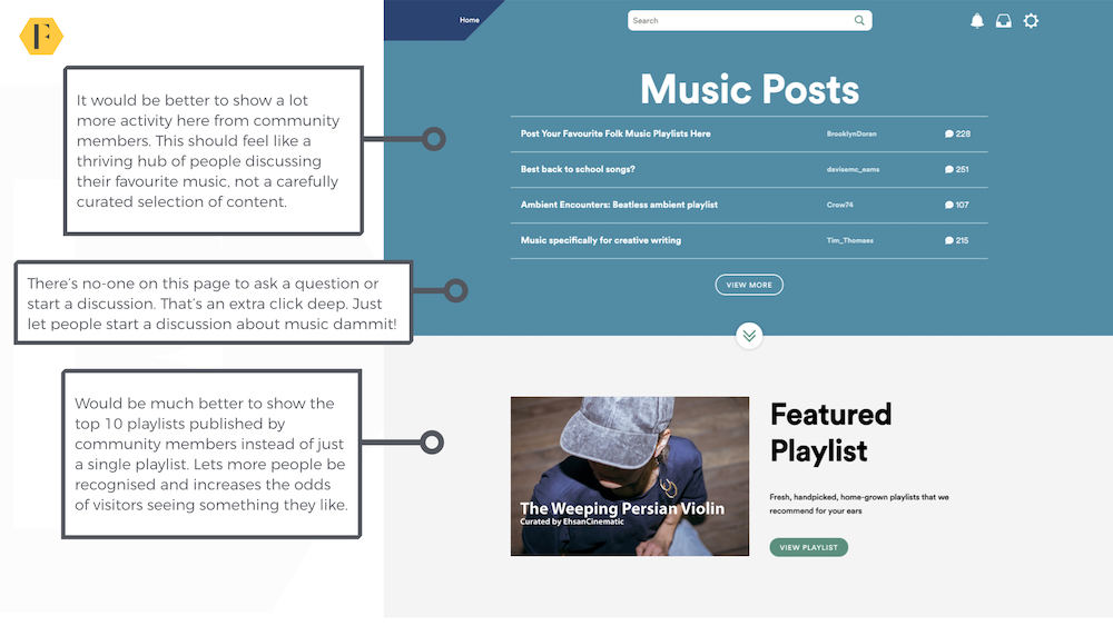
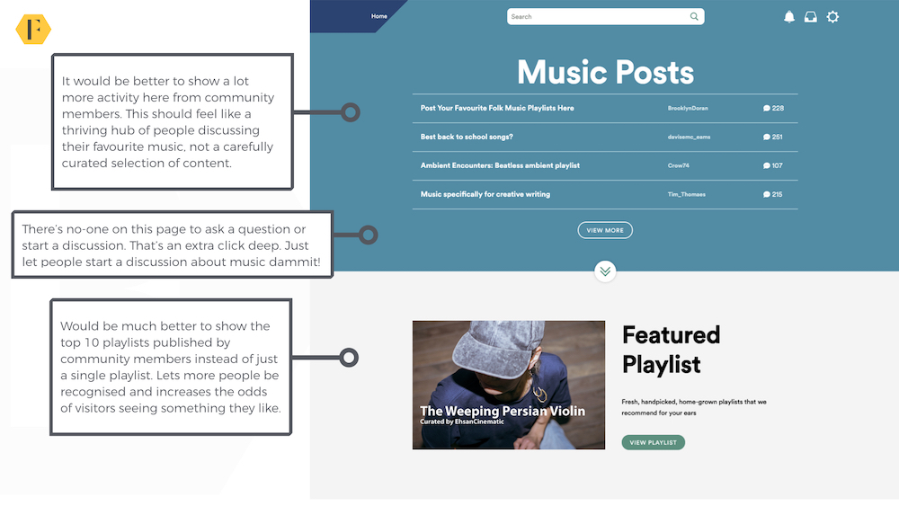
The ‘Music Chat’ section has incredible potential which isn’t being fully utilized at the moment.
(If image doesn’t display, please click here)
It’s interesting to note music chat appears to have just overtaken help as the most popular activity in the community (by posts per day). The section is broken down to include:
- Featured discussions.
- A full list of discussions (with pinned topics).
- The blog posted as a discussion.
- A featured playlist.
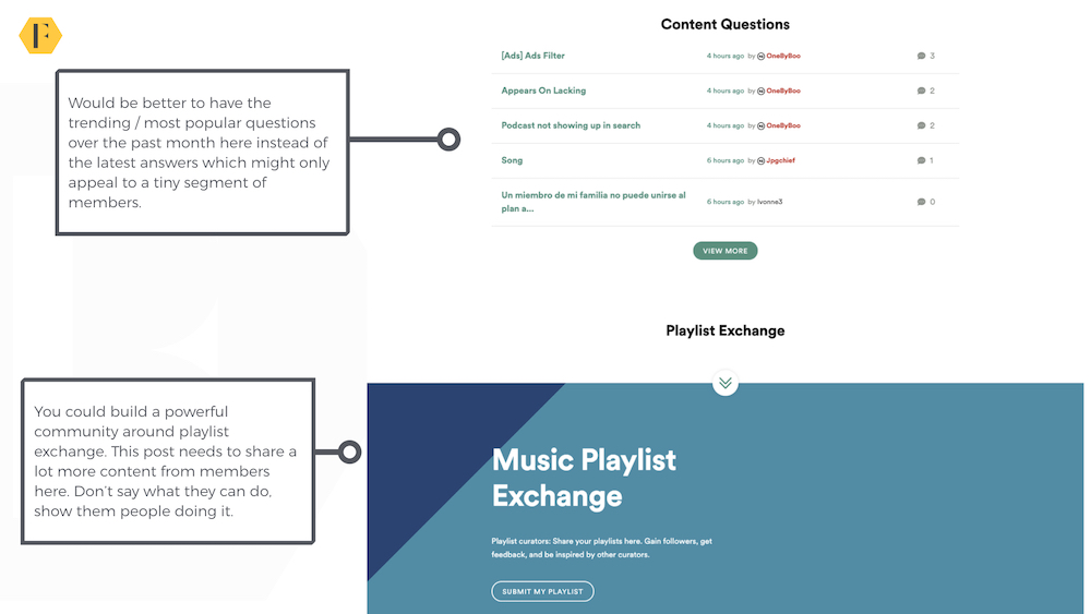
- ‘Content Questions’ Q&A.
- Playlist exchange – you can submit your playlist (albeit it’s not clear where these go).
This section is a mishmash of different ideas all under a single umbrella of generic Music Chat. It clearly has huge potential but also a clearer strategy. Playlists are likely to be huge, while content discussions might be a better fit for the help forums.
I’d suggest renaming it from ‘Music Chat’ – which feels like a placeholder, to something that closer represents the benefit of the area (finding and sharing your Favourite Music).
(If image doesn’t display, please click here)
Next, it would be ideal to feature the most popular member-submitted playlists, followed by general music discussions and content questions. Given Spotify is also moving into podcasts and concert ticket sales, there is potential to build a huge music community around these topics. It’s a little surprising this hasn’t happened yet.
Ideas: 51k posts (14 new posts per day)
The ideas area is one of the most successful we’ve seen with both a large number of ideas submitted and a considerable number of new ideas per day – many of which get a good level of support.

(If image doesn’t display, please click here)
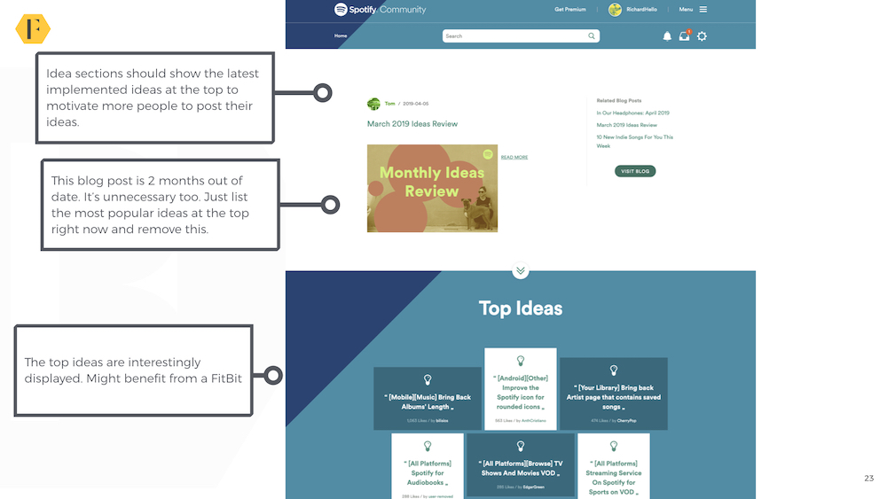
The design of the ideas section isn’t great. The blog post takes up far too much space and lingers for the rest of the month even after members have read the post. In this case, the top March 2019 ideas post is still featured as of May 20. The display of the most popular ideas is great and should replace the blog section. The live ideas area should also appear higher up along with a breakdown of their current status.
This would also benefit from showing the latest implemented ideas (to encourage future ideas). The FitBit community generally does a great job of showing these benefits.

(If image doesn’t display, please click here)
One interesting innovation is Community RockStars are enabled to change the status of ideas submitted within the community.
All ideas also receive a reply and the most popular ones often receive updates on status. There seems to be a reluctance, however, to reject highly popular ideas which can linger for 5 years after they’ve been posted.
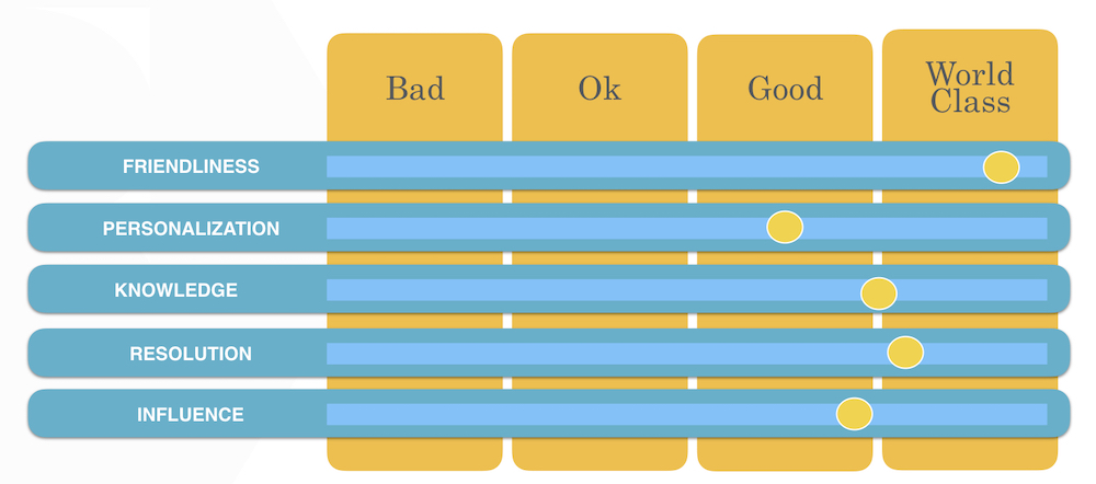
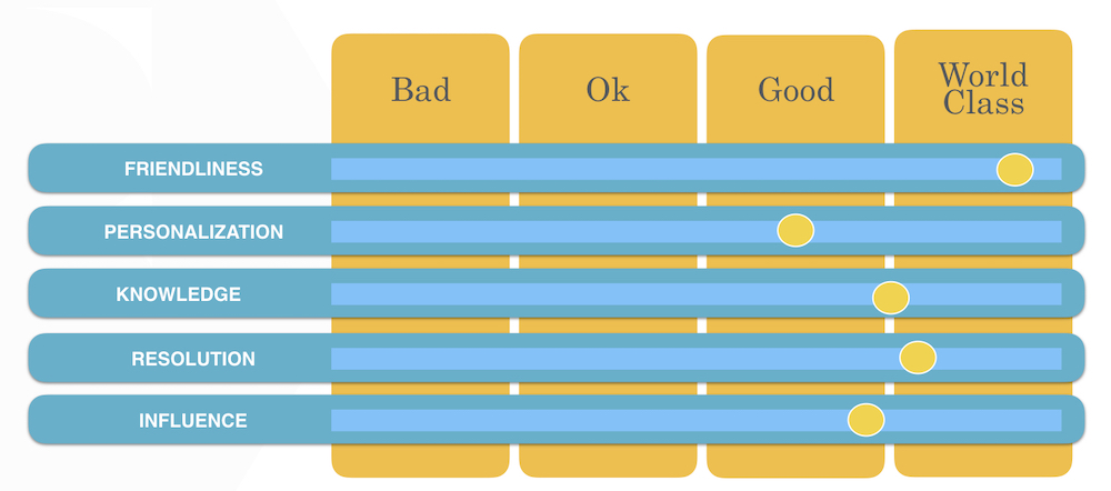
Final Rating
The Spotify community is one of the only ones we’ve seen which delivers a world-class level of engagement. There are still areas for improvement, but it’s far better than most.
(If image doesn’t display, please click here)
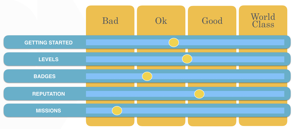
Gamification

(If image doesn’t display, please click here)
The Spotify community uses standard Lithium gamification with multiple levels based upon a combination of actions members have performed and badges reflect individual achievements. There doesn’t appear to be any integrations with other areas of Spotify (which is a shame).
Badges
(If image doesn’t display, please click here)
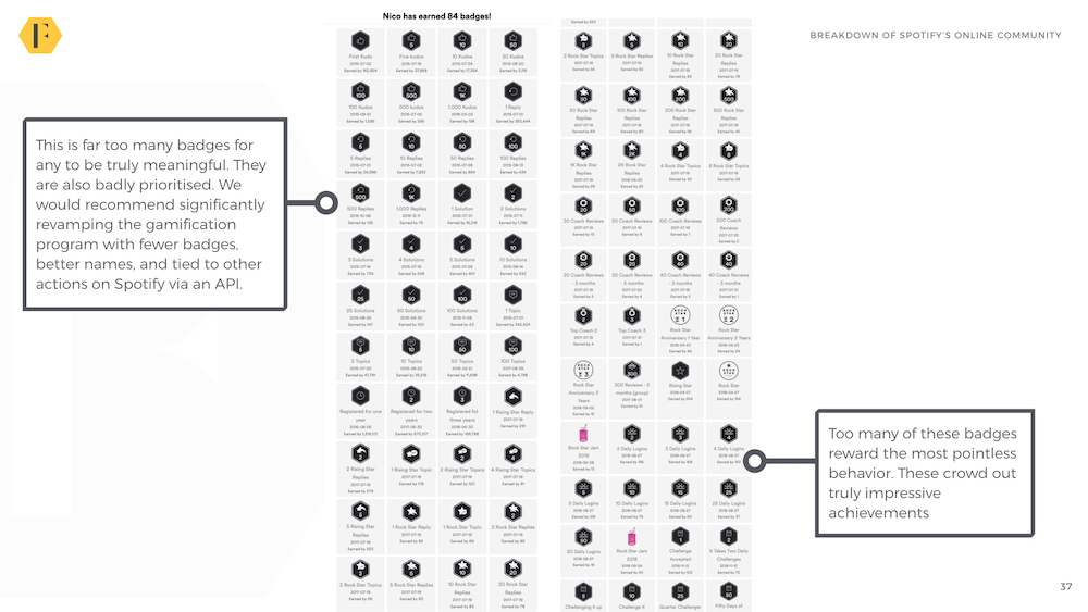
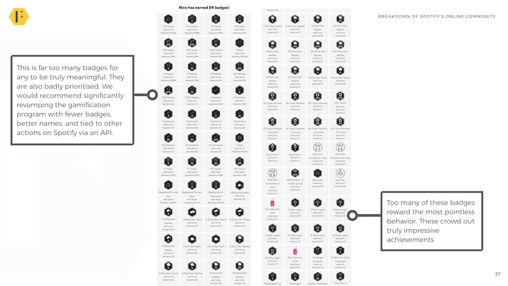
Spotify offers dozens of different badges to recognise behaviors ranging from logging in twice in one day to posting 500 replies. As a rule, we’re not generally a fan of giving badges for minimal behaviors. Top badges are prioritised for member profiles, but not on the badges page.
Levels
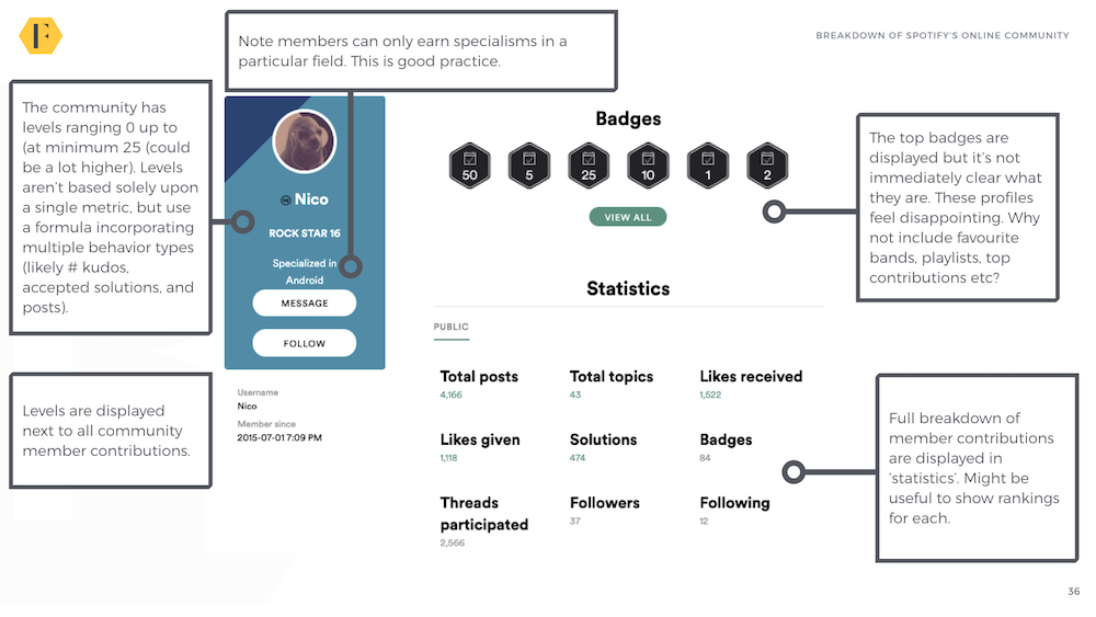
Spotify has a handful of levels ranging from 0 to 21 (at least).
These levels aren’t based solely upon providing answers, but by a range of behaviors (i.e. you can’t just post relentlessly, you have to provide [x] number of accepted solutions and receive [x] amount of kudos etc..).
Final Rating
Spotify’s gamification is largely reflective of Lithium’s gamification offerings and advice. You could easily argue this is a great implementation of Lithium. However, compared to what else is out there, I would disagree.
(If image doesn’t display, please click here)
The Spotify Rock Star Program

(If image doesn’t display, please click here)
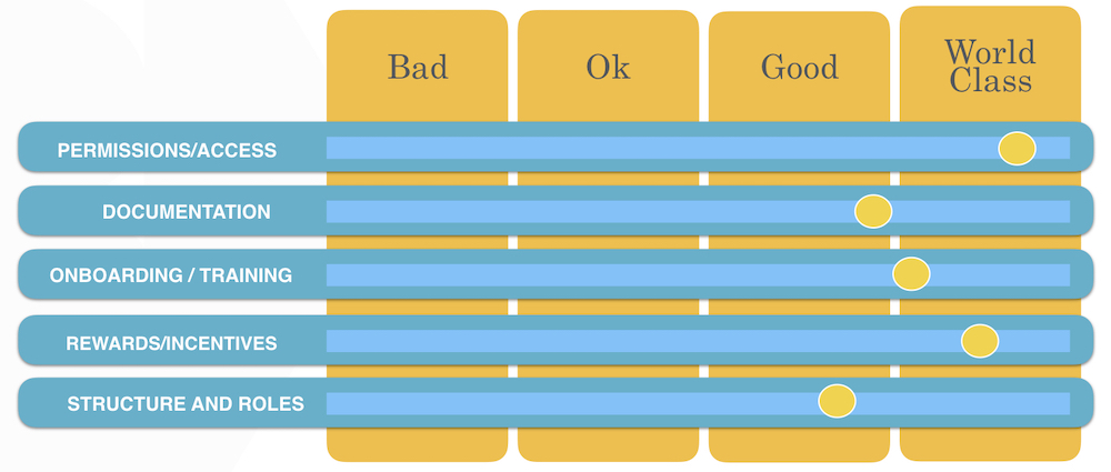
The Spotify Rock Star program is widely regarded as one of the best MVP/Superuser programs around. The Rock Star program has 132 members from 20 countries who have provided around 60% of all accepted solutions in the community.
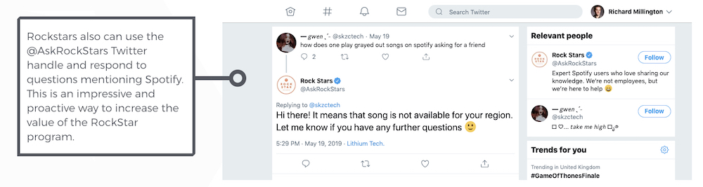
Participants of the Rock Star program don’t just answer questions in the community, they also have access to a shared @AskRockStars Twitter account.

(If image doesn’t display, please click here)
In this account they don’t just respond to questions mentioning the handle, they proactively respond to anyone mentioning a problem with Spotify. It’s rather impressive.
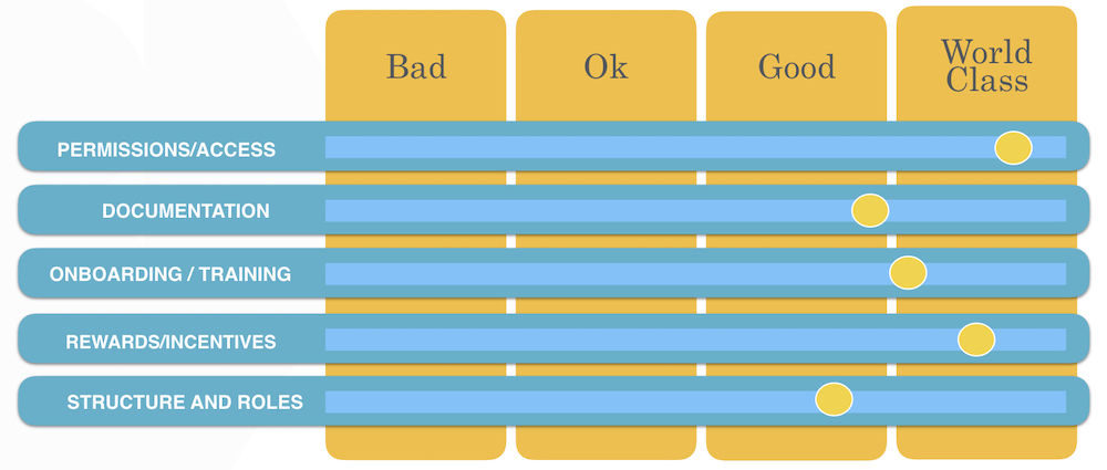
The level of access and permissions granted to RockStars is higher than we’ve seen in most other programs.
The process is also fairly well documented with the top rockstars listed by participation over a fixed time period (instead of since the beginning of the program).
The Rock Star Program also has an interesting reward system based upon the number of points members have accumulated. However, it’s not clear how points are determined (Lithium doesn’t have a default point scheme). Rewards range from a beach ball (15 points) to Marshall Monitor Bluetooth headphones – $250 (2,800 points).
This works out to each point being worth around $0.09 making each accepted solution probably worth somewhere in the region of $0.45 (this could be wildly wrong without knowing what point multiplier Spotify uses). Points are likely an accumulation of kudos, accepted solutions, and total posts.
The top 10 Rock Stars each year receive an all expenses paid trip to attend the Rock Star Jam in Stockholm, Sweden.
Final Rating
By almost all metrics, the Rock Star program is world class.
(If image doesn’t display, please click here)
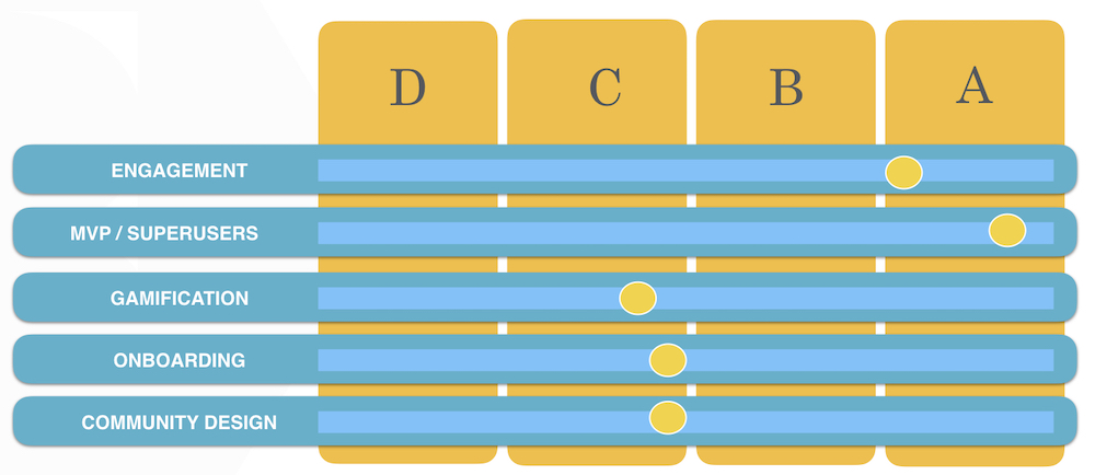
OVERALL RATING: B

(If image doesn’t display, please click here)
The Spotify Community is a mature community with some remarkable strengths.
These are its broadly enthusiastic community, a fairly high level of activity, an outstanding MVP program (which answers almost every question), a thriving ideas section, and a rapidly growing music-chat community.
However, it also faces several key challenges. Our recommendations would be:
1) Address the limited visibility within Spotify, it’s a major concern. It’s almost impossible to find from the main website today.
2) The lack of a unified search feature is also another clear drawback. The community and support section shouldn’t be in competition with one another.
3) Improve the on-boarding of new members (which is non-existent today).
4) Redesign the homepage to show trending questions/unanswered questions.
5) Redesign the music-chat area.
In short, Spotify has a really great community which could also be even better.
“The Age of Intent” — a big idea book about Artificial Intelligence
Two years ago, I got the opportunity to start work on a book about artificial intelligence. Today, you get to see the result. AI is one of the most powerful forces driving technology right now. Conversational interfaces — whether that’s online chat or Alexa — are another. Artificially intelligent chatbots, also known as virtual agents, … Continued
The post “The Age of Intent” — a big idea book about Artificial Intelligence appeared first on without bullshit.
Apple Launches Updated iPod touch with A10 Chip, Larger 256GB Storage Option

Today Apple announced an updated version of its last remaining iPod product, the iPod touch. The device starts at the same $199 price as before, but it’s been upgraded in a couple of ways, such as adding an A10 Fusion chip to replace the previous generation’s A8, which among other things enables Group FaceTime and augmented reality features.
Lots about the new iPod remains the same. It keeps the previous generation’s basic form factor, including the same 4-inch display and headphone jack. The device is available in Pink, Silver, Space Gray, Gold, Blue, and (PRODUCT)RED finishes, just as it was before. One thing that’s new, however, besides the upgraded A10 chip, is that there’s now a higher storage capacity available. Joining the 32GB and 128GB models, you can now get an iPod touch with 256GB of storage. Pricing for the lower tiers of storage remains $199 and $299 as before, and the new model comes in at $399.
The new iPod touch is available today to order from Apple.com, and will be available in Apple Stores later this week. Apple clearly wanted to get this device into the world ahead of WWDC next week, so it will be interesting to see if, perhaps, that means new software like iOS 13 will no longer run on A8 chips, and thus Apple needed to modernize the iPod before announcing that new version of iOS.
Support MacStories Directly
Club MacStories offers exclusive access to extra MacStories content, delivered every week; it's also a way to support us directly.
Club MacStories will help you discover the best apps for your devices and get the most out of your iPhone, iPad, and Mac. Plus, it's made in Italy.
Join NowGet Dark Mode Support and Much More, in SoundSource 4.1
 If you use audio in any way on your Mac, our newest app SoundSource is for you. With it, you can control audio on a per-app level, add effects to any audio, boost sound from even the tiniest MacBook speakers, and gain fast access to your Mac’s audio devices.
After we released SoundSource 4.0 in March, we received a lot of great customer feedback. We kept these requests and ideas in mind as we continued development. Today, we’re shipping a major update in the form of SoundSource 4.1. This new version adds several features, squashes a large number of bugs, and improves the app in ways both big and small.
Big Changes, Tucked in the Preferences
The two biggest changes in SoundSource 4.1 can be found in the new “Appearance” section of the Preferences window:
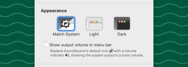
SoundSource’s new Appearance preferences
Dark Mode Support
The most striking change is certainly the optional new Dark appearance:

SoundSource’s new Dark Mode appearance
Use the default “Match System” setting, and SoundSource will follow your OS-wide appearance.1 If you prefer, you can force SoundSource to use the “Light” or “Dark” theme, regardless of your system-wide settings.
Output Volume in Menu Bar
The other major appearance change comes via a simple checkbox. Turn on the “Show output volume in menu bar” preference, and SoundSource’s default menu bar icon will be replaced with a volume indicator.
This icon helpfully displays a simplified approximation of the current output volume, and even indicates when your output device is entirely muted. With this, you no longer need the system Volume control in the menubar at all.
Easier Control of Special Audio Sources
 We heard from users who wanted to adjust and control audio in the Finder, as well as the OS’s “Text to Speech” functionality. That’s now possible with SoundSource 4.1, as these sources are now easily selected from the new “Special Sources” section found in the “Add App” Source selector.
Smaller Updates
There are also many smaller updates to appreciate as well. These include:
-
 Full Undo Support – SoundSource now includes full Undo support, so you can revert any changes you make to settings. Just hit Command (⌘)-Z on your keyboard to undo your most recent change.
 -
 Audio Effects Indicator – SoundSource now shows a helpful “FX” badge to indicate when a source is being modified by audio effects.
 -
 Right-Click Menu Bar Menu – A standard click on SoundSource’s menu bar icon reveals the app’s main window. Now, a right-click will show a helpful menu giving you quick access to SoundSource’s settings, or a fast way to quit the app.
 -
 Enhancements and Refinements Galore – We worked tirelessly to provide a worthy follow-up to SoundSource 4’s auspicious debut. This update includes over 30 distinct improvements, from better handling of Bluetooth devices to a more-obvious background state, and much, much more.
Critical Bug Fixes
 Older versions of SoundSource had several issues which could cause the app to pinwheel or even crash. These issues were fortunately quite rare, but that also made them difficult to track down. After some deep debugging, we believe we’ve eliminated these problems. We strongly encourage all users to update to SoundSource 4.1 immediately for optimal performance. If you see any similar problems in the latest version, be sure to get in touch.
Get It Right Now
SoundSource 4.1 now represents the latest and greatest in sound control for your Mac, and we can’t wait for you to try it out. Users who already have SoundSource 4 should update to version 4.1 free of charge. Just open the Preferences window in SoundSource, click the “Check for Update” button, and enjoy!
If you’re new to SoundSource, visit our web site to learn all about our superior sound control. You can also download the free trial immediately.
Footnotes:
-
“Match System” will follow settings found in the General System Preference. On MacOS 10.14 (Mojave), it follows the “Appearance” setting for Light or Dark Mode, while on MacOS 10.13 and lower, it follows the older “Use dark menu bar and Dock” setting. ↩︎
"Blur by background for all calls"
I was setting up audio and video in Skype this morning in preparation for a call with my friends Elmine and Ton and noticed a setting, Blur by background for all calls, that I hadn’t seen before.
Here’s what I looked like with the setting toggled off:

And here’s the blur turned on:

The background was noticeable enough for Ton to remark on it; I like it because it reduces the visual clutter of my office while not completely eliminating the background (presumably a “remove the background” setting would be a possibility using similar algorithms).
When Ton toggled the setting on it was less satisfying: there was a bookshelf in the close background that Skype couldn’t quite distinguish from Ton’s head, leaving him with a bookish halo effect.
I’ve largely abandoned Skype, as my weekly conference call with the home office has replaced it with Zoom. One of the reasons we made the switch is that Skype updates were forever interrupting our calls, but with no obvious improvement in functionality stemming from the update; indeed this “blur” function is the first new feature I can recall in Skype in a long, long time. Not enough to win me back, but still interesting nonetheless.
Zoom is not without its own real time video processing: it offers a Touch up my appearance setting that appears to work like a kind of digital putty knife:
Here’s Zoom with the setting turned off:


While Skype’s background-blurring feature seems innocuous and helpful, Zoom’s touch-up feature seems creepy and dishonest. And so I leave it off.
Ill at Ease
As an amateur ethnographer of Silicon Valley storytelling, I’ve spent more time than is probably healthy on YouTube watching advertisements for every conceivable product and service. Regardless of the thing being sold, these ads tend to model a vision of seamless living, and provide an aesthetic and affective framework to match. A survey of videos from companies like Postmates, Uber, Stitch Fix, and Amazon finds a set of stories where the customer is the protagonist, and their quest — getting to their child’s graduation on time, finding an outfit for a big date — presents the narrative core. The logistics of the product or service disappear into the background, and this absence amplifies and deepens the personal stories of the users: with less time spent on minutiae, our characters can spend more time on everything else.
Domestic and reproductive labor are still very much the realm of human beings
Along with foregrounding their stories, these advertisements also literally center the customer: their faces are positioned in the center of the frame, and the camera follows their journey. Many of the ads highlight a sense of tactile coziness — our characters inhabit a world that’s soft and warm and sun dappled, often with diffuse or glowing light sources visible in the background. Along with smooth, shiny devices, and sleek, seamless service, this forms a unified aesthetic of frictionlessness: cozy, unencumbered by clutter, and free of dis-ease.
A frictionless life is the tacit promise of many of the last decade’s most “disruptive” technologies, companies, and services. From startups that promise to get your apartment scrubbed and tidy without having to set eyes on a cleaner or negotiate a tip, to clothes subscription services that send you perfectly fitted garments you didn’t even know you wanted, the app-enabled economy thrives by selling a vision of effortlessness and ease for users. The reality, though, is considerably different.
Narratives about the horror and difficulty of daily life’s indignities abound in the personal blogs of tech founders, coupled with speculations about how these frictions could be problem-solved out of existence. The ur-text of this genre might be a 2015 blog post by Rob Rhinehart, inventor of Soylent, writing about how he simplified not only his diet, but the entirety of his daily life. Rhinehart’s blog went offline in April 2017, shortly before Soylent began its Series B financing round, but it’s still available on the Wayback Machine:
First, I never cook. I am all for self reliance but repeating the same labor over and over for the sake of existence is the realm of robots … I have not set foot in a grocery store in years. Nevermore will I bumble through endless confusing aisles like a pack-donkey searching for feed while the smell of rotting flesh fills my nostrils…I buy my staple food online like a civilized person.
He goes on to describe how he streamlines every aspect of his life — from rejecting car ownership in exchange for Uber and public transit to eschewing laundry by ordering regular shipments of near-disposable clothes direct from a wholesaler — and ends the piece with this:
The first space colonies will have no coal power plants. I am ready. For now though, as I am driven through the gleaming city, my hunger peacefully at bay, I have visions of the parking lots and grocery stores replaced by parks and community centers, power plants retrofitted as museums and galleries. Traffic and trash and pollution will evaporate, if only we are willing to adapt some routines.
What stands out here is the hysterical affective contrast between the horrifying description of grocery stores, kitchens, and retail shopping, and the vision of a smooth ride through the gleaming city, fed and watered by technology, safe from the traumas of reproductive labor that he would otherwise have to perform. Rhinehart’s utopian imaginings are interleaved with self-aware asides and practical advice on how to run your entire minimalist apartment off one solar panel, but the underlying drive is towards a stripping back of the chaff of life through relentless outsourcing.
Rhinehart’s rhetoric is knowingly extreme, but entirely genuine. While the desire for a life unencumbered by solid food may not be universal, most of us have wished for a break from the complexity and hassle of keeping ourselves alive and functioning in a world of long work hours, increasing precarity, and environmental breakdown. A scaled back version of Rhinehart’s gleaming city is presented to the rest of us through ads for Amazon and Uber and Postmates, in a series of prosaic fantasies that make frictionless convenience appear as something we all deserve.
A similar tone permeates other personal blogs by tech folks, including that of Y Combinator’s Sam Altman and Venmo co-founder Andrew Kortina, whose recent blog post describes the challenges of procuring a toothbrush with a similar horror. “Why are there so many choices but not the one I want? How am I spending over five minutes picking out toothbrushes?… The utter meaninglessness of this moment consumed my entire consciousness, and I just stood there, eyes widening with terror, or despair.” This quixotic hero’s journey is described in a fairly lighthearted and self-aware tone, but the “terror, or despair” seems genuine. This existential horror when faced with inefficiency and excess seems to be one of the motivating forces behind the technologies that promise to simplify our lives.
The stories laid out in these blog posts evince a longing for a sexy seamless world where there’s only one toothbrush, it gets delivered directly to your door, and it’s really, really cool. “In a world where technology can deliver the ride you need within five minutes wherever you are in the world,” says Uber cofounder Travis Kalanick, “just imagine all the other goods and services that you could one day get delivered quickly, safely, with just the single touch of a button.”
Ex Facebook VP Sam Lessin calls this hankering for a technologically-enhanced frictionless world “FOMO for the future.” Lessin doesn’t elaborate on the specifics of this future, but his utopic vision board likely shares characteristics with Rhinehart’s description of a world of convenience, efficiency, cool shit, and clearly demarcated opportunities for leisure and self-improvement. This is a compelling design fiction, and it contributes to a sense of manifest destiny for entrepreneurs, so that “working backwards from a far-off tech utopia,” as Tech Crunch puts it, becomes the mandate for any ambitious startup. Soylent, Uber, and the rest of the convenience economy provide a set of hacks for sloughing off the frictive granularity of daily life, leaving more time and space for visionary world building or, more prosaically, for work — why waste time at the supermarket when you have a future to build?
This of course is only one vision of the future — from Ursula Le Guin to the Zapatistas, many other versions have been written, often involving a complete rearrangement of economic systems or social relations. Work toward these futures would require a different set of tactics, technologies, and economic arrangements in which frictionlessness may not be the defining logic. For the tech set, the imagined future likely involves a continuation of economic arrangements and systems of capital accumulation: a sleeker, more efficient version of today’s capitalism that sweeps away its consequences as a matter of design. Frictionlessness becomes both a moral imperative of manifest tech-destiny and an aesthetic framework for reverse-engineering a cool future.
Despite Rhinehart’s cri de coeur about “the domain of robots,” domestic and reproductive labor are still very much the realm of human beings. As many critics have pointed out, AI and automation are currently limited in their ability to replace human labor with unattended machine labor. “Frictionless” interfaces may mean that you don’t have to lay eyes on the person cleaning your house or delivering your groceries, but it’s still humans doing the job. In her essay “The Automation Charade,” Astra Taylor coined the term “fauxtomation” for “automation” that either relies on sneakily transferring tasks to customers — as with a self-check grocery aisle — or hiding labor, like with Amazon’s Mechanical Turk. With fauxtomation, “work has not disappeared… but the person doing the work has changed.”
In most of the smooth fantasies I’ve looked at, automation (if there is any) is only a small part of what’s really going on. Instead, the “innovation” is to make the friction occur somewhere else, out of sight of the customer: disappearance as a different kind of magic. In this way, the cozy narratives and ease of use encourage the displacement of difficulty, stress, waste, trash, and trauma, onto other people and places. This displacement takes place at two major geographic scales: the regional, and the global and hugely distributed.
The displacements of friction that take place at a local and regional level are perhaps easiest to comprehend, and many excellent critiques of the gig economy and rent-seeking platforms tend to focus on immediate geographic effects that “disrupt” cities and workers. The idea that “frictionless” services invisibilize labor might seem counterintuitive to those of us who live in cities where every second car is an Uber and every second shopper is doing an Instacart run. But the ability to avoid extended interactions or ongoing relationships with service providers allows consumers to opt out of a reckoning with their class position, and the technological intermediary means that the negotiations and responsibilities that come with hiring a full-time housekeeper or personal assistant are outsourced to the app, letting customers remain cheerfully helpless about the minimal rights and poor wages that the workers are afforded.
The cozy narratives and ease of use encourage the displacement of difficulty, stress, waste, trash, and trauma, onto other people and places
When you zoom further out, you find enormous global networks of extraction, logistics, manufacture, and transportation, along with sites of disposal, salvage, and waste. These networks are necessary to fuel the just-in-time manufacturing and seamless delivery of goods required for a frictionless life. In his blog post, Rob Rhinehart writes, “I get my clothing custom made in China for prices you would not believe and have new ones regularly shipped to me. Shipping is a problem…but it’s still much more efficient and convenient than retail. Thanks to synthetic fabrics it takes less water to make my clothes than it would to wash them, and I donate my used garments.” This arithmetic is designed to reduce laundry labor and decision fatigue in his own life, but what looks frictionless and efficient to him also requires raw fossil fuels for the polyester, manufacturing labor, fuel used and carbon emitted in transportation, and huge amounts of computing power. Once dropped to Goodwill, the garments go on to have a complex afterlife, requiring more labor and resources to be sorted, tagged, and resold, and eventually disposed in landfills or incinerators either in the U.S. or abroad.
These complex systems are mostly invisible to the end customer, but there can be disastrous effects for the communities that live alongside sites of extraction or refuse, or who labor under exploited conditions. Engineers and environmentalists talk about “sacrifice zones”: geographic areas that have been permanently impaired by environmental damage or economic disinvestment, often as a result of damaging extractive practices or poorly managed waste disposal. In a paper published in The Journal of American History, Geographer Craig E. Colten describes how the lower Mississippi river corridor, damaged by decades of petrochemical discharge and unregulated waste disposal, has become a “landscape of risk and injustice.” The sacrifice zone is seen as an acceptable externality, while the health and wellbeing of the people who populate the damaged landscape comes at a distant second to the pressures of expansion and profit.
As well as being literal geographic areas sacrificed in the name of capital, the idea of a “sacrifice zone” is also a rich metaphor for the things that we as citizens or consumers are willing to abnegate, or to betray, in the name of convenience and seamlessness. The technocapitalist sacrifice zone is the out-of-sight arena where our goods are produced and services are procured, conveniently hidden behind the scrim of frictionless technology. What looks like a smooth platform that brings us the things we need turns out to be a global network of people and things that stretches from the great Pacific garbage patch to the server farms that power our transactions.
Smooth minimalism relies on the outsourcing, and invisibilization, of all kinds of labor and extraction, from the complex logistics systems that get your products shipped to you, to the pit mine where minerals for your phone came from. This process is enabled by a proliferating cluster of platforms that connect customers and providers. As Leif Weatherby describes in “Delete Your Account: On the Theory of Platform Capitalism,” “platforms are raised areas that facilitate — and leave open — exchange and social activity.” This is the business model, but not the material reality. While life on the platform is imagined as a moveable feast, a cozy version of an electrical grid where you can plug in to get what you need, the metaphor doesn’t hold: a true platform also puts everything on the same level: a factory beside a yoga mat, a janitor beside a CEO. This degree of open plan horizontality is antithetical to the desire for frictionlessness, where part of the point is that we don’t have to see or spend time with the factory, the delivery driver, or the janitor.
The obscured logic of the machine is a disavowal of human responsibility
It’s not clear if the platform is a metaphor or a thing, says Weatherby. Most likely it’s both. We deserve, to start, a better metaphor: I’m proposing that instead of the platform, we think of frictionless logic as dependent on the membrane. The membrane flips the platform sideways, putting the customer on one side and everything else on the other, hidden behind a shimmering screen.
Eatsa, a recent restaurant tech startup, is an archetype for the technological membrane. Eatsa is a “restaurant operating system built for the digital era” that manifests in a modern automat comprised of a smooth white empty room, with a row of touch screens against one wall, and a grid of cubbies on the other. To use Eatsa, you order your food on a touchscreen and a few minutes later it magically appears in one of these slick cubbies for you to grab — no human contact required. It’s the perfect smooth fantasy.
Eatsa provides the illusion of automated customized food preparation, but the cooks and salad preppers are all human, obscured behind the row of cubbies. As well as obscuring the labor, this hiddenness also prevents relationship-building and shows of solidarity between customers and workers. The cubbies are the literal membrane through which product, labor, and money pass, but which hide those who perform labor and cope with environmental fallout from the customers who access the product. Fully automated luxury capitalism for some, air pollution and minimal labor protections for others.
The more we allow our lives to be serviced by “frictionless” technology, the less we’re able to see what happens on the other side of the membrane erected by companies like Uber, Amazon, and Seamless; and when we can’t see it, it’s easy to let everything on the other side become a giant sacrifice zone. This invisibilization is exacerbated as machine learning and deep learning are baked into more and more technologies and decision making processes, which has the effect of further outsourcing responsibility for bad futures, labor abuses, and environmental destruction, by ceding decision making and oversight to algorithmic processes. The obscured logic of the machine is a disavowal of human responsibility.
Recently, I encountered a tiny rupture that gives me a bit of hope. My friend works in downtown San Francisco and sometimes gets her lunch from Eatsa. While it’s mostly a well-oiled machine, she told me that occasionally the timing is off, and you see the hand of a worker placing the food into your cubby. She isn’t the only one to notice. “Imagine my dismay when I actually saw a human hand place the food inside that glass box,” says one distressed Yelp reviewer. “I asked if the meals were assembled by robots, and he wouldn’t give me a straight answer,” says another. Instead of a seamless, futuristic experience, these customers were faced with the uncanny vision of a human hand emerging from the other side of the membrane: the return of the repressed, the realization that it’s not robots after all.
Experiencing a rupture in the membrane can be pretty disturbing, especially if you’ve bought into the smooth fantasy. But these moments of rupture can be the start of something, whether it’s hands touching hands through the Eatsa cubby, or a growing sense of solidarity, or the desire to destroy the smooth fantasy that keeps us separated.
And we're back


It's been a while. More than a year actually.
There were a few reasons, the main one though was that I really needed to upgrade Ghost and that didn't work because something had broken in the server which had it way out of date.
But I finally bit the bullet and rebuilt the server, it's now better than it was before, including offering encryption on the URL. So your browsing is safe(r).
More to come in the coming weeks.
OmniFocus for Web Review: Access Your Tasks Everywhere

The best task manager you can have is the one that's always with you, no matter which device you're using. Many people started with paper notebooks or index cards, and nowadays we have iPhones and iPads that can go with us everywhere, and even Apple Watches that can be independent devices if we need them to be.
The web is a ubiquitous platform – it's everywhere, the framework behind much of what we interact with, and something we nearly always have access to. OmniFocus for the Web is a brand new product that makes the most of the web platform to allow you to manage your tasks on any computer – be that Windows, Linux, or a Mac.
OmniFocus for the Web is intended as a companion product; you need either the Mac or iOS version of OmniFocus 3 in order to use it. You can either pay for access to the web component separately, or if you don't own OmniFocus on another platform you might choose to go with the complete subscription package, which includes the iOS, Mac, and web applications for the length of your subscription. Sign up is done through the iOS or Mac applications - which means payment runs through Apple's subscription service.
Functionality
With OmniFocus for the Web being a brand new product and version 1.0, today's release is limited to certain basic features for now. Let's dive in and take a look.
Inbox

The majority of my tasks start life in the inbox – sometimes they're added via MailDrop, sometimes through automations, but mostly because I click on the "New Inbox Task" button frequently. The main purpose of the web application is to let you capture, view, and complete tasks rather than manage them, and the inbox plays an essential role in that.
Projects

Just like on the Mac, the sidebar here lists your projects according to their hierarchy, complete with icons that indicate project type and the ability to collapse folders. By default you see all of your projects collapsed in the main view, and you can go to a project or folder in the sidebar, which will show just that selection, or expand one or more projects as you choose. There's a button at the bottom of the sidebar which allows you to add all kinds of projects and folders.
Tags

The tags view works just like the projects view, but you see your hierarchy of tags in the sidebar. These can be collapsed as you see fit, and in general this feels very familiar to the projects view.
Flagged

The flagged view, grouped by tags.
Many people use flagged to indicate tasks they intend to work on next, or high priority items that aren't necessarily due. The flagged view is grouped by tags just like on the Mac and iOS, however by default all the tag groups are collapsed which makes it quick and easy to see which groups of flags you have to work on; clicking on a tag heading expands the group, as you would expect.
User Interface
What first struck me about OmniFocus for the Web is how familiar it looked. We were first introduced to the dark sidebar with the light main area in OmniFocus 3 for the Mac, and it's a helpful guide on the web to distinguish each section of content.
Top Menu
Across the top we have a menu bar which takes its cue from the iOS version of the app, including a sync button, the ability to collapse the sidebar, customise view options, clean up, undo, redo, new task, new inbox item, and the inspector. The colours of these buttons change depending on which view you're in, so in the flagged view they're orange, and in the tags view they're purple.
Sidebar
The sidebar has two sections: the vertical menu to select which area of the application you wish to use, and the secondary area (not available in the inbox) which lets you focus on projects or tags, depending on which view you're in. This works just like the Mac, with groups of tags or folders for projects being collapsable so you can hide what you don't need.
Inspector
The inspector lives on the right side of the screen, and is where you can edit projects, tasks, or tags in true detail. You can show or hide it by clicking the i button in the right-hand side of the menu, and it looks very similar to the Mac application. We don't yet have an editable inspector like on iOS, but each section can be collapsed, and you have full editing capabilities available. This means that the Project and Tags fields automatically suggest matches based on what you're typing – and let you create if you need to, and the date fields have both the suggestion buttons for +1 day, +1 week, and +1 month, as well as the traditional calendar drop down.

The tag, task, and project inspectors in OmniFocus for the Web.
Encryption
Something many people are concerned about in today's world is security and privacy, which the Omni Group has thoroughly considered here. OmniFocus for the Web supports the end-to-end encryption available with your OmniSync account, so when you log in you'll provide your username, password, and your sync phrase. If you don't have or don't want to use end-to-end encryption that's not a problem, but there's nothing stopping you from doing so.
What's Missing?
This is a brand new product, so it hasn't had time to reach maturity or feature parity with its native counterparts. There are a few notable features which are not yet present, namely the Forecast view and custom perspectives. For the time being the only automation option is MailDrop – though I'm sure it's only a matter of time before people start making bookmarklets to bend OmniFocus for the Web to their will.
We haven't yet been given any more than a web interface – there is no REST API, and integration with Zapier is still reliant on the MailDrop service which has limitations. However, it is hard to believe that the Omni Group isn't thinking about further automation along these lines. With this being a first release and Omni Automation – the Omni Group's cross-platform automation through JavaScript – coming to the OmniFocus apps this year, there is fair reason to hope for positive change in the future.
How I Use It
My primary work machine is a MacBook, so whilst on that device I can use OmniFocus for Mac in lieu of the web version; however, I have several Windows machines I work on regularly, including my Windows machine at home which I use for certain programs that are Windows-only (and for playing computer games occasionally). I can log into OmniFocus on any of these and view as well as manage my tasks and projects directly. This allows me to complete and add tasks without having to utilize another device, which is especially handy if I want to add something referencing a local item – I can just copy and paste instead of trying to type it all over again, or having to use MailDrop. I no longer have to pull my iPhone out of my pocket to check off a completed task and see what I need to do next, I can simply switch to the right tab in my browser.
Thankfully I don't work heavily out of the Forecast view, but I do miss my custom perspectives and the Focus feature from the Mac that allows you to select projects or folders and hide everything else. That said, for the purpose of getting to my tasks and getting work done this is an excellent beginning – and knowing the Omni Group, it won't stagnate, they'll be working on improvements and new features before we know it.

Forecast View in OmniFocus for the Web (Beta).
The great news is, OmniFocus for the Web launches today but it already has new features in beta – this includes the Forecast view, and just like all OmniGroup products we will see this web product featured in their annual roadmap posts.
Compatibility and Pricing
OmniFocus for the Web is aimed at people using a laptop or desktop, not mobile devices. While testing I tried it on an iPhone, Android phone, and both 12.9" and 11" iPad Pros. Screen size was an issue on all but the largest iPad Pro, requiring too much scrolling around to see what you need; the web version is also best optimized for mouse or trackpad input, not touch. On the Mac and iOS you'll have the best experience using the native OmniFocus apps.

OmniFocus for the Web on iOS and Android.
Use of the free OmniSync service is a requirement for OmniFocus for the Web; while OmniFocus for iOS and Mac can sync with your own server if you choose, to use the web component you'll need to sync through OmniSync.
OmniFocus for the Web is available as a subscription product. If you already own OmniFocus on the Mac or iOS and just want to add the web component, it costs $4.99/month or $49.99/year. If you want to get a bundle of all the OmniFocus products – native apps and web version – you can pay $9.99/month or $99.99/year. Or, alternately, new users can still purchase the iOS and Mac apps separately then pay the lower, web-only subscription cost. Each subscription option offers a two-week free trial to all users. The full subscription plan is available through the iOS and Mac App Store apps, but the web-only plan has to be purchased directly through OmniGroup.

Choosing a plan on the web.
I'm really pleased with OmniFocus for the Web – it's an excellent new product but with plenty of room for future growth. In its current form it has already made my life much easier, allowing me to avoid switching between systems for task management – and as it gains features and depth over the coming years it will become even more powerful and useful, both to myself and many others.
Support MacStories Directly
Club MacStories offers exclusive access to extra MacStories content, delivered every week; it's also a way to support us directly.
Club MacStories will help you discover the best apps for your devices and get the most out of your iPhone, iPad, and Mac. Plus, it's made in Italy.
Join NowMarket Share or Profit?
The ILC market peaked in terms of unit volume back around 2012. We appear to be about to cross the "contract by half" threshold in terms of volume this year or next. The amount the camera makers received for their units has not quite fallen as much, but is also in deep contraction.
Most of the camera makers have at one point or another stated that they're going upscale. To use Sony's language: "improvement in the product mix reflecting a shift to high value-added models."
So you see some interesting things as you peruse the financial reports that might confuse you in the short term. Again using Sony as an example, unit volume of digital cameras went down from 4.4m to 3.6m (-18%) while operating income (profit before corporate things and taxes) went up from 74.9b yen to 84b (+12%).
Of course, you have to read closer. Buried in Sony's reporting is that their Imaging Products & Solutions group had a miserable January through March, just like Canon just reported. Traditionally that quarter is the worst performing for the camera companies, but Sony showed a 73% drop in operating profit year-to-year.
Wrong or Right Strategy?
The discussions of the first quarter camera sales that are going on all around the photographic community—they're bad—keeps popping up a comment that I believe is incorrect.
That comment is something along the lines of "the continued and now rapid drop in sales shows that the strategy of going up-scale doesn't work."
Well, it does and it doesn't.
What the camera companies are doing is trying to keep profitable, despite the declining marketplace. You can see that best in the mirrorless camera market, where volume is not increasing, but the dollars taken in are. That's a direct result of a high-end push (e.g. everything from the X-T3 to the GFX cameras for Fujifilm, and the full frame cameras from Canon, Nikon, and Sony).
Pretty much everyone seems to be in the position where they think they'll live with the contraction in units as long as they can stay profitable. Canon and Sony have already reported being profitable for the terrible Q1 2019 quarter, Nikon probably will, too.
So the repeated comment I keep seeing is incorrect.
Nikon's Full Year Results
Nikon reported the same thing we've been seeing from the other camera companies: the January to March quarter was pretty miserable. Miserable enough that Nikon missed by 3% on revenue and profit on the already downgraded estimates they made not too long ago.
I'm going to cut to the chase: Nikon's forecast for the coming four quarters (their fiscal year). It's pretty dismal, too. ILC body sales go from 2.06m units to 1.6m, a decline of 22%. Lens sales go from 3.17m units to 2.6m, a decline of 18%. Compact cameras go from 1.6m units to 1m units, a decline of 37%. Simply put: Nikon is still in contraction mode. And Nikon projects the market to be in similar contraction, as well.

Nikon's Quarterly ILC Volume
This puts Nikon's market share at 18.8% for ILC, a historic low in the decades I've been following them. Lenses? 17.9%, also a historic low. Compacts? 16.7% market share, not exactly a historic low, but this market is really one where the last company standing will be left closing the door.
In my other article today on Nikon's Management Goals, I note their emphasis on moving to mostly full frame. Nikon says that full frame sales have increased for two years in a row now, and I'd bet they think they can do that again. But given their projections for the year and other comments, that means that they're thinking the market defined by the D5, D750, D850, Z6, and Z7 are where they need to be putting their efforts.
The Brutal Quarter
Now that everyone has reported their detailed financial information we can see just how bad the January through March numbers were. Here are the overall sales (dollars) reported for the quarter compared to the same quarter last year:
- Canon down 23%
- Sony down 7%
- Nikon down 21%
- Fujifilm down 3%
- Olympus down 24%
- Ricoh (Pentax) up 4%
- Overall camera shipments (CIPA) were down 25% in dollars
- Overall lens shipments (CIPA) were down 13% in dollars
That's pretty grim, overall. All total, the published financials we can track—Panasonic doesn't provide numbers that we can use—were down 16.7% overall in terms of dollars, year-to-year (e.g. first quarter 2018 compared to first quarter 2019).
I'm pretty sure that set of numbers has set off panic in Tokyo. It wouldn't matter whether you're one of the ones with only modest drops or one of those with big drops, because the net net is that the overall market shrank big time.
I don't yet have a complete set of numbers broken out in sub-categories where I could absolutely determine what happened, but the numbers I do have seem to suggest that the higher end (particularly full frame, and particularly mirrorless) is holding serve better than the lower end (particularly crop sensor consumer DSLRs).
My Shortest Essay On the Camera Market Yet
In dealing with all the feedback from my article on the Brutal Quarter, I found myself responding with a simple truth.
All the Japanese camera companies are thinking of and phrasing the smartphone cannibalization as a business problem. As in "the smartphone killed the camera business."
This is incorrect thinking. It's a customer problem: "the smartphone stole our customer."
What you do about a problem in business always devolves to whether you've defined the problem correctly.
There is no shortage of customers who want to take photos and share them. There is a shortage of cameras that let people do that quickly and simply.
Where Are We? (Update IV or V, I've Lost Count)
For over a decade I've been writing the following about the currently-available digital cameras: "if you can't get good-looking prints at the maximum size a desktop printer can produce, it isn't the camera that's the problem." (The print size I'm referring to is basically 13x19", though we've gotten a few printers recently that could theoretically fit on a desktop and go beyond that.)

The 6mp D70. And yes, this image, with a lot of tender care in post processing, holds up quite well in a 19" print, despite seeming to only start with enough pixels for a 10" one. In fact, I processed it in a window on my monitor that was about 19" wide.
As I've noted in some earlier articles, I've been using this rainy spring to go through my image files (all the way back to 1992). Those come from dozens of different cameras and brands and hundreds of lenses. Nothing I've seen so far says that the quoted remark at the top of this article isn't true.
So what is the problem? Why might you not get good-looking photos? And where do we really stand with today's products? Where might we go next?
What is the Problem?
So if the camera isn't the problem with getting bad looking images, what is? The shorthand answer is:
- Bad setting decisions — poor exposure, poor JPEG settings, wrong white balance, wrong shutter speed (motion), wrong aperture (focus), and so on.
- Bad shot discipline — poor handholding, support that isn't, poor timing.
- Wrong lens — too much cropping, observable lens fault for the subject (e.g. linear distortion for architecture, vignetting for landscape, etc.).
- Bad processing — too much or improper sharpening, wrong colors, too much saturation, improper white/black levels, incorrect noise reduction, wacky contrast decisions.
I've seen plenty of all four of these things in imagery from others when they begin complaining about their camera.
What's Likely to Go Away?
The common theme you see now is that we're in a DSLR-to-mirrorless transition period. I would agree, but that doesn't mean that DSLRs go away completely, nor does it mean everything will go away. After all, Nikon is still building a high-end film SLR body and selling it (F6).
Transition, therefore, means "the majority of users" transfer from DSLR to mirrorless, and probably over a period of at least three or four years (has to do with update cycles, disposable income, age, and much more). But four years from now, there will still be DSLR users.
Both Canon and Nikon have said they'll continue to build DSLR products while building out their new mirrorless systems. Moreover, Sony is still selling their DSLR (SLT) products, despite not having introduced one for years (the A99m2 body was the last one in 2016, and the last Alpha mount lenses were introduced in 2015).
So let's talk about what's likely to go away in DSLR land, what's likely to stay available, and why.
Canon
It's no secret that the APS-C DSLRs are Canon's biggest bane at the moment. By my count, Canon still has 11 such models on the market they're trying to sell, including multiple generations of some products. Clearly, that will change. Canon executives themselves say so.
My Second-Longest Ride: 304km Adventure with Gorm
My Latest Ride
304km (189mi) with 3,596m (11,798') of climb
I haven't done a whole lot of riding since last fall, and in particular over the last month or so have been beset on and off by a persistent throat infection, so I probably bit off more than I could chew with a 300km ride with Gorm, but while he's in town I want to take the opportunity for such epic adventures.
The ostensible goal of the ride was to visit a mountain area of Gifu Prefecture known as “Machu Picchu of Gifu”, due to a view of it that calls to mind the famous Machu Picchu of Peru.
(I can't remember “Machu Picchu”, so it's somehow morphed to “Pikachu” in my head.)
The simplest route would get us there and back in less than 250km (150mi), but we had other plans.

Panasonic LX100 at an effective 50mm — 1/100 sec, f/2.7, ISO 200 — map & image data — nearby photos
Gorm Arrives for our Departure
5:25am

Panasonic LX100 at an effective 24mm — 1/125 sec, f/4.5, ISO 200 — map & image data — nearby photos
Empty Streets
We popped over the mountains to Lake Biwa (the largest lake in Japan, introduced four years ago in “Bicycle Ride Around Japan’s Largest Lake”), and kept a steady pace along the lake for the 60km to the mountains at its north.

Panasonic LX100 at an effective 24mm — 1/160 sec, f/5.6, ISO 200 — map & image data — nearby photos
Heading North

Panasonic LX100 at an effective 24mm — 1/2000 sec, f/7.1, ISO 200 — map & image data — nearby photos
Gorm
taken at 33 kph (21 mph)

Panasonic LX100 at an effective 24mm — 1/500 sec, f/5.6, ISO 200 — map & image data — nearby photos
Passing By
the Shirohige Shrine Gate
two hours in; taken at 34 kph (21 mph)
This shrine gate was first featured on my blog more than 10 years ago, in “Main Gate of the Shirohige Shrine” and also as the subject of the example photos in “Overexposure and Underexposure, and the Compensation Thereof”. It's a bit special to me now as a cyclist because it was the destination for my first 100+km ride four years ago, as seen here, which Gorm also joined on.
Today, we barely slowed down as we passed, along the way to Gorm's first 300+km ride. (My longest ride is 408km / 254mi double loop around the lake; today's ride would become my second-longest).

Panasonic LX100 at an effective 24mm — 1/500 sec, f/5.6, ISO 200 — map & image data — nearby photos
Lovely Views
a common theme for rides in this area

Panasonic LX100 at an effective 24mm — 1/1600 sec, f/6.3, ISO 200 — map & image data — nearby photos
A Lakeside Shrine Gate
that I had never noticed before

Panasonic LX100 at an effective 24mm — 1/320 sec, f/5.6, ISO 200 — map & image data — nearby photos
Riding Through Makino

Panasonic LX100 at an effective 24mm — 1/125 sec, f/5.6, ISO 200 — map & image data — nearby photos
Back in the Mountains

Panasonic LX100 at an effective 24mm — 1/320 sec, f/5.6, ISO 200 — map & image data — nearby photos
Farming Valley



Panasonic LX100 at an effective 24mm — 1/250 sec, f/5.6, ISO 200 — map & image data — nearby photos
First Destination Climb of the Day
3½ hours in
In researching areas for the route — research that took much longer than the ride itself — I found what looked to be a lovely climb (4km /2.4mi at 7%) that for some reason had only a handful of registered attempts on Strava. Indeed, it was lovely.
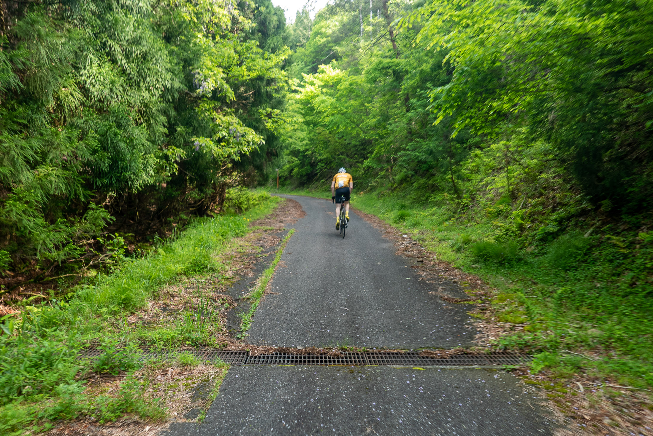

Panasonic LX100 at an effective 25mm — 1/125 sec, f/2.2, ISO 200 — map & image data — nearby photos
Dangerous Grating
(not so lovely; need to take extreme care on the descent)

Panasonic LX100 at an effective 28mm — 1/1600 sec, f/2.2, ISO 200 — map & image data — nearby photos
Gorm Waiting at the Top
Without trying hard or even knowing how long the climb was, Gorm missed the KOM by just five seconds. We still had a very long day ahead, so it was prudent to pace ourselves, but it makes one want to return to give it an earnest effort.

Panasonic LX100 at an effective 24mm — 1/1600 sec, f/2.8, ISO 200 — map & image data — nearby photos
Good Spirits
We descended into yet another fertile valley...
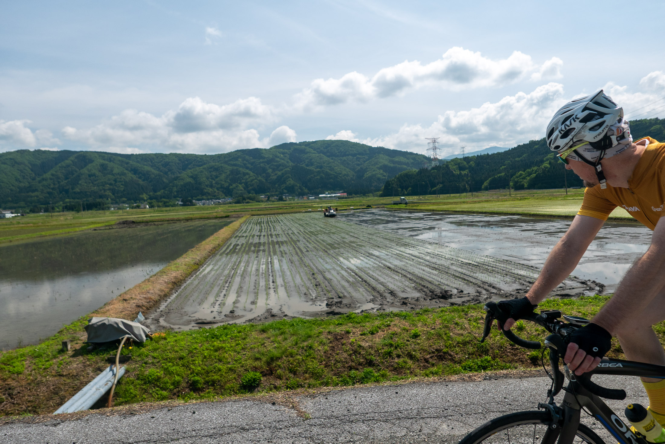
Panasonic LX100 at an effective 24mm — 1/2000 sec, f/2.8, ISO 200 — map & image data — nearby photos
Preparing the Rice Paddy

Panasonic LX100 at an effective 24mm — 1/1250 sec, f/2.8, ISO 200 — map & image data — nearby photos
Approaching the Kusaoka Shrine
草岡神社
Part of the day's agenda was to visit the Kusaoka Shrine (草岡神社), the shrine owned by the family of a friend. I had been here two weeks earlier to photograph a wedding, so had promised to stop by on my bicycle some time.

Panasonic LX100 at an effective 28mm — 1/250 sec, f/5.6, ISO 200 — map & image data — nearby photos
Towering Trees


After a short visit, we took a detour to Yogo Lake, which looked just lovely in my research. It did not disappoint. A loop around it took about 11 minutes.

Panasonic LX100 at an effective 24mm — 1/640 sec, f/5.6, ISO 200 — map & image data — nearby photos
Starting Around Yogo Lake


Panasonic LX100 at an effective 75mm — 1/320 sec, f/5.6, ISO 200 — map & image data — nearby photos
Small Village

Panasonic LX100 at an effective 24mm — 1/250 sec, f/5.6, ISO 200 — map & image data — nearby photos
Just Lovely


Panasonic LX100 at an effective 24mm — 1/640 sec, f/5.6, ISO 200 — map & image data — nearby photos
Half Way Around
We actually went around it twice. The first time, not knowing just how lovely it would be, we gave it somewhatg of an earnest effort, and ended up with the #6-best effort on the loop segment (though bumped down considerably when a group of five guys did a team effort yesterday). We could have gone quite a bit faster if we didn't have another 200km of ride in front of us.
It was so lovely, though, that we decided to do it again for enjoyment and photos.
I'd noticed a restaurant near the end of the loop, so we stopped in there for lunch.

Panasonic LX100 at an effective 24mm — 1/125 sec, f/5.6, ISO 200 — map & image data — nearby photos
Stop for Lunch

Panasonic LX100 at an effective 24mm — 1/100 sec, f/1.7, ISO 200 — map & image data — nearby photos
Well-Earned Ice Coffee

Panasonic LX100 at an effective 24mm — 1/80 sec, f/1.7, ISO 200 — map & image data — nearby photos
Chicken-Nugget Lunch for Two
We stopped for almost an hour, which was way way too long, but it was certainly enjoyable.

Panasonic LX100 at an effective 24mm — 1/200 sec, f/5.6, ISO 200 — map & image data — nearby photos
Takin' it Easy
it took a while to figure out whether it was real; it was
Now we had a short 25km and a couple of small climbs to get to the start of the big climb of the day...

Panasonic LX100 at an effective 24mm — 1/800 sec, f/5.6, ISO 200 — map & image data — nearby photos
Lovely Rural Area


Panasonic LX100 at an effective 24mm — 1/200 sec, f/5.6, ISO 200 — map & image data — nearby photos
At the Top
of one of the short climbs

Panasonic LX100 at an effective 24mm — 1/60 sec, f/1.7, ISO 1000 — map & image data — nearby photos
Old Tunnel

Panasonic LX100 at an effective 28mm — 1/200 sec, f/5.6, ISO 200 — map & image data — nearby photos
Last Rest Before the Big Climb
The main climb of the day was the eastern approach to Kunimi Pass. “Kunimi” (国見) in this case means “Kingdom View”, and indeed we were treated with sweeping views that a photo like this does no justice:









After almost an hour of slow, hot (but visually stunning) slog, we arrived at the top:

Panasonic LX100 at an effective 24mm — 1/200 sec, f/5.6, ISO 200 — map & image data — nearby photos


Halfway Point: Kunimi Pass
8½ hours into the ride; only 150km remains until home
This was followed by more than 10 minutes of lovely descent, plummeting down the other side of the mountain.
Just before we were to rejoin civilization at a main road, we were suddenly stopped by an elderdly construction worker blocking the road, saying that the road was closed and that we would have to go back. This was an extremely unappealing proposition for us, as it would me that we would have to make an hour's climb back to the top, retracing our steps for hours in the opposite direction.
Bicycles and pedestrians can often get by road damage that cars can't, so I wanted to investigate the nature of the closure. The old man was adamant, though, that “it had been decided” that no one should pass. I was persistent, and eventually could peek around a curve in the road to see that the road was completely open; it was closed due to a worry that some unstable rocks might fall onto it.
I was willing to take the risk for the one second it would take to pass the area in question, and so told the guy that I was sorry that I'd be making trouble for him, but that I would accept my own responsibility and proceed. He kept saying “but it's been decided!”, but he can't physically stop me as he's not a police officer, so Gorm and I proceeded. Indeed we did not die during the one second it took to pass, and as we passed the guard on the other side, I yelled out farther apologizes.
I feel bad for the guy, just doing his job, but he was given a ridiculous job.

Panasonic LX100 at an effective 24mm — 1/125 sec, f/4, ISO 200 — map & image data — nearby photos


Back in Civilization
With renewed energy we proceeded toward the steep climb that leads to the “Machu Picchu” view. The initial climb to the village itself is a lovely 1.9km @ 9.2% through tea fields.

Panasonic LX100 at an effective 24mm — 1/320 sec, f/5.6, ISO 200 — map & image data — nearby photos


Steep

Panasonic LX100 at an effective 24mm — 1/400 sec, f/5.6, ISO 200 — map & image data — nearby photos


Steep Selfie
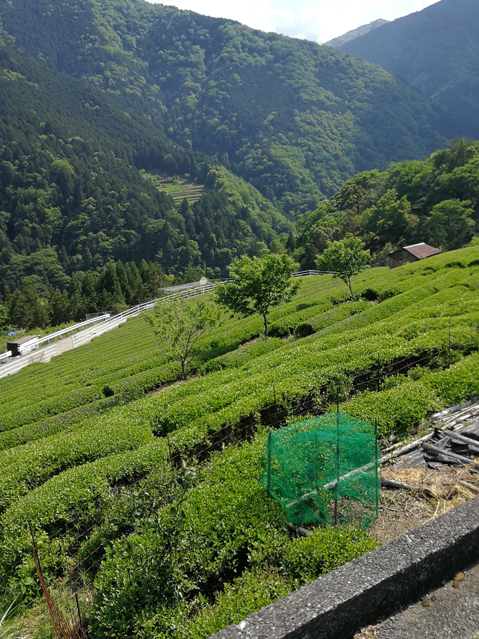
VTR-L29 at an effective 27mm — 1/730 sec, f/2.2, ISO 50 — map & image data — nearby photos


photo by Gorm Kipperberg

VTR-L29 at an effective 27mm — 1/750 sec, f/2.2, ISO 160 — map & image data — nearby photos


Me
photo by Gorm Kipperberg
I was quite the stylish sight.  My tonsils seem to be extremely sensitive to temperature and pollution, so I have learned
that wearing a mask makes things much better. Without it, I invariably come down with a cold the next day.
My tonsils seem to be extremely sensitive to temperature and pollution, so I have learned
that wearing a mask makes things much better. Without it, I invariably come down with a cold the next day.
I was also wearing long sleeves and leggings (Under Armour Heatgear) so that I didn't have to deal with sun lotion.
Once one reaches the village after the steep climb, it seems that one can hike for 15 minutes to get to the “Machu Picchu” view back down to the village, but in my research I found a small road that looked to curve around from the top, so I thought I might be able to ride to the view. That adds an extra 1.5km at an even steeper 11.1%, until the road turns gravel:

Panasonic LX100 at an effective 24mm — 1/125 sec, f/5, ISO 200 — map & image data — nearby photos


End of the (Paved) Road
I thought that we might get the nice view by continuing on the gravel for a while, but it didn't work out.... the best we got was to some big valley elsewhere:

Panasonic LX100 at an effective 75mm — 1/160 sec, f/5.6, ISO 200 — map & image data — nearby photos


Not the View We Hoped For
but still nice

Panasonic LX100 at an effective 24mm — 1/125 sec, f/4.5, ISO 200 — map & image data — nearby photos


Back in the Village
At this point we'd done 170km (105mi) over almost 10 hours, and now it was time to head home. There was just one final mountain in the way...

Panasonic LX100 at an effective 24mm — 1/320 sec, f/5.6, ISO 200 — map & image data — nearby photos


Entering the Final Climb
The final climb is more than 12km (7½mi) of gradually-steepening back mountain road. The final kilometer averages 9%.
This road, too, was not without its challenges. Half an hour in, we come across a sudden unannounced road closure:

Panasonic LX100 at an effective 24mm — 1/200 sec, f/5.6, ISO 200 — map & image data — nearby photos


Blocked-Off Road
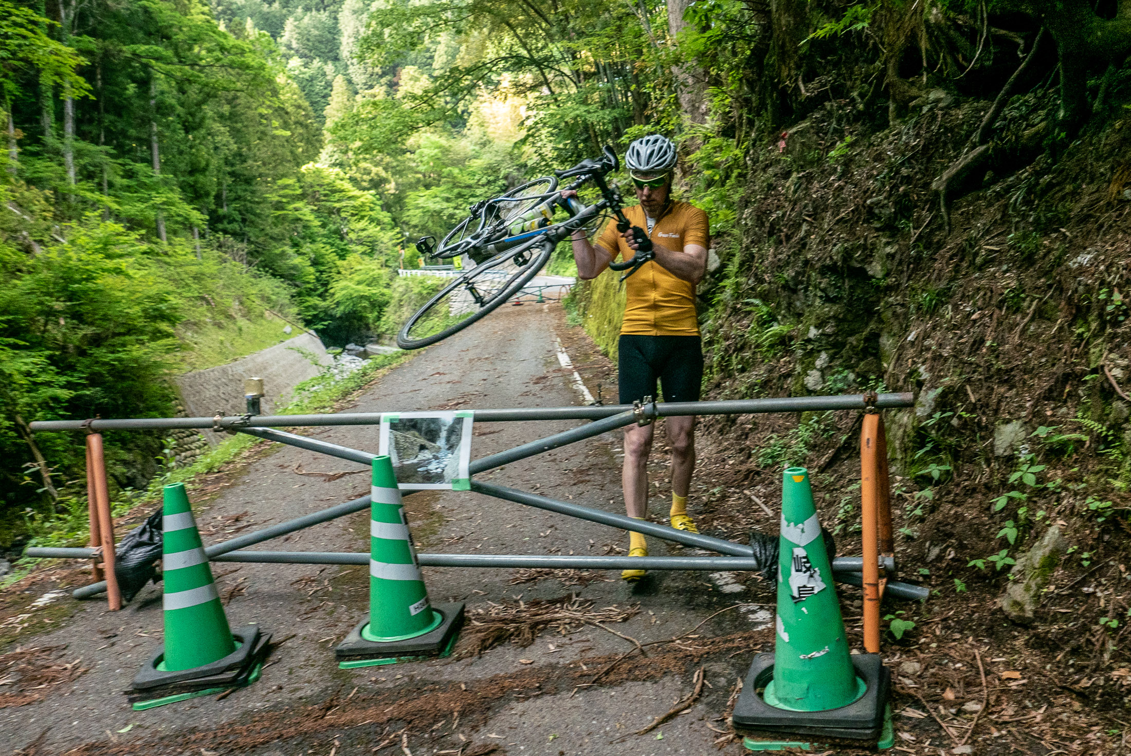
Panasonic LX100 at an effective 24mm — 1/125 sec, f/4, ISO 200 — map & image data — nearby photos


Not Closed to Bicycles
The soil under parts of the road was washed out, so it certainly wasn't safe for cars, but it was fine for bicycles keeping to one side.
Then I got my first flat tire in more than two years.
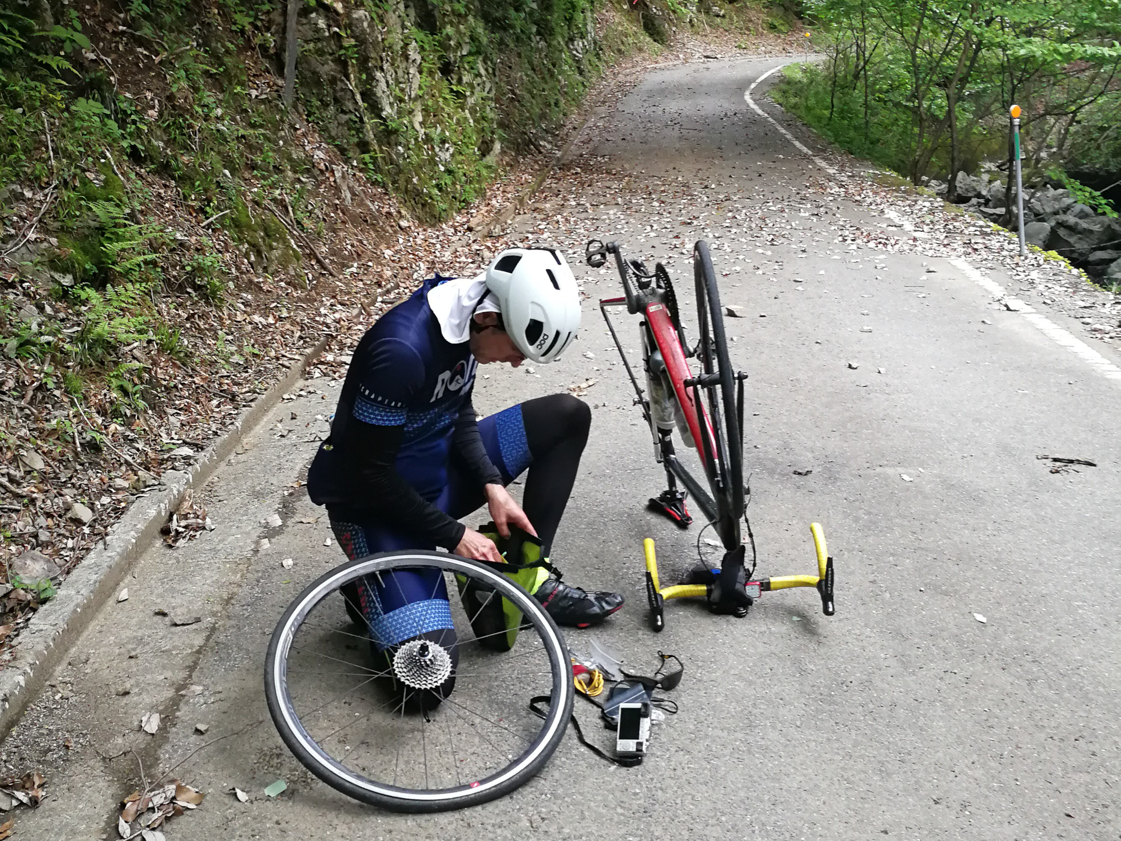
VTR-L29 at an effective 27mm — 1/120 sec, f/2.2, ISO 250 — map & image data — nearby photos


Fixing a Flat
My first in over two years, but it's like riding a bike...
photo by Gorm Kipperberg
I used to get flat tires all the time, but that stopped when I switched to Continental Gatorback tires, and after that switch I went for 11,000 tire kilometers until I got a pinch flat two years ago on this ride. One gets a pinch flat when they don't have enough tire pressure for the conditions, and that's exactly what happened today. I probably should have checked the tire pressure before heading out on a 300km ride. Doh!
I've gone almost 23,000 tire kilometers since the previous flat. Not bad. That's two flats, due to my own stupid fault, in almost 21,000 tire miles. Not bad indeed.
What was bad was my spare tube. I used to always bring two spare tubes, but after 1½ years of no flats, I switched to carrying just a single spare, and it turns out that this single spare had a manufacturing defect. Doh!
Thankfully Gorm had two spares, so I didn't have to resort to patching a broken tube.
My tire pump then broke.
I'd not needed it for years for myself, but had used it plenty in helping others, so I'm not sure why it decided to die now, but had Gorm not been there, I would have been stranded. I used his pump to pump up his tube in my tire.
Now I was paranoid about another pinch flat, as it's difficult to get really high pressure with these small hand pumps. I took it slowly and carefully up, then down the other mostly-bumpy side.

VTR-L29 at an effective 27mm — 1/120 sec, f/2.2, ISO 160 — map & image data — nearby photos


Passing the Barrier
leading from the other direction
photo by Gorm Kipperberg

Panasonic LX100 at an effective 24mm — 1/125 sec, f/5.6, ISO 200 — map & image data — nearby photos


Lovely New Tarmac
though the road surface for most of the descent was, unfortunately, lunar
We descended into the historic city of Sekigahara. I'd intended to stop by the site of The Battle of Sekigahara, which 420 years ago set Japan on the path to being a single political unit instead of a collection of warring kingdoms, but instead I stopped by a bike stop to fill my tire properly, and to buy another spare tube.
10km of rolling hills later, we stopped for dinner, but it turns out that we were both slightly nauseous, so we barely ate anything.

Panasonic LX100 at an effective 24mm — 1/125 sec, f/1.7, ISO 1250 — map & image data — nearby photos


Wasted Dinner
13 hours and 210km (130mi) into the ride
Once we left at about 6:30pm, we had about 92km of mostly-flat lakeside road between us and home, so we put the pedal to the metal.

Panasonic LX100 at an effective 24mm — 1/125 sec, f/1.8, ISO 200 — map & image data — nearby photos


Back at Lake Biwa
last light
7:02pm — taken at 33 kph (21 mph)
Our average speed during the last few hours, mostly in the dark, was faster than during the first few hours. We wanted to get home.

VTR-L29 at an effective 27mm — 1/4 sec, f/2.2, ISO 1250 — map & image data — nearby photos


Last Few Hours
photo by Gorm Kipperberg
Unfortunately, I got another flat with about an hour to go. It turns out that the tube I'd gotten from Gorm also had a manufacturing defect, and the rubber had slowly separated from the stem. I switched to the tube I'd bought, and we could finally head home.
I arrived at home at 11pm, 17½ hours after starting. It became my 2nd-longest ride, and the 4th-most amount of climb.
Work Futures Daily-Chaotic and Smart

| Richer Sounds Trust | Living At Risk | Wednesdayless | Farm Workers Rights | Curtis Carlson |
Canadians not sold on self-driving vehicles yet says CAA study

The Canadian Automobile Association (CAA) has released a new study detailing that a slim majority of Canadians don’t trust autonomous vehicles.
Sixty-one percent of Canadians are concerned about autonomous vehicles’ accountability in the event of an accident, and a slightly smaller 59 percent are worried about the vehicles being hacked.
53 percent of Canadian are even worried about connected cars sharing their data with third parties.
An earlier study by CAA mentions that 83 percent of Canadians only have a vague knowledge of autonomous technology.
To remedy this the association has launched a new website where Canadians can go to learn about the new vehicle technology.
These stats are based on a poll of 2,006 Canadians, according to CAA.
Source: CAA
The post Canadians not sold on self-driving vehicles yet says CAA study appeared first on MobileSyrup.
Tell Me, Learning Analytics…

While I'm not disagreeing with the criticisms of learning analytics in this post, I'm not exactly agreeing with the argument that we need more humans to do the work. It seems to me that what we really need is better AI. "Someone who is falling behind probably needs personal attention and care from the teacher or at least a TA." Maybe this is true. Or maybe they're failing for reasons that have nothing to do with the course. Or maybe they're failing because of the human in the course. I don't know. I do know that in the era of all-human instruction, lots of students still failed.
Web: [Direct Link] [This Post]ARM unveils new Cortex-A77 CPU and Mali-G77 GPU designs

Another year, another new ARM silicon design. At its annual TechDay event, the British semiconductor company announced the design blueprints of the new Cortex-A77 CPU core and the Mali-G77 GPU family.
Right off the bat, ARM claims the A77 design boasts a significant 20% performance improvement in instructions per clock (IPC) over the older A76 design. The chip-designer also said the new design has “laptop -class performance.” Considering Qualcomm’s newest 8cx processor — which it showed beating an Intel i5 in benchmarks at Computex — uses the Kryo 495 based on the Cortex-A76 design, A77 could be the way to go for future ultrabooks.
ARM boasts the A77 has 5G support, as well as better machine learning capabilities.
Per industry norms, each generation of ARM processor is typically manufactured on a new nod, which makes them more power efficient.
ARM introduced a new Mali-G77 GPU alongside the Cortex A77 as well, boasting a 40 percent performance uplift over the G76 design. The G77 GPU should improve mobile games and battery life thanks to its increased efficiency. It’s also worth noting that the G77 family is based on the brand-new ‘Valhall’ architecture. It replaces the familiar ‘Bifrost’ architecture that formed the foundation of many ARM Mali GPUs starting with the G71.
The two new products are available for companies, like Qualcomm, Samsung, and MediaTek to license for their respective ARM processors.
In many cases, certain licensees may improve upon the designs by adding extras. The Qualcomm Snapdragon 855, for example, uses a tweaked Cortex-A76 CPU core design for its bigger cores. Same goes for Samsung. It’s latest Exynos 9820 processor uses a customized older Cortex-A75 design called Mongoose 4.
One company that will not have access to the new Cortex and Mali designs, unfortunately, is Huawei. The Chinese telecom company lost its access to future ARM licenses after ARM cut ties with Huawei following the U.S. ban.
The post ARM unveils new Cortex-A77 CPU and Mali-G77 GPU designs appeared first on MobileSyrup.
Apple could get rid of 3D Touch from all 2019 iPhones

Apple may be removing 3D Touch from all of its 2019 iPhones.
MacRumors says it received a research note from a Barclays analyst team that confirms Apple will “eliminate” 3D Touch in all of its 2019 iPhones. The Wall Street Journal also reported the same news back in January.
It’s unclear why Apple would get rid of the feature, however. Reportedly the company might bring Haptic feedback to all of its handsets, instead of just its more affordable handsets. Back in 2018, the iPhone XR, which features an LCD display rather than OLED, utilized Haptic Touch instead of 3D Touch.
Haptic Touch includes less functionality than 3D Touch and does not support Apple’s Quick Actions app menus or the ‘Peek and Pop’ feature that allows users to preview content.
While Apple will not unveil its 2019 iPhones at WWDC next month, the company could show off a version of iOS that doesn’t feature 3D Touch at all.
Apple first implemented 3D Touch four years ago on the iPhone 6s.
Source: MacRumors
The post Apple could get rid of 3D Touch from all 2019 iPhones appeared first on MobileSyrup.
TikTok’s creator is working on a smartphone: report

ByteDance, the company behind TikTok (Douyin in China), is transforming from a content creation provider to a smartphone maker.
According to Financial Times tipsters, ByteDance is currently in the process of developing its own smartphone after having acquired patents and talents from Chinese phone maker Smartisan. Founder Zhang Yiming has “long dreamt” of a TikTok smartphone, according to an anonymous source.
The rumoured smartphone is presumably marketed toward the social media fanatics and millennials in China and would come installed with the TikTok (Douyin) application.
The rumour didn’t include any specifications or proposed launch day. ByteDance has declined to comment on this report. It’s unlikely that this phone would go on sale in markets outside of Mainland China.
Smartphones that embraced an Internet service have flopped historically. This occurs because the smartphone focuses on pushing and advertising services over fine-tuning the user experience. Amazon’s Fire Phone is a perfect example of a smartphone with enhanced Internet service over usability. HTC First and HTC ChaCha, both Facebook-tuned smartphones, were largely overlooked by consumers as they preferred to use the dedicated Facebook app.
However, BytesDance’s smartphone attempt might have a different result in China. Douyin has overtaken the country by storm with 300 million active monthly users in China as of 2018.
Source: Financial Times Via: Engadget
The post TikTok’s creator is working on a smartphone: report appeared first on MobileSyrup.
How is Haskell faster than C?
Haskell is very competitive with C, and on some benchmarks, it is faster. How is that possible? With all that Haskell does on top of the raw C code, how can it possibly be faster? In this episode, I talk about two advantages of Haskell that can make it faster than C.
Transcript
Eric Normand: How is Haskell faster than C? I’ve two explanations, which I’ll get to in a moment. My name is Eric Normand, and I help people thrive with functional programming.
Usually, languages are compared to C. It’s the standard benchmark language to say like, “Oh, this language is only a factor of two slower than C.” Most languages are slower than C. Especially when you get into the more higher-level languages, you have this idea, “Well, we lost a lot of speed.”
You don’t have to deal with all these problems that C has. You don’t have memory leaks because we have a garbage collector. You don’t have to deal with when to free the memory, just all these niceties add up, but it’s at the cost of the speed.
Then, you have something like Haskell that is often faster than C in the benchmarks. It’s very close to C when it’s not faster. It’s not like, “Oh, it’s twice as slow.” No, it’s right there, it’s within a few percentage of C, and very often it’s on the other side, it’s faster than C. What’s going on?
There’s actually two things, at least. These are the two things I know of that are going on. The first is optimization. Haskell has a lot of knowledge. The Haskell compiler is given a lot of knowledge about the program and the form of types, usually. Those types are richer than what the types in C are.
Not only is it the types, but there’s a lot of the semantics of Haskell that give the compiler a lot of leeway, let’s call it, a lot of wiggle room for optimization.
One of those is lazy evaluation. In C, it’s strict evaluation, you put a function there, it executes one line at the time. It’s how you should think of C executing. It’s going to call this line. Everything on this line is going to finish before we get to the next line.
In Haskell, that’s not the case. You can call something, give it a name, and it doesn’t actually do anything yet. The compiler can actually analyze it and a lot of times figure out, “Hey, you’ve never used this and this branch.” I’m not going to do it yet until I know that you’re in this branch, and then I’ll do it.
Or, it might never do it. The analysis gets so complex. It might remember how to do it and in case you need it, it will be there, but it won’t do it. There’s a lot of stuff that you could in theory hand-tune if you’re very good at optimizing.
As a programmer, you could hand-tune and say, “Oh, there’s a certain case where I won’t need this value, so I’m just not gonna calculate it until I really, really need it.” In practice, it gets so hard. It gets so complicated that you’re just not going to do it. Haskell can do that. Haskell just does it and the programmer doesn’t have to think about it.
It can do some analysis, it can figure out when something is going to be needed anyway, it might as well just calculate it now. It can do some analysis and say, “Oh, it’s only needed sometimes, so I probably won’t do it yet.” Sometimes it just puns and says, “Well, I don’t know how to analyze this.” The net effect is that that it’s faster.
Another thing is it can do a lot of, because everything is pure, it can do a lot more optimizations like moving code around, inlining, and doing more stuff at compile time that can’t be done in C. Those are typically thought of like inlining, people optimization, that kind of stuff.
Haskell has a broader range of maneuvers that it can do that let the code get optimized really well. That’s nice. It’s like you’re getting the benefits of the high level. You can code how it should be read. I’m coding for another programmer, I’m just making it very readable, but then the compiler can transform it into something that’s better to be executed on the machine.
That’s number one, that’s optimization. Number two is potentially even bigger. That is that Haskell lets you use better data and algorithms. I need to explain because, yes, they’re both true and complete. Let’s take that argument, I agree, but let’s take it off the table.
Bryan Cantrill actually made this argument, and that’s where I got the idea for this episode from. He was talking about Rust but it applies equally to Haskell. He has been doing a lot of system programming in his career and a lot of it is done in C because it needs to be low level.
His argument goes like this, “Well, if you need a data structure, in C it’s just hard to do anything more complex than a linked list.” Or, maybe you could get a little bit more complicated, but you write linked list all day long because it’s something that you know you’re not going to mess up and it does the job, and it’s fine.
Haskell, because it’s higher level, it can actually manage much more complex data structures and do so in a correct way. It gives you tools to write data structures that are known to be more efficient for certain access patterns. Linked lists are very linear.
Not every access, if you access the first thing, it’s constant. In general, you’re accessing things inside the list randomly. Let’s say that’s what your algorithm is. You’re accessing stuff randomly. That’s linear. If you do that in a loop, wow, you’re quadratic already.
In Haskell, you can replace that linked list with something else, like let’s say a tree. Now, your access is logarithmic, and you’ve already saved a bunch of time in terms of time complexity.
That is another way that Haskell benefits over C. That if the problem is complicated enough or big enough where a linked list…The difference between in-access complexity and Big O notation complexity, between a linked list and a tree, boom, it’s a big enough difference. Haskell’s going to win.
It’s simply a matter of how much complexity can you handle. Of course, if someone wrote a tree in C and you imported that library and you included it in your C code, you would start competing again with Haskell. You could do that, sure. Do you do that? Is that a possibility?
In these benchmarks, it might not be a possibility. Whereas, in Haskell, you could do that, you could write it yourself. I find that this is the case, a lot of times, in higher-level languages. It’s a spectrum. C is a very low level, Java’s higher level than C, but then Scala’s higher level than Java, Clojure is higher level than Java.
It’s a spectrum. What happens is as you tackle these benchmarks, sure, C is going to win because it’s very small problems. It’s like calculating something with a known algorithm. People have been optimizing the C algorithm for that for years, so they know exactly how to make it the fastest.
When you’re dealing with more real-world problems, bigger problems, very often, you do need garbage collection and a better concept of data type and data structure than C will give you. That’s what happens. It is not just about data structures, there are other facilities of the language.
As a little anecdote, I heard a story once where there was a competition to see who could write the fastest program, and it was C versus Java. It surprised everyone, especially the C programmers, but the Java implementation won.
It won by a lot. The C people were like, “No, that’s not possible. It’s…” “How can this big monstrous VM beat our highly-tuned tiny little C program?” They started reading the Java code. You could imagine them huddled there with their printouts like, “Huh!” They all were like, “No, look. They cheated.”
What they were pointing at was, in Java, they had used threads. They used multiple threads to solve the problem, whereas, in C they didn’t. They considered that cheating. In C, you can see the problem here. You could see why they consider it cheating.
Because they’re used to benchmarks where it’s just one thread, purely sequential code. It is really hard to write threads in C compared to Java. In Java, it’s very easy to write threads and to start new threads. What do you do? What do you do? Who won?
I say that Java people won. That’s the whole point of Java, is that it makes those kind of things easy. It makes threads on cross-platform really easy. It makes garbage collection cross-platform really easy. I think that the same thing is true of Haskell.
If it makes writing a data structure that gives you an advantage over a linked list, let’s say, easy. That’s what you get. That’s why it’s faster.
All right. If you have some ideas about why Haskell is faster, about these high-level languages, how they could be faster than a low-level language where you get to control everything and highly tune the code down to individual instructions if that’s the thing you like doing. How is that even possible? Do you agree with me, disagree? I’d love to know.
You can go to lispcast.com/podcast. You can find ways to contact me, email, Twitter, LinkedIn. You can also find all the past episodes. They have audio, video, and text transcripts of all the past episodes. You can find subscribe links if you want to subscribe. Thank you so much. Check you later.
The post How is Haskell faster than C? appeared first on LispCast.
Apple says Apple Watch Series 4’s ECG feature is coming to Canada

Apple has confirmed that the Apple Watch Series 4’s electro-cardiogram feature (ECG) is finally coming to Canada.
That said, the tech giant hasn’t revealed a specific release date for the feature’s launch, only stating that Health Canada has approved it. In a statement to The Canadian Press, Apple says that it plans to bring the Series 4’s ECG functionality to Canada “as quickly as possible.”
Last week, news broke that Health Canada approved the Series 4’s ECG feature after iPhone in Canada reported that Health Canada approved two filings related to the functionality.
With WWDC just around the corner in early June, it’s possible Apple could have plans to launch the Apple Watch Series 4’s ECG feature in Canada, as well as other regions, at some point during the annual developer conference.
Currently, the ECG is manufacturer-locked to the region the Apple Watch is purchased. This means that even if you switch the region an Apple Watch purchased in Canada is located, the ECG functionality still won’t be accessible.
Source: CTV (The Canadian Press)
The post Apple says Apple Watch Series 4’s ECG feature is coming to Canada appeared first on MobileSyrup.
This is how Yoda was filmed pic.twitter.com/0KcfVVbZg2
mkalus
shared this story
from  moodvintage on Twitter. moodvintage on Twitter.
|
This is how Yoda was filmed pic.twitter.com/0KcfVVbZg2

 moodvintage
on Monday, May 27th, 2019 8:15pm
moodvintage
on Monday, May 27th, 2019 8:15pm108 likes, 21 retweets
Brainstorm for Windows - Franz Grieser
Is anyone here still using Brainstorm? Or anyone willing to share his or her experience with the software?
It is still available, I just downloaded it and got it running (it's the first time in years that my anti-virus software does not ring an alarm). It's the 2008 version 3.6. In the past, I never managed to run the software, now it does.
http://brainstormsw.com
Thanks, Franz (still looking for a decent outliner in Windows)