Shared posts

28 Aug 21:13

What kind of software is functional programming not suited for?

by Eric Normand

Functional programming cannot be suited for everything, right? Well, let’s not be so sure. Functional programming, like imperative programming and object-oriented programming, is a paradigm. It is a fundamental way to approach software. There are many languages that fall within the umbrella of FP. It is quite possible that everything we know how to do in software, we know how to do well with FP, the same way we know how to do it with imperative and with OOP.

Video Thumbnail
What kind of software is functional programming not suited for?

Functional programming cannot be suited for everything, right? Well, let's not be so sure. Functional programming, like imperative programming and object-oriented programming, is a paradigm. It is a fundamental way to approach software. There are many languages that fall within the umbrella of FP. I

Transcript

Eric Normand: What kind of software is functional programming not suited for? We will go over this question and explore it in some depth by the end of the episode. Hi, my name is Eric Normand, and I help people thrive with functional programming.

This is an important question, because if we are being honest with ourselves, we’re going to find places where something isn’t a good fit. If it’s a good fit for one thing, there’s going to be a bad fit somewhere else. To say that a thing is good at everything is probably to delude yourself.

I want you, my listener, to have a more balanced view of what’s going on, so we’re going to explore this question. I’m going to make reference to other paradigms, object-oriented paradigm and imperative paradigm, and we’ll see. We’ll see how they all do as paradigms.

The question is, what kind of software, what applications, what domains, what kind of context is functional programming not suited for? My first impression is this is like asking what object-oriented programming is not suited for, or what imperative programming is not suited for.

Even though I don’t generally endorse imperative programming, like in the same way I endorse functional programming, it’s hard for me to think of a domain where imperative programming is not great. I don’t feel like I’m being biased by saying that I think that there’s something wrong with the question. I want to go into why that might be.

The thing is, these are general approaches. These paradigms are general-purpose approaches to software. They are more like a world view from which to begin your exploration of a problem domain and how you might solve it. It’s not like they’re mutually exclusive.

Their ideas certainly aren’t mutually exclusive. They just kind of set a groundwork, a framework, in which you’re going to continue exploring.

They’re a whole system of thinking, and so it’s hard to say that some kind of application wouldn’t do well in imperative programming. It’s a system of thinking. It’s a place to start. Likewise with object-oriented programming. It’s a place to start.

Just to be super clear, when I’m talking about the three major paradigms, object-oriented, imperative, and functional, I’ll quickly give a nutshell description of these as paradigms.

Imperative programming turns everything into a sequence of steps. That is your main programming unit is a routine or a subroutine. You can break up a sequence of steps into further steps, call those and name them, and refer to them that way. You could see that this is a generally applicable paradigm.

A lot of people say, “Functional is really good with math.” A lot of high-performance math routine software, is written in an imperative style. It’s written in Fortran, so it’s really hard to make that argument that functional programming is better at math than Fortran.

Object-oriented programming, there’s basically three main concepts. There are objects, which hold state and accept messages, there are the messages that are sent between objects, and there are the methods, which are the code that runs when the message is received.

In this way, you create this network of objects that communicate with each other. The computation happens through the dispatch of different messages and what each object does with the messages it receives.

Likewise, you look at software written today, a lot of it is written in object-oriented programming, in an object-oriented style. It spans all sorts of domains, all over the spectrum. It’s really hard to say that it’s not suitable for this stuff.

People have built systems to do aircraft engineering, to embedded systems, to simple web applications. Everything is built in this OO framework.

I’m going to say the same for FP, that there’s really nothing that FP isn’t suited for. Real quick, functional programming as a paradigm begins with three things, the three main concepts — actions, calculations, and data. These are mutually exclusive categories that everything falls into.

When I read answers on the Internet, one thing that I see come up a lot as a good answer or as common answer — and people like this answer, they upvote it and stuff — is that anything that’s main purpose or the main function of the software is to keep track of and change state.

They give the examples of stuff like a game engine, where characters and other items are constantly changing. They’re moving. Their health points are changing. There’s a lot of state, and it doesn’t make sense to do this in functional programming, because it’s much easier to just set mutable fields on objects.

I want to address this, because it is a very common answer. Functional programmers do use state. Let me just put it bluntly. We do. There is a particular definition of functional programming that I don’t agree with that says that functional programming is exclusively programming with pure functions.

That means no state, no side effects, nothing, just pure functions. If that is the case, if it is programming with pure functions, then these answers are right. The trouble is that that is not what most functional programmers do in their day job.

When they’re actually building a real system, they are making practical compromises. They are not sticking to this very rigid reductionist definition of functional programming.

That would be like saying in Java, you could only do stuff with message passing, meaning no if statements, no for loops, no primitives. Everything has to be an object. Nobody does that. It’s just not the way it’s done.

Now, there are some languages that make it easier to do that, like I believe with Smalltalk, everything, even if statements were done with messages. That was a choice they made, just like Haskell makes a choice to be a very pure language, although it does have I/O. Don’t forget about that.

I don’t agree with that definition. Functional programmers do use state. They do use side effects. They just have a tidy place to put them. They put them in the actions category. All that is to say that functional programming is big.

There’s a lot of room in this umbrella of functional programming to solve any problem you might have. That’s why it’s not really possible to say, “Well, it’s not good at this,” because it’s a big umbrella. That thing fits under there, and someone may have found a way to do it. There’s lots of languages.

I’m going to name two domains that maybe I would feel like just intuitively, “Oh, these things, these domains, no. They’re not good for functional programming,” but then I researched them, and it turns out that there are functional programming solutions in there.

The first one is embedded systems. I looked into this, because I figured embedded systems are super constrained in terms of memory and CPU processing. You’re not going to be able to fit a garbage collector in the kind of runtime that we’re used to when we’re dealing with nice functional languages. But, I was wrong.

There are several versions of Scheme, or other Lisps, that are made to run in an embedded environment. They’re pared down. They’re not the Scheme you would run on your desktop or on a server. They’re very small, and they encourage a lot of functional programming practices, and they discourage others.

There’s going to be mutable data, like the const cells, the things you make linked lists out of — they’re mutable — but it encourages recursion. It has first-class functions. You make a tradeoff there for space. Now, there’s other languages, too. I’m just picking on Scheme, but there’s other functional languages.

Then you get to something like Rust. Rust is a very functional language. A lot of it falls under the functional umbrella.

It has a really nice type system that can optimize away a lot of stuff that we’ve relied on runtimes for in the past — memory safety, being able to efficiently store and deal with mutable state in a safe way.

Rust is a perfect example of functional programming for embedded systems. It’s just, it proves that [laughs] it is suitable for everything.

There might not be a language for that particular problem yet, but it doesn’t mean that FP isn’t good for it. It doesn’t mean that all languages are. I would never use Clojure in an embedded system. It’s too big. Everyone knows that. No one’s going to dispute that.

The other one is the GPU. There are many systems for writing the language that GPUs speak, which is OpenCL, something like that. Oh, I forgot the name. Let me look it up real quick. Yeah, there’s Cuda and OpenCL.

These are C-like languages. They’re imperative. Like in Clojure, there’s ways of writing what looks like Clojure, that gets compiled into OpenCL, and then sent to the GPU. That’s not what I’m talking about. I’m talking about a functional paradigm approach to programming the GPU.

I didn’t know that this existed, but it does. I would have said, “No, you just want imperative. Just give me the raw code, and let me do it by hand.” No, there’s a thing called Futhark, F-U-T-H-A-R-K, that is a functional language that operates on arrays.

It has map, filter, reduce, and it happens all in parallel on the GPUs. It compiles to OpenCL or Cuda, and it is a completely pure, type-safe functional language that is competitive with hand-optimized code. It’s high level in the way that an imperative language wouldn’t be.

To me, this is it. It’s saying, “Yeah, sure, maybe Clojure or Haskell itself won’t compile right to the GPU, but here is a small functional language that will compile nicely to the GPU.” That’s what it’s made for. It’s made for interop with a regular language, like a CPU-bound language.

You’re running it in Python, and then you need to call out to something fast on the GPU. You could write it in this nice functional language in a functional style.

I’m going to conclude. I think that FP is generally applicable, because it really is just a general approach to software.

In the same way that object-oriented programming is probably OK, I don’t know if OOP would be good on the GPU. Just saying, just because the message passing might…I don’t know. I’m not a GPU person, but it just seems like the message passing would be not a good fit for the architecture of the GPU.

That’s not to say that it’s not possible. I don’t know. The thing is, when we talk about whether it’s a good fit for a certain environment or application domain, we’re usually thinking about a particular language that we are thinking about.

We’re saying, “Is Haskell good for this?” OK, Haskell is not good for everything. Clojure is not good for everything. There are particular domains where it is a good fit and not, but FP encompasses all of them. As a framework, as a paradigm, it is flexible, it can do it all, and I think that’s the case with imperative and with object-oriented.

Well, yep, that’s all I have to say. I hope I’ve brought some clarity to this. A lot of the fine points are on the definition of FP as a paradigm. I think that state and side effects are a part of FP, just the fact that we have names for them in a way that other paradigms don’t. That’s it. I’m done.

If you liked this episode, you can find all the past episodes at lispcast.com/podcast. There you can find audio, video, and text of all of the past episodes. You’ll also find links to subscribe to the podcast and to find me on social media, be it email, Twitter, or LinkedIn.

I really think the social part of social media is the main thing. It’s not a broadcast medium, it’s a way of getting in touch with more people, keeping in touch with people, engaging with them, forming relationships, friendships, nice, deep discussions.

Please find me and send me a message and that’s it. Thanks for listening and rock on.

The post What kind of software is functional programming not suited for? appeared first on LispCast.

28 Aug 21:11

NetNewsWire 5.0 Now Available

NetNewsWire for Mac icon: globe with a satellite in the foreground.

NetNewsWire 5.0 is shipping!

In case you haven’t been following along until just now: NetNewsWire is an open source RSS reader for Mac. It’s free! You can just download it and use it. No strings.

It’s designed to be stable, fast, and free of bugs. It doesn’t have a lot of features yet, and that’s because we prioritized quality over features. We will be adding more features, of course, but not quickly. We’re also working on an iOS app.

It syncs using Feedbin. We’ll support more systems in the future (as many as possible).

I hope you like it!

Some links…

Thanks to so many people

I want to especially thank Sheila Simmons and my family and friends.

This release took five years to make, and for four of those years it wasn’t even called NetNewsWire. It was just a year ago that I got the name NetNewsWire back from Black Pixel — and I thank them again for their wonderful generosity.

I also want to thank Brad Ellis for making the beautiful app icon and toolbar icons. Thanks to our major code contributors: Maurice Parker, Olof Hellman, and Daniel Jalkut. Thanks to Ryan Dotson for writing the Help book. Thanks to Joe Heck for looking after infrastructure issues (especially continuous integration).

Thanks to my co-workers and friends at The Omni Group (which is a wonderful place to work). Thanks to the ever-patient and ever-awesome NetNewsWire beta testers on the Slack group and elsewhere.

And thanks to everyone who’s ever used the app in its 17-years-and-counting run. Because of you, NetNewsWire has been, and remains, the thrill of my career.

28 Aug 18:45

Riding to Iona Beach Park

by jnyyz

For a post RSVP ride, I was intrigued by a route that was posted in the archived section of the Vancouver Bicycle Club. I was particularly interested in exploring the area around the airport, labeled Iona Beach Regional Park.

2017 John Hathaway Birthday Ride

For the first part of the ride, I came down from UBC, and I wanted to check out the protected intersection at 1st and Quebec, which I visited last year when it was not quite fully installed. Here is a video of cars and cyclists going through the intersection. It is not ideal as there was not much traffic, it being 9 am on a Sunday.

At this point, I joined the official route, which basically took me south across town, more or less on the Heather bikeway.

These units on the back side of a condo complex that fronted on 49th looked like laneway housing.

Here is the bike and pedestrian approach to the Canada line bridge.

The bridge looks in remarkably good shape, very close in condition to the last time I went across in 2012.

I was amused that the posted route took me past the River Rock Casino, which is where I caught the bus to Seattle just a few days ago.

Peering through a fence at the site of what I presume to be the Richmond night market.

Now crossing a short bridge from Richmond to Sea Island, which is where the airport is. Given traffic, I elected to take the sidewalk across.

On the other side of the bridge there is signage indicating various destinations. At this point I decided to head towards Iona Beach Park, which sounded like the most interesting choice.

Heading towards the park past the outlet mall, I noticed a cyclist pulled over picking berries.

A little further on I saw this group of cyclists. One of them told me that they were going to do an informal time trial.

The road is smooth and dead level with limited traffic on the weekend. I was surprised by the number of cyclists out and about, with a strong bias towards racer types.

Past the post office terminal, the road narrows, and the pavement was rougher, although still perfectly fine. All the way at the end of the road you reach Iona Beach Regional Park.

From this point, there are two long spits that extend into the ocean. The north branch looked natural, but the arrow straight south one allowed bikes. So here I go, out 4 km to the southwest. Bikes were allowed on the gravel road to one side of the raised pedestrian walkway.

At Lands’ End, Vancouver version.

Looking back, you can see the city and the airport in the distance.

I should mention that the whole time I was out by the airport, there was a significant breeze coming from offshore. This meant tailwinds all the way back. BTW the Brompton with the narrow tires did just fine on the gravel.

I admit that when I got back to the airport, I was not excited about crossing the bridge to Granville Ave, as it didn’t look bike friendly. I elected to take the Canada line back to Oakridge, before biking back to UBC. On the way back, I stopped at a viewpoint to take another look at the two splits. The one further away was the one that I biked. I found out later that this spit is used to dump treated sewage some distance from the shore, hence the shape of the raised walkway.

Here’s what my ride looked like on Strava.

A nice way to cap off a biking weekend in Vancouver.

28 Aug 18:43

NetNewsWire 5.0 Ships

NetNewsWire 5.0 Now Available:

"In case you haven’t been following along until just now: NetNewsWire is an open source RSS reader for Mac. It’s free! You can just download it and use it. No strings.

It’s designed to be stable, fast, and free of bugs. It doesn’t have a lot of features yet, and that’s because we prioritized quality over features. We will be adding more features, of course, but not quickly. We’re also working on an iOS app."

A big congrats to Brent Simmons and everyone else who worked on NetNewsWire 5.0. I've been using NetNewsWire since version 1.0- which was released way back in 2003! I'm super happy to see development started back up on it and I know it has many more great years ahead of it.

28 Aug 18:43

Design Your Seasonal Adventure

by Ton Zijlstra
Liked Reflections on My “Summer of Proust.” (Gretchen Rubin)
Every spring, on the Happier with Gretchen Rubin podcast, my sister Elizabeth and I talk about our yearly resolution to "Design your summer." This resolution was originally inspired by this passage from Robertson Davies: Every man makes his own summer. The season has no character of its own, unless one is a farmer with a professional concern for the weather. Circumstances have not allowed me to make a good summer for myself this year…My summer has been overcast by my own heaviness of spirit. I have not had any adventures, and adventures are what make a summer.

I like this notion by Gretchen Rubin of defining an ‘adventure’ for the summer. I try to do one ‘extracurricular’ activity per quarter (e.g. 12 hacks in Q1, or how we used to do a month in another European city each year), but framing it as a seasonal adventure has a more human ring to it. Makes it an epic tale of which you are both the narrator and protagonist.

A season is 13 weeks, and that is a useful time span to plan something for. It is small enough to keep an overview and keep track, and long enough to do something meaningful even with little bits of time. I’ve been doing my own planning in 13 week periods for 6 years now, and name those 13 weeks periods by season (although they actually coincide with quarters).

With Summer almost behind us, what will be my adventure of the Fall?

28 Aug 18:43

The partisan divide widens over American higher education, and it may cost us

Bryan Alexander, Aug 27, 2019
Icon

The original purpose of higher education was to equip the ruling class to continue being the ruling class. This requires promulgating a set of beliefs and institutions that are anathema to an open and democratic society. Today, those beliefs and institutions are being called into question, and rightly so. This may cause higher education to become less popular in some quarters. If so, too bad.

Web: [Direct Link] [This Post]
28 Aug 18:43

Survival: the first 3.8 billion years

Lisa Feldman Barrett, Nature, Aug 27, 2019
Icon

This is a review of Joseph LeDoux's The Deep History of Ourselves: The Four-Billion-Year Story of How We Got Conscious Brains. I haven't read this, but his Synaptic Self is high on my recommended list. This review isn't as kind as it could be, suggesting that LeDoux is going beyond his area of expertise. The book offers "a natural history of brains as they developed the capacity to create the elements of the human mind, focusing mainly on the emergence of emotions, memory and consciousness." If LeDoux isn't qualified to offer such an account, I don't know who is.

Web: [Direct Link] [This Post]
28 Aug 18:42

Prizmo 5 for iOS Delivers Fast Scanning and Powerful OCR

by John Voorhees

I own a ScanSnap S1300i scanner, but I’m not sure why anymore. I used to scan paper documents and store them on my Mac. I’d OCR the scans, so they would be text searchable, and I used Hazel rules to organize them in folders automatically. However, I realized recently that not only do I rarely need to refer back to those scanned documents, but most are already available in electronic form online. If I need to look at an old credit card statement or bill, I can log into those accounts to find the information I need, so I tossed my scanner in a drawer.

Important bits of paper still come into my life now and then, but I’ve found that an iOS scanning app is more convenient for the volume of scanning I do now. There are lots of terrific apps on iOS to capture and organize scans, but Prizmo by Creaceed, which I’ve been testing for the past week, has quickly become one of my favorites, distinguishing itself with its ease of capture and terrific OCR functionality.

Creaceed makes two similarly-named apps that share some common features. Prizmo Go, which we’ve covered before, quickly captures text from images of documents that you can use in other apps. Prizmo, which has been around longer than Go, can convert document images to text too, but it’s also a full-featured scanning app.

Creaceed has been refining the scanning process for years, and with version 5 of Prizmo, it has reduced scanning to just three steps. When you point an iOS device’s camera at a page, Prizmo detects its edges, highlighting the entire sheet in blue. Tap the shutter button to take a photo of the page, and Prizmo opens a preview of the image where you can make adjustments to the page detection and rotate the image. The final step, if you’ve got no other pages to scan, is to tap ‘Done’ and save your scan. Prizmo can also import images of documents from your Photos library and detect the page’s orientation using machine learning to auto-rotate the image.

Both the scanning process and the machine learning-based approach to auto-rotation are new to version 5 of Prizmo. Previous versions of Prizmo could detect pages and suggest cropping, but they didn’t do so as well as version 5 in my experience or automatically as part of the capture workflow. Nor were those versions able to automatically rotate images based on machine learning. These are largely under-the-hood and workflow design changes, but they manage to simplify the scanning process by reducing the number of steps and adjustments necessary to create a good scan.

In contrast, when I use my ScanSnap, the process is more involved. I need to open it up, unfold, and set the paper feeder for the paper size I want to scan and unfold the tray that collects scanned pages. Then, I need to make sure my pages aren’t stuck together, bent too much, or crooked in the paper feeder, all of which could jam the scanner or feed multiple pages through at one time. It’s not a horribly complicated procedure, but it does fail, and pointing my iPhone’s camera at a page and tapping a button is undeniably easier.

With Prizmo, if you have a multi-page document to scan, you have two options. After tapping the ‘Keep Scan’ button when you’re satisfied with the image you’ve captured, you can point your camera at another piece of paper and and tap the shutter button to scan it. When you’re finished, tap the ‘Done’ button, and each of the images you saved will be part of the same multi-page document. Alternatively, you can use version 5’s new ‘Autoshoot’ feature, which is a mode that automatically takes a picture of each page you place in view of your iOS device’s camera as soon as it detects the page and you’re holding the camera still. I’ve found this to be the fastest way to deal with multiple pages.

If you turn on iCloud support, Prizmo saves the PDFs and other documents you create in their own Prizmo folder in iCloud Drive. However, your documents are not available from a separate Prizmo file provider.

Prizmo has a bunch of tools for cleaning up a scan.

Prizmo has a bunch of tools for cleaning up a scan.

After you’ve scanned a document, Prizmo includes a lot of non-destructive tools to adjust the image that help make it more legible. There are tools to rotate, crop, and flatten the image as well as make adjustments to brightness, color, and edges. There are also buttons for changing the scan’s page size, editing business cards, batch-processing, reverting to the original image, and sharing.

In my testing, I found flattening, brightness, and contrast adjustments to be most useful to make scans more readable. Brightness and contrast work as you’d expect if you’ve used the same sort of tools with photos, and flattening, which is a new tool in version 5, changes the perspective of the scan to compensate for taking it at an angle or if you take an image in a book or magazine where the binding curves the pages.

Prizmo can OCR a scan on-device, or using its optional Cloud OCR subscription service.

Prizmo can OCR a scan on-device, or using its optional Cloud OCR subscription service.

I don’t need my scanned documents to look perfect to be useful references for the future, but a little flattening and contrast adjustment goes a long way in making the most of my other favorite feature of Prizmo, which is OCR that is available in over 20 languages. Prizmo has two methods for handling OCR. The first is entirely on-device, which was available in earlier versions of the app and is an excellent option if you have confidential documents that you are uncomfortable uploading to a server for processing.

With version 5, Prizmo now offers an optional paid Cloud OCR service too, which uploads your scans for processing and returns the OCRed text. Although the service requires you to upload your documents, the advantage is it’s more accurate than on-device OCR. In my tests, Prizmo’s Cloud OCR service was surprisingly fast too.

OCR is never perfect, especially if you’re dealing with scans with unusual layouts in magazines or books. In my testing, though, the quality of Prizmo’s Cloud OCR has been impressive and substantially better than the on-device option. Whichever you use though, Prizmo makes it easy to clean up OCRed text if you want. I’ve found, however, that Prizmo’s Cloud OCR is so good that even if it gets words wrong here and there, it’s good enough for finding a document later using search, so I don’t bother editing.

Prizmo has a reader mode similar to Instapaper for reading scans or having them read to you.

Prizmo has a reader mode similar to Instapaper for reading scans or having them read to you.

As with earlier versions of the app, Prizmo 5 has a built-in reader mode with voice support. Once you’ve scanned a document and performed OCR on it, reader mode is a little like Instapaper or other read-it-later services. You can adjust the typeface, margins, and other elements and use Prizmo to read what you’ve scanned or have it read to you with the app’s built-in voice support. As you listen, Prizmo highlights the words as they are read. There are full playback and reading pace controls too. I don’t typically scan documents for reading, so I don’t expect to have much use for this feature, but it’s a great option if you regularly read printed material.

Prizmo is a remarkably deep app that includes a myriad of other features. If you scan a lot of business cards, you’ll appreciate the ability to tap elements of the scan to identify them as particular fields before saving to the Contacts app. You can also interact with contact elements like phone numbers, URLs, and addresses with smart actions. Prizmo features a bunch of options for exporting to file formats like searchable PDF, DOCX, TXT, PNG, and JPEG too, some of which are new, and can automatically upload PDFs to iCloud, Dropbox, OneDrive, and WebDAV.

The app is also integrated throughout iOS. For instance, there’s an iMessage app for quickly sharing scans, Siri shortcuts for initiating scans, an x-callback-url scheme, keyboard shortcut support, and a Photos extension. Prizmo has excellent accessibility support including VoiceOver, spoken guidance and description, Dynamic Type, and the OpenDyslexic reading font too.


I like to re-evaluate the hardware and apps in my life regularly. My scanner sat on my desk for far too long before I decided to put it in a drawer. The dust it was collecting should have prompted me to take action earlier, but I had automated scanning to a point where it became part of my routine. What I realized, though, was that ‘going paperless’ doesn’t mean scanning every piece of paper that crosses your desk any more than ‘Inbox Zero’ is about maintaining an empty email inbox.

With most personal and business records available for download elsewhere, I’ve dispensed with most scanning, reserving it for only the most critical information that I can’t trust will be retrievable online. It’s an approach that has freed me from busy work, cleared up my desk, and led me back to iOS scanning.

Prizmo, which previously cost $9.99, is now free to download on the App Store. Certain features like unlimited on-device OCR, full access to text and text-to-speech, smart actions, and watermark removal are included in a Premium Pack that is discounted for the launch ($9.99 the first week and $13.99 thereafter) and for users of Prizmo 4 ($4.99 the first week and $8.99 thereafter).

There are also two Cloud OCR subscription plans for light and heavy users of the app that can be purchased monthly or annually. The smaller plan includes 50 OCR requests per month for $0.99/month or $9.99/year, and the larger plan includes 500 OCR requests per month for $4.99/month or $49.99/year.


Support MacStories Directly

Club MacStories offers exclusive access to extra MacStories content, delivered every week; it’s also a way to support us directly.

Club MacStories will help you discover the best apps for your devices and get the most out of your iPhone, iPad, and Mac. Plus, it’s made in Italy.

Join Now
28 Aug 18:42

How to Make Smart Choices About Tech for Your Course

Michelle D. Miller, Chronicle of Higher Education, Aug 27, 2019
Icon

I still think my old Nine Rules for Good Technology is the best guide for making technology decisions. The contrast to that approach, though, is this guide. What's the difference? This guide is thoroughly entrenched in existing practice - your selection of technology will be directly based on what you already do and what you already know (or think you know). Anything else - like, say, science - is merely "the lens" through which you make your decision. My Nine Rules, by contrast, focus on selecting technologies according to their affordances, and will result in a certain amount of serendipity and new discovery. As new technologies should.

Web: [Direct Link] [This Post]
28 Aug 18:28

Crown Sterling asserts its legal right to be an idiot

by Josh Bernoff

Remember Crown Sterling — the cryptography company with a strange product based on predicting prime numbers? Now it’s suing Black Hat USA, the conference where it announced the product, for being mean to it. Crown Sterling paid $115,000 to be a Gold Sponsor of Black Hat USA. That sponsorship included delivering a sponsored, promoted talk. … Continued

The post Crown Sterling asserts its legal right to be an idiot appeared first on without bullshit.

28 Aug 18:28

Cartogram of where presidential candidates campaign

by Nathan Yau

Presidential candidates campaign harder in some states more than others. National Popular Vote made cartograms for the 2012 and 2016 elections showing the states where general election candidates held events. Above is the one for 2016. [via kottke]

Tags: campaign, election

28 Aug 18:28

Arrington in Barcelona: Festes de Gràcia

by Gordon Price

I met G.B. Arrington in Portland, Oregon, when he worked for Parsons Brinckerhoff as a cofounder of their Placemaking Group, with a world-wide reputation as an innovator in Transit Oriented Development (TOD).  Now in ‘retirement’, he’s the Principal at GB Place Making, LLC – and a resident of Barcelona. 

His Facebook page provides a constant stream of images and observations from the Catalan city, most recently on the Festes de Gràcia – heaven for an urbanist with an appreciation of public spaces and how they can be used.

Here’s a selection of his posts (click on the title to see the images):


Festes de Gràcia is a little more than a week alway and the metamorphosis of the neighborhood is already underway. 22 Gràcia streets and plazas will be decorated by residents. I’m told the festival attracts over 1.5 million visitors. Yikes. This is what Carrer de Verdi looked like this afternoon – the street has been doing decorations since 1862 and remains one of the most famous of the Festes de Gràcia. The street just around the corner from us has also started decorating.


The real attraction of Fiesta Mayor de Gràcia are the creative spectacular transformations. The streets in the neighbourhood compete to win the prize of being the best decorated street. And the crowds come to ooh and aah. This block long suspended Viking ship would be an example.


Many of the Fiesta Mayor de Gràcia decorated streets successfully create an immersive experience at a grand scale – one moment you are on a normal street then you pass through into a tunnel of color seemingly reaching up into the sky. Where was this decorator for my senior prom?

Another view from the Fiesta Mayor de Gràcia – the transformations of the narrow historic streets using recycled materials into places of aaah is inspiring.


For many of the decorated streets in Fiesta Mayor de Gràcia making a big bold statement is part of the strategy. This towering electric guitar on Carrer de la Fraternitat certainly qualifies as a big bold statement.


These fish helped win the “El Centro” award in the street competition of Fiesta Mayor de Gràcia – best use of recycled materials. Recycling is one of the basics in the street decorations. Unfortunately after this picture was taken vandals burned down the decorations at the entrance of the street were set fire causing 5 people to be evacuated. A festival fueled by beer is not always a good thing.


28 Aug 18:28

This is what success looks like :: Diabetes in remission

by Volker Weber

a0c657c48056ea7237e255dfae0efd74

Three months ago I stopped taking all meds that I took for two years battling my Diabetes. Today I got the results from my blood sample and they look very good. HbA1c is the key indicator since it tells you the long term blood sugar levels.

Only if you know this disease you will be able to understand how happy (and proud of myself) I am. There IS a better way. You don't have to slide into ever more medication and finally Insulin. Type 2 is reversible if you solve the root cause: the food you have been eating is bad for you.

Now excuse me while I do my happy dance.

#dontbreakthechain

28 Aug 18:06

Dark Noise Review: Ambient Noise Never Looked So Good

by Ryan Christoffel

An ambient noise app’s most important job is providing a variety of sounds that can evoke a soothing sense of calm, and offer environment control. The App Store is full of apps that accomplish this purpose, and a new one’s being added to that roster today: Dark Noise, from developer and designer Charlie Chapman.

One chief advantage of Dark Noise over its competition is that out of the gate it’s the best of iOS citizens. Nearly every relevant iOS technology that Apple puts at developers’ disposal has been implemented in Dark Noise: Siri shortcuts, haptic feedback, alternate app icons, a customizable widget, an iPad version with Split View support, and more. I’ve never used an ambient noise app with such strong system integrations.

What makes Dark Noise truly special, however, is the way it’s easy not only on the ears, but the eyes too. Chapman’s pedigree as a designer and motion graphics artist shines throughout the app, creating a design experience through animations and gestures that’s truly delightful.

Dark Noise is available on both iPhone and iPad, with layouts suited well for each device. The iPhone app essentially consists of a list of ambient noises you can choose to play, and a playback screen you can pull into view from the bottom of the screen; the iPad version combines both the noise list and playback screen into a single interface, taking advantage of the device’s extra screen real estate in a way that not even Apple’s own Music and Podcasts apps do.

The iPad app keeps the noise list and player onscreen at once.

The iPad app keeps the noise list and player onscreen at once.

There are 38 different sounds to choose from in Dark Noise, spanning from the basic white/pink/brown/grey noise options to categories like Water, Appliances, Nature, Fire, Urban, and Human. I like the variety of options, and all the noises sound great – even those I expected might be grating turned out strangely soothing in a way.

Tapping a noise initiates playback, and you can hit the heart icon next to a noise to favorite it; favorites live at the top of the screen, where you can rearrange their order to your liking. From the playback screen you can configure a sleep timer for your current noise, set for a specific time of day or duration. There’s also the option to stream sound to an external device via AirPlay, though unfortunately the app isn’t AirPlay 2-ready, so you’ll have to deal with AirPlay 1’s standard delay.

At its core, that’s the basic utility offered by Dark Noise. It’s simple and no-nonsense, but it is lacking one key feature I’ve appreciated from competing apps: the ability to play multiple noises simultaneously to create a custom mix. Chapman says that feature is in his future development plan, but for now Dark Noise only supports playing one noise at a time. That one drawback aside, Dark Noise still beats out its competition in every other way I can imagine.

Dark Noise's widget can display sounds in two different styles.

Dark Noise’s widget can display sounds in two different styles.

I mentioned the app’s impressive host of system features. Dark Noise’s widget provides a quick way to initiate playback of any given sound, and you can customize it to include the four noises you choose, or let it default to your favorited noises and recently played. You can set up Siri shortcuts to play different noises. The app includes over 20 alternate icons to choose from, and eight different color themes. Adoption of Handoff means you can easily transfer noise playback from one device to another. Split View and Slide Over support on iPad feels like a luxury for this category of app, but I deeply appreciate it as a heavy iPad multitasker.

Best alternate app icons ever? I think yes.

Best alternate app icons ever? I think yes.

One could argue that many of these features should be a given for apps launching in 2019, and as much as I might agree, that sadly isn’t the reality for most apps. But even if you do discount the advantage such features grant Dark Noise, they aren’t the only strength in its court. Dark Noise’s design is what really pushes it over the edge as the clear best ambient noise app.

Let’s start with the icon animations. Every noise in the app has its own custom icon, which is displayed in the main list view and also the playback screen. The icons look great no matter which theme of the app you use, but the best thing about them is that in the playback screen they’re animated.

Every noise has its own animated icon.

This short video can’t do justice to the beauty of seeing these animations in high-resolution while your favorite ambient noise is playing, but trust me when I say it’s a lovely effect.

Speaking of lovely effects, the buttery smooth animations when raising or dismissing the playback screen are unmatched by other apps. The pleasant haptic feedback click that engages when either motion is complete is a cherry on top.

Haptic feedback is a core element of the Dark Noise UX: it’s there when you favorite a noise, when you re-order favorites, when toggling the app’s settings, hitting the play/pause button, and as part of the aforementioned playback screen transitions. I think it’s brilliantly employed, but if you’re not a fan of haptics you can reduce them in Settings.

The app has a handful of other small, but important design touches too. Like the way the downward facing arrow at the bottom of the playback screen subtly bounces up and down while adjusting translucence, or the animation when you favorite or unfavorite a noise, or the bolding of a noise’s name while it’s playing. I haven’t enjoyed fiddling with an app so much since version 2 of Castro was released.


Dark Noise is one of those apps that you have to play around with yourself for the sum of its parts to amount to something meaningful for you. Beautiful, whimsical, delight-inducing design is hard to put into words; it’s best experienced, not described.

That said, all the design achievements aside, at its core Dark Noise serves one primary purpose: playing ambient noise. It does a good job of that, with a healthy array of enjoyable sounds available. The ability to mix multiple sounds together would be great, but hopefully an update can fix that omission in the near future.

While writing this review, construction work was battering my ears from all sides: out my window I heard a jackhammer as street work was underway, and on the other side of my apartment door men were toiling away installing new floor tiling. As unpleasant as that situation was, it made a fitting environment to try out Dark Noise. Using the app’s more serene sounds, such as Drippy Rain, Beach, and Fireplace, I was able to focus my thoughts and write in peace, despite the chaos of my surroundings. And that’s what the app is all about: creating the environment your situation needs. In my case, both the sounds Dark Noise provides and the delightful design touches made for a pleasant afternoon writing despite the external racket.

Dark Noise is available on the App Store at a special launch price of $3.99.


Support MacStories Directly

Club MacStories offers exclusive access to extra MacStories content, delivered every week; it’s also a way to support us directly.

Club MacStories will help you discover the best apps for your devices and get the most out of your iPhone, iPad, and Mac. Plus, it’s made in Italy.

Join Now
28 Aug 18:06

Privacy Fundamentalism

by Ben Thompson

Farhad Manjoo, in the New York Times, ran an experiment on themself:

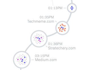
Earlier this year, an editor working on The Times’s Privacy Project asked me whether I’d be interested in having all my digital activity tracked, examined in meticulous detail and then published — you know, for journalism…I had to install a version of the Firefox web browser that was created by privacy researchers to monitor how websites track users’ data. For several days this spring, I lived my life through this Invasive Firefox, which logged every site I visited, all the advertising tracking servers that were watching my surfing and all the data they obtained. Then I uploaded the data to my colleagues at The Times, who reconstructed my web sessions into the gloriously invasive picture of my digital life you see here. (The project brought us all very close; among other things, they could see my physical location and my passwords, which I’ve since changed.)

What did we find? The big story is as you’d expect: that everything you do online is logged in obscene detail, that you have no privacy. And yet, even expecting this, I was bowled over by the scale and detail of the tracking; even for short stints on the web, when I logged into Invasive Firefox just to check facts and catch up on the news, the amount of information collected about my endeavors was staggering.

Here is a shrunk-down version of the graphic that resulted (click it to see the whole thing on the New York Times site):

Farhad Manjoo's online tracking

Notably — at least from my perspective! — Stratechery is on the graphic:

Stratechery's trackers

Wow, it sure looks like I am up to some devious behavior! I guess it is all of the advertising trackers on my site which doesn’t have any advertising…or perhaps Manjoo, as seems to so often be the case with privacy scare pieces, has overstated their case by a massive degree.

Stratechery “Trackers”

The narrow problem with Manjoo’s piece is a definitional one. This is what it says at the top of the graphic:

What the Times considers a tracker

This strikes me as an overly broad definition of tracking; as best I can tell, Manjoo and their team counted every single script, image, or cookie that was loaded from a 3rd-party domain, no matter its function.

Consider Stratechery: the page in question, given the timeframe of Manjoo’s research and the apparent link from Techmeme, is probably The First Post-iPhone Keynote. On that page I count 31 scripts, images, fonts, and XMLHttpRequests (XHR for short, which can be used to set or update cookies) that were loaded from a 3rd-party domain.1 The sources are as follows (in decreasing number by 3rd-party service):

  • Stripe (11 images, 5 JavaScript files, 2 XHRs)
  • Typekit (1 image, 1 JavaScript file, 5 fonts)
  • Cloudfront (3 JavaScript files)
  • New Relic (2 JavaScript files)
  • Google (1 image, 1 JavaScript file)
  • WordPress.com (1 JavaScript file)

You may notice that, in contrast to the graphic, there is nothing from Amazon specifically. There is Cloudfront, which is a content delivery service offered by Amazon Web Services, but suggesting that Stratechery includes trackers from Amazon because I rely on AWS is ridiculous. In the case of Cloudfront, one JavaScript file is from Memberful, my subscription management service, and the other two are public JavaScript libraries used on countless sites on the Internet (jQuery and Pmrpc). As for the rest:

  • Stripe is the payment processor for Stratechery memberships.
  • Typekit is Adobe’s web-font service (Stratechery uses Freight Sans Pro).
  • New Relic is an analytics package used to diagnose website issues and improve performance.
  • Google is Google Analytics, which I use for counting page views and conversions to free and paid subscribers (this last bit is mostly theoretical; Memberful integrates with Google Analytics, but I haven’t run any campaigns — Stratechery relies on word-of-mouth).
  • WordPress.com is for the Jetpack service from Automattic, which I use for site monitoring, security, and backups, as well as the recommended article carousel under each article.

The only service here remotely connected to advertising is Google Analytics, but I have chosen to not share that information with Google (there is no need because I don’t need access to Google’s advertising tools); the truth is that all of these “trackers” make Stratechery possible.2

The Internet’s Nature

This narrow critique of Manjoo’s article — wrongly characterizing multiple resources as “trackers” — gets at a broader philosophical shortcoming: technology can be used for both good things and bad things, but in the haste to highlight the bad, it is easy to be oblivious to the good. Manjoo, for example, works for the New York Times, which makes most of its revenue from subscriptions;3 given that, I’m going to assume they do not object to my including 3rd-party resources on Stratechery that support my own subscription business?

This applies to every part of my stack: because information is so easily spread across the Internet via infrastructure maintained by countless companies for their own positive economic outcome, I can write this Article from my home and you can read it in yours. That this isn’t even surprising is a testament to the degree to which we take the Internet for granted: any site in the world is accessible by anyone from anywhere, because the Internet makes moving data free and easy.

Indeed, that is why my critique of Manjoo’s article specifically and the ongoing privacy hysteria broadly is not simply about definitions or philosophy. It’s about fundamental assumptions. The default state of the Internet is the endless propagation and collection of data: you have to do work to not collect data on one hand, or leave a data trail on the other. This is the exact opposite of how things work in the physical world: there data collection is an explicit positive action, and anonymity the default.

That is not to say that there shouldn’t be a debate about this data collection, and how it is used. Even that latter question, though, requires an appreciation of just how different the digital world is from the analog one. Consider one of the most fearsome surveillance entities of all time, the East German Stasi. From Wired:

The Stasi's files

The German Democratic Republic dissolved in 1990 with the fall of communism, but the documents assembled by the Ministry for State Security, or Stasi, remain. This massive archive includes 69 miles of shelved documents, 1.8 million images, and 30,300 video and audio recordings housed in 13 offices throughout Germany. Canadian photographer Adrian Fish got a rare peek at the archives and meeting rooms of the Berlin office for his series Deutsche Demokratische Republik: The Stasi Archives. “The archives look very banal, just like a bunch of boring file holders with a bunch of paper,” he says. “But what they contain are the everyday results of a people being spied upon.”

That the files are paper makes them terrifying, because anyone can read them individually; that they are paper, though, also limits their reach. Contrast this to Google or Facebook: that they are digital means they reach everywhere; that, though, means they are read in aggregate, and stored in a way that is only decipherable by machines.

To be sure, a Stasi compare and contrast is hardly doing Google or Facebook any favors in this debate: the popular imagination about the danger this data collection poses, though, too often seems derived from the former, instead of the fundamentally different assumptions of the latter. This, by extension, leads to privacy demands that exacerbate some of the Internet’s worst problems.

  • Facebook’s crackdown on API access after Cambridge Analytica has severely hampered research into the effects of social media, the spread of disinformation, etc.
  • Privacy legislation like GDPR has strengthened incumbents like Facebook and Google, and made it more difficult for challengers to succeed.
  • Criminal networks from terrorism to child abuse can flourish on social networks, but while content can be stamped out private companies, particularly domestically, are often limited as to how proactively they can go to law enforcement; this is exacerbated once encryption enters the picture.

Again, this is not to say that privacy isn’t important: it is one of many things that are important. That, though, means that online privacy in particular should not be the end-all be-all but rather one part of a difficult set of trade-offs that need to be made when it comes to dealing with this new reality that is the Internet. Being an absolutist will lead to bad policy (although encryption may be the exception that proves the rule).

Apple’s Fundamentalism

This doesn’t just apply to governments: consider Apple, a company which is staking its reputation on privacy. Last week the WebKit team released a new Tracking Prevention Policy that is taking clear aim at 3rd-party trackers:

We have implemented or intend to implement technical protections in WebKit to prevent all tracking practices included in this policy. If we discover additional tracking techniques, we may expand this policy to include the new techniques and we may implement technical measures to prevent those techniques.

Of particular interest to Stratechery — and, per the opening of this article, Manjoo — is this definition and declaration:

Cross-site tracking is tracking across multiple first party websites; tracking between websites and apps; or the retention, use, or sharing of data from that activity with parties other than the first party on which it was collected.

[…]

WebKit will do its best to prevent all covert tracking, and all cross-site tracking (even when it’s not covert). These goals apply to all types of tracking listed above, as well as tracking techniques currently unknown to us.

In case you were wondering,4 yes, this will affect sites like Stratechery, and the WebKit team knows it (emphasis mine to highlight potential impacts on Stratechery):

There are practices on the web that we do not intend to disrupt, but which may be inadvertently affected because they rely on techniques that can also be used for tracking. We consider this to be unintended impact. These practices include:

  • Funding websites using targeted or personalized advertising (see Private Click Measurement below).
  • Measuring the effectiveness of advertising.
  • Federated login using a third-party login provider.
  • Single sign-on to multiple websites controlled by the same organization.
  • Embedded media that uses the user’s identity to respect their preferences.
  • “Like” buttons, federated comments, or other social widgets.
  • Fraud prevention.
  • Bot detection.
  • Improving the security of client authentication.
  • Analytics in the scope of a single website.
  • Audience measurement.

When faced with a tradeoff, we will typically prioritize user benefits over preserving current website practices. We believe that that is the role of a web browser, also known as the user agent.

Don’t worry, Stratechery is not going out of business (although there may be a fair bit of impact on the user experience, particularly around subscribing or logging in). It is disappointing, though, that the maker of one of the most important and the most unavoidable browser technologies in the world (WebKit is the only option on iOS) has decided that an absolutist approach that will ultimately improve the competitive position of massive first party advertisers like Google and Facebook, even as it harms smaller sites that rely on 3rd-party providers for not just ads but all aspects of their business, is what is best for everyone.

What makes this particularly striking is that it was only a month ago that Apple was revealed to be hiring contractors to listen to random Siri recordings; unlike Amazon (but like Google), Apple didn’t disclose that fact to users. Furthermore, unlike both Amazon and Google, Apple didn’t give users any way to see what recordings Apple had or delete them after-the-fact. Many commentators have seized on the irony of Apple having the worst privacy practices for voice recordings given their rhetoric around being a privacy champion, but I think the more interesting insight is twofold.

First, this was, in my estimation, a far worse privacy violation than the sort of online tracking the WebKit team is determined to stamp out, for the simple reason that the Siri violation crossed the line between the physical and digital world. As I noted above the digital world is inherently transparent when it comes to data; the physical world, though — particularly somewhere like your home — is inherently private.

Second, I do understand why Apple has humans listening to Siri recordings: anyone that has used Siri can appreciate that the service needs to accelerate its feedback loop and improve more quickly. What happens, though, when improving the product means invading privacy? Do you look for good trade-offs, like explicit consent and user control, or do you fear a fundamentalist attitude that declares privacy more important than anything, and try to sneak a true privacy violation behind everyone’s back like some sort of rebellious youth fleeing religion? Being an absolutist also leads to bad behavior, because after all, everyone is already a criminal.

Towards Trade-offs

The point of this article is not to argue that companies like Google and Facebook are in the right, and Apple in the wrong — or, for that matter, to argue my self-interest. The truth, as is so often the case, is somewhere in the middle, in the gray.5 To that end, I believe the privacy debate needs to be reset around these three assumptions:

  1. Accept that privacy online entails trade-offs; the corollary is that an absolutist approach to privacy is a surefire way to get policy wrong.
  2. Keep in mind that the widespread creation and spread of data is inherent to computers and the Internet, and that these qualities have positive as well as negative implications; be wary of what good ideas and positive outcomes are extinguished in the pursuit to stomp out the negative ones.
  3. Focus policy on the physical and digital divide. Our behavior online is one thing: we both benefit from the spread of data and should in turn be more wary of those implications. Making what is offline online is quite another.

This is where the Stasi example truly resonates: imagine all of those files, filled with all manner of physical movements and meetings and utterings, digitized and thus searchable, shareable, inescapable. That goes beyond a new medium lacking privacy from the get-go: it is taking privacy away from a world that previously had it. And yet the proliferation of cameras, speakers, location data, etc. goes on with a fraction of the criticism levied at big tech companies. Like too many fundamentalists, we are in danger of missing the point.

I wrote a follow-up to this article in this Daily Update.

  1. This matches the 31 dots in Manjoo’s graphic; I did not count HTML documents or CSS files
  2. I do address these services and others in the Stratechery Privacy Policy
  3. Let’s be charitable and ignore the fact that the most egregious trackers from Manjoo’s article — by far — are news sites, including nytimes.com
  4. Or if you think I’m biased, although, for the record, I conceptualized this article before this policy was announced
  5. And frankly, probably closer to Apple than the others, the last section notwithstanding
28 Aug 18:05

Work Futures Daily | Belonging, Not Fit

by Stowe Boyd

| National Identity Crisis | Belonging, Not Fit | Staff Strategy | Neil Irwin | 5G Questions |

Continue reading on Work Futures »

28 Aug 18:05

"A Punchy Commuter Ebike" - Electrek on the Blix Vika+

by Sabrina Hockett

Recently Electrek.co reviewed the updated Blix VIka+ and were surprised at the amount of power for such a compact folding ebike. Micah from Electrek had previously reviewed the Blix Aveny city ebike, so testing out the folding Blix ebike model gave him a wider perspective on the types of bikes Blix creates. Check out his review and watch his Youtube video below!


The Blix Vika+ "is a folding bike that combines fancy style with deceptive power." Part of what makes Blix different is the focus on balancing style and power to create both a good looking and user-friendly ebike. The Vika+ "is a refined ebike that turns heads and starts conversations." However, "as dapper and polished the design is, what I really like about the Vika+ is how well it rides."

With updates including a 500W motor and 48V battery, riding the Vika+ is "a much more thrilling experience." Plus, "when it comes to hill climbing or stop light acceleration, that extra power is always welcome." The Vika+ offers both pedal assist and throttle options, so there are multiple ways to ride. The 48V 14Ah battery has 672W of power which means you "can ride for days and days before needing to recharge," and it even powers "the built in lights on the bike which I love!"

Blix Vika+ Folded

Some of the newly updated features include the seat which is cushy and "has an included grab handle under the saddle that works great for positioning the bike when you need to move it around tight spaces like an elevator or your living room." The seat can lift up which "allows the battery to be removed," great for "charging inside or just decreasing the chance of getting your battery stolen when parked outside."

Another cool thing about the Blix Vika+ is Blix has designed baskets and racks that work on the front head tube and rear rack. The "wide range of options in  Blix's new line of cargo accessories is definitely impressive, so it’s worth checking out if you’re already considering getting a Blix bike." Another perk of the Vika+ frame is the"low-step through design of the fram makes mounting a breeze," in addition to its folding ability!

Overall, the Vika+ "certainly has a lot going for it and enough differentiation to set it apart from the rest of the pack. It would make a great city bike and commuter option for many people."

Check out the Youtube review below!


Thank you to Electrek.co for taking the time to review the Vika+!


Check out the Full review here!

Learn more about the Vika+ here!

Follow Us for all things Blix:

Blix Owners Group

Instagram

28 Aug 18:04

So You Want to Start a Podcast

Podcasting has gotten quite a bit easier over the past 10 years, due in part to improvements to hardware and software. I wrote about both how I edit and record both of my podcasts about 2 years ago and, while not much has changed since then, I thought it might be helpful if I organized the information in a better way for people just starting out with a new podcast.

One frustrating problem that I find with podcasting is that the easy methods are indeed easy, and the difficult methods are indeed difficult, but the methods that are just above easy, which other markets might label as “prosumer” or something like that, are…kind of hard. One of the reasons is that once you start buying better hardware, everything kind of snowballs because the hardware becomes more modular. So instead of just using your phone headphones to record, you might buy a microphone, that connects to a stand, that connects to a USB interface using an XLR cable, that connects to your computer. Similarly, on the software side, there’s really not much out there that’s free. As a result of both phenomena, costs start to go up pretty quickly as soon as you step up just a little bit.

I can’t do anything about costs, but I thought I could help a little bit on sorting out what’s out there and what’s genuinely valuable. There are two versions here: the free and easy plan if you’re just starting out and the next level up, which is basically what I use.

The three things I’ll cover here that you need for podcasting are:

  1. Hardware - this includes all recording equipment like microphones, stands, cables, etc.
  2. Recording Software - Unless you live in a recording booth you’ll need some software for your computer (which I assume you have!)
  3. Editing Software - the more complicated your podcast gets the more you’ll need to edit (beyond just trimming the beginning and end of the audio files)
  4. Hosting - Unless you plan on running your own server (which is an option but I don’t recommend it) you’ll need someone to host your audio files.

Free and Easy

There are in fact ways to podcast for free and many people stay at this level for a long time because the quality is acceptable and cost is zero. If you want to just get started quickly here’s what you can do:

  1. Hardware - just use the headphones/microphone that came with your mobile phone.
  2. Recording Software - If you are doing a podcast by yourself, you can just use whatever app your phone has to record things like voice memos. On your computer, there should be a built-in app that just lets you record sound through the headphones.
  3. Editing Software - For editing I recommend either not editing (simpler!) or using something like Audacity to just trim the beginning and the end.
  4. Hosting - SoundCloud offers free hosting for up to 3 hours of content. This is plenty for just starting out and seeing if you like it, but you will likely use it up.

If you are working with a partner, it gets a little more complicated and there are some additional notes on the recording software. My go-to recommendation for recording with a partner is to use Zencastr. Zencastr has a free plan that lets you record high-quality audio for a max of 2 people. (If you need to record more than 2 people, you can’t use the free option.) The nice thing about Zencastr is that it uses WebRTC to record directly off your microphone, so you don’t need to worry too much about the quality of your internet connection. What you get is separate audio files, one for each speaker, that are synched together. Occasionally, there are some synching glitches, but usually it works out. The files are automatically uploaded to a Dropbox account, so you’ll need one of those. Because Zencastr automatically goes to MP3 format, the files are relatively small. Also, if you have a guest who is less familiar with audio hardware/software, you can just send them a link that they can click on and they’re recording.

Note that even if your partner is sitting right next to you, it’s often simpler to just go to separate spaces and record “remotely”. The primary benefit of doing this is that you can cleanly record separate/independent audio tracks. This can be useful in the editing process.

If you prefer an all-in-one solution, there are services like Cast and Anchor that offer recording, hosting, and distribution. Cast only has a free 1-month trial and so you have to pay eventually. Anchor appears to be free (I’ve never used it), but it was recently purchased by Spotify so it’s not immediately clear to me if anything will change. My guess is they’ll likely stay free because they want as many people making podcasts as possible. Anchor didn’t exist when I started podcasting but if it had I might have used it first. But it always makes me a little nervous when I can’t figure out how a company makes money.

To summarize, here’s the “free and easy” workflow that I recommend:

  1. Record your podcast using Zencastr (especially if you have a partner), which then puts audio files on Dropbox
  2. Trim beginning/ending of audio file with Audacity
  3. Upload audio to SoundCloud and add episode metadata

And here are the pros and cons:

Pros

  • It’s free

Cons

  • Audio quality is acceptable but not great. Earbud type microphones are not designed for high quality and you can usually tell when someone has used them to record. Given that podcasts are all about audio, it’s hard for me to trade off audio quality.
  • Hosting limitations mean you can only get a few episodes up. But that’s a problem for down the road, right?
  • Editing is generally a third-order issue, but there is one scenario where it can be critical—when you have a bad internet connection. Bad internet connections can introduce delays and cross-talk. These problems can be mitigated when editing (I give an example here) but only with better software.

Beyond Free

Beyond the free workflow, there are a number of upgrades that you can make and you can easily start spending a lot of money. But the only real upgrade that I think you need to make is to buy a good microphone. Surprisingly, this does not need to cost much money. The best podcasting microphone for the money out there is the Audio Technica ATR2100 USB micrphone. This is the microphone that Elizabeth uses on the The Effort Report and Hilary uses on Not So Standard Deviations. As of this writing it’s \$65 on Amazon, but I’ve seen it for as low as \$40. The benefits of this microphone are:

  • The audio quality is high
  • It isolates vocal audio really well and doesn’t pick up a lot of background audio (good for noisy rooms like my office).
  • It connects directly to a computer via USB so you don’t need to buy a separate USB interface.
  • It’s cheap

The problem with getting “better” (i.e. more expensive) microphones as that they tend to be more sensitive, which means they pick up more high-frequency background noise. Professional microphones are designed for you to be working in a sound-proof recording studio environment in which you want to pick up as much sound as possible. But podcasting, in general, tends to take place wherever. So you want a microphone that will only pick up your voice right in front of it. Technically, you lose a little quality this way, but it’s equally annoying to have a lot of background noise.

Now that you’ve got a microphone, you need to stick it somewhere. While you can always just hold the microphone, I’d recommend an adjustable stand of some sort. Desk stands like this one are nice because they’re adjustable but they do require you to have a semi-permanent office where you can just keep it. The main point here is that podcasting requires you to sit still and talk for a while, and you don’t want to be uncomfortable while you’re doing it.

The last upgrade you’ll likely need to make is the hosting provider. SoundCloud itself offers an unlimited plan but I don’t recommend it as it’s not really designed for podcasting. I use Libsyn, which has a $5 a month plan that should be enough for a monthly podcast. They also provide some decent analytics that you can download and read into R. What I like about Libsyn is that they do one job and they do it really well. I give them money, and they provide me a service in return. How simple is that?

That’s it for now. I’m happy to make more recommendations regarding software and hardware (feel free to tweet me @rdpeng), but I think what I’ve got here should get you 99% of the way there.

28 Aug 18:04

How Web Content Can Affect Power Usage

Users spend a large proportion of their online time on mobile devices, and a significant fraction of the rest is users on untethered laptop computers. For both, battery life is critical. In this post, we’ll talk about factors that affect battery life, and how you, as a web developer, can make your pages more power efficient so that users can spend more time engaged with your content.

What Draws Power?

Most of the energy on mobile devices is consumed by a few major components:

  • CPU (Main processor)
  • GPU (Graphics processing)
  • Networking (Wi-Fi and cellular radio chips)
  • Screen

Screen power consumption is relatively constant and mostly under the user’s control (via screen on-time and brightness), but the other components, the CPU, GPU and networking hardware have high dynamic range when it comes to power consumption.

The system adapts the CPU and GPU performance based on the current tasks being processed, including, of course, rendering web pages that the user is interacting with in their web browser and other apps using web content. This is done through turning some components on or off, and by changing their clock frequency. In broad terms, the more performance that is required from the chips, the lower their power-efficiency. The hardware can ramp up to high performance very quickly (but at a large power cost), then rapidly go back to a more efficient low-power state.

General Principles for Good Power Usage

To maximize battery life, you therefore want to reduce the amount of time spent in high-power states, and let the hardware go back to idle as much as possible.

For web developers, there are three states of interaction to think about:

  • When the user is actively interacting with the content.
  • When the page is the frontmost, but the user is not interacting with it.
  • When the page is not the frontmost content.

Efficient user interaction

Obviously it’s good to expend power at times when the user is interacting with the page. You want the page to load fast and respond quickly to touch. In many cases, the same optimizations that reduce time to first paint and time to user interactive will also reduce power usage. However, be cautious about continuing to load resources and to run script after the initial page load. The goal should be to get back to idle as fast as possible. In general, the less JavaScript that runs, the more power-efficient the page will be, because script is work on top of what the browser has already done to layout and paint the page.

Once the page has loaded, user interactions like scrolling and tapping will also ramp up the hardware power (mainly the CPU and GPU), which again makes sense, but make sure to go back to idle as soon as the user stops interacting. Also, try to stay on the browser “fast paths” — for example, normal page scrolling will be much more power-efficient than custom scrolling implemented in JavaScript.

Drive idle power usage towards zero

When the user is not interacting with the page, try to make the page use as little power as possible. For example:

  • Minimize the use of timers to avoid waking up the CPU. Try to coalesce timer-based work into a few, infrequent timers. Lots of uncoordinated timers which trigger frequent CPU wake-ups are much worse than gathering that work into fewer chunks.
  • Minimize continually animating content, like animated images and auto-playing video. Be particularly vigilant to avoid “loading” spinner GIFs or CSS animations that continually trigger painting, even if you can’t see them. IntersectionObserver can be used to runs animations only when they are visible.
  • Use declarative animations (CSS Animations and Transitions) where possible. The browser can optimize these away when the animating content is not visible, and they are more efficient than script-driven animation.
  • Avoid network polling to obtain periodic updates from a server. Use WebSockets or Fetch with a persistent connection, instead of polling.

A page that is doing work when it should be idle will also be less responsive to user interaction, so minimizing background activity also improves responsiveness as well as battery life.

Zero CPU usage while in the background

There are various scenarios where a page becomes inactive (not the user’s primary focus), for instance:

  • The user switches to a different tab.
  • The user switches to a different app.
  • The browser window is minimized.
  • The browser window is visible but is not the focused window.
  • The browser window is behind another window.
  • The space the window is on is not the current space.

When a page becomes inactive, WebKit automatically takes steps to save power:

In addition, WebKit takes advantage of features provided by the operating system to maximize efficiency:

  • on iOS, tabs are completely suspended when possible.
  • on macOS, tabs participate in App Nap, which means that the web process for a tab that is not visually updating gets lower priority and has its timers throttled.

However, pages can trigger CPU wake-ups via timers (setTimeout and setInterval), messages, network events, etc. You should avoid these when in the background as much as possible. There are two APIs that are useful for this:

  • Page Visibility API provides a way to respond to a page transitioning to be in the background or foreground. This is a good way to avoid updating the UI while the page is in the background, then using the visibilitychange event to update the content when the page becomes visible.
  • blur events are sent whenever the page is no longer focused. In that case, a page may still be visible but it is not the currently focused window. Depending on the page, it can be a good idea to stop animations.

The easiest way to find problems is Web Inspector’s Timelines. The recording should not show any event happening while the page is in the background.

Hunting Power Inefficiencies

Now that we know the main causes of power use by web pages and have given some general rules about creating power-efficient content, let’s talk about how to identify and fix issues that cause excessive power drain.

Scripting

As mentioned above, modern CPUs can ramp power use from very low, when the device is idle, to very high to meet the demands of user interaction and other tasks. Because of this, the CPU is a leading cause of battery life variance. CPU usage during page loading is a combination of work the browser engine does to load, parse and render resources, and in executing JavaScript. On many modern web pages, time spent executing JavaScript far exceeds the time spent by the browser in the rest of the loading process, so minimizing JavaScript execution time will have the biggest benefits for power.

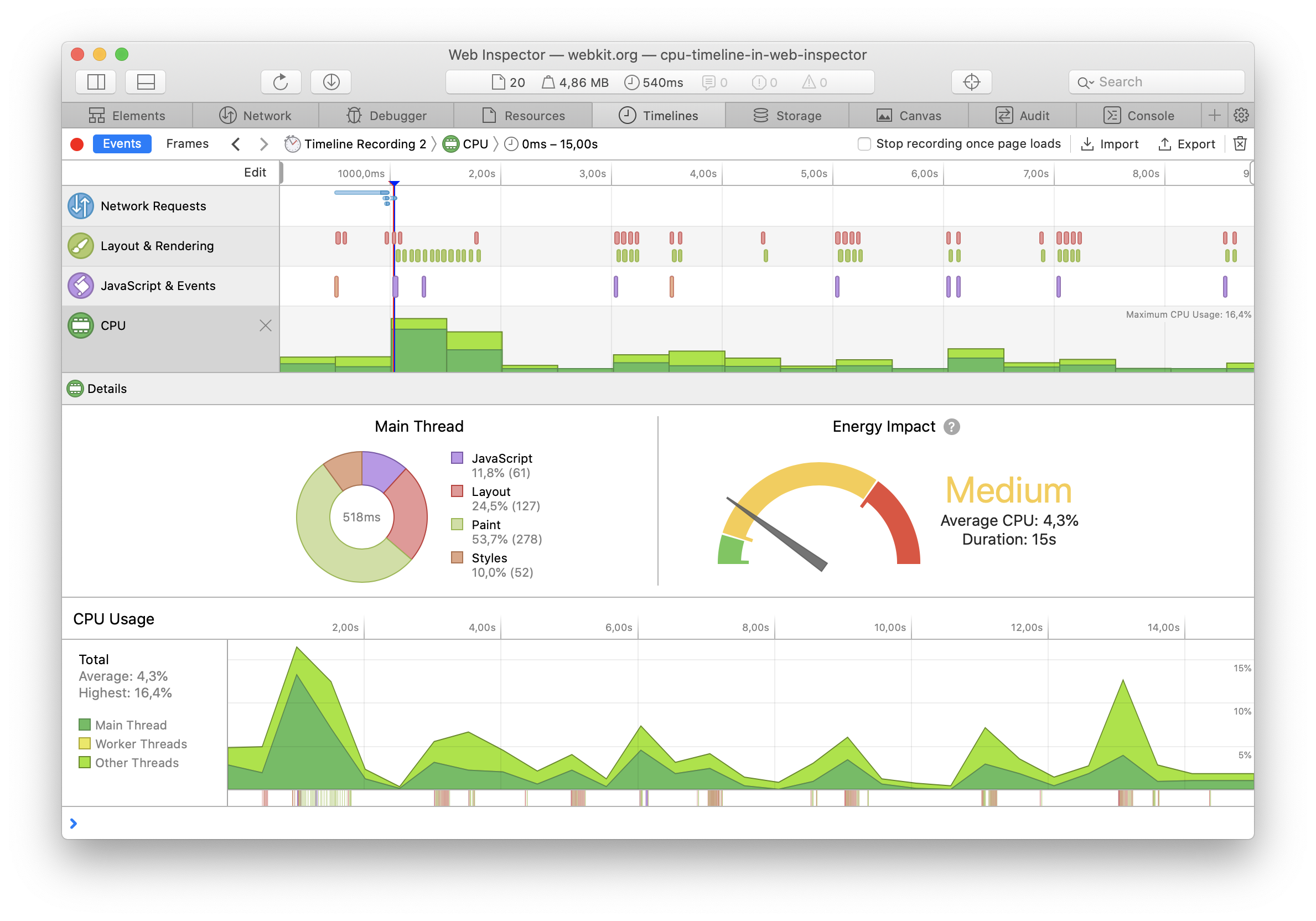
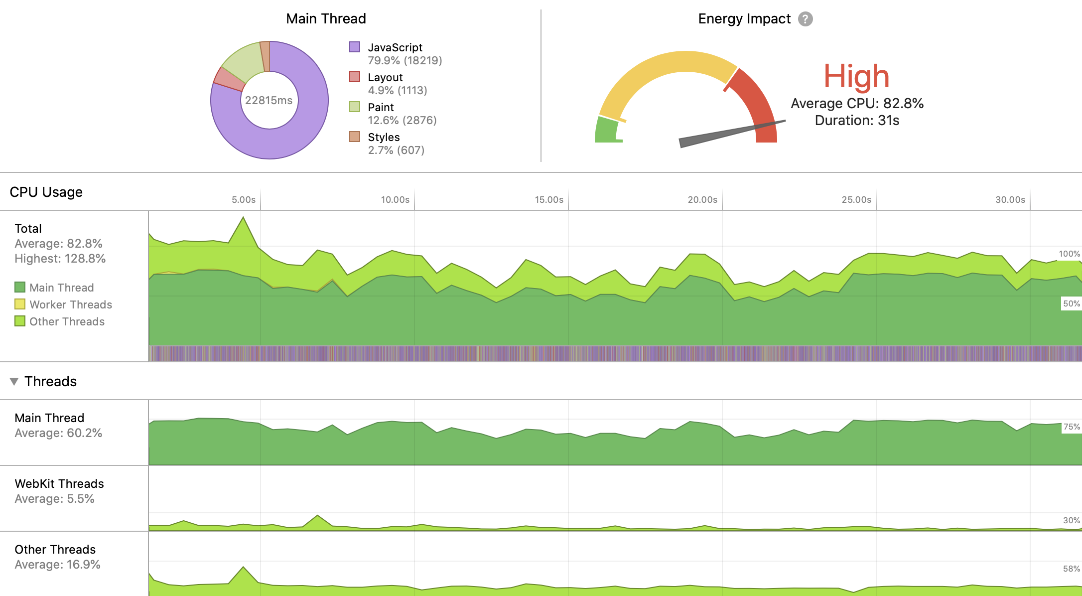
The best way to measure CPU usage is with Web Inspector. As we showed in a previous post, the timeline now shows the CPU activity for any selected time range:

To use the CPU efficiently, WebKit distributes work over multiple cores when possible (and pages using Workers will also be able to make use of multiple cores). Web Inspector provides a breakdown of the threads running concurrently with the page’s main thread. For example, the following screenshot shows the threads while scrolling a page with complex rendering and video playback:

When looking for things to optimize, focus on the main thread, since that’s where your JavaScript is running (unless you’re using Workers), and use the “JavaScript and Events” timeline to understand what’s triggering your script. Perhaps you’re doing too much work in response to user or scroll events, or triggering updates of hidden elements from requestAnimationFrame. Be cognizant of work done by JavaScript libraries and third party scripts that you use on your page. To dig deeper, you can use Web Inspector’s JavaScript profiler to see where time is being spent.

Activity in “WebKit Threads” is mostly triggered by work related to JavaScript: JIT compilation and garbage collection, so reducing the amount of script that runs, and reducing the churn of JavaScript objects should lower this.

Various other system frameworks invoked by WebKit make use of threads, so “Other threads” include work done by those; the largest contributor to “Other thread” activity is painting, which we’ll talk about next.

Painting

Main thread CPU usage can also be triggered by lots of layout and painting; these are usually triggered by script, but a CSS animation of a property other than transform, opacity and filter can also cause them. Looking at the “Layout and Rendering” timeline will help you understand what’s causing activity.

If the “Layout and Rendering” timeline shows painting but you can’t figure out what’s changing, turn on Paint Flashing:

This will cause those paints to be briefly highlighted with a red overlay; you might have to scroll the page to see them. Be aware that WebKit keeps some “overdraw” tiles to allow for smooth scrolling, so paints that are not visible in the viewport can still be doing work to keep offscreen tiles up-to-date. If a paint shows in the timeline, it’s doing actual work.

In addition to causing power usage by the CPU, painting usually also triggers GPU work. WebKit on macOS and iOS uses the GPU for painting, and so triggering painting can cause significant increases in power. The additional CPU usage will often show under “Other threads” in the CPU Usage timeline.

The GPU is also used for <canvas> rendering, both 2D canvas and WebGL/WebGPU. To minimize drawing, don’t call into the <canvas> APIs if the canvas content isn’t changing, and try to optimize your canvas drawing commands.

Many Mac laptops have two GPUs, an “integrated” GPU which is on the same die as the CPU, and is less powerful but more power-efficient, and a more powerful, but more power-hungry “discrete” GPU. WebKit will default to using the integrated GPU by default; you can request the discrete GPU using the powerPreference context creation parameter, but only do this if you can justify the power cost.

Networking

Wireless networking can affect battery life in unexpected ways. Phones are the most affected due to their combination of powerful radios (the WiFi and cellular network chips) with a smaller battery. Unfortunately, measuring the power impact of networking is not easy outside of a lab, but can be reduced by following some simple rules.

The most direct way to reduce networking power usage is to maximize the use of the browser’s cache. All of the best practices for minimizing page load time also benefit the battery by reducing how long the radios need to be powered on.

Another important aspect is to group network requests together temporally. Any time a new request comes, the operating system needs to power on the radio, connect to the base station or cell tower, and transmit the bytes. After transmitting the packets, the radio remains powered for a small amount of time in case more packets are transmitted.

If a page transmits small amounts of data infrequently, the overhead can become larger than the energy required to transmit the data:

Networking Power Overhead of transmitting 2 packets with a delay between them

Such issues can be discovered from Web Inspector in the Network Requests Timeline. For example, the following screenshot shows four separate requests (probably analytics) being sent over several seconds:

Sending all the requests at the same time would improve network power efficiency.

Conclusion

Webpages can be good citizens of battery life.

It’s important to measure the battery impact in Web Inspector and drive those costs down. Doing so improves the user experience and battery life.

The most direct way to improve battery life is to minimize CPU usage. The new Web Inspector provides a tool to monitor that over time.

To achieve great battery life the goals are:

  • Drive CPU usage to zero in idle
  • Maximize performance during user interaction to quickly get back to idle

If you have any questions, feel free to reach me, Joseph Pecoraro, Devin Rousso, and of course Jon Davis.

28 Aug 18:04

How Release Day Went

Yesterday was a great day! A few things to note, in no particular order:

NetNewsWire got some press coverage, including a well-done review in MacStories.

We got a lot of feature requests, but no bug reports.

Except that we did get a single-digit number of crash logs. On investigation, I found two distinct backtraces — we’ll need to fix those. The thing is, there’s no freakin’ way the app should crash in those spots. Except that, obviously, it can. Rarely, but it happens.

The servers started timing-out at one point during the day. I contacted DreamHost support and they fixed things (and told me that the fixes they applied should prevent this in the future).

There were a number of nice blog posts and tweets about NetNewsWire, which was awesome. After working so hard for so long, it’s great when people appreciate the app. We don’t get paid in money, after all. 🐣

I have no idea how many downloads of the app there were. GitHub is hosting the download, via its releases feature, and I don’t see a way to find out how many times it’s been downloaded. Which is totally fine with me.

* * *

I should say something more about the no-bug-reports. There’s no special magic or talent or anything to this — there’s just the willingness to say that we’re not going to ship until we’ve got the bugs out, and then sticking to that.

This is a matter of pride and ethics, for sure, but there’s another dimension: since the app is open source, it’s written by volunteers (including me), and we have no dedicated support team. Any time we spend fielding bug reports is time taken away from working on the next feature.

Making apps — even, or especially, free apps — is an exercise in economics. With free apps, the economics are even more constrained, because nobody is going to hire even a part-time support person. So we do everything we can do keep costs down — especially time costs.

Plus — buggy apps can be demoralizing to the people who work on them. Part of my job is to make sure people are proud and happy to work on the app. And that means making sure everyone knows we’re super-serious about doing our best to never ship bugs.

28 Aug 18:03

The Great Trivializer

by Doc Searls

black hole

Last night I watched The Great Hack a second time. It’s a fine documentary, maybe even a classic. (A classic in literature, I learned on this Radio Open Source podcast, is a work that “can only be re-read.” If that’s so, then perhaps a classic movie is one that can only be re-watched.*)

The movie’s message could hardly be more loud and clear: vast amounts of private information about each of us is gathered constantly in the digital world, and is being weaponized so our minds and lives can be hacked by others for commercial or political gain. Or both. The movie’s star, Professor David Carroll of the New School (@profcarroll), has been delivering that message for many years, as have many others, including myself.

But to what effect?

Sure, we have policy moves such as the GDPR, the main achievement of which (so far) has been to cause every website to put confusing and (in most cases) insincere cookie notices on their index pages, meant (again, in most cases) to coerce “consent” (which really isn’t) to exactly the unwanted tracking the regulation was meant to stop.

Those don’t count.

Ennui does. Apathy does.

On seeing The Great Hack that second time, I had exactly the same feeling my wife had on seeing it for her first: that the very act of explaining the problem also trivialized it. In other words, the movie worsened the very problem it solved. And it isn’t alone at this, because so has everything everybody has said, written or reported about it. Or so it sometimes seems. At least to me.

Okay, so: if I’m right about that, why might it be?

One reason is that there’s no story. See, every story requires three elements: character (or characters), problem (or problems), and movement toward resolution. (Find a more complete explanation here.) In this case, the third element—movement toward resolution—is absent. Worse, there’s almost no hope. “The Great Hack” concludes with a depressing summary that tends to leave one feeling deeply screwed, especially since the only victories in the movie are over the late Cambridge Analytica; and those victories were mostly within policy circles we know will either do nothing or give us new laws that protect yesterday from last Thursday… and then last another hundred years.

The bigger reason is that we are now in a media environment summarized by Marshall McLuhan in his book The Medium is the Massage: “every new medium works us over completely.” Our new medium is the Internet, which is a non-place absent of distance and gravity. The only institutions holding up there are ones clearly anchored in the physical world. Health care and law enforcement, for example. Others dealing in non-material goods, such as information and ideas, aren’t doing as well.

Journalism, for example. Worse, on the Internet it’s easy for everyone to traffic in thoughts and opinions, as well as in solid information. So now the world of thoughts and ideas, which preponderate on social media such as Twitter, Facebook and Instagram, are vast floods of everything from everybody. In the midst of all that, the news cycle, which used to be daily, now lasts about as long as a fart. Calling it all too much is a near-absolute understatement.

But David Carroll is right. Darkness is falling. I just wish all the light we keep trying to shed would do a better job of helping us all see that.

_________

*For those who buy that notion, I commend The Rewatchables, a great podcast from The Ringer.

28 Aug 18:02

[ridgeline] SW945: The Sound of a Walk in Japan

by Craig Mod
While walking this past spring I recorded two “seasons” of an ambient, binaural audio podcast called SW945. You can find it at all the usual podcast haunts: Spotify, Apple Podcasts, Overcast, etc. Special thanks to Simplecast for hosting and sponsoring. The premise of SW945 is simple: Fifteen minutes of audio recorded each day, around 9:45am, while on my long walks in Japan. “Season One” covers my walk from Kamakura to Tokyo, Tokyo to Kyoto.
28 Aug 18:02

No-One Is Counting

by Richard Millington

When you next meet with your buddies this week, will anyone be tracking the number of conversations you have?

Will someone be keeping an eye on which conversations people like the most and try to have more of those conversations?

Will anyone report how many people showed up and will you work together to try and increase that number?

You hopefully answered ‘no’ to all three.

We know in the real world that the quantity and popularity of people and conversations bears little relation to the success and value of the group.

So if you wouldn’t track it between your close friends, why would you track it between total strangers?

What really matters is whether members enjoy one another’s company, whether they help and support each other, whether they can explore exciting new ventures together and whether they feel they can belong.

Not as easy to measure, but with surveys, interviews, and sentiment analysis they’re not impossible to measure either.

p.s. The online world is the real world.

28 Aug 17:47

Sicherheitsrisiko Betriebssystem: 5 Prozent sind veraltet und erhalten keine Sicherheitsupdates mehr

by Externer Autor
Kaspersky warnt vor einer unterschätzten Gefahr Der Countdown läuft: Support für Windows 7 wird in einem halben Jahr eingestellt Laut einer aktuelle Kaspersky-Analyse haben viele Unternehmen eine tickende Cyber-Zeitbombe bei sich im Haus: ihr Betriebssystem [...]
28 Aug 17:21

Google might roll out Android 10 to Pixel phones on September 3rd

by Shruti Shekar

Google might be rolling out Android 10 to Pixel devices on September 3rd.

According to a report from PhoneArena, two Google Support agents indicated that the new Android OS will be hitting Pixel devices at the beginning of next month.

While Google is rolling the new OS to Pixel phones, it will likely still be a while before it arrives on other Android devices.

HMD Global is the only company that has indicated it will begin rolling out the new OS sometime in the fourth quarter of this year for the Nokia 9 PureView, Nokia 8.1 and Nokia 7.1 smartphones.

It’s likely that other smartphone manufacturers will reveal when they plan to roll the OS out to their devices in the coming weeks.

Google recently revealed plans to ditch Android’s longrunning dessert naming scheme for numbers.

Source: PhoneArena Via: Android Central

The post Google might roll out Android 10 to Pixel phones on September 3rd appeared first on MobileSyrup.

28 Aug 17:21

Nintendo Switch Lite Hands-on: The Switch that doesn’t switch

by Dean Daley

I recently had the opportunity to go hands-on with the Switch Lite, Nintendo’s upcoming revision of the standard Switch. Even though the Switch Lite has lost some of the features that made the original Switch great, I left the hands-on event impressed by the console — in fact, I may even purchase one of my own.

The best thing about the Switch Lite was how it feels in your hands. This was in part because the console’s weight, coming in at 0.61 lbs, is 0.2 lbs lighter than the regular Switch.

Even though the Switch Lite is double the weight and much bigger than the classic Game Boy Advance, I couldn’t help but draw comparisons between the two handhelds. While the Gameboy Advance lacks joysticks, the extra buttons and the large screen, I still felt like I was holding the successor to the handheld because of the Lite’s shape. I’d even go so far as to say that it also felt like a bigger PlayStation Vita in some ways.

Regarding size, the Nintendo Switch Lite is 3.6-inches high, 8.2-inches long, 0.55-inches deep with a 5.5-inch display.

One of the first things I noticed about the console is how much more I prefer the Lite’s size compared to the standard Nintendo Switch. Since its body and screen are smaller than the Switch, the Lite feels more portable than its larger counterpart. I often found the standard Switch too big, and that it wasn’t the type of device I’d want to lug around on my daily commute, though I know I might be in the minority when it comes to this opinion.

I even opted to use the console docked more often than not because of this. For example, on six-plus hour plane rides, I wouldn’t pull out the console because it felt it was too large to be used in handheld mode.

While I didn’t get to take the Switch Lite on-the-go, I think its size is perfect. And even though some smartphones have a bigger display than the Switch Lite, I found the 5.5-inch screen perfectly displayed the games I played during my brief time with the console.

The Switch Lite also features texturized material on its rear that felt more comfortable to hold than the regular Switch and also seems to make the handheld more durable. Additionally, the coating even adds a little bit more personality to the handheld.

Switch vs. Switch Lite

However, the Nintendo Switch Lite’s differences don’t stop with the look and feel. If you’re hoping for simply a smaller Switch, this isn’t the console for you.

The Switch Lite is only usable in handheld mode. It also lacks Joy-Cons, a kickstand and the ability to connect to a dock. That means you can’t connect it to the TV, use Tabletop mode or detach a Joy-con and hand it to your buddy.

Without these features, it feels like the Switch Lite is more of a successor to the Nintendo 3DS and 2DS, Nintendo’s handheld-only gaming systems than a lite version of the Switch. However, as expected, the Japanese gaming giant assured me that it would keep the 3DS/2Ds line completely separate from the Switch Lite.

Without the above functionality, the Switch Lite isn’t the full package, and in a sense, even its name doesn’t make sense considering the ‘Switch’ in ‘Nintendo Switch’ represents the ability to change the way you play.

Due to the lack of Joy-Con controllers, the Switch Lite also doesn’t feature HD Rumble and an IR Motion Camera. This means that you’ll need to purchase Joy-Cons for games that require the gamepads’ specific features. And if you buy the Joy-Cons separately, you’ll also need a Joy-con Charging Grip since the Switch Lite can’t charge them.

Nintendo suggests users look for a specific ‘Handheld mode’ icon when buying games for the Switch Lite.

Even though the Switch Lite lacks Joy-Cons, this wasn’t something I found to be an issue. If anything it only enhanced the gameplay experience because with my regular Switch, I often accidentally pop out my Joy-Cons by accident when playing games.

Another change that I didn’t notice was the Switch Lite lacks an ambient brightness sensor. This means you’ll need to change the handheld’s display brightness manually. In a dimly lit room, this didn’t seem to make a difference to me.

While I couldn’t test the battery on the Switch Lite, according to Nintendo’s website the device features a 3,570mAh battery that can last approximately three to seven hours. The original Switch had a bigger 4,310mAh battery but could only last 2.5 to 6.5 hours.

The increase of the battery is due to the Switch Lite’s smaller display and its updated processor. The Switch Lite features a newer Nvidia Tegra processor that is more power-efficient than its predecessor.

Playing the games

While, I didn’t play anything as intensive as Legend of Zelda: Breath of the Wild, I did have a blast playing The Legend of Zelda: Link’s Awakening, and Luigi’s Mansion 3 on the Switch Lite.

I played almost the full demo for Luigi’s Mansion 3 until the boss killed me. During my experience, the graphics looked just as good if not better than the regular Nintendo Switch in handheld mode.

This is because in handheld mode both the Switch Lite and basic Switch displays graphics in 720 x 1280-pixel resolution (720p), and, due to its slightly smaller display, the Switch Lite features more pixels per inch (ppi).

The game flowed smoothly without stuttering, which is what I’d expect from a Nintendo-developed console.

Even though I was using a smaller display, there wasn’t a moment where I thought I’d benefit from a bigger screen.

Nintendo reportedly used different display technology for the Switch Lite in comparison to the regular console. However, in my brief with the device, I didn’t notice a difference.

After years of using the smaller screens on handheld consoles like the 3DS, DSi and the Gameboy Advance SP, the Nintendo Switch Lite feels like the natural step up from these devices. The bigger Switch, on the other hand, is more like a console that can switch into a handheld, whereas the Switch Lite is the handheld-only Nintendo system I’ve been waiting for.

The better handheld

I used both the ‘Grey’ and ‘Yellow’ Switch Lite variants. While the Grey was quite bland, I thought the Yellow variant was flashy and reminded me of Pikachu.

There’s also a ‘Turquoise’ colour and a limited-edition Pokémon Sword and Shield-themed console. I didn’t get to see either of these models.

The Nintendo Switch Lite plays games well, the screen looks solid and in-hand the Switch Lite feels excellent.

If you already have a Nintendo Switch, you probably don’t need the Switch Lite. Considering the Switch does everything the Switch Lite is capable of and more. But if you’re like me and are still considering the Switch Lite because of its size and appearance, there is actually a way to share content between the two consoles.

If you don’t own a Switch console yet, take a look at the Switch Lite. While it might not offer the full package, it’s still a viable option

With a smaller body, and given how comfortable it feels in your hands, the Switch Lite seems to be the better choice out of the two versions of the Switch depending on what you’re looking for, especially considering its $259.99 price tag.

Nintendo is launching the Switch Lite on September 20th. The limited-edition Pokemon Sword and Shield console launch November 8th, before the launch of the associated title.

The post Nintendo Switch Lite Hands-on: The Switch that doesn’t switch appeared first on MobileSyrup.

28 Aug 17:21

Head of Freedom Mobile says a sizable number of customers left Rogers for Freedom over the weekend

by Ian Hardy
Freedom Mobile

Freedom Mobile has been busy.

The Shaw-owned wireless carrier has expanded its network reach in Ontario and several parts in British Columbia. Freedom is known for low-cost plans that include large amounts of data, which Canadians are pining for.

Recently, Freedom’s main competitors, Rogers, Bell, and Telus, have offered plans to their customers that feature ‘unlimited’ or an ‘infinite’ amount of data for roughly $75 CAD per month. This has spurred a level of wireless competition in Canada that hasn’t been seen since 2008 when all the new carriers were granted a license to operate.

In 2010, when Wind Mobile (now Freedom Mobile), Mobilicity (now part of Rogers), and Public Mobile (now part of Telus) went live with ‘unlimited talk, text and data’ wireless options, all of the carriers offered a ‘port-in credit’ to those who switched from the Big 3. It worked but was met with frustration due to lack of network connectivity.

These days, just like faded jeans from the 1980s, it seems the ‘port-in’ credit offer is back and the competition is fierce.

Rogers’ sub-brand Fido recently kicked off an offer directed at Freedom customers to switch that provided an iPhone XR for $0 upfront on a $75 plan for 10GB. Freedom, within 2-hours, countered with a ‘limited-time’ promo for Rogers and Fido customers with a $0 iPhone XR, which was already in-market offer but offered at a lower cost with more data, specifically $55/15GB plan.

During an interview with MobileSyrup, Paul McAleese, President of Wireless at Shaw Communications, stated, “This bully tactic just didn’t work. It backfired spectacularly on Rogers.”

McAleese would not disclose a specific number as the company is currently mid-quarter. That said, he did confidently say “over the weekend, just the Saturday and Sunday, four times more Rogers customers left Rogers for Freedom than Freedom customers left for Rogers. This is despite the fact that they had a head start. This was a very busy weekend during back-to-school. It was a sizable number. Not in the hundreds. A sizable number.”

“I think we are seeing these tactics a little dated… A few years ago this was a very crude but effective tool,” said McAleese. “This was a reasonable tool for the incumbents but we’ve seen a really significant change because Freedom is a radically different company than it was a few years ago when Shaw bought it. We’ve invested billions of dollars to improve the network experience, our quality, distribution, our devices,” said McAleese.

One of the main reasons for the pop in subscribers over the weekend was Freedom’s ability to innovate, says McAleese.

“There is a complete lack of innovation for the customer from the incumbents. Freedom has led with the ‘Big Gig,’ ‘Big Binge,’ ‘Absolute Zero,’ but the response of the industry has been to copy a 2-year old plan from us and hope for the best. Canadian wireless penetration is at 91 percent while the United States is at 120 percent. There are still a lot of Canadians who do not own a phone. These tactics don’t do anything to expand the industry. They are predatory, they are targeted and have a bully level of intent,” said McAleese.

Since acquiring the company and its 940,000 wireless subscribers in 2016, Shaw recently reported Q3 2019 earnings with Freedom Mobile subscriber base hitting 1,578,355 wireless customers.

Its competitors, Rogers, has 10,708,000 wireless subscribers, with Telus coming in at 9.9 million wireless subscribers, while Bell has 9,630,313 total wireless subscribers.

“What is telling to me about the weekend is that Canadian consumers, given an opportunity and a moment to pause and think about how the market is playing out, will go in favour of the challenger,” said McAleese. “We continue to see from customers that they are making their decisions based on value and the value is just not there [with the incumbent carriers]. This weekend was a great indicator of that and possibly a sign of things to come.”

The post Head of Freedom Mobile says a sizable number of customers left Rogers for Freedom over the weekend appeared first on MobileSyrup.

28 Aug 16:56

Fairphone 3 is environmentally friendly, built with mostly recycled materials

by Dean Daley

Fairphone has just announced the Fairphone 3, the company’s newest sustainable device.

Fairphone promised that its latest smartphone is easy to repair, sports conflict-free, responsibly-sourced and recycled materials.

The company’s latest handset is reportedly easy to repair as the company used only seven modules to build the device.

Additionally, Fairphone uses ethical materials to build the device. Such as tin and tungsten which is reportedly conflict-free. Its gold is Fairtrade, and the coppers and plastics are recycled. Fairphone, however, is still looking for a way to source cobalt for lithium-ion batteries as they are sometimes mined under conditions that violate human rights. In certain countries, however, if you recycle your previous phone when you buy a Fairphone 3, you’ll receive rewards.

The Fairphone 3 features a 5.7-inch full HD display a 12-megapixel rear-facing camera and an 8-megapixel selfie shooter. Further, it has a Snapdragon 632 processor, 4GB of RAM, 64GB of storage and a removable 3,000mAh battery.

Unfortunately, this environmentally friendly smartphone will not be officially available in Canada. The Fairphone 3 comes out on September 3rd in Europe.

Source: Fairphone, Via: The Verge

The post Fairphone 3 is environmentally friendly, built with mostly recycled materials appeared first on MobileSyrup.

28 Aug 16:56

Fitbit officially reveals its Alexa-enabled Versa 2 smartwatch

by Patrick O'Rourke
Fitbit Versa 2

After weeks of rumours, Fitbit has officially announced the Versa 2, the fitness wearable maker’s successor to the original Versa.

While the Versa 2 looks very similar to its predecessor at the outset, it includes several new features under the hood.

For example, the Versa 2 features an on-device microphone for the first time on a Fitbit device, enabling Amazon Alexa voice-activated assistant integration with the wearable.

Alexa responds to voice commands with text-based messages on the Versa 2’s display, which means you won’t have to worry about loud responses from the voice-activated assistant. Wearers will be able to accomplish tasks like setting alarms and timers, checking local weather and news and even controlling their smart home devices, all through Alexa-powered voice commands.

Fitbit also says the Versa 2 features faster performance thanks to a better processor, a brighter, larger AMOLED display, a “precision-crafted swim-proof design,” and additional health features, including expanded sleep tracking. The second iteration of Fitbit’s smartwatch line also features five-day battery life, according to the company.

Regarding price, the Versa 2 costs $249.95 CAD — the same price as the original Versa — with the Versa 2 Special Edition that features a fabric strap costing $279.95. The Versa 2 is available for pre-order now and is set for a September release date, according to Fitbit.

Fitbit is also introducing a new low-cost smart scale called the Aria Air that tracks the user’s weight and also syncs with the Fitbit app. Similar to the more expensive Aria 2, the Air is capable of calculating the user’s BMI and weight. The Aria Air is set to cost $69.95 CAD.

Along with the Versa 2 and Aria Air, the wearable company has also announced Fitbit Premium, a new $13.49 a month or $106.99 per year health and fitness subscription service. Fitbit says the new platform leverages the wearer’s unique health data tracked by Fitbit’s devices to offer personalized tips to help users meet their health and fitness goals.

Fitbit Premium features advanced sleep features, hundreds of additional workouts, extra challenges and various health reports. The service is set to launch at some point in September. All Fitbit Versa 2 Special Edition owners get a free 90 day trial of the platform, while those with other Fitbit devices only have access to a seven trial.

We’ll have more on the Fitbit Versa 2 in the coming weeks.

The post Fitbit officially reveals its Alexa-enabled Versa 2 smartwatch appeared first on MobileSyrup.

28 Aug 16:56

Google ready to move Pixel production from China to Vietnam: report

by Shruti Shekar

Google is ready to move its Pixel production house from China to Vietnam as the U.S.-China trade war grows.

According to the Japanese news outlet Nikkei, there is no news of how this may or may not affect the production of the tech giant’s next flagship phone the Pixel 4. The article indicated that Google is converting an old Nokia smartphone plant in the northern Vietnamese province of Bac Ninh.

It’s also in the same region where Samsung developed its smartphone supply chain, 9to5Google reported. This would mean that there would be a steady supply of workers skilled in the area of production, it indicated.

The movement of production facilities also happens at a time that the U.S. is facing a trade war with China. Google has been slapped with increasing tariffs that will affect production.

According to the Nikkei report, Google wants to boost production and ship between eight and 10 million smartphones by the end of 2019.

It is unlikely though that the next set of Pixel 4 and 4 XL smartphones will come out of Vietnam just yet since it is so close to being launched.

Source: Nikkei Via: 9to5Google

The post Google ready to move Pixel production from China to Vietnam: report appeared first on MobileSyrup.