Shared posts

14 Nov 14:33

S9:E8 - Why you should read the new edition of the Pragmatic Programmer (Andy Hunt, Dave Thomas)

The Pragmatic Programmer was published in 1999 by software engineers Andy Hunt and Dave Thomas, and is considered to be one of the quintessential books on programming. For its 20th anniversary edition, we chat with Andy and Dave about the book’s impact, what’s changed in the new edition, and what remains the same, along with things they’ve learned over the past 20 years.

Show Links

Andy Hunt

Andy Hunt is a programmer turned consultant, author and publisher. He has authored award-winning and best-selling books, including the seminal The Pragmatic Programmer (now in a new and heavily revised 20th Anniversary Edition) and many others, including the popular Pragmatic Thinking and Learning: Refactor Your Wetware, the Jolt-worthy Practices of An Agile Developer, and Learn to Program with Minecraft Plugins for the kids.

Dave Thomas

Dave Thomas likes to code.

15 Sep 19:12

What I Like About Eleventy

Over the last month so, I’ve been working with Dr. Julian Jones to port some design system projects from Jekyll over to Eleventy, the feral possum of static site generators. Why undertake a whole replatforming initiative? Well, there were two primary issues we were trying to solve:

  1. Robustness - About a year ago our Autoprefixer quit generating some flexbox prefixes. We filed an issue for Jekyll Assets but we’ve heard nothing back. Even though we don’t officially support IE9/10, getting CSS compat with a browserconfig is a nice to have and would resolve some weird inconsistencies with production.
  2. Performance - Compile times have slowly creeped up. On my computer (WSL on a Core i9), it can take up to 20 seconds to compile on save. This is partially my system, partially because we use a lot of includes in our design system, but probably half of it is Jekyll Assets picking up and running JavaScript through Babel.

This is not heap all the blame on Jekyll Assets (open source is hard!) but after a year of dissatisfaction, we decided to change the infrastructure. In 2019, Autoprefixer and a bundling pipeline for JavaScript is a requirement for us but Jekyll only supports Sass and Coffeescript compilation out of the box.

We’re close to wrapping up this migration and I was asked on Twitter to write about it. So, without further ado, here’s what I like about Eleventy…

Eleventy is Jekyll-like

Eleventy has a similar API to Jekyll. What I mean by this is that it has a few core features of a static-site generator that we require.

  • Layout Inheritance
    A good static site generator needs a concept of “layouts” which are a step up from _header.php and _footer.php. Ideally, the parent layout can inherit props (like page.title or page.bodyClass) from the child page, usually stored in some YAML Front Matter.
  • Simple Templating with Filters
    I don’t need all of PHP/Ruby/JS in my templates. I prefer templates to be near-logicless but I’ve found that you’ll always need some basics like if...else and foreach as well as some filters. Filters are little functions that manipulate a string or any array like add, sub, sort, slugify, or modulo. Especially in a JAM Stack mindset where you render data from an API, you need a few tools to reformat data on-the-fly in your template.
  • JSON Data Folders
    One day clients are going to figure out my secret where I steal JSON from their API and put in a data/ folder to use real data building prototypes. It speeds up prototyping and gives you a more realistic representation of what you’re trying to build. I use this feature liberally.

If I have these features then I have most of what I need. One huge convenience is that Eleventy supports Liquid templates as well as a handful other popular templating engines. Eleventy’s flexibility here makes it a good candidate (over other static-site generators) for migrating a design system with dozens and dozens of small partials already written in Liquid.

Eleventy is Fast

Compared to our previous Jekyll build, the initial results are very promising for our main task that compiles pages, compiles Sass, and transpiles our ES6 code (for IE11).

Jekyll Eleventy
15.376s 3.593s

It’s literally 5x faster for me! To say this will have an impact on my speed of development is an understatement. I’m less likely to start another task or drift over to YouTube while waiting for a file to save.

Perf stats like this are highly subjective to my computer and my project, so if Jekyll works for you and still feels fast, that’s great! Please don’t change anything because of this post! I’ve seen huge improvements by moving my personal blog to Jekyll 4 and WSL2 and am seeing sub-second initial compile times and half-second regenerations.

But, at the time of writing, we’re version locked to Jekyll 3.8.6 by Jekyll Assets. In our situation, everyone (on both Mac and Windows) was feeling the drag of compile times. If there’s a Doherty Threshold for static-site generators, I think it’s around three second compile times.

Eleventy is built on Node

There are a few benefits of switching over to a Node-based static site generator:

  1. You can install Node by downloading a binary from their website for Mac and Windows. It’s hard to quantify how much easier this is to get someone new up and running on a project compared to installing homebrew, to install rbenv, to install ruby, to install bundler
  2. Being on Node means we can better use npm to manage our JavaScript dependencies. We were doing things the traditional way (folder full o’ JavaScript) because it didn’t make sense to manage two concurrent workflows for Node and Ruby. But now that we’re all Node we can more easily leverage a package.json to maintain, document, manage, bundle, and audit our JavaScript dependencies more efficiently.
  3. We control our asset pipeline. I tried to diagnose and patch Jekyll Assets but I’m not enough of a Rubyist to hack together an asset pipeline alternative. But with JavaScript I’m dangerous enough to roll my own and have quite a few options: npm scripts, gulp, parcel, rollup, or even webpack.
  4. You can use npx @11ty/eleventy to run Eleventy without installing it! This is a niche feature but a good code smell for me. It means we’re using Eleventy purely as a file-processor. To me it’s a subtle nuance between using a tool and being pinned under a dependency.

I still love Ruby, but maintaining one system is much easier than maintaining two.

Tradoffs from switching to Eleventy

This list is short, but I think it’d be fair to discuss some of the tradeoffs we’re making by a platform switch.

On the Cathedral vs. Bazaar spectrum, Eleventy operates more on the bazaar end. By that I mean it doesn’t prescribe much. You want a bunch of filters? Write your own, Eleventy only comes with two. You want multiple layouts? Write a bit of JS to get those registered. Did you remember to setup an .eleventyignore? Even the Sass and JS pipelines are BYO.

The overhead here isn’t too dramatic, but this may not be in everyone’s comfort zone. Switching from Jekyll can be a big task if you used all of Jekyll’s features. There was quite a bit of manicuring to get us to where the whole project would compile. But for us, if we can save 12 seconds on every save and we get better JS package management out of the deal, we’ll start reaping the return on investment quite quickly.

Should you switch to Eleventy?

If you’re not feeling the slowdown and the speed improvements in Jekyll 4 are working for you, then it’s probably not worth the switch. The best thing I could say is.. Try it!

We’re finding Eleventy to be a good fit for lots of our projects going forward… And pair Eleventy with Netlify and you’ve got quite a nice setup with near-instant branch deploys, serverside A/B testing, serverside analytics, password protection, and can even dip your toes into serverless.

29 Aug 22:48

West Pacific. Where We Drink.

by Gordon Price

Stanley Park Brewing

(For full image, click on title.)

29 Aug 22:47

Read Why I'm not at CCCamp 2019: In conclusion,...

by Ton Zijlstra
29 Aug 22:42

The car-free myth. The Netherlands is a great country to live in if you're car-free, but it's a very long way from being a car-free country. Dutch car ownership and use are at an all time high.

by David Hembrow
The 1970s in Assen. The city was then full of cars. Cars are now restricted in the city centre, but it would be incorrect to assume that they've gone away. In fact, car numbers have tripled since this photo was taken. A myth has grown up about the Dutch being enthusiastic cyclists who live in green cities and rarely drive. In reality, the majority of journeys are made by motorized vehicles and
29 Aug 22:42

Apple watchOS 6 :: First Impressions

by Volker Weber

fbef3676945af12c983d8e46bb06de9e

This is the shallow reason I risked updating my Apple Watch with the current watchOS 6 beta. I wanted the colors in my favorite watchface to go away. Infograph suits me really well, it packs a ton of information into a regular watch face with hour and minute hands. But the watchOS 5 version is way too colourful for my taste. It is still available but you can now change it to a more monochome look.

I was lucky. Although I went beta I have not run into any issues yet. Judging from my first 24 hours I would say this is ready to go. But what do I know? There is probably a lot to do to get it there.

62b4206c0c256d573a5b9099919c1b10

Most watchfaces in watchOS 5 were still built for the first generations Watch up to version 3. But now we finally get more faces that make good use of the screen estate from very elaborate ones to more elegant designs. It is unlikely I would ever choose any of them, but that is completely up to your own taste.

1c065d032dc32f4ada910e19ff803573

There are quite a few new apps, like a caculator, (menstrual) cycle tracking, you can find your friends, track the noise around you, and did we have a radio? I don't know. While I am a heavy Apple Watch user, I am not much into apps. It watches over my health, it notifies me of important events in my life, but I don't spend much time looking at it.

f5ea15f1ec70f7f8027344799983ca5c

The really big changes are the App Store and the ability to install software updates without going through the iPhone. Apple Watch is getting ever more independent from iPhone. It isn't there yet, but it is making progress.

29 Aug 22:41

MacBook Air vs. MBP13 or wait/hope for MacBook 12?

by janet tokerud

I want to talk about the MacBook 2016 and MacBook Pro 2016s that I purchased for a minute and then onto what’s next for me. I bought my rose gold MacBook 2016 in the highest configuration, the Macbook Pro with Touch Bar came out and that led to a 2nd purchase. Other than desktop Macs that I replaced last year, these are still my main Macs. I don’t use desktops much.

I’m typing on my Rose Gold MacBook 12 which I prefer over my faster but heavier MBP with Touch Bar. So, after 3 years, I’m kind of in the mood for a new laptop and have that same dilemma except a bit worse right now. I can’t believe there is no MacBook 12 for 2018 or 2019. I have a VERY hard time believing this is a discontinued model. No way!

Rumors have been going around for a long time that the next MacBook 12 will be driven by one of Apple’s A chips, not an intel chip. The industry this year is coming to the conclusion that Apple needs to do this platform switch. Also, we have incursions from iOS 13 with Catalyst coming to help migrate iOS apps to the Mac. If iOS app migration and A chips continue to close in on Macs and MacOS, the MacBook may get a double whammy soon!

Software development is slow compared to hardware except that firmware is essentially software burned into silicon so it’s still trouble. There’s no way Apple can turn its back on Mac miniaturization. I know some may think Macs are yesterday’s news but some of the best things and all the big complex apps have been on PCs and Macs not on smartphones and iPads.

iOS apps are getting better as that is where the volume is. As in 20 smartphones vs 1 Mac and maybe 3 PCs. This is guesswork with these numbers, but in any case we have developers working on stuff that fits on tiny devices that never grows up to run on Mac apps.

The Mac and Windows apps aren’t getting upgraded fully if at all. FileMaker Go is practically a view only device compared to FileMaker Pro Advanced which can build incredibly powerful and complex databases and automate just about anything at scale. Part of the problem is that iOS is a touch or fat finger environment that can’t handle as much detail/complexity as a Mac or say Windows 10.

One more time on Desktop Software. It’s not going away. It is being invested in and can run on things like a sexy little MacBook 12. In MacOS Catalina come Fall, we get to plug an iPad into our Macs and use Apple Pencils on the Mac software that supports it. Macs will get a little more fun in their lives and who knows what happens with Apple’s A processors cranking out augmented reality on these Macs. Interesting that we are actually plugging the iPads in with wires, I guess the wires will allow better performance. Which might be understandable if we throw in a big dose of augmented reality. I hope someone finds an application for AR quickly for something fun like maybe genealogy family trees – kind of like time travel if the software can figure out how to visualize that.

So, temporarily I’m stuck with the NEW COOL MacBook Air 2019. OK, 12 ounces heavier isn’t working for me but I do admire the 13 inches of screen real estate over the 12 — some stuff is designed for a minimum of 13″. Also, I very much appreciate the 2 Thunderbolt ports vs. 1 USB-C on the MB12. I get 4 on a MacBook Pro — 2 on both sides which really helps when you need a plug and power is on your right side.

The new Air 13 seems to get a thumbs down from reviewers based on performance. Just like the MacBook 12’s have done. The 13 has a girly 8th gen Y Intel processor (a lousy 2 cores) vs. the beefy hotter 9th gen 4-core processor in the new MBPs. All I can say to Apple is you could have done a little more for the Air. Like offer an option but I suppose that wedge and that 1/4 lb. lighter Mac couldn’t handle these beefier hotter chips. I think the marketing guys were trying to drive a wedge between the two models. Whatever.

Even though 1/4 lb. is almost nothing, I seem drawn to the Air 13. It is a vote for smaller lighter. I would get the next MB12 if there were any available other than a 2017 (that’s too historic and only 1 year ahead of what I have now!). Also, cost is an issue with the MBP. It’s too easy to end up spending close to $3000 with one of those if you, like me, want to have 16gb RAM and a terabyte SSD for an extra $200. The Air I want probably will cost me closer to $2000, but once you open the floodgates of processor choices on the MBP13, you cross the $2500 line in a heart beat.

Anyway, if you are a woman like me who is not crazy about even an extra 1/4 lb. or like little devices like I do and really aren’t doing lots of intensive gaming or video processing or something, I say go with the Air 13. OK. One last admission, I have an iMac Pro on my desk should some crazy reason for more power come up at some point. I pretty much hate working at my desk, so most work is done like this on the couch with my MB12.

There is an outside chance a MacBook 12 will show up if Apple doesn’t like its sales of Macs in September but I doubt it. I’m still a little on the fence about buying before I can get a 2019 or 2020 MacBook 12 but as soon as I make a move, you’ll be the first to know!

29 Aug 22:38

Qt

by Rui Carmo

One of the toolkits I was most involved with a number of years back, sometime before Trolltech became part of “Nokia”:com/Nokia.

Sadly, most of what I did with it is lost in the mists of time, and even though it remains a viable cross-platform solution in 2019, the cognitive overhead is still a tad too high for personal projects.


29 Aug 22:38

From review of the literature to mind map of the field

by Raul Pacheco-Vega

In a previous blog post, I explained how, after having done all the reading, I plot the literature (yes, by hand and doing mind mapping techniques) and then, based on this map, I write full paragraphs of the literature review. In this short blog post, I reverse my approach, and instead I show how you can map the literature and discern major research themes, trends and topics based on the paragraphs coming from a literature review. I will use Nielsen et al 2019 again on the politics of plastics as an example.

Mind-mapping and writing

My Twitter thread shows step-by-step how I go about this mapping process.

As anybody who reads my blog can tell, I LOVE mind maps. Mind-mapping is an extremely powerful technique to study, review the literature and write. There’s plenty of free software out there to create solid mind maps (I tried LucidChart and MindMapUp) or you can write them by hand, with colours, as I do.

29 Aug 22:37

Vancouver Mural Festival

by Stephen Rees

This afternoon we took a different kind of a walk. Instead of one of the beaches or the forest, this took in the industrial side of the city. Each year there is a mural festival in Vancouver where artists from here and around the world paint the sides of buildings.

There are several blog posts from 2017 this is the first of four.

Right now I am fighting with the flickr web site, which is where I usually put most of my pictures. I had hoped with their new independent status that they would become more reliable. Sadly, they are still far too often showing the “bad panda” excuse page. So I have uploaded this year’s pictures to the WP media library, in case flickr lets you down too.

You can find a map and other useful information on the Vancouver Mural Festival webpage

Garriya by Sonny Green: Australia
Pablo Zamudio
K C Hall : Raven Transformation
Homecoming by Kathy Ager
Eva Eskelinen
Sebastian Curi
William Liaou
Alex Joukov “Status Symbol”
“Cosmic Breeze” by Olivia de Liberto
Oneo

Sadly an artist coming here from Japan can get no respect from the local moronic “taggers” who have already defaced the mural (bottom right).

I posted a larger stitched panorama on flickr

Oneo panorama
Medianeras
SatOne
Charlie Edmiston
Pamela Pinard and Syd Danger

There are several more new murals on the other side of Main Street. I will try to get to them.

mural panorama
This mural is missing from the official map. It is adjacent to the Holden Courage memorial and is painted over previous murals on the same wall. (East 5th at Main, car park, nw corner)
29 Aug 22:35

Week Notes 19#34

by Ton Zijlstra

Not a productive week, it had a strong sluggishness to it. Let’s see if next week feels better.

  • Spent a day at the Province of North-Holland
  • Worked on a European tender
  • Worked on open data for energy poverty and circular economy
  • Worked on another contract that is slow in materialising
  • Did the monthly salary administration for my company
  • Had a pleasant weekend with E and Y

34“34” by Aaron Benitez, license CC BY SA

29 Aug 22:35

Greta Thunberg’s pissing all sorts of people of...

Greta Thunberg’s pissing all sorts of people off with her Atlantic crossing, but it really is about as carbon neutral as you can get. Rock on.

29 Aug 20:55

Extinctionist

by Gordon Price

David Koch in the New York Times:


For more on ‘Extinctionists’ – go here.

29 Aug 20:55

Gender Bias in Snowplowing?

by Barry Rueger

Gastown in Winter

Gastown in Winter

Every once in a while you read an article that really challenges long-held assumptions.  This one at the 99% Invisible site tells the story of a Swedish town that realized that plowing major roads first, then side streets and sidewalks, actually disadvantaged women in a significant way.

As researchers dove into the subject, however, they discovered that male and female driving patterns were markedly different.

While men mainly commuted to and from work, women drove all over to run errands and to take care of elderly family members. They also walked more, trudging across often-unplowed intersections, sometimes with kids in tow. Aside from health and safety, that labor, when tallied up, was found to be worth almost as much to the economy as paid work.

“This work contributes hugely to GDP,” explains Caroline Criado Perez, author of Invisible Women: Data Bias in a World Designed for Men, a book about how women are often left out of design.

Changing the priorities to plow side streets and sidewalks first turned out to have great benefits, and didn’t even impede the road users very much.

As is often the case in municipal decision-making, the practice of plowing major streets first seems to be grounded in the time honoured tradition of “because that’s what we’ve always done.”

H/T to Ash Amlani for spotting this one.

29 Aug 19:35

A multimodal trip to Seattle (and G&O Family Cyclery)

by jnyyz

As a prelude to RSVP, I had to make my way to Seattle. The plan was to fly into Vancouver, and then to take a bus down to Seattle. The Brompton would fly in a hard case, and then I would take it on the bus with a soft bag from Radical Designs. Here I am waiting for the UP Express on the way to Pearson.

Skipping a few steps, here is the Brompton on the way to the airport on the Canada Line.

Even though the Radical bag has a shoulder strap, I found that the easiest way to carry the bike was to put the regular handles over my shoulder, drape my arm over the bag, and to support the bike from underneath by grabbing the rack.

I’ve arrived in Seattle. Bike unfolded. The last time I was here, there were green Lime e-bikes all over the place. This time, these Jump e-bikes were very common. Although the indicator light showed that this one was dead. A postcard in the basket revealed that UBER is behind these bikes, which to me is not a selling point.

I noticed before I left, that my favourite bike shop in Seattle was between where I was going to stay and downtown. So off I went, while checking out some of the local bike infra. Here I am on 8th Ave headed north.

Bike infra should be obvious to the user. WTF Seattle, apparently at Virginia St I’m supposed to bike diagonally across the intersection while dodging cars?

On the other hand I enjoyed the MUP that runs along the west side of Lake Union.

A brief pause at the Fremont lift bridge to let some rich person’s powerboat to pass.

Arriving at G&O Family Cyclery.

The last time I visited, I noted that a good deal of the stock was e-bikes, and from what I could see, this trend has continued. BTW biking up to the Greenwood neighbourhood, I was reminded of how hilly Seattle is.

Davey was busy attending to real customers, but I did have a nice chat with Robert about a few of their newer bikes. Here is the e-assisted version of the Big Dummy, the Big Easy, which is still not available in Canada, although Morgan and Stephanie have one because they are special.

Robert said that they are popular because the riding position is more aggressive than other designs, but there were some minor issues with it as a family bike. For one, the position of the optional second battery makes a centre stand impossible.

Carsick bags come in many different colours, and G&O stocks “tie dye”.

I couldn’t leave empty handed so I got one of their bottles with their new slogan.

Now a short night’s sleep before the first day of RSVP.

29 Aug 18:31

Learn the Basics, Struggle a Bit, Then Ask Questions

by Eugene Wallingford

Earlier this week, there was a meme on Twitter where people gave one-line advice to young students as they stepped onto a college campus as first-years, to help them enjoy and benefit from their college years. I didn't have anything clever or new to say, so I didn't join in, but something I read this morning triggered a bit of old wisdom that I wish more students would try to live out. In tweet-size form, it might be: "Learn the basics, struggle a bit, then ask questions." Here's the blog-size version.

In Tyler Cowen's conversation with Google economist Hal Varian, Cowen asks about a piece of advice Varian had once given to graduate students: "Don't look at the literature too soon." Is that still good advice, and why? Yes, Varian replied...

VARIAN: Because if you look at the literature, you'll see this completely worked-out problem, and you'll be captured by that person's viewpoint. Whereas, if you flounder around a little bit yourself, who knows? You might come across a completely different phenomenon. Now, you do have to look at the literature. I want to emphasize that. But it's a good idea to wrestle with a problem a little bit on your own before you adopt the standard viewpoint.

Grad students are often trying to create new knowledge, so it's best for them not to lock themselves into existing ways of thinking too soon. Thus: Don't look at the literature too soon.

I work mostly with undergrads, who study in a different context than grad students. But I think that the core of Varian's advice works well for undergrads, too: Start by learning a few basic ideas in class. Then try to solve problems. Then ask questions.

Undergrads are usually trying to master foundational material, not create new knowledge, so it's tempting to want to jump straight to answers. But it's still to valuable approach the task of learning as a process of building one's own understanding of problems before seeking answers. Banging on a bunch of problems helps us to build instincts about what the important issues and to explore the fuzzy perimeter between the basics and the open questions that will vex us after we master them. That happens best when we don't see a solution right away, when what we learned in class doesn't seem to point us directly to a solution and we have to find our own way.

But do ask questions! A common theme among students who struggle in my courses is the belief they just have to work harder or longer on a problem. Too many times I've had a student tell me "I spent an hour on each of the five homework problems." Really? My goal is for each problem to take 15 minutes or less. After half an hour, or maybe a second attempt the next day, maybe you are missing something small but important. Ask a question; maybe a little nudge can put you on the right track. Sometimes, your question will help me realize that it's the problem which is flawed and needs a tweak!

Back at the beginning of the process, too strong a belief in the ability to figure things out on one's own creates a different sort of breakdown in the learning process: It can be tempting to skip over what you read in your textbook and what you learn in class, and start trying to solving problems. "It's basic material, right? I'll figure it out." You might, but that's taking the idea to an unhealthy level. There's a difference between seeking answers too soon and trying to solve problems without the basic tools you need. Trust your profs a little bit... In class, they are trying to give you the basic tools you need to solve interesting problems.

There's nothing new here. But let's be honest; there isn't much new to be found in ways to learn. Even in the digital age, the basic tenets remain true. That's why I extol curiosity and persistence and why I'd rather be Mr. Miyagi than an answer machine. Learning will be uncomfortable. The trick is to find a way to balance the curiosity with the discomfort, the not-knowing with the receiving of answers and moving on. I wish I had great advice for how to find that balance, but I think people ultimately have to do that for themselves. We benefit by being part of a community of learners, but we each learn in our own ways and on our own time.

Actually, writing up this post has led me to a goal for myself as a teacher this year, and which may be good advice for my fellow teachers: Be more explicit about my expectations of students. This is true both at the micro-level of, say, how much time to spend on homework problems before seeking help, and at the macro-level of how to approach learning. If I want students to do something, I should at least remove the barriers between what they are thinking they should do and what I would like for them to do.

So there's some advice for students and some advice for teachers. Let's enjoy the new year and learn together.

29 Aug 18:31

Printmaking in the Open

by peter@rukavina.net (Peter Rukavina)

Although Art in the Open 2019 was a cavalcade of artistic wonders, my favourite part of it was the portable printmaking studio set up on Victoria Row by St. Michael’s Printshop from St. John’s, Newfoundland and Labrador.

I was trying to explain to someone last night the difference between printmakers and printers, and I suggested that it was kind of like they’re Portuguese and we’re Spanish. To the casual observer we’re easily confused with each other, and, indeed, it’s possible to make yourself understood speaking one language to a native speaker of the other. But we’re different nations with different traditions, different sensibilities, different terminologies.

But, that all said, we’re all Iberians, so to speak, as our alchemy involves ink, paper, form and pressure. And so I loved spending time in their midst.

The portable printshop was setup up to print on anything you might bring along with you, using one of a fleet of woodcuts that they traveled with.

I brought along a piece of scrap canvas, and selected this stunning cut by Newfoundland artist Kim Greeley for my print:

Kym Greeley print hanging to dry, Art in the Open, 2019

I’m so, so happy with the result. You can come see it on my shop door in St. Paul’s Parish Hall next time you’re near.

The St. Michael’s crew were hard at it for hours last night, a little overwhelmed, I think, by the reception they got to their offer-to-print.

I’ve emerged with a newfound appreciation for my Iberian cousins and a resolve to accelerate my plans, long unfulfilled, to visit Newfoundland and Labrador.

29 Aug 18:31

RSVP: the 61% edition

by jnyyz

Good friend and riding partner Steve and I decided this summer that rather than doing STP for the third time, that we would do the other north/south ride run by Cascade Bike Club: Ride from Seattle to Vancouver plus Party (RSVP).

We were are leaving the house before dawn. Since it is one month later than STP, it was quite a bit darker than last year.

Here’s a crappy picture at the start. Not as elaborate set up as for STP since there are only 2500 riders on this one.

Heading north on the Burke-Gilman trail.

Dawn breaks over Lake Washington.

Approaching the first of three major climbs for Friday, the one that starts in Woodinville.

About a third of the way up the hill: DISASTER. The rear tire on the Brompton seemed OK the previous day, but riding to Steve’s from G&O, I noticed some out of roundness in the rear tire. This was also apparent riding to the start line, but I couldn’t see anything in the dark. However, it was clear now that the rear tire had worn clean through. Forget all the good things that I’ve said in the past about Greenspeed Scorchers.

Tried to boot the tire with a combination of some tire patches on the inside of the casing, plus a $5 bill.

At least Wilfrid Laurier got me the rest of the way up the hill, but then the tire was flat again. There was a bike shop at the corner, and Neil from Eastside Ski& Sport was very kind to let us camp out there for a while until we decided what to do, but of course he didn’t have a ETRO 349 tire.

We sent Peg to pick up a tire from a shop that will go unnamed. The person at the shop swore up and down that he was sending us a 349 tire, but when it arrived it was a 305, and we were back to square one. In the end, we drove back to Seattle, and I went out to G&O Family Cyclery again where they would have the tire for sure. They had plenty of take offs from owners of older model Bromptons who had swapped them for Schwalbe Marathons. Davey kindly let me use the kid zone to repair my bike.

I swapped out both Scorchers for good measure. To be fair, I got about 4000 km out of them, including STP on both a tikit and the Brompton.

Steve’s wife Peg sacrificed the rest of her day off to drive us up to Mt. Vernon where we could rejoin the ride. Ironically, there was a sudden rain squall while we were driving (that wasn’t in the forecast) and it ended just as we were dropped off. Thanks Peg!

Just out of Mt. Vernon, we pass by the I-5 bridge over the Skagit river that fell down some years ago.

A long flat ride towards some hills that we will eventually skirt to the west before getting to Bellingham.

Just past the turn for Chuckanut Rd, this bakery is highly recommended.

Approaching the hills now.

No really serious climbs on this part of the route: just a series of rollers.

Us getting in the way of some pretty, but hazy, scenery.

Another picture.

Hey, we’re in Bellingham.

One last hill before town had a series of signs talking up pink lemonade.

These lovely ladies have been serving at the top of “lemonade hill” for the past 22 years!

They also had a cowbell for first time RSVP riders. Of course no ride is complete without more cowbell.

Drat, once we reach town, there is still more climbing to do.

This fellow was not part of our ride but had left Redmond on his way to Vancouver, and then the islands.

One last turn before the luggage drop at the Days Inn.

After a shower and a change of clothes, some well earned beer at the Boundary Bay Brewery.

Leaving our accommodations bright and early the next morning.

Luggage drop off.

Very gradual climb out of town along Northwest Avenue.

Steve cruising along

Can you tell I’m riding a Brompton?

Approaching the Lynden rest stop.

Plenty of snacks were provided.

However, given the Dutch theme of the town, I was disappointed by the lack of Stroopwafels, and I had to make do with a cookie.

Heading north for the border along aptly named Double Ditch Rd.

We guessed that the line of trees that we were looking at for a while would be the border, and sure enough, we turn left just short of it.

Yes that is the border, and the road to the right is in BC. We were told by CBP that there were sensors and cameras for security.

Lining up to cross the border.

This is one of the more interesting ways that I’ve crossed into Canada. They set this up especially for RSVP.

Steve was admitted into Canada without having to answer too many questions.

We continue west along on the border, but this time in Canada.

We started seeing a lot of cyclists going the other way on Zero Avenue. It turns out that they were on the BC Ride to Conquer Cancer. Unfortunately we saw two riders in a pack go down, but by the time we got close, it seemed that everyone was on their feet and OK.

Heading north now on Otter Rd. These people look serious.

The one big climb for the second day up to the Langley area. I will say that in the middle the grade went up to 13% which was no fun on with my standard 6 Spd Brompton gearing.

Who says recumbents can’t climb?

North Otter Elementary rest stop.

I had a nice conversation with the owner of this bike. 650B, Ti, S&S couplers, etc. His partner had a lot of questions about my Brompton.

A bit of a break in Maple Ridge.

Preparing to cross the Fraser River on the Golden Ears Bridge.

We use a spiral ramp to ascend to the level of the bridge.

Approaching the bridge span proper, we hear our names being called out, and it’s Joel and friend Josh from Minneapolis. Joel had done STP at the same time as us in the past.

I actually found this crossing to be a little unnerving given the fact that the span was very high, and the bikeway rather narrow and right at the edge.

Waiting to cross HWY 7, just at the Pitt River crossing.

This bridge was not as high or long, and the bikeway was wider.

It’s pretty much city riding after the second bridge, but it helps when you are in a huge pack of riders.

Rest stop at Port Moody.

Now we have to skirt Burnaby Mountain before reaching Vancouver. We see a road that looks like it heads straight up the mountain, but we turn right before it.

Now a little over five miles on the Barnett Highway, but at least there is a very wide shoulder.

Who knew that there was a velodrome tucked away on this side of the mountain?

Hopefully this is the last climb. It was ...

29 Aug 18:30

Recommended on Medium: Drupal. The Next Generation. They Are Out There.

Approaching 20 years old, the Drupal Community must prioritize recruiting the next generation of Drupal Professionals

Ferris Wheel in Centennial Olympic Park in Atlanta, Georgia

Time flies when you are having fun. One of those phrases I remember my parents saying that turned out to be quite true. My first Drupal experience was nearly 10 years ago and within a blink of an eye, we have seen enormous organizations adopt and commit to Drupal such as Turner, the Weather Channel, The Grammys, and Georgia.gov.

Throughout the years, I have been very fortunate to meet a lot of Drupal community members in person but one thing I have noticed lately is that nearly everyone’s usernames can be anywhere between 10–15 years old. What does that mean? As my dad would say, it means we are getting O — L — D, old.

For any thriving community, family business, organization, or your even favorite band for that matter, all of these entities must think about succession planning. What is succession planning?

Succession planning is a process for identifying and developing new leaders who can replace old leaders when they leave, retire or die. -Wikipedia

That’s right, we need to start planning a process for identifying who can take over in leadership roles that continue to push Drupal forward. If we intend to promote Drupal as the solution for large and small enterprises, then we should market ourselves as a viable career option to lure talent to our community.

There are many different way’s to promote our community and develop new leaders, one of which is mentorship. Mentorship helps ease the barrier for entry into our community by providing guidance around how our community operates. The Drupal community does have some great efforts taking place in the form of mentoring such as Drupal Diversity & Inclusion (DDI) initiative, the core mentoring initiative and of course the code and mentoring sprints at DrupalCon and DrupalCamps. These efforts are awesome and should be recognized as part of a larger strategic initiative to recruit the next generation of Drupal professionals.

Companies spend billions of dollars a year in recruiting but as an open-source community, we don’t have billions so

… what else can we do to attract new Drupal career professionals?

The Drupal Career Summit

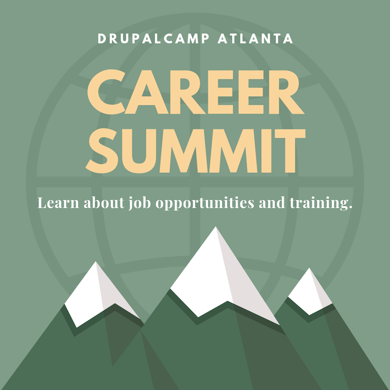
This year’s Atlanta Drupal Users’s Group (ADUG) decided to develop the Drupal Career Summit, all in an effort to recruit more professionals into the Drupal community. Participants will explore career opportunities, career development, and how open source solutions are changing the way we buy, build, and use technology.

  • Learn about job opportunities and training.
  • Hear how local leaders progressed through their careers and the change open source creates their clients and business.
  • Connect one-on-one with professionals in the career you want and learn about their progression, opportunities, challenges, and wins.

When and Where Is it?

On Saturday, September 14 from 1pm -4:30pm. Hilton Garden Inn Atlanta-Buckhead 3342 Peachtree Rd., NE | Atlanta, GA 30326 | LEARN MORE

Who Should Attend?

Student and job seekers can attend for FREE! The Summit will allow you to meet with potential employers and industry leaders. We’ll begin the summit with a panel of marketers, developers, designers, and managers that have extensive experience in the tech industry, and more specifically, the Drupal community. You’ll get a chance to learn about career opportunities and connect with peers with similar interests.

REGISTER

Are You Hiring?

We’re looking for companies that want to hire and educate. You can get involved with the summit by becoming a sponsor for DrupalCamp Atlanta. Sponsors of the event will have the opportunity to engage with potential candidates through sponsored discussion tables and branded booths. With your sponsorship, you’ll get a booth, a discussion table, and 2 passes! At your booth, you’ll get plenty of foot traffic and a fantastic chance to network with attendees.

BECOME A SPONSOR

What you can do?

If you can’t physically attend our first Career Summit, you can still donate to our fundraising goals. And if you are not in the position to donate invite your employer, friends, and colleagues to participate. Drupal Career Summit.


Drupal. The Next Generation. They Are Out There. was originally published in Drupal Atlanta on Medium, where people are continuing the conversation by highlighting and responding to this story.

29 Aug 18:30

Recommended on Medium: Leaving the MIT Media Lab

Last Thursday, August 15, I heard for the first time about Joi Ito’s business relationship with Jeffrey Epstein and the ties between Epstein and the MIT Media Lab, which occurred after his appalling crimes were already known. I also learned about a deposition that names Media Lab co-founder Marvin Minsky in relation to further crimes. The same day, Ethan Zuckerman wrote me a letter informing me that Ethan is leaving the Media Lab, a decision that I unequivocally support.

As a current visiting scholar at the MIT Media Lab, I have written to Joi and Ethan and informed them that I will be ending my affiliation with the Lab after this academic year. During my last two years as a visiting scholar, the Media Lab has continued to provide desk space, organizational support, and technical infrastructure to CivilServant, a project I founded to advance a safer, fairer, more understanding internet.

As part of our work, CivilServant does research on protecting women and other vulnerable people online from abuse and harassment. I cannot with integrity do that from a place with the kind of relationship that the Media Lab has had with Epstein. It’s that simple.

Although I was a student at the Lab during the time that Joi cultivated a business and funding relationship with Epstein, I was not aware of any of this. I am profoundly disappointed in the decisions that Joi made, and that the Lab somehow allowed to happen. The Media Lab has confirmed to me that none of Epstein’s money ever reached me or CivilServant, which is some small relief.

CivilServant still has remaining funds, servers, and a contractor working physically at the Media Lab, and I have asked the team to prioritize spending down those resources and moving our systems off the Media Lab’s infrastructure. I expect it will take us into the spring of 2020 to do so. While this will definitely be disruptive to our young initiative, one small mercy is that as a new faculty member at Cornell, I have a good home for this work.

Unlike me, Ethan doesn’t have a new institutional home for himself, his students, or the many meaningful projects at the Center for Civic Media. Over the coming year, I (and I hope many others) will support Ethan, his students, and staff as they make this very challenging transition. In whatever form the Center for Civic Media community takes in the future, I will be even more proud to continue my affiliation with that community after Ethan’s logical, principled, costly choice.

The MIT Media Lab is a community of creative people who helped me grow into the person I want to be in the world. I am in tears as I write this. Like Ethan, I hope that the Media Lab and the Lab community can turn this terrible situation into a chance to become a better place.

29 Aug 18:28

Recommended on Medium: Yes, Post-Vacation Burnout Is a Thing

If a holiday is supposed to leave you refreshed and restored, why are you often more tired than when you left?

Continue reading on Forge »

29 Aug 18:28

Gigaom’s Open Research Initiative

by Stowe Boyd

Opening up to the broader community, and inviting participation

Continue reading on GigaOm »

29 Aug 18:18

GoodTask: A Powerful Task Manager Based on Apple’s Reminders App [Sponsor]

by MacStories Team

GoodTask is a powerful task manager for iOS and the Mac that’s built on top of Apple’s Reminders app. By leveraging Reminders, GoodTask syncs to all your iOS devices and Macs, supports Exchange, and works seamlessly with Siri shortcuts. But that’s just the start.

Tasks can be filtered using GoodTask’s Smart List feature. Smart Lists act like saved searches allowing you to view subsets of your tasks. For example, maybe you want to find all of your un-dated tasks with a certain tag. With Smart Lists, that’s incredibly simple to set up.

Another powerful feature of GoodTask is Quick Actions. You define a grid of information to add to tasks with a single tap from the Quick Actions view. Maybe you have a project, tag, day of the week, time, or other bits of data you add to tasks over an over. With Quick Actions, the repetition of typing that information over and over is eliminated. The app also includes a Smart Button on iOS to quickly move between frequently-used lists.

Interactive notifications with Quick Actions allow users to do things like auto-snooze tasks right from a notification without opening the app. There’s also a feature-rich Apple Watch app from which you can manage existing tasks and add new ones. Add to that a handy Today widget and GoodTask excels at being available no matter the device or context. The app’s iOS icons are customizable and you can switch between a variety of themes or make them yourself to set GoodTask up exactly the way you want too.

Take charge of task management today by visiting GoodTask’s website to learn more about its Mac, iOS, and Watch apps and discover the power of the premier task manager based on Apple’s Reminders app.

Our thanks to GoodTask for sponsoring MacStories this week.


Support MacStories Directly

Club MacStories offers exclusive access to extra MacStories content, delivered every week; it’s also a way to support us directly.

Club MacStories will help you discover the best apps for your devices and get the most out of your iPhone, iPad, and Mac. Plus, it’s made in Italy.

Join Now
29 Aug 18:18

Holding ourselves to a higher standard: “Language-independent” just doesn’t cut it

by Mark Guzdial

My CACM blog post this month (see link here) is a retraction of the term “language-independent” in our work on the FCS1 and SCS1:

There is no language independence here. The FCS1 and SCS1 are multi-lingual which is a remarkable achievement. We might also call them pseudcode-based assessments, which is how they can be multi-lingual, but since a pseudocode-based test isn’t necessarily validated across other languages, “multi-lingual” is a stronger claim than “pseudocode-based.” We do not cover all of any of those languages (Java, MATLAB, or Python), but we do cover the subset most often appearing in an introductory CS course.

They are clearly not language independent. In the great design space of programming languages, Java, MATLAB, and Python cluster together pretty closely. There are much more different programming languages than these — I’m sure it’ll take any reader here just a few moments to generate a half-dozen candidates whose learners would score poorly on the FCS1 and SCS1, from Scratch to Haskell to Prolog.

I only vaguely remember the discussion about using the term “language independence” with Allison many years ago.  I remember her asking me if we should worry about the (relatively few) classes that used languages other than Python, MATLAB, and Java.  I think I told her she needed to graduate. I judged from the perspective of what was being published at the SIGCSE Symposium — Python, MATLAB, and Java was “language independent” enough for the paper to be seen as valuable to SIGCSE reviewers. I don’t remember the details, but I’ll accept the blame for the decision to call FCS1 (and SCS1 later) language independent.

That was a long time ago, before the International Computing Education Research Conference (ICER) was invented.  Since then, we have a computing education research community that aims to answer questions about how people learn computing — period. We’re not just about undergraduate introductory computer science classes. Even at the undergraduate level, we should study the classes (no matter how few) doing something different to see what’s powerful and interesting about them. We should explicitly be exploring unusual (even purpose-invented) languages to understand more of the interaction between programming languages and human cognition.  An insightful PPIG paper from Clayton Lewis (see link here) was recently circulated on Twitter (see tweet) that makes great points about the complexity of measuring that interaction:

The PPIG community should be proud that cognitive dimensions analysis emerged from the work of people in its ranks, Thomas Green, Marian Petre, Alan Blackwell, and others. We should be skeptical of calls to replace its use with A-B trials or other quantitative methods that cannot cope with the complexity of the language design landscape. When results of A-B trials and similar studies are presented, we should diplomatically ask for the mechanisms that are involved to be described. Colleagues who present the results of such trials should be prepared to respond to this request, so that the generalizability of their results can be assessed.

We should not be driven by what’s in classrooms today (see previous post making that argument). We should hold ourselves to a higher standard. Our goal is to create a lasting record of exploration and research for a research community.

That’s why it’s past time for this retraction.


29 Aug 18:18

RSwitch 1.4.0 Released

by hrbrmstr

Swift 5 has been so much fun to hack on that there’s a new update to macOS R-focused mebubar utility RSwitch available. Along with the app comes a new dedicated RSwitch landing page and a new user’s guide since it has enough features to warrant such documentation. Here’s the new menu

The core changes/additions include:

  • a reorganized menu (see above)
  • the use of notifications instead of alerts
  • disabling of download menu entries while download is in progress
  • the ability to start new R GUI or RStudio instances
  • the ability to switch to and make running R GUI or RStudio instances active
  • additional “bookmarks” in the reorganized web resources submenu
  • Built-in check for updates

To make RSwitch launch at startup, just add it as a login item to your user in the “Users & Groups” pane of “System Preferences”.

The guide has information on how all the existing and new features work plus provides documentation on the how to install the alternate R versions available at the R for macOS Developer’s Page. There’s also a slightly expanded set of information on how to contribute to RSwitch development.

FIN

As usual, kick the tyres, file feature requests or bug reports where you’re comfortable, & — if you’re macOS-dev-curious — join in the Swift 5 fun (it really is a pretty fun language).

29 Aug 18:17

What your book says about you

by Josh Bernoff

A business book is an extension of you. It makes an impression — both good and bad. There’s an idea going around that a book is just a big (and expensive) business card. If that were true, it wouldn’t matter much what was in it. In truth, it matters an awful lot. Because if a … Continued

The post What your book says about you appeared first on without bullshit.

29 Aug 18:17

Open Worlds

by Alexi Alario

Minecraft has sold 176 million copies across all platforms, making it the best-selling video game of all time. I first learned of it in 2013, when its popularity was peaking, just before it was acquired by Microsoft when it bought the indie studio Mojang for $2.5 billion. While surviving against monsters, starvation, other players, and environmental conditions can be part of the game, the main object is to build things. Players extract resources from the environment and combine them to make construction materials, armor, weapons, and more. All the nerdiest boys in my seventh-grade class were obsessed with it; they all wore T-shirts and backpacks with the game’s pixelated characters, and I would overhear them making plans to meet up in the game after class. They talked about monsters, dungeons, building fortresses, and mining rare gemstones. Motivated mostly by the fear that I was missing out, I downloaded a free trial.

When I first played it, it seemed a serene and infinite garden of paradise. I spent hours wandering aimlessly around the blocky map, not realizing that the world had no edge — as you go forward in any direction, the game engine procedurally generates topography by its own algorithmic logic, adorning it with shrubs, lakes, snow-capped mountains. The excitement of exploration, even in this most basic sense, was addicting. Beyond this, the possibilities seemed endless — you could create a life-size replica of your house or build a volcano or have a war between your friends, all possible through finding, mining, and assembling blocks with different properties.

Ten years from its conception, millions of people still play Minecraft. The swirling pool of user-created content surrounding it is ever-expanding. The game hosts invite-only servers allowing for multiplayer experiences; there are currently about 200,000 of these servers, with more being created every day. Earlier this summer, YouTube superstar PewDiePie began uploading a series of videos in which he goes “back to our Minecraft gameplay roots” — a reference to the Minecraft video that was his first upload in 2010. The popularity of the series, which has amassed 57.7 million views thus far, signals a revival among the game’s veteran players, sparked partly by irony but fueled by wholesome nostalgia. As a recent article in the Verge noted, Minecraft has surpassed Fortnite as a YouTube search term for the first time since 2017. There are also creative collectives like Blockworks, a design studio and consultancy working only in Minecraft, and coffee-table books like Beautiful Minecraft, which reframe the blocky environment as digital landscape photography. The comment sections under YouTube videos of the game’s soundtrack make the persistent emotional resonance and nostalgia for Minecraft plain: “How do u explain to your therapist that you cried over a minecraft song.”

Minecraft and Roblox’s selling point is the possibilities the bare framework affords. The user’s creative labor is built in as an expectation

As Minecraft’s player base has grown up, the game and its surrounding meme culture have become an apparent safe haven from adult ideas of productivity and the stress that comes with it. On YouTube there is a massive amount of Minecraft content that documents elaborate and impressively pointless feats of creativity within the game. Unsurprisingly, impressive builds are also featured among these top videos, from large International Style mansions to NASA space shuttles. Many of these must have been incredibly time-consuming and labor-intensive. Much of the most-viewed Minecraft content are music videos made in the game to accompany parody versions of songs like Usher’s “DJ’s Got Us Fallin’ in Love” (71 million views) and Katy Perry’s “Last Friday Night” (122 million views). The popularity of this kind of content suggests that the nostalgia for Minecraft is tied to the perception that it was a “waste of time” that was also somehow pure — an open world that allowed for user-defined objectives, in which truly unmotivated discovery was possible, where players could build things for their own sake and not out of sense of mandatory productivity or competitive advantage.

But the very popularity of these memes militates against such nostalgia. Obviously these Minecraft builds aren’t truly pointless; their point is to rack up views. The media economy that has sprung up around Minecraft has not only reflected a nostalgia for the game; it has institutionalized it and capitalized on it. And it has set the stage for newer open world games that more explicitly indoctrinate players into the protocols of developing human capital.

Beyond every multimillion-view Minecraft-themed video that generates thousands of dollars in ad revenue, there are millions of young players doing the same thing for nothing. About two years ago, I briefly stayed with family friends in a small town in Italy. This family had a son who was about 10 years old and fully obsessed with Minecraft, as were most kids in the area. He was constantly begging his parents for money for a new computer, a gaming headset, and a webcam to make YouTube videos. His argument to his mostly oblivious parents was that PewDiePie was making millions of dollars a year doing the same exact thing that he was highly capable of. When his parents looked to me for confirmation, I had no idea what to tell them. I thought of the millions of kids who were making the same argument to their parents across the world.

It seems that many Minecraft players share the memory of committing a sort of in-game suicide, building sky-high single-block poles and jumping off them. I remember doing this too, looking down from the top through the atmospheric haze that obscured the ground, hitting the arrow key just enough so that I would fall off the surface under me. It’s similar to having one of those falling dreams where you wake up right before you hit the ground (as this meme illustrates). You plummet through the clouds, realistically accelerating until you suddenly hit the ground and a red screen tells you, “You died!” And then you respawn immediately and do it again.


Even as Minecraft experiences a nostalgic renaissance, the online open world Roblox has become its spiritual successor. Roblox has become massively popular in the past two years, with over 90 million monthly players, most of them between the ages of nine and 15. It shares Minecraft’s basic core design — blocky graphics, flat colors, and the requirement of user participation to turn it into something better. Its selling point isn’t anything that exists in the game itself but the possibilities the bare framework affords. The user’s creative labor is built in as an expectation. But unlike Minecraft, Roblox isn’t a single expansive world or a defined game in itself; it has no basic game modes to return to and no classic game mode from which all the other user-created games stem. It is more a game-creation platform, hosting more than two million games, each of which is its own world, with its own rule set, value system, map, and user interface.

Games like Robloxian High are all about customizing your character, finding your clique, getting into a relationship, and driving around

While the open worlds of Minecraft and Roblox are sometimes touted as an opportunity for children to learn programming skills and develop an aesthetic sensibility, they have also become indoctrination into entrepreneurship for children, shaping their creativity and passion before they have enough life experience to know the alternatives or the consequences of it. Almost every game on Roblox is free to play, but there are opportunities to spend Robux, the game’s universal currency, at every corner. Some games offer VIP packages, which allow access to restricted areas and special abilities, while others rely solely on catalog features like clothing, weapons, and vehicles. A spreadsheet made by a younger brother of one of my friends lists purchases like “DJ Access,” “Majestic Leaf Wings,” and “🌈🔥SALE🔥🌈Rainbow Adidas Hoodie🔥🌈” within Robloxian High.

Befitting the young player base, the most popular games in Roblox are titles related to school and work. The game that I see most often is simply called Work at a Pizza Place. The objectives of the game are listed as follows:

  • Work as a team to fulfill food orders.
  • Use your work earnings to upgrade your house and buy furniture.

Managers can fire and hire players and give out bonus checks. Once you earn enough Robux, you can order a digital “pizza” to your own house in the game. This may not seem particularly exciting, but it’s suggestive of the horizons of the Roblox user’s world. It’s as though pizza on demand is the greatest thing they can imagine.

Along with “pizza,” any game with “high school” in the title seems destined for Roblox success, reflecting how teendom is marketed to them as a period of freedom and self-expression, of friends taking over for family as the center of social relationships. Games like Robloxian High are all about customizing your character, finding your clique, getting into a relationship, and driving around. When I went to customize my Roblox character in a game called Royale High, other players began spawning and flying around. It was around 4 p.m., which meant that many of these users probably just got home from school. It felt vulnerable to be trying on skin colors and hairstyles in front of these intricately designed and experienced young users, who instantly joined their friends and start conversations. The realism of the trompe l’oeil designer clothes and Instagram-baddie faces clashed with my underlying Lego-like form, two seemingly incompatible worlds colliding. Eventually I ended up wearing a Comme des Garçons PLAY striped long-sleeved shirt and black sweatpants with white Converse. Each item was free to try in this microcosm; to wear them anywhere else in the Roblox universe, I’d have to buy them.


On Reddit, I found a thread where longtime Roblox players evince their own form of nostalgia, complaining about how the Roblox world has changed: Younger players have turned to simulator- or tycoon-type games and away from games based on agility, like obstacle courses, or more traditional combat-style games like shooters. The comments imply that the games gradually became more social, requiring less creativity on the behalf of the creator. One commenter writes: “New and exciting games are no where to be found because all the little 7 year Olds want to train to become a superhero or own pets in roblox.” These new-style games — like Clone Tycoon 2, in which the user creates a clone army to battle others, and Adopt Me!, where players collect and trade pets ranging from dragons to flamingos — are all highly social and prominently feature the ability to design and customize yourself and your home. Instead of appreciating the variety available in Roblox as a game hosting platform, game creators filled their worlds with irresistible custom content to get players attached to their possessions.

Compared with Minecraft, most Roblox games are highly individualistic and use private property as their main incentive rather than skill-building or a sense of common good. The most popular games in Roblox abandon the traditional game model of leveling up toward a concrete goal and instead focus on the user’s desire to accrue possessions that signify their taste and status. The social aspect of the game makes customization the most important factor, hence the abundantly garish visuals. In most of the popular simulation and tycoon games, the user plays with others but doesn’t collaborate with them. Roblox seems to encourage creativity only when it has the potential to make money: through development, or through buying and selling in-game merchandise. Minecraft’s up-front payment system seems almost idyllic by comparison, seeming to foster an environment that allows for collaborative project building rather than a delivery system for invasive ads.

By enabling self-defined goals and DIY accumulation of skills, Minecraft once seemed to promise fun without fixed form, without ownership

Some in the Reddit thread counter these kinds of complaints with a kind of bootstraps mentality: If you don’t like the games you’re seeing in Roblox, nothing stops you from making the kinds of games you actually want. But others offer a conspiracy theory about how the company behind Roblox promotes simulators and tycoon games because they help it realize the potential for making money from children. “Their business model is ingenious,” a commenter writes. “They get people to make games for them, provide an engine, and then reap about 58 percent of the profits.” The business logic of Roblox is like a multilevel marketing scheme: Users are given the promise of entrepreneurial freedom while actually being tethered to a giant corporation. In place of the desire to create and build without any kind of monetary incentive — the fantasy at the heart of Minecraft nostalgia — there is a testament to the innocent and “natural” self-motivation of young players.

Though Minecraft and Roblox both require time and effort, the multiplayer aspect of Roblox games makes leveling up a social competition based on resources rather than skill. In the nostalgic memory of Minecraft, multiplayer interaction is often an extension of real-life relationships and requires synergetic teamwork. In Roblox, multiplayer modes are more starkly competitive. While the promise of Roblox is that it “powers imagination,” it seems to prompt players to imagine only what it can sell them and what they can sell, from relatively concrete objects like musical instruments to abstract ones like dictatorial powers. Just as there’s no end to the fun you can have, there’s no end to the amount of real-world money you could spend. New achievements are constantly being added, and games are updated with new user-created content on a daily basis.

Open worlds can viewed less as games than as experiments in political philosophy, fostering new kinds of citizenship. For me, watching Minecraft grow over the past 10 years has been like watching an idealized simulation of the unfolding of human history. A linear path of development can be drawn from Minecraft’s beginnings — the shared player world has gone from mass agriculture with NPC villagers to the building of in-game giant functional computers. With Minecraft, there can be nostalgia for “modernity” — that is, for the possibility or even the inevitability of “progress.”

Roblox, however, is nonlinear and postmodern. Since it contains multiple disconnected worlds, it has no governing master narrative, no shared experience of development that players might collectively remember in the future. Its openness is based more on the promise of personal acquisition than discovery. It evolves by encouraging every player to become their own independent developer. Players choose the rule sets they want to live by, affording infinite variations. People are nostalgic for Minecraft because they are nostalgic for an open world that promised discovery rather than entrepreneurship; now the popular open worlds offer no escape from the quest for personal advantage. Instead players are trained in how to distance themselves from each other through blatant signifiers of achievement.

By enabling self-defined goals and DIY accumulation of skills and resources, Minecraft once seemed to promise fun without fixed form, without ownership, without competition and hierarchy. Roblox has no such pretense. Though its premise of blurring the line between player and creator may seem democratizing, it transforms conventional gameplay into entrepreneurial striving while indoctrinating young children into capitalist society’s hierarchical scoreboards, its fantasy of being the best by having the most.

29 Aug 18:17

NetNewsWire Review: The Mac RSS Client, Rebooted with a Solid Foundation for the Future

by John Voorhees

After Google Reader disappeared, a lot of people drifted away from RSS readers. For many, social networks like Twitter filled the void, leading some observers to declare the death of RSS. However, a funny thing happened in the aftermath of Google Reader’s demise. New sync services arose, and RSS readers flourished on iOS, where competition to provide users with new and innovative ways to read their favorite feeds has been fierce.

However, feed reader options haven’t been nearly as robust on the Mac. As I’ve noted before, many of my favorite RSS readers for iOS don’t have Mac counterparts, and those that do haven’t been developed with the same regularity we’ve seen on iOS. It’s into this landscape that NetNewsWire 5 launches today.

If you’ve been using RSS for any length of time, you’ve undoubtedly heard of NetNewsWire, but may not be aware of its long history. The app’s roots stretch back to 2002 with NetNewsWire Lite 1.0, which Brent Simmons developed. In 2005, the app was purchased by NewsGator, then Black Pixel bought the app in 2011.

Simmons began working on a new open-source RSS reader called Evergreen in 2015. But then in 2018, he reacquired the rights to NetNewsWire from Black Pixel, bringing the app back to where it started for the first time in 13 years.

NetNewsWire comes with a built-in set of feeds to get newcomers started.

NetNewsWire comes with a built-in set of feeds to get newcomers started.

NetNewsWire 5 is an all-new, free app rebuilt from the ground up using Evergreen’s code, but bearing the name of Simmons’ original feed reader. The time and hard work by Simmons and other contributors to the open-source project are apparent. NetNewsWire 5 is a thoughtfully-designed, fast app with powerful search. The app won’t be my primary Mac feed reader until it has more syncing options or the planned iOS version is released, but if your feed reading is limited to the Mac or you use Feedbin to sync your feeds to iOS, NetNewsWire is an excellent choice.

You can subscribe to feeds directly from NetNewsWire by clicking the plus button in the toolbar or choosing ‘New Feed’ from the File menu, or from Safari with the app’s extension, which pre-populates the ‘New Feed’ form with a site’s feed URL. NetNewsWire also supports importing OPML files, which is the format that most apps and services (NetNewsWire included) offer for exporting the list of feeds you follow.

Feeds can be refreshed manually or every 10 minutes, 30 minutes, hour, 2 hours, 4 hours, or 8 hours.

Feeds can be refreshed manually or every 10 minutes, 30 minutes, hour, 2 hours, 4 hours, or 8 hours.

The app’s design will be familiar to anyone who has used RSS readers in the past. There are three panes with feeds on the left, article headlines and other information in the middle, and a detail view on the right. The leftmost sidebar, which lists your RSS feeds and can be hidden, is divided into as many as three sections: Smart Feeds, On My Mac, and Feedbin if you’ve set up an account.

Smart Feeds include ‘Today,’ ‘All Unread,’ and ‘Starred,’ which collect new items with today’s date, all unread items regardless of their date, and articles you’ve starred, respectively. On My Mac includes any feeds you sync directly to your Mac.

NetNewsWire can store items from the feeds you follow locally or sync with Feedbin.

NetNewsWire can store items from the feeds you follow locally or sync with Feedbin.

If you’ve set up a Feedbin account in NetNewsWire’s Preferences, you’ll also see a Feedbin section in the sidebar. The advantage of using something like Feedbin over syncing locally to your Mac is that many iOS feed readers support Feedbin too, so using the service as an intermediary between NetNewsWire and a different iOS reader will keep the read-state of your feeds in sync across both apps.

Feedbin is a good place for NetNewsWire to begin integrating with sync services because it’s used by a lot of people and other feed readers. As a complete reboot of the app with a brand-new codebase, it’s understandable that the app only works with one sync service at launch. Simmons has said that other sync services are on the roadmap for future development, which is good to hear. Although Feedbin is widespread, there are lots of other popular RSS sync services, including Feedly, NewsBlur, FeedWrangler, and Inoreader, to name just a few.

The center pane of NetNewsWire is a list of all the articles in whichever Smart Feed, folder, or individual feed is selected in the sidebar. This list can be manually or periodically refreshed at set intervals that can be chosen from the app’s General Preferences. Articles can also be sorted newest to oldest or the other way around, and each entry in the list includes the headline, publication name, time, and site icon, making it easy to scan quickly for things you want to read. The final pane is where each selected article appears, displaying the name of the feed, author, site icon, headline, and date.

The toolbar and feed list can be hidden for a more minimalist reading experience.

The toolbar and feed list can be hidden for a more minimalist reading experience.

The top of the window features a customizable toolbar that can be hidden and by default includes buttons to add a new feed, create a folder for organizing multiple feeds, refresh your feeds, mark all or some feeds read or unread, search feed, navigate to the next unread feed, star an article or open it in Safari, and share using the macOS share sheet. The same functionality, as well as feed and UI navigation, can be accomplished with a full set of keyboard shortcuts too. NetNewsWire also supports dark mode and AppleScript.

Simmons and the other contributors to NetNewsWire have built a solid foundation for the future with version 5.0. The app parses feeds consistently, and I’ve been impressed with the app’s search, which is faster and more capable than any other RSS client I’ve used. I also appreciate that the app supports the Mac’s share sheet because I send links elsewhere for reading later as often as I read them in my feed reader itself. NetNewsWire also includes a preference to open links in the background, an option that every app that links to the web should offer.

NetNewsWire's search is lightning-fast.

NetNewsWire’s search is lightning-fast.


As a reboot, NetNewsWire 5.0 is effectively a 1.0. As a result, there are a couple of things missing. The first is additional sync options. I read RSS feeds on my Mac and iOS equally. Ideally, I’d like an iOS version of NetNewsWire, but with sync services, I can manage using two different apps like I do today. However, until NetNewsWire supports more than Feedbin, its utility as a cross-OS feed reader is limited. Fortunately, Simmons has said other sync services and an iOS app are coming.

I’d also like to see NetNewsWire add more customization options, so users can tailor the reading experience to their individual tastes. Many other readers let users pick the typeface and its size, margin width, line spacing, and other aspects of the appearance of articles. I like the design NetNewsWire has settled on as its default, but I’d like the option to tweak it myself. I’d also like to be able to hide the unread count badge on the app’s icon from the app’s Preferences, rather than from the Terminal, and display only unread articles in the article list.

Finally, I read my feeds from newest to oldest and frequently skip over many headlines. NetNewsWire lets me mark every article older than the one currently being viewed as read, but not newer ones, which is an option I’d like to have as I work my way back in time through a long list of articles.

RSS feeds are an essential part of my daily workflow at MacStories. It’s a concentrated list from a wide variety of sources that I can tear through quickly throughout the day, picking out interesting, unique gems that I want to share with readers. For monitoring a large volume of sources, the efficiency of RSS can’t be beat, which is why I’m excited about NetNewsWire.

There are areas of the app I’d like to see supplemented and refined, but Simmons and the other contributors are off to a terrific start. I look forward to watching NetNewsWire evolve. I’ve been concerned about the state of feed readers on the Mac for a while and seen too many other readers that are buggy or have been left to languish. As an open-source project and with a core group of contributors that care about the reading experience and maintaining the open web, NetNewsWire has the potential to become my and many other users’ go-to RSS reader on the Mac.

You can download NetNewsWire for free from its website.


Support MacStories Directly

Club MacStories offers exclusive access to extra MacStories content, delivered every week; it’s also a way to support us directly.

Club MacStories will help you discover the best apps for your devices and get the most out of your iPhone, iPad, and Mac. Plus, it’s made in Italy.

Join Now
29 Aug 18:17

Former Director of Planning Ray Spaxman Discusses What is Iconic About Vancouver

by Sandy James Planner


Ray-Spaxman-4-778495

Ray-Spaxman-4-778495

Douglas Todd in the Vancouver Sun opens up a conversation that is very timely: exactly what are we doing with landmarky twisty bending towers and jenga block buildings in Vancouver, and who are they really for?

In his article, Todd interviews Ray Spaxman who was Director of Planning for the City of Vancouver for sixteen years. Ray is originally from Kings Lynn in Great Britain (where George Vancouver came from) and is a very tall man who was known for a thoughtful approach to city planning and a strong advocate for public participation in planning. The term “livability” was coined by Ray and his team. An architect and a planner by training, Ray is also an artist, and during public hearings and meetings often captured  the entire room of people in one sketch. You can read a bit more about Ray Spaxman and his time at City Hall  here.

While his leadership of the planning department ended in 1989, his thoughtful legacy and staff choices led the department into the millenium.

When asked to define what “iconic” buildings are, Ray responded: “You either try to be iconic because you want to stand out, or you are iconic because you stand out.” 

Spaxman also bluntly pointed out that building developers want to sell condominium units to “wealthy people in foreign lands” and the term “iconic” has changed. Previously that term would be for places  where power and community melded in  “public gathering places,to the town hall, the church or concert hall” . The forms of those types of places are all recognizable and have deep symbolism to people.

Designers now want to imprint similar symbolism on their buildings for developers to sell a new kind of brand to a buyer that has not seen that type of product before.

But does it work?

New York City has several examples of Bjarke Ingels’ curving  buildings, and I’ve written about the bendy super talls and the proposed NYC “spiral” tower.

fullsizeoutput_2e6e

fullsizeoutput_2e6e

Labelling Bjarke Ingels’ Vancouver House as “sort of iconic” Spaxman broadens his definition of the phrase by pointing out that in the past that term was given to buildings and places that had special values to the community. In Victoria that would be the B.C. legislature. And in Vancouver where views across the city have been protected with  progressive view corridor protection guidelines, the views of the Lions are iconic.

Spaxman highlighted the fact that the design of Vancouver itself, how it fits into the bays and how the glass towers are oriented in the downtown can be called iconic. And that is true, as is it  easily recognizable in any air photo and has deep meaning to people from this place.

There’s a message in there too. I am reading that we don’t need one-off twisty bendy buildings to differentiate ourselves, but need to continually protect and strengthen what we already have~an extraordinary natural setting with a rhythm of towers. Ray Spaxman likened the glass tower similarity to the pattern created by Paris’ six-storey apartment form.

Here’s a YouTube video of Ray Spaxman talking about the planning history of False Creek South in 2017. In this short evocative talk about the history, form and environment of this place, you get a sense of the sensitive comprehensive approach this planner championed in Vancouver.

Images: Alex Hayward & Sandy James


29 Aug 18:12

Where and why the Amazon rainforest is on fire

by Nathan Yau

For Bloomberg, Mira Rojanasakul and Tatiana Freitas discuss why the Amazon rainforest is on fire:

Commodities are key drivers behind the increased pace of deforestation. An analysis of tree loss from 2001 to 2015 shows that most of the Amazon was lost to commodity-driven deforestation—or “long-term, permanent conversion of forest and shrubland to a non-forest land use such as agriculture, mining or energy infrastructure.”

Tags: Amazon, Bloomberg, fire