mkalus
shared this story
from  ottocrat on Twitter. ottocrat on Twitter.
|
Doing the rounds on German social media I’m told: pic.twitter.com/96BJbY6ukc


253 likes, 133 retweets
|
mkalus
shared this story
from ottocrat on Twitter.
|
Doing the rounds on German social media I’m told: pic.twitter.com/96BJbY6ukc
Planes don’t magically jump upwards in the air (usually).
They build momentum, raise the nose to a 5-degree pitch, and gradually take flight.
The runway matters as much as the plane.
If the runway is too short or too bumpy, the flight will end in failure.
The same is true for launching a community. It’s tempting to focus on the features of the plane and ignore the runway.
This is your runway of resources, support, and expectations. Is your runway long enough for the community you’re trying to build? The bigger your vision, the longer the runway needs to be.
If your colleagues don’t share the same goals, requirements, and approach to community, with the same understanding and passion as you, you’re going to have a bumpy journey.
If your colleagues don’t have the same expectations of the community’s journey as you do, you’re not going to achieve results fast enough for them to stay supportive.
It’s very common to communicate too little with your senior colleagues when building a community, it’s far more difficult to communicate too frequently.
In almost every project we’ve worked on, the community team needs to double the amount of time they spend lengthening and smoothing the runway.
For Datawrapper, Lisa Charlotte Rost outlines the steps to prepare and clean your data in Excel or Google Spreadsheets. From the beginning:
When you download an Excel file, it often has multiple sheets. Our data set has three of them, as seen on the bottom: “Data”, “Metadata – Countries” and “Metadata – Indicators”. Look through all of your sheets and make sure you understand what you’re seeing there. Do the headers, file name and/or data itself indicates that you downloaded the right file? Are there footnotes? What do they tell you? Maybe that you’re dealing with lots of estimates? (Does that maybe mean that you need to look for other data?) If you don’t find notes in the data, make sure you look for them on the website of your source.
The guide is in the context of prepping your data to load into the Datawrapper tool, but the advice easily applies more generally.
Tags: cleaning, Excel, spreadsheet


Mobile device repair guide website iFixit recently tore apart the Google Pixel 4 XL and it turns out it isn’t the easiest phone out there to fix.
Notably, the website discovered that to fix the phone’s screen, you need to disassemble the device starting from the back.
On a positive note, iFixit says that the device uses the same Torx 3 screw standard throughout the entire phone, which is a nice touch. It also seems like the Pixel 4 is sealed for waterproofing.
Inside the device, the website was able to find out that Samsung manufacturers the handset’s display. This is a bit od since the Korean company doesn’t even use 90Hz displays in any of its own devices.
Interestingly enough, the phone’s wireless data modem is from Skyworks and features 5G in its extended name. iFixit found out that it’s the Skyworks ‘SKY5®-8212-11 Front-End Module for 5G NR, LTE, WCDMA and CDMA.’ The Pixel 4 doesn’t feature 5G and the Skywork’s modem listing also doesn’t include any mention of the new standard apart from its name, making this an intriguing, yet unexplained find.
Other finds include a mystery RAM chip from Samsung that’s thought to be for the dedicated Pixel Neural Core, and a four-core audio processor to help with live transcription.
All in, there’s a lot going on inside this phone, but if you break it, it’s going to be tough to repair. Notably, four is the same score that it gave the Pixel 3 XL last year.
Source: iFixit
The post iFixit gives the Pixel 4 XL a low repairability score of 4 appeared first on MobileSyrup.
mkalus
shared this story
from  redhistorian on Twitter. redhistorian on Twitter.
|
Two important reads today on the reporting of Brexit. First, @davidallengreen on the ability of anonymous "No. 10 sources" to flood the media with fake loopholes, get-outs & "dead cat" stories - none of which were legally plausible - to drown out the reality of a govt in retreat. twitter.com/davidallengree…
The usual defence is that reporting Number 10 briefing is that it is "lifting the veil" (@Peston)
But by uncritically reporting such diversionary information, a veil was not lifted
A veil was instead placed over the real news, that a valid extension request had been sent
1140 likes, 285 retweets

During a recent congressional hearing, Twitter erupted in a frenzy after our country’s acting director of National Intelligence mentioned using a Garmin GPS device to get to work. “What year is it!!!!” one person scream-typed. But even though I’m a self-proclaimed tech connoisseur who’s interested in the newest and shiniest gadgets, I replied that I’ve used a Garmin for years—and still cherish it.
mkalus
shared this story
from  DmitryOpines on Twitter. DmitryOpines on Twitter.
|
When an extension is granted and November 1st comes and goes without London becoming a warzone, will reporters start finally challenging politicians who predict seas of blood in the streets every time their project suffers a delay or set back?

This is from a couple weeks ago, but it's a good concept and worth sharing. "Open Competency Models are a set of competency models being made available under a Creative Commons license. They are meant to change over time, while people engaged in the discipline add skills from their profiles that reflect their experience and while organizations continue to customize the models so as to capture their differentiated approach." According to Steven Forth, "Ibbaka-TeamFit will be contributing a series of Open Competency Models to its communities over the coming year." Which of course immediately makes me think of the need for an open competencies repository (or data store).
Web: [Direct Link] [This Post]Email the last five people that joined your community.
Ask how they heard about your community.
If they came via search, what terms did they search for?
If they came via a referral, who referred them and why did they trust this person?
If they came via your website, what information were they looking for?
What drove them to sign up and create their first contribution?
Why didn’t they just read?
Was there anything that nearly stopped them from signing up?
What parts of the community mattered most to them? Was there anything they didn’t care about?
It only takes 30 minutes and you might be amazed by the quality of data it yields.

Laut Microsoft gibt es bei Partnern 82.000 offene Stellen, Unternehmen fehlen erforderliche Fachkräfte. Daher Microsofts Initiative "Workforce of the Future"
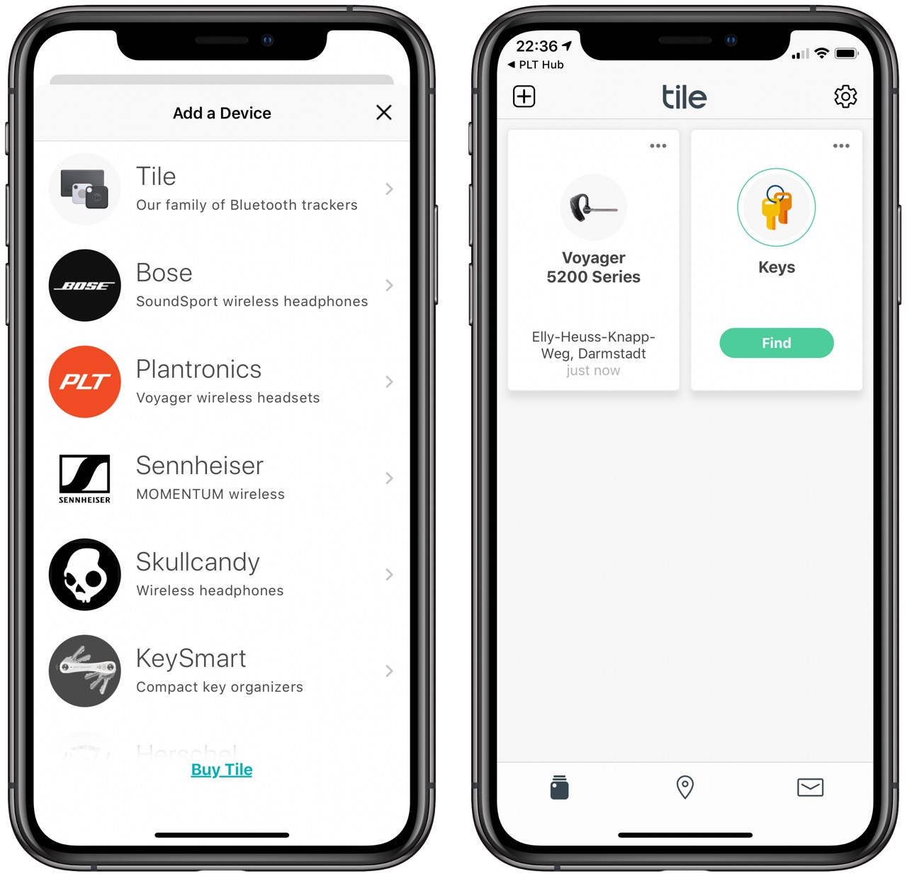
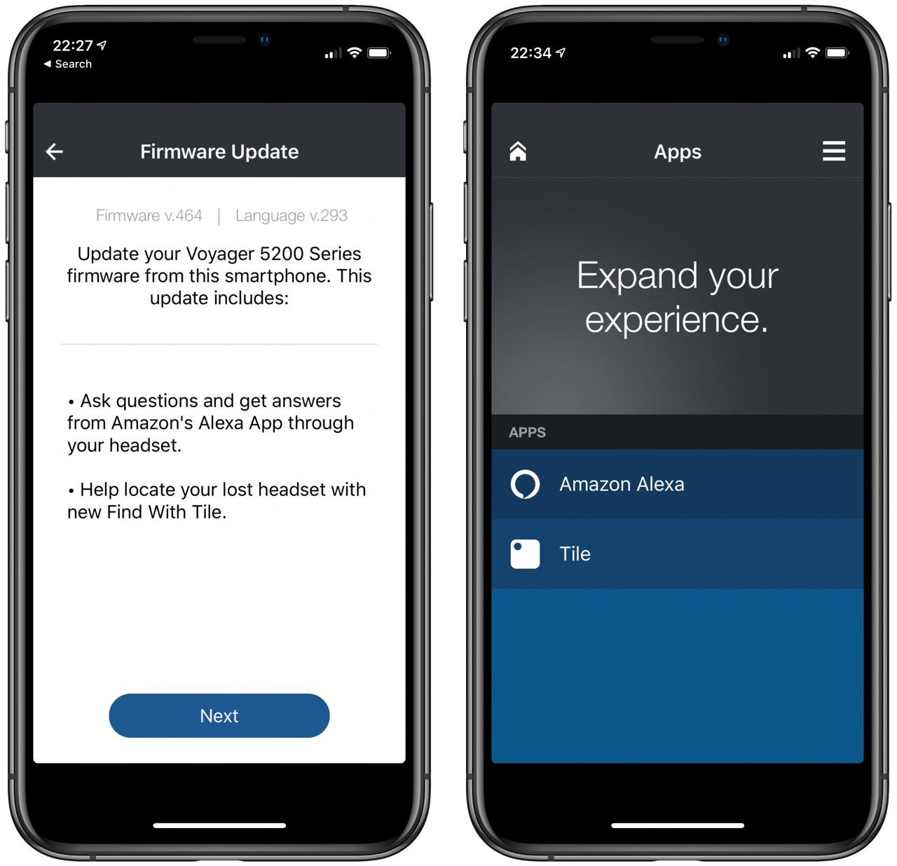
Plantronics has pushed a firmware update to my Voyager 5200 UC which enables it for Find with Tile. Tile is working with other manufactures so their devices can be found on the Tile network. As far as PLT is concerned, only the 5200 and the new 4200 series work with Tile. I expect other headsets to get this update as well. If you can't find the headset, you can make it ring, and it's quite loud. There's nothing to add to the hardware, it's all software-based and uses the headphones existing Bluetooth chip and battery.
The Find with Tile system is designed to link up a lot more stuff, meaning that you can keep track of a whole range of different items, with over 20 partnerships already announced. Tile's aim is to link-up all your devices so that you can easily locate something you lose at home, leave at the gym, on a bus or anywhere else.
Adam Fitch commented on the post below, expressing doubt that we’ll end with a Haussmann-style boulevard on Broadway:
What is more likely to happen is that the areas immediately around the stations will be quickly redeveloped with clusters of 30-40 storey condo towers with a bit of chain and big box commercial at the ground level, ala Marine Gateway and Lower Cambie Village.
Perhaps something like what is emerging on West Davie in the West End:


Your basic Vancouverism – the style that transformed Downtown South in the 1990s: streetfront podium accommodating commercial uses, with separated towers above.
The model is essentially the high-density version of the ‘Grand Bargain’ – low-rise residential and slow-growth on the interior blocks, with a high-density buffer along the arterials (with the unstated class distinction that goes with it). It’s a choice more likely to emerge from the Broadway planning process than a more simplistic consolidation of density in a few blocks around less than half a dozen station areas.
Irony alert: At the moment, a building-height-to-street-width ratio that might make sense on Broadway at roughly 100 in width feels more crowded and canyon-like on a street of 66 feet, even though the three-storey podium that creates the streetwall alleviates the impact of the towers.
It’s a variation on the development scale that has been allowed in the West End since the 1950s, evident elsewhere on Davie.

Or maybe it doesn’t really matter much. So long as there is animation, transparency, sunlight and rain protection along the sidewalk, the height becomes irrelevant once we get used to it.
Thank you all for the continued support and remarkable demand for the Librem 5.
As we’ve shared earlier, we are iterating through shipping batches. The purpose of doing so is to increment and improve with each batch toward mass production and share that story publicly. As a result, these earlier batches are limited in quantity as we move toward mass production. Publicly releasing iterated hardware at this level of transparency is extremely uncommon, but in nearly everything we do we try to lead by example. Forming as a Social Purpose Corporation, open sourcing all our software, having PureOS be FSF endorsed, securing the lower layers of computing, or manufacturing a revolutionary mobile phone from scratch… all have required sacrifice but are well worth it to provide people with a values-driven alternative to Big Tech.
A surprising amount of people wanted “the earliest batch possible” even understanding that Aspen and Birch will have known issues. It has been inspiring to learn that thousands of people want early iterations. It shows that even with a not-yet-mass-produced device, our supporters want to have and own a phone that fully respects their freedoms and are willing to accept being an early adopter and all that goes with that.
We intended on the second revision of Aspen (black case) getting into the hands of backers, but due to the results of quality control tests against RAM clocking at full-speed (consuming power and generating heat), we made the decision to move those backers to Birch and deliver the rest of Aspen to developers and staff. This issue will be corrected and tested prior to the shipping of the Birch batch. As we progress toward the larger (but still limited) Birch batch we can already see the writing on the wall; we have more demand for early batches than the supply planned until we reach mass production.
We know that many of you have been frustrated by the lack of public updates around the Aspen batch until now, and we hear you. We are trying to balance the myriad (but imminently solvable) challenges of perfecting the Librem 5, with the aim to update all of you with detailed updates as early and often as we can.
Please continue to be patient. You will get your Librem 5. It’s just a matter of iterating through the supply toward mass production to meet the demand. Your support and understanding as we’ve designed and built this revolutionary mobile phone from schematics on up has been much appreciated.
As a quick recap of all we’ve done, which should showcase that we have a long history of delivery and industry uncommon transparency:
The demand for the Librem 5 is immense and we appreciate all the excitement and interest. We are excited too! Purism was founded with the goal of creating the Librem 5 and our focus now is on delivering it. This is no easy task, but we’re devoted to this cause.
As we approach the Birch delivery window, we are also able to share some greater detail on each batch, current known issues, and our roadmap.
Librem 5 Aspen has three primary known issues, first is thermal throttling, second is unoptimal antenna routing, and third is CPU placement for thermal dissipation. (NOTE: Thermal throttling is solved by additional kernel development via software update). Shipping of Librem 5 Aspen devices has concluded. Shipping resumes with the Birch batch.
Librem 5 Birch has two known issues, thermal throttling, and CPU placement for thermal dissipation. (NOTE: Again thermal throttling is solved by additional kernel development via software update). All Librem 5 Birch devices are expected to ship before November 26th, however due to a delay the beginning of the shipping window (October 29th) will now be moved to November 15th.
Librem 5 Chestnut has one known issue, CPU placement for thermal dissipation. There is no current expected delays in delivery; before December 31st.
Librem 5 Dogwood already has board design changes to route the CPU to the inner side which will allow for improved and direct thermal dissipation through the aluminum chassis. By solving issues from Aspen, Birch, and Chestnut the Dogwood batch has no known issues at this time. The Librem 5 Dogwood is currently our test batch before mass production and there are no expected delays in delivery.
Librem 5 Evergreen is our mass production batch and there are no expected delays in delivery.
We will assign customers to particular batches as each phone is tested and ready to ship. Once a particular customer’s order is ready to ship, we will contact them to confirm their batch preference and get final shipping details.
We’d like to thank everyone for the continued support and excitement for what we do. We wouldn’t have accomplished everything we have and be on the cusp of disrupting the smartphone market if it wasn’t for every single one of you.
The post Supplying the Demand appeared first on Purism.
<spoilers>
While I’ve enjoyed most of the latest round of Star Wars films, there’s something that hasn’t sat with me. It could be some nostalgia for the original trilogy, but in my mind the formula for a good Star Wars seems to be a handful of core characters (Han, Luke, Leia, R2D2, C-3P0, Chewbacca, Darth Vader), then a periphery of semi-important people (Obi Wan, Yoda, Jabba the Hutt, the Emperor, Boba Fett) who potentially all end up dying, but appear in at least two movies and make a big impact to the lore. Solid core, recycled periphery, strong lore.
In the latest batch of movies and side stories I feel we’ve been taken on a whirlwind tour of the galaxy. It’s been genuinely exciting opening new chapters of the Star Wars universe that were previously only available in … ahem …. “niche” books. And while this exciting, I’m finding myself disappointed the characters are as disposable as characters in a George R.R. Martin novel.
Here’s a list of disappointments:

Movie by movie, maybe this is fine. But cumulatively, it adds up and feels like the Universe is built up then torn down over and over again. Shallow throwaways make the world building feel shallow and empty.
The prequels, despite their glaring problems did okay with character recyclability (other than the podracers, all the Sith apprentices, and the Jedi Council). I suppose it’s not perfect, but some of those characters were given new life in the animated series Star Wars: The Clone Wars which tried to salvage what it could from the lore introduced by the first three movies. This doesn’t exonerate those films, but all the main characters I would argue were well developed (other than Anakin, the only actor that had to be good in these movies).
I’m a bit anxious for some of my favorite characters in this final episode, The Rise of Skywalker, but excited nonetheless. I’m also glad it won’t be 20 years until we get more Star Wars with new serial content promised on Disney+. Disney, afterall, is a Character Machine and it’s in their interest to maintain good characters and lore, so perhaps the Universe won’t be squandered afterall. Help us, Bob Iger, you’re our only hope.
Though I care deeply, I suppose I’m old enough now that —like Obi-Wan Kenobi— I may have to let go and let saving the Galaxy be the next generation’s problem.
mkalus
shared this story
from  Ulysses Blog. Ulysses Blog.
|
The new Split View that Apple introduced with iPadOS allows users to view two app windows side by side. For Ulysses, senior developer Götz was in charge of the implementation. Read our interview to learn how to make best use of the new system feature.

Götz, you’ve added the new iPadOS Split View to Ulysses. Ulysses had its own split view feature before, where users could display two Ulysses editors next to each other. What’s better about the new Apple system feature?
The main advantage is that the new Split View allows creating entirely new Ulysses windows. With our custom split view, users were restricted to two windows (which were only shown in landscape orientation). With the new multitasking feature in iPadOS, users can create as many Ulysses windows as they want and not only show two Ulysses windows side-by-side, but also show these windows alongside other apps or as Slide Over windows.
When programming, could you use your experiences with the Ulysses editor split view as a basis, or did you have to start from scratch?
We threw away most of our custom implementation and pretty much started from scratch. In only a few places, such as auto-updating export previews, we could reuse our existing code base. Making our custom code fit in with the new iPadOS multi-window architecture was just too much work. This is also the main reason why we removed the custom implementation for iOS 12 – having both implementations just didn’t work out well in the end.
Let’s have a look at specific use cases. I would like to display Ulysses and YouTube next to each other, what should I do?
If you already have Ulysses running on your iPad, drag upwards from the bottom edge to show the Dock. Then, drag the YouTube app icon from the Dock to the left or right edge of the screen. Once the Ulysses window is shown in a blurred state and a preview for the YouTube app is shown, you can drop the YouTube icon. You can resize the split ratio between both apps by dragging the handle in the middle of the screen.
Now, I would like two work with two Ulysses editors, as I have to compare a text to its translation.
You can achieve this the same way. Alternatively, you can drag a Ulysses sheet from an existing Ulysses window. Navigate to the sheet you would like to see in Split View and begin dragging the sheet to the left or right edge of the screen. At the edge, you can drop the sheet and you’ll see a new window. And there’s another way: You can tap and hold the sheet in the sheet list and select “Open in New Window” from the context menu.

Finally, I wish to see my text on the left and the export review of my DOCX output on the right hand side. How can I achieve that?
You can once again use the new iPadOS context menus for this: tap and hold the sheet you’d like to export and select “Export in New Window”. If the sheet is already open in the editor, you can also tap and hold the export icon in the bar at the top right and select “Export in second window”. In both cases, a new window with an export preview will be opened on the right half of the screen. You can close export preview windows by tapping the Done button at the top left.
What else should I know about working with Split View?
Contrary to export preview windows, regular Ulysses windows stay around when “closing” them by dragging them out of the visible screen. If you open the app switcher (e.g. by double tapping the Home button), you will find all Ulysses windows. To show only Ulysses windows, tap and hold the Ulysses icon in the Dock and select “Show All Windows”. To explicitly close a window, you can swipe up the window. The window will not be really closed until you lock the screen. Until this moment, you can show all windows using the aforementioned “Show All Windows” action and tap “Restore Closed Windows” in the top right.
You can also swap windows in Split View. To do so, drag down a window at its handle at the top just a bit so it becomes a floating app window. Then, drag the window to the left (or right) edge of the window and let go.
Did you know that you there’s also the option to split the editor on Mac? Consult our detailed and illustrated tutorial about everything split view, on all devices.
mkalus
shared this story
from  Price Tags. Price Tags.
|
Adam Fitch commented on the post below, expressing doubt that we’ll end with a Haussmann-style boulevard on Broadway:
What is more likely to happen is that the areas immediately around the stations will be quickly redeveloped with clusters of 30-40 storey condo towers with a bit of chain and big box commercial at the ground level, ala Marine Gateway and Lower Cambie Village.
Perhaps something like what is emerging on West Davie in the West End:

Your basic Vancouverism – the style that transformed Downtown South in the 1990s: streetfront podium accommodating commercial uses, with separated towers above.
The model is essentially the high-density version of the ‘Grand Bargain’ – low-rise residential and slow-growth on the interior blocks, with a high-density buffer along the arterials (with the unstated class distinction that goes with it). It’s a choice more likely to emerge from the Broadway planning process than a more simplistic consolidation of density in a few blocks around less than half a dozen station areas.
Irony alert: At the moment, a building-height-to-street-width ratio that might make sense on Broadway at roughly 100 in width feels more crowded and canyon-like on a street of 66 feet, even though the three-storey podium that creates the streetwall alleviates the impact of the towers.
It’s a variation on the development scale that has been allowed in the West End since the 1950s, evident elsewhere on Davie.
Or maybe it doesn’t really matter much. So long as there is animation, transparency, sunlight and rain protection along the sidewalk, the height becomes irrelevant once we get used to it.

Happy Birthday!
Toronto’s first bike lane turns 40
by Albert Koehl
Toronto’s first bike lane is now 40 years old! When it was installed in the late summer of 1979 the bike lane on Poplar Plains Rd. might have signalled—despite its modest half-kilometre length—a readiness by City Hall to accommodate bicycles on its streets, but instead it simply presaged the long struggle that followed against motorists’ insatiable appetite for space.
The Poplar Plains bike lane, through a leafy South Hill neighbourhood, required the elimination of one motor lane – a noteworthy achievement in the post-WWII era when planners and politicians obsessed about widening roads. The number of cyclists using the bike lane was initially small, which was no surprise given that the lane didn’t even reach St. Clair Ave., and only ran one-way northbound – all of it on an uphill so steep (it is after all, the shoreline of the ancient Lake Iroquois) that many cyclists continue(d) to walk their bikes.
The bike lane did, however, give cyclists some protection along a roadway that many motorists treated as a “racetrack” to Forest Hill, recalls Michael Schabas, a member at the time of the city cycling committee (a volunteer advisory body), which had called for the lane. Indeed, at the top of the hill two police officers guided northbound motorists first right then left across St. Clair into Forest Hill, hence the moniker “Forest Hill Expressway,” as some people called it.
Once installed, one might have expected motorists, who could still legally use the bike lane for passenger pick-ups and drop-offs, to accept the trifling loss of road space as a token acknowledgement of pressing problems of air pollution and dependence on foreign oil, as well as the surge in cyclists after the ‘bicycle revival’ of the early 1970s. Instead many motorists were traumatized by the intrusion – quickly finding an ally in the news media.
Mere weeks after the installation, on October 14, 1979, the Toronto Star wrote an anxious editorial entitled, “There’s a limit to bicycle lanes in Toronto.” The city was “suffering yet another devastating attack of the anti-car blues,” according to the Star, which called the bike lane “an ill-conceived notion that will only exacerbate already intolerable traffic conditions and pose a serious safety hazard.” (The suggestion was that frustrated motorists would dart into the bike lane and endanger cyclists.)
Many local residents, although originally skeptical about the bike lane, nonetheless came to appreciate its traffic-calming benefits. In fact, at the behest of local residents, the lane was later extended toward St. Clair as a safety measure for school children at a local elementary school.

The Star also fretted about the impact on motorists of bike lanes proposed for Harbord and Wellesley Streets, suggesting that cyclists should be content with recreational trails and sign-posted ‘bike routes’ along quieter streets. But motorists needn’t have worried. It took another decade for the next bike lanes to appear, including one along Russell Hill Rd. -- the southbound corollary to Poplar Plains.
The bike lane on Poplar Plains was a remnant of a more ambitious initiative approved by council in 1976 that include bike lanes on Poplar Plains, Russell Hill, Simcoe, McCaul, and Bedford, among other roads. These lanes were intended to improve on a portion of an existing, ‘discretionary’ north-south bike route (designated by signposts) running from the lake to the city’s northern boundary, then near Lawrence Ave.
The approved bike lanes were slated for installation in 1977 but were instead subsumed in a comprehensive study (by city consultant Barton-Ashman) that held great promise for a bikeway network but delivered, at great expense, virtually nothing except a few wider curb lanes of dubious value. It was perhaps then that City Hall discovered a formula that it still exploits today to the detriment of cyclists – bike lane studies that masquerade for action.
Some motorists today continue to howl with indignation at any perceived intrusion on the public road by bike lanes - even as climate change has gone from scientific prediction to everyday reality. In fact, 40 years after Toronto’s first bike lane, the city still doesn’t have a cycling network. But last week, as if to celebrate the Poplar Plains milestone, the city finished installing a new bike crossing of the raised concrete median for the St. Clair LRT tracks that had become a barrier for northbound cyclists.
But all of this is really just to say to the Poplar Plains bike lane, “Happy Birthday!”
Albert Koehl is an environmental lawyer and founder of Bells on Bloor.

Recently, Tefficient had an interesting post on Twitter in which they stated that in Austria, mobile network traffic is now 53% of the fixed line traffic in the country. An incredible number, could it really be true? And if so, how does that compare to mobile network traffic in other countries? To find out, I had a look at Austria’s telecom regulator report for 2018 and compared the values to those from Germany’s telecom regulator report.
According to Wikipedia, Austria has a population of 8.8 million. In 2018, 3.4 million TB of data were transported over fixed internet connections such as DSL, cable and fiber while 1.7 million TB of data was transported over the networks of the three wireless operators. So yes, the 53% is really true.
Let’s compare these numbers to Germany. With a population of 83 million, i.e. roughly 10 times that of Austria, the amount of data transported in fixed network was 45 million TB in 2018. In mobile networks, about 2 million TBs were transported. In other words, not much more mobile traffic than in Austria but generated by 10 times the number of people. It’s from regulator reports so the numbers are likely to be accurate.
So how come? The major difference between the two countries is, that two network operators in Austria are offering unlimited fixed mobile Internet access for reasonable rates with LTE home routers. For some reason or other, fixed line Internet connectivity adoption is at a low 28% in Austria compared to 41% in Germany based on the number of people and not households. So that’s the difference right there and the reason the numbers are so different.
As a result I would expect that especially during busy hours, mobile data rates in Austria would be significantly lower than in Germany where networks are way less loaded than in Austria. But this doesn’t seem to be the case, the Austrian regulator only notices very little speed decrease during busy hours. Also, network tests carried out annually for telecom magazines show better throughput values for Austrian networks compared to their German counterparts. And this despite the significantly higher load, which I find really puzzling!?
So how could it be? Austria has only 1/10th of the population of Germany but is 1/4 of the size. In other words, population density is much lower, 106 people per km2 in Austria vs. 253 people per km2 in Germany. But one has to factor-in mountainous regions in Austria which are very sparsely populated. Consequently, in most habitable parts of Austria, I would assume that the population density is higher. So how about the number of base stations compared between network operators? In Germany, one network operator claims 30.000 sites while in Austria, the number of one of the network operators must be around 6.000 sites according to these values. This is 1/5 of the German value which makes sense given the 1/4 of the landmass. So while the base station density might be somewhat higher in Austria, it definitely can’t compensate for the order of magnitude of higher load in the network. It also can’t be the amount of spectrum used in Austria that could account for the difference as in Germany, at least two of the network operators have 50-60 MHz on air in cities. Austrian operators are unlikely to have more.
So I’m still puzzled how the network load can be around 5 times higher per base station site in Austria while network speed tests still attest excellent throughput speeds. A bit of a riddle.


Volvo has electrified its popular XC40 SUV and it’s coming to Canada late next year.
This is the automaker’s first true electric Volvo unless you count its subsidiary, Polestar’s new all-electric sports car, the Polestar 2.
Like the Polestar car, the XC40 Recharge is going to have an infotainment system that’s built on Android for tighter integration with Google Maps and Assistant.
The company says that pricing with be released in Q1 of 2020 and drivers will be able to buy the new XC40 in Q4 of the same year.
What we do know is that it has somewhere between 400km and 320km in range, just over 400 horsepower and a fast-charging system that can hit 80 percent of the vehicle’s charge in 40 minutes.
Since we don’t know the price, it’s unclear what other cars to compare this to, but Tesla’s upcoming Model Y is supposed to have a range of 370km to 451km depending on the trim level users buy.
The fast-charging system relies on 150 kW DC charging, and Volvo does mention that it could be slower in colder temperatures.
The company says it plans to release a Recharge version of five of its cars over the next five years, and the electric XC40 is the first step on that path.
Source: Volvo
The post Volvo’s electric XC40 Recharge is coming to Canada in Q4 2020 appeared first on MobileSyrup.

The Toronto Transit Commission is beginning the next step of its Presto rollout by phasing out tickets, tokens and passes from collector booths.
Transit riders in the Toronto area will still be able to buy these forms of vouchers from some third-party locations. There’s a list of third-party sellers on the TTC’s website.
The commission also mentions that there is no expiry date for the old form of fare vouchers, except GTA Weekly Passes can only be used until December 1st, 2019. The agency also mentions that users without a large buffer of tickets, tokens or passes should be ready for lineups at Presto machines on December 1st.
Instead of tickets, tokens and passes, the Transit Commission is pushing users to buy Presto Cards. There are two forms of Presto cards, plus the TTC has promised that it’s working on a mobile payment version for Android phones.
Regular, multi-use Presto Cards cost $6 CAD and can be re-loaded as many times as a user wants. Single-use Preso cost either $3.25 for a single ride, $6.50 for a two-way trip or $13 for a day pass.
You can buy these cards at vending machines in subway stations, Shoppers Drug Marts, the Presto card website or the TTC Customer Service Centre above Davisville Station.
This change seems to be a long-time coming since the TTC even converted its collector booths at Yorkdale and Lawrence West stations in January of 2019 into customer service centres. It also launched a mobile app for re-loading Presto cards in late 2018.
Source: Toronto Transit Commission
The post TTC to stop ticket, tokens and pass sales at fare booths on November 30 appeared first on MobileSyrup.

Google has announced that it reached a historical milestone by being the first company to achieve quantum supremacy.
The difference between a regular computer and a quantum computer is the faster processing speeds. In order to reach quantum supremacy, a company has to create a quantum computer that is able to perform tasks that today’s computers cannot.
“Our machine performed the target computation in 200 seconds, and from measurements in our experiment we determined that it would take the world’s fastest supercomputer 10,000 years to produce a similar output,” the tech giant said in a blog post.
Following Google’s blog post announcement, IBM released its own blog post refuting Google’s claims. IBM is largely involved in quantum computing and addressed the premature results.
“We argue that an ideal simulation of the same task can be performed on a classical system in 2.5 days and with far greater fidelity,” IBM researchers wrote.
Google has said that it is open to implementing improvements for its quantum computer simulation.
“Quantum computing will be a great complement to the work we do (and will continue to do) on classical computers,” Google concluded in its blog post.
Image credit: Google
The post Google says it achieved ‘quantum supremacy,’ IBM questions claims appeared first on MobileSyrup.

Google has released the numbers on just how effective Project Treble has been at improving the speed of Android updates.
In a post on the Android Developers blog, Google outlined the effects of Project Treble.
While you may be wondering why now, when Treble launched alongside Android 8.0, there was no way to test its impact. At the time, Treble was a significant overhaul to some of Android’s underlying architecture. This meant it couldn’t be applied to devices coming from Android 7.0 Nougat and was only available to devices that launched with Android 8.
In other words, Google couldn’t test the impact of Treble until Android 9.0 Pie came out so it could compare the upgrades to the previous release.
To measure that data, Google compared the number of devices on Android 8 in July 2018, just before Android 9 became available, to the number of devices running Pie in August 2019, just before the company launched Android 10. According to Google, Android 8 accounted for 8.9 percent of the ecosystem before 9 came out. However, Android 9 accounted for 22.6 percent of the ecosystem ahead of Android 10.
Google chose to measure adoption at these points since both those times marked a year of availability for both Android 8 and 9.
Further, Google says that its beta program also indicates the success of Treble. Project Treble allowed for more devices from more manufactures to run the Android 9 beta. Google says that in addition to its Pixel devices, seven device models from seven manufacturers supported the Android 9 beta. However, the Android 10 beta increased that to 18 devices from 12 manufacturers.
Google also discusses improvements made in Android 9 and 10 regarding updates.
For example, the search giant worked closely with silicon manufacturers to help reduce the average upgrade time by more than three months. Google expects to see upgrades from Android 9 to 10 noticeably sooner as a result.
Google also “completed the seal between the vendor and system components of Android.” The company says that this will ensure new versions of “the top part of the OS” will run on older versions provided by partners. It also formalized the interface to the Android Linux kernel, expanded the Treble test suite and more.
Because of the changes, Google received feedback from manufacturers and silicon partners indicating upgrades from Android 9 to 10 are going more smoothly.
The effects can be seen already. Some manufacturers, like Essential and Xiamoi, launched updates the same day Google announced Android 10. Other manufacturers, like OnePlus, started Android 10 beta programs that same day and began updating devices within days.
Additionally, Google says Asus, LG, Motorola, OPPO, RealMe, Samsung, Sharp, Sony, Transsion and Vivo have committed to updating some devices to Android 10 by the end of the year.
Google closed out its blog post with some of the changes made in Android 10 to help with updates.
For example, there are Dynamic System Updates (DSU), which allows developers to install Google-signed Generic System Images (GSI) on supported devices.
GSIs include “pure Android,” and allow developers to install unmodified Android Open Source Project (AOSP) code on devices without touching the Factory ROM. This should help both with updates and with the custom ROM community.
There’s also Project Mainline, which Google says “is to the core of the Android OS what Project Treble is to its foundation.” Mainline will allow Google to update components of the OS through the Play Store directly.
While many of these changes sound complicated and confusing, Google designed them to help improve developers’ ability to build updates for devices. And while the number of devices getting faster updates may seem small, it’s important to remember that Android is a massive ecosystem with hundreds of manufacturers, processors and thousands of devices. Any improvement to update speed Google can make is a huge win for Android.
Source: Google Via: XDA Developers
The post Google says Project Treble ‘had a positive effect’ on update speeds appeared first on MobileSyrup.
Another update to the Windows Terminal has just been released! As always, you can download the Terminal from the Microsoft Store, the Microsoft Store for Business, and GitHub.
 Note: In the About popup within the Terminal, this version will appear as v0.6.
The Terminal now has even better tabs! The WinUI TabView used in the Terminal has been updated to version 2.2. This version has better color contrast, rounded corners on the dropdown, and tab separators. Also, when too many tabs fill the screen, you can now scroll through them with buttons!
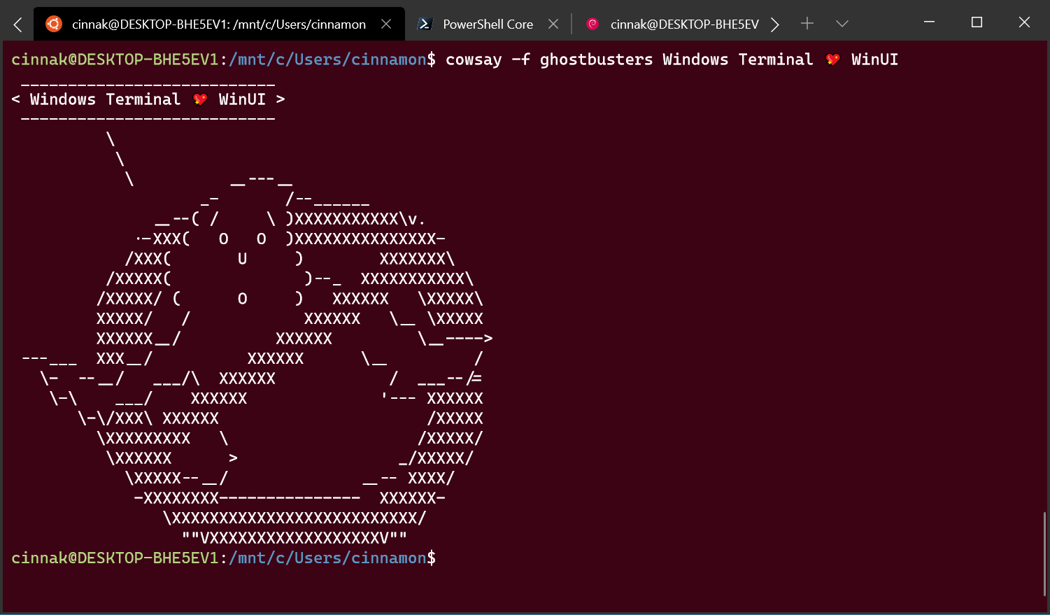
Windows Terminal now automatically detects any Windows Subsystem for Linux (WSL) distribution installed on your machine along with PowerShell Core. If you install any of these after this update of the Terminal, they will appear in your profiles.json file!
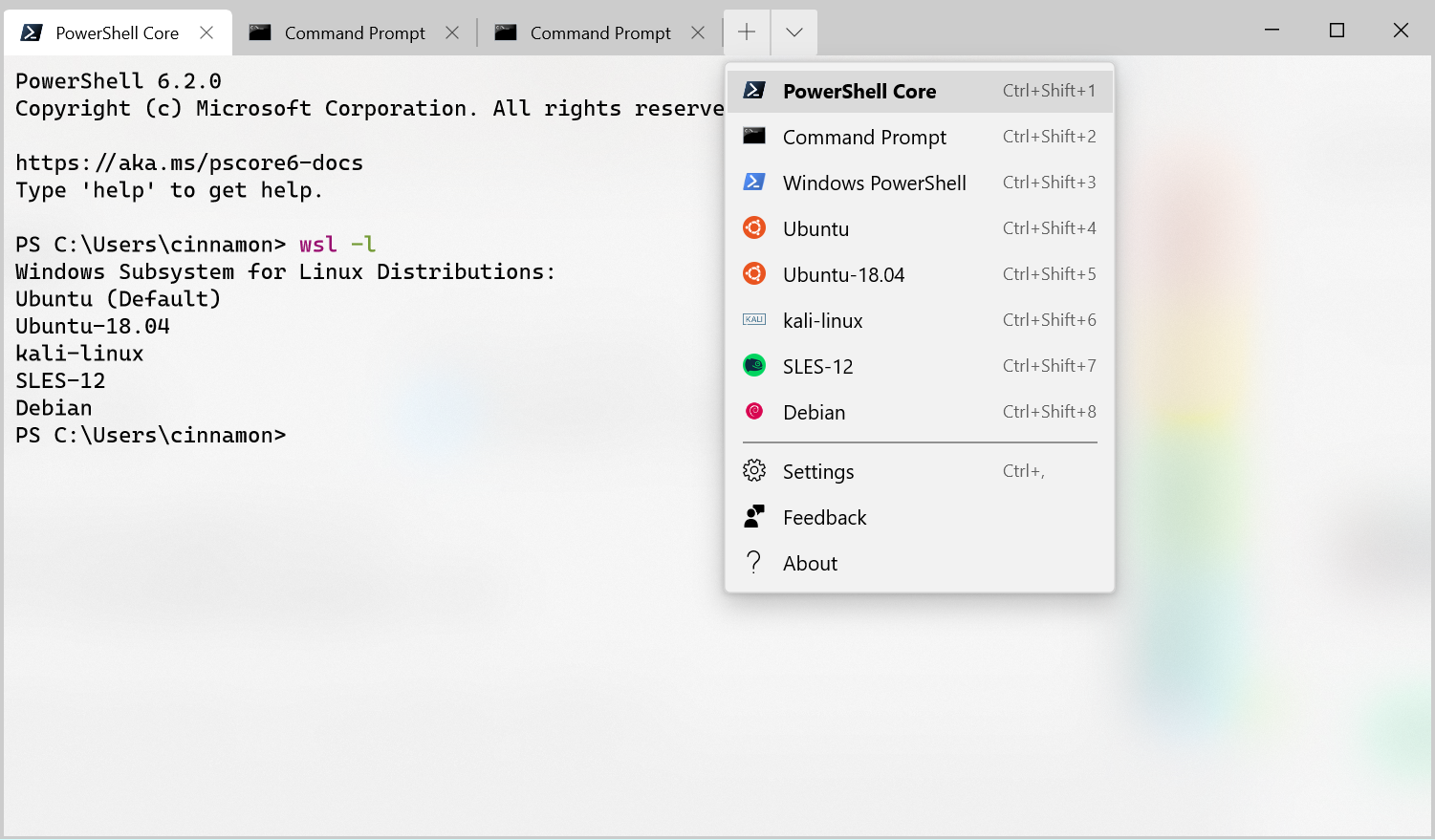
Note: If you don’t want a profile to appear in your dropdown, you can set "hidden" to true in your profiles.json file.
"hidden": true
The Terminal now has an improved settings model! It ships with a defaults.json file with all of the default settings included. If you’d like to see what’s included in the default settings file, you can hold down the Alt key and click on the settings button in the dropdown menu. This file is an auto-generated file and changes made to the file are ignored and overwritten. Your own profiles.json file is where you can add as many custom settings as you’d like.  If you’d like to reset your settings, Scott Hanselman (@shanselman) has written an excellent blog post on how to do just that!
If you add a new profile, scheme, key binding, or global setting in your profiles.json, it’ll be treated as an added setting. If you create a new profile whose GUID matches an existing one, then your new profile will override the old one. If there is a default key binding included in the defaults.json file that you would like to free up, you can set that key binding to null in your profiles.json.
{

    "command": null, "keys": ["ctrl+shift+w"]

}
You can now set the Terminal to launch as maximized or set its initial position! Setting the Terminal to launch as maximized can be done by adding the global setting "launchMode". This setting accepts either "default" or "maximized".
"launchMode": "maximized"
If you’d like to set the Terminal’s initial position, you can add "initialPosition" as a global setting. This property accepts a string with the X and Y coordinates separated by a comma. For example, if you’d like the Terminal to launch at the top left of your primary screen, you’d add the following to your profiles.json:
"initialPosition": "0,0"
Note: If you’re using multiple monitors and would like to set the Terminal to launch to the left or above your primary monitor, you will have to use negative coordinates.
 You can now double-click on the tab bar to maximize the window!
One of the main bugs causing newline issues with copy and paste has been fixed!
HTML copy doesn’t leave the clipboard open anymore!
You can now use font names longer than 32 characters!
There is no longer text corruption when running two tabs at the same time!
General stability improvements (less crashes)!
We love working with our community and we’d like to call out those who have especially made an impact!
Feel free to reach out to Kayla (@cinnamon_msft) on Twitter if you have any questions or feedback! You can also file an issue on GitHub if you encounter any problems or have any feature requests. See you next month!

The post Windows Terminal Preview 1910 Release appeared first on Windows Command Line.


