Shared posts

25 Oct 07:16

The Best iPhone Cases for the iPhone 12, 12 Mini, 12 Pro, and 12 Pro Max

by Nick Guy
The Best iPhone Cases for the iPhone 12, 12 Mini, 12 Pro, and 12 Pro Max

You’re either a case person or you’re not, but we always think putting a protector on your iPhone is a good idea, especially as repair prices continue to climb. The iPhone 12 is the first major redesign since 2017’s iPhone X, affording case makers an opportunity to come up with all-new designs and to refine models we’ve had good experiences with in the past. No matter what style case you prefer, we have recommendations, and we’ll continue to test as new models are released.

25 Oct 07:16

Hands-On with the HomePod’s New Intercom Feature, Alarms, and Siri Tricks

by John Voorhees

With yesterday’s releases of iOS 14.1 and HomePod Software Version 14.1, which could really use a catchier name, Apple has introduced several new features announced last week at its iPhone 12 and HomePod mini event. Most readers are probably already familiar with what’s in the updates based on our iPhone 12 and HomePod mini overviews, so I thought I’d update my HomePods and devices to provide some hands-on thoughts about the changes.

Most of the new features are related to the HomePod. Although proximity-based features are exclusive to the HomePod mini, which features Apple’s U1 Ultra Wideband chip, some of the other functionality revealed last week is available on all HomePod models.

Intercom

Until the HomePod mini ships, Intercom is limited to the original HomePod.

Until the HomePod mini ships, Intercom is limited to the original HomePod.

At last week’s Apple event, the company introduced Intercom, a new feature that allows you to broadcast announcements using the Home app or Siri. After you update to HomePod Software Version 14.1 using iOS or iPadOS 14.1, you can broadcast to a HomePod in a specific room or zone of your home or all of your HomePods at once. Apple says the feature will work with the Apple Watch, iPhone, and iPad too, but as I’ll detail below, that’s not working yet, at least for me.

If you’re running 14.1 on an iPhone or iPad, you can open the Home app, long press on a HomePod, and tap on the gear icon to access its settings where you can update the HomePod to version 14.1. After your HomePod is running 14.1, you’ll see a new option in the HomePod’s settings called Intercom. Tap through to make sure the feature is turned on for your HomePods.

Once set up, you can use commands like “Hey Siri, tell everyone it’s time for dinner” using one HomePod, and your message will be broadcast to any other HomePods you have. You can also say things like “Hey Siri, Intercom Living Room,” and in my example, Siri will prompt you to record a message that will be sent to only the HomePod called “Living Room.’

After a day of testing Intercom between HomePods located in my office and our living room, the feature has worked as advertised. However, the utility of Intercom is directly proportional to the number of HomePods you have. I have two, and if I know someone is in the living room as I work in my office, the feature is a handy way to send a message. I could accomplish the same thing by dictating a text message, but they might not have their iPhone handy, or I may not know which of my family members is in the living room, making Intercom a better option.

With iOS 14.2, other devices will join in the Intercom messaging fun.

With iOS 14.2, other devices will join in the Intercom messaging fun.

What I’m really looking forward to, though, is adding a HomePod mini or two to the Intercom mix along with other devices. Right now, if you ask Siri to send a message via Intercom using any device other than a HomePod, you’ll get a response that the feature only works with HomePods, which is potentially confusing to anyone who watched last week’s Apple event.

The Home app's iPadOS 14.2 onboarding process.

The Home app’s iPadOS 14.2 onboarding process.

However, if you’re running the iOS or iPadOS 14.2 beta, you’ll find additional Intercom UI in the Home app. With iPadOS 14.2 installed, I was greeted by a set of onboarding popups that explained Intercom, asked me to choose between never using the feature with my iPad, using it only when I’m home, or using it anywhere. Finally, I was prompted to pick who among the family members I’d previously added to the Home app could use Intercom.

On iPadOS 14.2, there's a new button in the Home UI for sending Intercom messages.

On iPadOS 14.2, there’s a new button in the Home UI for sending Intercom messages.

Sending an Intercom message from the Home app.

Sending an Intercom message from the Home app.

iOS and iPadOS 14.2 add a new button in the Home app UI that looks like an audio waveform for sending Intercom messages. The button only appears in rooms that include a HomePod. Tap it, and you should be able to send an Intercom message to the HomePod in that room, though it didn’t work in my tests at first. Eventually, though I was able to get Intercom to work using my iPhone, which I updated to the iOS 14.2 beta.

The Home app's new Discover tab on iPhones running iOS 14.1.

The Home app’s new Discover tab on iPhones running iOS 14.1.

While I’m on the subject of the Home app, it’s worth noting that the new Discover tab appears in iOS 14.1 but not on iPadOS. From Discover, you can learn more about HomeKit devices and access links to products sold through the Apple Store app in a format that is reminiscent of the App Store’s editorial content.

Alarms

The HomePod alarms UI in iOS 14 (left) and iOS 14.1 (right).

The HomePod alarms UI in iOS 14 (left) and iOS 14.1 (right).

HomePod alarms can now be set to play music when they go off. Alarms support any song, playlist, or radio station available in Apple Music. To set one, long-press on a HomePod inside the Home app. Previously, setting up an alarm only allowed you to name an alarm, pick the time it would go off, and designate whether it was a repeating alarm.

After you update your HomePod and iOS device to 14.1, adding an alarm or editing an existing one will look different. First, the tumbler-style time picker has been updated to the new iOS 14 time picker. Second, there’s a new Alarm Sound section that lets you pick between playing the HomePod’s default tone or media, which reveals additional settings when selected.

Adding music as an alarm.

Adding music as an alarm.

The first button, ‘Select Media,’ offers options to pick music from the Listen Now, Browse, Radio, and Library sections of the Music app. Picking any of the four options opens a view within the Home app that is identical to that section of the Music app, but with the Home app’s toolbar buttons at the top. Also, in a very nice touch, you can choose between the current volume of the HomePod for your alarm or a custom volume, which will undoubtedly save many people from having to be pulled off the ceiling when they wake up after listening to loud music the night before. Once you’ve picked what you want the alarm to play, the alarm details display the artwork for your selection.

I’ve been considering putting a HomePod mini in my bedroom, and even before I’ve tried the mini, I can guarantee that I’d rather wake up to a song or playlist than the HomePod’s default alarm. The change is a small, but I expect it will increase my use of HomePod alarms dramatically.

Other Siri Updates

Location and web-based queries fielded by your HomePod are sent to your iPhone as Siri Suggestions.

Location and web-based queries fielded by your HomePod are sent to your iPhone as Siri Suggestions.

Siri has been updated on the HomePod too. If you ask about a location, Siri suggestions will appear in the Maps app on your iOS devices. Sure enough, when I asked my HomePod for directions to Dell Rhea’s Chicken Basket, I got a Siri suggestion in Maps on my iPhone within seconds.

Similarly, Siri can send web searches to your iPhone. Everyone wants to know the difference between seals and sea lions, so I asked Siri, which helpfully sent two websites and a YouTube video to my iPhone.

Siri works better across multiple HomePods now too. You can stop alarms, timers, and media playback on any HomePod from another one. Voice recognition, which already works to distinguish members of your household for things like Calendar events and tasks in Reminders, now works with the Podcasts app, too, allowing individualized experiences for everyone in your household.


I’m excited for the full roll-out of Intercom. Once other devices and HomePod minis are online, the feature should be a quick and easy way to communicate with family members spread around your house. With a teenager who spends a lot of time in his bedroom with the door closed and headphones on, this could end my days of shouting up the stairs at dinnertime. The location-based Siri suggestions are another touch I know I’ll use a lot as I get ready to go somewhere and want directions sent to my iPhone without having to dig it out. As Federico and I recently discussed on AppStories, Apple seems to be making a renewed push with HomeKit, Siri, and the HomePod that should be interesting to watch over the next year and beyond.


Support MacStories Directly

Club MacStories offers exclusive access to extra MacStories content, delivered every week; it’s also a way to support us directly.

Club MacStories will help you discover the best apps for your devices and get the most out of your iPhone, iPad, and Mac. Plus, it’s made in Italy.

Join Now
25 Oct 07:16

Falsehoods programmers believe about time

Tim Visée, GitHub, Oct 21, 2020
Icon

I have to admit I laughed to myself when an experienced programmer I respect said in a meeting, "Calendars are solved." Back then (and to this day) I must use (and synchronize manually) two separate calendars, one for work and one for home. And when we're talking about programming involving date-time and calendars, well, you're almost certainly going to have to rely on a calendar library, which may or may not have considered all the problems listed in this article. It's a good quick fun read and will give you a new appreciation of the complexity of time.

Web: [Direct Link] [This Post]
25 Oct 07:15

Pay-per-use physics models for virtual fashion

How about skin tight t-shirts with tracking markers, especially made for rendering synthetic shirts with physics-model fabric for wearing on Zoom? And how would the virtual shirts be priced?


Problem. I spend my work days on video calls. For some of those calls, I wear a shirt. I want to give a good impression, and a shirt is good for that, but it feels like a waste: I have a limited number of shirts before I have to take them off to the cleaner. (Getting my shirts cleaned and pressed is my laundry vice. Generally laundry is my happy place: sorting, folding, all that, it’s a finite task that I love. But ironing bores me to tears, so I factor into any shirt purchase the fact that I’ll have to pay for cleaning.)

Solution. Virtual fashion.

The concept is that I could wear a skintight t-shirt printed with computer vision motion tracking markers, semi-reflective patches (to measure ambient light), and known colour areas (for white balance).

Software on my computer would intercept the webcam signal, and add a virtual shirt – or a virtual anything else. Using a physics engine, it would have a full cloth simulation to mimic light or heavy fabrics (the shirt I wear depends on the season), and adapt to my movement and the light in the room.

The idea is that, for everyone else on the call, the virtual shirt is indistinguishable from me wearing an actual shirt. Only I have an infinite wardrobe.

Shirts would be purchased from all the usual designers and retailers: Hugo Boss or Uniqlo, whatever. Buy as normal, but download the 3D model into your virtual fashion software, and there’s no physical garment to take to the cleaners.


This concept at least partially inspired by a recently-purchased all-over-print ugly shirt: a ridiculous-looking garment that magically renders the wearer invisible to CCTV.

Here’s a pic of me in the t-shirt. Ostensibly the pattern confuses the facial recognition algorithms of a certain brand of CCTV camera. This article talks more about the patterns and links to the original paper.

So if there are patterns that computers see badly, are there patterns that computers see really, really well, and what would you do with that? Hence a motion cap shirt for virtual fashion.


The question is: how would you price a virtual shirt? Is it a one-off purchase, or perhaps a subscription to a virtual wardrobe?

For me, the key difference with garments (over, say, music) is that’s it’s possible to spend more on the material itself and that expense is visible to the trained eye.

Sure, expensive material can mean it hangs better, or lasts longer, or whatever. But high fashion doesn’t always do those things. And sometimes exactly what you want is a low-cost basic: higher price doesn’t always mean better.

So what unfakeably expensive material provides, if nothing else is a meaningful foundation for wide price differences, and that gives rise to exclusivity, brands, and all the rest.

How to replicate all of that with virtual fashion?

With virtual garments, there’s no meaningful reason to price a Prada shirt differently from a no-brand one. The design maybe? But the value of design is down to personal preference; there will be no consensus on what should cost more and what should cost less.

UNLESS: The true difference between virtual garments is down to the quality of the simulation.

A simulation with more compute thrown at it can and will look better. Throw a better GPU (the chip responsible for rendering the graphics) at the rendering problem, and the virtual shirt will be higher resolution, run at a higher frame rate, and the cloth will hang more authentically. It gets rendered once, on your machine, and then everyone else on the video calls gets to see it. And better GPUs do indeed cost more. Nobody else needs an expensive CPU, but they’ll definitely be able to tell that you spend a lot on yours.

The difficulty is that the GPU is bundled with your laptop or smartphone. Any virtual garment, high end or low end, gets rendered with the same chip. Quality difference is eliminated.

Pay-per-use physics simulations

So how about this, to open up the economics of virtual fashion:

Speculatively bundle the absolutely best available GPU in every laptop and every phone. But don’t activate its full capabilities, and don’t pass the cost onto the consumer at the time of purchase. Instead allow virtual garments (which are just 3D models in physics simulations, don’t forget) to pay to unlock levels of capability on a per-model basis.

The 3D model designer would pay the GPU manufacturer directly. Perhaps they pay a per-unit fee with a multiple that takes into account model complexity and level of desired verisimilitude.

The consumer, purchasing the 3D model, would pay the designer. When they use the item, the GPU is unlocked for that item only. The consumer would not be able to purchase a garment and then choose how much rendering power to give it.

Instead of an upfront GPU purchase, this is a pay-per-use model.

It would allow for purchasing cheap virtual shirts that look ok, and expensive virtual shirts that look shimmering, amazing, and computationally profligate.

(What do we call this? Speculative economics?)


I wonder what high fashion would look like in this world?

Anything that requires top-end GPU capabilities I imagine: lots of reflections, lots of crinkles and complexity on the surface, and lots of semi transparent layers, all falling in interesting (and expensively) crumpled folds.

And then I wonder whether real-life fashion would end up mimicking the virtual? Would high-end garments end up using ordinarily-priced material… but all designed to appear especially difficult to render in simulation?

All of which is to say: I would pay money for an actual t-shirt which is designed to be hard to visually simulate. Do let me know if you make one.

25 Oct 07:15

CRADLE conference 2020

Selena Chan, learning elearning, Oct 21, 2020
Icon

Selena Chan has been posting summaries of presentations at the Centre for assessment and digital learning (CRADLE) conference at Australia's Deakin University. The posts start here. Highlights include a session on evaluative judgement (EJ) and the RIPPLE platform, some presentations on assessment in a post digital world, and a talk from Monika Nerland on epistemic practices and an ongoing project (CORPUS) studying changing requirements in the public service. Chan also covered the recent ULearn conference from New Zealand with posts starting here.

Web: [Direct Link] [This Post]
25 Oct 07:11

I Voted on the First Day of Early Voting in Nashville. Even the Weather has Been Nice

by Rex Hammock

This is a photo of my bike and me voting in 2015>

I voted last Wednesday, October 14, at the Green Hills Branch of the Nashville Library, the 2017 National Gale/LJ Library of the Year

(I threw in that last part because it truly is a most remarkable library — but may be yet another tragic victim of Coved-19 (A topic for later.) (Note: In addition to services available online, the library branches are offering curbside service, as well.) (Info)

Typically, I vote early on any election.

And I’m always impressed with how well-run the voting process is run.

It took me an hour and a half to stand in line and vote. The library has not been open for monthsIt has never taken me an hour and a half to vote. But I would have been glad to spend all day there.

It may be a cliche, but this is the most important election in your lifetime.

Here are all of the early voting locations in Davidson County, which, by the way, also goes by the name, Nashville. And it also goes by the name “Metro Nashville.” And all merged together, the city and county are officially named Metropolitan Government of Nashville?Davidson County.

The following prediction isn’t much of a prediction: Vice President Biden will win rhw Metro Nashville Davidson County vote. But it’s not much of a prediction because Nashville is an island of blue in a red sea.

25 Oct 07:11

What If We Got Rid of Offices?

by Dave Pollard


cartoon by the late New Yorker cartoonist Robert Weber, one of the few cartoonists who worked mostly with charcoal

One of the things that CoVid-19 has made clear is that “offices” for individual workers (and so-called “executives”), and even for groups of “white collar” workers, are in most cases completely unnecessary. That’s not to say people don’t want them, and want to get back to them. It’s to say they aren’t needed — that with a bit of relearning we can do everything from home that we can do in an office, and perhaps more, and just as well if not better.

The immediate benefits would be (a) eliminating an enormous amount of commuting time, (b) drastically reducing commuters’ automobile emissions and expenses, (c) freeing up a huge amount of wasted space, much of it in cities that are desperately short of affordable housing, (d) reducing the demand for space in “prestige” areas of cities that are obscenely overpriced, and hence bringing rents down, and (e) reducing a large portion of the costs of doing business that are passed along to customers, potentially reducing product and service costs to customers.

This wouldn’t change the world, of course. The dangers are (a) that the 1% would simply pocket the savings themselves, (b) that a lot of bullshit “office” jobs would simply be eliminated, much as most secretarial jobs were eliminated a generation earlier, when it was clear they served no purpose, and (c) that “top executives” will still retain their personal offices, making having an office even more absurdly sought-after as a status symbol than it is now (and entrenching and deepening the hierarchy between those “with” and “without” offices — a further gutting of the last vestiges of the middle class). And of course for many, especially the poor and working women, working from home is currently nearly impossible, and they would need to be provided with spaces near their homes where they could work effectively; a challenging but not insurmountable problem.

The argument for having offices and other physically proximate spaces for workers, even when not necessary to produce anything, is that people are allegedly more productive and accountable in an office working alongside peers and bosses (read: bosses don’t trust subordinates), and that physical proximity encourages important consultation and collaboration. But so far little or no effort has been put into either (a) finding out if that’s actually true, or (b) improving tools and technologies that render it no longer true.

I was one of the first “executives” in North America to pilot what was then called the “mobile office”, lugging around my “portable” computer (in those days it was so heavy I developed “PC syndrome” tendonitis); I essentially carried my “office” in my briefcase. I was given the best available technology at that time; in return I gave up my physical office (financially, that was a wash to my employer).

These “pilot programs” were mostly unmitigated disasters. Then as now, if you wanted to talk to someone “important”, or a decision-maker, you had to do so in person. Then as now, “important” people didn’t answer the phone (then, they had secretaries to run interference for them; now, they have voice-mail and email and assistants to automatically delete voice-mails and emails addressed to them). So if you tried to operate without an office, you couldn’t talk with anyone “important”. You had to come into the office to be “visible” and basically wait for an invitation, for them to visit you. Since that could be a long wait, you generally needed to book a “visitor’s office” on the off-chance of being granted an audience that day.

Peers looked upon these “visitor’s offices” with suspicion and denigration: Don’t you dare encourage people to take my office away; I have a “real” office with “my” files and other important things that have to be here, so I have to be here. You might try to jam a lot of visits and in-person conversations into your scheduled visits to “the office”, but no one would cooperate with you — that’s just not how things were (and are) done in “the office”. I could go on, but you get the idea: Becoming a “mobile office” worker was a de facto demotion, in the eyes of both bosses and peers.

Nothing has changed that much. There’s still jockeying for, measurement of, and hierarchy-ranking of and preening over offices. So for many, at all levels of the bullshit jobs codependency, giving up one’s office is unthinkable, and eliminating offices would be considered a grievous and insulting error.

So I’m not naive enough to believe it will happen, at least not until the economy collapses, which may still be a decade or two away. I’m just saying it could happen, with enormous net benefits for just about everyone. Just as you really don’t have to physically shake hands to sustain a healthy business relationship during CoVid-19, you really don’t have to have physical offices — any offices — to sustain a healthy organization. They are anachronisms, like the suit and tie, clung to by the conservative and the fearful.

Imagine, then, what a world without offices would be like — assuming the technology has improved to accommodate this change — cameras and audio quality and screen-sharing that simulate physical presence in a space as much as possible:

  1. Except in those rare places where large numbers of people absolutely have to work in close proximity to manufacture real products that cannot be largely automated, there would be no “rush hour”. Emptier highways, cleaner skies, less road rage and stress.
  2. I think there would be a tendency for people to be evaluated more on how accessible they make themselves to others (fellow workers, customers, suppliers). And perhaps less on the size and trappings of their office, or on their “span of control” or job title, or on their dubiously-computed “contribution” to profits.
  3. I think there would be less capacity and less indulgence for micromanaging, and necessarily more delegation of decision-making capacity to front-line workers. A lot of painstakingly collected and scrupulously ignored research suggests this would be a good thing.
  4. It would be much easier to logically reorganize a company or organization because the physical silos would no longer help entrench the structural ones. That would include more easily breaking an organization into autonomous units that would be more customer-facing and less hierarchical. This would be a huge (and for executives, scary) change, since they have long conned the world into believing the myth that their decision-making is more important and valuable than that of front-line workers.
  5. Trust would of necessity become the currency of business. After trying to establish “check-ins” to ensure remote workers are observing “office hours”, owners would eventually have to give up and learn to evaluate people on the quality and value of what they produced and not how many hours it took to produce it (or whether they were regularly in the office working early or late).
  6. Shareholders and directors, who’ve been conned for years into assessing management on all the wrong bases and entrenching an absurdly disproportionate remuneration and reward system for executives, might have to start looking at value-for-money, value added, real customer and employee satisfaction surveys (not the fake scale-of-1-to-10 fraudulent surveys used now), and measures of organizational innovation and resilience, to assess the quality of their investments and management, instead of using profit growth as the single, universal surrogate. It would start to become clearer, I think, how very equally everyone working for an organization contributes to its success, or failure. But maybe that’s wishful thinking.
  7. Executives would no longer be able to con customers and investors that they were skilled, knowledgeable, important, and worth a lot of money, based on the trappings of their offices, titles and real estate. They might have to demonstrate that they actually do something of value to justify their salaries and patronage.

I hear some objections that “serendipitous encounters” in the office are essential to networking, to collegiality, and to innovation. If you think so, please show me the evidence that these even occur in most organizations, let alone that they produce useful results. Middle managers hope to have such encounters with executives to make their presence known and possibly move up the ladder.

But my observation is that this is mostly just dreaming and projection. There are very few organizations where promotion has anything whatsoever to do with merit — it’s about connections, family, and image. Just look at the political “leaders” in any country and you’ll see a public demonstration of what it takes to get “to the top”. Water coolers, even when they existed, served only as a means for peers to gossip and hobnob and for executives to pretend they cared about occasionally mixing with the minions.

There has been considerable “cultural anthropology” work done that shows that the presence of offices and departments in an organization is more of an impediment than a help to cross-sectional interaction and communication. The sheep of one kind are all placed in one pen so they’re easier for their shepherd and their sheepdogs to herd, not so that they can commune with other sheep.

The sheep aren’t going anywhere — if they’re still working in large hierarchical organizations they’ve imbibed the corporatist kool-aid and believe that theirs is the only way to succeed (or even survive) in business. (Sadly, because of the criminal imbalance of wealth and power in our global economy, they’re now probably correct.)

But the corporate elite could easily let them do their bullshit jobs from home — it wouldn’t make any difference and would provide the five benefits noted above. And this elite might even dare to get their fellow executives to give up their offices too — it would make zero difference to anything that matters, and some of them might actually get to spend some time with their families, if they dared.

I know this sounds bitter and over-the-top, but in all my years of business with many organizations, I’ve just found it to be more and more true. Our economy is built on many myths, most of them completely untrue; the myth of the importance of offices is just a minor one of these.

Pollard’s Law of Complexity asserts that:

Things are the way they are for a reason. To change something, it helps to know that reason. If that reason is complex (and it usually is), success at truly understanding and changing it is unlikely, and developing workarounds and adapting to it is probably a better strategy. Complex systems evolve to self-sustain and resist reform until they finally collapse.

Offices evolved for reasons that are in part anachronistic and in part to demonstrate power and to simplify command and control over employees. None of those once-important reasons still applies, so the system is continuing, much as the wearing of suits and ties continues, because of inertia. For the last 30 years those of us weary of these dysfunctional remnants of old paternal industrial culture have been working around them. Perhaps now is as good a time as any to encourage them to collapse before they do so naturally.

The implications would be far-reaching, and extend beyond the politics and economics of corporatist hierarchies. It might start to dawn on us that appearance (and citizenship, and lineage) have nothing to do with someone’s capacity, intelligence, creativity, values, or value to society. And that wealth and power are inherited things, passed usually from father to son, and that they have absolutely nothing to do with either merit or effort (even if you believe merit or effort entitles you to an obscene share of the world’s wealth and power).

And, on a closer look, it might dawn on us that most of the expenditures that are built into the things we struggle to buy — expenditures on executive salaries and perks, on the wages paid for bullshit jobs, on advertising and PR, on litigation against potential competitors and uppity customers, and on acquisitions and share buy-backs — that make up in many cases 80-90% of the “cost” of what we buy, are completely unnecessary, and result in products costing an order of magnitude more than they need to, even if we were to halt the offshoring of labour and materials to struggling nations.

I think that in time, we will realize this sad and outrageous truth, this gargantuan $47T dollar theft from workers by corporatists and their shills, from the rest of us. I think most of us have at least started to realize that capitalism, as it’s been practiced over the past two centuries, is just an elaborate boondoggle to funnel wealth to the ultra-rich from the rest of us.

Like the desolating and ruinous global industrial growth economy that sustains it, this boondoggle is teetering and will soon come crashing down, no matter what we do. If it takes a while we may yet obliterate the half of the world’s natural wealth and biodiversity that isn’t already gone, and accelerate even further the destruction of our air, water, soil, food, lands, oceans and resources that have led to the sixth great extinction of life on our planet. Perhaps if we gave a little push to this one little domino — offices and what they represent — it might start something in motion that would precipitate something more profound, and at least spare future generations some of the consequences of our folly.

But just watch the resistance from the plutocracy if this starts to happen. They know what they have to lose. And if they decide they need fewer offices after the pandemic, you know whose offices will remain untouched.

25 Oct 07:10

Google Antitrust Notes

I just read the US antitrust “Complaint” against Google. This is obviously just the first chapter of a very long story, but here are early observations.

Don’t get upset that this is going to take years to work through. Figuring out how to unclench Google’s stranglehold on the Internet wouldn’t be easy even without their army of excellent lawyers fighting tooth and claw every step of the way, which they will be. It’s still worth doing.

I found the Complaint document to be well-written and well-argued. You don’t need to be an antitrust attorney, or any kind of lawyer at all, to understand its argument. I recommend reading it; It’s not that long and I certainly learned a few things about the shape of the search and advertising business, and you probably would too.

To my surprise, a few members of my tribe were pushing back against this lawsuit. The first argument was “This is an operation of the corrupt and malevolent Trump administration, whose real target is their dorky notion that social media is biased against conservatives.” Well, no. Even granted the cosmic awfulness of the current administration, the complaint is still coherent and sensible, and none of the anticonservative-bias fantasyland makes an appearance. Sometimes bad organizations do good things; deal with it.

The second pushback is along the lines of “It may be a monopoly but Google is a damn good search engine, and it’s free. So how can that be bad?” Which raises a very sensible question…

Who is harmed?

I agree: It’s not obvious that end-users are hurt directly. Google provides, at the end of the day, a pretty awesome search service. It meets my needs well, and they seem to fix breakages when they’re reported.

The problem is (to steal a phrase from the Complaint) “monopoly rents from advertisers”. Search advertising is a context where you know exactly what the user is looking for, and it’s amazingly effective, and Google enjoys a monopoly, which means they can charge what the market will bear, and they do. Here’s ¶168:

Google’s exclusionary conduct also substantially forecloses competition in the search advertising and general search text advertising markets, harming advertisers. By suppressing competition, Google has more power to manipulate the quantity of ad inventory and auction dynamics in ways that allow it to charge advertisers more than it could in a competitive market. Google can also reduce the quality of the services it provides to advertisers, including by restricting the information it offers to advertisers about their marketing campaigns.

While the Complaint doesn’t mention it, Google has used the insanely-effective AdTech machinery they’ve built around Search to go after the rest of the online advertising market. They and Facebook now enjoy an effective duopoly, which they’re using to ingest a larcenous proportion of the money flowing through the system, thereby wreaking devastation on the publishing industry. Which is to say, intellectually impoverishing our civilization.

The phone builders

The investigators did a really good job digging into the tools Google uses to wrangle the companies who make Android phones. There’s a carrot and a stick. The carrot is that if you play nice and give Google all the search business, they’ll pay a you a commission on the billions they get in revenue.

The stick is the Google Android apps, in particular Google Play Services. Android may claim to be open-source but that’s smelling increasingly like a big fat lie, since apparently more and more essential features have migrated into Play Services, including notification capabilities and OAuth.

I was actually in the Android group when we shipped Play Services, and I thought it was a brilliant idea because we could add value to the platform without having to convince phonemakers to adopt a whole new release of Android, something they were famously bad at. I feel clueless for having missed the lock-in angle.

The Apple Angle

The Complaint says that mobile traffic in the US is 60% iOS vs 40% Android, which I hadn’t known. Apple routes all the search traffic to Google, which in return routes billions of dollars to Apple. The arrangement works great for both of them. As for the advertisers and publications, they’re just roadkill.

Disappointment

Section VIII, at the end of the Complaint, is entitled “Request for Relief”. It doesn’t even fill one of the 64 pages. It asks the court to (a) agree that Google is behaving illegally, (b) “Enter structural relief as needed to cure any anticompetitive harm”, (c) force Google to stop doing these bad things, (d) do what it takes to restore competitive conditions, (e) do whatever else the Court finds just and proper, and (f) cover the plaintiffs’ expenses.

I’m disappointed. Maybe this is a symptom of me not being an antitrust lawyer, but I’d have hoped for some specific, creative ideas on how to accomplish these good things.

Since the plaintiffs didn’t bother, let’s look at what they could do.

Regulation

If we don’t like what Google’s doing to the advertisers and the phone builders, we can pass new regulations to forbid them, or enter a Consent decree whereby Google agrees to stop doing those things. This is how the big Microsoft monopoly litigation was settled in 2001.

I hate it. You need to write these things carefully and the second the ink is dry the company will start working to game the system. Then there’s the risk of regulatory capture, where the people who are supposed to enforce the new rules start sharing Google’s worldview and basically just don’t. Finally, if new regulations apply to everyone not just Google (which they should) they can be turned into an advantage if they’re so cumbersome that only a giant company can afford to comply with them.

Breakup

One big problem with monopolies is that they use their locked-in profits to invade other business sectors and compete unfairly because they can afford to forego profit. The classic solution is just to break the monopolist the hell up.

I’m pretty sympathetic to this approach and wrote a whole blog piece talking through this in detail. While I stand by every word, reading the Complaint raised my consciousness on the mobile front, which probably affects important details of the breakup.

Utility-style regulation

So if you want to break the company up but you still want excellent search and you want to restore sanity to the advertising business, what else could you do?

You can make a case that Web search is a natural monopoly. Running the crawlers and indexers and servers is freaking expensive, requiring monster capex and operational expenditure. It’s not obvious to me that the world needs more than one.

The counter-argument would be that competition drives innovation. Speaking as a person who spent some years of his career working on full-text search, I doubt that there’s much left in the way of low-hanging fruit. But I might be wrong.

How about declaring that some parts of search implementation are monopolies, and that’s OK, and they should be regulated as such, in exactly the same way we regulate power and water and other natural-monopoly utilities.

You’d require that the monopoly offer a straightforward full-text-based document retrieval API that implements several different ranking algorithms and charges per search. You’d forbid it from engaging in any advertising businesses. Then you’d free up people to build consumer-facing search interfaces and compete to sell advertising on them. They could also compete on enriched search, the kind of thing Google does where it converts units and currencies, does arithmetic, knows timezones and populations and capital cities, and branches to the right Wikipedia article while you’re still typing.

You could have one of these things that runs no advertising at all, just charges you a (pretty damn low) fee per search. On top of which it’d be faster. I could see myself paying for such a thing.

It’d be tricky to work out. But it might give us a much, much nicer Internet. And a richer intellectual landscape.

25 Oct 07:09

The Growing Proliferation of Approaches To Building A Community

by Richard Millington

The traditional way to start a community was to find a forum-based platform and invite your members to join. You initiate discussions and hope things take off.

And this is still the main approach for most brands today.

But it’s increasingly just one of many possible approaches.

I was recently on a call with a vendor that uses various techniques to identify fans of the brand on social media and invite them into a private group. Within these groups, members get exclusive information and are rewarded for sharing messages/responding to criticism.

Other vendors, like Meetup, will let you find existing groups about your brand and either sponsor or collaborate with the owners.

Other vendors, like TokyWoky, will let you integrate community discussions directly into the sales path throughout the company website. Members can engage with people via a chatbox while visiting different pages.

Other organisations begin with a blog, build up an audience, and then try to start a community from the commenters on the blog.

Others begin by hosting a series of virtual events, see who turns up, and then expand to have bigger events or a platform that lets attendees chat to one another.

Others start by hosting a series of challenges, figure out which are most popular, and slowly expand upon that.

Others just engage with their fans and audience on social media. They ask members to tag photos and share those photos on their site.

Others stitch together their own community experience using Medium, Slack, Zapier integrations, and a virtual events platform.

Others invite the smartest customers into mastermind groups and use that as the basis to gather feedback and stimulate ideas.

Others start a virtual book club and grow from there.

etc…

The traditional approach gets the most attention not because it’s the best, but because it is the most visible when it works.

Yet your approach might be completely different – and that’s probably good. If you can’t reach a few thousand people, trying to launch a new community from scratch through a public forum probably isn’t the right approach.

Increasingly, you get better results from targeting fewer people. And that’s probably going to mean using a non-traditional approach too.

25 Oct 07:08

Lists

by rands

25 Oct 07:08

100 Days in Obsidian, Pt. 1

by Ton Zijlstra

I’ve been using Obsidian a little over 100 days now. So, with over three months of daily use it’s good to review the experience. I will do this in some detail, and it will span several blogposts. To explain both the evolution over time, as well as how I currently work with Obsidian in practice in a more detailed way, as Frank (rightly!) requested.

My system leads the use of tools

First off, a key point to make. I am using a system for myself to plan and do my work, maintain lots of things in parallel, and keep notes. That system consists of several interlocking methods, and those methods are supported by various tools. What I describe in my review of 100 days of using Obsidian, is not about Obsidian’s functionality per se, but more about how the functionality and affordances of Obsidian fit with my system and the methods in that system. With a better fit with my system and methods, I can reduce friction in my methods, and reduce the number of tools I need to use in support of those methods. At the same time, the use of a new tool like Obsidian influences the practical application of methods, it creates a different daily practice. Those shifts are of interest as well.

What I started with

The image below shows you how my overall system of work and taking in information looks. It’s a personal knowledge management system, that both takes care of the networked nature of making sense of new information and evolving interests, as well as the more hierarchical nature of working on projects and executing tasks. Both start with my general notion of where I want to be headed (‘goals’).

I used different tools for different parts of that image:

  • Excel (orange) for: listing goals (3-10 yrs out), the 3 month planning cycle I keep (along the lines of ’12 week year’), the habits I want to maintain or introduce, and tracking of those habits and project progress/fulfillment.
  • Things (red) for: areas of my life I’m active in, projects within those areas, and tasks in those projects.
  • WordPress (darkblue) for: daily logs (which I started keeping end of April this year, on an internal WP instance), week logs (internal draft blogposting), and of course for public blogging itself.
  • Evernote (blue) for: a list of all my current interests/favourite topics, all types of note taking, related to my work/projects and my information diet.
  • Other tools (grey) come into play for feedreading (Readkit), blocking time (Nextcloud calendar in Thunderbird), book reading (Kindle, Nova2), keeping references (Zotero since June, Evernote before that)

While evaluating my system, I tried Obsidian

In the spring I had started evaluating my system. I found I was not keeping up several parts of it, had fallen out of practice with a number of elements, and had changed some of my practices without adapting the flow in my tools. It had therefore suffered in its usefulness. Being at home because of the pandemic allowed me to allocate some time to take a better look, and to start testing some changes. On the tool side of that evaluation, I want to get rid of Evernote (as a silo and single point of failure) since some years.

One change in my system I was experimenting with, was keeping better atomic notes about the core concepts and key elements in how I work. Late last year I thought a bit about atomic notes, i.e. cards with individual snippets, and bringing those collections of snippets and the process of curating them and threading them into e.g. a blogpost or a line of argumentation. In January I came across Zettelkasten and took a closer look, in the spring I read a book about Zettelkasten and knew I wanted to adopt parts of it into my system (linking notes first and foremost, and storing references in a better way). That’s when I started using Zotero to keep references, and stopped doing that in Evernote (Zotero can take website snapshots and store them locally, something I used Evernote for a lot. On top of it if you give Zotero a reference it will find and store a PDF of a scientific article, very useful to read more deeply).

I started to keep atomic notes, sometimes called ‘evergreen notes’ which I to myself now call Notions, capturing concepts from my work (so not work related notes, but conceptual notes) first in both WordPress and Evernote simultaneously. WordPress (a local instance on my laptop, not online) because I already used it for day logs since April, and it allows relatively easy linking, and Evernote because it is much easier to keep notes there than WP, but linking in Evernote is much harder. I also played with some note taking tools, and that’s when I came across Obsidian. It immediately felt comfortable to use it.

How after 100 days Obsidian has covered my system

After over 100 days of Obsidian my use of it has expanded to include a much larger part of my system. Along the way it made my use within that system of Things, Evernote and almost Excel obsolete. It also means I sharpened my system and practice of using it again. This is how the tool use within my system, with the use of Obsidian in green, now looks

Obsidian now contains some 1200 mark down files. 500 are Notions, atomic notes almost exclusively about my own concepts and other core concepts in my work, in my own words. Mostly taken from my own blogposts, reports, and presentations over the years. The other 700 are some 115 day log / week log / month maps, about 100 proto-notions and notes that contain conceptual info to keep from other sources, and some 500 work and project related notes from conversations and work in progress. This sounds as a very quantitative take, and it is. I have in the past months definitely focused on the volume of ‘production’, to ensure I could quickly experience whether the tool helped me as intended. I think that monitoring the pace of production, which I’ve done in the past months, will no longer be relevant by the end of this year. I used the quantity as a lead indicator basically, but have been on the lookout for the lag indicators: is building a collection of linked notes leading to new connections, to more easily creating output like blogposts and presentations, having concepts concisely worded at hand in conversations to re-use? And it did. One very important thing, central to the Zettelkasten method, I haven’t really tried yet however, which is to use the current collection as a thinking tool. Because I was more focused on creating notions first.

On Obsidian as a tool

There are four things in Obsidian that are to me key affordances:

  1. it is a viewer/editor, a fancy viewer/editor, on top of plain markdown text files on my laptop. It builds its own local database to keep track of links between notes. Whatever happens to Obsidian, my data is always available.It being ‘just’ a viewer is important because Obsidian is not open source and won’t be. There is a potential open source alternative, Foam, but that tool is not yet developed enough.
  2. being ‘just’ an editor means using regular text files, it feels like coming full circle, as I have for the most part been note taking in simple text files since the late ’80s. Textfiles always had my preference, as they’re fast and easy to create, but it needed a way to connect them, add tags etc., and that was always the sticking point. It means text files are available outside of Obsidian. This allows me to access and manipulate notes from outside Obsidian without issue, and I do (e.g. on mobile, but also with other software on my laptop such as Tinderbox that I used for the images in this post).
  3. it makes linking between notes (or future links) as simple as writing their filenames, which is supported by forward search while you’re typing.
  4. it shows graphs of your note network, which to me is useful especially for 2 steps around a note you’re working on.

I use Obsidian as simple as possible; I do not use plugins that are supposed to help you create notes (e.g. the existing Zettelkasten and Day log plugin), because they make assumptions about how to create notes (how to name them, which links to create in them). I created my own workflow for creating notes to avoid functionality lock-in in Obsidian: day logs are created manually by keyboard shortcuts using Alfred (previously TextExpander), as are the timestamps I use to create unique file names for notes.

Timeline of three months of Obsidian use

Below is a timeline of steps taken in the past months, which gives you an impression of how my use of Obsidian in support of my system has evolved.

November 2019 I discuss the concept of cards (i.e. atomic notes), curation and writing output

January 2020 I first looked at the Zettelkasten method and some tools suggested for it. I mention the value of linking notes (possible in Evernote, but high friction to do)

May 2020, read the book about Zettelkasten by Sönke Ahrens, adopted Zotero as a consequence.

7 July started with deliberately making Zettelkasten style atomic notes in WordPres en Evernote in parallel, to move away from collecting as dumping stuff in your back yard. Atomic notes only concerning my concepts in my work.

8 July started using Obsidian, after having just started creating ‘evergreen’ notes

15 July having made 35 atomic notes, I make a new association between two of them for the first time.

28 July I’m at 140 conceptual notes. I named the collection Garden of the Forking Paths. I switched my digital tickler files (a part of the GTD method) from Evernote to Obsidian. I had stopped using them, but now it felt normal again to use them. The post I wrote about this, was made from atomic notes I already had made beforehand.

5 August I find I haven’t used WordPress anymore for my day logs ever since starting with Obsidian, and that I also added week logs (an automatic collation of day logs), and monthmaps (a mindmap at the start of the month listing key upcoming things and potential barriers). My Evernote use dropped to 4 notes in 4 weeks, whereas it was 47 the 4 weeks before it. After almost a month of Obsidian, I am getting more convinced that I am on a path of ditching Evernote.

12 August I renamed my ‘evergreen’ notes, that contain my concepts mostly, to Notions, as the generic word notes doesn’t make a distinction in the character of some the things I’m putting into notes.

12 August I write a first long form blogpost made from Notions

13 August Added Nextcloud synchronisation of the note files, allowing mobile viewing and editing of notes

31 August I keep track of tasks in Obsidian and drop Things. There was a time I always did such things in straightforward text files. Being able to do so again but now with a much better way of viewing and navigating such text files and the connections between them, makes it easy to ‘revert’ to my old ways so to speak.

13 September I am at 300 Notions. These first 300 notions are mostly my notions, the things that are core to my thinking about my own work, and the things I internalised over the past 25 years or so, of doing that work. I expect that going forward other people’s ideas and notions will become more important in my collection.

13 September I describe how I make notions and notes

September / October I increasingly use my conceptual Notions as reference while in (online) conversations.

5 October I gave a client presentation (about the Dutch system of base registers) pulled together completely from existing Notions.

7 October added a ‘decision log’ to my note keeping.

16 October 100 days in Obsidian, 500 Notions and about 700 other types of notes.

16 October reinstated a thorough Weekly Review (a component of GTD) into my system.

21 October I gave a brief presentation Ethics as a Practice, the second this month pulled together from existing notes.

This all as a first post looking back on 100 days of Obsidian.
Part 2: Hierarchy and Logs
Part 3: Task management
Part 4: Writing connected Notions, Ideas, and Notes
Part 5: Flow using workspaces
Part 6: Obsidian development vs my usage

25 Oct 07:07

Fulfilling small dreams as often as possible

by peter@rukavina.net (Peter Rukavina)

I’ve fallen hard for Ella Risbridger.

I found my way to her through Cupboard love: my biggest romances always begin in the kitchen, which led me to her website, and to her writing about her late partner, and his cancer. And, ultimately, to Midnight Chicken, her cookbook cum memoir. Wherein she writes:

I always start with a cup of tea. Writing this down it feels simultaneously absurdly English, and also not at all English, to have a proper cup of tea in the morning. Yorkshire, with a splash of milk and a teaspoon of sugar (brewed in the cup, milk and sugar and the teabag waiting for the kettle to boil), or Earl Grey with a brief twist-and-pinch of lemon. Lady Grey, Lapsang Souchong, green, red. Begin with a big mug of tea. Or maybe you’d rather have coffee. Three spoonfuls of ground beans in the bottom of the cafetiere, water just off boiling, and the bold crema that emerges when you press the plunger down, all glass and silver and daringly continental. I take mine black, first thing. Black, and back to bed — and perhaps that’s a good rule, for the morning: however you begin, take it back to bed. I set the alarm ten minutes earlier just for this. Some people meditate; I make to-do lists in bed with a mug of something hot. Propped up against the pillows, cup in one hand, pen in the other, contemplating the day ahead: it’s sort of like a battle plan.

When I was a little girl, every day I used to tell my mum: this is my Big Plan, and this is my Little Plan. I still do this, and I always begin both plans with breakfast. Partly because that or way the to-do list gets off to a good start, and partly because breakfast is important. Old wives and young nutritionists are united on this one: eat breakfast, and eat breakfast well. Breakfast like a king, the old saying goes. And I do. So should you. A small space carved out at the very beginning of the day just for you — it makes everything else smoother, tidier, easier.

Reading this, I became conscious that my morning routine, for as long as I can remember, has seemed a frantic giant slalom, a race to get myself up, get Oliver up, get us abluted and dress and fed and ready for the 9:30 a.m. gong, when our respective days start formally.

A decade ago, I had yet to become a skier in this race, having shirked all responsibility for the morning, save walking Oliver to school, to Catherine. And even the walking-to-school part was in some doubt, as I wrote in 2007:

Yesterday I lollygagged in bed 10 minutes later than usual. I was in no danger of falling out of line, but from Catherine’s reaction — “are you taking Oliver to school today?” — it was obvious that she still harbours some doubts about my long-term abilities in this regard. Indeed I think that part of my steely resolve on this issue is to simply to demonstrate to Catherine that I am not a total lay-about and that it is possible for me to make some contribution to the efficient running of the household, no matter how small it might ultimately be.

I am proud that I conquered at least some of my layabouty tendencies, and did, indeed, walk (and, later, drive) Oliver to school for the rest of that school year, and the 11 school years thereafter.

Eventually, though, sleeping in until the last minute, jumping out of bed, and getting Oliver to school became untenable: while Catherine was bound and determined to make Oliver’s breakfast and lunch every day (a stab at the darkness, I think, and proof to herself that she was still whole), eventually the balance of responsibilities had to shift. I started to get Oliver rousted (not always a simple task), and then started to make him breakfast, and, eventually, took on the entire party. And I did this, against my worser nature, with jaw clenched and eyes on the leave-for-school deadline.

It worked, but it cast the day in a cruel light, and reading Risbridger write about a “small space carved out at the very beginning of the day just for you” seemed so overwhelmingly attractive, that my body, traditionally primed to fight back viciously against any attempt to wake up before the absolute latest possible time (8:00 a.m. in the recent structure of the family day), graciously consented to allow me to wake up, without an alarm, at 7:05 a.m. yesterday.

At which point I went downstairs, boiled the kettle, made myself a cup of Lady Baker’s English Breakfast, and sat myself down on the big orange chair in the living room (I could not bring myself to go for the total Risbridger and go back to bed). In the fumble to accomplish this, I forgot my phone upstairs, which left me free to not check the latest COVID death count but, instead, to continue reading Midnight Chicken.

By the time the 8:00 a.m. alarm went off upstairs, I was, true to promise, primed for a “smoother, tidier, easier” morning.

And I did it all over again this morning, albeit with an Assam tea, which seemed better suited to the task.

As it happens, I was able to invoke this life lesson at an Autism Society zoom last night, led by Peter Mutch. It turns out that what I found my own circuitous route to is called self-care in the mental health game; that was Peter’s focus last night, and while he covered things ranging from muscle relaxation and diaphragm breathing to walks in the woods, the idea of taking time for yourself, time that can feel needlessly self-indulgent, was key to it all. I was happy to be able to share my morning tea story with the assembled.

Meanwhile, Midnight Chicken is just such a terrific book, the kind of book that I feel I should immediately purchase for everyone I know. Here is Risbridger writing about the joy of making morning pastries:

And then you offer a little platter of miniature pastries to your people, and everybody tells you how wonderful you are, and you have done nothing but be gloriously lazy and make pastries on the sofa. Serve these pastries with very hot coffee made in one of those natty little Italian espresso pots. Having wanted such an espresso pot for years, I recently acquired one, and it is an endless joy to me. I recommend, if you can, fulfilling small dreams like this as often as possible.

And on pikelets (“like crumpets, but untidy”):

Now whisk like billy-o. Keep whisking: 3-4 minutes of whisking with your whole strength. Come on, you’ll get an hour to rest in a minute.. This puts the holes in the pikelet, which sounds like an old-fashioned idiom for breaking something (‘By Jove, that’s put the holes in the pikelet!’) but isn’t: the bubbles of air you’re beating into the mixture become the holes when you griddle it. Cover the bowl with a clean tea towel, and take your tea back to bed.

After an hour or so (it’ll stand a little bit longer, so don’t worry if you’re at a good bit of your book, or otherwise occupied), come back and check the mixture. It should be bubbly and frothy, and about half as big again as when you left it. Stick your largest frying pan over a medium heat, adding a drizzle of oil if your pan’s not non-stick.

Her recipe for the eponymous Midnight Chicken is, almost, enough to make me consider breaking my vegetarian vows and tracking down a chicken.

I can’t afford to buy a copy for all of you, so please go and order one from The Bookmark.

25 Oct 07:06

Halide Mark II Review: The Convenience of Computational Photography and Flexibility of RAW in an Elegant Camera App

by John Voorhees

iPhone photography has come a long way in the past 13 years. The original iPhone had a 2 MP camera that produced images that were 1600 x 1200 pixels. Today, the wide-angle camera on an iPhone 12 Pro has a 12 MP camera that can take shots that are 4032 x 3024 pixels.

Hardware advancements have played a big role in iPhone photography, but so has software. The size of an iPhone and physics limit hardware advances, resulting in diminishing returns year-over-year. Consequently, Apple and other mobile phone makers have turned to computational photography to bring the power of modern SoCs to bear, improving the quality of images produced by iPhones with software.

Computational photography has advanced rapidly, pushed forward by the increasingly powerful chips that power our iPhones. Every time you take a photo with your iPhone, it’s actually taking several, stitching them together, using AI to compute adjustments to make the image look better, and presenting you with a final product. The process feels instantaneous, but it’s the result of many steps that begin even before you press the shutter button.

However, the simplicity and efficiency of computational photography come with a tradeoff. That pipeline from the point you press the Camera app’s shutter button until you see the image you took involves a long series of steps. In turn, each of those steps involves a series of judgment calls and the application of someone else’s taste about how the photo should look.

Apple has made great strides in computational photography in recent years, but it also means someone else's taste is being applied to your images. Source: Apple.

Apple has made great strides in computational photography in recent years, but it also means someone else’s taste is being applied to your images. Source: Apple.

In many circumstances, the editorial choices made by the Camera app result in great photos, but not always, and the trouble is, your ability to tweak the images you take in compressed file formats is limited. A more flexible alternative is to shoot in a RAW file format that preserves more data, allowing for a greater range in editing options, but often, the friction of editing RAW images isn’t worth it. The Camera app is good enough most of the time, so we tolerate the shots that don’t look great.

However, what if you could have the best of both worlds? What if you could capture a lightweight, automatically-adjusted photo and an editing-friendly RAW image at the same time, allowing you to pick the right one for each image you take? If you like the JPEG or HEIC image produced by Apple’s computational photography workflow, you could keep it, but you could always fall back to the RAW version if you want more editing latitude. That way, you could rely on the editorial choices baked into iOS where you like the results but retain control for those times when you don’t like them.

That’s what Halide Mark II by Lux sets out to accomplish. Halide is a MacStories favorite that we’ve covered many times in the past, but Mark II is something special. The latest update is an ambitious reimagining of what was already a premier camera app, building on what came before but with a simpler and easier to learn UI. Halide Mark II puts more control than ever into the hands of photographers, while also making it easy to achieve beautiful results with minimal effort. Halide also seeks to educate through a combination of design and upcoming in-app photography lessons.

By and large, Halide succeeds. Photography is a notoriously jargon-heavy, complex area. It’s still possible to get bogged down, fretting over which settings are best in what circumstances. However, Halide provides the most effective bridge from point-and-shoot photography to something far more sophisticated than any camera app I’ve used. The result is a camera app that gives iPhone photographers control over the images they shoot in an app that’s a pleasure to use and encourages them to learn more and grow as a photographer.

Opening Halide Mark II for the first time, I immediately knew big changes had been made. However, at the same time, the app was familiar, which made getting started straightforward.

I'm not a huge fan of onboarding flows, but Halide's is excellent and gets you up and running with the app quickly.

I’m not a huge fan of onboarding flows, but Halide’s is excellent and gets you up and running with the app quickly.

Halide’s design remains simple on first launch and includes a seven-step onboarding flow to familiarize you with the basics. The lion’s share of the onboarding covers the app’s gesture system, which is valuable because the UI contains so few obvious controls.

Halide Mark II can display histogram and waveform data next to the iPhone's notch or at the bottom of the viewfinder.

Halide Mark II can display histogram and waveform data next to the iPhone’s notch or at the bottom of the viewfinder.

The main UI is dominated by the camera’s viewfinder. You can display a tiny histogram that reports luminance, color, or waveform data at the top of the screen to the left of the iPhone’s notch. Tapping on the histogram at the top of the screen cycles through each option, and tapping on the histogram button below the viewfinder cycles through three states: off, on in the left corner of the screen next to the notch, and on at the bottom of the viewfinder. To the right of the notch is an icon that indicates whether you are recording location metadata with the images you take and your current exposure setting. These visualizations are powered by what the Lux team calls XDR Analysis, a real-time 14-bit RAW data stream that you can read more about in the Halide announcement.

Switching between Auto and Manual modes (left) and using Zebra stripes (right).

Switching between Auto and Manual modes (left) and using Zebra stripes (right).

Swiping up and down in the viewfinder adjusts exposure, and swiping in from the right edge of your iPhone reveals buttons to switch between auto and manual modes as well as a button to turn zebra stripes on and off. In manual mode, you gain control over ISO settings and shutter speed, and in both modes, zebra stripes visualize whether your camera settings adjustments are causing you to clip aspects of an image.

Immediately beneath the viewfinder is the Quick Bar, which by default includes the histogram button that I already covered, a button for turning viewfinder grid guides on and off, which provide a satisfying bit of haptic feedback when the app detects your horizon line is level, and a button to switch between the rear and front-facing cameras.

Swiping up on that toolbar reveals additional settings, including the flash, a toggle to turn RAW capture on and off, timer and white balance options, and the app’s settings. From Halide’s settings, you can swap these controls with the ones in the Quick Bar to create a personalized Quick Bar. The remaining controls in Halide’s main view are arrayed around the shutter button and include focus controls, a toggle to enter portrait mode, a button for switching among the wide, ultra-wide, and telephoto lenses, and a thumbnail of the last shot you took.

Halide's portrait mode controls.

Halide’s portrait mode controls.

The default set of controls in Halide’s main UI strike an excellent balance. The tools people will want most often are easily accessible without getting in the way. Just as important, though, is that Halide Mark II’s UI is full of tiny affordances that make it a pleasure to use and easy to learn.

The app makes abundant use of haptic feedback to let you know when certain operations have been completed. There are also animations and other visual feedback that provide hints about what’s happening, such as the animation showing each shot you take landing in the thumbnail area at the bottom of the screen. Second-level controls are kept out of sight until summoned by interactions such as turning off auto-focus, which I appreciate too. However, my favorite touch is the readout above the shutter button that lets you know what the app’s buttons do. The messages only appear for a moment, but they’re unobtrusive nudges that help eliminate the intimidation factor of using such a feature-rich camera app.

Autofocus (left) and the focus loupe (right).

Autofocus (left) and the focus loupe (right).

One of my favorite changes to Halide is its focus control. Auto-focus is on by default, but you can swipe right on the control to manually set focus. When you enter manual focus mode, a magnifier loupe appears onscreen that zooms in on the center of the viewfinder, making it easier to precisely dial in focus. There’s also a button to turn the focusing loupe on full time and a focus peaking button to visualize focus status.

The other setting beneath the viewfinder that’s worth exploring in more detail is the toggle for turning RAW capture on and off. This is Halide at its most complex. With RAW capture turned off, Halide takes a HEIC-formatted photo just like Apple’s Camera app. Halide also provides multiple options for shooting in RAW.

Halide uses the DNG RAW format, which like other RAW formats, retains more image data than compressed formats like HEIC or JPEG. Shooting in RAW gives you the latitude to make greater editing adjustments later. However, RAW images usually look worse than processed JPEG or HEIC images before they’ve been edited.

Beneath the viewfinder, the RAW button's icon indicates whether you're shooting in RAW or not and whether Coverage is turned on (far right image).

Beneath the viewfinder, the RAW button’s icon indicates whether you’re shooting in RAW or not and whether Coverage is turned on (far right image).

Halide can capture in RAW or what it calls RAW+, a RAW image plus a JPEG version of an image. As I understand it, the trouble with this approach is that Apple’s full suite of in-camera, computational photography adjustments aren’t applied to the JPEG image when it’s saved alongside a RAW image. It’s a nice option for quickly saving a fully-editable RAW image and a compressed version, but the JPEG version suffers to a degree.

Halide’s solution is a feature called Coverage. Instead of saving the RAW and compressed images at the same time, which is what RAW+ does, Coverage takes two separate shots one after the other – one RAW, one compressed – and then saves them together in the same file as just like RAW+. The advantage is a higher-quality compressed image that can take advantage of Apple’s Smart HDR and Deep Fusion processing. The disadvantage is that it takes a little longer for the camera to take two shots in a row, which is why the feature is turned off by default.

Halide's Reviewer (left) and EXIF data (right).

Halide’s Reviewer (left) and EXIF data (right).

Coverage isn’t the only way Halide tackles the difficulty of shooting in RAW. When you click on the thumbnail in the lower-left corner of the screen, you enter Reviewer mode, which displays your images with EXIF metadata that you can swipe up on for more details. If you’ve shot an image in RAW+ with Coverage on or off, you’ll also see JPEG and DNG buttons. Tapping on each button switches between the two formats.

If you switch to RAW, you’ll see that images generally look less colorful and vibrant because they haven’t been edited in-camera the way compressed formats are, which is where Halide’s Instant feature comes in. Instant is a little like the magic wand tool in Apple’s Photos app. Found in the top righthand corner of the Reviewer, Instant applies a custom 17-step set of edits to your RAW image non-destructively. Often the results are good enough without making any further edits, but even when they’re not, the changes are a good head start on editing the RAW image because from here, you can export your RAW image to a separate photo editing app.

This photo was taken using coverage with the JPEG (left), RAW (middle), and RAW with Halide's Instant feature applied (right).

This photo was taken using coverage with the JPEG (left), RAW (middle), and RAW with Halide’s Instant feature applied (right).

Together, Coverage and Instant provide a clever way of ensuring a high-fidelity compressed image and a low-friction, easy-to-edit RAW option. If the compressed version of your shot is good, that’s all you need, which is terrific, but it’s nice to have the option to apply your own editorial choices and creativity to the RAW image Halide captures. Apple’s ProRAW image format, which was announced last week, may offer something similar through its API, but it will only work with the iPhone 12 Pro, while Halide works with many more iPhones now.

The downside is that the options in Halide’s settings need to be explained better. The Lux team’s post introducing the new app is an excellent overview, but coming to the options in the app’s settings cold without that background is a little tough. Halide offers the best of both the computational photography world and high-fidelity RAW capture in a unique and low-friction way, but it’s still a little hard to know where to get started.

Finally, I should mention that Halide will be offering in-app photography lessons beginning with a 10-day course. Halide’s course wasn’t available during my testing, but I’m keen to give it a try.


Halide was already such a solid app that the introduction of the Mark II version came as a surprise. Following up such a successful app is tough, but the team at Lux has delivered with Halide Mark II by coupling the flexibility and power of RAW photography with the simplicity of computational photography. Apple appears to be heading in a similar direction with its new ProRAW file format. However, I expect Halide Mark II will be fine and is worth checking out now. Not only does the Lux team say they will support ProRAW in the future, but the app also supports a long list of iPhones that ProRAW won’t, and it provides a level of control that Apple probably won’t.

No matter how you prefer to shoot photos, it’s unmistakably a terrific time to be an iPhone photographer. A wealth of excellent camera apps and photo editors are available, but if I had to recommend only one app for getting more out of your iPhone’s camera and learning the ins and outs of photography, it would be Halide Mark II.

Halide Mark II is available on the App Store for a one time $36 payment, which is currently discounted to $30 for a limited time, or you can join the app’s membership program for $11.99 a year, which is $9.99 for a limited time. The app also includes a one-week free trial. Halide’s membership alternative adds custom icons with other perks promised for the future. Existing Halide customers can download Halide Mark II for free and will get a one-year Halide membership for no additional charge using the ‘Restore Purchases’ option after the onboarding.


Support MacStories Directly

Club MacStories offers exclusive access to extra MacStories content, delivered every week; it’s also a way to support us directly.

Club MacStories will help you discover the best apps for your devices and get the most out of your iPhone, iPad, and Mac. Plus, it’s made in Italy.

Join Now
25 Oct 07:05

McGee’s Musings turns 19 today

by Jim

McGee’s Musings turns 19 today. I started this outpost on the Web nineteen years ago while I was on the faculty of the Kellogg School. It was a way to share ideas with my students. It also grew out of my abiding interest in doing knowledge work effectively.

Recently, there’s been a resurgence of interest in how to best apply technology to knowledge work. Some of this is about developing software tools. More interesting to me has been a set of new ideas about how to use tools. Notes, for example, have taken on new roles and new importance. What does it mean for a note to be “atomic” or evergreen?” Why is that a useful distinction?

What is a Zettelkasten? Should I care? How about a “digital garden?”

One of the key concepts I’ve been working out for myself has been the idea of making knowledge work observable. This spot has been one element of that ongoing effort.

I’m beginning to work on how to improve this experiment both for myself and those who’ve been following along. There are two key questions I need to address. The first is where to draw the line between what gets shared and what isn’t yet fully baked. When in the creation process does it help to reveal the current state of progress to make still more progress? That’s largely an emotional decision about how exposed I want to feel.

The second question is what other elements should be part of the design of this place? What would make this site more useful for you? What’s missing? I’ve got some ideas. I’m researching others. What would you recommend?

The post McGee’s Musings turns 19 today appeared first on McGee's Musings.

25 Oct 07:05

How Normal Am I?

Tijmen Schep, Oct 22, 2020
Icon

This is an exceptionally effective demonstration of some of the things websites can do to draw conclusions about you. How Normal Am I? is an art project/tech demo website by Tijmen Schep that I found on Metafilter. It says it's using face-recognition to gauge how "normal" you are but as the Metafilter post says, "At least that is the link-baity hook. What it is really doing is giving a short but effective demonstration of what is possible in the field of recognizing and categorizing people." It's definitely worth trying out, but be warned: as the first comment notes, "this turned the camera on on my laptop, then never turned it off."

Web: [Direct Link] [This Post]
25 Oct 07:04

Notification literacy?

Doug Belshaw, Literacies, Oct 22, 2020
Icon

Like Doug Belshaw, I take a really hard line on notifications - I accept them for text messages and Strava, but that's it. Why? Well as Doug Belshaw says, our "‘social norms’ have been shot to pieces by companies employing machine learning to growth hack the human brain." In other words, he says, "they’ve optimised engagement with their platforms to such an extent that it bypasses human rationality." Don't let them into your head! Some things you can do: "switch to the mobile web version of social networks rather than having a native app installed." And when "prompted to allow notifications do not allow them." Also, I would add, in Android go to 'Settings > Apps & notifications', where you can turn them all off in one place. On an iPhone it's harder, but you can still turn off notifications.

Web: [Direct Link] [This Post]
25 Oct 07:04

The Legacy of Kevin Desmond

by Gordon Price

He came at a time when TransLink was maligned and demoralized, thanks to Christy Clark’s pointless and destructive referendum.  He led the organization to its greatest success, to become the best transit agency in North America.  And to improvements which continue to roll out. (If not for the pandemic, we’d still be seeing significant increases in ridership.)

I suspect he received calls from headhunters every week.  And with opportunities that became irresistible.  I will not be surprised if he becomes the next Secretary of Transportation in a Biden administration.

Here’s the interview PriceTalks did with Kevin Desmond last year – still revealing for the backstory of a public servant who will be much missed but with whom we received much benefit.

Happy hiking, Kevin.

25 Oct 07:03

Project LightSpeed: Rewriting the Messenger codebase for a faster, smaller, and simpler messaging app

Project LightSpeed: Rewriting the Messenger codebase for a faster, smaller, and simpler messaging app

Facebook rewrote their iOS messaging app earlier this year, dropping it from 1.7m lines of code to 360,000 and reducing the binary size to a quarter of what it was. A key part of the new app's architecture is much heavier reliance on SQLite to coordinate data between views, and to dynamically configure how different views are displayed. They even built their own custom system to add stored procedures to SQLite so they could execute portable business logic inside the database.

Via @ricardoanderegg

25 Oct 07:03

CG-SQL

CG-SQL

This is the toolkit the Facebook Messenger team wrote to bring stored procedures to SQLite. It implements a custom version of the T-SQL language which it uses to generate C code that can then be compiled into a SQLite module.

Via @ricardoanderegg

25 Oct 07:03

How to plan a workshop in 10 steps

by Doug Belshaw

I was helping someone plan a workshop today. While I was no expert in the content, it made me realise there’s a common structure I’ve come to use.

1. Briefly introduce the workshop leaders. You’ll demonstrate your expertise later, and presumably the attendees were impressed enough by your credentials to book a place.

2. Allow participants to say something. It doesn’t really matter what it is, but you could ask them to rank how they’re feeling out of 10, or finish the sentence, “if you really knew me, your know that…”

3. Get participants to do something. It doesn’t really matter what it is, but if you’re using a new tool later, this is a good, low-stakes opportunity to ensure everyone can access it. You could ask people to add a stick note to a physical wall or a Google Jamboard indicating what they’re hoping to get out of the workshop.

4. Go through the structure of the workshop. Explain what you’ll be covering, when the breaks are, etc. Ideally, link this back to the previous activity, outlining how the workshop will meet the participants’ requirements.

5. Provide some input. If you need to explain a concept, go through some theory, or otherwise lecture participants, do it now! Try to keep it to 15 mins, then stop for questions. If you’ve got two workshop leaders (always a good idea!) switch it you need to provide more input.

6. Stop for a 15 min break. Tailor the length of your breaks to the needs of your participants (accessibility, age, etc.) but give them at least 15 mins.

7. Practice. After asking for any further questions after the break* give participants a chance to practice what they’ve been taught. If there’s no immediately-obvious way to do this, break into pairs or small groups to discuss how they could apply what they’ve learned in their job/life.

8. Provide a space to park ideas and people. Deal with latecomers, off-topic ideas, and other miscellaneous things by having a ‘clinic’ breakout room and ‘Parking lot’ board.**

9. Check in after lunch. Ask people what they had to eat. Food is an easy way for a group to bond.

10. Ask participants to commit to next steps. If there’s a follow-up workshop, set homework. If there’s not, ask participants to commit to an action, and then follow up with them via email / social media / pigeon after a specified amount of time.


There’s plenty more workshop advice I could give, but I’ll stop there for now. Perhaps one more bit: although you should have dedicated Q&A time, there should never be a time when it’s not OK for participants to ask a question.


* always pause for longer than you think you need to (e.g. drink from a water bottle or coffee cup to prolong the pause)

** my friend Laura Hilliger calls this a ‘zombie garden’!


This post is Day 53 of my #100DaysToOffload challenge. Want to get involved? Find out more at 100daystooffload.com Posted in 100DaysToOffload

The post How to plan a workshop in 10 steps first appeared on Open Thinkering.

25 Oct 07:02

On KERI: a way not to reveal more personal info than you need to

by Doc Searls

You don’t walk around wearing a name badge.  Except maybe at a conference, or some other enclosed space where people need to share their names and affiliations with each other. But otherwise, no.

Why is that?

Because you don’t need a name badge for people who know you—or for people who don’t.

Here in civilization we typically reveal information about ourselves to others on a need-to-know basis: “I’m over 18.” “I’m a citizen of Canada.” “Here’s my Costco card.” “Hi, I’m Jane.” We may or may not present credentials in these encounters. And in most we don’t say our names. “Michael” being a common name, a guy called “Mike” may tell a barista his name is “Clive” if the guy in front of him just said his name is “Mike.” (My given name is David, a name so common that another David re-branded me Doc. Later I learned that his middle name was David and his first name was Paul. True story.)

This is how civilization works in the offline world.

Kim Cameron wrote up how this ought to work, in Laws of Identity, first published in 2004. The Laws include personal control and consentminimum disclosure for a constrained usejustifiable parties, and plurality of operators. Again, we have those in here in the offline world where your body is reading this on a screen.

In the online world behind that screen, however, you have a monstrous mess. I won’t go into why. The results are what matter, and you already know those anyway.

Instead, I’d like to share what (at least for now) I think is the best approach to the challenge of presenting verifiable credentials in the digital world. It’s called KERI, and you can read about it here: https://keri.one/. If you’d like to contribute to the code work, that’s here: https://github.com/decentralized-identity/keri/.

I’m still just getting acquainted with it, in sessions at IIW. The main thing is that I’m sure it matters. So I’m sharing that sentiment, along with those links.


25 Oct 06:59

✚ How to Make Symbol-based Glyph Charts, with R Examples

by Nathan Yau

Using geometric shapes as an encoding can provide another dimension to your charts. Read More

25 Oct 06:58

✚ The Process 112 – Statistics Without Awareness, Virtual Reality, and a Bar Chart Race

by Nathan Yau

Look around. Take it in. Read More

25 Oct 06:57

OCTO Speaker Series: Simon Willison - Personal Data Warehouses: Reclaiming Your Data

OCTO Speaker Series: Simon Willison - Personal Data Warehouses: Reclaiming Your Data

I'm giving a talk in the GitHub OCTO (Office of the CTO) speaker series about Datasette and my Dogsheep personal analytics project. You can register for free here - the stream will be on Thursday November 12, 2020 at 8:30am PST (4:30pm GMT).

25 Oct 06:57

Arresting Decline

Alex Usher, Higher Education Strategy Associates, Oct 23, 2020
Icon

Alex Usher has an interesting theory to explain the lack of interest in post-secondary education funding in Canada: "It is not so much that higher education isn’t seen as an answer to the problem of growth (though that is part of the issue).  No, the real issue is that few people care about growth anymore." What he means by 'growth' is "policies to increase collective wealth... To make the economy richer, more productive, more able to support higher private-sector salaries and higher public-sector spending." So what's the answer? Maybe a challenge: "something like being among the world’s most advanced and fairest economies by 2040." I could get behind that. But I think we'd need to look at the proposition more closely - our models of economic growth are broken, and divorced from concepts of equity and sustainability (both of which will be necessary to be an advanced and fair economy in 2040). But still. I like his thinking here.

Web: [Direct Link] [This Post]
25 Oct 06:56

“Donald Trump may win or lose, but he will never concede.”

by Andrea

The Atlantic: The Election That Could Break America. “If the vote is close, Donald Trump could easily throw the election into chaos and subvert the result. Who will stop him?” By Barton Gellman.

“The worst case, however, is not that Trump rejects the election outcome. The worst case is that he uses his power to prevent a decisive outcome against him. If Trump sheds all restraint, and if his Republican allies play the parts he assigns them, he could obstruct the emergence of a legally unambiguous victory for Biden in the Electoral College and then in Congress. He could prevent the formation of consensus about whether there is any outcome at all. He could seize on that un­certainty to hold on to power.

Trump’s state and national legal teams are already laying the groundwork for postelection maneuvers that would circumvent the results of the vote count in battleground states. Ambiguities in the Constitution and logic bombs in the Electoral Count Act make it possible to extend the dispute all the way to Inauguration Day, which would bring the nation to a precipice. The Twentieth Amendment is crystal clear that the president’s term in office “shall end” at noon on January 20, but two men could show up to be sworn in. One of them would arrive with all the tools and power of the presidency already in hand.

“We are not prepared for this at all,” Julian Zelizer, a Prince­ton professor of history and public affairs, told me. “We talk about it, some worry about it, and we imagine what it would be. But few people have actual answers to what happens if the machinery of democracy is used to prevent a legitimate resolution to the election.””

Link via MetaFilter.

25 Oct 06:55

What does Empathy look like? Dignity?

by charlie

I regularly look for interesting intersections of tech, art, and meaning. This installation on Empathy reminded me of discussions from years ago around how connected mobile devices could be used as ambient emotional connections.

With this installation, I want to show how, through simple interactions, we make new relationships with others and might be made aware that each and every one of these can contribute to the strengthening of humankind. I believe this is the true meaning of empathy. from: Yuki Anai, Empathy

Here’s a poem I wrote (with inspiration and input from the rest of the design team) at a workshop long ago.

Her presence permeated the ordinary,
Lighting our pockets along the way.
We smile, and miss her.
With a sniff of sadness,
She knows we are here.
 
by: Phil, Riitta, Timo, and Charlie
Espoo – 31jan07

This installation on empathy really caught my attention, though, not only because it does that cross-experiential mix-up I so enjoy, but because it tied back to another, more recent thought I had regarding making the intangible tangible.

What does dignity look like?
One of those intangibles I’ve ben pondering is dignity. World and local events have brought human dignity and what it means back to the top of daily discussions. I believe strongly that we should all have a universal commitment to individual dignity, and for us to take the balanced actions we need to take as a society, we need to make decisions informed by individual dignity. Just ask yourself how this year would have been different if the powers that be actually considered human dignity.

So, in my current mind wave around tangible experiences, I’ve asked myself ‘what does dignity look like?’

I’ve not come to an answer or a tangible concept, but this empathy installation would certainly resonate well with whatever dignity would look like.

Image from: Yuki Anai, Empathy (via Creative Applications Network)

The post What does Empathy look like? Dignity? first appeared on Molecularist.
25 Oct 06:55

Now I’ve moved from TextExpander to Alfred and ...

by Ton Zijlstra

Now I’ve moved from TextExpander to Alfred and am creating new extension text snippets in Alfred, I encounter questions to solve dynamic content of snippets. Particularly with dates. Alfred’s dynamic snippet possibilities for dates are somewhat limited of themselves. Finding this tip from 2017 in the Alfred forum by one of the admins and following her pointer to this overview of unix date format patterns was very helpful.

Where Alfred only looks at the date and things relative to it, with those patterns you can do anything, as long as you remember Alfred starts from the date itself.

So getting the week number is {date: w} and last week’s number is {date -7d: w} (todays date minus 7 days, -1w won’t work). And getting the things like Q4 is {date: qqq}.

I use these snippets to create dynamic links in my Obsidian note files. E.g. I have a weekly review note, which ends with a link to the previous and the next weekly review file. The file names are along the lines of ‘W 2020-43 Review’. I create links dynamically with Alfred using the snippet, with the dynamic parts between {}:

[[W {date -7d:YYYY-w} Review | previous week review]]  [[W {date +7d:YYYY-w} Review | next week review]]
25 Oct 06:34

Here’s what’s coming to Crave in November 2020

by Dean Daley

Bell has announced the content coming to its Crave video streaming platform in November.

We’ve broken down all the new content below by date and all times are in ET. We’ve also separated the different shows and movies by which tier of Crave they fall within.

Crave has three tiers: basic, Crave + Movies + HBO and Starz Programming. On top of Crave’s regular monthly $9.99 CAD cost, Crave + Movies + HBO costs an extra $9.99 per month and Starz is an extra $5.99 per month.

Crave is available on Android, iOS and now on PlayStation 4.

November 1st

  • A View to Kill (HBO + Movies)
  • Casino Royale (2006) (HBO + Movies)
  • Diamonds are Forever (HBO + Movies)
  • Die Another Day (HBO + Movies)
  • No (HBO + Movies)
  • For Your Eyes Only (HBO + Movies)
    From Russia With Love (HBO + Movies) 
  • GoldenEye (HBO + Movies)
  • GoldFinger (HBO + Movies) 
  • License to Kill (HBO + Movies) 
  • Live and Let Die (HBO + Movies) 
  • Moonraker (HBO + Movies) 
  • Never Say Never Again (HBO + Movies) 
  • Octopussy (HBO + Movies) 
  • On Her Majesty’s Secret Service (HBO + Movies) 
  • Quantum of Solace (HBO + Movies) 
  • Skyfall (HBO + Movies) 
  • Spectre (HBO + Movies) 
  • The Living Daylights (HBO + Movies) 
  • The Man with the Golden Gun (HBO + Movies) 
  • The Spy Who Loved Me (HBO + Movies) 
  • The World Is Not Enough (HBO + Movies) 
  • Thunderball (HBO + Movies) 
  • Tomorrow Never Dies (HBO + Movies) 
  • You Only Live Twice (HBO + Movies) 
  • Primary Colours (Starz)

November 3rd

  • The Candidate (Starz)

November 4th

  • Ash (HBO + Movies) 
  • Enemy (HBO + Movies) 

November 6th

  • The Bernie Mac Show: seasons 1 – 5
  • Emma (HBO + Movies) 
  • Burden (HBO + Movies) 
  • The Iron Lady (Starz
  • Speed (Starz
  • Man Down (Starz)

November 7th

  • 2020 Rock and Roll Hall of Fame Induction Ceremony @8pm ET (HBO + Movies) 

November 8th

  • Moonbase 8: season 1

November 9th

  • Industry: season 1, episode 1 @10pm ET (HBO + Movies) 

November 11th

  • American Woman (2019) (HBO + Movies) 
  • Afghan Luke (Starz)
  • Thin Red Line (Starz)
  • Patton (1970) (Starz)

November 12th

  • Transhood *Documentary* @9pm ET (HBO + Movies) 

November 13th

  • I Am Greta (HBO + Movies) 
  • Dark Waters (HBO + Movies) 
  • (Not) Hero
  • Bee & Puppy Cat
  • Dragon: The Bruce Lee Story (Starz)
  • Fruitvale Station (Starz)
  • Gone Baby Gone (Starz)

November 15th

  • The Regans: season 1, episode 1 @8pm ET
    Flesh and Bones: season 1 (Starz)
  • Murder on Middle Beach: season 1, episode 1 @10pm ET (HBO + Movies) 

November 16th

  • His Dark Materials: season 2, episode 1 @9pm ET

November 18th

  • Crazy, Not Insane @9pm ET (HBO + Movies) 
  • Dreamland (HBO + Movies) 
  • Gabrielle (Starz)
  • Zero Dark Thirty (Starz)

November 20th

  • Dolittle (HBO + Movies) 
  • Wendy (HBO + Movies) 
  • Macho @9pm ET
  • 16 and Pregnant: seasons 1 – 6
  • Double Your Dish: season 1
  • Made by Destruction: seasons 1 – 2
  • Moka’s Fabulous Adventure: season 1B
  • Teen Mom: seasons 6 – 9
  • The Real World: seasons 28 – 30
  • American Psycho (Starz)
  • Empire of the Sun (Starz)
  • Maze Runner: The Scorch Trials (Starz)
  • RockNRolla (Starz)

November 21st

  • Between the World and Me @8pm ET (HBO + Movies) 

November 22nd

  • Belushi @9pm ET

November 25th

  • The Mystery of DB Cooper @9pm ET
  • Sweetness in the Belly (HBO + Movies) 
  • Inch’Allah (Starz)

November 26th

  • Flight Attendant: season 1, episodes 1-3 (HBO + Movies) 
  • Super Intelligence (HBO + Movies) 

November 27th

  • A Christmas Carol (HBO + Movies) 
  • A Twist of Christmas (HBO + Movies) 
  • A Wish For Christmas (HBO + Movies) 
  • Christmas Encore (HBO + Movies) 
  • Christmas in Angel Falls (HBO + Movies) 
  • Every Christmas Has a Story (HBO + Movies) 
  • Every Day is Christmas (HBO + Movies) 
  • It’s a Wonderful Life (HBO + Movies) 
  • Looks Like Christmas (HBO + Movies) 
  • My Christmas Dream (HBO + Movies) 
  • A Fair Snowman (HBO + Movies) 
  • Never Rarely Sometimes Always (HBO + Movies) 
  • Santa’s Squad (HBO + Movies) 
  • S.O.S Christmas (HBO + Movies) 
  • The Polar Express (HBO + Movies) 
  • A Colbert Christmas: The Greatest Gift of All
  • A Russell Peters Christmas
  • Christmastime in South Park
  • Comedy Central’s All-Star Non-Denominational Christmas
  • Special
  • Corporate: season 3
  • Doctor Who: The Christmas Specials
  • Howdytoons: Dinosaur Songs
    Howdytoons: Nursery Rhymes
  • Howdytoons Prehistorica
  • Most Ridiculous: Season 2
  • Tosh.0: season 11C
  • Casino (Starz)
  • Punisher: War Zone (Starz)
  • Sherlock Holmes: A Game of Shadows (Starz)
  • The Hurt Locker (Starz)
  • Fred Claus (Starz)
  • Harold & Kumar Christmas (Starz)
  • Tyler Perry’s A Madea Christmas (Starz)
  • Black Christmas (1974) (Starz)
  • Adam Sandler’s Eight Crazy Nights (Starz)
  • Die Hard (Starz)
  • Die Hard 2 (Starz)
  • Love Actually (Starz)
  • Miracle on 34th Street (1947) (Starz)
  • Miracle on 34th Steet (1994) (Starz
  • Jingle All The Way (Starz)
  • Jingle All The Way 2 (Starz)
  • Little Women (Starz)
  • Batman Returns (Starz)
  • Lethal Weapon (Starz)
  • The Family Man (Starz)
  • Arthur Christmas (Starz)
  • Deck the Halls (Starz)
  • Santa’s Little Helper (Starz)
  • The Family Stone (Starz)
  • 12 Men of Christmas (Starz)
  • Sleepless in Seattle (Starz)
  • Gremlins (Starz)
  • You’ve Got Mail (Starz)
  • Edward Scissorhands (Starz)
  • Santa Fake (Starz)
  • A Christmas Carol (1984) (Starz)
  • The Best Man Holiday (Starz)
  • Eyes Wide Shut (Starz)
  • Coopers’ Christmas (Starz)

The post Here’s what’s coming to Crave in November 2020 appeared first on MobileSyrup.

25 Oct 06:34

Surface Laptop Go Review: Best mini laptop you shouldn’t buy

by Jonathan Lamont

The Surface Laptop Go is hands down my favourite laptop of the year, which is what makes it so hard to say you shouldn’t buy it.

Pretty much from the moment I opened the box, I knew I’d love it. From the gorgeous Ice Blue colour of the review unit to the minuscule size, light weight and impressive portability, it was perfect. Even using it was a mostly great experience — despite the older, slower internals Microsoft opted for, the Surface Laptop Go handled most of my day-to-day tasks with ease.

I’ve long felt that Microsoft’s Surface devices were expensive for what they offered, although not always unreasonably so. For the Surface Pro or Laptop, both devices offer similar performance and a heightened build quality compared to the competition along with a similar but often slightly higher price.

My hope with the Surface Laptop Go was that it would break that trend with a truly affordable option that surpassed the competition. Unfortunately, that wasn’t the case.

Ultimately, the higher-than expected price puts the Laptop Go — and myself — in an awkward spot. On the one hand, I think the Laptop Go is an excellent computer, especially for fans of small form-factor PCs. The Laptop Go is mostly unmatched in the Windows laptop space. On the other hand, it took only a few minutes of browsing on Best Buy to find laptops with similar guts to the Laptop Go with much cheaper prices.

Solidly mid-range specs

  • Display: 12.4-inch PixelSense Display, 1536 x 1024 pixel resolution (148ppi), 3:2 aspect ratio, 10-point multi-touch
  • Processor: 10th Gen Intel Core i5-1035G1
  • Memory: 4GB or 8GB LPDDR4x RAM
  • Storage: 64GB eMMC, 128GB SSD or 256GB SSD
  • Dimensions: 278.18 x 205.67 x 15.69mm
  • Weight: 1,110g (2.45lb)
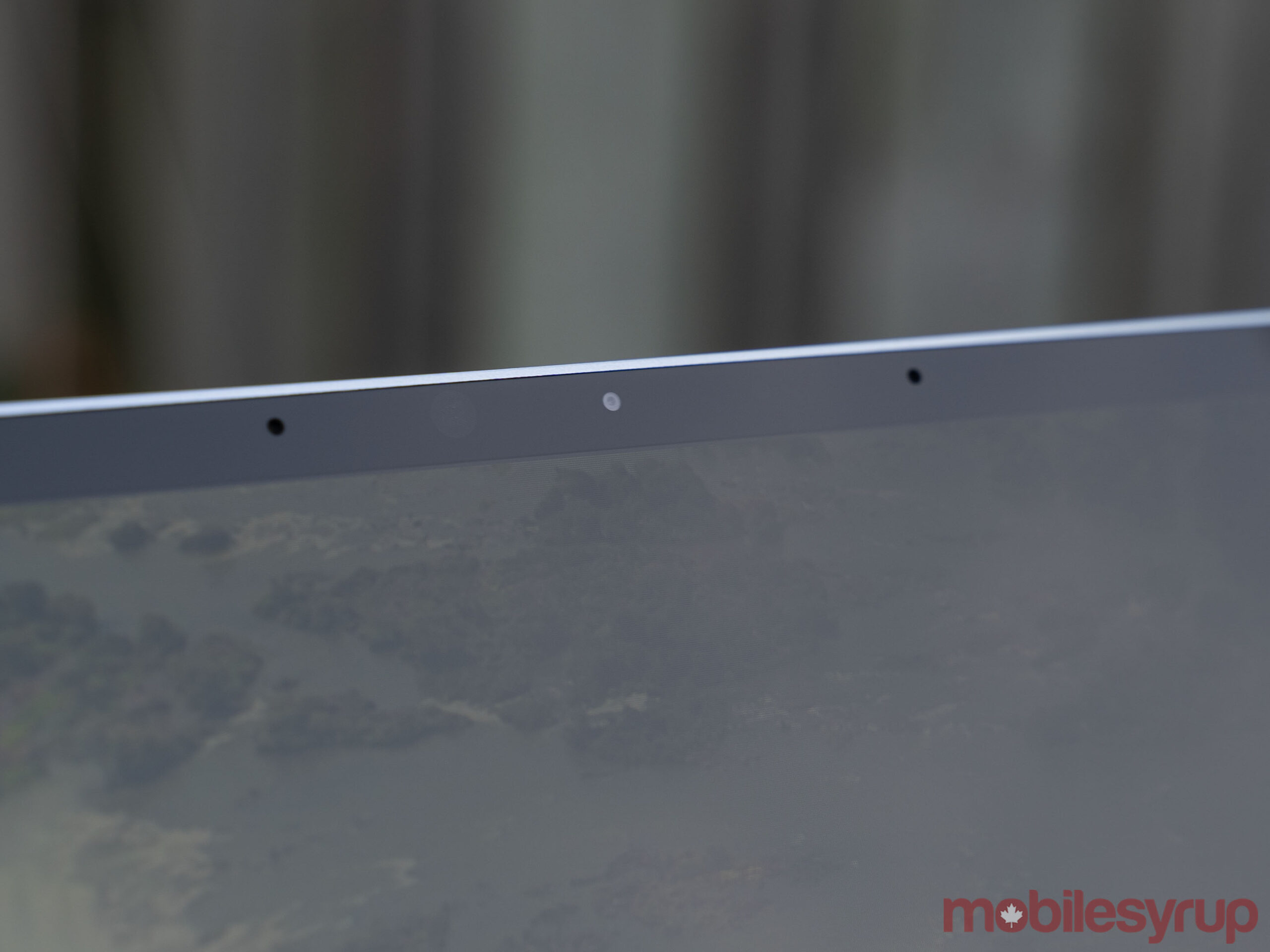
  • Camera: 720p HD f/2.0 front-facing camera
  • Operating System: Windows 10 Home in S Mode
  • Battery: Up to 13 hours of “typical device usage”
  • Connectivity: Bluetooth 5.0, Wi-Fi 6
  • Sensors: Ambient light sensor
  • Ports: 1x USB-C, 1x USB-A, 3.5mm headphone jack, 1x Surface Connect port
  • Graphics: Intel UHD graphics

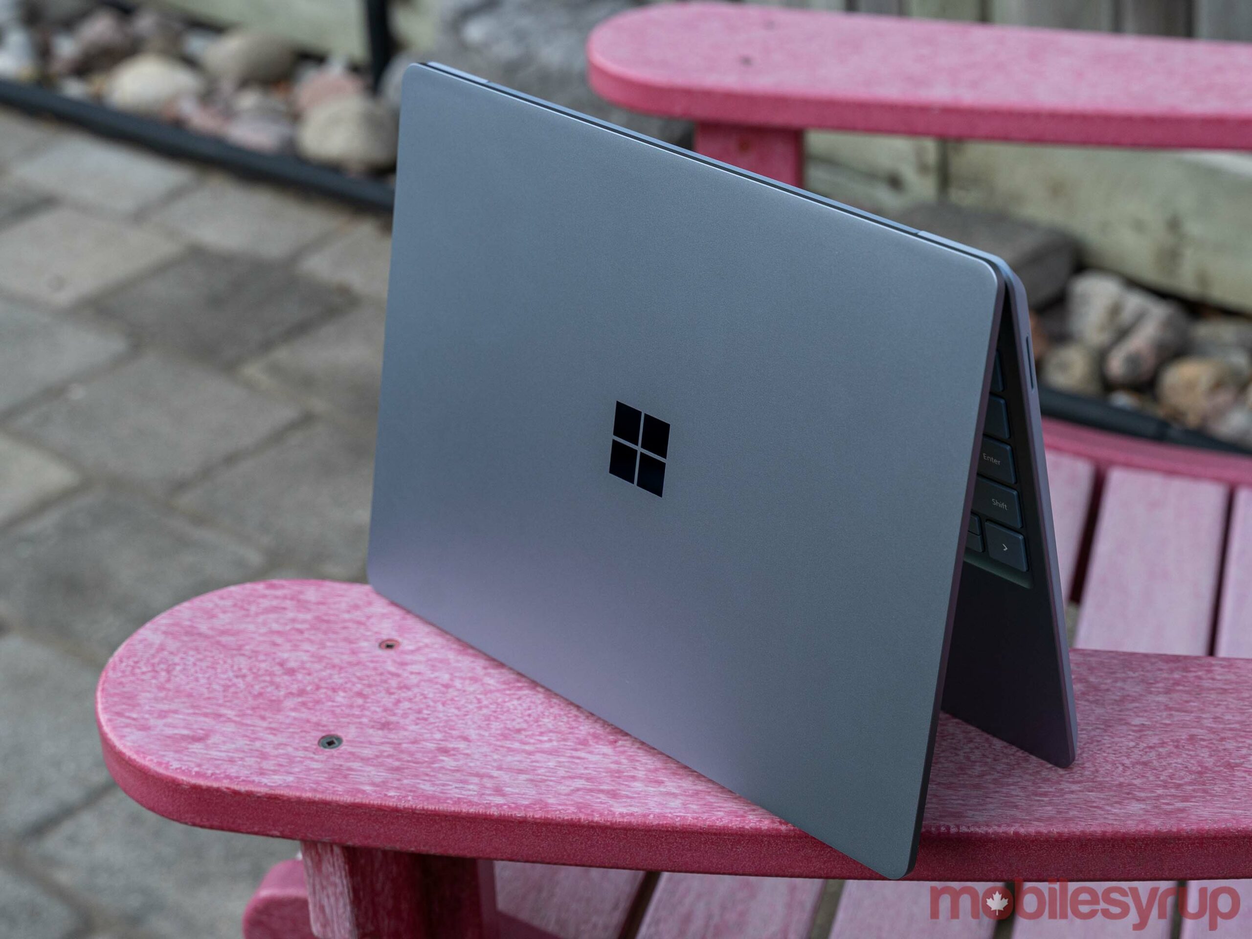
Tiny laptop, great design

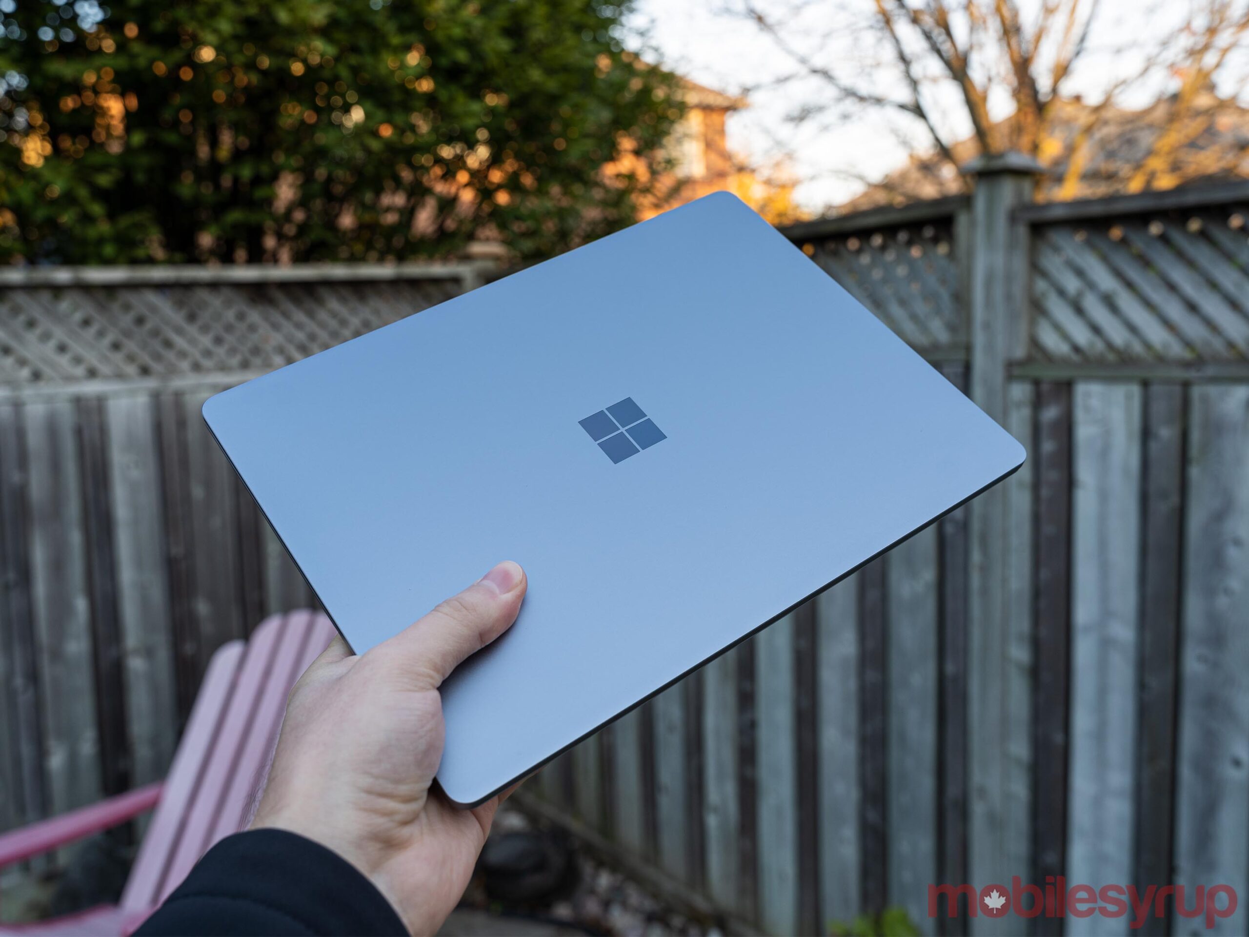
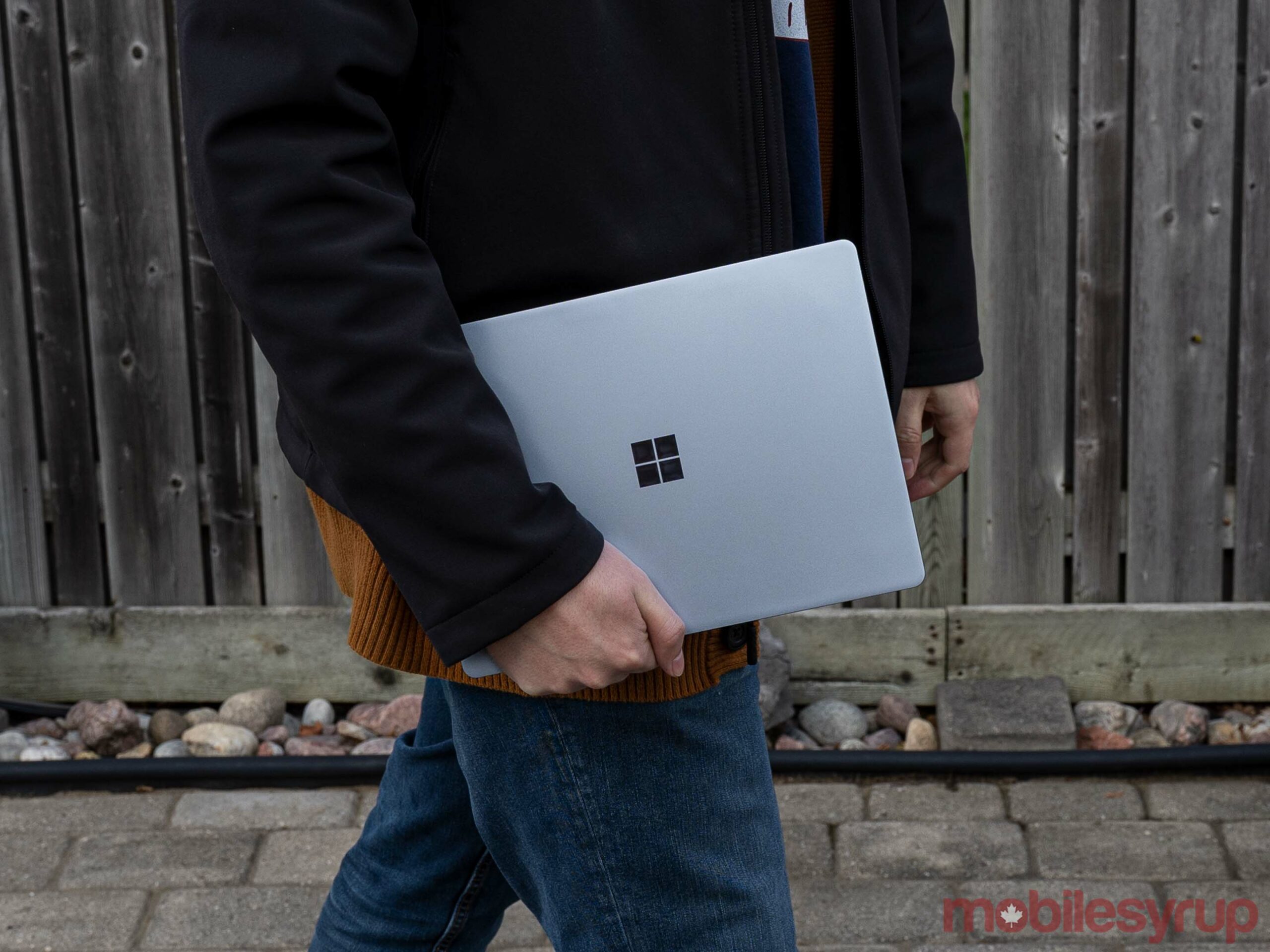
When I saw the box the Surface Laptop Go came in, I was excited. It was smaller than other Surface packaging, hinting at the sleek laptop within. Once I pulled the Ice Blue Laptop Go out of the package, I was even more impressed.

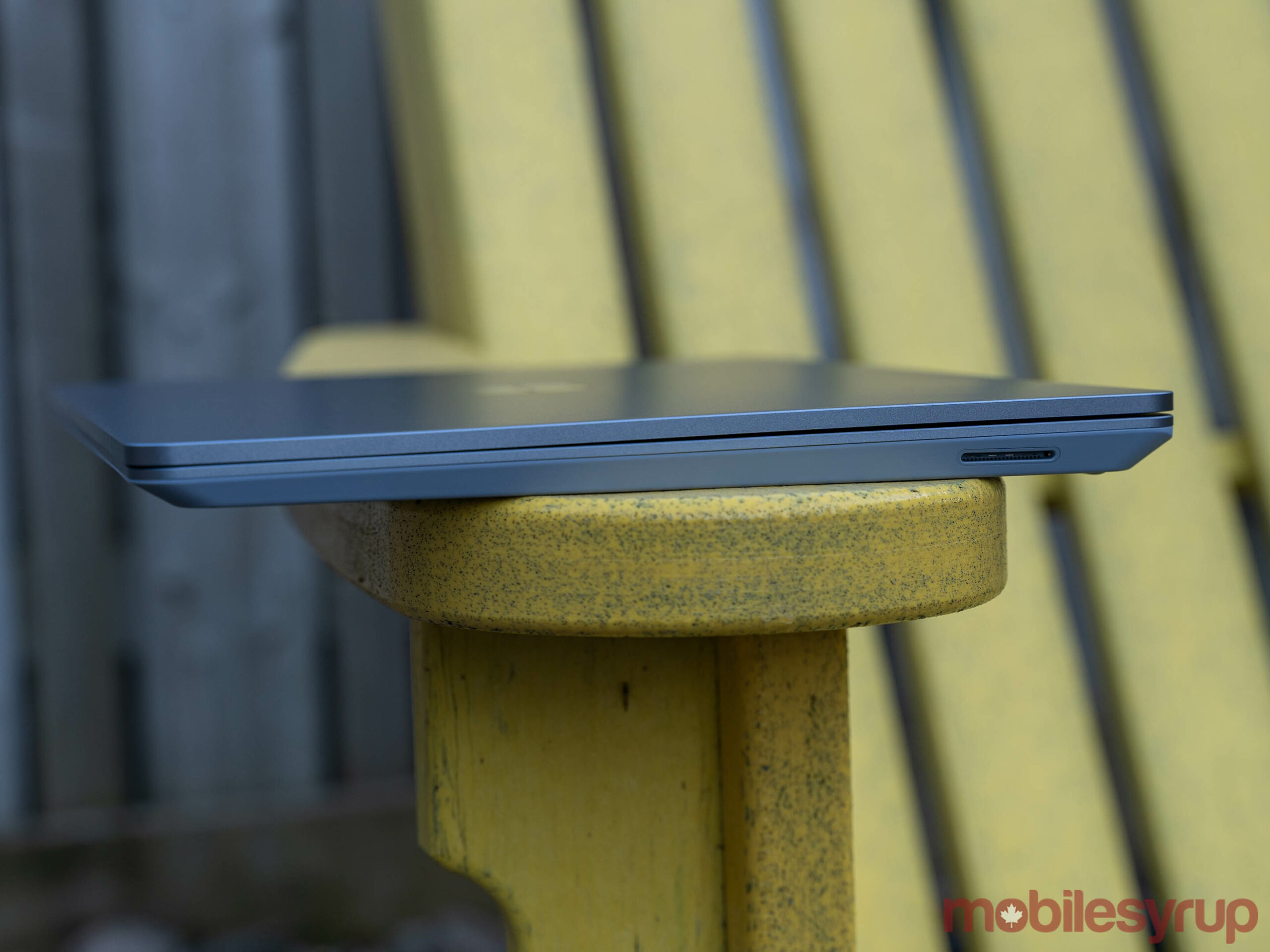
Despite being a relatively minuscule 12.4-inches (which isn’t that much smaller than the 13.5-inch Surface Laptop), the Laptop Go is remarkably sturdy. Typically with smaller, lower-cost laptops like this, manufacturers cut costs with build quality and you end up with flex in the display or body.

That’s not the case with the Surface Laptop Go, which feels surprisingly premium — even with the plastic base. The lid and the top of the laptop around the keyboard are aluminum, but Microsoft says it used a plastic resin made with 30 percent glass fibre and 40 percent recycled material for the underside of the laptop. However, it feels really nice and other than looking a bit odd next to the aluminum, doesn’t significantly detract from the experience.

In many ways, the Surface Laptop Go feels a lot like Apple’s discontinued 12-inch MacBook, although not quite as sleek and certainly more powerful.

The Laptop Go is pleasantly light and the size makes it incredibly portable. With the excellent build quality, I’d have no issue tossing this in a backpack and taking it on the go. While the pandemic has kept me at my home office for a while, I could easily see this being an ideal travel laptop.

Mediocre screen manages not to ruin the experience

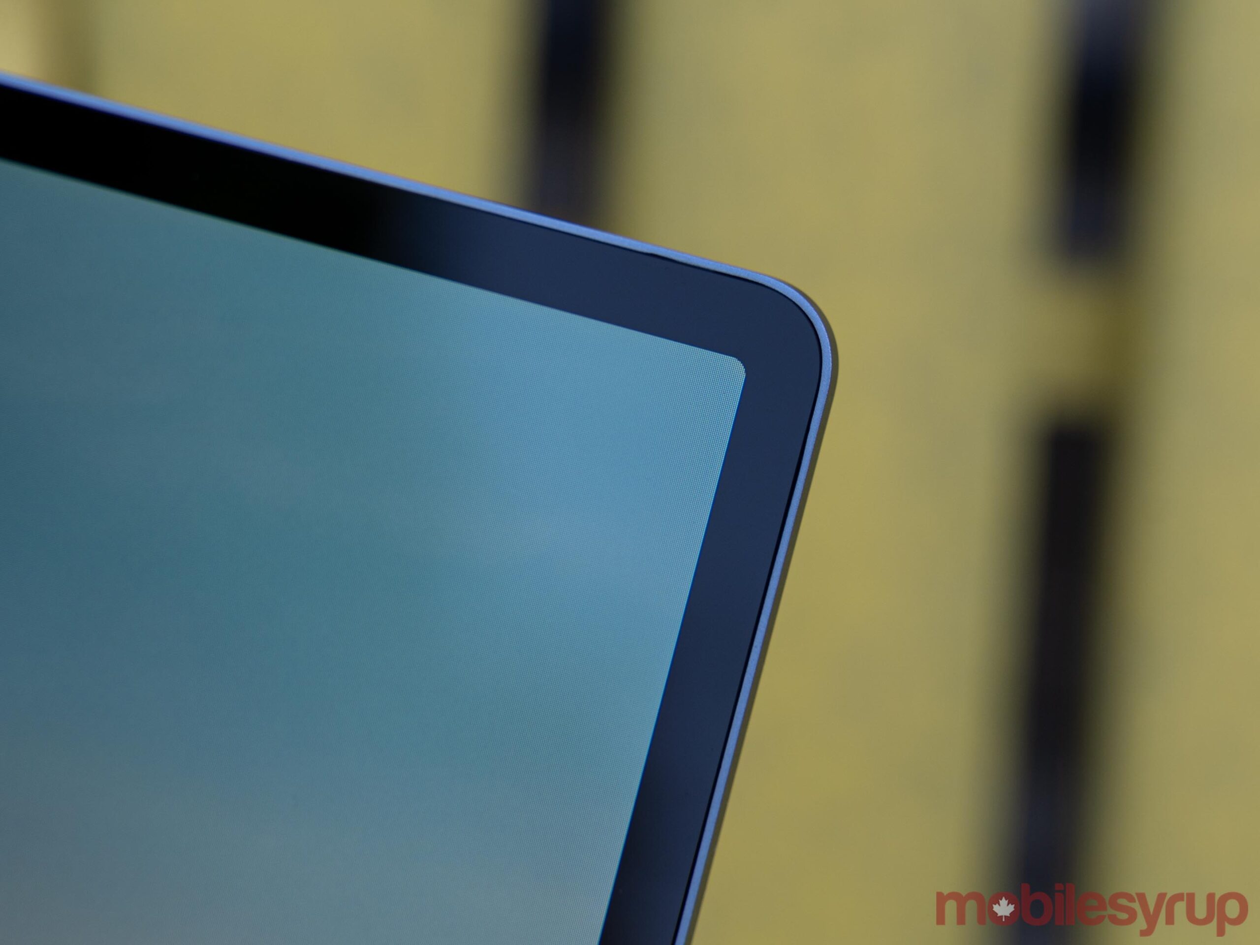
While the overall design of the Surface Laptop Go is excellent, some aspects aren’t quite as good. The display, for instance, is a misstep on Microsoft’s part, albeit not enough to ruin the whole experience.

The best way to describe the Surface Laptop Go’s display is mediocre. Colours looked fine, but the resolution is incredibly disappointing. I had hoped that at this price point Microsoft would include at the very least a Full HD+ display. Unfortunately, Microsoft opted for a sub-par 1536 x 1024 pixel screen instead.

While it looks okay when you’re using the Laptop Go on your lap or on a desk, moving the screen slightly closer than a normal viewing distance quickly reveals the pixels.

Another oddity with the display is that Microsoft opted to round the corners on it. The company seems to be following the recent trend with smartphones that has seen the wide adoption of rounded corners. Unfortunately, the rounded corners look out of place with Windows 10, which itself is almost entirely made up of squares, rectangles and other elements with 90-degree corners.

I have no issue with the rounded corners themselves other than that the low-res display makes them look jagged instead of smooth. They just look out of place on Windows. Part of the reason rounded corners work on smartphones is that both iOS and Android feature user interface elements with rounded corners, which ties together the software and hardware. That’s not the case here.

One upside to the low-res display is that it helps with battery life, which I’ll dig into more in a bit. However, I would love to see a better display on the Laptop Go, especially with the higher-end models that come very close in price to the Surface Laptop 3, which has an incredibly crisp and vibrant screen.

Ultimately, the display is fine for the Laptop Go, but a disappointment when you consider the cost of the device.

Handles the basics well

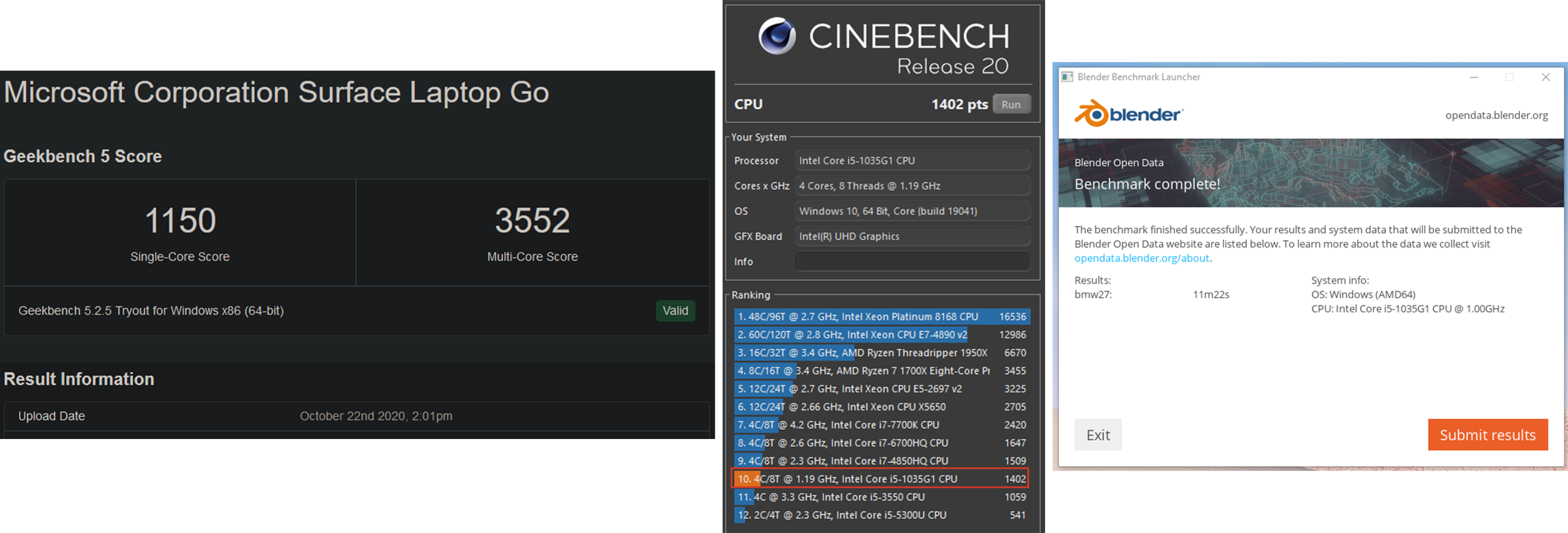
When it comes to performance, the Laptop Go isn’t exactly a powerhouse. It uses an older Intel i5-1035G1 processor instead of one of the new 11th Gen CPUs (likely in an effort to keep costs down). It’s also got Intel’s old UHD graphics instead of the impressive new Xe graphics available on the 11th Gen chips.

I don’t put much stock in benchmarks as they often don’t tell the whole story, but they can be a useful tool for providing a general idea of what performance is like. With that in mind, I ran a few CPU-oriented benchmarks on the Laptop Go. In Geekbench, the Laptop Go managed a reasonable 1150 single-core score and 3552 multi-core score. On Cinebench, the Laptop Go managed a low score of 1402, while the Blender ‘bmw27’ benchmark took 11 minutes and 22 seconds to complete. None of these numbers are particularly impressive, but considering that the Laptop Go is a small, portable laptop, these scores aren’t terrible either.

In short, benchmarks show the Laptop Go performing slightly below what you’d see on a Surface Laptop 3 or Pro 7 with an i5-1035G7 or i5-1035G4 processor respectively. However, it’s important to note that both the Laptop 3 and Pro 7 can be equipped with i7 CPUs and more RAM, which can help boost performance.

Benchmarks aside, the Laptop Go works fine. In my use, which involved opening a ton of tabs and editing some photos in Photoshop, it handled everything well. I’d get the odd stutter while scrolling around, but it was never problematic.

Things got a little dodgy when running Photoshop, however. At one point with a solid 15 browser tabs open alongside Photoshop, the 8GB of RAM just wasn’t enough to go around. My browser began clamping down on unused tabs and stopping those processes to save memory. When I returned to those tabs, it took a while to get back up and running. It’s important to note that this is intended behaviour when memory usage is high, so I’m not surprised to see it. However, I do wish that Microsoft offered a Laptop Go version with 16GB of RAM precisely to help with this scenario.

Since the Laptop Go is aimed more at students or people who now find themselves working remotely, most people who get a Laptop Go will likely use it primarily for browsing the web or using software like Microsoft’s Office Suite. I doubt most users will push it as hard as I did, and few will run into the same issues as me.

The laptop definitely doesn’t have the chops for gaming either, so anyone wanting to game on the Go should look elsewhere.

With that in mind, those who use Microsoft’s Edge browser will likely find the performance optimal. Other browsers aren’t quite as effective on the Laptop Go in my testing, but still very capable as long as you keep your tab count down.

S Mode returns

Like the Surface Go 2 I reviewed earlier this year, the Laptop Go runs Windows in S Mode out of the box. In short, this means Microsoft locks down Windows so you can only use software from the Windows Store.

On the one hand, S Mode is a helpful option, say for those who aren’t computer savvy, as it can protect against unsafe downloads and installations by blocking everything not from the Microsoft-vetted Store. This is ideal for grandparents who need a laptop but may not need or want all the extra stuff, or perhaps for kids who just need the basics for schoolwork.

An extra bonus this time around is that, unlike the Go 2, the Laptop Go arrived with Microsoft’s new Edge browser installed. When I review the Go 2, I couldn’t use the much-improved Chromium Edge without switching out of S Mode, which seemed like a cruel joke. At least now those who want to stick in S Mode have access to a modern browser that’s actually really good.

For the majority of people though, one of the first things you’ll do is turn S Mode off. That’s how it went for me — I went to download my browser of choice and was promptly sent to the Microsoft Store to switch from S Mode. Although you have to do it from the Store, it’s worth noting that switching from S Mode to regular Windows 10 is free. Once you switch, you can’t go back, but chances are if you’re making the jump to regular Windows 10, you don’t want to go back anyway.

Decent battery life for a tiny PC


In short, I found the battery life to be fine for what the Laptop Go is. In my testing, I hit about four and a half to five hours on average with fairly heavy use (10+ tabs open and Photoshop).

Granted, I elected to run the Laptop Go on the ‘Better performance’ setting accessible from the Battery icon in the taskbar. It gives four performance options ranging from ‘Best battery life’ to ‘Best performance.’ The default setting is ‘Recommended,’ just one step up from ‘Best battery life.’

While the Recommended setting was adequate most of the time, I found I was able to get much better performance just by bumping it up to the Better performance setting without a significant hit to battery life (Recommended kept the laptop going for more than five hours). Likely, you can play with these settings yourself to get the ideal balance of performance and longevity. I recommend using the Better performance setting when unplugged. Also, make sure you change the setting when the Laptop is plugged in — by default, Microsoft strangely set the Laptop Go to run at the Best battery life setting when charging.

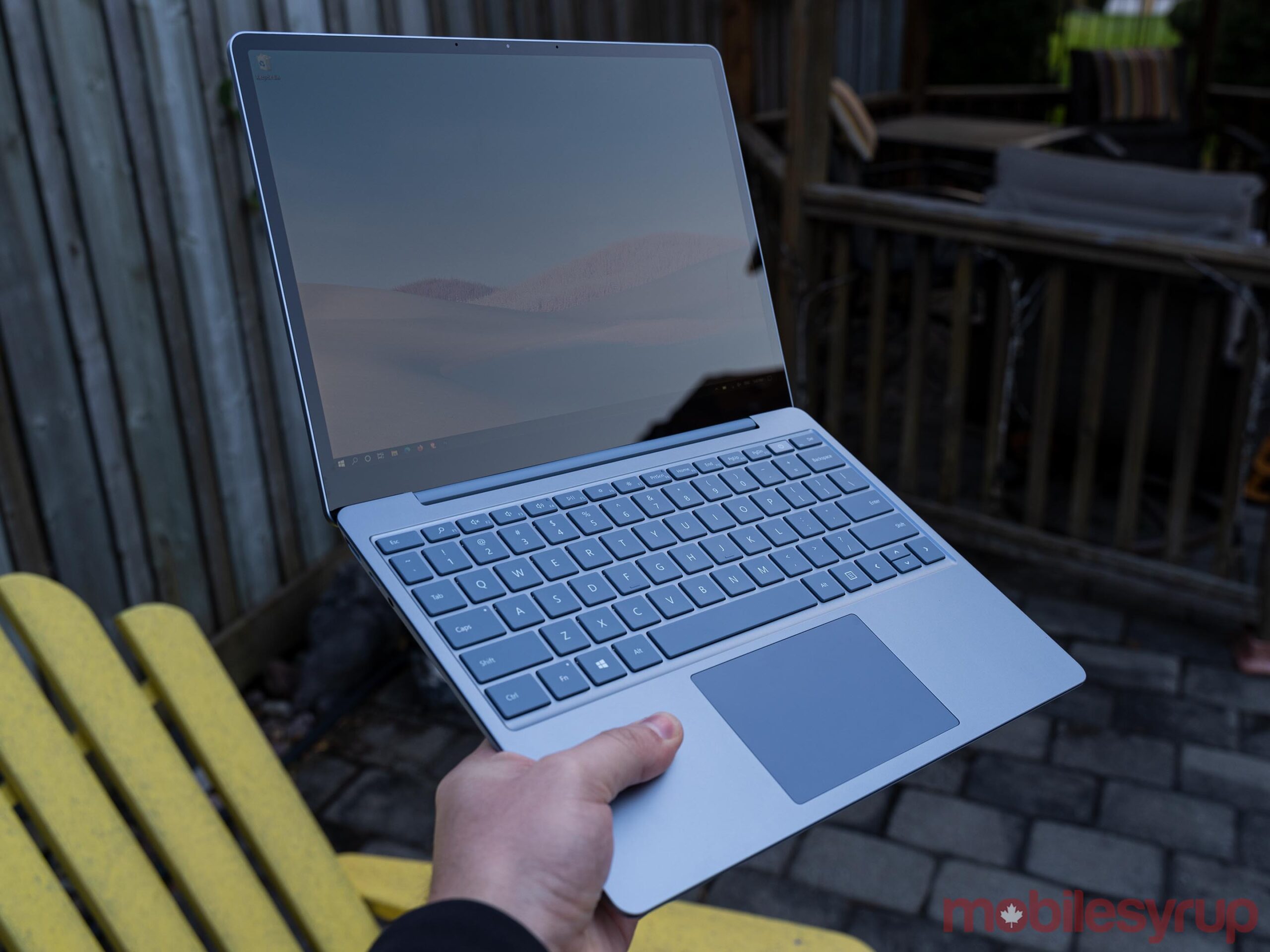
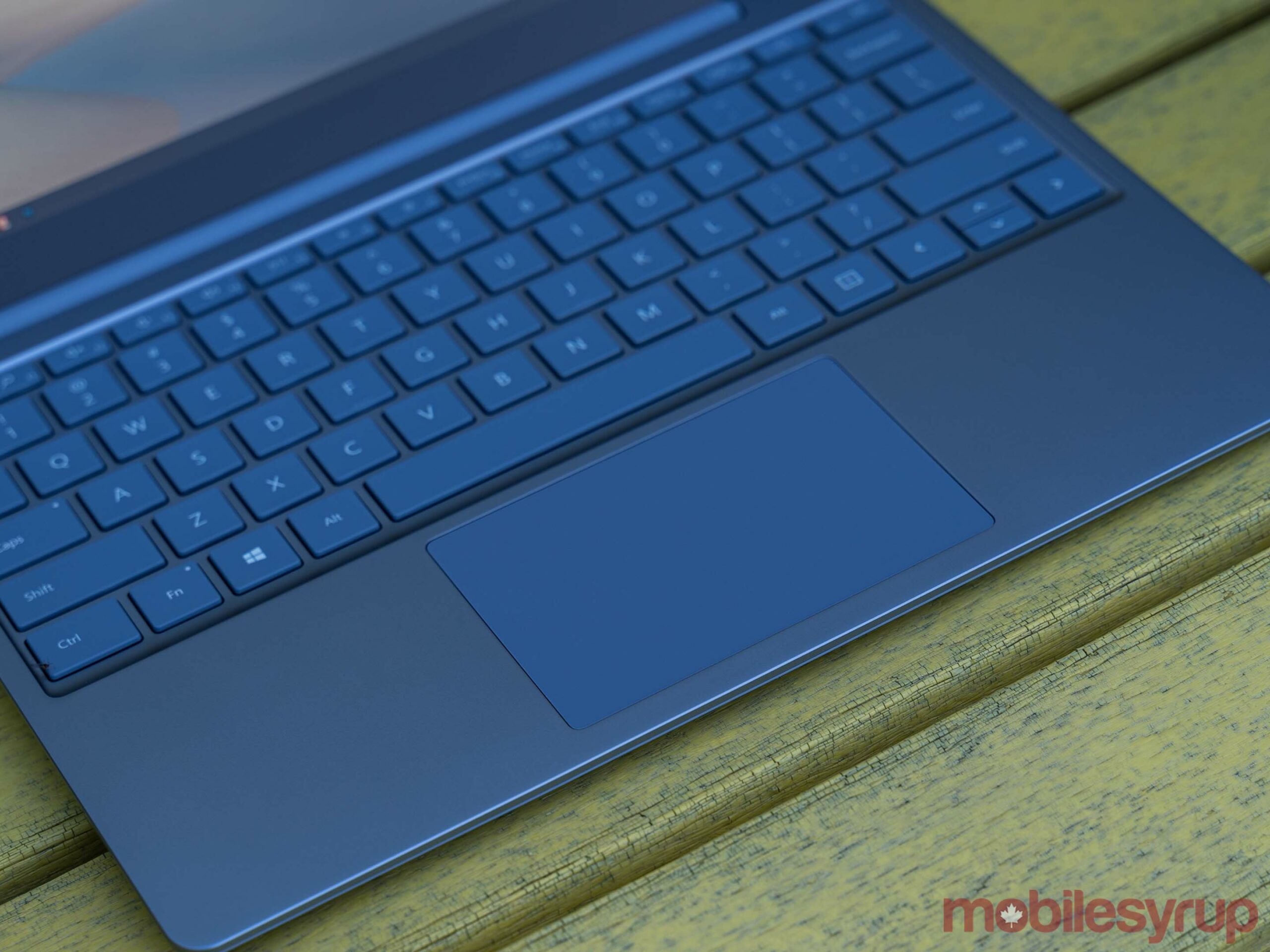
Microsoft remains the best when it comes to keyboards

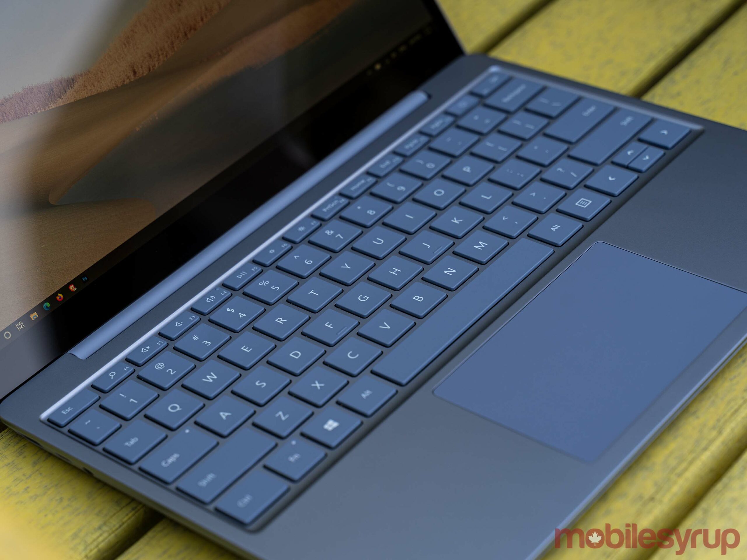
Nothing compares to my mechanical keyboard, but it’s unfortunately not as portable as I’d like. When I do have to suffer with a laptop keyboard, however, Microsoft continues to prove it’s the best around.

Typing on the Surface Laptop Go is an absolute joy and is almost enough to save the other aspects of this laptop.

The keyboard is tactile without being loud — I’m a fan of very clicky boards, but those who work near me most certainly are not, and they welcome the near-silence of the Laptop Go compared to my normal racket.

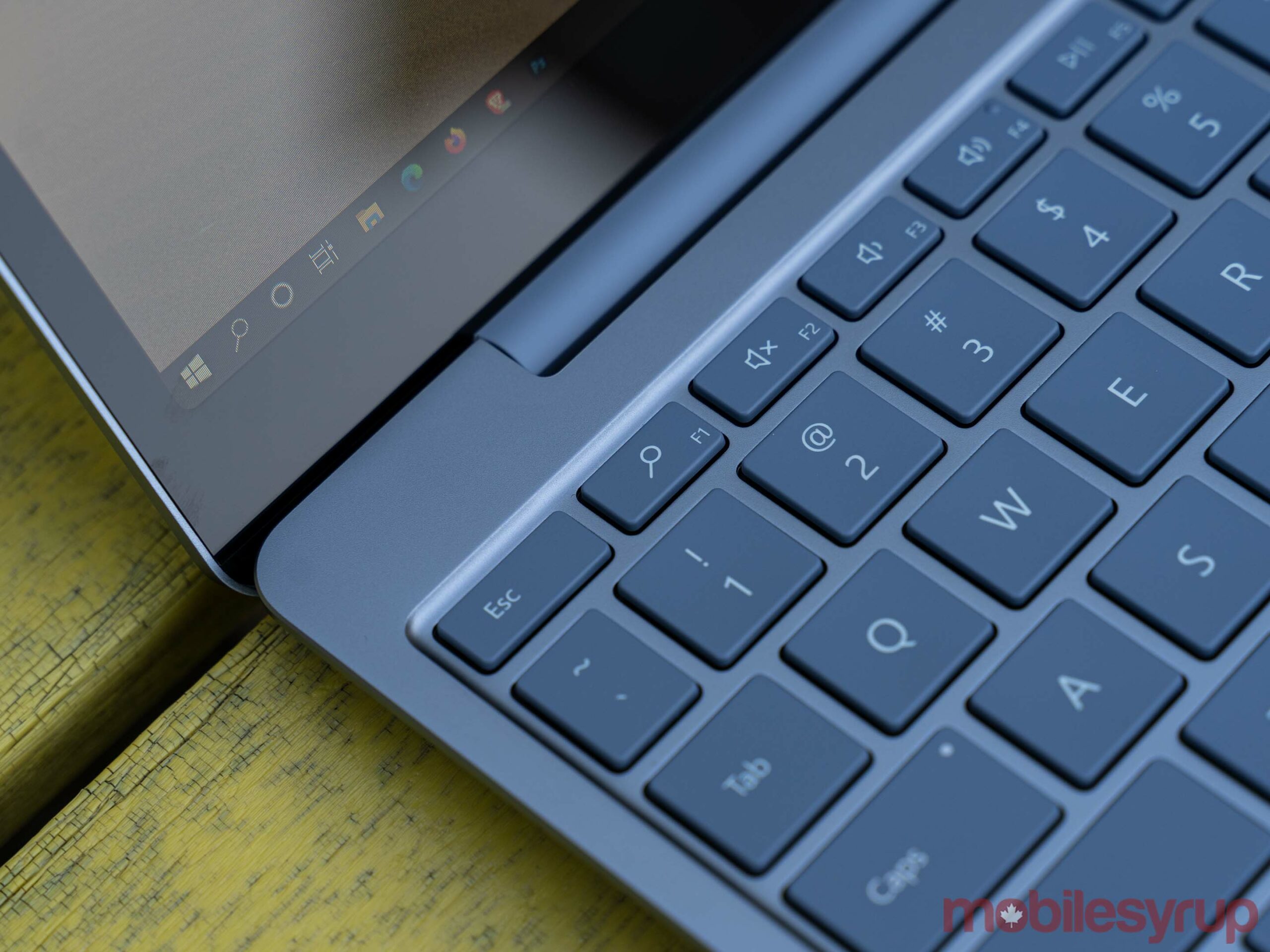
As good as the keyboard is, I do have two small issues. First, there’s no keyboard backlight. This won’t be an issue for people until they try typing in a dimly lit room, but it’s worth knowing in case you need to do that often.

The Laptop Go sports a dedicated ‘Search’ key as well, but it’s entirely redundant since you can tap the Windows key and start typing to initiate a search as well. I’m sure Microsoft could have come up with something else to put in its place that added functionality.

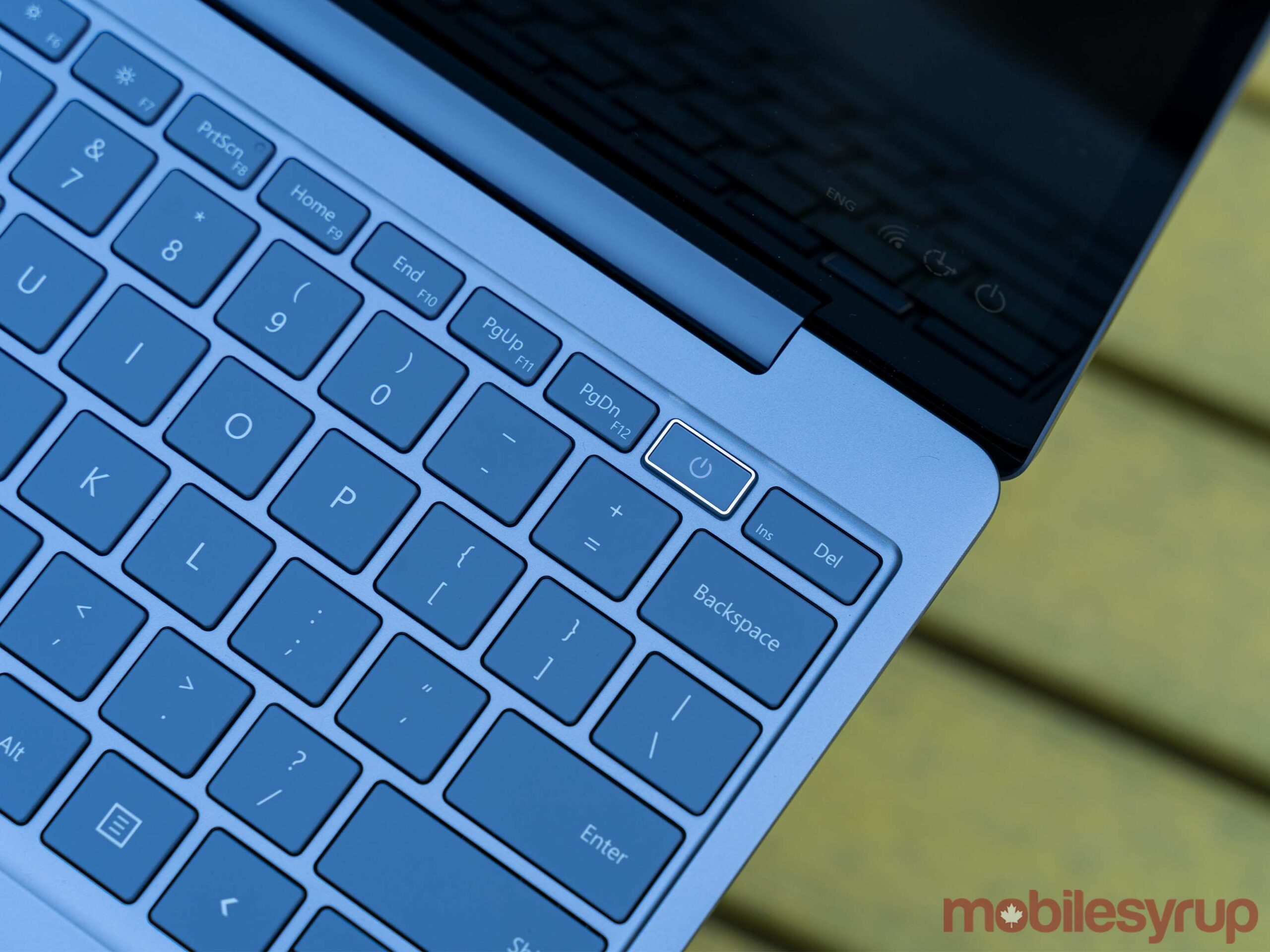
Microsoft also managed to get an excellent trackpad into the Laptop Go, which came as a surprise to me. While it’s a bit small for my taste, there also isn’t much room for anything bigger so it works. It’s incredibly smooth and responsive — honestly, I didn’t enjoy using the Surface Laptop 3 trackpad this much.

It’s not as good as what Apple includes on its MacBook laptops, but the Laptop Go is very close to matching the MacBook in this area.

Finally, the keyboard includes one key that looks quite different from the others: the power key, which also happens to contain a fingerprint scanner. While not quite as fast or convenient as Windows Hello face recognition, the fingerprint scanner works well and is a great, quick way to securely sign in to your laptop.

My only real gripe with the scanner is it looks incredibly cheap compared to the rest of the laptop.

Surface Laptop Go is almost perfect

I really want to love the Surface Laptop Go. It’s so close to being perfect for me. It’s lightweight and extremely portable. It has some of the best keyboards and trackpads I’ve used on a Windows laptop. It looks way more premium than it is. I can even forgive the sub-par display, but for the price, the corners Microsoft cut just aren’t acceptable.

Acer has an Aspire 5 laptop available at Best Buy Canada with the same or better specs as the top Laptop Go configuration. The biggest difference? Price. The top-level Laptop Go clocks in at $1,299.99 in Canada for an i5, 8GB of RAM and a 256GB SSD. The Aspire 5 cost about $800, making it slightly more than the base-level $759.99 Laptop Go with the same i5, 4GB of RAM and 64GB of eMMC storage.

As much as I love the Laptop Go, I can’t justify the cost and honestly, you shouldn’t pay as much as Microsoft is asking for a laptop like this. The $759 base model should be the price for the mid-tier $959 model and it should have at the very least a FHD+ display. If you’re looking at the Laptop Go and considering the $1,229 model, just do yourself a favour and get the base level Surface Laptop 3 for $1,349 — the faster processor and better screen are well worth the extra $120.

At the time of writing, a sale on the Microsoft Store also made the Surface Pro 7 with a faster i5, 8GB of RAM and 128GB of storage (plus the extra money for the Surface Type Cover attachment) about $30 cheaper than the top-level Laptop Go configuration.

Frankly, the pricing is the most disappointing part of the Laptop Go. There is almost no reason to spend this much money on what the Laptop Go offers. Anyone looking to get something similar can find a cheaper, better version from another PC-maker like Acer.

The post Surface Laptop Go Review: Best mini laptop you shouldn’t buy appeared first on MobileSyrup.