Shared posts

12 Aug 15:25

How we live now – 2: Information is Transportation

by pricetags

The most useful app I found recently – Transit App (thank you, Daily Scot) described here – is now even more useful.  Almost from the day Mobi launched, the app had the docking stations marked, with the number of bikes and available racks immediately evident.

App 2

Plus Car2Go locations and reserve options.   Plus bike routes in addition to transit lines, with the next bus shown in real time.

The layering is the thing: practically all the choices I need to navigate the city, seamlessly integrated on one interface.

That explains this:

Times

Letter here.


12 Aug 15:25

Review of the Computer Boys in Digital Humanities Quarterly

by nathanen

Somehow I missed this review of The Computer Boys Take Over in the Digital Humanities Quarterly.  Here is the money quote praising the book:

Nathan Ensmenger’s book is an impressive and engrossing historical work. He brings the crises and the peopling of computer programming alive. His historical artifacts become characters and a full picture of what this heterogeneous history looks like emerges. He adeptly weaves together competing voices in history with competing personalities to leave us with this haunting and antagonizing last line, echoed from the rhetoric of programming as created by the history: “almost thirty years after the NATO Conference on Software Engineering many programmers are still concluding that ‘excellent developers, like excellent musicians and artists, are born, not made'” [243].

But as tempting as it is to only highlight the positive from this review, I was also intrigued by the author Trisha Campbell‘s biggest critique:

And therein lies my only problem with the book, and it is my same problem with many academic books; the thing is socially constructed and the pages of the text helped us get there, but how do we build from this heterogeneity. Is there a method? Perhaps this will be Ensmenger’s second book.

Alas, I suspect that it will take me longer than that (and perhaps a couple more books) to figure this one out, but I increasingly share Campbell’s call to make the theory of social constructivism more practically applicable.   One of the welcome benefits of having moved from a  history of science program to a School of Informatics and Computing is that I interact more regularly with scientists and technologists.  When I am talking with fellow humanists and historians it is (too) easy to wave away challenging questions by invoking theory; with practitioners, I have to work more to make myself clear, to figure out what I actually mean, and to be relevant.  This is a good thing.


12 Aug 15:24

Dangerous S-Curves Ahead!

by nathanen

The much-hyped and controversial website Vox.com (“Its mission is simple: Explain the news”) has been taken to task for a recent article claiming that the speed of adoption of new technologies has been speeding up. They have been criticized not only for their uncritical and misleading use of data, but also the way in which they approached the process of making corrections to the original article.

The actual claim made in the Vox.com piece about the supposed accelerating pace of technology is not at all original. In many ways, it would be hard to find a more conventional piece of “wisdom.” It is true that their reliance on Youtube videos allegedly showing how children today cannot figure out what a Sony Walkman might be for is particularly anecdotal (“kids say the darndest things!”), but if you were to ask the proverbial man or woman on the street about technology this is pretty much exactly what they would say.

The Vox.com article is a prime example of what I teach my students about the dangers of the “s-curve.” The s-curve has become something of a cliche in pop-economics writing about the history of technology.

Here is the basic form (and premise) of the s-curve graph (adapted from a recent lecture in my Information Society course):

w10b-Myth4-GUI Revolution.005

The idea is that the adoption of a novel technology often starts slowly, then accelerates rapidly as the technology gets perfected, and then tails off as the technology becomes mainstream.  The “fact” that the length of these s-curves are getting increasingly shorter is the premise behind many a “technology is driving history” argument — including the recent one made by Vox.com.

w10b-Myth4-GUI Revolution.004

The problem, of course, is that by fiddling with dates, scale, or detail, you can fit any technological phenomenon into a convenient s-curve.

Consider for example this illustration of the adoption of electric-car technology:

test.001

In the surface, this seems to capture the s-curve phenomenon neatly.

But let us provide a more historically-accurate graph of electric-car ownership in the 20th century, which actually looks more like this:

w10b-Myth4-GUI Revolution.028

The really interesting phenomenon here is how popular electric cars were in the early decades of the 20th century.  Here is a close view of that period.  Notice that ownership peaks at about 1920.

w10b-Myth4-GUI Revolution.030

Here is a picture of an Edison manufacturer electric car from this period

w10b-Myth4-GUI Revolution.023

and, just for fun, a picture of Colonel Sanders standing next to his electric car

w10b-Myth4-GUI Revolution.024

The point is that these vehicles were popular.  It was only a combination of social changes (electric cars get gendered female — they become known as “chick cars,” so to speak), technological innovations, political changes (cheap oil!), etc., that gasoline powered vehicles become standard. [For more on this history, see David Kirsch’s The Electric Vehicle and the Burden of History]


w10b-Myth4-GUI Revolution.041

If we overlay a graph of the adoption of hybrid gas-electric vehicles onto this history, we can begin to explain the resurgence of electric vehicles in the early 21st century.  (Again, the explanation is social, political, and technological).

w10b-Myth4-GUI Revolution.029


Finally, we could overlay all of this with an s-curve that seems to neatly capture the phenomenon.  But this would provide an entirely false picture of the history of the electric car, and would suggest a coherence to the s-curve model of technological adoption that is entirely inconsistent with reality.   The story of the electric car is not one of gradual (albeit slow) transformation from niche to mainstream technology.   The s-curve does not fit.


w10b-Myth4-GUI Revolution.027

So how does this relate the the Vox.com article?

Depending on how you chose your endpoints, you can always construct a picture of accelerating adoption.  Take for example the curves associated with various music reproduction technologies:

w10b-Myth4-GUI Revolution.011

This seems to support the idea that the adoption period of the iPod was much shorter than that of the phonograph. This is probably true.    But what does it tell us?  If we think more broadly about the underlying phenomenon, which is music reproduction, we get a different story.w10b-Myth4-GUI Revolution.013

Yes, consumers took to the iPod much more quickly than the Sony Walkman. But this is because the Sony Walkman had already done all the work — social, economic, etc. — that accustomed people (and music publishers) to the idea of portable, mass-reproduced popular music.  And the Sony Walkman in turn was building on decades of work — again, social, economic, and legal — that had already changed the way in which Americans consumed music.  What do you think was the more revolutionary moment of technological change?  When you upgraded your Walkman to an iPod?  Or when your grandparents first heard recorded music on a phonograph?   It seems pretty clear to me that the latter was the much more significant (and disruptive) experience.

How does this relate to the history of computing?  My lecture on “dangerous s-curves” was created specifically to talk about the adoption of electronic digital computing technology, and in particular the personal computer.   It is easy to interpret the history of the PC as a part of a “changing pace of technology” argument — but only if you ignore the many decades of technological and social work that went into create the tools, user-base, and technologies (particularly software) that made it easy to adopt this “new” technology.


w10b-Myth4-GUI Revolution.046


The s-curve for “computing” subsumes a number of related but quite different curves (and technologies) that cover the rise — and fall — of the main-frame and mini-computer.   The PC was not just the latest in a series of developments in computing.  In many ways, it came out of a very different technological trajectory.

The point is, again, that you can force this history into a s-curve that supports whatever argument you want about the course and pace of technological development.  But to do so conceals much more than it  reveals.


12 Aug 15:24

Skill in Epistemology

files/images/body_of_knowledge.jpg


Carlotta Pavese, PhilPapers, Aug 14, 2016


Carlotta Pavese has authored a couple of decent papers on the notion of knowing as a skill (Skill and Knowledge, Skill and Know-How) forthcoming in Philosophy Compass and located in PhilPapers. They won't transform your understanding of knowledge, but they raise questions around what might be called the 'intellectualization' of a skill. For example, we say Robin Hood (a good archer) hit the target because he did the proper things,  while the Sheriff of Nottingham (a poor archer) hit the target only because of luck. The enumeration of 'the proper things' is an 'intellectualization', and may or may not actually explain why Robin Hood hit the target. There are many ways to acquire and instantiate a skill, and indeed, there are skills where we could not possibly 'know how' - perceptual skills, for example. So if knowing is a skill, what does this tell us about knowing? Image: from Google Images, derived and corrupted from here.

[Link] [Comment]
12 Aug 15:24

What’s Up with SUMO – 11th August

by Michał

Hello, SUMO Nation!

How have you been? We missed you! Some of you have gone on holidays and already came back (to the inaudible – but huge – relief of the hundreds of users who ask questions in the forums and the millions of visitors who read the Knowledge Base). Let’s move on to the updates, shall we?

Welcome, new contributors!

  • … who seem to be enjoying summer away from computers… The way they should! So, no major greeting party for anyone this week, since you’ve been fairly quiet… But, if you just joined us, don’t hesitate – come over and say “hi” in the forums!

Contributors of the week

Don’t forget that if you are new to SUMO and someone helped you get started in a nice way you can nominate them for the Buddy of the Month!

Most recent SUMO Community meeting

The next SUMO Community meeting

  • …is happening on the 17th of August!
  • If you want to add a discussion topic to the upcoming meeting agenda:
    • Start a thread in the Community Forums, so that everyone in the community can see what will be discussed and voice their opinion here before Wednesday (this will make it easier to have an efficient meeting).
    • Please do so as soon as you can before the meeting, so that people have time to read, think, and reply (and also add it to the agenda).
    • If you can, please attend the meeting in person (or via IRC), so we can follow up on your discussion topic during the meeting with your feedback.

Community

Social

Support Forum

Knowledge Base & L10n

Firefox

  • for Desktop
    • …or the Desktop side…

…what a quiet ending to this post, I hope you did not fall asleep. Then again, a siesta on a hot summer day is the best thing ever, trust me :-). Keep rocking (quietly, at least in the summer) the helpful web!

12 Aug 15:24

Never Surrender

by Eric Karjaluoto

I’m a sneaky dad. For example, a few weeks back, I tricked my kids into exercise. I had them race one another across a field. Ari (who’s 7) is almost as fast as his brother, Oscar (who’s 9). For a good while, it was fun for both of them.

That said, Oscar still has an edge over his younger brother. Albeit tiny, it was enough to unnerve Ari. Once he fell a step behind, Ari threw himself to the ground. In histrionics typical to my boy, he turned red, made a horrible expression, and then wailed about how unfair the race was.

I don’t like playing into these sorts of outbursts. I could be mistaken, but I think doing so takes something away from my kids. Instead, I (sort of) gave him shit. “Why are you acting this way?” I asked. Then I explained that he had only been a step behind. Should he have kept going, his brother might have slowed or tripped. Ari could have won that race, but in thinking he might lose, he lost.

Ari will beat his brother in a running contest, at some point. He’s a fast kid. In fact, I bet he could win such a contest right now, if he decided he wanted to—and just didn’t stop. I can remind him of this, but that’s as far as my influence extends. The rest is up to him. He’ll have an opportunity to win, once he decides to take it.

Not long after, I had a tough day. You know the kind… when no matter what you do, it feels like you can’t gain any ground. It’s on those days that I imagine myself as Shelley Levene, in Glengarry Glen Ross: that washed-up old coot whose time has passed. I wonder if what I’m doing is worthwhile, and ask myself why I even bother. I’m a joke. A fake. An imposter.

Sometimes I give in to such thoughts, This time, though, I gave myself shit—like I did to Ari, out on that field: “Why are you acting this way? You might only be a step behind. If you keep going you might make it, but if you believe you’ll lose, you’ve already lost.”

If you make things, you know how easy it is to quit. You encounter a lot of resistance when you build something new—and even more when you try to build an audience for it. Hans and I talk about this in our two most recent episodes of The Kerfuffle: The Idea Machine and Bringing Home the Bacon (which we released today).

If you’ve read my blog before, this article might sound familiar territory. At this point, I’ve likely written a half-dozen variations of this same post. I keep writing it, though, because I know that as a maker, you’ve felt the same way at some point. And some days, you’re probably not equipped to give yourself shit, when you need to be reminded to not give up.

So, I’ll do it for you:

Keep going… You just need to keep going. The world needs what you’re making. And if you stumble, you can start over. But whatever you do, don’t let your doubt stop you.

And now, because I can’t resist:

12 Aug 15:23

The Best Portable AC Power Supply

by Mark Smirniotis
portable-ac-power-top-chargetech-portable-power-outlet

If you want to power or charge a small, AC-based device such as a laptop when power outlets are out of reach, you should get the ChargeTech Portable Power Outlet (27 Ah). It’s essentially the same thing as a USB-only battery pack, but with higher capacity and an AC outlet. The ChargeTech stood out among the small models we tested because it offered the best balance of size, capacity, and price. About the size of a small hardcover book, it’s compact enough for you to carry it in a laptop bag, backpack, or carry-on, but it holds enough energy to completely charge a large laptop—or charge the smallest models two or three times over. If you need to power more than just a laptop or some other small device but a gas generator is out of the question, we like the Goal Zero Yeti 400 Solar Generator for its higher capacity and output, as well as its top-notch build quality—even if it’s too big and too heavy to lug around all the time.

12 Aug 15:23

Ascent From Social Media

I think it's time to move on from Facebook. Not to try to replace it, but to rather ascend from it, to get away from the bottom-feeders and think about new ways to connect with family and friends, new ways to cooperate with colleagues around the world.

, , Aug 11, 2016 [Link]
[Comment]
Share |
12 Aug 15:23

Multi-Mobi

by Ken Ohrn

Ubiquity in the transportation mix.

Here’s a Mobi doing the multi-mode thing on a bus rack.

Note that the clever rider has engaged the Mobi’s built-in cable lock in order to take advantage of the way it locks the front wheel into a turn.  You could swipe the Mobi off the bus rack, but you won’t be riding it away.

Multi.Mobi

Photo by Ari Nitikman (with thanks to occasional PT author Tanya Paz)

UPDATE from Tanya: 

The back story to the photo is that there was only the bus driver on that bus – no passengers. It was Not in Service.

Did someone leave it on the bus? I like the idea instead that the bus driver picked it up and will drop off the bus, then ride it home.


12 Aug 15:22

Simplenote Open Source

by Matt

The first-party premier Simplenote native apps for Android, iOS, and macOS are now fully open source. I’m very proud of the team for this, and excited that the broader Simplenote community can now see behind the scenes of how things are developing with the app, which remains one of my personal favorites across every platform. What’s Simplenote? It’s the easiest way to have your plain text notes synced instantly across every device and browser you use.

12 Aug 15:21

Putting The Community First…As Long As It’s Profitable

by Richard Millington

In my mid-teens, I spent a lot time at The Playing Fields.

The Playing Fields was a video gaming cafe in London. The Playing Fields loved their community. They loved their community so much that they let their best community members play for free.

Alas, letting your best customers play for free turned out to be a terrible business strategy. The business went bankrupt. No more freebies, no more community.

Almost every organisation at some level wants to make its community happy. And almost every organisation has to draw the line where they can do that profitably.

Let’s put free products/services for community members for life at one end of the continuum and completely ignoring the whims and wishes of members at the other.

You have to draw your line somewhere on that continuum.

How far are you willing to go to please your members? Sure, community members might ‘come first’…but if the company goes bankrupt making members happy then what’s the point?

The thing is, there’s usually far more cost-effective ways to please members than free stuff.

I don’t think we ever wanted to play for free at The Playing Fields. A freebie here and there might help, but we were much more interested in name recognition, a sense of status and influence. Each of these would have been much more cost-effective alternatives.

The magic isn’t identifying the things that the community will love and doing that. It’s identifying the most cost (and time) effective ways to do things the community will love. Track a community sentiment or satisfaction score. Measure how happy members are with the community and test things to see what makes them more happy. You will find, in almost every case, the things that really make members happy are not tangible, they’re psychological.

They usually include being listened to, having their opinion sought, having a sense of influence, being recognised by members, getting fast responses to questions etc…

Not a secret, perhaps, but worth a reminder.

12 Aug 15:20

Breaking Down: Tic-Tac-Toe

(Editor’s Note: Keep in mind as you’re reading, this post is an executable Eve program. See the raw text here. This is our first example of literate programming in Eve, so let us know what you think!)

Tic-tac-toe in Eve

Last week on the mailing list, RubenSandwich posted an interactive demo capable of playing and scoring tic-tac-toe searches. He provided some great feedback about the issues he ran into along the way. Now that the language is becoming more stable, our first priority is seeing it used and addressing the problems that surface. To that end, his troubles became our guide to making Eve a little friendlier for writing interactive applications in general. Today we’ll look at a simplified version of tic-tac-toe that takes into account his feedback.

This analysis (and future breakdowns) will be written inline in Eve to make the discussion flow more naturally. Since Eve is a superset of GitHub-Flavored Markdown which our blog is capable of rendering, we can provide a pleasant reading experience directly from the source code.

Game logic

Tic-Tac-Toe is a classic game played by two players, “X” and “O”, who take turns marking their letter on a 3x3 grid. The first player to mark 3 adjacent cells in a line wins. The game can potentially result in a draw, where all grid cells are marked, but neither player has 3 adjacent cells. To build this game in Eve, we need several parts:

  • A game board with cells
  • A way to mark a cell as “X” or “O”
  • A way to recognize that a player has won the game.

To begin, we initialize the board. We commit an object named @board to hold our global state and create a set of #cells. These #cells will keep track of the moves players have made. Common connect-N games (a generalized tic-tac-toe for any NxN grid) are scored along 4 axes (horizontal, vertical, the diagonal, and the anti-diagonal). We group cells together along each axis up front to make scoring easier later. This process is made much cleaner by the addition of new math expressions like range[from, to]. This is a small part of our effort to expand the standard library based on usage. If you’re interested in helping shape this, stop by our RFCs repository or jump right in on our discussion of standard string expressions.

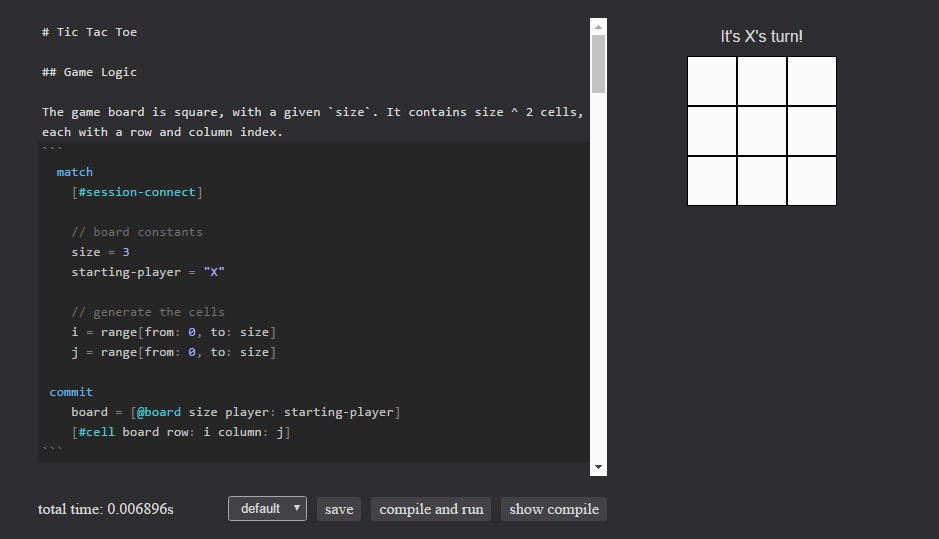
The game board is square, with a given size. It contains size ^ 2 cells, each with a row and column index.

search
  [#session-connect]

  // board constants
  size = 3
  starting-player = "X"

  // generate the cells
  i = range[from: 0, to: size]
  j = range[from: 0, to: size]

commit
  board = [@board size player: starting-player]
  [#cell board row: i column: j]

A subtlety here is the last line, [#cell board row: i column: j]. Thanks to our relational semantics, this line actually generates all 9 cells. Since the sets of values computed in i and j have no relation to each other, when we use them together we get the cartesian product of their values. This means that if i = {0, 1, 2} and j = {0, 1, 2}, then i x j = {(0, 0), (0, 1), ... (2, 1), (2, 2)}. These are exactly the indices we need for our grid!

Now we tag some special cell groupings: diagonal and anti-diagonal cells. The diagonal cells are (0, 0), (1, 1), and (2, 2). Notice anything about them?

Diagonal cells have a row index equal to its column index

search
  cells = [#cell row column]
  row = column
bind
  cells += #diagonal

Similarly, the anti-diagonal cells are (0, 2), (1, 1), and (2, 0).

Anti-diagonal cells satisfy the equation row + col = N - 1, where N is the size of the board.

search
  cells = [#cell row column]
  [@board size: N]
  row + column = N - 1
bind
  cells += #anti-diagonal

A game is won when a player marks N cells in a row, column, or diagonal. The game can end in a tie, where no player has N in a row.

search
  board = [@board size: N, not(winner)]
                    // Check for a winning row
  (winner, cell) = if cell = [#cell row player]
                      N = count[given: cell, per: (row, player)] then (player, cell)
                    // Check for a winning column
                    else if cell = [#cell column player]
                      N = count[given: cell, per: (column, player)] then (player, cell)
                    // Check for a diagonal win
                    else if cell = [#diagonal row column player]
                      N = count[given: cell, per: player] then (player, cell)
                    // Check for an anti-diagonal win
                    else if cell = [#anti-diagonal row column player]
                      N = count[given: cell, per: player] then (player, cell)
                    // If all cells are filled but there are no winners
                    else if cell = [#cell player]
                      N * N = count[given: cell] then ("nobody", cell)
commit
  board.winner := winner
  cell += #winner

We use the count aggregate in the above block. Count returns the number of discrete values (the cardinality) of the variables in given. The optional per attribute allows you to specify groupings, which yield one result for each set of values in the group.

For example, in count[given: cell, per: player] we group by player, which returns two values: the count of cells marked by player X and those marked by O. This can be read “count the cells per player”. In the scoring block, we group by column and player. This will return the count of cells marked by a player in a particular column. Like wise with the row case. By equating this with N, we ensure the winning player is only returned when she has marked N cells in the given direction.

This is how Eve works without looping. Rather than writing a nested for loop and iterating over the cells, we can use Eve’s semantics to our advantage.

We first search every row, then every column. Finally we check the diagonal and anti-diagonal. To do this, we leverage the #diagonal and #anti-diagonal tags we created earlier; instead of selecting [#cell], we can select on [#diagonal] and [#anti-diagonal] to select only a subset of cells.

React to Events

Next, we handle user input. Any time a cell is directly clicked, we:

  1. Ensure the cell hasn’t already been played
  2. Check for a winner
  3. Switch to the next player

Then update the cell to reflect its new owner, and switch board’s player to the next player.

Click on a cell to make your move

search
  [#click #direct-target element: [#div cell]]
  not(cell.player)                               // Ensures the cell hasn't been played
  board = [@board player: current, not(winner)]  // Ensures the game has not been won
  next_player = if current = "X" then "O"        // Switches to the next player
                else "X"
commit
  board.player := next_player
  cell.player := current

Since games of tic-tac-toe are often very short and extremely competitive, it’s imperative that it be quick and easy to begin a new search. When the game is over (the board has a winner attribute), a click anywhere on the drawing area will reset the game for another round of play.

A reset consists of:

  • Clearing the board of a winner
  • Clearing all of the cells
  • Removing the #winner tag from the winning cell set
search
  [#click #direct-target]
  board = [@board winner]
  cell = [#cell player]
commit
  board.winner -= winner
  cell.player -= player
  cell -= #winner

Drawing the Game Board

We’ve implemented the game logic, but now we need to actually draw the board so players have something to see and interact with. Our general strategy will be that the game board is a #div with one child #div for each cell. Each cell will be drawn with an “X”, “O”, or empty string as text. We also add a #status div, which we’ll write game state into later. Our cells have the CSS inlined, but you could just as easily link to an external file.

Draw the board

  search
    board = [@board]
    cell = [#cell board row column]
    contents = if cell.player then cell.player
              else ""
  bind
    [#div board @container style: [font-family: "sans-serif"], children:
      [#div #status board class: "status", style: [text-align: "center", width: 150, padding-bottom: 10]]
      [#div class: "board" style: [color: "black"] children:
        [#div class: "row" sort: row children:
          [#div #cell class: "cell" cell text: contents sort: column style:
            [display: "inline-block" width: "50px" height: "50px" border: "1px solid black" background: "white" font-size: "2em" line-height: "50px" text-align: "center"]]]]

Winning cells are drawn in a different color

  search
    winning-cells = [#cell #winner]
    cell-elements = [#div cell: winning-cells, style]
  bind
    style.color := "red"

Finally, we fill the previously mentioned #status div with our current game state. If no winner has been declared, we remind the competitors of whose turn it is, and once a winner is found we announce her newly-acquired bragging rights.

Display the current player if the game isn’t won

  search
    status = [#status board]
    not(board.winner)
  bind
    status.text += "It's {{board.player}}'s turn!"

When the game is won, display the winner

  search
    status = [#status board]
    winner = board.winner
  bind
    status.text += "{{winner}} wins! Click anywhere to restart!"

Along the way to making this demo, many new standard library expressions were added, the execution strategy for aggregates was overhauled, parser bugs were fixed, and dependency ordering glitches resolved. We even began to appreciate how literate programming will work in Eve (the post you are reading right now is an executable Eve program).

The human-compiled version of tic-tac-toe was completed in only about half an hour, and required very few changes to get working once the platform caught up. The latest iteration of Eve is still very much in its infancy, but even now its showing a lot of promise for teasing out simple and general solutions to complicated problems. As one of its creators, I’m obviously a biased party when discussing Eve, so feedback such as RubenSandwich’s is invaluable in helping us make the language more robust. If you find the time to try Eve yourself, please don’t hesitate to share your experiences with us on the mailing list.

12 Aug 15:19

No filter. New #JunoCam #Jupiter raw images available now. Download, process + share https://t.co/ijHwy72xXp https://t.co/dRMzL7uk9K

by NASAJuno
mkalus shared this story from NASAJuno on Twitter.

No filter. New #JunoCam #Jupiter raw images available now. Download, process + share https://t.co/ijHwy72xXp https://t.co/dRMzL7uk9K


Posted by NASAJuno on Thu Aug 11 19:11:40 2016.


698 likes, 354 retweets
12 Aug 15:19

Apple Smart Keyboard or Logi Create :: Which is it?

by Volker Weber

ZZ3570D1BE

Two weeks ago there was no option if you wanted a German keyboard that would also protect the screen of your iPad Pro 9.7. Then Logitech announced the Logi Create and Apple made the Smart Keyboard available in more languages. On the very same day. Instead of having just one simple choice we had two. I have worked with both and I have come to a decision.

I have a theory that says you will drop everything you carry in your hands, eventually. We don't drop laptops as much as mobile phones, because we carry them in bags and then put them on a table. That's why we put phones in cases, and laptops not. That has a profound implication on whether Logi Create or Apple Smart Keyboard is right for you.

Create is a tank. It wraps your beautiful thin iPad in a big protective envelope. That envelope will hold your Pencil, it has the better keyboard, and it will protect your iPad much better than anything you buy from Apple.

Smart Keyboard on the other hand is thin and light. It's the bare minimum of what Apple could have designed to both protect the screen from scratches and provide a decent keyboard. It's lighter, it's thinner, and it does not disfigure your sleek iPad Pro.

If you use that iPad mostly at home and once in a while need to compose longer pieces of text, then Smart Keyboard is right for you. You can tear off the keyboard easily and connect other accessories to the Smart Connector. I like to put the iPad Pro on the Logi Base when I am not using it. Smart Keyboard lets you use your other accessories like the Silicone Case. All of these things fit neatly together.

If your iPad is a laptop replacement, the only computer you use day in and out, and if you drag it around wherever you go, often without a bag, then Create is a better choice. It will keep your Pencil, you can more quickly set it up as laptop, you can place it on the table like a folio for taking notes, you can drag the iPad towards you and place it over the keyboard to draw on a slightly inclined surface. But taking it out of the Create envelope and putting it back does not feel right.

If I go on a business trip, I feel more inclined to use Logi Create. It just keeps it all together. In all other use cases I would prefer the Apple Smart Keyboard.

Both products win the editor-refuses-to-give-it-back award. I did not expect that to happen for either one. Isn't it nice to have two good choices?

[Please note that this is only for the iPad Pro 9.7. The big 12.9 is a completely different machine. Adding a Logi Create to that beast is going to make it very unwieldy.]

12 Aug 15:19

DTEK50 :: This is not a BlackBerry

by Volker Weber

ZZ7CCE08EB

I have had the DTEK50 for more than two weeks and I am struggling to explain why I like it so much. "This is not a BlackBerry" is probably the best I can come up with.

Here is the deal. This phone does not feel like a BlackBerry. It was never designed by the company, it does not say "BlackBerry" on the front and the 'berry logo on the back is hardly noticeable. This phone was not designed for corporate use, it's a TCL reference design for a consumer phone. Thin and light, very decent cameras, stereo speakers front and back. And while it is thin and light for its size, it still feels solid. You put it in your pocket and then just forget about it until you use it. It's a phone for somebody who does not show off.

BlackBerry gives you its secure Android, but you are holding a good midrange Android phone. Andrew Orlowski from The Register was with me in New York, and he shares my sentiments. Read his review here.

[There are no scratches on the screen. I just like to have a black fur as my wallpaper.]

12 Aug 15:18

Outlook in 2013 Reminds me of why I left Hotmail for Gmail in 2006

by Bardi Golriz

I was a happy Gmail user for many years. But as the product matured, the experience cluttered. My dissatisfaction emerged in 2011 with its last redesign. I didn't like it. And I especially didn't like Google+ infiltrating the service shortly after. Unfortunately, the alternatives were not any better. That was until the summer of 2012 when Outlook suddenly appeared. Ironically, it actually reminded me of Gmail back in 2006, when I migrated from Hotmail. Gmail's recently redesigned compose and reply experience compared to Outlook's effectively illustrates why I made the switch. 

Clicking on the "Compose" button in Gmail now opens a modeless overlay to compose your email in. Google claims [emphasis mine]:

You can now write messages in a cleaner, simpler experience that puts the focus on your message itself, not all the features around it. 

undefined
Gmail's compose new message modeless overlay

By providing context through the visibility of your inbox (and its accompanying interface), the opposite in fact happens. Google says you can now "check emails as you're typing, minimize drafts for later, and even compose two messages at once". This encourages multitasking behaviour that interrupts your primary task and compromises your focus. Daniel C. McFarlane & Kara A. Latorella describing the effect of multitasking interfaces:

Users do not maintain constant focus on a single task, but switch between multiple tasks and intermittently supervise the processing of their delegated tasks. These intermittent interactions necessarily entail interruptions.

I don't know about you, but when I'm writing, whether it's an email or a report, interruptions are never welcome. Furthermore, I can't remember the last time, if ever, that I wrote two messages simultaneously or needed to check for new emails as I'm typing a new message. The single use case where this UI makes sense is when replying to an email, as context facilitates the response. But, apparently, that makes no sense to Google. 

When viewing an email thread in Gmail, the last message only appears open; you can reply using its corresponding text box. If you want to obtain additional context by opening any other messages in the thread, the reply box loses visibility as it maintains its position at the bottom of the page 1. This movement away from your reply's input eschews Nielsen's 'recognition rather than recall' heuristic i.e. the user's memory load isn't minimised as they need to "remember information from one part of the dialogue to another" . If, however, a modeless overlay was used, you could have continued writing your reply as you reviewed previous replies.

undefined
Minimal context - reply visible

undefined
Additional context - reply hidden

Outlook, on the other hand, puts content before chrome. When you're composing a message or reply, it's a cleaner, simpler experience that really does put the focus on the message.

undefined
Composing a message in Outlook

Unlike Gmail, when you're replying to an email, the reply's content area shows previous replies by default. And because it's practically a full-screen experience, at least the last couple or so 2  replies are usually visible without needing to scroll. It may not provide entire context but it's usually more than enough 3.

undefined
Replying to a message in Outlook

There are many other examples that demonstrate how Outlook beats Gmail in simplicity and cleanliness that I'll cover in the future. However, as important as these are, I know a better email service alone isn't enough reason to switch. The cloud it's integrated with has become critical to the overall experience. And it's SkyDrive's superiority to Google Drive 4 (that I'll address later) that makes this a no-contest as far as I'm concerned.

If you, like me, signed up to Gmail back in the day not only because it generously offered 1 GB of storage space but also because it offered a cleaner and simpler email experience, then I suggest you give Outlook a chance. You'll be pleasantly surprised. Add SkyDrive to the mix and you'll have a serious decision to make.  

Update: I've found out you can actually do a "Pop out reply" in Gmail. Its lack of discoverability can be attributed to Google's uncompromising (and sometimes counter-intuitive) pursuit of minimalism.

1. A message's reply box by default hides the entire content of the thread. You can click on the text box's "..." to untrim the reply's content, but you'll be unable to see your input once you scroll down past the last couple or so messages. In fairness, this is similar to Outlook.

2. Of course this number would vary depending on the length of previous replies and the size of your window. It could be more if they were short replies and/or a bigger window displaying them on or less if the last reply was lengthy and/or a smaller window displaying them on.

3. The recipient's latest reply and my message that it was in reply to are almost always the necessary amount of context I'm after. Obviously, different metrics apply when the thread involves more than two people.

4. That's Google Drive, the cloud storage service, and not its Google Docs branch. I've made the distinction because Office's web apps still have some way to go to match Docs.

12 Aug 15:18

Shaw partners with TransLink to offer free Wi-Fi on all Vancouver SeaBus Ferries

by Rose Behar

Thousands of daily Vancouver commuters can now enjoy free Wi-Fi on the SeaBus Ferries that travel between Downtown Vancouver and the North Shore thanks to a partnership between Shaw Communications and Metro Vancouver’s regional transportation authority TransLink.

“Until now, commuters have been able to enjoy complimentary access at both terminals,” said Greg Pultz, vice-president of operations at Shaw in a press release.

“As of today, anyone and everyone who wants it has access to fast Wi-Fi from the moment they enter the ferry terminal to the moment they leave the destination terminal.”

This is a significant development, considering the SeaBus, which crosses Burrard Inlet to connect Vancouver and North Vancouver, ferries nearly six million passengers every year.

Shaw Internet subscribers will automatically connect to Shaw Go Wi-Fi after initial setup, while passengers who are not Shaw customers can access Shaw Go WiFi by selecting ‘ShawGuest’ from the list of available WiFi networks.

Related reading: Following Shaw acquisition, Wind Mobile now has 1 million subscribers

11 Aug 20:32

The Art of Simplicity

by Neil Cybart

Apple Watch and Apple Music shared something in common with each other in the beginning. They lacked simplicity. In an effort to give each product the best chance of success, Apple focused too much on telling a compelling story and not enough on letting the product tell its own story. This lack of simplicity explains how Apple Watch and Apple Music were called both resounding successes and utter failures during their first year. 

Early Criticism

At each step along the way, Apple Watch and Apple Music had their critics. Many claimed the initial Apple Watch keynote lacked direction, others thought the Watch didn't seem to do enough, and some claimed that the Watch's interface was too confusing. 

After just a few weeks on the market, it would have been an understatement to say that Apple Watch had become a polarizing product. While some people loved it, others thought it lacked the finish and attention to detail found in other Apple products. As Wall Street slashed Apple Watch sales expectations, what was once deemed the next big thing after iPhone quickly turned into nothing more than a footnote on Apple's quarterly earnings calls.

The Apple Music unveiling wasn't too different from the unveiling of Apple Watch. The introduction during the WWDC 2015 keynote was not good. In the following months, the press turned against the service with some referring to Apple Music as "cluttered," "awful," and even "broken." Reports of a confusing user interface and a list of random problems plagued Apple Music for most of its first year. 

Given how expectations turned sour for both Apple Watch and Apple Music soon after launch, one would have assumed each would end up being massive flops in the market. However, the opposite occurred. 

Successes

During the first 15 months on the market, Apple sold 14.5 million Apple Watches at an average selling price of $435 each. In addition, Apple sold at least five million extra Watch bands as Watch wearers embraced the idea of owning multiple bands. The Apple Watch is already a $10 billion business. It's difficult to describe this as anything other than a success. 

Apple Watch has become not just the best selling smartwatch, but one of the single-best selling devices worn on the wrist in history. In addition, there is growing evidence that Apple Watch has already begun to impact the Swiss Watch industry (evidence herehere, and here). It may be a distant memory now, but the wrist watch had been deemed mortally wounded by the smartphone as recently as a year ago. The percentage of people going around without a watch on their wrist was hitting multi-generational highs. The Apple Watch changed everything. 

Meanwhile, Apple Music garnered 15 million paying subscribers in its first year, a pace six times faster than that of Spotify. Even though music can be consumed for free at Spotify, YouTube, and Pandora, Apple was able to get 15 million people to pay as much as $120 per year to lease music. This is nearly twice the average amount spent per user per year in iTunes. More impressively, Apple Music's 15 million subscribers represents about 15% of all paid music streaming users in the world

Lack of Simplicity

How can Apple Watch and Apple Music appeal to millions of people yet be considered flops or failures by others? While high expectations and never-ending comparisons to iPhone success may have contributed to this unique dynamic, neither reason gets to the heart of the issue. 

Apple Watch and Apple Music lacked simplicity. This produced a situation in which the product's key attributes and value propositions resonated with some customers while others saw nothing more than unfinished products.

Simplicity allows a product to communicate with users. The result is a clear understanding of that product's perceived functionality and purpose. One way of accomplishing this is to develop a product in such a way as to allow that product's design to tell a story. Design isn't just about a product's physical attributes. It also involves how the product works. Apple has had success in the past when it comes to selling simplicity. 

  • iPod simplicity. The iPod was designed for one task: listening to 1,000 songs in your pocket. Everything about the device was geared toward making it easy to accomplish that one task. It would be incorrect to say that the device's functionality was limited due to its simplicity. Instead, the iPod became one of the most loved ways to consume music thanks to its click wheel and accompanying user interface.  
  • iPhone simplicity. The iPhone was designed to play music, surf the web, and make phone calls. As with the iPod, simplicity didn't lead the iPhone to be a comprised device with a lack of features. Instead, the iPhone became the most versatile, personal computer in history thanks to the new multi-touch user interface. 

The problem facing Apple Watch and Apple Music wasn't that their launch presentations weren't good enough or that they relied on ineffective marketing campaigns. Those items weren't able to explain the response these products received in the marketplace. Instead, Apple tried too hard during product development to tell a story in order to give each product a strong sales pitch at launch. 

With Apple Watch, Apple pushed the idea that third party apps would transform the device into a versatile gadget with lots of use cases. The thinking was that this would have the Watch appeal to a wide range of consumers. The app revolution had led to much success for iPhone and iPad, so Apple figured this would rub off on Apple Watch. The Watch's user interface was built around the idea of using apps on the Watch as if it was an iPhone or iPad. A honeycomb pattern of app icons was given nearly as much prominence as Watch faces. 

In essence, Apple tried too hard selling the Watch as a mini iPhone on the wrist with which users rely on lots of apps to get through their day. Much more problematic was that Apple never explained how apps would help Apple Watch tell its story. This dynamic made it difficult for consumers to understand the Watch's purpose. Was the Watch supposed to be used like an iPhone or was it some kind of fitness tracker with apps? 

With Apple Music, Apple's problem was more straightforward. Instead of launching Apple Music as an easy to use streaming service that placed an emphasis on music discovery through human curated playlists, Apple tried to make Apple Music a one-stop shop appealing to everyone. It suffered from a lack of purpose. One example of this was the Connect feature with which Apple Music users could follow their favorite music artists. As apps on the Watch may have made sense on paper, something like Connect seemed to initially make sense for Apple Music. However, adding an entirely new social layer within an already crowded app just didn't do much to convey Apple Music's fundamental purpose of making it easy to listen to music.

Solutions

One way to validate the claim that Apple Watch and Apple Music lacked simplicity is to look at this year's WWDC keynote (my full analysis from WWDC is available here and here). WatchOS 3 and the new Apple Music highlight that Apple was aware of a lack of simplicity and had been working for months on removing friction points.  

Apple Watch. After using the Watch for just a few days back in April 2015, it became clear that the device wasn't a regular watch. It was also obvious that it wasn't a mini iPhone. Instead, the Apple Watch was something different. A watch case containing a rectangular face, digital crown meant for scrolling, and sensors used to record data suggests the device had been designed to be a monitoring device. Users could monitor their health/fitness activity, incoming notifications, and other types of information including calendar items, directions, and mobile payments. The changes found in watchOS 3 are meant to allow Apple Watch to better tell its story as a monitoring device. 

Apple is now de-emphasizing apps in the new user interface, instead focusing on complications and Watch faces. Instead of selecting apps from dozens of small icons arranged in a honeycomb pattern, with watchOS 3, we primarily consume information through complications on Watch faces. This is why Apple made it much easier to switch Watch faces in watchOS 3. Even the Watch's side button functionality was altered to make it easier to consume information.

Apple Music. In the revamped Apple Music app announced at WWDC, Apple went back to the basics with the focus being on adding simplicity to the app. Refined tabs, including a more accessible music library as well as rethought "For You" and "Browse" tabs, make it easier to access the most important items. In addition, the Connect tab was removed and instead the functionality associated with Connect was positioned as more of a background item to the app. While there are still some questions as to font sizes and other design elements, it's difficult to argue that Apple didn't make it easier to discover new music daily. 

Simplicity Is an Art

The primary takeaway from Apple Watch and Apple Music lacking simplicity is that simplicity is an art. Simplicity could only be added to Apple Watch if the product had a design capable of telling a story in the first place. If the product is truly flawed, trying to add simplicity in later revisions or versions will lead to disappointment. Similarly, with Apple Music, Apple can only add simplicity to the service if Apple truly believes in using human curation to allow users to discover new music. 

It is easy to say that Apple should have done this or that differently with Apple Watch during the first year. Could Apple have highlighted different use cases? Would skipping third-party apps have led to much of a sales difference? These questions are irrelevant if the underlying product is not capable of conveying purpose in the first place. 

Looking ahead, when it is time for Apple to introduce new products and services, management will likely look at Apple Watch and Apple Music and remember that a product's value is derived much more from the story told through design than by the narrative created with a certain feature set. Without good design, simplicity is unattainable. 

Receive my analysis and perspective on Apple throughout the week via exclusive daily updates (2-3 stories a day, 10-12 stories a week). To sign up, visit the membership page

11 Aug 20:31

Ascent from Social Media

by Stephen Downes
The sad part is, most of you won't read this message.

Not because you don't want to. You probably do. You actually followed me just for that purpose. But because your social network is lying to you.

As of today my Facebook page OLDaily has 638 'likes'. This mean s 638 people think they are following the page. Yet when I post an article on that page, it reaches a small percentage of that audience. This item, for example, which as of today has reached 33 people.

There are ways to increase the size of my audience on Facebook. I can advertise - specifically, I can 'sponsor' the post. If I spend $4 I can increase its reach by an estimated 10-11 people. Surprisingly, people are paying to boost their posts on Facebook.

What they're trying to do is to insert themselves into my news feed. My news feed is where I read the messages my friends and family have posted. It has long been the target of unwanted attention, as spammers through out clickbait and exhort readers to 'like' and 'share' these empty posts.

These are annoying, but at least my friends actually recommended them (and there are ways of blocking these shares based on where they originate, so when Shirley sends me another meme from the radio station, I no longer see it, because I've blocked everything from the radio station - it takes a while to do this, but at least it can be done).

The sponsored posts weren't recommended by anyone - there's no hint of 'social' about them. They're just inserted into my feed. And while (in theory) I can block messages from a specific source, I can't keep them out of my feed altogether.

I used to be able to do this. For years I've browsed the web with ad-blocking software in my browser. It selects what I want to see, and eliminates the advertisements. It's able to spot the advertisements because reader views of advertising are tracked and reported, and the software can spot this.

Regular advertising - "Eat at Joe's" - slips right through, because it's just content. That's what all advertising used to be. But today's advertising spies on you, installs software on your computer, adds extra seconds to page loads, and generally makes your life miserable. So I blocked it. But now, Facebook has disabled my ad blocker.

All this - the clickbait and spam and sponsored posts and advertising - is inserted into my feed instead of the observations and comments from my friends. And that's why my useful post that 638 people want to see is actually seen by only 33 people. Facebook wants me to join this cavalcade of sponsored posts. Not so much because of the money but because it legitimizes the whole thing.

And - frankly - what it legitimizes are the the greasy bottom-dwellers of the internet. As I go through my feed today this is what I see: Search-Engine Optimization (SEO) services. Gambling houses. Skeezy political organizations. Sexist domain name registrars. 'Bank owned homes'.  Health heart institute (with a fake Princeton URL). There are reasons why I avoid all these sites!

So not only is my personal information being bought and sold by Facebook applications, it is being sold to these guys. Ewww.... where can I wash?

What Facebook has done very deliberately is to insert itself between you and your friends. Nowhere is this more clear than with Facebook messenger, where Facebook no longer allows you to use a mobile browser to send messages to your Facebook friends - you are required to use their proprietary app. It won't let you read what they send you without the app either.

And it has inserted itself there not to serve any higher purpose (such as, you know, actually letting me communicate with my friends). It has inserted it there because it thinks it has me, because it thinks it has managed to eliminate all of your choice in the matter, because it thinks that Facebook is better than nothing.

After all, some other sites have been responding to my ad blockers as well. Sites like Wired and Forbes are preventing me from viewing their content, throwing up a big advertising window instead in which they require that I turn off my ad blocker if I wish to view their contents. But I can easily view other sites, and so I read (and link to) their competitors.

But without Facebook, what to I route around to? How, for example, do I find out about this story about Ulrike Reinhard (as of today, 52 reads on Facebook, 972 reads on my web site)? The value I get from Facebook is that, when my friends' messages finally get through, they're worth listening to.

Facebook has me going both ways. They make me pay money in order to allow people to read my content, and then they throw advertising at the people who are trying to read that content. And now they're tightening the screws.

And even as it clamps down on content, Facebook favours the wrong people, siding once again with the bottom-dwellers of the internet. It has no qualms about encouraging catfishers and other scammers to operate with impunity. Alec Couros has been struggling with this for years as Facebook allows scammer after scammer to use his image to defraud innocent victims. Breastfeeding, however, bothers Facebook a lot. It has no problems with hate speech, but generally dislikes plus sized women, cannabis advocates, sexual health organizations, indigenous people, reporters, and mentions of Facebook censorship.

Why do we tolerate this?

To a large degree, we don't. People have tried to build alternatives, like Elgg and Diaspora and App.net and pump.io and GNU.social. Though they've all had some success and reached some level of usership, none has really caught on, and all are in various stages of abandonment. There are enterprise social networks like Yammer which are poorly used.

It's like we don't want to replace Facebook. We've seen social networks and we don't need another one. Younger people are using things like Tumblr and WeChat and  YikYak and Tinder. And of course Pokemon Go. And Instagram and Snapchat. None of these is perfect, but also none of these seems to be so closely associated with the seamy side of the net the way Facebook is.

So, maybe just maybe, we can live without Facebook. And after all, if my stuff on Facebook is actually not being read, why continue to bother with it.

So I think it's time to move on from Facebook. Not to try to replace it, but to rather ascend from it, to get away from the bottom-feeders and think about new ways to connect with family and friends, new ways to cooperate with colleagues around the world.

Over the next few days I'm going to turn off the feeds and shutter the Facebook pages (I won't delete them, because then some SEO creep will pretend they're me). But first I'll make sure there are other ways to contact me.

And over the next few weeks I'm going to revisit what I do with my core offerings, my newsletter and my other work, and think about making my incoming content feeds work better for me, and my outgoing feeds work better for my readers. Thoughts and comments are welcome, as always.
11 Aug 20:30

To Founders in Search of Patience and Low Costs

by Eugene Wallingford

Nils Pihl, CEO at Traintracks.io, writes about the benefits of launching the start-up in Beijing:

It took two years of hard work and late nights at the whiteboard to build a prototype of something we knew we could be proud of -- and what Silicon Valley investor would agree to fund something that would take two years to release? Not only that, but it would have cost us roughly 6 times as much money to develop it in Silicon Valley -- for no immediate benefit.

If moving to Beijing is not an option for you, fear not. You do not have to travel that far to find patient investors, great programmers, and low cost of living. Try Des Moines. Or St. Louis. Or Indianapolis. Or, if you must live in a Major World City, try Chicago. Even my small city can offer a good starting point, though programmers are not as plentiful as we might like.

The US Midwest has a lot of advantages for founders, but none of the smog you'll find in Beijing and much shorter commutes than you will find in all the places people tell you you have to go.

11 Aug 20:29

Just when you thought your browser couldn’t do any more …


Doug Peterson, doug – off the record, Aug 14, 2016


I'm giving a couple new  Firefox experiments a test run:

  • No More 404  - uses the Wayback Machine to find copies of pages that have disappeared from the internet, but still have links
  • Activity stream  - "A rich visual history feed and a reimagined home page..."
  • Tab Center  - "moves your tabs to the side of your browser window"

Firefox is often the browser where new web features are tested and copied by other browsers later. It's one of the reasons I continue to use it.

[Link] [Comment]
11 Aug 17:38

Recommended on Medium: A Novel Defense of the Internet

The Internet is making us stupid. Tech-enabled multitasking has destroyed our attention span. Social media is a waste of time.

Continue reading on Medium »

11 Aug 17:38

Twitter Favorites: [skinnylatte] . @cheryltan88′s wonderful piece on Singlish. My second language (my first being Teochew, and my third English!) https://t.co/HEpvRYb5pR

Adrianna Tan @skinnylatte
. @cheryltan88′s wonderful piece on Singlish. My second language (my first being Teochew, and my third English!) time.com/4441078/singli…
11 Aug 17:37

Twitter Favorites: [DenimAndSteel] Twitter is opening up Moments creation to everyone. Who will create the first MomentStorm? https://t.co/WZ3ZgnIh1J

Denim & Steel @DenimAndSteel
Twitter is opening up Moments creation to everyone. Who will create the first MomentStorm? niemanlab.org/2016/08/twitte…
11 Aug 17:37

Data scientist David Robinson analyzes the anger of Trump’s tweets

by Josh Bernoff

David Robinson, data scientist at Stack Overflow, published an insightful analysis of Donald Trump’s tweets. It provides a fascinating window into Trump’s mind as he squeezes his thoughts down into 140 angry characters. And it begins to reveal what Trump would do all day long if elected president. Robinson’s analysis: Trump’s tweets are even more hateful … Continue reading Data scientist David Robinson analyzes the anger of Trump’s tweets →

The post Data scientist David Robinson analyzes the anger of Trump’s tweets appeared first on without bullshit.

11 Aug 17:37

Android users may soon no longer need a Google+ profile to review Play Store apps

by Igor Bonifacic

Following the lead of YouTubeAndroid users may soon no longer need a Google+ profile to voice their opinion on particular apps, movies, music and games.

According to Android Police, several of its readers have sent in emails, reporting that they’ve been able to write and post reviews to the Play Store without a Google+ profile. The news follows reports of the +1 button disappearing from the Play Store.

It’s possible what Android Police‘s readers are seeing is a bug, but it’s just as and indeed more likely that this is another step in the process of Google closing the door on its social ambitions.

While the search giant redesigned Google+ as recently as this past November, Google has been slowly been disconnecting the social network from the rest of its ecosystem of apps and services. As noted above, last year Google waived the Google+ profile requirement for commenting on YouTube videos. At I/O 2015, the company packaged Google+ excellent photo editing capabilities into a separate app called Photos. Unbundled from Google+, Photos has accrued 200-million active monthly users in just its first year of availability.

Since I do have Google+ profile linked to my email, I can’t verify Android Police‘s report. So drop a comment below if you can confirm the change.

11 Aug 17:36

Hold Still

A fascinating autobiography of the influential photographer, accompanied by many photographs (to which the Kindle edition does nothing like justice). Oddly, she says very little about the genesis of At Twelve, the haunting book that made her famous, and there’s surprisingly little about the success of Immediate Family.

What I had missed about Mann is that she sees herself as explicitly a Southern artist – not a regionalist, and certainly not a fan of Southern racial nostalgia, but still chiefly interested in the people (especially poor people, black and white) and in the backwater.

11 Aug 17:36

'Harry Potter' Exhibition to Enchant the British Library

by Beckett Mufson for The Creators Project

Image courtesy The British Library

It's no castle, but the British Library will channel its inner Hogwarts next year with a collection of enchanting books and artifacts from the wizarding world of Harry Potter. The exhibition, announced on the heels of Harry Potter and the Cursed Child's sold-out theatrical debut, will coincide with the 20th anniversary of Harry Potter and the Philosopher's Stone. “We at the British Library are thrilled to be working with J.K. Rowling and with Bloomsbury... to inspire fans with the magic of our own British Library collections,” says Jamie Andrews, Head of Culture and Learning at the British Library.

The goal is to transmute the lore for which Harry Potter fans have shown an unquenchable thirst with the mythological elements of humankind's actual past. The London institution says they will showcase "an extraordinary range of wizarding books, manuscripts and objects, and combine centuries-old British Library treasures with original material from Bloomsbury’s and J.K. Rowling’s archives." Design Week reports that the British Library is seeking an exhibition designer who will be programming original artwork for the show, but the call for entries has not yet been announced. 

Below, see images of both the Hogwarts castle at Universal Studios and the British Library. If you squint, they both look pretty magical.

Wikimedia Commons

Wikimedia Commons

The British Library exhibition, which has not yet been named, will run from October 20, 2017 through February 28, 2018.

Related:

13 Artists Cast Magical 'Art Spells' in a Mysterious Group Exhibition

Wingardium Leviosa! | GIF Six-Pack

Christmas Dinner at Hogwarts' Great Hall

11 Aug 17:36

A Cry for Help for Renters

by michaelkluckner

courierarticle

Jessica Barrett’s article in the Courier explores the long list of shortcomings in government policy to protect renters. We’re taught as children that the 3 essentials of life are food, shelter and clothing; clothing isn’t much of a problem, but can you imagine a society where food is speculated upon to the degree that shelter is currently here? There would be riots in the street.

When you live long enough, everything seems to come ’round again. The rental crisis of 1973, with a vacancy rate of about 1/5th of a percent, seems impossibly distant…

housing solution

… but triggered the creation of the Rentalsman’s office, residential tenancy legislation and, eventually, the MURB tax-shelter program of the federal government.

Why was there a rental crisis in 1973? The Strata-Title Act of 1966, which caused a wave of conversions of rental buildings into condos, to the point that the city put a moratorium on such conversions that year.

Why is there a rental crisis now? The Strata-Title Act, at least in the sense that condos are much more profitable to build than rental buildings. The Herb Auerbach article a few days ago stated that clearly. Solution? Probably the same as in 1973.


11 Aug 14:25

Michael Phelps race times since his first Olympics

by Nathan Yau

Olympics Phelps

That Michael Phelps. He is a crazy man, in the best possible way. Derek Watkins and Larry Buchanan for the New York Times compare race times of young Michael Phelps against those of current Michael Phelps. The piece as a whole serves as a quick visual history of the legendary swimmer’s career, that we still get to watch more of (if I can figure out NBC’s broadcasting schedule, that is).

Tags: Michael Phelps, Olympics