I thought my eyesight was beginning to go. It turns out, I’m suffering from design.
It’s been getting harder for me to read things on my phone and my laptop. I’ve caught myself squinting and holding the screen closer to my face. I’ve worried that my eyesight is starting to go.
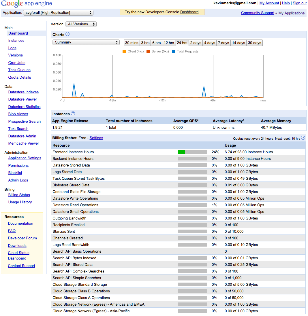
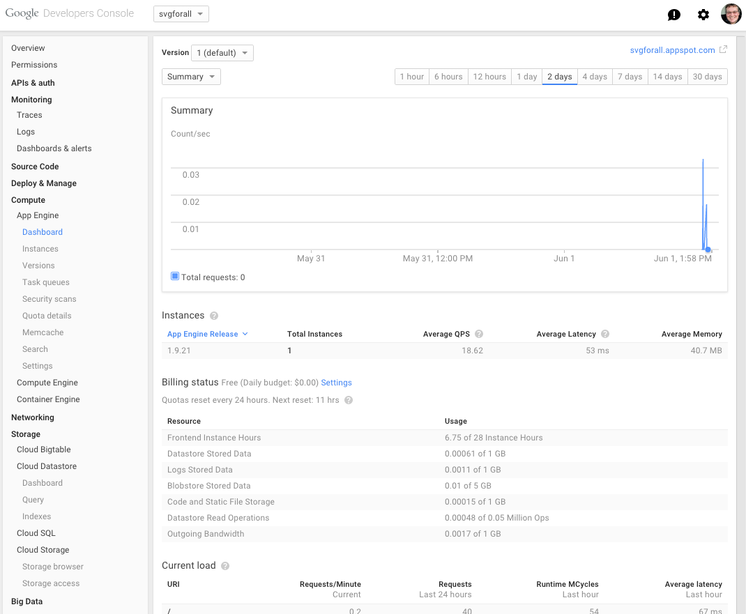
These hurdles have made me grumpier over time, but what pushed me over the edge was when Google’s App Engine console — a page that, as a developer, I use daily — changed its text from legible to illegible. Text that was once crisp and dark was suddenly lightened to a pallid gray. Though age has indeed taken its toll on my eyesight, it turns out that I was suffering from a design trend.
There’s a widespread movement in design circles to reduce the contrast between text and background, making type harder to read. Apple is guilty. Google is, too. So is Twitter.
Typography may not seem like a crucial design element, but it is. One of the reasons the web has become the default way that we access information is that it makes that information broadly available to everyone. “The power of the Web is in its universality,” wrote Tim Berners-Lee, director of the World Wide Web consortium. “Access by everyone regardless of disability is an essential aspect.”
But if the web is relayed through text that’s difficult to read, it curtails that open access by excluding large swaths of people, such as the elderly, the visually impaired, or those retrieving websites through low-quality screens. And, as we rely on computers not only to retrieve information but also to access and build services that are crucial to our lives, making sure that everyone can see what’s happening becomes increasingly important.
We should be able to build a baseline structure of text in a way that works for most users, regardless of their eyesight. So, as a physicist by training, I started looking for something measurable.
Google’s App Engine console before — old-fashioned but clearGoogle’s App Engine console after — modern, tiny, and pallid
It wasn’t hard to isolate the biggest obstacle to legible text: contrast, the difference between the foreground and background colors on a page. In 2008, the Web Accessibility Initiative, a group that works to produce guidelines for web developers, introduced a widely accepted ratio for creating easy-to-read webpages.
To translate contrast, it uses a numerical model. If the text and backgroundof a websiteare the same color, the ratio is 1:1. For black text on white background (or vice versa), the ratio is 21:1. The Initiative set 4.5:1 as the minimum ratio for clear type, while recommending a contrast of at least 7:1, to aid readers with impaired vision. The recommendation was designed as a suggested minimum contrast to designate the boundaries of legibility. Still, designers tend to treat it as as a starting point.
Contrast as modeled in 2008
For example: Apple’s typography guidelines suggest that developers aim for a 7:1 contrast ratio. But what ratio, you might ask, is the text used to state the guideline? It’s 5.5:1.
Apple’s guidelines for developers.
Google’s guidelines suggest an identical preferred ratio of 7:1. But then they recommend 54 percent opacity for display and caption type, a style guideline that translates to a ratio of 4.6:1.
The typography choices of companies like Apple and Google set the default design of the web. And these two drivers of design are already dancing on the boundaries of legibility.
It wasn’t always like this. At first, text on the web was designed to be clear. The original web browser, built by Berners-Lee in 1989, used crisp black type on a white background, with links in a deep blue. That style became the default settings on the NeXT machine. And though the Mosaic browser launched in 1993 with muddy black-on-gray type, by the time it popularized across the web, Mosaic had flipped to clear black text over white.
When HTML 3.2 launched in 1996, it broadened the options for web design by creating a formal set of colors for a page’s text and background. Yet browser recommendations advised limiting fonts to a group of 216 “web-safe” colors, the most that 8-bit screens could transmit legibly. As 24-bit screens became common, designers moved past the garish recommended colors of the ’90s to make more subtle design choices. Pastel backgrounds and delicate text were now a possibility.
Yet computers were still limited by the narrow choice of fonts already installed on the device. Most of these fonts were solid and easily readable. Because the standard font was crisp, designers began choosing lighter colors for text. By 2009, the floodgates had opened: designers could now download fonts to add to web pages, decreasing dependency on the small set of “web-safe” fonts.
As LCD technology advanced and screens achieved higher resolutions, a fashion for slender letterforms took hold. Apple led the trend when it designated Helvetica Neue Ultralight as its system font in 2013. (Eventually, Apple backed away from the trim font by adding a bold text option.)
As screens have advanced, designers have taken advantage of their increasing resolution by using lighter typeface, lower contrast, and thinner fonts. However, as more of us switch to laptops, mobile phones, and tablets as our main displays, the ideal desktop conditions from design studios are increasingly uncommon in life.
So why are designers resorting to lighter and lighter text? When I asked designers why gray type has become so popular, many pointed me to the Typography Handbook, a reference guide to web design. The handbook warns against too much contrast. It recommends developers build using a very dark gray (#333) instead of pitch black (#000).
The theory espoused by designers is that black text on a white background can strain the eyes. Opting for a softer shade of black text, instead, makes a page more comfortable to read. Adam Schwartz, author of “The Magic of CSS,” reiterates the argument:
The sharp contrast of black on white can create visual artifacts or increase eye strain. (The opposite is also true. This is fairly subjective, but still worth noting.)
Let me call out the shibboleth here: Schwartz himself admits the conclusion is subjective.
Another common justification is that people with dyslexia may find contrast confusing, though studies recommend dimming the background color instead of lightening the type .
Several designers pointed me to Ian Storm Taylor’s article, “Design Tip: Never Use Black.” In it, Taylor argues that pure black is more concept than color. “We see dark things and assume they are black things,” he writes. “When, in reality, it’s very hard to find something that is pure black. Roads aren’t black. Your office chair isn’t black. The sidebar in Sparrow isn’t black. Words on web pages aren’t black.”
Taylor uses the variability of color to argue for subtlety in web design, not increasingly faint text. But Taylor’s point does apply — between ambient light and backlight leakage, by the time a color makes it to a screen, not even plain black (#000) is pure; instead it has become a grayer shade. White coloring is even more variable because operating systems, especially on mobile, constantly shift their brightness and color depending on the time of day and lighting.
This brings us closer to the underlying issue. As Adam Schwartz points out:
A color is a color isn’t a color… …not to computers…and not to the human eye.
What you see when you fire up a device is dependent on a variety of factors: what browser you use, whether you’re on a mobile phone or a laptop, the quality of your display, the lighting conditions, and, especially, your vision.
When you build a site and ignore what happens afterwards — when the values entered in code are translated into brightness and contrast depending on the settings of a physical screen — you’re avoiding the experience that you create. And when you design in perfect settings, with big, contrast-rich monitors, you blind yourself to users. To arbitrarily throw away contrast based on a fashion that “looks good on my perfect screen in my perfectly lit office” is abdicating designers’ responsibilities to the very people for whom they are designing.
My plea to designers and software engineers: Ignore the fads and go back to the typographic principles of print — keep your type black, and vary weight and font instead of grayness. You’ll be making things better for people who read on smaller, dimmer screens, even if their eyes aren’t aging like mine. It may not be trendy, but it’s time to consider who is being left out by the web’s aesthetic.
How the Web Became Unreadable was originally published in Backchannel on Medium, where people are continuing the conversation by highlighting and responding to this story.
After a number of years of desktop exclusivity, Google Chrome Canary browser has finally made the jump to Android.
Now available via the Google Play Store, this offshoot of Chrome allows users to try out experimental new features before they make it into the main release of Google’s web browser.
Of course, there’s a catch: Google explicitly warns that updates are pushed to devices without prior human testing. Moreover, expect frequent downloads, with updates coming in at almost a daily cadence.
Still, if you’ve ever wanted to be on the bleeding edge of tech, Canary is one way to do it.
Scanbot, which can scan documents, QR codes, and bar codes, received a major update today. Version 6 adds a host of powerful features aimed at handling documents after they have been scanned and saved as PDF files.
Scanbot has always been an excellent tool for scanning documents to PDFs on the go, but its PDF editing tools were limited. With version 6, Scanbot can now add, move, delete and rotate scanned pages. You can also annotate PDFs with a pen tool, highlighter, and eraser. Version 6 adds an enhanced pen tool with several colors and stroke sizes. In addition, the Pro version, which includes optical character recognition (OCR), now lets you turn OCR off, only invoking it on demand when needed. Finally, Scanbot has added support for Microsoft OneDrive, OneNote for Business, and Amazon Drive.
Version 6 of Scanbot is a solid update to a mature app. The one change in version 6 that I don’t like is the icon. Scanbot’s old robot icon added a touch of whimsy and fun to an otherwise utilitarian app. It feels like Scanbot’s maker, doo, decided to go after a more corporate user base and perhaps had a hard time selling an app with a robot icon to ‘serious’ business customers. Whatever the reason behind the change, I will miss the old icon. What hasn’t changed though, is that Scanbot 6 is a powerhouse utility that should fill nearly anyone’s mobile scanning needs.
Over the years, Apple gradually stopped going to trade shows in the oughts, making its last appearance at Macworld in 2009.
That’s why it was surprising when MacRumors published a listing that showed the company was set to be a first-time exhibitor at the 2017 Mobile World Congress, the world’s largest annual mobile that takes place in Barcelona, Spain every year.
While that listing was quickly pulled, likely at Apple’s request, it provided some intriguing information that suggests the Cupertino-based tech giant might attend the event in a business-facing capacity.
Apple’s listing shows one of its locations as being in the App Planet Exhibition, a pavilion set to feature more than 200 app-specific exhibitors, including Adobe and Google. The listing also revealed two spaces in the level above Hall 2 in the Fira Gran Via Conference Centre, which MacRumors suggests might be meeting rooms. This, coupled with the fact that the listing was removed, indicates that the company may attend the event in a business-facing, rather than consumer-facing capacity.
Eschewing a consumer-facing role would also mean Apple wouldn’t have to go back on its 2008 statement explaining why it would not be returning to Macworld, or many other trade shows, in the future.
“Apple is reaching more people in more ways than ever before, so like many companies, trade shows have become a very minor part of how Apple reaches its customers,” the company stated.
“The increasing popularity of Apples Retail Stores, which more than 3.5 million people visit every week, and the Apple.com website enable Apple to directly reach more than a hundred million customers around the world in innovative new ways.”
Salesforce and Disney have given up on acquiring Twitter, citing its troll problems. To succeed in tech you need either profits or growth; Twitter has neither. So somebody’s going to buy it that doesn’t care about the users. As a result, if you’re a user, you can expect a very scary future — scarier than any ghosts … Continued
This tweet touched off an interesting conversation:
That moment when you are blogging and you realize you should sit down and code an app for that.™ And what do you mean Apple API’s won’t support it?
FRIEND
I read the NYTimes coverage about this, and the comments section had some very interesting commentary from actual engineers. Apparently Samsung has major, major cultural issues that this is bringing to light.
ME
The only cultural issue is the disconnect at Samsung Mobile between their stated core values and their actual one.
FRIEND The Times article explained that Samsung has a militaristic corporate culture: top-down orders with no bottom-up feedback. Thus, the directive to include all the features and do it as fast as possible.
ME
Next, I’ll be hearing you say that because the Korean language is so formal, lower level engineers couldn’t express their concerns about the battery to their bosses à la Outliers and the Korean Air crashes. Spare me Gladwell-esque racist revisionism. :-D
Samsung has designed tons of phones including the Galaxy S7 that don’t explode. Heck, there are still millions of Galaxy Note 7’s haven’t exploded (yet). They’ve also been a regimented and top-down chaebol since their founding with no problems other than a derivative design.

And, while the I didn’t read the comments, I did read the NYT article last week. I found it really crappy “me-too” reporting (the Verge and others beat them to nearly every important scoop in this story). Their only value-add was a flawed supposition that Samsung could manage the Galaxy Note 7 recall the same way the Tylenol murders in the 80’s were handled. That analogy would only apply if Johnson & Johnson were deliberately putting cyanide in their tablets.
FRIEND
Interesting. The NYT article comments included someone who said they had been in contact with some Samsung engineers who were on some kind of exchange program visiting Stanford. Their complaints reinforced the narrative that Samsung is a crappy place to work for engineers in which bottom-up feedback doesn’t exist.
I’m curious to hear more of your perspective on why the “cultural” argument is “Gladwell-esque racist revisionism.” (I haven’t read Outliers, so I don’t know the exact anecdote you’re referring to.)
ME
Gladwell’s argument basically boils down to the highly formalized manner of address in Altaic languages (Turkish, Mongolean, Korean, and Japanese) in which there can be a dozen ways to phrase the same thing based on the speaker-addressee relationship. He claimed Korean accidents from KAL007 (the one shot down by Russian MIGs in 1983) through KAL801 (hit a mountain in Guam in 1997) were because the copilot or engineer could not properly communicate to their captain or ground staff what was going on due to the need to formalize and present it submissively/passively.
“Ching Chong, Ding Dong” means… the plane crashes.
This is after Gladwell claimed that Asians are better at math because their grandfathers picked rice and the Chinese language has single syllables for all digits so… balance — it’s not racist at all!
Never mind he presents no corroborating evidence for 007, or explains why TurkishAir, JAL, ANA, AirAsia, or Asiana flights aren’t constantly dropping out of the sky given the native tongues of their flight crews. Talk about missing your landing!
Korean chaebol (Samsung is one of them) are modeled after Japanese zaibatsu so I have no doubt they are very top-down. Heck, you’ve just specified the starting premise behind the male protagonist in every Korean drama ever: scion of a chaebol who everyone bows down to falls for tomboyish, willful girl who doesn’t care for that order. 
From Heirs which I’m told is one of the most popular KDramas of all time.
Why hasn’t this incident happened before with the other Galaxy phones, or other Samsung products, or something similar with LG, Hyundai, or with nearly every product from Japan not made by Sony? Surely my Dad’s Lexus should have exploded by now?! (Toyota was part of the same zaibatsu that owned Toshiba, Toray chemicals, Suntory whiskey, and Sapporo beer.) All of them, their subsidiaries (present and former) have an identical corporate structure and similar top-down corporate culture.
Yes, no doubt rigidly hierarchical corporate culture contributed to the conditions that led to this—we saw a similar breakdown at VW regarding their “clean” diesel engines. But I guarantee that if I go find the NYTimes article about that, I won’t see a comment that reads: “My cousin once visited Germany for Oktoberfest and this happened because Volkswagen was founded by the Nazis.”
The unique trigger here was not hierarchical corporate culture, which is fairly common. It was the opportunity to “jump ahead” of a competitor they had been “closely tracking” since they made their mark in the space.
FRIEND
Thanks for the explanation!
The NYTimes comments did mention ongoing quality issues with Samsung products in general, as well as unfriendly return policies—classifying what were perceived as product defects as regular use wear and tear, thus denying warranty protection. I’m not sure if those are biased comments or isolated incidents or both, though.
Perhaps this is just another lesson in top-down management and poor incentive structures (i.e. the recent Wells Fargo account scandal).
ME
Oh, that one was because Americans are all arrogant, racist, gun-loving materialists who lack cultural awareness and ignore the environment.
Don’t try to understand it, it’s difficult for even me too, but the explanation involves military interventionism and a lot of mathematics which I’m culturally better able to understand because I’m more than 1/8 Korean-American.
When I read a disagreement with Samsung’s explanation for the Galaxy Note 7 fires, it seems more likely a design error (too big a battery in too small a space), and less only a manufacturing one (low quality batteries fron one supplier). (Samsung claimed all they had to do was switch battery suppliers from a subsidiary over to TDK and ATL.) Since then, I’ve been waiting for the other shoe to drop and… voilà!
While the exact details are unknown the reason for the outcome is quite simple: management sent a set of specs (for size and battery life) that were impossible to meet without risk of the battery shorting and exploding while leaving no time for quality assurance to catch it. Sure, top-down corporate culture contributed to a lack of pushback here. But all disasters are going to be a coincidence of many failures. It’s important to find the salient ones.
The question is do you think the deadline and specs were made by those at the top in a vacuum?
The only cultural issue that is unique to Samsung is the disconnect between corporate myth and unstated true corporate values at Samsung’s mobile division.
The mythological value is exemplified in the vignette relayed at the end of the Bloomberg article above (an article which the NYT simply rehashed and made worse):
Twenty years ago, in a chapter of Samsung Group history that employees can recite by heart, Chairman Lee grew so frustrated by faulty mobile phones that he piled up thousands of the devices and lit the whole heap ablaze. Never compromise on quality, he exhorted the workers watching, putting Samsung on course to become the top seller of mobile phones in the world.
The chairman of Samsung in the story was competing with Nokia, not Apple—it would be more than a decade before Apple even introduced a mobile phone. Samsung’s mobile growth and profits would not come from beating Nokia in (what are now called) feature phones, but from the space created by Apple iPhone exclusivity and the unwillingness of Nokia, Blackberry, Microsoft, Motorola/Google, HTC, Palm, and others to shortcut time-to-market by shamelessly copying the Apple design.
The actual unstated core value is this: “copy Apple and compete.” Samsung may yet prevail in Apple Inc. v. Samsung Electronic Co., Ltd., but there is no doubt from reading it in detail that the Galaxy was built on the backs of Samsung management stealing Apple designs.
(As an example of the difference between myth and values: When I ask most people what Google’s core value is, they reply, “Don’t be evil.” That’s wrong, thats just as motto. Their mission, as clearly stated on their homepage, is “to organize the world’s information.” It is because achieving that mission naturally creates opportunities to do terrible things that a company might need to balance it with a mythical rational of “we’re not evil.”)
Now back to the question: Were the deadline and specs made in a vacuum?
No, the deadline was fixed by the need to beat Apple’s iPhone 7 launch date on September 7, 2016. The specs are based on Apple’s iPhone 6S plus. The only thing truly different was that opportunity presented in the knowledge that Apple, for the first time, would not do a significant industrial redesign of the iPhone 6 series in the iPhone 7.
Those specs were based on market need to compete with Apple and ignored Apple’s inherent advantage created by tight control of both the operating system and chipset coupled with reclaiming space wasted by the audio jack. With this advantage, Apple can reach power/battery capacity/size constraints just not possible (yet) on the Android platform.
For reference:
2750mAH: size of iPhone 6S+ battery
2850mAH-3000mAH: predicted size of iPhone 7S+ battery (it ended up at 2900mAH, after the space savings of removing the audio port
3020mAH: size of the Galaxy Note 5 battery, already pushing the limit while giving up 200mAH to the previous generation when they copied Apple’s non-removeable form factor and power management features
3500mAH! The battery Samsung asked for and received in the Galaxy Note 7 without any changes to components to allow the battery to be bigger.
(Despite these numbers, in real-world use, both iPhones last longer on a single charge than the both Galaxy Notes.)
“Uncompromising quality” is obviously not a true core value as evidenced by the lack of pushback at all levels meeting such absurd specifications. So yes, my friend is right, there was no avenue for engineers expressing concerns about meeting the specs by the deadline to push back, but the avenues didn’t exist because quality is a myth.
The actual core value is to “beat and copy Apple.” You can see that core value at work in setting the deadline (before Apple announces the iPhone 7). You can see that core value at work in the absurd specification (battery life comparable to Apple’s iPhne). You can see that core value at work by Samsung’s “uncompromising” (and unrealistic) pursuit of the above (the iPhone 7 will be “boring”, Samsung can leapfrog Apple to take the lead).
Take away any of the above, and you have any one of a dozen typical non-exploding Samsung Galaxy rollouts.
…
ANOTHER FRIEND:
Where’s the video of a Note 7 accidentally put in a Samsung washing machine, cut to meth house exploding in fireball.
Tesla announced today that all of the cars it is currently producing — including the Model 3 — will be capable of self-driving “at a safety level substantially greater than that of a human driver.”
The cars in production are decked out with eight surround cameras that provide 360-degree visibility around the car at up to 250 meters of range and a forward-facing radar that can see through rain, dust and even the car ahead. The cars also feature 12 updated ultrasonic sensors. According to Tesla, the updated sensors allow for detection of objects at nearly twice the distance of its prior system.
But while the hardware might be capable, the software is not quite there yet.
Before activating the self-driving features, the company states that it has to calibrate the system using millions of miles of real-world driving. While that’s occurring, the new cars will temporarily go without certain first-generation Autopilot features, like automatic emergency breaking, collision warning, lane holding and active cruise control.
As the features are validated, they will be added through OTA updates for the new vehicles.
On a conference call with press, Tesla founder Elon Musk promised an LA to New York demonstration drive of one of the new fully autonomous vehicles by the end of 2017.
In response to media that questioned the safety of such a feature, likely due to a high-profile accident that made recent news, Musk stated that publications put too much emphasis on such incidents without putting them in proper context, according to The Verge.
Musk argued that overall autonomous driving was much safer than human driving, following up with a pointed, “Next question.”
At a recent event hosted by the Urbanarium, the City of Vancouver’s new general manager of planning and sustainability, Gil Kelley, had the opportunity to introduce himself to the collected nerdy-urbanists (myself included) and to introduce us to his planning philosophy. It was a great conversation and throughout the presentation there seemed to be a lot of nodding and agreement with the broad statements of both values and process.
Mid-way through, however, there was one moment that stood out as a bit of a non-sequitur. Following up on the need to take on ‘big ideas’ he mentioned briefly that we may not need to make any large interventions into the current zoning map because we already have the necessary ‘zoned capacity’ to take us to 2040. This comment lit up many twitter feeds and garnered a pointed question from the audience at the end of the event.
I don’t fault him the attempt to temper the fears or expectations of large-scale changes under his watch. What it does highlight, however, is that the idea of ‘zoned capacity’ is a real trigger in the local conversation.
How did “zoned capacity” become such a flashpoint in Vancouver? In large part it is due to the efforts of character-retention advocates who have argued (in a large number of op-eds) that we don’t need to update our zoning map (and so risk the loss of existing character homes) because there already exists enough unused capacity within our current zoning plans to absorb all of the necessary growth for the next 20 years. On its surface the idea seems both simple and compelling, and – for this reason – it has gone largely unchallenged until recently.
I’ll add some thoughts that stem from my experiences designing and building single-family homes in Vancouver:
Um, What about re-zonings?
The idea of “20 years zoned capacity” seems to have really taken flight based on a 2014 consultant report looking at multifamily zones. Buried in there is an acknowledgement that about half of that 20 years of zoned capacity will actually come from re-zonings. While single-family houses usually are built within the current zoning, by contrast a large percentage of the city’s multi-family housing in Vancouver is being done through a re-zoning process. If we have enough ‘zoned capacity’ why is this?
There’s a second acknowledgement that much of what is currently zoned might not be where the market wants to build.
By relying on re-zoning to provide half of our multifamily capacity, we’re biasing the city towards large-scale development while neglecting the so-called missing middle: duplexes, four-plexes, town houses and other forms that are smaller and much finer grained – housing types that work better in a context where there is ‘pre-zoning’ (by updating the zoning map) versus relying on spot re-zoning.
Every re-zoning exemplifies the fact that our current zoning map (our ‘zoned capacity’) is either the wrong size, the wrong type or in the wrong location. If we need to re-zone, then we don’t have enough ‘zoned capacity’ – or the zoning that we do have is out-of-date relative to today’s needs. Perhaps it’s time to take another look at pre-zoning.
Spreading the love (lane house style):
It turns out that we have an interesting example of citywide pre-zoning: The 2009 laneway house bylaw.
The laneway-houses update was unique in that density was added city-wide to the majority of the city’s ‘single family’ lots. Overnight some 60,000+ lots became eligible to add this new type of purpose-built rental and, in the years since, nearly 400 of the units have been built per year.
A map of the 2000+ built lane houses shows that they are spread evenly across the city in both the richer and (relatively) poorer neighbourhoods, and in areas with higher and lower density. Both the benefits and impacts of this new density have been able to be spread across the city, and home owners across the city have been able to age-in-place, supplement their income or provide housing for their extended family.
Why? Because the zoned capacity for lane houses is ~150 times the annual throughput.
To put it another way, in the next 20 years if we keep building 400 lane house per year, then we’ll have only used up 1/8 of the pre-zoned capacity. Yet another way to put it: the pre-zoned capacity for lane houses is ~16 times higher than the pre-zoned capacity for multi-family housing. This is why we’re seeing lane houses everywhere, but not the other missing middle housing types.
This is also why the lane house policy has allowed individual homeowners to act as the de-facto developer. Citywide pre-zoning can allow new dwellings to be infilled in small increments and even single lots. This stands in stark contrast to the re-zoning approach, which almost always involves lot consolidation and rarely allows existing owners to densify-in-place.
If you want the development of your city to be a more equitable process, and you want to avoid the appearance that only certain communities and corridor residents need to bear the brunt of redevelopment, then the pre-zoned capacity needs to be much much larger than the amount of housing you actually want to build each year.
New zones are great (if you can find them):
Tucked away in the neighbourhood plans for areas like Norquay Village and Grandview Woodlands have been some really interesting new zones created for stacked townhouses and other ‘missing middle’ housing types, but if you zoom out, it becomes clear that these pockets of pre-zoning are few and far between.
The city has 24 neighbourhoods. Of these 24, only six have so far gone through a more detailed planning process that resulted in a pre-zoning map. The other neighbourhoods (Dunbar, etc.) are coasting on CityPlan vision statements from the late 90s while relying on corridor re-zonings (and the lane-house bylaw) for their evolution.
At first glance this corridor approach seems fine, but, as the lane house policy showed, there is a widespread latent demand for new flexibility and new housing options within our one- and two-family zones. A pre-zoning approach (that complements our neighbourhood plans) would spread both the opportunity and impacts more equitably.
As we start a new conversation about the future of our city, we need to acknowledge that the ‘zoned capacity’ argument is – at best – an argument for continuing to focus on larger scale re-zonings, and – at worst – is a misdirection aimed at channeling densification into certain corridors and communities while leaving the zoning of our one and two family neighbourhoods static.
It’s time to acknowledge that the world is changing faster than our plans, and we probably need to revisit our approach to ‘zoned capacity’.
* Bryn Davidson lives and works in Vancouver. His team designs and builds custom homes for individual homeowners and their families.
Multi-Touch gestures have always been an integral part of the iPhone experience, but pinch and double tap were just the beginning of the story. Last year iPhone 6s introduced an entirely new dimension to the Multi-Touch experience with 3D Touch. 3D Touch-capable displays sense how much pressure a user applies when she touches the screen. Using this technology, iOS has a new Peek and Pop experience that, among other things, lets users preview content in Safari. I’m happy to announce some updates that allow WKWebView developers to take advantage of this too.
Peek and Pop
WebKit supports Peek and Pop as an easy way to preview links. Apps built against the iOS 10 SDK will have Peek and Pop link preview enabled by default, but the feature is not new; since iOS 9, WKWebView clients could opt into Peek-based link previews on 3D Touch-capable devices using the allowsLinkPreview property on WKWebView. When the allowsLinkPreview property is set to true, users can gently press on links to peek them, which loads the link in another view over the app and blurs the app in the background.
If the user presses harder on the link, it pops open in Safari.
Not all apps are the same
This behavior works great for apps like Mail. Mail uses WebKit to display rich HTML content, but it is not a web browser, so link navigation is always handed over to Safari. However, many WebKit apps do handle link navigation and behave more like web browsers themselves. In iOS 10 we have made Peek and Pop work better for these types of apps.
Consider WKPedia. Anders and I made WKPedia, a Wikipedia browser app, as a demo app for WKWebView in iOS 8. WKPedia has a WKNavigationDelegate that enforces a navigation policy so that when a user taps links to other Wikipedia pages, WKPedia handles the link navigation within the app, but when the user taps a link hosted on any other domain, WKPedia hands the navigation off to Safari.
I have set allowsLinkPreview to true in order to enable Peek and Pop, but the default behavior is not ideal for this app. Now if a user taps on a link, WKPedia uses the load policy to decide whether to navigate to the link inside the app or to hand it over to Safari. But if she peeks and pops the link, the pop will always navigate to the link in Safari regardless of the load policy.
Customizing Peek and Pop in iOS 10
If you have an app like WKPedia and are looking to provide a better experience, you can start using a new API we’ve added in iOS 10! The new API will display a custom view controller whenever the user peeks and pops a link using 3D Touch inside a WKWebView. It consists of three new delegate methods in the WKUIDelegate protocol.
The first method, webView(_:shouldPreviewElement:) will be invoked as soon as the user touches an element. Returning false will disable previews entirely for this element and prevent the other methods from being invoked. Returning true will give you the opportunity to provide a custom view controller if the user touches with enough force to initiate a Peek.
If the user does enter a Peek, webView(_:previewingViewControllerForElement:defaultActions:) is your opportunity to provide that custom view controller. Returning any non-nil view controller will result in that view controller being displayed as a Peek preview. The defaultActions parameter is an array of the actions that WebKit would use as previewActionItems for this element by default. If you wish to use any of these actions, you just need to return them from your view controller’s implementation of previewActionItems. Here’s WKPedia’s implementation of this delegate method:
func webView(_ webView: WKWebView, previewingViewControllerForElement elementInfo: WKPreviewElementInfo, defaultActions previewActions: [WKPreviewActionItem]) -> UIViewController? {
    // If this URL is not allowed by our navigation policy, then it must not be a link
    // to a page on Wikipedia, so returning nil will let WebKit display its default
    // preview which will pop to Safari.
    if !navigationAllowedForURL(elementInfo.linkURL) {
        return nil;
    }

    let previewViewController = ArticlePreviewController()

    previewViewController.view.frame = self.view.frame
    previewViewController.view.backgroundColor = UIColor.white()

    var actions = [WKPreviewActionItem]()
    for previewAction in previewActions {
        if previewAction.identifier == WKPreviewActionItemIdentifierShare {
            actions.append(previewAction)
        }
    }
    previewViewController.defaultPreviewActionItems = actions

    previewViewController.load(request: URLRequest(url:elementInfo.linkURL))

    return previewViewController
}
Finally, webView(_:commitPreviewingViewController:) will be invoked if the user touches with enough force to Pop the view controller. At that time, you can choose to display the popped view controller inside your app.
This API gives developers control of Peek and Pop so that users can have a better experience. I look forward to seeing it in more apps!
For more information, contact me at @dethbakin, or Jonathan Davis, Apple’s Web Technologies Evangelist, at @jonathandavis.
To anyone who tries to observe accurately, men are clearly the privileged gender. However, this observation is likely to generate a hostile response from certain types of men, because they do not feel privileged. They have heard their right to privilege questioned, and seen their privilege somewhat diminished in the last few decades. The diminishment does not go nearly as far as it should, so far as I am concerned, but, because their privilege forms a major part of their identity, the change is resented out of all proportion to its effect. To far too many men, being male is a major part of their identity, which is particularly difficult because the traditional roles no longer work.
In the last century, traditional masculinity took two blows it has never recovered from. First, in North America and Europe, two generations were decimated several times over and warped by the loss of millions of men in the two World Wars. Some of the survivors returned home handicapped or suffering trauma, others eager to put their experiences behind them and become an economic success.
Neither of these attitudes made many of the survivors ideal role models for their children. As a result, several generations of men had to re-invent masculinity for themselves.
Lacking examples, many stalled in adolescence, which is often a time of exaggerated and over-simplified gender roles. Instead of learning responsibility for their dependents, the use of their physical strength for others, or any of the other expectations that could sometimes make the traditional masculine roles acceptable, they focused on the superficial – swearing, drinking, watching sports, and domination without responsibility.
In particular, as adolescents often do, they developed a negative identity, defining themselves primarily as not being women. A negative identity is always a shaky basis for anyone’s sense of self, but what made this identity particularly unstable was that the necessities of war time had also caused women’s roles to change as they actively helped the war efforts. The result was that the basis for many men’s identities shifted. Add the reduction of domestic work due to automation, and the liberalization of many laws, and by the 1960s, many women realized they no longer needed to depend on men.
Since male identity depended on a disappearing view of women, the change in the female gender role suddenly left many men with no sense of who they were – a problem that many men still struggle with today. Rather than adjusting to the changes, they prefer to lament them, evoking a view of traditional masculine roles that the men of the past would probably openly despise. Rather than learning from the example of feminists and starting to examine their own roles, they obsessively blamed women for destroying their sense of identity.
Those men who escaped these dead ends have done so mainly by building identities that are not based on their gender. Their senses of themselves are based on their accomplishments or sense of ethics. Rather than viewing themselves primarily as men, like feminists before them, such men have struggled to identify themselves as humans first, and to consider their biological sex as a detail only relevant in one part of their lives. Unlike the Men’s Rights Activists, they have tried to develop an adult sense of themselves, one that is self-contained and not dependent on women’s roles.
There are many advantages to this new definition of masculinity, not least of which is the possibility of actual friendships with women. However, to men who invested so much in a distortion of the past and in not being women, this new definition is unacceptable. They call men who adopt it effeminate, as though the old insult has any power over those whose identity is self-contained. The truth is, they have too much invested in their confusion and resentment to move beyond it into anything healthier.
They would rather condemn or attack, and assert their own psychosis than consider any other alternative – and, unfortunately, there is no easy way to make them re-evaluate themselves. A few learn flexibility as they realize that their wives and daughters benefit from feminism, but for the most part, they continue the confusion and the hurt by passing their perceptions on to other generations, condemning their own sons to a distorted and corrupt perception of themselves, ensuring that their self-inflicted misery will continue.
Earlier today, Google released the first Developer Preview of Android 7.1 Nougat for the Nexus 6P, Nexus 5X, and Pixel C. The latest version of Nougat comes with a bunch of minor new features like support for circular icons, app shortcuts, bug fixes, new API levels, and more.
Continue reading →
This report is aiming to capture and explain what has happened during and after the launch of Firefox 49on multiple support fronts: Knowledge Base and localization, 1:1 social and forum support, trending issues and reported bugs, as well as to celebrate and recognize the tremendous work the SUMO community is putting in to make sure our users experience a happy release. We have lots of ways to contribute, from Support to Social to PR, the ways you can help shape our communications program and tell the world about Mozilla are endless. For more information: [https://goo.gl/NwxLJF]
Firefox 49 won’t start after installation Both Noah and Philipp narrowed down the cause of Firefox not starting, the build that the issuw with Kapersky started and filed bug 1305436 below
My thanks goes out to all contributors for their help in supporting everyone from crashed (which can be difficult and annoying) to people thanking us. All of your hard work has been noticed and is much appreciated
Along with Amit Roy (twitter: amitroy2779) for helping uses every day
Social Support Highlights
Brought to you by Sprinklr
Total active contributors in program ~16
Top 12 Contributors
Name
Engagements
Noah
103
Magdno
69
Daniela
28
Andrew
25
Geraldo
10
Cynthia
10
Marcelo
4
Jhonatas
2
Thiago
2
Joa Paulo
1
Number of Replies:
Trending issues
Innbound, what people are clicking and asking about:
Outbound top engagement:
Thank yous from users who received SUMO help
Support Forums:
Thanks to jscher from determining between how windows and Firefox handles different video file types Thank you post
Thank you for Noah from a user on Social, link here
Short summary of the University of Pennsylvania’ s Business Education Online Learning Summit on September 19-20. "The key takeaway," writes Anne Trumbore, "is that future of post-graduate business education is global, micro-credentialed, accessible, individualized, and empowering. And the learner is going end up the winner." MOOCs get a lot of criticism - but they did open up a new world of open online learning for students.
Recode's article and other recent speculation suggests that this media event will be primarily dedicated to unveiling new Mac products, many of which are well overdue for an update. In particular it is expected that the MacBook Pro laptop line will receive a significant update with a new touch screen strip that replaces the function keys, a thinner design, improved performance, and potentially Touch ID.
It is also expected that the iMac line will be refreshed. Less likely, but still plausible, are updates to the Mac Pro (last updated in December 2013), MacBook Air (last updated March 2015), and Mac Mini (last updated October 2014).
It is also possible that Apple may announce a ship date for the new wireless AirPods that were announced last month at Apple's iPhone 7 keynote. At the time, Apple said that the AirPods would be available in "late October". The iPhone 7 Plus' new Portrait mode, which creates a depth-of-field effect, has been in a public beta of iOS 10.1 since late September and its official release date could also be announced at this event.
Like MacStories? Become a Member.
Club MacStories offers exclusive access to extra MacStories content, delivered every week; it’s also a way to support us directly.
Club MacStories will help you discover the best apps for your devices and get the most out of your iPhone, iPad, and Mac. Plus, it’s made in Italy.
Left - Bicycle Bob Date Unknown, Right - Bicycle Bob dressed as Moses on shore of St. Lawrence River, circa 1981. Photos courtesy of Robert Silverman.
Cars, cars everywhere What a stink! Packed together Street by street Usurping our space Eliminating our feet We had nothing to like Then we rediscovered the bike Bicycle Bob
Written by Albert Koehl
Poetry, protests, street theatre, lobbying, civil disobedience, and having fun all went together for Montreal’s early cycling advocates in the 1970s and 80s. In those days Toronto and Montreal were laggards of equal standing in addressing the safety of bicycle commuters. Today, Montreal is one of North America’s best cycling cities while Toronto still prefers studies over action on bike lanes. (See the documentary Les bons, les méchants et la bicyclette). While it’s difficult to properly weigh the factors that resulted in Montreal’s current cycling superiority over Toronto, one thing is clear: Montreal had Bicycle Bob.
I first heard of Bicycle Bob in 1981 as a summer student at the Ontario Science Centre. A transportation exhibit mentioned Bob and the statement that the bicycle is the world’s most efficient transportation vehicle. This fact, and his name, stuck with me. Thirty-five years later, I spent an afternoon earlier this month with Bob --- now more often known as Robert Silverman --- in his art-bedecked loft in the picturesque town of Val-David, north of Montreal.
In the early 1970s Bob, who grew up in Montreal, was active in popular protests against the Vietnam War. When the war ended in 1975, he was ready to take on a new cause. This lead to a series of meetings with cycling activists in April and May of that year at his home (to the chagrin of his landlord). Le Monde à Bicyclette (or Citizens for Cycling), as the group came to be known, soon included Claire Morissette who was to become another leader of Montreal’s cycling movement.
The group’s first actions included the presentation of a bike to Mayor Jean Drapeau for his official duties (the Mayor didn’t show up at the event); a race that pitted transit, a car, and a bicycle against each other (the bike won easily); and a mass cycling parade (which drew 3,000 riders). “It was such a great feeling,” says Bob of the parade. The “velorution” was underway.
Bob had concluded, based on his research and meetings with U.S. advocates, “that there was a contradiction between the great wish for cycling and the absence of encouragement.”
Le Monde à Bicyclette focused on what Bob calls “cyclo-provocations” or “cyclo-frustrations” – particularly ones that affected cyclists across the city.
The prohibition of bicycles on the subway became one of the group’s priorities. The plan was to show the absurdity of the ban in light of items that were allowed. Cyclists, armed with long ladders, baby carriages, skiis, and a large (home-made) hippo, among other items, were organized to board subway trains. This cyclo-drama got wide media attention. It was the first salvo in a battle that lasted three years and included fighting charges against Morissette for bringing her bike on the subway. The transit authority eventually relented and the group had its first victory. “It was fun,” recounts Bob.
Another “provocation” was the fact that cyclists had no way to safely cross the St. Lawrence River from the south shore onto the island of Montreal given the fast-moving motor traffic on the connecting bridges. Fortunately, there was an easy solution.
Moses, or at least Bob dressed as Moses, was sent to part the waters of the river to deliver cyclists safely to the opposite side. The media loved the stunt, and cyclists “got a lot of sympathy” from the public. The group then set to work gathering the support of neighbouring municipalities and federal and provincial representatives. The province and city eventually acted -- building a bridge for pedestrians and cyclists in 1990 – and later adding bike lanes to other bridges.
The group also staged die-ins where cyclists, smeared with ketchup, dramatized the peril on Montreal’s roads. At another event, bicycles were specially equipped to give them the dimensions of cars to demonstrate the car’s ludicrous space demands. “The cars got so mad,” Bob recalls with a laugh.
At its height the small group that started in 1975 would grow to 500 members although Bob says, “we were at our best when we had little resources and the least members.”
Bob believes Montreal was able to make up for its cycling disadvantages, such as its hills and cold winters, with its strong citizen cycling movement. Bob, who had strong connections with Toronto activists, suspects Toronto’s early cycling movement was hampered by being centred in the City Cycling Committee at City Hall. (The Cycling Committee was in place from 1975 to 2010.)
Today Bob lives very nearly adjacent to the 200 km-long P’tit Train du Nord bike trail which stretches gracefully through the Laurentian Mountains to the outskirts of Montreal. Sadly, he can no longer take advantage of the opportunity given the macular degeneration of his eyes. He’s also 82 now (born in 1933) although his passion for cycling hasn’t dimmed. Bob brings up a few improvements needed for cyclists in Val-David … then shrugs and stops himself, remembering his limitations. Nonetheless he later tells me that he’s helping on the campaign to maintain bike lanes over the winter on Montreal’s Jacques Cartier bridge.
Montreal, like Toronto is still overrun with cars, Bob acknowledges, but he doesn’t spend much time attacking motorists even while his distaste for automobiles is clear. Much of Bob’s advocacy was focused on convincing people of the absurdity of the status quo and the beauty of the alternatives.
“I liked every minute,” Bob reminisces about his cycling advocacy.
Cycling is “such a nice cause, who can attack it?”
(Note: A few days after this interview Bob suffered a stroke. The author spoke to Bob again by telephone on October 18, 2016. Bob is still in hospital but in good spirits and working on his recovery.)
Albert Koehl is an environmental lawyer, writer, and co-founder of Bells on Bloor.
Has Toronto turned the corner when it comes to accepting the bicycle as a legitimate part of our transportation system? A Forum Research poll from September 30 provides good reasons for optimism. The survey found 70 per cent of Torontonians favour bike lanes compared to a mere 22 per cent who oppose them. A majority of people in the city even support the long-debated Bloor bike lane—installed just weeks ago.
The on-road reality for Toronto’s cyclists is still a far cry not only from cycling superstars like Copenhagen or Amsterdam but also from our big city Canadian rival, Montréal. Past municipal promises to increase bicycle infrastructure—like Toronto’s 2001 Bike Plan for 500 kilometres of bike lanes—failed miserably. Without safe bike lanes, many people are unwilling to take a chance cycling on our fast-paced roads—let alone allow their children to do the same. The Forum poll appears to show deepening and broadening support for bike lanes in Toronto, findings that can’t help but make an impression on decision-makers at City Hall.
Will Mayor John Tory brush aside the fact that 73 per cent of those who voted for him in the last election endorse bike lanes? Will councillors take note of poll results showing majority buy-in for bike lanes from all parts of the city: 79 per cent in the former City of Toronto and East York, 70 per cent in Etobicoke, 69 per cent in Scarborough, and 61 per cent in North York?
The Chinese company LeEco has had its sights set on the smartphone market in the United States for quite some time, and the company has finally made a huge splash.
Continue reading →
Here are quick links to our Best Posts about Bike Lights. Check them out - you you are sure to find a post that answers some of your questions about bike lights.
The way in which I try to tackle my ever-growing to-do list is to use a method that I call “granular planning and the Rule of Three“. Granular planning refers to breaking down the work in accomplishable tasks, and then scheduling them throughout the week/month.
#acwri@raulpacheco just mentioned 'granular planning' So crucial: committing to the small daily tasks that will comprise the ultimate goal.
It’s granular because it is refined at the micro-scale, as opposed to grand-vision planning at the macro-scale. I adopted this method of granular planning from my Masters’ degree courses on Project Management (I took several courses in the Civil Engineering department at UBC, and my brother is a civil engineer and an expert on project management — by the way, you can read and buy his book here).
The Rule of Three is quite simple, as Professor Stephanie Wheatley mentions in her tweet below.
Every day, I make a list of 3 things I need to get done. Just three–not always academic. It makes things more manageable. #withaphd
I don’t list 3 things I need to accomplish every day (which is a very sensible approach), but I break down each paper revision or piece of research into 3 components (hence The Rule of Three). If the list of components I need to fix (or research or write) is much longer than 3 items, then we have a bit of a problem, but as long as it’s just 3-5 things, I can deal with it. Then I insert one item per day (or two, if I have a particularly lax day where I can just write or do research). This is important, because I need to know that when I budget time for a specific task, I can actually accomplish it on that day. If I can’t, for some reason, I migrate the task to the following day.
As an example, you can see my To-Do list for this week (my Weekly Plan, as written in my Everything Notebook). This plan is mirrored both in my Google Calendar (particularly talks I need to give, and meetings I’m supposed to be attending), and my Weekly Activity Whiteboard (you may have seen those in this post). As you can see, I have two days off campus this week (I’m giving a talk on Thursday at the Mexican Institute of Water Technology, and a guest lecture on Friday with the PRODIALOGO-CIDE programme). This means I need to plan my travel accordingly. I also have four meetings (one with students, one with my PhD student, one with my colleagues on campus, and one with my coauthor Dr. Kate O’Neill), and one event (the 40th anniversary of our Masters programme) to attend. But I also want to finish a paper on remunicipalization that I have almost ready, and that I know I basically can finish this week because the changes are pretty minor.
As you can see, I broke down the edits I need to make to the paper into four different pieces of work. This is important, because writing on my To Do list “I have to finish the remunicipalization paper” doesn’t help. What tasks do I actually, honestly, clearly need to finish? I re-read my paper, and found the four spots where I can see the document is still weak. So I planned to finish those four tasks (do note that here, I am breaking The Rule of Three and actually making four edits, but that’s beside the point). I broke down the work of editing a paper for final submission into a set of four manageable tasks. That’s granular planning, combined with the Rule of Three (again, in this particular case, the rule of four). You can see, for example, that one of my four items is editing a concluding paragraph. I can do that in 2 hours!
The important thing about granular planning is deciding the size of the three tasks. For me, a task is manageable, it’s of decent size and it will make me feel like I accomplished something. One of the great things about granular planning and the Rule of Three is that you can break down any task into three pieces of work and then apply the method to any process. A few examples:
If you need to revise a manuscript, you can plan the 3 items you are going to work on and place them in the Drafts Review Matrix.
A very close friend of mine, and colleague, has already implemented this granular planning and Rule of Three method and it’s been working for her. It works for me, and hopefully it will work for my blog readers!
In the lead up to Guy Laurence’s departure from Rogers this past Monday, Canada’s largest carrier approached competitor Telus three times in an attempt to get former CEO Joseph Natale out of his non-compete agreement with the carrier, according to a revealing new report from the Financial Post.
Rogers has even gone so far as to offer to compensate Telus in order to get Natale, who left the Vancouver-based carrier in July 2015, out of his agreement — though Telus has yet to entertain any of the company’s offers.
The carrier began courting Natale since some seven months ago, reports the Financial Post. Spearheaded by the Rogers family, the search was led by company chairman Alan Horn and a small group of other executives. The group conducted the search in complete secrecy, with Laurence’s inner circle in the dark on the impending move.
“When Joe [Natale] became available, it became too irresistible,” said an unnamed Rogers source to FP reporters Theresa Tedesco and Emily Jackson. “Here was a guy with real operations experience who ran one of our major competitors. The opportunity to was just too good to pass.”
The decision to announce Laurence’s departure came when leadership became worried that news of the search might leak. The company pulled the trigger on Laurence’s dismissal, even though Natale’s non-compete agreement is not set to expire until July 2017.
Despite excellent results over his three-year tenure as company CEO, a “stunned” Laurence was reportedly told, “It just wasn’t working” in a closed-door meeting between himself and Horn.
Rogers may end up waiting the full length of Natale’s agreement to get its new man in place. According to a source within Telus, “There are no conversations going on at the present time and there’s no reason for us to be proactive.”
What’s more, the company may have to defend against a legal injunction from Telus, which may have grounds to argue that the hiring of Natale under these particular circumstances has the potential to hurt its shareholders.
Mashable reports that Apple users, including one of the publication’s own employees, have been suffering hack attacks tied to their iMessage and Apple ID accounts, both on their computers and smartphones.
The issue, which Apple support says is likely an attempt by hackers to steal personal information, began for the Mashable employee when she received a message in her computer’s iMessage account from a foreign number, with a message written in Chinese.
A short time later, she says she received a notification that her Apple ID was being used on another device. The only prompt connected to the notification was to click “OK.” Immediately after clicking on the button, her iMessage account was flooded with messages from a foreign number, written Chinese.
The Mashable employee changed her Apple ID password, security questions, and contacted Apple support.
A rep for Apple said the hack is fairly new and that developers are currently working on a fix. The company was unsure if users’ personal information had been compromised.
Still, Apple users on Twitter have been reporting the issue for several weeks.
The vibrance and diversity of East London is captured through the physical gestures of its inhabitants in Rosana Antolí’s Virtual Choreography, what the artist calls the world’s first digital archive of everyday motions. Cataloging gestures like the thumbs-up of a security guard and the moves of a basketball player, the project spans performance and video to evoke daily life in the rapidly-changing neighborhood of Hackney Wick.
Though she started the project in East London, canvasing the area and documenting the movements of community members, Antolí is working towards a “world gesture map,” an open source database of everyday motions around the globe. “Right now, Hackney Wick is quite eclectic,” she tells The Creators Project. “You have the builders of new constructions in development, you have the locals that are living here, you have industries, there’s several representations. So what I did was ask these different people what gestures they did the most throughout their days.”
Antolí recorded approximately 40 gestures for the first iteration of Virtual Choreography, from a priest delivering a sermon to a receptionist answering a telephone. Each subject mimed their chosen action to the camera for 60 seconds, and the resulting footage turns seemingly menial tasks into choreographed performance, highlighting the unique movements and behavioral traits of Hackney Wick’s population. The gestural census is archived online for all to view and contribute their own movements.
“I think it’s a very good critique of how we live,” Antolí says. “The movements show what gestures we use to do our jobs, which we usually automate, and because they’re normally automated we don’t get a chance to think about it.”
The visualizations of the gestures of Hackney Wick residents are being exhibited, along with physical elements, at arebyte gallery in London. They’re also available through a digital open database, and Antolí plans to expand the project to neighborhoods in other cities, comparing and contrasting cultural norms and psychogeography around the world.
“It’s like conducting an archaeological survey of an area. When I bring this project to Jerusalem, India, or America, it’s going to be totally different because of cultural differences in the areas I choose to do it in,” Antolí explains. “I’m sure in five or ten years, the skaters who are in Hackney Wick now won’t be here, because the neighborhood is changing and new construction is coming.”
Influenced by Erwin Wurm’s One Minute Sculptures, which turn participants into works of art while they hold everyday objects in outlandish positions for 60 seconds, Virtual Choreography deconstructs participants’ body language in a democratic exploration of their lives and the realms they inhabit.
“For me," Antolí concludes, "the aim is to create choreography for the Hackney Wick area, as well as choreography for other cities, through the natural movements of people who live there."
Virtual Choreography is on view at arebyte gallery through Nov. 8. More information about the project can be found here, and you can try uploading your own gesture to the database here.
Article with question mark in title? Answer likely “no.” But, it’s going to be some classrooms, for sure. An interesting use of computer vision and machine learning to generate metadata about student engagement. This could (should|will) be used for more than just lecturing, and what if students had access to their own data? This could be a powerful tool to support self-reflection on teaching and learning…
In a case of almost-perfect-timing, I presented to the iLab yesterday about some of my ideas for PhD work – looking for ways to help support self-reflection on teaching and learning. I talked about how student teachers use video of their teaching as a tool to learn teaching skills, and how video is basically an opaque blob of media that is extremely time-, labour- and cost-intensive to use for non-trivial projects. I then compared to some of the tools that enable some understanding of teaching and learning interactions in online learning, and that these types of tools are completely unavailable for face-to-face learning. These kinds of technologies can help, as long as they’re not weaponized into a surveillance culture or student assessment tools.
So, it’s already happening. We need to figure out what that means, and how to use this kind of thing for good before Pearson et al commercialize it and start selling silver bullets.
His team is looking into the use of facial recognition in classes, so lecturers will know when students start losing interest. “We want to see, when the lecturer delivers the lectures, whether the students are paying attention – do they grasp the idea or they show a doubtful face?”, he says. This will help lecturers intercede in their learning journey before exams, which would otherwise be “too late”, Tang says.
The analysis will be anonymised so that individual students’ identities are not revealed. “We do have to respect the students’ privacy”, he asserts. “That means we don’t go down to the individual student to say ‘this person was lost’, or ‘this person smiled’”. Machine learning will crunch out the analysis and give an aggregate review of class emotions. “This way, I feel that the personal privacy is being protected, yet still able to benefit the class and lecturer”.
Last Friday’s “The Riddler” column on FiveThirtyEight presents an interesting probabilistic puzzle:
While traveling in the Kingdom of Arbitraria, you are accused of a heinous crime. Arbitraria decides who’s guilty or innocent not through a court system, but a board game. It’s played on a simple board: a track with sequential spaces numbered from 0 to 1,000. The zero space is marked “start,” and your token is placed on it. You are handed a fair six-sided die and three coins. You are allowed to place the coins on three different (nonzero) spaces. Once placed, the coins may not be moved.
After placing the three coins, you roll the die and move your token forward the appropriate number of spaces. If, after moving the token, it lands on a space with a coin on it, you are freed. If not, you roll again and continue moving forward. If your token passes all three coins without landing on one, you are executed. On which three spaces should you place the coins to maximize your chances of survival?
(There are also two variations offered, for which I present solutions afterwards).
Last year I took a look at the “lost boarding pass” puzzle in R, and I found it a useful example of using simulation to answer probabilistic puzzles. Much like the boarding pass puzzle, this has recursive relationships between each round and the previous choices, making it nontrivial to simulate. And much like the other puzzle, performing simulations can be a way to gain insight towards an exact solution.
Simpler version: one choice, 50 spaces
It’s often good to start with a simpler version of a puzzle. Here, let’s consider the case where:
We have only 1 coin to place, not 3
There are only 50 spaces, not 1000
Well, to sample a random roll we would use the sample function with replace = TRUE, and can turn those into positions with the cumsum() (cumulative sum) function:
In this simulation the player rolled a 4, then 3, then 3, getting to positions 4, 7, and 10. It’s easy to perform this for many rolls and many trials with the replicate function. I’ll sample 50 rolls in each trial.1
set.seed(2016-10-18)
num_rolls <- 50
max_position <- 50
trials <- 200000

# create a 50 x 10 matrix of cumulative positions
# Each row is a turn and each column a trial
positions <- replicate(trials, cumsum(sample(6, num_rolls, replace = TRUE)))
positions[1:6, 1:6]
We end up with 50 rows (one for each roll) and 10 columns (one for each trial), each containing a random simulation. For example, the first player ended up in position 4, then 7, then 10, and so on. The next went from 4 to 5 to 11.
We want to place our one coin in the most likely position, which means we just have to count the number of times each space (up to space 50) is visited. We can use the (built in) tabulate function to do so2:
Let’s start by visualizing the probability of landing on each space. (I’m using theme_fivethirtyeight from ggthemes in honor of the source of the puzzle).
First, we notice that each position gets increasingly more likely up to 6, before diving back down. The pattern repeats itself more mildly up to 12, then basically stabilizes.
That the probabilities climb up to 6 makes sense, because there’s only a 1/6 chance of landing on 1 (you have to get it on your first roll), but there are many ways of ending up on 6 (you could roll it directly, roll 1 then 5, two 3s, three 2s, etc). The drop to 7 then makes sense because there is no longer the 1/6 possibility of landing on it on your first roll. So what would be the best spaces to pick if you had only one coin to place?
6, 5, 12, 11, and 10 (the ends of those periodic cycles) were the only spaces that were better than the stabilizing probability that the later positions get stuck in.
What is that stabilizing state? Well, consider that the average roll of a six-sided die (the average of its six faces) is . This means that in the long run, we’d expect the die to move about 3.5 spaces each round- which means it would hit one out of every 3.5 spots. So if it stabilized around any one number, it would make sense for it to be 1/3.5 (2/7), which looks right:
In fact, on reflection it’s fairly straightforward to calculate the exact probabilities for each space by defining a recursive relationship between each position and the previous ones. We could notice that:
For each position, the probability is the average of the probabilities of the previous 6 positions
We define the position 0 to have a probability of 1 (you always start there), and negative positions to a have a probability of 0.
We can execute this simulation with a for loop or a functional approach3:
# with a for loop:
exact <- 1
for (i in seq_len(50)) {
  exact <- c(exact, sum(tail(exact, 6)) / 6)
}
exact <- exact[-1]

# alternative version with purrr::reduce
exact <- purrr::reduce(seq_len(51), ~ c(., sum(tail(., 6)) / 6))[-1]

exact
We can compare this (in red) to our simulated values to confirm we got it right:
Three coins to place
We’ll now try the original version of the problem, where we place three coins. Why not just pick the three individually most likely spaces (5, 6, and 12) and call it a day? Because the probability of landing on these spaces is not independent. We need to maximize the chance we land on any space if we want to survive, and perhaps choosing 5, 6, and 12 includes “redundancies,” where we are likely.
One common necessity in simulations is to rearrange your data into. Let’s rearrange our simulated data positions into a binary matrix that I’m calling boards. Here instead of having one row for each turn, there will be one row for each space on the board. We’ll then place 1s at all the spaces where you landed. To do this, we’ll use a trick for using a two-column matrix as indices that we originally used in the boarding pass post.
# create a two-column matrix of position and trial number
position_indices <- cbind(c(positions), rep(seq_len(trials), each = num_rolls))
position_indices <- position_indices[position_indices[, 1] <= max_position, ]

# create an empty integer matrix, set those positions to 1
boards <- matrix(0L, nrow = num_rolls, ncol = trials)
boards[position_indices] <- 1L

dim(boards)
For example, we can see that the first simulation landed on 4, 7, and 10, and the second on positions 4 and 5.
Why construct it this way? Because it makes it easy to evaluate a three-coin strategy. For example, how well would we do if we choose spaces 1, 2, and 3? We can simply ask how many trials we landed in at least one of them:
# get first three rows of boards
mean(colSums(boards[1:3, ]) > 0)
## [1] 0.500225
It looks like we’d win about half the time (which makes sense- we’d have to get a 1-3 as the first roll). What about choosing 4, 5, and 6?
mean(colSums(boards[4:6, ]) > 0)
## [1] 0.79342
We’d do a good deal better, with an almost 80% chance of surviving.
Let’s brute force this by trying all possible three-coin strategies between 1 and 20. (Since the per-space probability, it looks very unlikely that the best strategies will need to go past 20 spaces. A strategy of picking 5, 6 and 20 isn’t going to be that different than picking 5, 6, and 500). The combn function is useful for this, creating a matrix with one row for each of the 1140 three-coin choices:
For each of these strategies (each column in the matrix), we do the same “probability-of-winning” calculation as before.
calculate_success <- function(choice) mean(colSums(boards[choice, ]) > 0)

# use apply to perform this function on each column of strategies
probabilities <- apply(strategies, 2, calculate_success)
This is by far the slowest step of the simulation, and it gets slower still if you consider more than 20 spaces. (See the Appendix for a faster matrix-based method when working with two coins).
Which three-coin strategies maximized your probability of surviving?
# Restructure the strategies matrix into a three-column data frame
strategy_df <- as_data_frame(t(strategies))

# now add in the probabilities and sort:
best_options <- strategy_df %>%
  mutate(probability = probabilities) %>%
  arrange(desc(probability))

best_options
We notice that most of the top strategies include 5 and 6 in them, which were the two best choices for our “choose one” version of the game. However, the version that beat everything else (and not by a small amount) was to choose 4-5-6: and even though 4 on its own was not a particularly high probability space.
We can visualize the 25 best choices to see what else they have in common:
We notice that 5 and 6 dominate most strategies, and when we move away from them we tend to focus on consecutive triplets (like 10-11-12 or 9-10-11).
This makes sense in terms of interdependence among choices. Once you’re already picking 5 and 6, you should pick ones that are less likely to co-occur with those two to maximize your chances of hitting at least one. This includes ones that are immediately adjacent (4 or 7).
To review, here’s all the code we used to solve the puzzle, in one place:
The Riddler offered a few variations on the puzzle. One of the advantages of the simulation approach to puzzle-solving is that it can be easy to extract the answers to related questions.
Can’t pick adjacent spaces
Suppose there’s an additional rule that you cannot place the coins on adjacent spaces. What is the ideal placement now?
This is straightforward with our simulation setup:
The best way to get all three is to pick 6-12-18. In retrospect this makes sense: if you need to hit every coin, this is equivalent to playing the single-choice version three times and needing to win all three. Since 6 is the best choice for each “subgame”, you place your coins 6 apart.
Lessons
What can we learn from this example simulation?
Start with a simpler version: In this case we started with a one-coin version of the puzzle, and explored the results with visualization and mathematical reasoning. This gives you an intuition for the problem and help design the full simulation.
Add restrictions to your solution space. The Riddler offered a board with 1,000 spaces. There are 166 million (choose(1000, 3)) possible three-coin strategies in a board that large, which would have made it almost impossible for us to brute-force. But since we’d already started with a simpler verison and knew that the probabilities stabilized around the 15th space, we figured that we didn’t need to use more than the first 20 spaces to find the best strategy. (Exercise for the reader: what is the best strategy that requires a space beyond the first 20, and how highly is it ranked?)
Know your built-in functions in R. The combn function is an easy way to generate possible coin-placing strategies, and the tabulate function is an extremely efficient way of counting integers in a limited range (far faster than the more commonly used table). The Vocabulary chapter of Advanced R gives a pared-down list of built-in functions that’s worth reviewing. (Though amusingly, the list skips tabulate!)
Appendix: Matrix-based approach for two coins
If you’re experienced in matrix multiplication and sets, you may spot a fast way we can find pairs of “or” combinations.
The number of events in the union of A and B () can be found with:
(where means the number of times A and B happen together). Luckily, from our binary matrix it is computationally easy to get both and as matrices:
# 50 x 50 matrix of A + B
per_position <- rowSums(boards)
position_plus <- outer(per_position, per_position, "+")

# 50 x 50 matrix of A and B
position_and <- boards %*% t(boards)

# 50 x 50 matrix of counts of A or B
position_or <- position_plus - position_and
Thanks to optimizations in R’s matrix operations, this is far faster than the apply method we use in the main post. We can examine the best strategies using melt from the reshape2 package:
We can then see that the best two-coin strategies include 5-6 (which are the two best single-coin strategies), as well as 4-6 and 6-8.
I don’t yet have an effective method for extending this matrix approach to three coins. Can you find one?
We don’t really need to sample 50 rolls for the 50-space version since the chance of needing all fifty (rolling all 1s) is effectively impossible- I include it only for simplicity. ↩
If you’re familiar with R you may have expected me to do table(positions): but table is very slow for large integer vectors relative to other counting methods, taking about two seconds on this data. (Among other reasons, it converts it to a character vector before counting). count from the dplyr package gets about a 10x improvement, and data.table a greater improvement still. But in the very special case of counting occurences of integers from 1 to 50, tabulate is by far the fastest: about a 150x improvement above table. ↩
Why did I use reduce from the purrr package rather than the built in Reduce? I like the conciseness of defining each step as ~ c(., sum(tail(.)) / 6) rather than function(x, y) c(., sum(tail(.)) / 6). Note also that while this step builds up a vector incrementally, which is normally a performance hit in R, this calculation takes about a millisecond so it’s not really worth optimizing. ↩
If you pre-ordered a Pixel or Pixel XL smartphone, you may want to start furiously refreshing your email inbox. Both the Google Store and Canadian carriers have started to send out Pixel and Pixel XL orders.
A number of MobileSyrup readers shared the shipping confirmations they got, solidifying the news that Google’s latest smartphone is on its way to consumers.
Have you gotten a notification that your Pixel or Pixel XL smartphone is on the way? Let us know in the comment section.
Thank you to Devin and everyone else that sent in their shipping confirmation!
How can we work together to put an end to the 1980’s kind of thinking that views more cars, bigger highways and sprawling development as progress?
In Delta we are already seeing the results – and costs – of climate change as sea level rises and storm surges challenge the dike system that protects our low-lying community. What do we gain if we save a few minutes on our travels into Richmond or Vancouver if we contribute to increasing air pollution, loss of farmland and global warming?
Panelists Harold Steves (Richmond City counsellor and “father of the ALR”), Susan Jones (respected environmental advocate) and Andrew Martin (UBC School of Community & Social Planning) will examine the forces behind the project and the alternatives to this multi-billion dollar mega-development.
The panel presentations will be followed by an open community discussion on alternatives and actions.
We’re always looking to provide our users with with easier ways to discover and engage with photographs and groups that inspire them. As part of this vision, today we’re announcing updates to Flickr’s desktop Feed that will keep content fresh and puts groups at the forefront. Learn more about these new features below!
Discover More
There are currently over 12.4 billion photos on Flickr, and we want you to see as many as possible. That’s why we’ve moved to a two-column feed! Not only can you discover more photos, but you can easily stay up to date on the activities of people you follow. We’ll also surface recommendations based on your favorite photos and Flickr featured photographers, so you can find photos and groups that match your interests. This new desktop feed matches the iOS and Android app feeds (plus some fun additional features), so switching between desktop and mobile will be more seamless than ever.
Preview Photos
With the new Preview feature, you can not only see how many photos people you follow have uploaded, but you can scroll through their photos right from your feed. Gone are the days of having to go to their page to see what you care about.
Enjoy Notifications
Tired of having to scroll through your feed to see your notifications? With the new notifications hub you will be alerted to activity (ex: photo faves and responses) no matter which page you’re on. And after many requests, we’re bringing you group notifications! Find out when new discussions are started and never miss a discussion response again. Don’t worry, if notifications become bothersome, they can also be muted.
Whether you’re a power user or a newbie, we hope you enjoy this update! Please send us any feedback you have so we can continue to improve the Flickr experience.




 By relying on re-zoning to provide half of our multifamily capacity, we’re biasing the city towards large-scale development while neglecting the so-called missing middle: duplexes, four-plexes, town houses and other forms that are smaller and much finer grained – housing types that work better in a context where there is ‘pre-zoning’ (by updating the zoning map) versus relying on spot re-zoning.





 Earlier today, Google released the first Developer Preview of Android 7.1 Nougat for the Nexus 6P, Nexus 5X, and Pixel C. The latest version of Nougat comes with a bunch of minor new features like support for circular icons, app shortcuts, bug fixes, new API levels, and more.

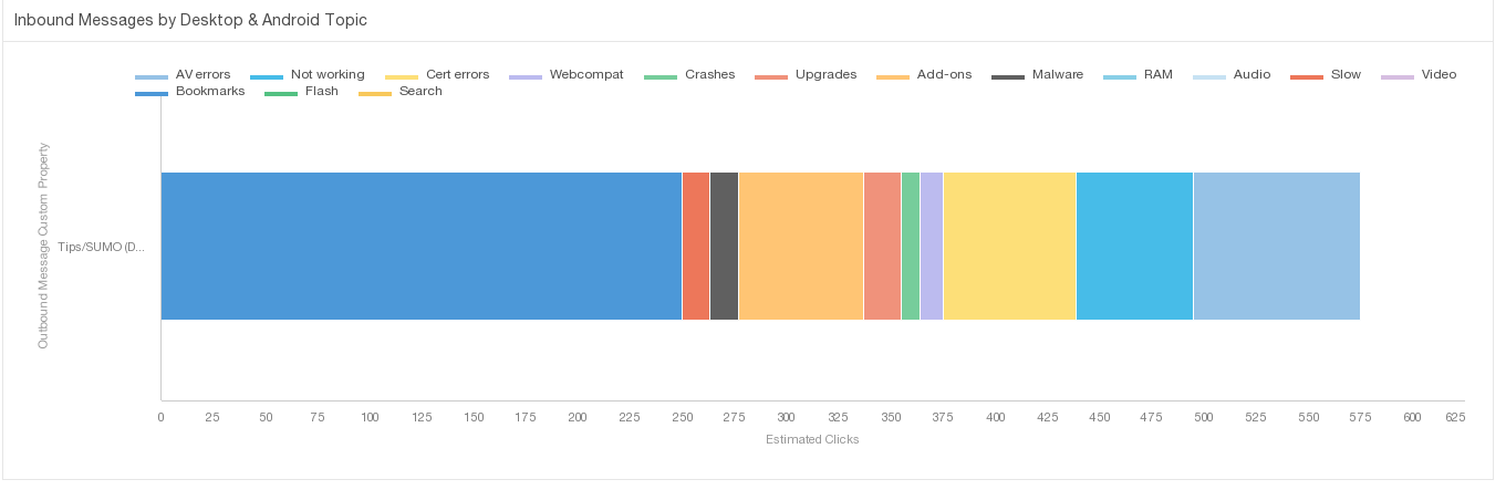


 The Chinese company LeEco has had its sights set on the smartphone market in the United States for quite some time, and the company has finally made a huge splash.
 Here are quick links to our Best Posts about Bike Lights. Check them out - you you are sure to find a post that answers some of your questions about bike lights.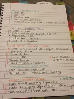
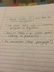
 Consumerist:


 Installation shots from Rosana Antolí's "Virtual Choreography." All photos © Erola Arcalís.


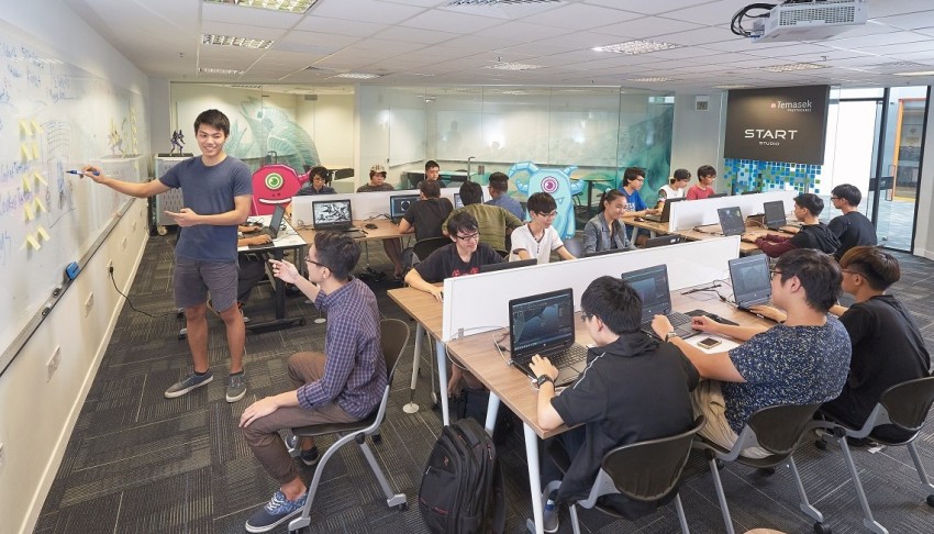
 Kickstand Comics featuring Yehuda Moon.