Shared posts

15 Dec 02:06

Temporarily embarrassed millionaires

files/images/Screen-Shot-2016-11-28-at-9.43.41-PM.png


Bonnie Stewart, the theoryblog, Dec 17, 2016


Understanding this mindset is key to understanding a lot of what happens in the mythologizing of learning, writes Bonnie Stewart: @socialism never took root in America because the poor see themselves not as an exploited proletariat but temporarily embarrassed millionaires.” The idea is that people don't address underlying socio-economic causes of poverty because they don't see themselves as poor. "I’ m particularly interested in how we fight the strange cocktail of victimization and entitlement that hate leeches onto and deploys in its service," she writes. "I’ m interested in how media and social media are part of the problem, and what we do about it."

[Link] [Comment]
15 Dec 02:06

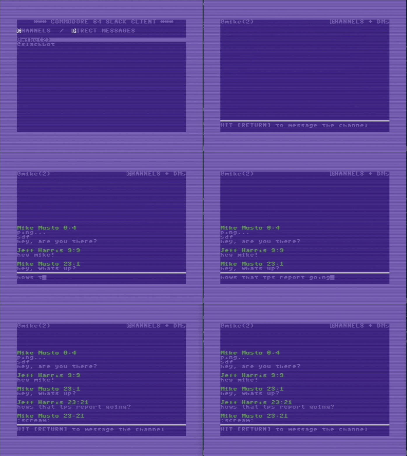
Slack on the Commodore 64 thanks to Raspberry Pi

by Lucy Hattersley

We use Slack all the time at Pi Towers. Granted, we often use it for sharing animated cat GIFs and the latest hacks for the office coffee machine, but we are definitely big fans.

Imagine our delight, then, when we heard about a Slack client for the Commodore 64 (another long-standing flame of ours). Our love for the C64 knows few bounds: along with the Sinclair Spectrum and the BBC Micro, it gave many of us here at the Raspberry Pi Foundation a coding kick-start.

The only thing that could make this better is the Raspberry Pi. And guess what’s sitting slap-bang in the middle between Slack and the C64? Only our favourite single-board computer.

This amazing trinity of tech brings our favourite things together for a text messaging party. We just had to figure out how it worked.

Raspberry Pi Slack

The Raspberry Pi accesses the Slack API

It turns out that bringing Slack to the C64 was no easy matter. Jeff Harris is a software engineer and hobbyist game developer in San Francisco. He’s responsible for developing Slack for the C64.

Much as we love it, the C64 is a little long in the tooth, so it needs a little help connecting to Slack’s API. Jeff’s ingenious result is to hook a Raspberry Pi up to it. “The C64 has an extension port called the user port which, via an adapter, can communicate over RS-232 serial,” Jeff says. The solution was to connect the user port on a Commodore 64 to a USB port on the Raspberry Pi, and Jeff created a homemade cable to do just that.

“The fastest I have been able to run this reliably is a solid 1200 baud or 150 bytes per second,” explains Jeff. At 0.00015 MB, it’s not likely to be much use at a LAN party, but it’s good enough for transferring text messages.

Slack client for Commodore64

What is one thing that Slack is missing? A native client for Commodore64! I built this client in 6502 assembly on the C64 side, and a NodeJS app running on a Raspberry Pi, connected to the C64 via a serial connection. More details here: http://1amstudios.com/2016/11/27/c64-slack-client/

Coding Slack in 6502 Assembly

With the hardware hooked up, Jeff set about writing a Slack client for the Commodore 64. “On the Raspberry Pi, I wrote a NodeJS app which talks to the Slack RTM API,” he says.

The Raspberry Pi connects to the Slack API. It then uses the serial port to talk to the USB serial driver.

“On the Commodore, I wrote an application in 6502 Assembly,” says Jeff. “It uses built-in KERNAL ROM functions to read and write the serial port and update the screen.”

In this blog post, Jeff shows how the C64 client code works using C as a demonstration language. If you want to try recreating the project, all the code is available on Jeff’s GitHub page.

It’s great to see the Commodore 64 still being hacked and kept in use after all these years.


The post Slack on the Commodore 64 thanks to Raspberry Pi appeared first on Raspberry Pi.

15 Dec 01:57

A Computer for Everything: One Year of iPad Pro

by Federico Viticci
I wasn't sure I needed a 12.9-inch iPad when Apple announced the iPad Pro in September 2015. And yet, over a year later, the iPad Pro is, by far, the best computer I've ever owned. I've never felt so satisfied with any other Apple device before – but the transition wasn't easy.

After years spent adapting what I learned from the Mac to bring it to iOS, what I found on the other side was a more focused, efficient way of working and communicating with people. The iPad Pro accelerated my move to an iOS-only setup; today, I genuinely don't know how to perform certain tasks on a Mac anymore.

I use my iPad Pro for everything. It's my writing machine and favorite research tool, but I also rely on it to organize my finances, play games, read books and watch movies, program in Python and Workflow, and manage two successful businesses. While I've been advocating for such multi-purpose use of the iPad platform for a while, the iPad Pro elevated the threshold of possibilities, reaching an inflection point that has pushed others to switch to an iPad as their primary computer as well.

Much of the iPad's strength lies in iOS and its app ecosystem. If Apple were to stop making iPads, I'd still prefer to work on a device that runs iOS rather than macOS. iOS is where app innovation happens on a regular basis with developers one-upping each other in terms of what software can achieve; I also prefer the structure and interactions of iOS itself. The iPad Pro is the purest representation of iOS: it's a computer that can transform into anything you need it to be.

Even if this discussion was settled a long time ago, it bears repeating: millions of people today like working on iOS more than they do on macOS, and the iPad Pro is the best machine to run iOS. There is no sarcastic subtext about the Mac here, which is still a fantastic environment that many Apple users love and need for their line of work. The Mac and the iPad can coexist in a market where customers believe one is superior to the other. I prefer working on the iPad; others like their Macs more. And that's fine because, ultimately, the Apple ecosystem as a whole grows stronger and we all reap the benefits.

The iPad Pro is the purest representation of iOS.

Over the past year of daily iPad Pro usage, I've made it my personal goal to optimize my iPad workflows as much as possible. This is one of the best aspects of the iOS platform: competition between developers is fierce and you can always choose between different apps to get work done – apps that are improved on a regular basis and are constantly updated for the latest iOS technologies. With enough curiosity and patience, iOS rewards you with the discovery of new ways to work and save time.

Since my last iPad story in February, I've taken a hard look at my entire iPad setup and rethought the parts that weren't working. I tried new apps, created new automations, and optimized every weak spot I could find. I improved how I collaborate with my teammates and produce weekly content for Club MacStories members. Thanks to the time I invested in understanding and fine-tuning my iPad Pro, I was able to embark on more projects, double MacStories' growth, and manage a larger team.

As a result, my iPad Pro today is noticeably more capable than it was a year ago – all without the need for a hardware refresh.

Here's what I've done.


eBook Version

An eBook version of this story is available exclusively for Club MacStories members. Club MacStories offers access to weekly MacStories extras – including workflows, app recommendations, and interviews – and it starts at $5/month.


The eBook can be downloaded from the member Downloads area (to download files on iOS, read this).

Get exclusive extras and support MacStories by signing up for Club MacStories today.

Table of Contents

File Management

Due to the lack of a traditional, Finder-like way to browse the local iOS filesystem, file management is one of the toughest challenges of switching to an iPad-first lifestyle. After years of experiments and workarounds, I've come to terms with the fact that file management on iOS requires a new mindset altogether.

The best way to manage files on iOS is to go all-in with cloud storage and rely on native apps and integrations to access your files everywhere and minimize duplicates.

Over the past year, I've consolidated all my file storage needs in Dropbox and iCloud. I use iOS apps to open and manage files that live in a cloud service, and I leverage iOS' document providers to open and import files in apps that don't integrate with Dropbox. While the document picker and document providers get a bad rap, they have improved since the days of iOS 8. I use document providers every day for collaboration with the MacStories team.

Accepting this new reality – that an iPad can't manage local files and folders like a Mac – took time and dedication. If you don't adapt – if you think you can force iOS to be more like the Mac's Finder – you're going to have a bad experience in your transition to iOS. Alas, this also means that people who want to, but can't adapt – either because they can't use cloud services at work or prefer not to store personal files anywhere online – will have to work harder to make an iPad their primary computer. It is possible to create your own centralized, Finder-like setup on an iPad, but it comes with substantial trade-offs.

Dropbox is my primary cloud filesystem and backup service. All my work-related text files and documents are stored in Dropbox, which continues to offer specific advantages over Apple's iCloud Drive: Dropbox integrates with hundreds of iOS apps, it supports public sharing on a file and folder-based level (fantastic for collaboration), and it even works with external web automation services such as IFTTT and Zapier. I don't subscribe to the theory that Dropbox is a feature, not a product, when Apple's implementation of file management in iCloud Drive doesn't even come close to Dropbox's feature set. As an extensible file management platform, Dropbox rocks.

However, iCloud isn't as bad or limited as some are painting it. iCloud is an umbrella term that covers multiple parts of the modern iOS experience – it's more in line with Apple's original goals today than it was when it launched five years ago.

I use two iCloud features for my files and documents:

  • iCloud Photo Library, for photos, videos, and, more importantly for MacStories screenshots;
  • iCloud Drive, for secondary file backups and quick access to documents in some apps.

Thanks to the multiple layers of Dropbox and iCloud, I can set up a new iPad every year with relative ease – all I have to do is log into my iCloud and Dropbox accounts and point apps to their associated storage space. In addition to being an easier way to work with files than shuffling local documents around, this cloud-first approach is an utmost necessity as you can't backup an iOS device like you would with a Mac, using external drives and apps like Time Machine or SuperDuper. When everything is already stored in Dropbox and iCloud, managing iOS apps becomes easier, and I feel safer because my files are also backed up and I have virtually infinite copies of them.

Google Photos

I’m terrified of losing my photos and videos, so I also pay for Google Photos storage to keep original copies on Google’s servers. Google Photos isn’t my primary app to browse photos, but I like keeping tabs on the company’s machine learning efforts, feeding its engine the contents of my photos so it can grow smarter over time. I find Google Photos to be superior to Apple’s Photos app to delete multiple photos at once and to create shared albums for other people. Photo content search is also slightly more intelligent than Apple’s take on iOS 10.

All my most important files and folders (work PDFs, podcast audio files, invoices, etc.) and app-specific libraries are either stored in iCloud (with iCloud Drive and CloudKit) or Dropbox. This isn't new – I've been storing app documents in Dropbox since they launched an iOS SDK in 2010 – but being religious about cloud storage entails a deeper optimization of iOS to go beyond Apple's tools as well as the limitations of the official Dropbox app.

I find Readdle's Documents app to be the best file manager for iOS. Documents is available on both the iPhone and iPad and it's the closest alternative to a Finder you can have on iOS. The app supports Split View on the iPad and you can throw anything at it with a share extension; Documents will store files and organize them with an interface that mirrors what we're used to having on desktop computers.

I like Documents for two reasons: it's built with serious file management in mind (unlike the iCloud Drive app, which is severely limited on iOS) and it's meant to be used as a bridge between the local filesystem and the cloud. Because of these design decisions, Documents is my main app to manage files in Dropbox and iCloud Drive instead of the official apps from Dropbox and Apple.

Documents unifies local and cloud-based file management with tools to quickly move files between locations. This may sound trivial, but Apple doesn't provide such an integrated solution for iOS. In the Documents sidebar, you have three types of locations:

  • Local documents (stored on-device);
  • iCloud Drive (Documents' own iCloud Drive folder);
  • Synced folders.

The latter is what ties everything together and allows you to seamlessly integrate iCloud Drive and Dropbox. Documents supports a variety of third-party cloud accounts, including Dropbox, Google Drive, Box, or your own WebDAV and FTP servers. Each service can be added as a remote location, which lets you browse cloud storage directly in Documents and take advantage of the app's features. Among these, you can enable two-way sync for individual folders: a synced folder will be available in the app's sidebar for faster access, and its contents will be automatically synced with the cloud.

Documents lets you sync Dropbox folders for offline access on the iPad.

Documents lets you sync Dropbox folders for offline access on the iPad.

This is a terrific idea to bring multiple services together in a single file manager. From one screen, I can quickly access Dropbox files that are nested into sub-folders on my account; any folder is only two taps away because Documents can sync it as a bookmark. The best part, though, is the interoperability for files between different services: files can be moved across iCloud, local storage, and third-party cloud services – something that isn't possible (or as intuitive) on iOS by default.

Moving a file from Documents' iCloud Drive storage to another location.

Moving a file from Documents' iCloud Drive storage to another location.

There are other details and features worth noting in Documents that make it the missing Finder for iOS. You can save specific files (from any storage location) as favorites, and there is a Recents view that lists files you've recently viewed; files from multiple services are consolidated on this page, which helps you jump between documents stored across separate services and folders. Thanks to Documents' solid preview capabilities, most file types can be opened and previewed in the app. I do this regularly for audio clips, images, and text files.

Documents can also unzip compressed archives in the current directory (like the Finder on macOS), and it has proper download management features with an interface that displays progress for file downloads. To download files with Documents, you can browse the web with an in-app browser, or you can send a download URL to the app by prefixing it with rhttp. I use this workflow from a widget to open a download URL from the system clipboard into Documents and queue the download there.1

Using the Documents browser to download a file from the web.

Using the Documents browser to download a file from the web.

Documents' in-app browser isn't great for browsing sessions that involve multiple tabs and logins2, and, unfortunately, it doesn't integrate with the 1Password extension either. Documents' browser gets one aspect right, though: when you tap on a link that redirects to a downloadable file (such as a .zip archive), Documents prompts you to download the file and save it in a folder. After 9 years of iOS, Apple's Safari still doesn't offer this basic functionality.

Not only can Documents download files in a local directory, it can even put downloaded files into iCloud Drive (so they're immediately available across all your devices) and save them into synced folders. This means you can go from a download link to a copy of the file instantly pushed to your Dropbox account or FTP server, which is great. This is my favorite way to download files on the iPad.

I should also point out that Documents supports viewing revisions of a Dropbox file – a feature that Dropbox itself hasn't enabled in their iOS app. I don't always have to revert to an older version of a file, but having the option in an iOS app makes me feel better than not having it.

Generally speaking, Documents, unlike Apple's iCloud Drive app, provides common features you'd expect from a file manager in 2016. You can switch between grid and list views, sort files by name and date, search across their filenames and contents (the latter only if indexed beforehand), perform operations such as moving, renaming, copying, and tagging files and folders, and, of course, upload files to cloud services or share them locally with iOS apps and extensions. We've covered Documents on numerous occasions at MacStories in the past; time hasn't made the app obsolete at all. If anything, after iCloud Drive's regression in iOS 10, Documents is more relevant than ever.

There is, however, some merit to iCloud Drive and its integration with the rest of iOS. In fact, I like using iCloud Drive for some apps and workflows where iCloud is faster than Dropbox.

As I wrote in my review of iOS 10, the design of the 'Save to iCloud' extension is the kingpin of inefficiency in how it defaults to expanding every folder and sub-folder upon saving a file. But, the extension works everywhere and it doesn't make you wait for a progress bar to finish uploading thanks to iCloud Drive's background privileges.

Good design (left) vs. Design by someone who doesn't use iCloud Drive.

Good design (left) vs. Design by someone who doesn't use iCloud Drive.

Conversely, while the 'Save to Dropbox' extension is better designed and more functional, it requires you to stare at an 'Uploading...' animation without being able to do anything else because the upload has to finish in the foreground, otherwise the system may suspend it. I'm not fond of it, but I use the 'Save to iCloud' extension to put files in the Documents app folder, and it works.

Speaking of which, I initially thought iCloud's premise of app folders wouldn't gel with me, but, in practice, the metaphor has been surprisingly apt. After years of iOS, my brain has been rewired to think of documents in terms of which app contains them and where I was working with them. iCloud Drive makes this logical association a centerpiece of the experience by overlaying app icons on folders.

I find it more intuitive to think of my iCloud files as an archipelago of items rather a lot of files all stuffed on one big island. I know that my text documents are in the iA Writer folder in iCloud while images are in the Pixelmator folder. I can use their respective apps to access them, or I can open the iCloud Drive app and take a tour of every island and check where each item lives.

In addition to iCloud Drive's system integrations, Workflow is the other connective tissue between my files and cloud accounts. Workflow has excellent support for both iCloud Drive and Dropbox, letting you create file management automations that can save a lot of time.

For iCloud Drive, Workflow is limited to accessing files from the app's own container – Workflow can't poke around and get files from Documents' iCloud Drive sandbox, for instance. Still, because it can read and save files programmatically, Workflow enables you to create reusable templates to speed up file management.

Creating a better iCloud Drive extension takes one action with Workflow.

Creating a better iCloud Drive extension takes one action with Workflow.

You can create a workflow that returns a specific file stored in a sub-folder inside /Workflow/ and that tells you its size or last modification date. Alternatively, you can create workflows that save new files into iCloud Drive, taking advantage of the app's hundreds of actions for data manipulation. Want to save multiple images passed to the Workflow extension into iCloud Drive at once? No problem. How about renaming a file before saving it to iCloud Drive (something Apple's iCloud Drive extension can't do)? Workflow has you covered there as well. And because iCloud Drive files are cached by iOS for offline retrieval, it's usually faster to work with documents and other assets in Workflow using iCloud Drive as you won't have to wait for a download from the cloud.

Dropbox actions in Workflow grant you more freedom than iCloud Drive.

Dropbox actions in Workflow grant you more freedom than iCloud Drive.

Dropbox support in Workflow is a lot more powerful than iCloud Drive, though. Thanks to the Dropbox web API, Workflow can automate advanced functionalities such as getting files from any directory, deleting them, creating shared links, adding folders, and saving new files into any folder on your Dropbox. Because it's an API, you don't even have to keep the Dropbox app installed to use these actions.

Workflow Downloads

Workflow can also automate file downloads from the web using the ‘Get Contents of URL’ action. For those times when I don’t want to use Safari or Documents to download a file, I can fire up this workflow, get a file from the Internet, and share it with any iOS extension I want.

Workflow has been a strong incentive to use Dropbox as my primary filesystem as it allows me to fully control my files with automation, which I find essential to speed up common and boring tasks on the iPad. With Workflow, I can copy shared links for files I frequently access with two taps, I can fetch assets from any directory (including folders other people have shared with me), and I can append text to an existing plain text document.

A good example of the versatility granted by Workflow and Dropbox actions is the automation I've been using to create a copy of an iA Writer document every time I want to publish it. By default, iA Writer text files are stored in iCloud Drive; for longform stories, I also create manual backups in GitHub using Working Copy. Because I want the shorter posts I publish on MacStories to be permanently archived on Dropbox, I added a Dropbox step to my Publish to WordPress workflow that, right after publishing, puts a .txt copy of the post in a Dropbox folder. This way, I don't have to think about saving files to Dropbox – it happens automatically when I run the publishing workflow.

There's an incredible freedom to using Dropbox in Workflow, and I wish the Workflow team would add more actions based on the Dropbox API.

I want to mention iA Writer, too. iA Writer is one of the few iCloud-based apps to support viewing and restoring versions of a file natively on iOS.3

File versions in iA Writer.

File versions in iA Writer.

A lot of iPad users don't know that iCloud has support for file revisions like Dropbox, and I like how the feature has been implemented in iA Writer with the ability to revert the current file to an older copy or create a duplicate of it.

The Downsides of iOS File Management

There are still downsides to managing files on an iPad-only setup. Some of them have been around for a long time; others are a by-product of recent additions to the iOS platform.

iCloud Drive app folders are isolated from each other. iOS apps like Documents and Workflow can't access or display the contents of other apps' folders. This prevents the existence of a full-featured iCloud Drive file manager that offers functionalities Apple doesn't want to build in their iCloud Drive app. There should be an API to allow third-party apps to gain access to the entire contents of your iCloud Drive filesystem, just like there are APIs for photo and music access.

You can't pass around multiple files at once. Something I miss from macOS is the ability to move multiple files around from one location to another. If you want to copy multiple files to another app on iOS, your best chance is to compress them as a single .zip archive or upload them to the cloud and download them again afterwards.

This shouldn't be the case. Apple needs to rework the entire 'Copy to/Import with' extension system (the former 'Open In' menu) and the document picker with support for multiple items.

iCloud Drive is missing features available on the web app. Did you know you can view recently deleted files and restore them in iCloud Drive? I wouldn't be surprised if you didn't, because this option is only available on the iCloud web app, which isn't even supported on Safari for iOS. The iCloud Drive file management UI needs to be completely revamped, and Apple has to include these hidden features in the redesign.

No drag & drop for files on the iPad. This applies to Split View in general, but there should be an easier way to move files between two apps that doesn't require tapping multiple times through menus and share sheets. Drag & drop is an obvious solution: it would be nice if I could drop an image from iCloud Drive into an image editor, or if I could drag a file from Dropbox into my email client to quickly attach it to a message. This is basic stuff for the Mac; the iPad should have this feature, too.


File management on iOS has a long way to go. Compared to macOS, the iPad is still in its infancy when it comes to managing files across multiple apps.

Unlike a couple of years ago, however, managing files on iOS has improved and developers have been clever in supporting new technologies such as document providers and Split View, which cut the time required to move files between locations. Adopting cloud storage with Dropbox and iCloud for everything has made managing files on my iPad easier, but Apple has to reconsider some iOS limitations and redesign the iCloud Drive experience from the ground up.

With Dropbox, iCloud Drive, and third-party apps that integrate with them, I don't need a Mac to manage my files, but I wish iOS could be a little more flexible.

Hardware

If I had to, I could get by with an iPad Pro and the Apple Smart Cover as a basic iPad setup. To complement my writing workflow and get the most out of the iPad's hardware, though, I've tested several accessories over the past year from stands and covers to keyboards and Bluetooth headphones. These are the ones I like and use the most.

Twelve South ParcSlope

When I want or need to use the iPad Pro primarily with multitouch, I think Twelve South's ParcSlope provides the best angle and grip for any kind of flat surface.

Originally conceived as a MacBook stand, the ParcSlope tilts the iPad Pro at a higher angle (18 degrees) than a folded Smart Cover, which helps me hunch over the screen less. The ParcSlope is made of sturdy aluminum with a soft rubber pad to hold the iPad in place. Similarly to other Twelve South products, it almost looks like an accessory Apple would make.

If I know I'm going to use the iPad Pro via touch for several hours, I grab the ParcSlope and put it on my desk.

Razer Keyboard Case

As I wrote last month, I typed my entire iOS 10 review on an Apple Magic Keyboard (held in place by the Studio Neat Canopy stand) and used it every day until I discovered the Razer Keyboard Case for iPad Pro in mid-September. This keyboard is flawed in many ways and it's not for everyone, but it's also the kind of accessory I needed to comfortably type from anywhere during my average writing day.

What sets the Razer keyboard apart is the case that holds the iPad. Unlike other keyboard-case combos, Razer added an adjustable metal kickstand that allows you to change the viewing angle of the iPad's screen while retaining a firm position that prevents the device from wiggling too much when typing.

This has been a revelation for me as I spend a lot of time waiting in my car and I want to get work done in those hours; with the Razer keyboard, I can type on a full-size laptop keyboard with the ability to adjust the iPad's angle.

Furthermore, Razer built a mechanical keyboard that is backlit (with multiple illumination levels) and features iOS-specific media keys. This is great to type at night and to access functions like screenshots and playing music without having to touch the screen. When I'm not typing on it, I usually detach the keyboard and put the iPad Pro inside the case on my lap to watch TV shows or play videogames.

For more details and impressions, you can read my original review here.

Anker PowerCore 20000 Battery

I bought this external battery earlier this year and I've been carrying it around with me everywhere I go.

The PowerCore 20000 gives the best results when used with devices with smaller-capacity batteries (like iPhones), but I've found it to provide enough power to keep an iPad Pro alive until I get home and can use a real charger. Effectively, I use this to keep the iPad Pro around the critical 10% of battery left so I can finish what I'm doing. When I don't use it with the iPad Pro, my girlfriend and I fully recharge our iPhones with it.

Apple 29W USB-C Charger

Speaking of chargers: if you have an iPad Pro 12.9-inch, you need to upgrade to the 29W model and get a USB-C to Lightning cable. The 12.9-inch iPad Pro is the only iPad to support USB Power Delivery with fast charging, which enables the device to recharge considerably faster than when using the default 12W charger.

Earlier this year, I ran a series of tests and discovered that the 29W adapter took 90 minutes to charge an iPad Pro from 0 to 80%; the 12W model needed 3.5 hours to perform the same charge.

Anyone who works on a 12.9-inch iPad Pro every day needs to buy one of these.

Sennheiser Momentum 2.0 Wireless

I've bought several headphones this year.4 After months of testing, I realized that I liked the B&O H6 (2nd generation, over-ear) wired headphones best, but I wanted to have a wireless version with the same benefits. Reviews for the wireless H7 variation weren't positive, so I set out to find something comparable that would be just as light and elegant, with good Bluetooth performance, decent battery life, and large over-ear cups, and that I could wear for many consecutive hours with noise cancellation.

After weeks of research and reading other people's reviews, I went with the Sennheiser Momentum 2.0 Wireless and I'm extremely happy with my purchase. These are my ideal wireless headphones for prolonged listening sessions and I love the sound they produce as well as their design.

The Momentum 2.0 are comfortable thanks to an over-ear design that I barely feel around my ears (unlike the Beats Solo3, which are on-ear and I mostly use when working out in shorter bursts of time as they press against my head too much). The memory foam material of the ear cups is soft and has a premium feel to it. The headphones' overall build quality is top notch – I particularly like the adjustable steel arms and texture of the headband.

Connection with the Momentum 2.0 happens over Bluetooth, which isn't as fast or reliable (or as impressive, range-wise) as the W1 chip found in the Solo3, but because I use them when I'm listening to a nearby device (usually my iPad), Bluetooth hasn't been an issue. One of the Momentum's best features is that they can pair with multiple devices at once: when I turn them on, they connect to both my iPhone and iPad and I can switch between audio sources seamlessly. If I only want to hear sounds from my iPad, I disconnect the headphones from the iPhone's Control Center – a constant reminder that Apple made a good choice in simplifying wireless headphone management with iOS 10.

The Momentum 2.0 Wireless sound great: they don't have the heavy bass of the Beats Solo and Studio, and they're fantastic for alt-rock, pop, and post-rock (my three top genres). Active noise cancellation is good as it muffles a lot of what goes around me (though it doesn't completely mute loud sounds); I've been leaving the headphones on even when not listening to music because I like the increased isolation when I'm writing.

The Sennheiser Momentum 2.0 Wireless are one of my favorite purchases of the year – they are the culmination of months of testing different headphones, and I'm carrying them everywhere I go.

SteelSeries Nimbus Controller

The iPad Pro's large screen makes it a fantastic device to play videogames. And while iOS is best experienced with multitouch, an increasing amount of quality iPad games have added support for MFi controllers over the past two years; despite some limitations, I find playing with a controller and the iPad Pro in front of me surprisingly engaging.

The SteelSeries Nimbus is one of the best console-like controllers you can find for iOS and tvOS. There are two analog sticks at the bottom, a d-pad in the top left, and four buttons on the right side. There are four shoulder buttons and a central menu button to access multiple functions in games, too. The Nimbus feels like a mix of the Wii U and Xbox One controllers – I think it looks nice and, more importantly, it feels good. Buttons are clicky enough, the d-pad is okay, and even the analog sticks – while not as good as the DualShock 4's ones, in my opinion – are superior to other MFi controllers I've tested, including the Gamevice for iPhone (which I own and regularly use).

Everyone has different preferences for analog sticks and buttons, but the Nimbus strikes a good balance of premium quality and comfort across the board. I've enjoyed playing Oceanhorn and Crashlands with the iPad Pro propped up on my lap or a desk. I look forward to playing more games this way next year.

Tom Bihn Daylight Briefcase

After almost five years of using a Tom Bihn Ristretto bag every day, earlier this year I decided to upgrade to a bigger bag to accomodate the iPad Pro and wireless headphones. I had no doubt I was going to get another Tom Bihn product (I'm a huge fan of the company); after some de rigueur research, the Daylight Briefcase seemed like the best option for me. I ordered one before WWDC and I went to San Francisco with it.

The Daylight Briefcase is a laptop bag that can fit the 12.9-inch iPad Pro perfectly. Like other Tom Bihn bags, there are plenty of compartments and semi-hidden pockets in and out, which I use to hold accessories and cables. The Daylight Briefcase is made of a high-quality nylon material that is durable and can resist a variety of scenarios such as rain, relaxing at the beach, and being walked over by people and dogs (all personally tested). The Absolute shoulder strap (a $20 upgrade) is comfortable and adjustable, and I like the sober-but-not-boring look of the whole product.

In more extreme situations, the Daylight Briefcase has acted as a carry-on bag for flights with tons of hardware and even t-shirts inside. I wouldn't use any other bag for my iPad Pro and related accessories. I can't recommend this bag enough.

Entertainment

Besides work, I use my iPad Pro for entertainment. I'd say that, over the past 12 months, I've optimized the way I work from my iPad just as much as I've changed how I consume media on it. I don't want to be tied to a television set for TV shows and video games anymore; once again, I prefer the freedom an iPad gives me.

With a four-speaker system and a large Retina display I can hold and put anywhere, the iPad Pro has become my favorite computer to listen to music, watch movies, and play games, too.

Music

I'm one of those people who can't choose between Apple Music and Spotify. I like that Apple Music has lyrics and I want to follow Apple's progress on streaming and iOS integrations; on the other hand, Spotify has superior discovery features and algorithmic enhancements that let me find new music every week. I pay for both and I listen to a lot of music, both old and new.

I've written about Spotify and Apple Music on separate occasions before, and this is not the time for a proper review of the two services. From an app standpoint, though, Apple is ahead of Spotify: Apple Music for iPad supports Split View, it has built-in lyrics, and it features an easier activation of the share sheet, which is buried into a sub-menu on Spotify.

Apple Music supports multitasking; Spotify for iPad doesn't.

Apple Music supports multitasking; Spotify for iPad doesn't.

Spotify has a different advantage over Apple Music: thanks to Spotify Connect, it can pair directly with audio devices in my house without using Bluetooth and thus redirecting all system audio to a speaker.

Spotify Connect makes it easy to connect to external speakers directly.

Spotify Connect makes it easy to connect to external speakers directly.

Spotify Connect can beam music to my two Echo devices and it has recently gained integration for streaming to Sonos speakers. It's nice to be able to browse music and control playback on my Echo from Spotify on the iPad without interfering with system sounds or YouTube videos. I wish Apple Music could stream to the Amazon Echo over Wi-Fi instead of Bluetooth, but I know such partnership is likely never going to happen.

Video

For a long time, downloading torrents was one of the reasons that prevented me from using the iPad Pro as my only computer. I kept an ailing MacBook Air around for two reasons: recording podcasts and downloading torrents with Transmission. I'm still working on a native iOS solution for the former; due to Apple's App Store rules, I had to offload the latter to a device that is neither an iPad nor a Mac.

At the beginning of the year, I bought a Synology NAS (a DS214Play) and have been using it as a home server and media center. The Synology handles torrent downloads now, keeping video files organized in its local storage (4 TB in RAID1) and ready for streaming through iOS clients. I don't use my MacBook for torrents anymore, and, as an added benefit, I can also start downloads from outside my home network on the iPad Pro.

Synology has a collection of dedicated iOS apps to manage various server-related activities. Among these apps, there are DS Get and DS File: the first app can send torrent files to the Download Station app on the Synology to start downloading them; the second one is a file manager to log into the NAS and manage files and folders other apps can access. You can use these apps on a local Wi-Fi network; if you're not at home, a free dynamic hostname service called QuickConnect lets you log into the Synology remotely to manage everything from iOS. You can leave a Synology running at home while plugged into Ethernet, and log in and access files from iOS over cellular or another Wi-Fi network.

The DS Get app registers on iOS as a handler of .torrent files. When I open a torrent in Safari on my iPad, I use the 'Copy to' extension to send the file to the DS Get app, which logs into my Synology and starts the download. There are workflows and APIs to download torrents without sending a file from the browser, but I've found the manual process in Safari to be faster and more intuitive.

DS File isn't spectacular but it gets the job done.

DS File isn't spectacular but it gets the job done.

Once a download is completed, I open DS File and move the video file into the appropriate directory. There are applications for Synology servers that can take care of renaming, transcoding, and organizing files into folders automatically, but they require a bit of initial setup I haven't had the time to go through yet. Apps on my iPad can stream most types of video formats anyway, and I like the fact that I choose where to move files so I know where to find them at all times. For those few occasions when my iPad can't stream an .mkv file, I use my girlfriend's 2015 MacBook Pro to download it and re-encode it to MP4 with HandBrake. I should probably research automated transcoding options for the Synology itself.

Infuse 5.

Infuse 5.

My favorite app to stream videos on the iPad is Infuse Pro. I covered the app before (most recently, with the launch of version 5) and I think it's the richest, easiest-to-use video player for iOS. Infuse 5 features automatic subtitle downloads from Open Subtitles; it can output Dolby TrueHD and DTS-HD MA audio; and it plays just about any video format you throw at it. Plus, Infuse looks great, it syncs with trakt.tv, and it adds contextual information to movies and TV shows such as posters, descriptions, and cast details.

I start watching videos with Infuse in two ways. Both DS File and DS Video (Synology's take on a Plex-like media center) can send streamable video URLs to Infuse with the tap of a button.

Sending a file to Infuse from DS Video.

Sending a file to Infuse from DS Video.

After moving files with DS File, I can navigate to a folder, tap a file, and choose Infuse as a compatible player. Doing this sends a URL (either a local one for your home network or an authenticated QuickConnect one) to Infuse, which will start streaming right away.

Alternatively, Infuse lets you browse servers and network-attached storage devices via UPnP and DLNA. My Synology NAS shows up in Infuse's list of available devices, so I can navigate into it with a file management UI and pick a video to play. What's even better, though, is that Infuse lets you save individual Synology folders as favorites for quick access.

Synology folders as favorites in Infuse.

Synology folders as favorites in Infuse.

I created bookmarks for my Media and Downloads folders, and I can view their contents from the main page of Infuse without opening the network discovery screen.

Infuse Pro can stream videos to a Google Chromecast as well. I use the Chromecast to stream YouTube videos on the big screen with one tap from the official YouTube app, but I like to watch TV shows and movies on my TV, too, especially when I have some friends over.

"Casting" from Infuse.

"Casting" from Infuse.

I upgraded from a first-generation Chromecast to a second-gen model this year for faster performance, and the integration with Infuse is fantastic. There's a button in the video playback UI to "cast" a video to a television; streaming with the Chromecast is usually faster and more reliable than AirPlay because Google's service fetches videos from a URL instead of buffering a video file on the local network. Using Infuse as the middleman between my Synology and the Chromecast works without a hitch.

I also created an Alexa-Logitech Harmony routine that lets me say "Alexa, turn on Chromecast". When I utter that command, my TV and Sony soundbar turn on, switch to the correct HDMI input for the Chromecast, and I can start streaming. No more fiddling with a bunch of remotes, as all it takes is a tap of the Chromecast button in Infuse. If I can't (or don't want to) summon Alexa verbally, I run a routine in the Yonomi iOS app, which has the same effect thanks to its Harmony support but doesn't require voice input.5

The combination of a Synology NAS and Infuse has singlehandedly solved the problem of not being able to download torrents on my iPad Pro. Sure, I didn't "fix" the problem per se – I circumvented it with an external device that isn't a Mac – but I'm deeply satisfied with the results. Video files aren't taking up storage on my iPad Pro and there's a server always ready to download torrents on a fast fiber connection that I can interact with using iOS apps. I don't see myself ever moving away from this system; if anything, I might upgrade to a more powerful Synology next year.6

Synology Web App and Plex

Synology servers can also be accessed from a web app that requires reloading Safari in desktop mode (or using iCab with a custom user agent for the NAS’ IP address). I prefer the native experience of the single-purpose DS apps for iOS, but the web app is necessary for certain server management features.

I’ve also been testing Plex again, which launched several new features this year and improved their iOS app. Plex looks great, but it seems to be more aimed at users who maintain large libraries of movies, photos, and music, whereas I only care about video. Plex indexing also seems to slow down my Synology quite a bit. As soon as I upgrade to a faster Synology, I’ll try to put everything in Plex and see what happens. I’m intrigued by their new updated photos experience with AI search.

Television Time, a TV show tracker developed by Maximilian Litteral, deserves a special mention. I've tried dozens of TV show trackers over the past 7 years of MacStories and Television Time is the first one that doesn't make me feel like there's something missing.

Television Time has it all: there's Trakt sync (I'm obsessed with my Trakt stats), support for the latest iOS features such as haptic feedback on the iPhone 7 and rich notifications for iOS 10, settings to hide spoilers and add notification offsets, and, of course, an iPad app.

I use Television Time to view synopses of upcoming episodes and check off what I've watched. Coupled with Trakt VIP (which recently launched a useful Alexa skill and comes with nice extras), Television Time has gained a permanent spot on my iPad.

Console Gaming

I don't only play iOS games on my iPad Pro. I've also been using it to play old Nintendo games and even modern PlayStation 4 titles.

A few weeks ago, I took the plunge and installed Provenance, a third-party emulator for old Nintendo consoles like the NES, SNES, and Game Boy.7 Provenance isn't allowed on the App Store: you have to download an Xcode project, sign it with a developer certificate, and install it over USB on an iOS device. That may sound overly complicated, but the instructions are clearly laid out and I was able to follow them and get everything working in less than 30 minutes. You can do this, too.

A Link to the Past running on Provenance on my iPad Pro.

A Link to the Past running on Provenance on my iPad Pro.

I'm not new to Nintendo emulators. I started following tech blogs because I used to run homebrew software on my PSP8 and I spent hundreds of hours playing with Snes9x. Provenance falls in line with similar apps for desktop computers and jailbroken devices. Emulation isn't perfect but it's acceptable, there's auto-save, and the app automatically categorizes games with titles and artwork downloaded from the Internet.

Provenance's main interface is not too exciting, unlike OpenEmu.

Provenance's main interface is not too exciting, unlike OpenEmu.

What I love about Provenance is that it takes advantage of the Game Controller framework on iOS to let you play with any MFi controller. As you can imagine, I've been using my Nimbus to play A Link to the Past and Super Metroid on my iPad Pro, and it's glorious. If you told me when I was 9 that I'd be playing SNES games on a Retina display that could always be with me, I would have thought you were as crazy as Miyamoto's team back in the Stunt Race FX days.

When I'm in the mood for a more modern gaming experience but can't sit in front of my PS4, I use PlayMira. This app (previously called PlayCast) uses PlayStation's Remote Play APIs to let you control your console and play games from an iOS device. You have to follow the instructions to configure your PS4 for Remote Play with the app, but once you're set, PlayMira lets you wake up a PS4 and start playing anywhere you are.9

Playing Final Fantasy XV with PlayMira.

Playing Final Fantasy XV with PlayMira.

And it's amazing. I've used PlayMira to play No Man's Sky, Battlefield 1, and Final Fantasy XV on my iPad Pro and I almost couldn't believe what I was doing. If you have a fast Internet connection, performance is good on both Wi-Fi and cellular access from iOS, though you should expect the occasional frame rate drop or graphical glitch.10 Like Provenance, PlayMira lets you use virtual onscreen controls that replicate a DualShock 4, but you'll want to get an iOS game controller and use that instead. I had to remap some buttons to different combinations on my Nimbus, and it'd be better if my DualShock could directly connect to the iPad, but it works well enough.

Part of the reason I've always remembered portable game consoles fondly is the fact that games could always be with me. With PlayMira, I can turn my iPad into a portable screen for my PlayStation 4 games wherever I am. This app is one of my favorite surprises of the year.

Calendars

I'm not a heavy calendar user. I don't have a lot of events going on at specific times and locations; I tend to have a series of tasks that have to be completed within a certain time frame, so I use my task manager more than my calendar app. However, I'm trying to be more disciplined about adding all kinds of personal and work-related events to multiple calendars, and I found an app that suits my taste better than others.

Timepage launched on the iPad earlier this year, and I switched to it as my main calendar app as soon as it came out. We have reviewed Timepage on MacStories multiple times, and I believe it is one of the best app launches of the past year.11 Developed by Bonobo in partnership with Moleskine, Timepage makes calendars beautiful and smart with some of the most clever interactions I've seen on iOS in a while. This is true for both the iPhone and iPad versions, but the app truly shines on the iPad Pro's large display.

Timepage's Scarlet Red theme is gorgeous.

Timepage's Scarlet Red theme is gorgeous.

There's no calendar client as elegant as Timepage. The app comes with multiple themes to choose from, and there's a unique use of pastel tints, bold typography, and colored accents throughout the interface that make your daily agenda stand out. On the iPad, days are displayed in a vertical strip on the left, with events in the middle and details for individual days and events on the right.

There are tons of delightful touches everywhere, such as integration with weather forecasts, estimated travel times, and a morning briefing that tells you what your day is going to be like. Even adding a new event eschews the paradigms of traditional calendar clients.

Timepage's unique event creation UI.

Timepage's unique event creation UI.

Timepage isn't just about the novelty effect of a unique calendar visualization, though. The app is built on new types of interactions that simplify navigation in intelligent ways. In the month sidebar, for instance, there's a heatmap that indicates how busy each day is through different levels of shading.

Calendars displayed in the app are available as large bubbles at the bottom; if you tap and hold one, you can drag the finger around to switch calendars and update the heatmap above to only show events for the current selection. It's a genius solution for the problem of filtering month views by calendar. But I could also mention how swiping horizontally expands the sidebar into a full month view, or how the event creation panel pairs relative times of the day with more precise hours and how you have to scrub through a progress bar to set the time quickly.

Timepage is filled with ideas, design choices, and interaction patterns I've never seen in any other iOS calendar client before. It's a joy to use and look at, it's fun, and the developers are constantly improving it with new integrations and features. Managing my schedule with Timepage on the iPad makes me want to use my calendar more.

Email Management with Airmail and Sanebox

I switched to Airmail as my primary email client in April. While I've kept tabs on other email apps, I always go back to Airmail because of its power-user features and integrations. I explained my reasons for switching in my previous coverage of versions 1.0 and 1.1, but there are some recent developments that have improved how I manage email on my iPad even further.

As I shared in the October 2016 Monthly Log newsletter for Club MacStories members, I started using Sanebox a couple of months ago. Sanebox is a web service that connects to your email provider (in my case, Gmail) and separates messages in categories based on importance and type. It's the same concept as apps like Inbox and Spark, but it happens in the cloud and it uses mailboxes/labels, which means you can change email clients and Sanebox will continue to operate because it's not a proprietary feature of an app. As long as it's connected to your email account, Sanebox will remove unimportant messages from your inbox and file them into a folder. Even if you switch email clients, you'll be able to take advantage of Sanebox because it's just a brain in the cloud, independent of the app you use to read emails.

Sanebox seemed to be tailored precisely for my problems. I like modern email clients that try to guess which emails are more important than others, but I don't want to start this training process from scratch every time I switch apps. And because of my job, I have to try different email clients quite often. After forwarding every Gmail account I previously had to a single address, I turned on Sanebox and let it organize email for me.

I’ve never had a better relationship with email than with Sanebox.

Two months in, I can say I've never had a better relationship with email than with Sanebox. The service's marquee functionality is the ability to discern messages you don't need to see right away. Those messages are automatically moved to a SaneLater folder as soon as they hit my account. Similarly, newsletters and other "announcement" emails go into a SaneNews folder. Messages that Sanebox deems important stay in the inbox. If you don't agree with Sanebox's intelligence, you can train it by filing messages into a different folder or by creating more advanced rules on the Sanebox website.

Thanks to Sanebox, I've gotten used to a new kind of email triaging workflow: the few messages in the inbox are acted upon as soon as possible, while SaneLater and SaneNews emails wait until the evening or the weekend, when I have more time to read. Sanebox has learned from my training and it knows where to file messages from important people. Thanks to the SaneBlackHole (another folder), I also have an easy way to make sure I'll never see a message from a specific sender again. All of this works in any email client.

My Airmail setup.

My Airmail setup.

With its deep customization, Airmail can handle this type of email workflow beautifully. Sanebox folders I use daily are saved as favorites in Airmail, where I can put them at the top of the sidebar for quick access. Favorites let me move between different groups of emails with a couple of taps; they can also have custom colors, which helps spotting them at a glance.

Filing messages into mailboxes is key to Sanebox, and Airmail has the most powerful Move interface of any email app on iOS.

Airmail's move UI.

Airmail's move UI.

With favorite folders at the top, I can file a message into any Sane-folder without having to scroll a long list of mailboxes from my Gmail account. Fast message filing also means I'm training Sanebox more often because it's not a chore, which results in smarter email organization every day. It's a win-win.

I've described both in detail before, but Airmail's Smart Folders and app integrations are outstanding. To my knowledge, Airmail is the only iOS email app that lets you create complex smart folders that work for any type of email account. I have smart folders that act as saved searches (built using the Gmail search syntax) and they help me find messages that are addressed to a specific person or that contain words I'm often looking for. App integrations are equally impressive: Airmail can work with task managers, cloud storage services, document providers, and even the package tracking app Deliveries to turn messages into actions. The list of services and apps supported by Airmail is the new standard for power-user email clients on iOS.

I try not to spend too much time managing email, but there is still a lot of value in it for me because of the connections I make and new products I discover with email. The combination of Sanebox in the cloud and Airmail on iOS helps me be more efficient with the important messages I need to take care of, but more relaxed with everything else. Sanebox and Airmail have saved me dozens of hours.

GitHub and Markdown Editing

Here at MacStories, we like to write in Markdown. We appreciate the portability of plain text and how it enables us to try different text editors for iOS and macOS. Markdown and plain text are also easily scriptable, which saves us time when editing stories. Unlike most tech publications, we never collaborate on articles using Word or Google Docs because I don't want to deal with rich text or HTML code. I like plain text and John Gruber's invention so much, we even rebuilt MacStories to accept native Markdown text for every post.

Over time, as the MacStories team expanded and multiple writers had to provide feedback on drafts, my stance on not using collaborative rich text services was becoming a hurdle for everyone. For a while, if we wanted to check out a story someone was working on, we had to exchange files, create duplicates, and then compare differences between two text files with a diff tool on the Mac before sending the annotated version back. It was less than ideal.

The system we've been using over the past year relies on GitHub and has native support for Markdown and iOS. This is how we've been collaborating on stories – including my iOS 10 review – throughout 2016 for both MacStories and Club MacStories, and I couldn't be happier with it.

GitHub is mostly known as a code hosting platform that enables programmers to collaborate on code and keep track of changes in shared projects called repositories. At a fundamental level, however, GitHub deals with text and compares differences between versions of the same text file. The same principles that allow programmers to host their code on GitHub can be used for collaborative Markdown writing, which is what we've done through several GitHub repositories.

Each MacStories writer has their own private GitHub repository where they can save drafts of articles currently being worked on. Other members are invited to the repository so they can read each other's stories and provide feedback. We have a general Club MacStories repository that John and I use to assemble issues of our newsletter every week, and I also have a personal repository where I save drafts I would like others to read in advance.

Most programmers interact with GitHub from a command line interface (CLI) on desktop computers, which isn't exactly user-friendly; much of the GitHub terminology is already quite obscure, and using the service from a terminal only adds to that complexity. Fortunately, there are great GitHub clients for iOS with a proper GUI to manage repositories and commits, making the GitHub experience on iOS visually appealing and integrated with iOS apps.

My favorite GitHub client for iOS is Working Copy by Anders Borum. Working Copy is a power-user GitHub client with Markdown support, app integrations, automation features, and ongoing support from its developer. Working Copy is one of the apps I've used the most this year and it played an important role in convincing me GitHub was the right service for us.

Working Copy lets you commit (save) files from other iOS apps with a share extension. This allows us to save Markdown documents from any text editor, screenshots from an email client or the Photos app12, and so forth. As long as a file can be shared with extensions, we can commit it to our repositories with Working Copy.

Both Markdown files and images can be committed to a repository with the Working Copy extension.

Both Markdown files and images can be committed to a repository with the Working Copy extension.

This even works for overwriting an existing document with a new version: if I have an updated draft of a document I've already saved in Working Copy, I just need to share it to the app again, tap the existing file, and commit it to add a new version.
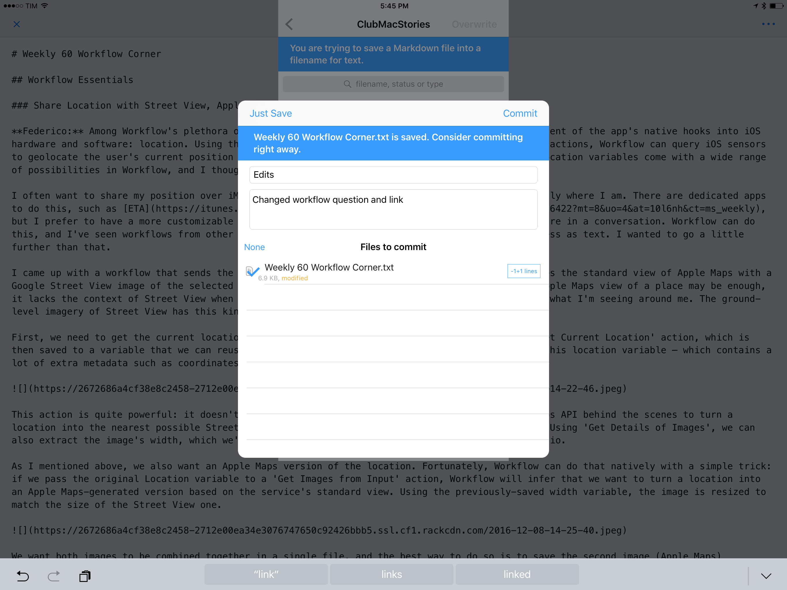
Overwriting a text file with a new commit from Ulysses.

Overwriting a text file with a new commit from Ulysses.

The most useful features of Working Copy are revealed in the app. For every file, Working Copy keeps a list of commits (versions) from GitHub and allows you to view titles and comments for each version. Then, the best part: Working Copy supports GitHub's diff highlights for individual words in addition to entire paragraphs, which is exactly the kind of tool we needed for collaboration. Not only can Working Copy highlight in red/green the paragraphs that changed from one version of a file to another – it can also highlight individual word changes with a darker shade.

Diff highlights in Working Copy.

Diff highlights in Working Copy.

Working Copy's diff support has been a boon for how we edit Markdown and collaborate on articles. We can keep track of every edit and comment in a centralized location without creating duplicates. Working Copy makes it easy to follow the evolution of a document through multiple commits; every writer can chime in with their own suggestions and Working Copy will handle file merging and conflict resolution thanks to GitHub. Version control and diffs are integrated in the same app, and everyone is always looking at the same (and most recent) copy of a file. Thanks to Split View on the iPad, I can keep iMessage or Slack open on one side, put Working Copy on the other, and discuss edits and comments with someone else.

Multiple commits from different writers.

Multiple commits from different writers.

Working Copy supports Markdown syntax highlight and it ships with a basic text editor, but I prefer to read and edit articles in other apps. There are a few options available and they're all made possible by Working Copy's integration with iOS frameworks.

Working Copy can be used as a document provider to import files from repositories into external apps. Furthermore, files provided by Working Copy can be opened and edited in another app and the changes will be reflected directly in Working Copy; the app essentially gives access to its sandbox scoped to an individual file.

iA Writer is one of the few text editors I know that supports this "open and edit" mode: by tapping File > Open in iA Writer, I can select Working Copy, pick a file, and iA Writer will open it without creating a duplicate.

Opening a Working Copy document in iA Writer via the document picker.

Opening a Working Copy document in iA Writer via the document picker.

In this case, iA Writer is accessing a file directly in Working Copy. I can read, edit, and preview the document in iA Writer and every change I make will be saved back into the file stored in Working Copy. With this system, I can replace Working Copy's barebones text editor with iA Writer's richer selection of editing tools and beautiful interface. This is my favorite way to read and edit longform pieces from other writers, and it's all based on a solid GitHub workflow for iOS.

I can even manage entire repositories as bookmarked folders outside of Working Copy. This is one of the most impressive implementations of document providers I've seen to date. Textastic, the popular code editor for iOS, can open repositories from Working Copy and save them as bookmarked locations in its sidebar.

This file, displayed in Textastic, is stored in Working Copy.

This file, displayed in Textastic, is stored in Working Copy.

Think of these folders as aliases of a document provider's sub-directory that are automatically updated alongside the original storage. I can open a Working Copy repository in Textastic, create directories, move files around, and even edit text documents with Textastic's own editor instead of Working Copy's.

Changes made in Textastic (left) are reflected in Working Copy's repository.

Changes made in Textastic (left) are reflected in Working Copy's repository.

As with open mode in iA Writer, any change I make in Textastic is saved back into Working Copy thanks to the iOS document provider API. I don't have to create duplicates or copy files around with extensions. Every week, I archive old GitHub documents from Textastic on iOS, committing changes in Working Copy with GitHub notifications that are delivered to multiple Slack channels at once – no Mac involved.

I wouldn't be able to switch to any other collaborative Markdown environment now. Working Copy and GitHub have enabled us to be faster and more consistent at proofing each other's stories with a fantastic set of integrations on iOS. As a side benefit, relying on GitHub for collaborative editing has resulted in a third layer of backups for my drafts and it's making me consider GitHub as an internal wiki tool to create nicely formatted Markdown guides for the MacStories team.

It’s possible to work with the same version of a file between multiple iOS apps now.

There's also an argument to be made about document providers and filesystem preconceptions on iOS. I bet most iPad users have no idea that document providers can be so flexible these days – in fact, I believe a lot of iOS app developers don't even bother to add deeper support for document providers. But as Working Copy, Textastic, and iA Writer show, it's possible to work with the same version of a file between multiple iOS apps now – with a streamlined workflow that is comparable to a Mac. I wish more app developers and Apple itself would consider this.

Automation

Much of what I do on the iPad is facilitated by automation. I've been writing about iOS automation for several years, and I've seen all the forms it's taken so far – from the humble beginnings of URL schemes to callback URLs, Python scripts, and, finally, Workflow.

There's an important difference between the old iOS automation kin and the modern wonders of Workflow. Four years ago, URL schemes were the only way to turn an iPad into a passable work device for advanced tasks. Automation was an escape hatch from Apple's limitations and the immaturity of iOS. Today, iOS is a stronger, more capable platform that, for many, is superior to macOS. There's still work to be done, but, for the most part, iOS automation today is an optional enhancement – a way to speed up tasks and make them more accessible. In four years, and largely because of iOS 8 and iOS 9, iOS automation has evolved from a workaround into a creative optimization.

It would be impossible to recall all the workflows and scripts I've put together over the years. You can find previous examples in the dedicated Workflow, Pythonista, Drafts, and automation pages on MacStories – I highly recommend going through the archives. And, of course, you can also receive fresh workflows and explanations every week with the MacStories Weekly newsletter.

As you can see, most of my recent automations happen in Workflow, and I rely on the app quite a bit:

Many of my workflows are specific to the MacStories team and I only use them a few times per week, so there would be little value in sharing them. Furthermore, many of them are based on web automation with Zapier, which I plan to discuss in a separate story in the future.

Instead, below you'll find a collection of my most used general-purpose iOS workflows and automations. Hopefully, these will give you an idea of how automation can enhance and speed up the modern iOS experience.

Time Tracking

As I shared in the latest Monthly Log newsletter for Club MacStories members, I've started tracking my time with Toggl to optimize how I get work done and understand where my time is going. The experiment is going well, but time tracking is the kind of habit that needs to be ingrained in your memory until it becomes second nature. The best way to do so is to make it easy to start new timers.

I previously detailed my Toggl automations with the release of Workflow 1.6. I have two separate workflows to start new timers from pre-built templates and check for how long an existing timer has been running.

The advantage of using these workflows in lieu of the Toggl web app is that they can be triggered as widgets in a couple of seconds. With iOS 10.2, interacting with widgets is even faster than before as iOS now remembers your position when you pull down from the status bar. If you are viewing widgets before dismissing Notification Center, iOS won't re-open notifications by default the next time you pull down. This minor change allows me to track my time on the iPad more easily as all I need to do is swipe down, run my timer workflow, and return to what I was doing.

You can learn more and download my Toggl workflows ...

15 Dec 01:53

Trackpads? Are you serious?

by xjgi4k
This is my second post about moving from Mac to Windows. I originally was just going to focus on the OS differences but was amazed to find out that while I loved the Surface Book, I hated the Yoga. Keep in mind that my target audience here isn’t Windows users but Mac users who are […]
15 Dec 01:52

Fast and good: Robert Scoble and Shel Israel’s amazing publishing model

by Josh Bernoff

Self-publishing is much faster than traditional publishing. But can you create a quality book that way? Yes, but only with a disciplined process and the right support team. Here’s my insider’s account of how Shel Israel and Robert Scoble pulled it off with their new book book, The Fourth Transformation: How Augmented Reality and Artificial Intelligence Change Everything. Shel … Continued

The post Fast and good: Robert Scoble and Shel Israel’s amazing publishing model appeared first on without bullshit.

15 Dec 01:52

A Syrian voice and a small slice of peace

by Chris Corrigan

In 2014 I ran an Art of Hosting training in Istanbul with a number of friends.  Many of the people we were working with were people that had taken the energy and intentions of the 2013 Gezi Park occupation and had spread that out through democratic forums to the neighbourhood parks throughout the city and in places like Ankara to help people discuss events and organize to look after their neighbourhoods.

One day we joined a peace protest on the Galata Bridge and later that evening we gathered in the fish market for dinner, not far from Taksim Square.  Walking up there from our workshop location, we passed by a little peace camp in front of the Galatasaray school on the Ístiklal Caddesi. The campers were protesting the escalating violence in Syria.

One of our workshop participants was a well travelled young woman who had been involved in the initial revolution in Damascus and then left for Beirut when it turned violent. While we were in our workshop she was awaiting the news about whether her mother would be able to leave Syria.

We talked for a while about what the beautiful and creative initial stirrings of the revolution were like, and how social media connects us, and what it’s like to be a citizen of the world, connecting with each other, trying to understand each other. And we ended the conversation with another friend reflecting on what it was like to have been in that same place the year before being chased by the Turkish police and having rubber bullets fired at her.

I recorded that conversation and was listening to it again this morning as news came through of the continued slaughter in east Aleppo and the subsequent deal to allow some residents to leave. You can listen to this conversation if you like. I won’t identify any of the people on this recording. It shows humans from several countries trying to connect and make sense of impending immense violence in a world in which they have very little power.  We are just standing around talking, on our way to party, learning a thing or two about each other. I don’t know why but this stark contrast reminds me that even as we hear news of overwhelming violence and chaos, there is always this also happening.

For me, that is as good a definition of peace as any.  If your heart is breaking this morning like mine is, perhaps a little connection with a few simple humans will help.

15 Dec 01:51

The Best Laser Printer

by Ben Keough
top pick printer on desk

After nearly 250 hours of research and testing over the past few years, we’ve found that the best choice for an affordable laser printer right now is the Brother HL-L2340DW. Among the dozens of laser printers we’ve looked at, the L2340DW is one of the most economical and least frustrating printers you can buy.

15 Dec 01:50

Apple removing ‘time remaining’ battery life estimates

by Rui Carmo

I think this is both a) stupid and b) symptomatic of how Apple addresses software issues these days.

I completely get that boxing the estimates for power consumption is harder when the power profile changes dramatically as CPU workload shifts it up or down in clock speed (and all the more so when factoring in other bits of the integrated Intel chipset), but removing the feature instead of fixing this estimation is the wrong thing to do.

They should work on throwing some savvy engineers at the problem (and communicating that). What they achieved is tantamount to signaling their inability or unwillingness to improve the experience, and lessen it instead.

15 Dec 01:38

International bike spotting – Rory Lowe

by dandy

To help us get through the next couple of colder months, dandyhorse is going to be profiling cyclists from around the world! Folks who love to cycle, here in Toronto and further afield, will give us insight into what it's like to cycle in their cities. Want to add your voice to the bikespotting series? Get in touch with us at: cayley@dandyhorsemagazine.com

Rory Lowe - Trainee Paramedic/Barista, Sydney

What is it like biking in your city?

Riding in Sydney is beautiful and fun but can be pretty stressful with agro drivers showing little respect for cyclists. I commute for work and also ride longer distances on my road bike, I stick to the same few routes for my longer rides as they generally have less heavy traffic on them. Sydney has quite a few cycle lanes in the central city area which makes it more relaxing to ride.

How are the bike lanes?

The bikes lanes that aren't being removed (yet) are pretty good, generally they're well kept and link up to others. Sometimes they are pretty badly thought out which makes riders use the road instead.

What can the city do better?

They could make the cycle lanes connect up and have a better flow to them in regards to the traffic lights. The city could also add more cycle lanes in and around the city, try to encourage people to commute on them more.

Where else would you like bike lanes?

City, surrounding suburbs, connected to the beaches

What is the relationship between cars and bikes?

Generally it's not very good at the moment, it's kind of an 'us vs them' vibe. It's stupid and dangerous and not helping anyone. Some drivers are courteous with riders but others are aggressive and seem to have no problem putting cyclists in danger.

If you could summarise city cycling in one word what would it be? 

Complicated

Related Articles

The great divide: The "Urban vs Suburban" debate misses the point 

International bike spotting - Alison Piper 

Showing bikes some love - Bikes vs Cars hits Toronto


15 Dec 01:38

Yahoo admits to a new data breach that affects 1 billion user accounts

by Rose Behar

Three months after Yahoo confirmed a 2014 data breach that affected over 500 million accounts, the company has revealed a new data theft of twice the size that took place in 2013.

The company stated that an “unauthorized third party” stole data associated with more than one billion user accounts in August 2013. The breach was discovered when Yahoo data was presented to the company by law enforcement in November. The company says it has not identified the details of the breach, but believes the event is distinct from the September breach. It has connected some of the activity from this most recent December breach to the state-sponsored actor that they believe was responsible for the September data theft.

In both cases it may have revealed names, emails, dates of birth, telephone numbers, hashed passwords and in some cases encrypted and unencrypted security questions, according to Yahoo’s reports.

This could jeopardize the tech company’s agreement with Verizon to acquire its core business. Verizon has said that it will review the impact of the breach, and an anonymous source familiar with the matter cited by WSJ noted that the company still has “all options on the table, including renegotiating the deal’s price or walking away.”

Yahoo has urged users to take safety precautions such as reviewing their online accounts and changing passwords and security questions for accounts on which they use similar information to their Yahoo account.

SourceYahoo
14 Dec 21:30

Shaw’s Mobi bike-share deal lauded as smart branding | Transportation

mkalus shared this story .

Shaw Communications Inc.’s decision to partner with Vancouver’s Mobi by Shaw Go bike-share program for at least five years is a win-win deal, according to marketing professors.

Although the Calgary-based telecommunications giant is not revealing how much it is spending to wrap Mobi’s nearly 1,500 bikes with Shaw branding and provide the system’s 94 current stations with Wi-Fi, observers say the move is strategically smart.

Not only does Shaw get to associate its brand with an initiative that many view in a positive light, it also gets to put its brand on a swarm of moving billboards and connects the brand with a demographic that is likely to buy Shaw products such as mobile phone plans and Wi-Fi.

“They’re really painting themselves the right colour here and showing that they care about social equity,” said Simon Fraser University Beedie School of Business marketing professor Lindsay Meredith.

“They show that they’re trying to keep fossil fuels down and are providing a transportation mechanism for people who are poor and can’t afford cars.”

Another strategic advantage of the move for Shaw is the amount of visible exposure the brand will get, Meredith added.

“The average commuter who drives his car into work can be exposed to 5,000 ads a day. So how do I get through to you? With repetition.”

The third benefit to putting the branding on the bikes is that the bike-share program’s members are key target customers because they are likely to own mobile phones and use Wi-Fi, said University of British Columbia Sauder School of Business marketing professor Darren Dahl.

“Shaw taps into a specific consumer segment: younger and typically more environmentally conscious,” he said.

“Garnering favourable brand impressions from their effort here, amongst this group, is probably deemed as valuable to the organization.”

That value comes because younger people are far more likely to have smartphones. They are also more likely to need Wi-Fi.

Dahl called the move a “win-win” because Mobi gets financial support for its upstart operation and reduces the risk of failing.

Mobi also gets the advantage of having its stations Wi-Fi-enabled, thereby potentially attracting customers who are as interested in buying a membership for the free Wi-Fi access as for the bikes themselves.

Mobi general manager Mia Kohout told Business in Vancouver that she believes that tourists bought a large chunk of the more than 5,000 day passes that have been purchased from the program.

Making free Wi-Fi part of the day-pass offering increases the value of the product and is particularly attractive to tourists, who might not want to use their own data plan because of roaming charges, Meredith said.

Despite the new sponsorship, Mobi faces an uphill climb given the struggles that many bike-share programs have faced across North America.

The City of Seattle plans to end its Pronto bike-share program in March because of continuing losses even though it landed Alaska Airlines as a sponsor.

Kohout said that Mobi membership is ahead of its expectations, with more than 5,000 annual or monthly members and more than 130,000 rides taken to date.

She remains optimistic that the 24-employee program will exceed its initial projection of 10,000 members by the end of the first year.

Mobi was expected to operate at a loss for at least the first year and perhaps on an ongoing basis.

The City of Vancouver pumped $5 million into capital costs to get the program started. It also contributed $1 million into various other startup costs and committed $500,000 per year in each of the first five years. •

gkorstrom@biv.com 

@GlenKorstrom 

14 Dec 21:30

Apple removes ‘time remaining’ battery indicator in new macOS update

by Patrick O'Rourke

With reports coming in that neither the 15-inch or the 13-inch MacBook actually stand up to Apple’s claims of 10-hour battery life, the tech giant has responded in an interesting way: the company has eliminated the “time remaining” estimate that shows up when you click the battery icon in macOS’ status bar.

The change is rolling out as part of macOS Sierra 10.12.2, which released on December 14th.

macbookprobatterylife

While I haven’t experienced the abysmal three to four hour battery life some users are reporting, I have yet to hit 10 hours when using the 13-inch MacBook Pro as my daily device. I typically find battery life falls in the six to seven hour range, though this number is far under the 10 hours Apple claims the new USB-C MacBook Pro is capable of.

It’s unclear why Apple opted to remove this feature and you could argue that “time remaining” has always been more of an estimated figure rather than an actual scientific prediction. It’s possible that Apple is just removing the feature for the time being in an effort to rework its accuracy.

There is, however, another way of accessing a battery life estimate in the latest version of macOS sierra. If you navigate to finder, then search for ‘Activity Monitor,’ you can also view battery life in the bottom corner of the screen.

14 Dec 21:30

Don’t Want Alexa Listening In Your Wynn Las Vegas Hotel Room? Unplug That Echo

by Mary Beth Quirk
mkalus shared this story from Consumerist.

At first, it might sound pretty cool that the Wynn Las Vegas will be adding Amazon Echo speakers to every hotel room. hotel room. In fact, the idea of a voice-controlled assistant in your room may be something you see as a positive — but it could also be a bit creepy to think that the always-listening device is sitting by your bedside, hearing everything you do while alone (or not) in your room.

All 4,748 hotel rooms at Wynn Las Vegas will be equipped with Echo by the summer of 2017, Amazon and Wynn Resorts announced today. Initially, guests will only be able to ask Alexa to do things like turn down the room lights, adjust the temperature and drapery, and control the TV. That means no ordering stuff from Amazon Prime, or directing Alexa to pump up the jams.

Eventually, features like a personal assistant function will be added.

“She becomes our butler, at the service of each of our guests,” said Wynn Resorts chairman and CEO Steve Wynn. “I have never, ever seen anything that was more intuitively dead on to making a guest experience seamlessly delicious, effortlessly convenient than the ability to talk to your room.”

While voice-controlling your hotel thermostat or ordering up room service without having to touch the hotel phone is a plus, there are definitely reasons to be concerned about the Echo’s always-on microphone.

It’s currently unclear what Wynn and Amazon will do to maintain users’ privacy — especially as more customizable options are added to the service. As The Verge notes, the app does allow users to review previous commands, a feature that hotel workers — or clever snoops — could possibly take advantage of.

And although hotel employees might not be sitting around actively listening to what you’ve told Alexa, having Echo speakers in hotel rooms would seem to only give hackers more of an incentive to try to compromise these devices.

Whether you’re on a business call or just checking in with your mom on FaceTime, no one wants to be overheard. If you don’t want Alexa to listen in, you can mute the Echo’s microphone by hitting a button on the top of the device. But if you really want to make sure Alexa isn’t quietly listening to your every utterance, just unplug the thing and dim the lights manually like it’s still 2015.


14 Dec 21:29

A look at Vizio’s mobile-first approach to the smart TV

by Patrick O'Rourke

I’ve been making displays smart before smart televisions as we know them today even existed.

It started in the mid 2000s with a Windows Program called TVersity that creates a local media server, the Xbox 360 and a 19-inch 720p computer monitor, combining forces to give me the ability to download content from various sources, that could then be streamed directly to Microsoft’s video game console.

Over the years my streaming system has shifted significantly, moving between various games consoles and set-top boxes, including Android TV, Roku devices and now, the 4th generation Apple TV coupled with Plex and apps like Hulu, SlingTV and Netflix. The inherent concept of a smart television has never made sense with how I consume media because of the access I have to devices that have the ability to make any display “smart,” at least not until now.

vizio-1

Whether its LG’s WebOS or Samsung’s Tizen, two of the more promising smart TV operating systems, or any number of other more cumbersome television OSs, I’ve always felt that the concept of the smart television is inherently flawed.

Updates are often slow to roll out and in some cases, even recently released televisions don’t end up receiving the latest software (this happened to me with my LG TV and WebOS 2). There are just too many disparate platforms for app developers to support. This also occurs in the set-top box space, though the issue is far less prevalent.

“But Patrick, smart TVs have improved significantly over the past few years,” is something you’re probably saying to yourself right now. While this statement is correct with Samsung, LG and arguably even Sony, which is starting to take their televisions more seriously, there’s one manufacturer that’s approaching the concept of an internet connected television from a wildly different perspective.

The TV OS of the future

vizio-2

Vizio, a relatively small Irvine, California-based television manufacturer with approximately 450 employees that was recently acquired by Chinese giant LeEco for $2 billion USD, has vastly different vision for the future of the smart TV. Vizio’s line of televisions, including last year’s P-Series TVs as well as this year’s M-Series, both feature 4K resolution and HDR. High-dynamic range picture technology allows for deeper colour and is arguably this year’s focal point for television manufacturers, but this isn’t the draw of Vizio’s televisions.

Unlike most TVs, however, Vizio’s sets lack a traditional on-screen interface. There are basic settings that can be altered with the included traditional remote, but this functionality is limited, though this is by design.

Taking a different approach to the concept of a smart TV and even televisions in general, Vizio has partnered with Google to build its entire TV experience around Google’s Cast streaming protocol, the same technology that powers the tech giant’s series of popular HDMI Chromecast streaming sticks (another great option for turning a dumb television into a smart TV). On a very basic level, Vizio’s televisions essentially feature a built-in Chromecast.

This concept hinge’s on Vizio’s SmartCast app, which is available for Android and iOS. The television’s settings are altered from the app’s menu and any platform that supports Cast is able to send content directly to the television, effectively making the TV a large extension of your smartphone. This means that YouTube videos, Netflix, Chrome and a number of apps that support Google’s Android-based Cast infrastructure, can appear directly on Vizio’s televisions with just a few swipes of a touch screen.

In an era where many people prefer to watch content on their tablet, laptop or smartphone, as opposed to actually watching the much larger TV that’s often directly in front of them, Vizio’s approach to smart televisions is an interesting attempt at getting people to once again make the TV the primary source of viewing content.

There could, however, be a disconnect for some with this unique approach. Admittedly, I was frustrated during my first day with the 55-inch M-Series television that Vizio sent me to test out because an additional step is required — depending on how you look at it — to launch an app like Netflix.

Instead of using a standard TV controller and navigating to Netflix in an on-screen menu, with Vizio’s TV, you need to pick up the included tablet, and locate the app you want to launch. Removing the bloatware preinstalled on the TV’s tablet controller and placing each app I frequently use on the main launch screen, helped solve this issue.

It was really a matter of training myself to use the remote, or whatever mobile device I was using at the time to control the tv.

The most noteworthy part of utilizing Cast as the core of its television operating system, is that the onus doesn’t fall on Vizio to constantly update its OS. Instead, this task falls on app developers, removing the need for constant television operating system updates and opening up the potential to be compatible with a much wider variety of apps. With so many streaming apps already supporting Google’s Cast platform, apps like Netflix no longer need to create a specific application designed to run on the operating system.

Reinventing the aging TV remote

vizio-6

Beyond Vizio’s emphasis on Cast, the other striking shift regarding the company’s approach to TVs is how it has altered the fundamental concept of a television controller.

WebOS’ WiiMote-like cursor system has remained confusing, Apple TV’s Siri Remote is an inaccurate mess, and adding a QWERTY keyboard to a television remote makes typing easier, but completing every other task becomes a little more complicated.

vizio-4

Vizio, on the other hand, has opted to utilize an iOS or Android device, which most people already own, as the main way to control its televisions. This gives the television manufacturer the ability to change up the mobile display as it sees fit and also leaves it up to the user in terms of what device they want to use to control the TV.

With the M-Series, Vizio has opted to include a standard Android phablet sized device, which I found works perfectly fine, though I prefer to use either my iPhone 7 Plus or Google’s Pixel, my two daily driver smartphones. The ‘Vizio Tablet Remote’ is a six-inch tablet that runs the stock version of Android Lollipop, features an eight-core Snapdragon processor, dual speakers, 1080p display and a useful charging cradle.

Quality at a low price

vizio-5While I’m far from a television expert, the picture quality of the 55-inch M-series 4K television with HDR seems in-line with what I’ve viewed from higher-end manufacturers like Sony and Samsung. I’m also not alone in this conclusion, with various reviews of Vizio’s P-Series and M-Series also praising the television line’s price-to-quality ratio.

The build quality of the actual television, however, is less than stellar. It’s constructed of what feels like flimsy plastic and is also somewhat thick when compared to its competitors.

Vizio’s M-Series and P-Series televisions start at $1,499 CAD for the 50-inch P-Series and go all the way up to $5,999 for the 80-inch M-Series. While Vizio’s larger televisions are pricey, the manufacturers smaller TVs, typically in the 50 to 60-inch range, are significantly more affordable when compared to competitors. Vizio’s televisions are manufactured in China by company’s like AmTran and Hon Hai.

It’s unclear if Vizio’s vision for the future of televisions is truly where the TV industry should be headed. The company’s vision for the next generation of television technology is, however, the first time I’ve felt a television has evolved to fit in with how modern viewers consume media.

14 Dec 19:41

User Study: New Firefox Privacy Permissions Panel

by Bill Selman

The Firefox User Research team will now be posting results from more of our smaller research studies. Our aim is to share our results and provide some insight into our research and product development process.

Imagine you just came home with a framed picture. You need to find a nearby hardware store so you can buy nails to hang your picture up on the wall. You open your web browser and navigate to a well-known hardware chain’s web site to find a nearby location. When you find the page with store locations, the hardware chains’ web site asks you to share your current location. Maybe you’re in a hurry…sharing your location in this case means you don’t have to type in your current address.

A well-known American hardware store chain’s locations around Portland, Oregon

With Firefox, we believe that personal information should never automatically be handed over to a website without the user’s permission. After all, a web browser should be more than an application that blindly accesses web sites. Firefox mediates between you and those web sites to protect your privacy and security. When we talk about this role at Mozilla, we talk about how Firefox is the user’s agent on the web. Among our goals for Firefox is the mission to protect our users from privacy and security risks and to help them make more informed decisions.

A Better Privacy Permissions Panel

From previous internal research, the Firefox product team was aware that Firefox’s current privacy panel UI is ambiguous to users. For a geolocation request in Firefox’s current implementation, users are presented with a drop-down box displaying a catalog of options:

Current Firefox (FF50) Privacy Permissions Panel
  • Share location with the current site (just this once)
  • To always share their location with this specific site,
  • Defer sharing their location
  • Never share their location

Further confounding the decision process for users is the “X” widget in the upper corner of the panel that dismisses the dialogue. What does dismissing the dialogue mean? How do users interpret the “X”? Do they believe that “X” means “don’t allow” location sharing ? Or do users believe they are deferring the choice and simply dismissing the dialogue to move on with their current task?

The Firefox privacy team wanted to improve the labeling and also the interactions in order to help Firefox users make a more informed decision. The team iterated on several designs that attempted to resolve these questions. The goals of the redesign were:

  • Communicate more clearly to users the choice they being asked to make
  • Capture the expression of user intent with more certainty
  • Present actions with more understandable outcomes
Version of the new Firefox Privacy Permissions Panel for Geolocation. This version has no “X” widget.

The team settled on a simpler design with better labeling and fewer interactions. However, questions remained about the possible usefulness of the “X” for users. What if users did not want to make a choice at that moment? What if they just wanted to make the dialogue go away and move on with their browsing? Would users be annoyed at being forced to make a choice? The team was unsure.

Two Studies

To evaluate the new design, the Firefox UX research team conducted two unmoderated, remote studies with 25 participants in the US, Canada, and the UK who selected Firefox as their primary web browser. Sessions were run between September 23, 2016 and November 1, 2016. For these initial studies, we focused on Firefox Desktop, not Firefox for Android or iOS. After downloading a special build of Firefox Nightly with the new privacy panel designs, participants followed a talk-aloud protocol to complete a series of tasks that triggered different privacy permissions panels. Participants’ test sessions were recorded and reviewed.

In each study, we divided participants into two groups. One group of participants used a special build of Firefox Nightly in which the new privacy permissions panel had the “X” widget; the other group had a version without the “X” widget.

Version of the new Privacy Permissions Panel with an “X” widget.

Study One

In the first study, participants were told to use Firefox Nightly to complete three primary tasks:

  1. Navigate to Starbucks.com and find a store nearest them (triggering panel requesting geolocation).
  2. Revisit the Starbucks.com site to observe participants’ reactions to being prompted again or not (depending on their selection of “Remember my decision”).
  3. Navigate to talky.io and follow the instructions to start a web-based video chat with an unspecified friend.

Here’s what we learned:

  • All participants appeared to understand the basic request presented to them in the permissions panel: sharing their current location with a site and allowing access to their computer’s webcam and microphone for a web chat site.
  • “Allow” means allow the site access to the requested resource or information. “Don’t allow” means deny access.
  • None of the participants appeared to be visibly or audibly frustrated or annoyed by being forced to make a choice between “Allow…” and “Don’t Allow.”
  • Among the group of participants with the option to dismiss the permissions panel using the “X” only one did. When asked about her the meaning of clicking the dismissal widget, she stated that she believed clicking “X” was the same as “no.”
  • Only one participant selected the “Remember this decision” checkbox. It’s unclear if participants saw the box or not. However, several participants expected the browser to not prompt them again. As Participant WxP3 said on being shown the privacy panel on the second visit to Starbucks.com, “I did not expect to see [the privacy panel again] again. I expected it to remember my location. I guess it doesn’t.”

Study Two

We wanted to test the new geolocation privacy panel, but with an additional layer of complexity. Unlike the Starbucks geolocation prompt which has an obvious transactional purpose (it’s on the Find a Store page only), how do participants react to the geolocation prompt when the purpose isn’t obvious?

Again, participants were divided into two groups with a special version of Firefox Nightly: one group with the “X” widget and one without the “X” widget.

In the second study, participants were told to use Firefox Nightly to complete three primary tasks:

  1. Navigate to T-mobile.com. A panel is triggered on loading the site, but on the T-mobile.com page, the transactional meaning is less clear.
  2. Navigate to Starbucks.com and find a store nearest them (triggering panel requesting geolocation).
  3. We asked participants to locate their current settings for their privacy permissions.

Here’s what we learned:

  • We observed similar results with regard to participants’ understanding of the permissions panel: all participants understood the general request.
  • More participants in the “X” group selected “X” this time and all but one of them had the same interpretation of “X”: “No, I don’t want [the site] to access my location.” (Participant WxP7)
  • One participant clicked “X” and interpreted “X” as both minimize and as “No.” Participant WxP3 said, “I closed it down…I really just minimized it. There was a pop up that was in my way and it wanted to share my location and I either said “no” or just minimized it. I just kind of got it out of my way.” For this participant, making the dialogue go away and not wanting to share their location are the same thing.
  • The context of the request for geolocation is important in users’ decisions. Several participants who selected “Don’t Allow” for T-Mobile said they did not know why T-Mobile was asking for their geolocation. As Participants WOxP6 said, “I felt like T-mobile didn’t need to know my location because I was just looking for a phone.”
  • Very few participants were able to relocate the status of their decision about sharing geolocation in Firefox. (TIP: It’s currently located in the address bar when you visit the specific domain.)

Observations

In spite of making a quick decision, participants do understand in general terms what is being asked of them. A simple “Allow” or “Don’t Allow” interface appears to be adequate for almost all of our participants to make a clear decision.

Further, the “X” widget is redundant because for all participants it carried the meaning of “Don’t Allow sharing.” In expressing her desire to make the dialogue go away and say “no,” one participant provided an additional layer of meaning. Based on this observation and the lack of frustration expressed by participants, we feel confident that the “X” dismissal widget can be removed because fewer possible interactions make for an easier user experience.

In the decision process, the context about the relevance of geolocation provided by a website appears to be very important. Based on participants’ answers to follow-up questions, it’s clear why Starbucks is asking them for their location. Participants may not want to share their location with Starbucks for privacy reasons (in fact a small number of participants said regardless of value they never shared their geolocation for this reason), but the request is clear to them. By contrast, it’s not clear from the testimony of participants why T-Mobile is asking for their geolocation data.

Technologies like geolocation in the browser can be potentially useful to both sites and users. But these tools can be used as gimmicks or in a way that does not provide visible user value. Web sites and developers need to situate why they are asking for users’ location in a meaningful context. When websites aren’t providing context for requesting this information, they are adding an extraneous task for users to perform that increases frustration and potentially eroding trust in the web site’s purpose and intent.

For Further Study

Which UI elements do participants see? Why did so few participants notice or select the “Remember my decision” checkbox? How can we improve users’ understanding of how to make persistent decisions?

Since most participants could not locate with the permissions management interface, how can we improve it? Many participants chose the Options (on Windows) or Preferences (on OS X) to locate permissions management.

How can we better support users like the small number of participants in our two studies who never wish to share their location?

Revisit privacy permissions on Firefox for Android and iOS. Is the experience or choice different on a mobile browser? How can we improve the experience there?


User Study: New Firefox Privacy Permissions Panel was originally published in Firefox User Experience on Medium, where people are continuing the conversation by highlighting and responding to this story.

14 Dec 19:41

Reply about Someone Forgot to Close an HTML Tag

by StefanieJ2

StefanieJ2 has posted a comment:

It is a perfect example of what I have learned from you concerning photography and story.

Someone Forgot to Close an HTML Tag

14 Dec 19:41

Make Sure You Destroy That Check After A Mobile Deposit

by Mary Beth Quirk
mkalus shared this story from Consumerist.

With the convenience of mobile banking services, it’s pretty easy to deposit check by just taking a couple of photos with your phone. But it’s important to remember that you still have to be careful about what happens to that paper check; just ask the Arizona woman who is out $1,500 after using the Bank of America mobile app to deposit a check

It’s good practice to write “deposited” on any check you deposit with a mobile app, and then, once it’s been accepted by your bank, destroy it.

That’s a lesson one Bank of America customer customer learned the hard way — and lost a lot of money in the process: ABC 12 News in Arizona has the story of a woman who used the bank’s mobile app to deposit a check for $1,500.

“I read terms and agreements. I make sure I’m doing things the right way,” the Scottsdale resident told the news station.

But two months after she deposited the check, she says the bank debited $1,500 from her checking account with no explanation. She called the bank to find out what the heck was going on.

“And they said ‘We can’t tell you’,” she says. She did her own digging, and even filed a police report to uncover more information.

As it turns out, after she’d deposited the check, it was apparently stolen. Even though her mobile deposit of the check had gone through, someone — caught on grainy ATM video — was able to cash that check a second time. The scammer even added a second signature to the back.

This second cashing of the check resulted in Bank of America debiting the customer’s account for the amount of the earlier deposit.

BofA has been made aware of the situation, but seems to indicate that this is all on the customer’s shoulders.

“To help prevent checks from being negotiated more than once, customers using mobile check deposit are directed in our Mobile Check Deposit Agreement to write ‘Deposited’ on the check and destroy the original check promptly after the deposit has been acknowledged,” a spokesperson said. “As long as the ‘live’ check is still in existence, there is a chance that it could be negotiated more times.”

The bank added that it is “not at liberty to discuss the transaction information captured in ATM footage.”

The customer calls BofA’s response “disappointing,” and says she will be pulling all her accounts with the bank.

“I’ll never deposit anything mobily ever again,” said Rogers.

As with any banking document you receive, make sure you comb the fine print so you know how long you need to keep the original check, and your rights regarding disputes. And again, write a big fat DEPOSITED on it while you’re waiting for it to be accepted, and destroy it when all is said and done. Paper shredders are known to do the trick.


14 Dec 19:40

Diversity at Dropbox

by Arden Hoffman

Dropbox founders hosting senior women leaders at a networking event in December 2016. From left to right: Arden Hoffman, VP of People; Amber Cottle, VP of Global Public Policy & Government Affairs; co-founders Arash Ferdowsi and Drew Houston; Lin-Hua Wu, VP of Communications; and Carolyn Feinstein, Chief Marketing Officer. Dropbox founders hosting senior women leaders at a networking event in December 2016. From left to right: Arden Hoffman, VP of People; Amber Cottle, VP of Global Public Policy & Government Affairs; co-founders Arash Ferdowsi and Drew Houston; Lin-Hua Wu, VP of Communications; and Carolyn Feinstein, Chief Marketing Officer.

Over 75% of people using Dropbox today come from outside the US—with different needs and backgrounds. We believe it takes a diverse team to build innovative products that delight users, and we’re committed to building an inclusive culture that reflects the world around us.

In 2016, we continued to invest in programs that help attract and retain diverse candidates. We’ve made modest strides—the number of women in leadership roles went up, and so did the number of new hires who are women and minorities—but we still have work to do.

We’ve also started to do more benchmarking of ourselves against the industry. For the second year, Dropbox was awarded a perfect score for LGBTQ equality on the Human Rights Campaign’s Corporate Equality Index (CEI). In addition, the Great Places to Work Institute recently named Dropbox a Best Workplace for Diversity and a Best Workplace for Asian Americans.

Year in review

The efforts we’ve made to recruit, retain, and develop women have contributed to 35% of our new hires being women—up from 28% last year. Similarly, the percentage of women in senior leadership has increased from 21% to 27%. This past year, we made a number of key female hires, including Chief Marketing Officer Carolyn Feinstein and VP of Communications Lin-Hua Wu. We also promoted Amber Cottle, who leads our DC office, to VP of Global Public Policy & Government Affairs.

Though we’ve made progress in hiring minorities this year, the numbers aren’t where we want them to be. New hires across minority groups (including Asians, Hispanics, Blacks, and people of two or more races) comprised 45% of all new hires in 2016—up from 41% in 2015. We also saw a small increase in Hispanics and Blacks at Dropbox, who make up 6% and 3% of Dropbox, respectively. Asians and people who self-identify as two or more races stayed flat at 30% and 4%, respectively.

Key programs

As part of our efforts to create a diverse workplace, we’ve developed programs that aim to help Dropboxers feel supported to do their best work. Specifically, we focus on the following:

  • Equal pay policy: We continue to provide equal pay for equal work. Building an equitable workplace is key to supporting the inclusive foundation we’re trying to build. And we were honored to sign the White House Equal Pay Pledge earlier this year.
  • Parental leave policy: We’ve expanded our policy so all new Dropbox parents in the US can take up to eight weeks of leave (for non-birthing parents) and up to 20 weeks of leave (for birthing parents) at 100% pay. New parents can also take their parental leave intermittently to ease their transition back to work.
  • Employee resource groups (ERGs): Our employee resource groups are a key part of our culture. ERGs plan regular events and workshops that celebrate the unique contributions of every Dropboxer and discuss topics that matter to employees. Current ERGs include: Asians@, Black Dropboxers, LatinX, Pridebox, and Women@.
  • Other initiatives: We’ve partnered with organizations like Code2040, a non-profit that helps connect minorities with summer internships in companies like ours. We’ve also co-designed and funded an after-school Hacker’s Lab at Mission High School in San Francisco and mentored two teams of young female entrepreneurs via Technovation. Finally, our CTO, Aditya Agarwal, is on the board of the Anita Borg Institute.

*Due to rounding, some columns may not sum to 100%.

2016 diversity charts text description

14 Dec 19:40

YIMBYism in California

by pricetags

From the New York Times:

sna-diego

Increasingly, even well-off professionals are finding they can no longer afford to live in the San Diego area. In October, the county’s median home price was the highest in a decade — $507,500 — according to CoreLogic, a data analysis company.

Part of the problem, housing experts say, is simply a shortage of units that is driving demand. As the number of San Diegans has risen, new housing construction has failed to keep pace.

And one reason for the lack of construction? The residents of San Diego.

In many cases, housing proposals fail because residents pressure officials to reject them on the grounds that they would spoil neighborhood character.

About six months ago, frustration over San Diego’s inability to lift its housing stock led to the formation of Housing You Matters, a coalition that includes business, building and environmental organizations. …

Housing You Matters appears to represent San Diego’s first formal organization of so-called Yimbys — an acronym for “Yes in My Backyard” and a wordplay on Nimby, or “Not in My Backyard.” …

The San Diego advocates say they are challenging an attitude that flared during a recent housing battle in Poway, about 20 miles from downtown San Diego.

A project was proposed to build 22 units of affordable housing for veterans on a vacant lot in town.

At an emotional hearing on Nov. 15, several residents attested to their admiration of veterans, but many also denounced the plan. It would be an eyesore and a traffic nightmare, they said. …

The project was rejected with a 3-to-2 vote.


14 Dec 19:40

Pastebot Reborn as a Powerful Mac Clipboard Manager

by John Voorhees

You may remember Pastebot as an early iOS clipboard manager. That app is no longer available, but Tapbots has brought Pastebot back in the form of a macOS app. Pastebot for Mac can store up to 500 of your most recently copied items, including text, URLs, images, and files. The clips are stored chronologically with the most recent ones on top. That makes finding recent clips easy, but even older clips that are buried under recent items aren't hard to find thanks to Pastebot's smart search functionality. In addition, you can save frequently used clips to custom pasteboards and manipulate clips with filters.

The main window of Pastebot bears a resemblance to the Finder with a sidebar on the left that includes a list of your clipboard, pasteboards, and filters, and a right-hand pane that displays your clippings or filters depending on what is selected in the sidebar. The toolbar at the top of the window includes buttons to modify the layout of the Pastebot window and a search box.

The main Pastebot window expanded (left) and compact (right).

The main Pastebot window expanded (left) and compact (right).

My favorite view is the multi-line view that includes a preview of each clipping and its metadata. For instance, a clip of an image includes a preview of the image file, but also lists its dimensions, size, date copied, and the app from which it was copied. That same metadata is key to Pastebot’s search functionality that can find clips by metadata as well as by strings of text within a clipping. That means you can create searches to do things like find just those clips copied from your email client and images by dimensions.

Think of filters as the kind you apply to modify photos, not sort email. With filters you can perform transformations on your clippings such as converting rich text to plain text, making a text clip all uppercase, or encoding a URL. Pastebot comes with over a dozen built-in filters, but you can create your own with a system that is similar to creating a smart playlist in iTunes.

Pastebot is also fast to use because there are keyboard shortcuts for every major action. If you don’t like the shortcuts Tapbots has chosen, most are also customizable too.

Pastebot's quick paste menu.

Pastebot's quick paste menu.

As powerful as the main Pastebot window is though, more often than not you will probably want to use the quick paste menu. Typing Command+Shift+V opens a window from which you can quickly use the number keys on your keyboard access your most recent ten clips or search for one deeper in the list. You can also apply filters and share clips with the macOS share sheet from the quick paste menu.

Another feature I've found myself using regularly is Sequential Paste. It lets you copy multiple items and then paste them elsewhere, one after the other. My favorite way to access Sequential Paste is to trigger the quick paste menu or open the main window, navigate to a clip I want, and press the right arrow key. Each time you do this, the clip will receive a number, which is the order in which they will be subsequently pasted. When you’re finished picking clips typing Command+Control+V pastes the clips in the specified order.

Building MacStories Weekly with the Sequential Paste.

Building MacStories Weekly with the Sequential Paste.

Sequential Paste is great for tasks like the assembly of MacStories Weekly. The Club MacStories newsletter is sent to members every week using MailChimp, which has a web-based templating system that is easy to use, but breaks content into chunks such as text blocks and image blocks. If an article has multiple images, that means a lot of back and forth between a text editor and the browser to put the story together. Pastebot lets me copy each block of text and each image sequentially before I open Safari to paste each block into MailChimp. In the aggregate, it has saved me a lot of time because I’m not jumping back and forth between apps nearly as much.

My one wish for Pastebot is for Tapbots to bring it back to iOS. That’s where Pastebot started and one advantage that an app like Copied has over Pastebot. The lack of an iOS version aside, Pastebot's combination of keyboard shortcuts and thoughtful features makes it a powerful clipboard manager worth trying if you work on a Mac.

Pastebot is available on the Mac App Store for $19.99.


Support MacStories Directly

Club MacStories offers exclusive access to extra MacStories content, delivered every week; it’s also a way to support us directly.

Club MacStories will help you discover the best apps for your devices and get the most out of your iPhone, iPad, and Mac. Plus, it’s made in Italy.

Join Now
14 Dec 19:40

vowe dot net is about to move

by Volker Weber

This site will move to a different server soon. We are currently on 136.243.238.234 and will move to 46.4.80.4. But I jumped the gun because the new server isn't working as expected yet.

I will update when we are ready.

14 Dec 19:39

Still not complicated, still very, very hard

by russell davies

I did a presentation about 'digital transformation' yesterday. The usual stuff.

I often use this quote:

"It’s just change management. It’s not complicated; it’s just hard."

It's from a long piece about the transformation of the Democratic election machine, and, as I was presenting it I realised how it also now illustrates something else - you have to keep going.

It's hard, it's very hard, because you don't just recreate your organisation and then stop, you have to keep doing it, you have to keep going. Because now, it seems, the Democratic organisation has fallen behind. They were convinced they were the best, so they got complacent. Centrally-planned, non-responsive, unwilling to change.

Possibly as Will Davies points out (tweets quoted below) they were falling between two stools - attempting to add digital tooling to conventional thinking. You can't do that. You can't have the best of both worlds. You have to go the full Cummings.

In fact, what we need, more than anything is Dominic Cummings For Good.

Will Davies:

"Problem with allowing data analytics to dictate a political campaign is you risk falling between two stools: (tweet)

a) traditional political campaigning (that Clinton clearly snubbed)

b) proper nihilistic Cummings-style mathematics (tweet)

Cummings’ argument is: to do data analytics properly, employ only people with no experience in politics whatsoever. (tweet)

Whereas it sounds like Clinton had seasoned campaign managers staring at data, ending up with the worst of both worlds. (tweet)"


14 Dec 19:39

Vancouver-based Mojio raises $15 million in funding led by Amazon Alexa Fund and Deutsche Telecom

by Jessica Galang

Vancouver-based Mojio has raised a $19 million CAD Series A in a round led by the Amazon Alexa Fund and Deutsche Telekom, a European telecommunications provider.

Mojio’s open platform allows all cars to become connected cars with its hardware. Last year. Mojio launched an app marketplace, which included apps such as one that sends out maintenance reminders and a car-tracking app to prevent theft. The company teamed up with Telus in 2014.

“The Mojio team has built a leading, scalable platform and mobile app for connecting the 500 million+ unconnected cars,” said Thomas Vogel, investment director of Deutsche Telekom Strategic Investments. “Deutsche Telekom and other smart operators love the hardware-agnostic approach and have plans for rolling out Mojio globally. Kenny Hawk (CEO) has built an experienced team with a track record of building highly successful businesses and we look forward to supporting Mojio’s growth.”

mojio

Amazon and Deutsche Telekom will act as operator partners for Mojio as the company looks to expand in US and European markets. Mojio provides the platform and the mobile app behind T-Mobile’s SyncUP DRIVE, its all-in-one connected car solution that launched nationwide on November 18. Mojio has also partnered with Deutsche Telekom to support its pan-European rollout of connected car services, beginning with T-Mobile Czech Republic in December.

“The connected car market is heating up and our strategic investors are fueling our penetration with wireless operators and OEMs globally,” said Mojio CEO Kenny Hawk. “This latest round of funding will enable us to grow our engineering talent in Palo Alto, Prague, and Vancouver.”

Mojio said that these partnerships will provide Mojio with access to nearly 250 million mobile subscribers. Mojio is currently hiring engineers for technology roles in Palo Alto, Prague, and Vancouver to support additional launches with wireless operators in 2017.

Amazon Alexa and Mojio have been working together for over a year, with Mojio developing one of the first Alexa skills for connected cars. For example, users could ask Alexa questions like “Alexa, ask Mojio how much fuel my car has.” With this investment, the Alexa Fund is helping fuel the development of Mojio’s second generation Alexa Skill, which will harness the automotive data being collected by Mojio’s open platform and bring new capabilities to Alexa.

“Alexa now has more than 6,000 skills, and what we hear from customers is that some of the most useful skills are those which connect people to everyday tasks,” said Steve Rabuchin, vice president of Amazon Alexa. “We’ve been impressed with Mojio’s innovation in the connected car space, and we’re excited to help them expand their capabilities and bring new, innovative skills to Alexa.”

In June 2015, Mojio received an undisclosed investment from the Amazon Alexa Fund, which was among its first seven investments. In October, Mojio was the first startup to receive investment from the $100 million BC Tech Fund.

This article was originally published on BetaKit

Source Mojio
14 Dec 19:39

Slack adds built-in video calling

by Igor Bonifacic

In June, Slack added voice calling to its workplace collaboration app. Now comes the logical extension to that feature: video calling.

Set to roll out to the company’s Mac, Windows and Chrome clients in the “next few days,” one-to-one video calling will be available to all Slack users. Meanwhile, Group video calling, with support for conversations with up to 15 people at the same time, requires one of company’s paid plans.

For the time being, support for the feature on Slack’s mobile app is limited: mobile users can join in on a call, but they’re limited to sharing and receiving audio. The company doesn’t mention whether or not video calls are coming to mobile.

For users that prefer to continue using their existing video calling solution, whether that be Hangouts or any other number of other currently available messaging apps, the good news is that Slack doesn’t lock one into using its solution; it’s possible to set the app to default to third-party services.

While it’s hard to be impressed with video calling in 2016 — even slow moving WhatsApp added the feature to its app earlier this year — Slack manages to set itself apart with an interesting emoji response feature. Say a team leader asks for their team for an opinion on a subject, team members can respond without unmuting themselves by using the thumbs up emoji or a select number of other symbols.

For Slack, video calling is just one of the features it needs to stay on top of the suddenly crowded workplace collaboration space. Even if video calling is completely pedestrian in 2016, it may be what keeps people from switching to something like Microsoft Teams.

Source Slack
14 Dec 19:38

Instagram adds the ability to bookmark posts to view later

by Zachary Gilbert

When Instagram shifted its timeline to an algorithmic feed, the social network’s community was up in arms.

The change forced high-profile users to create posts designed to educated followers on the shift, showing them specifically how to enable notifications in order to ensure followers can still view their content. Instagram, however, has now added a new feature designed to combat algorithm anxiety.

instagram-screenshot

Instagram has now introduced the ability to bookmark a post. The feature works fairly easy and is activated by tapping on the bookmark icon located on the bottom left side of a post. Now you can scroll through your timeline bookmarking posts that you maybe don’t have time to look at now, but want to save to browse at a later date.

Bookmarking can also help elevate the algorithmic timeline by allowing you to save posts before they’re adjusted in your timeline by Instagram’s “we show you what we think you want to see” algorithm.

The new feature is rolling out to users starting today.

SourceInstagram
14 Dec 19:38

Apple pulls watchOS 3.1.1 after the update bricks some Series 2 smartwatches

by Igor Bonifacic

Apple has pulled the latest release of watchOS, version 3.1.1, after some Series 2 users started reporting that the update made their smartwatch inoperable.

News of the devastating bug began to circulate on Reddit yesterday when Series 2 users began to share pictures of their bricked smartwatches. In some instances, installing watchOS 3.1.1 causes the Series 2 Apple Watch to display a red exclamation mark, with a message prompting its owner to visit Apple’s support site, www.apple.com/help/watch, when the update is done installing.

Apple Watch Series 2 bricked

The support page directs Apple Watch owners to restart their device by holding down the Digital Crown and side button at the same time. The website adds that if a reset does not restore the device, it will need to be taken in for repair at Apple.

Unfortunately, according to Apple Insider, the majority of affected Series 2 owner say the fix has not worked for them.

To make matters worse, Apple Stores are not equipped to facilitate the repair; properly restoring the Apple Watch requires access to its diagnostic port, which the company’s technicians do not do in-store.

If 3.1.1 bricked your smartwatch, your best bet is to skip the visit to the Apple Store and contact Apple Support directly. The company is sending replacements to affected Series 2 owners.

Cupertino has yet to reveal why watchOS 3.1.1 has bricked some devices, though it’s likely a safe bet that the company will release a patched version of 3.1.1 soon. Apple released watchOS 3.1.1 on Monday alongside iOS 10.2 and tvOS 10.1.

Inline image courtesy of Reddit user jayt-94

14 Dec 19:38

Amazon Prime Video in Canada: Complete TV and movie list

by Ian Hardy

Amazon has officially brought its Amazon Prime Video streaming service north of the U.S. border, giving Canadians access to a selection of movies and television shows, including Amazon’s own original content. While the selection is currently limited, below is a current list of all the titles available for online and offline viewing.

In a statement to MobileSyrup, Amazon Canada said, “like everything we do at Amazon, we are focused on continuously improving the customer experience, including adding content and localizing features over time. We’ll continue to add a full line-up of fresh new original programming from some of the world’s greatest storytellers and entertainers to Prime Video globally in early 2017.”

movies

Movies:

Action & Adventure:

  • Wanted
  • The Mummy (1999)
  • The Mummy: Tomb of the Dragon Emperor
  • The Mummy Returns
  • Fast & Furious
  • The Fast and the Furious: Tokyo Drift
  • The Fast and the Furious
  • 2 Fast 2 Furious
  • Fast & Furious 5
  • Miami Vice
  • The Missing
  • The Hulk
  • The Incredible Hulk
  • Doom
  • Green Zone
  • Battleship
  • Van Helsing
  • Apollo 13
  • Jarhead
  • The Man with the Iron Fists
  • Darkman
  • Fighting
  • The Scorpion King
  • The Hornet’s Nest
  • The Chronicles of Riddick: Dark Fury
  • The Chronicles of Riddick
  • The Ghost and the Darkness
  • Fear and Loathing in Las Vegas
  • Sanctum
  • Paul
  • Serenity
  • Galaxy Quest
  • Hellboy II: The Golden Army
  • Crocodile Dundee
  • Waterworld
  • The Four Feathers
  • Scorpion King 2: The Rise of a Warrior
  • xXx
  • xXx: State of the Union

Crime:

  • Scarface (1983)
  • Wanted
  • Miami Vice
  • 2 Fast 2 Furious
  • Fast & Furious
  • The Fast and the Furious: Tokyo Drift
  • Littleman
  • Freedomland
  • Fast & Furious 5
  • Gigli
  • Smokin’ Aces
  • Breach
  • xXx: State of the Union
  • State of Play
  • Green Zone
  • Public Enemies
  • American Gangster
  • Changeling
  • The Black Dahlia
  • The Life of David Gale
  • Half Baked

Drama:

  • Charlie St. Cloud
  • Children of Men
  • American Beauty
  • The Express
  • Sanctum
  • Punch-Drunk Love
  • Charlie Wilson’s War
  • The Forgotten
  • Elizabeth: The Golden Age
  • The Four Feathers
  • Freedomland
  • Leap Year
  • Rent
  • Maid in Manhattan
  • Radio
  • Fighting
  • Across the Universe
  • The Good Shepherd
  • Patch Adams
  • The Best Man
  • Fatal Attraction
  • The Ghost and the Darkness
  • The Wolfman
  • Ghost
  • Field of Dreams
  • Apollo 13
  • Big Miracle

Kids & Family:

  • Despicable Me
  • Curious George
  • Alvin and the Chipmunks Meet The Wolfman
  • Babe
  • Nanny McPhee
  • Alvin and the Chipmunks Meet Frankenstein
  • Mr. Bean’s Holiday
  • The Tale Of Despereaux
  • Dr. Seuss’ The Lorax

Comedy:

  • Bridesmaids (2011)
  • Mamma Mia! The Movie
  • American Reunion
  • American Pie 2
  • American Wedding
  • The Aminal
  • Little Black Book
  • Tomcats
  • Punch-Drunk Love
  • About a boy
  • Charlie Wilson’s War
  • Superstar
  • Littleman
  • The Brothers Solomon
  • Nanny McPhee
  • The Flintstones
  • I Now Pronounce You Chuck & Larry
  • Gigli
  • Couples Retreat
  • Maid in Manhattan
  • American Dreamz
  • Are We There Yet?
  • 13 Going on 30
  • Brüno
  • Monty Python’s Meaning Of Life
  • Get Him to the Greek
  • Funny people
  • The Break-Up
  • The New Guy
  • Happy Gilmore
  • Meet the Fockers
  • Meet the Parents
  • Crocodile Dundee
  • Crocodile Dundee II
  • Weird Science
  • The Out of Towners (1999)
  • Little Fockers
  • Dazed and Confused
  • The Fighting Temptations
  • Role Models
  • Forgetting Sarah Marshall
  • Galaxy Quest
  • Mr. Bean’s Holiday
  • Sixteen Candles
  • Leap of Faith
  • Accepted
  • Scott Pilgrim vs. The World
  • The Five-Year Engagement
  • Forces of Nature
  • Dead Man on Campus
  • Knocked Up
  • Baby Mama
  • The Blues Brothers
  • Half Baked
  • Dear God
  • Nuts!

Thriller:

  • The Adjustment Bureau
  • Sanctum
  • Devil
  • xXx
  • Smokin’ Aces
  • The Skulls III
  • Breach
  • Dawn of the Dead
  • Rear Window
  • The Thing (2011)
  • Twelve Monkeys

Bollywood Movies:

  • Sultan
  • Sarbjit
  • Prem Ratan Dhan Payo
  • Don
  • Don 2
  • Fan
  • Ready
  • Ek Tha Tiger
  • Talaash
  • Zindagi Na Milegi Dobara
  • Dil Dhadakne Do
  • Humpty Sharma Ki Dulhania
  • Kapoor & Sons
  • Aashiqui 2
  • Fukrey

Animated:

  • Despicable Me
  • Curious George
  • Alvin and the Chipmunks Meet The Wolfman
  • The Chronicles of Riddick: Dark Fury
  • Alvin and the Chipmunks Meet Frankenstein
  • The Tale Of Despereaux

tv shows

TV Shows:

Amazon Original Series:

  • The Grand Tour
  • The Man In The High Castle
  • Transparent (Season 1 and Season 2)
  • Hand Of God
  • Mozart in the Jungle (Season 1 and Season 2)
  • Red Oaks
  • Julian Fellowes Presents Doctor Thorne

Top TV

  • The Grand Tour
  • Fear the Walking Dead
  • The Man In The High Castle
  • Transparent (Season 1 and Season 2)
  • Community (Season 1 to Season 6)
  • Justified
  • Startup
  • Hand Of God
  • Mozart in the Jungle (Season 1 and Season 2)
  • The Night Shift (Season 1 and Season 2)
  • Red Oaks
  • Chi’s Sweet Adventure (Subbed)
  • Julian Fellowes Presents Doctor Thorne
  • The Night Manager
  • Wishenpoof!
  • Just Add Magic

Anime TV:

  • ViVid Strike!
  • Magical Girl Lyrical NANOHA StrikerS
  • Magical Girl Lyrical NANOHA
  • Magical Girl Lyrical NANOHA A’s
  • The Great Passage
  • BATTERY the animation
  • KABANERI OF THE IRON FORTRESS
  • Shin chan Spin-off vol.1 Aliens vs. Shinnosuke
  • Chi’s Sweet Adventure (Subbed)
Source Amazon Prime
14 Dec 19:37

Glitched-Out Photo Manipulations Blur the 8-Bit World and Ours

by Nathaniel Ainley for The Creators Project

Dream Reflector

Inspired by science fiction and the captivating nature of strange imagery, Sydney based illustrator Mxfreeze creates futuristic juxtapositions of characters, animals, and landscapes. His grainy photo manipulations have a coarse texture and look almost like dilapidated wallpaper peeling off an abandoned house. These piquantly pixelated scenes are often inspired by worldly events or by conversations that conjure up complex imagery in the artist’s head.

Quam Valley Observers

Emerging

Some of these photo manipulations are part of larger series that the artist writes detailed narratives for. This lets the images work almost like a storyboard. The picture below, for example, is part of a series released in September called Reganna Valley. Mxfreeze describes how, when the alien race went to the valley to die, their souls were released “only to inhabit and control the nearest living human.” He writes, “To dwell within. They now hide in the bodies of the poorest people from the Reganna Valley, feeding on sank flesh and blood, patiently waiting for time and deception is how they conquer.” Through these considered narratives, the artist tackles real-world perceptions of war and destruction, as well as the natural world and metropolis.

Reganna Valley

Mxfreeze constructs the majority of his works in both Adobe Illustrator and Photoshop. In addition to photo manipulations like these, Mxfreeze makes music, trippy music videos, and scaley character concepts. You check out more of his work on his website.

Related:

Rippling Photo Manipulations Turn Seattle Into A Liquified City

Tour Solomon's Temple in Young Magic's New 3D Musical Environment [Premiere]

[Music Video] Vinyl Williams Puts on Kaleidoscope Eyes for "Space Age Utopia"

14 Dec 19:36

Kickstart: Trumpism and Urbanism

by pricetags

By Gord Price

I’ve been wondering how Trumpism will manifest itself when it comes to ‘urbanism’ – especially the values with which we use to plan and develop cities and urban regions. My guess: regardless of their merits and successes, there will be a rejection of contemporary urban ideas – notably mixed-use, transit-oriented communities with an emphasis on safe and beautiful public realms not dependent on the car.  More particularly, there will be a defunding of those transportation choices that move us away from Motordom, especially cycling infrastructure.  Oh yeah, especially bike lanes.

Why?  Because those are the ideas and choices of the ‘urban elites.’  It matters not whether such urban environments can benefit all parts of the community, and actually enhance affordability for those squeezed out of the 20th-century version of the American Dream.  It certainly doesn’t matter whether they help make our environments more sustainable. Those people lost; their ideas and actions must be rejected – indeed, reversed.

One of the ways, for instance, that those who deny climate change can express their confident disbelief is to double down on the production and use of carbon-based fuels, and to promote consumption of the urban forms and lifestyles that are dependent on them.  Or better yet, in the win-lose game of polarized politics, actually discourage, even prevent, those alternatives to the way of life glamorized in the extreme by those places branded with garish gold signs of the name of the President to be.


14 Dec 19:35

Apple Improves Support Experience with New App

by Ryan Christoffel

Following a soft rollout last month in the Netherlands, Apple has now launched a new Support app in the U.S. App Store for both iPhone and iPad.

This new app is the latest sign of Apple's efforts to provide easy and convenient ways for its users to get the help they need with support issues. It follows an expanded presence on Twitter in the last year, where the company started with an Apple Music Help account , then later replaced it with a more wide-reaching Apple Support account .

Support serves many of the same functions as Apple's Support website , but within the simple interface of an app.

Upon opening Support for the first time you'll be asked to log in with your Apple ID, then walked through a brief description of how to use the app.

The main landing page for Support contains a list of devices that are linked with your Apple ID. If you need to remove some devices from this list, tap the person icon in the top-left corner and tap "Select products to display." From here you can choose to hide certain devices, or you can follow the instructions given for removing a device from your Apple ID altogether.

From the main navigation page, tapping on one of your listed devices provides a variety of categories meant to narrow down what type of issue you're having with that device. Once you've selected the appropriate category, in most cases you're then presented with a list of more detailed topics to navigate.1 Finally, selecting the appropriate topic presents you with a list of support options. These include direct communication with Apple through chat, phone call, or a scheduled call, as well as a list of recommended articles meant to pertain to the topic at hand. In some cases, depending on the issue, you may also be presented with the recommendation to bring your device in for repair, accompanied by a list of local Apple Stores and instructions on how to setup an appointment.

A couple other small features of the app worth mentioning. First, on the iPad it supports Split View, so you can use it alongside another app. Second, in the app's settings screen you can view a recent history of support issues associated with your Apple ID.


The whole experience of getting help for an issue is well streamlined in the Support app. When a device is giving you trouble, the last thing you want to do is navigate a frustrating support process, and Apple seems to have kept that in mind when designing this app. Each step in the process is clear. And if you've ever had a support experience with a company that felt like aimlessly running around in circles, you'll appreciate the value of a clear, simple, confusion-free experience.

Support is available from the App Store as a free download for iPhone and iPad .


  1. This was true for iPhone, iPad, and Apple Watch, but the two exceptions I discovered in my testing are the Mac and Apple TV support pages. Selecting from the presented categories with those two led me straight to a list of support options, skipping the topics page altogether. The only way to see more detailed topics was to select the category labeled "Other Mac Topics" or "Troubleshooting Apple TV.” ↩︎

Support MacStories Directly

Club MacStories offers exclusive access to extra MacStories content, delivered every week; it’s also a way to support us directly.

Club MacStories will help you discover the best apps for your devices and get the most out of your iPhone, iPad, and Mac. Plus, it’s made in Italy.

Join Now