Lately I've been revisiting an old interest in sub-turing models of computation.
For most of my professional life, I've been somewhat annoyed by the mismatch between what we "mostly" wind up writing at a systems level (plumbing artifacts, with mostly-fixed memory and responsiveness requirements) and the tools we "mostly" wind up writing them in (arbitrary computation languages we can't even prove the memory-safety of programs in, much less bound the time or space usage of). Unlike many language people, I am not really interested in increasing programmer expressivity; I'm interested in the opposite problem: how to usefully restrict the languages we're working in, to more-closely match the problem domain (and enable stronger degrees of confidence that what we wrote won't go wildly wrong in the field).
In the past six months or so I've come to focus on 3 areas of work, all of which I feel inform and somewhat augment one another:
1. The work of Rajeev Alur (with significant digressions into Nancy Lynch's earlier work) around timed automata and visibly-pushdown automata. These are careful augmentations of finite automata with additional properties -- resettable clocks, stacks with limited rules for pushing and popping -- that retain decidability of important spatial and temporal properties. They don't "fall off the cliff" into computable functions, yet they are significantly more expressive than finite automata.
2. The work of Nobuko Yoshida and associates within the world of "choreography types" and "session types", and similar "global type" regimes. These are formalisms for describing a communication system (local or distributed) in terms of interaction-patterns between multiple (possibly transient) participants; a kind of extension of interface definition languages to cover (branching) sequences of permitted calls and returns. Protocol descriptions. The protocols so-described are, if properly designed, amenable to reasoning-about in terms of decidable automata mentioned previously.
3. The work of Andrei Sabelfeld, Heiko Mantel and associates within the world of "information flow security" or "language based security". These are not quite as obviously related to the former, except for one unusual fact: there is a type of decision that can be made about information flow -- the "non-interference" criterion, for example -- which can be expressed in a newly-emerging family of decidable HyperProperties, formulae in temporal logics that range over possible computation paths within a formal system.
So ... I'm somewhat interested to see if these mechanisms can be put to use in practical languages that systems people work in. There are encodings of a few, using fancy corners of haskell or even rust's type system. But I increasingly think there is room for "full" languages in this space, not embeddings. I think the potential exists for a language that targets compilation into reliable components, and networks-of-components, that are guaranteed to behave well; that push general-purpose languages to the periphery of those networks, as byzantine actors.
This hasn't exactly congealed into a plan yet, but it's what's percolating in my mind. We'll see if I manage to scrape up the energy to do anything about it.
If any of y'all know people, projects or things-to-read that the above list seems affiliated with, I'd be interested to hear!
Rezaul Huque Nayeem has been involved with Mozilla since 2013. He is from Mirpur, Dhaka, Bangladesh where he is an undergraduate student of Computer science and Engineering at the Daffodil International University. He loves to travel countrywide and hangout with friends. In his spare time, he volunteers for some social organizations.
Rezaul Huque Nayeem is from Bangladesh in south Asia.
Hi Nayeem!How did you discover the Web?
I discovered the web when I was kid, one day (2000/2001) in my uncle’s office I heard something about Email and Yahoo. That was the first time and I learned little bit about the internet on that day. I remember that I was very amazed when I downloaded a picture.
How did you hear about Mozilla?
In 2012 one of my friends told me about Mozilla and its mission. He told me how to contribute in many pathways in Mozilla.
How and why did you start contributing to Mozilla?
I started contributing to Mozilla on 20 march, 2015 by QA Marathon Dhaka. On that day my mentor Hossain Al Ikram showed me how to contribute to Mozilla by doing QA. He teached me how to test any feature on Firefox, how to verify bugs or do triage. From that day I love doing QA. Day by day I met many awesome mozillians and was helped by them. I love to contribute with them in a global community. I also like the way Mozilla works for making better web.
Have you contributed to any other Mozilla projects in any other way?
I did some localization on Firefox OS and MDN. I contributed in MLS (Mozilla Location Service). I also participated in many Web Maker focused events.
What’s the contribution you’re the most proud of?
I feel proud to contribute to QA. By doing QA now i can find bugs and help to get them fixed. That’s why now many people can use a bug free browser. And it also teaches me how to work with a community and make me active and industrious.
Please tell us more about your community. Is there anything you find particularly interesting or special about it?
The community I work with is Mozilla Bangladesh QA Community, a functional community of Mozilla Bangladesh where we are focused in contributing in QA. It is the biggest QA community and growing day by day. There is about 50 + active contributors who regularly participates in Test days, Bug Verification days and Bug triage days. Last year, we verified more than 700 bugs. We have more than 10 community mentors to help contributors. In our community every member is so much friendly and helpful. It’s a very active and lovely community.
What’s your best memory with your fellow community members?
Every online and offline event was very exciting for me. But Firefox QA Testday, Dhaka (4.dec.2015) was the best memorable event with my community for me. It was really an awesome offline daylong event.
You had worked as a Firefox Student Ambassador. Do you have any event that you want to share?
I organized two events on my institutional campus, Dhaka Polytechnic Institute. One was a Webmaker event and another one was for MozillaBD Privacy Talk. Both was thrilling for me, as I was leading those events.
What advice would you give to someone who is new and interested in contributing to Mozilla?
I will tell him that, first you have to decide what you really want to do? If you work with a community, then please do not contribute for yourself, do it for your community.
If you had one word or sentence to describe Mozilla, what would it be?
Mozilla is the One who really wants to make web free for people
What exciting things do you envision for you and Mozilla in the future?
I envision that Mozilla will give much effort on connecting devices so that world would get some exciting gear.
We build Quip to work the way strong teams do. Our all-new 2017 design reflects everything we’ve learned about team productivity since we first launched Quip in July 2013.
At the core of Quip’s product is a simple philosophy: We learn by listening. At Quip, over half of our small team works directly with customers — including all three of our product managers. We mine a mountain of deep conversations for common needs and emerging workflows that we can support through thoughtful feature design. We use our own product for this, too — Quip’s Twitter integration lets us pipe Tweets to and about @quip into a chat room where the entire team reads what people are saying. We act on urgent points, and absorb more nuanced ones into our product design and engineering process. Quip’s new design responds to some of the most consistent pieces of feedback we’ve received over the past year.
At the same time, we learn from research. Dispatches from the bleeding edge of collaboration research fly around our office, informing hallway conversations and product design. Finally, we learn by doing. We consider our small team to be a group of experimenters, always coming up with new ways of working and testing them over time. The Quip team uses Quip for absolutely everything: project plans, to-do lists, event planning, meeting notes, strategy docs. Everything. As we grow, we keep asking ourselves: How can Quip continue to serve as a tool for decisive action informed by broad awareness? And whenever we hit on a new insight, we build it into Quip as fast as we can.
Ultimately, we’ve learned that strong teams work fast, act friendly, and embrace fun. To pave the way for the future of work as we see it through that lens, we’ve redesigned Quip from the ground up. Our new design elevates focus, flow, and feedback — the three drivers of team productivity.
Focus
Quip’s new design uses color to shape focus. The bright white content area takes center stage while the dark gray, slightly translucent sidebar chills out on the sidelines, waiting to lend a hand to quick context-switching. The sidebar button becomes solid orange when notifications await, offering a clear hint of where to turn your attention next. Once the sidebar is open, the Favorites section serves as a home for the working set of documents you’ve chosen to focus on. And when you open a shared document, the conversation shows up alongside it within the bright white content area, bringing into focus what your teammates are saying and what’s changed.
Meanwhile, Quip’s emphasis on minimalistic formatting remains. All the bells and whistles of fonts and colors can be deceivingly distracting — so we built Quip with a low overhead to getting started. Docs have a fresh, legible look and feel with limited formatting options on purpose. Meanwhile, Quip’s contextual document, spreadsheet, and checklist menus come into view when your cursor is focused in a section where they’d be handy — there when you need them, gone when you don’t. The result is that work happens faster, and teams build a shared understanding of what work looks like and how it gets done. Quip’s docs are already effortlessly beautiful, so you don’t have to spend time making them that way.
Finally, Quip boosts focus by being fast. The fastest tools are built by people obsessed with technical performance, which Quip’s industry-leading engineering team certainly is. But that’s just the beginning. Fast is also about feedback loops driven by direct mentions — knowing when your attention is needed where, and being able to respond from wherever you are, whether that happens to be a web browser, one of our desktop apps, or Quip’s iOS and Android apps on the go.
Flow
Team productivity is a dance between responsive conversation and heads-down creation, and the new Quip carves out space for both. The best real-life example I can describe is my own, so here’s a typical day for me in Quip.
As a product manager, I start the morning by checking the notification bell (usually on my phone), where I can browse through what’s beckoning my attention. Just like on social networks, anytime someone mentions me in a document or a chat that I’m shared on, a notification is triggered. And now with Reminders, my past self can keep my future self on track by setting a notification that will fire off exactly when I need it to.
Once I’ve glanced through my notifications, I move to the sidebar. The sidebar is designed to give me quick access to all the docs I’ve been investing attention in recently, for as long as they’re still relevant.
After I check out my sidebar and tend to any docs and chats that need my attention, I like to scan through my Updates feed to see all the latest action on docs and chat rooms across the company. The Updates feed gives me the superpower of ambient awareness: I always have my finger on the pulse of where my teammates are spending their time, which influences how I spend mine.
For staying in your flow, there’s nothing better than Quip’s approach to keyboard shortcuts and in-line actions, which we’ve carried forward into the new design. If you buy into productivity gurus’ claims that doing everything from your keyboard without mousing around is the secret to moving at the speed of thought — and I certainly do — the messiness of traditional keyboard shortcuts is infuriating. It’s like they don’t want to be learned. Quip to the rescue, at a bunch of different levels:
For in-line actions — things you can do in context, alongside text and images — we go a step further than most productivity apps, which focus on the right-click menu.
A comment bubble shows up to the left of the line that’s in focus, inviting you to start a conversation in context.
The style square serves as an indicator of a text section’s style, as well as a quick-switcher.
Selected text sports a formatting popover with bold, italic, underline, and other options.
The Tools bubble gives an overview of everything you can add to a doc (checklists! spreadsheets! images!)
Feedback
Quip can show you who’s participated where, right down to the paragraph or individual task level, and keeps people in the loop accordingly. Edits, highlights, and comments are all ways of conveying interest: “This matters to me.” And if it matters to you, we want you to know the latest. That’s why Reminders get sent to the person who writes a task in the first place — as well as anyone mentioned in the task — and why you’ll get a push notification if someone responds to a comment you’ve made. A comment can be as simple as a single emoji; at Quip, we love doing this as a way of registering an opinion on a topic while keeping things light and friendly — similar to how you might nod in agreement during a meeting. At Quip, we make decisions in docs instead of calling meetings, so we’ve found other fun and friendly ways to nod.
Quip also lets you control the flow of feedback you’re receiving with the new Updates feed. This replaces the Inbox, because customers told us that calling it an “Inbox” brought to mind old email workflows. Quip represents a new way of working, so they felt words we use should reflect that, too. We agreed, so we changed it.
We also added History and Frequently Viewed to the sidebar. The more you switch contexts, the more useful it is to have pointers back to wherever you just were. Because modern work is so dynamic, seamless context-switching and context-recovery is definitely something we want to support. With Quip’s new design, we do. History is a straight reverse-chronological list of the last few items you opened, up to fifteen, and one of the features we’ve heard the most requests for over the past year. Frequently Viewed is an algorithmically-defined list of places you’ve been spending time in Quip recently. History offers a shortcut back to “that doc you know you saw a minute ago and can’t remember the name of to save your life.” Frequently Viewed is more opinionated, but it’s shaped by your opinions — by the reality of where you’re spending your time.
With improved checklists and new Reminders, we’ve added more task management tools to Quip. But we did it in a way that jives with the rest of Quip — it’s light, and it gives you what you need when you need it. Reminders and mentions let you pick dates and people to associate with your tasks, and weave those tasks into the work you’re doing. The checklists speak up to keep you on track, creating feedback loops that drive a shared definition of “done.” The goal here was flexibility, because we heard from our customers that rigid task management tools were just too overwhelming. Teams were falling back to sticky notes and whiteboards. Quip checklists offer powerful basics that everyone can use and understand.
What’s Next
Here at Quip, we’ve seen the future of work because we’ve lived it. At our office, we don’t even use email — no, really. When we have something quick to say, we send a chat message; when we want to plant a seed that can grow into something more, we start a document; when we want to plan something out, we use a checklist. Focus, flow, and feedback — the three drivers of team productivity — fuel our workdays, and every workday starts in Quip. Strong teams work fast, act friendly, and have fun. We’re confident that Quip will be a source of strength for your team, too.
Originally published at quip.com. Thanks to Juli Fischer and Ryan Anderson for collaborating on this piece, and to the whole team for making the new Quip so fun to write about.
A few weeks back, I reviewed handheld stabilizers for your phone or your GoPro. They make a huge difference in the quality of your videos—because let’s face it: Jerky looks amateur.
But you may not need one of those expensive gadgets to stabilize your footage. Turns out YouTube can perform stabilization for you!
Find your video in your Video Manager. Hit Edit. Click the Enhancements tab, then Stabilize. Then go see a couple of movies; the analysis takes a really long time.
But when it’s over, the result is a thousand times more watchable. It’s not perfect—sometimes you get little moments of weirdness, where your hand jerked a lot—but hey, it’s free.
As most of you know, I left Uber in December and joined Stripe in January. I've gotten a lot of questions over the past couple of months about why I left and what my time at Uber was like. It's a strange, fascinating, and slightly horrifying story that deserves to be told while it is still fresh in my mind, so here we go.
I joined Uber as a site reliability engineer (SRE) back in November 2015, and it was a great time to join as an engineer. They were still wrangling microservices out of their monolithic API, and things were just chaotic enough that there was exciting reliability work to be done. The SRE team was still pretty new when I joined, and I had the rare opportunity to choose whichever team was working on something that I wanted to be part of.
After the first couple of weeks of training, I chose to join the team that worked on my area of expertise, and this is where things started getting weird. On my first official day rotating on the team, my new manager sent me a string of messages over company chat. He was in an open relationship, he said, and his girlfriend was having an easy time finding new partners but he wasn't. He was trying to stay out of trouble at work, he said, but he couldn't help getting in trouble, because he was looking for women to have sex with. It was clear that he was trying to get me to have sex with him, and it was so clearly out of line that I immediately took screenshots of these chat messages and reported him to HR.
Uber was a pretty good-sized company at that time, and I had pretty standard expectations of how they would handle situations like this. I expected that I would report him to HR, they would handle the situation appropriately, and then life would go on - unfortunately, things played out quite a bit differently. When I reported the situation, I was told by both HR and upper management that even though this was clearly sexual harassment and he was propositioning me, it was this man's first offense, and that they wouldn't feel comfortable giving him anything other than a warning and a stern talking-to. Upper management told me that he "was a high performer" (i.e. had stellar performance reviews from his superiors) and they wouldn't feel comfortable punishing him for what was probably just an innocent mistake on his part.
I was then told that I had to make a choice: (i) I could either go and find another team and then never have to interact with this man again, or (ii) I could stay on the team, but I would have to understand that he would most likely give me a poor performance review when review time came around, and there was nothing they could do about that. I remarked that this didn't seem like much of a choice, and that I wanted to stay on the team because I had significant expertise in the exact project that the team was struggling to complete (it was genuinely in the company's best interest to have me on that team), but they told me the same thing again and again. One HR rep even explicitly told me that it wouldn't be retaliation if I received a negative review later because I had been "given an option". I tried to escalate the situation but got nowhere with either HR or with my own management chain (who continued to insist that they had given him a stern-talking to and didn't want to ruin his career over his "first offense").
So I left that team, and took quite a few weeks learning about other teams before landing anywhere (I desperately wanted to not have to interact with HR ever again). I ended up joining a brand-new SRE team that gave me a lot of autonomy, and I found ways to be happy and do amazing work. In fact, the work I did on this team turned into the production-readiness process which I wrote about in my bestselling (!!!) book Production-Ready Microservices.
Over the next few months, I began to meet more women engineers in the company. As I got to know them, and heard their stories, I was surprised that some of them had stories similar to my own. Some of the women even had stories about reporting the exact same manager I had reported, and had reported inappropriate interactions with him long before I had even joined the company. It became obvious that both HR and management had been lying about this being "his first offense", and it certainly wasn't his last. Within a few months, he was reported once again for inappropriate behavior, and those who reported him were told it was still his "first offense". The situation was escalated as far up the chain as it could be escalated, and still nothing was done.
Myself and a few of the women who had reported him in the past decided to all schedule meetings with HR to insist that something be done. In my meeting, the rep I spoke with told me that he had never been reported before, he had only ever committed one offense (in his chats with me), and that none of the other women who they met with had anything bad to say about him, so no further action could or would be taken. It was such a blatant lie that there was really nothing I could do. There was nothing any of us could do. We all gave up on Uber HR and our managers after that. Eventually he "left" the company. I don't know what he did that finally convinced them to fire him.
In the background, there was a game-of-thrones political war raging within the ranks of upper management in the infrastructure engineering organization. It seemed like every manager was fighting their peers and attempting to undermine their direct supervisor so that they could have their direct supervisor's job. No attempts were made by these managers to hide what they were doing: they boasted about it in meetings, told their direct reports about it, and the like. I remember countless meetings with my managers and skip-levels where I would sit there, not saying anything, and the manager would be boasting about finding favor with their skip-level and that I should expect them to have their manager's job within a quarter or two. I also remember a very disturbing team meeting in which one of the directors boasted to our team that he had withheld business-critical information from one of the executives so that he could curry favor with one of the other executives (and, he told us with a smile on his face, it worked!).
The ramifications of these political games were significant: projects were abandoned left and right, OKRs were changed multiple times each quarter, nobody knew what our organizational priorities would be one day to the next, and very little ever got done. We all lived under fear that our teams would be dissolved, there would be another re-org, and we'd have to start on yet another new project with an impossible deadline. It was an organization in complete, unrelenting chaos.
I was lucky enough during all of this to work with some of the most amazing engineers in the Bay Area. We kept our heads down and did good (sometimes great) work despite the chaos. We loved our work, we loved the engineering challenges, we loved making this crazy Uber machine work, and together we found ways to make it through the re-orgs and the changing OKRs and the abandoned projects and the impossible deadlines. We kept each other sane, kept the gigantic Uber ecosystem running, and told ourselves that it would eventually get better.
Things didn't get better, and engineers began transferring to the less chaotic engineering organizations. Once I had finished up my projects and saw that things weren't going to change, I also requested a transfer. I met all of the qualifications for transferring - I had managers who wanted me on their teams, and I had a perfect performance score - so I didn't see how anything could go wrong. And then my transfer was blocked.
According to my manager, his manager, and the director, my transfer was being blocked because I had undocumented performance problems. I pointed out that I had a perfect performance score, and that there had never been any complaints about my performance. I had completed all OKRs on schedule, never missed a deadline even in the insane organizational chaos, and that I had managers waiting for me to join their team. I asked what my performance problem was, and they didn't give me an answer. At first they said I wasn't being technical enough, so I pointed out that they were the ones who had given me my OKRs, and if they wanted to see different work from me then they should give me the kind of work they wanted to see - they then backed down and stopped saying that this was the problem. I kept pushing, until finally I was told that "performance problems aren't always something that has to do with work, but sometimes can be about things outside of work or your personal life." I couldn't decipher that, so I gave up and decided to stay until my next performance review.
Performance review season came around, and I received a great review with no complaints whatsoever about my performance. I waited a couple of months, and then attempted to transfer again. When I attempted to transfer, I was told that my performance review and score had been changed after the official reviews had been calibrated, and so I was no longer eligible for transfer. When I asked management why my review had been changed after the fact (and why hadn't they let me know that they'd changed it?), they said that I didn't show any signs of an upward career trajectory. I pointed out that I was publishing a book with O'Reilly, speaking at major tech conferences, and doing all of the things that you're supposed to do to have an "upward career trajectory", but they said it didn't matter and I needed to prove myself as an engineer. I was stuck where I was.
I asked them to change my performance review back. My manager said that the new negative review I was given had no real-world consequences, so I shouldn't worry about it. But I went home and cried that day, because even aside from impacts to my salary and bonuses, it did have real-world consequences - significant consequences that my management chain was very well aware of. I was enrolled in a Stanford CS graduate program, sponsored by Uber, and Uber only sponsored employees who had high performance scores. Under both of my official performance reviews and scores, I qualified for the program, but after this sneaky new negative score I was no longer eligible.
It turned out that keeping me on the team made my manager look good, and I overheard him boasting to the rest of the team that even though the rest of the teams were losing their women engineers left and right, he still had some on his team.
When I joined Uber, the organization I was part of was over 25% women. By the time I was trying to transfer to another eng organization, this number had dropped down to less than 6%. Women were transferring out of the organization, and those who couldn't transfer were quitting or preparing to quit. There were two major reasons for this: there was the organizational chaos, and there was also the sexism within the organization. When I asked our director at an org all-hands about what was being done about the dwindling numbers of women in the org compared to the rest of the company, his reply was, in a nutshell, that the women of Uber just needed to step up and be better engineers.
Things were beginning to get even more comically absurd with each passing day. Every time something ridiculous happened, every time a sexist email was sent, I'd sent a short report to HR just to keep a record going. Things came to a head with one particular email chain from the director of our engineering organization concerning leather jackets that had been ordered for all of the SREs. See, earlier in the year, the organization had promised leather jackets for everyone in organization, and had taken all of our sizes; we all tried them on and found our sizes, and placed our orders. One day, all of the women (there were, I believe, six of us left in the org) received an email saying that no leather jackets were being ordered for the women because there were not enough women in the organization to justify placing an order. I replied and said that I was sure Uber SRE could find room in their budget to buy leather jackets for the, what, six women if it could afford to buy them for over a hundred and twenty men. The director replied back, saying that if we women really wanted equality, then we should realize we were getting equality by not getting the leather jackets. He said that because there were so many men in the org, they had gotten a significant discount on the men's jackets but not on the women's jackets, and it wouldn't be equal or fair, he argued, to give the women leather jackets that cost a little more than the men's jackets. We were told that if we wanted leather jackets, we women needed to find jackets that were the same price as the bulk-order price of the men's jackets.
I forwarded this absurd chain of emails to HR, and they requested to meet with me shortly after. I don't know what I expected after all of my earlier encounters with them, but this one was more ridiculous than I could have ever imagined. The HR rep began the meeting by asking me if I had noticed that *I* was the common theme in all of the reports I had been making, and that if I had ever considered that I might be the problem. I pointed out that everything I had reported came with extensive documentation and I clearly wasn't the instigator (or even a main character) in the majority of them - she countered by saying that there was absolutely no record in HR of any of the incidents I was claiming I had reported (which, of course, was a lie, and I reminded her I had email and chat records to prove it was a lie). She then asked me if women engineers at Uber were friends and talked a lot, and then asked me how often we communicated, what we talked about, what email addresses we used to communicate, which chat rooms we frequented, etc. - an absurd and insulting request that I refused to comply with. When I pointed out how few women were in SRE, she recounted with a story about how sometimes certain people of certain genders and ethnic backgrounds were better suited for some jobs than others, so I shouldn't be surprised by the gender ratios in engineering. Our meeting ended with her berating me about keeping email records of things, and told me it was unprofessional to report things via email to HR.
Less than a week after this absurd meeting, my manager scheduled a 1:1 with me, and told me we needed to have a difficult conversation. He told me I was on very thin ice for reporting his manager to HR. California is an at-will employment state, he said, which means we can fire you if you ever do this again. I told him that was illegal, and he replied that he had been a manager for a long time, he knew what was illegal, and threatening to fire me for reporting things to HR was not illegal. I reported his threat immediately after the meeting to both HR and to the CTO: they both admitted that this was illegal, but none of them did anything. (I was told much later that they didn't do anything because the manager who threatened me "was a high performer").
I had a new job offer in my hands less than a week later.
On my last day at Uber, I calculated the percentage of women who were still in the org. Out of over 150 engineers in the SRE teams, only 3% were women.
When I look back at the time I spent at Uber, I'm overcome with thankfulness that I had the opportunity to work with some of the best engineers around. I'm proud of the work I did, I'm proud of the impact that I was able to make on the entire organization, and I'm proud that the work I did and wrote a book about has been adopted by other tech companies all over the world. And when I think about the things I've recounted in the paragraphs above, I feel a lot of sadness, but I can't help but laugh at how ridiculous everything was. Such a strange experience. Such a strange year.
Note: I am temporarily disabling comments because there are too many for me to keep up with!
For a long time my father has been a Nokia customer. He used a Nokia-X2. Things he liked were features like legit font, sharp screen, backlit hardware keyboard and call quality. He didn’t really use any other feature. Recently after about five years of usage; that phone conked out and with that we were in the market for a similar phone.
A lot of friends online suggested me to go with Easyfone. I was skeptical initially. I went through all the amazon reviews and feature list in detail. It seemed like a decent phone and features weren’t path breaking. So at last I made up my mind and bought it from Amazon for roughly ₹3500. It got delivered in time and in good condition. He has used it for a while now and here is our feedback.
Build quality is decent. Feels solid, light weight and fits well in the hand. Has anti skid back for slippery hand. But build quality is not as good as Nokia. And I doubt if it can survive in the harsh like Nokia. That said no other phones are as sturdy as Nokia phones. Overall not bad.
Screen is big enough, clear and has big and legible fonts. All of which we liked. Keys are well spaced, big, have clear lettering, backlit and have good tactile feedback. Again full marks there.
Dedicated SOS button on the back.
Clear Scree,, Big keypads are a great feature.
Dedicated Torch and Screen Lock keys.
The phone comes with three dedicated buttons. SOS button at the back, slide-able torch button and lock/unlock button. I really like that they have a dedicated screen lock and unlock button. On a regular phone one needs to long press * or # to unlock. It used to be really difficult1 for my mother to use it. Torch is at the top and it works. It gets its own dedicated button. In fact this makes it much more useful specially in the night.
SOS functionality gets activated on long press. It begins with a countdown with an option to cancel. If you don’t cancel it then sounds an alarm. Enough to get attention in a room or corridor. Then it automatically calls the contacts on “emergency” list. You can pre-configure up-to 5 emergency contacts. It calls all five one after another until someone picks up. It calls each contact up-to 3 times. Then it puts the phone in auto-pick mode where any incoming call will be automatically received on speaker. Along with this It also sends a SOS SMS message with location details, battery strength & before stored medical information. The message is usually a link to a webpage with all the details including the lat/long.
Screenshot of the SOS webpage
I am not sure if the phone has GPS. I couldn’t get the details anywhere. I doubt it. Regardless in my tests the location was quite accurate, it was in 10-100 meters range. Phone sends a link which gives all the information. Hence its easy to forward if the situation requires. The SOS feature is well thought out and works. We had a couple of false alarms in the beginning due to the location of the button. My father usually holds the phone in a way that would make him press the SOS button. But it only took couple of days.
Unpacking easyfone
The phone has FM radio and can take memory card up to 8GB. One can use a standard 3.5mm head phone jack. It uses standard micro USB for charging. Also comes with cradle like cordless phones if you don’t want to think about charging. It’s a quad band (GSM 850/900/1800/1900) so can be used overseas. Call quality is good, its loud and clear. The speaker phone feature works, its loud and clear.
Camera is bad, it’s not even decent. But since we weren’t looking for that feature it didn’t matter to us. No internet. Again we didn’t need it.
At MEX/11, Louisa Heinrich shared a series of techniques for creating contextually responsive digital experiences. One of the guiding principles was for designers to acknowledge the fictional narratives users create for themselves.
“Look at the calendar on my iPhone…In January, I set-up a recurring reminder to go to the gym every Monday, Wednesday and Saturday. It’s still there, I don’t want to delete it – that would be like admitting defeat. Does that mean I’m actually at the gym three times a week, though? Of course it doesn’t!” — #mexuservoice
These stories we tell ourselves about who we are, our relationship with others and the world around us, are often more important in determining our emotional response to a digital product or service than the binary facts understood by computers.
In practice, this can mean making provision for a subjective preference to override a seemingly more logical, data-driven choice in the interests of building trust and understanding with the users.
Louisa’s talk was part of MEX Pathway #14, an ongoing exploration of principles for context aware experience design, which has gone on to inform more recent thinking about artificial intelligence.
MEX Pathway #14, cataloguing ongoing work into the principles for context aware design
The principle, part of an emerging series in the MEX journal, is summarised below in a tweetable, shareable graphic. Please share and thank you for citing appropriately.
How many members do we need to reach critical mass?
What activities do they need to perform to become regulars?
Do personal welcomes work as well as automated messages?
Which activities drive the behavior we need? etc…
The data to answer all of these questions is on your server right now. You just don’t know how to identify it, collect it, analyze it and present it.
But imagine if you did? How much more precise and tailored would your work become if you could answer these questions?
Statistics is like any topic, very difficult at first but makes sense once you stick with it.
If you’re looking to add an entirely new skill set this year, I suggest taking a statistics course. If you can’t do that, raise $1k to $2k and post questions on Upwork or Kaggle that a freelancer can answer for you.
This is clearly becoming an increasingly important part of our work. So why not get ahead of the curve.
In September, NYU professor of Global Liberal Studies Dr. Michael Rectenwald published an essay to his site LegitGov.org arguing that the institutionalizing of political correctness on campus — specifically “trigger warnings, safe spaces, and bias reporting” — created a type of panopticon, a prison whose singular, central guard tower, leads the inmates to believe they are being watched at all times.
“Contemporary academic panopticism, operating under the guise of protecting and encouraging ‘diversity,’ is anathema to academic freedom and inquiry, while simultaneously undermining any potential for collective agency, or solidarity, among its subjects. Above all, panopticism individualizes.”
Although the subject matter involved common talking points of the cultural civil war between the right and left, the essay itself received no controversy at the time. Rectenwald wasn’t denouncing progressive student struggles; instead, he argued that university bureaucrats adapt the ethical vocabulary of anti-oppression politics to actually suppress self-organization and expression. They become the arbiters of campus life and activism, channeling it towards identity-based activism that often does not think critically about its engagement with a broader movement or neoliberal institutions like universities or the Democratic Party.
Word of the leftist defector spread amongst alt-right Twitter, as the “Deplorable Prof” pledged to dress as his hero, Nietzsche, who had been “trigger warned out of the curriculum”
Rectenwald, whose work in the past focused on secularism, counterculture literature, and polemics against neoliberal capitalism, tweeted the essay from his personal account, followed by many fellow left-wing academics. The essay was met with little controversy or attention — it received four likes and one retweet. But the most positive response was from an anonymous account called Trumpeting Trump: “NYU prof @drrectenwald *obliterates* trigger warnings, safe spaces+bias reporting — a must-read essay.”
That tweet contained the potential for a broader audience: attention and support at the cost of values and decency. With surprisingly little hesitation, Rectenwald, like many others before him, seemed to accept the Faustian bargain.
Later that day, a Nietzsche avatar-ed account called @AntiPCNYUProf appeared, tweeting condemnations of Hillary Clinton, defenses of Donald Trump, and distributing stories mocking campus-based social justice movements from the right-wing blog Campus Reform. It was unremarkable from thousands of other anonymous pro-Trump accounts, aside from its conceit that the user was an NYU professor on a crusade to take down the school’s liberal campus culture from within. “I’m a real full-time NYU prof,” he tweeted on September 15th, “who has inside stories that will blow yr mind. When I reach 500 followers the floodgates open.”
Word of the defector spread amongst alt-right Twitter, and the account gained thousands of followers (although the “gates” never unlocked). Over the next month the account mocked liberal students, asserted Hillary Clinton to be a demon, and decried media bias against the Trump campaign. One of its more popular tweets referred to a favorite subject of the anti-PC right, the backlash against mocking Halloween costumes of Native Americans or blackface. The “Deplorable Prof” pledged to dress as his hero, Nietzsche, who had been “trigger warned out of the curriculum.”
In November, NYU student newspaper Washington Square News reporter Diamond Naga Siu discovered @AntiPCNYUProf’s real identity and published an interview with Rectenwald. In the ensuing interview, he clarified that he was not “alt-right” or pro-Trump, but a left communist: The account was a satirical character, he said, demonstrating how panopticism leads to an inability to express how one really feels for fear of punitive measures, leading leftists to defect right.
“I don’t support Trump at all,” he told Siu. “I hate him — I think he’s horrible. I’m hiding amongst the alt-right, alright?” The account’s ideological positioning was, he claimed, a means to speak freely. He clarified that he was pro-diversity, but that “a cis, white, straight male like myself is guilty of something. I don’t know what. But I’m fucking sure I’m guilty of it. And I am very low on the ethical totem pole, you know? … The most beleaguered are the best, and the worst is the best. So there’s a one-downmanship that goes on.”
As Rectenwald found a more receptive audience among conservatives, the persona began to seem less a character than a primary public identity
Soon after the WSN piece, 12 colleagues wrote an open letter criticizing Rectenwald’s statements. They recognized his right to say what he liked, but urged him to express his criticisms in a more civil, or at least rational, way, citing his stigmatization of mental illness, as well as a tweet about students jumping from windows in the event of a Trump victory. They also critiqued his “ad hominem” and “straw-man” fallacies, pointing out that, for instance, NYU’s Liberal Studies program had no policy mandating trigger warnings, nor was one proposed.
Rectenwald denounced the letter as “Orwellian” to the Washington Post; in the same piece, he claimed that on the day it was published, he was asked by his dean to take a paid leave. The New York Post reported that he was “out” at NYU, seeming to confirm his original thesis — the one that launched his “deplorable” persona — that leftist institutions were intolerant of dissent: “They are actually pushing me out the door for having a different perspective.”
On the November 11 episode of the Fox Business program Varney & Co, as images of protests against the election of Trump looped on the split screen, Rectenwald told Varney that trigger warnings and safe spaces were “tools of oppression in their own right,” and declined, conspicuously, to talk about his leave from NYU. “I have to be very careful. According to NYU there is absolutely no connection between my leave of absence and my stated opinions.” NYU confirmed as much: Despite the suspicion of ideological persecution, Rectenwald’s leave of absence had been requested, for alleged mental health reasons; in fact, he had been rehired for the next semester and given a raise.
As Rectenwald found a more receptive audience among conservatives than he had among the left — gaining attention from media ranging from Fox News and the NY Post to the neo-Nazi blog Daily Stormer, and a radio show of Holocaust denier Kevin Barrett — the “Deplorable Prof” persona began to seem less like a character, and more like a primary public identity. Much of the evidence Rectenwald tweets of oppressive PC hysteria is sourced from Campus Reform, a right-wing site that decries all forms of liberal or left campus activism, and works with Turning Point USA to create a “Professor Watchlist” of academics who promote a “radical agenda.” Ironically, in late December, Rectenwald called for the resignation of one of the professors on the watch list for a tweet satirically adopting alt-right terminology.
If his crusade was a “thought experiment” about the PC Panopticon, the way his “Twitter family” made him feel seemed to eventually become more important than what it stood for
Although he once claimed to hate Trump, Rectenwald has expressed more concern for the “creeping totalitarianism” of “SJW ideology” than the blatant authoritarianism of the Trump administration. If his crusade was, at some point, a “thought experiment” about the PC Panopticon, it may seem as though he has disproven his own thesis by retaining his position at a higher salary. NYU has no policy mandating trigger warnings; their “Safe Zone” trainings are meant to educate staff and students about LGBTQ allyship, not shut down speech. As of 2016, dozens of courses teach Nietzsche. “[We] are not interested in trigger warnings,” Rectenwald’s critics wrote in their open letter. “We are interested in addressing historic, continuing inequities and in helping ensure that Liberal Studies is a community in which no one is marginalized by reason of their identity, whether tacitly assumed by others or actively claimed.”
Rectenwald recently called his followers, which include self-described White Nationalists, his “Twitter family,” while at NYU he felt like he was “being exiled.” Like many other defectors, he belongs to a movement that seeks to be for white men, in an ironic turn of which they are fully conscious, a safe space. For these defectors, perhaps hurt feelings and defensiveness could be said to have hijacked values and political convictions; the way this community made them feel about themselves became more important than what it stood for. Once they became embedded, stated convictions ceased to matter.
Nietzsche’s iconoclasm was central to the @DeplorableNYUProf account. Perhaps, like Nietzsche’s Zarathustra, Rectenwald needed to create a character, speaking in vicious aphorisms, to transcend academic criticism and the echo-chamber of his milieu, taking struggle against both the identitarian rabble of campus politics and its cynical cooptation by Clintonian Democrats. For all his bluster, it’s worth remembering that Nietzsche referred to his bad faith followers in Genealogy of Morals sarcastically as “free thinkers,” who “hate the Church but love its poison.”
Many of the arguments of pre-Deplorable Rectenwald, however, are proving themselves timelier than ever. With a labor movement and democratic party in death throes after surrendering to neoliberalism, a neoliberal tendency toward “individualization” has successfully fractured a left that now desperately needs to find its footing. The sexism and racism inherent in both social institutions and activist scenes create festering divisions of resentment, a situation he once analyzed with some nuance.
In an essay a from 2013, Rectenwald cited Eve Mitchell’s essay “I Am a Woman and a Human” as having a particularly good dialectical understanding of identity under capitalism. She writes: “If we understand ‘identity’ [as material] we will struggle for a society that does not limit us as ‘bus drivers,’ ‘women,’ or ‘queers,’ but a society that allows everyone to freely use their multi-sided life activity in whatever ways they want.”
Mitchell argues that organizing as women and queers, for instance, is not the end goal of revolutionary politics, but a crucial point of departure for immediate self-defense and empowerment, while acknowledging at times this logic can limit a movement’s scope, or turn reactionary. This has become chillingly clear as the alt-right and their friends in the White House attempt to push white identity politics to scapegoat minority groups, arguing material improvement can only come from separation and ethnic cleansing.
“I enjoy tweeting from the account for the same reason that I created it in the first place,” Rectenwald told me. “It allows me to express ideas that I feel constrained saying otherwise.” Those constraints include not just academic and journalistic ethics, but basic solidarity in the effort to build a unified social force to overthrow dominance based on race, gender, and class. That he could find any sort of satisfaction in the complete abandonment of this work for a meager compensation of favstars and Fox appearances speaks to the profound pettiness of this “deplorable” swamp, a toxic mutation of our own stagnation.
Apple’s futuristic ‘Campus’ HQ will finally open its doors to employees this April under its new name, ‘Apple Park’, situated in California’s Santa Clara Valley.
While there’s no word yet on whether or not it has a T-Rex, it will have a heartfelt homage to former Apple boss Steve Jobs. Jobs, who helped in the early stages of the site’s development, will have the 175-acre campus’s 1,000 seater theater named after him.
The Park, replacing Apple’s current One Infinite Loop base of operations, is fully powered by renewable energy, with its spaceship-like design measuring up at 2.8 million square feet of space.
‘The home of innovation’
“Steve’s vision for Apple stretched far beyond his time with us. He intended Apple Park to be the home of innovation for generations to come,” said Tim Cook, Apple’s CEO.
“The workspaces and parklands are designed to inspire our team as well as benefit the environment. We’ve achieved one of the most energy-efficient buildings in the world and the campus will run entirely on renewable energy.”
“Steve invested so much of his energy creating and supporting vital, creative environments,” added Jony Ive, Apple’s chief design officer.
“We have approached the design, engineering and making of our new campus with the same enthusiasm and design principles that characterize our products.”
If a job at Apple didn’t already seem like a dream, the Apple Park has some great perks or its employees, with a 100,000 square-foot fitness center, apple orchards (obviously) and running paths to explore.
Update:Perhaps the first laptop ever to be designed from the ground up with Android apps in mind, the Samsung Chromebook Pro now inhabits our list at number 2. Read on to find out why this stylus outfitted Chromebook is one of the best you can buy!
Though it’s been all but confirmed at this point that Microsoft is working on its own lightweight operating system to challenge Chrome OS, using Windows proper on a cheap laptop or tablet is a historically frustrating experience. Besides, Microsoft tried this before with Windows RT and lost out to none other than Google’s Chromebook lineup.
Not only are they powered by one of the best browsers in the business, but every new Chromebook that releases will ship with Android app support via the Google Play Store out of the box. Some offerings even boast premium features, such as touchscreens and versatile form factors, without administering highway robbery, making Chromebooks perfect for everyday, casual PC use.
Although they don’t approach the imposing specs of some of the best laptops on the market, Chromebooks are exceptional in their own right. In many instances, they pack little more than 720p screens and basic Intel Celeron processors. At the end of the day, however, Chromebooks are designed with accessibility and portability in mind, extensive battery lives being a priority.
Speaking of which, Chromebooks usually claim somewhere between seven and nine hours of battery life on a single charge, whereas screen size can fall anywhere between 11.6 and 15 inches. Some even shake up conventional notebook design by taking on the role of a 2-in-1 convertible laptop, complete with 360-degree hinge rotation and often even styluses.
Here we’ve gathered the best of the best Chromebooks and lined them up in a list for your convenience. Everything from the pixel-dense HP Chromebook 13 to the handsome, new Asus Chromebook Flip has been considered. Without further ado, let’s explore the options!
Before the Asus Chromebook Flip came around, pickings were slim when it came to affordable Chromebooks with full-on Intel Core processors and full HD 1080p displays, not to mention touchscreens, backlit keyboards and USB-C ports. It may take advantage of an Intel Pentium chip on the low-end, but the Asus Chromebook Flip is by means low-end. Compared to what’s offered by the competition, the Asus Chromebook Flip’s value is unparalleled, and that’s without getting into its pristine tablet mode, which blows other hybrids completely out of the water.
The Samsung Chromebook Pro is the result of Google’s efforts in converging Android and Chrome OS. With the Google Play Store now supported on every new Chromebook that comes out, it only makes sense to design a Chromebook with a 12.3-inch QHD touchscreen, a 360-degree hinge and stylus support to boot. It may have a keyboard that’s too compressed for comfort, but the Samsung Chromebook Pro more than makes up for it doubling as a tablet that puts most Android slates to shame. It even managed to nail pen input on the first go, which took Microsoft three tries to get to that point with the Surface Pro.
[Editor’s Note:The Samsung Chromebook Pro won’t be available for purchase until later this Spring.]
Read the full review: Samsung Chromebook Pro
3. Dell Chromebook 11
Dell’s updated Chromebook is a star in almost every regard
CPU: Intel Celeron N2840 | Graphics: Intel HD Graphics | RAM: 2GB – 4GB | Screen: 11.6-inch, HD (1366 x 768) touchscreen | Storage: 16GB SSD
Rugged design
180-degree barrel hinge
Touchscreen not standard
Small keyboard
On this Chromebook 11, you’ll find a 180-degree reinforced hinge, sturdy design, sealed keyboard and trackpad and a punchy typing experience accompanying a perfectly portable package. In addition to using the Chromebook for classwork, bass-happy students will appreciate the loud stereo speakers for music and videos. Everyone else will appreciate the Dell Chromebook 11’s ability to lay flat using a 180-degree barrel hinge, an effective inclusion for touch-based activities. Don’t worry about dinging it, either. This device remains the most rugged Chromebook on our list.
Read the full review: Dell Chromebook 11
4. Acer Chromebook 15
The colossus of Chromebooks
CPU: Intel Celeron – Core i5 | Graphics: Intel HD Graphics – HD Graphics 5500 | RAM: 2GB – 4GB | Screen: 15.6-inch, HD (1,366 x 768) – FHD (1,920 x 1,080) | Storage: 16GB – 32GB SSD
Fast processing speed
Long battery life
Very heavy
Awkward keyboard
Rather than “Think Different,” Acer’s spin on Apple’s catchphrase would be “Think Bigger.” Unlike most in its class, this Chromebook is blessed with a 15.6-inch Full HD screen made better only by its optional Intel Core i5 processor. You probably won’t need all that power on a Chromebook (luckily, there’s a newer, even cheaper model that’s been added recently), but it sure is nice to have the option. When it comes to larger Chromebooks, there isn’t much selection, but luckily, Acer has devised a no-brainer.
Read the full review: Acer Chromebook 15
5. Acer Chromebook R11
360-degree flips for days
CPU: Intel Celeron N3150 | Graphics: Intel HD Graphics | RAM: 2GB – 4GB | Screen: 11.6-inch, HD (1,366 x 768) | Storage: 16GB – 32GB SSD
Convertible
Good battery life
HD-only display
Terrible trackpad
The R11’s minimalist design may not win any fashion shows, but behind that plain shell is a surprisingly fit laptop destined to endure an entire day’s work. It’s even among the first Chromebooks to support Android apps by way of the Google Play Store. So, if you’ve ever wanted to use Firefox on a Chromebook, well, now you can. The R11 packs day-long battery life, punchy performance and a 360-degree hinge with touchscreen. It won’t break the bank, thereby making flaws, like an iffy trackpad and barely-HD touch display, a little easier to swallow.
Read the full review: Acer Chromebook R11
6. HP Chromebook 14
A well-balanced Chromebook
CPU: Intel Celeron N2840 – N2940 | Graphics: Intel HD Graphics | RAM: 2GB – 4GB | Screen: 14-inch, HD (1,366 x 768) BrightView | Storage: 16GB – 32GB eMMC
Excellent keyboard, trackpad
Crisp, vivid screen
Slower than some rivals
Average battery life
With a rock-bottom starting price, the HP Chromebook 14 is the best choice for those seeking a basic web browsing machine. While Acer’s Chromebook 15 serves up similar components (save for SSD storage rather than eMMC), HPs’ 14-incher is a bit more compact and better looking to boot. The HP Chromebook 14 sports a bright blue finish and a screen devised to surprise. Overall, this machine boasts the best value out of every Chromebook you could buy. Albeit average in both battery life and performance, the HP Chromebook 14 is a sublime offering considering the cost.
Read the full review: HP Chromebook 14
7. HP Chromebook 13
Flashy and functional, this Chromebook means business
This Chromebook offers a handful of distinct features from what you might find on a comparable Windows laptop. You’re guaranteed at least a 1440p screen – above average for a Chromebook. Even better are the not one, but two USB-C ports. And, if you’re willing to shell out just a bit more cash, you can also nab yourself an Intel Core-M processor rather than a Pentium. All of this is complemented by incredible style, a metallic design that exudes Pixel influence. Given that Google discontinued its own Chromebook earlier in the year, the HP Chromebook 13 wins the best high-end Chromebook position handily.
Read the full review: HP Chromebook 13
Juan Martinez and Gabe Carey have also contributed to this article.
While all eyes are on Apple's rumored iPhone 8 to see whether or not the company will fully embrace wireless charging, the Cupertino tech overlords has already dipped its toes in the waters with its wirelessly-charged Apple Watch.
It wasn't a perfect implementation however, with the timepiece's contact points requiring a relatively precise positioning in order to ensure there is a consistent charging flow.
Apple is likely looking to improve that for its future smartwatch evolutions, and a newly-uncovered patent filing suggests that convenience is high on the agenda.
Flexible power
The patent, as seen at the United States Patent and Trademark Office, describes a method with which how a device (specifically a wearable) could be charged no matter how it is placed on its induction base:
In some elements of the patent, it's as simple as putting the core charging plate of the power supply on a hinge, letting an Apple Watch sit on its side as well as flat when charging.
It seems a simple addition, and one that will please owners of bedside tables the Apple Watch would make for a perfect alarm clock, if only it could draw power when resting at an angle to make its screen viewable. Sure, there are third party options, but for Apple purists, only something with that Cupertino branding will do.
We didn’t want to just reach out to our existing audience; we wanted to introduce the joys and benefits of outlining to a much larger audience. We decided that meant two things: we needed to make the app much simpler, and we needed to make it much more affordable.
I’ve been the junior developer on the OmniOutliner team for a couple years, and it’s a joy to work on an app that I’ve loved for years as a user. We’re not finished yet with this release, but I’m very happy with how it’s turning out.
PS I like that Ken mentions MORE in the blog post:
We shipped the first beta of OmniOutliner while Mac OS X was still in beta, and doing so introduced us to a passionate community of outliners who had been using great outlining tools like MORE for over a decade.
MORE was by Living Videotext, which was Dave Winer’s company. Later I went to work at Dave’s company UserLand Software, which also included an outliner in its app Frontier, which I worked on. So there is a sort-of family tree connection from OmniOutliner back to MORE.
Today Instagram announced a new feature that will be rolling out to all users soon: the ability to share multiple photos or videos within a single post.
Here's how it works:
When uploading to your feed, you’ll see a new icon to select multiple photos and videos. It’s easy to control exactly how your post will look. You can tap and hold to change the order, apply a filter to everything at once or edit one by one. These posts have a single caption and are square-only for now. On your profile grid, you’ll notice the first photo or video of your post has a little icon, which means there’s more to see.
As you browse your feed, a post that contains a collection of photos or videos will show a number of small dots underneath the first image, with each dot representing a photo or video you can swipe through.
This update comes with Instagram 10.9, released yesterday, but isn't yet available to all users. According to TechCrunch, it will roll out globally over the next few weeks.
Support MacStories Directly
Club MacStories offers exclusive access to extra MacStories content, delivered every week; it’s also a way to support us directly.
Club MacStories will help you discover the best apps for your devices and get the most out of your iPhone, iPad, and Mac. Plus, it’s made in Italy.
In my early pick for 2017’s “App Description of the Year,” Moment’s Eun Seong Kim tells a story about his frustration and disappointment after the dreaded “Storage Almost Full” message caused him to miss an exciting moment at a Toronto Raptors basketball game. It’s an elevator pitch that ends with the question that drew me to Moment: “What if I could keep video recording but only capture the last 5 seconds?”
I instantly identified with Kim's hypothetical. When I’m shooting video, I’m often only looking for the 5 or 10 seconds of action, but I'm stuck with a multi-minute clip that I have to edit. Moreover, even though my iPhone has plenty of storage now, there’s a real chance I will run into the same problem in the future.
After I tried Moment, I was sold – the app lets you record video for as long as you want and, when you’ve gotten the shot you need, exports the last 5 or 10 seconds to Photos. Because Moment is constantly discarding the portion of what you are recording that is older than the last 5 or 10 seconds, the video you’re shooting doesn’t take up a significant portion of your storage space, so you’re free to have the video running as long as you’d like before getting the right shot.
In practice, it’s as simple as it sounds. I set my phone up, pressed record, and after a couple of minutes ended the recording. When I opened Photos, the video was there immediately as a clip of the last 5 seconds I recorded.
Although it’s a simple utility, Moment solves the problem of having to delete photos and videos to clear room for more. Lazy editors will appreciate it, too. If you fall into either of those categories, give Moment a try.
Tinderbox helps you visualize, analyze, and share your ideas. I’ve been working on this release, pretty much literally nonstop, for months on end. There’s a ton of new stuff. Some is research. Some is just engineering and polish – better performance, more effective multi-tasking.
Since launching the new Firefox Test Pilot program in May 2016, we’ve debuted several experiments with the goal of finding browser features that users love and incorporating them into future versions of Firefox. Today, we’re continuing our efforts toward creating a more modern and better performing Firefox with two new Test Pilot experiments.
SnoozeTabs:
We’ve all been in that situation where your friend sends you a link to an interesting and lengthy article, but you’re too busy at the moment to take the time to read it. With SnoozeTabs, you can dismiss this article’s tab and set a time for when you want the tab to reappear. SnoozeTabs helps reduce clutter on your screen and in your bookmarks so you can focus on what matters right now.
Snoozing a tab is simple. Just click the snooze icon in the top right corner and select from the dropdown menu when you’d like to be reminded. From here, you can also manage your snoozed tabs.
When the snooze is ended, the old tab will reappear with the snooze icon and alert you that the page is back. Sweet!
Pulse:
Pulse is a way for you to instantly send Firefox engineers your opinion on which sites work well in Firefox and which sites don’t. Just click on the pulse button in the bookmark bar and rate a site’s performance with one through five stars. By telling us how Firefox performed on a wide variety of sites, you will help us understand how Firefox is performing in general and also help our engineers understand where to focus their efforts to improve Firefox browser performance.
Click on the new Pulse icon in the URL bar and you’ll be prompted to rate the website and answer a few questions – and help us make Firefox faster while you browse.
How to get started:
These Test Pilot experiments are available in English only. To activate Test Pilot and help us build the future of Firefox, visit testpilot.firefox.com.
If you’ve experimented with Test Pilot features before, you know that you might run into some bugs or lose some of the polish in Firefox, so you can easily enable or disable features at any time.
Your feedback on these and the other Test Pilot experiments will help us determine what ultimately ends up in Firefox, so let us know what you think!
What’s been missing from the conversation is a calculated look at fake news’s reach. We know little about the amount of fake news an average citizen consumes, or how it fits into their overall news diet. In fact, we don’t know much about the fake news audience, period. Are visitors to fake news sites in an echo chamber wherein they remain unexposed to conflicting information? Are they regularly consuming both fake and real news? How are audiences stumbling upon fake news? Without examining the audience, it’s impossible to know the scope of the problem.
As has become increasingly clear, “fake news” is neither straightforward nor easy to define. And so when we set out on this project, we referred to a list compiled by Melissa Zimdars, a media professor at Merrimack College in Massachusetts. The news sites on this list fall on a spectrum, which means that while some of the sites we examined* publish obviously inaccurate news (e.g., abcnews.com.co), others exist in a more ambiguous space, wherein they might publish some accurate information buried beneath misleading or distorted headlines (e.g., Drudge Report, Red State). Then there are intentionally satirical news sources, like The Onion and Clickhole. Our sample included examples of all of these types of fake news.
We also analyzed metrics for real news sites. That list represents a mix of 24 newspapers, broadcast, and digital-first publishers (e.g., Yahoo-ABC News, CNN, The New York Times, The Washington Post, Fox News, and BuzzFeed).
We gathered data for both the real and fake news sites from comScore, a Web analytic company that tracks online activity of about 1 million people within the US and then makes projections about the online behavior of the total US online audience.
Our analysis examined visitation (measured by unique visitors) and engagement (measured by average minutes per visitor) for real and fake news sites each month between November 2015 and November 2016. We used the averages of visits to and time spent with our real news and fake news samples to examine how real news consumption compared to fake news consumption, as well as how audiences for each changed over time. We chose November to November as our timespan because we were especially interested in observing if audience behavior changed leading up to and immediately following the election.
In addition to examining visitation and engagement, we also looked at the percentage of visitors to fake news sites who also visited real news sites, and the percentage of visits to both fake and real news sites that originated from Facebook. We looked at desktop and mobile online audiences, and found similar patterns across both platforms.
The fake news audience is real, but it’s also really small
Here’s what we found. First, the fake news audience is tiny compared to the real news audience–about 10 times smaller on average. This held true between November 2015 and November 2016. In fact, the real news audience spiked in October and November, while the fake news audience held constant.
Month
Fake News Mobile
Fake News Desktop
Real News Mobile
Real News Desktop
Nov 2015
2,294
866
17,432
8,069
Dec 2015
2,398
844
19,330
8,306
Jan 2016
2,102
867
21,892
8,810
Feb 2016
1,632
827
20,857
9,569
March 2016
1,829
912
22,089
9,973
April 2016
1,738
703
20,302
8,433
May 2016
1,740
754
19,505
8,378
June 2016
1,680
771
21,948
8,382
July 2016
1,995
920
23,396
8,544
Aug 2016
1,914
839
22,644
8,349
Sept 2016
1,772
756
23,091
8,866
Oct 2016
1,910
900
25,806
9,708
Nov 2016
2,145
1,001
30,225
10,961
Real News Desk…
Online news audiences spent more time on average with real news than fake news. The one exception was Drudge Report, which attracts an enormous amount of audience engagement as measured by average minutes per visitor. Take last November, for example. The average minutes-per-unique-visitor for Drudge Report clocked in at an astounding 275 minutes, 12 times higher than the same metric for The Washington Post and 11 times higher than it was for Breitbart.
City
Purchase Price
Drudge Report
274
Breitbart
25
The Washington Post
22
...
This is the amount of time viewers spent on fake vs. real news platforms, including Drudge Report, in minutes.
Month
Fake News Mobile
Fake News Desktop
Real News Mobile
Real News Desktop
Nov 2015
4
12
7
8
Dec 2015
8
8
7
9
Jan 2016
4
4
4
9
Feb 2016
3
9
9
10
March 2016
6
10
6
9
April 2016
4
16
6
9
May 2016
3
19
6
9
June 2016
4
17
6
9
July 2016
5
15
6
10
Aug 2016
4
15
6
10
Sept 2016
15
17
5
9
Oct 2016
7
16
6
11
Nov 2016
4
17
6
10
Real News Des…
This is the amount of time viewers spent on fake vs. real news platforms, without Drudge Report, in minutes.
Month
Fake News Mobile
Fake News Desktop
Real News Mobile
Real News Desktop
Nov 2015
3
5
7
8
Dec 2015
3
6
7
9
Jan 2016
3
6
6
9
Feb 2016
3
7
7
10
March 2016
3
6
6
9
April 2016
3
7
6
9
May 2016
3
7
6
9
June 2016
3
6
6
9
July 2016
4
5
6
10
Aug 2016
3
6
6
10
Sept 2016
4
6
5
9
Oct 2016
3
6
6
11
Nov 2016
3
6
6
10
Real News Des…
We also found that the fake news audience does not exist in a filter bubble. Visitors to fake news sites visited real news sites just as often as visitors to real news sites visited other real news sites. In fact, sometimes fake news audiences visited real news sites more often: For example, 56 percent of Infowars’s audience visited The New York Times in October, while only 40 percent of The Washington Post’s audience did.
Month
Fake News Audience Cross Visits
Real News Audience Cross Visits
Yahoo-ABC News Network
51
42
The New York Times
41
36
The Washington Post
39
32
Wall Street Journal
23
37
Fox News
25
40
CNN
27
27
Real News Audience C…
Last, and perhaps least surprising to everyone but Mark Zuckerberg, we saw that audiences found their way to fake news via social media at a much higher rate than they did to real news. We already know that a majority of US adults get their news via social media platforms. Here, though, we can see that nearly 30 percent of all fake news traffic could be linked back to Facebook, while only 8 percent of real news traffic could.
Fake news linked back to Facebook
Created by
Percent of Stories
Traffic From Facebook
27
Traffic From Everywhere Else
73
Traffic From Everywhere Els…
Real news linked back to Facebook
Created by
Percent of Stories
Traffic From Facebook
8
Traffic From Everywhere Else
92
Traffic From Everywhere El…
Is fake news a fake problem?
Our findings call into question the scope of the fake news problem, while complicating the way we think about it. On the one hand, the fact that the fake news audience is small and highly likely to also visit real news sites may come as a relief to those who fear this audience lives in a separate, distorted reality. But exposure to news is one thing–how these audiences interpret the news is another. If half of the fake news audience had been approaching both real and fake news for the past year with an open mind, you would expect that audience to shrink as readers eventually abandoned fake news sites. That this has not happened suggests the fake news audience isn’t reading real news because they believe it might also be accurate, but because these sources are popular and they want to know how the rest of the world “falsely” understands current events. If this is indeed the case, it means solving the fake news problem will be much trickier than limiting its supply.
*Editor’s note: We are reporting the study findings listed here as a service to our audience, but we do not endorse the study authors’ baseline assumptions about what constitutes a “fake news” outlet. Drudge Report, for instance, draws from and links to reports in dozens of credible, mainstream outlets.
Has America ever needed a media watchdog more than now? Help us by joining CJR today.
Jacob L. Nelson is a PhD candidate at Northwestern University. His research explores the relationship between news organizations and their audiences. Follow him @jnelz.
Liza Wajong, CEO and founder of Nusa Coffee in Vancouver, in the café at 2766 W. 4th Ave. in Kitsilano on Monday.
See Notes / Direction / PNG
The cosy interior of Liza Wajong’s new Vancouver café — Nusa — may only be 400-square-feet in size. But beyond coffee, it may also be the Lower Mainland’s most accessible gateway to the culinary culture of the world’s fourth most-populous country.
Nusa, which means “island” in Bahasa — Indonesia’s official language — is one of the only local establishments that is dedicated to the southeast Asian country. This is despite a sizable overseas community of 14,320 (according to the 2006 census) in Canada, with about 5,000 in B.C.
But while Wajong is hopeful of her café’s potential to raise “brand awareness” for her homeland, she added the key — first and foremost — is sharing good coffee in a responsible way.
“Five per cent of our earnings go back to the family owned farms in Indonesia that we partner with,” she said, noting she wanted to support small growers who are under economic pressure to sell their land to the environmentally harmful palm-oil industry. “ … For me, the work is not pressure, because I’m doing this with a purpose — not just to be successful, but be ethical and sustainable. If we can grow the community both here and in Indonesia, then why not?”
Some brands of Indonesian coffee (specifically those from the island of Sumatra) have already become ubiquitous in North American chains. But coffee-industry officials say consumers are often not aware of the variety and quality available from the entirety of Indonesia, spread out over some 17,000 islands totalling about 1.9 million square kilometres.
Nusa Coffee is located at 2766 W. 4th Ave. in Kitsilano.
Chuck Chiang /
PNG
“I don’t think people understand how good this coffee is,” said Rick Masana, director of Vancouver’s Republica Coffee Roasters (which roasts Nusa’s imported beans locally). “People often go for the marketing … But (Indonesia) is one of the best for growing coffee beans in the world, and we know because we import from 54 countries.”
Masana said coffee is typically ranked in a 100-point system, with the average cup in Vancouver likely rating about 84-88 points. He said Nusa’s coffee can rate as high as 94, due partly to the nation’s abundant volcanic soil.
Nusa opened in January after two years in the planning stages, and was already selling beans as an importer from several exotic Indonesian islands before the café’s opening. Among its offerings is the renowned Kopi Luwak, made from beans eaten by — then defecated from — a catlike animal native to Indonesia.
But Wajong also made sure to feature beans from a wide range of islands such as Flores, Java and Sulawesi, adding that the coffee has already attracted a following in the café’s Kitsilano neighbourhood, as well as the attention of international students from Indonesia and local community members.
“People know about Sumatra coffee, but they can get it from anywhere,” said Wajong. “There’s much more to Indonesian coffee, and the only way to show them what we have to offer is to give it to them in a cup … I feel that people sometimes know more about Bali than they do about Indonesia. But that’s changing, especially with the new generation — and I hope this (café) is a part of that process.”
Jimbo Jones Wahhh!!! why won't women sleep with me? I'm so alpha, they always just go for money right that must be it. Damn shallow, gold digging women all I want is a really attractive girl who is completely subservient to me and now women think they have rights I can't get that... etc.
redpillers are an absolute fucking joke, cringier than furries, dumber than flat earthers, a true internet cunt fest.
Canadian retail sales declined unexpectedly in December, marking the biggest drop in nine months as consumers bought fewer new cars and spent less during the holiday shopping season, putting a damper on expectations for economic growth at the year’s end.
The 0.5 per cent decrease reported by Statistics Canada on Wednesday was worse than economists’ expectations for sales to be unchanged. November data was revised slightly higher for a gain of 0.3 per cent.
Stripping out the effect of price fluctuations, December’s sales volume was down 1.0 per cent. The retail figures bucked the trend of recent data pointing to a strengthening economy in December.
The decline in volume “puts a dent into what was otherwise looking like a firm performance for December GDP,” said Nick Exarhos, economist at CIBC. Nonetheless, fourth-quarter growth should still come in at around 2 per cent, he said, cooling after a strong rebound in the third quarter.
The Canadian dollar weakened to a two-week low against the greenback following the data. The weak reading could give the Bank of Canada more reason to maintain its dovish tone when it meets next week. The bank is widely expected to hold interest rates at 0.50 per cent. “It does hammer home the theme that we have been saying, that the Bank of Canada has been saying, that there is no impetus for the Bank of Canada to follow the Fed in tightening,” said Andrew Kelvin, senior rates strategist at TD Securities.
Kelvin said the data will push fourth-quarter growth closer to the central bank’s forecast of 1.5 per cent, though the economy should still exceed that.
December’s decline, the biggest since March, was widespread, with nine out of 11 sectors posting lower sales. Purchases at motor vehicle and parts dealers were down 0.9 per cent due to less spending at new car dealers, which offset increases elsewhere in the sector, including auto parts stores and used car dealers.
Sales were also weaker at stores typically tied to holiday shopping. Clothing purchases tumbled 3.7 per cent, while sales at electronics and appliance stores fell 2.3 per cent.
General merchandise store sales were down 1.3 per cent, the second month of declines in a row.
Sales were up 3.7 per cent for 2016 overall, the biggest increase since 2014, with volumes up 2.5 per cent. Consumer spending has helped underpin the economy in recent years, though that has served to drive household debt compared to income to a record high.
Public support new crossing of Fraser but not the planned bridge
Environmental Assessment: 96% of submissions opposed the bridge
Metro Vancouver:21 of 22 Mayors oppose the bridge[i]
BC Minister of Transportation, Todd Stone, has been misrepresenting public opinion of the planned new bridge to replace the George Massey Tunnel. In January, 2017, former BC Premier Mike Harcourt claimed it would be a better idea to build another tunnel.[ii]
Minister Stone replied that another tunnel was more expensive and that Mr. Harcourt’s claims do not reflect the opinions of thousands of people who participated in the public consultations.[iii]
In fact, a review of the public consultations reveals that Mr. Harcourt’s comments do reflect public opinion which is strong opposition to the bridge.
Respondents to four consultation periods showed support for:
another tunnel
retention of the existing tunnel with upgrades
rapid transit
protection of farmland
Respondents expressed concerns about:
costs to taxpayers
plans to pay for the bridge with user tolls
increasing number of trucks
plans for LNG vessels on the river
large shipping vessels on the river carrying jet fuel and coal
lack of integrated regional transportation plan
impacts of construction over several years
destruction of habitat
air pollution
The last opportunity for public input was the Environmental Assessment of the planned bridge to replace the George Massey Tunnel. (January 15, 2016 to February 16, 2016)[iv]
Of 446 written submissions, 22 offered comments without showing support or opposition to the planned bridge. Of the other 424 submissions, 96% expressed opposition to the bridge. Only 4% supported the bridge.
There were three earlier consultation periods. The first phase (November-December, 2012)[v] sought information from the public on usage of the tunnel. 16 written submissions were thoughtful comments about transit, environment and integrated regional planning. Many urged retention of the existing tunnel.
The second phase (March-April, 2013) offered 5 options but the feedback form did not provide opportunity for fair comment. The report of phase 2 claimed high support for a new bridge but there was no evidence to support the claim.
The information provided at the Open Houses and meetings was incomplete. Facilitators told attendees that a bridge is cheaper than a tunnel but did not provide evidence. One facilitator told the public that “only 2% of respondents in Phase 1 wanted to keep the tunnel”.
Many of the written submissions offered the same concerns as documented in the first phase. A number of written submissions opposed the bridge (21/47) while a small percentage expressed support (7/47).
The Third Consultation Period (December, 2015-January, 2016) occurred after the announcement of the bridge. The results of this phase were documented in a report prepared by Lucent Quay Consulting. The Report documented numerous issues raised by the public. There was considerable concern about costs and tolls.
Palmer: Liberals claim support for bridge tolls[vi]
March 31, 2016 7:22 am
VICTORIA: “The B.C. Liberals are claiming the latest round of public consultations has confirmed “strong public support” for their plan to replace the George Massey tunnel with a toll bridge.
But the summary report on those consultations, released Wednesday, tells a different story.
…
Those who commute through the often-congested tunnel on a daily basis likewise support the prospect of getting to and from work more quickly.
But there was precious little support for the more controversial aspects of the project.
Only 24 per cent of those responding via a publicly distributed feedback form made a point of saying they were “generally supportive” of the overall scope of the tunnel replacement plan. A further 31 per cent expressed conditional support for some aspects of the project as outlined on the feedback form.
But that was far from constituting an unqualified endorsement for the plan to remove the existing tunnel, replace it with a high-level 10-lane bridge, and reconstruct adjacent connecting roads and intersections at a combined cost of $3.5 billion.
Even more misleading was the government characterization of the survey’s findings on tolling.
Respondents were told only that the “province intends to fund the project through user tolls and is working with the federal government to determine potential funding partnerships.”
Most supporters of the bridge serve vested interests. The over-sized, over-priced bridge does not have public support.
Comments will be available on this page until March 15, 2016 and after this date all posted comments will be available through the EAO electronic Project Information Centre (ePIC) application
OpenSignal has released its latest Global State of Mobile Networks report, providing a comprehensive snapshot of the overall global wireless landscape.
The report demonstrates that LTE steadily continues to displace 3G and that Wi-Fi remains an important feature for smartphone users, especially in Canada.
“Since our last global mobile networks report, we’ve seen average overall mobile data speeds increase steadily in countries worldwide. But we’re also seeing continued reliance on Wi-Fi networks as supplemental means of accessing the mobile internet. We may be in the 4G age, but, as always, consumers are using a multitude of wireless technologies,” states OpenSignal.
Overall Speed
In terms of overall speed of data networks, Canada has improved marginally from 18.31Mbps in the last report to 20.26Mbps. 87 different countries were included in this section of the report’s findings, and even in an age of rapid wireless improvement, the results remain extremely broad.
Canada is the only country in the west to reach 20Mbps, giving the nation a ranking of 12th on the list of the world’s fastest national networks. This is up two places from its previous 14th position slot.
South Korea maintains its first place position, though the country’s average mobile data connection speed dropped slightly since the last report was issued, to 37.54Mbps. Other countries that crossed the 30Mbps threshold include Norway, Hungary and Singapore.
Canada lands over 20 positions above its southern neighbour, the United States, which averages a much lower mobile connection speed of 12.48 Mbps. The lowest average speed recorded among the countries on this list is Costa Rica at 2.69 Mbps.
Time on Wi-Fi
Unlike the last Global State of Mobile Networks report, this recent edition also focuses on the time spent on Wi-Fi by smartphone users around the world. 96 countries were included in this section of the report and of these nations, 38 had time on Wi-Fi scores of 50 percent or greater.
Canada takes a massive leap from the last section to place fourth in the Wi-Fi component, behind the Netherlands, China and Germany. According to the report, Canadians spend approximately 60.65 percent of their time on mobile networks connected to Wi-Fi.
This represents a 10 percent higher rate than the United States, whose residents spend just over half their time on mobile networks connected to Wi-Fi. The lowest recorded time on Wi-Fi of the countries included on this list was Nigeria, whose residents spend just over 11 percent of their time connected to Wi-Fi networks.
For this report 19,257,135,678 data points were collected from 1,095,667 users of OpenSignal’s speed testing app between November 1st, 2016 and January 31st, 2017.
Jide, the company behind Remix OS, is preparing to launch a new take on its Android fork designed specifically for Android smartphones.
Set to come out later this year, Remix Singularity will allow Android phone users to turn their device into a desktop PC. What looks and works like stock Android during normal operation, turns into something akin to Windows and OS X when users plug their smartphone into a monitor or HDTV. Standard desktop operating system paradigms like multi-window multi-tasking and floating windows become available. There is even a start menu, as well as a file manager and task bar.
If all of this sounds familiar, it’s because Microsoft has been pushing a similar computing vision with its Windows 10’s Continuum functionality. Moreover, Samsung will reportedly do something similar when it launches the Galaxy S8.
The one catch to the entire setup is that users will need to side load the Play Store to gain access to their library of Android apps. While not a huge ask for the tech-savvy, this requirement is sure to limit the project’s mainstream appeal. The company has been working on Remix OS for the past three years. In that time, the ROM has been downloaded 4 million times.
Instagram users will soon be able to share multiple photos and videos in one post, the social media giant announced today.
Instead of having to choose one specific photo to upload, users will be able to combine up to 10 photos and videos in one post and swipe through to see them all.
Instagram says this offers a variety of uses, such as making step-by-step tutorials or sharing a collection of vacation photos.
To use this feature, people can tap the upload button as usual and select the new icon to upload multiple photos and videos.The post can be edited, with the option to filter everything at once or edit individual photos or videos. Tapping and holding the screen will change the order of the media or remove a specific photo or video from the selection.
Any captions and location tags, as well as likes and comments, will apply to the entire post. Users’ friends can be tagged in individual photos and videos.
Multi-photo and video posts will be marked with blue dots on the bottom of them, indicating that they can swiped back and forth to be viewed entirely.
No specific release timing was given, but Instagram says this new feature will be rolling out to everyone “in the coming days.”

 Rezaul Huque Nayeem has been involved with Mozilla since 2013. He is from Mirpur, Dhaka, Bangladesh where he is an undergraduate student of Computer science and Engineering at the Daffodil International University. He loves to travel countrywide and hangout with friends. In his spare time, he volunteers for some social organizations.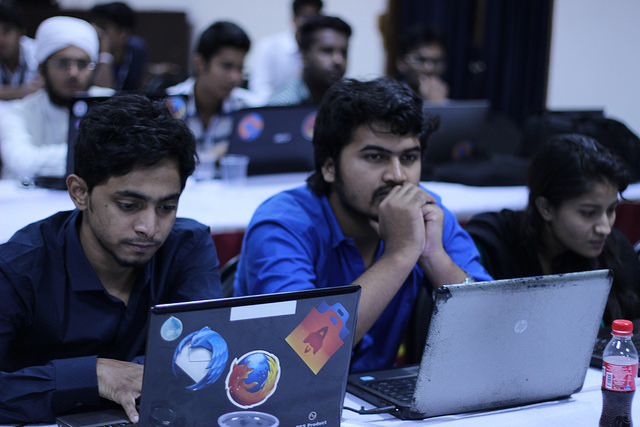
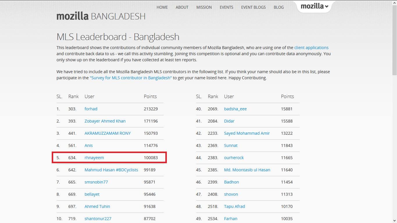
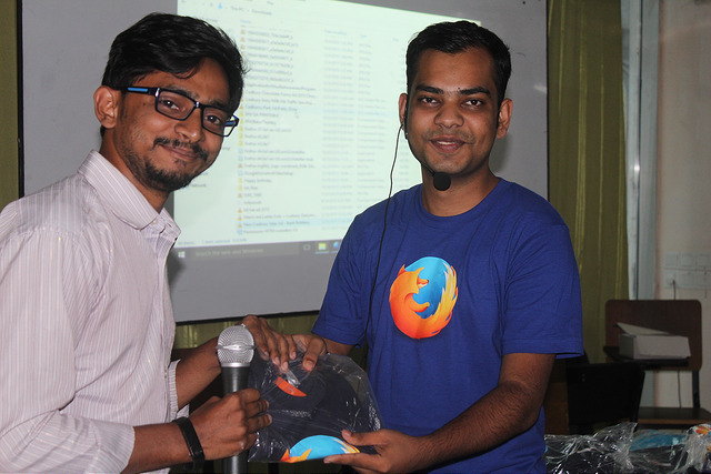
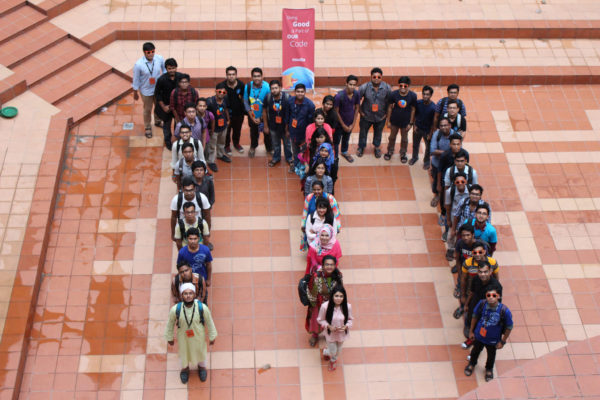
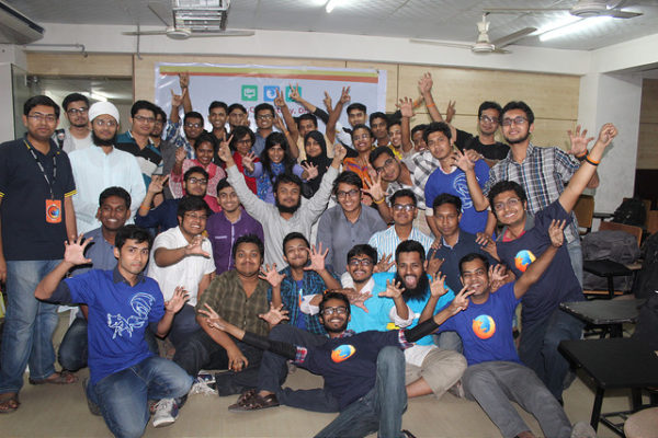
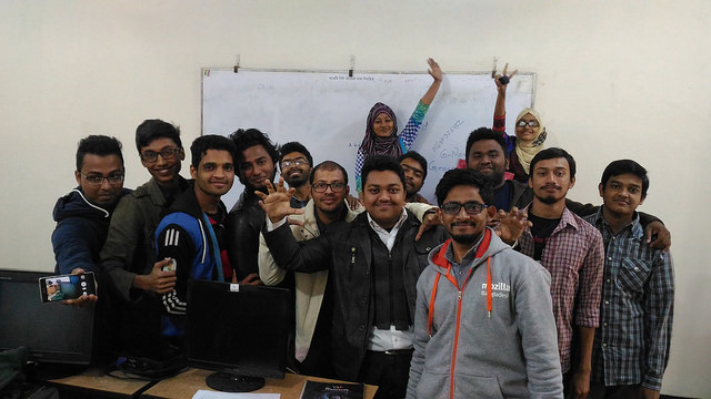
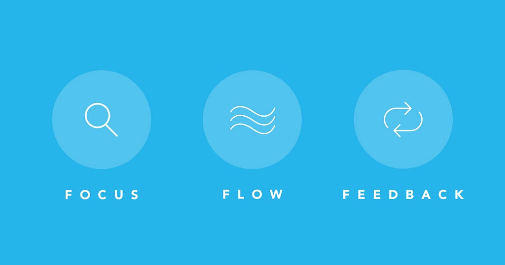
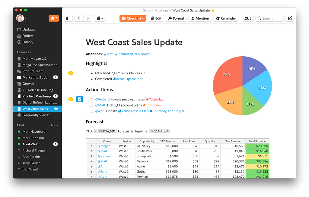
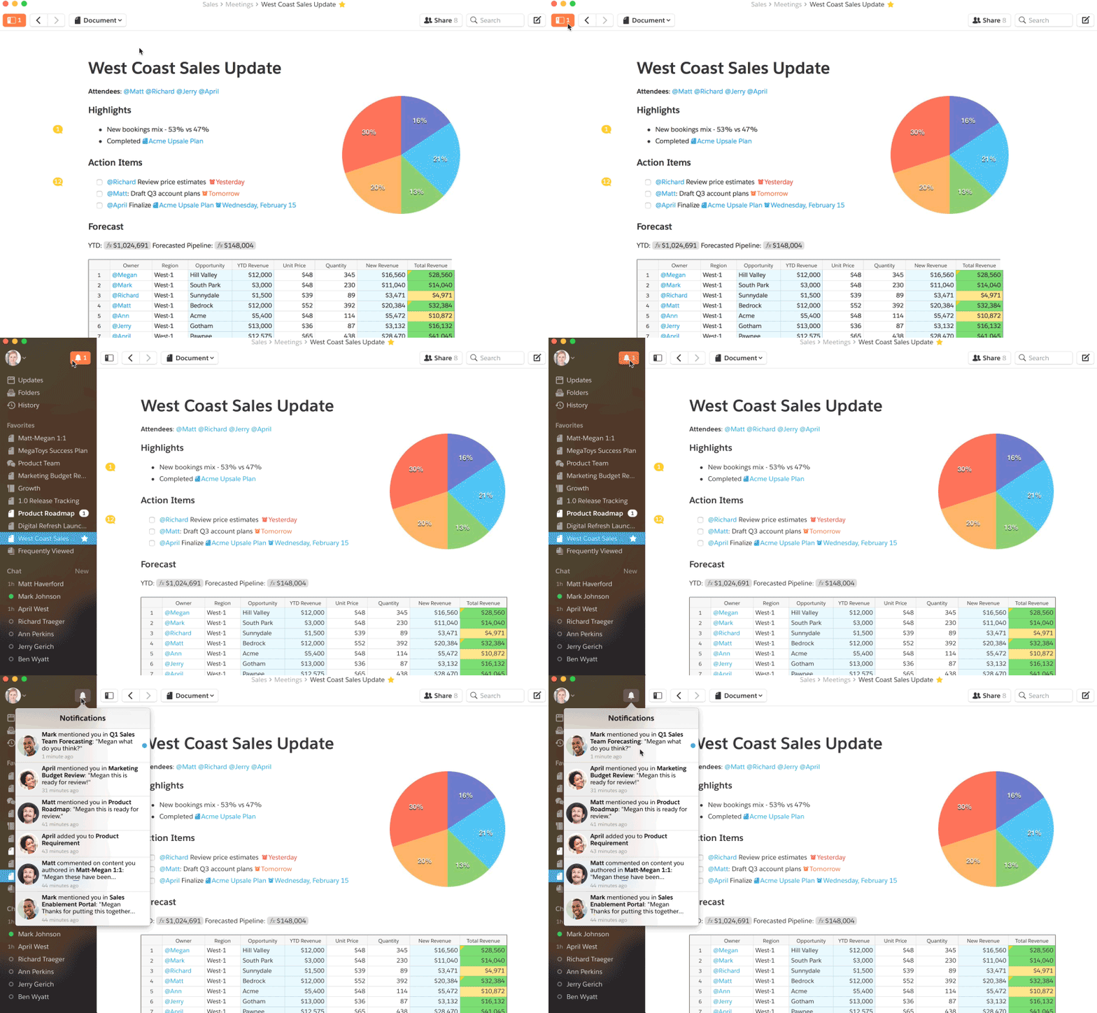
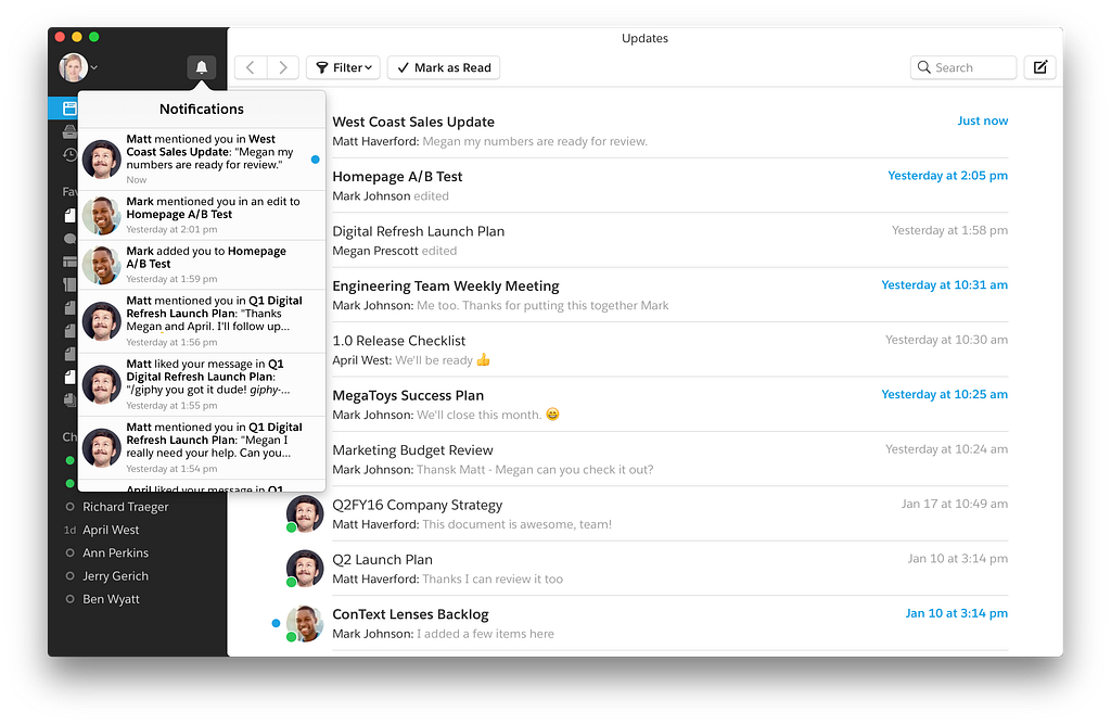
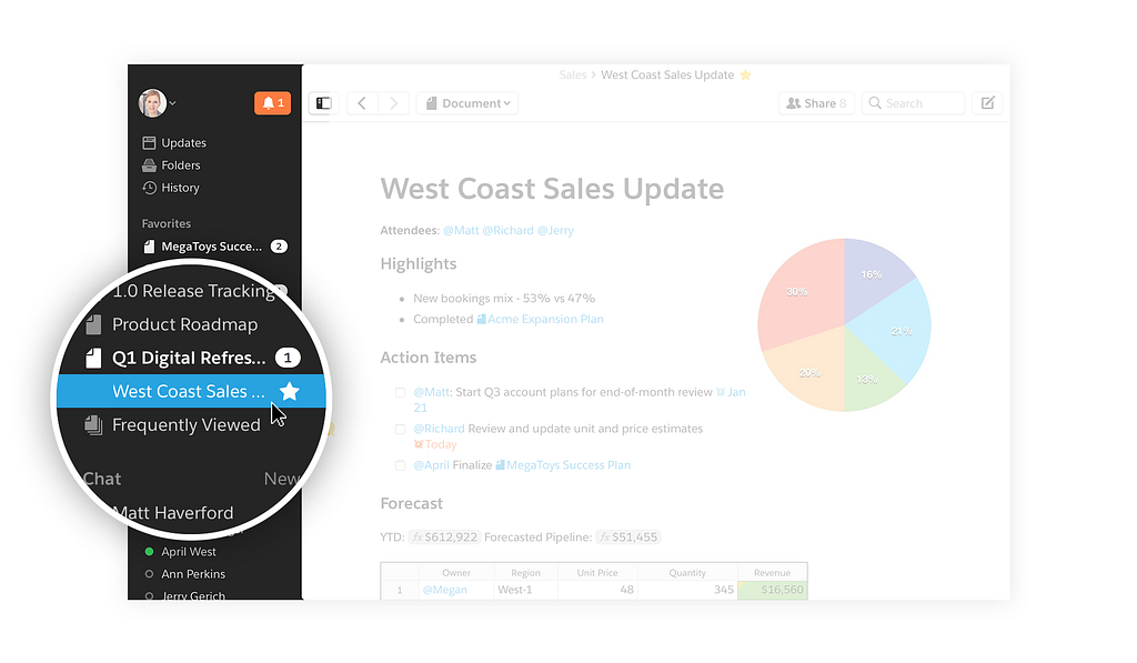
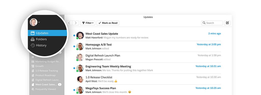
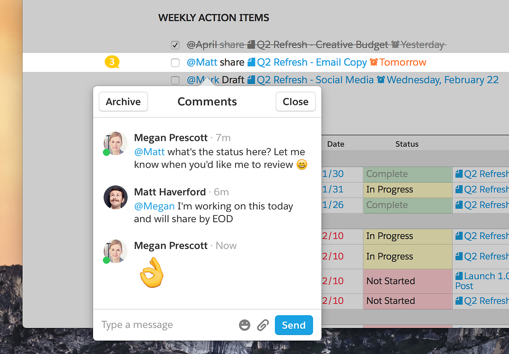
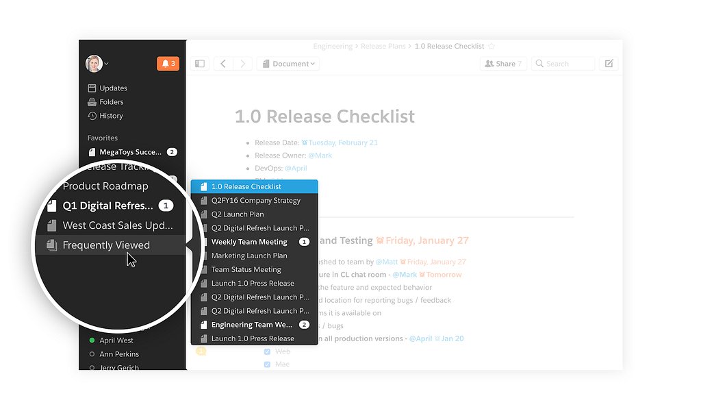


 Blog - Susan J. Fowler.

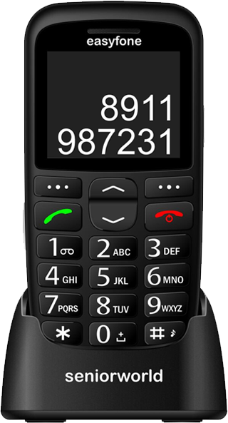
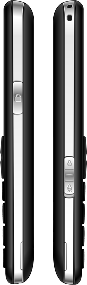



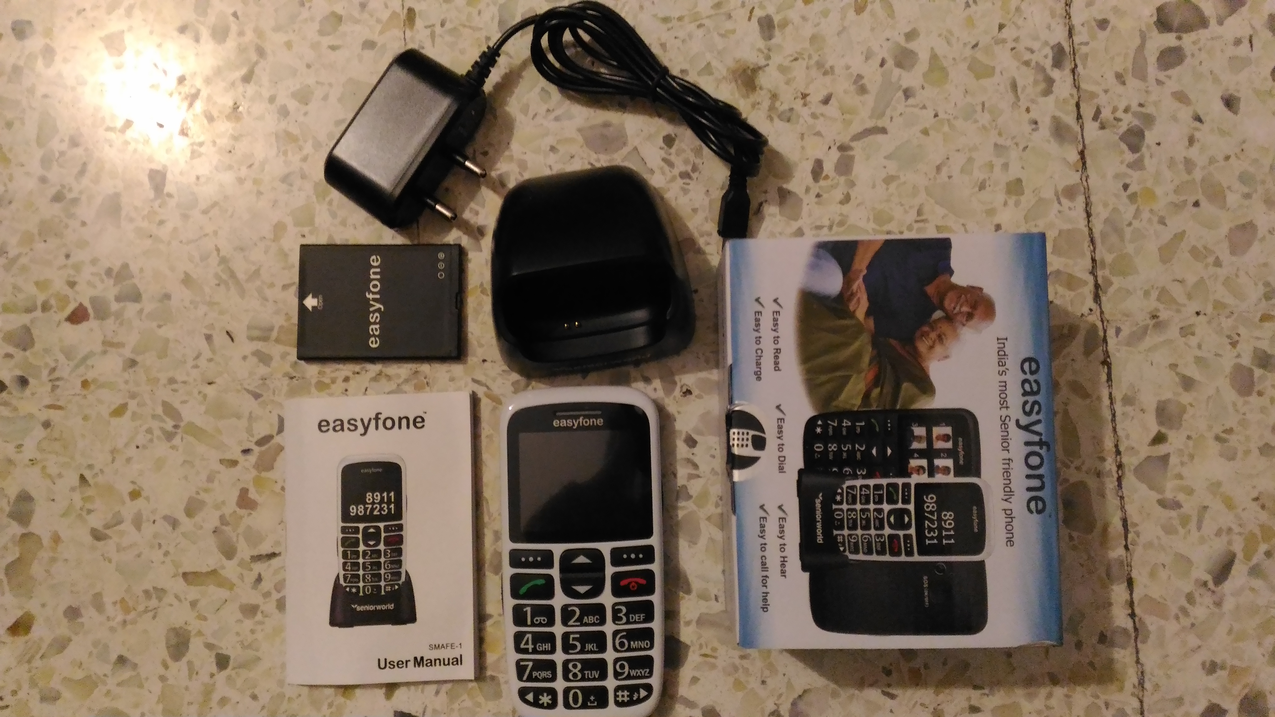

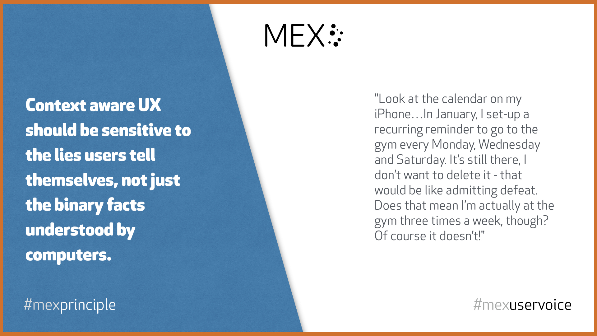


 the Apple Watch would make for a perfect alarm clock, if only it could draw power when resting at an angle to make its screen viewable. Sure, there are third party options, but for Apple purists, only something with that Cupertino branding will do.


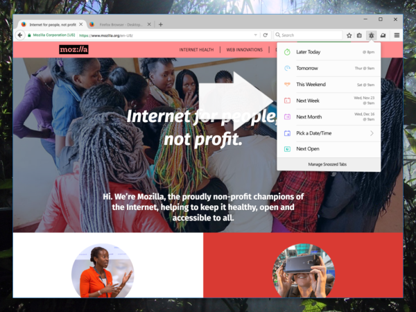
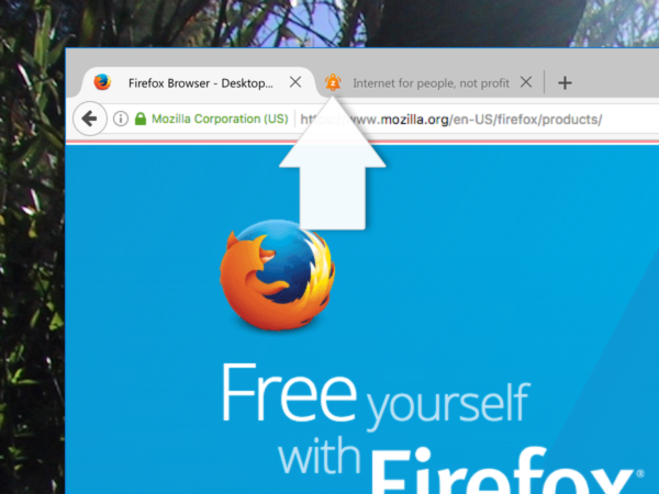
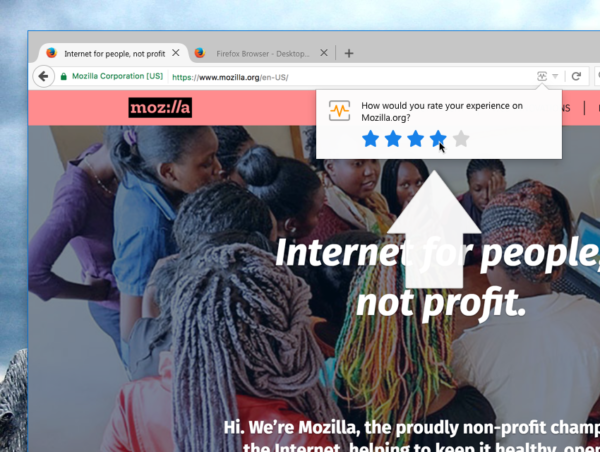

![VANCOUVER, B.C.: February 20, 2017 -- Liza Wajong, CEO and founder of Nusa Coffee in Vancouver, at the cafÈ located at 2766 W. 4th Avenue, in Kitsilano. PHOTO BY CHUCK CHIANG/PNG [PNG Merlin Archive] ORG XMIT: POS1702201456206628 [PNG Merlin Archive]](http://wpmedia.vancouversun.com/2017/02/vancouver-b-c-february-20-2017-liza-wajong-ceo-and-f2.jpeg?quality=55&strip=all&w=840&h=630&crop=1)
 Vancouver Sun.
 The Globe and Mail - Economy.


 Instagram says this offers a variety of uses, such as making step-by-step tutorials or sharing a collection of vacation photos.