Shared posts

14 Mar 02:46

Mikael Colville-Andersen: Building City Streets to Move People (on Bikes)

by dandy


Image courtesy of Ontario Good Roads Association

Mikael Colville-Andersen: Building City Streets to Move People (on Bikes)

Story by Albert Koehl
Photos by Wayne Scott

The dilemma for Toronto’s cycling community was on full display Monday night during a presentation by Mikael Colville-Andersen, CEO and founder of Copenhagenize Design Co., and the discussion that followed with Toronto’s Chief Planner, Jennifer Keesmat, and Straphanger author Taras Grescoe.

People will ride bikes if it’s fast and convenient (i.e. you won’t convince them by talking about the environment, says Colville-Andersen). The most important factor is good infrastructure. Getting good infrastructure requires political leadership. Political leadership will develop from a strong grassroots movement. And grassroots support will grow when cycling is fast and convenient.

Colville-Andersen jokes that he doesn’t design political leaders, he just designs good streets for cyclists.

Copenhagenize Design works around the world to make cities better places to live, relying heavily on the bicycle. The bicycle, proclaims the company’s website “is the most powerful tool in the urban toolbox for rebuilding our urban spaces to become more life-sized.”

Colville-Andersen’s examples about urban cycling success stories makes the Toronto listener feel distinctly like the dullard in the room, given our slow progress on bike lanes, but he assures us that cycling infrastructure is a simple solution that works everywhere. It’s somehow heartening to hear that Colville-Andersen was born in Fort McMurray, Alberta (Canada’s tar sands capital) and grew up in Calgary, even if he has lived in Copenhagen --- where 400,000 people per day ride bikes and where his company is based --- for the last 23 years.

Image of Colville-Andersen's powerpoint presentation - courtesy of Wayne Scott

Colville-Andersen says the problem with urban design in Western cities started with the arrival of the automobile – a machine initially detested by much of the population for the danger it created. Effective marketing, he says (citing Peter Norton’s book Fighting Traffic), succeeded in “changing our perception of what streets were for.” Eventually the main question asked by traffic engineers, who had been put in charge of our roads, was: “how many cars do we fit down this street?”

Today, the question has finally been transformed into: “how many people can we move down the street?” For the first time in 100 years we are looking at our cities in a different way and “the bicycle leads the way,” says Colville-Andersen. He quotes former mayor of Paris, Bertrand Delanöe: “The fact is that automobiles no longer have a place in the big cities of our time.”

It’s now “time for us to re-democratize our streets; to re-democratize our urban landscape,” argues Colville-Andersen.

Key elements of a good cycling city are traffic calming, a bike share program, and infrastructure. In terms of the appropriate type of infrastructure, in Copenhagen streets with 40 kmh speed limits generally get painted bike lanes; at 50 kmh, grade separated bike lanes; and at higher speeds complete separation (sometimes using bi-directional lanes).

Copenhagenize Design focuses on design and observation -- and data. (He says it’s important for activists to gather their own data.)

Traffic engineers traditionally tell people where they should go, instead of designing streets to allow people to go where they want to go. His company focuses on planning based on observed mobility patterns, or what he calls “desire lines.” There has, however, been surprisingly little research, says Colville-Andersen, about how cyclists move around a city.

On the issue of the common characterization of cyclists as “rogues” in the urban landscape (both in Copenhagen and here), he points to observations by his company at a particular Copenhagen intersection. It turned out that only 7% of cyclists disobeyed the law. Colville-Andersen characterizes most law-breaking cyclists as “momentumists” – they don’t like to stop because of the effort it requires. He concludes that, “Good design improves human behaviour. Citizens react to the infrastructure (or lack of it) with their behaviour. Listen to them. Don’t scold them.”

One of the great opportunities in cities today is how we move cargo. Colville-Andersen says that 51% of cargo in European cities could be moved on a bike or bike trailer. It’s a point Wayne Scott, a former foot and bike messenger in Toronto, has pushed for years.

Cycling infrastructure should be an obvious choice even for fiscal conservatives given how fast investments in cycling infrastructure pay for themselves. In Denmark, therefore, it’s no surprise that even right-leaning politicians vote for bike lanes. Colville-Andersen says that 67% of the members of Danish Parliament actually cycle to work. The savings are certainly convincing. He says riding a bike for one kilometre saves the community 24 cents (Cdn), while driving a car for the same distance costs 91 cents.

Image of Colville-Andersen's powerpoint presentation - courtesy of Wayne Scott

Earlier in the day, Colville-Andersen spoke at a conference of the Ontario Good Roads Association. He jokes that he got jovial pats on the back for his talk but no so much enthusiasm for his recommendations to implement cycling infrastructure. If the Ontario Good Roads Association is today slow to come around to the idea of good roads for cycling, it’s only because they’ve strayed from their roots in the late 1800s. It was cyclists, sometimes allied with farmers, who pushed the good roads movement in an era when asphalted or even nicely graded roads weren’t the norm.

Colville-Andersen concludes by saying that Copenhagen’s bicycle network is the city’s “greatest monument.” In Toronto, we know that we don’t yet have much cycling infrastructure to brag about -- our monuments are mostly dedicated to the automobile. But Colville-Andersen says that cycling infrastructure works in all cities. He simply rejects the notion that, “It’ll never work here; it’s different here.”

Toronto’s cycling community is certainly familiar with the “It’ll never work here” response from many Council members whose goal remains to move as many cars as possible. It’s too bad these politicians still espouse a discredited transport wisdom that emanates from a by-gone era. It remains our job to convince them otherwise.

Albert Koehl is an environmental lawyer, writer, and co-founder of Bells on Bloor.

Related Articles

Q+A with Copenhagenize urban planner James Thoem 

Winter Cycling Tips from Copenhagenize

Winter Cycling Congress

dandyREVIEWS – Eat, Sleep, Ride, City Cycling and Straphanger


14 Mar 02:46

I Want to Kill LinkedIn

by Eric Karjaluoto

I’m working on something ambitious. It’ll likely crash and burn—and not in a spectacular way. (I’m not that notable.) Rather, it’s the sort of thing that’ll probably lead me to bankruptcy and force me to get a day job. But, what the heck? I’m at a point in life at which foolish things are behind me. I’d like to get in a few kicks before the only one left is at the bucket.

Before I get to that, though, allow me to share my deep, passionate, and undying hatred for that network so many of us use—but often don’t know why.

It’s still a résumé site with social features bolted on (badly)

I received my first LinkedIn invite from my friend Ernest. I signed up, added my résumé, but couldn’t imagine ever coming back. For a long time I didn’t. LinkedIn remained a résumé site for a good while. Somewhere in the mid-aughts, it started to resemble a social network.

Users could post updates and others could comment on those updates. This all worked a little like my Mom’s ’65 Renault: occasionally. The site is unintuitive. Finding key content is difficult. You can’t edit/correct comments. And notifications are a joke. It’s sort of like LinkedIn’s brass decided they were successful enough to not bother trying.

It isn’t a professional network; it’s a tool made for recruiters

I have a lot of connections on LinkedIn, and every day I receive more requests. A lot of these are from people I don’t know—and never will. Instead, they’re from bogus accounts, desperate social climbers, and pseudo-spammers. (I particularly appreciate the ones who spam me within minutes of accepting their invites.)

Truth of the matter is that I’ve never established a single meaningful new connection on LinkedIn. And I know why. I’m not the core user—because I’m not a recruiter. For folks who are, LinkedIn must be the most amazing thing… like… ever! Sure, they pay to access the data, but at their fingertips are a treasure-trove of résumés and prospective candidates. I’m happy for their good fortune, but it’s still a tool for them, and not the rest of us.

Dark patterns abound

If you aren’t familiar with dark patterns, I urge you to give Dan Schlosser’s blog post a read. It’s both enlightening and maddening. Users often don’t do what we’d like them to. So, we’re often forced to redesign what we’ve built, to encourage certain actions. But, there’s a line, and LinkedIn crosses it.

There’s nothing wrong with LinkedIn’s management wanting to get lots of people to use their service. The way they do this is sneaky, though. They’ll do anything to get you to link your address book to their service. (If you choose not to, they continually attempt to trick you into doing so.) Once they have that info, they send automated messages without your knowledge, on your behalf.

Imagine someone stealing your address book, and calling everyone in it, saying you asked him to. How long would you keep such a friend?

Pay to play

You know what LinkedIn gets right? Its business model. The company has 414 million users and earned ~$2.94 billion last year. They seem to have the cashflow thing figured out.

LinkedIn built its success on people sharing their connections, but this is not a quid pro quo situation. In fact, establishing new connections—with folks you don’t know—kind of sucks, on LinkedIn. Let’s say you find someone new you want to reach out to, through the service. Reaching that person requires you to buy a plan (these start at ~$30/month). This is great for their business, as are their other toll booths, but shouldn’t the web be about people first?

Low fidelity

My next point isn’t LinkedIn’s fault, but they don’t do much to remedy this situation, either. Have you ever looked at the comments made on social media and wonder why people are so mean? I do. I’m particularly surprised by this when I know those who are posting those comments—and believe them to be fine people.

Text is a difficult medium. Even a minor rearrangement of words can completely change how they’re interpreted. Worse yet, readers tend to imbue passages with their own emotions. This leads to those weird moments in which you aren’t sure whether someone’s being funny or a jerk. Maybe this is a minor point, but I think it’s why I never even get close to a meaningful discussion on LinkedIn.

The dialogue there is about as sincere and meaningful as what you’ll find at a networking event for young entrepreneurs. Lots of people are talking, but little of this discussion leads to much.

The content sucks

I feel bad whenever I take the bait, and actually read content on Linkedin—because a large amount of it is pure shit. I lump this content into three categories of turds: shameless self-promotion, clickbait, inane busines-esque drivel. Lately, I even see folks highlighting their personal tragedies, in an attempt to get more visibility. (Classy.)

Part of this relates to the sorts of people attracted to LinkedIn. They want to get ahead, and it’s OK to be “ME! ME! ME!” on this network. That makes it no less off-putting, though. The part that I blame LinkedIn for, is the lack of any decent filtering mechanism. This results in a horrible signal to noise ratio: The vague inspirational quotes. The guy who posts every car he has for sale. The jerk who posts a selfie every time he gives to charity (because he’s such a good guy). Oh, brother.

Endorsements are a joke

Endorsements are a good idea that LinkedIn botched. Their system continually prompts users to endorse others. So, many do—even if they’ve never worked together (or even know one another). As a result, LinkedIn endorsements stand for nothing. Sure, a newbie might see the 300 endorsements you have for SEO, and think you’re the bees knees—but, few are that easy to trick.

It’s not just that LinkedIn endorsements stink. The bigger problem is that LinkedIn encourages engagement in a heavy-handed way. The closest analogy is forced-fun at a workplace. Sure, some will begrudgingly take part. These are only gestures that lack substance/meaning, though.

The wrong paradigm

You know how to succeed in business? Stop trying to make yourself good, and instead make someone else look good. Social media is still a new-ish medium, though, and such insights are lost on many. So, networks like LinkedIn become places to promote yourself, brag, and build your connection/follower count. This doesn’t translate to much in the real world, though.

Opportunities do arise as a result of one’s connectedness; but, it’s the nature of those connections that makes the difference. The way you strengthen a connection? You start with the other person. You offer help. You lend a hand. You make yourself useful. LinkedIn isn’t made for that, though. It’s a growth machine that’s helps you make a lot of noise—but does little to strengthen your connections to others.

Hubris? Maybe

I was an early LinkedIn user. Even still, though, I’ve gained almost nothing from being on that network. By this I mean that I can’t think of a single relationship that grew as a result of my participation. Maybe I should give it time, but, it’s been 14 years. Shouldn’t I, by now, be able to point to at least one benefit?

What’s the solution? There are likely many. Mine is a long-shot. Actually, it’s a foolish moonshot, and you’ll probably mock me for it. (Incidentally, I first mistyped “moonshot” as “moonshit.” A Freudian slip? Possibly.) I say that some of us ought to move on from LinkedIn, and build a professional network that’s actually good for users. We’re doing this, over at Officehours. Let me tell you a bit about our approach.

A mission first; a business second

Our mindset is completely different from most venture-backed startups. (After you read this, you might even consider us simplistic.) Our belief is that good things happen when you help others—and that everyone benefits from this sort of behavior. So, we’re building a tool to help people share their knowledge, and feel comfortable asking for help.

This isn’t the kind of mission that gets a VC all hot and sweaty. That’s OK—we’re not going that route anyway. Instead, we run a super low cost operation. To us, success is in building something that people benefit from—not in making a big pile of cash. Sure, we have ways to make a little money from this thing, but that’s not the part that interests us.

One-on-one instead of one-to-many

We’d never walk into a public place and insult people the way we do, online. But you only need to look at a few comments on YouTube, to realize how crummy people can be. This isn’t a technology problem; it’s a numbers problem. When folks think they’re speaking into a void—and can’t see the faces of those who’re listening—they tend to be more cavalier in what they say.

But, limit the conversation to just two people, and they tend to act like they normally would. That’s why we started Officehours with the notion of connecting two people (who might not know one another) for a brief, one-on-one conversation. And you know what? It works. Well, it’s not perfect, and it’s not operating at scale, but the talks are surprisingly enjoyable. In fact, most feel good after those talks—almost like they know one another a little. To me, that’s something special.

Opportunities, not obstacles

I think giving is like a boomerang: do something good, and it might come back to you. However, you need the right context for this sort of action to work. (Going on LinkedIn and offering to help random people would never work—because it’s not that sort of environment.) So, we need a whole new approach to a professional network. And that starts with the philosophy behind it.

We think the network should offer more than it takes. It should encourage you to meet new people, and build new relationships. It should help you find new jobs, and projects to collaborate on. It should work to encourage positive behavior between community members.

So, we don’t charge you to reach out to new people. In fact, our system makes it easy to contact others who are open to a conversation. Meanwhile, we’re adding ways to post content that’s beneficial—instead of frivolous or self-serving. And, we’re trying a bunch of weird things—like job posts you can comment on (so that there are fewer walls between people and opportunities).

Filtered streams

Content sharing is something we’ve had in the works for a few months, and we’re close to releasing our first take on this. This is no small thing to get right, and we probably haven’t. That said, a few parts of it seem to have potential. The problem we’re trying to solve here, is how to help you find useful information—without needing to make your way through so much noise.

We think the answer is in providing multiple means of sorting shared content. You can view posts from only those you follow (like Twitter), or access content by all users within a category (like Reddit). You can also subscribe to categories you’re interested in, to customize which content you see.

Moderated

We’re still a small community, and I’m kind of happy about that. Our size allows me to stay close to those who’re using the product, and learn from them. It also allows me to check every person who joins the service to ensure that they’re not spammers. I then ruthlessly prune out those who’re here for the wrong reasons. I do this because we feel that the spirit/quality of this community matters.

If something on Officehours isn’t working, or you need help, I’ll be the one who helps you. If it’s over my head, I’ll ask Eric Shelkie to look into the problem. Point being: the same people who’re building this thing are taking calls and shepherding the community’s development. This can’t last forever, so we’ll need to rely on community members who’re willing to lend us a hand.

A UX for you

There are no ads on Officehours. There are no sponsored posts. There are no unnecessary alerts. There are no prompts to do things you don’t want to do. There are no nudges to increase your profile strength to become an, “All-Star.” This is because such things weren’t there for your sake—and we think that’s kind of crummy.

Instead, we’re working to create a clean, simple, and distraction-free experience. Every feature, item, and design element we add is considered. The question we keep asking is, “how will this help our users?” not, “how will this help us?” Maybe this isn’t that big of a deal, but we think these sorts of decisions are really important.

We’ll screw up

We’re two guys, and we’re attempting to do something that larger/smarter teams have failed at. It’d be fair to say that we’re way out of our league. Plus, the product isn’t there, yet. We know that, and we’re working on it. I guess I’m saying that we’ll get lots wrong, but we’re going to give it everything we’ve got, anyway.

I have this theory about networks: it’s that you don’t so much make one. Instead, it’s like setting your house up for a party. The quality of the party isn’t in how nicely your tablecloth matches your napkins (although those are nice details). It’s found in the unique chemistry of the guests you invite.

So, I’m putting this out there as a sort of open invitation. If you believe that we deserve better tools. If you think a community is more important than creating excessive wealth for a small few. If you believe we all benefit by working collectively… I could go on, but you get what I’m saying.

We’re still early, but we’re trying to do something worthwhile. I hope you’ll join in our little party. And if you want to talk to me about any of this, I’m game.

The post I Want to Kill LinkedIn appeared first on Eric Karjaluoto.

14 Mar 02:46

A Simple Metric For Measuring Internal Support

by Richard Millington

A simple way to measure internal support for any organization’s community is to see where the community is featured on the homepage.

If you visit SAP.com (a client), you will see Communities featured on the homepage navigation bar just after Solutions, Support, And Training. The homepage also features contributions from the community.

Visit Oracle.com and you will see the community featured as a navigation tab but it’s smaller and not in the main bar. There are no member contributions in the community featured on the homepage.

Now visit Apple.com. Can you find the community? You first need to click support and scroll down below search, products, popular (support) topics, iTunes/gift card scams, Apple care and warranty, repair and service, counterfeit parts, and then Apple support communities.

All three are great proxies for the priority and value given to the community. If the community is hidden or buried within the homepage, it’s usually not a priority for the business.

This isn’t a side-issue. This directly impacts the level of traffic you receive and thus how successful your community will be. Being featured more prominently on the homepage is one of the very few areas which directly and immediately bend the trend lines in your favour.

Don’t just lobby for more resources and support, lobby for positioning too. The worst thing that can happen is a redesign that gives the community less priority. The best is being featured more prominently.

14 Mar 02:46

The New Manager Death Spiral

by rands

The starting gun fires and when the starting gun fires, you run. You’re a new manager, and while the sound of gun firing is startling, you run because this is finally your chance. You’ve been promoted to the role of manager, you want this gig, and this is your chance to shine, so you run.

I will now explain how your good intentions and well-trained instincts are going to erode your credibility, stunt the growth of your team, and re-enforce the theory that most managers are power hungry jerks working with all the authority and making judgment calls with woefully incomplete data.

It’s called the New Manager Death Spiral and, unfortunately, I can effectively write about it because I’ve performed parts of it. Over and over.

BANG

This is a synthesized version of the New Manager Death Spiral. It combines every single leadership mistake you can make spun into a beautiful, cascading, horrific mess. It is unlikely that you’ll perform the Death Spiral this completely, but I guarantee that you’ll perform parts of it.

It begins with a thought, “I can do it all. I’m The Boss.”

As a new manager, you want to prove yourself, so you sign-up for all the things, you work late, and you do your very best to kick ass and make a good first impression. This is the approach that worked well for you as an individual, so, of course, it’ll work when leading a team. This is where the Spiral begins because the initial thought is actually, “I can do it all myself. I’m the Boss.”

You are used to having complete visibility and total ownership of your work because that is how it worked in your former individual contributor work life. You are instinctually reluctant to delegate your work because it represents an unfamiliar loss of power. Compounding your poor judgment is your belief that you are the best person to do this because you’ve done it before as an individual.

The problem is your enthusiastic effort to prove yourself. You signed up for far too much work than you possibly do yourself, which leads to your first failure mode: the quality of your work drops because you lack the time to correctly complete it. Missed deadlines, dropped commitments, and half-completed work passed off as the final product are just a couple of awkward situations you discover.

The Spiral starts to pick up speed now because you can see the glimmer of your failure in their eyes. You update your mantra with an affirmation, “I can do it all myself. I’m in control because I am the Boss.”

With the first admission of the reality of the situation, you begin to half-delegate the smaller less important projects. Half-delegation is the act of giving them the work, but not full control nor context. They don’t need it, right? You’re the Boss. You’ll tell them when they need to know.

Like you, they start to fail either because they feel they don’t have the authority to change the course of the project or their lack of understanding of the fun context around the project had them pointed in the wrong direction from day one. They bring this to your attention.

First, They Tell You

This is where the Spiral gets painful. Remember – every possible wrong decision stitched together.

The team on the failing project says, “We didn’t understand that this portion of the project was more important, so we started over here which, in hindsight, was clearly the wrong place to start.”

You’re internally frustrated. You think, but do not say, “It’s obviously the wrong place to start. If I were running this project, we wouldn’t be in this situation.” You’re right, but you’re also so wrong. You’re right that if you were hands on running this project, your prior experience would’ve improved execution. You’re wrong because a strategy of not building trust through successful delegation is one the greatest accelerants to the New Manager Death Spiral.

However, you can not appear weak. Remember the line, “I can do it all myself. I’m in control because I am the Boss.” Changing strategy is an admission failure, failure is a weakness, and you are the Boss. You give the barest of corrective advice and tell them “Go figure it out… or else.”

Your team leaves this interaction with the following impression: they are failing, and you’re mad, inflexible and unwilling to listen to their opinions. This is the point of the of the Spiral where they stop talking to you and start talking to each other.

Then, They Tell Each Other

Since you aren’t listening, this team starts talking to each other and other teams. They are trying to self-correct and perhaps they might, but this is the Death Spiral, so they don’t. They fail. This is unfortunate because they had all the data to be successful and just needed a leadership nudge, but since it was clear you didn’t want to hear it they didn’t share, and the project failed.

Everyone is demoralized, everyone feels like they failed, but since no one is truly communicating all sorts of opinion starts to become facts. You tell yourself the story that you might not have the right people on the team and perhaps if shuffling people around you’ll get a better outcome. They think they failed because you didn’t get them context because you were busy withholding information, being proud, and not listening.

They continue to judge, and they create their versions of the truth and you and your leadership style. Again, there’s far more of them than you, which means that their version of the truth spread at a faster rate than yours. Eventually, a piece of that twisted truth regarding your leadership ability arrives on your plate from someone you listen to and you’re shocked.

That is not me.

Congratulations. Through a deft combination of poor communication, crap judgment, and systematic demoralization of the team, you and your team have not only failed at the task at hand; but you’ve also irreparably harmed your relationship with your team and your credibility.

You’re right, it’s not really who you are. Who you are now is precisely the opposite of a leader.

Management is Not a Promotion

You’re promoted when you are successful in your current job. It is equal parts recognition and reward. In many companies, the expectation is that you’re performing at that higher level for a period before you are promoted, so there is a good chance you are equipped for this gig.

You do not start management equipped for the gig. I’ve said it before, your first role in management is a career restart. Yes, you’ve acquired dealing-with-humans skills from being a part of a team, but the New Manager Death Spiral is deliberately constructed to demonstrate how the very instincts that got you the new role are going to steer you in the wrong direction.

The New Manager Death Spiral is an unrealistic, but deliberate construction. It is unlikely that you performed every single step in the Spiral. It is equally likely that as you read this article that you nodded your head, “Yup. I did that.” Whether you performed one or all of the steps, the lessons are the same, and they are lessons I wish someone would’ve given me as a first-time manager. Here are three:

Let others change your mind. There are more of them than you. The size of their network is collectively larger than yours, so it stands to reason they have more information. Listen to that information and let others change your perspective and your decisions.

Augment your obvious and non-obvious weaknesses by building a diverse team. It’s choosing the path of least resistance to build a team full of humans who agree with you. Ideas don’t get better with agreement. Ideas gather their strength with healthy discord, and that means finding and hiring humans who represent the widest spread of perspective and experience.

Delegate more than is comfortable. The complete delegation of work to someone else on the team is a vote of confidence in their ability, which is one essential way the trust forms within a team. Letting go of doing the work is tricky, but the gig as a manager isn’t doing quality work, it’s building a healthy team that does quality work at scale.

At the heart of each lesson is the same essential leadership binding agent: trust. When you are actively listening, and when their ideas visibly change your decisions, you build trust. When diversity of opinion is valued and creates healthy debate, you create trust. When you truly delegate the work that made you a better builder, they will begin to trust you as a leader.

And that’s who you want to be.

14 Mar 02:45

The true meaning of the generalities in the Trump speech to Congress

by Josh Bernoff

Donald Trump’s first speech to a joint session of Congress was typical of such addresses. It was unusual for Trump in that it was clear, well-structured, and got most of the facts right — but like the average State of the Union, it was a mixed bag of gritty legislative proposals and pabulum. Let’s take a look at … Continued

The post The true meaning of the generalities in the Trump speech to Congress appeared first on without bullshit.

14 Mar 02:45

Bomb threats to Jewish Community Centers

by Nathan Yau

Ken Schwencke and Al Shaw from ProPublica with a set of straightforward maps that show bomb threats to Jewish community centers and organizations:

Since Jan. 1, at least 89 locations of Jewish organizations in the United States — including schools, Jewish Community Centers, and offices of the Anti-Defamation League — have received a total of 114 bomb threats. The majority have come in five of what the JCC Association of North America calls “waves” — groups of robocalls coming on a single day. So far, none of the threats have been carried out.

Gross.

Tags: Jewish, ProPublica, threats

14 Mar 02:45

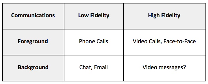
Are ‘phone calls’ obsolete?

by Stowe Boyd

Today’s video call platforms will make phone calls the new telegram.

Continue reading on Work Futures »

14 Mar 02:45

Dropbox Pro is now Dropbox Plus

by John Adams


We designed Dropbox Pro to give you more of the Dropbox you love. With 1 TB of storage, Pro lets you access and share all of your important files, big and small. Today, we’re giving Pro a new name to better reflect all the extra space it offers: Dropbox Plus. Don’t worry—the name is the only change we’re making. You’ll still get the same space and advanced features at the same price.

Dropbox Plus opens up whole worlds of possibilities. You can store your entire photo library, and automatically back up new pics using our camera uploads feature. Or keep a library of large files for work reference—right at your fingertips, wherever you are. Or set up a file request for a big project without worrying about overloading your Dropbox.

Whatever kinds of projects you’re working on, Dropbox Plus helps you get more of the Dropbox you love. To learn more, visit the Dropbox Plus page.

14 Mar 02:44

R for Excel Users

Like most people, I first learned to work with numbers through an Excel spreadsheet. After graduating with an undergraduate philosophy degree, I somehow convinced a medical device marketing firm to give me a job writing Excel reports on the orthopedic biomaterials market. When I first started, I remember not knowing how to anything, but after a few months I became fairly proficient with the tool, and was able to build all sorts of useful models. When you think about it, this is an amazing feature of Excel. Every day, all over the world, people open up a spreadsheet to do some data entry and then, bit by bit, learn to do increasingly complex analytical tasks. Excel is a master at teaching people how to use Excel.

R is not like that. I learned to use R as a side project during law school, and it felt a bit like training with an abusive kung-fu master in the mountains of rural China.

I couldn’t get R to do anything. It wouldn’t read in files, draw a plot or multiply two numbers together. All I could do was generate mystifying errors and get mocked on Stack Overflow for asking redundant questions. This was all made more frustrating by the fact that I could accomplish all of these things in Excel without much difficulty.

This is the basic pain of learning to program. Programming languages are designed to be general in their application and to allow you to accomplish a huge variety of complex tasks with the same basic set of tools. The cost of this generality is a steep learning curve. When you start learning to do basic tasks in R, you are also learning how to do complex things down the road. As you learn more and more, the marginal cost of complex analyses goes down. Excel is the opposite, and is very easy at the beginning, but the marginal cost goes up with the complexity of the problem. If you were to graph this it might look like this:

At the beginning, when you are trying to accomplish simple things like balancing a budget or entering some data by hand, R is definitely harder to learn than Excel. However, as the task gets more complex, it becomes easier to accomplish in R than Excel, because the core structures of Excel are designed for relatively simple use cases and are not the best for more complex problems. This isn’t to say that you can’t solve a lot of complex problems with Excel, it’s just that the tool won’t make it easy for you.

For a lot of us, the pain of learning to program feels like the pain of failure. When the program gives you an incomprehensible error message it feels like it’s telling you that you’re stupid and lack programming aptitude. But after programming for a while, you learn that nobody really understands those errors, and everybody feels like an imposter when their program fails. The pain you feel is not the pain of failure, it’s just the pain of learning.

Why is learning new things so hard?!

The difficulty of learning a new tool is caused by two obstacles:

Obstacle #1: The tool is different from what you know

When you know how to use something you have this vast amount of basic vocabulary about that tool. I haven’t used Excel seriously for six years, but I can still remember all of its hot-keys, formula names, and menu structures. When you’re learning a new tool you don’t know any of this stuff, and that automatically makes it more difficult. Additionally, you might know where to look to find help on the old tool, or how to Google questions in such a way that you find useful answers. You don’t know any of these things about the new tool, which is painful.

Obstacle #2: The mental model underlying the tool is different from your current mental model

The way the new tool wants you to think about the problem is different from the way you are used to thinking about the problem. For instance, if you are used to putting your analysis in a rectangular grid, then moving to a tool which is designed around procedural commands is going to be difficult.

In my opinion obstacle #2 is by far the larger barrier for Excel users. Most of the people who learn R have some basis in programming. The mental models underlying languages like Matlab or Python, as well as statistical packages like SPSS and SAS, have a lot in common with R, and there are many resources available for translating the bits which don’t make sense. Excel makes you think about analytical problems in a very different way, and there aren’t very many resources for translating the two paradigms.

Four Fundamental Differences Between R and Excel

1) Text-based analysis

Excel is based on the physical spreadsheet, or accountant’s ledger. This was a large piece of paper with rows and columns. Records were stored in the first column on the left, calculations on those records were stored in the boxes to the right, and the sum of those calculations was totaled at the bottom. I would call this a referential model of computation which has a few qualities:

  • The data and computation are usually stored in the same place
  • Data is identified by its location on the grid. Usually you don’t name a data range in Excel, but instead refer to it by its location, for instance with $A1:C$36
  • The calculations are usually the same shape as the data. In other words if you want to multiply 20 numbers stored in cells A1:An by 2, you will need 20 calculations: =A1 * 2, =A2 * 2, ...., =An * 2.

Text based data analysis is different:

  • Data and computation are separate. You have one file which stores the data and another file which stores the commands which tell the program how to manipulate that data. This leads to a procedural kind of model in which the raw data is fed through a set of instructions and the output pops out the other side.
  • Data is generally referenced by name. Instead of having a dataset which lives in the range of $A1:C$36 you name the data set when you read it in, and refer to it by that name whenever you want to do something with it. You can do this with Excel by naming ranges of cells, but most people don’t do this.

2) Data structures

Excel has only one basic data structure: the cell. Cells are extremely flexible in that they can store numeric, character, logical or formula information. The cost of this flexibility is unpredictability. For instance you can store the character “6” in a cell when you mean to store the number 6.

The basic R data structure is a vector. You can think of a vector like a column in an Excel spreadsheet with the limitation that all the data in that vector must be of the same type. If it is a character vector, every element must be a character; if it is a logical vector, every element must be TRUE or FALSE; if it’s numeric you can trust that every element is a number. There’s no such constraint in Excel: you might have a column which has a bunch of numbers, but then some explanatory test intermingled with the numbers. This isn’t allowed in R.

3) Iteration

Iteration is one of the most powerful features of programming languages and is a big adjustment for Excel users. Iteration is just getting the computer to do the same thing over and over again for some period of time. Maybe you want to draw the same graph based on fifty different data sets, or read and filter a lot of data tables. In a programming language like R you write a script which works for all of the cases which you want to apply it to, and then tell the computer to do the application.

Excel analysts typically do a lot of this iteration themselves. For instance if an Excel analyst wanted to combine ten different .xls files into one big file, they would probably open each one individually, copy the data, and paste it into a master spreadsheet. The analyst is effectively taking the place of a for loop by doing one thing over and over again until a condition is met.

4) Simplification through abstraction

Another major difference is that programming encourages you to simplify your analysis by abstracting common functions from that analysis. In the example above you might find that you have to read in the same type of files over and over again and check that they have the right number of rows. R allows you to write a function which does this:

read_and_check <- function(file){
  out <- read.csv(file)
  if(nrow(out) == 0) {
    stop("There's no data in this file!")
  } else {
    out
  }
}

All this function does is read in a .csv file and then check to see if it has more than zero rows. If it doesn’t, it returns an error. Otherwise it returns the file (which is called “out”). This is a powerful approach because it helps you save time and reduce errors. For instance, if you want to check if the file has more than 23 rows, you only have to change the condition in one place rather than in several spreadsheets.

There’s really no analog for these kinds of functions in an Excel-based workflow, and when most analysts get to this point they just start writing VBA code to do some of this work.

Example: Joining two tables together

I thought I’d illustrate these principles by working through the example of joining two tables together in Excel and R. Let’s say that we had two data tables, one with some information about cars and another with the colour of those cars, and we want to join the two of them together. For the purpose of this exercise, we’re going to assume that the number of cylinders in a car determines its colour.

library(dplyr)
library(knitr)
cars <- mtcars
colours <- data_frame(
  cyl = unique(cars$cyl),
  colour = c("Blue", "Green", "Eggplant")
)

kable(cars[1:10, ]) #kable is just for displaying the table
mpg cyl disp hp drat wt qsec vs am gear carb
Mazda RX4 21.0 6 160.0 110 3.90 2.620 16.46 0 1 4 4
Mazda RX4 Wag 21.0 6 160.0 110 3.90 2.875 17.02 0 1 4 4
Datsun 710 22.8 4 108.0 93 3.85 2.320 18.61 1 1 4 1
Hornet 4 Drive 21.4 6 258.0 110 3.08 3.215 19.44 1 0 3 1
Hornet Sportabout 18.7 8 360.0 175 3.15 3.440 17.02 0 0 3 2
Valiant 18.1 6 225.0 105 2.76 3.460 20.22 1 0 3 1
Duster 360 14.3 8 360.0 245 3.21 3.570 15.84 0 0 3 4
Merc 240D 24.4 4 146.7 62 3.69 3.190 20.00 1 0 4 2
Merc 230 22.8 4 140.8 95 3.92 3.150 22.90 1 0 4 2
Merc 280 19.2 6 167.6 123 3.92 3.440 18.30 1 0 4 4
kable(colours)
cyl colour
6 Blue
4 Green
8 Eggplant

In Excel you would probably do this using the VLOOKUP() function, which takes a key, and a range, and then looks up the value of that key within that range. I put together an example spreadsheet of this approach here. Notice that in each lookup cell I typed some version of =vlookup(C4,$H$2:$I$5, 2, FALSE). This illustrates a few things. First, the calculation is the same shape as the data, and happens in the same file as the data. We have as many formulas as we have things that we want to lookup, and they are placed right next to the dataset. If you’ve used this approach you can probably remember making mistakes in the process of writing and filling this formula. Second, the data is referred to by its address on the sheet. If we move the lookup table to another sheet, or another place on this sheet, that is going to screw up out lookup. Third, notice that the first entry of the cyl column in the spreadsheet store in C2 is stored as text, which causes error in the lookup function. In R, you would have to store all the calendar values as a numeric or character vector.

To do the same thing in R, we would use this code:

left_join(cars, colours, by = "cyl") %>% 
  filter(row_number() %in% 1:10) %>% # to display only a subset of the data
  kable() 
mpg cyl disp hp drat wt qsec vs am gear carb colour
21.0 6 160.0 110 3.90 2.620 16.46 0 1 4 4 Blue
21.0 6 160.0 110 3.90 2.875 17.02 0 1 4 4 Blue
22.8 4 108.0 93 3.85 2.320 18.61 1 1 4 1 Green
21.4 6 258.0 110 3.08 3.215 19.44 1 0 3 1 Blue
18.7 8 360.0 175 3.15 3.440 17.02 0 0 3 2 Eggplant
18.1 6 225.0 105 2.76 3.460 20.22 1 0 3 1 Blue
14.3 8 360.0 245 3.21 3.570 15.84 0 0 3 4 Eggplant
24.4 4 146.7 62 3.69 3.190 20.00 1 0 4 2 Green
22.8 4 140.8 95 3.92 3.150 22.90 1 0 4 2 Green
19.2 6 167.6 123 3.92 3.440 18.30 1 0 4 4 Blue

Here we refer to the data by its name, use one function to operate on the whole table rather than row by row. Because consistency is enforced for each vector we can’t accidentally store a character entry in a numeric vector.

Iteration

Now let’s say we wanted to get the mean displacement for each colour of car. Most Excel users would probably do this iteration manually, first selecting the table, sorting it by colour and then picking out the ranges that they wanted to average. A more sophisticated analyst would probably use the averageif() function to pick out the criteria they wanted to average on, and so avoid a few errors. Both approaches are implemented in the iteration tab of the spreadsheet.

In R you would do something like this:

left_join(cars, colours, by = "cyl") %>% 
  group_by(colour) %>% 
  summarize(mean_displacement = mean(disp)) %>% 
  kable()
colour mean_displacement
Blue 183.3143
Eggplant 353.1000
Green 105.1364

What this does is takes the data set, splits it up by the grouping variable, in this case colour, then applies the function in the summarize function to each group. Again, the difference is that we’re always referring to things by name rather than location, there is one line of code which applies the function to the whole dataset, and all of the iterative actions are stored in the script.

Generalizing through functions

Functions are among the more difficult parts of learning to program, and you really can get by for quite a long time without ever learning to use them. I wanted to include them just because they are common and can be quite discouraging for Excel users because they are totally foreign to their workflow. A function is a way of using existing code on new objects. In the case above it might look like this:

join_and_summarize <- function(df, colour_df){
  left_join(df, colour_df, by = "cyl") %>% 
    group_by(colour) %>% 
    summarize(mean_displacement = mean(disp))
}

The things between the function() braces (df and colour_df) are called “arguments”, and when you call the function all it does is take the actual objects you supply to the function and plugs them in to wherever that argument appears between the curly braces. In this case we would plug in cars for the df argument, and colours for the colour_df argument. The function then basically replaces all the dfs with cars and colour_dfs with colours and then evaluates the code.

join_and_summarize(cars, colours) %>% 
  kable() 
colour mean_displacement
Blue 183.3143
Eggplant 353.1000
Green 105.1364

Conclusion

Excel users have a strong mental model of how data analysis works, and this makes learning to program more difficult. However, learning to program will allow you to do things that you can’t do easily in Excel, and it really is worth the pain of learning the new model.

14 Mar 02:44

The Flexibility of Audio Hijack 3

by Paul Kafasis

Audio Hijack IconOver at Six Colors, Jason Snell recently wrote about two different ways he uses Audio Hijack 3 to record audio for his podcasts. Jason covers both recording (and live-streaming) his audio when all his guests are remote, as well as using Audio Hijack to record multiple parties in the same room. If you’re curious to learn more about how podcasters do their work with Audio Hijack (as well as Loopback and Nicecast, or you’re interested to start your own podcast, this is a great post.

These sorts of set-ups are exactly how we hoped Audio Hijack 3 would be used when we were designing it. We knew the new design would enable all manner of great new uses. For instance, making it possible record to multiple files in one Audio Hijack Session was certain to be powerful, but it’s not always easy to see if and how that power is being used. It’s very gratifying to see our work put to such good use by others!

14 Mar 02:44

The New Leader in Wearables

by Neil Cybart

There has been a sea change within the wearables industry. In a remarkable turn of events, Apple looks to have grabbed the wearables unit sales crown from Fitbit this past holiday season. It's time to begin thinking about wearables not just as standalone devices for the wrist, but rather platforms containing a number of products designed for different parts of the body. In this environment, Apple has become the new wearables leader.

Change Is in the Air

Over the past few years, the wearables industry had come to revolve around two product categories targeting the wrist: 

  • Health & fitness trackers
  • Smartwatches

Fitbit and Apple have been the top two companies selling wearables in volume. While Fitbit's assortment of health & fitness trackers outsold Apple Watch in terms of unit sales, the higher-priced Apple Watch gave Apple the revenue edge. After initially positioning Apple Watch as a mini iPhone on the wrist, Apple changed strategies last year in an effort to close the unit sales gap between Fitbit and Apple Watch. Management shifted Apple Watch marketing more towards health & fitness while lowering the entry-level price and expanding the product line to include more fitness-oriented Watches. 

The ingredients for an interesting holiday quarter for the wearables industry seemed to be in place. The debate centered on whether or not Apple would be able to entice people to embrace smartwatches instead of dedicated health & fitness trackers. However, Fitbit had an early November surprise announcement. The company disclosed a sudden deterioration in customer demand in 3Q16, and the negative trends had continued into October. The slowdown caught Fitbit off guard. Management was forced to issue very weak financial guidance for the upcoming holiday shopping season. More worrying, management didn't seem to know what was driving the sudden decline in demand. While Apple Watch was a prime suspect, Fitbit has never publicly viewed Apple as a competitive threat.

Despite lowering sales expectations, Fitbit still ended up missing its holiday sales forecast. The company hit a brick wall in terms of sales growth. Demand for Fitbit products completely evaporated at the end of the year with the company seeing a 21% decline in unit sales in 4Q16. Just one year earlier, Fitbit had reported 55% unit sales growth. 

While Fitbit saw weakening consumer demand, other wearables players reported much more positive results. Apple reported record Apple Watch sales in 4Q16. Fossil and Garmin also saw promising smartwatch trends. (My Fossil and Garmin 4Q16 earnings analysis is available here and here, respectively.) Garmin even described a scenario of robust smartwatch demand during the holidays. While consumers turned away from Fitbit health & fitness trackers during the second half of 2016, smartwatches have been gaining momentum. 

By the Numbers

The shift in consumer preferences regarding fitness & health trackers and smartwatches is visible when comparing Fitbit and Apple Watch unit sales. As seen in Exhibit 1, Apple nearly closed the unit sales gap between Apple Watch and Fitbit last quarter. During 4Q16, Fitbit sold 6.5M devices at an average selling price of $85. Meanwhile, Apple sold 5.6M Apple Watches at an average selling price of $372. 

Exhibit 1: Fitbit vs. Apple Watch Unit Sales

Exhibit 1 would seem to suggest that despite significant sales trouble, Fitbit was still able to keep its title as the best-selling wearables company in the world. Upon closer examination, there is more to the story. Apple was not able to meet Apple Watch demand during the holiday quarter as Apple Watch Series 2 faced severe supply shortages. Meanwhile, Fitbit was stuck with elevated inventory levels throughout the holiday season. Accordingly, on a sell-through basis, Apple Watch and Fitbit demand was likely neck and neck. This is an astounding turn of events from the previous holiday quarter when Fitbit outsold Apple Watch by 1.7x.

A New Product

On a sell-through basis, Fitbit may have been able to just squeak by Apple Watch to retain the title of best-selling wearables company over the holidays. However, there is still a missing piece to the discussion. The definition of wearables has changed. This past holiday season saw the introduction of AirPods, Apple's second wearables product

After a two-month delay, Apple began selling AirPods in mid-December. When taking into account AirPods launch sales during the last two weeks of December, I estimate Apple sold more wearables devices than Fitbit during the holiday quarter.

Apple's 4Q16 Wearables Sales:

  • Apple Watch: 5.6M units (my estimate - details are available here)
  • AirPods: 1.0M units (my estimate - details are available here)
  • Total: 6.6M units

Note: This total does not include Beats headphones containing Apple's W1 chip. 

When taking into account AirPods sales, the sales data from Exhibit 1 looks a bit different. As seen in Exhibit 2, Apple sold more wearables than Fitbit for the first time last quarter. Considering how both Apple Watch and AirPods were supply constrained (AirPods are still severely supply constrained), it is responsible to assume Apple could have easily sold eight or nine million wearables devices last quarter. This would be 60% more than the number of Macs sold and 65% of iPad unit sales. 

Exhibit 2: Fitbit vs. Apple Watch and AirPods Unit Sales

Screen Shot 2017-02-28 at 3.49.30 PM.png

Platform Play

On Apple's 1Q17 earnings call, Apple introduced a new way of describing Apple Watch and AirPods. Here's Tim Cook: 

"With AirPods off to a fantastic start, a strong full first year for Apple Watch, and Beats headphones offering a great wireless experience using the Apple-designed W1 chip, we now have a rich lineup of wearable products. Their design, elegance, and ease of use make us very excited about the huge growth potential for wearables going forward."

The wearables industry is rapidly turning into a platform play. The winners will be those companies offering a range of wearable devices. Apple Watch, AirPods, and W1 chip-equipped Beats headphones represent Apple's wearables platform. As seen in the following diagram, the wearables market is best viewed as a collection of distinct battles for real estate: wrists, ears, eyes, and body (i.e. clothing). At this point, the wrist and ears are the two areas ready for mass-market products. Additional battles for the eyes and body remain R&D projects at this point given design and technological barriers. 

  Screen Shot 2017-03-02 at 2.40.17 PM.png  

Apple is currently the only company playing in at least two wearables geographies at scale (wrist and ears). Many are underestimating the benefits associated with this type of control over a wearables platform. Similar to how strong loyalty and high satisfaction have resulted in low churn within the iPhone installed base, satisfied Apple Watch owners are that much more likely to buy AirPods and vice versa. As consumers embrace a full suite of wearables products, it doesn't hurt Apple to have an existing user base of more than 800 million people. 

Changing Competition

The significant change found at the top of the wearables market with Apple overtaking Fitbit in terms of unit sales signals a broader shift within the industry. Consumers are gravitating toward greater utility on the wrist. Dedicated health & fitness trackers are displaying many of the same characteristics shown by cheap MP3 players at the beginning of the iPod era. Consumers are beginning to bypass cheap alternatives with limited functionality and reliability and instead value additional functionality. 

Fitbit's growing struggles provide a new perspective on how competition is unfolding in the wearables market. Instead of the battle existing between wearables companies, the true competition is found between wearables and non-wearables. Apple's primary wearables competitor isn't Fitbit, Garmin, Fossil, or Samsung. Instead, Apple is competing for the same wrist real estate as legacy watch and jewelry companies. Even bare wrists represent prime competition for Apple Watch. Going forward, this battle for real estate is only going to intensify and expand to the ears. 

A closer look at Fitbit's strategy would reveal the company misidentified its competition. Instead of looking at bare wrists and non-wearables as the competition, which would have led Fitbit to push much further and faster up market in terms of capability and functionality, Fitbit assumed its only competition was multi-purpose smartwatches retailing for four or five times the price of Fitbit. Management assumed the dedicated health & fitness tracker and smartwatch segments were distinct enough to coexist and appeal to different target markets. In reality, the pricing gap between the two categories had been rapidly shrinking, and the two product categories were increasingly chasing after the same group of people, which only made matters worse for Fitbit. The company got caught with an inadequate product line that didn't resonate with consumers. This would explain Fitbit's recent decision to reduce its product line in 2017 and instead go up market with its own smartwatch.

As for Apple, the company is showing all of the signs of placing a very big bet on wearables. Not only is management completely on board with wearables, but the company's Industrial Design group has been moving towards wearables for years. As seen in Exhibit 3, the wearables segment represents a key growth opportunity for Apple. In 2016, there were approximately 50M wearable devices shipped (not including cheap step and sleep trackers). This compares to the nearly 175M tablets and 1.5 billion smartphones shipped. It is only a matter of time before wearables outsell tablets. 

Exhibit 3: Wearables, Tablets, and Smartphones Unit Sales (2016)

The body represents a new battleground in tech. A vibrant wearables platform consisting of Apple Watch, AirPods, and Beats headphones has positioned Apple as the new leader in the wearables market. While Apple still faces various risks and challenges in the wearables space when it comes to adoption, the amount of progress seen in just the past two years bodes well for wearables playing a pivotal role in our lives.

Receive my analysis and perspective on Apple throughout the week via exclusive daily emails (2-3 stories a day, 10-12 stories a week). To sign up, visit the membership page.

14 Mar 02:44

Unlimited Opportunities

by Richard Millington

…don’t just stop at lobbying for priority.

Lobby to have relevant discussions featured next to relevant products throughout the site. Get more links from the support center, the contact form, the post-checkout page and everywhere else.

There are countless places throughout your company’s site where the community can be featured and add more value. Why not spend some time going through them and seeing if you can make that happen?

It’s a simple way that has a long-lasting impact.

14 Mar 02:44

Visa restrictions and possible impact on innovation

by Nathan Yau

The Washington Post talked to three experts on the American workforce and innovation and how immigration restrictions to the US might impact future progress. Aside from the important topic the ratio of words to charts is interesting. I’ve gotten used to seeing pieces that are chart-heavy or word-heavy, but this is more one-to-one. I like it.

Tags: immigration, Washington Post

14 Mar 02:43

Just have half the talking at meetings.

by Stowe Boyd
13 Mar 21:51

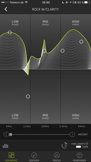
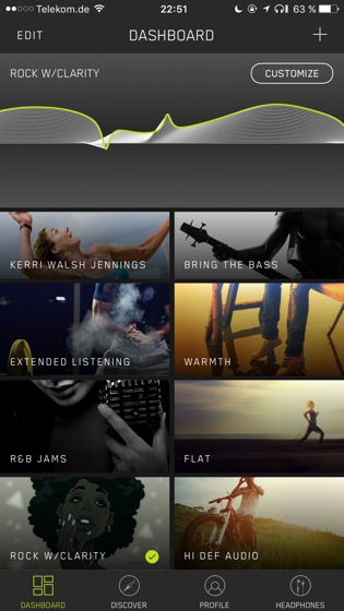
Jaybird X3 :: Now my favorite ear canal headset

by Volker Weber

0f228b8f4d9162db559735c4a41122bd

I always take a few days after a "First impressions" post to follow up on a product. And the X3 has proven themselves worthy. They provides a complete seal without being uncomfortable. I also tried the Freedom once more, but I cannot achieve the seal even with the exact same ear gels. This is one of the rare exceptions where a less expensive product wins. :-)

f5746ceda7f12b64df000a945274b096

I ran the battery all the way down while working today. Recharged it and then used the X3 some more. Very comfortable after I made sure they fit perfectly in my first session. I tried them without the fins, but they won't stay in as perfectly as with them.

84c5059171acb57fe7d80cc91026ba6b 33215bde10270a5ce45e81b41e483017

13 Mar 21:21

iPad Diaries: Apple Pencil, Notability, and the Joy of Note-Taking

by Federico Viticci
Please don't judge me by my terrible handwriting. I have other qualities.

Please don't judge me by my terrible handwriting. I have other qualities.

iPad Diaries is a regular series about using the iPad as a primary computer. You can find more installments here and subscribe to the dedicated RSS feed.


Ever since I first got the 12.9-inch iPad Pro, I've wanted to use the Apple Pencil more. However, every time I tried to fit the Pencil into my workflow, I stumbled upon the realization that, no matter the excellence of the tool at hand, I'm no artist.

I spend most of my time typing with a keyboard (either a Bluetooth one or the iPad's software one) and, while it's fun to pretend I know what I'm doing in Linea or Paper, the sad reality is that I'm downright terrible at sketching or drawing. Moreover, unlike others, my background doesn't involve a passionate appreciation of pen and paper. Therefore, I'm attracted by the Pencil's concept and technology, but I don't need it for my main line of work; plus, handwriting stopped being a daily habit after I graduated high school in 2007.

I was inspired by a story Ryan wrote, though, to reconsider if my work routine could still benefit from a different note-taking perspective. Testing fresh approaches and new ideas has always been the underlying theme of my switch to the iPad, after all. So when Ryan shared his thoughts on using the Pencil for non-artistic purposes, I took it as an opportunity to try out the Pencil as a complement to my writing needs rather than a futile diversion.

Get More iOS Productivity Tips and Workflows

With a Club MacStories subscription, you’ll gain access to weekly iPad workflows, iOS app recommendations, and other exclusive extras.

Starting at $5/month, Club MacStories includes MacStories Weekly – a newsletter delivered every Friday with a focus on iOS productivity and showcasing new and interesting iOS apps. One of MacStories Weekly’s regular sections is the Workflow Corner – a weekly assortment of iPad workflows, iOS automation tips, and tutorials curated by Federico and the MacStories team.

As a new member, you’ll also receive complete access to our back catalogue of over 80 newsletter starting from September 2015.

You can find out more about Club MacStories here, or subscribe directly below.


While I stopped jotting down notes with pen and paper almost a decade ago, it's not that I don't miss the feeling of it.

Back in high school, taking notes during classes or creating my own mind maps at home relaxed me and allowed me to better understand a subject. There's something deliberate, purposeful about writing by hand that I used to find soothing and functional to my studies.

After school and once I started a career in writing online, of course, I largely shifted to digital note-taking and typing on a keyboard – activities that offer high flexibility and none of the limitations of pen and paper. But as I'm growing older, and as distractions from apps increase on a daily basis, I've started to remember the days of handwritten mind maps more fondly. Ryan's Pencil story and watching my girlfriend consume one Field Notes notebook after the other were the catalysts for my decision to find a new use for the Apple Pencil.

After a few days of research on the App Store that led me to testing (again) a variety of note-taking apps, I've settled on Notability – at least for now. This app has been around a long time, and it met my requirements for a smart notebook that can embed multiple data types on individual pages. Notability lets you handwrite text with a Pencil, type text boxes with the keyboard, draw lines of varying thickness and colors, and even cut and paste entire blocks of content between pages. I'm still open to ideas for other Pencil-based note-taking apps to try on the iPad Pro, but, compared to Noteshelf and GoodNotes (two popular contenders), I prefer the ink engine1 and palm rejection of Notability.

A week into my experiment with Notability, I'm already seeing some of the benefits of old-school note-taking reimagined for the modern Pencil era. Normally, I would read articles in Safari or DEVONthink and type notes into iThoughts, Ulysses, or Apple Notes; in doing so, the software keyboard would occupy half of the available screen real estate, while an external keyboard would facilitate distractions by making it too easy to constantly switch between apps with the CMD-Tab switcher. With Notability in Split View, I can keep a primary app on the left and take notes on the right side without the iOS keyboard getting in the way.

By letting the Pencil and multitouch interactions intentionally slow me down, doing research and taking notes feels calmer. More thoughtful, perhaps. With a keyboard, I'd quickly type out anything I can think of, then switch between apps and type something else because the system lets me; with the Pencil and Notability, writing by hand demands I concentrate and think deeply about what I'm writing on the screen and the connections between my notes. And I love having this experience again after 10 years.

To reinforce this positive behavior, I've started keeping a Scratchpad note constantly open in Split View whenever I'm not writing stories or handling other management tasks. Instead of hiding and showing the software keyboard every couple of minutes, I can just grab the Pencil and jot something down. I've even found myself doodling in Notability while I'm thinking about current projects or watching a video; I realize now that I used to do the same in high school. These habits have remained dormant under a layer of apps and keyboards; they're surfacing again now, practically unchanged.

There are both benefits and disadvantages to Notability's page-based approach. As an app, I appreciate that Notability can embed multiple data types and files within a page and that it can zoom into scalable ink that doesn't lose quality at bigger sizes. The variety of tools available in Notability allows me to create my own mind maps with any kind of shape or color I want because I'm not depending on anyone to support my favorite note-taking layouts. I don't feel constrained by features someone else decided for me because I'm fully in charge of structuring and formatting my notes.

In Notability, you can select drawings, cut them, and paste them elsewhere, which means you can use them as mini templates, like my checkmarks.

In Notability, you can select drawings, cut them, and paste them elsewhere, which means you can use them as mini templates, like my checkmarks.

At the same time, I wish Notability went the extra mile and supported an infinite canvas not bound by the traditional confines of a "page". And I also would have liked to see deeper support for any kind of data type or file that can be imported on iOS – whether it's a URL from Safari, a video, rich text from Notes, or a file copied from a document provider. From this standpoint, my ideal tool would be a mix of iThoughts, OneNote2, and Notability – a truly versatile notebook, deeply integrated with iOS technologies, which allowed me to enter anything I want into a infinitely zoomable canvas.

For now, I'm happy with Notability and its page-oriented approach. I'm organizing my notes in subjects (such as "iPad Diaries" and "Personal Notes") and there's a lot more I want to try and learn. For instance, I'm going to set up templates by duplicating notes; I'll also consider marking up early drafts of stories from the MacStories team with a Pencil and red ink. I'm researching a handful of future stories in Notability, and while I can't see myself outlining my iOS reviews in the app (for that kind of large scale project, I'll still rely on iThoughts), I like the writing environment created by the Apple Pencil and Notability.3


As someone who moved past pen and paper several years ago, I wasn't expecting to like the Pencil as much as I am. Once I accepted the Pencil as a non-artistic input device, I began rediscovering the pleasure and concentration of manual note-taking. The Pencil is bringing back a kind of joy I had long forgotten – a delightfully visual, tactile experience that can't be replicated by any software or hardware keyboard. And if this different flavor of note-taking can help me relax and plan ahead with a deeper focus, I believe it's an area I should continue exploring.


  1. By comparison, Noteshelf's ink appeared slightly blurry on the 12.9-inch iPad Pro's screen. Notability's ink feels more like a real pen and less like a subpar digital adaptation. ↩︎
  2. I've tried Microsoft's app multiple times over the past year. There's something about OneNote's ink rendering and UI that doesn't stick with me; I have a feeling that it comes down to Microsoft's custom, non-native implementations of iOS scrolling, fonts, and drag & drop. OneNote is a powerful iOS app, and it's better than ever, but it still feels too Windows-y. ↩︎
  3. Outside of Notability, I'm waiting for this Belkin case/stand to be delivered (I think it'll be useful to carry the Pencil around and put it on my desk), and I've rediscovered the convenience of text selection through the Pencil in traditional text editors. This is something I briefly mentioned in my original reviews of the iPad Pro and Pencil in 2015: the Pencil's fine tip and responsiveness make it a better input device for text selection than a finger. I can see why Myke likes to prepare show notes for Relay FM with the Apple Pencil in hand. ↩︎

Support MacStories Directly

Club MacStories offers exclusive access to extra MacStories content, delivered every week; it’s also a way to support us directly.

Club MacStories will help you discover the best apps for your devices and get the most out of your iPhone, iPad, and Mac. Plus, it’s made in Italy.

Join Now
12 Mar 17:32

How mass participation sports events ‘exploded’ in Hong Kong – and the challenges city faces to stay at the forefront

by James Porteous
In these cooler months, there’s at least one, often several, mass participation events in Hong Kong every weekend; no wonder Dan Parr says “mass participation – everything from 2km fun runs to ultra-endurance runs – has absolutely exploded in the city.” He should know: the managing director of sports marketing firm Fast Track Asia is also one of the city’s leading ultra-runners, whose team was second in last November’s 100km Trailwalker. Parr was...
07 Mar 20:47

Seeing The World Through Her Lens

by Zee Jenkins

“Nothing attracts me like a closed door. I cannot let my camera rest until I have pried it open.”

– Margaret Bourke-White

Flickr is home to millions of photographers from around the world, each with a unique perspective, view, and experience. Among those many millions of photographers are millions of women with cameras, smartphones, and visual voices.

History’s best female photographers span multiple genres. From the personal portraits of Ilse Bing and Dorothea Lange to the unique street photography of Helen Levitt, women with cameras have pioneered new techniques and have helped bring photography to the masses.

In honor of Women’s History Month and International Women’s Day, we’re inviting female photographers of all ages and experience levels, from all countries and backgrounds, to share how they view the world, using use the hashtag #ThroughHerLens.

March is all about celebrating women, and at Flickr, we look forward to highlighting the amazing visual stories they have to tell all month long.

Tell your friends and invite the world to see #ThroughHerLens. We’ll be featuring some of our favorite photographers and images from the hashtag on the Flickr Blog.

Motherhood
Like a prayer
Plant Therapy.
lovely day
Fugue

02 Mar 23:15

Sweden brings back military conscription amid Baltic tensions

mkalus shared this story from BBC News - Home.

The Swedish government has decided to reintroduce military conscription - a move backed by the country's MPs.

The decision means that 4,000 men and women will be called up for service from 1 January 2018, a defence ministry spokeswoman told the BBC.

They will be selected from about 13,000 young people born in 1999, who will be asked to undergo a military assessment, Marinette Nyh Radebo said.

Non-aligned Sweden is worried about Russia's Baltic military drills.

In September, a Swedish garrison was restored to Gotland, a big island lying between the Swedish mainland and the three ex-Soviet Baltic states.

Why is this happening?

Ms Nyh Radebo said the return to conscription was prompted by "the security change in our neighbourhood".

"The Russian illegal annexation of Crimea [in 2014], the conflict in Ukraine and the increased military activity in our neighbourhood are some of the reasons," she said.

How will it work?

The 13,000 who undergo the military tests will be a mixture of volunteers and conscripts. "You are part of the conscript system once you've done the tests - men and women are treated equally," Ms Nyh Radebo said.

"The authorities choose the ones who are willing, interesting and motivated."

Russian menace pushes Sweden towards Nato

Norway breaks tradition to host US troops

Baltic warning of Russian test for Nato

Poland to sign up 35,000 paramilitaries

The conscripts will serve for nine to 12 months. The aim is to encourage them either to become military professionals or, later, to join the reserves.

"If we want full and trained military units, the voluntary system needs to be complemented by compulsory military service," Defence Minister Peter Hultqvist told Swedish public broadcaster SVT.

Sweden had military conscription until 2010, but previously only men were drafted.

How does this impact regional security?

Ms Nyh Radebo said that "70% of parliament is behind the decision to strengthen the military and co-operation with the countries around us".

The closest co-operation is with Finland, she added.

Sweden and Finland are not in Nato, but co-operate closely with the alliance. Their Nordic neighbours Norway and Denmark are in Nato.

The Swedish recruitment system will be modelled on Norway's, Ms Nyh Radebo said.

A Swedish government report on defence priorities for 2016-2020 says recruitment of reserve squad leaders, soldiers and sailors has "proved to be problematic".

It details a range of measures to boost Swedish military capabilities, citing "the deteriorating security situation in Europe, particularly in light of the Russian aggression against Ukraine". Deeper defence co-operation with Finland is "critical", it says.

According to a 2015 research paper by Barbara Kunz of the IFRI Security Studies Center, Sweden has about 52,000 full-time military personnel - 20,000 of them permanent staff and most of the others Home Guard members.

Which other European countries have conscription?

Most of the 28 EU member states abolished military conscription. France and the UK - the main pillars of Nato defence in western Europe - made their armed forces fully professional (France in 2001, the UK in 1963).

Germany suspended conscription in 2011, but provision for it remains in the constitution. There is a debate now about reintroducing some form of national service.

During the Cold War, national service meant that West Germany could mobilise 495,000 soldiers and boost the numbers to about 1.2 million if necessary with reservists.

Turkey has the second-largest armed forces in Nato, after the US military. Turkey has conscription for all men over the age of 20. They must serve between six and 15 months.

Neighbouring Greece - a Nato partner - has compulsory military service (nine months) for men from the age of 19. Cyprus - a longstanding source of Greek-Turkish tension - also has conscription.

Denmark, Norway and Finland have limited conscription, but their forces are overwhelmingly professional. Estonia and Lithuania - small Baltic states wary of Russian moves near their borders - have similar recruitment policies.

In Russia all men aged 18-27 have to spend a year in the armed forces.

Ukraine brought back conscription in 2014, when tensions with Russia escalated.

Switzerland operates a militia system, whereby men have to serve periods in the armed forces from 19 to 34 years of age, and keep their equipment at home.

02 Mar 23:10

10 reasons why not even the best Android phones can get iPhone users to switch – BGR

mkalus shared this story from BGR.

Apple’s iOS platform and Google’s Android operating system have never been more capable and feature rich than they are today. Both ecosystems enjoy tremendous support from a wide range of third-party developers. Both platforms are available on both affordable devices and on gorgeous, premium devices. In 2017, you really can’t go wrong with either platform. Each one has advantages over the other, and each one is beloved by a huge portion of its user base. And yet in countless studies over the past few years, Apple almost always seems to top the charts in brand loyalty and customer experience across every category.

Users flow from one platform to the other all the time, for various reasons. But according to data shared by Apple CEO Tim Cook — which is backed up by anecdotal evidence that we often share — Android users switch to the iPhone far more often than iPhone users bail on Apple’s platform. Why is that? We did some quick digging to find out.

In a thread we came across on Reddit two weeks ago, an iPhone users who had switched to the Google Pixel XL wrote about why after four months, he went back to the iPhone. It was an interesting read, and it prompted us to reach out to a number of iPhone users to discuss why they switched from Android, or what keeps them from switching to Android. People email us all the time to discuss their smartphone preference, so we asked people to quickly and concisely list the main reasons why they switched to the iPhone or why they have no plans to switch away from the iPhone.

In this post, we’ll cover the 10 most common responses we received.

Software updates: This was easily the reason that was cited most frequently.

As of February 20th, 79% of all active iPhones, iPads and iPod touch handhelds were running iOS 10, the most recent version of iOS, which was released to the public this past September.

As of February 6th. 1.2% of active Android devices were running Android 7 Nougat, the most recent version of Android, which was released to the public this past August.

The most popular version of Android is Lollipop, which was released more than two years ago in November 2014. Nougat, the most recent version of Android, won’t achieve that feat until sometime in late 2018, at which time Android 9.0 will likely have been released.

Google has created a platform that proliferated rapidly since it’s open source and available to vendors for free, but software updates have to pass through so many hands that it takes forever to push them out. What’s more, only flagship Android phones typically enjoy software updates for several years, which means mid-range and entry-level devices will often stop receiving updates with key Android features long before the user is ready to upgrade to a new phone.

Customer support: This is another huge one, and it’s one we wrote about at length recently. No other consumer electronics company on the planet comes anywhere remotely close to matching Apple’s after-sale service.

Water resistance: This is an interesting one since Apple was pretty late to the game when it came to water-resistance, but a number of people mentioned switching to the iPhone 7 or 7 Plus because of the IP67 water and dust resistance.

Premium hardware: A number of people expressed a desire to have a $650+ phone that actually looks and feels like they paid $650+ for it. This was interesting to me considering how much better phones like the Galaxy S, Note, Moto and OnePlus handsets have gotten in recent years, but it was still a reason that was mentioned quite often.

iMessage: Seriously… there are so many people out there who just can’t come to terms with living life as a green bubble.

Continuity: Samsung is working on offering tighter integration with Windows and there are great third-party apps like AirDroid that offer features similar to Continuity, but nothing is as slick and smooth as Apple’s solution.

Apple Watch: Android Wear recently got a bit better, but it still as a long way to go before it even comes close to matching Apple’s watchOS platform. Add to that the fact that the Apple Watch is a sleek and elegant accessory while most Android smartwatches are giant, chunky gadgets that look like oversized G-Shocks, and you’ve got yet another check in the win column for Apple.

Apps: We have addressed this issue a number of times before here on BGR, and it’s still something that is on plenty of people’s minds. Apple’s iPhone almost always gets apps first, and the user experience is nearly always superior on iOS. Add to that all of the iOS exclusives out there, and you’ve got a third-party app ecosystem that can’t be beat.

Simplicity: This is another one we’ve touched on a few times here on BGR. The fact that Android is so versatile and customizable is a huge draw for many users. But for others, it’s little more than a hassle. A number of people said that it took them far too much time and effort to set up an Android device and to maintain the user experience, so they prefer the simplicity of iOS.

Battery life: Just about every single iPhone 6/6s Plus and iPhone 7 Plus owner who spoke with us listed battery life as a big reason for switching to the iPhone. Apple’s smaller iPhones don’t have great battery life at all, but the Plus models are class leaders. Personally, since I switched to the iPhone 7 Plus from an iPhone 6s, I can’t even remember the last time I worried about battery life.

02 Mar 23:10

Before it’s too late

by CommitStrip
mkalus shared this story from CommitStrip.

02 Mar 23:08

Towards insertables: Devices inside the human body

files/images/6214-51742-1-PB.png


Kayla J. Heffernan, Frank Vetere, Shanton Chang, First Monday, Mar 04, 2017


I think I would choose some other term than 'insertable' but I would certainly agree that this represents a new device classification. An 'insertable' is a piece of technology one inserts inside one's body (for example, sub-cutaneous electronic door keys). They are distinguished from 'implants' in that they are non-surgical and removable, not medically necessary, and non-specialist. Educational uses for such technology might include personal identification (for access to records from remote systems), cues and reminders (I'll call this category 'twitches'), and eventually, direct neural access to data, messages from other people, and visual information (for augmented displays in artificial lenses).

[Link] [Comment]
02 Mar 23:08

Dear Twitter. It’s not me, it’s you

files/images/EdTechRations-eBook-Cover.png


David Hopkins, Technology Enhanced Learning Blog, Mar 05, 2017


I continue to use and monitor Twitter and I'm feeling the same way as this author. "My Twitter feed is now full of political commentary and all sorts of negative content that wasn’ t there before." And not just Twitter. I'm actually finding it pretty hard to find material on learning technology because people are preoccupied with political affairs. So it's not Twitter's fault, particularly. Although Twitter has become, you know,  boring

[Link] [Comment]
02 Mar 23:05

Recommended on Medium: Learning to build CAD models of a wooden remote

Step 2/4 in the “Everything you need to build your own Turn Touch smart remote” series

This is part of the full guide on how to make your own Turn Touch from scratch. This is the story of the design challenges faced when trying to make a seamless remote and how to overcome them. If you follow this guide, using the accompanying open-source design files, then you will be able to build your own Turn Touch that you can use to control your smart devices and apps on your phone and computer.

If you want to get your own, Turn Touch is on Kickstarter.

Signup on the Turn Touch mailing list to hear about future updates

The source code for the CAD models is available on Github.

Now let’s put it all together. The remote is broken up into 7 stacked parts, starting at the top:

  • top four wood buttons (beige)
  • top wood case (gold)
  • top plastic insert (light grey)
  • plastic button arms (teal)
  • circuit board (purple)
  • bottom plastic insert (dark grey)
  • bottom wood case (gold)

Starting the CAD process wasn’t easy. I didn’t even know which CAD program to use. I tried four programs, in order: Sketchup, Rhino, Solidworks, and finally Autodesk Inventor.

The models for Sketchup were limited by the simplistic capabilities of Sketchup, but Sketchup to its credit does a wonderful job of introducing you to the basics of CAD.

The models for Rhino were limited by the non-parametric capabilities of Rhino, where it was easy to model shapes but extremely difficult and time-consuming to change the parameters that determined how models affected each other.

The models for Solidworks were just the right balance of ease of creation and future modifiability. But once I tried Autodesk Inventor, its admittedly minor differences from Solidworks won me over. And while Autodesk’s Fusion 360 wasn’t production ready when I started the process, if I were to begin again today I was absolutely use it.

Figuring out how pieces fit together

The question to consider when designing each of these layers is what is their relation to the layer immediately above and below itself. The circuit board defines where its mounting pegs are for aligning with the plastic insert below it, and it defines the button dome positions on top for aligning with the plastic button arms above.

Seven layers: wood buttons, top wood case, top plastic insert, plastic button arms, circuit board, bottom plastic insert, bottom wood case

There’s quite a bit of overlap, so each of these pieces fit together nicely to form a much more compact package.

2" wide × 2" deep × 0.68" tall (52mm × 52mm × 18mm)

The circuit board defines the most fundamental constraints, so the design must form around it. That’s not always the case, but when the device is trying to be as compact as possible, it’s a good place to start.

On the other hand we have the outer design, which is shaped to fit your hand. Those contours, while independent of the circuit board, are constrained to fit the circuit board footprint. So from the top constraints, inside and outside, we can begin dissecting the component layers and figuring out how to build this remote.

First problem: How to hold the buttons in place

The button travels down the height of the metal dome when pressed, so there needs to be some way of holding the button in place while it’s pressed down so that it reliably returns to the original position.

The actuator is tall enough to allow the button arms to bend without deformation

Below you can see the concept of buttons arms. Each button has two arms that angle out diagonally from the center of the button. This holds the button in place from the sides.

The button array on the left attaches to the top enclosure on the right, held in place by its own structure

The remote has no border between buttons, so the button arms cannot cross over on top of other buttons. Two arms come from opposite corners and merge into the button half-way down its length.

Why not extend the arms all the way down to the center of the remote? Extending the arm would cut the deformation in half, since each part of the arm has half the height to travel when pressed. But it would also compromise the strength of the button, allowing it to break during assembly.

The length of the arms is a good compromise between strength and flexibility.

Possibly my favorite design inside the remote is how the buttons are held in place. Originally there were pegs in the insert and holes in the button arms. This worked but not well. It was at the mercy of various tolerances when building two separate plastic pieces: the top insert and the button arm. Any misalignment had to be corrected for on the other piece.

If the peg was too fat, the button arm’s hole had to be widened using a miniature, conic jeweler’s file. If the peg was too narrow, the button arm had to be adhered somehow to the peg to prevent it from slipping off. It was a nightmare.

By using tabs that reach over the top insert, the buttons hold themselves in place. During assembly the button array needs to be bent into place, but once attached it doesn’t go anywhere. This also solved the issue of broken pegs when buttons are forcefully pushed in during assembly.

Second problem: Pressing on any part of the button face

Users are going to press a button on any part of the button. And if the press isn’t directly in the center, then it needs to be accommodated.

Each button is held in opposite diagonal corners, so when a button is pressed the arms deflect slightly downward. But they also form an axis that the button can rotate on.

If the button is pressed anywhere not on that axis of rotation, it will either push up the inside corner or outside corner and pull down the other side. To prevent this, we add a paddle on the outer corner of the button. This paddle is aligned with the plastic inserts so that it has a tiny bit of wiggle room but ultimately is constrained from moving up or down, preventing the button from rotating.

The blue paddle rests between the bottom and top plastic inserts, preventing the button from rotating when pressed

Third problem: Holding the remote together

During a demo this is everybody’s favorite part. The top and bottom of the remote need to be held together so that the end user can open up the remote and swap out the battery.

Most remotes use a plastic latch that either needs to be pinched by the user or pulled apart. Alternatively, some remotes are round and can be rotated around internal threads to open.

To solve this problem, I turned to a set of eight strong neodymium disc magnets. They get glued and placed into holes that are sized slightly smaller than the disc magnet, forcing the opening on the side of the hole to expand slightly. This holds the magnet in place and, coupled with an adhesive, ensures a strong hold on the magnet.

It is so satisfying to pull a remote apart and let it snap back together with the power of mangetism. And these magnets are strong, so they pack a lot more punch than anything else this size.

Fourth problem: Accounting for alignment tolerance stackup

This problem has been one of the most perplexing and unforgiving issues I’ve come across on the remote. The issue is that the 7 separate pieces of the remote need to be adhered together in a way that compensates for the different relative tolerances and variable sizes of each component.

There are only a few sizes that must remain fixed. These are the circuit board, which has been fixed in size due to the requirements of the button positions. Second are the wood case’s top and bottom pieces need to be the same size and aligned perfectly with each other so that they form a seamless lip.

The trick is to have a buffer that can absorb the differences in tolerance between the two constraints. This buffer is between the inside of the wood and outside of the plastic insert. That space is apportioned to allow for inaccuracies that arise from two-sided machining.

What the above image shows is that the wood, on top, has a variable amount of space for the plastic insert to move around and align itself. The problem that arises during machining is that the top and bottom may not be evenly aligned, so the tolerance has to account for the maximum offset on one top and the maximum offset in the opposite direction on bottom.

While there is no issue with having a buffer that moves the button arms around, the buttons are no longer perfectly aligned with the opening in the top of the case. To account for this, the plastic button arms are inset from the edges, as evidenced by the purple circuit board peeking around the margins of the teal button arms below.

Smaller button arms (teal) allow the wood to be independently aligned without overlapping other buttons

The wood buttons are glued on top of the plastic button arms, so they don’t need to be perfectly aligned. But the plastic arms are reduced in size so that a wood button isn’t sitting on top of two plastic arms that happen to be slightly offset due to any alignment issues.

But this brings up another issue. We want to maximize the amount of wood at every point while minimizing the total size. We do this because otherwise the wood could break in the thin sections during machining.

Let’s turn back to the see-through side view of the remote.

Notice the space by the yellow arrow is a weak spot that runs along the circumference of the remote. By minimizing the height of the plastic insert we can maximize the wood that holds it in. This minimizes the possibility of split wood during the machining process.

And with that we come to the most exciting part of the process, how to successfully machine the wood.

This is part two of a four part series on everything you need to build your own Turn Touch smart remote.

Next step: CNC machining and fixturing to accurately cut wood

If you want to get your own, Turn Touch is on Kickstarter.

02 Mar 23:05

Twitter Favorites: [moore_oliver] The Union station bus terminal where that woman was killed is a complicated interplay of pedestrians and vehicles https://t.co/UXJAsVm7ZF

Oliver Moore @moore_oliver
The Union station bus terminal where that woman was killed is a complicated interplay of pedestrians and vehicles theglobeandmail.com/news/toronto/a…
02 Mar 23:05

Twitter Favorites: [sonyaellenmann] The reason Susan Fowler's account was so credible is that she put her name and reputation on the line. It's costly, but that's what it takes

Sonya Mann @sonyaellenmann
The reason Susan Fowler's account was so credible is that she put her name and reputation on the line. It's costly, but that's what it takes
02 Mar 23:05

Instapaper Liked: After rare bus fatality, GO looks at safety of downtown Toronto station

The Union station bus terminal where that woman was killed is a complicated interplay of pedestrians and vehicleshttps://t.co/UXJAsVm7ZF — Oliver Moore…
02 Mar 23:03

Prisma update lets users create their own photo filters with artificial intelligence

by Jessica Vomiero

Prisma announced recently that its latest update will allow users to customize their own photo filters.

However, in doing this, the user will train the machine learning system to generate the type of filters each user wants.

Even for users who don’t want to customize their own shots, Prisma is launching a filter store both on Android and iOS to further expand the number of styles offered. The company told Engadget that all the visuals in the store will be free.

This move seems to be geared more towards letting their machine learning algorithms better select new styles for users, rather than forcing the same styles on all their users. To start, Prisma will reportedly add new styles every week, though the eventual goal is to add them on a daily basis.

Interestingly, the added AI features may be a play to generate return users. With machine learning algorithms integrated with the platform, the potential for new and unique designs is always present.

Source: Engadget

The post Prisma update lets users create their own photo filters with artificial intelligence appeared first on MobileSyrup.

02 Mar 23:02

Google increases Gmail’s attachment limit to 50MB

by Igor Bonifacic

Google has updated Gmail’s attachment limit. Moving forward, users can receive emails with attachments up to 50MB in size.

Previously, the limit was 25MB, and that limit remains intact for outgoing emails. I should also note the 25MB and 50MB caps are cumulative. Users cannot send multiple 25MB in one email.

“Sending and receiving attachments is an important part of email exchanges,” says Google in the blog post announcing the change. “While Google Drive offers a convenient way to share files of any size, sometimes you need to receive large files as direct email attachments.”

Speaking of Drive, Google says users can continue to use company’s cloud storage solution to send larger files.

According to the company, Gmail users across the globe should see the updated attachment limit within the next one to three days.

Source: Google

The post Google increases Gmail’s attachment limit to 50MB appeared first on MobileSyrup.

02 Mar 23:01

Medium becomes the next platform to launch a Snapchat lookalike

by Jessica Vomiero

With the launch of its latest feature, Medium has become the latest in a stream of tech companies to attempt to crack the Snapchat code.

The online publishing company has announced plans to launch a ‘Series’ feature that involves video content. Users can start a Series at any time, and can be continued, card by card, as the story unfolds.

Each “card” can be filled with text, videos and images. However, unlike Snapchat, Series cards don’t expire after 24 hours. To view a Series, Medium readers need only to click from one screen to the next by either tapping on the right or swiping to the left.

To create a series users must tape a looping video, and also have the option to customize their pages with big titles, pullout quotes, or text. It’s clear that this new feature attempts to mimic the page-turning action of reading a book.

However, it’s impossible to get around the all-too-familiar feel of Snapchat’s stories feature. Medium announced this past January that it would lay off 50 employees in its search for a sustainable solution to monetizing online content without compromising it.

Source: Medium Via: Wired

The post Medium becomes the next platform to launch a Snapchat lookalike appeared first on MobileSyrup.