The fabulous Tracy Kelly of BC Campus invited me north to Vancouver to co-facilitate two workshops, one on graphic facilitation in higher education (“VizEd“), and the second a larger team collaborative Liberating Structures 2 day immersion workshop. In keeping with my debrief/reflection practice, here are my lessons from the sold-out GF workshop. First, it was a … Continue reading Lessons from VizEd Vancouver
It’s hard to select and implement a community platform.
You need to know the different platforms, their pricing tiers, comparable features, and know if others liked the platform.
Then you need to see demos of each and negotiate with each. It’s an exhaustive, risky, process.
We’ve spent 5 months pulling together our experiences (and data) into a simple tool that can do this for you. Today, we’re happy to launch our online community platform tool which lets you compare, filter, and read the reviews of the top platforms.
If you want to know what these platforms cost, what features they offer, what community professionals think of each of them, and get quotes, click here.
The tool is entirely free to use – we only ask you to help us out by submitting a review of platforms you’ve used in the past.
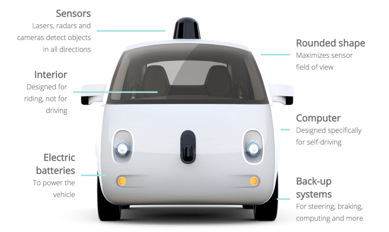
You won’t need to depend on the navigation anymore because the AR-powered Head-Up Display (HUD) of the car will show you holographic display directions to get to your destination. This will be powered by WayRay, a Swiss developer of a holographic augmented reality technology for internet-connected cars, freshly invested by China’s e-commerce giant Alibaba.
Topping up to its effort made in connected cars in the recent years, Alibaba Group has invested US$ 18 million in WayRay’s series B along with its existing investors, announced on March 14th. With the funding, the Swiss company has entered into a partnership with Banma Technologies to develop a new AR car infotainment system which capable of delivering contextually relevant information to drivers and engaging entertainment for passengers.
“WayRay’s making the windscreen a new medium for information. The futuristic in-car infotainment system is the first to use color holographic technology (they were previously only green). Furthermore, the system provides a smart driving assistant that collects your driving stats and patterns, offering up a gamified system of rewards,” said Mary Lapuk, head of communications at WayRay’s R&D base in Russia told TechNode.
WayRay has its own R&D center and prototyping factory and specializes in the development and production of transparent holographic displays based on HOE (holographic optical elements). Navion, WayRay’s first AR navigation system is the key to bringing this AR system. It is a standalone unit that uses holography to visualize timely and useful driving information directly in front of the driver’s eyes.
“Navion eliminates the need to look away from the road while driving, refocusing your eyes and helps to reduce distraction while driving, making your trip safer,” Mary says.
In 2017, the company plans to release a consumer version of Navion and to sign contracts with major global car manufacturers to implement their infotainment system. The company refused to disclose the mark and the model of the car which will be developed in partnership with Banma. However, the company mentioned that the retail sales of smart driving assistant “Element” will start within a couple of months in the US and China to analyze different driving styles.
“WayRay is a pioneer in transparent HOE of such large sizes, which act as virtual optical elements (diffraction gratings). This allows the creation of optical systems that deliver ‘true AR’ virtual images that appear in the distance – all within a small optic footprint,” Mary adds.
The company has also invested in research and development to further its material science expertise – creating materials for ultra-thin films, for example – and created software for the design of optical systems to record the diffraction patterns inside polymers.
Alibaba’s plan to “Open Sesame” your car
Ultimately Alibaba wants to get into future cars to enable you to “open sesame!” your car, that is, to voice control your car. And this effort is done through Banma Technologies, an independent startup invested by Alibaba Group and China’s largest automaker SAIC Motor, dedicated to making developments in internet-connected cars.
WayRay will work closely with this consortium to create an advanced AR HMI that integrates augmented reality navigation, driving assistant notifications, a virtual dashboard, and much more. The new system will be built into one of Banma’s 2018 car models, turning it into the world’s first vehicle in production with a holographic AR HUD display.
YunOS-powered Roewe RX5 car allows drivers to take selfies in the connected car
The global connected car market is expected to reach US$ 180.3 billion by 2022, and Alibaba is making steady efforts to get the grip of the market.
Alibaba revealed their YunOS-powered Roewe RX5 car November last year. Three models of Roewe cars have been launched in conjunction with Banma, committed to empowering the vehicle via data, computation and innovative mobility services. At the Single’s day event held in Shenzhen, Alibaba demonstrated how their connected cars listen to driver’s orders to turn the music or air conditioning on and book movie tickets. It can also direct a drone to navigate the running car and film the scenery around it.
The video below shows their smart car demo, starting at 2’33”.
I’ve learned a lot working with Tim. I also respect his work ethic and he is a steadfast contributor to the open source community. This would be an excellent summer opportunity for any student interested in system-level hardware hacking!
Please note: application deadline is April 3 16:00 UTC.
This example demonstrates how to capture input from forms and create and explore records from that. It should also provide a look at some of the particular complications and pitfalls in dealing with forms. In the future it’ll most likely be useful to address a more complicated version of forms, but for now this is a good starting point to develop an intuition of the concepts. If anything seems oversimplified or susceptible to edge cases and user error, it’s most likely from the effort to avoid bugs and overly complicated layouts.
You can play with this example in your browser here.
Page Layout
Containers
This one’s pretty simple; I want a nav bar at the top to let me manually go to the different pages, and an app window where those pages are rendered.
By abstracting this step out, I can define all the pages I want as in the block before, and then here find those pages and create a button on the nav bar for each of them.
This commits a record called #app-window whose attribute target specifies which page gets rendered. In this case, when the app starts up, I want the landing view to be the Start page.
commit
  [#app-window target: "Start"]
Start Page
The starting page isn’t very complicated - it contains a thank you message for the civically engaged Earthicans, the flag of Earth, a button to start a new registration for another voter, and a subtle sponsorship message.
search @session @browser
  [#app-window target:"Start"]
  window = [#div class:"app-window"]

bind @browser
  window.class += "home-screen"
  window <- [children:
    [#div class:"thank-you" text:"Thank you for registering to vote!"]
    [#img class:"old-freebie" src:"https://upload.wikimedia.org/wikipedia/commons/thumb/3/3a/Futurama_flag_of_Earth.svg/720px-Futurama_flag_of_Earth.svg.png"]
    [#button target:"Register" class:"begin-btn" text:"Begin a new registration"]
    [#div class:"sponsor" text:"This election sponsored with love by MomCorp"]
  ]
Voter Registration Page
The voter registration page starts with questions that determine the eligibility of a registrant to complete the form. A voter must be both a citizen, and not convicted of a felony. This block sets up the form, and posses those two questions.
If either of the qualifications are not met in the submission, then a message is displayed informing the registrant. We can access the from submission through a #submission record. The attributes of the submission map to the field attribute in each of the #field records of the form. Form submissions can be either #valid, meaning the submission contains all of the required fields; or #invalid, meaning the submission is missing some of the required fields. This gives you flexibility on how to handle form submissions.
search @browser @session
  [#submission #valid form citizenship felony]
  form = [#form name: "Voter Registration"]
  not(form = [#qualified])

  disqualified = if citizenship != "Yes" then "disqualified"
                 else if felony != "No" then "disqualified"

  form-message = [#form-message form]

bind @browser
  form-message.children += [#div class: "error-message" text: "Sorry, you are not qualified to register to vote"]
The form is #qualified if the qualifications are met.
search @browser @session
  [#submission #valid form citizenship: "Yes" felony: "No"]
  form = [#form name: "Voter Registration"]

bind @browser
  form += #qualified
When the registrant is deemed qualified, the rest of the voter registration form is revealed. This is done by attaching additional sections to the already exiting form, defined above.
This listens for a new submission on the registration form, and creates a new #voter record with the submitted information.
search @browser @session
  form = [#form #qualified]
  submission = [#valid form first-name middle-name last-name birthday gender phone ssn address1 address2 city state zip party]
  window = [#app-window]

// Reset the form for a new submission
commit @browser
  form -= #qualified
  form += #reset

// Save the submission as a new voter record, and change the page to a submission summary page
commit @session
  window.target := "Submission"
  window.voter := voter
  voter = [#voter first-name middle-name last-name birthday ssn phone gender party address: [address1 address2 city state zip]]
The registration summary page displays the voter’s new voter card, as and contains a button that redirects back to the starting page.
Technically this question susses out both one’s gender and organic life versus robot status, and the end result is the need for a list of genders rather than a binary option. Instead of adding these manually in the voter registration page layout, I’ve made a list here, open to any additional genders that need to be added. Any gender on this list will get added to the voter registration page, which gets sorted by the order attribute.
While the Tastycrats and Fingerlicans are the primary parties, there are many third parties to choose from, and they all get listed here. Again, this makes it easy to add or remove political parties without having to mess around with the voter registration page.
commit
  [#party party-name:"Tastycrat Party" priority:1]
  [#party party-name:"Fingerlican Party" priority:2]
  [#party party-name:"One Cell, One Vote" priority:3]
  [#party party-name:"Green Party" priority:4]
  [#party party-name:"Brain Slug Party" priority:5]
  [#party party-name:"Dudes for the Legalization of Hemp" priority:6]
  [#party party-name:"Bull Space Moose Party" priority:7]
  [#party party-name:"National Ray-Gun Association" priority:8]
  [#party party-name:"People for the Ethical Treatment of Humans" priority:9]
  [#party party-name:"Voter Apathy Party" priority:10]
  [#party party-name:"Rainbow Whigs" priority:11]
  [#party party-name:"Antisocialists" priority:12]
  [#party party-name:"Reform Party" priority:13]
  [#party party-name:"No Party" priority:14]
Summary Page
This page gives an administrator an overview of all the Earthicans who have registered to vote, and drawing the contents is actually pretty easy. All we need is a #voter-card for each #voter record. The layout for what the #voter-card looks like gets handled in the next block, and the brunt of the work for this section is actually the styling.
Here’s a few sample registered voters to help populate the Summary page.
commit
  [#voter
   first-name: "Philip"
   middle-name: "J."
   last-name: "Fry"
   birthday: "08-14-1974"
   gender: "male"
   ssn: "0810"
   party: "Voter Apathy Party"
   address: [address1: "620 W 42nd St" address2: "Apt 00100100" city: "New New York" state: "NY" zip: "10036"]]

  [#voter
    first-name: "Hubert"
    middle-name: "J."
    last-name: "Farnsworth"
    birthday: "04-09-2841"
    gender: "male"
    phone: "04-09-2841"
    ssn: "2458"
    party: "National Ray-Gun Association"
    address: [address1: "650 W 57th S." city: "New New York" state: "NY" zip: "10036"]]

  [#voter
    first-name: "Turanga"
    last-name: "Leela"
    birthday: "07-29-2975"
    gender: "Female"
    phone: "212-307-7760"
    ssn: "3001"
    party: "No party"
    address: [address1: "715 9th Ave" address2: "Apt 1I" city: "New New York" state: "NY" zip: "10036"]]

  [#voter
    first-name: "Bender"
    middle-name: "Bending"
    last-name: "Rodriguez"
    birthday: "01-02-2996"
    gender: "Manbot"
    party: "No party"
    ssn: "BU22"
    address: [address1: "620 W 42nd St" address2: "Apt 00100100" city: "New New York" state: "NY" zip: "10036"]]

  [#voter
    first-name: "John"
    middle-name: "A."
    last-name: "Zoidberg"
    birthday: "05-05-2914"
    gender: "Male"
    ssn: "DXC7"
    party: "People for the Ethical Treatment of Humans"
    address: [address1: "The dumpster behind 650 W 57th St" city: "New New York" state: "NY" zip: "10036"]]

  [#voter
    first-name: "Hermes"
    last-name: "Conrad"
    birthday: "07-15-2959"
    gender: "Male"
    ssn: "6789"
    party: "Brain Slug Party"
    address: [address1: "105 Duane St" address2: "Apt 3007" city: "New New York" state: "NY" zip: "10007"]]

  [#voter
    first-name: "Amy"
    last-name: "Wong"
    birthday: "05-04-2978"
    gender: "Female"
    phone: "212-995-8833"
    ssn: "5523"
    party: "Dudes for the Legalization of Hemp"
    address: [address1: "10 West St." city: "New New York" state: "NY" zip: "10007"]]
A Custom Form Element
Forms have a title and one or more sections. Each section has an optional name, and contains one or more fields. Each field additionally has the input type of that field (input, radio button, drop down list, etc.).
A form starts as a #form record.
search @browser
  form = [#form]

bind @browser
  form += #div
  form.sort := 0
  form.class := "form"
search @browser
  form = [#form]

bind @browser
  form.children += [#button #submit form sort: 100 text: "Submit"]
Handle form submission
When the submit button is clicked, the form enters a #validating stage, where all form data are collected and compared against the field specifications. If any field does not match, then the submission is tagged #invalid and those fields are called out to the user to correct.
If all fields are valid, then the submission is marked #valid and the data are stored in a new #submission record stamped with the submission time.
We start by saving the data in the submission record, and mark the submission as #validating. Validation is covered in the next section.
search @event @browser @session
  [#click element: [#submit form]]
  [#field form field]
  [#time timestamp: time]

  value = if field.value then field.value
          else ""

commit @browser
  submission = [#submission #validating form time]
  lookup[record: submission, attribute: field.field value]
Handle form validation
If a field is #required and a submission is #validating, then we check that the field is actually filled. If any required fields are not filled, then we mark the submission as #invalid`.
Give invalid fields a custom class. Also display a message at the top if any fields are required but missing. The bind here allows the form to be corrected dynamically, unmarking previously invalid fields as soon as they are filled.
search @browser
  [#submission #invalid form]
  field = [#field #required form not(value)]
  field-label = [#h3 field]
  form-message = [#form-message form]

bind @browser
  field-label.class += "required-field"
  form-message.children += [#div class: "error-message" text: "Please fill out all required fields"]
If all required fields are valid, then the submission is marked #valid
Resetting currently has a bug that affects multiple form submissions in succession.
search @browser
  form = [#form #reset]
  submission = [#submission form]

commit @browser
  form -= #reset
  submission := none
Custom Input Types
Custom input types are implemented by taking the value of the input (whatever that may be) and assigning it to the value attribute of its corresponding #field record. For example, the value of a text field is just value. However, the value of a radio field is the value of the option that is checked, so some additional logic needs to be in place to work with these various components. However, the interface to access these data from Eve is to uniformly look at the value on the #field. In this example, we implement both the radio and the input fields, but more can be implemented in this way.
Render radio buttons
search @browser
  field-display = [#div #field field form]
  field.type = "radio"

bind @browser
  field-display.children += [#div #radio field children:
    [#h3 field text: field.label]
    [#div option: field.options children:
      [#div class: "radio-label" text: field.options.label]
      [#input class: "radio-button" field form type: "radio" name: field.field value: field.options.label]]]
Save radio value in its respective #field
search @browser @session
  radio = [#input type: "radio" checked: true field value]
  field = [#field]

bind @browser
  field.value := value
Render input fields
search @browser
  field-display = [#div #field field form]
  field.type = "input"
  placeholder = if field.placeholder then field.placeholder
                else ""

bind @browser
  field-display.children += [#div children:
    [#h3 field text: field.label]
    [#input class: "text-input" type: "input" form field name: field.field placeholder]]
Save input value to respective #field
search @browser @session
  input = [#input type: "input" field value]
  field = [#field]

bind @browser
  field.value := value
In a recent talk, New York Times graphics editor Gregor Aisch noted that only 10 to 15 percent of readers who visit an interactive visualization on their site actually click on anything. That’s a lot of people who don’t get everything that New York Times interactives have to offer, which begs the question: Is it worth the time and effort to make these things?
Every day I'm online, it seems, there's a whole new technology to learn. Yesterday I was messing around with Bower, which has been around a while but which I hadn't time to learn previously. Today it's on to WebVR. This article looks at Mozilla's A-Frame, a web framework for building virtual reality experiences. A-Frame is based on HTML and the Entity-Component pattern." There's a demo based on "a basic VR voxel builder." Think Minecraft. "The voxel builder will be primarily for room scale VR with positional tracking and tracked controllers (e.g., HTC Vive, Oculus Rift + Touch)." It also works on desktop and mobile - see the demonstration here, and play with it yourself by downloading code from GitHub.
"If we want truly open education," writes Graham Attwell, "then we need to open up opportunities for creating and facilitating learning as well as participating in a programme." I agree. He also adds "Brian Mulligan responded... with a link to the Moocs4All web site. the web site includes this promo video for a free course held last year on ‘ Making MOOCs on a budget.'" But as he notes, "it is possible to hack a MOOC platform together with WordPress or to install Open edX. But it isn’ t simple." All true.
But. As readers know, my gRSShopper software has always been open source. This is what was used to launch the first MOOCs and what I still use to manage my newsletter. Like the other hacks, however, it is difficult to install. But this will soon change. I am almost completed work on gRSShopper in abox. This will be a fully contained gRSShopper server you can easily run anywhere. You will be able to use it as either a MOOC or as a PLE (and of course you can use your PLE to take MOOCs). It's not an official project so it has been slow going, but it won't be long now. Stay tuned.
This is not a literal question so I'm not looking at / for specific models, but more a theoretical one. Let's assume I could choose between two bikes for commuting, one with a modern 22 speed drivetrain setup and another with a single speed. The geared bike weighs 30 lbs, and the single speed bike weighs 20 lbs. They cost around the same (not that it makes any difference in this particular scenario). My commute would be about 8 miles each way, so 16 miles round trip, in a major U.S. city with normal traffic and not too much elevation gain (say around 150-200 ft or so, also round trip). Let's assume the city has 4 seasons and I would commute every day. Let's say I weigh around 140 lbs. I've tried to outline both the pro's and con's below, but I'd like to figure out if I'm missing something.
Geared Bike
Gears may allow for a faster overall speed if there are long uphill or downhill sections, or long open flat stretches with no traffic
Single Speed Bike
There is a weight reduction vs the geared bike (in this scenario about 6%) which may result in an increase in acceleration, especially when accelerating from frequent stops in traffic or going uphill
There is a slight increase in drivetrain efficiency due to a lack of derailleurs and a "perfect" chainline
If the rider regularly encounters traffic or does not ride over any substantial hills, I believe the single speed may actually be the better choice in most urban commuting scenarios. Given all of the following information, which one do you think would be faster and why? Any real world experiences and results would be welcome as well. Please disregard any other benefits not related to speed, such as the single speed having less parts = less maintenance and more reliability, generally more quality for the same amount of money spent on a single speed, etc.
Edit: I feel like everyone is missing the point of this question, so I thought I'd clarify. I own a modern 22 speed bike, a fixed gear, a single speed, a single speed mountain bike, and a relatively light 3 speed IGH. As I mentioned before, I do not want to hear about the pro's and con's of actually using each one for commuting in terms of cost, maintenance, etc.: I know about these already having owned them. I just want to know, given my particular scenario, which one you think would be faster and the technical reasons why you came to that decision. I'm not interested in discussing anything other than implications on commuting speed for this particular question.
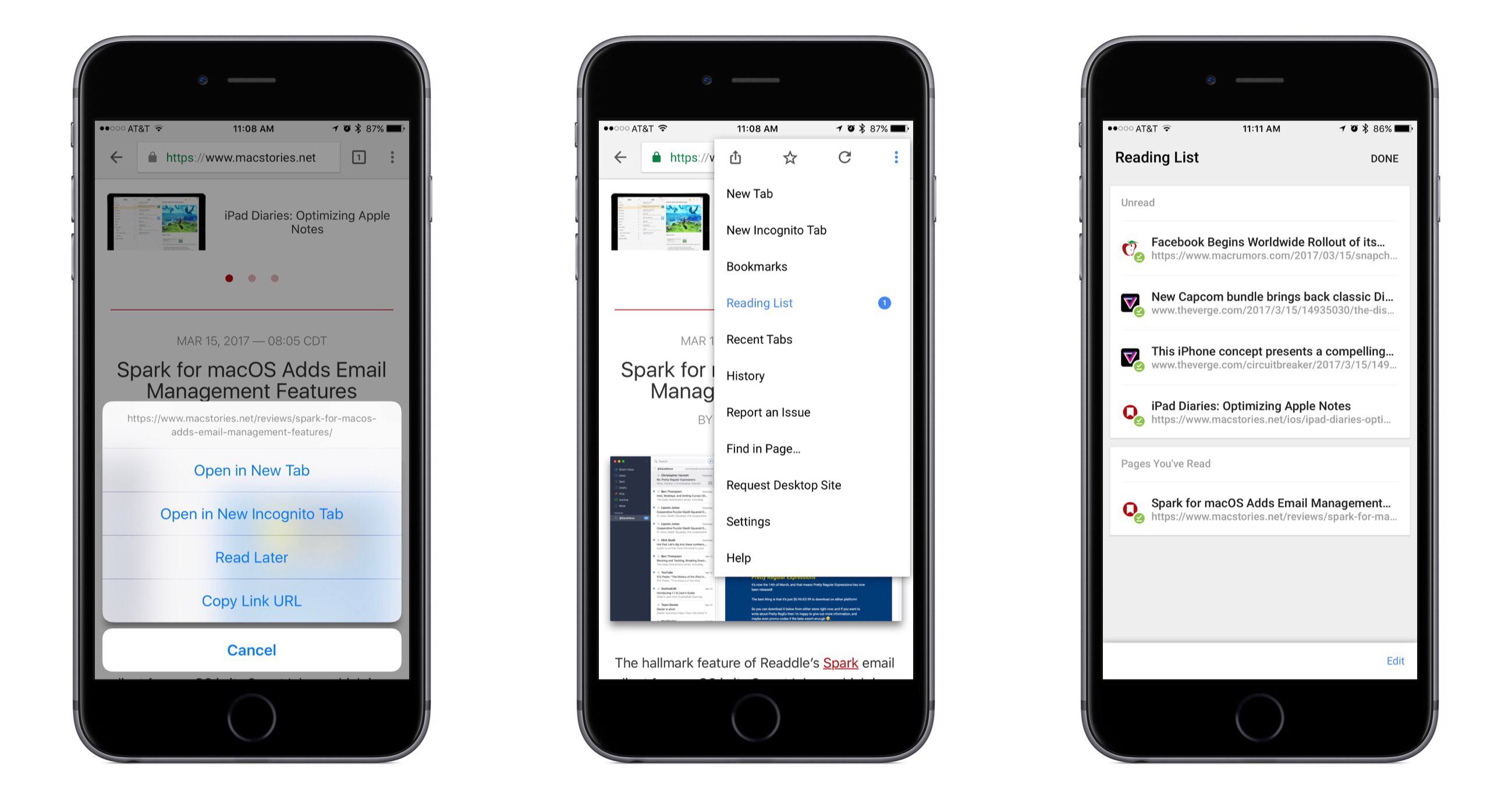
In its latest update, Google Chrome for iOS has added a native Read Later feature to quickly save articles for later consumption. From the app's release notes:
If you find an interesting article that you want to read later, tap the Share icon and then Read Later to add the page to your Reading List. Articles on your Reading List are saved on your device so you can read them wherever you are, even when you aren't connected to the web.
Although the release notes mention tapping the Share icon to save articles, I've found the quicker way to be long-pressing a link, which presents a menu that contains the 'Read Later' option.
In testing the offline functionality, I discovered that Chrome will not save a webpage's full formatting for offline viewing; instead, it stores a stripped down version of the page. All of the necessary content, including images, is still preserved, but the viewing experience is not as pleasant as that of other read-later services.
Overall, although there's nothing particularly interesting or innovative about the way Read Later works, it's still a nice feature addition for Chrome users.
Support MacStories Directly
Club MacStories offers exclusive access to extra MacStories content, delivered every week; it’s also a way to support us directly.
Club MacStories will help you discover the best apps for your devices and get the most out of your iPhone, iPad, and Mac. Plus, it’s made in Italy.
I first noticed this in the 1980s when I discovered that groceries in the suburbs were way better than the ones in the inner city where I lived. And now it's an internet is a problem I'm living with right now. I live in Casselman, a small town in rural Ontario, and even though fibre-optic internet cable passes right through town we cannot obtain high-speed internet. The phenomenon is known as 'redlining'. According to Wikipedia it's "the practice of denying services, either directly or through selectively raising prices, to residents of certain areas based on the racial or ethnic composition of those areas." Wikipedia's definition is too narrow, of course. "The data... show a clear and troubling pattern: A pattern of long-term, systematic failure to invest in the infrastructure required to provide equitable, mainstream Internet access to residents of the central city (compared to the suburbs) and to lower-income city neighborhoods." This article notes "AT& T dismissed the idea that providers would redline or cherrypick communities, and legislators apparently believed them." Of course, that's exactly what happens - in the U.S., in Canada, and around the world.
'Microlearning' is one of those terms that is becoming increasingly vague with use and popularity. According to this article, "the term 'microlearning' was coined by the Research Studios Austria as "learning in small steps," and it has been heavily popularized due to most of its interventions being Web 2.0 friendly." It is not itself a theory but can be associated with cognitive load theory (CLT). According to t he article, "CLT was first described by John Sweller, and it proposes that 'learning occurs in two mechanisms: 1) schema acquisition, or forming a mental map, and 2) transfer of knowledge into working memory.'” The idea is derived from George A. Miller's work in the 1950s (setting our cognitive capacity at 7 items, plus or minus 2). Microlearning, says the article, "is not a one-size-fits-all approach, but rather a good companion for formal instruction. Microlearning may not be an optimal solution for complex tasks in workplace learning."
We have to reject the wishful thinking that the driverless future is a generation away for our industry, our jobs, us.
I stumbled upon something from Yuval Noah Harari, The rise of the useless classat the TED site. Harari is making what is now an uncontroversial claim:
The most important question in 21st-century economics may well be: What should we do with all the superfluous people, once we have highly intelligent non-conscious algorithms that can do almost everything better than humans?
The central question of 2025 will be: What are people for in a world that does not need their labor, and where only a minority are needed to guide the ‘bot-based economy?
Harari doesn’t reference that report, which is a landmark in the discourse on the topic. (In passing, I’m happy to announce I am now serving as a member of the Pew Research Center’s advisory board on Robotics and AI.)
Harari points out the rate of change in AI today is so fast that what was imagined as a distant, next-generation goal only a decade ago is coming to market this year:
In 2004, professor Frank Levy from MIT and professor Richard Murnane from Harvard published research on the job market, listing those professions most likely to undergo automation. Truck driving was given as an example of a job that could not possibly be automated in the foreseeable future. A mere 10 years later, Google and Tesla can not only imagine this, but are actually making it happen.
It’s so cute
Harari riffles through the recent discourse about the driverless future, touching on familiar questions:
Our capabilities are reducible to ‘algorithms’ that have evolved over time, and there is no reason AI can’t copy — or better — how we do things.
Will people find refuge in artistic creativity? Not likely.
Is this analogous to the creation of the industrial urban proletariat, forced off the land and into the factories and mines, and exploited like machinery? Well, kind of, but instead of being exploited,
In the 21st century we might witness the creation of a massive new unworking class: people devoid of any economic, political or even artistic value, who contribute nothing to the prosperity, power and glory of society. This “useless class” will not merely be unemployed — it will be unemployable.
4. Harari cites Osborne and Frey’s 2013 The Future of Employment, which is now a touchstone in the discourse about the driverless future of work. He reinforces their argument — a large proportion of today’s occupations are liable to be ephemeralized by AI and robots — and stands up and knocks down the techno-utopian trope that technological change has always eliminated jobs, but created new ones. His counter is swift and to the jugular:
Of course, by 2033 many new professions are likely to appear — for example, virtual-world designers. But such professions will probably require much more creativity and flexibility than current run-of-the-mill jobs, and it is unclear whether 40-year-old cashiers or insurance agents will be able to reinvent themselves as virtual world designers (try to imagine a virtual world created by an insurance agent!). And even if they do so, the pace of progress is such that within another decade they might have to reinvent themselves yet again. After all, algorithms might well outperform humans in designing virtual worlds, too. The crucial problem isn’t creating new jobs. The crucial problem is creating new jobs that humans perform better than algorithms.
That paragraph is a perfect and concise riposte to the starry-eyed optimists who don’t accept the possibility of a dark end to the rise of driverless.
He ends with the requisite Skynet/Terminator notions: that AI will become sentient, and smarter than all of us, and simply terminate us as a petty annoyance.
However, he doesn’t have an answer to the question he asks, and offers no glue to hold the house of cards together. He doesn’t mention universal basic income, or the likelihood of a political movement countering the driverless future. He does touch on a key corollary of his opening question, wondering who should ‘own’ the productivity and profits from a driverless economy:
As algorithms push humans out of the job market, wealth and power might become concentrated in the hands of the tiny elite that owns the all-powerful algorithms, creating unprecedented social and political inequality.
The driverless future looks increasingly to be a time of increased inequality, where ever greater numbers of professions are ephemeralized, vaporized, driverlessized, and people find themselves unable to compete even as a janitor, burger flipper, or vegetable picker. The time is coming when it won’t be just the dispossessed coal miners and factory workers of the Rust Belt voting against a future in which they have no place. It will be the unemployed programmers and PR staffers whose once-upon-a-time middle-class lifestyles will be hitting the wall, along with the financial planners and options traders, the paralegals and researchers, the doctors and nurses, the IT staff and the news reporters. Every job is at risk.
We have to reject the wishful thinking that the driverless future is a generation away for our industry, our jobs, us. This is happening now, one occupation, one job, one person at a time.
As Apple pushes deeper into luxury brand territory, the company is making its products more accessible through lower pricing. At $159, Apple is underpricing AirPods. The same can be said for Apple Watch, priced at $269. In just ten years, we have moved from the "Apple Tax" days, when Apple was accused of pricing products artificially high, to Apple products being priced below the competition. Apple is using its balance sheet and scale to grab new users, and in the process, redefine luxury.
Underpricing AirPods
After using AirPods for the past three months, one takeaway relates to pricing. It is clear that Apple is underpricing AirPods. While this statement may sound outlandish considering that a pair of EarPods is included in every iPhone box, AirPods are not just any pair of headphones. The combination of accelerometers, optical sensors, Apple's new W1 chip, and a well-designed charging case, position AirPods as Apple's second wearables product. AirPods are computers for your ears. This distinction does a better job at framing the device's surprisingly low $159 price.
Contrary to the conclusions found in most headphone buying guides, AirPods should not be compared to lower-priced, wired headphones. These buying guides not only lean on sound quality to unfairly shortchange truly wireless headphones, but also misidentify why consumers want to buy wireless headphones in the first place. AirPods' primary value proposition isn't found with sound quality but rather with not having any wires. Accordingly, the product should be compared to other truly wireless headphones.
It is very difficult to find a pair of wireless headphones priced lower than AirPods. In the run-up to Apple unveiling AirPods this past September, the wireless headphone market consisted of the following players:
Kanoa: $300
Bragi Dash: $299
Erato Apollo 7: $289
Skybuds: $279
Earin: $249
Motorola VerveOnes+: $249
Samsung Gear IconX: $199
Bragi Headphone: $149
Given the preceding list, a strong case could have been made for Apple to price its new wireless headphones at $249, or even $299. The fact that Samsung priced its Gear IconX at $199 seemed to suggest a sub-$200 retail price for AirPods was unlikely. Instead, Apple sent shockwaves pulsing through the market by pricing AirPods at only $159. The action instantly removed all available oxygen from the wireless headphone space. The idea of Apple coming out with a new product that would underprice nearly every other competitor was unimaginable ten years ago.
Many wireless headphone companies have been forced to cut pricing in an attempt to better compete with AirPods. Even after price cuts, competitors are still unable to come close to AirPods pricing. While some of these competing headphones include additional capabilities and functionality, much of this benefit is overshadowed by the lack of Apple's W1 chip. When it comes to contributing to the premium experience found with AirPods, the W1 chip is near the top of the list.
Underpricing Apple Watch
A similar pricing dynamic is found with Apple Watch. After cutting the entry-level price $50 to $299 in March 2016, Apple unveiled a new Apple Watch pricing strategy last September. Apple upgraded the first generation Apple Watch device with a new dual-core processor, the same processor found in the higher-priced Apple Watch Series 2 models. In addition, Apple gave the Watch a new name, Apple Watch Series 1, and a $30 price cut to $269.
At $269, Apple Watch Series 1 is one of lowest-priced smartwatches worth buying in the marketplace. Attractive pricing was one key factor driving record Apple Watch sales this past holiday quarter. In fact, even the Apple Watch Series 2, at $349, is one of the lowest-priced smartwatches in its class:
Fossil Fenix 5: $599
Garmin Forerunner 630: $399
Michael Kors Access: $350
Samsung Gear S3: $349
Fossil Q Founder: $275
Apple's aggressive pricing strategy has also gone a long way in shrinking the price gap between Apple Watch and dedicated health and fitness trackers. There is now only a $70 difference between an Apple Watch Series 1 and Fitbit Blaze.
Three Pricing Theories
There are three theories to explain Apple's AirPods and Apple Watch pricing strategy.
A) iPhone as Hub. Instead of making a profit on Apple Watch and AirPods, Apple is underpricing the devices in an effort to boost iPhone sales. The logic is that since Apple Watch and AirPods are being positioned as iPhone accessories, Apple views the devices as tools to keep consumers attached to their iPhones. Apple compensates for the lack of Apple Watch and AirPods profit by selling high-margin iPhones and Services.
B) Manufacturing Scale. This is the most straightforward theory. Apple has simply gotten better at making products at a lower cost. With a sizable production ramp (millions of units), Apple management can use scale and its existing supply chain to quickly bring down component and manufacturing costs for a new breed of personal tech gadgets.
C) Consumer Segmentation. Management is using product pricing to grow Apple's user base. On one end, management cuts entry-level pricing in an effort to make products more accessible. However, management then pushes at the other end of the pricing spectrum with premium SKUs targeting a different part of the user base. The higher-priced SKUs help boost Apple's overall margin profile.
History
On the surface, each of the three preceding theories seem to contain some logic. The iPhone is not only Apple's best-selling product, but also the most effective tool for growing the user base. At the same time, Apple has seen much progress in keeping component costs contained across its product line.
However, upon further examination, there is a serious flaw found with Theory A (besides the fact that Apple is moving beyond the iPhone as Hub product strategy). AirPods and Apple Watch pricing doesn't reflect a new strategy designed to juice iPhone sales. Instead, Apple has actually been traveling down this pricing path for years. Apple's decision to unveil the initial iPad at $499 in 2010, and then come out with a $329 iPad mini just two years later, marked a sea change in the way Apple approached product pricing.
In the mid-1990s, Apple made a series of strategic mistakes related to the Mac. Instead of trying to grow market share, management chased profit. Apple introduced a variety of high-priced Macs targeting existing Mac users. Apple was having difficulty targeting new users in the face of the strengthening Windows empire. Apple was doubling down on niche instead of chasing mass market.
Apple took a completely different strategy with iPad. With iPad, Apple cared much more about grabbing market share. This attitude was born from motivation to not repeat Apple's dark days from the 1990s. Up until last year, there was thought to be one major caveat to Apple's market share ambition. Apple was interested in initially grabbing share in the premium segment of the market and then gradually working its way down market. There is evidence to suggest this attitude is now changing a bit as Apple is selling wearables.
Apple's Pricing Strategy
AirPods and Apple Watch pricing demonstrate how Apple is looking to own not only the premium segment of the wearables market, but rather the entire market. As Apple runs deeper into luxury, the company is reducing entry-level pricing. This is a curious development as one assumes the opposite would have occurred - Apple would keep prices high to maintain a certain level of exclusivity or scarcity. Instead, Apple is redefining the concept of luxury in order to sell mass-market products.
Consider Apple's approach to Apple Watch pricing. With $269 and $369 Apple Watch options, Apple is very competitive with nearly every smartwatch. However, at the other end of the product line with Apple Watch Hermès and Edition starting at $1,149 and $1,249 respectively, Apple is selling different materials, and a different kind of experience, at much higher prices. Apple is segmenting the product line to appeal to a wider variety of users.
With Apple's entry-level Apple Watch pricing, management isn't necessarily targeting a premium segment of the smartwatch market, but rather its going after the entire market. AirPods represents an even more extreme case study of this mass-market appeal.
Apple is able to sell product at low prices by utilizing its strong balance sheet and powerful supply chain to secure very attractive component orders. In addition, the company's efforts to own its own silicon and other core technologies are starting to pay dividends from both a performance and pricing perspective. Apple's growing vertical integration is allowing the company to run with lower pricing yet still maintain historically high margins. The growing legal battle between Apple and Qualcomm isn't just about Apple being unhappy with Qualcomm's business model. Rather, it's about Apple wanting to eventually get into the baseband processor business. (Afull primer related to the lawsuit is available for members here.) This will come in handy when selling a cellular Apple Watch down the road as Apple can create its own system on a chip (SOC) containing its own AX processors, GPU, and an LTE modem chip.
Lower-priced Apple products result in increased sales, which leads to Apple's ability to place even larger component orders. Apple will soon be on pace to sell 20M Apple Watches per year. For AirPods, annual unit sales will likely be even higher. These sales numbers provide Apple flexibility to reduce the pricing of older models even further. Meanwhile, competitors are unable to get a foot in the door. We saw a version of this dynamic unfold in the tablet market during the early 2010s. The same thing is now taking place in the smartwatch market, and it could even expand to the wireless headphone industry.
Things to Monitor
Given Apple's revised pricing strategy, there are a few developments worth monitoring:
Apple Watch. A $199 Apple Watch is inevitable at this point. On the other end of the pricing spectrum, new partnerships with luxury brands similar to Hermès seem likely.
AirPods. It is not unreasonable for Apple to eventually have an entire AirPods platform comprised of lower-priced models with certain features and components as well as higher-end options targeting a more premium segment of the market. Interestingly, Apple started towards the low end and may work its way up market as additional functionality is added.
iPhone. Stronger than expected demand for the higher-priced iPhone 7 Plus tells us that higher-priced iPhones are coming. Higher prices will be justified as iPhones morph from being computers that fit in one’s pocket into personal augmented reality navigators utilizing the most capable cameras to ever fit in a pocket. Meanwhile, Apple continues to reduce entry-level iPhone pricing. The most recent example is Apple bringing back the iPhone 6 in a few select markets and pricing it a bit lower than iPhone SE.
iPad. Given the iPad's position within Apple's broader product line, the product category is following the iPhone in terms of higher-priced models. On the other end, there may not be much room left for Apple to lower iPad's entry-level pricing to significantly less than $269.
Redefining Luxury
Apple's pricing strategy is ultimately about bringing new users into the Apple ecosystem. While the iPhone remains the most effective tool for accomplishing this, Apple wearables will increasingly represent another new user tool at management's disposal. It may be difficult to believe, but AirPods likely represent the first Apple product for more than a few people. Additional value will flow to companies selling multiple wearables products to the same user. As it currently stands, the average Apple user owns more than one Apple product. This trend will only intensify as time goes on when considering Apple Watch and AirPods.
The trickiest aspect of Apple's pricing strategy is running with lower prices while at the same time, becoming more of a luxury brand. In essence, Apple is redefining luxury. While other luxury brands have utilized lower-priced items to serve as brand entry points, Apple is taking the practice to an entirely new level by pricing products below the competition. Apple is making luxury much more accessible with the idea that low-priced gadgets can create an experience just as luxurious as that of premium gadgets. It's going to be difficult for other consumer tech companies to play in this game.
Receive my analysis and perspective on Apple throughout the week via exclusive daily emails (2-3 stories a day, 10-12 stories a week). To sign up, visit the membership page.
Whether you're a cyclist who just moved to Portland, OR, or is getting into biking, it's nice having friends who ride. So we gathered together a list of the best ways to meet some new ebike buds while also having a good time.
Go on a Group Ride
All over Portland, there are weekly, biweekly, and monthly bike rides happening. Riding in a group is a fantastic way to meet new people, see new places, and ride safely.
Whether you're looking for a ladies only ride, an ebike ride, or a friendly race to sweat it out, there's a group for you.
Keep an eye out around your neighborhood for local postings, or check out Bike Portland’s event Calander to find group rides.
*Pro Tip: bring along Bluetooth speakers or make your own bike mounted speaker system to make it a party!
Go on to a Bike Event
If you're looking to make genuine connections with the bike activist type, casual riders or dedicated cyclists head to the next bike event in your area. In a city as bike friendly as portland, you can find a bike event any time of the year. Here are our two favorites:
Years ago, there was a day in February that was perfect for a bike ride: -54 degrees and pouring rain. Some folks thought it would be the perfect day for a bike ride, thus the Worst Day of the Year ride was born. Since then it has turned into a full on costume ride and has only been canceled once due to dangerous weather.
For more events, go to this comprehensive list of the annual bike rides in Portland.
The Spots to Stop
Biking, Beer, and coffee pretty much go hand in. If you don’t drink one, you almost definitely drink the other.
Perhaps cafes and breweries are a given, but for a reason! They go hand in hand with biking. If you're the type who likes to ease into the morning with a cup of joe at your local coffee shop check out Go for an old classics like Anna bananas or a local default like Coava.
Maybe your ideal way to end the work day is to head to the bar for 16 oz of your favorite brew. If this is you, ride on over to Cascade or Lucky Lab.
Frank Ducote sends along a Crosscut clipping on the Washington State initiative to study high-speed rail between Seattle and Vancouver:
Frank asks:
This surely would require a safer, shorter and straighter alignment in BC, most likely along the Highway 99 corridor. But where could/would it cross the Fraser without headroom?
Everybody knows the Model One from Tivoli Audio, designed by the late Henry Kloss. Although many consider it a modern classic, Model One itself incorporates visual elements similar to Kloss' legendary KLH Model Eight table radio. Tivoli Audio was founded by Tom DeVesto. He moved on to create Como Audio and launched a Kickstarter campaign.
Tivoli Audio has evolved from building the simple Model One to make lots of different products. The Model One Digital is a play on the original Kloss design, unfortunately without the good parts. There isn't a mechanical switch to turn it on/off but this small button that you can press, long press or turn. The ring around the display also turns so you can tune into an FM station, but both are completely without feedback. Everything just happens on the screen. It looks like a round display but it isn't. It's a rectangular display inside a round bezel. The box is well built, the speaker sounds reasonably well, the cloth is a fine quality, and yet, the mechanics feel cheap.
The new device has the same proportions as the Model One, but it is slightly larger.
The back is completely different. There is an aux in, but no rec out (fixed) or headphone out (variable). While the Model One has an interal power supply and can be also be run on 12V/0.8A, the Digital version needs its own external power supply which feeds it 15V/1.5A. There is also a MicroUSB service port and two buttons for Setup and Party Mode. Party Mode gives you an indication that this device can join a group of devices to play the same music. Since I have but one of them, that is not something I will be looking into.
Model One Digital can play from many sources:
Via Antenna it is an FM or a DAB+ radio
Via Bluetooth it is just a speaker
Via Wifi it can stream from TuneIn, Spotify, Tidal, Deezer and QQ Music, or music stored on your Android or iOS device. It also has Spotify Connect.
This versatility is the good news. The bad news is that this device isn't easy. Model One was easy, Model One Digital is complicated. There is an app to control it, but that needs a lot of evolution. I cannot get everything to work, even after putting in two hours. I fail at very simple things. The clock for instance. Do you remember the old video recorders that used to blink with 00:00? I feel this level of stupid.
What I can get to work is FM radio, when I hook it up to my roof antenna via the threaded terminal. No DAB/DAB+ though. With my Model One I was able to just connect a 75 Ohm "external antenna". Spotify Direct works over Wifi, so does internet Radio with TuneIn. But when I switch the device off and back on, I am back in FM radio. I can press the On button repeatedly to cycle through the other options, but none if them starts playing anything without my smartphone or some other external source: FM, DAB (empty), Aux, Bluetooth, Wifi. When I launch the app, it tells me I have no radio. I have set it up a few times but learned to just wait instead. It will eventually find it. More bad news: it hisses and the display is unreadable in daylight.
But here is the killer. The Sonos Play:1 simply destroys the Model One Digital in every single aspect but FM radio. It's way easier to setup and operate. I think it is prettier, it sounds way better. Make that wayyyyyyy. And that is before Trueplay Tuning. Last but not least, it's also less expensive.
This is going back. No editor refuses-to-give-it-back award. But I am keeping my Model One.
Arlo is one of those products I continue to recommended. It's a product I don't just review and put aside, I use it every single day. Just today I installed a three camera setup at a friend's house and her 90 y/o father decided to order another set on the spot. That's right, 90. But he doesn't look it and he is still very agile, both physically as well as mentally. I digress.
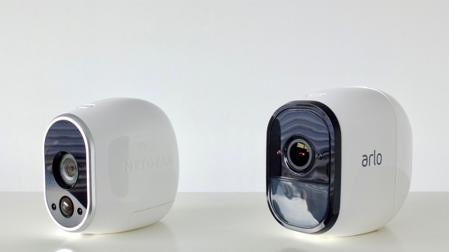
When I returned home, UPS showed up and brought a new Arlo Pro. That's the one on the right. It also came with a new base station.
If you already have an Arlo system, you can just buy a camera and add it to your old base station. Arlo and Arlo Pro mix on either the new or the old base station.
While both the old and the new base station have the same ports, the new one adds two features: it has an extremely loud (110 dB) and annoying siren and it lets you record video to local storage. If you plug storage into the old station's USB port, it gets completely ignored, while the new one offers the new storage option, in addition to the cloud storage. Why do Arlo cameras need a base station? They run on battery power and need to be isolated from the regular Wifi traffic.
Battery power hasn't been a problem with the Arlo cameras so far. I need a new set of 4x CR123 about once every six month. CR123 are an odd size and you can't get them in a super market. When you buy ten at a time from Amazon, you pay roughly seven Euros for the set of four. The new Arlo Pro has a rechargeable battery. When it is running low, you will have to fetch the camera, connect it via MicroUSB to the included charger and then replace it to the original location. You can also buy additional packs and an external charger. I will see what causes more trouble over time.
One observation: the hole in front of the MicroUSB port is tiny. You will need to use the cable that Netgear supplies. If you don't need the camera to be waterproof, you can also keep it plugged in and don't need to worry about the battery.
Arlo Pro has a new motion sensor that works over longer distance and the camera starts up four times faster so it's more difficult to slip by before the camera starts recording. The lens also went from 110 to 130 degrees viewing angle. It now has a microphone and speaker so you can talk to the delivery man at the front door via your Arlo app.
All important question: do you need to replace your existing Arlo cameras with the Plus cameras? That is a definite no. I still recommend the original system, and it's also considerably cheaper. Only if you want to make use of the advanced features or if you are burning through too many batteries, upgrading to Pro would make sense.
I am going to use the new camera more aggressively than the old one to see how the battery holds up. This isn't going back. I will keep you posted.
You know poor writing is slowing down your organization. But changing a culture — any culture — is wicked hard. Where should you start? And how can you maintain the change? I suggest three steps: 1. Generate awareness. 2. Share knowledge. 3. Provide systems for help and support. Here’s how to do these. 1. Generate … Continued
Just like you’re more substance than a selfie, our visual refresh goes deeper to represent what dating’s really like
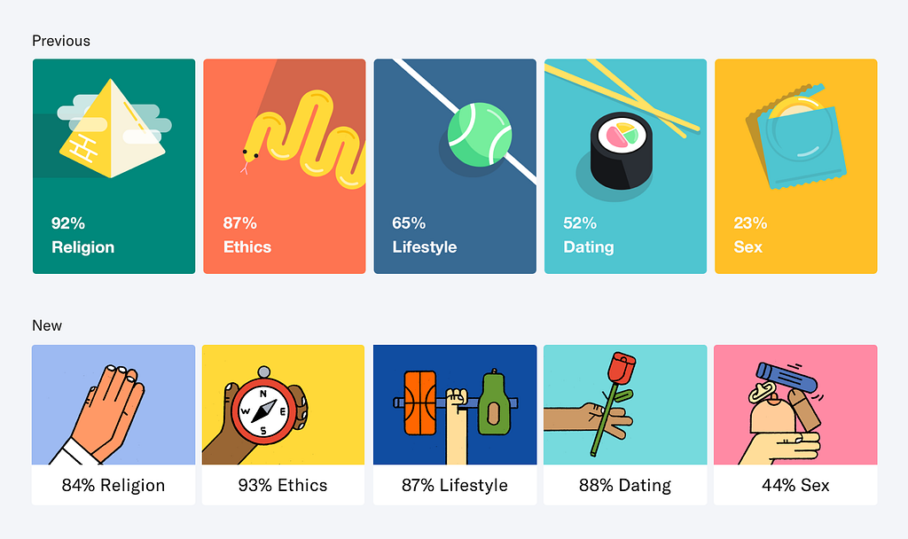
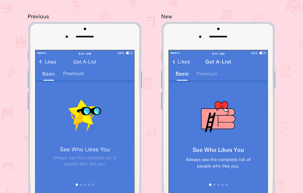
The new illustrations help us visualize — and connect with — all parts of dating: the quirky, the charming, and the confusing.
Going on dates can be really nice. There’s human connection, companionship, sex — sometimes even just a great makeout sesh. But we can’t only highlight the really nice and ignore the aspects of dating that aren’t so lovely, like having to share a cocktail or coffee with the occasional catfisher, scammer, ego maniac, or bland dingus. After all, dating can be a weird, chaotic, alluring mess — full of highs and lows.
At OkCupid, we work hard to help you meet someone who ticks all your boxes, and hopefully has some great qualities you weren’t even looking for. But ultimately, all we can do is provide you the space to express what’s important about you. We’re all individuals with unique charms and quirks, and showing them off is the best way to meet someone you’ll really click with. So we’ve changed things up a bit — not only so you can express your individuality now, but also to better reflect the dating experience, and hopefully lighten the mood a bit, too.
Illustrations
The new illustrations were done by Jay Daniel Wright, a charming goofball based in Berlin. We tossed around a number of great illustrators, but Jay’s work always made us smile and left us feeling genuinely good about the world. We hope Jay’s illustrations do the same for you.
Jay’s sketches in progress
If nothing else, his drawings are fun, quirky, and unique — qualities they share with the interesting people you’ll meet on OkCupid.
“The Two of Us” got an update.
Typography
We’re now using one typeface, GT America, across all platforms. While a number of us are feeling a bit down on the whole America thing, we still love it here. And even if we didn’t, GT America isn’t actually American but rather the creation of some Swiss folks at Grilli Type. It’s a handsome blend of that sweet Swiss rationalism we see in our favorite grotesque san-serifs (see: Helvetica) and the quirk of American gothics (see: Franklin Gothic). For non-typography nerds, here’s the point: GT America is eccentric and individual, just like, well, humans.
The visual refresh includes new typography and illustrations.
Design Philosophy
Our design philosophy hasn’t changed that much. Our focus remains on making an easy-to-use, enjoyable product. But OkCupid has come a long way from where we started. There was some charm in the OkCupid of old, a place with very few rules that was peculiar, ugly, and open. Since our humbler beginnings, we’ve simplified things a lot. And that is a philosophical choice. When designing a product like ours, we have two directions to choose from:
We can create a visual style and experience that glorifies the ideal — an experience that feels almost utopian. In this world, we present dating as fun and easy; it’s a pool party with a perfectly diverse set of friends who look like they model on the weekends, and travel the world during the week. There’s a colorful gradient sheen, and its perpetually golden hour. This is the approach most companies in this space are taking. It’s lovely. It’s the dream we’re all striving for, right?
Or we can reflect the reality of this adventure we’re all on together. It’s a little rough around the edges, loud, bizarre, and eclectic. It can be complicated, but ultimately we can all see the beauty in the mess if we look for it.
Some of Jay’s illustrations were inspired by existing icons, like the star.
We have always wanted to be a dating app for humans. Real humans. All humans: men, women, gender fluid, transfeminine, gay, straight, asexual, queer, questioning, etc. Not glossed up models living a perfect life that we’re pretty sure doesn’t exist, or does — but only for a select few. We’re not here to tell you what’s cool, or pretend that we know. Instead, we’re here to encourage you to be yourself. And we’re going to continue to build an open platform that lets you express all the things that make you who you are.
We know you’re more substance than selfie. Sign up at OkCupid.com to connect with people as individual as you are.
If the topic isn’t part of a member’s identity, you can’t build a typical community.
No-one is in AT&T’s community by choice. Something broke and they want a quick resolution. You shouldn’t try building a sense of community, initiating off-topic discussions, and interviewing your newcomers*.
The name of this game is speed and quality. You need to solve a member’s problem before they’ve had to ask a question. That’s the gold standard you edge closer towards each day.
If the topic is part of a member’s identity, you’re playing a different game. Your members don’t want answers, they want a place to belong. They want to know their peers and see how they compare. They want to achieve a positive distinctiveness.
Most successful communities today are like AT&T. They are customer support based. Members want good answers to tough questions.
If you’re not sure, here’s a simple test. Ask members of your audience to describe themselves. If they mention your topic (e.g. “I’m a programmer”), you can build an identity-based community. If not, build a support community.
Both types of communities work. The secret is being clear about which you’re building.
* you can build a community of superusers among this group.
Even if (like me) you don't have the time and space in your life to construct one of these, just reading the article is enough to give you inspiration. It also gives you a 20-20 glimpse into the future. The idea is to hook up a camera to a $40 minicomputer called Raspberry Pi, take pictures of visitors, and then send them to the cloud where you'll apply Amazon Web Services (AWS) face-recognition technology to them. The expensive bit is the $50 Echo Dot, a hands-free, voice-controlled device that you use to control your device.
But then it hit me. Code is not literature and we are not
readers. Rather, interesting pieces of code are specimens
and we are naturalists. So instead of trying to pick out
a piece of code and reading it and then discussing it like
a bunch of Comp Lit. grad students, I think a better model
is for one of us to play the role of a 19th century naturalist
returning from a trip to some exotic island to present to
the local scientific society a discussion of the crazy beetles
they found: "Look at the antenna on this monster! They look
incredibly ungainly but the male of the species can use these
to kill small frogs in whose carcass the females lay their
eggs."
The point of such a presentation is to take a piece of code
that the presenter has understood deeply and for them to help
the audience understand the core ideas by pointing them out
amidst the layers of evolutionary detritus (a.k.a. kludges)
that are also part of almost all code. One reasonable approach
might be to show the real code and then to show a stripped down
reimplementation of just the key bits, kind of like a biologist
staining a specimen to make various features easier to discern.
My scientist friends often like to joke that CS isn't science, even
as they admire the work that computer scientists and programmers do.
I think Seibel's essay expresses nicely one way in which studying
software really is like what natural scientists do. True, programs
are created by people; they don't exist in the world as we find it.
(At least programs in the sense of code written by humans to run on
a computer.) But they are created under conditions that look a lot
more like biological evolution than, say, civil engineering.
As Hal Abelson says in the essay, most real programs end up
containing a lot of stuff just to make it work in the complex
environments in which they operate. The extraneous stuff enables
the program to connect to external APIs and plug into existing
frameworks and function properly in various settings. But the
extraneous stuff is not the core idea of the program.
When we study code, we have to slash our way through the brush to
find this core. When dealing with complex programs, this is not
easy. The evidence of adaptation and accretion obscures everything
we see.
Many people do what Seibel does when they approach a new, hairy
piece of code: they refactor it, decoding the meaning of the
program and re-coding it in a structure that communicates their
understanding in terms that express how they understand it. Who
knows; the original program may well have looked like this simple
core once, before it evolved strange appendages in order to adapt
to the condition in which it needed to live.
The folks who helped to build the software patterns community
recognized this. They accepted that every big program "in the
wild" is complex and full of cruft. But they also asserted that
we can study such programs and identify the recurring structures
that enable complex software both to function as intended and to
be open to change and growth at the hands of programmers.
One of the holy grails of software engineering is to find a way
to express the core of a system in a clear way, segregating the
extraneous stuff into modules that capture the key roles that
each piece of cruft plays. Alas, our programs usually end up
more like the human body: a mass of kludges that intertwine to
do some very cool stuff just well enough to succeed in a harsh
world.
And so: when we
read code,
we really do need to bring the mindset and skills of a scientist
to our task. It's not like reading People magazine.
I’ve put my tweets on a rolling auto-delete, which probably means I’ll be doing ocassional shorter pieces in this space in addition to longer pieces. For posterity, or something.
Anyway, a thought for the day. As we think about the firehose of the Stream — that never-ending reverse-chronological scroll of events that has become the primary metaphor of the web, via Facebook, Twitter, Instagram, and who-knows-what-else — it’s worth noting that the Stream was originally a solution for scarcity, not abundance. That is, the reason that Facebook made the News Feed was that people got tired checking out all of their friend’s Facebook walls only to find there were no updates. So Facebook borrowed a lesson from RSS, that had solved this problem years earlier: serialize contributions from different places into a single reverse chronological feed. This made sure that when ever you logged into Facebook you were guaranteed there was some activity with which to engage.
To repeat, the Stream here was a solution for too little activity. By pooling activity and time-ordering it, a sense of abundance was created.
We’ve talked about this before on this blog (I should find the link, but I’m being lazy at the moment).
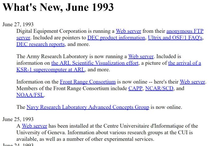
What I don’t think I recognized before now was that this motivation was behind the first web stream as well — that granddaddy of all feeds, the NCSA “What’s New” page:
The What’s New page was there for a bunch of reasons — making things findable being the big one, and creating a sense of WWW momentum being another. But the biggest reason why it was there was scarcity: Without it, people would log in and find nothing new to do. I mean look at it — you have an average of one or two servers — one or two servers — coming online each day. We’re not talking information overload here.
I don’t really have a point here. I just find it interesting that the feeds that we now portray as a solution to organizing abundance grew out of needs to deal with scarcity.
Just as Airbnb comes under review by the City of Toronto, a local group has singled out the short-term rental company as contributing to the high price of real estate in the city.
Fairbnb, an anti-Airbnb coalition group, is calling on the city to impose stricter rules on the San Francisco-based rental platform. The group recently published a report stating that Airbnb is a large contributor to soaring rental rates in Toronto.
The city of Toronto is about the begin consultations on the best way to regulate this burgeoning industry, whereas other Canadian cities have already begun the conversation.
Fairbnb will be asking the city to protect the rental market for legitimate homeowners by enforcing a one host, one listing policy. This will prevent users of the service from buying and renting multiple properties.
As the discussion surrounding Airbnb’s legal status in Toronto looms, the scenario seems increasingly similar to the Uber debacle of 2016. Over the first half of the year, the City debated the legality of the service until finally granting Uber approval to operate last summer.
Before that took place however, the city had to endure a slew of protests from taxicab drivers who argued that allowing Uber to operate would be detrimental to their livelihoods. It’s important to note however, that it’s still early days.
In addition Airbnb appears to be increasing its marketshare in a number of ways. One of these ways suggests a nod towards luxury rental services with the purchase of the Montreal-based rentals company, Luxury Retreats.
A second way Airbnb is looking to expand could be through its newly launched Trips feature, which lets hosts offer guided tours to customers. This could eventually lead Airbnb to play a greater role in the travel experience beyond the living arrangements.
A recent private members bill put forward by NDP MPP Peter Tabuns aims to make rental housing more affordable in Ontario by calling for an exemption that removes rent control from almost all rental units constructed after 1991.
Recreational drone users in Canada now face additional restrictions when practicing their hobby, as a result of new regulations announced by Canadian Federal Transportation Minister Marc Garneau in Toronto on Thursday during a press conference.
“I take very seriously the increased risk to aviation safety and to people on the ground caused by drones. That is why I am proceeding with this measure which takes effect immediately — to enhance the safety of aviation and the public while we work to bring into force permanent regulations,” said Garneau in a statement sent to MobileSyrup.
Canadian government moves to regulate drone use
The rules, which are effective immediately, result in recreational drone users facing a fine of up to $3,000 CAD if caught violating them.
Garneau also says that these rules are designed to curb the number of near-misses between drones and commercial aircraft, which have reportedly doubles between 2014 and 2016. Transport Canada recently revealed that there have been 148 reported incidents involving drones in 2016, an increased from the 85 incidents in 2015 and the 41 in 2014.
The new Canadian drone regulations are as follows:
Drones can’t be flown higher than 90 metres
Within 75 metres of buildings, vehicles or people
At night
Within nine kilometres of somewhere aircraft take off or land
Without contact information marked on the drone itself
Over forest fires, emergency response scenes or controlled airspace
Many of these new rules existed as guidelines prior to this announcement. Now, however, they’re enforceable by law and have a strict penalty attached to them when violated. These regulations only apply to recreational drones of more than 250g and up to 35kg.
“The RCMP encourages recreational drone users to be responsible when operating in public places. We encourage all drone operators to think about the safety of those around them, and follow the new regulations at all times,” said chief superintendent Eric Stubbs of the Royal Canadian Mounted Police, in a statement.
It’s worth noting that members of the Model Aeronautics Association of Canada (MAAC) that fly drones at MAAC sanctioned fields or events, are not subject to these new rules.
Drone Manufactures Alliance says new rules will stifle innovation
DJI, one of the industries biggest drone manufacturers, recently forward a statement from the Drone Manufacturers Alliance, following the release of these new regulations. While the Drone Manufacturers Alliance admits that these regulations will improve safety overall, it believes that these new rules will hurt innovation and stall growth. The organization also emphasizes that there has never been a confirmed collision between a “civilian drone and a traditional aircraft.”
“The Drone Manufacturers Alliance, the organization representing manufacturers of the majority of civilian drones, believes new drone regulations announced today by Transport Canada will provide a negligible increase in safety while sharply curtailing the ability of Canadians to explore and photograph their country and teach their children about science and technology,” says the statement form the Drone Manufacturers Alliance.
On the other side of the spectrum, Drone Delivery Canada says it supports the Canadian governments new regulations on recreational drone use.
“Right now those regulations are lagging behind the progress that is being made. We want to join forces and work together with government so that we are no longer operating in a regulatory, legal and ethical vacuum,” said Richard Buzbuzian, president of Drone Delivery Canada.
Vancouver-based financial insights startup Koho is launching exclusively across Canada this week. Koho is a mobile hub that allows users to manage their money via a mobile app and the reloadable prepaid Koho Visa card.
Koho users can use their prepaid Visa card anywhere Visa is accepted, while taking advantage of benefits like real time updates, automatic savings goals, instant transfers to others using the service, spending insights, chat support and low balance notifications.
“We’ve seen a lot of this in the news lately,” said CEO Daniel Eberhard, in a statement. “Canadians are paying some of the highest bank fees in the world while being sold products they don’t need or understand. We don’t think that’s right.”
Recent reports indicate that the practices of the Big Five Canadian banks are under review by the Financial Consumer Agency of Canada after receiving reports of aggressive and unethical sales tactics. Some of these allegations include selling products and services to consumers without expressed consent. The review of these practices will begin in April.
To begin signup process, interested individuals need only to download the app, sign up for the service and load the Koho Visa card with a balance through an Interac e-transfer, or by linking a personal bank account. Once this is completed, the Koho Visa card is then mailed to the user.
The process is entirely free, besides a few specific services like foreign currency interactions which cost extra money. In addition though, all the services provided through the app are free for users to access.
According to Eberhard, the response during beta testing was extremely encouraging, which aligns with the growing excitement about fintech technologies in Canada as of late.
“The response during the private beta was amazing. More than 10,000 Canadians signed up, we transacted over $1.3 million dollars. In virtually every metric, Koho is used in a fundamentally different way than traditional offerings. We’re growing really quickly,” said Daniel Eberhard.
According to data sent to MobileSyrup, users of the service use their Koho Visa card eight times per month, as compared to an average of one time per month for traditional banking apps. In addition, deposit amount grew by an average of nine times between the first and second deposits.
The federally regulated People’s Trust company issues the Koho Visa card to users and holds the money deposited on the card until users want to access it.
Currently, Koho is only available for download in the App Store.