Shared posts

19 Jul 15:41

Vintage vs Modern Fit

by Velouria


A few times, when writing about a vintage bicycle's setup, I have mentioned that it has been configured for a 'modern fit.' Subsequently, I have been asked what that means. Seeing these two bicycles side by side in our yard the other day provided a convenient opportunity to explain. I will preface this by saying that, to experts on the topic - with whom I do not doubt my readership is replete with - my explanation will come across as overly simplified and merely grazing the surface of the subject at hand. But in the interest of those new to the topic and not technically-minded, a discussion needs to start somewhere. And so I'll start mine here.

The two bicycles in the above photo belong to the same rider. Both bicycles fit him. Moreover, despite their dissimilar-looking setups, they fit him similarly - meaning, he is stretched out in a similar way when astride each one. The bicycles achieve this differently: The one on the left stretches the rider out by means of a long top tube. The one on the right does it by means of low handlebars.

If you sit down on a chair and have someone hold an apple just within your reach, this will start to make sense. If they lower the apple, you will have to lean over and reach for it. Now if instead of lowering the apple, they move it slightly further out, you will, likewise, have to lean over and reach for it.

There is a rudimentary geometrical explanation for what I am trying to describe here, but I am going to stay away from abstractions. If you do the reaching for an apple bit, you will start to see how a bicycle can be set up in a variety of ways to achieve similar upper body extension in order to reach the handlebars.

You will also start to see that, just because a bicycle has a metre of seatpost sticking out and a slammed stem, does not necessarily make it an 'aggressive' setup. In fact, depending on the rider's size, it can be quite upright. Similarly, a cyclist riding a bicycle with the saddle and handlebars level can be in a super-aggressive flat-back position.

So why are bicycles today sized down and set up with lots of saddle to handlebar drop, whereas bicycles in the Olden Times (roughly pre-1990) were sized larger, with the handlebars and saddle nearly level?

There are several overlapping explanations, and here is where we get to the more complicated stuff. The move to the modern drivetrain, with its integrated brake/shift levers, resulted in cyclists spending more time on the 'hoods' of their handlebars rather than in the drops. It therefore made sense to lower the entire handlebar setup. Some will argue that the rise in bottom bracket heights over the decades contributed also, as did the changing shape of the bicycle frame as tubing manufacturing practices evolved.

It also goes without saying that there is more to a bicyclist's position than reach alone, and the vintage vs modern setups - combined with a specific frame's geometry - will affect the overall balance and handling of the bike differently. All this is part of a quite multifaceted and sometimes heated discussion, which you can follow on many a bicycle forum.

But also... It cannot be denied, I think, that it's at least partly down to trends - which change for bicycling-related matters just as they do for other aspects of popular culture.

To the eye of today's sporting cyclist, the modern setup simply looks cool - fast, sleek, aggressive. The vintage setup looks quaint, heavy, relaxed.

But trend-based perceptions are not always in line with reality. And let's just say that quite a few of my friends of a Certain Age gently poke fun at the younger road cyclists for being far too upright on their bicycles compared to the 'correct' position. Of course the modern bikes, with their short top tubes and tall head tubes, are to blame.

What constitutes an 'aggressive' setup is subject to cultural/ peer/ marketing influence.

From a practical standpoint, the vintage vs modern fit preference matters, mainly because it determines the frame size we look for in a bicycle. For example, referring again to the photo in this post the bicycle on the left is a 57cm top tube frame, and the bicycle on the right is a 54cm. Put simply: for a vintage fit, you will need a larger frame ...and a polishing cloth for those pretty downtube shifters!
08 Sep 15:40

Saying no to Pie

by Kieran Healy

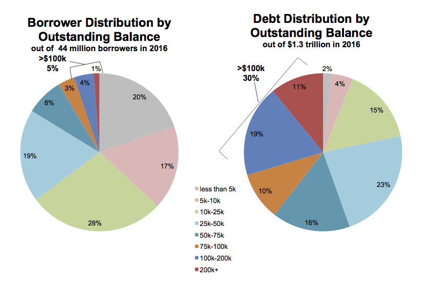
I saw this pie chart via Beth Popp Berman on Twitter yesterday:

Pie charts of student debts by percent of all borrowers and percent of all debt.

Pie charts of student debts by percent of all borrowers and percent of all debt.

As you probably know, the perceptual qualities of pie charts are not great. In a single pie chart, it is usually harder than it should be to estimate and compare the values shown, especially when there are more than a few wedges and when there are a number of wedges reasonably close in size. A Cleveland dot plot or a bar chart is usually a much more straightforward way of comparing quantities. When comparing the wedges between two pie charts, as in this case, the task is made harder again as the viewer has to ping back and forth between the wedges of each pie and the vertically oriented legend underneath.

There’s an additional wrinkle, too. The variable broken down in each pie chart is not only categorical, it’s also ordered from low to high. The data describe the percent of all borrowers and the percent of all balances divided up across the size of balances owed, from less than five thousand dollars to more than two hundred thousand dollars. It’s one thing to use a pie chart to display shares of an unordered categorical variable, such as percent of total sales due to pizza, lasanga, and risotto for example. Keeping track of ordered categories in a pie chart is harder again, especially when we want to make a comparison between two distributions. The wedges of these two pie charts are ordered (clockwise, from the top), but it’s not so easy to follow them. This is partly because of the pie-ness of the chart, and partly because the color palette chosen for the categories is not sequential. Instead it is unordered. The colors allow the debt categories to be distinguished, but don’t pick out the sequence from low to high values.

So not only is a less than ideal plot type being used here, it’s being made to do a lot more work than usual, and with the wrong sort of color palette. As is often the case with pie charts, the compromise made to facilitate interpretation is simply to display all of the numerical values for every wedge, and also to add a summary outside the pie. If you find yourself having to do this, it’s worth asking whether the chart could be redrawn, or whether you might as well just show a table instead.

Here are two ways we might redraw these pie charts. As usual, neither approach is perfect—or rather, each approach draws attention to features of the data in slightly different ways. Which works best depends on what parts of the data we want to highlight.

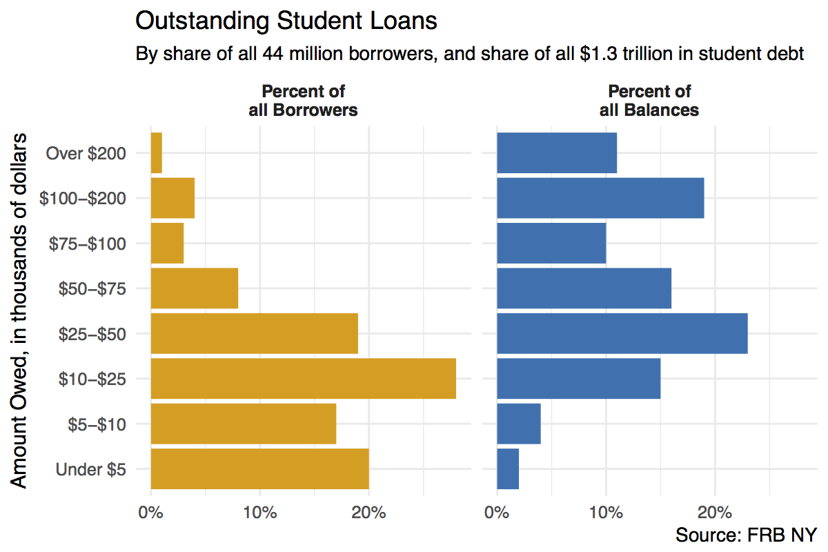
A first effort at redrawing the pie charts uses a faceted comparison of the two distributions.

Faceted barplot of student debts by percent of all borrowers and percent of all debt.

Faceted barplot of student debts by percent of all borrowers and percent of all debt.

Here we split the data into the two categories, and show the percentage shares as bars. The percent scores are on the x-axis. Instead of using color to distinguish the debt categories, we put their values on the y-axis instead. This means we can compare within a category just by looking down the bars. For instance, the left-hand panel shows that almost a fifth of the 44 million people with student debt owe less than five thousand dollars. Comparisons across categories are now easier as well, as we can simply scan across a row to see, for instance, that while just one percent or so of borrowers have more than $200,000 in debt, that category accounts for more than 10 percent of all debts.

We could also have made this bar chart by putting the percentages on the y-axis and the categories of amount owed on the x-axis. When the categorical axis labels are long, though, I generally find it’s easier to read them on the y-axis. Finally, while it looks nice and helps a little to have the two categories of debt distinguished by color, the yellow and blue colors aren’t encoding or mapping any information in the data that isn’t already taken care of by the faceting. This graph could just as easily be in black and white, and it would not lose any informational content if it were.

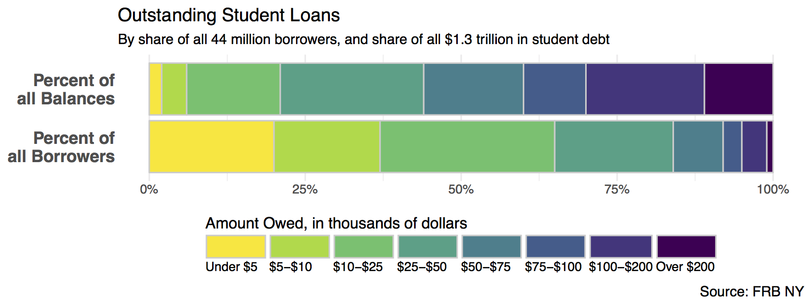
One thing that is not emphasized in a faceted chart like this is the idea that each of the debt categories is a share or percentage of a total amount. That is what a pie chart emphasizes more than anything, but as we saw there’s a perceptual price to pay for that, especially when the categories are ordered. But maybe we can hang on to the emphasis on shares by using a different kind of barplot. Instead of having separate bars distinguished by heights, we can array the percentages for each distribution proportionally within a single bar. Here’s one way to do that.

Stacked (but side-oriented) barplot of student debts by percent of all borrowers and percent of all debt.

Stacked (but side-oriented) barplot of student debts by percent of all borrowers and percent of all debt.

In this version we can more easily see how the categories of dollar amounts owed break down as a percentage of all balances, and as a percent of all borrowers. We can also eyeball comparisons between the two types, especially at the far end of each scale. It’s easy to see how a tiny percentage of borrowers account for a disproportionately large share of total debt, for example. But estimating the size of each individual segment is not as easy here as it is in the faceted plot, however. This is because it’s harder to estimate sizes when we don’t have an anchor point or baseline scale to compare each piece to. (In the faceted plot, that comparison point was the x-axis.) So the size of the “Under 5” segment in the bottom bar is much easier to estimate than the size of the “$10-25” bar, for instance.

Note also that, compared to the pie chart, our color scheme for the bars recognizes that the debt categories are ordered from a low value to a high value. The colors run in a discrete low-to-high sequence from yellow to dark purple. The palette is from the viridis package, which does a very good job of combining perceptually uniform colors with easy-to-see, easily-contrasted hues along its gradient. Some balanced palettes can be a little washed out at their lower end, especially, but the viridis palettes avoid this.

09 Apr 03:41

Lab Cooking

Tech whiz Brett Terpstra takes a deep dive into food with A Bolognese From The Lab. He’s got a nice, systematic approach to cooking. Interesting notes:

  • Brett toasts his fennel seeds, which is a good idea. He also toast his bay leaves. I’m skeptical of that. Anyone else toast their bay leaves?
  • He uses relatively little onion, but purees his mixture of onion, celery, and carrot before browning it. That’s intriguing!
  • He uses a 1.5C of whole milk, reducing it almost all the way. (The web recipes says “completely evaporated” but we’ve been chatting in the background and he really means “until it glazes the meat.” I’ve used cream in that role because I’m frightened that whole milk will curdle. What say you?)

Also memorable: Peter Merholz’s carbonara.

09 Apr 03:40

Dear Wirecutter: What Should I Look For When Buying a Used Car?

by Rik Paul

Q: I am interested in buying a used car, specifically the Honda Fit, and looking for some general advice. What should I look for when purchasing a secondhand car?

09 Apr 03:40

Arbutus’ Light Rail

by Ken Ohrn

Kenneth Chan in the DailyHive expands on what is known about transit for the Arbutus corridor.  My general thoughts are:  More choices to more places.  A good thing — bring it on.

There’s an opinion poll in the article — running around 6:1 in favour of Arbutus’ light rail (at time of writing).

Arbutus.streetcar

Artistic rendering of a light rail transit system in Salt Lake City running on a grass-covered track (TRAX)

Why transit at all?  Well, there’s that pesky matter of the agreement with CP Rail to buy their old abandoned rail line.

The City of Vancouver says its use of the former railway strip is defined by its purchase agreement with Canadian Pacific Railway (CPR), and this agreement establishes the Corridor be used for walking, cycling, and light rail.

“The City in its capacity as owner of the Lands will commence and expedite an internal planning process to design the portion of the lands for light rail use and walking and cycling use,” reads Article 9 in the agreement between both parties. . .

. . .  Arbutus Corridor is suitable for light rail given it runs on a pre-existing railway right-of-way and there are only 10 street crossings along a 55-block stretch of the route. It could potentially complement the Canada Line, acting as a ‘relief line’ for the parallel route, especially with the underground Broadway extension of the Millennium Line terminating at the intersection of Arbutus Street and Broadway.

However, such a train system is likely many years away with the Broadway extension and the new light rail transit system in Surrey designated as regional priorities. TransLink and the Mayor’s Council have not identified the next rail rapid transit priorities following the completion of the current slate of transit expansion plans.

More of Mr. Chan’s earlier thoughts on light rail for the Arbutus Corridor and elsewhere:

An Arbutus light rail line would likely begin as a natural southern extension of the long-proposed Downtown Vancouver streetcar – from the existing railway right-of-way along South False Creek that starts near Granville Island and ends just west of the Cambie Street Bridge, behind the Canada Line’s Olympic Village Station entrance building. The Arbutus Corridor’s northern tip is just one block away, separated from the start of the South False Creek railway corridor by only a strip mall.


09 Apr 03:40

Radical Efficiency

by rands

Silicon Valley earned its name for the early chip-making business which staked early claims in orchard filled valleys. Companies such as Fairchild Semiconductor and later Intel and AMD were in the business of silicon, but they were also in the business of reinventing business introducing such concepts of stock options for employees and openly denying the hierarchical culture of the traditional corporation. “People remained faithful to each other, but not to the employer or the industry.”1

I’ve spent a good part of the past three decades at companies such as Borland, Netscape, Apple, Palantir, Pinterest and now Slack and all that time I’ve been watching. What is the secret sauce? What are the attributes of high growth start-ups that allow some to be wildly successful where others plateau, stagnate and die?

Here’s one common thread I’ve observed: healthy companies and teams efficiently communicate.

A Diverse Set of Eyeballs

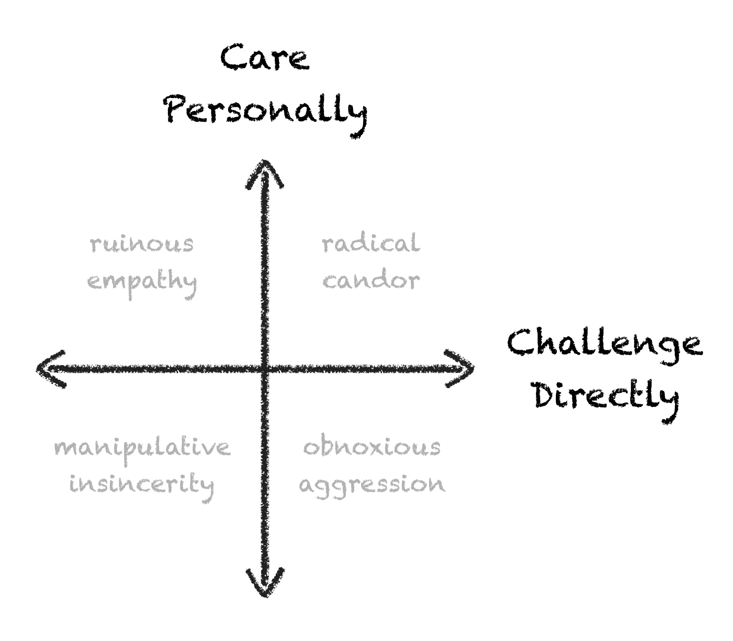
I can’t stop highlighting Kim Scott’s recently published Radical Candor. I watched the original video several years back and was instantly infected with her simple (but complex) framework around both delivering and receiving feedback:

At the core of the concept of Radical Candor is the idea that the humans you work with and for are uniquely equipped to give you feedback. These are the humans that day in and day out are watching how you treat others, how many you make decisions, and how the results of those decisions play out.

Not only do these humans have a wealth of useful feedback, but they are also distinctly not you. They are each shaped by a different set of experiences that subtly shape their feedback with a healthy bias. Whether this bias increases or decreases the quality of the feedback is a moot point if they never effectively give it to you.

My rule: all ideas get better with a diverse set of eyeballs. Radical Candor preaches a clear and humane strategy for developing relationships with your circle of relevant humans so that everyone’s operating mode defaults to efficiently sharing feedback.

That’s the third time I’ve typed “efficiency.” When I reflect on teams that I consider efficient communicators, I measure in the following ways:

  • How long does it take new (perhaps controversial) information to be introduced?
  • How quickly do they adapt to new information? How fast do they error correct?
  • How vigorous is the debate? How respectful?

The core mechanic in each of these communication interactions is feedback. It isn’t just data moving Human A to Human B; it’s the required amount of effort for Human A to build, convey, and deliver that data plus the required amount of effort for Human B to receive, digest, and act on the data. If you define effort as work plus time, the higher the total effort, the lower the efficiency.

Scott writes, “Defining [work] relationships is vital. They’re deeply personal, and they’re not like any other relationships in your life. But most of us are at a loss when we set about to build those relationships.”

Well defined work relationships define the teams I’ve admired in my career. They were not the nicest teams, they were not the most pleasant, but these were teams with deep trust in each other. They deeply heard each other. They weren’t worrying about personality conflicts or politics, they were listening for real treasure… the signal.

Silicon Sauce

Radical Candor is not just a framework for delivering feedback; it’s an entire management philosophy about building high-trust teams. While it covers the compounding strategic value of efficient feedback, the book also dives into developing growth plans for your team, creating a culture of open communication, techniques of avoiding boredom, and defining a results-focused team.

If you’re looking for the secret sauce of the Silicon Valley, I would argue that each chapter of Radical Candor captures a component of that sauce. If you are a leader of humans, aspire to lead humans, or just want to iterate on the craft of communication, grab a highlighter, and dive into Radical Candor.


  1. https://en.wikipedia.org/wiki/Traitorous_eight 
09 Apr 03:39

Parkmageddon — Sacred Space

by Ken Ohrn

The Economist visits parking — setting aside of large amounts of urban space for storage of motor vehicles during that 95% of the time they aren’t moving. The author looks at parking minimums and strategies in:  London, Tokyo, Beijing, San Francisco, Amsterdam and others.

Apple.Cupertino

For 14,000 workers, Apple is building almost 11,000 parking spaces. Many cars will be tucked under the main building, but most will cram into two enormous garages to the south. Tot up all the parking spaces and the lanes and ramps that will allow cars to reach them, and it is clear that Apple is allocating a vast area to stationary vehicles. In all, the new headquarters will contain 318,000 square metres of offices and laboratories. The car parks will occupy 325,000 square metres. . . .

. . . Parking can seem like the most humdrum concern in the world. Even planners, who thrill to things like zoning and floor-area ratios, find it unglamorous. But parking influences the way cities look, and how people travel around them, more powerfully than almost anything else. Many cities try to make themselves more appealing by building cycle paths and tram lines or by erecting swaggering buildings by famous architects. If they do not also change their parking policies, such efforts amount to little more than window-dressing. There is a one-word answer to why the streets of Los Angeles look so different from those of London, and why neither city resembles Tokyo: parking.


09 Apr 03:39

HUB Cycling works to UnGap the Map in Metro Vancouver

by Average Joe Cyclist

HUB Cycling, the charity behind Bike to Work Week, has launched a new video to raise awareness of their campaign to make cycling safer and more connected for everyone in Metro Vancouver. Read all about their ambitious plans, including cycle highways, and find out how you can get involved by adopting a gap!

The post HUB Cycling works to UnGap the Map in Metro Vancouver appeared first on Average Joe Cyclist.

09 Apr 03:38

It’s Time for Open Citations

by Mozilla

Mozilla is signing on to the Initiative for Open Citations (I4OC). We believe open data is integral to a healthy Internet — and to a healthy society.


Today, Mozilla is announcing support for the Initiative for Open Citations (I4OC), an effort to make citation data from scholarly publications open and freely accessible.

We’re proud to stand alongside the Wikimedia Foundation, the Public Library of Science and a network of other like-minded institutions, publishers and researchers who believe knowledge should be free from restrictions. We want to create a global, public web of citation data — one that empowers teaching, learning, innovation and progress.

Currently, much of the citation data in scholarly publications is not easily accessible. From geology and chemistry journals to papers on psychology, the citations within are often subject to restrictive and confusing licenses which limit discovery and dissemination of published research. Further, citation data is often not machine readable — meaning we can’t use computer programs to parse the data.

Mozilla understands that in some cases, scholarly publications themselves must be protected or closed in order to respect proprietary ecosystems and business models. But citations are snippets of knowledge that allow everyone to engage with, evaluate and build upon ideas. When citations are inaccessible, the flow of knowledge stalls. Innovation is chilled. The results are damaging.

At Mozilla, we believe openness is a core component of a healthy Internet and a healthy society. Whether open citations or open source code, openness allows people to learn from each other, share ideas and foster collaboration.

I4OC details

I4OC seeks to uphold this openness in the realm of scholarly research. Specifically, I4OC calls for citation data that is structured, separable and open. That means:

Structured ensures citation data is presented in a universal, machine-readable format. This empowers computer programs to unpack and draw connections between different research areas.

Separable ensures citation data can be accessed and analyzed without the need to comb through entire journal articles or books. This allows people to navigate research easily, the same way people navigate the web.

Open ensures citation data is free to access and free to reuse. This allows anyone — students, teachers, entrepreneurs, autodidacts — to benefit.

I4OC is asking scholarly publishers to deposit their citations in Crossref and enable reference distribution. Crossref is a nonprofit organization developing infrastructure and services for scholarly publishers.

We’re already seeing progress. Since the start of I4OC in 2016, the percentage of publishers sharing citations has jumped from 1% of Crossref’s 35 million articles (that include citation data) to over 40%.

That’s heartening, but there’s still a long way to go. We want that number to reach 100%. We want openness to become the norm, not the exception. That’s why Mozilla is supporting I4OC. And that’s why Mozilla is committed to teaching and defending openness online. Want to learn more? Read Mozilla’s Internet Health Report to see how openness makes the Internet exceptional. And sign our petition to open up access to federally-funded research in the U.S.

Photo: Sofia University library // Anastas Tarpanov // CC BY-SA 2.0

The post It’s Time for Open Citations appeared first on The Mozilla Blog.

09 Apr 03:21

I am using Lisp more, and big changes to my consulting business

by Mark Watson, author and consultant
I haven't been using Lisp languages much in the last five or six years since I started using Ruby or Haskell more often to experiment with new ideas and projects. Now that I am winding down my remote consulting business (more detail later) I want to spend more time writing:

I have three book projects that I am currently working on: "Practical Scheme Programming (Using Chez Scheme and Chicken Scheme)", "Ruby Programming Playbook",  and a fourth edition update to "Loving Common Lisp, or the Savvy Programmer's Secret Weapon". All three of these books will be released using a Creative Commons no commercial reuse, no modifications, share with attribution license, so copies of these eBooks can be shared with your friends.

I was very excited when the fantastic Chez Scheme system was open sourced but some of the excitement was soon tempered by the time required to get much of my existing Scheme code running under Chez Scheme and R6RS. To be honest, much of the work for this book is simply for my own use but I hope that I can help other Scheme developers by organizing my work to get set up for Chez Scheme development, by supplying a large number of useful code "recipes", and documenting techniques for using Chez Scheme. I used to mostly use the (also excellent) Gambit Scheme, created by Marc Feeley, for writing small utilities that I wanted to compile down to compact native code. Scheme works better than Common Lisp or Clojure for generating small and fast executables with fast startup times.

Another writing project I am working on now is to update and expand my book Loving Lisp book (it has sold well, and previous buyers get a free upgrade when I am done with the rewrite later this year). There are several new examples I am adding, many of which will simply be rewrites of Haskell, JavaScript, and Java programs that I have developed in recent years. Rewriting them in idiomatic Common Lisp will be fun.

I have a long history using Common Lisp, starting when I upgraded my  Xerox 1108 Lisp Machine in 1983. I have written two successful commercial products in Common Lisp, used a derivative of Common Lisp to program a Connection Machine, and used CL on several large projects.

To brush up on Common Lisp, I am (once again) working through several books written by people with far better Common Lisp programming skills than I have: Edi Weitz, Peter Norvig, and  Paul Graham. My Common Lisp code sometimes suffers from using too small of a subset of Common Lisp and I don't always write idiomatic Common Lisp code. It is definitely time for me to brush up on my skills as I rewrite my old book.

I have only written one Ruby book (for Apress) in the past but since I use Ruby so much for small "getting stuff done" tasks, I have intended to finish a new book on Ruby that I started writing about two years ago.

I hope to have all three of these writing projects complete in the next 18 months. When I published my last book "Introduction to Cognitive Computing" last month, I counted my titles and realized that I have written 24 books in the last 29 years. I love every aspect of writing, and I have met many awesome people because I am an author, so the effort is very worthwhile.

re: large changes to my consulting business:


I have combined doing remote and onsite consulting for the last 18 years. I used to very much enjoy both remote and onsite work but in the last few years I have found that I don't enjoy working remotely as much as I used to while I have been very much enjoying my onsite gigs where I get to meet my customers and not just talk on the phone. Working onsite is a very different experience. So, I have stopped accepting remote work except for longer term projects with some onsite "face time" with customers.

09 Apr 03:13

The Best Sport Sunglasses

by Bob Howells
orange-haired woman wearing yellow-lensed sport sunglasses while running

After cycling, running, trail running, hiking, or snowshoeing daily over the course of two months, constantly swapping out and comparing more than a dozen brands and some 40 models of sunglasses, we believe that the Ryders Seventh with photochromic yellow lenses represents the best choice for eye protection in a wide range of activities, and at a great price. The Seventh deftly changes the amount of light it allows to pass through depending on light conditions, while always providing windshield-like protection and sharp contrast. We found this model to be extraordinarily versatile.

09 Apr 03:13

Bicycling 2017 Buyer’s Guide

by elbybike
09 Apr 02:39

Was ist da eigentlich bei Apple passiert?

by Volker Weber

IMG 8388

Apple hat gestern ein Produkt angekündigt, das es dieses Jahr noch nicht zu kaufen gibt. Ich kann mich nicht daran erinnern, dass sowas schon jemals passiert ist. Das müssen wir mal aufdröseln.

Was ist passiert? Apple lädt fünf Apple-freundliche Journalisten ein, setzt sie mit dem Top-Management (ohne CEO) an einen Tisch und erklärt ihnen, dass Apple an einem neuen modularen Mac Pro arbeitet. Apple gibt dabei zu, dass der aktuelle Mac Pro kaum zu erneuern ist. Apple verspricht den anwesenden Journalisten, weiterhin professionelle Anwender mit geeigneter Hard- und Software zu versorgen.

Was ist das Problem? Apple hatte 2013 den Trashcan-Mac als Ablösung des Cheesegraters (siehe Bild) päsentiert. Mehrere CPUs, mehrere GPUs, sehr kompaktes Design, sehr leise, erweiterbar über Thunderbolt. Dieses Gerät wurde niemals signifikant aufgewertet, wird aber nach wie vor zu einem stolzen Preis verkauft. Jetzt steht ein kleines Upgrade ins Haus, das ohne Einnordung dieses inneren Zirkels von Journalisten als völlig unzureichend gewertet würde. Diesen Schlag galt es abzuwehren.

Apple hat mit dem Trashcan zwei Wetten verloren: Statt mehrerer kleiner GPUs mit paralleler Verarbeitung setzt der Rest der Welt auf einzelne Monster-GPUs, die ordentlich Kühlung brauchen, und die sich im Trashcan nicht unterbringen lassen. Und die zweite Wette? Erweiterung allein über Thunderbolt.

Das ambitionierte Design des Trashcan ist verständlich, wenn man sich anschaut, was Apple sonst so von iPhone bis iMac baut: hochintegriert, möglichst kompakt und schlank, nicht erweiterbar, lautlos bis sehr leise. Akkus werden in den kleinsten Ecken versteckt, Mainboards immer kleiner, Lüfter wenn möglich verbannt. Das passt nicht zu den Anforderungen im Pro-Bereich: maximal schnelle Grafik-Pipeline, hohe Performance bei CPU und GPU, blitzschnelles I/O auf Speicher mit hoher Datenrate. Mit einem (von vorne nach hinten) beinahe durchsichtigen Gerät wie dem Cheesegrater ging das, mit dem Trashcan nicht. Und so ein schnelles neues System muss her, wenn Apple ernsthaft VR machen will.

Apple sagt nicht, wann sie die Sackgasse erkannt haben. Aber sie sagen, sie konstruieren eine neue Baureihe mit einem modularen System, das ausreichend Reserven für Upgrades hat. Mir würde ja das Gehäuse da oben gefallen. Aktuell ist es nur ein Beistelltisch mit veralteten G5 CPUs.

cheesegrater

Eine kleine Nebenbemerkung: ich finde das neue iPad interessant. Weniger Integration, weil Display nicht mit dem Frontglas verklebt ist. Das ist billiger herzustellen und auch billiger zu reparieren. Damit wird es ein bisschen dicker, ein bisschen schwerer, ist aber am Ende vielleicht doch das bessere Gerät. Ich kann mir vorstellen, dass bei Apple auch schon ein paar Leute an modularen Macbooks arbeiten. Das fände ich ziemlich "Pro".

09 Apr 02:39

MKBHD sinks the Galaxy S8 in less then six minutes

by Volker Weber

Samsung makes great components and terrible copycat software, then combines them in their devices. Will they ever learn?

09 Apr 02:39

Twitter for Deutsche Bahn

by Volker Weber
Today, we are rolling out Twitter Lite, a new mobile web experience which minimizes data usage, loads quickly on slower connections, is resilient on unreliable mobile networks, and takes up less than 1MB on your device.

More >

09 Apr 02:39

Windows Mobile is falling off a cliff

by Volker Weber

ZZ38500429

These were two of my favorite phones ever, both running on Windows Phone 8.1. Then came Windows 10, for the desktop, and the phones were left behind. The Lumia 950/XL were a bag of hurt with their crashing bugs. Then came the Anniversary update, and the phones were still lagging. Now it's time for Creators Update, and Mobile still hasn't caught up. There aren't even any new features to write home about. And it's coming to only 13 devices.

The community is up in arms and they are abandoning the platform in droves. Promoters turn into critics. Many apps have been removed from the store or haven't been updated in a long time.

There always comes a time when you have to realize things didn't pan out as planned. BlackBerry 10 fell off that cliff last year, BlackBerry OS a long time ago. Ubuntu is giving up on their phone, Mozilla gave up last year. Sailfish is always on the brink of bankruptcy.

The winner takes it all. iOS takes the profit, Android takes the market share with many vendors struggling to make a penny. Microsoft has made iOS and Android their platorms of choice for their apps and cloud services.

Windows 10 and macOS, Android and iOS. That's where we are today with user facing O/S. And there is a silent player that is getting stronger: ChromeOS. Windows 10 can run on many things, but as far as the eye can see, it's not going to be phones. The market has rejected it.

09 Apr 02:39

Uri Shaked: A Few Notes About What We Do At BlackBerry

by Volker Weber
'I work for BlackBerry. Yes, they still exist.' This is how I introduce myself when I speak in conferences, and sometimes also when I meet new people. When I hear the way people laugh when I add the second sentence, I realize that this was the thought that had just crossed their minds. Usually they follow up with the question: so what does BlackBerry do nowadays, anyway?

Read on.

More >

09 Apr 02:34

The Twitter API Platform’s Future

by Ryan Christoffel

Twitter today disclosed future plans for its API platform and published a public roadmap where developers can track the company's progress.

One of the most significant changes announced is that later this year the company will be unifying its API platform, combining the strengths of its Gnip APIs with its more affordable REST and streaming APIs. This will simplify the platform and provide more powerful APIs at, in theory, lower costs to developers with smaller-scale needs – though pricing plans have not been announced at this point.

The announcement post contains many details on the API platform's future, but a few specific things are highlighted which launch today or in the short-term future:

  • Today, we launched the Account Activity API, which provides access to real-time events for accounts you own or manage, with delivery via webhooks.
  • Today, we also launched a set of new Direct Message API endpoints that will enable developers to build on the new Direct Message features we recently announced.
  • Later this year, we’ll launch a new set of tools that enable developers to sign up, access, and manage APIs within a self-managed account. This will including the ability to get deeper access and more features, all with a transparent pricing model.
  • We’ll also be shipping a new Search API that provides free access to a 7-day lookback window with more sophisticated query capabilities and higher fidelity data retrieval than is currently available. We’ll also provide a seamless upgrade path to full-fidelity 30-day or full archive lookback windows.

Twitter's openness regarding its plans should be an encouragement to anyone who depends on third-party Twitter clients like Tweetbot or Twitterrific. The Direct Message API, for example, will now support media attachments like the official Twitter app.

Although it may be some time before we see today's announcements bring specific benefits to third-party apps, Twitter has had a rocky relationship with developers in the past, and today's announcement is a sign of commitment to its API platform and developers.

→ Source: blog.twitter.com

09 Apr 02:34

Apple Launches Clips Video App for iPhone and iPad

by Ryan Christoffel

Apple has released a new app for iPhone and iPad, the previously announced video tool Clips.

Apple describes Clips as an app "for making and sharing fun videos with text, effects, graphics, and more." Essentially it's a stripped-down version of a video editor like iMovie, optimized to make edits fast and user-friendly on mobile. Its key focus is allowing you to shoot seconds-long clips and string them together into a video worth sharing.

Getting started with a new clip is simple: you just press the big, red 'Hold to Record' button and video will record until you release it. Optionally, you can also take an existing image or video from your library and import it to the app. Whether you're recording something new, or editing existing content, Clips will always require your video to fit a square orientation. This might annoy some people, but it makes sense as a format that works well when viewed in either portrait or landscape.

Once you've captured a photo or video, Clips provides a variety of tools with which to quickly edit that video. Content can be overlayed on top of the video, like resizable emoji, text bubbles, and more. Prisma-like filters can be added, as can audio soundtracks. One of the neatest tools is called 'Live Titles," which takes any words spoken while recording and creates animated captions out of those words in real-time. This eliminates the sometimes-tedious task of writing captions in later.

When you're done recording and making edits to a video, sending it out into the world is handled by the share sheet, which contains all of the standard avenues for sharing content – Facebook, Snapchat, Twitter, and whatever other apps you have installed. A clever feature Apple has added to the share sheet in Clips is that if the app detects that one of the people in your video matches a face from your photo library, or if you said someone's name during the video, the share sheet will list those people as suggested options to share your video with via iMessage, alongside a grouping of people you've recently messaged.

Overall, Clips is well-polished, packed with tools, and it does well what it's designed for. The recent onslaught of ephemeral, short-form video content on services like Snapchat and Instagram was clearly a strong influence on Clips' creation. And while I haven't gotten into the 'Stories' craze myself, I'm still expecting to be a somewhat-regular Clips user. Whereas I find something like Instagram Stories intimidating because I don't like the pressure of shooting and immediately sharing something. Clips allows those who want to move that fast to do so, while people like me can take their time – I can record something, save it to the Photos app, maybe share it with my wife or a friend, and if I end up really liking it, I can later share to social media.

Clips is available on the App Store. Downloading it requires that your device is running iOS 10.3 or later.


Support MacStories Directly

Club MacStories offers exclusive access to extra MacStories content, delivered every week; it’s also a way to support us directly.

Club MacStories will help you discover the best apps for your devices and get the most out of your iPhone, iPad, and Mac. Plus, it’s made in Italy.

Join Now
09 Apr 02:34

Microsoft Releases Social Scheduling iMessage App, ‘Who’s In’

by Ryan Christoffel

Microsoft has introduced a new app called 'Who's In' to the iMessage App Store. The app is designed to help friends plan social events together without ever leaving the iOS Messages app.

When you want to coordinate an event with friends, opening 'Who's In' will present several types of activities to choose from:

  • Eat and drink
  • Watch a movie
  • Visit an attraction
  • Create your own

After making your selection, a Bing-powered list of relevant options will be presented such as restaurant names, movie titles, etc. These are sorted based on your location, and once you've picked one, you'll be asked to specify a date and time for the event to take place. These details are all compacted into an iMessage card that gets saved into your message body so you can send it to friends. When they receive your message, they can vote on whether they'll be attending or not.

In many ways 'Who's In' resembles the scheduling app Doodle, but with a more narrow focus on the specific activities featured in the app.

'Who's In' is available for download from the iMessage App Store.


Support MacStories Directly

Club MacStories offers exclusive access to extra MacStories content, delivered every week; it’s also a way to support us directly.

Club MacStories will help you discover the best apps for your devices and get the most out of your iPhone, iPad, and Mac. Plus, it’s made in Italy.

Join Now
09 Apr 02:34

Why Pro Matters

by Federico Viticci

Great take by Sebastiaan de With on why Apple needs to cater to the pro community and care about the Mac Pro again:

The same kind of huge leaps are happening in gaming and game development; a powerful modern GPU is a requirement for working on and using VR and AR, one area Apple is said to be working on. Demand and interest in 3D work, for design, game and software development, and video is bigger than ever and growing exponentially.

Without a truly top-tier workstation, Apple will miss out on a huge segment of digital creatives that can craft the future of human-machine interaction — something way beyond tapping a piece of glass. It would lack a Mac workstation with the raw computing power to prototype VR and AR interactions, build game worlds, simulate complex models and render the effects of tomorrow’s great feature films all the while offering those same creatives a platform to create for its own mobile devices.

The Mac Pro user base may be a single-digit percentage of all Macs sold, but it's a group of users with an important indirect effect on the Apple ecosystem. Very often, they are the same users who make the movies, videogames, TV shows, music, and apps we put on our devices every day. They are few people who create highly influential content millions of others use, enjoy, and rely upon. And Apple has realized they don't want to let that community go.

→ Source: medium.com

09 Apr 02:33

Pogue's Basics: How to speed up YouTube playback with a keystroke

If you’re a longtime “Pogue’s Basics” fan, then you already know that you can jump 10 seconds ahead in playback of a YouTube video by pressing the L key. Or jump 10 seconds back with the H key. Or pause/unpause the video with the letter K.

And maybe you know that the number keys on your keyboard, 1 through 0, represent 10-percent increments of the video. Hit 3 to jump 30% of the way in, for example.

But here’s one more: It’s super helpful to watch a video on high speed, especially if it’s a slow talker. Usually, you have to do a bunch of clicks to adjust the speed, starting with the gear icon at lower right.

But there’s a keyboard shortcut: type >! That is, Shift-period. And less-than (<, or Shift-comma) to slow it down. Cool!

David Pogue, tech columnist for Yahoo Finance, welcomes non-toxic comments in the Comments below. On the web, he’s davidpogue.com. On Twitter, he’s @pogue. On email, he’s poguester@yahoo.com. You can read all his articles here, or you can sign up to get his columns by email

More Pogue:

Pogue’s Basics: Use YouTube’s built-in stabilizer

Pogue’s Basics: Bring back Photoshop’s New Document box

These 6 systems will get rid of Wi-Fi dead spots in your house

iOS 10 Hidden Feature: Bedtime-consistency management

Pogue’s Basics: Money – The Amazon card

iOS 10 Hidden Feature: Do Not Disturb Emergency Bypass

Pogue’s Basics: Money – Extended warranties

Pogue’s cheap, unexpected tech gifts #2: ThinOptics glasses

A dozen iOS 10 feature gems that Apple forgot to mention

GoPro’s most exciting mount yet: a drone

Professional-looking blurry backgrounds come to the iPhone 7 Plus

Pogue’s Basics: Turn off Samsung’s Smart Guide

Pogue Basics: Touch and hold Google Maps

The Apple Watch 2 is faster, waterproof—and more overloaded than ever

We sent a balloon into space — and an epic scavenger hunt ensued

Now I get it: Snapchat

The new Fitbits are smarter, better-looking, and more well-rounded

Apple has killed every jack but one: Meet USB-C

09 Apr 02:26

Zero In On The Drop-Off Points

by Richard Millington

Run a cohort analysis (Google Analytics/Community-Analytics can help) and identify the most common drop-off points.

Be aware that the biggest will always be between week 0 and 1. There are ways to tackle this, but ignore this group for now. This group skews your data too badly.

Look at where the remaining 20% or so of survivors begin to drop-off.

Is it after week 3? 4? 8? 12? Focus on these points. Now interview some members who did drop off at this point and ask them why (the last visit date often works).

You will usually get answers along the lines of:

“I just forgot about the community really”
“I didn’t really see anything I could help with”
“It didn’t quite click with me”
“I became too busy”
“To be honest, I didn’t like feeling dumb”

(all genuine quotes)

You might stumble upon an outlier, but assume these reasons are reflective of broad groups of individuals. Find the ones which appear most often and run a short survey for the drop-outs to answer to find out which resonates most.

Now set up an automated reminder specifically timed to tackle these objections. Don’t use facts at this level, you need emotions. Focus on an amazing story that will surprise or dazzle someone. Highlight an action they can take so they won’t forget about you. Focus on how they can help even if they don’t have an expertise. Focus on someone who was in their position and overcame it – with a convincing case study.

You can have fun with it if you like.

Repeat this for different drop-off points. If you get it right, you should see a small bounce in the retention rates. A small bounce might not seem important, but as with all things retention – it builds up over time.

09 Apr 02:26

Twitter Favorites: [JohnBiehler] 2 years, 9 cities and 2000 people later, #3DCanada is a wrap! https://t.co/Hhc5BAYgEj

John Biehler @JohnBiehler
2 years, 9 cities and 2000 people later, #3DCanada is a wrap! pic.twitter.com/Hhc5BAYgEj
08 Apr 13:59

What I did today (Apr. 6 '17)

by Anselm Eickhoff

After some experimentation and measurement, I proved an obvious fact today: the naive approach of just exploring all possible daily schedules grows out of hand in complexity, astronomically quickly.

For example: even in a tiny city that just consists of 4 places (shops or homes) with corresponding activities from my rural-village scenario, and connecting roads, I got over 80.000 daily schedules that would have to be evaluated to come up with a feasible lifestyle for a single person.

When I tried to do the same for a city with 9 places, it just ate my RAM. Such are the impossibilities that a guerilla-city-sim programmer has to face...

Does that mean that I'm just doing pointless excercises? No - trying stuff like this and seeing the grandiose scale of the problem I'm facing in front of my eyes helps tremendously - both in a philosophical, as well as a very practical sense. I can actually see how much work I force the computer to do, where, and why - and this fuels my intuition to come up with a better approach.

My next step will be to implement my first try at something smarter (based on simulated annealing, as was planned), informed by what I learned today.


08 Apr 13:58

Accessible Cycling is Better Together

by dandy

Cycling should be accessible for all! Bike designers are looking into ways to best meet the needs of every kind of cyclist. Derek Rayside, an all season rider and activist based in Toronto with a penchant for tandems, points out the best rides for every kind of bike fan in your life.


The author and his family at the Coldest Day of the Year Ride on a Onderwater family tandem. Photo by Yvonne Bambrick.

Story by Derek Rayside

Tandem, or multi-rider, bikes can make cycling accessible to many people who might not otherwise be able to enjoy cycling. Whatever the challenge, from a wheelchair to blindness, from infirmity to inexperience, there is a great bicycle available for you to share with a friend. On a tandem bicycle, the captain is the person who steers, shifts, and brakes (and usually provides most of the power); the stoker provides auxiliary power.


There are some great new tandem tricycles that connect with wheelchairs. The Duet Cycle, made in Holland and available in Canada from the Flaghouse, has a fully functioning detachable wheelchair at the front. Pedal your friend to your destination, then detach the wheelchair and push them inside. Nihola, from Denmark, makes a cargo tricycle with a platform, also at the front, intended to carry a wheelchair you already own --- with the passenger in it, of course! Nihola is available at Curbside Cycle on Bloor St, Urkai in Burlington, and Alo Velo in Montreal.


Image courtesy of  Frank Mobility


Image courtesy of Nihola

There are also a variety of tandem tricycles that do not involve wheelchairs. Rick Hendrikx and his family in Kerwood ON make a recumbent tandem trike with the captain and stoker sitting side-by-side.

Image courtesy of RickSycle


The Freedom Concepts ET2611 has an adult captain in the rear with a special needs child stoker in front. Worksman Cycles from New York City makes both inline and side-by-side tandem trikes (available in Toronto here). Belize Bicycles from Montreal also makes a tandem trike

Image courtesy of the Flaghouse 

Image courtesy of the Worksman

Image courtesy of Belize Bikes 

If you are comfortable balancing for another person (who should be lighter than you), then both conventional and innovative two-wheel  tandems are available. Many bike shops carry conventional tandem bicycles, with the captain in front, and both riders having conventional saddles. Two innovative tandems that are available in the Toronto area are the Hase Pinot and the Onderwater Family Tandem. Both of these put the stoker(s) up front for a better view. On the Hase Pinot (available at Urbane Cyclist on College St), the stoker has a recumbent seat, and so requires less core strength to stay on the bike.

Image courtesy of Hasel Bikes - Pinot Model  

The Onderwater Family Tandem (available at Urkai.com in Burlington) is intended for an adult captain in the rear, with a child stoker up front. My family has the XL version, with two stokers up front. One of the factors that motivated us to get this bike was that my spouse did not have the opportunity to learn to ride as a child. With our tandem, I could balance for her as she learned. Now she leans into turns with the best of them. Similarly, our son learned to ride on our family tandem, as will his younger sister. This bike is our main mode of family transportation around town, for groceries, hockey, kung fu, etc.: whatever we need to get to, we ride all together on our family bike.


Family Tandem at Terry Fox Run - Image Courtesy of Derek Rayside 

These innovative tandems can make cycling accessible to people with a variety of sizes and abilities. At the Terry Fox Run last falI gave a ride to a boy with muscular dystrophy who had never been on a bike before. He loved it! He had enough strength to keep himself in the saddle, but not to pedal and not to balance the bike: he didn’t need to do those things on the tandem; he could just enjoy the wind in his hair. Our family tandem is large enough that his older sister and my two children also came along for the ride --- with the rider of honour up front. As for the Terry Fox Run, his amazing sister ran the entire distance pushing him in his wheelchair while their grandmother cheered them on.

There are two non-profits in Toronto that connect volunteer captains with stokers who need assistance. The Toronto TrailBlazers Club provides loaner bikes for rides with vision-impaired stokers --- and has been doing so for almost 30 years. Cycling Without Age is a newer non-profit, based in Denmark, with ten Canadian chapters, including Toronto. Their trikes have a bench for two adult passengers up front, and their motto is “the right to wind in your hair”. There are lots of ways to get involved. You can make arrangements for Cycling Without Age to visit your grandparents retirement home and take them and their friends for a ride. Or you can volunteer to be a captain with either organization and meet some great new people. Or you can make a donation towards either worthy cause via their web pages.

 Image courtesy of Cycling without Age

Whatever your situation, there is a bike that you and your friend can enjoy together. Ride on!

You can follow all of Derek's cycling adventures at @FamilyBike416 on Twitter

Related Articles on dandyhorse magazine

Ordinary Spokes volunteer wants to see everyone on a bike

A bright future for cycling: Report back from Ontario By Bike’s Cycle Tourism Conference

Be a TRAILBLAZER: Tandem riding club needs captains

Cargo bikers roll out for Open Street


07 Apr 13:22

Vaughn Palmer: ‘Forces of no’ dig in for tunnel replacement ceremony

by Stephen Rees

DSCN9158There was an opinion piece by Vaughn Palmer in the Vancouver Sun yesterday which did not give anything like a balanced coverage. The protest is against spending far too much money on a “solution” that we know will not work. Not against doing something about people currently experiencing long delays to get through the tunnel at some times of day. Groups like Fraser Voices have been concerned that the bridge was decided on in the Premier’s office – and all the effort since then has been to justify a quixotic choice. All the other options – including sticking to the BC Liberals’ previous plan – are simply ignored. And then they lie about the port’s intentions to deepen the ship channel.

So I wrote a Letter to The Editor.  I am putting this out here now because I think it is very unlikely to be published.


Vaughn Palmer’s characterization of the protest at the tunnel ceremony is not accurate. There are real alternatives to the $3.5bn vanity project that have not been adequately examined.

The real problem is congestion at peak periods. Traffic through the tunnel has actually been in steady decline for the last ten years. However, the Port of Vancouver operates the container terminal on bankers’ hours. Monday to Friday 8am to 4pm. No other port operates like that. It ensures that truck traffic uses the tunnel at peak periods, and makes the congestion worse. That is deliberate. It helps the port make the case for tunnel removal. There are plenty of records available that demonstrate the Port’s long term strategy for deepening the dredging of the channel – and the tunnel prevents that. In the short term, simply banning trucks at peak periods – and opening the container collection and delivery facilities  24/7 – will relieve the present problem.

In the longer term, congestion can never be solved by widening roads. Never has done, never will do. All that does is move the line-up to somewhere else. The only way to reduce car traffic is to increase transit service. One bus can carry many more people in a given length of road than cars can. The province has already invested in bus lanes both sides of the tunnel but service needs to be increased. And when that isn’t enough, add another tube on the river bed carrying light rail.

As for the claim that the “full freight will be covered by tolls”, it has not worked for the Port Mann or the Golden Ears. Why would the Massey replacement be any different?


Filed under: port expansion, Transportation Tagged: George Massey Tunnel, Massey Tunnel
07 Apr 03:56

The Next Google Home May Double as a Wi-Fi Router

by Evan Selleck
Google Home is a smart speaker, which already makes it a worthwhile device for many owners, but the next version of the device may pack another feature inside. Continue reading →
07 Apr 03:56

Twitter Lite Is a Faster and Leaner Version of Its Mobile Site for Slow Data Networks

by Rajesh Pandey
Twitter today announced Twitter Lite, a lighter version of its website that is meant for use on slower networks. The ‘lite’ version of the social media service looks and works similar to its native app for iOS and Android, except that it is able to achieve all of this right from within the browser of your device and on a slow connection. Continue reading →
07 Apr 03:56

Android O Feature Highlight: Wi-Fi Automatically Enables Itself When Near a Saved Network

by Rajesh Pandey
With Android O, Google will make it easier for your device to automatically connect to known Wi-Fi networks. A new feature in Android O, currently hidden and disabled in the developer preview, will automatically turn on Wi-Fi when you are near a saved network. Continue reading →