Shared posts

16 Apr 00:15

Outflow Review: Simple Subscription Tracking

by Jake Underwood

As I’ve mentioned in previous articles, I’m a huge fan of Bear, the minimalist note-taking app developed by Shiny Frog. To show my appreciation and grab an extra feature or two, I pay a monthly subscription fee of $1.49, a price so low that I forgot that I paid it at all.

It’s a similar story for other services, too – $5 each for Pocket Premium and Apple Music slip out of my bank account monthly without much thought. But that’s where the cheap stuff ends, and the expensive subscriptions begin: $15 for HBO Now, $15 for a Spotify family subscription, and $20 for the Adobe Creative Suite. After all of this, I’m at $71.49 a month for software, some of which I’m rarely putting hours into.

Because my subscriptions span different platforms and renew at different times, I’ve been looking for ways to track where all my money is going. With Outflow, I’ve found a new way to do that.

Adding it All Up

In a way, Outflow is a pretty spreadsheet replacement – you put in the name of the service, how much it costs a month, and when it renews. As you continue adding services, you get an updated list and the total cost of your subscriptions.

To add a subscription, tap the '+' in the top right corner. Then, choose manual, domain, or automatic entry – while manual and domain require you to put in information of your own, automatic will request permission to scan your Gmail account and fill in the necessary information. I’ve stuck primarily to manual, as this has been the quickest for me.

Outflow offers a nice selection of subscription services when you tap to add a company, but if what you subscribe to doesn’t exist in their list, you can simply type in a custom entry. Once this is done, add in the price, frequency, last billing date, renewal frequency, payment method, and any optional notes. Hit Save, and you’ve added a subscription to Outflow.

As you fill in your data, your list will continue to grow, showcasing your subscriptions, how much they individually cost, and how long until they renew. For quick glances, this data is laid out in a beautiful way, allowing me to see the important information right away.

There are two ways to view this data, too, and both are really well-designed. Take a look at the screenshot below:

Card and grid views

Card and grid views

Reminders and Settings

To keep you aware of when each of your subscriptions renew, Outflow offers a reminder feature that will push you a notification the day of renewal, the day before renewal, or the week before renewal. By hopping into settings and flipping the toggle of your choice, you can easily set this up; as someone who is always trying to keep track of money leaving my account, I’m very happy to see this included.

There are other notable options in the app's preferences that may be of interest to you, including the ability to change the default currency, setting a preferred layout, and suggesting a company for easier entry.

Conclusion

For a simple way to track my ever-growing list of subscriptions, I can’t think of a better option than Outflow. It’s visually appealing and easy to use, both improvements over a classic spreadsheet. With all of what I mentioned above and a widget showing the next subscription renewal, I’m loving Outflow.

To download Outflow for $1.99, head on over to the App Store (iPhone only).


Support MacStories Directly

Club MacStories offers exclusive access to extra MacStories content, delivered every week; it’s also a way to support us directly.

Club MacStories will help you discover the best apps for your devices and get the most out of your iPhone, iPad, and Mac. Plus, it’s made in Italy.

Join Now
16 Apr 00:14

No Thanks Mr. Nimby – We Want a New Los Angeles

by Ken Ohrn

Personally, I tend to think of L.A. in a narrow sort of way.  Freeways, smog, mansions in the hills, a vast sprawling carpet of single-family homes whose lights twinkle forever as you fly over them. Oh yes — and total car dependency for everyone.

As Lauren Herstik writes in the New York Times, there are two existing L.A.s (one is mine) and an emerging third one. The third L.A. is not without detractors whose arguements are very familiar to us here in Vancouver. But there are also supporters, as in huge numbers of voters, who have a liking for the third L.A.  And there is lots to recognise in the characteristics of the third L.A.

los-angeles11-44-43_40530

Writes Herstik:  The effort to slow construction, known as Measure S or the Neighborhood Integrity Initiative, was financed mainly by Michael Weinstein, the president of the Hollywood-based AIDS Health Foundation. Mr. Weinstein’s office is on the 21st floor of a Hollywood skyscraper with a view of the hills, next to the future site of two 28-story mixed-use residential towers

Mr. Weinstein said that kind of development was out of character for the neighborhood. . .

. . .  Measure S, which was defeated last month, was the third in a trio of transformative local ballot measures. In November, Angelinos approved a $1.2 billion bond to build affordable housing, along with a half-cent sales tax increase to pay for mass transit.

. . .  Koreatown is well served by mass transit: Three metro stops along Wilshire Boulevard link it to downtown Los Angeles.

“It’s denser and people are choosing to live there because they want to give up some square footage in exchange for more,” Mr. Hawthorne said. That’s more time, access to transit and a pedestrian culture.

. . . “I see a series of many urban centers along the transportation corridors”, said Nelson Rising, chief executive of Rising Realty Partners, which has worked extensively in downtown Los Angeles.

“Anything near a transit stop will become viable and attractive”, Mr. Rising said. He pointed to specific hubs of density along the purple line, which currently links downtown to Koreatown and is set to extend all the way to Santa Monica with the passage of the transit measure. He also pointed to the Expo Line, which runs parallel to Interstate 10 and connected downtown to Santa Monica in May 2016.

The city planning department has laid the groundwork for these changes. Last year it enacted a mobility plan to diversify transportation modes by 2035, and created a new industrial live-work zone in response to demand from commercial and residential sectors for that kind of multiuse development.


16 Apr 00:11

Recommended on Medium: Trying out Ikea’s new smart lightbulbs

I’ve been trying out Ikea’s new Trådfri smart lightbulbs, because Nat got some and they looked good.

Which is how I found myself doing a firmware reset on my lightbulbs.

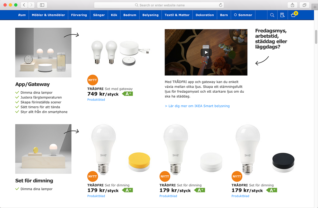
The Ikea Trådfri range

What is it?

They’re lightbulbs, that are dimmable and have changeable colour temperature. They have wireless remotes, and there’s an app.

Why would you do this?

Like Nat, I had no interest in smart lighting before this. Why take something that already works in my home and make it more fiddly to use (though an app vs light switch) or easier to break (what if the wifi goes down etc)?

The videos and GIFs on their Swedish product page are what convinced me to give it a try. They sold me on the use case, the problem, and the interaction design.

There’s these clear little interaction demos:

https://medium.com/media/c52c444677956cd26d64f48472270d8c/href

I like that floating gestural puck. Clear cause and effect, like a normal dimmer switch but no longer attached to the wall.

Beyond that there’s stuff like:

https://medium.com/media/a5bbbd83ed4614246d4ba985105350f7/href

Huh, I guess it is weird that the only place in the room I can change lighting is a fixed button on the wall at the room entrance. And that when I’m reading and it starts to get dark I have to get up and walk over to the door instead of using a remote wherever I am.

And it sure looks appealing changing the lights in a multi-purpose room. Shifting between reading/eating/cooking etc. Previously that meant lots of different lamps/fixtures with different colour temperature bulbs and going around to a lot of switches.

With previous smart bulbs the main feature I’ve seen is the RGB colour changing, but I can’t see much point to turning my room red or purple or green. Changing colour temperature for different activities however seems much more useful.

Not something to show off to guest with, but something that helps make a more pleasant home.

Normal and experimental

I like the mix of form factors, both in lights and interfaces.

There’s normal bulbs, to replace existing halogens and lamps and stuff. But then there’s glowing light panels and doors. Because why should light be shaped like an incandescent bulb? The constraints that caused that form factor are now gone.

Then there’s the interfaces. The app looks competently done. The remote looks fine, sensible, if a bit boring. But then there’s the accelerometer puck. Looks playful. Colourful yellow as opposed to off-white plastic like the rest of the range.

Plenty of variety.

Affordable

A normal E27 bulb is £8, while a smart one is £9.

The easiest way to start is the £15 pack for a bulb and a remote. At that price I might as well try it on one lamp and see how I find it.

But like everything in ikea, while individually items are cheap, it quickly adds up. While I’m in the shop I guess I might as well buy the gateway to use the app, it’s only £25 more. And just a few more bulbs, because one alone doesn’t make it worthwhile…

In-store

I was keen to see it in-store. How do you sell the problem and the lifestyle in a retail display? And explain which components are needed for which outcomes? Do people get to play with the interaction before hand? Have they got a display room? Or those wooden blocks in the online photos?

No, it’s a mess. The smart bulbs are shelved next to normal bulbs. They’re not differentiated from the normal bulbs.

There are some smart bulbs in display boxes, but most aren’t plugged in. The one’s that are plugged in, don’t have a control for customers to try out changing colour temperature and brightness. There’s a TV presumably to show demo videos, but it’s switched off.

There’s no signage or paper guide to which bits do you need to get started, or what each of the pieces do.

It reminded me of Alexander Grünsteidl’s talk from This Happened a few years ago. Perhaps these kinds of interactive products are better sold online, with video and GIFs and diagrams, than in retail.

https://medium.com/media/7ece2a40c179ba1c68c475cd9e698db6/href

Setup

The unboxing and setup isn’t the friendliest. The packaging is hard to open. There’s multiple different manuals in each box. Ikea’s trademark diagrammatic manuals don’t translate well to explaining the pairing of wireless networked devices.

Weirdly bulbs can’t be paired directly to the app/gateway. Every bulb has to be linked to a remote, and in turn that remote linked to the app/gateway.

Once it’s set up and working with the app it’s pretty clear to control and use.

But when there are problems (How do I make the remote only dim some of the lights? How do I change which group a bulb is in? Is this bulb actually paired with the remote?) it’s really hard to understand what’s wrong from the blinking LEDs, and what to do to fix it.

When a normal lightbulb breaks I know to try changing it, to check the fuse and to check if there’s a power cut. With a smart lightbulb, I’m not sure which things to check,

The only reliable solution I’ve found is to hardware reset everything and start again.

It’s during these frustrating times that I wonder about the returns policy. The bulbs aren’t broken, but they don’t work. How do I explain that at Ikea’s very defensive customer services counter?

At least when the wireless control parts of Trådfri breaks, it falls back to being a normal lightbulb, that I can control with a normal light switch. As Nat says, it doesn’t becomes a collection of expensive paperweights.

Living with it

So far, there’s some awkwardness. Having to launch an app to change colour temperature. The remote is never where I need it. But then, normal lightswitches are awkward too. This is just a new type of awkward. Once I work out what I want, and where what type of remote should live, it’ll be fine.

Local vs online

The first thing I wanted was Amazon Echo integration. Or IFTTT. Or siri.

But the ikea lightbulbs don’t work with these services. The bulbs are a local system, not connected to the internet. The app only works when you’re on the same wifi network as the gateway.

Nat covered some great points about local vs online and trust and security in their writeup. I’m also happy with this tradeoff, preferring something doesn’t stop working when an online service goes away. I can’t see when I’d want to control the lights remotely from outside the home anyway.

I think it’s interesting that visually there’s no difference between something that does processing/control locally (like Ikea) vs online on their servers (Hue, Nest).

Here’s what the starter kit looks like for Philips Hue.

And here’s what it looks like for Ikea Trådfri.

There’s no visual shorthand in the product for how they work on the backend.

On one hand, so long as it works and solves the problem the customer shouldn’t care. But on the other, the customer should be able to understand the tradeoffs and make an informed decision while shopping.

Likewise, The Sun covered the launch of Trådfri by scaremongering about hacked bulbs joining botnets, even though these bulbs aren’t online and use Zigbee rather than Wifi. How can the consumer understand that?

Is this something that should be solved through designing the product to represent its network backend? Or by giving people tools, such as privacy conscious router or user friendly port scanning app, to help them understand what the devices in their home are doing? Or perhaps its something the retailers or reviewers of these products should be flagging up?

Or maybe its something that should be part of the very architecture of homes?

Anyway. These are some notes.

Mostly, Ikea did pretty good I think. A solid first networked product. Something that’s trying to solve a problem, rather than being a gadget. Well done Ikea.

Nat also wrote about their experience with the lightbulbs in more detail.


Trying out Ikea’s new smart lightbulbs was originally published in Buckley Williams on Medium, where people are continuing the conversation by highlighting and responding to this story.

16 Apr 00:10

Habs vs Leafs Bike Showdown

by dandy

Even though some of us Toronto Maple Leafs fans know better than to get excited about a play off season, it IS possible at this point in time that the Leafs and Habs could face off in the play offs.... so let's see how Montreal and Toronto face off  when it comes to bike infrastructure. Guest post from Robert Zaichkowski originally published on February 20, 2017 on his blog Two Wheeled Politics.

  
Photo Courtesy of Tom Szczerbowski-USA TODAY Sports

Story and Images by Robert Zaichkowski

One of the oldest and largest Canadian sports rivalries is the Montréal Canadiens (Habs) versus the Toronto Maple Leafs. Until last week’s Winter Cycling Congress (see previous post), I never biked in Montréal which Copenhagenize and Biking Expert ranked as among North America's best. After getting a taste of Montréal’s infrastructure, let’s review their facilities and see how Toronto stacks up.

THE ROUTE

Bartek Komorowski’s mobile workshop about Montréal’s four seasons cycling network was an eight-kilometre ride from Bibliothèque le Prévost (near Jean-Talon Métro station) to the Hyatt Regency Montréal (Places des Arts station). Before starting our trip, we saw a snow removal machine with a brush in front and a liquid brine dispenser in the back. Brine is a salt water solution which is more expensive, but less corrosive than road salt. Komorowski mentioned the responsibility for winter maintenance lies with individual boroughs (e.g. Plateau-Mont-Royal), given a neighbouring borough used road salt. There is a guide currently being developed to harmonize maintenance standards.

Snow removal in the bike lane!

Our ride started on Boyer Street; one of the first cycle tracks which opened in 1984. These older cycle tracks are bi-directional and use paint and green bollards. Until this past winter, it was among many which were closed from November 16 to March 31. Given the popularity of Boyer Street for cyclists – about 8000 to 9000 use the cycle tracks daily – it became the first to have traffic signals synchronized for cyclists last year.

Montréal was the first city where I saw a bike counter display up close; located at Laurier station. That street has a contraflow bike lane where bicycles outnumber cars at about 4000 cyclists per day. Wide sidewalks are also provided to improve safety for children getting to the nearby school.

While the Boyer cycle track and Laurier contraflow bike lanes were properly maintained, Komorowski ensured our workshop included examples of poor cycling conditions. Case in point, the contraflow bike lane on Laval Avenue was almost invisible. Not only were there parked cars on both sides – creating a dooring risk – but the freezing rain, thaw, and subsequent flash freeze turned that road into a skating rink! Since the BIXI bikes didn’t have winter tires, I had to steer into a snowbank to avoid injury!

We then used cycle tracks on Rachel, Berri, and Maisonneuve Streets to return to the Hyatt Regency. The Rachel cycle tracks were recently retrofitted with raised tracks and barrier curbs, while those on Maisonneuve near Place des Arts are sidewalk based. The Berri and Maisonneuve intersection is a potential challenge, given cycle tracks on both streets are amongst the city’s most popular. Per the counter data from the Ville de Montréal’s website (more on data collection in this post), Berri averages 3900 cyclists per day from May to September (7500 peak) and Maisonneuve averages 5700 per day (9400 peak). For comparison, Toronto’s Bloor Street and Queens Quay peaked at 6000 cyclists per day. For future reconstruction – including upcoming work on Rosemont Boulevard – Montréal is shifting to unidirectional cycle tracks.

Of its 788-kilometre bikeway network, Montréal currently clears 432 kilometres or 55%; putting Toronto to shame given they only clear the Martin Goodman Trail and streets with over 2000 cyclists per day. This effectively means nothing for Toronto cyclists west of Ossington Avenue, north of Bloor Street, and east of the Don River. Despite Toronto’s cycling network and winter clearing being dwarfed by Montréal, there are a few things Toronto does better than Montréal.

Year-round bike share! – BIXI Montréal is larger than Bike Share Toronto (5200 bikes vs 2000). However, Montréal’s BIXI stations and bikes are removed and stored during the winter months, while Toronto’s is open year-round. A Winter Cycling Congress presentation mentioned it was cheaper for Toronto to maintain its bike share during the winter than removal and storage.

  1. More accessible subway stations! – Elevators are key for encouraging people to bring bicycles on subways. Right now, only 10 of 68 Métro stations have elevators compared to 35 of 69 TTC stations. While Toronto plans to make their entire subway network accessible by 2025, Montréal must wait until 2038 with only 31 stations accessible by 2022. Furthermore, Montréal only allows people to bring bicycles onto the first subway car; something not required by Toronto.
  2. No winter closures! – While many of Montréal’s cycle tracks are closed for the winter months (until next winter), Toronto never had this rule despite inferior winter maintenance.

LESSONS FOR TORONTO

It may appear Toronto does not fare so bad after considering advantages such as winter bike share use and accessible subway stations. However, Toronto must accelerate their cycling network plan – which was dealt a recent setback by deferring bike lanes on Yonge Street – and improve their winter maintenance program by reducing salt use and expanding snow clearing. One last Montréal idea Toronto may want to adopt to fix bicycle parking shortages is to retrofit existing poles with bike rings.

Thanks to Bartek Komorowski for showcasing Montréal’s cycling facilities and providing supplementary information. Let’s continue moving Toronto forward and get a true bike rivalry going!

Game on!

Related Articles on www.dandyhorsemagazine.com

Why Montreal is great for biking

Flashback Friday: Mapping the future of bike lanes in Montreal c. 1897

Ride for a Dream 

16 Apr 00:10

Pogue's Basics: How to forward a text message

In a previous “Pogue’s Basics” tip, I let you know that you could report cellphone text-message spam by forwarding it to 7726.

“Well, great,” one reader wrote, “but how do you forward a text message!?”

Ah. I guess that might have been helpful information!

  • On the iPhone, hold your finger down on the actual text message that you want to pass along. When the More button appears, tap it, then tap the curly Forward arrow.
  • On Android, hold your finger down on the actual text message, and then tap Forward.

In each case, you’re now asked for the phone number you want to forward to.

Boom: The deed is done.

David Pogue, tech columnist for Yahoo Finance, welcomes nontoxic comments in the comments section below. On the web, he’s davidpogue.com. On Twitter, he’s @pogue. On email, he’s poguester@yahoo.com. You can read all his articles here, or you can sign up to get his columns by email

More Pogue:

Pogue’s Basics: Use YouTube’s built-in stabilizer

Pogue’s Basics: Bring back Photoshop’s New Document box

These 6 systems will get rid of Wi-Fi dead spots in your house

iOS 10 Hidden Feature: Bedtime-consistency management

Pogue’s Basics: Money – The Amazon card

iOS 10 Hidden Feature: Do Not Disturb Emergency Bypass

Pogue’s Basics: Money – Extended warranties

Pogue’s cheap, unexpected tech gifts #2: ThinOptics glasses

A dozen iOS 10 feature gems that Apple forgot to mention

GoPro’s most exciting mount yet: a drone

Professional-looking blurry backgrounds come to the iPhone 7 Plus

Pogue’s Basics: Turn off Samsung’s Smart Guide

Pogue Basics: Touch and hold Google Maps

The Apple Watch 2 is faster, waterproof—and more overloaded than ever

We sent a balloon into space — and an epic scavenger hunt ensued

Now I get it: Snapchat

The new Fitbits are smarter, better-looking, and more well-rounded

Apple has killed every jack but one: Meet USB-C


16 Apr 00:03

The Mac Is Turning into Apple's Achilles' Heel

by Neil Cybart

Apple's decision to change course and develop a new Mac Pro has received near-universal praise from the company's pro community. While developing a new Mac Pro is the right decision for Apple to make given the current situation, it has become clear that the Mac is a major vulnerability in Apple's broader product strategy. The product that helped save Apple from bankruptcy 20 years ago is now turning into a barrier that is preventing Apple from focusing on what comes next. 

Apple's Mac Meeting

There were three takeaways from Apple's recent on-the-record meeting with five journalists in Cupertino to discuss the Mac.

  1. Apple is sorry about the lack of Mac updates targeting pro users.
  2. The current Mac Pro suffers from a fatal design decision (although the device will continue to be sold).
  3. Management debated the Mac Pro's future and decided to change strategy and begin work on an entirely new Mac Pro. The company will also work on an Apple-branded pro display to go along with a new Mac Pro. 

(My complete review of Apple's emergency Mac meeting is available for members here.)

It is easy to look at this highly unusual meeting as being just about the Mac Pro and Apple trying to prevent influential content creators from jumping to a competing platform. However, read between the lines, and it becomes clear that Apple has a much bigger problem on its hands than simply an outdated Mac Pro.

The Mac has become a major headache for Apple, and management is on the verge on going down the Mac rabbit hole, funneling an increasing amount of resources and attention into a product category that doesn't represent the future of personal computing. The risk is that Apple will be stuck with a $25B legacy business and corresponding user base that will threaten the company's increasingly ambitious product strategy.

Tale of Two Apples

Apple is like a novel where two characters are battling each other in the post-PC era. When it comes to mobile, Apple's success is unmatched. The company is connecting with the mass market like never before. The iPhone is bringing more than 100M new people into the Apple ecosystem each year. Apple Watch momentum is building with a user base surpassing 20M people. Early AirPods sales trends look even more promising. More importantly, Apple executives have been on the same page with each other when it comes to strategy. 

This cohesion in strategy extends to how Apple continues to place big bets in an effort to control its own destiny in mobile. Recent news of Apple developing its own GPU solution is the latest step in the company's quest to ship a single system-on-the-chip (SOC) powering a range of mobile and wearable devices. This will give Apple a competitive advantage measured in decades. The company is also placing big bets on mobile services such as mapping and payments, items that will serve to create a competitive advantage in the changing tech landscape. 

In stark contrast, Apple's Mac strategy looks like a slow-motion train wreck. While Apple has made some progress with bringing elements of mobile such as Touch ID, multi-touch displays, and ARM processors, to the Mac, years of sporadic updates have overshadowed the positives. Apple's relationship with its pro Mac user community has deteriorated and can now be described as toxic. To make matters worse, there appears to be a growing rift among Apple executives concerning Mac strategy. 

As for why Apple's problematic Mac strategy hasn't caused too many issues for the company up the now, the business has become niche. As seen in Exhibit 1, Apple is selling more than 250M iOS devices per year.  In comparison, they are selling fewer than 20M Macs. The Mac accounts for just 11% of Apple's overall revenue. More importantly, the Mac is no longer the primary way new users enter the Apple ecosystem. In addition, one can also argue that pro Mac users haven't had much in the way of alternative platforms up until recently, although this is still being debated. 

Exhibit 1: The Post-PC Era at Apple

The Achilles' Heel

Apple's Achilles' heel is becoming visible. As Apple gets better at making technology more personal for the mass market, the company is losing touch with its legacy pro users. The situation came to a head last week with Apple announcing that it began work on a new Mac Pro. While one can chalk up a new Mac Pro as a one-off cost for keeping iOS app developers engaged in the platform, Apple's vulnerability extends much deeper than one Mac model.

There appears to be a growing rift among Apple executives when it comes to Mac strategy. Apple Industrial Design and Apple management have spent the better part of the past 10 years focused on devices designed to move hundreds of millions of people beyond the Mac. However, this strategy did not address 30M Apple users dependent on pro Mac hardware and software. While this segment only accounts for 4% of Apple's user base, it is responsible for creating content consumed by the other 96% of Apple users. These content creators have played a major role in Apple's mobile success. 

Apple's Achilles' heel is found with the niche devices at the tail end of the business. As seen in Exhibit 2, when compared to smaller screen unit sales, devices targeting pro users barely register. Apple has come to the realization that these niche devices, instead of being cast off or ignored, need ongoing attention and resources. 

Exhibit 2: Apple Device Sales Mix (Screen Size)

Path to Today

It is fair to ask how Apple got into this predicament.  

The Mac isn't like the iPod, a device cleanly and quickly cannibalized by a newer Apple product. iOS and multi-touch are not able to handle all of the tasks given to Mac. This is one reason why Apple has been extremely vocal about continuing to invest in the Mac despite running forward with iPhone and iPad. The debate was never about whether or not Apple will continue to sell Macs, but rather about how best to bring the Mac into the future. 

One path forward was for Apple to consolidate resources and place a bet that higher-end MacBook Pros and iMacs would be able to handle the needs of most Mac Pro users. Apple ended up being partly right. A majority of pro Mac users have transitioned their workflows to MacBooks and iMacs without incident. 

Apple ran into an issue when it came to addressing the niche of the niche. Millions of pro users could not make the jump from Mac Pros or other high-end PCs to a MacBook Pro or iMac. Apple needed to support these users for no other reason than they create the content consumed by the rest of the user base. 

Issues

Apple's decision to work on a new Mac Pro raises a number of red flags. 

Resource strain. Even though Apple has $246B of cash and cash equivalents, the company is resource-constrained when it comes to time and attention. Apple's functional organizational structure produces a constant battle among products and teams to grab that finite amount of management's attention. For management to dedicate attention to new pro Mac hardware, the company may need to take its foot off the accelerator with other products. This may seem like a major flaw, and judging from the amount of criticism directed towards Apple's organizational structure, such an opinion is widely held. However, Apple's structure is put in place in order for the product to be put ahead of everything else. It is not a disadvantage or weakness, but rather one of Apple's secrets to success. There is value found in having Apple's Industrial Design team, along with Tim Cook and his inner circle, move from product to product throughout the year in order to place a select few big bets.

Broader cultural differences. Some may argue that Apple is capable enough to develop mobile and wearable devices while selling pro Macs at the same time. This ignores the much more complicated aspect of Apple satisfying vastly different user needs with pro Macs. Apple would not only be developing a new Mac Pro or standalone display, but also sustaining a small but influential base of pro users dependent on macOS. Similar to how the iPhone user base is changing, Apple's overall user base has become quite heterogeneous in terms of technology wants and needs. It may be nearly impossible for Apple to satisfy all of its users. 

Product strategy hole. According to consensus, the biggest challenge Apple is facing is finding a business as profitable and influential as the iPhone. This extends to Apple not being able to expand its developer and app success to newer product platforms. It has become clear that Apple's inability to move beyond the Mac poses a much bigger long-term risk. 

There may be a hole developing in The Grand Unified Theory of Apple Products (shown below). The idea behind the theory is that Mac portables and desktops are positioned as the most powerful machines in Apple's product line. These machines will then serve to push the rest of Apple's product line forward. However, there isn't much evidence of this actually taking place. Instead, iPhones and iPads are being used to decide where to bring MacBooks and iMacs. There is also the awkward situation of iPad Pro beginning to give Mac a run for its money in terms of performance. 


Meanwhile, there isn't much evidence of MacBook or iMac features serving as inspiration for Apple's smaller screens. This is a sign of value destruction occurring with larger screens found at Apple's tail end of the business. We are giving more of our time to the smaller screens in our lives. Where does this leave Macs within Apple's broader product strategy? It increasingly looks like an odd fit as the Mac becomes a legacy platform.

Additional Concerns

The need to have a highly unusual private, on-the-record briefing with five journalists to explain a complete reversal in Mac strategy signals a management team on defense. Apple is afraid of influential Mac content creators jumping ship. This is the exact opposite of the aggressiveness Apple has shown with mobile and wearables. The more one looks into the topic, the more worrying things appear.

In an attempt to explain Apple's new Mac strategy, Apple SVP Phil Schiller wiped the dust off the old quadrant product grid. At the same time, Schiller has been increasingly vocal about the Mac being around for the next quarter of a century. Here's Schiller in late 2016:

"The new MacBook Pro is a product that celebrates that it is a notebook, this shape that has been with us for the last 25 years is probably going to be with us for another 25 years because there’s something eternal about the basic notebook form factor. You have a surface that you type down on with your hands, with a screen facing you vertically. That basic orientation, that L shape makes perfect sense and won’t go away." 

Schiller is likely guided by the desire to calm pro Mac users' fears. Arguing that the Mac will be around for 25 years means that these users won't need to worry about transitioning away from the Mac during their careers. However, this stance places Apple in an awkward situation. Nowhere is this seen more clearly than in Apple's recent iPad Pro ad campaign. On one hand, Apple is saying it thinks the laptop form factor will be around for 25 years. However, Apple then launches a marketing campaign positioning the iPad Pro as a better computer than MacBook. 

The Way Forward

My suspicion is that instead of trying to get around its Achilles' heel, Apple will try to be more cognizant of it. It is likely that a majority of Apple's senior executives, including Apple's Industrial Design group, still view the iPad and iOS as the more promising platform than Mac and macOS for the next 25 years of computing. Apple is pushing iPad like never before. New pro Mac hardware will not change this dynamic. However, it has become clear that Apple realizes its previous Mac strategy fell short as there was no viable path forward for tens of millions of pro Mac users.

Apple disclosed a few facts about its pro Mac users as measured by pro software usage. The data contains clues as to where Apple's product strategy may be headed. According to Apple, 70% of the Mac user base does not use pro software and would not classify as pro users. This is another way of saying that the iPad Pro could do quite well serving the needs of 70M Mac users. Meanwhile, the other 30% of the Mac user base wants and needs the power and flexibility that Apple has historically had trouble selling. 

Apple will likely position the Mac as a computing platform for legacy pro users while iOS will be targeted to everyone else. This will entail a few steps: 

1) Triple down on iPad. The writing is on the wall. Apple will not be able to address its Achilles' heel until iPad can be used for developing apps. This will involve Apple ramping investment and resources into iPad software, hardware, and accessories. While consensus assumes Apple should look to the Mac for iPad software inspiration, the more appropriate course of action is to look at the iPhone for inspiration. There is a reason that the iPhone is outselling the Mac by 10x. People enjoy iOS as a computing platform. After all, the iPad is just a bigger iPhone.

2) Continue to be aggressive with Mac design. Apple Industrial Design will continue to be aggressive in bringing the Mac experience forward. There have been some controversial Mac design decisions taken recently, including decisions about the Touch Bar and the insistence that multi-touch does not make sense on vertical Mac displays. Some may argue that Apple needs to look at a new Mac Pro as a hardware engineering problem and have the Industrial Design team take a back seat. This may be a recipe for disaster. It just goes to show how tricky of a proposition pro Mac hardware is for this management team. 

3) Running fast with new endeavors. The Mac does not represent Apple's future. Instead, the changing tech landscape will require Apple to play in new industries. The company needs to be extra aware of the long-term damage done by the Mac becoming a resource strain and jeopardizing other initiatives.  

Figuring Out What Comes Next

Apple still needs the Mac. Tens of millions of users aren't able to pack away their large displays and embrace iPhones and iPads. However, the Mac debate has never been about whether or not Apple will stop selling Macs. Instead, the question has been, how will management be able to retain the value of the laptop and desktop form factors in today's mobile world?

The most important thing for Apple to do when it comes to the Mac is to think about what comes next. Apple's broader mission is to use devices capable of making technology more personal to inspire a new generation of content creators. It is clear that iPhone and iPad are already inspiring tomorrow's content creators. Apple Watch and AirPods are not far behind in terms of being able to inspire.

When taking into consideration new technologies such as augmented reality, it is fair to wonder just how important large screens will even be in our lives in the future. Small screens are going to transition from being just tablets, smartphones, and smartwatches to being augmented reality navigators. In such a world, large screens will look like relics. The path forward for Mac looks bumpy.

Receive my analysis and perspective on Apple throughout the week via exclusive daily emails (2-3 stories a day, 10-12 stories a week). To sign up, visit the membership page.

16 Apr 00:02

GitHub notification… notifier

by Kristina Chodorow

Here is what my inbox look like each morning:

All those pink-tagged messages are emails from GitHub. Gmail cannot figure out which ones are important and GitHub’s notification stream, in my experience, is useless. It’s noisy and doesn’t clear the way I’d expect. The problem is, people actually do mention me on bugs. And I often have no idea.

So, I made my own notification system. It’s a Chrome extension that is a little ear that sits next to your location bar. If you have an unread GitHub notification, it turns red. If you’re all caught up, it’s green.

If this would be useful to you, please give it a try!

Download the Chrome extension here.

Feedback and suggestions welcome!

16 Apr 00:02

Twitter Favorites: [tinysubversions] I did the thing again. I thought of a joke, searched to see if anyone had already made it, and yes, it was me a yea… https://t.co/gyp54QQp1F

Darius Kazemi @tinysubversions
I did the thing again. I thought of a joke, searched to see if anyone had already made it, and yes, it was me a yea… twitter.com/i/web/status/8…
16 Apr 00:02

Come Fly With Me (well, not really) — Comparing Involuntary Disembarking Rates Across U.S. Airlines in R

by hrbrmstr

By now, word of the forcible deplanement of a medical professional by United has reached even the remotest of outposts in the #rstats universe. Since the news brought this practice to global attention, I found some aggregate U.S. Gov data made a quick, annual, aggregate look at this soon after the incident:

While informative, that visualization left me wanting for more granular data. Alas, a super-quick search turned up empty.

However, within 24 hours I had a quick glance at a tweet (a link to it in the comments wld be ++gd if anyone fav’d it) that had a screen capture from a PDF from the U.S. DoT Air Travel Consumer Reports site.

There are individual pages for each monthly report which can be derived from the annual index pages. I crafted the URL scraping code below before inspecting an individual PDF. It turns out grabbing all the PDFs was not necessary since they don’t provide monthly figures for the involuntary disembarking. But, I wrote the code and it’ll likely be useful to someone out there so here it is:

library(rvest)
library(stringi)
library(pdftools)
library(hrbrthemes)
library(tidyverse)

# some URLs generate infinite redirection loops so be safe out there
safe_read_html <- safely(read_html)

# grab the individual page URLs for each month available in each year
c("https://www.transportation.gov/airconsumer/air-travel-consumer-reports-2017",
  "https://www.transportation.gov/airconsumer/air-travel-consumer-reports-2016",
  "https://www.transportation.gov/airconsumer/air-travel-consumer-reports-2015") %>%
  map(function(x) {
    read_html(x) %>%
      html_nodes("a[href*='air-travel-consumer-report']") %>%
      html_attr('href')
  }) %>%
  flatten_chr() %>%
  discard(stri_detect_regex, "feedback|/air-travel-consumer-reports") %>% # filter out URLs we don't need
  sprintf("https://www.transportation.gov%s", .) -> main_urls # make them useful

# now, read in all the individual pages. 
# do this separate from URL grabbing above and the PDF URL extraction
# below just to be even safer. 
map(main_urls, safe_read_html) -> pages

# URLs that generate said redirection loops will not have a valid
# result so ignor ethem and find the URLs for the monthly reports
discard(pages, ~is.null(.$result)) %>%
  map("result") %>%
  map(~html_nodes(., "a[href*='pdf']") %>%
        html_attr('href') %>%
        keep(stri_detect_fixed, "ATCR")) %>%
  flatten_chr() -> pdf_urls

# download them, being kind to the DoT server and not re-downloading
# anything we've successfully downloaded already. I really wish this
# was built-in functionality to download.file()
dir.create("atcr_pdfs")
walk(pdf_urls, ~if (!file.exists(file.path("atcr_pdfs", basename(.))))
  download.file(., file.path("atcr_pdfs", basename(.))))

It also wasn’t a complete waste for me since the PDF reports have monthly data in other categories and it did provide me with 3 years of data to compare visually.

The table with annual data looks like this in the PDF:

and, that page looks like this after it gets processed by pdftools::pdf_text():

The format is mostly consistent across the three files, but there are enough differences to require edge-case handling. Still, it’s not too much code to get three, separate tables:

# read in each PDF; find the pages with the tables we need to scrape;
# enable the text table to be read with read.table() and save the
# results
c("2017MarchATCR.pdf", "2016MarchATCR_2.pdf", "2015MarchATCR_1.pdf") %>%
  file.path("atcr_pdfs", .) %>%
  map(pdf_text) %>%
  map(~keep(.x, stri_detect_fixed, "PASSENGERS DENIED BOARDING")[[2]]) %>%
  map(stri_split_lines) %>%
  map(flatten_chr) %>%
  map(function(x) {
    y <- which(stri_detect_regex(x, "Rank|RANK|TOTAL"))
    grep("^\ +[[:digit:]]", x[y[1]:y[2]], value=TRUE) %>%
      stri_trim() %>%
      stri_replace_all_regex("([[:alpha:]])\\*+", "$1") %>%
      stri_replace_all_regex(" ([[:alpha:]])", "_$1") %>%
      paste0(collapse="\n") %>%
      read.table(text=., header=FALSE, stringsAsFactors=FALSE)
  }) -> denied

denied

## [[1]]
##    V1                   V2      V3     V4          V5   V6      V7     V8          V9  V10
## 1   1   _HAWAIIAN_AIRLINES     326     49  10,824,495 0.05     358     29  10,462,344 0.03
## 2   2     _DELTA_AIR_LINES 129,825  1,238 129,281,098 0.10 145,406  1,938 125,044,855 0.15
## 3   3      _VIRGIN_AMERICA   2,375     94   7,945,329 0.12   1,722     80   6,928,805 0.12
## 4   4     _ALASKA_AIRLINES   6,806    931  23,390,900 0.40   5,412    740  22,095,126 0.33
## 5   5     _UNITED_AIRLINES  62,895  3,765  86,836,527 0.43  81,390  6,317  82,081,914 0.77
## 6   6     _SPIRIT_AIRLINES  10,444  1,117  19,418,650 0.58   6,589    496  16,010,164 0.31
## 7   7   _FRONTIER_AIRLINES   2,096    851  14,666,332 0.58   2,744  1,232  12,343,540 1.00
## 8   8   _AMERICAN_AIRLINES  54,259  8,312 130,894,653 0.64  50,317  7,504  97,091,951 0.77
## 9   9     _JETBLUE_AIRWAYS   1,705  3,176  34,710,003 0.92   1,841     73  31,949,251 0.02
## 10 10    _SKYWEST_AIRLINES  41,476  2,935  29,986,918 0.98  51,829  5,079  28,562,760 1.78
## 11 11  _SOUTHWEST_AIRLINES  88,628 14,979 150,655,354 0.99  96,513 15,608 143,932,752 1.08
## 12 12 _EXPRESSJET_AIRLINES  33,590  3,182  21,139,038 1.51  42,933  4,608  24,736,601 1.86
##
## [[2]]
##    V1                   V2      V3     V4          V5   V6      V7     V8          V9  V10
## 1   1     _JETBLUE_AIRWAYS   1,841     73  31,949,251 0.02   2,006    650  29,264,332 0.22
## 2   2   _HAWAIIAN_AIRLINES     358     29  10,462,344 0.03     366    116  10,084,811 0.12
## 3   3      _VIRGIN_AMERICA   1,722     80   6,928,805 0.12     910     57   6,438,023 0.09
## 4   4     _DELTA_AIR_LINES 145,406  1,938 125,044,855 0.16 107,706  4,052 115,737,180 0.35
## 5   5     _SPIRIT_AIRLINES   6,589    496  16,010,164 0.31    ****   ****        **** ****
## 6   6     _ALASKA_AIRLINES   5,412    740  22,095,126 0.33   4,176    864  19,838,878 0.44
## 7   7     _UNITED_AIRLINES  81,390  6,317  82,081,914 0.77  64,968  9,078  77,317,281 1.17
## 8   8   _AMERICAN_AIRLINES  50,317  7,504  97,091,951 0.77  35,152  3,188  77,065,600 0.41
## 9   9   _FRONTIER_AIRLINES   2,744  1,232  12,343,540 1.00   3,864  1,616  11,787,602 1.37
## 10 10  _SOUTHWEST_AIRLINES  96,513 15,608 143,932,752 1.08  82,039 12,041 116,809,601 1.03
## 11 11    _SKYWEST_AIRLINES  51,829  5,079  28,562,760 1.78  42,446  7,170  26,420,593 2.71
## 12 12 _EXPRESSJET_AIRLINES  42,933  4,608  24,736,601 1.86  55,525  7,961  29,344,974 2.71
## 13 13           _ENVOY_AIR  18,125  2,792  11,901,028 2.35  18,615  2,501  15,441,723 1.62
##
## [[3]]
##    V1                   V2      V3     V4          V5   V6     V7    V8          V9  V10
## 1   1      _VIRGIN_AMERICA     910     57   6,438,023 0.09    351    26   6,244,574 0.04
## 2   2   _HAWAIIAN_AIRLINES     366    116  10,084,811 0.12  1,147   172   9,928,830 0.17
## 3   3     _JETBLUE_AIRWAYS   2,006    650  29,264,332 0.22    502    19  28,166,771 0.01
## 4   4     _DELTA_AIR_LINES 107,706  4,052 115,737,180 0.35 81,025 6,070 106,783,155 0.57
## 5   5   _AMERICAN_AIRLINES  60,924  7,471 135,748,581 0.55     **    **          **   **
## 6   6     _ALASKA_AIRLINES   4,176    864  19,838,878 0.44  3,834   714  18,517,953 0.39
## 7   7  _SOUTHWEST_AIRLINES  88,921 13,899 125,381,374 1.11    ***   ***         ***  ***
## 8   8     _UNITED_AIRLINES  64,968  9,078  77,317,281 1.17 57,716 9,015  77,212,471 1.17
## 9   9   _FRONTIER_AIRLINES   3,864  1,616  11,787,602 1.37  3,493 1,272  10,361,896 1.23
## 10 10           _ENVOY_AIR  18,615  2,501  15,441,723 1.62 19,659 1,923  16,939,092 1.14
## 11 11 _EXPRESSJET_AIRLINES  55,525  7,961  29,344,974 2.71 47,844 6,422  31,356,714 2.05
## 12 12    _SKYWEST_AIRLINES  42,446  7,170  26,420,593 2.71 35,942 6,768  26,518,312 2.55

And, it’s not too much more work to get that into a usable, single data frame:

map2_df(2016:2014, denied, ~{
  .y$year <- .x
  set_names(.y[,c(1:6,11)],
            c("rank", "airline", "voluntary_denied", "involuntary_denied",
              "enplaned_ct", "involuntary_db_per_10k", "year")) %>%
    mutate(airline = stri_trans_totitle(stri_trim(stri_replace_all_fixed(airline, "_", " ")))) %>%
    readr::type_convert() %>%
    tbl_df()
}) %>%
  select(-rank) -> denied

glimpse(denied)

## Observations: 37
## Variables: 6
## $ airline                <chr> "Hawaiian Airlines", "Delta Air Lines", "Virgin Americ...
## $ voluntary_denied       <dbl> 326, 129825, 2375, 6806, 62895, 10444, 2096, 54259, 17...
## $ involuntary_denied     <dbl> 49, 1238, 94, 931, 3765, 1117, 851, 8312, 3176, 2935, ...
## $ enplaned_ct            <dbl> 10824495, 129281098, 7945329, 23390900, 86836527, 1941...
## $ involuntary_db_per_10k <dbl> 0.05, 0.10, 0.12, 0.40, 0.43, 0.58, 0.58, 0.64, 0.92, ...
## $ year                   <int> 2016, 2016, 2016, 2016, 2016, 2016, 2016, 2016, 2016, ...

denied

## # A tibble: 37 × 6
##              airline voluntary_denied involuntary_denied enplaned_ct
##                <chr>            <dbl>              <dbl>       <dbl>
## 1  Hawaiian Airlines              326                 49    10824495
## 2    Delta Air Lines           129825               1238   129281098
## 3     Virgin America             2375                 94     7945329
## 4    Alaska Airlines             6806                931    23390900
## 5    United Airlines            62895               3765    86836527
## 6    Spirit Airlines            10444               1117    19418650
## 7  Frontier Airlines             2096                851    14666332
## 8  American Airlines            54259               8312   130894653
## 9    Jetblue Airways             1705               3176    34710003
## 10  Skywest Airlines            41476               2935    29986918
## # ... with 27 more rows, and 2 more variables: involuntary_db_per_10k <dbl>, year <int>

Airlines merge and the PDF does account for that (to some degree) but I’m not writing a news story and only care about the airlines with three years of data since I — for the most part — have only ever flown on ones in that list, so the last step is to filter the list to those with three years of data and make a multi-column slopegraph/bumps chart based on the involuntary disembarking rate by 10k passengers (normalized rates FTW!):

select(denied, airline, year, involuntary_db_per_10k) %>%
  group_by(airline) %>%
  mutate(yr_ct = n()) %>%
  ungroup() %>%
  filter(yr_ct == 3) %>%
  select(-yr_ct) %>%
  mutate(year = factor(year, rev(c(max(year)+1, unique(year))))) -> plot_df

update_geom_font_defaults(font_rc, size = 3)

ggplot() +
  geom_line(data = plot_df, aes(year, involuntary_db_per_10k, group=airline, colour=airline)) +
  geom_text(data = filter(plot_df, year=='2016') %>% mutate(lbl = sprintf("%s (%s)", airline, involuntary_db_per_10k)),
            aes(x=year, y=involuntary_db_per_10k, label=lbl, colour=airline), hjust=0,
            nudge_y=c(0,0,0,0,0,0,0,0,-0.0005,0.03,0), nudge_x=0.015) +
  scale_x_discrete(expand=c(0,0), labels=c(2014:2016, ""), drop=FALSE) +
  scale_y_continuous(trans="log1p") +
  ggthemes::scale_color_tableau() +
  labs(x=NULL, y=NULL,
       title="Involuntary Disembark Rate Per 10K Passengers",
       subtitle="Y-axis log scale; Only included airlines with 3-year span data",
       caption="Source: U.S. DoT Air Travel Consumer Reports <https://www.transportation.gov/airconsumer/air-travel-consumer-reports>") +
  theme_ipsum_rc(grid="X") +
  theme(plot.caption=element_text(hjust=0)) +
  theme(legend.position="none")

I’m really glad I don’t fly on JetBlue much anymore.

FIN

The code and a CSV of the cleaned data is in this gist and the code is also in this RPub.

I’m also glad to now know about a previously hidden, helpful resource for consumers who have to fly on U.S. carriers.

16 Apr 00:01

Are big city downtown gas stations on the way out?

by pricetags

The gas station might survive – but not the suburban form in urban centres.

From the CBC:

Vancouver is set to lose its last downtown gas station, as the Esso at Burrard Street and Davie Street is now listed for sale. Late last month, the only other place to fill up in the city’s downtown area closed.

The surging cost of real estate in the city is adding pressure to shut down businesses like gas stations, sell the properties, and build dense, lucrative developments like condominiums.


Changing face of transportation

Gordon Price, former Vancouver city councillor and fellow at the Simon Fraser University Centre of Dialogue, says the current business model for gas stations is under threat.

“Some would say this is the end of the gas station in downtown Vancouver, but really, it’s the end of the suburban model for gas stations — the idea where you take the good part of a block, pave it over, put up a few gas pumps and a mini-mart,” said Price. “That model, given the land values, is clearly over.”

Price can foresee a not-too-distant future when traditional gas stations disappear, and a new style of business emerges in their place.

“I do think there is an opportunity for something like an energy supply depot, a place where you might get … gas and other fossil fuels if you need them,” he said.

“Maybe it’s a place you get other transit services [like fares], as well. Maybe it’s a place where you sign up for public bike share — a full utility.”

“When you go to places like Europe, certainly Asia, they’ve been through this before — high land values and very dense urban environments.  You see a very different way to get some gas. Sometimes it might just be a pump on the sidewalk,” said Price.

… downtown Vancouverites will have to drive the extra kilometres to tank up once the final station closes.

“Vancouver would be an exception, only that it’s so extreme because of land values,” said Price, whose only lament about the station closure is that he’ll lose another place to inflate his bike tires.


16 Apr 00:01

Please, Let’s Not Go There Again

by jbat

The post Please, Let’s Not Go There Again appeared first on John Battelle's Search Blog.

cayuhoga-river-fire

Here’s a top-of-my-head rundown of all the shit going down that promises to take us forty years back, to a time when, well…you decide what kind of time it was.

  • Women had to fight for basic rights. Anyone remember “women’s lib”? That movement found its voice in the 70s, and made steady if punctuated progress for forty years. Now Trump’s promising to repeal the iconic 1970s Roe v. Wade decision, has scrapped equal pay (unnecessary regulations, amiright?!), and, well, this.
  • Dirty, climate changing coal was king in the ’70s, powering nearly halfof US energy output. It’s now less than a third and dropping fast, mainly because of clean sources like solar and wind, which are starting to take power costs to zero, all while driving far more jobs than coal. Do we really want to go back? Well, Trump certainly does. WTF?
  • The EPA was established in 1970, when our rivers were on fire and kids had to hide inside from killer smog attacks (I was one of them). Now, Trump’s EPA has repealed decades of regulations, and it’s run by a guy who, well, hates the EPA. Oh, please, let’s go back to flaming rivers and unbreathable air, shall we?!
  • And then there’s climate change. After decades of science, inconvenient truths, and global disasters, the world’s leaders finally got their collective shit together and agreed to do something about our shared existential crisis. But not Trump, who thinks climate change is a hoax and has vowed to cancel the Paris accords. That sentiment might have flown in 1975. But now? Really?
  • Law and Order.” If you’ve not watched 13th, please add it to your NetFlix cue…or just take 90 minutes and watch it now. The phrase “law and order” is a semiotic stand in for systemic racism and state-driven racial injustice. It rose to prominence in the 1970s as a political reaction to the civil rights movement, and has been widely discredited as social policy. But, you guessed it, Trump wants to bring it back.
  • Oh, and war. Remember that long, Cold one? Forty years ago, it was the most critical foreign policy issue of the day. By last year, it was all but over. Then Trump got elected, and…well, it sure feels hot again.
  • Rampant capitalism/neoliberalism/financialization. This is a tough subject to detangle, but in essence, the past forty years have seen the rise, and recent decline, of unrestrained, Friedman-esque capitalism(note this new book on the topic, FWIW). The Great Recession gave our body politic pause, and while Dodd Frank was in many ways toothless, it did set a new tone. Trump not only put a gaggle of bankers in charge of his government, he also is committed to repealing Dodd.

I could go on and on (immigration, creationism, public schools…) but I think I’ve made my point. We love to idealize the past, but forty years ago, women and minorities had vastly diminished rights, our environment was a mess, climate change was ignored, capitalism was unrestrained and destructive, and we were playing a terrifying game of nuclear chess with Russia. By last year, we had made massive progress on all of these crucial societal issues.

And now we’re going back to the ‘70s. Anyone else want off this particular train?

The post Please, Let’s Not Go There Again appeared first on John Battelle's Search Blog.

16 Apr 00:01

City Conversation: Fixing Health Care – Apr 20

by pricetags

Fixing B.C.’s Healthcare System


We’re smug about having better healthcare than the United States. But on the respected Commonwealth Fund’s international scorecard of eleven advanced nations, Canada ranks next to last.

How to make healthcare better?  Presenters are Dr. Stephen Pinney, a Canadian orthopaedic surgeon, former clinical professor at UBC, and former head of orthopaedics at St. Paul’s hospital in Vancouver, now practicing in San Francisco. in his new book, How Hockey Can Save Healthcare, he prescribes ways to expand coverage while reducing costs and improving your care.

Dr. Brian Day is founder of Vancouver’s private, for-profit Cambie Surgery Centre. He wants people to have the right to choose private, user-pay health care.


Thursday, April 20
 .
12:30 – 1:30 pm
 .
Room 1600- 515 West Hastings, SFU Harbour Centre
 .
No reservations, but come a bit early to be sure of a seat. 


16 Apr 00:01

The Best Apple Watch Chargers and Stands

by Dan Frakes
five Apple Watch stands on basket with Apple Watch

After researching scores of Apple Watch charging stands and travel chargers and testing about a dozen of the most promising models over the past year, we think the best option for most people looking for a consistent and stable place to charge their Apple smartwatch is the Spigen S350 Apple Watch Stand.

16 Apr 00:01

What is The History of The Quantified Self a History of? Part 1

by Gabi Schaffzin

In the past few months, I’ve posted about two works of long-form scholarship on the Quantified Self: Debora Lupton’s The Quantified Self and Gina Neff and Dawn Nufus’s Self-Tracking. Neff recently edited a volume of essays on QS (Quantified: Biosensing Technologies in Everyday Life, MIT 2016), but I’d like to take a not-so-brief break from reviewing books to address an issue that has been on my mind recently. Most texts that I read about the Quantified Self (be they traditional scholarship or more informal) refer to a meeting in 2007 at the house of Kevin Kelly for the official start to the QS movement. And while, yes, the name “Quantified Self” was coined by Kelly and his colleague Gary Wolf (the former founded Wired, the latter was an editor for the magazine), the practice of self-tracking obviously goes back much further than 10 years. Still, most historical references to the practice often point to Sanctorius of Padua, who, per an oft-cited study by consultant Melanie Swan, “studied energy expenditure in living systems by tracking his weight versus food intake and elimination for 30 years in the 16th century.” Neff and Nufus cite Benjamin Franklin’s practice of keeping a daily record of his time use. These anecdotal histories, however, don’t give us much in terms of understanding what a history of the Quantified Self is actually a history of.

Briefly, what I would like to prove over the course of a few posts is that at the heart of QS are statistics, anthropometrics, and psychometrics. I recognize that it’s not terribly controversial to suggest that these three technologies (I hesitate to call them “fields” here because of how widely they can be applied), all developed over the course of the nineteenth century, are critical to the way that QS works. Good thing, then, that there is a second half to my argument: as I touched upon briefly in my [shameless plug alert] Theorizing the Web talk last week, these three technologies were also critical to the proliferation of eugenics, that pseudoscientific attempt at strengthening the whole of the human race by breeding out or killing off those deemed deficient.

I don’t think it’s very hard to see an analogous relationship between QS and eugenics: both movements are predicated on anthropometrics and psychometrics, comparisons against norms, and the categorization and classification of human bodies as a result of the use of statistical technologies. But an analogy only gets us so far in seeking to build a history. I don’t think we can just jump from Francis Galton’s ramblings at the turn of one century to Kevin Kelly’s at the turn of the next. So what I’m going to attempt here is a sort of Foucauldian genealogy—from what was left of eugenics after its [rightful, though perhaps not as complete as one would hope] marginalization in the 1940s through to QS and the multi-billion dollar industry the movement has inspired.

I hope you’ll stick around for the full ride—it’s going to take a a number of weeks. For now, let’s start with a brief introduction to that bastion of Western exceptionalism: the eugenics movement.

Francis Galton had already been interested in heredity and statistics before he read Charles Darwin’s On the Origin of the Species upon its publication in 1859. The work, written by his half-cousin, acted as a major inspiration in Galton’s thinking on the way that genius was passed through generations—so much so, that Galton spent the remainder of his life working on a theory of hereditary intelligence. His first publication on the topic, “Hereditary Talent and Character” (1865), traced the genealogy of nearly 1,700 men whom he deemed worthy of accolades—a small sample of “the chief men of genius whom the world is known to have produced” (Bullmer 159)—eventually concluding that “Everywhere is the enormous power of hereditary influence forced on our attention” (Galton 1865, 163). Four years later, the essay inspired a full volume, Hereditary Genius, in which Galton utilized Adolphe Quetelet’s statistical law detailing a predictive uniformity in  deviation from a normally distributed set of data points—the law of errors.

Much like Darwin’s seminal work, Quetelet’s advancements in statistics played a critical part in the development of Galton’s theories on the hereditary nature of human greatness. Quetelet, a Belgian astronomer, was taken by his predecessors’ work to normalize the variation in error that occurred when the position of celestial bodies were measured multiple times. Around the same time—that is, in the first half of the nineteenth century—French intellectuals and bureaucrats alike had taken a cue from Marquis de Condorcet, who had proposed a way to treat moral—or, social—inquiries in a similar manner to the way the physical sciences were approached. Quetelet, combining the moral sciences with normal distributions, began to apply statistical laws of error in distribution to the results of anthropometric measurements across large groups of people: e.g., the chest size of soldiers, the height of school boys. The result, which effectively treated the variation between individual subjects’ measurements in the same manner as a variation in a set of measurements of a single astronomical object, was homme type—the typical man (Hacking 111–12).

In 1889, Galton wrote, “I know of scarcely anything so apt to impress the imagination as the wonderful form of cosmic order expressed by the ‘Law of Frequency of Error’” (66). Six years earlier, in Inquiries Into Human Faculty, he declared that he was interested in topics “more or less connected with that of the cultivation of race” (17, emphasis added)—that is, eugenics—than simply the observation of it. Galton’s argument was rather simple, albeit vague: society should encourage the early marriage and reproduction of men of high stature. Per Michael Bulmer, “He suggested that a scheme of marks for family merit should be devised, so that ancestral qualities as well as personal qualities could be taken into account” (82). Once these scores were evaluated, the individuals with top marks would be encouraged to and rewarded for breeding; at one point, he recommended a £5,000 “wedding gift” for the top ten couples in Britain each year, accompanied by a ceremony in Westminster Abbey officiated by the Queen of England (Bulmer 82). This type of selective breeding would eventually be referred to as “positive eugenics”.

The statistical technologies developed by Quetelet and the like were utilized by Galton for more than just the evaluation of which individuals were worthy of reproduction, they also allowed for the prediction of how improvements would permeate through a population. Specifically, he argued that if a normally distributed population (being measured upon whichever metric—or combination of which—he had chosen) reproduced, it would result in another normally distributed population—that is, the bulk of the population would be average or mediocre (Hacking 183). He called this the law of regression and understood it to slow severely the improvement of a race towards the ideal. However, if one could guarantee that those individuals at the opposite end of the bell curve—that is, the morally, physically, or psychologically deficient—were not reproducing, then an accelerated reproduction of the exceptional could take place (Bulmer 83). Thus was born “negative eugenics”.

I will revisit the proliferation of eugenics a bit later in this study, but it is important here to note that the historical trail of the active and public implementation of eugenics eventually goes cold somewhere between 1940 and 1945, depending on in which country one is looking. Most obviously, the rise of the Third Reich and its party platform built primarily on eugenicist policies had a direct effect on the decline of eugenics towards the midway point of the twentieth century. Previously enacted (and confidently defended) state policies regarding forced sterilization from Scandinavia to the United States were eventually struck-down and stay as embarrassing marks on national histories to this day (Hasian 140), though the last US law came off the books in the 1970s.

This is not to suggest that the scientific ethos behind the field—that one’s genetic makeup determines both physical and psychological traits—went completely out of fashion. Instead, I hope it has becomes obvious, even in this brief overview, that the aforementioned analogies between eugenics and QS are not difficult to draw. But how do we get from one to the other? And am I being crazy in doing so?

The second question is probably up for grabs for a little while. I’ll begin to answer the first one next week, however, when I sketch out a history of self-experimentation and behavioral psychology, moving backwards from the Quantified Self to eugenics. Come back again, won’t you?

Gabi Schaffzin is a PhD student at UC San Diego. Having just returned from the east coast, his jetlag has left him without anything witty to add. 


References

Bulmer, M. G. Francis Galton: Pioneer of Heredity and Biometry. Baltimore, Johns Hopkins University Press, 2003.

Galton, Francis. “Hereditary Talent and Character.” Macmillan’s Magazine, 1865, pp. 157–327, galton.org/essays/1860-1869/galton-1865-hereditary-talent.pdf. Accessed 17 Mar. 2017.

Galton, Francis. Natural Inheritance. New York, AMS Press, 1973 (Originally published 1889).

Hacking, Ian. The Taming of Chance. Cambridge, Cambridge University Press, 1990.

Hasian, Marouf Arif. The Rhetoric of Eugenics in Anglo-American Thought. Athens, University of Georgia Press, 1996.

Lupton, Deborah. The Quantified Self: a Sociology of Self-Tracking. Cambridge, UK, Polity, 2016.

Neff, Gina, and Dawn Nafus. Self-Tracking. Cambridge, MIT Press, 2016.

16 Apr 00:01

An affordable ocular fundus camera

by Helen Lynn

The ocular fundus is the interior surface of the eye, and an ophthalmologist can learn a lot about a patient’s health by examining it. However, there’s a problem: an ocular fundus camera can’t capture a useful image unless the eye is brightly lit, but this makes the pupil constrict, obstructing the camera’s view. Ophthalmologists use pupil-dilating eye drops to block the eye’s response to light, but these are uncomfortable and can cause blurred vision for several hours. Now, researchers at the University of Illinois at Chicago have built a Raspberry Pi-based fundus camera that can take photos of the retina without the need for eye drops.

Dr Bailey Shen and co-author Dr Shizuo Mukai made their camera with a Raspberry Pi 2 and a Pi NoIR Camera Module, a version of the Camera Module that does not have an infrared filter. They used a small LCD touchscreen display and a lithium battery, holding the ensemble together with tape and rubber bands. They also connected a button and a dual infrared/white light LED to the Raspberry Pi’s GPIO pins.

When the Raspberry Pi boots, a Python script turns on the infrared illumination from the LED and displays the camera view on the screen. The iris does not respond to infrared light, so in a darkened room the operator is able to position the camera and a separate condensing lens to produce a clear image of the patient’s fundus. When they’re satisfied with the image, the operator presses the button. This turns off the infrared light, produces a flash of white light, and captures a colour image of the fundus before the iris can respond and constrict the pupil.

This isn’t the first ocular fundus camera to use infrared/white light to focus and obtain images without eye drops, but it is less bulky and distinctly cheaper than existing equipment, which can cost thousands of dollars. The total cost of all the parts is $185, and all but one are available as off-the-shelf components. The exception is the dual infrared/white light LED, a prototype which the researchers explain is a critical part of the equipment. Using an infrared LED and a white LED side by side doesn’t yield consistent results. We’d be glad to see the LED available on the market, both to support this particular application, and because we bet there are plenty of other builds that could use one!

Read more in Science Daily, in an article exploring the background to the project. The article is based on the researchers’ recent paper, presenting the Raspberry Pi ocular fundus camera in the Journal of Ophthalmology. The journal is an open access publication, so if you think this build is as interesting as I do, I encourage you to read the researchers’ presentation of their work, its possibilities and its limitations. They also provide step-by-step instructions and a parts list to help others to replicate and build on their work.

It’s beyond brilliant to see researchers and engineers using the Raspberry Pi to make medical and scientific work cheaper and more accessible. Please tell us about your favourite applications, or the applications you’d develop in your fantasy lab or clinic, in the comments.

The post An affordable ocular fundus camera appeared first on Raspberry Pi.

16 Apr 00:01

Recommended on Medium: Beyond busy

How Slack apps can use custom status to add context

People’s lives at work are more nuanced than simply being “away” or “busy.” To help users in Slack add context around what they’re doing or why they’re not available, your app can write a custom status — a short string of text and an emoji that appears beside someone’s name in Slack — using two new API profile attributes, status_text and status_emoji.

What can you build with custom status?

People in Slack can write their own custom status or select from pre-filled options like “Vacationing” or “Out Sick.” Your app can extend these choices with a status that updates automatically, so users don’t have to do it manually.

For instance, a travel assistant app could read someone’s flight itinerary and update their status when they’re in the air. Or an incident monitoring tool could add “On Call” to the status of a developer on rotation.

People’s statuses appear in a few places in Slack, like in their profile, the message box in someone’s DMs, and the Quick Switcher (command + K on Mac; Ctrl + K on Win). Since anyone on a Slack team can see someone’s custom status — whether or not they use your app — it can be a good opportunity for you to show off how your app is being used in real time.

Let’s look at how some apps are using custom status today.

Zenefits syncs with your vacation schedule

Zenefits built their Slack app to sync with an employee’s time off requests, creating a custom status automatically when they’re on vacation. Upon their return, their status returns to whatever that person had set previously.

Meekan communicates when you’re in a meeting

Meekan, a scheduling bot for Slack, syncs with a user’s calendar and creates a custom status to indicate that they’re in a meeting. People using Meekan can choose from several options on Meekan’s settings page, including “Back in x minutes” — a minute-by-minute countdown that only an app can provide.

Start building

Your app can read and write someone’s custom status within a user’s profile, represented by two new profile attributes. And, with the user_change API event, you can detect when someone’s status changes. Read this short guide to learn what you need to get started.

Are you using custom status in a creative way for your team? Tell us your story at developers@slack.com.


Beyond busy was originally published in Slack Platform Blog on Medium, where people are continuing the conversation by highlighting and responding to this story.

16 Apr 00:00

Trump and Cities: Richard Florida

by pricetags

From City Nation Place via Herb Auerbach:

Richard Florida on Trump and Cities

A new book by city expert Richard Florida, The New Urban Crisis, explores the forces that propelled Trump to the presidency, and offers plenty of analysis about what’s in store for large urban centers around the globe. 

You mention in your new book, The New Urban Crisis, that Trumpism is a backlash against an urban-powered growth model. How so?

I saw it first with Rob Ford in Toronto and I said if it could happen in as progressive and diverse a city as that, more and worse would follow. And it did. First Brexit, then Trump, now the surge in populist sentiment across Europe. This is a direct byproduct of the New Urban Crisis. In fact, you can’t understand Trump and the populist backlash if you don’t understand the New Urban Crisis. That backlash is the political reaction to winner-take-all urbanism—the growing gap between superstar cities and their advantaged residents, and everywhere and everyone else.

How did that work in U.S. voting patterns in November?

You can see it in the vote, which the book breaks down. Clinton took the dense, affluent, knowledge-based cities and close-in suburbs that are the epicenters of new economy. She won the popular vote by a substantial margin. But Trump took everywhere else. In the primaries, his support was concentrated in counties with larger white populations, more blue-collar jobs, larger shares of people who didn’t graduate high school, and also, according to an analysis in The New York Times, with greater shares of people living in mobile homes. In the general election, he took 61% of the vote in rural places compared to 33% for Clinton. He won 57% of the vote in metros with less than 250,000 people, compared to 38% for Clinton. He carried 52% of the vote in metros with between 250,000 and 500,000 people, compared to 34% for Clinton. All told, he won 260 metros, compared to Clinton’s 120. But the average Trump metro was home to just 420,000 people compared to 1.4 million for Clinton.

Why do some Trump supporters see our major cities as centers of corruption and violence?

While Trump poses our great cities as centers of pathology and violence, the reality is that they have become our premier platform for innovation and economic growth. Fifteen of America’s top 20 metro areas are sanctuary cities—and they account for roughly 45% of U.S. GDP. The Bay Area, Greater Los Angeles and the Boston-NY-Washington DC corridor generate two-thirds of all high-tech start-up companies in the United States. Trumpism or populism is not just about economics or inequality. It’s about geography and race. It’s a backlash against women, immigrants, minorities, globalism, and it’s a fundamental check on this urban-powered growth model and on the rising living standards of all Americans.

So Trump is a backlash against falling behind by non-city residents?

Our nation has sorted itself along class and racial lines. Trumpism is a backlash against the urban cosmopolitan creative class and its values of diversity, tolerance, multiculturalism, meritocracy and globalism. It comes from parts of the country that are falling behind economically, that are whiter, less diverse, and which feel threatened by the rise of diverse, global urban places and the people who live in them. And this is the case in the U.S. and around the world. So, the populist mind sets sees cities not as centers of innovation and growth but as the places that are undermining traditional family values. Trump gives this a unique spin. Even though he lives in New York, he is unable to see the changes that have happened there. He still sees it as the same kind of distressed city it was back in the 1970s and 1980s when he was cavorting at Studio 54.


15 Apr 23:57

The New Urban Crisis: Will London Fail?

by pricetags

From the New York Times:

An exquisitely produced essay on London’s profile and prospects – and an illustration of the Florida thesis below, applied to Britain.

Worth checking out to see a fine example of contemporary online ‘newspaper’ design.


15 Apr 23:57

Novel Reading

by mikecaulfield

Today’s assignment: Was novel reading a reason for admitting women into an asylum in the 1800s?

novel reading


13 Apr 14:40

Getting Started with OmniOutliner Essentials

by Derek Reiff
mkalus shared this story from The Omni Group.

OmniOutliner Essentials is the starting point for those new to outlining. (Or OmniOutliner!) If you collect information, create lists, explore Big Ideas, or write just about anything, you need Essentials. If you also need an introduction, let’s get to work.

What It’s For

At its core, OmniOutliner Essentials is an app for writing with structure. You can write a novel, take notes, collect ideas, create nested lists, sort tasks, and on and on. What OmniOutliner Essentials brings to the table is a unique set of tools for organizing, visualizing, and styling your writing.

Writing

For example, say you’re writing a long blog post or going all the way for a novel. In OmniOutliner, major sections or chapters can be collapsed out of the way as you work on others. You can add notes to headings and each paragraph, then collapse and reveal those when you need them. Instead of just words on a page, your writing becomes components you can manage, and it gets even more powerful from there.

Notes

If taking notes or creating lists is more your thing, OmniOutliner Essentials has a strong suite of tools to style and organize your documents. You can indent and outdent as much as you want, apply heading and highlight styles to each line for distinction, and there are ample keyboard shortcuts to let you work as quickly as possible.

When it comes time to organize your list, OmniOutliner Essentials has a wealth of tools for sorting, creating tasks, moving a line throughout the document, adding notes to each individual item, then hiding and revealing everything on command.

How to get started

Well, the short and sweet version is:

Ok, fine, there’s a little more to it than that.

Get acquainted with outlining

Tinker with a few of these key aspects of OmniOutliner to get an idea of what’s possible:

  • Use File > New to create a new OmniOutliner document, then pick from one of the templates available in the Resource Browser
  • Start typing
  • Press Return to create a new row - everything you do in OmniOutliner will be added to a row
  • Use Tab to indent your new row under the previous row
  • Use Shift-Tab to outdent a row one level
  • Use arrow keys to move up and down through your rows
  • When editing a row with child rows (rows that have been indented under it), click View > Collapse Row (or use Command-0) to collapse everything under that row. Now you’re outlining with gas
  • Use the Format menu to style your rows and help them stand out. OmniOutliner Essentials has a good selection of built-in Header and Highlight styles from which to choose

These tips should get you started with the writing and organizational power OmniOutliner Essentials can bring to nearly any project. If you want to learn more, check our extensive Support section with more documents and videos that delve deeper into OmniOutliner’s extensive tools, the differences between OmniOutliner Pro, and our complete, downloadable manual.

13 Apr 14:40

Hong Kong’s Vicky Lau shows new fish dishes she’s adding to menu at bigger, relocated Tate restaurant

by Bernice Chan
There’s been a lot of buzz around Vicky Lau, the chef-owner of Tate Dining Room and Bar. She left her career in graphic art to pursue culinary arts instead, and in a few short years has garnered many accolades, including being named Veuve Clicquot Asia’s Best Female Chef two years ago. Hong Kong’s Vicky Lau named Asia’s best female chef Last week Lau was in Manila to make a presentation on the theme of sustainability at the gourmet trade show Fusion Madrid Manila. In...
13 Apr 14:39

Quickly browse large CSV files on the desktop with Tad

by Nathan Yau

When you first get a CSV file, sometimes it’s useful to poke at it a bit to see what’s there. Sometimes you need to restructure the data or sort it in some non-straightforward way. Tad is a lightweight desktop application that helps with this early stage of data gathering, “designed to fit in to the workflow of data engineers and data scientists.” It’s free and open source.

I played around with it a little bit, and it’s still a little rough around the edges, but it seems like a promising start, especially for larger datasets. For small datasets, you’re probably better off just firing up R, Excel, or whatever software you use already.

Tags: csv

13 Apr 14:34

Deep Learning in 7 lines of code

files/images/convoluted_nn.png


gk_, Medium, Apr 16, 2017


This is a technical article with some good less-technical points. First, we have the idea of how straightforward machine learning has become, as noted in the title. Second, though, those seven lines embody considerable depth of function. The data is run through several layers of neural networks (five of the seven lines in question). Finally, this: "The essence of machine learning is recognizing patterns within data." But it's not just the essence of machine learning, it's the essence of learning in general. To know is to recognize. To recognize is to be connected in a particular configuration. To learn  is to form those connections from experience and reflection.

[Link] [Comment]
13 Apr 14:33

Dear Wirecutter: How Can I Wipe and Restore Tablets and Phones for Travel?

by Dan Frakes

Q: I frequently travel domestically and internationally. I see more and more stories about the seizure of tablets and phones, and travelers being required to turn over device passwords. I would like to wipe my phone and tablet prior to departing on trips. Ideally I would upload the backup to the cloud and then restore it after going through customs or immigration.

As of now, I have not found an Android or iOS app that will completely restore my device after wiping it. I would like to restore my phone and tablet with all of my current apps in the same location and grouping. Is there an app that can do this?

13 Apr 14:32

Excel Rose

by Ronny
mkalus shared this story from Das Kraftfuttermischwerk.


(via Gedankensprudel)

13 Apr 14:32

Rogers and Fido customers are experiencing issues with sending texts and receiving duplicates

by Rose Behar
rogers outdoor sign hq - geotxt

Customers of Rogers and its sub-brand Fido are experiencing text message trouble due to an as-yet undiagnosed network issue.

The Twitter support accounts for Rogers and Fido both published tweets on April 11th regarding the fact that “some customers are reporting issues sending texts or receiving duplicates.”

In the tweets the carriers assure customers that the situation will be resolved shortly. This is not the first time Rogers and Fido customers have experienced texting-related issues, though the previous instance was notably more bizarre, preventing the receipt of texts with the word “Uber” in them. That issue, however, was related to filtering out the word as spam. Rogers has told MobileSyrup that this particular problem is completely unrelated.

As of the time of publication of this story, many subscribers with both Fido and Rogers from across the country are still reporting the issue.

Update 12/04/17: Rogers manager of media relations Andrew Garas told MobileSyrup: “We are aware of an issue some customers are having sending texts or receiving duplicates and appreciate their patience. We’re continuing to work on a fix and hope to have everything back to normal ASAP.”

Thanks to Nelsonius for the tip!

The post Rogers and Fido customers are experiencing issues with sending texts and receiving duplicates appeared first on MobileSyrup.

13 Apr 14:32

CanCon Podcast Ep. 62: Why Canada will never get unlimited data plans

by Douglas Soltys
Canadian Flag

The RCMP has admitted it’s making use of Stingray devices to collect data from cellular phones. With non-RCMP devices identified in Montreal and Ottawa, CanCon’s ongoing privacy debate takes a turn: what happens when the cost of surveillance technology (or the ease of accessing what’s been collected) outstrips rigid legal procedure?

The CanCon podcast has spent much of 2017 evaluating some of tech’s most high-profile CEOs. This week is no different. A recent opinion piece penned in the New York Times refers to the rash of “C.E.-bro” culture, and the CanCon team wonders if something similar applies to high-profile women CEOs before the conversation turns into a reflection on how to develop as a leader.

Speaking of leadership, the Ontario government is looking for a modernisation of its practices through a new fellowship program with Code for Canada. Can embedding digital disruptors into the halls of government lead to any measurable impact?

Tune in as CanCon’s podcast crew – Erin Bury, Managing Director of 88 Creative, Patrick O’Rourke, MobileSyrup Senior Editor, Jessica Galang, BetaKit News Editor, and Douglas Soltys, BetaKit Editor in Chief – plays a round of Good CEO, Bad CEO and struggles to identify what CRTC stands for.

Have some hot takes on the topics that were covered? Maybe you want to suggest something for a future podcast! Perhaps you have a burning question about something you read in tech news that we didn’t cover. Email us, post a comment below with the answer or question, or better yet, rate CanCon 5-stars on iTunes and post your thoughts there.

Subscribe via: RSS, iTunes, Stitcher, Google Play

CanCon Podcast Episode 62 (04/10/17)

The Canadian cellular struggle is real
Canadian carriers should offer unlimited data: Toronto City Council to CRTC
RCMP reveals use of cellphone tracking ISMI catcher devices

Good CEO, Bad CEO
Jerks and the Startups they ruin
Feminist Hypocrisy Is The New Trend In Startup Narratives
Oculus Co-founder and Rift creator Palmer Luckey leaves Facebook
Tesla is now worth more than Ford after delivering a record number of cars for the quarter

A government hackathon
Code for Canada wants tech and government to build better public services together

Canadian Content music clip (under fair dealing): “The Sting” by Nick Diamonds

The post CanCon Podcast Ep. 62: Why Canada will never get unlimited data plans appeared first on MobileSyrup.

13 Apr 14:32

Garmin’s new Vivosmart 3 fitness tracker will likely make some Fitbit Charge 2 owners envious

by Igor Bonifacic
Garmin

On Wednesday, Garmin announced it’s latest Vivosmart fitness tracker, the Vivosmart 3. If you’re a long time Fitbit user, you may find yourself considering a switch after reading about what Garmin’s new wearable can do.

The most noticeable change, compared to past Vivosmart trackers, is a slimmer and sleeker form factor. Garmin says the Vivosmart 3 is waterproof up to 50 meters — though it can’t track pool laps — and has a battery capable of sustaining itself through five days of continuous use.

Like the Charge 2, the Vivosmart 3 includes an optical heart rate sensor and it’s capable of tracking V02 max, a stat that’s highly indicative of an individual’s aerobic health. It’s the first Garmin fitness tracker to support this functionality. It will also keep tabs on all the other stats most fitness wearables are capable of tracking, including steps, calories burned, floors climbed, sleep and more. Notably, it’s also capable of tracking strength training sessions.

Garmin is also hyping up the wearable’s stress tracking functionality. According to the company, the Vivosmart will keep track of its wearer’s stress levels, with on-device breathing exercises there to help users relax in stressful situations. All that’s missing from making the Vivosmart is GPS tracking.

Garmin’s Vivosmart 3 fitness tracker is available to pre-order starting today for $190 at major Canadian retailers like Best Buy. At $190, it’s about $10 cheaper than the Charge 2.

Source: Business Wire

The post Garmin’s new Vivosmart 3 fitness tracker will likely make some Fitbit Charge 2 owners envious appeared first on MobileSyrup.

13 Apr 14:32

Nintendo Switch in stock at Canadian EB Games retail locations in ‘limited quantities’

by Patrick O'Rourke
Nintendo Switch

The Nintendo Switch is in stock at Canadian EB Games retail locations today, according to a Tweet sent out by the video game retailer’s official Twitter account.

It’s unclear exactly how many Nintendo Switch console will be available at EB Games location, but the retailer suggests those interested check their local store for stock.

Nintendo’s new hybrid home console-portable system has been difficult to find since it launched just a few weeks ago, though the system is not as elusive as the Japanese company’s extremely popular NES Classic.

Update – 3:18pm: The Switch is now available at The Source. Canadians, act fast here.

Update – 3:23pm: Switch inventory is once again sold out at The Source.

Update #2 – 4:20pm: Sold out once again. Seems to be a popular day as more inventory has arrived in Canada, this time the Switch is available online at Walmart Canada.

The post Nintendo Switch in stock at Canadian EB Games retail locations in ‘limited quantities’ appeared first on MobileSyrup.

13 Apr 14:32

Google to detail ‘the new Google Earth’ on April 18

by Igor Bonifacic
New Google Earth press event invite

Google will host an event dedicated to Earth, its satellite imaging app, on April 18th, the company announced on Wednesday via invites sent to media publications.

The search giant hasn’t said what it will reveal at the event. However, given that Google has decided to devote an entire event to the app, it’s likely the company is preparing to release a substantially updated version of the app.

Notably, the event will take place four days before Earth Day 2017.

What do you think Google will announce? Tell us in the comment section.

Source: The Next Web

The post Google to detail ‘the new Google Earth’ on April 18 appeared first on MobileSyrup.