Shared posts

12 Jun 18:27

Drag and Drop. REALLY? It's Freaking Drag and Drop!

Brad Sams on last week's The Sams Report commenting on the furore surrounding the iOS 11 announcement that drag and drop support is coming:

Brad is mixing up Win32 and UWP. For example, Appy Text doesn't support drag and drop because UWP dictates any file dropped into an app is constrained with a read-only permission. I decided if I went ahead and included support anyway that it's more likely to annoy and/or confuse the user than leaving it out completely.1 There's 36 votes since 2015 on UWP's UserVoice for this to change.2 As for dragging text from one app and dropping it in Appy Text, this, as far as I'm aware, isn't supported by UWP at all. But this doesn't appear to be universally supported between Win32 apps either. This may be an area that iOS actually leads the way in how naturally apps talk to each other with (I bet) little-to-no effort from devs to open up their apps. So, yes Brad, the hype is real.

More broadly speaking, the bigger mix-up seems to happen when iOS is compared to Windows and UWP seems to be conveniently sidelined with priority placed on the strength of Win32's legacy to help one-up iOS. The ability for Win32 apps to now run on ARM may mean UWP's need to be independent has been pushed back but its college years are inevitable. Remember, Windows Phone being two-something years late to the mobile story meant it never had a (fair) chance of competing. UWP has even more catching up to do considering iOS has way, way more than two years on it and, judging by WWDC 2017, won't be slowing down any time soon to make this a fair contest.

1. After adding read-only support to a local test build, I decided that keeping it in feels like a bug, whereas leaving it out feels more like an unsupported feature, neither ideal but the latter something I'm more okay with.

2. This can't be a move to keep users safe. There's nothing implicit about this action. The comments on the UserVoice page correctly argue that is the kind of basic capability stopping developers from going all-in with UWP.

12 Jun 18:25

The Smell of Bad Software

by russell davies

There's a magnificent twitter account called Sean's Work Computer. It's a record, in screenshots, of the trials of dealing with a bad corporate IT environment. The account's bio is "Not an official account of the Government of Canada // Pas un compte officiel du Gouvernement du Canada."

I have a similar collection of screenshots because I'm trying to work out how to capture the smell of bad software. Not terrible software, not stuff that won't load or might take down a network, but the stuff that just adds tiny increments of unnecessary friction to every transaction.

Because you sit in meetings and people tell you about the new expenses system that you're going to get and you just start to sniff that bad smell. But no one else is smelling it and you feel like such a complainer pointing it out. Software is hard and everyone's trying their best and it's better than doing it with a spreadsheet and it's built into the corporate IT deal so we have to use it, really, but you just want to say CAN NO ONE ELSE SMELL THIS? This is going to drive us INSANE.

For instance, you might be asked to enter a City of Purchase when you incur an expense. (Which is odd in itself when many of your expenses are on Amazon. What city is that? And what if you're in, say, a town? Anyway, never mind.)

And so you type London in the dropdown and the first thing that pops up is London, Ontario. Hard to know why, it doesn't seem to be alphabetical, but it's very easy to miss the fact that you've done this. I imagine the world is going to end up with more transactions being recorded in Canada than you'd imagine.

Screenshot 2017-06-06 10.03.34

I'm not arguing that London, Ontario shouldn't be on the list. Just that maybe there should be a way of defaulting to the country that the system already knows you're in. Or something. There are ways of doing this. I've seen them.

Or, for instance:

Screenshot 2017-06-06 10.12.35

You have a Payment Type dropdown. It only offers 'Cash' as an option and if you type anything else in that box it just changes it to 'Cash' when you move to the next item. Honestly, I don't use that much cash.

You could tell it was going to be like this from the first moment it was mentioned and yet here it is. I can't work out why. I think it must be because the friction isn't recordable, it doesn't directly impact the balance sheet in the same way that the deal with SAP does. It just makes everyone's lives slightly harder, their morale slightly worse and their likelihood of leaving slightly higher. And that's hard to measure.

Maybe Sean has the right idea.


12 Jun 18:25

How To Automatically Enable Always On Display on Samsung Galaxy S8 or Galaxy S7 While Charging

by Rajesh Pandey
The Always On Display functionality on the Galaxy S8 and S7 remains one of my favorite features of the device. Samsung had first debuted this feature with the Galaxy S7 in 2016 and has kept refining it since then. Continue reading →
12 Jun 18:24

piton released on CRAN

I’m pleased to announce the release of piton, a software library for writing Parsing Expression Grammars that can be embedded in and accessed from R.

Parsing whats?

Parsing Expression Grammars, or PEGs, are a formal language for recognising and parsing strings. They produce unambiguous matches, are more powerful than regular expressions, and (in the case of piton) are implemented entirely in compiled code.

R already uses PEGs - Hadley Wickham’s readr package uses a Parsing Expression Grammar to recognise file formats and element formats, which is one of the reasons it’s so dang fast (that and Hadley’s a bloody genius). But the few implementations there are have been hand-written each time.

Piton!

piton (so named because it’s the term for a type of climbing peg - I know, I know) doesn’t actually implement a parsing expression grammar. Rather, it wraps the Parsing Expression Grammar Template Library (PEGTL) library by Colin Hirsch and Daniel Frey and so provides a framework for you to implement arbitrary PEGs (and define actions to be taken upon a match happening).

As an exceedingly simple example of what PEGs can be used for, piton contains a simple PEG that recognises comma-separated lists of numbers and (if presented with one, stored as a string) can reliably extract all the numbers and sum them together:

library(piton)

peg_sum("1,2,  5, 91, 34")
[1] 133

Because the package’s internal library is header-only it can be imported and used by other Rcpp packages. As a result, R programmers who work with C++ can now (should they choose) define arbitrary grammars and actions using piton, and incorporate those into their own packages or codebases.

Use

As said, this is designed for package and codebase development where you need to reliably parse an arbitrary thing, not random use. If you’re interested in implementing a PEG in your package, you need to:

  1. Link piton into your package as a dependency, using //[[Rcpp::depends()]] (see this post for an example of how it works);
  2. #include <pegtl.hpp>
  3. Write and expose your grammar
  4. Done!

The PEGTL docs contain quite a bit of documentation on how the underlying library works, and various examples of PEGs are included within the package itself. Integration with Rcpp is pretty clean, although developers may benefit from not explicitly using the Rcpp namespace due to a couple of collisions with the PEGTL namespace.

piton is already in use by Scott Chamberlain’s experimental pegax library for parsing taxonomy data, and is now stable and on CRAN. It can be installed with:

install.packages("piton")

To see the source code, raise issues or suggest improvements, simply visit the GitHub repository and let me know what’s up!

12 Jun 18:23

Recommended on Medium: Introductory bullshit detection for non-technical managers

You are a non-technical manager for a team of programmers or other highly skilled domain experts. You sometimes have some difficulties “speaking the same language” as your team and sometimes that means things don’t go well.

Here is an introductory checklist of some questions to get you started on getting the answers that will actually help you get the information you need to do your job well. These are things you should expect your team to be able to answer in a way that you can understand, so that you can have the confidence you need to say yes or no to the right things.

You need to communicate that you expect all answers to be in plain English (or whatever language you’re speaking.) Stop if there is anything at all you do not understand. Not “I have an idea of how it works…” but actual understanding. If you don’t understand, you’re speaking at the wrong level in the conversation and you’re going to get snowed. Making sure you’re communicating well is your responsibility as manager.

Let’s assume you have a team of programmers. What should you be asking?

Understand the problem

☐ Ask: What problem are you actually trying to solve? No metaphors (“It’s like a car…”). Expect the people on your team to describe the actual, concrete problem they want to solve for the benefit of a specific person or group. Describe it from that person or group’s point of view. Is it an iteration problem? Is it a usability problem? Is it a problem of meeting expectations? These things are all things you can quantify and verify. Unless you have a satisfactory answer to this question, you do not move on with any project, no matter how small it seems.

☐ Ask: What is one concrete example of a problem this will solve? A trap a lot of technical people can fall into is wanting to create something simply because it’s interesting, not because it’s actually useful in any way. If you don’t have a satisfactory answer to even one problem that could be practically solved, then it’s at best considered research. Perhaps you can make room for research and that’s fine. But you need to know that’s what it is. And not put it into production.

☐ Ask: Who specifically will represent the users of this system? You should expect your team to tell you who they are actually creating something for. Who will directly benefit from the work. And a real life individual person they will consult with on questions and who can verify it meets their expectations, at least. If your team is working in a vacuum, it’s a sure sign they’re working on the wrong thing.

☐ Ask: What are the platform constraints? What you don’t want to happen: You discover only when you try to ship on a particular platform that it doesn’t work and was never intended to work. Or, that you spent twice as long creating a solution that would work on platforms that will never be used or tested. Regardless of what anyone may try to tell you, you have a finite set of platform constraints. “Everything” is nonsense. Enumerate what is expected to work well. Is it for PC desktop? What are the minimum specs for all the hardware? Is it for the browser? Which browsers? What versions? What hardware will those be running on? Is it custom hardware? What CPUs, GPUs, OSs, other software, performance characteristics of peripherals, networking, etc. Get answers that are as specific and thorough as possible. Create the list because you have to make sure it all gets tested.

☐ Ask: What are the memory constraints? Memory access is the most common real bottleneck in any software system. Understanding the deeper issues is well beyond this simple introduction, but you should at least expect to have an answer to how much memory will be needed. Memory on real hardware is not infinite. What are the limits? Is it a fixed amount or does it depend on what’s happening in the system? What are the real limits of the system, given the various platform limits outlined above? If you can’t get satisfactory answers to these questions, send it back to the drawing board.

☐ Ask: What are the performance constraints? Every system has performance requirements. They’re either explicit or will surprise you when you’re not ready. What are the exact performance requirements for this problem? Would it be acceptable if it took a week to calculate or 20 minutes to open the application? Does it need to happen in 30 seconds or 5 milliseconds or 100 microseconds? There is an acceptable upper bound and you need to have absolute clarity on what that is. If your team can’t answer this now, then whatever they do design will inevitably fail to meet the unarticulated real world constraints at some point.

There are also some phrases you should aware of that are red flags and generally very good signals of bullshitery. When someone on your team says…

“I’m making a generic version of…”

It means: I don’t understand the constraints of the actual problem, so I’m going to design an even bigger problem that we have no way of verifying the efficacy of.

“I’m creating a framework to…”

It means: I’m not interested in solving the actual problem, so I’m going to create something else so that the person that actually will solve the problem has to also fix the problems in my stuff on top of that.

“It’s platform independent.”

It means: I literally have not spent two seconds thinking about what platforms this will obviously not work for.

“I’m adding this to make sure it’s future proof.”

It means: I believe in fairies.

“I really need to refactor this bit…”

When you hear “refactoring” it’s a bit more of a yellow flag. Technical debt is a real thing that needs to be addressed and that you should be aware of. I recommend reading Paying Down Your Technical Debt to get a basic understanding of the concept.

However, it can also be just an excuse to change things to some conception of “better” for no real benefit. Whatever better means to that programmer today, you can be confident that they’ll think it’s shit in a couple of years as they gain more experience and skill. That’s totally fine, but you can’t afford to get caught up in a loop of always retrofitting everything to “better” every time the definition of better changes. Unless you’re Google, in which case you keep doing that until some other team solves the actual problem and your project gets deprecated.

Value

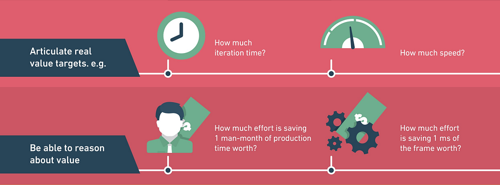
As a non-technical manager, once you understand the problem, you have to articulate the answer to the question of value.

☐ Answer: How much is this worth solving? Is solving this problem or creating this system, based on your understanding of the problem, worth two weeks of development? Two years? Twenty years? At what point does developing it cost more than the value you could possibly gain? This is your actual budget. You’re not asking how long it will take, you’re saying how much is worth spending. If you cross that line, you stop development.

Beyond the problem at hand, you should also ask about what additional value could be created that may not be obvious to you:

☐ Ask: What specific things will we be able to do that we can’t do now?
☐ Ask: What specific things will be cheaper than they are now?
☐ Ask: What specific things will be higher quality for the end user than they are now?

Cost

As a non-technical manager, you still need to be able to reason about the actual costs of development. Which includes opportunity costs. You are relentlessly asking yourself and your team: Is this the most valuable thing we can be doing?

☐ Ask: What previous art solves a similar problem? Get to the heart of the build or buy question right away. If no one has ever solved this specific problem before, ask what parts have been solved. Is an 80% solution good enough for your needs? Is this work really where your team can add unique value?

☐ Ask: What evidence can you show that this will solve the problem? A lot of development is just guessing. You need to see some evidence those guesses are founded in some reality. You should expect your team to provide a simulation or prototype or fake (but statistically relevant) data which can demonstrate the solution is at least plausible before you commit.

☐ Ask: What connects to this? What systems will depend on this? What systems will this depend on? Enumerate all the dependencies. Other systems, libraries, users, protocols, everything. Even if you don’t understand what each thing does specifically, you can understand the complexity of the network of connections. Things with a more complex network of dependencies will be more costly to develop and maintain.

☐ Ask: What’s Plan B if this doesn’t work? A sure danger sign that someone is way too attached to a specific solution (and at risk of ignoring the actual problem) is an inability to articulate any alternatives. Ask: What are you going to do when we’re up against a deadline, this solution isn’t working as expected, everything is broken, and we still have to ship? Yeah… Get an answer to that, then do that first. Then you can talk about how you can make it better.

☐ Ask: What are you not doing instead? Real life is all triage and trade-offs. You need to understand what’s not happening so you can communicate that to interested parties. And so you can make sure the right trade-offs are being made in this case.

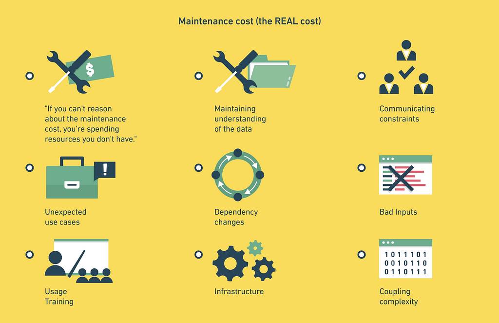
Maintenance cost: The overwhelming cost of developing any solution is almost always maintenance. If everything goes well, the initial development cost is noise compared to that.

☐ Ask: How long will the system survive? No system lasts forever. When will this system be scheduled for replacement? To put a finer point on it: During what period will you be making no changes to the system except for critical bug fixes?

☐ Ask: What are the prerequisites for using the solution? What must continue to be true? What do users need to know? What does the data need to look like? If you’re not convinced your team knows the requirements then they will be ill-prepared to handle it when those requirements inevitably change.

Confidence

As a non-technical manager, you also need to have a process for developing confidence in the progress of a system without digging into the internal details.

☐ Ask: How can someone else be able to verify it works as expected? While the author of the system may have a pretty good idea of whether or not the system works as expected, there will be blindspots. You need some kind of QA process which can validate things work and can find those unanticipated areas which weren’t obvious to the developer.

☐ Ask: Can you demonstrate a failure? Your team will be showing you progress over time. Perhaps giving demos of workflows or playthroughs of how things are supposed to work. You can generally assume that works. what you really want to see is what happens when you go off script. Most of the complexity is in handling those off-script behaviors. If that’s not being handled well, it’s a real problem that you need to address immediately and it’s definitely not “nearly done”, whatever they might think.

The 80/50 Rule

If you’re not 80% done by the time you’ve used 50% of your resources, you are behind. 80% done means you can ship it right now. You may not like it. It may have some rough edges. But it actually works and handles off-script input in an acceptable way. Use this rule rigorously to verify your team is where they expect to be. You don’t need to know the details of the system to know that if it’s not actually usable at this point, it’s almost certain that you won’t ship it on time. When something doesn’t pass this test, it’s time to evaluate what needs to change. Does this project need to stop? Do other projects need to move? “I can make up the time” is not a realistic response.

What you’re not asking…

By contrast, there are two specific questions that you are not asking. You should be confident that your experts can solve the problem you’ve agreed to, given the constraints you’ve discussed (including costs.) You should be confident it’s worth solving. But you’re wasting everyone’s time if you’re trying to break down tasks you don’t understand.

⊘ Don’t ask: What are the specific tasks?
⊘ Don’t ask: How long will this task take?

None of the above requires you to understand what your team is doing as well as they do or how they are doing it, technically. But having a rigorous process for understanding why they are doing it, the value, the costs, and evaluating your own confidence level will help you ensure that your team is, in fact, working on the right things.


Introductory bullshit detection for non-technical managers was originally published in It’s Your Turn on Medium, where people are continuing the conversation by highlighting and responding to this story.

12 Jun 18:23

Recommended on Medium: Time for a vNotes Format?

A note sync format across devices & systems

Today we have vCards for person & business contact data, and CardDAV for syncing and sharing. For calendar data we have vCal and CalDAV.

This means that CRMs, for example, can link data to your calendar and your contacts. Any changes can get synced to the native contacts and calendar in your phone or calendar.

But what about notes?

Evernote, Google Keep, SimpleNote, Apple Notes. Never mind other systems that people use for note taking like Google Docs or Dropbox Paper.

They don’t link to calendars for meeting notes, they don’t link to contacts that are mentioned.

Your CRM has a notes field, but at best you can save it as part of a CSV export. You can’t just sync your notes to your phone or desktop, so at best you’re copy pasting.

WebDAV is an existing protocol for sync / access, but is more complicated than “just” notes.

And even with all of these systems, we don’t have support for linking objects – a person, a company, a meeting, another document.

I’ve been using Dropbox Paper as my primary note taking tool, both for business and personally. It supports @-mentions for people and +-mentions for other Paper docs. It has a meeting template for your connected Google Calendar – but you can only connect one account, and it doesn’t write back to that cal event in any way. Also no mentions of cal events directly.

I don’t want to slip down the slippery slope of semantic everything, but I do want to link, annotate, and preserve meaning and entity types as I build information.

We’re seeing a flood of systems across Slack, upgraded wikis, and more. Markdown is prevalent as a good-enough rich text formatting syntax, plus embedding / unfurling of remote content.

Somebody give me a sync / notes format that harmonizes notes and search for me!

Pointers to existing thinking around these concepts appreciated!


Time for a vNotes Format? was originally published in Boris Mann’s Blog on Medium, where people are continuing the conversation by highlighting and responding to this story.

12 Jun 18:23

RIP, Adam West.


RIP, Adam West.

12 Jun 18:22

Driving Innovation Through Communities

by Richard Millington

…doesn’t usually generate many useful ideas.

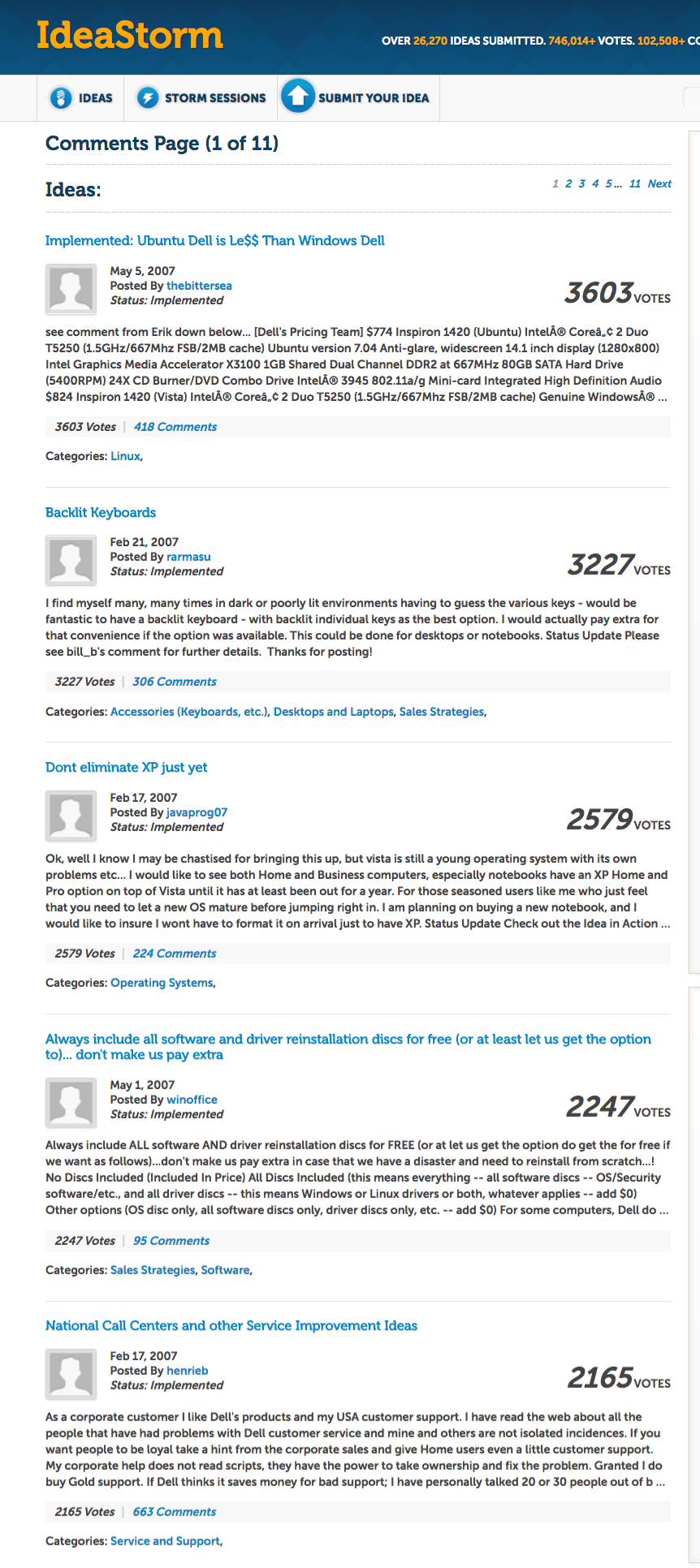
Take a second to look at Dell’s Ideastorm’s top implemented ideas.

They’re interesting, but we can agree they’re primarily tweaks around the edges of products. None saved Dell or helped invent the iPad. They’re also likely ideas Dell engineers already considered.

Ideas are pretty cheap. The hard part isn’t generating an idea, it’s developing the process for evaluating and nurturing ideas. Popular ideas need to be practical and a business priority. They also need strong internal supporters to fight for resources.

How many organizations are set up for that?

Crowdsourcing ideas from customers doesn’t usually lead to good ideas, it leads to a list of product complaints. The same kind of complaints you can gather from any of your support reps.

Innovation in communities comes not from gathering ideas, that’s easy, but in refining ideas. Getting early input into new products, testing concepts on small samples, and treating the community as a focus group works well.

Likewise, track which topics are rising in popularity, see which landing pages people are arriving on. This tells you which issues to address next. Create a place to report bugs (this also prevents all discussions being filled with bug reports).

But to make this work you still need the process for it. Go to the marketing team, PR team, and engineering team and see if they want early feedback from a tiny group of members. It works for content too. Before our ROI project, we gathered valuable feedback from dozens of our community.

Focus on building one process first (e.g. let’s get community feedback on our next content piece) and build from there. Collect stories of success you can use to persuade other departments.

Communities can be a really powerful tool for driving innovation. Build processes to use them to test and refine ideas.

12 Jun 18:22

The 10.5” iPad Pro: Future-Proof

by Federico Viticci

There's something about the screen of the new 10.5” iPad Pro that feels immediately novel but quickly becomes normal, and something that seems obvious at first but reveals itself as a deeper change after a few days. As a heavy user of the 12.9” iPad Pro, I've been pleasantly deceived by this new iPad, and the more I think about it, the more I keep coming back to the display and the story behind its new form factor.

Pro Sizes

I’ve been using the original 12.9” iPad Pro as my primary computer for the past two years. I’ve always seen the large iPad Pro as Apple’s ultimate expression of the iPad’s mission: a large multitouch canvas that can transform into anything you want – a computer that can sit on a desk as a laptop replacement and be carried around without compromise. The 12.9” iPad Pro is the iPad for those who want the power of iOS and the comfort of a notebook.

There are iPad users, however, who value the portability of iPads with a smaller footprint even if that results in a more constrained iOS experience. Looking at Apple’s iPad product line, it’s evident that the vast majority of iPad customers prefer compact sizes: while Apple has offered only one option above 10 inches, the iPad mini, iPad Pro 9.7”, and the 2017 iPad were all aimed at users who wouldn’t think twice about throwing an iPad in a bag and who wouldn’t be seriously affected by the reduction in screen real estate. Given the uncertain future of the iPad mini, the 9.7” iPad has become the model for people who want a big-enough screen with extreme portability.

To me, this is what makes the introduction of a new iPad screen size so fascinating, for a couple of reasons. First, Apple is tweaking a form factor that is perceived as the ideal one by millions of customers. More importantly, Apple’s latest iPad updates – which also include a spec-bump for the 12.9” model – bring much needed unification to the entire line that was missing since the Air/mini days: all new iPad Pro models carry the same hardware and specs; you just have to pick the size you like. The 10.5” iPad Pro and 12.9” have the same A10X chip, a True Tone display, support for wide color, a second-generation Touch ID sensor, and a four-speaker system. You simply have to choose the kind of iOS experience you’re looking for in an iPad Pro.

And as I said above, for nearly two years I’ve relied on the large iPad Pro as my everyday computer for work and pleasure. But since I’ve been curious to live the so-called MultiPad lifestyle, and after Apple provided me with a review unit of the 10.5” iPad Pro last week, I figured I could run an experiment. I set up my favorite apps and workflows from the 12.9” iPad Pro on the new 10.5” model and used it for nearly a week, doing what I usually do on the iPad – which tends to mean all kinds of tasks.

To my surprise, while I still prefer longform writing and heavy Split View-driven research on the 12.9” iPad Pro, I’ve enjoyed everything else more on the 10.5” version. A big reason for that, I believe, is the improved display technology and expanded screen size.

The Display

The first time I swiped on the 10.5” iPad Pro’s 120Hz display last week, I thought it looked fake – like a CGI software sequence. It was incredibly, utterly crisp and fast. It didn’t look like iOS belonged on the screen: after years of iPad usage, my brain was telling me that something didn’t seem normal about the way iOS was animating. Except it’s all real, and it simply takes a couple of days to get used to the new display and the work Apple has put into ProMotion for smoother scrolling and fluid animations throughout the system.

A good way to think about the iPad’s new display with ProMotion is not the difference between low-res and Retina screens, but the jump from 30fps to 60fps. You see more of every animation. Text is more legible when you scroll and doesn’t judder. It’s hard to explain and it has to be seen and experienced to be fully understood. Every scroll, page transition, and app launch animation on the 10.5” iPad Pro is absurdly smooth to the point of feeling unrealistic at first – hence the common reaction that something doesn’t quite compute. But as you spend some time with the new iPad and start using it on a daily basis, its display becomes normal and you wish that other Apple displays were the same.

I’m not even a week into my tests with the 10.5” iPad Pro, and I think scrolling on my first-gen 12.9” iPad Pro looks choppy now. I’d be surprised if 120Hz displays with ProMotion don’t expand to the iPhone later this year and other Apple computers in the future. The combination of hardware and software really is that good.

How Apple has accomplished this is impressive from a technical standpoint. Thanks to better displays and optimizations in iOS, Apple has managed to double the iPad’s display refresh rate. On first-gen Pro models, the display would always refresh at 60Hz but scan for touches at 240Hz when the Pencil was being used, so that drawing with a fine tip on screen could be even smoother and more natural than sketching with a finger.1 On the new generation of iPad Pros, the A10X enables a display refresh rate of 120Hz – a breakthrough in the mobile industry – with the same touch sampling rate of 240Hz when the Pencil is used.

In addition, ProMotion – the set of features underlying the new display technology – brings Pencil latency down to 20 milliseconds, and it supports variable display refresh rates to increase battery life by intelligently adapting the display to the content being viewed by the user. Because high refresh rates are taxing on the system and thus demand more power and energy, ProMotion automatically lowers refresh rates to 24Hz for still images and 48Hz for video. This way, content that doesn’t require high refresh rates for an optimal viewing experience still looks great, and the 120Hz refresh rate kicks in when the user is interacting with the iOS interface.2

In practice, the result is perhaps not as easily explained as the leap from the iPad 2 to the iPad 3’s Retina display, but it’s also not as minor as the difference between regular and True Tone displays. I’d say that ProMotion sits somewhere in the middle between Retina and True Tone in terms of effect on the average iOS experience. I could work on my iPad without high refresh rates, but I don’t want to go back to a display that isn’t as fluid as the one on the 10.5” iPad Pro.

Besides the sense of increased responsiveness and improved Pencil performance, the 10.5” iPad Pro’s display simply feels nicer and looks like the future. Once you try an iPad Pro with a 120Hz display, there’s no going back.

The 10.5” iPad Pro’s display feels nicer and looks like the future.

In addition to ProMotion, the screen’s actual and perceived size plays an essential role in defining this iPad Pro. This isn’t the edge-to-edge iPad that rumors imagined earlier in the year. Apple has taken the same pixel density as the 12.9” iPad Pro (264 ppi – alas, still considerably lower than the iPad mini’s 326 ppi) and introduced a new resolution (2224 x 1668), resulting in a screen size that is nearly 20% bigger than the 9.7” iPad Pro. The 10.5” iPad Pro still has visible bezels, but they’ve been noticeably trimmed down (Apple says by nearly 40% compared to the previous small iPad Pro), especially along the longer sides of the device.

In my experience, the display itself feels bigger than it actually is. By extending towards the corners of the iPad’s body as much as possible, the display seems to disappear into the bezels, which is particularly apparent when you hold the device in portrait mode to read a book or article in Safari.

Thinner bezels.

Thinner bezels.

If you compare a 9.7” to a 10.5” iPad Pro side-by-side, the increase in screen size doesn’t look like a big difference, but everything feels more spacious when you’re holding the new iPad. And because a lot of small-iPad usage tends to happen in portrait as you’re focusing on content, there’s the illusion that your hands are holding a device with no bezels. Once again, it’s hard to describe, and it’s not nearly as impressive when the iPad is docked on a Smart Keyboard in landscape mode, but it feels nicer than the old 9.7” model.

I’ve been thinking about why Apple has spent so much time and effort on what is arguably a minor increase over the 9.7” iPad’s screen size, and I believe the answer lies in the exponential response to incremental improvements. At compact sizes, even the smallest tweaks can have a profound impact on the experience. Apple wanted to extract the maximum sense of niceness and spacious UI from a device that could be small enough to carry around, weigh one pound, and still target a different kind of user than the 12.9” iPad Pro.

The new 10.5” screen size is a winner, but it’s ProMotion that truly makes it come alive.

Working on a 10.5” iPad Pro

I was curious to see if the larger screen could make the 10.5” iPad Pro a viable alternative to multitasking on the 12.9” model, but, as I imagined, working with Split View on this iPad is the same as the 9.7” version, showing enlarged iPhone interfaces3 instead of two full-size iPad apps at once. If you were expecting the same Split View experience as the 12.9” iPad Pro, the 10.5” doesn’t allow it.

iPad Pro 9.7” (top) and iPad Pro 10.5”.

iPad Pro 9.7” (top) and iPad Pro 10.5”.

This limitation is mostly due to 12.9” being a bigger jump than 10.5” is from 9.7”, but resolution is also a factor. While some had assumed that Apple would take the same 2732 x 2048 display of the 12.9” iPad Pro and condense it to a smaller size, the company has introduced a new resolution in the iOS device matrix – a decision, I think, made to hit 264ppi on a 10.5” panel while retaining UI elements that are large and comfortable to tap. Cramming the large iPad’s display into this model might have resulted in a richer multitasking experience at an even smaller scale, but I believe touch usability would have suffered. This resolution feels like the optimal one for this screen.

I’ve been testing this iPad doing what I usually do – research for MacStories articles (including my future iOS 11 review), reading in Safari and Twitter, email, and collaboration with multiple apps in Split View, including Working Copy, Slack, and Messages to communicate with other team members. Coming from a 12.9” iPad Pro, multitasking and interacting with two apps at once isn’t as flexible or fast because you’re dealing with compact UIs that have to pack more elements in toolbars at the top and bottom of the screen.

Split View on the first-generation 12.9” iPad Pro and the new 10.5” model.

Split View on the first-generation 12.9” iPad Pro and the new 10.5” model.

But as a successor to the 9.7” iPad Pro – which I believe will be the common upgrade path for most users – Split View is slightly superior on the 10.5”: essentially, everything’s a bit taller so you can see a couple of extra lines of text when writing or reading without having to scroll. It’s not a dramatic improvement from the old iPad Pro, but if you go back to the first model after trying the 10.5”, you’ll be able to tell the difference.

I haven’t tested apps and games that target the A10X in the 10.5” iPad Pro, but overall, the device yields unsurprisingly solid performance, which is a good thing. The original iPad Pro’s hardware has always felt too powerful for the software it was running, and I assume we’ll see more practical gains from the A10X later this year once iOS 11 apps start integrating with frameworks such as drag and drop, Core ML, and ARKit. I’ll be curious to see how running iOS 11 with three apps at once (two in Split View plus floating Slide Over) will perform on the original iPad Pro line compared to the new generation using the A10X and ProMotion. The iPad’s new hardware seems almost underused for now (my 10.5” review unit is running the latest version of iOS 10), but I have a feeling that Apple’s future-proofing strategy will pay off with iOS 11 and beyond.

For professional users, where the 10.5” iPad Pro also shines right now is in the slightly-larger software keyboard and Pencil drawing performance.

The former is noticeable enough to add up over time and make you prefer the software keyboard of the 10.5” iPad over the 9.7” one. Every key is slightly larger and easier to hit, which doesn’t sound like a big deal until you get used to it and go back to the first-gen iPad Pro’s software keyboard. It’s not as delightfully PC-like as the software keyboard on the 12.9” iPad Pro, but it’s better than before.

The Pencil’s performance improvements enabled by ProMotion are real, and we’re getting closer to the point where drawing with a Pencil on screen has almost no perceptible latency and feels like writing with a marker on glass.

As I’ve written before, I don’t use the Pencil much for actual drawing because I’m not an artist, but I’ve started to enjoy the simple act of handwriting and taking notes in apps like Notability and GoodNotes. I find it relaxing and I like how the Pencil forces me to slow down and think more deeply about the words I’m typing on screen. With the 10.5” iPad Pro, I’m probably not going to benefit from the low latency and smoother ink engine as much as artists and other creative pros will, but I’ve noticed that even adding basic annotations and text comments is more fluid and responsive than it used to be, which is something I can appreciate. Looking ahead at the changes coming to Notes with iOS 11, I suspect I’ll end up using the Pencil regularly for research and brainstorming.

If you use the Pencil a lot, the combination of a lighter iPad with a bigger screen and higher refresh rate is a strong argument in favor of the 10.5” iPad Pro.

Accessories

Alongside a review unit of the iPad Pro, Apple provided me with a Pencil, a Smart Keyboard, and one of the new leather sleeves that can hold both the iPad and Pencil to be carried around together.

For the Pencil and Smart Keyboard, you can refer to my original review of both accessories from November 2015 as neither sports major changes at this point.

The new iPad Pro 10.5” Smart Keyboard.

The new iPad Pro 10.5” Smart Keyboard.

The Smart Keyboard is slightly larger than the old version for the 9.7” iPad Pro, which should be a welcome improvement for existing users, but my overall stance hasn’t changed. My hands are too big for the Smart Keyboard, which I only use if I’m traveling and don’t have enough space to prop up my iPad on a Canopy and type with an Apple Magic Keyboard. My ideal iPad keyboard setup would be a Smart Cover combined with a backlit Magic Keyboard; unfortunately, that still doesn’t exist.

If you liked the Smart Keyboard before, you’ll like this one as well. The materials are the same, the key travel is the same, and it still pairs using the Smart Connector, which is a nicer experience than Bluetooth. I wrote and edited this entire article on the Smart Keyboard for the 10.5” iPad Pro, and I didn’t run into any issues.

The new iPad Pro leather sleeve.

The new iPad Pro leather sleeve.

The leather sleeve is an interesting idea. Apple gave me a Midnight Blue model that I’ve been using to carry the iPad, Smart Keyboard, and the Pencil together instead of having to place the Pencil in a Belkin case I purchased a few months ago. The Pencil can be placed into an inset at the top of the sleeve that protects the device and ensures it doesn’t fall off, while the iPad goes inside the sleeve that has leather on the top and microfiber lining at the bottom, where the back of the iPad is supposed to rest. To me, it feels like good quality leather and there’s even an etched Apple logo in the back; of course, I can’t judge how the material will age over the next few months.

Setting the Pencil in the leather sleeve.

Setting the Pencil in the leather sleeve.

A common misconception about the leather sleeve is that it can only fit the iPad with no cover attached, but it’s actually the opposite. The leather sleeve is best used when the iPad is attached to a Smart Cover or Smart Keyboard; otherwise, the device will be loose and it might slip out (even when the Pencil is in), which happened to me when I was testing the iPad in the sleeve with no keyboard or cover attached to it.

This leads me to believe that the leather sleeve is primarily targeted at users who keep the Smart Keyboard always on, have a Pencil, and move between offices and different locations on a daily basis for presentations, on-site interviews, and other mobile tasks. If used this way, the leather sleeve is an elegant all-in one accessory. I’ve found myself frequently using it during the week of WWDC to hold the iPad and its accessories together in my bag without having to store them separately.

I’m going to buy a black leather sleeve for every iPad we own in our household – it looks nice, and it fixes a common problem with an attractive solution.

Everything Else

Below, I’ve included some additional comments and answers to questions I was asked while testing the 10.5” iPad Pro over the past week.

It supports fast charging and USB 3.0 transfer speeds. The new iPad Pro comes with the same fast charging feature of the original 12.9” iPad Pro, and it packs a USB 3.0 controller in the Lightning port that allows for faster data transfers with external storage units and desktop computers. I bet fast charging will propagate to every portable Apple device.

It comes with a 12W adapter in the box. Alas, if you want to take advantage of fast charging, you’ll still have to buy a 29W USB-C adapter separately.

It has a headphone jack. As long as Apple finds room for a headphone jack in their non-iPhone devices, they’re going to offer one. This makes the transition to wireless audio smoother for everyone, particularly pro iPad users who rely on external audio interfaces and music apps.

How many apps can you fit in its dock running iOS 11? Right now (beta 1 of iOS 11), same as the 9.7” iPad Pro: 13 user-added apps, plus up to 3 Siri proactive suggestions for a total of 16 app icons in the iOS 11 dock.

Can you use an old Smart Cover with it? You can attach a 9.7” Smart Cover to the 10.5” iPad, but it’ll be loose and it won’t cover the entire front of the device. You’ll have to buy a new Smart Cover and Smart Keyboard for this iPad.

Pro specs. According to GeekBench, the 10.5” iPad Pro has 4 GB of RAM; the previous 9.7” iPad Pro had only 2 GB of RAM. This could enable more powerful iOS 11 multitasking features that won’t be available to the first-generation small iPad Pro.

The Future of iPad

It’s not difficult to reach a verdict on the new iPad Pro. If you‘ve used the 9.7” iPad Pro for work every day and want the absolute best in preparation for iOS 11 later this year, you should get the 10.5” iPad Pro. Everything about this iPad is nicer, faster, and a bit more spacious than before to justify the upgrade. If you demand the best from your iPad, this is the new best you can buy.

The conclusion is different if you, like me, have preferred the 12.9” iPad Pro as a large workstation for the past two years. Even if it’s bigger than the 9.7”, the 10.5” iPad Pro can’t compete with its larger counterpart when it comes to Split View and the sheer amount of content displayed on screen. I’m not going to give up my 12.9” iPad Pro for writing articles, doing research, and working with Split View to move data between multiple apps. If you like the best and largest expression of iOS, I recommend getting the new 12.9” iPad Pro.

Personally, after a week of usage, I’ve appreciated the 10.5” form factor and new display so much, I’ve ended up somewhere in the middle. The 10.5” iPad Pro feels great to hold with one hand when catching up on Twitter, reading articles saved in Safari, and putting together advanced automations in Workflow. I’ve missed this kind of portability from the 12.9” iPad Pro, and I‘ve enjoyed having a smaller companion to more comfortably work on planes, in the car, or around the house. Plus, the screen is incredible.

I’m not sure if I’ll end up using multiple iPads in the near future, but I know this: the 10.5” iPad Pro is the nicest, most powerful iPad I’ve used to date.


  1. See: display refresh rate and Touch Coalescing. Effectively, iOS ends up with more scanned touches from the Pencil than necessary for a 120Hz display, but these touches are used to inform iOS’ predictive algorithms and APIs. ↩︎
  2. Even more impressive: if you’re watching a video and taking notes with the Pencil in Split View (video on the left, Notes on the right, for example), the display refreshes at 48Hz for the video, but as soon as you start drawing, the refresh rate automatically goes up to 120Hz for the Pencil. When the Pencil lifts off the screen, it goes back to 48Hz. ↩︎
  3. Compact layouts with toolbars at the bottom and no tab bars at the top in apps like Safari. ↩︎

Support MacStories Directly

Club MacStories offers exclusive access to extra MacStories content, delivered every week; it’s also a way to support us directly.

Club MacStories will help you discover the best apps for your devices and get the most out of your iPhone, iPad, and Mac. Plus, it’s made in Italy.

Join Now
12 Jun 18:20

Data-over-Sound: An interesting approach to connectivity

by Dean Bubley
I cover three main areas in my research & advisory work:
  • Communications networks & services - mobile network evolution, IoT connectivity, telco business models and policy, and so on
  • Communications applications & technologies - voice, video, messaging, UC etc
  • Communications futurism - the intersection of comms. with other domains such as AI, IoT, blockchain, VR/AR and so forth 
All are evolving at speed, sometimes linked and sometimes in orthogonal - or even opposite - directions. Sometimes the intersections of these various threads yield some surprising combinations and innovations, which are interesting to explore.

I've just written and published a white paper for a client (Chirp.io), on one such intersection - the use of audio signals for short-range communications, or Data-over-Sound. It can be downloaded here (link). The easiest way to think about it is as an alternative to NFC or QR-codes for certain applications - but usable by any device with a microphone/speaker, and with less need for physical proximity or cumbersome pairing like Bluetooth. It's applicable to both normal phones and PCs, and also a variety of IoT devices.

(As always when I write documents like this, I have a stringent set of rules about my editorial independence. Given my normal "spikiness" when I write, in practice it means I need to have broadly-aligned opinions in advance. I've turned down writing papers when I've known the client wouldn't like the views & conclusions in the final report).

The emerging Data-over-Sound sector is currently quite fragmented, and has a mix of new platform players and point-solutions, integrated into customised vertical applications. It's being used for mobile payments in India, device-pairing for UC meeting-room whiteboard applications, and even between robots. Other use-cases exist in retail, advertising/marketing, ticketing and other domains. It can use both audible and inaudible frequency ranges.

In some ways it's similar to technologies like WebRTC, in that it's a capability rather than a product/service in its own right. It still needs some expertise to integrate into an application - and indeed, enough people with "vision" (OK, OK, hearing & inner voice...) to recognise the possible use-cases.  Ideally, it could benefit from more standards, better interoperability, the emergence of extra tools and platforms - and also some ethical standards around things like privacy & security, especially where ultrasound is used covertly.

I don't think Data-over-Sound is going to revolutionise the entire world of connectivity - the same way I'm always skeptical when people claim blockchain is "a new Internet". But I think it should be an important addition to device-to-device communications (I've never viewed NFC positively), and should yield a range of beneficial applications as awareness grows, and applications/tools mature. (And hey, who doesn't like technologies that let your phone speak R2D2 - video link)

The download link, again, is here. The paper gives some background to the technology and use-cases, as well as discussing the emerging structure of the sector.
12 Jun 18:20

Domain Name

by Lou Cornum

When he came to the supposed new world, Columbus supposed he saw Indians. Some 500 years later, in the supposed new world of the internet, many Indians now see themselves as ndns. Though its meaning may at first have been unclear, “ndn” is now widely understood online to mean Indian. But how does anyone know if they’ve ever actually heard ndn? The word is hard to say aloud in a way that marks its divergence from Indian. I sometimes jokingly exaggerate the undertones of French pronunciation in the nasalization of n-dee-n (or Indienne). Otherwise, I am content to say “Indian” and hope that those I speak to, those in the know, can hear what I’m really saying: ndn.

Ndn is a subtraction made substantive, marking how terms made to describe Indigenous peoples are always lacking — how we are made to lack and always feel lacking

This difficulty in articulation indicates how well-suited ndns are to the internet. Ndn is a subtraction made substantive, marking how terms made to describe Indigenous peoples are always lacking — indeed how we are made to lack and always feel lacking. But in the word’s notes of subversion and irreverence, as well as its widespread use in forming digital collectives and connections, ndn also signals the ways in which ndns build worlds even as ours are invaded and denigrated. This remains true in the ways ndns emerged on the internet and continue to use internet spaces for cultural expression, consciousness-raising and political organization. In my time on the ndn internet, the term has come to signify not just a clever transfiguration but also a digital model for how ndns might form new kinds of relationships at the outer limits of colonial categories.


In 1491, the millions of peoples on the continents now called the Americas had many different names for themselves and each other. None of those words were “Indian.” Indians — though supposed to be all dead or dying by many — somehow continue to be both not real and still living. The word ndn is only one of our latest adaptive transformations in the genocidal landscape of the settler colony. This adaptation is not just a revision of the category Indian, but a declaration against all the categories of containment we have been subjected to through the names imposed on us.

By the time I was born and being classified by various state institutions, the term Native American had taken root. Tellingly, most Native people call themselves just that, Native, without the American. It is the form most palatable to liberal conceptions of minorities and how they should identify themselves, and as such Native American remains the most commonly accepted phrase for public and institutional discourse in the United States. In Canada, Central America, and the Caribbean, the words and terminologies for Indigenous peoples vary, shaped by related but distinct political, geographic, and cultural differences. The slurs directed at Indigenous peoples or used for sporting team names also vary according to national boundaries and race relations.

Despite the continuing anxiety about what we should call ourselves and what others should call us, the word Indian persists both as inter-community self-reference and as bureaucratic identifier. To this day the federal agency responsible for managing Indian lands held in trust by the government is called the Bureau of Indian Affairs, and it is the Indian Health Services that runs medical facilities on the rez. The ways in which we call ourselves Indians and the way it is said to us by the government both emphasize the colonial condition. Indian, because it is known to be borne of Columbus’s error, marks the originating colonial encounter and the continuing misrecognition of the colonial gaze. Ndn takes this misnomer and further marks its illegitimacy by stripping it of vowels and diminishing its ability to signify without our own input meaning.

Ndn was born on the internet. Like multiplying fungal fruits, new language forms sprout from disturbances and cross-fertilizations. I can’t pinpoint when or where ndn began, but my feeling is it popped up in various patches simultaneously. Once a large number of Native people got on the internet, we began to build ways of connecting and alerting ourselves to our own mass. Again and again, #ndn emerged as the node we extended into a solidifying network. By the mid-2000s, Ndn Country had arrived.

Some people insist on NDN, which I like for its obstinate appearance, a blockade on the supposedly transparent meaning of names. But my aesthetic preference is for unassuming ndn. One appeal is the term’s elusiveness, manifest also in its difficulty to actually say out loud. In all lower-case, ndn mimics a domain name like .com, but for the ndn net. It suggests the existence of a whole inner internet marked .ndn. As a hashtag, #ndn has been forming an archive of Indigenous people’s missives and creating portals to click through to each other. It provides a sense of multitudinous widespread groups of ndn people, much more in excess of what a word like Indian attempts to contain. Each #ndn is like a little land claim, staking out as Indigenous a much different kind of space than is usually associated with Indigenous territories. In cyber space our claims to collective presence across many tribal and national affiliations may be bound by the constraints of code and tied to physical IP addresses, but an online network also allows people from disparate territories to hold and shape a new kind of digitally-grounded, diffuse territory together.


To understand what ndn country is, and the possibilities for Indigenous futures it engenders, we need to trace the history of Indigeneity and the internet. Even before the advent of the world wide web, the labor of Indigenous women made possible the mass production of semiconductors used in early electronic computing devices, as digital media scholar Lisa Nakamura has written about in her work on racialized tech labor. In 1964, the Fairchild corporation opened a plant for the manufacturing of integrated circuits in Shiprock, New Mexico on the Navajo reservation. Navajo women were the vast majority of people hired because of the supposedly translatable skills of Navajo weaving to the fine detailed work of building circuits, though the less romantic desire for cheap labor most certainly animated the corporation’s decision. After ten years, the Shiprock operations shut down and the Fairchild corporation decided to gain even more of a profit exploiting workers in Asia. While tired conceptions of Indigenous life in America continue to assume a divide between the traditional world and the modern, Navajo women’s experience with the Fairchild corporation demonstrates a much more entangled view. This early moment in internet history also illustrates the often unseen material basis from which online communities we are familiar with today emerge.

Ndn takes the misnomer borne of the colonial gaze and further marks its illegitimacy by stripping it of vowels and diminishing its ability to signify without our own input meaning

When the internet did come into the mainstream, internet connectivity was disproportionately unavailable or difficult to access on Indian reservations. Many Native peoples continue to face material barriers to internet access in the United States and the Americas more broadly. This means the world I’ve outlined as ndn country includes only a certain subset of Indigenous peoples globally. There have been some efforts to bring online spaces and the infrastructure they require to reservations and other under-resourced Native communities. Launched in 1996, CyberPowWow was an early site of online Indigenous collectivity for Native artists, and users also created physical “Gathering Sites” in different cities and towns where ndns without their own computers could meet others with computers and get online. In 2017, there are pervasive assumptions that everyone is “plugged in.” However if we want ndn country to continue to be a site of political and cultural collaboration and resistance, we should continue and extend the work of groups like CyberPowWow in creating infrastructure and access points that allow those in under-resourced communities in Indian Country to get online and join networks.

Since the mid-oughts, ndn presence online has exploded, and digital platforms have increased while, in a certain sense, narrowing: Instead of occurring in multiple connected chat rooms hosted on one niche website, most internet conversations today take place on a handful of well-known mainstream platforms. On CyberPowWow and its offspring, AbTec (short for Aboriginal Technology, incorporating and chopping up the Canadian term “Aboriginal”), ndns discussed ndn issues with other ndns. On the social media platforms popular today, our conversations occur in a more public sphere, which can lead to un-ending call-outs of cultural appropriation but also mass mobilization of support for Indigenous movements. On these more mainstream platforms, where a term like ndn is more widely used, it seems a way not only to represent ourselves to each other but to make a statement about ourselves to others.

I recently reached out on Twitter, by far the space where I most interact with other ndn people outside my family, to see what recollections people had of when they first encountered “ndn.” Ndn first appeared for one friend on chat boards and forums that were admined and frequented by Natives. Another person remembers seeing it used as a URL abbreviation for a law firm website. For many, ndn would emerge on Tumblr. Almost everyone noted how ndn, perhaps because of its opaque pronunciation and meaning, appeared at first as a kind of winking in-joke and declaration of post-modern presence and re-appropriation. In a world determined by genocide and now overdetermined by the dominant narrative of Indigenous disappearance, to find new ways to appear and proliferate is endlessly important to Native peoples.

I came to Tumblr a little late, in 2011, convinced to join in part because of the promise of being connected to other similarly alienated, similarly queer Indigenous people. The term ndn seemed to have been around for awhile already, and coming across the term, and the network of ndns it both described and manifested, gave me a sense of pleasure through expansive intimacy. Tumblr is also where I connected with people who were interested in what we were in earnest starting to call Indigenous Futurism. Greatly indebted to the Afrofuturists and their inspired ilk, Indigenous Futurism was a broad label for music, visual art, fiction, fashion, and weird internet posts with sci-fi aesthetics that disrupted the colonial association of ndns with static past-oriented tradition. My Tumblr URL was the-red-planet, which I liked as a triple entendre on Mars, ndns, and communism. The red planet was also a digital spatialization of a utopic Indigenous Futurist vision. If I couldn’t actually go with all the ndns to Mars, we could type certain smaller worlds into being on the internet-verse. Writing on Indigenous Futurism in 2015, I described the “space ndn” as the central figure in my futurist imaginary as someone who complicates notions of where Indigenous people belong. The space ndn might leave the grounded space of ancestral territory, but the practices borne of those places do not die, they adapt, both transforming and being transformed by the demands of interstellar travel. This concept of an indigeneity in flux was something I was already experiencing.

If by 2011, ndn signalled for me my inauguration into an online community, the next year would make clear the power of online organizing to coordinate and influence group actions offline. It began in December 2012 with the proliferation of another three-letter clarion call, #INM, or Idle No More, a declaration of renewed fervor in a long history of Indigenous resistance. The hashtag at first marked an internet teach-in about the Canadian bill C-45, an omnibus budget bill put forth by the Conservation administration of Stephen Harper that removed environmental protection measurements on almost all Canadian waterways and opened up tribal lands to leasing. Striking down this bill remained the central tenet of INM, but the larger movement also demanded a total undoing and reworking of relationships formed under illegitimate domination by foreign powers.

The immense role of digital platforms in structuring and supporting this political action is reflected in the 2014 anthology The Winter We Danced: Voices from the Past, the Future and the Idle No More Movement. A majority of the pieces were first published online either on blogs, in magazines or in Facebook groups, and their titles incorporate the hashtags from which the movement was defined. Many, such as Leanne Simpson’s Fish Broth and Fasting, were viral instant classics of the movement’s ethos. More than just a public forum for discussing the struggle, the internet was also a crucial organizing tool for orchestrating the large flash mob round dances that began to garner the movement more public attention, and disseminating information about blockades of the trans-Canada highway and points along the railways. The widespread use of live streams at blockades and public protests has continued with the digitally-uploaded real-time coverage of the protest camps at Standing Rock. Both the on-the-ground and online activities around Idle No More and Standing Rock demonstrated Indigenous disruptions of public spaces that, far from democratic, were structured around Indigenous displacement and death, histories forced to the surface of North America’s consciousness by the insistence of Indigenous peoples. These moments in struggle are when we work towards a commons that is not premised on continuing colonial occupation.


Idle No More, the struggle at Standing Rock, and the interplay between these places and the internet illuminate for me the ways in which Ndn Country changes our conception of Indian Country. Indigenous struggles against colonial governance and resource extraction all come back to a question of land. But what do “land” and “territory” mean in the context of the internet? There is both the land and resources from the land that make our software, hardware and networks possible, most of which is stolen from Indigenous peoples, and also the territories of the internet built from what CyberPowWow users called “unnatural resources” such as pixels, data, computing power, bandwidth. Though even online territories can carry all the Western notions of territorial rule or sovereignty, ndn territory must necessarily be theorized and enacted in radically different ways. Ndn territory is not about private ownership but building a decolonial commons. One example of this might be the @IndigenousXca twitter account, which is run by a different Indigenous host every week and has more than 10,000 followers. The account does not have a sovereign, but a series of facilitators who allow it to become a high-traffic node for ndn conversation.

The deep space of Indigenous futurism shares some features with the digital ndn’s cyberspace. Both are expansive territories with certain edges and contours but resistant to being overlaid with the forms of the bordered world

The futurist modes of thinking that a dis-identity like ndn allow can stretch our considerations of how we formulate politics “on the ground.” José Esteban Muñoz used disidentification as a concept to illustrate the ways people of color maneuver the restricted models of subjectivity imposed by dominant straight white society. As a disidentification with Indian, ndn is a marker of a flexible, irreverent relationship to the discourses ndn people must move through to make claims for resources and land. It can also shape our engagements on the cacophonous space of the internet, where many different kinds of people are making claims to their right of presence. The pedagogical aspect of online communities in this context can’t be understated. From Tumblr to Twitter, I continue to learn so much about historical relationships between Indigenous peoples and descendants of previously-enslaved Black peoples. There are also posts and threads akin to scholarly-level output describing Black Indian experience (shout out to @chipotalosa for tireless work on this front). These are forms and objects of knowledge production that are routinely dismissed in universities but proliferate in different corners of Ndn Country as it exists within and alongside other online territories. On the internet it seemed it was possible to connect in ways that had been outlawed by the settler plantation. Not on a huge scale, but in moments and flashes, through the signals people send by manipulating media to show appreciation, resonances, and recognition, if not always understanding.

The use of ndn also lends itself to a transnational conception of settler colonialism and the people it dispossess, similar to the way Indigenous has become a global category for political organizing against land dispossession and genocide in its ethnic, cultural, linguistic and other forms. Earlier I mentioned how the defining words and categories used by governments and Native peoples differ considerably depending on which foreign settler government has dictated the terms of engagement. I’ve seen ndn used, however, by people of various national origins. Part of its irreverent tone is tied to the ease with which it can be picked up and used without reference to one nation, whether a colonial one, or a misidentified origin as in the case of the India in Indian.

While I do not want to flatten a term so thin it loses all shape, one of the useful things about ndn is its capaciousness. There is a lot of rightful mistrust among ndns about those who claim Indigenous heritage for personal gain or recognition. There are also a lot of overdetermined narratives in reaction to fears about what constitutes authentic Indigeneity. Claiming to be ndn rather than Native American or something similar is for me a disavowal of authenticity as something possible or worthy. All Indians are simulacra, as argued by Anishinaabe writer Gerald Vizenor, borrowing from Jean Baudrillard to describe how we are seen as copies of some original Indian, a figure who does not exist. The ndn internet makes obvious the simulation, instead of hardening ideas of a transparent self marked by a legible history.


I move through and think of the internet as a place of dynamic tensions between territories of defined subjects and unenclosed formations of distributed selfhood. The space ndn of Indigenous futurism is a figure I’ve written about because they insist on a certain kind of Indigeneity that is also in flux far away from traditional territory and traditional forms of thinking about territories. I am prone to this kind of thinking because I am someone who lives thousands of miles away from my ancestral territory. This imagining of what deep space means to the space ndn shares some features with the cyberspace of the digital ndn. Both are expansive territories, sites of collective belonging with certain edges and contours but resistant to being overlaid with the forms of the bordered world.

The nation has become one such form. While many Native peoples make a claim for nationhood based on pre-contact forms of governance, and while I respect these histories, the nation as it is enacted now for Indigenous people is little more than a colonial tool of co-option. Thus I consider the nation, like the category Indian, as something given to some of us without our consent, and that we can choose to transform or deconstruct for our own decolonial purposes. “Ndn” helps me conceive of ways of talking about Indigeneity and decolonization that are not necessarily expressed through desire for a resurgence of nationhood because “ndn” speaks to how we can still claim space without requiring exclusive forms of citizenship.

I am used to disagreeing with other ndns, feeling alienated from Indigeneity (especially the associated forms of spirituality), and questioning the validity of my Navajo membership despite family relationships and the bureaucratic stamp of a Certificate of Indian Blood. Being an ndn on the internet has thrown into high relief these disagreements and discomforts with a lot of common expressions of Indigeneity. Some days I plug in to ndn country only to find myself scrolling in muted anger and disappointment. However, being an ndn on the internet has also made it possible in many ways for me to keep living as an ndn. I am only ndn because I am in relation with other ndns. In the amorphous territory of Ndn Country, I find many ways to be ndn, different ways to have relationships to territory, and most importantly, tools for creating ways to live together outside colonial enclosures and categories.

12 Jun 18:19

The new iPad Pro

by Volker Weber

e4efb66ac12fb64eb1b9b93a49e63ecf
iPad Pro 9.7, AirPods, Logitech K780, Apple Pencil

Since I moved most of my workloads to the Surface Pro 4 I haven't used the iPad Pro as much as I used to. But the WWDC keynote got me fired up again. Apple is about to take a big leap with iOS 11 and that is going to benefit the iPad Pro.

This machine is so much more expensive than a regular iPad that it only makes sense if you are either well-heeled or determined to use this as your main computer. And the hardware certainly wasn't holding you up. Microsoft validated the incredible speed of the iPad Pro when announcing the new Surface Pro by comparing it to the Apple offering. IOS 11 will make this machine much more usable for general use, by adding better multitasking, drag&drop and file management. And Pencil is finally catching up with some of the features in Windows 10.

Beyond the software that will only refresh "in the fall" which I read as "shortly before the next iPhone", Apple is doing something they did with the iPods: killing an excellent product with an even better one. The iPad Pro 9.7 has such a gorgeous screen that it is hard to image how a 10.5 screen beats that. But there is an important difference: 120 Hz refresh rate. What does that mean? The new machine will be able to redraw the screen 120 times a second. How is that important? When you scroll in documents, they will appear paper-like, because they don't get blurred when you move them. Once you have seen that, you can't go back. Of everything that is new about the new iPad Pro - iPhone 7 camera with OIS, new CPU and GPU - that is what is going to make the most lasting impression. A little side effect: the Pencil, which is already the best on the market, gets even faster. And faster means again, more like paper.

There was no other tablet that could beat the iPad Pro 9.7 hardware. And Apple is taking it up another notch.

12 Jun 18:18

Do what you say you’re going to do

by Paul Jarvis

People often ask me for advice on freelancing and my answer is always the same. It may come across as stupid or reductive, but it’s what’s made me stand out a designer, and now as someone who sells products.

The post Do what you say you’re going to do appeared first on Paul Jarvis.

12 Jun 18:17

Chinatown under “Siege for Densification?”

by Sandy James Planner

chinatown23nw1

It has been an interesting time to read the different viewpoints being expressed about the proposed 12 storey Beedie development proposed for the site at 105 Keefer Street. The site is strategic because it is an important iconic corner in Vancouver’s Chinatown, which is the largest most contiguous Chinatown in North America. The buildings have been owned by families and historical clans and often had scores of people on the property deeds, a fact that may have delayed the redevelopment of this area.

There is no doubt that there is an important historic place, central to the development of Vancouver and this country. The importance of Chinatown and these early folks that built the country through the railway and through trade has been checkered by abject racism, head taxes, and many other indignities. This group also stopped the freeway from going through Strathcona and Chinatown in the 1960’s and 1970’s creating the fabric of Vancouver as a livable place.

The challenge with the proposed Beedie building has been about scale, context, and size. In exchange for an additional two storeys, 26 units  were going to be built for seniors (fully paid for by BC Housing) along with 106 market condos and an additional three storeys. But this tradeoff has been contentious with nearly two hundred people coming out to speak to Council over four days, with the majority being against the project. This has also been a touchstone for a new generation of interested Vancouverites with roots in Chinatown to learn about planning processes and fret about the erosion of this significant place by developer density. Why when there is a plan from 2011 is the City allowing rezonings?

chinatown-keefer-gauthier

Jim Lehto is a former development planner from the City of Vancouver and a graduate of the Harvard University Urban Design program. He wrote much of the policy for the heritage areas of Chinatown and Gastown, as well as the density transfer policy.  In this opinion piece published in the Vancouver Sun Jim discusses the difference between “density” and “neighbourhood”. Jim states:   “Vancouver neighbourhoods are under siege by densification. If done correctly, a host neighbourhood will survive and prosper. If done without a comprehensive understanding of the area, a host neighbourhood will no longer be recognizable physically, demographically or economically. Its resident culture and amenities will be depleted and altered beyond repair. What is happening in Chinatown is an example of one-dimensional application of density that does not consider the socio-economic, cultural, and amenity characteristics of this unique neighbourhood…The old adage “The operation was a success, and the patient died” can well apply to densification exercises that are not matched to their host neighbourhoods.”

While discretionary zoning in Chinatown allowed additional height and density, Jim notes it was not the “right” of a developer to just obtain the bonuses. Somehow the approved outright height of 70 feet allowed in 2003 morphed into an outright height of 90 feet, without a merit test. This was further compounded in 2011 with  a strategy allowing permitted heights to 120 feet on the Keefer site and even higher, 150 feet along Main Street. As Jim Lehto notes “But as heights have been continually raised, the city has lost its leverage to test the merit of the project despite the original intent of the Chinatown zoning… The community against the rezoning wonders how many truly affordable senior’s units will be available, whether the form of the building respects the historic character of the neighbourhood, and is highly concerned about potential negative gentrification.”

“Densification alone is a crude and inadequate planning tool in every established neighbourhood, and especially within the complex socio-economic, cultural and heritage objectives of Chinatown. The fallout of the 105 Keefer project is the outcome of deleted zoning tools that formerly would have allowed the city to properly judge the merits of this project... If Chinatown, which is one of the most identifiable and culturally secure neighbourhoods, can be so significantly impacted by densification, then no neighbourhood is exempt. There is much damage possible in a rush to rezone and densify, without a comprehensive understanding of the host neighbourhood, a digestible densification phasing, and an inclusion plan to protect and value the people and amenities of the host neighbourhood that have evolved over time. In this time of hysterical land values, care must be taken to value what will be lost — as much as what will be built.”

jlehto


12 Jun 18:16

who needs ggplot2 when you can weave your own Lake Louise small multiples :-)? blown away by artists as always! goLucyPoskittgo! added as a favorite.

by vanderwal
vanderwal added this as a favorite.

who needs ggplot2 when you can weave your own Lake Louise small multiples :-)? blown away by artists as always! goLucyPoskittgo!

12 Jun 18:16

photowalk around Les Ezyies-france-em10-20150713-P7130123.jpg added as a favorite.

by papyruss
papyruss added this as a favorite.

photowalk around Les Ezyies-france-em10-20150713-P7130123.jpg

12 Jun 18:11

Das Probleme mit Katar ist wohl weniger, dass die Terroristen ...

mkalus shared this story from Fefes Blog.

Das Probleme mit Katar ist wohl weniger, dass die Terroristen finanzieren, sondern dass sie nicht Trump finanzieren wollten.
A source close to the 2010 talks with Trump say he made the Doha stopover (along with stops in Dubai and Abu Dhabi) to raise money for a distressed real estate fund he was assembling. Trump opened the discussion with QIA by bragging about the success of Trump International and the many deals he had personally put together. Trump had hardly got through his own biography when Dr. Al-Abdullah, QIA’s senior executive, interrupted to say words to the effect of: We know who you are and what you have done. Tell us what you can do for us right now.

That single, curt interruption apparently left Trump stunned. He had expected his hosts to be impressed, if not grateful, that a person of Trump’s stature would visit the Qatari capital. Apparently distracted by the lack of decorum, Trump barely continued with his pitch. The meeting abruptly ended, according to one account, with Trump exiting the room visibly angered.

12 Jun 18:11

Major upgrades planned for Ontario’s Barrie line

by Stewart Thorpe
mkalus shared this story from Global Rail News:
Wow, electrification. Nice to see that at least some parts of Canada are joining the 20th century.

The Ministry of Transportation of Ontario has announced a wave of major upgrades for the Barrie line in order to ease congestion.

Plans include the electrification of the line, a double track expansion and an upgrade to track and signalling. Noise and retaining walls will also be installed.

The number of services will be increased under the changes to bring all-day, evening and weekend service to residents living in the area.

In addition, bridge expansions will take place at Sheppard Avenue West, Major Mackenzie Drive and Yonge Street.

Infrastructure Ontario and Metrolinx – which owns the line – have began the procurement process by issuing a Request for Qualifications (RFQ) for interested parties to build and finance the Barrie Rail Corridor Expansion – Grading Project.

By 2025, planned service levels on the Barrie GO line includes: two-way service every 15 minutes between Union Station and Aurora Station; two-way service every 60 minutes between Union Station and Allandale Waterfront Station during the midday and evening periods of weekdays, as well as on weekends; and peak-period, peak-direction service on weekdays, at frequencies of every 30 minutes, between Union Station and Allandale Waterfront Station.

Minister of transportation Steven Del Duca said: “Our government is focused on delivering a world-class transit and transportation system that keeps Ontario moving.

“We are making continued progress, as demonstrated with the start of procurement for infrastructure upgrades along the Barrie GO Line.”


Read more: Italferr to help with construction of new Trasandino railway tunnel in Peru


12 Jun 18:11

Nicola Sturgeon calls for May to pause Brexit negotiations

by Severin Carrell Scotland editor
mkalus shared this story from EU referendum and Brexit | The Guardian:
The biggest idiocy was to invoke Article 50 and then go to the polls. Sure, delay the negotiations, it's not like the clock is ticking. By the looks of it they may have, if they're lucky, 12 months of negotiations.

Scottish first minister says election has left UK government so weak a cross-party approach is needed before EU talks begin

General election 2017 – live updates

Nicola Sturgeon has called for Theresa May to pause the Brexit negotiations to build a new cross-party, “four-nation” consensus on the UK’s approach.

The first minister said the general election result had left the UK government so unstable and weak it was vital that May sought the support of devolved governments and opposition parties to agree a common position before the talks with the EU, due to begin next week.

Continue reading...
12 Jun 18:11

V for Wikipedia: A Reading Interface To Discover The World [Sponsor]

by John Voorhees

V for Wikipedia is a beautifully-designed reader for Wikipedia. The app, which has won awards for its design and was declared an Editors’ Choice by Apple, emphasizes typography and mapping to make exploring Wikipedia a delight.

V for Wikipedia features a four-tab interface with a search box that is always available at the top of the main interface. The first tab features the most popular Wikipedia articles in an attractive two column layout. There are also search history and bookmark tabs for easily finding recently browsed or saved articles.

But where V for Wikipedia really shines is its location tab. The app marks locations around you that have Wikipedia entries with colorful markers that have lines that gracefully curve to a row of articles that scrolls horizontally across the bottom of the screen. The design is attractive, but also functional, like an interactive travel guide or encyclopedia.

Another highlight of V for Wikipedia is its attention to each article’s layout, imagery, and typography. From the signature map view, to the the careful design of the articles, V for Wikipedia transforms Wikipedia into a stylish reading experience that sets it apart from other Wikipedia readers. Chosen by Apple as one of the best apps of 2016, V for Wikipedia is the best choice for travelers, students, researchers, and anyone else who uses Wikipedia regularly.

V for Wikipedia is available on the App Store as a Universal app for the iPhone, iPad, and Apple Watch. Learn more about V for Wikipedia here.

Our thanks to Raureif for sponsoring MacStories this week.


Support MacStories Directly

Club MacStories offers exclusive access to extra MacStories content, delivered every week; it’s also a way to support us directly.

Club MacStories will help you discover the best apps for your devices and get the most out of your iPhone, iPad, and Mac. Plus, it’s made in Italy.

Join Now
12 Jun 18:11

A rather dandy Pi-assisted Draisine

by Alex Bate

It’s time to swap pedal power for relaxed strides with the Raspberry Pi-assisted Draisine from bicyle-modding pro Prof. Holger Hermanns.

Raspberry PI-powered Dandy Horse Draisine

So dandy…

A Draisine…

If you have children yourself or have seen them in the wild on occasion, you may be aware of how much they like balance bikes – bicycle frames without pedals, propelled by striding while sitting on the seat. It’s a nice way for children to take the first steps (bah-dum tss) towards learning to ride a bicycle. However, between 1817, when the balance bike (also known as a draisine or Dandy Horse) was invented by Karl von Drais, and the introduction of the pedal bike around 1860, this vehicle was the new, fun, and exciting way to travel for everyone.

Raspberry PI-powered Dandy Horse Draisine

We can’t wait for the inevitable IKEA flatpack release

Having previously worked on wireless braking systems for bicycles, Prof. Hermanns is experienced in adding tech to two wheels. Now, he and his team of computer scientists at Germany’s Saarland University have updated the balance bike for the 21st century: they built the Draisine 200.0 to explore pedal-free, power-assisted movement as part of the European Research Council-funded POWVER project.

With this draisine, his team have created a beautiful, fully functional final build that would look rather fetching here on the bicycle-flooded streets of Cambridge.

The frame of the bike, except for the wheel bearings and the various screws, is made of Okoumé wood, which looks somewhat rose, has fine nerves (which means that it is easy to mill) and seems to have excellent weather resistance.

Draisine 200.0

Uploaded by ecomento.tv on 2017-06-08.

…with added Pi!

Within the wooden body of the draisine lies a array of electrical components, including a 200-watt rear hub motor, a battery, an accelerometer, a magnetic sensor, and a Raspberry Pi. Checking the accelerometer and reading wheel-embedded sensors 150 times per second (wow!), the Pi activates the hub motor to assist the draisine, which allows it to reach speeds of up to 16mph (25km/h – wow again!).

Raspberry PI-powered Dandy Horse Draisine

The inner workings of the Draisine 200.0

More detailed information on the Draisine 200.0 build can be found here. Hermanns’s team also plan to release the code for the project once confirmation of no licence infringement has been given.

Take to the road

We’ve seen a variety of bicycle-oriented Pi builds that improve safety and help with navigation. But as for electricity-assisted Pi bikes, this one may be the first, and it’s such a snazzy one at that!

If you’d like to see more cycle-based projects using the Raspberry Pi, check out Matt’s Smart Bike Light, David’s bike computer, and, for the fun of it, the Pi-powered bicycle beer dispenser we covered last month.

The Pi Towers hive mind is constantly discussing fun new ways for its active cycling community to use the Raspberry Pi, and we’d love to hear your ideas as well! So please do share them in the comments below.

The post A rather dandy Pi-assisted Draisine appeared first on Raspberry Pi.

12 Jun 18:11

The second generation of Snap Spectacles may include augmented reality

by Rose Behar
snapchat patent

Snap, the company behind ephemeral messaging app Snapchat, is reportedly working on the second generation of its video-recording Spectacles and sources that spoke with TechCrunch state the new glasses will be “quite different” from the first generation.

The publication believes the main difference between the first and second generation will be augmented reality features, due to Mashable‘s unearthing of a 2015 Snap patent application for AR glasses. The filing details Snap’s plans to use AR tech to sense a user’s location and then overlay digital projections on the real world around them.

The launch of AR-enabled Spectacles would also jibe with Snapchat’s recently released World Lenses, which, unlike masks, allows users to place 3D objects in the space around them.

The patent application also makes mention of other potential vehicles for AR technology, including a visor or helmet. The company has also considered selling a 360-degree camera, according to a previous report from TechCrunch.

Snap Spectacles first went on sale in November 2016 for $129.99 USD, allowing users to take video and photos that could be posted to Snapchat. The gadget has received mostly positive reviews but doesn’t seem to be greatly benefiting the company’s bottom line in any significant way, considering the company pulled in $149.6 million USD in revenue in the first quarter, with an overall loss of $2.2 billion.

When MobileSyrup last reached out to Snap about when Spectacles will reach Canada, the company responded that they had nothing to share.

Source: TechCrunch 

The post The second generation of Snap Spectacles may include augmented reality appeared first on MobileSyrup.

11 Jun 04:55

The 6 Ds of Tech Disruption: A Guide to the Digital Economy

11 Jun 04:55

Technology Will Erase Jobs—But Also Make Everything Cheap or Free | Vanessa Bates Ramirez

11 Jun 04:54

98% of the Web in One Sentence

by Eugene Wallingford

Via Pinboard's creator, the always entertaining Maciej Cegłowski:

Pinboard is not much more than a thin wrapper around some carefully tuned database queries.

You are ready to make your millions. Now all you need is an idea.

11 Jun 04:54

Samsung Galaxy S8 and S8+ camera: more of the same, but still elite

by Ted Kritsonis
Samsung Galaxy S8

If you were disappointed Samsung didn’t overhaul the rear camera in the Galaxy S8 and S8+, you shouldn’t be. Sticking to what worked previously has suited both output and performance just fine.

Samsung’s Galaxy S6 was an influential device, despite the division it sowed. Having cut out the water-resistance and memory card slot, the company alienated some, but the improved glass-heavy design befitted a high-end flagship.

A turning point of that device that has been arguably overlooked is the camera. It was really the first time I could recall Samsung building an effective shooter — at least under decent lighting. The Galaxy S7 and S7 edge took it up a notch with vastly improved low-light performance.

The cameras in the Galaxy S8 and S8+ weren’t really touched, but should they have been? Expectations for trend-setting handsets usually lead to careful experimentation, a lesson Samsung has learned the hard way more than once.

Despite the lack of major changes, these two phones can still shoot with the best of them. The catch is that their best results are somewhat hidden away.

Going elite

Samsung Galaxy S8 camera sample photo

When Samsung introduced Pro mode into its camera interface, it brought in DSLR-style manual controls. Coupled with a better image sensor and wider aperture in the Galaxy S7 and S7 edge, the company had finally turned a corner to proper elite status in smartphone photography.

One of the most popular flagships should offer high-end photography, at least by smartphone standards. Previously, performance had improved incrementally with each successive Galaxy launch — except it was only truly visible in good lighting situations. The Galaxy S7 and S7 edge finally changed that.

Not surprising, then, that the same camera was squeezed into the ill-fated Galaxy Note 7, and essentially the same one re-purposed for both the Galaxy S8 and S8+. Smart move, for the most part; Samsung’s recent tendency to refrain from excessive gimmickry has benefitted the camera along the way.

Rather than cram in superfluous features with singular intent, the focus on improving the foundational layer of overall composition has borne fruit for the company. Case in point: going with larger pixels and a wider f/1.7 aperture meant more light could hit the image sensor in the S7 and S7 edge. The dual-pixel sensor implemented phase detection across every pixel, which explains why it could focus so quickly, regardless of lighting conditions.

The S8 and S8+ inherited all of this, meaning there are no real surprises here. Shooting modes include Auto, Pro, Panorama, Selective Focus, Slow Motion, Hyperlapse, Food and Virtual Shot. Technically, the skin tone slider that is always accessible in Auto might count as one too.

Pro mode

Samsung Galaxy S8 camera sample photo

Truly discerning this phone’s camera performance begins with the Pro mode. Two reasons stand out. First, the reduced post-processing that occurs, and second, the ability to shoot in RAW, which eliminates any post-processing. Not everyone has the patience or knowledge for the latter part, but people who care about taking impressive and artistic shots with their S8 or S8+ very well might. Of course, you can always choose to save both a JPEG and RAW copy of each image, though it can take up a lot of storage after a while.

Adjusting ISO, shutter speed, auto-focus, white balance, exposure compensation, and even tone, puts far more control in your hands. Each one is adjustable via a slider. Responsive as it is, I’ve never been completely sold on how the interface looks and feels.

The two settings that stand out the most are ISO and shutter speed. It is possible to set either one to auto and adjust the other to see what happens, but I often find it skewing too far, so I set them both manually. In low-light, a slightly underexposed shot is generally better than an overexposed one because colour reproduction is better, and there is a greater chance of bringing out more detail with less noise in post-editing.

One thing the S8 and S8+ are very good at is shooting at night or in low-light by hand, but rest it on a flat surface or tripod and use a timer, and the results can be even better. Really slow shutter speeds with fairly low ISO (to keep out noise) are highly susceptible to any movement, making free hand shooting virtually impossible on either device.

For example, shooting the moon in the clouds and getting some detail out of it would have been impossible without using a tripod. Samsung’s AMOLED displays can still exaggerate colours in any photo, but gone are the days where everything you shot looked like you used a vibrant pop art filter.

It doesn’t hurt that focusing is so fast. Shooting a photo right after focusing on a subject is among the fastest I’ve used on a smartphone, even in low-light situations. Shooting this way in RAW ensures post-processing doesn’t go overboard, but always gives you a JPEG to use or share anyway.

Without question, Pro is the best mode to learn and shoot in. It works well in all situations, and especially stands out in cases where Auto overcompensates to the point of ruining the shot.

Everything else

Samsung Galaxy S8 camera sample photo

To utilize the full 12MP, Samsung wisely defaults to the 4:3 aspect ratio on the camera. Shooting in the wider 18:5:9 aspect ratio native to both the S8 and S8+ drops it down to 7.9MP. That’s still more than enough to get a nice sized image, and is probably better for capturing vistas and bigger groups.

Unlike certain competitors, Samsung hasn’t taken the same dive into dual-lens mobile photography. Selective Focus uses software trickery to create a depth of field effect. It’s actually not bad because the adjustable slider helps moderate the effect, though I’m not so sure that it’s all that different from years past.

The Food mode is also a carryover from before, but I suspect many S8 and S8+ users aren’t aware of it. I met an S8+ owner who didn’t even know there were other shooting modes, much less one devoted to food. Anecdotal, yes, but given Samsung’s reach with its flagship devices, some potentially great photos are lost because the company doesn’t play up these features.

I’m not as bullish on modes like Hyperlapse and Virtual Shot, but at least they work, and are open to artistic exploration and experimentation. Even the Snapchat-style effects and stickers are an acquired taste, in my mind.

Samsung also barely noted shooting video in Pro mode. Long overdue, especially from a company trying to market live streaming capabilities where better quality should theoretically make a bigger impact. Setting up a still photo with Pro mode’s sliders already sets up a video because the recording button is next to the shutter. In the field, this is a much faster approach than making it a separate mode altogether, like the LG G6 camera does.

I noted the vibrancy of Samsung’s Super AMOLED displays already, and noting it again for the more realistic output. When I playback a photo or video on the S8 or S8+, I have more confidence it will look pretty much the same on a TV or laptop. That certainly wasn’t always the case in the past.

Bixby Vision

Bixby Vision

To describe this as a work in progress would be putting it mildly. Samsung played up Bixby heavily on the eve of the S8 and S8+ launch, only to then backpedal and say certain features weren’t ready yet.

Bixby Vision is one of the three pillars that make up the company’s new artificial intelligence. The idea of being able to point the camera at an object and shop for it directly is smart, but to date, I have found the implementation full of holes.

Most products weren’t recognized. Was it because I wasn’t angling the phone right to get the perfect shot, or was it a lack of retailer support? Probably both, but Samsung doesn’t confirm either way. If this unique camera feature is to have legs, quick improvement will be necessary.

Video and Live Broadcast

Bixby photo


One thing I wish Samsung would have included on the video side is 24fps. There is a 60fps setting at 1080p for shooting faster action, plus an auto-focus tracking (toggled on or off) in the settings, but nothing to add some cinematic flair to any regular video clip (other than slapping on a filter).

Not that quality is bad. It definitely isn’t, and adding Pro mode features makes it harder to shoot a poor quality video.

Live Broadcast is no longer a native feature in the camera app, and can now only be done directly on the YouTube or Facebook apps. One catch I’ve noted though: you need to have a certain number of YouTube subscribers in order to do it directly through that app. Facebook has no such restriction.

More of the good stuff

Bixby Vision


Compare the camera features and modes of, say, a Galaxy S4 to those of the S8 and S8+ and the difference is stark. Sure, the smartphone camera technology of the time was more limited, but the list of modes and gimmicks to shoot with seemed endless. Now, it’s the reverse. Fewer modes, but much better performance. I think it’s pretty obvious which one matters most.

In making a real breakthrough with the S6 and S7, Samsung finally proved it could enable users to produce spectacular results. That it continues to trim the fat and expel the fluff only helps draw out the camera features that matter most.

As good as it is out of the box in Auto, it’s the Pro mode that’s worth shooting with. Learning and mastering that will completely change your camera game with either of these phones.

The post Samsung Galaxy S8 and S8+ camera: more of the same, but still elite appeared first on MobileSyrup.

11 Jun 04:53

Downtown Library Expansion

by Ken Ohrn

Construction begins, involving hoardings, cranes, big vehicles and people in hardhats.  Homer and W. Georgia, looking south (more or less).  The result will be 40,000 sq. ft. (costing ~$15.5M) of upgrades to VPL Downtown.

Click to enlarge.

VPL.10.Jun.2017

Here’s more detail on the changes that are now out of design and into construction phase.


11 Jun 04:52

Week 121 chemo complete: An explosion of purple

by tyfn

Week 121 chemo complete: An explosion of purple

This morning it was cloudy as I walked around Queen Elizabeth Park. I originally planned on looking for roses, however there were grounds people working in the rose garden and I didn’t want to get distracted. Instead, I found a cool spot where these purple flowers were blooming.

Queen Elizabeth Park is such an active place in the early morning. I saw people walking backwards uphill, observed others doing exercises to music, and had joggers pass by multiple times. A photographer asked me where the best place was to see hummingbirds, sadly I had no idea. I will be on the lookout next time.

To recap: On Sunday, June 4th, I completed Cycle 31 Week 1. I have Multiple Myeloma and anemia, a rare cancer of the immune system. Multiple myeloma is a cancer of the plasma cells that affects the plasma cells, a type of immune cell that produces antibodies to fight infection. These plasma cells are found in the bone marrow. As a blood cancer, it is incurable, but treatable. Since February 9th 2015, I have been on Pomalyst and dexamethasone chemo treatment (Pom/dex).

Weekly chemo-inspired self-portraits can be viewed in my flickr album.

Steveston - Britannia ShipyardsMay 2014: Steveston – Britannia Shipyards

The post Week 121 chemo complete: An explosion of purple appeared first on Fade to Play.

11 Jun 04:51

Vancouver man’s first ride on e-skateboard ends with $600 ticket

mkalus shared this story from Vancouver Sun:
Good news, now go after all these electric scooters that people pretend are bicycles.

Daniel Dahlberg was riding his Boosted Board v2 down a hill in Kitsilano when he was stopped by police and fined $598 for riding a motorized skateboard on the road. Handout June 2017 [PNG Merlin Archive]

Daniel Dahlberg was riding his Boosted Board v2 down a hill in Kitsilano when he was stopped by police and fined $598 for riding a motorized skateboard on the road. Handout / PNG

A Vancouver man is “flabbergasted” after his first ride on his new, motorized longboard ended with a $598 fine.

Daniel Dahlberg, 25, was on his way to work, riding a Boosted Board v2 that he’d purchased just two days earlier from West 4th Avenue’s Boarder Labs. After rolling down a hill and coming to a stop at 3rd Avenue and Maple in Kitsilano, a Vancouver police officer on a motorcycle pulled him over, then wrote him a ticket.

“My jaw dropped to the ground and he hands me the ticket and it was for $598,” Dahlberg said. “That’s the most absurd part of everything.”

It may be absurd, but it’s the law. According to ICBC, motorized skateboards and scooters cannot be operated on roads or sidewalks in B.C. The Motor Vehicle act defines both as motor vehicles, but they don’t meet provincial equipment safety standards for on-road use. One exception is if the motorized scooter is part of a parade, but then it must be insured, and Dahlberg’s one-man parade had no insurance, as the officer pointed out upon writing the ticket.

“I asked him why,” Dahlberg said. “He said it’s because I had no insurance. So then I asked him, I had no idea I needed it, how do I get it, and he told me that I wasn’t able to get insurance. So I just kinda stared at him flabbergasted because I didn’t know how to respond to that. It doesn’t really make a lot of sense.”

Dahlberg’s plea of ignorance, which seems understandable when motorized scooters and skateboards are common sights on Vancouver’s streets, had little affect. The officer responded that ignorance of the law is not an excuse. 

“I told him, ‘I completely agree, but I’ll walk this thing right back to the store and give it back because I had no indication at all that this was illegal,'” Dahlberg said. “I made a comparison to a motorized bike and he said those ones are actually legal because they actually assist you and you’re able to operate them manually. I made the case that I could operate my skateboard manually. He said ‘nice try.'”

Dahlberg intends to challenge the ticket.

“I’m definitely going to contest it,” he said. “Definitely. I just think it’s wrong that I can’t use a device like this.”

He also plans to return the e-skateboard and get his money back. Unfortunately, he’ll have to deal directly with the manufacturer. He can’t return it to the board shop because, thanks to his short-lived first ride, which ended with him walking with the board under his arm the rest of the way, it’s been used. 

“I have contacted the place that sold it to me to basically find out why they didn’t warn me. He said they’ve been selling these boards for two years and he’s never been aware of the  law,” Dahlberg said.

Now that Dahlberg is aware of the law, he’d like to see it reconsidered.

“I’d love to see that change,” he said. “I see no reason why I should be discouraged from using a device that emits no carbon, that’s safe.”

Fellow boarder James Tait agrees. He recently bought a motorized skateboard of his own and, after hearing about Dahlberg’s story on Reddit, he’s worried about taking it out for a ride. 

“As far as I’m concerned, this law is outdated,” he said in an email to Postmedia. “Instead of driving a car, which damages our planet and quite frankly costs a fortune, I have the option to ride an electric board which, when operated safely, is no different than riding a bike.”

“In a province so connected with the outdoors and and the health of the planet, it seems unfortunate to penalize those who wish to find alternate methods of transportation. There are a lot of us riding the devices in Vancouver, with many shops that sell them, and for me to not be able to ride this anymore would be unfortunate because it’s unbelievably fun to ride, but it also costs a fair amount of money and I’d rather not see it collecting dust.”

hmooney@postmedia.com


CLICK HERE to report a typo.

Is there more to this story? We’d like to hear from you about this or any other stories you think we should know about. Email vantips@postmedia.com.

11 Jun 04:51

MSR’s Seattle Repair Shop: Keeping Timeless Gear Alive

by MSR Team
mkalus shared this story from The Summit Register.

When Larry Penberthy started MSR in 1969, he knew he couldn’t control the demands people would place on his gear, but he could engineer his products to be exceptionally durable and easily repaired. By doing so, he’d ensure that MSR gear offered the longest possible useful life—which was good for both his customers and the environment. Even at that time, high-quality manufacturing was not always the norm and Larry wanted his gear built for the long haul, not for mere trends.

Today, MSR gear is still built on that same philosophy and our Seattle Warranty & Repair Shop is right there to back it up. Every year, the shop’s technicians restore to original working order thousands of well-used and lovingly abused MSR products—clogged WhisperLite stoves from the ‘70s, 10-year-old Lightning snowshoes with broken bindings, “ancient” MSR tents with torn rainflies.

“This gear has a history and the people who bring it in have a history—you can see it in their faces,” says Iris Diligencia, one of the shop’s two full-time technicians. “They tell us they want to pass their gear on to their kids someday. It’s cool to work on classic products and know I’ll be able to keep that gear alive for years to come.”

Repair Shop

Walk-ins welcome

The repair shop is located at MSR’s headquarters and it’s not unusual for PCT hikers to stop in with worn out gear as they near the end of their hike. “Many people come in off of their trips—thru-hikers, motorcyclists on long tours, one guy biked in from the East Coast,” says Charlie Lane, the other full-time technician. Legendary mountaineer Fred Beckey once brought in his old cobwebbed XGK stove to have it serviced before a remote expedition. “In the spring we can get 40 stoves in one bunch from NOLS, or tents from Boy Scout camps,” Charlie says.

Together, Charlie and Iris have encyclopedic knowledge of a decades’ worth of MSR gear—they literally know the products inside and out. “I love working on this old gear. It’s like restoring a classic motorcycle engine and getting it running smoothly again,” Charlie says.

Repair Shop

Warranty, maintenance, or repair?

When products come across their workbenches, the technicians determine whether the product falls under warranty, maintenance, or repair. “We can fix most things because we can run over to MSR’s factory next door and get practically any part we need to fix a piece of gear,” Iris says.

The technicians also spend a good deal of time educating customers on how to use their equipment and take care of it. “I like keeping people excited about the outdoors, and when your gear works it makes it that much more enjoyable,” Charlie says.

Repair Shop

Sustainable solution

It’s not just about breathing new life into old gear. MSR’s founder, Larry, wasn’t just a tech-minded engineer, he was also a passionate outdoorsman and lifelong mountaineer. He knew that respect for the outdoors was one of the best ways to help preserve precious wild places. The other way was to build gear that lasted as long as possible, so that excess resources needn’t to be used up to replace them. That dedication to conservation is still alive today.

“The more things we can fix, the more things we can keep out of landfills—the better,” Iris says.

Seattle Repair Shop

Location, hours and services

Have a trusty MSR product that needs service or repair? The MSR Warranty & Repair Shop is located at 130 South Dakota Street, Seattle, 98134, and is open Monday-Friday 8:00 a.m. to 4:00 p.m. Here are a few of the main services it offers:

Stove overhaul ($35): This may include a thorough cleaning, as well as replacing the fuel line, and installing new legs, new flame rings and a new wick. Afterward, the stove is burn-tested to ensure it’s working to MSR standards.

Fuel pump overhaul ($10): The team will change the pump’s O-rings and conduct a pressure test to ensure sure it’s operating within MSR specs.

Stove + fuel pump overhaul ($40)

Water filters: This typically includes thoroughly cleaning and unclogging the filter, and replacing worn or broken parts.

Tent poles: Broken poles are replaced for free thanks to their limited lifetime warranty. The technicians’ “Tent Bible” includes tent schematic drawings that date back to 1998, and the shop has the pole segments to service many of those tents.

Tent fabric: Our in-house seamstress can sew in panels, fix mesh rips, and tape worn seams. The team can also replace the sliders on the zippers (but not the zippers themselves).

Snowshoes overhaul: If your snowshoes are older than 5 years and the damage falls outside of warranty, the team can upgrade you to a new pair of decks or bindings for a highly discounted price.

Repair Shop

How to service your products yourself

Just about every MSR product can be maintained in the field without special tools, and/or serviced annually with an MSR maintenance kit. Here are a few helpful links to get you started:

Stoves:

Stove Maintenance Videos

Stove Annual Maintenance Kit

Stove Expedition Maintenance Kit

Tents:

Tent Pole Repair Splints

Tent Mesh Repair Kit

Tent Fabric Repair Kit

Tent Wash & Restore Kit

Water Treatment:

Water Filter & Purifier Replacement Parts & Kits

Snowshoes:

Snowshoe Replacement Parts & Kits

The post MSR’s Seattle Repair Shop: Keeping Timeless Gear Alive appeared first on The Summit Register.