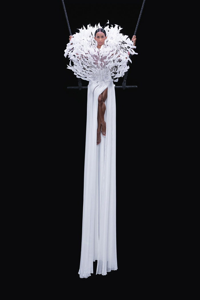
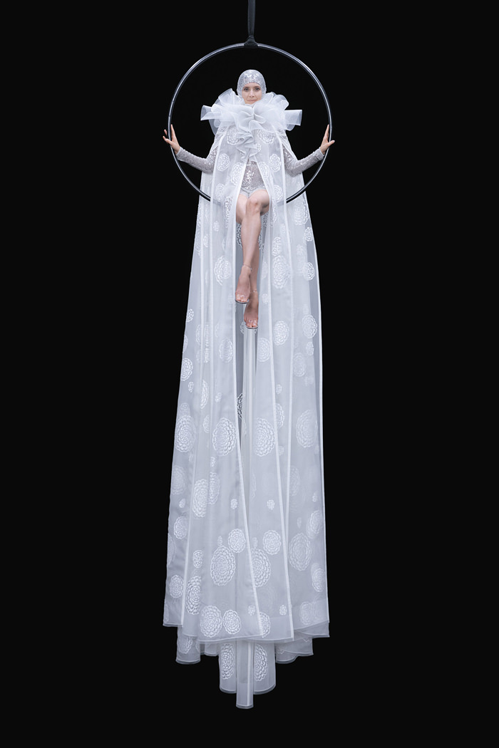
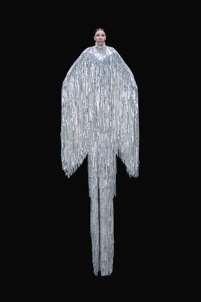
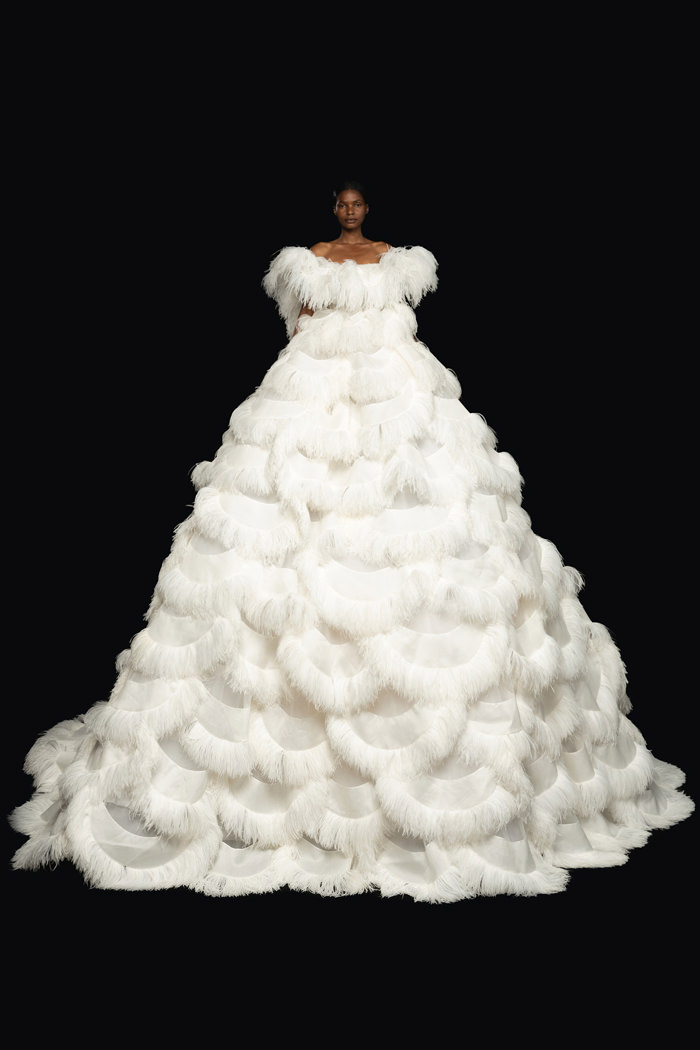
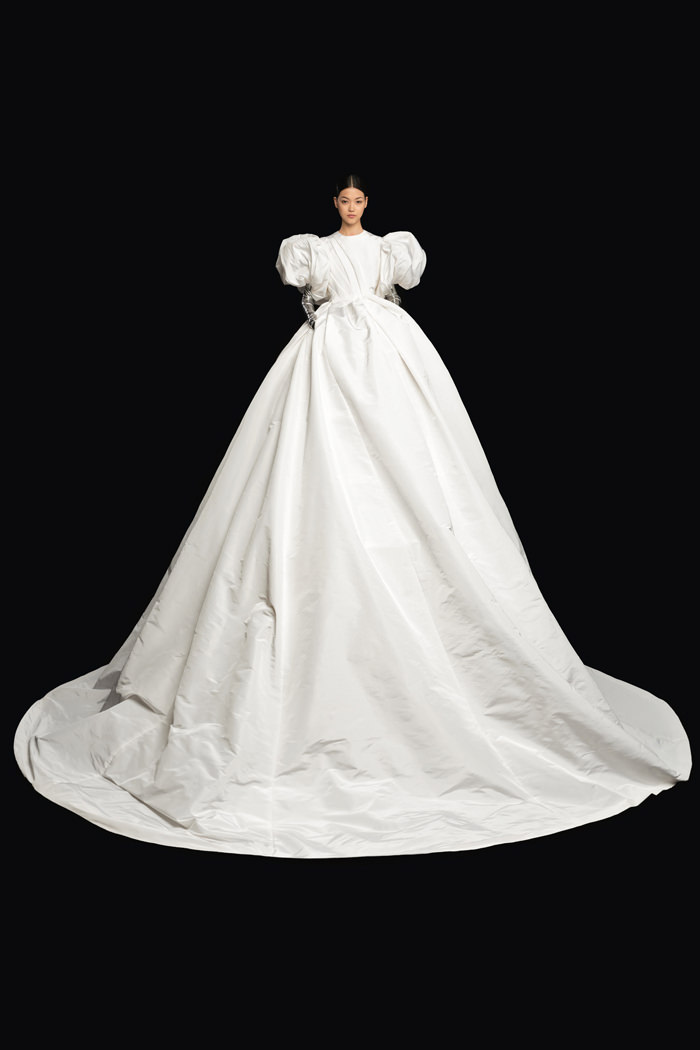
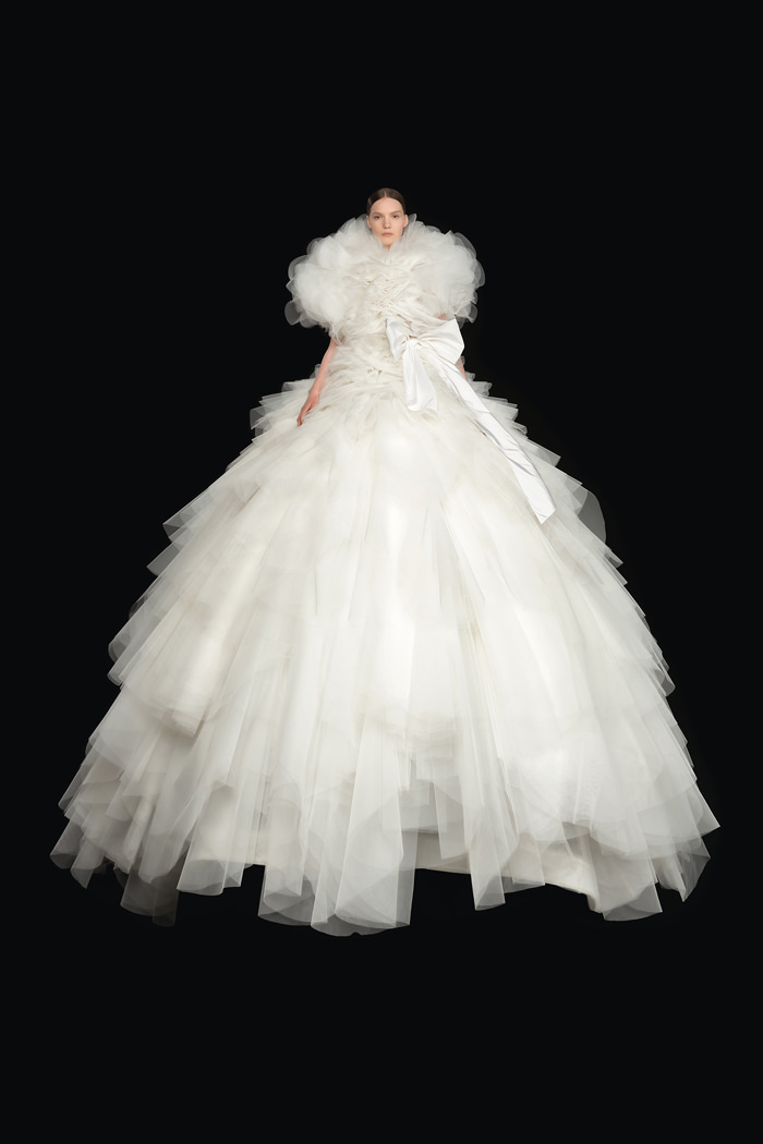
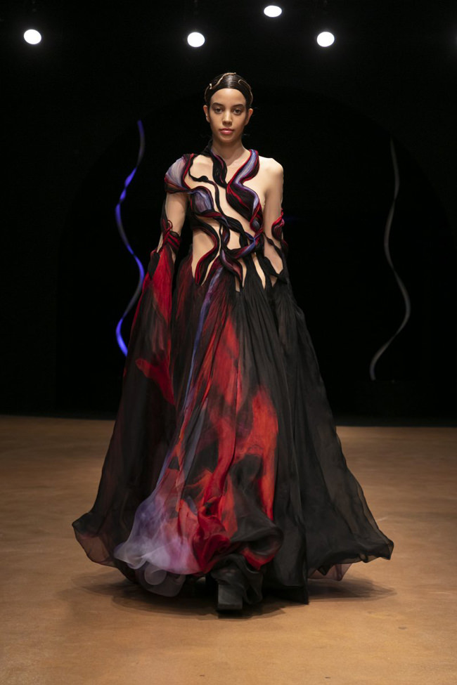
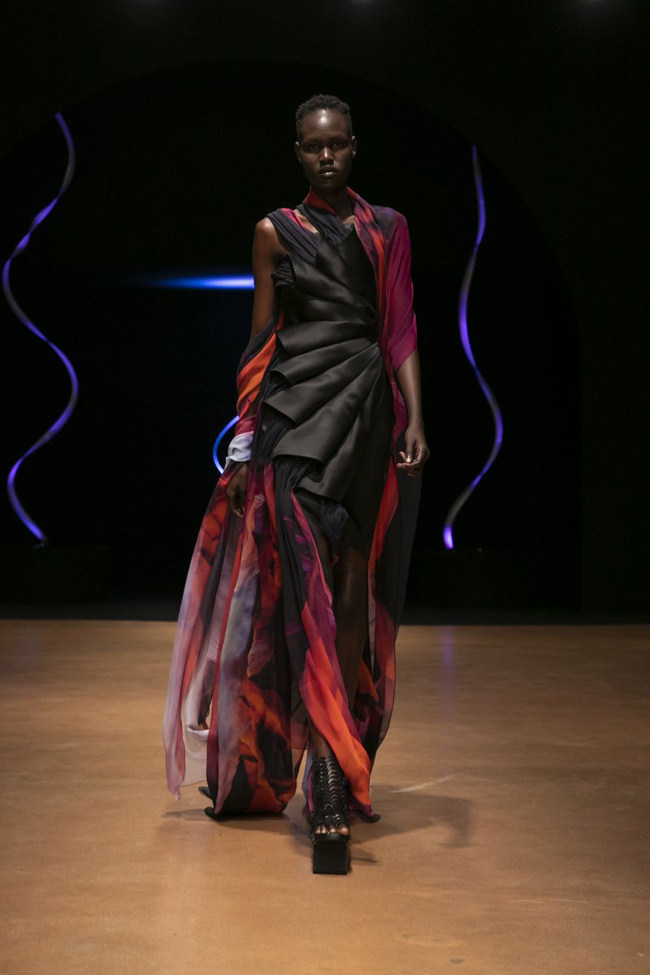
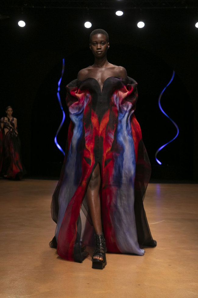
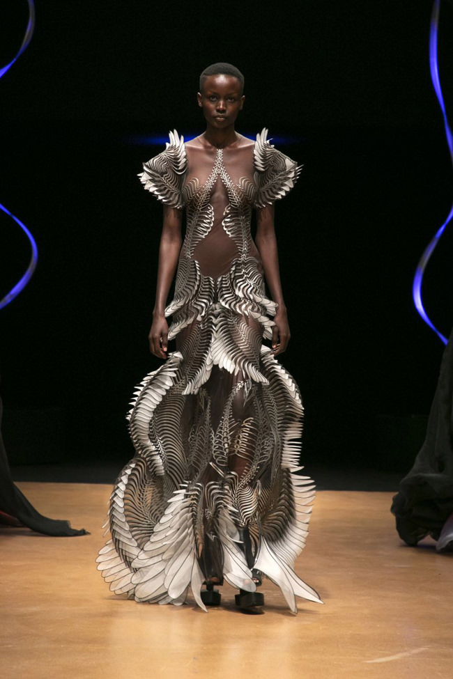
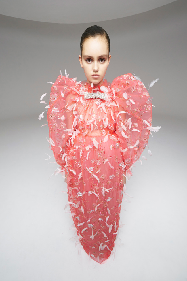
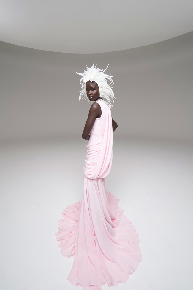
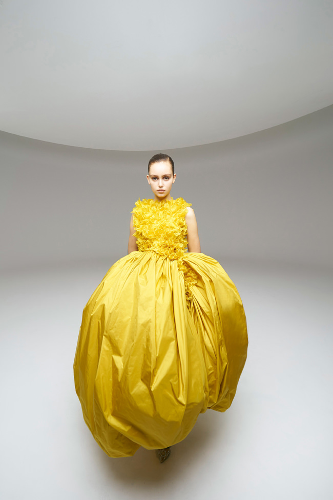
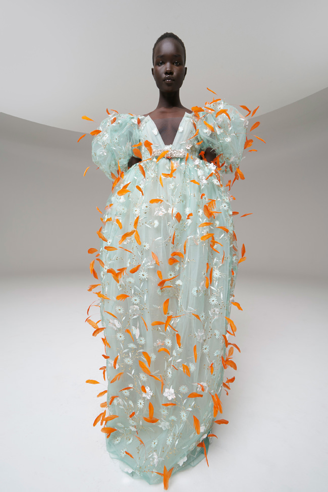
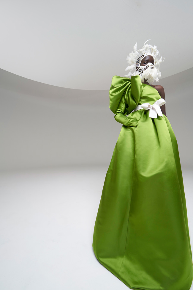
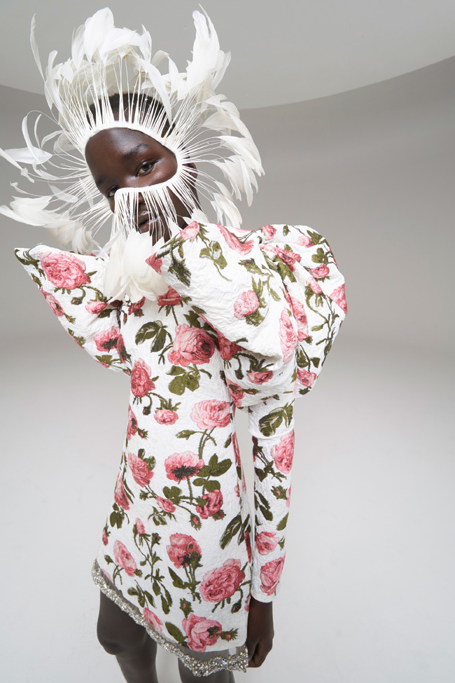
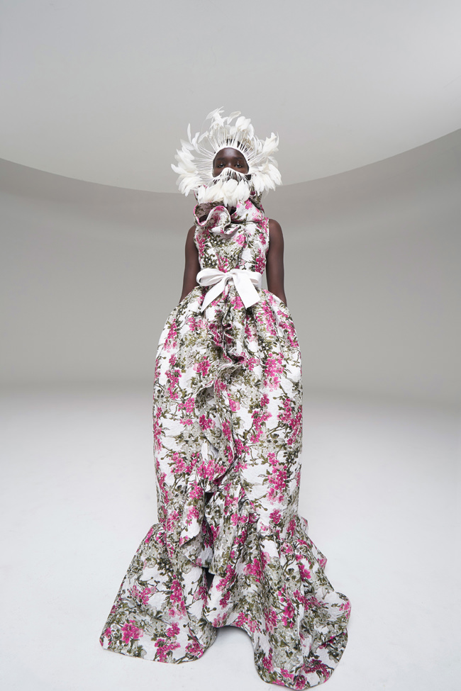
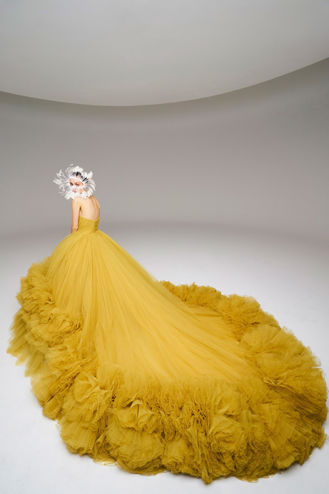
Across history, moments of reset, or restart, invariably put human values at the center. Humanism is the seed of rebirth.
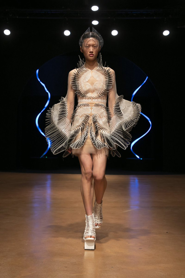
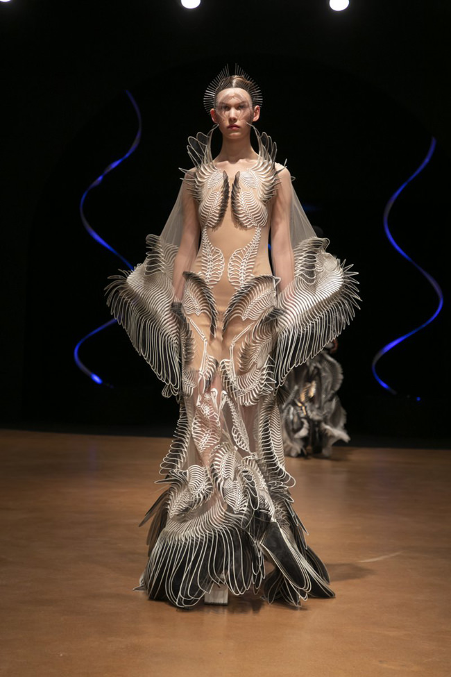
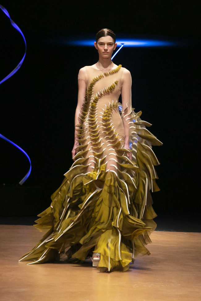
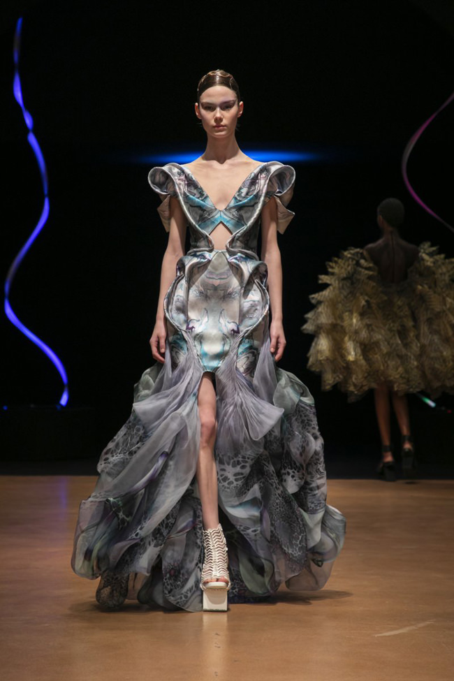
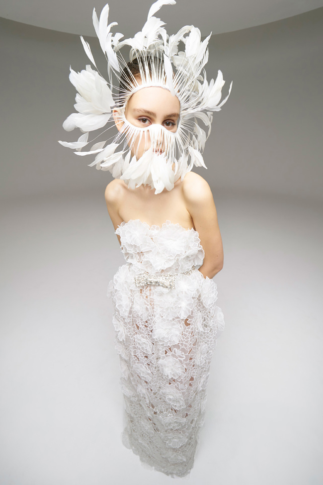
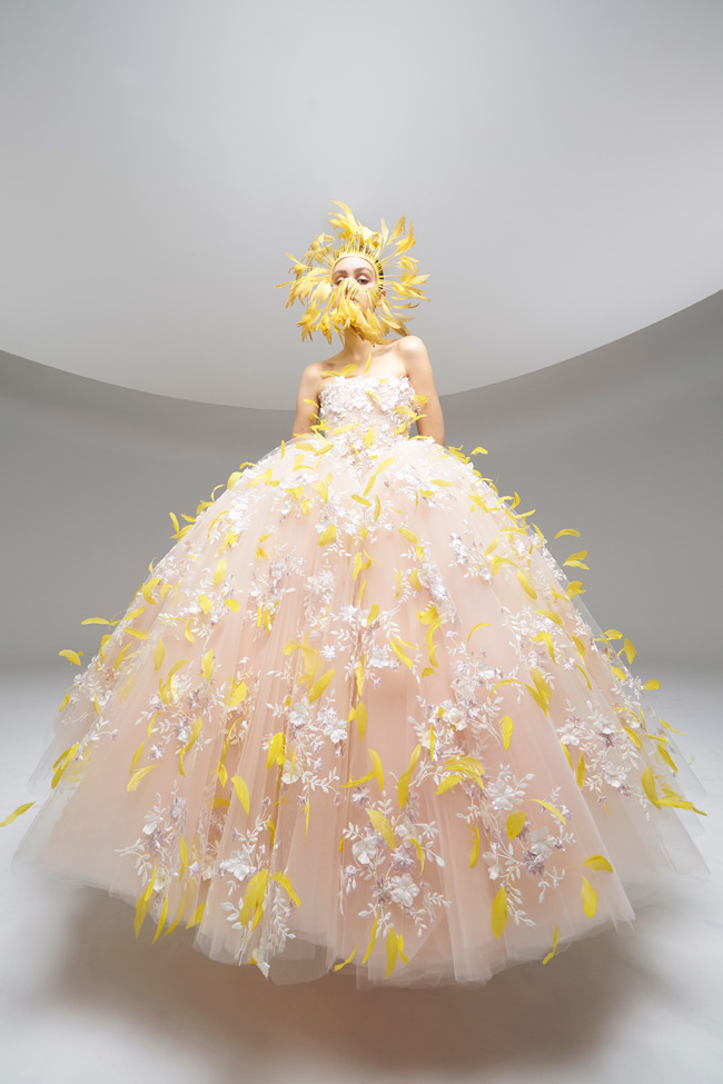
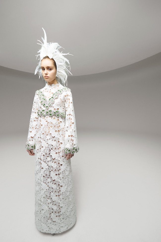
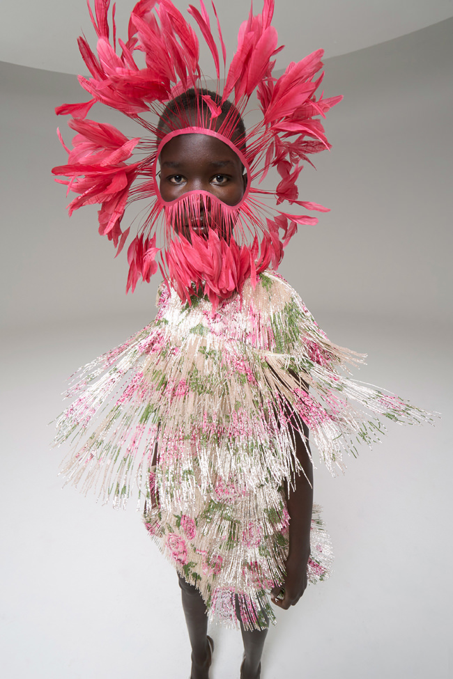
This is one of such moments. Focusing on fashion as the profoundly human activity of giving form to matter through the hands, shaping creations that the body inhabits and brings to life, Pierpaolo Piccioli conceives a new start in the space of fifteen silhouettes. He focuses on the human and lets it dialogue with the digital to create a new dream, at once material and immaterial. A dream of pure fashion in which the painstaking work of the Ateliers is handed over to artist Nick Knight to bloom and flourish in light.
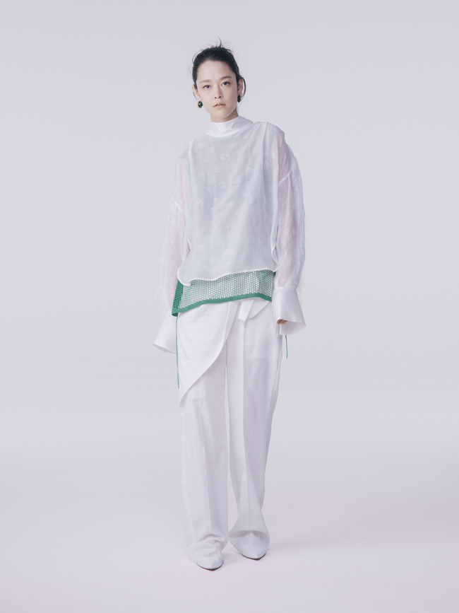
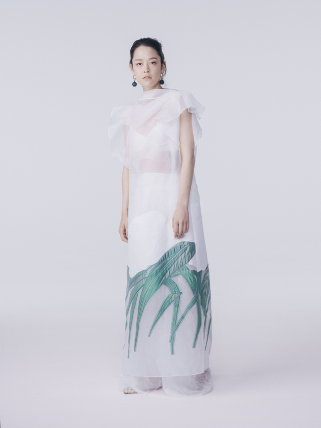
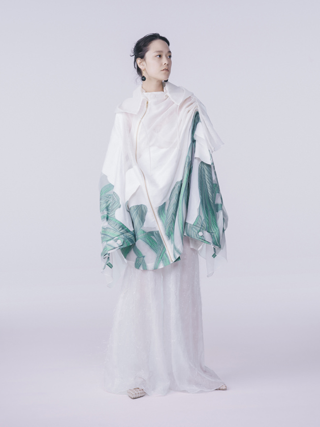
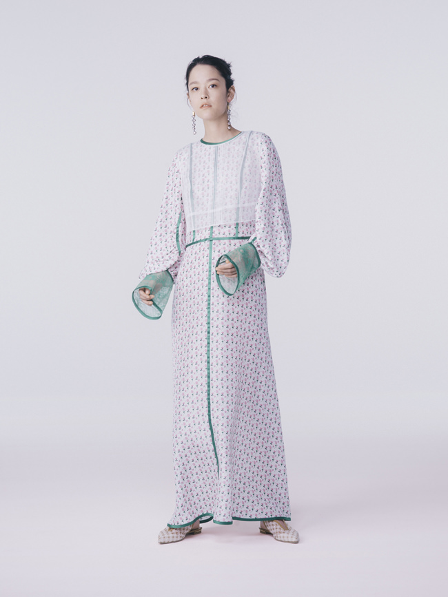
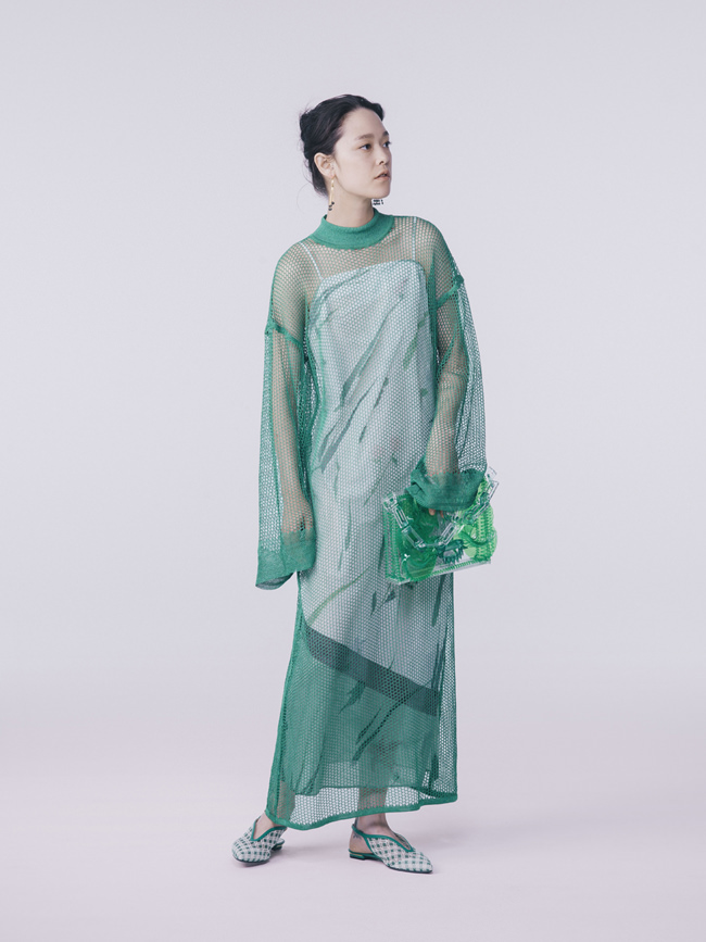
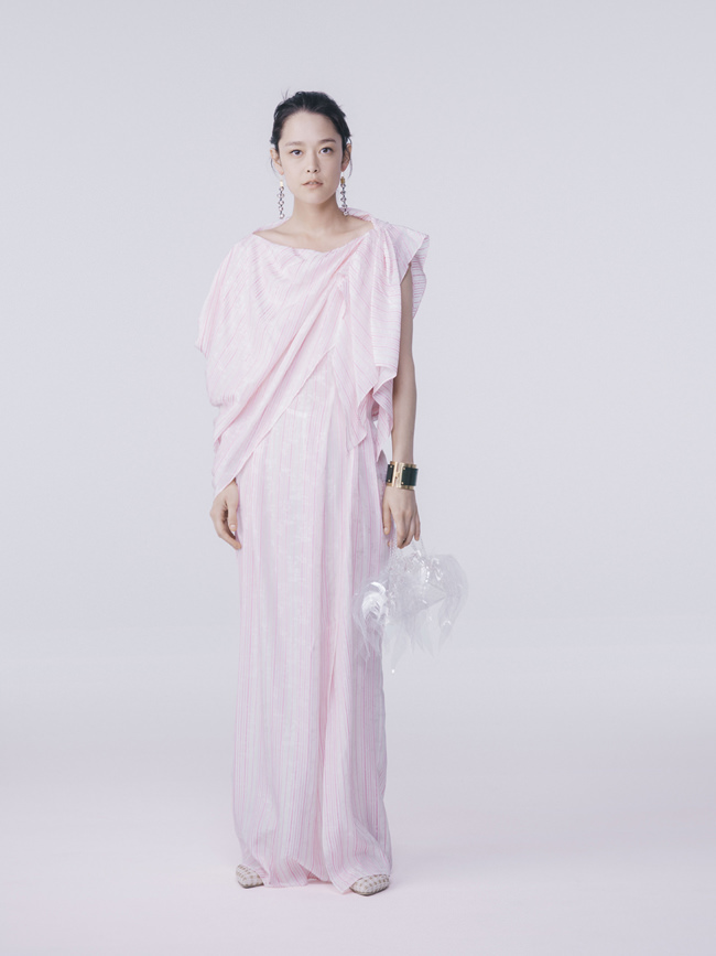
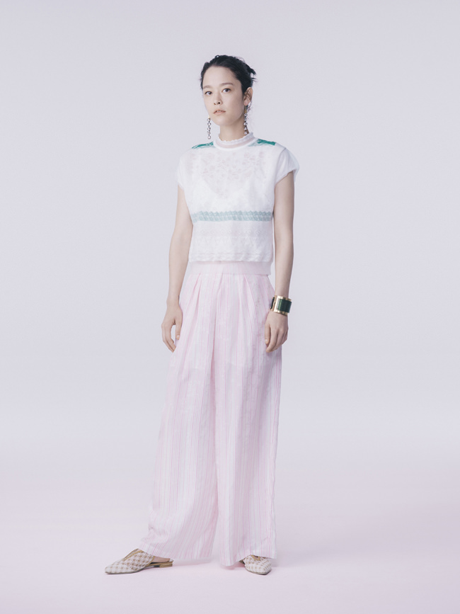
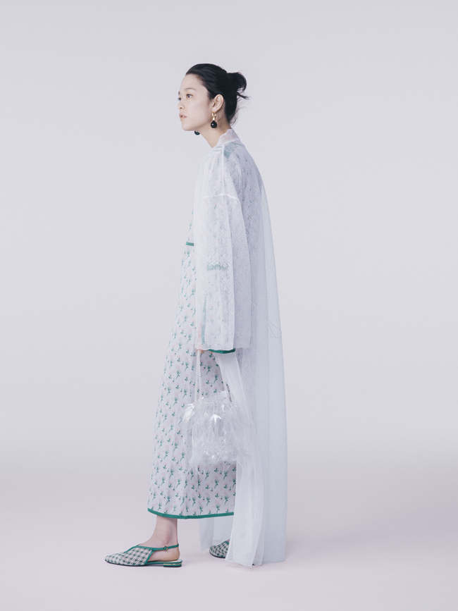
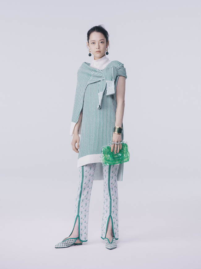
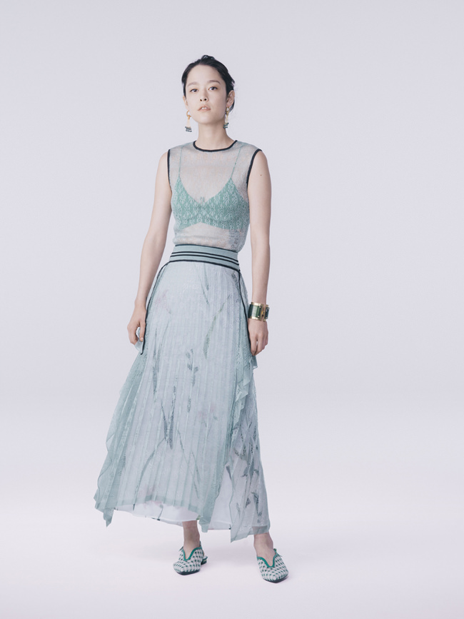
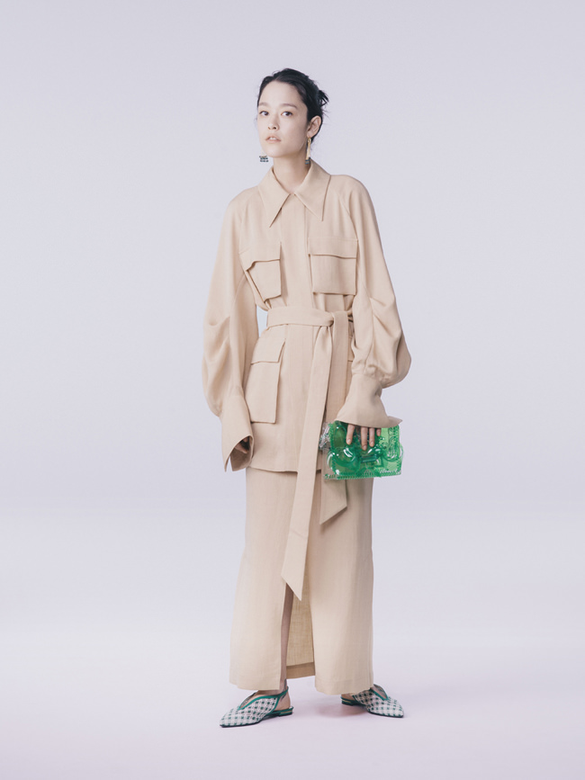
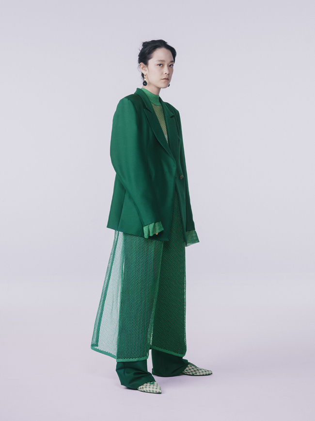
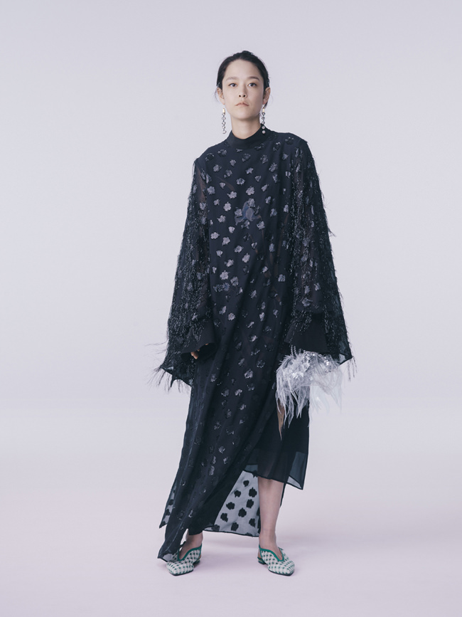
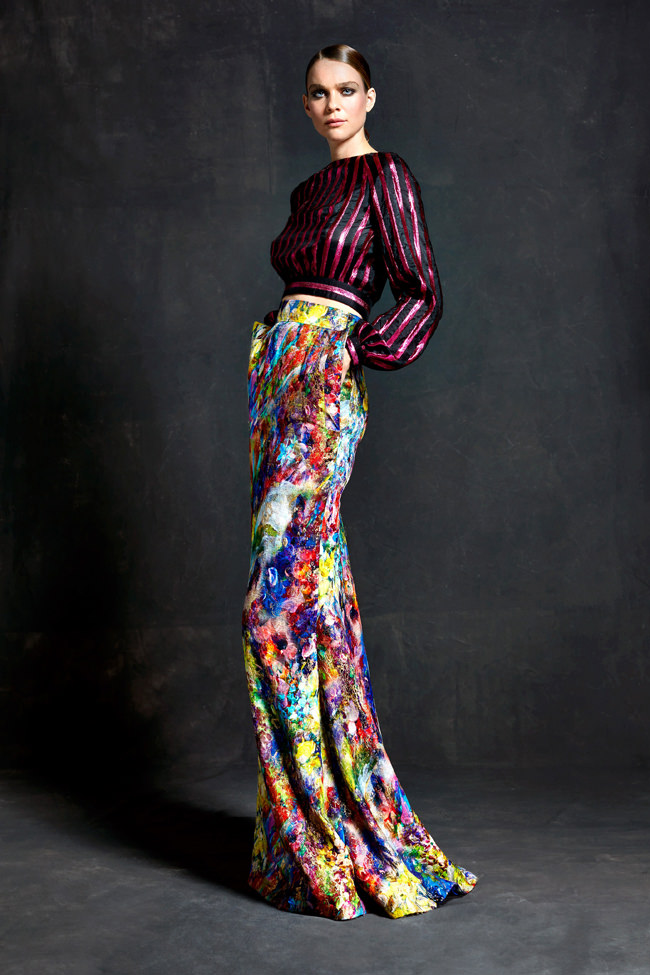
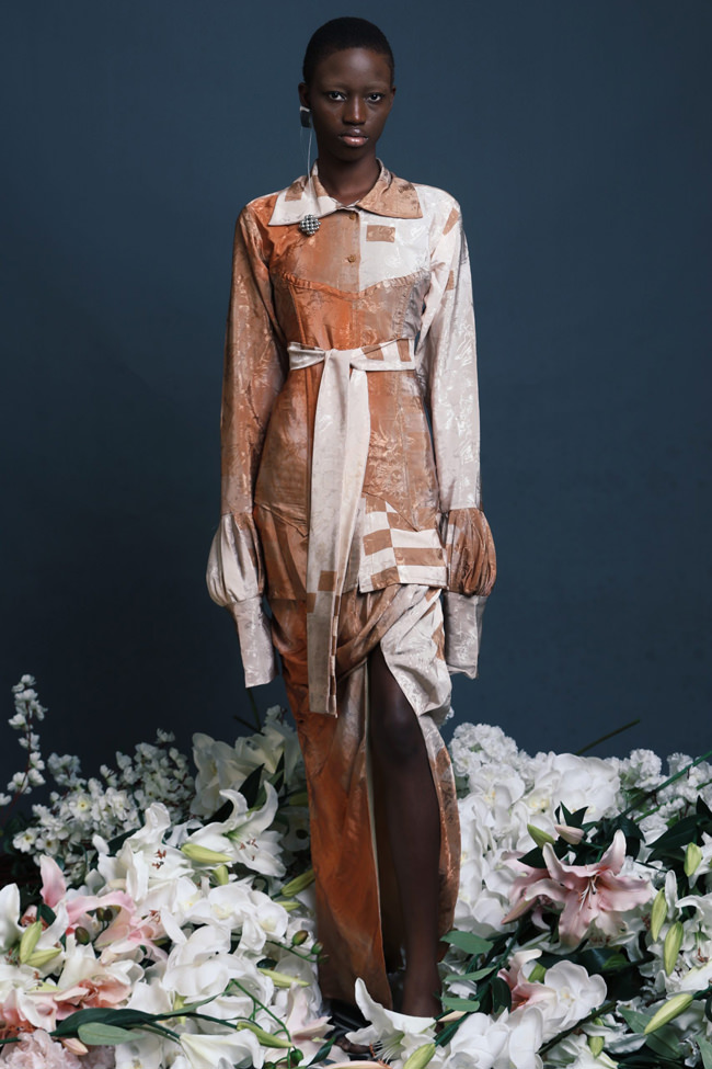
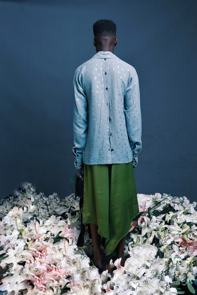
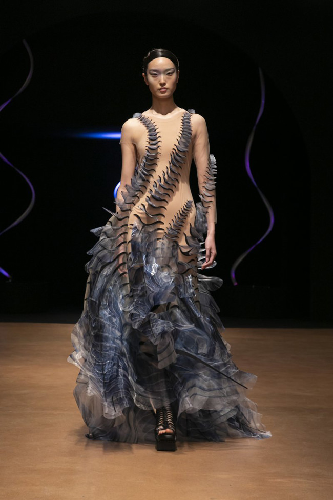
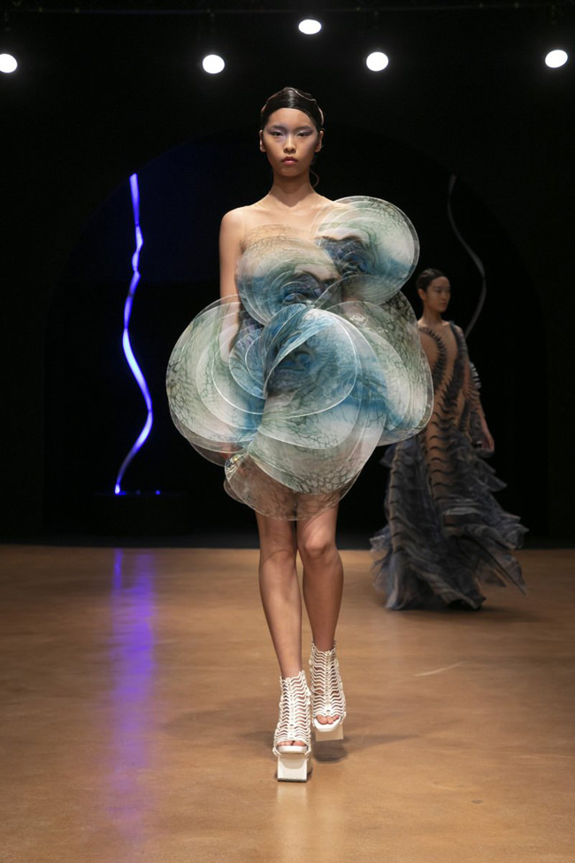
Maiko Kurogouchi is a designer based in Tokyo who launched her brand Mame Kurogouchi a decade ago and has overseen its rise to international acclaim and prominence. She won the award for Best New Designer at the 2014 Mainichi Fashion Grand Prix Shiseido Sponsorship and in 2017 claimed the Tokyo Fashion Prize. After graduating from Bunka Fashion College (which oversaw the design educations of Junya Watanabe and Yohji Yamamoto), Maiko Kurogaouchi worked at the Issey Miyake studio for a few years before launching her line. In the years since, she has cultivated a brand following among fashion insiders ecstatic over her 21st Century high-fashion approach using traditional kimono textiles and embroideries rendered in modernist shapes and styles.
From the description of her spring summer 2020 collection featured below:
The family of Kurogouchi used to grow silkworms during her grandmother’s days. Silkworms were treated as a sacred being with respect as they brought business to the family. Silk is considered to be a normalised material, but back then, it would take 3000 cocoons in order to weave a piece of Kimono garment.
While, Silk has had a special place in Mame Kurogouchi’s design, she has come to think without doing it themselves, she couldn’t understand the challenge of weaving a textile using cocoons. This realisation drove her to plan growing 30 silkworms at her atelier with the team, and name them Shiro (white).
Silkworms are sensitive and delicate beings. If one gets sick, it affects others. In order to turn cocoons into yarns, it would have to be consistent which is why producing silk on commercial basis is challenging.
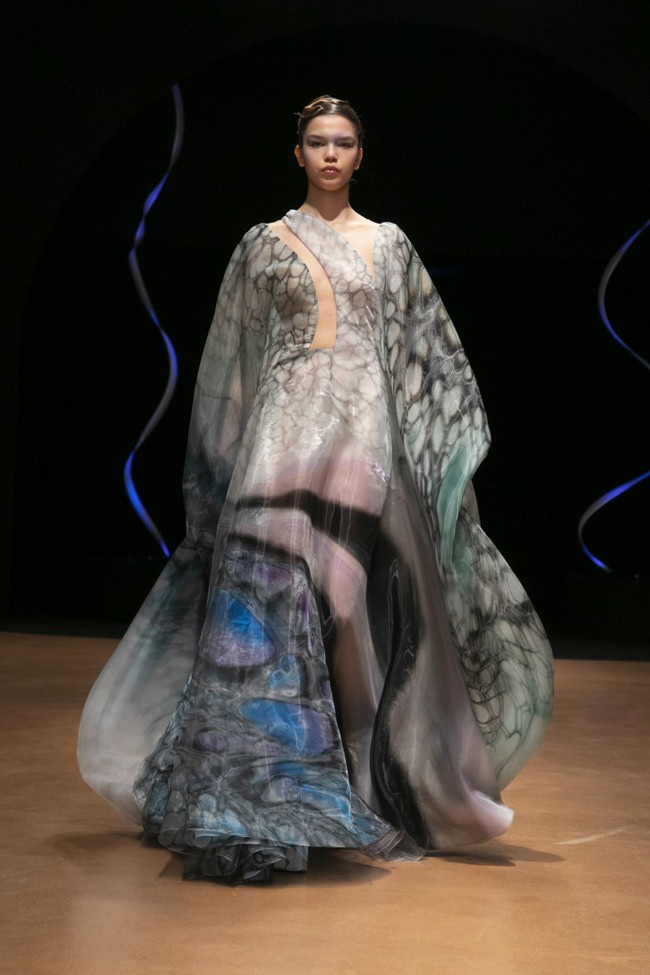
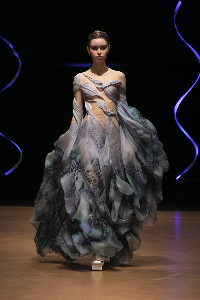
Newborn silkworms are so small that are almost invisible but through five molting process, they become 25 times longer and 10,000 times heavier. And before it starts to blow fibres into the air and around them, its body becomes transparent. Yarns came out of Shiro’s mouth had sparkles, reflecting lights around them. Kurogouchi wanted to make a garment that would wrap one’s body gently by breathing soft light into the body, just like how Shiro transformed itself by wrapping its body with shiny transparent yarns. She went to a weaver in Komatsu Ishikawa, the only weaver that can produce silk jacquard, and came away with a delicate sheet of textile she was looking for. Using silk and shinny flat yarn for the warp and silk yarn for the weft, weaving together, and two types of the jacquard textiles were made thanks to the idea of leaving the shiny yarn uncut. The black one provoked the image of a dark night in Amami, brightened by nocturnal insects.
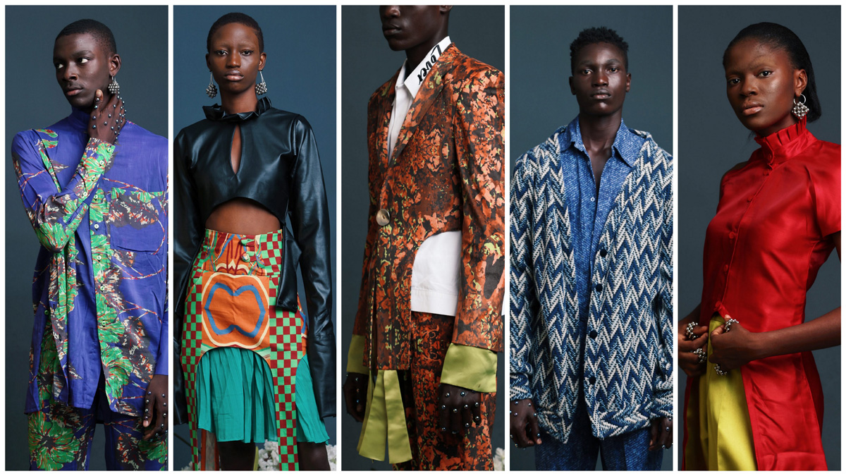
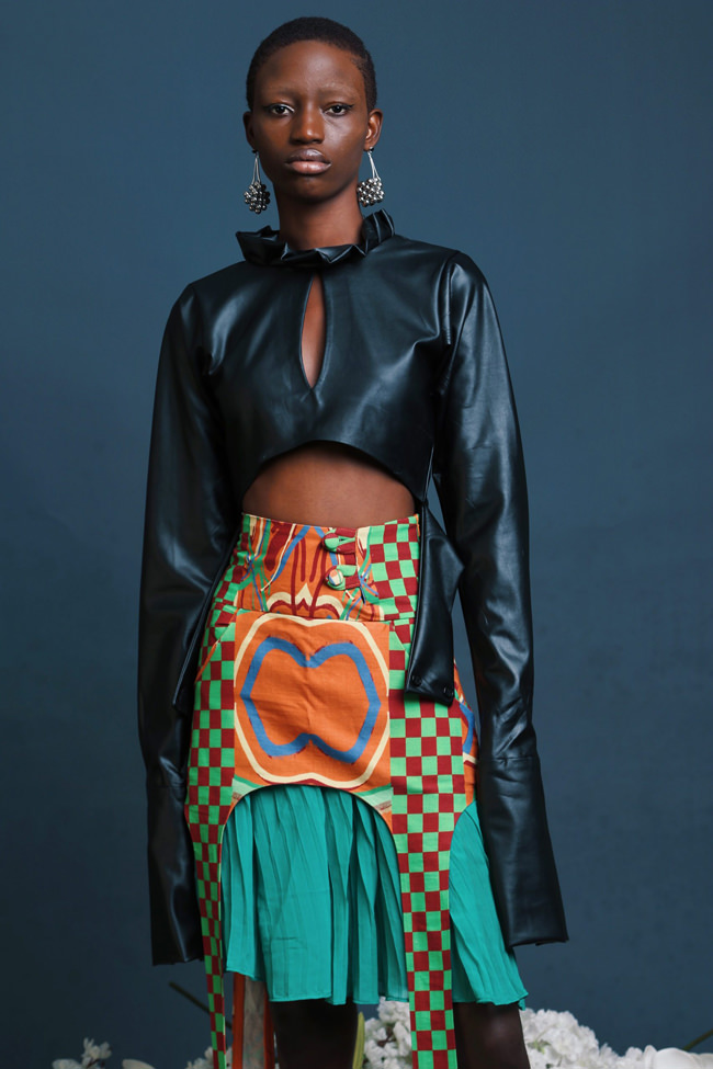
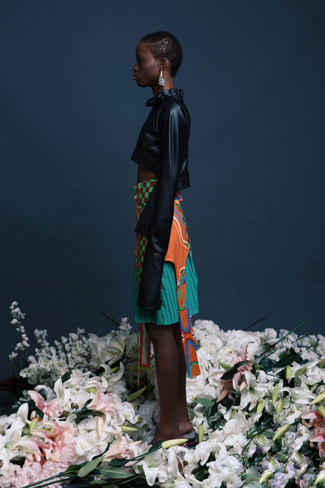
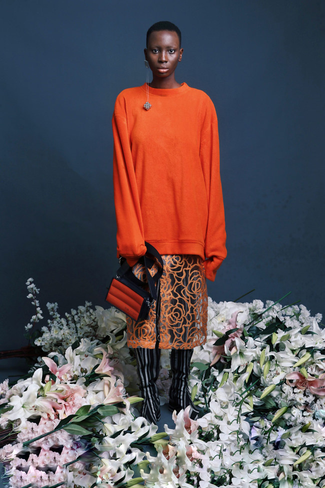
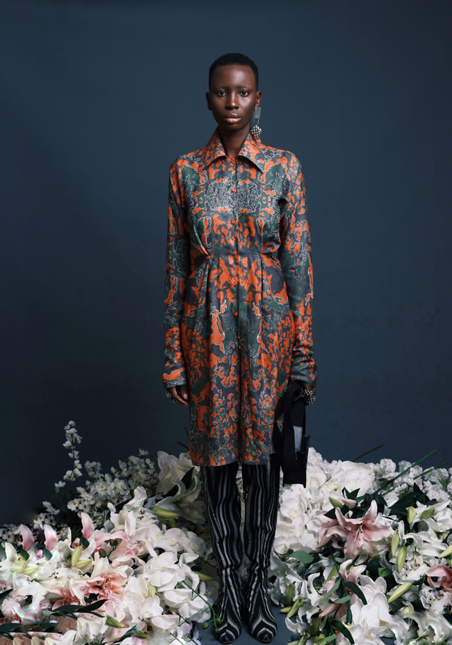
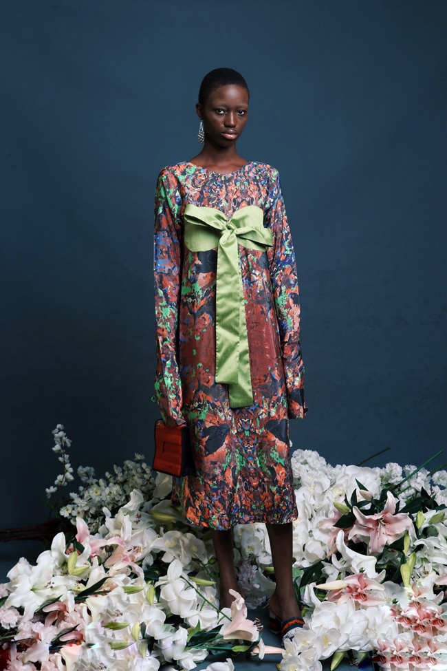
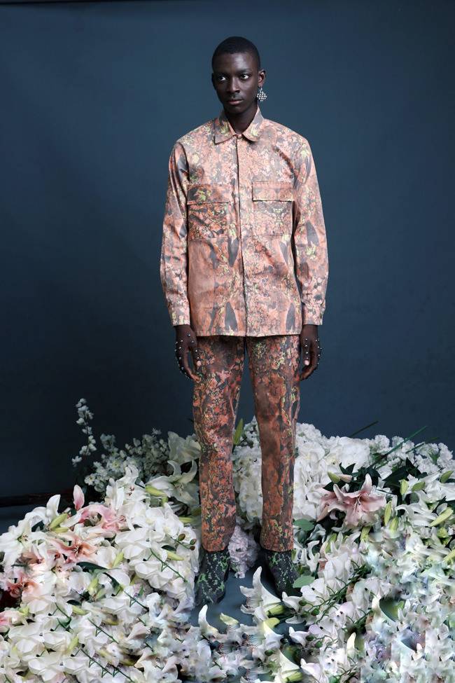
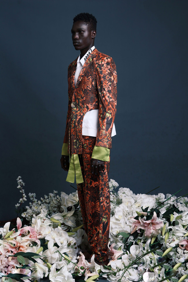
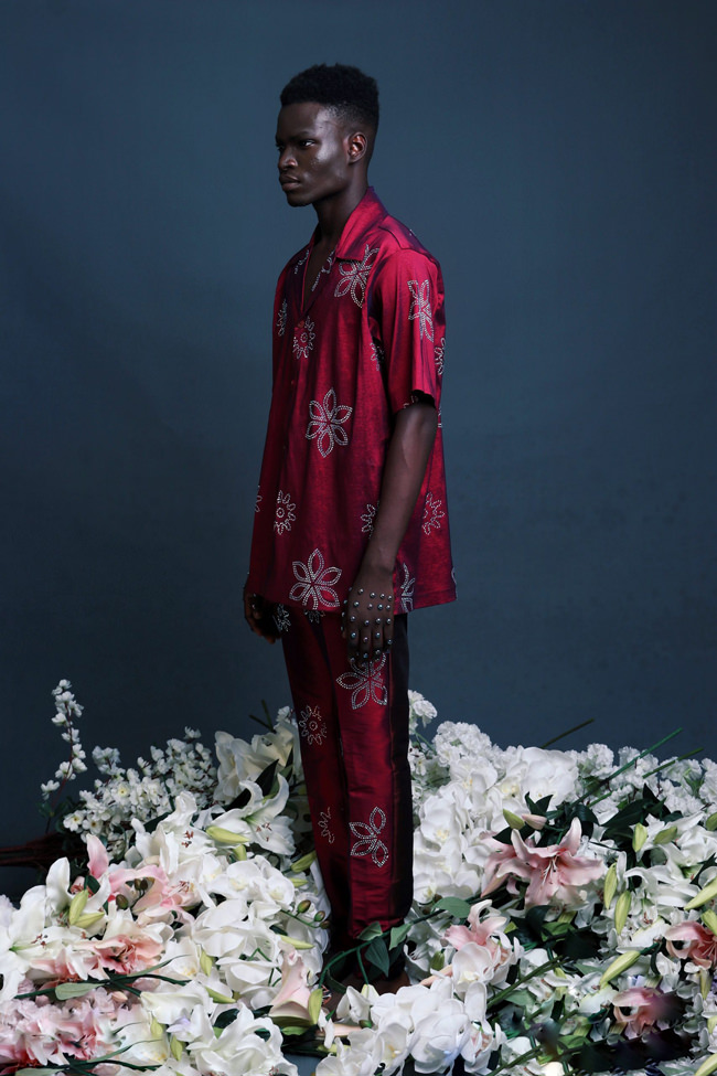
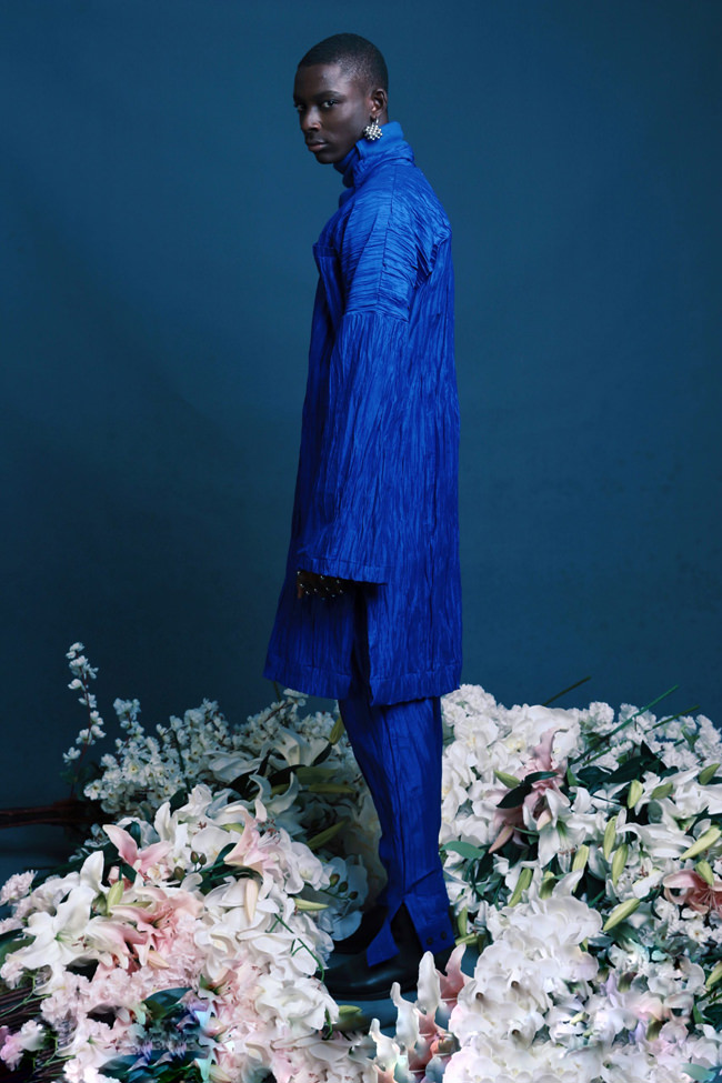
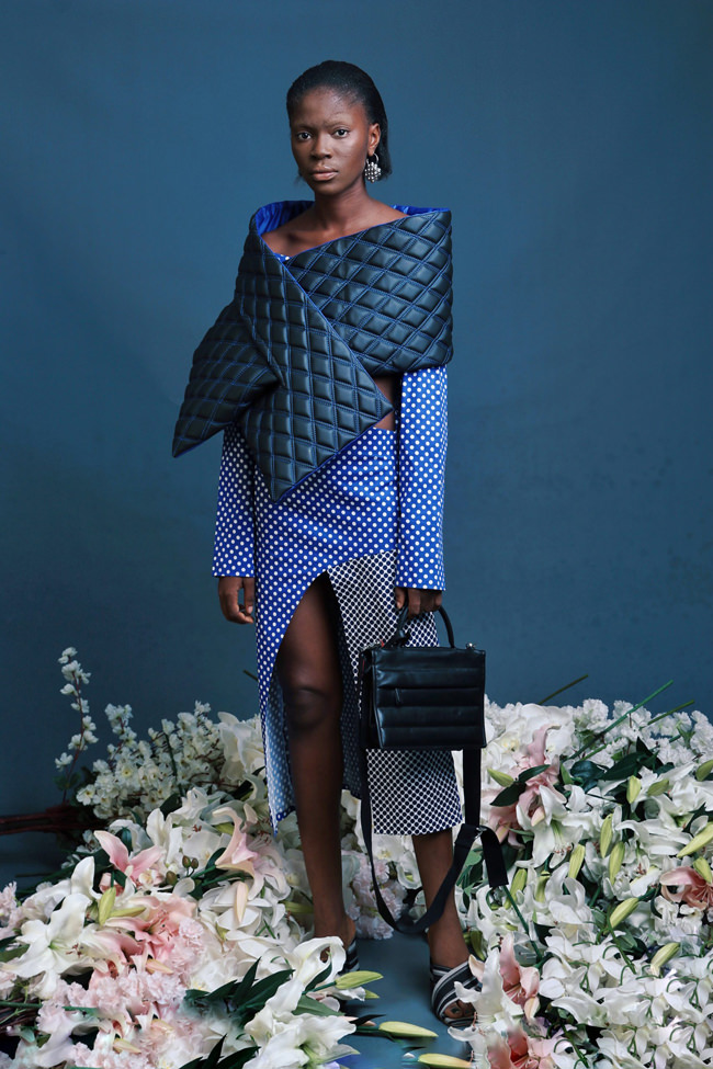
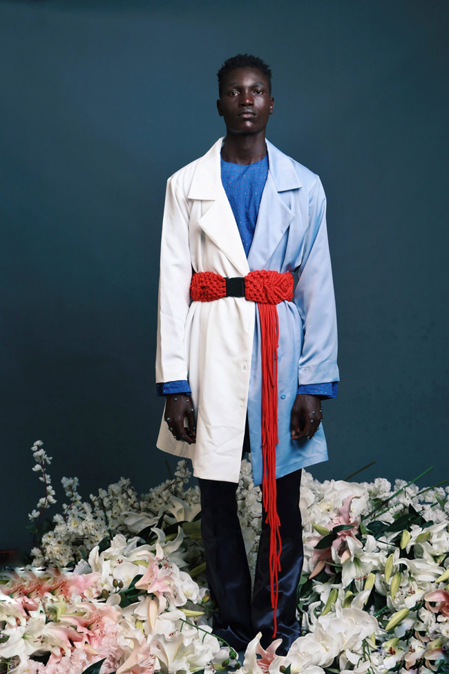
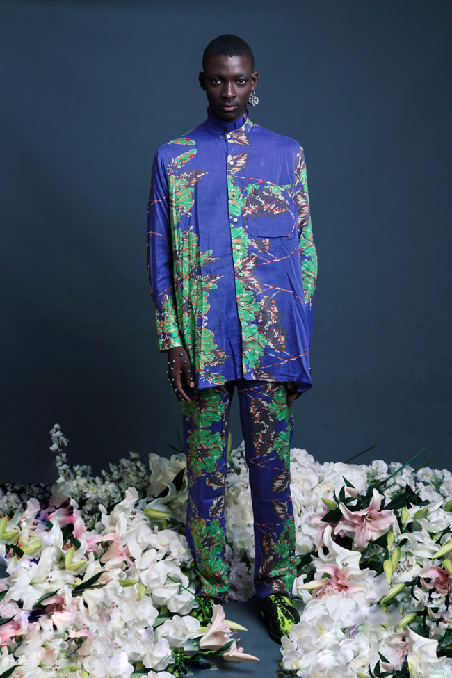
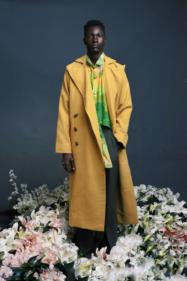
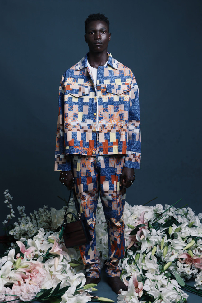
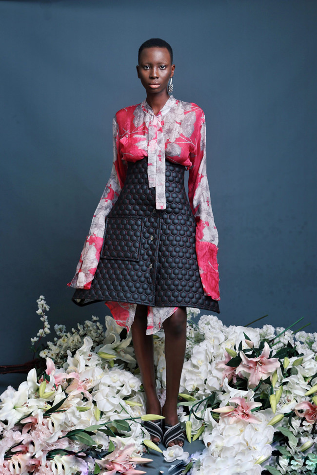
Adebayo Oke-Lawal has been designing since the age of 10. He started Orange Culture in 2011, after having worked with several Nigerian designers, to turn his unique vision of fashion into reality. Since starting the label and an official runway debut at Lagos Fashion & Design Week 2011, he’s been hard at work trying to showcase Orange Culture to the world. The label is more than a clothing line, Adebayo insists. It is a “movement” that covers universal silhouettes with an African touch to a creative class of men, translating into a heady mixture of Nigerian inspired print fabrics, colour and contemporary urban street wear.
In the years since founding Orange Culture, the self-taught Adebayo Ole-Lawal has been quietly but forcefully pushing his vision of colorful, challenging, androgynous fashion on the world, in a mission to deconstruct or re-examine traditionally masculine modes of presentation. His work challenging gender norms and masculinity has been met with some pushback, but he doesn’t seem remotely concerned with it. As he told Vogue last year:
“We had, and still have, some problems. The way society is in Lagos…we’re used to very specific ways of seeing things. Gender is an exact way of thinking back home and has been for a very long time. Things have been written in the press that say Orange Culture is ‘feminizing our men’ and that we’re going to hell because of it. Now it’s just, like, I don’t care, you can write it. I’ve been doing this for years, and it is working, and it is still growing. If you have a problem with a man wearing jewelry or an oversize blouse or painting his nails, that’s your problem. It’s not Orange Culture’s!”
And while his androgynous clothing may be the more notable or press-worthy thing about his work, there’s no denying his slightly more traditional manifestations of womenswear and menswear still manage to be challenging and eye-popping in a way that feels so new it’s pre-new.
WBUR reports a site that tracks Covid-19 transmission says Massachusetts has an Rt rate of 0.67, which means that many people who test positive are not spreading the virus - a rate of 1.0 would mean that an infected person has infected just 1 other person. This is a good thing, obviously.
Annie, the voice of songs such as "The Greatest Hit", "Heartbeat", "I Know Ur Girlfriend Hates Me" and "Russian Kiss", is finally back. This is the first release of the Norwegian singer ever since her latest EP, Endless Vacation, in 2015. It's a slower song than your average Annie song, as it is pretty much a downtempo, but you still can see her identity there.
Not only that, she also announces a new album is on the way, the first since "Don't Stop", in 2009. It was produced by Stefan Storm and was defined by the singer as “the soundtrack to a film that doesn’t exist”.
01 In Heaven 02 The Streets Where I Belong 03 Dark Hearts 04 Miracle Mile 05 Corridors of Time 06 Forever ’92 07 American Cars 08 Mermaid Dreams 09 Stay Tomorrow 10 The Countdown to the End of the World 11 The Bomb 12 The Untold Story 13 It’s Finally Over
Bella Luna Restaurant and Milkyway Lounge, which survived a traumatic move from Hyde Square to the Brewery complex, couldn't beat Covid-19: It announced today it's shutting for good because the very nature of its business - a social gathering place - is now untenable due to Covid-19 concerns.
The mission of our business is to gather people together in groups, to foster social closeness - the opposite of social distancing. Gathering in groups is not going to be a safe activity until there is a widely-available vaccine or treatment. We are not comfortable putting our team members and guests at risk of contracting the virus while working and dining in our space. Also, the public health hazards of Covid-19 will exist for over a year; and without being able to operate at full capacity, our business is not financially sustainable.
The restaurant and lounge became a JP meeting spot over its nearly 28-year history, and continued even as it had to shut its candlepin lanes and pick up and move several blocks away in 2008 after a rent dispute with its Hyde Square landlord.
Thank you for making Bella Luna & The Milky Way your second home, for becoming friends with us and our team, for celebrating life’s most precious moments with us. It has been our honor to serve you all.
We are proud of having created a vibrant and safe space for all, founded in the values of generosity, inclusivity, creativity and respect. We are proud of our team members, past and present, who worked with tremendous dedication and commitment to carry out our special brand of hospitality with a purpose. We are proud of our wonderful promoting partners and the countless talented performers who expressed themselves through music, dance, art, spoken word, opera, crafts, comedy, story-telling & fashion, and to all who came to witness and celebrate that talent. Thank you all for having fun and creating community in our space. We are proud of having used our business to support so many amazing non-profit organizations and individuals working to build a better Boston; thank you for giving us the opportunity to help.
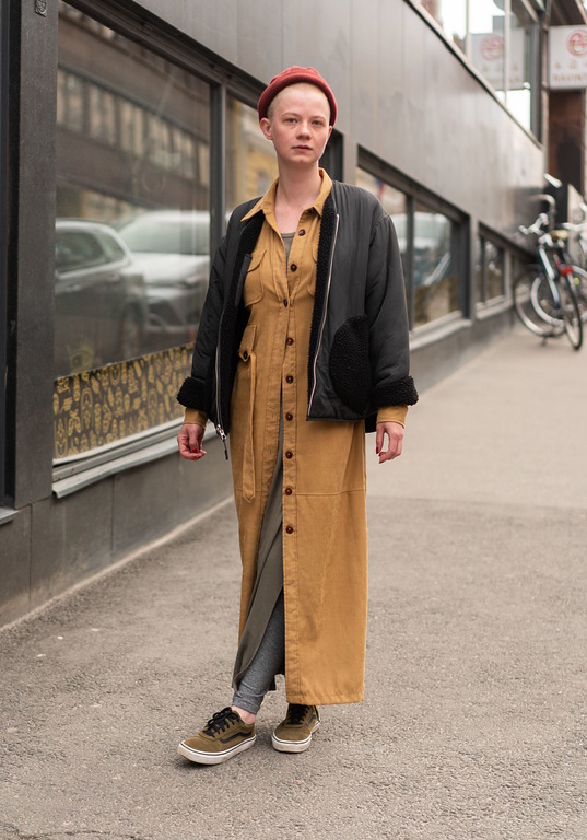
“I'm wearing a mixture of everything. The beige jacket dress is my latest vintage found. I'm inspired by classical feminine business looks and the tomboy style.”
- Karlie Kloss shared a quote from Instagram poet Cleo Wade encouraging people to call out racism within their own family - Tavi Gevinson, actress/writer/etc, left a comment pointing out Karlie has no problem associating with her in-laws, the Kushners and the Trumps - Karlie ignores Ivanka's comments and posts on social media but still associates with Ivanka and Jared in private - Tavi points out Karlie can't have it both ways
Transcript of Tavi's comment in case Karlie pulls a Lea and deletes it: "Karlie, give it a rest. You have a lot of nerve to make a show of championing girls‘ coding and your other causes while only politely disowning your family in public (lmao @ you ignoring ivanka on social media; she still went to your wedding). I can’t believe you’re not more embarrassed not just by them but YOUR decision to only publicly disown their politics in polite ways so you can have it both ways. I don’t know what kinds of conversations you have behind the scenes (besides when Jared asked your dad to solicit solutions to a global pandemic in a Facebook group back in March 😂) but like.....what am I looking at. This is a fucking joke."
Remember two weeks ago when we shared the tour of this kitchen and laundry room? And everyone LOVED it (including us). WELL, that house is back, and today we’re sharing the rest of it.
If you missed the last post, you should 100% go check it out, but here’s the quick recap – Allison and Benjamin bought this cute home back in 2018. Over the course of a year they freshened the whole place up without ripping out any flooring or tearing down a single wall. And yet, through the magic of paint, wallpaper, new hardware, beautiful vintage pieces, and hard work, they managed to give new life to their home. I think what we all collectively love so much about this home is the fact that Allison and Benjamin worked with what the house already had, versus starting over. I feel like there’s this standard in the design world that when a house is bought the new owners are expected to have all these plans for how they want to change the property they’ve just purchased. But, not only is that not financially viable for every home buyer, it’s not always necessary. Some homes are great as is, and just need some tender love and care to really shine.
Allison was once again kind enough to chat we me, interview style, about her home transformation. And just like last time, I’ll be in italics (mostly for the cool factor, but also to make it clear who’s “speaking”). Let’s get into it…
I’ll start by saying that your home already some very cute features, and good bones (like the parquet style floor in the entry). But, even with those moments considered, you didn’t change much in terms of structure in the home. Could you elaborate on why you kept so much of the homes original architecture? Was that a stylistic decision to keep as much of the original character of the home intact, or a budgetary decision?
Hot Tip
Old, dark wood paneling on the walls or ceilings making a room feel too heavy? A fresh coat of white paint will brighten the space, while still keeping the character and texture of the paneling.
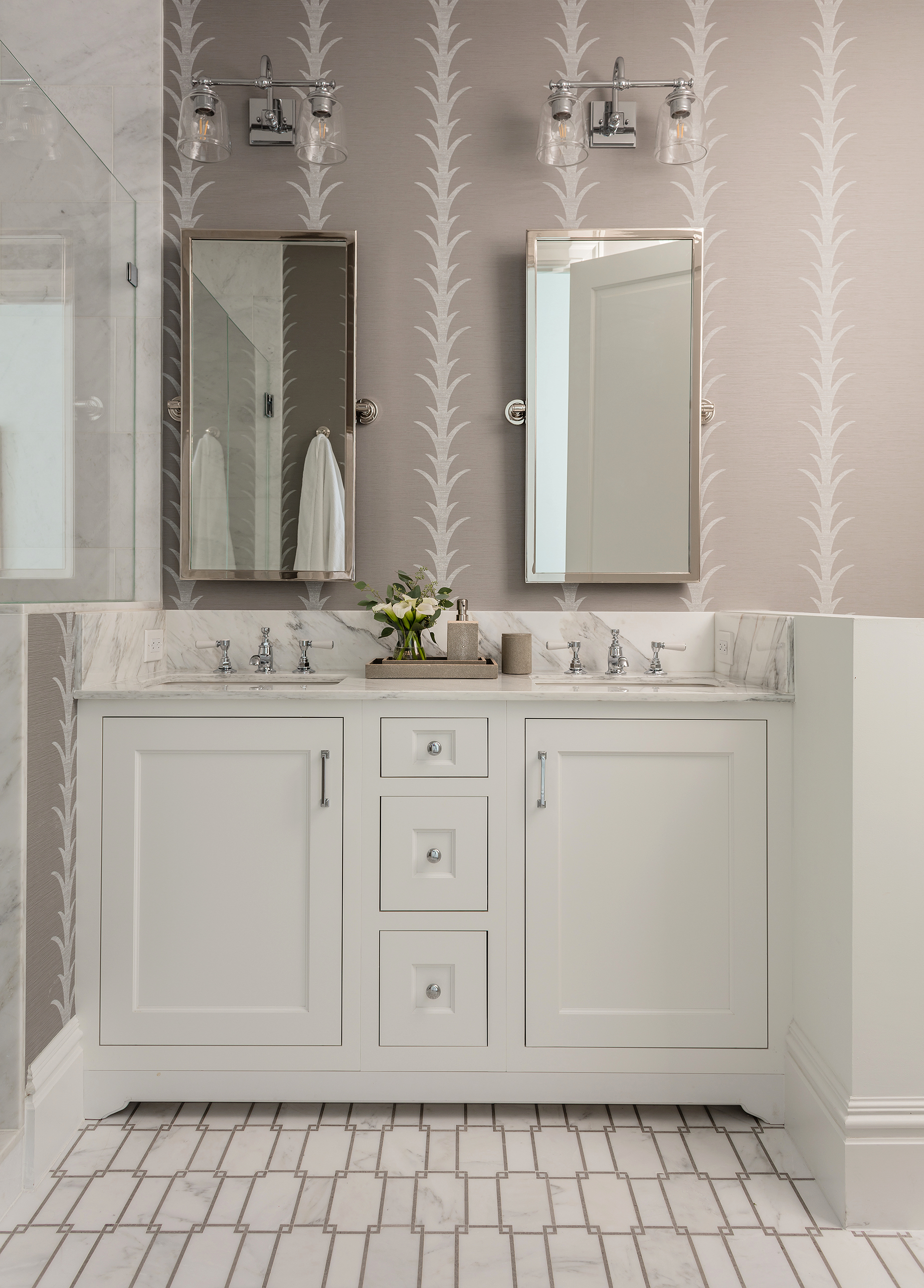
It was a bit of both! The house has so many lovely features that are original to the house that I wouldn’t have changed if you had paid me, like the scalloped vent over the stove in our kitchen that I am OBSESSED with. I had initially wanted to renovate the bathrooms. But to do them the way I really wanted to was decidedly out of our budget.
Let’s jump right into those next then, because they are two of my favorite moments in the house. Both bathrooms are really extraordinary – any story to deciding the stylistic direction behind either of them?
I think the biggest challenge in the home was figuring out how to give the original tile in the bathrooms new life
When we first moved in I looked into renovating both the master and guest bathroom, but realized it was not in the budget (and wouldn’t be for a while). I had wanted to open up the master bedroom to the master bathroom, which you have to enter via the hall, to make it en suite. But to do it how I wanted it would have been well over $50k. So I thought, “how can I make these beautiful, feel more functional, and bring new life to the original tiles?”
This is what the master bathroom looks like now (above). I almost put up chinoiserie wallpaper, which would have been gorgeous, but there is no exhaust fan in there so it would have been a mess (wallpaper and moisture don’t mix – but if you get a good fan you can do it). My sister suggested painting the walls blue to compliment the blue tile. It was a bold decision, but I experimented with it, and ended up using Farrow and Ball Inchyra Blue. I absolutely love it.
We think that keeping things tonal (with a moody element) was the way to go with that lighter blue tile. Now it looks sophisticated and modern but still looks like it belongs in her wonderfully vintage home.
I was not very fond of the yellow tile in the guest bathroom at first, but I really love it now with the red and white ticking wallpaper. I used Farrow and Ball Red Earth on the doors and molding and it is a very happy combination. I folded up a yellow scarf I found at St. Vincent De Paul’s thrift store and nailed it up to make a valance. I also had this one roll of vintage Schumacher chinois wallpaper that I was dying to use but didn’t have enough for the whole room so I put it on the wall behind the toilet, and it seems to work together!
These two bathrooms were my least favorite rooms in the house, and they took the most creative juices to get them right. But now I love them so much that I don’t think I’ll ever want to renovate!
Hot Tip
Mixing wallpaper patterns is the same as pillows or bedding - Make sure to vary the pattern scale so they don't visually compete. Allison did it perfectly with these two.
One of the changes that was made by the real estate agents to prepare for the sale was to remove the original sink in the guest bathroom (so sad) and replace it with an IKEA cabinet. I found a vintage pedestal sink with a gorgeous vintage brass faucet on Craigslist for $200, and it made all the difference in the world.
When you moved into the home did you have a budget in mind for any of the improvements you wanted to implement? And do you mind sharing what that was?
Hot Tip
If you have wall to wall carpet in your home or rental that you're not a fan of, but can't remove, just throw another rug right over it. A layered rug will steal the attention of the eye. Just make sure the piles are different. A flat weave or big fluffy flokati rug are good options - just choose something with big contrast from the traditional pile of wall to wall carpet.
I did not have a specific number. In the end, I think we spent about $20k, give or take. That included the appliances in the kitchen, labor to paint and install wallpaper, all the hardware, and supplies for the entire home.
What aspects of your updates do you think made the biggest impact throughout the house?
Our house had been in one family since it was built in 1939, which is why so many of the original features were still intact (like the cute built-ins in the dining room). We didn’t want to lose those. In the end, I think putting colors and patterns on the walls made the biggest impact, without sacrificing any of the original character.
Hot Tip
Try matching your trim to a tone in your wallpaper (other than white) for a bold, yet pulled together look.
I love color so much and it never ceases to amaze me how it can transform a space. Choosing the right color, though, is quite a challenge and can drive a person completely insane. But when you finally find the right one, it’s like angels singing!
Where did you source all your amazing wallpapers from, and what paint colors have you used throughout the house?
I looked at SO MUCH WALLPAPER. I was dreaming wallpaper by the end of it. wallpaperdirect.com and decoratorsbest.com are my go-to sources. They’ve got pretty much everything you could need, and sometimes at lower prices. I also bought a bunch of vintage wallpaper on eBay and Etsy.
Lastly, any favorite sources for vintage items in your home?
I live for estate sales. There is no greater joy for me than getting to explore beautiful old houses and finding treasures and seeing how people lived. I also spent a LOT of time on Etsy and eBay. I’ve found that most vintage and thrift stores in LA are either tapped out or too expensive (for what it is), so I don’t frequent those as often as I used to.
One last BIG thank you to Allison and Benjamin for not only letting us into their home, but letting us take it over and shoot it for two days, and then annoy them with questions for this post. Their home is a true testament to “making it work,” which is something I’m going to putting into practice in my own kitchen VERY soon. And as always, if you’ve got any “make it work” or old home charm stories I love reading them endlessly in the comment section.
In the inaugural episode of Side-by-Side Chef, Troye Sivan calls Carla Lalli Music from Australia to make a spot of breakfast. Of course, with the time difference this means that Carla is making breakfast at 9PM EST, but everybody loves breakfast for dinner. Can Troye follow Carla's instructions without looking and make Japanese soufflé pancakes?
Claire Saffitz, Brad Leone, Chris Morocco, Andy Baraghani, Sohla El-Waylly, Alex Delany, Carla Lalli Music, Priya Krishna and Christina Chaey at home as they compete in a one-on-one scavenger hunt.
Claire Saffitz, Brad Leone, Chris Morocco, Gaby Melian, Andy Baraghani, Sohla El-Waylly, Amiel Stanek, Carla Lalli Music, Priya Krishna and Christina Chaey at home as they show us the oldest food in their kitchens. Whether it's smuggled lardo or ten year old fruitcake, there are a probably a few items here that may be a health hazard.
sorry i sent this twice mods, i forgot to add the write up the first time! source: yt1, yt2, yt3
Actor Stanley Tucci (who apparently still gets dressed and isn't slumming it in jammies like the rest of us during this quarantine) shows us how to make a Negroni, a popular Italian cocktail.
A Negroni is 1 oz Gin, 1 oz Campari, 1 oz Sweet red Vermouth. Stanley shakes the drink in this video but usually with gin (or with a cocktail that is all liquor) you give it a nice stir since shaking can bruise the gin and change the flavor.
Stanley should definitely do more videos on cocktails to keep us occupied during this quarantine time of year.
ONTD, what's your drink of choice to forget about everything right now?
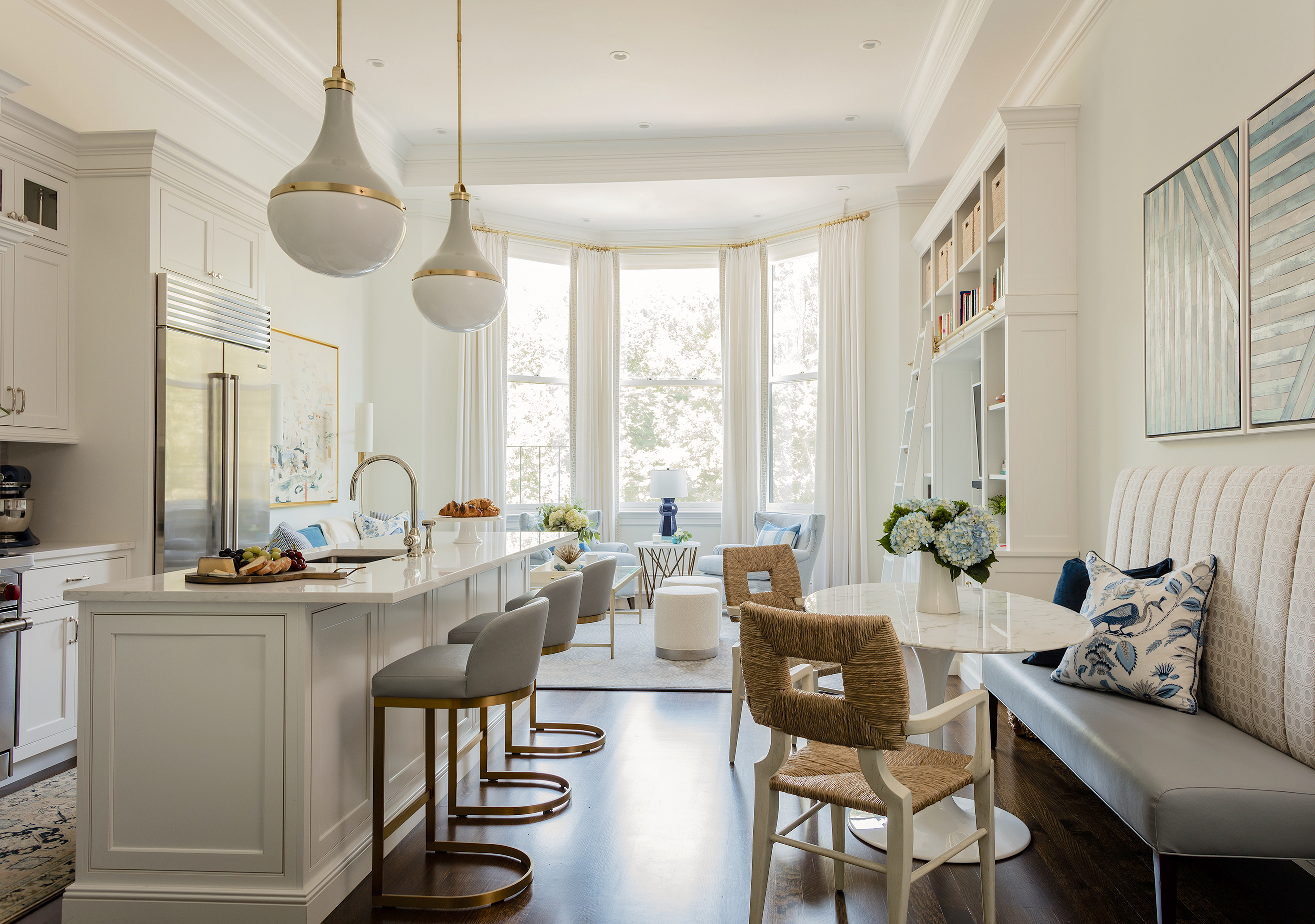
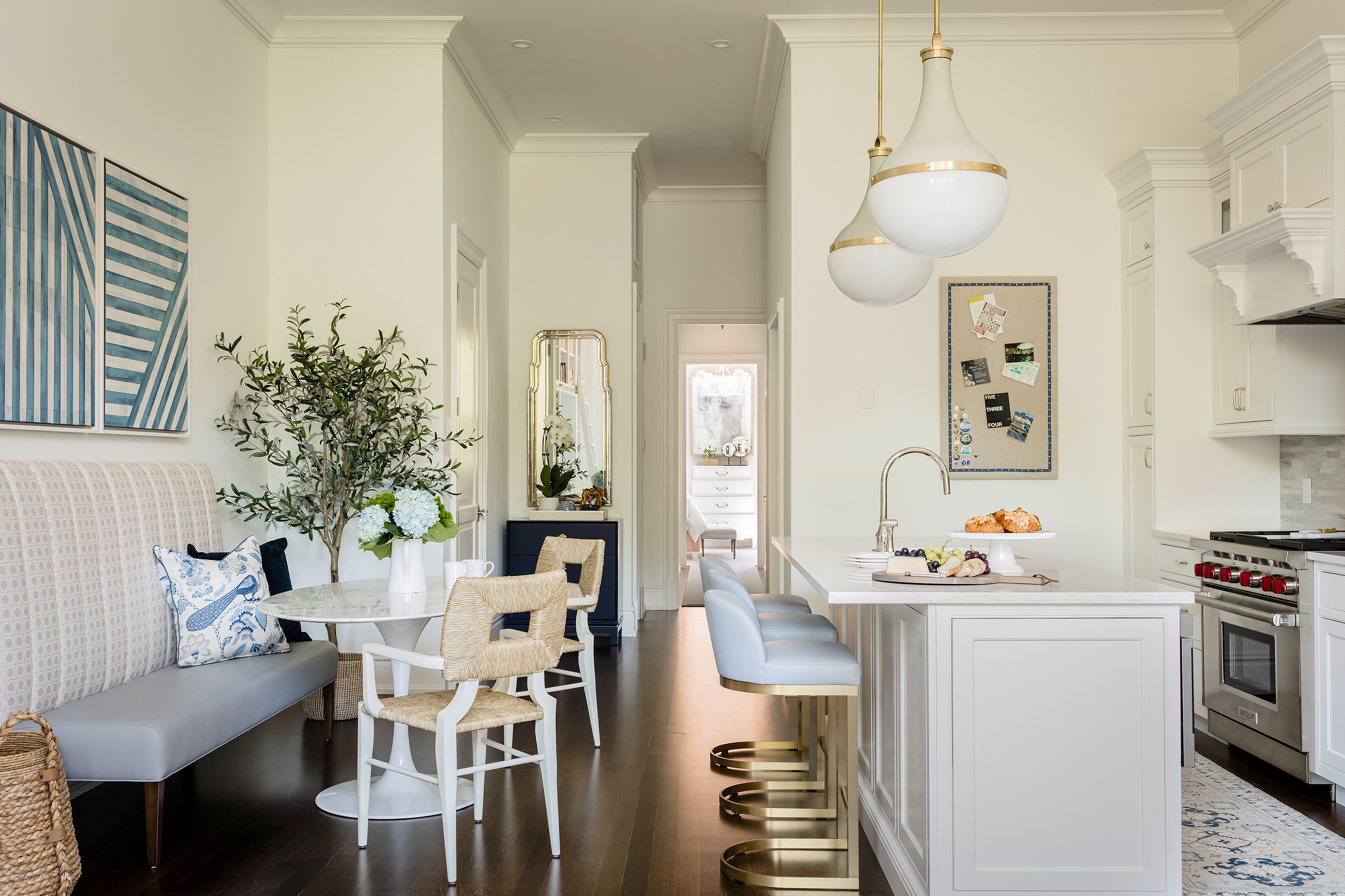
I am SO excited to show you guys this project that has been complete for a little while. It was slated to be published and then all hell broke loose and instead of waiting even longer for another publication to decide- I made the call to go right to you through the blog. :) This client was a DREAM to work with. She bought this one bedroom condo in Boston’s gorgeous Back Bay with incredible soaring ceilings, giant windows and lots of potential. The whole building had been renovated by a builder- so the kitchen and baths were redone before we came into play, but luckily they did a good job on the finishes. We wanted to take it further and replace some of the items they chose (namely all the lighting!), and because this is a one bedroom, we needed to get creative in ways to maximize storage. Let’s start the tour!
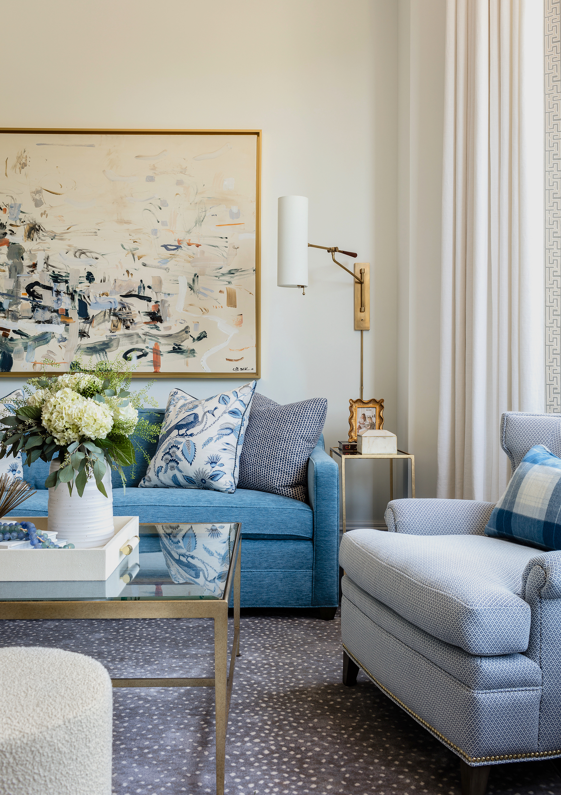
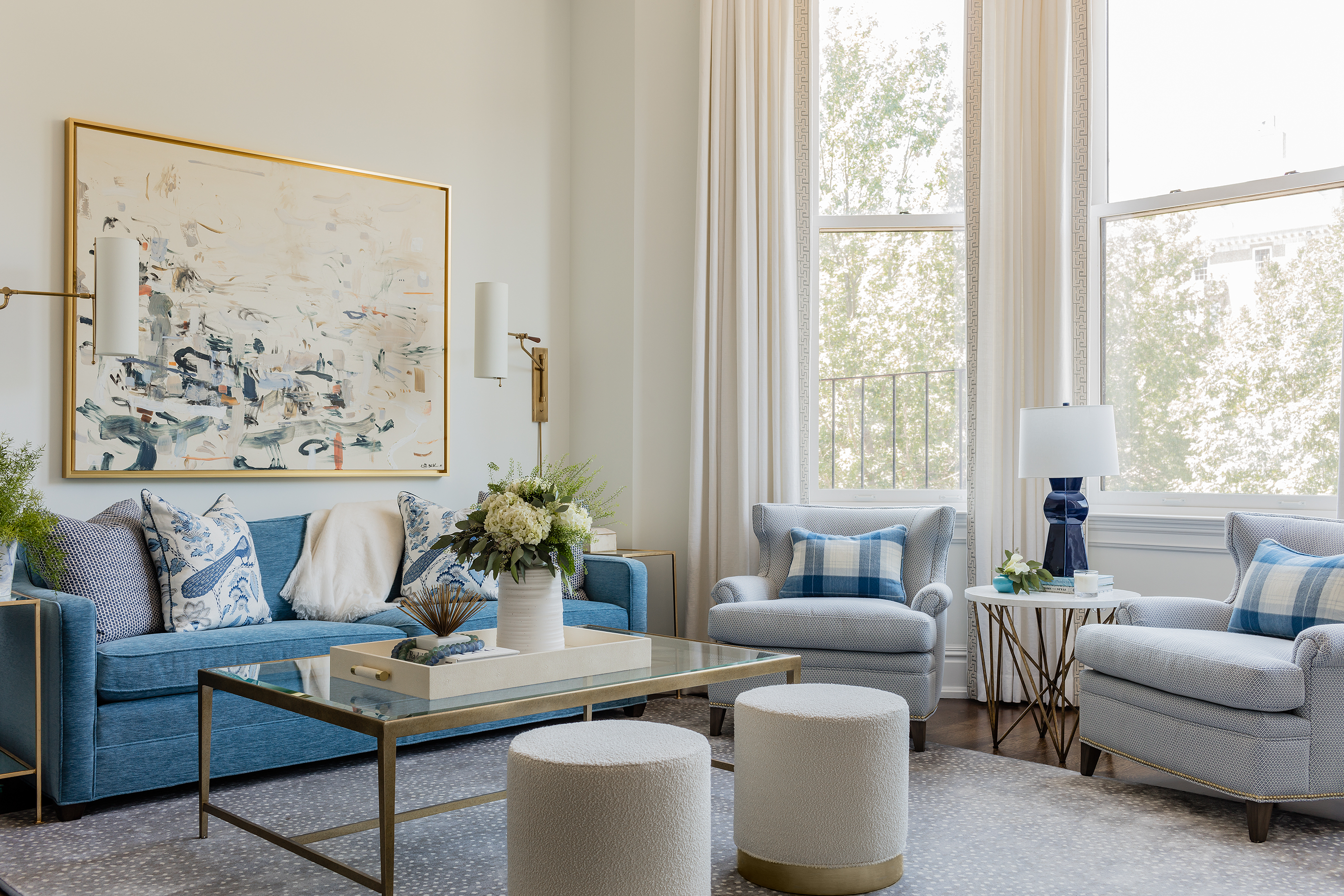
Here is the whole living area- open, bright and THOSE CEILINGS! We needed to create three zones here- kitchen, dining and living. The walls are Benjamin Moore Chantilly Lace Matte and the trim is Chantilly Lace Satin finish. We wanted to keep this room bright and clean and let the furniture and art be the star. The floor to ceiling drapes make this room. They emphasize the height of the space and also add some desperately needed softness to it as well.
The client loves blue and so we convinced her to do a bright blue sofa in an awesome indoor/outdoor velvet. I was OBSESSED with this huge Kristin Blakeney piece from the moment I saw it and felt it was the most perfect piece for this project. It took a little convincing, but she went for it and it’s absolutely perfect. A soft, super durable rug grounds everything and the large glass coffee table keep the space feeling open but offers up lots of surface area for entertaining. We added two ottomans for pull-up extra seating along with a pair of comfy club chairs.
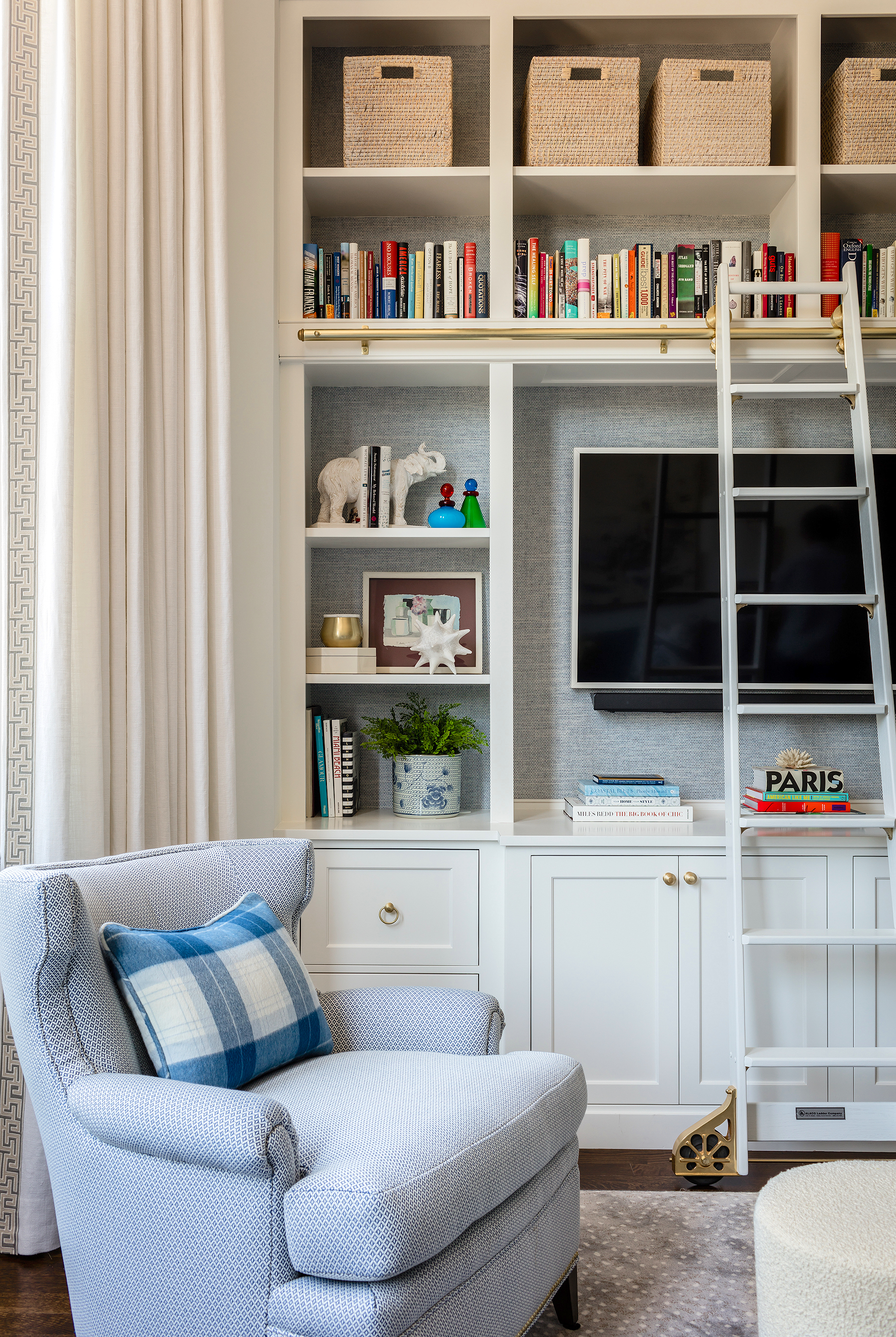
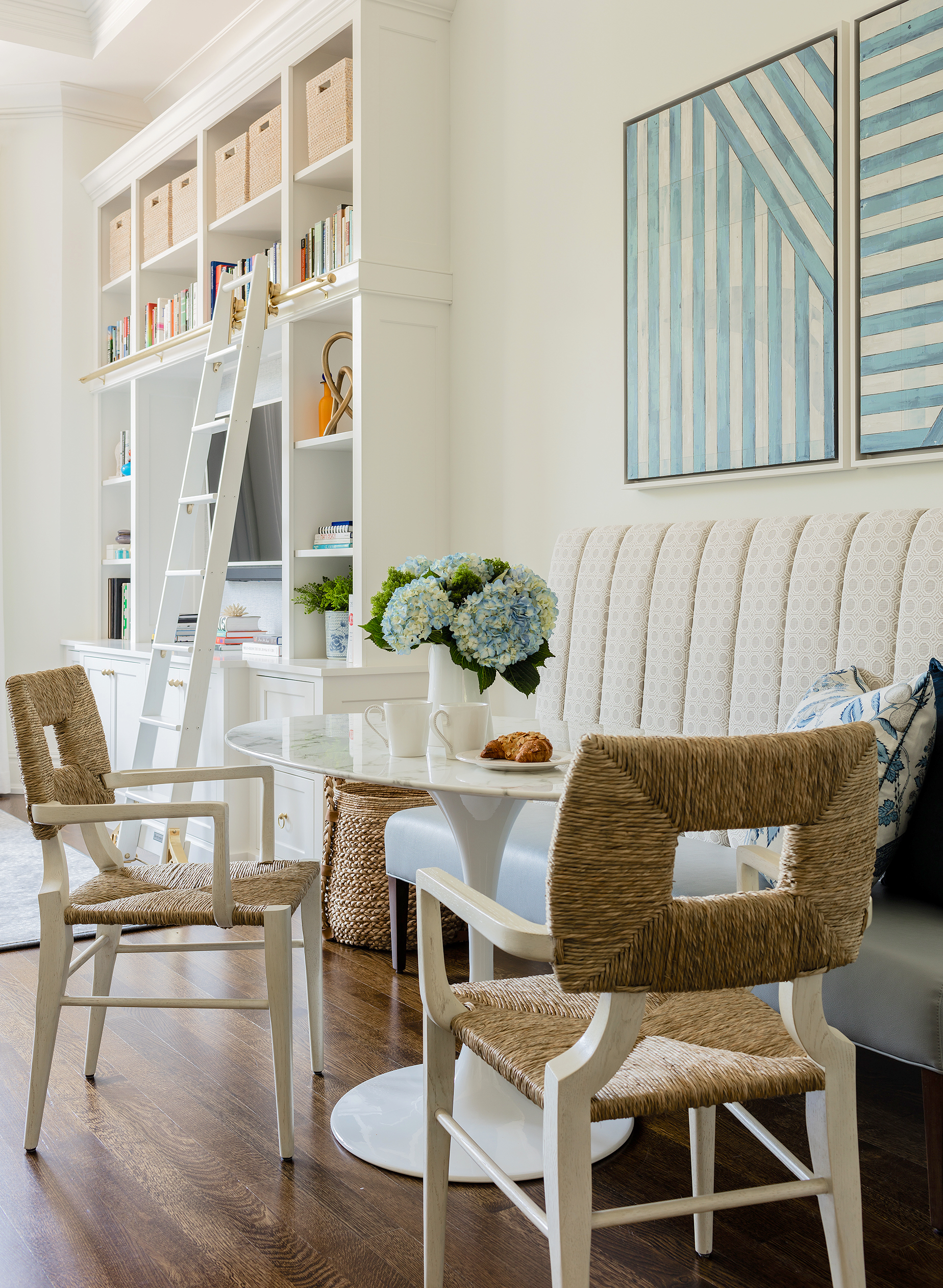
The most impactful thing we did in this space was the built in. We designed it to be a storage powerhouse using the vertical space we had an abundance of. I was SO excited to incorporate a library ladder too, let’s be honest. We wallpapered the back in a gorgeous woven grasscloth in pale blue to add a hint of color and texture. The pair of chairs we have in the bow front window area are done in an indoor outdoor woven to prevent fading from all the sun coming through those huge windows. Those little plaid pillows kill me too- made from an insanely luxurious alpaca fabric.
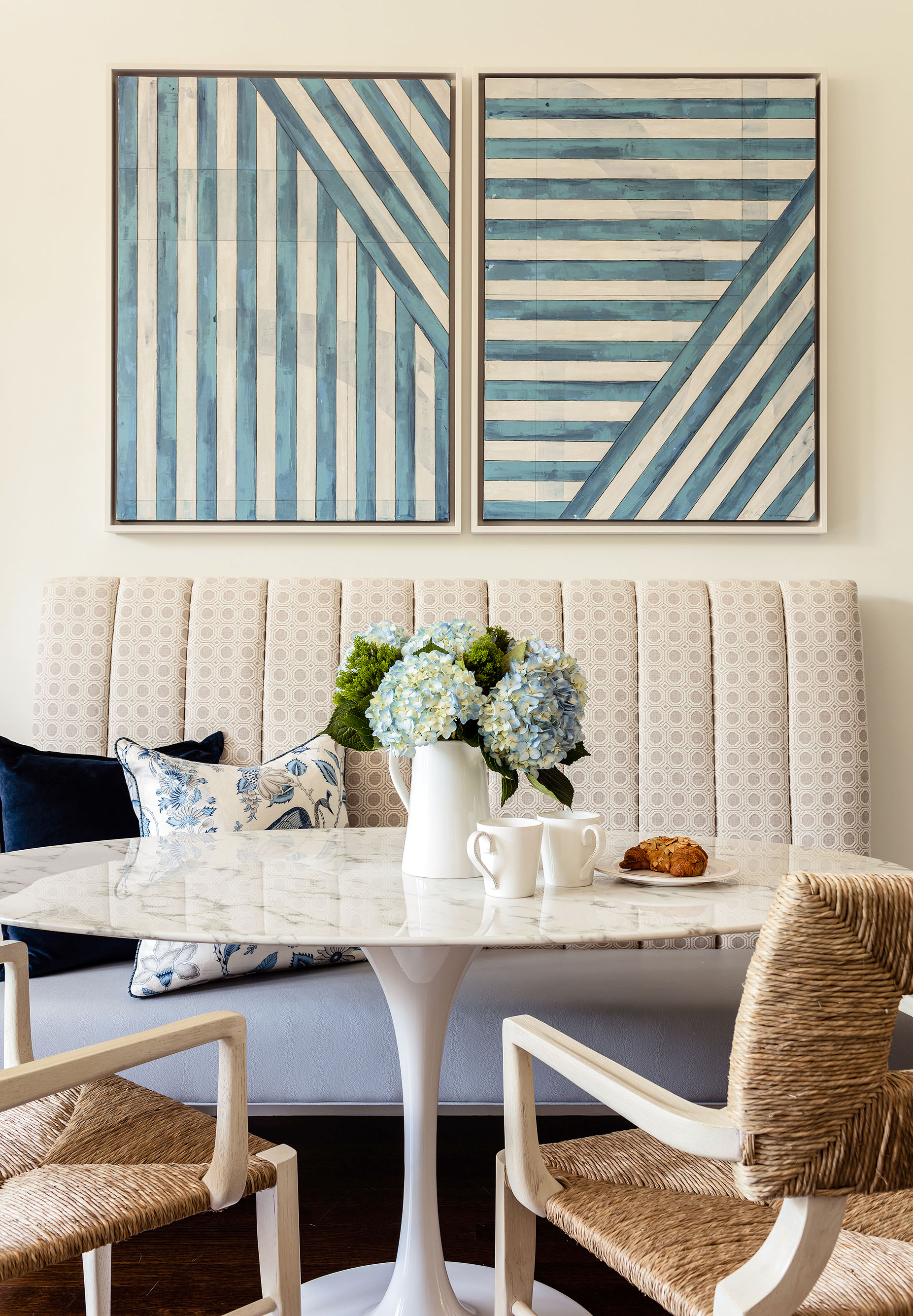
Looking from the living room you can see back towards the entry and bedroom and the awesome little dining area we created. The space is narrow so we thought a banquette and oval table would allow for the most pass through space between the counter stools and the seating and yet offer up enough space to host up to six.
I have been in love with these Peter Dunham chairs FOR AGES. And I finally got to use them! :) The channel tufted banquette was made for us by Bjork Studio and came out perfect.
The art was commissioned by us from Erin Clark. I adore the graphic nature of these and how the tones play off the Blakeney painting in the same open space.
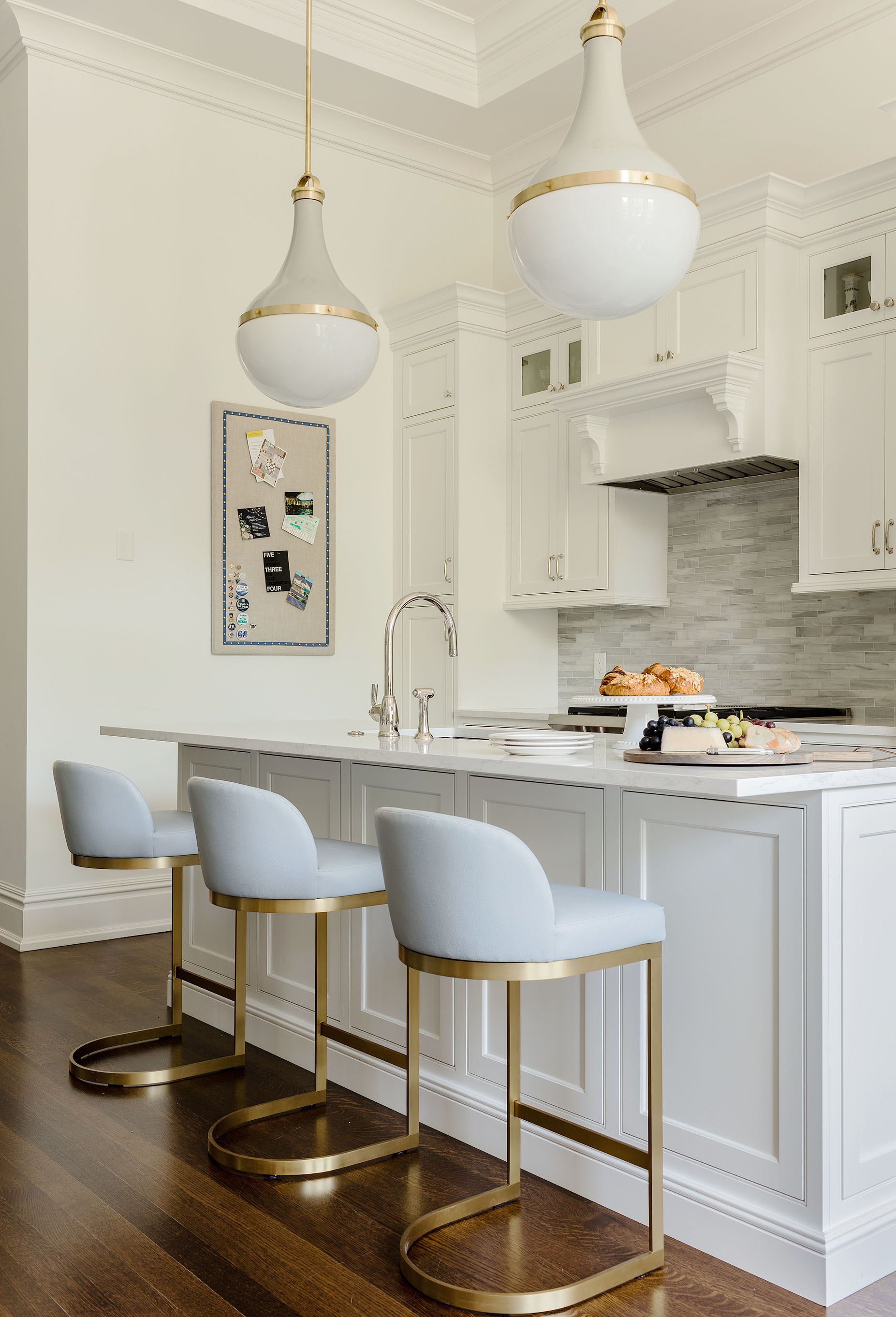
As I mentioned, the kitchen was already done, but we replaced the lights they had with these amazing Urban Electric pendants- there is no other statement lighting in those whole room, so I wanted these to be a showstopper! The stools are actually Restoration Hardware, but we had them reupholstered in the same pale blue faux leather as the seat of the banquette to keep things uniform (and also SO easy to clean). The pinboard we had made to coordinate with the finishes.
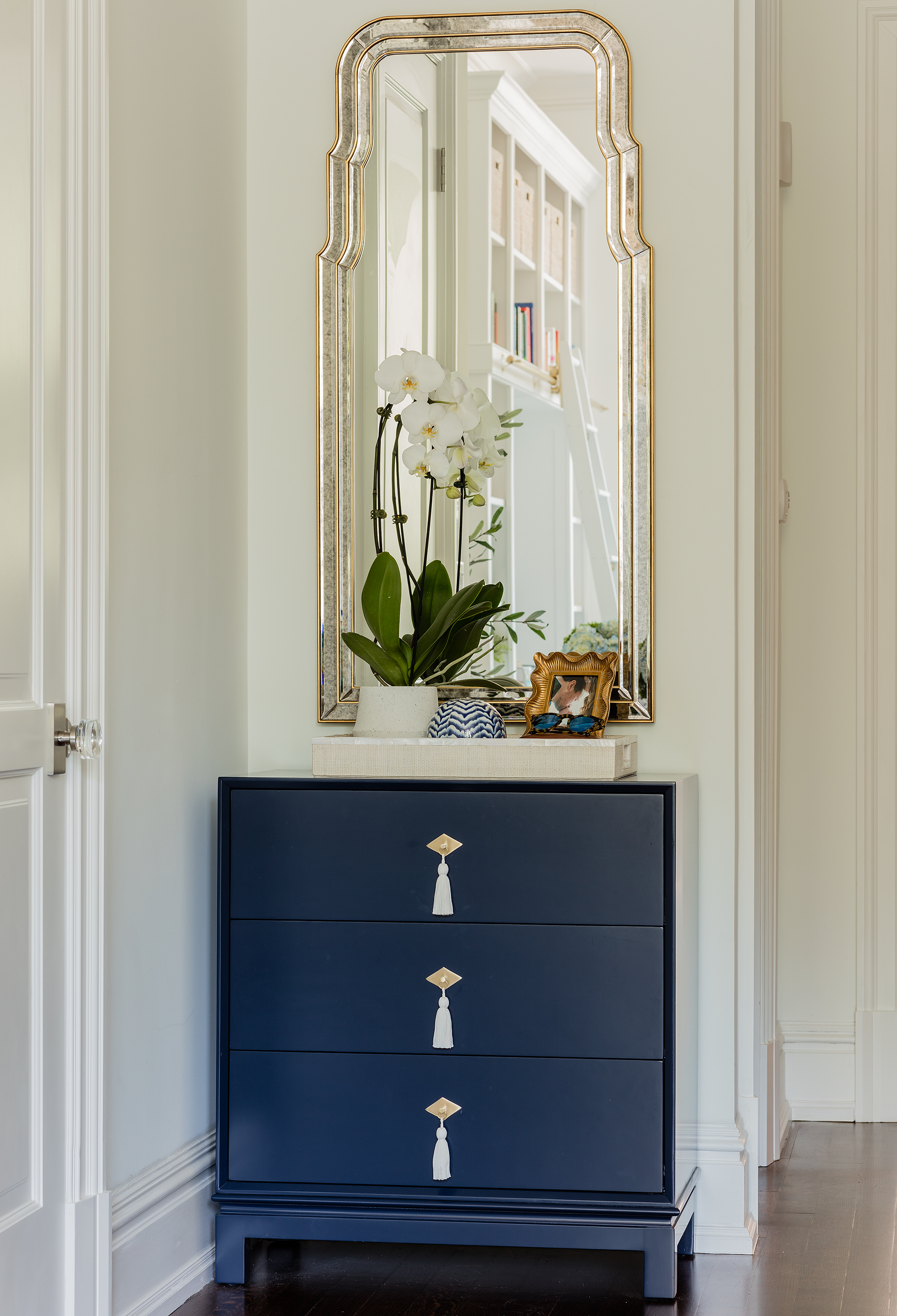
The elevator opens up right into this space and we wanted to create a “moment” here, even though it’s a small entry. We also needed some more storage (always, right?) This chest was custom made by The CEH for us. A statement mirror covers the electrical panel (sneaky!).
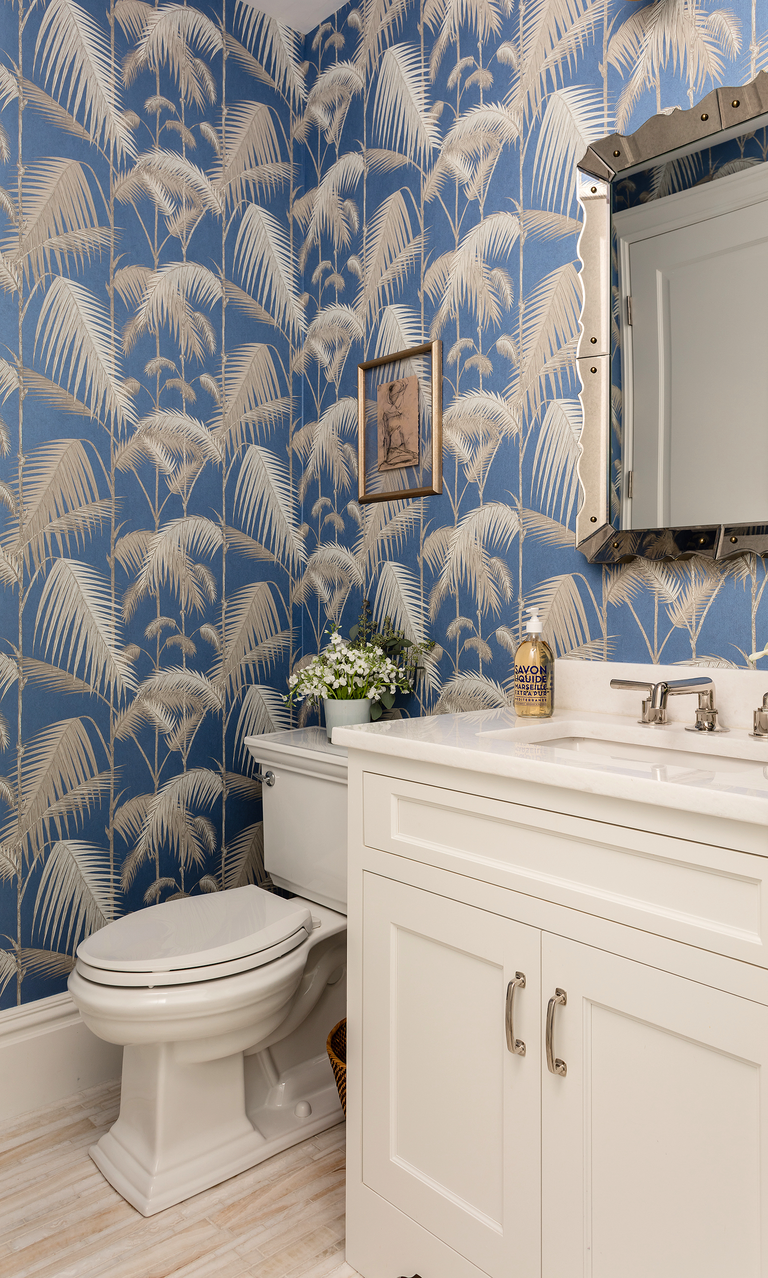
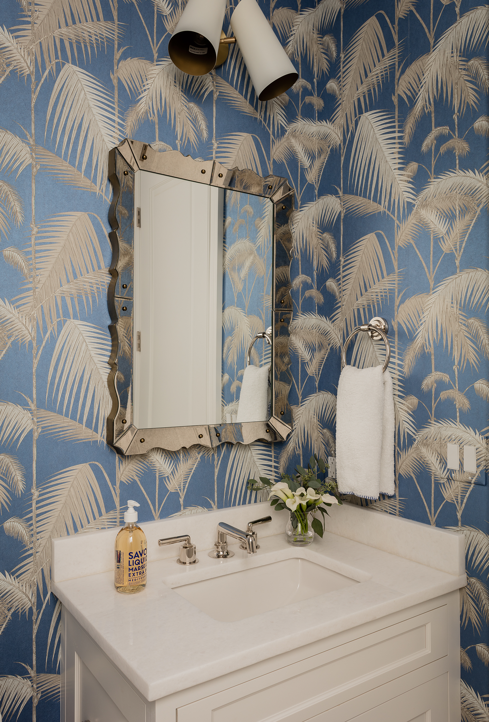
The powder room was renovated, but we wanted to make it WOW, so we did this Cole & Sons wallpaper in here to really make a statement in this small, windowless room.
A new mirror and lighting capped off the mini-makeover.
There is a long narrow hallway between the entry and the bedroom and given that the ceilings are SO high, I thought it was a space calling for fun lighting. We replaced the can lights with these star pendants and they make the journey from the living area to the bedroom so much more special. We also hung gallery walls on each side of the hall with the client’s personal photos and special memorabilia, keeping it more private but organized and visually quite stunning.
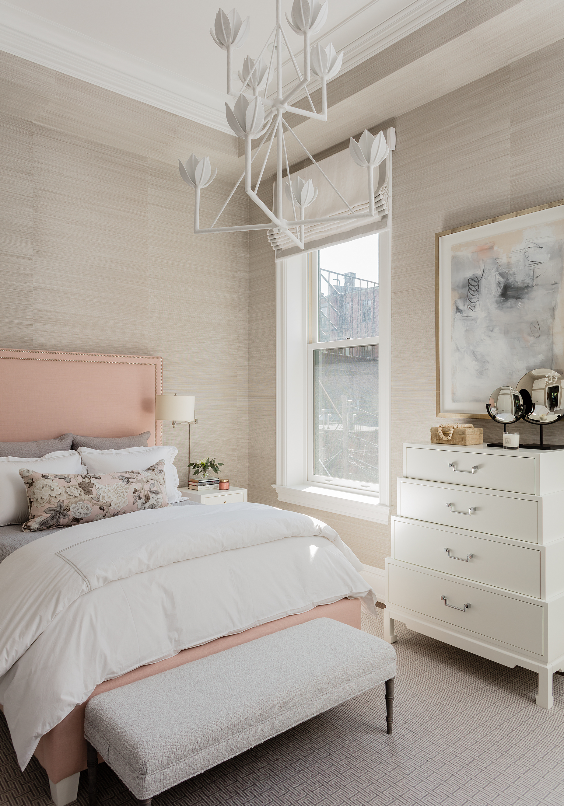
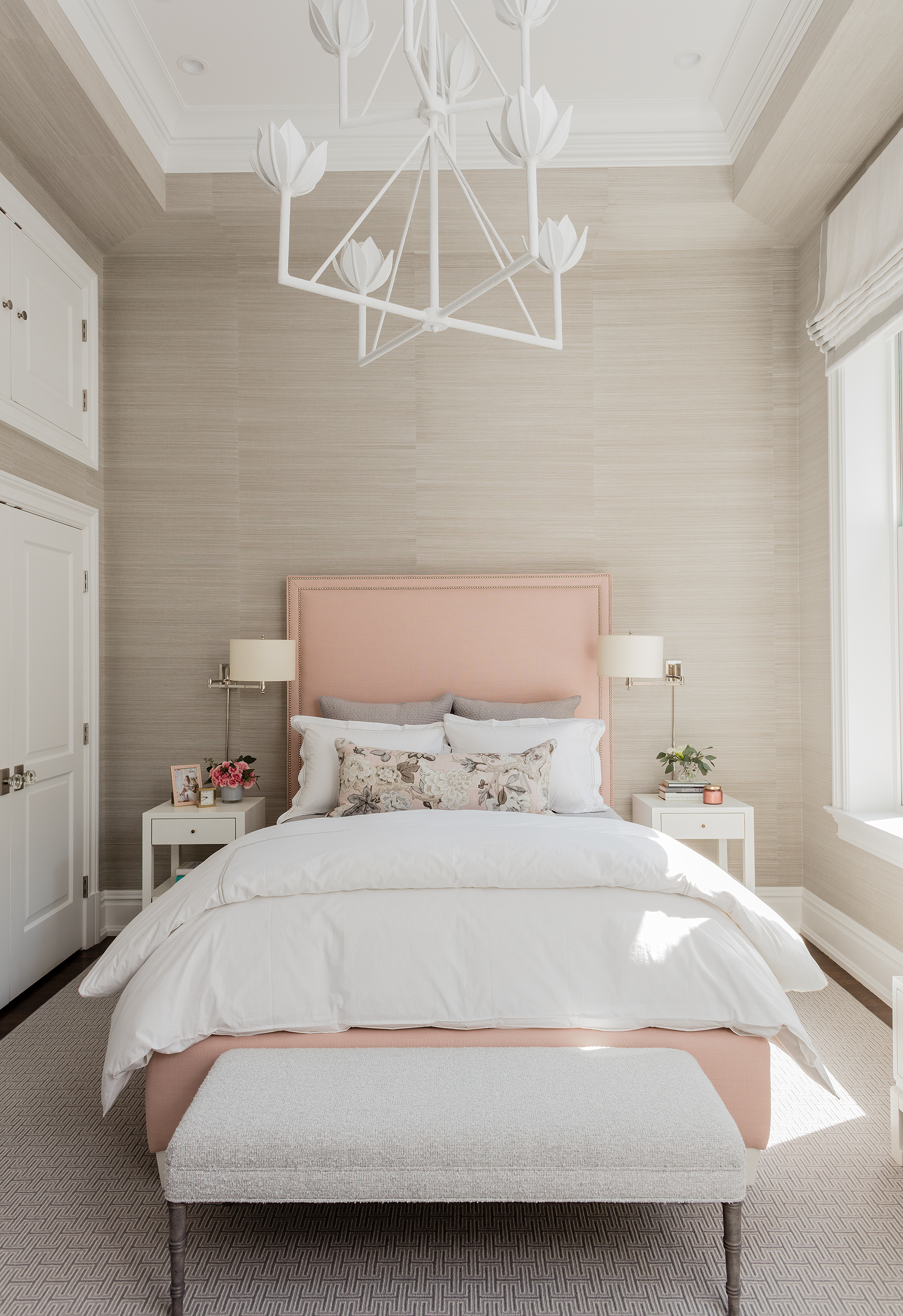
Looking into the bedroom. Literally feels like a breath of fresh air.
I am SO glad our client let us use grasscloth all over this room, including the soffits (it helps conceal them, I think). It warms up this room SO much. And that chandelier? I literally leapt for joy when it went in. :) The roman shades are motorized (think Cameron Diaz’s bedroom in The Holiday) and the bed was done in the prettiest shade of pale pink.
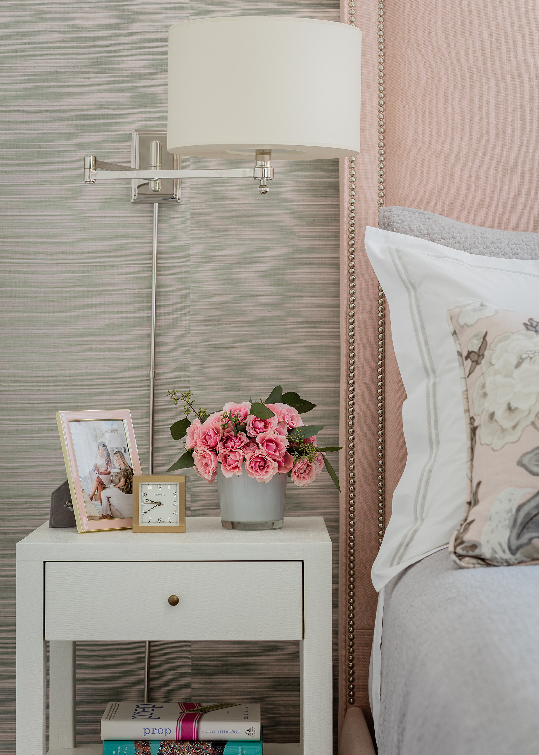
A gorgeous detail shot.
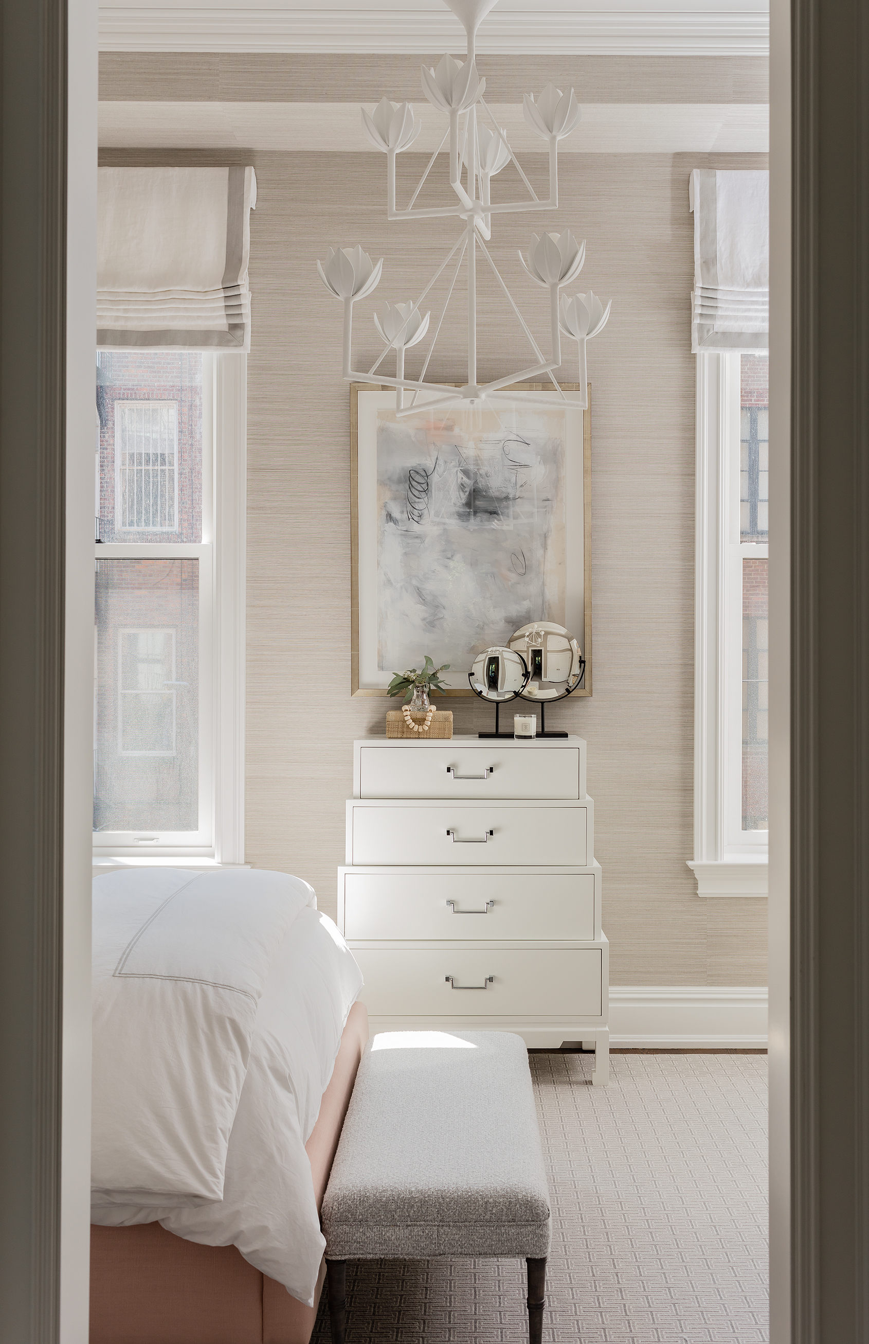
Again, this room is narrow, so wall sconces were a must in order to free up nightstand surface space. As you can see, there is lots of storage space with the upper and lower closets here. And I so love that bench we did in a nubby boucle.
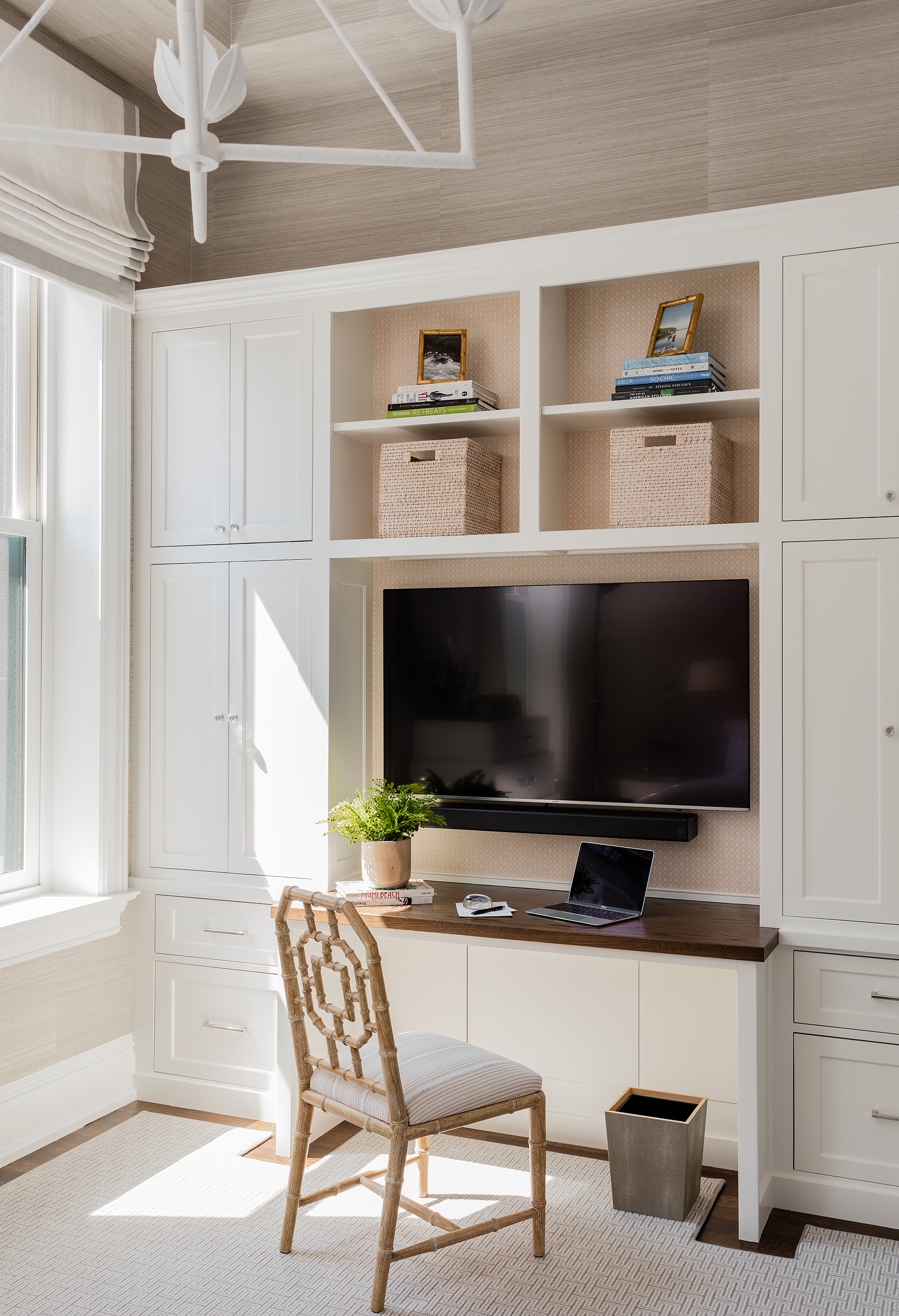
Of course, yet again, we needed more efficient storage that used up the ample vertical space- so we designed on another built in that houses the TV, more “stuff”(including her printer) and acts as a desk too! We lined the backs of this one in a small scale pink wallpaper to balance the pink of the bed on this side of the room.
The master bathroom had such nice finishes, but we did replace the sconces and add a vinyl patterned wallpaper to make it more interested and warm in here.
I’m proud of this space, mostly because our client tells me all the time how much she loves it and how happy it makes her. That is why we do this after all, right??
While I’m not sharing specific sources (we have to maintain the value of our services) here is a “get the look” roundup of items that can help you get a space like this!
JavaScript is currently disabled in this browser. Reactivate it to view this content.
I’m switching to five posts a day this week because there’s so much to talk about. There’s still one more coming after this one…
The Families First Coronavirus Response Act (FFCRA), which became law last week, offers some American workers expanded family and medical leave — and it’s paid. That’s a key difference from the leave already provided under the Family and Medical Leave Act, which protects your job but doesn’t require you to be paid while you’re out.
This new law only applies to employers with fewer than 500 employees and some public agencies. If you work for a larger private company, none of this covers you. But if you’re at a covered company, you are eligible for:
• Two weeks (up to 80 hours) of expanded family and medical leave at your regular rate of pay (up to $511 per day and $5,110 over a two-week period) if you’re unable to work because you’re quarantined (via a government order or on the advice of a health care provider), and/or experiencing COVID-19 symptoms and seeking a medical diagnosis
• Two weeks (up to 80 hours) of expanded family and medical leave at two-thirds of your regular rate of pay (up to $200 per day and $2,000 over a two-week period) if you are unable to work because you need to care for someone subject to quarantine (via a government order or on the advice of a health care provider)
• Up to an additional 10 weeks of expanded family and medical leave (on top of the two above) at two-thirds of your regular rate of pay (up to $200 per day and $2,000 over a two-week period) if you are unable to work because you need to care for a child (under 18 years old) whose school or child care provider is closed for reasons related to COVID-19, and if you have been employed there for at least 30 days
If you’re a health care provider or emergency responder, your employer may exclude you from this leave. Small businesses with fewer than 50 employees may qualify for exemption from the requirement to provide leave due to school closings or child care unavailability, if it would jeopardize the viability of the business.
Employers will receive tax credits to offset the costs of providing this paid leave.
Employers cannot require employees to find a replacement worker for themselves or require them to use other paid time off.
Cambridge Mayor Sumbul Siddiqui and City Manager Louis. DePasquale announced today they're signing contracts with several restaurants in Harvard and Central squares to cook meals for the city's homeless population, at a time when local homeless shelters are having trouble with staffing for own kitchens.
The restaurants will prepare bagged or boxed lunches for delivery to local shelters, the officials said.
The Central Square Business Improvement District (BID) and the Harvard Square Business Association are identifying restaurants in their Squares that can help provide meals to the shelters in need of food next week. The city will then be seeking to identify additional restaurants for contracts and meals beyond next week.
If restaurants are interested in supporting this initiative by providing individual hot and/or cold bagged or boxed meals for distribution to the homeless population at various locations, they should contact the City of Cambridge’s Purchasing Department at purchasing@cambridgema.gov by Monday, March 23 at 9 a.m. Once the city has a list of interested vendors, the Purchasing Department will send the vendors who inquire a formal solicitation of quotes for them to submit prices to Purchasing.
— Britney Spears Remixes (@BSpearsRemixes) March 5, 2020
- On the 20th anniversary of “Oops!...I Did It Again”, Record Store Day 2020 offers a 12" vinyl record featuring four (4) rare remixes of Britney's hits AND four (4) rare songs previously released only outside the USA.
- The limited edition 12" vinyl record will only be available on Record Store Day 2020 which happens on April 18, 2020 (Saturday).
- Side A: Oops!... I Did It Again (Ospina's Deep Club Mix), Lucky (Jason Nevins Mixshow Edit), Stronger (Mac Quayle Club Mix), Don't Let Me Be The Last To Know (Hex Hector Radio Mix)
- Side B: You Got It All (The Jets cover), Girl in the Mirror, Heart, Walk On By
Last week, Britney's boyfriend, Sam Asghari, revealed that Britney broke her metatarsal bone on her left foot that required a trip to the hospital. Tonight, Britney posted a video of the CHAOTIC dance routine that broke her foot.
Britney captioned the video, "I haven't danced in six months so I was full throttle at this spot. And yes .... I know I'm barefoot .... don't laugh but I grip the floor better that way!!!! PS you can hear where I broke my foot here. Sorry it's kind of loud!!!!"
Legendary Children’s initial proposal and early drafts were full of references and information that we either already knew well or were familiar enough with that we were easily able to flesh out our knowledge with a bit of research. For instance, in the chapter on Drag Race’s sketch comedy and improv challenges (entitled “Watch Out for Those Sketchy Queens, Gurl”), it was easy enough for us to start off by mentioning the groundbreaking work of Divine in the classic trash cinema films of John Waters like Mondo Trasho, Pink Flamingos, and Female Trouble. That culture-breaking work is ALL OVER Drag Race (which the show has openly admitted, not least when they centered an entire Ru-sical around Divine, with extra-special guest judge Waters himself) and it was very easy for us to examine the ways in which those films and that style of drag permeates the show and its most successful performances. We’ll be doing a deeper dive on Waters and Divine in an upcoming Legendary post, but don’t worry: we gave them their due in the book. After all, Divine’s right there on the front row of the cover, isn’t she?
Sharing that front row with her, on the left side, is a lesser-known drag queen named Doris Fish, done up in the ’80s camp drag of her own groundbreaking, generation-defining work, Vegas in Space. In fact, that’s the main reason why we weren’t as familiar with Doris, who we wound up falling in love with during the writing of the book. We’re of the RuPaul generation. You see, Divine was a crucial figure in defining drag in the mainstream for the Baby Boomers. Ru almost singlehandedly held up the drag banner for Generation X. But for the early years of the Millennial generation, one of the most memorable and notable representations of the art of drag was Doris Fish, her drag sisters from Sluts-a-Go-Go, and a menagerie of 1980s San Francisco queens who made up the eye-popping cast of Vegas in Space. Why? Because for the entire decade of the ’90s, Vegas in Space played in heavy and near-constant rotation on The USA Network’s “Up All Night,” making it the sort of cultural wallpaper of a generation, back when “flipping through the channels” was a thing people did that exposed them to images they never would have found on their own.
And if you are a Millennial or Gen-Xer or older who managed to miss it in those flipping-through-the-channels days before your phones had computers installed in them, we have the great pleasure of introducing it to you and telling you to run to Amazon Prime and watch it RIGHT NOW. You will NOT be treated to amazing performances or fantastic special effects or even a story or plot that makes much sense. You WILL sit through some of the most eye-popping drag of the late 20th Century which, much like Divine’s and Ru’s, had long-term effects on the art of drag and pushed it into bolder directions. Sasha Velour is an enormous fan and champion of the film and once you sit through it, you can definitely see how it influenced her own drag. We had a passing familiarity with Fish and with Vegas in Space, but it wasn’t until we started diving deep and digging into the roots of drag cinema and drag theater (which also led us down a Hibiscus road, among many others), that we truly came to appreciate him and his most famous creation.
The film took over seven years to complete, in a stop-and-start shoestring production that Fish, “real” name: Philip Mills, a Sydney transplant in the San Francisco drag scene, partially funded through non-drag sex work, joking “No one ever told me you couldn’t make a feature film on a prostitute’s salary.” Regardless of what you may think of sex work (although if you have any interest in the history of drag or queer culture, we suggest you get over it, since a great number of our artists and social warriors either funded their work or just survived through sex work, at a time when all queer people were seen by the mainstream as exotic fetishists at best), that’s a stunning example of one queen’s commitment to art; one artist’s unshakable belief that what he was doing was worth pursuing for years, putting his own body down as collateral. The history of queer art and politics is full of men and women who did the same. When the film finally saw its premiere in 1991, Mills was not there to celebrate it. He died of AIDS complications four months before.
It’s not high cinema and that’s entirely the point. The sketch challenges on Drag Race and the history of drag acting in general has deep roots in both underground theater and trash cinema. Like the work of John Waters and Divine, Vegas in Space is much more interested in being campy, bitchy and occasionally shocking than it is in being technically perfect (or even good), let alone artistically fulfilling. If you’ve noticed by now that we haven’t given you much information on the plot or particulars here, it’s because a) they’re kind of hard to recap, and b) you really need to experience the whole thing yourself. We won’t claim your mind will be blown, but you sure as hell will see more than your share of eye candy.
And yet, art it became, whether intended or not. After a decade on cable television, Vegas in Space has found itself in museum retrospectives and film festivals, championed as an example of high drag, high camp, and the ferocity of queer art birthed under impossible circumstances and in the face of social disapproval. It may not (yet) have the same legendary status as Pink Flamingos or the same culture-defining status as Paris is Burning, but Vegas in Space is as pure an example as you’ll ever find of the kind of queer art that gets born when drag queens insist on making it their own goddamn way, everyone else be damned. Grab a bottle of wine and settle in to watch it soon with some bitchy friends.
And of course, for much more on Doris, Divine, Hibiscus, the history of drag acting and the entire last century of queer life, by all means, feel free to pre-order our lovely little book on these and many other subjects, kittens. We would be ever so grateful and we promise you’ll get some killer stories in return.
Director Matt Reeves took to Twitter on Thursday afternoon to share a first glimpse at Robert Pattinson in “The Batman.” Though less than a minute long, this moody camera test offers a good glimpse of Pattinson in the batsuit — at least from the waist up.
Production on “The Batman” is currently underway, with Warner Bros. releasing the DC Comics-based tentpole on June 25, 2021.
“Out of all the big roles that I knew of in that kind of realm, there was just something about this one,” Pattinson told BBC of Bruce Wayne in “The Batman.”
Super High-Res Images of Matt Reeves’ #TheBatman bat-suit reveal.
We love the “work-in-progress” idea for the suit & how Greig Frasier captures it. It’ll be cool to see him update the tech throughout the story. LOVE the bat-symbol design - very similar to the Arkham games... pic.twitter.com/TH7Zvx5jnH
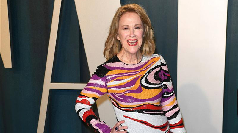
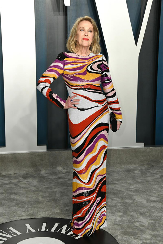
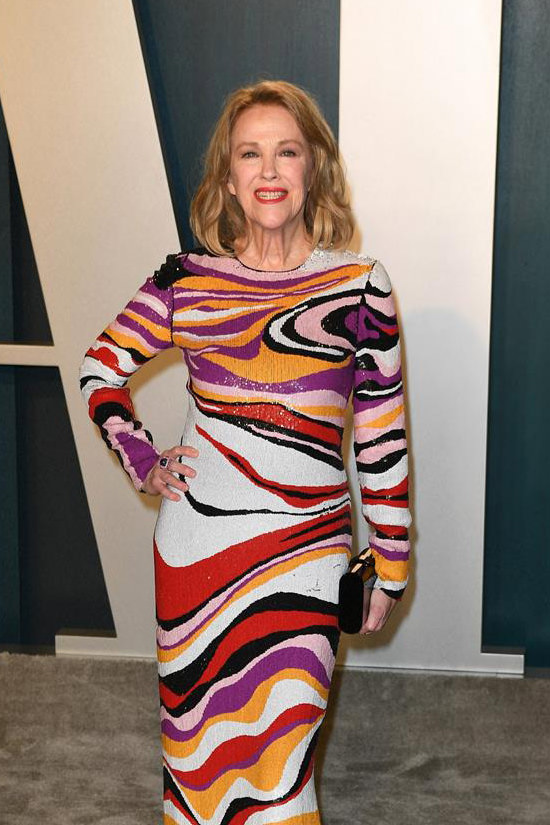
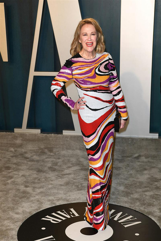
Catherine O’Hara walks smoothly and confidently into the judging circle, puts one hand on her hip, faces the cameras and says without words:
“A reminder: I am not Moira Rose.”
What a spectacular look for her. What a great, declarative way to step away from her signature character’s signature black-and-white aesthetic. She looks like she’s ready to move on to the next role and that’s a great message to send on this particular night, when the entire industry is partying and/or posing.
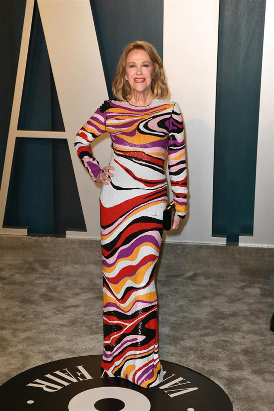
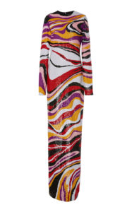
Style Credits: – Jeffrey Dodd Swirl Sequin Gown Featuring a Rounded Neckline, Embroidered Sequins and Long-sleeve Silhouette from the Fall 2018 Collection – Ruchi New York Jewelry – Edie Parker Clutch
Styled by Andrew Gelwicks [Photo Credit: Thompson/AdMedia/Media Punch/INSTARimages.com, Niviere David/ABACA USA/INSTARimages.com, jeffreydodd.com, modaoperandi.com]
the levels of xenophobia i've witnessed in recent weeks is astounding
WBUR reports, notes something similar happened during the SARS scare in 2003 - at least until Mayor Tom Menino went on a walking tour of the neighborhood and didn't get SARS - that Chinatown is no more at risk from the new coronavirus strain than anywhere else and that you're far, far more likely to get the flu, which can also be fatal.
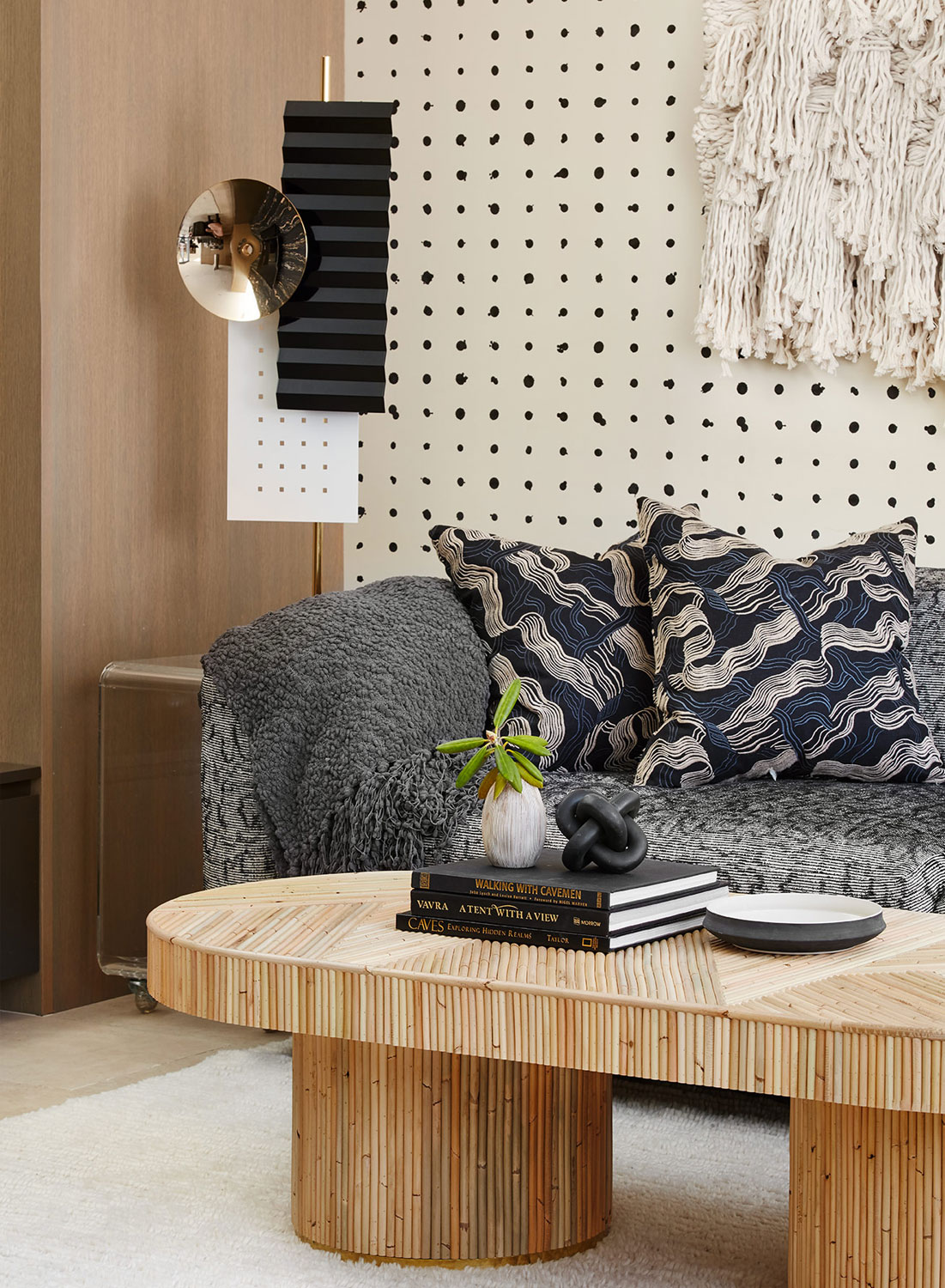
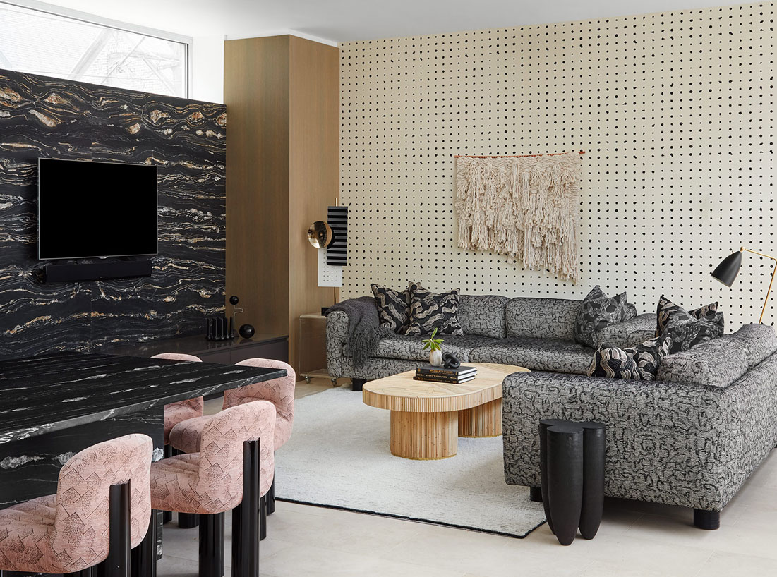
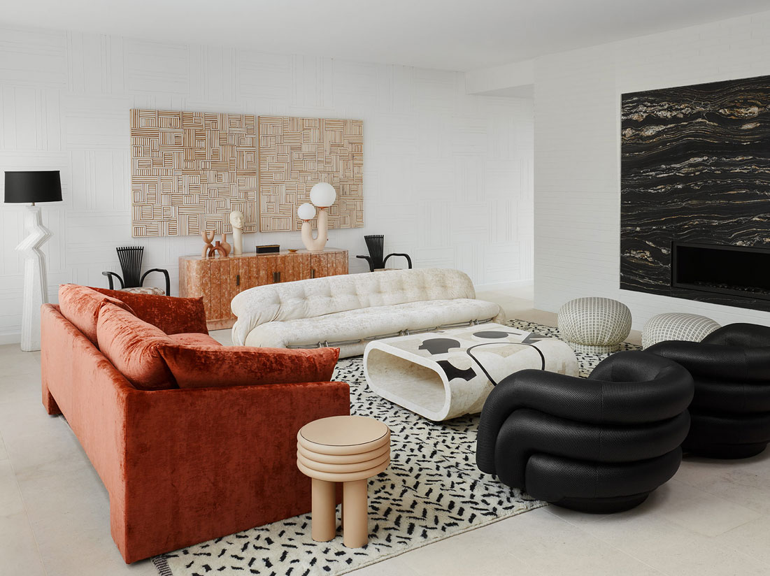
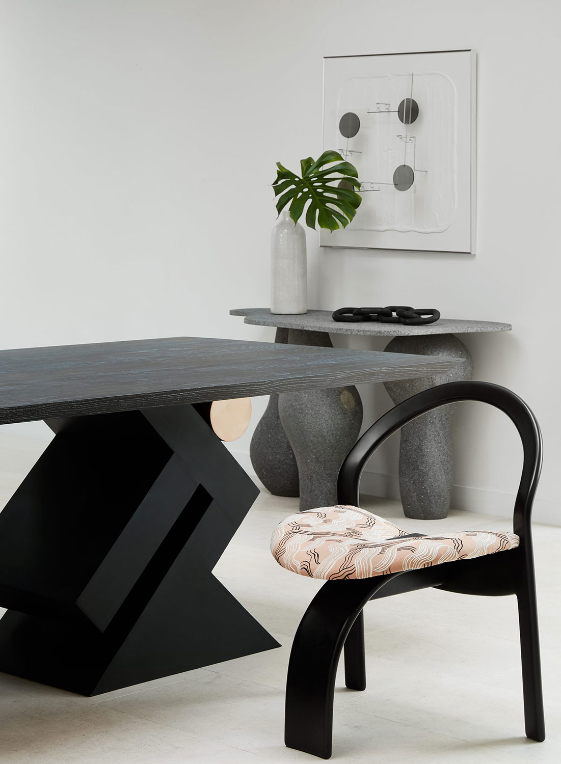
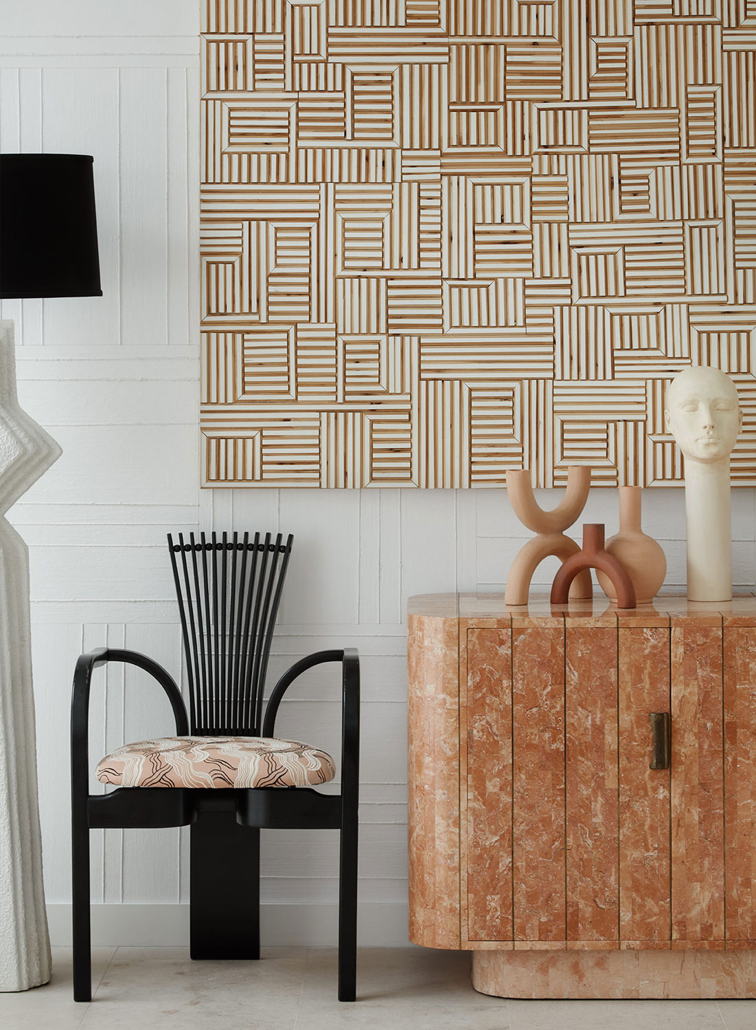
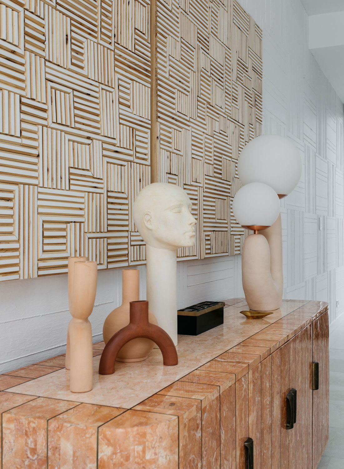
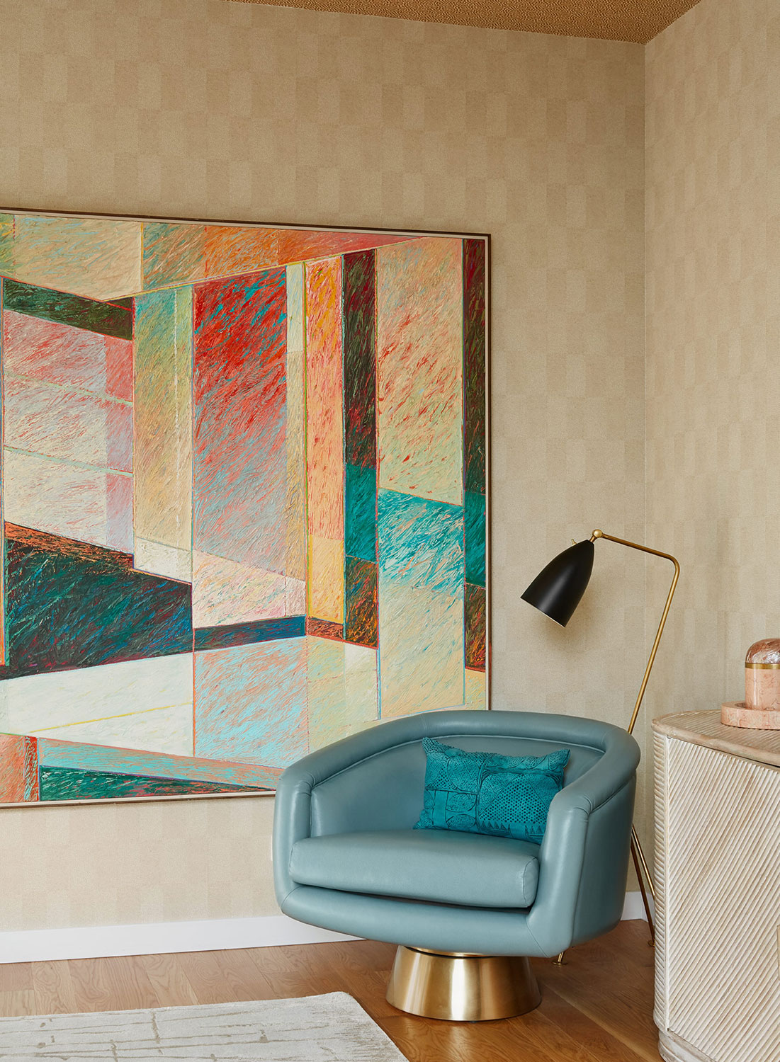
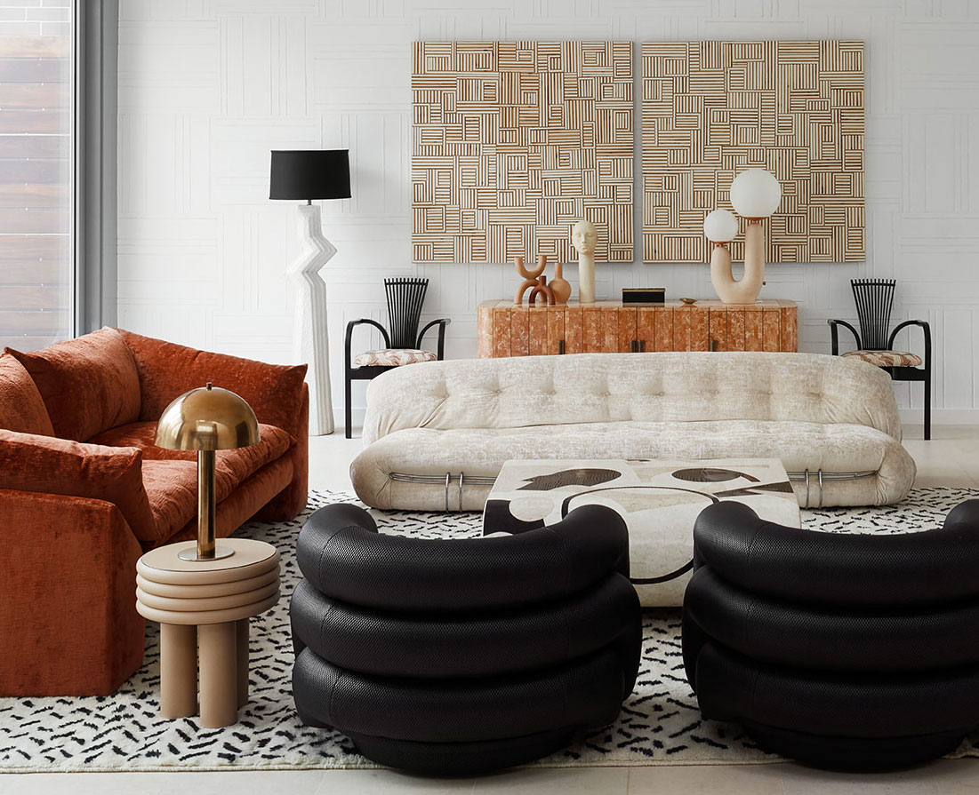
This is a post where home decor meets my personal life. I’ve known the homeowners of this fabulous place for, wow, I think 20 years now…girl, can you believe it’s been that long? Carrie was my boss at a startup dot com back in 2000. Her style has evolved over time, and I can officially say, this home is hands down my favorite. It’s bold, fearless, and confident…just like her and her husband. She worked with interior designer extraordinaire, Jen Talbot, to bring this past meets present bonkers decor to life. Situated in Chicago’s Bucktown neighborhood, this home was recently featured in LivingEtc’s March issue (on newsstands now), and it’s an absolute honor to feature this modern home tour here on House Of Hipsters. Let’s dig into my interview with Jen (oh and be sure to follow @jentalbotdesign on Instagram).
What was the inspiration for this modern Bucktown home? Highly curated, vintage 80’s with a sculptural overtone and purposeful use of color. The client’s tag line was “modern sophisticated meets Kelly Wearstler in the 80’s”.
She had just wrapped a 3-year design project at the new luxury boutique hotel, the St. Jane Hotel (formally the Hard Rock Hotel), and wanted her personal space to reflect the fresh innovative approach she applied to the hotel and her wardrobe. Unique pieces that were singular to her space.
Is the finished design close to the mood board you first presented to the client? Mood boards always evolve. This one more than usual because we used so much vintage. Often times we would find an amazing piece, and it would get snatched up before we pulled the trigger to purchase. The overall essence of the board did not change, just the actual pieces. The beauty of that? The design became more curated because we were forced to source even better pieces, one treasure at a time.
The homeowners let you take some serious risks. Was there anything they said no to? There was one weird metal floor lamp I found that pretty much belonged in outer space and looked like an evil octopus. It was a piece that I was on the fence about. But oftentimes if you are not sure you love or hate a piece, that’s the sweet spot. It’s a very fresh visual to push out of your comfort zone.
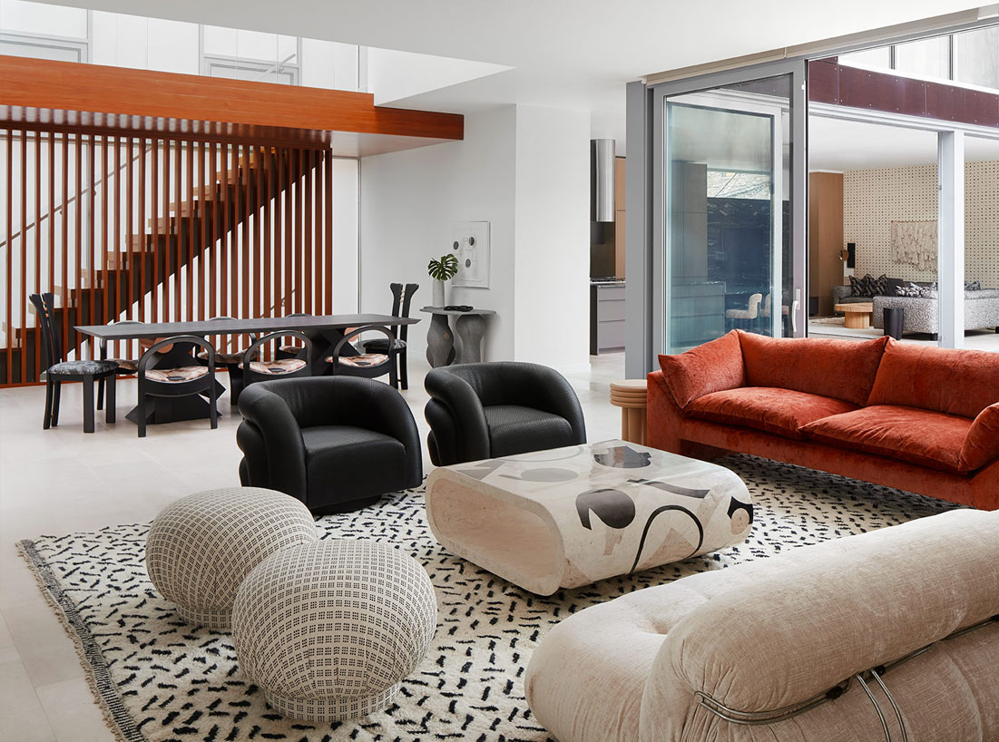
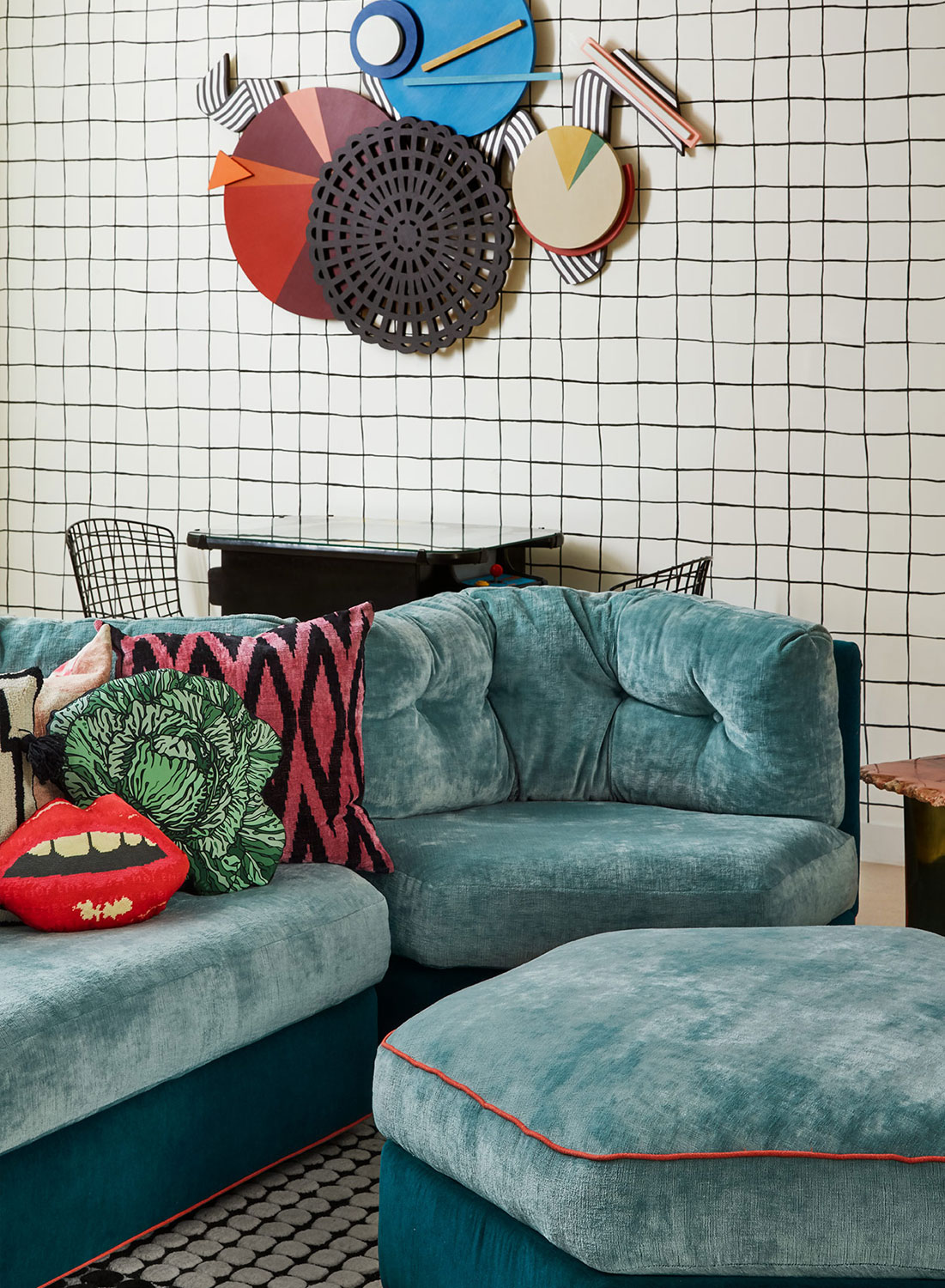
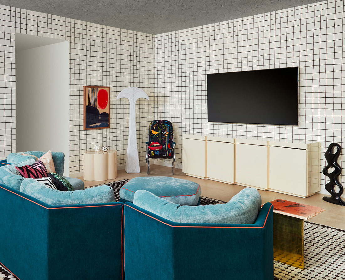
When you initially started the design, what room did you dig into first? We started with the main floor — the living room, dining room, and kitchen area are all open to each other and have to play together. Once the living room was designed, we built out from there. The client knew she wanted a particular sofa, so that became our anchor and jumping-off point.
The wallcoverings add so much texture to each room. I especially love the subtle texture in the front living room and the beige on beige with black graphics printed in the bedroom. Can you tell me more about these? The client talked about getting sick of patterns easily so we decided to explore textures. The textured wallpaper in the living room was custom developed for the space. By working with a wallpaper company that was already doing textured, we had them change the direction and layout, color match, and cut it into 18 x 18 squares. We then “tiled” the wall, giving it a complete customized look.
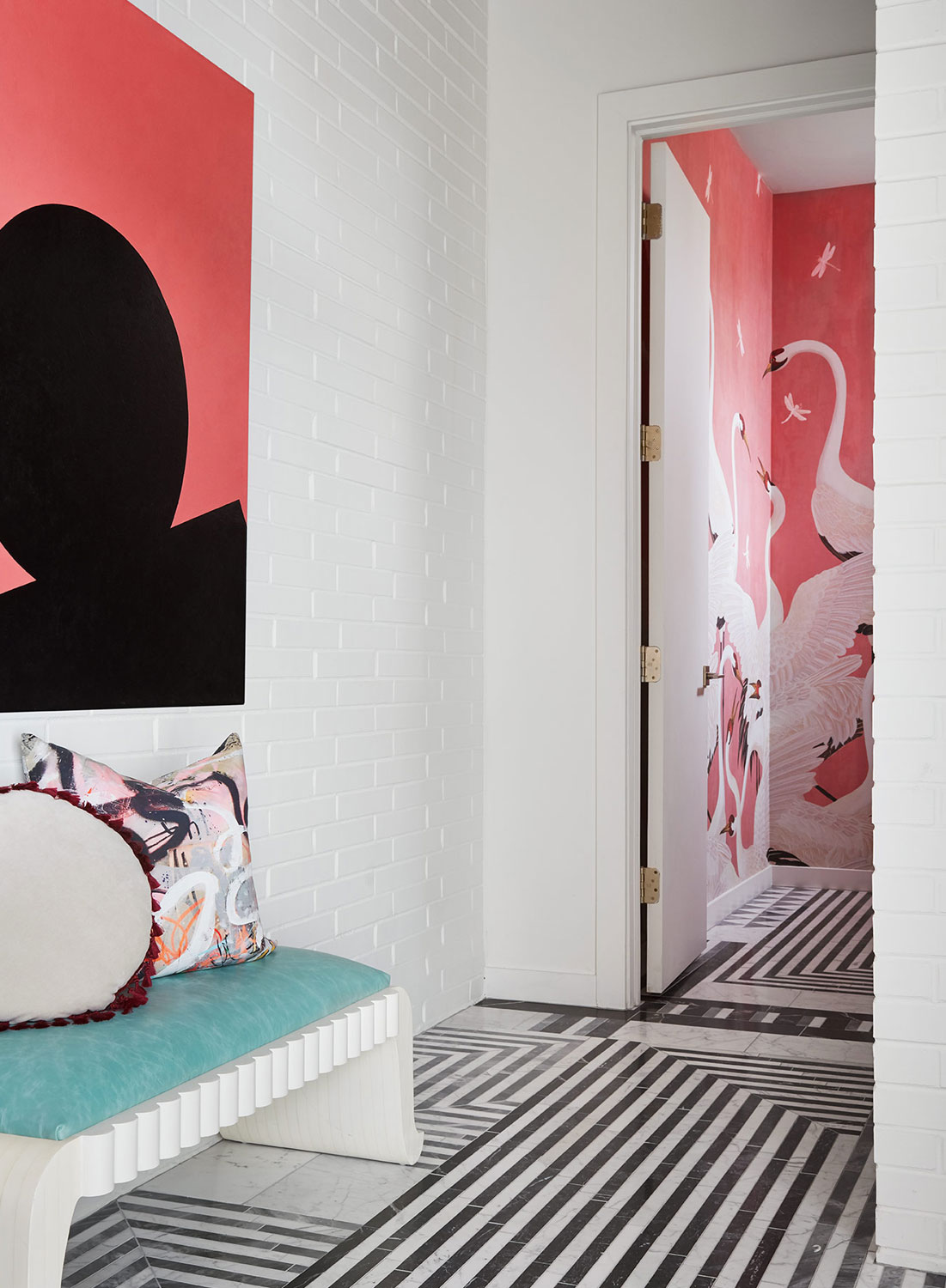
It’s stunning, and I love how the art plays off the wall covering. You guys nailed it.
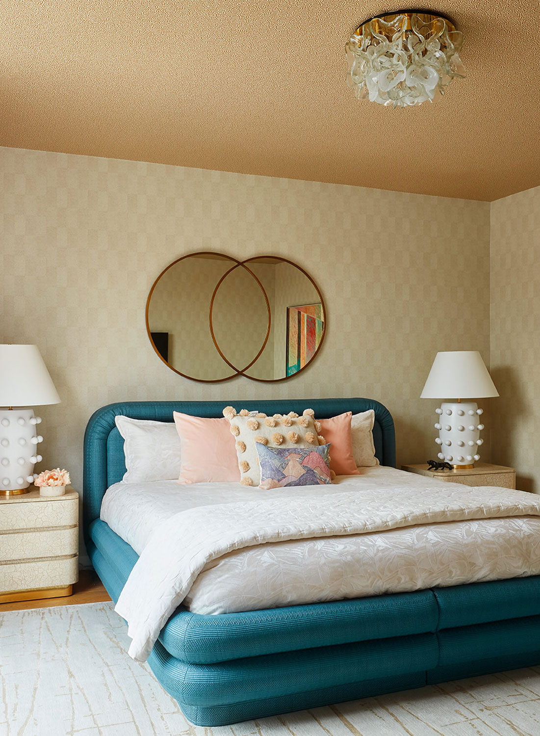
In the master bedroom, we worked to find two papers that could play off each other and be paired to create visual interest. Selected were two subtle wallpapers from Osborne and Little — same color family with a similar size print. They naturally related to each other.
Jen, that’s genius! The effect adds spectacular texture to the bedroom. Also, the bold pop of turquoise and that gold ceiling is spectacular.
What was your biggest challenge while designing this space? The modern framework of the existing space was definitely a challenge. I am more accustomed to working with vintage homes and pairing each room with modern elements. In this home, we had to make the visually dominant wood staircase work into the overall design. Originally, the wall was exposed brick, but we painted it white to give the space a more modern flavor. We also reworked the fireplace stone surround to create cohesion with the kitchen stone.
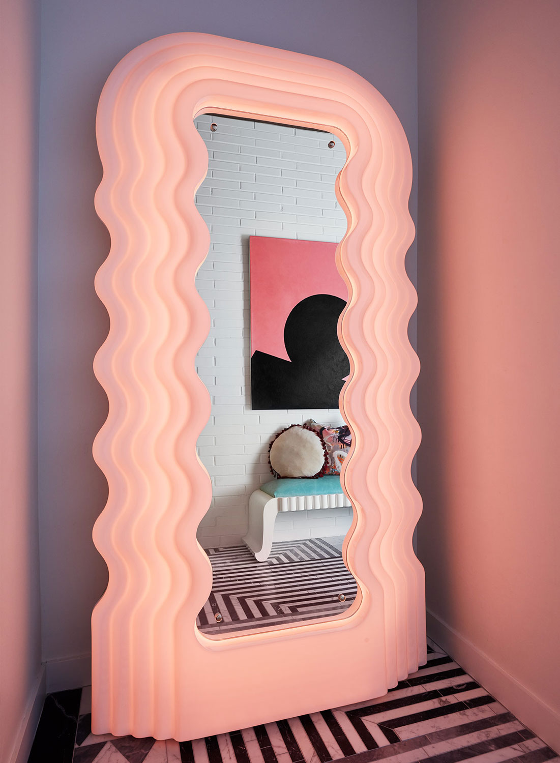
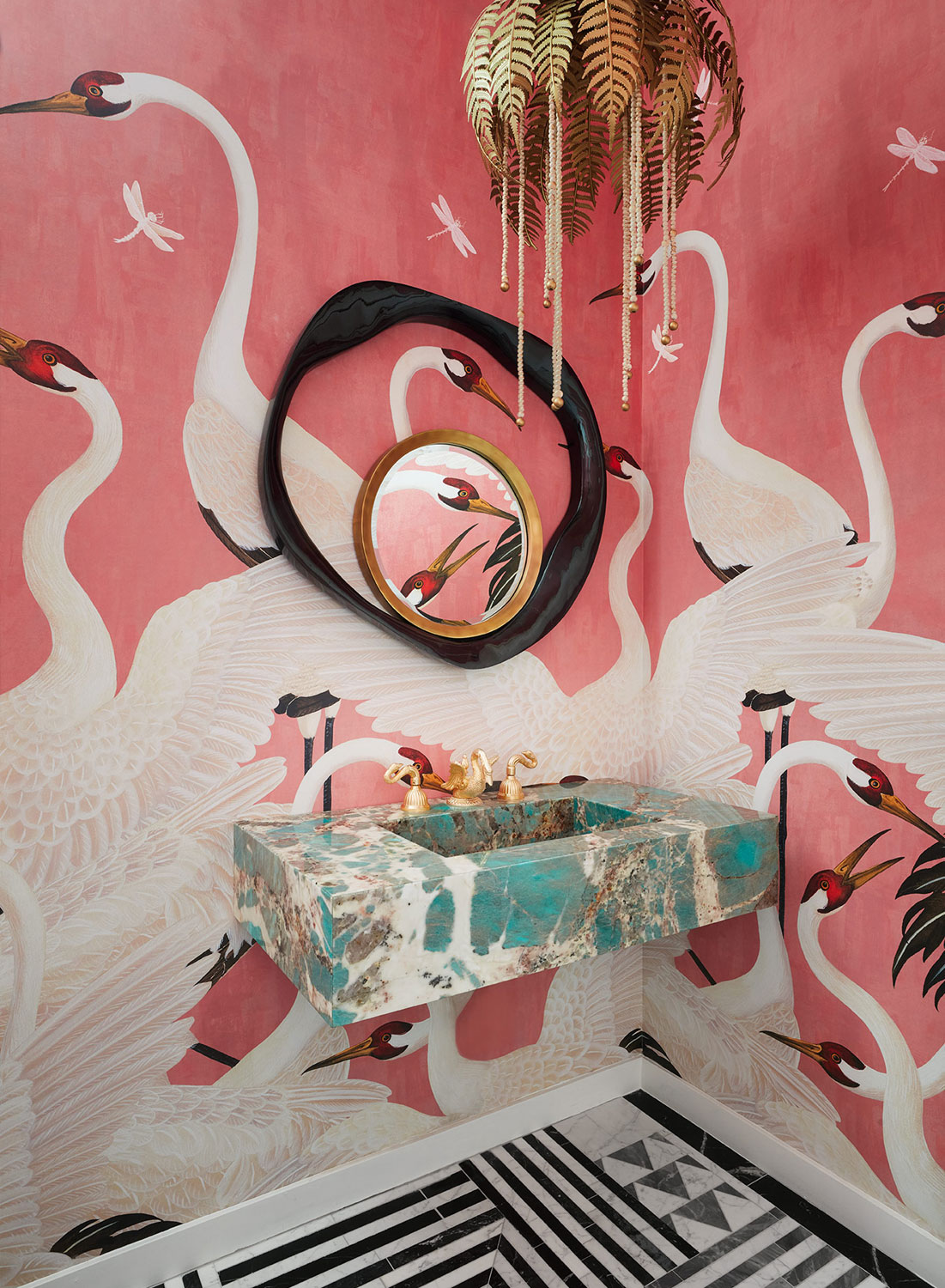
I’ll admit, that’s my absolute favorite as well. Undulating pink…it’s without a doubt my dream mirror.
I attended a party at the home while you were still finishing the design. I must confess…before I left, I went into the pink Gucci powder room and totally snapped some pictures because it’s just too good…oh and not to share it on Instagram…that was challenging. What was your inspiration for this daring bathroom and can you elaborate on that amazing sink? In this space, the client wanted to completely “go for it” and create a room that her guests would talk about for weeks after leaving her party. The space started with the stone selection. We were shopping for the kitchen stone and fell in love with the green marble. I had to find a way to work it in. The powder room was the obvious place, and we designed the room around it. I love using just a hint of unexpected color in a space; it can make it feel so special. Other times I love to see the conversation I can start between colors and color stories. It’s a wonderful challenge to push yourself creatively.
In Drawing 101, back in my art school days, we were not allowed to use any color until we mastered the use of just graphite pencils on paper. That way we could learn shading a shape, rather than being overwhelmed with what colors to use. Color came much later because it was a new challenge and a different way to look at things.
Hmmmmm, maybe that’s why I design in neutrals so often. Color and pattern are both challenging. You certainly nailed this design.
The sofa in the kids’ playroom has such an unusual shape. Can you tell me more about it? This was a great vintage find but in terrible condition when we found it. The lines were great with huge potential, but it had to be completely rebuilt. The sofa is three pieces that fit together to create a “U” shaped sectional, and each section almost “hugs” your body when you sit in it. It’s pretty fantastic. For the design, I loved the idea of a two-tone piece, that was one color on front and another complimentary color on the back, with contrasting piping detail. The end result was better than I imagined.
Talk about leveling up. The piping really does add that extra special something. If you don’t mind, I’ll be keeping this idea in my brain for my next upholstery project.
Do you have a favorite room? I think the living room is my favorite. The textures and mix of subtle with bold color and the pop of wild pattern on the coffee table is perfection…but maybe the powder room is tied for first.
Cambridge Day reports the owner of the Middle East complex in Central Square has put the complex up for sale - but that he hopes whoever buys it will keep the nightclub open.
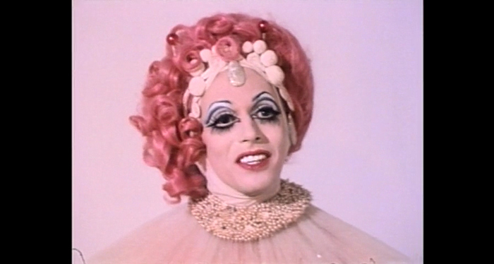
Alexis Haines (formerly Alexis Neiers) relives and recreates the iconic Nancy Jo voicemail from the short lived E! reality series “Pretty Wild.” Haines’ memoir, “Recovering From Reality,” is available now.


 Dustin Halleck Photography


