Director Alexander Payne (Election, Sideways) is coming out with his latest film in December. Downsizing, which stars Kristin Wiig, Matt Damon, and Christoph Waltz, is about a world where humans are able to shrink themselves down to five inches tall.
When scientists discover how to shrink humans to five inches tall as a solution to over-population, Paul (Matt Damon) and his wife Audrey (Kristen Wiig) decide to abandon their stressed lives in order to get small and move to a new downsized community — a choice that triggers life-changing adventures.
When humans get smaller, the world and its resources get bigger. We’d live in smaller houses, drive smaller cars that use less gas, eat less food, etc. It wouldn’t even take much to realize gains from a Honey, I Shrunk Humanity scheme: because of scaling laws, a height/weight proportional human maxing out at 3 feet tall would not use half the resources of a 6-foot human but would use somewhere between 1/4 and 1/8 of the resources, depending on whether the resource varied with volume or surface area. Six-inch-tall humans would potentially use 1728 times fewer resources.
I’m sure the movie skews more toward a generic fish-out-of-water tale rather than addressing the particular pros and cons of shrinking people down to the size of hamsters (e.g. cutting human life span by orders of magnitude), but I will still be first in line to see this one.
Protractor is a popular end-to-end test framework that lets you test your Angular application on a real browser simulating the browser interactions just the way that a real user would interact with it. End-to-end tests are designed to ensure that the application behaves as expected from a user's perspective. Moreover, the tests are not concerned about the actual code implementation.
Protractor runs on top of the popular Selenium WebDriver, which is an API for browser automation and testing. In addition to the features provided by Selenium WebDriver, Protractor offers locators and methods for capturing the UI components of the Angular application.
In this tutorial, you will learn about:
setting up, configuring and running Protractor
writing basic tests for Protractor
page objects and why you should use them
guidelines to be considered while writing tests
writing E2E tests for an application from start to finish
Doesn't that sound exciting? However, first things first.
Do I Need to Use Protractor?
If you've been using Angular-CLI, you might know that by default, it comes shipped with two frameworks for testing. They are:
unit tests using Jasmine and Karma
end-to-end tests using Protractor
The apparent difference between the two is that the former is used to test the logic of the components and services, while the latter is used to ensure that the high-level functionality (which involves the UI elements) of the application works as expected.
If you are new to testing in Angular, I'd recommend reading the Testing Components in Angular Using Jasmine series to get a better idea of where to draw the line.
In the former's case, you can leverage the power of Angular testing utilities and Jasmine to write not just unit tests for components and services, but basic UI tests also. However, if you need to test the front-end functionality of your application from start to end, Protractor is the way to go. Protractor's API combined with design patterns such as page objects make it easier to write tests that are more readable. Here's an example to get things rolling.
 /*
  1. It should have a create Paste button
  2. Clicking the button should bring up a modal window
*/

it('should have a Create Paste button and modal window', () => {

    expect(addPastePage.isCreateButtonPresent()).toBeTruthy("The button should exist");
    expect(addPastePage.isCreatePasteModalPresent()).toBeFalsy("The modal window shouldn't exist, not yet!");

    addPastePage.clickCreateButton();

    expect(addPastePage.isCreatePasteModalPresent()).toBeTruthy("The modal window should appear now");
});
Configuring Protractor
Setting up Protractor is easy if you are using Angular-CLI to generate your project. The directory structure created by ng new is as follows.
The default project template created by Protractor depends on two files to run the tests: the spec files that reside inside the e2e directory and the configuration file (protractor.conf.js). Let's see how configurable protractor.conf.js is:
If you are ok with running the test on Chrome web browser, you can leave this as is and skip the rest of this section.
Setting Up Protractor With Selenium Standalone Server
The directConnect: true lets Protractor connect directly to the browser drivers. However, at the moment of writing this tutorial, Chrome is the only supported browser. If you need multi-browser support or run a browser other than Chrome, you will have to set up Selenium standalone server. The steps are as follows.
Install Protractor globally using npm:
npm install -g protractor
This installs the command-line tool for webdriver-manager along with that of protractor. Now update the webdriver-manager to use the latest binaries, and then start the Selenium standalone server.
webdriver-manager update

webdriver-manager start
Finally, set the directConnect: false and add the seleniumAddress property as follows:
The config file on GitHub provides more information about the configuration options available on Protractor. I will be using the default options for this tutorial.
Running the Tests
ng e2e is the only command you need to start running the tests if you are using Angular-CLI. If the tests appear to be slow, it's because Angular has to compile the code every time you run ng e2e. If you want to speed it up a bit, here's what you should do. Serve the application using ng serve.
Then fire up a new console tab and run:
ng e2e -s false
The tests should load faster now.
Our Goal
We will be writing E2E tests for a basic Pastebin application. Clone the project from the GitHub repo.
Both the versions, the starter version (the one without the tests) and the final version (the one with the tests), are available on separate branches. Clone the starter branch for now. Optionally, serve the project and go through the code to get acquainted with the application at hand.
Let's describe our Pastebin application briefly. The application will initially load a list of pastes (retrieved from a mock server) into a table. Each row in the table will have a View Paste button which, when clicked on, opens up a bootstrap modal window. The modal window displays the paste data with options to edit and delete the paste. Towards the end of the table, there is a Create Paste button which can be used to add new pastes.
The sample application.
The rest of the tutorial is dedicated to writing Protractor tests in Angular.
Protractor Basics
The spec file, ending with .e2e-spec.ts, will host the actual tests for our application. We will be placing all the test specs inside the e2e directory since that's the place we've configured Protractor to look for the specs.
There are two things you need to consider while writing Protractor tests:
Jasmine Syntax
Protractor API
Jasmine Syntax
Create a new file called test.e2e-spec.ts with the following code to get started.
/* Path: e2e/test.e2e-spec.ts */

import { browser, by, element } from 'protractor';

describe('Protractor Demo', () => {

  beforeEach(() => {
    //The code here will get executed before each it block is called
    //browser.get('/');
  });

  it('should display the name of the application',() => {
   /*Expectations accept parameters that will be matched with the real value
   using Jasmine's matcher functions. eg. toEqual(),toContain(), toBe(), toBeTruthy() etc. */
   expect("Pastebin Application").toEqual("Pastebin Application");

  });

  it('should click the create Paste button',() => {
    //spec goes here

  });
});
This depicts how our tests will be organized inside the spec file using Jasmine's syntax. describe(), beforeEach() and it() are global Jasmine functions.
Jasmine has a great syntax for writing tests, and it works just as well with Protractor. If you are new to Jasmine, I would recommend going through Jasmine's GitHub page first.
The describe block is used to divide the tests into logical test suites. Each describe block (or test suite) can have multiple it blocks (or test specs). The actual tests are defined inside the test specs.
"Why should I structure my tests this way?" you may ask. A test suite can be used to logically describe a particular feature of your application. For instance, all the specs concerned with the Pastebin component should ideally be covered inside a describe block titled Pastebin Page. Although this may result in tests that are redundant, your tests will be more readable and maintainable.
A describe block can have a beforeEach() method which will be executed once, before each spec in that block. So, if you need the browser to navigate to a URL before each test, placing the code for navigation inside beforeEach() is the right thing to do.
Expect statements, which accept a value, are chained with some matcher functions. Both the real and the expected values are compared, and a boolean is returned which determines whether the test fails or not.
Protractor API
Now, let's put some flesh on it.
/* Path: e2e/test.e2e-spec.ts */

import { browser, by, element } from 'protractor';

describe('Protractor Demo', () => {

  beforeEach(() => {
    browser.get('/');
  });

  it('should display the name of the application',() => {

    expect(element(by.css('.pastebin')).getText()).toContain('Pastebin Application');

  });

  it('create Paste button should work',() => {

    expect(element(by.id('source-modal')).isPresent()).toBeFalsy("The modal window shouldn't appear right now ");
    element(by.buttonText('create Paste')).click();
    expect(element(by.id('source-modal')).isPresent()).toBeTruthy('The modal window should appear now');

  });
});
browser.get('/') and element(by.css('.pastebin')).getText() are part of the Protractor API. Let's get our hands dirty and jump right into what Protractor has to offer.
The prominent components exported by Protractor API are listed below.
browser(): You should call browser() for all the browser-level operations such as navigation, debugging, etc.
element(): This is used to look up an element in the DOM based on a search condition or a chain of conditions. It returns an ElementFinder object, and you can perform actions such as getText() or click() on them.
element.all(): This is used to look for an array of elements that match some chain of conditions. It returns an ElementArrayFinder object. All the actions that can be performed on ElementFinder can be performed on ElementArrayFinder also.
locators: Locators provide methods for finding an element in an Angular application.
Since we will be using locators very often, here are some of the commonly used locators.
by.css('selector-name'): This is by far the commonly used locator for finding an element based on the name of the CSS selector.
by.name('name-value'): Locates an element with a matching value for the name attribute.
by.buttonText('button-value'): Locates a button element or an array of button elements based on the inner text.
Note: The locators by.model, by.binding and by.repeater do not work with Angular 2+ applications at the time of writing this tutorial. Use the CSS-based locators instead.
Let's write more tests for our Pastebin application.
 it('should accept and save input values', () => {
      element(by.buttonText('create Paste')).click();

      //send input values to the form using sendKeys

      element(by.name('title')).sendKeys('Hello world in Ruby');
      element(by.name('language')).element(by.cssContainingText('option', 'Ruby')).click();
      element(by.name('paste')).sendKeys("puts 'Hello world';");

      element(by.buttonText('Save')).click();

      //expect the table to contain the new paste
      const lastRow = element.all(by.tagName('tr')).last();
      expect(lastRow.getText()).toContain("Hello world in Ruby");
});
The code above works, and you can verify that yourself. However, wouldn't you feel more comfortable writing tests without the Protractor-specific vocabulary in your spec file? Here's what I am talking about:
 it('should have an Create Paste button and modal window', () => {

    expect(addPastePage.isCreateButtonPresent()).toBeTruthy("The button should exist");
    expect(addPastePage.isCreatePasteModalPresent()).toBeFalsy("The modal window shouldn't appear, not yet!");

    addPastePage.clickCreateButton();

    expect(addPastePage.isCreatePasteModalPresent()).toBeTruthy("The modal window should appear now");


  });

 it('should accept and save input values', () => {

    addPastePage.clickCreateButton();

    //Input field should be empty initially
    const emptyInputValues = ["","",""];
    expect(addPastePage.getInputPasteValues()).toEqual(emptyInputValues);

    //Now update the input fields
    addPastePage.addNewPaste();

    addPastePage.clickSaveButton();

    expect(addPastePage.isCreatePasteModalPresent()).toBeFalsy("The modal window should be gone");
    expect(mainPage.getLastRowData()).toContain("Hello World in Ruby");

  });
The specs appear more straightforward without the extra Protractor baggage. How did I do that? Let me introduce you to Page Objects.
Page Objects
Page Object is a design pattern which is popular in the test automation circles. A page object models a page or part of an application using an object-oriented class. All the objects (that are relevant to our tests) like text, headings, tables, buttons, and links can be captured in a page object. We can then import these page objects into the spec file and invoke their methods. This reduces code duplication and makes maintenance of code easier.
Create a directory named page-objects and add a new file inside it called pastebin.po.ts. All the objects concerned with the Pastebin component will be captured here. As previously mentioned, we divided the whole app into three different components, and each component will have a page object dedicated to it. The naming scheme .po.ts is purely conventional, and you can name it anything you want.
Let's go over what we've learned thus far. Protractor's API returns objects, and we've encountered three types of objects thus far. They are:
promise.Promise
ElementFinder
ElementArrayFinder
In short, element() returns an ElementFinder, and element().all returns an ElementArrayFinder. You can use the locators (by.css, by.tagName, etc.) to find the location of the element in the DOM and pass it to element() or element.all().
ElementFinder and ElementArrayFinder can then be chained with actions, such as isPresent(), getText(), click(), etc. These methods return a promise that gets resolved when that particular action has been completed.
The reason why we don't have a chain of then()s in our test is because Protractor takes care of it internally. The tests appear to be synchronous even though they are not; therefore, the end result is a linear coding experience. However, I recommend using async/await syntax to ensure that the code is future proof.
You can chain multiple ElementFinder objects, as shown below. This is particularly helpful if the DOM has multiple selectors of the same name and we need to capture the right one.
Now that we have the code for the page object ready, let's import it into our spec. Here's the code for our initial tests.
/* Path: e2e/mainPage.e2e-spec.ts */

import { Pastebin } from './page-objects/pastebin.po';
import { browser, protractor } from 'protractor';


/* Scenarios to be Tested
  1. Pastebin Page should display a heading with text Pastebin Application
  2. It should have a table header
  3. The table should have rows
  4. app-add-paste tag should exist
*/

describe('Pastebin Page', () => {

  const mainPage: Pastebin = new Pastebin();

  beforeEach(() => {
      mainPage.navigateToHome();
  });

  it('should display the heading Pastebin Application', () => {

      expect(mainPage.getPastebinHeading()).toEqual("Pastebin Application");


  });

   it('should have a table header', () => {

      expect(mainPage.getTableHeader()).toContain("id Title Language Code");

  })
  it('table should have at least one row', () => {

      expect(mainPage.getFirstRowData()).toContain("Hello world");
  })

  it('should have the app-add-paste tag', () => {
      expect(mainPage.isAddPasteTagPresent()).toBeTruthy();
  })
});
Organizing Tests and Refactoring
Tests should be organized in such a way that the overall structure appears meaningful and straightforward. Here are some opinionated guidelines that you should keep in mind while organizing E2E tests.
Separate E2E tests from unit tests.
Group your E2E tests sensibly. Organize your tests in a way that matches the structure of your project.
If there are multiple pages, page objects should have a separate directory of their own.
If the page objects have some methods in common (such as navigateToHome()), create a base page object. Other page models can inherit from the base page model.
Make your tests independent from each other. You don't want all your tests to fail because of a minor change in the UI, do you?
Keep the page object definitions free of assertions/expectations. Assertions should be made inside the spec file.
Following the guidelines above, here's what the page object hierarchy and the file organization should look like.
We've already covered pastebin.po.ts and mainPage.e2e-spec.ts. Here are the rest of the files.
Base Page Object
/* path: e2e/page-objects/base.po.ts */

import { browser, by, element, promise, ElementFinder, ElementArrayFinder } from 'protractor';

export class Base {

    /* Navigational methods */
	navigateToHome():promise.Promise<any> {
    	return browser.get('/');
  	}

  	navigateToAbout():promise.Promise<any>  {
  	 	return browser.get('/about');
  	}

  	navigateToContact():promise.Promise<any>  {
  		return browser.get('/contact');
  	}

  	/* Mock data for creating a new Paste and editing existing paste */

	getMockPaste(): any {
		let paste: any = { title: "Something  here",language: "Ruby",paste: "Test"}
  		return paste;
	}

	getEditedMockPaste(): any {
		let paste: any = { title: "Paste 2", language: "JavaScript", paste: "Test2" }
		return paste;
	}

	/* Methods shared by addPaste and viewPaste */

	getInputTitle():ElementFinder {
		return element(by.name("title"));
	}

	getInputLanguage(): ElementFinder {
		return element(by.name("language"));
	}

	getInputPaste(): ElementFinder {
		return element(by.name("paste"));

	}
}
Add Paste Page Object
Blueprint for the AddPaste component
/* Path: e2e/page-objects/add-paste.po.ts */

import { browser, by, element, promise, ElementFinder, ElementArrayFinder } from 'protractor';
import { Base } from './base.po';
export class AddPaste extends Base  {

	getAddPaste():ElementFinder {
		return element(by.tagName('app-add-paste'));
	}

	/* Create Paste button */
	getCreateButton(): ElementFinder {
		return this.getAddPaste().element(by.buttonText("create Paste"));
	}

	isCreateButtonPresent() : promise.Promise<boolean> {
		return this.getCreateButton().isPresent();
	}

	clickCreateButton(): promise.Promise<void> {
		return this.getCreateButton().click();
	}

	/*Create Paste Modal */

	getCreatePasteModal(): ElementFinder {
		return this.getAddPaste().element(by.id("source-modal"));
	}

	isCreatePasteModalPresent() : promise.Promise<boolean> {
		return this.getCreatePasteModal().isPresent();
	}

	/*Save button */
	getSaveButton(): ElementFinder {
		return this.getAddPaste().element(by.buttonText("Save"));
	}

	clickSaveButton():promise.Promise<void> {
		return this.getSaveButton().click();
	}

	/*Close button */

	getCloseButton(): ElementFinder {
		return this.getAddPaste().element(by.buttonText("Close"));
	}

	clickCloseButton():promise.Promise<void> {
		return this.getCloseButton().click();
	}


	/* Get Input Paste values from the Modal window */
	getInputPasteValues(): Promise<string[]> {
		let inputTitle, inputLanguage, inputPaste;

		// Return the input values after the promise is resolved
		// Note that this.getInputTitle().getText doesn't work
		// Use getAttribute('value') instead
		return Promise.all([this.getInputTitle().getAttribute("value"), this.getInputLanguage().getAttribute("value"), this.getInputPaste().getAttribute("value")])
		.then( (values) => {
			return values;
		});

	}

	/* Add a new Paste */

	addNewPaste():any {
		let newPaste: any = this.getMockPaste();

		//Send input values
		this.getInputTitle().sendKeys(newPaste.title);
		this.getInputLanguage()
			.element(by.cssContainingText('option', newPaste.language)).click();
		this.getInputPaste().sendKeys(newPaste.paste);

		//Convert the paste object into an array
  		return Object.keys(newPaste).map(key => newPaste[key]);

	}

}
Add Paste Spec File
/* Path: e2e/addNewPaste.e2e-spec.ts */

import { Pastebin } from './page-objects/pastebin.po';
import { AddPaste } from './page-objects/add-paste.po';
import { browser, protractor } from 'protractor';

/* Scenarios to be Tested
  1. AddPaste Page should have a button when clicked on should present a modal window
  2. The modal window should accept the new values and save them
  4. The saved data should appear in the MainPage
  3. Close button should work
*/

describe('Add-New-Paste page', () => {

  const addPastePage: AddPaste = new AddPaste();
  const mainPage: Pastebin = new Pastebin();

  beforeEach(() => {

    addPastePage.navigateToHome();
  });

  it('should have an Create Paste button and modal window', () => {

    expect(addPastePage.isCreateButtonPresent()).toBeTruthy("The button should exist");
    expect(addPastePage.isCreatePasteModalPresent()).toBeFalsy("The modal window shouldn't appear, not yet!");

    addPastePage.clickCreateButton();

    expect(addPastePage.isCreatePasteModalPresent()).toBeTruthy("The modal window should appear now");


  });

  it("should accept and save input values", () => {

    addPastePage.clickCreateButton();

    const emptyInputValues = ["","",""];
    expect(addPastePage.getInputPasteValues()).toEqual(emptyInputValues);

    const newInputValues = addPastePage.addNewPaste();
    expect(addPastePage.getInputPasteValues()).toEqual(newInputValues);

    addPastePage.clickSaveButton();

    expect(addPastePage.isCreatePasteModalPresent()).toBeFalsy("The modal window should be gone");
    expect(mainPage.getLastRowData()).toContain("Something here");

  });

  it("close button should work", () => {

    addPastePage.clickCreateButton();
    addPastePage.clickCloseButton();

    expect(addPastePage.isCreatePasteModalPresent()).toBeFalsy("The modal window should be gone");

  });

});
Exercises
There are a couple of things missing, though: the tests for the View Paste button and the modal window that pops up after clicking the button. I am going to leave this as an exercise for you. However, I will drop you a hint.
The structure of the page objects and the specs for the ViewPastePage are similar to that of the AddPastePage.
Blueprint for the ViewPaste component
Here are the scenarios that you need to test:
ViewPaste Page should have a button, and on click, it should bring up a modal window.
The modal window should display the paste data of the recently added paste.
The modal window should let you update values.
The delete button should work.
Try to stick to the guidelines wherever possible. If you're in doubt, switch to the final branch to see the final draft of the code.
Wrapping It Up
So there you have it. In this article, we've covered writing end-to-end tests for our Angular application using Protractor. We started off with a discussion about unit tests vs. e2e tests, and then we learned about setting up, configuring and running Protractor. The rest of the tutorial concentrated on writing actual tests for the demo Pastebin application.
Please let me know your thoughts and experiences about writing tests using Protractor or writing tests for Angular in general. I would love to hear them. Thanks for reading!
Pizza Hut really used to be excellent. Even into the 90s, it was still a nice place to eat. Now, even though I still love their pizza, the service is always terrible, and it's just another restaurant. But the prices have gone up more than inflation. So, what's the point?
From the moment you walked in the place, you knew it was something special. You knew this was going to be something you’d remember, and it all started with the decor. The interior didn’t look like a fast food joint with it’s huge, sprawling windows, and cheap looking walls, or tiled floors. When you walked in, you were greeted by brick walls, with smaller windows, that had thick red fabric curtains pulled back, and a carpeted floor. It just felt higher-class than walking into McDonalds or Burger King.
The booths were high-backed, with thick padded vinyl seats and back rests. The high backs was also different from your usual eating out experience. These high backs gave you a sense of privacy, which was great for a date night. Also great for a date night were the candles on the tables. Those little red glass candles that were on every table, and were lit when you got to your seat. It was a little thing, but when added to everything else, it was quite the contribution. Your silverware was wrapped in a thick, cloth napkin that beat the heck out of the paper napkins everyone else was using at the time. And you could always count on the table being covered by a nice, red and white, checkered table cloth.
Pizza Hut was the #1 eating-out destination for me as a kid. My family never ate out much, so even McDonald’s, Arby’s, or Hardee’s was a treat. But Pizza Hut was a whole different deal. Did I enjoy eating salad at home? No way. But I had to have the salad bar at Pizza Hut. Did I normally eat green peppers, onions, and black olives? Nope…but I would happily chow down on a supreme pizza at Pizza Hut. And the deep dish pan pizza…you couldn’t get anything like that in rural Wisconsin, nor could you easily make it at home. Plus it was just so much food…you could eat as much as you wanted and there were still leftovers to take home. Plus, with those high-backed booths, you could play paper football without having the extra points go sailing into the next booth.
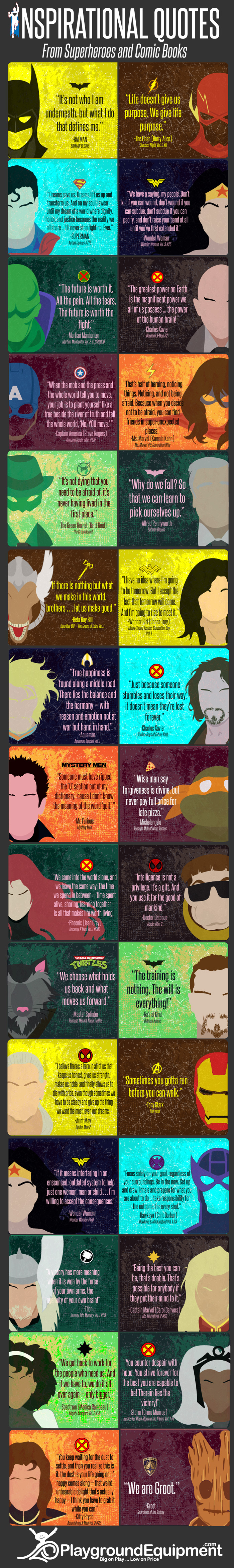
Inspirational Quotes from Superheroes and Comic Books
Superheroes can be empowering and inspirational for both children and adults. Despite their superpowers and the colossal obstacles that they face, many of their messages in movies, television, and comic books can resonate with normal human beings too! This infographic is a collection of some of the most powerful quotes that are applicable in the real world...
Straight outta HasCon: The Transformers Optimus Prime Converting Power Bank! Hasbro revealed their geek's wet dream of a charger in July, but hauled it out in person Autobot for the first time at their HasCon convention in Rhode Island over the weekend.
Commercial sales through Hasbro will begin on September 20, 2017, but for those who want to get their nimble fingers on one of the first 6500mAh Optimus Prime, enterprising HasCon attendees are currently selling off theirs on eBay. Here's one listing. A simple "Optimus Prime Power Bank" search will turn up several others.
The fearless leader of the Autobots charges devices with the same triple-jointed flair he uses to fight the Decepticons. Packed into his standard backup battery brick he'll deliver 6500mAh of additional juice to most rechargeable devices. But if you want to turn your charging session into more of a spectacle, or just need something to dick around with while you wait for an extra bar, the power bank converts from gray brick to full-color and ready-for-battle Optimus Prime in 16 steps.
Once on the scene, Optimus Prime bears a blue-Energon LED sword, which you can light up and dick around with even more via the battery power you're supposed to be saving for the phone that will inevitably die right as you open the Lyft app for a ride home.
A top Dude Gift for a Geek
pick, the Transformers Optimus Prime Converting Power Bank also comes with a mobile phone stand and a micro USB / USB charging cable.
But what if we don't really need React, or any other fairly-large-ish JavaScript framework?
What if the only thing we want is the ability to render HTML templates and also really efficiently re-render them when we need to, like React is known for?
As far as I understand it, that's what projects like lit-html are for. As I write, it's a pretty new library from Google and the Polymer folks.
It allows you to define an HTML template with regular template literals, like this:
And this is where lit-html shines. It's smart enough to only update the parts of the DOM it needs to.
Here's a little comparison where some data is changed, then the templates re-rendered. If we innerHTML the whole thing, well, the entire DOM is changed. With lit-html it just changes smaller inner parts.
Here's a little video where you can see the DOM-updating difference:
lit-html on the left, "regular" on the right. Demo project.
There is another project along these lines too. I don't know quite enough to judge, but it's a bit older and I believe it's a bit more robust. It's called HyperHTML.
HyperHTML also allows you to create templates and render them. And most importantly rerender them efficiently.
Here's a demo where the data comes from the Quotes on Design API and inserted into a template:
Kinda cool that these mini-libraries exist that do useful things for us, so when situations arise that we want a feature that a big library has, but don't want to use the whole big library, we got smaller options.
Jenny List had an amusing piece some years ago for the Oxford Dictionaries blog about diacritics, starting by saying you might think they’re not needed for English, and continuing:
But as any halfway observant child would tell you, what about the café down the road? Or the jalapeño peppers you and your fiancée enjoyed on your à la carte pizza, brought to you by a garçon? Washed down with a refreshing pint of Löwenbräu while reading a Brontë novel, no doubt. Or perhaps you’re not as naïve as all that, dreaming as you were of a ménage à trois. No, that’s probably a bit risqué, not to mention too much of a cliché. For somewhere so supposedly devoid of diacritic marks on our letters, we do seem to see an awful lot of them.
Of course, the English language has appropriated so many words from other languages that it would be extremely surprising were some of them to manage the transition unscathed. Most words gradually lose their accents on Anglicization; cafe is a perfect example of this as its occurrence without the accent is slowly overtaking that of café. Our lexicographers use the Oxford English Corpus to track the relative use of diacritic marks when deciding upon the preferred form of an imported word. Other words have left their diacritics behind completely, such as muesli (which has lost its umlaut on the u) or canyon (which is an Anglicization of the Spanish word cañon). Sometimes a word will retain its accent to preserve the pronunciation thus bestowed or to settle any ambiguity between the imported word and a similarly spelled existing English word. Thus we find maté and mate or the three outwardly similar but completely different words pâté, pâte, and pate. Occasionally we even encounter the same word entering English by two completely different routes, such as rosé and rose or the unexpected souffle and soufflé. Who knew that omitting that final e-acute could put you in hospital!
Some of our most familiar diacritics appear in brand names. Most of us will have eaten Nestlé chocolate (or perhaps even drunk Nescafé coffee) or imbibed copious quantities of umlaut-bespeckled German beers, but not I hope before driving away in a Škoda or a Citroën. As an aside, given the treatment his surname receives from most Brits, it should be stressed that the pronunciation of that last trema on the ‘e’ is important: cars from the company founded by André Citroën are not lemons.
She goes on to talk about Häagen-Dazs ice-cream, Gü puddings, and the metal umlaut; as for André Citroën, we discussed the history of his name back in 2008 — his cars may not have been lemons, but the Citroëns were originally Limoenmans.
It’s been a while
since I’ve done this sort of article, but today I’m back, and I really think
you’re going to love this one. We’re going to put our creative juices on
hold and spend some quality time together exploring the history and evolution
of those little critters that we like to call “icons”.
So, if you’re into icon design
as much as I am (digital fist bump while smiling like a crazy person), make a
quick stop at the nearest espresso machine and grab a cup of that magical bean
liquor, and then gently hop on back into the chair and let the journey begin.
1. Icons. The What, When, and Why
Well, I guess a lot of you already know the
answer, but if the social sciences class "Research Methods and Techniques" taught me
anything, it’s that for each and every study (which this article clearly is),
you should always start from the root level of your concept and then gradually build
your way up using multiple layers of information.
The What
So, “icon” is a noun
of Greek origin (eikόn), and is
defined according to the Merriam Webster online dictionary as “a conventional
religious image typically painted on a small wooden panel and used in the
devotion of Eastern Christians.”
Now, I think we
can all raise an eyebrow and agree that this isn’t exactly the sort of “icon”
that we’re interested in, since we aren’t actually in the business of painting
divinity-praising images on wood (or I guess most of us aren’t), so let’s try
and approach the term from a more modern, technological perspective.
From a digital
standpoint, an “icon” is a “graphic symbol on a computer display screen that
represents an object (such as a file) or function (such as the command or
delete)”.
An even more
insightful explanation can be found on the online version of the Cambridge
Dictionary where they define it as “a small picture or symbol on a computer
screen that you point to and click on (=press) with a mouse to give the
computer an instruction.”
Now, before we move on, I would like to point out that although icons
were initially created with the intent of being used within (desktop) computer
graphic interfaces, they have quickly proven their utility, making their way to
other screen-enabled devices that have adopted them due to their ease of use.
The When
The first ever set
of computer icons was born in 1981, when computer scientist David Canfield
Smith and designer Norman Lloyd Cox joined forces in order to bring the “office
metaphor” to the Xerox Star 8010, which was the first office intended computer
of its time.
The idea was to have Norman design a set of office items such as
documents, folders, file cabinets, etc., which were to define the first icon
style (pixel art) on which all the other ones would be based.
The Why
The reason why
icons came to be is that computers advanced to a stage where they needed a
visual symbol capable of easing the interaction between their software’s
interface (the GUI or Graphical User Interface) and the user’s needs.
This means that
from a symbolistic perspective, it has both a function and a meaning,
since it has to carefully and correctly convey the object or action which it
was intended to describe, using visual cues that aim to be self-explanatory.
You can learn more about the research process involved in the creation
of these types of visual metaphors, by reading my 10 Top Tips for Creating Awesome Icons article, which will answer most if not all of your questions.
2. Defining (Creative) Style
Since the article
focuses on presenting and explaining the evolution of icons from a visual
perspective, it’s only natural that we take a couple of moments to see exactly
what “style” is, since a lot of times the term gets misunderstood.
If we go back to
the Merriam Webster dictionary, we’ll see the noun defined as “a particular
manner or technique by which something is done, created, or performed”.
One definition really stood in my mind, since it describes the term as
“a distinctive appearance, typically determined by the principles according to
which something is designed”.
Put both together,
and we quickly realize that style is basically a form of expression (be it
visual or of another nature) based on an intricate relationship between the
methods and principles carefully chosen and developed by a creator (the artist),
in order to bring his or her vision into form.
Now, for example, an actor’s style can easily be reduced to the way that person talks, walks, and looks. Singers can set themselves apart by adopting a specific set of clothing
and a softer or deeper voice.
Designers, on the
other hand, strive to accomplish a sense of style by infusing different visual
characteristics based on methods and techniques that were developed over a long
process of exploration and refinement, making them their own.
Now here is where
it becomes a little tricky, since in design, one’s personal style can quickly be taken, imitated and iterated upon, turning it into a collective style, where
different designers follow similar if not identical compositional techniques.
That being said, no individual style is completely pure, since
everything that is being created is basically a visual iteration and/or
evolution based on somebody else’s previous work.
3. What Influences Style?
At this point, we’ve managed to get a sense of what “style” is, but let’s take a couple of
moments and see what factors can influence its development and evolution.
As we all know, for
every art form there are a set of tools and mediums that end up influencing its
growth and popularity, and icon design is no exception to that rule.
As designers, we spend
our days creating digital products that are meant to live on within a digital medium,
which is influenced by the state and evolution of technology determined by the computing
power and display advances made available in one’s lifetime. This is why the
journey from pixel art icons to fully fledged skeuomorphic ones was a really
long one, since computers didn’t have the raw power to display the amount of
pixels that we currently have.
For designers, this
means that they always have to adapt and become fully dependent on the medium, which
depending on its evolutionary state can influence their style by adding or
removing creative limitations.
A perfect example
of this is VR (Virtual Reality) where we are just starting to make advances by figuring out the possibilities and limitations of this new and exciting
medium.
In the beginning, I promised that the study would focus on presenting and
briefly describing the ten styles that shaped icon design into its current
state, so without wasting any more time, grab another sip of that hot coffee and
let’s jump straight into it.
3.1 The Original Three
We’re going to kick things off by presenting the trinity from which all
started.
Pixel Art Icons
Then
As we saw a few
moments ago, the first ever icon style that came into existence was created
and shaped by the technology of its time, when computers were slow and designers
had to deal with monochromatic displays.
The mission was to
make use of the existing limitations and create the icons using an elaborate
process of positioning a specific number of black pixels over a square grid, until
the symbol started taking shape, which is where the name of the style comes
from.
The style itself can only be described as bold, since it used hard, thick, black lines for the
outlines and softer, thinner lines and details for the inner composing sections.
To me personally, pixel-based icons are really impressive since not only
were they the first to open up personal computers to the consumer market, but they’ve
also managed to stay relevant due to the simplicity of their nature, since over
their 36 years of existence, not much has changed, and maybe that’s a good
thing.
Xerox 8010 Star GlobalView OS - image provided by ToastyTech
Now
Today, pixel art icons continue to maintain their popularity, since they’re a powerful nostalgia trigger, bringing back the feel and look of the early days of computing, where style wasn’t about how many details you could cram into a small space, but how you could capture the eyes’ attention using as few visual elements as possible.
The year is 1985,
and ATARI has just debuted TOS (The Operating System) with the launch of its
Atari 520ST computer, which is the first time we see a visual evolution from
the pixel icons. If before the user had to deal with two-dimensional icons, now
the experience changes for the better with the introduction of isometric icons,
based on the same “office metaphor”, which added the illusion of depth and dimension
to its GUI (Graphical User Interface) using the third axis.
In terms of style,
this wasn’t a radical departure. Think of it more as a visual improvement,
since they were still pixel based, but brought some subtle changes such as the
addition of projected hard shadows and uniform line thickness.
To some, the word “isometric” doesn’t seem like the best way to label
the style, since by its definition, an isometric projection is a “method for
visually representing three-dimensional objects in two dimensions” in which
“the three coordinate axes appear equally foreshortened and the angle between
any two of them is 120 degrees”. To me personally, they could be seen as the
first attempts at bringing a new perspective to the “office metaphor” that
ultimately led to what we now call isometric icons.
Today, the style
has seen a radical departure from its monochromatic pixel-based origins, leaning
heavily on the use of colors and shapes in order to bring three-dimensional
objects to life.
In terms of complexity, the style is fairly difficult to master, since
it requires designers to visually reimagine the object they want to
portray using a rotated cube as a reference object, which isn’t always easy, especially when you’re dealing with oddly shaped objects.
Fast forward four
years, and things are finally starting to break the pattern with the launch of Steve Jobs's NeXT workstation computer, which came with NeXTSTEP OS.
If up until this
point icons were thought of as being simple symbols meant to ease the interaction
between human and machine, Jobs took it to the next level with the
introduction of the first ever skeuomorphic icons, which were designed to mimic
their real-world counterparts.
Say goodbye to those thick, chunky outlines, and hello to a level of
craftsmanship never before seen inside a GUI (Graphical User Interface),
characterized by the use of shading and highly detailed illustrations all
crammed inside the same small space.
As computers became
more powerful and screen technology evolved, skeuomorphism became more of an
art form than a simple symbol, pushing the techniques and imagination of its
creators to a point where the depicted objects blurred the line between pixels
and reality.
From intricate
gradients to life-like textures, highlights and shadows, the process can be
really hard to master if you haven’t had any artistic training. If you're interested in this style, you can start learning by recreating a Stylized Strawberry Icon which will show you all the basics.
The style itself became super popular in 2007 with the launch of Apple’s
iPhone, and remained so up until the year 2012, when there was a shift from
realistic icons to minimalist ones.
At this point, our
timeline is going to get a little blurry here and there, since for some of the upcoming
styles we won’t be able to pinpoint the exact moment when they appeared and
gained popularity, which is why I’ve decided to group and order them based on
the attributes which they share and evolved from.
Line icons are a
direct evolutionary branch of the original pixel art icons, being one of the
current popular styles practiced, due to their ability to portray powerful
imagery using simple shapes and outlines.
For a design
philosophy, the style itself uses the same principle of separating the object’s
different composing sections using hard, thick lines, but it does so using
strokes as opposed to individual squares. This change of technique has made it
easier for the designer to create and adjust them, since you’re now dealing
with shapes and paths instead of individual pixels.
Beyond that, the
style has become more organic, since the evolution of computer displays has
made it possible to use curved lines and rounded corners, compared to the old
days when you had to bring your ideas to life using super-sharp rectangular
shapes.
I personally love the style, since it’s easy to approach and get good at
once you’ve practiced it a few times.
Glyph Icons
From a
terminological perspective, the noun “glyph” comes from the
French “glyphe” which itself originates from the Greek “gluphē” and can be defined as a “hieroglyphic character
or symbol”. From a design perspective, a “glyph” is a visual style, where the
objects are represented using monochromatic shapes that can have subtle empty spaces
separating their different composing sections.
While simple in its nature, the style can be really effective, especially
when used in smaller sizes, since you can depict the object using a
minimalist but still comprehensible result, which is why it can be seen as
the precursor of flat design.
Flat icons as a
style became popular around the year 2012, with the launch of Microsoft’s newly
redesigned visual language that we knew as Metro (now Fluent), which came as a
direct response to Apple’s abuse of skeuomorphism.
Visually speaking,
there was a huge shift in design philosophy, aiming for a clear, minimalist approach by breaking the object down to its bare essentials,
removing as many details as possible in the process.
This led to the
birth of a new type of icons that were easy to understand and use, due to the
fact that the focus had been redirected onto the careful use of colors and
basic geometric shapes.
Eventually, designers saw the potential that flat design had, and they started creating new icons based on clear shapes, free of any gradients or drop
shadows, and developed the style into what it is now.
As things started
changing with flat design, in 2014 Google decided to embrace the change and brought
designer Matias Duarte aboard to help create its own visual language, which it
called Material Design.
Now, if skeuomorphism had too much going on, and flat design was well, too flat, Google
positioned itself somewhere in the middle by bringing back the highlights and
shadows but giving them a subtler presence, creating a visual style where
objects are stacked over one another. They went even further and put together a
pretty extensive online guide, where they talk about everything from
material properties to layout principles and color styles, which makes it
really easy to jump in and adopt the style.
In my opinion, material icons are a nice addition to flat design, and as
long as Google has something to say, they will continue to be popular.
For the next style,
it’s really kind of difficult to put a label on, since it sits somewhere between
the boundaries of line icons and isometric ones, borrowing key elements from
both.
I’ve almost broken my brain trying to define it, and I finally came to the conclusion that the
best fit would be dimensional, since the process focuses on adding dimension or
depth to the icon from a horizontal perspective.
The way it’s done is
by presenting both the front and one of the object’s sides, using rectangular
shapes for everything that is not of circular or curved nature. For the objects
that fall within the second category, they are usually represented using one
perspective, the front, which creates a contrasting and at the same time cohesive
balance between the icon’s composing elements.
In terms of difficulty, the style is somewhat easy to understand and
master as long as you’ve got a basic understanding of perspective, so that you
can correctly define and position the details needed for both the front and
side sections.
This next one is in
a category of its own, since as visually appealing as it is (just look at these
little beauties), it’s not that frequently used since most of the time it’s
viewed as being too “playful”. The style became more popular after Dropbox’s
rebranding, which showed the potential to build a truly unique identity, using
hand drawn-like lines that have a shaky nature to them.
In my opinion,
this type of icon can prove to be friendlier, since the relation between
them and the user becomes warmer because you’re dealing with symbols that
feel as if they were designed not by a computer, but rather by a living, breathing
human.
In terms of complexity, the style can be hard to handle, especially if
you’re not used to drawing and shading, which also makes it hard to imitate,
since you’re not just creating the shapes by clicking and dragging rectangles
and circles.
Lastly, we have a
breed of icons that is truly unique since its dynamic nature begs you to click
on them. While they might look like pure visual gimmicks, animated icons are
the future of interaction, since they hold an incredible power when it comes to
the engaging process between the user and the interface.
No matter what
form they take (flat, line, etc.), animated icons can bring something new and
fresh to the table, due to their second state (when hovered on), and thus
double the information available to the user, since when hovered on, they can
bring useful data in a matter of seconds.
In a world where
VR (Virtual Reality) and AR (Augmented Reality) are the future, one can see the potential of integrating animations within the fabric of icons.
In terms of complexity, the style can be hard to master, since you are not only designing them but also taking the time to fully bring them to life,
which can be hard if you don’t know exactly what you want to express through
them.
Before we wrap things up, I really want to thank each and every designer who participated in the study, and most importantly ToastyTech for providing the images of the operating systems.
That being said, I hope you've enjoyed going through the history of what we call icons and discovered something new and captivating.
Also, if you want to learn more about icons, I strongly recommend you go through some of the following articles, since I'm sure you'll end up finding some fresh and useful tips.
As a beginner, creating digital artwork intended for web use can sometimes get a bit frustrating, especially when you put a lot of time into a piece (be it...
Today we’re going to take a look at the different ways of exporting icons using a tool that is often feared, but will take your productivity to another level...
Lately I’ve been getting a lot more technical and started exploring solutions to the different challenges that you might encounter along your creative...
This little quick tip is dedicated to a subject that is close to my heart but at the same time gave me some strong headaches in the early days of my design...
T-Mobile has made several Un-carrier moves in an attempt to shake up the wireless industry and solve pain points for customers, and today the next Un-carrier move has been revealed.
T-Mobile today unveiled Netflix On Us. Starting September 12, T-Mobile customers on a qualifying T-Mobile One plan can get a free Netflix subscription each month.
To get your free Netflix, you’ll need to have at least two voice lines on a T-Mobile One plan with taxes and fees included. This includes customers with free lines from the recent “lines-on-us” deals. However, T-Mo customers on an Unlimited 55+ or 2 lines for $100 promo will need to switch to the latest T-Mobile One plan to qualify for Netflix On Us.
Customers that qualify for Netflix On Us can enroll online, in a T-Mobile store, or by calling T-Mobile customer service starting September 12. To enroll, you’ll be given a URL to link your T-Mobile account with your Netflix account.
The Netflix On Us promo covers the cost of the standard $9.99 Netflix plan with two streams. If you’d like to upgrade to the premium $11.99 Netflix plan with four streams, Ultra HD, and HDR, you can do so and T-Mo will add the $2 difference to your bill each month.
Sawyer Hollenshead has written up his thoughts about how he collaborated with the designers and developers on the HealthCare.gov project.
In this post, I’d like to share some of the bigger technical decisions we made while building that design system. Fortunately, a lot of smart folks have already put a lot of thought into the best approaches for building scalable, developer-friendly, and flexible design systems. This post will also shine a light on those resources we used to help steer the technical direction.
There's a lot going on in here, from guidelines on code architecture and documentation to build systems and versioning. In other words, there's a lot of great detail on the inner workings of a massive public project that many of us are at least outwardly familiar with.
Interesting to note that this project is an offshoot of the United States Design Systems project, but tailored specifically for the Centers of Medicare & Medicaid Services, which oversees HealthCare.gov.
In 1952, a friend of J.R.R. Tolkien showed him a tape recorder, which the author had never seen before. Delighted, Tolkien sat for his friend and read from The Hobbit for 30 minutes “in this one incredible take”. The audio is split between these two videos (with visuals and music added later):
Given the circumstances, the clarity of this recording is pretty remarkable. Give it a listen for at least the first two minutes…hearing Tolkien do Smeagol/Gollum’s voice is really cool. (via open culture)
Each year on the 19th of January there is renewed effort to canonize Robert E. Lee, the greatest confederate general. His personal comeliness, his aristocratic birth and his military prowess all call for the verdict of greatness and genius. But one thing — one terrible fact — militates against this and that is the inescapable truth that Robert E. Lee led a bloody war to perpetuate slavery. Copperheads like the New York Times may magisterially declare: “of course, he never fought for slavery.” Well, for what did he fight? State rights? Nonsense. The South cared only for State Rights as a weapon to defend slavery. If nationalism had been a stronger defense of the slave system than particularism, the South would have been as nationalistic in 1861 as it had been in 1812.
No. People do not go to war for abstract theories of government. They fight for property and privilege and that was what Virginia fought for in the Civil War. And Lee followed Virginia. He followed Virginia not because he particularly loved slavery (although he certainly did not hate it), but because he did not have the moral courage to stand against his family and his clan. Lee hesitated and hung his head in shame because he was asked to lead armies against human progress and Christian decency and did not dare refuse. He surrendered not to Grant, but to Negro Emancipation.
GitHub is a great place to find projects that are freely distributed to the public, but have you ever starred a repo only to forget how cool and useful it could be? In this article I’ll bring to light some fantastic projects freely available on GItHub that have a strong focus on helping animators building motion for the web.
Rellax is a buttery smooth, super lightweight, parallax library that also works across various devices. Without writing tons of code you can learn how to make a smooth scrolling experience for your project and fully understand the ins and outs of what makes parallax what it is.
If you’re into creating more life-like physics-based motion for your work look no further than dynamics.js.
With it, you can animate CSS properties of any DOM element, SVG properties and JavaScript objects. Not only will this library test your JS prowess, but you’ll also learn how physics makes for a more intuitive and life-like experience for users.
The sliders on its homepage really help you to understand how each property works in conjunction with its peers to create physics-based motions which reflect our real world movements.
Create stunning, fluid and smooth transitions between your website’s pages. Barba.js is a small (4kb minified and gzipped), flexible and dependency-free library which helps take your website’s UX to the next level.
It’s also a lesson in how PJAX (push state AJAX) and the Push State API can be used to enhance page transitions. If you’ve never heard of these technologies it’s a great introduction to them that, in the end, results in a very slick effect for page traversing.
Tip: take a look at this tutorial for more on Push State:
In this tutorial we’re going to build a website whose pages transition smoothly, without the usual aggressive page refresh. To achieve this we’ll use the...
Wick is the internet’s free and open source multimedia creation toolkit. It’s a browser-based hybrid animation and coding environment for crafting interactivity for the web. Heavily inspired by tools such as Flash (keyframe-based animations anyone?), HyperCard, and Scratch, it was developed in response to a growing need for such a tool with the modern web.
Create smooth motion using the browser as your guide, without downloading any additional software to get the job done.
Create beautiful CSS3 powered animations in no time. The tool on bouncejs.com allows you to generate static keyframes that can be used without any extra JavaScript, but if you’d like your application to generate these on the fly, you can use the Bounce.js library.
The keyframe output is definitely intriguing, and insightful into the use of the matrix() CSS function and keyframe building. This is a great tool to really fine-tune a specific motion and understand how keyframes can be used to create stunning bounce-esque movements. There is also a great Medium article, written by its creator Joel Besada, on reducing the amount of keyframes generated, why this is something worth striving for, and a fascinating look into easing.
Note: at present time Bounce is no longer under active development with no plans for future development according to Joel.
Anime is a lightweight JavaScript animation library. It works with any CSS properties, individual CSS transforms, SVG or any DOM attributes, and JavaScript Objects.
This is a wonderful library for getting a grasp on how to construct and learn about timeline-based movements, starting animations at certain values, complicated keyframe animations, defining starting times relative to a previous animations duration, building playback controls and so much more.
I highly suggest giving it a run through and if you desire even more there are plenty of demos on CodePen as well.
I love this one. Wait! Animate provides an easy way to calculate keyframe percentages so that you can insert a delay between each animation iteration.
There is a config tool to add waits to your own animations without the need for JavaScript, since CSS doesn’t provide an easy way to pause an animation before it loops around again; animation-delay simply denotes a delay at the very start of the animation.
You can even customize your timing, duration and movement direction in order to fine tune your desired movement. This is a really fun way to learn about motion and gives you feedback for your settings in real-time.
MoJS is a “motion graphics tool belt for the web”. It allows you to create silky smooth animations and effects for a staggering user experience. There is even an option to create a custom build for your current project’s needs; so long large file size overheads!
There are plenty of demos to dive into and listed on GitHub. Learn to create some really captivating motion effects like my favorite the “Bubble Layout”, word revealing, dust trails and other effects like “burst”, plus much more. If you want to learn how to create complicated and intricate effects look no further, because MoJS has your back.
Another ghost.. Spirit is a superb animation tool for the web (the app can be found here); jump in and animate objects using a visual timeline. I just know this one is going to be awesome!
Spirit will change the way you create animations for the web. You are given full timeline control, the ability to inspect animations and an easy to learn and understand API. It’s an intuitive and simple way to comprehend building animations without the large overhead of learning complicated software.
ScrollReveal gives you easy scroll animations for the web. And its lightweight too; aside from having zero dependencies, the library is 3.3KB minified and Gzipped.
Get your feet wet with interval-based sequence animations that can be configured to load asynchronously. ScrollReveal also supports 3d rotation out of the box and that means you can get your 3D learn on and really get creative without having to grok the underlying scroll functionality and mechanics.
Parting Thoughts
Do you have some more open-source repos I missed? Have you used any of the projects listed for this article? Leave a comment and link below! I hope at least one of these examples can be of use in your daily work. Happy coding!


