×You need to sign in to continue.

Shared posts

14 Jan 22:03

all-four-cheekbones: facts-i-just-made-up: Genetically...

firehose

read til end


all-four-cheekbones:

facts-i-just-made-up:

Genetically Modified Berry compared to Organic Berry:

Note that the modified specimen is bloated to about 3 times the mass of the common berry. Advanced rot has set in prior to maturity and tests revealed 78% more lactic acid in the modified organism.

Upon contact with the modified berry, the picker’s hands exhibited a rash which is clearly visible on the fingers and should not be mistaken for juice stains acquired during picking. While the common berry, of course, has no ill effects on the skin, the modified organism had an effect similar to poison oak and swelling set in shortly after the photo was taken.  The discoloration and pain lasted approximately 12 hours with treatment including Neosporin and Syrup of Ipecac.

At 16 hours the specimen went missing and could not be monitored for decay rates.  While the common berry remained, the modified berry was spotted the next Tuesday at the corner of Wallace and 12th St. Having grown another meter and a half, the genetically modified berry murdered two prostitutes and became the target of a cross country manhunt. It was last seen on February 20th in Boulder, CO where it has joined with several bananas from the Monsanto corporation and stolen at least two shotguns from the Boulder Police Department.

A manifesto was released online suggesting that the berries intend to strike at our nurseries, killing our young and replacing them with further modified organisms which we will raise as our own. They also intend to “free their enslaved brothers” by treating common fruits and possibly vegetables with mutagens.

The head of the FDA could not be reached for comment as he has gone missing. Only a glass of unidentified red fluid was found in his office, labeled “Extra Pulp”.

#I am so glad I kept reading

14 Jan 21:43

Photo

firehose

I miss you Space Ghost


14 Jan 21:38

gotodisneyandbeyond: Moana (2018) - The main character will be...

firehose

'Indiewire describes "Moana" as a "Polynesian musical," and in September, Musker confirmed that song would play a crucial role in the movie, telling the site that "animation and music go along together." '


gotodisneyandbeyond:

Moana (2018) - The main character will be Moana Waialiki, a sea voyaging enthusiast, and the only daughter of a chief in a long line of navigators. When her family needs her help, she sets off on an epic journey. The film will also include demi-gods and spirits taken from real mythology.

14 Jan 21:34

Photo

firehose

smh


14 Jan 21:33

Reviewed: New Logo, Identity, and Packaging for Black+Decker by Lippincott

by Armin
firehose

'Black+Decker still sells powerful-looking tools — I mean, look at that saw. So even if you put a logo typeset in Zapfino on it, it would still look like that simply by turning it on it would put chest on your hair.'

Orange is the New Black

New Logo, Identity, and Packaging for Black+Decker by Lippincott

Established in 1910 by S. Duncan Black and Alonzo G. Decker, Black & Decker received the world's first patent for a portable power tool — "the first portable electric drill with pistol grip and trigger switch" to be specific — in 1917 and has since become one of the most well-known power tool manufacturers in the U.S. and possibly around the world offering "power tools, accessories, outdoor yard care equipment, home cleaning products, automotive and lighting products, hardware and other home improvement products". Yesterday, Black & Decker introduced a new logo and identity — plus new spelling as Black+Decker — designed by New York, NY-based Lippincott.

In June of 2013, Lippincott also redesigned Stanley, Black+Decker's sister company. Reported here.

New Logo, Identity, and Packaging for Black+Decker by Lippincott
The hexagonal nut logo has been in use since 1921 and modified in 1926, 1960, 1984, and 2000 (header image above, notice the lesser amount of stripes).
In 2013, Stanley Black & Decker engaged Lippincott to help redefine their brand. We outlined clear — and demanding — objectives for the brand strategy and design: the brand would need to be fundamentally human, to reflect BLACK + DECKER's ability to transform a daunting task into a feeling of accomplishment. It would need to be simple, evoking a past and future of intuitive, human-centric design, while still being meaningfully different and modern.

Lippincott case study

New Logo, Identity, and Packaging for Black+Decker by Lippincott
Before and after design of product and packaging.
The rounded holding shape evokes the brand's once iconic product plaques. The minimalist design speaks to their intuitive products and experience while appealing universally across geographic borders. The stark assertiveness of the packaging celebrates the brand's power while allowing for design flexibility, most obviously across categories, from BLACK + DECKER's iconic black and orange, to a softer, more versatile white and gray palette.

Lippincott case study

New Logo, Identity, and Packaging for Black+Decker by Lippincott
Logo detail.

It's not easy letting go of an iconic brand and Black+Decker's nut icon and condensed serif surely was one — possibly underrated in contrast to other large consumer brands. The only aspect that remains of the old logo is the justified stacking of the name, except that now it comes in a more standard-looking typeface and inside a rounded-corner stroke. It's not a bad logo and it's properly executed but, in terms of power-tool-ness, it lacks torque. The logo looks softer, perhaps to take off the edge of intimidation that most power tools have for the average person that can barely screw in a lightbulb (i.e., me) and it does succeed in creating a more personable identity, rather than an overtly macho identity like the old logo did.

New Logo, Identity, and Packaging for Black+Decker by Lippincott
Drill, baby, drill.
New Logo, Identity, and Packaging for Black+Decker by Lippincott
Sample packaging.
New Logo, Identity, and Packaging for Black+Decker by Lippincott
Sample use of logo on products.

Nonetheless, Black+Decker still sells powerful-looking tools — I mean, look at that saw. So even if you put a logo typeset in Zapfino on it, it would still look like that simply by turning it on it would put hair on your chest. The new logo works well on the product, particularly on the drill where it feels like it was born to play that role. The new packaging is odd. It's too neutral, even more so in the orange- and black-less applications but the simplicity might stand out in the crowded and overly loud home improvement shelves. Overall, it's an interesting redesign that really changes the attitude buy perception of the brand and you have to wonder if in five or seven years somebody asks this to be butched up some.

Many thanks to our ADVx3 Partners
14 Jan 21:30

Newswire: Here's Donald Glover’s new short film “Chicken And Futility"

firehose

"It all plays out like some watered-down mumblecore, but maybe get used to it. After Glover’s final appearance on Community airs in a few weeks, it’s all about the music and this sort of thing."

The February/March issue of Complex features a gorgeously produced cover story on Childish Gambino, a.k.a. Donald Glover, titled “Know The Ledge,” which allowed the rapper-slash-actor to navel-gaze and wax philosophic about computer science, all while tracking his music career through his latest album, Because The Internet. Glover already supplemented that record with a 75-page screenplay and a 25-minute film, Clapping For The Wrong Reasons, and now, in conjunction with the Complex interview—which also had too many quotes to fit in just one story—he's written and directed another film, “Chicken And Futility.”

The short features Glover reading e.e. cummings in his house—there's his fellow Derrick Comedy alum D.C. Pierson’s novel Crap Kingdom on the table—while his friends play Marvel Vs. Capcom in the background, before talking about his conflicted obsession with Chik-fil-A and the futility of moths’ existence. (It’s a metaphor.) It all plays out like some watered-down ...

14 Jan 21:28

Word War G — The Nib  — Medium

by OnlyMrGodKnowsWhy
firehose

via otters

8d2cc425146099670fad12b892654e24
OnlyMrGodKnowsWhy

@Toby woop-woop-siren.gif

Original Source

14 Jan 21:27

Facebook reportedly preparing to take on Flipboard with 'Paper' news reader

by Chris Welch
firehose

Facebook Reader

Facebook is currently putting the finishing touches on its own mobile news reader service and could launch the product by the end of January, according to a new report from Re/code. The social network's Flipboard competitor is reportedly called Paper — not to be confused with the popular iOS drawing app — and is finally nearing completion after "years" of work. (The Wall Street Journal broke news on the effort last year.) Re/code says it's currently unclear whether Paper will be a standalone app when it reaches Facebook's users; it may instead take the form of a web app optimized for mobile devices.

Much like Flipboard, Paper will reportedly display stories from The New York Times, The Washington Post, and other publications in a visually appealing layout that also mixes in Facebook status updates. CEO Mark Zuckerberg apparently has had direct involvement in the creation of Paper, though it's largely the work of Facebook's News Feed team — including some design-minded talent that came to the company through acquisitions. We're midway through January, so if the rumored timetable is accurate, Facebook should be sharing more details on Paper before long.

14 Jan 21:14

Now Hiring at the Mercury: Food Critic Wanted!

by Wm.™ Steven Humphrey
firehose

Chris Onstad beat, who is "starting an all-natural, craft soda company!"

It's another sad day here at the Mercury as we bid farewell to our beloved food critic, Chris Onstad. Happily, he's not dead, and is simply leaving to pursue a new and exciting venture: starting an all-natural, craft soda company! (Oh my god, Chris is gonna NAIL that, and I'm gonna drink the crap out of it. Thanks for the pre-adult onset diabetes, Chris!) Good luck, Monsieur Onstad, you've been an inspiration to us all, and you have our sincere thanks for all your thorough, thought-provoking work!

Now I need a moment to allow my tears to dry, so here's the help wanted ad for our NEW FOOD CRITIC position. Even if you have a Totino Pizza Roll palate, take a look and please pass it on to anyone you think might be a good fit! THANK YOU!

WANTED: FOOD AND DRINK CRITIC

The Portland Mercury is looking for a new food/restaurant/drink critic to add to our stable of great writers. COULD THAT BE YOU, OR SOMEONE YOU KNOW? Let's find out:

The successful candidate will have strong/snappy writing skills, a passion for food and drink, demonstrable knowledge of what makes a great dish and eatery, and a brain crammed full of information regarding the Portland restaurant scene. Reporting skills are a definite plus, as is prior food/drink criticism experience.

Duties include writing one restaurant review per week for the print edition, and publishing at least three blog posts per week on Blogtown, as well as being heavily involved with our bi-annual food/drink issues. This is a FREELANCE position, which allows the candidate plenty of time to have other employment, and this person can choose their own hours—as long as deadlines are met.

Pay is $125 per week, and meals eaten for review purposes are paid for (within reason of course) by the Mercury.

Interested parties should email editor Wm. Steven Humphrey HERE (put "FOOD AND DRINK CRITIC POSITION" in the subject line) and include the following:

• A cover letter describing why you're so awesome.

• A resume that includes pertinent experience.

• Up to six published food/drink writing clips (blog posts are acceptable, as are PDFs and URLs). No published clips? NO PROBLEM. Send in a 600-word review of a place you've eaten at recently.

DEADLINE FOR APPLICATIONS IS FRIDAY, JANUARY 24, 2014.

[ Subscribe to the comments on this story ]

14 Jan 21:13

The von Trapps Have Recorded an Album with Pink Martini

by Ned Lannamann
firehose

wha

Look. We here at the Mercury love the von Trapps—unabashedly, unashamedly, unreservedly. The von Trapps are, of course, the great-grandchildren of Captain and Maria von Trapp, whose story you know from The Sound of Music. It turns out the four siblings (Sofia, Melanie, Amanda, and August, all ages 19-25) currently all live together in a house here in Portland—that would be the best reality show ever—and have performed frequently onstage with Pink Martini. Now the von Trapps have teamed with Pink Martini for their first major international album. It's called Dream a Little Dream, and it was recorded here in Portland at Kung Fu Bakery Studios with producer/engineer David Friedlander; it comes out March 4 on Heinz Records, Pink Martini's label.

There are some notable guests on Dream a Little Dream, including Wayne Newton, Jack Hanna, and the Chieftains, yeah yeah blah blah, but most notable-est of all is an appearance by Charmian Carr. YES, the Charmian Carr, who played Liesl in the The Sound of Music movie. Carr sings on a song from The Sound of Music, of course ("Edelweiss"), and "Lonely Goatherd" is also on the album, because how could it not be. Other tracks include three songs written by August von Trapp, and tunes from Rwanda, China, Sweden, Bavaria, and Japan. I'll post the album cover and track list after the jump.

The von Trapps and Pink Martini have several US tour dates scheduled in March, but no confirmation if the von Trapps will appear at Pink Martini's three hometown shows with the Oregon Symphony at Arlene Schnitzer Concert Hall, to take place on April 11-13.

PINK MARTINI AND THE VON TRAPPS, DREAM A LITTLE DREAM
1. Storm
2. Kuroneko no tango
3. Dream a Little Dream
4. Fernando
5. Hayaldah hachi yafa bagan
6. Friend
7. Die Dorfmusik
8. In stiller Nacht
9. Le premier bonheur du jour
10. Rwanda nziza
11. Gongxi
12. Hushabye Mountain
13. Lonely Goatherd (featuring Wayne Newton and Jack Hanna)
14. Edelweiss (featuring Charmian Carr)
15. Thunder (featuring the Chieftains)

[ Subscribe to the comments on this story ]

14 Jan 21:11

trvstno1: No I’m not smiling at you I’m smiling at your dog don’t look at me

trvstno1:

No I’m not smiling at you I’m smiling at your dog don’t look at me

14 Jan 21:11

Photo

firehose

no god only shiba


14 Jan 21:10

Hire This Woman: Cartoonist Sarah Horrocks

by Janelle Asselin

In the overwhelmingly male comic book industry, it has been a challenge for some editors and readers to see the ever growing number of talented women currently trying to make a name for themselves. With that in mind, ComicsAlliance offers Hire This Woman, a recurring feature designed for comics readers as well as editors and other professionals, where we shine the spotlight on a female comics pro on the ascendance. Some of these women will be at the very beginning of their careers, while others will be more experienced but not yet “household names.”

Cartoonist Sarah Horrocks may be most well-known for her Adventure Time cover and of course her excellent critical writing for this site and elsewhere, but she’s done a great deal of interior work on her own projects as well, such as Hecate Snake Diaries and Dysnomia, and her work has (or soon will) appear in Brandon Graham’s Image Comics titles iMultiple Warheads and Prophet Horrocks usually does every part of the comics process on her projects, from writing to lettering.

six gun gorilla sarah horrocks

ComicsAlliance: What kind of comic creator are you? 

Sarah Horrocks: I am a comic creator. I do whatever it takes to make comics. So I do everything. Writing, penciling, coloring, inking, lettering whatever. I don’t really view those things as necessarily separate things in terms of comics. Like, when I’m writing a comic, I’m thinking about how it’s colored and how it looks. When I’m drawing the pages, I’m still thinking about the story as a whole and where the words are going to go on the page.  Even when I’m inking or coloring, it’s all part of the totality of the comic, and it’s actually weirder for me to think about it in specialized terms. Maybe less so for writing — but definitely art. I have a cover I’m working on now, which someone else will be coloring, and that’s already completely messing with my brain. So much of my planning of a page is in terms of color or non-color.

CA: Do you work on paper or digitally?  Why?

SH: I do pencils and inking on paper, and then color digitally. Lettering is, I guess, a mixture of the two. I prefer to do my pencils and inks in analog because I like having an actual thing when I’m done — it also works well with my process, because I do a lot of sort of brutal things to the paper with how I ink, and, I dunno, I dig that.

CA: What’s your background/training?

SH: I have a BA in English from Tulane University. Everything artistically, I have taught myself.

CA: How would you describe your creative style?

SH: Queer-Techno-Witchy-Art House Horror

CA: What projects have you worked on in the past? What are you currently working on?

SH: The most notable thing in terms of something people have heard of is an Adventure Time cover for BOOM!, but I also have self-published two books digitally, Hecate Snake Diaries vol. 1 and vol. 2, which are still available for sale. I also drew the barcode on Brandon Graham’s recent Multiple Warheads collection. I have a backup coming up in the book he writes for Image, Prophet. I also have a two-page short in Frank Santoro and Andrew White’s Comic Workbook Magazine. I also have done work with the Witch House audiovisual collective Mater Suspiria Vision. I have a book that they put out through Phantasma Disques called Dysnomia. It is like a Jean Rollin film in comic form.  It is my most cohesive statement in comics to date. It is sold out now, though, but I will probably have some copies with me at Emerald City Comic Con, if people are so inclined. The book has its own soundtrack. It was a lot of fun. I like working with those people.

Currently I’m working on some cover work, and a long form comic album called Morganth Yaari, which is basically The Thing meets Akira meets Solaris –if those things weren’t about dudes and had way more robots. I will also have another Hecate Snake Diaries anthology in August for sale digitally.

CA: Approximately how long does it take you to create a 20-page issue?

SH: 300 hours tops?  Four to six hours to pencil, two-to-four hours to ink, color is one-to-four depending on how annoying my computer is being… oh, I didn’t add writing to that.

CA: What is your dream project? 

SH: Well, I basically started learning to draw so I could make this epic intense cosmic barbarian epic comic, and I’m just kind of waiting until I’m mature enough as an artist to handle the material. It’s like this epic Black Metal/Red Sonja/Dune type thing that in my head looks like Gustav Dore meets Blade of the Immortal in a dense oppressive Blame!-type world. That’s my dream project. I have a ways to go before I can draw it how I see it.  Right now Morganth Yaari is my dream project, though. That’s the great thing with being an artist is that everyday can be your dream project.

CA: Who are some comic creators that inspire you?

SH: Brandon Graham, Emma Rios, Tsutomu NIhei, Taiyo Matsumoto, Alberto Breccia, Jose Gonzalez, Hiroaki Samura, Sloane Leong, Hiroaki Araki, Philippe Druillet, Roque Romero, Sergio Toppi, Enki Bilal, Guido Crepax, Inio Asano, Jeffrey Catherine Jones, Frank Frazetta, Barry Windsor Smith, Arthur Ranson, Simon Bisley, Ashley Wood, Luis Garcia, Esteban Marotto, Fernando Fernandez, Brendan McCarthy, and Guy Peellaert

CA: What are some comics that have inspired you either growing up or as an adult?

SH: Salammbo by Philippe Druillet, Blame! by Tsutomu Nihei, Takemitsu Zamurai by Issei Eifuku and Taiyo Matsumoto, Bianca by Guido Crepax, Nijigahara Holograph by Inio Asano, Sharaz-De by Sergio Toppi, Rob Liefeld X-Force comics, Alberto Breccia’s Lovecraft adaptions, Blade of the Immortal by Hiroaki Araki, Oyasumi Punpun by Inio Asano, and Indian Summer by Hugo Pratt and Milo Manara.

CA: What’s your ideal professional environment?

SH: Alone at my house in the early morning hours before the sun comes up, with a pencil in my hand, my dog asleep behind my chair, and good music creeping out of the speakers.

CA: What do you most want our readers and industry professionals to know about your work?

SH: The work speaks for itself and you either dig it or you don’t.

CA: How can editors and readers keep up with your work and find your contact information?

SH: Twitter and Tumblr. I update both often with all kinds of things, and there are tabs on my Tumblr to filter the site through. People can hit me up on either of those formats and then continue on over to email if they want to. That seems to work the best.

If there is a woman you’d like to recommend or if you’d like to be included in a future installment of this feature, drop us a line at comicsalliance-at-gmail-dot-com with “Hire This Woman” in the subject line.

14 Jan 21:09

[video] Swift Boat Veterans For Truth Clear John Kerry After Exhaustive 9-Year Investigation

After years of painstaking research, the Swift Boat Veterans For Truth found that John Kerry was entirely honest about his military accomplishments.


14 Jan 21:07

Ramiro Gomez Paints The Invisible People Who Work For The Rich Into Luxury Magazine Ads

by Sara Barnes
firehose

via Kara Jean

Ramiro Gomez - PaintingRamiro Gomez - PaintingRamiro Gomez - Painting Ramiro Gomez - Painting

Artist Ramiro Gomez alters luxury magazine ads and photographs by adding in the often-underpaid workers that make their beauty and opulence possible. He paints gardeners, cleaning ladies, people who maintain swimming pools, and more. They are faceless bodies and appear like ghosts in and in front of mansions and sunny palm trees. By doing so, Gomez highlights the disparity between these lavish lifestyles and the workers who barely make minimum wage.

Gomez experienced this firsthand as a live-in nanny for a wealthy West Hollywood family. In an interview with Fast Company, he states,  “It was interesting the feeling that would happen as I was signing off this purse, that the family had so much already, yet they weren’t able to pay [me] more,” Gomez says. “I took it personally, in a way.” This job was also where he first had the idea for the series. After fishing magazines like Dwell and Luxe out of the trash, he tore out the ads and started painting in figures.

So, what do affluent folks think of Gomez’s work? Those that have seen it actually like it, including his former employers. His paintings illustrate the complex economic system that find ourselves in. Those who can most likely afford Gomez’s work are ones that identify with the luxury lifestyle. But, they are essentially buying work that is critical of their status. That’s part of the point of Gomez’s paintings – to engage with an audience who might otherwise not realize the other side of their privilege. (Via Fast Company)

Ramiro Gomez - Painting Ramiro Gomez - Painting Ramiro Gomez - Painting Ramiro Gomez - Painting Ramiro Gomez - Painting Ramiro Gomez - Painting Ramiro Gomez - Painting

The post Ramiro Gomez Paints The Invisible People Who Work For The Rich Into Luxury Magazine Ads appeared first on Beautiful/Decay Artist & Design.

14 Jan 21:03

The 100 Apple employees Google just acquired by buying Nest

by Christopher Mims
Here's every Nest employee who used to work at Apple according to LinkedIn, except for the ones who haven't uploaded a headshot.

Nest, maker of internet connected gizmos for the smart home, is a good fit for Google in many ways. But that Google just paid $3.2 billion for a company that has only two products—a thermostat and a smoke detector—seems a bit much. Why the super high valuation? It could be that Google perceives Nest as a way to insinuate itself into what could some day be the trillion dollar market for the internet of things, or a way onto the coming “smart grid.

Or it could just be that Google really wants the talent Nest has attracted. Founded by Tony Fadell, the “father of the iPod,” Nest has managed to peel at least 100 people off of Apple, his former employer, according to a search of LinkedIn (of course, given that LinkedIn data is user-driven, there could be more Nest employees who’ve made this switch, or LinkedIn users who haven’t updated their profiles). From executives to product designers, there are surely things these exceptional people could be doing for Google.

14 Jan 21:02

A Girl Walks Home Alone At Night, an Iranian Vampire Western

Ana Lily Amirpour’s A Girl Walks Home Alone at Night will premiere at Sundance this month, claims it is a mix of spaghetti western, comics, horror film, and Iranian New Wave. It also promises a vampire riding a skateboard. We are very, very intrigued. AICN has a poster and some pages of a tie in comic.
14 Jan 21:01

Newswire: FX picks up a pilot from Zach Galifianakis and Louis C.K., another from Charlie Kaufman, Michael Cera, and John Hawkes

firehose

'an original comedy from Zach Galifianakis, who will star in a new show co-written and executive produced by C.K.'

That recent deal granting Louis C.K. the right to bring pretty much any funny person through the FX door and give them a show has yielded its first pilot order. The network announced today that it’s picked up an original comedy from Zach Galifianakis, who will star in a new show co-written and executive produced by C.K.—though those are all the details on hand. What format the show will take, what it will be about, and where it will fit into the busy schedules of both men are all details that have yet to be announced or possibly even figured out, as the mere announcement of a new FX show from Louis C.K. and Zach Galifianakis is understandably enough to stir interest on its own. We can probably rule out aerobics instruction and a show about the crew of a high-tech military helicopter—because they already did that, and ...

14 Jan 20:54

Newswire: Nine accomplished directors and Michael Cera to tackle Ten Commandments series

firehose

lol @ hed

As part of its new foray into original programming—and as part of the general craze for biblical shows that's led to everything from NBC's A.D. to David Mamet's Seven Deadly Sins project—Cubs-and-reruns network WGN America has hired a slate of high-profile directors and Michael Cera to direct a 10-part series based on the Ten Commandments. (The actual commandments handed down by Moses, not the Charlton Heston film about them).

No word yet as to which director is taking on which "Thou Shalt Not...," but the list of auteurs is impressive, as it includes Gus Van Sant, Jim Sheridan, Lee Daniels, and Wes Craven. Also on board is actor-turned-first-time-director Michael Cera, so get ready for a backlash of criticism that all his graven images are basically just George Michael. It also remains to be seen how Van Sant will handle directing ...

14 Jan 20:54

Newswire: Prince booked his New Girl role because he “knows everything about the show”

Suggesting that a mundane domestic existence awaits even those who once purred “I sincerely want to fuck the taste out of your mouth” into a microphone, the co-showrunners of New Girl told E! that it was Prince’s extensive knowledge of their show that led to the musician’s upcoming visit with Zooey Deschanel and company. “He knows everything about the show,” Brett Baer said, leaving out whether or not The Purple One was a fan from the start or if he jumped on the bandwagon after the members of 3rd Eye Girl told him the show got really good in the middle of season one. Firming up Prince’s fan bona fides, he specifically requested to be involved in the Nick-Jess relationship, clearly sensing that development would need some added tension by the midpoint of season three. “His thing was all about getting to Jess and trying to bring out ...

14 Jan 20:49

Gianmarco Magnani


Gianmarco Magnani


Gianmarco Magnani


Gianmarco Magnani

Gianmarco Magnani

14 Jan 20:43

Former Oracle manager claims he was fired over wage-discrimination complaints

by Sean Gallagher

A manager fired by Oracle is suing the company for discriminatory practices. Ian Spandow, a former senior regional sales manager, claims he was fired because he complained about the company’s practice of “paying Indian employees wages that are substantially lower than those paid to Caucasian employees,” according to a lawsuit filed January 7.

Bloomberg BusinessWeek reports that Spandow joined Oracle in 2005. Last year, he sought to bring a seven-year Oracle employee in India to California and made a request to Oracle human resources for an offer at the same level as comparable US employees with the same experience and track record. He says that he was told to offer significantly less, with the salary director allegedly saying that $50,000 to $60,000 was “good money for an Indian.”

In his lawsuit, filed in US District Court in San Francisco, Spandow—who is Irish and was working for Oracle in California under an L-1 visa, claims that when he complained about that directive, he was fired. Spandow is claiming wrongful termination and unlawful discrimination under federal and California labor laws.

Read 2 remaining paragraphs | Comments

14 Jan 20:43

Pack your earplugs: FCC moves to allow in-flight voice calls, mobile data

by Cyrus Farivar
firehose

AAAAAAAAAAAAAAAAAAAAAAAAAAAAAAAAAAAAAAAAAAAAAAAAAAAAAAAAA

The Federal Communications Commission has taken another incremental step toward allowing in-flight calls and access to mobile data while aboard aircraft.

In a formal 68-page filing (PDF) with the Federal Register to be published on Wednesday, the FCC noted that these new proposed rules would be "subject to applicable Federal Aviation Administration (FAA) and Department of Transportation (DOT) rules, the choice of whether to enable mobile communications [including data] services using an Airborne Access System and, if so, which specific services to enable."

As we reported in December 2013, the DOT is already looking to ban in-flight voice calls. In a statement, DOT Secretary Anthony Foxx told Ars that because the public is "troubled" about annoying in-flight callers, the agency will "determine if allowing these calls is fair to consumers."

Read 3 remaining paragraphs | Comments

14 Jan 20:42

A dream come true: Become a cat with Catlateral Damage

by Peter Bright
firehose

seriously worth it
protip: FYB

First-person simulators are cool. Cats are cool. Indie title Catlateral Damage brings together these two cool things to make something even cooler: a cat simulator. You're a cat trapped in a room. Your mission? Knock as much stuff off the shelves as you can within two minutes.

Catlateral Damage Alpha 3.2a gameplay.

Originally created for the August 2013 7DFPS game jam, Catlateral Damage lets you live the cat experience first-hand. Punch and swipe things with your paws, sending them tumbling to the floor below. The game comes in downloadable versions for Windows, OS X, and Linux, but you can play it in the browser with the Unity plugin as well.

Gameplay is admittedly a little limited, but then again, the life of a cat is pretty limited. You sleep, you eat, you troll your owner. Rinse, repeat. If you enjoy this in game form, you can vote for Catlateral on Steam Greenlight.

Read on Ars Technica | Comments

14 Jan 19:57

A Paper Sculpture of Smaug the Dragon Made from Pages of ‘The Hobbit’

by Kimber Streams
firehose

fuck your books

Smaug Sculpture

Denmark-based artist Victoria of VMCreations, also known as “FarTooManyIdeas,” has created a fantastic sculpture of Smaug the dragon made from pages of a Danish copy of The Hobbit by J.R.R. Tolkien. The piece even includes a tiny little paper Bilbo hiding around the corner of the book.

Smaug Sculpture

Smaug Sculpture

Smaug Sculpture

images via FarTooManyIdeas

14 Jan 19:56

Glover’s birdseye view of Portland, Oregon (1879)

by the59king
firehose

Meanwhile, in Portland
Modern-day Ross Island Bridge would be on the far right side of the map; best guess is the Fremont Bridge would be on the far left side.

Glover’s birdseye view of Portland, Oregon (1879)

BQWGevmgSSKVtxpg_TTE.S. Glover's birdseye map of Portland, Oregon in 1879. Birdseye view of Portland, Oregon Date: 1879 Author: E.S. Glover Dwnld: Full Size (13.7mb) Print Availability: See our Prints Page for more details pff This map isn't part of any series, but we have other Oregon maps that you might want to check out. Glover's Portland, Oregon [gmap] is dominated by beautifully-rendered fir trees, and is bisected across the frame by the...

the BIG Map Blog - Interesting maps, historical maps, BIG maps.

14 Jan 19:47

Broken Age skips Early Access, hits Steam with season pass

by Jessica Conditt
firehose

yay, fuck early access

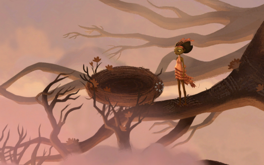
Broken Age is no longer launching as an Early Access game on Steam, instead hitting as a full release with a season pass that includes parts one and two. "You may recall that at one point Broken Age was planned for release under the Steam Early ...
14 Jan 19:46

Why is everyone disappointed by Google buying Nest?

by Nilay Patel
firehose

'that hasn't stopped customers from worrying — and most seem to think Google will "ruin" Nest in a variety of ways, with Google+ integration standing in for a host of potential sins.'
...
'give Google the chance to acquire more data, and it usually will. Fadell wouldn't rule out future changes yesterday. "At this point, there are no changes to our terms of service, and that's it. That's all I can say." '

Google's bombshell $3.2B acquisition of connected-home company Nest Labs makes simple sense on paper: Nest CEO Tony Fadell says he'll gain the ability to scale his business without worrying about cash or infrastructure, while Google gets a company at the leading edge of the difficult smart-home market and a team skilled in building well-designed products that combine hardware, software, and services. (And how: before Nest, Fadell and co-founder Matt Rogers led the iPod and iPhone teams at Apple.) It's a win-win, and Nest's investors sound ecstatic. "It's a fantastic return," Lightspeed Venture Partners' Peter Nieh told The Wall Street Journal.

But outside of the players directly involved in the deal, there was a second, more visceral reaction: disappointment. Nest was the first in a new wave of hardware startups built by engineers and executives eager to apply their experience building smartphones to new markets — a mission captured perfectly by Fadell's irrepressible upstart spirit in interviews and appearances. But by selling Nest seems to have undercut the optimism those companies represented, and perhaps not coincidentally, underlined a growing distrust of Google itself — a distrust shared by regular consumers, tech investors, and privacy advocates alike.

Although Fadell says Nest will remain mostly independent, with its own identity, team, and even offices intact, it will most certainly become a part of Google. "It's somewhere between YouTube and Motorola," Fadell said yesterday, describing two of the search giant's more famous acquisitions. Motorola has remained almost completely independent, "firewalled" away from Google's Android team, while YouTube has become more and more integrated over time — with a recent outpouring of anger when its comment system was tied to the niche Google+ social network.

So what will happen to Nest? Fadell called any speculation "totally premature" yesterday, but that hasn't stopped customers from worrying — and most seem to think Google will "ruin" Nest in a variety of ways, with Google+ integration standing in for a host of potential sins. Others worry that Nest will fall victim to the ongoing platform war against Apple, although Fadell says the company will continue to support iOS.

Still others wondered, perhaps a bit facetiously, if Nest would become yet another in a long line of companies acquired by Google in a flurry of hype only to disappear years later.

Viewed at a distance, the reaction is similar to Avis buying Zipcar: the fear that a slower, less innovative giant will kill the spirit and pace of a beloved startup. The difference, of course, is that Google is itself one of the richest and most innovative companies in the world. That it carries even the whiff of a lumbering giant is odd — especially since for tech investors, the Nest deal smacks of coldly efficient dominance.

Consumers aren't the only ones feeling some angst over Google's purchase of Nest. Yesterday's news caused a big question to boil up among Silicon Valley venture capitalists. How do you play the game when Google is one of the biggest investors in tech and also one of the biggest buyers of tech startups? "The purchase of Nest was a big win for us, of course," said one of the company's investors, who asked to remain anonymous. "But at the same time you have to wonder, could this company have been 10 times bigger had it continued to go things on its own?"

can Google Ventures be trusted to keep its founder interests separate from its backers?

Entrepreneurs face a similar pickle. Google has said that its venture arm is completely independent from core business, but that always seemed like wishful thinking, and yesterday's purchase will only strengthen the perception that taking an investment from Google Ventures ties a startup closely to Google itself. "It sends some really mixed signals," said another Nest investor. An entrepreneur might look at this and see the upside: an investment from Google Ventures means an acquisition by Google is more likely down the road. But for the truly ambitious entrepreneurs who want to take on tech titans like Google and Facebook the question now is, can Google Ventures be trusted to keep its founder interests separate from its backers?

The question of trust is perhaps most important of all. Fadell once described the Nest thermostat to me as nothing more than an on / off switch with a lot of nuance — nuance gained by collecting huge amounts of data about your living patterns and energy needs. Adding that data to Google's formidable collection of information about nearly everyone who uses the internet struck immediate fears with privacy advocates and a growing base of skeptics who contend Google's ad-supported business model creates an anti-privacy culture.

And the timing wasn't great for the counterargument: hours before the Nest announcement, Google clarified that a controversial plan to let Google+ users easily email nearly anyone on Gmail would be more private for "high-profile" users. It's another in a long string of confusing messages about privacy from Google, and the Nest team did little to alleviate the concerns.

give Google the chance to acquire more data, and it usually will

Co-founder Matt Rogers wrote that the company "takes privacy seriously," and that its privacy policy limits the use of customer data to "providing and improving Nest's products and services." But those services could arguably be improved by integration with other Google products, and the implications are unclear — give Google the chance to acquire more data, and it usually will. Fadell wouldn't rule out future changes yesterday. "At this point, there are no changes to our terms of service, and that's it. That's all I can say."

It's a strange set of affairs: an innovative young company led by some of the best engineers and executives in the business being acquired and validated by one of the great American businesses of the past 20 years should be a slam dunk of good PR. Instead, there's a chorus of concern — some sincere, some contrived, but all of it grounded in fear of an unchecked Google.

Additional reporting by Ben Popper

14 Jan 19:43

Powerful ad starring the NFL's only deaf offensive player

by Michael Katz
firehose

autoreshare

Sure, it's a commercial, but it's cool to see Seahawks fullback Derrick Coleman tell his inspiring story.

14 Jan 19:43

Did Black and Decker lose a nut with its modernist redesign?

by Zachary M. Seward
firehose

'every single letter in that logo lines up with the one above or below it, along its left edge
and yet the kerning doesn’t look weird on either the top or bottom word
that is a kerning miracle
some designer accomplished that and was like “my existence is validated” '

The tool that was used on the old logo.

Black & Decker would now like to be known as BLACK+DECKER, part of a corporate refresh that aims to “modernize the brand.” The American toolmaker’s new logo is definitely sleeker. Here’s the before (left) and after (right):

Black and Decker before and after

The redesign is most striking in the real-world context where most consumers will first encounter it. Doesn’t this power drill look a bit like it’s from the future?

black_decker_drill

As Quartz’s Christopher Mims noted (the rest of this piece is drawn from chats and tweets with my colleagues) the modernist aesthetic seems like an attempt to shore up Black and Decker’s market position in the face of lower-cost competitors like Ikea, which sells an electric screwdriver for $25. The list price of the tool pictured above is more like $89.

@zseward Right… disruption from the low end, so they go high style, high concept, whatever to continue to own the high end.—
Christopher Mims (@mims) January 14, 2014

The new packaging almost looks… fake.

black_decker_packaging

It’s reminiscent, actually, of Tropicana’s ill-fated redesign of its orange juice cartons in 2009. The new look wasn’t bad at all, but customers found it generic, a reminder that there’s a fine line between sleek and soulless.

3175380709_00780c5d91_bjpg

Still, the Black and Decker redesign, by New York-based Lippincott, appears to be an improvement; it received a mostly favorable review from the influential brand design blog Brand New. The site also included a nice history of the company’s hexagonal nut logo, which didn’t survive the latest refresh. Heather Timmons said the original one, introduced in 1921, “says ‘farm to table,’ ‘I made it myself,’ and ‘quality handicrafts’ all in one.”

black_decker_logo_history

David Yanofsky thinks the plus sign in the new logo is a reference to a Phillips head screw. (I’m not so sure.) Jason Karaian said the switch from an ampersand makes Black and Decker resemble an architectural practice and adds,

@mims @zseward Looks like it belongs in a hipster coffee shop to me. Does it appeal to "high end" carpenters?—
Jason Karaian (@jkaraian) January 14, 2014

Perhaps the most interesting choice Lippincott made was the logo’s kerning, or the spacing between letters. From the Quartz chat room:

Mims:
every single letter in that logo lines up with the one above or below it, along its left edge
and yet the kerning doesn’t look weird on either the top or bottom word
that is a kerning miracle
some designer accomplished that and was like “my existence is validated”
if you stop looking at the words, this is an extremely nice logo, in my opinion
like, I wonder if part of the reason for the rebrand was they’re trying to make the brand more international… in which case it’s more about the form of the letters, for non english speakers?

Yanofsky:
that kerning isn’t everything it’s made out to be
look at “BLACK” on its own
11947836605_2337f63d4b_b
more like B LACK #amirite

Mims:
the kerning only works in context
cutting it in half like that nicely illustrates the balance it only has when taken as a whole

Yanofsky:
disagree the Cs are miskerned
11948208723_ef7ddcac90_b

Mims:
one C on the bottom is centered under the A above it
which they had to do so it wouldn’t look like DEC KER
so what this is all proving is that this logo is a master class in the kind of compromises designers make to create a harmonious logo

Yanofsky:
i’d frame it as logo’s aren’t perfect

Mims:
true
but this dissection has been fascinating
would make a great quartz piece

Sounds good.