Shared posts

19 Aug 22:51

Getting started in Clojure…

by Patrick Durusau

Getting started in Clojure with IntelliJ, Cursive, and Gorilla

part 1: setup

part 2: workflow

From Part 1:

This video goes through, step-by-step, how to setup a productive Clojure development environment from scratch. This part looks at getting the software installed and running. The second part to this video (vimeo.com/103812557) then looks at the sort of workflow you could use with this environment.

If you follow through both videos you’ll end up with Leiningen, IntelliJ, Cursive Clojure and Gorilla REPL all configured to work together :-)

Some links:

leiningen.org
jetbrains.com/idea/
cursiveclojure.com
gorilla-repl.org

Nothing surprising but useful you are just starting out.

19 Aug 22:51

Solr-Wikipedia

by Patrick Durusau

Solr-Wikipedia

From the webpage:

A collection of utilities for parsing WikiMedia XML dumps with the intent of indexing the content in Solr.

I haven’t tried this, yet, but utilities for major data sources are always welcome!

17 Aug 16:07

Review: Now You See It by Stephen Few

by jacobalonso

My conclusions: Awesome book. Buy it here: Now You See It: Simple Visualization Techniques for Quantitative Analysis.

With the advent of computerized visuals in the late 1960’s, statistician John Tukey pointed out that exploring data would be one of the greatest strengths of interactive computers. In Now You See It: Simple Visualization Techniques for Quantitative Analysis, Stephen Few deconstructs this idea and provides a fantastic guide to using modern statistical and visualization tools, emphasizing interactivity, practical visualization, and simplification. Using Tableau and other popular tools extensively, Few’s work is engaging and really exhaustive. I’ll be honest: I really enjoyed this book.

PART 1
I did not entirely know what to think when I started the book, and Few does begin with a different approach than I had expected. He writes,

“…we’ve largely ignored the primary tool that makes information meaningful and useful: the human brain. While concentrating on the technologies, we’ve forgotten the human skills that are required to make sense of the data.”

Strong start. In “Building Core Skills for Visual Analysis,” Few goes into detail about the history of data visualization and the way that we perceive that data. The chapter on the history of information visualization was particularly enlightening, and really made me wonder what tools and methods we will be using in 10 years or even 100. Human history is a one of visualizing our world, and the methods we use to accomplish that appear to become increasingly comprehensible, even as the amount of data we use increases.

Particularly in Chaper 4, entitled Analytical Interaction and Navigation, I enjoyed how Few looked at the types of software used in analysis. His list of the most important elements of good software really articulates something I have though before: Excel is somewhat limited. In fact, the chapter would serve as a good guide for those seeking to create their own, novel data analysis tools. While a little out of my area, I found it quite compelling.

PART 2
In the second half of the book, Few looks at specific techniques in data analysis. In all, the second half is extremely image-heavy, which I appreciated. He compares effective and ineffective visualizations, breaking down the various patterns and techniques into
– Time-series Data
– Ranking Relationships
– Deviations
– Data Distribution
– Correlation between Variables
– Patterns in Data with Multiple Variables
Entitled “Honing Skills for Diverse Types of Visual Analysis,” Few explores different ways of showing the data, ranging from complex data analyses to simple Excel charts. Each chapter is very detailed, and full of very detailed visuals. He concludes each chapter by compiling a list of best practices—for example, when comparing percent change of data with different beginning points, Few recommends using logarithmic scales.

I found these chapters to be the most useful, and ultimately I believe could effectively be used as a reference for nearly any quantitative project. Especially taking into account the best practices section, I think the second half is an absolute necessity to researchers interested in visualization.

PART 3
Entitled “Further Thoughts and Hopes,” Few ends with some conclusions on the future of data analysis and visualizations. Particularly in examining the implications of ubiquitous computing and the cloud, I enjoyed the last section, although it is certainly not as directly useful to students or researchers.

RECOMMENDATION
While reading Now You See It: Simple Visualization Techniques for Quantitative Analysis, I was frequently reminded of Edward Tufte, only modernized and sometimes a little more directly useful to practitioners. Instead of static graphs, Few emphasizes interactive visualizations—and even though it is a textbook, it reads in a very engaging way. And it grows on you.

I want to return back to something I mentioned earlier: the book does make Excel seem limited. Indeed, Few has noted elsewhere that popular business tools do not visualize data in a very productive way. However, although no single software should be expected to do everything, I did find that most of the examples in the book can be roughly replicated in Excel. If you are die-hard Excel fanatic, I still think there is a great deal of value in the book. This brings me to my last point.

To be frank, when I finished reading it was not exactly sure what to make of it. I have a number of reference books on data analytics and visualization, and I wasn’t sure I had actually learned something meaningful. However, I was soon confronted with a project from a school district with whom I am working, and I realized I kept returning back to Few’s book over and over. I was trying to be more visual and more interactive, and the charts in the book are extremely accessible. While Edward Tufte tends to emphasize design tools like Adobe Illustrator, Few uses Tableau and R (which incidentally is free).

Although I have seen many of the charts in the book elsewhere, reading the book was enlightening and truly compelled me to explore new options in terms of visualizing in novel ways. I would highly recommend Now You See It: Simple Visualization Techniques for Quantitative Analysis to any practitioner, student, or even any person simply interested in visualization in general.

Finally, I feel that his conclusions align with my beliefs about the brain as a pattern recognition machine. In the past few days, I have been attending a Professional Development by Quantum Learning, which emphasizes using research from neuroscience to guide teaching. And indeed, like both Few and the Quantum Learning team have noted, the brain is our most powerful tool–if used right–and we need to become more adept at making the way we display information ‘brain friendly.’ As Few writes,

Computers can’t make sense of data; only people can.

Buy it here: Now You See It: Simple Visualization Techniques for Quantitative Analysis.

Sources:
Few, Stephen. Now You See It: Simple Visualization Techniques for Quantitative Analysis. Analytic Press, 2009. Print.
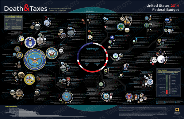

17 Aug 16:07

NIH Big Data to Knowledge (BD2K) Initiative [TM Opportunity?]

by Patrick Durusau

NIH Big Data to Knowledge (BD2K) Initiative by Shar Steed.

From the post:

The National Institutes of Health (NIH) has announced the Centers of Excellence for Big Data Computing in the Biomedical Sciences (U54) funding opportunity announcement, the first in its Big Data to Knowledge (BD2K) Initiative.

The purpose of the BD2K initiative is to help biomedical scientists fully utilize Big Data being generated by research communities. As technology advances, scientists are generating and using large, complex, and diverse datasets, which is making the biomedical research enterprise more data-intensive and data-driven. According to the BD2K website:

[further down in the post]

Data integration: An applicant may propose a Center that will develop efficient and meaningful ways to create connections across data types (i.e., unimodal or multimodal data integration).

That sounds like topic maps doesn’t it?

At least if we get away from black/white, match one of a set of IRIs or not, type merging practices.

For more details:

A webinar for applicants is scheduled for Thursday, September 12, 2013, from 3 – 4:30 pm EDT. Click here for more information.

Be aware of this workshop:

August 21, 2013 – August 22, 2013
NIH Data Catalogue
Chair:
Francine Berman, Ph.D.

This workshop seeks to identify the least duplicative and burdensome, and most sustainable and scalable method to create and maintain an NIH Data Catalog. An NIH Data Catalog would make biomedical data findable and citable, as PubMed does for scientific publications, and would link data to relevant grants, publications, software, or other relevant resources. The Data Catalog would be integrated with other BD2K initiatives as part of the broad NIH response to the challenges and opportunities of Big Data and seek to create an ongoing dialog with stakeholders and users from the biomedical community.

Contact: BD2Kworkshops@mail.nih.gov

Let’s see: “…least duplicative and burdensome, and most sustainable and scalable method to create and maintain an NIH Data Catalog.”

Recast existing data as RDF with a suitable OWL Ontology. – Duplicative, burdensome, not sustainable or scalable.

Accept all existing data as it exists and write subject identity and merging rules: Non-duplicative, existing systems persist so less burdensome, re-use of existing data = sustainable, only open question is scalability.

Sounds like a topic map opportunity to me.

You?

17 Aug 16:06

Death & Taxes 2014 Poster and Interview

by Patrick Durusau

Death and Taxes by Randy Krum.

The new 2014 Death & Taxes poster has been released, and it is fantastic! Visualizing the President’s proposed budget for next year, each department and major expense item is represented with proportionally sized circles so the viewer can understand how big they are in comparison to the rest of the budget.

You can purchase the 24” x 36” printed poster for $24.95.

Great poster, even if I disagree with some of the arrangement of agencies. Homeland Security, for example, should be grouped with the military on the left side of the poster.

If you are an interactive graphics type, it would be really cool to have sliders for the agency budgets and display the agency results for changes.

Say we took 30 $Billion from the Department of Homeland Security and gave it to NASA. What space projects, funding for scientific research, rebuilding of higher education would that shift fund?

I’m not sure how you would graphically represent fewer delays at airports, no groping of children (no TSA), etc.

Also interesting from a subject identity perspective.

Identifying specific programs can be done by budget numbers, for example.

But here the question would be: How much funding results in program N being included in the “potentially” funded set of programs?

Unless every request is funded, there would have to be a ranking of requests against some fixed budget allocation.

Another aspect of Steve Pepper’s question concerning types being a binary choice in the current topic map model.

Very few real world choices, or should I say the basis for real world choices, are ever that clear.

17 Aug 16:06

Fingerprinting Data/Relationships/Subjects?

by Patrick Durusau

Virtual image library fingerprints data

From the post:

It’s inevitable. Servers crash. Applications misbehave. Even if you troubleshoot and figure out the problem, the process of problem diagnosis will likely involve numerous investigative actions to examine the configurations of one or more systems—all of which would be difficult to describe in any meaningful way. And every time you encounter a similar problem, you could end up repeating the same complex process of problem diagnosis and remediation.

As someone who deals with just such scenarios in my role as manager of the Scalable Datacenter Analytics Department at IBM Research, my team and I realized we needed a way to “fingerprint” known bad configuration states of systems. This way, we could reduce the problem diagnosis time by relying on fingerprint recognition techniques to narrow the search space.

Project Origami was thus born from this desire to develop an easier-to-use problem diagnosis system to troubleshoot misconfiguration problems in the data center. Origami, today a collaboration between IBM Open Collaborative Research, Carnegie Mellon University, the University of Toronto, and the University of California at San Diego, is a collection of tools for fingerprinting, discovering, and mining configuration information on a data center-wide scale. It uses public domain virtual image library, Olive, an idea created under this Open Collaborative Research a few years ago.

It even provides an ad-hoc interface to the users, as there is no rule language for them to learn. Instead, users give Origami an example of what they deem to be a bad configuration, which Origami fingerprints and adds to its knowledge base. Origami then continuously crawls systems in the data center, monitoring the environment for configuration patterns that match known bad fingerprints in its knowledge base. A match triggers deeper analytics that then examine those systems for problematic configuration settings.

Identifications of data, relationships and subjects could be expressed as “fingerprints.”

Searching by “fingerprints” would be far easier than any query language.

Reasoning that searching challenges users to bridge the semantic gap between them and content authors.

Query languages add another semantic gap, between users and query language designers.

Why useful results are obtained at all using query languages remains unexplained.

17 Aug 16:06

Haskell Tutorial

by Patrick Durusau

Haskell Tutorial by Conrad Barski, M.D.

From the post:

There’s other tutorials out there, but you’ll like this one the best for sure: You can just cut and paste the code from this tutorial bit by bit, and in the process, your new program will create magically create more and more cool graphics along the way… The final program will have less than 100 lines of Haskell[1] and will organize a mass picnic in an arbitrarily-shaped public park map and will print pretty pictures showing where everyone should sit! (Here’s what the final product will look like, if you’re curious…)

The code in this tutorial is a simplified version of the code I’m using to organize flash mob picnics for my art project, picnicmob… Be sure to check out the site and sign up if you live in one of the cities we’re starting off with :-)

Could be a model for a topic maps tutorial. On the technical parts.

Sam Hunting mentioned quite recently that topic maps lacks the equivalent of nsgmls.

A command line app that takes input and gives you back output.

Doesn’t have to be a command line app but certainly should support cut-n-paste with predictable results.

Which is how most people learn HTML.

Something to keep in mind.

17 Aug 16:05

Classification accuracy is not enough

by Patrick Durusau

Classification accuracy is not enough by Bob L. Sturm.

From the post:

Finally published is my article, Classification accuracy is not enough: On the evaluation of music genre recognition systems. I made it completely open access and free for anyone.

Some background: In my paper Two Systems for Automatic Music Genre Recognition: What Are They Really Recognizing?, I perform three different experiments to determine how well two state-of-the-art systems for music genre recognition are recognizing genre. In the first experiment, I find the two systems are consistently making extremely bad misclassifications. In the second experiment, I find the two systems can be fooled by such simple transformations that they cannot possibly be listening to the music. In the third experiment, I find their internal models of the genres do not match how humans think the genres sound. Hence, it appears that the systems are not recognizing genre in the least. However, this seems to contradict the fact that they achieve extremely good classification accuracies, and have been touted as superior solutions in the literature. Turns out, Classification accuracy is not enough!

(…)

I look closely at what kinds of mistakes the systems make, and find they all make very poor yet “confident” mistakes. I demonstrate the latter by looking at the decision statistics of the systems. There is little difference for a system between making a correct classification, and an incorrect one. To judge how poor the mistakes are, I test with humans whether the labels selected by the classifiers describe the music. Test subjects listen to a music excerpt and select between two labels which they think was given by a human. Not one of the systems fooled anyone. Hence, while all the systems had good classification accuracies, good precisions, recalls, and F-scores, and confusion matrices that appeared to make sense, a deeper evaluation shows that none of them are recognizing genre, and thus that none of them are even addressing the problem. (They are all horses, making decisions based on irrelevant but confounded factors.)

(…)

If you have ever wondered what a detailed review of classification efforts would look like, you need wonder no longer!

Bob’s Two Systems for Automatic Music Genre Recognition: What Are They Really Recognizing? is thirty-six (36) pages that examines efforts at music genre recognition (MGR) in detail.

I would highly recommend this paper as a demonstration of good research technique.

17 Aug 16:05

Designing Topic Map Languages

by Patrick Durusau

A graphical language for explaining, discussing, planning topic maps has come up before. But no proposal has ever caught on.

I encountered a paper today that describes how to author a notation language with a 300% increase in semantic transparency for novices and a reduction of interpretation errors by a factor of 5.

Interested?

Visual Notation Design 2.0: Designing UserComprehensible Diagramming Notations by Daniel L. Moody, Nicolas Genon, Patrick Heymans, Patrice Caire.

Designing notations that business stakeholders can understand is one of the most difficult practical problems and greatest research challenges in the IS field. The success of IS development depends critically on effective communication between developers and end users, yet empirical studies show that business stakeholders understand IS models very poorly. This paper proposes a radical new approach to designing diagramming notations that actively involves end users in the process. We use i*, one of the leading requirements engineering notations, to demonstrate the approach, but the same approach could be applied to any notation intended for communicating with non-experts. We present the results of 6 related empirical studies (4 experiments and 2 nonreactive studies) that conclusively show that novices consistently outperform experts in designing symbols that are comprehensible to novices. The differences are both statistically significant and practically meaningful, so have implications for IS theory and practice. Symbols designed by novices increased semantic transparency (their ability to be spontaneously interpreted by other novices) by almost 300% compared to the existing i* diagramming notation and reduced interpretation errors by a factor of 5. The results challenge the conventional wisdom about visual notation design, which has been accepted since the beginning of the IS field and is followed unquestioningly today by groups such as OMG: that it should be conducted by a small team of technical experts. Our research suggests that instead it should be conducted by large numbers of novices (members of the target audience). This approach is consistent with principles of Web 2.0, in that it harnesses the collective intelligence of end users and actively involves them as codevelopers (“prosumers”) in the notation design process rather than as passive consumers of the end product. The theoretical contribution of this paper is that it provides a way of empirically measuring the user comprehensibility of IS notations, which is quantitative and practical to apply. The practical contribution is that it describes (and empirically tests) a novel approach to developing user comprehensible IS notations, which is generalised and repeatable. We believe this approach has the potential to revolutionise the practice of IS diagramming notation design and change the way that groups like OMG operate in the future. It also has potential interdisciplinary implications, as diagramming notations are used in almost all disciplines.

This is a very exciting paper!

I thought the sliding scale from semantic transparency (mnemonic) to semantic opacity (conventional) to semantic perversity (false mnemonic) was particularly good.

Not to mention that their process is described in enough detail for others to use the same process.

For designing a Topic Map Graphical Language?

What about designing the next Topic Map Syntax?

We are going to be asking “novices” to author topic maps. Why not ask them to author the language?

And not just one language. A language for each major domain.

Talk about stealing the march on competing technologies!

17 Aug 16:05

Poderopedia Plug & Play Platform

by Patrick Durusau

Poderopedia Plug & Play Platform

From the post:

Poderopedia Plug & Play Platform is a Data Intelligence Management System that allows you to create and manage large semantic datasets of information about entities, map and visualize entity connections, include entity related documents, add and show sources of information and news mentions of entities, displaying all the information in a public or private website, that can work as a standalone product or as a public searchable database that can interoperate with a Newsroom website, for example, providing rich contextual information for news content using it`s archive.

Poderopedia Plug & Play Platform is a free open source software developed by the Poderomedia Foundation, thanks to the generous support of a Knight News Challenge 2011 grant by the Knight Foundation, a Startup Chile 2012 grant and a 2013 Knight fellowship grant by the International Center for Journalists (ICFJ).

WHAT CAN I USE IT FOR?

For anything that involves mapping entities and connections.

A few real examples:

  • NewsStack, an Africa News Challenge Winner, will use it for a pan-African investigation by 10 media organizations into the continent’s extractive industries.
  • Newsrooms from Europe and Latin America want to use it to make their own public searchable databases of entities, reuse their archive to develop new information products, provide context to new stories and make data visualizations—something like making their own Crunchbase.

Other ideas:

  • Use existing data to make searchable databases and visualizations of congresspeople, bills passed, what they own, who funds them, etc.
  • Map lobbyists and who they lobby and for whom
  • Create a NBApedia, Baseballpedia or Soccerpedia. Show data and connections about team owners, team managers, players, all their stats, salaries and related business
  • Map links between NSA, Prism and Silicon Valley
  • Keep track of foundation grants, projects that received funding, etc.
  • Anything related to data intelligence

CORE FEATURES

Plug & Play allows you to create and manage entity profile pages that include: short bio or summary, sheet of connections, long newsworthy profiles, maps of connections of an entity, documents related to the entity, sources of all the information and news river with external news about the entity.

Among several features (please see full list here) it includes:

  • Entity pages
  • Connections data sheet
  • Data visualizations without coding
  • Annotated documents repository
  • Add sources of information
  • News river
  • Faceted Search (using Solr)
  • Semantic ontology to express connections
  • Republish options and metrics record
  • View entity history
  • Report errors and inappropriate content
  • Suggest connections and new entities to add
  • Needs updating alerts
  • Send anonymous tips

Hmmm, when they say:

For anything that involves mapping entities and connections.

Topic maps would say:

For anything that involves mapping subjects and associations.

Poderopedia does lack is a notion of subject identity that would support “merging.”

I am going to install Poderopedia locally and see what the UI is like.

Appreciate your comments and reports if you do the same.

Plus suggestions about adding topic map capabilities to Poderopedia.

I first saw this in Nat Torkington’s Four Short Links: 5 July 2013.

17 Aug 16:02

QOTD: Heinlein’s truth-telling language, Speedtalk

by jodi

Inventing languages is a past-time both of philosophers and science fiction storytellers. It spotlights the relationships between language and thought and language and culture.1

Yesterday I ran across Heinlein’s truth-telling language, Speedtalk. A few lines were really striking:
“In the syntax of Speedtalk the paradox of the Spanish Barber could not even be expressed, save as a self-evident error.”
“The advantage for achieving truth, or something more nearly like truth, was similar to the advantage of keeping account books in Arabic numerals rather than Roman.”

Here’s a longer quote:

But Speedtalk was not “shorthand” Basic English. “Normal” languages, having their roots in days of superstition and ignorance, have in them inherently and unescapably wrong structures of mistaken ideas about the universe. One can think logically in English only by extreme effort, so bad it is as a mental tool. For example, the verb “to be” in English has twenty-one distinct meanings, every single one of which is false-to-fact.

A symbolic structure, invented instead of accepted without question, can be made similar in structure to the real-world to which it refers. The structure of Speedtalk did not contain the hidden errors of English; it was structured as much like the real world as the New Men could make it. For example, it did not contain the unreal distinction between nouns and verbs found in most other languages. The world—the continuum known to science and including all human activity—does not contain “noun things” and “verb things”; it contains space-time events and relationships between them. The advantage for achieving truth, or something more nearly like truth, was similar to the advantage of keeping account books in Arabic numerals rather than Roman.
All other languages made scientific, multi-valued logic almost impossible to achieve; in Speedtalk it was as difficult not to be logical. Compare the pellucid Boolean logic with the obscurities of the Aristotelean logic it supplanted.

Paradoxes are verbal, do not exist in the real world—and Speedtalk did not have such built into it. Who shaves the Spanish Barber? Answer: follow him around and see. In the syntax of Speedtalk the paradox of the Spanish Barber could not even be expressed, save as a self-evident error.

Gulf, as printed in Assignment in Eternity – Robert A. Heinlein - Baen edition

This seemed to me to echo Leibniz’ symbolic language, in the “truthtelling” aspects — perhaps since I wrote a few months ago about Leibniz!2
Leibniz was perhaps the first philosopher to write about a special language for expressing truth or making arguments evident.34

  1. Apparently Wikipedia keeps a list of constructed languages and has nearby discussion on the purpose of some of these.
  2. For thesis Chapter 1, forthcoming; thanks to some comments from Adam Wyner. Ironically, my BA thesis was on Leibniz monads, but if I’d ever read the “Let us calculate” lines, I certainly didn’t have them in mind when thinking of argumentation!
  3. For more, see Roger Bishop Jones on Leibniz and the Automation of Reason.
  4. For references to the original, trace a discussion on the listserv historia-matematica, started by Robert Tragesser 1999-05-23, [HM] Leibniz’s “let us calculate”?, with responses over several months. Michael Detlefsen gives references to several of Leibniz’s writings, and a followup question about which quote is most widely known (1999-07-17, started by “L. M. Picard” with the subject [HM] Leibniz’s “let us calculate”) yields a very useful response from Siegmund Probst, quoting several variants with detailed references.
17 Aug 16:02

Developing an Ontology of Legal Research

by Patrick Durusau

Developing an Ontology of Legal Research by Amy Taylor.

From the post:

This session will describe my efforts to develop a legal ontology for teaching legal research. There are currently more than twenty legal ontologies worldwide that encompass legal knowledge, legal problem solving, legal drafting and information retrieval, and subjects such as IP, but no ontology of legal research. A legal research ontology could be useful because the transition from print to digital sources has shifted the way research is conducted and taught. Legal print sources have much of the structure of legal knowledge built into them (see the attached slide comparing screen shots from Westlaw and WestlawNext), so teaching students how to research in print also helps them learn the subject they are researching. With the shift to digital sources, this structure is now only implicit, and researchers must rely more upon a solid foundation in the structure of legal knowledge. The session will also describe my choice of OWL as the language that best meets the needs in building this ontology. The session will also explore the possibilities of representing this legal ontology in a more compact visual form to make it easier to incorporate into legal research instruction.

Plus slides and:

Leaving aside Amy’s choice of an ontology, OWL, etc., I would like to focus on her statement:

(…)
Legal print sources have much of the structure of legal knowledge built into them (see the attached slide comparing screen shots from Westlaw and WestlawNext), so teaching students how to research in print also helps them learn the subject they are researching. With the shift to digital sources, this structure is now only implicit, and researchers must rely more upon a solid foundation in the structure of legal knowledge.
(…)

First, Ann is comparing “Westlaw Classic,” and “WestlawNext,” both digital editions.

Second, the “structure” in question appeared in the “digests” published by West, for example:

digest

And in case head notes as:

head notes

That is the tradition of reporting structure in the digest and only isolated topics in case reports did not start with electronic versions.

That has been the organization of West materials since its beginning in the 19th century.

Third, an “ontology” of the law is quite a different undertaking from the “taxonomy” used by the West system.

The West American Digest System organized law reports to enable researchers to get “close enough” to relevant authorities.

That is the “last semantic mile” was up to the researcher, not the West system.

Even at that degree of coarseness in the West system, it was still an ongoing labor of decades by thousands of editors, and it remains so until today.

The amount of effort expended to obtain a coarse but useful taxonomy of the law should be a fair warning to anyone attempting an “ontology” of the same.

17 Aug 16:02

Organizational Skills Beat Algorithmic Wizardry

by James Hague
I've seen a number of blog entries about technical interviews at high-end companies that make me glad I'm not looking for work as a programmer. The ability to implement oddball variants of heaps and trees on the spot. Puzzles with difficult constraints. Numeric problems that would take ten billion years to complete unless you can cleverly analyze and rephrase the math. My first reaction is wow, how do they manage to hire anyone?

My second reaction is that the vast majority of programming doesn't involve this kind of algorithmic wizardry.

When it comes to writing code, the number one most important skill is how to keep a tangle of features from collapsing under the weight of its own complexity. I've worked on large telecommunications systems, console games, blogging software, a bunch of personal tools, and very rarely is there some tricky data structure or algorithm that casts a looming shadow over everything else. But there's always lots of state to keep track of, rearranging of values, handling special cases, and carefully working out how all the pieces of a system interact. To a great extent the act of coding is one of organization. Refactoring. Simplifying. Figuring out how to remove extraneous manipulations here and there.

This is the reason there are so many accidental programmers. You don't see people casually become neurosurgeons in their spare time--the necessary training is specific and intense--but lots of people pick up enough coding skills to build things on their own. When I learned to program on an 8-bit home computer, I didn't even know what an algorithm was. I had no idea how to sort data, and fortunately for the little games I was designing I didn't need to. The code I wrote was all about timers and counters and state management. I was an organizer, not a genius.

I built a custom a tool a few years ago that combines images into rectangular textures. It's not a big program--maybe 1500 lines of Erlang and C. There's one little twenty line snippet that does the rectangle packing, and while it wasn't hard to write, I doubt I could have made it up in an interview. The rest of the code is for loading files, generating output, dealing with image properties (such as origins), and handling the data flow between different parts of the program. This is also the code I tweak whenever I need a new feature, better error handling, or improved usability.

That's representative of most software development.

(If you liked this, you might enjoy Hopefully More Controversial Programming Opinions.)
17 Aug 15:58

Predicting Terrorism with Graphs

by Patrick Durusau

A Little Graph Theory for the Busy Developer by Jim Webber.

From the description:

In this talk we’ll explore powerful analytic techniques for graph data. Firstly we’ll discover some of the innate properties of (social) graphs from fields like anthropology and sociology. By understanding the forces and tensions within the graph structure and applying some graph theory, we’ll be able to predict how the graph will evolve over time. To test just how powerful and accurate graph theory is, we’ll also be able to (retrospectively) predict World War 1 based on a social graph and a few simple mechanical rules.

A presentation for NoSQL Now!, August 20-22, 2013, San Jose, California.

I would appreciate your asking Jim to predict the next major act of terrorism using Neo4j.

If he can predict WWI with “a few mechanical rules,” the “power and accuracy of graphs” should support prediction of terrorism.

Yes?

If you read the 9/11 Commission Report (pdf), you too can predict 9/11, in retrospect.

Without any database at all.

Don’t get me wrong, I really like graph databases. And they have a number of useful features.

Why not sell graph databases based on technical merit?

As opposed to carny sideshow claims?

17 Aug 15:58

Purely Functional Data Structures in Clojure: Red-Black Trees

by Patrick Durusau

Purely Functional Data Structures in Clojure: Red-Black Trees by Leonardo Borges.

From the post:

Recently I had some free time to come back to Purely Functional Data Structures and implement a new data structure: Red-black trees.

Leonard continues his work on Chris Okasaki’s Purely Functional Data Structures.

Is a functional approach required for topic maps to move beyond being static digital artifacts?

17 Aug 15:58

Version Control for Writers and Publishers

by Eugene Wallingford

Mandy Brown again, this time on on writing tools without memory:

I've written of the web's short-term memory before; what Manguel trips on here is that such forgetting is by design. We designed tools to forget, sometimes intentionally so, but often simply out of carelessness. And we are just as capable of designing systems that remember: the word processor of today may admit no archive, but what of the one we build next?

This is one of those places where the software world has a tool waiting to reach a wider audience: the version control system. Programmers using version control can retrieve previous states of their code all the way back to its creation. The granularity of the versions is limited only by the frequency with which they "commit" the code to the repository.

The widespread adoption of version control and the existence of public histories at place such as GitHub have even given rise to a whole new kind of empirical software engineering, in which we mine a large number of repositories in order to understand better the behavior of developers in actual practice. Before, we had to contrive experiments, with no assurance that devs behaved the same way under artificial conditions.

Word processors these days usually have an auto-backup feature to save work as the writer types text. Version control could be built into such a feature, giving the writer access to many previous versions without the need to commit changes explicitly. But the better solution would be to help writers learn the value of version control and develop the habits of committing changes at meaningful intervals.

Digital version control offers several advantages over the writer's (and programmer's) old-style history of print-outs of previous versions, marked-up copy, and notebooks. An obvious one is space. A more important one is the ability to search and compare old versions more easily. We programmers benefit greatly from a tool as simple as diff, which can tell us the textual differences between two files. I use diff on non-code text all the time and imagine that professional writers could use it to better effect than I.

The use of version control by programmers leads to profound changes in the practice of programming. I suspect that the same would be true for writers and publishers, too.

Most version control systems these days work much better with plain text than with the binary data stored by most word processing programs. As discussed in my previous post, there are already good reasons for writers to move to plain text and explicit mark-up schemes. Version control and text analysis tools such as diff add another layer of benefit. Simple mark-up systems like Markdown don't even impose much burden on the writer, resembling as they do how so many of us used to prepare text in the days of the typewriter.

Some non-programmers are already using version control for their digital research. Check out William Turkel's How To for doing research with digital sources. Others, such The Programming Historian and A Companion to Digital Humanities, don't seem to mention it. But these documents refer mostly to programs for working with text. The next step is to encourage adoption of version control for writers doing their own thing: writing.

Then again, it has taken a long time for version control to gain such widespread acceptance even among programmers, and it's not yet universal. So maybe adoption among writers will take a long time, too.

17 Aug 15:54

Unlocking the Big Data Silos Through Integration

by Patrick Durusau

Unlocking the Big Data Silos Through Integration by Theo Priestly.

From the post:

Big Data, real-time and predictive analytics present companies with the unparalleled ability to understand consumer behavior and ever-shifting market trends at a relentless pace in order to take advantage of opportunity.

However, organizations are entrenched and governed by silos; data resides across the enterprise in the same way, waiting to be unlocked. Information sits in different applications, on different platforms, fed by internal and external sources. It’s a CIO’s headache when the CEO asks why the organization can’t take advantage of it. According to a recent survey, 54% of organizations state that managing data from various sources is their biggest challenge when attempting to make use of the information for customer analytics.

(…)

Data integration. Again?

A problem that just keeps on giving. The result of every ETL operation is a data set that needs another ETL operation sooner or later.

If Topic Maps weren’t a competing model but a way to model your information for re-integration, time after time, that would be a competitive advantage.

Both for topic maps and your enterprise.

17 Aug 15:54

Looking ahead [Exploratory Merging?]

by Patrick Durusau

Looking ahead by Gene Golovchinsky.

From the post:

It is reasonably well-known that people who examine search results often don’t go past the first few hits, perhaps stopping at the “fold” or at the end of the first page. It’s a habit we’ve acquired due to high-quality results to precision-oriented information needs. Google has trained us well.

But this habit may not always be useful when confronted with uncommon, recall-oriented, information needs. That is, when doing research. Looking only at the top few documents places too much trust in the ranking algorithm. In our SIGIR 2013 paper, we investigated what happens when a light-weight preview mechanism gives searchers a glimpse at the distribution of documents — new, re-retrieved but not seen, and seen — in the query they are about to execute.

The preview divides the top 100 documents retrieved by a query into 10 bins, and builds a stacked bar chart that represents the three categories of documents. Each category is represented by a color. New documents are shown in teal, re-retrieved ones in the light blue shade, and documents the searcher has already seen in dark blue. The figures below show some examples:

(…)

The blog post is great but you really need to ready the SIGIR paper in full.

Speaking of exploratory searching, is anyone working on exploratory merging?

That is where a query containing a statement of synonymy or polysemy from a searcher results in exploratory merging of topics?

I am assuming that experts in a particular domain will see merging opportunities that eluded automatic processes.

Seems like a shame to waste their expertise, which could be captured to improve a topic map for future users.


The SIGIR paper:

Looking Ahead: Query Preview in Exploratory Search

Abstract:

Exploratory search is a complex, iterative information seeking activity that involves running multiple queries, finding and examining many documents. We introduced a query preview interface that visualizes the distribution of newly-retrieved and re-retrieved documents prior to showing the detailed query results. When evaluating the preview control with a control condition, we found effects on both people’s information seeking behavior and improved retrieval performance. People spent more time formulating a query and were more likely to explore search results more deeply, retrieved a more diverse set of documents, and found more different relevant documents when using the preview. With more time spent on query formulation, higher quality queries were produced and as consequence the retrieval results improved; both average residual precision and recall was higher with the query preview present.