You may want to make a retro video game or help with making the graphics for one. Then you’ll need a sprite: a pixel art character, animated and in different stances.
Then check this lesson out, as we’ll make a cute little bunny and give it a running loop animation.
If you find doing the actual pixel work too difficult or tedious, feel free to shop for great ready-made sprites as well as any other game assets on Envato Market.
1. Design the Character
Before the animation, we’ll do a static view of the character, and before doing that, we’ll need to figure out what it will look like.
Step 1
It's not such a necessary step if you're going to follow this tutorial exactly, but it was part of my process: sketching the character.
I sketched only the head. I tried a few different options and chose this style.
Step 2
To turn the bunny into pixels, I started drawing the eyes directly in Adobe Photoshop. The sketch wasn’t used much other than for defining the style.
If you’ve never done pixel art, you’ll want to create a New File in Photoshop and not make it very large—it can be 400 px by 400 px. You’ll want to work with a lot of zoom (like 700%) and use the Pencil Tool to draw one pixel at a time. I recommend keeping a second window of the same file open at 100% or 200% zoom so you can cycle between the windows and you can check on progress without the zoom.
I won’t follow a predefined sprite size, but I will make the character about as small as it can be while maintaining its main features. That’s why the eyes are a good starting point.
The eyes will simply be two lines, next to each other. Each eye is 3 px tall by 1 px across, and nearly black in color.
Step 3
With the eyes done, you can proceed with the nose of the bunny plus a few other details. It’s ok if the lines are simple for now.
Step 4
Now we can soften some of those lines. Also I’m already adding some teeth in front of the mouth, because bunnies have big front teeth.
Step 5
Let’s give the mouth a smile.
Step 6
And let’s add some ears. Right now they’re pointing straight up, and that could work also for this character, but we’ll bend them a bit.
The ears are about as thin as possible, with just 1px for the inside and then the outline pixels on the sides.
Step 7
Here’s one ear folding over, flapping down.
Step 8
And the back ear folds down the same way.
Step 9
Now, to finish the head, we’ll give the bunny a relatively big puffy cheek.
Step 10
And now we can draw a body under the head. We’ll make our bunny anthropomorphic, or with a human-like shape. The torso will basically be like a teardrop shape.
Step 11
We’ll give the bunny short legs and big feet. We can start with just one leg.
Step 12
The back leg is the same as the front one, but moved slightly to the side as it would otherwise be completely blocked by the front leg.
Step 13
Finally I moved the legs one pixel to the left because I thought they looked a bit off-center, and I connected the front leg to the belly by removing the pixel separating them.
Step 14
We’ll only have one arm visible in the standing position. The arm will have a kind of teardrop shape.
It will block some of the torso.
Step 15
Let’s clean up by removing the lines of the torso behind the arm.
And now the basic outlines of the bunny character are complete.
2. Color the Bunny
Now we turn those character outlines into a finished static sprite.
Step 1
Pick a color.
What color would you like for your bunny? I went for a tan kind of color and applied it, for now, to all areas except the nose. You can fill the areas with the Bucket Tool.
Step 2
Let’s give the bunny a cute white belly. Also a white pixel for the front teeth. The nose will have a little touch of pink, but mostly it will be white, as highlight.
Step 3
We give the bunny some shading: a darker version of the main fur color applied to areas where less light reaches. This shading can help give texture on the cheeks if we apply it with a bit of a pattern.
We’ll be keeping the back limbs and ears darker than the front ones. So the back leg gets only the new darker shade and the back ear gets mostly this shade except on the tippy top.
Step 4
Extend the shading to the white belly. I added a light grey color with a slightly blue hue.
Step 5
Some features will look better with less contrast, so I replaced some of the near-black color with dark brown on some inside pixels, like the mouth and neck.
I also added more detail with this dark brown to accentuate the puffy cheeks.
And now the character, in its standing position, is finished.
3. Draw the Running Frames
Now let’s give the bunny some motion; we’ll make a running loop.
This animation can be done with any number of frames, but as this is a small character, six frames will do fine.
Step 1
Let’s get the limbs out of the way for now.
The bunny’s torso and head won’t change much while it's running, so we’ll get that ready and keep it pretty much constant while we work on all the frames.
I left a bottom line as reference for the leg height or ground position.
Step 2
Lean the torso forward, simply by selecting the head and an area below the neck with the Rectangular Marquee Tool and then nudging 1 px to the right (which can be done with the right arrow key while the Move Tool is active).
In the end I moved the head forward 2 px.
Step 3
We didn’t properly rotate the torso just now, which means we kind of stretched it, making it slightly longer. So to adjust it back, let’s shrink the torso vertically 1 px and clean up the lines.
Let’s also move the torso 1 px closer to the bottom line, because the legs will be flexed for most of the running animation, and thus they shouldn’t be the same height.
Step 4
To do the legs, we only really need to work on one leg motion, as the other one will move the same way.
So the movement will need to be like a pendulum: the leg is bent through most of the motion except for when it extends forward (which is the first frame here)
So these would be the six frames of the leg motion (feel free to check more references of running frames). Notice the position of the foot when doing these. They're done in a bright color for contrast.
Step 5
We’ll work on all six frames side by side.
Here are the leg frames placed over the bunny. Do this in a New Layer.
Notice that the leg is not fixed to one point of the waist; when the leg goes back, it’s coming out of the back of the bunny, and when it goes forward, it’s coming out of the front of the bunny, to an extent.
Step 6
Here’s a quick way to start turning our guide lines into the final legs. First, replace the color with the fur color (you can do this with the Bucket Tool with the contiguous setting checked off), and instead of drawing the outlines around the legs, select the blank area around them with the Magic Wand and contract the selection (Select > Modify > Contract…) by 1 px. Then invert the selection (Select > Inverse) and then with the Bucket Tool (contiguous checked off) fill in with outline color.
Step 7
The legs aren’t finished yet, but let’s add a little skip to the bunny now because that will affect finishing the legs.
We’ll add the skip because while running we can’t expect the character to stay always at the same level. So we’ll bump the bunny up 1 px on the third frame, when the back leg is most extended, pushing the bunny up, and we’ll also need to add the skip on the sixth frame, when the opposite leg will be pushing the bunny up.
The frames with the skip are marked here with purple bottom lines. The other bottom lines have been turned into 20% black lines that can serve as shadows. On a platform game, this shadow might not be needed, but for now it will make the animation look better.
Step 8
To finish the leg, we have to make the foot chubbier, connect the leg to the body and also do a bit of shading.
Also, all bottom lines are now turned to shadows.
Step 9
Now that one leg is finished, we just have to copy it.
After pasting it, we should move the new leg a couple of pixels to the right, just as the legs were slightly spread on the standing position.
Right now it looks a little bit funny because both legs are moving the same way, which is actually usable for this character, as bunnies tend to hop. But we’ll change that to make them look as if the bunny's running.
Step 10
To get the legs to run, they should cycle alternately, so that when one leg is extended to the front, the opposite leg is extended to the back.
Because we have six frames, that means one of the legs will move its frames three positions to one side (and then take the three disembodied leg frames and move them to the one-legged bunny frames).
The new legs layer should be behind the bunny body layer.
Step 11
To finish the back leg, you should simply shade it darker, if you want to keep the back limbs darker than the front as we did in the standing position.
This is how the frames are looking so far. Don’t worry about making this animation for now. We’ll finish the graphics and animate the running loop at the end.
Step 12
Now it’s time to add the arms.
They’ll move pretty much like this. They’re bent throughout the running cycle, only extending back a little bit in the first frame. However, you can try your own variants to this motion to achieve different running styles.
Step 13
Place the arms over the body frames in a New Layer, and give them the right color and outlines, as we did with the legs.
Step 14
And then give the arms some volume.
Step 15
And finally shade them to convey further volume.
Step 16
Then copy the arm. New Layer, behind the body.
Step 17
And finally shade the new arms and move them so that they cycle opposite to the original ones.
Remember that the arms move counter to the legs so that when the left leg is at the front the left arm should be at the back.
Now this is how the arms are looking.
Step 18
Let’s add a bit of motion to the head, as that may be conspicuously static for now.
We’ll make the ears respond to the bunny’s motion. Here, on the frames where the bunny slightly skips up, I made the ears point down as though inertia is keeping them down while the bunny is skipping.
Step 19
On the frames after the skip, I made the ears less bent and more open, pointing forward.
Step 20
And finally I made the cheek fur move as well. Like the ears, a bit lower when the bunny skips up and a bit higher after the skip.
And here’s how that is looking.
Step 21
The last bit of work on the frames we’ll do will be on the torso, first by animating the white spot on the belly. The chest should be turning slightly as the bunny runs, so the white spot should respond to that motion.
So when the front arm points to the back, there should more of the white spot visible, and less of it when the front arm points forward.
Step 22
We didn’t need to draw the tail when the bunny was standing up, but now that it’s running, it seems that the tail should show up.
So first I put a red square marking where I think the tail should go. It goes in a New Layer, and for now it can be on top of the other layers.
Step 23
Now give the tail some color, shading and outlines.
Step 24
An extra touch for the tail: it hides slightly behind the bunny’s body as the bunny’s chest is more visible.
Step 25
To finish the tail, move the layer to the back and finish any shading/cleaning you see fit.
And the work on the frames is complete. Here’s what it’s looking like in motion—the extra detail work pays off, doesn’t it?
Let’s turn those frames into a loop.
4. Make the Animation
We have six frames that will seamlessly loop into a running cycle. We just have to put them in motion.
Step 1
Copy the frames into a New File.
You’ll have to copy one frame at a time, in the proper order (left to right). To copy all layers at the same time, you have to copy merged (Edit > Copy Merged), and just remember to have no background color when copying.
You’ll want the new file dimensions to be only slightly larger than the bunny.
When you paste them they should line up properly; the bottom line stays the same on all layers, and the nose does too, except for the two frames in which the bunny skips up 1 px.
You should end up with a file with six total layers; one per frame. No background.
Step 2
To make the animation in Photoshop, you’ll need to open the timeline window (Window > Timeline). It has a Create Frame Animation button unless it’s set to Create Video Timeline, in which case you change it to frame animation using the drop-down button.
Step 3
Press the Create Frame Animation button, and then press the timeline window options button, in the top right corner…
… and select Make Frames From Layers.
Step 4
Then finally select all frames and adjust their delay if you want (I chose a 0.1 second delay) and set the looping options to Forever.
And you've got your bunny running loop!
You can now use this sprite in games or export the file to GIF.
Awesome Work, You're Now Done!
Congratulations, the bunny runs now! He’s ready to save princess bunny or cause mischief or whatever you might come up with for him.
This should help give you an idea of what it takes to design and animate sprites. You can have fun making your own, or get to work and apply these graphics to a game!
And if this was too tedious for you to do, remember you can find finished game assets on Envato Market!
In the previous versions of Mac OS X you can securely delete files. I found this very handy for certain financial documents that I wanted to remove without the risk of having anything left behind should my Mac become compromised or stolen. Normally this would be accessed from Finder > Securely Empty Trash or right clicking on the Trash Dock icon and selecting Secure Empty Trash. This has been removed in the latest version of Mac OS due to a security venerability, but there is a method of doing this with Terminal.
This is an advance tip, so you need to have a little experience with Terminal. To do this open Terminal from Applications > Utilities. Type the following
srm -vr
Now drag and drop the file or folder you want to securely delete. Then press enter.
Terminal will do its thing and will securely delete the file.
This process will take a while so I recommend you delete folders at a time rather than each individual file. Alternatively you can move all of the files you want to delete into one folder and then delete that.
I hope that Apple will bring back the secure delete as this method is a little long and annoying.
Want to catch up on the latest Tweets about this site, follow me on Twitter.
You can like this site on Facebook.
Well, I’m back again, but this time I’m going to do something different, something that I hope you'll find interesting.
Today, I’m going to take a step back from the regular “in-depth technical tutorials/quick tips” and talk a little bit about icon design from a more general perspective. I'll share with you ten tips that I’ve come up with after doing some research from both my work and the work of others.
So if you’re into icon design as much as I am, grab a hot cup of coffee (I already have mine), and buckle in, since in the following article, we’re going to go over some things that might change/improve your creative process when it comes to designing these little pieces of artwork.
Also, before we start, I wanted to let you know that all of the icon packs used in this piece, and thousands more, can be found over at Envato Market, where designers from all around the world regularly upload new work.
1. Know Your Icon History
I know some of you will probably disagree, but the fact is no matter what you do in life, whether you’re a designer or a mechanical engineer (or anything else by that logic), you should always find the time and energy to gather information on the subject, since not only do you owe your career to those people, but you will also find out some interesting and educational things during the process.
Now, you don’t really need to go all crazy on the research, but you should at least try and find an answer to these three simple questions:
Who?
When?
Why?
Who?
The “Who” stands for the first creative tinkerers that came up with the idea of using icons as digital symbols. This aspect is usually overlooked and I don’t really understand why, since without the original “creators”, icon design might not have even been what it is today; these people laid the foundation for all that we use now. So, open up a tab and pay some homage by reading whatever you can find about them. You’ll probably understand why these people are so important to the birth and evolution of icon design and user interfaces.
When?
The “When”, as you’ve probably already guessed, stands for “that specific window in time” when the actual need for icons as digital visual symbols appeared. For those of you who didn’t know, icon design only appeared back in 1981 with the birth of the Xerox 8010 Star, which was basically the first computer that had a GUI or Graphic User Interface, which means that the art form itself is by no means old compared to others. But it’s not “young” either, since it has evolved incredibly quickly over the years, and it still hasn’t reached its full momentum.
Why?
The “Why” is probably the most important out of the three since it will explain how it all came to be, but to be honest, all of them are deeply interlinked, because the three variables influenced one another to a high degree.
Let’s take a minute and consider how different things could have been if the reasons behind the birth of the GUI were different, or if the people behind the project were never born. We would probably still be using line interfaces—well, probably not, but hey, things would be a little different, believe me!
Now, I won’t let you off that easy by giving you all the answers, since I really don’t want to spoil the journey for you. But I will leave you a link to a beautiful interactive website that has all the information gathered in one place and presents it so damn well.
In the end, this is just an exercise meant to help you get in touch with the roots of icon design, which I strongly advise you to do since you’ll understand why some things are as they are today. Also by comparing what has been done up until this point, you should be able to see how icons have evolved in terms of style and complexity, and grasp the direction of where things are going, or who knows even change that direction by producing something new and innovative.
2. Carry Out Some Basic Research for Any New Project
Now if the first tip was a nice little exercise that I thought you could do to boost your knowledge about icon design, this one is in my opinion a rule that you should try and adhere to, since it will help you define the style and visual language of the elements that you have to design within every new project.
Coming from a background in social sciences, I’ve managed to understand and appreciate the benefits of developing and applying an early research phase in almost everything that I do, even in icon design, since it allows me to better understand the “subject” and how it can affect both me and the other people/end users that it’s meant to cross paths with.
Now, in our case, the “subject” is actually a digital product that is created to sustain a visual conversation with users who will in the end interact with it. This interaction has to be easy to establish, and most importantly it has to feel natural, in the sense that the symbol has to speak clearly and trigger a common specific emotion/word in the hearts and minds of those who are viewing it, no matter whether it’s the first or the thirtieth time they're laying eyes on it.
So great icons have to be universal, and they have to go beyond barriers like gender, race, age, etc., and communicate the same message no matter who the end user is.
Now, as with any other product, icons are usually created with a certain role in mind. Whether they’re going to be used on a website or displayed inside an app, you should always take some time to think about the different variables that you have to account for when creating each and every one of them, since the style and "feel" will almost certainly be affected by these factors.
This can be easily achieved by spending a couple of hours and engaging in a research stage where you have to figure out the answers to these three short questions:
Who?
What?
How?
Who?
The “who” stands for “user” and describes all the variables that define him or her. This question is essential since, depending on the target audience, you need to adapt your design patterns in order for them to satisfy some conditions that might vary from one project to another.
In other words, you have to “figure out” who your user is by constructing an exhaustive list of characteristics that in the end might affect his or her experience with the icons and the UI itself.
Usually these characteristics are:
Age (younger users vs. older ones)
Gender (male users vs. female ones)
Race (cultural differences)
Education (educated users vs. users with no education)
Technical Skills (tech savvy users vs. users that fear technology)
Let’s take a quick example, and think about how age as a socio-demographic variable affects the way younger generations interact with UIs compared to older ones.
If your end user is younger, chances are that his or her eyes are more equipped to deal with smaller sized icons, but for an older user, things might be different. With age comes sight deterioration, which poses a serious problem if you’ve created a super small interface.
Then you have the problem of older users being afraid to change and use new technologies, since it’s harder for them to understand and figure out how new stuff works compared to the old ones they used back in the day.
The style of the actual icon can be perceived and accepted differently by older users, especially in cases where we use bright, saturated colors that might not be that appealing to them, since their eyes react differently to these stimuli compared to the eyes of younger people.
Now, if we throw in “education” as a third variable, then we have an even bigger divide, since within both age groups there will be users that have a basic education and users that haven’t had the chance to attend a proper learning institute.
While I don’t necessarily think that there’s a general rule when it comes to the level of education and the user’s ability to use a specific technology, there are definitely situations where users that have never come across a specific symbol might not be able to understand the meaning of an icon, since they’ve never had the chance to conceptualize it in that form.
Also, race is another thing we still have to think about, since some symbols might be read differently by users from other regions of the world depending on the context they are put in.
Once you start finding answers, you will see how your “user” is taking shape, since with each quality that you discover, you come closer to creating a definitive pattern that you will need to implement and use within your design, and therefore your visual language.
On the other hand, the “who” must also be used to figure out who the person or company that is initiating the communication is, since by knowing both the source and receiver we can identify the perfect sweet spot where the icons and UI communicate effortlessly, and they do so in a manner that reflects the personality of the company that is behind it.
This last part is usually done by creating custom variations of the symbols that are already being used, in order to give them a unique style that people can easily link to a brand.
What?
The “what” stands for “message”, or more precisely what I as a visual creator have to communicate to my audience. It might be a simple word, or an emotion. Whatever we want to pass on to our users, we have to make sure that it’s done in a manner that is simple enough to be understood by the person interacting with it.
Now, it’s pretty obvious that our “message” is directly linked to our audience, so depending on what variables we have identified within the end user, we have to make it simple enough for them to be able to interpret and understand.
So, if our audience is mainly composed of young people that have a higher level of education, that gives us the power of creating more complex-looking icons. If the users were older and had a lower level of education, then we would have to adapt our visual language so that our icons were simple enough to pass the idea through to them.
The “what” can also stand for “mission”, or more exactly the core business of a product, where in some cases users are actually required to have a basic visual symbol knowledge base in order for them to be able to interact with it.
Of course, you still have to try to build a language that is easily accessible to your core audience, but sometimes you might just have to force them to learn new things since in the end it’s in their best interest to do so.
A perfect example of this is using new creative/technical software such as Adobe Illustrator, AutoCad or any other one where, even though the icons were created with simplicity and ease of use in mind, the user still has to widen his or her visual knowledge base by getting familiar with the specific functions and buttons available as icons.
Example of Illustrator Icons
How?
The “how” stands for multiple things, from “how is my user going to interact with my UI?” to the different ways that I can adapt the visual language to facilitate an easier interaction. So the “how” will show us the path that we need to take once we’ve found the answers to the previous two questions. It is our guide that allows us to build and refine our visual language, allowing us to sustain a clear connection with our target audience, our end users, who at this point should be clearer than ever.
The “how” will also let us define the style and direction of our icons, since now we should know whether we should use smaller icons vs. larger ones, or more complex ones vs. basic ones.
Once you’ve found the answers to these three questions, you can then move on and start working on the actual icons themselves, since you should have a strong foundation to start from.
3. Figure Out the Theme
The theme is usually the next logical step that one needs to take when creating icons, and is something deeply related to the context where they will be used. You can think of the “theme” as being a story that is told by its composing elements, the icons.
As with any story, the facts have to be in sync, since you can’t name your story “The Old Man and the Sea” and then start talking about spaceships and rockets—that would be pretty confusing. So your “theme” will be reflected by the carefully crafted icons which will have to touch base with the idea/concept behind it.
Depending on who you are creating the icons for, whether it’s for yourself or for a client/company, you will find that the paths to choosing the right theme are quite different because the context might give you more or less liberty than you would desire.
Usually, if you’re creating an icon pack just for you, to use as part of your portfolio or to sell online, you have full creative liberty when it comes to finding a theme since nobody else is involved in the making and sharing of the product. The problem is that sometimes this can prove to be a hard challenge since it’s tricky to figure out exactly what you want to do all the time.
What I usually do when I find myself in a pickle is grab a piece of paper and then write down five different keywords that I would like to transform into icons. Once I’ve made my selection, I then start thinking about the different objects that I could include into my pack and write those down as well, making sure to gather at least 20 elements so that I’ll have a strong start. Then I take a couple of moments and revise my list since this usually results in adding more elements that I might have overlooked. When I’ve reached a number that I feel comfortable about, I then move on to the next step.
Now, when creating a theme for a client, the decision is usually made in collaboration with one or sometimes multiple persons who will try to present you their vision and then wait for you to come up with something that fulfills that vision. Most of the time you will find this helpful, since clients will always know more about their product/service than you, which means they can actually be a great resource that you can use in order to do your job.
Other times, the client will be totally unprepared and will want you to create something similar to what designer “X” or “Y” did for somebody else. If you’re ever in that situation, always remind your client that being original is more important than having a visual identity similar to somebody else’s. It is in these moments that you have to take control and guide the client to a common ground, where they don’t feel left outside of the decision-making process, and show them why your vision might work better.
4. Defining a Style for Your Icons
Once you have a theme, the next thing you have to start thinking about is the style that you want to use to create your icons. Now if the “theme” is your story then the “style” is how you tell that story, and it’s really important since it gives you the opportunity to set yourself apart from all the rest, by making something unique.
Today we have two big, not so completely different styles that are trending: flat and line icons.
4.1. Flat Icons
The first one is "flat", which is probably the easiest thing to call it, since it doesn't have all the bling and polish that skeuomorphism had going on for it, but instead follows a simpler principle where the symbol is a more playful depiction of its real-life counterpart or function.
If I were to briefly characterize the style, I would say that it's easy to grasp since you don't have to develop and master any crazy gradient skills, and it's fun to work with since you can play with a lot of shapes and colors and get something really interesting in the end.
The second style is "line", and it's a combination of flat with a flavor of old-school line work, where you isolate the different sections of the composition by adding thinner or thicker lines or outlines. Compared to the previous style, line icons can be built by using both fill shapes and outlines.
Another thing that's different with this style is that it forces you to work a lot more with the Pen Tool (P) compared to flat icons where you would rely on basic shapes such as rectangles and circles which you would adjust using the Pathfinder panel in combination with some other adjusting tools.
Now whether it’s “line icons” or “flat icons” it doesn’t really matter as long as you create something that carries your own personal signature, which if it’s good enough will instantly let people know who the author is.
I find style to be a sum of three different aspects:
Color
Shape
Expression
Color
Color is one of those things that helps define a personal style but it’s not that easy to master, since there’s an entire theory behind it, which you have to master since it will help you a lot. You can think of color as the “tone” that you set for your story. The brighter and warmer the colors are, the happier and warmer the story becomes.
Of course, this is just a small interpretation, since there are all kinds of meanings assigned to colors, which I won’t go over, since there’s already a very well-written piece that explains everything that you need to know in depth.
Shape
Now if color sets the “tone” to the story, then shape defines the skills of the “storyteller” since there are designers that can create highly detailed pieces of artwork, while others achieve the same effect using simple shapes that are just as expressive.
Beyond that, shape also helps establish the “mood” of the story, or more exactly how your users perceive the icons. You can go for a more playful feel which can be achieved by using soft rounded corners and shapes or for something more formal by using straight corners and lines.
You can also choose between shapes and lines that have a more organic feel that look more natural and ones that feel more man-made. In the end it’s all up to you and the project’s needs.
Expression can be viewed as the “emotion” that your icons trigger inside the mind of the person viewing them. As you’ve probably guessed, this is mainly done by combining smart color schemes with the right type of shapes. Without expression, your style will inevitably suffer since you won’t have that unique “something” capable of engaging the mind of the beholder.
Now the problem with style is that it’s somewhat hard to find, since usually creative minds are wired differently, which means that a particular designer might develop his or her style faster while others might have to work a little harder to discover theirs.
Usually, this is the biggest question that people ask in icon design, but the honest truth is that there is no universal formula for achieving a mind-blowing style. It’s all subjective to each and every one of us, and it only depends on the time and energy that we put into the process of becoming better at what we do. Style won’t find you until you’ve proven to be worthy of it, but believe me, when it does, you’ll be smiling for days.
Also, there’s nothing wrong with trying out different styles, since this is actually a good way to find out what you’re good at and what you could do to improve. Don’t believe me? Well, just pick a couple of your favorite icon designers and go back to their early days and try and see how their style developed and changed over time.
Today the trend with icon design is mostly focused on “line work”, where the composition is made out of fill colors and hard thick lines that delimit the different sections that build up the actual icon. The reason behind its popularity is mainly due to the simplicity with which you can express an idea/emotion by using just a couple of shapes and colors, compared to the old days of skeuomorphism where icons were created to resemble their real-world counterparts as closely as technically possible.
The thing with style is that it’s always changing, since designers always find new ways of improving what was done up to a certain point, which in the end leads to a transition to something new, something “fresh” that is powerful enough to make everybody else adhere to it. Also, as in fashion, icon trends always find a way of reviving themselves so there’s always a chance that we will see a dying trend come back to life at a distant point in time.
5. Create With Size Variation in Mind
Size—or more exactly “sizes”—is probably the most important aspect that you need to decide on, no matter the project that you’re working on, since your icons will probably be used across a range of different size and pixel density screens. This means that they have to follow certain predefined sizes established either by the interface or by the OS itself.
This is usually the case for mobile OS's where the companies responsible for their creation and development make these specifications public and ask the developers to adhere to them in order to keep things consistent.
So whether it’s Google’s Android or Apple’s iOS, you can easily find the right size / sizes that you need to come up with when creating a set of icons for a mobile app.
Other times you will be working on a website or a piece of software that will give you more freedom, but that means you have to take time and research which size works best depending on the different variables that you have to consider.
Now, you don’t have to know each size variation for each device and OS by heart, but you have to know that depending on the project’s needs, you will have to adapt and use predefined values instead of coming up with ones on your own.
On the other hand, if you’re building an icon pack to sell on an online market, you have the same rules here too, since usually these packs come with predefined size variations, that start from 16 x 16 px all the way to 256 x 256 px.
By knowing exactly which sizes you have to create, it will be far easier to manage any project, since you won’t have to pull the plug on the creative process and waste time on doing research that you should have done before you started creating anything.
As a general rule, no matter where your icon will end up being used, always start from the smallest size and use that as a base grid to build all the larger ones since when dealing with pixel perfect objects it’s easier to scale them up than to scale them down, which usually results in breaking your design.
You can read more on the process of correctly scaling your icons in this little tutorial that I wrote just recently.
6. Achieve Consistency and Coherence Using Reference Grids
As a general rule, if you’re creating an icon pack, so more than one icon for a project, the product has to be consistent all the way, otherwise the “style” will end up being nonexistent since your icons won’t be in visual harmony.
That being said, the next thing that you should start learning and applying throughout your workflow is Reference Grids. By definition, a Grid is a “structure made up of a series of intersecting straight (vertical, horizontal, and angular) or curved guide lines used to structure content. The grid serves as an armature on which a designer can organize graphic elements in a rational, easy-to-absorb manner” (Wikipedia).
In icon design, Reference Grids are usually a necessity since they allow you to create cohesive icon packs, which is kind of a must since you can’t sell a product that has an unbalanced style across its assets.
7. Always Avoid Using Text Inside Your Icons
Let’s be honest: if your icon isn’t able to tell its story by simply taking a look at it, then you’ve probably done something wrong, since the symbol behind it has to overcome the need of using any words.
Think how weird it would be if you had a clock icon with the word “clock” written under it. I mean, it should be obvious that what you’ve created is a clock without having to express it with words.
Beyond that, think how hard it would be to create a super small icon (24 x 24 px) and put in a word with a 6 px font weight next to it, and then actually expect the user to be able to read it.
Yeah, sure there are a couple of situations where you could use a letter or number, for example a text document icon or a calendar one, but these are usually rare cases, where these symbols might actually add to the style and meaning of the icon.
As a general rule, you should always stay away from using text, and instead find a way to create an icon that has a clear voice and expresses what it stands for from the start, without the need of any external help.
When it comes to photos, there are situations where images are still being used, but I have to be honest, I’ve never even once thought about using photos as part of an icon. I mean it’s just plain weird, since the whole reason for using icons in the first place is to translate a function or part of reality into a UI.
8. Aim to Achieve Pixel Perfection
For those who have read some of my other tutorials, you might know by now that I’m a real fanatic when it comes to creating pixel-perfect artwork, since I’m a strong believer in a “job well done”.
No matter what you’re doing, whether it’s icon design or mechanical clocks, there’s a clear line between those who create with quality in mind and those who create just for the sheer motive of making a quick buck. Believe me, you’ll always want to be part of the first group since otherwise you won’t last long.
This is the case with icon design, where in order to be good you’ll have to learn how to create for the digital medium by making sure that every little shape and line is perfectly snapped to the pixel grid in order for the icon to be as sharp and crisp as possible.
I’ve seen tons of badly constructed icons that look all mushy when displayed on higher dpi devices, and I’ve always asked myself why they didn’t do things the right way. In the end, it was this that motivated me to research as much as I could on the subject and create a “how to” instructional tutorial that explains the process of creating pixel-perfect artwork.
If learning by watching is more up your alley, then there's also a nice video course that I created a few months ago, which will take you through the step-by-step process of creating a set of pixel-perfect icons.
This one falls under the “less is more” principle since the whole idea of icon design is to create a visual symbol that speaks for itself while being as simple as possible in terms of its overall construction.
The reason behind this is that usually icons come in small-sized packages, which means that you as a designer and visual tinkerer have to find the optimal amount of detail that enables it to maintain its informational package while losing as much unnecessary “visual weight” as possible. By doing so, you will enable users to be more confident in their ability to understand and use both the icon and the different functions integrated within it, thus creating a more efficient interaction.
Some might argue that by stripping the icon down to its “bare essentials” you end up losing a lot of its visual appeal, but let me strongly disagree since I’ve seen some spectacular icons that are beautiful in their simplicity.
Remember, in the end your mission as an icon designer is to create something functional that is easy to use and has a nice appeal to it.
10. Always Iterate
Never, ever stop at just the first version of a design. Always force yourself to create as many iterations as possible until you find that golden one that not only speaks volumes but also looks the best. By doing so, you always push yourself to grow and develop skills faster and most importantly do a better job, which is something that each and every one of us should aim for.
It doesn’t matter if it happens on a plain piece of paper or on an 800 x 600 px Artboard. What matters is that you explore as many directions as possible before deciding on the definitive version, because your first ideas are not always the best ones.
If you want to push your skills and imagination to the max, limit yourself to six or eight iterations and do your best for each and every one of them. Then when you’re done, take a couple of moments to analyze and see which one does the job better and why.
If you manage to take this and turn it into a daily routine, I guarantee you will be able to tackle new projects faster, since you’ll know from the start which style works best, and you’ll become better at creating icons that in the end will reflect your level of craftsmanship.
In Conclusion
Now, to wrap things up, all these tips are simple things that each and every one of you could have probably come up with, but what makes them special (at least for me) is that they came from my own experience, my own creative journeys with both their ups and downs so that you can improve the way you tackle the creation of icons.
I really hope you’ve found them useful, and if you have any other tip that you want to share with the rest of us, make sure to leave it in the comments area since I’m sure that both I and everybody else reading it will be thankful.
Also, before I go I'll leave you with a link to all the icon packs that I've used as references, in case you want to check them out.
Having Wi-Fi problems on your Mac? The Wireless Diagnostics app included with your Mac can fix most of them. Our guide shows how to use this helpful app.
Despite its troubles, the VW Group is pressing ahead with a new Bugatti supercar, officially dubbed Chiron. It's expected to pack over 1,600 horsepower and make a bid for the title of "World's Fastest Automobile."
Since the announcement of the iPad Pro, there's been a great deal of debate about whether a jumbo-sized tablet running iOS can truly replace your laptop. If you're thinking about your next technology purchase and are on the fence between an iPad Pro and a MacBook, AppleInsider is here to help you break down the decision.
In Advanced Techniques in CorelDRAW, you'll explore a range of CorelDRAW's features in a very practical way, by creating a digital still-life scene from scratch.
What You’ll Learn
With the help of Envato Tuts+ instructor Mary Winkler, you’ll learn advanced rendering and vector techniques, including:
creating and using custom sprayer brushes
using gradient meshes to render shapes and objects
using gradients and other interactive tools to render objects
using textures and text to add quick details to an illustration
You will primarily use basic shapes to build a digital still-life scene, allowing you to focus more on lighting and shadow and less on drawing. You will learn how to balance your design with a harmonious color palette and play around with composition.
In the end, you'll have illustrated a still life that's completely made up, but retains a semi-realistic feel and is a great jumping-off point for advancing your digital illustration skill set.
Here are some free lessons from this course, as a preview of what you can expect:
Creating a Cup
In this lesson you’ll prepare a circle in order to render it into a cup shape and prepare it for its contents. This includes planning out lighting and shading for multiple content possibilities.
Creating a Basic Donut
Learn to create and render a simple torus shape. This lesson goes over choosing the right rendering style for an object, as well as choosing colors for a cake-type donut and making it work with the existing background and objects.
Creating a Pen
In this lesson you'll learn to draw and render a simple click pen with basic shapes and fountain fills.
Start Learning for Just $15
You can take our new course straight away by subscribing to Envato Tuts+. For just $15 a month, you get access to this course and hundreds of others, with new ones added every week.
Or if you're not ready to create your own illustrations and would rather purchase some to include in your digital projects, have a look at the most popular vectors on GraphicRiver.
We picked up an Apple Pencil yesterday afternoon and did a hands-on video to give MacRumors readers a look at the highly sought iPad Pro accessory.
Subscribe to the MacRumors YouTube channel for more videos.
The Apple Pencil is an accessory that's unique to the iPad Pro and was built from the ground up alongside the tablet. It's aimed at creative professionals who need a more precise tool for sketching, drawing, writing, and other tasks where accuracy is imperative.
Pressure and positioning sensors built into the Apple Pencil let it detect a range of forces, enabling pressure sensitive writing and drawing. When used with the iPad Pro, the tablet scans the signal coming from the device more than 240 times per second, resulting in the low latency levels seen in the video.
Tilt sensors in the tip of the Apple Pencil determine the orientation and the angle of the hand holding it, so it's possible to do things like shading by using the side of the tip. Apple has designed the Apple Pencil to work alongside a finger, so it can be used simultaneously with touch gestures. It also has palm rejection technology, so you can rest your hand on the iPad Pro screen when drawing or writing.
There's a Lightning connector at the bottom of the Apple Pencil that's used for charging. It has a 12 hour battery life but can also charge enough for a half hour of use in 15 seconds, so it will never be non-functional in a pinch.
The Apple Pencil can be purchased from the online Apple Store for $99. Orders placed now won't arrive until December, so customers seeking an Apple Pencil may have better luck in retail Apple Stores.
Related Roundup: iPad Pro Tag: Apple Pencil Buyer's Guide: iPad Pro (Buy Now)
There are people who walk this earth with a recorder and mic much the way a photographer does with a camera. Like the eye, the ear picks up rich and textured details, from the husky-voiced uncle spinning a yarn at Thanksgiving to swirly gusts of wind rousting the last leaves of fall clinging to their […]
The new iPhone 3D Touch display detects the level of pressure placed on the screen and, depending on the app, action, or home screen icon, offers different responses and interactions. These “peak” and “pop” features are throughout iOS and offer shortcuts of sorts to perform various functions, and they’re really a great feature of the ... Read More
Want a customized Apple Watch face that features a photo of your own choosing? This way every time you activate the Apple Watch to glance at the time, you’ll see the picture of your choice with a date and clock atop the image. This is a nice way to personalize the Apple Watch a bit, ... Read More
Device: Mac OS Category: Games Price: $6.99 -> $3.99, Version: 1.6.0 (iTunes)
Description:
"The game is far from obvious... it keeps you interested." @GameZebo
"Challenging hidden object game that ditches the gimmicks in favor of pure item hunting and atmosphere." @Jayisgames.com
"Letters from Nowhere is full of cute features which definitely will make you remember the game and cherish it." @Gamemile
Audrey has hard times. Her husband disappeared under very mysterious circumstances. She lives on trust and still believes that he will return home. One day she finds an unco letter supposedly written by her husband…
You are to help Audrey find out the truth behind his disappearance and get answers. Dramatic and captivating story, heaps of mysterious letters, tons of hidden objects - all these await you in a new hidden object adventure game Letters from Nowhere.
Walk through more than 30 enigmatic locations: an old cemetery, a provincial town, an artist studio. Meet eccentric characters and find clues. Follow letters to unlock the mystery. Who knows what can stand behind an ordinary letter from nowhere?
- Thrilling story to follow - Mysterious letters and unexpected twists of events - Enjoy more than 30 intuitively hand drawn locations - Collect powerful artifacts to solve puzzles and find clues - Unlock the secrets of Letters from Nowhere
MORE AWEM GAMES ● Cradle of Persia – Match your way through 100 levels to reveal the secrets of ancient Persepolis! ● Cradle of Rome – Highly addictive 100 levels of matching madness! ● Cradle of Rome 2 – Journey through 5 epochs of matching fun and exhilarating process of building the city! ● Cradle of Egypt – Build your own Egypt in the lastest game of the award-winning Cradle series! ● Golden Trails: The New Western Rush – Intriguing detective and romantic storylines and your chance to have the greatest adventure! ● Golden Trails 2: The Lost Legacy – Find over 2 000 hidden objects all around the world to reveal the secrets of the pirate's treasure! ● Golden Trails 3: The Guardian's Creed - Track the treasure and solve the riddles of the past in this hidden object game with the Templar setting! ● Letters from Nowhere 2 – Challenge your searching skills and find missing Patrick in this cryptic hidden object game! ● Romance Of Rome – Love and treachery, adventure and jeopardy await you in this amazing HO game! ● Star Defender 3 – A wide array of alien spacecrafts in more than 100 breathtaking levels! ● Star Defender 4 – Eight huge missions to save the humanity and become the hero! ● Check iPad App Store for more AWEM games!
STAY TUNED Have more fun: http://www.awem.com/ Find us on: https://www.facebook.com/awemgames Follow us on: http://twitter.com/#!/awem Watch us on: http://www.youtube.com/user/awemgames Enjoy our art on: http://pinterest.com/awemgames/
With Apple not allowing us to delete its pre-installed iPhone apps, may of us take to hiding them away inside a folder on the ‘back’ screen where they at least don’t get in the way. But a report in the WSJ suggests there’s another reason you may want to hide the Stocks app: using it too often can lead you to make poor investing decisions.
The report references a phenomenon known as myopic loss aversion, in which people are likely to sell stocks when they see frequent downward movements – even if the long-term trend is up.
When people are frequently told how their investments are doing—say, if they are given a daily update on their long-term investments, by smartphone or any other digital device—they are more likely to make poor financial decisions and possibly sell at the wrong time.
The reason frequent checks are risky is that the more often you look, the greater the chance you’re going to see a drop in the price. And that has nothing to do with the stock’s performance, it’s just stats.
If you check every single day, there’s a roughly 47% chance that the market will have gone down, based on its past movements. But what happens if you check once a month? The numbers will start to look a little better, as the market will only have gone down 41% of the time. Years are better still, as the S&P generates a positive return seven years out of every 10. And if you check once a decade, then you’re only going to get bad news about 15% of the time.
So if you want to make the best investment decisions, it seems the smart money is on leaving the Stocks app well alone.
IBM's Watson AI has been a Jeopardy champion and a very creative chef, next up, Watson the weather man. Well, sort of. IBM just announced that it plans to acquire The Weather Company's products and technology, which includes Weather.com and The Wea...
It's hard to stake a claim to silliest car concept at a show like the Tokyo Motor Show, but Nissan is probably, no definitely, the winner. What other car lets you play an RPG across almost the whole interior, or lets you splash the seats (and steer...
One of MasterCard's first partners for its new wearables project is Adam Selman -- Rihanna's favorite fashion designer, according to The New York Times. Since that initiative aims to bring mobile payments to pretty much everything, you can guess wh...
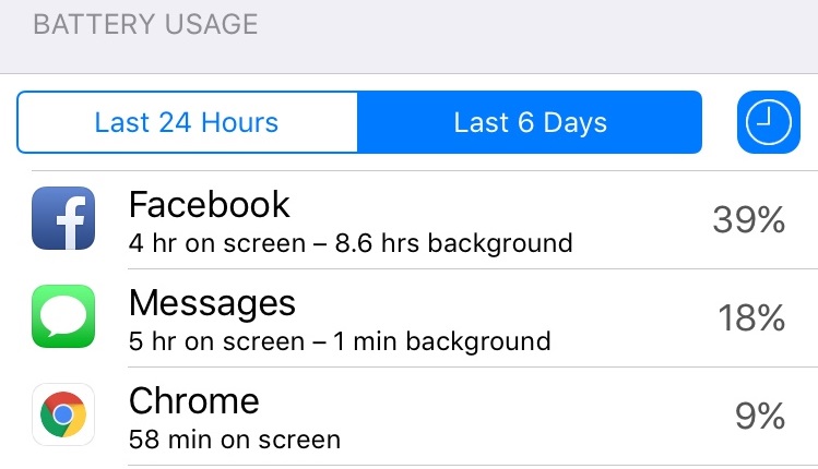
Facebook's newest iOS update, out today, fixes a major battery draining bug that some Facebook users have been experiencing in recent weeks. Affected users were seeing large amounts of battery drain on their iPhones due to Facebook running in the background, something that happened even when background app refresh was toggled off in the Settings app.
While the latest Facebook app release notes don't include a reference to the issue, Facebook engineering manager Ari Grant wrote a post (via TechCrunch) explaining the issues behind the battery drain and what Facebook has done to fix it. According to Grant, there were several factors that contributed to the problem, including a "CPU spin" in the network code and silent background audio sessions that kept the app awake even when it wasn't open.
The first issue we found was a "CPU spin" in our network code. A CPU spin is like a child in a car asking, "Are we there yet? Are we there yet? Are we there yet?"with the question not resulting in any progress to reaching the destination. This repeated processing causes our app to use more battery than intended. The version released today has some improvements that should start making this better.
The second issue is with how we manage audio sessions. If you leave the Facebook app after watching a video, the audio session sometimes stays open as if the app was playing audio silently. This is similar to when you close a music app and want to keep listening to the music while you do other things, except in this case it was unintentional and nothing kept playing. The app isn't actually doing anything while awake in the background, but it does use more battery simply by being awake. Our fixes will solve this audio issue and remove background audio completely.
When the Facebook battery draining issue first began circulating, MacStories' Federico Vittici hypothesized it was caused by silent audio running in the background, which turned out to be correct. Vittici believed Facebook used silent audio intentionally as a way to keep the app active in the background for tasks like pre-loading content, which he said showed "a deep lack of respect for iOS users."
Regarding today's comment from Facebook engineer Ari Grant, TechCrunch's Matthew Panzarino also suspects there's a possibility Facebook's use of background audio might have been done on purpose, despite Facebook's claim that it was an unintentional bug.
So if you believe Grant, this is a simple bug. It could happen to anyone etc etc. If you don't believe him, it was a thing Facebook was doing to make their app work a way they wanted it to but Apple didn't and they got caught. I'm not gonna pass any judgments here -- bugs happen all of the time and it's not fun to get pilloried over a simple mistake. Either way, attention was brought to it and it's fixed now.
Grant says fixes have been implemented for both of the issues causing battery drain and Facebook users "should see improvements in the version released today." Facebook will also continue to improve the battery usage of its iOS app.
When Twitter launched Moments, it talked briefly about its launch partners and how eventually anyone would be able to build their own moments. Until that happens, Twitter is launching an ecosystem using the same tools used by Moments to help publis...
ExpanDrive builds cloud storage in every application, acts just like a USB drive plugged into your Mac. With ExpanDrive, you can securely access any remote file server directly from the Finder or even the terminal. ExpanDrive supports:
SFTP/FTP/FTPS
Amazon S3
Dropbox
WebDAV
Rackspace Cloud Files
Openstack Swift
Dreamhost DreamObjects
Google Drive
OneDrive
Box.com
Copy.com
HP Helion
hubiC
Version 5.0.8:
Note: ExpanDrive 5 is a paid upgrade of $24.95. If you purchased after 1 May 2015, your key has been upgraded for free.
Capturing good audio isn’t easy. But it’s essential if you’re recording a new track, producing a podcast, or chatting over Skype.
If you don’t know the first thing about what makes for a good microphone it can be a long and exhausting search. Even if you do know the ins and outs of recording, you have to contend with cost and possibly multiple pieces of equipment depending on how extensive you want your setup to be. And then those wires. So many wires.
Austrian entrepreneur Philipp Sonnleitner thinks he has the solution. His new, wireless microphone Mikme, which goes on sale Monday, promises studio quality recording in a small but sturdy package.
Device: Mac OS Category: Education Price: $3.99 -> $1.99, Version: 1.1 (iTunes)
Description:
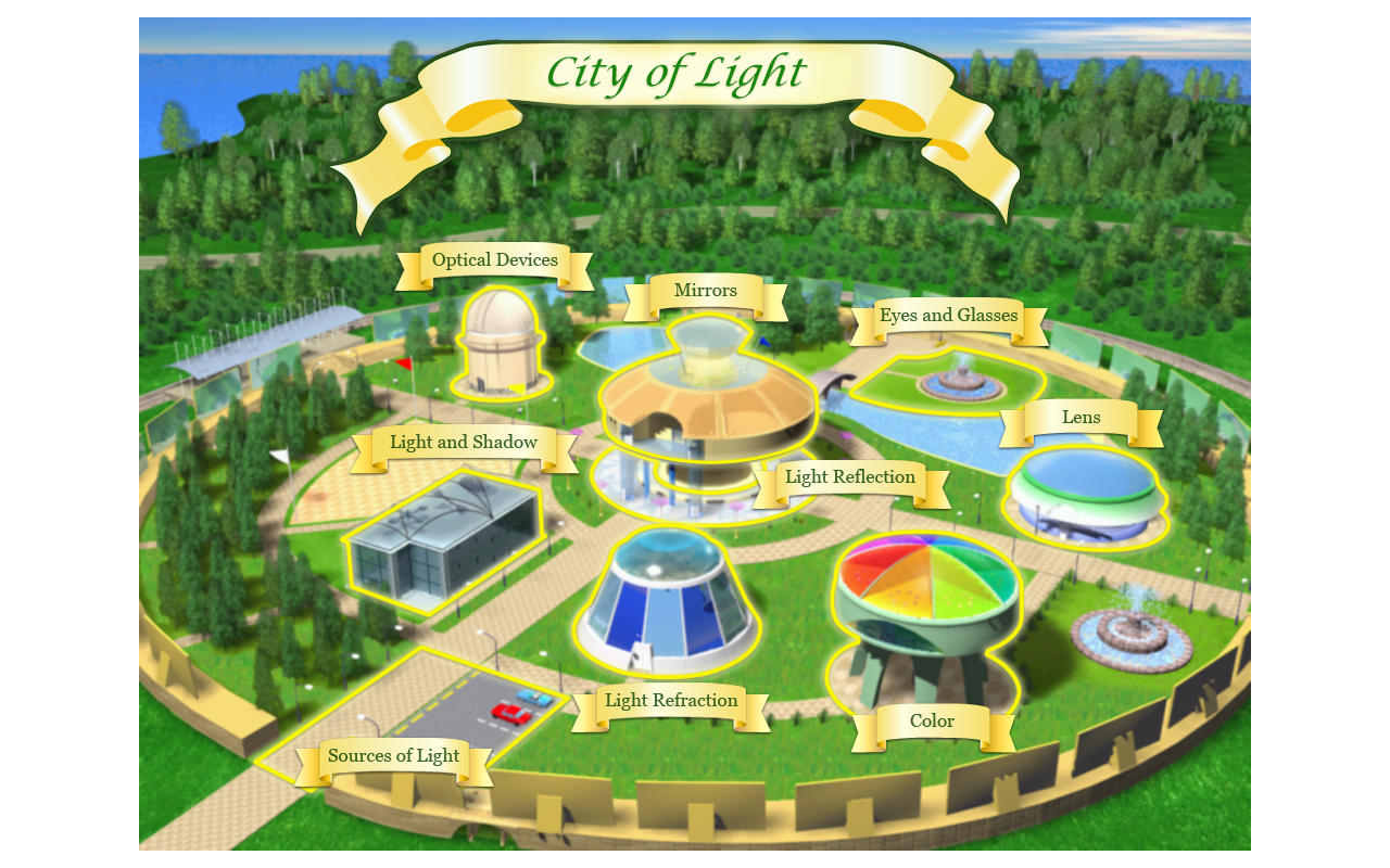
Instead of studying the phenomena of nature in a classroom, a Physics Teacher and two students – a bright girl and a curious boy – set out on an amazing journey to various wondrous STEM Islands.
On island “City of Light”, we will see why the plashes of sunlight appear on the walls. We will explore the components of the light beam and discover why the rainbow appears in the sky. We will learn why people can distinguish colors and how the objects cast shadows. At the end, we will play a game!
Would you like to know what makes a light ray or how a rainbow appears in the sky? Why can a person perceive colours and how do the objects cast shadows? A Physics Teacher will help you answer these and many other questions while travelling around the magic "City of Light". A bright girl student and a curious boy student will accompany you in this travel. It is always more fun to learn together.
There are 9 educational themes in the "STEM Islands. City of Light": • Sources of Light • Light and Shadow • Light Refraction • Mirrors • Light Reflection • Lens • Optical Devices • Eyes and Glasses • Color
You will learn much new and interesting after visiting 9 colourful pavilions of the City of Light. The knowledge gained in the City will help you play the games offered at the end of a learning themes. We are dedicated to make learning fun and interesting. You will try your luck shooting a laser cannon, help Kate light up a library, build a correct reflection of the boy in a distorting mirror and participate in lots of other interesting activities. Why not compete with your friends and see who can win the games faster?
Features: • Nine educational themes in one application. • Fun and welcoming characters assisting in knowledge gaining. • Use of colorful graphics, animation, video, 3D models for information presentation. • Six fun and motivational educational games. • Interactive help bookmark. • Fun activities touch upon every scene to provide the learner's active engagement in the process.
A new bug has been discovered in the Messages app, allowing a string of characters sent to a person via iMessage or SMS to crash an iPhone and cause the Messages app to crash after being opened. The bug, which requires a specific string of symbols and Arabic characters to be sent, was first noticed on reddit earlier this afternoon and has been spreading around the Internet since then.
Sending the string of characters to an iPhone results in an immediate respring, causing an iPhone to crash and quickly reboot. From there, if the Messages app was opened at a list view, the Messages app crashes automatically when you try to open it. If it was opened to the conversation where you received the message, the app will open, but attempting to go to another conversation causes Messages to crash.
MacRumors tested the bug on iPhones running iOS 8.3, but it may also be affecting other versions of iOS.
If you receive one of these messages, there are a few possible fixes that have worked for us and for other people who have encountered the bug. If the Messages app was opened to the conversation with the person who sent the offending message, the Messages app can be reopened to this conversation. Sending a reply message fixes the problem.
If Messages was opened to the conversation list view, the app will crash when you attempt to open it. You can fix this by having someone send you a message or by sending a message to yourself. There are several options for sending a message to yourself, including sending yourself a message via Siri or through the Share sheet in any app.
To send yourself a message in Siri, tell Siri to "Send a message to myself." Siri will open up a dialogue where you can give her a quick message like "Fix" that'll be sent to your iPhone to clear away the malicious message.
Alternatively, you can open an app like Notes, craft a quick note, and use the Share option (the little document with an arrow) to message it to yourself. Sending yourself something though the share sheet of an app opens a new messages window where you can enter your own contact information.
According to a Twitter user who spoke to Apple support, Apple's engineers are aware of the problem and are working on a fix.
Following Apple’s shipments of the first 1.3GHz versions of the 12″ MacBook this week, benchmarks have started to appear online for the new Intel Core M-5Y71 machine. Geekbench 3 shows the following results for each model, which vary based on the testing mode (32/64-bit) and number of processor cores used (single or multiple cores).
32-Bit: Single-Core Average 2387, Multi-Core Average 4673
64-Bit: Single-Core Average 2816, Multi-Core Average 5596
The 1.3GHz MacBook’s 64-Bit scores represent 16%-22% improvements over the 1.1GHz model, and 8%-9% gains over the 1.2GHz model. On April 27, we updated the 32-Bit scores now that additional benchmarks have been posted; they show smaller gains over the lower-speed models. More details are below…
Combing through Geekbench 3 results, the 1.3GHz MacBook’s scores compare most directly to Apple’s 1.4GHz Macs, such as the entry-level 21.5″ iMac and early 2014 entry-level MacBook Air. The latter model achieved Single- and Multi-Core scores in the 2400/4700 range for 32-Bit tests, and 2700/5300 for 64-Bit tests.
Geekbench 3’s Single-Core scores reflect the machines’ relative speeds when performing non-demanding tasks such as basic web browsing and word processing. Multi-Core scores demonstrate the machine’s ability to perform more complex tasks demanding additional processing power, such as video rendering.
The 1.3GHz MacBook is available only as a custom build-to-order model, but authorized resellers are now offering it at discounted prices.
Device: Mac OS Category: Productivity Price: $4.99 -> $2.99, Version: 2.3 (iTunes)
Description:
• • • Original Price: $9.99. Now: $2.99. End Date: 2015/05/10 • • •
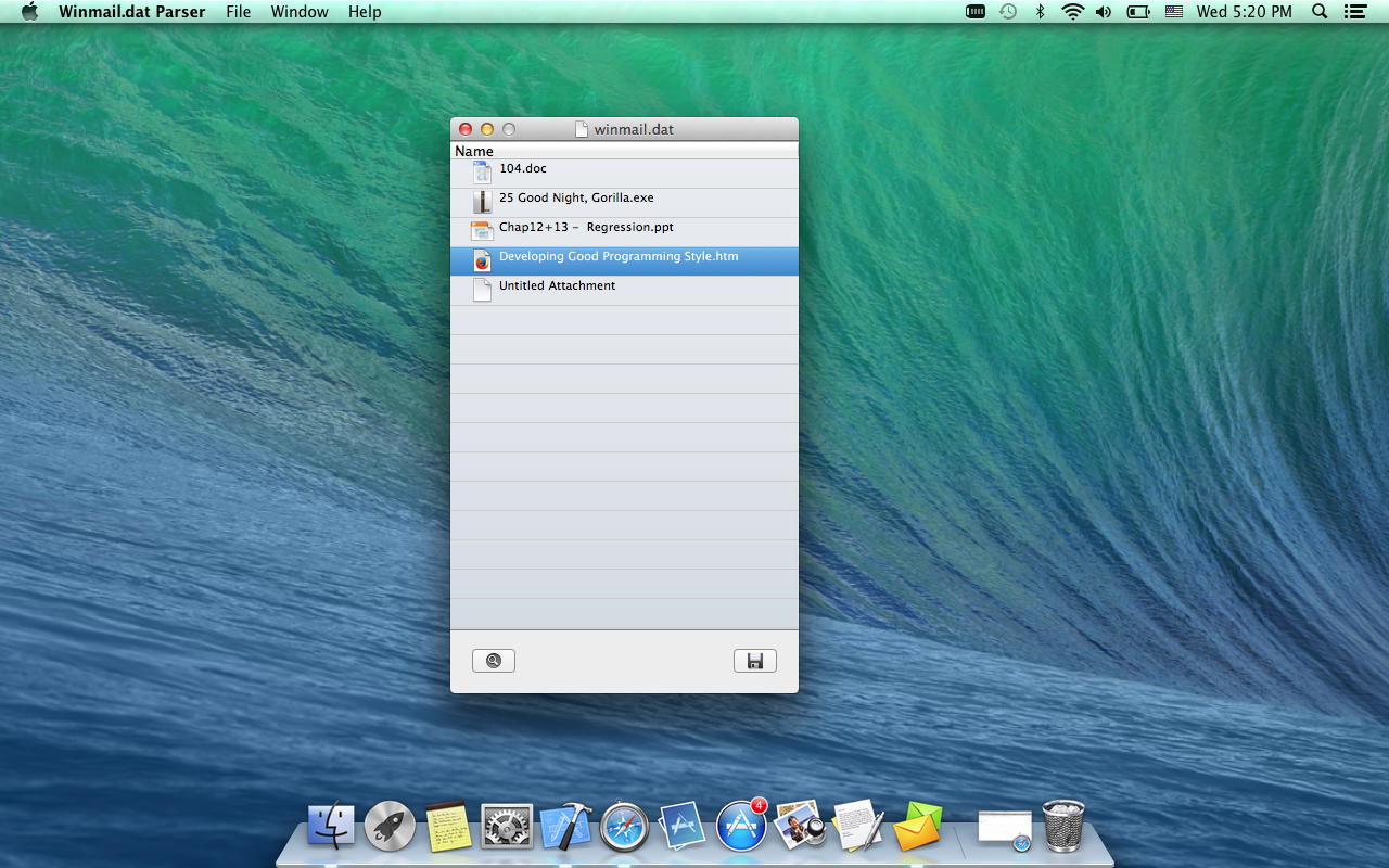
This application is a simple and powerful tool to let users read and extract all attachments from Winmail.dat files(Microsoft Outlook produced and TNEF encoded). It allows to open, view and save all attachments
• • Main Features • • • List all attachments contained of your Winmail.dat files.
• Extracts all attachments from Winmail.dat files.
• Easy to open, view and save Winmail.dat files.
• Preview all attached files from Winmail.dat files before saving.
• Drag & Drop Winmail.dat files or double-click Winmail.dat files to open.
• Allows copy and save embedded attachment in Winmail.dat files to specified folder.
• Easy to use and fast.
SUPPORT: Please send your bug reports or feature requests. Email: geasoftsupport@yeah.net
Last week's OS X 10.10.3 update is in some cases triggering kernel panics when previewing large JPEG image files, leading to crashes and reboots, according to complaints on Apple's support forums.
Download Shuttle is a download accelerator and manager. All downloads made via Download Shuttle are multi-segmented: each file is split into many smaller parts that are simultaneously being downloaded. This ensures that the speeds you experience are a lot faster as your bandwidth is maximized.
Features:
Faster speeds with multi-segmented downloads
Download management tool that allows unlimited simultaneous multiple downloads
Support for URLs that require authentication
Pause and resume support for URLs that support it
Drag and drop support for download links
Support for HTTP/HTTPS
OS X Service to send a URL to be downloaded directly by Download Shuttle
Quick Look support
Slick and incredibly easy to use interface.
Version 1.7:
Time remaining calculations optimized
Ability to batch download password protected links


 Since the announcement of the iPad Pro, there's been a great deal of debate about whether a jumbo-sized tablet running iOS can truly replace your laptop. If you're thinking about your next technology purchase and are on the fence between an iPad Pro and a MacBook, AppleInsider is here to help you break down the decision.
 Description:


 IBM's Watson AI has been a Jeopardy champion and a very creative chef, next up, Watson the weather man. Well, sort of. IBM just announced that it plans to acquire The Weather Company's products and technology, which includes Weather.com and The Wea...
 It's hard to stake a claim to silliest car concept at a show like the Tokyo Motor Show, but Nissan is probably, no definitely, the winner. What other car lets you play an RPG across almost the whole interior, or lets you splash the seats (and steer...
 One of MasterCard's first partners for its new wearables project is Adam Selman -- Rihanna's favorite fashion designer, according to The New York Times. Since that initiative aims to bring mobile payments to pretty much everything, you can guess wh...
 When Twitter launched Moments, it talked briefly about its launch partners and how eventually anyone would be able to build their own moments. Until that happens, Twitter is launching an ecosystem using the same tools used by Moments to help publis...

 Description:
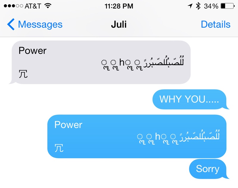 MacRumors tested the bug on iPhones running iOS 8.3, but it may also be affecting other versions of iOS.


 Description: